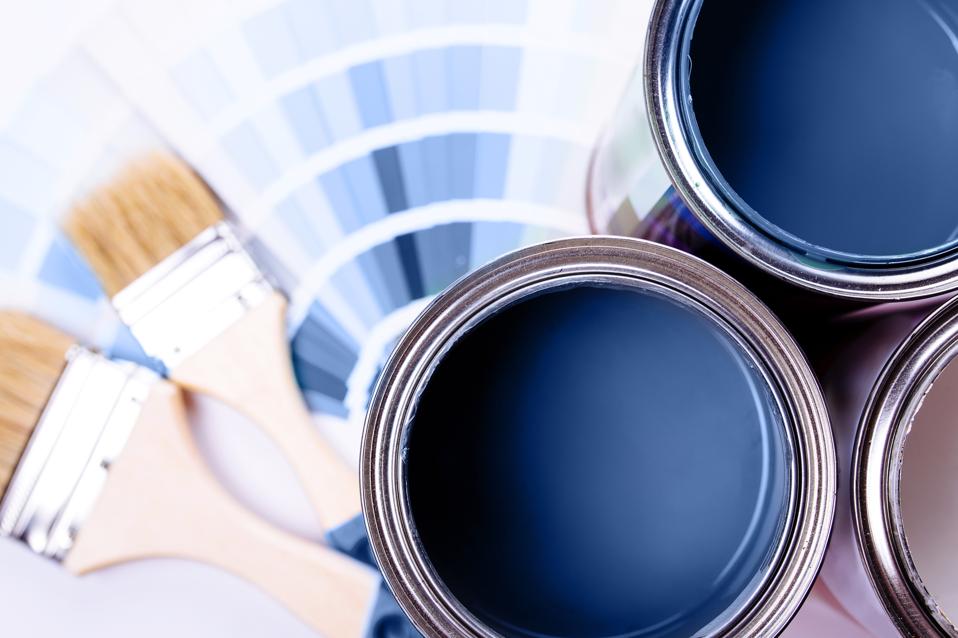
An expert in color psychology shares the 5 shades you should have in your living room
This article, drawing insights from color expert Amy Wax, details five specific color shades that are recommended for a living room space, based on principles of color psychology. The overarching theme is to create an environment that feels relaxing, comfortable, inviting, and emotionally balanced. Each color recommendation is accompanied by its psychological impact and suggestions for complementary pairings.
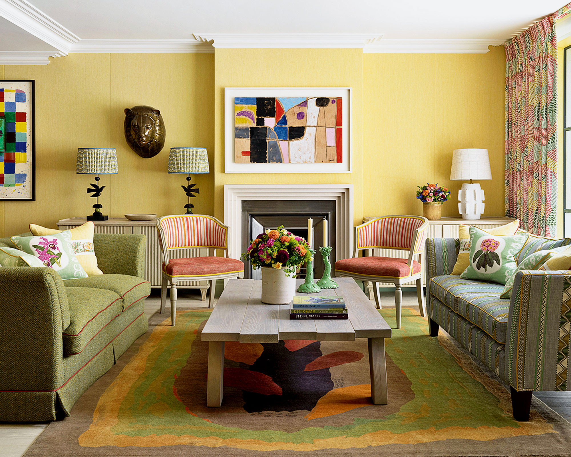
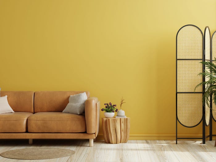
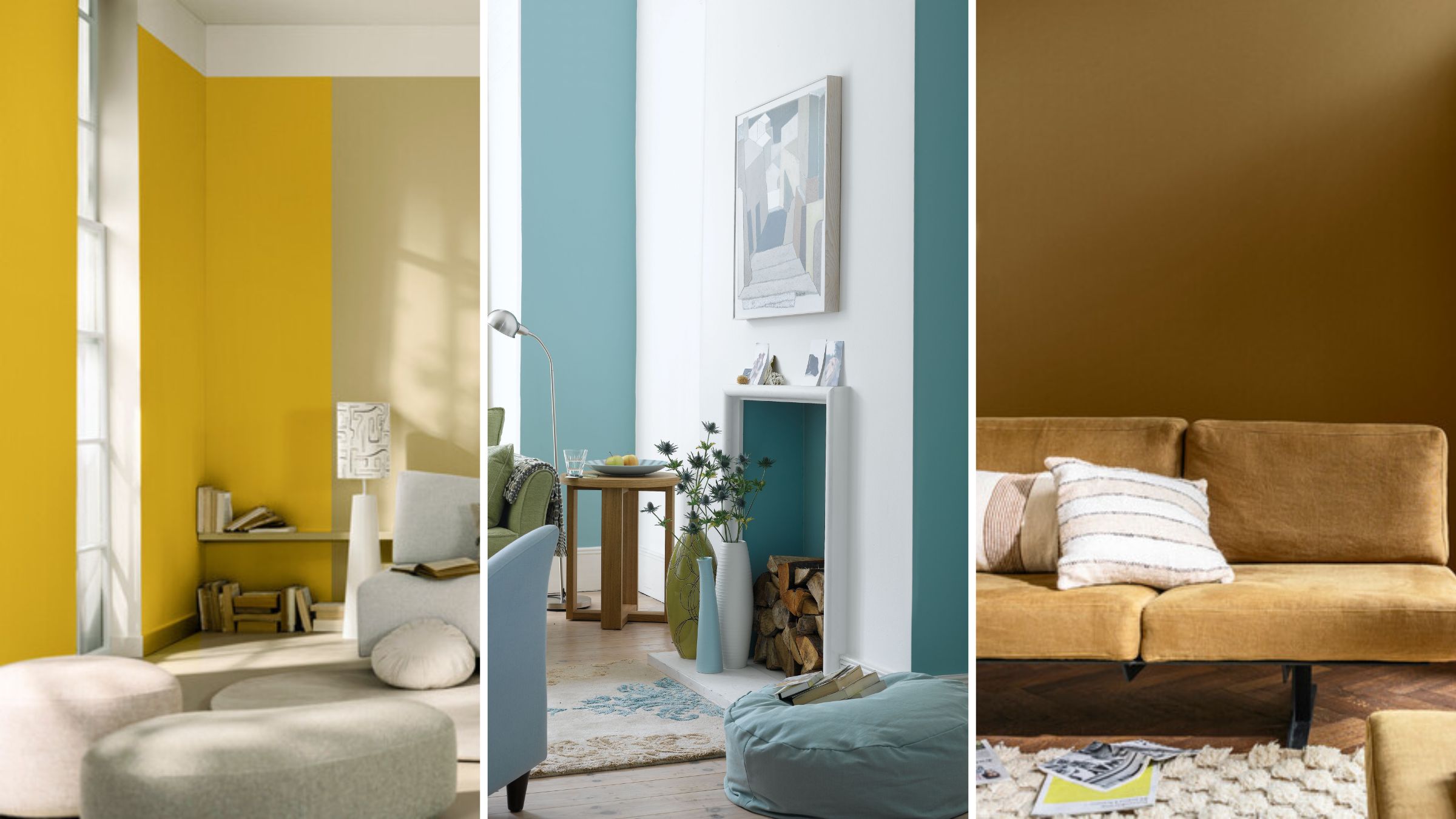
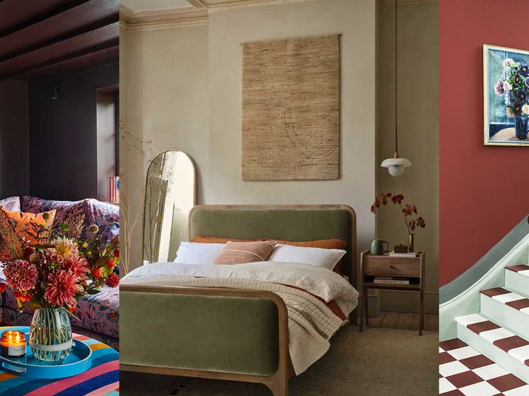
First, warm yellows, specifically pale golds and rich wheat tones, are highlighted for their ability to create a cozy and inviting ambiance. Amy Wax emphasizes that these softer yellows can improve one's mood, making a space feel sunny, warm, and spirited. However, a caution is given against using bright yellows, which can induce stress and agitation. Recommended pairings for warm yellows include blues, greens, and grays.
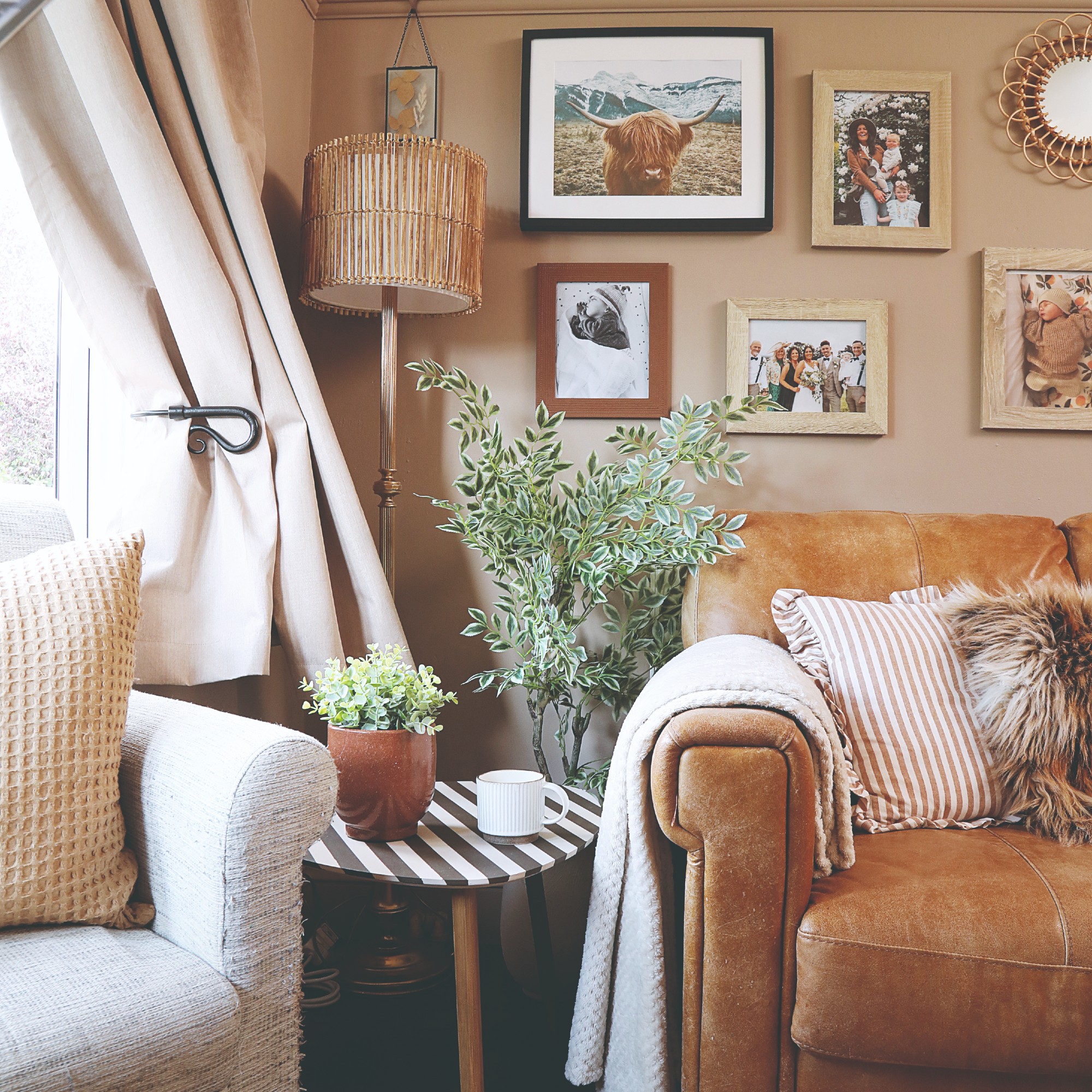
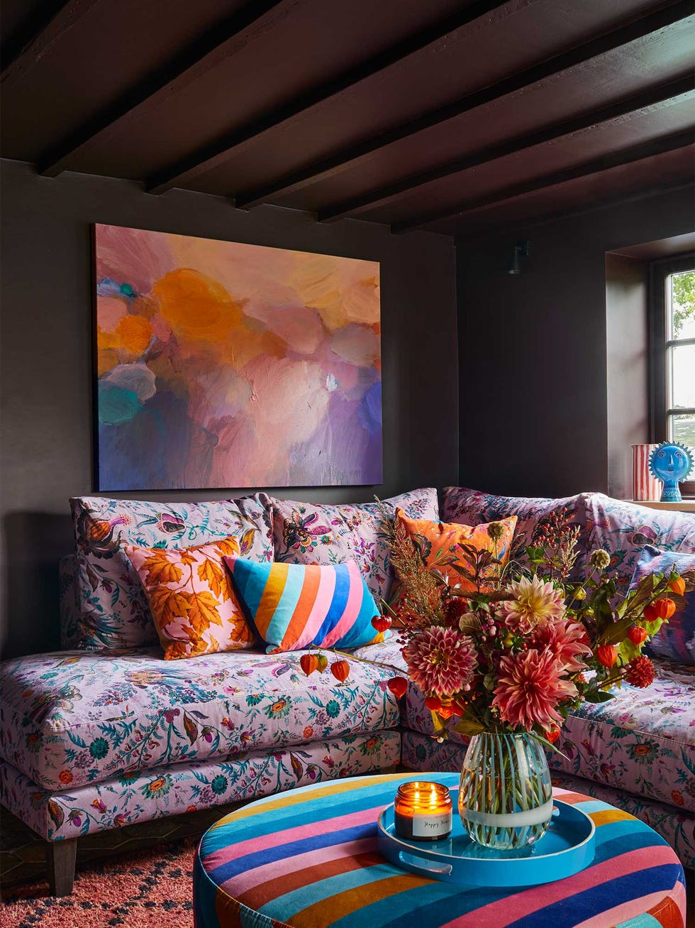
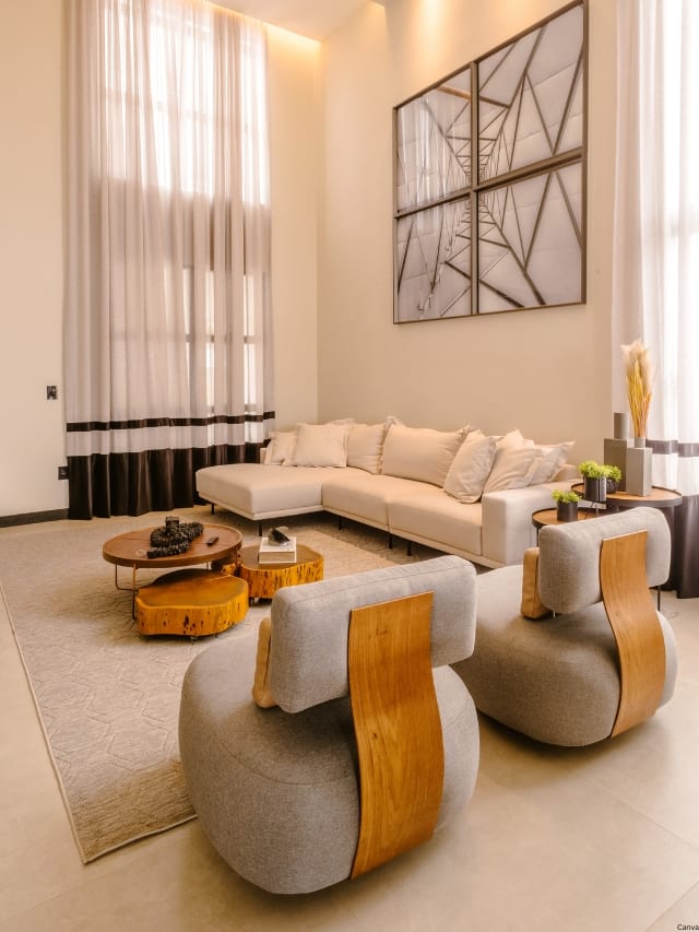
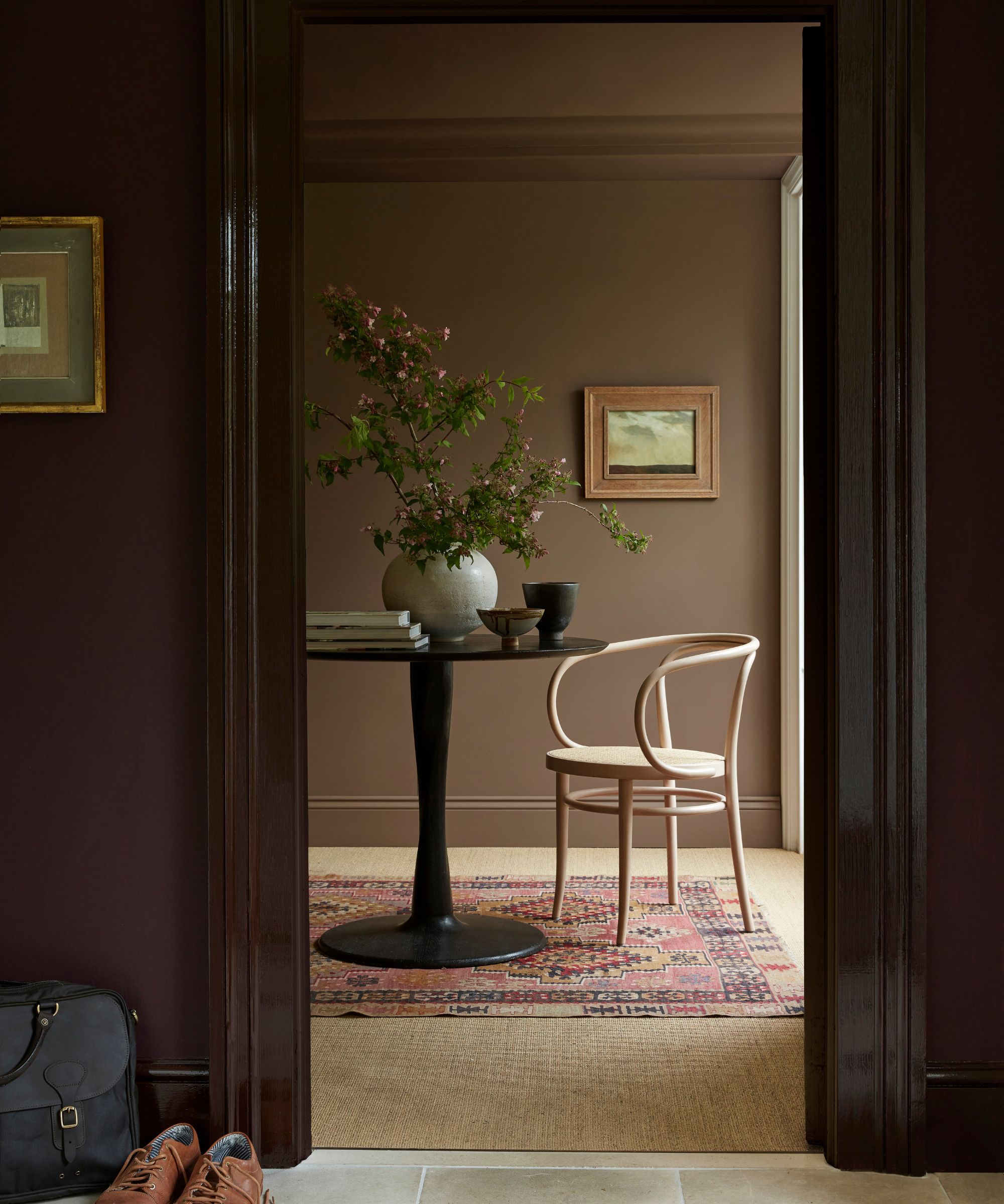
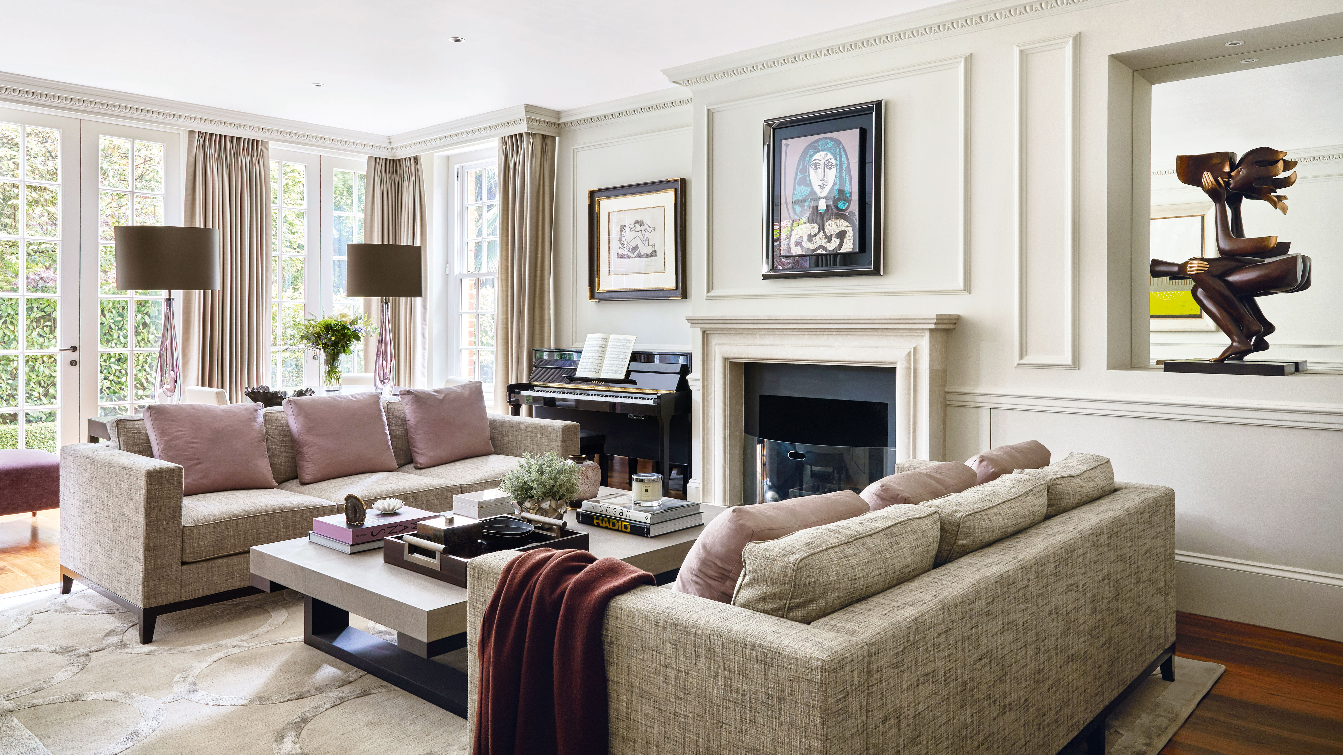
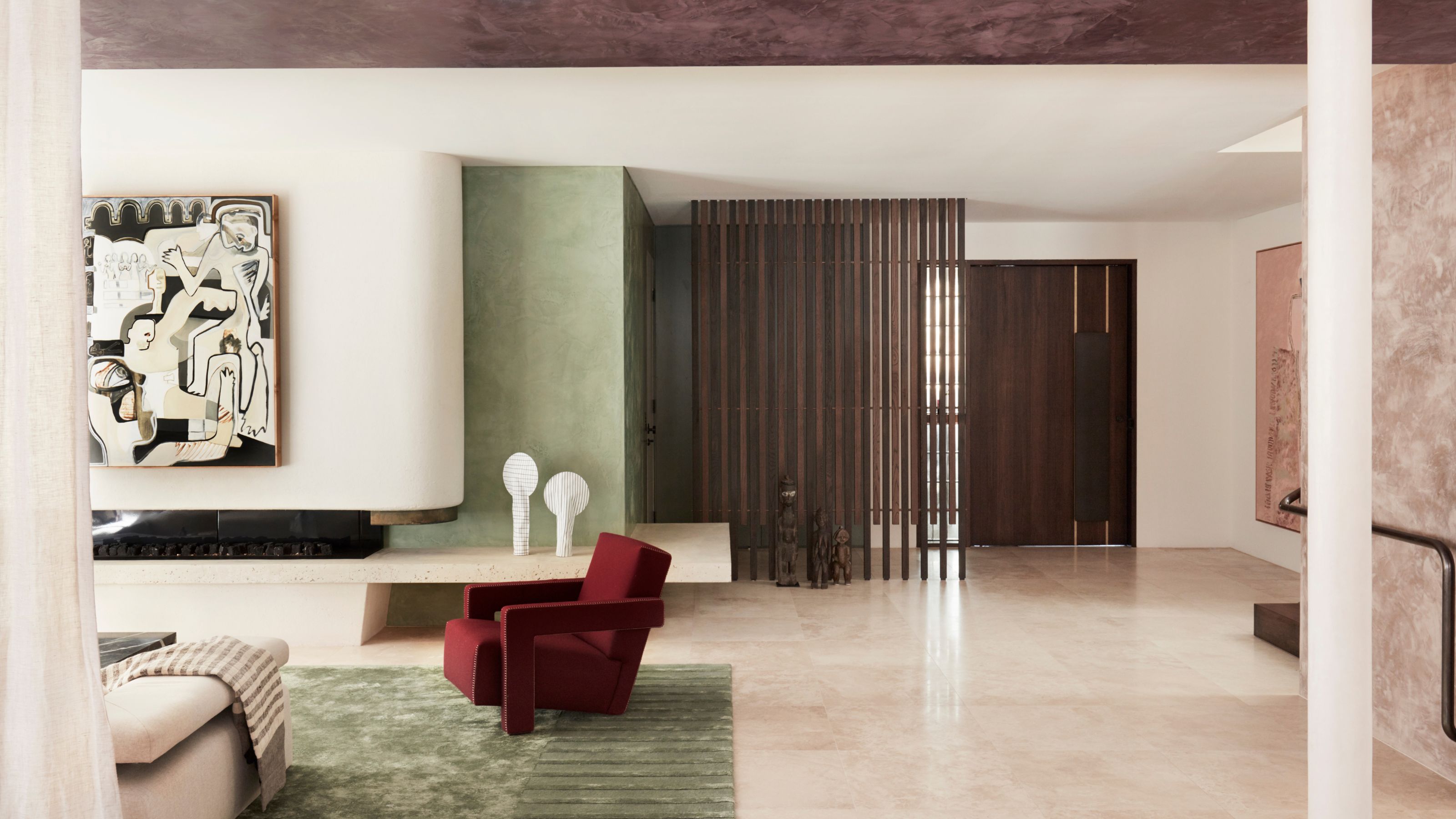
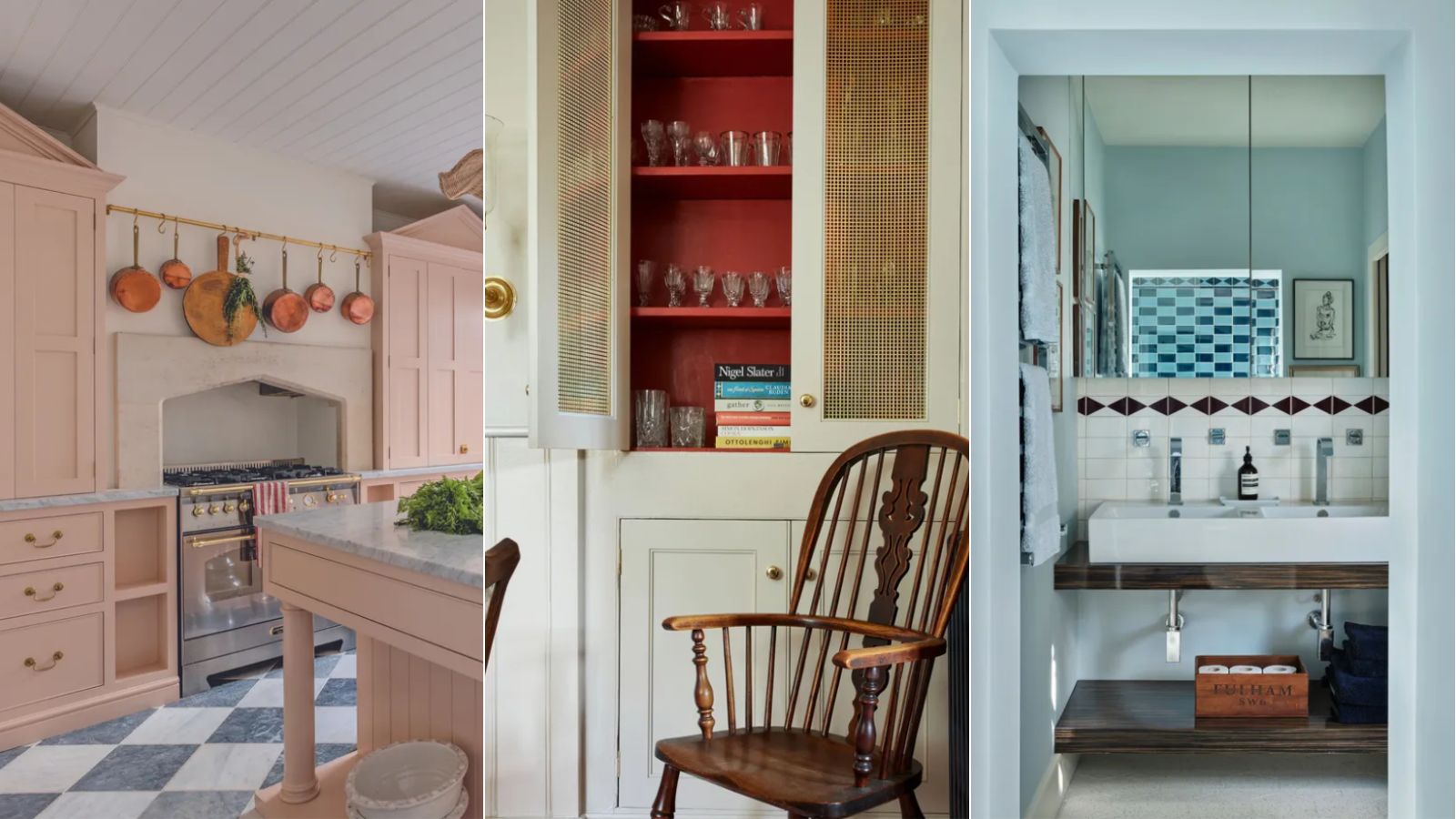
Second, greige, a versatile blend of gray and beige, is presented as an elegant and conservative base color for a living room. Its neutrality allows for the introduction of brighter accent colors, fostering a playful yet sophisticated atmosphere. Stone-colored beige or rich taupe variations of greige are suggested to pair well with brighter greens and colors from the plum and teal families.
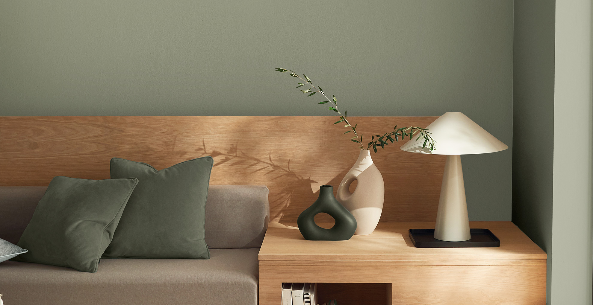
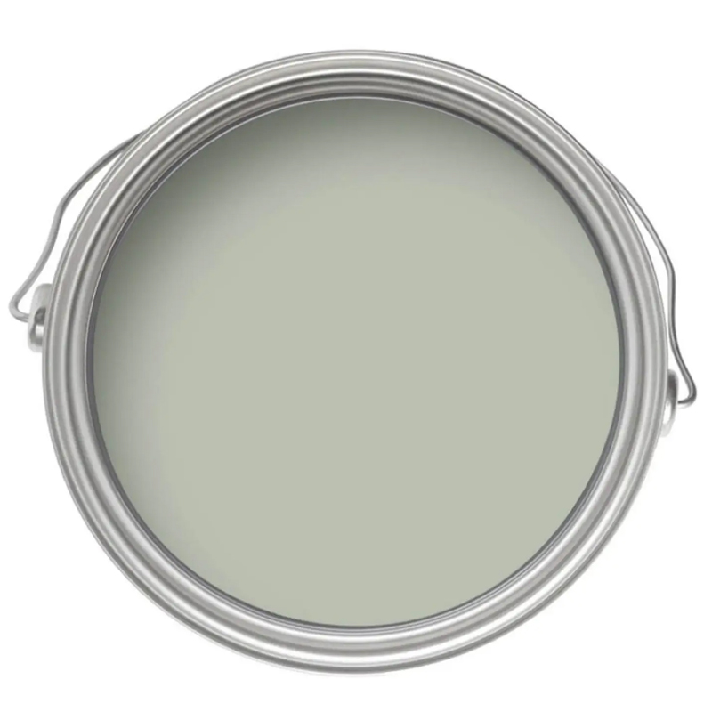
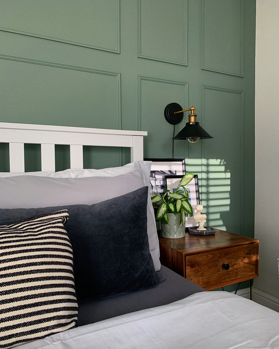
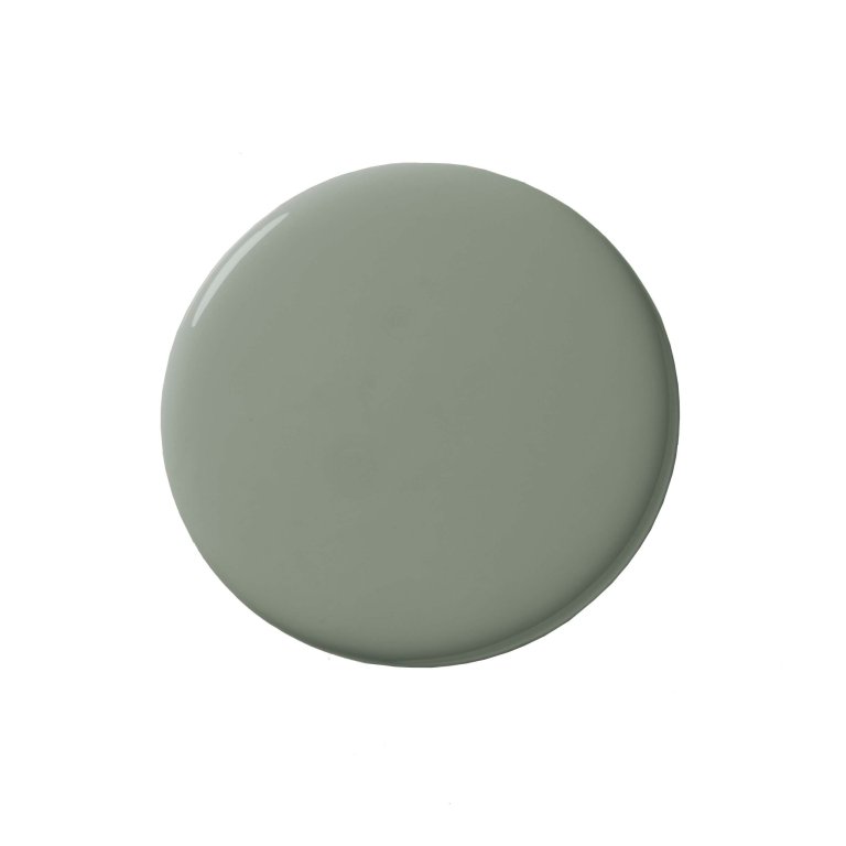
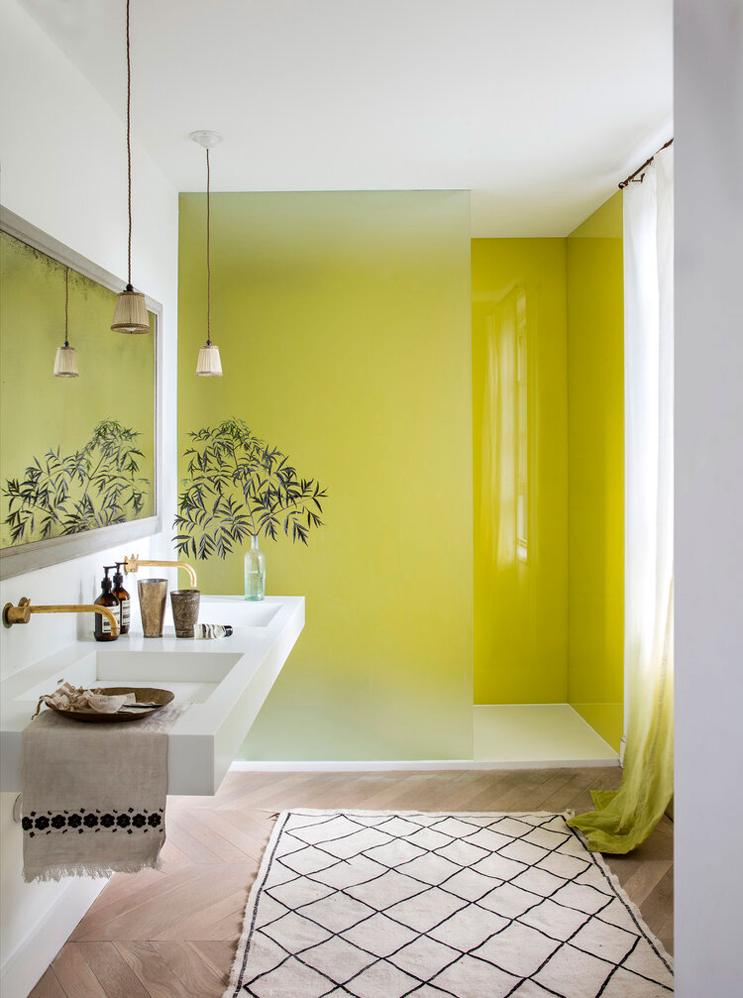
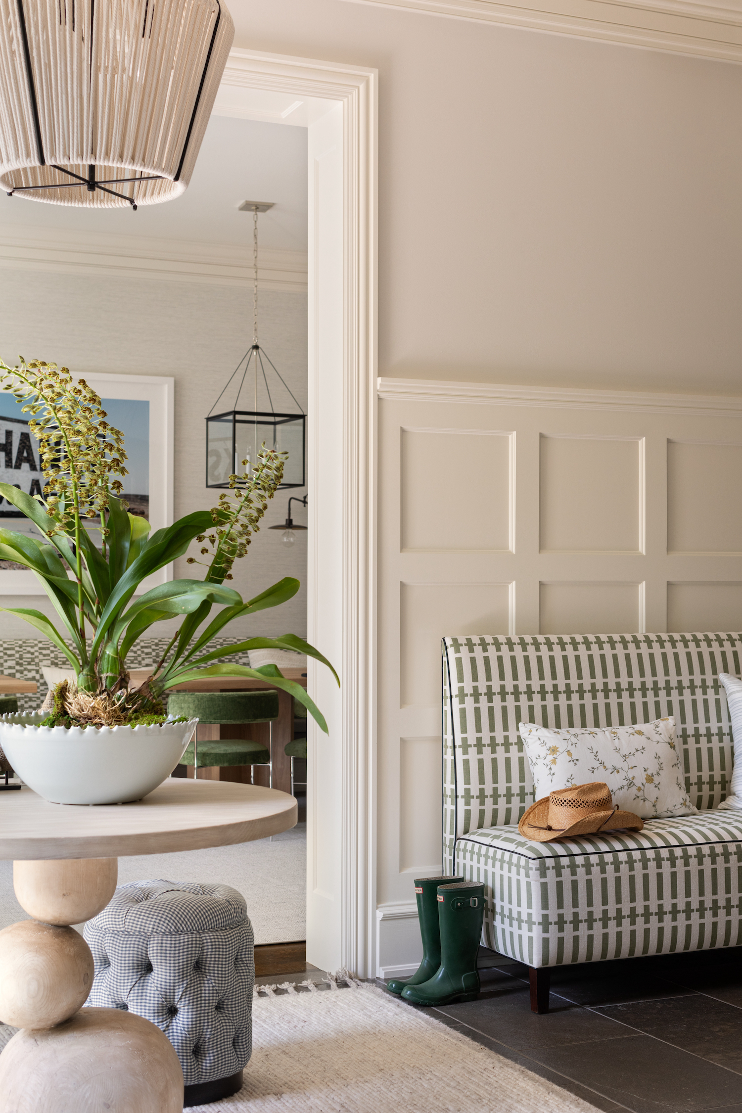
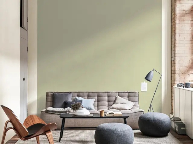
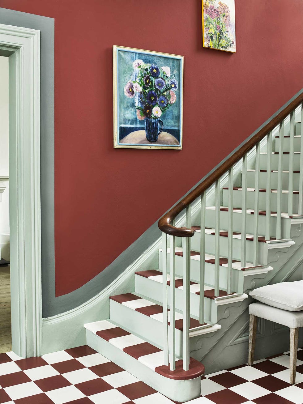
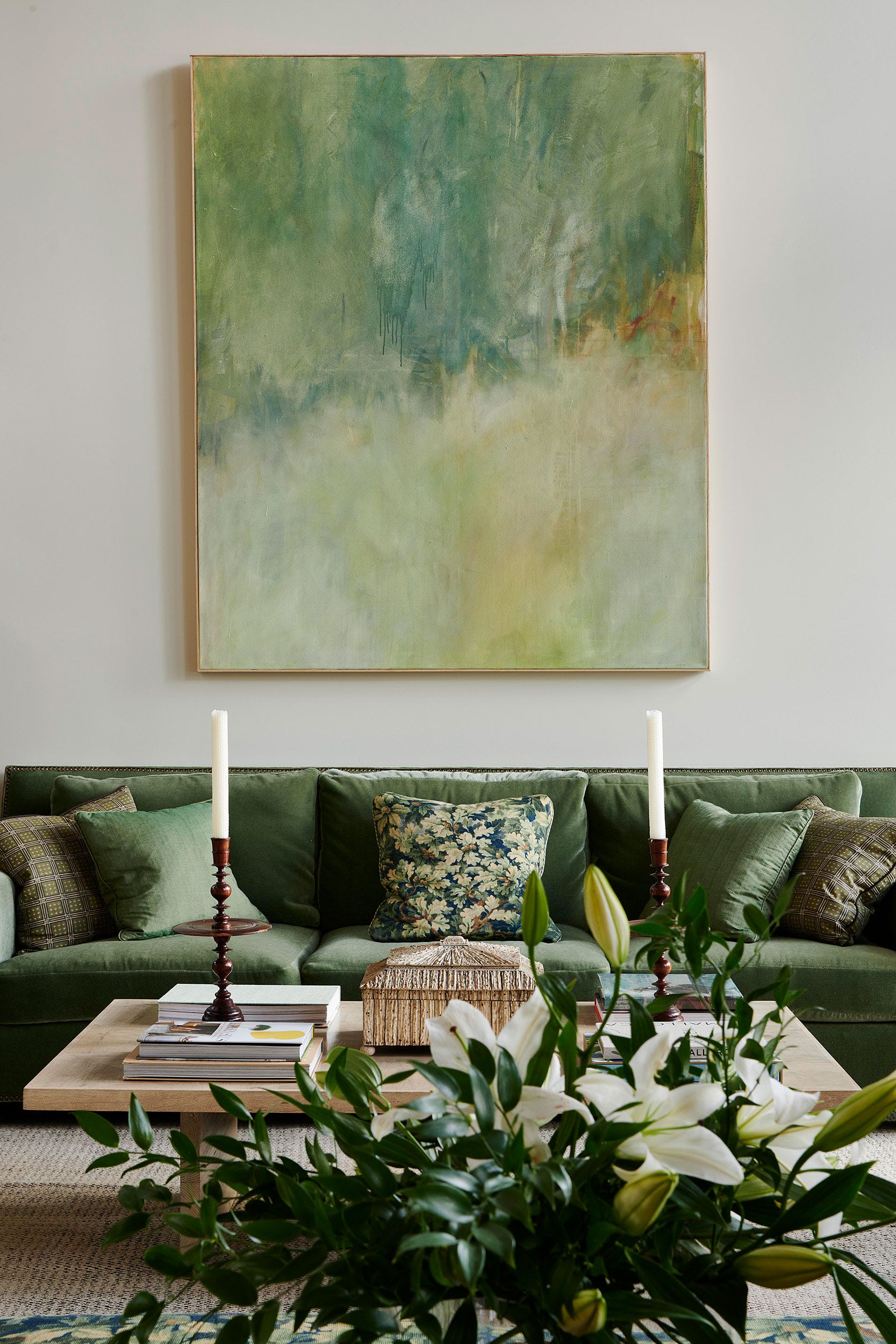
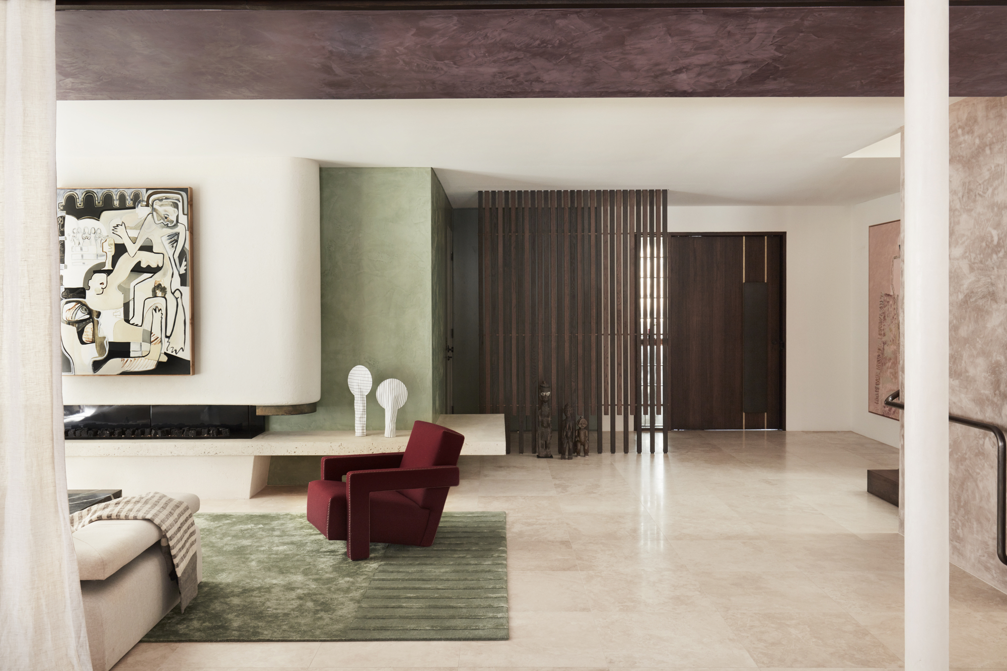
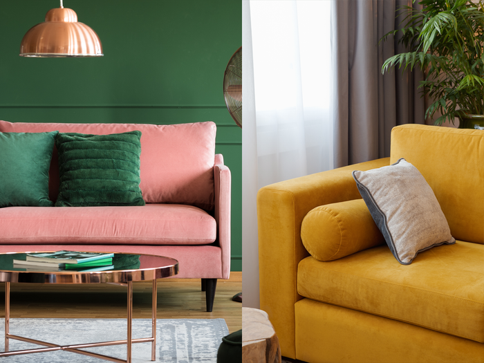
Third, shades of green are recommended for their calming and relaxing properties. The article notes that greens, particularly quiet sage or bold hunter green, can bring a natural element into the living room, contributing to a soothing environment that is easygoing and friendly. These greens are said to pair effectively with neutral creams, brick reds, and navy blues.
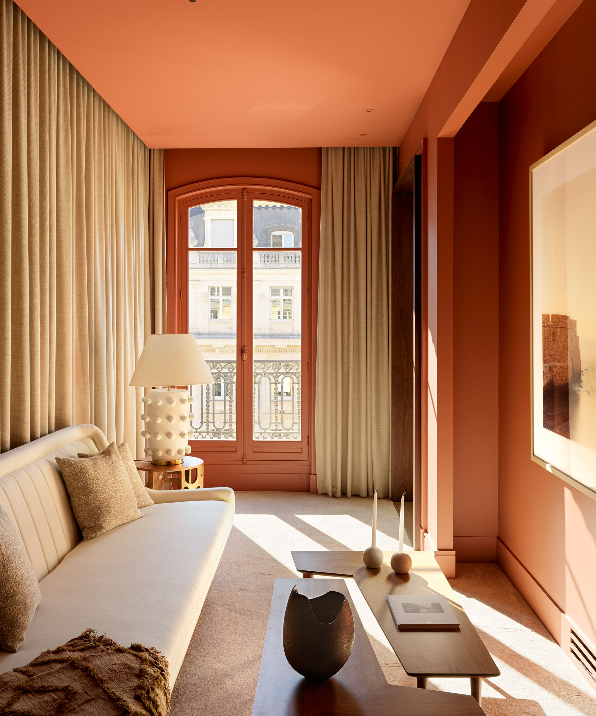
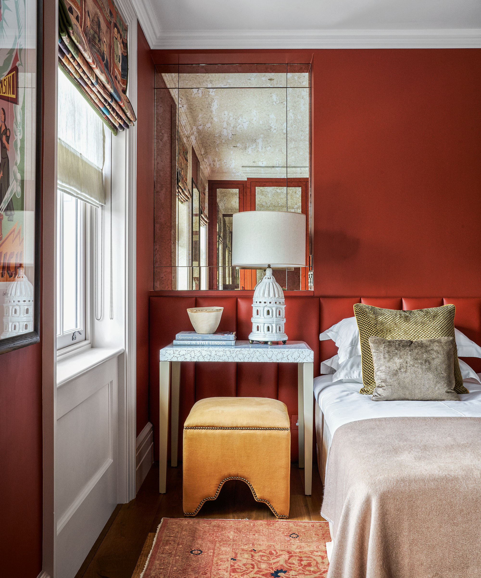
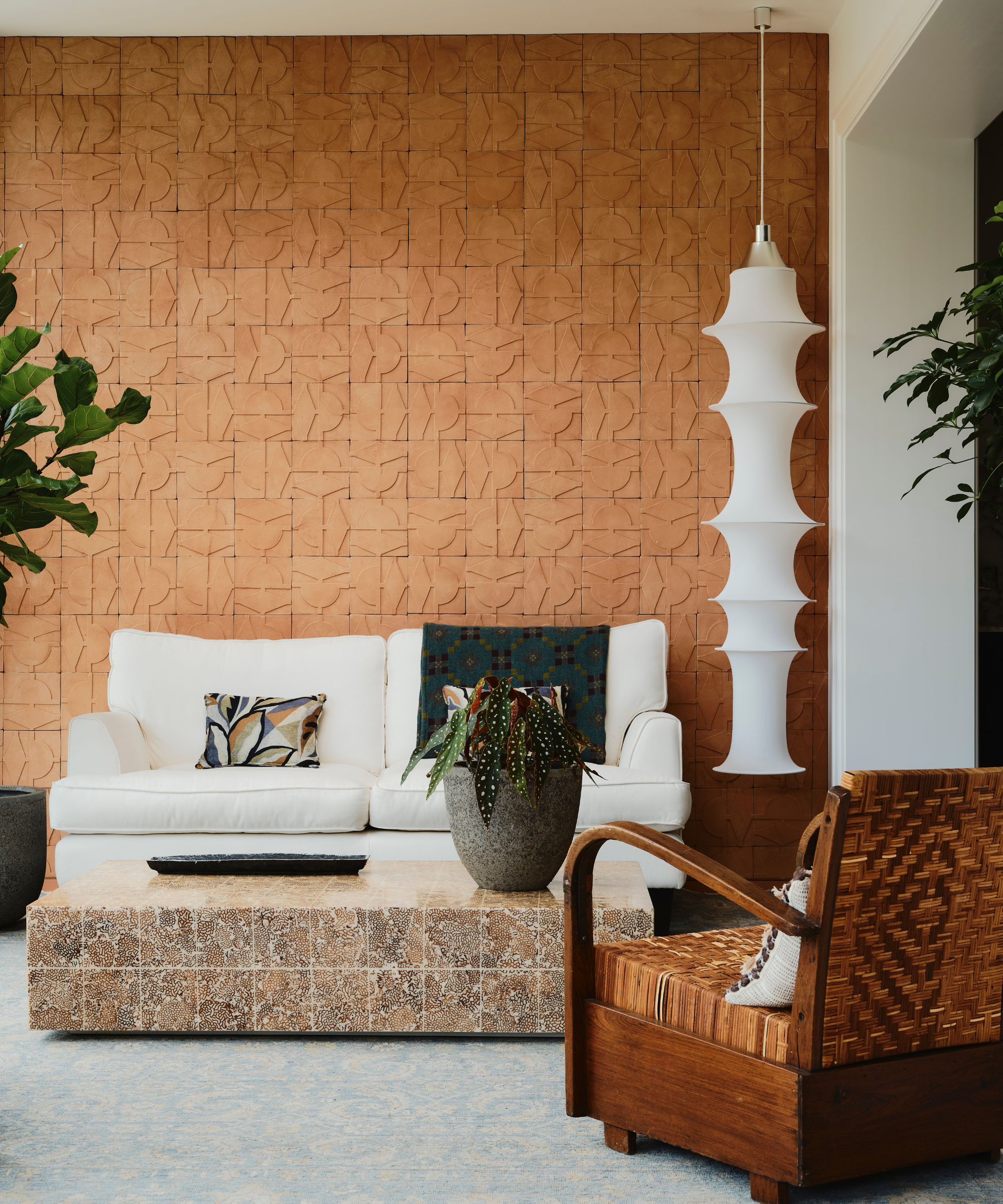
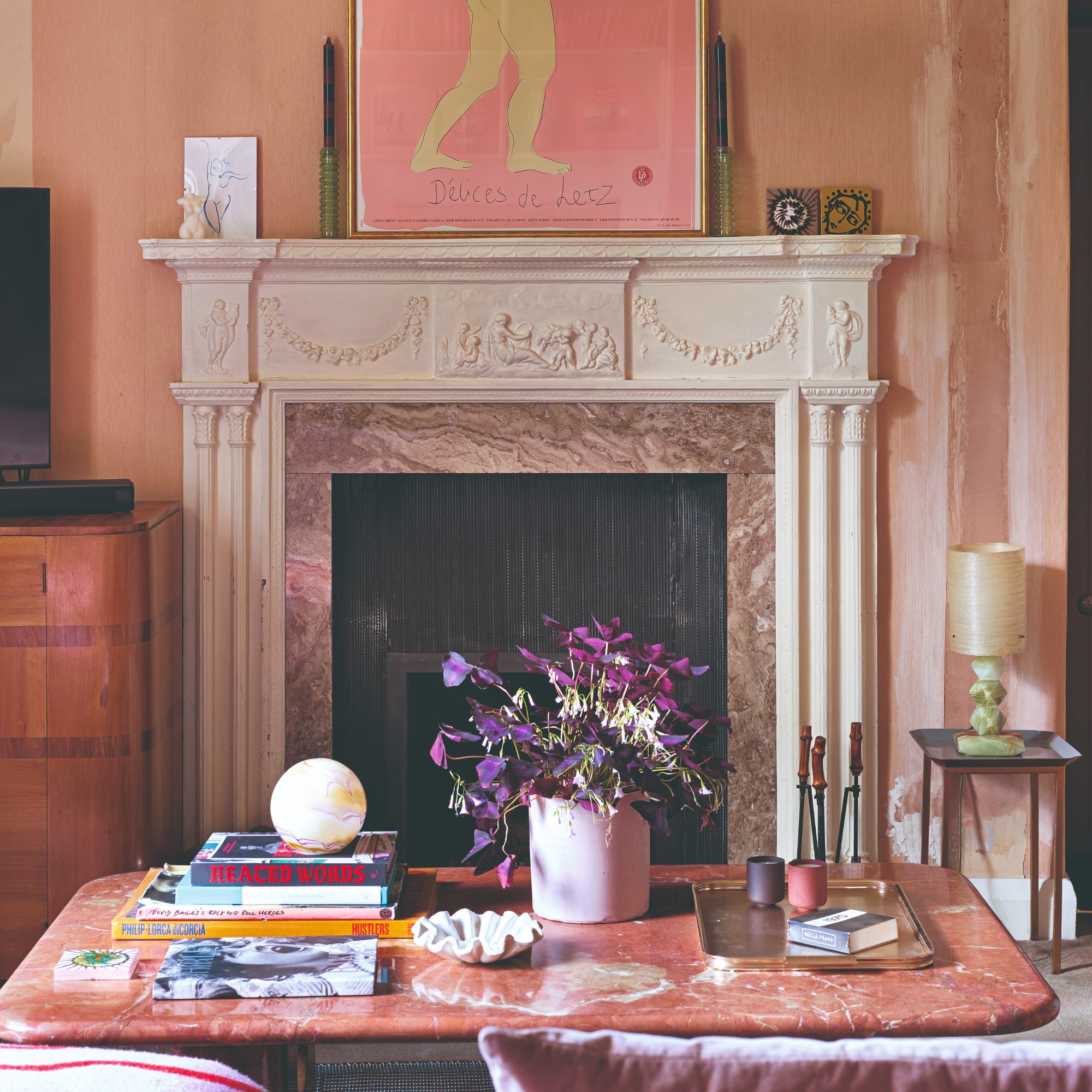
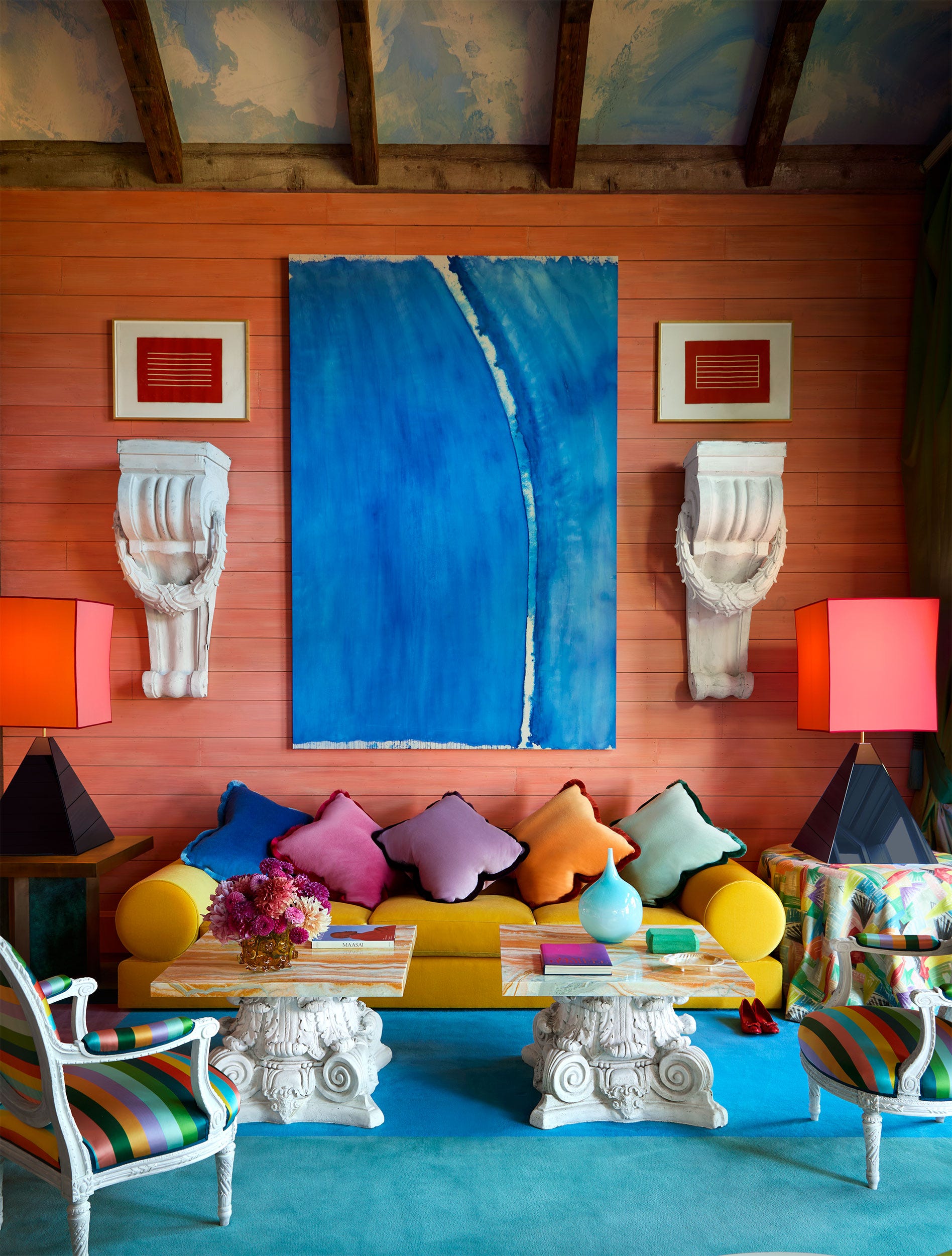
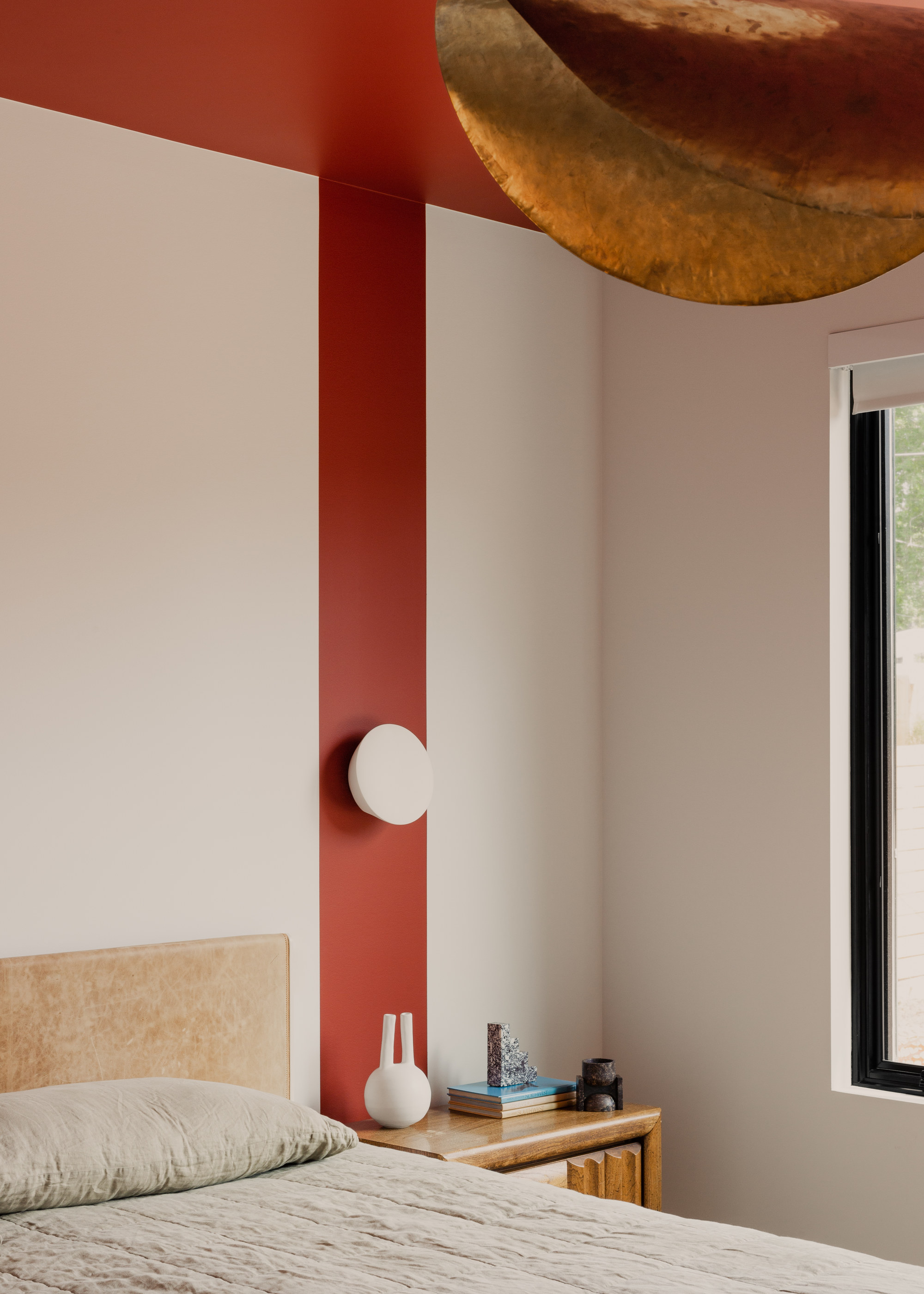
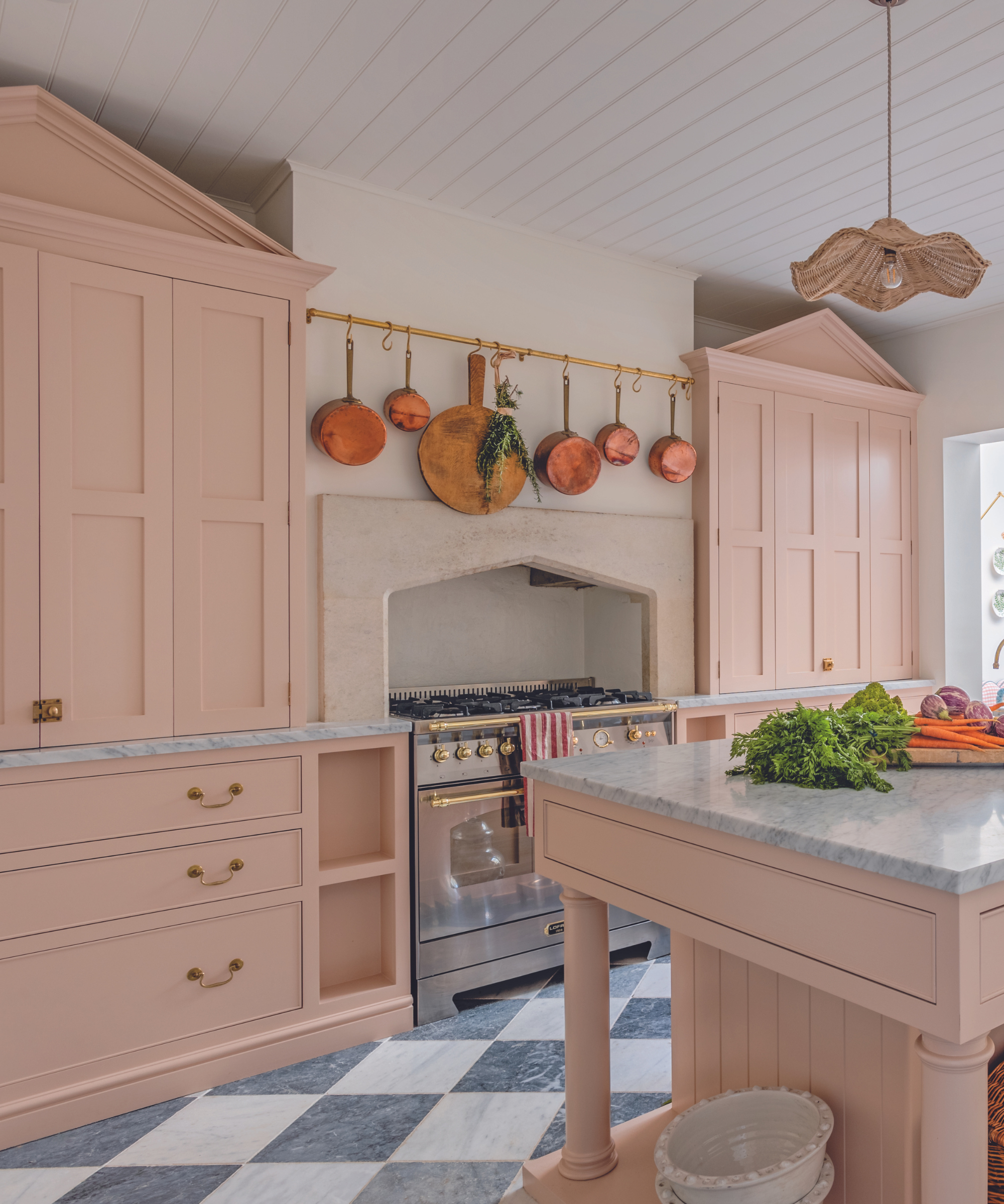
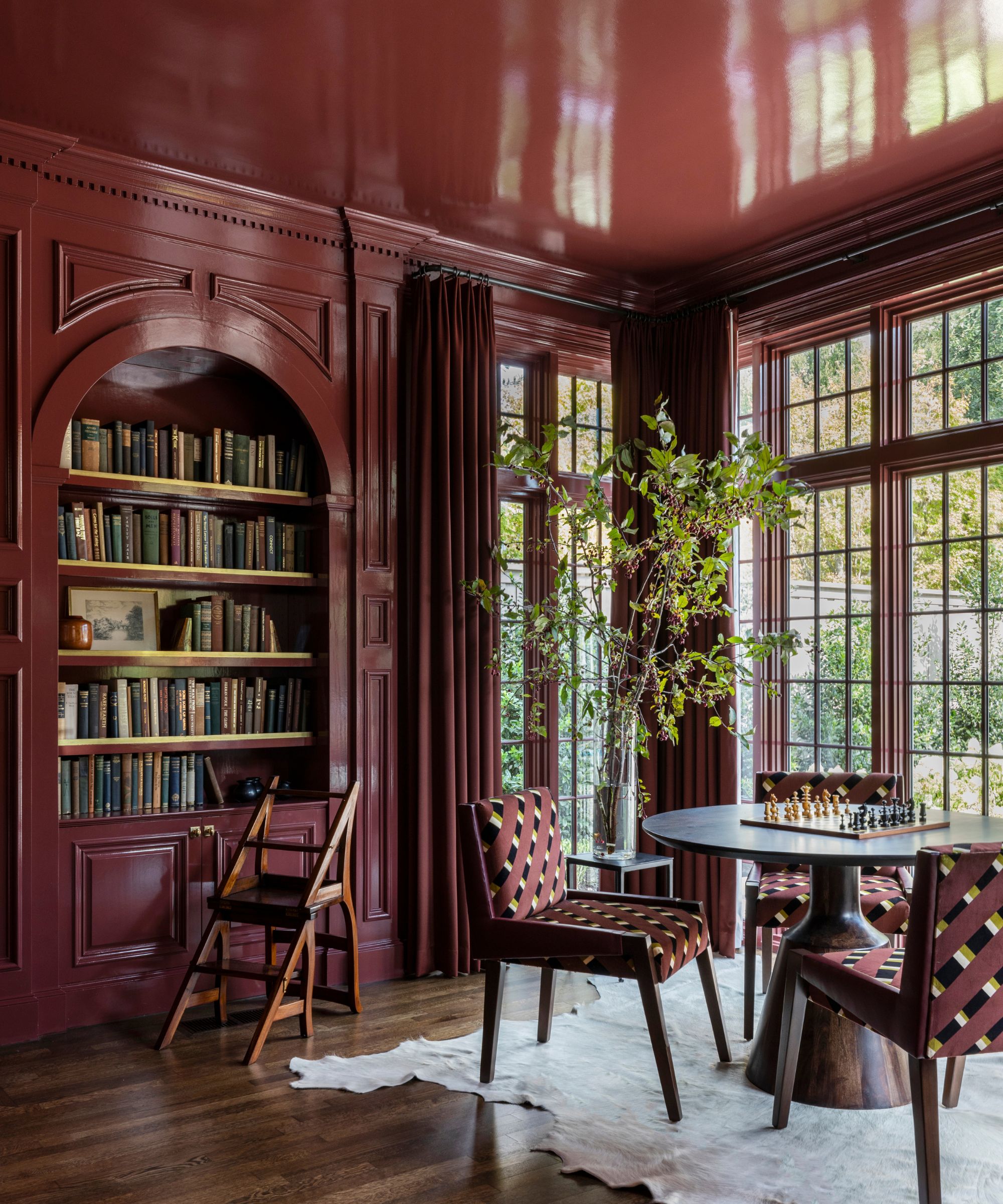
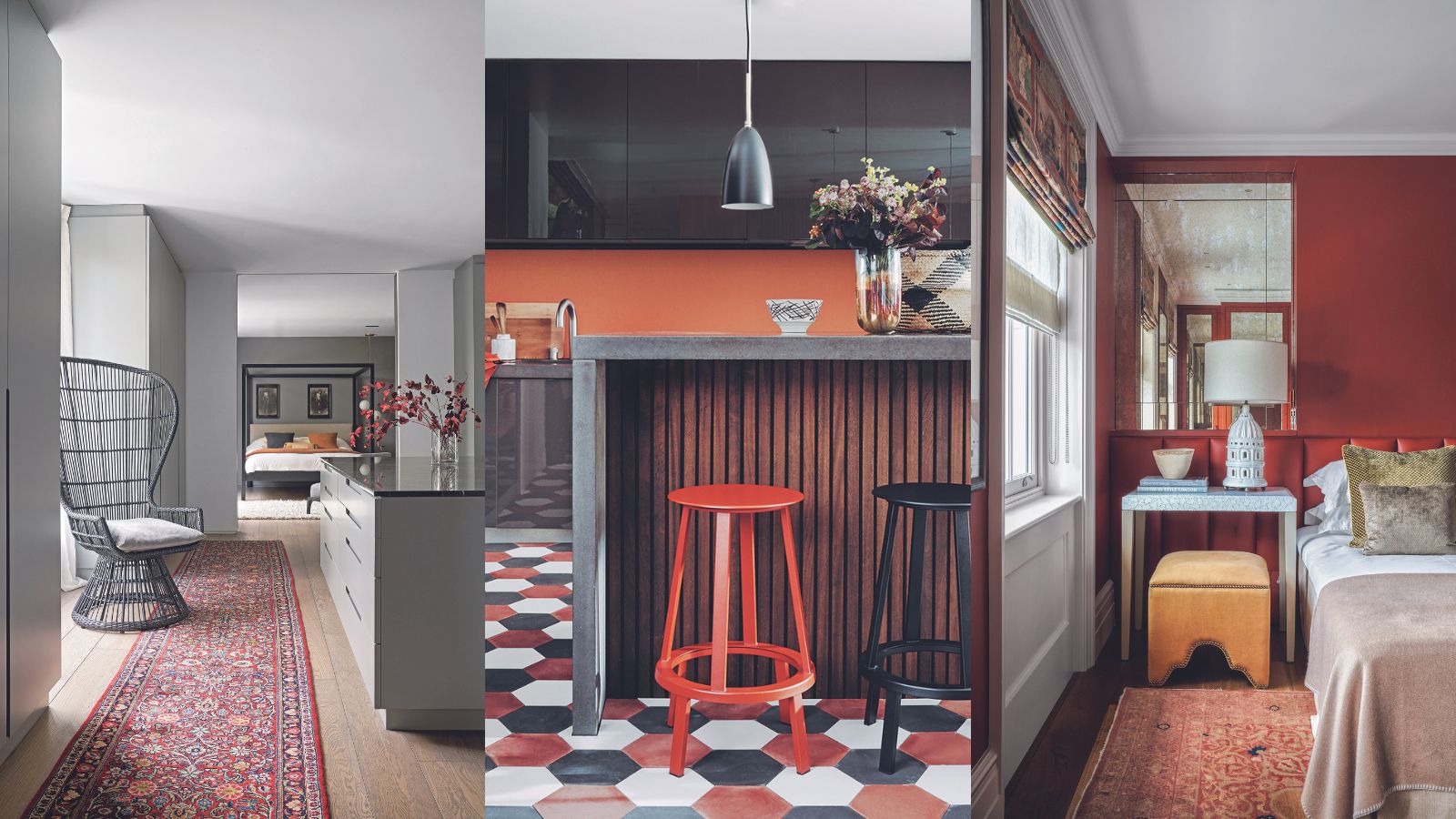
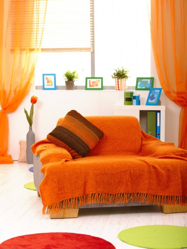
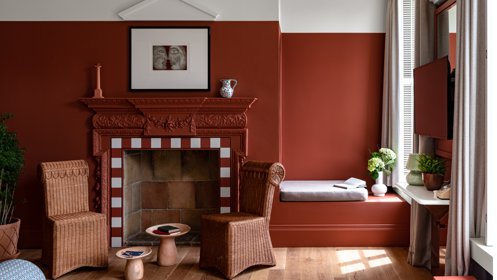
Fourth, terracotta is introduced as an earthy and warm option that can create a restful vibe. While acknowledging that brighter oranges can be stimulating, terracotta offers a more subdued and cozy version of the hue. The expert suggests that earth tones like terracotta can be dressed up with contrasting colors, such as off-whites, blue-green accents, or even black, to introduce a sense of drama into the room.
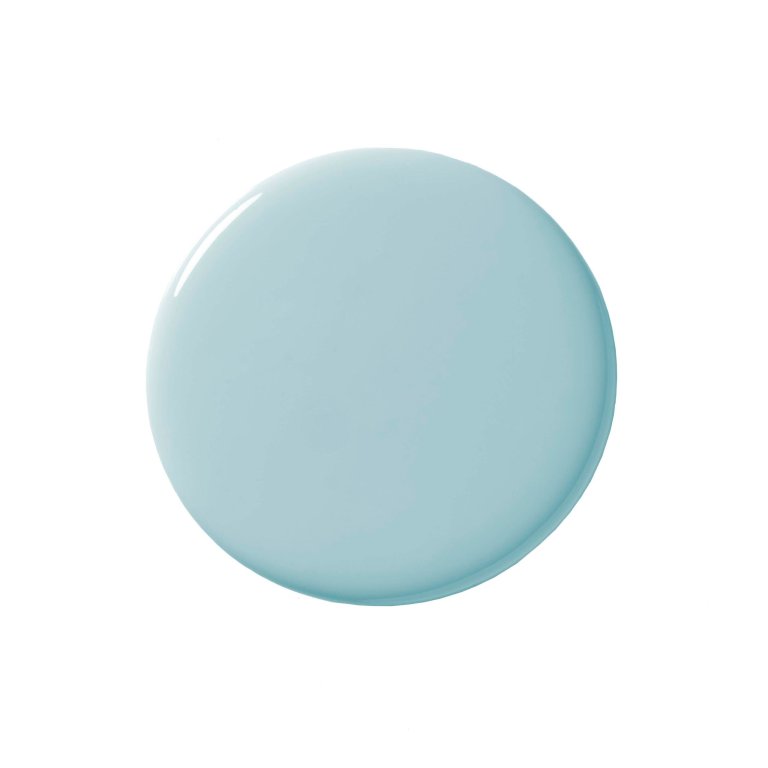
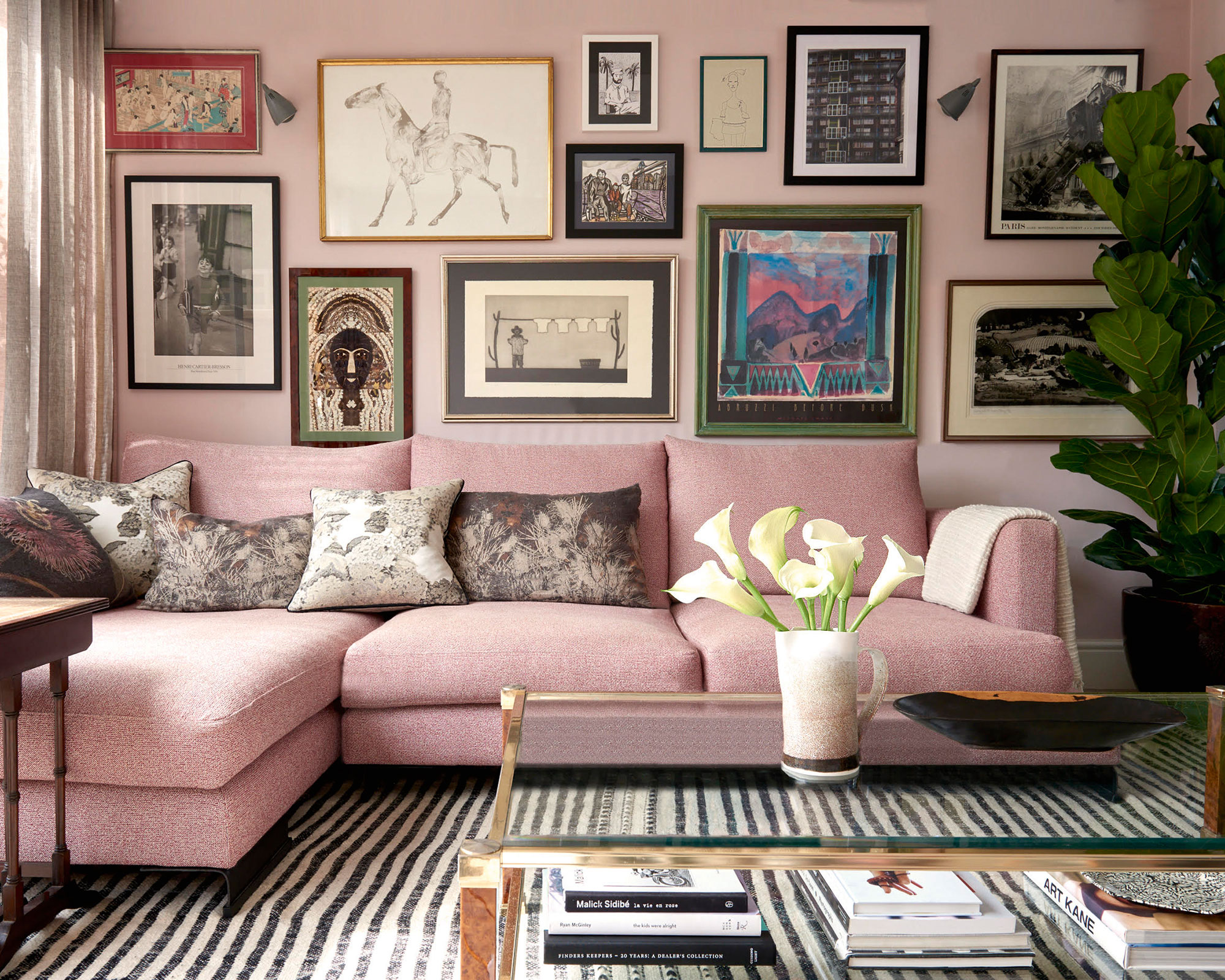
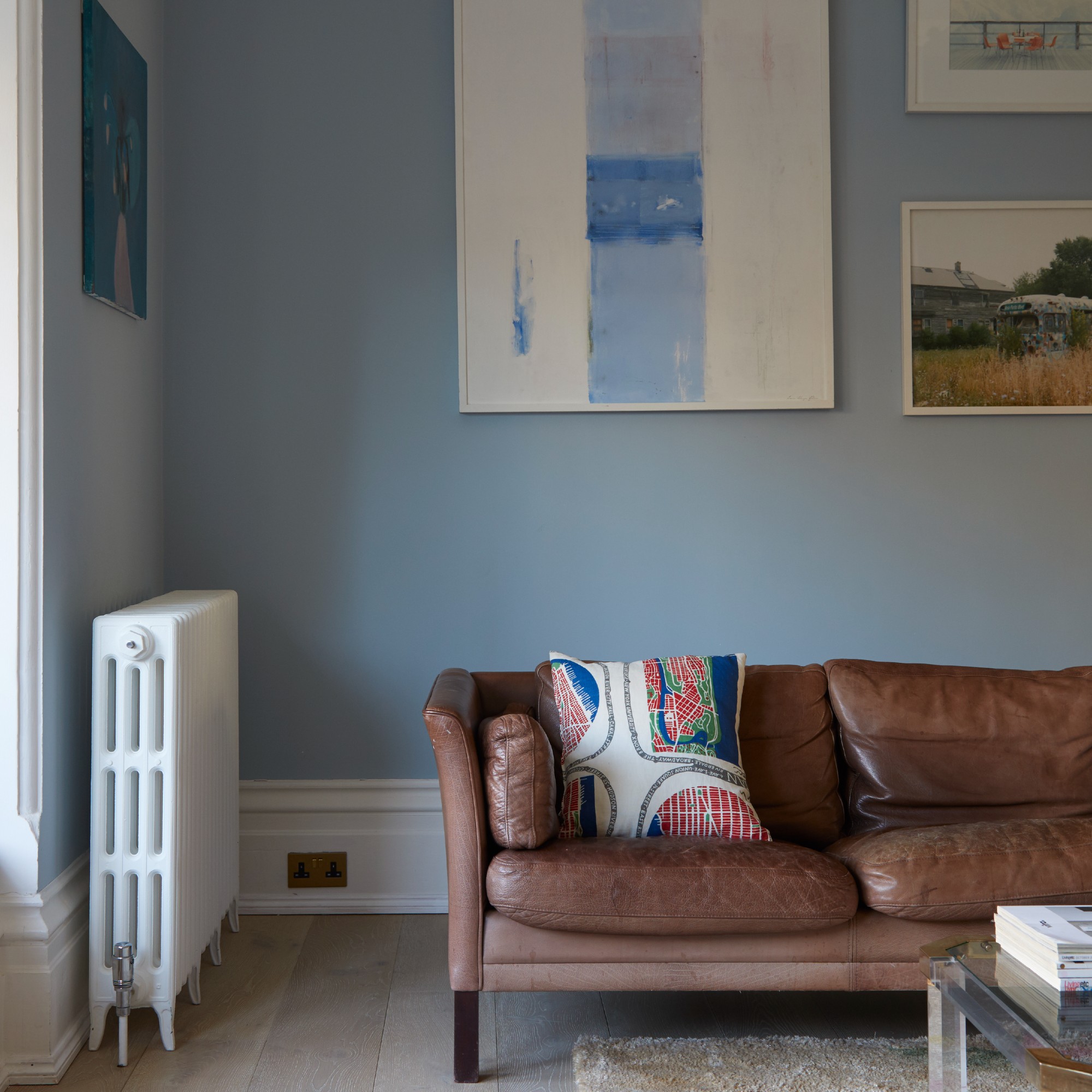
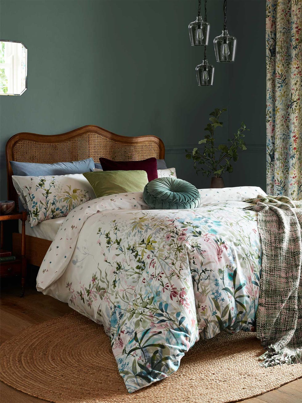
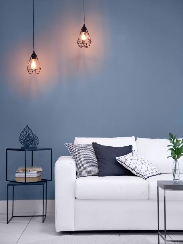
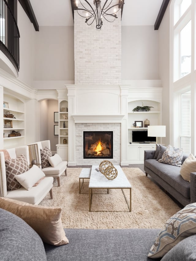
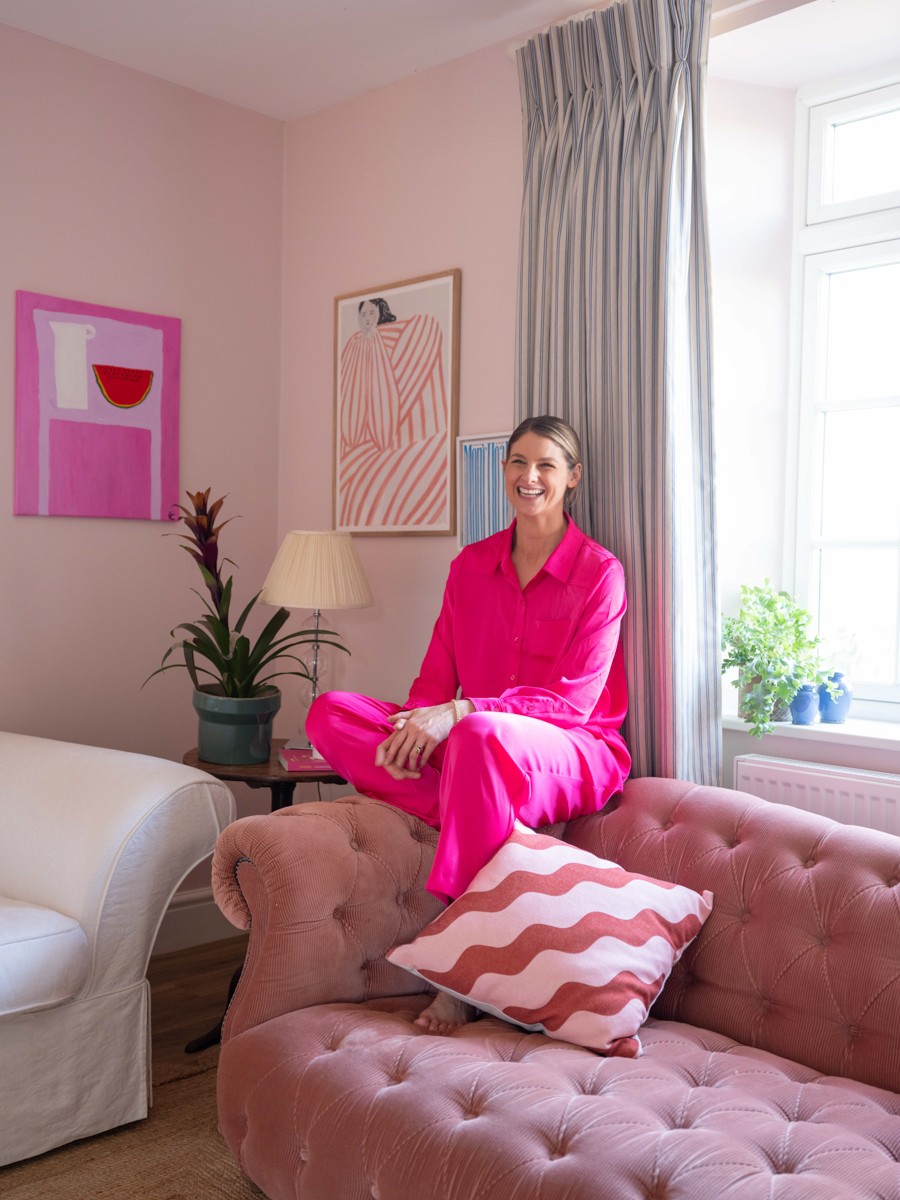
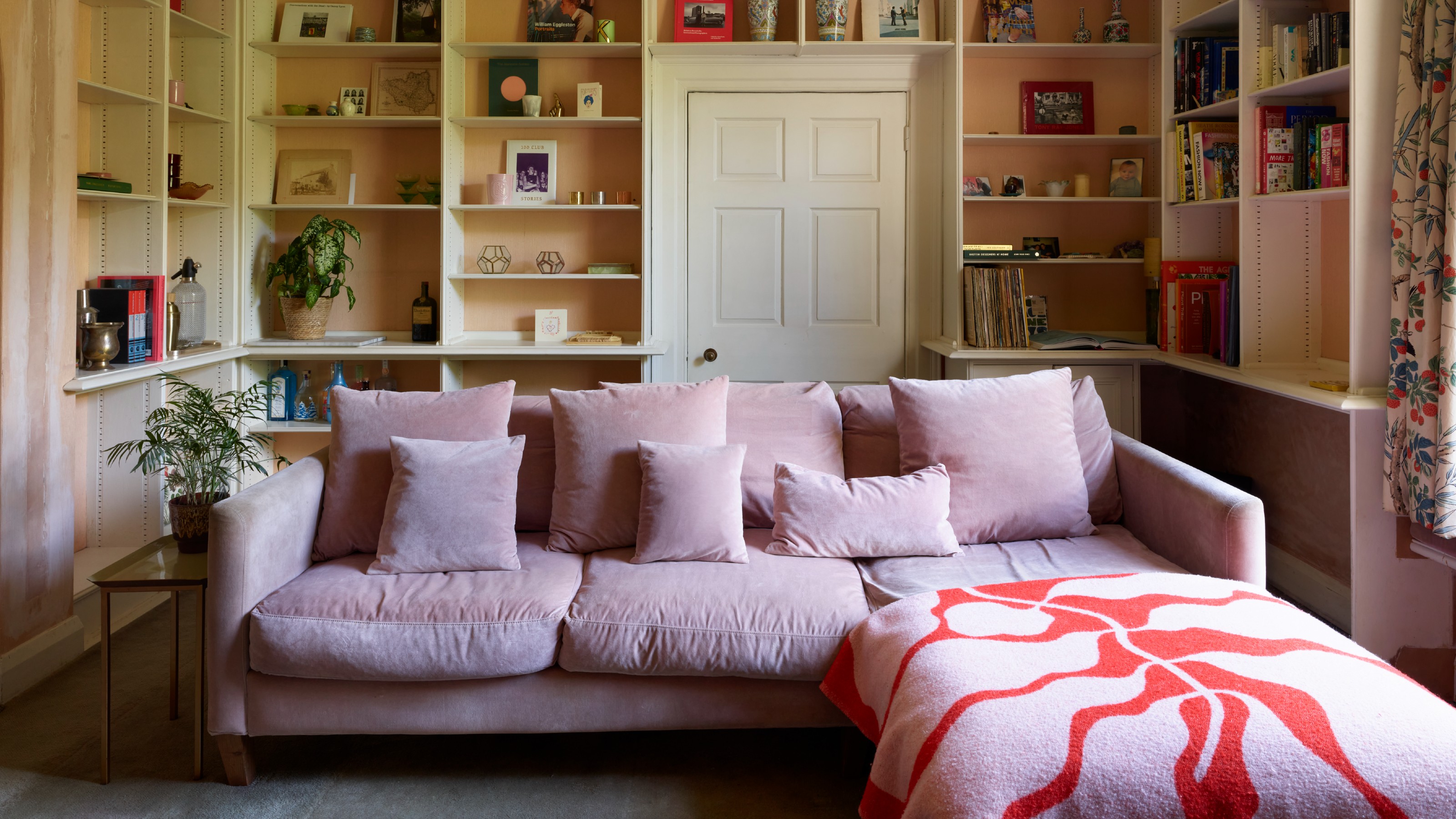
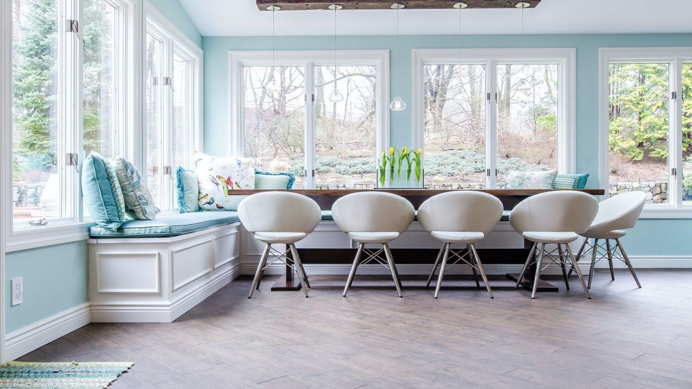
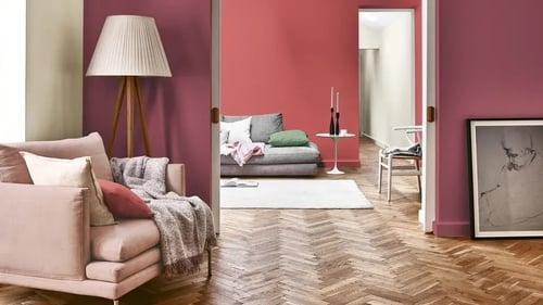
Finally, soft blues and delicate pinks are discussed for their ability to evoke feelings of openness, carefree relaxation, and reduced stress. Soft blues are universally appealing and can make a living room feel more expansive and relaxing, similar to a coastal palette. These shades, including light-blue, gray-blue, and blue-green, complement neutral earth tones like warm taupe or rich chocolate brown. Delicate pink, although considered to require expertise to execute effectively, is also noted for its soothing and comforting qualities, capable of reducing stress and strong emotions like anxiety. Pink can be paired with soft grays and warm browns for a comforting mood. The article provides practical advice for homeowners looking to enhance their living spaces through informed color choices.
#ColorPsychology #InteriorDesign #LivingRoomColors #HomeDecor #ColorExpert #MoodEnhancement #DesignTips #ColorPsychology #InteriorDesign #LivingRoomColors #HomeDecor #ColorExpert #MoodEnhancement #DesignTips
0 comment in total
You may also like

5 colors that will make your living room feel happier, according to interior designers
A Color Psychologist Says This Is the Most Relaxing Paint Color

Living room colour schemes – 26 ways to bring your lounge to life with on-trend shades and timeless colour combos
The 3 All-Time Worst Living-Room Paint Colors, According to Designers

Experts reveal the best living room paint colours to transform every space

5 best happy living room colors for an uplifting space

Before Choosing A Paint Color, Ask These 5 Questions

'The World of Color is Rife With Danger' — 5 Color Combinations That Don't Go Together and What to Use Instead

What are the worst colors to paint a room? The shades experts say you should never use
Expert Speak: What are the most soothing colours for the home?

Colour experts share their top paint trends for 2024

A color psychologist says these color schemes are the most likely to boost your mood
A color expert shares the 8 shades you should use in your living room this year
7 'Unhappy' Colors That Color Psychology Experts Would Never Paint Their Walls
7 colour tricks to transform your mood and living room design

The biggest color trends of 2025 – 10 colors designers say will lead the way next year
6 'Energetic Colors' for Vitality and "Sophisticated Interiors", According To Psychologists And Design Experts
How paint colour in your home can affect your mood
55 Living Room Color Ideas That Will Take Your Space from Drab to Fab

6 Calming Paint Colors Designers Swear By For A Relaxing Living Room