1/6
5 colors that will make your living room feel happier, according to interior designers
The living room is a central space in any home, serving as a hub for relaxation, entertainment, and social connection. The choice of a color scheme for this area is critical, extending beyond mere aesthetics to significantly influence daily mood and overall well-being. This article explores five sophisticated and unexpected color families, recommended by leading design and color experts, that can elevate a living room's emotional atmosphere while maintaining a timeless appeal. These color selections are designed to foster happiness and comfort without resorting to overly bright or jarring hues, aligning with current living room color trends and the principles of color therapy.
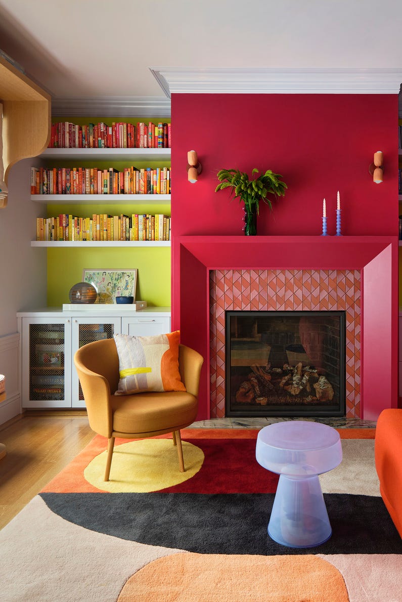
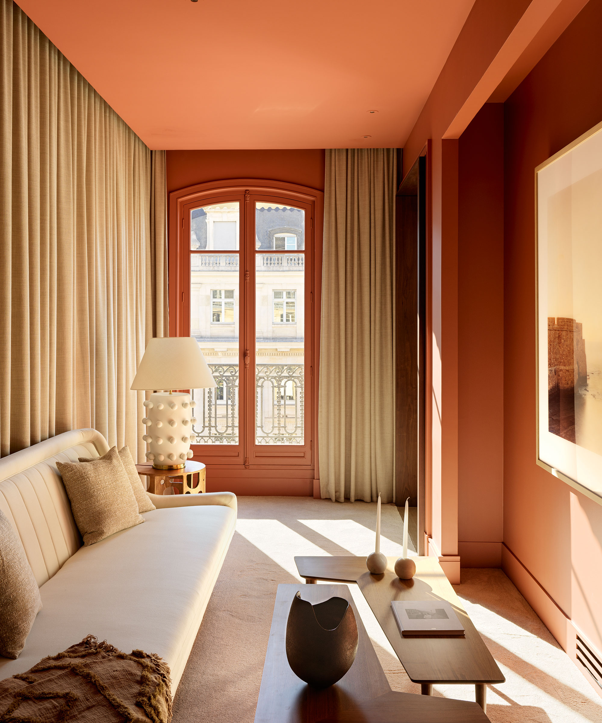
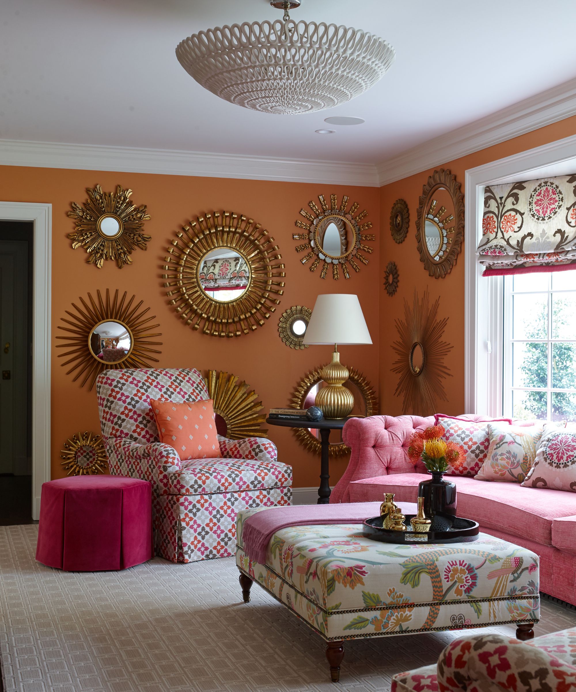
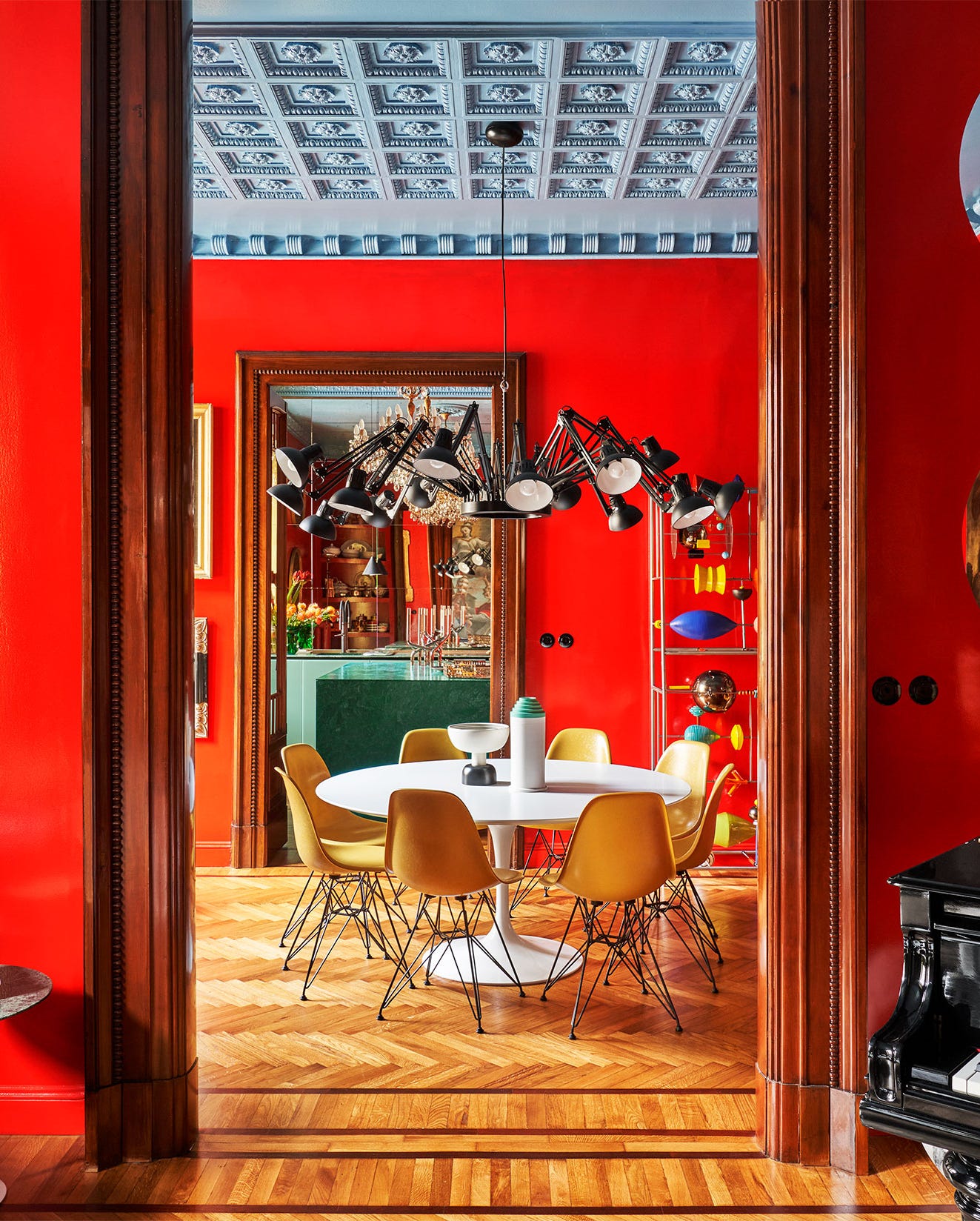
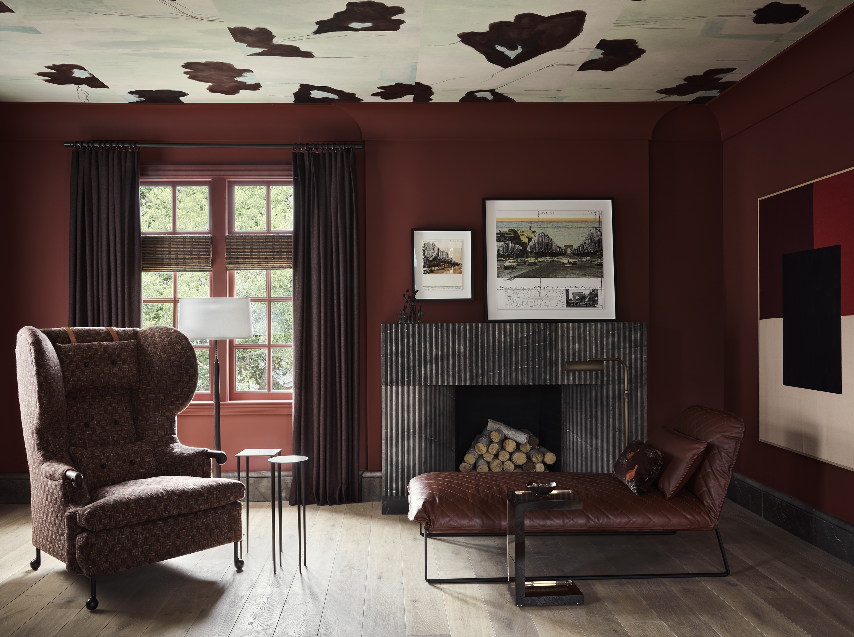
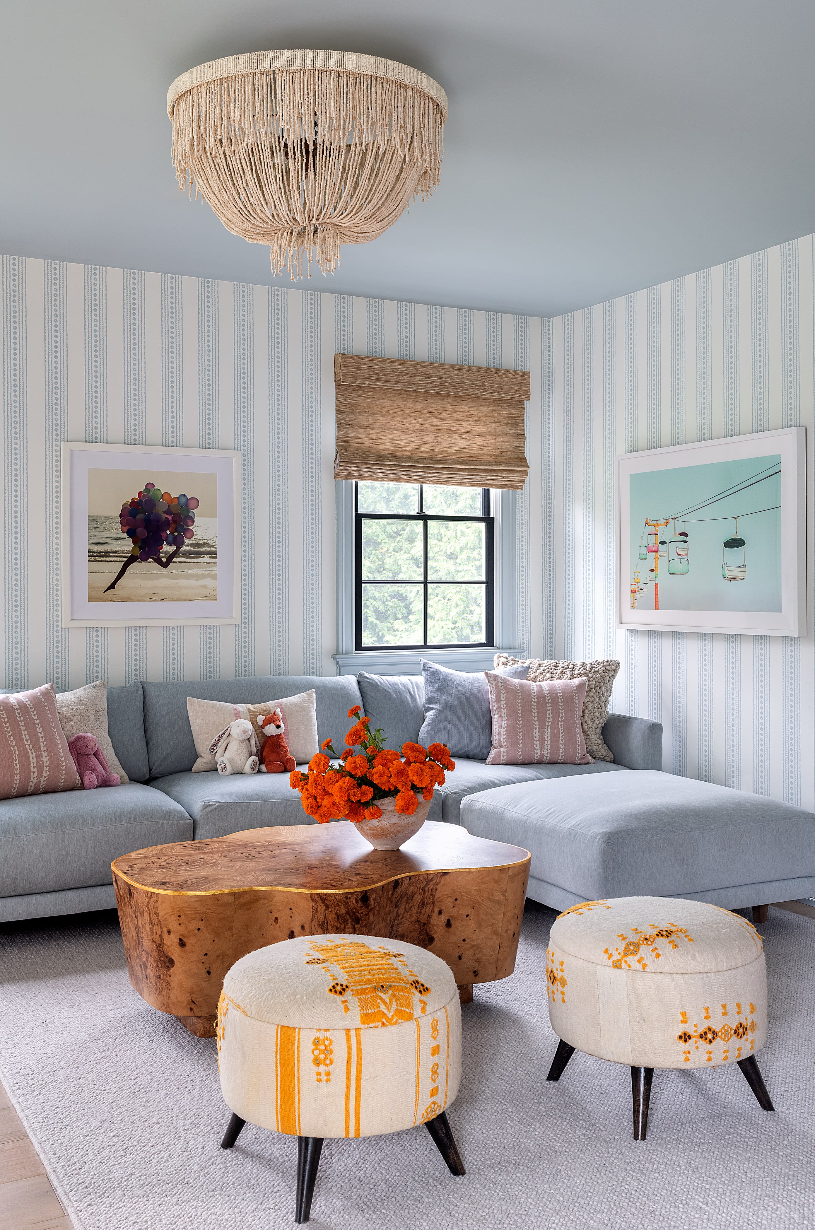
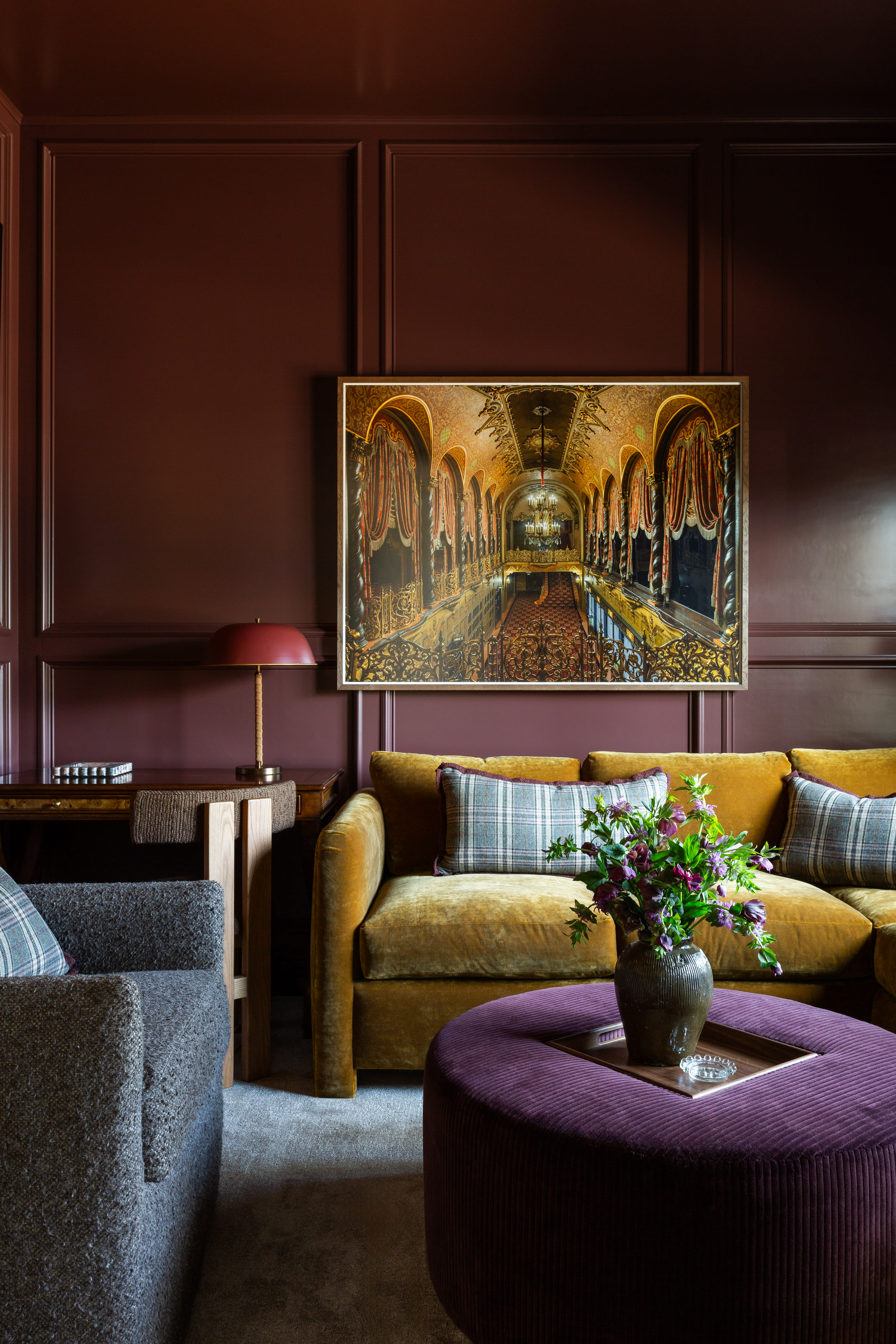
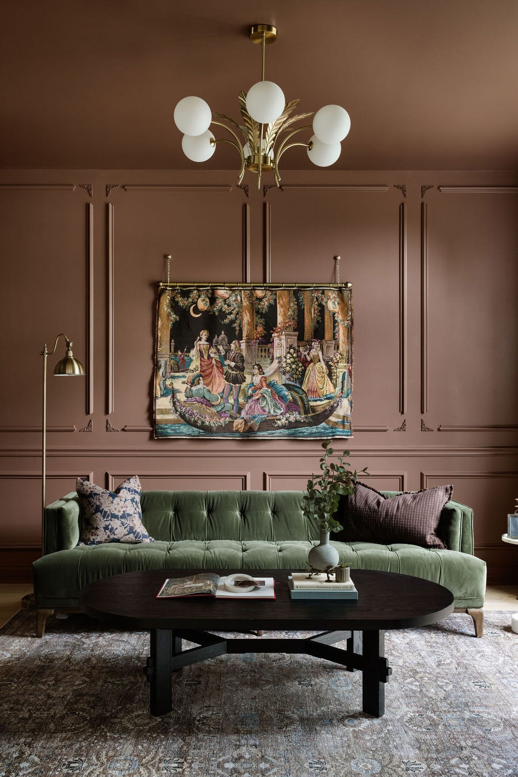
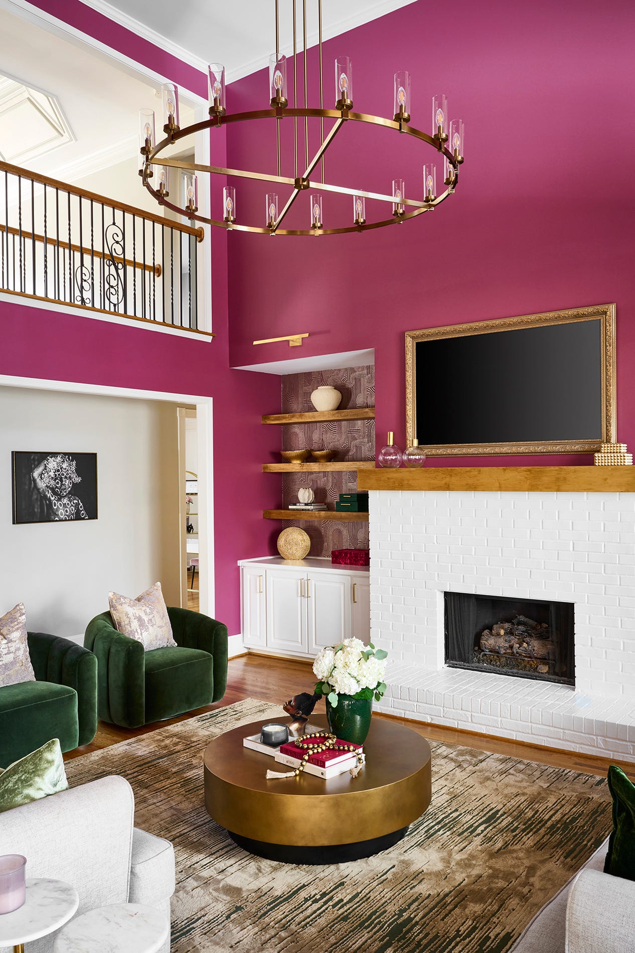
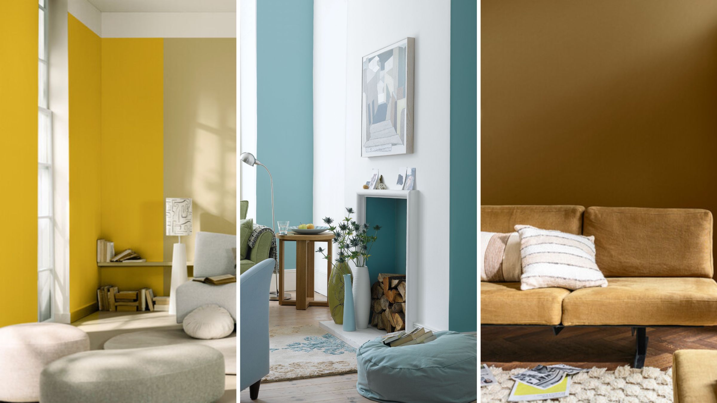
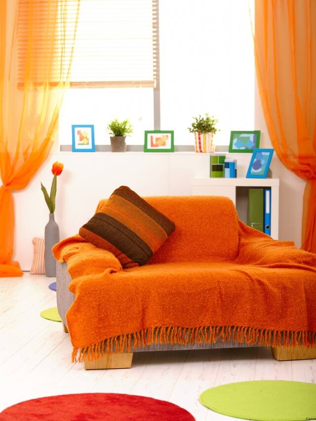
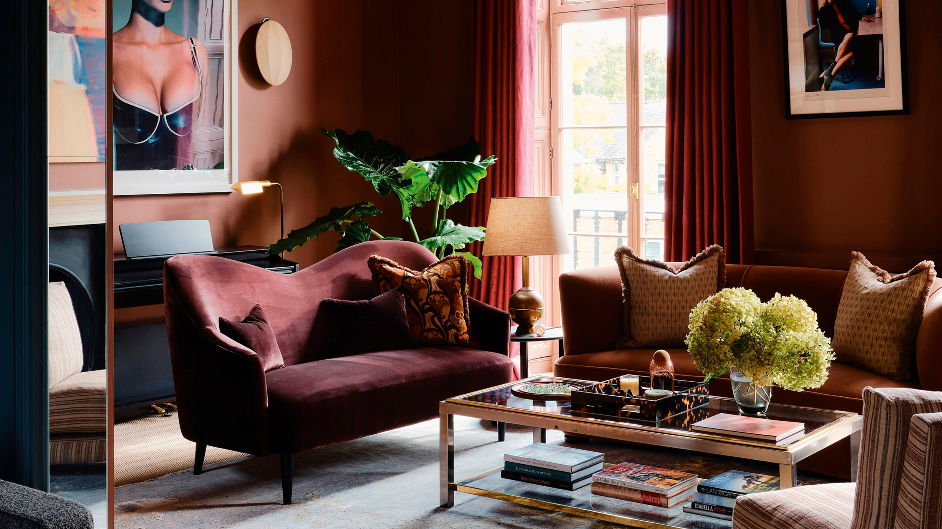
First, warm earthy reds and corals are presented as emerging anti-trend colors that inject zest and energy into a room. These muted tones, such as terracotta and coral, offer the vibrancy of red without being overwhelming, providing a rich and dramatic backdrop. Helen Shaw of Benjamin Moore and Erika Woelfel of Behr emphasize their dynamic, mood-boosting qualities. Instead of painting entire walls, these colors are suggested for high-impact accents like velvet armchairs, painted fireplaces, or color-drenched library nooks, allowing for a strategic application that maximizes their emotional effect.
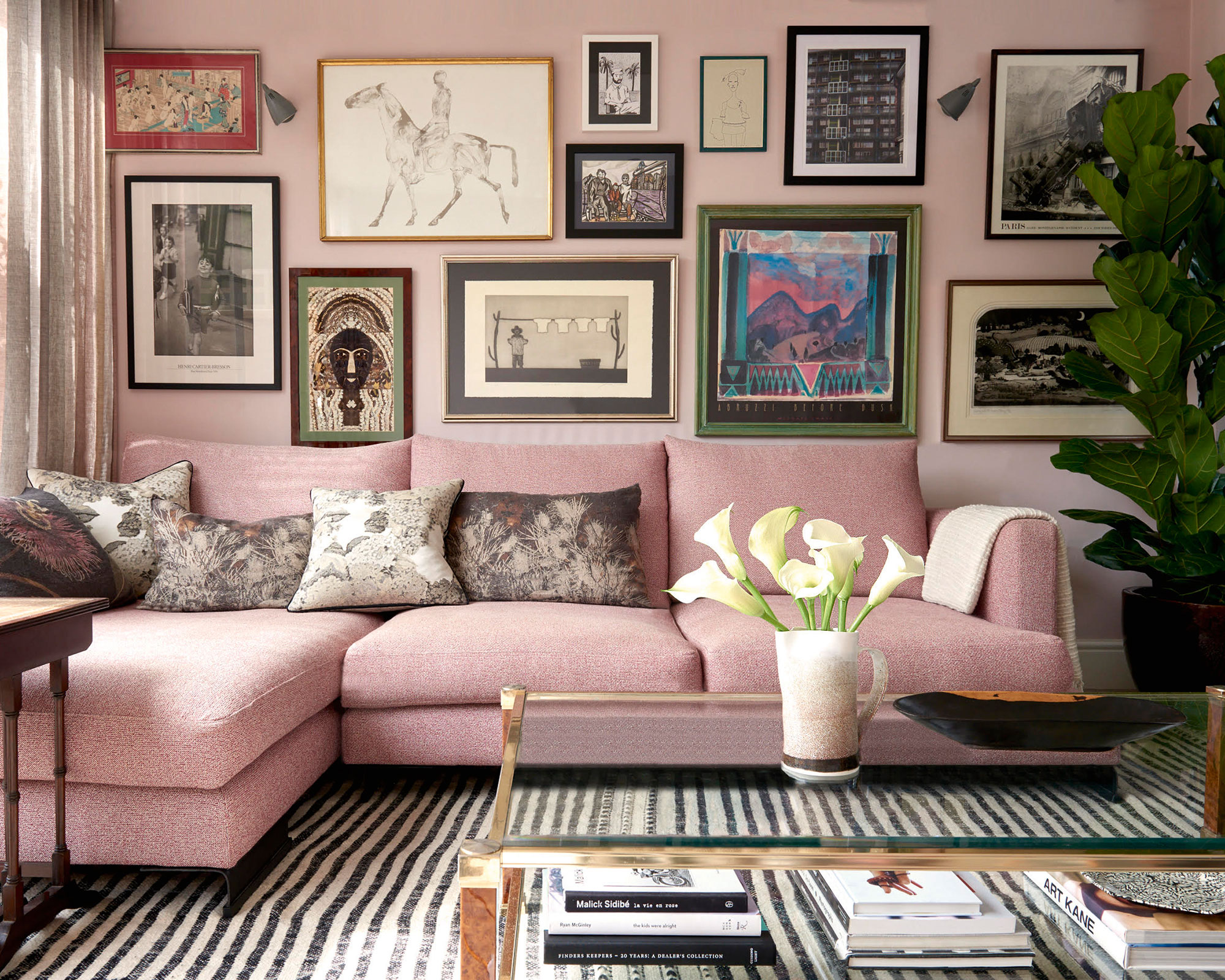
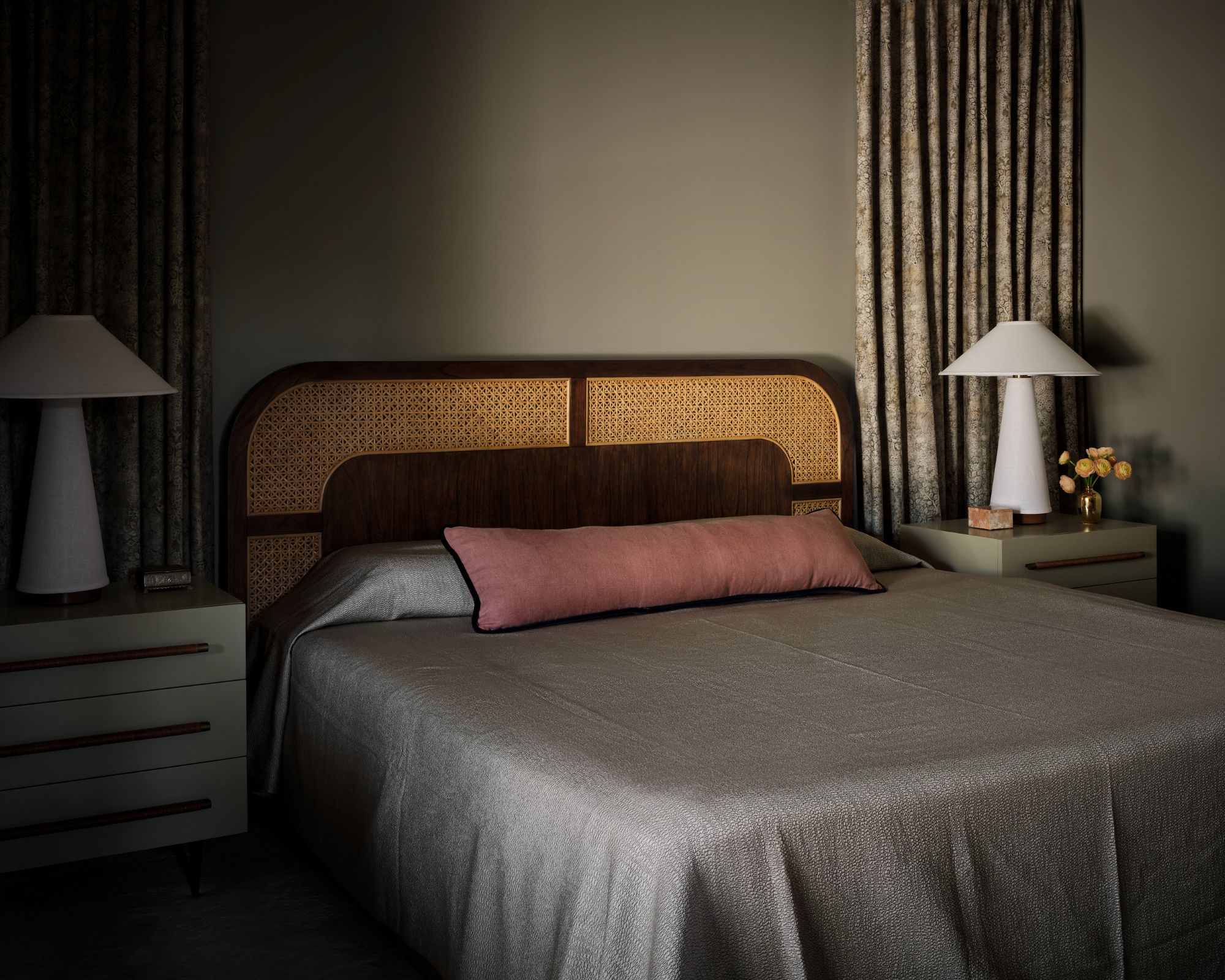
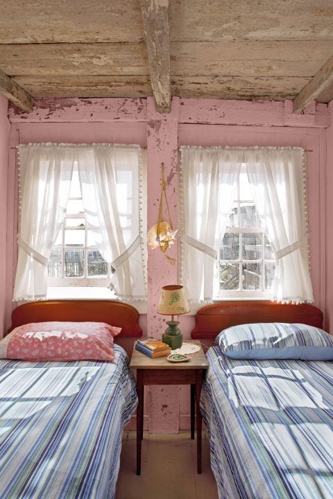
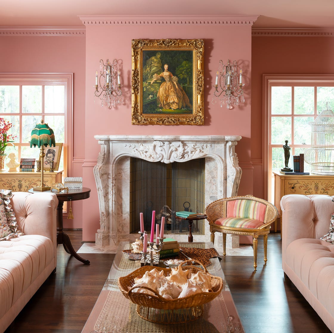
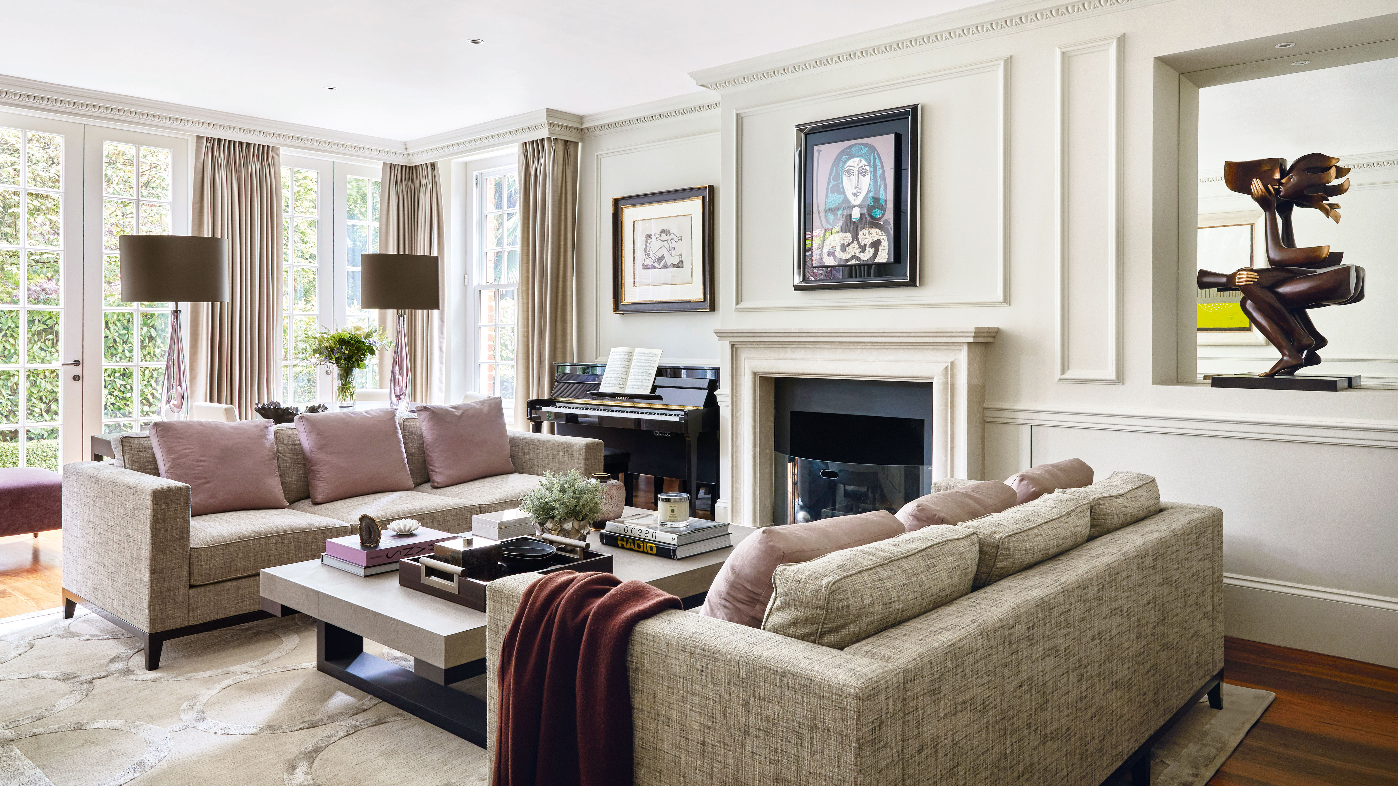
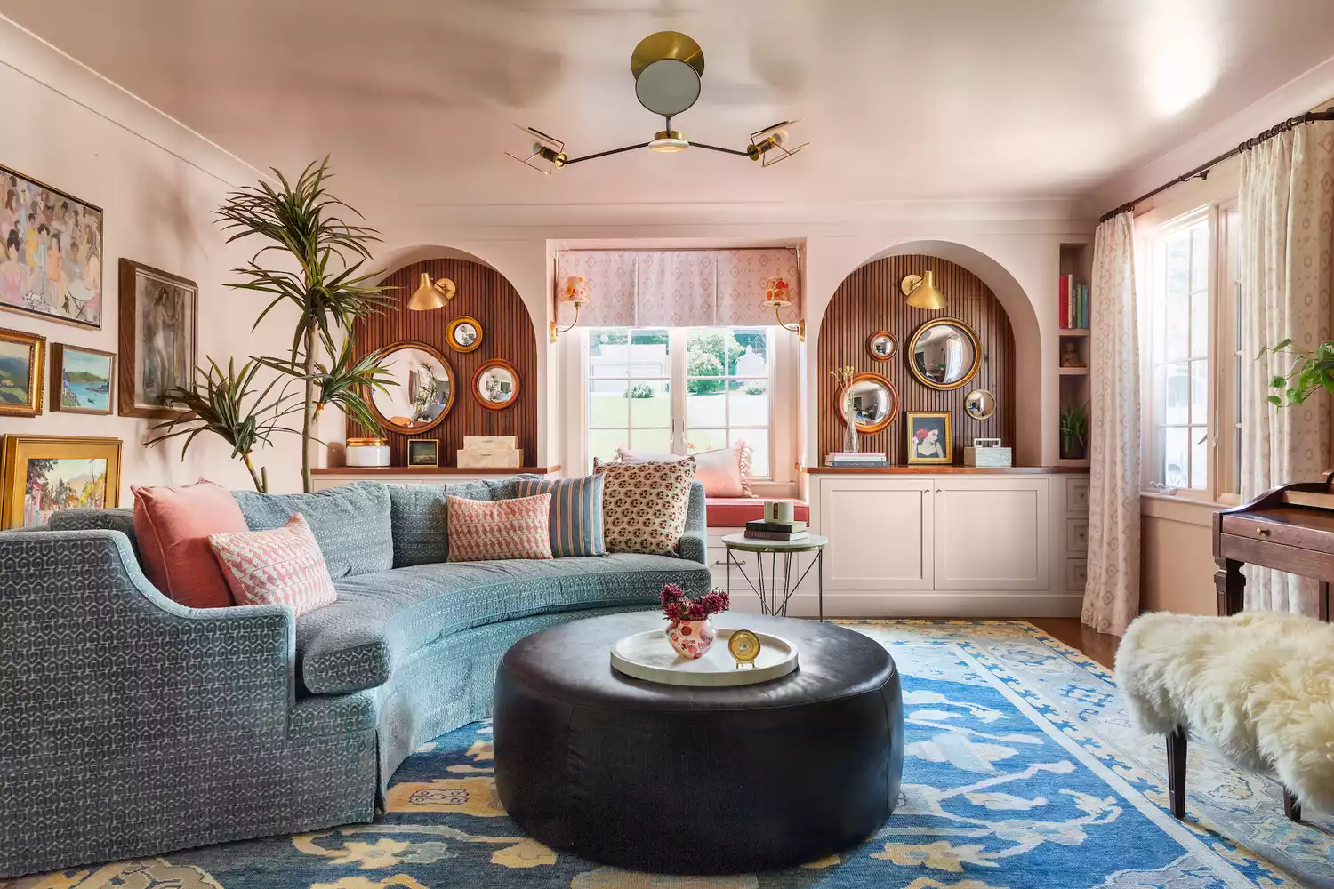
Second, soothing blush and earthy pinks are recommended for creating restorative and comforting spaces. These soft, earth-based hues transcend fleeting trends like 'Barbiecore,' offering a complex neutral option that feels warmly feminine and promotes relaxation. Patrick O'Donnell, a color consultant at Farrow & Ball, specifically suggests 'Farrow & Ball’s Setting Plaster' for its delicate brown notes and soothing feel, making it ideal for a cozy living room designed for unwinding.
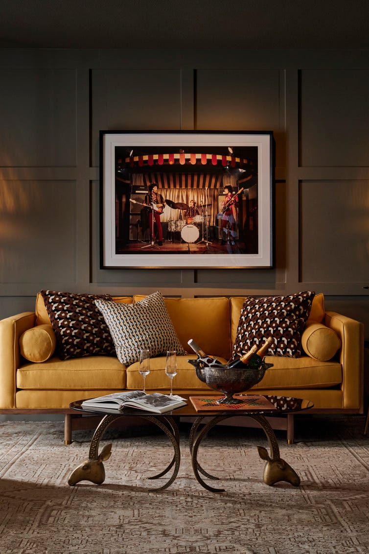
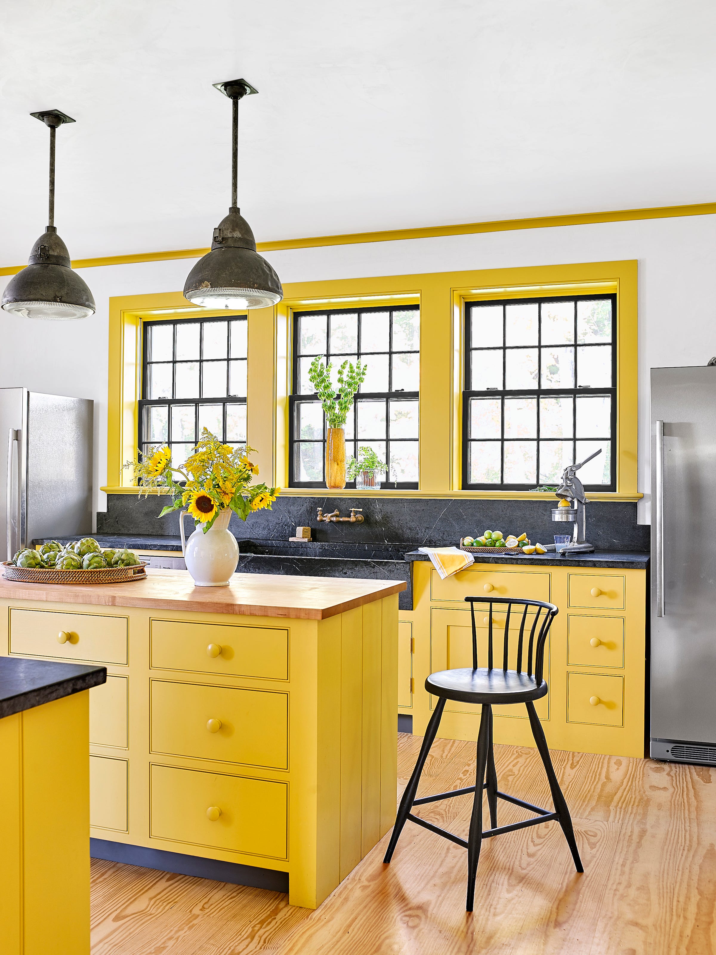
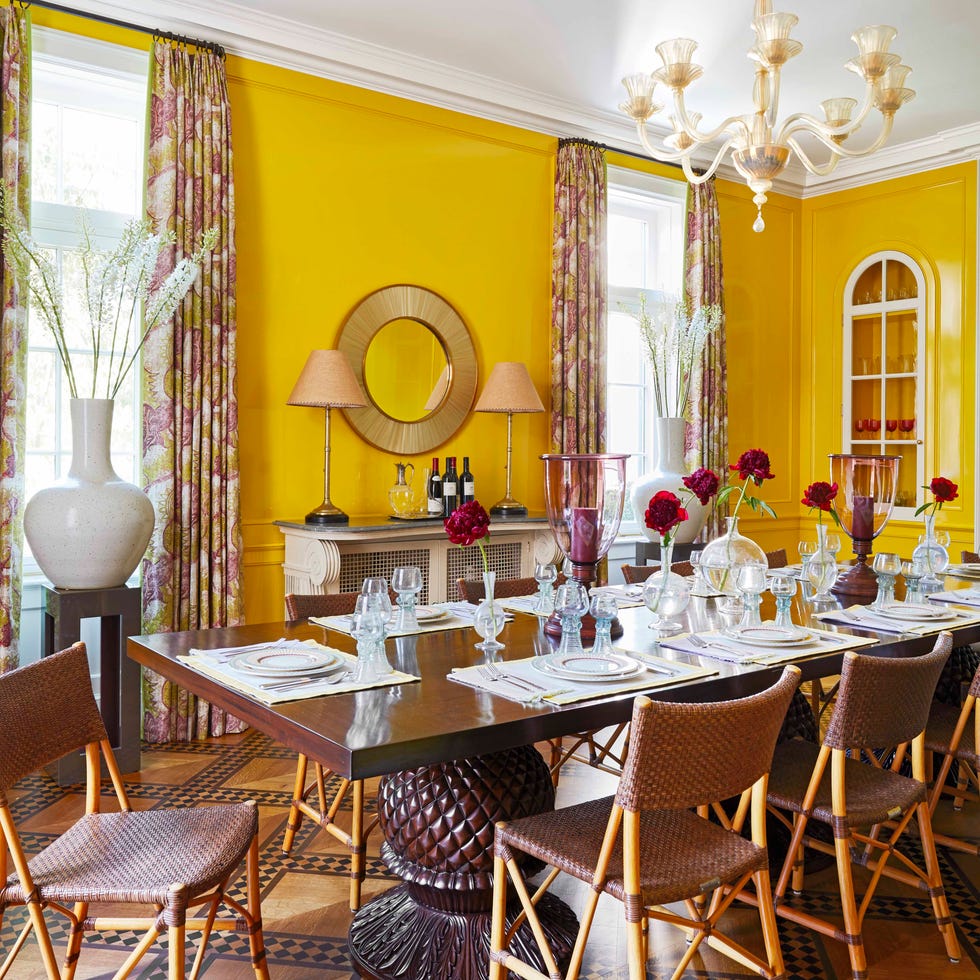
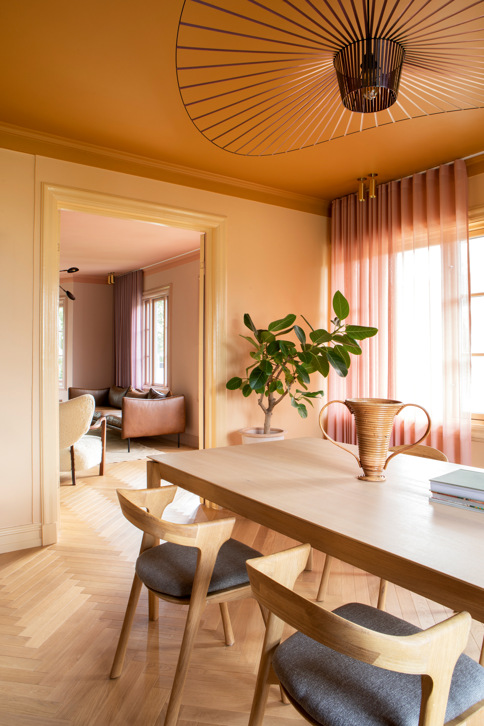
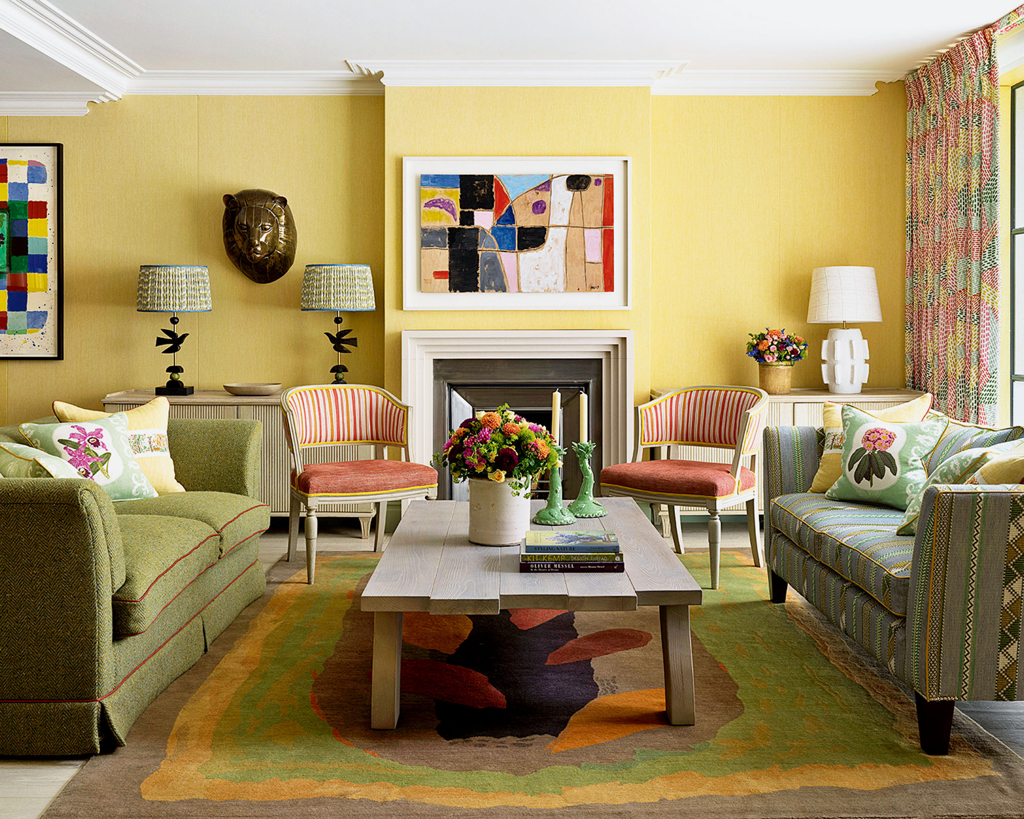
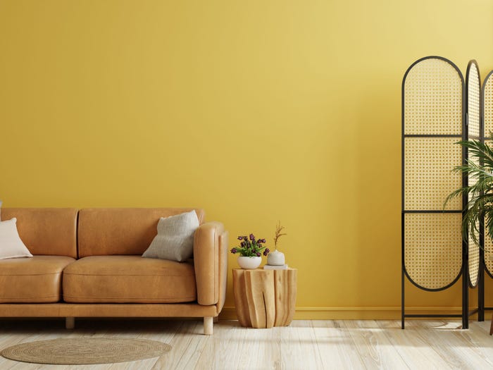
Third, uplifting golden yellows are highlighted for their ability to evoke optimism, warmth, and joy. While yellow can be intimidating, careful incorporation ensures a mood lift. Helen Shaw notes its mood-enhancing properties, advising its use as a strategic accent or to highlight architectural features. Examples include pale butter yellow on a ceiling or gold-toned velvet cushions, particularly effective in rooms with limited natural light.
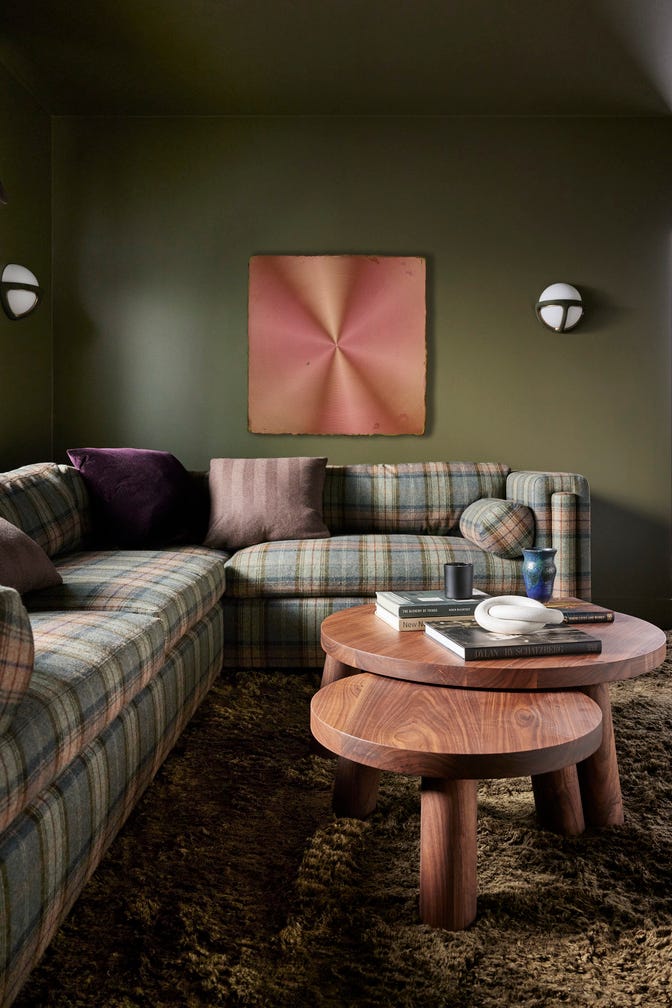
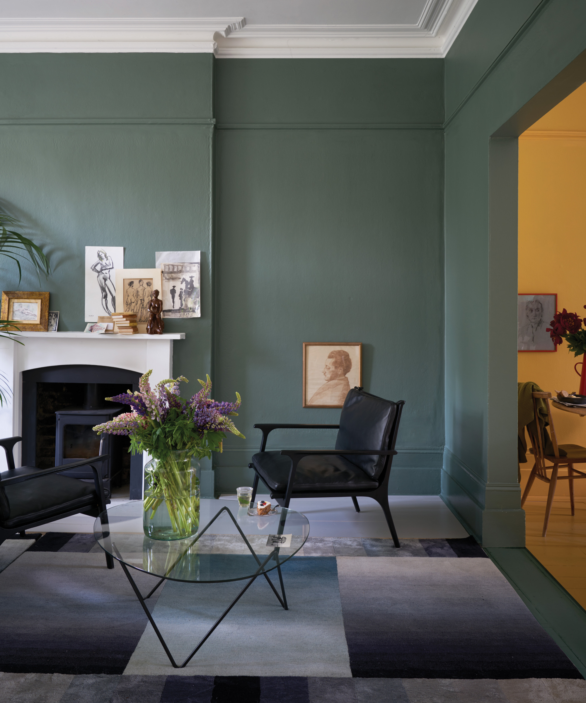
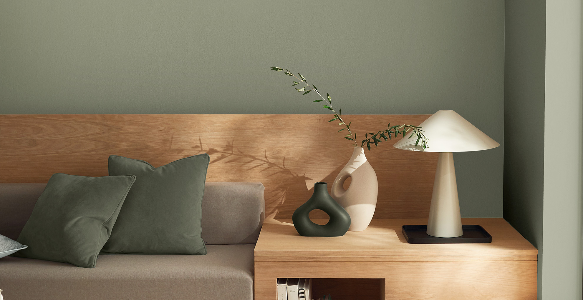
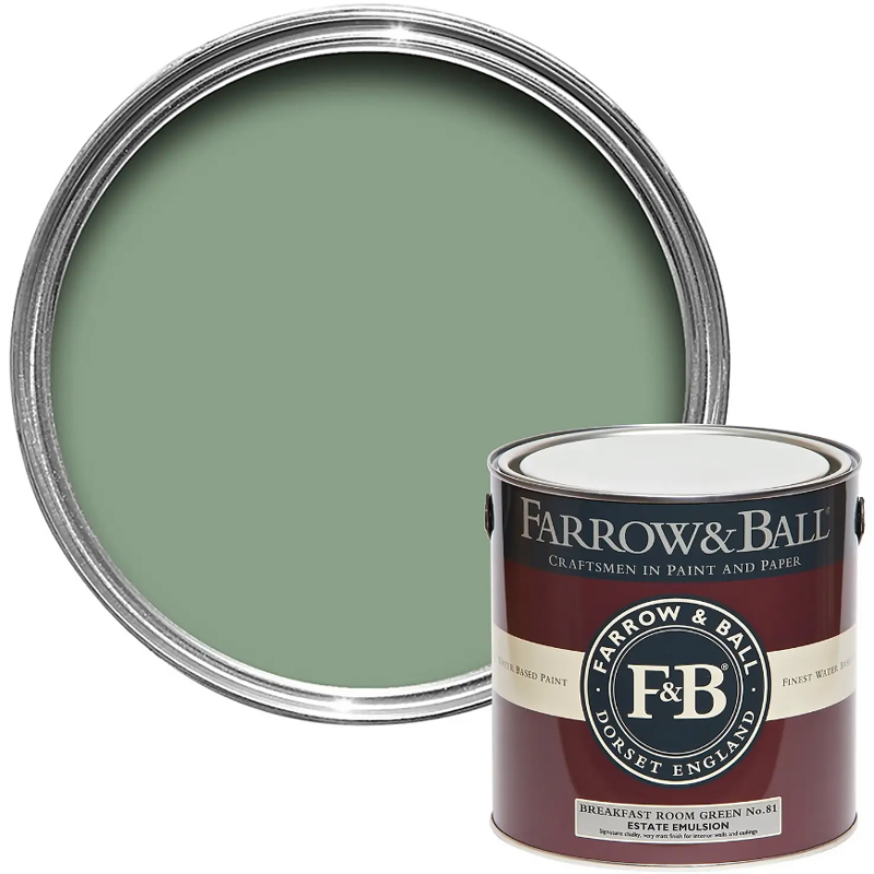
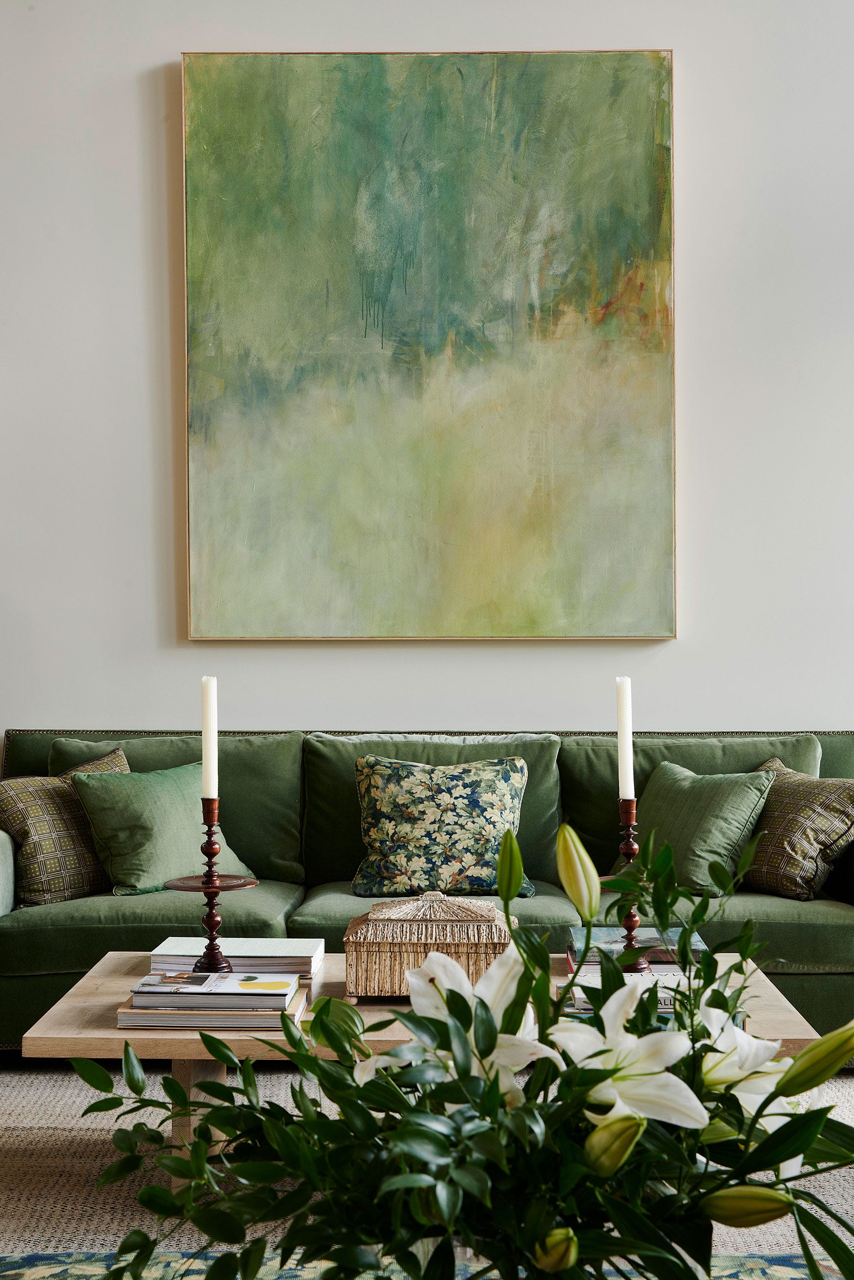
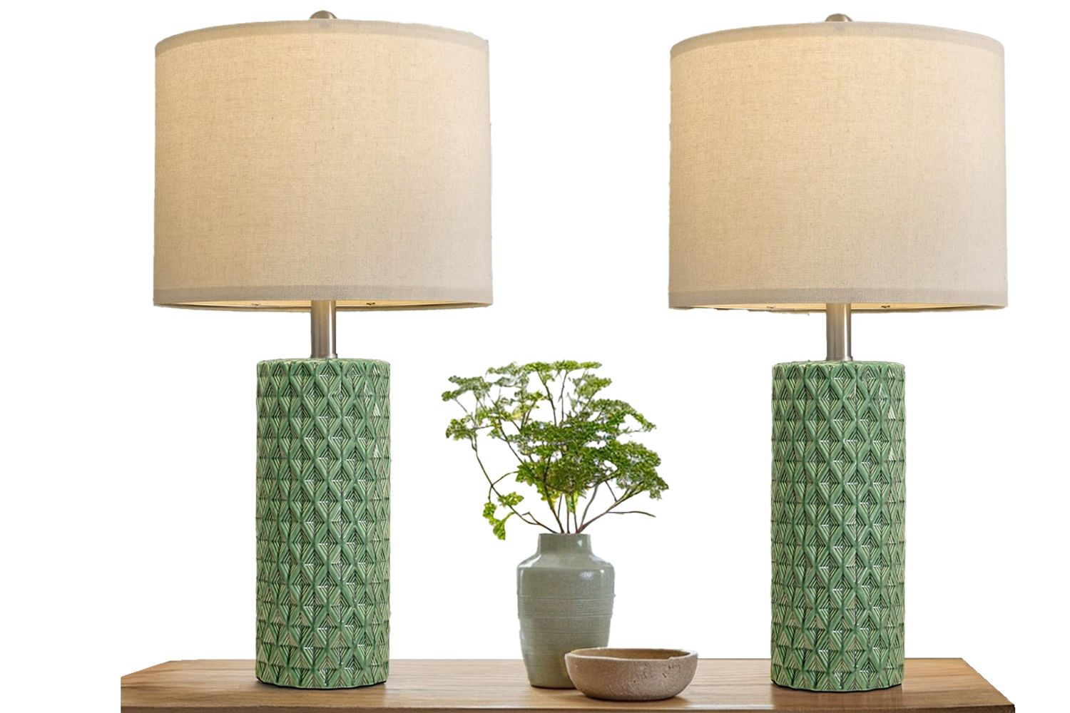
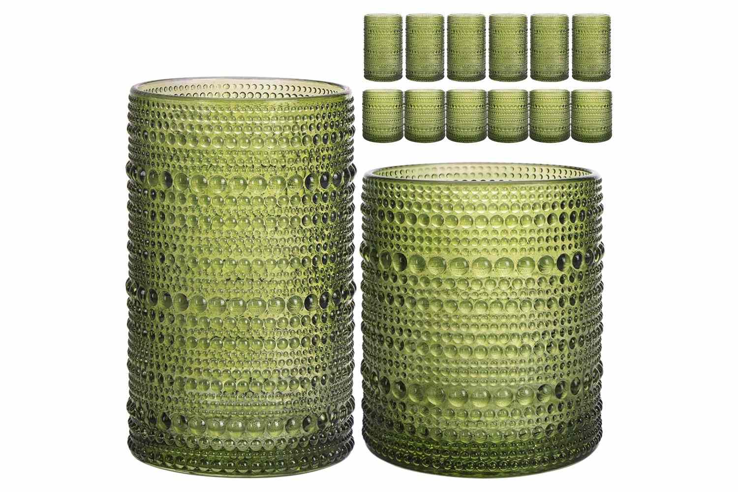
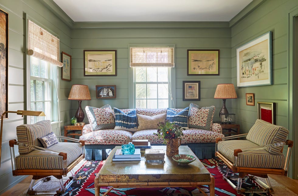
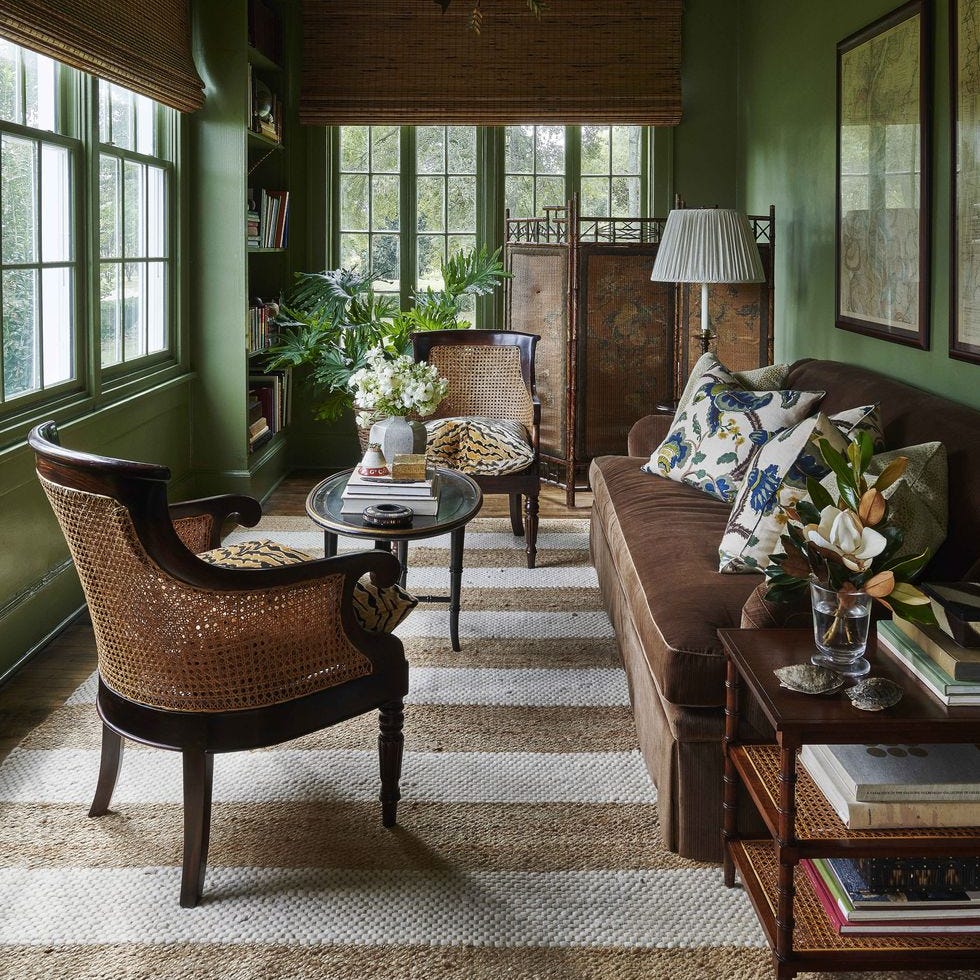
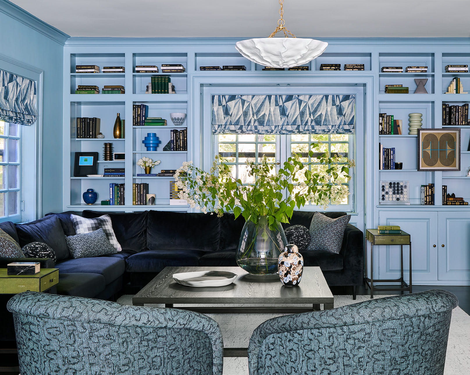
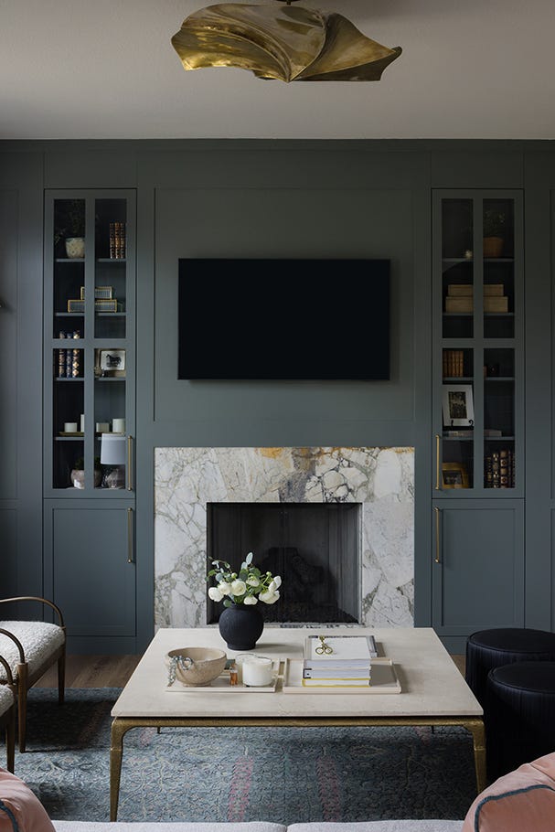
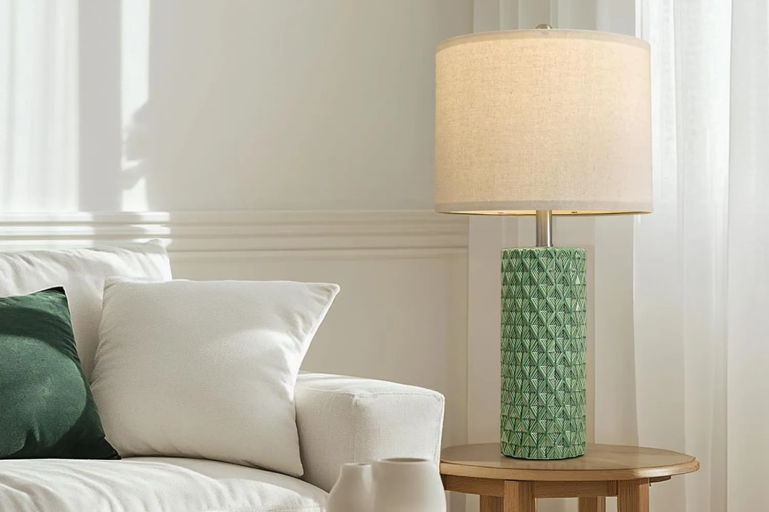
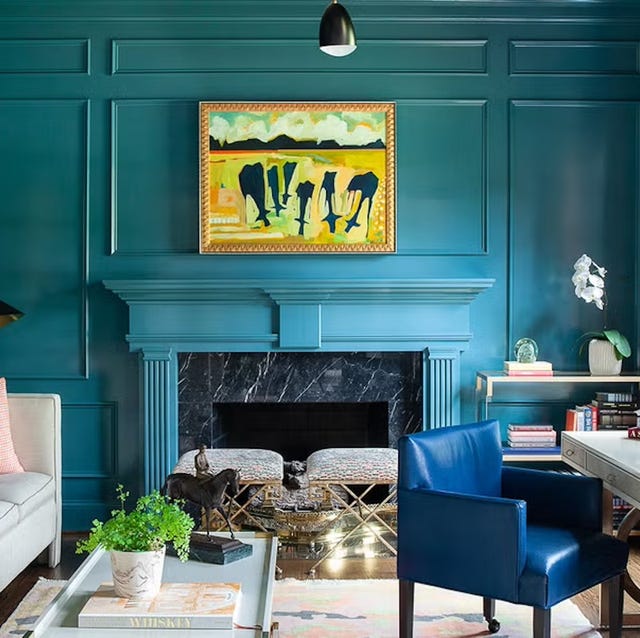
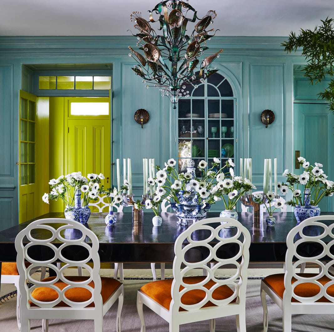
Fourth, restorative earthy greens are linked to biophilic wellness, promoting calm and happiness through a connection to nature. The article identifies deep forest greens and soft pistachio shades as key trends for 2026. Patrick O’Donnell suggests pairing 'Card Room Green' with a nuanced white for balance, while Ashley McCollum of Glidden recommends lighter pistachio hues like 'Glidden’s Whispering Pine' for spaces lacking natural light.
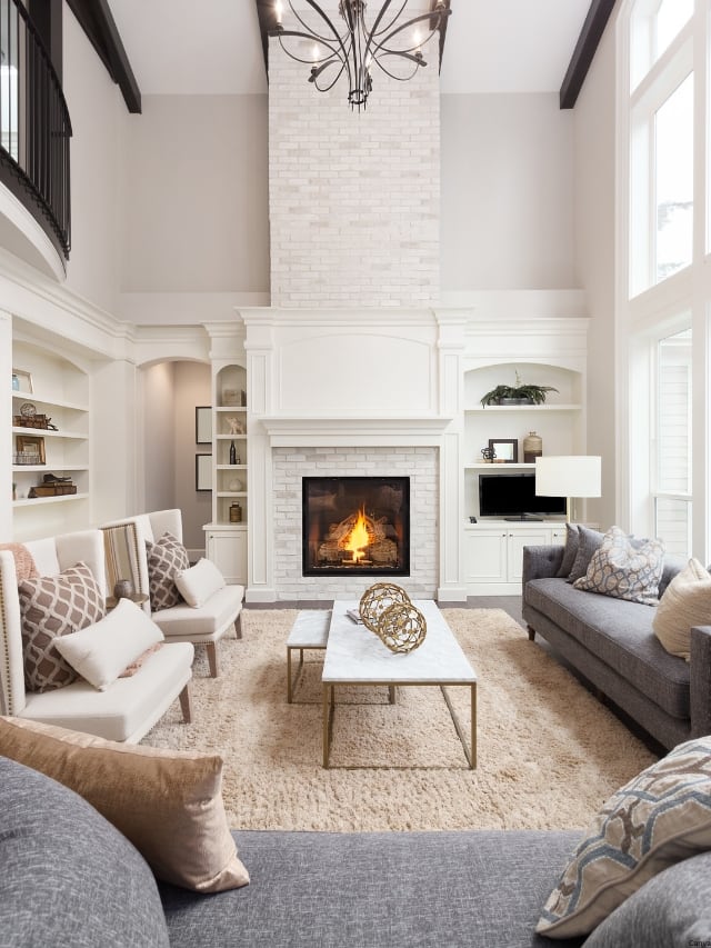
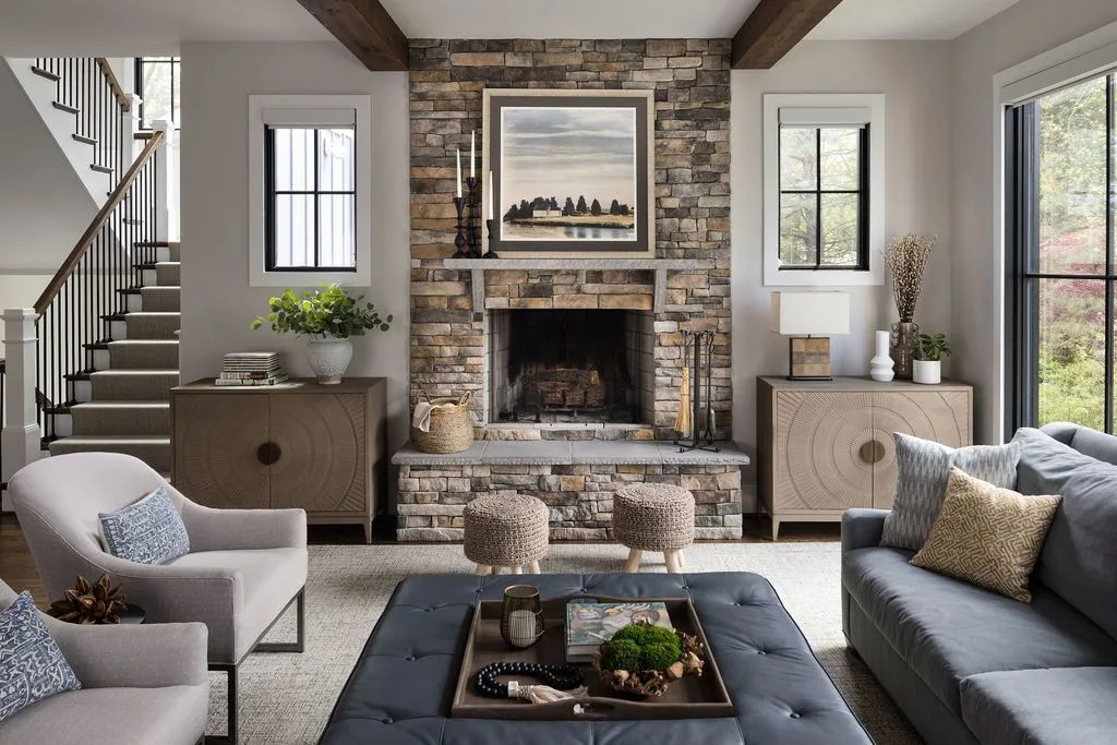
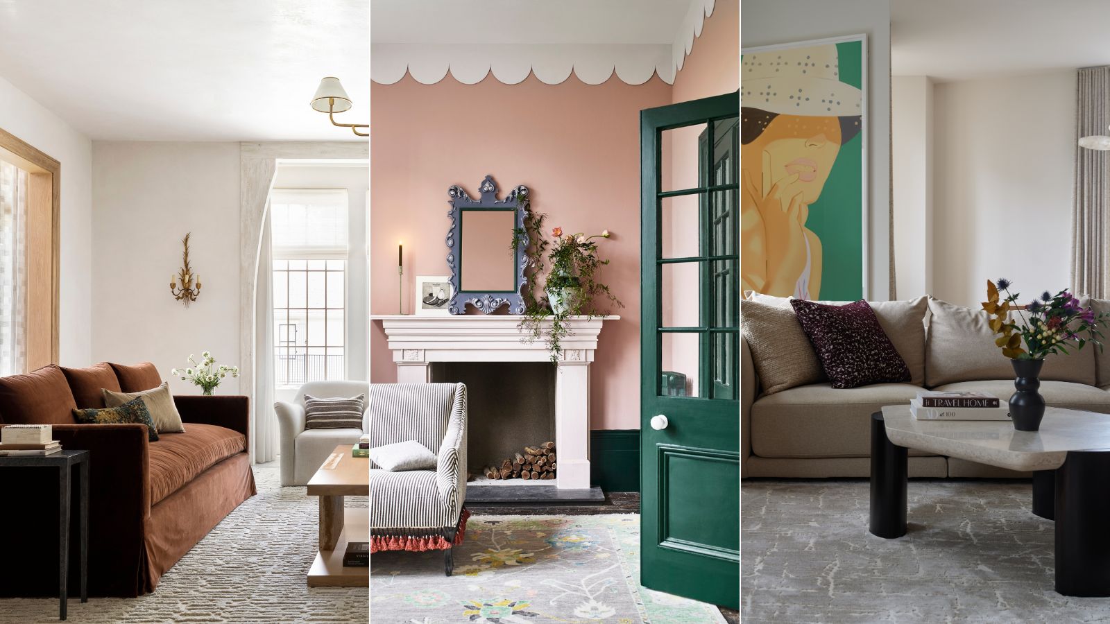
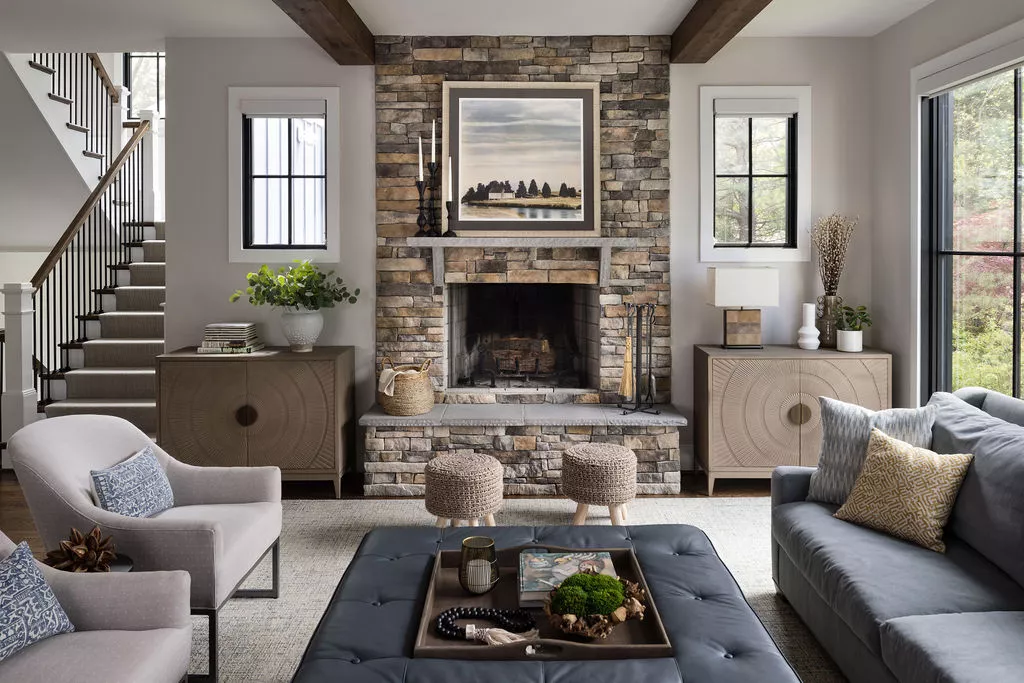
Finally, timeless foundational neutrals are discussed for creating serene, uncluttered, and stress-reducing minimalist living rooms. The success of neutral schemes depends on layering and sophisticated choices. Ashley McCollum advocates for 'Limitless' as an energizing neutral and emphasizes the importance of texture through materials like wool, boucle, and linen. Metallic accents, such as gold or bronze finishes, are recommended to add necessary light and luxury, preventing the neutral palette from appearing flat. These expert-approved color choices offer a path to designing a living room that not only reflects personal taste but also significantly contributes to a happier home environment.
#LivingRoomColors #InteriorDesignTrends #ColorPsychology #MoodBoostingColors #EarthyTones #NeutralPalette #HomeDecor #DesignTips #LivingRoomColors #InteriorDesignTrends #ColorPsychology #MoodBoostingColors #EarthyTones #NeutralPalette #HomeDecor #DesignTips
0 comment in total
You may also like
Designer-Approved Living Room Colors That'll Make You Feel Happier

5 colors that will make your bedroom feel calmer, according to designers
Interior Designers Say the Key to Creating a Joyful Space Is to Add in This One Color

The Best Living Room Paint Colors, According To Designers

5 best happy living room colors for an uplifting space

Experts reveal the best living room paint colours to transform every space

The 15 Best Paint Colors for Your Living Room, According to Interior Designers
Listen Up: These Are the Best Paint Colors for Your Living Room

These are interior designers' favorite color combinations for living rooms – from neutral and calming to bold and playful
6 Calming Paint Colors Designers Swear By For A Relaxing Living Room
How Your Home's Paint Colors Can Make You Happier, According to Experts

7 colour tricks to transform your mood and living room design

An expert in color psychology shares the 5 shades you should have in your living room
Add These Happy Colors to Your Home and Boost Your Mood
5 Living Room Color Trends for 2025 — New and Exciting Shades Designers Are Choosing for Walls


5 unexpected colors guaranteed to bring lasting joy and happiness to your living room – 'the perfect pick-me-up for fall and winter'
5 Cozy Paint Colors Interior Designers Use to Warm Up Cool Rooms and Create "Snug" Spaces

55 Living Room Color Ideas That Will Take Your Space from Drab to Fab

18 Living Room Color Ideas That are Oh-So Inviting
The Best Living Room Paint Colors, According To Designers