1/11
Add These Happy Colors to Your Home and Boost Your Mood
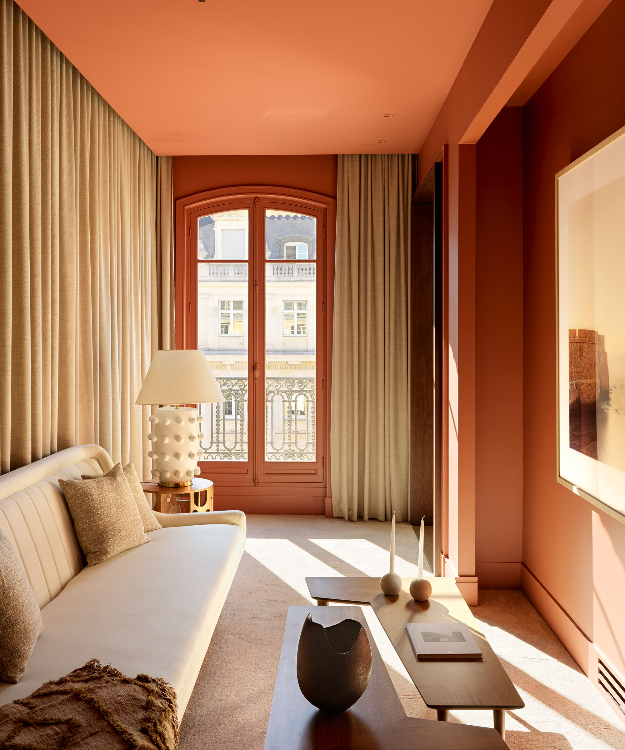
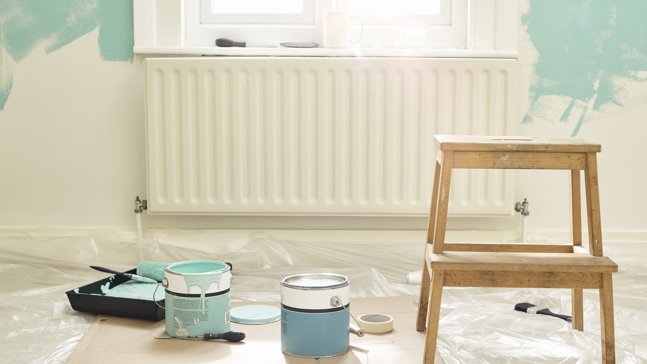
This article explores the significant impact of paint colors on mood and emotion within a home environment, particularly in celebration of National Color Therapy Month. Drawing insights from Sue Kim, a Valspar Color Expert, it delves into how specific shades can promote positivity and well-being. Kim emphasizes that personal connection to nature and memories is key to selecting colors that evoke happiness, suggesting a method of creating image collages to identify these emotionally resonant hues. While bold colors are often associated with happiness, the expert notes that softer tones can also provide moments of contentment for some individuals. The article advises against using extreme, overly vibrant, or 'muddy' paint colors with green undertones, which can have a negative impact.
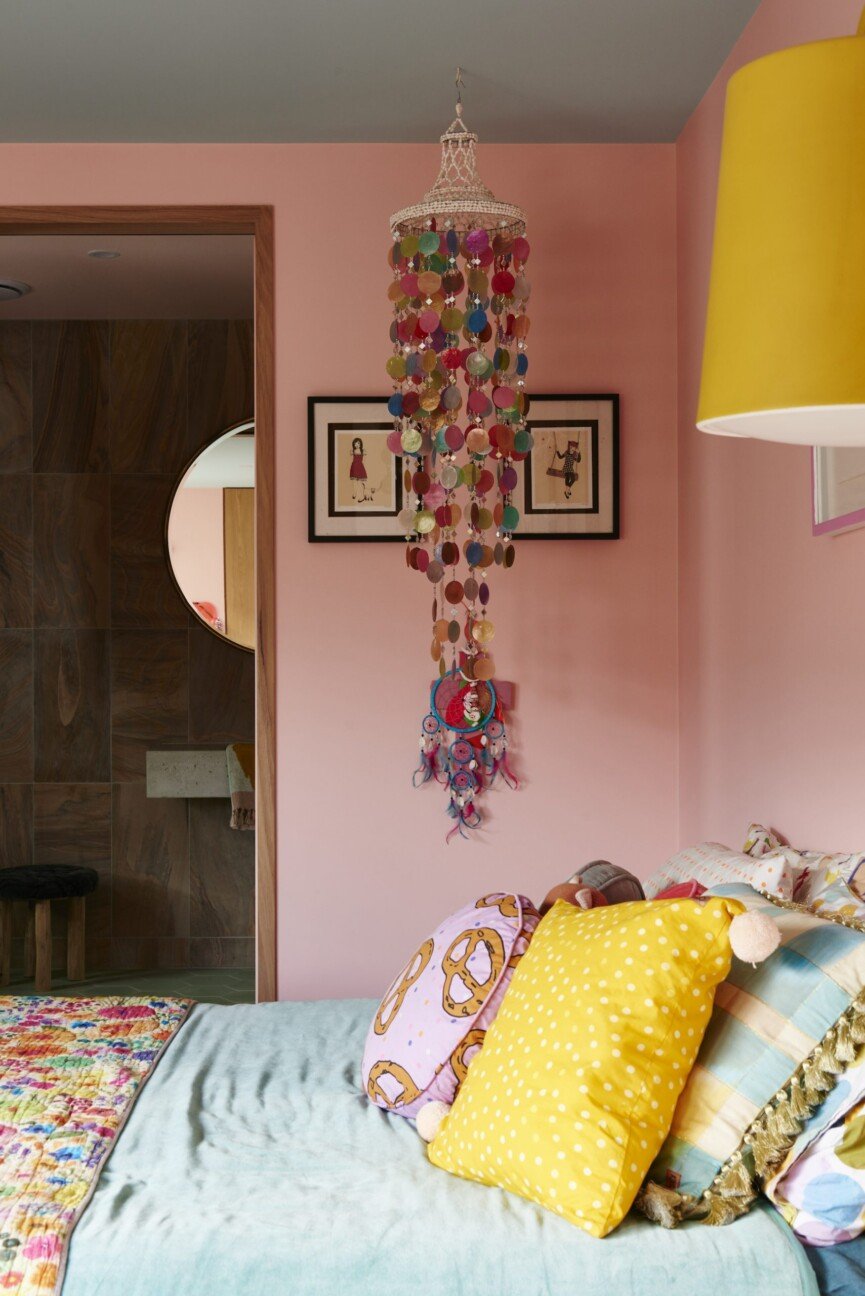
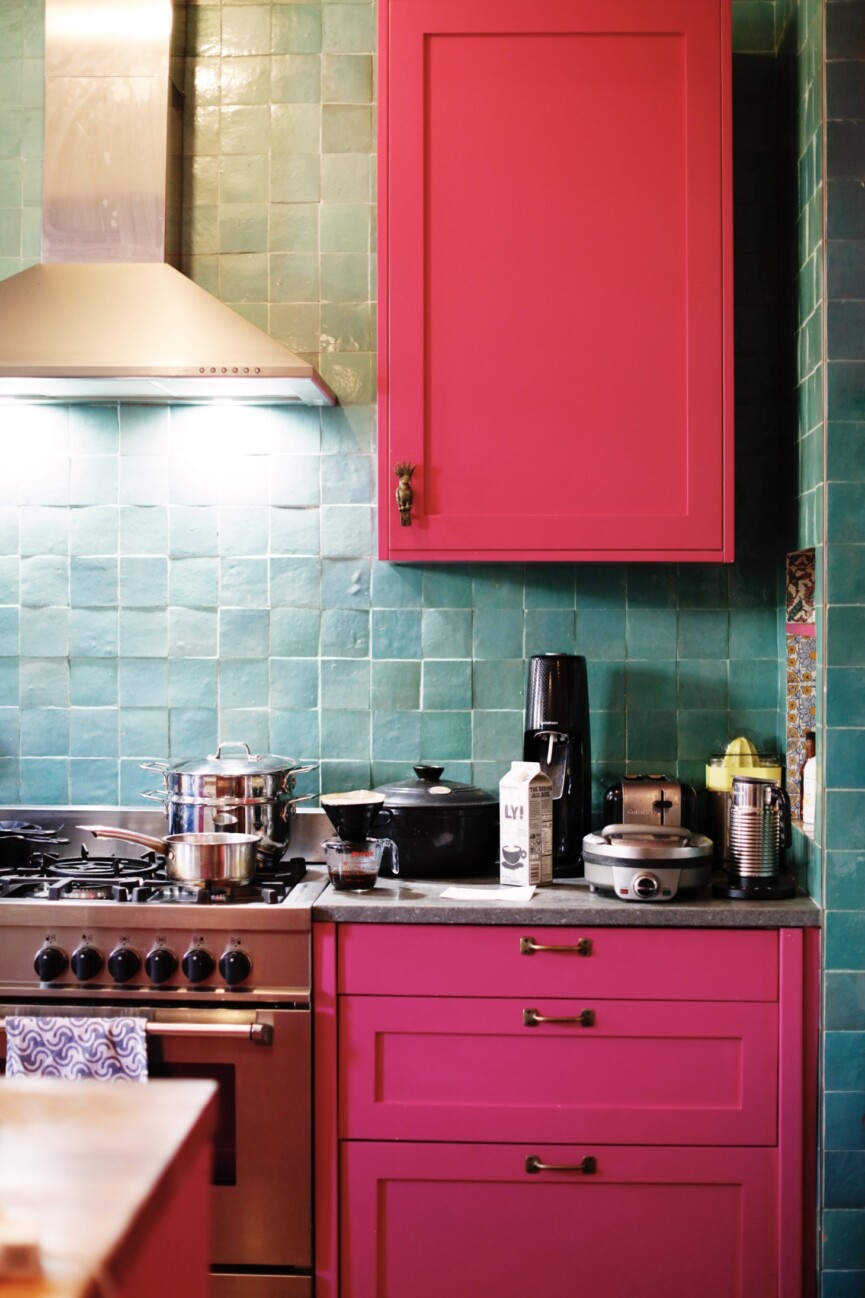
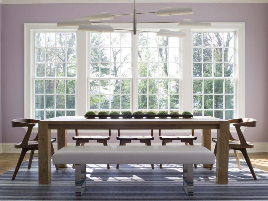
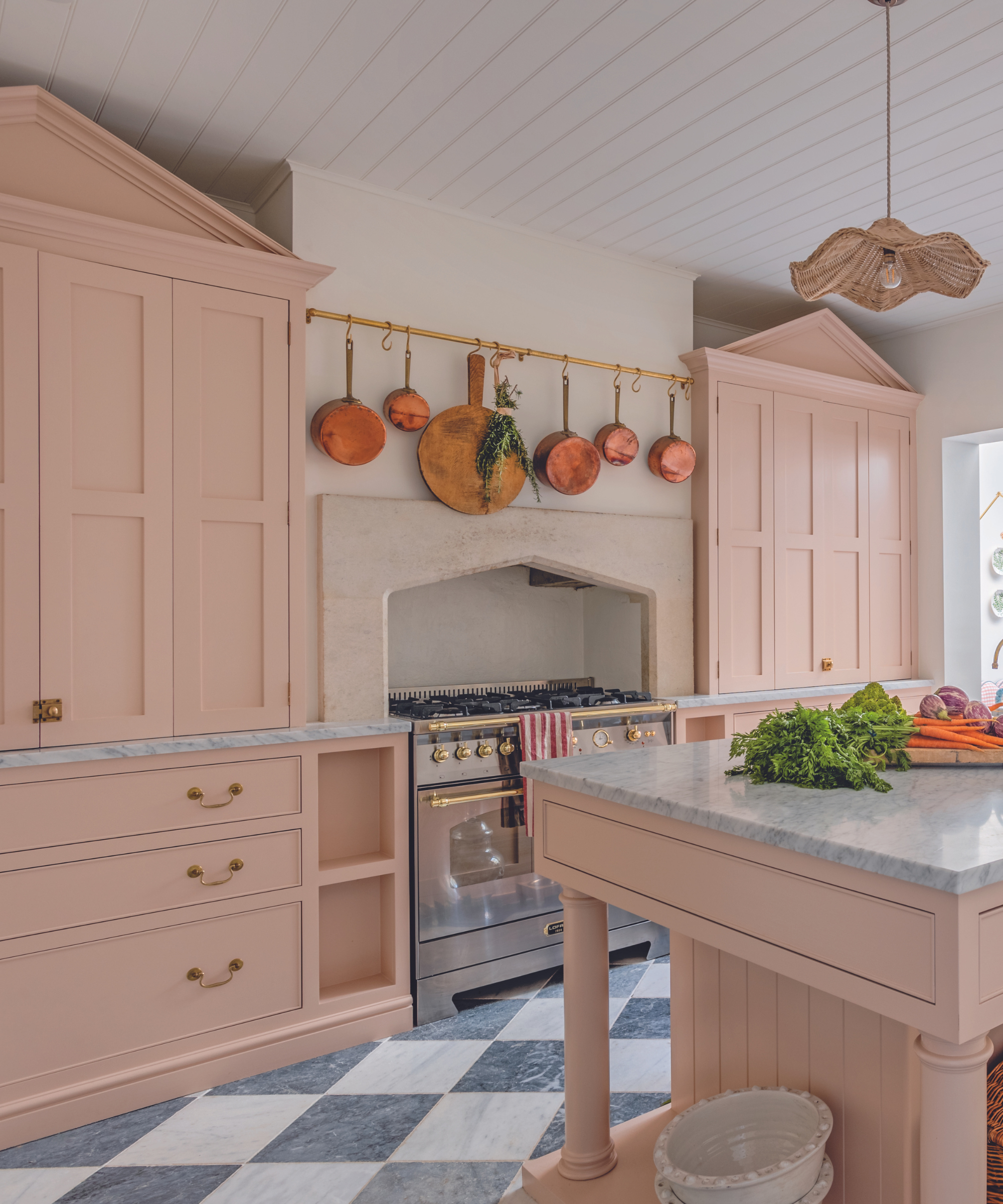
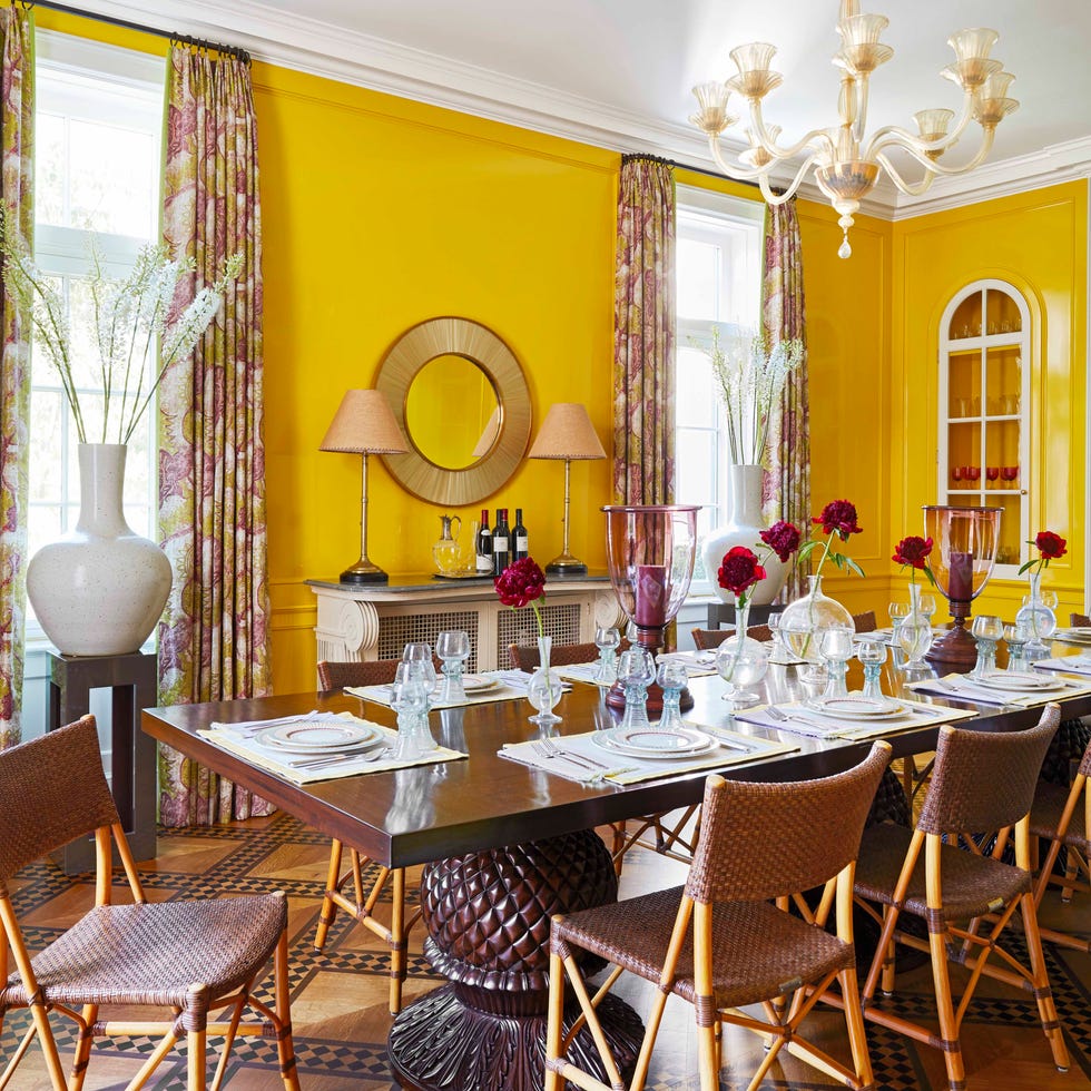
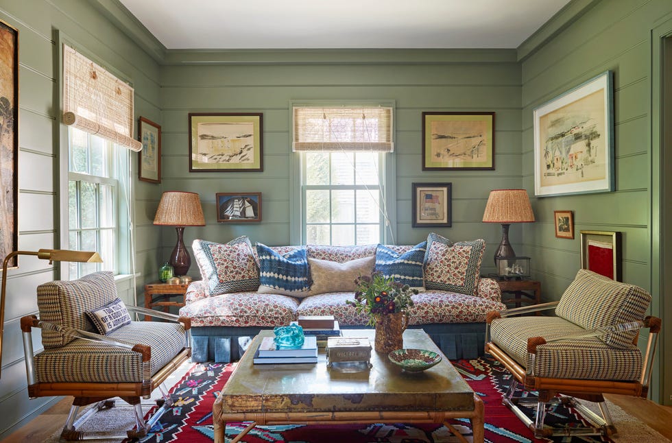
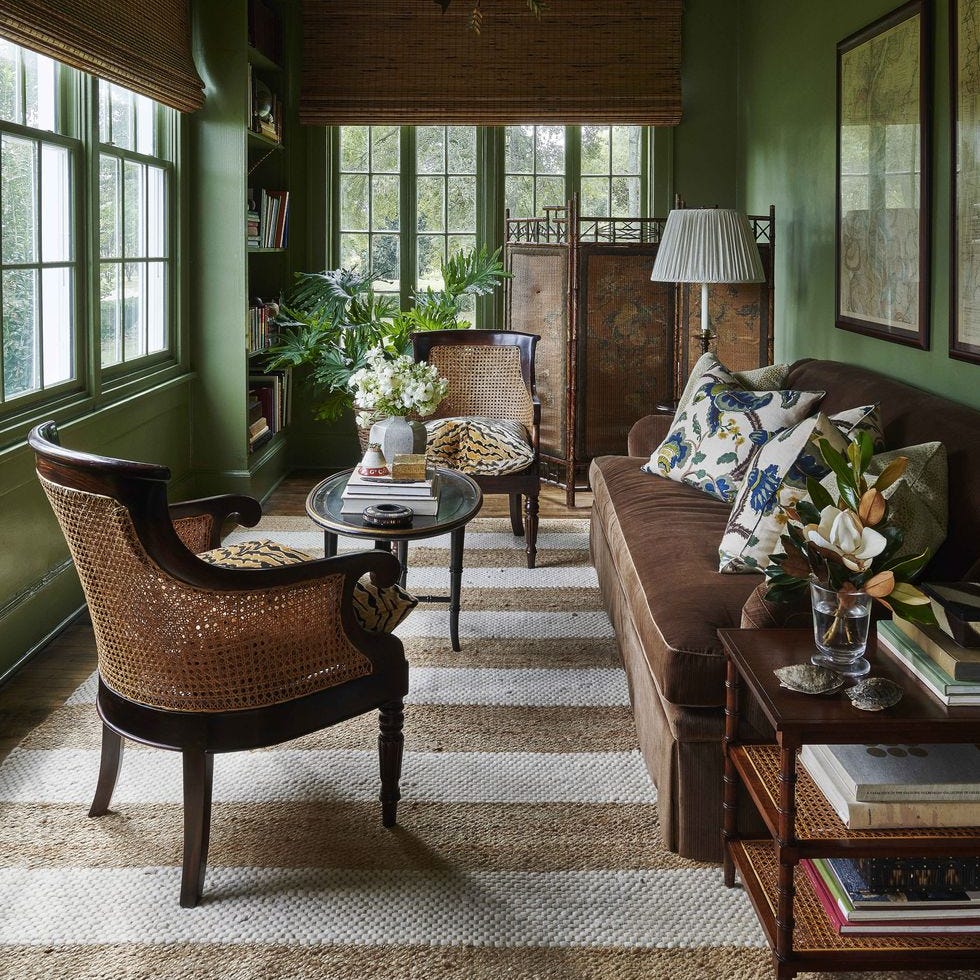
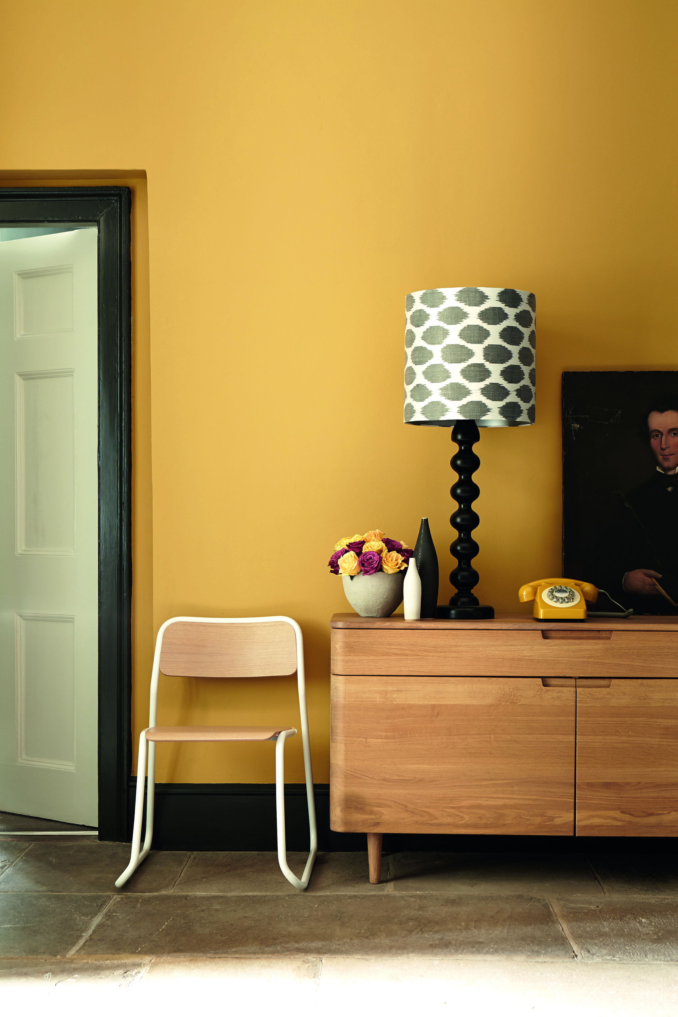
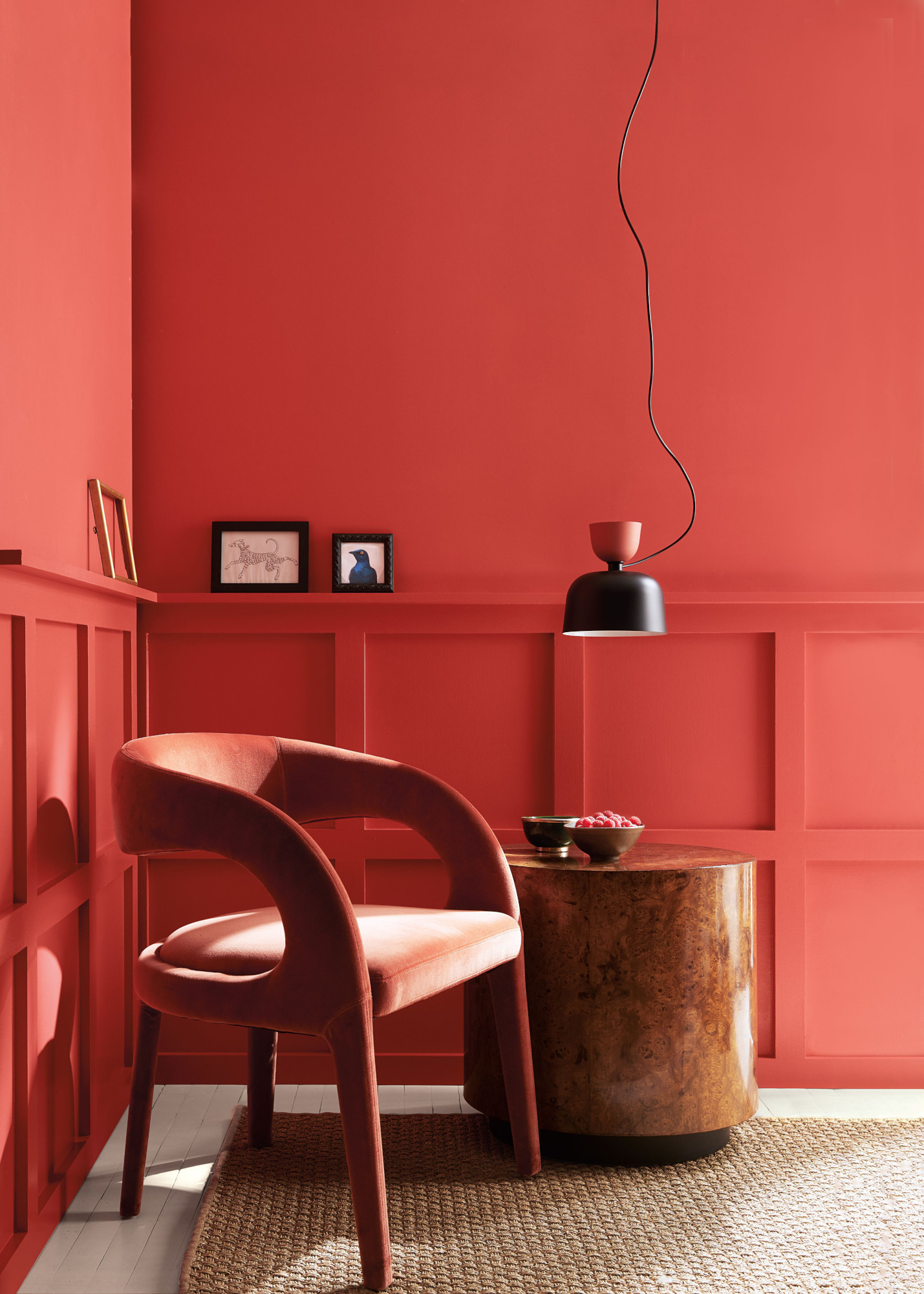
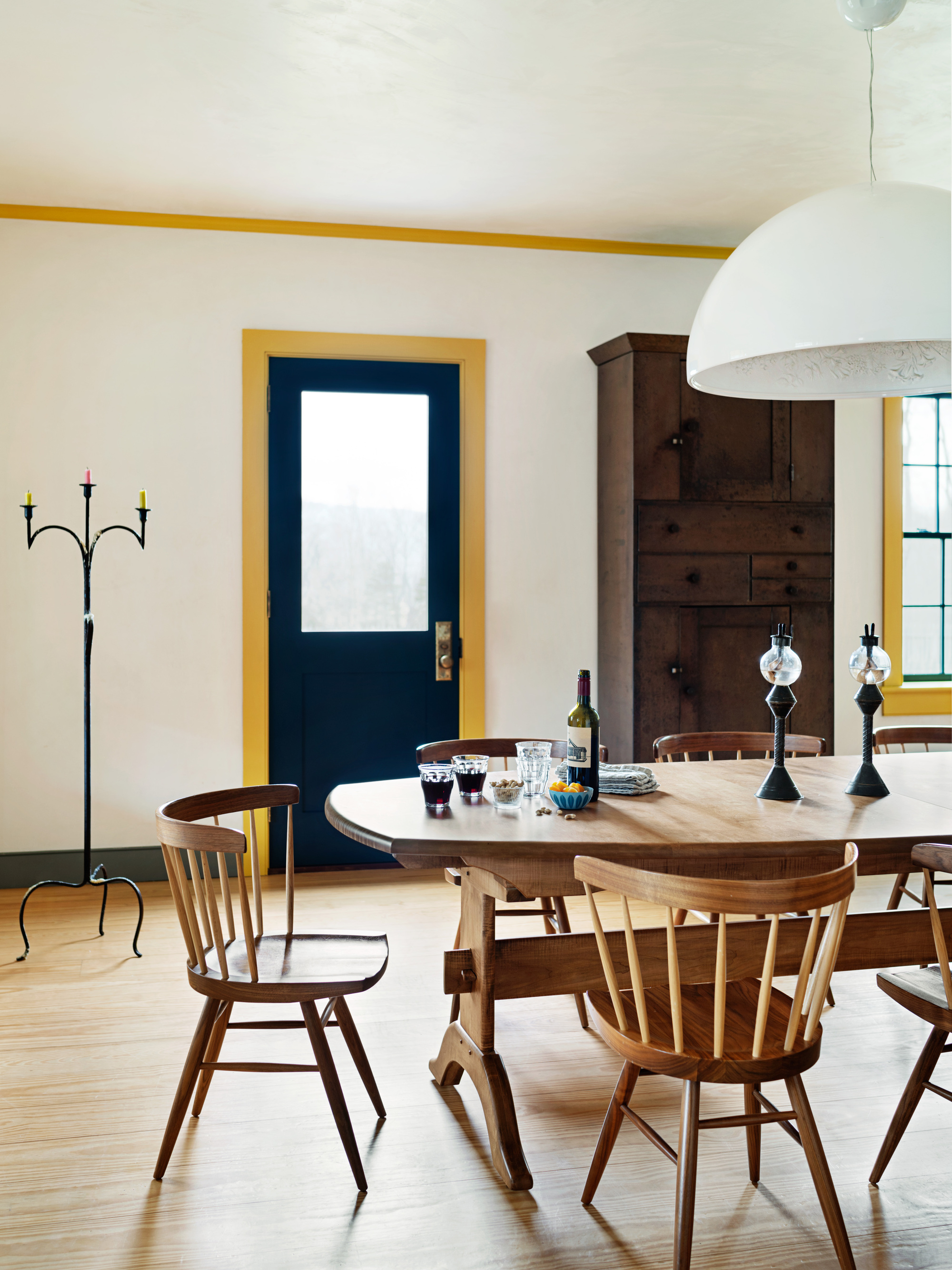
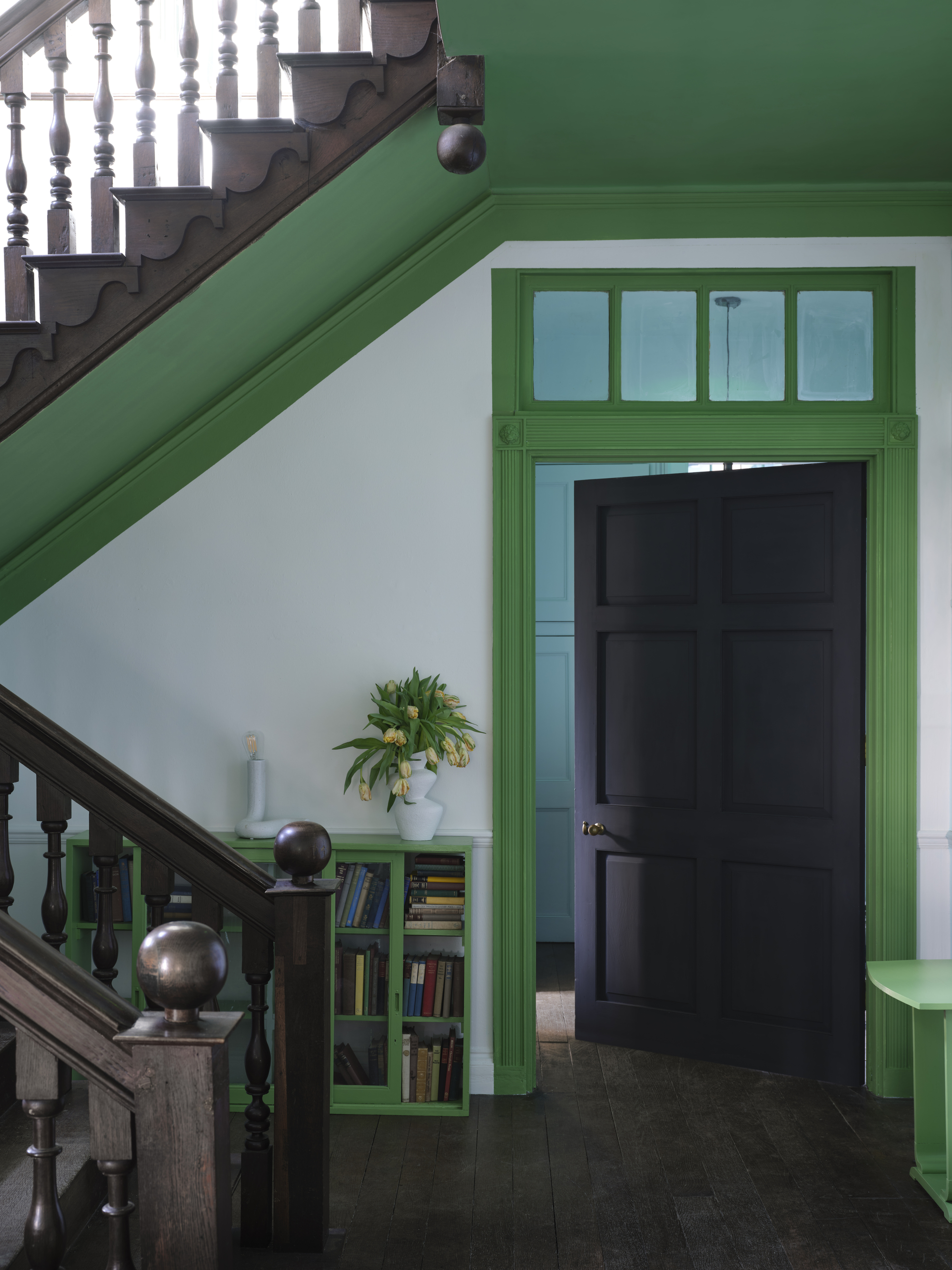
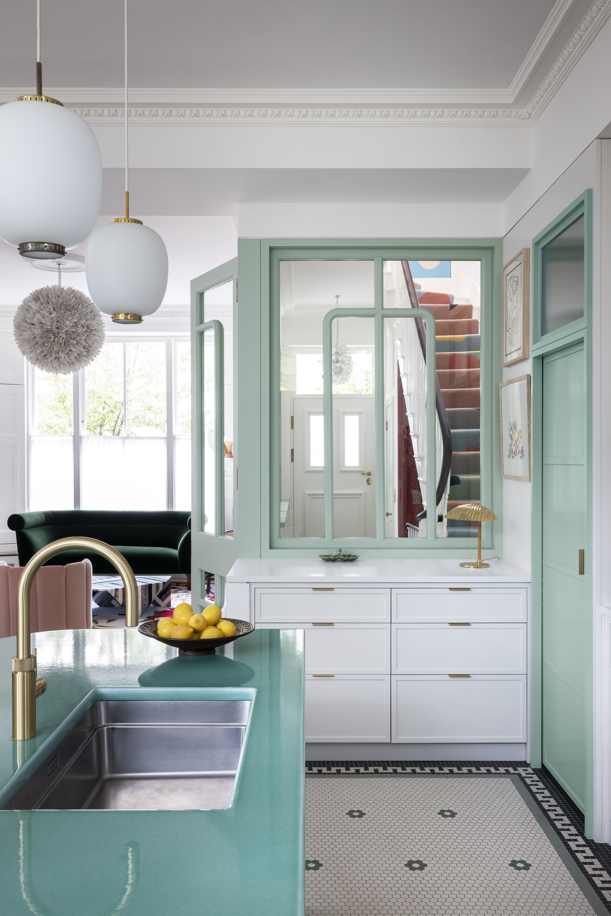
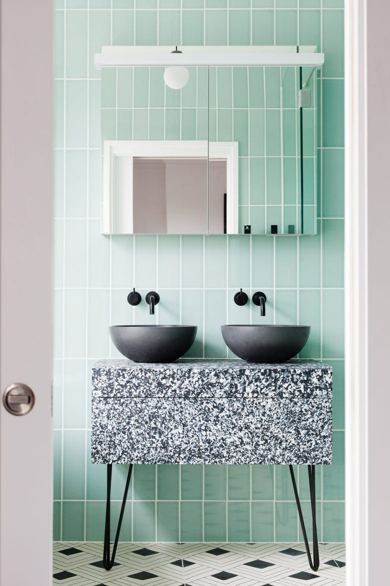
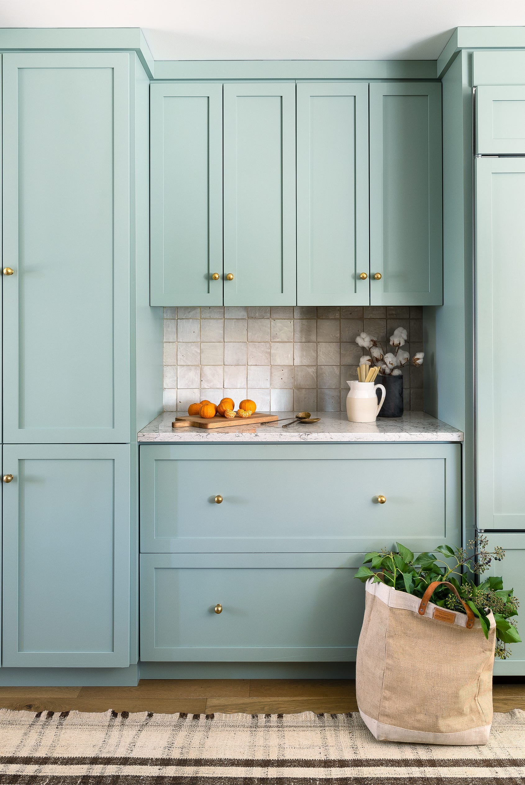
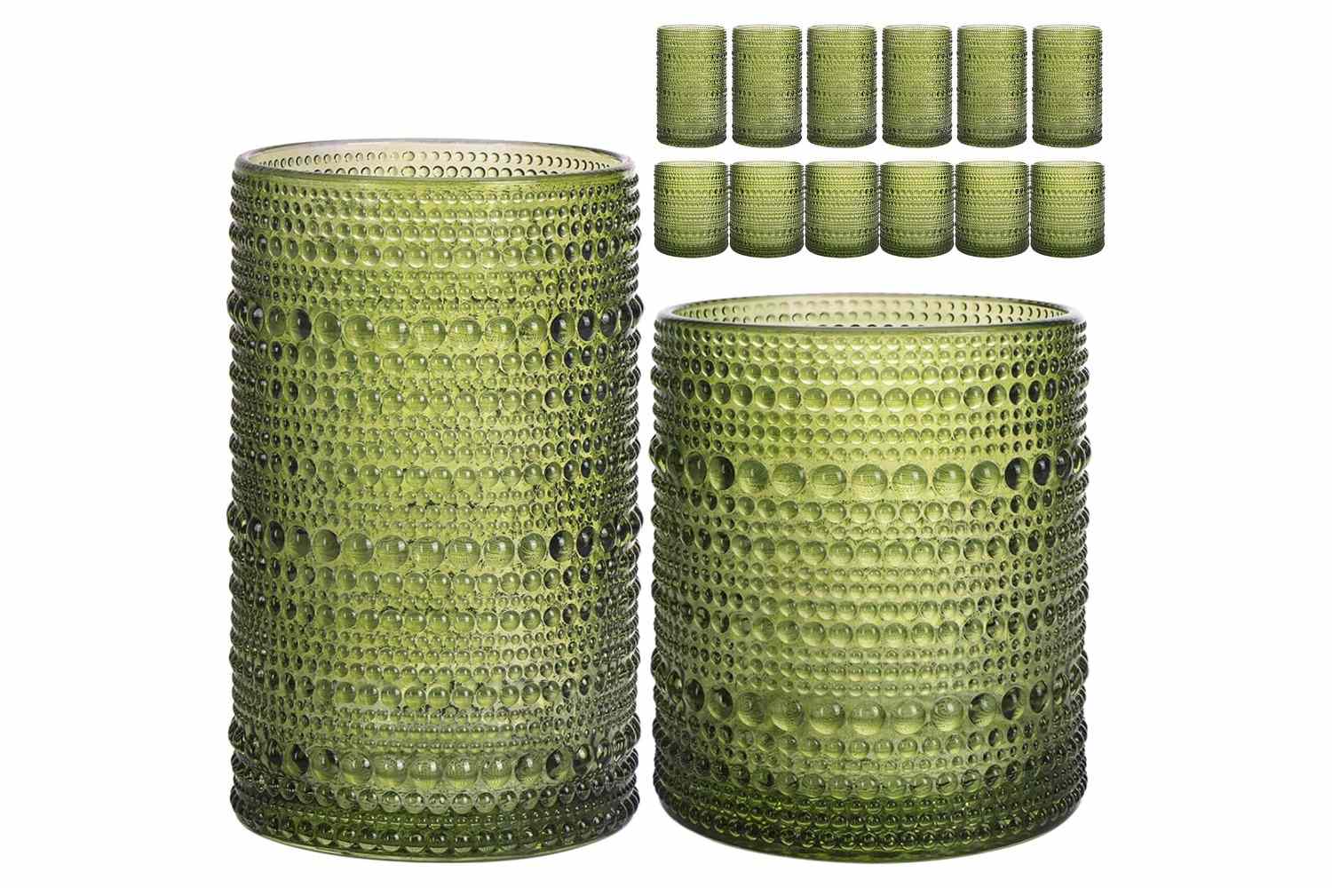
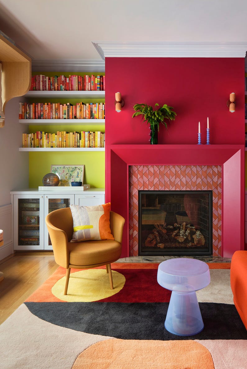
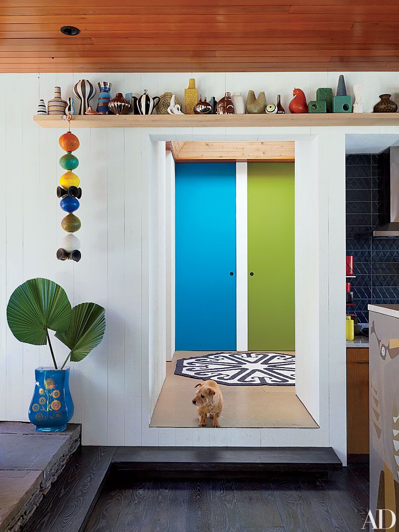
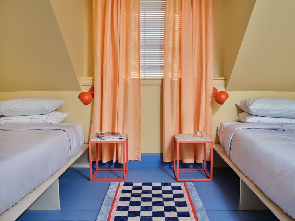
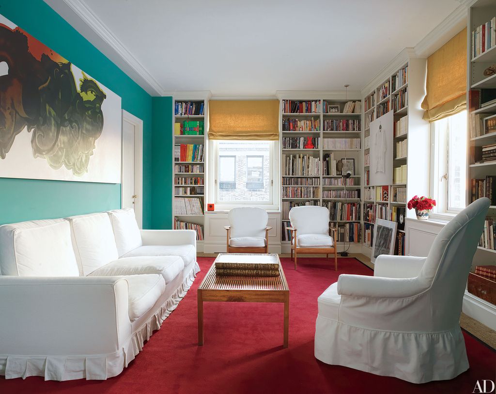
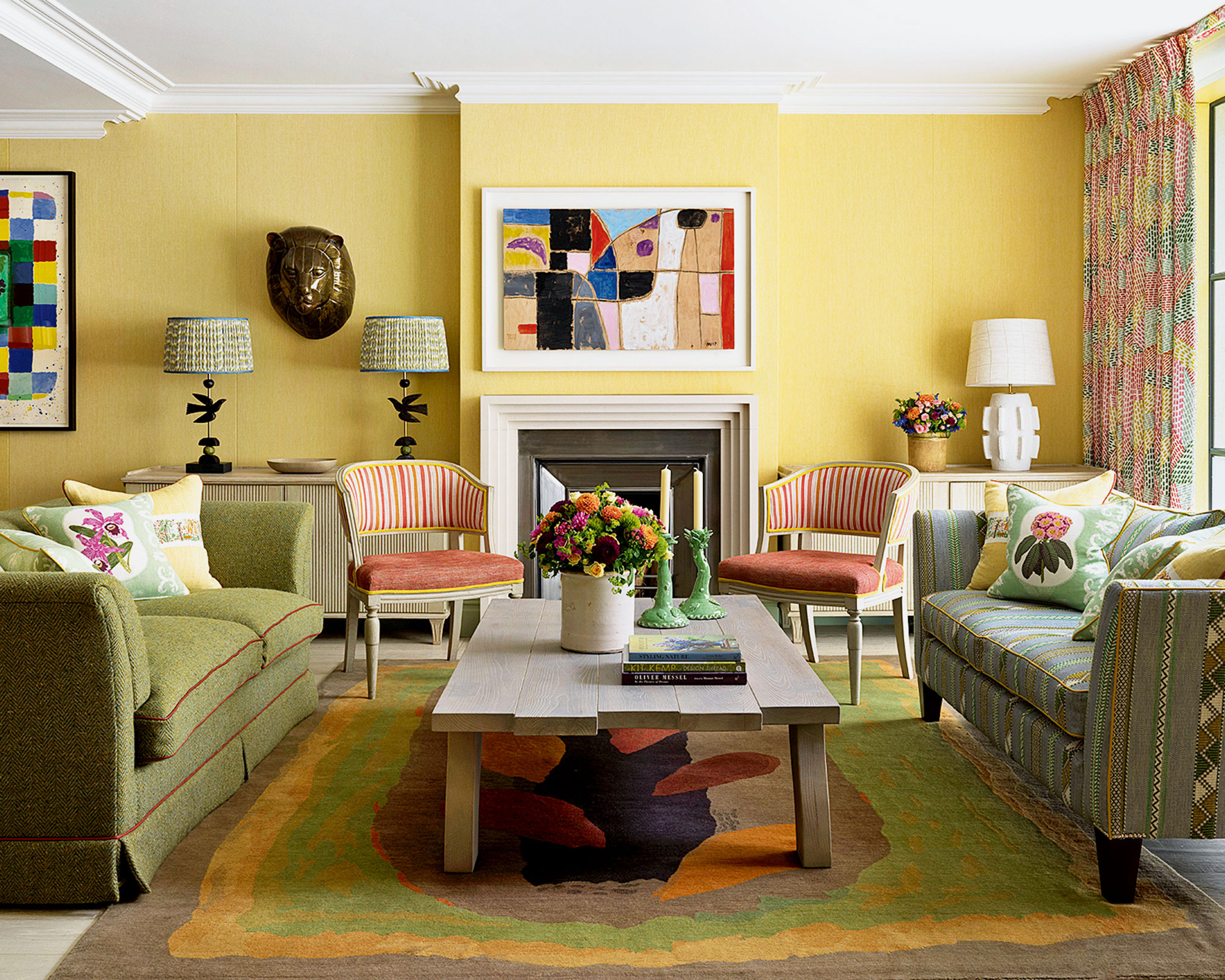
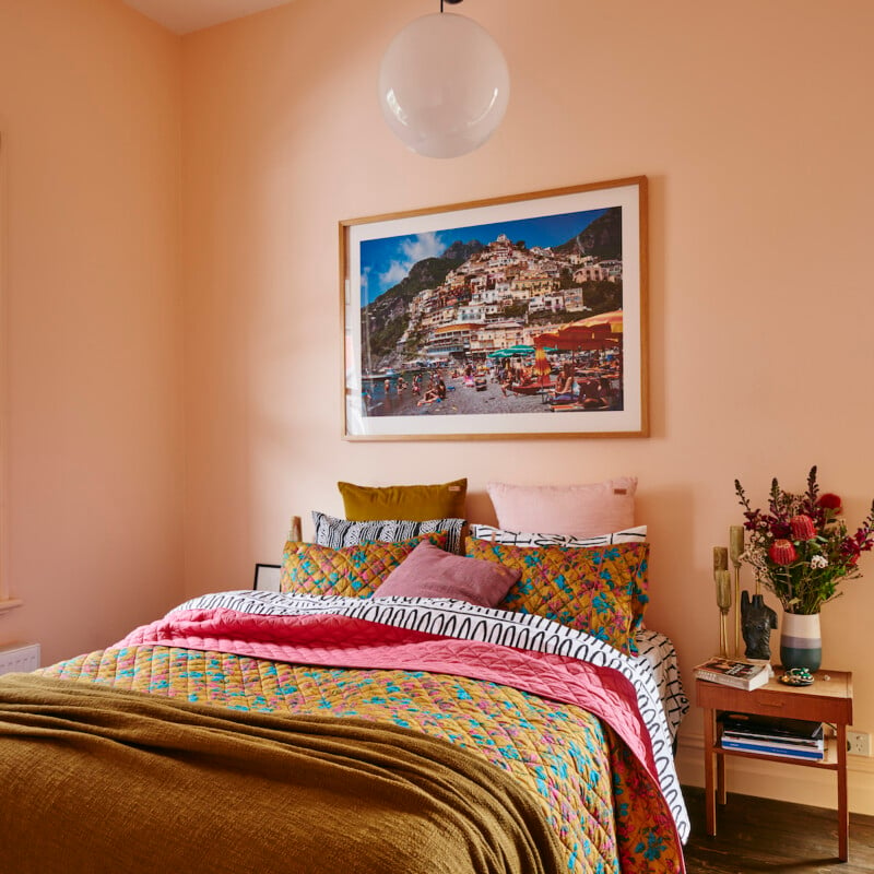
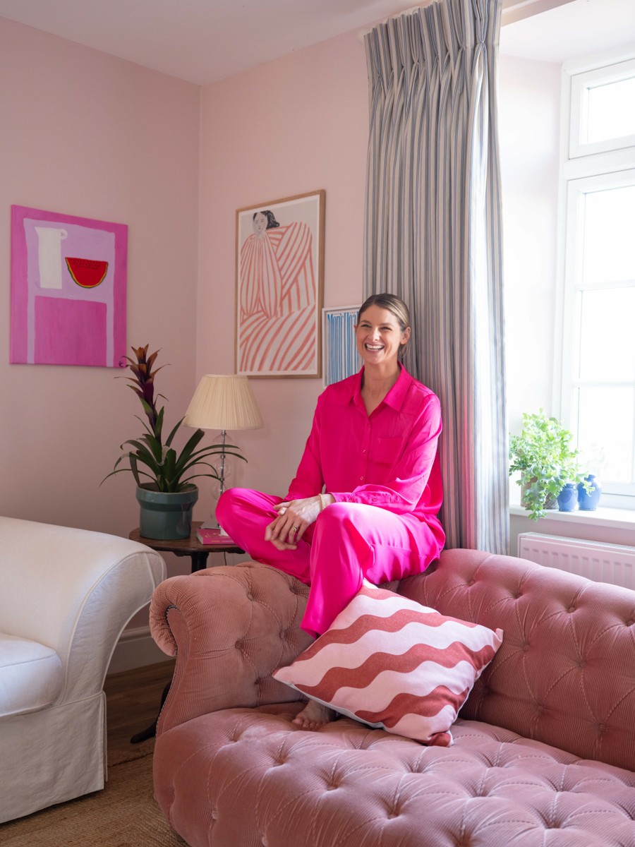
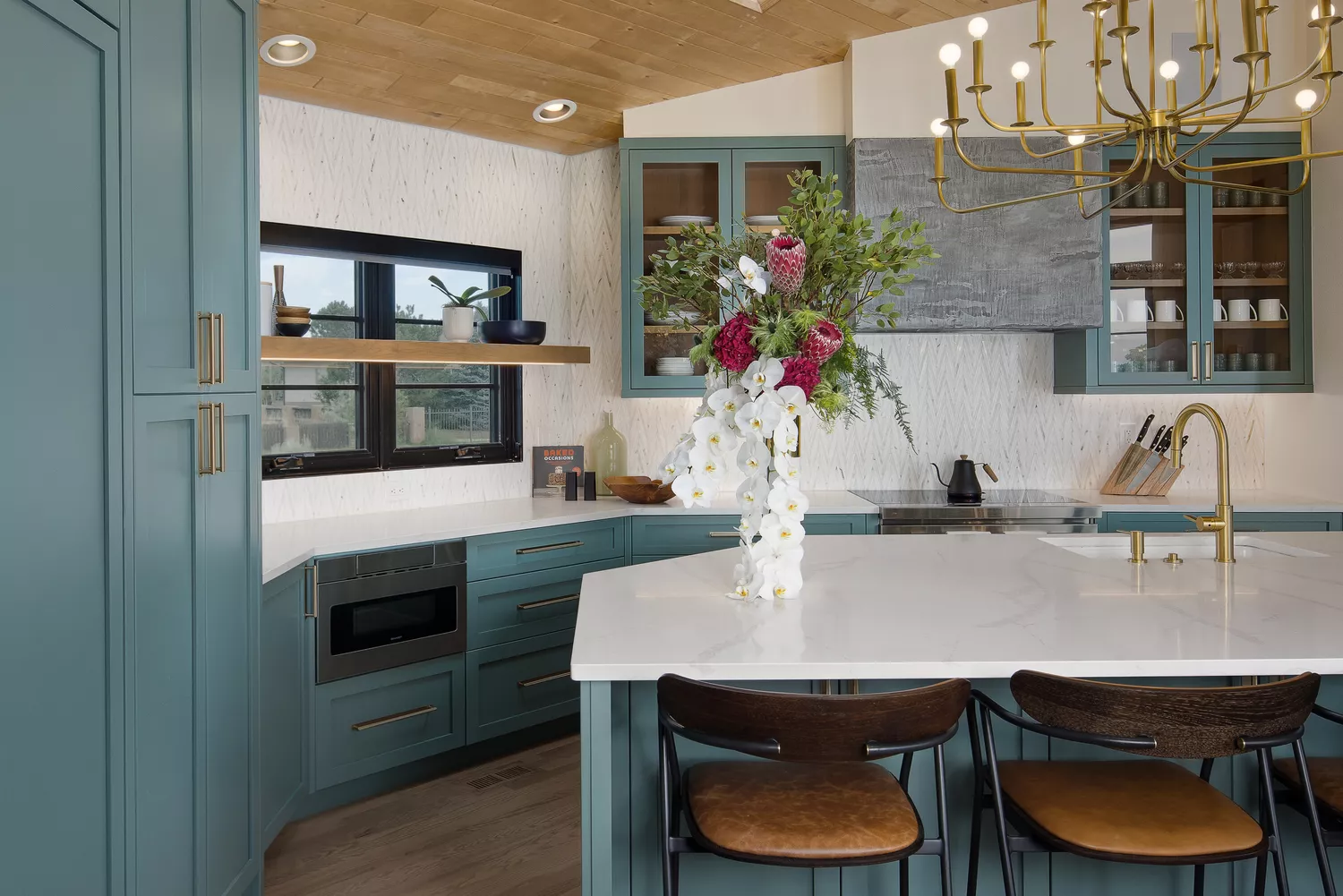
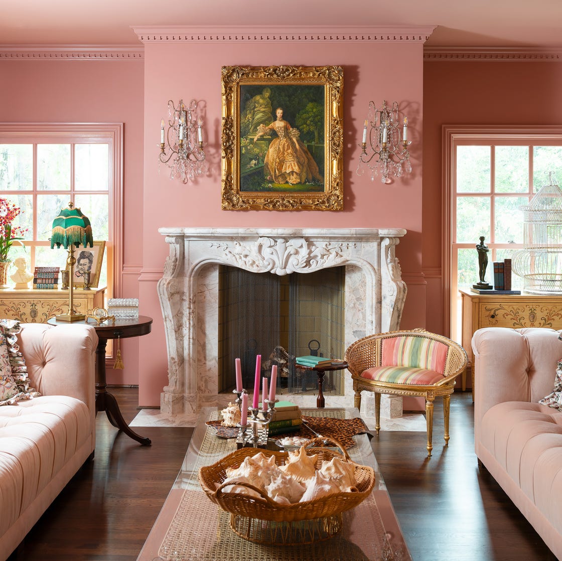
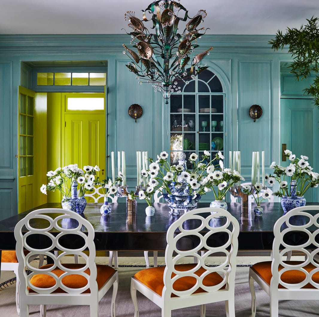
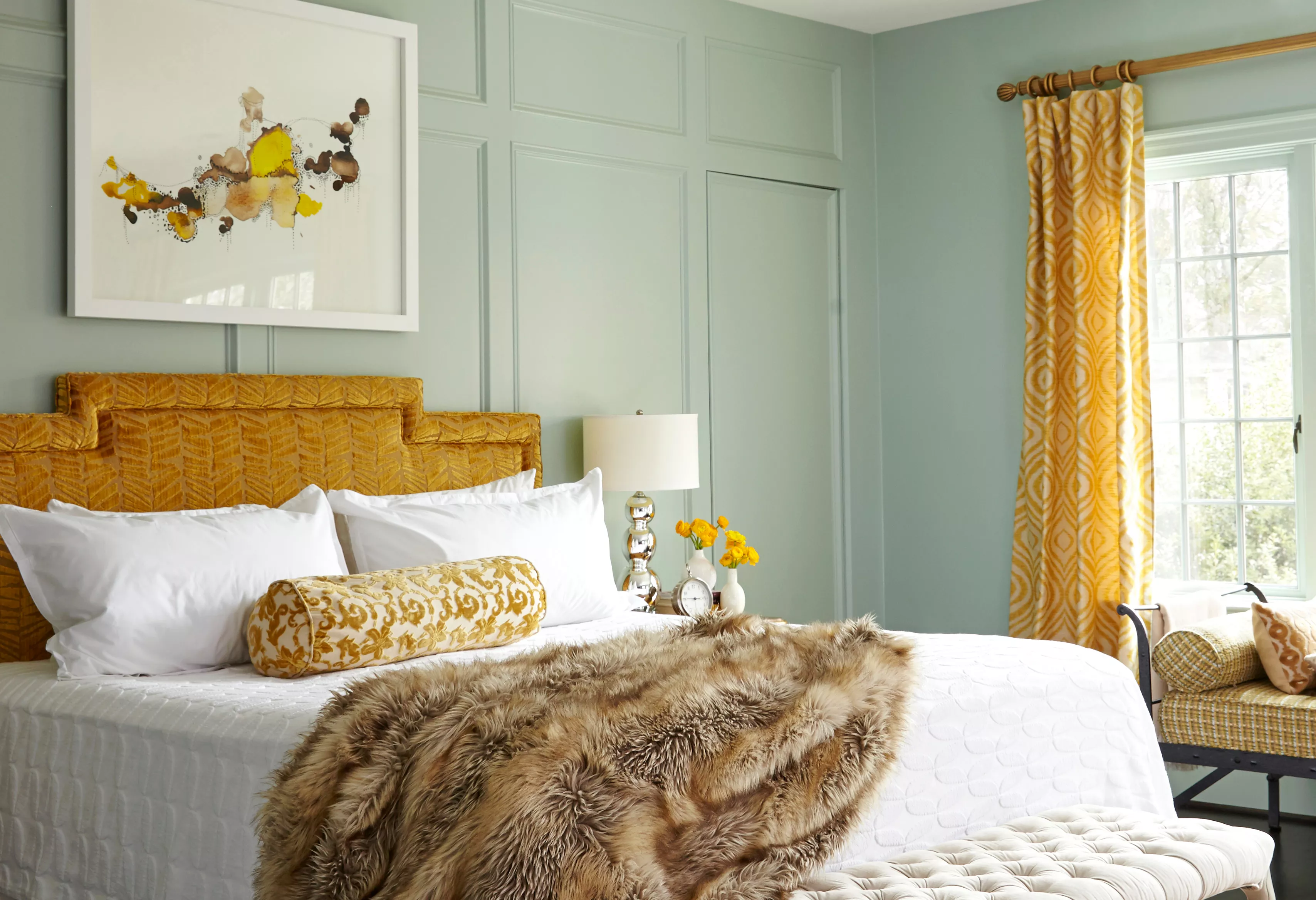
The piece then presents a curated list of ten colors, each associated with a particular positive emotion or effect. Pink is highlighted for joy, with 'Baby Soft' by Clare Paint as an example. Lilac is recommended for calm, citing 'Rhapsody Lilac' by Sherwin-Williams as a color that brings a happy and tranquil feeling, especially in a bedroom setting. Yellow is featured for cheerfulness, with 'Pablo Honey' by Backdrop Paint suggested for its ability to add vibrancy, particularly in a kitchen. Green is identified for energy, exemplified by 'Lazy Caterpillar' by Behr, suitable for invigorating spaces like a bedroom. Teal, specifically 'Madison Avenue' by Benjamin Moore, is presented as a color to invigorate and spark creativity, ideal for an office nook.
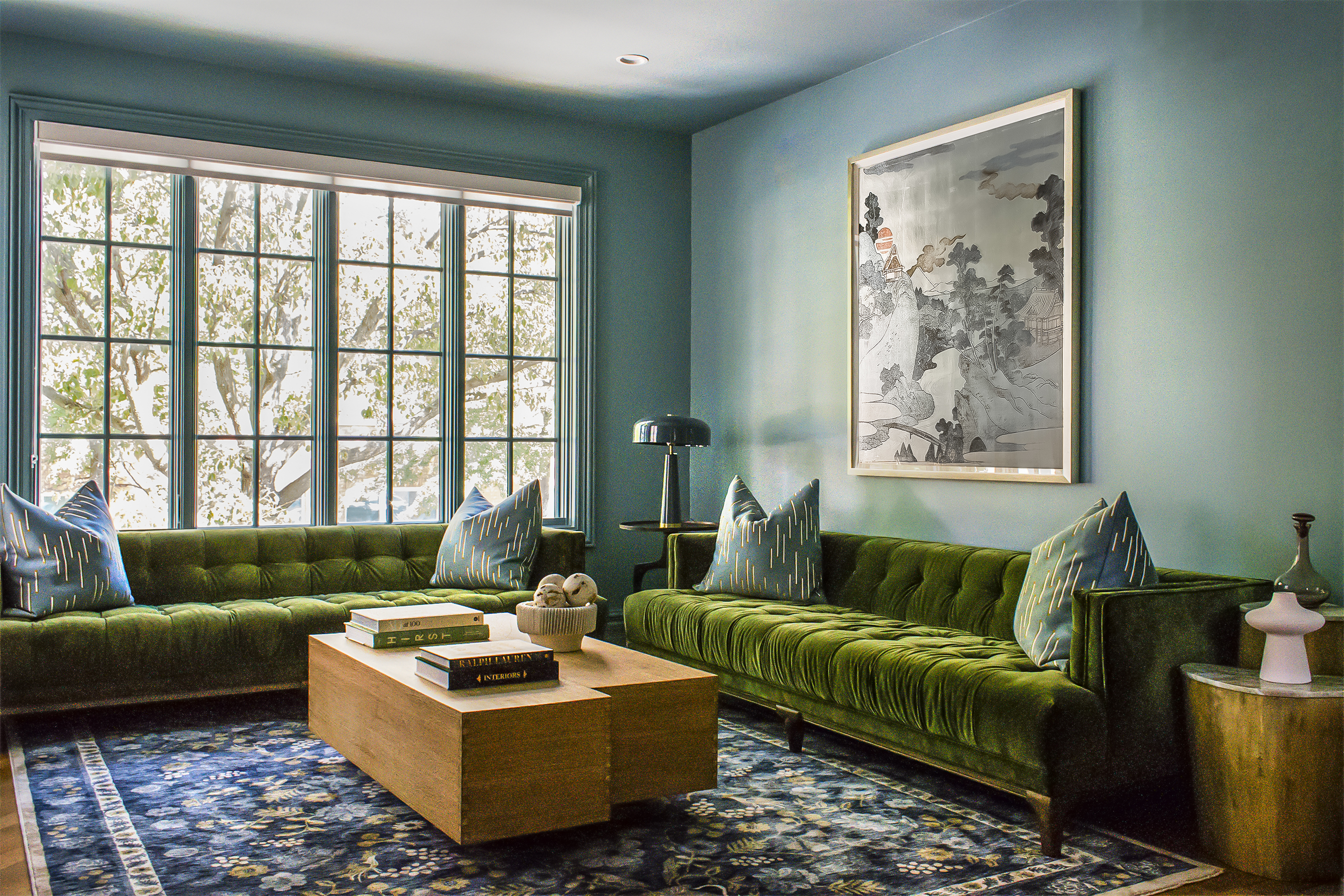
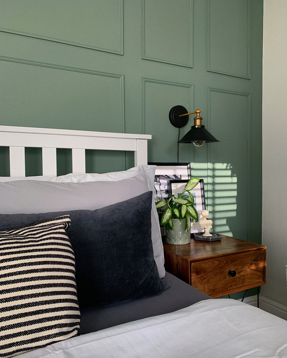
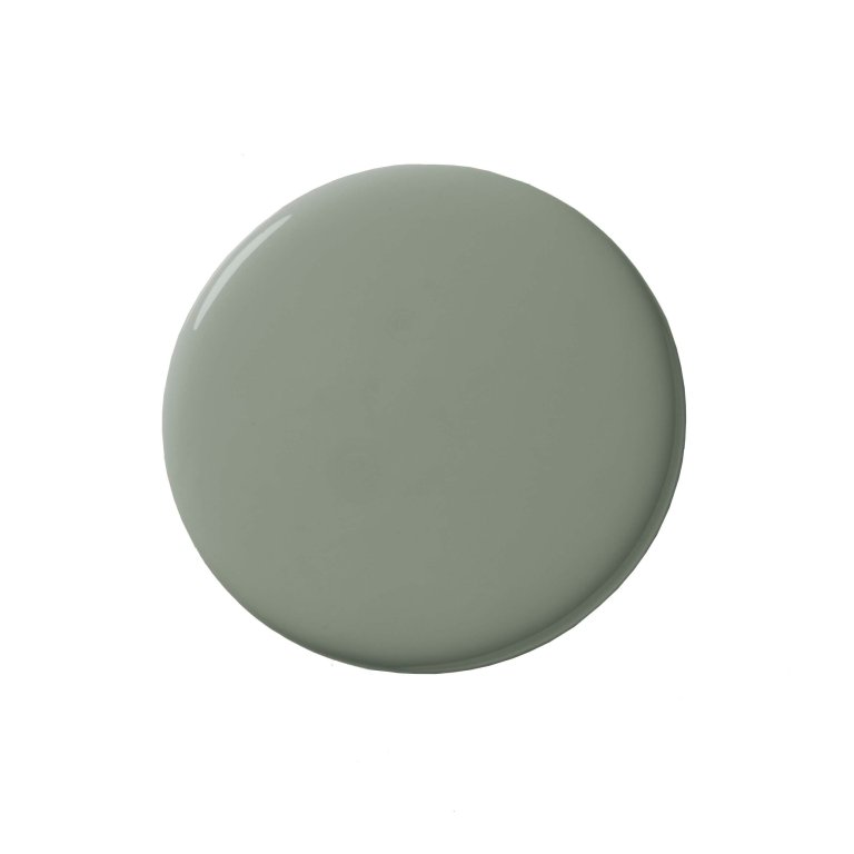
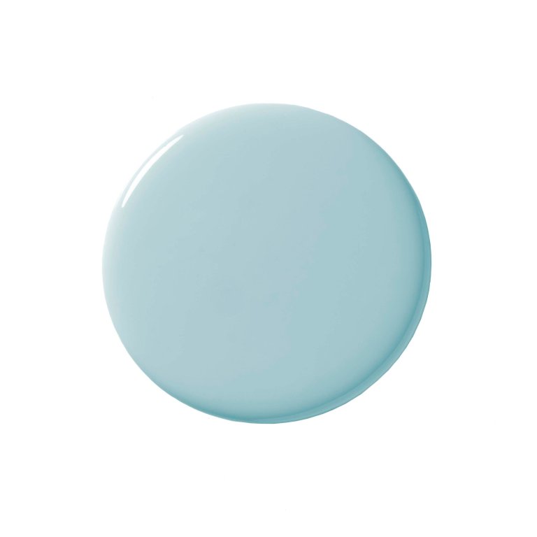
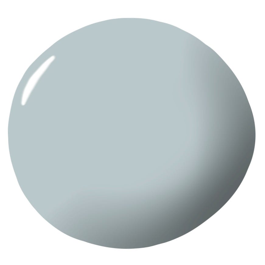
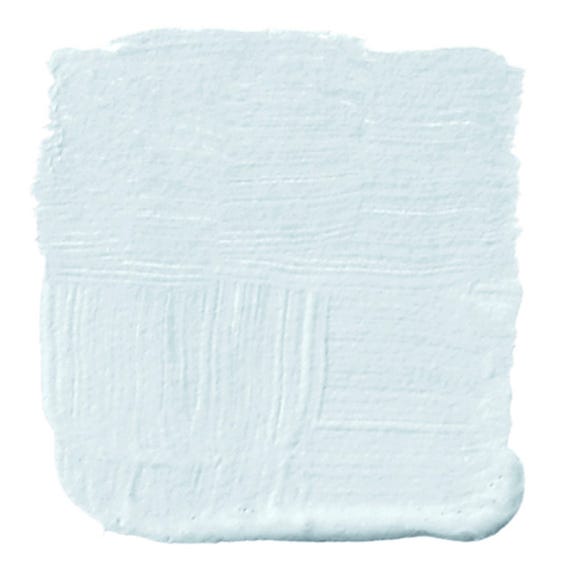
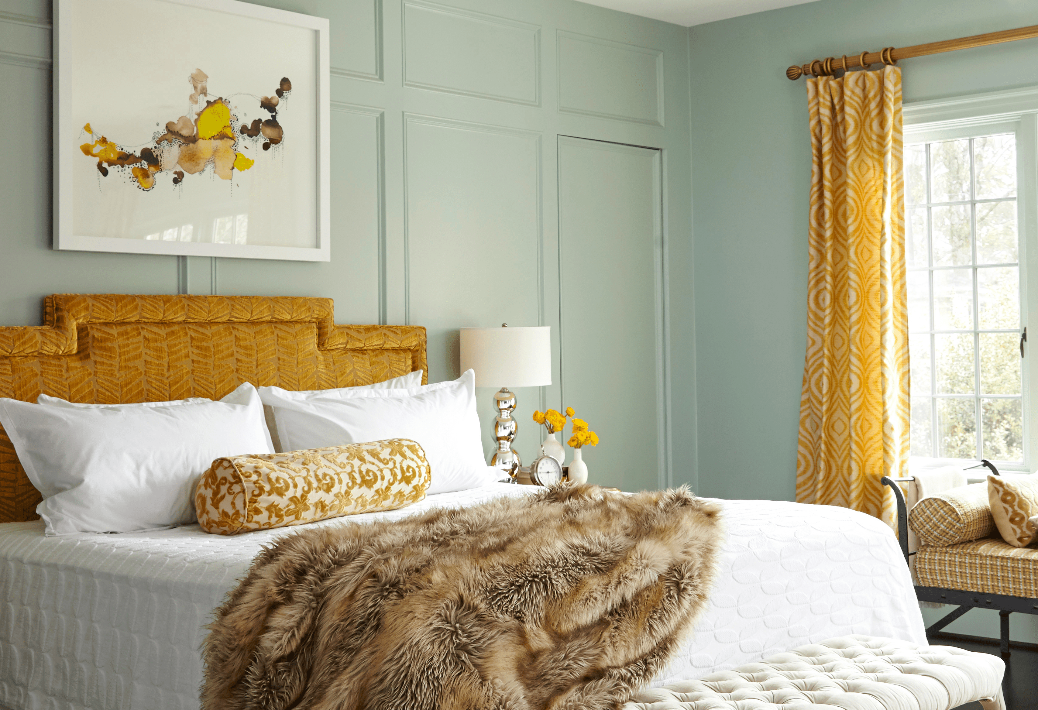
Light yellow, such as 'Daisy Spell' by Valspar, is discussed for its inherent happiness, described as luminous and evoking warm sun rays, thereby sparking positive energy. Sky blue, represented by 'Dreamy Clouds' by Valspar, is recommended for renewal, providing a calming and restorative quality that can improve rest and productivity. Violet black, like 'Twilight Purple' by Valspar, despite its dark appearance, is explained to offer a sense of retreat, relaxation, and focus due to its hidden violet undertones. Yellow-green, with 'Crushed Oregano' by Valspar, is showcased for optimism, capturing the essence of spring and stimulating personal growth. Finally, silver sage, using 'Smoke Infusion' by Valspar, is suggested for balance and harmony, promoting appreciation for simplicity and what truly matters. The article aims to inspire readers to choose paint colors that enhance their emotional well-being and create happier living spaces.
#HappyPaintColors #HomeDesign #ColorTherapy #InteriorDecor #MoodBoostingColors #ValsparColorExpert #PaintColorIdeas #EmotionalWellbeing #RoomTransformation #HappyPaintColors #HomeDesign #ColorTherapy #InteriorDecor #MoodBoostingColors #ValsparColorExpert #PaintColorIdeas #EmotionalWellbeing #RoomTransformation
0 comment in total
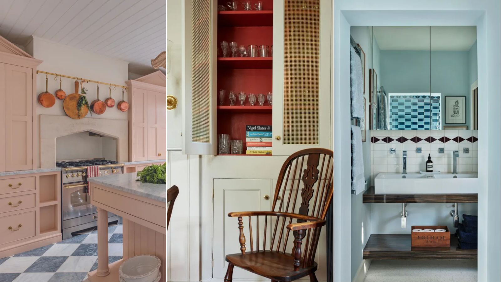
You may also like
The Brighter, the Better—These Vibrant Paints Will Infuse Your Home With Positivity

3 paint colors that Feng Shui experts say will make your home happier – 'they ignite joy!'

A Color Psychologist Says This Is the Most Relaxing Paint Color


17 Gorgeous Paint Colors For A Happy Home, According To Color Experts

A color psychologist says these color schemes are the most likely to boost your mood

'It's the best way to make a home joyful' - this paint trend is the perfect idea to introduce color thoughtfully

This One Color Instantly Boosts Joy in Any Room, According to Interior Designers

9 Color Blocking Ideas for a Bright, Cheery Home

5 best happy living room colors for an uplifting space
14 Mood-Boosting Kitchen Paint Colors That Will Instantly Brighten Your Day

5 colors that will make your living room feel happier, according to interior designers
20 Calming Paint Colors That Will Change the Way You Live


3 paint colors that Feng Shui experts say will make your home happier – 'they ignite joy!'

The Versatile Color That'll Cheer You and Your Home Up All Year Long

Designer-Approved Living Room Colors That'll Make You Feel Happier

5 unexpected colors guaranteed to bring lasting joy and happiness to your living room – 'the perfect pick-me-up for fall and winter'
How Your Home's Paint Colors Can Make You Happier, According to Experts

Interior Designers Say the Key to Creating a Joyful Space Is to Add in This One Color
15 Ways to Add Bold Color to Your Home
6 Paint Colors That Add Positive Feng Shui to Every Room in Your Home