1/25
A Color Psychologist Says This Is the Most Relaxing Paint Color
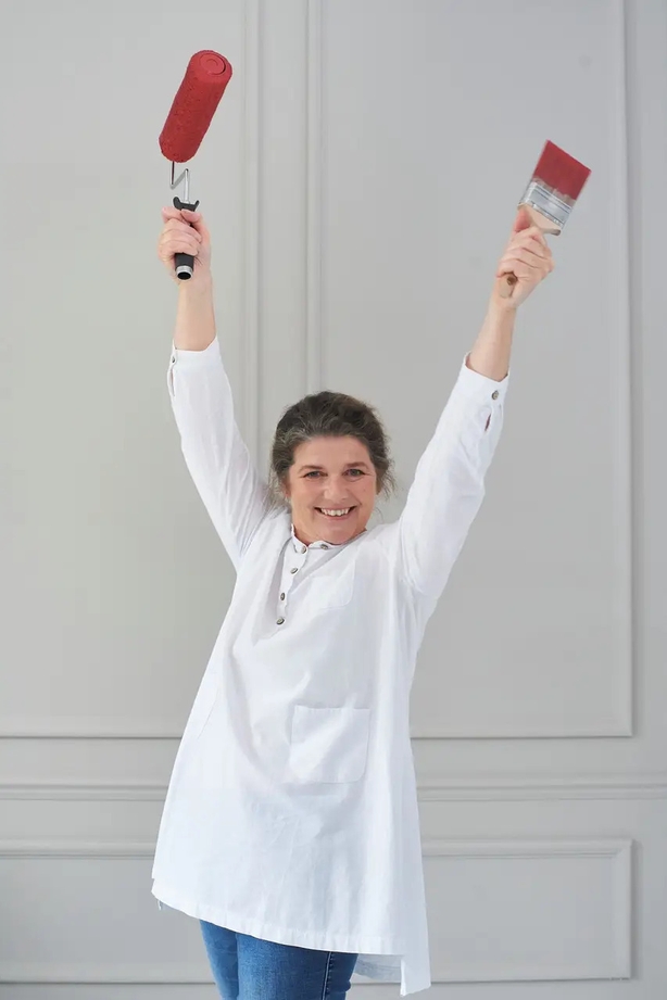
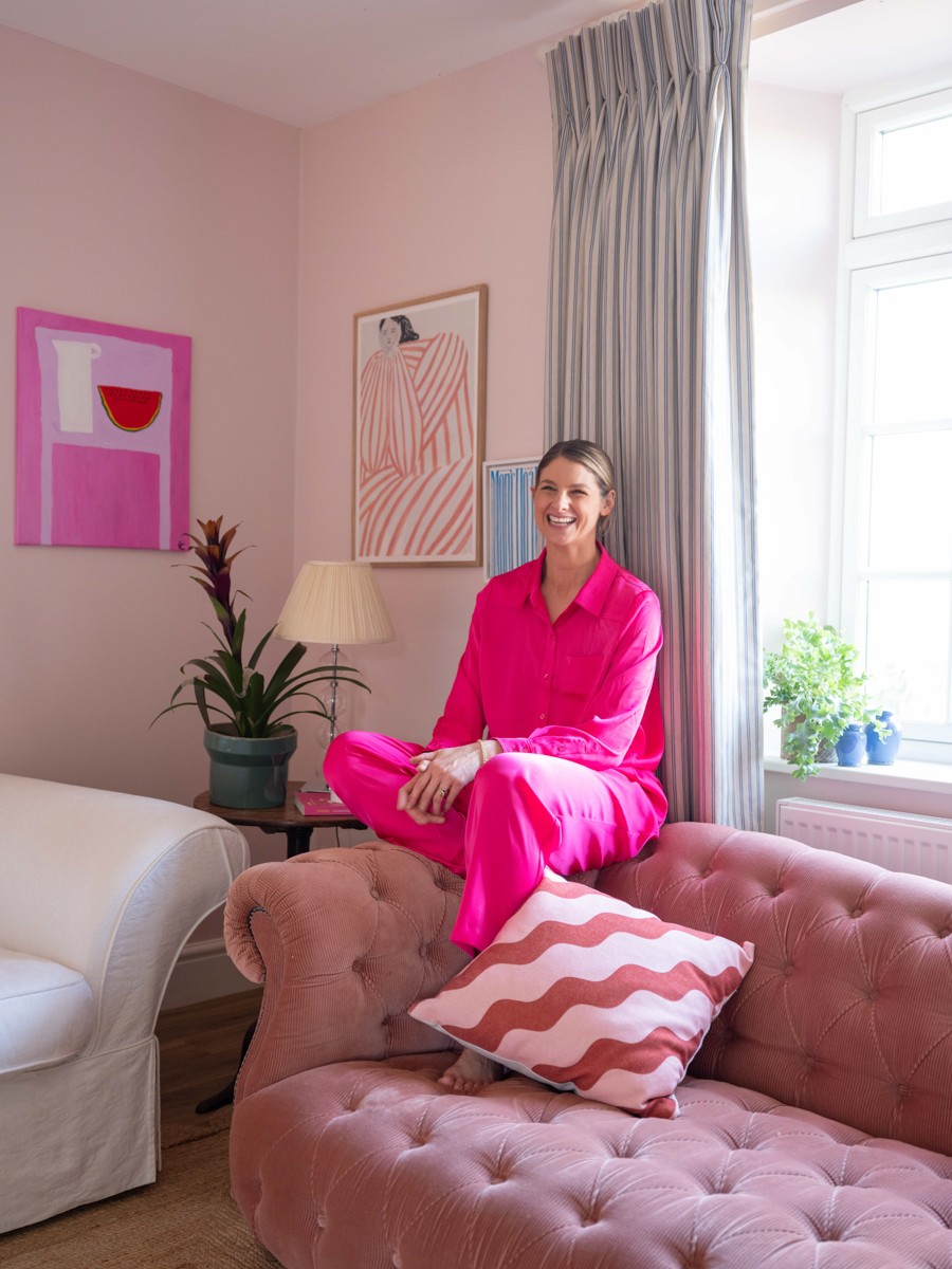
Tash Bradley, the director of interior design for the British home decor company Lick and a trained color psychologist, asserts that specific paint colors can significantly influence mood and enhance a space's purpose. Bradley, who oversees Lick's 124 shades and advises homeowners on color palettes, applies her expertise to not only aesthetic appeal but also the emotional impact of colors. She notes that each color and its variations evoke distinct moods, making them suitable for different rooms and desired atmospheres.
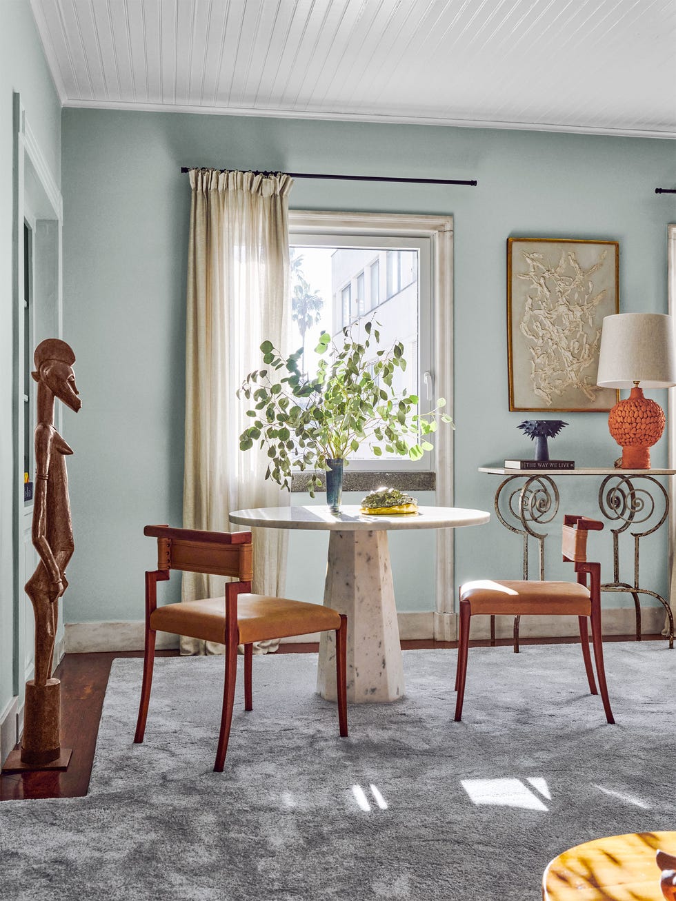
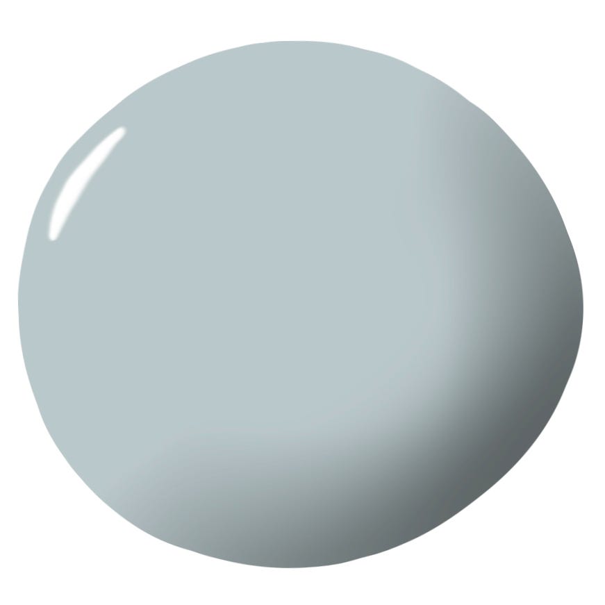
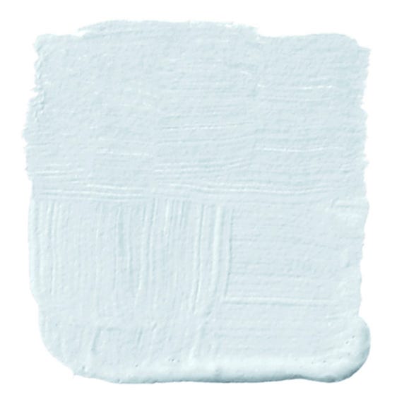
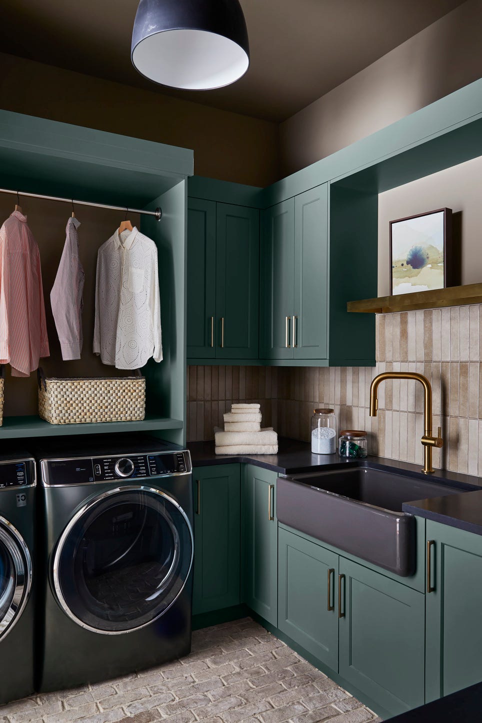
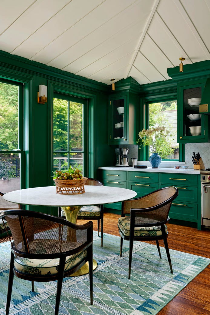
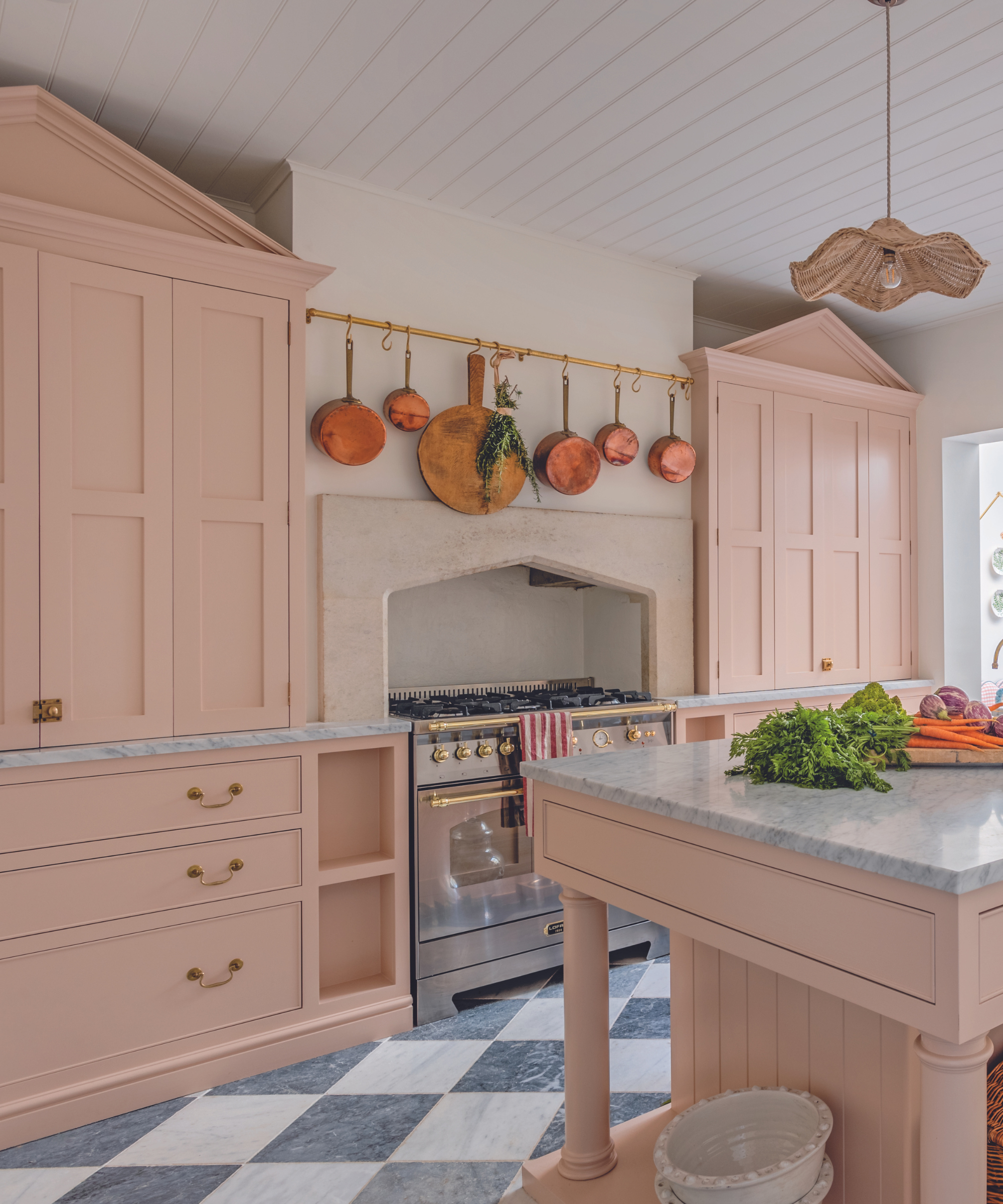
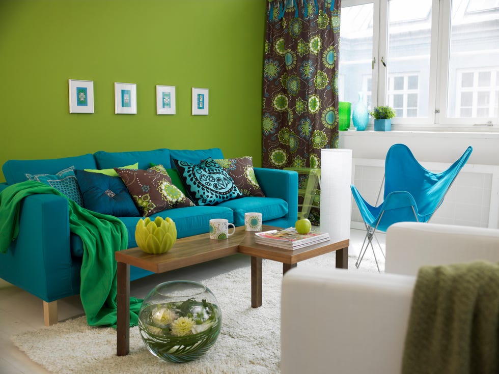
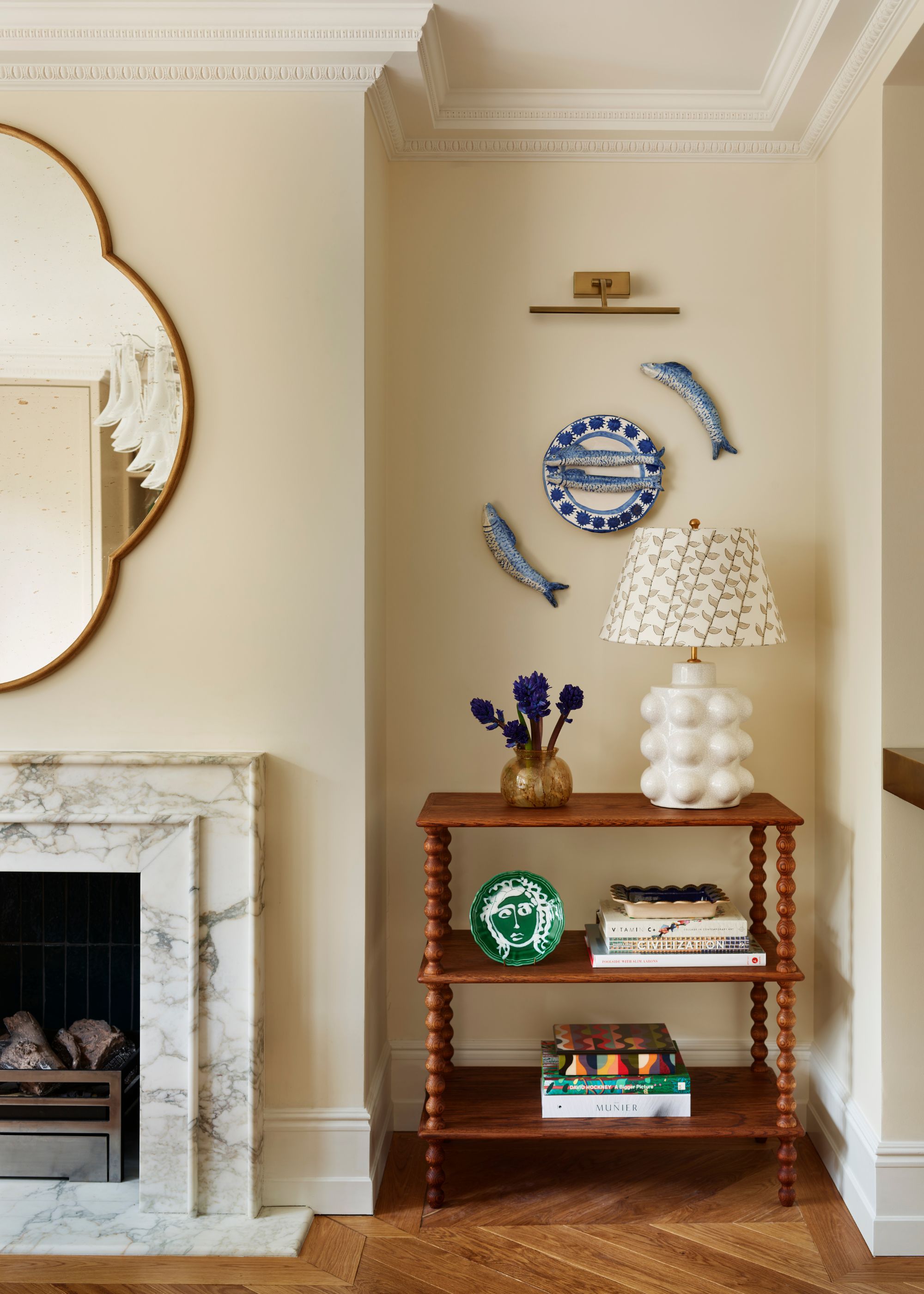
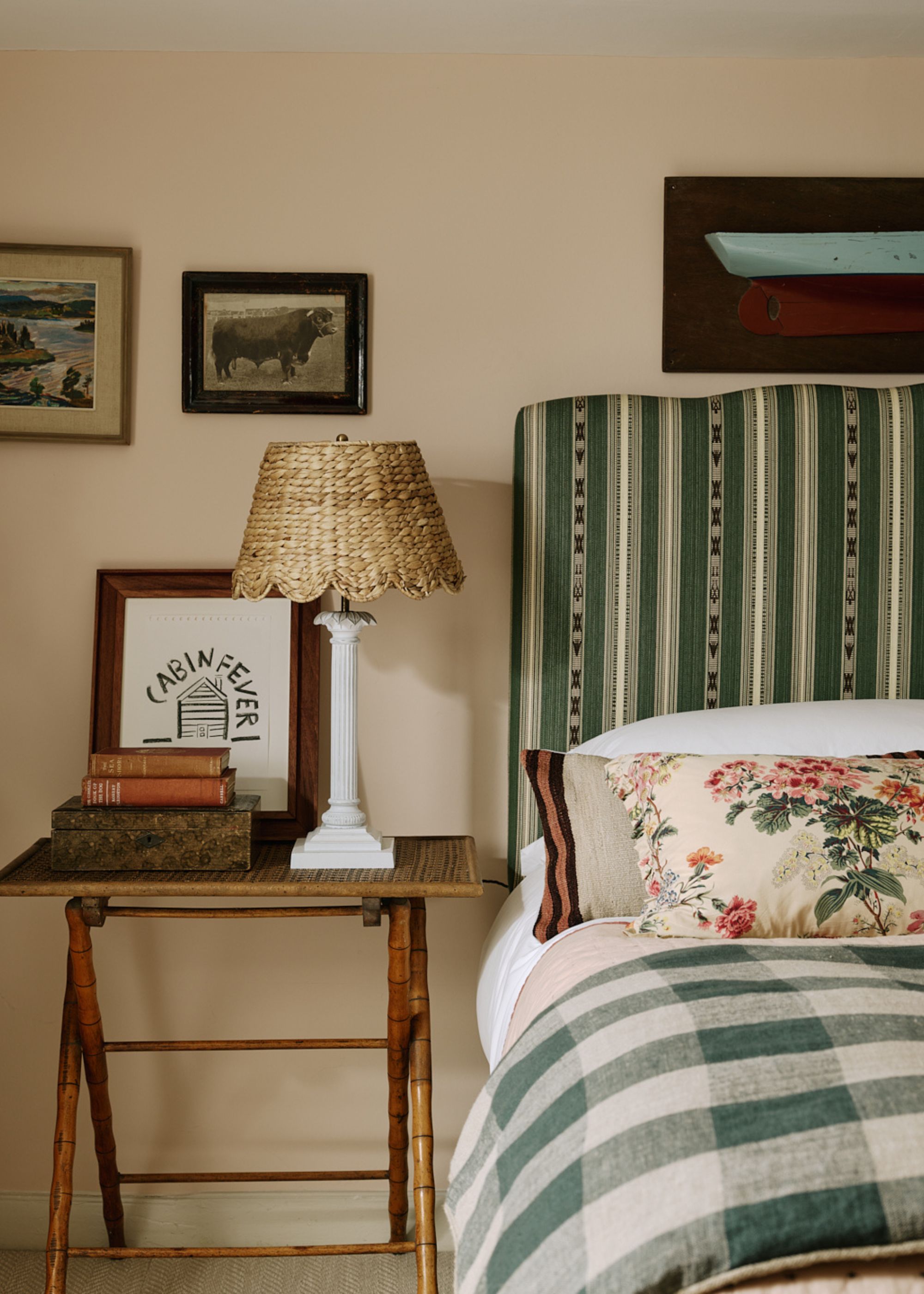
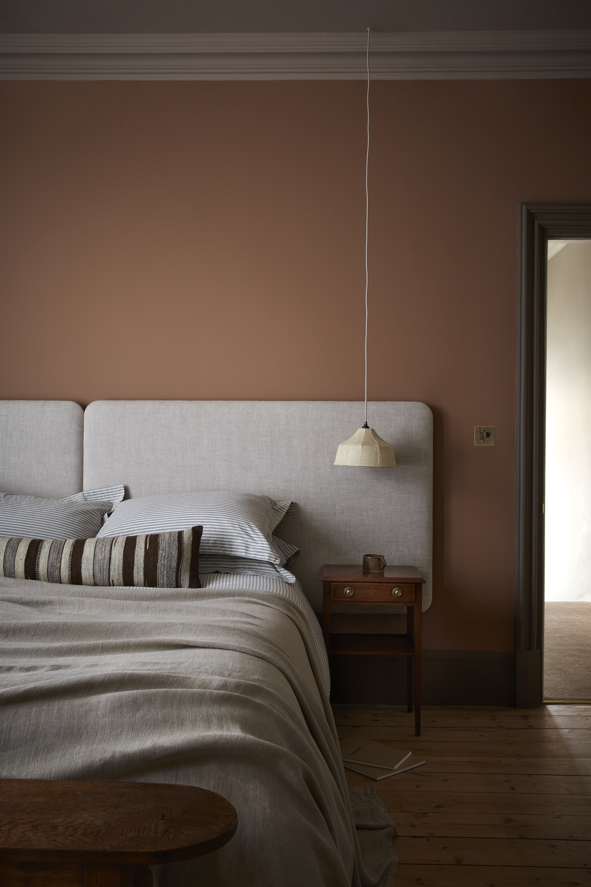
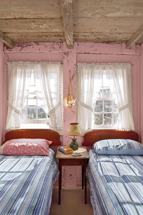
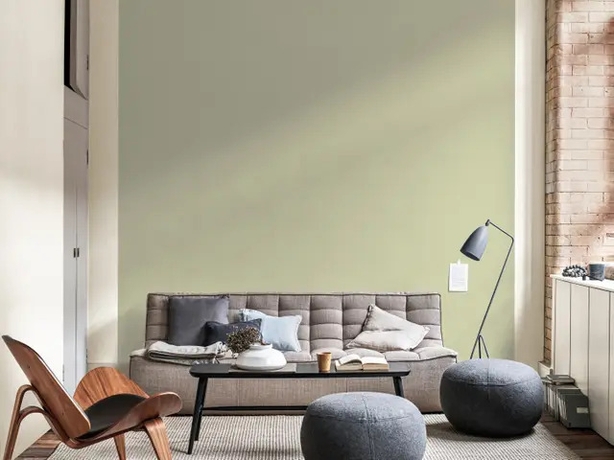
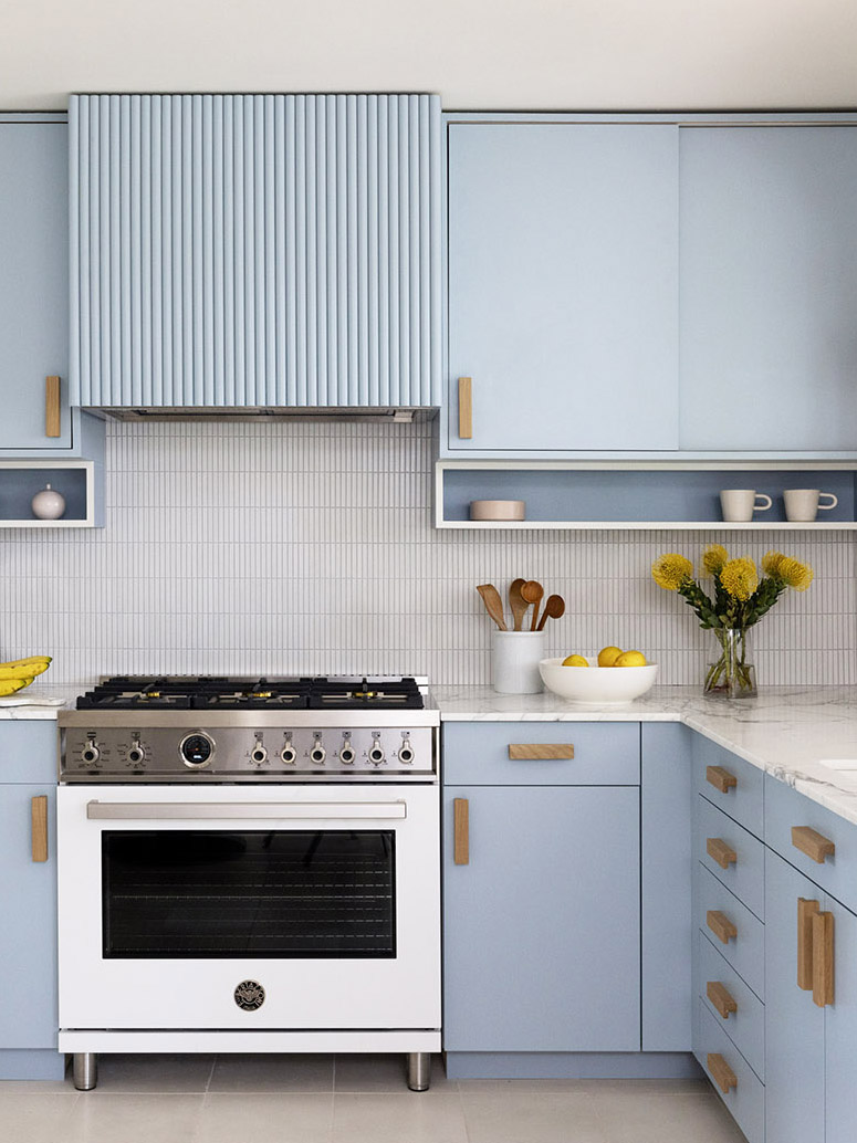
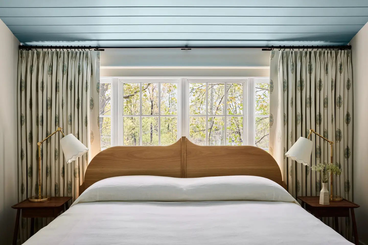
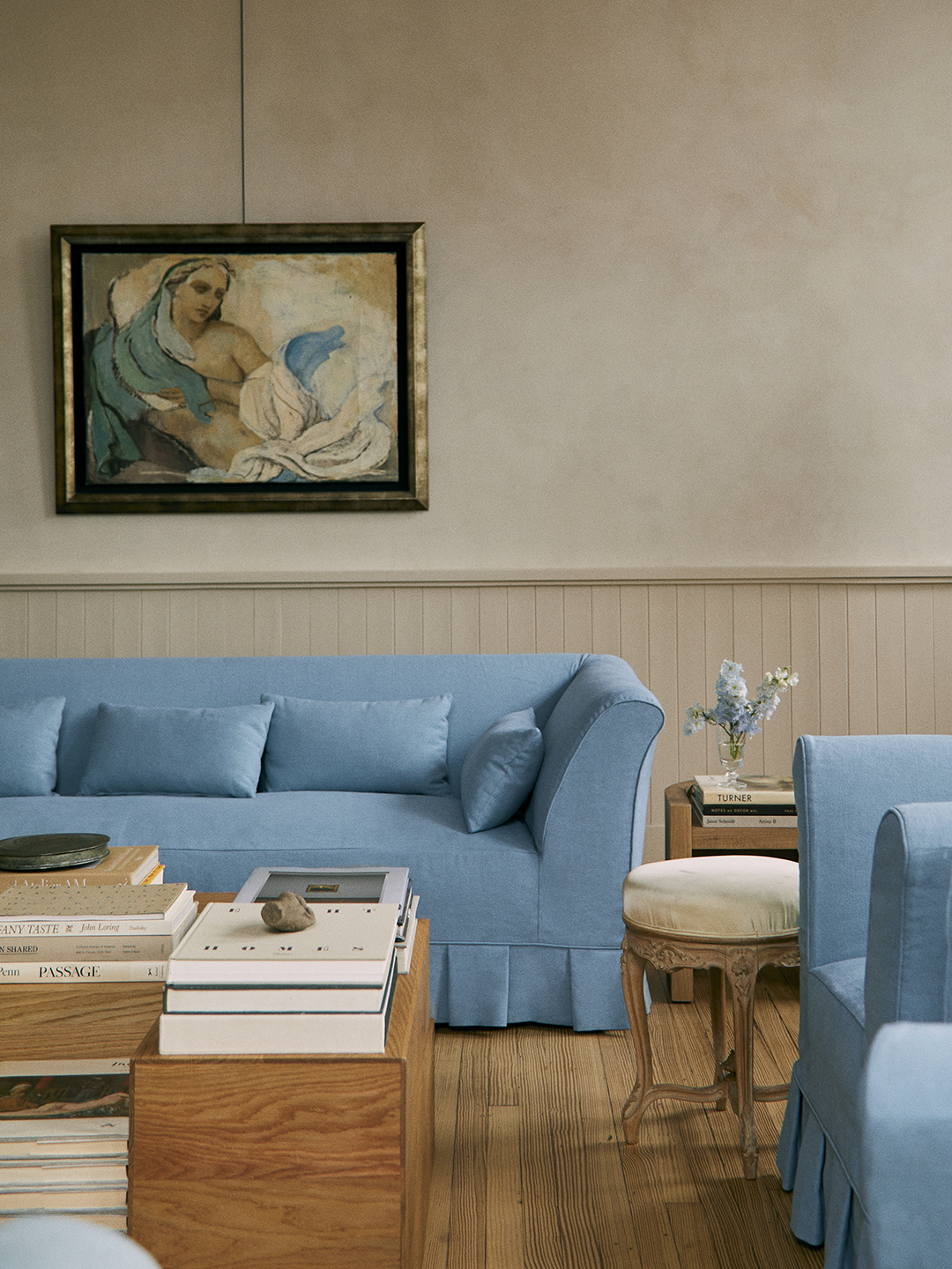
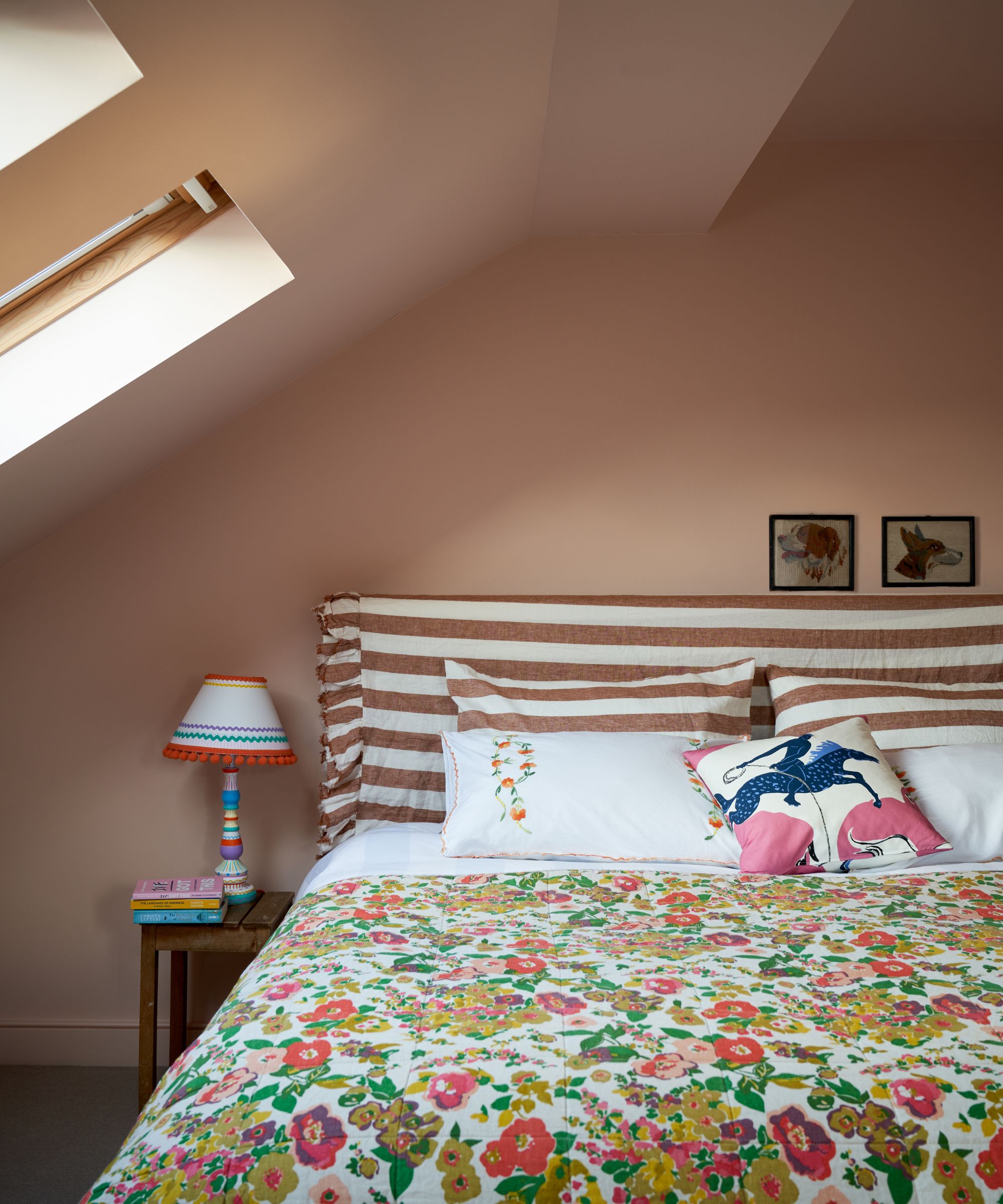
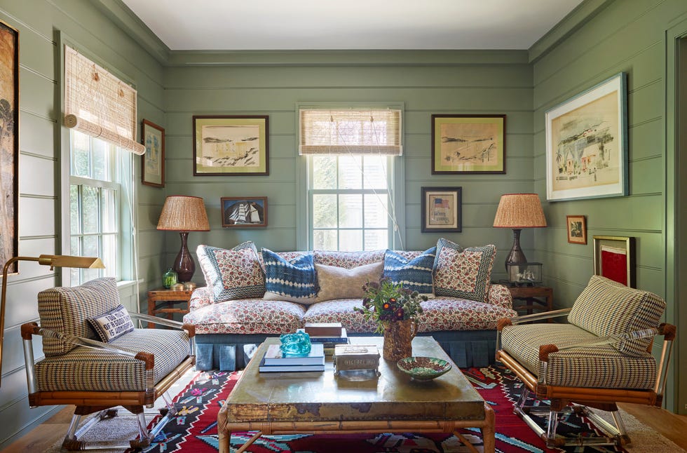
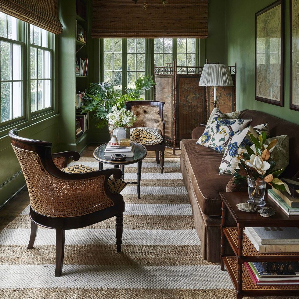
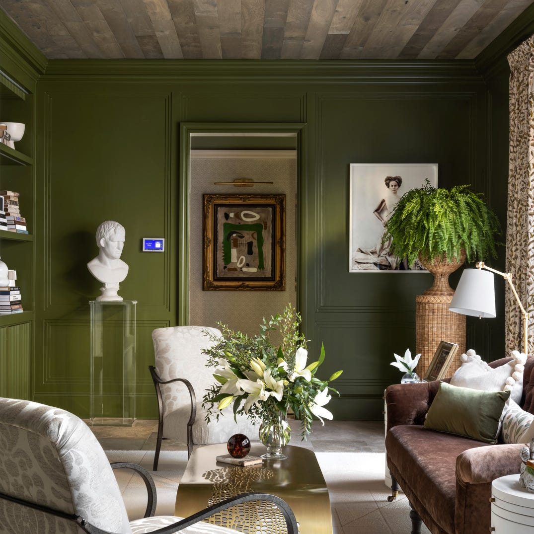
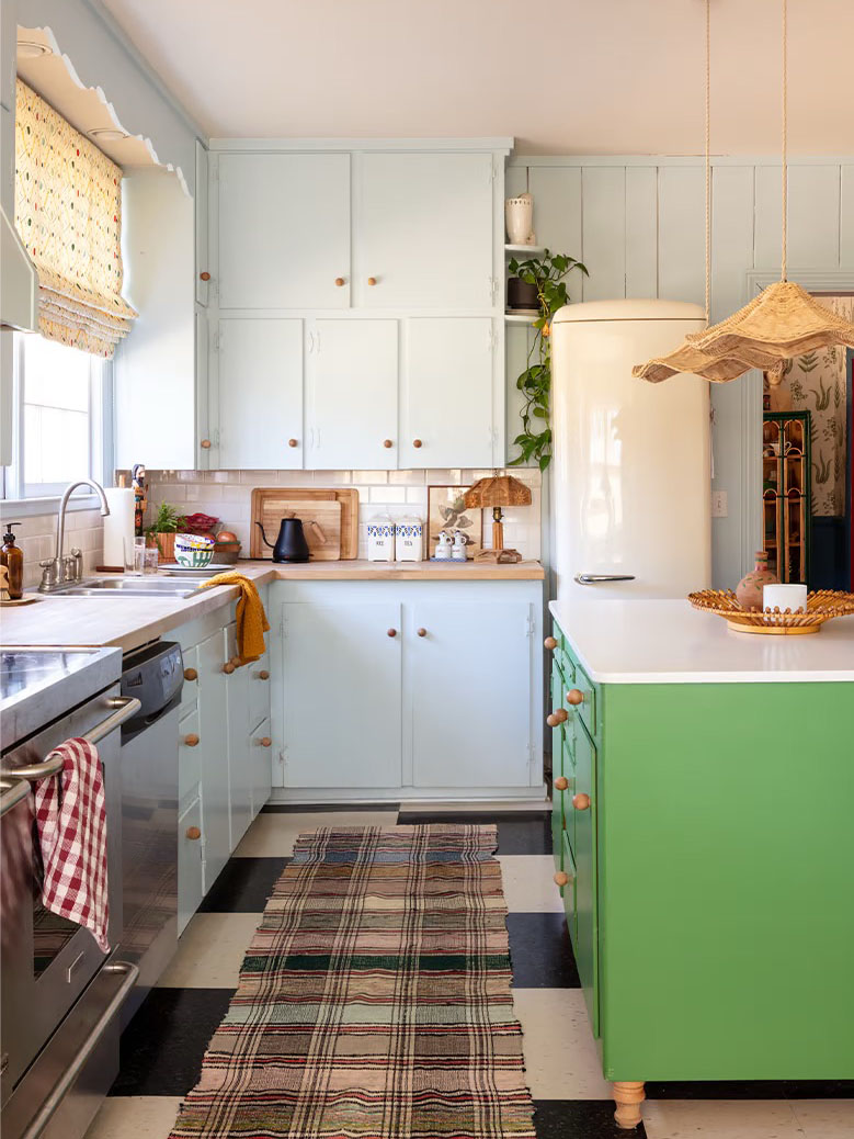
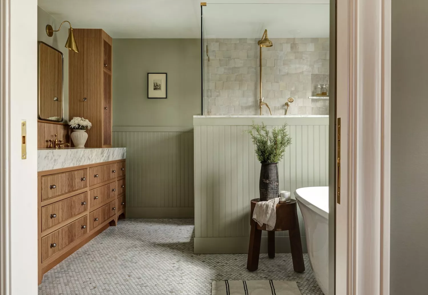
For creating a relaxed ambiance, Bradley recommends earthy green, light blue, warm beige, and soft pink. She refers to Pink 04 as a "shoulder-dropping color" due to its instantly relaxing effect, explaining that lighter shades are more nurturing. Greens are favored for their biophilic qualities, connecting individuals to nature and promoting harmony, while beige offers a non-demanding, inherently calming presence. Light blue, described as the "color of the mind," is believed to soothe a busy brain and is particularly effective in bedrooms for improving sleep. These relaxing colors are ideal for living rooms, encouraging guests to unwind, and greens are also suggested for kitchen cabinets, potentially promoting healthier habits.
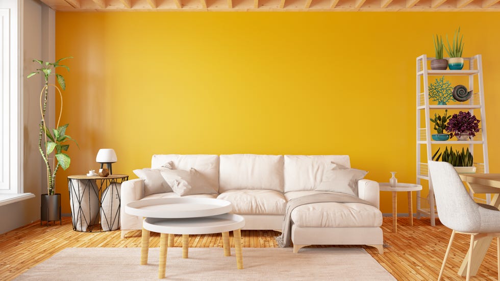
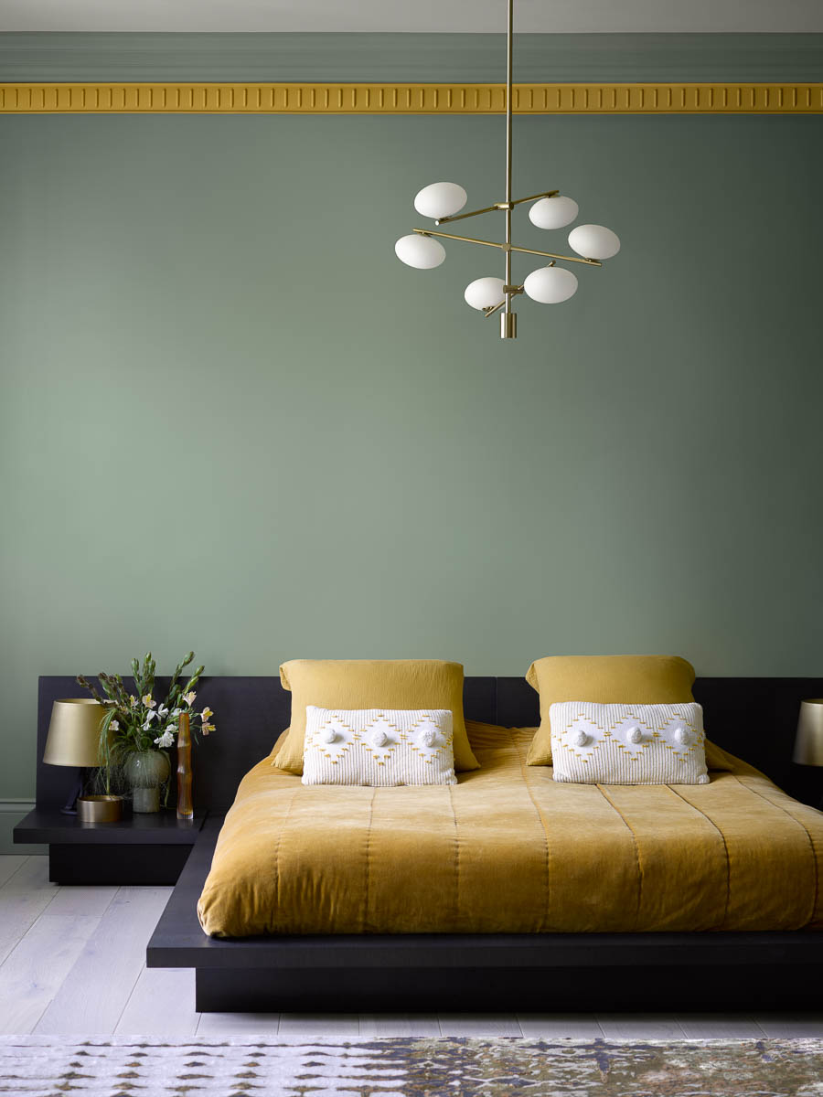
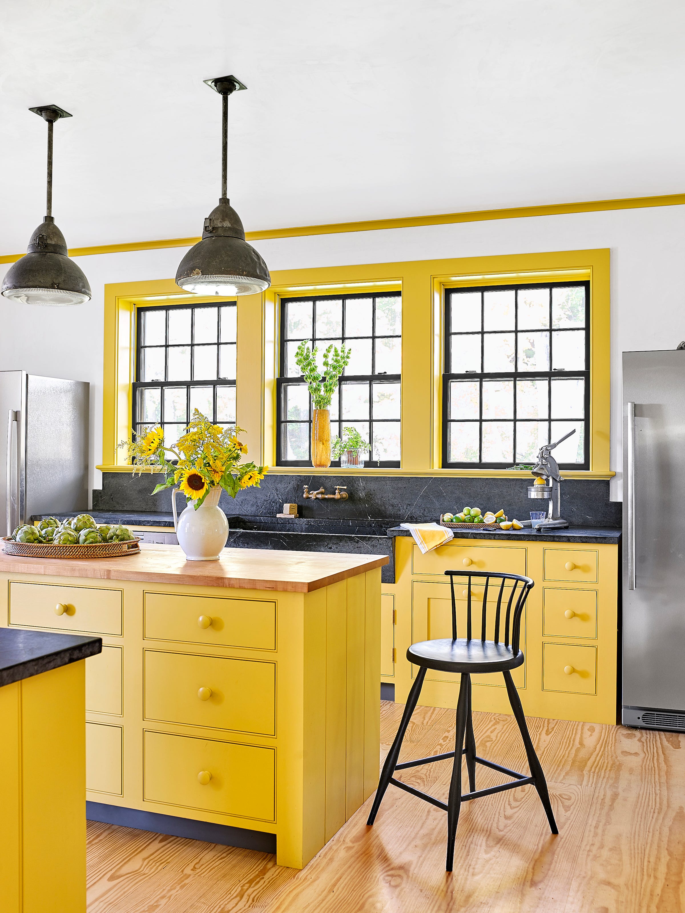
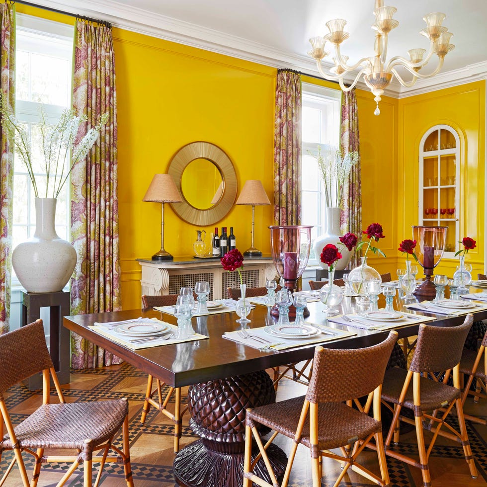
To boost energy, Bradley suggests colors with yellow undertones, such as certain blues and greens, or a pop of pure yellow. These sunny hues are associated with increased self-esteem and optimism. However, she emphasizes that proportion is crucial; using bright, energetic colors in small doses is key, as painting an entire room in a vibrant shade can induce anxiety rather than positive energy. Accent areas like doors, bathrooms, or small furniture pieces are optimal for incorporating these mood-boosting colors, and they can also be applied to outdoor furniture to combine with natural vitamin D.
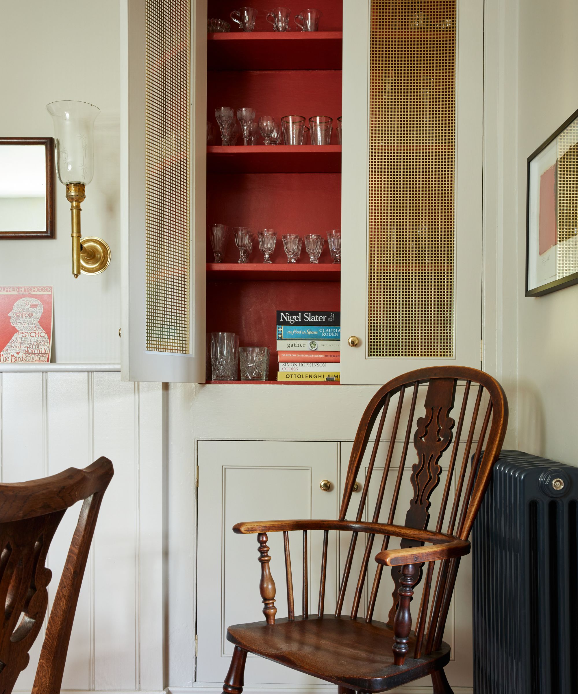
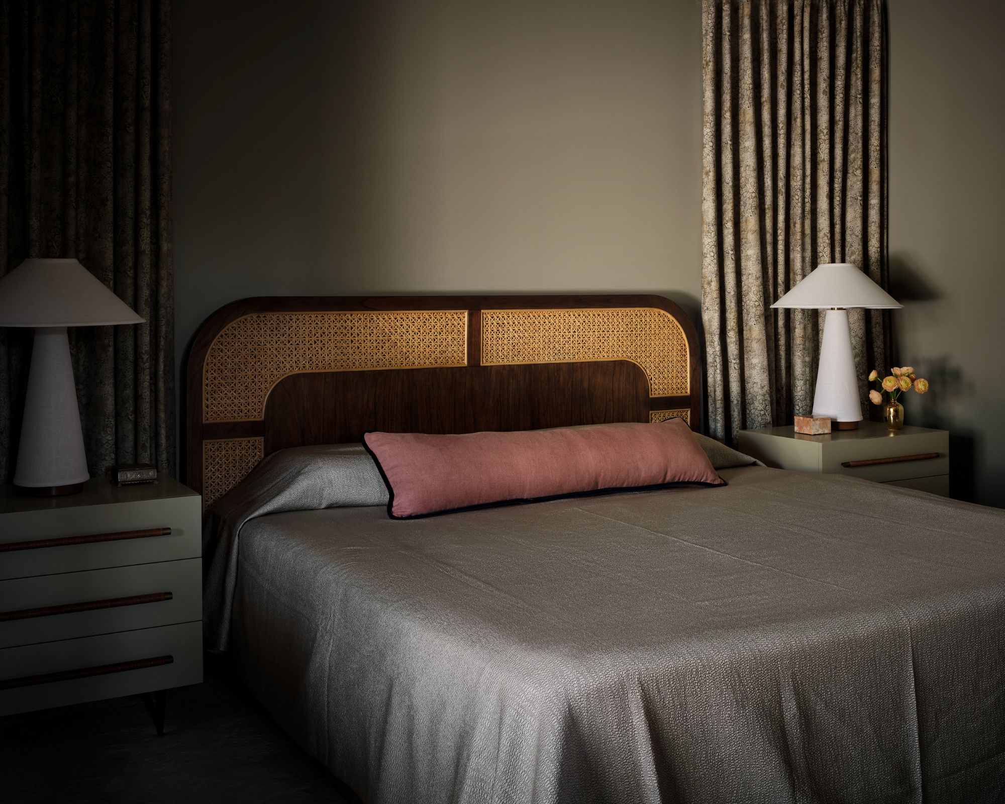
For a cozy feeling, Bradley points to beige, deep green, and earthy pink, which she collectively calls "snuggle-up colors." These shades foster a sense of security and settledness, making them perfect for creating hygge-inspired spaces. Living areas or any room intended for relaxation, such as watching a movie, are suitable for these colors.
Dark shades of blue are recommended for enhancing focus. Contrary to the common belief that dark blue promotes sleep, Bradley states that deeper blues actually encourage a thinking mind to stay concentrated, radiating serenity, security, and order. These colors are well-suited for home offices or quiet nooks dedicated to reflective activities like reading or writing.
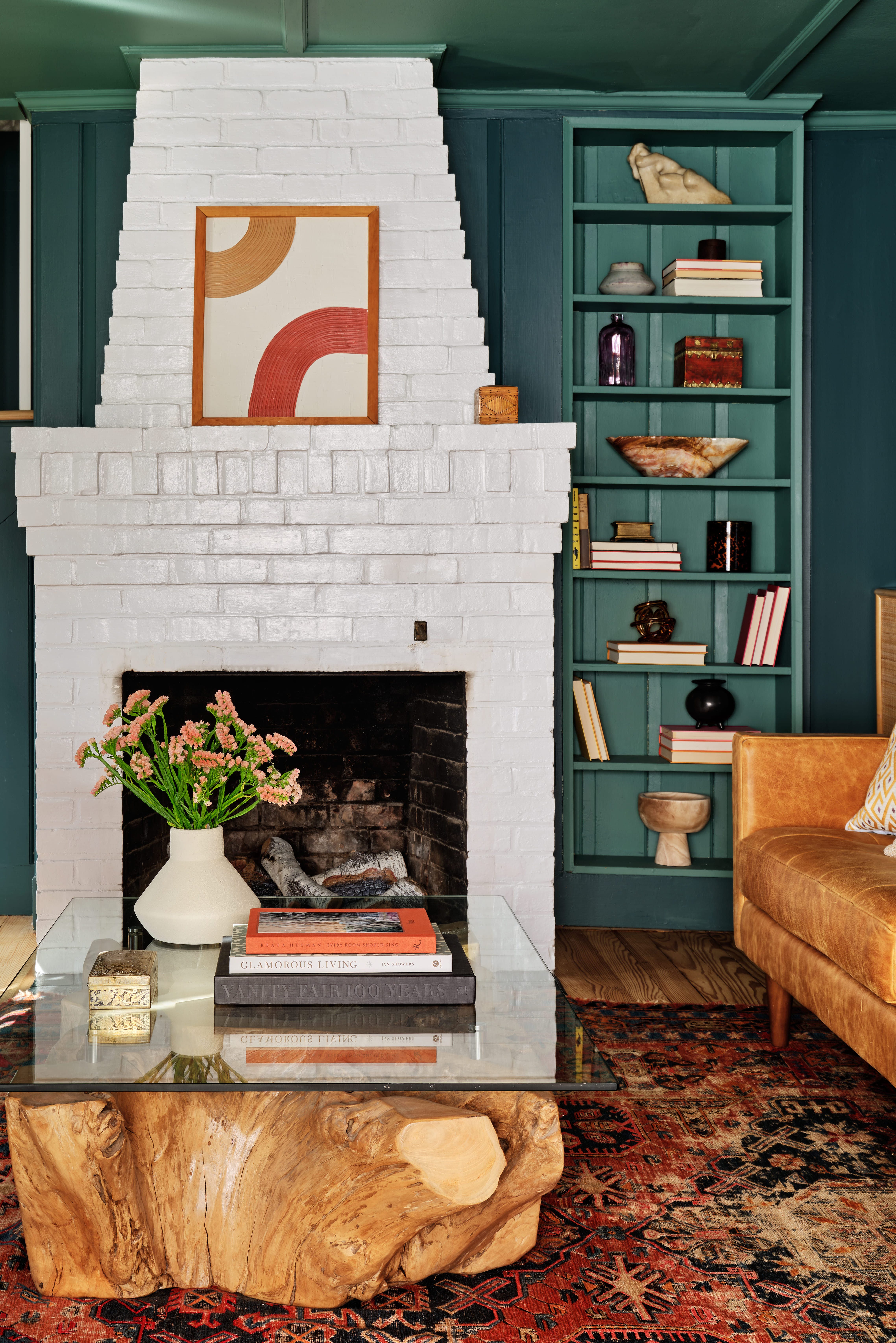
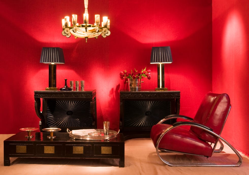
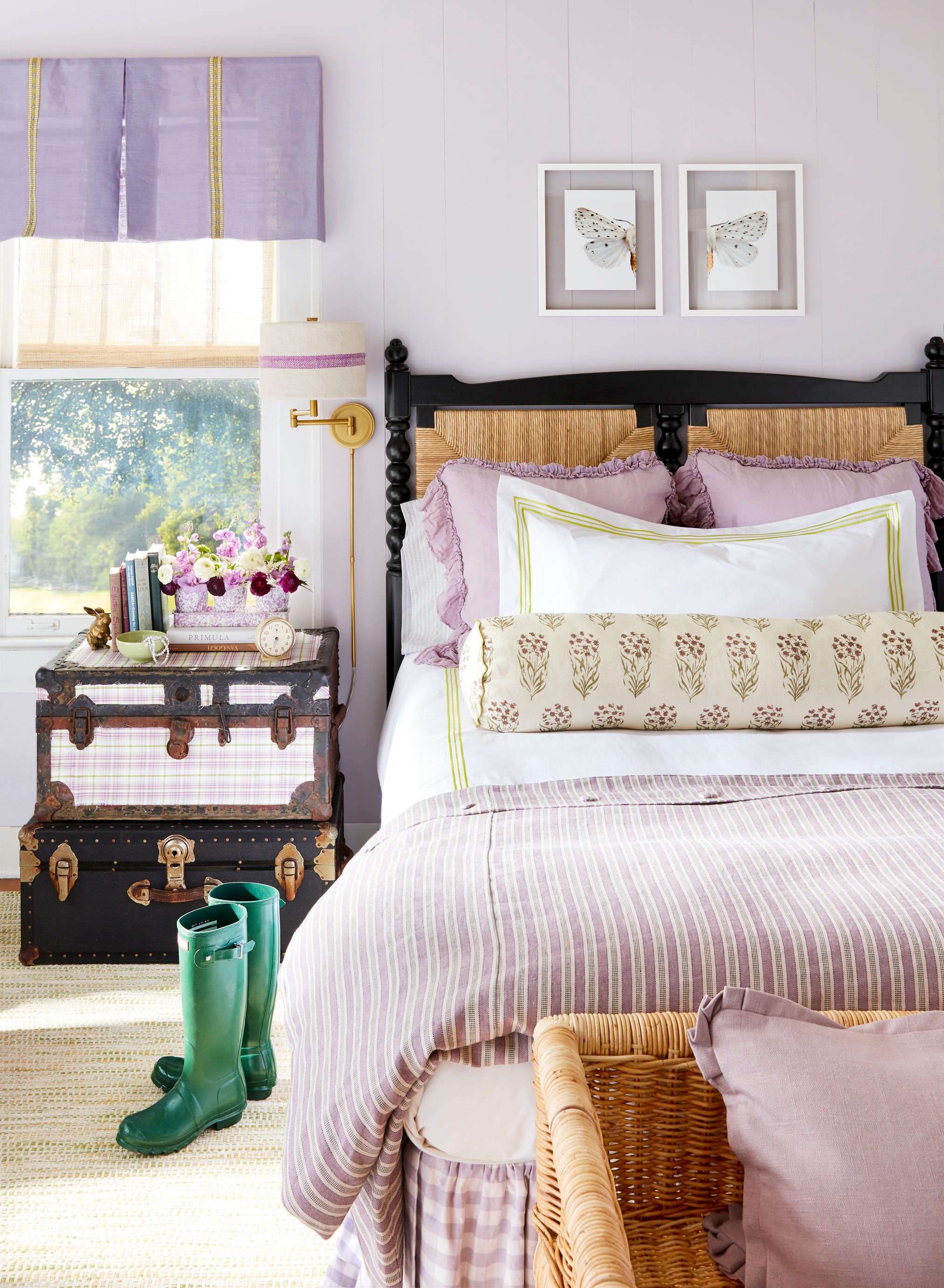
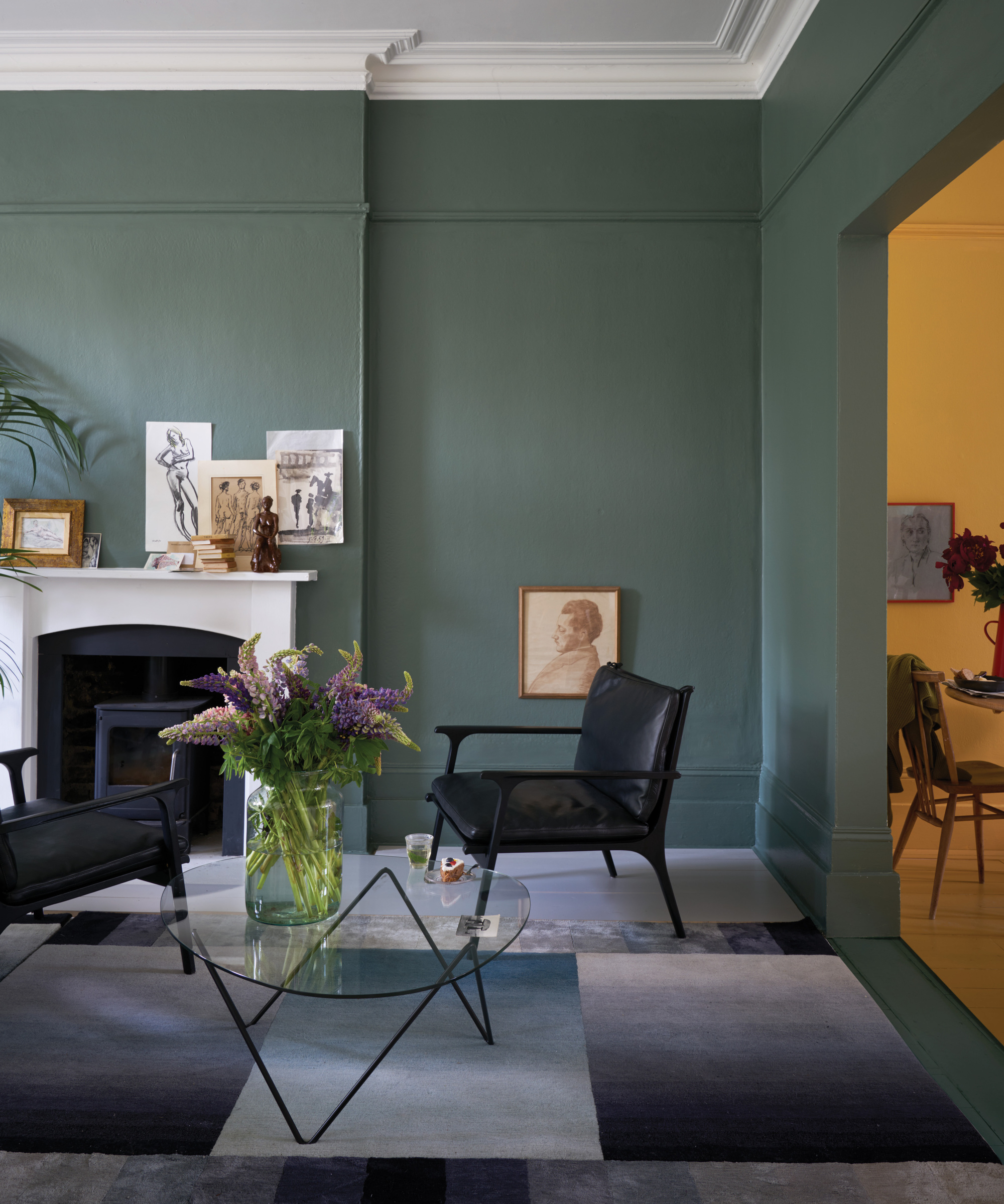
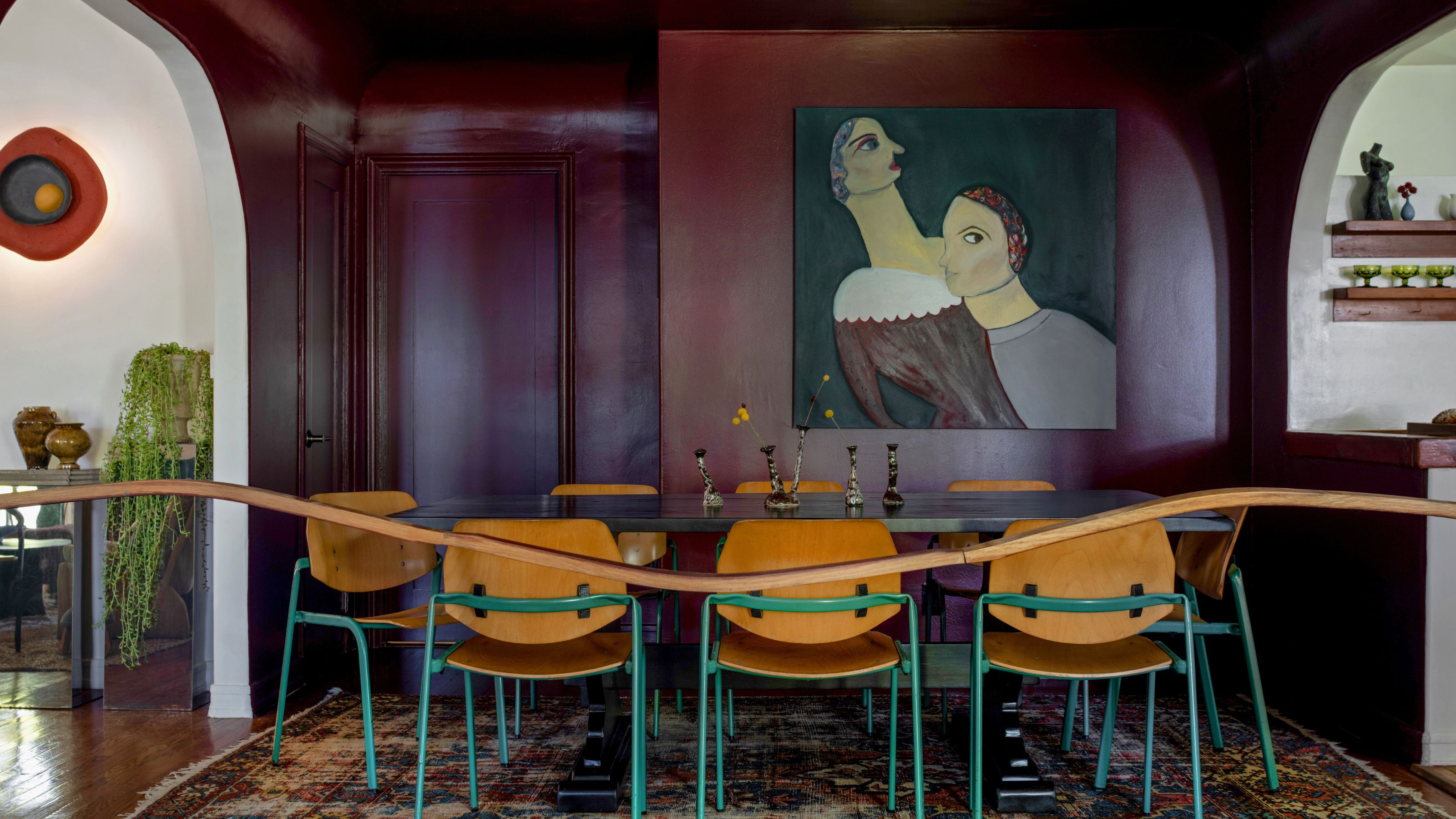
Finally, for a dramatic and moody aesthetic, Bradley suggests deep purple, teal, and red. These rich pigments create a striking contrast with adjacent spaces, making the surrounding areas appear brighter and more illuminated. For maximum impact, she advises applying these colors to an entire room, from floorboards to the ceiling, to avoid stark contrasts. Alternatively, they can be used in bathrooms or transitional spaces to enhance the brightness and inviting nature of neighboring rooms.
#ColorPsychology #InteriorDesign #PaintColors #HomeDecor #MoodEnhancement #RelaxingColors #EnergeticColors #CozySpaces #FocusedEnvironment #ColorPsychology #InteriorDesign #PaintColors #HomeDecor #MoodEnhancement #RelaxingColors #EnergeticColors #CozySpaces #FocusedEnvironment
0 comment in total
 No comments yet
You may also like
20 Calming Paint Colors That Will Change the Way You Live

Interior Designers Say the Key to Creating a Joyful Space Is to Add in This One Color

Designer Justina Blakeney Says This Paint Color Flatters Everyone and Is Perfect for Drenching Rooms
11 Calming Bedroom Paint Colors to Help You Relax and Wind Down at the End of the Day

Designers Declare This Color the Ultimate "Chill-Pill" for Your Home

These Paint Colors Bring Hostility to Your Home, According to Experts
What paint colors to use to create a relaxed vibe at home

From Cabinetry to Upholstery, This Soothing Color Is About to Upstage Sage
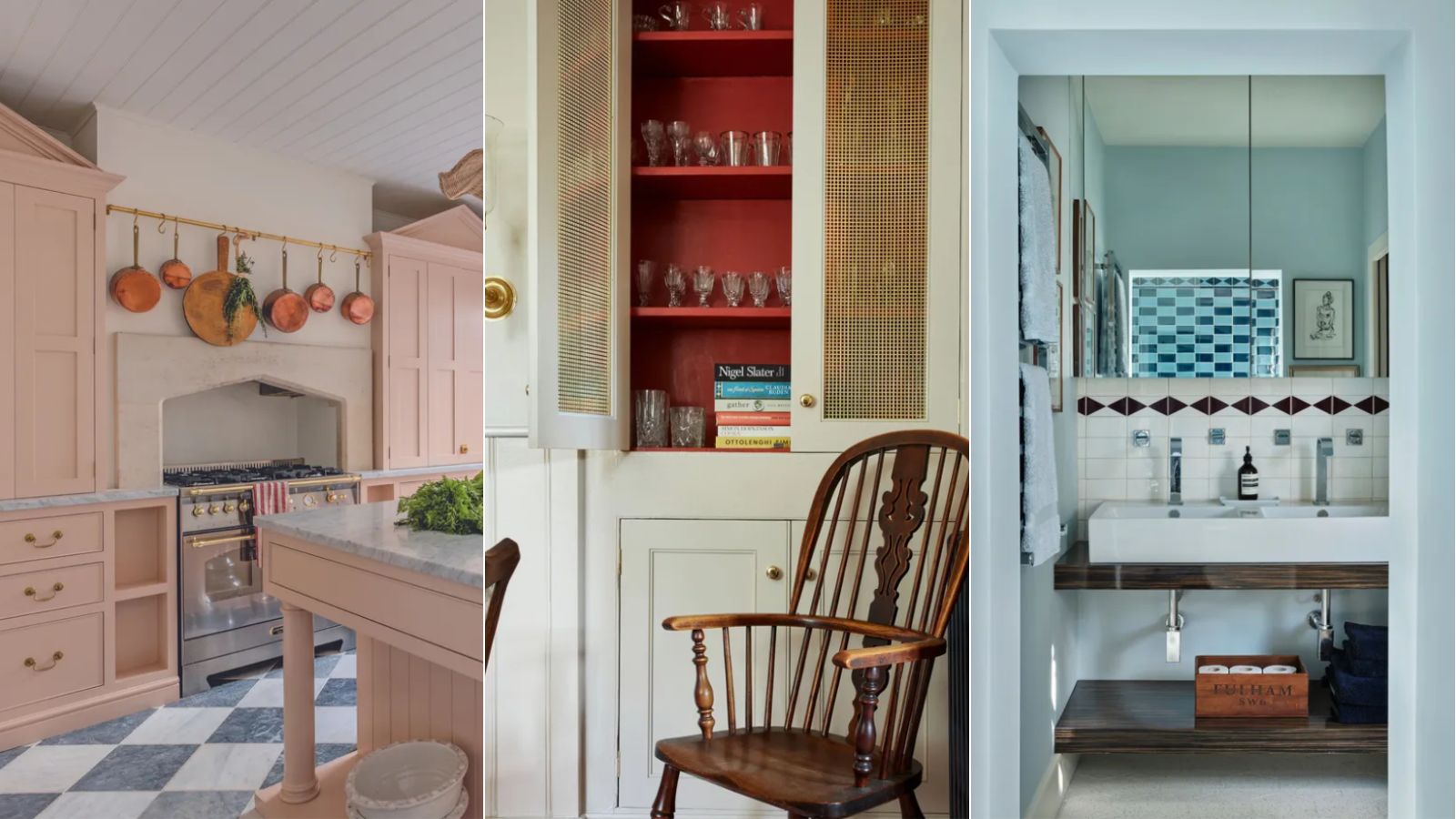
A color psychologist says these color schemes are the most likely to boost your mood

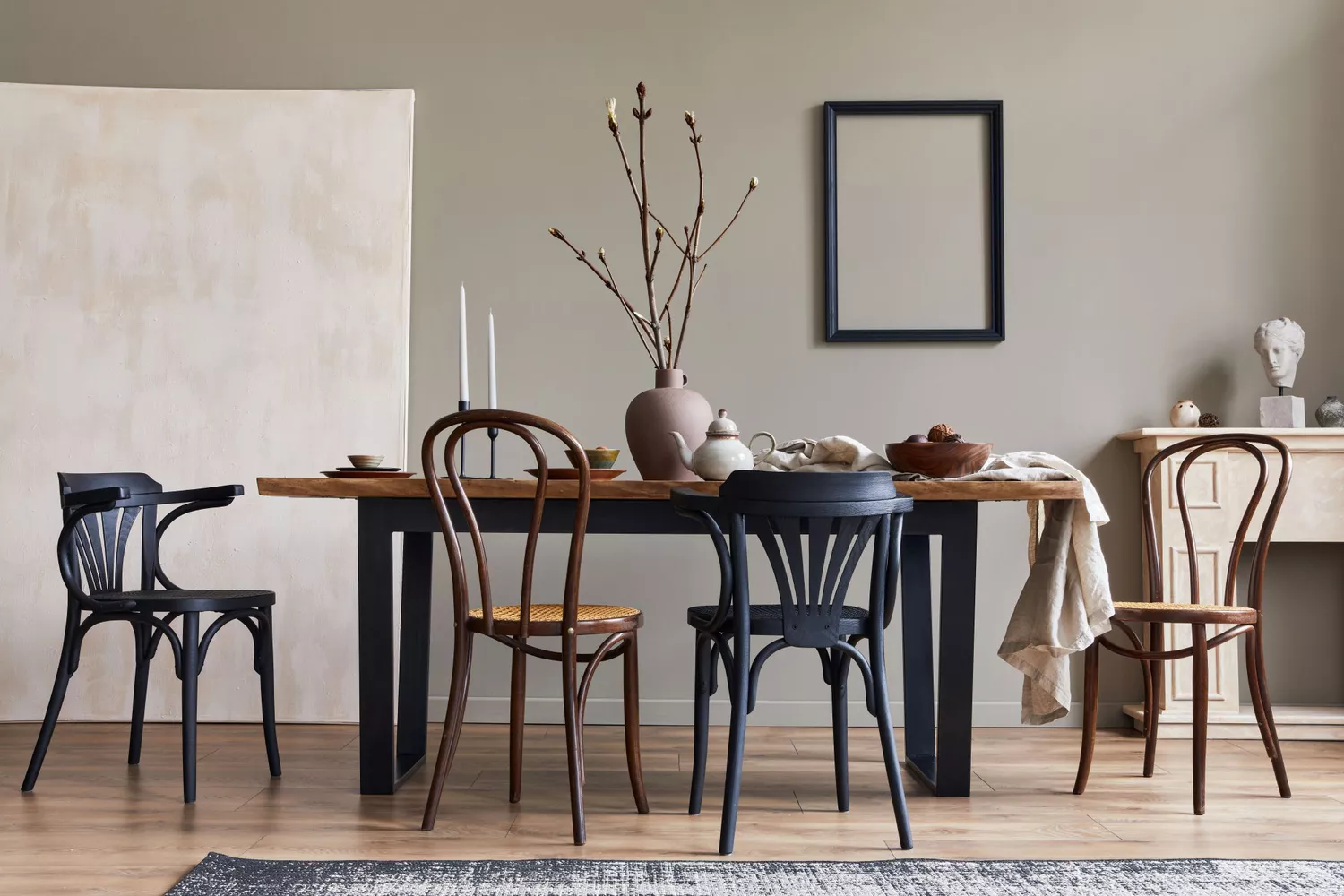
8 Paint Colors That Promote Wellness at Home

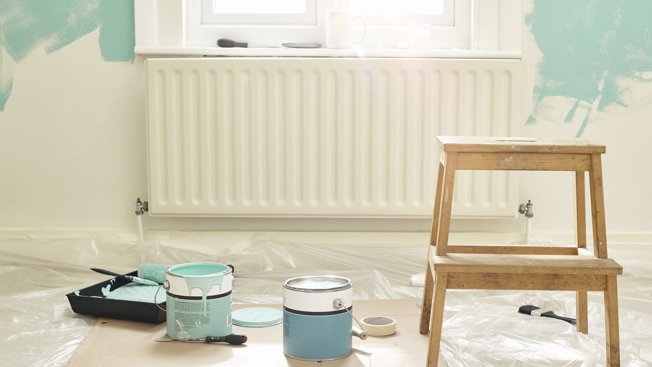
Add These Happy Colors to Your Home and Boost Your Mood
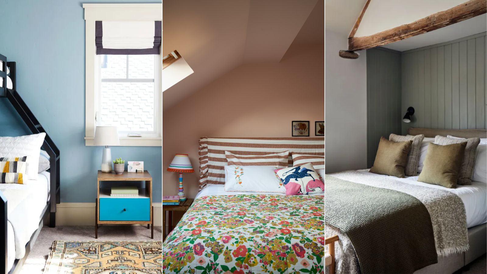
5 colors that will make your bedroom feel calmer, according to designers
Designers Agree: These Are the Most Relaxing Paint Colors for Any Room

13 Calming Paint Colors Designers Use to Make Rooms Feel Soothing — And No, They're Not All Neutrals

How paint colour in your home can affect your mood
How Your Home's Paint Colors Can Make You Happier, According to Experts

Tips on Calming Colors Schemes From a Workout Guru

5 Paint Colors That Will Help You Sleep Better if You Use Them in Your Bedroom
5 Cozy Paint Colors Interior Designers Use to Warm Up Cool Rooms and Create "Snug" Spaces

5 Living Room Paint Color Trends for When You're Craving a New Look