8 Paint Colors That Promote Wellness at Home
The selection of paint colors for a home significantly influences the mood and overall well-being of its occupants. Beyond aesthetic considerations, the psychological impact of color plays a crucial role in creating a calming and stress-reducing environment. Certain hues are known to foster feelings of peace, happiness, and tranquility, making them ideal choices for interior spaces aimed at promoting wellness. This guide explores eight specific paint colors and their associated benefits, offering insights from color marketing experts and certified color therapists.
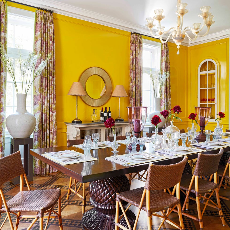
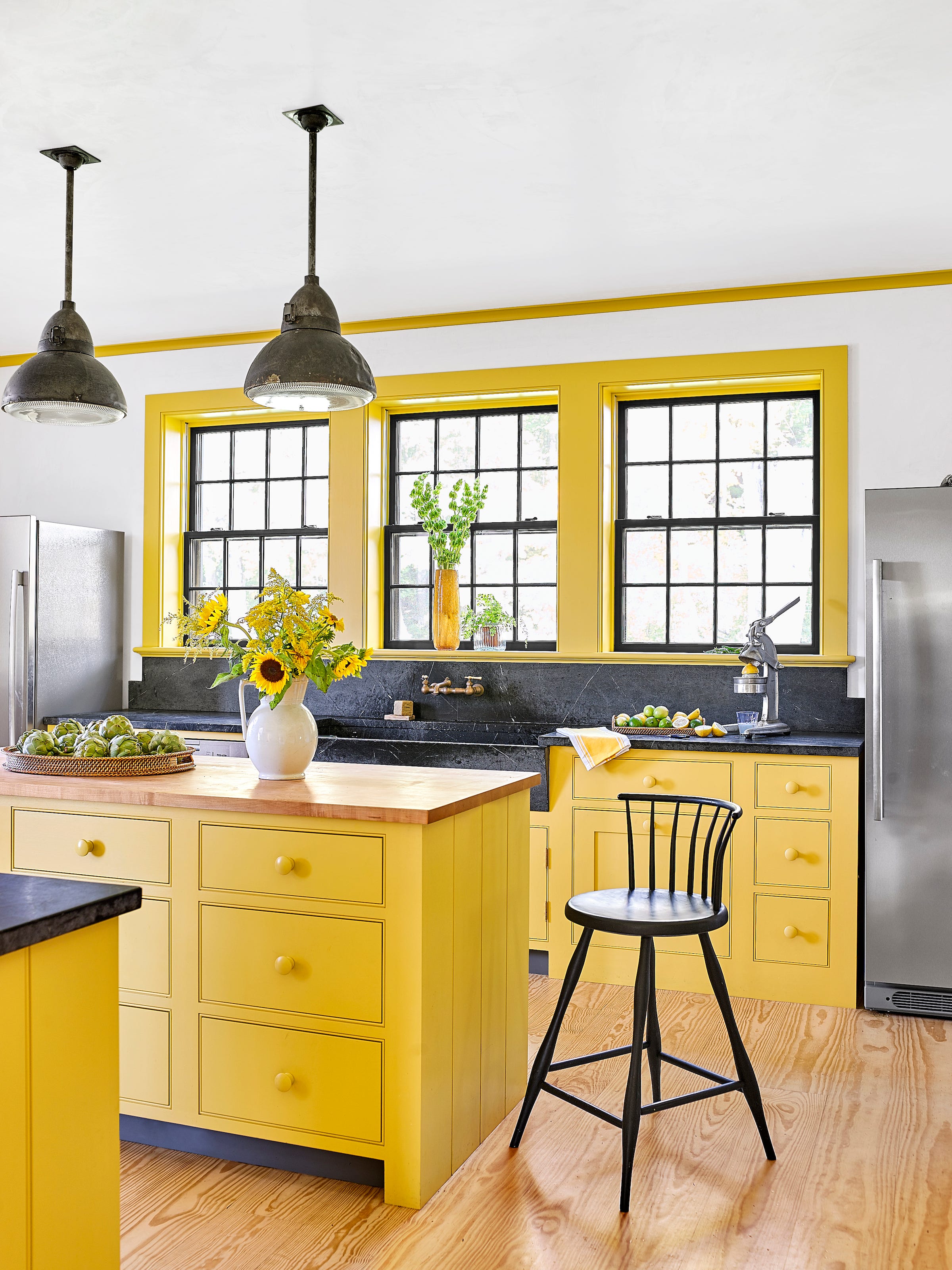
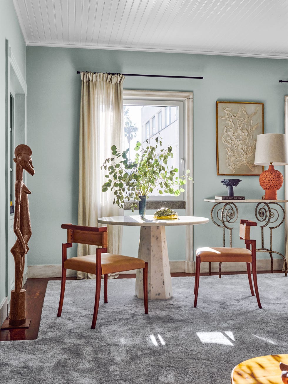
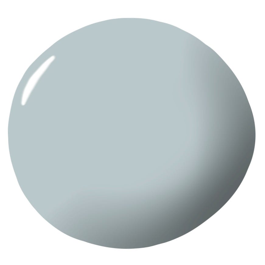
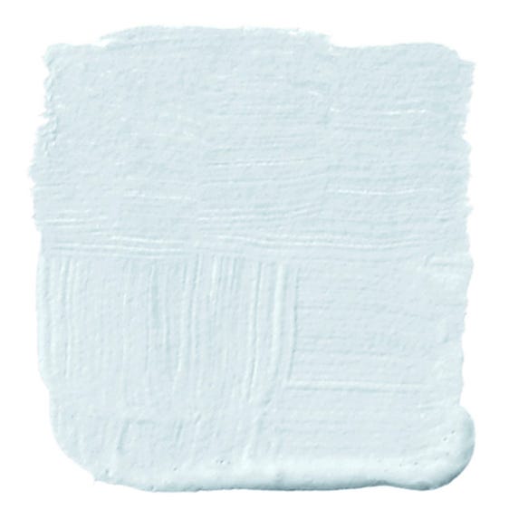
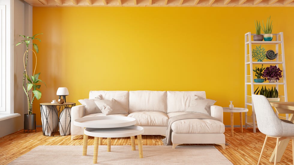
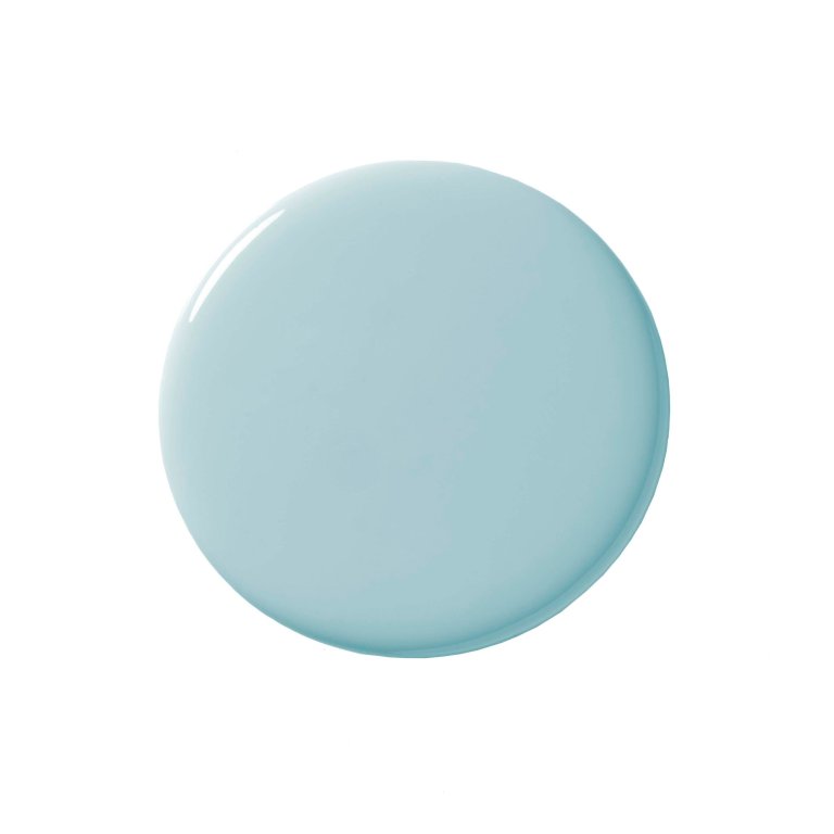
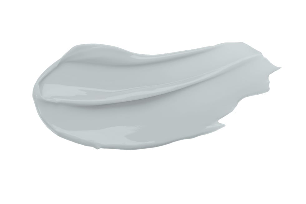
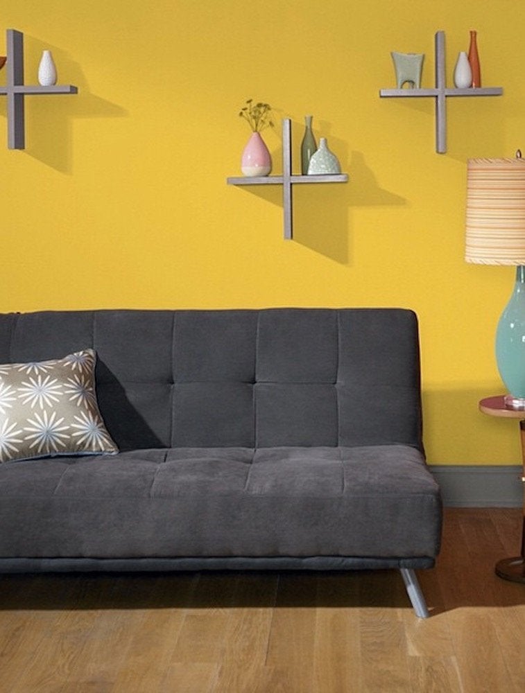
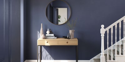
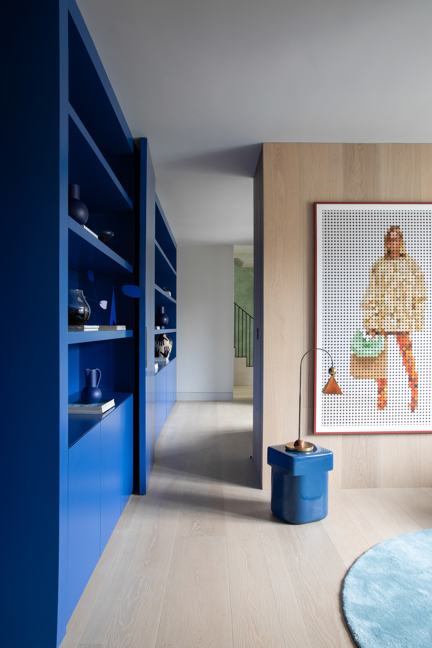
Pale, sunny yellows are recommended for their uplifting and happy connotations. It is important to choose soft, muted shades of yellow to convey warmth and calm, as overly bright yellows can be too energetic for spaces intended for relaxation. Soft blues, reminiscent of nature, are highly effective in promoting balance and serenity. These biophilic hues are commonly used in bedrooms, bathrooms, spas, and other wellness areas due to their association with peace and truth.
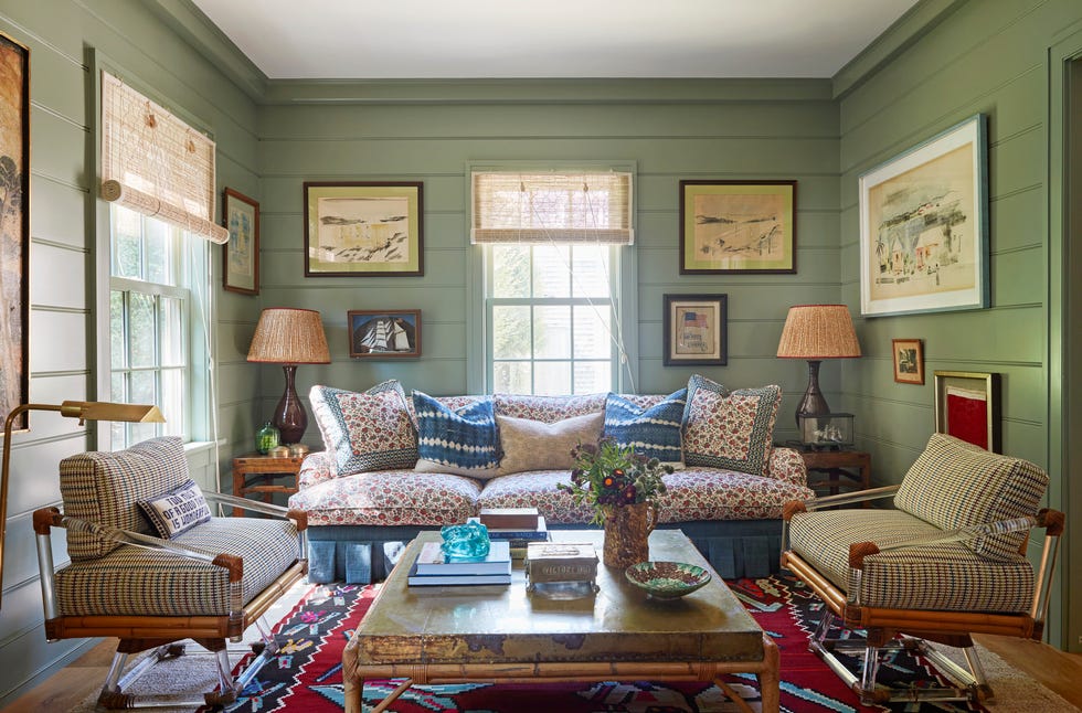
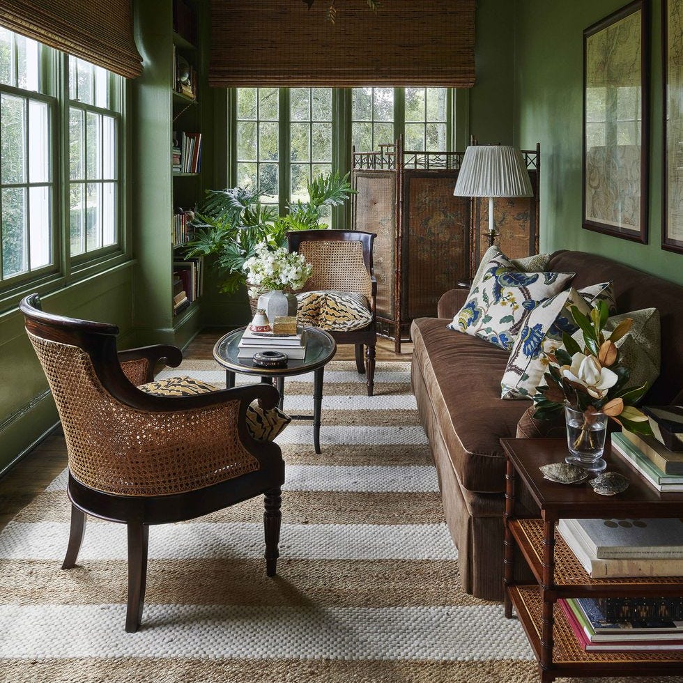
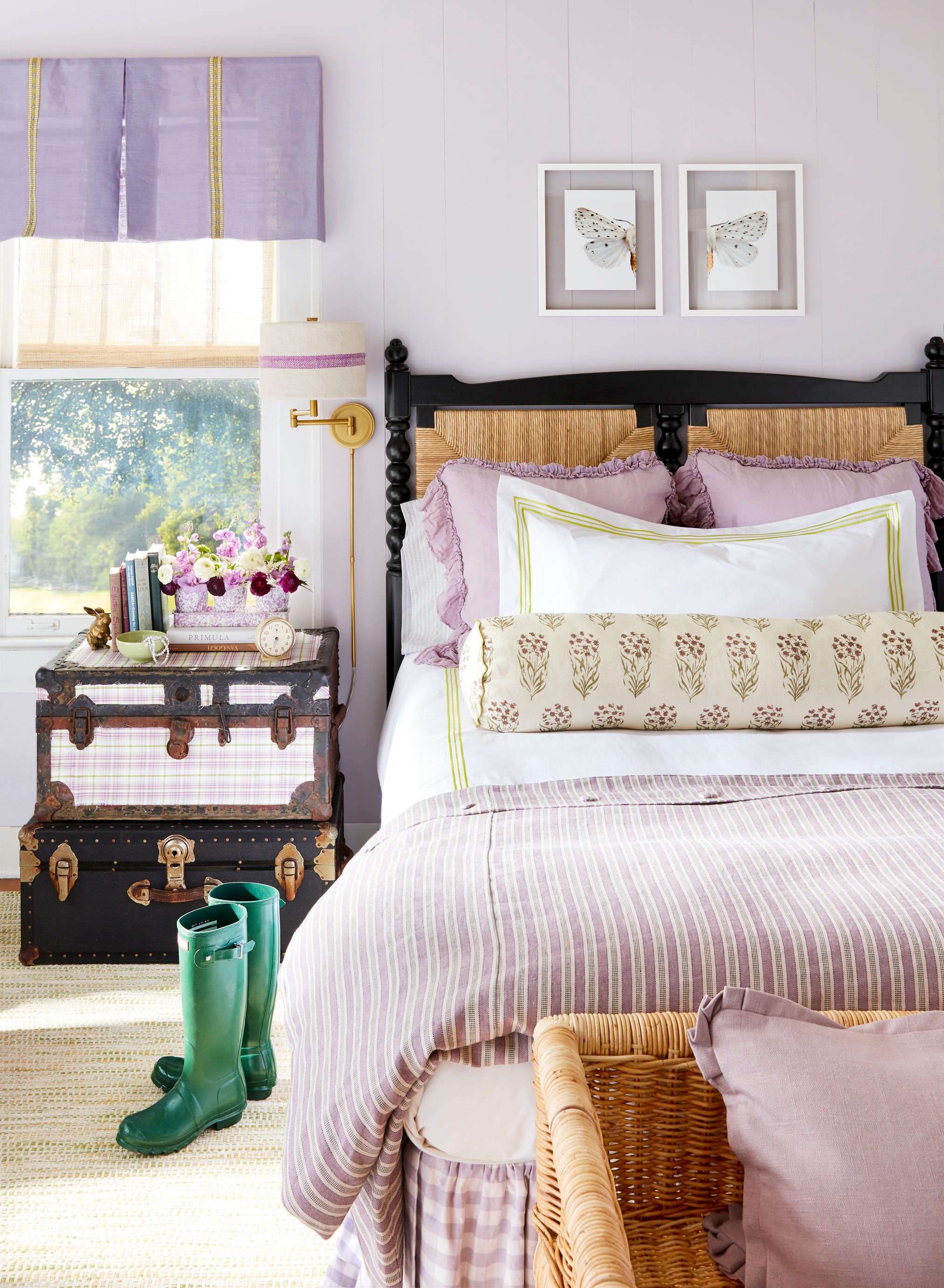
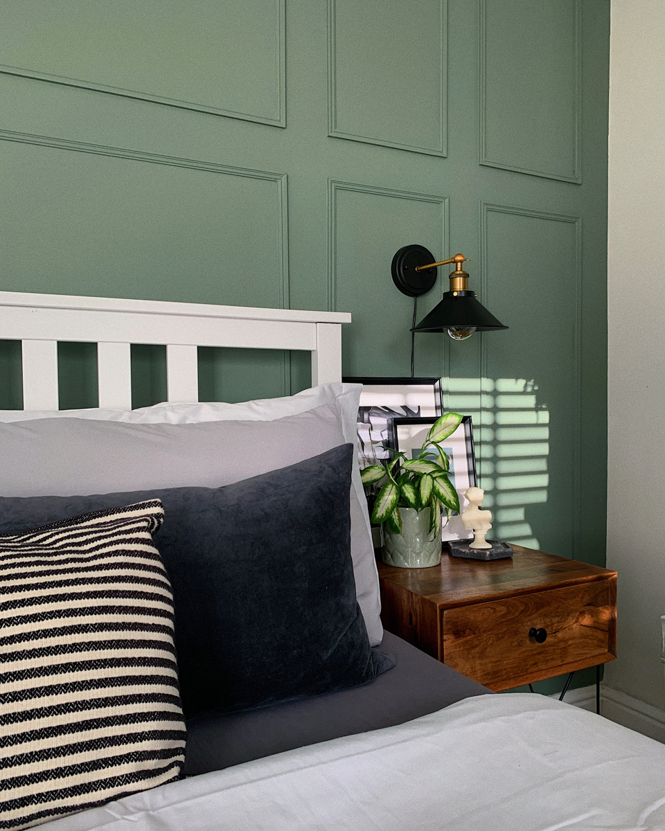
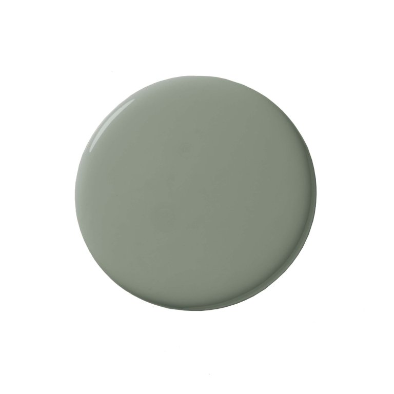
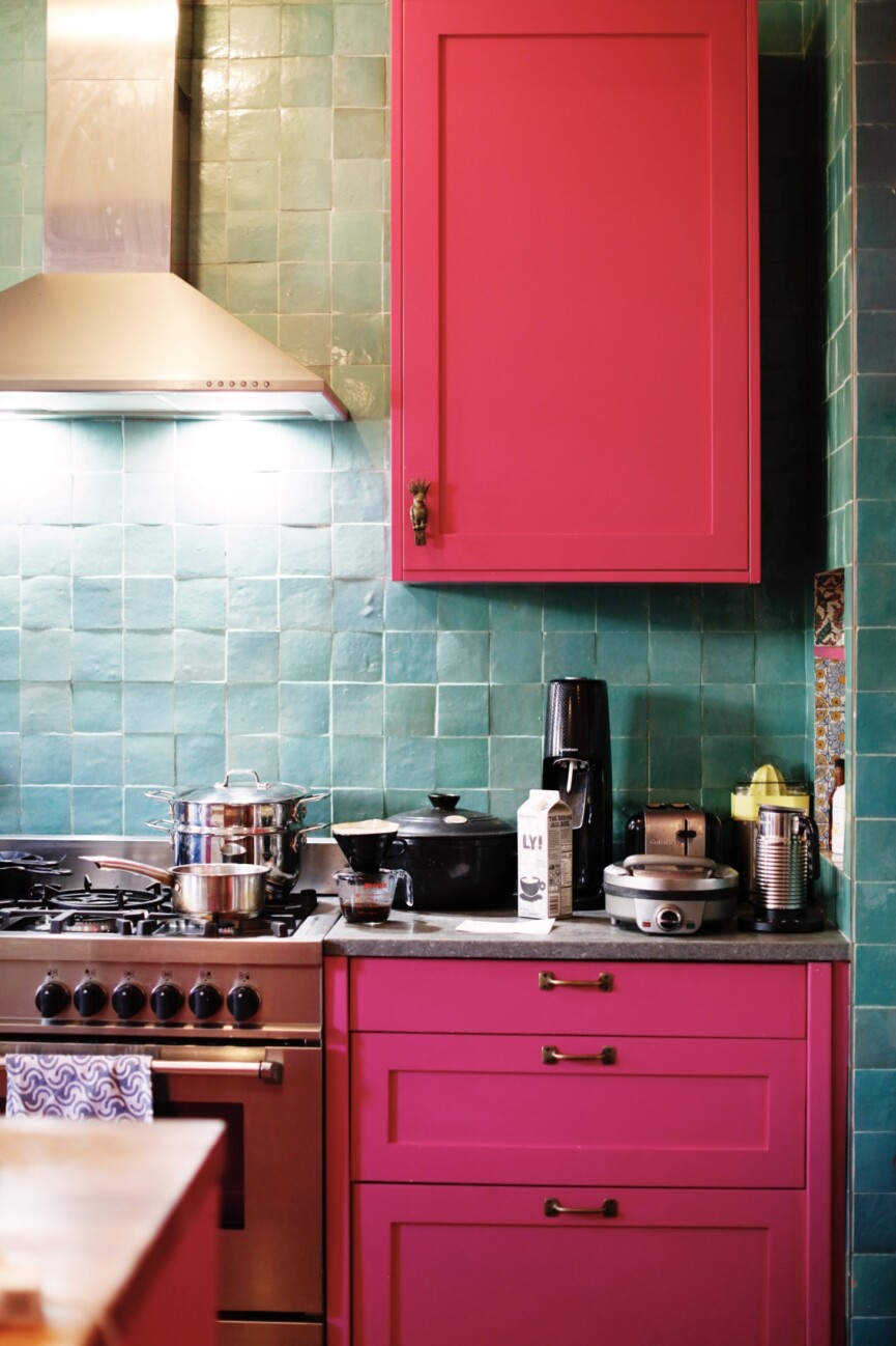
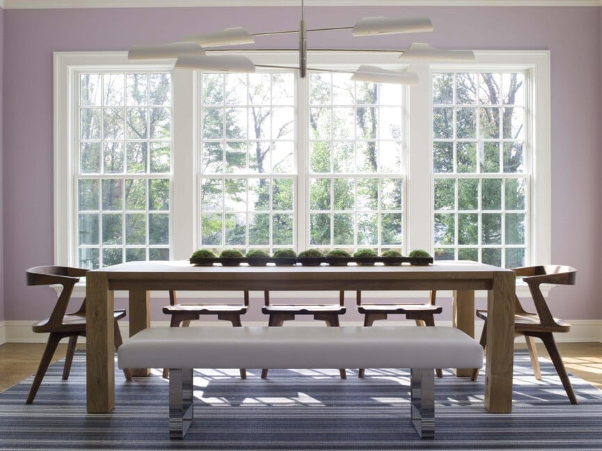
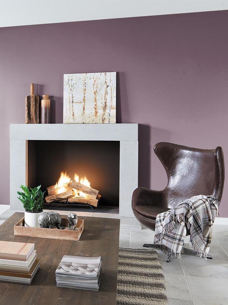
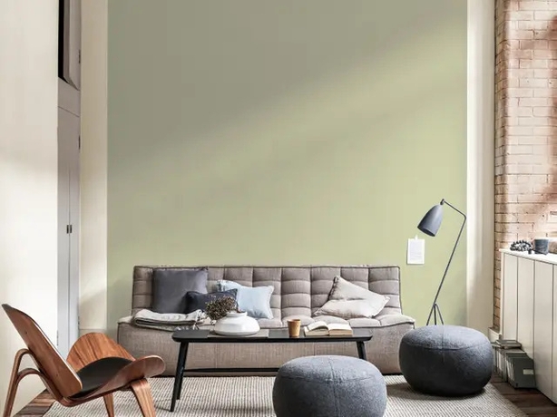
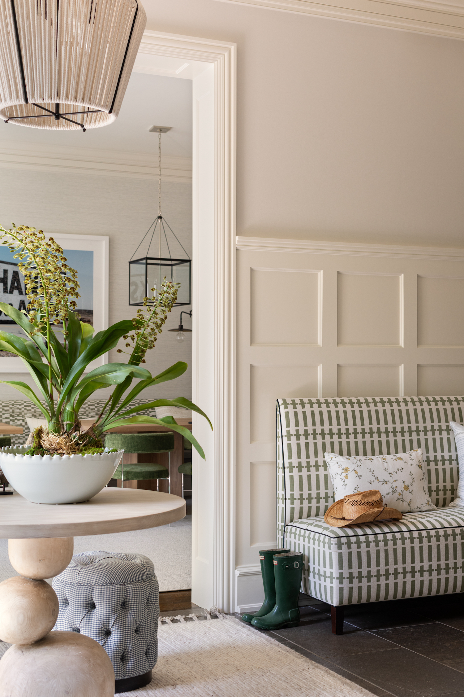
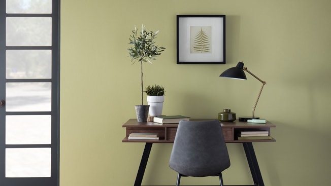
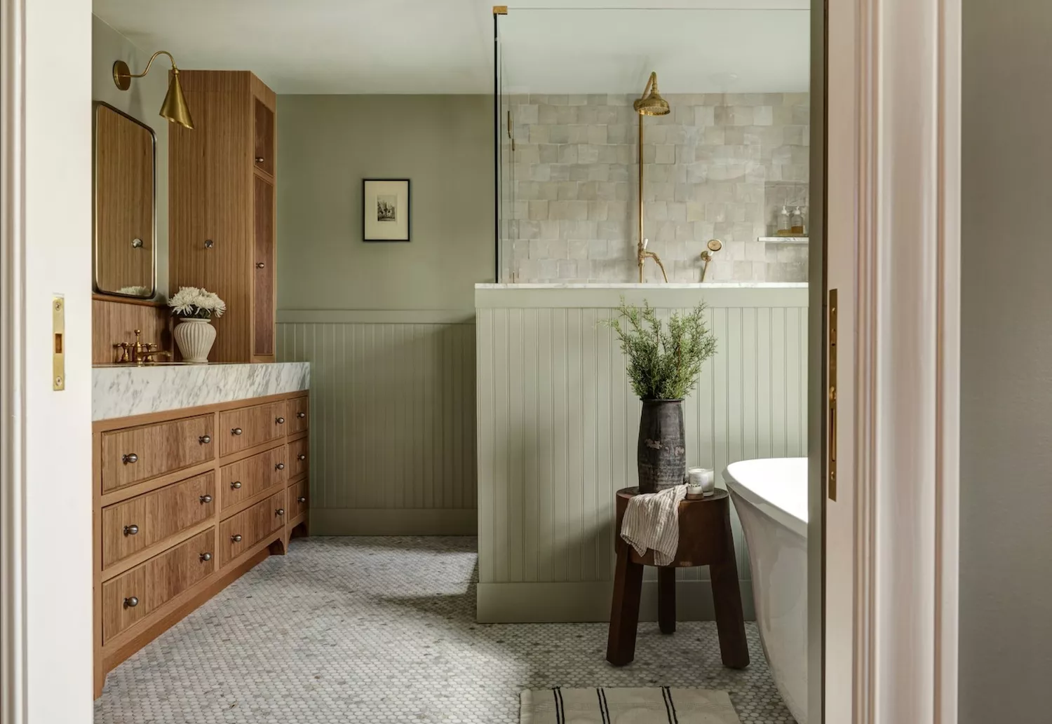
For environments where focus and introspection are desired, lavender or lilac purples are suggested. These pastel variations of purple are linked to wisdom, spirituality, and transformation. However, intense shades like eggplant or royal purple should be avoided, as they can induce negative or fearful emotions. Mint or sage greens, much like blues, draw from nature to evoke feelings of harmony, healing, regeneration, and love. Soft greens such as honey dew, sage, or celery are versatile and suitable for various rooms within the home.
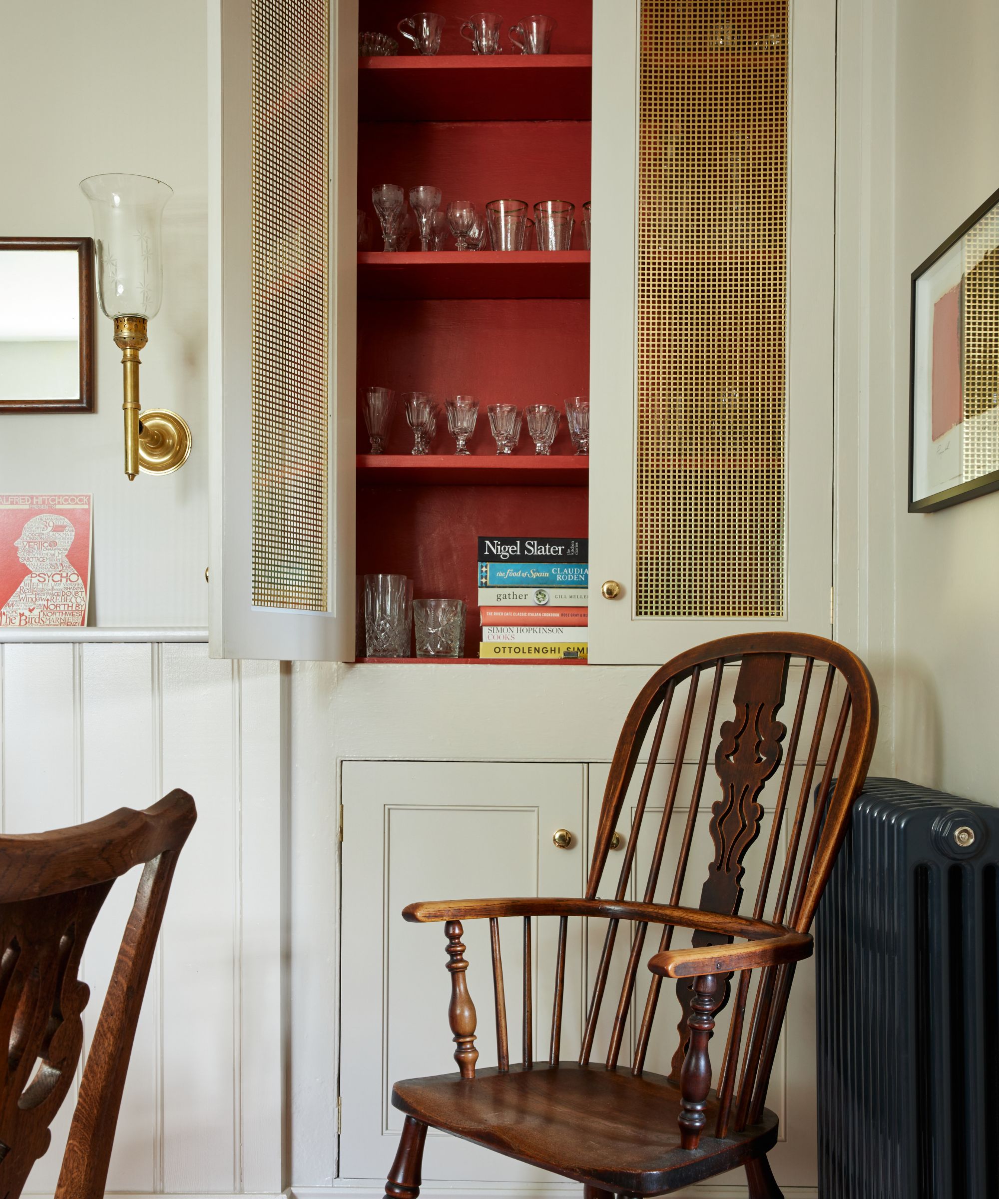
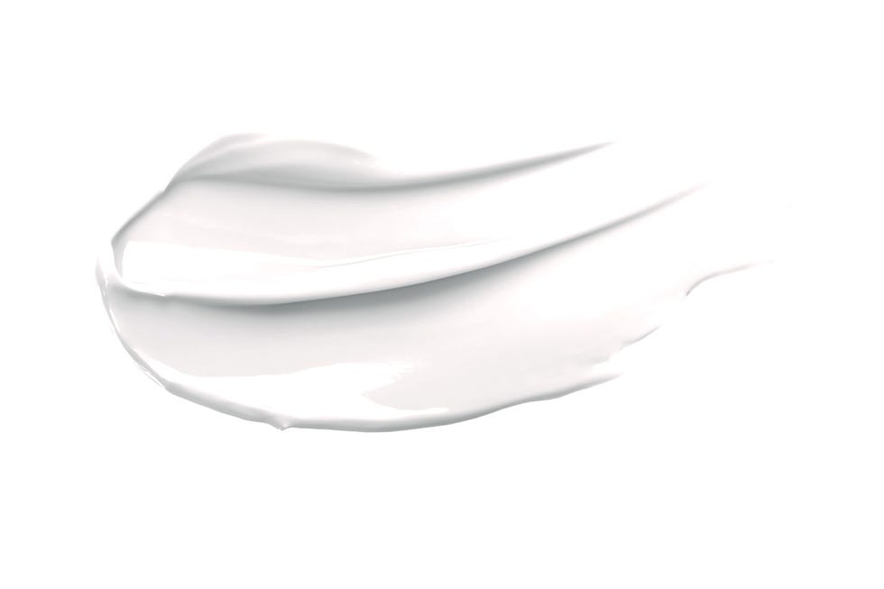
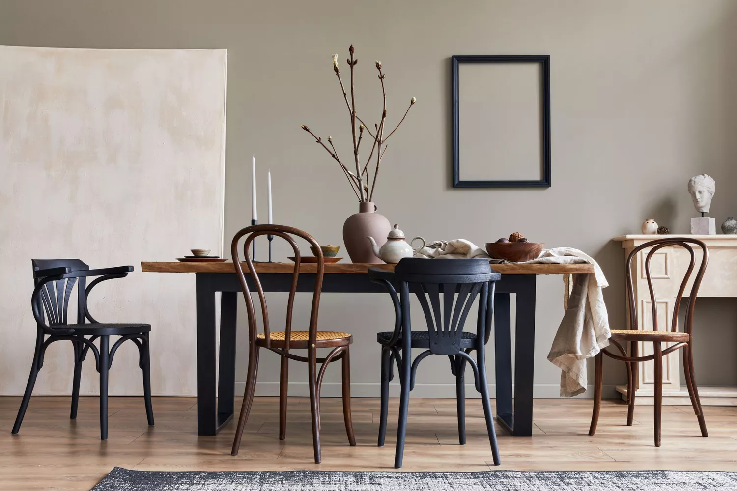
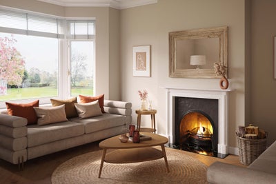
Neutral beige offers a subtle yet impactful alternative to white, providing a peaceful backdrop that allows for the layering of other colors, textures, and decor. This color is particularly suitable for individuals who are highly empathetic or sensitive, as it creates a sense of calm. Soft whites, representing solitude, purity, and cleanliness, remain a popular choice for their ability to create a blank canvas. To prevent a sterile appearance, white walls can be balanced with accents of soft pink, lavender, or blue.
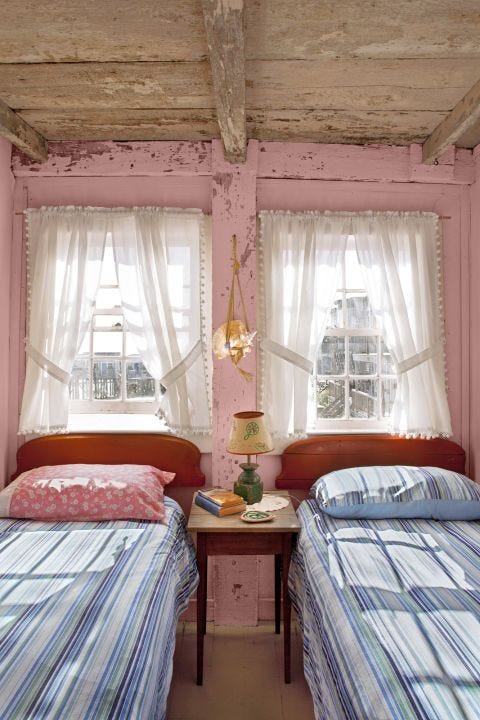
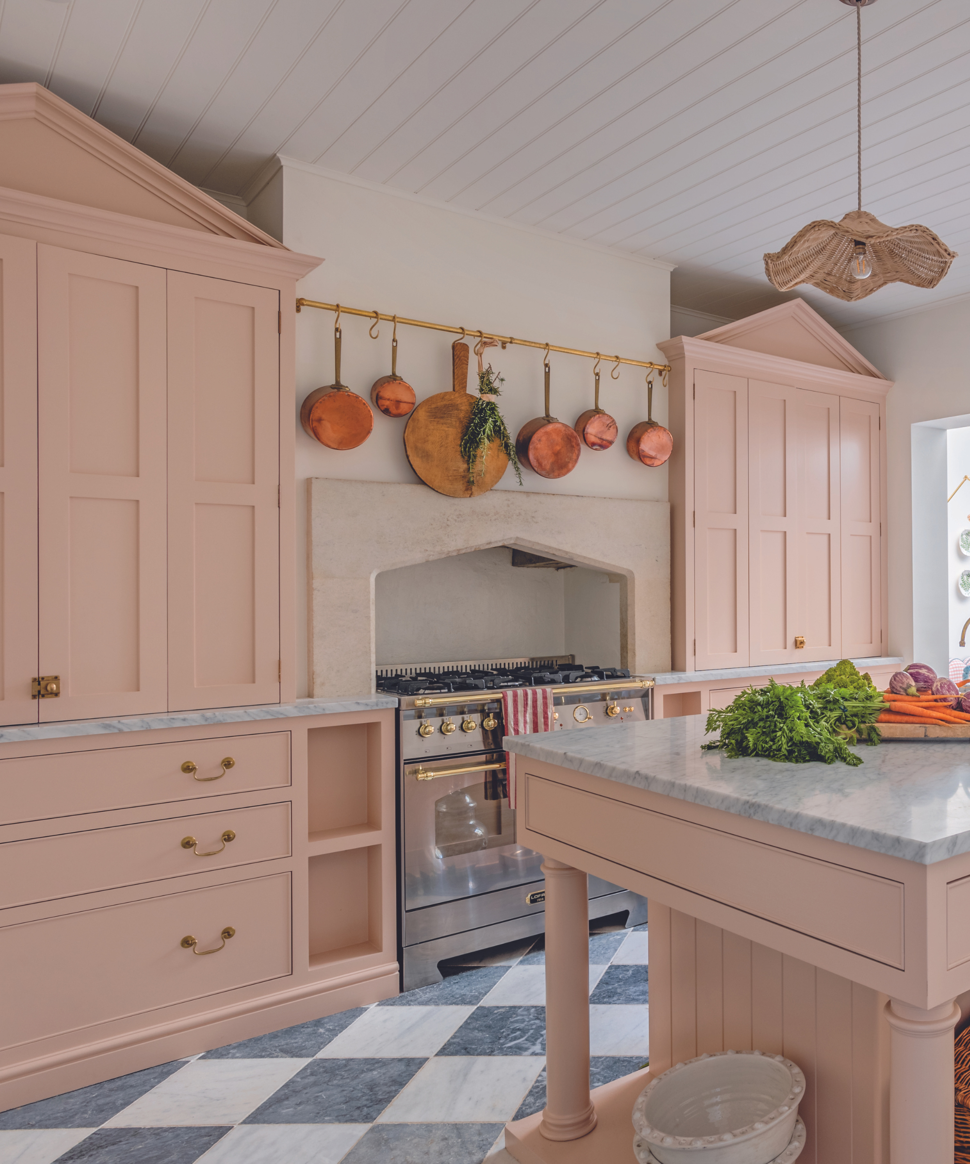
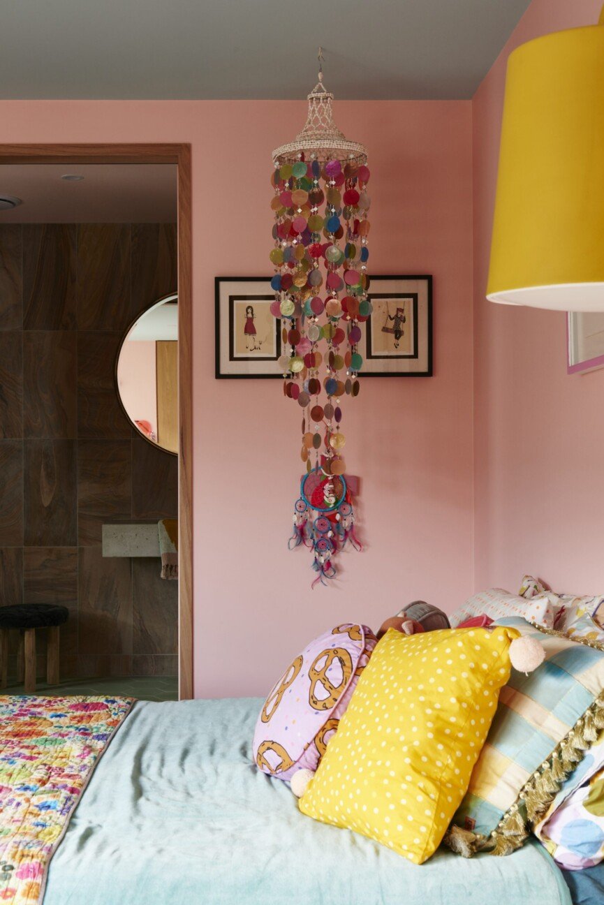
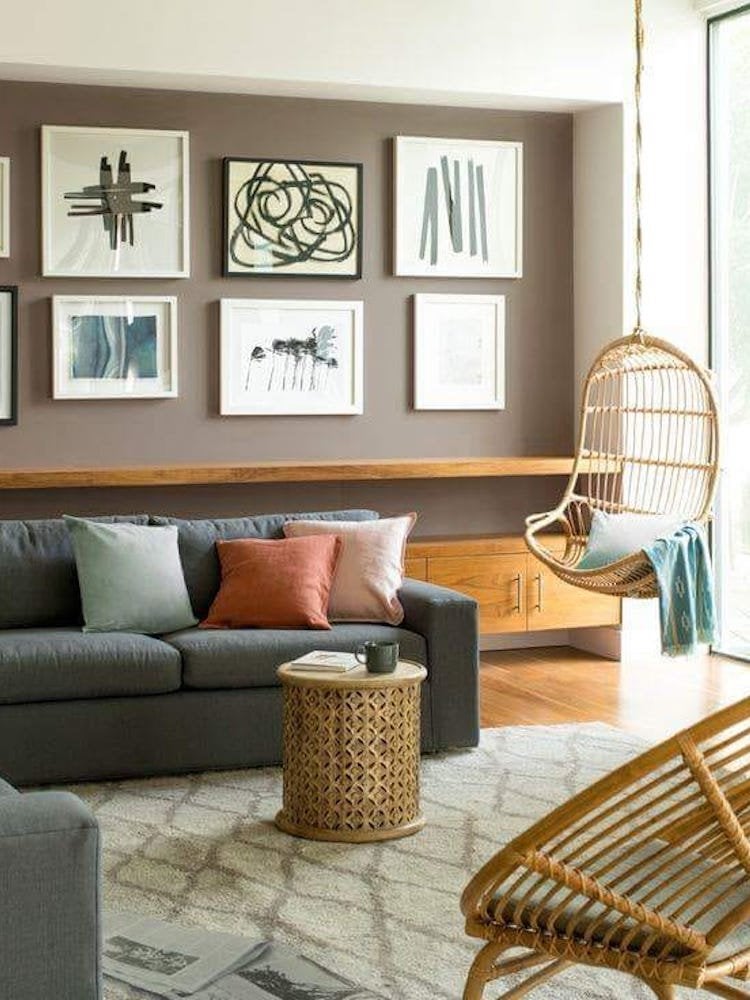
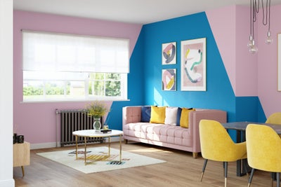
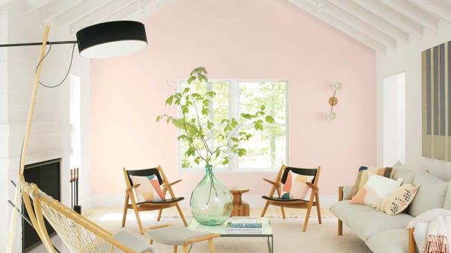
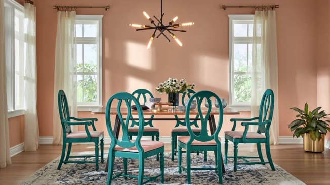
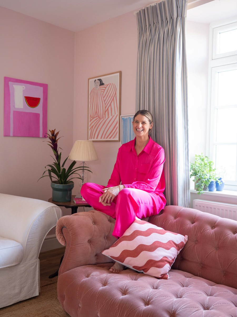
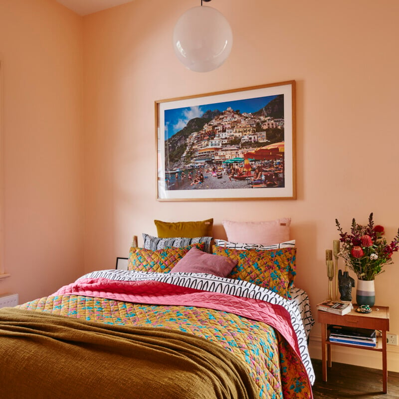
Pale pink, a restful color associated with compassion and unconditional love, is ideal for creating a pampering atmosphere. It is crucial to select softer, paler varieties, as vibrant pinks can be agitating or overly energetic. Finally, warm taupe, a medium gray-brown hue, provides a relaxed and cozy ambiance. Unlike other neutrals, taupe's warm undertones contribute to a sanctuary-like feel, enhancing comfort within the space.
#PaintColors #HomeWellness #InteriorDesign #ColorPsychology #StressReduction #HomeDecor #MindfulLiving #RelaxingEnvironments #PaintColors #HomeWellness #InteriorDesign #ColorPsychology #StressReduction #HomeDecor #MindfulLiving #RelaxingEnvironments
0 comment in total
 No comments yet
You may also like
How Your Home's Paint Colors Can Make You Happier, According to Experts

These Paint Colors Bring Hostility to Your Home, According to Experts

Best Home Gym Paint Colors for 2025

The 10 Best Warm Paint Colors For A Cozy Home
Add These Happy Colors to Your Home and Boost Your Mood
A Color Psychologist Says This Is the Most Relaxing Paint Color

Designers Agree: These Are the Most Relaxing Paint Colors for Any Room

How paint colour in your home can affect your mood
A color psychologist says these color schemes are the most likely to boost your mood

16 Calming Paint Colors That Will Make Your Home a More Restful Place

6 'Energetic Colors' for Vitality and "Sophisticated Interiors", According To Psychologists And Design Experts

7 'Unhappy' Colors That Color Psychology Experts Would Never Paint Their Walls
What paint colors to use to create a relaxed vibe at home

30 on-trend paint colours for every room in your home

14 Paint Colors That Can Make a Room Feel Instantly Cozy

Hottest Interior Paint Colors of 2020
20 Calming Paint Colors That Will Change the Way You Live
The Brighter, the Better—These Vibrant Paints Will Infuse Your Home With Positivity

Decorating with paint

8 Calming Colors to Paint Your Living Room—and Make the Space More Relaxing