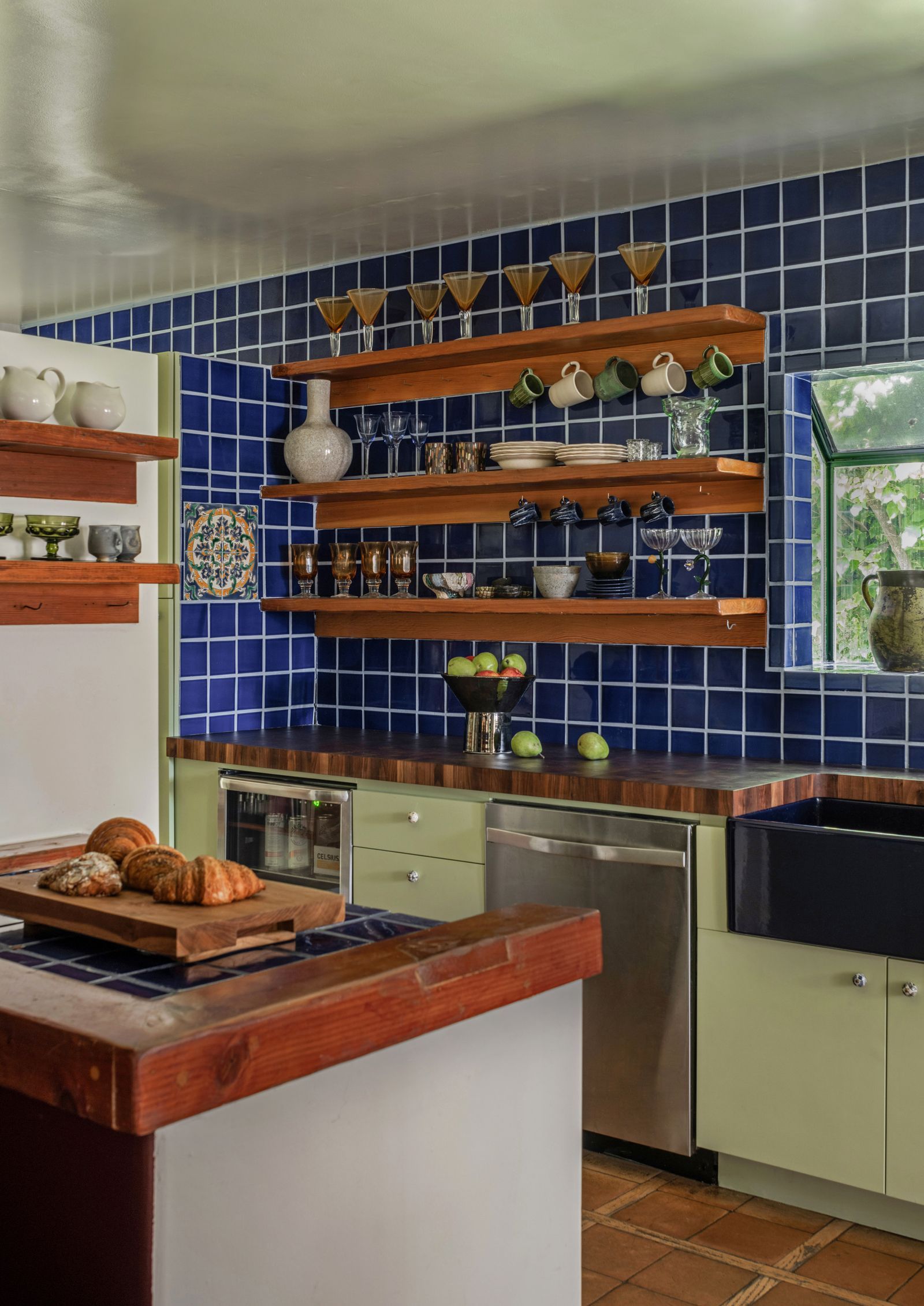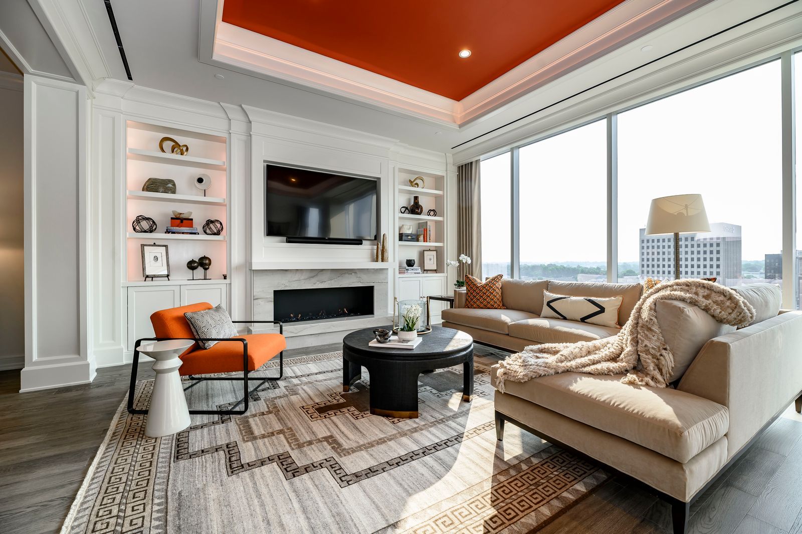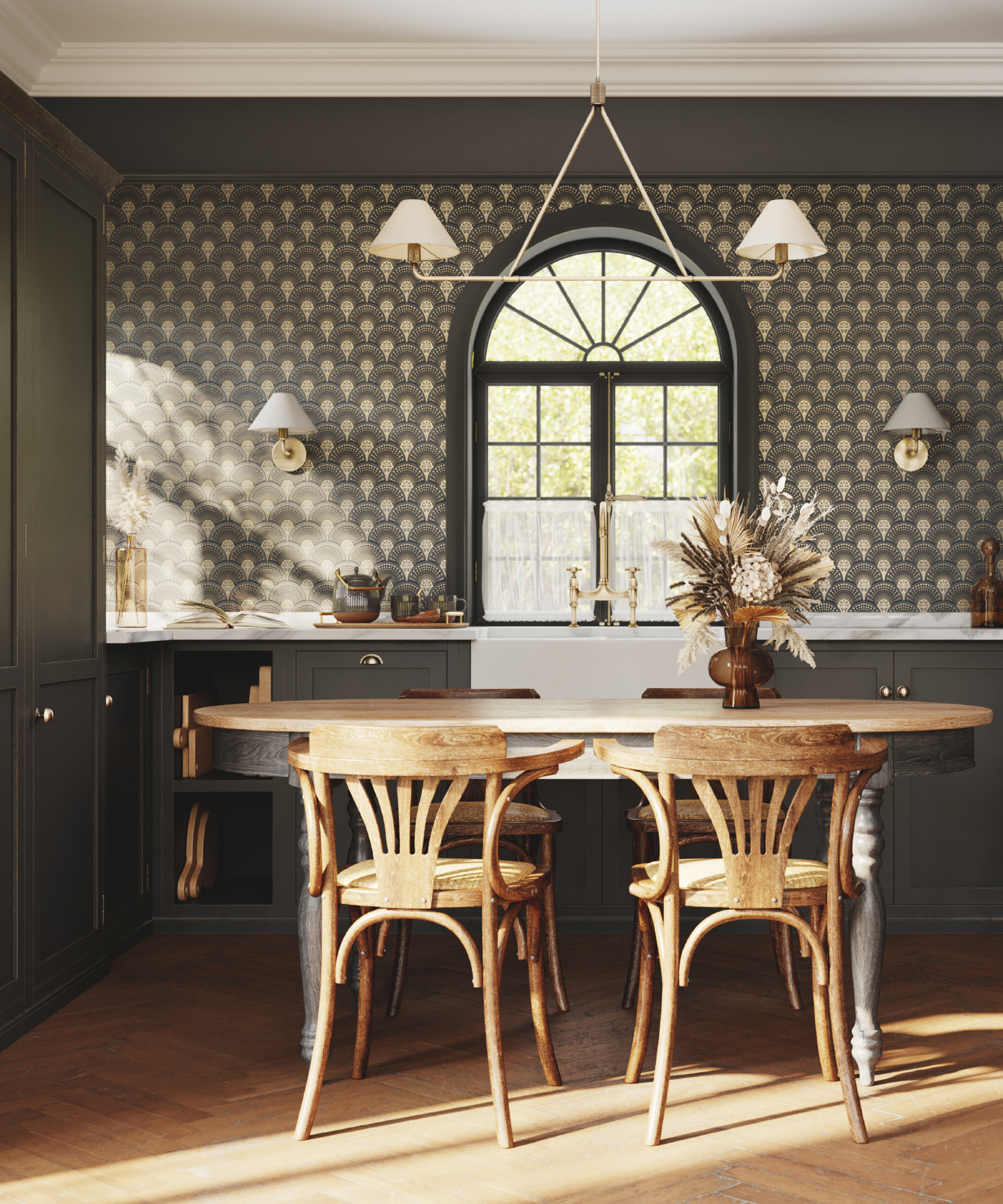
1/8
7 'Unhappy' Colors That Color Psychology Experts Would Never Paint Their Walls
The article explores the significant role of color psychology in interior design, emphasizing that color choices profoundly impact the mood and atmosphere of a space. It highlights that while individual reactions to colors can be subjective, often linked to personal memories, certain shades are more universally associated with feelings of unhappiness or discomfort. The author, Kate Hollowood, consults color psychology expert Karen Haller and interior designers like Róisín Lafferty, Garrow Kedigian, Andrea Goldman, and Maye Ruiz to identify seven specific colors considered 'unhappy' and offers alternative, mood-enhancing choices.
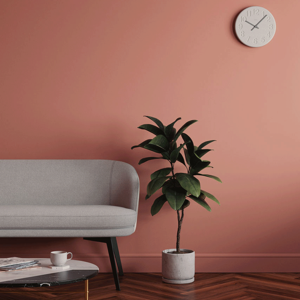
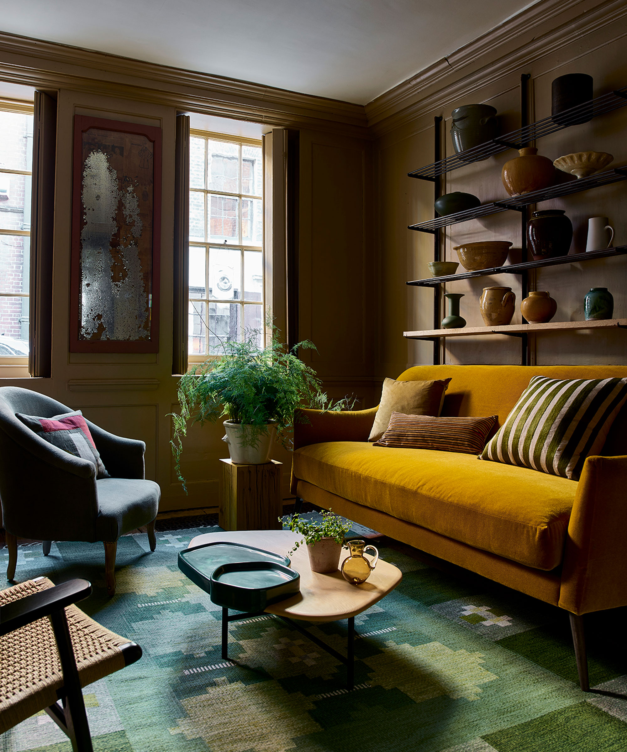
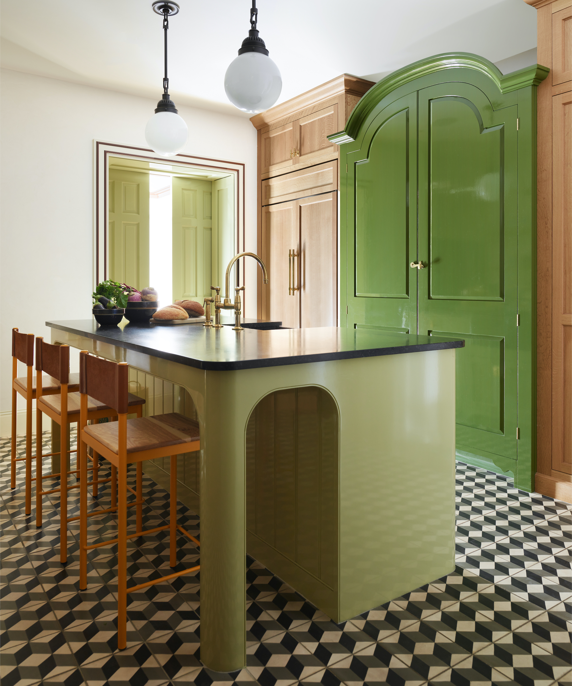
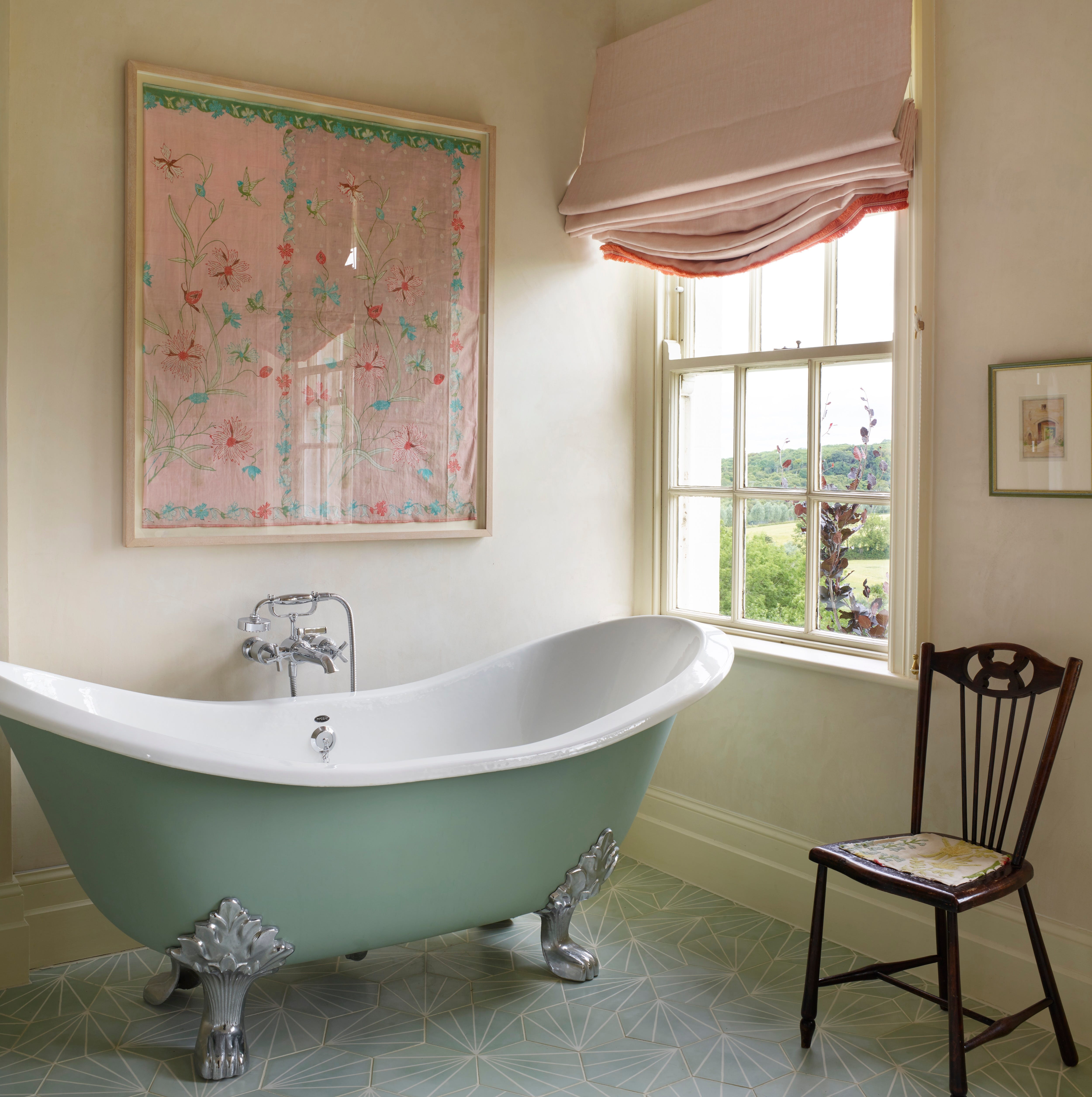
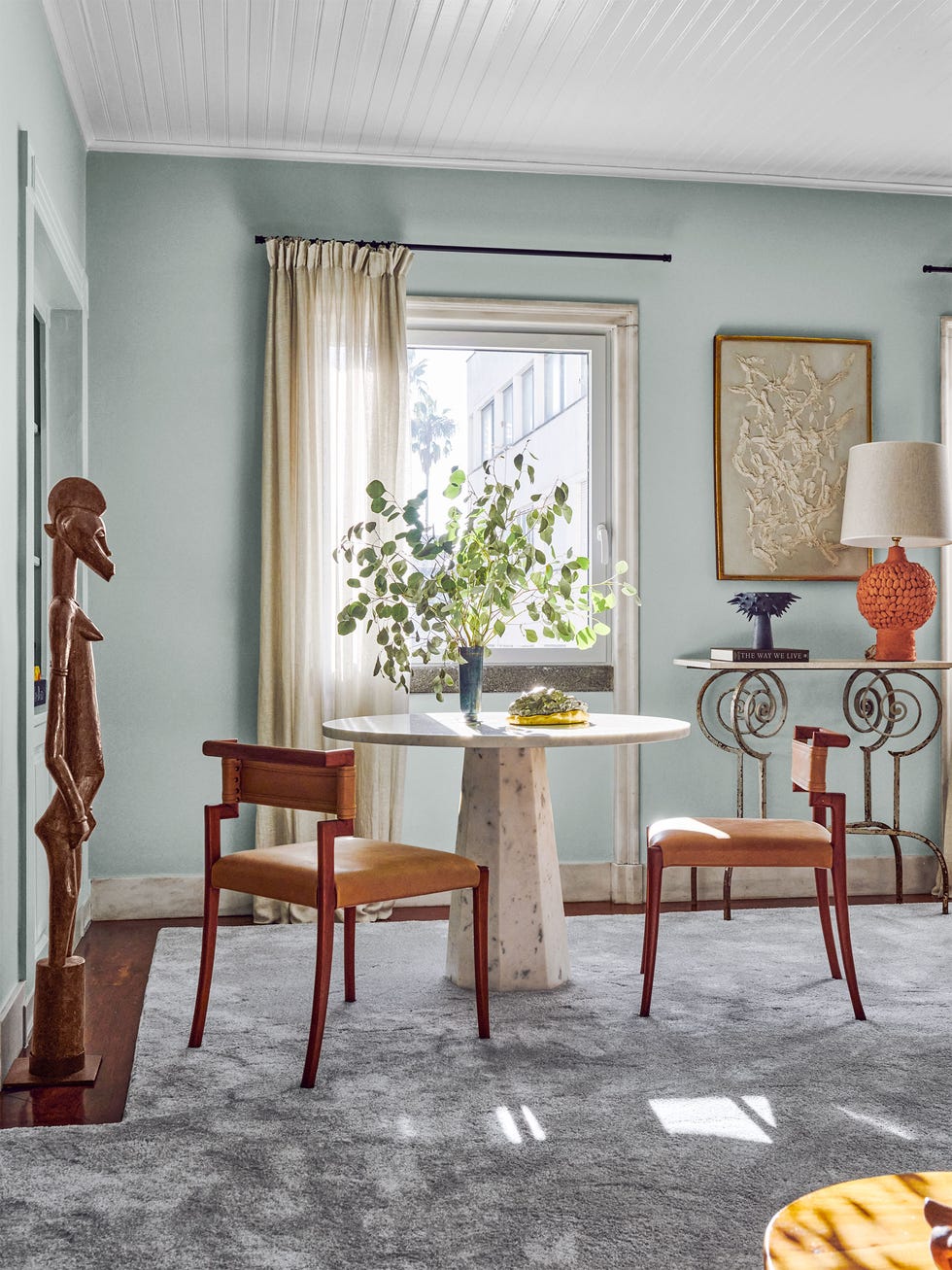
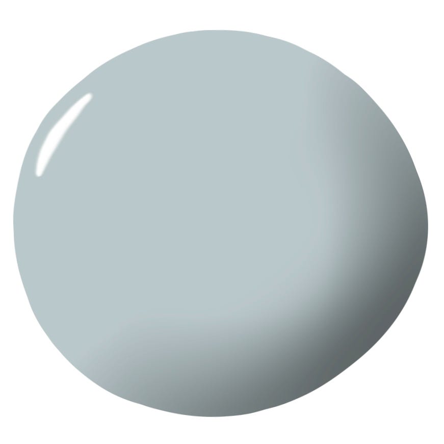
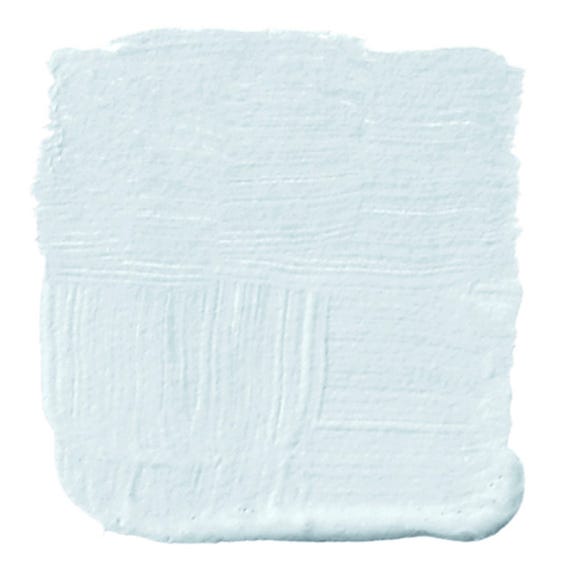
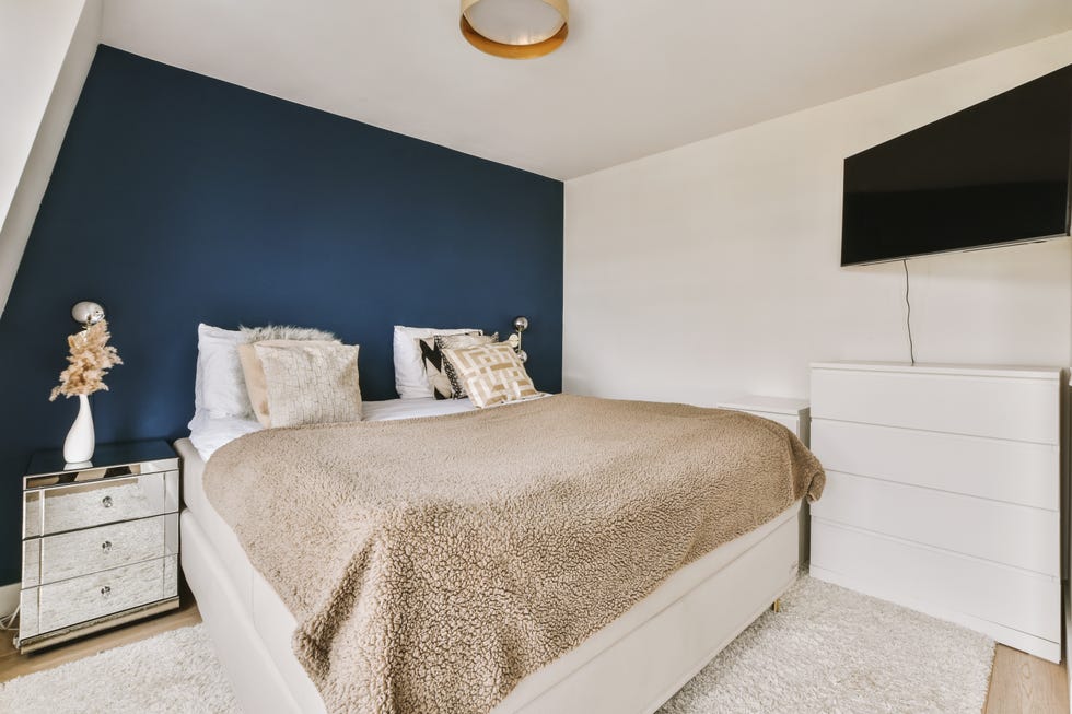
Baby blue is identified as a potentially cold and distant color due to its cool undertones. Róisín Lafferty suggests that while muted or powder blues can be calming, vibrant blues with yellow undertones, such as azure, can create a more inviting and peaceful atmosphere. The article advises balancing light blues with warmer tones and natural textures to prevent them from feeling unhappy. Chartreuse green, particularly greener yellows, is another color cautioned against, as it can be associated with sickness, indecency, and negative emotions, according to Professor Vijaya Lakshmi V's paper, "Psychological Effects of Colour." Garrow Kedigian recommends opting for chartreuse shades with a stronger yellow component to promote cheerfulness, reinforcing the idea that yellower versions of any hue generally contribute to a brighter feel.
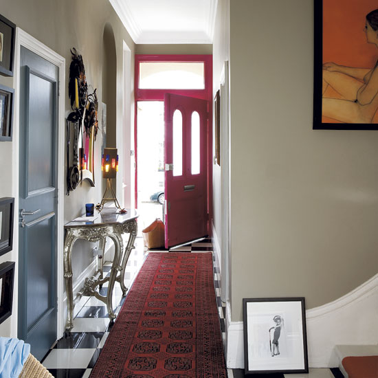
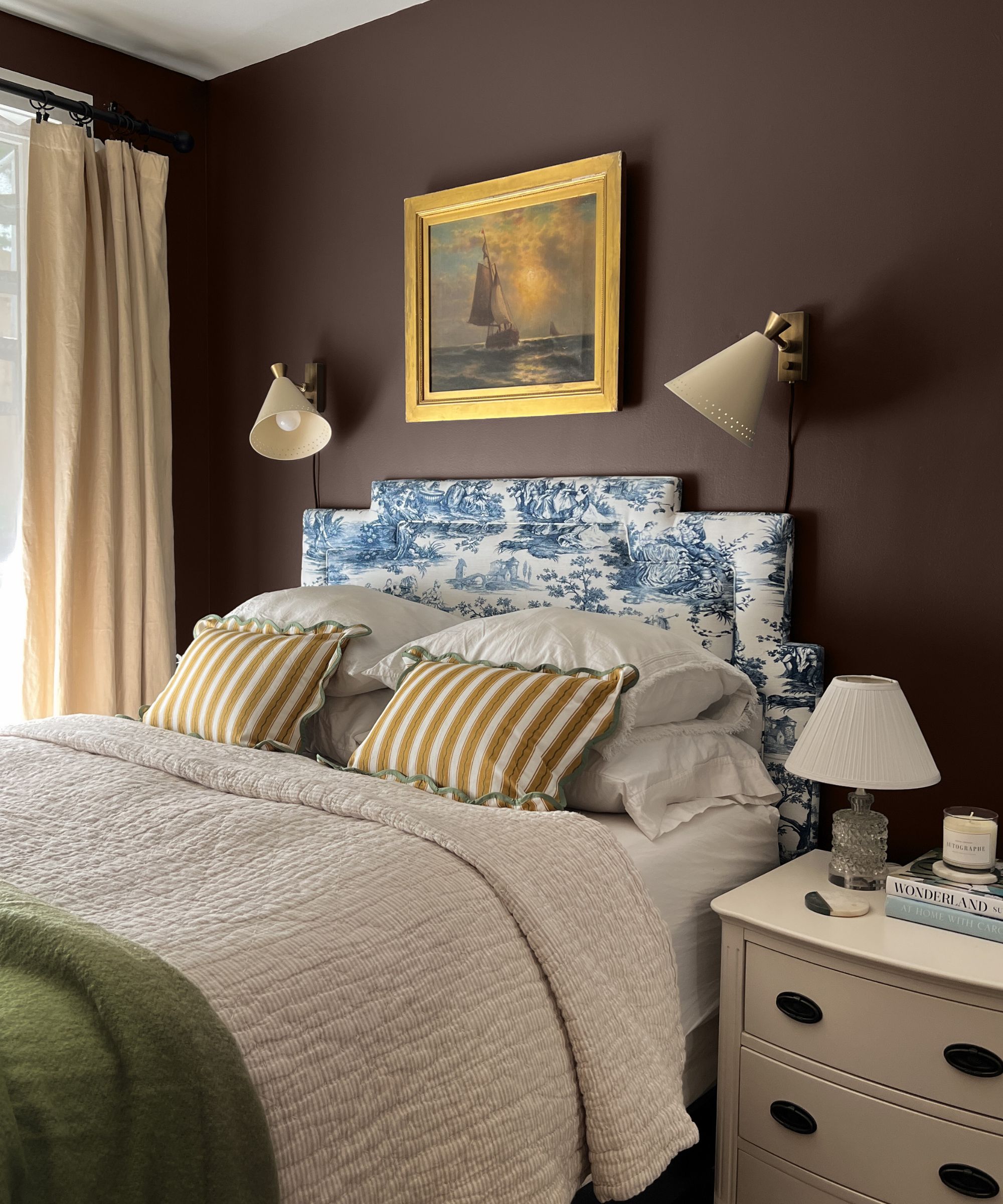
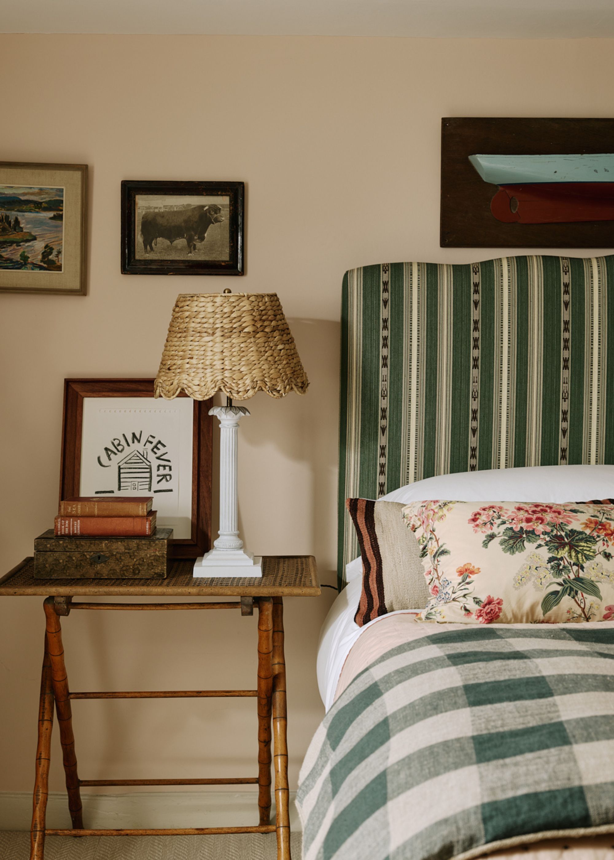
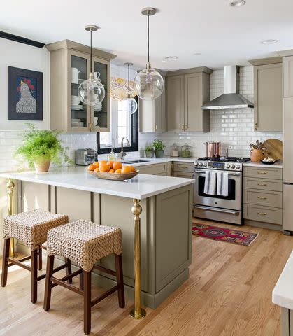
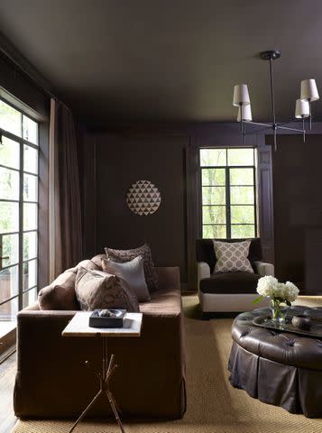
Slate gray is presented as an inherently unhappy color, described by Professor Lakshmi V as lacking character, monotonous, and associated with sadness, depression, and a lack of energy. However, the article acknowledges that light grays can be gentle and dark grays dignified. Andrea Goldman advises against cool-toned grays and instead suggests warmer grays or 'greige' (a blend of gray and beige) to create cozy and uplifting neutral spaces. Mud brown is also listed as a potentially mood-dragging color, with its negative associations including lack of humor and heaviness. The article contrasts this with warmer, earthy browns like cinnamon or Mocha Mousse, which can provide a grounding and calming effect, especially when integrated with diverse textures.
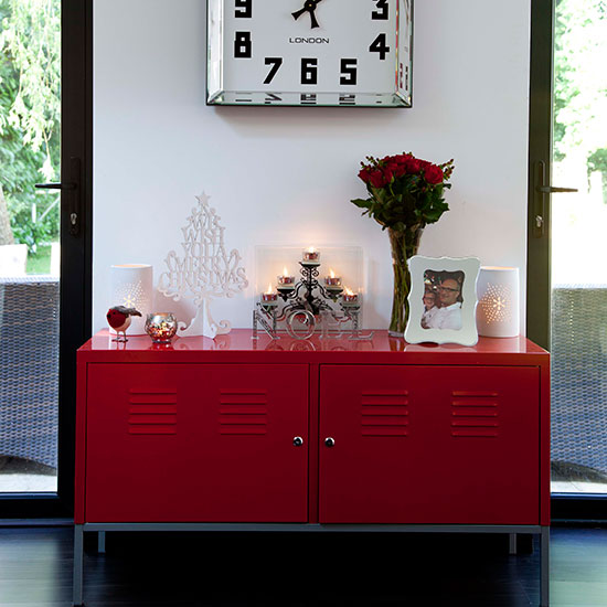
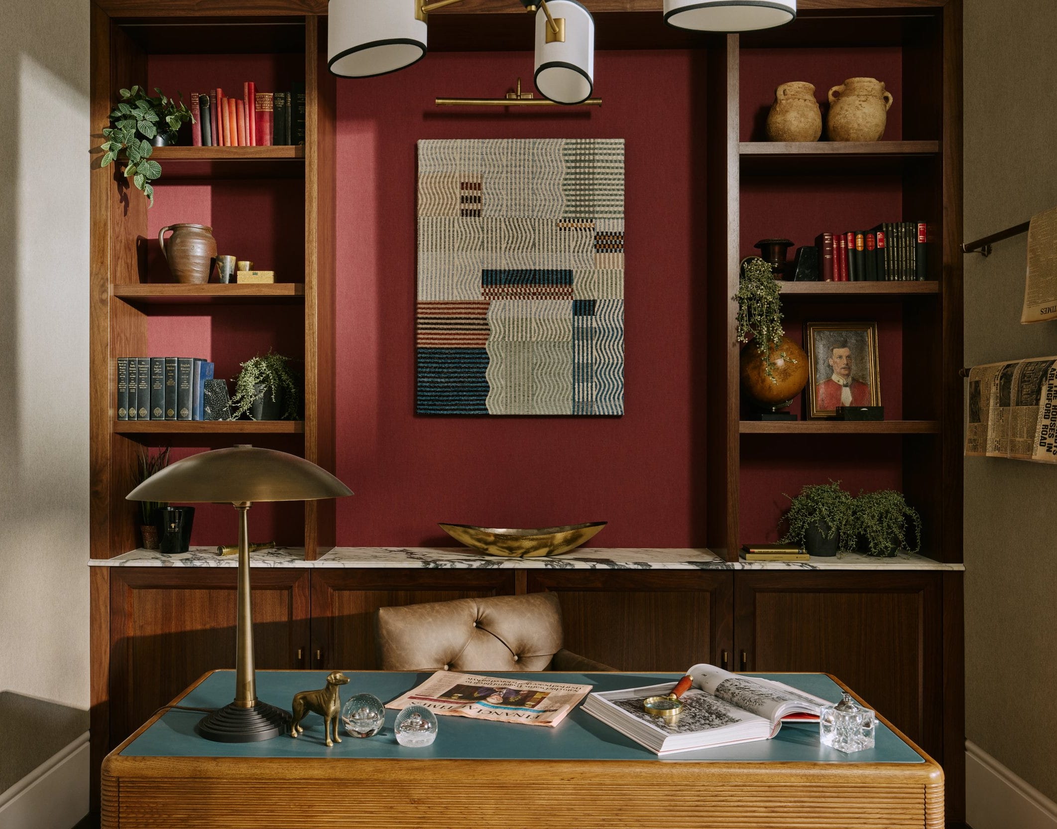
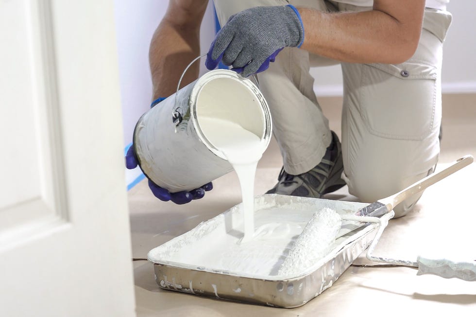
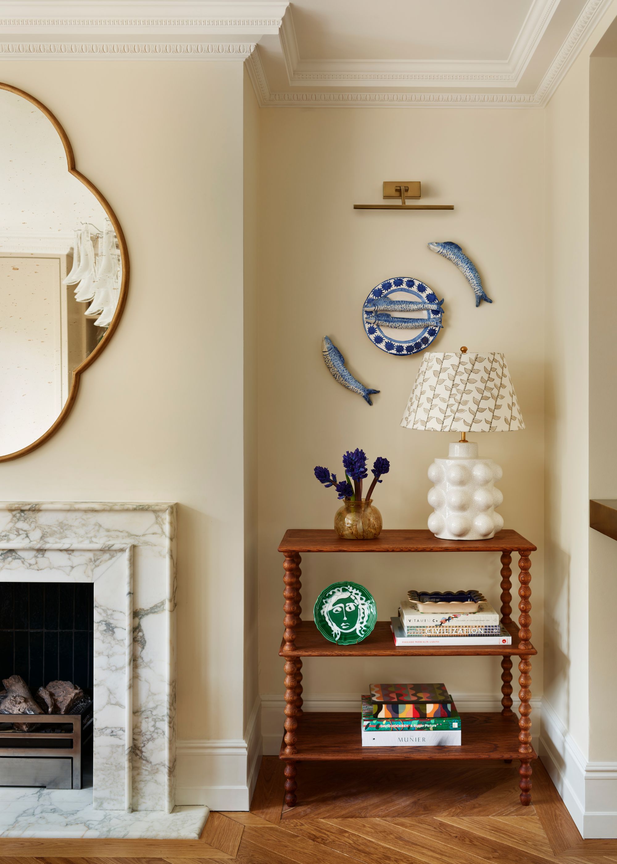
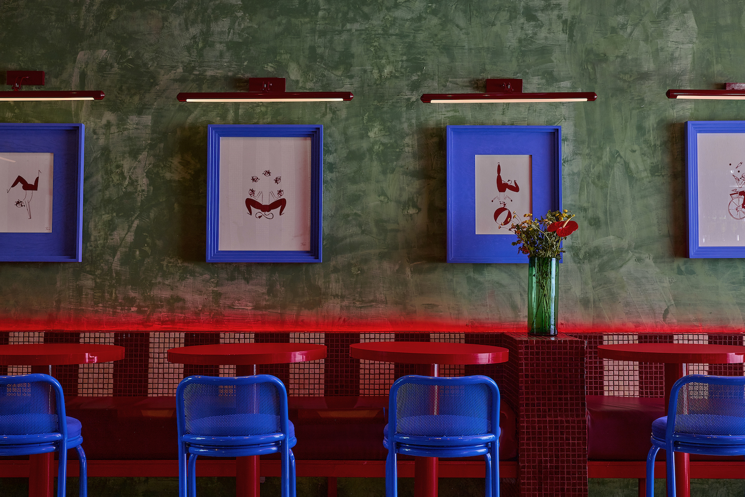
Pistachio green, particularly when used in isolation, can appear muted or melancholic. Maye Ruiz explains that while such a shade might not be uplifting on its own, it can serve as a balancing element in a room dominated by vibrant colors, preventing the space from becoming overwhelming. The article reiterates that green, positioned in the center of the color spectrum, generally offers balance and neutrality. True black, due to its association with mourning, darkness, and an absence of light, is another color that can easily feel depressing. Professor Lakshmi V notes its negative connotations like 'evil' and 'gloom' but also acknowledges its potential as a solid, reliable color. The article demonstrates how black can contribute to a sophisticated and upbeat space when softened by natural textures and balanced with contrasting, positive colors. Finally, bright white is surprisingly included, as it can create a cold and uninviting atmosphere despite often being chosen for its ability to create a sense of space. Ruth Mottershead, Creative Director at Little Greene, recommends warm, creamy off-whites with yellow undertones, like "Silent White," to achieve a soft, comforting, and mood-enhancing effect, especially when layered with different textures.
In conclusion, the article emphasizes that while color psychology identifies certain hues as potentially 'unhappy,' strategic use of layering, texture, and a focus on warm, yellow undertones can transform even these colors into elements that contribute positively to a home's atmosphere. It suggests that understanding color's emotional impact is key to crafting interiors that are both aesthetically pleasing and psychologically comfortable.
#ColorPsychology #InteriorDesign #HomeDecor #PaintColors #Moods #UnhappyColors #DesignAdvice #ColorTherapy #HomeAtmosphere #ColorPsychology #InteriorDesign #HomeDecor #PaintColors #Moods #UnhappyColors #DesignAdvice #ColorTherapy #HomeAtmosphere
0 comment in total
 No comments yet
You may also like

What are the worst colors to paint a room? The shades experts say you should never use


5 colors you should never paint a pantry – designers share the shades they swerve
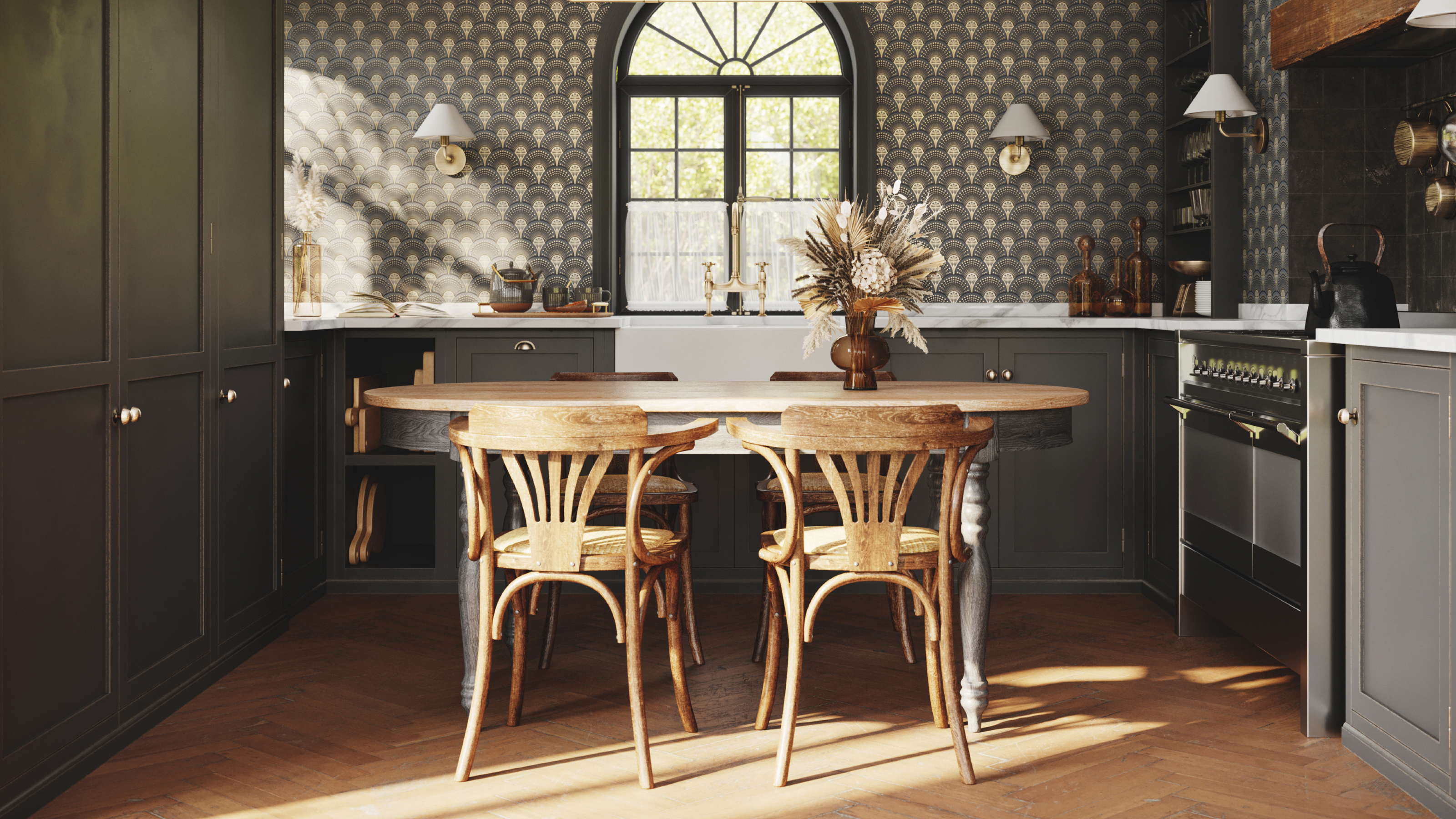
8 colors you should never paint kitchen cabinets according to the experts

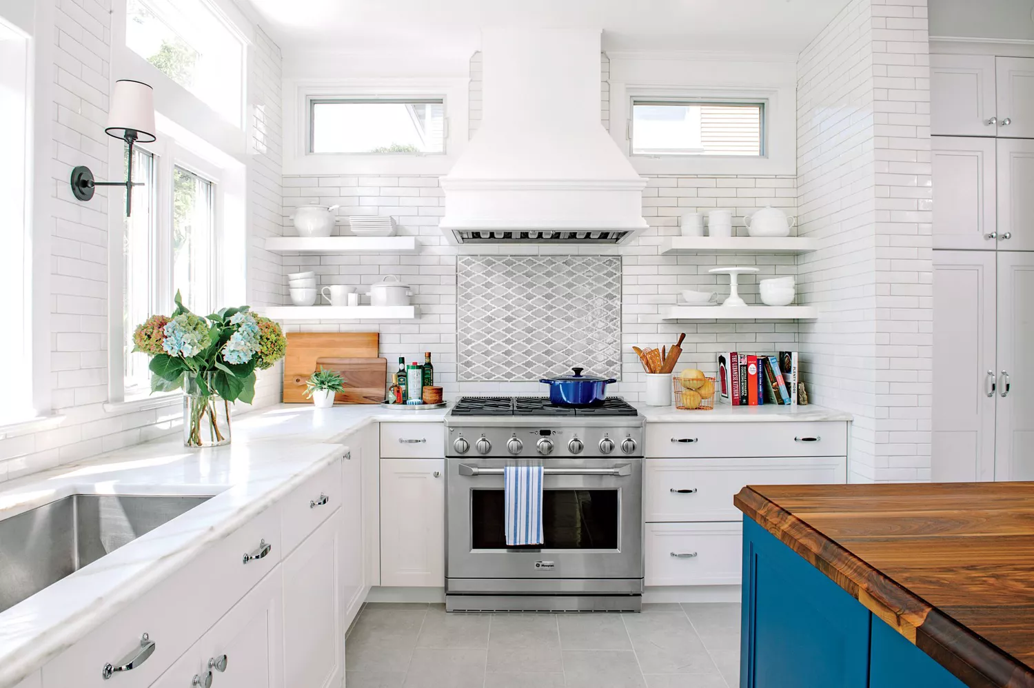
7 Paint Colors To Never Use In Your Kitchen, According To Designers
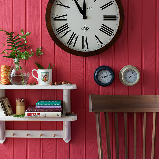
You should never paint your hallway this colour, according to colour psychologists
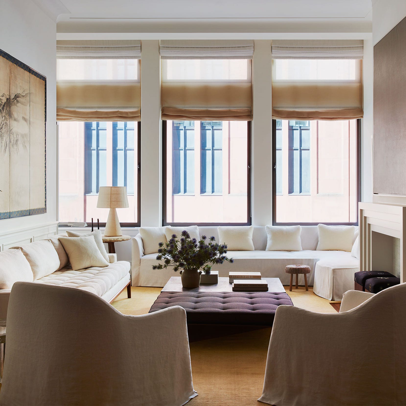
20 Calming Paint Colors That Will Change the Way You Live

7 Paint Colors Designers Totally Regret Using (and What They Wish They’d Used Instead)

7 Paint Mistakes That Make Designers Instantly Cringe When They Walk Into Someone's Home

5 'ugly colors' that I'll be decorating with in 2024 – these undesirable colors will trend this year
7 Paint Colors Designers Wish They Never Used (and What You Should Use Instead)


5 colors you should never paint your entryway – according to interior experts
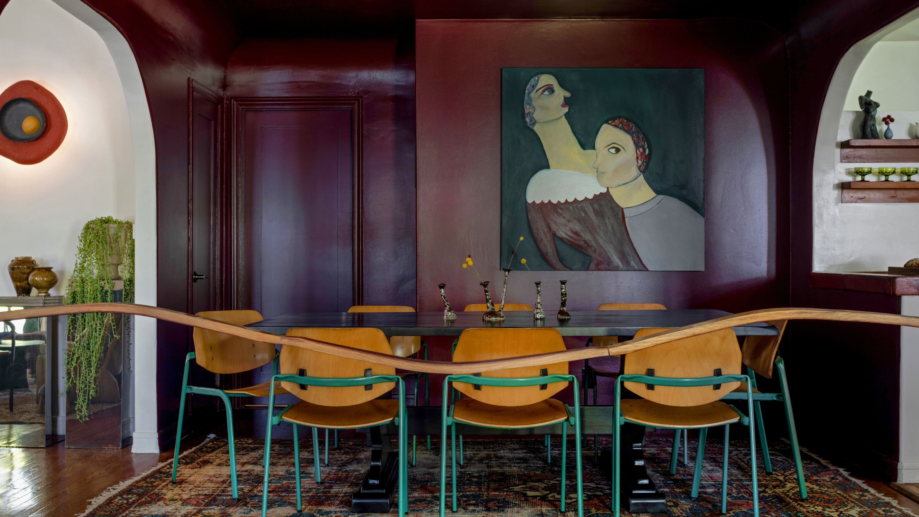
13 Calming Paint Colors Designers Use to Make Rooms Feel Soothing — And No, They're Not All Neutrals
The 10 Worst Paint Colors for Your Home, Experts Say


5 colors you should never paint a small room – designers warn us to steer clear of these hues, and what to pick instead
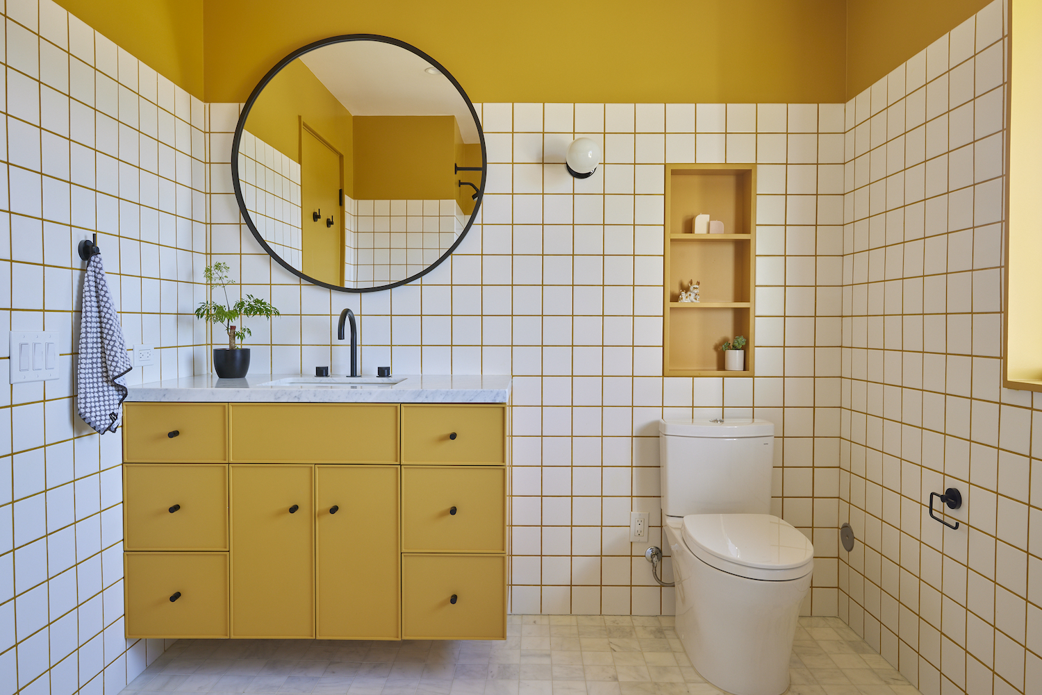
5 Times Interior Designers Used Colorful Tile Grout That Make Me Never Want to Choose White Again
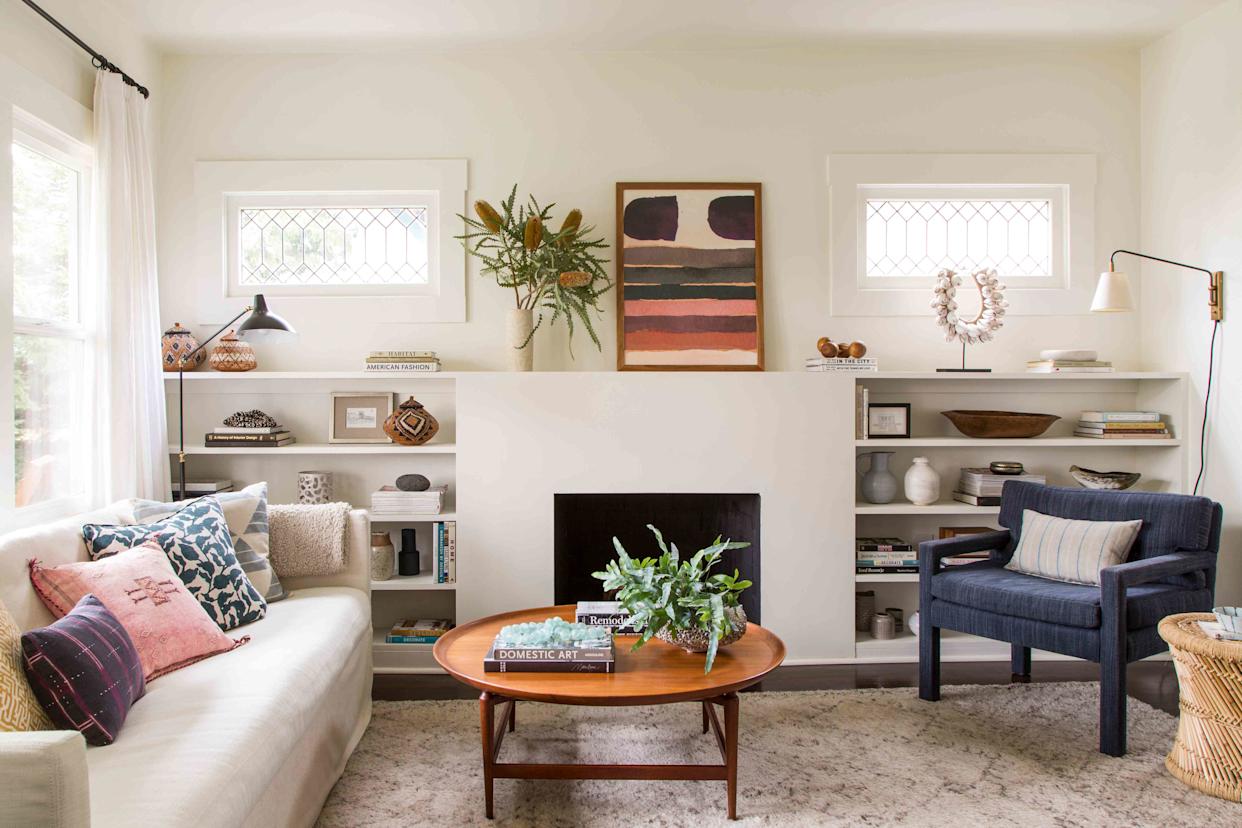
5 Paint Colors That Experts Say You Shouldn't Use in 2025


7 Most Underrated Paint Colours, According To Colour Experts
9 'good weird' paint colours approved by designers

7 times you should never paint a room white
9 Paint Colors You’ll Never Find in an Interior Designer’s Home