



1/4
You should never paint your hallway this colour, according to colour psychologists
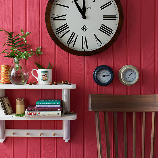
The hallway, often considered the trunk of a home from which all other rooms branch off, plays a crucial role in setting the initial tone for a house and welcoming occupants and guests. Despite its significance, it is frequently a neglected area when it comes to thoughtful design and color choices. According to insights from color psychologists and interior experts, there is one particular color that should be avoided in hallways: highly saturated red.
Color psychologist Lee Chambers emphasizes that for many, bright red can evoke a sense of warning or danger, making the entrance feel anything but welcoming. This perception can be unsettling and create an agitated atmosphere for those entering or passing through. Natasha Bradley, Head of Colour and Lead Interiors Expert at Lick, concurs with this sentiment, advising against the use of bright red, orange, and yellow in hallways. She explains that these highly saturated colors are overwhelming for a transitional space like a hallway, which should ideally offer a smoother, more calming transition into the home.
Instead of vibrant reds, experts suggest exploring deeper, more muted shades like rich maroon or oxblood if one is drawn to the red spectrum. These colors offer sophistication without the jarring intensity of brighter hues. However, for a more universally appealing and psychologically beneficial choice, alternatives are recommended. Lee Chambers proposes light, cheerful yellows or mellow peaches. These colors are known to bring warmth, subtle positivity, and a refreshing feeling, which can be particularly welcoming after a long day.
While avoiding certain colors, experts also acknowledge the hallway's potential as a space for creative expression, precisely because it is not a room where significant amounts of time are spent. Natasha Bradley encourages homeowners to make a feature of their hallway, stating that it's a suitable area to be adventurous with design. One common strategy she recommends is using darker tones in the hallway. This approach makes the adjacent rooms appear lighter and more expansive by contrast, creating an appealing visual flow. This concept aligns with a 'Farrow & Ball hallway paint secret' previously highlighted, where strategic dark paint choices in hallways can enhance the brightness of other areas.
However, the preference for dark hallways is not universal. Color consultant and therapist Suzy Chiazzari cautions against using dark shades of green, blue, grey, and purple in hallways. Her concern is that these darker tones can negatively impact mood and energy levels, which contradicts the goal of creating an inviting and uplifting entry space. Therefore, while daring with color is encouraged in hallways, careful consideration of the psychological impact of specific shades remains paramount to ensure the space contributes positively to the home's overall ambiance.
Ultimately, the choice of hallway color should balance personal aesthetic preferences with the psychological effects of colors to create a welcoming, functional, and mood-enhancing entrance to the home.
#HallwayDesign #ColorPsychology #InteriorDesign #PaintColors #HomeDecor #DesignTips #ColorSchemes #HallwayDesign #ColorPsychology #InteriorDesign #PaintColors #HomeDecor #DesignTips #ColorSchemes
 No comments yet