The 10 Worst Paint Colors for Your Home, Experts Say
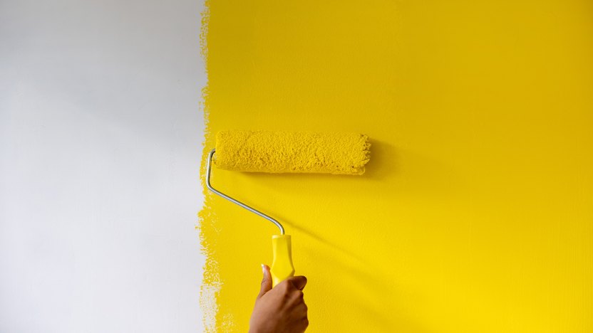
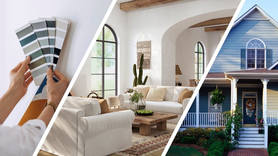
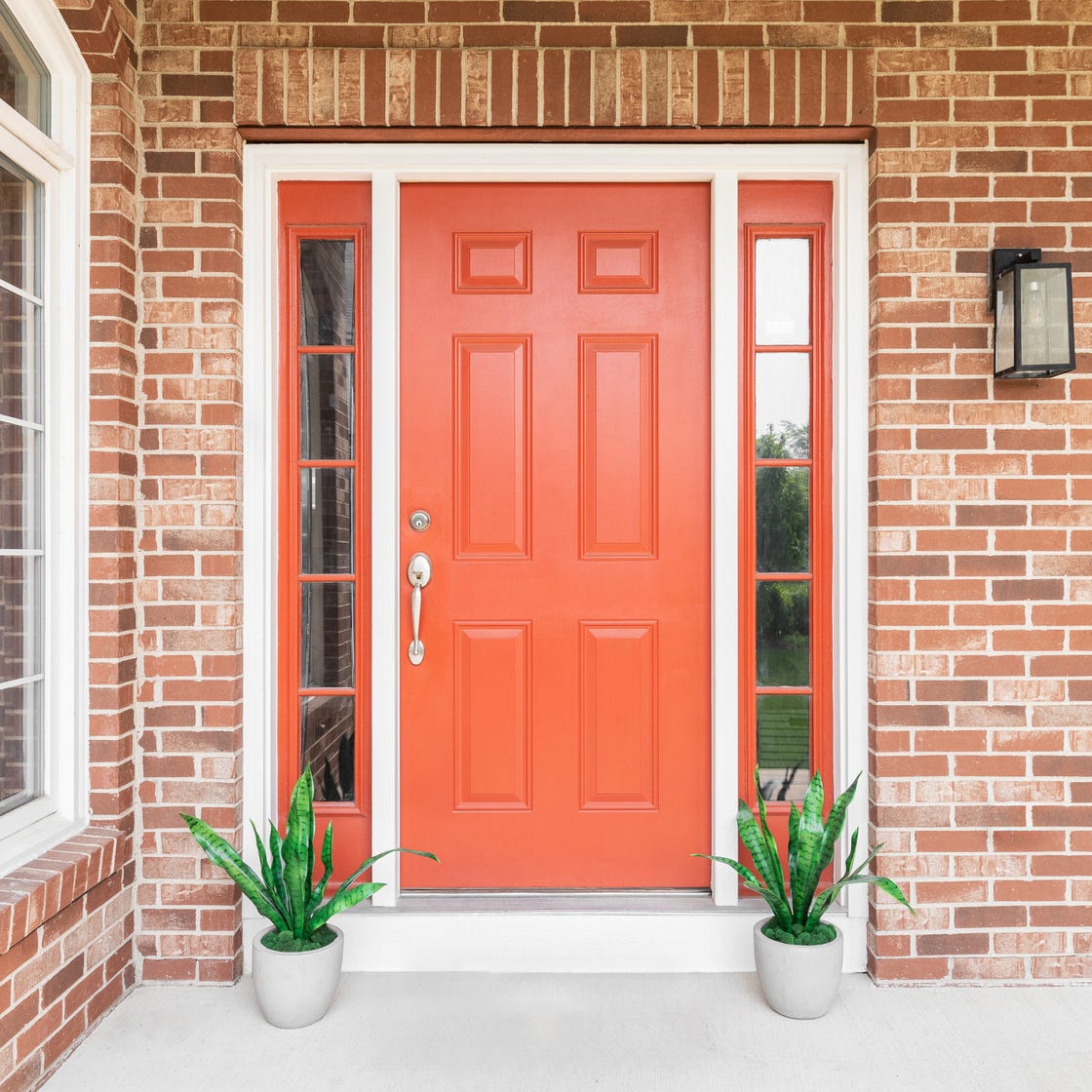
The choice of paint colors in a home can significantly impact its aesthetic appeal and even its resale value. Experts, including interior designers and realtors, advise against certain paint colors for various areas of the house. Bright colors such as yellow, red, and teal are generally disliked for front doors and exteriors. A 2023 Home Decor Report by Opendoor indicated that 48% of homeowners prefer neutral front door colors like white, gray, gray-blue, and gray-green. Similarly, 41% of respondents favored neutral and warm tones for home exteriors, while 21% opted for high-contrast palettes like navy with white accents or white with black accents. An analysis by Zillow in 2018 found that yellow exteriors could decrease a home's value by over $3,000. It is also recommended that exterior colors complement neighboring houses to avoid an unappealing contrast.
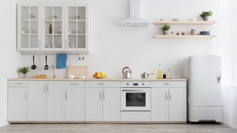
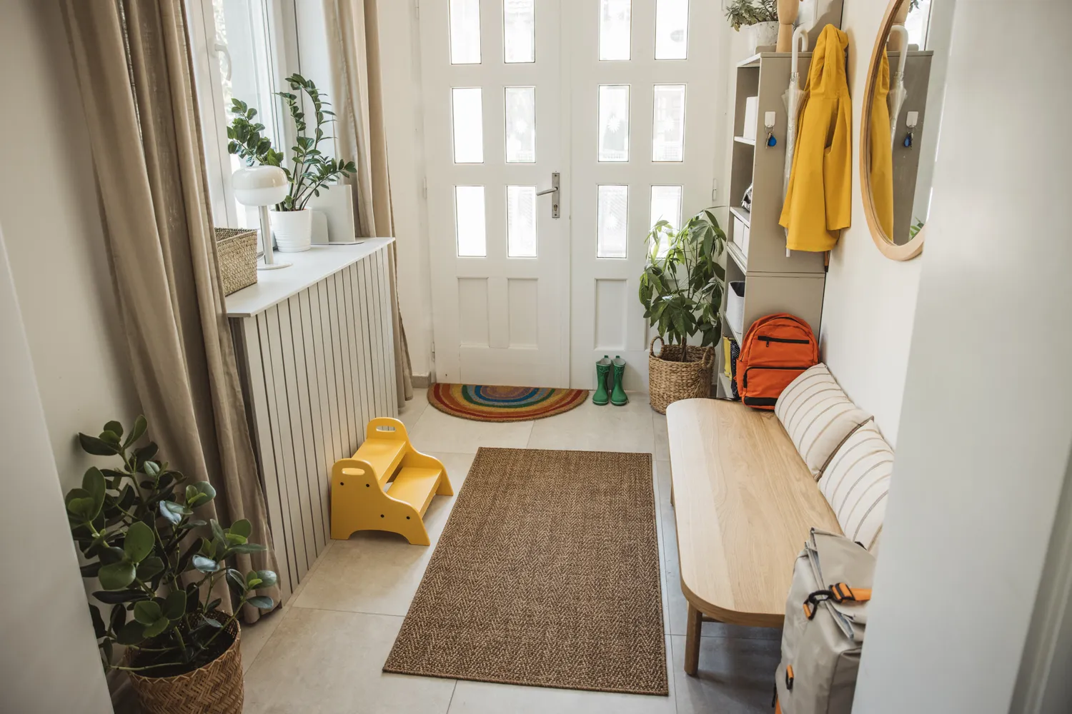
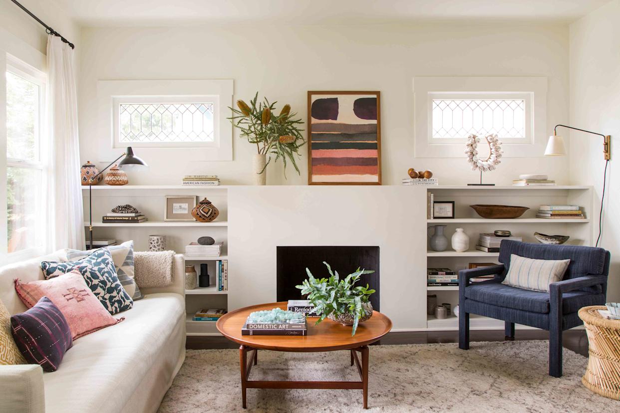
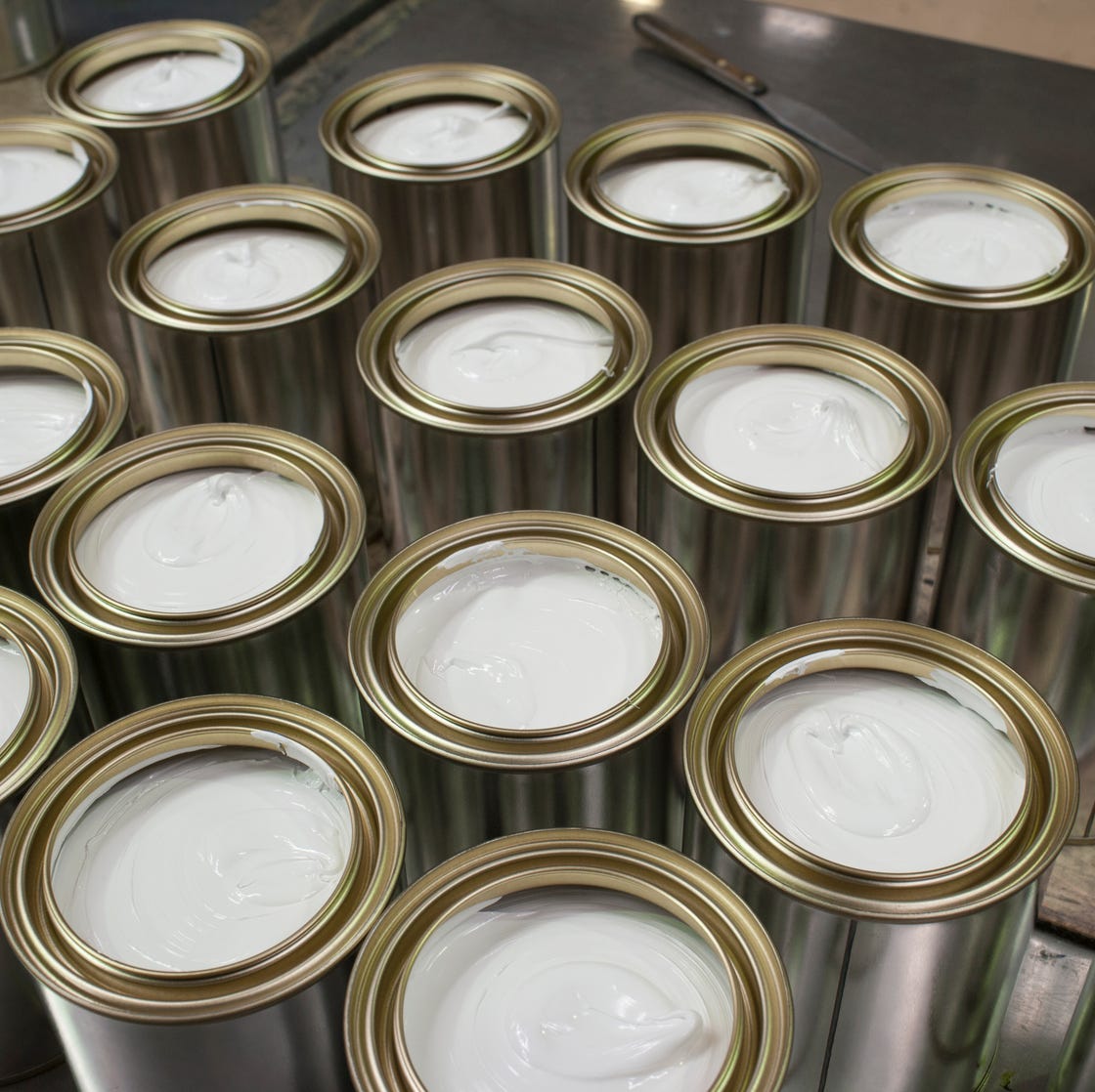
White paint, while seemingly versatile, is considered a poor choice for high-traffic areas such as kitchens, children's rooms, hallways, and bathrooms due to the high visibility of stains. In home offices, white walls can lead to eye strain and fatigue, and some experts suggest they may contribute to feelings of anxiety and make a room feel lifeless and boxy by exaggerating shadows. Instead of making a room feel bigger, white can sometimes have the opposite effect in certain contexts.
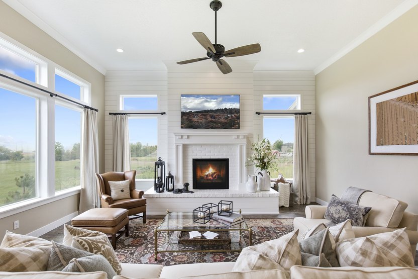
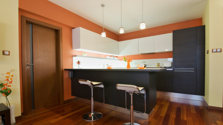
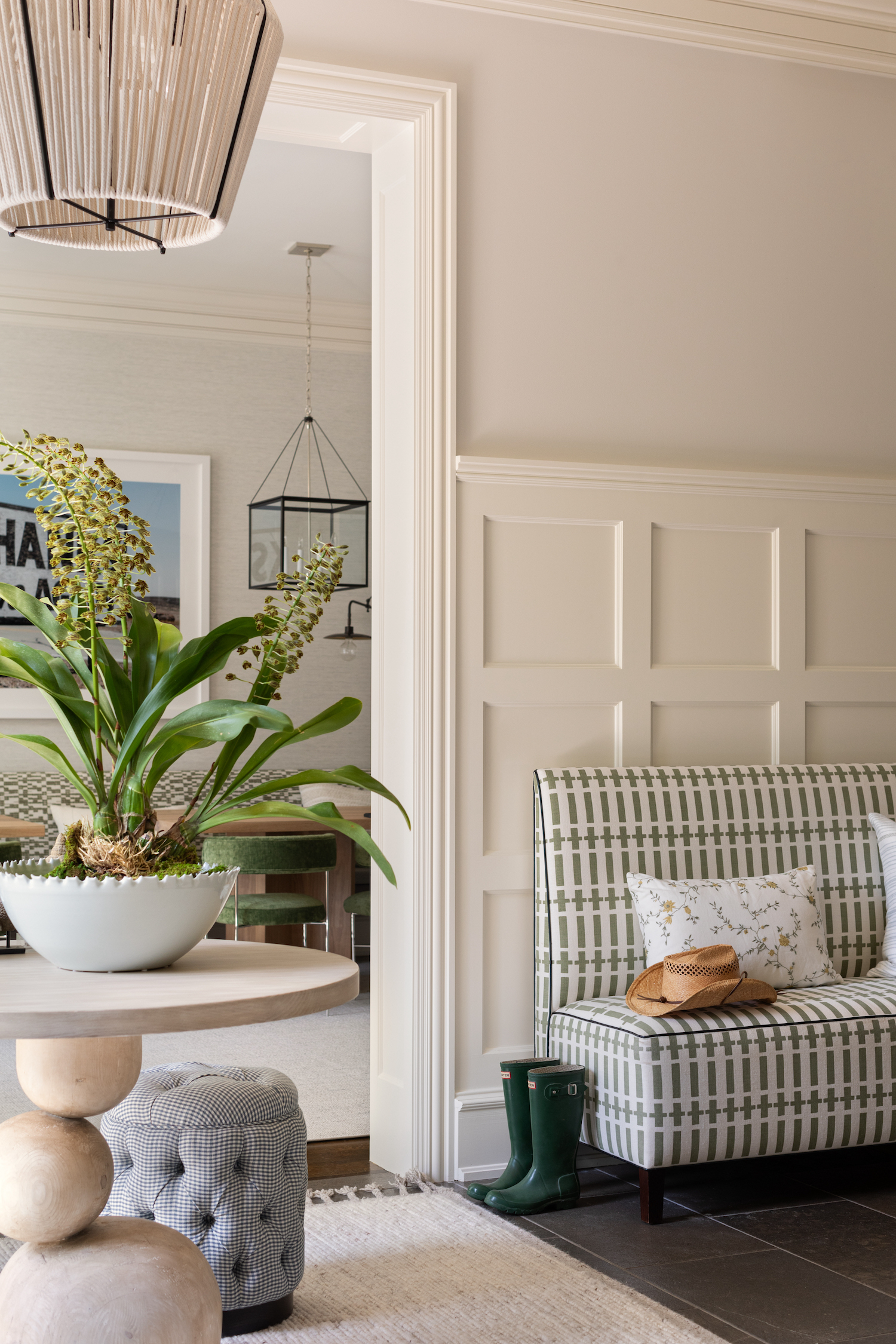
"Builder's beige," a generic mix of brown, beige, and gray with yellow undertones, is another color to avoid. It is often associated with spec homes and can make spaces appear darker and dingier, clashing with modern kitchen aesthetics and light-toned flooring. Similarly, "millennial gray," a cool-toned, somewhat sterile gray, has fallen out of fashion. Warmer tones like greige and various shades of taupe and clay are now more popular, with a Fixr's Paint and Color Trends Report 2023 indicating these as preferred choices among design professionals.
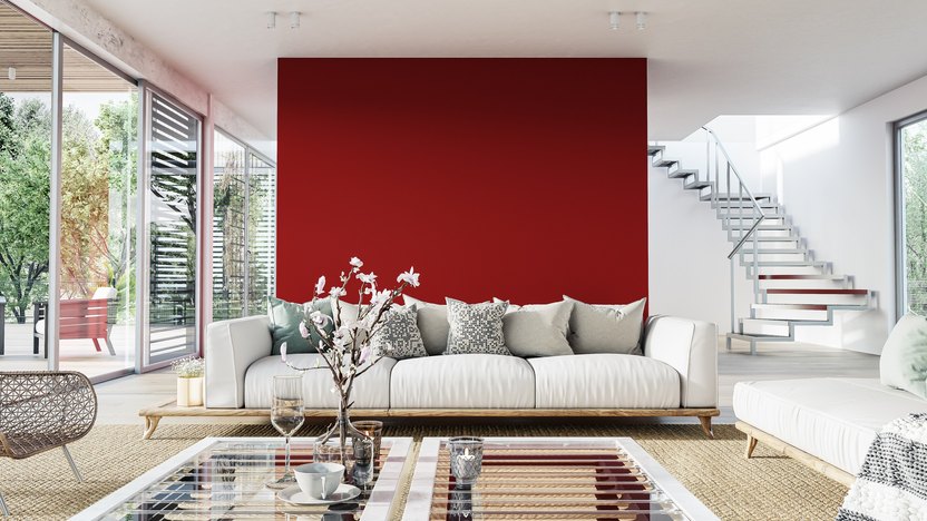
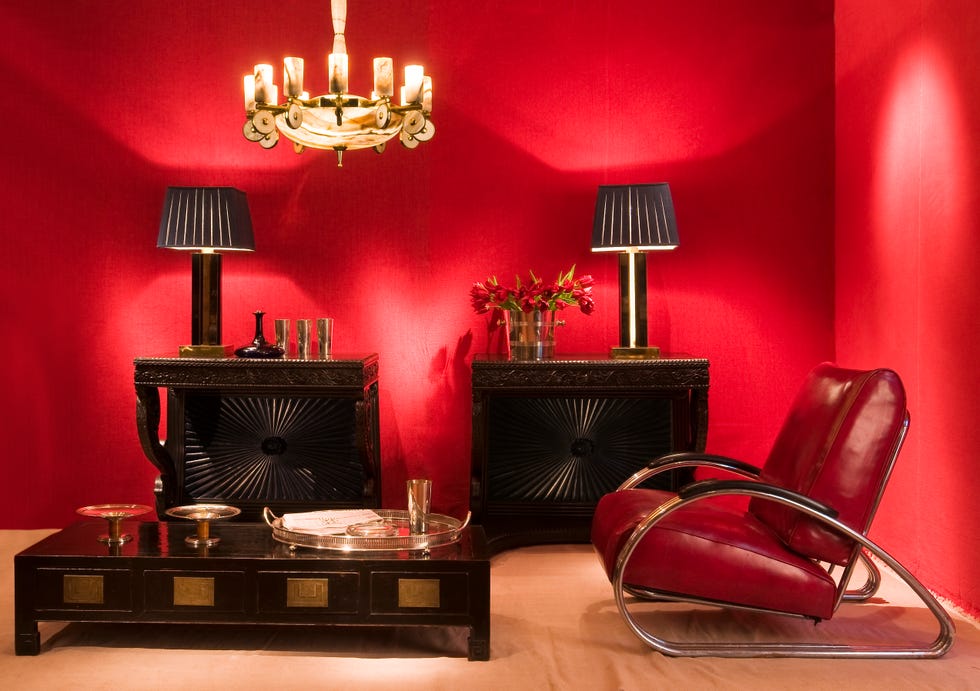
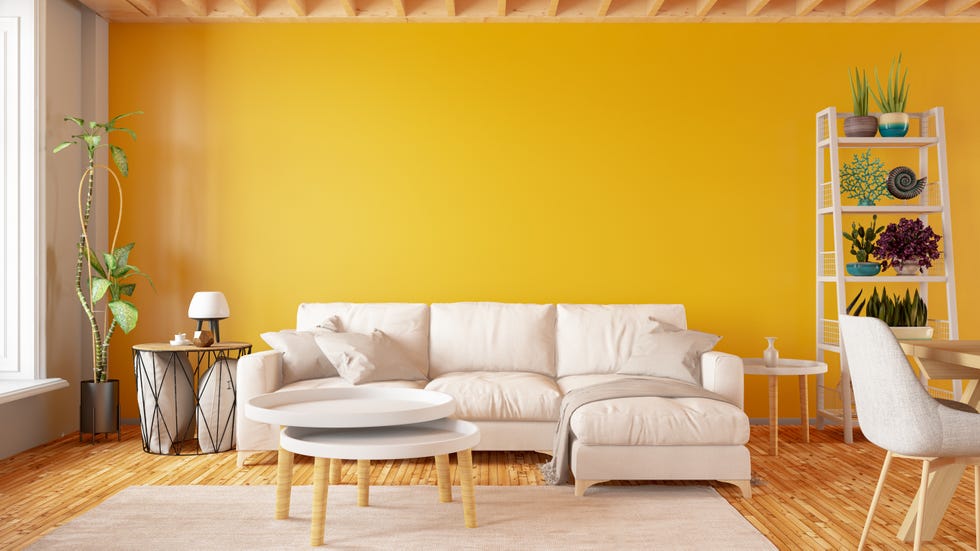
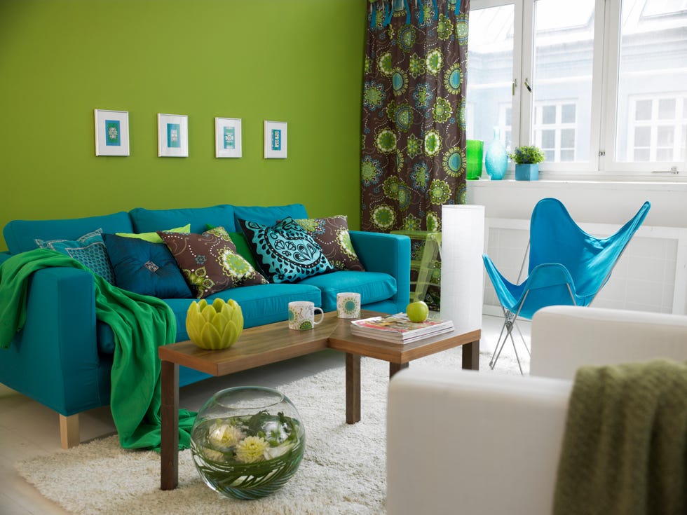
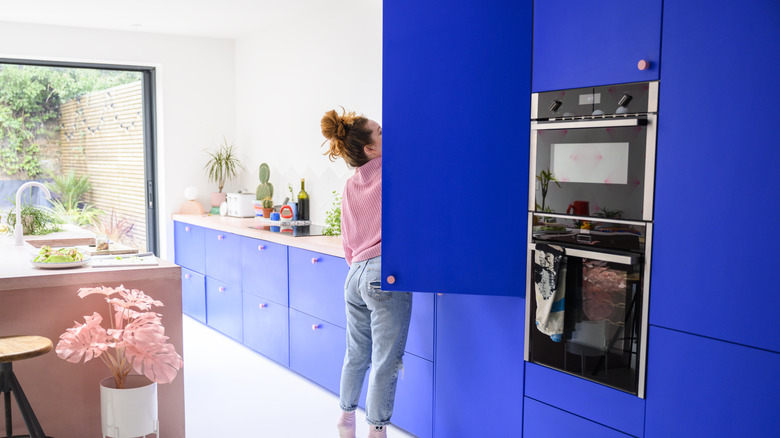
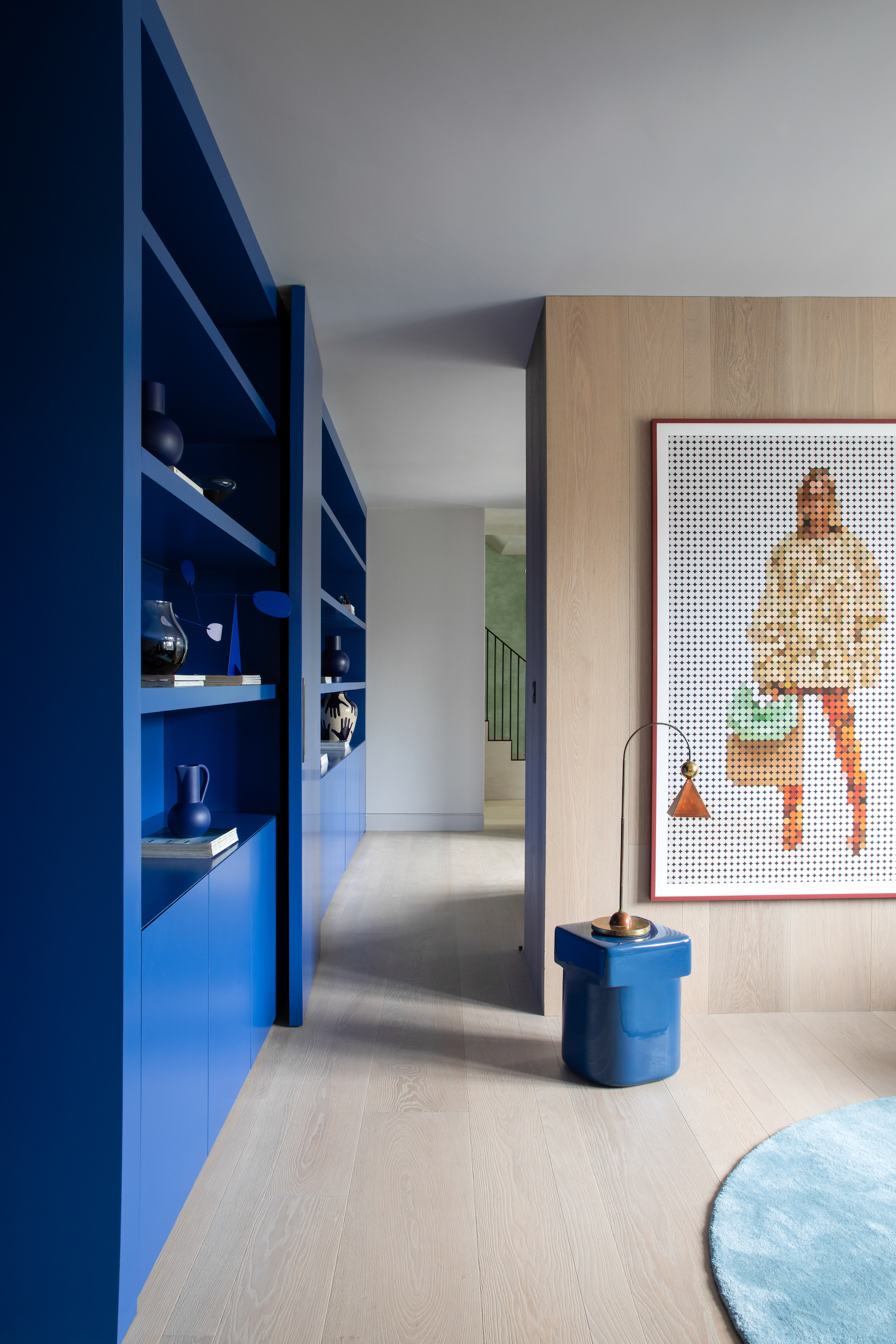
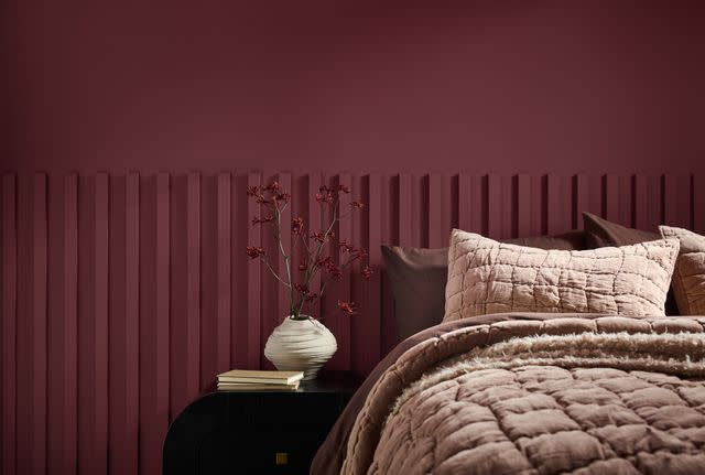
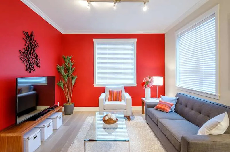
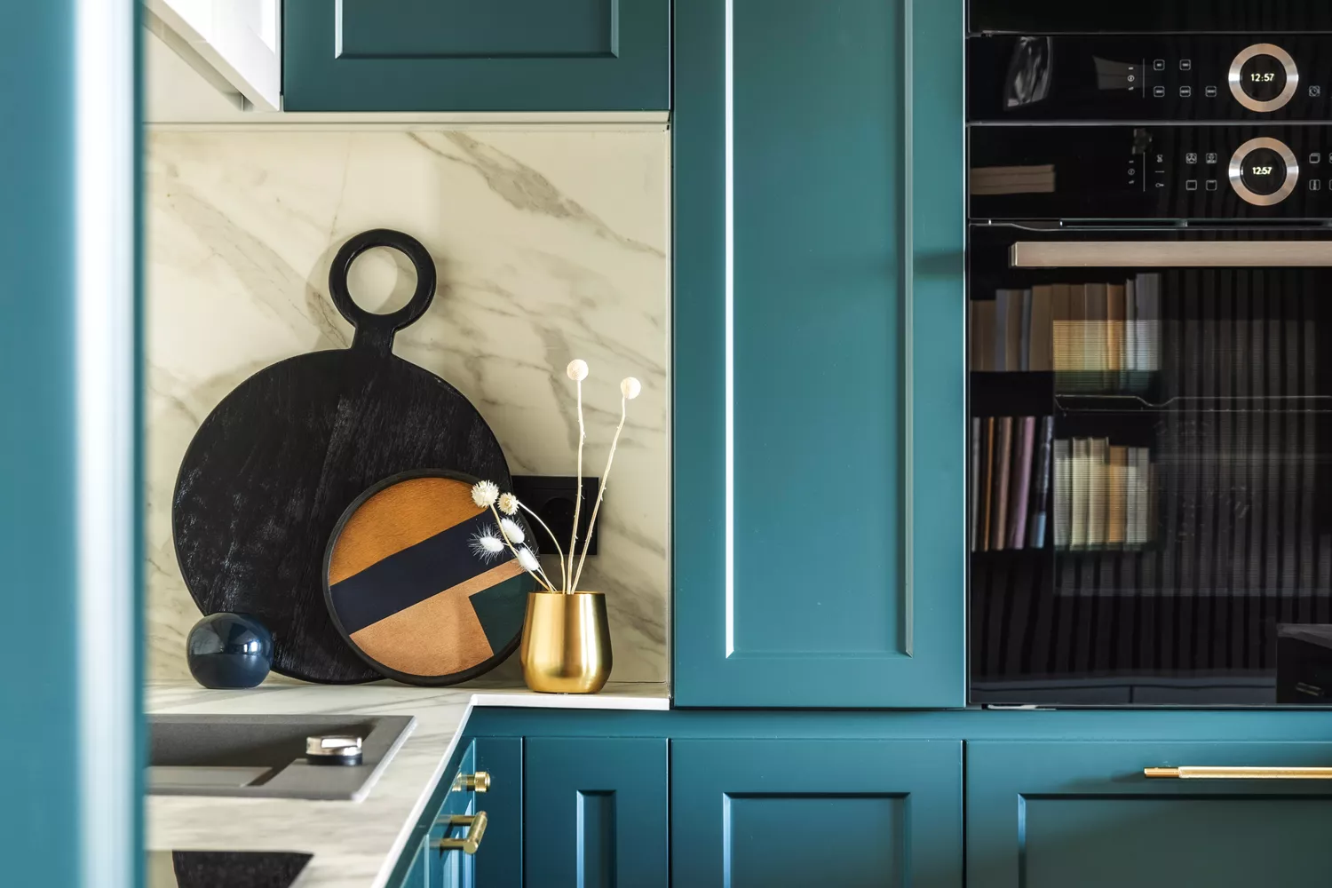
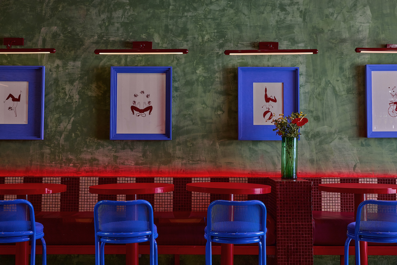
Bright, saturated colors are generally not recommended for interiors, particularly bedrooms, as they can be stimulating and hinder relaxation. Opendoor's research shows that bright or dark paint colors are a significant design deal-breaker for 13% of homebuyers. Red, in particular, is associated with danger and increased heart rate, making it unsuitable for bedrooms. However, bold colors can be acceptable for small, enclosed spaces like bathrooms or powder rooms.
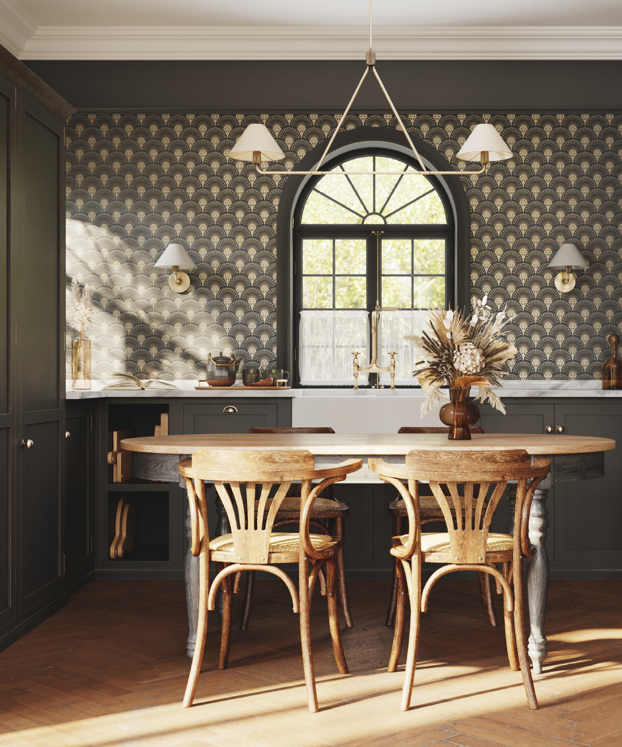
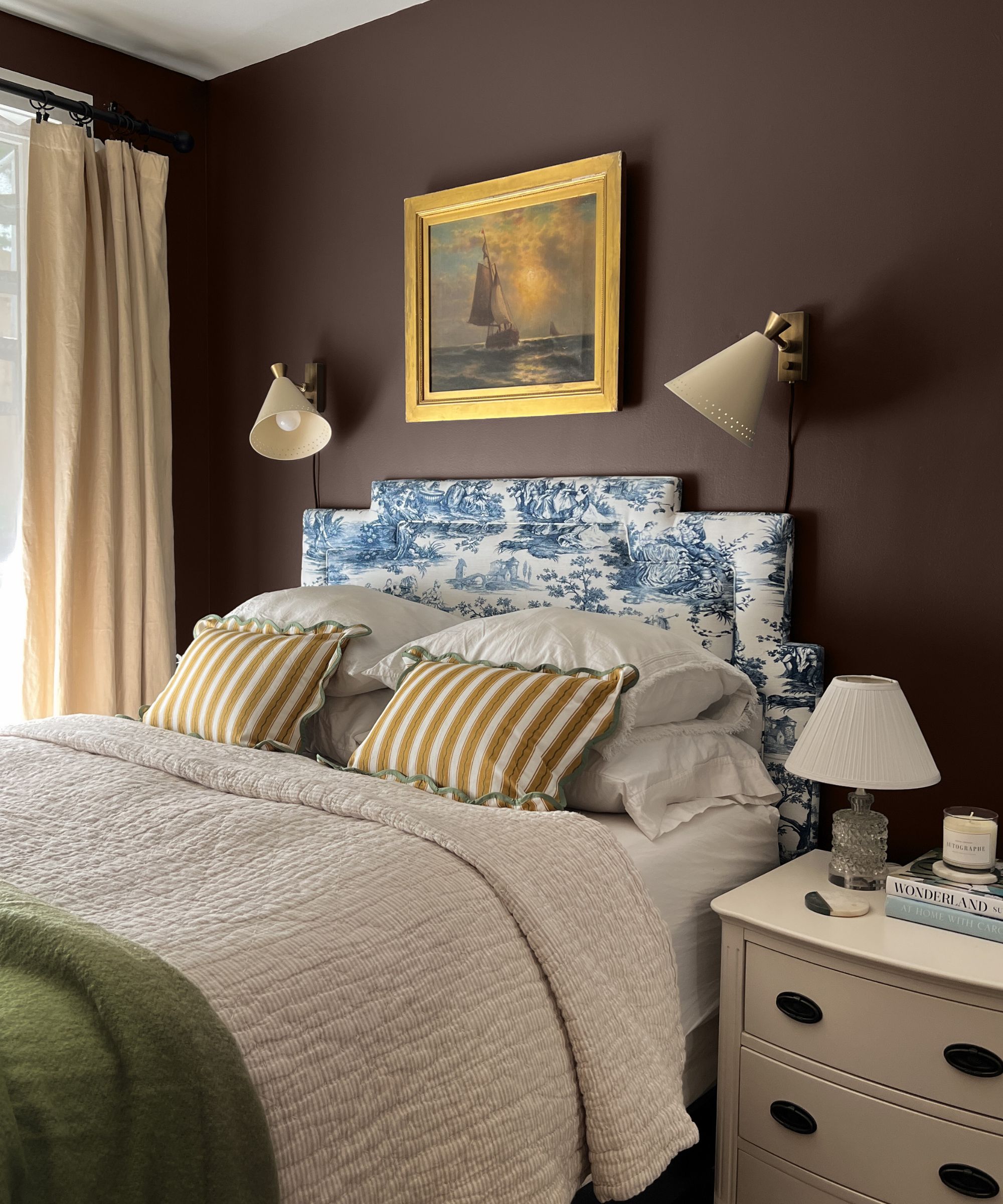
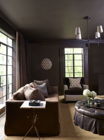
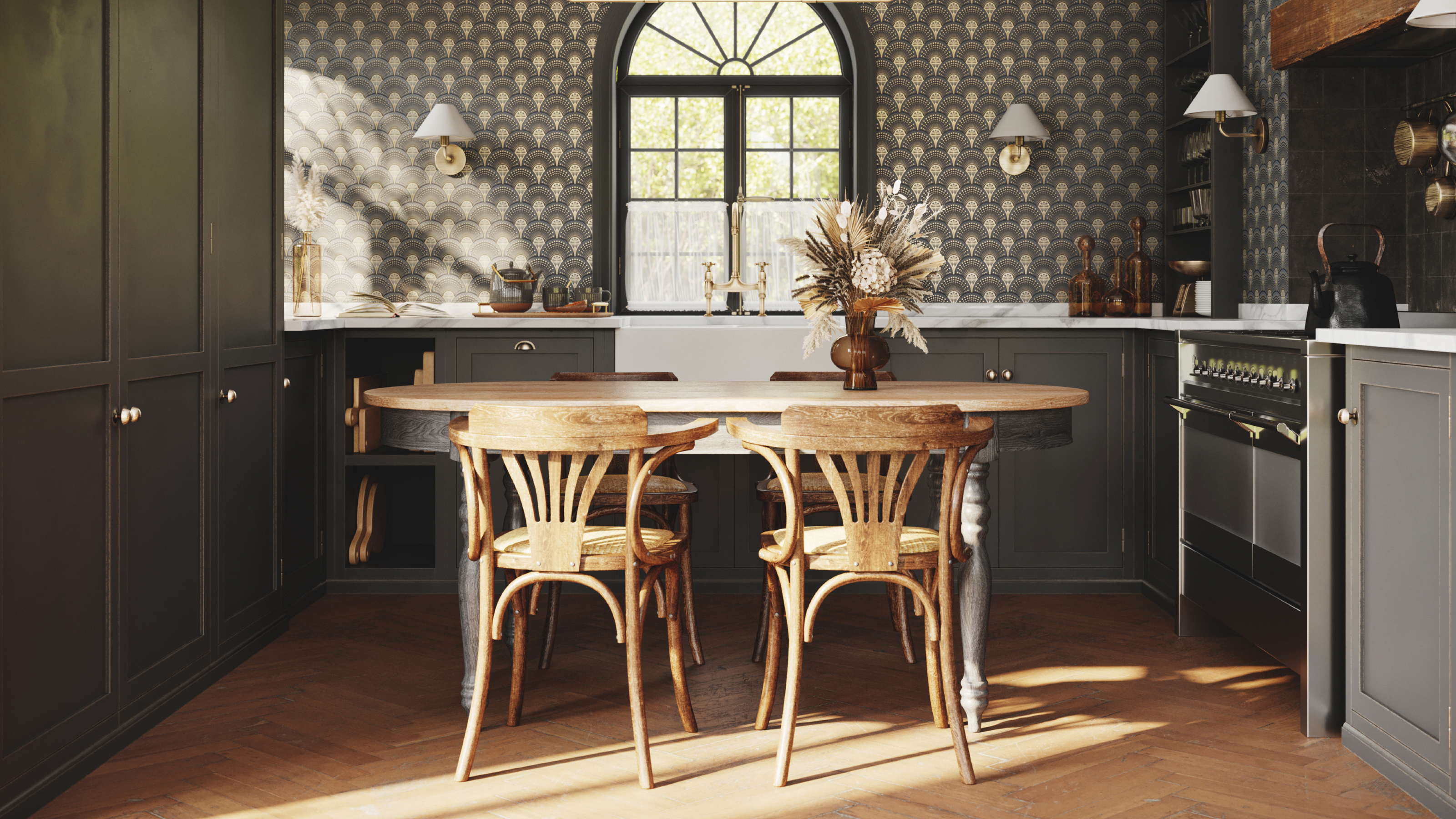
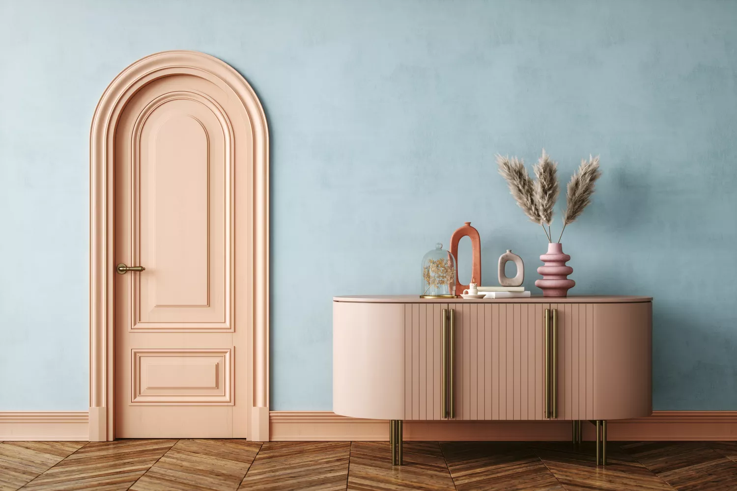
Black paint can make small or poorly lit rooms feel even smaller and darker, unless intentionally used for a dramatic, intimate effect with sufficient balancing light. Very dark paint colors are also not recommended for homes on the market, with only 2% of design professionals suggesting them for this purpose. Pastel pink and baby blue are often considered too childish or outdated for adult spaces, best reserved for accent walls rather than entire rooms. These colors can dominate a space, detracting from the room's overall aesthetic.
Finally, Pantone's 448 C, known as opaque couché, a dark green-brown hue, has been dubbed the "world's ugliest color." This color is strongly associated with negative descriptors such as "dirty," "death," and "tar," as revealed by a 2012 study, making it an ill-advised choice for any home interior due to its highly repellent nature.
#WorstPaintColors #HomeDesign #InteriorDesign #ResaleValue #ColorPsychology #HomeExterior #NeutralColors #HomeOffice #BedroomColors #PaintTrends #WorstPaintColors #HomeDesign #InteriorDesign #ResaleValue #ColorPsychology #HomeExterior #NeutralColors #HomeOffice #BedroomColors #PaintTrends
0 comment in total
 No comments yet
You may also like

What are the worst colors to paint a room? The shades experts say you should never use

6 Worst Colors To Paint Your Kitchen (And What To Choose Instead)
You should never paint your hallway this colour, according to colour psychologists
The 3 All-Time Worst Living-Room Paint Colors, According to Designers

Real Estate Experts Reveal the Paint Colors That Decrease Your Home Value—and Tricks for Finding the Perfect Hue
8 colors you should never paint kitchen cabinets according to the experts

6 Colors You Should Never Paint Your Entryway, According to Color Experts

5 Paint Colors That Experts Say You Shouldn't Use in 2025

These Paint Colors Bring Hostility to Your Home, According to Experts

Interior Designers List the Worst Paint Colors for Your Entryway

Interior design experts reveal the colour rules you should be breaking

11 Paint Colors That INSTANTLY Make Your Home Look "Expensive," According to Designers

Experts Rank the 10 Worst Paint Colors for Your Kitchen

5 colors you should never paint a small room – designers warn us to steer clear of these hues, and what to pick instead
8 Surprising Colors That Will Decrease Your Home's Value, According to Experts

5 colors you should never paint a pantry – designers share the shades they swerve

5 colors you should never paint your entryway – according to interior experts
5 'ugly colors' that I'll be decorating with in 2024 – these undesirable colors will trend this year
7 'Unhappy' Colors That Color Psychology Experts Would Never Paint Their Walls

5 Colors You Should Never Paint Your Hallway, According to Designers