Experts Rank the 10 Worst Paint Colors for Your Kitchen
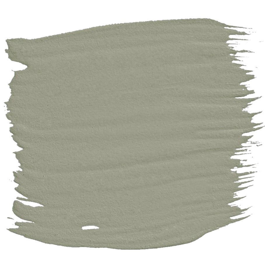
Choosing the right paint color for a kitchen is crucial, as certain hues can negatively impact the atmosphere and even appetite. While classic choices like white, sage green, timeless taupe, and navy blue are generally favored, some colors are advised against by design experts. The primary consideration when selecting a kitchen color should always be personal preference, aiming for a shade that promotes happiness and peace during daily activities, whether it's holiday meal prep or a quick Tuesday dinner. However, designers highlight several colors that are best avoided due to their potentially overwhelming or uninviting effects.
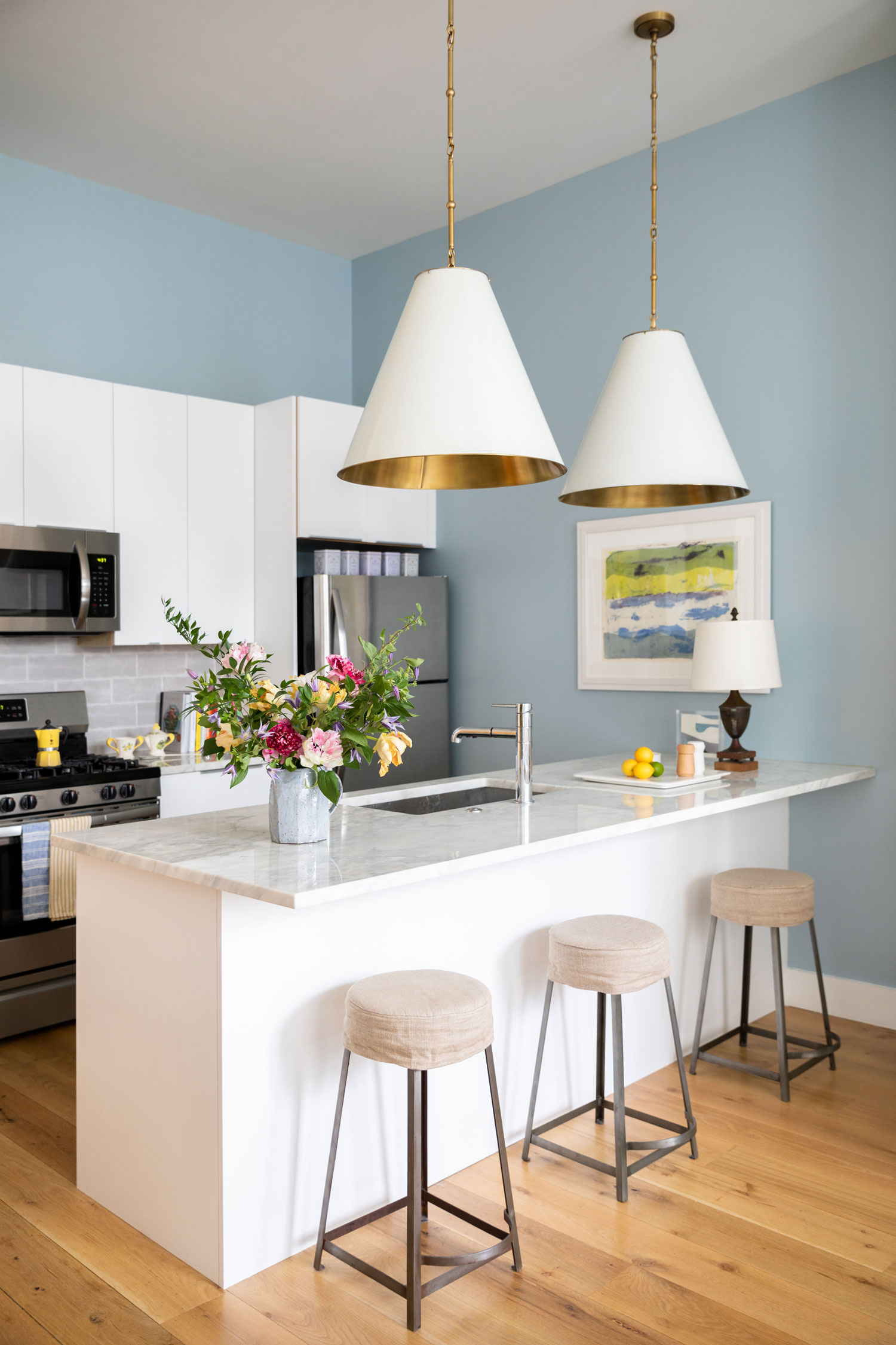
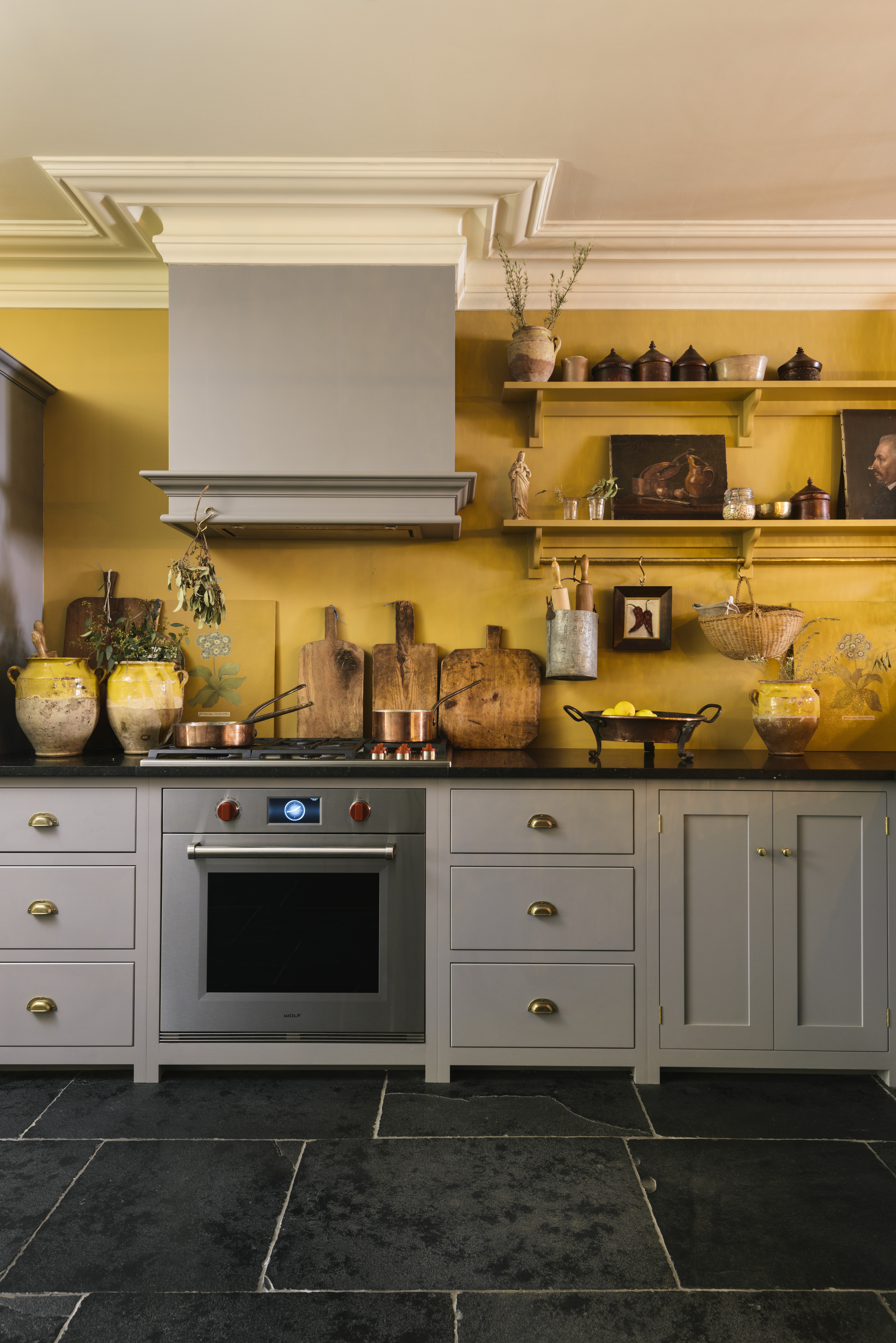
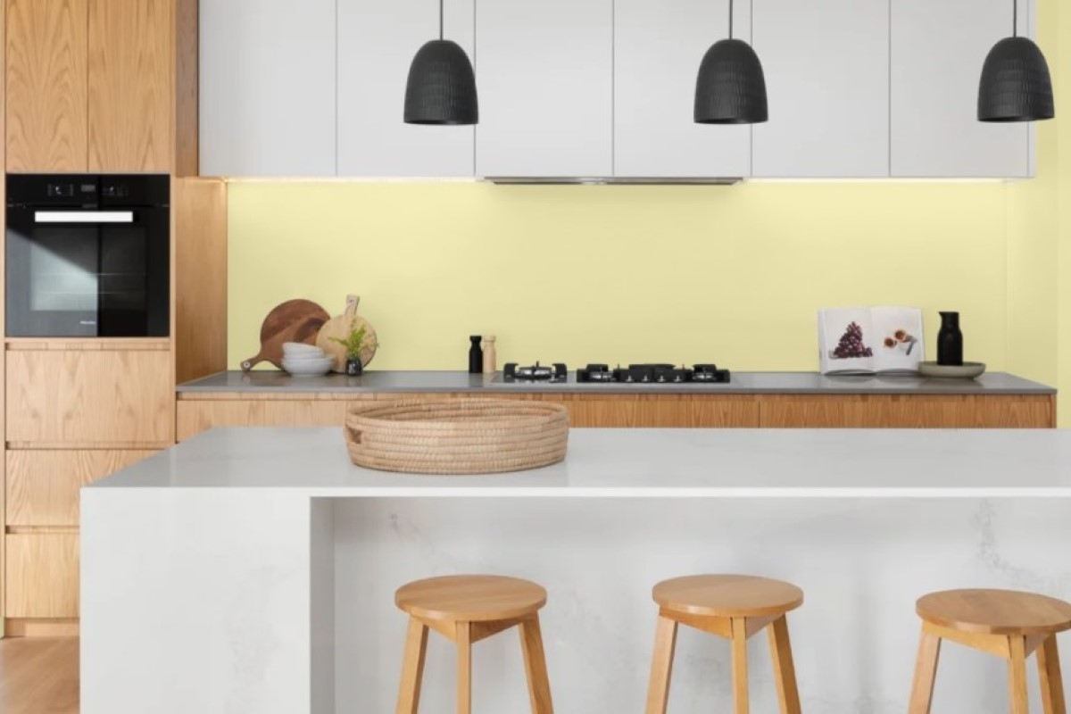
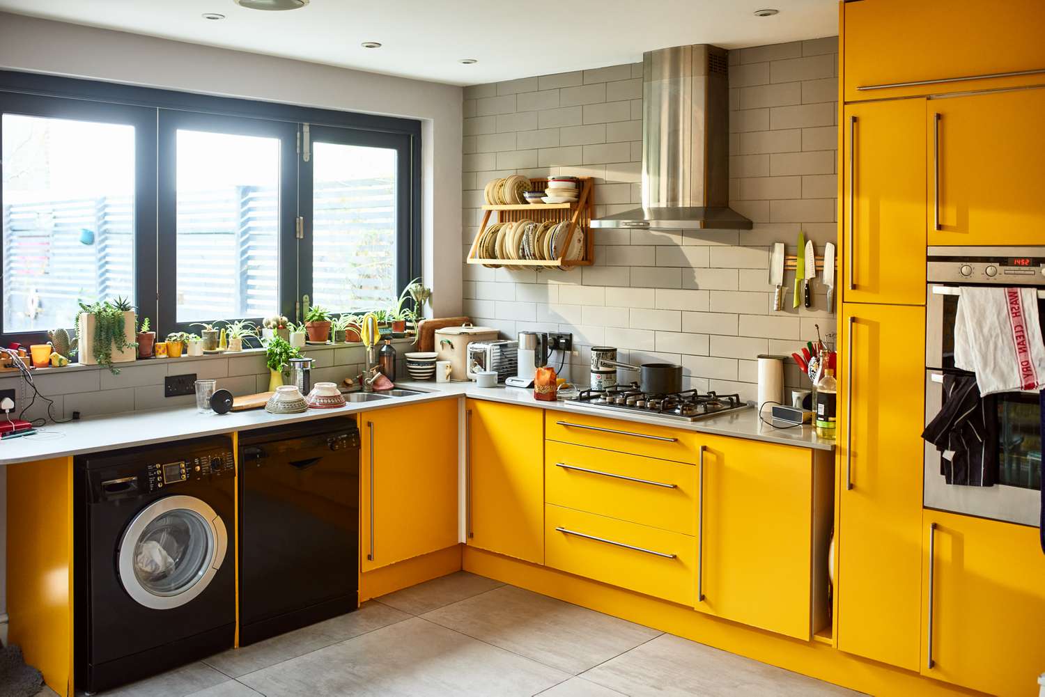
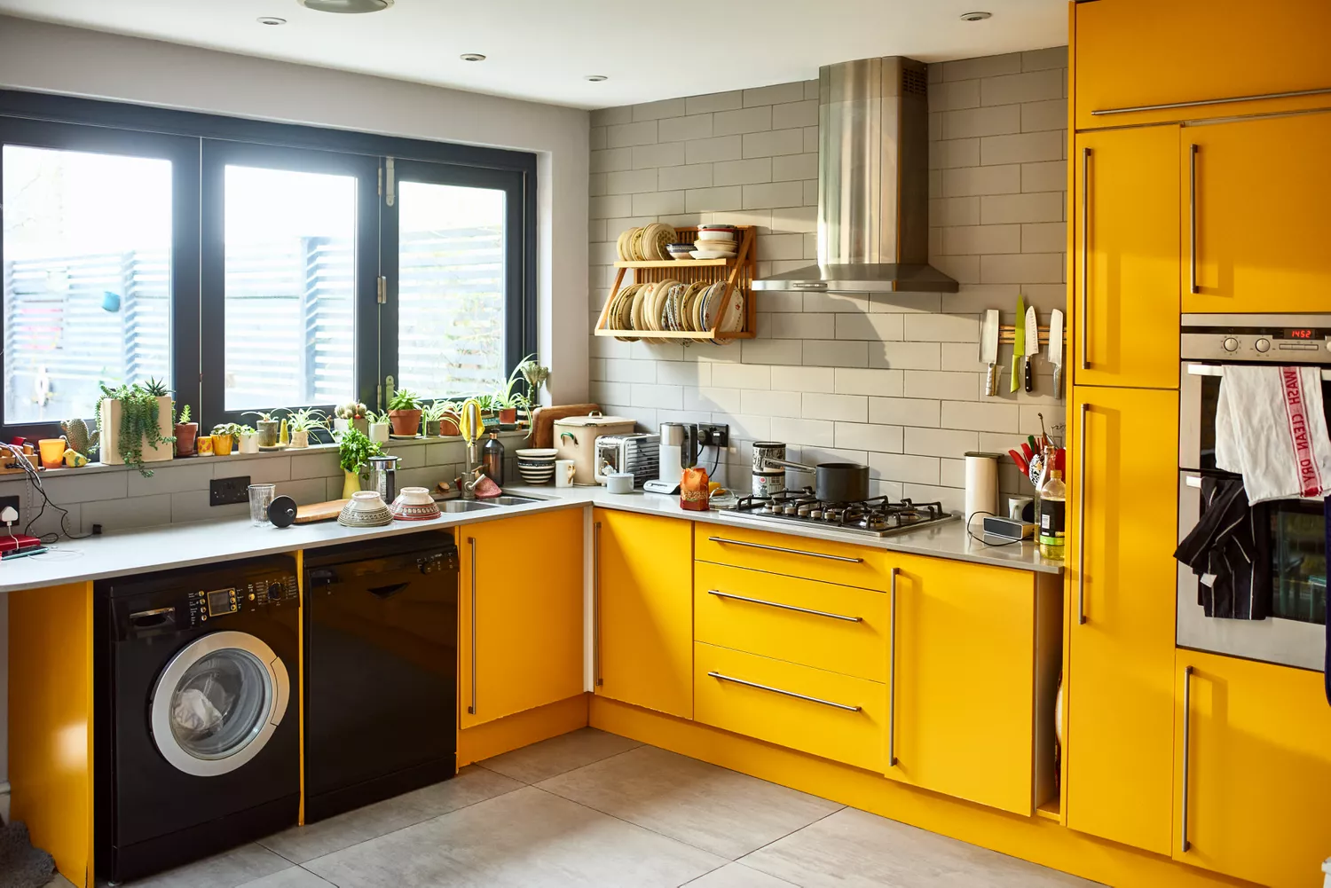
Bright red, despite its appetite-stimulating properties for accents, is considered too intense for an entire kitchen, as it can be overwhelming and even contribute to increased tension. Cool gray, a popular choice for its potential resale value, can make a kitchen feel stark and uninviting if the wrong tone is selected. Warmth and vibrancy are essential in kitchens, making overly cool grays unsuitable, especially under bright lighting. Similarly, while yellow can be cheerful, bright yellow tones can be overstimulating and may suppress appetite, with designers recommending softer, inviting shades instead of neon versions.
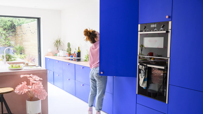
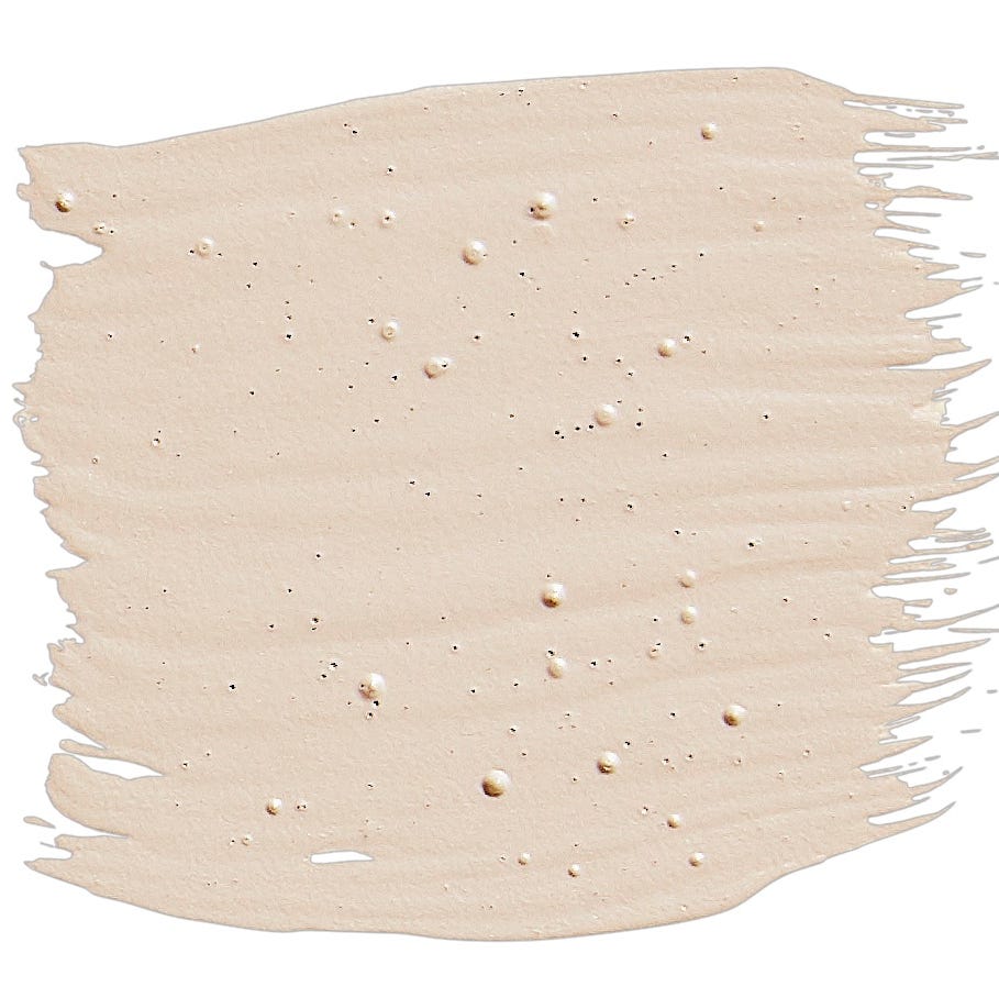
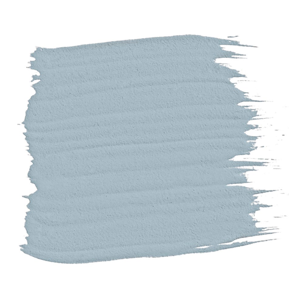
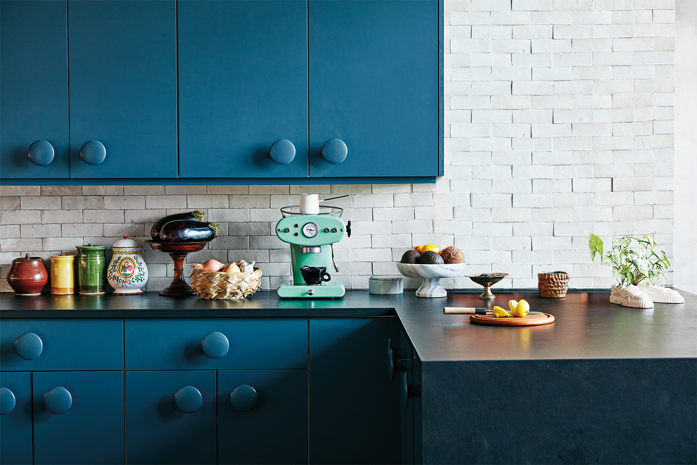
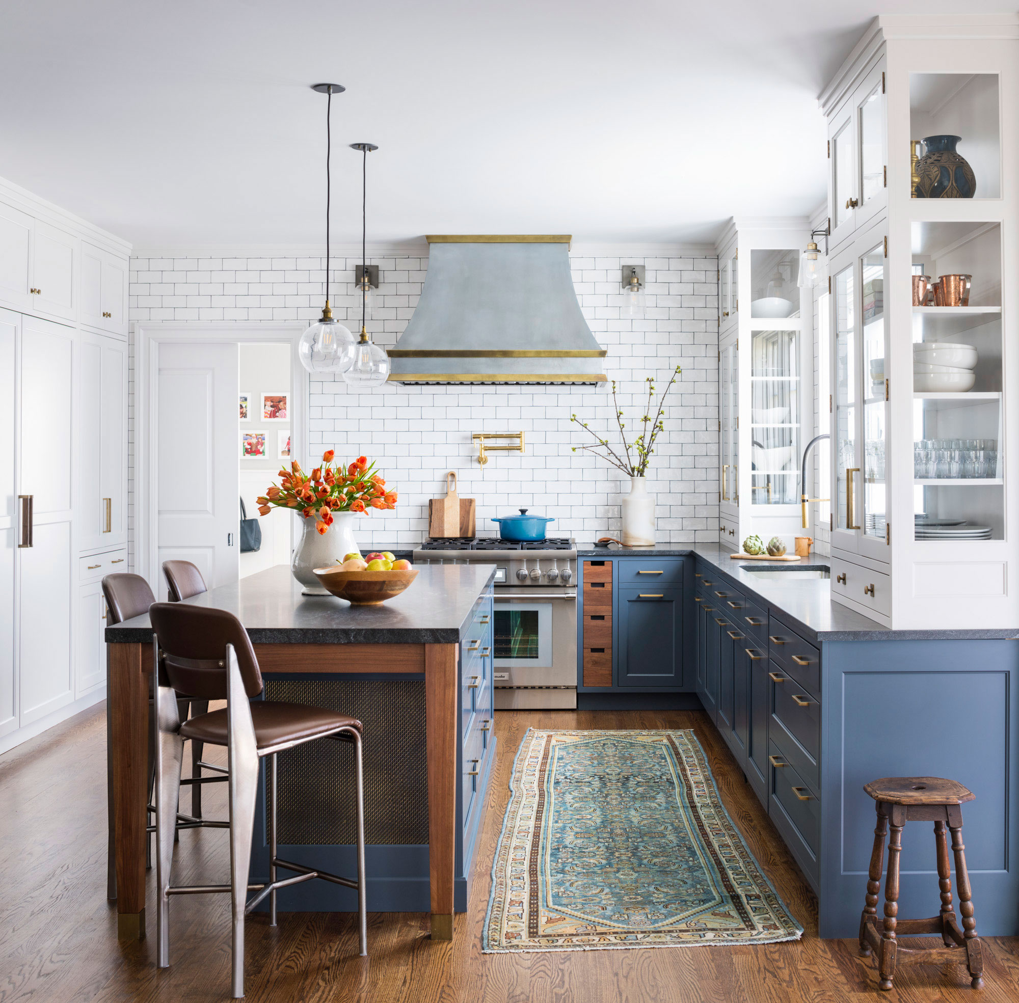
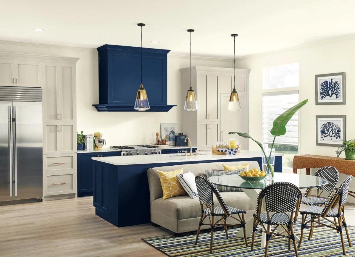
Yellow-tinted beige is another color to avoid, as it can quickly make a kitchen appear outdated; a light or medium taupe is suggested as a warmer alternative. Blue, though popular in design, is cautioned against for kitchens as some studies suggest it can suppress appetite, possibly due to its rarity in natural foods, leading to a subconscious association with unappetizing food. Deep red, like bright red, is deemed too intense for an entire kitchen space, particularly in an area meant for gathering and entertaining, due to its overstimulating nature.
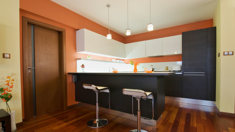
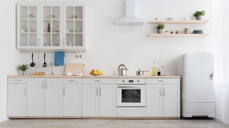
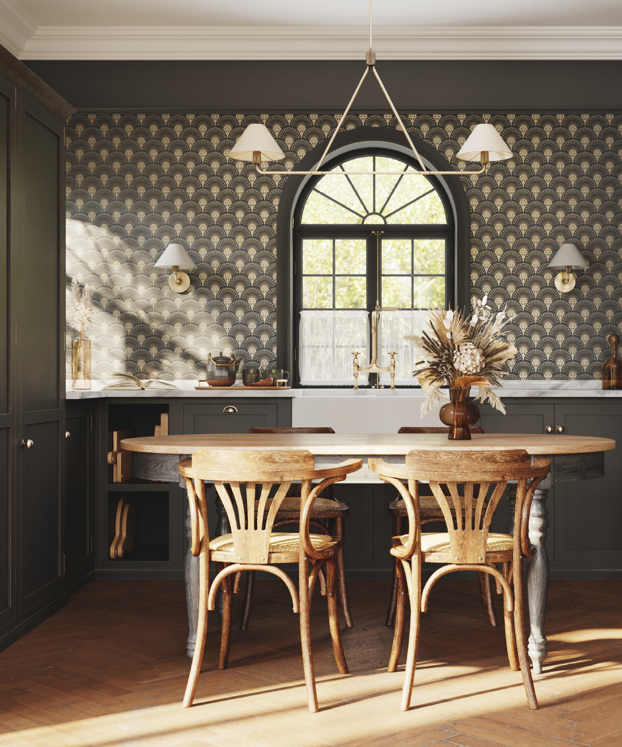
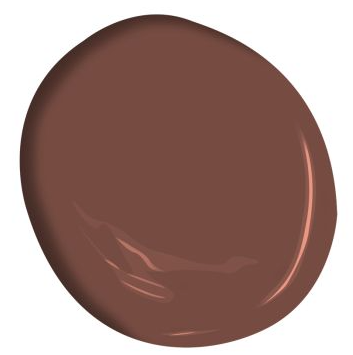
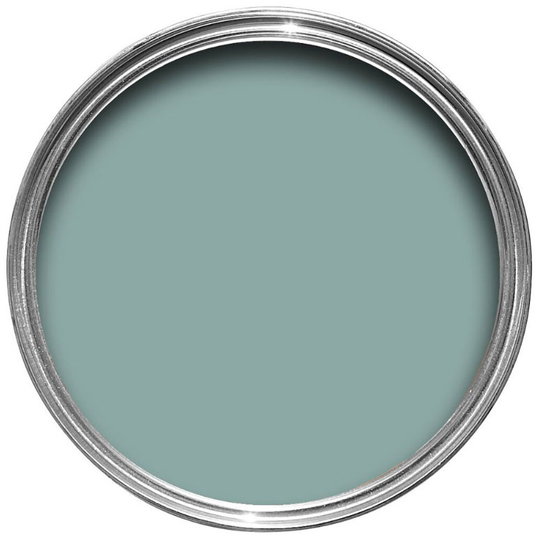
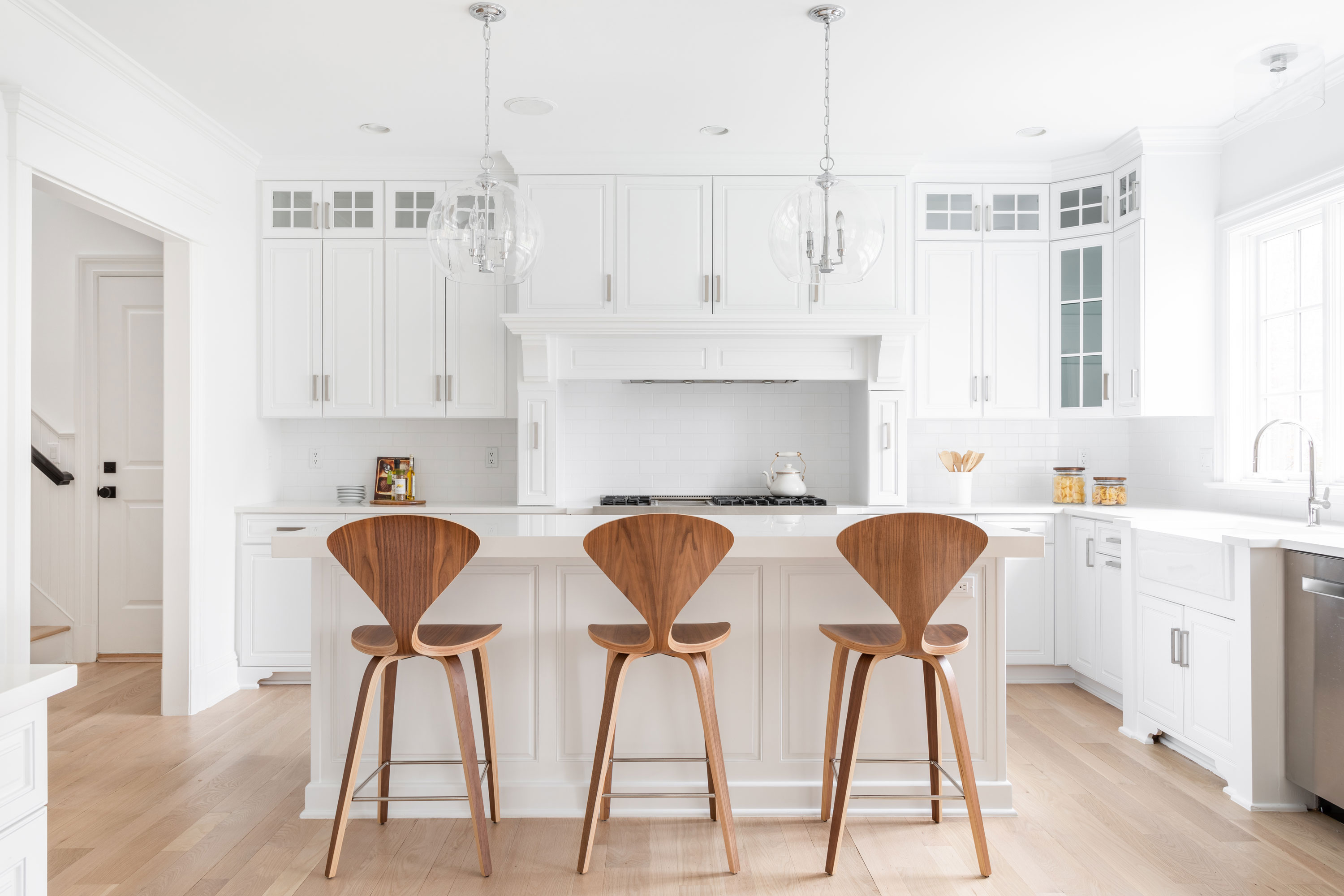
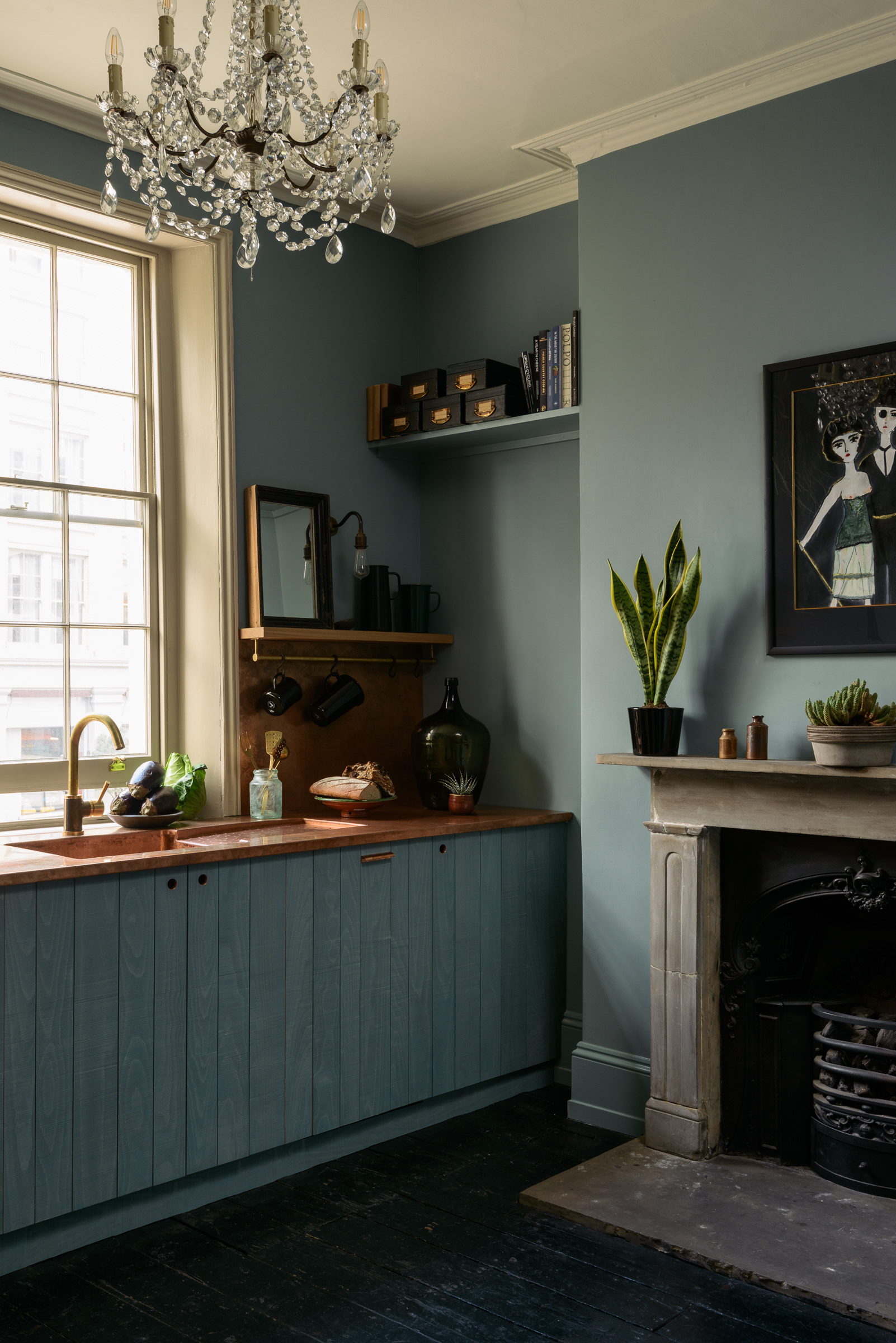
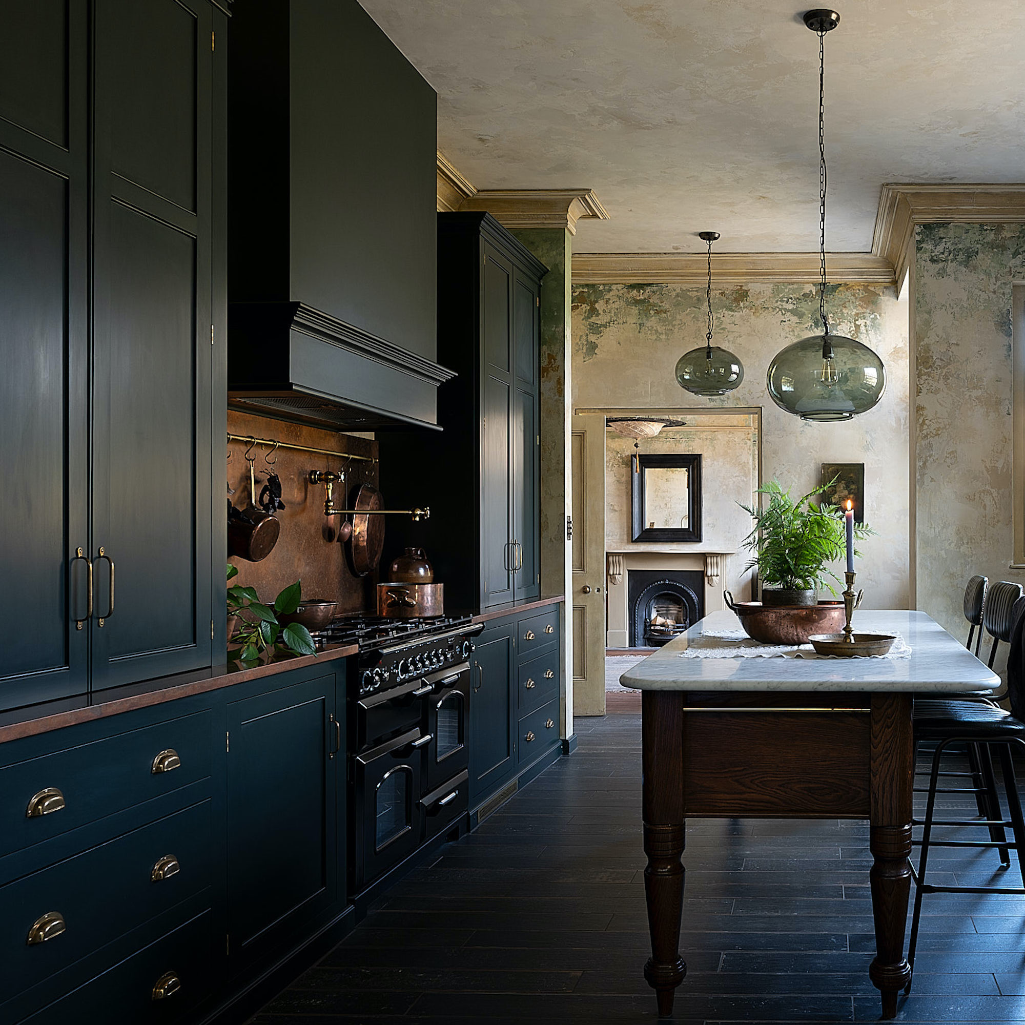
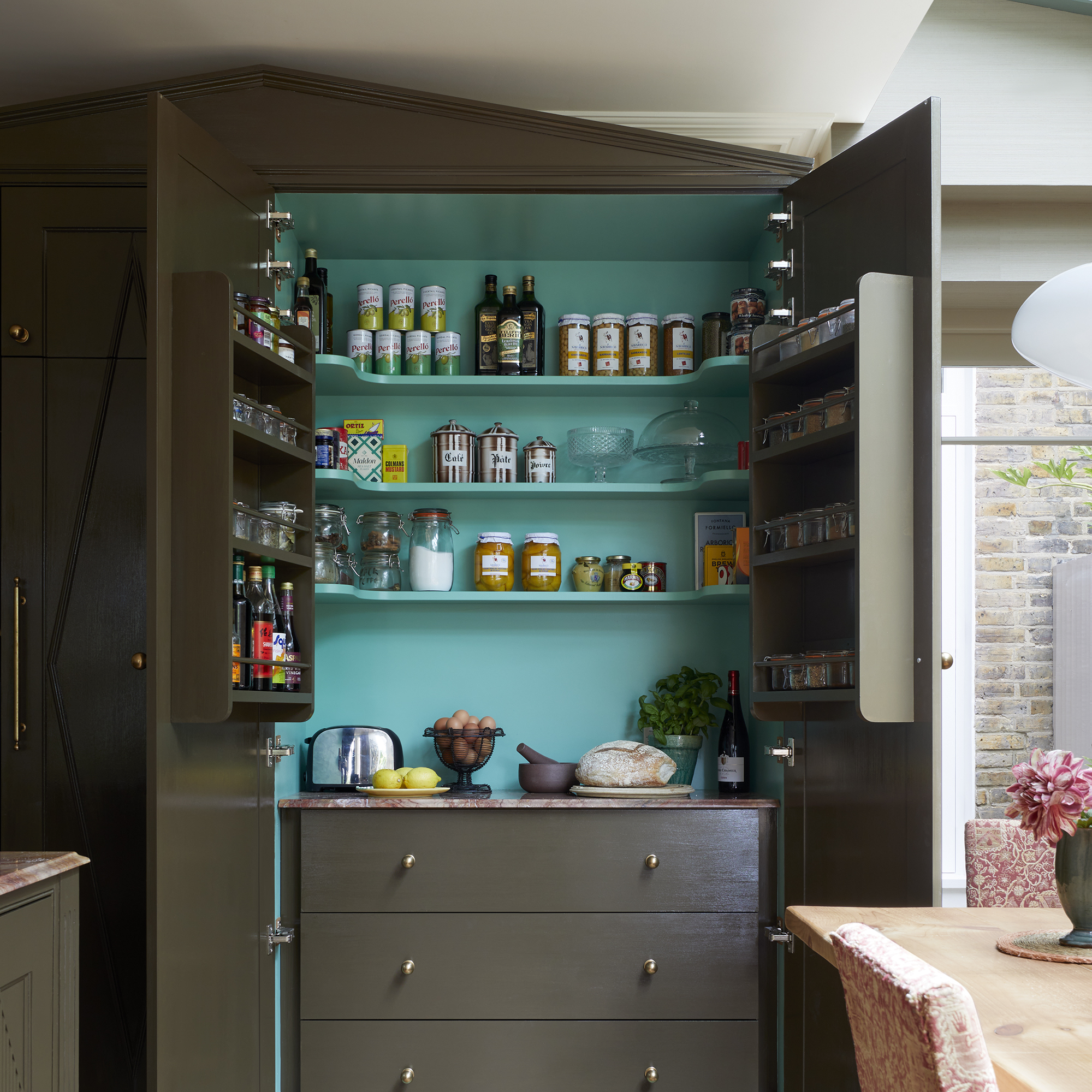
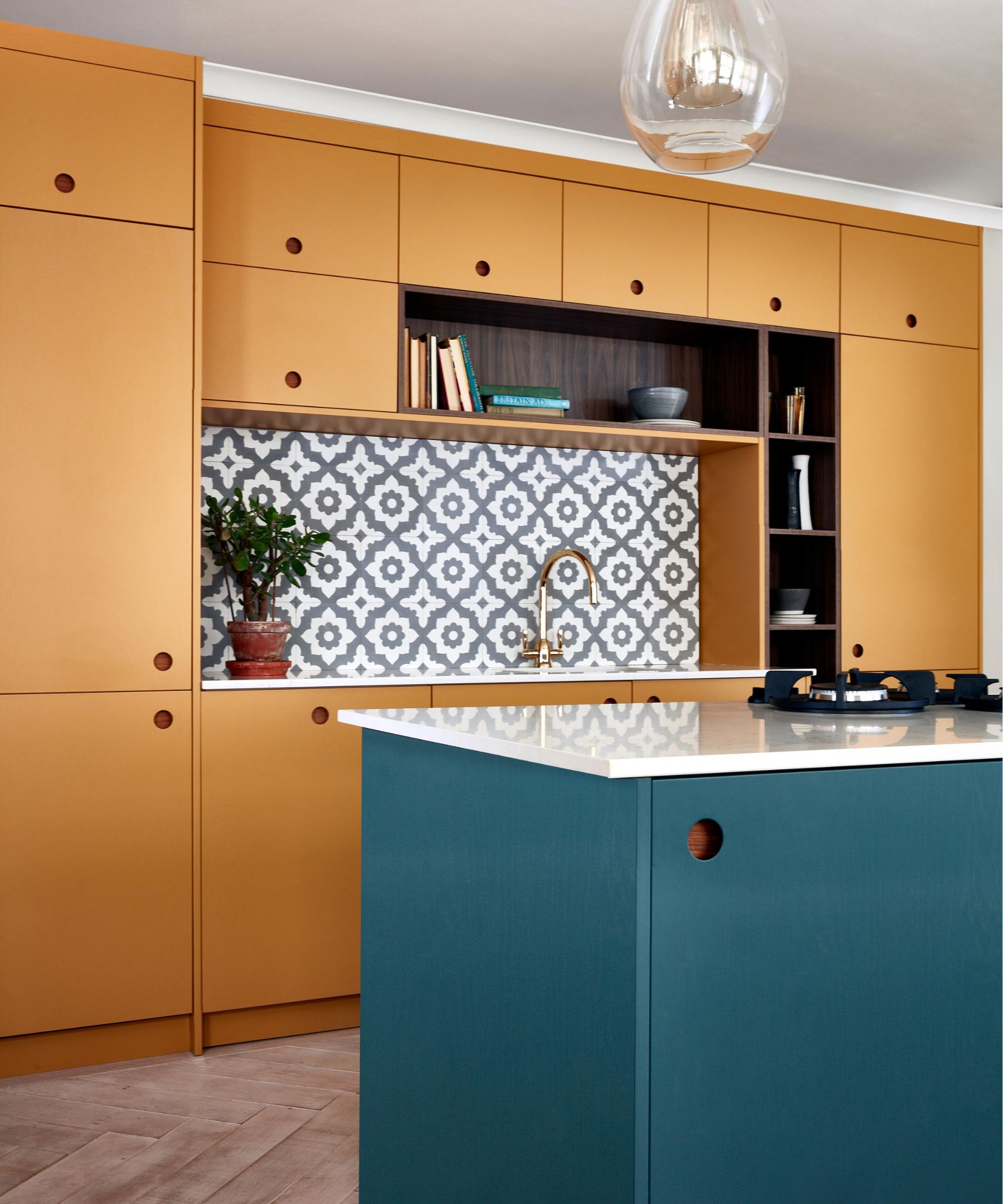
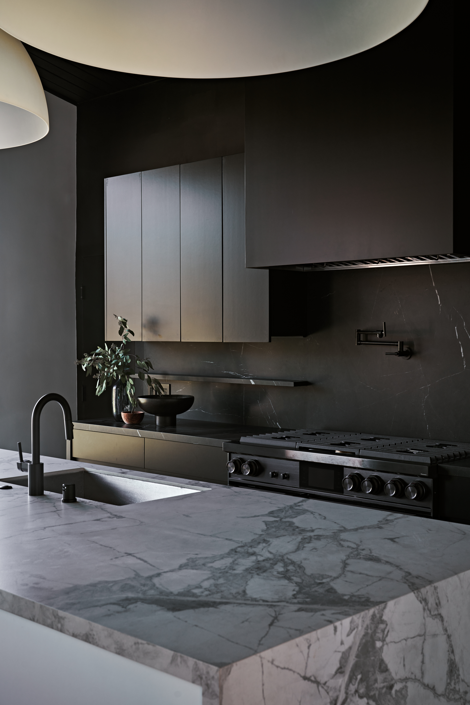
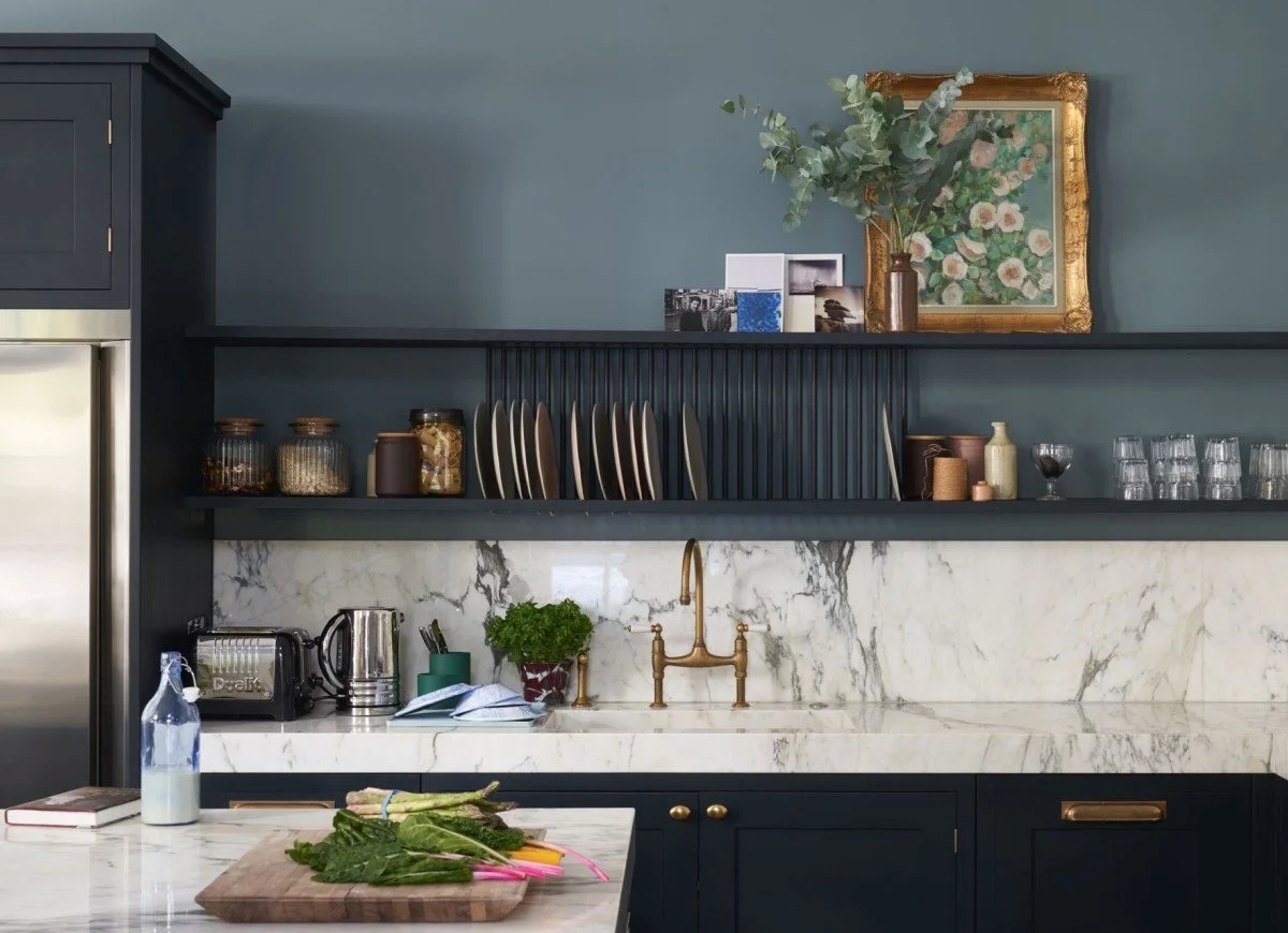
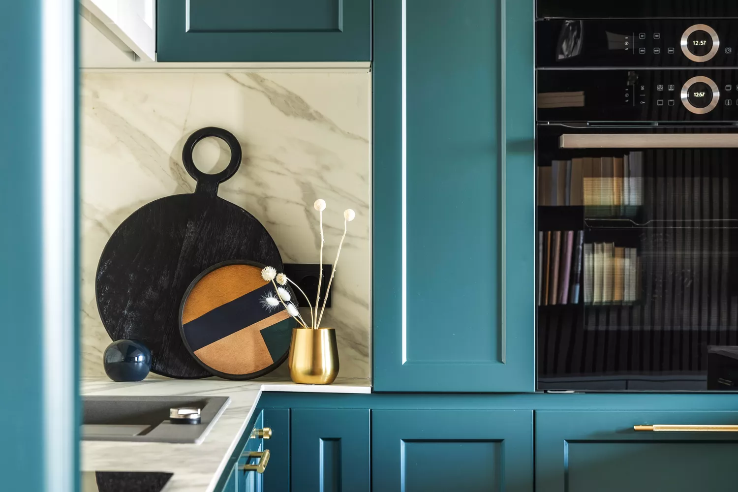
Dark brown can make a kitchen feel smaller and oppressive, blocking essential light needed for a warm and inviting atmosphere. It also tends to show dust and smudges more easily, increasing maintenance. Orange, while playful and energetic, can detract from the visual appeal of food and the overall luxurious feel of a space, making it less ideal for a kitchen. Bright teal, a rich blue-green, is also discouraged as it can make a kitchen feel cold and overly energetic, especially in the absence of natural light on a winter morning. Finally, stark white, though a classic symbol of cleanliness, can drain a kitchen of warmth, creating a sterile environment. A softer, more layered white with cream or taupe undertones is recommended to allow natural light to create a gentle warmth, balancing crispness with comfort and vitality.
#KitchenDesign #PaintColors #HomeDecor #InteriorDesign #ColorPsychology #DesignTips #HomeImprovement #KitchenDesign #PaintColors #HomeDecor #InteriorDesign #ColorPsychology #DesignTips #HomeImprovement
0 comment in total
 No comments yet
You may also like
6 Worst Colors To Paint Your Kitchen (And What To Choose Instead)
The Color to Never Paint Your Kitchen Cabinets, According to a Top L.A. Designer
The Best Kitchen Paint Colors All Have This One Thing In Common
Interior Designers List the Worst Paint Colors for Your Entryway
8 colors you should never paint kitchen cabinets according to the experts

It’s Official: These are the Best Kitchen Paint Colors, According to Designers
4 Colors You Should Never Paint Cabinets, According To Designers
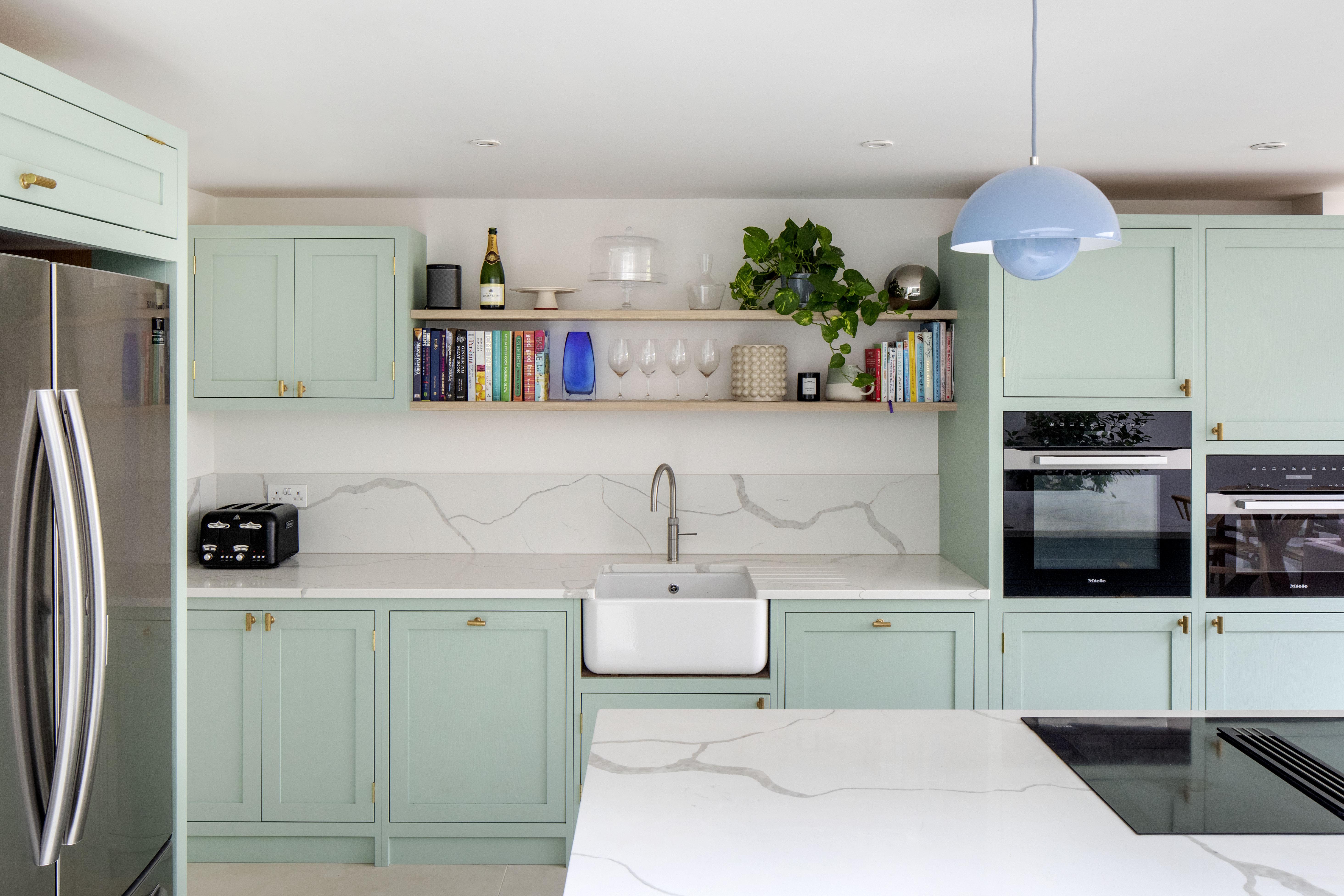
10 kitchen cabinet color mistakes to avoid for a cool and contemporary result

What are the worst colors to paint a room? The shades experts say you should never use

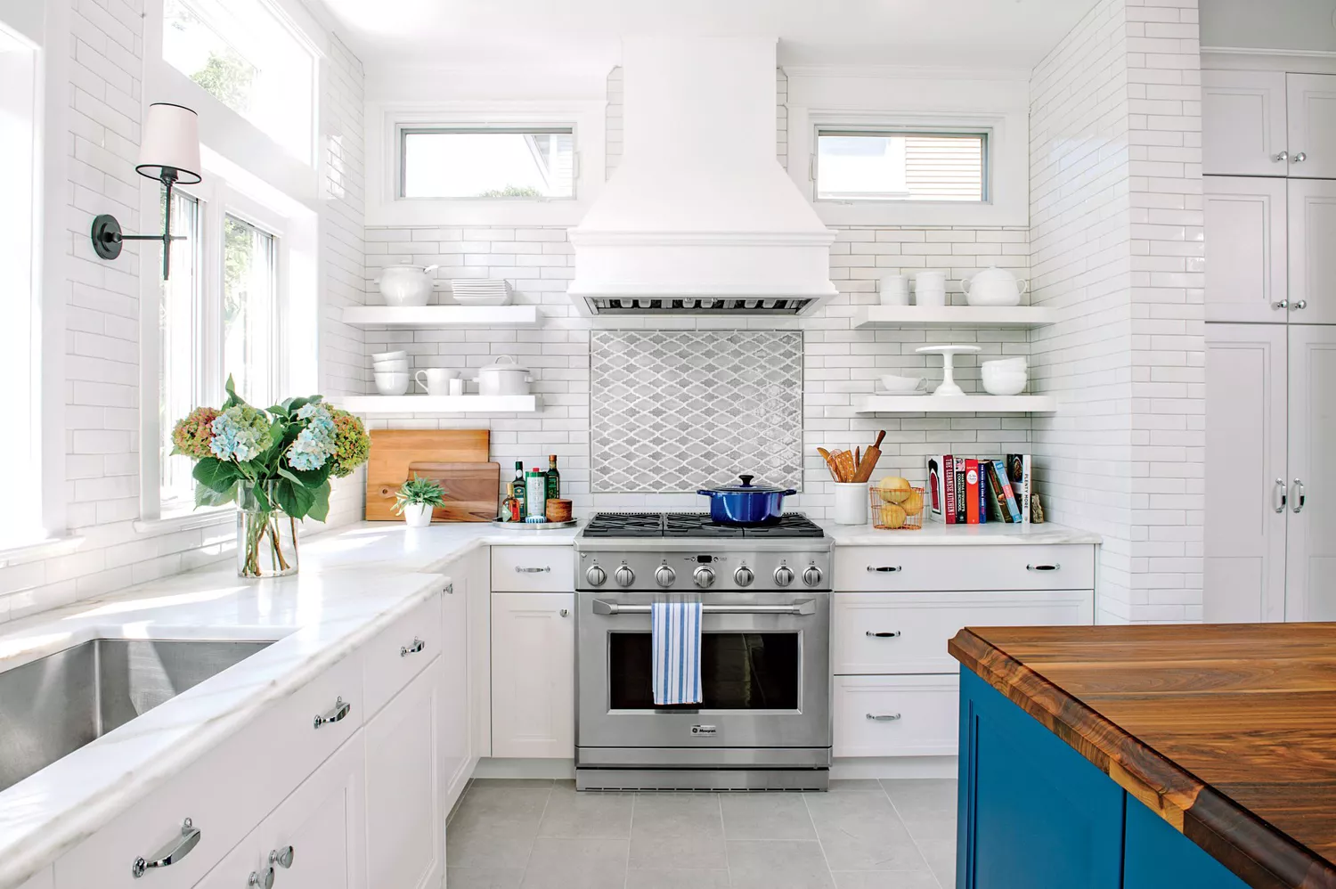
7 Paint Colors To Never Use In Your Kitchen, According To Designers

5 colors you should never paint your entryway – according to interior experts
The best colors for kitchen appliances, according to interiors experts

The 10 Worst Paint Colors for Your Home, Experts Say


5 colors you should never paint a pantry – designers share the shades they swerve
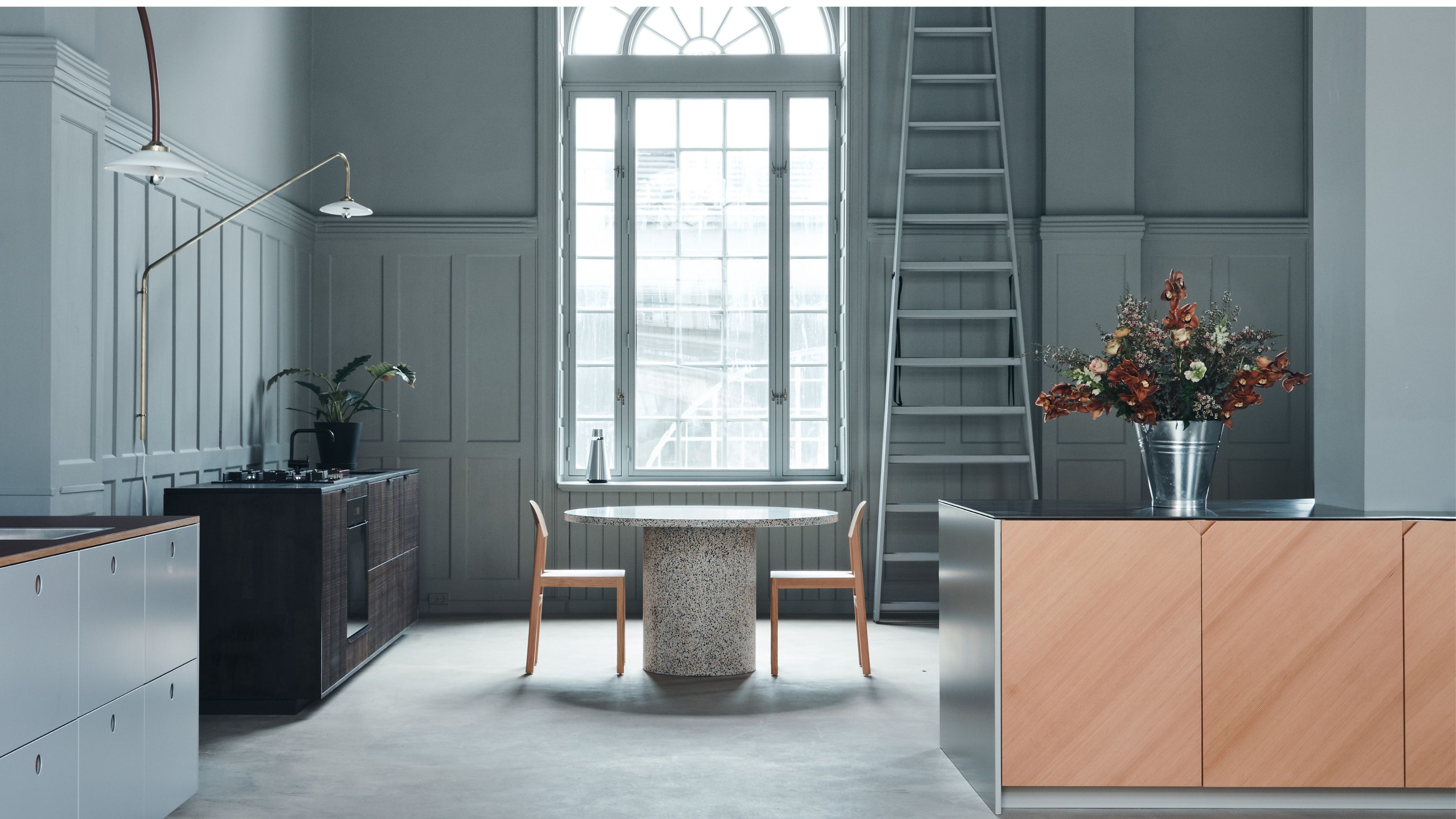
5 Reasons You Shouldn't Paint Your Kitchen Walls White — And the Alternatives You Need to Try

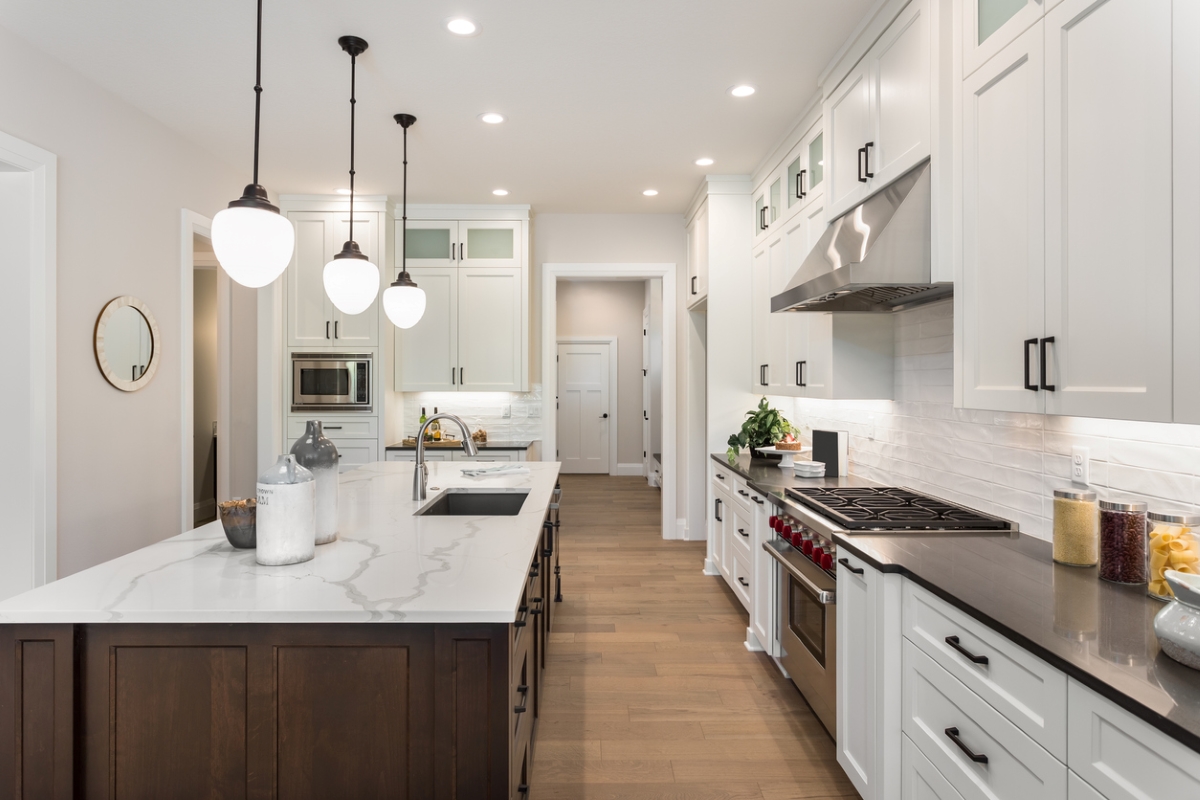
29 Best Paint Colors for a Kitchen You’ll Never Want to Leave

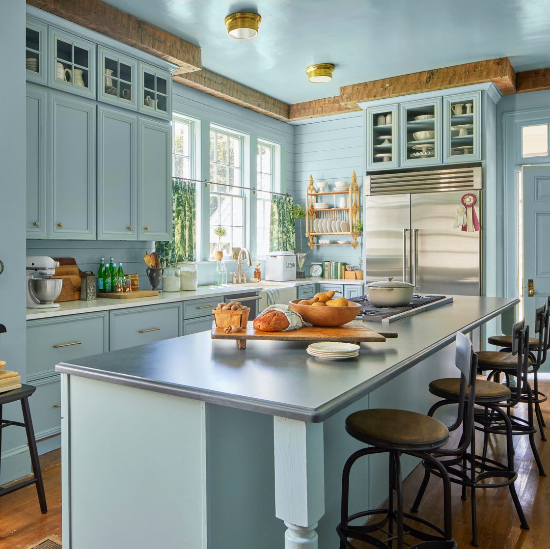
10 Kitchen Paint Colors You Won’t Regret in 10 Years, According to Designers
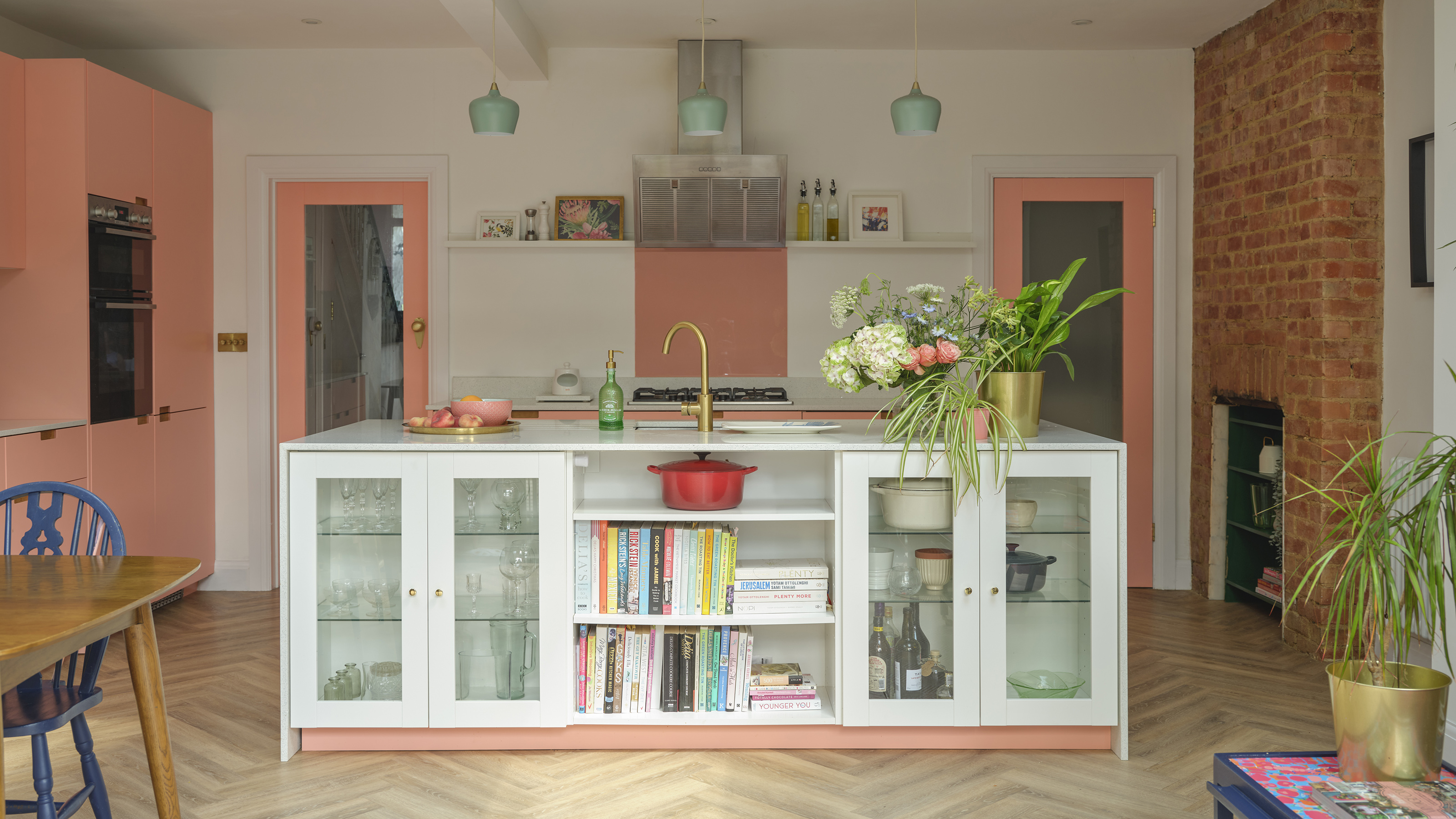
The best colours to paint a kitchen according to paint pros - pick the perfect shade for large, small, dark and light spaces
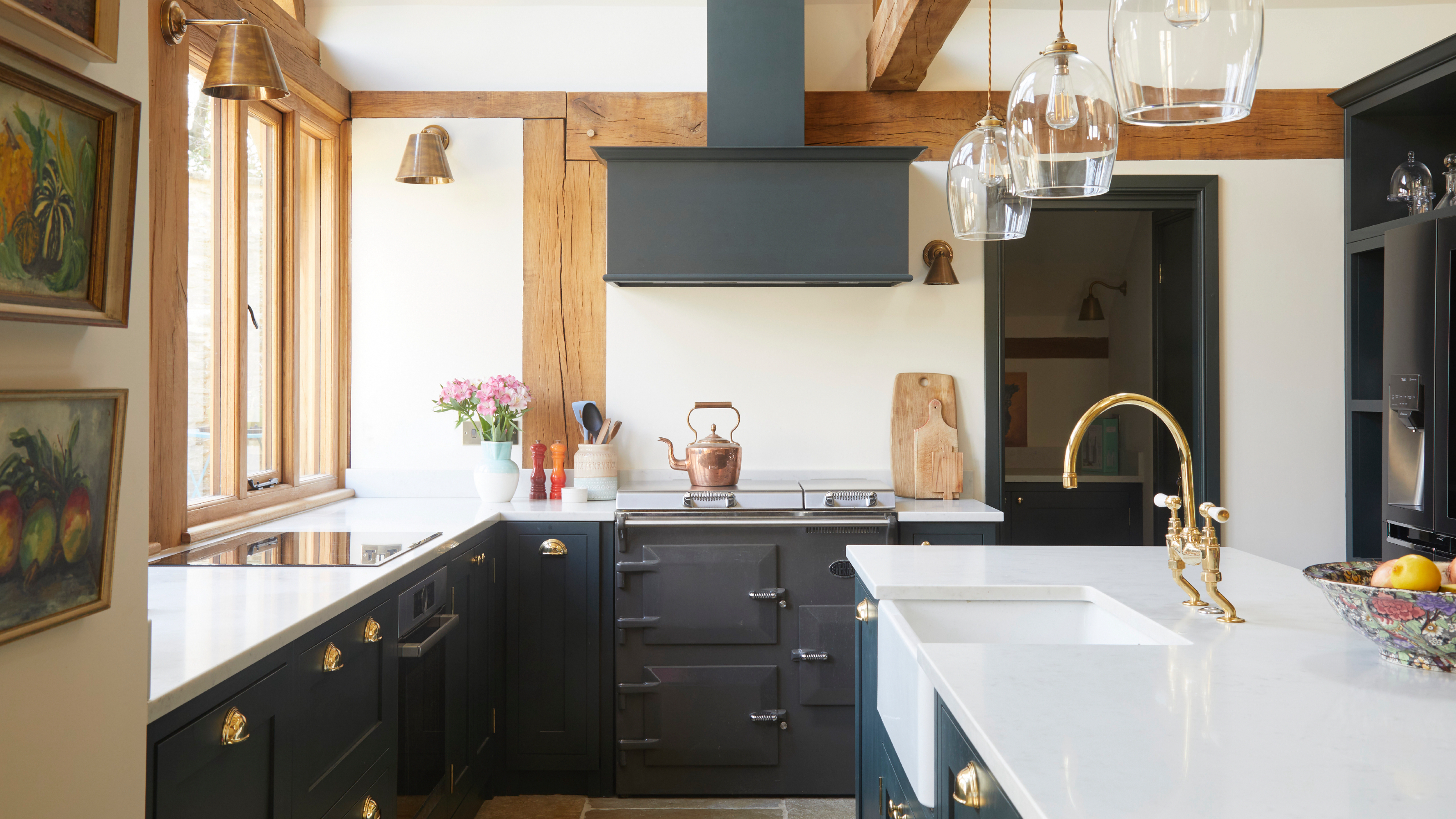
The best paint finishes for dark colours in a kitchen
5 Outdated Kitchen Paint Colors That Interior Designers Are Tired of Seeing