1/10
The best colours to paint a kitchen according to paint pros - pick the perfect shade for large, small, dark and light spaces
The kitchen serves as a central hub for socializing, entertaining, and cooking, making its color scheme a crucial element in determining the overall feel and aesthetic of the home. The right paint color can significantly impact the perception of space, allowing a kitchen to appear larger, creating distinct zones, or imparting a rustic or contemporary touch. Choosing a relevant historic color can add context and interest to the design, especially when considering the architectural style or cabinet type, whether sleek modern, traditional, or rustic. It is important to integrate existing elements like furniture, flooring, and appliances into the color palette to ensure harmony. Color can also be used effectively to highlight architectural features or areas of particular interest.
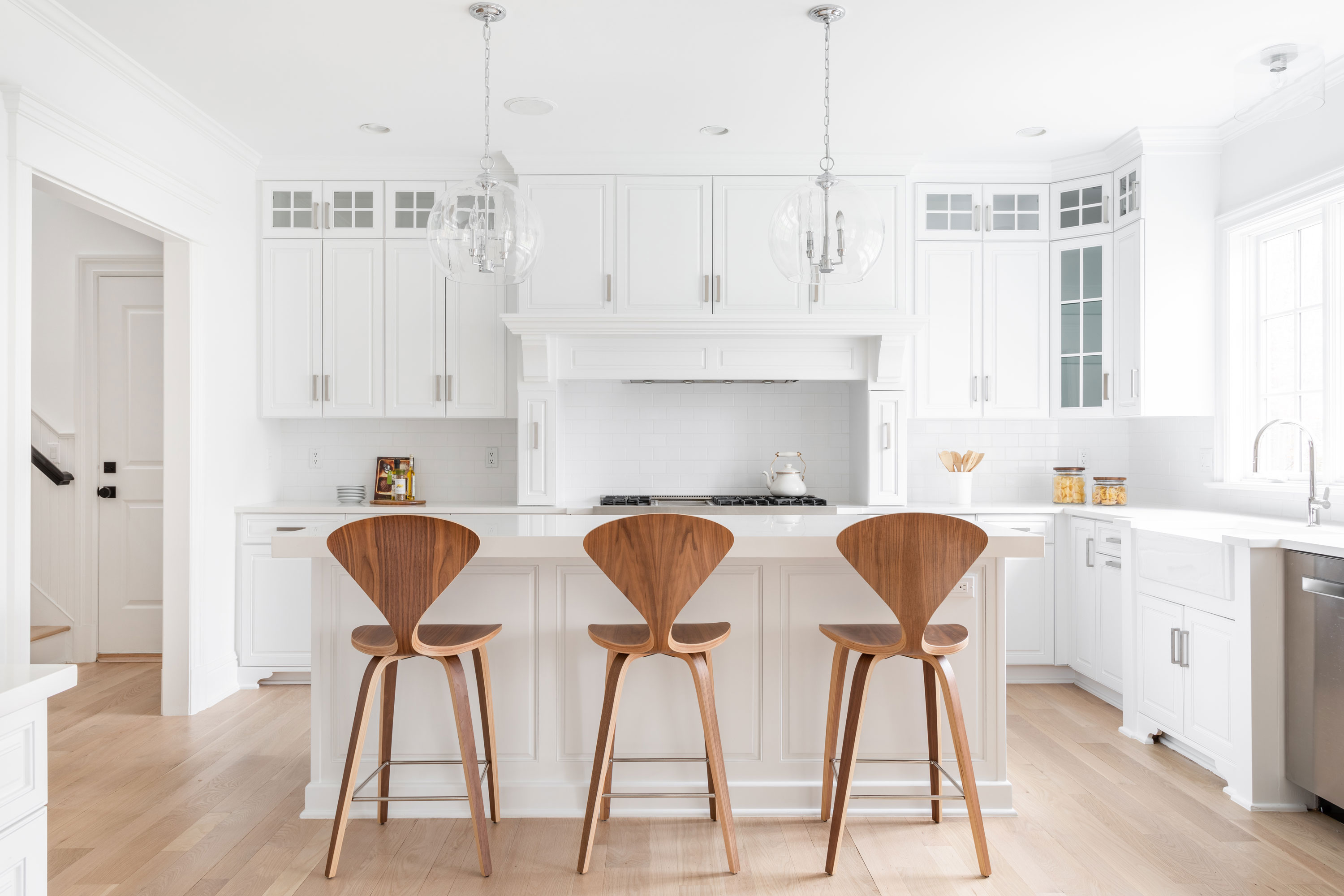
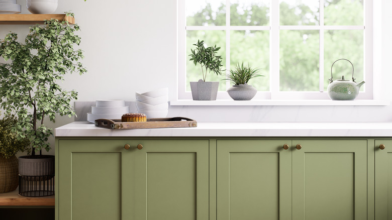
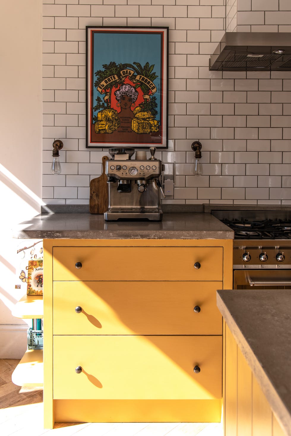
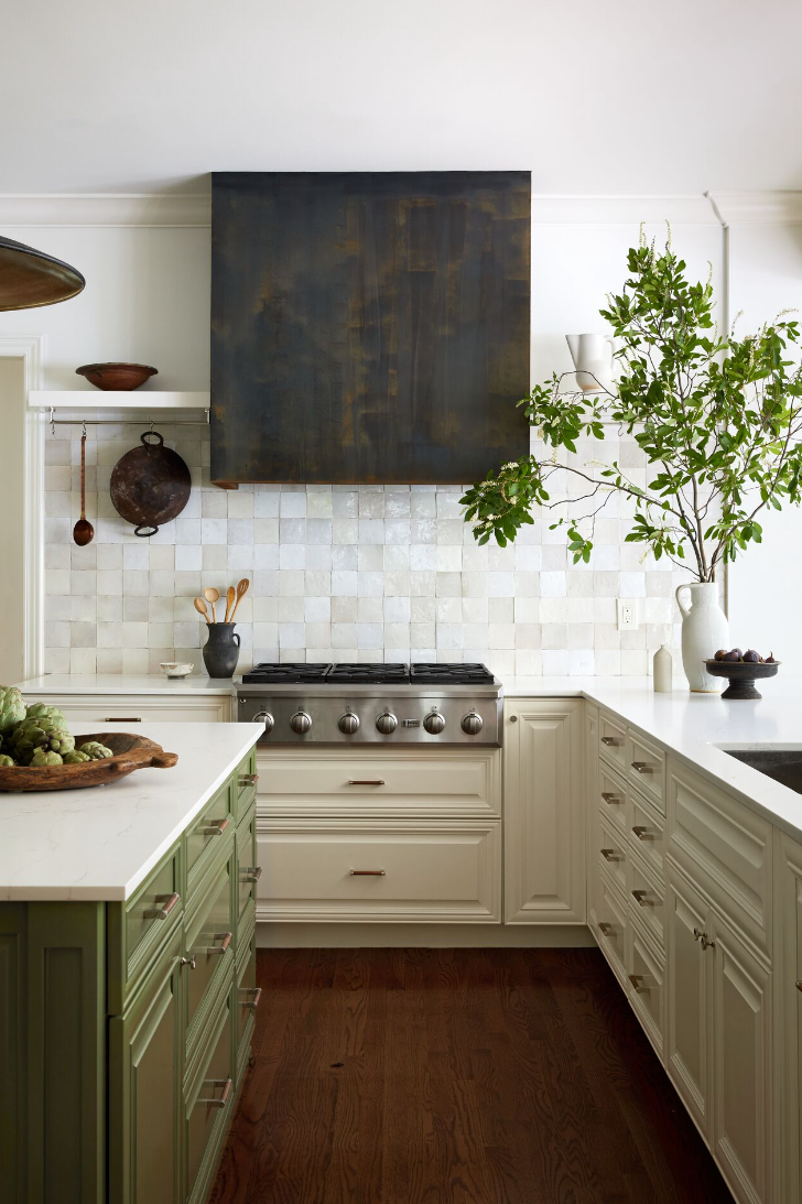
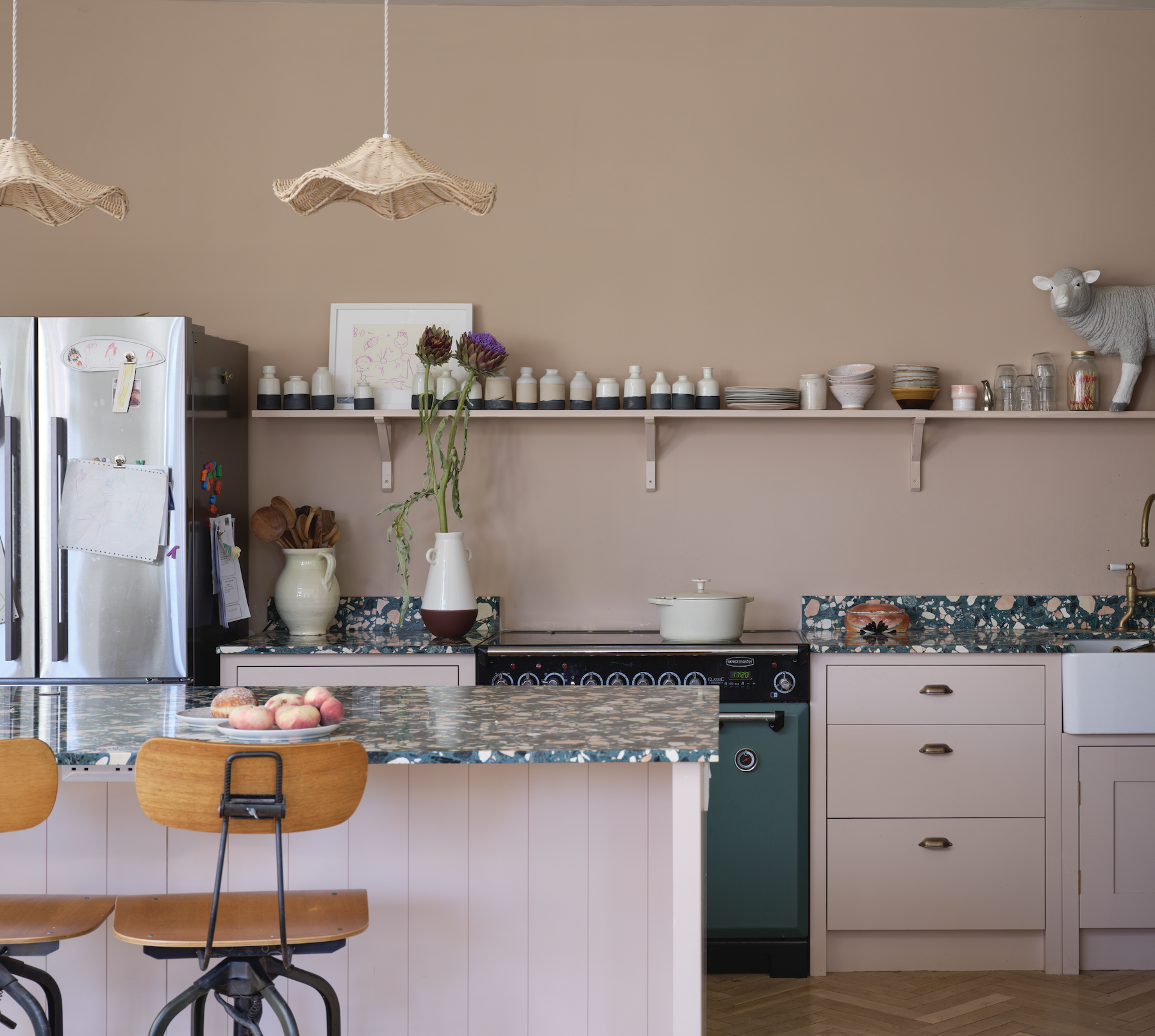
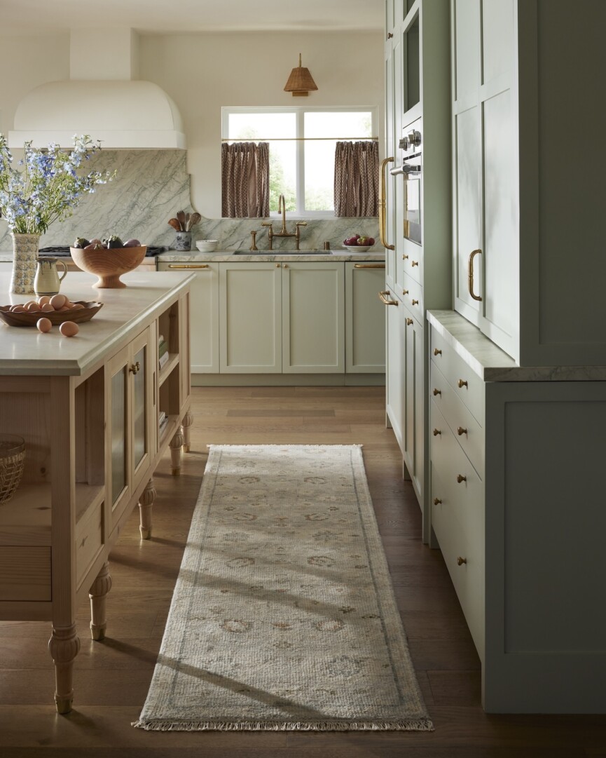
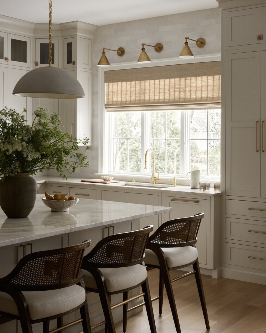

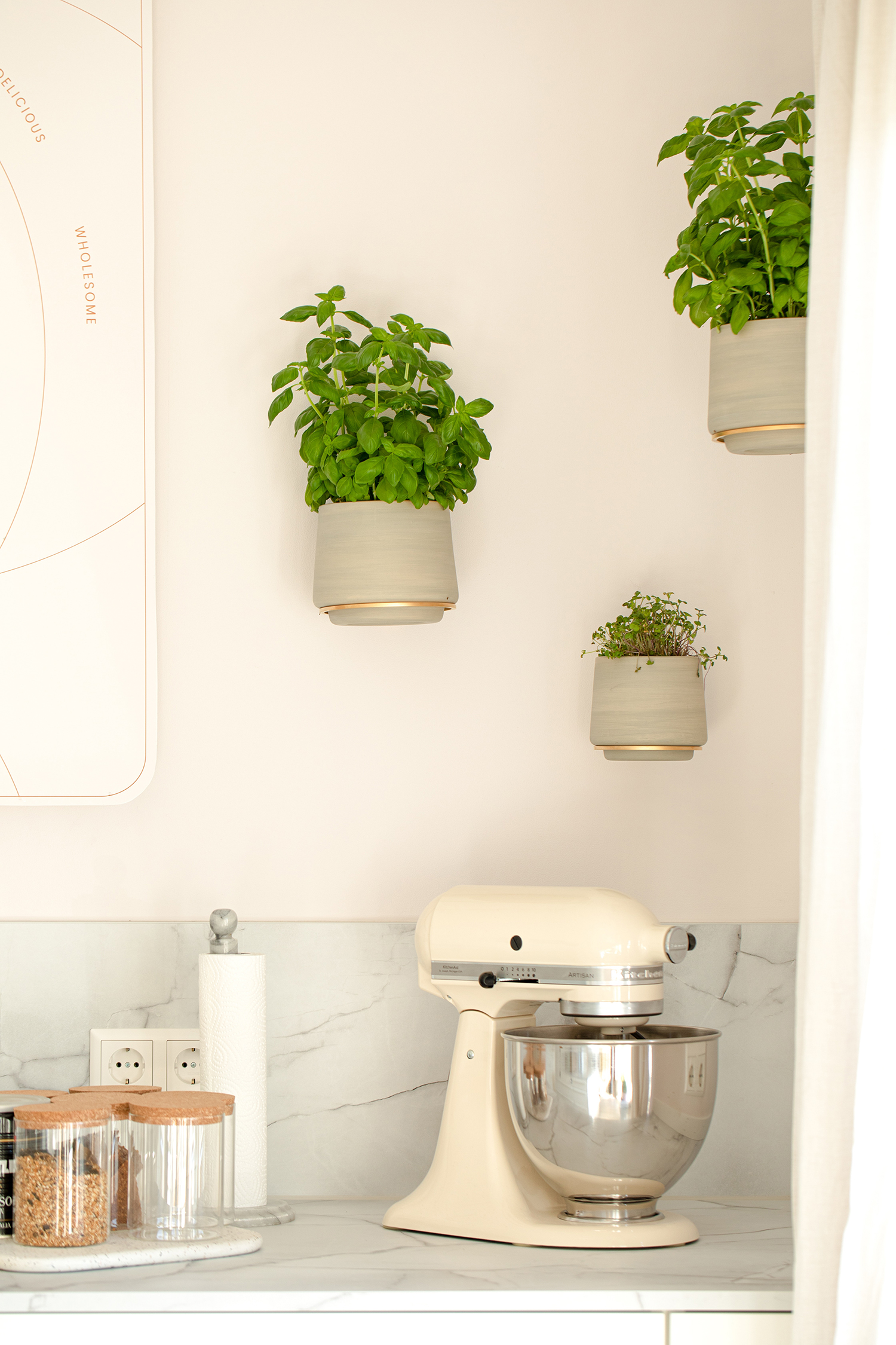
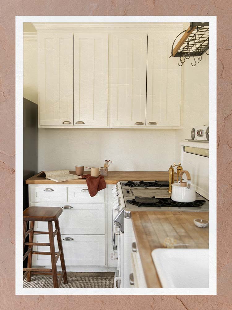
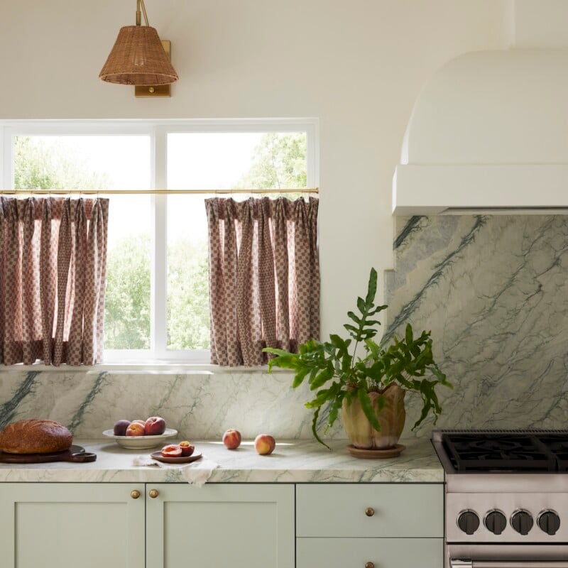
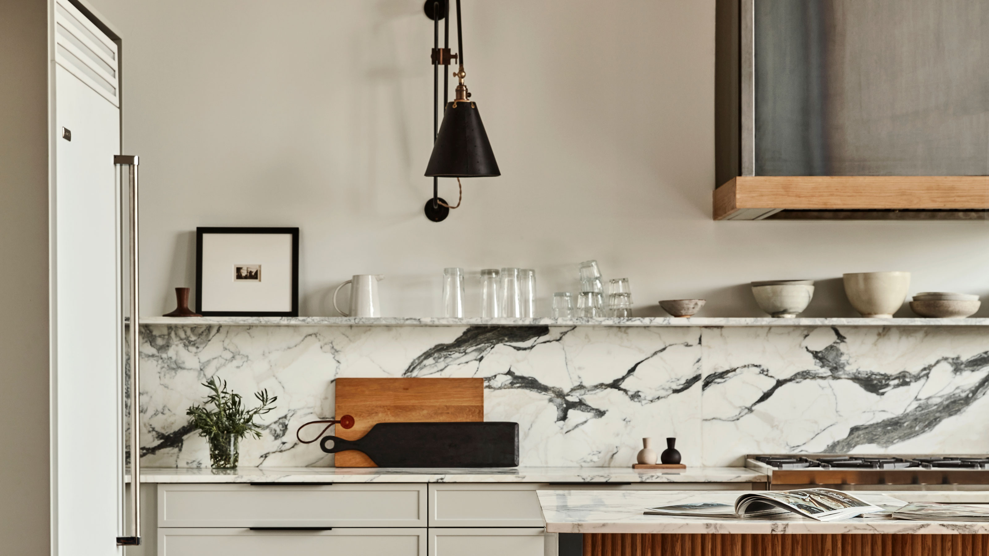
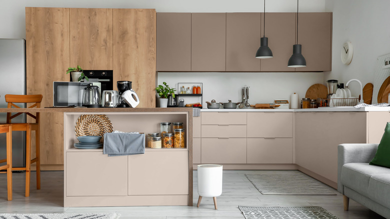
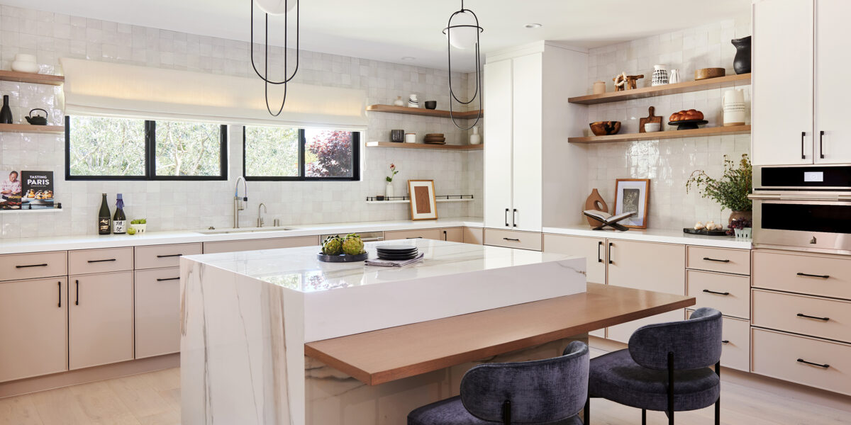
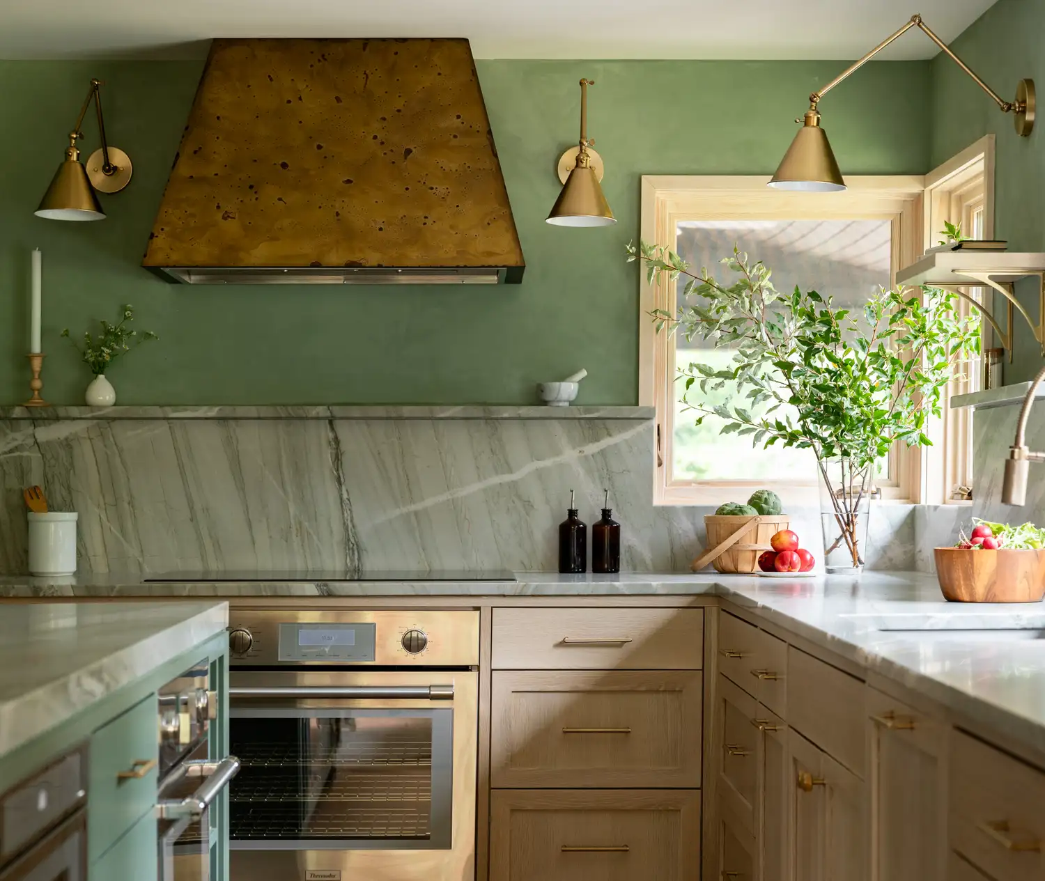
The optimal paint color for a kitchen depends on several factors, including the room's size, the amount of natural light it receives, and its intended use. A simple change in paint color can refresh and uplift the entire space on a budget. White kitchen ideas are considered a timeless choice, offering a bright and spacious feel. White creates a sense of calmness, making the space appear clean, sophisticated, and elegant. To prevent a sterile or cold ambiance, one can introduce vibrant accents through differently colored cupboards, colorful pops, or abundant plants. Recent trends, however, show a shift away from stark white towards earthier tones, with homeowners increasingly opting for creative and bold choices. Warmer colors, such as creamy neutrals, soft pastels, and olive greens, are gaining popularity, as they foster an inviting and homely atmosphere and are suitable for both cabinets and walls. Warm neutrals, like linen shades, remain favored for those seeking a minimalist palette, while earthy greens provide an accessible, calming, and organic splash of color.
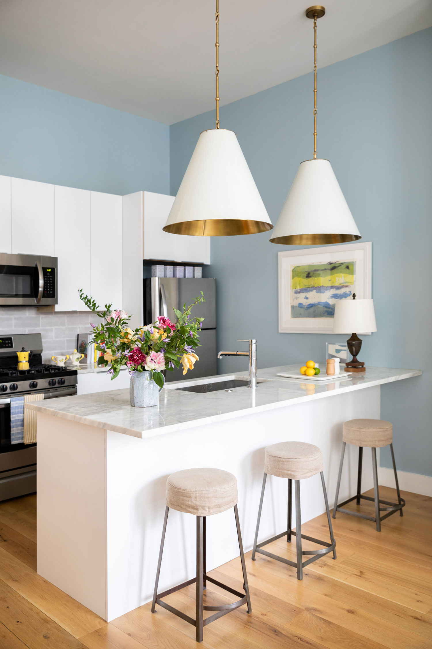
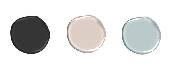
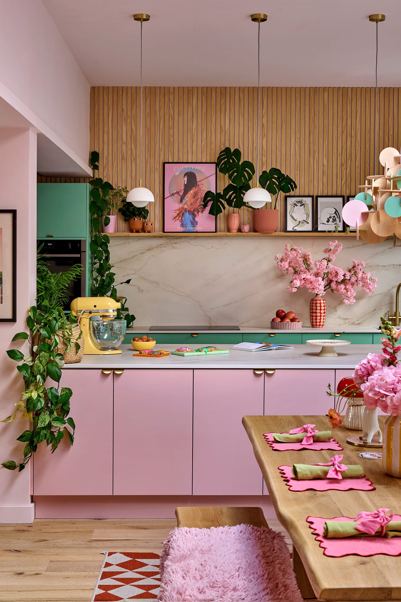
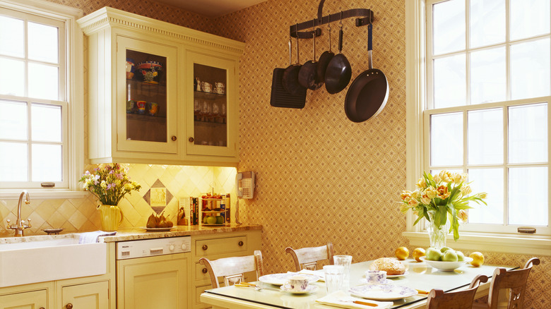
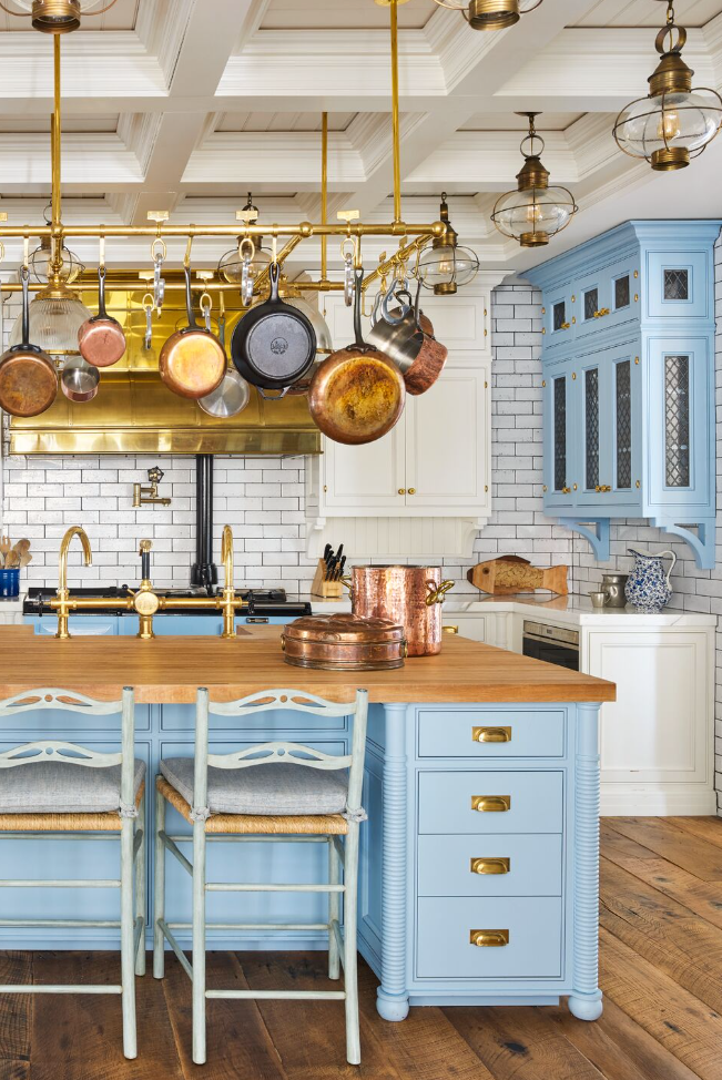
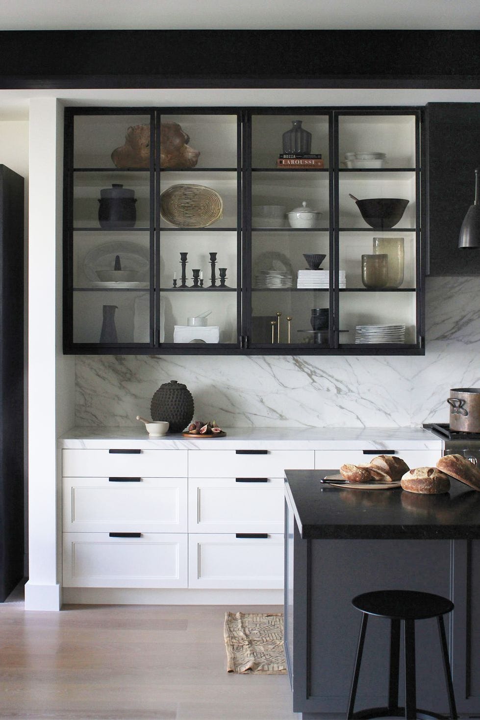
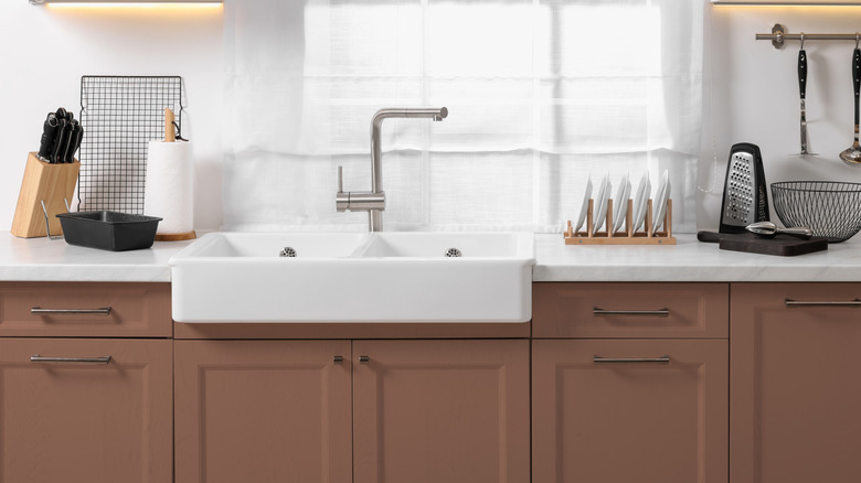
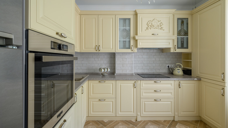
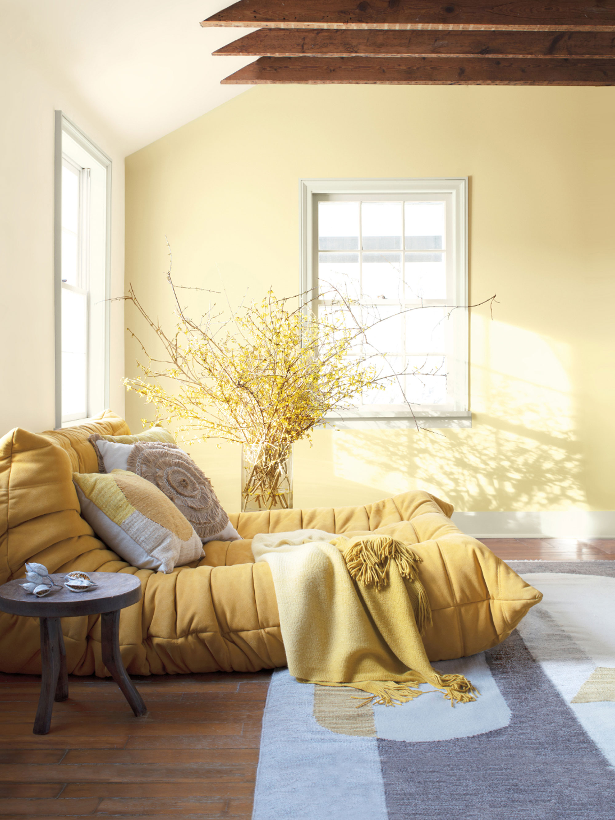
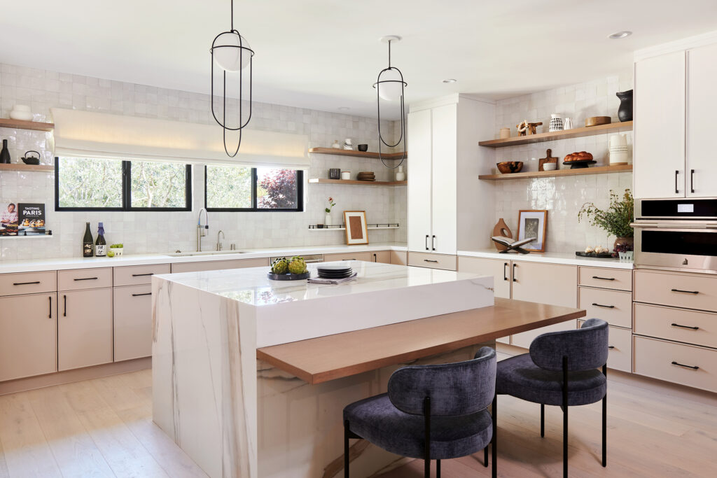
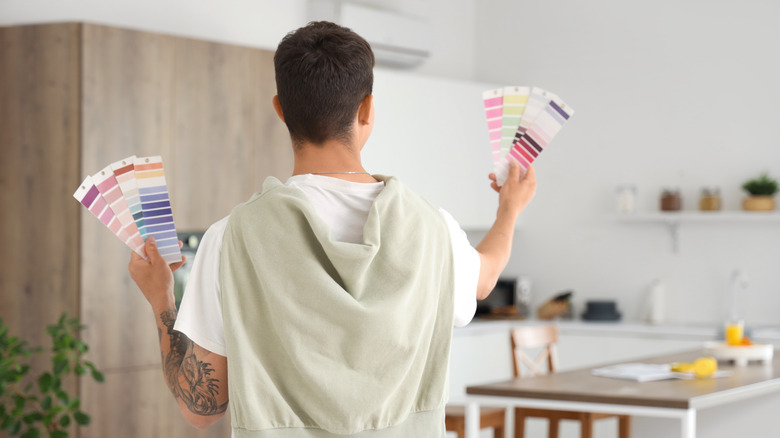
When selecting a new wall color, the desired mood or vibe is a primary consideration. For instance, a busy kitchen might benefit from avoiding loud prints that could create a chaotic feel, while a relaxation-oriented space could be enhanced by a soft green that promotes calmness. For smaller kitchens, the goal is to maximize light reflection to create an illusion of greater space. Neutral warm colors are ideal for generating a welcoming atmosphere, with pastel tones like powder yellow, baby blue, and pale pink offering a touch of color without overwhelming the space. Lighter walls or cabinets can be complemented with neutral textures such as granite or marble worktops and wooden shelving for a cohesive design. Even small kitchens can make a statement by combining brighter neutral wall colors with dark cabinetry, or by using dark colors on floor-standing cabinets and lighter shades on wall-hung units to maintain an airy feel.
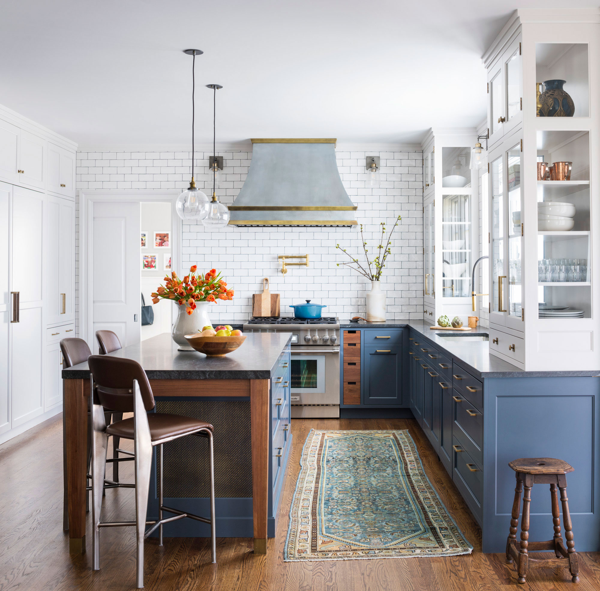
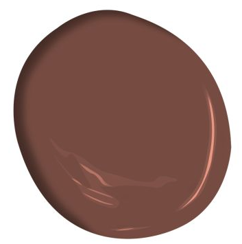
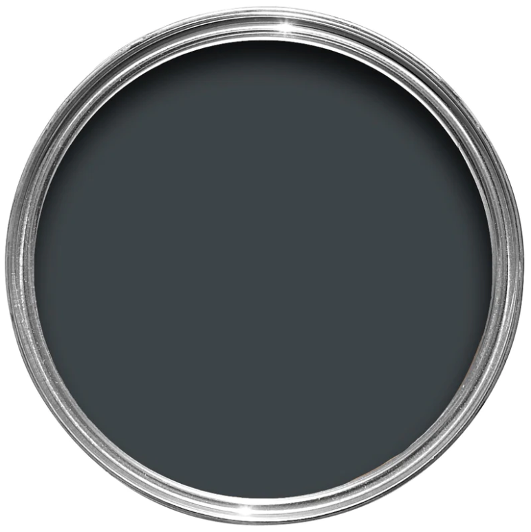
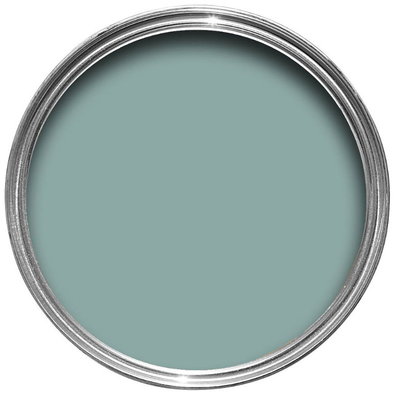
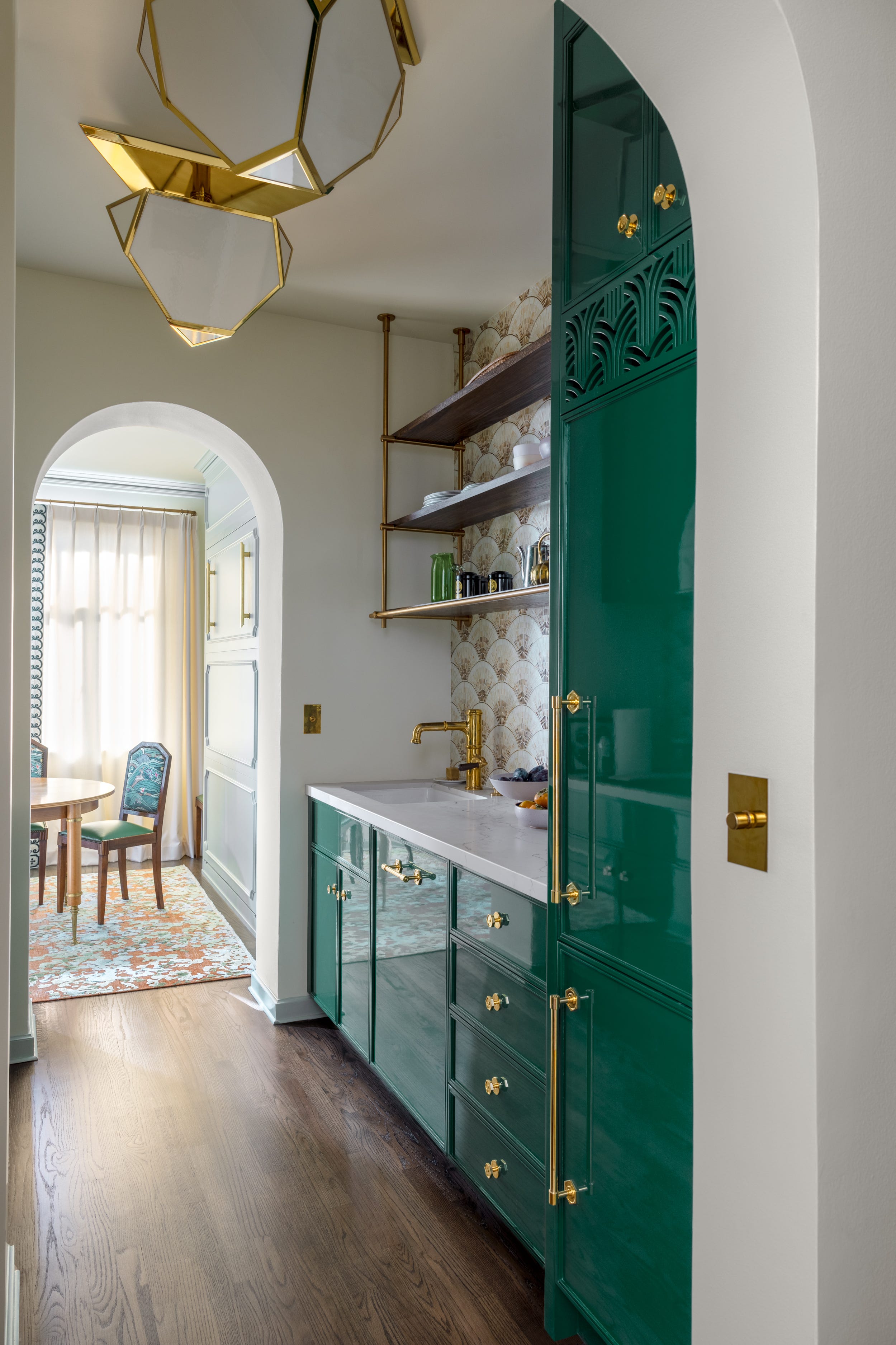
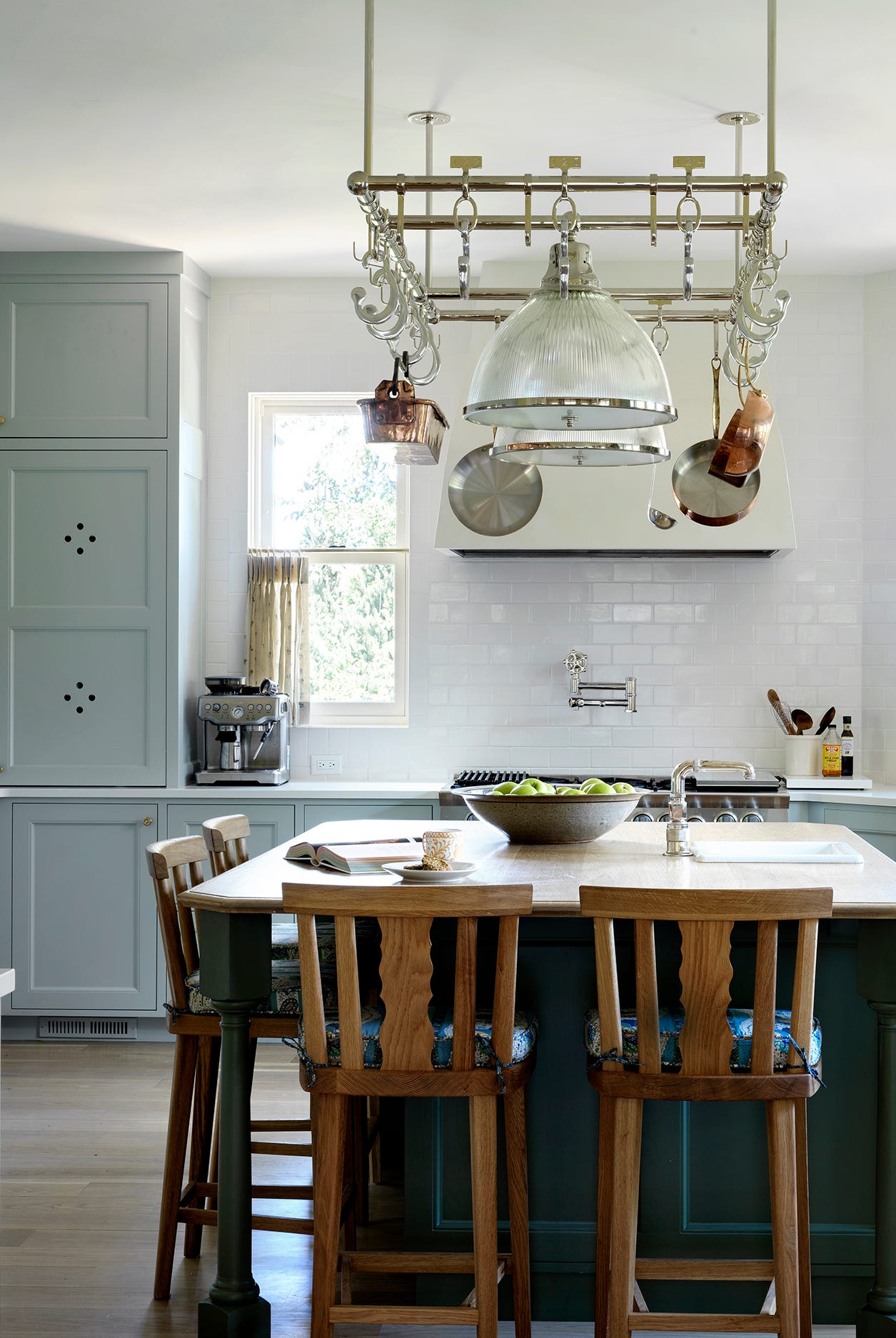
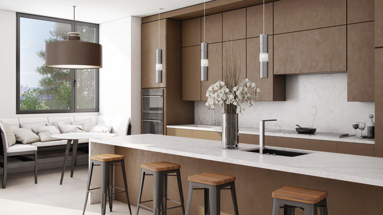
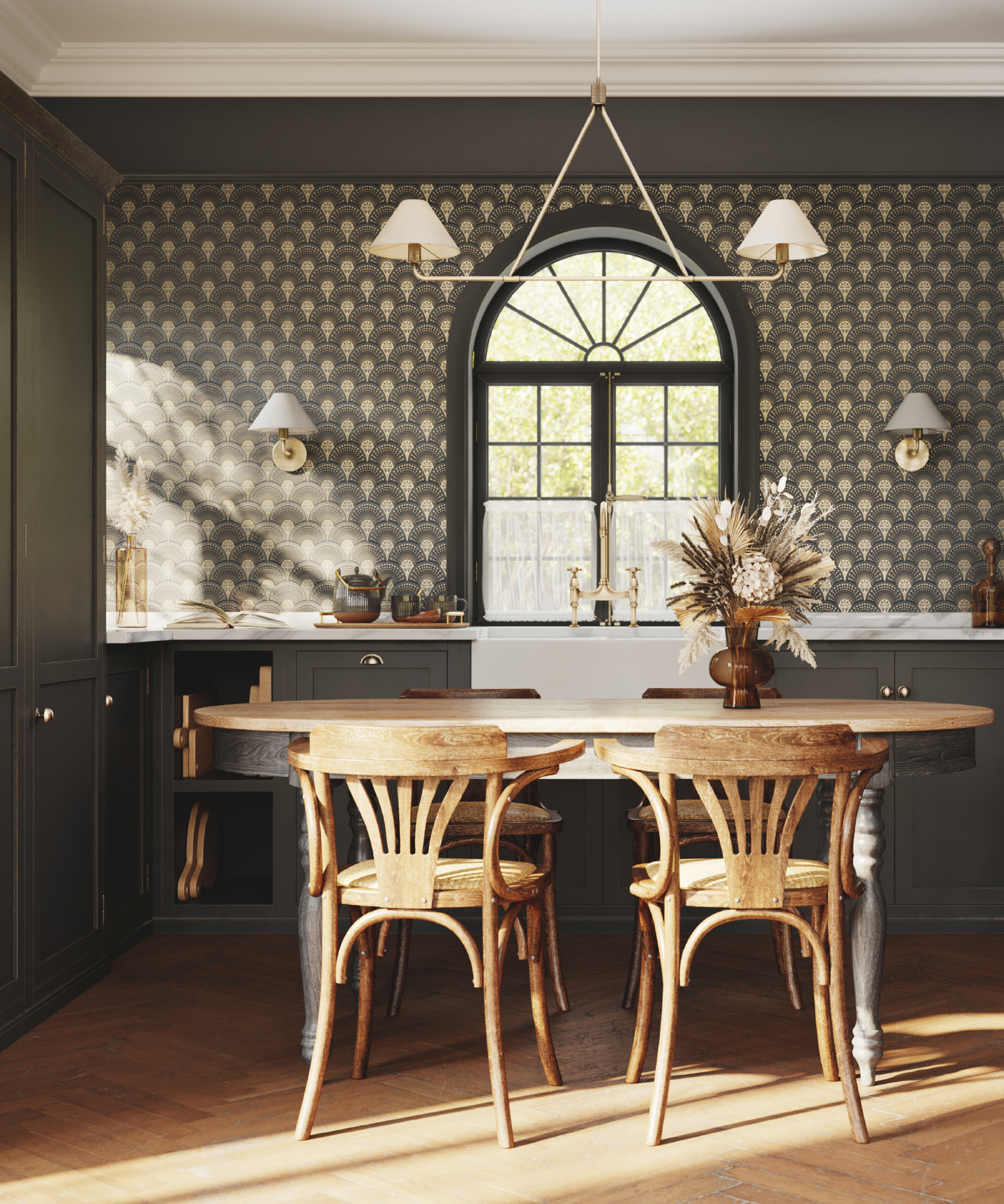
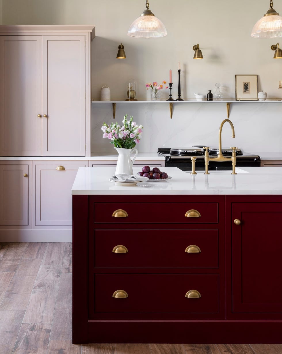
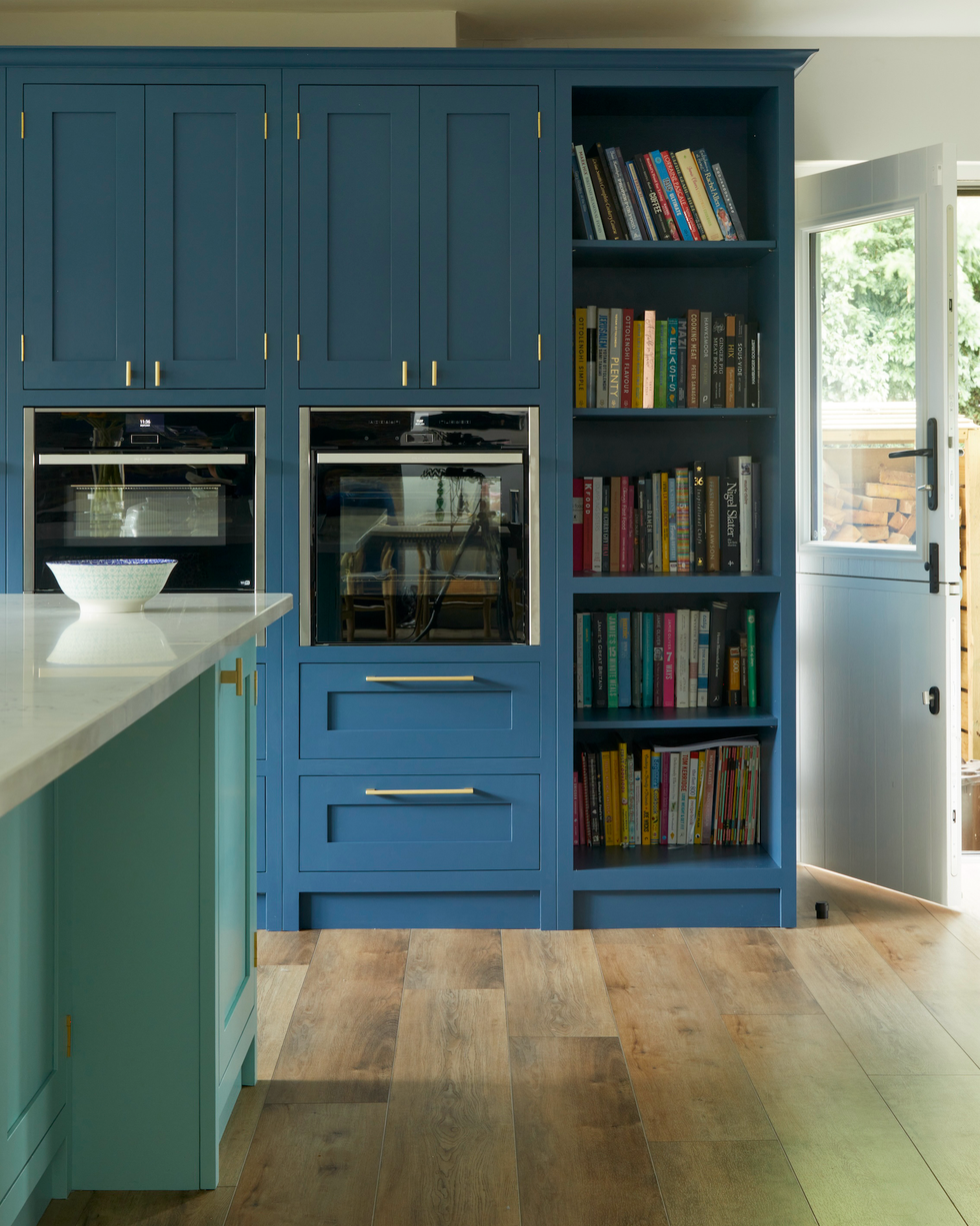
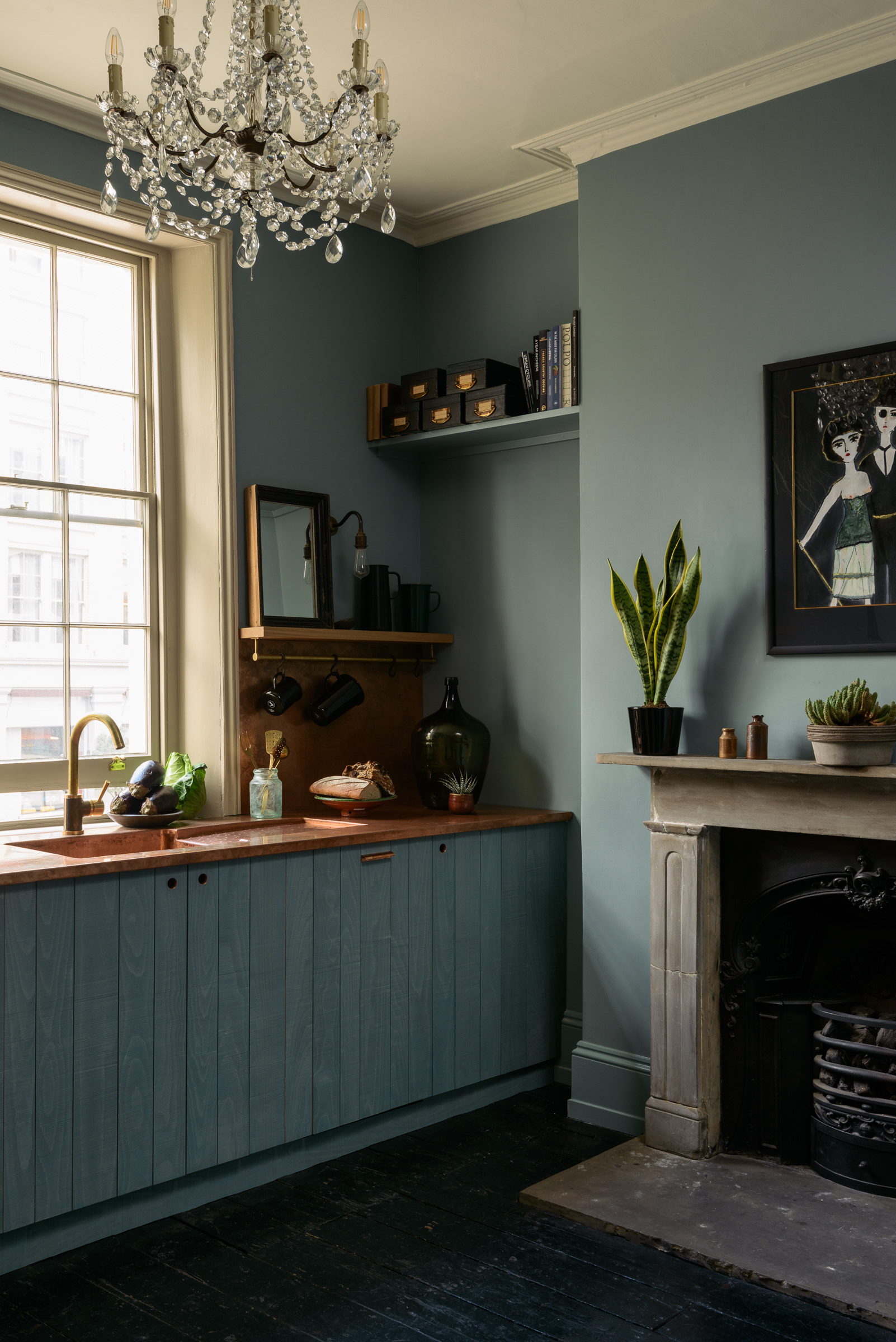
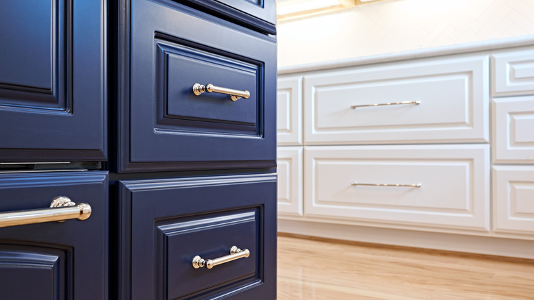

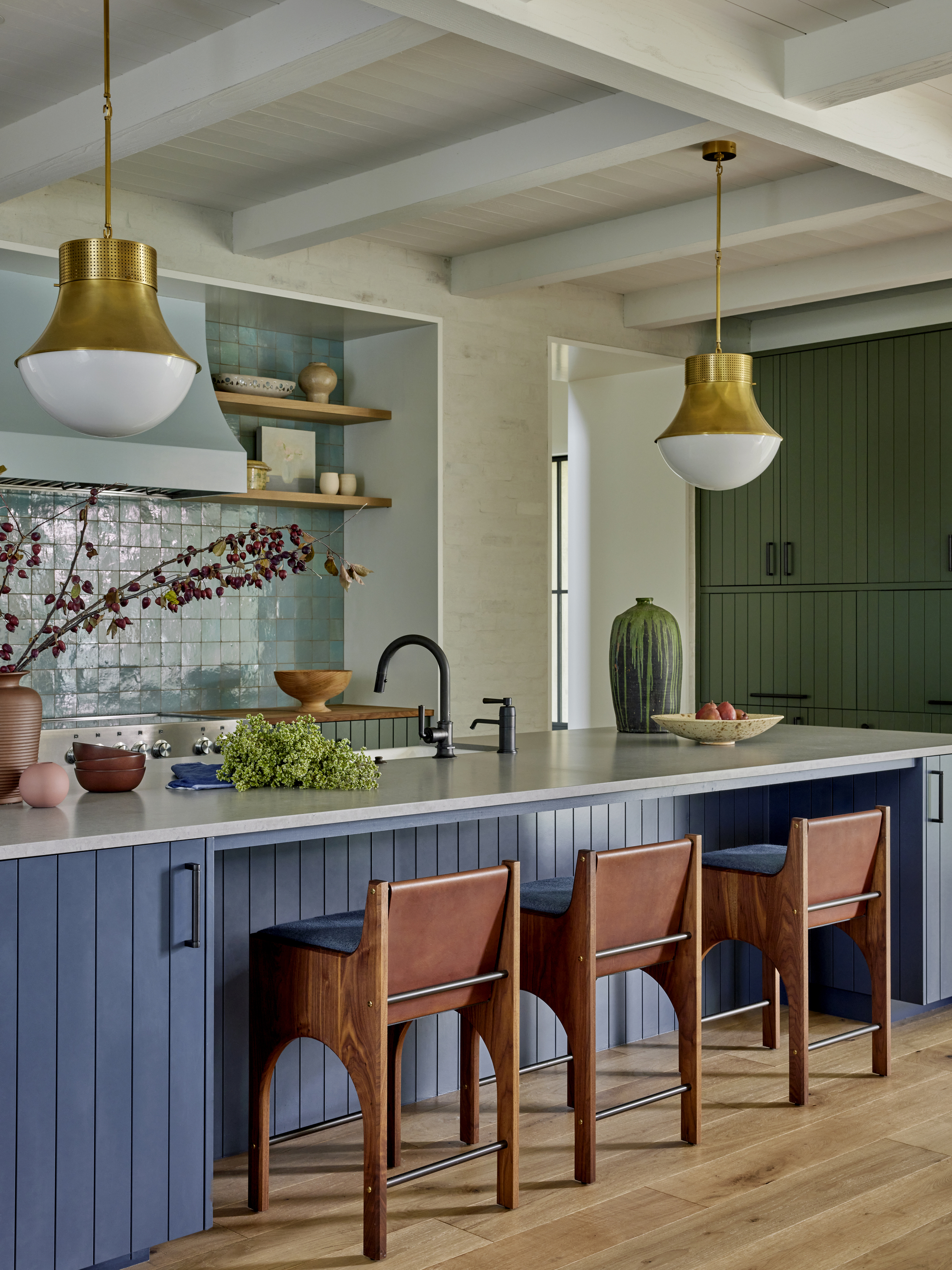

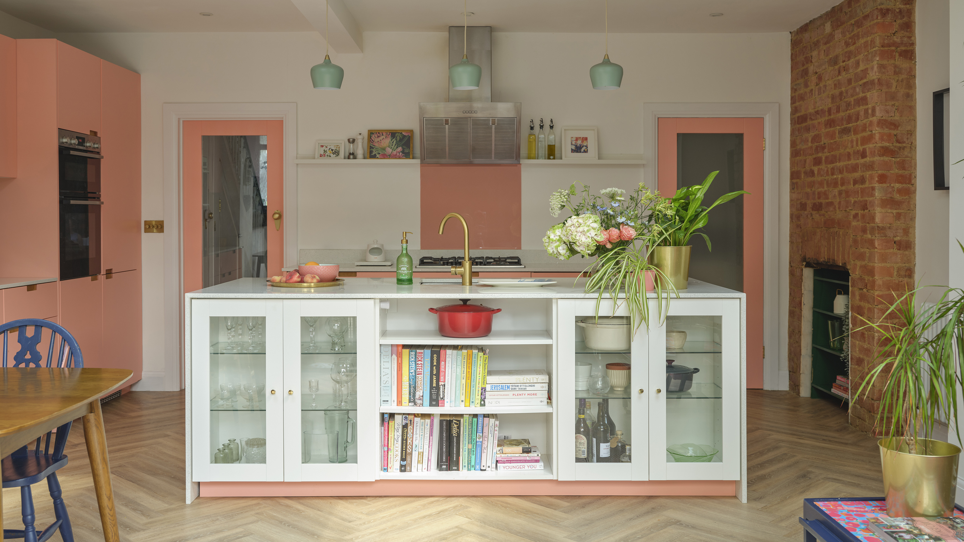
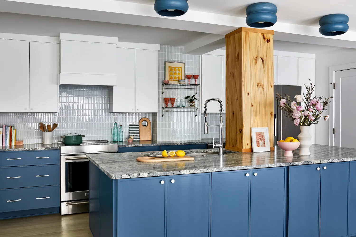
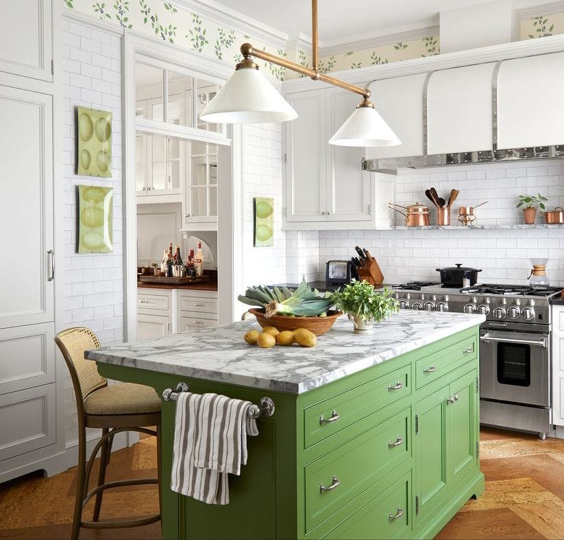
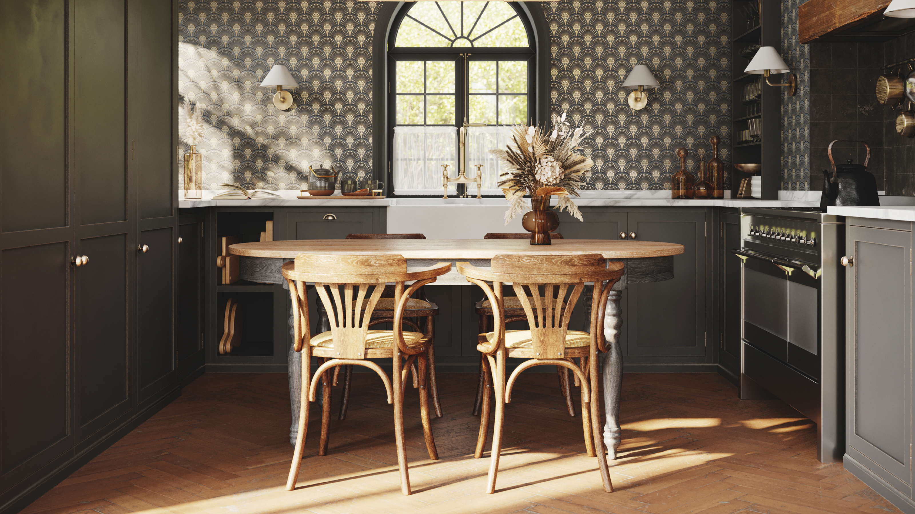
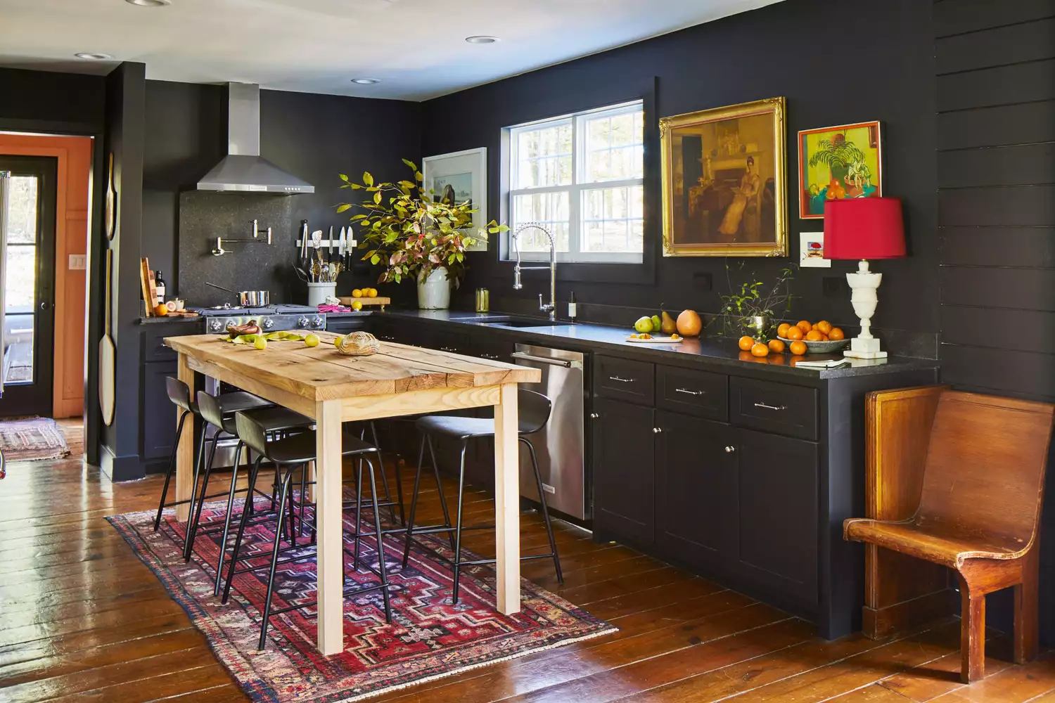
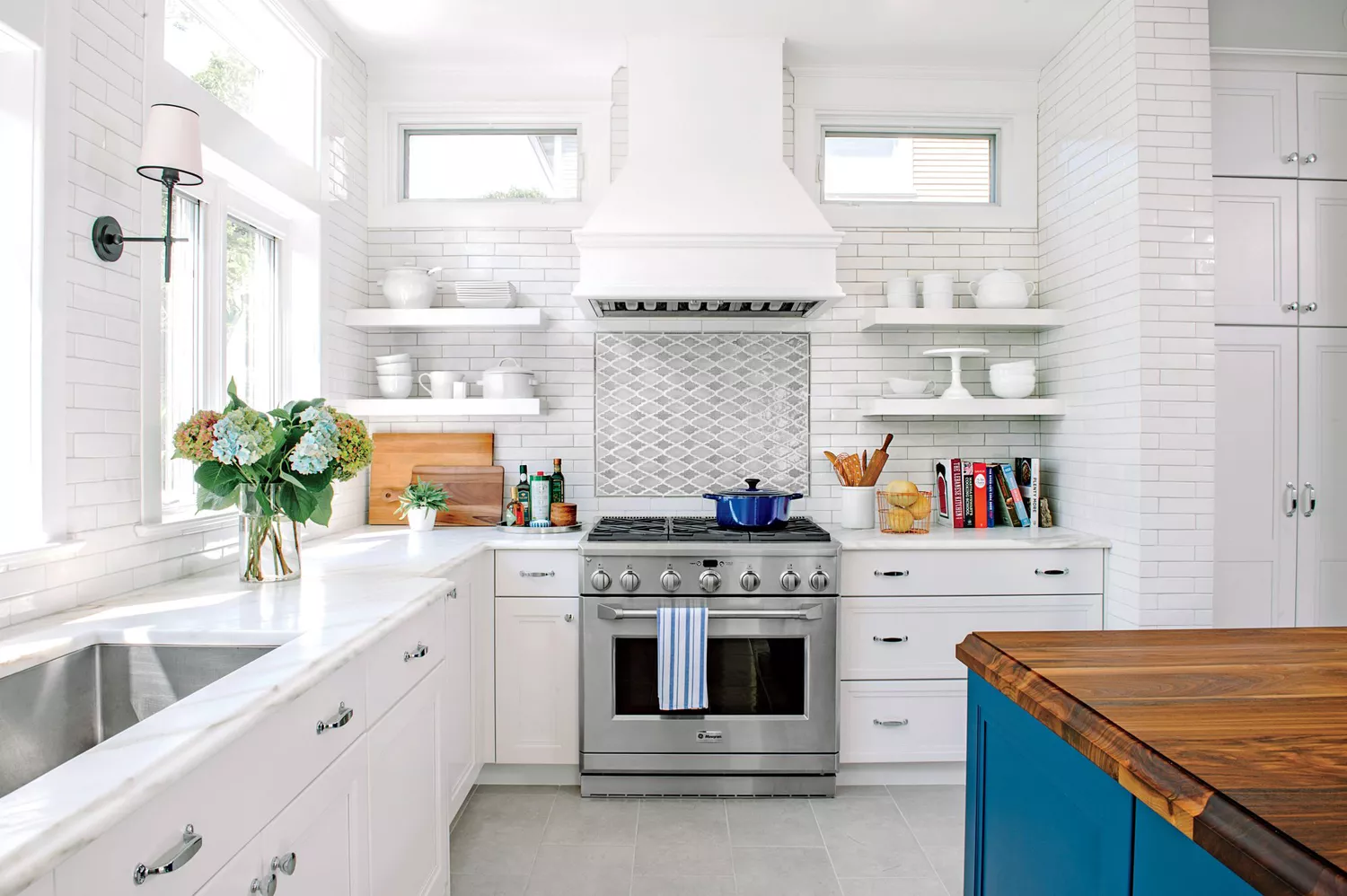
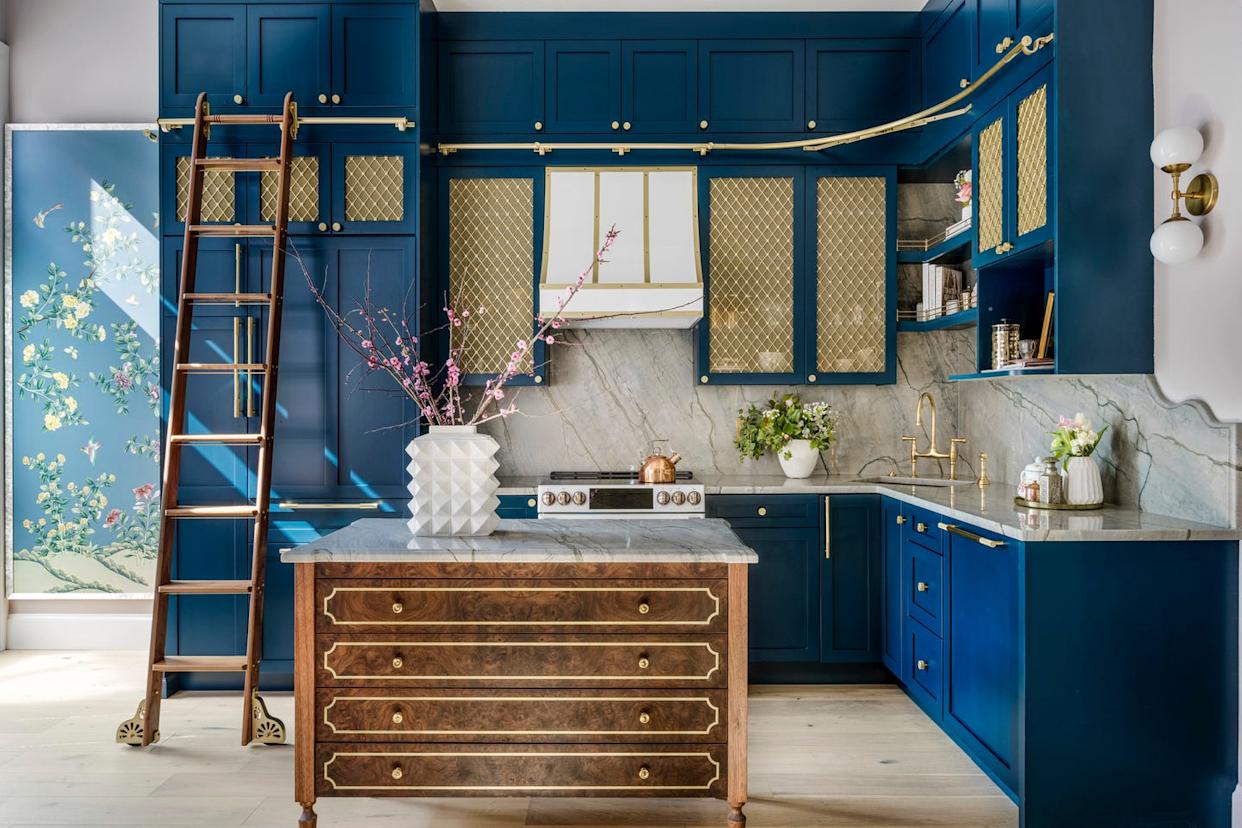
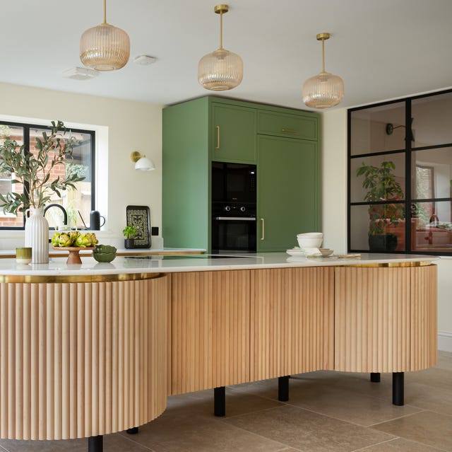
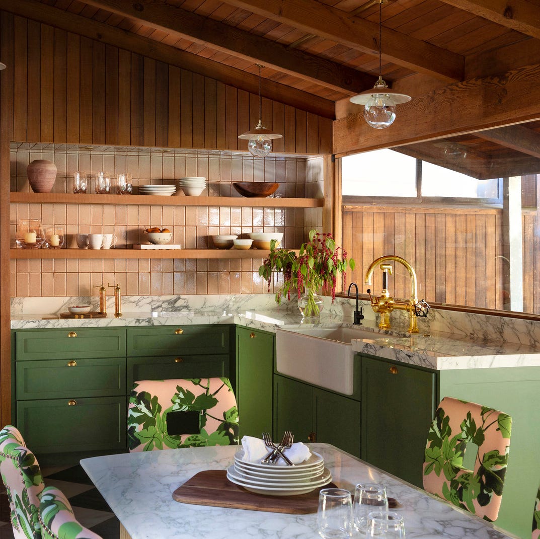
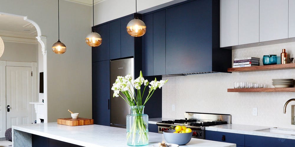
In larger kitchens, there is more flexibility to incorporate darker paint colors on walls, cabinets, and even kitchen islands. Paint becomes a tool for zoning in spacious kitchen layouts, especially in kitchen-diners, defining areas for preparation, cooking, eating, and socializing. Large kitchens, often blessed with abundant natural light, can accommodate bold and strong dark hues. Dark colors create a cozy and intimate environment, preventing large spaces from feeling cold or sparse. Dark blues, browns, and charcoals add depth, richness, drama, and sophistication to kitchen cupboards, pairing well with natural wood, brass fixtures, and white or marble countertops. These darker shades are also practical for busy kitchens as they effectively conceal stains and spills. For kitchen islands, a contrasting color to the main cabinetry, such as a green with a blue tint, can create visual interest. Another current trend involves pairing green-themed cabinets with pink accents to introduce a nurturing and restful quality suitable for a kitchen.
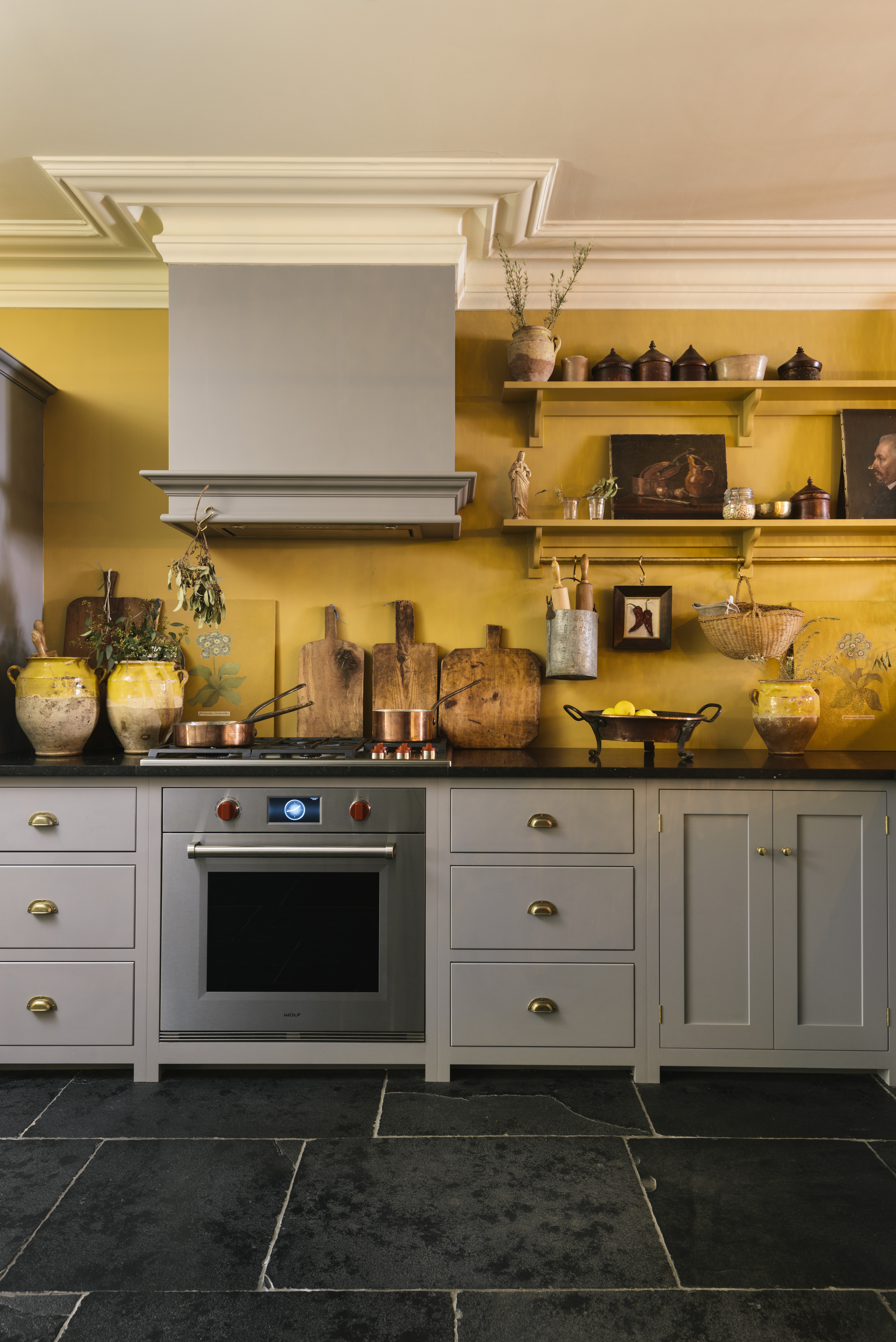
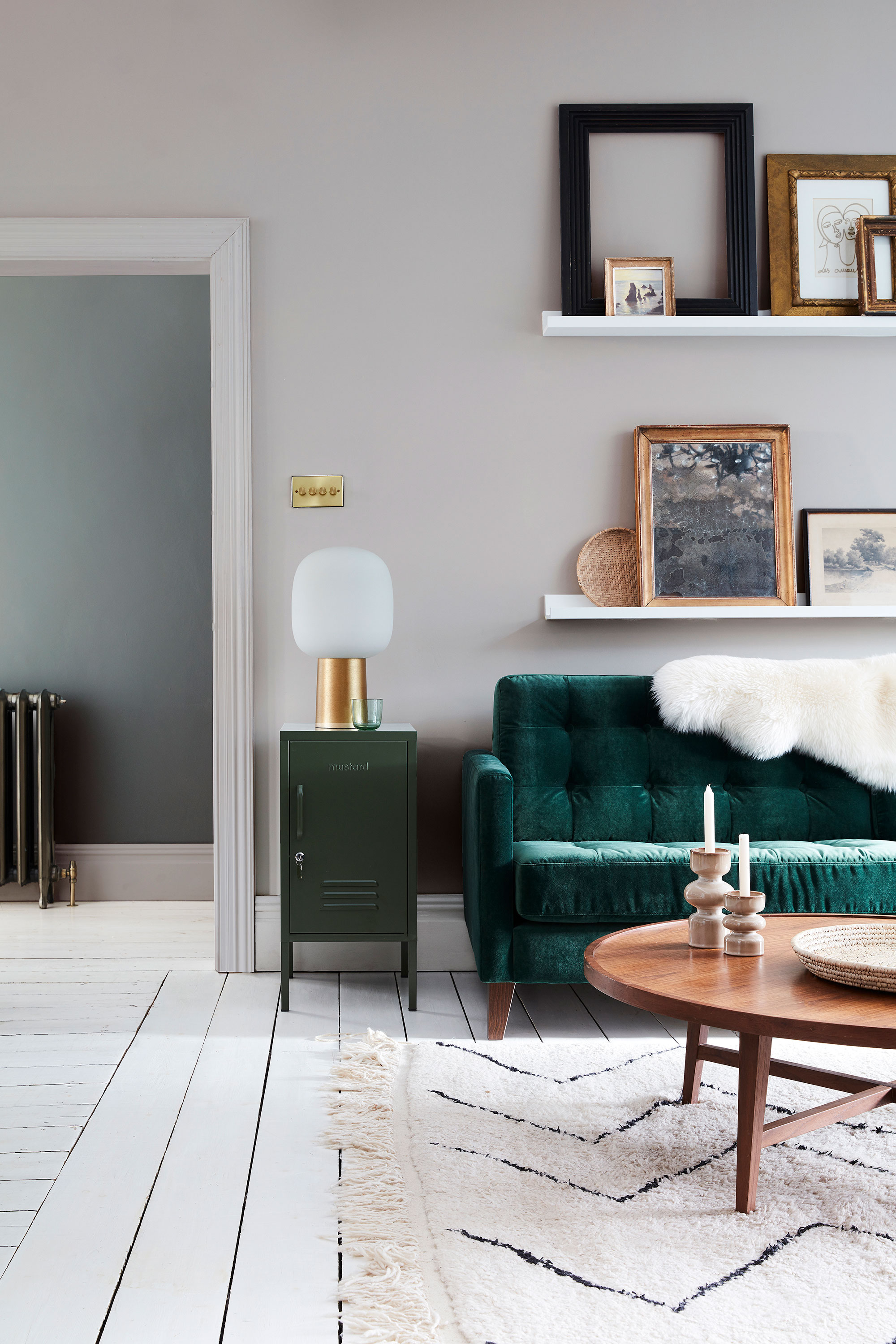
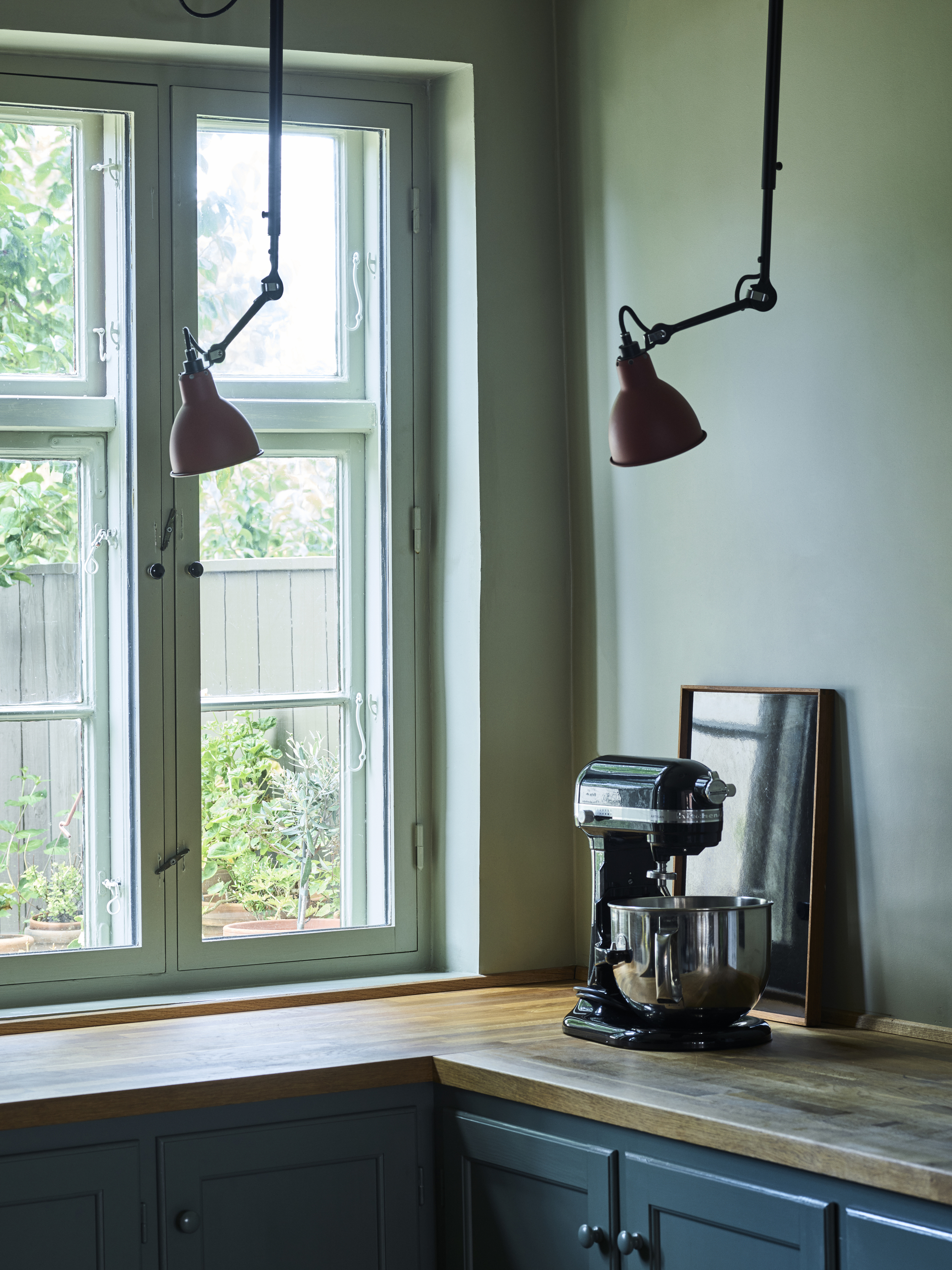
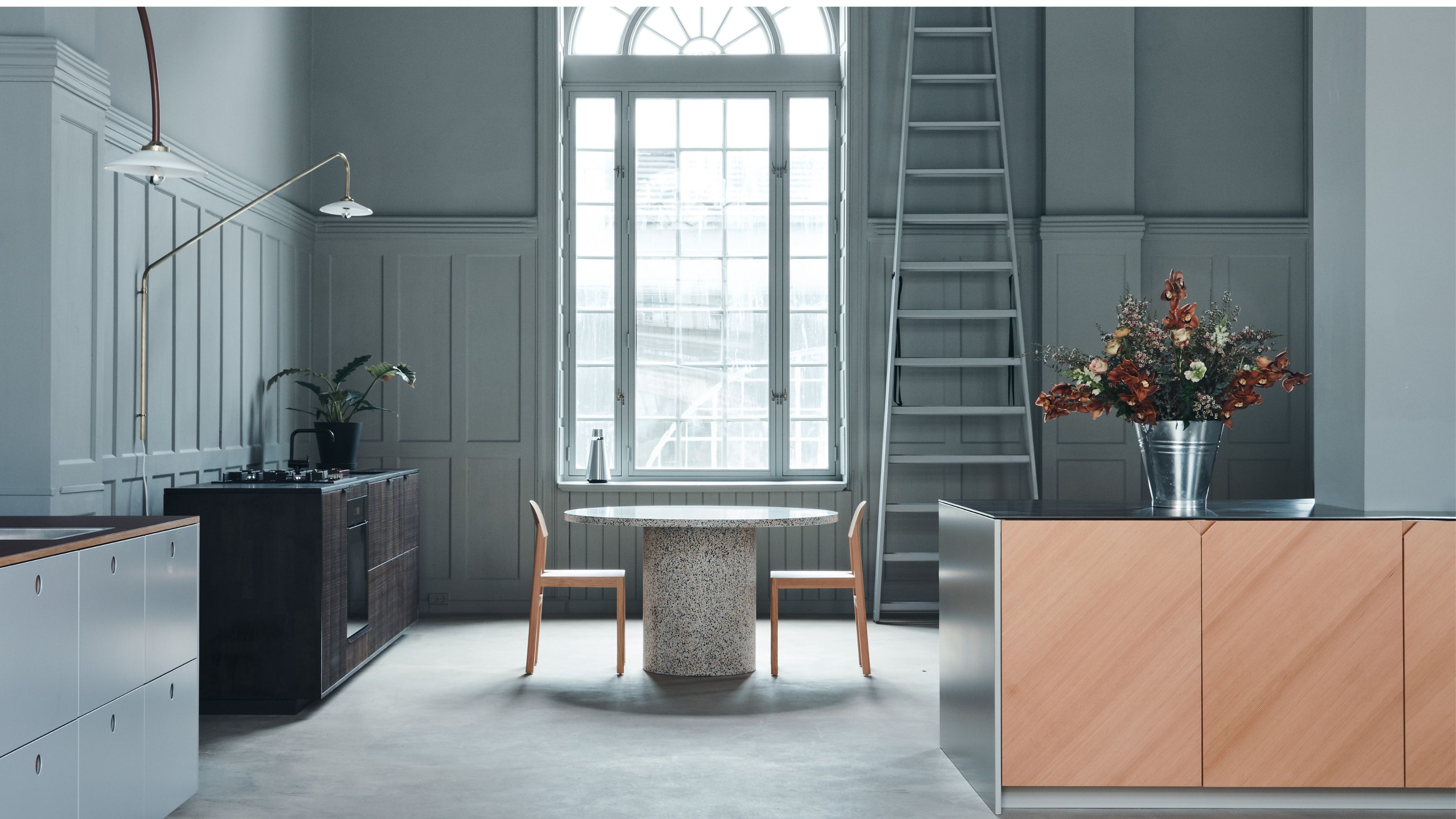
North-facing kitchens typically receive cooler and less natural light, which can make them feel cold and dark. To counteract this, warmer and richer colors like yellows, oranges, taupes, and stony shades are recommended, as they appear softer in the morning and bolder as the light fades. Conversely, south-facing kitchens are often bathed in bright sunlight, which can bleach out lighter colors. Therefore, dark kitchen ideas are well-suited for these spaces. Cool shades such as blues, greens, or violets help to balance the intensity of the sunlight, with dark walls contributing to a sophisticated and dramatic ambiance. These tones soften lines and create a cocooning effect, especially when contrasted with lighter shades like pale greys, whites, and pinks. The decision to use lighter or darker paint depends on the room's size and natural light. Cool neutrals are excellent for well-lit rooms and complement dark greens and blues, but require texture and accessories to avoid a clinical appearance. Warm neutral paints, especially earthy, natural tones, are increasingly popular for their brightness and sense of light. Dark colors make a statement, suit larger kitchens, and are practical for busy households due to their ability to hide dirt. Painting walls and kitchen cabinets in the same dark color creates a seamless look, and dark hues can make naturally bright kitchens feel cozier rather than dingy.
#KitchenDesign #PaintColors #InteriorDecor #HomeRenovation #KitchenColorSchemes #DesignTips #RoomLayout #HomeImprovement #KitchenDesign #PaintColors #InteriorDecor #HomeRenovation #KitchenColorSchemes #DesignTips #RoomLayout #HomeImprovement
0 comment in total
 No comments yet
You may also like
The Best Kitchen Paint Colors All Have This One Thing In Common
5 Gorgeous Paint Colors To Elevate Your Kitchen Cabinets In 2025

The best colors for kitchen appliances, according to interiors experts

We Asked Designers for Their Favorite Kitchen Cabinet Paint Colors—and Not One Picked White

It’s Official: These are the Best Kitchen Paint Colors, According to Designers
8 colors you should never paint kitchen cabinets according to the experts

4 Colors You Should Never Paint Cabinets, According To Designers
Designers Predict the Next “It” Kitchen Cabinet Color

Kitchen Color Selection Tips from 5 Designers
7 Paint Colors To Never Use In Your Kitchen, According To Designers
5 Reasons You Shouldn't Paint Your Kitchen Walls White — And the Alternatives You Need to Try

What's the Best Paint for Kitchen Walls? The Type, Finish, Color, and Even the Brand Professionals Always Pick
15 Cabinet Paint Colors That Look STUNNING in Any Kitchen

These kitchen paint colours will be everywhere in 2025 – and there's even one for neutral lovers

10 Trendy Kitchen Cabinet Colors You Should Try In 2025
The 6 Paint Colors for Your Kitchen That Will Never Go out of Style
The Kitchen Colors Designers Call “Forever Favorites”
14 Kitchen Cabinet Colors You Can Easily Mix and Match
Paint color ideas for every room – experts explain the best choices for different spaces
Top 20 Kitchen Paint Colors for Every Style—From Timeless Neutrals to Rich Earth Tones