The 3 All-Time Worst Living-Room Paint Colors, According to Designers
The article identifies three paint colors that interior designers strongly advise against for living rooms, highlighting their negative impacts on a space's ambiance and aesthetics. These colors are black, pure white, and lime green. Each color is analyzed for its specific drawbacks, with designers offering insights into why they should be avoided and suggesting better alternatives.
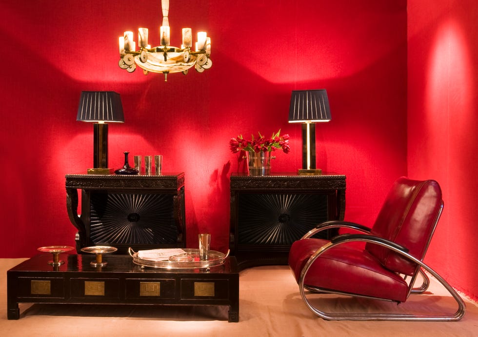
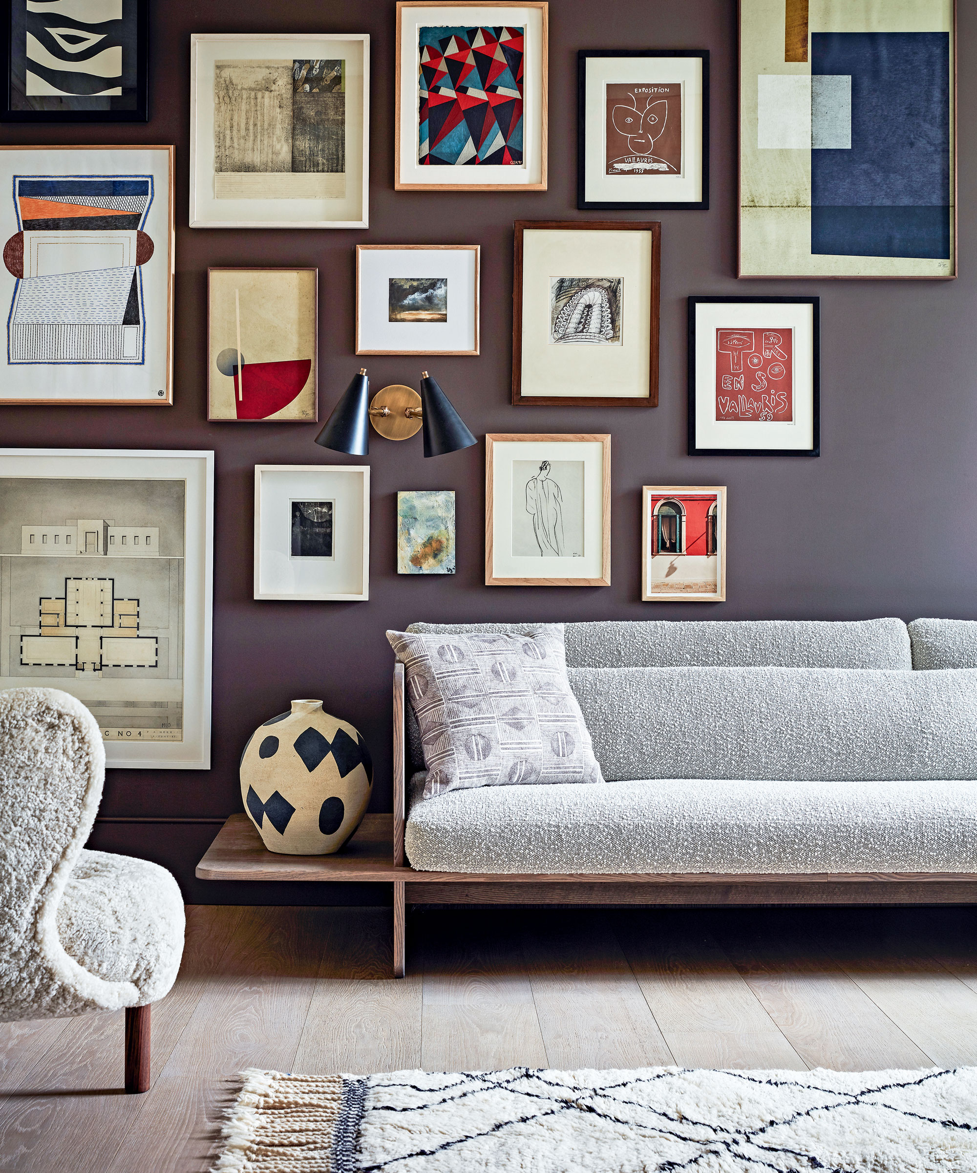
Black paint, while often perceived as sophisticated, is deemed unsuitable for living rooms due to its tendency to absorb light, making the room feel smaller, darker, and more confined. Designers explain that black can create a cave-like atmosphere, diminishing the sense of spaciousness and vibrancy typically desired in a central living area. Instead of a stark black, the article recommends deep charcoal or dark gray colors, which offer a similar dramatic effect without the oppressive feel. These alternatives provide depth and warmth while still allowing light to be reflected to some extent.
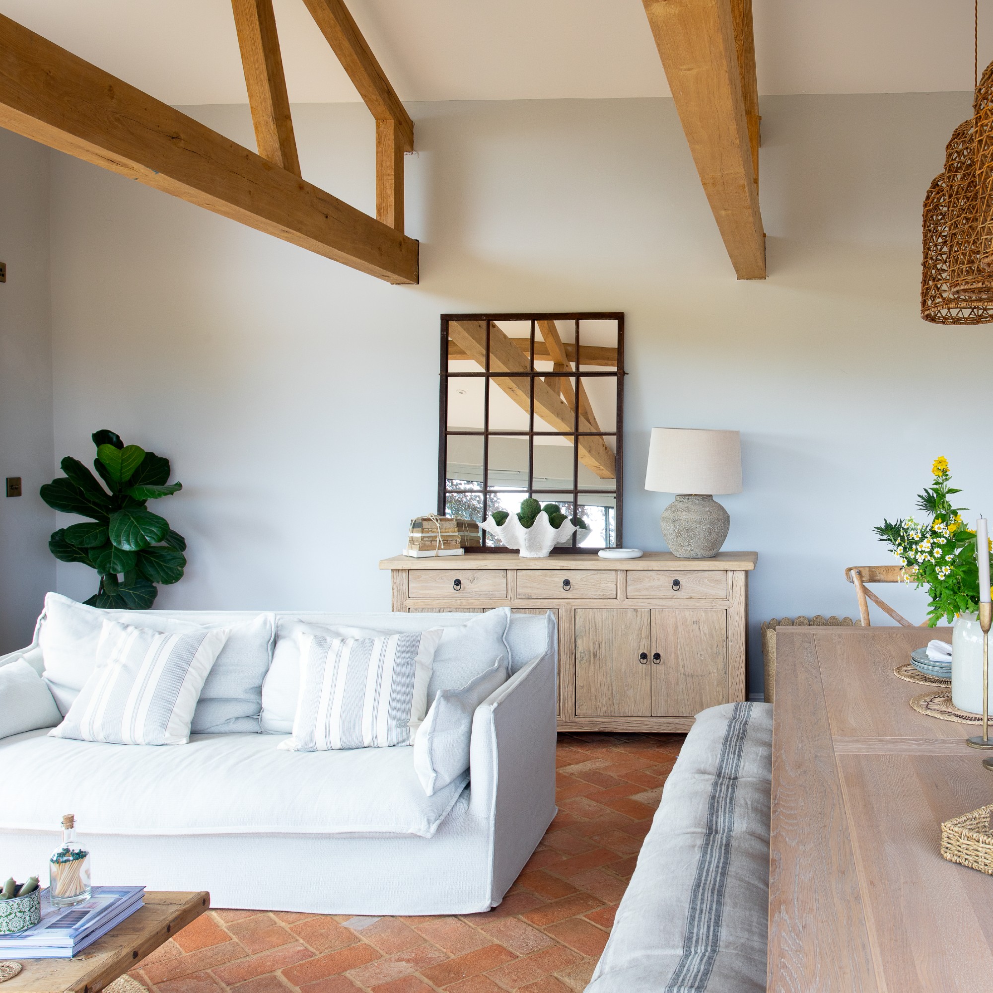
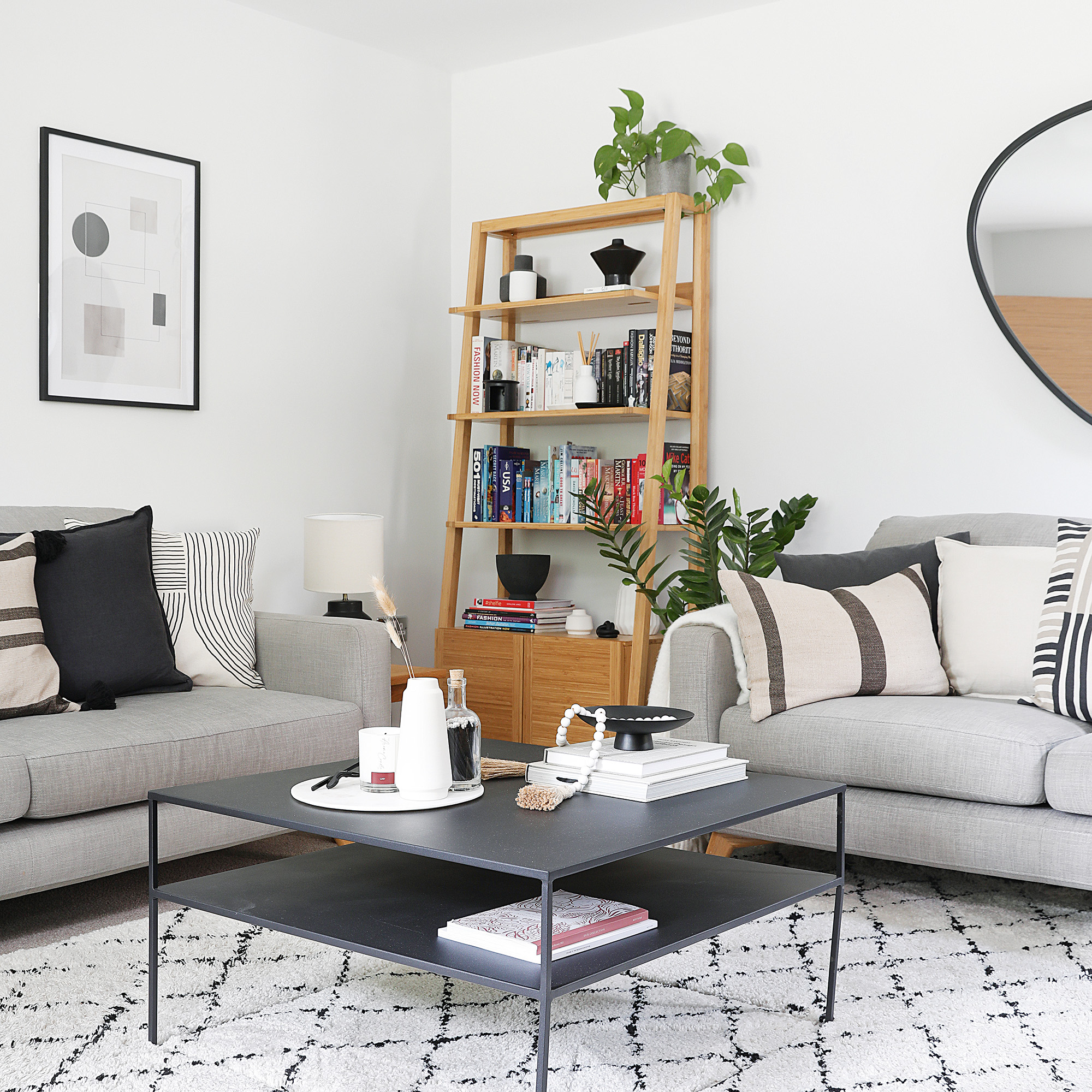
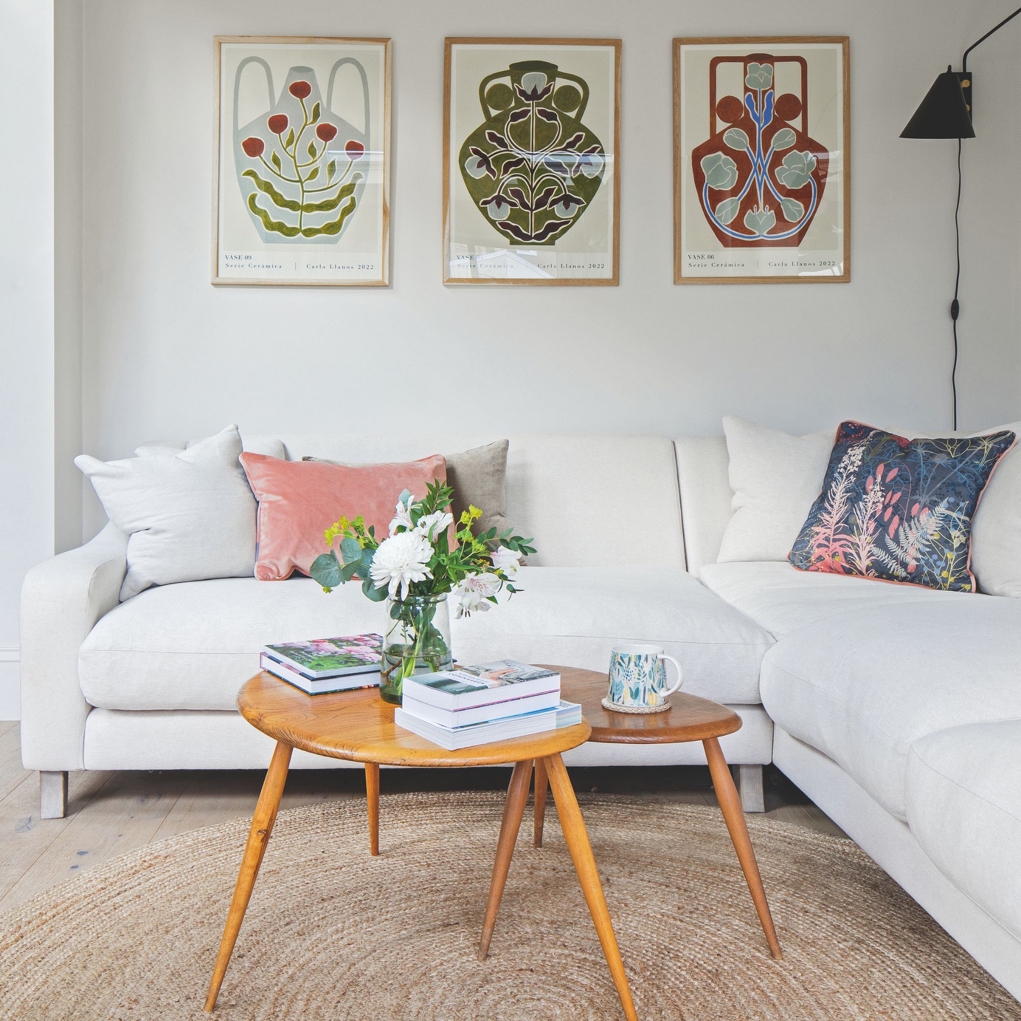
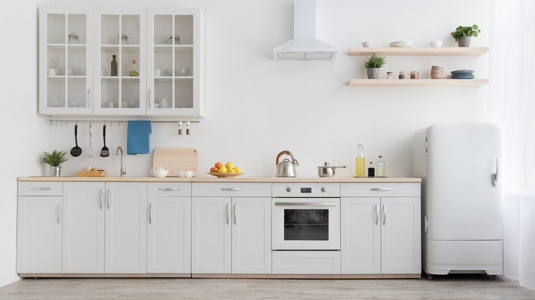
Pure white is another color on the list of undesirable choices. Although it is a classic and seemingly versatile option, designers warn against its use because of its potential to create a sterile, cold, and unwelcoming environment. A pure white can feel overly stark and devoid of personality, failing to foster the cozy and inviting atmosphere essential for a living room. The article suggests that warmer, off-white tones or whites with subtle undertones of beige or gray are preferable. These nuanced whites can brighten a room while adding a layer of softness and warmth, making the space feel more comfortable and lived-in.
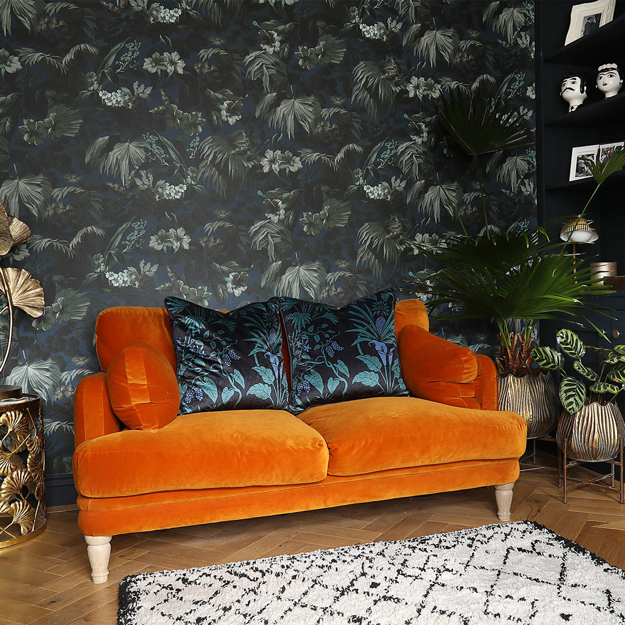
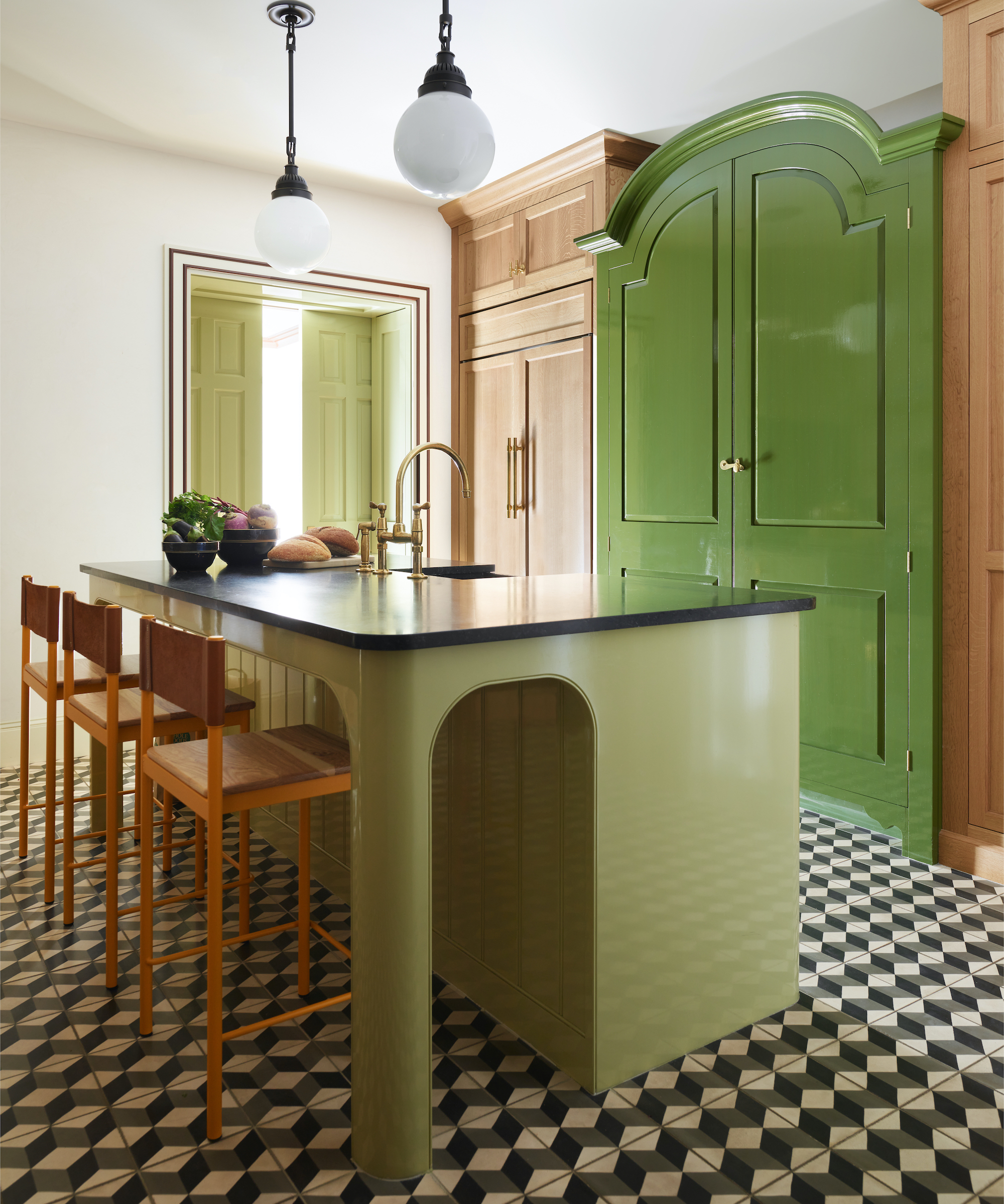
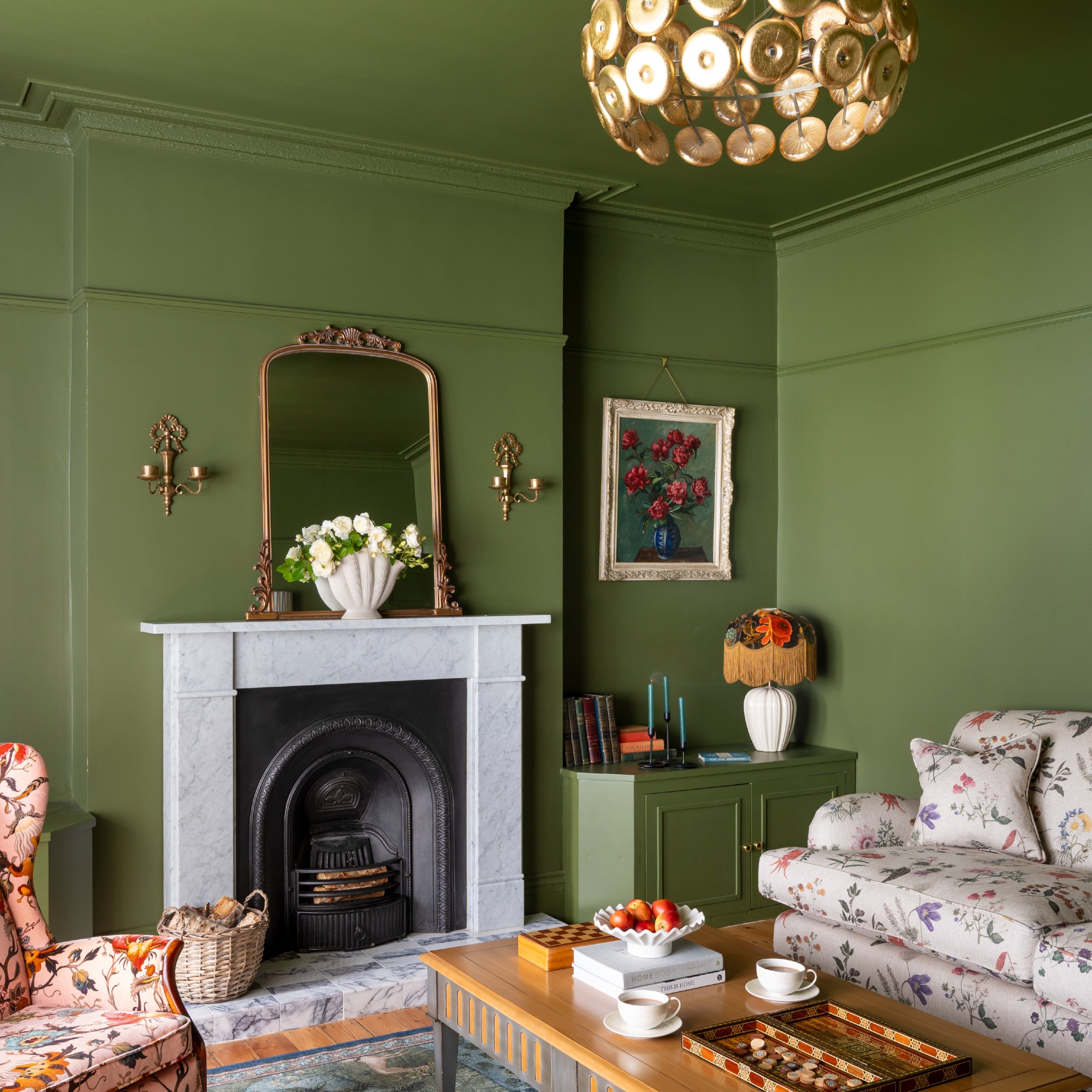
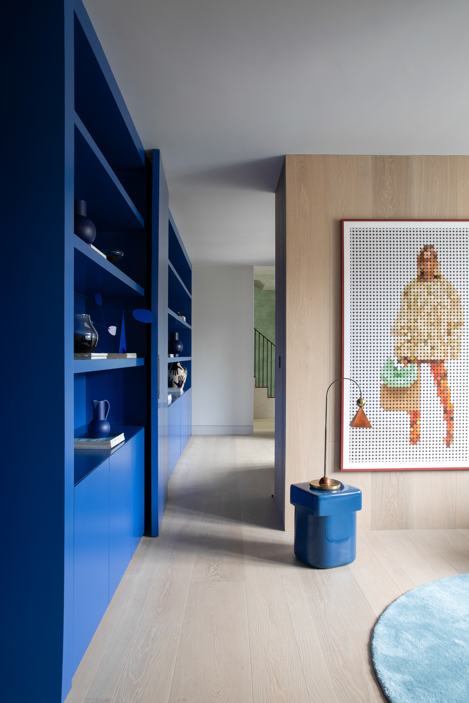
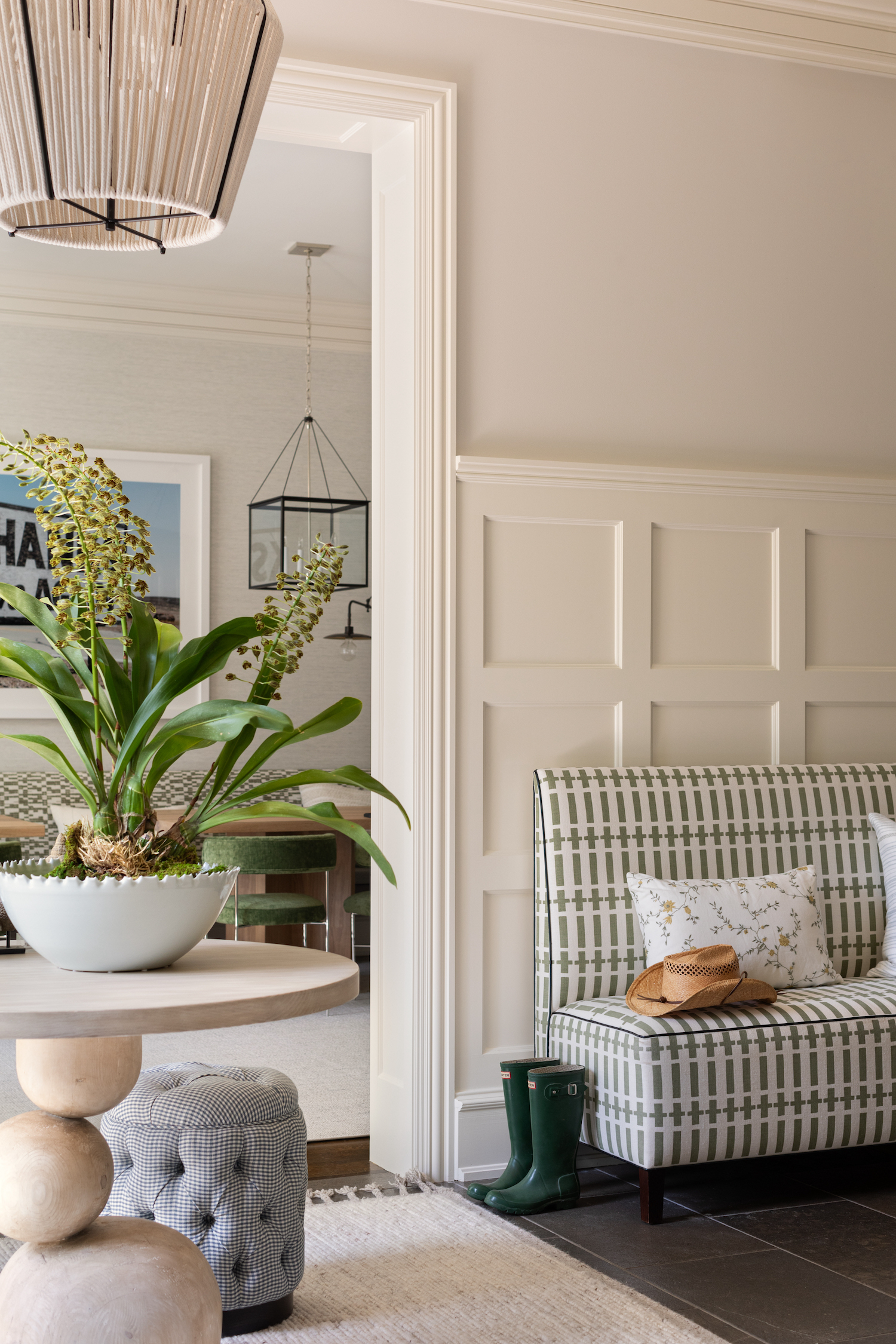
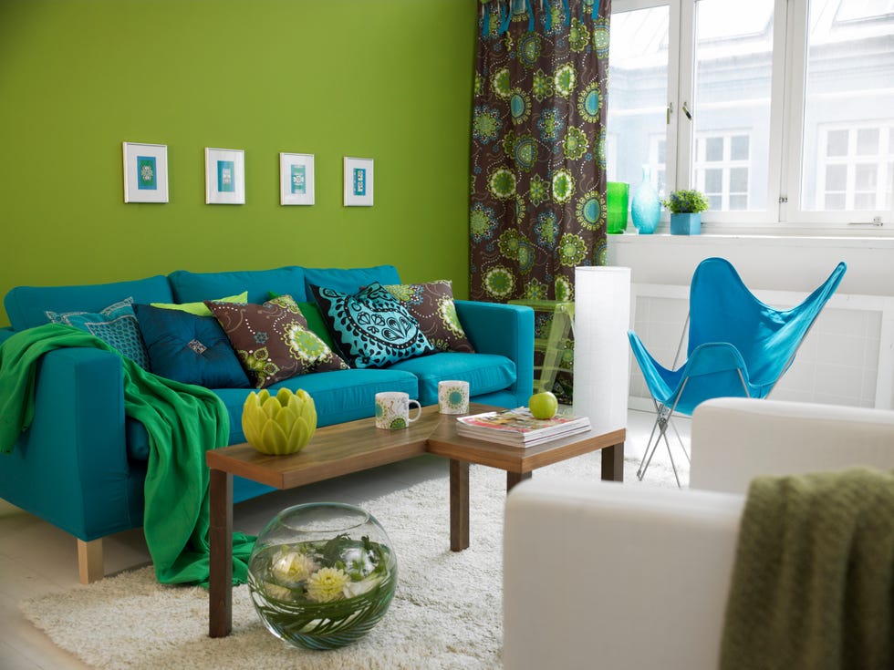
Lime green is presented as the third problematic color, primarily due to its intense and often overwhelming hue. Designers point out that lime green can be highly stimulating and difficult to coordinate with other decor elements, leading to a visually jarring and unbalanced space. Its vibrant nature can quickly become tiresome and may not contribute to a relaxing environment. For those who are drawn to green, the article proposes more subdued and natural shades such as sage green, olive green, or forest green. These greens can introduce a sense of nature and tranquility without overpowering the room's design.
The article emphasizes that paint color plays a crucial role in shaping the mood and perceived size of a living room. Selecting the right color can enhance comfort and visual appeal, while a poor choice can detract from the overall design. Designers stress the importance of considering how a color interacts with natural and artificial light, as well as with existing furniture and decor. By avoiding these three commonly misused colors and opting for their recommended alternatives, homeowners can create a more harmonious, inviting, and aesthetically pleasing living space. The advice aims to guide individuals in making informed decisions about their interior paint choices, ensuring their living rooms are both stylish and comfortable.
#ChoosingPaintColors #LivingRoom #PaintColors #InteriorDesign #HomeDecor #DesignTips #ChoosingPaintColors #LivingRoom #PaintColors #InteriorDesign #HomeDecor #DesignTips
0 comment in total
 No comments yet
You may also like

What are the worst colors to paint a room? The shades experts say you should never use


5 colors you should never paint your entryway – according to interior experts
The 3 worst colours for a small living room – the shades that will make a tiny lounge look smaller and less inviting
5 Colors You Should Never Paint Your Hallway, According to Designers


4 Outdated Colors Designers say you Should Steer Clear of When Decorating a Living Room

5 'ugly colors' that I'll be decorating with in 2024 – these undesirable colors will trend this year
5 Paint Colors to Never Use in Your Living Room, According to Interior Designers
7 'Unhappy' Colors That Color Psychology Experts Would Never Paint Their Walls
Experts say these are the 3 sofa colours to avoid

The 10 Worst Paint Colors for Your Home, Experts Say

I’m an interior designer - the worst paint colours for small rooms, and why bright white walls is not a good idea

These Paint Colors Bring Hostility to Your Home, According to Experts

Interior Designers List the Worst Paint Colors for Your Entryway

5 colors you should never paint a small room – designers warn us to steer clear of these hues, and what to pick instead
You should never paint your hallway this colour, according to colour psychologists
Couch colors to avoid – and what designers are recommending instead
The 3 living room paint colors all the trendiest experts are using

Interior design experts reveal the colour rules you should be breaking
6 Worst Colors To Paint Your Kitchen (And What To Choose Instead)
Experts Rank the 10 Worst Paint Colors for Your Kitchen