5 Paint Colors to Never Use in Your Living Room, According to Interior Designers
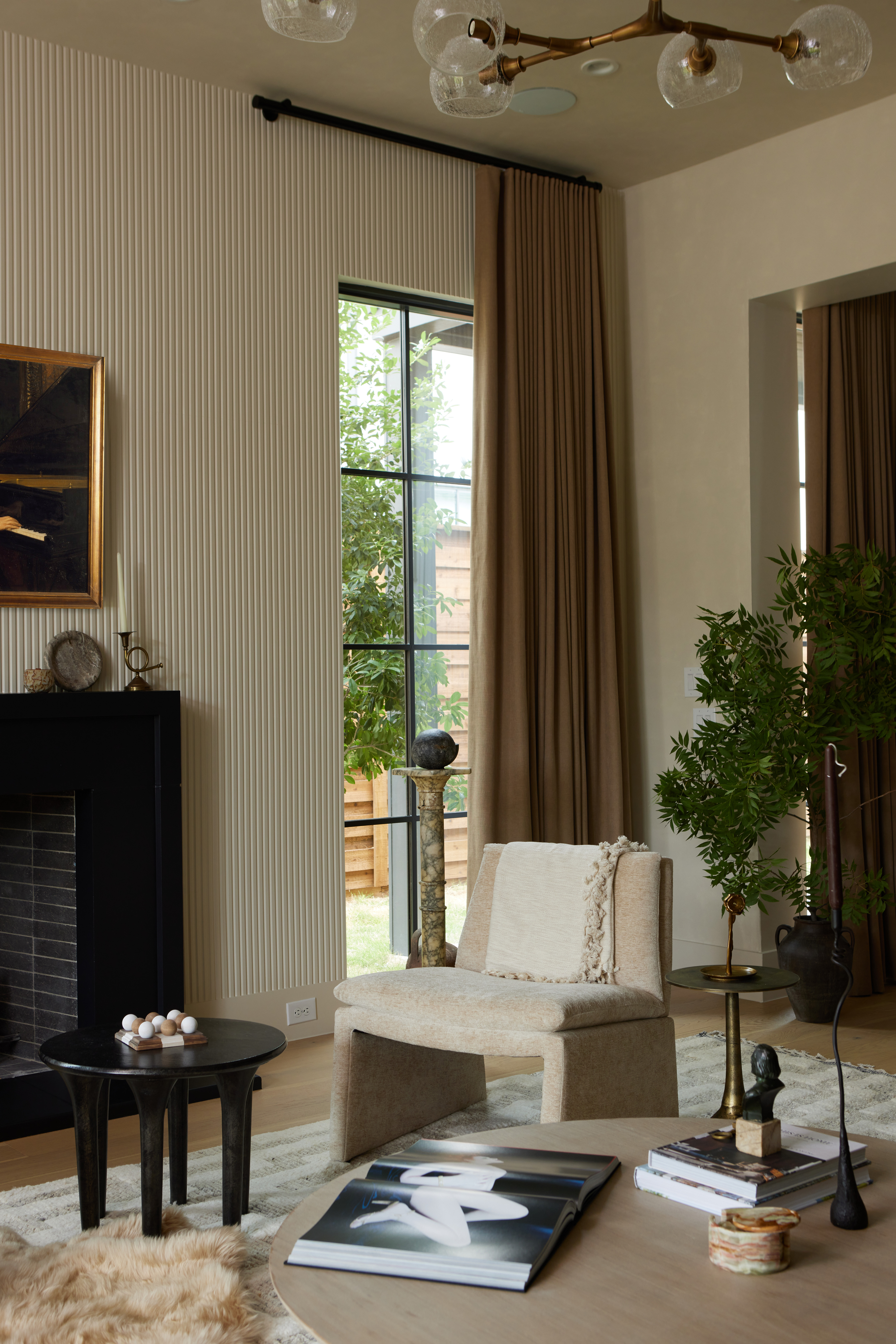
The living room serves as a central hub for relaxation, entertainment, and social gatherings within a home. Therefore, selecting the appropriate paint color is crucial in establishing a comfortable and inviting atmosphere. Interior designers advise against certain hues that can detract from this desired ambiance, either by being too cool, too bland, or too overpowering. The general recommendation is to opt for earth tones and warm shades that promote a sense of relaxation and harmony with adjacent rooms.
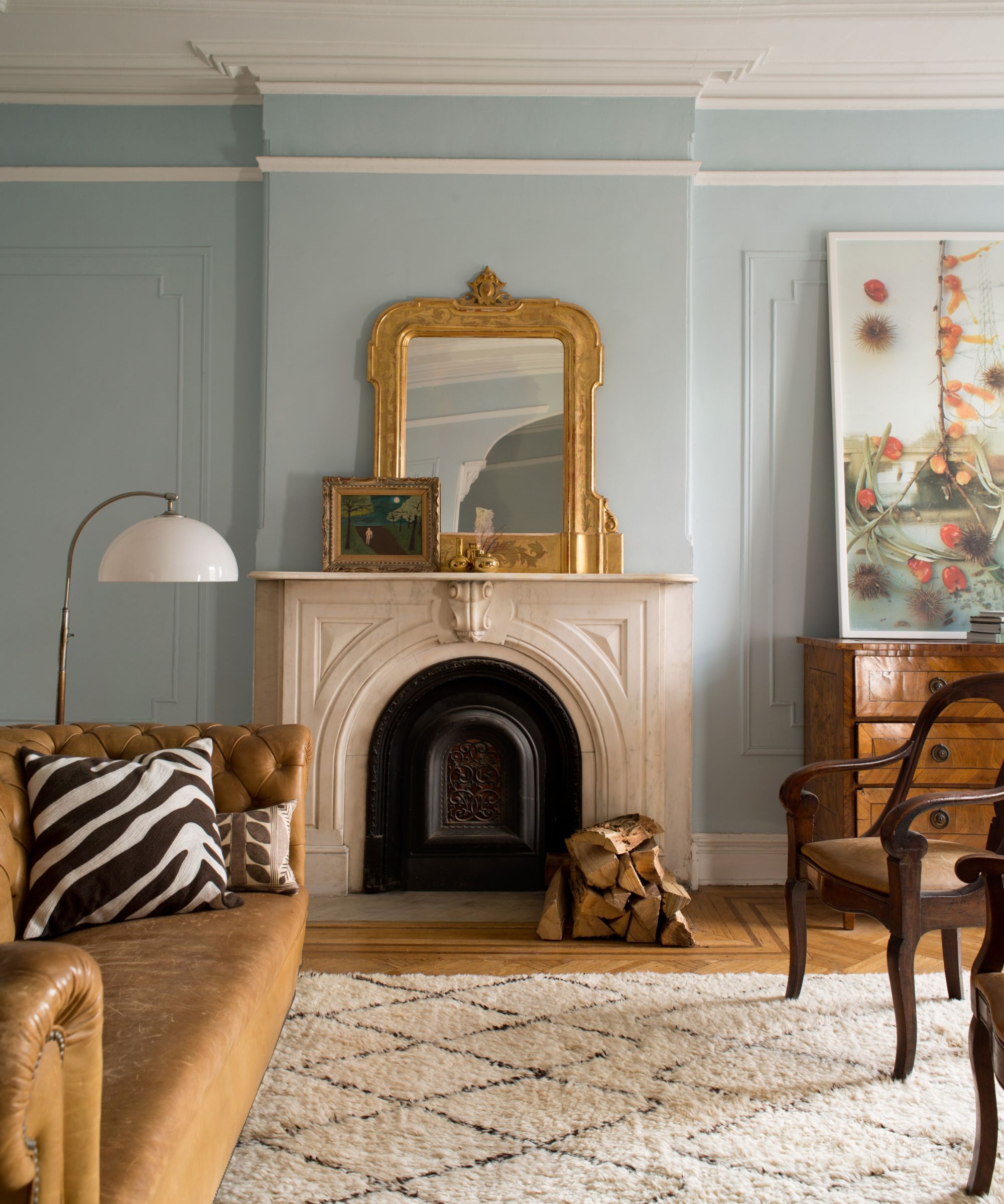
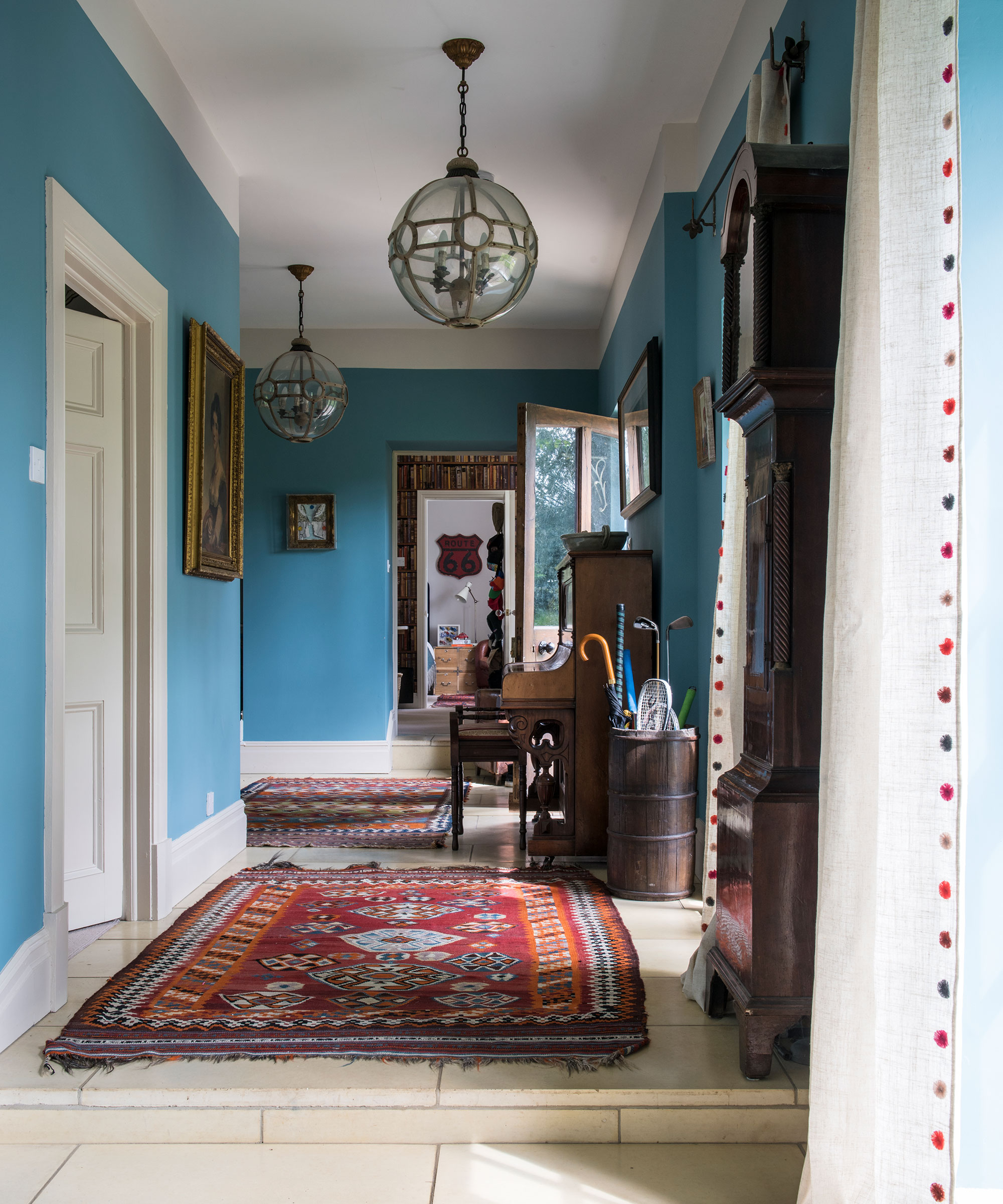
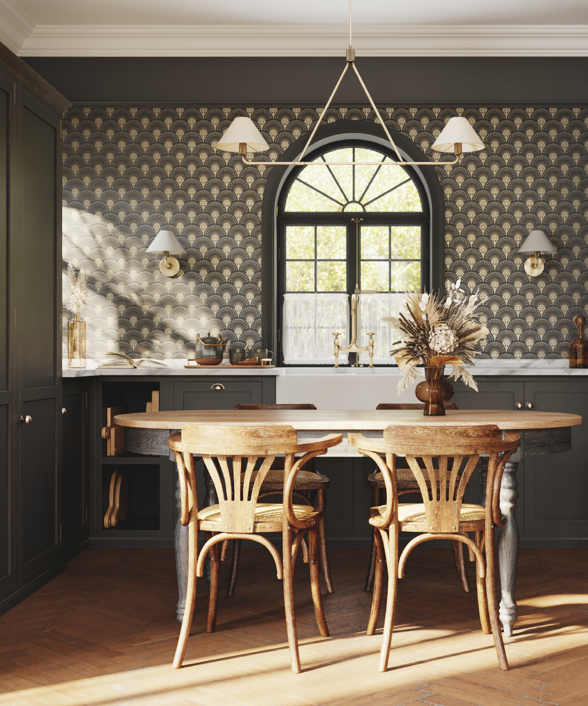
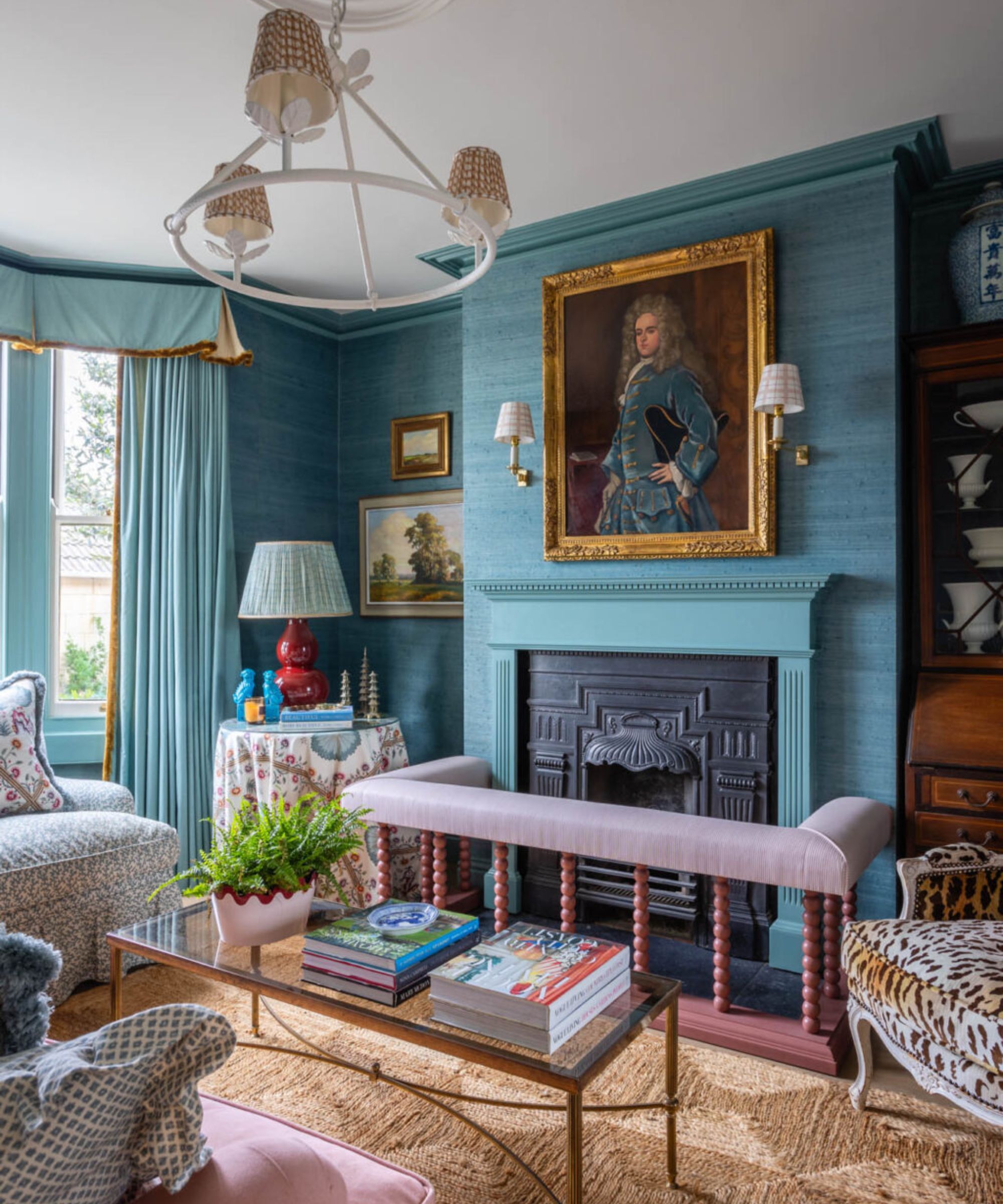
Gray, despite its past popularity, is now considered an unsuitable choice for living rooms. Designers describe it as boring, lacking character and vibrancy, and making a space feel monotonous, flat, and dated. Instead, warm neutrals like creamy beige, blues, greens, caramel browns, or rich jewel tones are suggested as alternatives. These colors offer energy, vibrancy, and warmth, creating a more appealing base for the room.
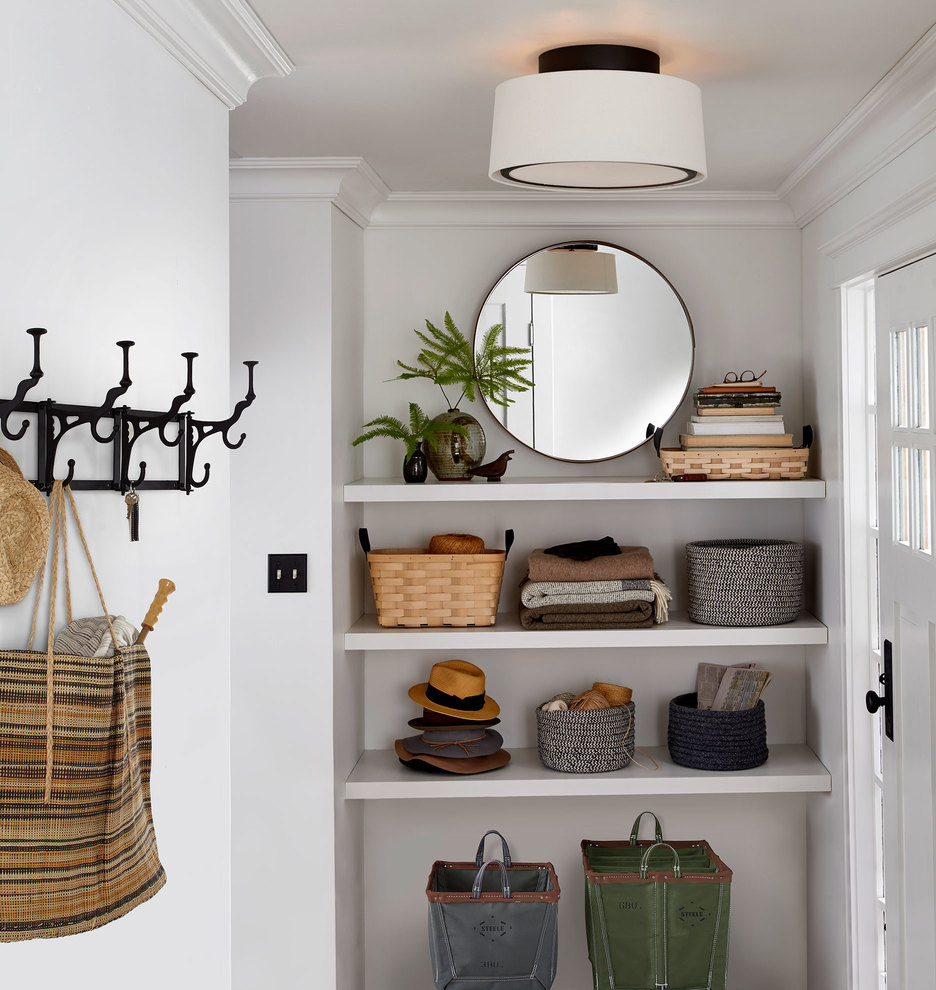
While white can project a clean and sophisticated image, basic cool whites are to be avoided. Such shades can render a living room cold, sterile, and bare. Interior designers recommend selecting whites with warm undertones, such as those with hints of cream or beige, to ensure the space feels welcoming and inviting. This approach prevents the room from appearing stark or impersonal.
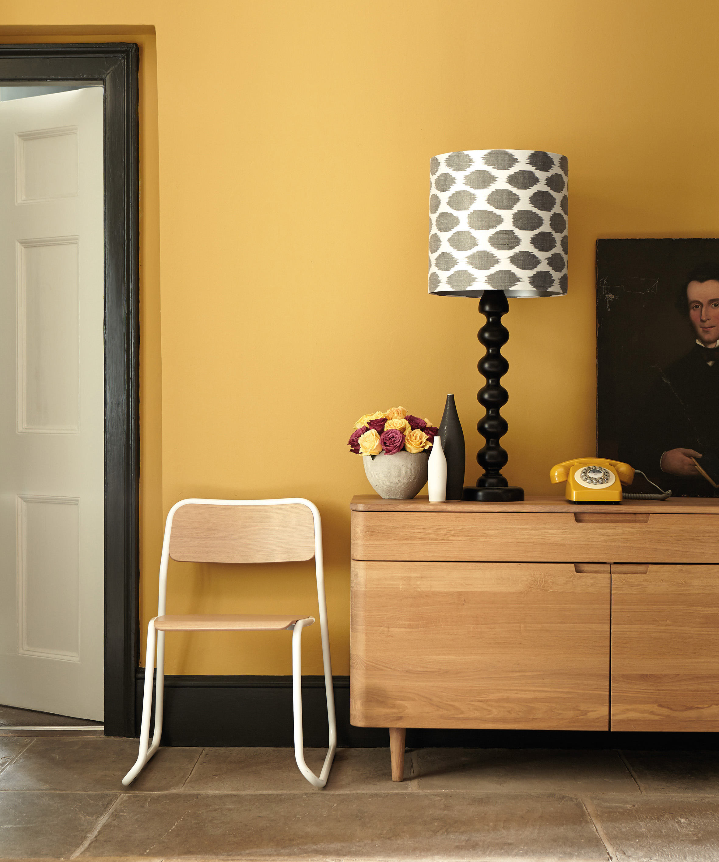
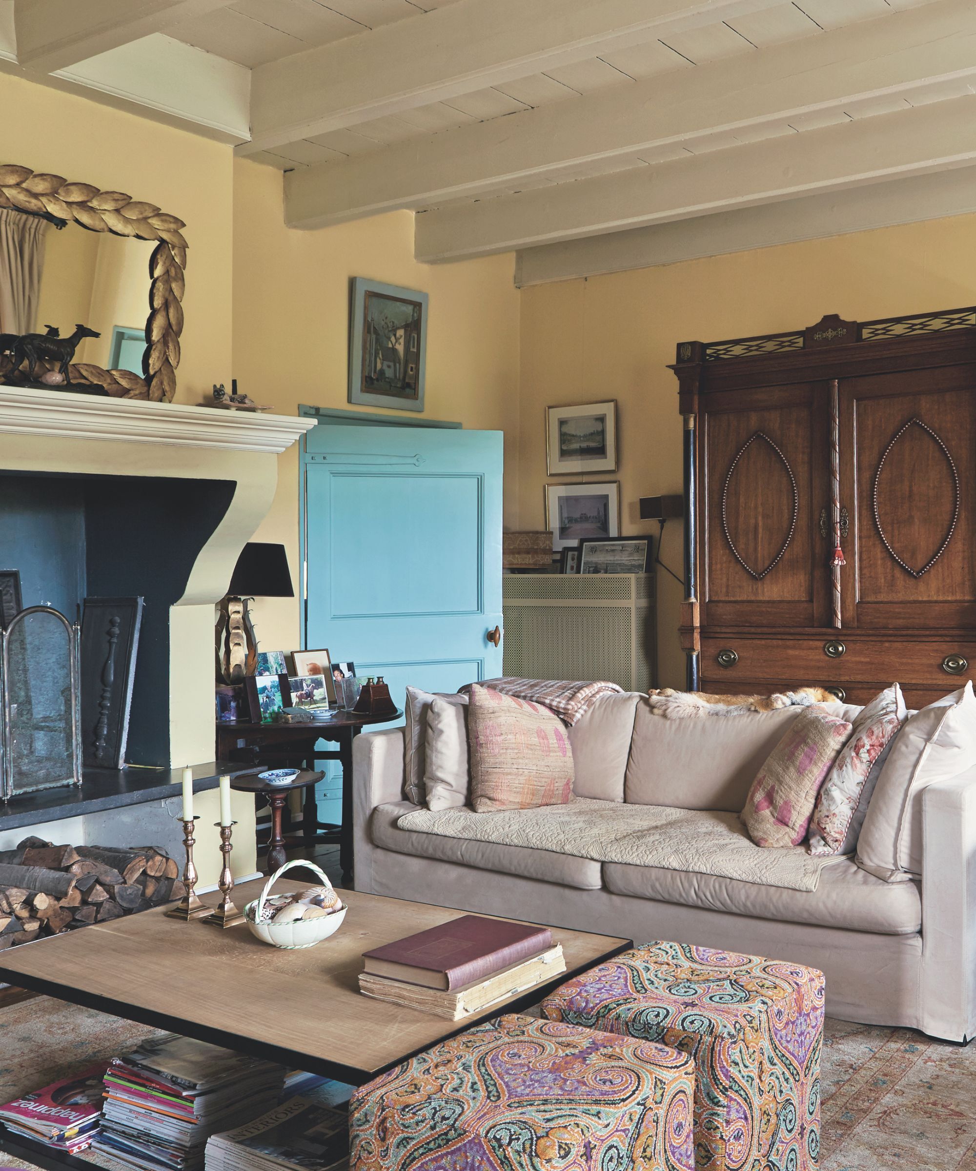
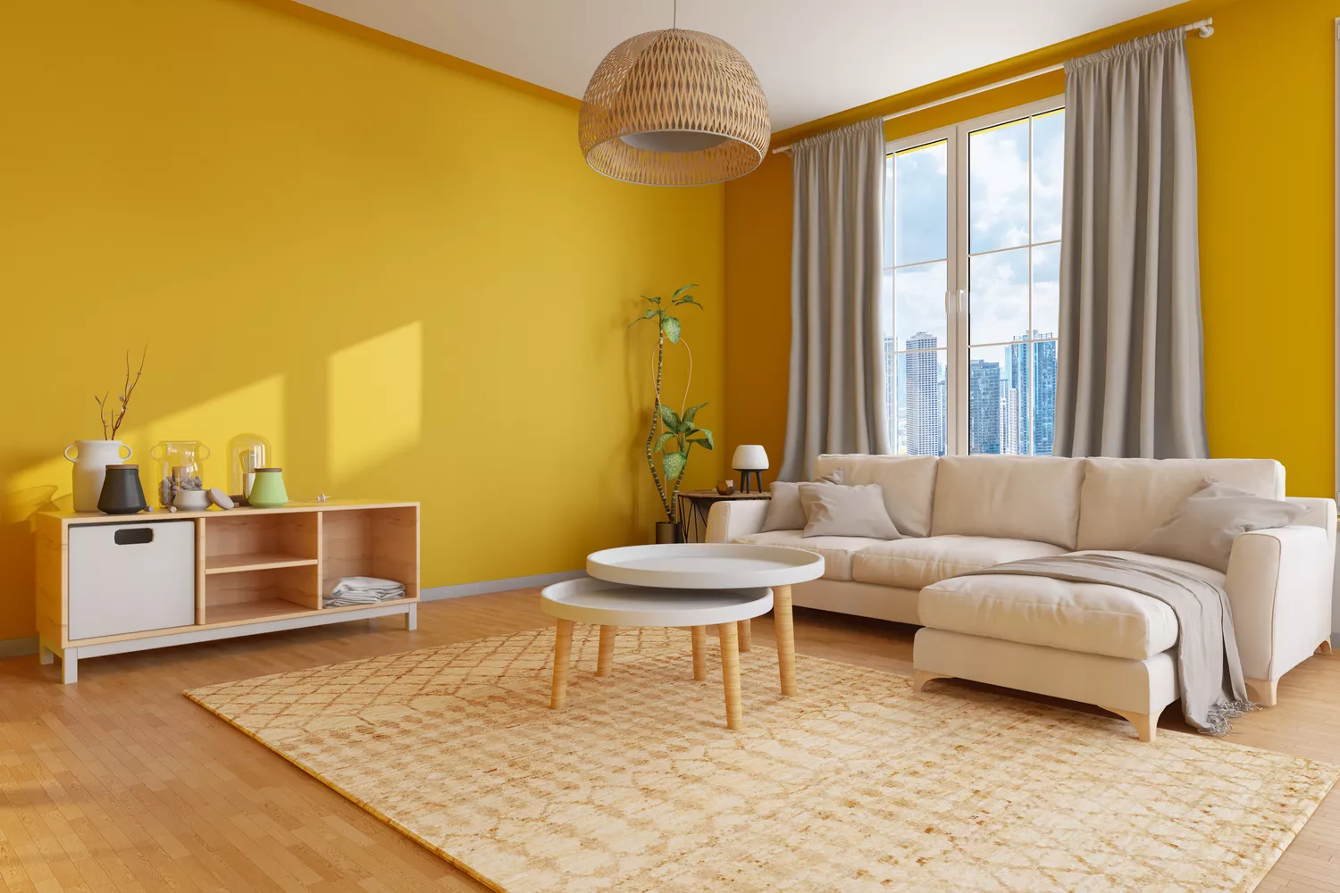
Bright, citrus-toned lemon yellow is another color to use with caution. While small accents of this hue can be cheerful, an entire room drenched in lemon can feel outdated and overwhelming. For those who appreciate yellow, more subdued and complex options like ochre, mustard, primrose, honey, or old gold are preferable, as they possess greater depth and richer undertones.
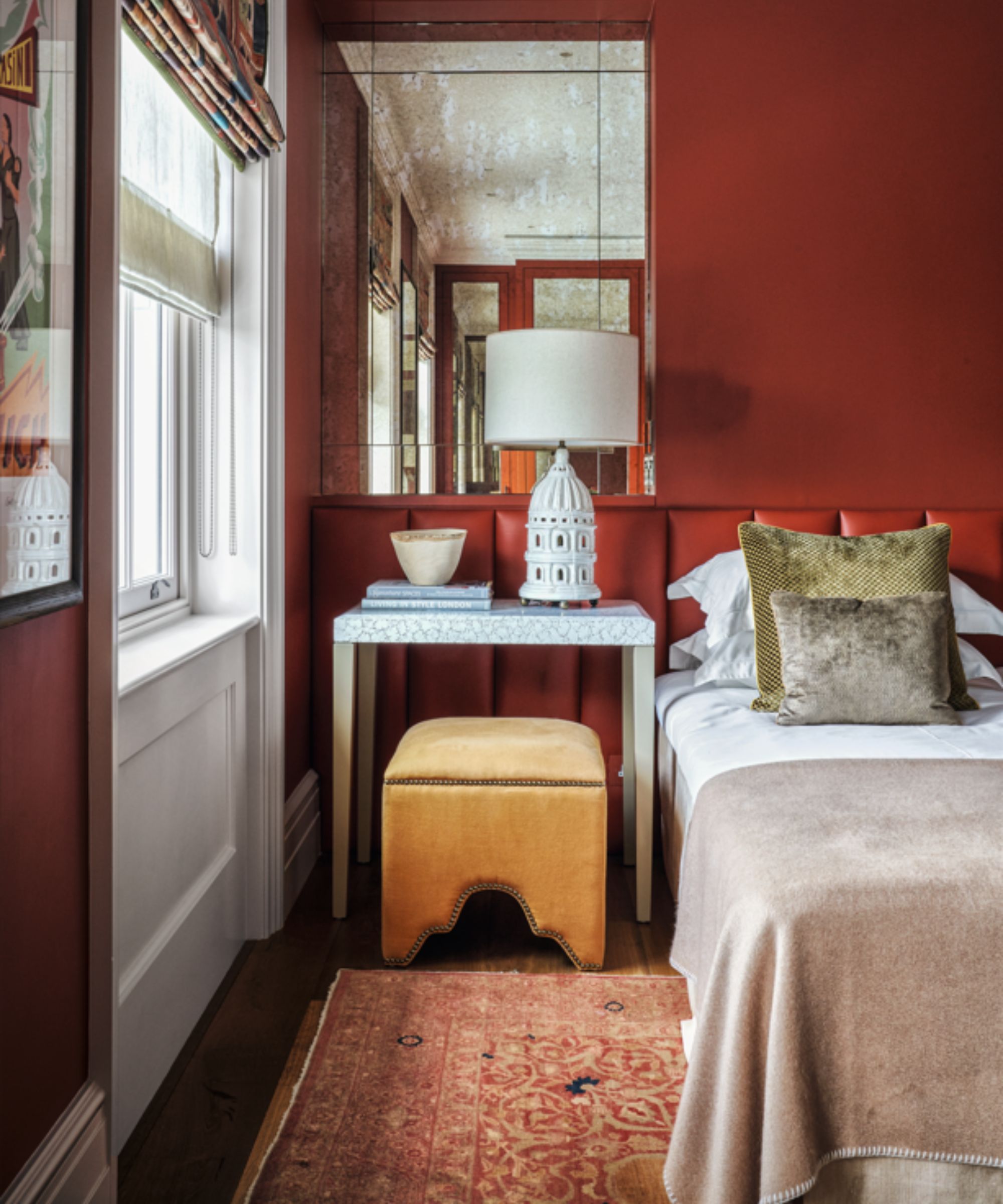
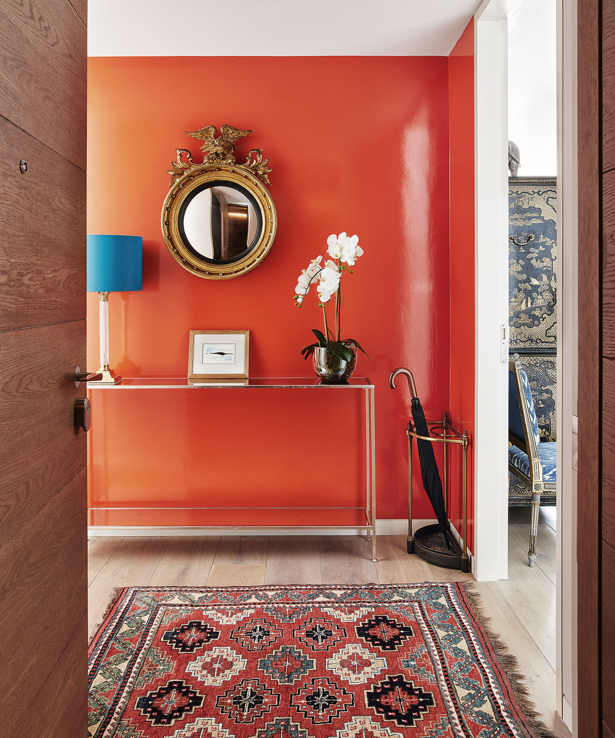
Similarly, intense, vibrant oranges are not recommended for living room walls. Colors that evoke pumpkins, traffic cones, or actual orange fruits can be overwhelming and overpowering. If orange is desired, designers suggest shades with brown undertones, such as rust or burnt orange, or those with a hint of pink, like coral, salmon, or apricot, to add depth and elegance.
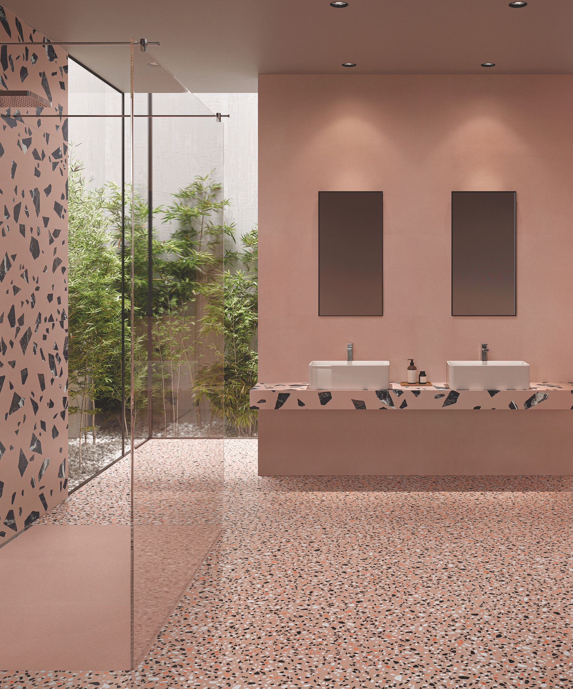
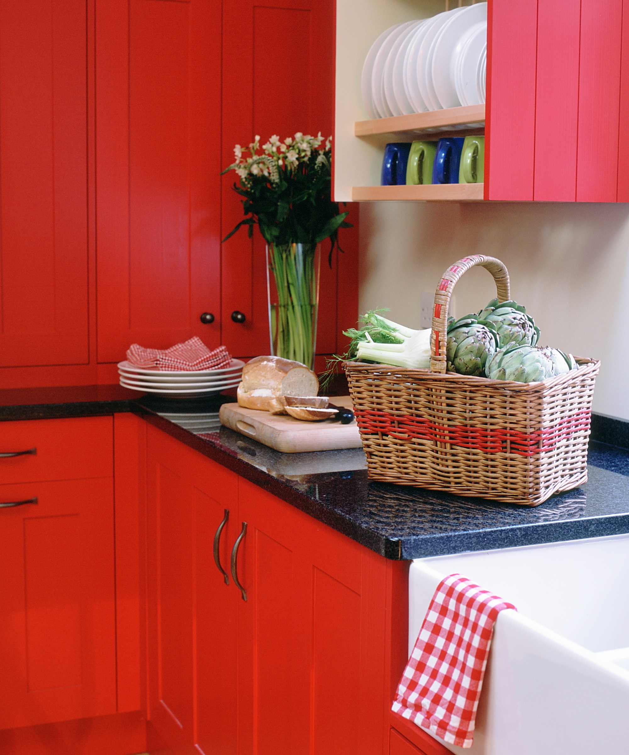
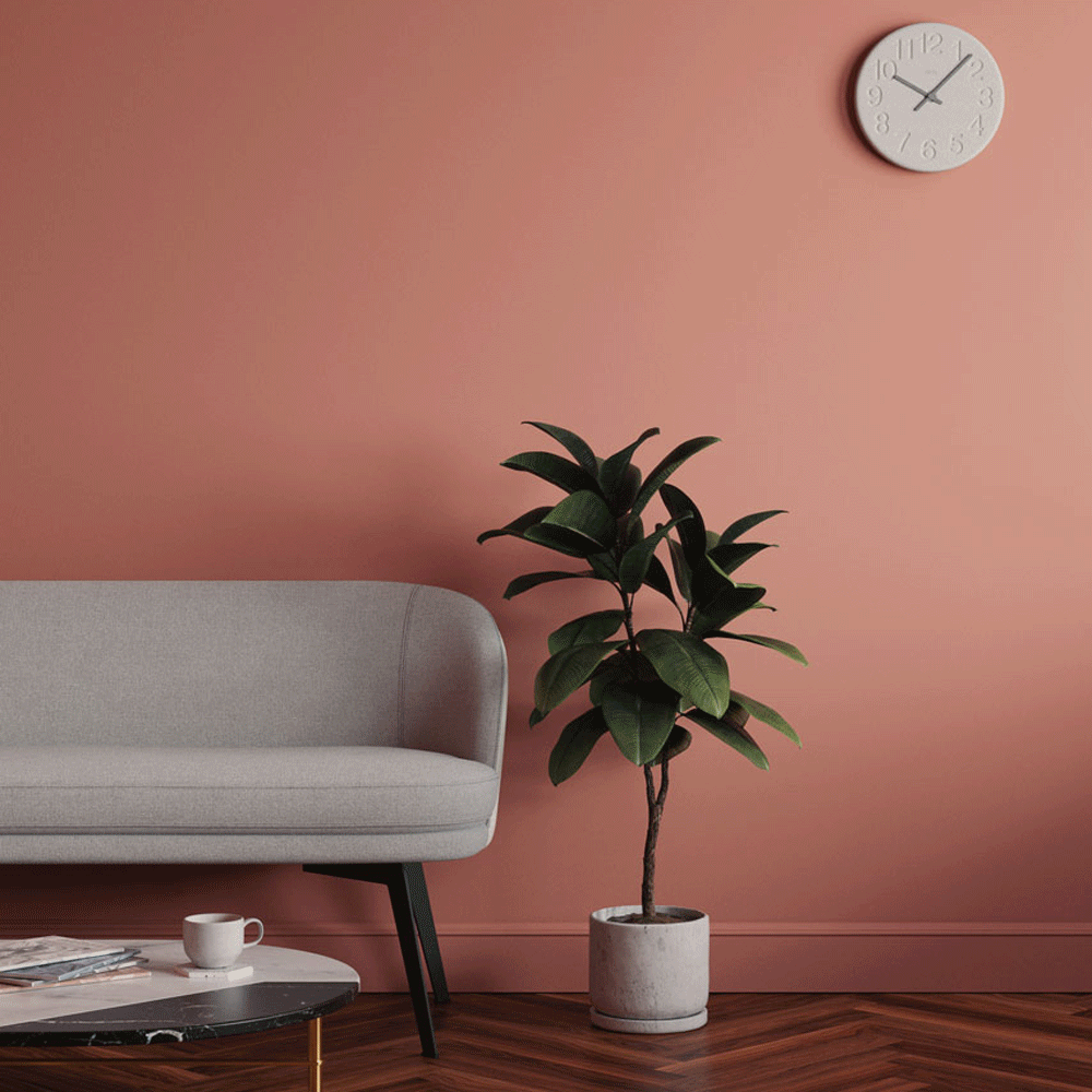
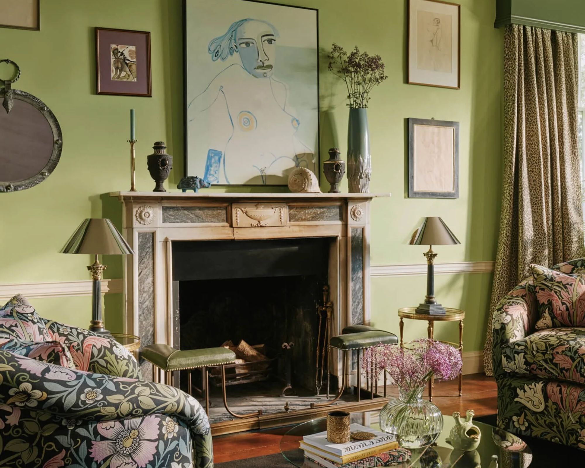
Finally, brights and neon colors, including vibrant pink, aqua, or lime green, are generally considered inappropriate for living room walls. These highly energetic hues can be too intense or harsh for a space meant for relaxation and socializing. While they can work as small decorative elements to add visual interest, using them on entire walls can create a distracting and unsettling environment. Instead, designers advise choosing shades that allow the room to feel natural, contemporary, and restful, such as olive, warm gray, creamy whites, or dusty rose. The overall goal is to select a paint color that complements the room's natural light and layout, effectively setting a peaceful and inviting mood.
#InteriorDesign #PaintColors #LivingRoomDecor #HomeDecor #ColorPalette #DesignTips #HomeImprovement #InteriorDesign #PaintColors #LivingRoomDecor #HomeDecor #ColorPalette #DesignTips #HomeImprovement
0 comment in total
 No comments yet
You may also like

5 colors you should never paint a small room – designers warn us to steer clear of these hues, and what to pick instead


5 colors you should never paint a pantry – designers share the shades they swerve
5 rug colors to avoid – the hues designers think you should veer away from on floors, plus how to make them work

4 Paint Colors Designers Say You Should Never Use In A Hallway

5 colors you should never paint your entryway – according to interior experts
5 colors to avoid in a bathroom – according to designers
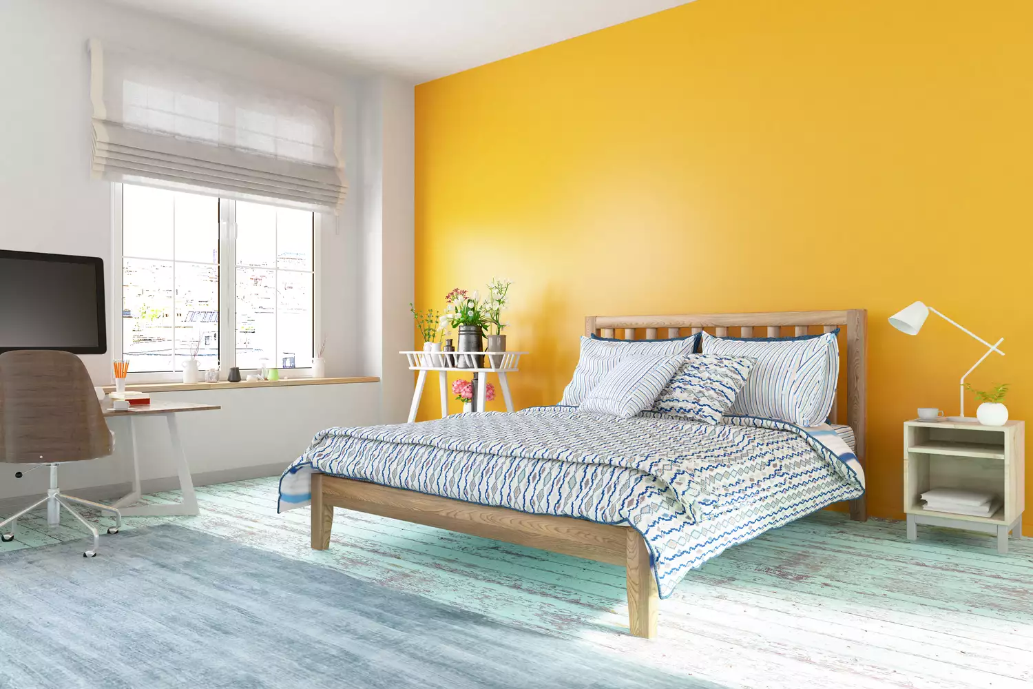
6 Paint Colors You Should Never Use in Your Bedroom, According to Interior Designers
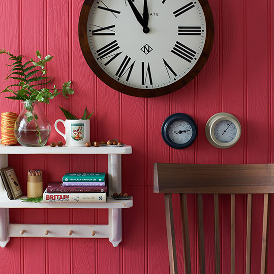
You should never paint your hallway this colour, according to colour psychologists

What are the worst colors to paint a room? The shades experts say you should never use
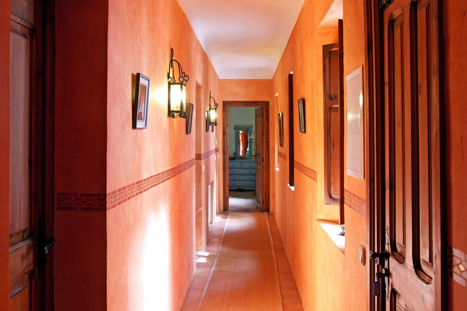
5 Colors You Should Never Paint Your Hallway, According to Designers


Interior design experts reveal the colour rules you should be breaking
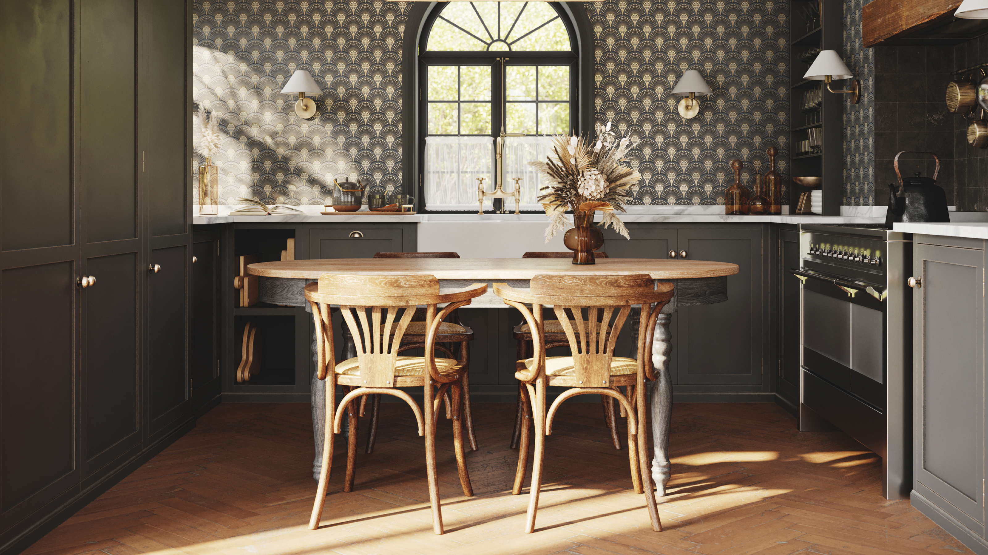
8 colors you should never paint kitchen cabinets according to the experts

5 Paint Colors You Should Never Use In A Bedroom, According to Designers

The paint colors to avoid in small living rooms — and what to use instead
Colors not to paint a mudroom – 5 hues to avoid in this high-traffic space
5 living room paint colors going out of style in 2025

4 Outdated Colors Designers say you Should Steer Clear of When Decorating a Living Room
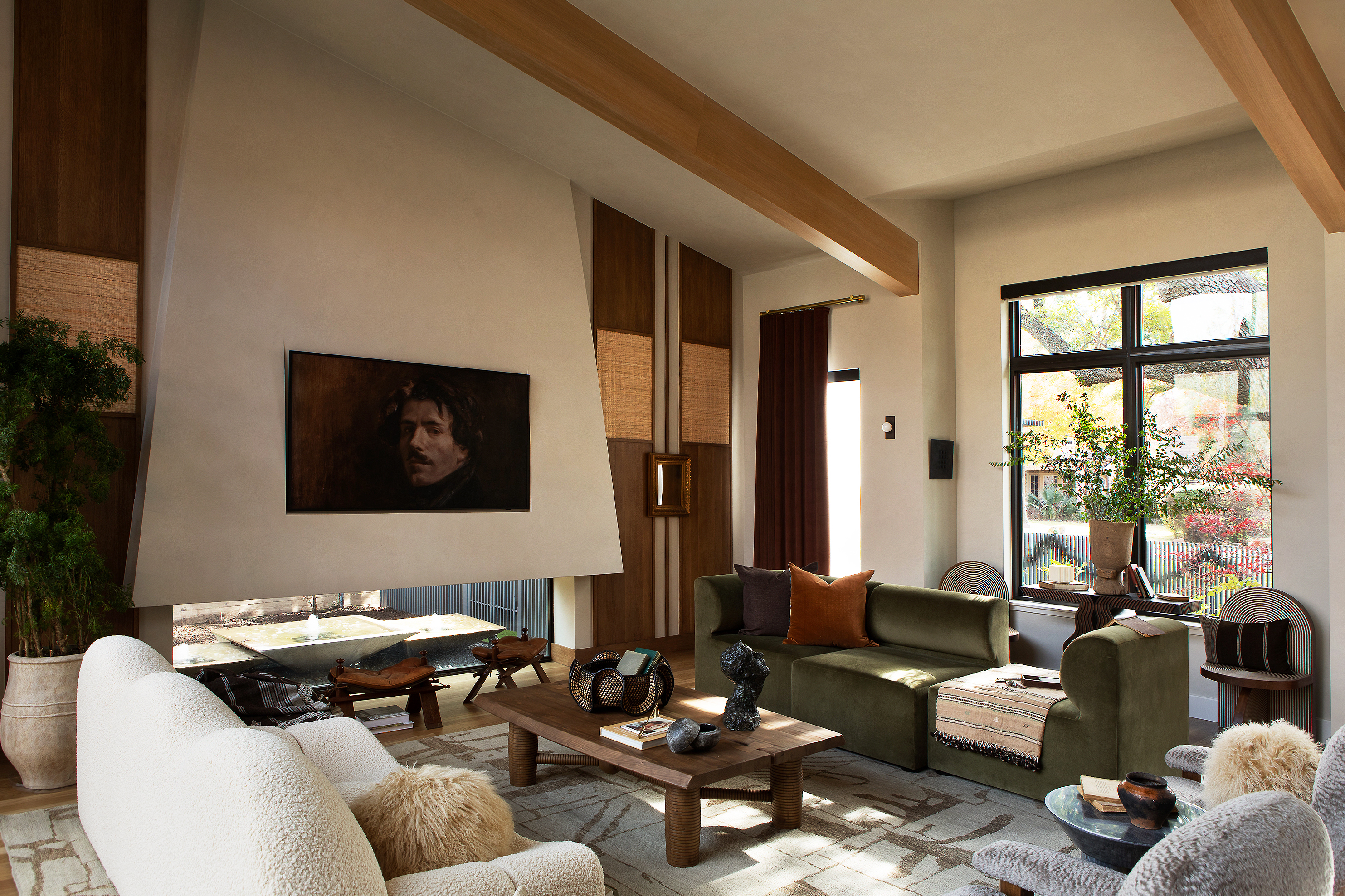
9 colors designers won’t be using in their living rooms in 2025
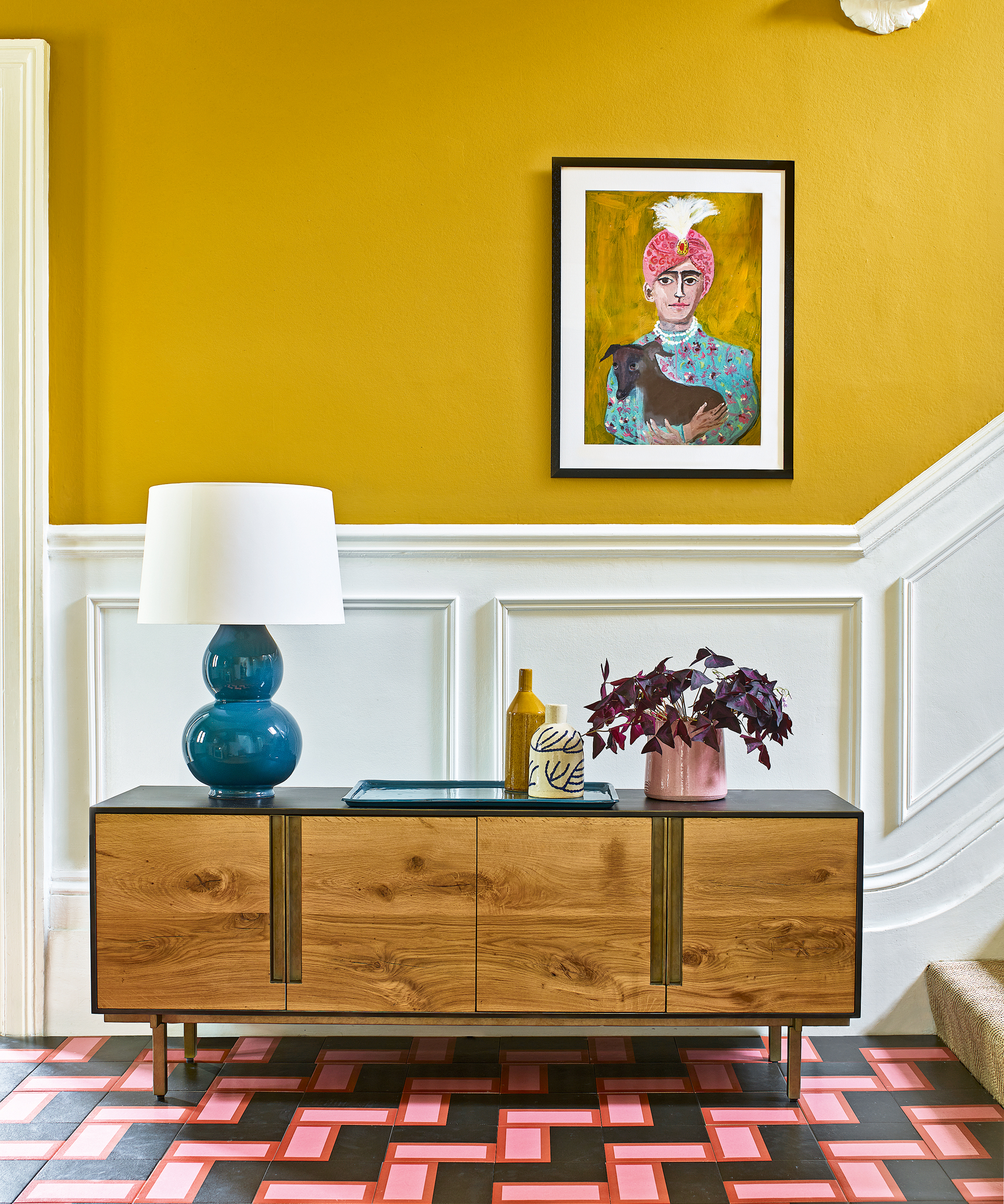
The colors you should never paint your hallway – and what really works
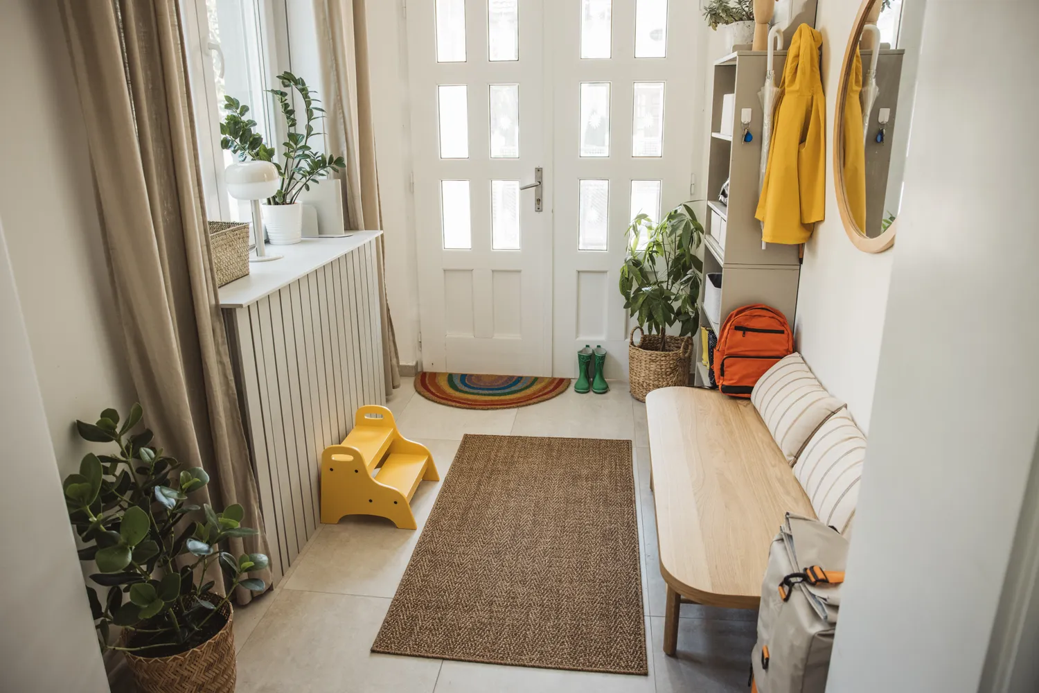
6 Colors You Should Never Paint Your Entryway, According to Color Experts