4 Paint Colors Designers Say You Should Never Use In A Hallway
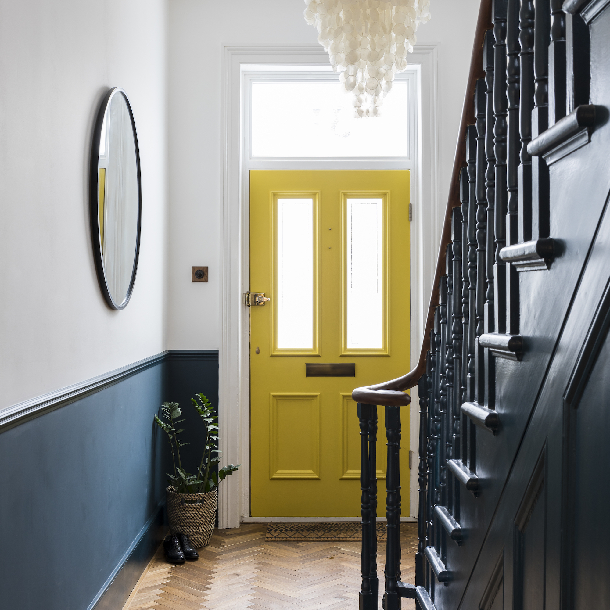

When selecting paint colors for a hallway, interior designers advise avoiding certain hues to maintain a cohesive and inviting atmosphere. Hallways are transitional spaces, connecting various rooms, and the right paint choice can significantly impact the overall flow and feel of a home. Incorrect color selections can disrupt this flow, making hallways appear less welcoming, narrower, or even oppressive.
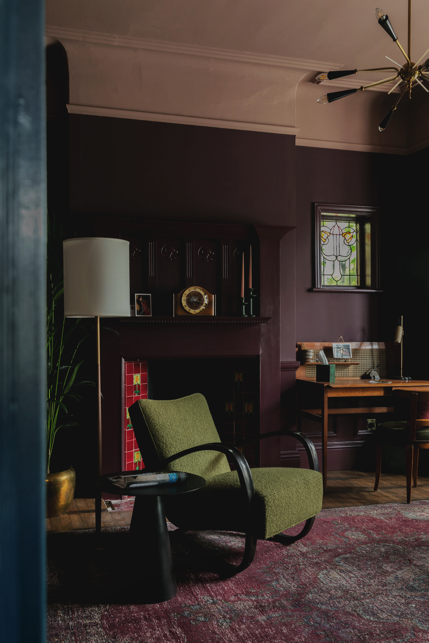
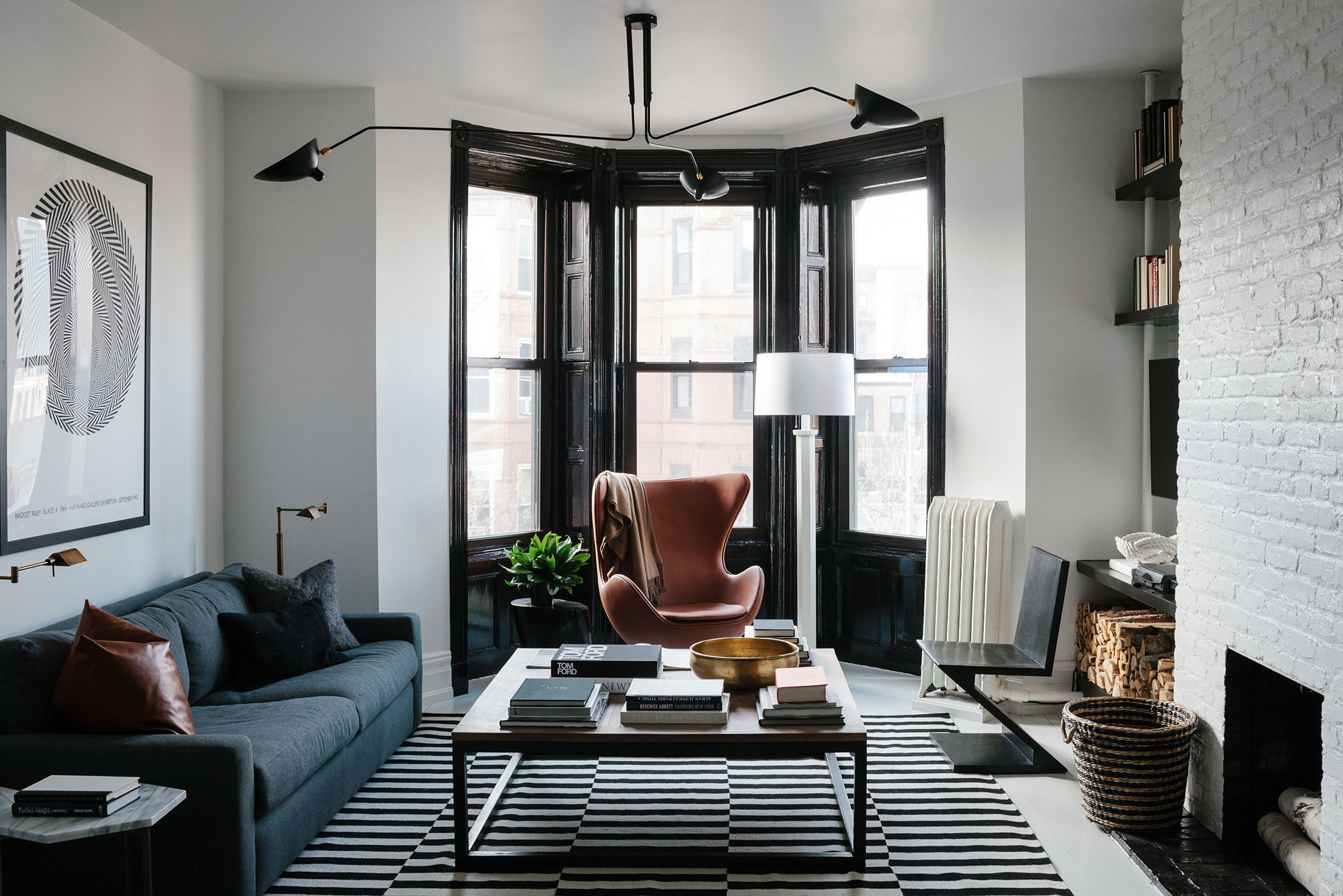
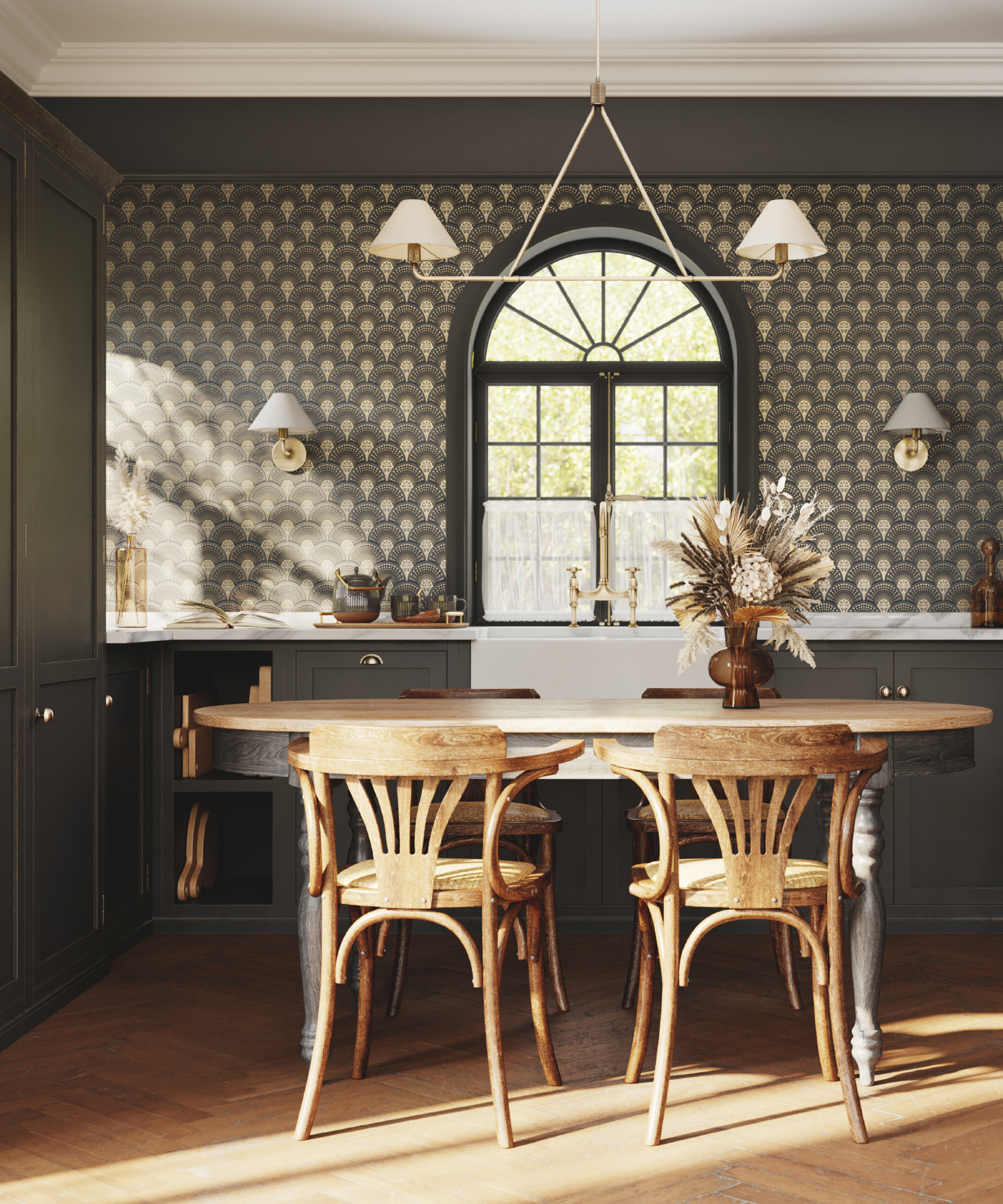
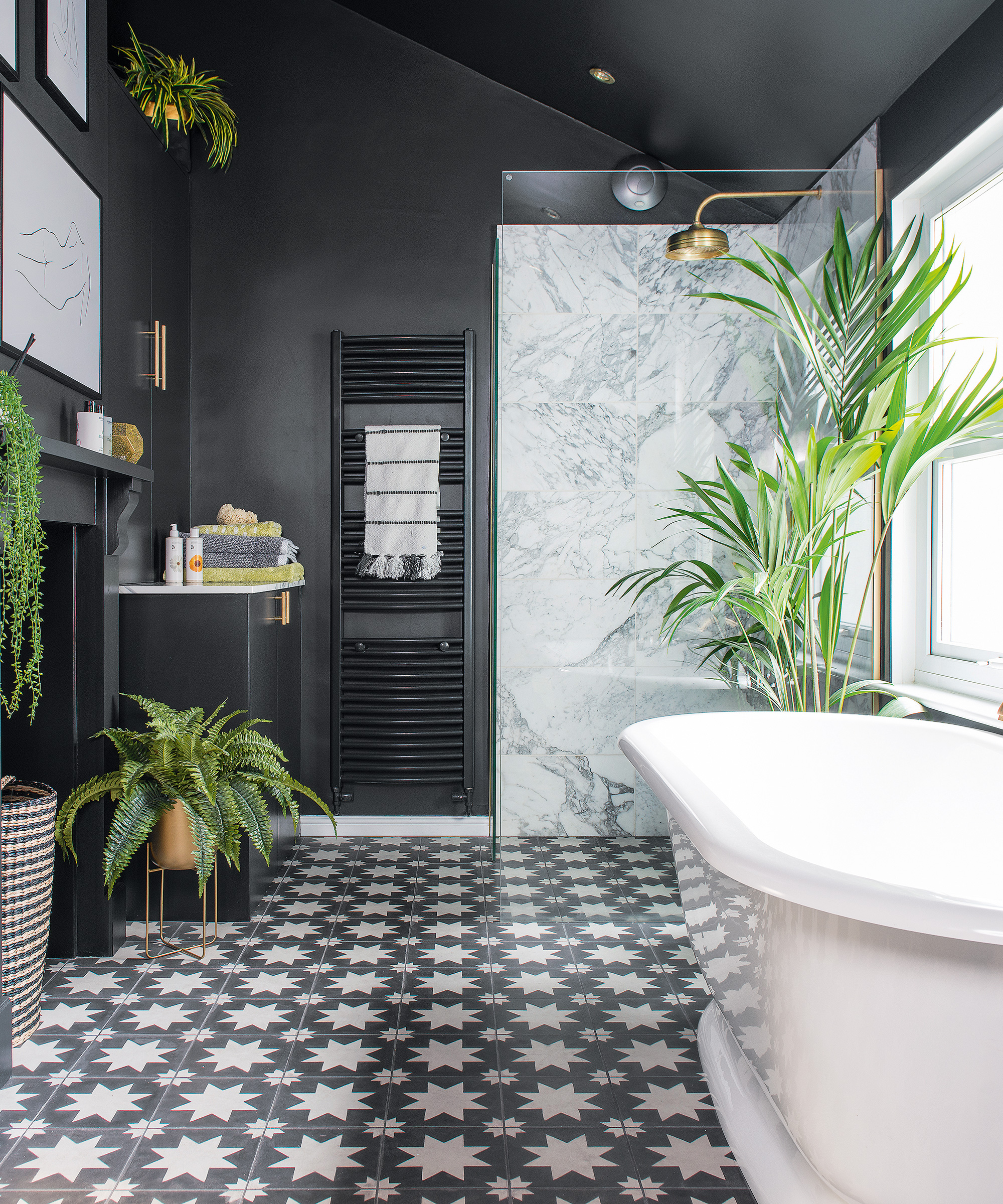
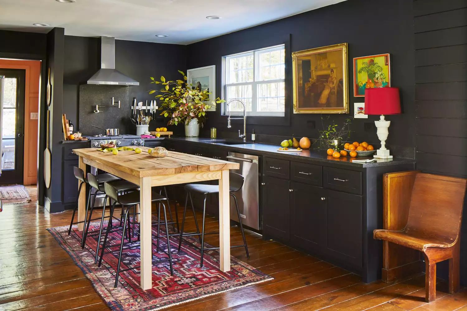
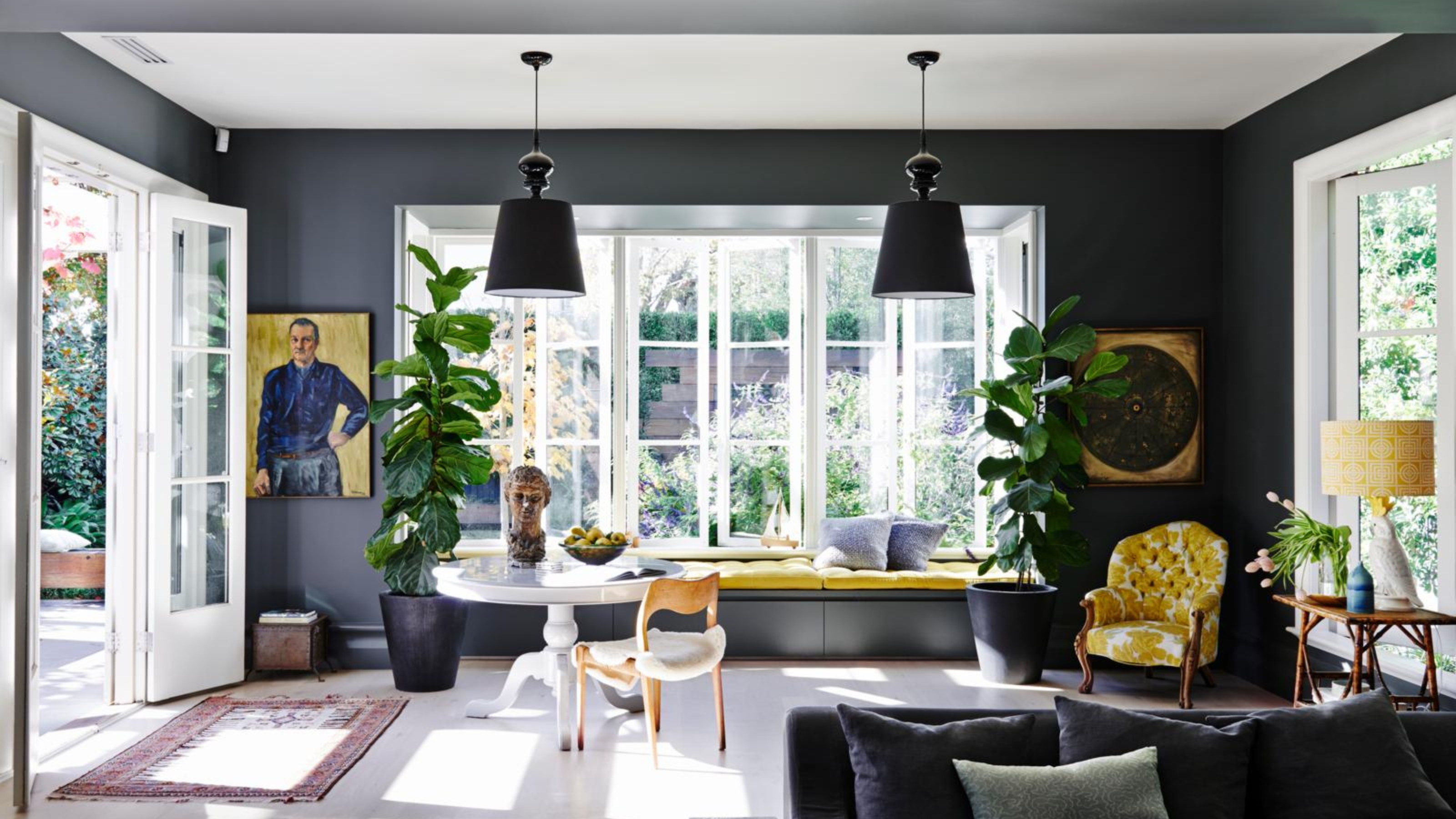
Very dark colors, such as deep blacks or grays, are generally discouraged. While dark colors can add drama in larger, well-lit spaces, in a hallway, they tend to "bookend" rooms, breaking the visual continuity and making the space feel heavy and confined. Designers emphasize that hallways should guide the eye seamlessly from one area to another, and dark shades can impede this visual journey, creating a tunnel-like effect rather than a smooth transition.
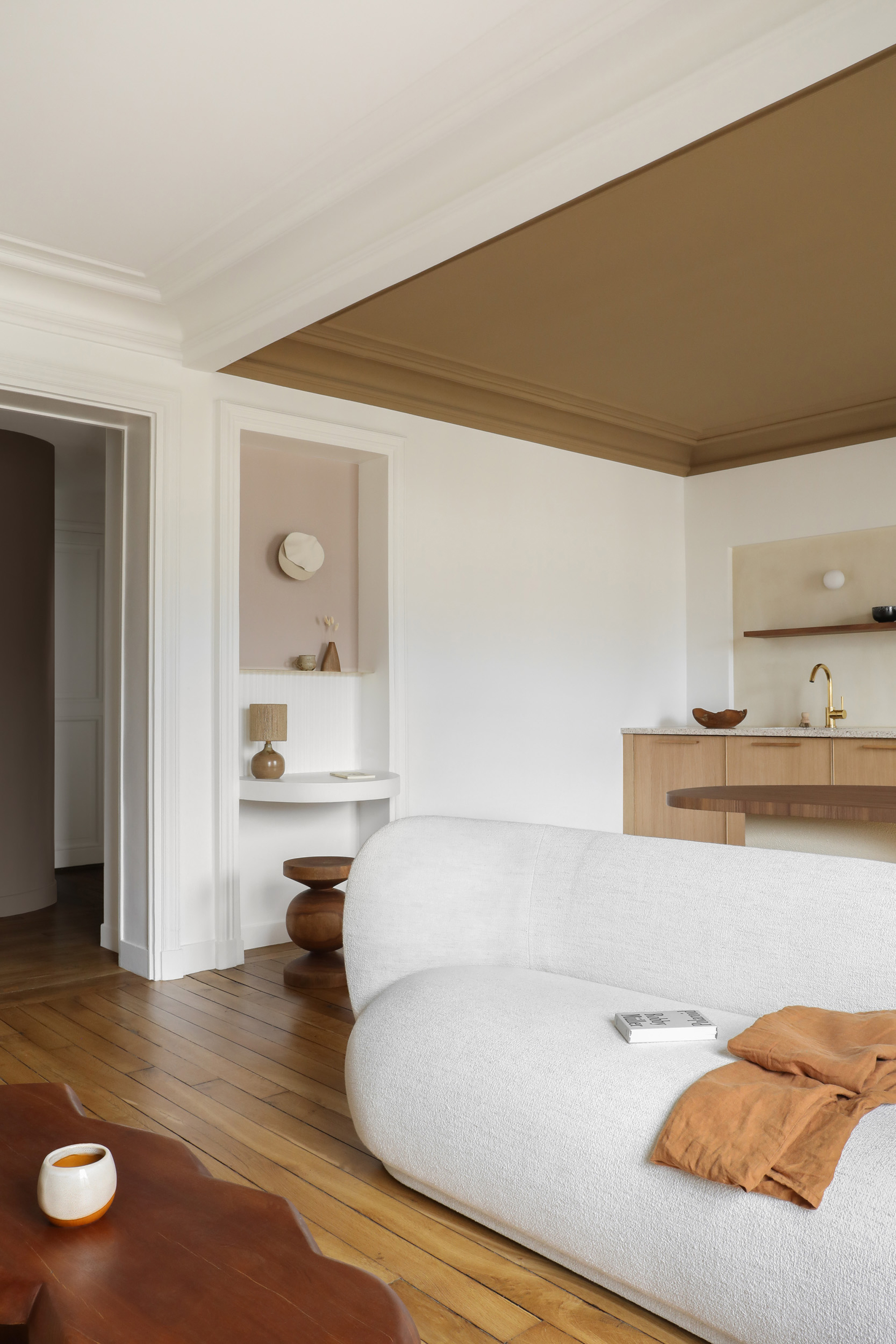
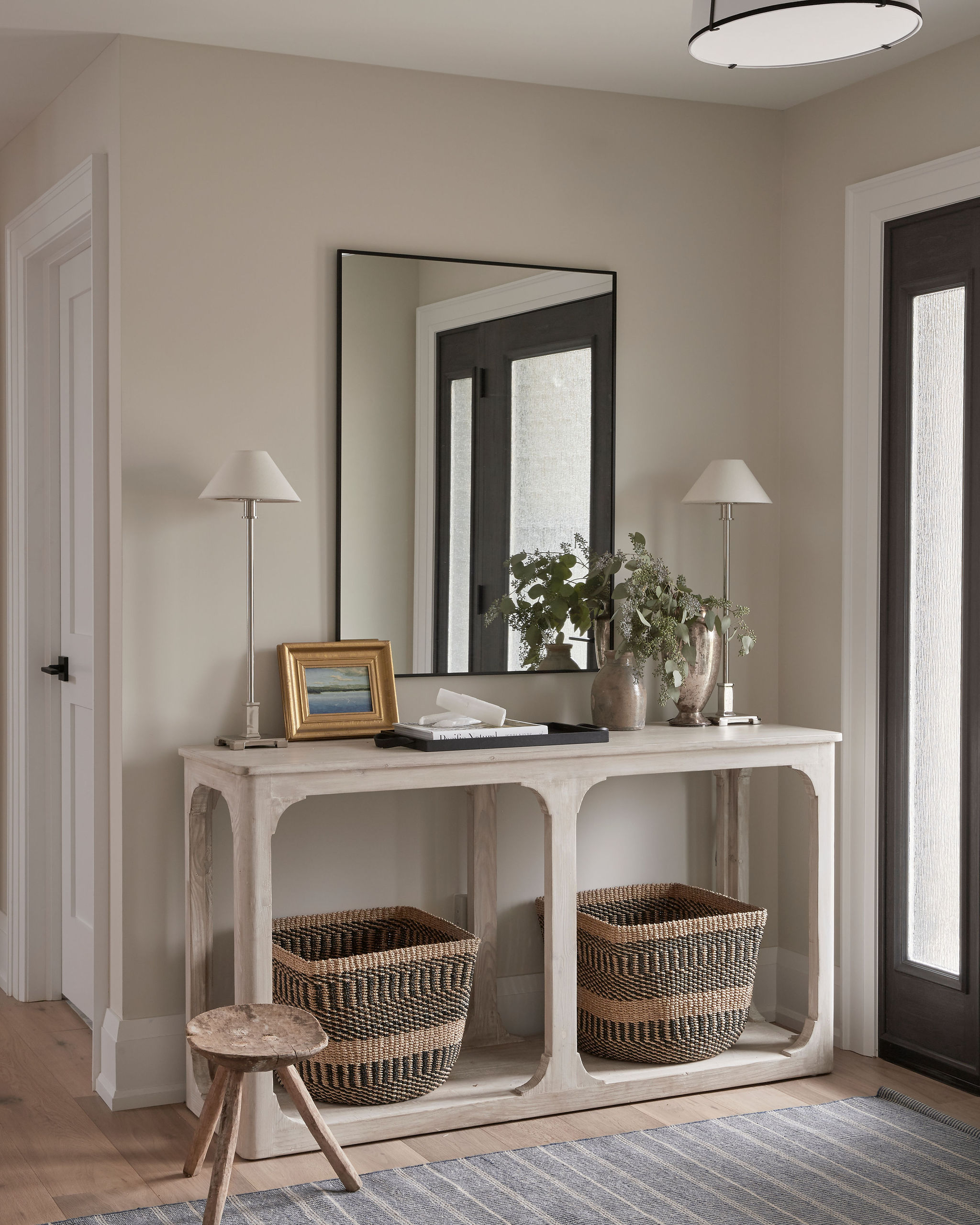
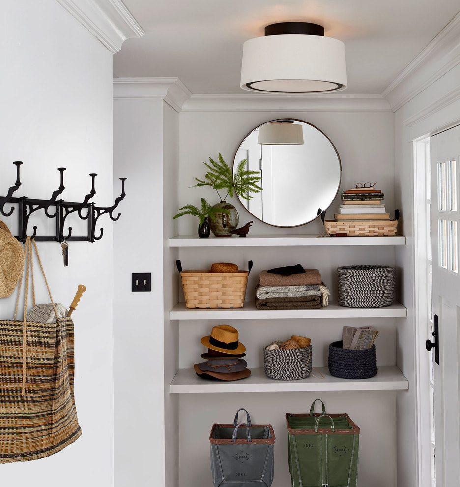
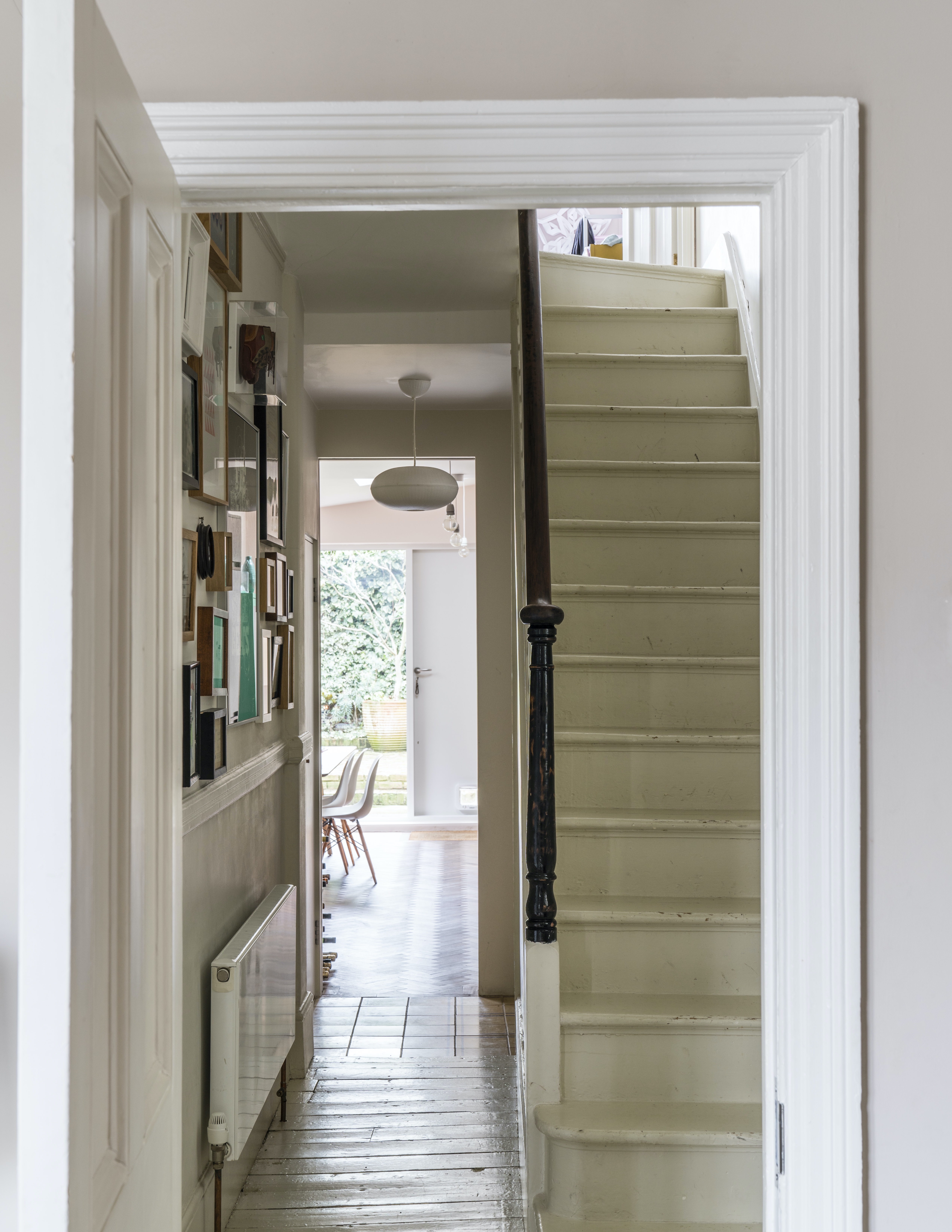
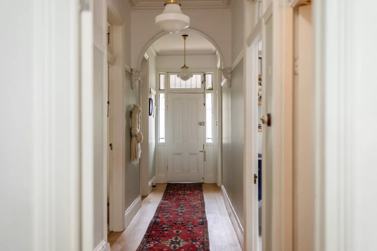
Conversely, stark white is also problematic. Despite its perceived brightness, an unadulterated white can appear institutional or sterile, especially in areas with limited natural light. Without the softening effect of ample sunlight, stark white can look flat and resemble an unfinished primer coat, lacking warmth and depth. Instead, designers recommend warmer whites or off-whites that offer a subtle richness and make the space feel considered and inviting rather than neglected.
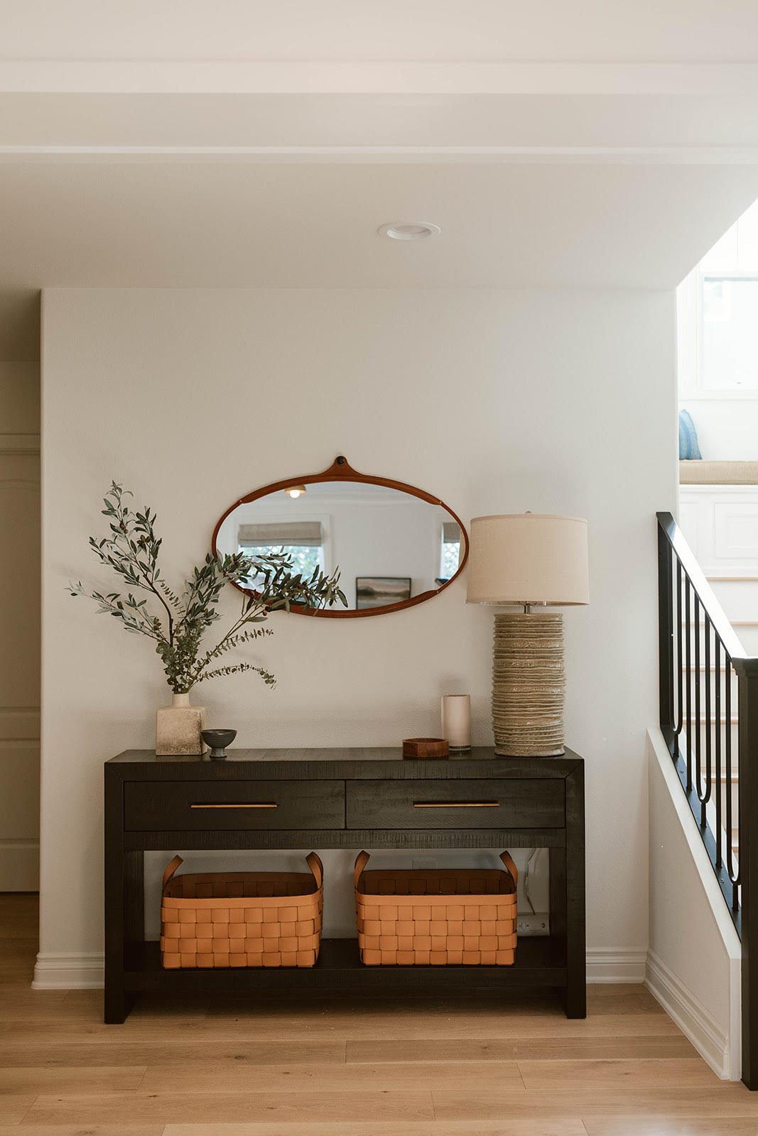
Concrete gray is another color frequently cited for avoidance. Given that hallways often lack significant natural light, cool-toned grays can exacerbate this issue, making the space feel enclosed, cave-like, and devoid of life. The absence of warmth in concrete gray can contribute to a rather lifeless and uninviting atmosphere, contrasting with the desired effect of a welcoming passage within a home.
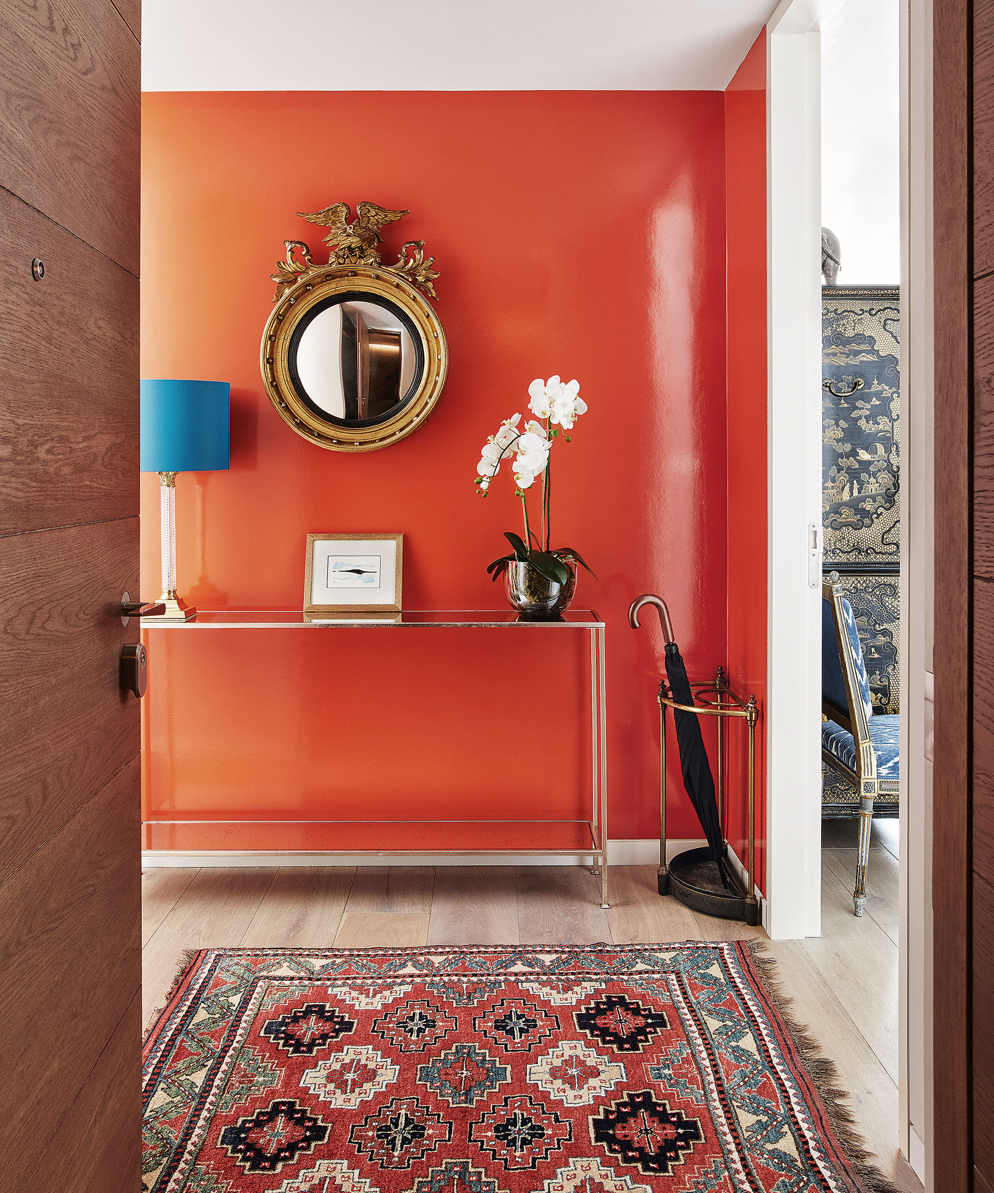
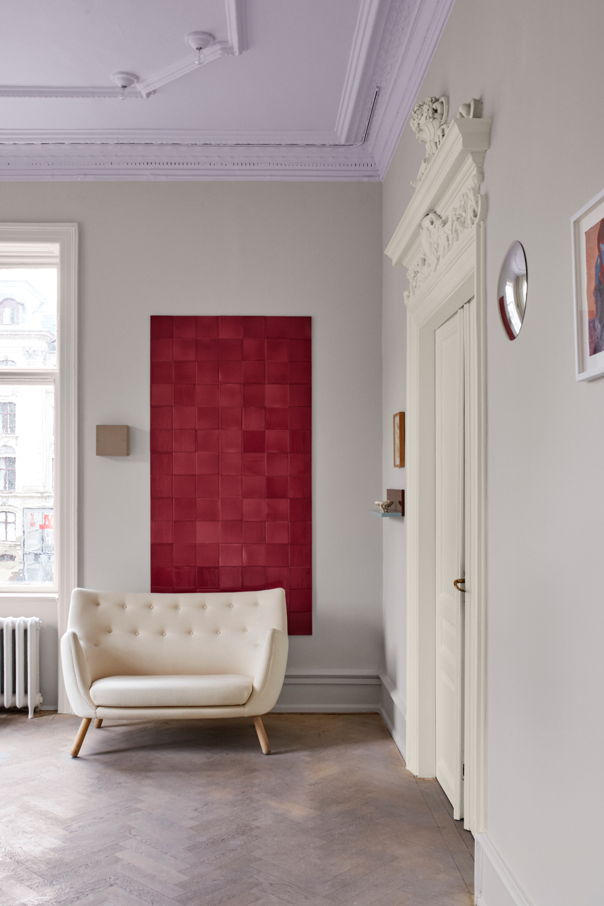
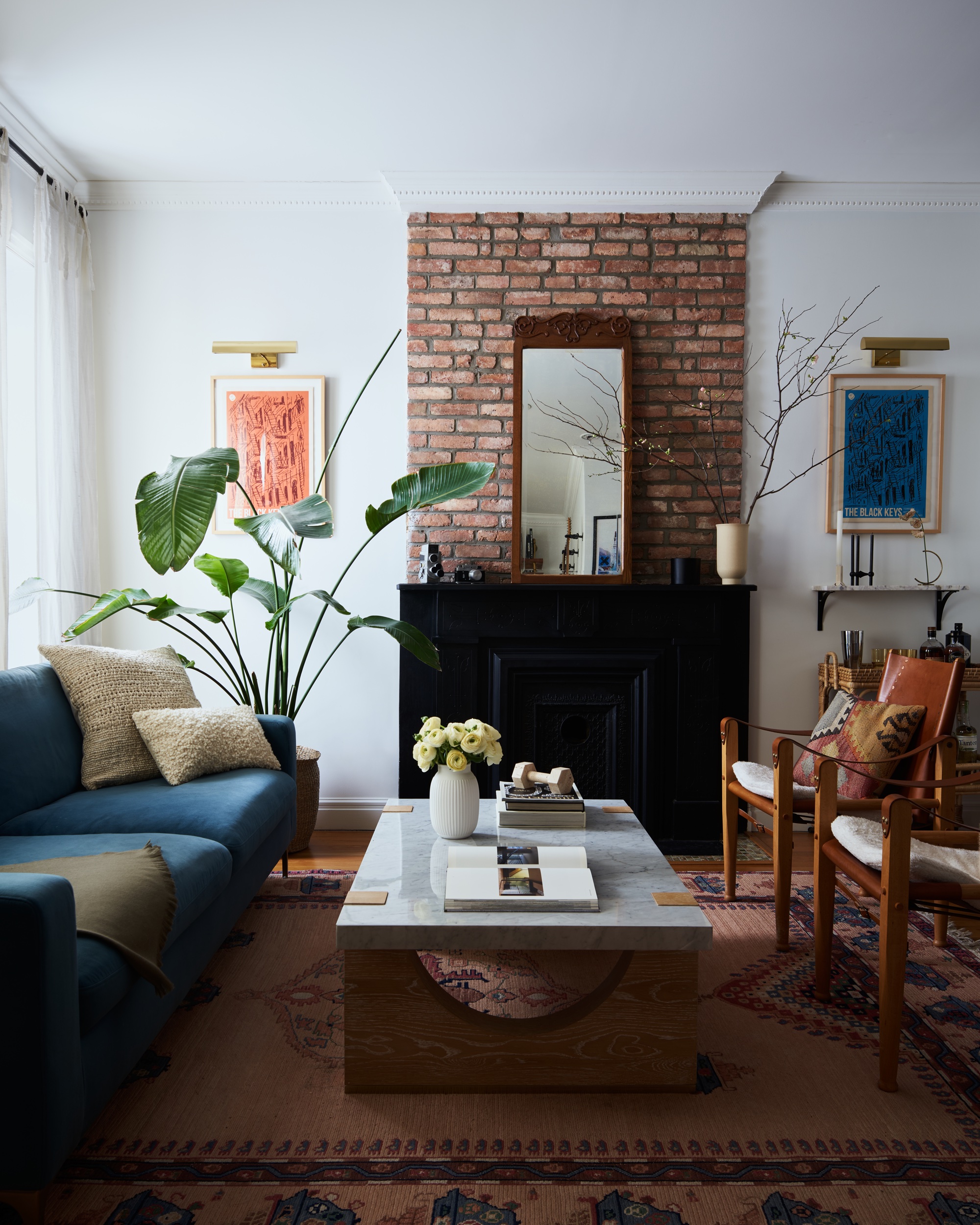
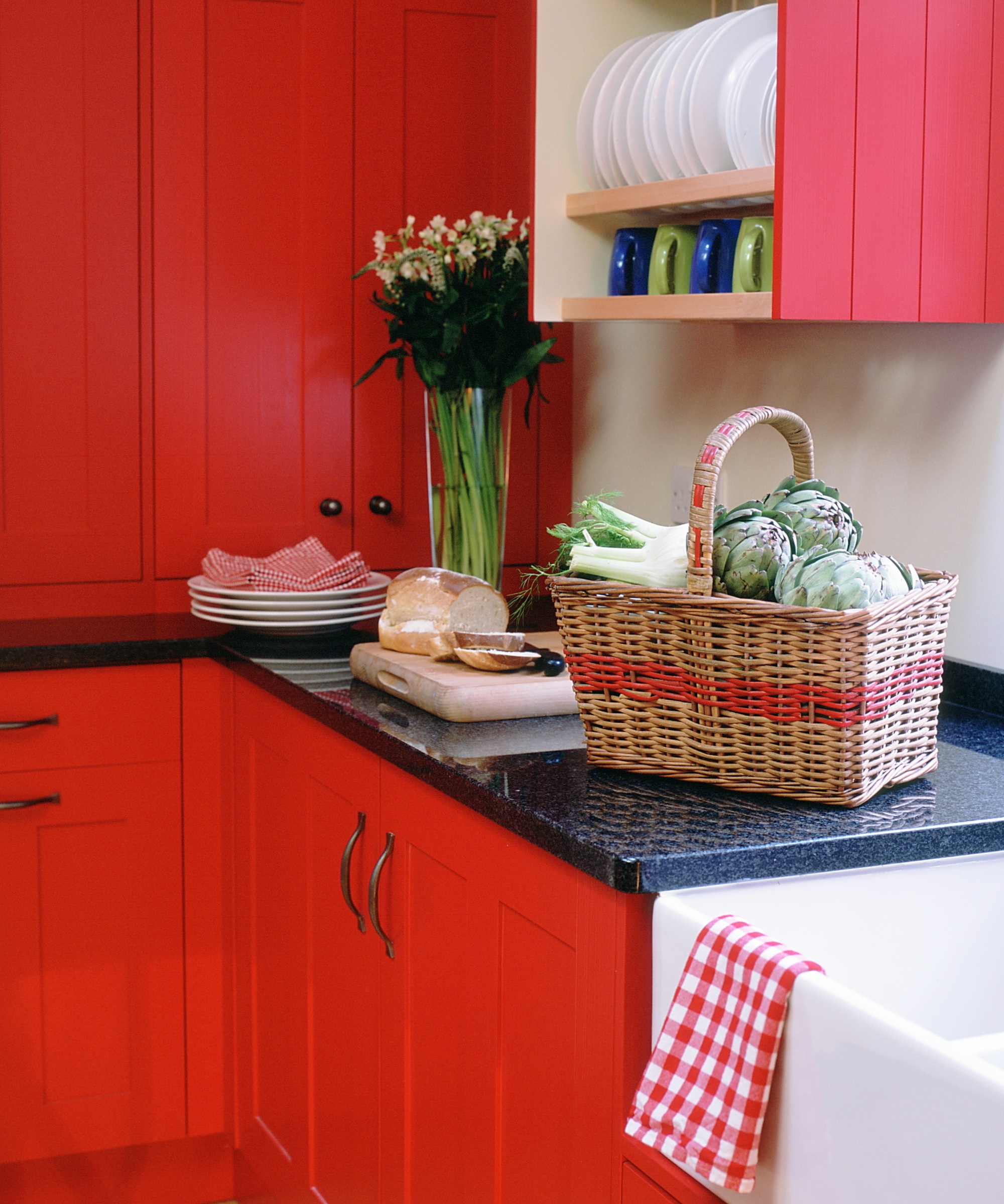
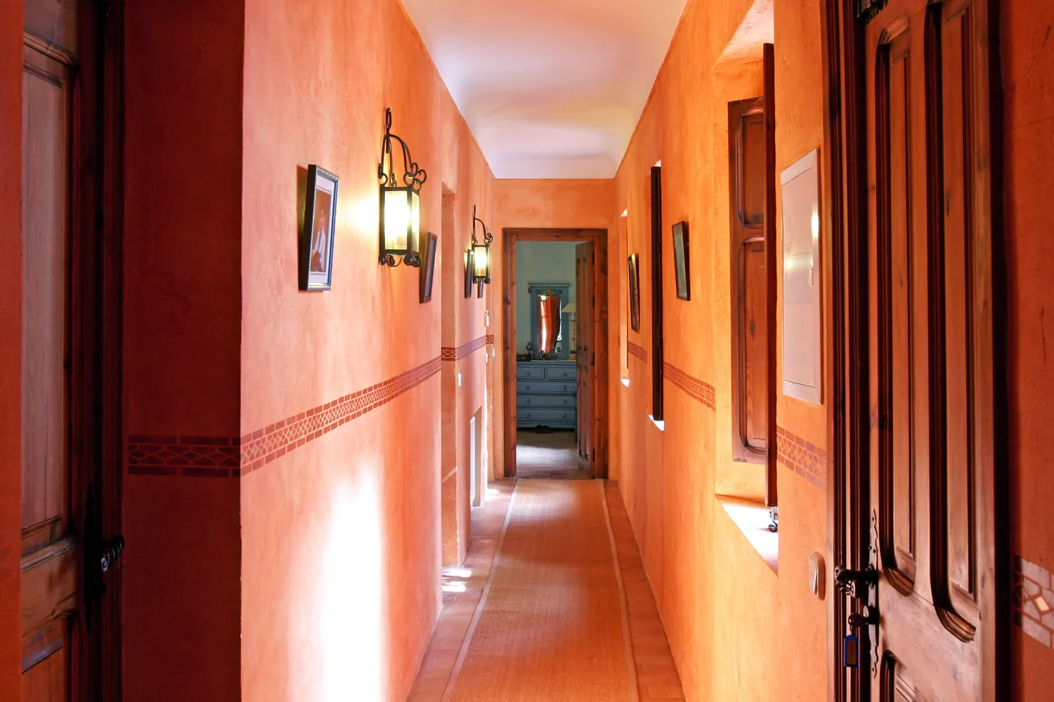
Bright, intense colors like reds and oranges are also on the list of colors to shun for hallways. While vibrant colors can be engaging in other parts of a home, their intensity can be overwhelming in a hallway, which is typically a smaller, more functional space. Designers aim to create timeless, livable environments where residents feel relaxed, and bold, highly saturated colors like red or orange can introduce too much visual energy, potentially making the space feel less serene. For those who wish to incorporate a bold element, designers suggest alternative approaches such as wallpapering the ceiling with a subtle texture like grasscloth, which can add visual interest without overpowering the confined space of a hallway. The overarching advice from designers is to prioritize colors that foster flow, warmth, and an open feel, thereby enhancing the transitional nature of the hallway within the home's overall design.
#HallwayDesign #PaintColors #InteriorDesign #HomeDecor #ColorPalettes #DesignTips #TransitionalSpaces #DecoratingMistakes #HomeImprovement #HallwayDesign #PaintColors #InteriorDesign #HomeDecor #ColorPalettes #DesignTips #TransitionalSpaces #DecoratingMistakes #HomeImprovement
0 comment in total
 No comments yet
You may also like
The colors you should never paint your hallway – and what really works


What are the worst colors to paint a room? The shades experts say you should never use

Interior design experts reveal the colour rules you should be breaking
5 Paint Colors to Never Use in Your Living Room, According to Interior Designers

5 colors you should never paint your entryway – according to interior experts
Trust us, these are the colours to avoid when painting a small hallway
6 Colors You Should Never Paint Your Entryway, According to Color Experts

8 colors you should never paint kitchen cabinets according to the experts

You should never paint your hallway this colour, according to colour psychologists
4 Colors You Should Never Paint Cabinets, According To Designers
4 Times Designers Say You Definitely Shouldn't Paint Your Walls and Ceiling in the Same Color

6 colors to avoid in an entryway – and the ones designers know make a better first impression
5 Colors You Should Never Paint Your Hallway, According to Designers

5 colors you should never paint a small room – designers warn us to steer clear of these hues, and what to pick instead
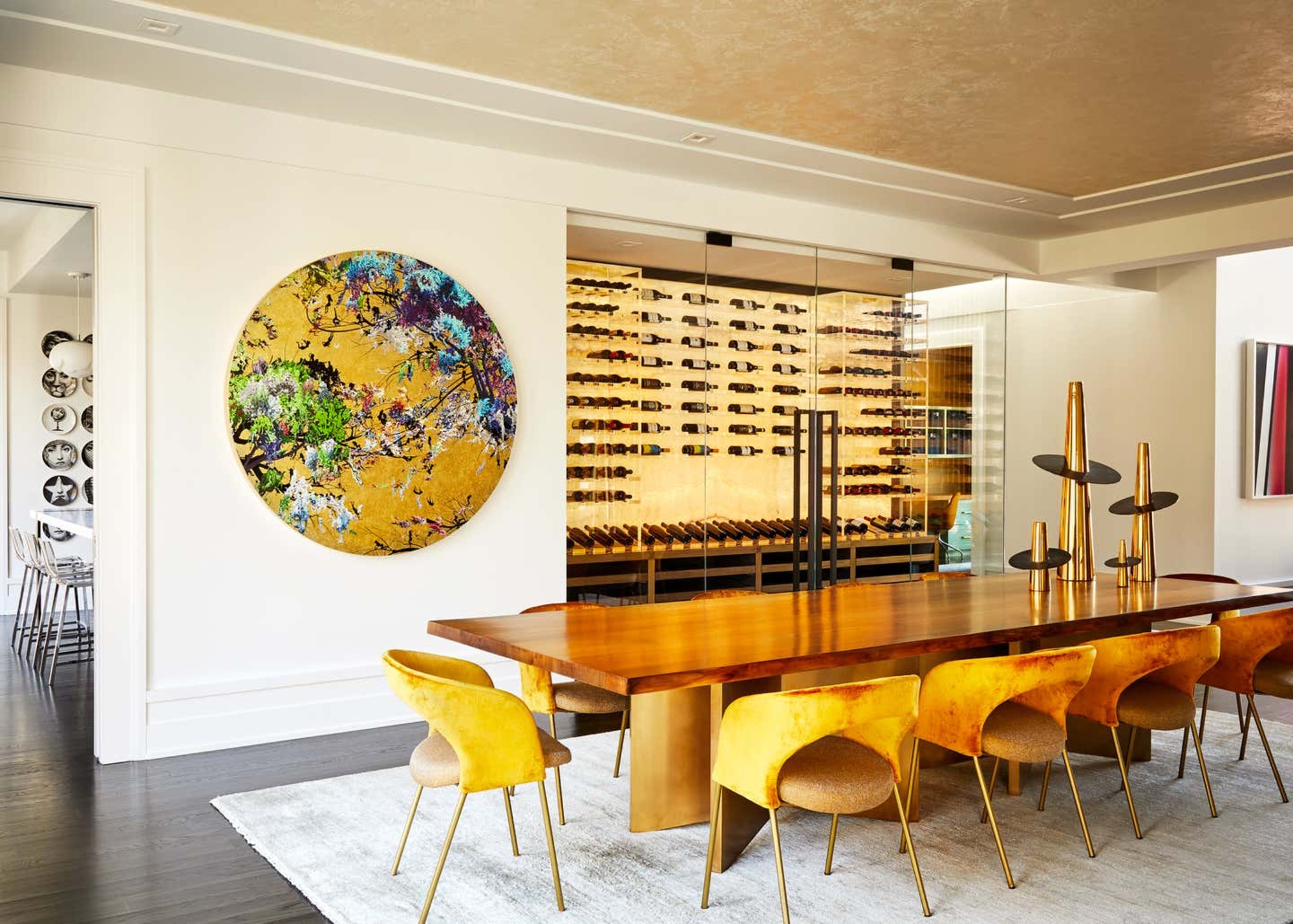
5 rug colors to avoid – the hues designers think you should veer away from on floors, plus how to make them work
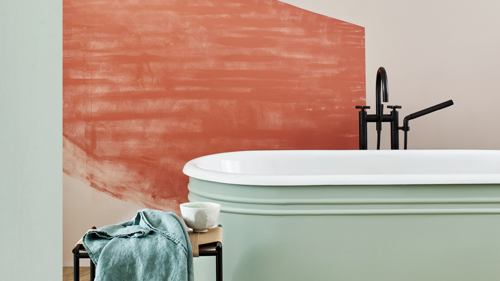
5 colors to avoid in a bathroom – according to designers

4 Outdated Colors Designers say you Should Steer Clear of When Decorating a Living Room

5 colors you should never paint a pantry – designers share the shades they swerve
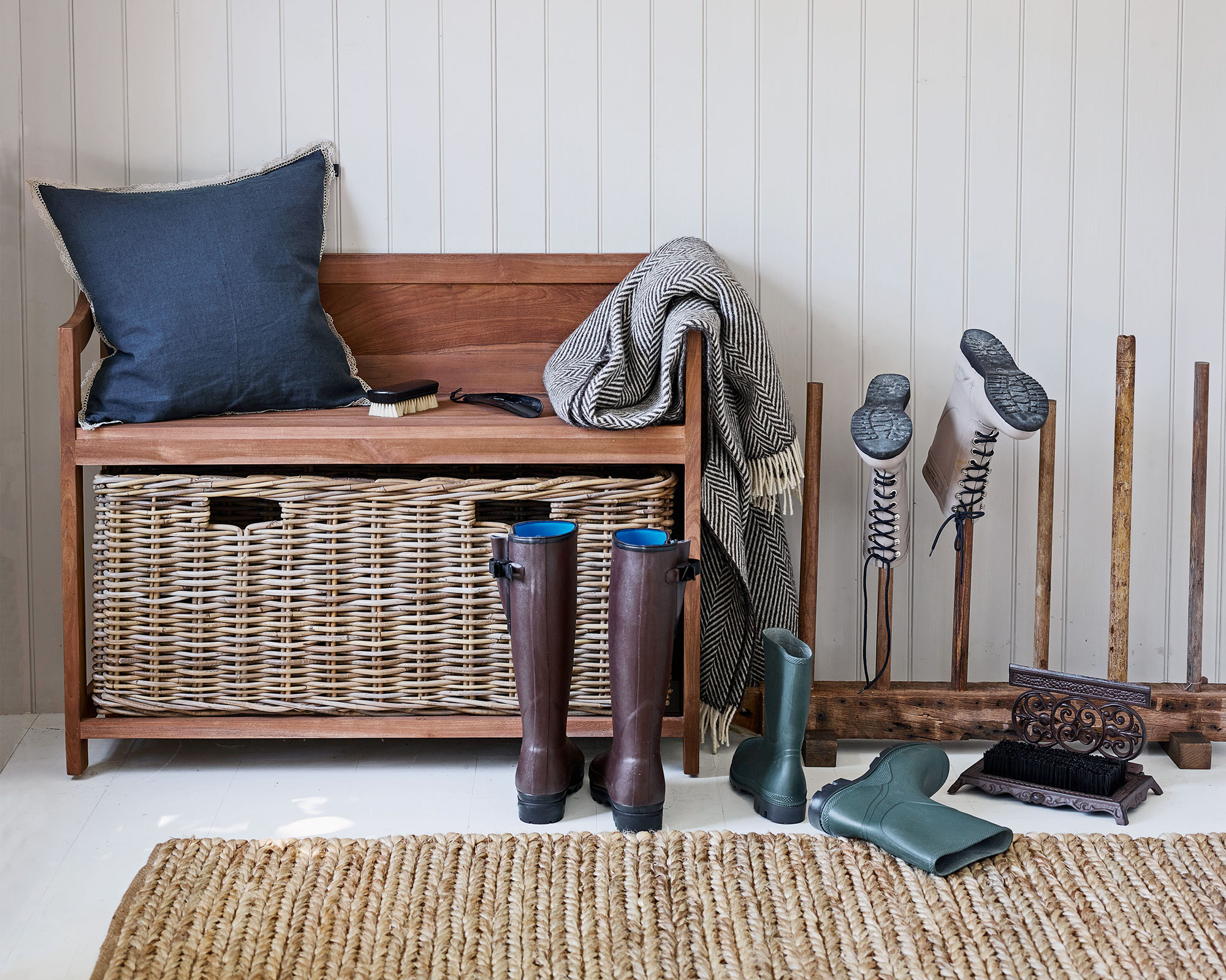
Colors not to paint a mudroom – 5 hues to avoid in this high-traffic space
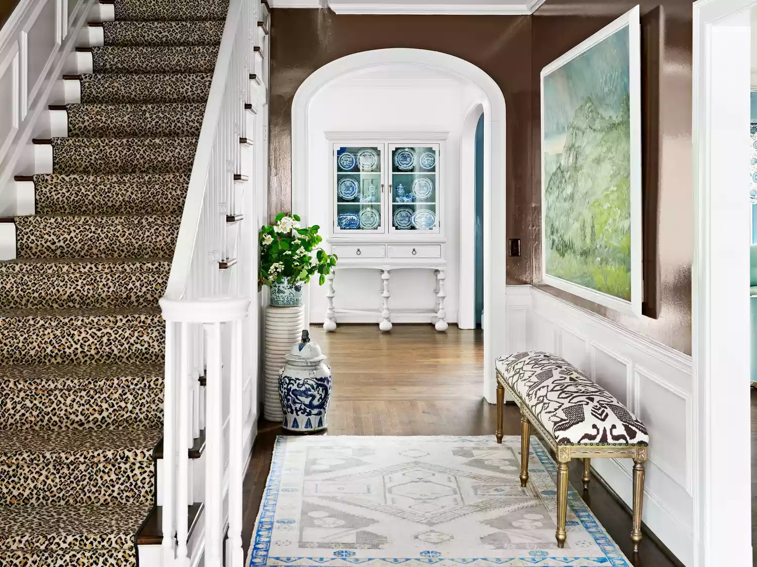
You Should Never Use These Paint Colors In An Entryway, According To Designers