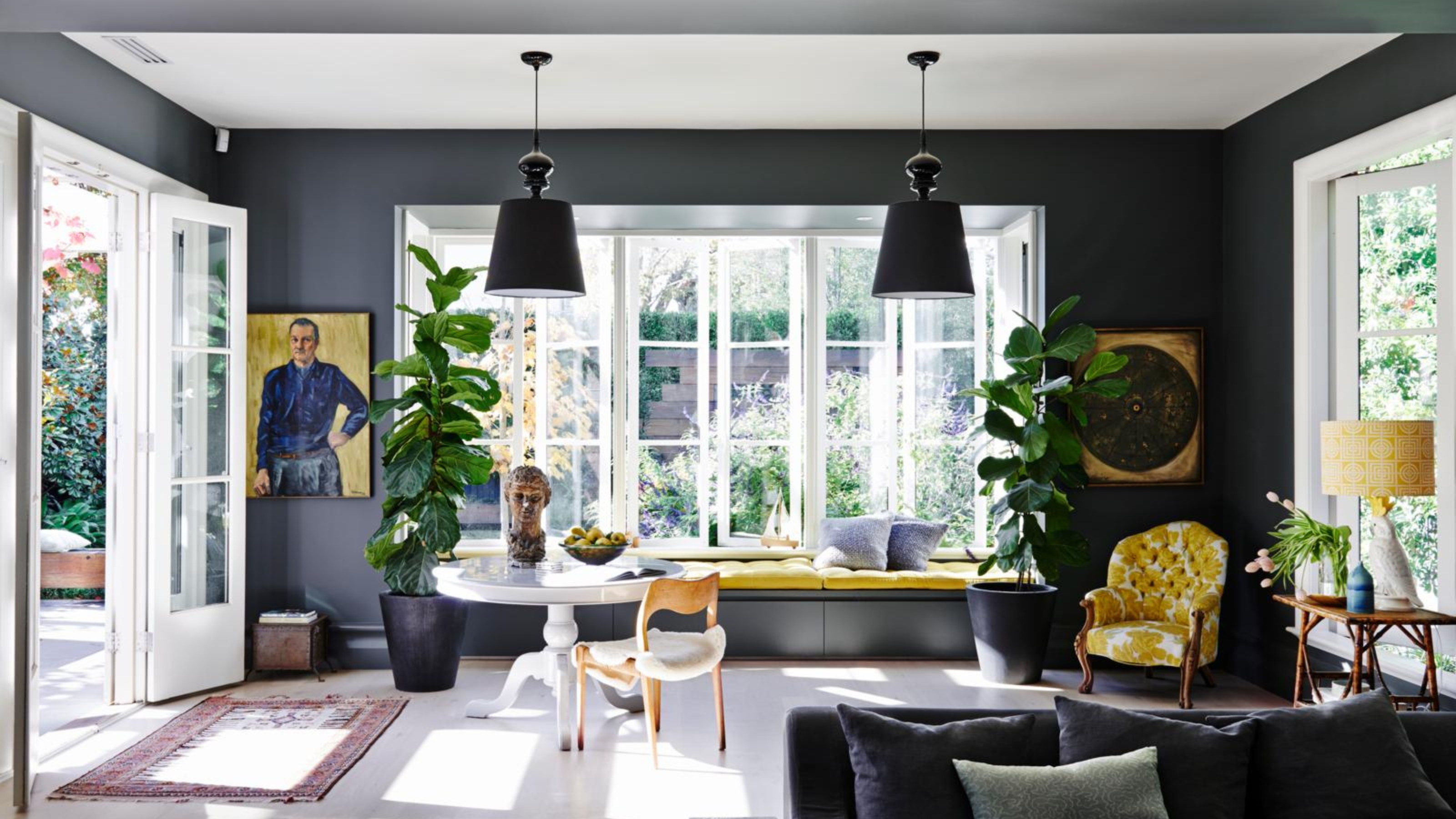
1/5
4 Times Designers Say You Definitely Shouldn't Paint Your Walls and Ceiling in the Same Color
While color drenching, the technique of painting walls, trim, and ceilings the same color, is a popular trend, it's not always the best choice for every space. There are specific situations where this monochromatic approach can be detrimental to a room's aesthetic. Designers have identified four key instances where opting out of color drenching can significantly enhance a room's design and functionality.
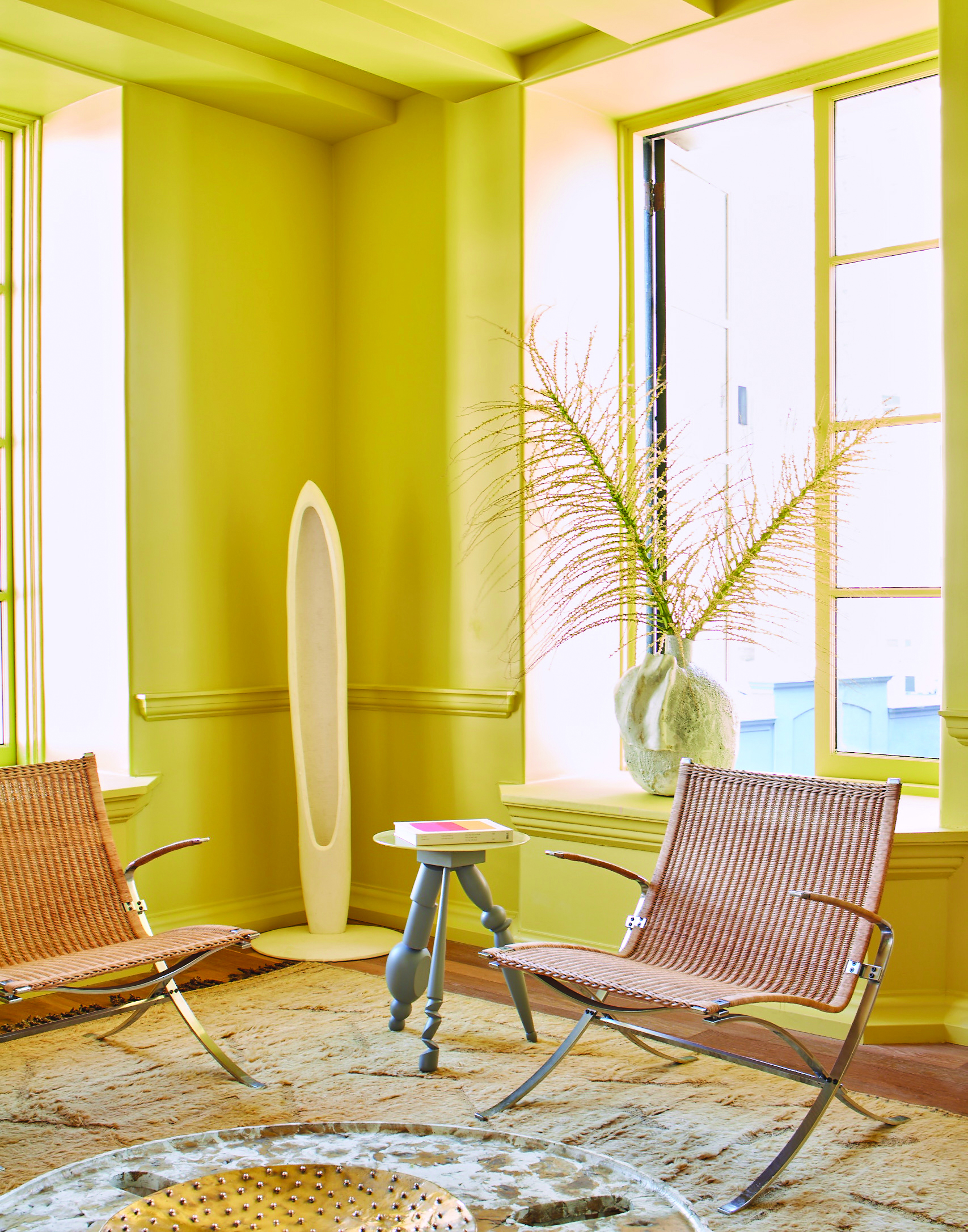
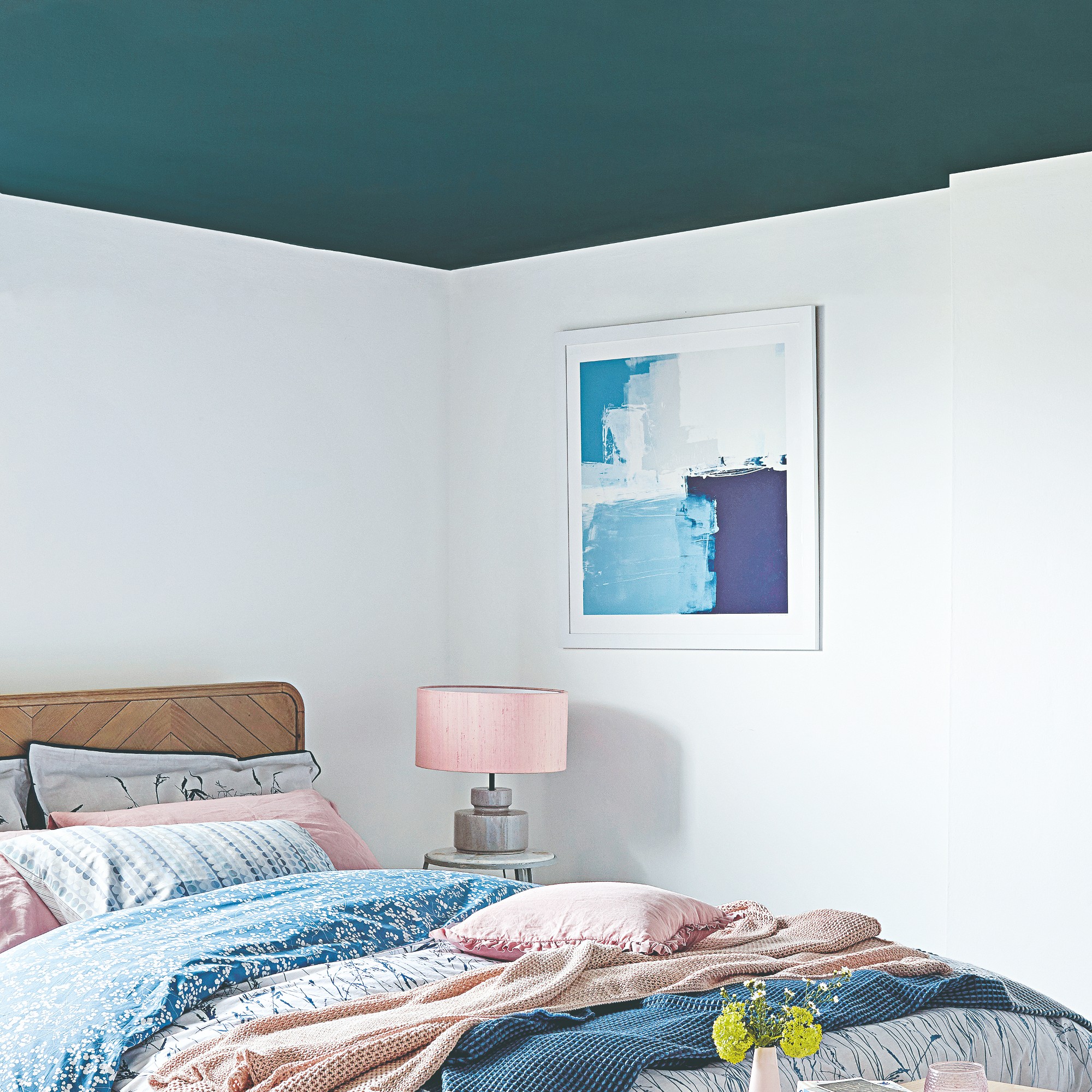
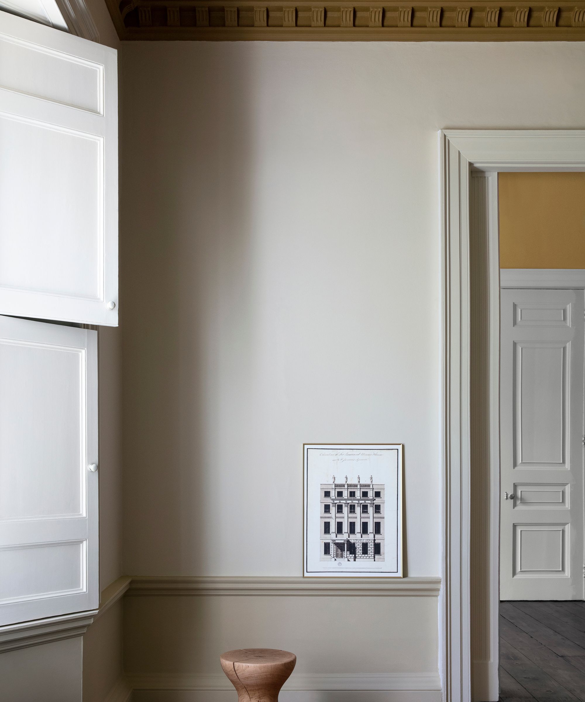
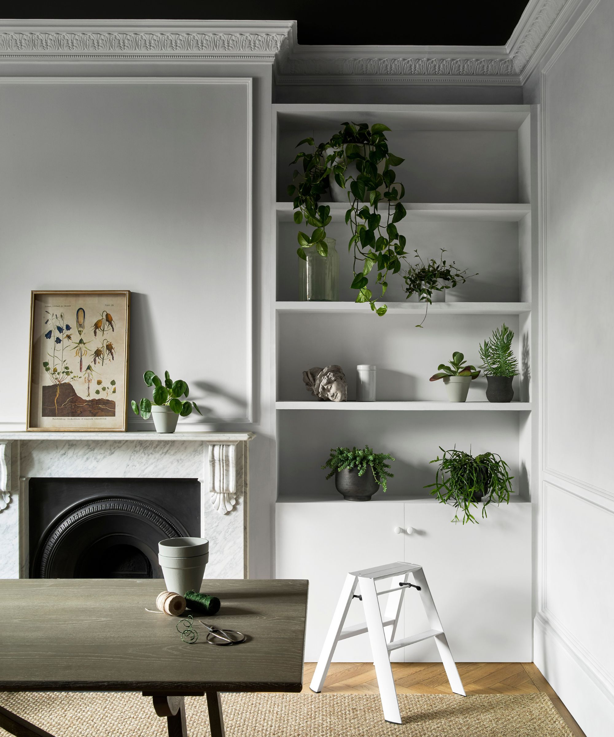
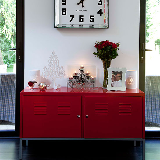
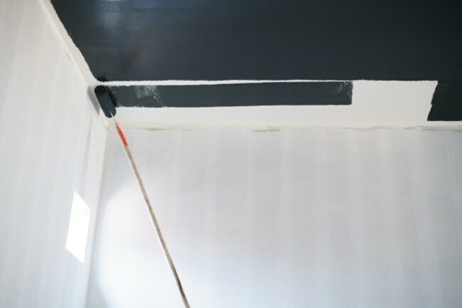
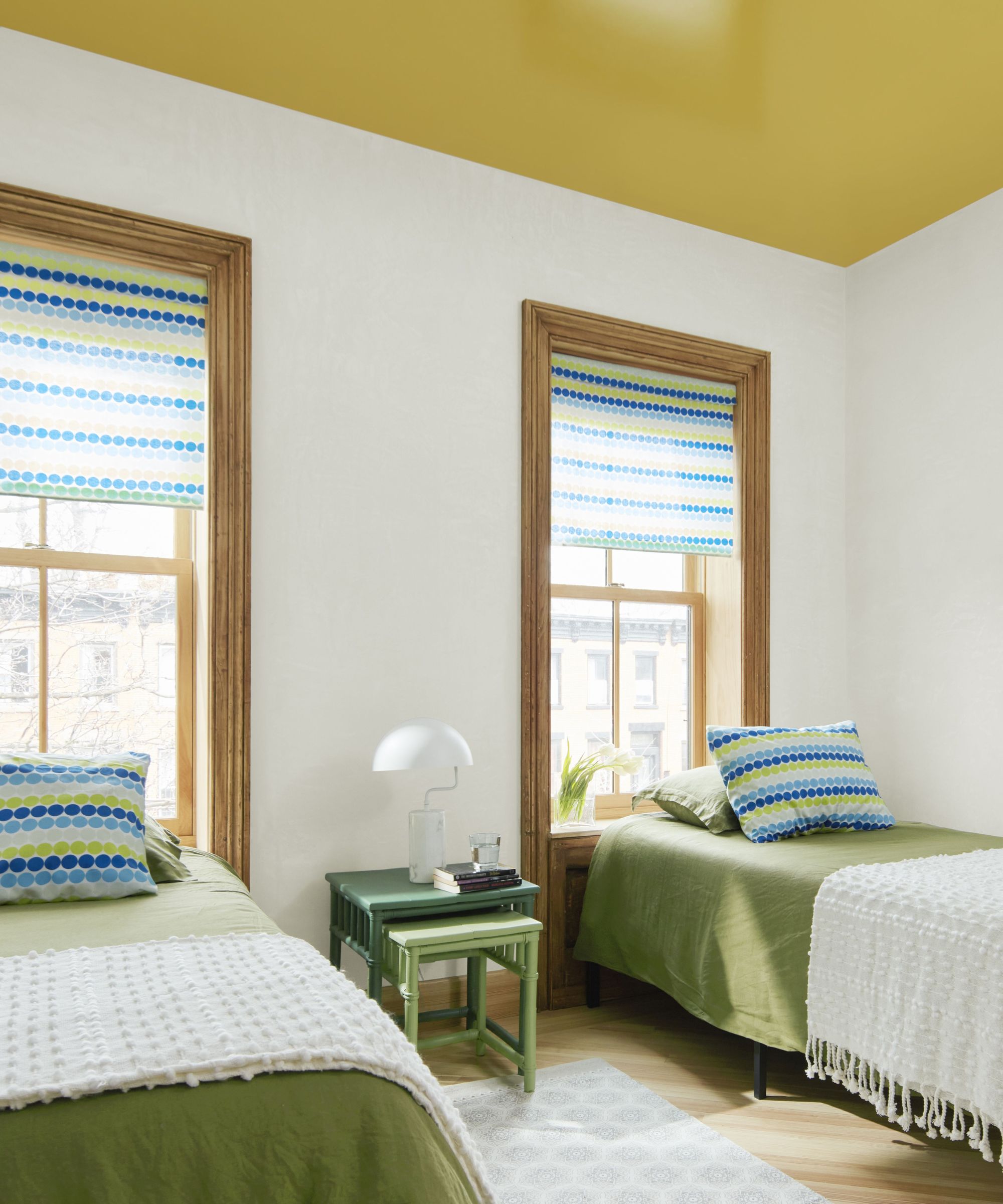
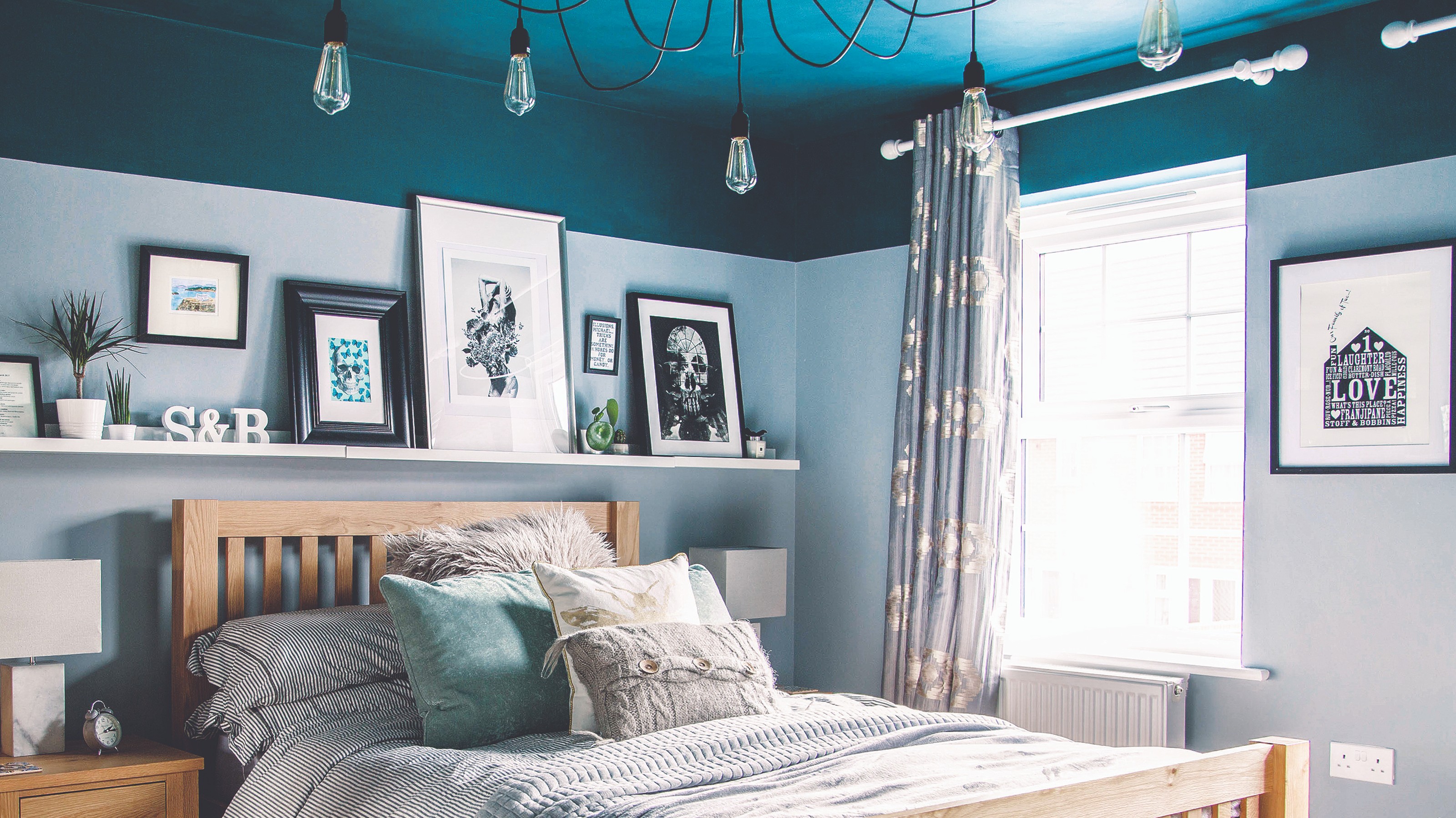
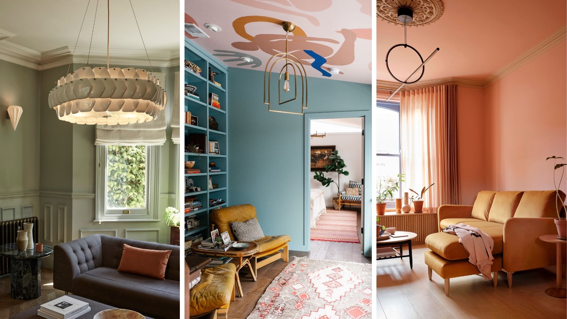
First, consider foregoing color drenching when the goal is to make a statement with the 'fifth wall' – the ceiling. Instead of blending the ceiling into the overall color scheme, utilizing it as a focal point offers a unique opportunity for design expression. Painting the ceiling a contrasting or unexpected color can elevate the room's uniqueness and provide an additional 20% of design space, transforming it into a modern and eye-catching feature. This approach allows for a more dynamic and personalized aesthetic, moving beyond a single-color palette.
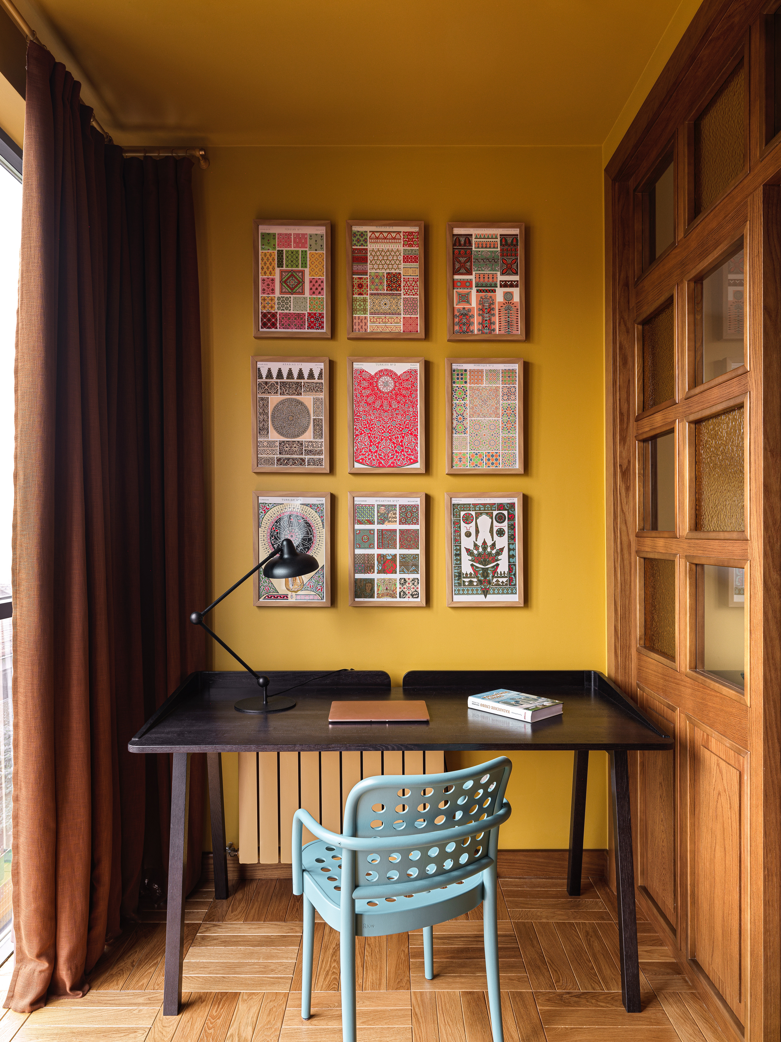
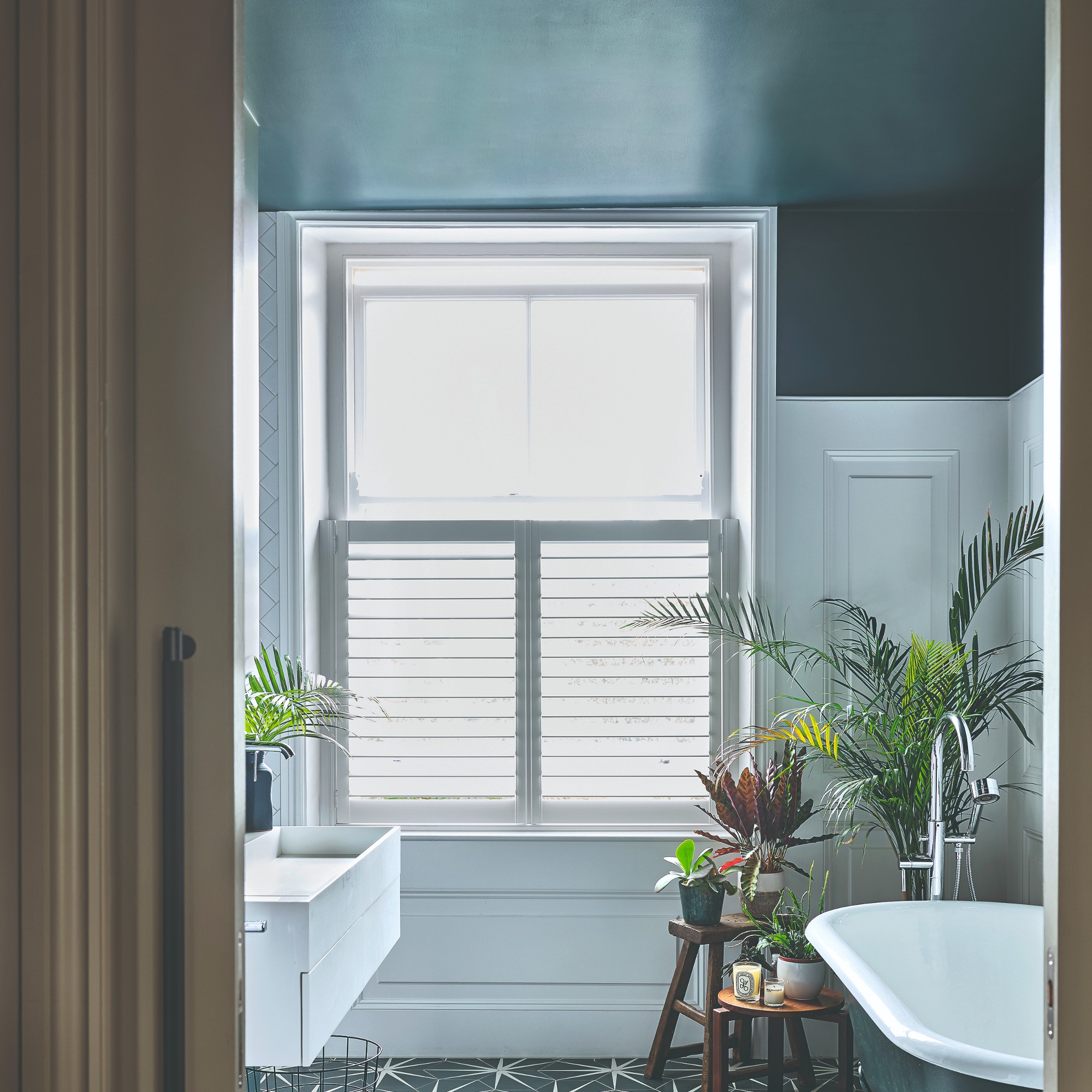
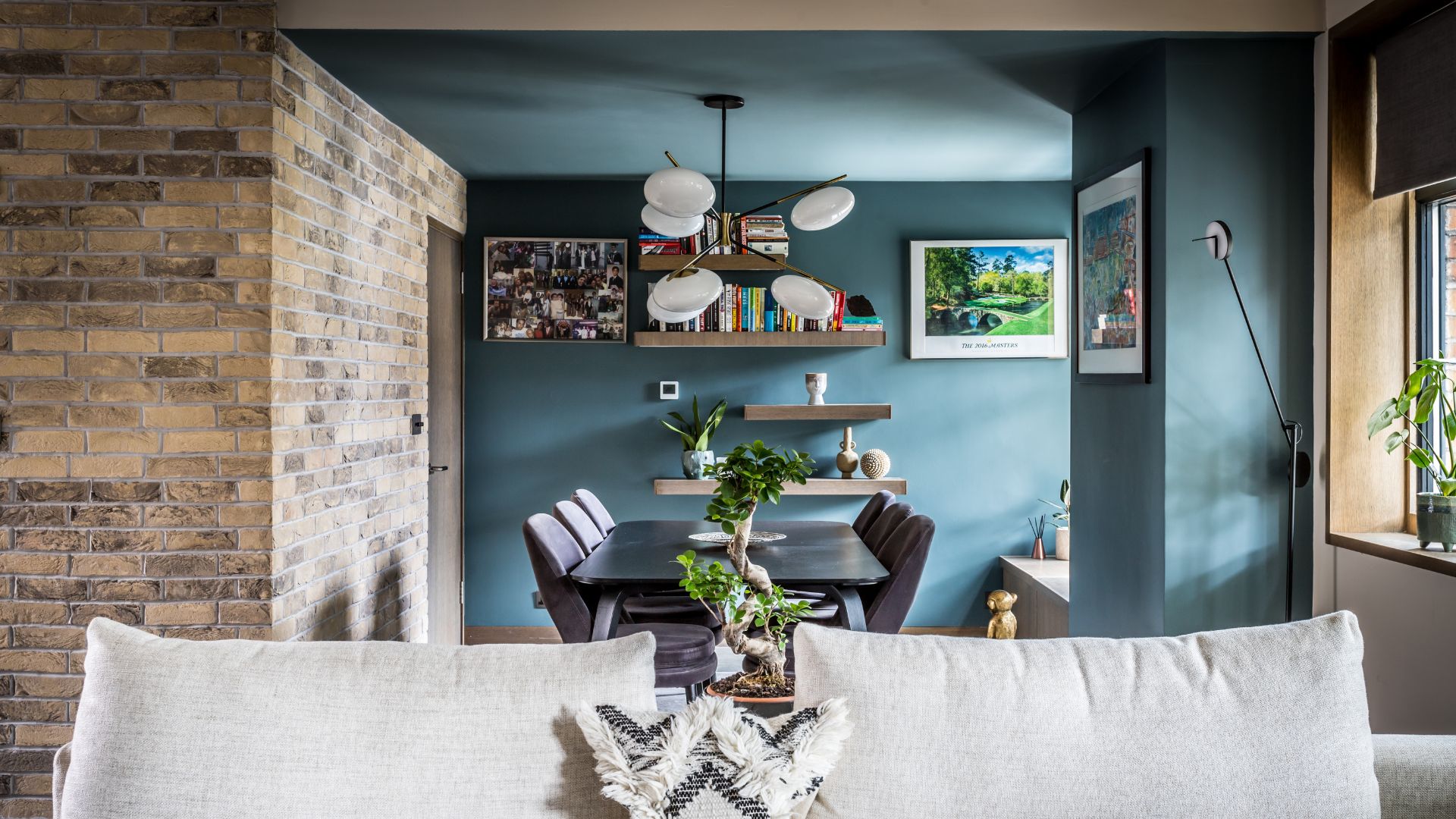
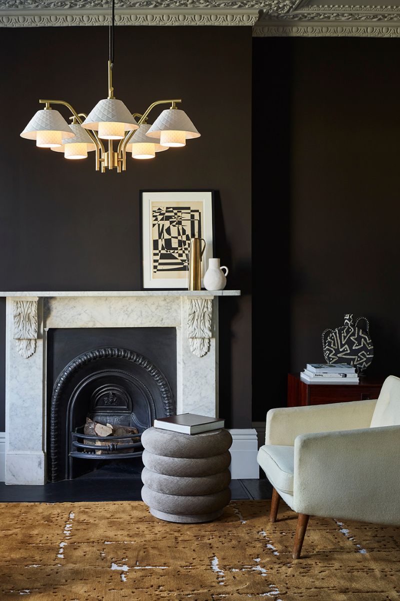
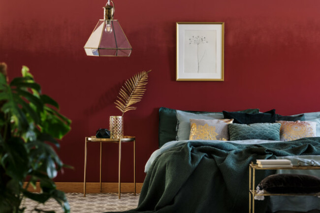
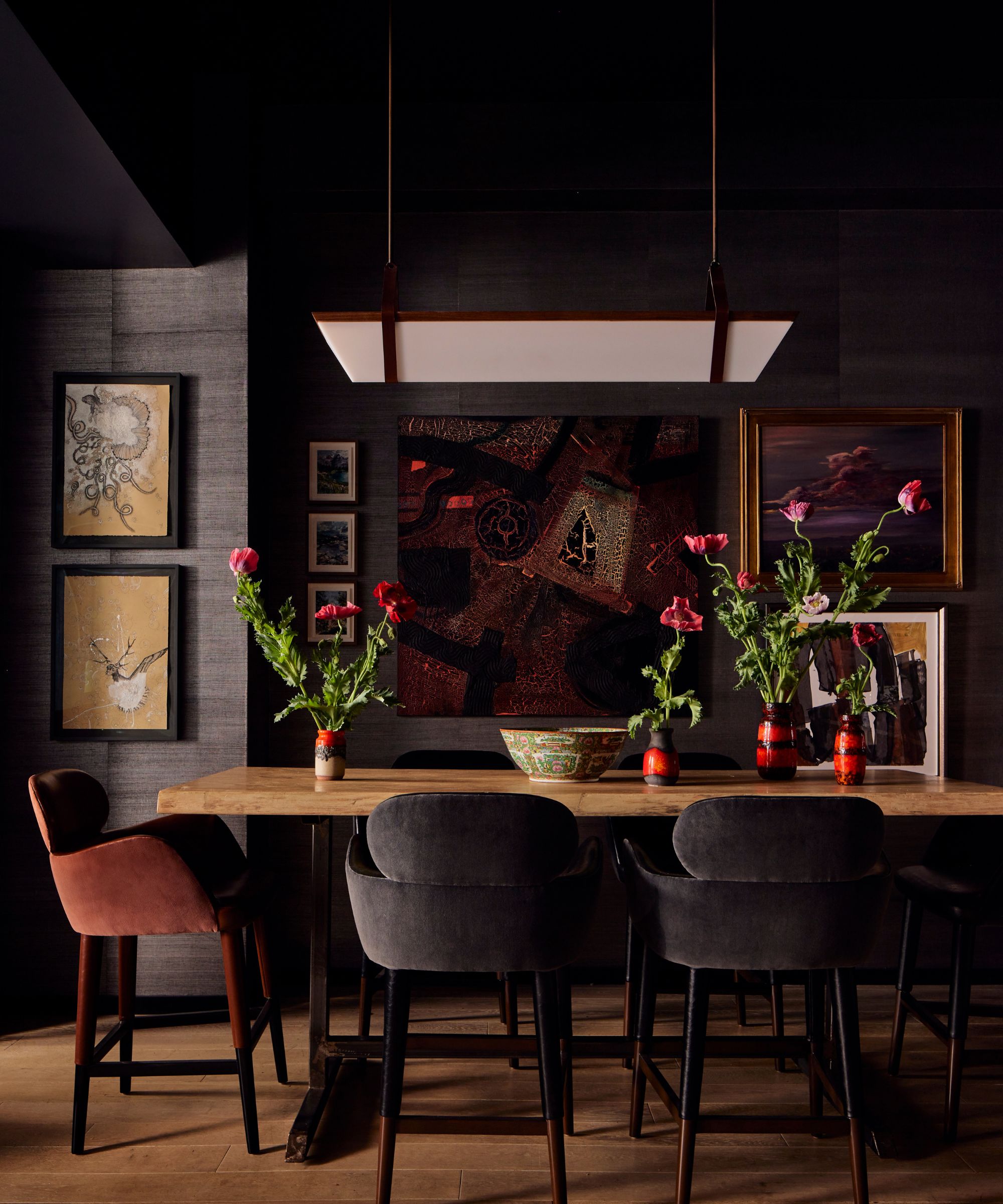
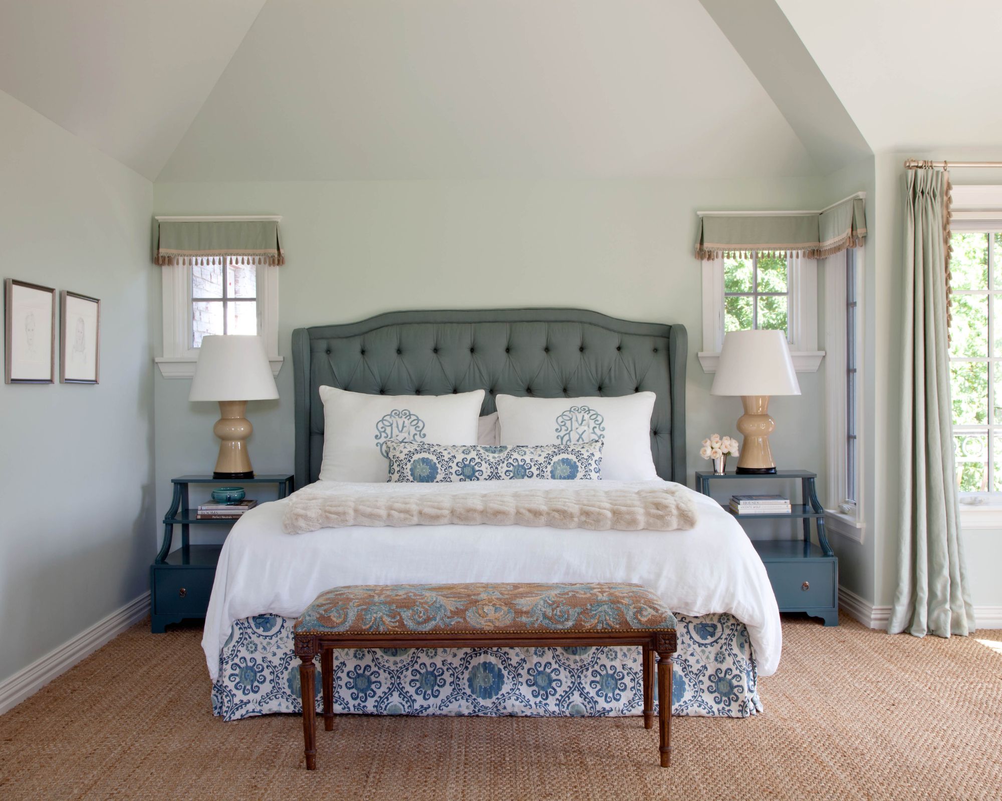
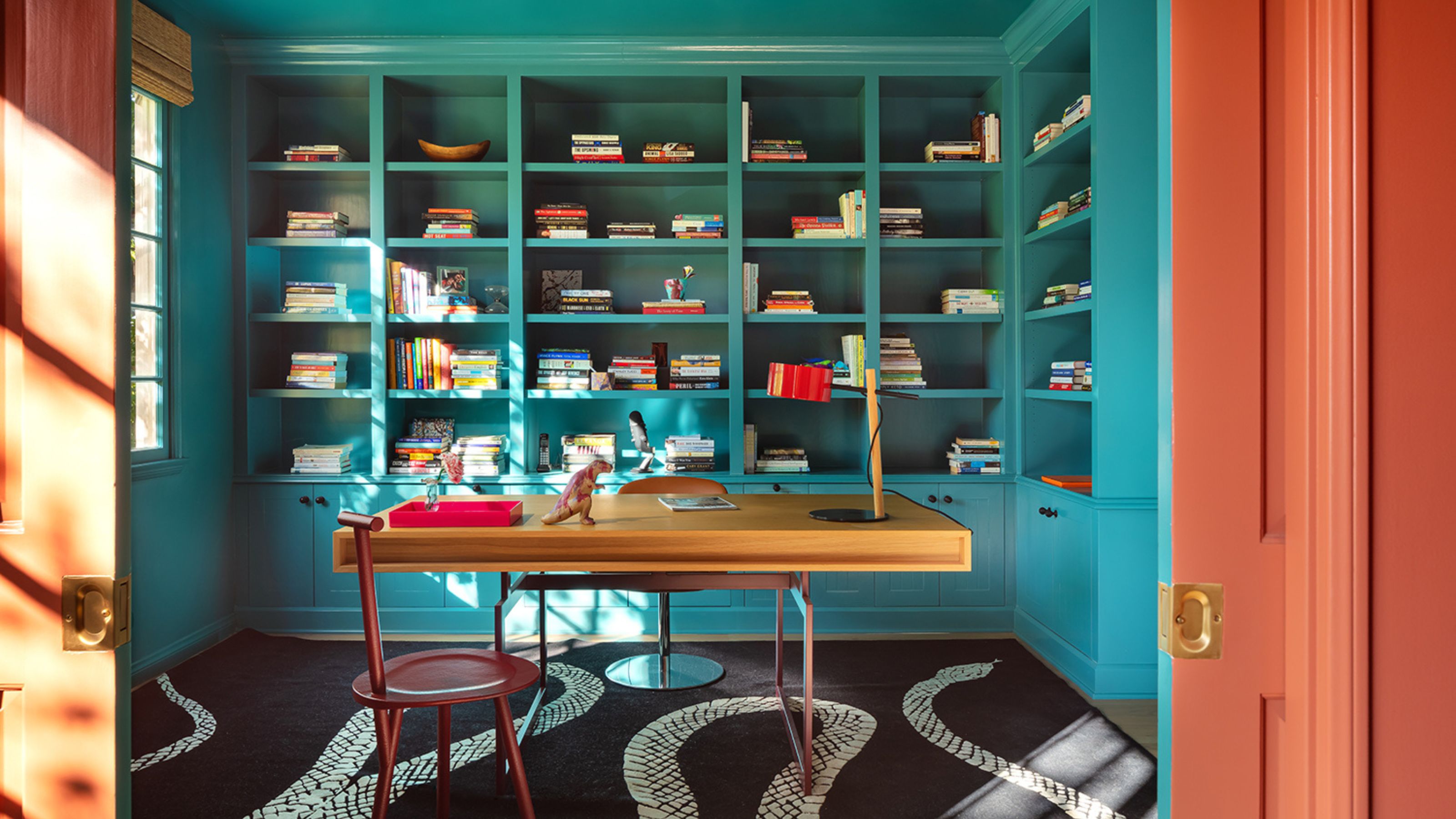
Second, rooms with low natural light are generally not suitable for color drenching, especially with dark hues. While dramatic color palettes are currently trending, applying dark shades to both walls and ceilings in a dimly lit room can create a cavelike and constricting atmosphere rather than a cozy one. To brighten such spaces, designers recommend painting the ceiling a shade or two lighter than the walls, which introduces dimension and visually increases the room's height. Alternatively, if a cocooning effect is desired, a 'double-drenching' technique, where different colors are repeated across walls and ceiling, can add depth without the unwanted confinement, particularly in less-used spaces like libraries or studies.
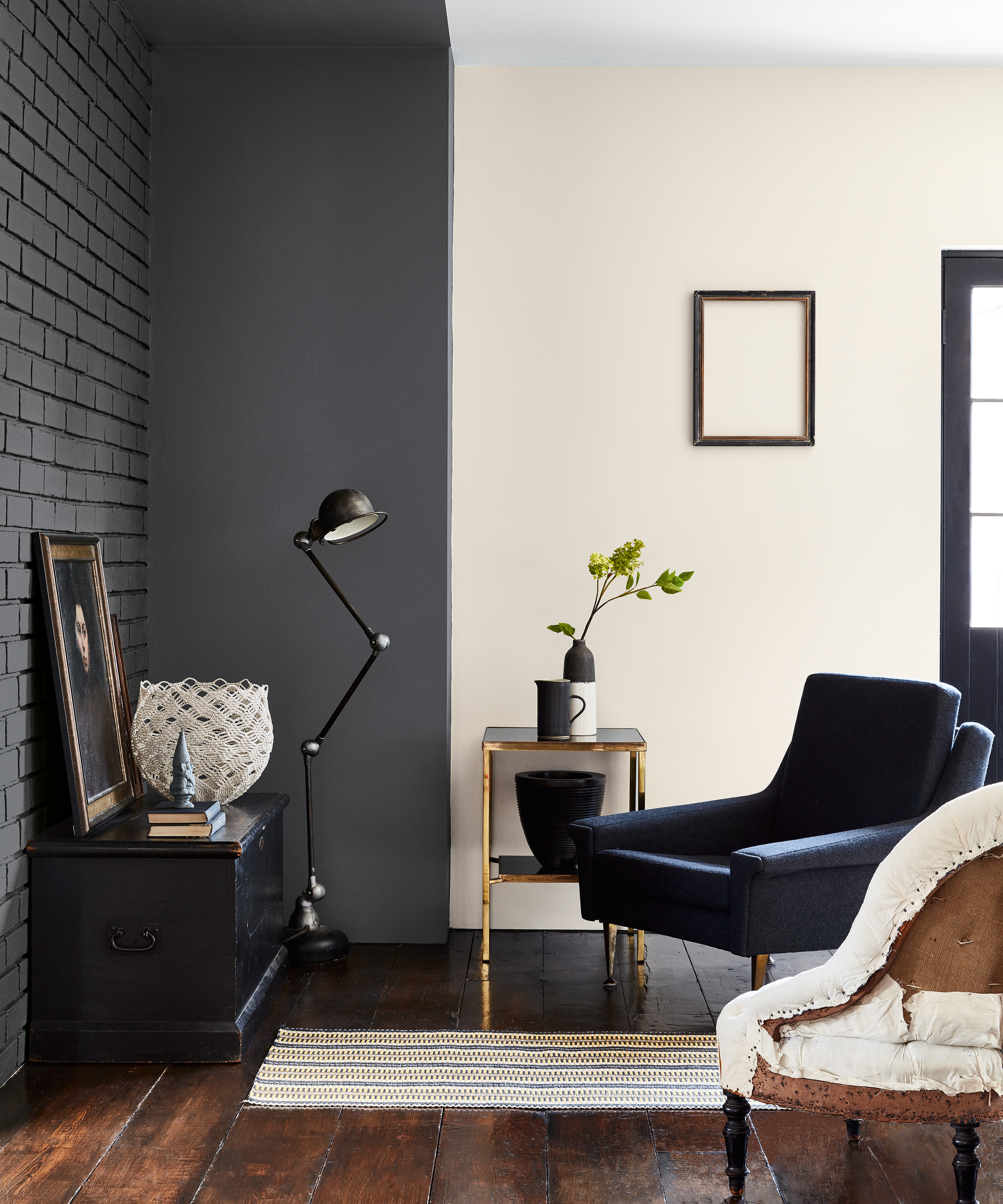
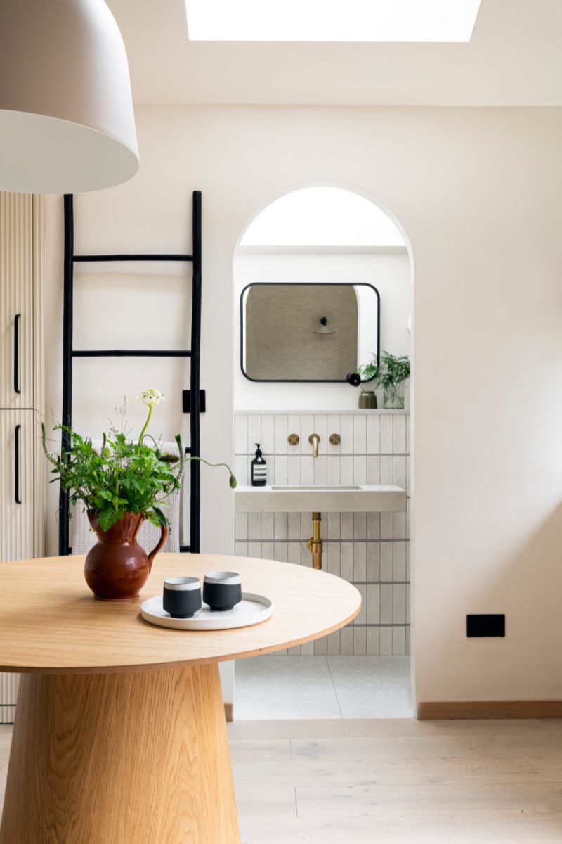
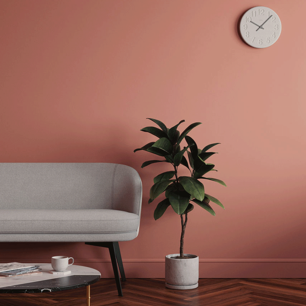
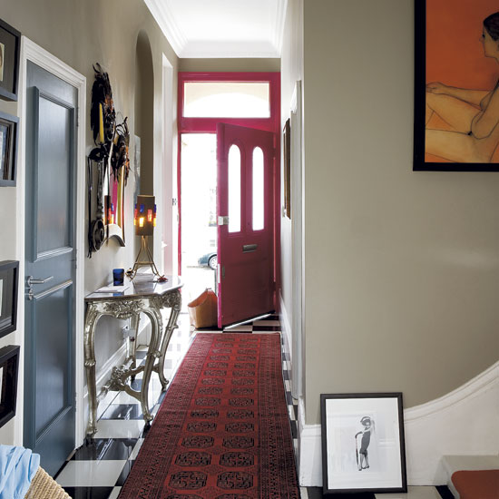
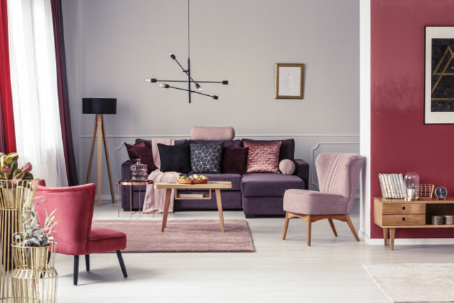
Third, open-concept rooms present challenges for color drenching. The expansive nature of these layouts makes it difficult to achieve the enveloping effect characteristic of color drenching. Applying a single color throughout a large, open space can result in a flat and one-dimensional appearance. Instead, using different paint colors for ceilings and walls can help define and zone different areas within an open plan. Painting the ceiling a slightly darker, non-white shade, such as a dusty pink, light blue, or soft tan, can subtly bring the room in, making the open concept feel cozier and adding character through varied elements.
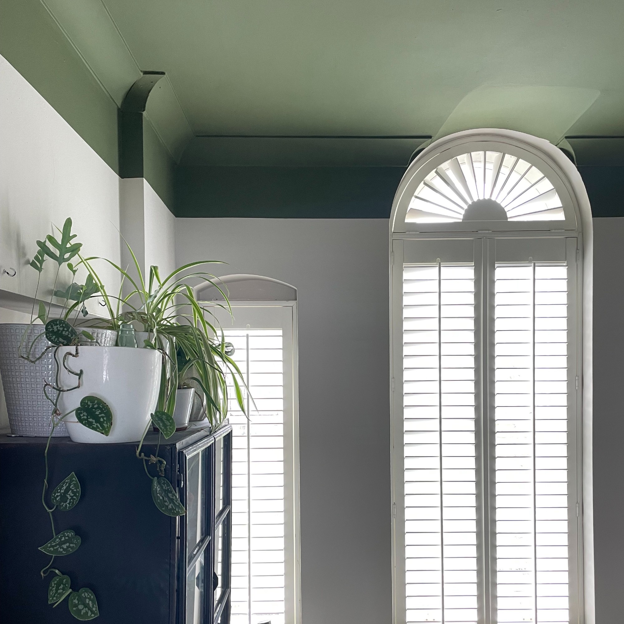
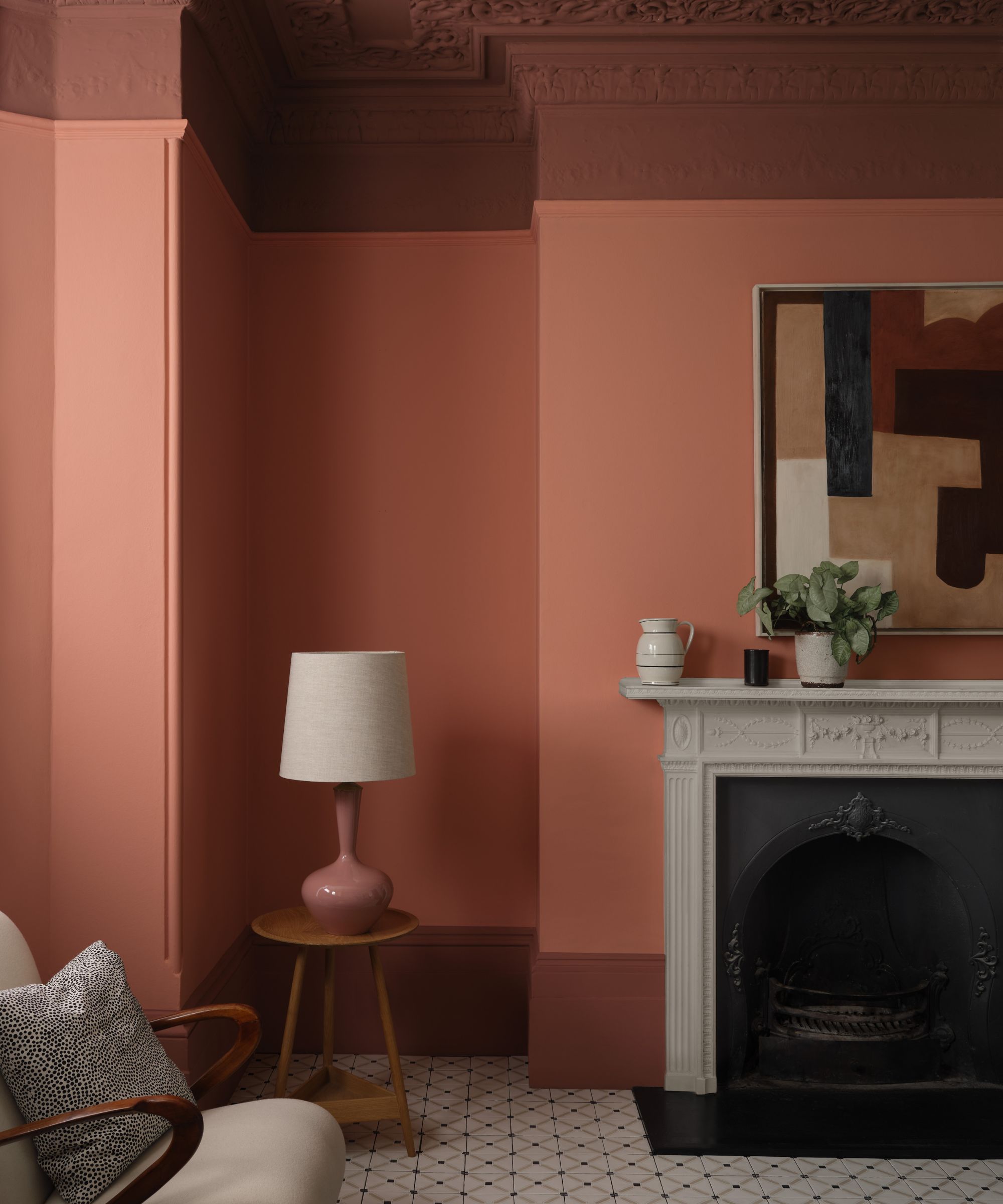
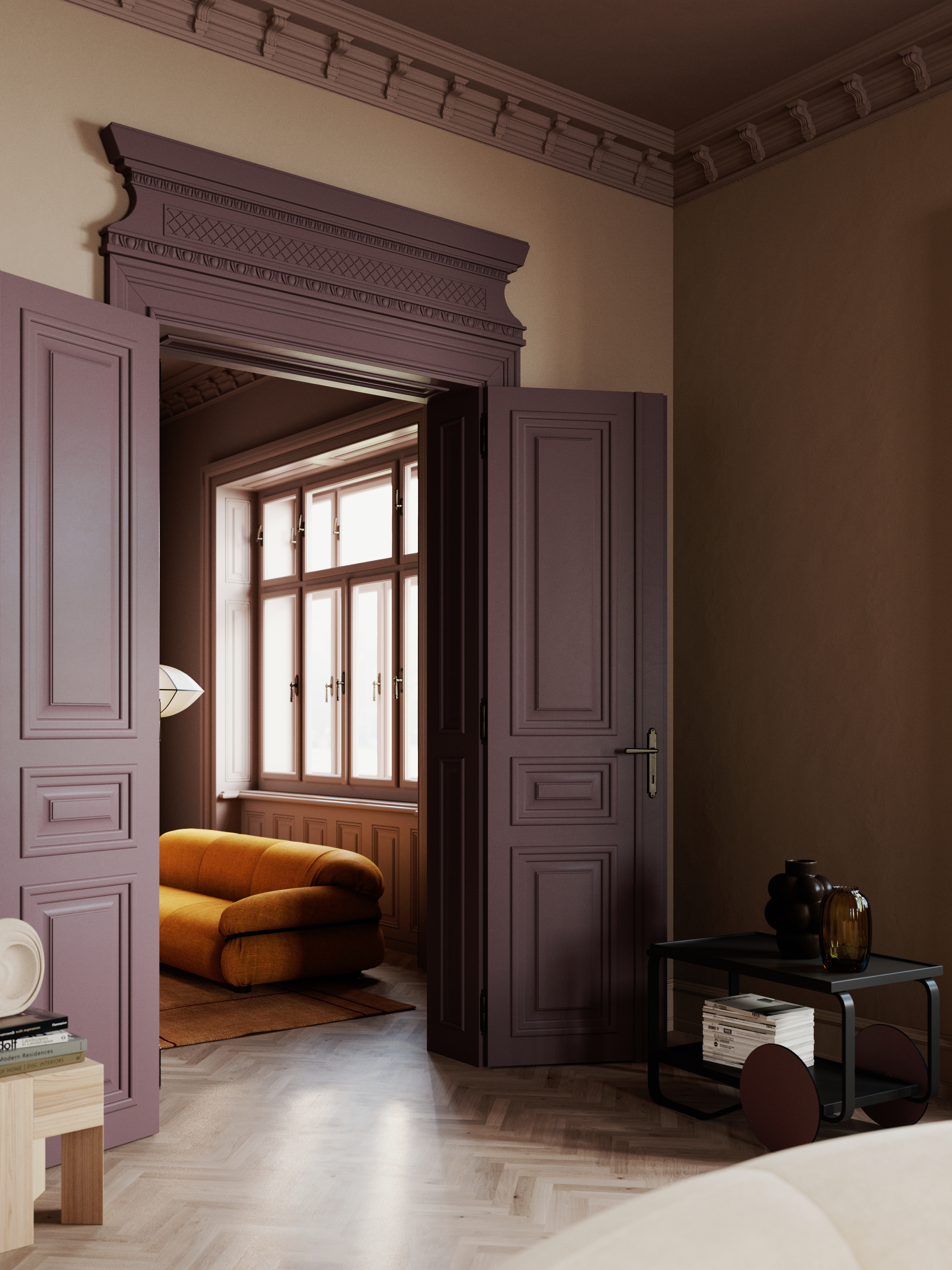
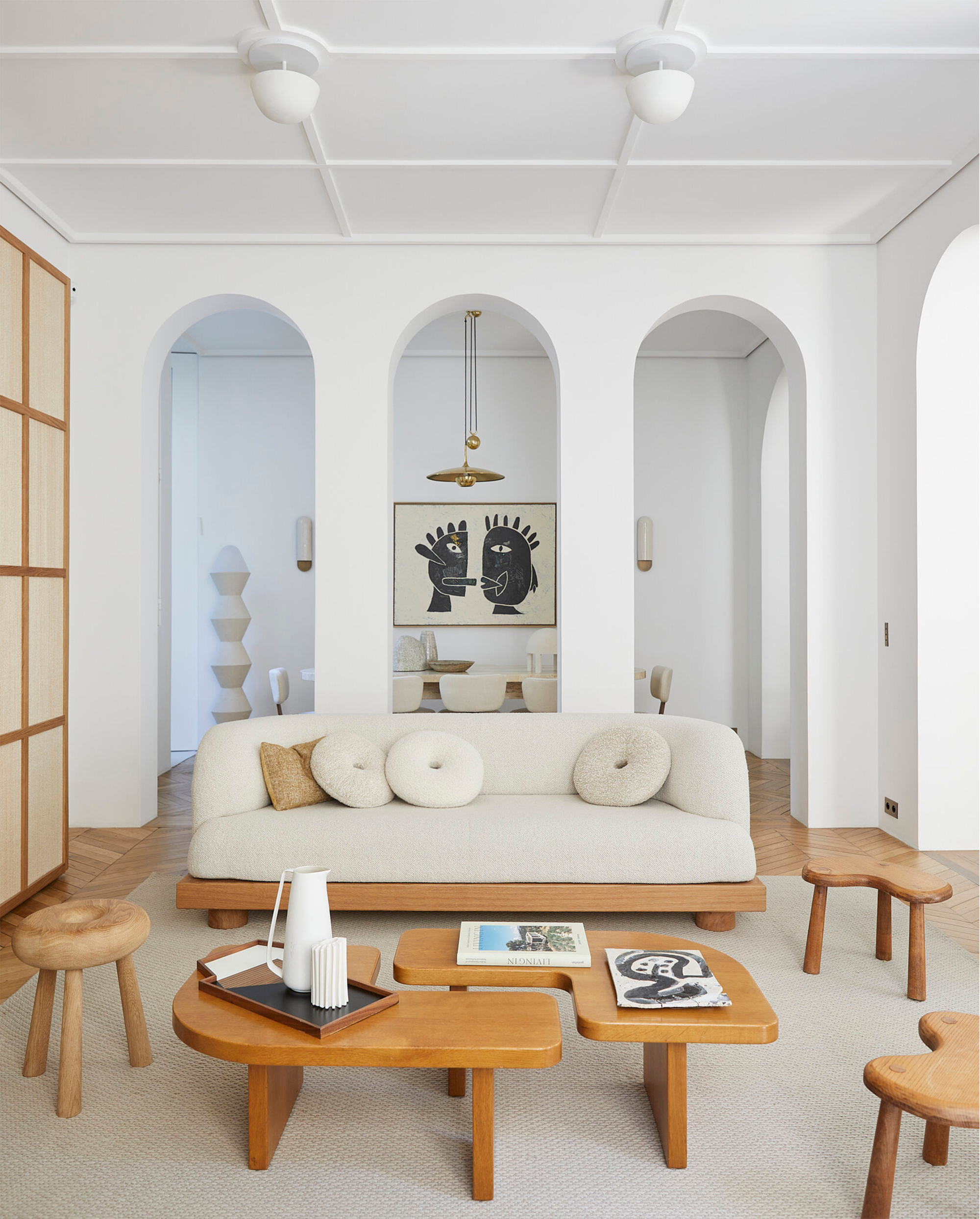
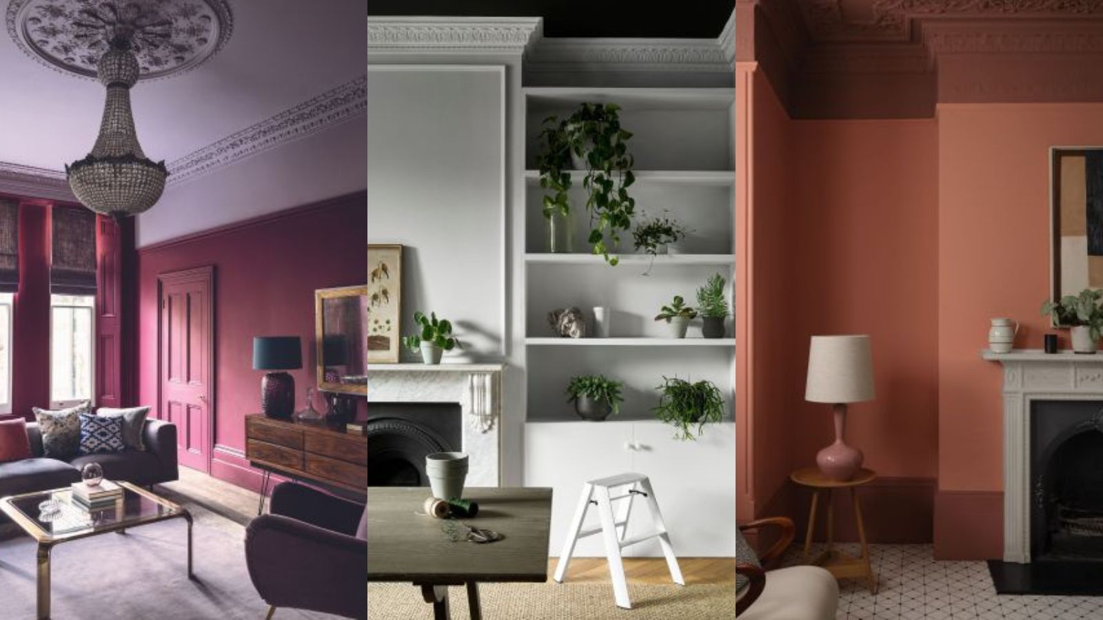
Finally, color drenching should be avoided in rooms featuring significant architectural details, such as crown molding or beams. These intricate elements are designed to be celebrated and highlighted, not to disappear into a uniform color scheme. Painting them the same color as the walls and ceiling can diminish their visual impact, leading to a flat and less dynamic space. Introducing contrast through different colors for these architectural features, even if the wall and ceiling colors are similar, allows them to stand out and contributes to the room's depth and intentional design. The key is to decide which aspects of the room are most important to emphasize and to use color strategically to achieve that goal, remembering that contrast is vital for creating depth.
#InteriorDesign #PaintColors #ColorDrenching #HomeDecor #CeilingDesign #ArchitecturalDetails #LowLightRooms #OpenConcept #PaintTechniques #InteriorDesign #PaintColors #ColorDrenching #HomeDecor #CeilingDesign #ArchitecturalDetails #LowLightRooms #OpenConcept #PaintTechniques
0 comment in total
 No comments yet
You may also like
Should You Paint Ceilings and Walls the Same Color? Experts Give Their Verdict

5 colors you should never paint a small room – designers warn us to steer clear of these hues, and what to pick instead


5 colors you should never paint your entryway – according to interior experts
4 Paint Colors Designers Say You Should Never Use In A Hallway
Should you paint your ceiling a different colour to the walls? Experts explain why everyone should consider it
5 reasons why you should never paint a ceiling white, reveals a leading paint and color expert
7 Paint Colors to Never Use on Your Ceiling, According to Interior Designers
7 Paint Mistakes That Make Designers Instantly Cringe When They Walk Into Someone's Home

When you should and shouldn't paint your ceiling, according to interior designers

An interior expert reveals the one thing you should never do when painting your walls

What are the worst colors to paint a room? The shades experts say you should never use
5 best colors to paint a ceiling according to designers – from colorful hues to classic white
Should You Paint the Ceiling and Walls the Same Color? Interior Designers Share Their Thoughts

You should never paint your hallway this colour, according to colour psychologists

'Dark ceilings make the room look smaller': 6 classic paint colour myths it's time to give up on

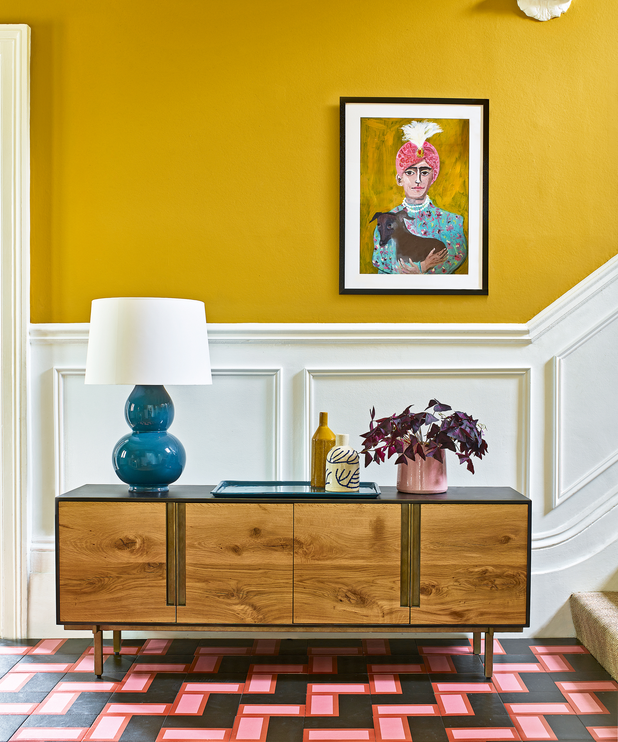
The colors you should never paint your hallway – and what really works

Interior design experts reveal the colour rules you should be breaking
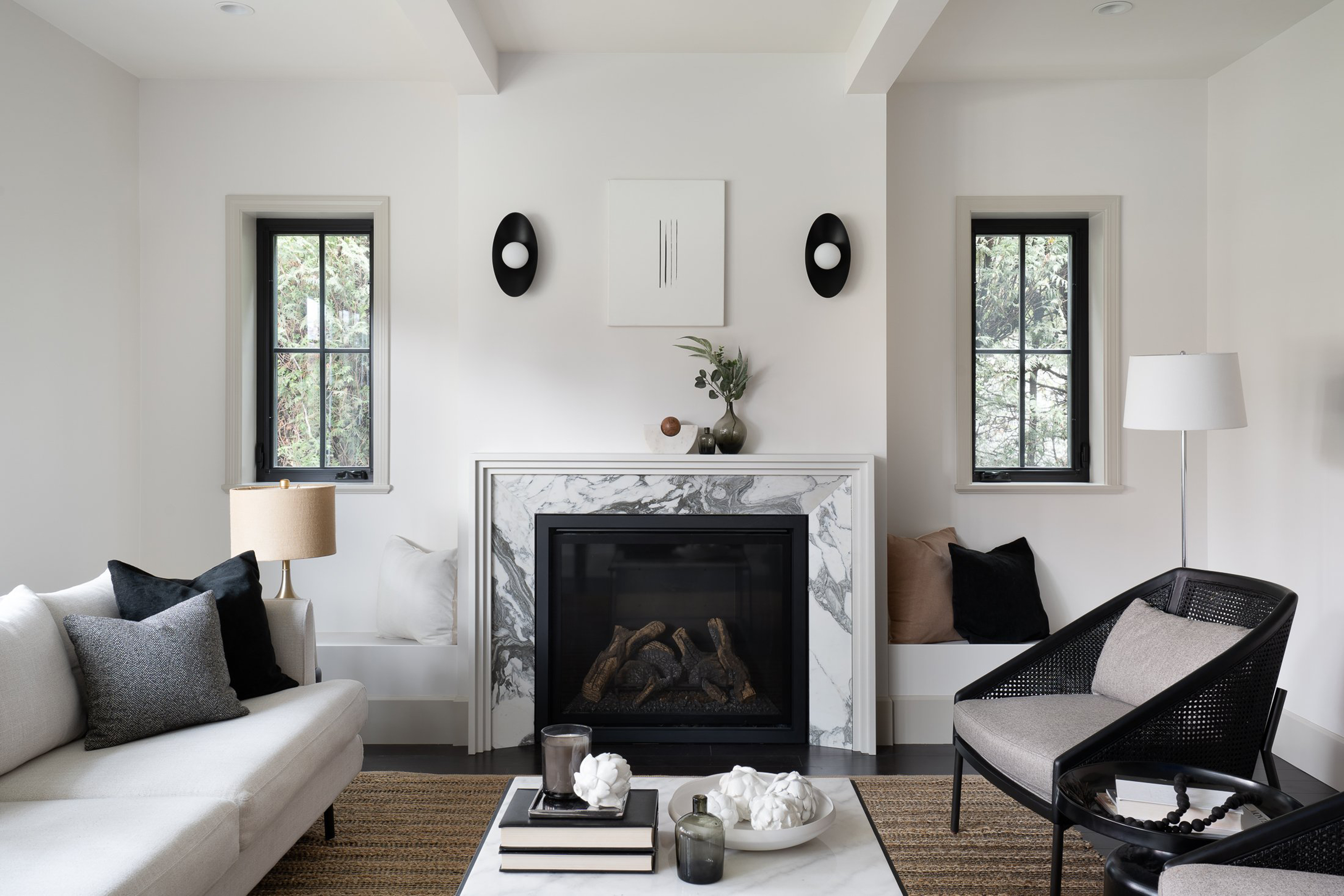
Should an entire house be painted the same color? Interior designers give their verdict

4 Outdated Colors Designers say you Should Steer Clear of When Decorating a Living Room
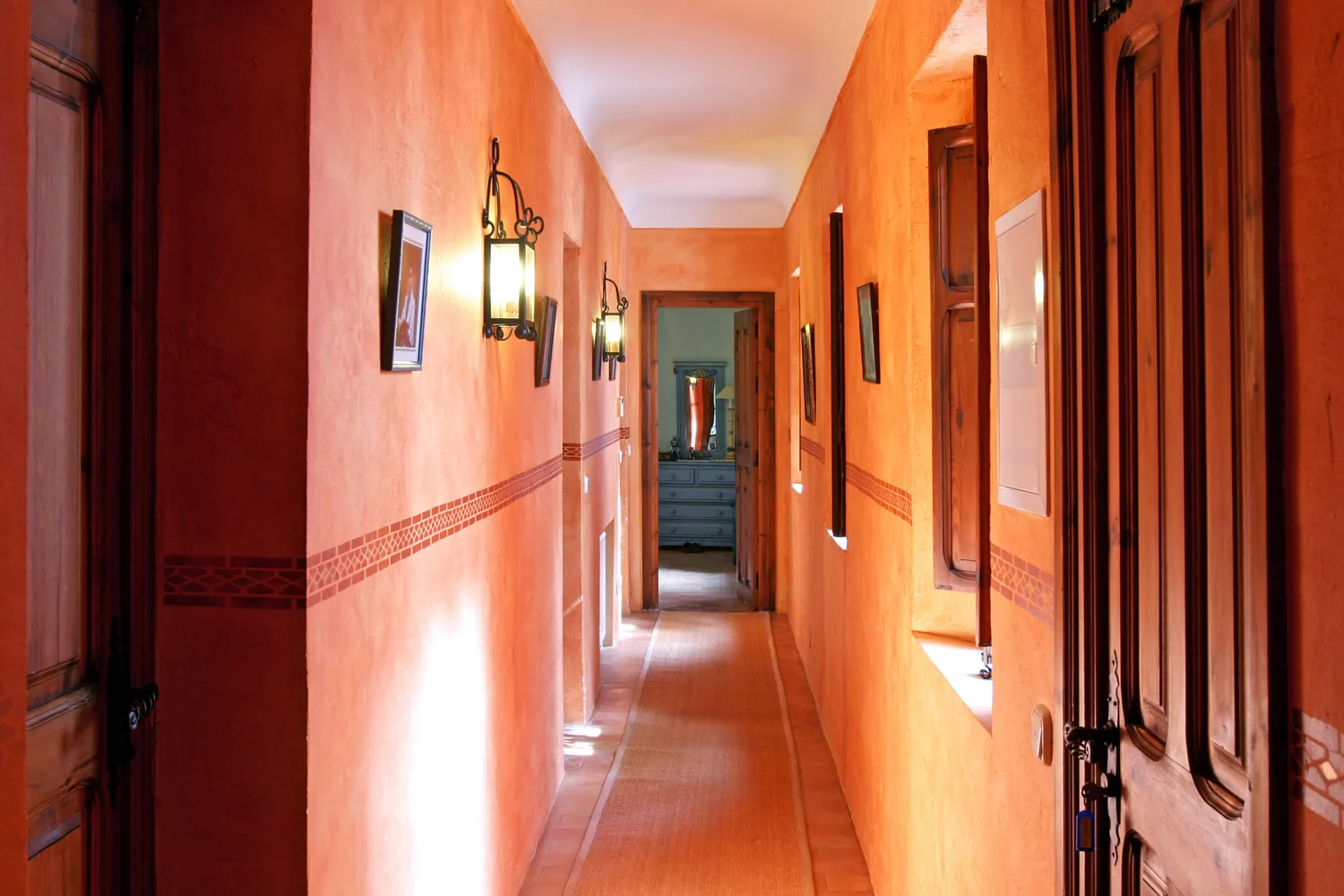
5 Colors You Should Never Paint Your Hallway, According to Designers