1/8
Trust us, these are the colours to avoid when painting a small hallway
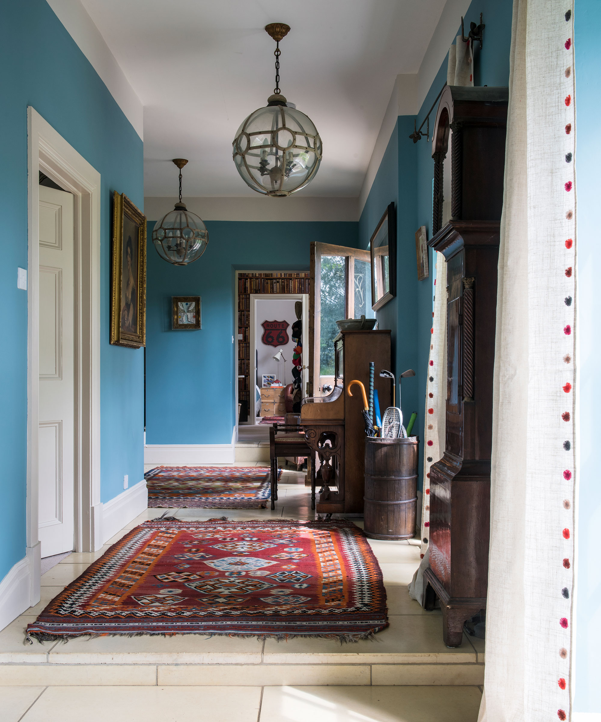
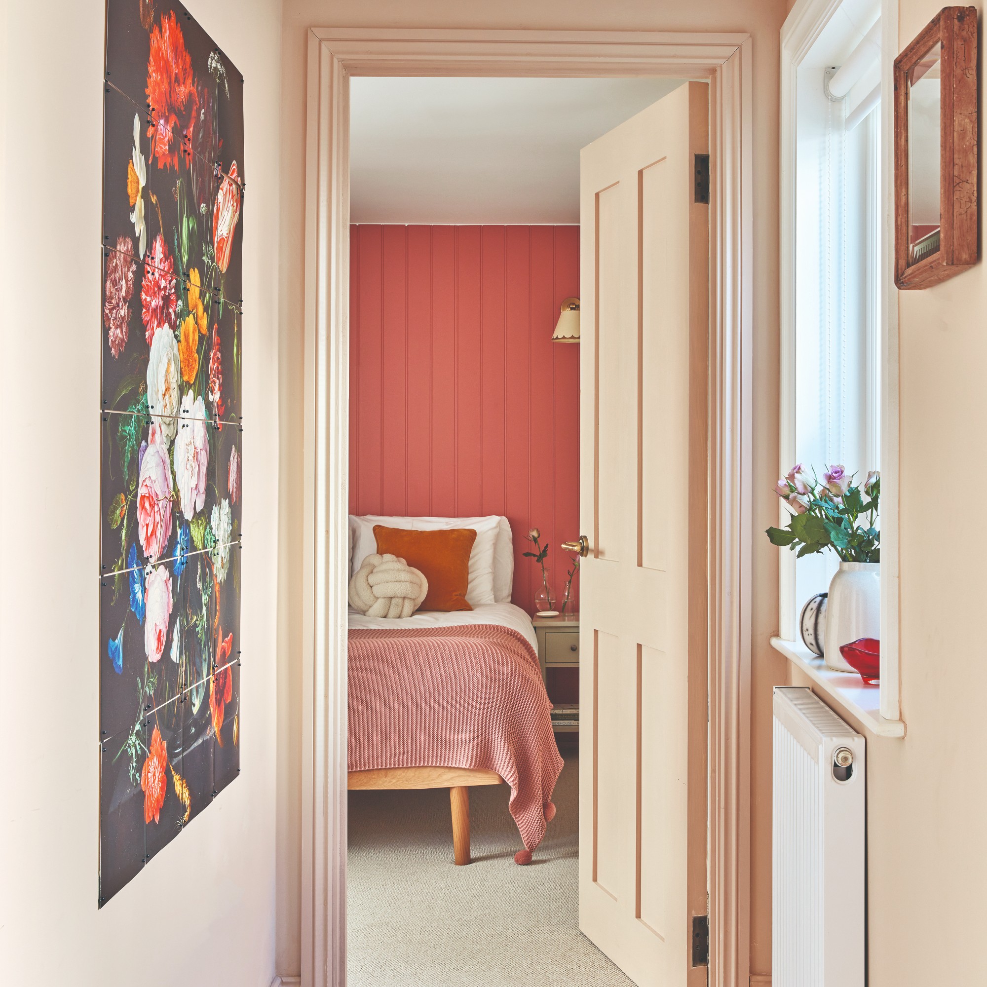
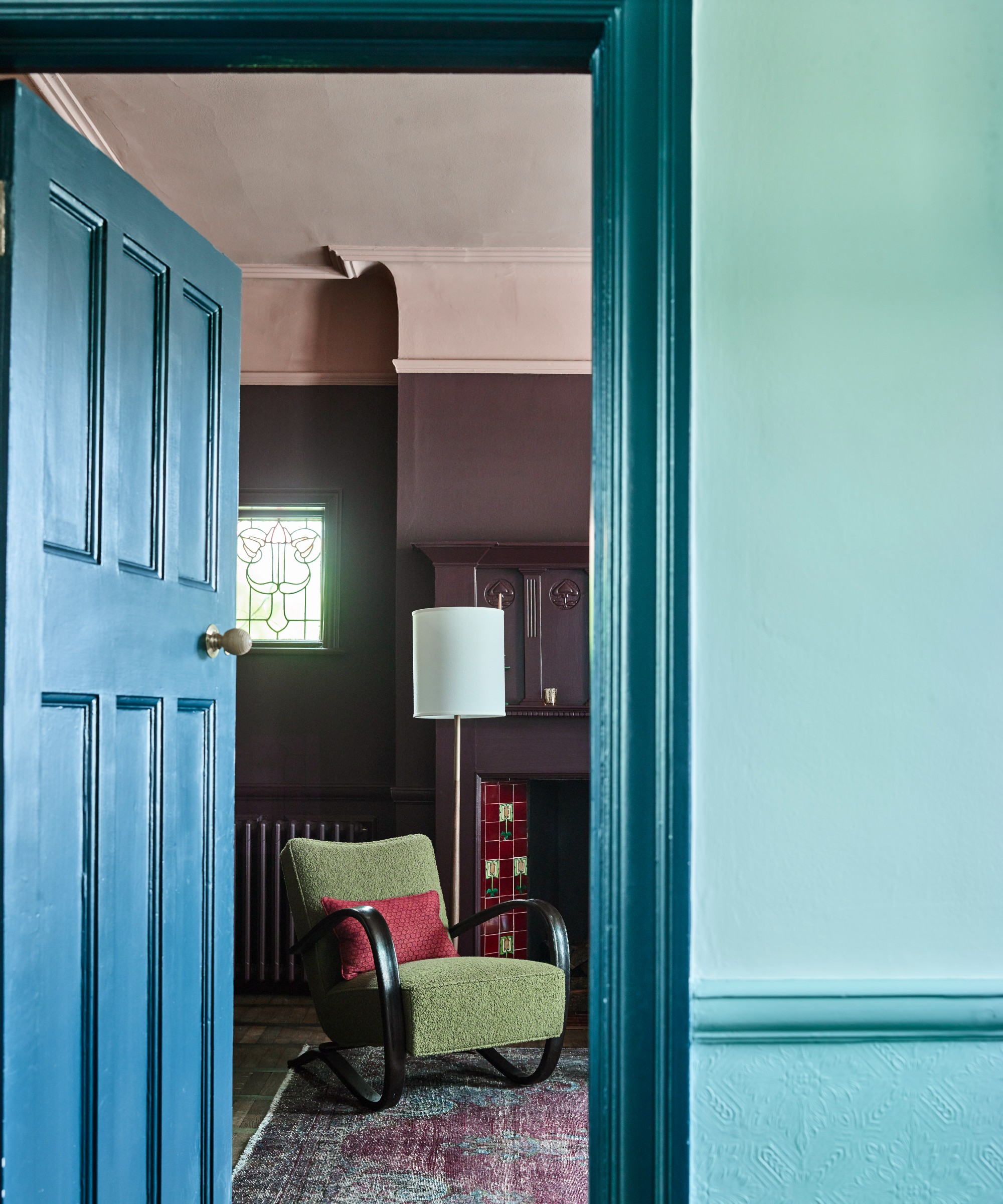
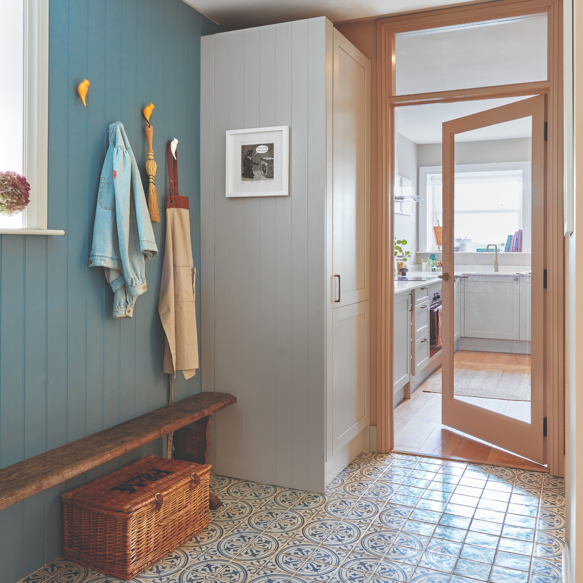
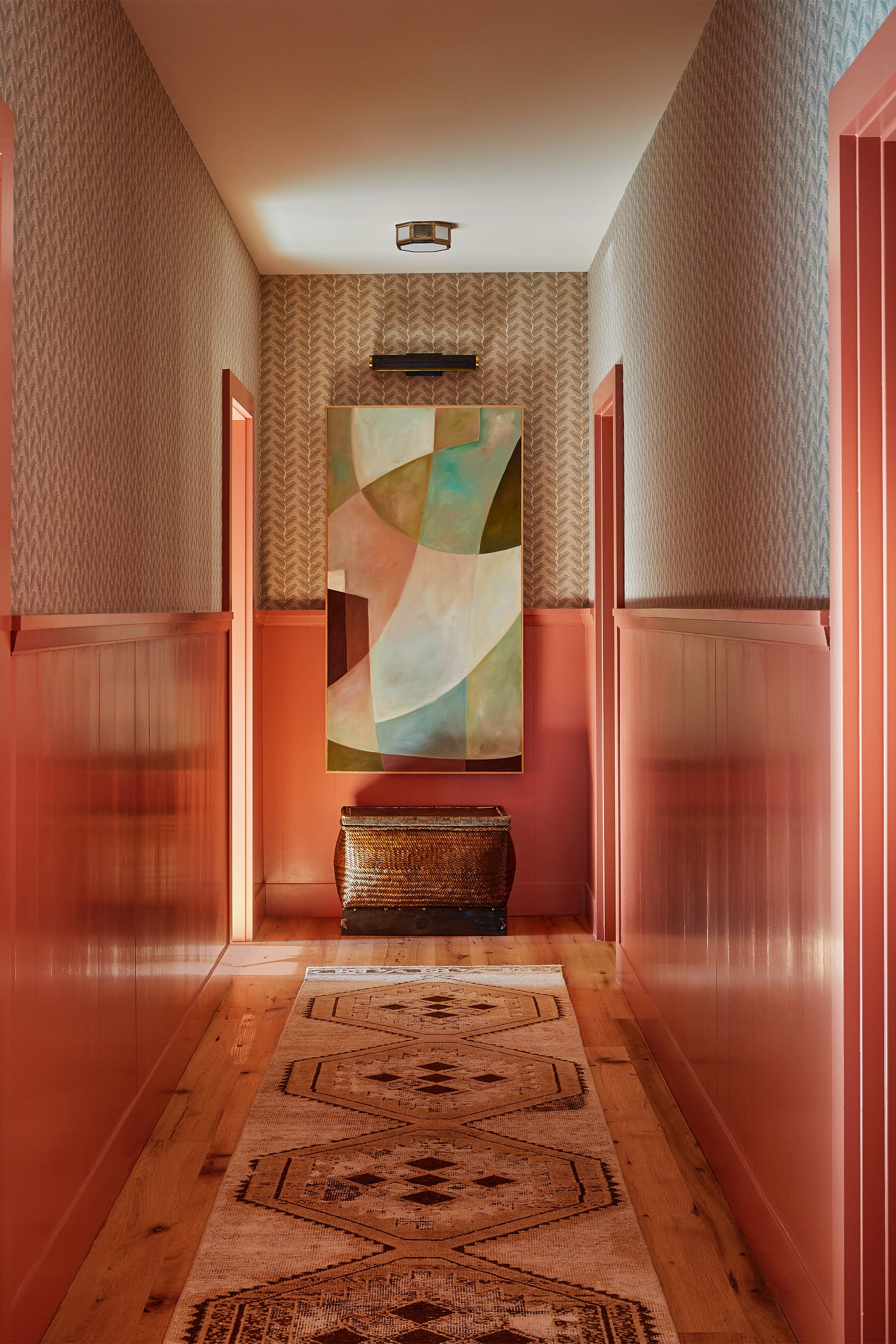
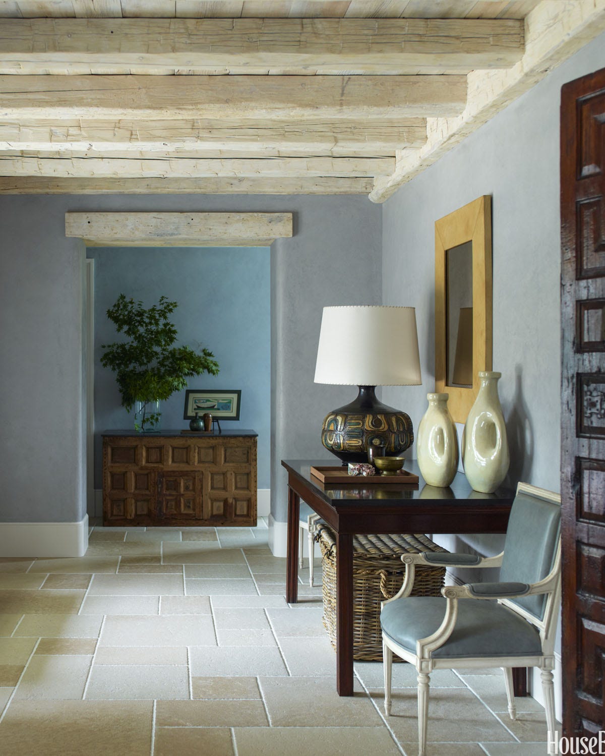
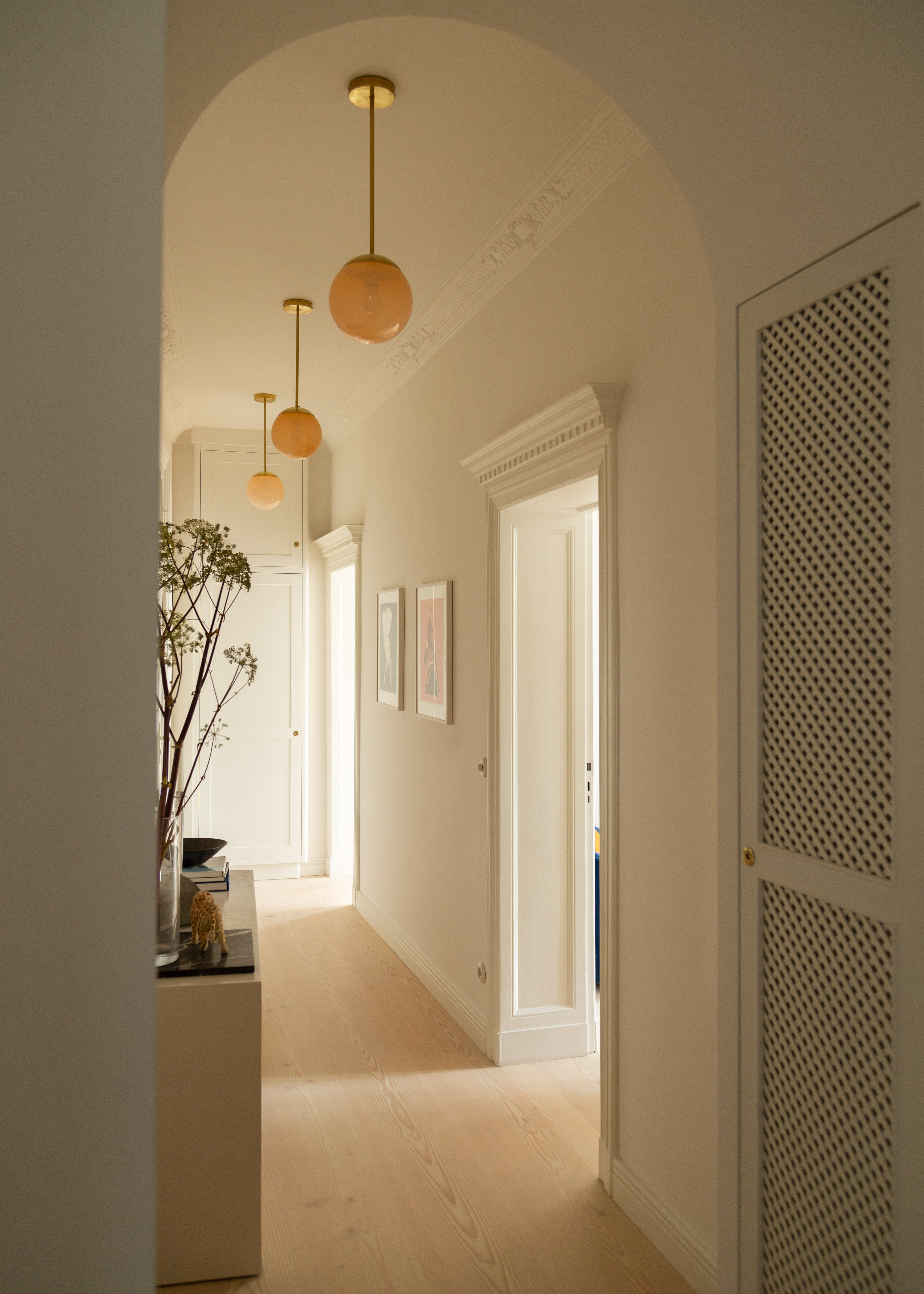
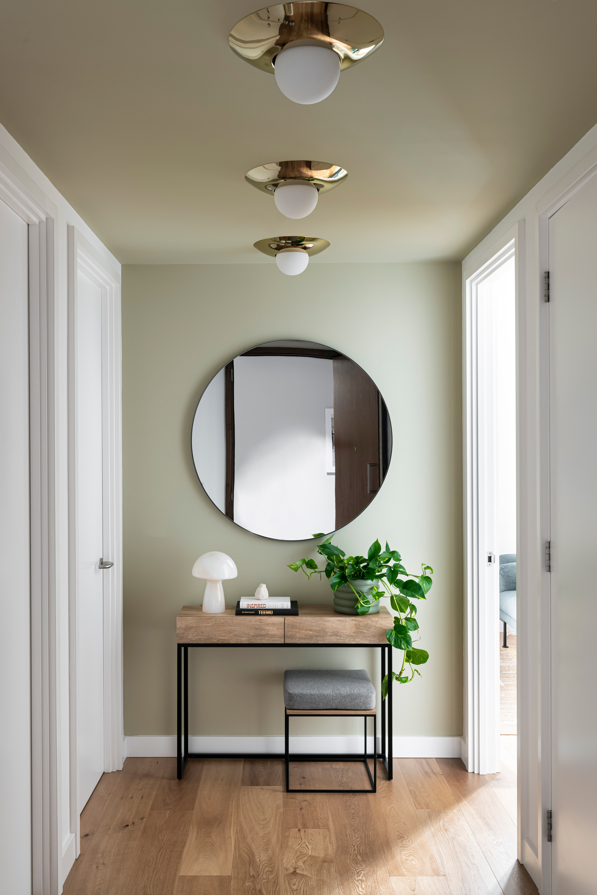
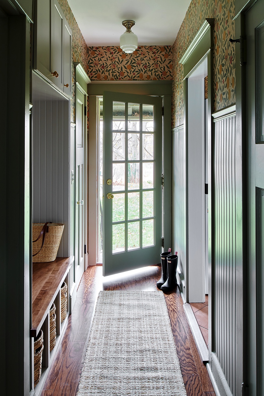
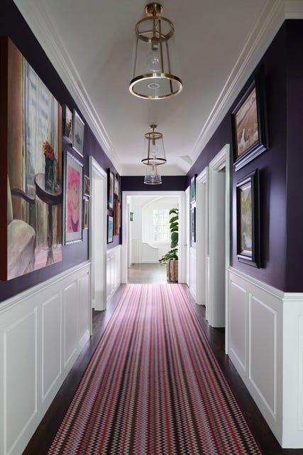
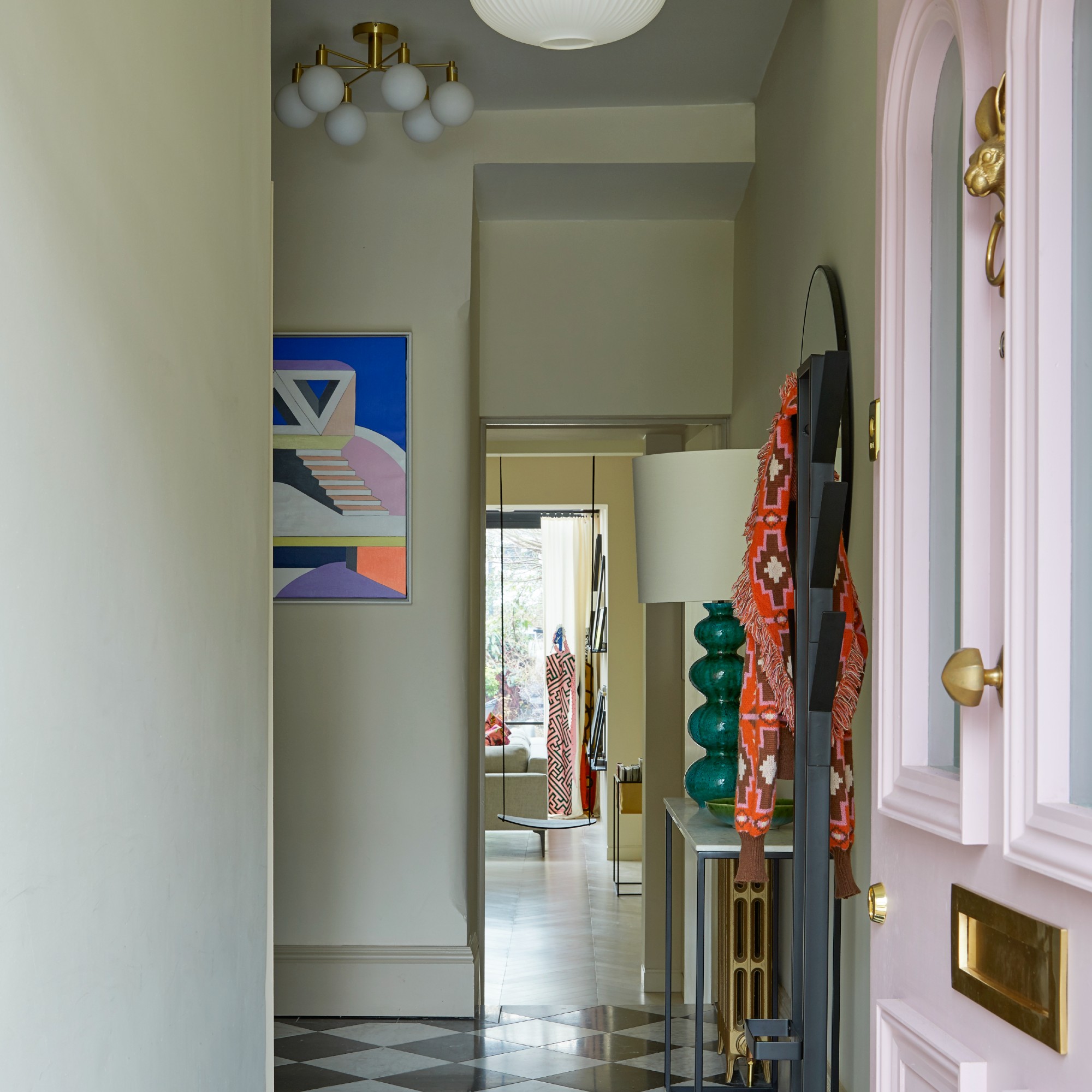
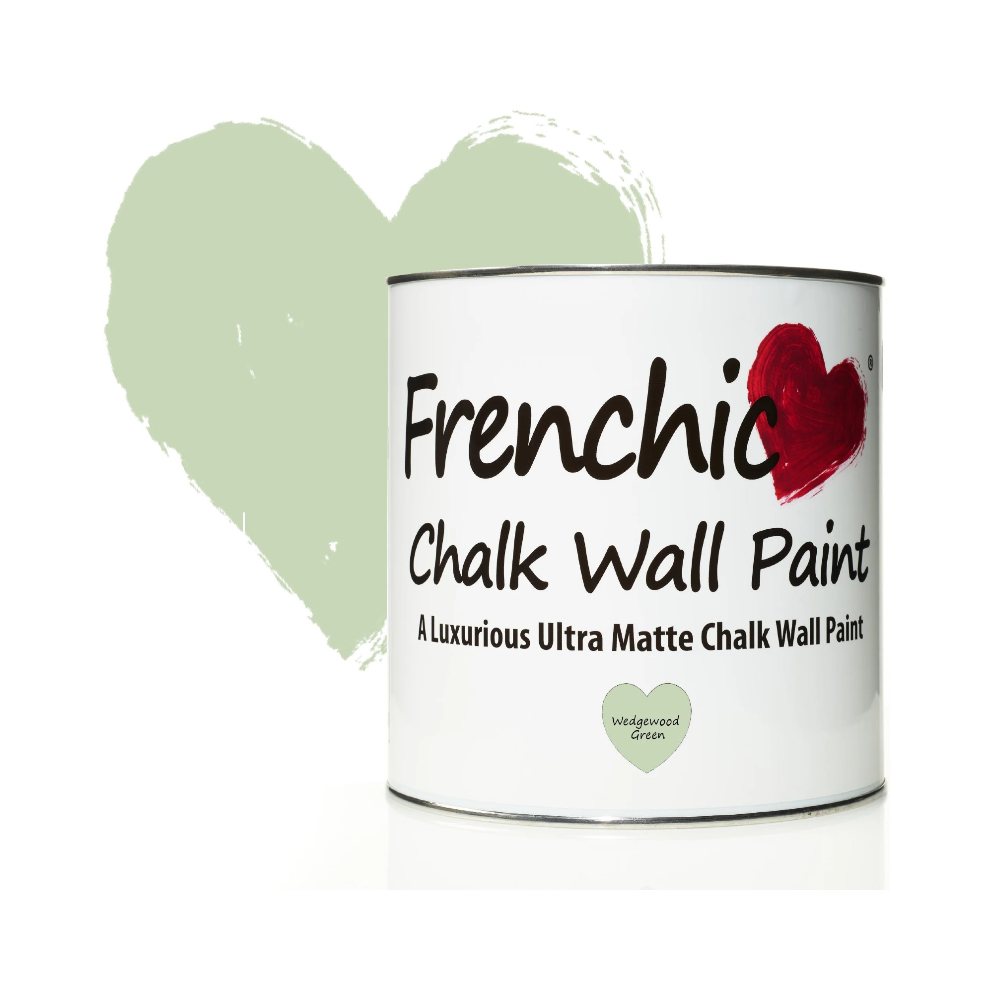
Choosing the right paint color for a small hallway can significantly impact its perceived spaciousness and overall atmosphere. While warm, bright colors like peach, yellow, or green can add vibrancy and comfort, and deeper blues, greens, or burgundy shades can create an immersive, comforting feel, there are specific colors and approaches that experts advise against. The goal is to make the entrance welcoming and prevent it from feeling gloomy or cramped, especially given that many hallways lack natural light.
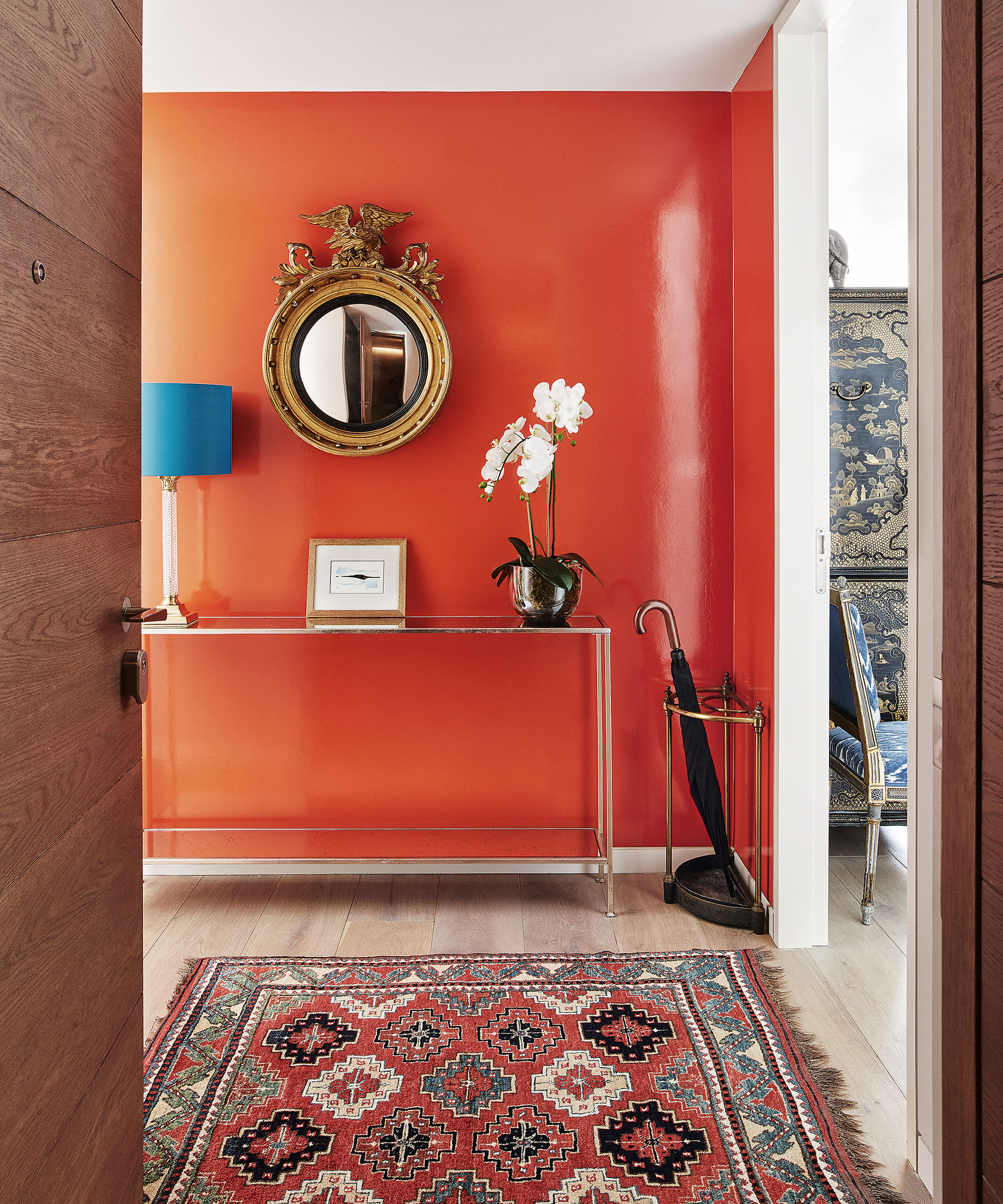
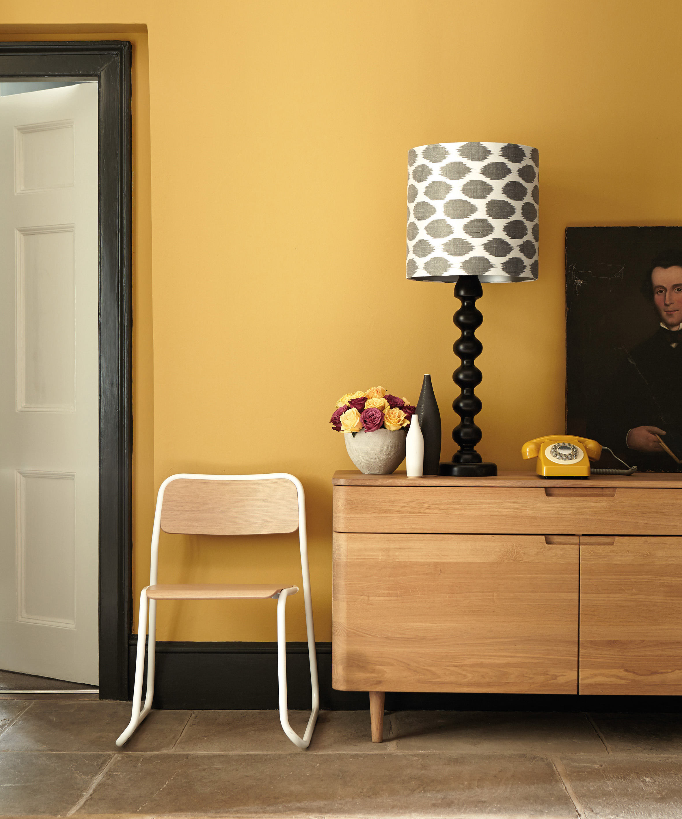
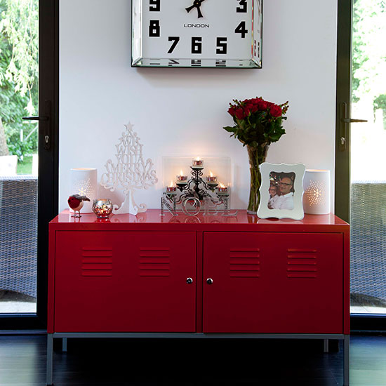
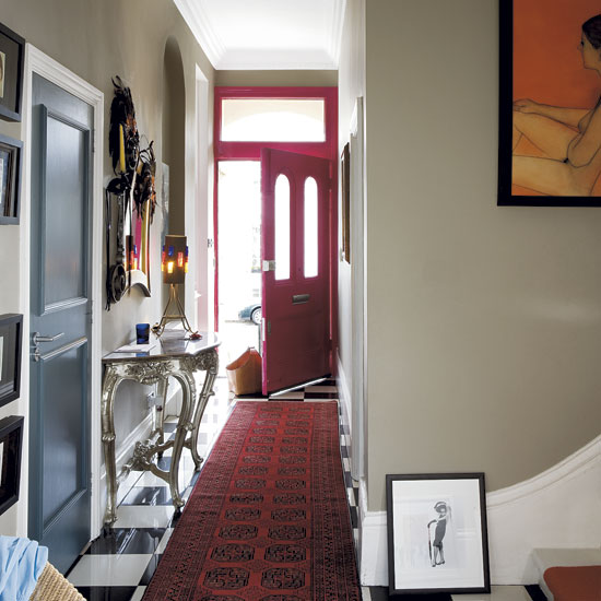
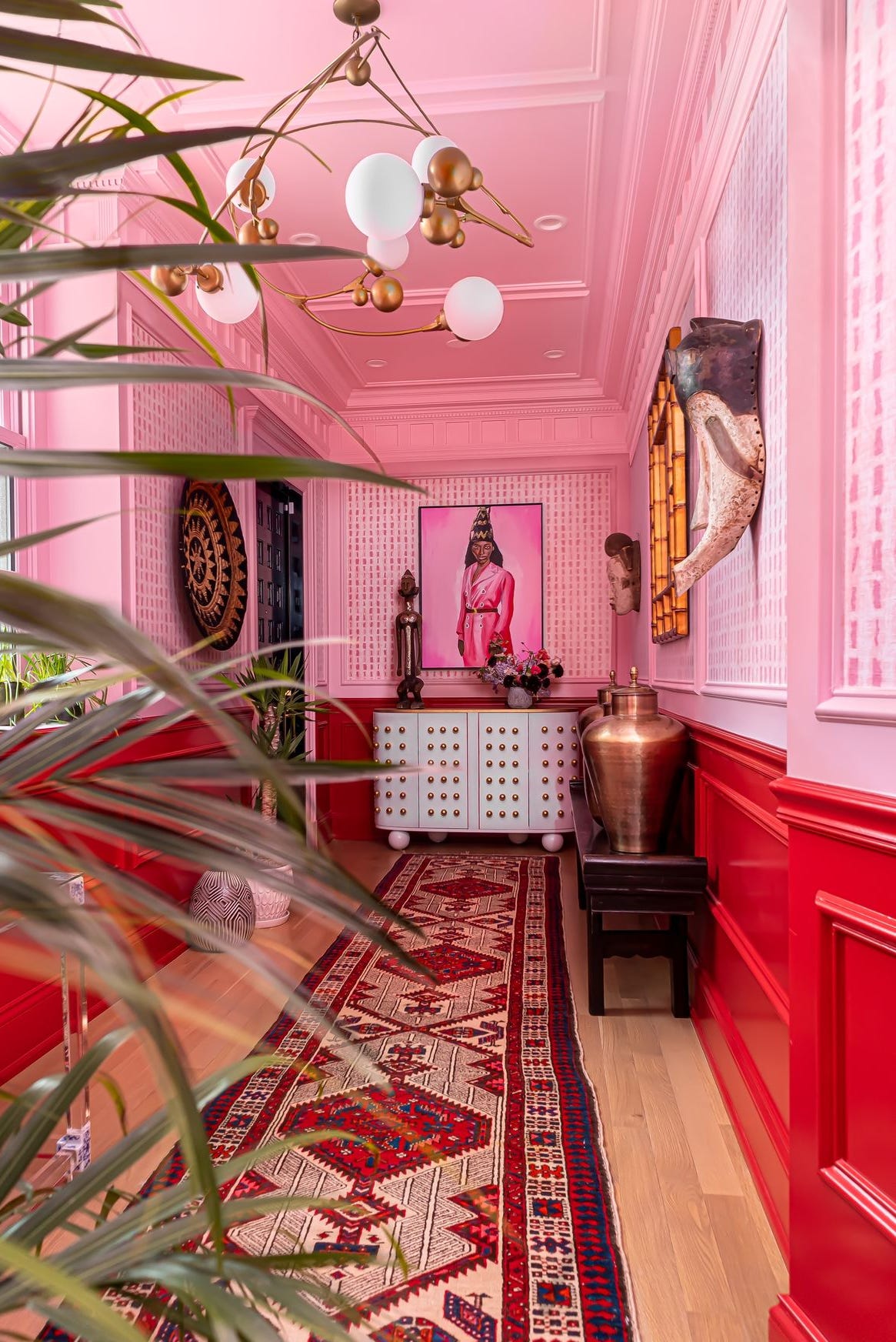
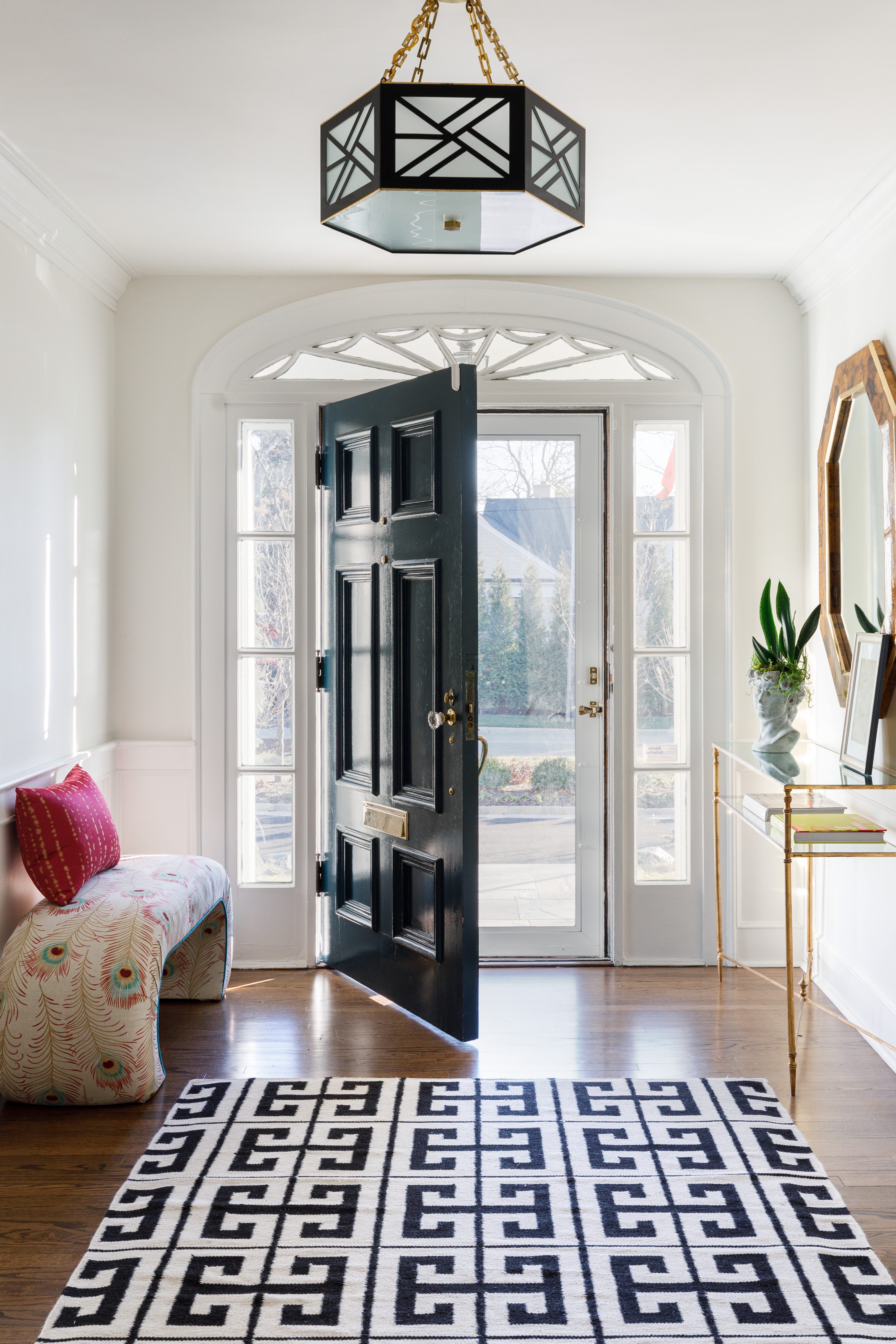
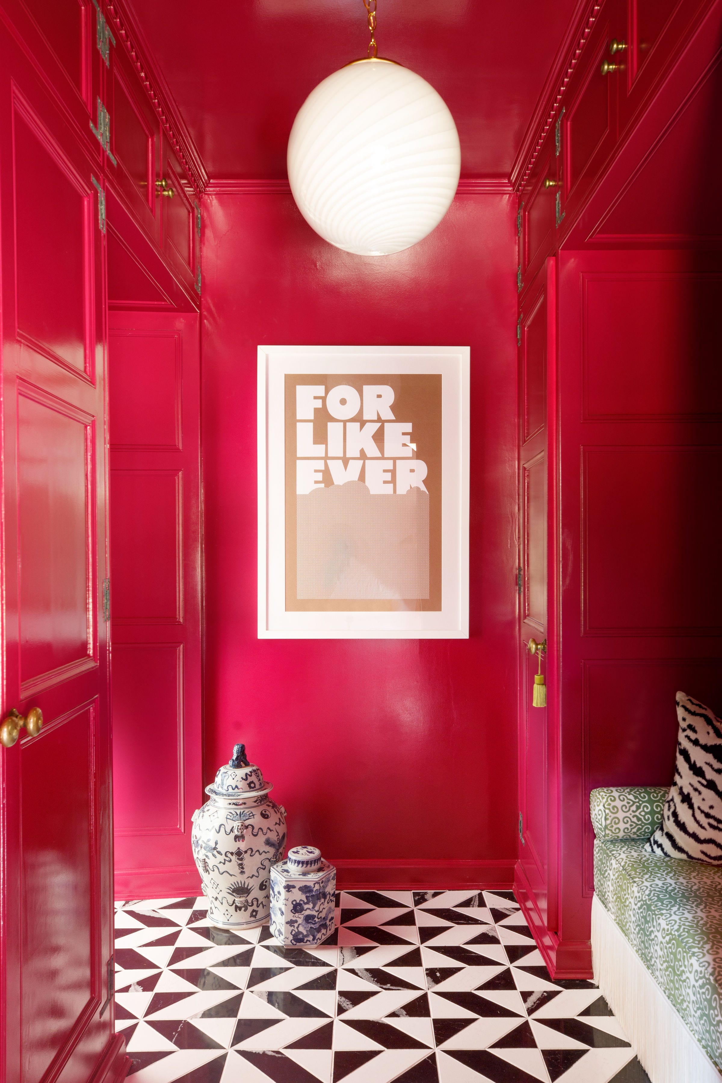
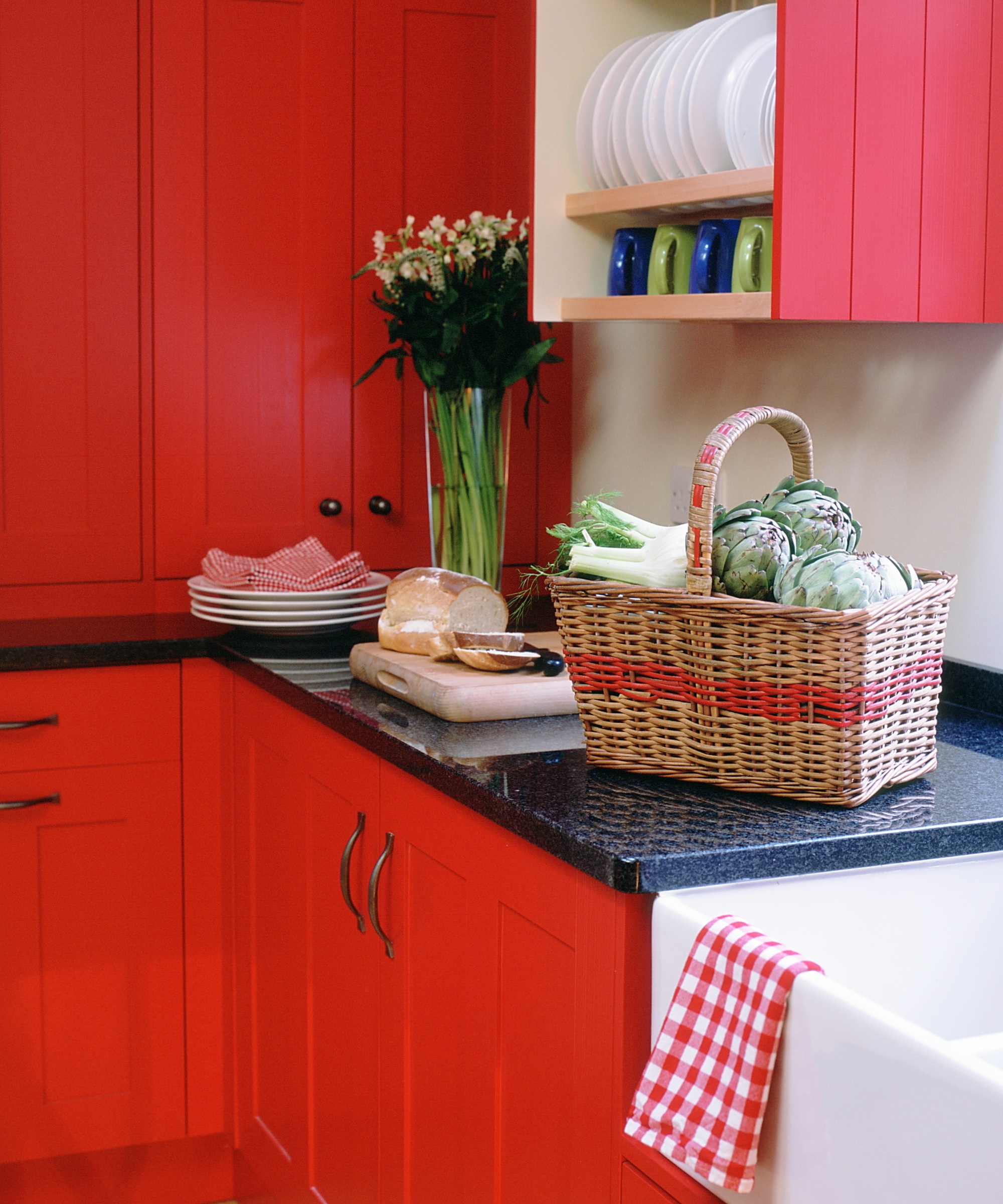
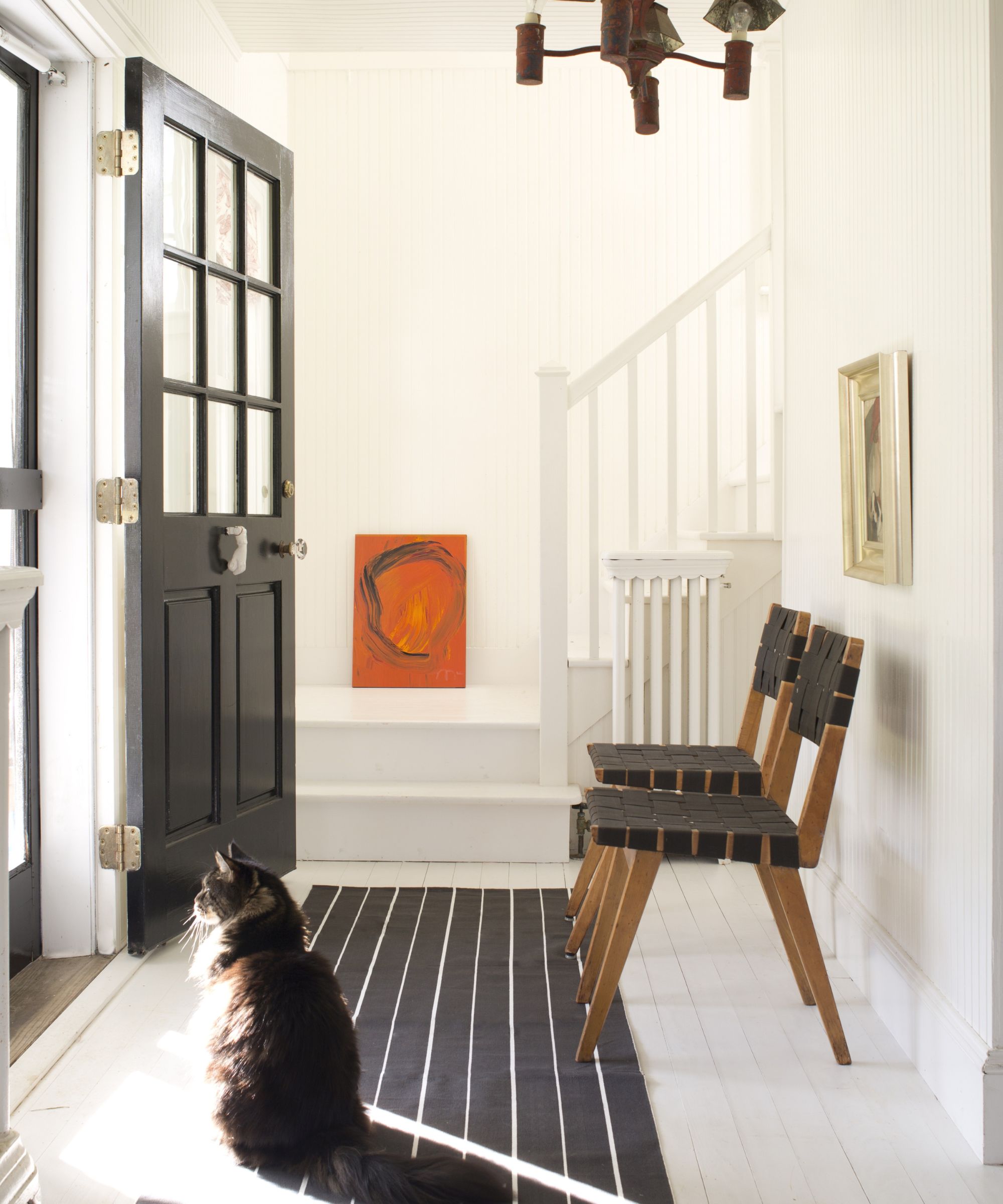
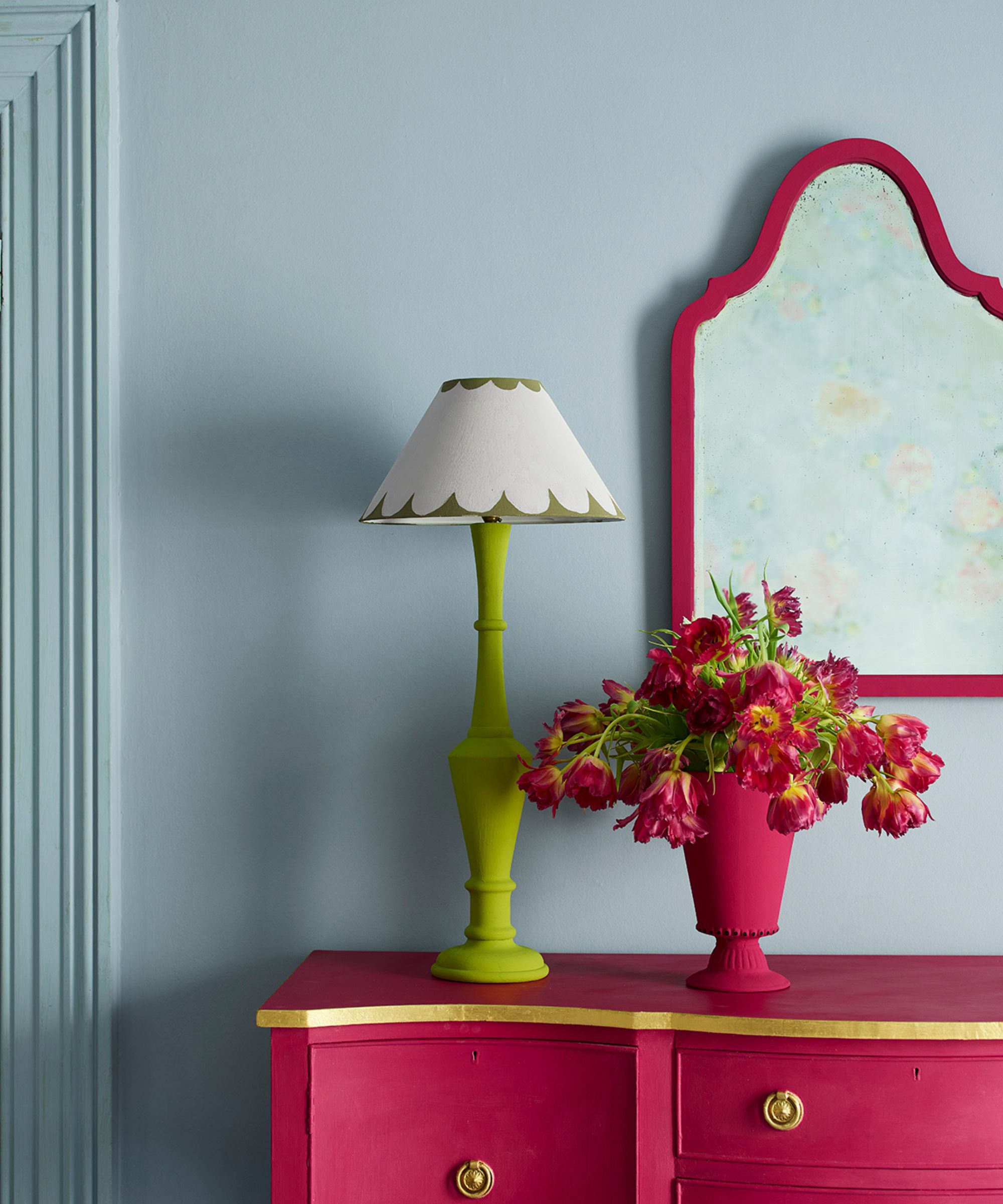
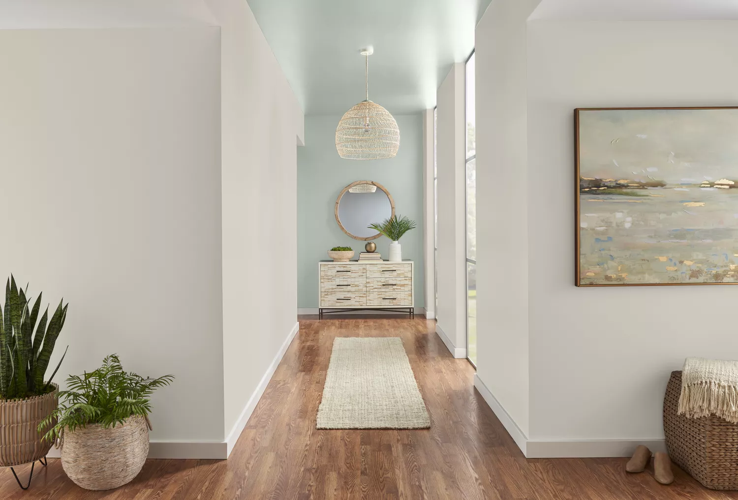
One common mistake is painting small hallways brilliant white. While seemingly logical for brightness, this often results in a cold, stark, and gloomy space that highlights dirt easily. Instead, warmer neutral tones from the taupe family are recommended to create a more inviting and forgiving environment. Similarly, vibrant pinks like bubble-gum or fuchsia, despite their current popularity, can overwhelm small areas, appearing harsh and potentially dating quickly. If pink is desired, lighter shades with cooler undertones or using vibrant pinks as accents are suggested. Bright red, while cozy in other rooms, can be too intense and emotionally stimulating for an entrance. Yellow is proposed as a less overwhelming alternative that still imparts a happy and positive mood.
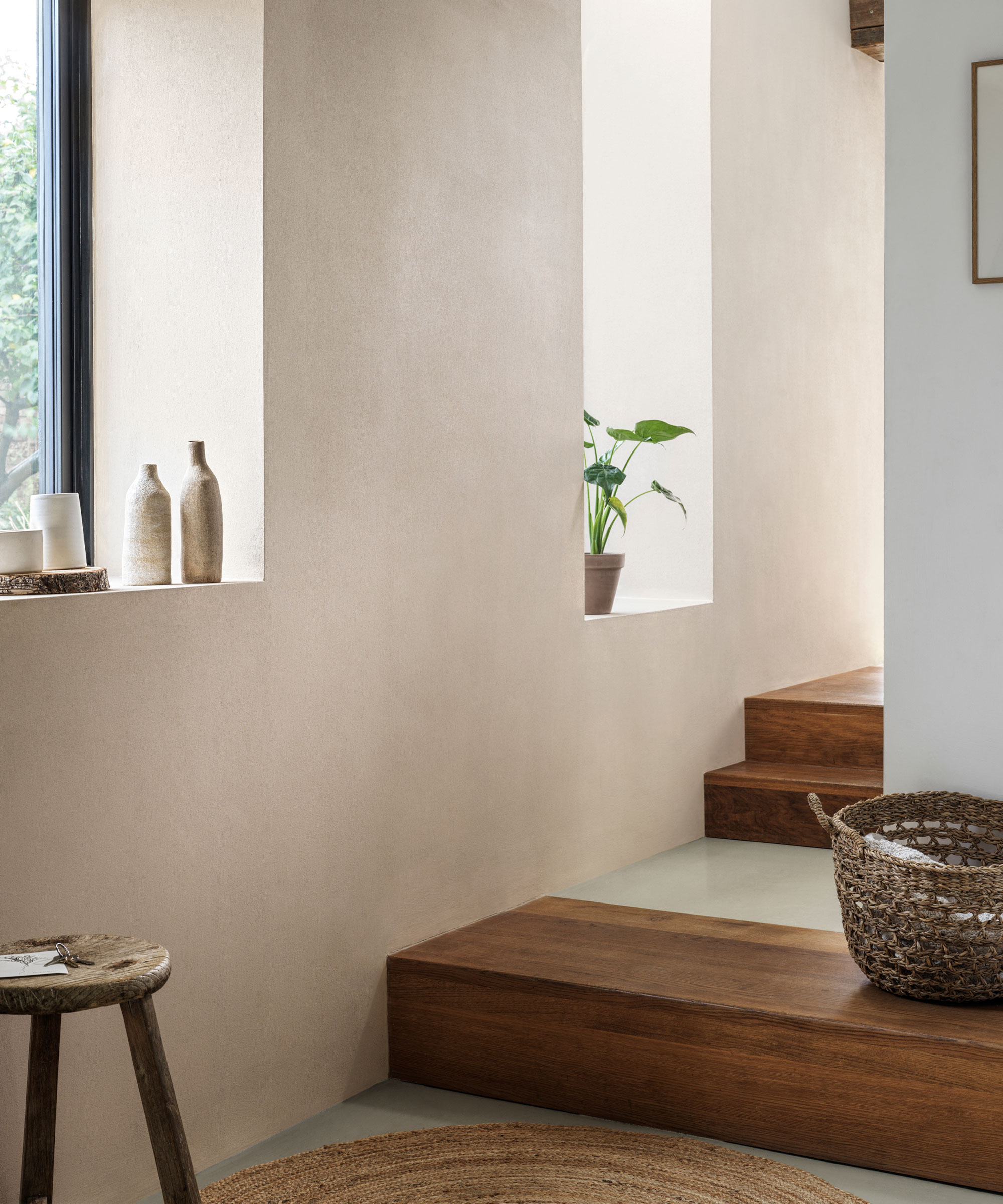
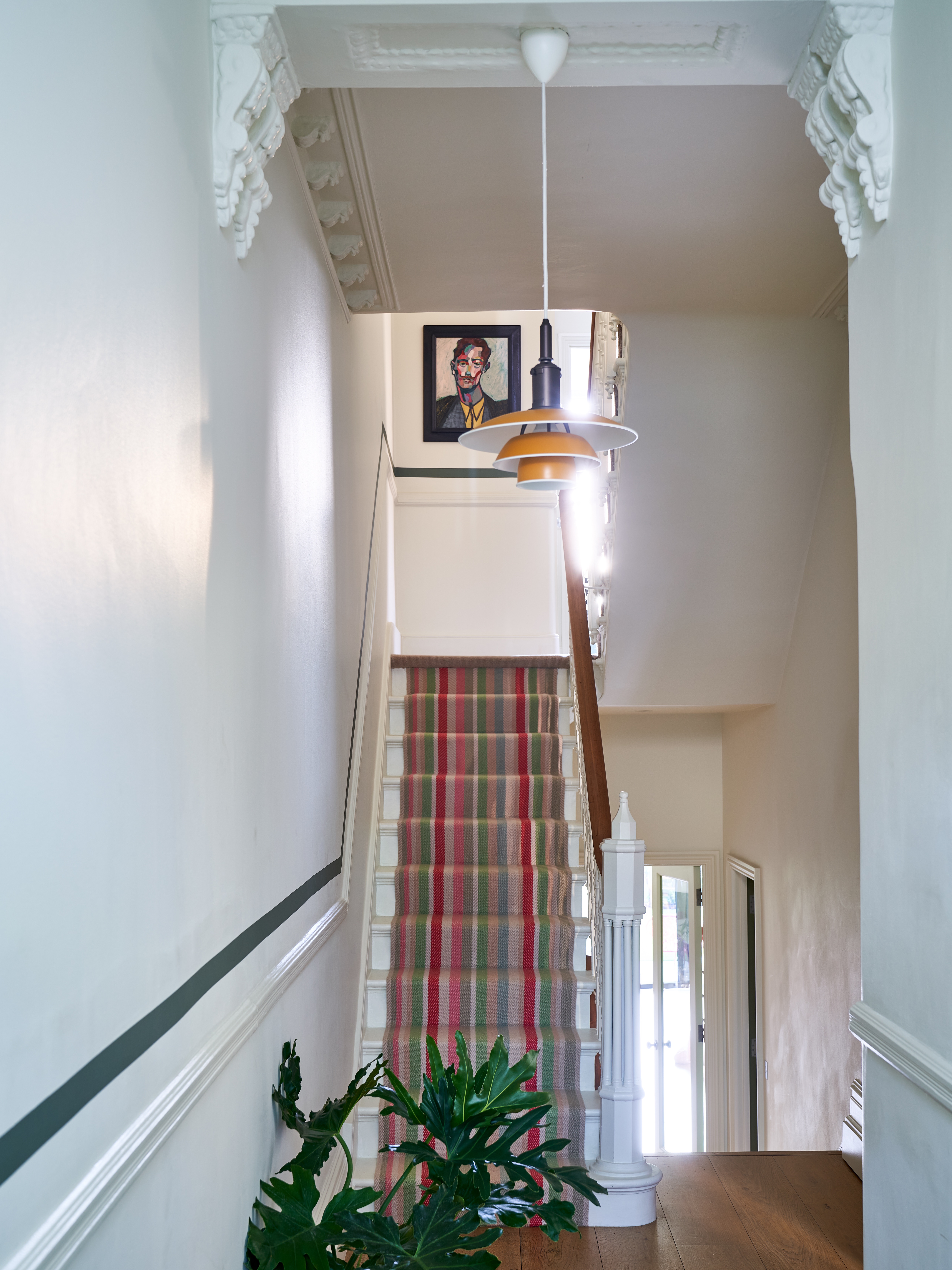
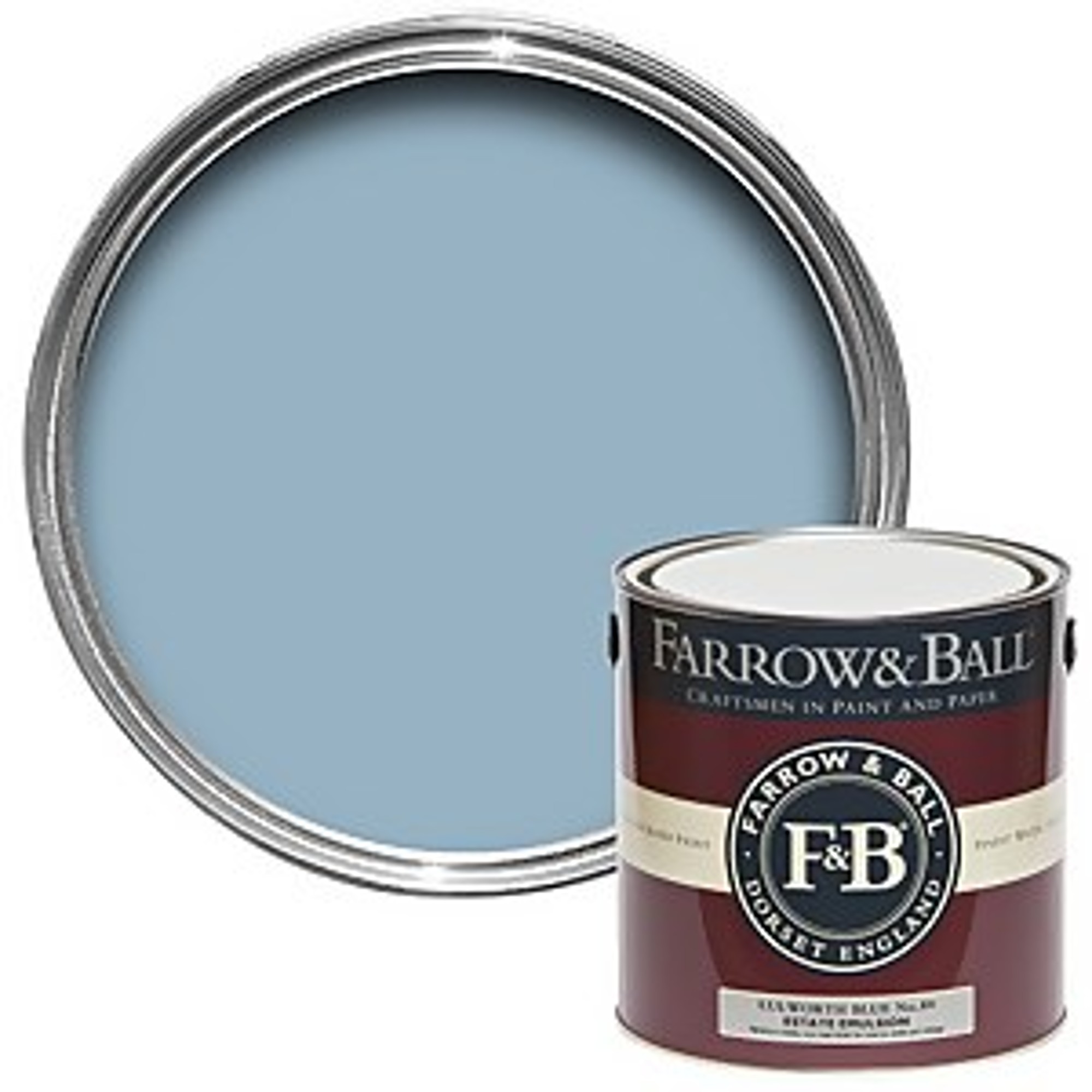
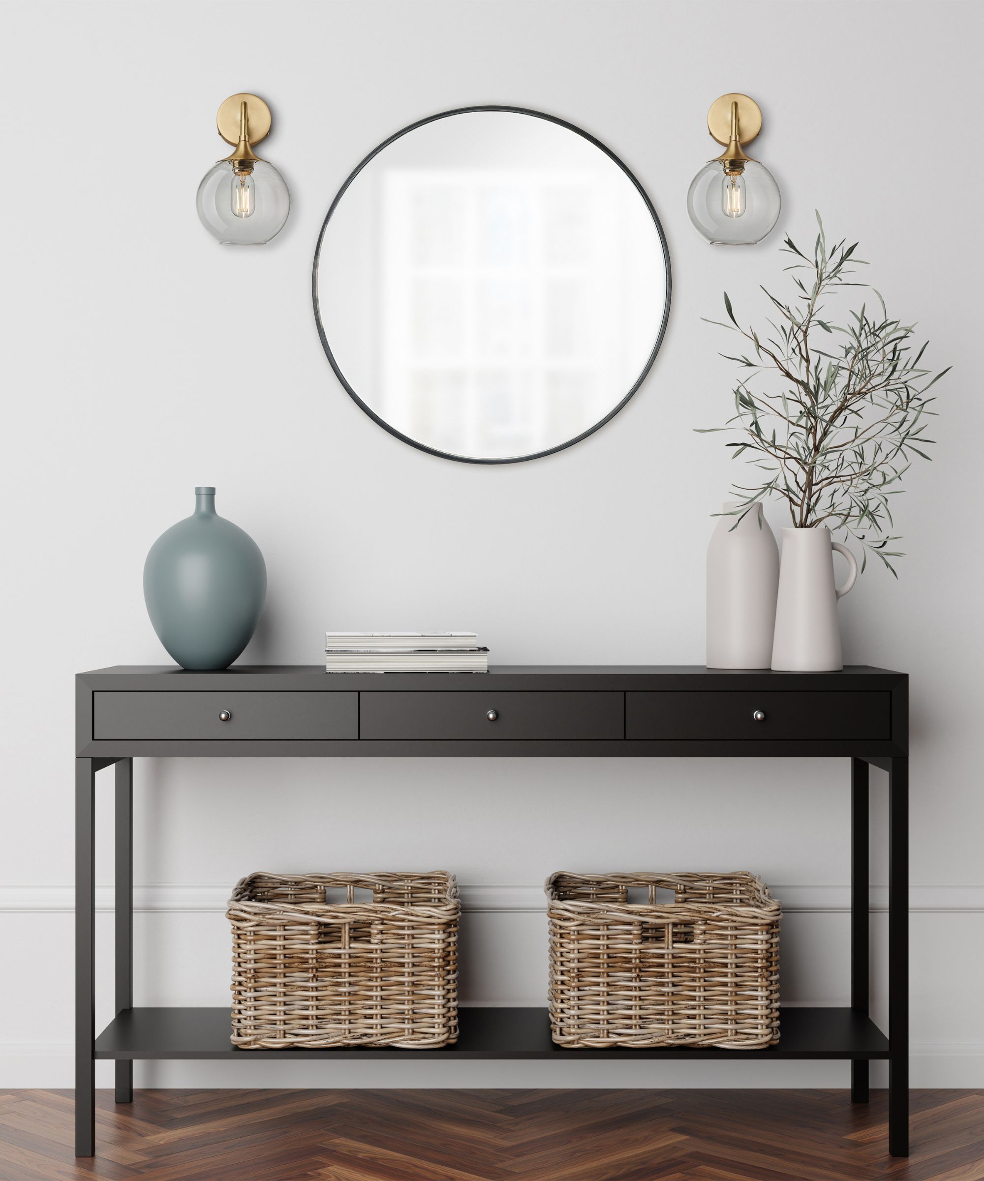
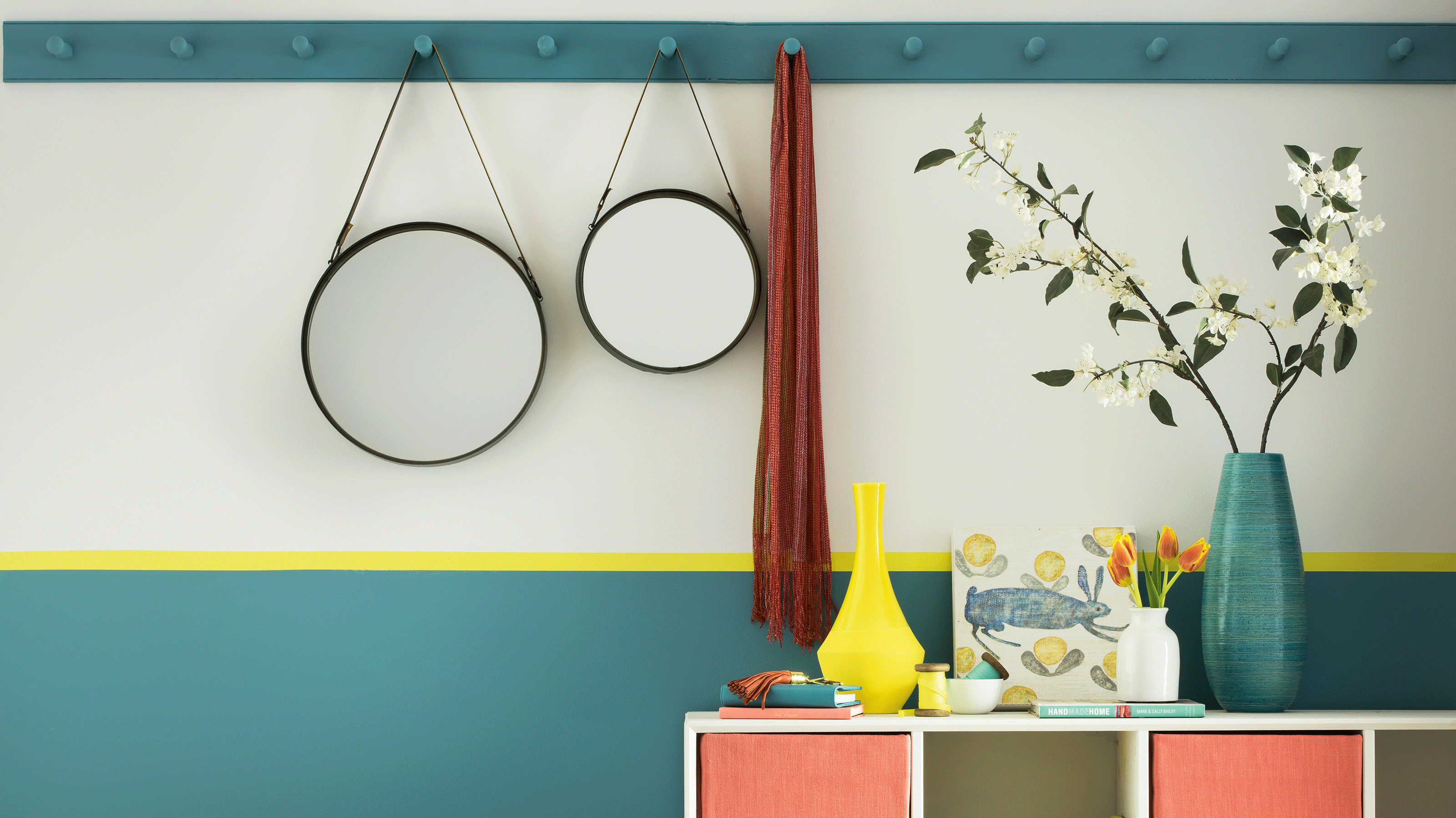

All-black walls, though dramatic and contemporary, are generally ill-suited for small, often dim hallways. Black absorbs light, making the space feel darker and more confined. A compromise involves painting only the lower half of the walls black and pairing it with a lighter color like white or a calming blue for the upper half, which allows light to circulate better. Keeping woodwork, ceilings, and flooring light also helps balance the aesthetic. Washed-out neutrals, such as magnolia, are another pitfall. While inoffensive, they fail to enhance the space or create a memorable first impression. Warm neutrals, chosen to complement adjacent rooms and consider undertones, can effectively boost light and maintain cohesion. Harsh neons, while playful in small doses, are advised against for entire hallway walls due to their overpowering and garish nature, which can clash with other decor and even cause discomfort.
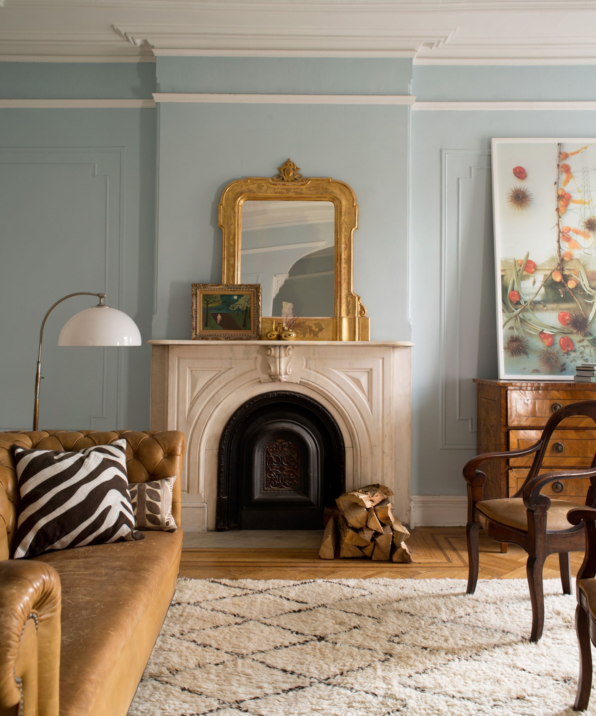
Finally, battleship grey, particularly dark, cold greys with blue undertones, should be avoided in small hallways. These can make the space feel smaller and unwelcoming. Lighter greys with warm, yellow undertones (greige) are a much better option for creating a brighter and more inviting entrance. It is crucial to test paint samples directly on the hallway walls to observe how the color interacts with changing light conditions throughout the day. By avoiding these color mistakes, homeowners can create a small hallway that feels more spacious, warm, and welcoming.
#HallwayDesign #SmallSpaces #PaintColors #InteriorDecorating #HomeImprovement #ColorPsychology #HomeStyling #HallwayDesign #SmallSpaces #PaintColors #InteriorDecorating #HomeImprovement #ColorPsychology #HomeStyling
0 comment in total
 No comments yet
You may also like
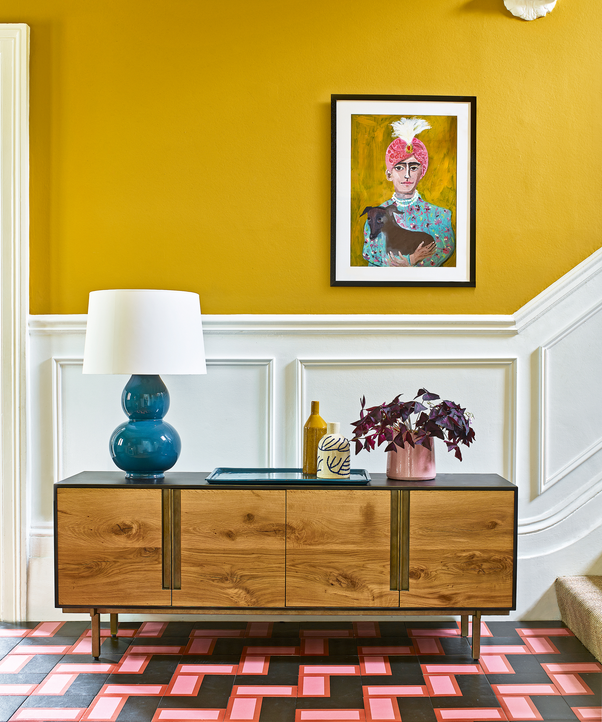
The colors you should never paint your hallway – and what really works

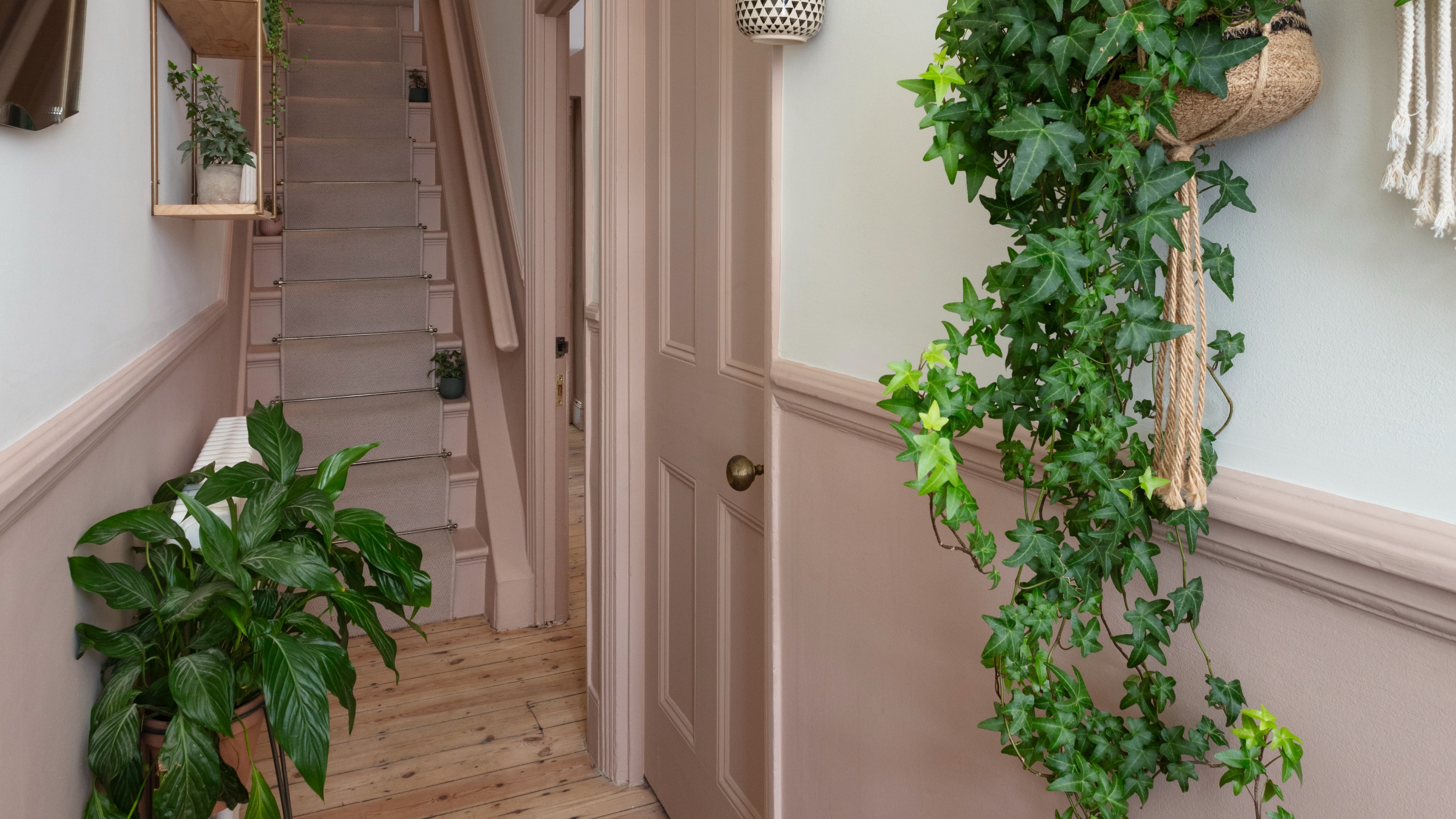
‘The colours that we decorate our hallway with should make us excited to be back’ – 16 hallway colour ideas to help you create a welcoming entryway
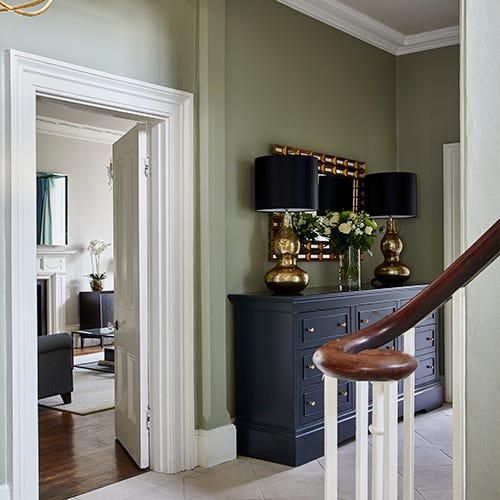
Sherwin Williams' Framboise Was the Perfect Color to Upgrade This Hallway

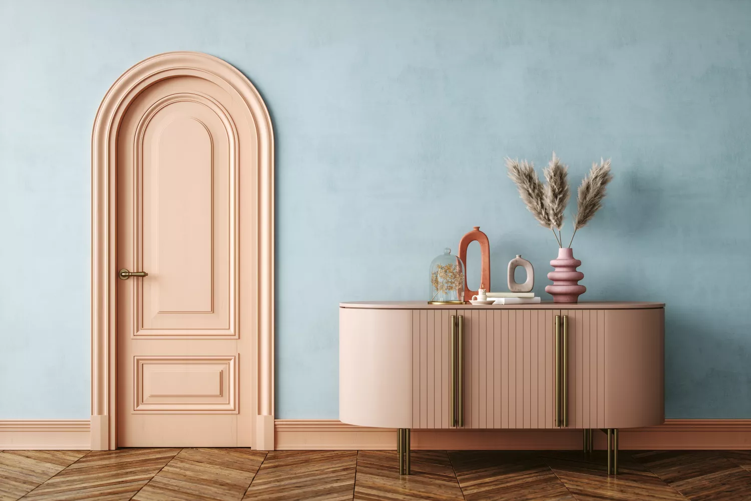
Interior Designers List the Worst Paint Colors for Your Entryway
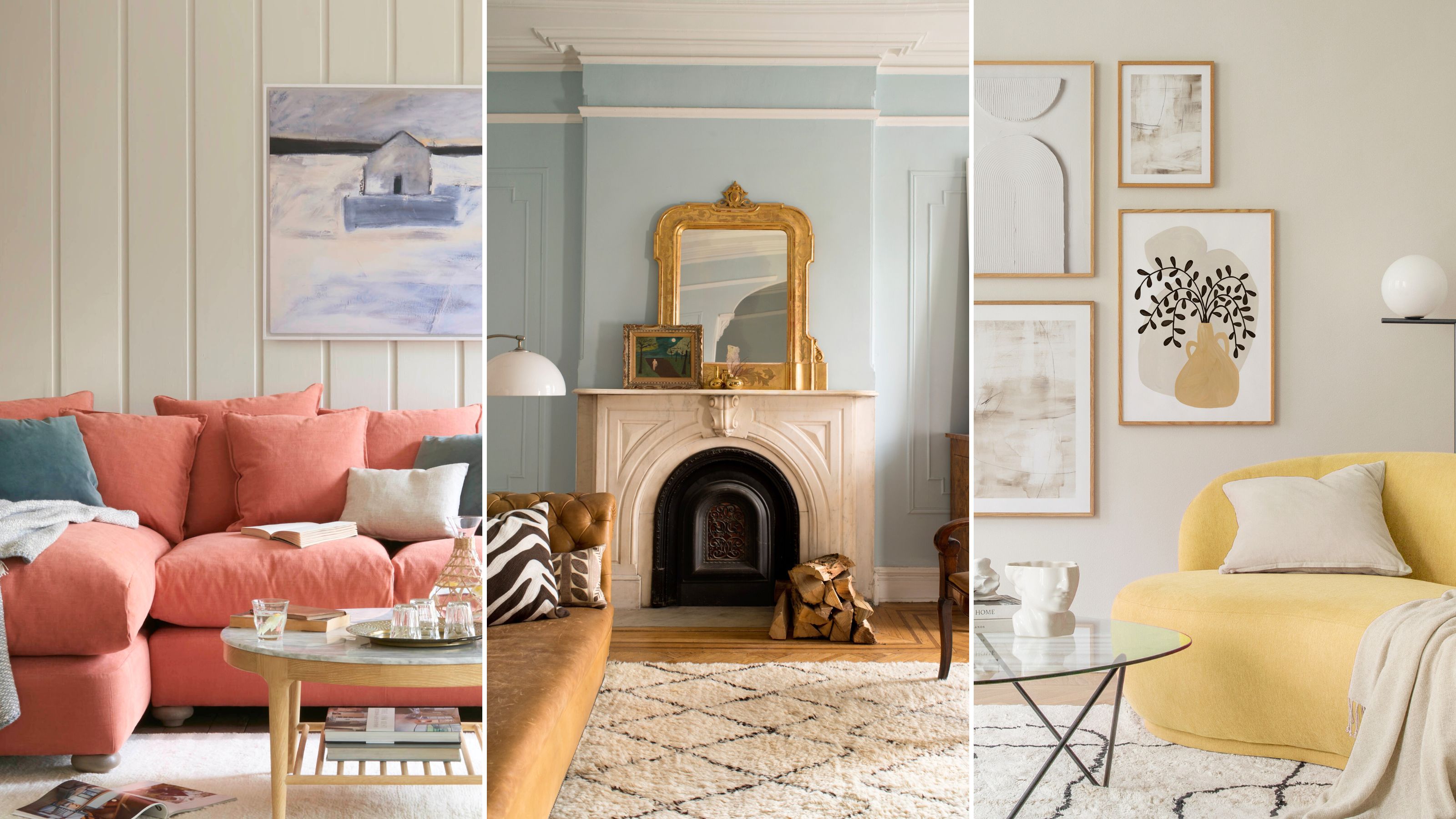
The paint colors to avoid in small living rooms — and what to use instead

You should never paint your hallway this colour, according to colour psychologists
6 Colors You Should Never Paint Your Entryway, According to Color Experts

Colors not to paint a mudroom – 5 hues to avoid in this high-traffic space

5 colors you should never paint a small room – designers warn us to steer clear of these hues, and what to pick instead
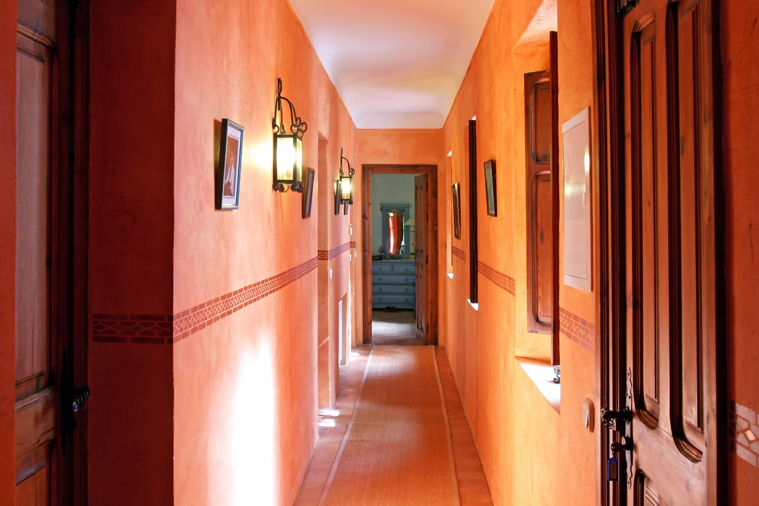
5 Colors You Should Never Paint Your Hallway, According to Designers

5 colors you should never paint your entryway – according to interior experts
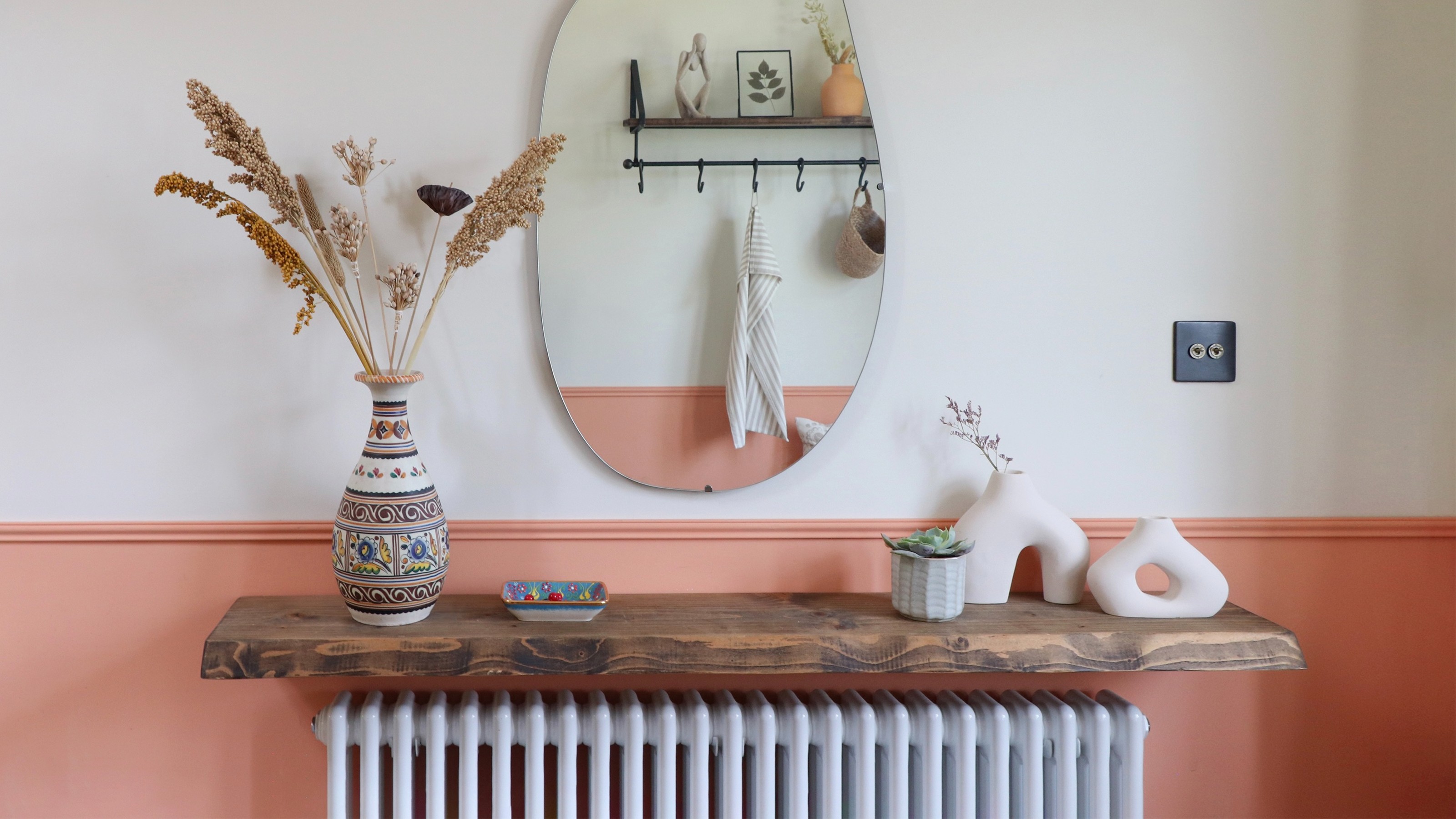
19 paint ideas for hallways – elevate your space with clever tricks and lustworthy shades
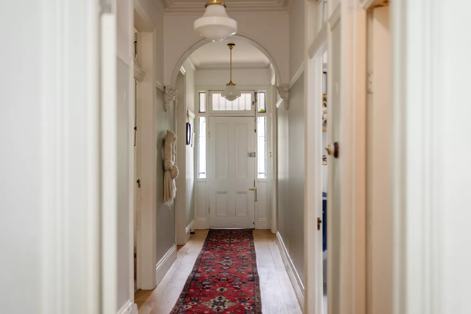
4 Paint Colors Designers Say You Should Never Use In A Hallway
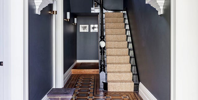
19 Elegant Hallway Paint Colors That Designers Swear By in 2025

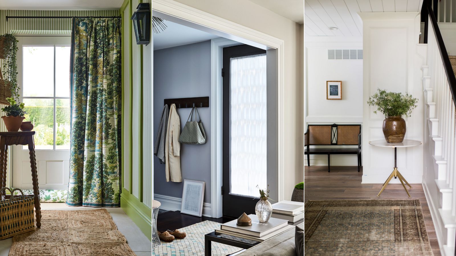
Best colors for small entryways – top designers swear by these 8 on-trend colors for the ultimate impact
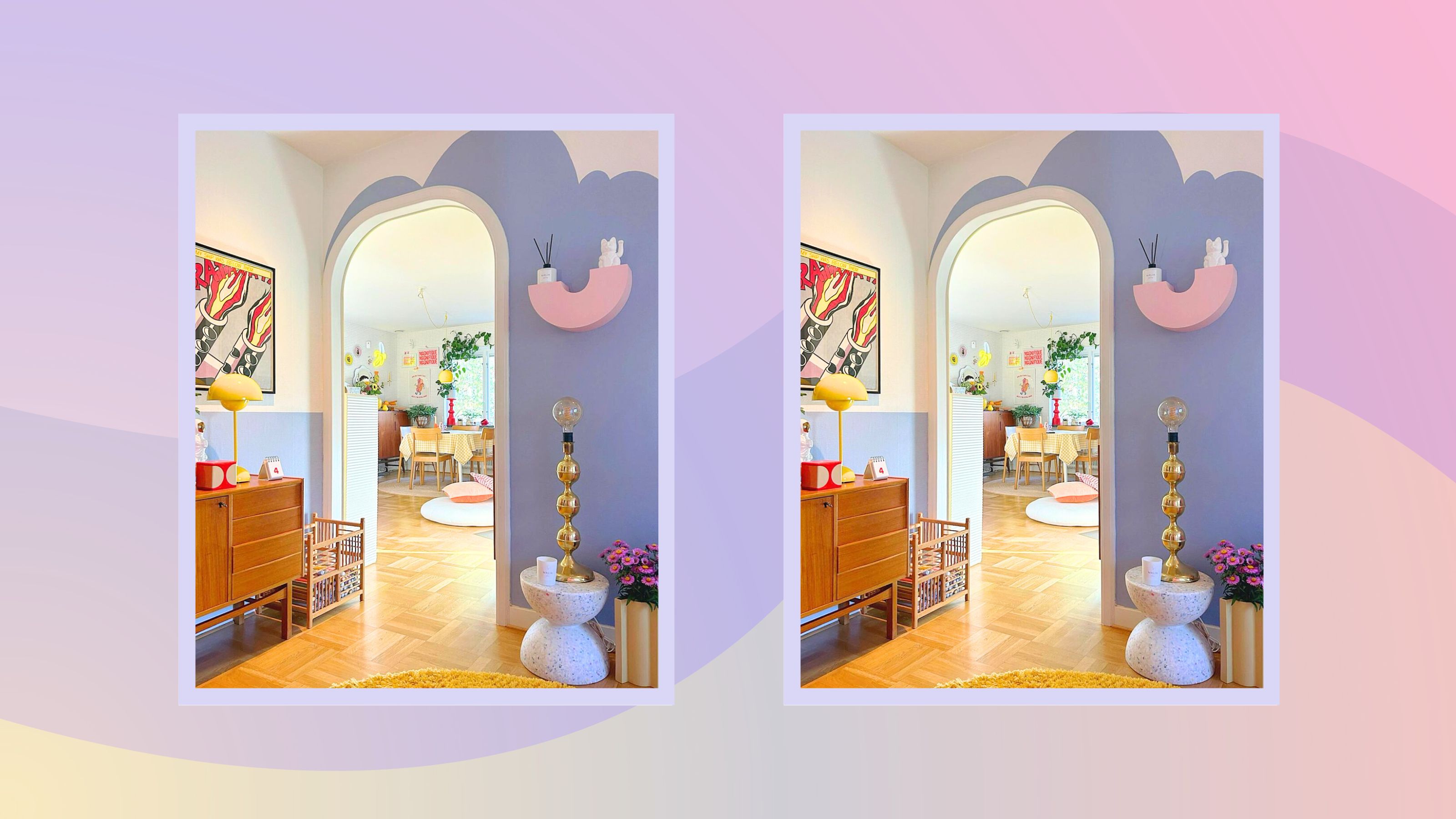
The best paint colors for small entryways — 7 shades design experts love
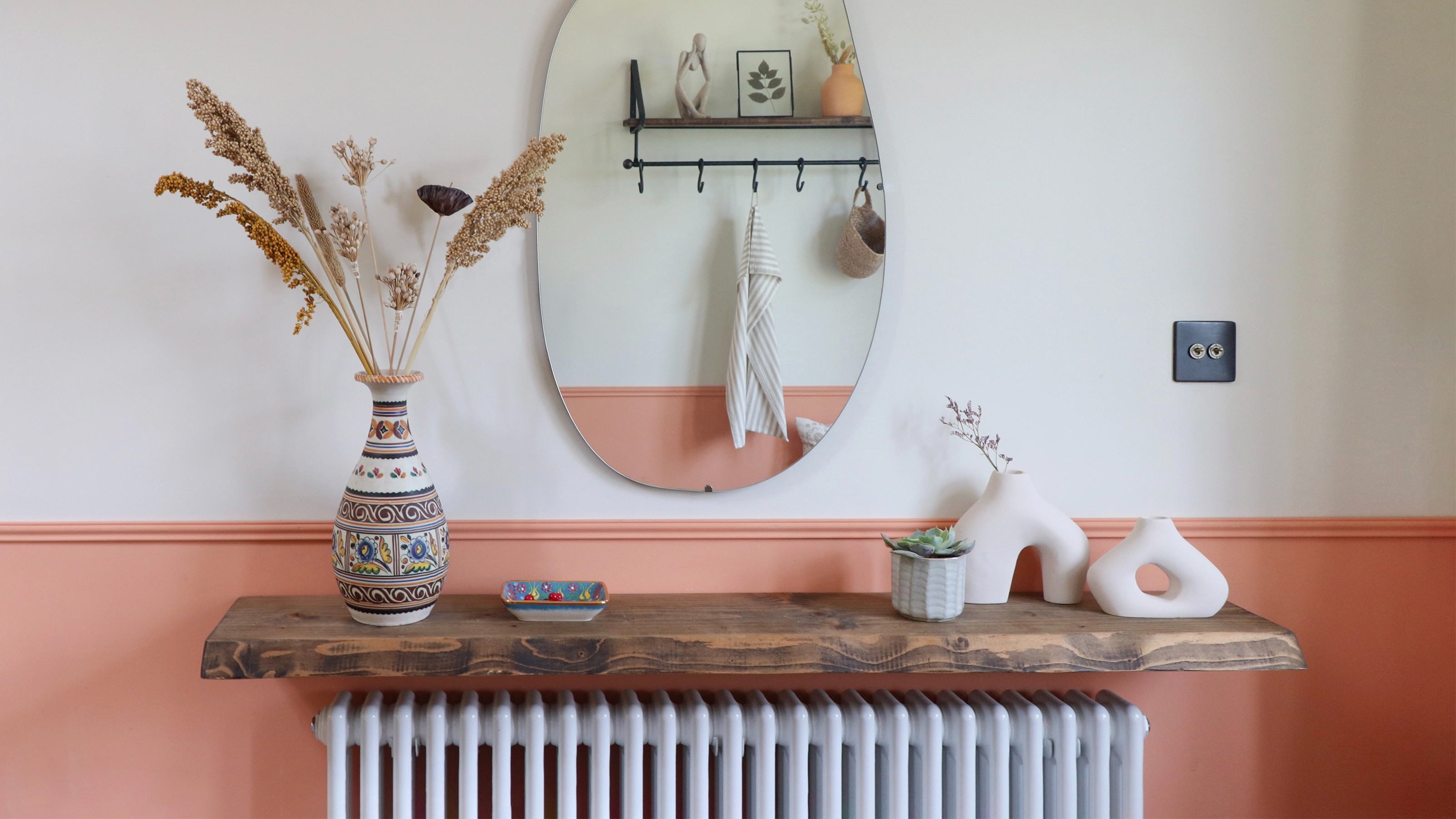
Hallway paint ideas to elevate your space with clever tricks
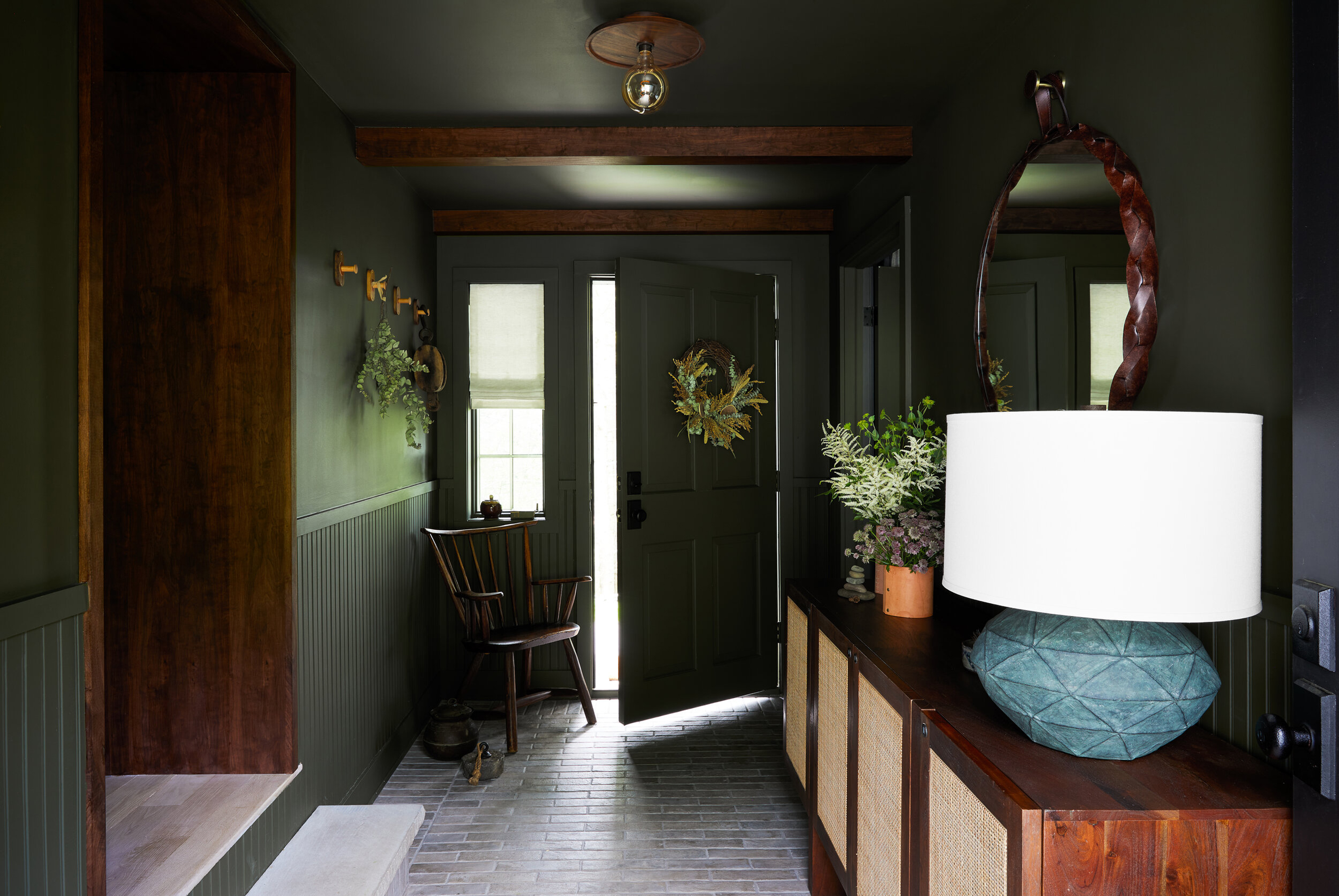
10 best colors for small entryways according to interior designers – shades to elevate your tiny space

5 best paint colors for a small entryways - designer-approved palettes
20 Hallway Paint Colors That Bring This Space to Life