1/5
5 best paint colors for a small entryways - designer-approved palettes
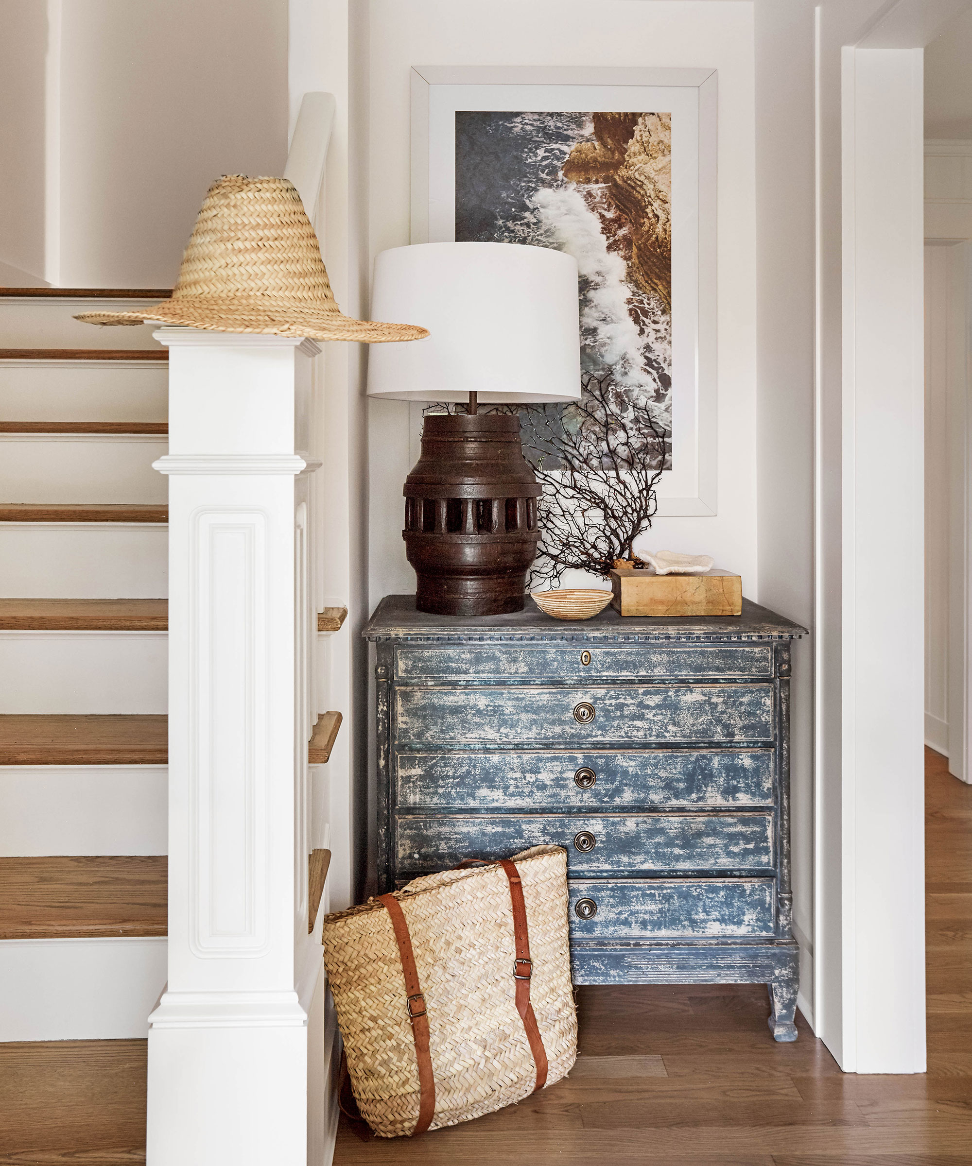
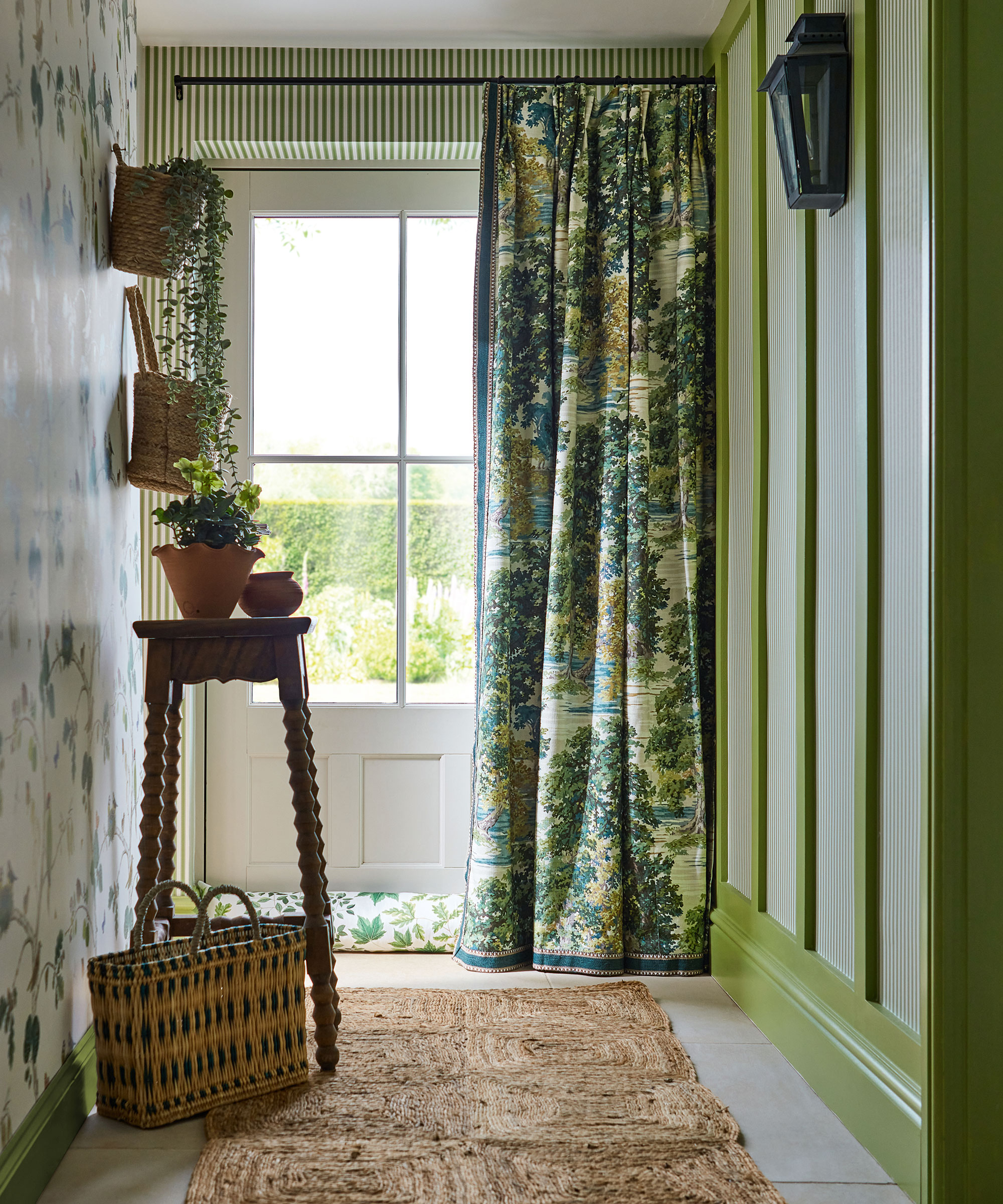
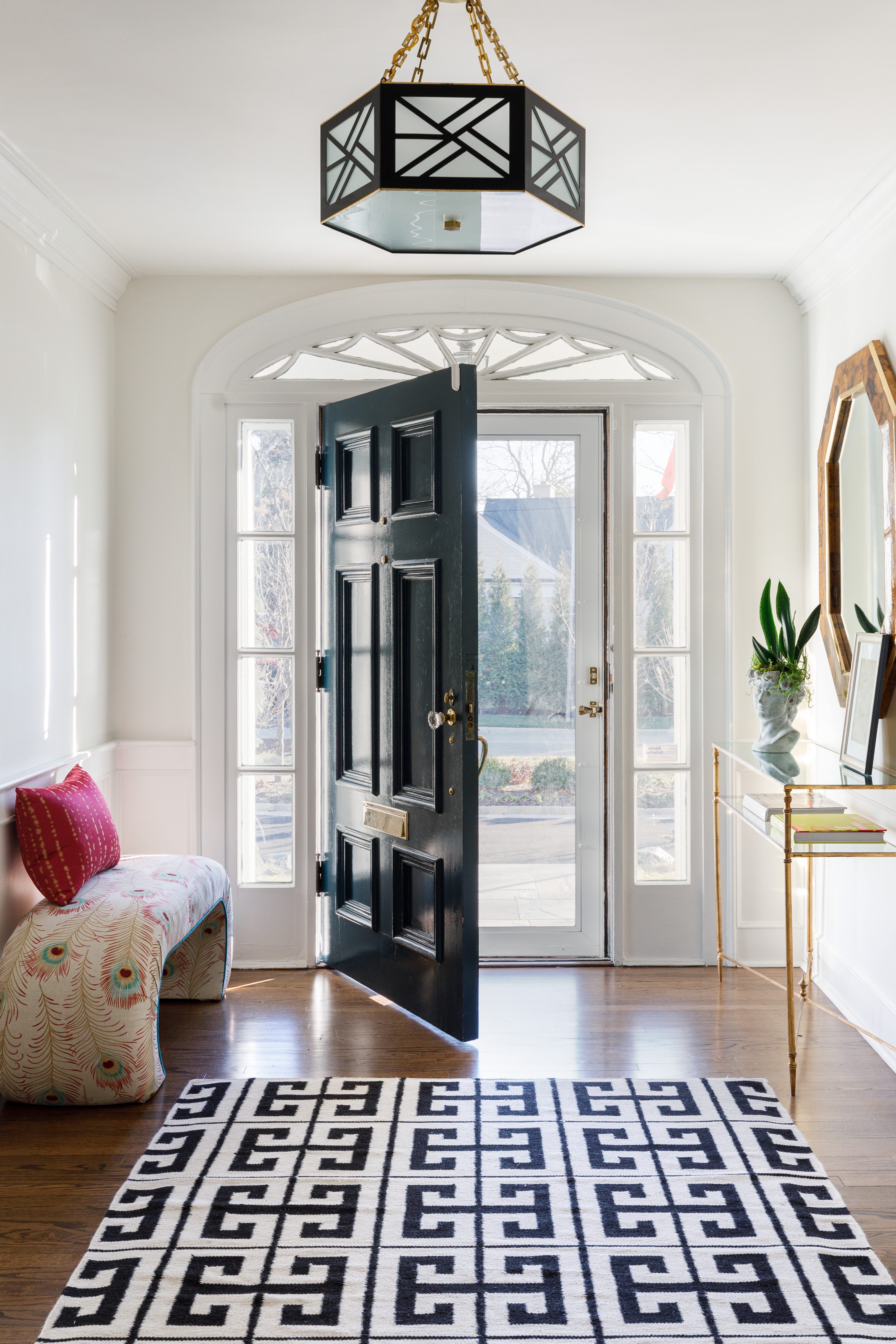
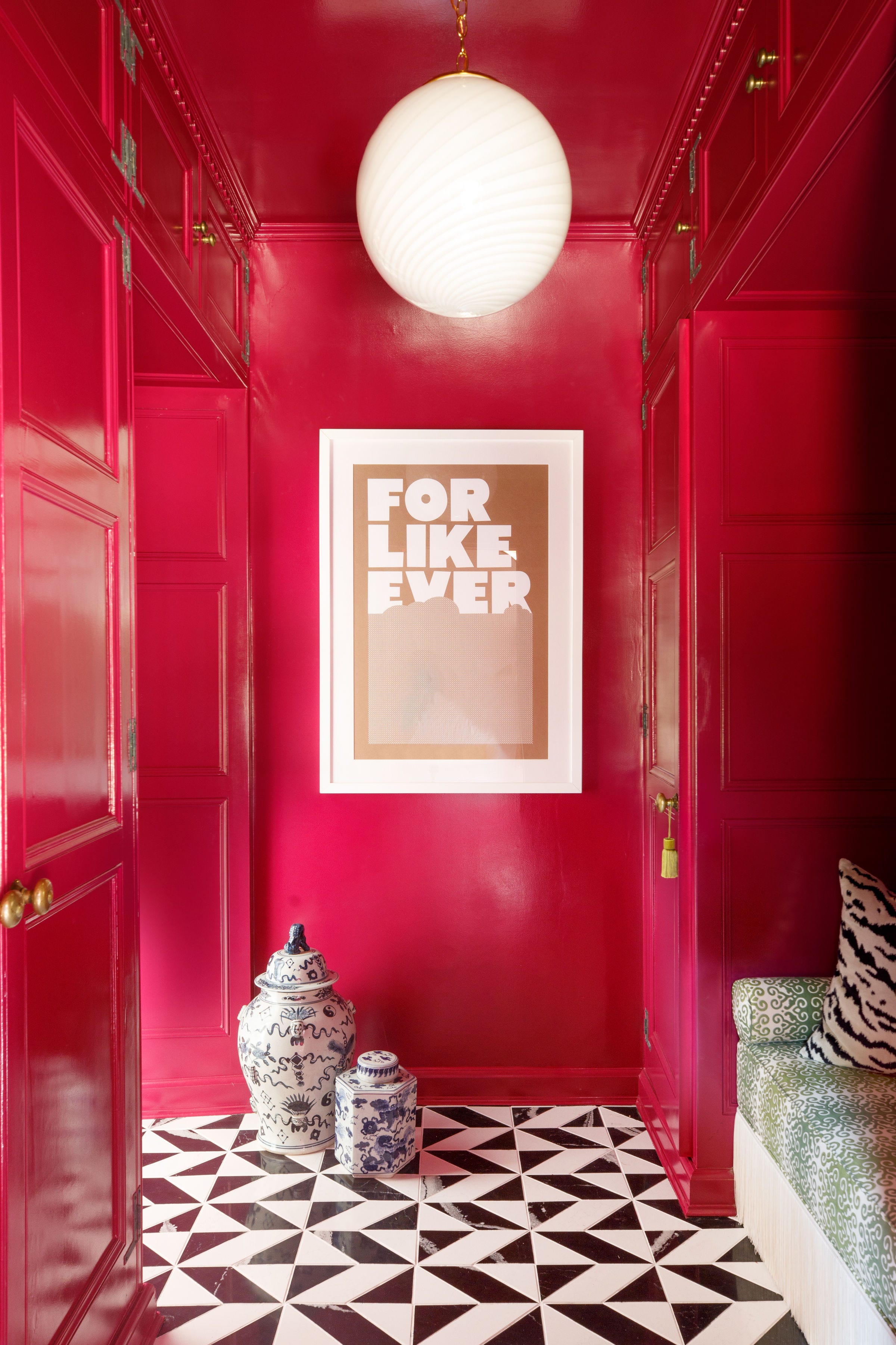
The entryway is the first impression a home makes, and its design, especially in small spaces, requires careful consideration. Designers suggest that even small entryways can benefit from bold colors to make a statement, or minimalist approaches to highlight adjoining rooms. This article explores five designer-approved paint colors that optimize the impact of a well-designed entryway, balancing aesthetic appeal with practical considerations.
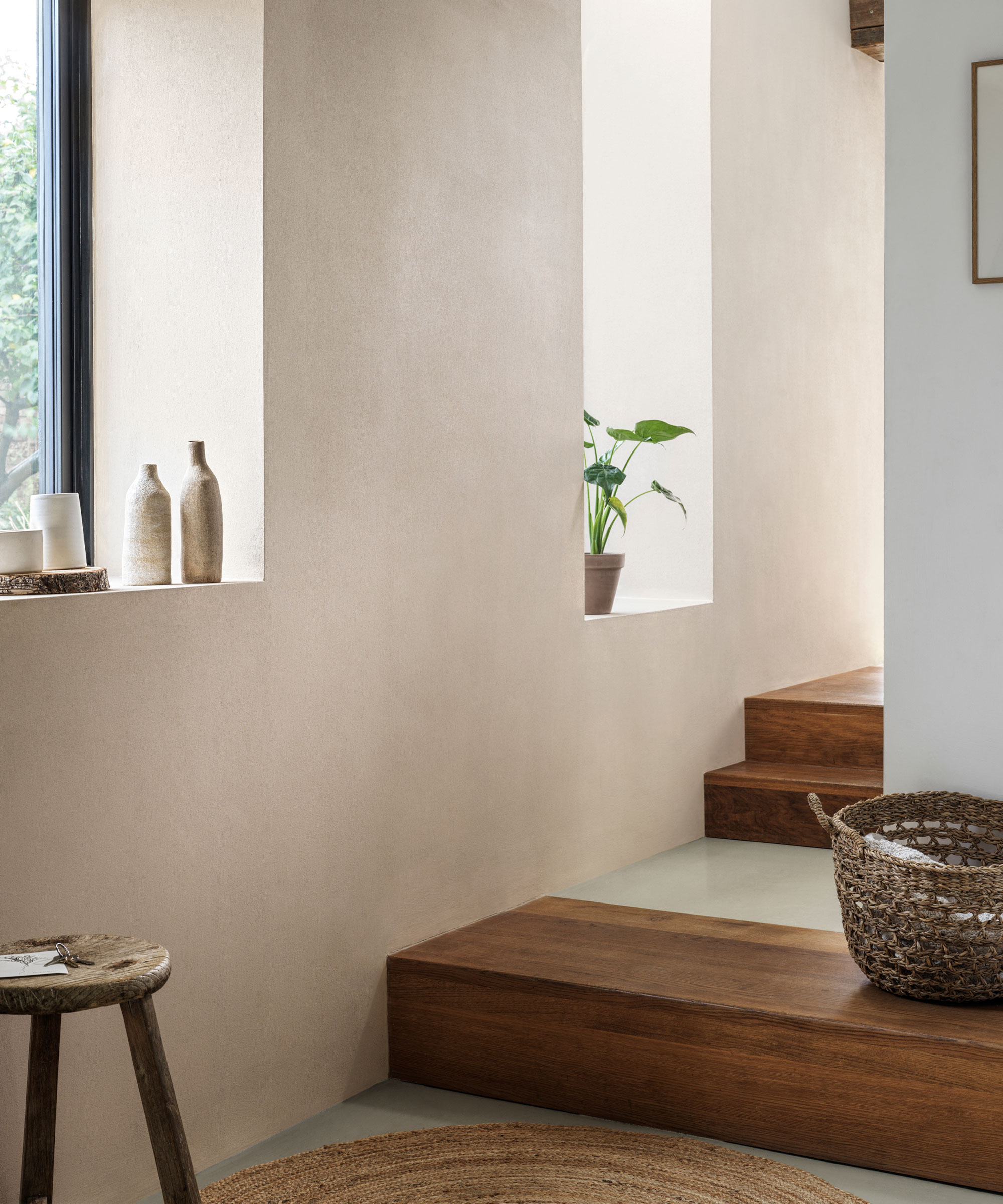
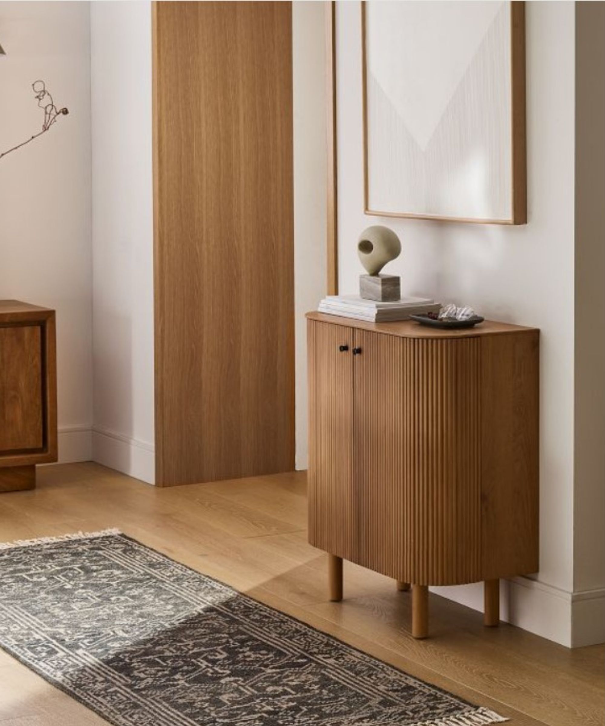
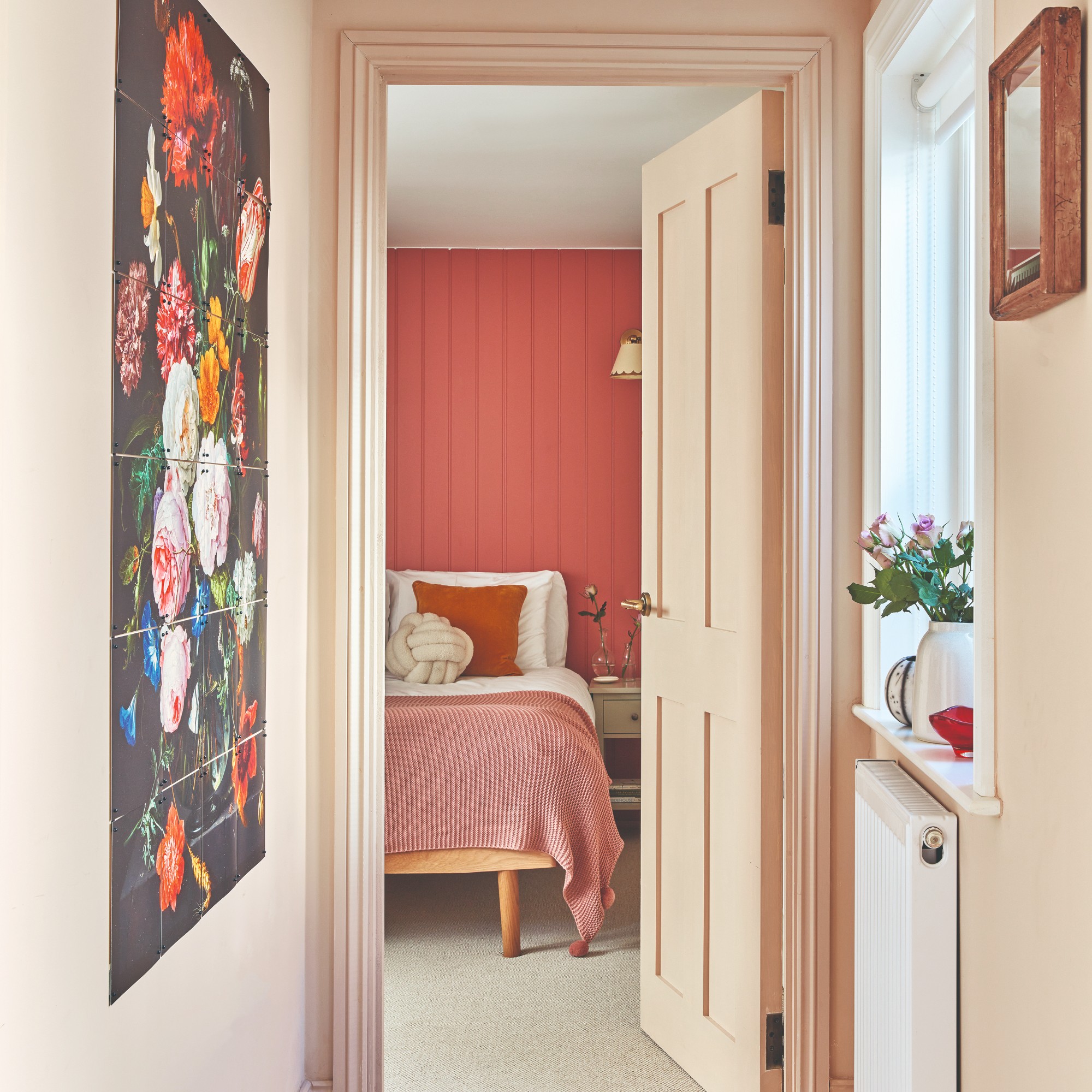
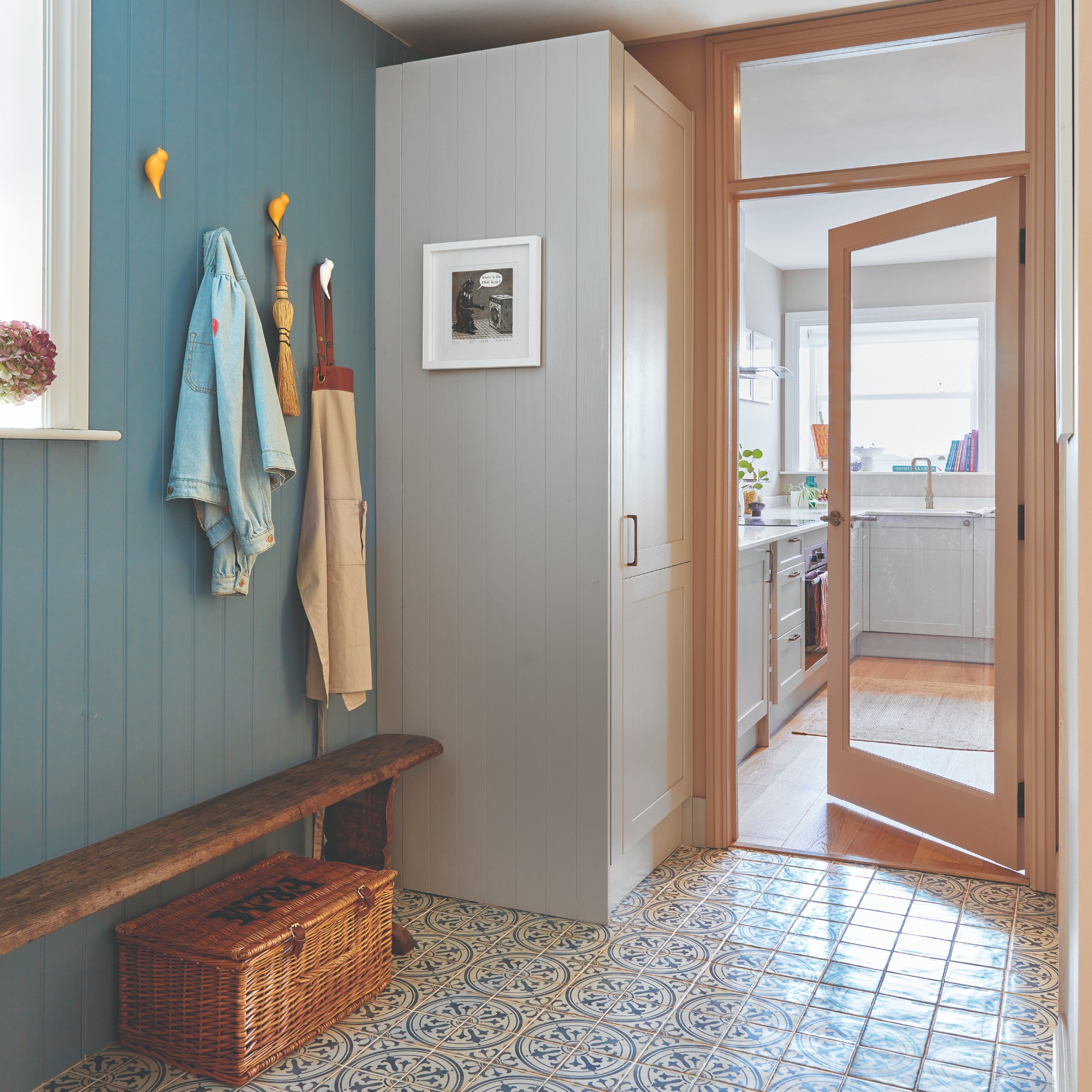
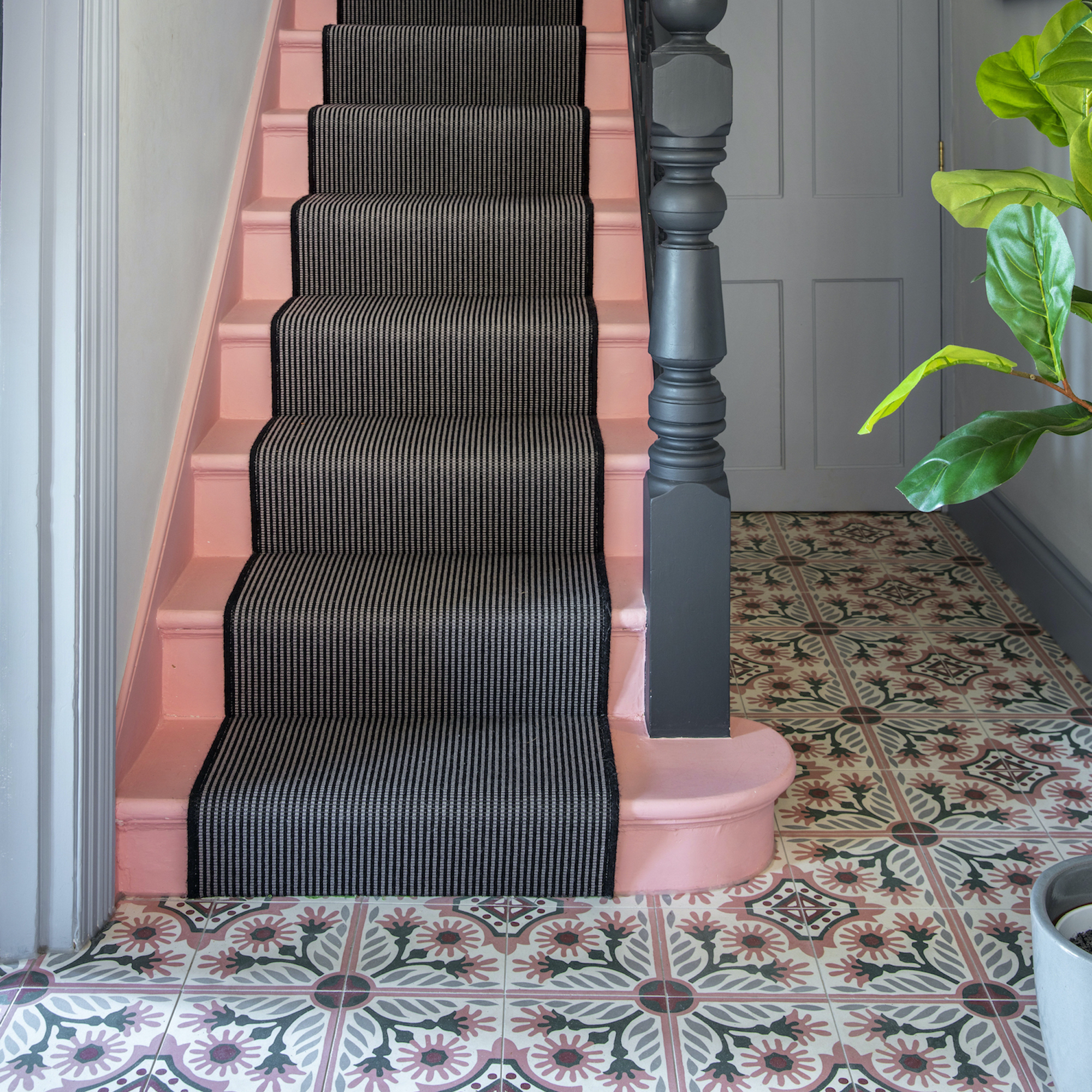
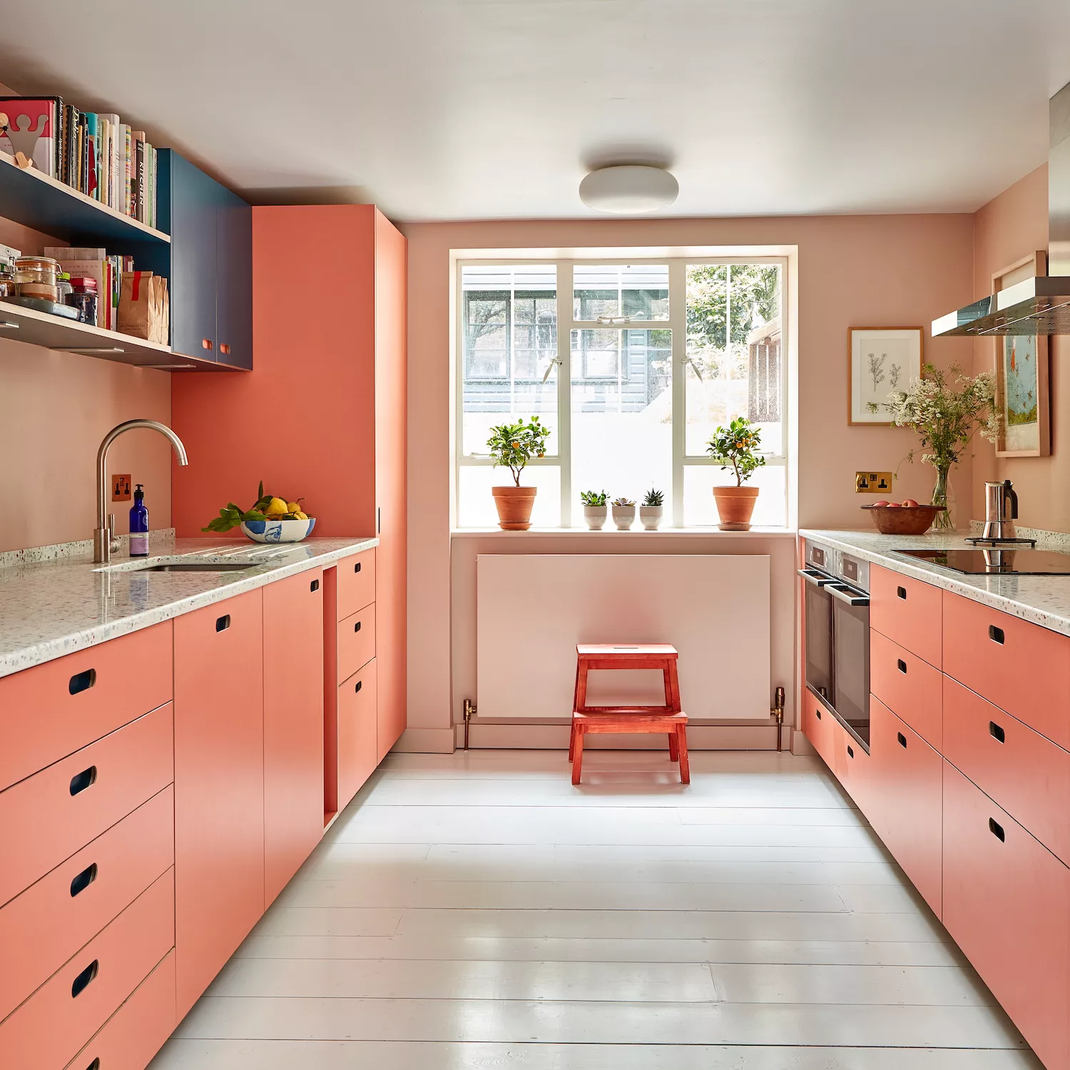
One recommendation for small entryways is JH Wall Paints' Color 165. This warm terracotta shade, described as an earthy tone, acts as a neutral and offers a cozy, inviting atmosphere, particularly suitable for fall. Jacqueline Gonçalves of Moksa Studio highlights its visual impact, noting that the leather limewash finish is durable, making it practical for high-traffic areas prone to scuffs from shoes and moving items. This choice demonstrates how a warm, adaptable color can create a sense of consistency and withstand daily wear.
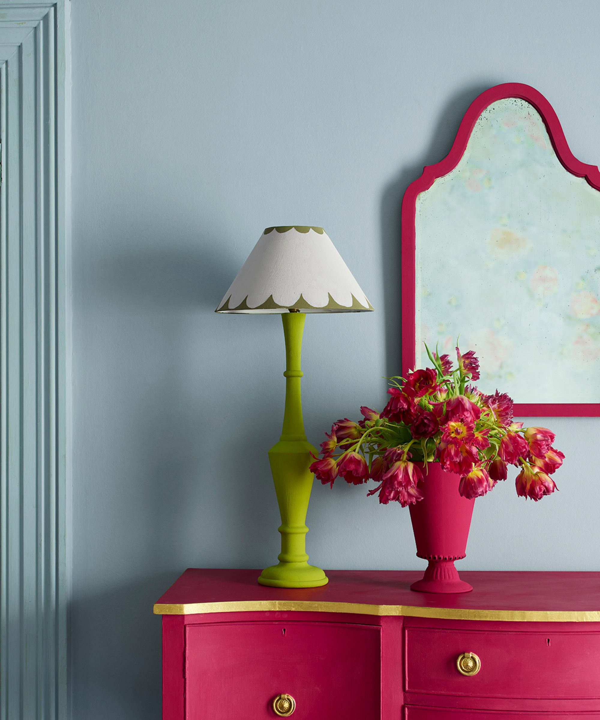
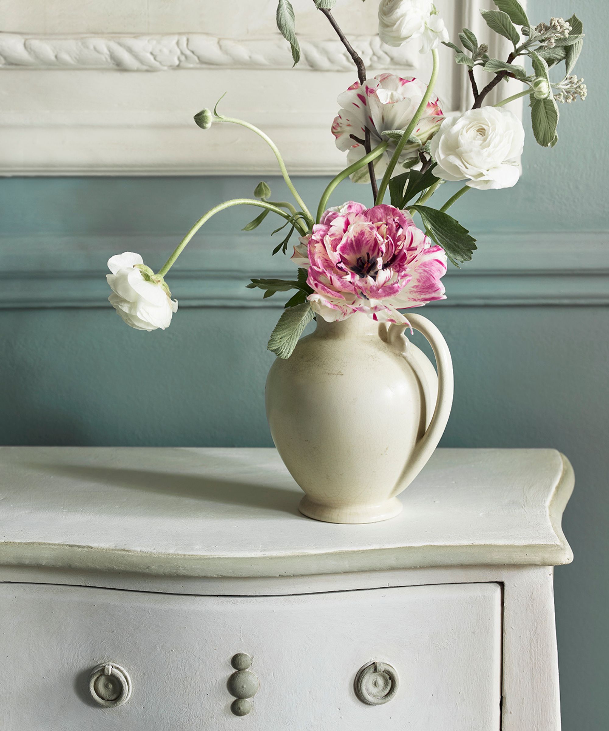
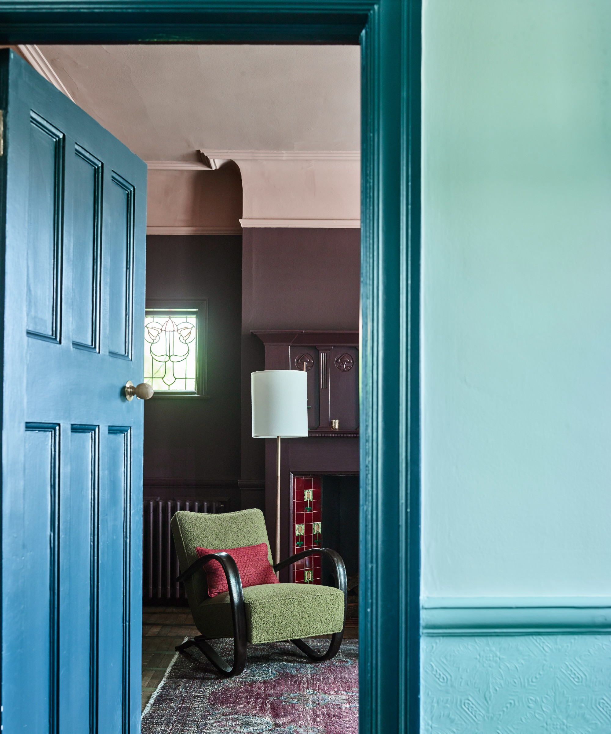
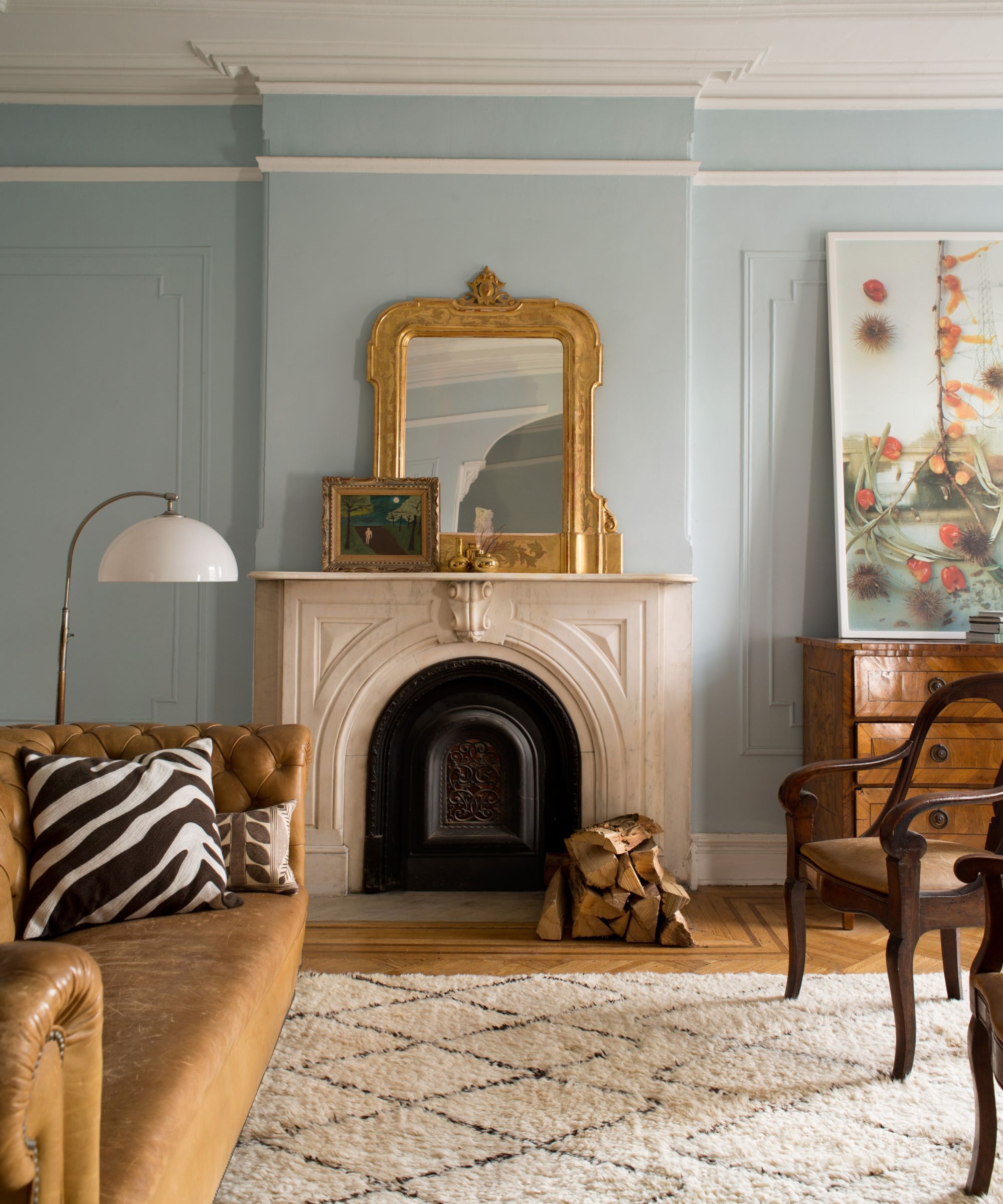
Farrow and Ball's Oval Room Blue is another suggested color, challenging the common belief that small spaces should avoid color. Patrick O'Donnell, Brand Ambassador for Farrow and Ball, emphasizes that mid-toned blues can transform narrow entryways, which often suffer from limited light and space, into areas with distinct personalities. Oval Room Blue, with its hints of green and black, provides depth and a calming, welcoming feel without appearing chilly, effectively maximizing the character of a small entrance.
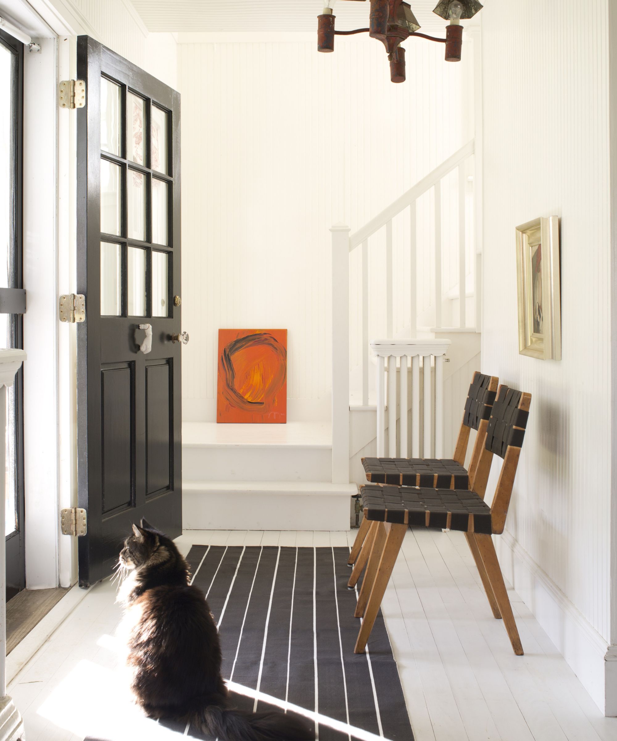
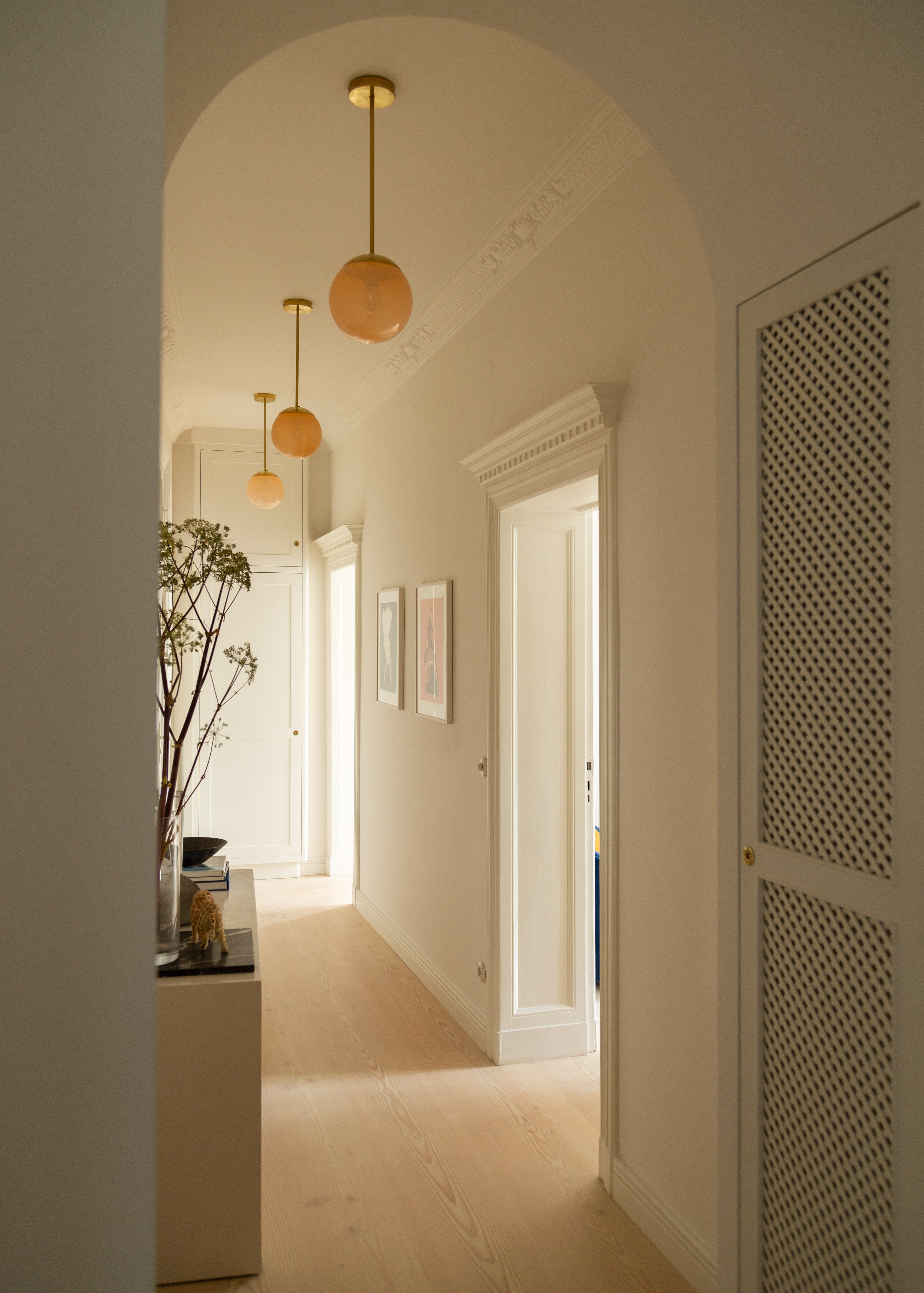
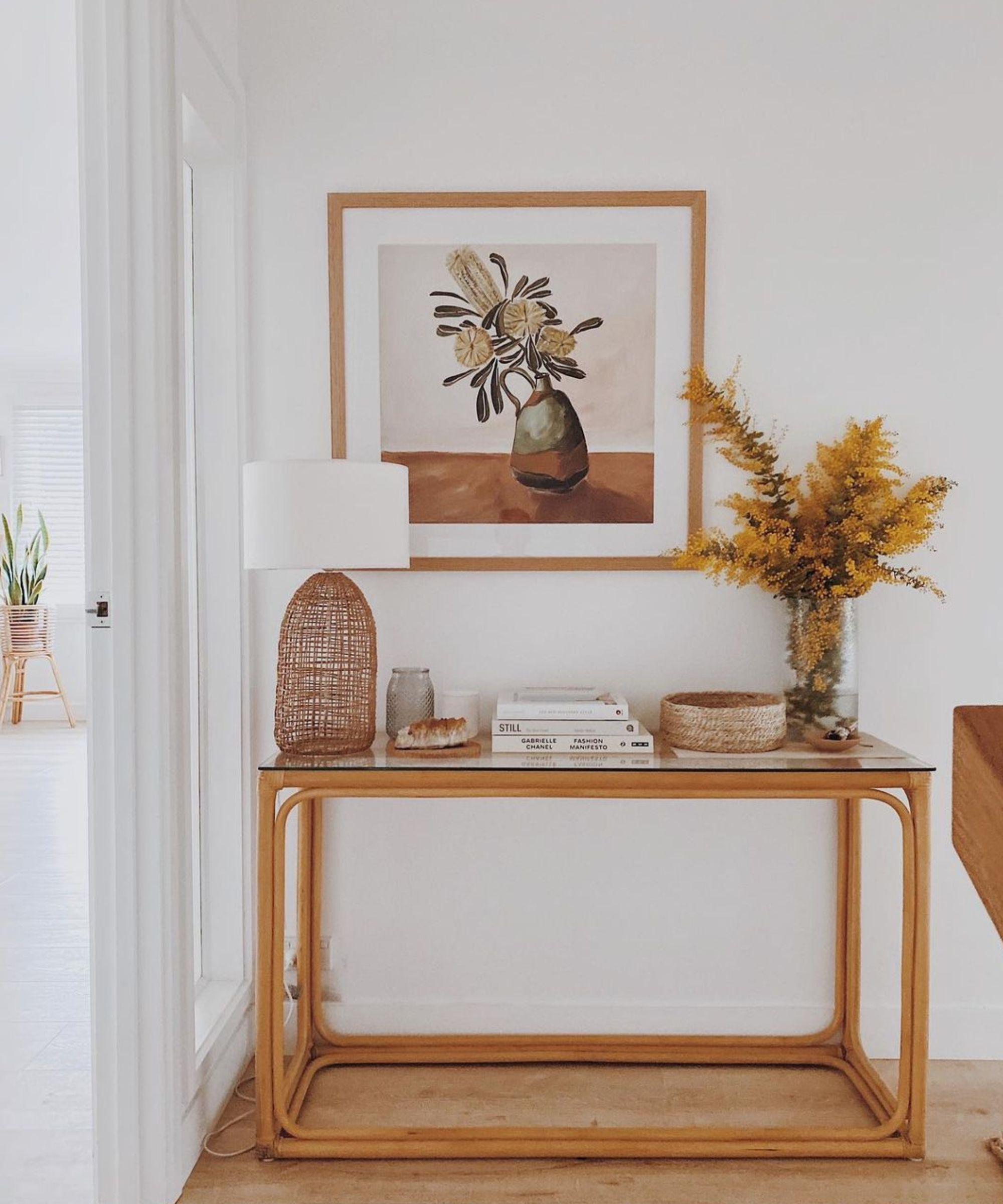
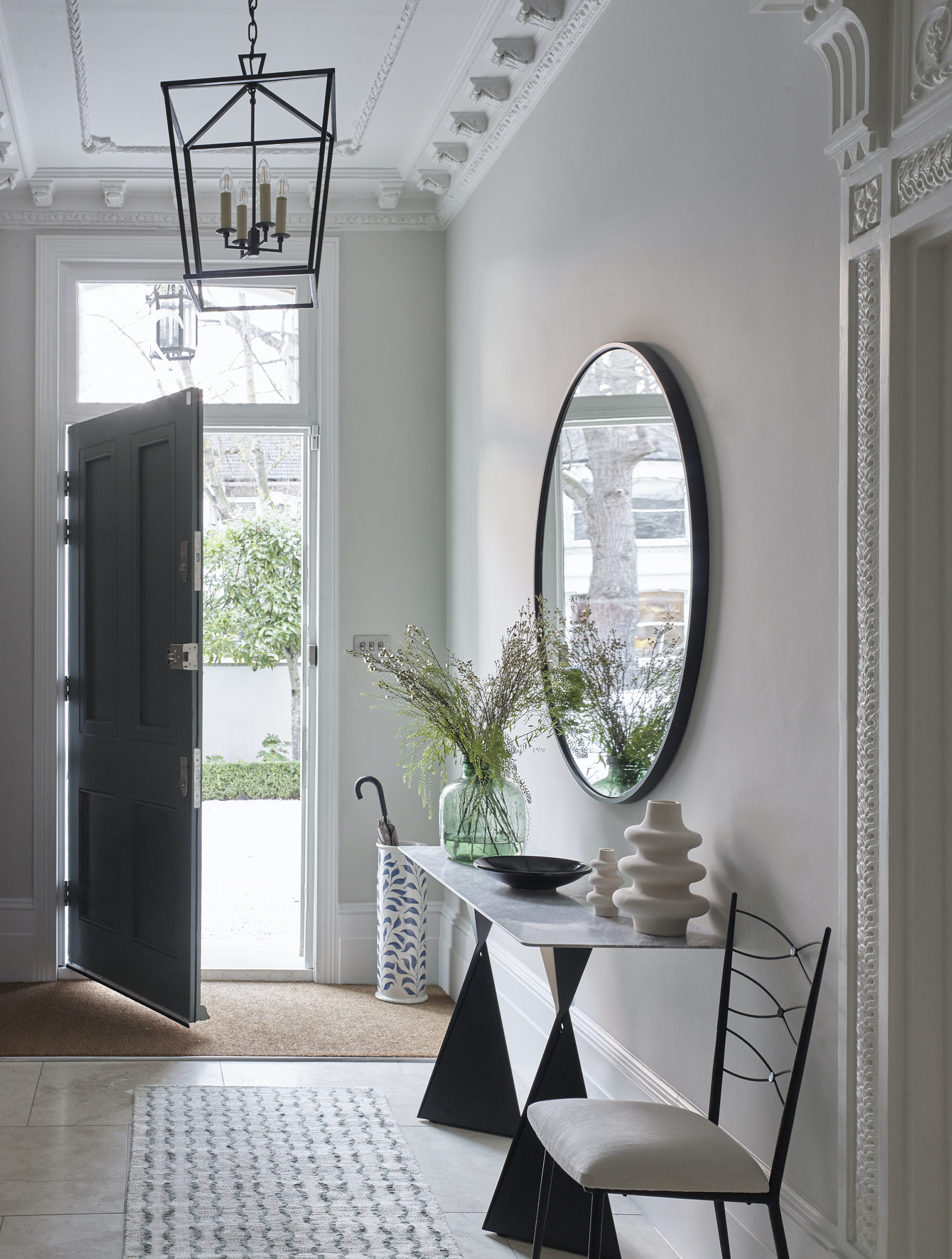
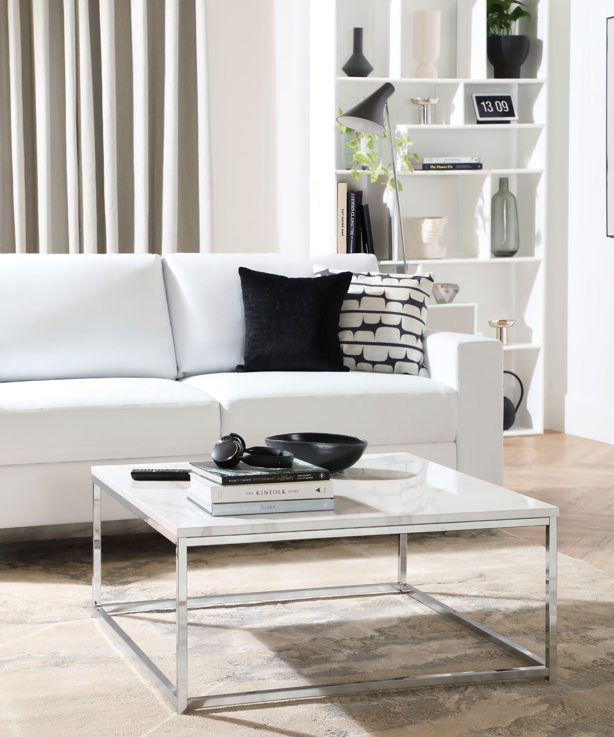
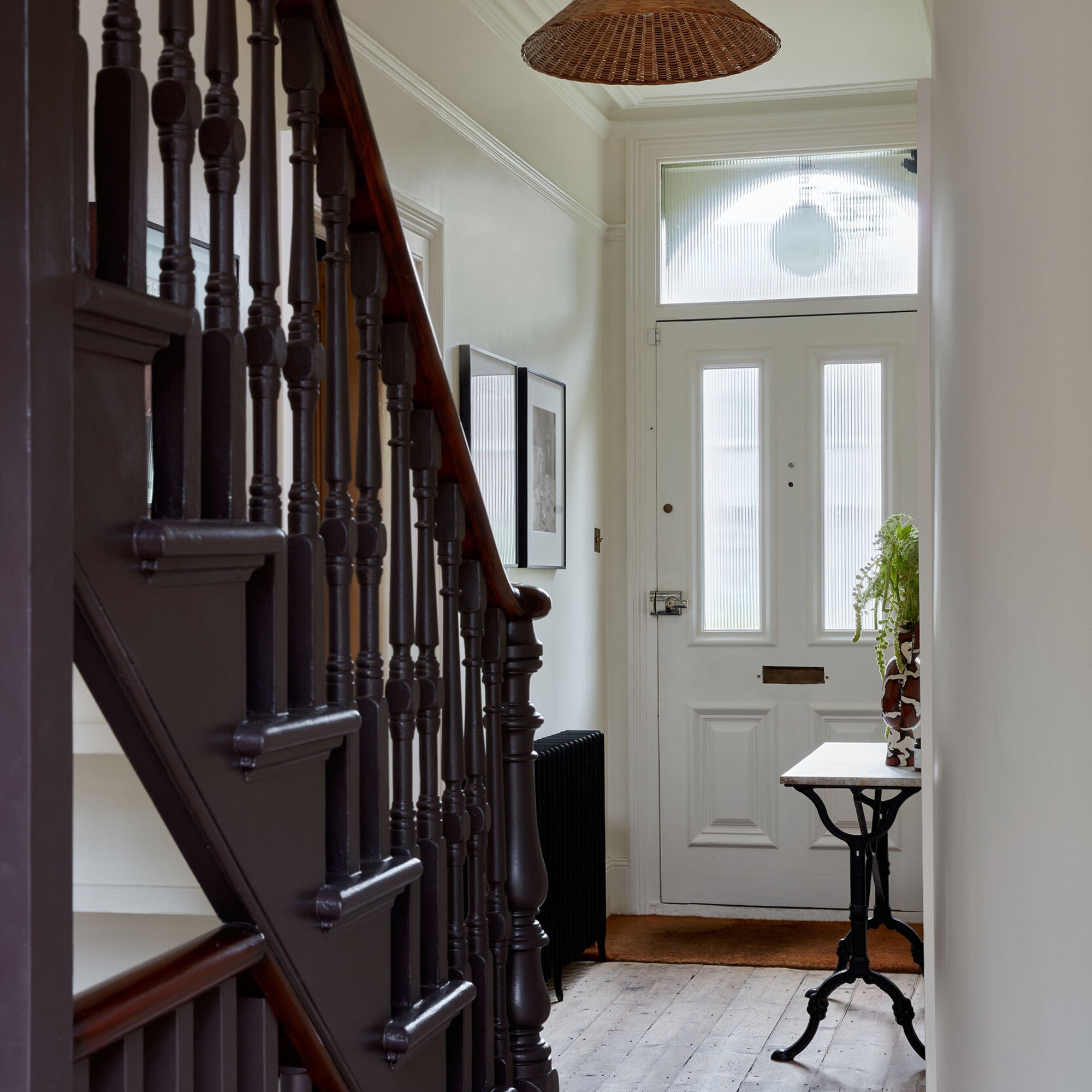
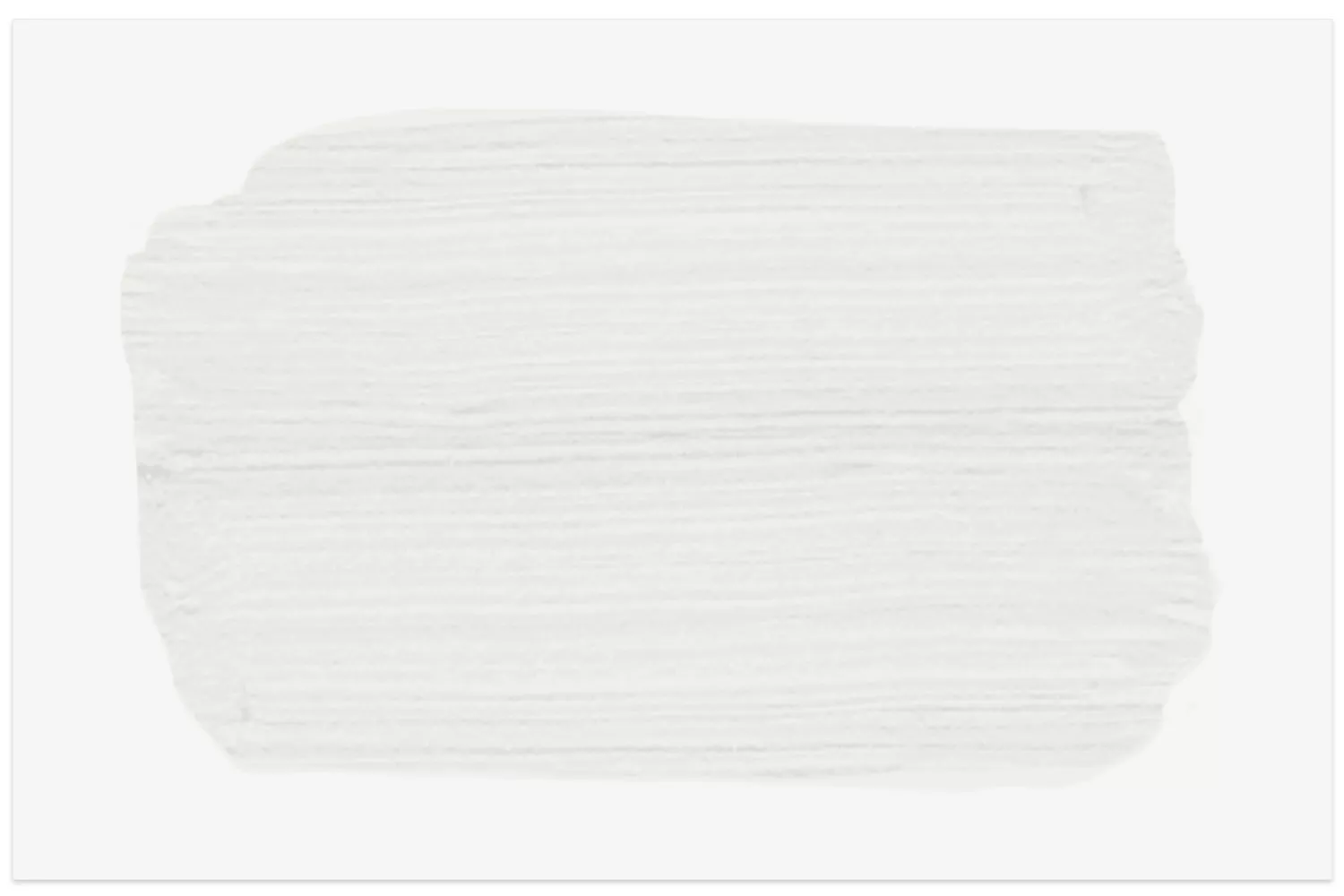
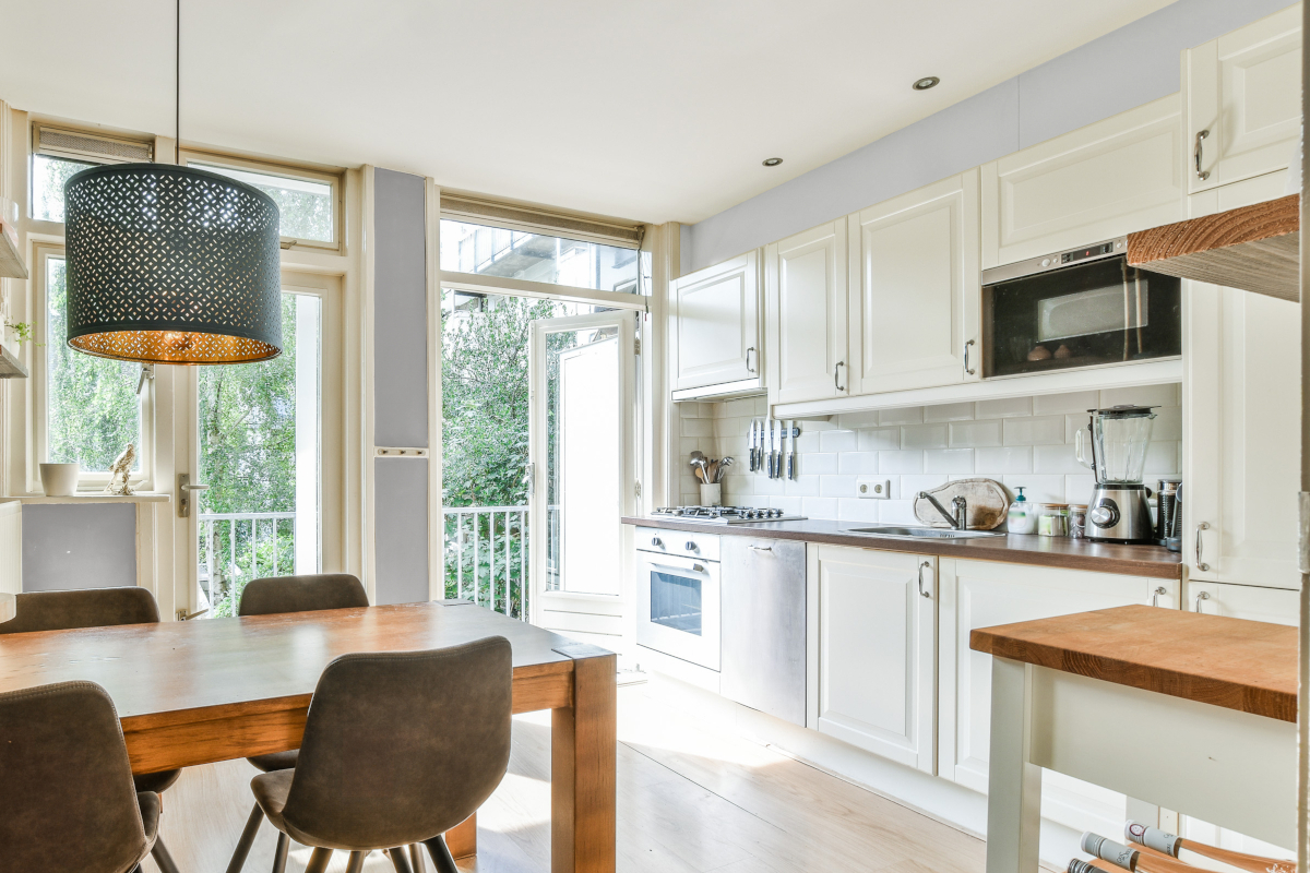
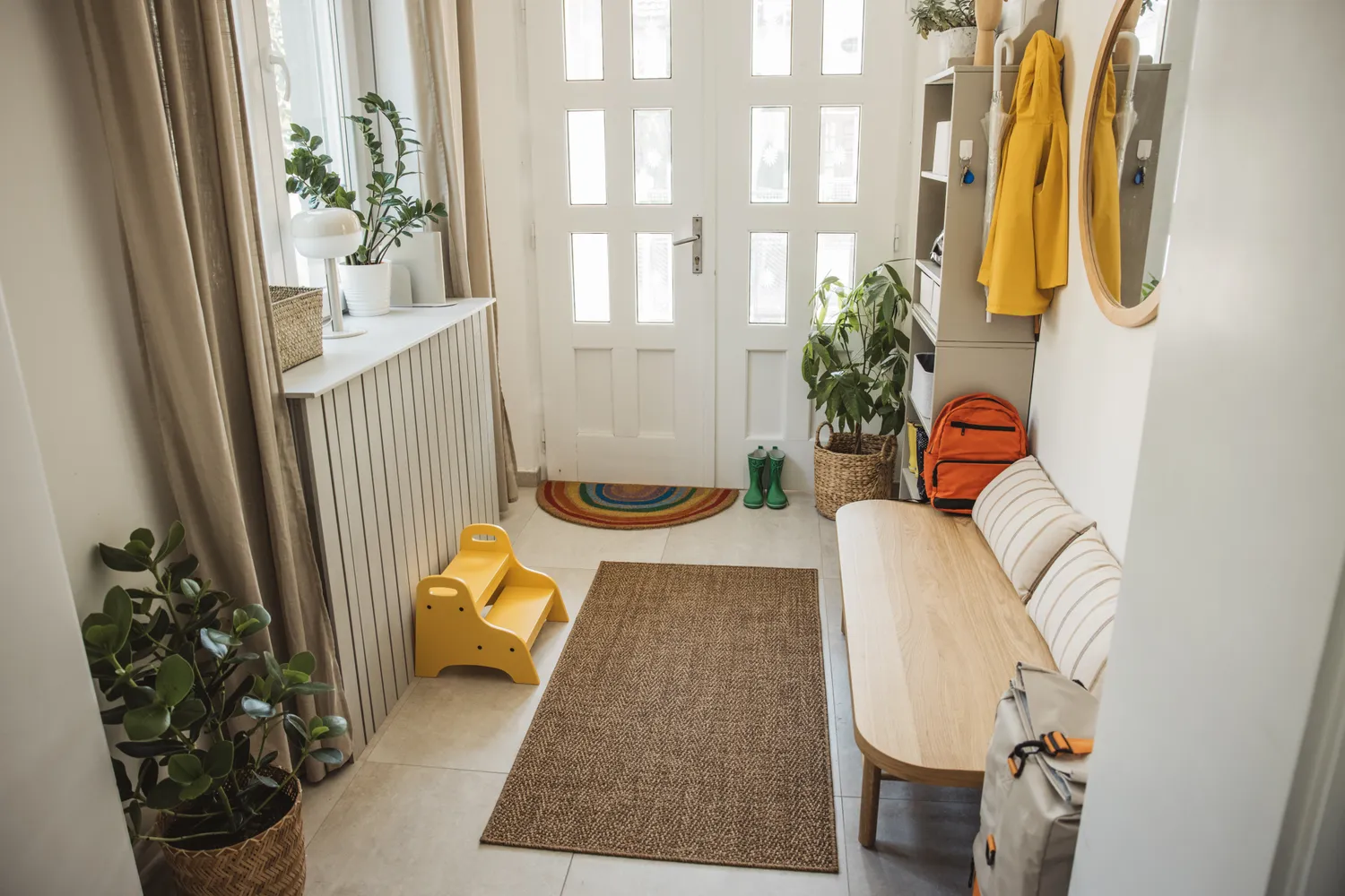
Conversely, O'Donnell also suggests Farrow and Ball's Pointing for those aiming for a light and expansive feel. By applying this warm neutral across walls, ceilings, and woodwork, even the narrowest entryways can appear wider and taller. Pointing contains subtle yellow or red undertones that introduce softness and warmth, reflecting light to create a brighter and more elongated space. This approach effectively uses light colors to counteract spatial limitations and create an airy atmosphere.
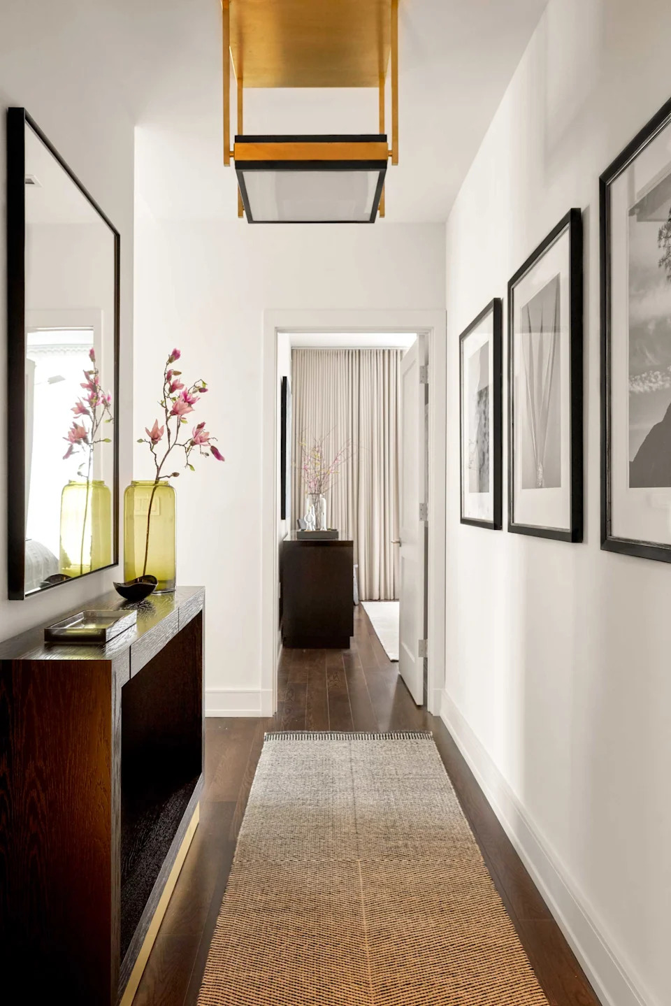
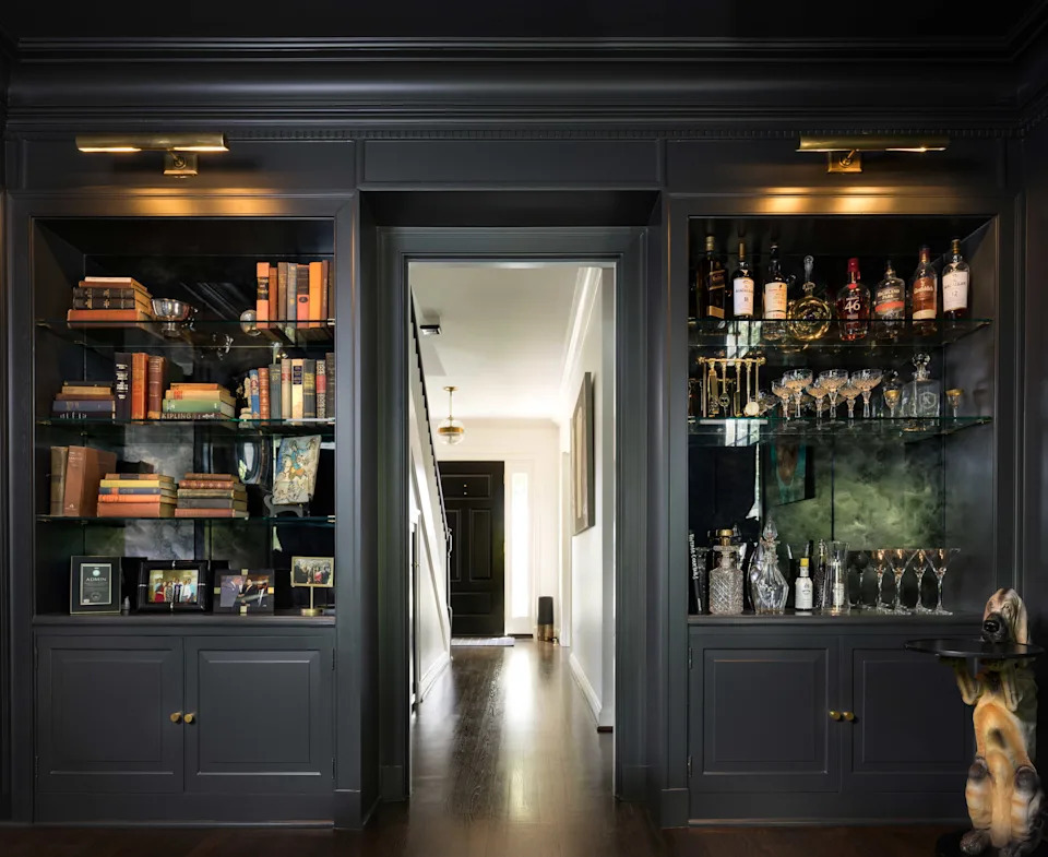
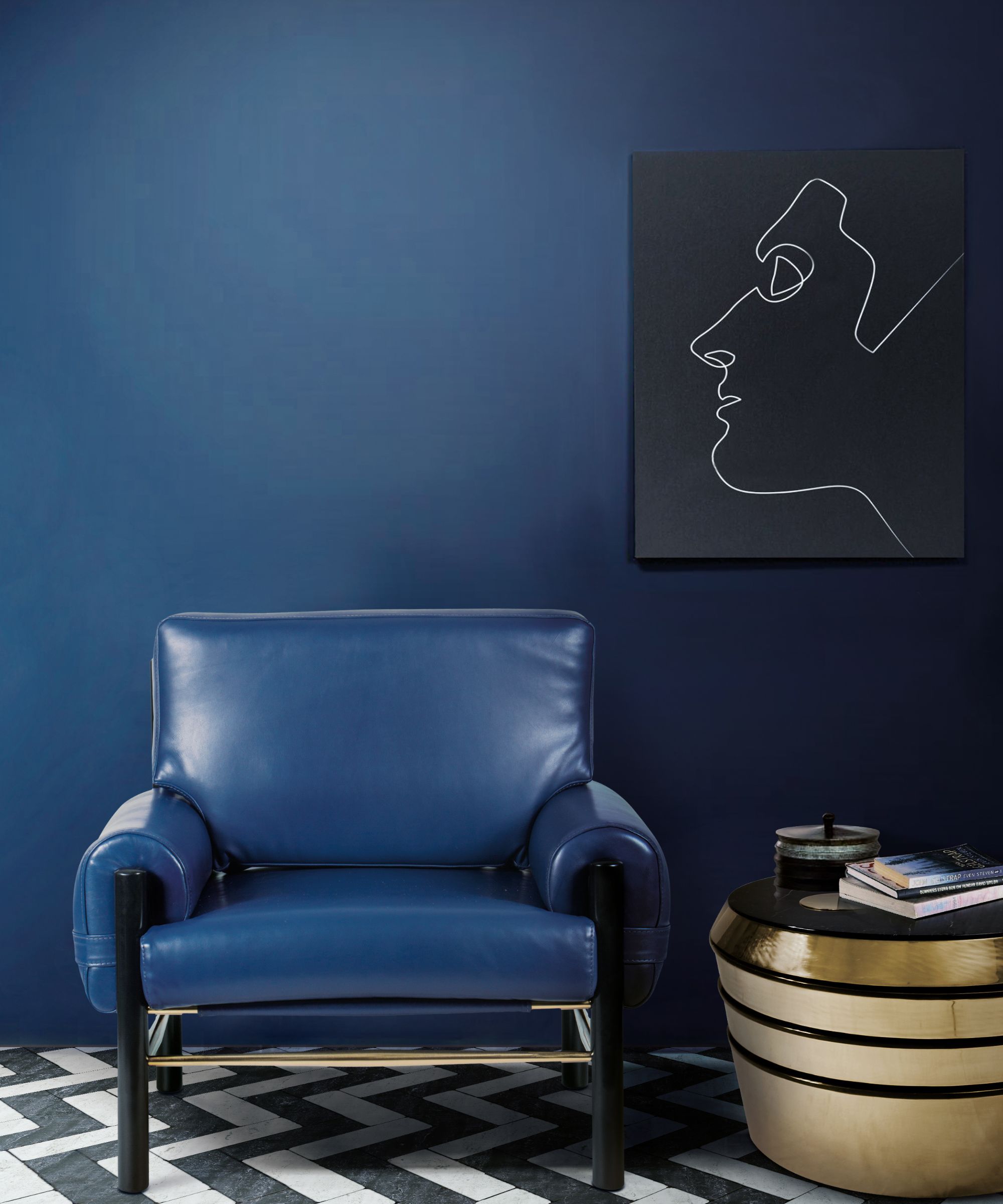
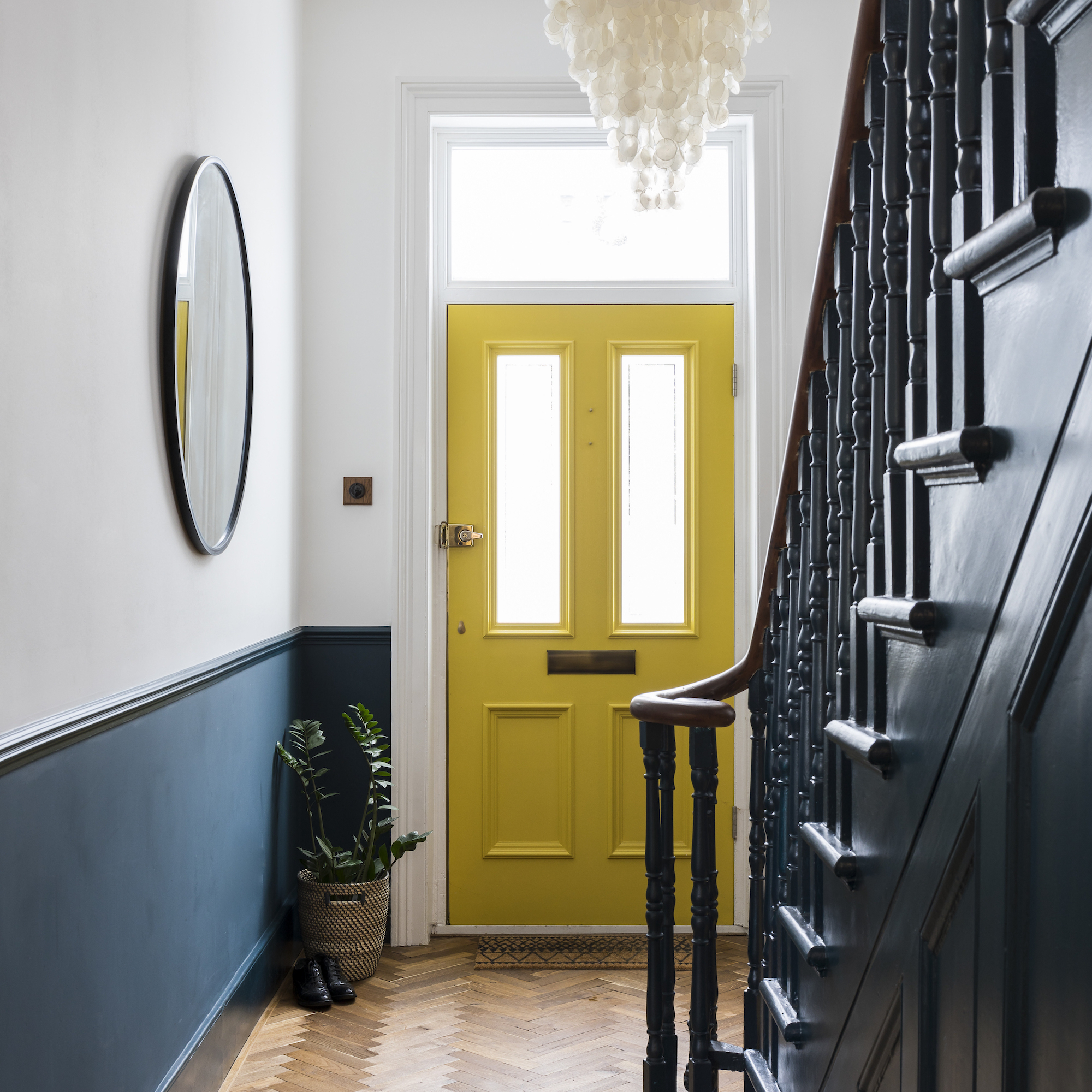
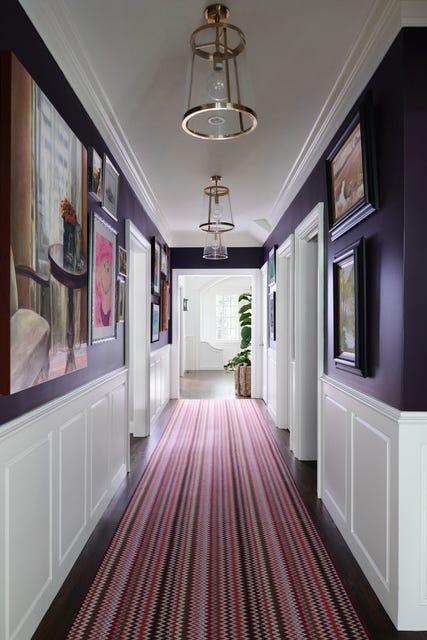

For a dramatic and moody aesthetic, Farrow and Ball's Hague Blue is recommended. O'Donnell encourages homeowners to embrace dark shades, explaining that a deep color like Hague Blue in Dead Flat finish, far from being enclosing, leverages the natural light limitations often found in entryways. This choice creates a spectacular dramatic impression and serves as an excellent backdrop for art and photographs, adding a sophisticated touch to the entrance.
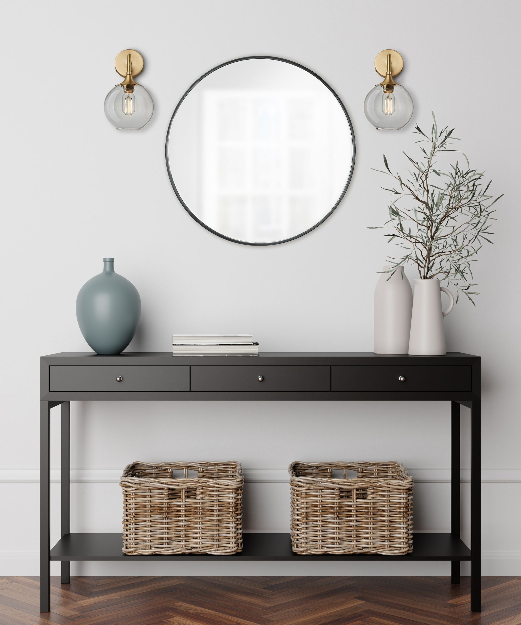
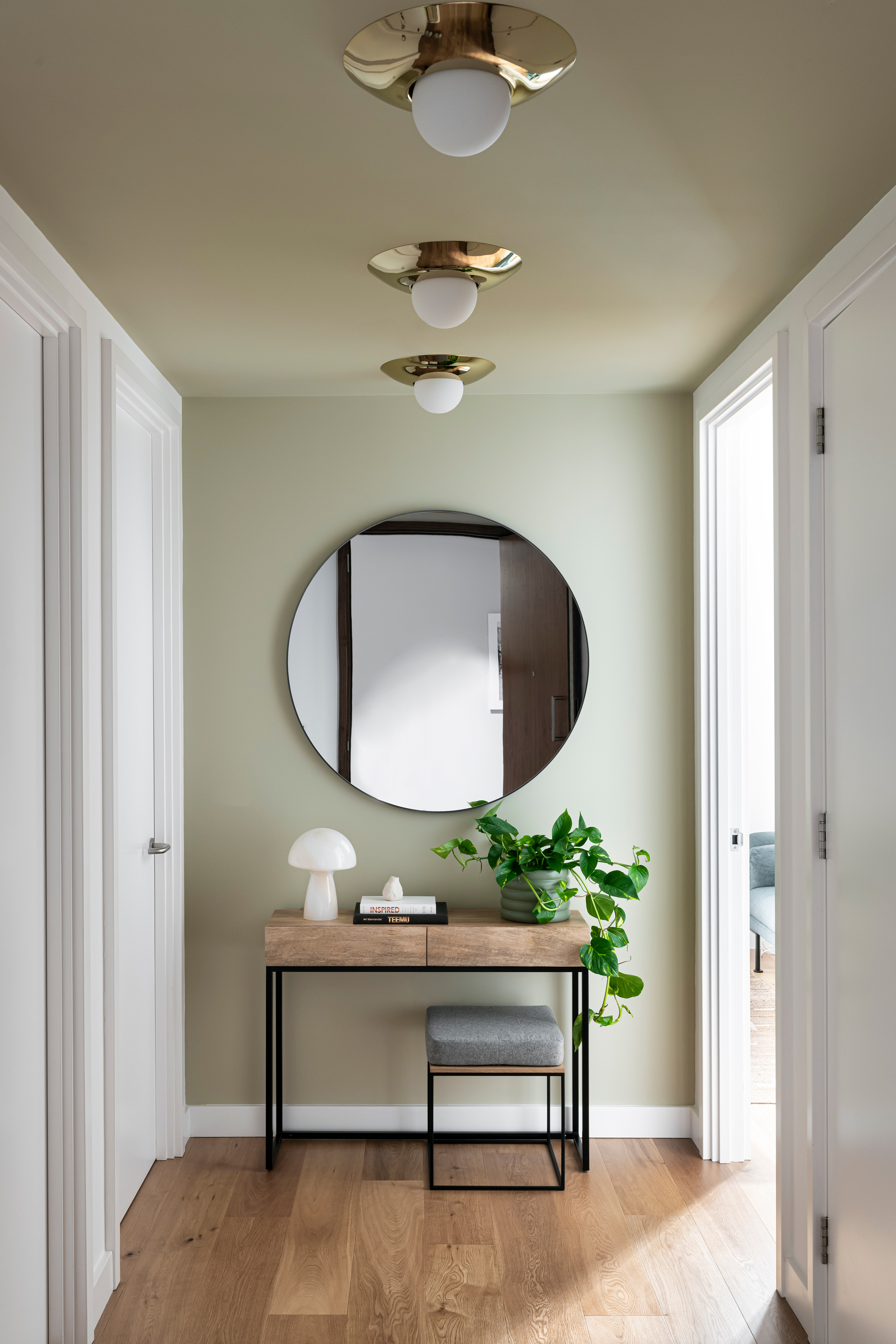
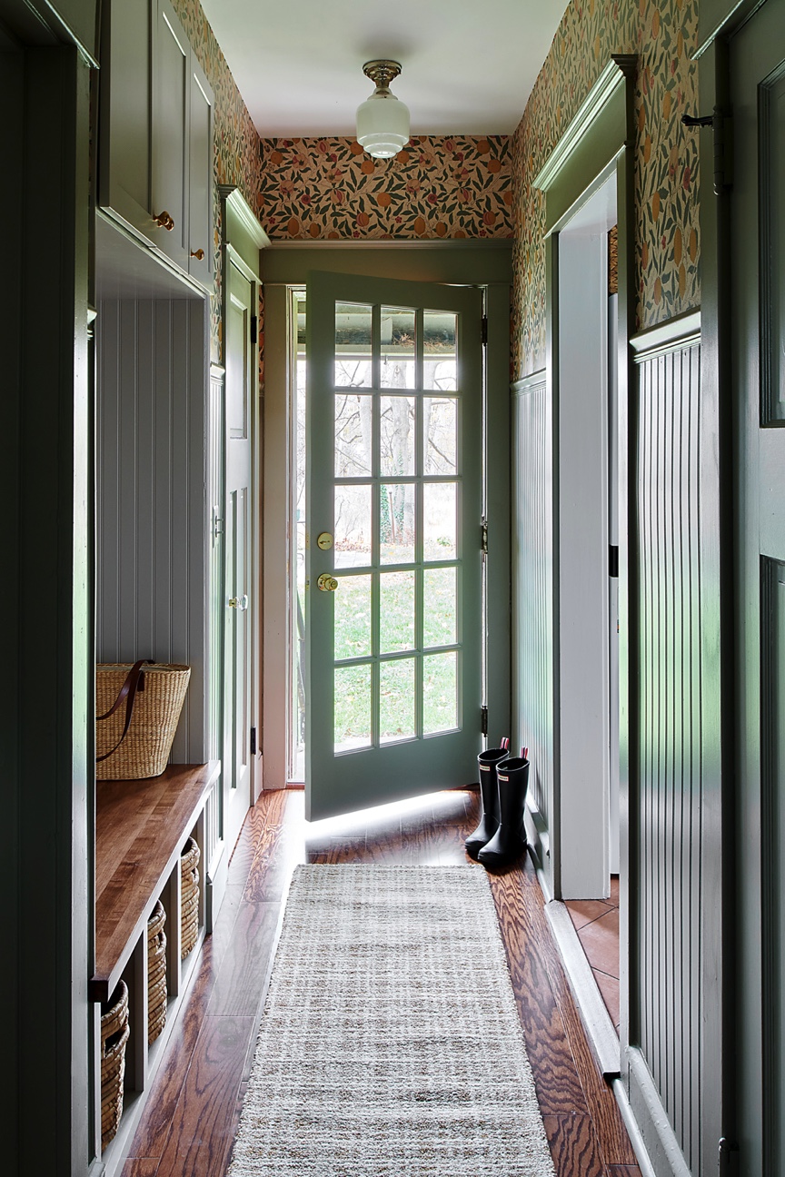

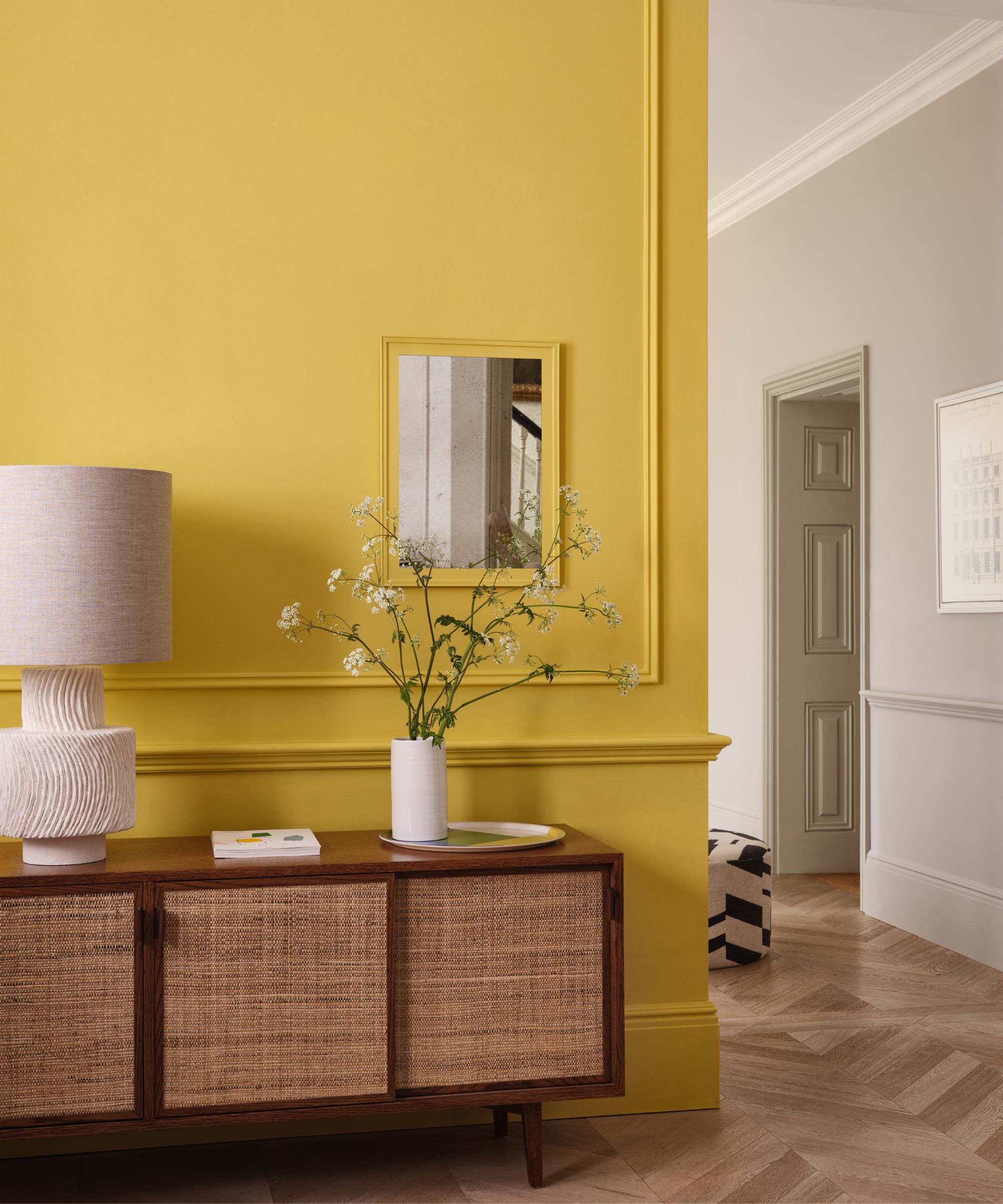
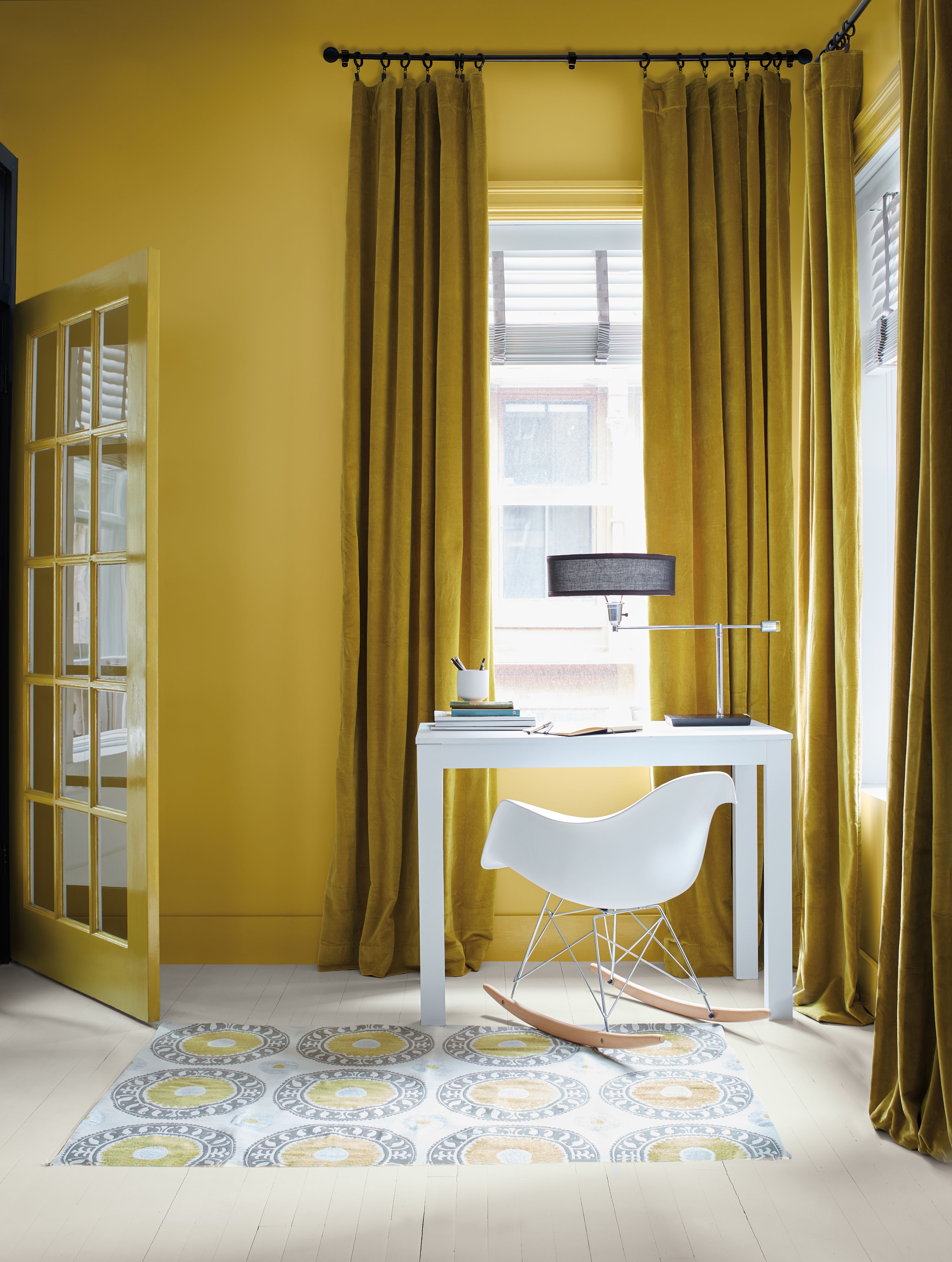
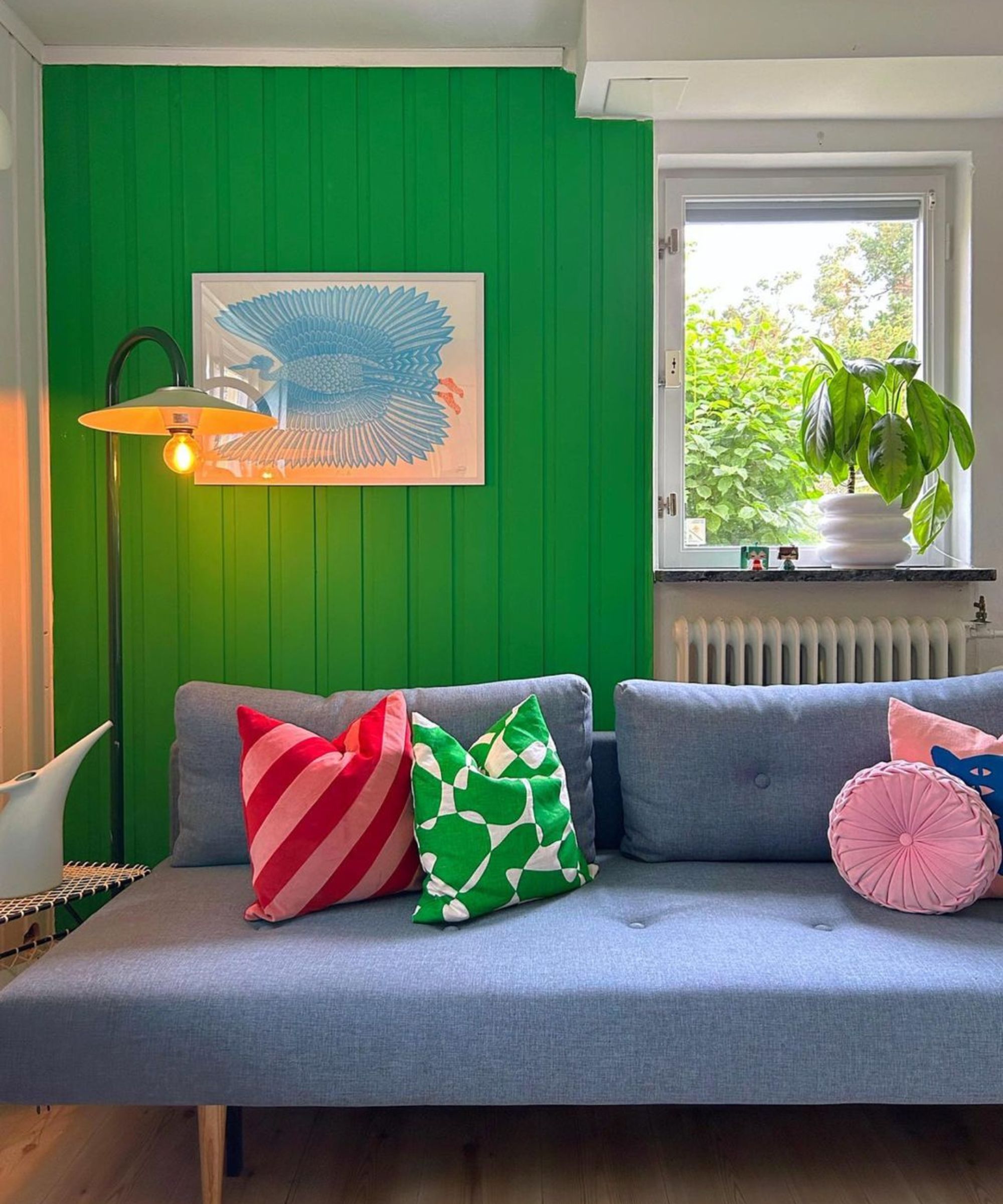
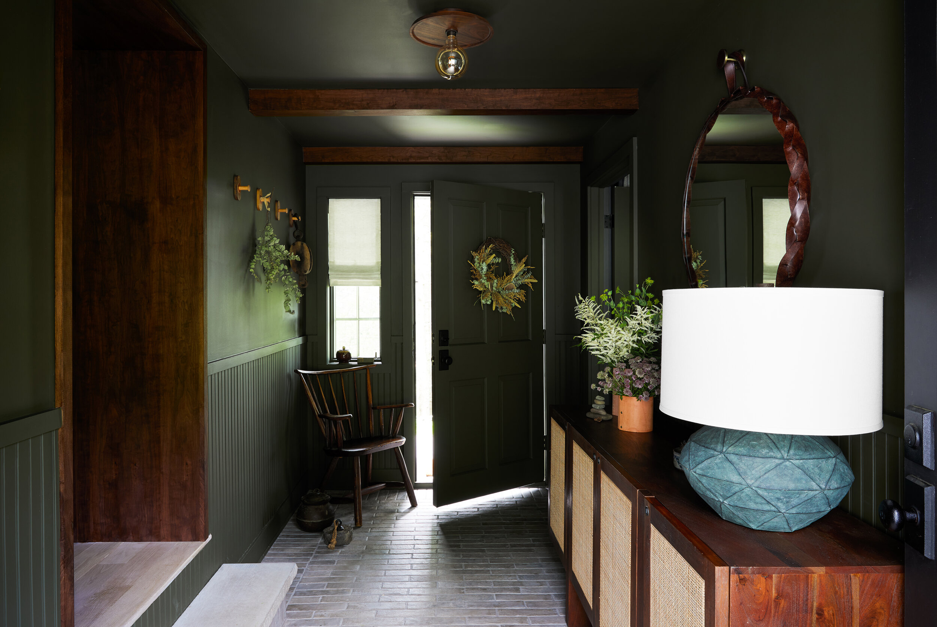
Finally, Dutch Boy® Paint's Ironside, the 2024 Color of the Year, offers a deep, comfortable shade with olive green undertones. Ashley Banbury, an Interior Designer at Dutch Boy® Paints, notes that Ironside functions as an earthy neutral, much like the terracotta, providing a versatile backdrop for accessories or statement furniture. This color is ideal for rooms that can accommodate a sideboard and decorative elements, maintaining a strong presence without overwhelming the small space. Ultimately, the choice between dark and moody or bright and expansive depends on the desired first impression, with designers providing options that cater to both preferences while maximizing the potential of small entryways.
#PaintColors #SmallEntrywayDesign #InteriorDesign #HomeDecoration #FarrowAndBall #JHWallPaints #DutchBoyPaints #EarthyTones #BoldInteriors #PaintColors #SmallEntrywayDesign #InteriorDesign #HomeDecoration #FarrowAndBall #JHWallPaints #DutchBoyPaints #EarthyTones #BoldInteriors
0 comment in total
 No comments yet
You may also like
The best paint colors for small entryways — 7 shades design experts love

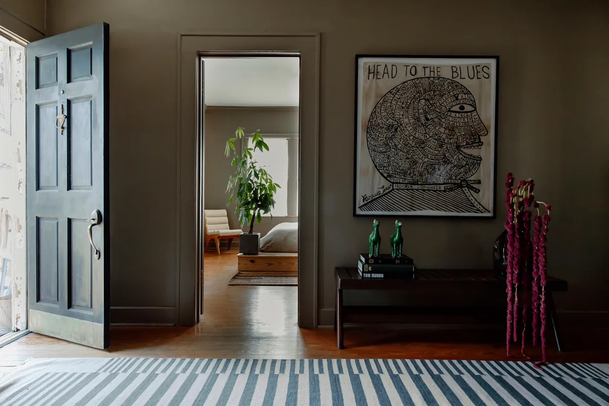
Should I paint an entryway light or dark? Here’s what the experts suggest

5 colors you should never paint a small room – designers warn us to steer clear of these hues, and what to pick instead

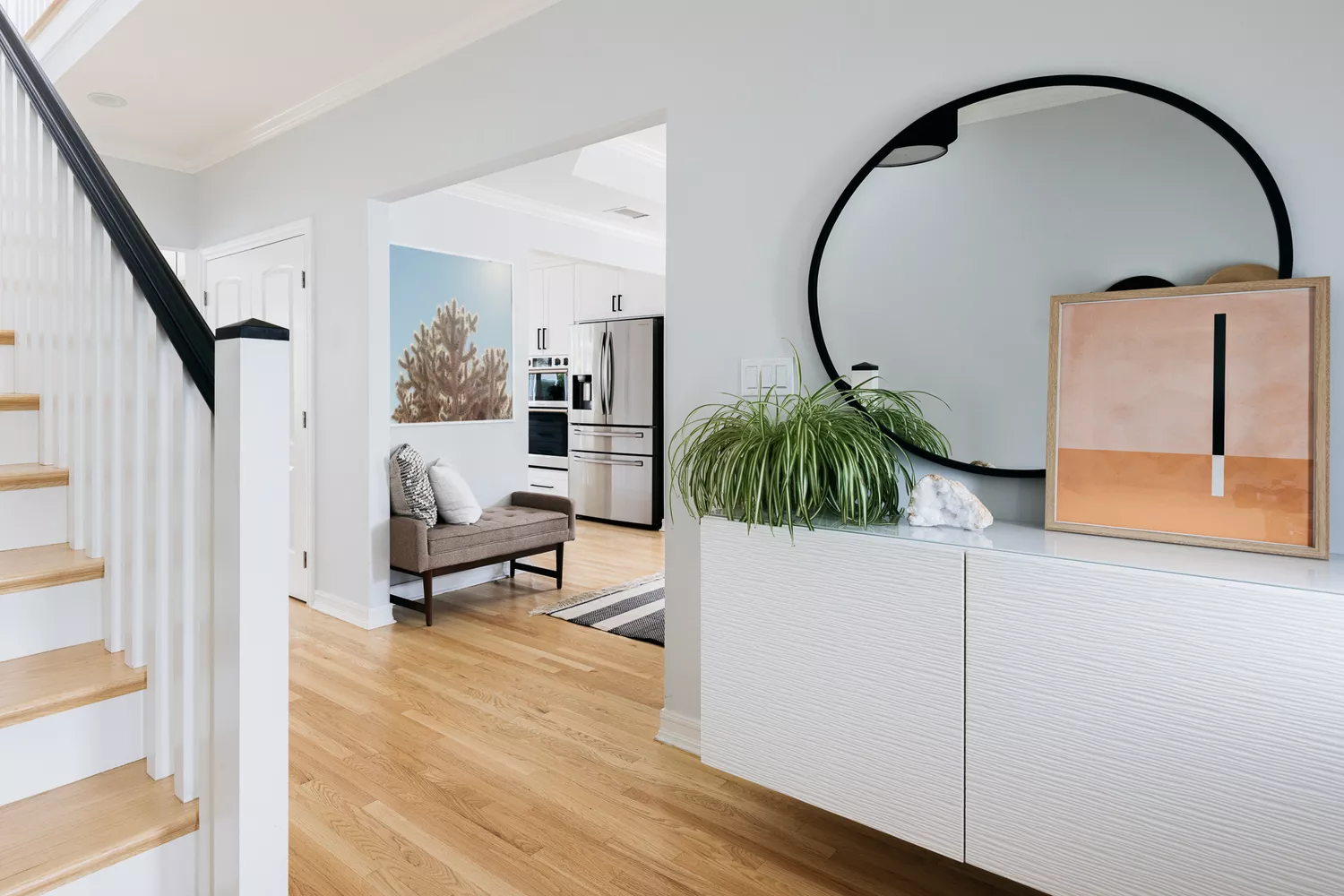
The 8 Best Foyer Paint Colors for an Elegant Entryway

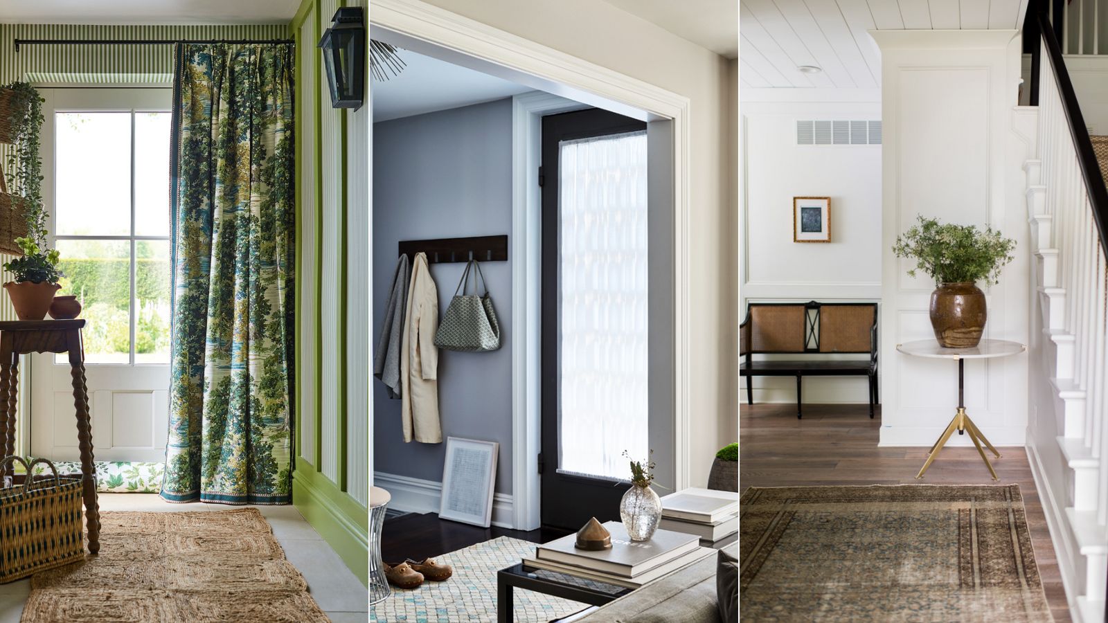
Best colors for small entryways – top designers swear by these 8 on-trend colors for the ultimate impact
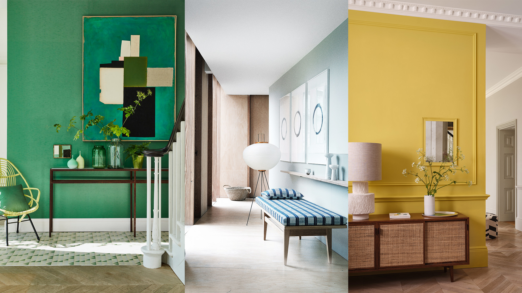
What colors brighten up an entryway? 5 shades that will bring light and life to your space
4 Entryway Paint Colors for a Welcoming First Impression

The paint colors to avoid in small living rooms — and what to use instead
10 best colors for small entryways according to interior designers – shades to elevate your tiny space
6 Colors You Should Never Paint Your Entryway, According to Color Experts

The best paint colors for small living rooms, according to design experts
Sherwin Williams' Framboise Was the Perfect Color to Upgrade This Hallway

You Should Never Use These Paint Colors In An Entryway, According To Designers
8 of the best paint colors to enhance small spaces, according to experts
‘The colours that we decorate our hallway with should make us excited to be back’ – 16 hallway colour ideas to help you create a welcoming entryway
Cooking in a Shoebox-Sized Kitchen? 9 Paint Colors to Open Up the Room

The best colors for small entryways for airy, bright spaces, according to interior designers

The 5 small entryway color mistakes design experts say are big bloopers
Trust us, these are the colours to avoid when painting a small hallway
The Small Kitchen Paint Colors Designers Swear By for Even the Tiniest Spaces