1/5
I’m an interior designer - the worst paint colours for small rooms, and why bright white walls is not a good idea
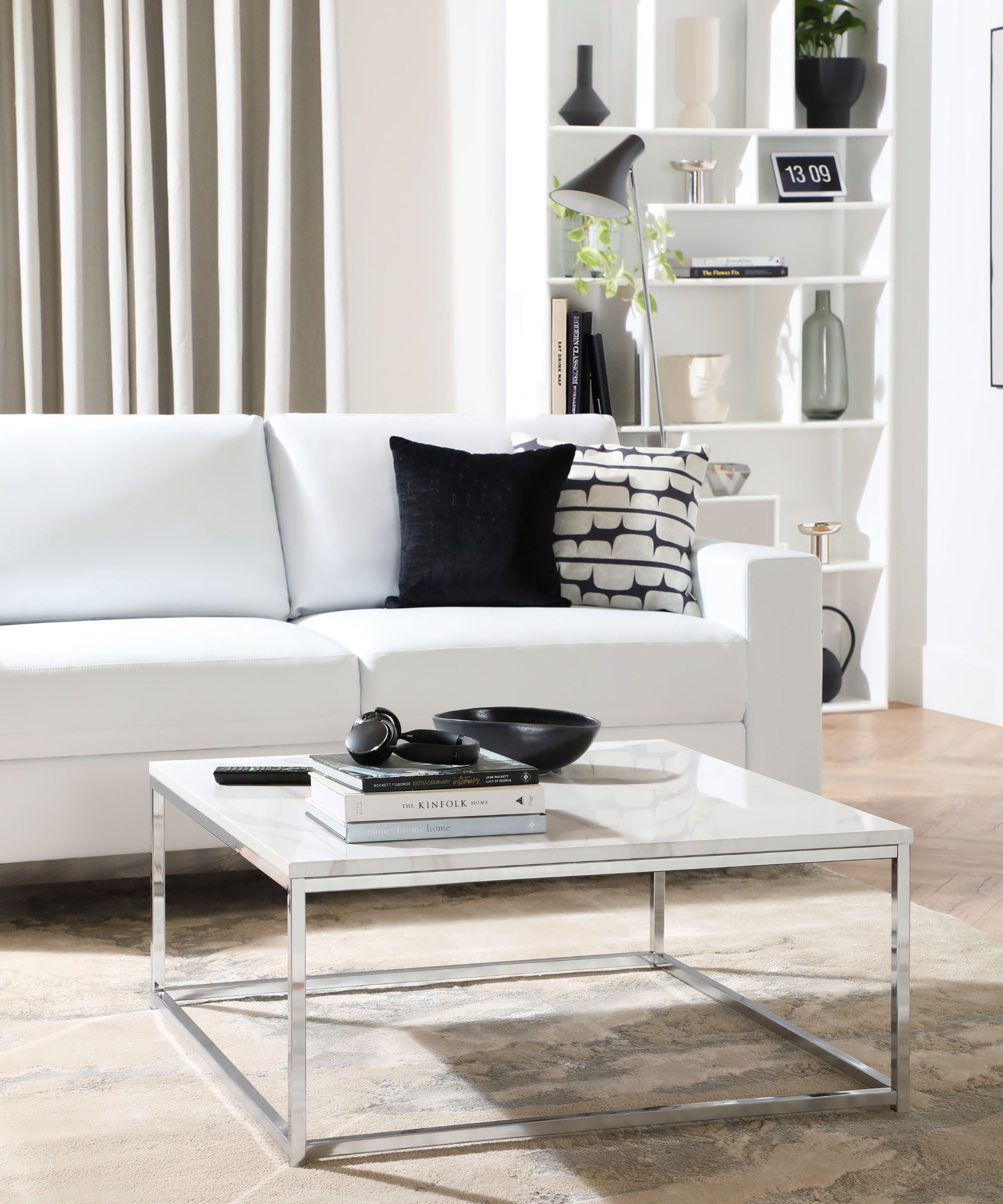
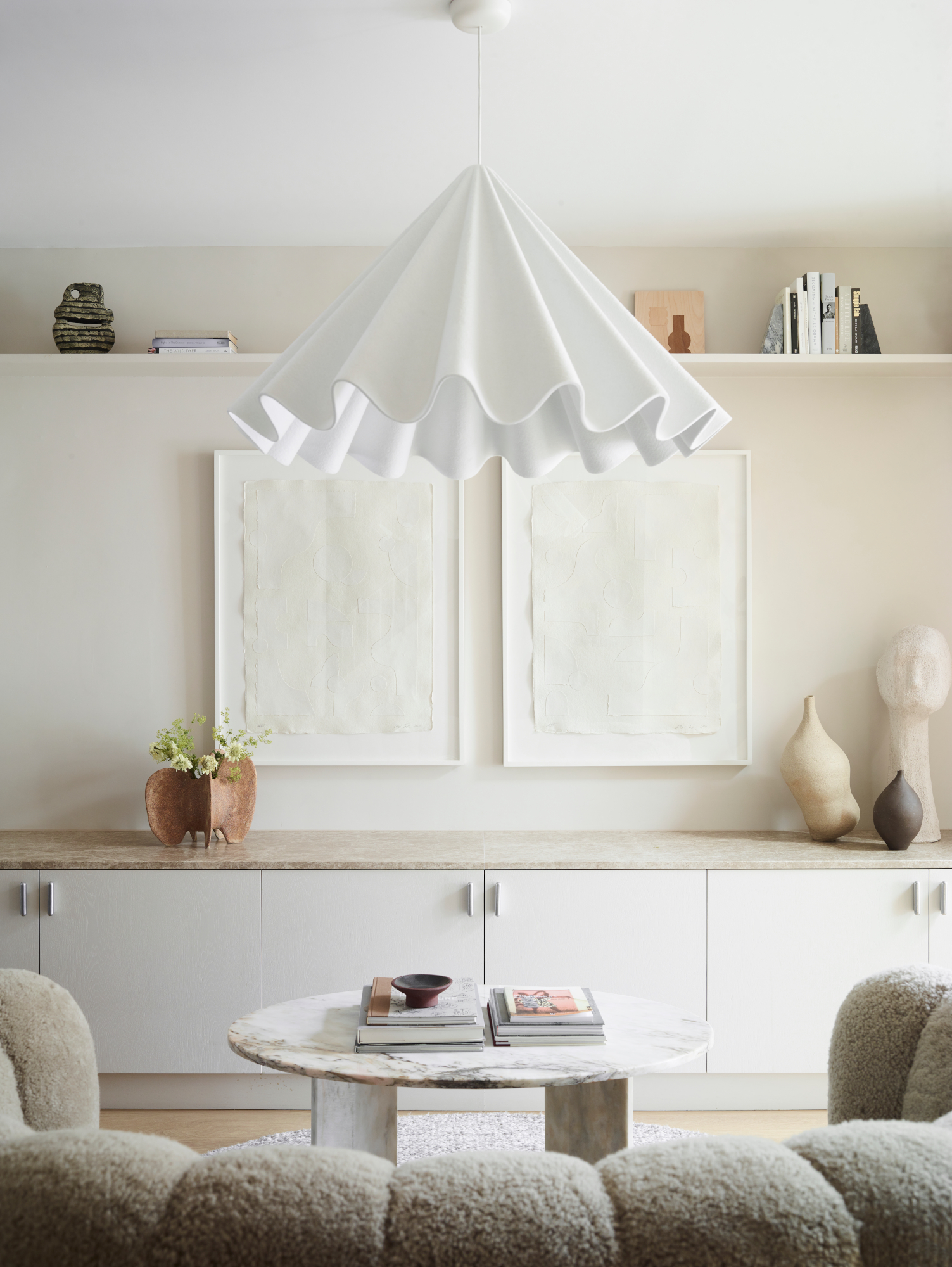
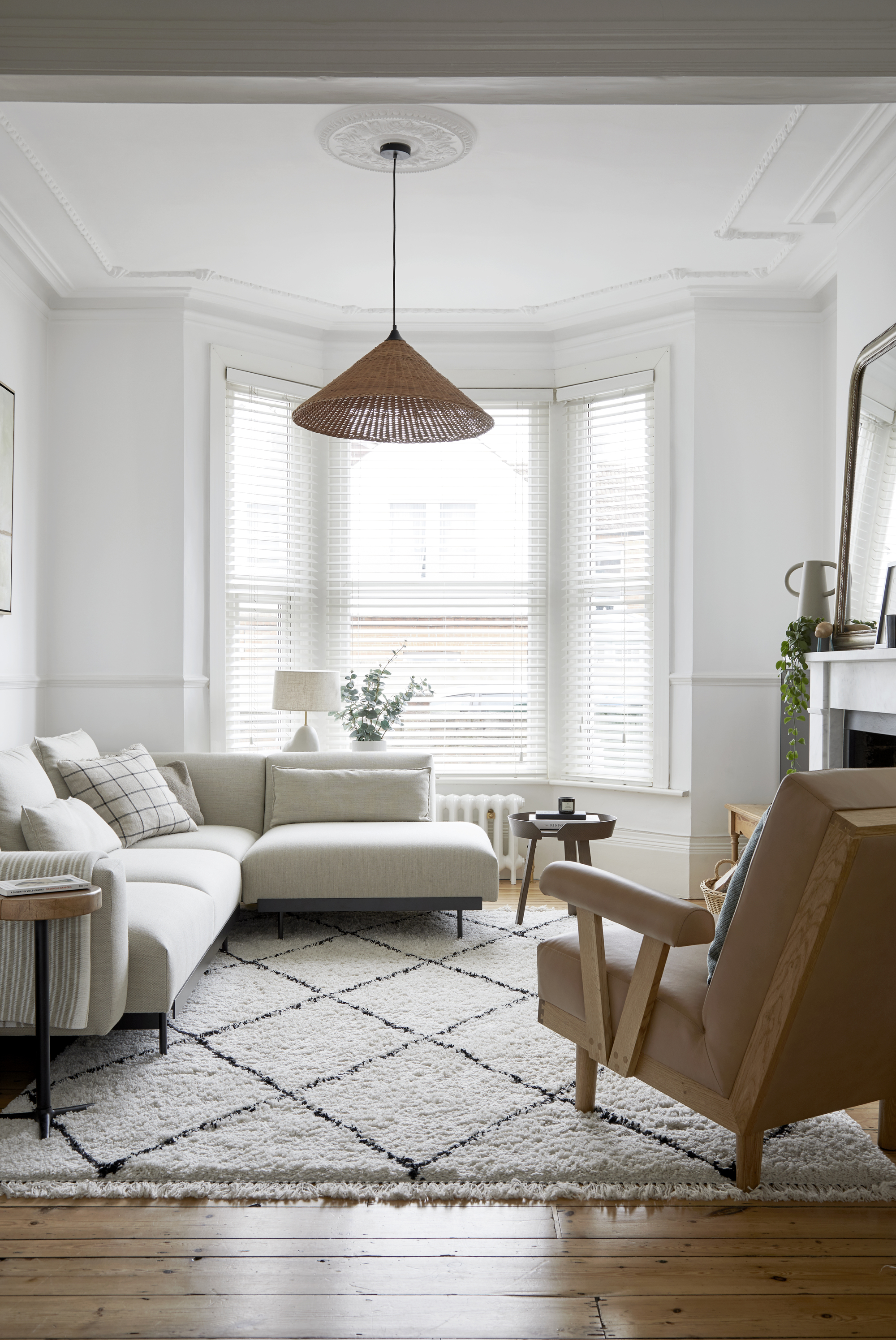
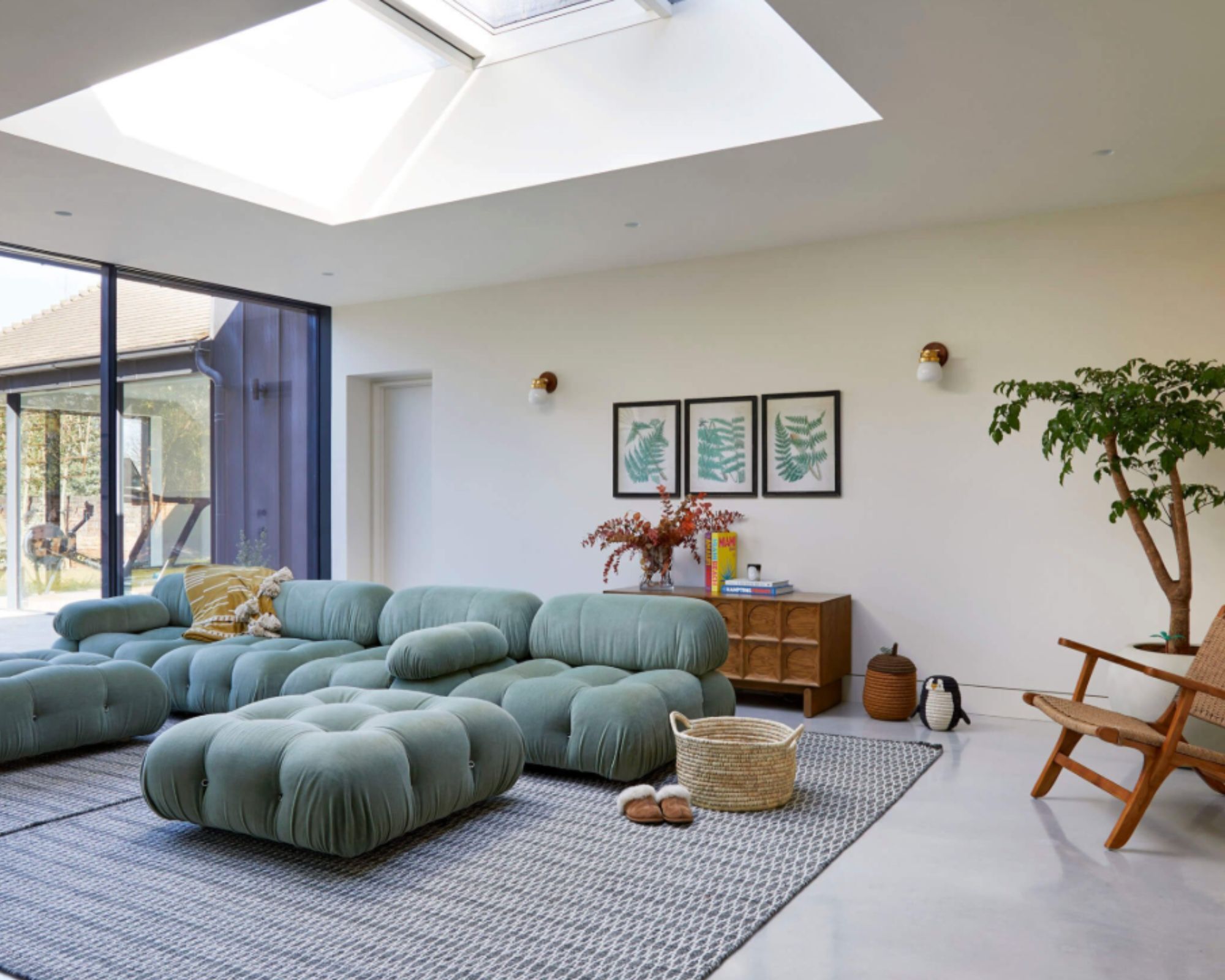
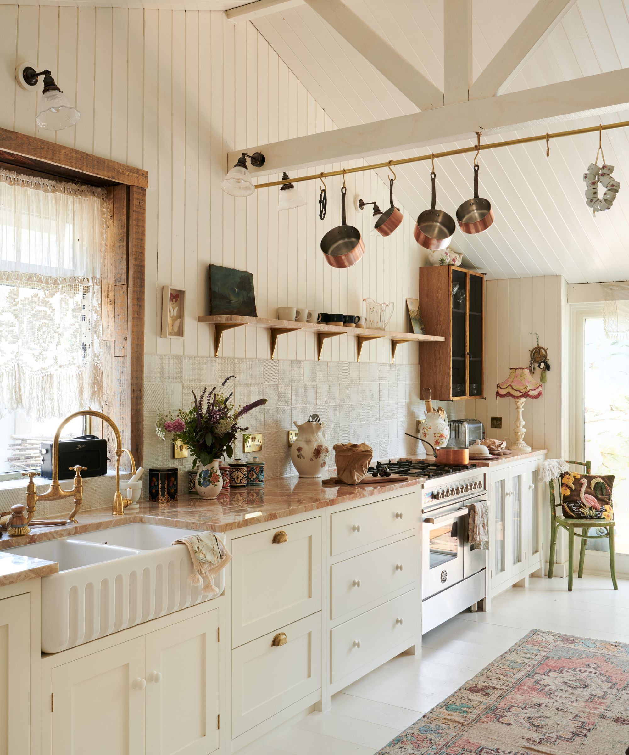
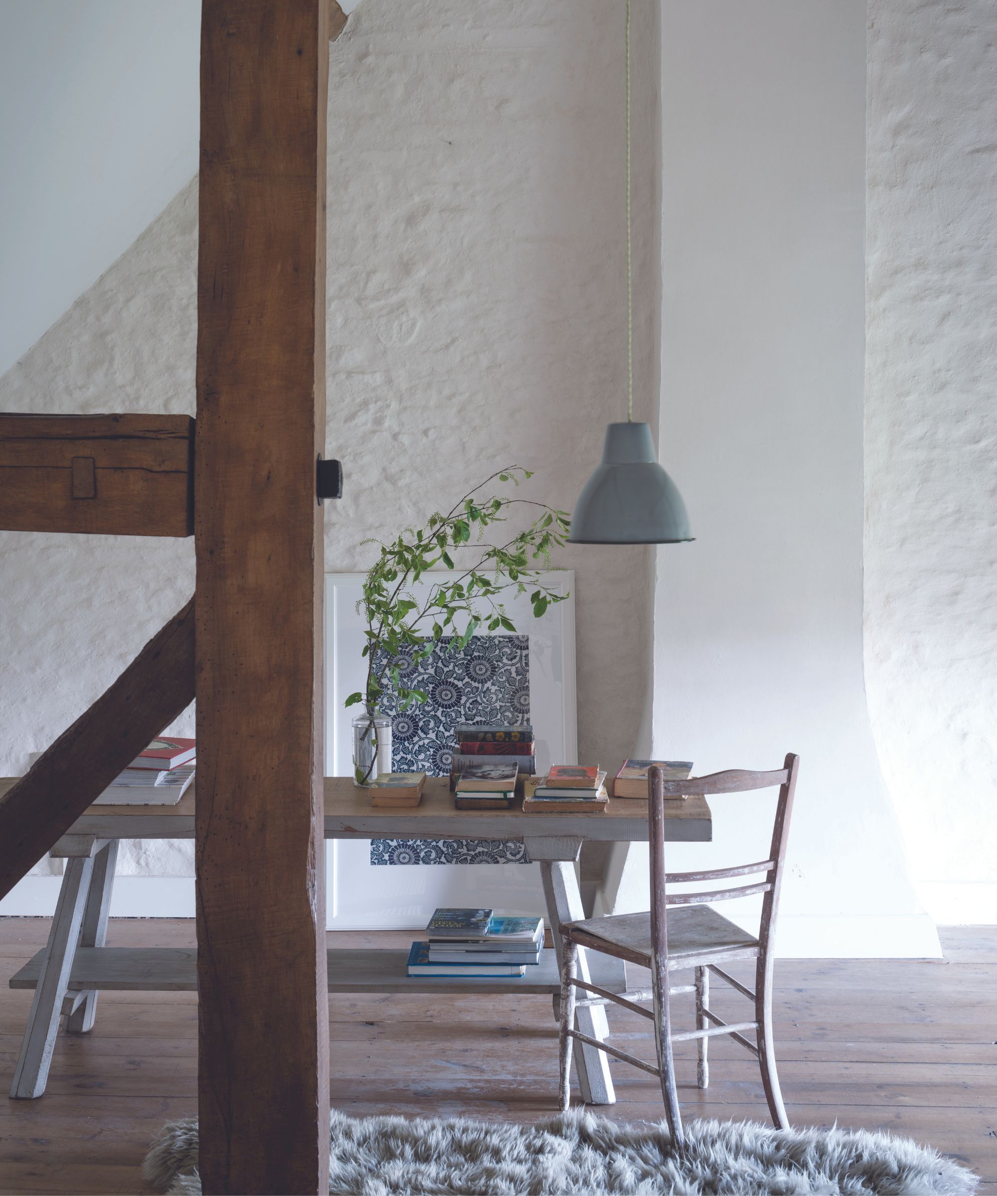
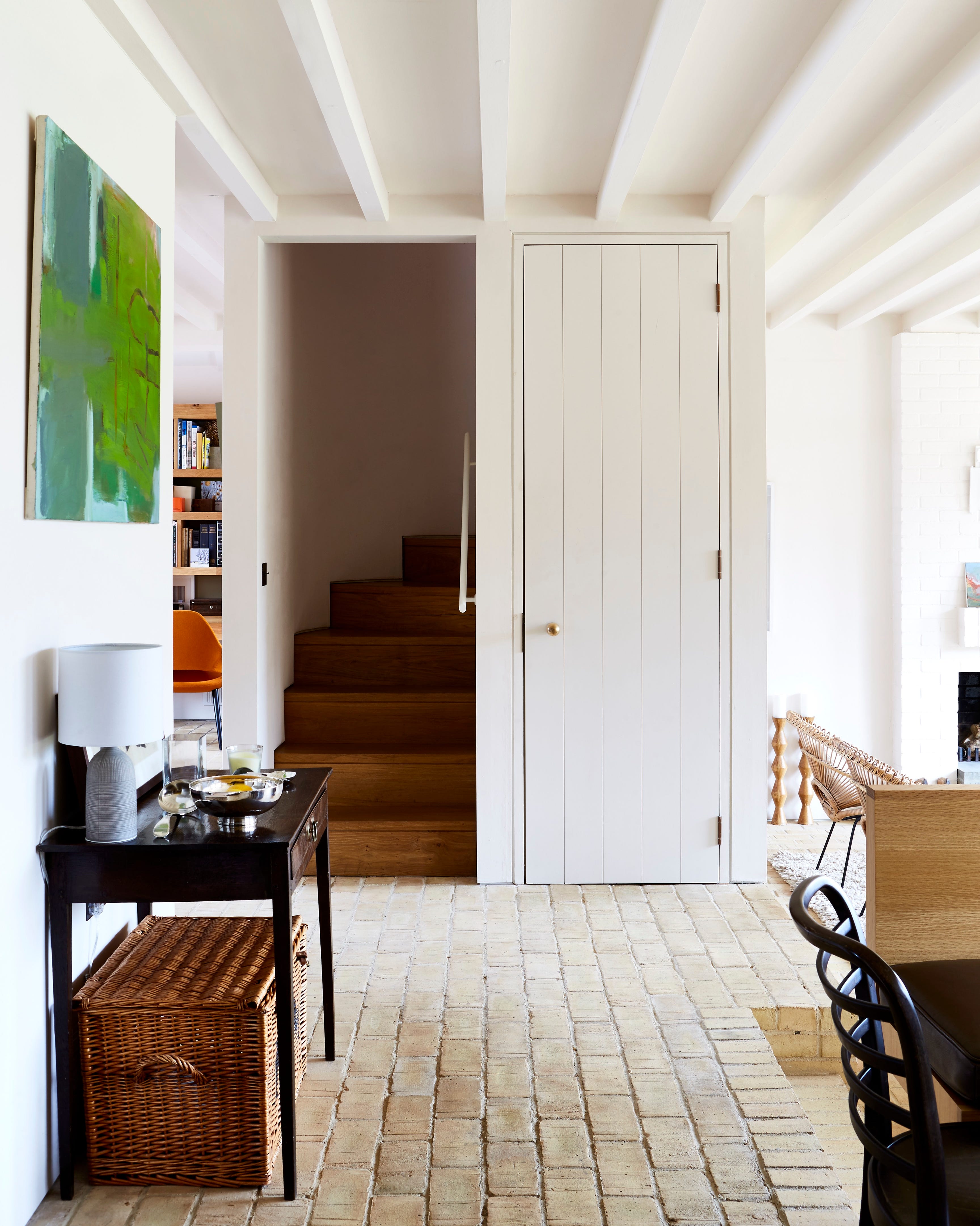
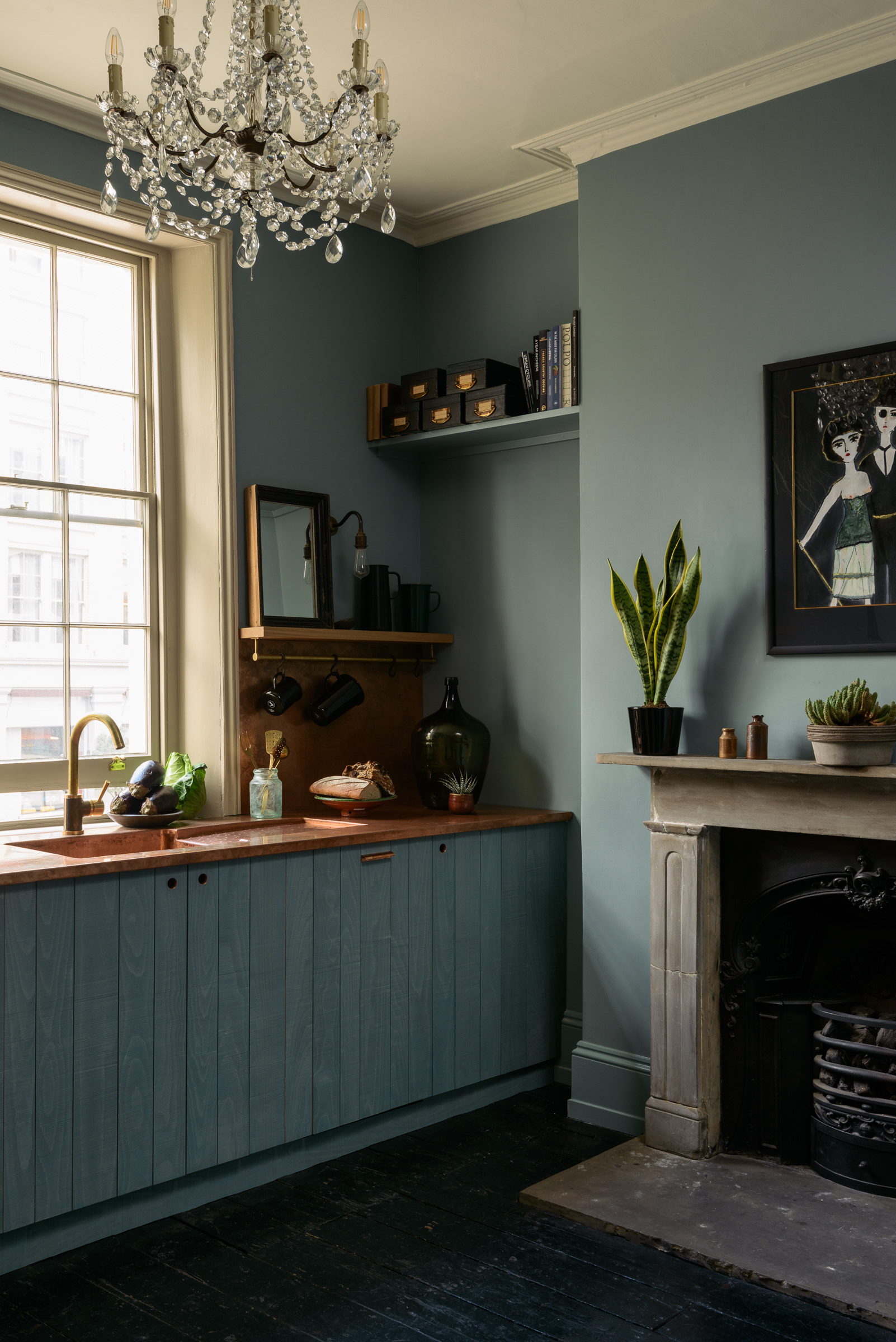
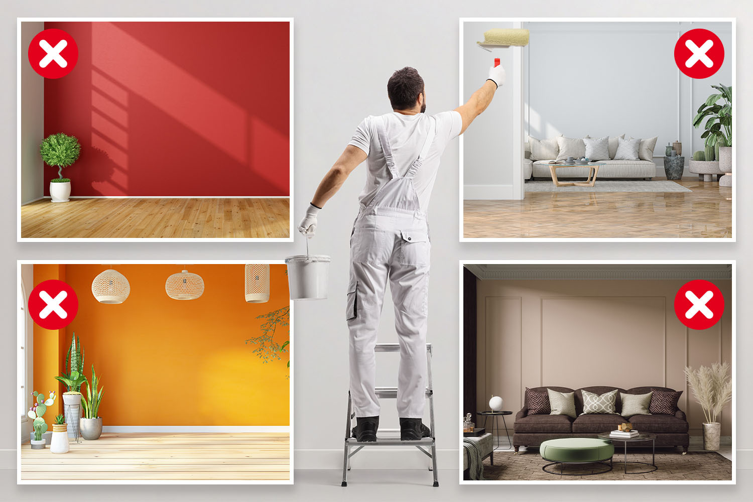
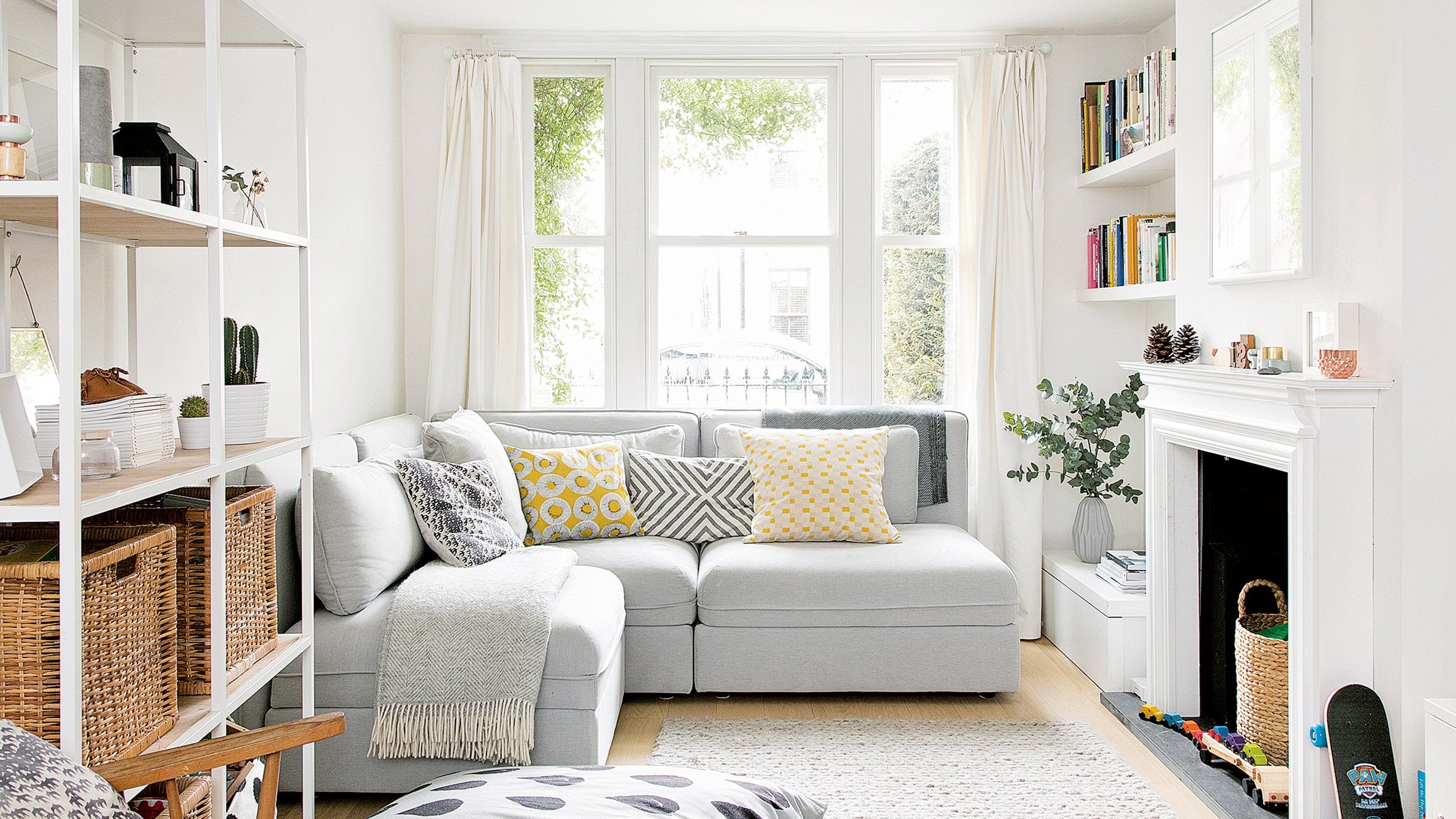
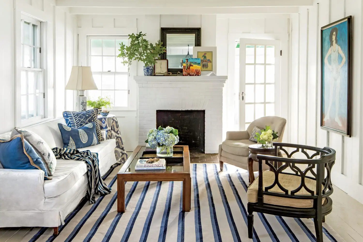
Many people believe that painting small rooms white will make them appear larger and more spacious. However, according to experts from The Good Painter, white is one of the worst paint choices for small spaces. Brilliant white can make rooms look boxy and bland, and it accentuates shadows and corners, which is undesirable in a small area. It can also create a clinical, unwelcoming atmosphere, similar to a hospital environment, leading to a restless feeling. If white is preferred, a chalky white, such as Farrow & Ball’s Off White, is recommended to visually open up the space, as it offers a softer alternative.
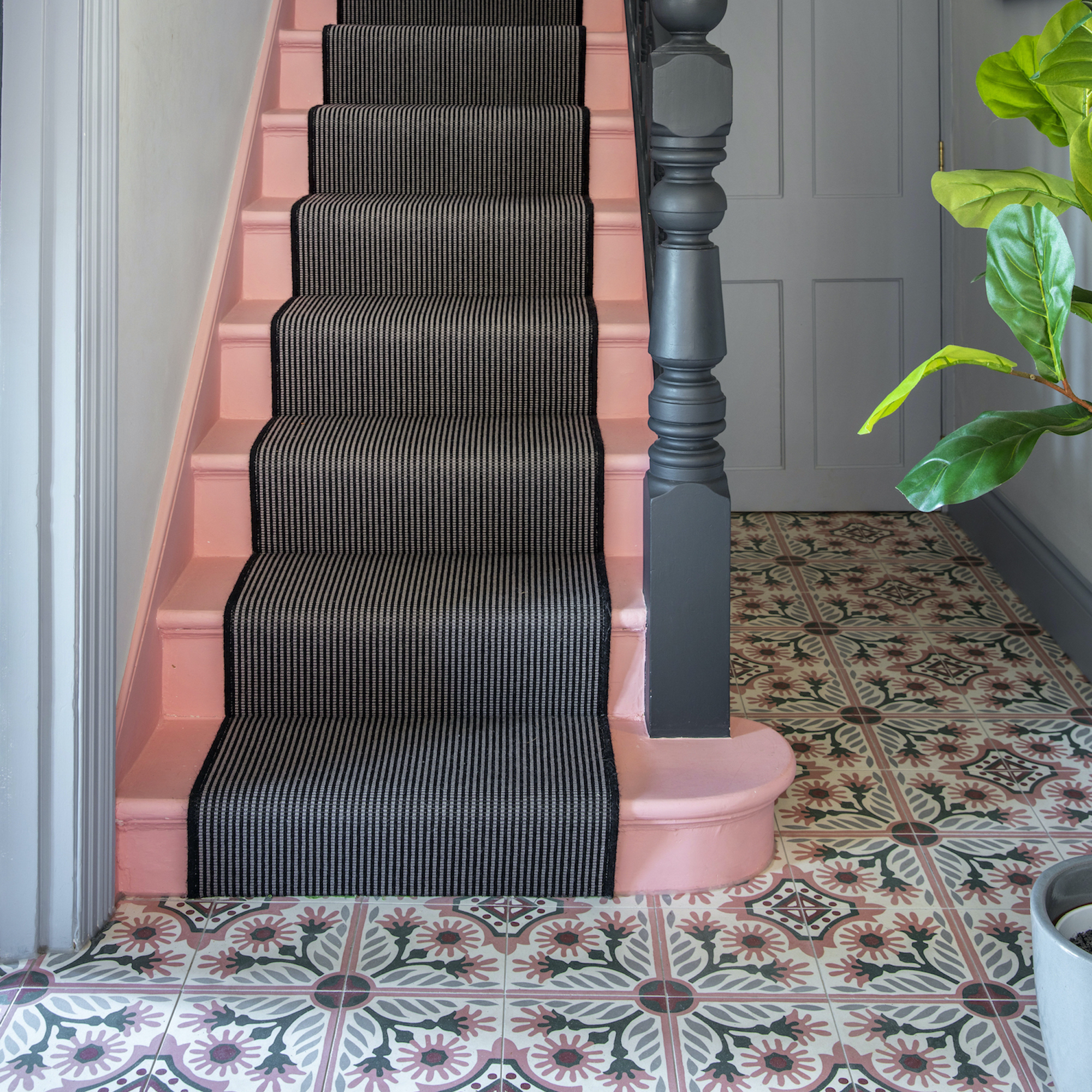
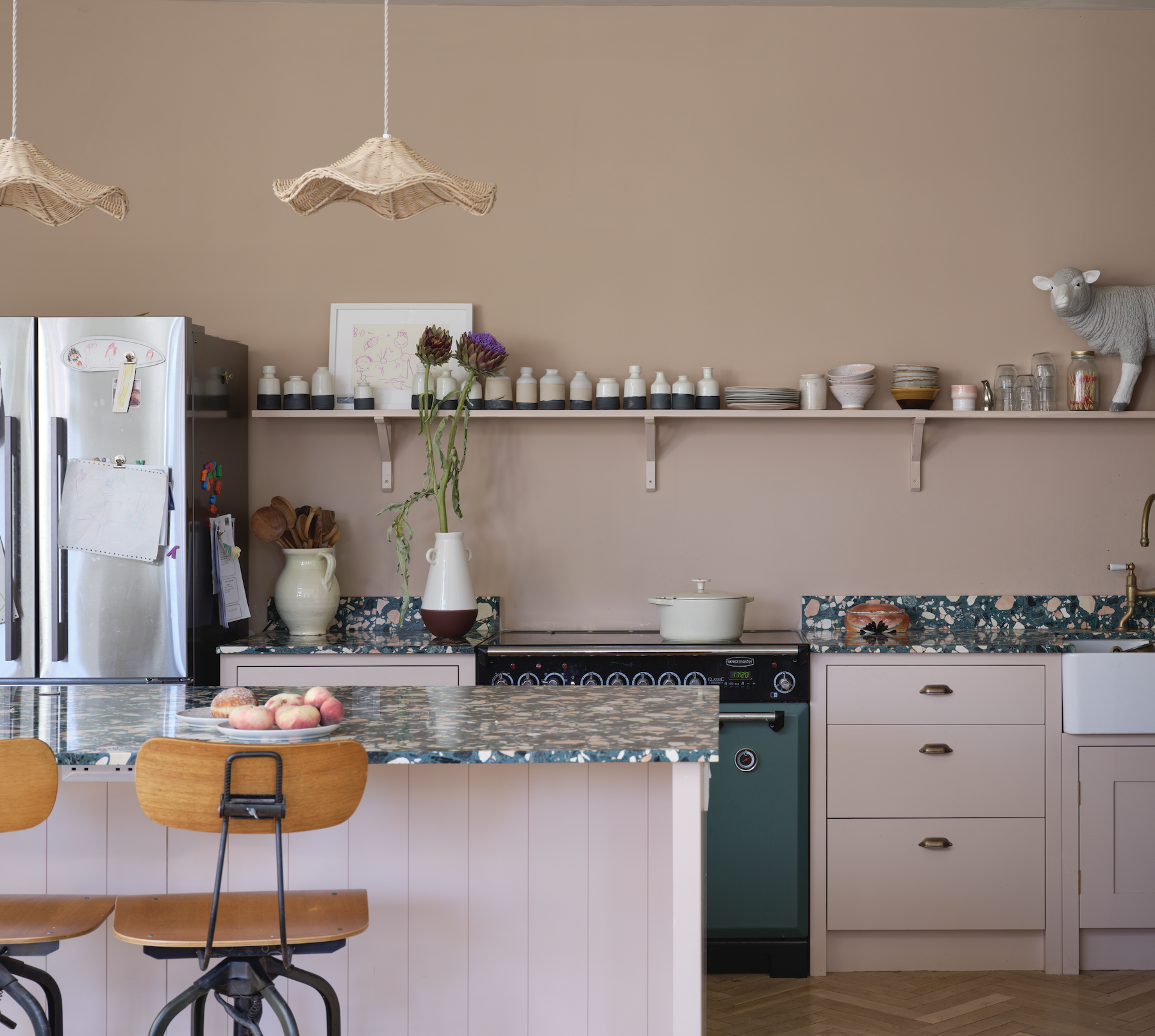
Another color to avoid in small rooms is bright red. While a bold choice, bright red can make small spaces feel unpleasant and uncomfortable. Experts suggest that aggressive reds can even lead to headaches and visually shrink a room. If a touch of red is desired, it is better to opt for muted or pastel shades, such as a dusty rose. Alternatively, red accessories can be used to add a splash of color without overwhelming the space, providing an easier way to balance the room's color scheme. Rusty reds or oranges are also suggested as more subtle alternatives for a vibrant touch, recommending shades like Little Greene’s Heat.
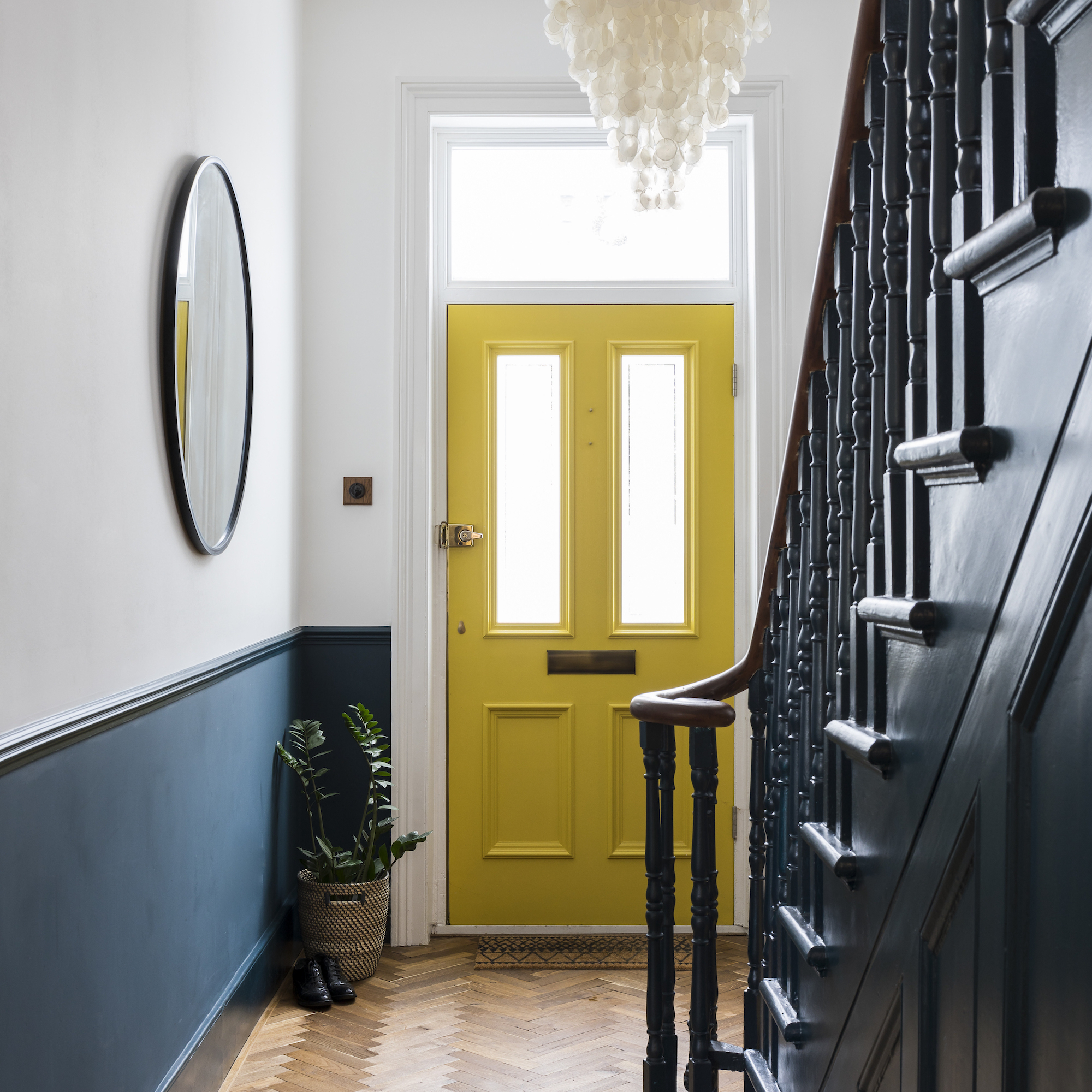
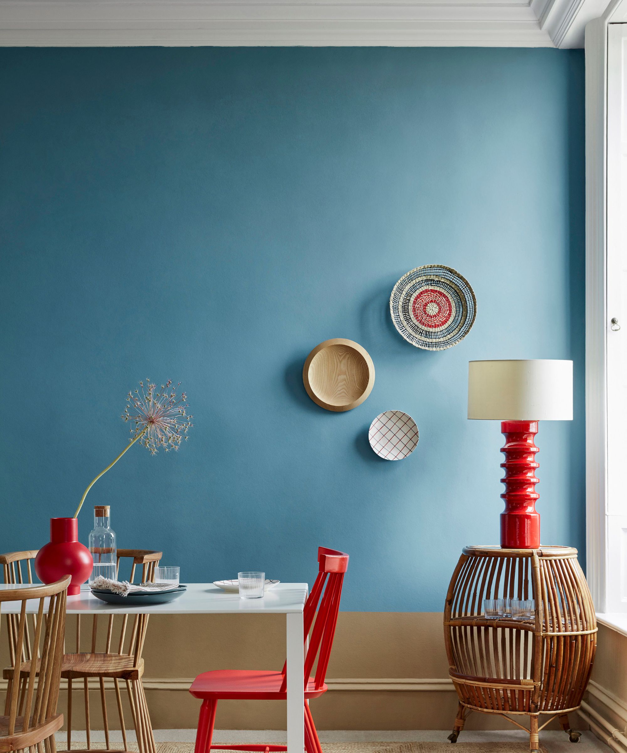
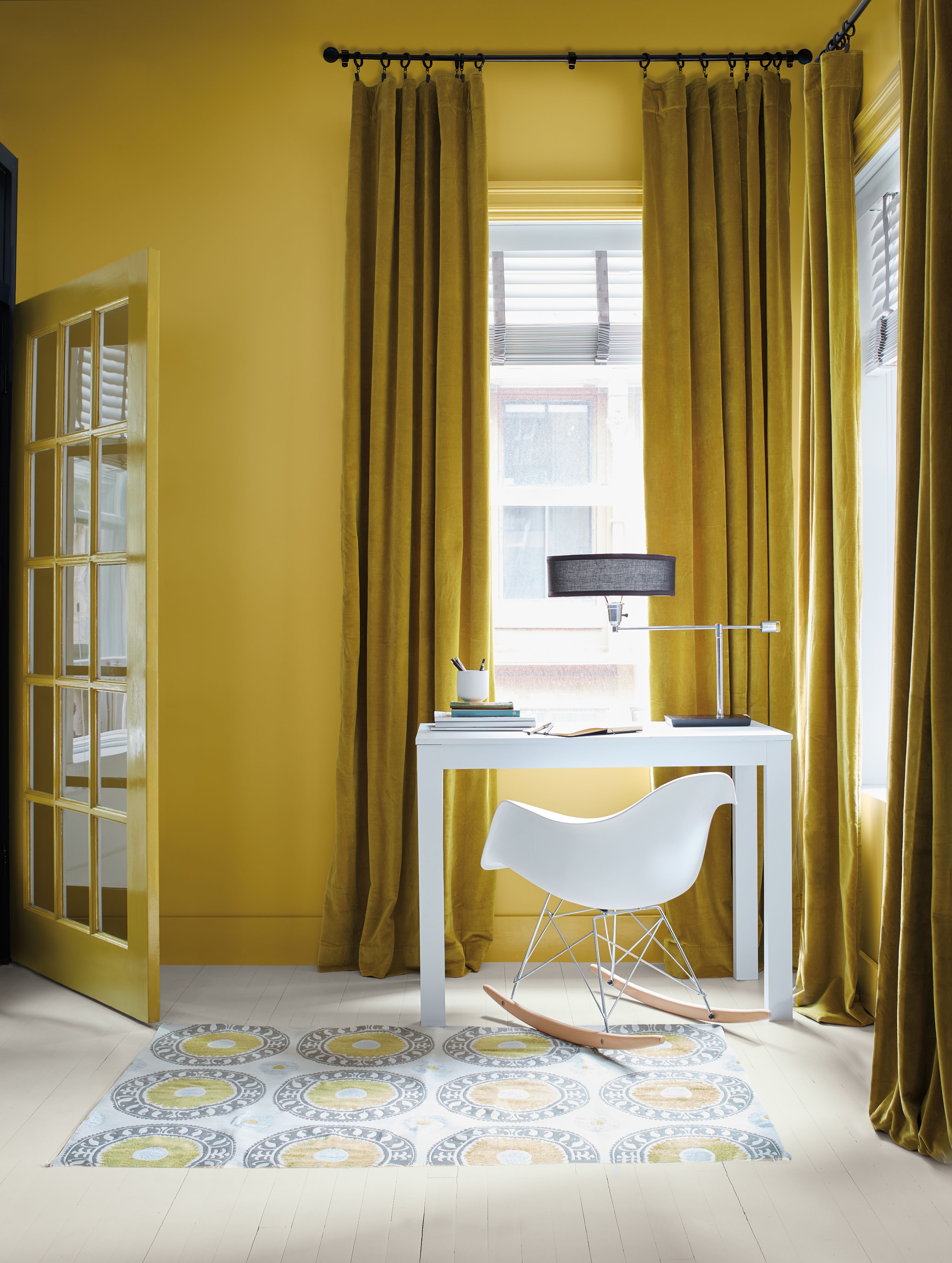
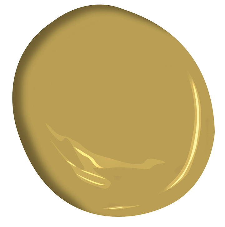
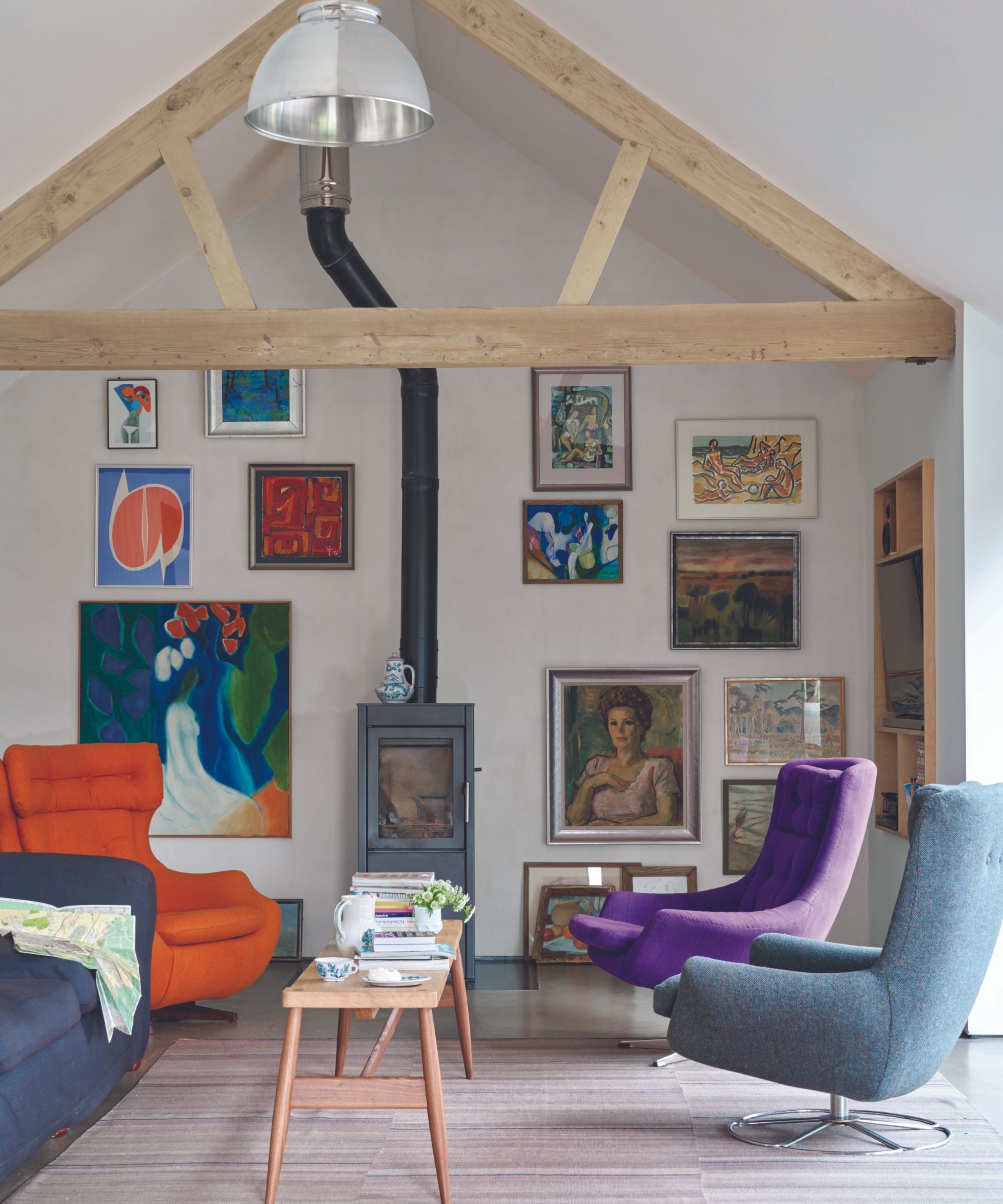
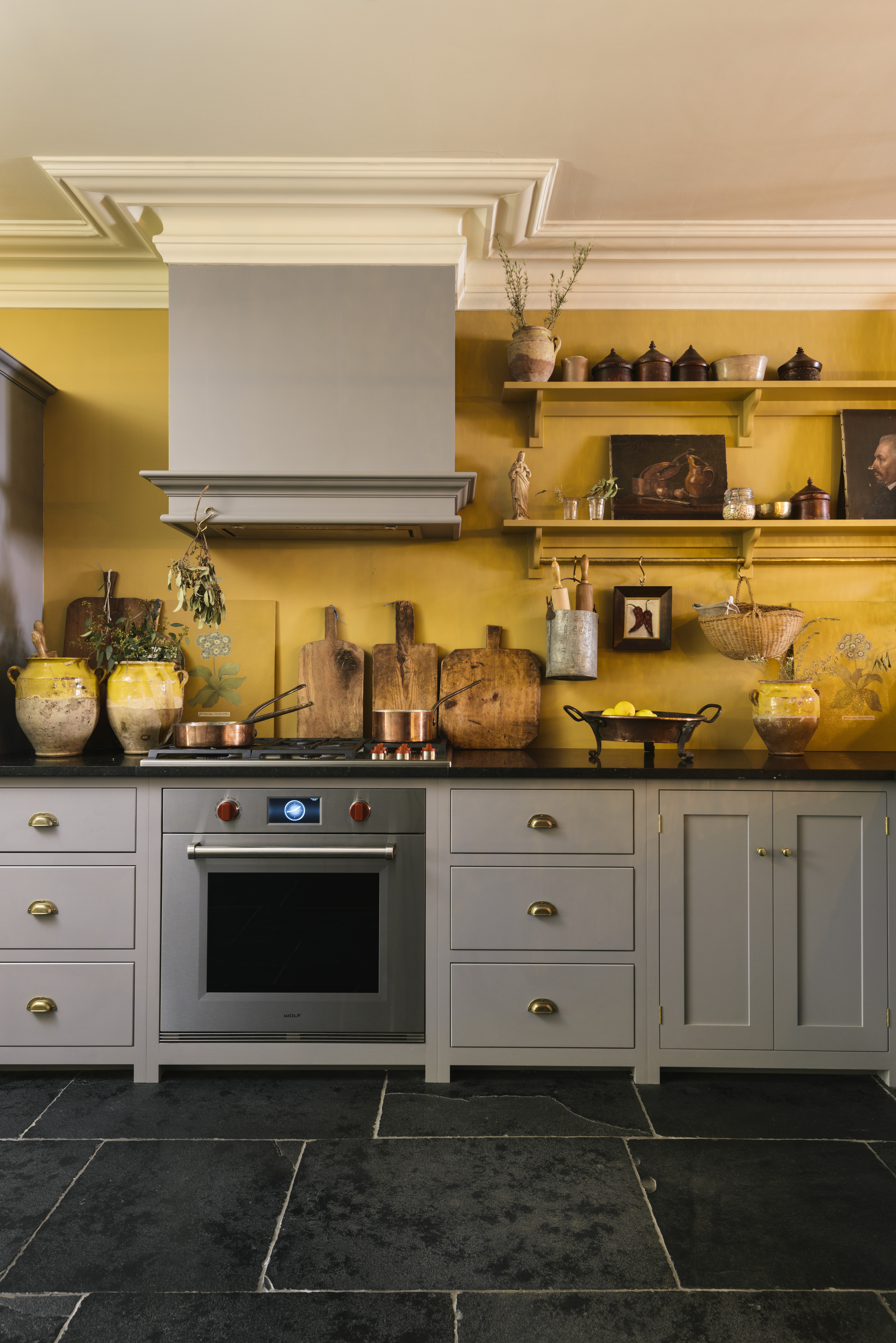
Bright orange and yellow, often chosen for children's rooms, should also be avoided in small spaces. These colors can be overstimulating and disrupt a harmonious environment. Yellow, in particular, is noted for its use in fast-food restaurants to stimulate appetite, which is not conducive to a relaxing home atmosphere. Additionally, bright colors like orange and yellow can draw attention away from furniture and accessories, making it difficult to find complementary decorations and potentially causing frustration. They can also create an alarming or endangering sensation.
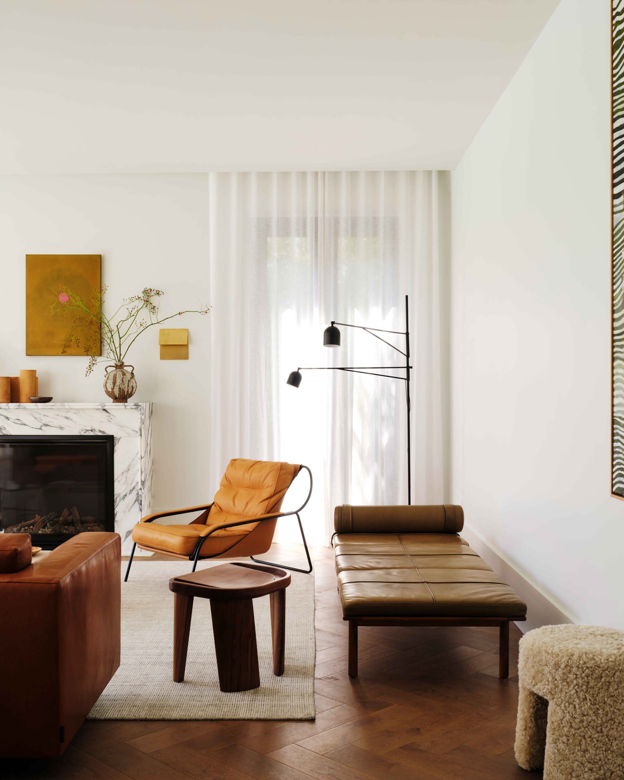
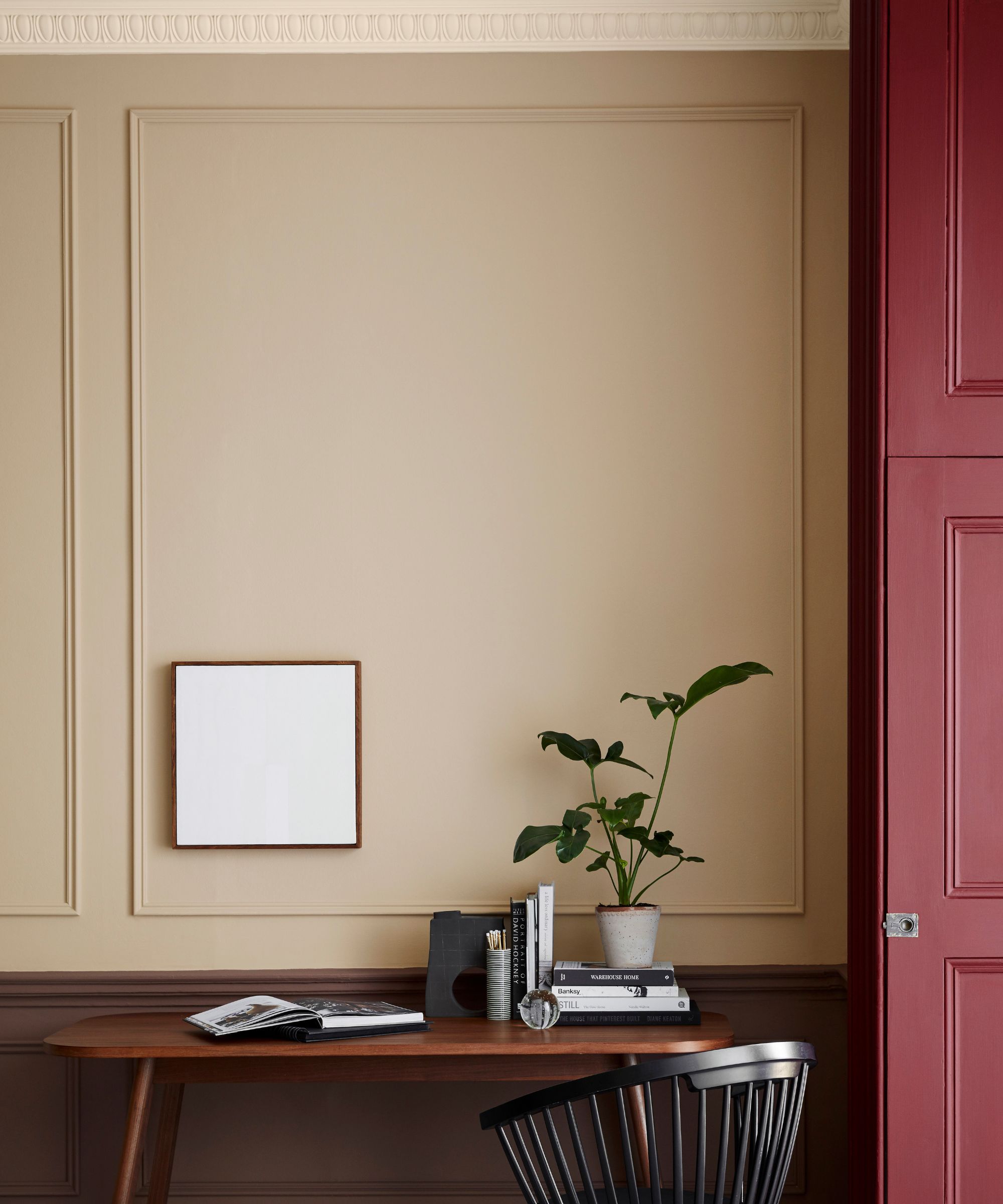
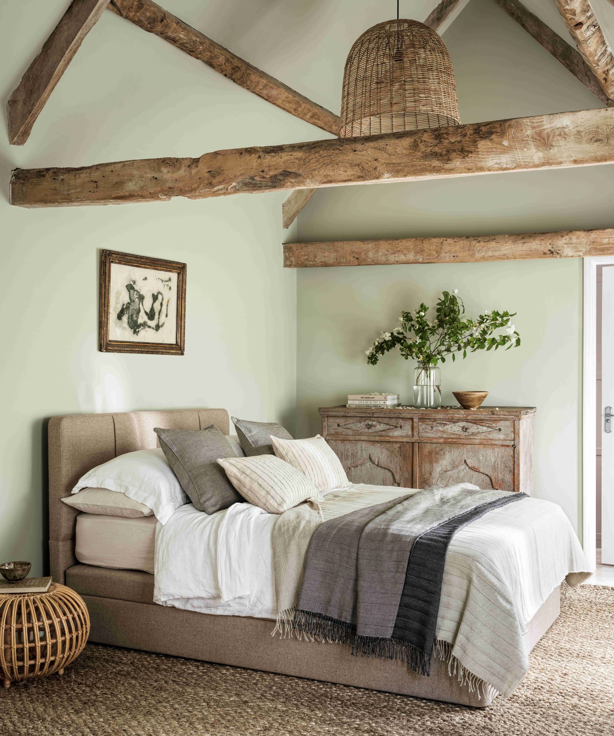
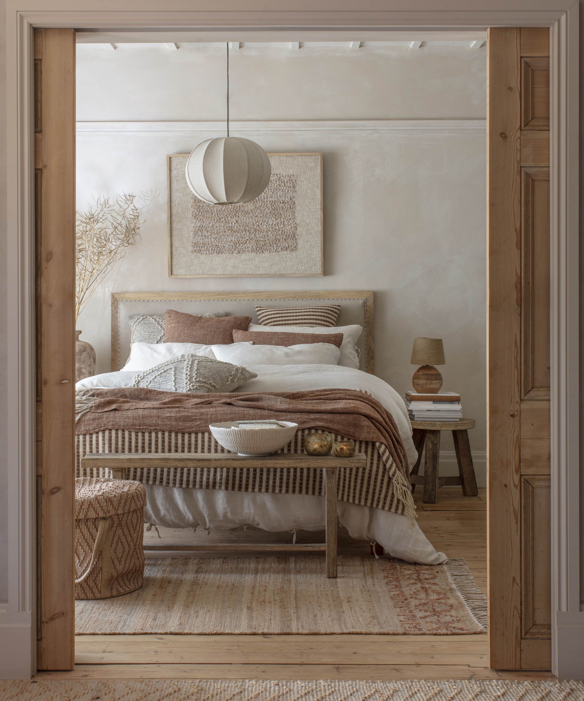
Finally, selecting neutral colors for small rooms can be surprisingly challenging. While they might seem like a safe and easy option, the vast array of beige shades can be confusing. The appearance of a neutral color can vary significantly based on natural light, room position, and exterior surroundings. Neutral colors are often complex combinations with pink, orange, blue, and green undertones, which can clash with existing interior decorations, furniture, and accessories. Due to this complexity, they are considered among the most difficult colors to choose. It is advised to use color swatches and have a painter apply samples directly to the walls to accurately assess how the color will look in the specific environment.
#InteriorDesign #SmallRooms #PaintColors #HomeDecor #ColorPsychology #SpaceOptimization #DIYHome #InteriorDesign #SmallRooms #PaintColors #HomeDecor #ColorPsychology #SpaceOptimization #DIYHome
0 comment in total
 No comments yet
You may also like

5 colors you should never paint a small room – designers warn us to steer clear of these hues, and what to pick instead

Is it better to paint small rooms light or dark? Here's what the top colour experts have to say
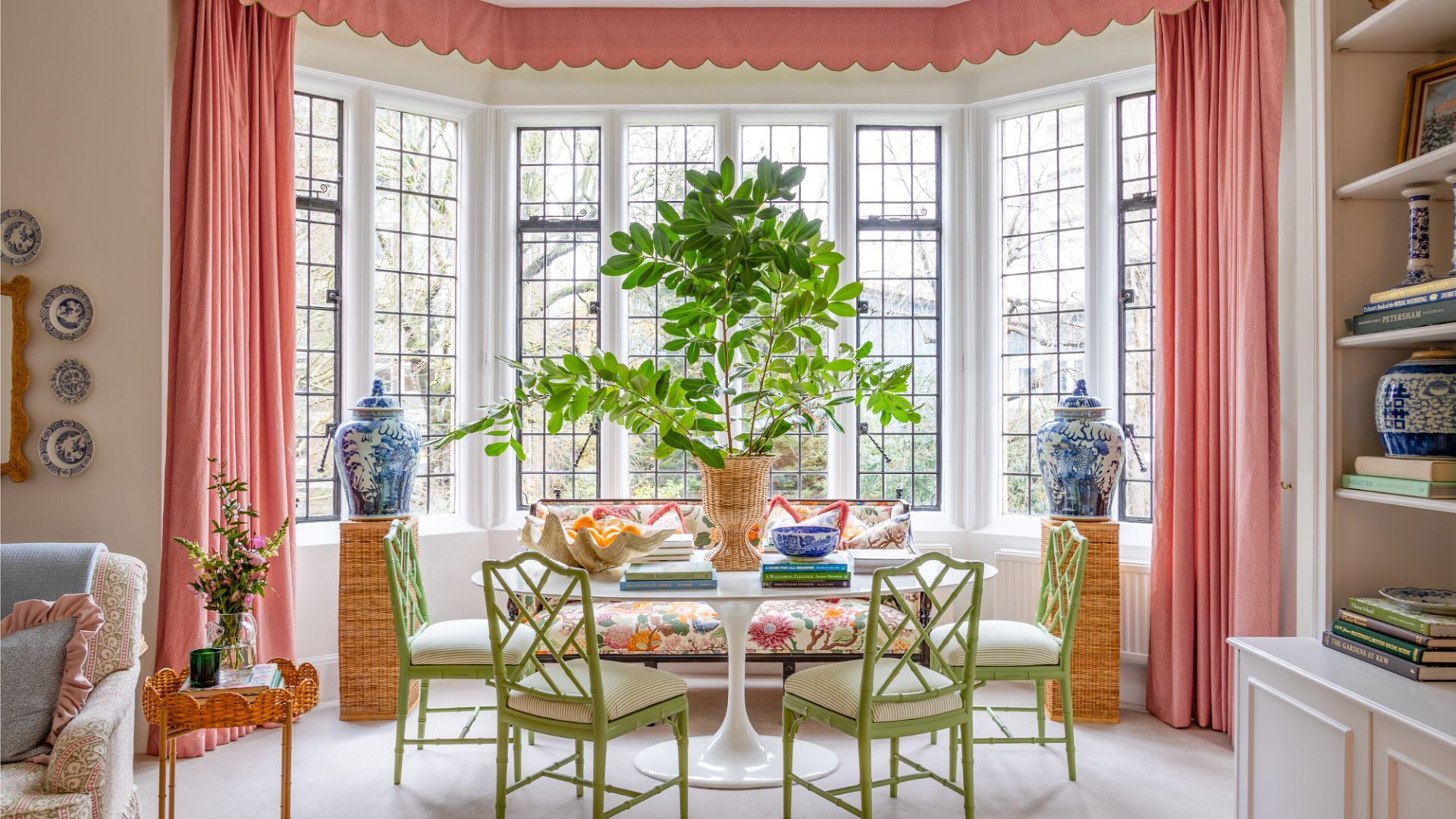
7 times you should never paint a room white
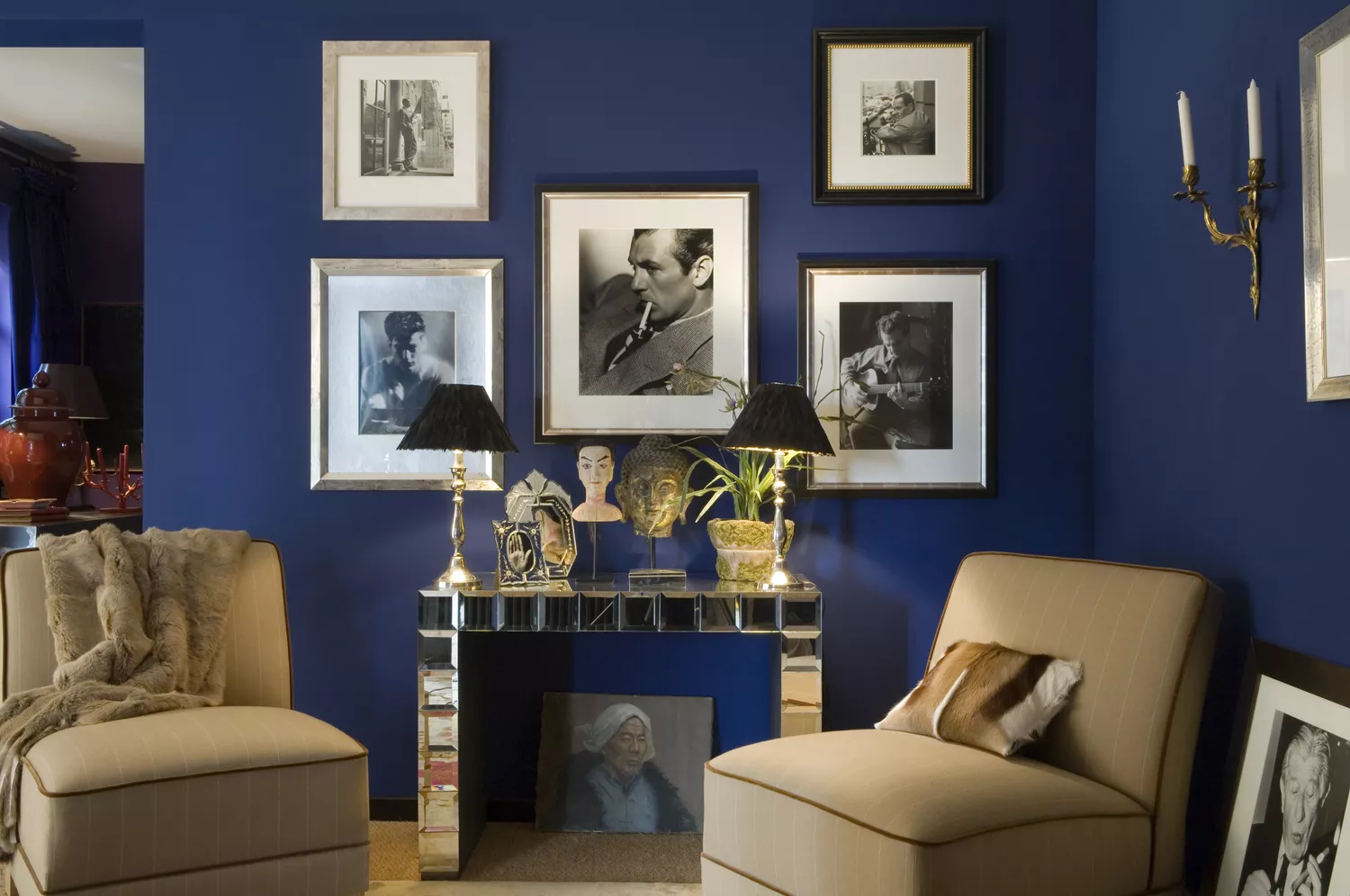
6 Paint Colors That Make Your Living Room Look Smaller, According to Interior Designers
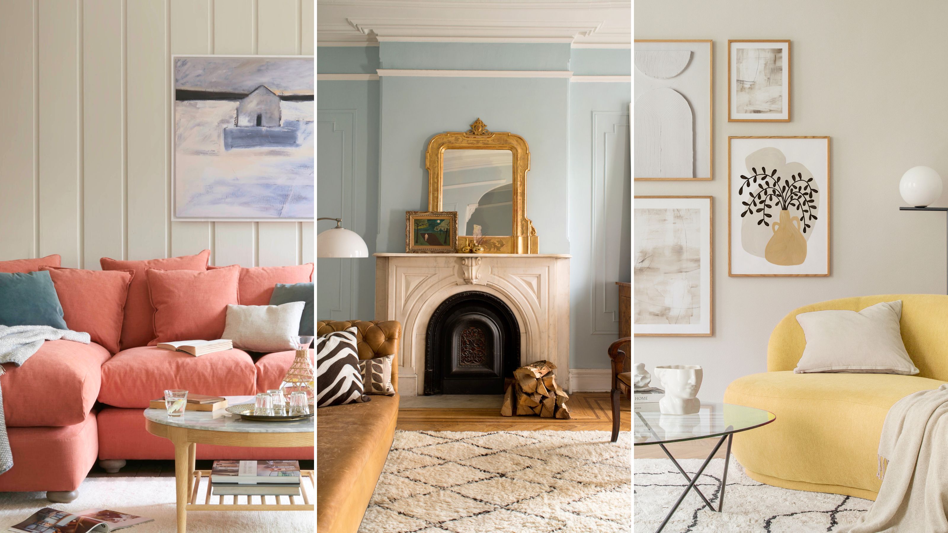
The paint colors to avoid in small living rooms — and what to use instead

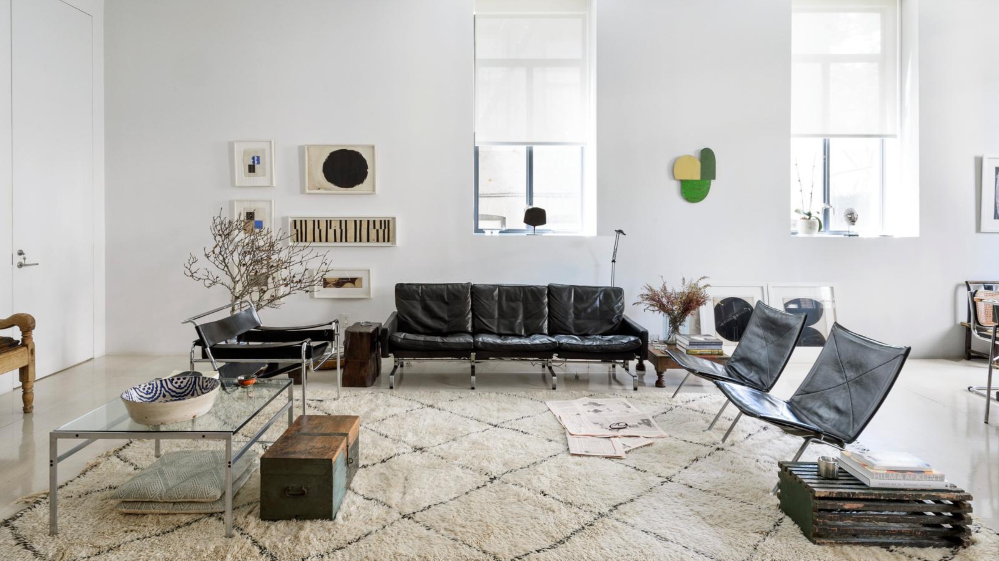
5 Problems With Painting Your Walls White That No-One Ever Talks About (Until Now)

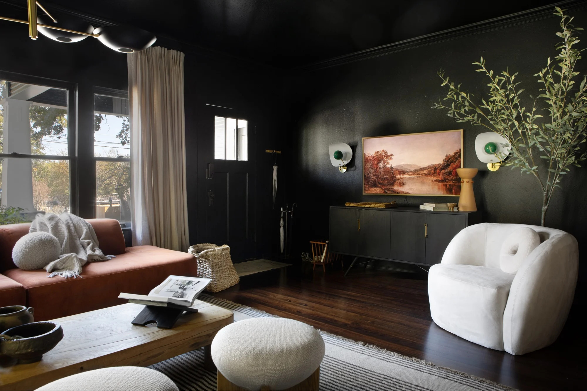
5 of best dark colors to paint small rooms, as chosen by designers – 'they'll make them feel bigger, and ceilings higher'

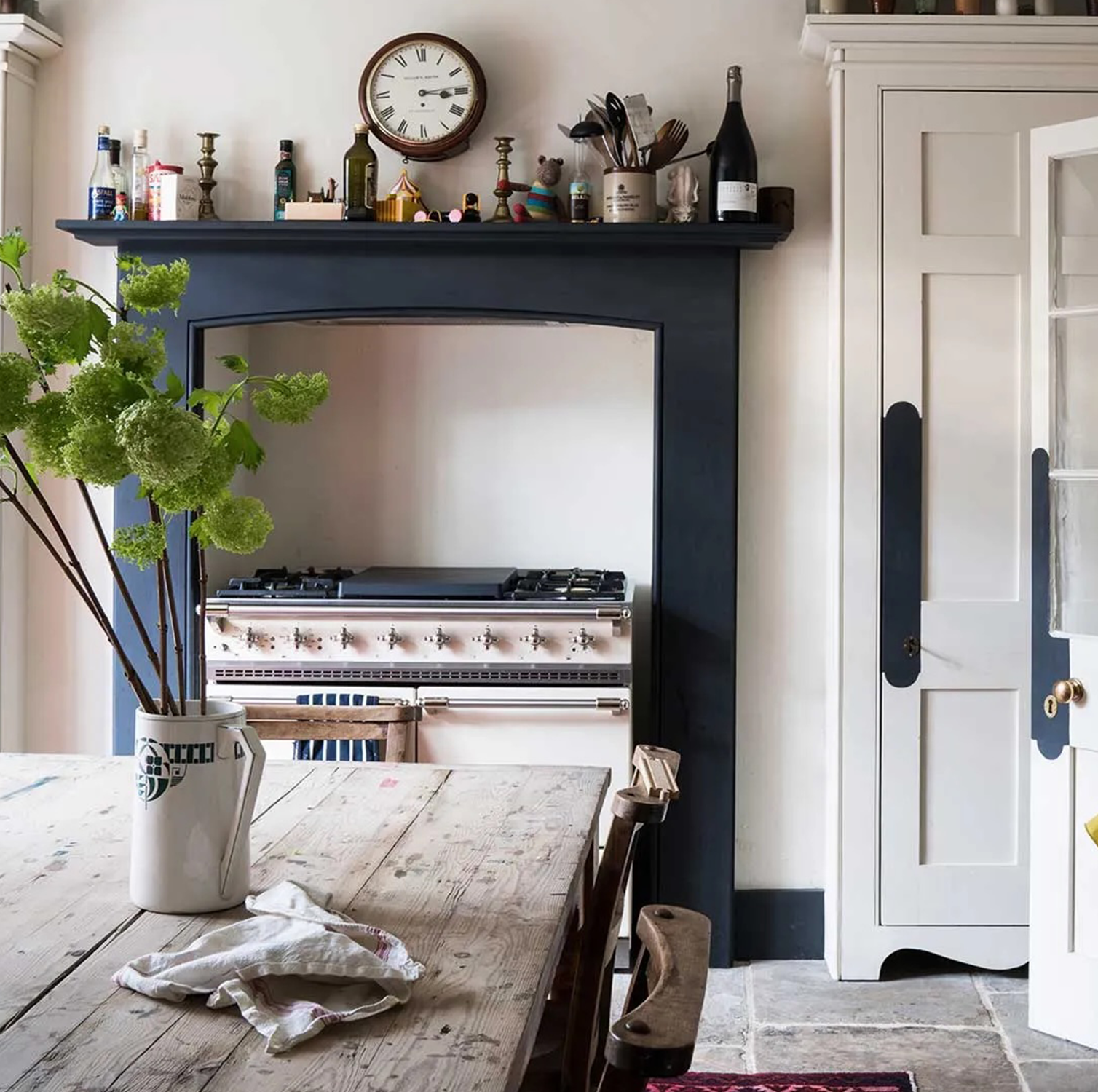
These 6 paint colours instantly make small rooms feel bigger
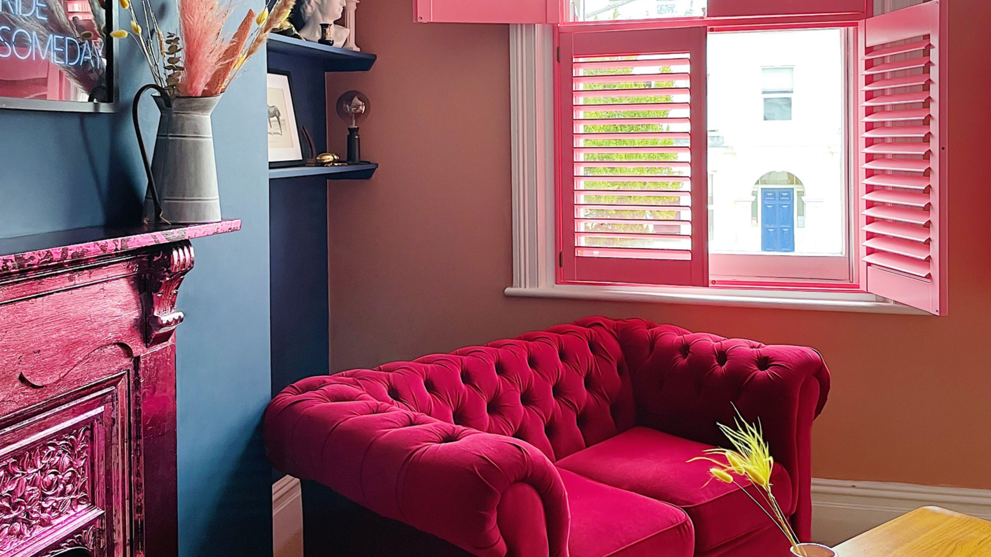
The best paint colors for small living rooms, according to design experts
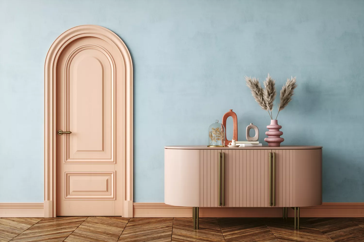
Interior Designers List the Worst Paint Colors for Your Entryway
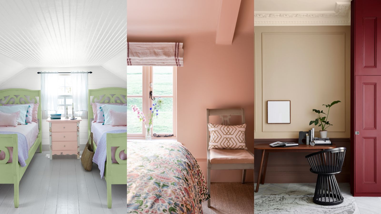
What colors make a small room look bigger? These space-stretching shades are what design experts use
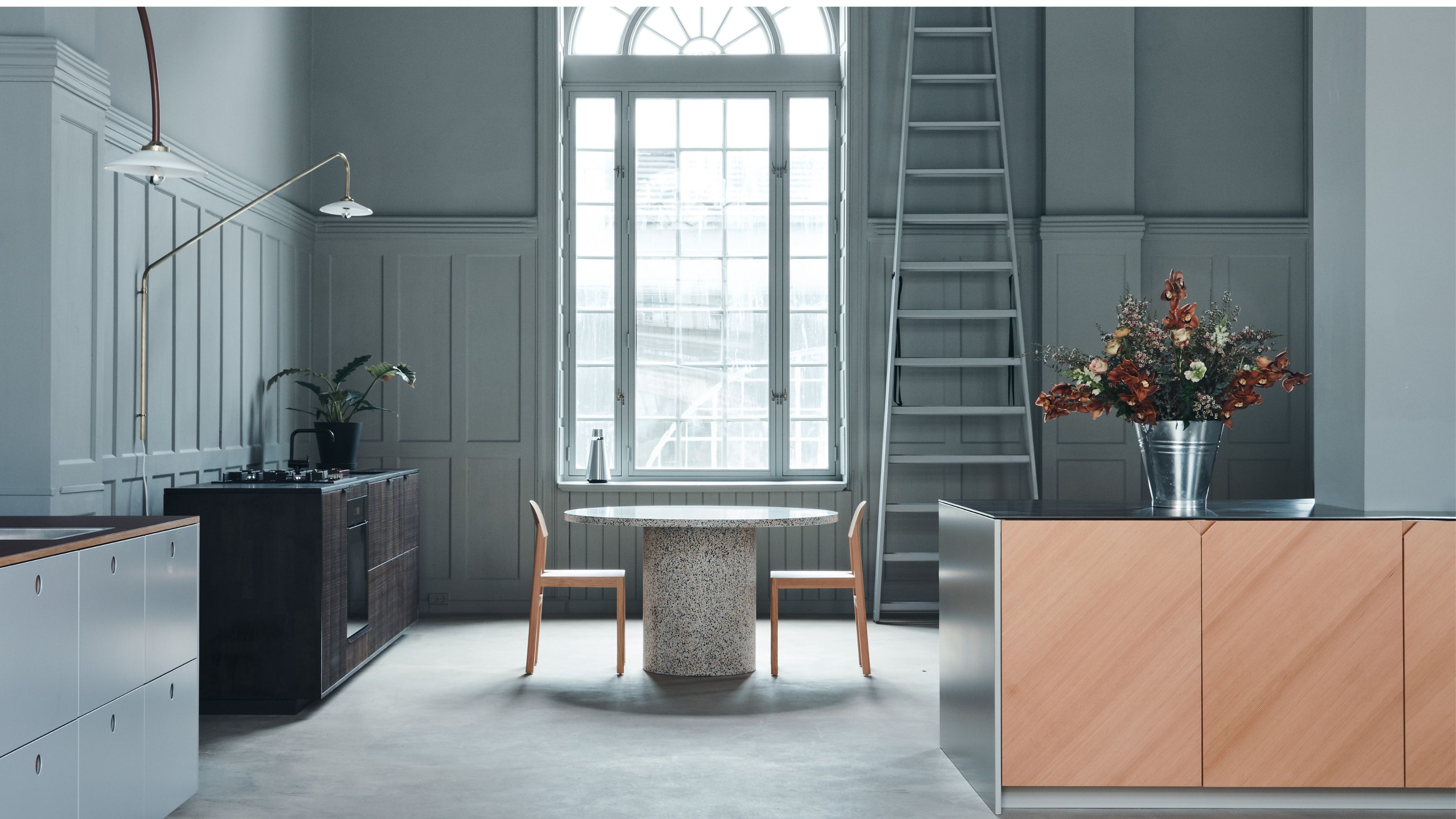
5 Reasons You Shouldn't Paint Your Kitchen Walls White — And the Alternatives You Need to Try
The 10 Worst Paint Colors for Your Home, Experts Say

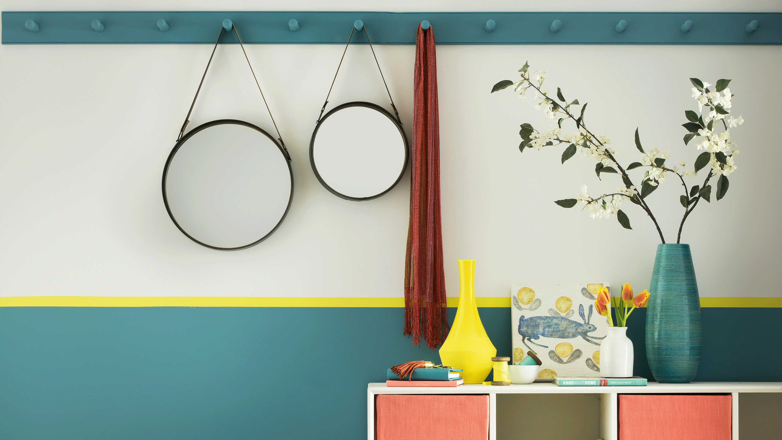
Trust us, these are the colours to avoid when painting a small hallway
8 of the best paint colors to enhance small spaces, according to experts
The 10 Best Colors for Small Bedrooms, According to Color Experts and Interior Designers

What are the worst colors to paint a room? The shades experts say you should never use
"Help, My White Walls Look Blue" — Here's Why It's Happening, and How to Fix This Common Problem
Are white walls still on trend? Designers weigh in on whether this classic shade is on the out
The Design Trick That Will Change How You Feel About White Walls