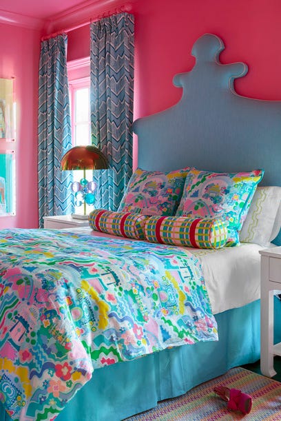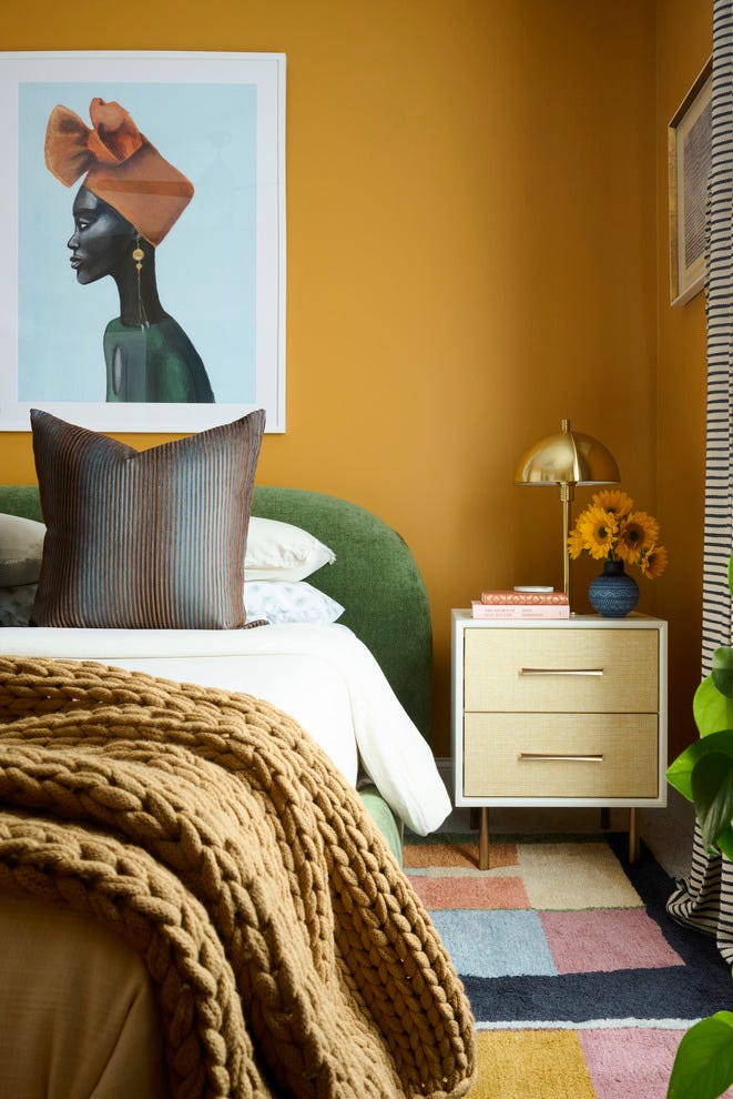
Designers Agree: These Are the Most Relaxing Paint Colors for Any Room
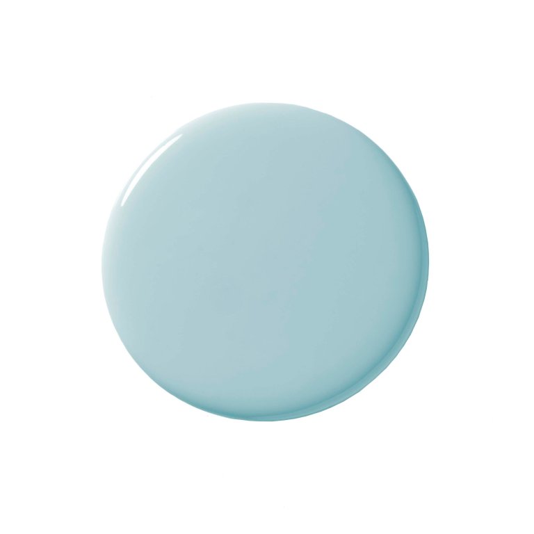
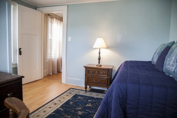
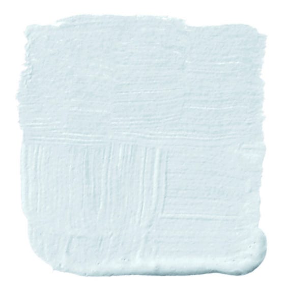
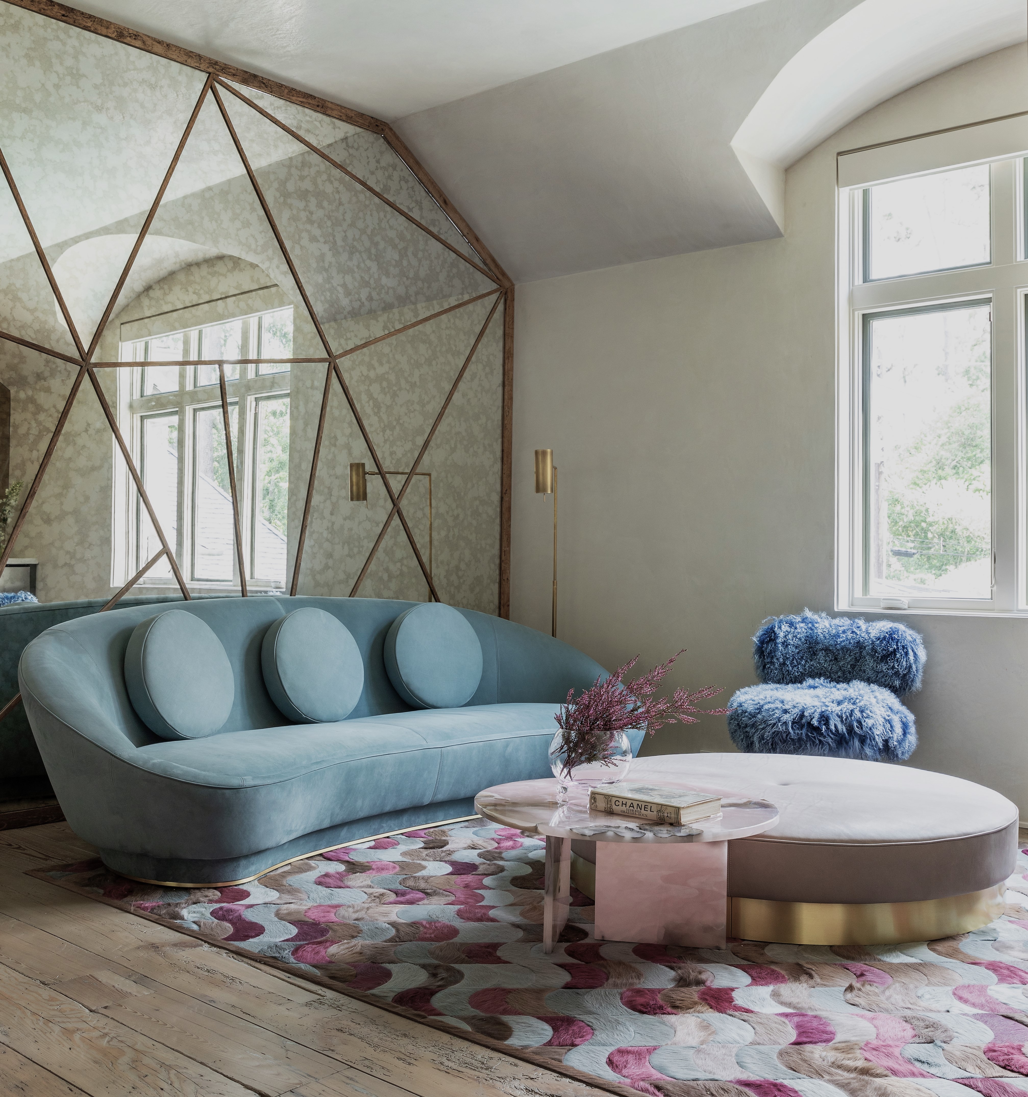
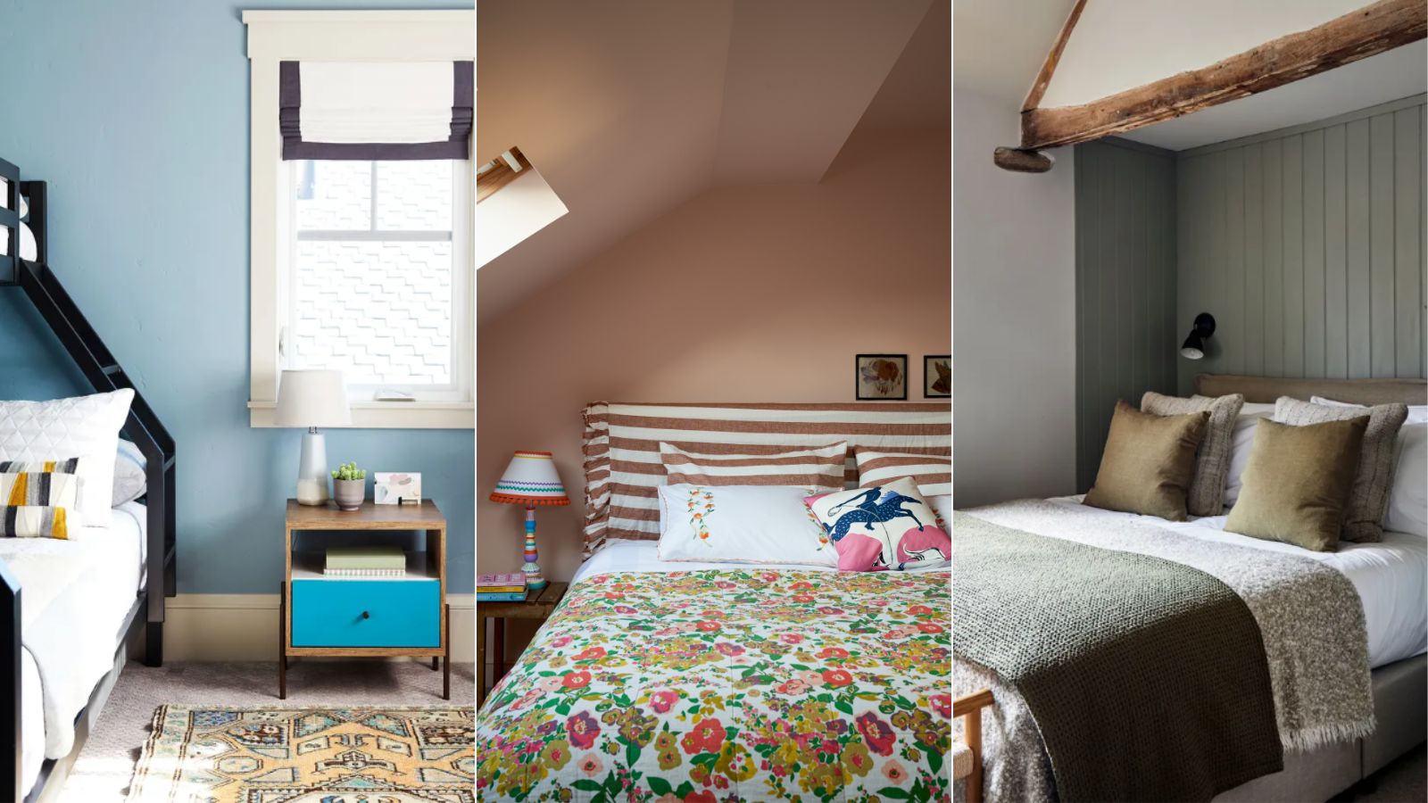
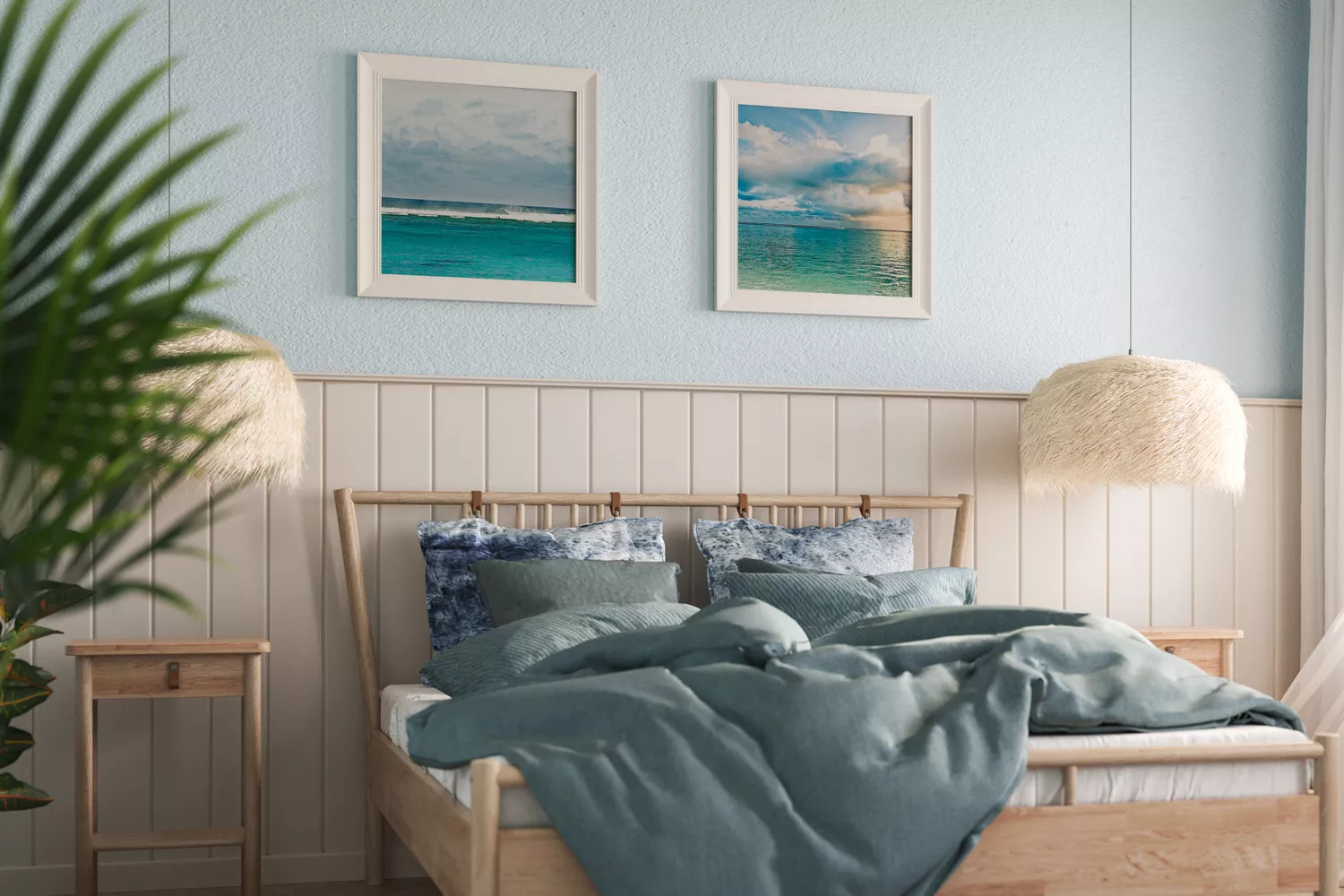
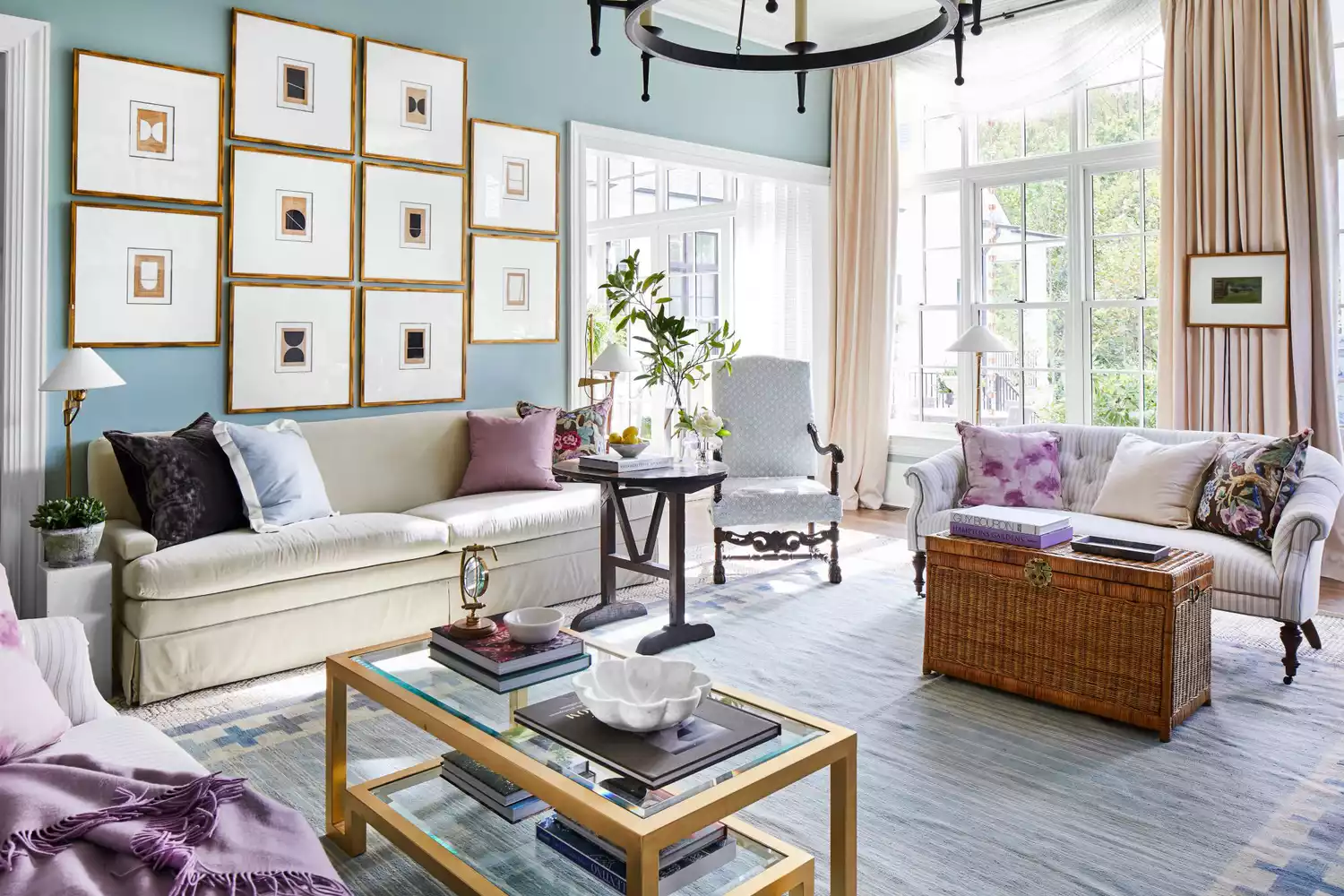
Selecting the right paint color can significantly impact the emotional ambiance of a space, fostering a sense of tranquility and relaxation. Interior designers recommend a palette of soft, muted tones combined with specific decor elements to achieve this effect. Light blue, such as Benjamin Moore's Windy Sky 1639, is frequently suggested for its gentle and airy quality, particularly beneficial in rooms with limited natural light. This shade, when applied with a matte or eggshell finish and paired with soft white or ivory trim and metallic accents like nickel or pewter, is ideal for bathrooms, sunrooms, and laundry rooms.
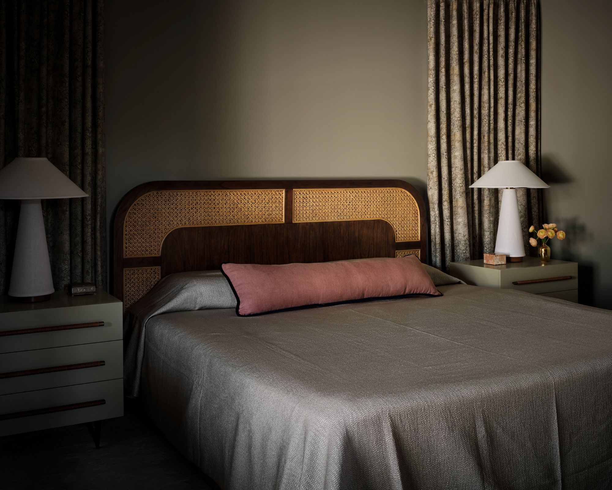
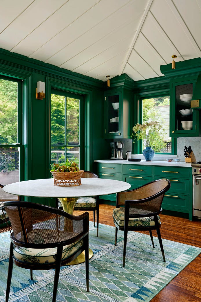
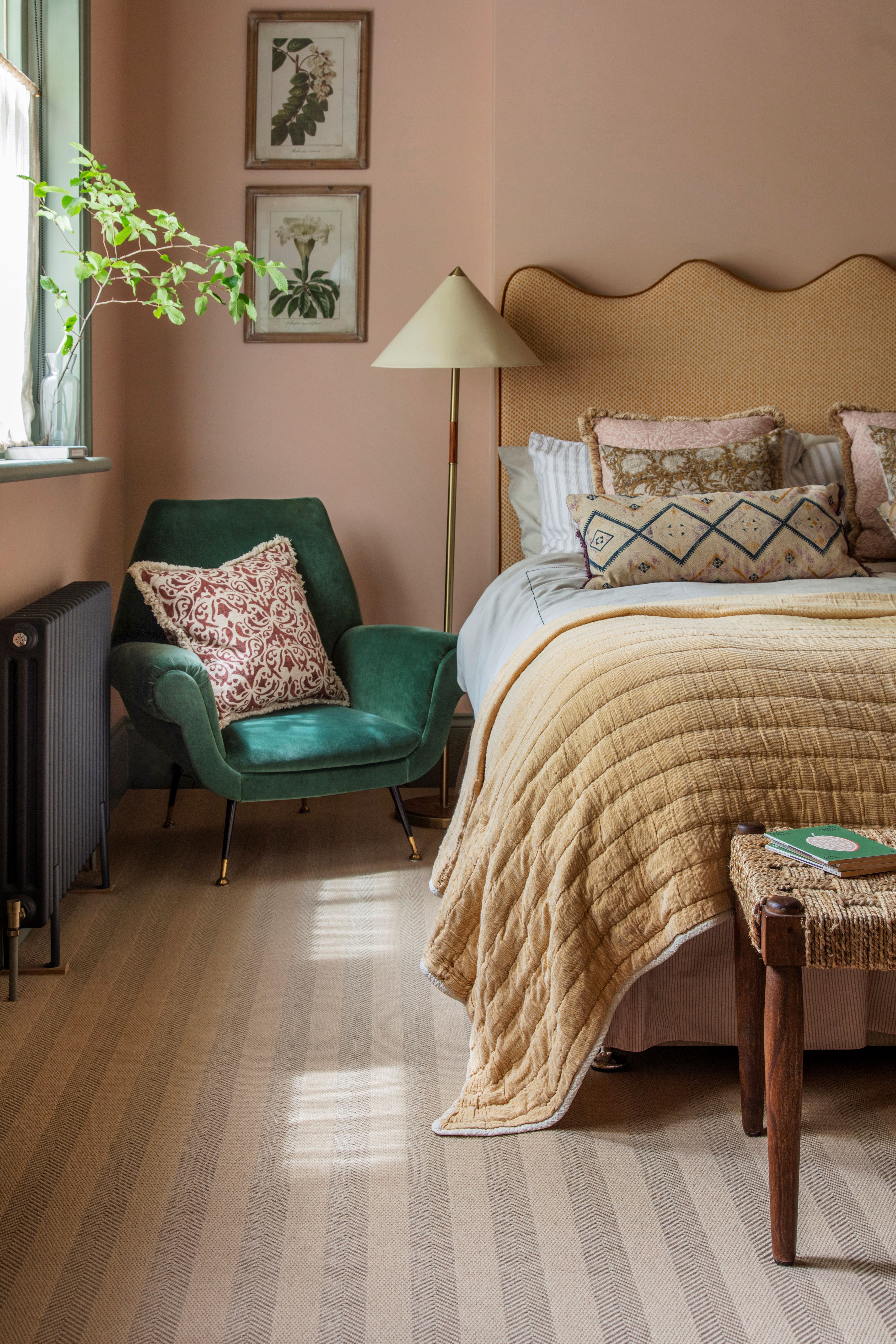
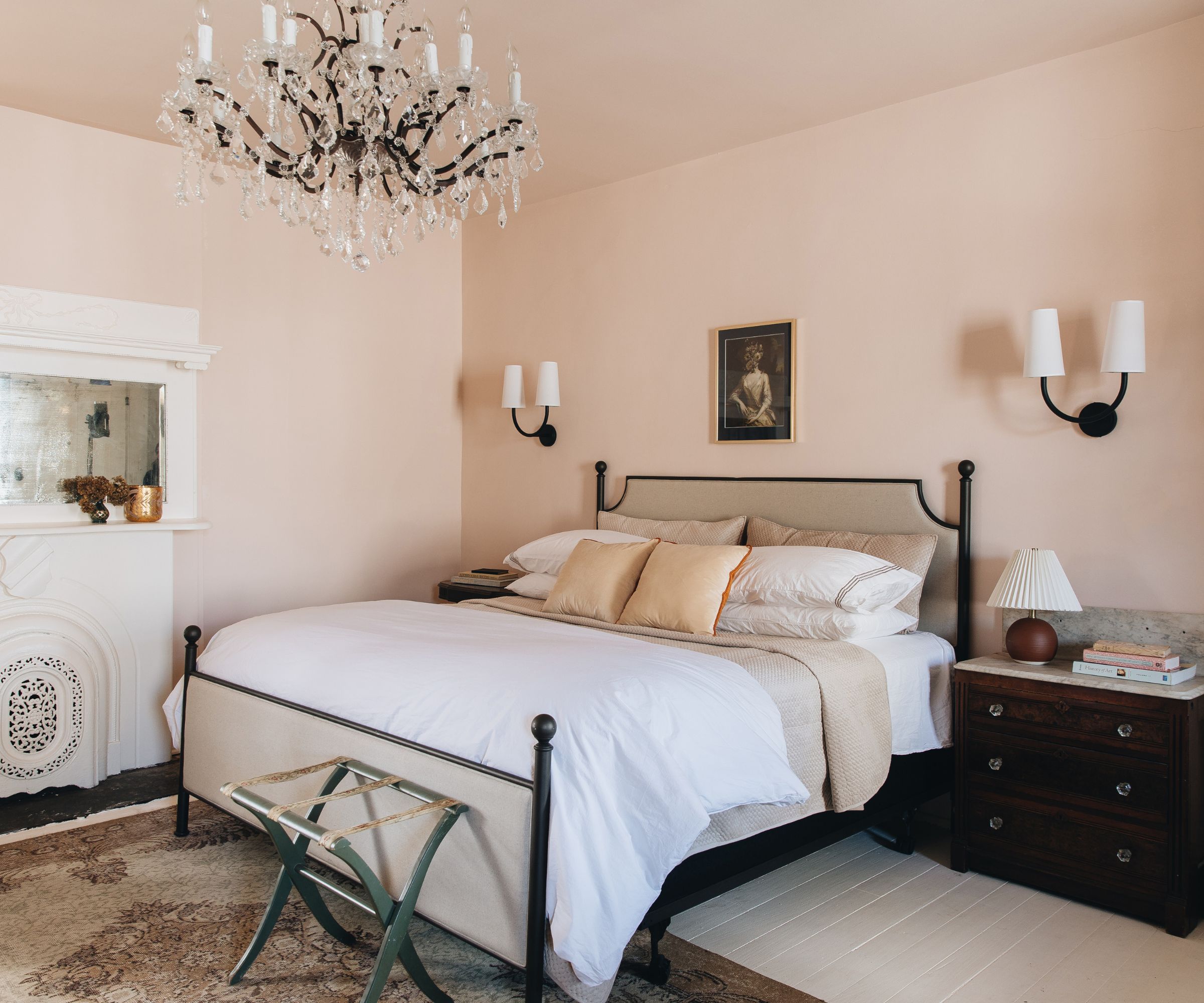
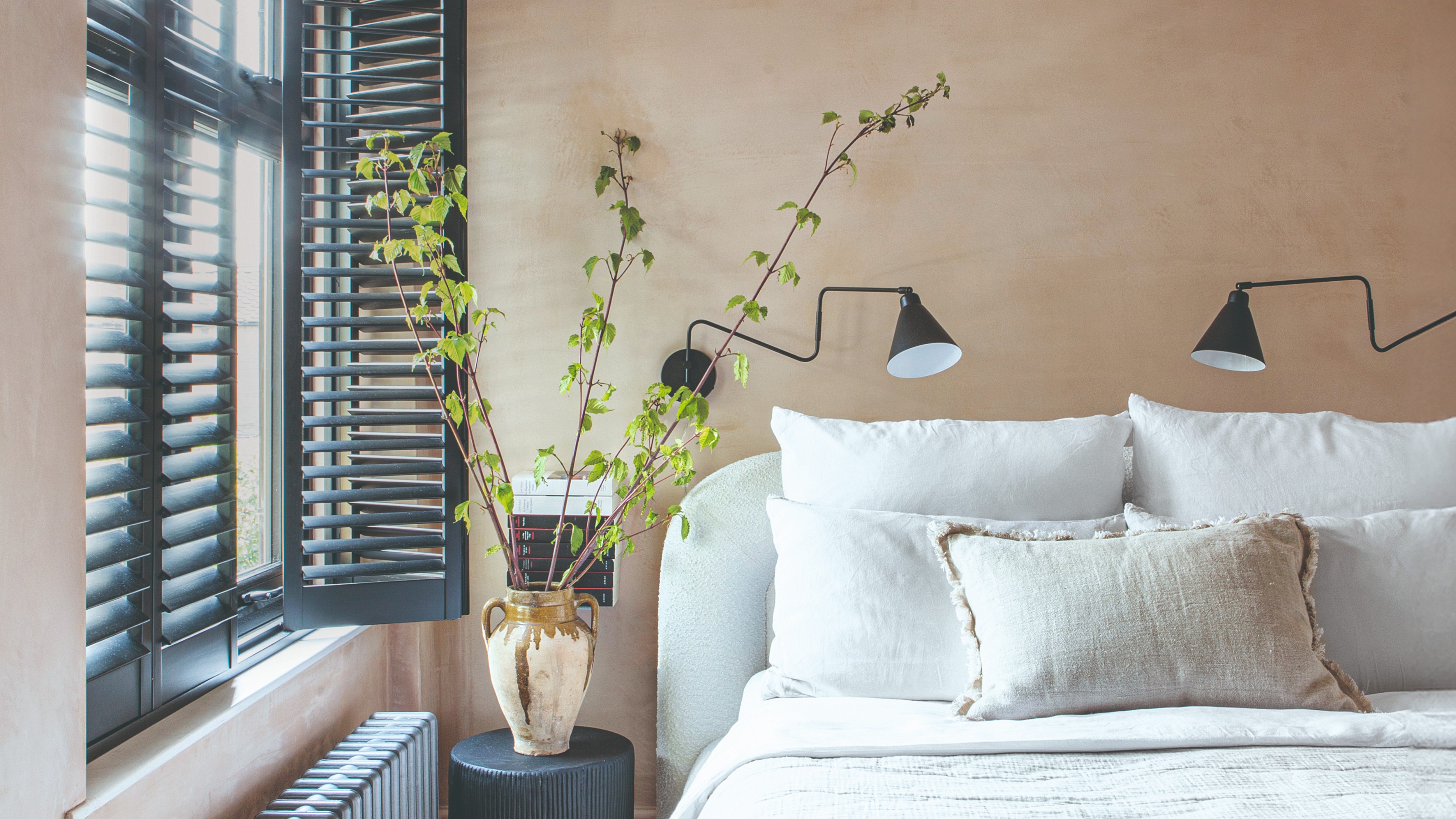
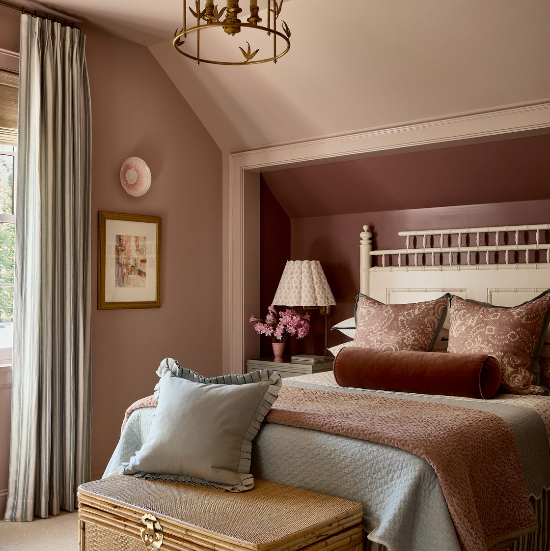
Mushroom tones, exemplified by Farrow & Ball’s Purbeck Stone No. 275, offer a versatile backdrop that suits both modern and traditional interiors. This color, a warm blend of brown and gray, avoids feeling cold or flat and is often used in bedrooms to create a calm and inviting atmosphere. It pairs well with aged wood tones and textural fabrics like bouclé or linen. Pastel greens, such as Glidden Diamond's Green Whisper, bring a sophisticated and peaceful vibe to studies, dining rooms, butler's pantries, and kitchens. This timeless and calming hue is best complemented by natural textures like white oak, aged brass, or unlacquered hardware.
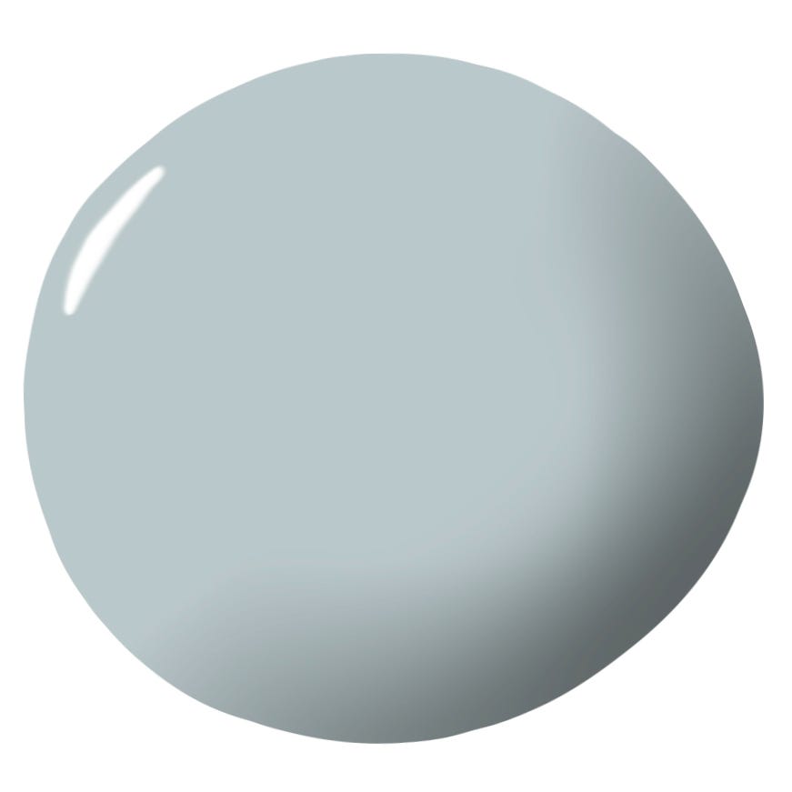
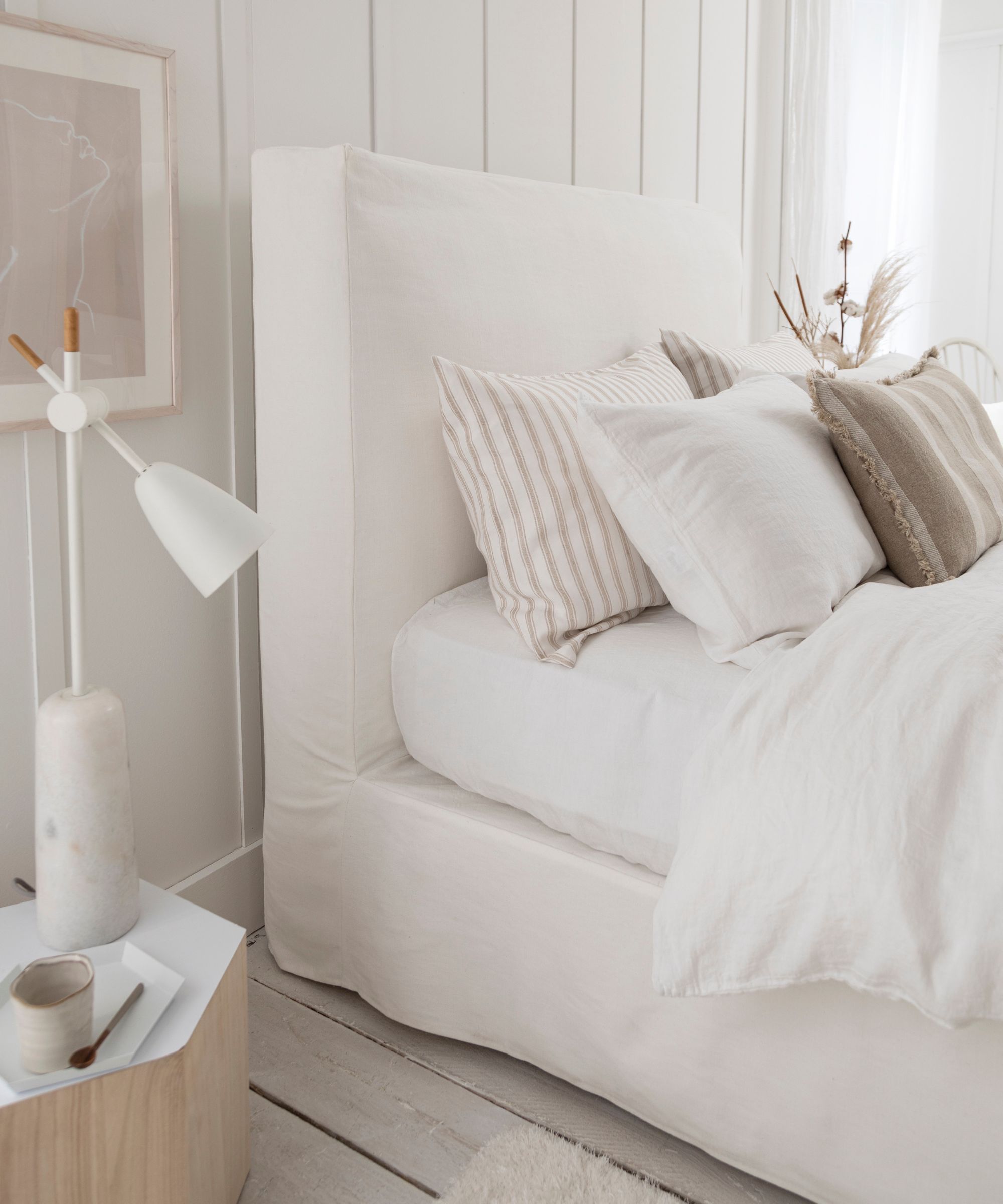
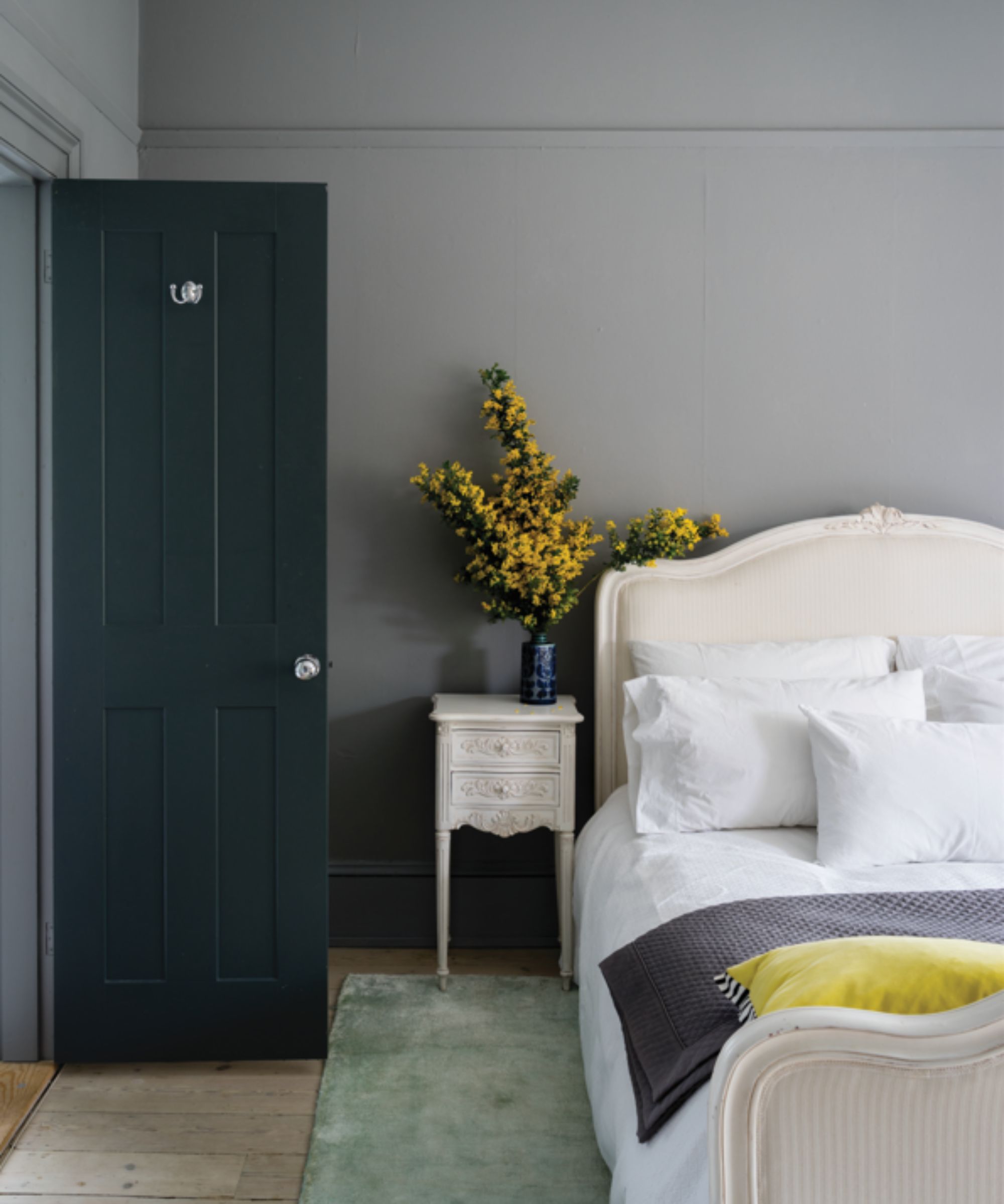
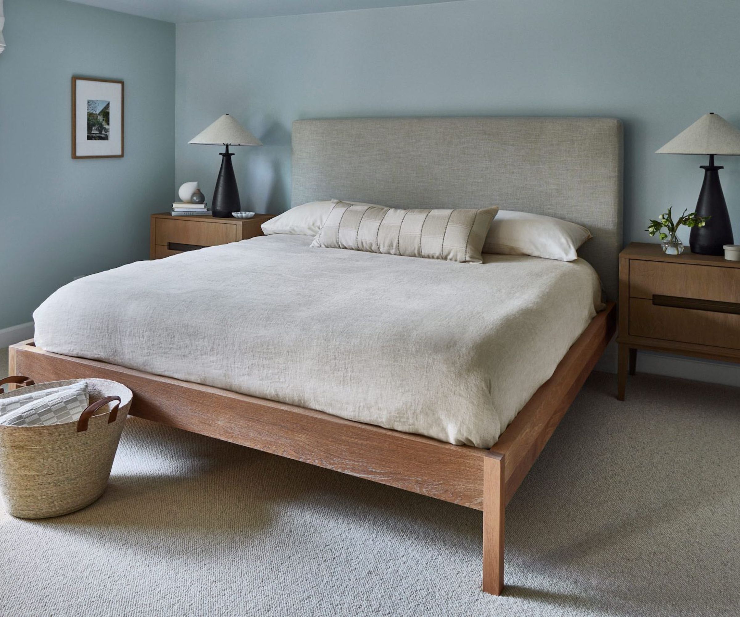
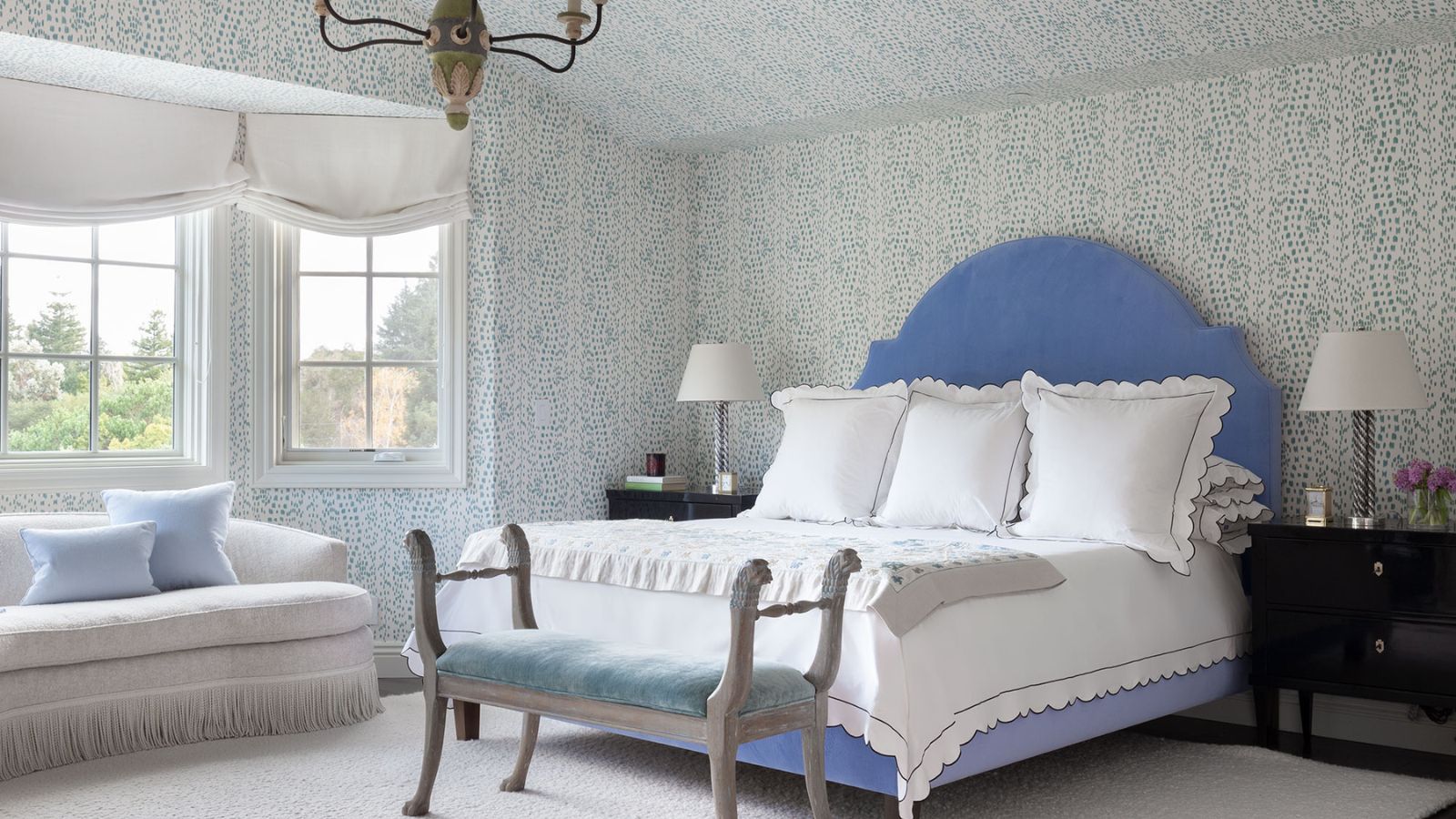
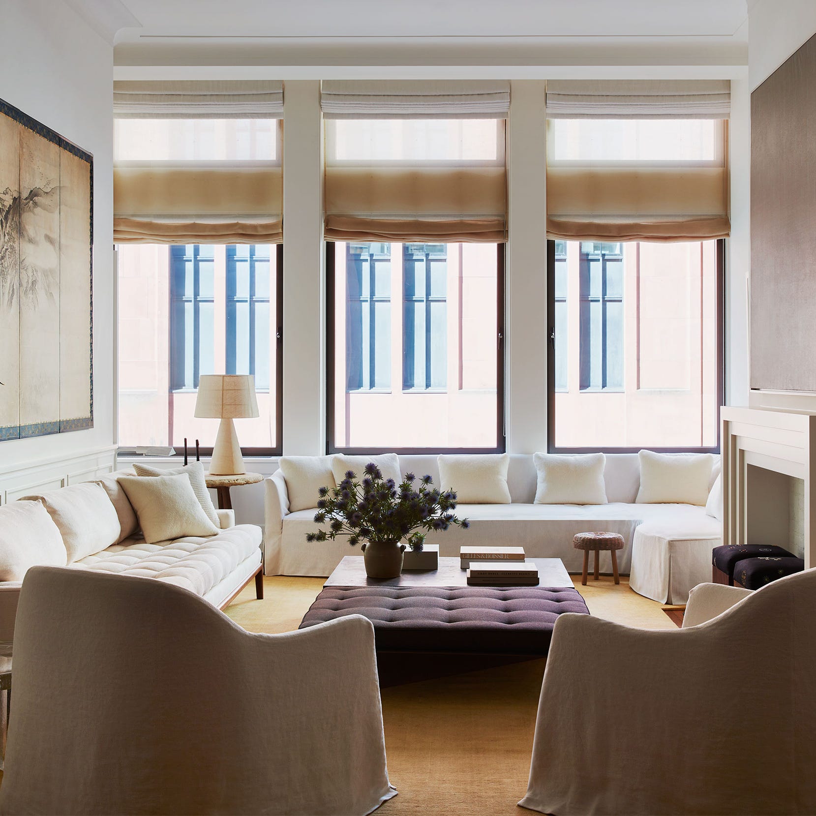
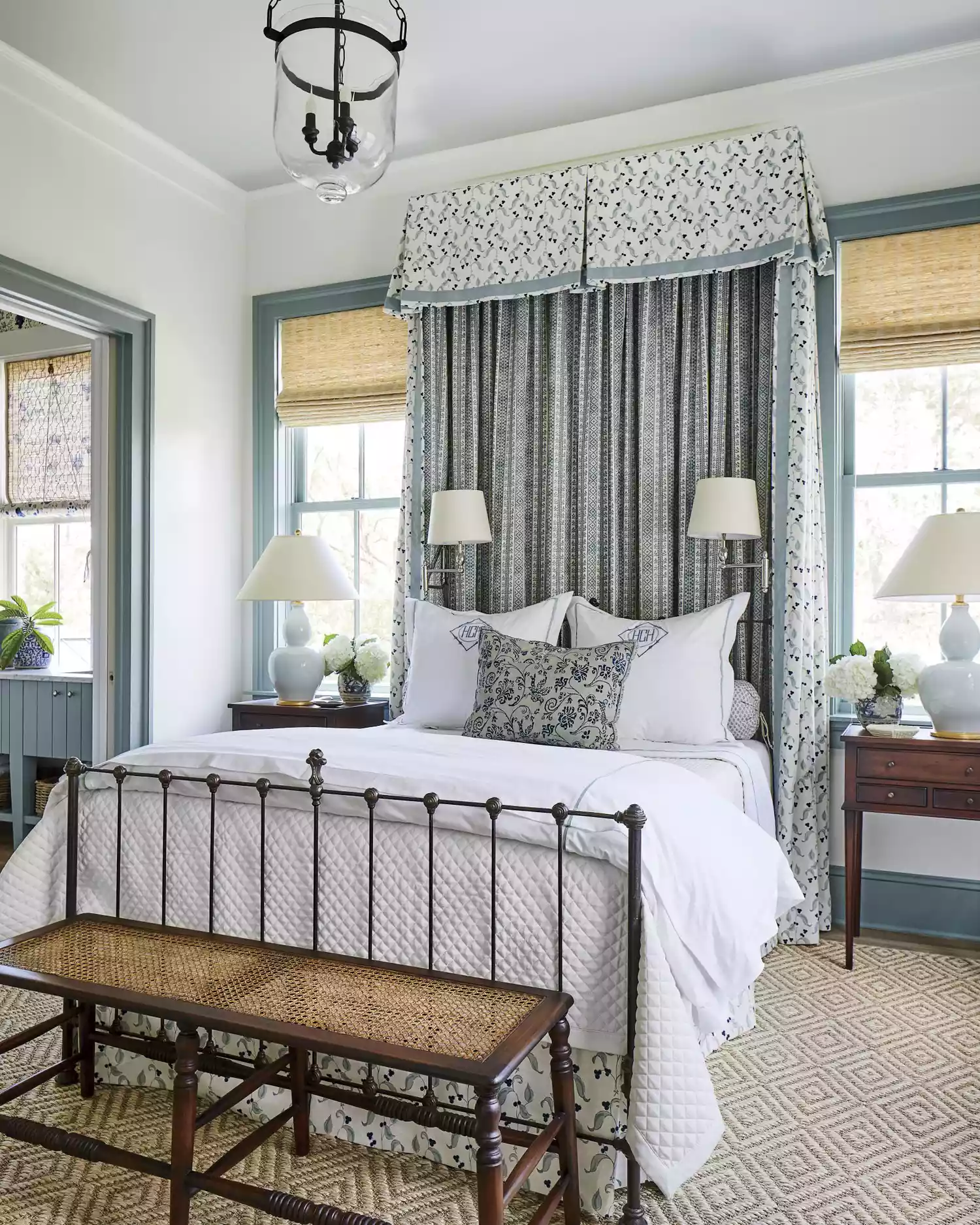
Off-white shades, like Farrow & Ball's Pointing, are praised for their ability to brighten a space without being harsh or cold. This subtle red-based off-white enhances natural light and works effectively with various textures, creating a refined and timeless look in kitchens and dining rooms. Pale blue-gray, such as Farrow & Ball's Skylight, is chosen to evoke the soothing essence of an overcast sky, perfect for creating a spa-like calm in bathrooms, bedrooms, and kitchens. Its effectiveness is amplified by natural light and clean lines.
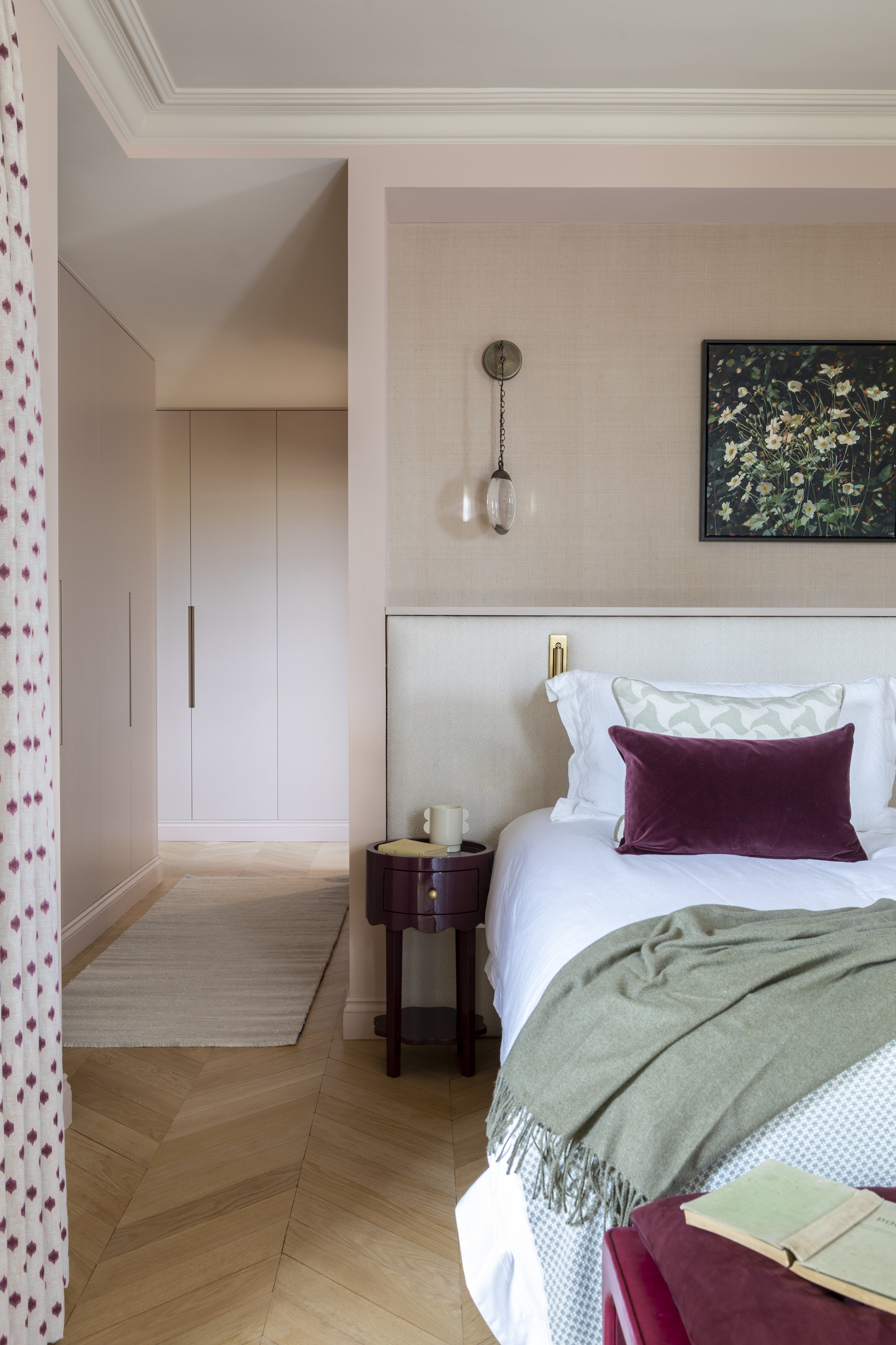
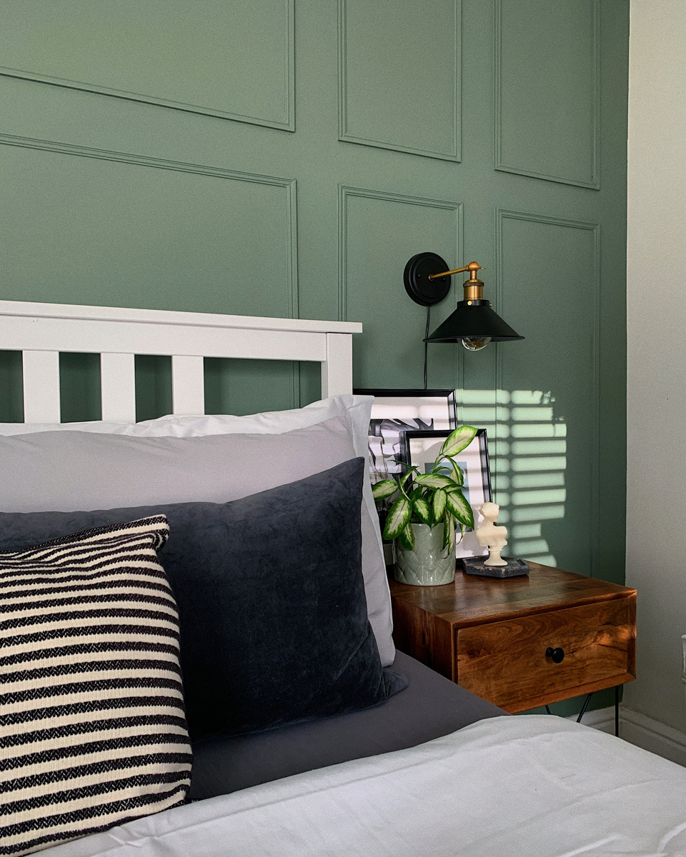
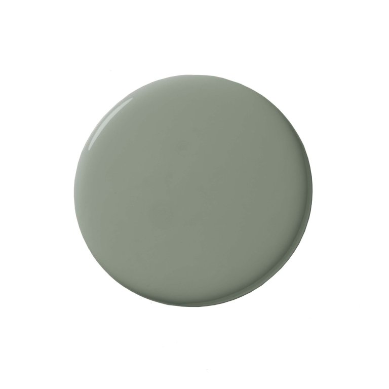
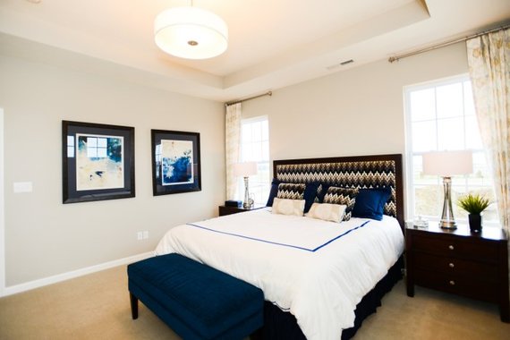
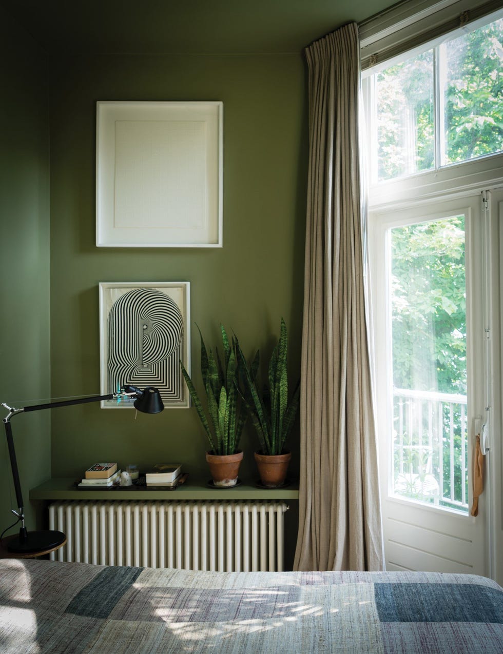
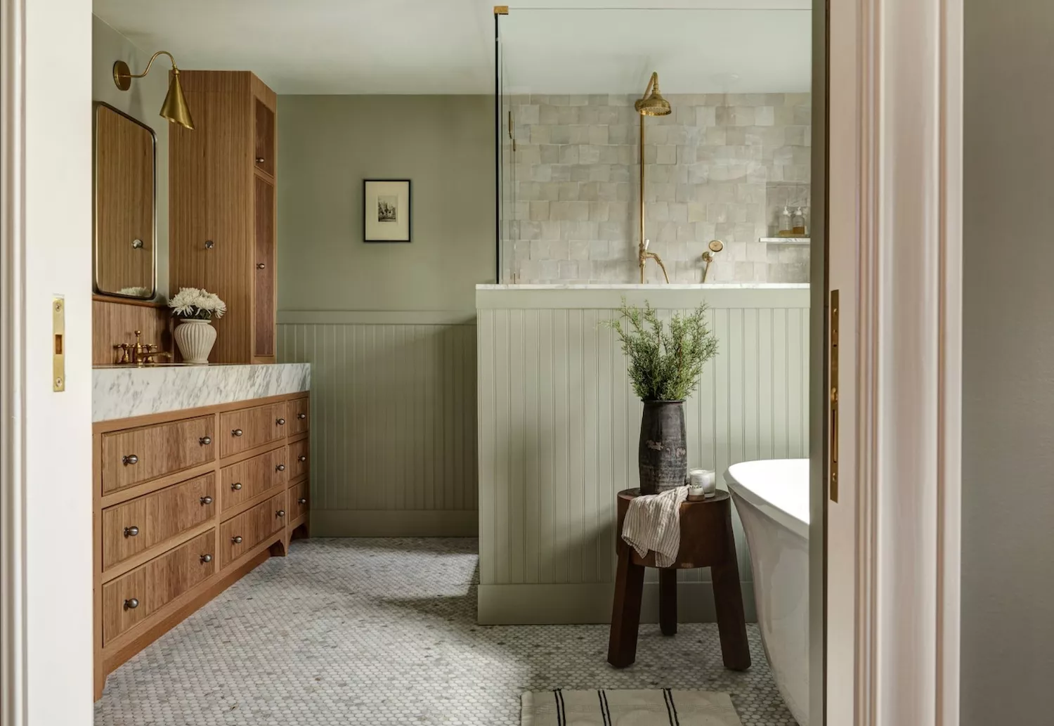
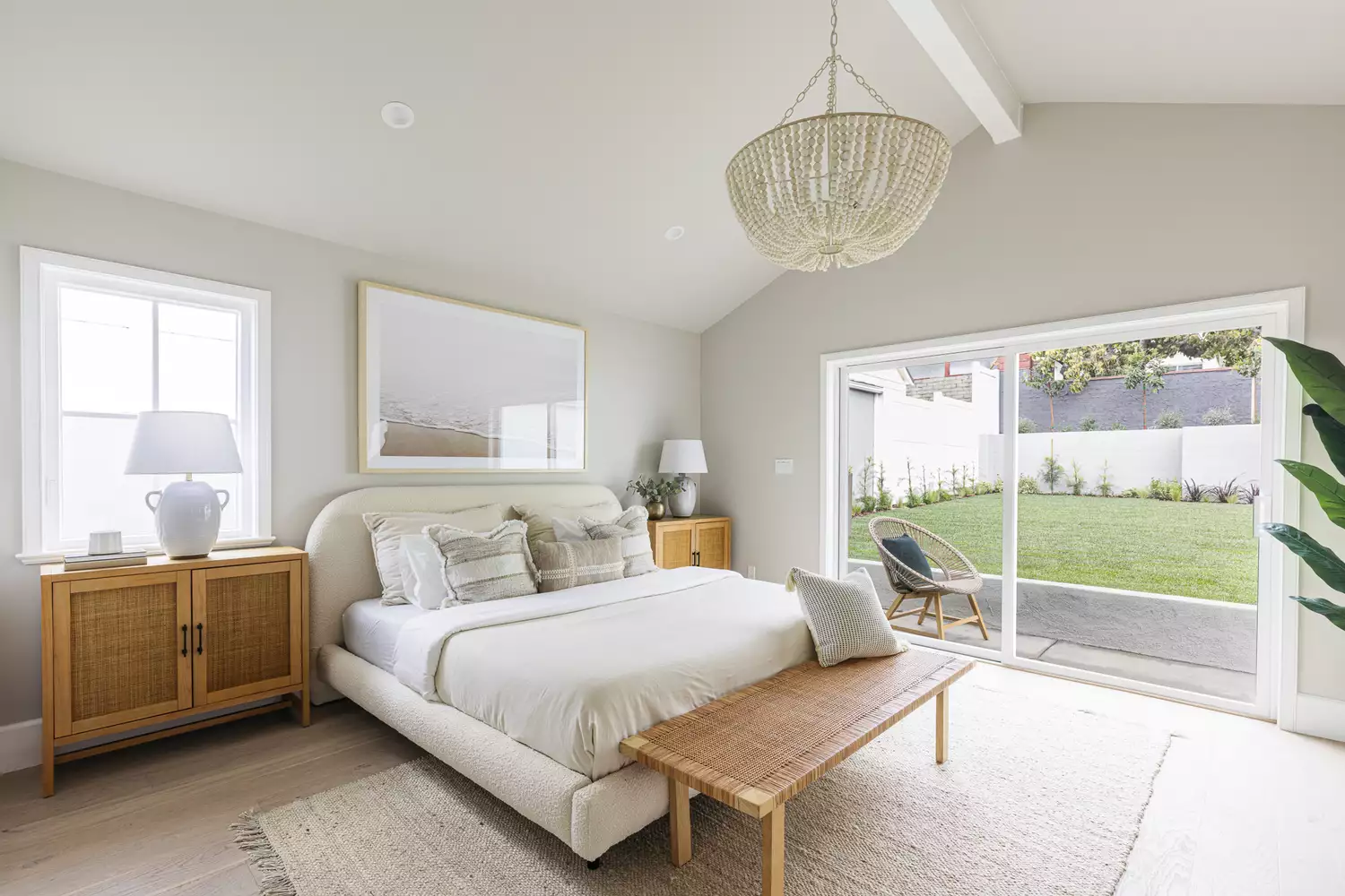
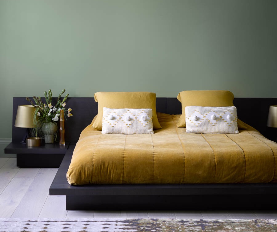
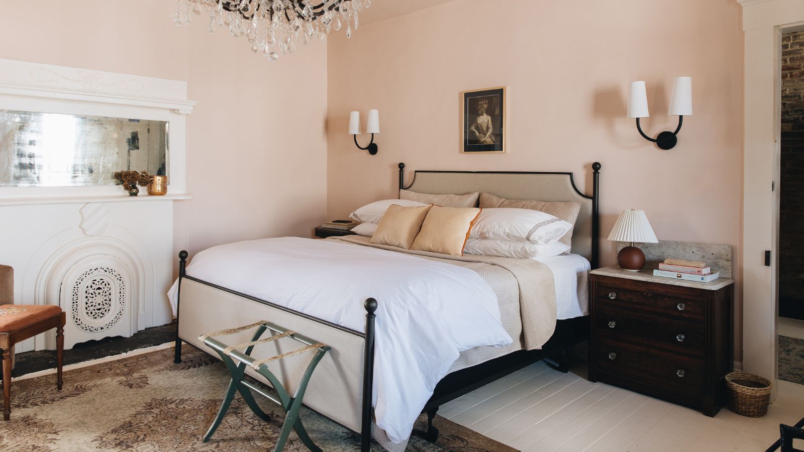
Muted sage green, like Farrow & Ball’s Vert de Terre, provides a noticeable calming effect and is recommended for bedrooms, entryways, or living areas where a restorative mood is desired. When combined with natural woods, soft linens, and neutral tones, it imparts a subtle warmth that is both inviting and comforting. Warm whites, specifically Dunn-Edwards Gardenia, with their gentle yellow undertones, create a relaxing and deep warmth, making them suitable for bedrooms, nurseries, and other restorative spaces.
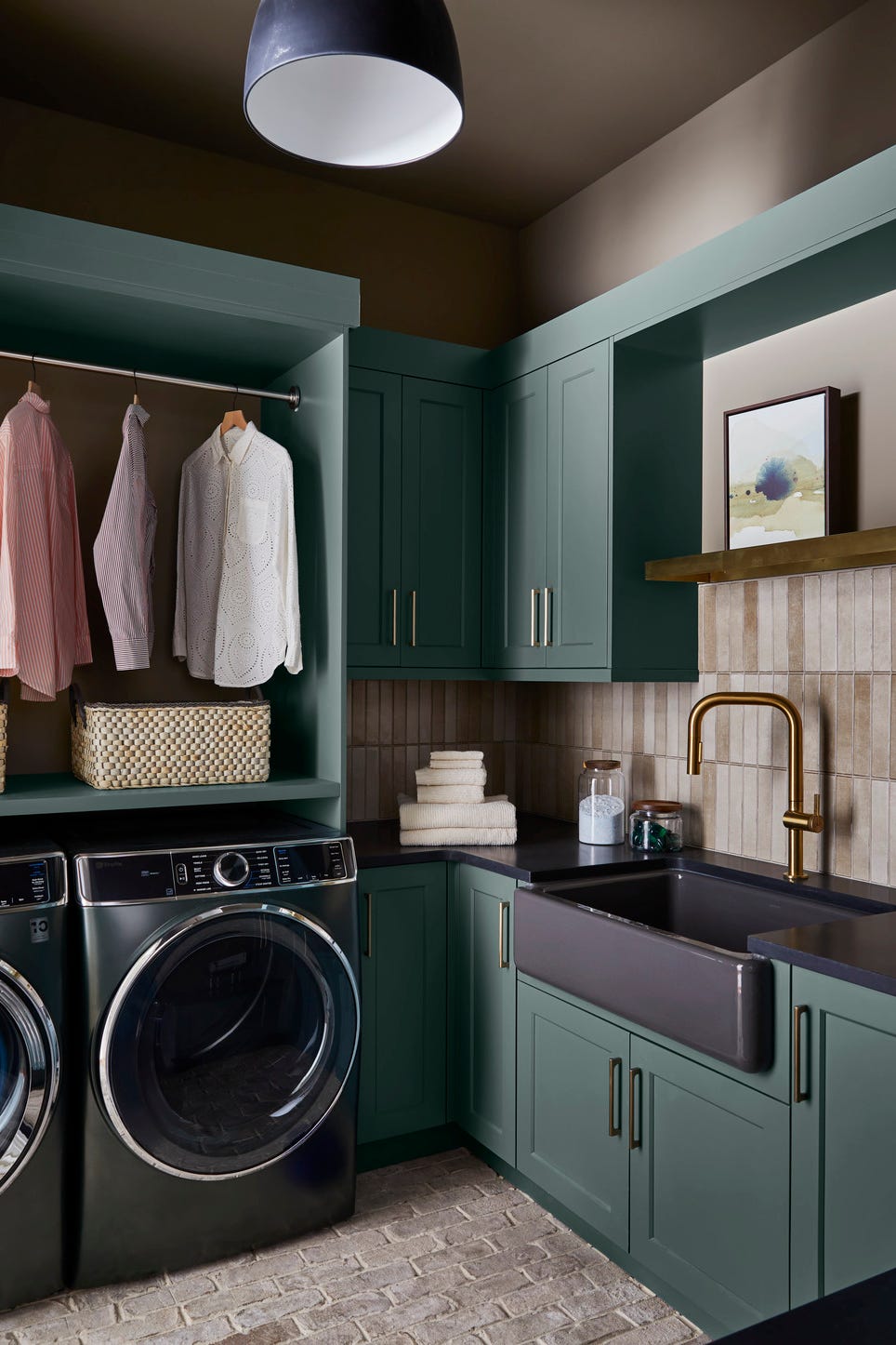
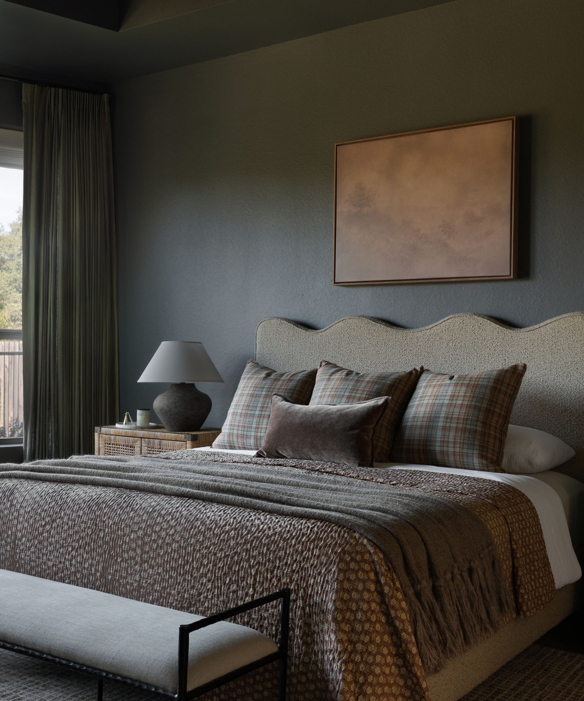
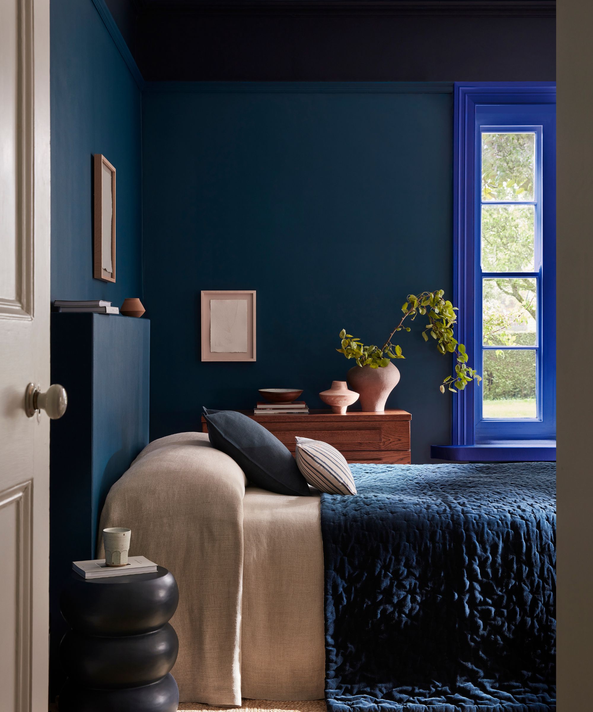
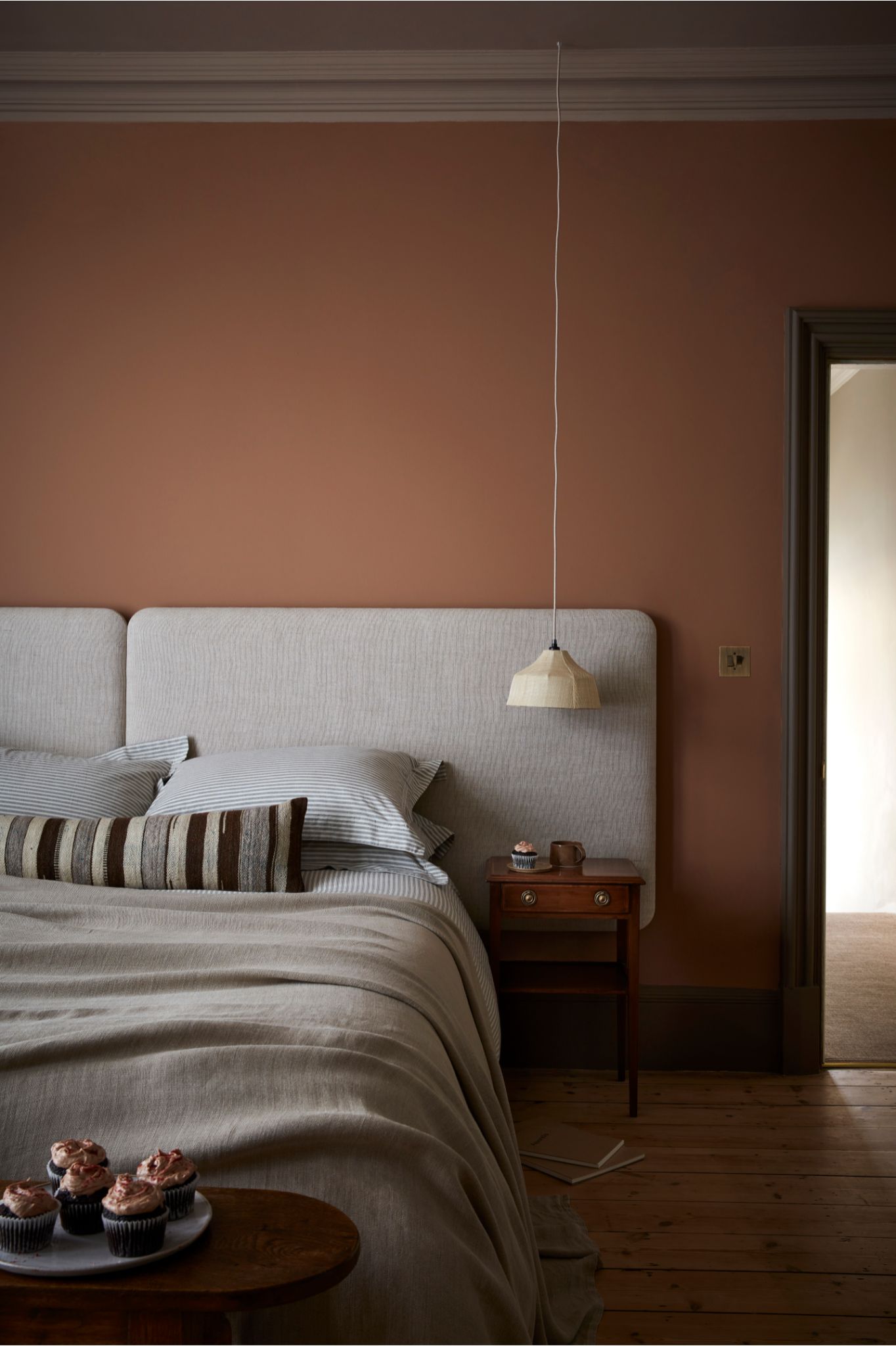
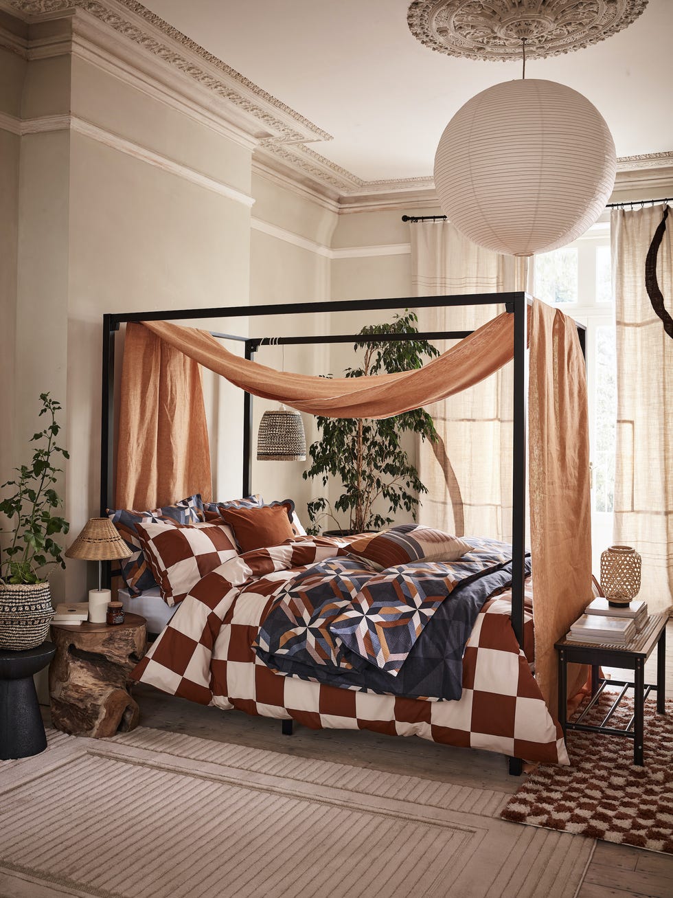
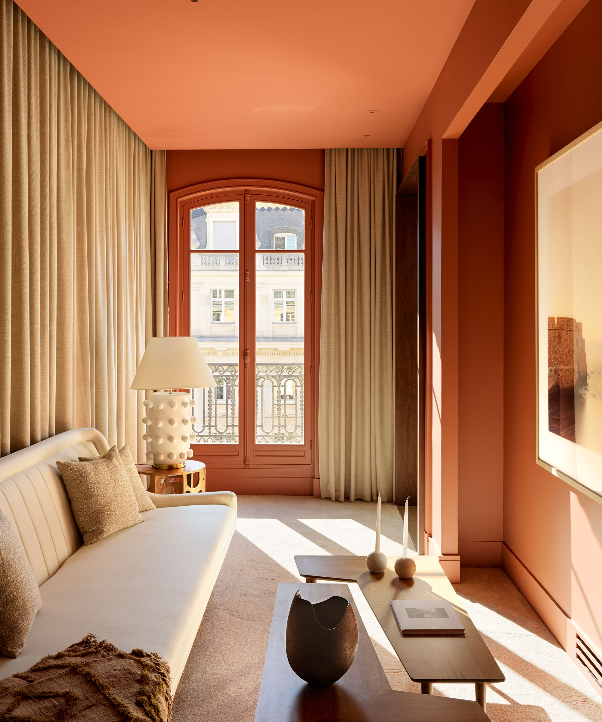
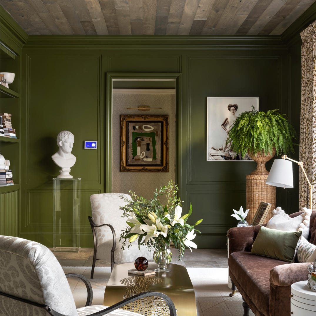
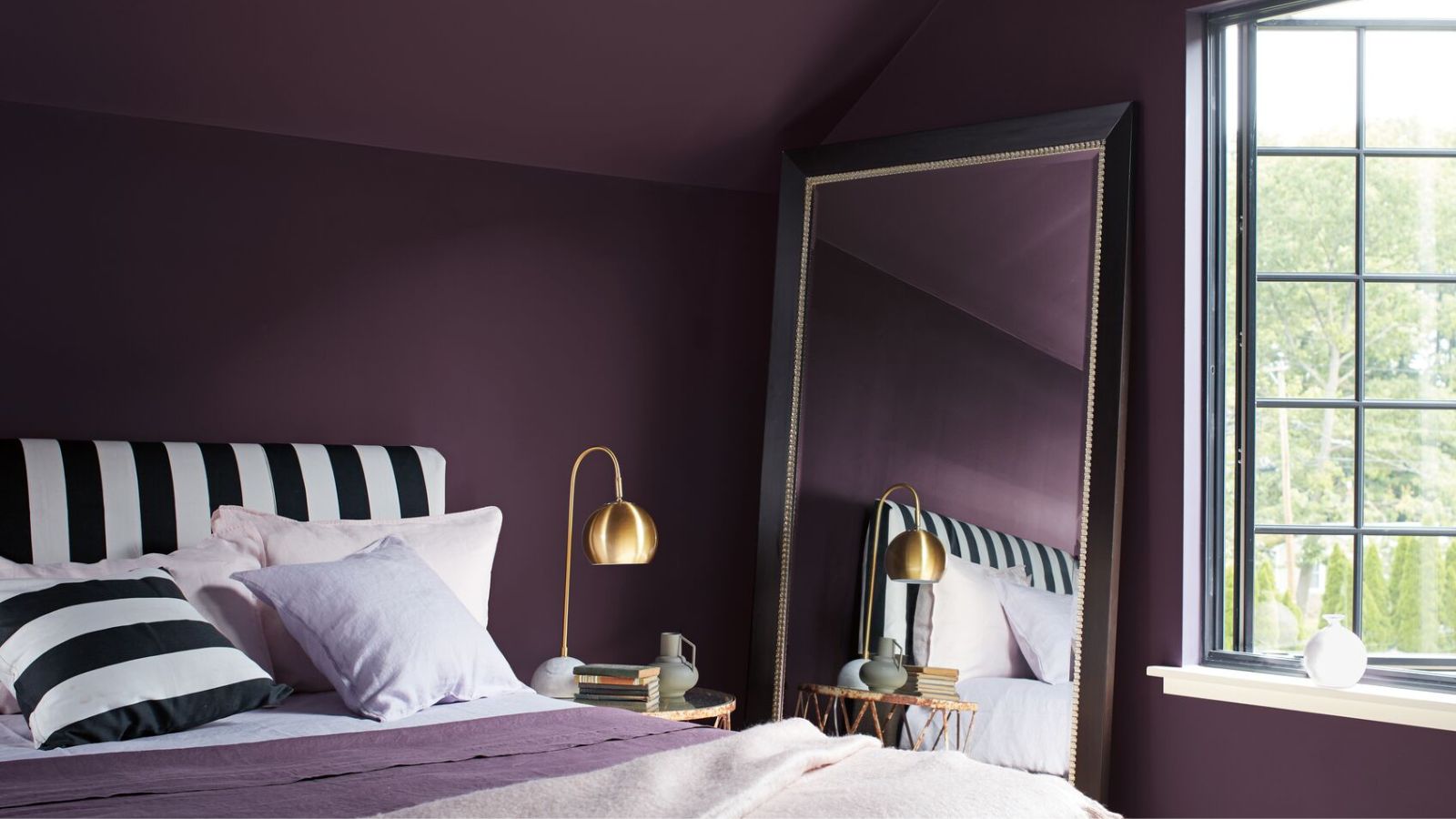
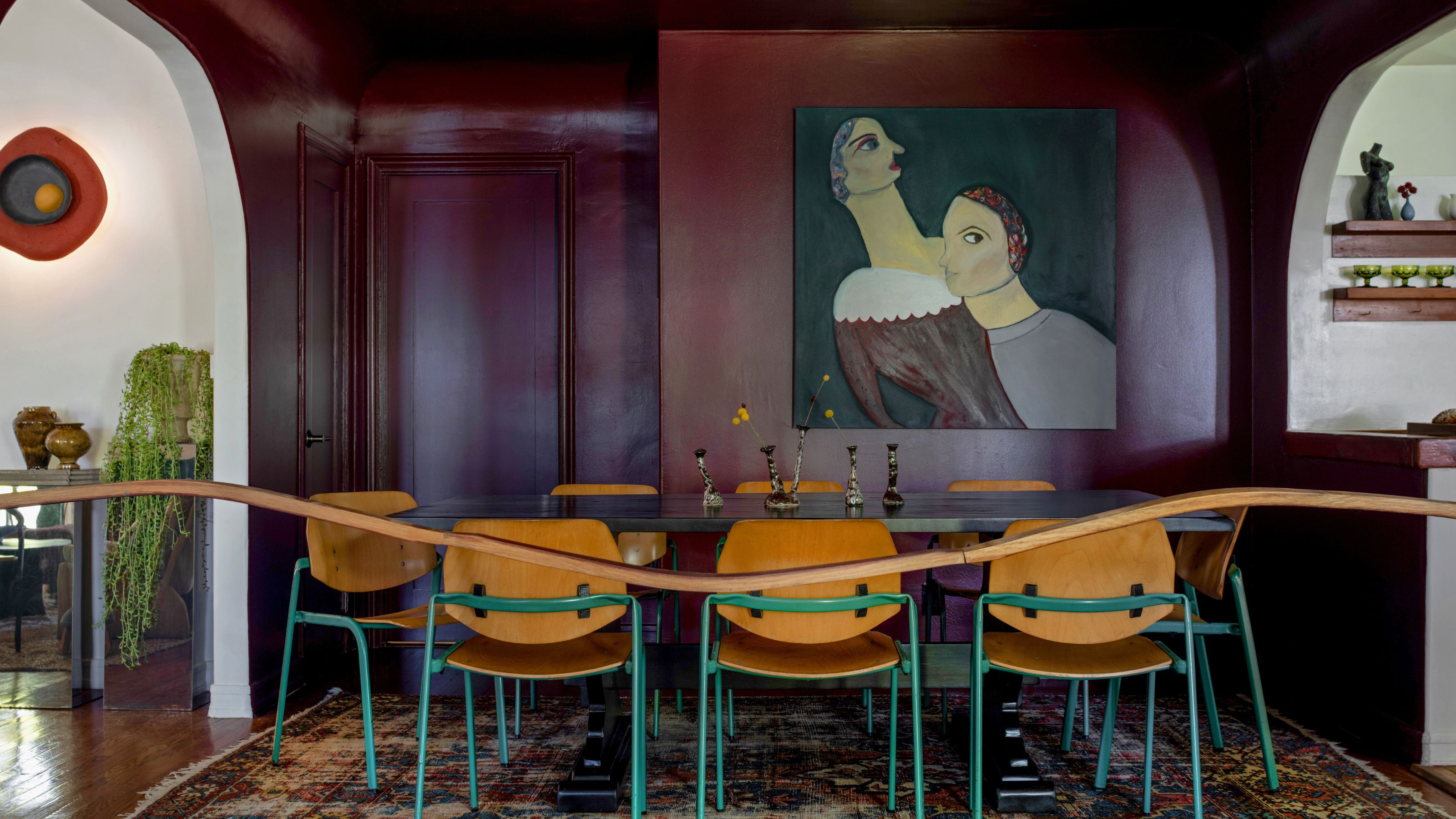
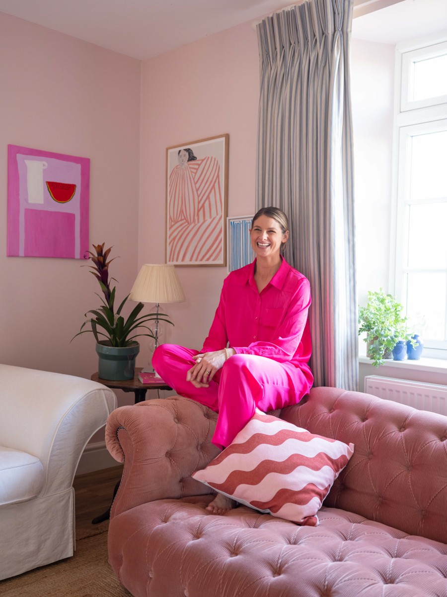
Darker hues, surprisingly, can also be relaxing. Forest green, exemplified by Benjamin Moore's Bavarian Forest, offers a nature-inspired, grounding presence that promotes quiet strength and contemplation. This color is ideal for intimate spaces such as libraries, dining rooms, home offices, or entryways. Finally, chocolate brown, a rich earth tone, is used to color-drench rooms like bedrooms, TV rooms, or game rooms, creating a deeply enveloping and relaxing atmosphere. For this effect, walls, window trim, and ceilings are painted the same dark color, while lighter tones in window treatments, rugs, and accessories prevent the space from feeling overwhelmed. These expert recommendations highlight the importance of color choice in shaping the emotional comfort of interior environments.
#RelaxingPaintColors #InteriorDesign #HomeDecor #PaintColors #CalmingSpaces #DesignTips #DecoratingIdeas #ColorPsychology #RelaxingPaintColors #InteriorDesign #HomeDecor #PaintColors #CalmingSpaces #DesignTips #DecoratingIdeas #ColorPsychology
0 comment in total
You may also like
5 colors that will make your bedroom feel calmer, according to designers
Designers Declare This Color the Ultimate "Chill-Pill" for Your Home

5 rooms that prove color drenching your bedroom is a good idea
What paint colors to use to create a relaxed vibe at home

13 Calming Paint Colors Designers Use to Make Rooms Feel Soothing — And No, They're Not All Neutrals

Best Bedroom Colors for Sleep

14 Best Bedroom Paint Colors for a Relaxing Space
5 colors that will make your living room feel happier, according to interior designers
A Color Psychologist Says This Is the Most Relaxing Paint Color

11 Calming Bedroom Paint Colors to Help You Relax and Wind Down at the End of the Day

5 bedroom colors going out of style in 2025 – and what designers are using instead for a stylish sleep space
18 dreamy bedroom colour ideas to create a rest-promoting, stylish space
6 Calming Paint Colors Designers Swear By For A Relaxing Living Room
5 Paint Colors That Will Help You Sleep Better if You Use Them in Your Bedroom
16 beautiful bedroom colour ideas and how to use them
The Most Grown-Up Pastel Color Palettes Designers Love For Rooms You Want to Relax in
You Can Wake Up HAPPIER Just by Painting Your Bedroom—Here Are the Colors Designers Love
20 Calming Paint Colors That Will Change the Way You Live

10 designers on the bedroom colors they always recommend
25 Soothing Paint Colors to Make Your Space Instantly Restful