1/12
The Most Grown-Up Pastel Color Palettes Designers Love For Rooms You Want to Relax in
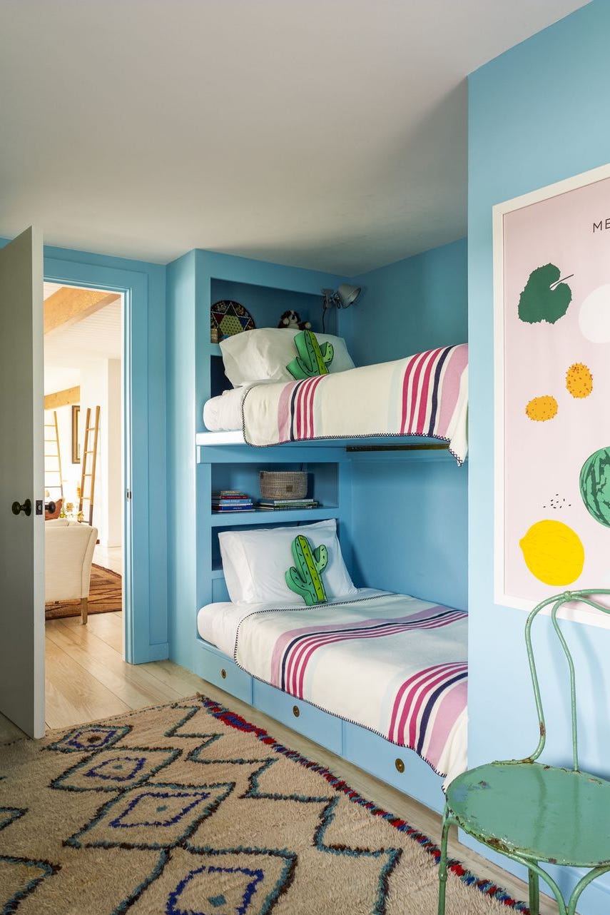
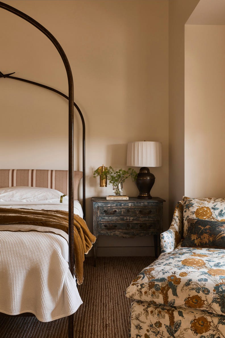
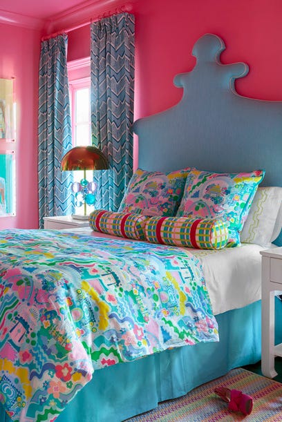
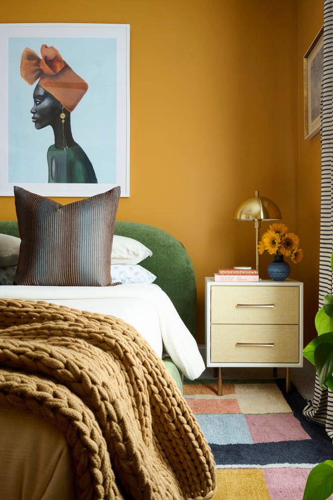
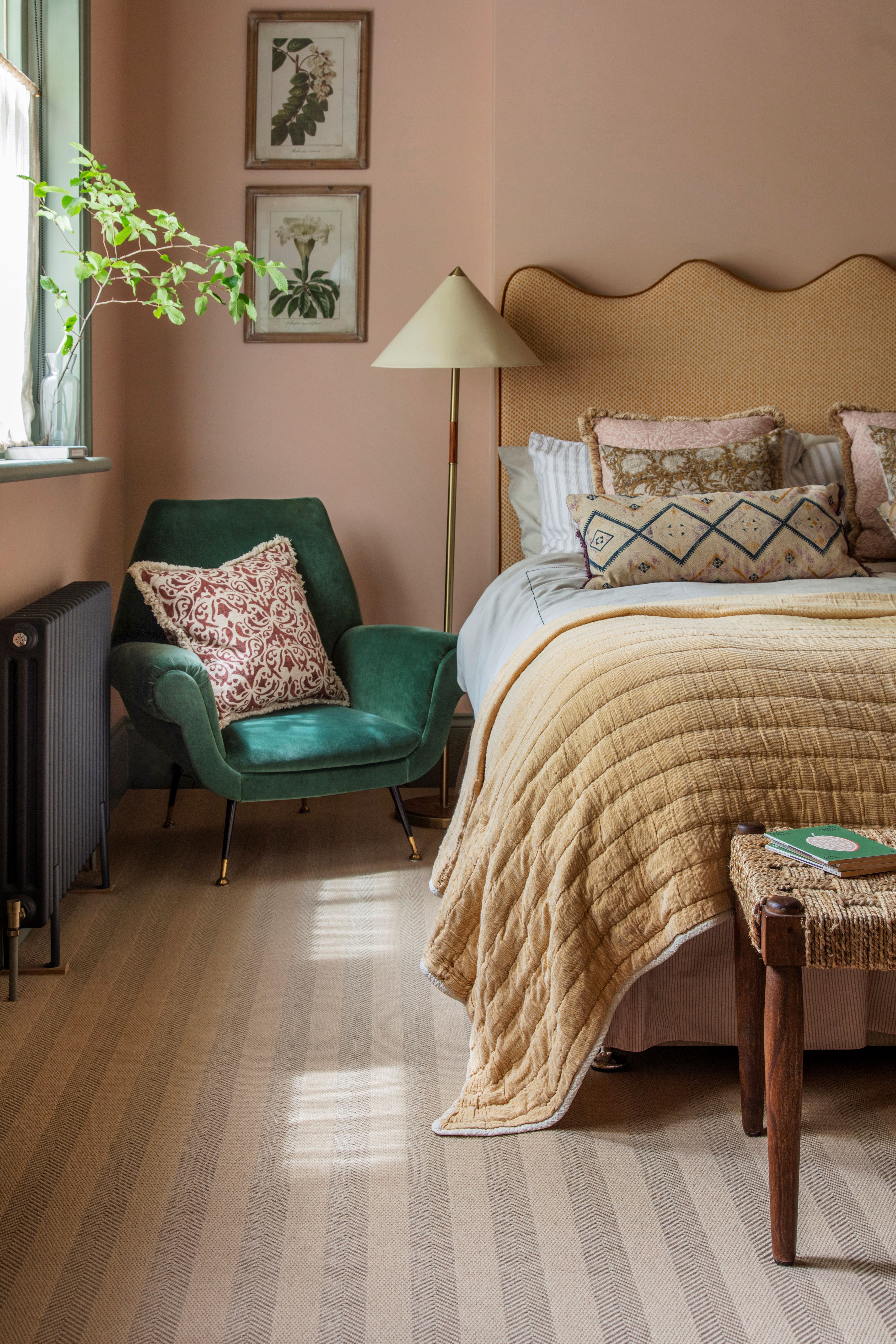
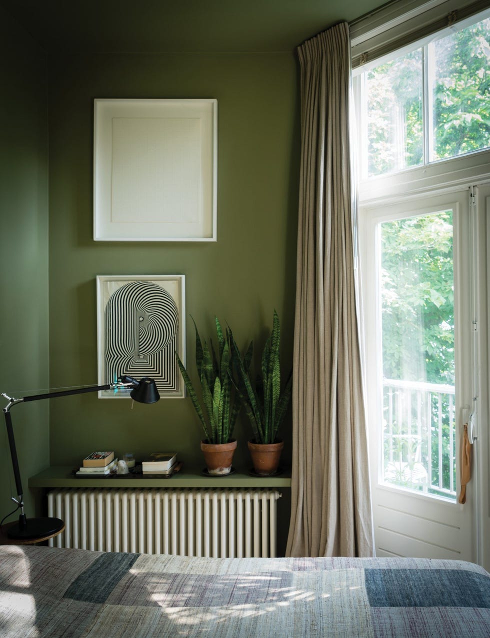
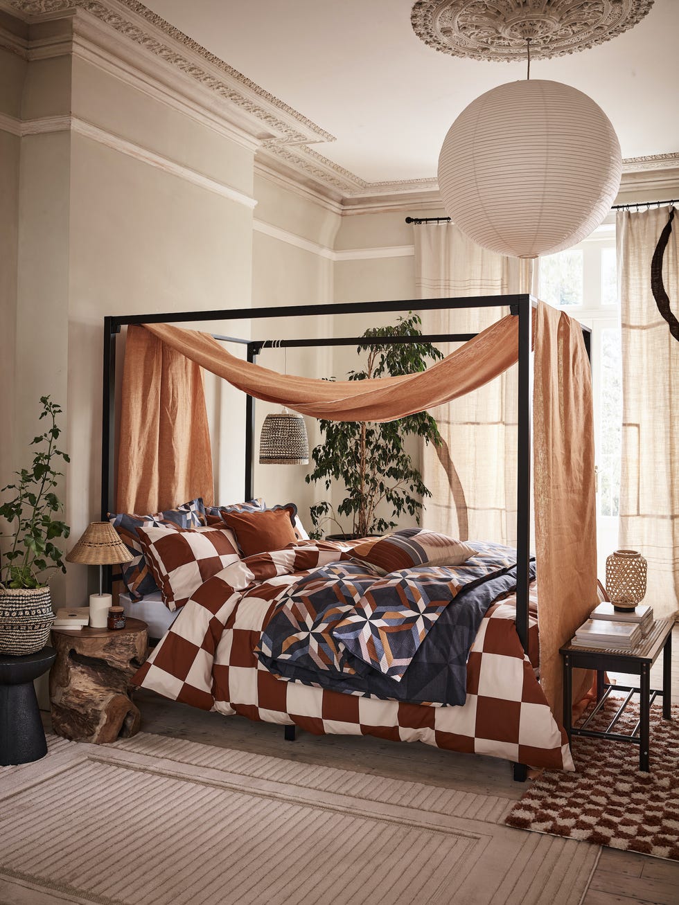
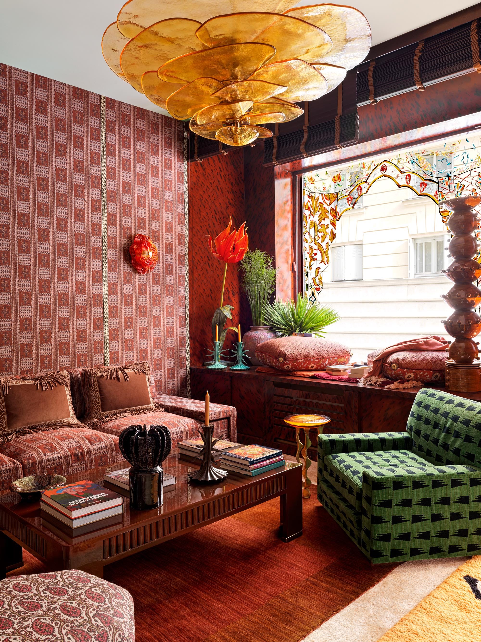
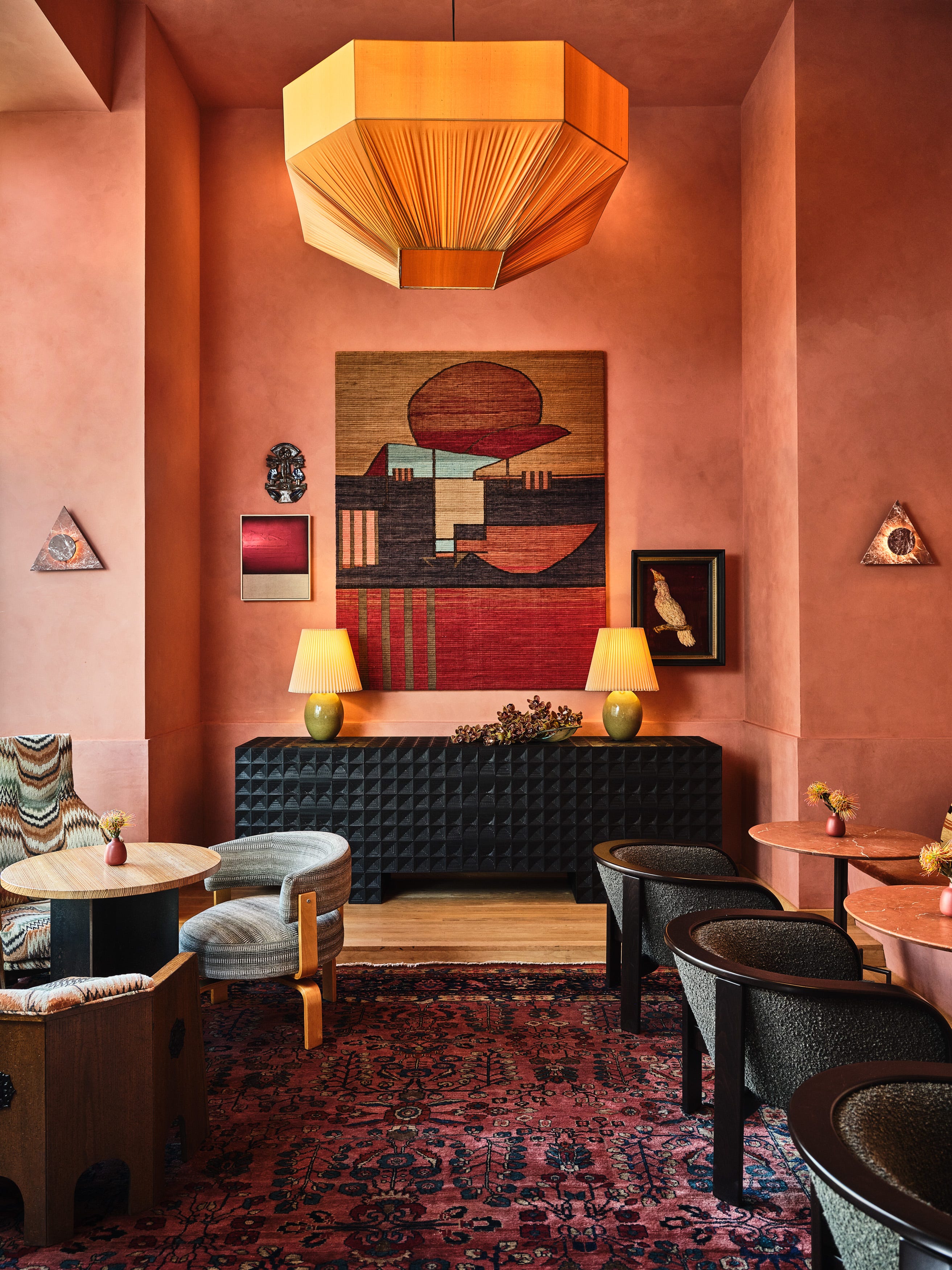
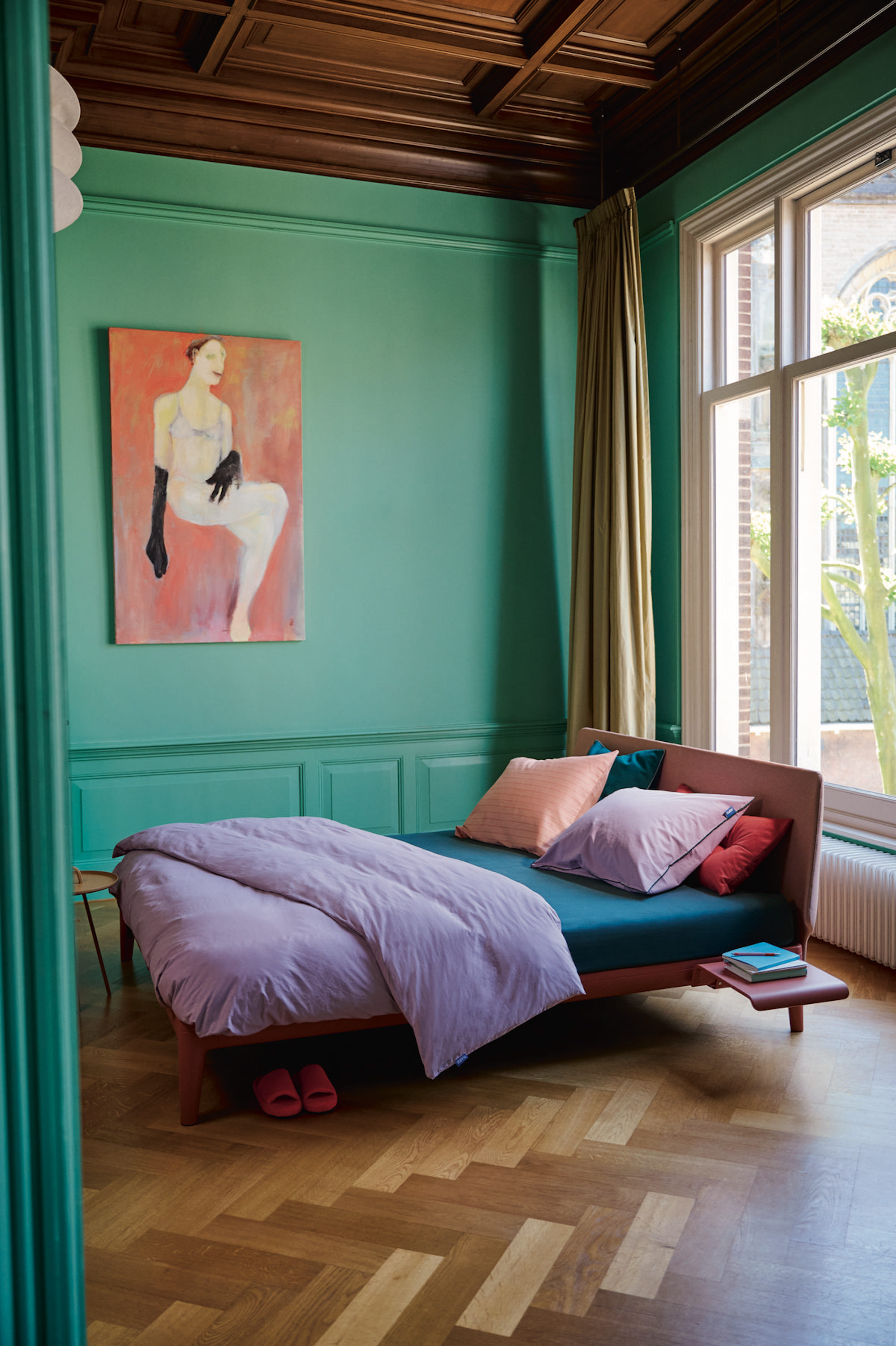
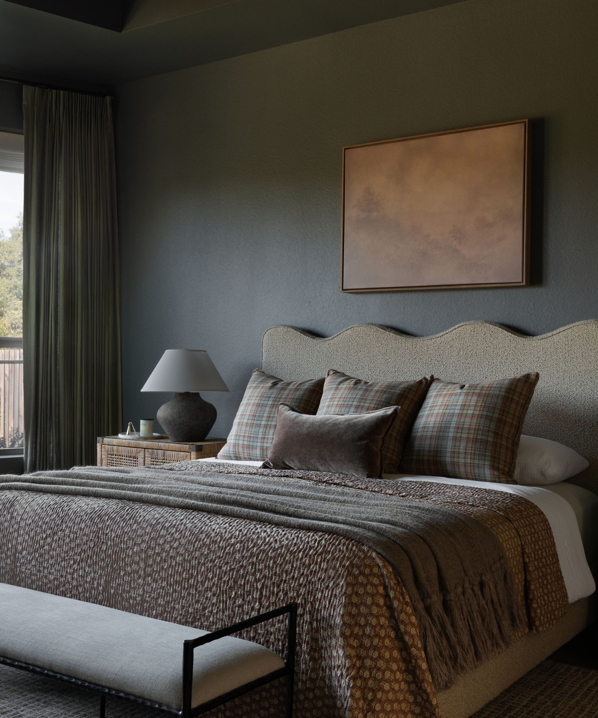
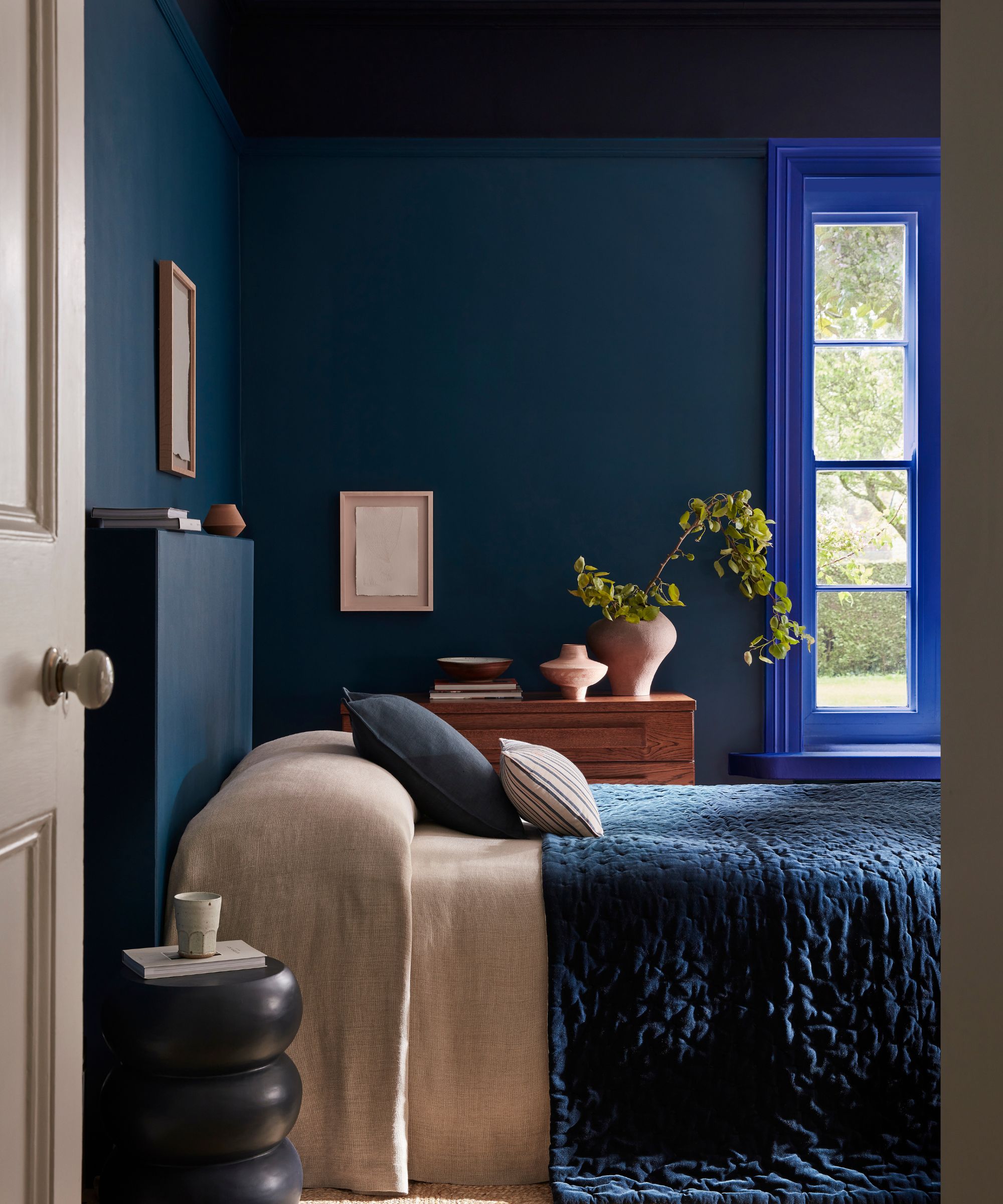
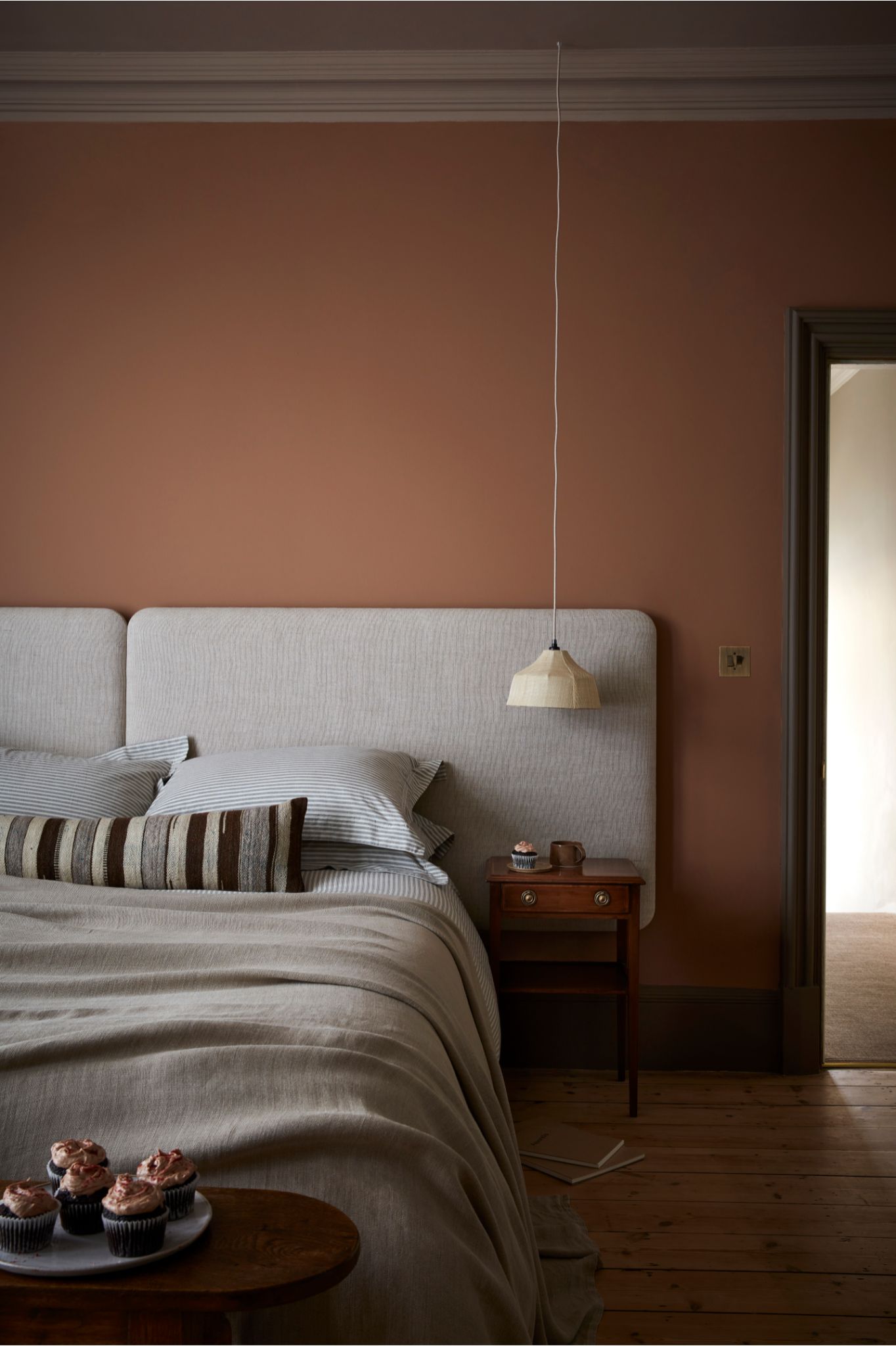
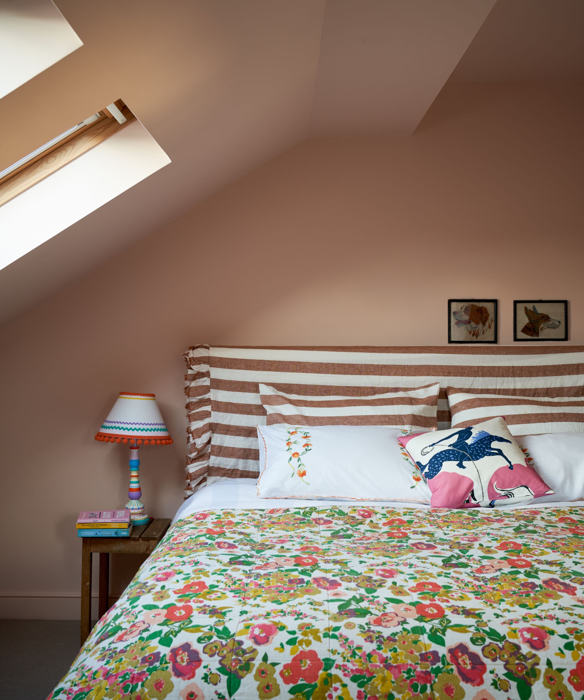
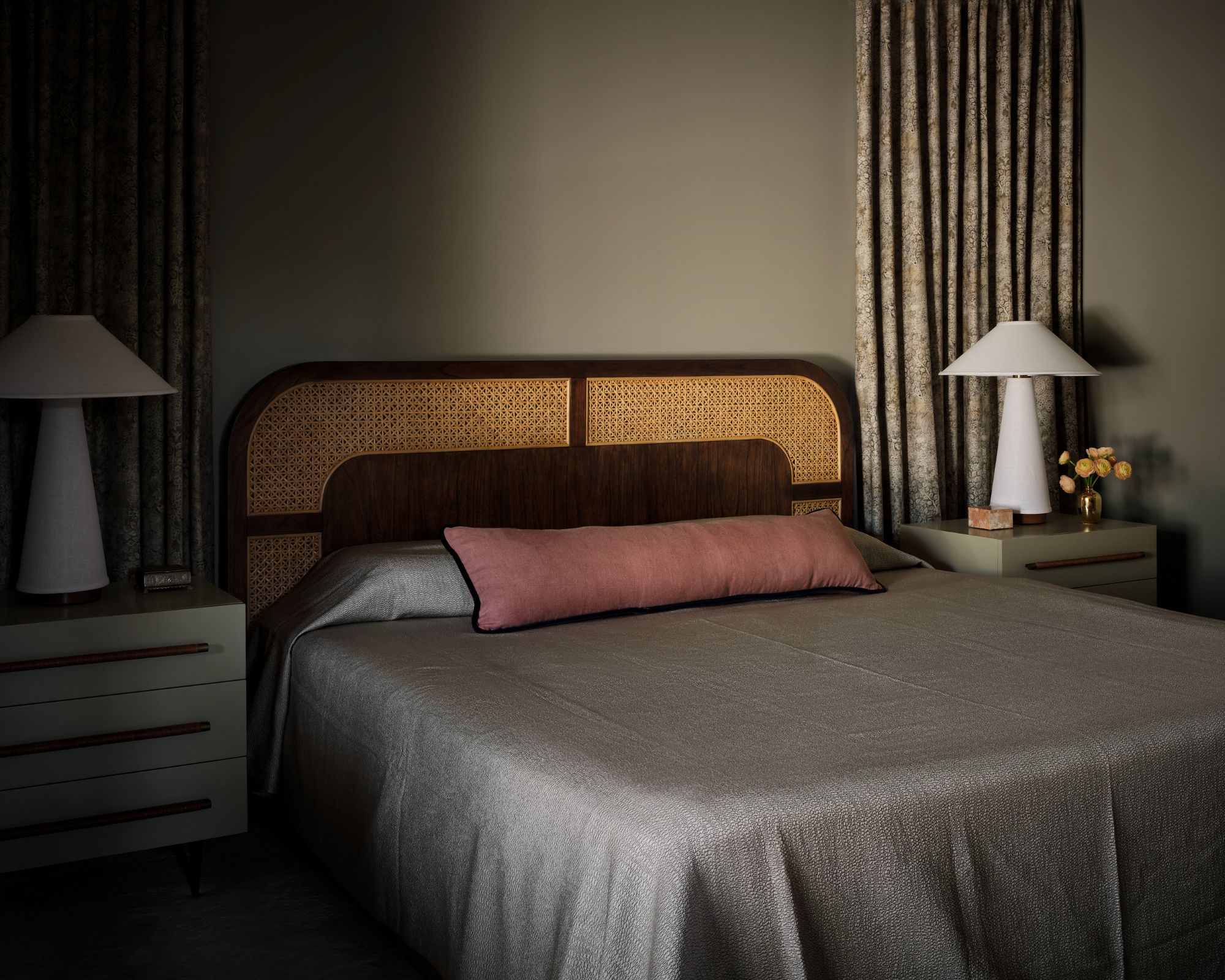
Pastel color palettes have evolved beyond children's bedrooms, becoming a sophisticated tool for designers to create soothing and grown-up schemes throughout the home. This shift involves pairing pastels with bolder shades and emphasizing their gray and blue undertones rather than sugary pigments, resulting in layered and calming spaces. Designer Brigette Romanek highlights the desire for relaxation in home environments, particularly bedrooms, and notes how well-executed pastels can provide this sense of calm and ease.
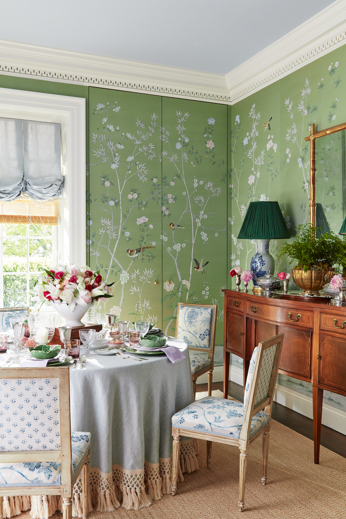
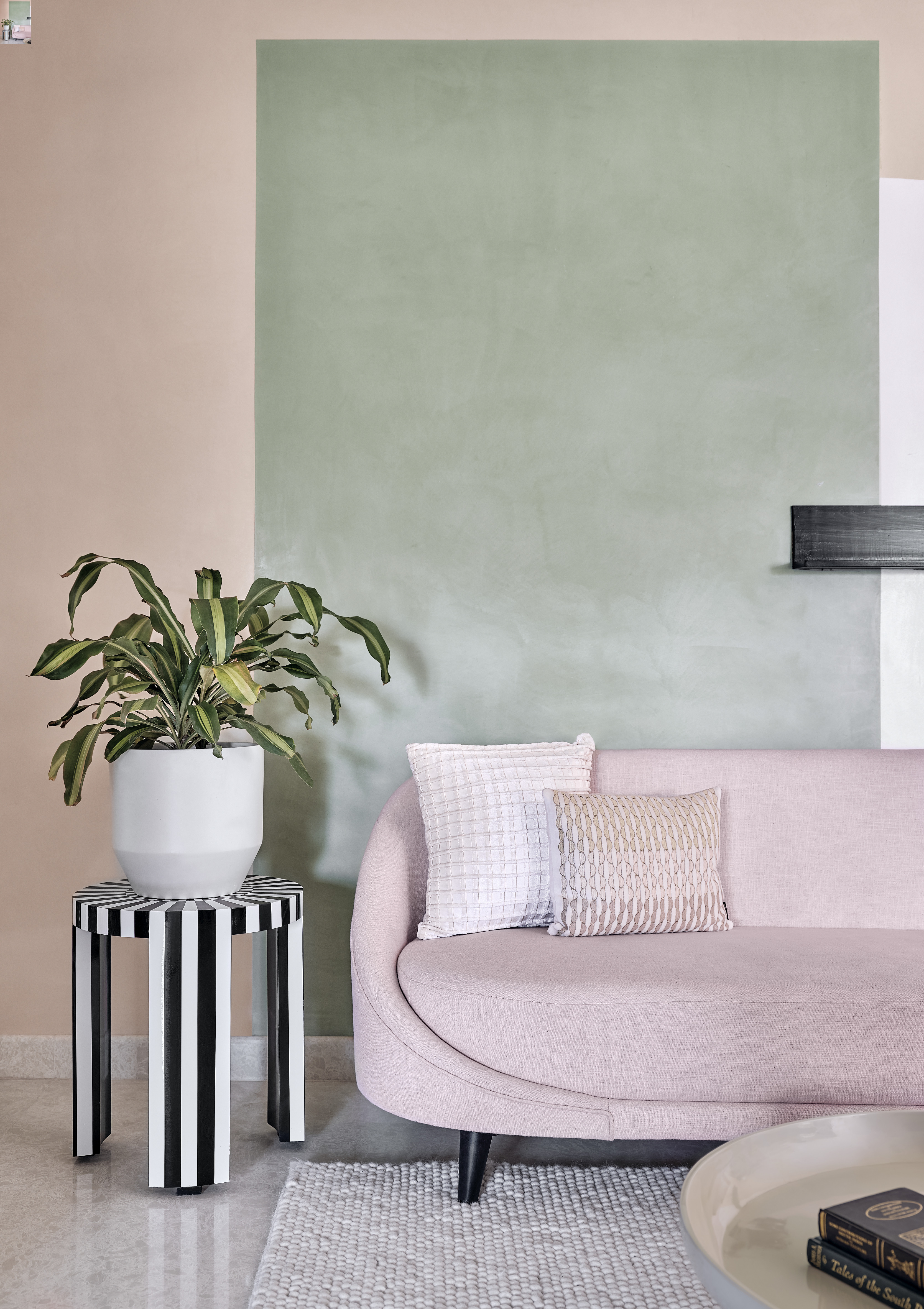
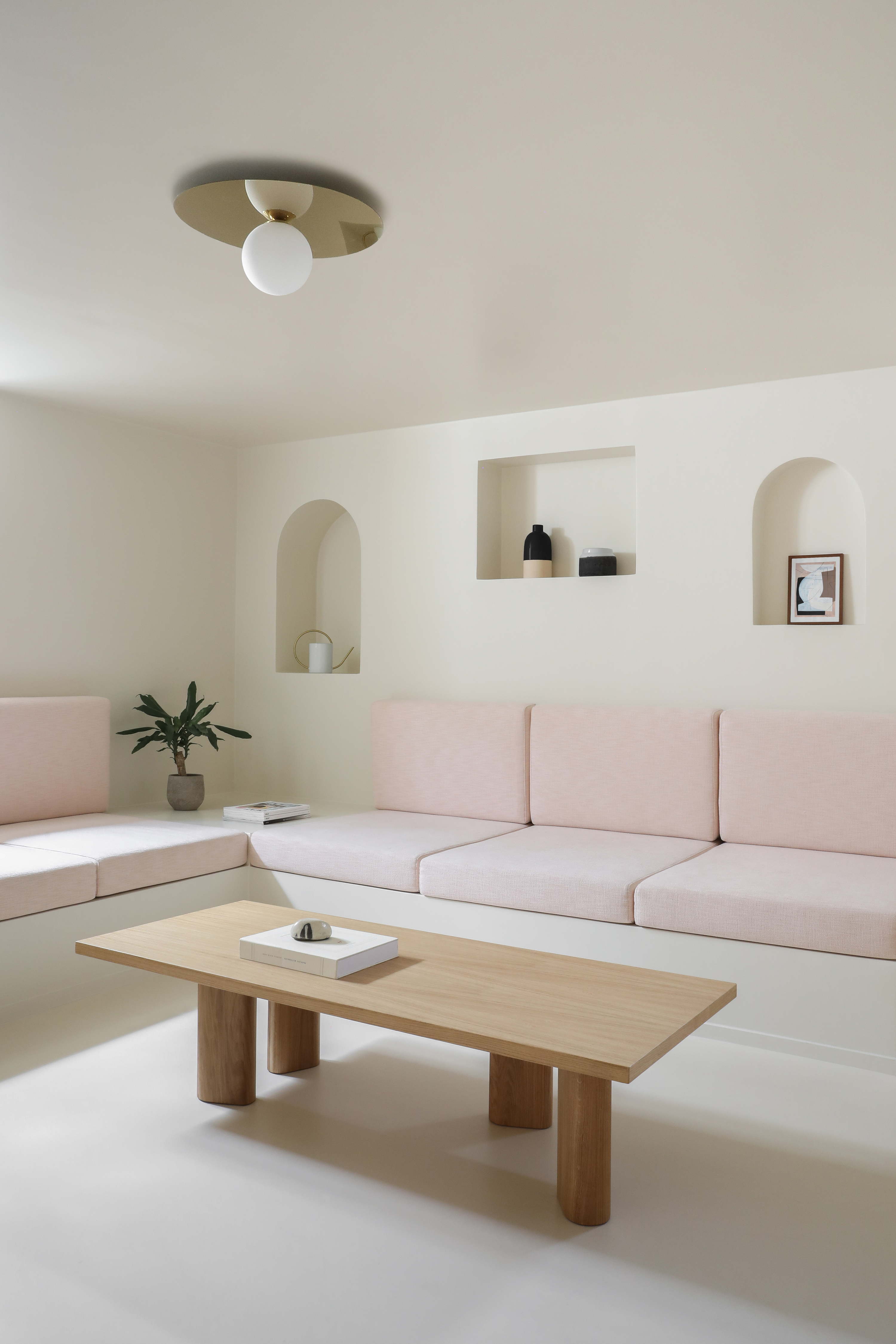
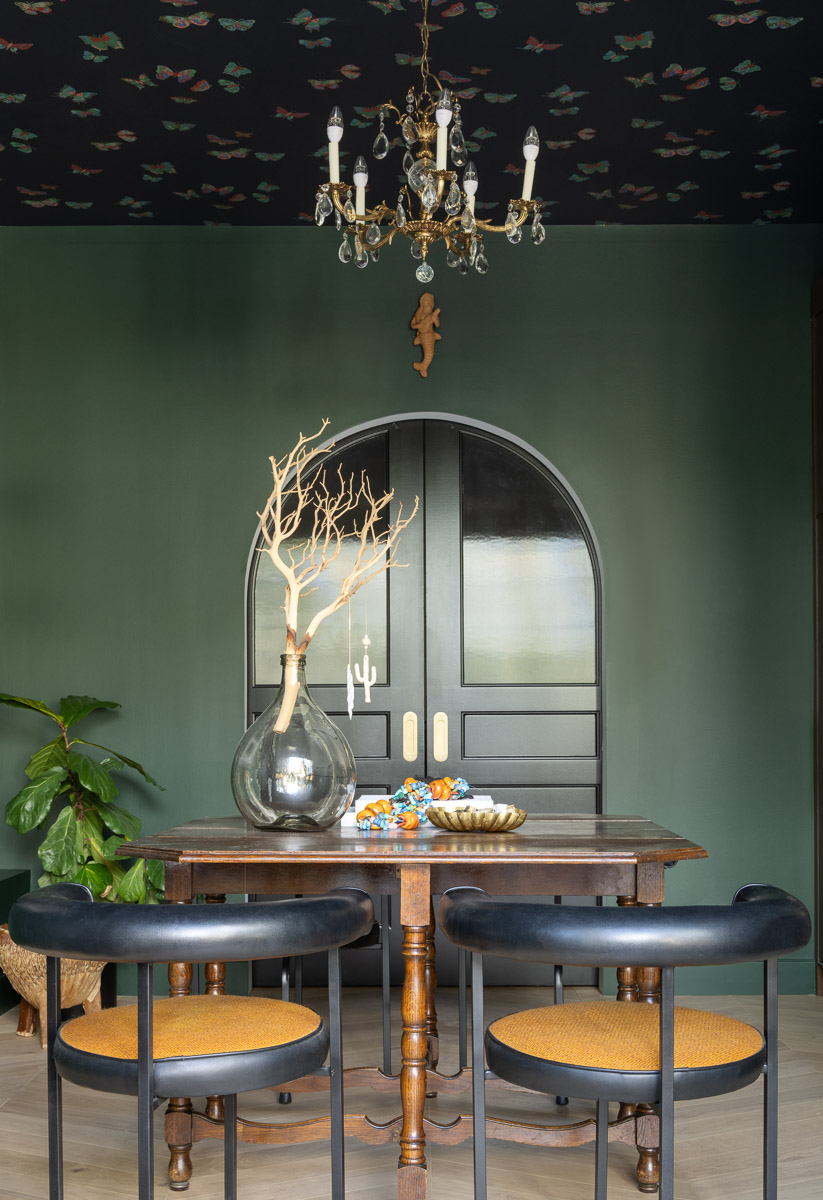
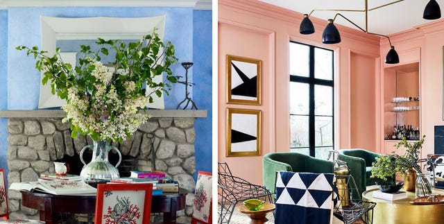
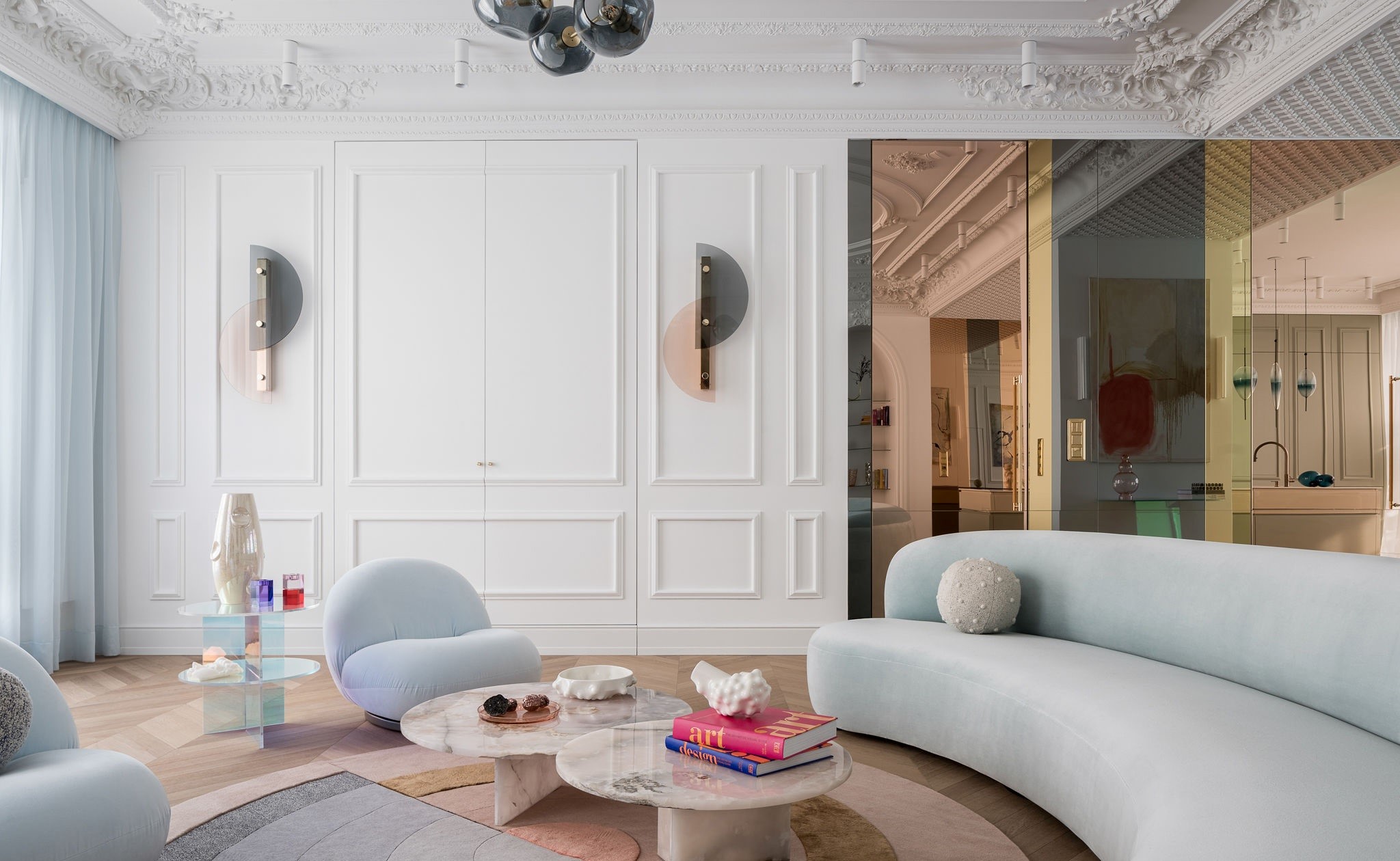
Several design approaches demonstrate the versatility of modern pastel application. One method combines pastel pinks and blues with off-white, as seen in Nina Magon Studio's living space. Here, creamy off-white plaster walls complement pastel furniture, creating a visually unchallenging and relaxing atmosphere. The plaster adds warmth and balances the furniture and textiles. Another technique involves using pastel pink with dark green and wood tones, exemplified by Mary Patton Design. The studio uses a creamy blush pink that lacks blue undertones, making it a warm foundation that can stand against bolder primary colors and harmonize with wood floor tones, preventing a clash with cooler colors.
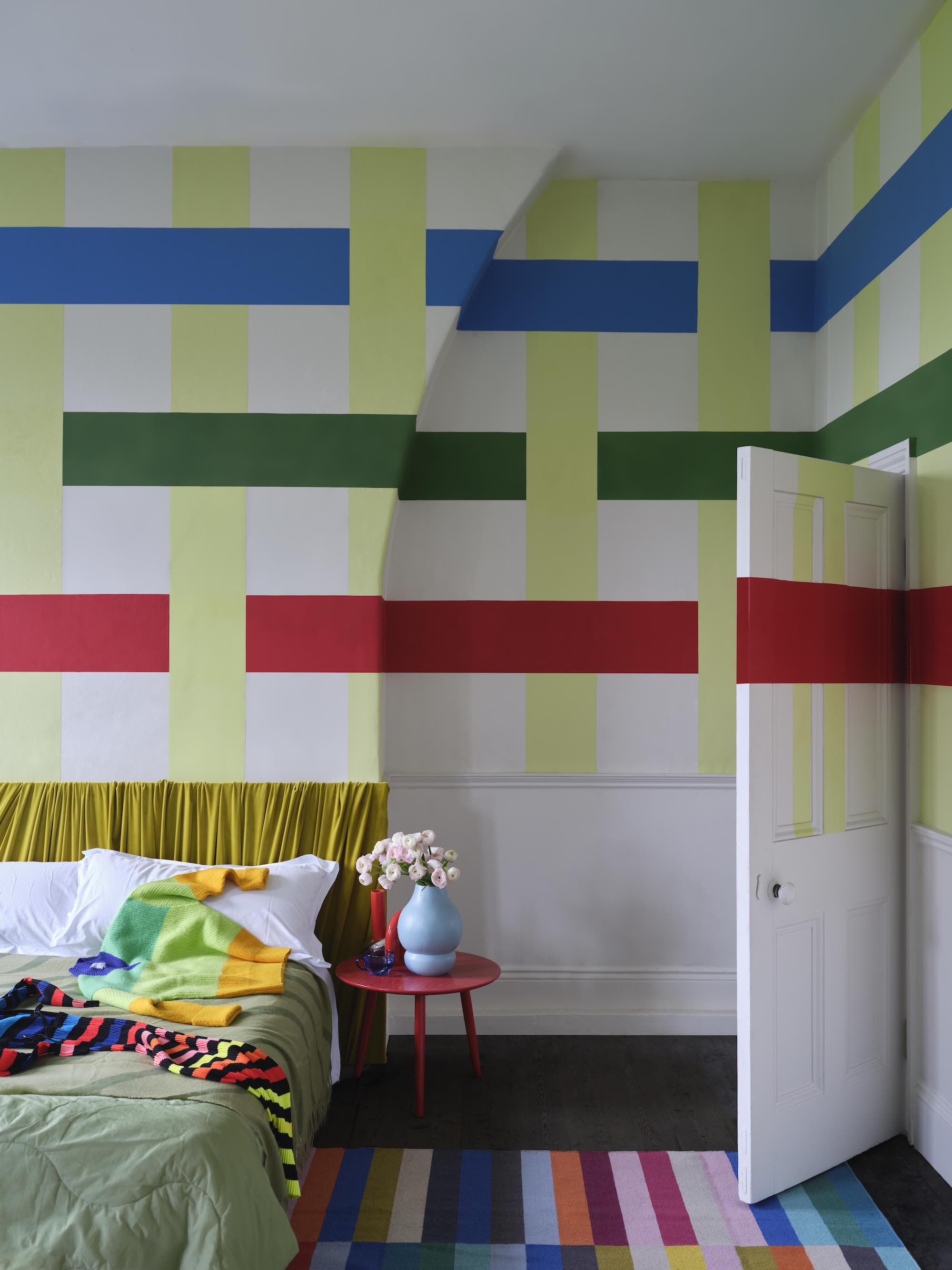
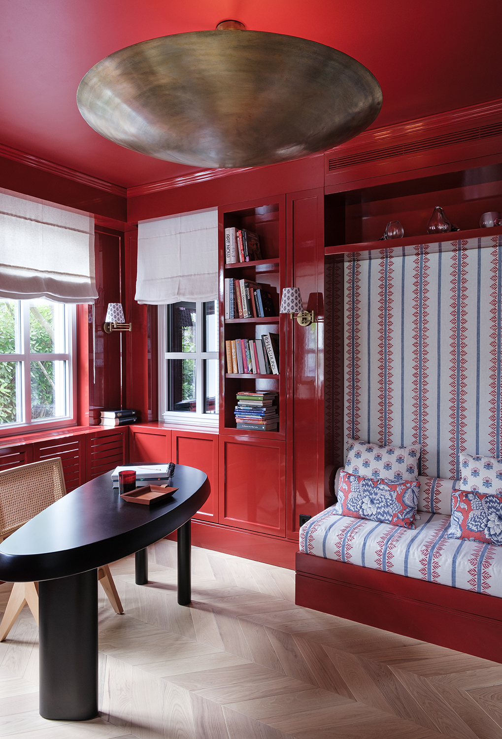
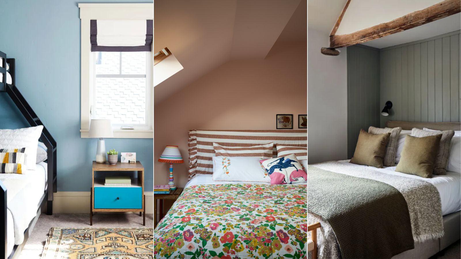
The article also explores more unexpected combinations, such as pastel blue and red. This approach aligns with the 'unexpected red' trend, where a dash of crimson elevates a space. LALA Reimagined's bedroom design pairs pale blue with red, creating a contemporary pastel scheme. The red acts almost as a neutral, adding an interesting and modern touch. For a contemporary feel, introducing a 'mediator' color between pastels is suggested. Koi Color Studio's dynamic living room palette uses a vibrant orange to split pastel blue and yellow, avoiding a common visual dilemma and creating a sophisticated blend. The orange acts as a split complementary color, uplifting both pastels.
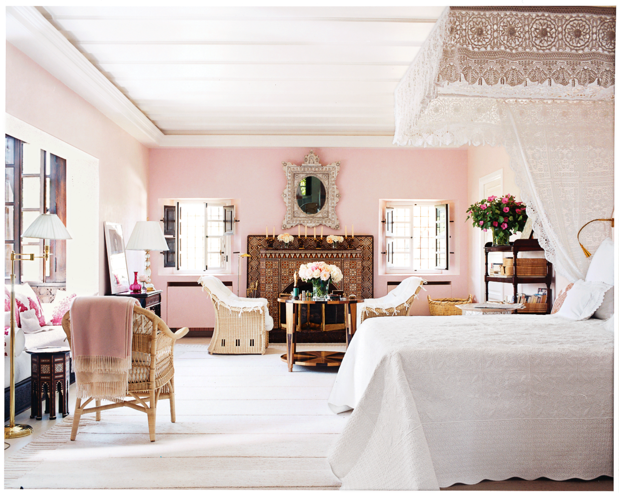
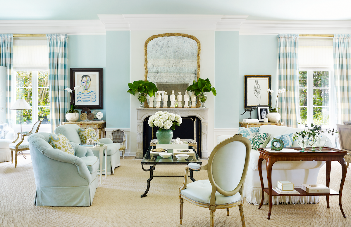
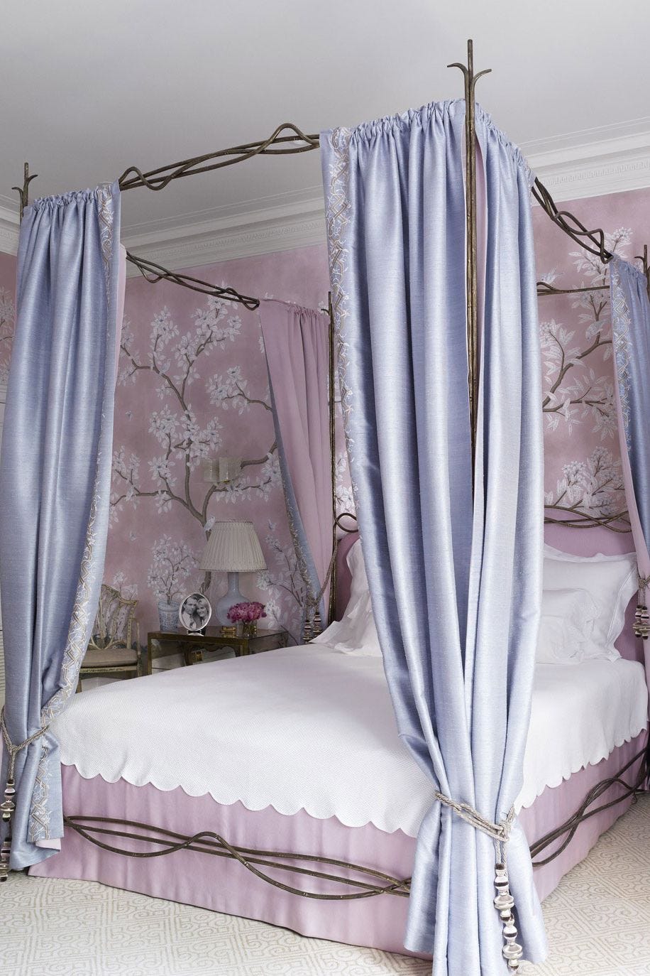
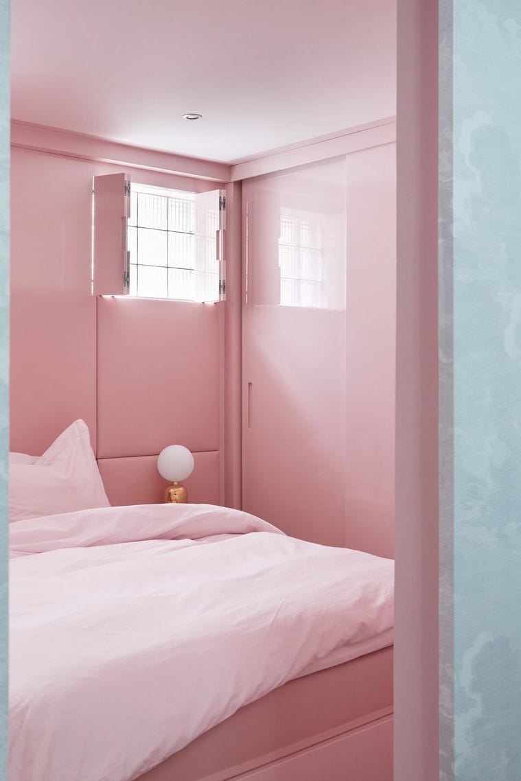
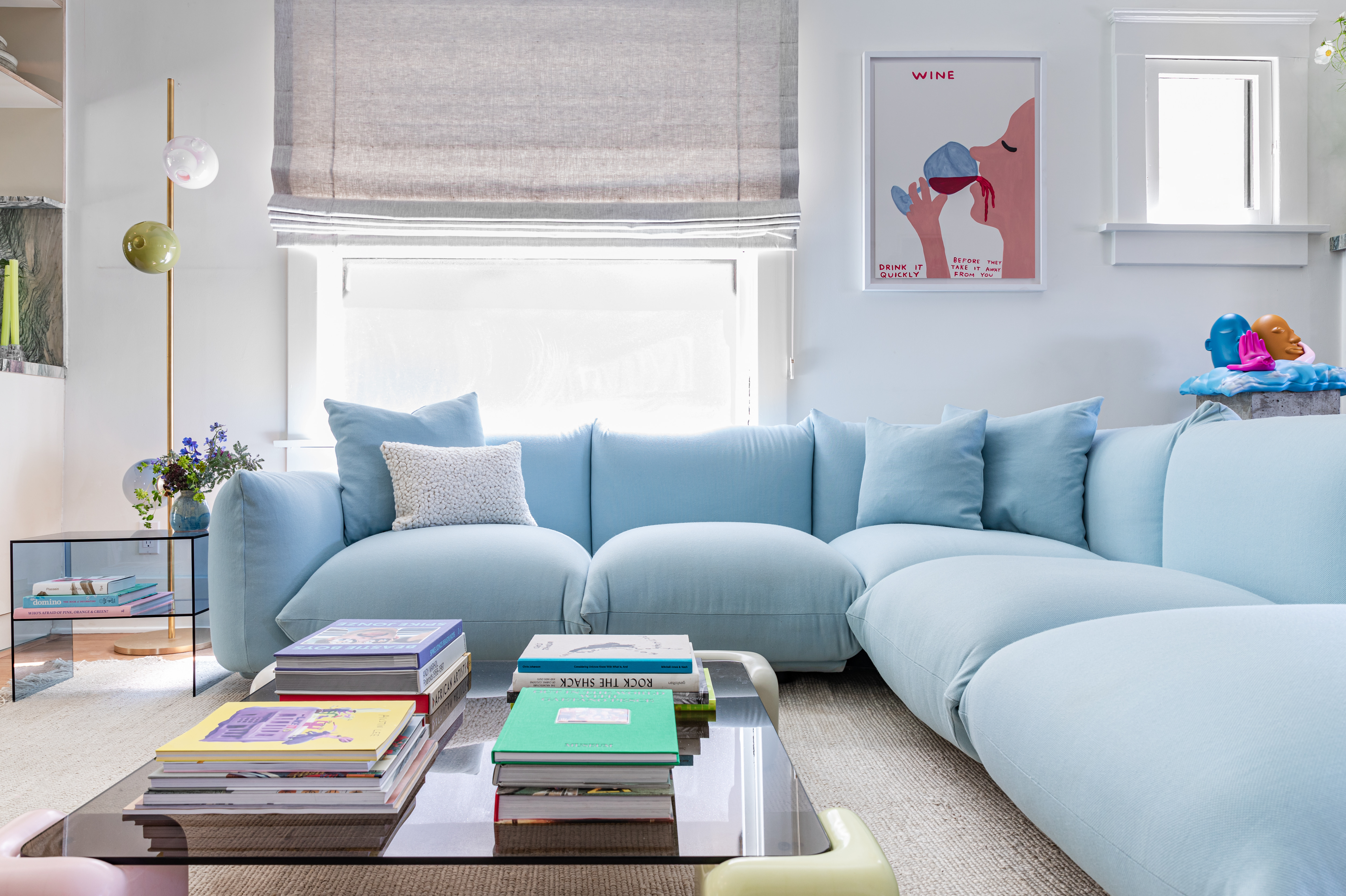
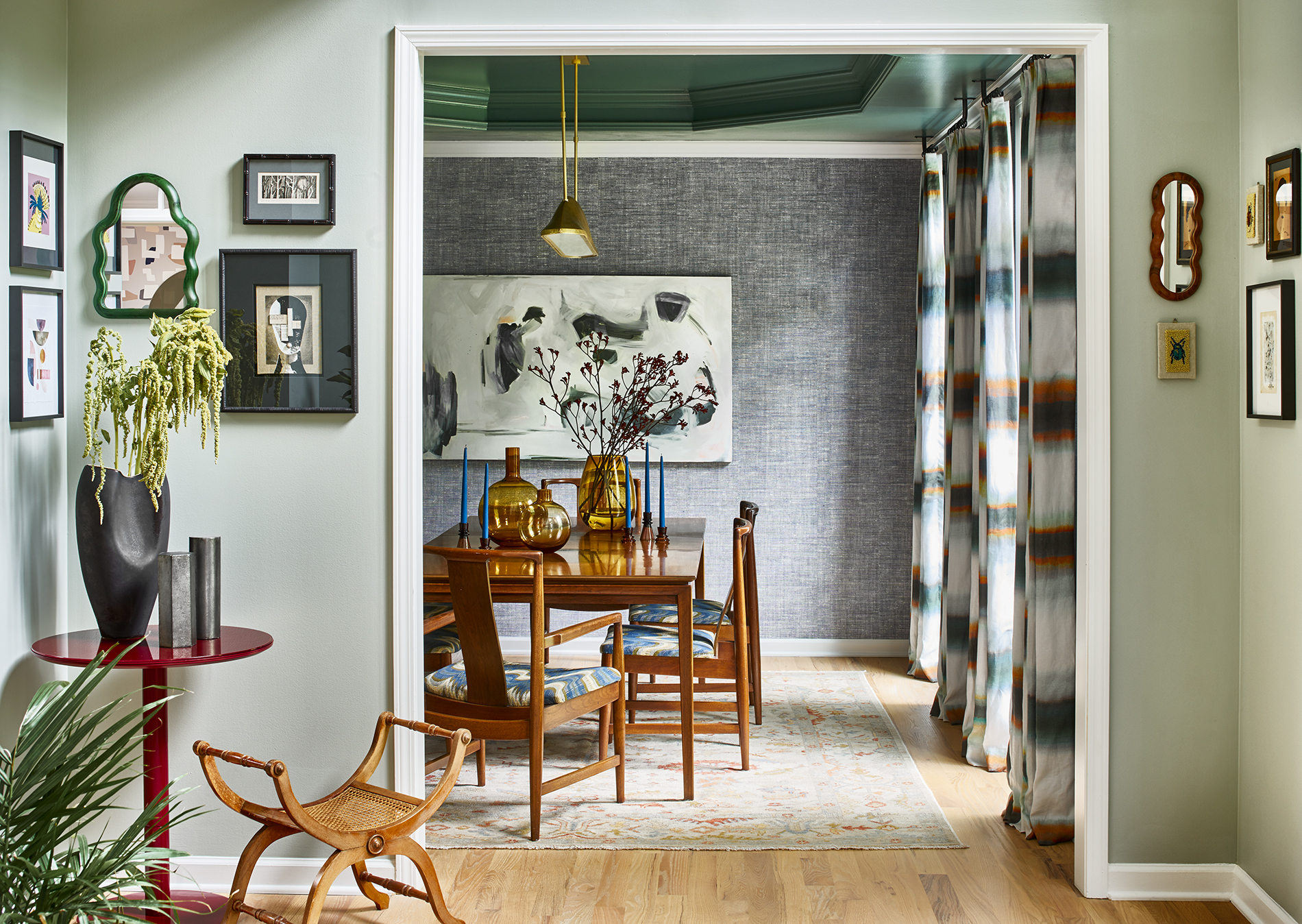
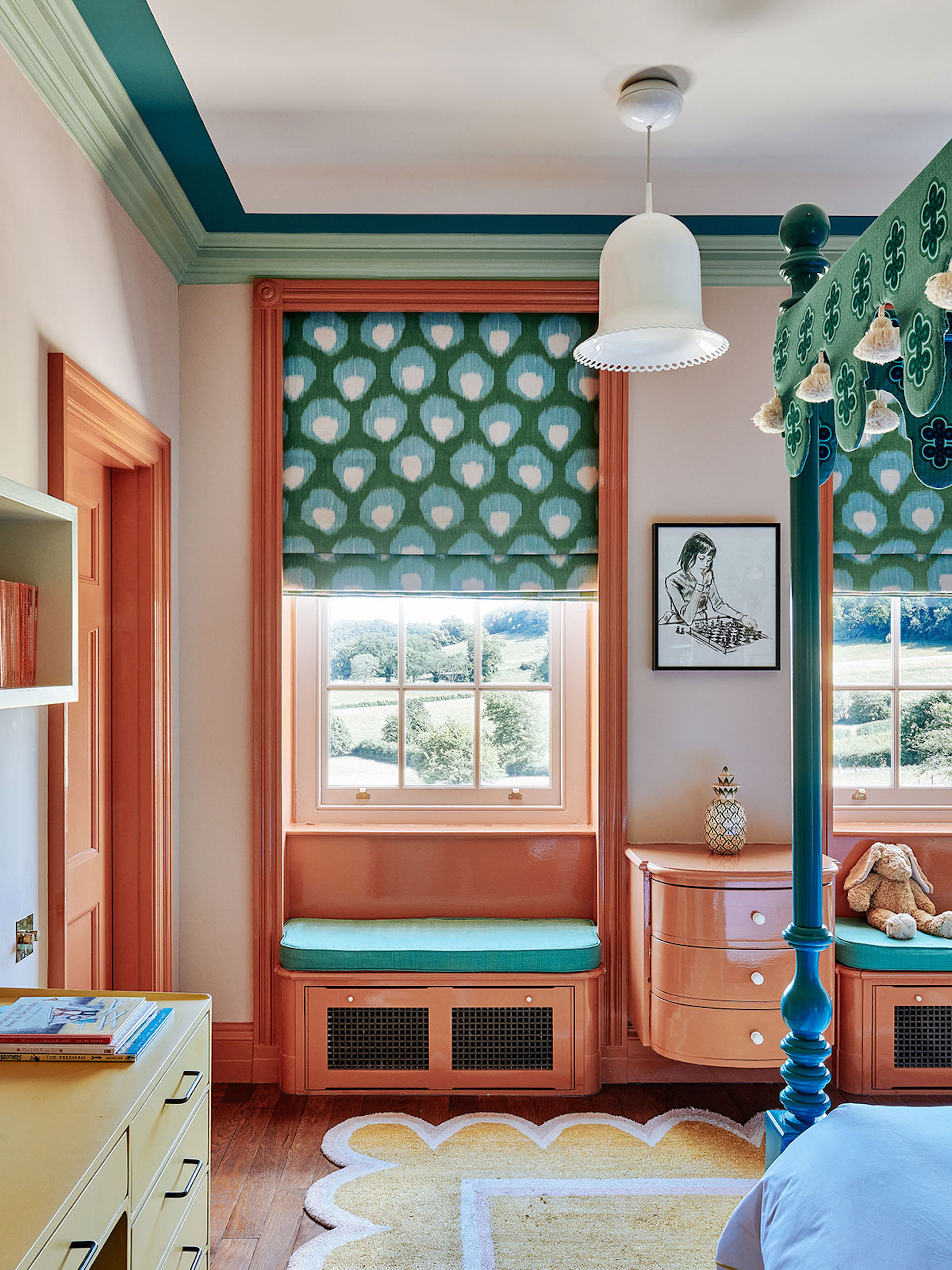
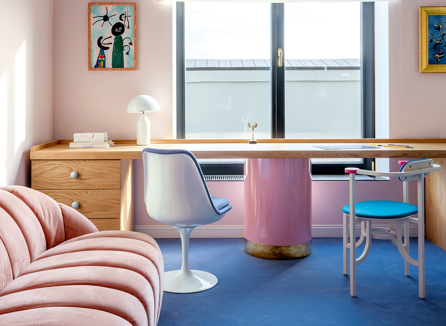
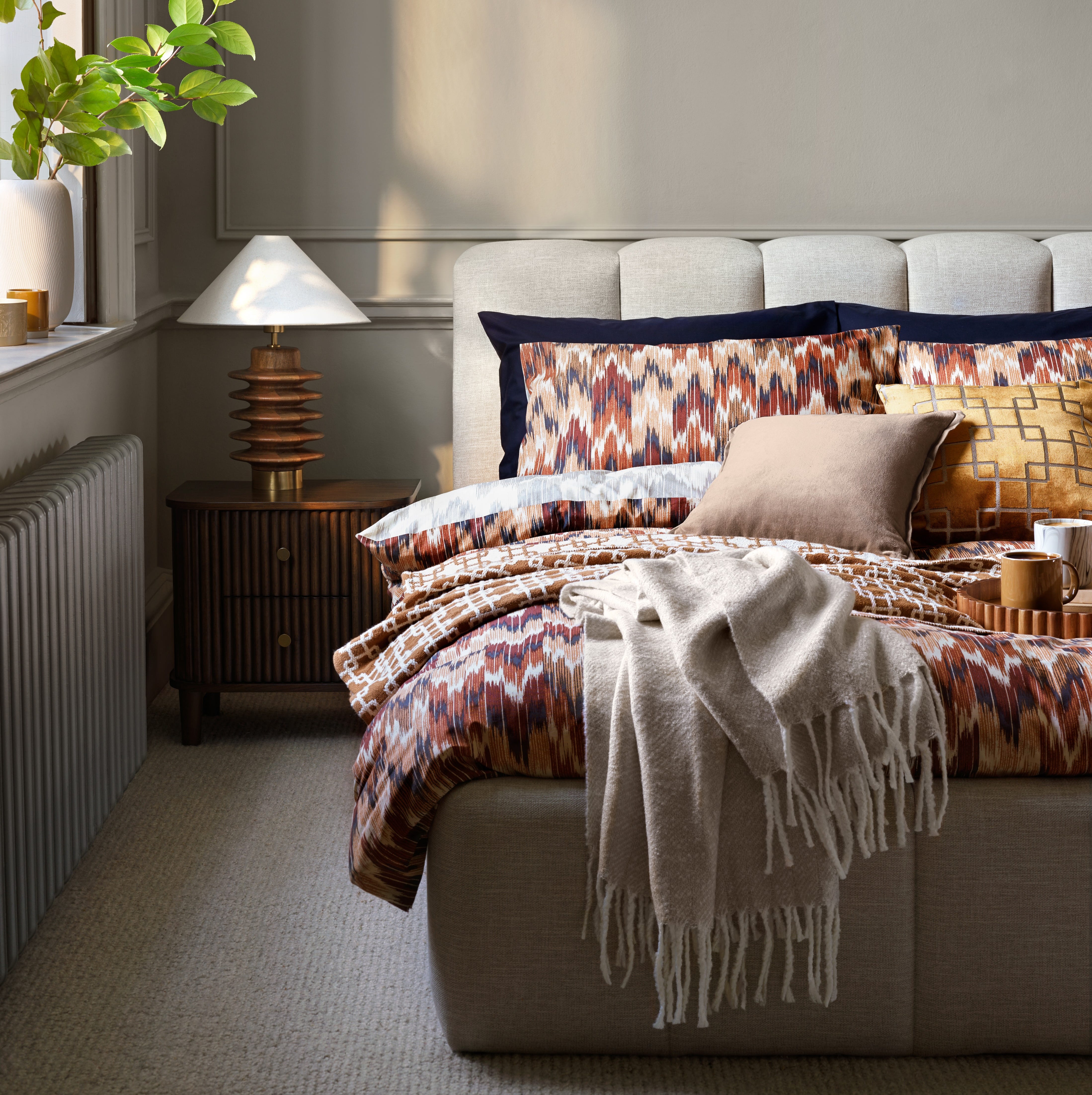
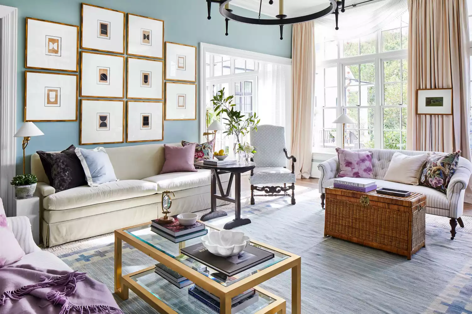
Pastel lilac with oak tones offers another sophisticated option. Jake Arnold's reading corner uses lilac on bookshelves and paneling, which is grounded by oak furniture and warmer-toned wood flooring, preventing it from appearing overly sweet. Designers recommend specific shades like Fine Paints of Europe's WC-09 or Farrow and Ball's Calluna for their subtle yet engaging qualities. The once-avoided combination of pastel green and blue is now embraced by contemporary designers. Uchronia's living area, inspired by malachite, features pastel green with a pastel blue sofa, creating a delicate yet glowing scheme that evokes a sense of calm and grounding. Finally, pastel pinks are often used as neutrals, providing an uplifting alternative to gray or white. Veresnovsky Design Studio's home office pairs pastel pink with darker pinks and royal blues, using the pastel pink as a backdrop on both the sofa and walls, creating a warm and inviting space. Carmel Brantley's pink bedroom illustrates how pastel pink carpet can ground richer pinks and grays, making a sophisticated space that avoids a childish aesthetic by allowing the pastel pink to act as a neutral alongside gray stone elements.
#PastelColorPalettes #InteriorDesign #HomeDecoration #RelaxingInteriors #ColorTrends #DesignTips #ModernPastels #RoomInspiration #PastelColorPalettes #InteriorDesign #HomeDecoration #RelaxingInteriors #ColorTrends #DesignTips #ModernPastels #RoomInspiration
0 comment in total
 No comments yet
You may also like
35 Surprisingly Chic Pastel Rooms Packed with Personality
The 2024 Pinterest color palette is what bedroom decor dreams are made of

12 Colors That Go With Green I'm Seeing Interior Designers Use All the Time Right Now
Why This Hue Is Suddenly Dominating Every Designer's Wishlist—Plus, How to Style It

You've Never Seen Pastel Rooms Like These

16 beautiful bedroom colour ideas and how to use them

6 Calming Paint Colors Designers Swear By For A Relaxing Living Room
5 colors that will make your bedroom feel calmer, according to designers
10 pastel living room ideas that prove this softer color trend is having a renaissance in interiors
11 Calming Bedroom Paint Colors to Help You Relax and Wind Down at the End of the Day

I've Bored of My Bedroom, So I'm Choosing One of These Colorful Ideas Instead
5 Vibrant Color Palettes Designers Are Using to Add Energy and Excitement to Decor
Designers Agree: These Are the Most Relaxing Paint Colors for Any Room

These 20 Rooms Use a Red Color Palette in All the Right Ways
5 rooms that prove color drenching your bedroom is a good idea
Incorporate Color Drenching Into Your Home Design

You Can Wake Up HAPPIER Just by Painting Your Bedroom—Here Are the Colors Designers Love
These are interior designers' favorite color combinations for living rooms – from neutral and calming to bold and playful

These Colors Will Be Everywhere in Interiors in 2025
25 Soothing Paint Colors to Make Your Space Instantly Restful