1/17
16 beautiful bedroom colour ideas and how to use them
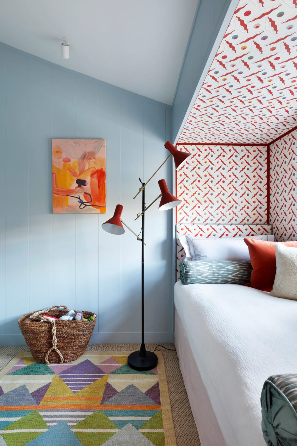
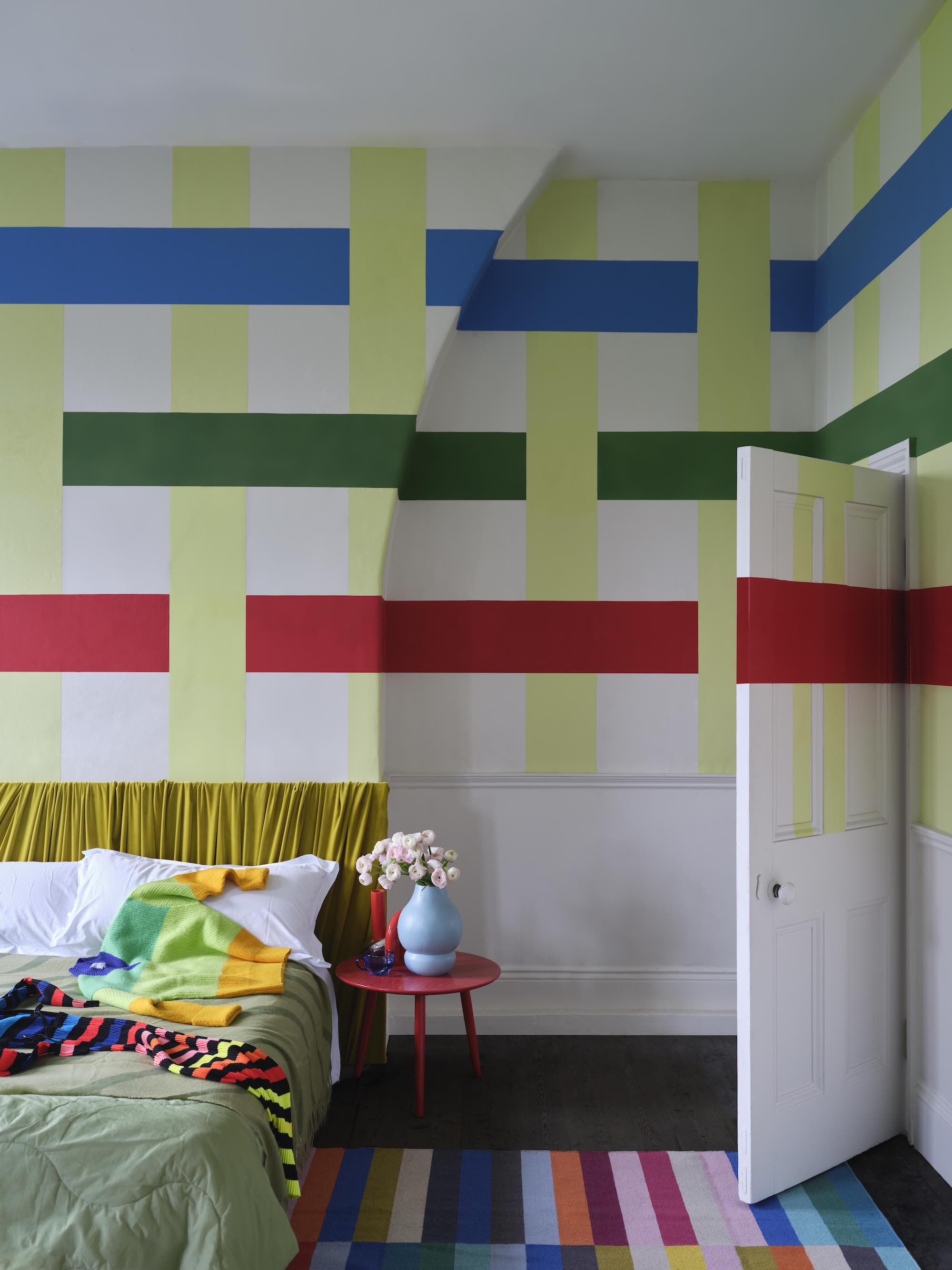
Choosing the right color for a bedroom is an opportunity for self-expression, with fewer practical constraints compared to other rooms. The selection of paint can primarily be guided by personal taste and the principles of color psychology, aiming to create a palette conducive to rest and relaxation. Marianne Shillingford, creative director at Dulux, advises developing a versatile color scheme that can be easily updated to accommodate changing preferences. This approach suggests focusing on a core palette while allowing for flexibility with details like stripes and bands of current favorite colors.
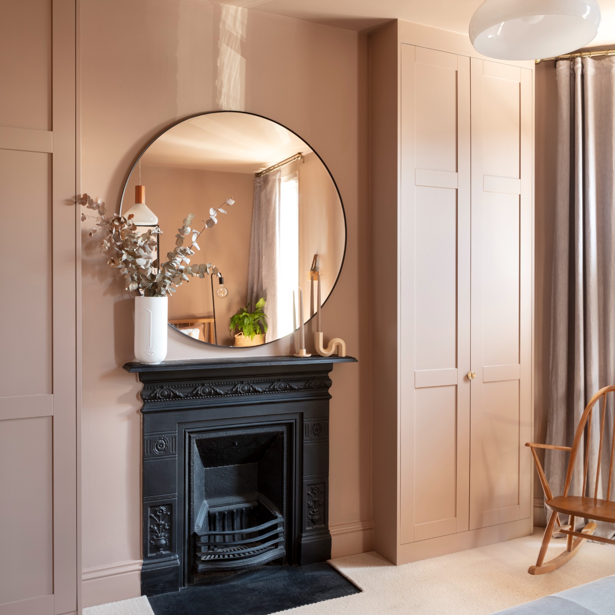
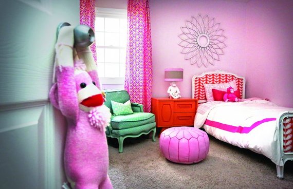
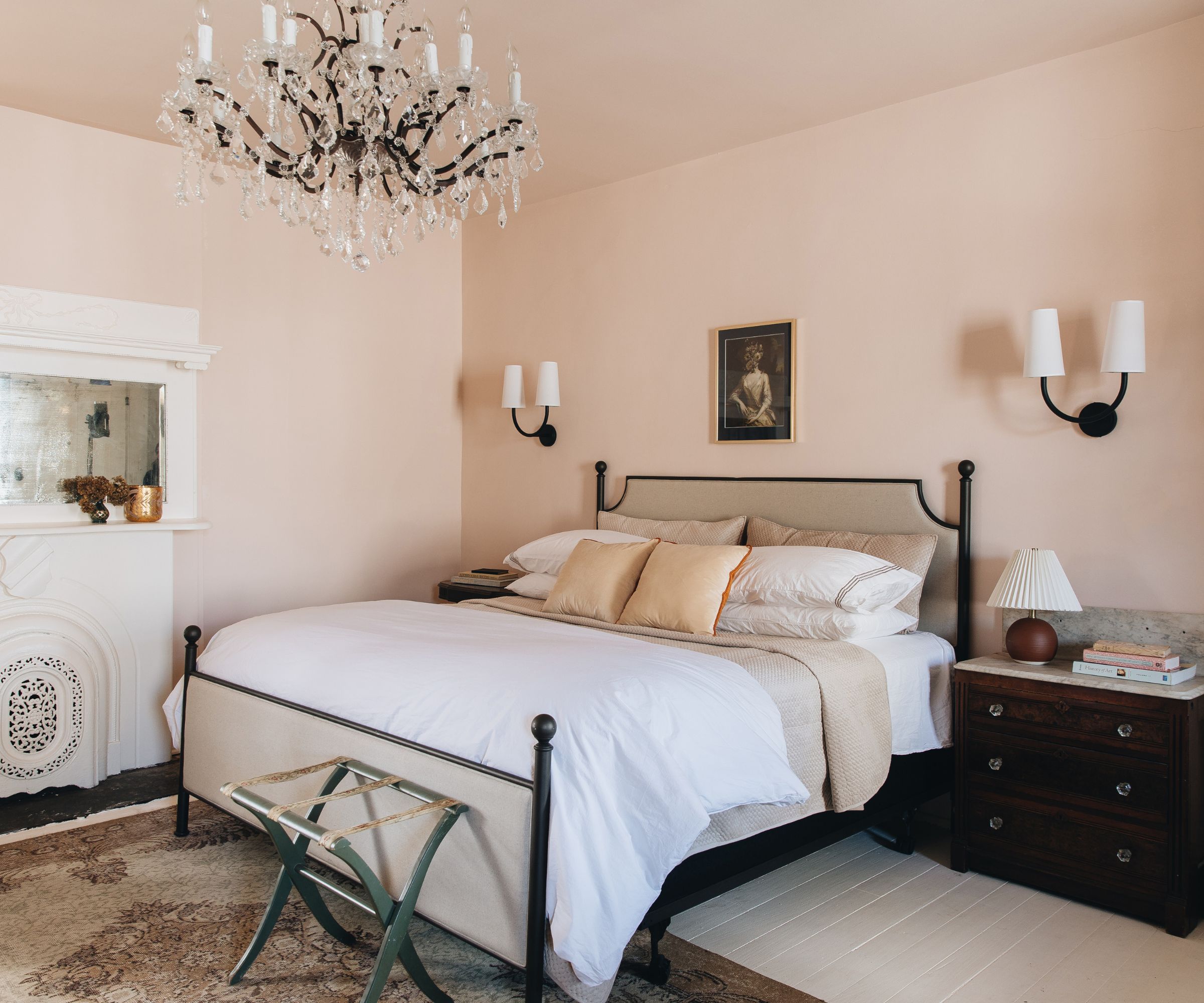
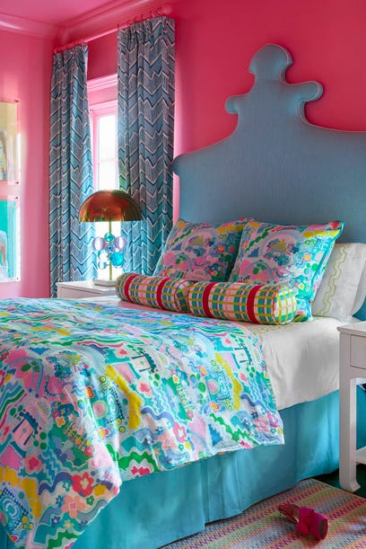
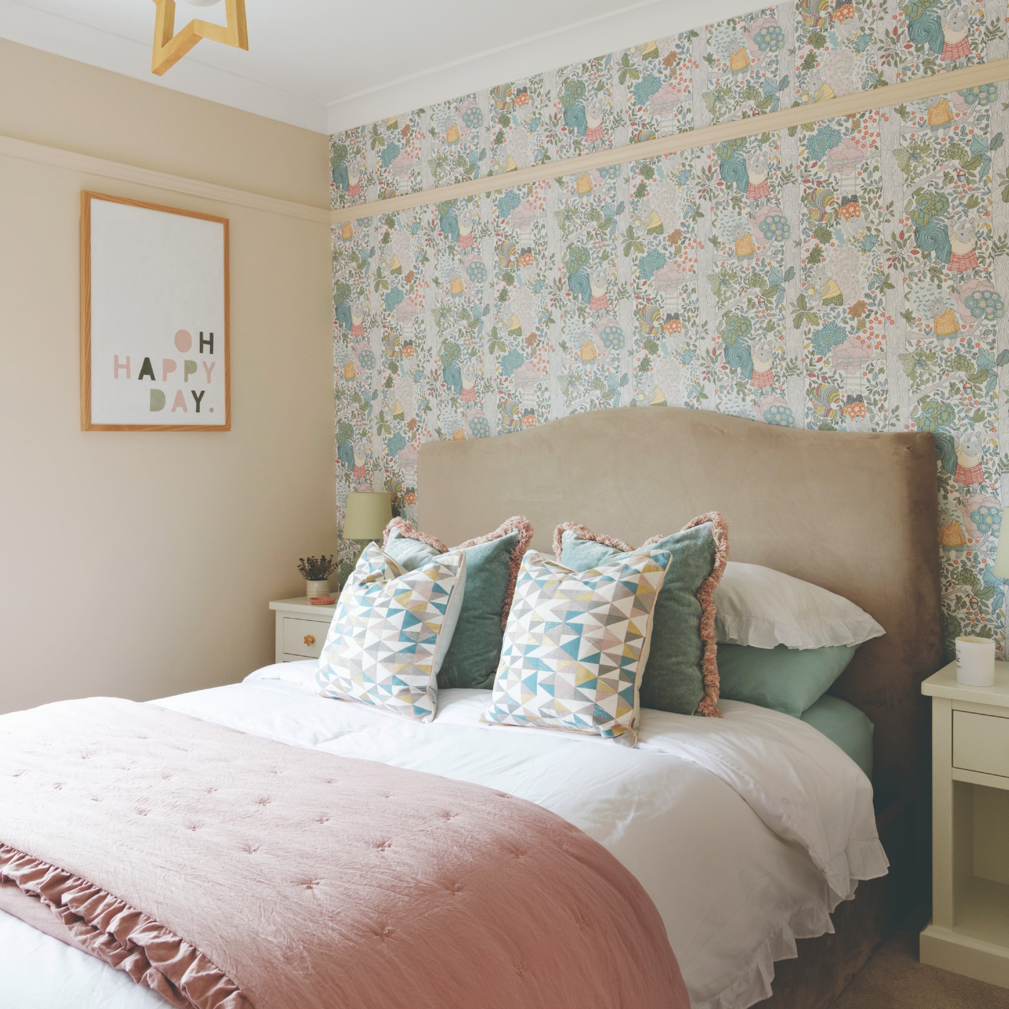
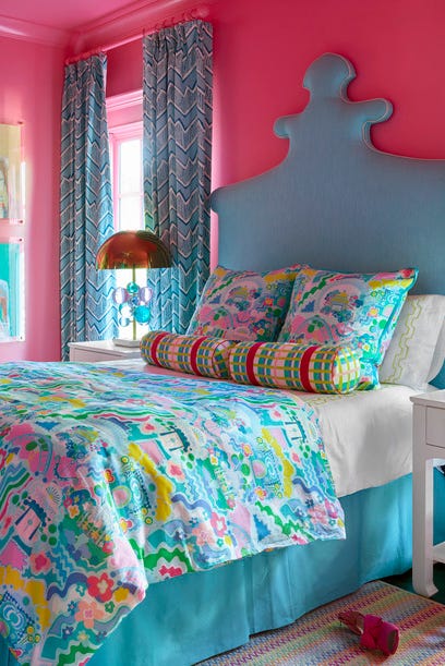
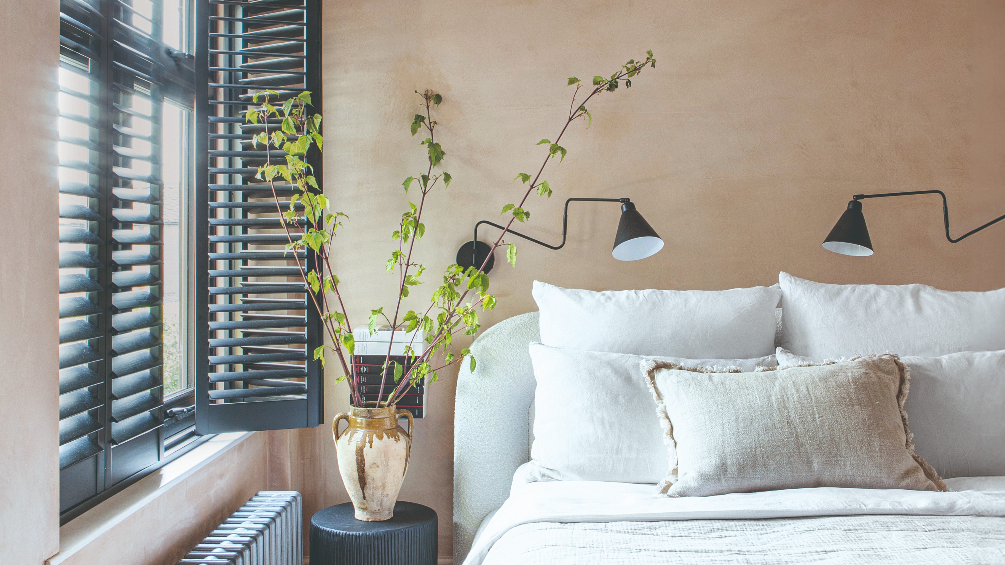
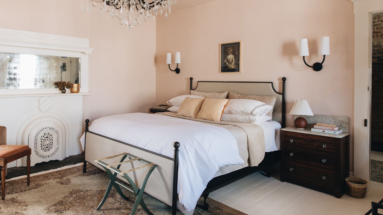
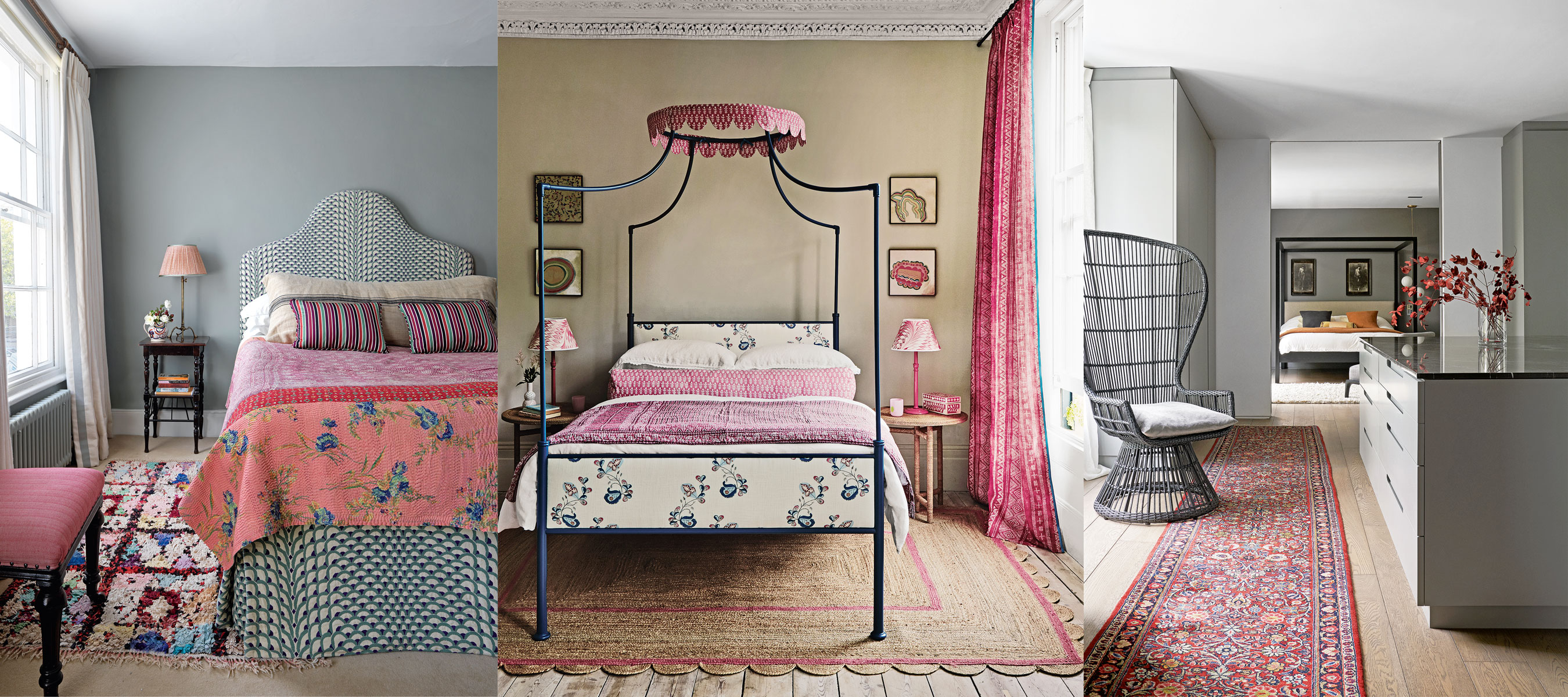
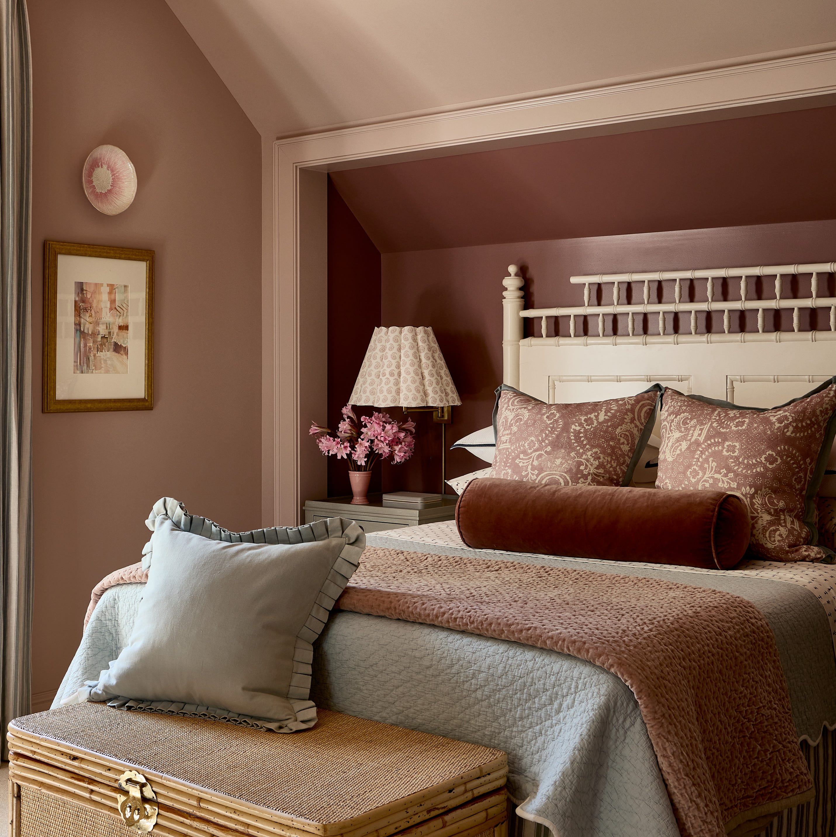
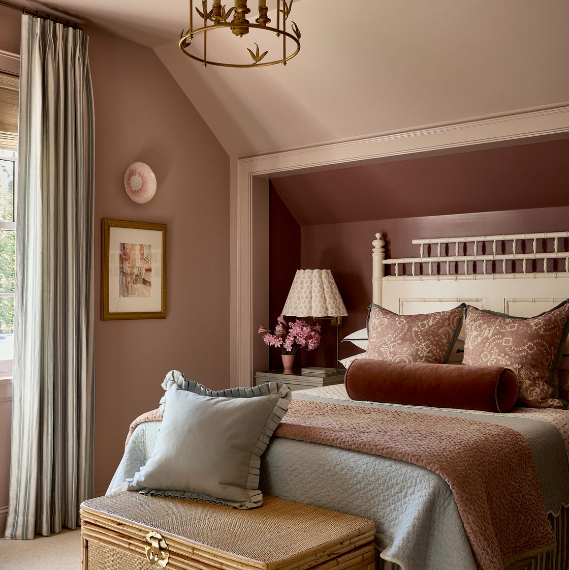
The article explores 16 distinct bedroom color ideas, offering design advice and styling tips from interior experts. These include Blush pink, which is nurturing and feminine, promoting warmth and working well with similar tones like warm grey or off-white. Sarah Lloyd, a paint and interior specialist at Valspar, notes that pink adds a touch of luxury; soft pinks like Valspar’s Wisteria Whisper offer subtle glamour, while vivid shades like Dance the Flamenco encourage passion. However, she cautions against overusing bright pinks for a calm environment, as intense colors can create urgency.
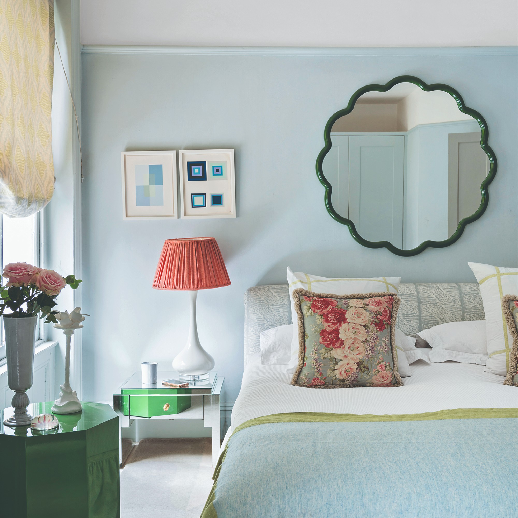
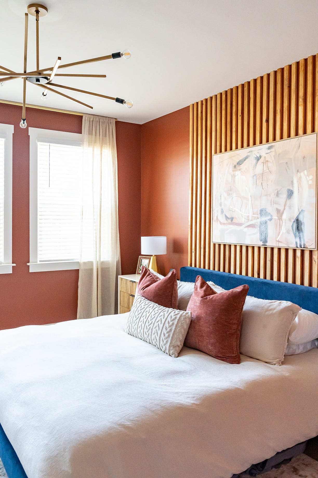
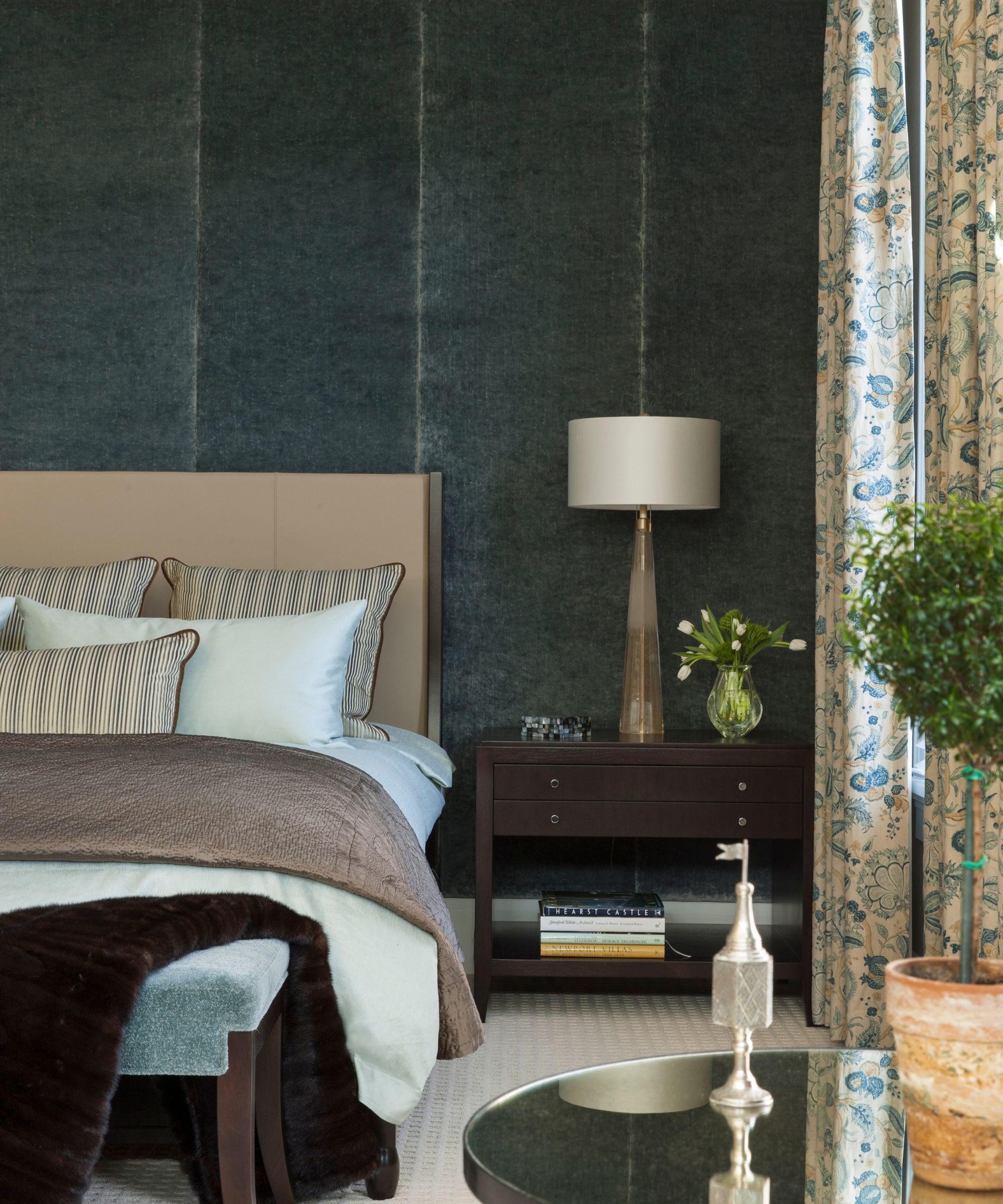
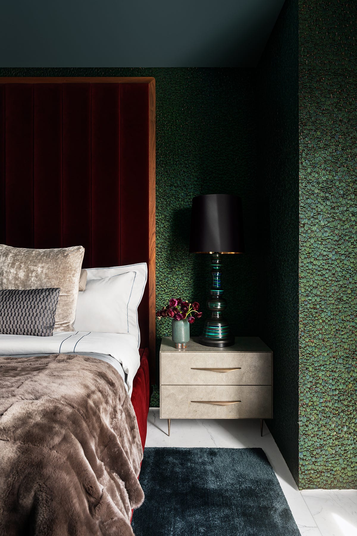
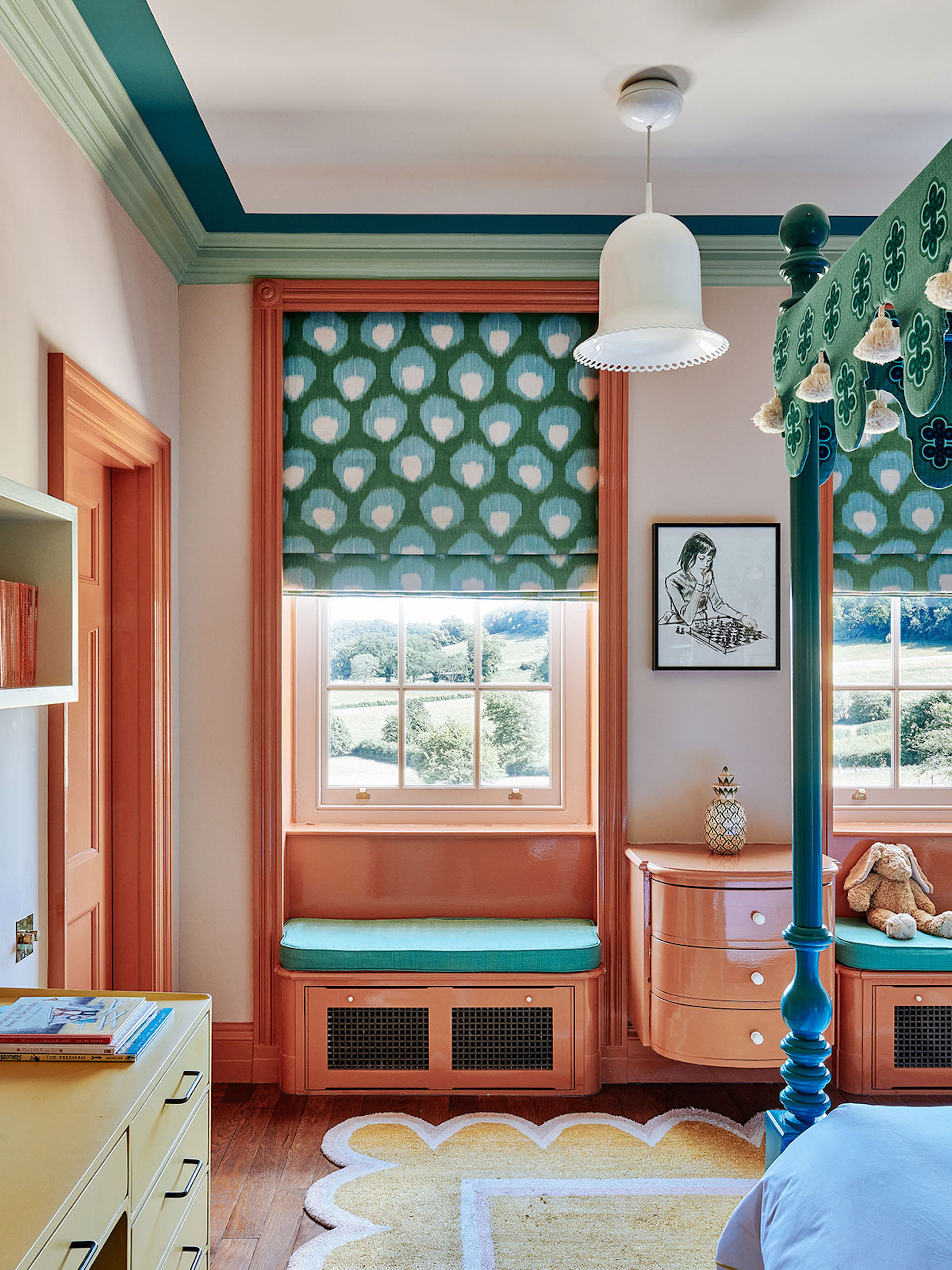
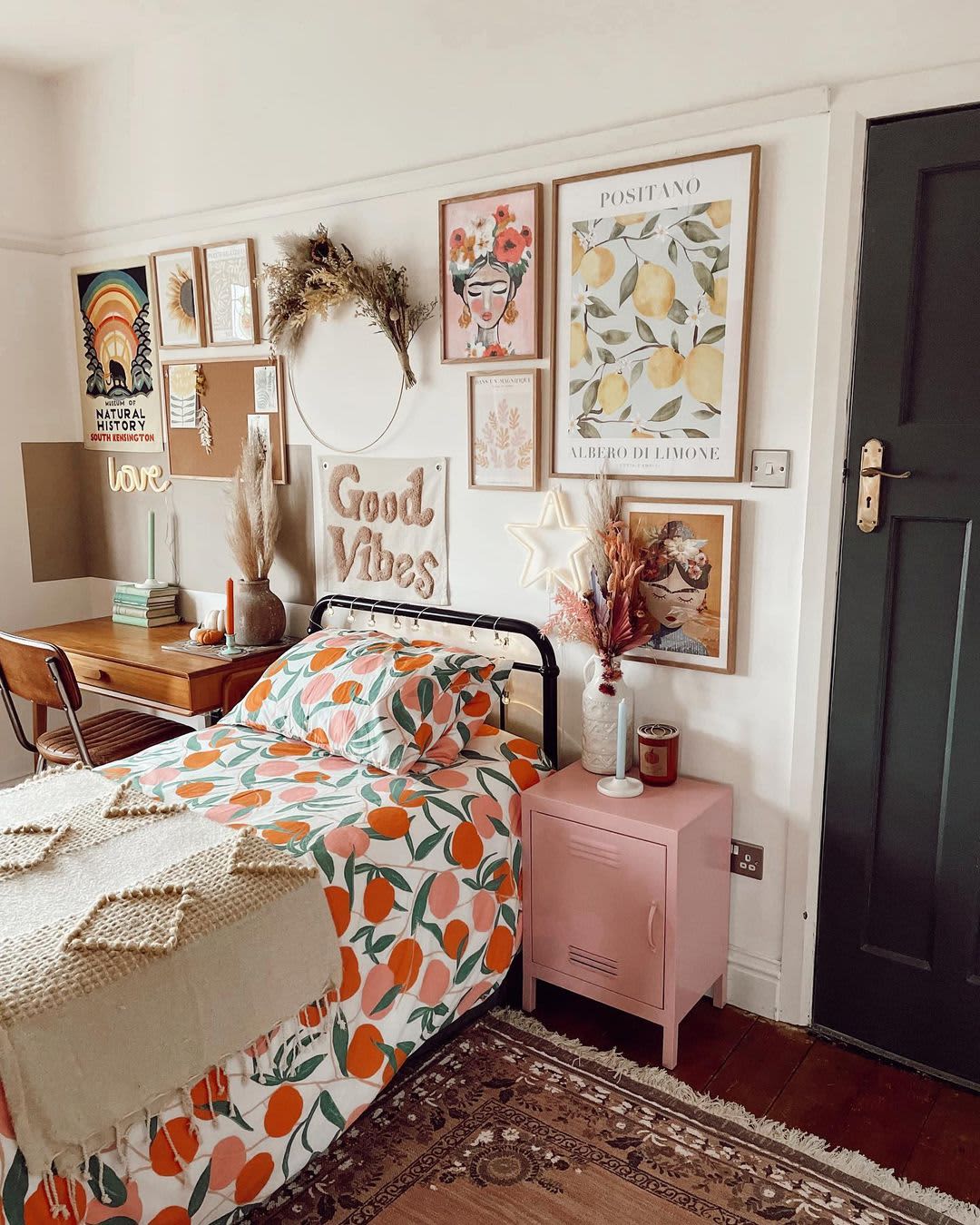
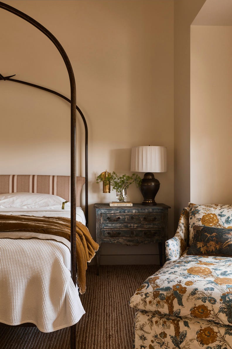
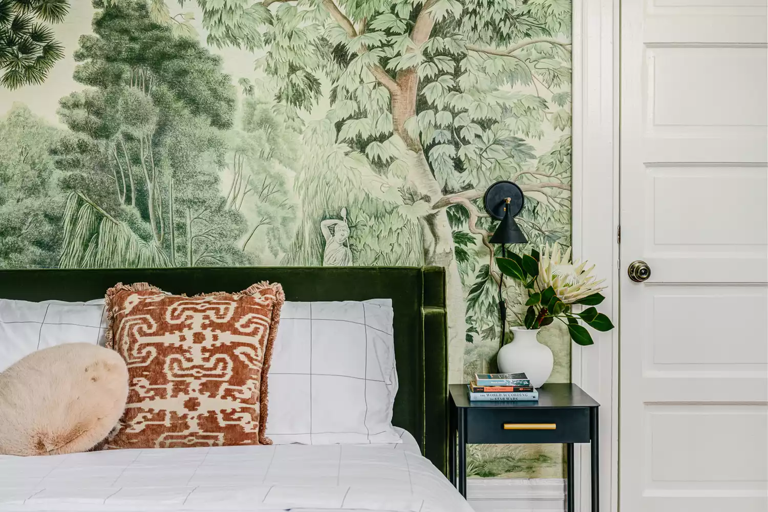
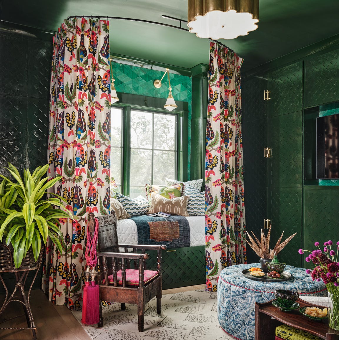
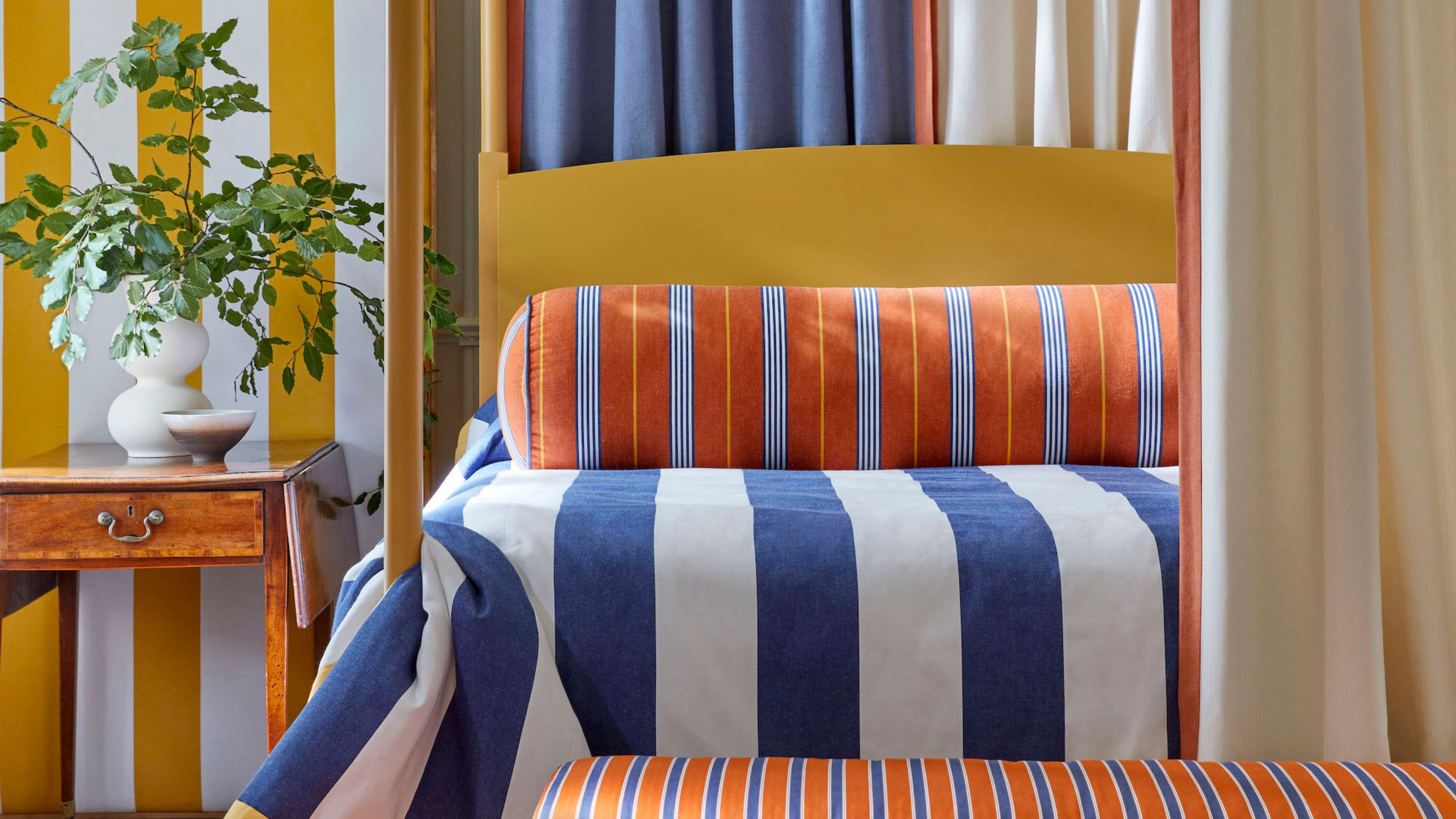
Deep green is presented as refreshing and peaceful, symbolizing restoration and harmony. Positioned in the middle of the color spectrum, it balances stimulating warm colors with calming cool ones. Adam Black, co-founder of Button & Sprung, suggests complementing deep greens with copper accessories for a contemporary look. Orange, including its muted terracotta variations, evokes Mediterranean influences, which can be enhanced with natural woods and plants like olive trees. Sarah highlights bold oranges like Valspar’s Vitamin C or Orange Marmalade for warmth and positivity, especially on a feature wall or in soft furnishings. The use of a four-poster bed with a draped canopy made from soft cotton or linen is suggested to add drama.
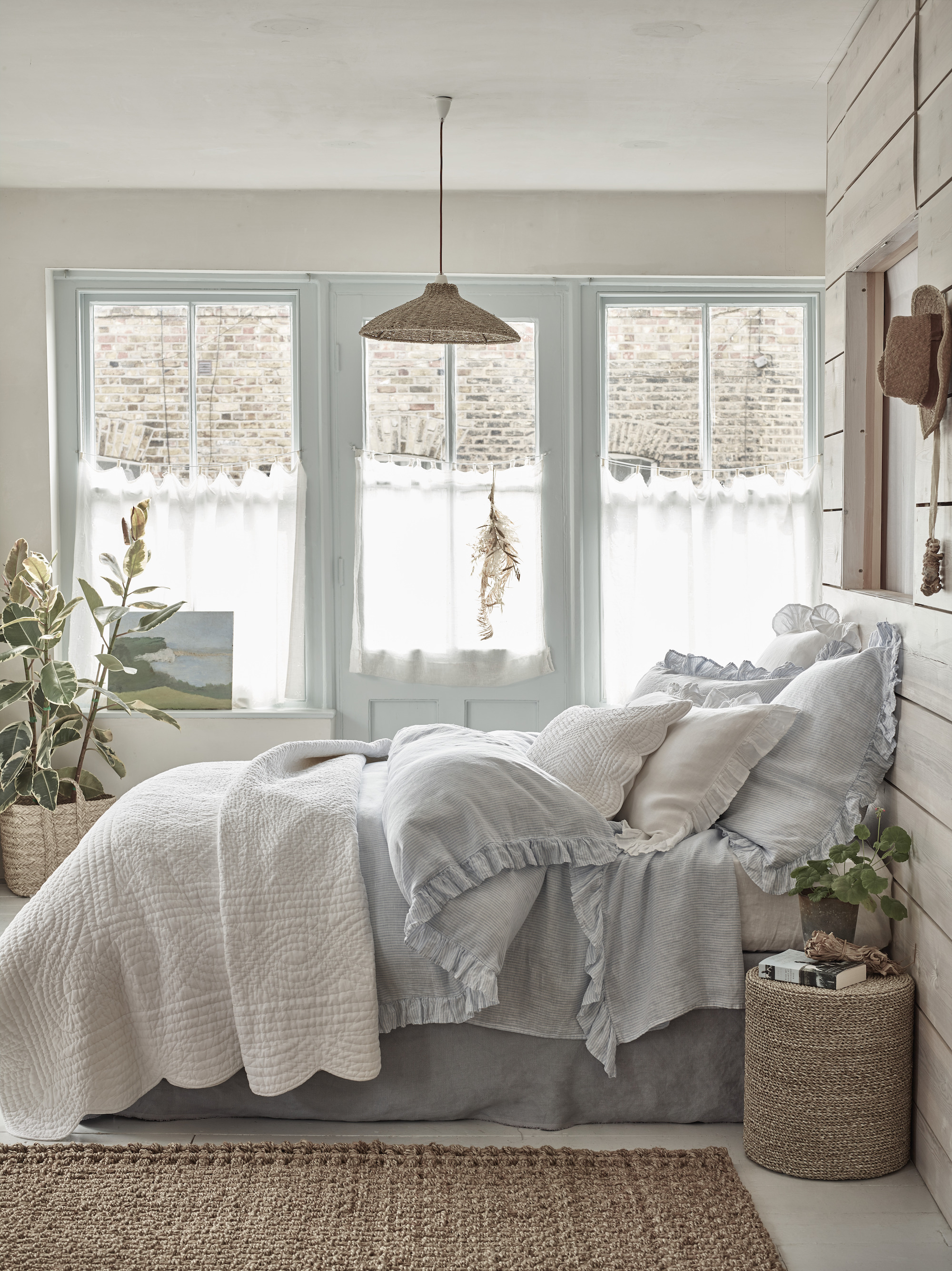
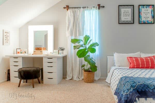
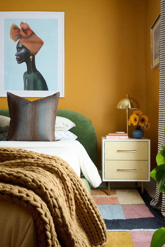
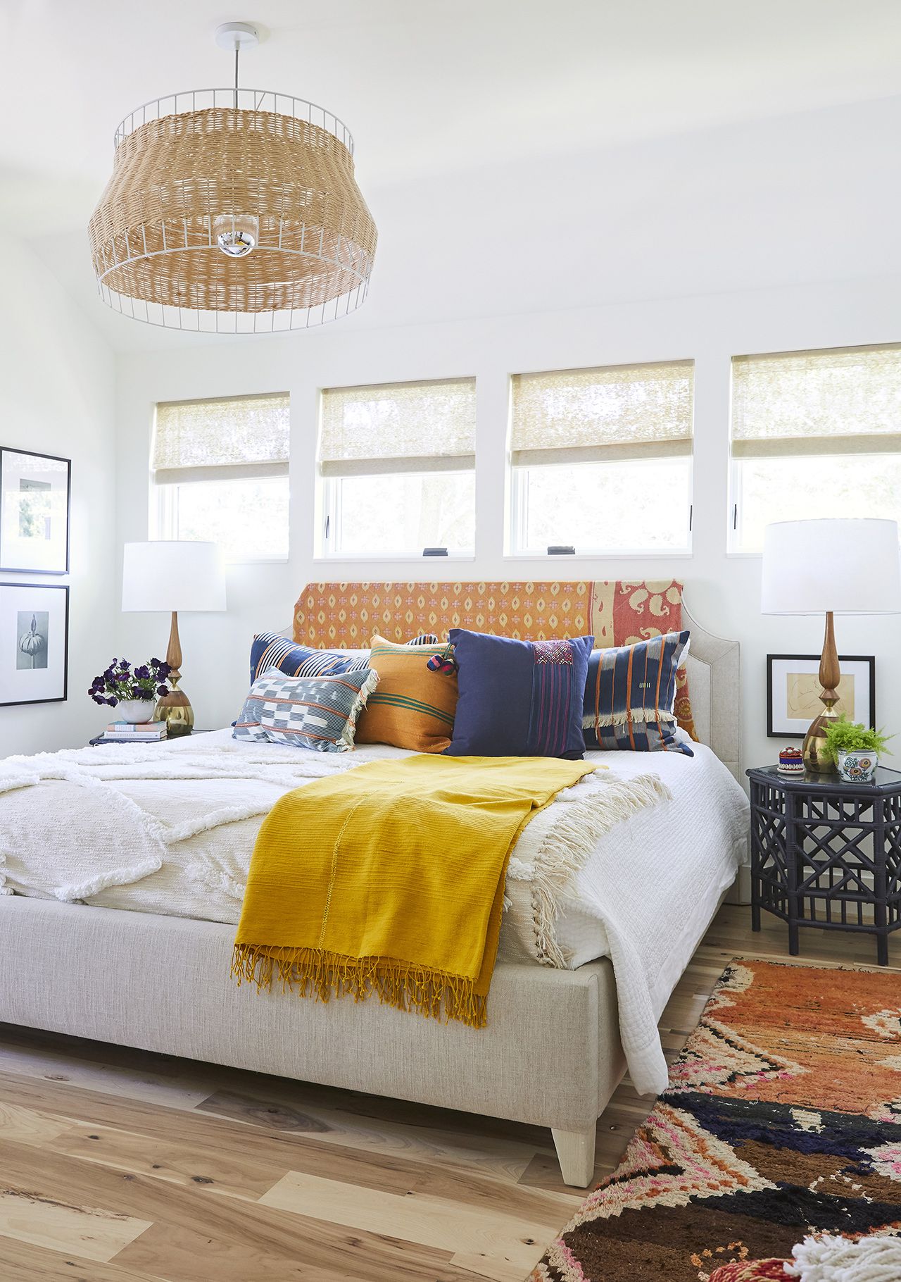
Pale grey and terracotta offer a combination where grey provides neutrality and balance. Yvonne Keal, senior product manager at Hillarys, explains that mixing warm and cool colors can be balanced by making one dominant and the other an accent. Terracotta accents, such as in window dressings or cushions, can warm up the space and make it inviting. Warm yellow, like orange, is associated with joy, comfort, and vibrancy. Marianne recommends a versatile neutral like Spiced Honey as a backdrop, especially in rooms lacking natural light, to boost mood. Amy notes that sunshine shades can significantly brighten a room.
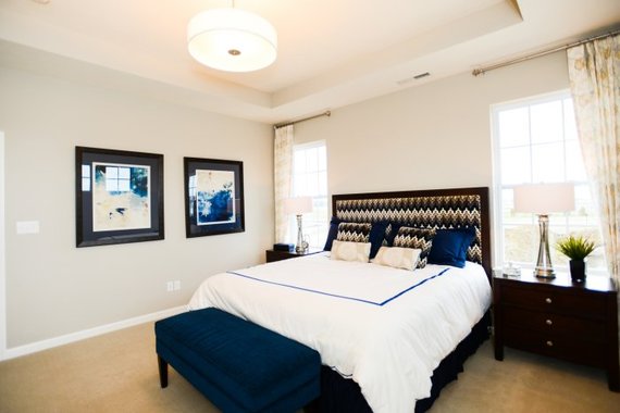
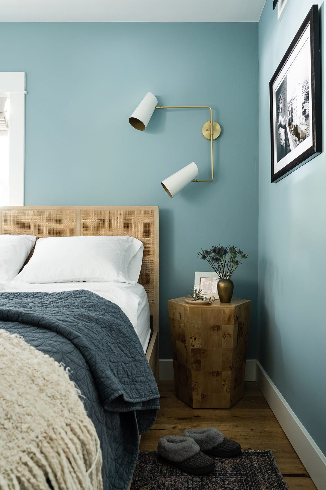
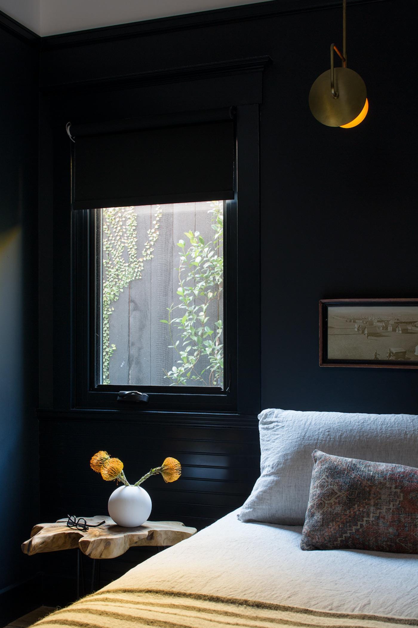
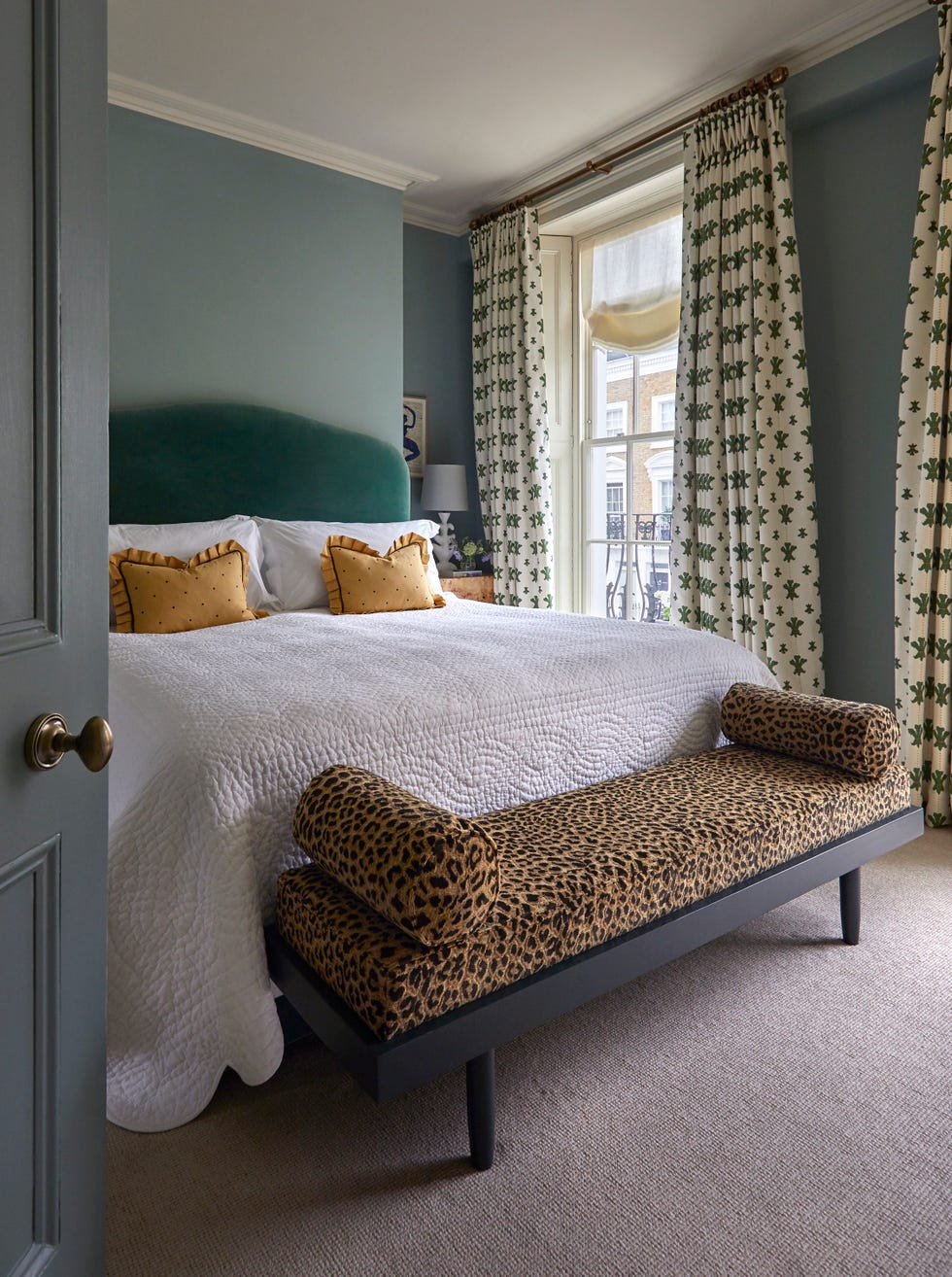
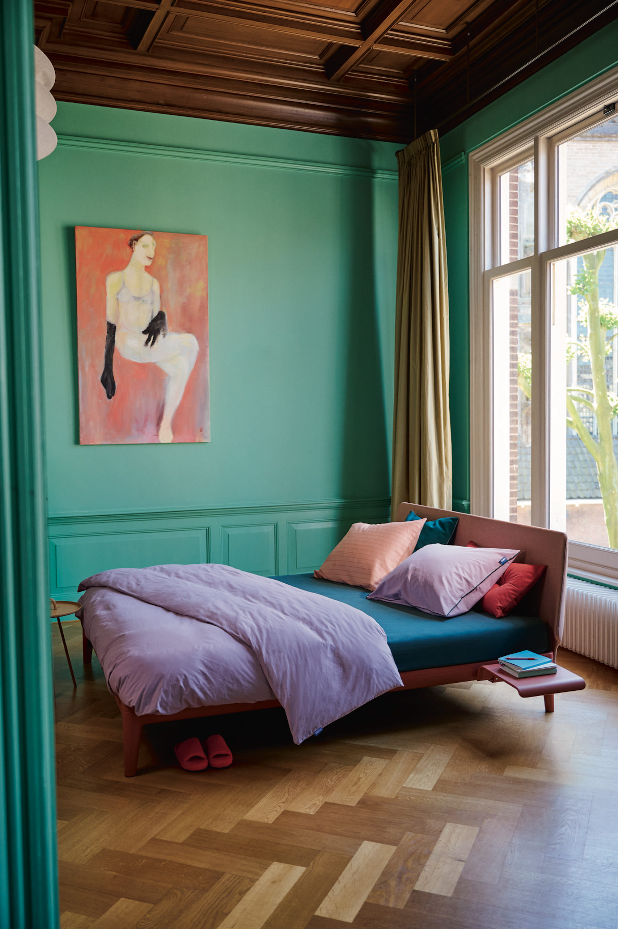
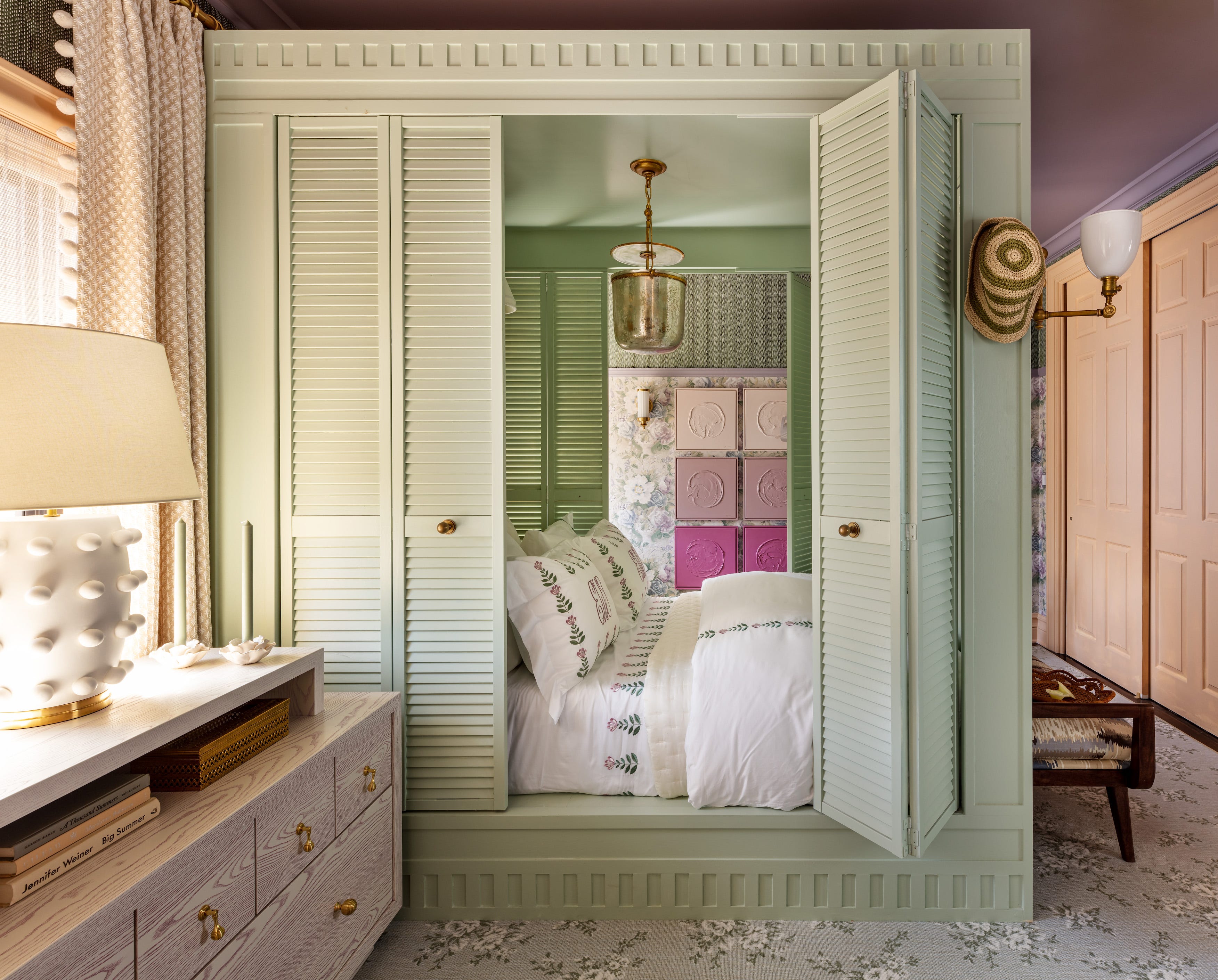
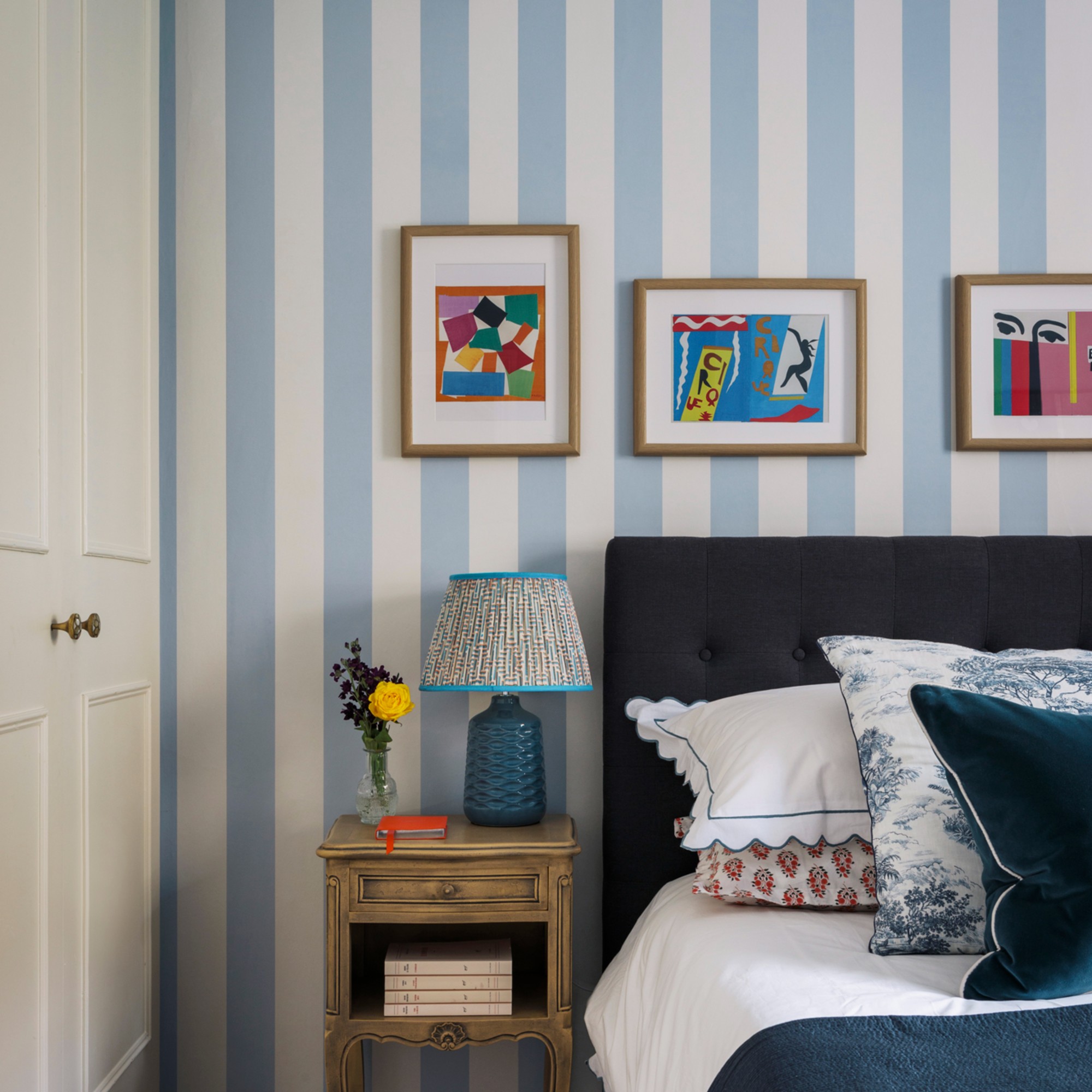
Midnight blue, a bold choice, represents stability, harmony, and peace, believed to calm a busy mind and lower heart rate. Sarah mentions its use in bedrooms and bathrooms for tranquil environments and stress reduction, emphasizing tonal blue combinations for mental decluttering. Sage, a soft green with added white, is versatile and pairs well with colors like grey, pink, and turquoise. Sarah Keady, House Beautiful’s style and interiors director, emphasizes its connection to the outdoors, recommending its use with plants and natural wood for maximum effect.
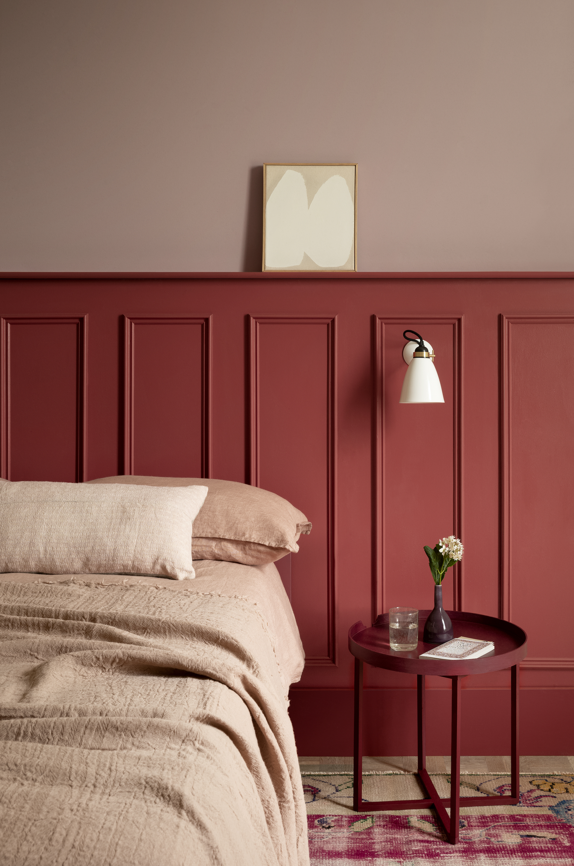
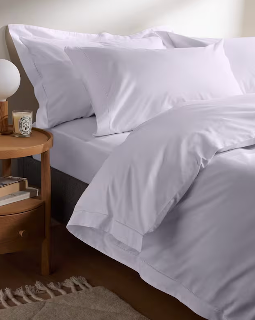
Red, a passionate and energizing color, can be sophisticated when used in warm tones and pairs well with citrusy yellows and blues. Sarah Lloyd advises using red sparingly or with calmer colors like salmon pink to avoid overwhelming the space. Soft cream provides a soothing and relaxing environment, ideal for promoting sleep. Joanna Ross, general manager of design at Sheridan, suggests warm neutrals and pastels as starting points. Martin Seeley, sleep expert and CEO of MattressNextDay, notes that neutral colors limit distraction and create balance for optimal sleep.
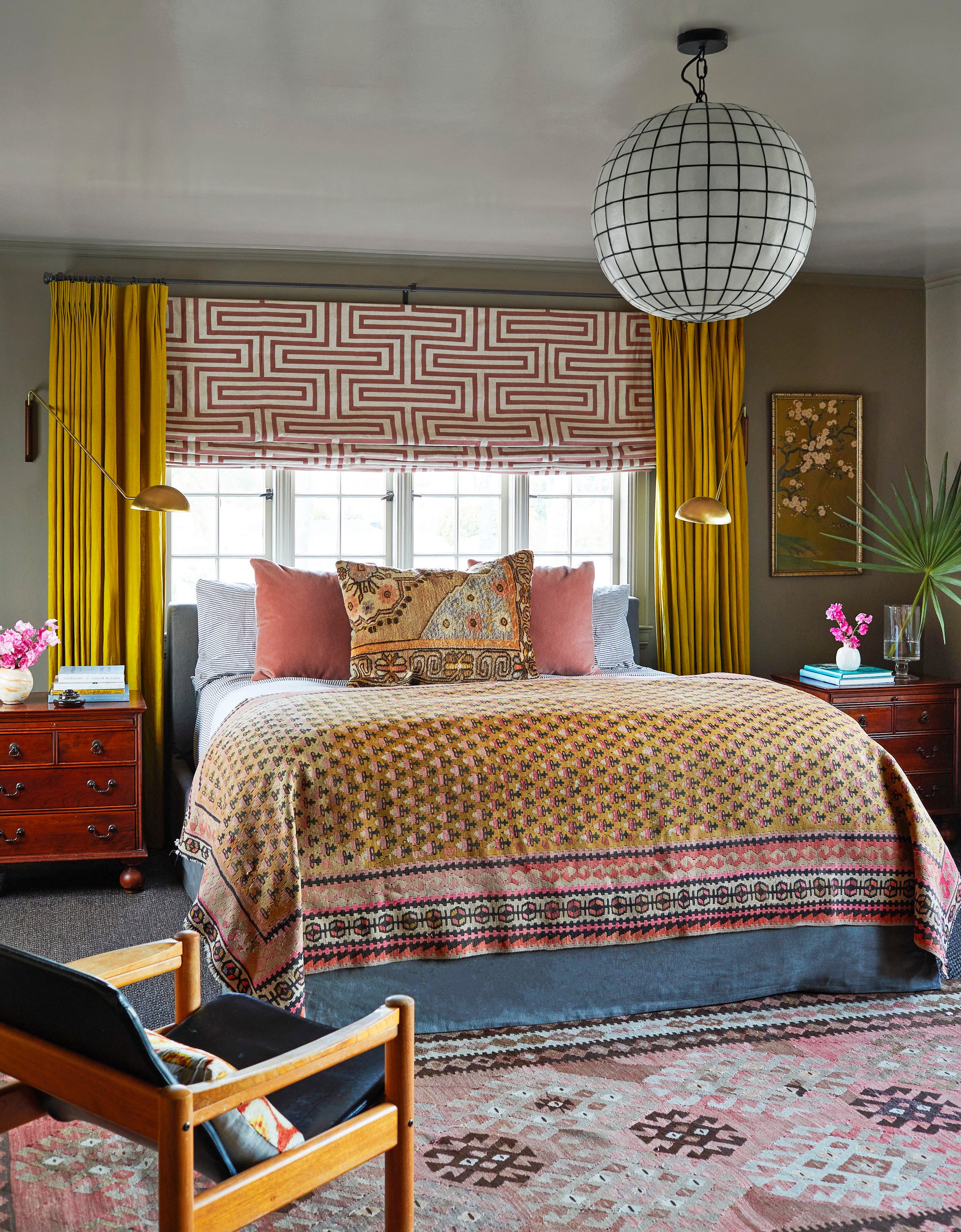
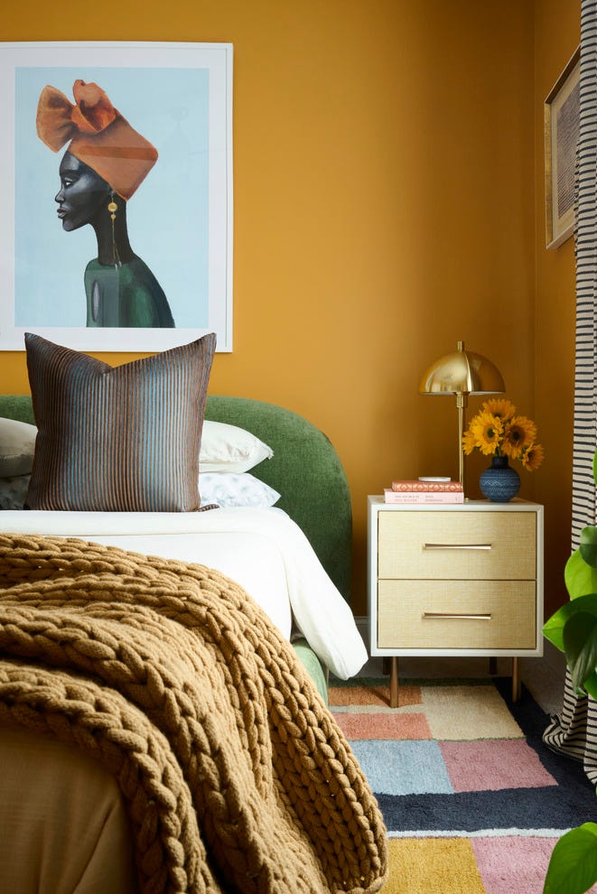
Purple, particularly pastel lilac, works effectively as a feature wall, complemented by exposed floorboards. Combining variations of a single color, such as deep purple with lilac, can create an impactful, mature aesthetic, especially with a strong contrast. Gold, while less conventional for bedrooms, can create a cocooning, luxurious feel when the entire room, including ceilings, is drenched in it. Glossy or metallic finishes enhance the effect, creating dynamic highlights in natural light.
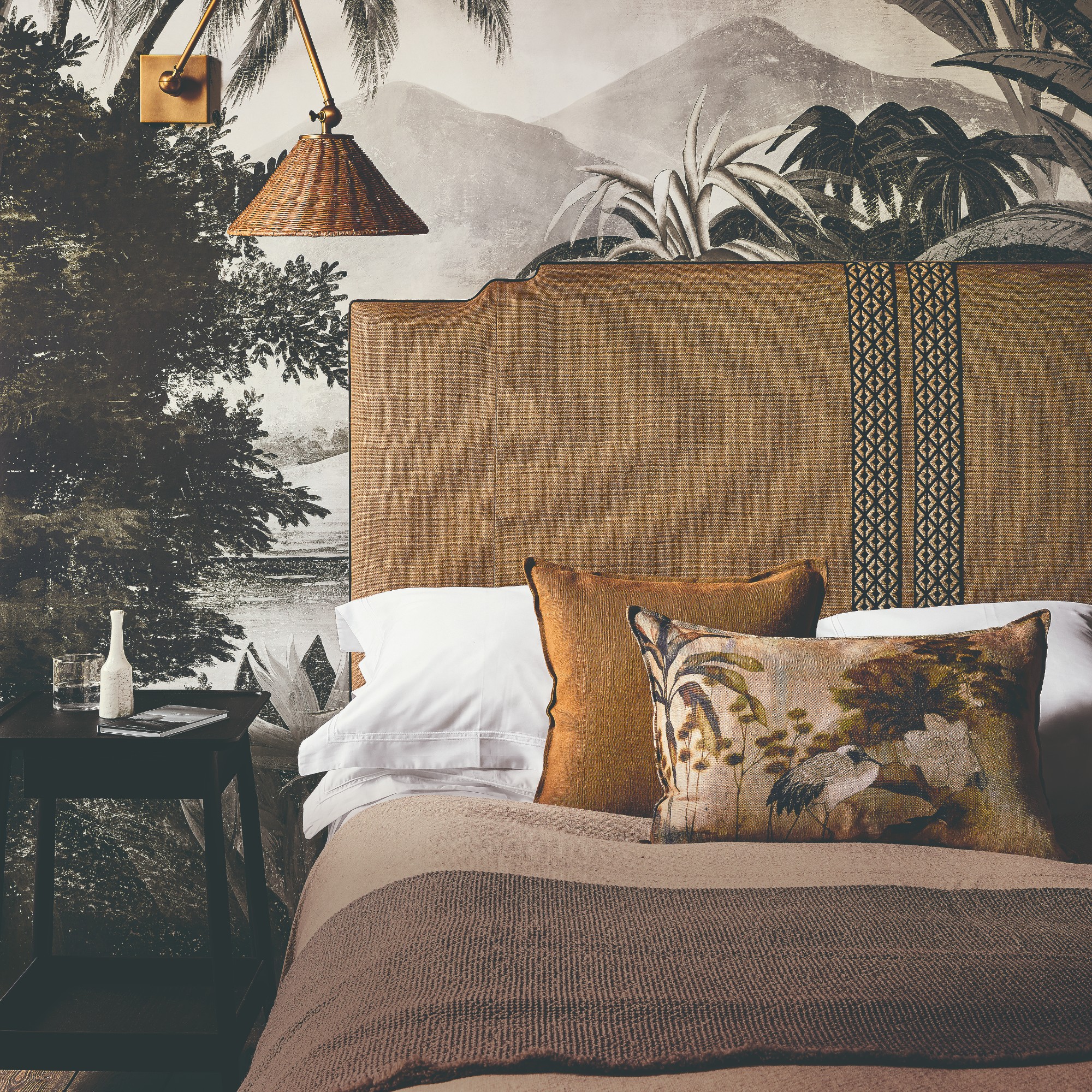
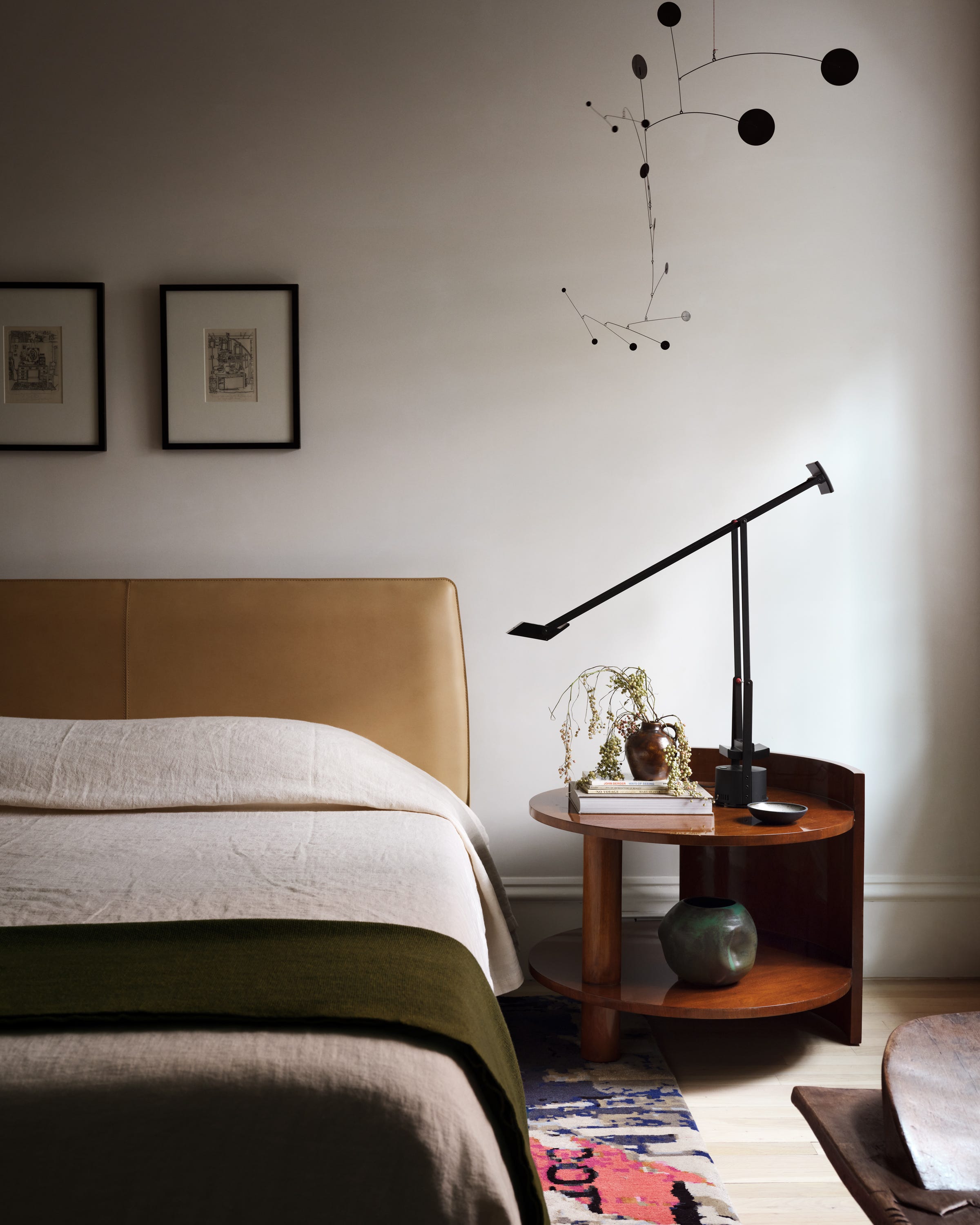
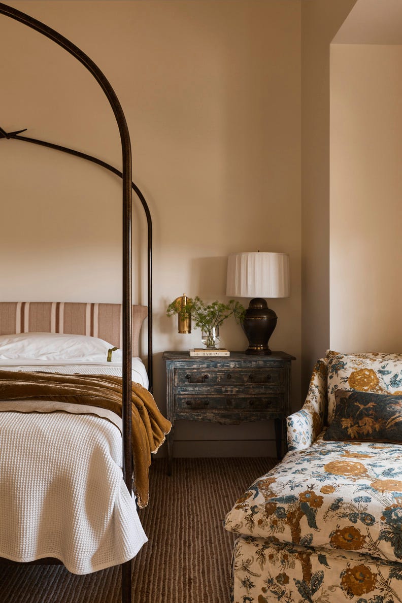
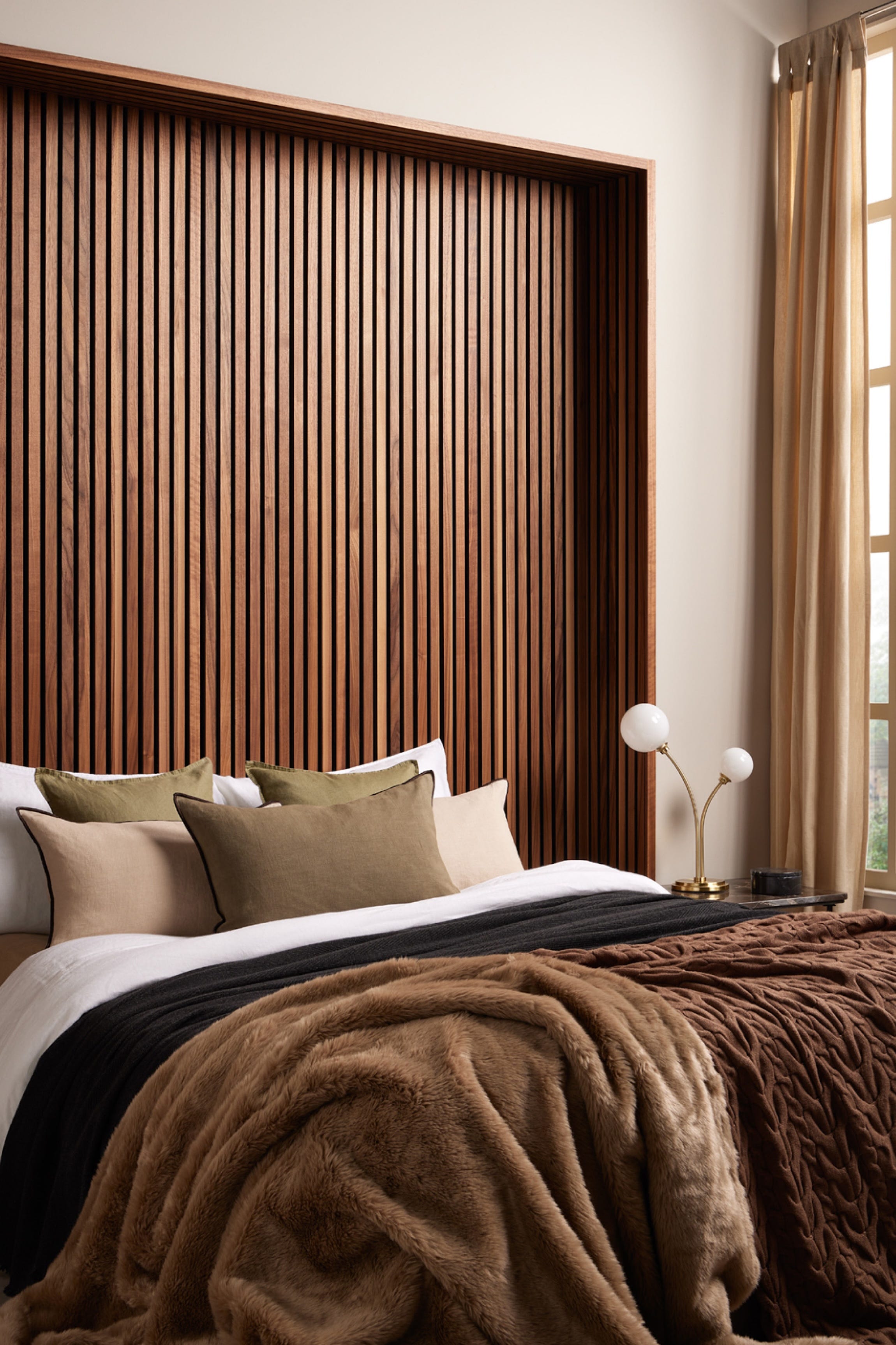
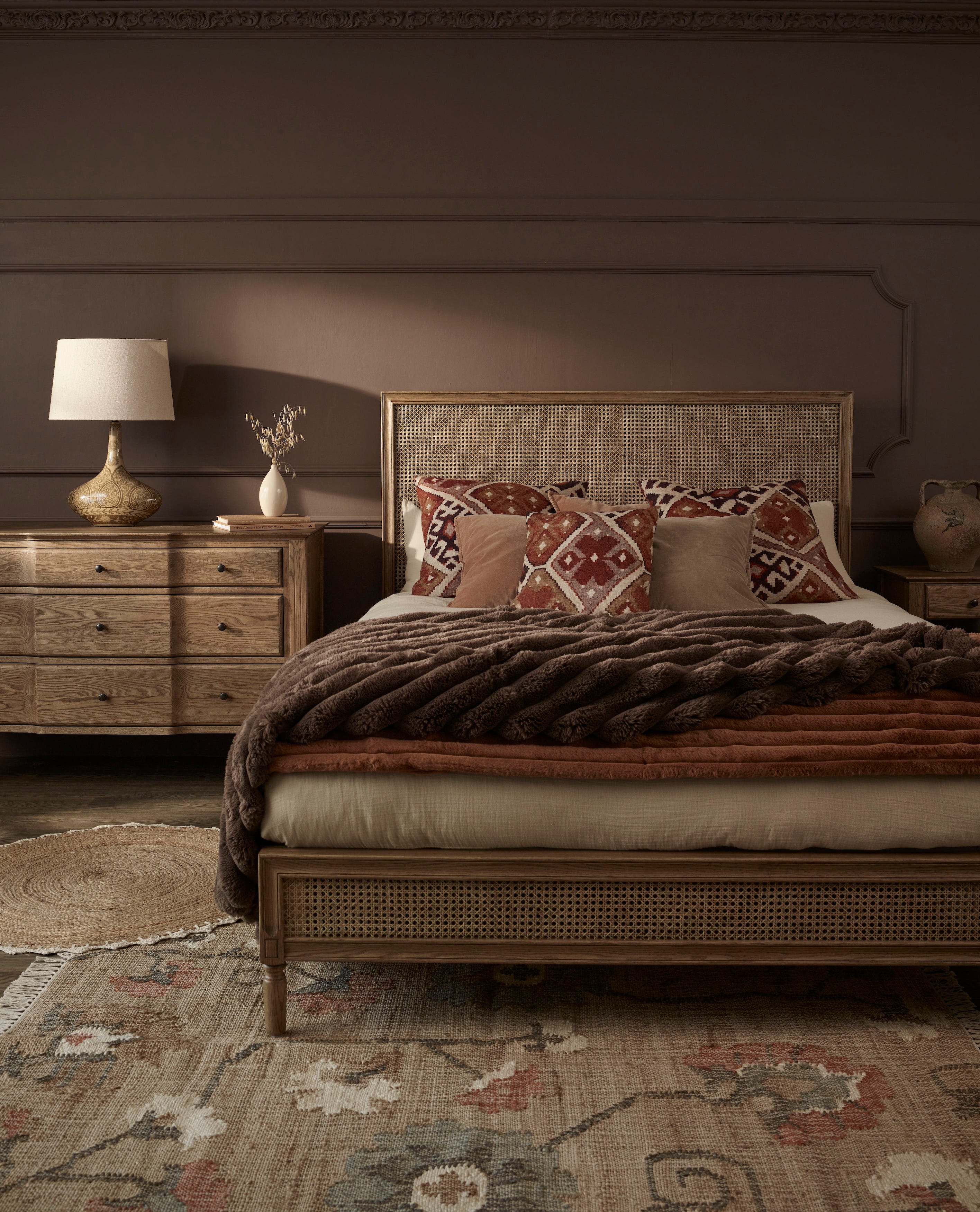
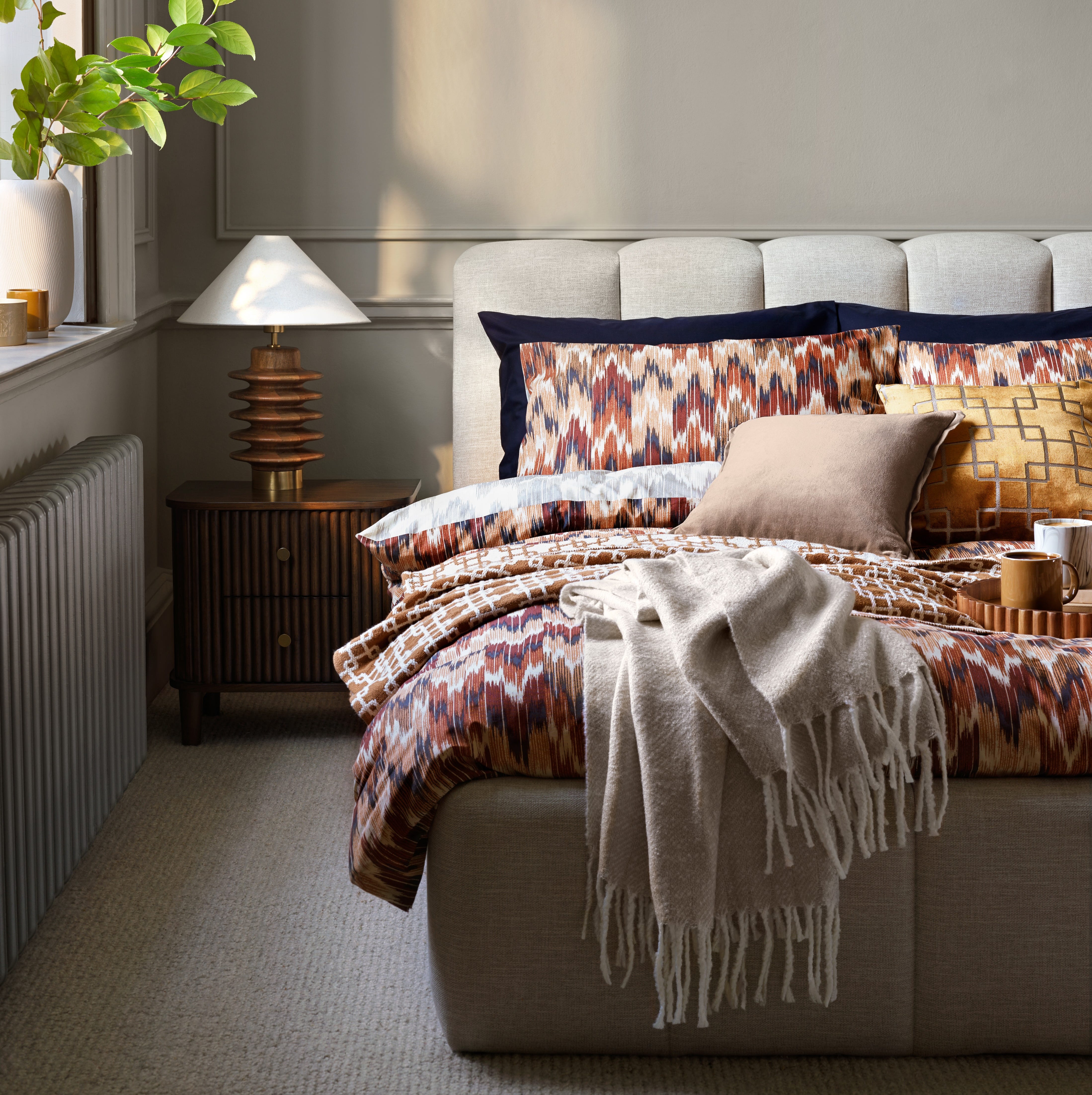
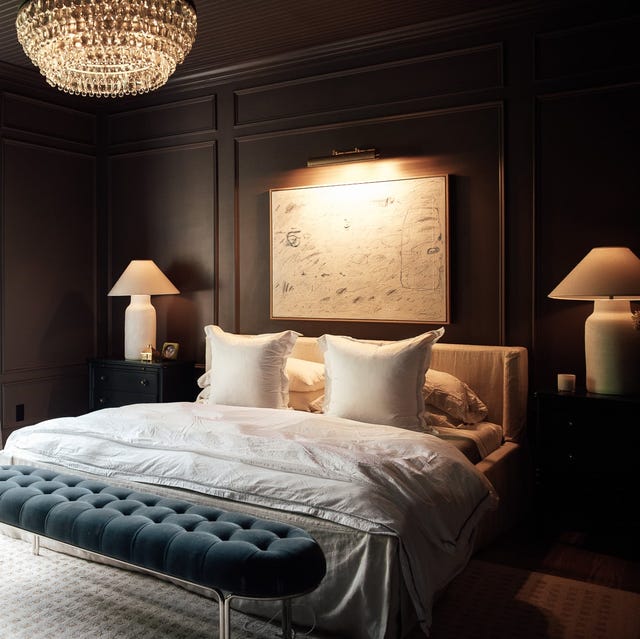
Brown offers a luxe, boutique hotel feel. The article suggests using deep browns, like Farrow & Ball’s Tanner's Brown with red undertones, on walls surrounding a dark wooden headboard to avoid contrast and create a cohesive look. Pink and sage form a safe color combination, particularly when similar muted tones are chosen. The absence of white maintains a muted and tonal aesthetic, effectively using color without being overpowering. The technique of two-tone color blocking can create a faux headboard effect.
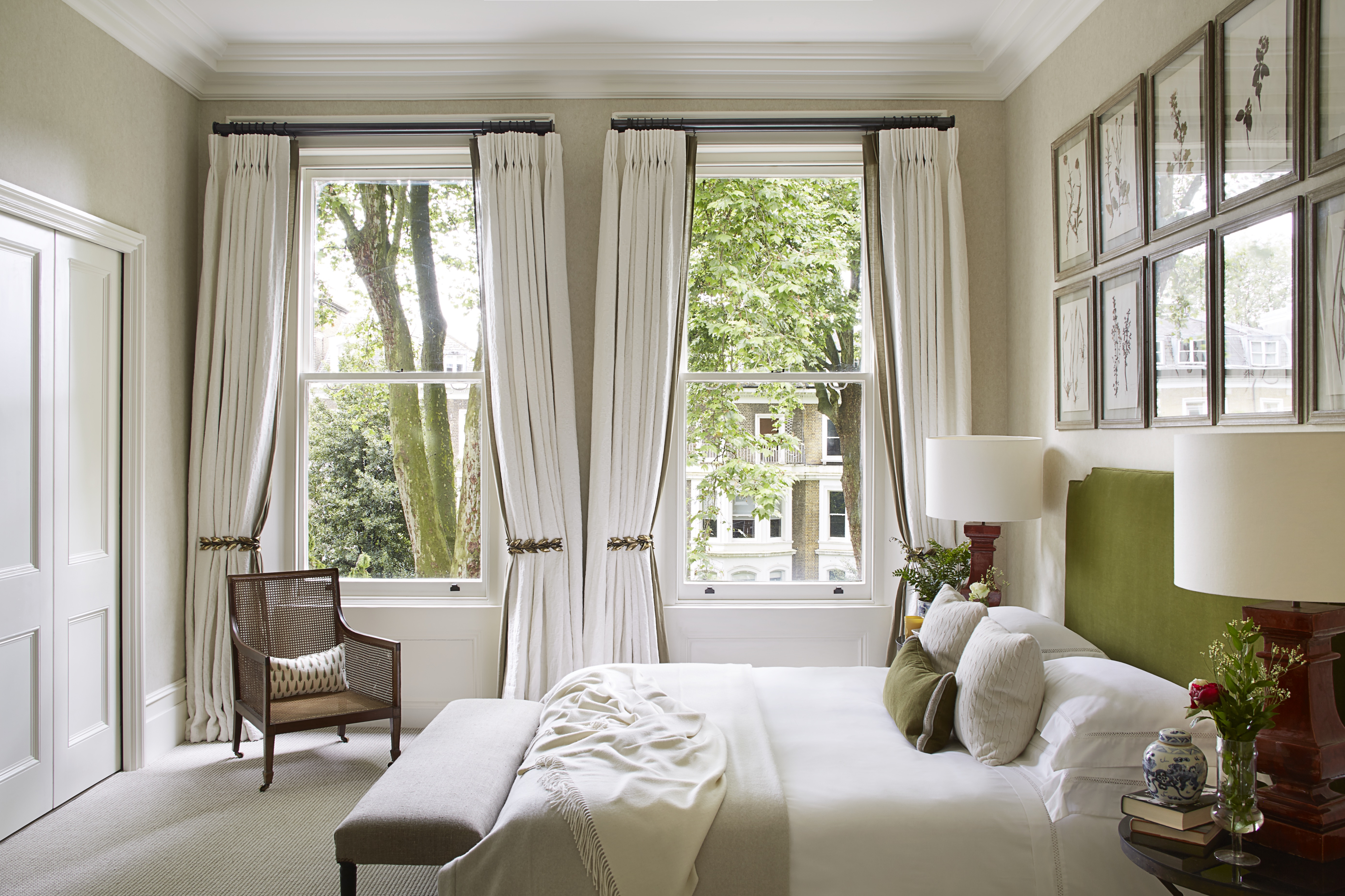
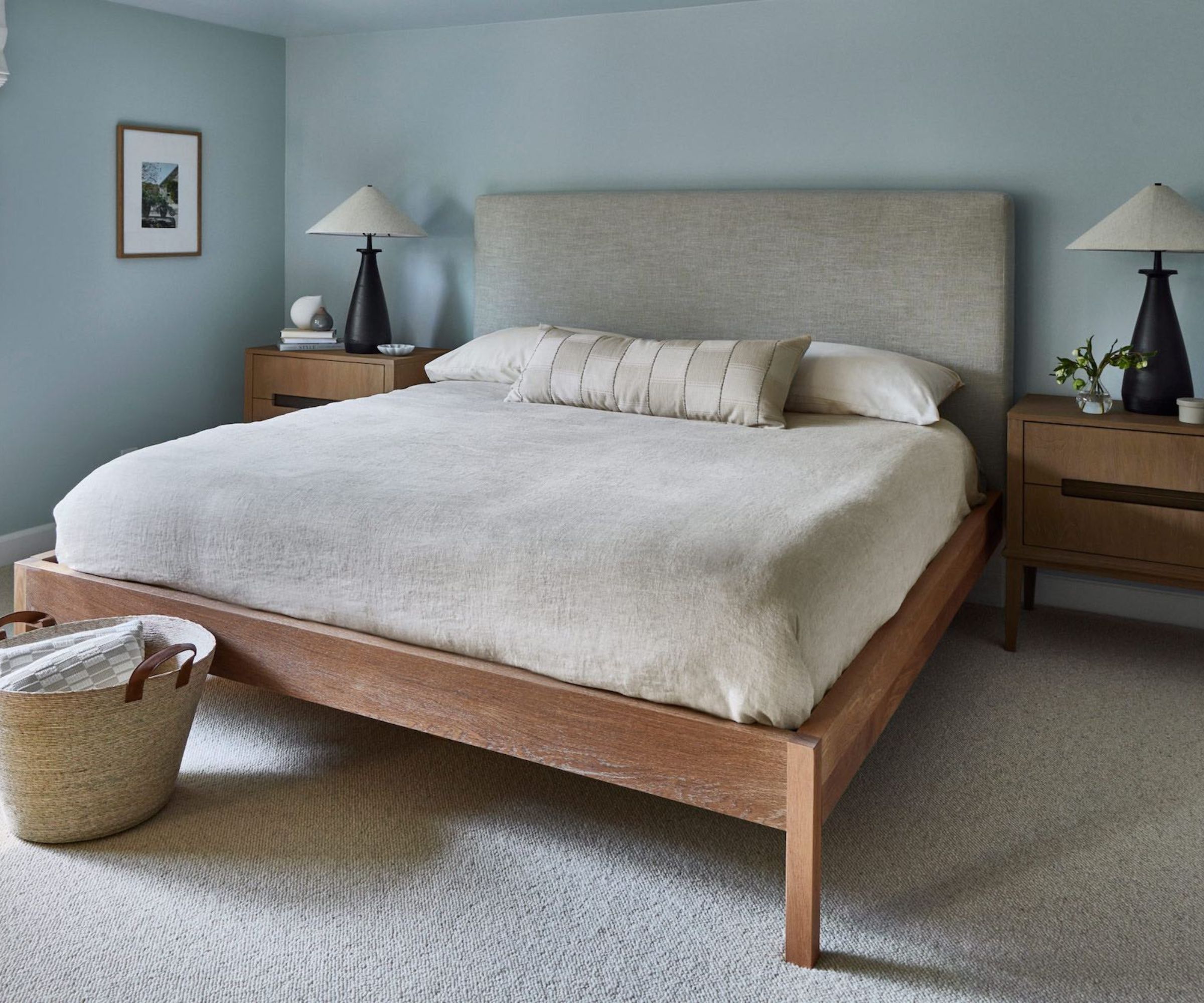
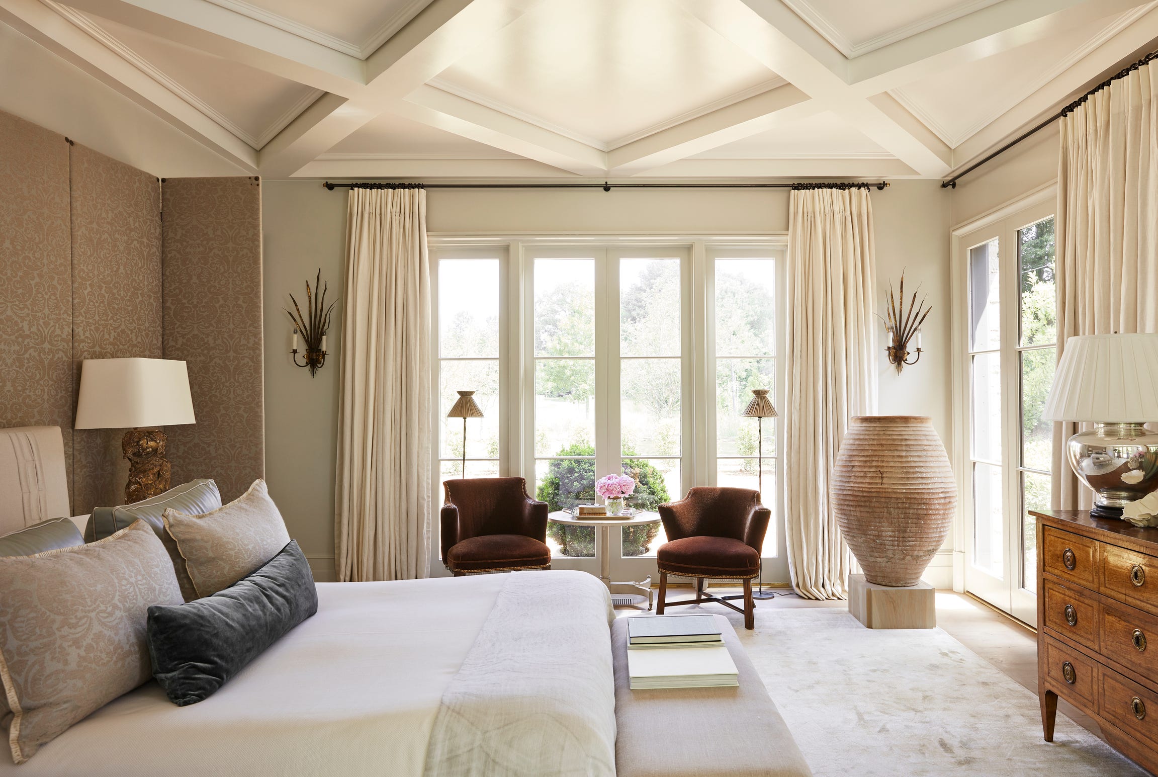
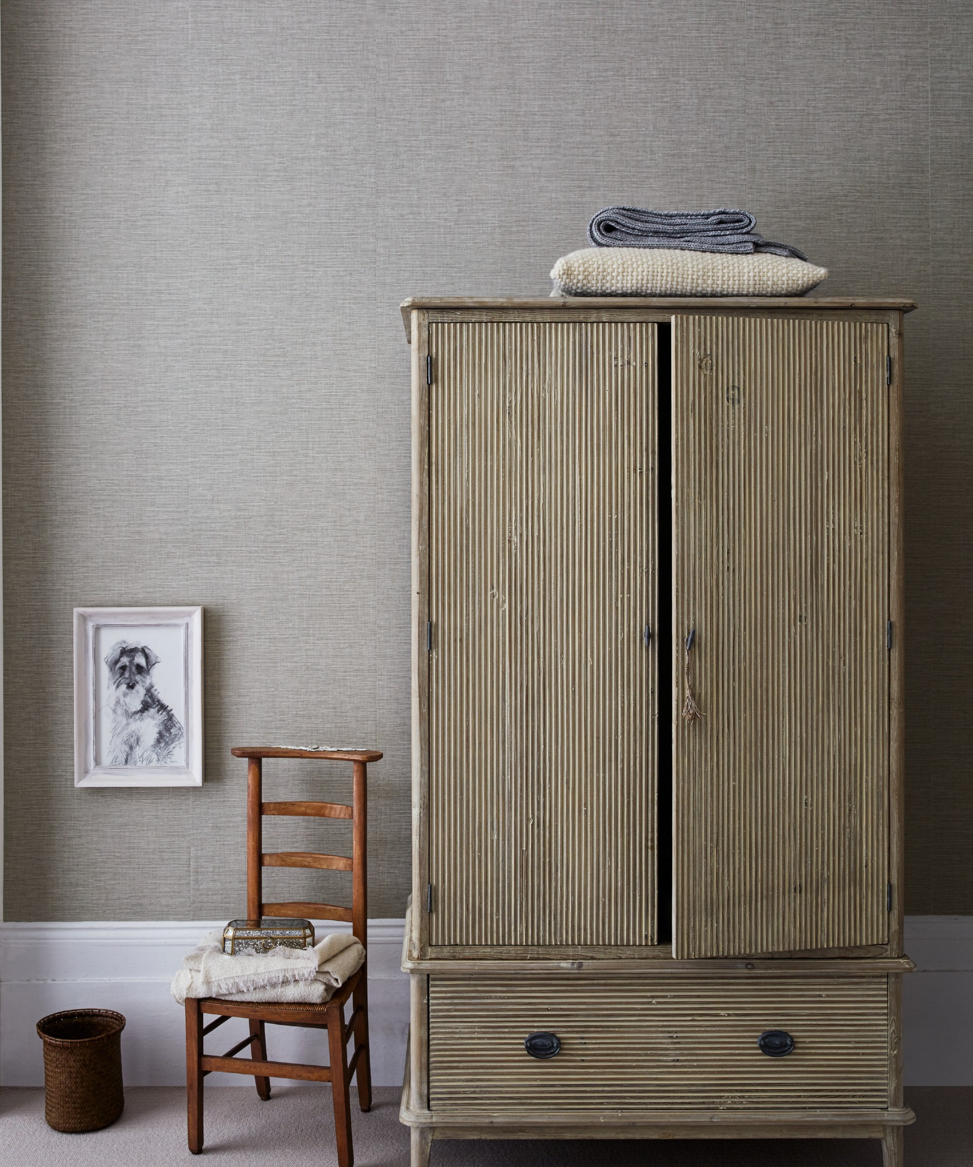
Warm grey is recommended for feature walls, providing impact without being overly distracting. Ruth Mottershead, creative director at Little Greene, suggests using grey paint to create color blocks that act as visual headboards and focal points. Ink blue, with its rich and regal connotations, is ideal for luxurious bedrooms, especially those with high ceilings and natural light to highlight brass accents. Finally, Greige, a blend of grey and beige, combines cooling and warming qualities for a serene bedroom. Subtle pink undertones in greige work well in south or west-facing rooms. Amy Wilson, an interior designer at 247 Curtains, suggests contrasting ceilings or soft furnishings to enhance the chosen color scheme.
#BedroomColourIdeas #ColourPsychology #HomeDecoration #InteriorDesign #PaintColors #RestAndRelaxation #BedroomPalette #DecoratingTips #HomeImprovement #BedroomColourIdeas #ColourPsychology #HomeDecoration #InteriorDesign #PaintColors #RestAndRelaxation #BedroomPalette #DecoratingTips #HomeImprovement
0 comment in total
 No comments yet
You may also like
18 dreamy bedroom colour ideas to create a rest-promoting, stylish space
10 designers on the bedroom colors they always recommend
16 Bright, Bold Teen Bedroom Ideas Your Teenager Will Love
12 Color Drenching Ideas for Bedrooms That Add Wall-to-Wall Ambience
Best Bedroom Colors for Sleep

The Best Bedroom Colors to Help You Sleep (And Wake Up Happy)

20 Bedroom Color Schemes for a Cozy and Calm Sleep Sanctuary, All Picked by Designers

How to Design the Colorful Bedroom of Your Dreams
Bedroom ideas for women – 9 ways to create the ultimate luxury retreat

Standout Bedroom Paint Color Ideas for a Space That's Uniquely Yours


These Beautiful Paint Colors Will Make You Want to Switch Up Your Bedroom Right Now

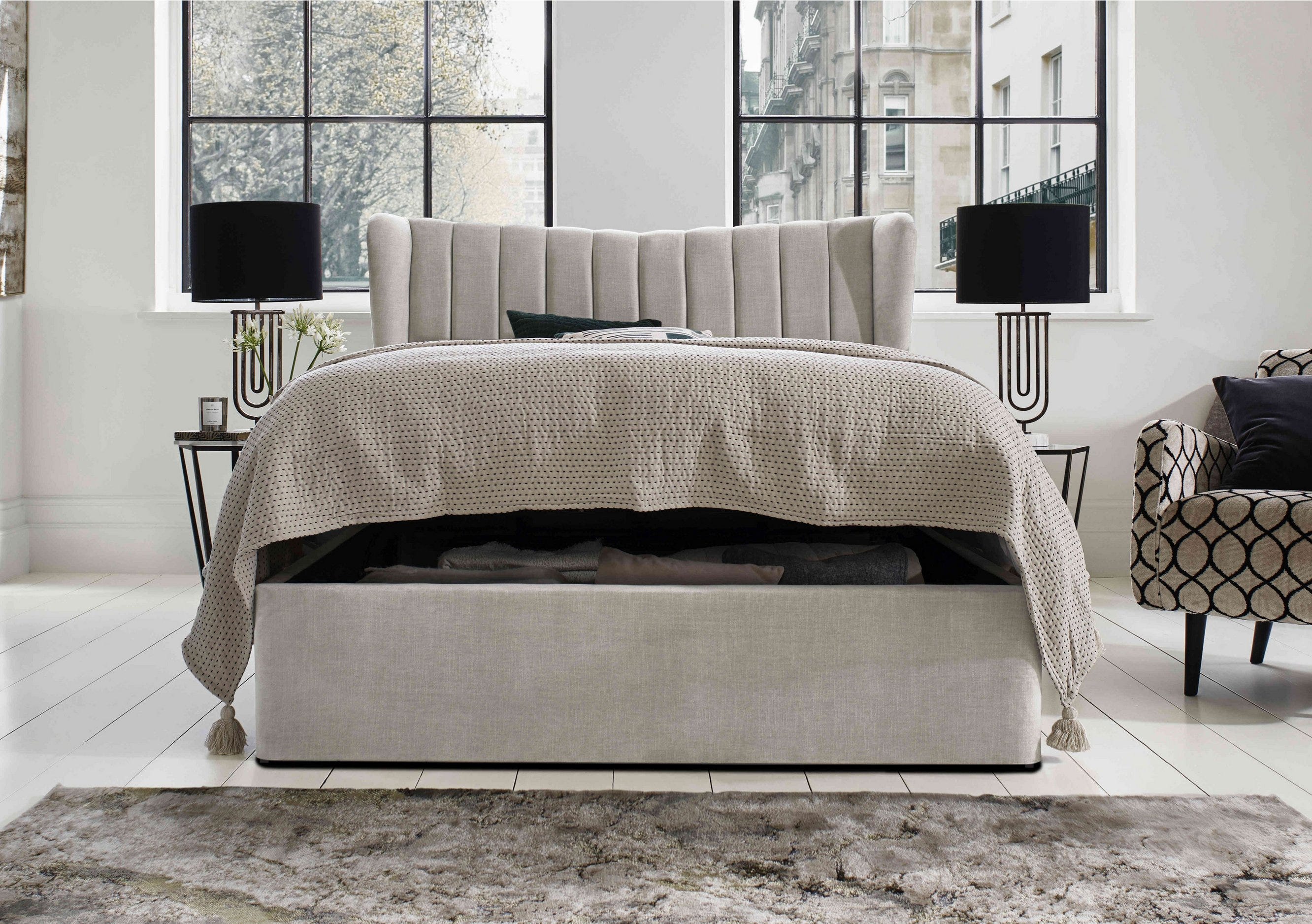
Bedroom inspiration and bedroom decorating ideas
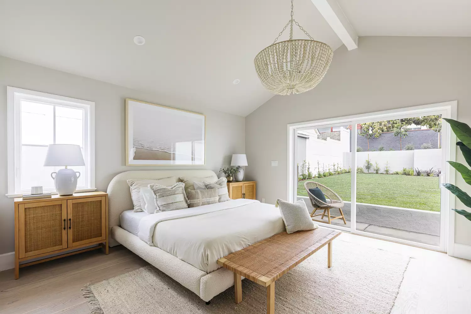
14 Best Bedroom Paint Colors for a Relaxing Space
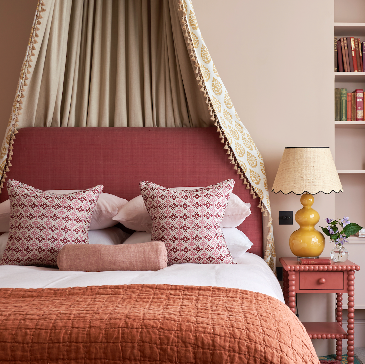
12 bedroom decor ideas we love – from relaxing colour palettes to lessons in layering

Designer-Approved Bedroom Paint Colors That'll Help You Wake Up Happier
You Can Wake Up HAPPIER Just by Painting Your Bedroom—Here Are the Colors Designers Love
We've Rounded Up the Best Bedroom Paint Colors — No Matter Your Style

I've Bored of My Bedroom, So I'm Choosing One of These Colorful Ideas Instead

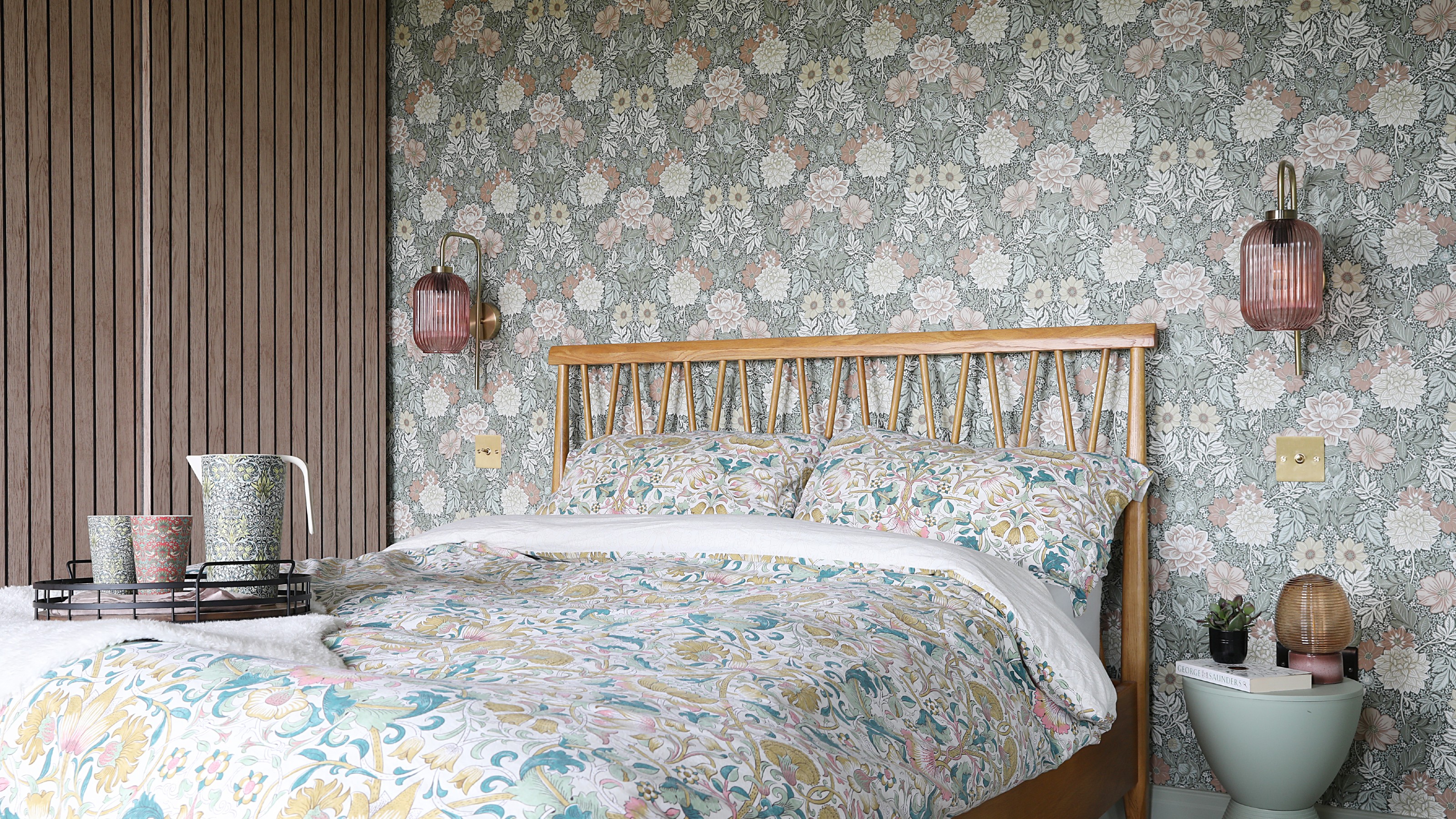
23 bedroom wallpaper ideas to bring in colour and pattern
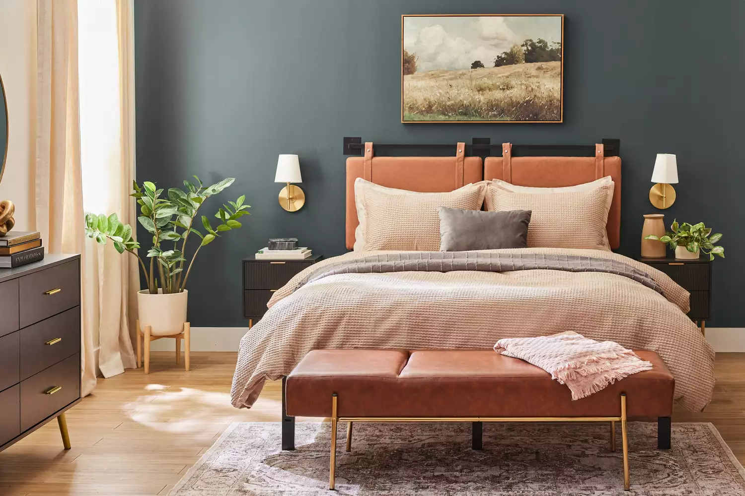
46 Best Bedroom Paint Colors in Every Shade of the Rainbow