1/24
20 Calming Paint Colors That Will Change the Way You Live
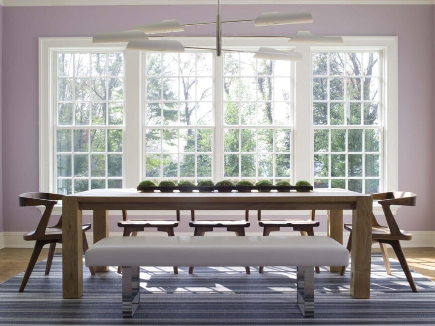
The choice of interior paint colors significantly impacts the mood, energy, and overall ambiance of a home. Beyond comfortable furnishings, wall color plays a crucial role in creating a tranquil environment. This concept is rooted in chromotherapy, or color therapy, which utilizes color to evoke positive emotions and support mental well-being. Experts in color and design highlight specific palettes known for their calming effects, broadly categorizing them into shades of blue and green, pale pinks, and warm neutrals.
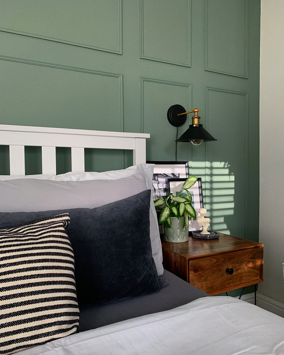
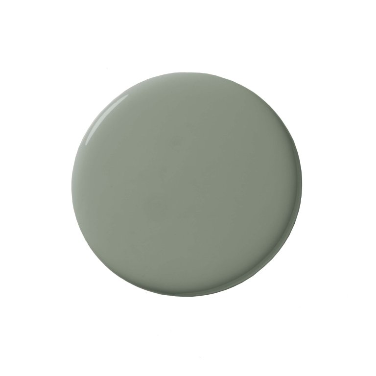
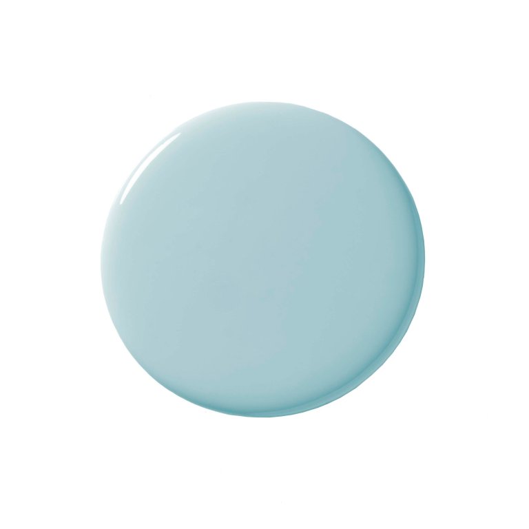
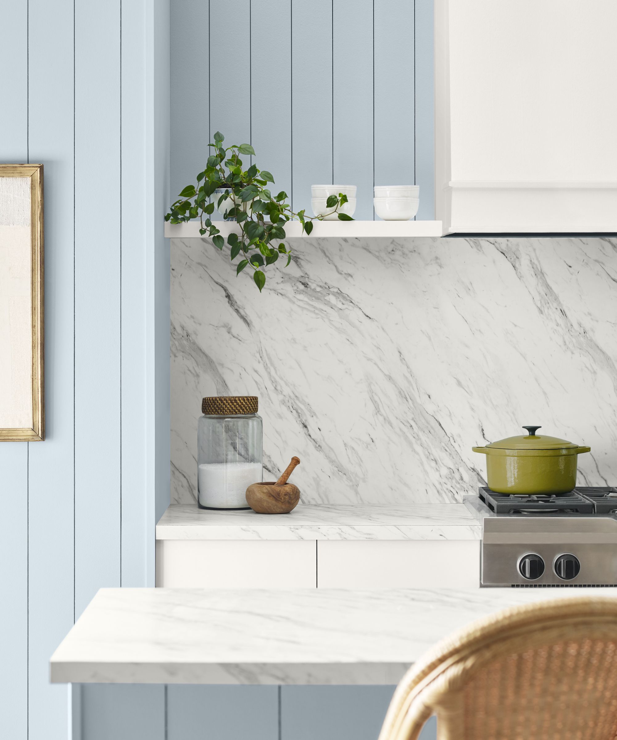
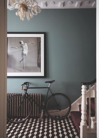
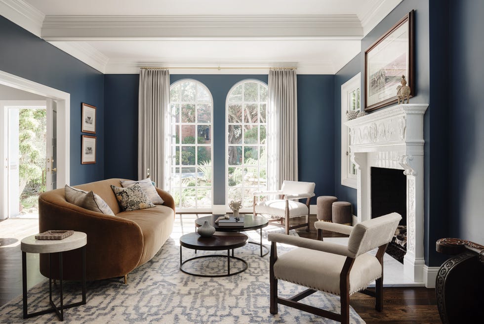
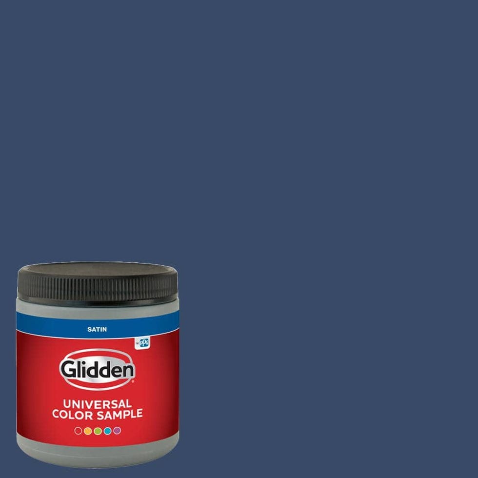
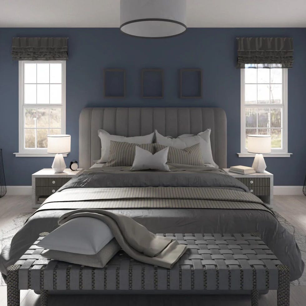
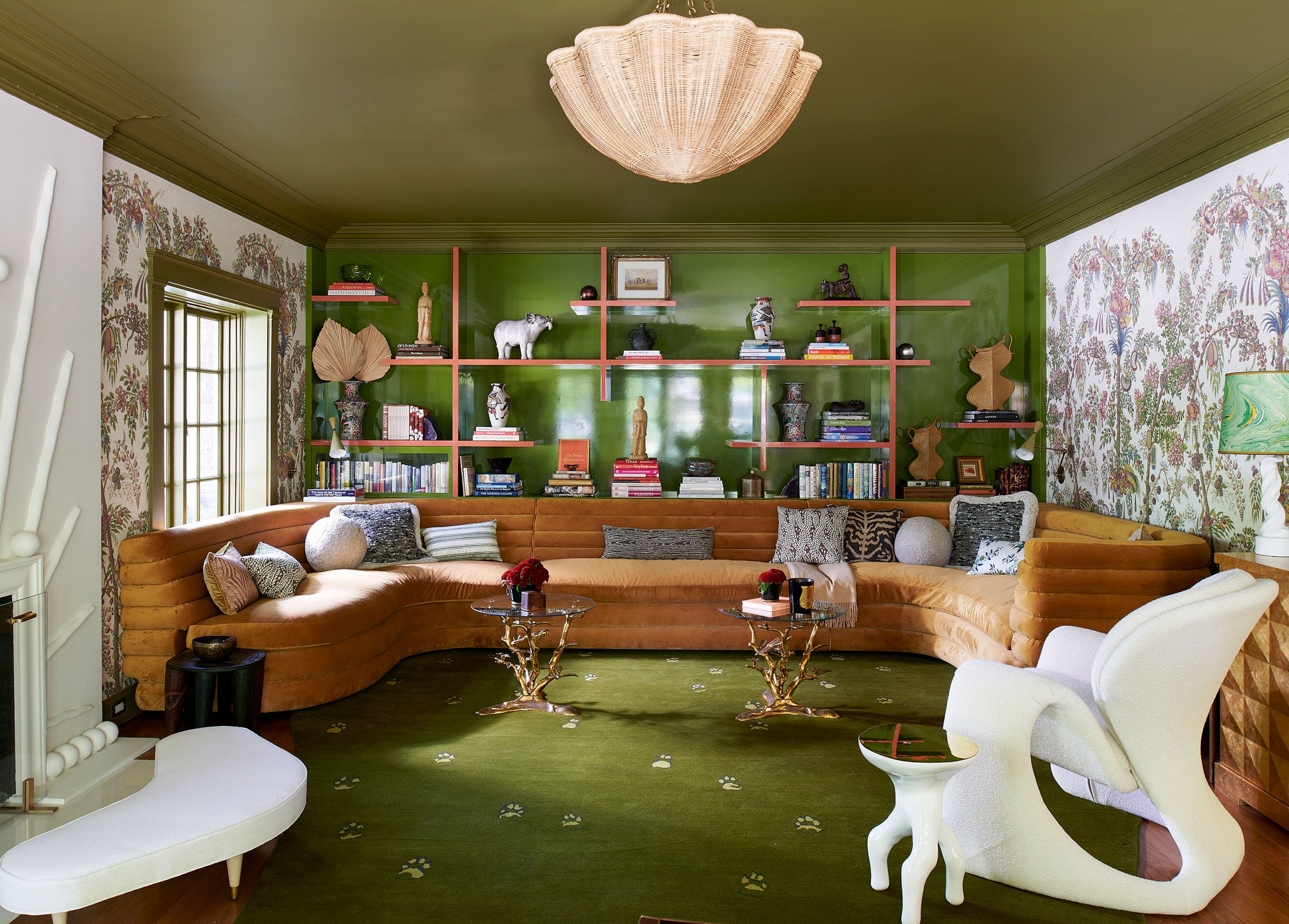
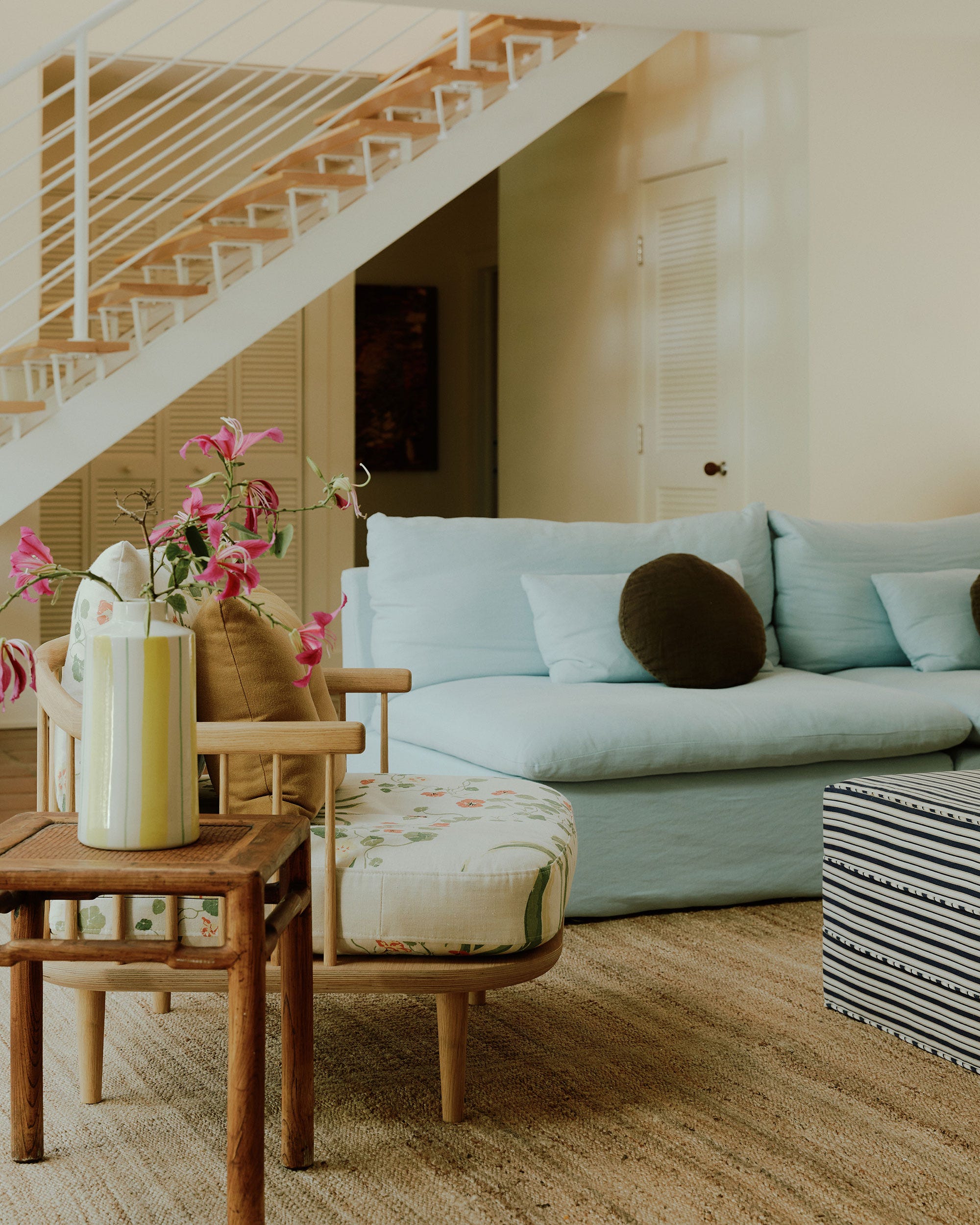
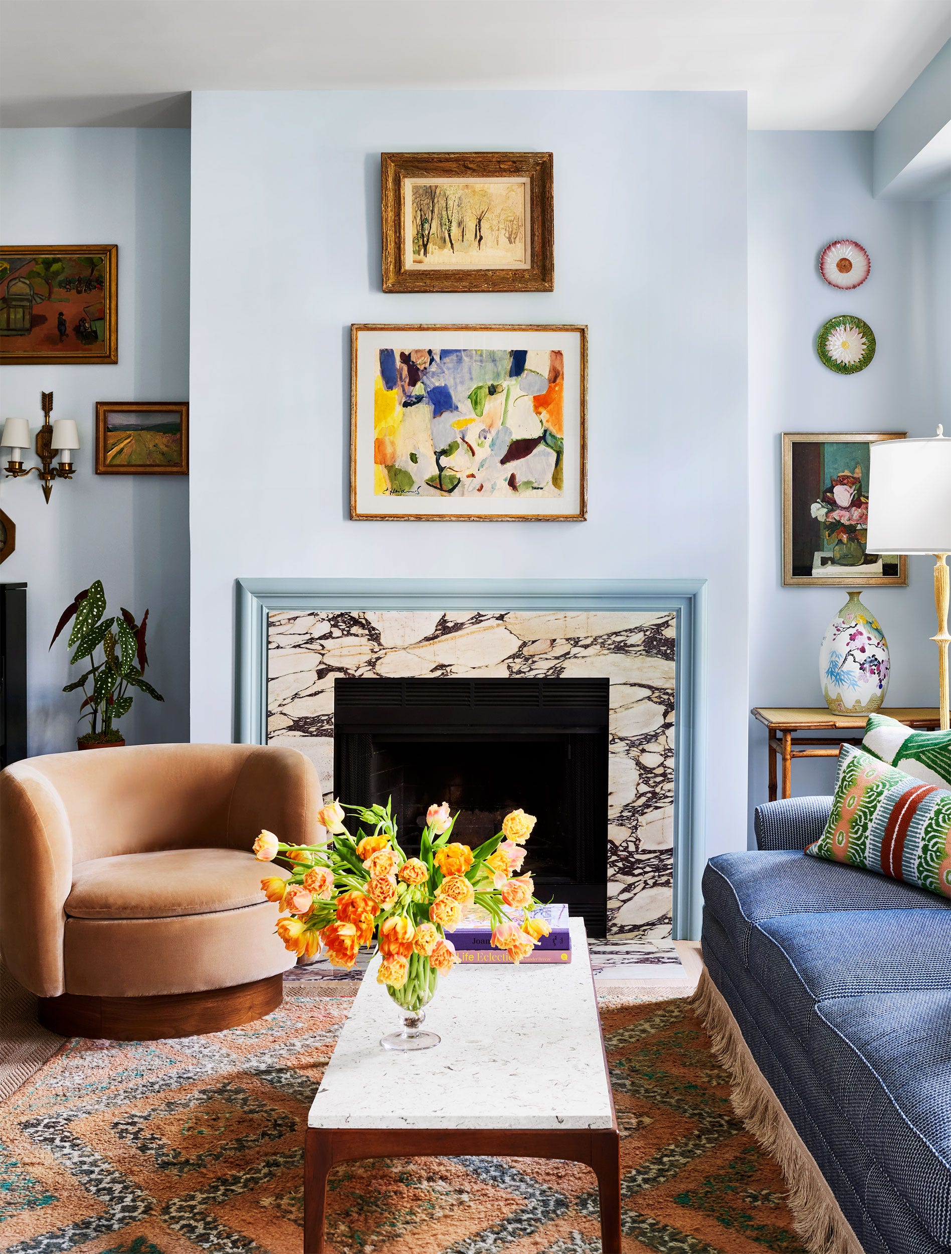
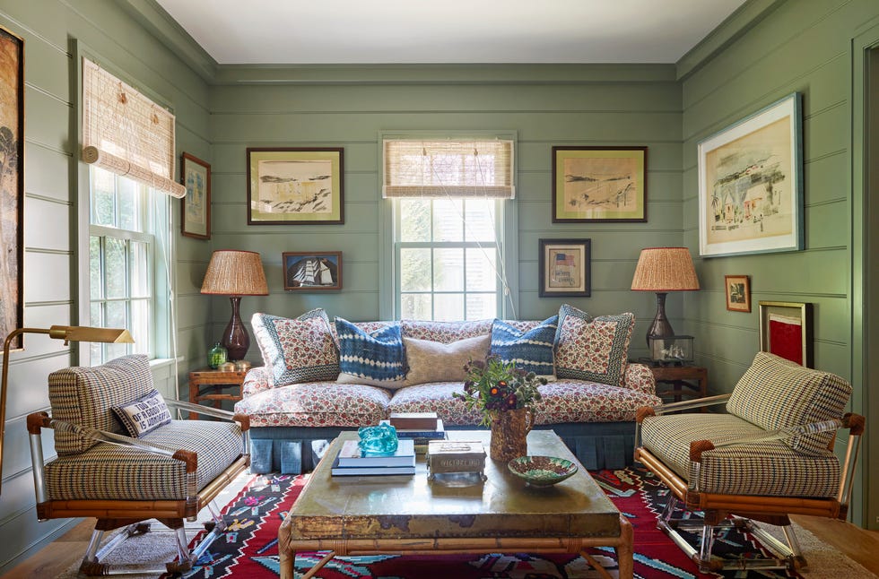
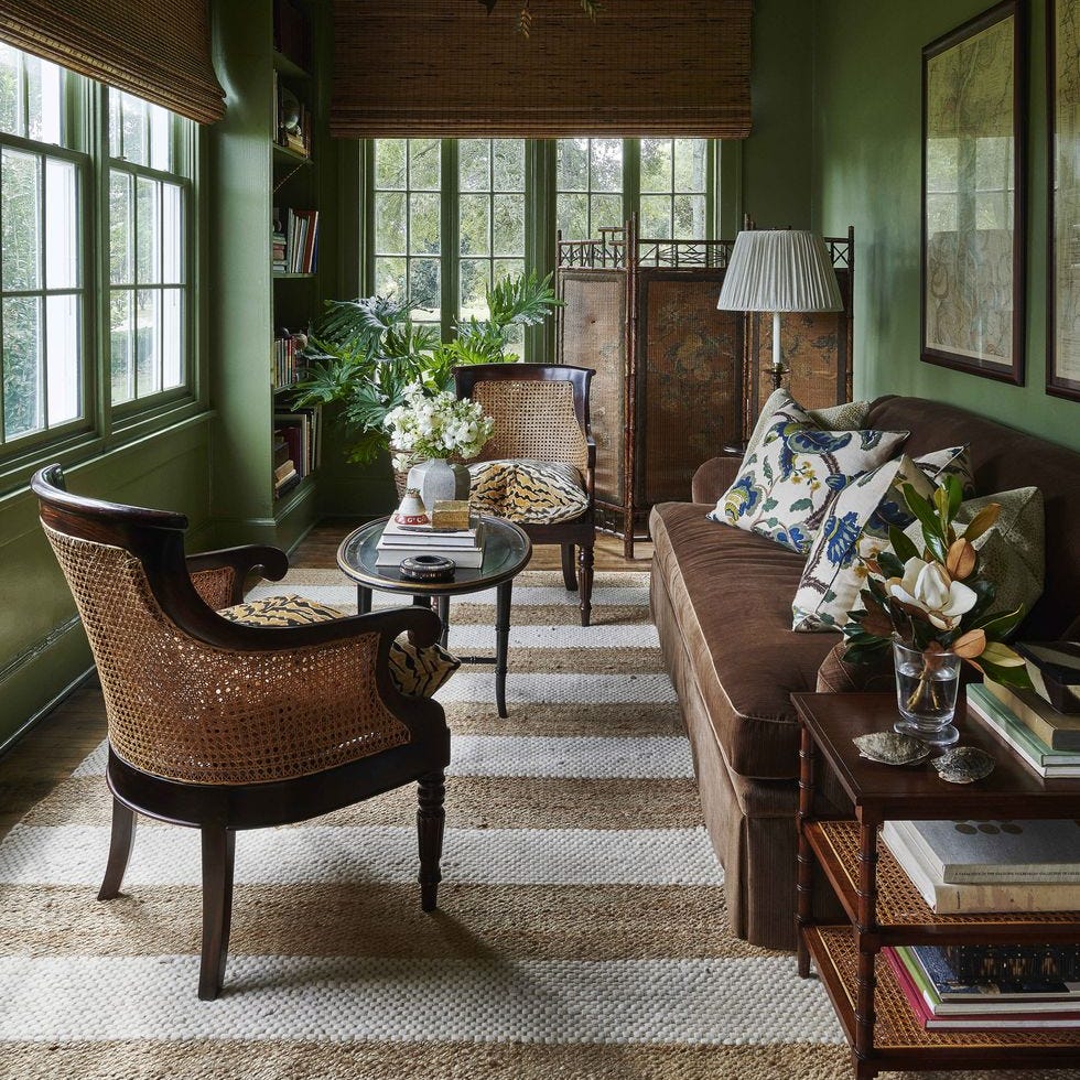
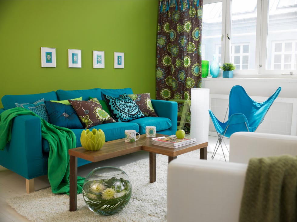
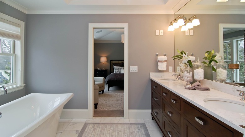
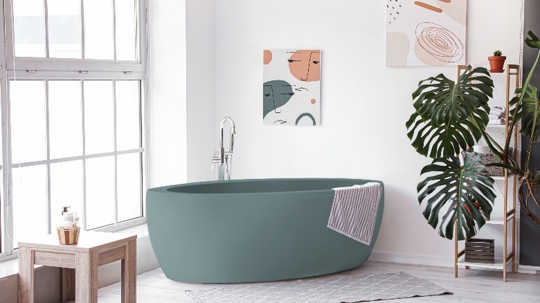
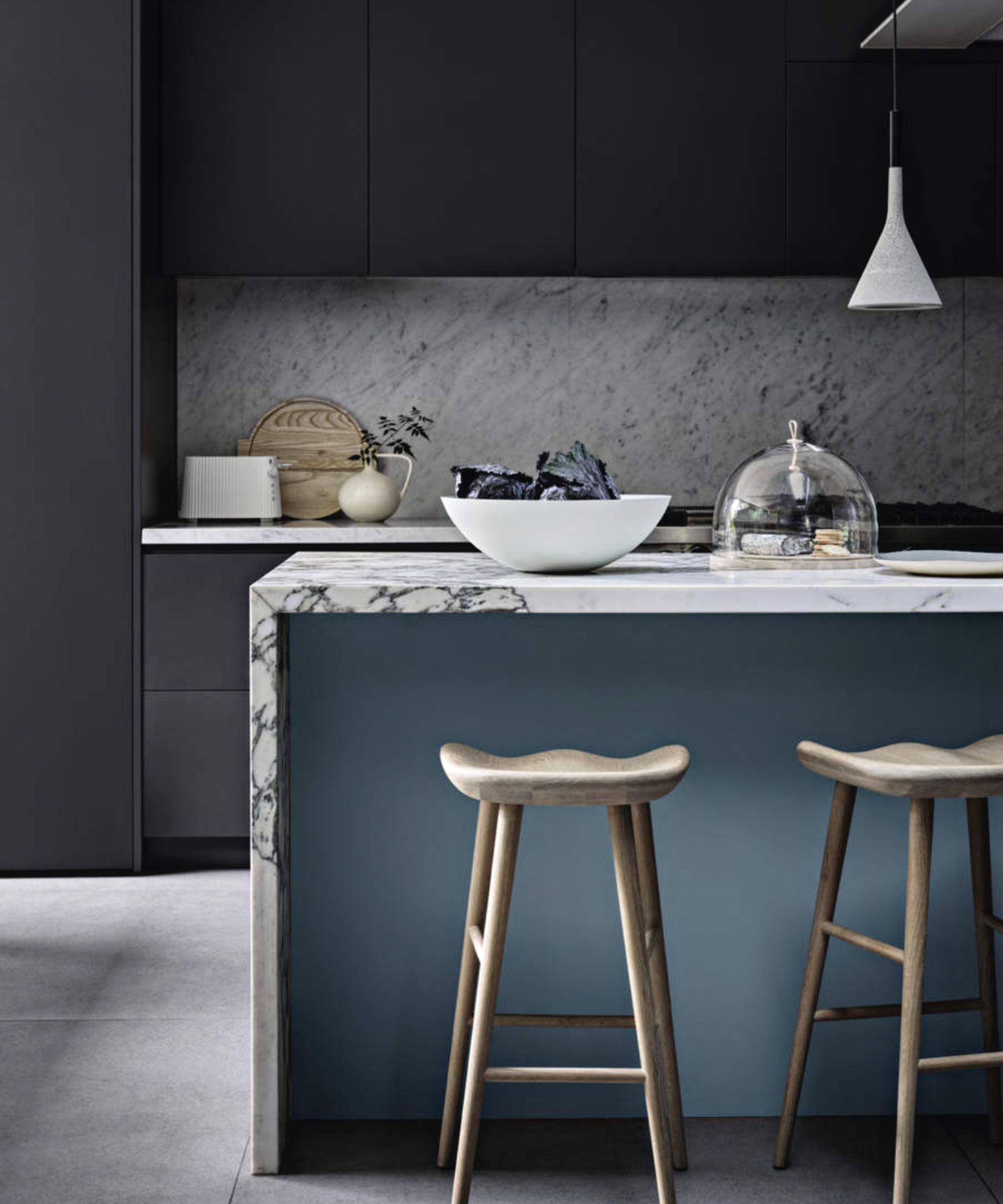
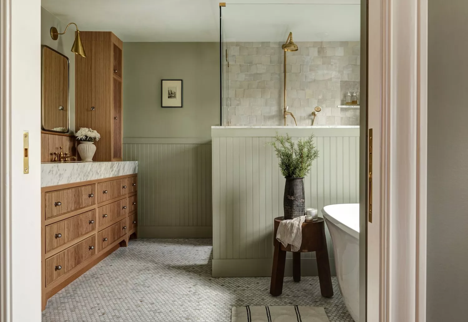
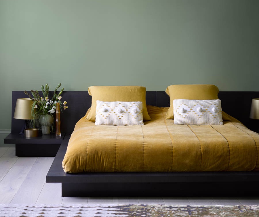
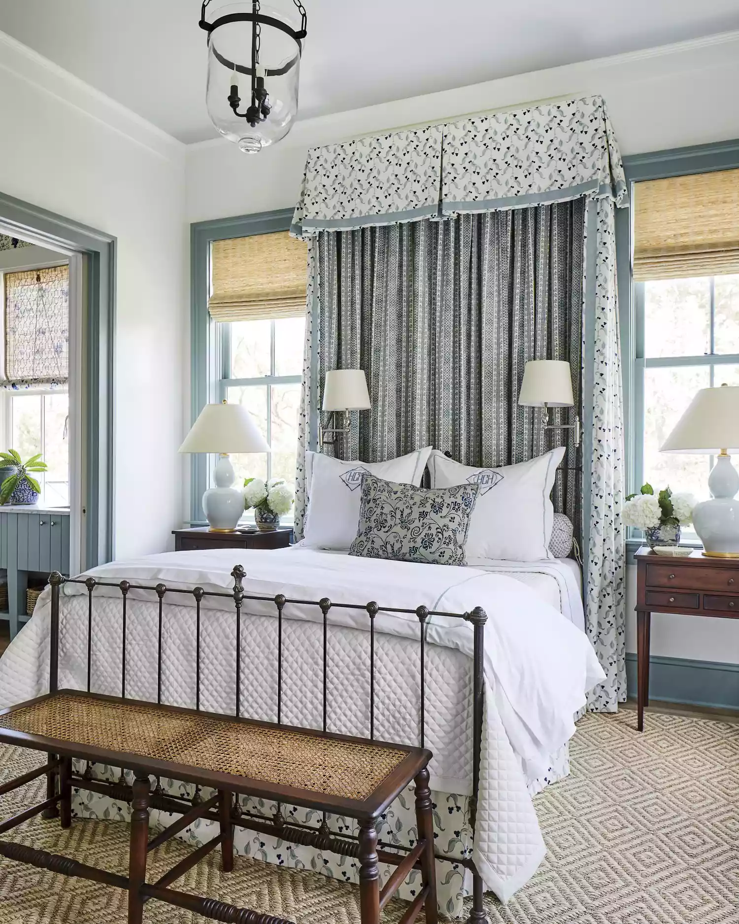
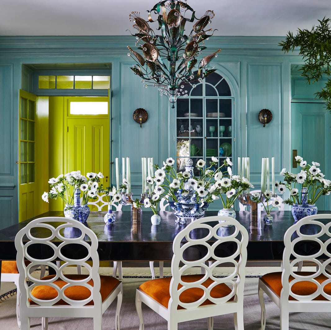
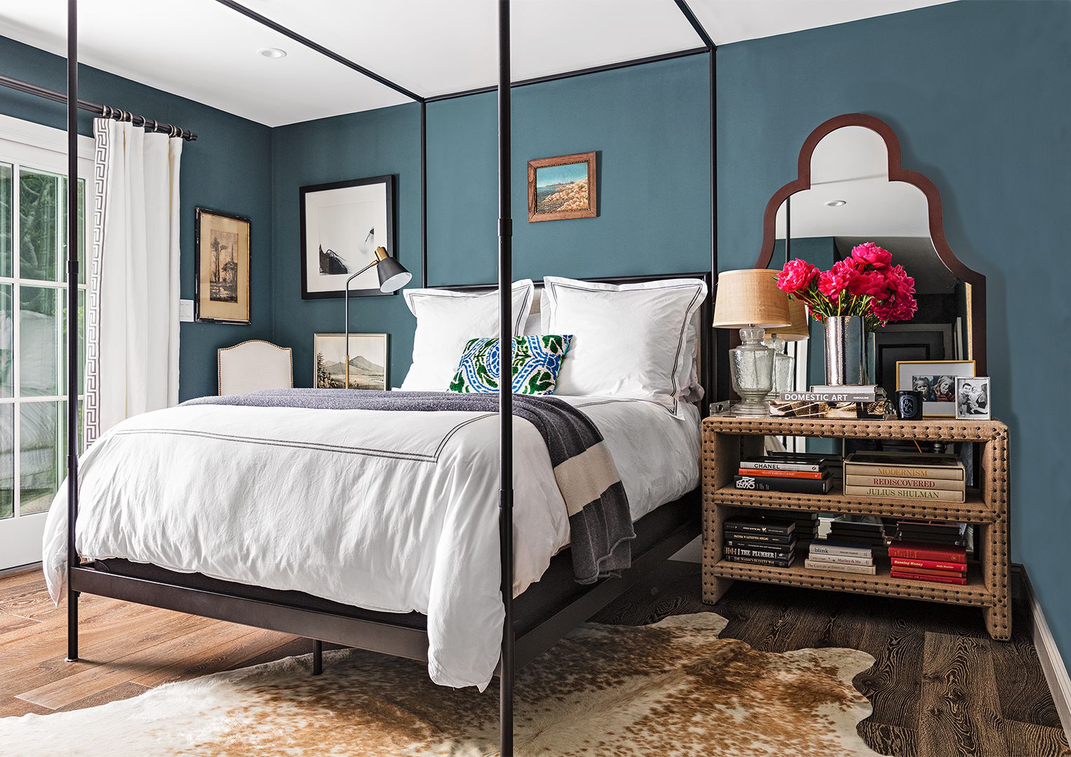
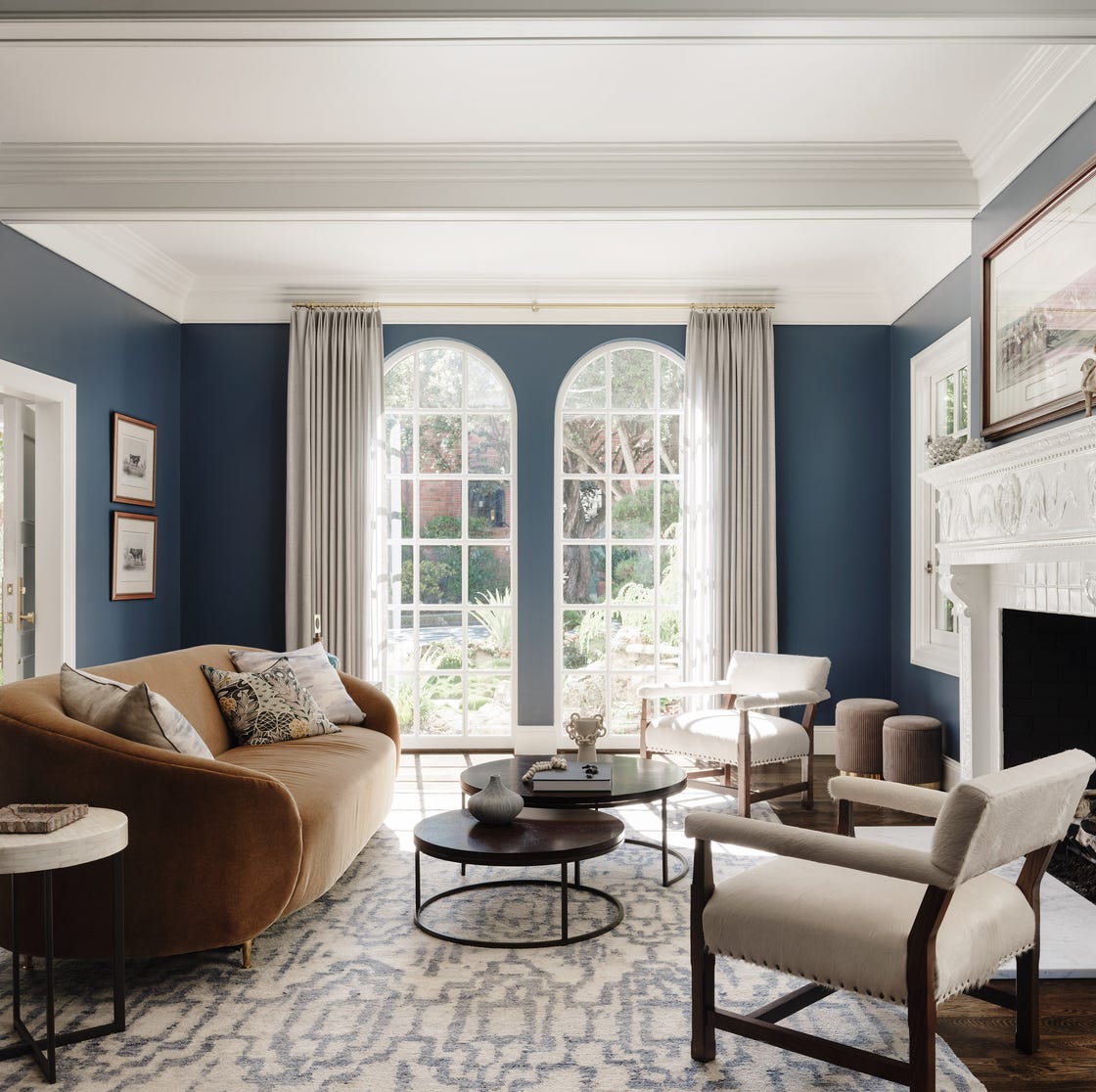
Shades of blue and green are widely recognized for their relaxing properties, making them ideal for fostering a serene atmosphere. Interior designers and color specialists emphasize that soft, cooler tones are generally preferred for creating a sense of calm. Light sages and sky blues, for instance, are frequently associated with spa-like settings. Scientific research supports these observations, indicating that the shorter wavelengths of cooler colors are perceived as inherently more relaxing by the human eye. This section features several paint recommendations in these calming hues, including Smoke by Benjamin Moore, a gray with blue-green undertones; Borrowed Light by Farrow & Ball, a frosty blue; Headspace by Clare, a delicate blue-green; Skylight by Farrow & Ball, a cool pale blue; Views by Clare, a blue-green reminiscent of the sea; Early Stuff by Backdrop, a light blue with gray undertones; Cromarty by Farrow & Ball, a misty gray-green; Sterling by Benjamin Moore, a light gray with blue-green undertones; Skywalker by Backdrop, a light blue with milky green undertones; and Northern Air by Benjamin Moore, a powdery cornflower blue.
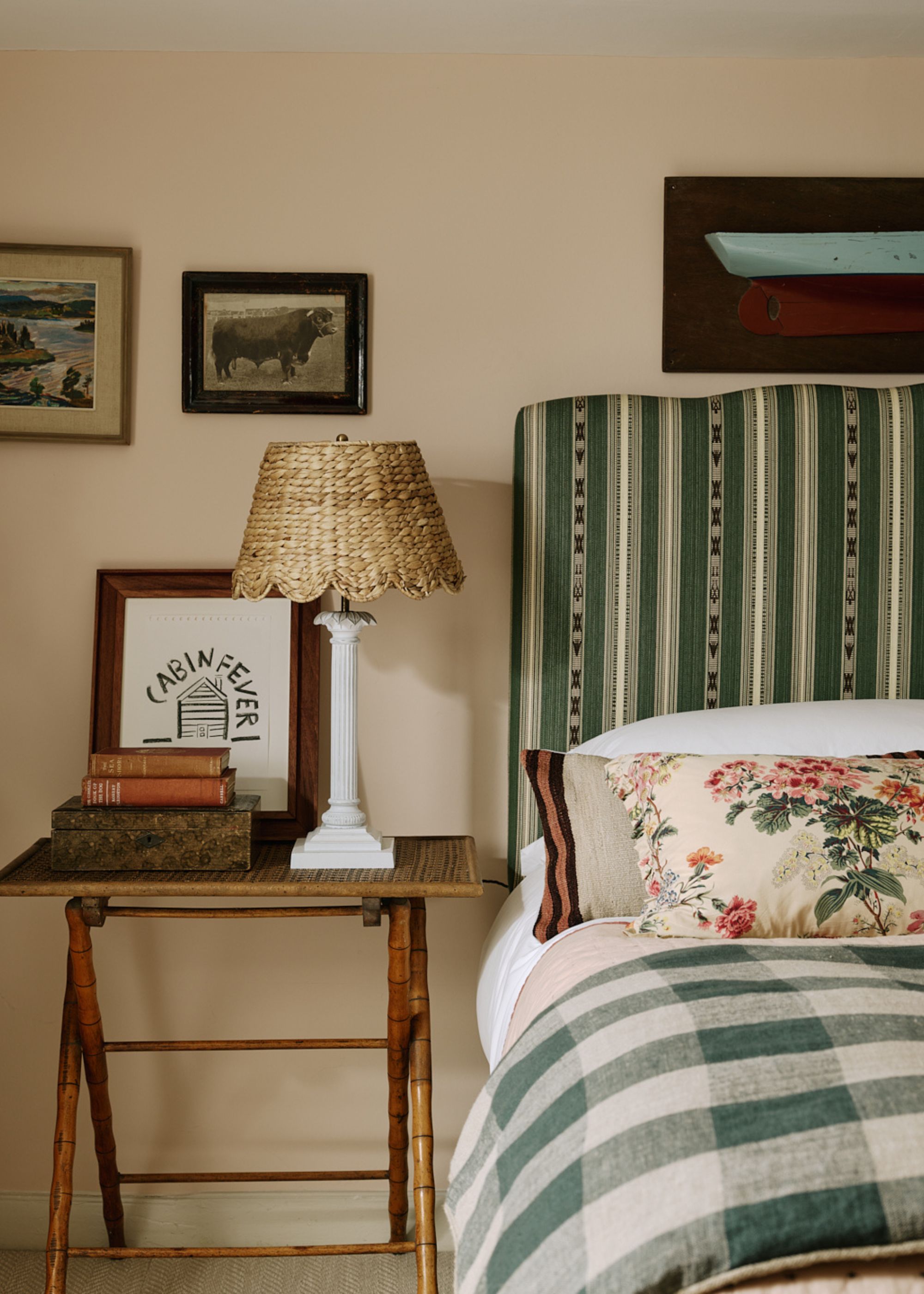
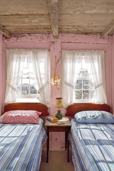
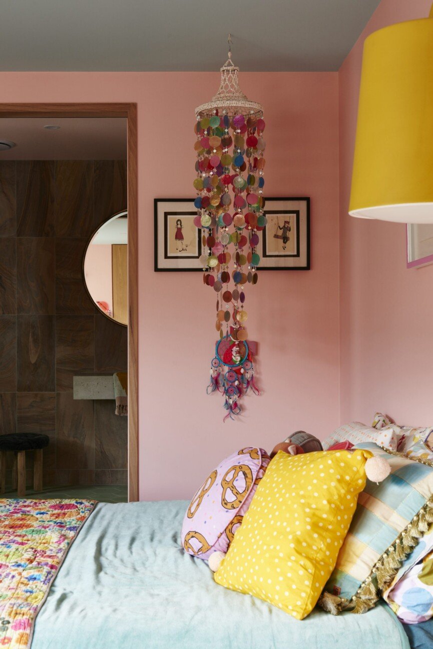
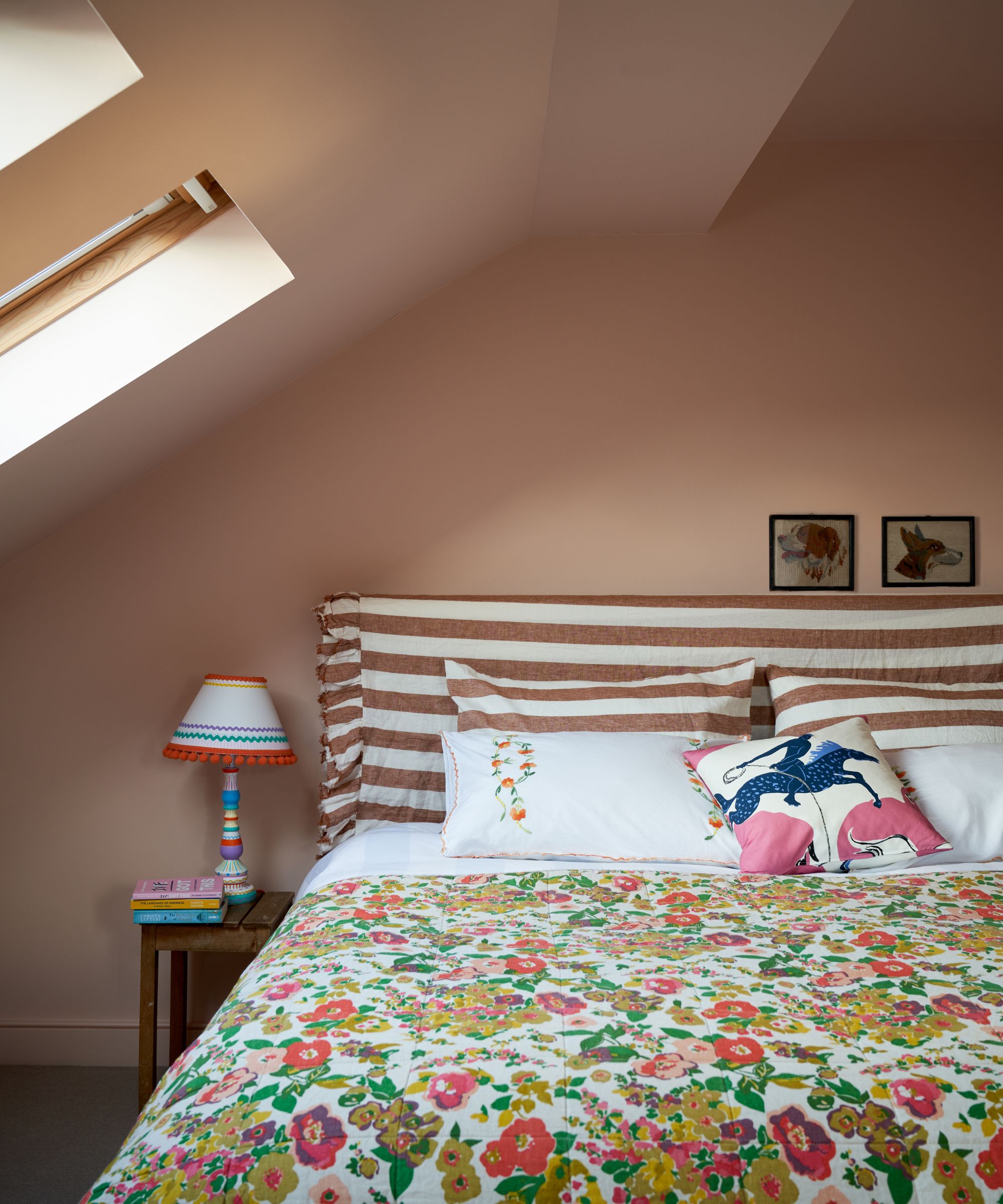
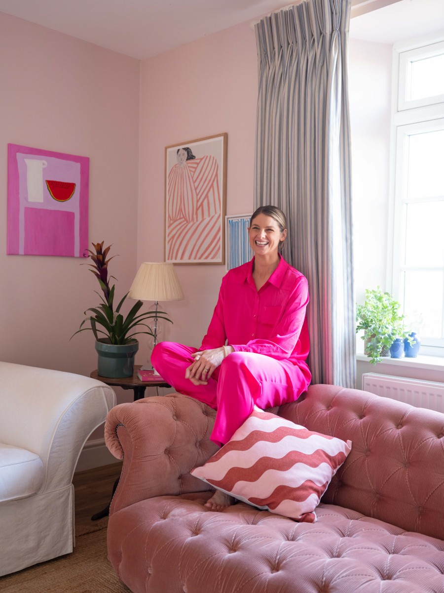
Pale pinks, particularly those with warm undertones, offer a soothing and inviting feel. Designers describe these colors as providing a “warm hug” – comforting without being dull. Neutral-adjacent shades with sufficient depth are championed for their ability to make an impact without overwhelming a space. Recommended pale pinks include Pink Ground by Farrow & Ball, a soft pink with yellow pigments for a subtle glow; Peignoir by Farrow & Ball, a gray-pink inspired by Victorian garments; Bridal Pink by Benjamin Moore, a faded pastel orange with peach undertones; Rosé Season by Clare, a vibrant bubblegum pink; Modern Love by Backdrop, a warm pink akin to faded bubble gum; and Uccello Pink by Donald Kaufman Color, a unique pink inspired by Old Masters' painting techniques.
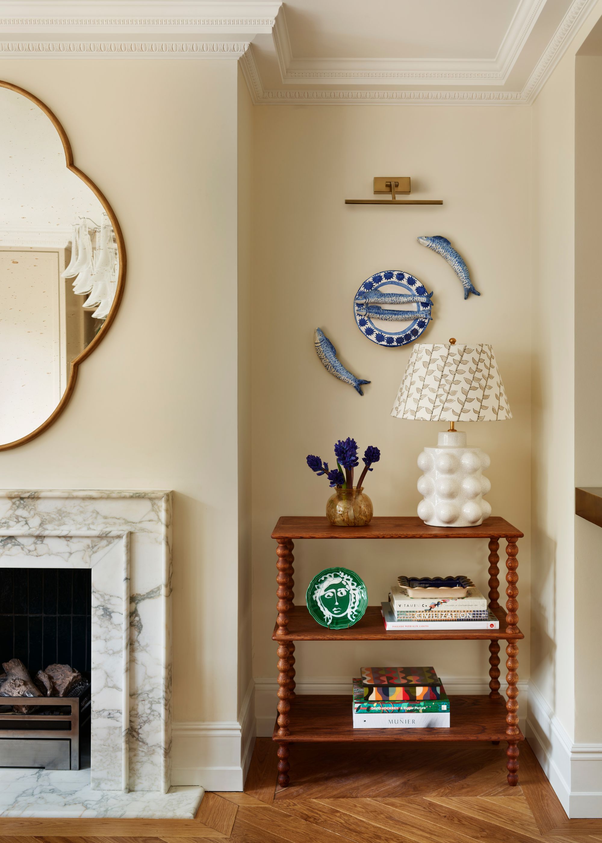
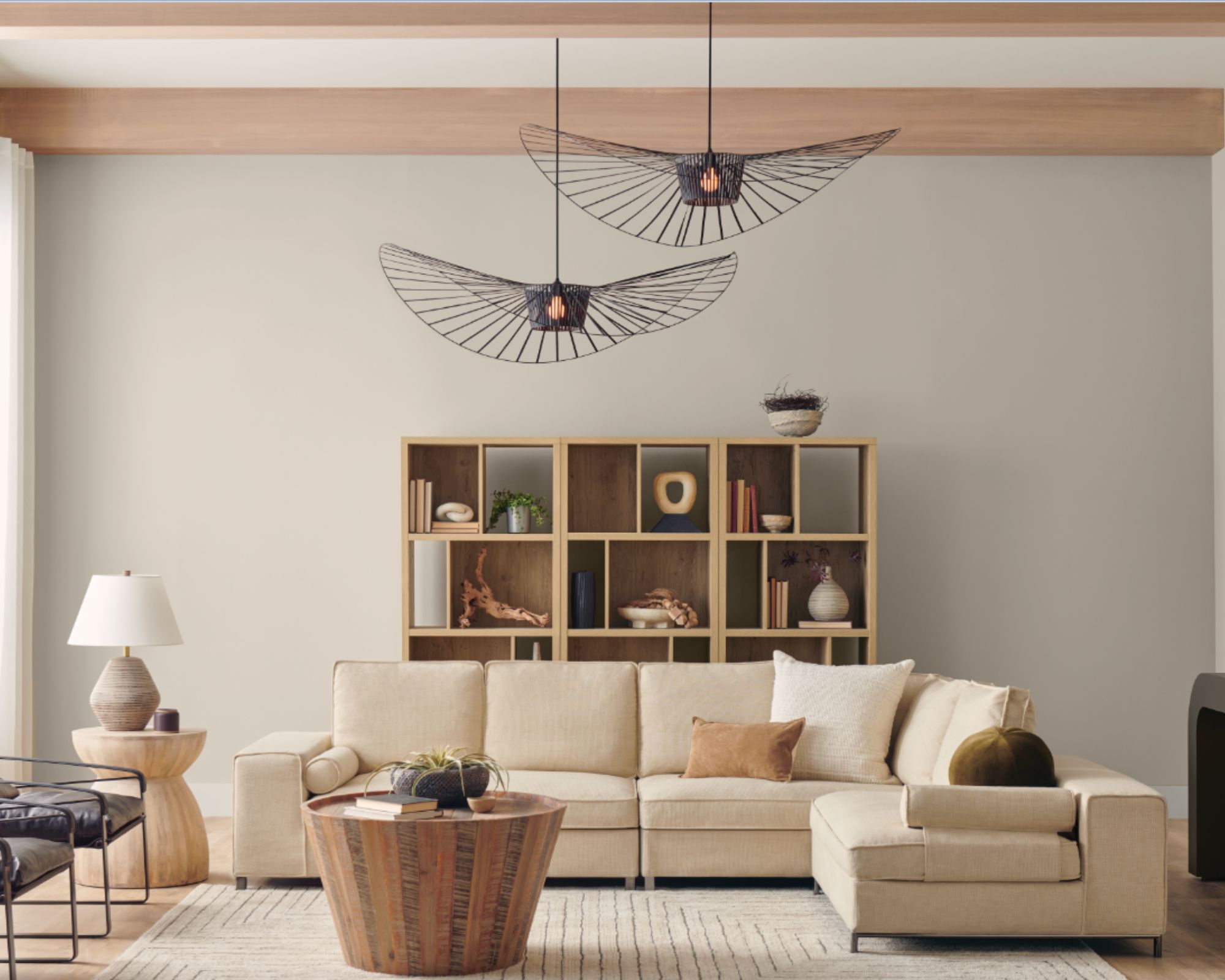
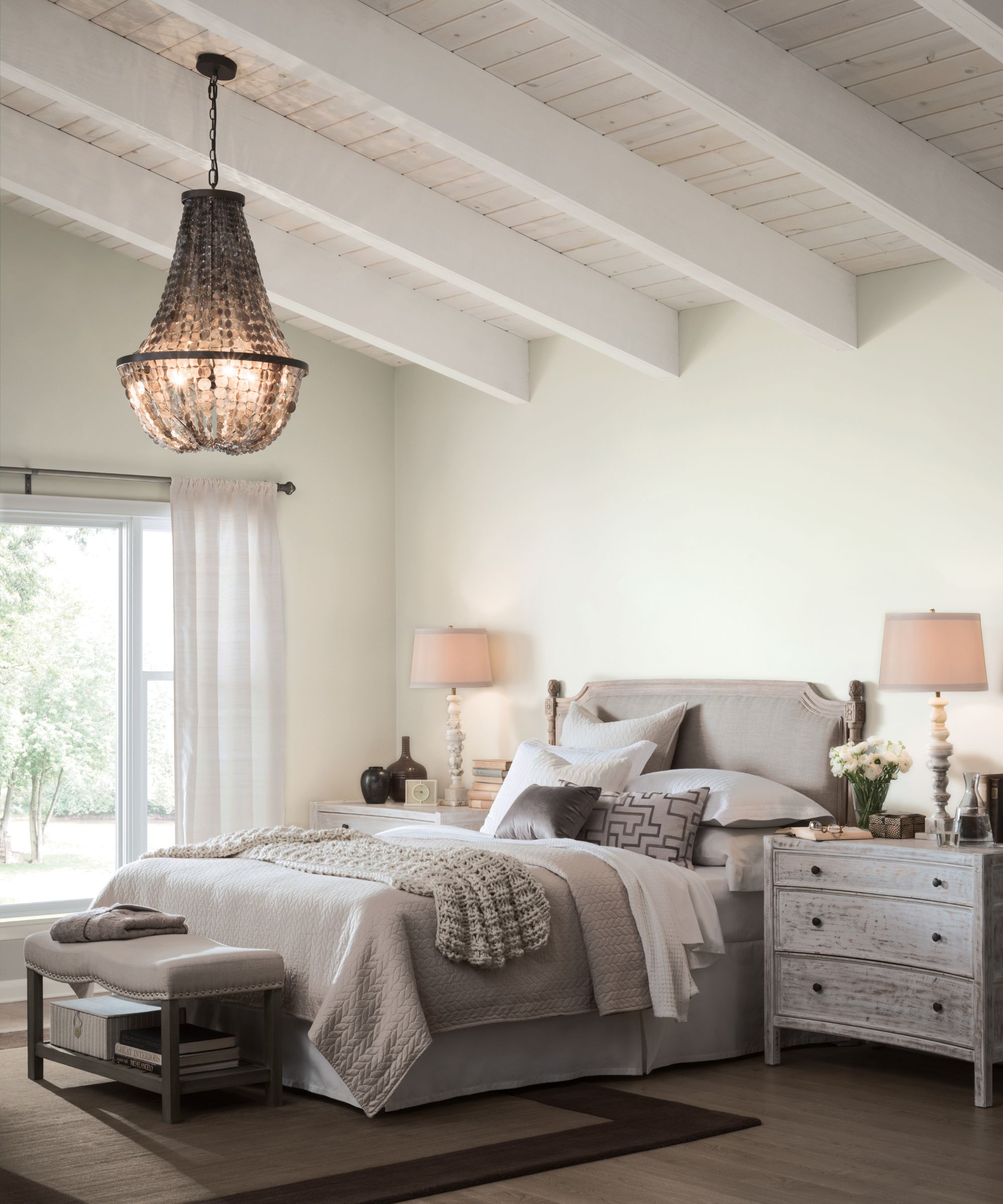
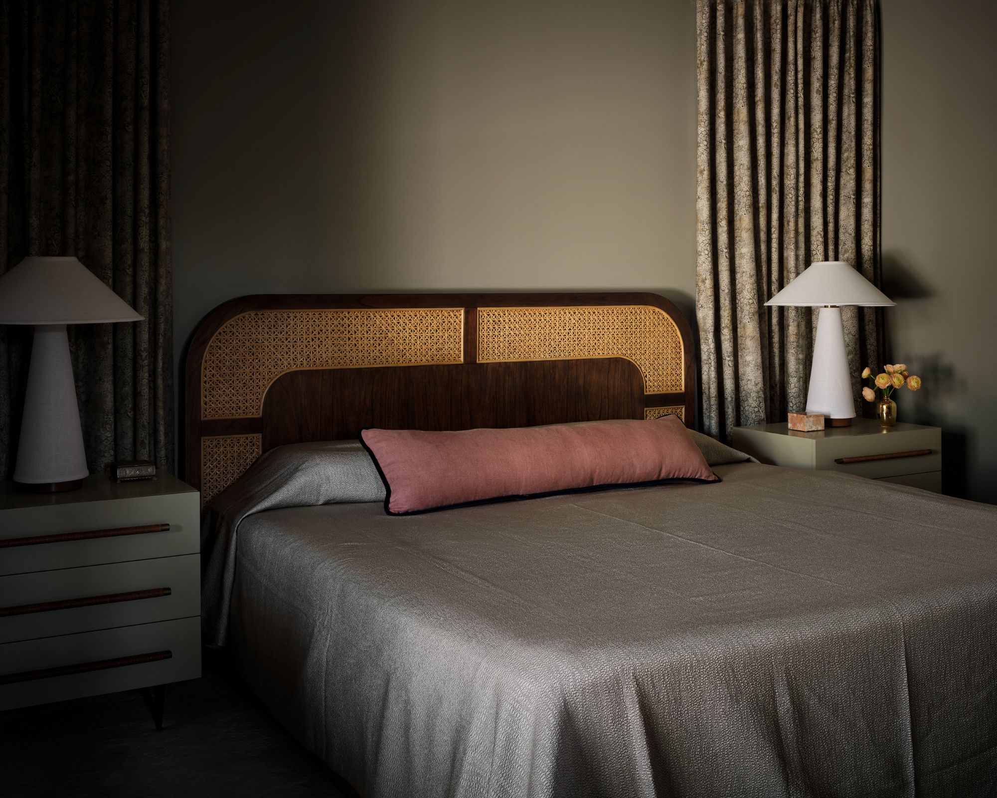
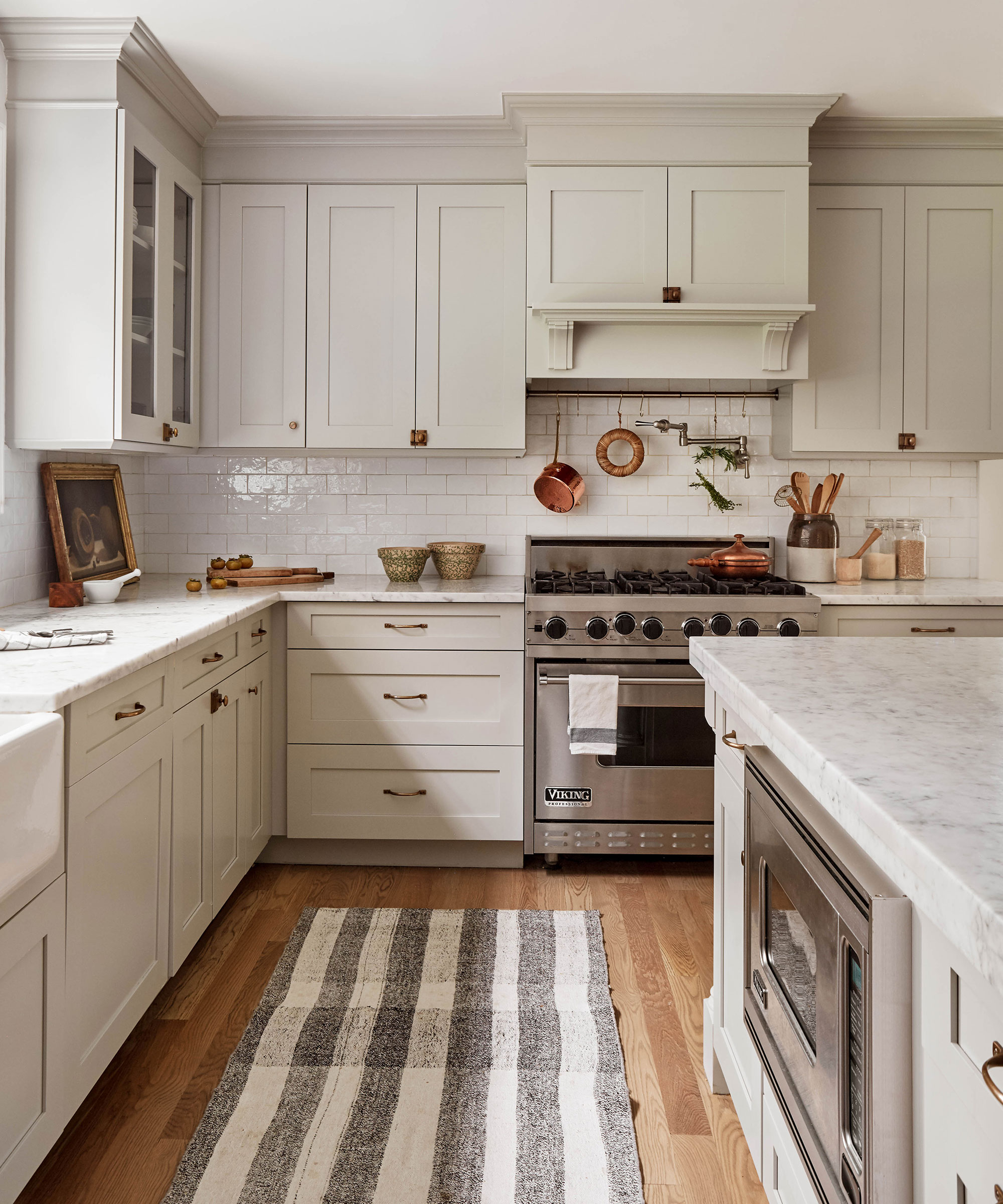
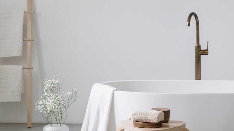
Warm neutrals are another popular choice for their calming effects and ability to create a welcoming atmosphere. These colors are often likened to a soft champagne, offering a gentle shimmer that contributes to a positive mood. Designers suggest that the inherent warmth in these hues makes a room feel inviting. Examples of warm neutrals include Turbinado by Clare, a honey-colored beige; Opal by Benjamin Moore, an opalescent muted white with peachy undertones; Slipper Satin by Farrow & Ball, a delicate off-white; and Palo Santo by Backdrop, a muted beige with yellow undertones, evoking the richness of European unsalted butter.
#CalmingColors #PaintColors #HomeDecor #InteriorDesign #ColorPsychology #BluePaint #GreenPaint #PinkPaint #NeutralPaint #Chromotherapy #CalmingColors #PaintColors #HomeDecor #InteriorDesign #ColorPsychology #BluePaint #GreenPaint #PinkPaint #NeutralPaint #Chromotherapy
0 comment in total
 No comments yet
You may also like
13 Calming Paint Colors Designers Use to Make Rooms Feel Soothing — And No, They're Not All Neutrals

20 Hallway Paint Colors That Bring This Space to Life
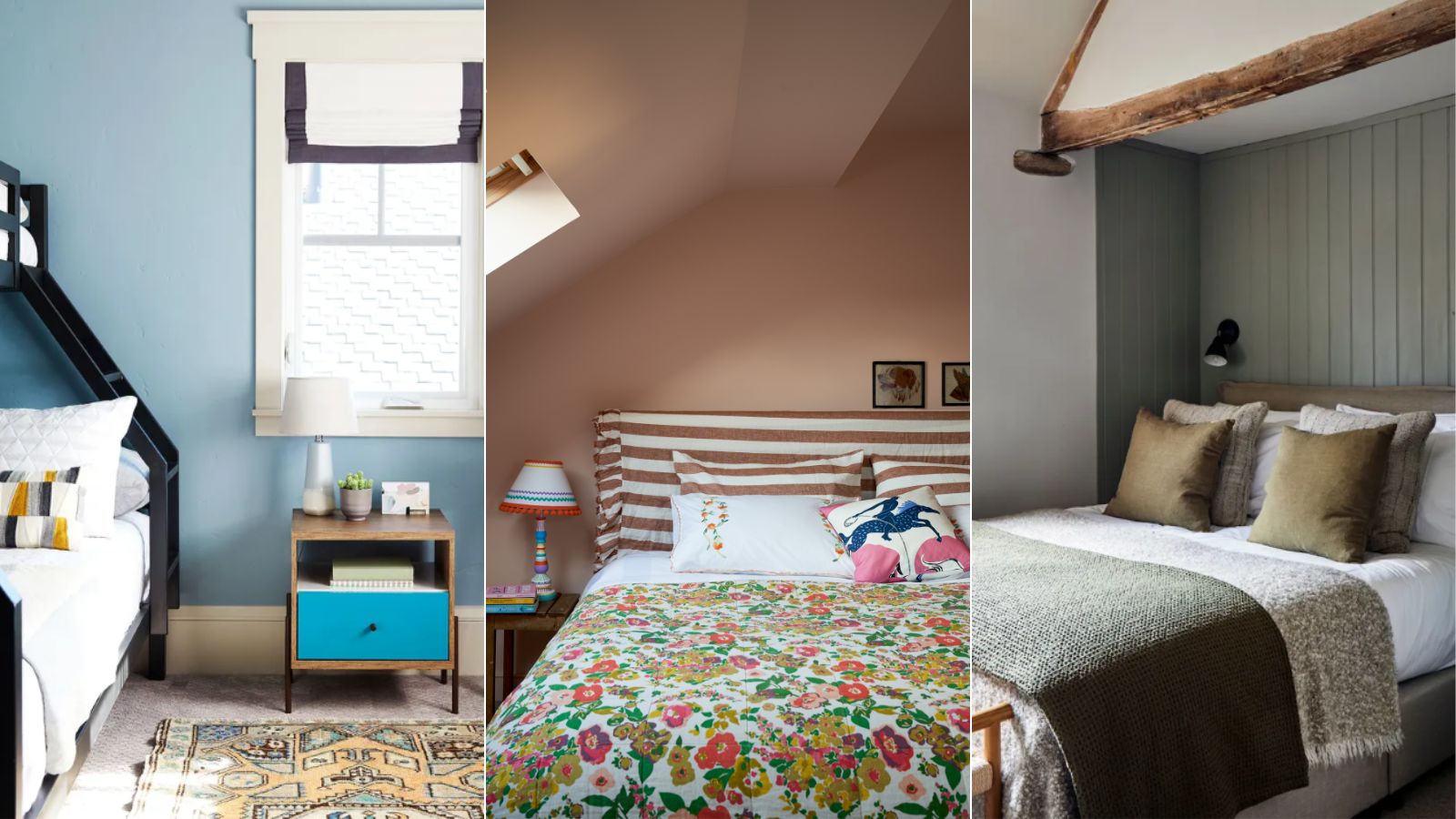
5 colors that will make your bedroom feel calmer, according to designers
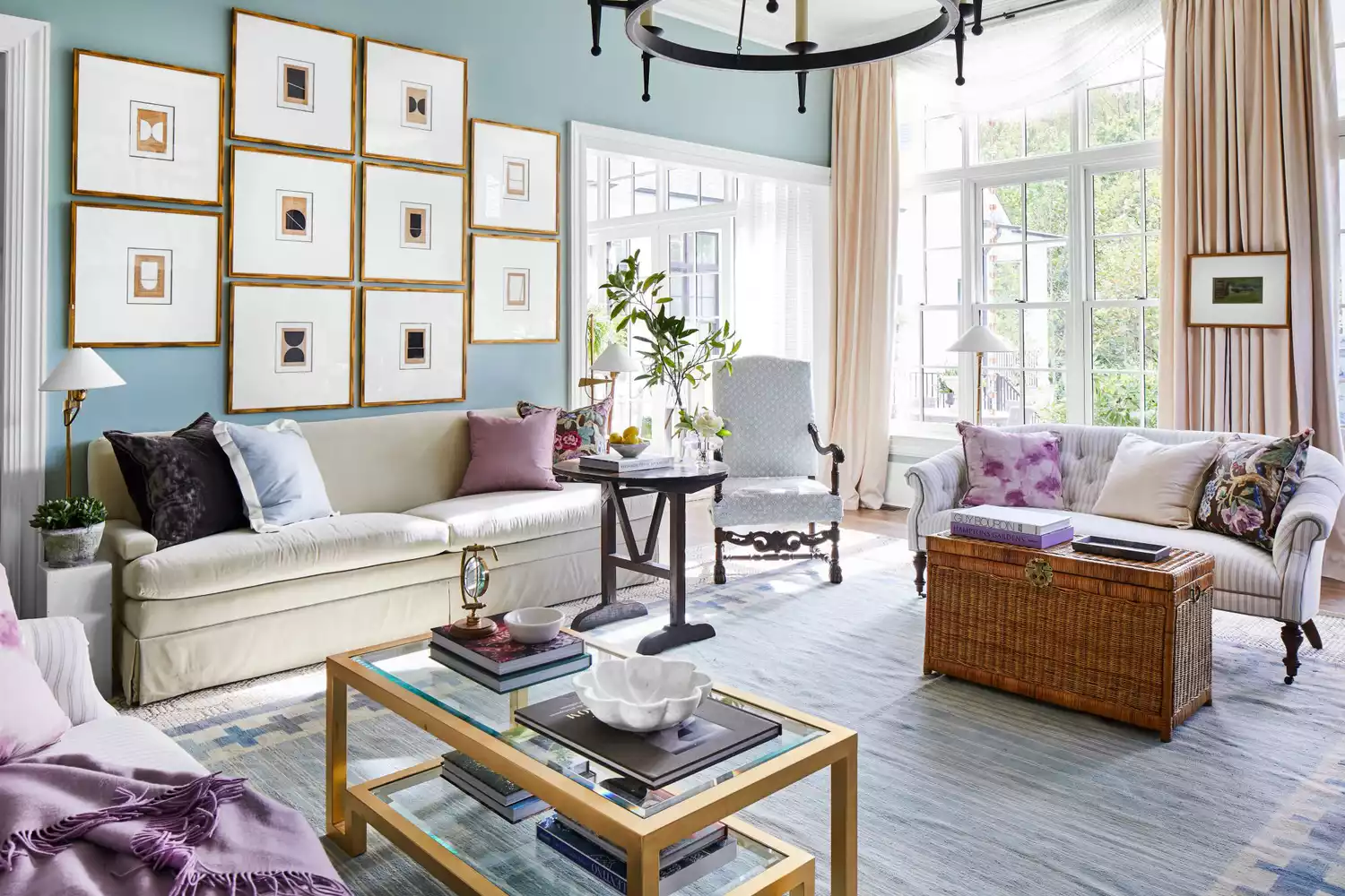
6 Calming Paint Colors Designers Swear By For A Relaxing Living Room
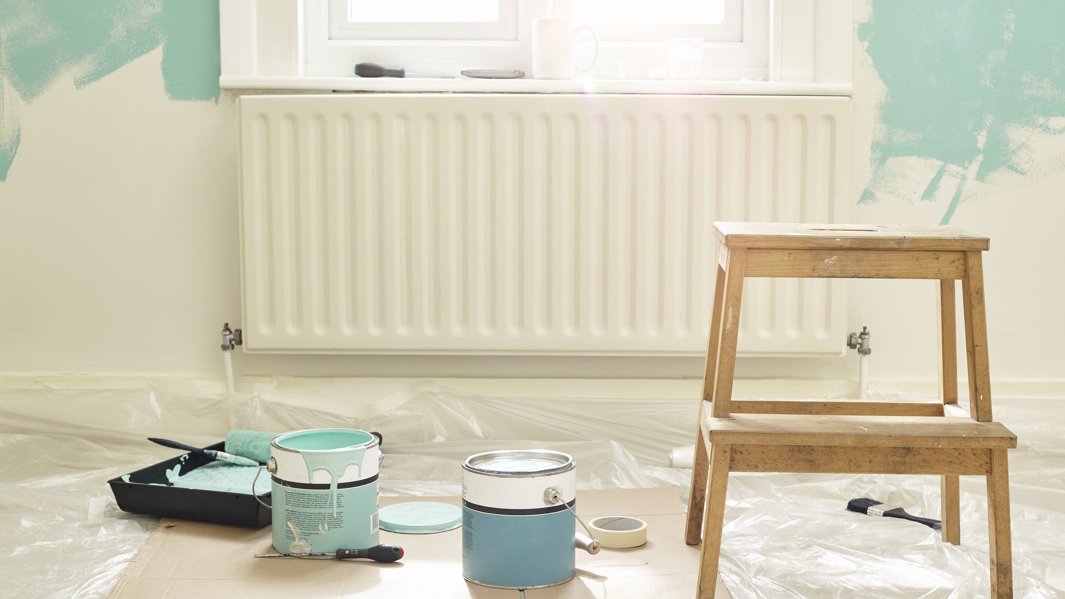
Add These Happy Colors to Your Home and Boost Your Mood
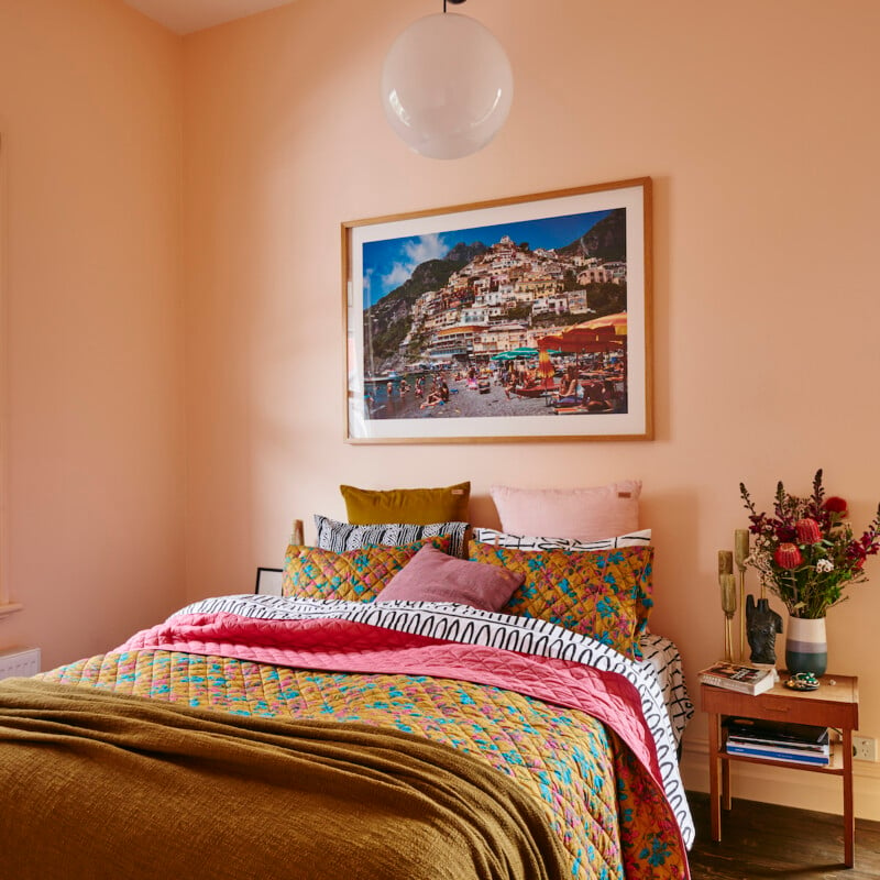
The Brighter, the Better—These Vibrant Paints Will Infuse Your Home With Positivity

Designers Agree: These Are the Most Relaxing Paint Colors for Any Room

5 Paint Colors That Will Help You Sleep Better if You Use Them in Your Bedroom
A Color Psychologist Says This Is the Most Relaxing Paint Color

25 Soothing Paint Colors to Make Your Space Instantly Restful
How Your Home's Paint Colors Can Make You Happier, According to Experts

20 Gorgeous Shades Of Paint That Will Make Your Bathroom Feel Like A Relaxing Spa

16 Calming Paint Colors That Will Make Your Home a More Restful Place

Lick Paint Will Transform the Mood in Your Home Through Color Psychology

These Paint Colors Bring Hostility to Your Home, According to Experts
Outdated color trends – 5 overdone colors that designers no longer love, and what to use instead

5 of the Most Calming Paint Colors From Sherwin-Williams
These Living Room Paint Colors Are a Total Mindset Shift
Tips on Calming Colors Schemes From a Workout Guru

8 Calming Colors to Paint Your Living Room—and Make the Space More Relaxing