1/21
These Living Room Paint Colors Are a Total Mindset Shift
The living room, often considered the heart of a home for activities ranging from leisure to social gatherings, necessitates a well-thought-out color scheme to enhance its ambiance. The prospect of selecting a paint color can be daunting, given the vast array of options. However, this article suggests that nearly any color can be effectively integrated into a living room design, provided there is a coherent design strategy. The 2026 color trends offer a rich source of inspiration, encompassing a diverse palette from sophisticated neutrals to vibrant jewel tones. These trends highlight various shades, excluding Pantone’s Cloud Dancer, each capable of transforming a space when applied with careful consideration.
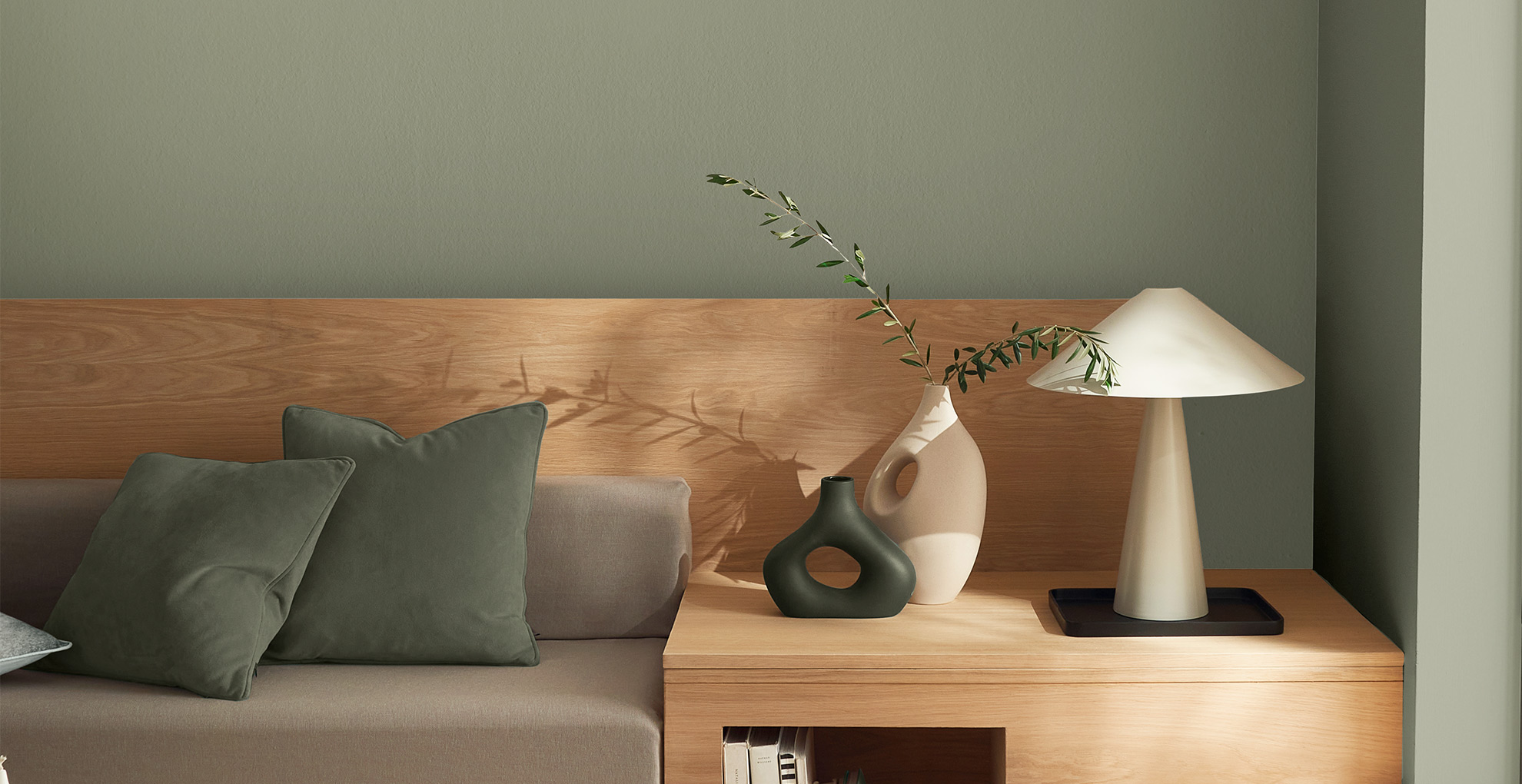
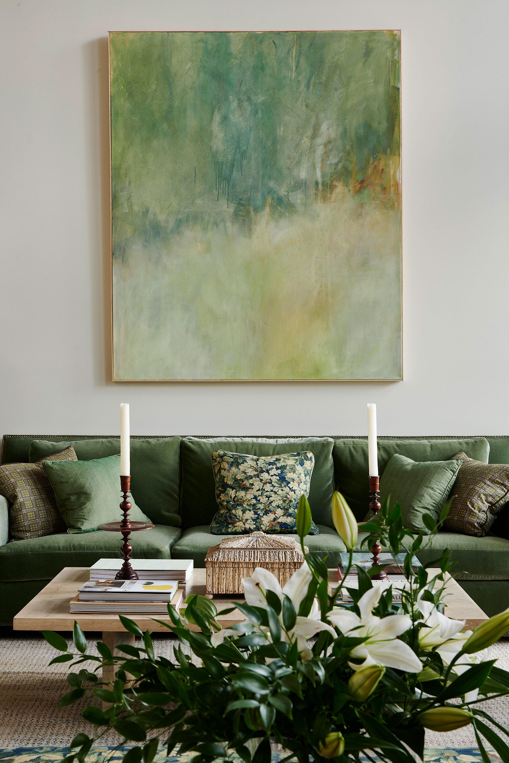
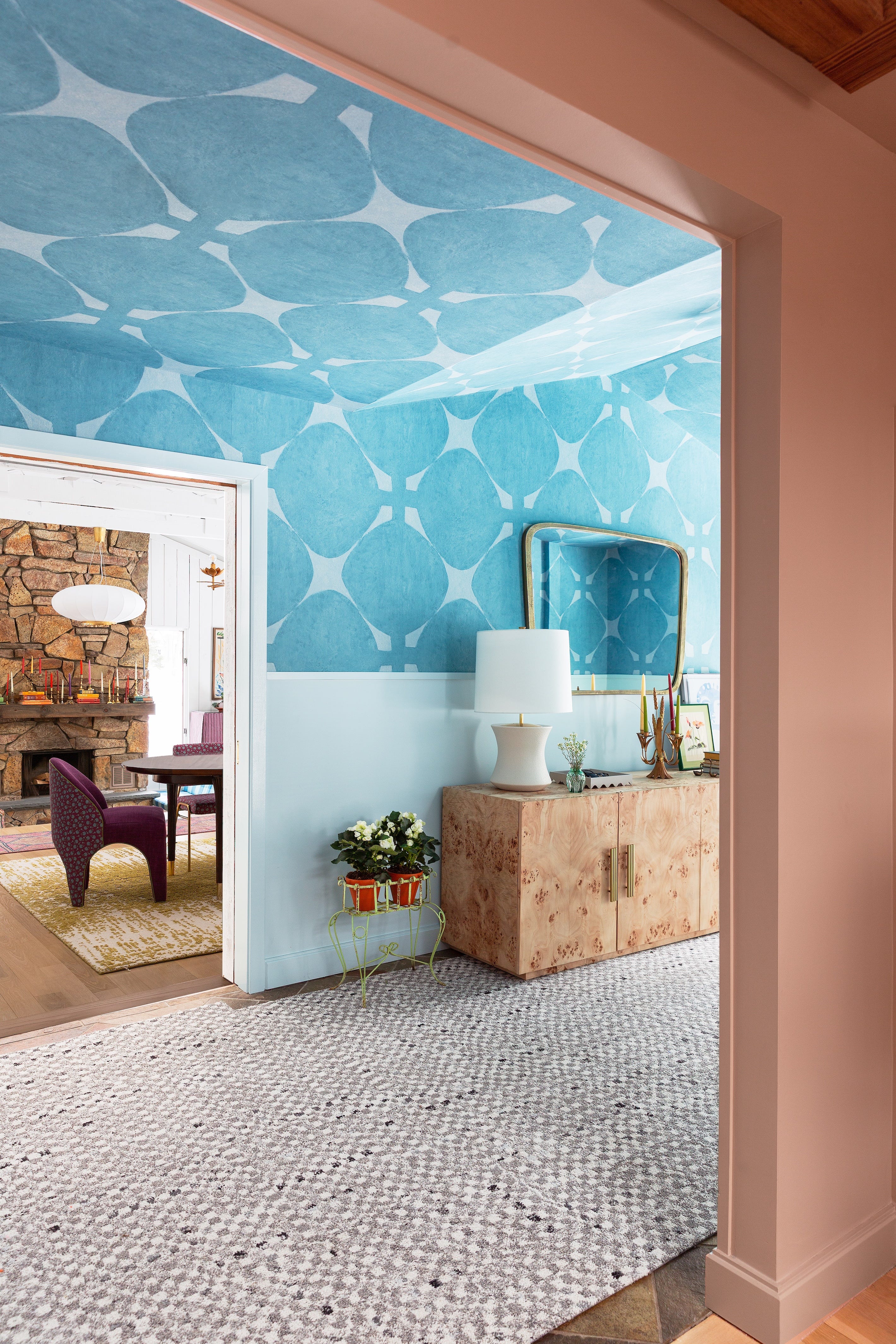
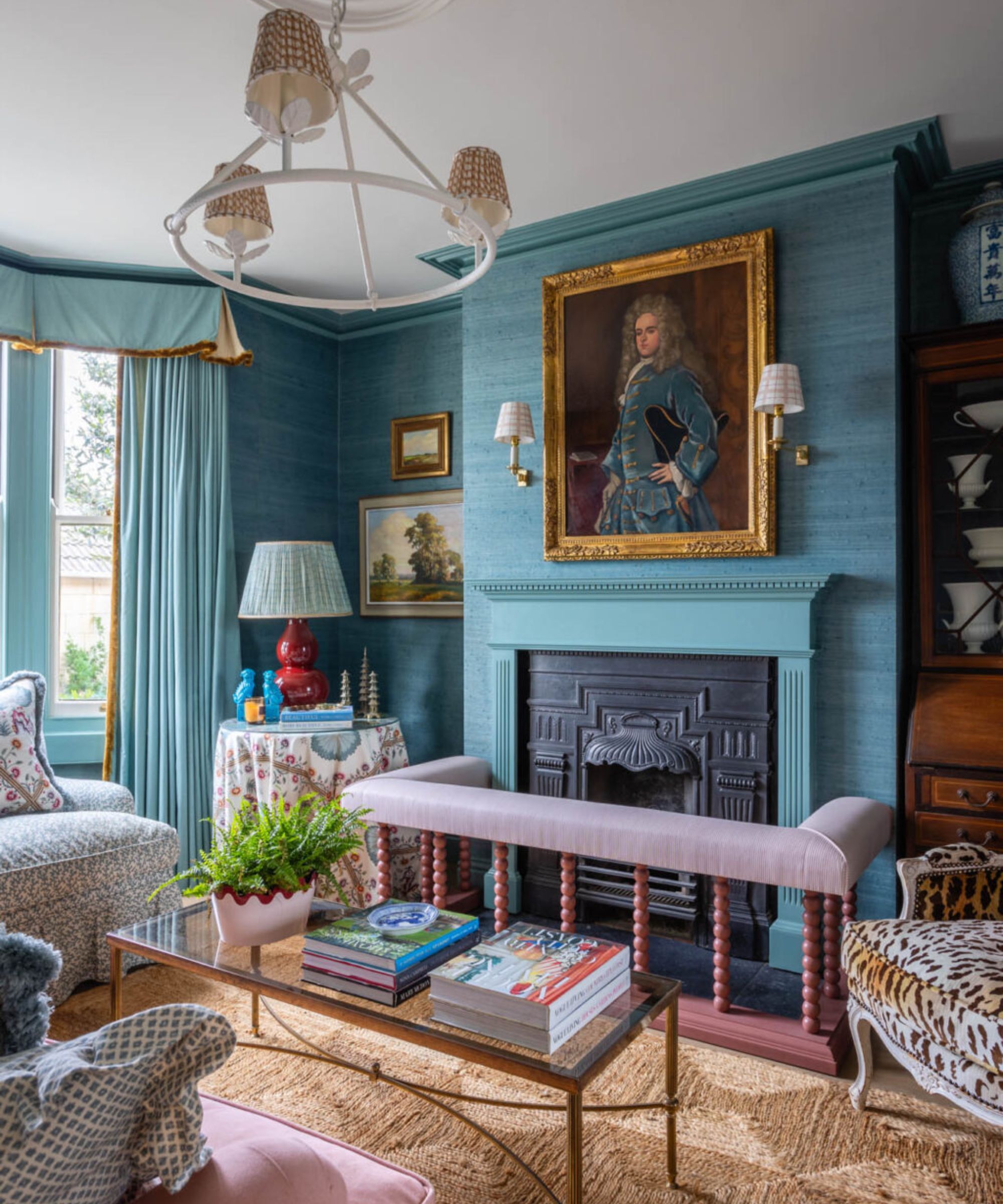
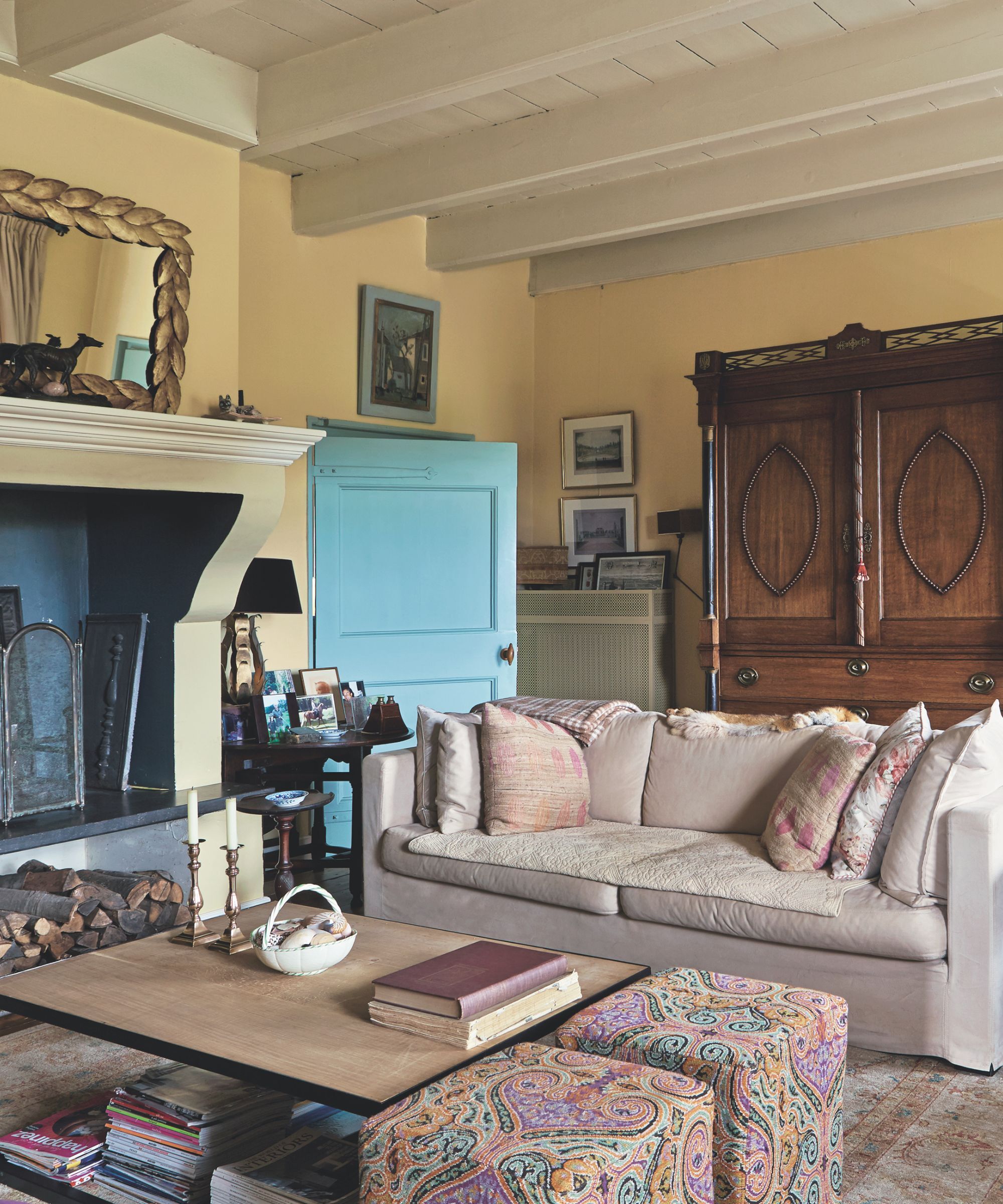
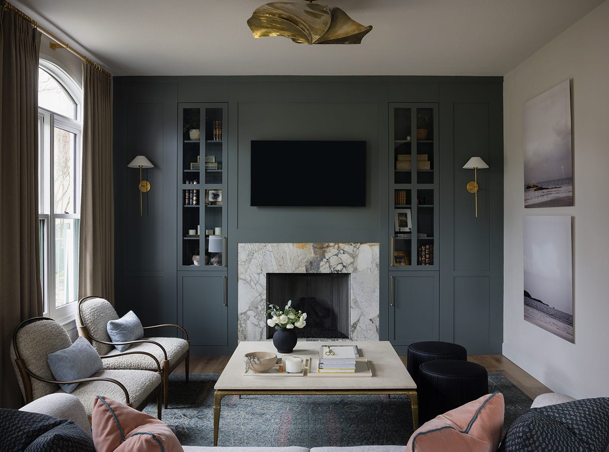
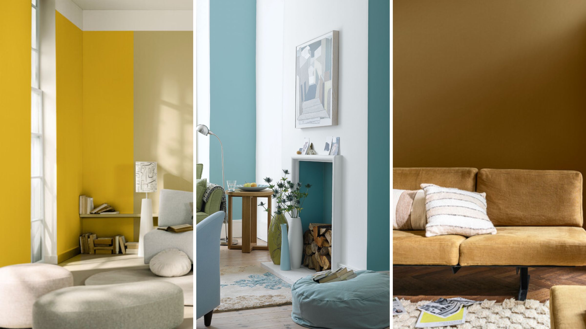
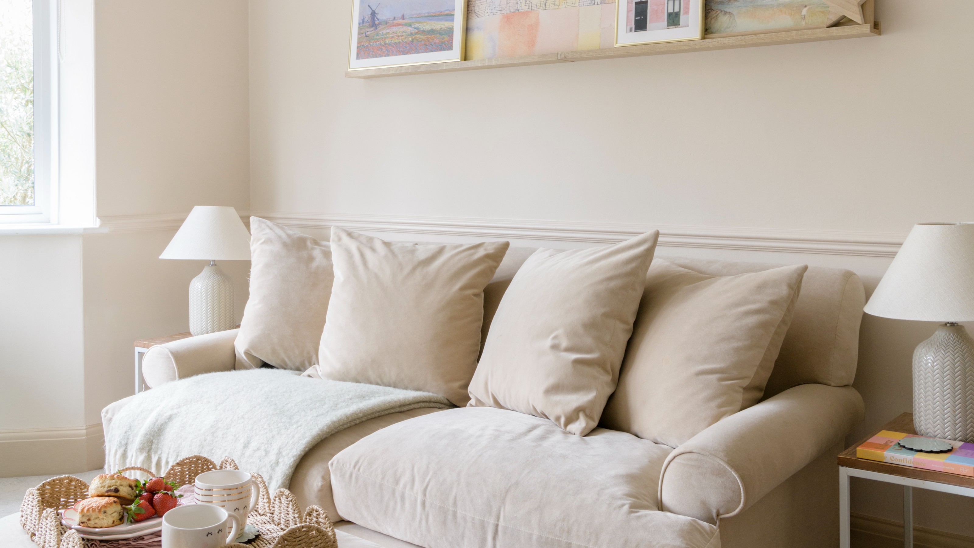
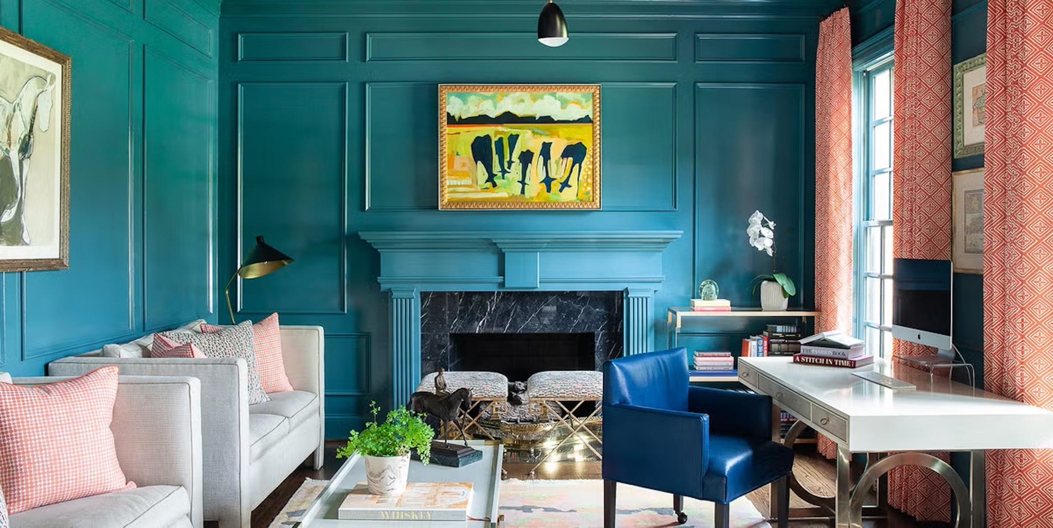
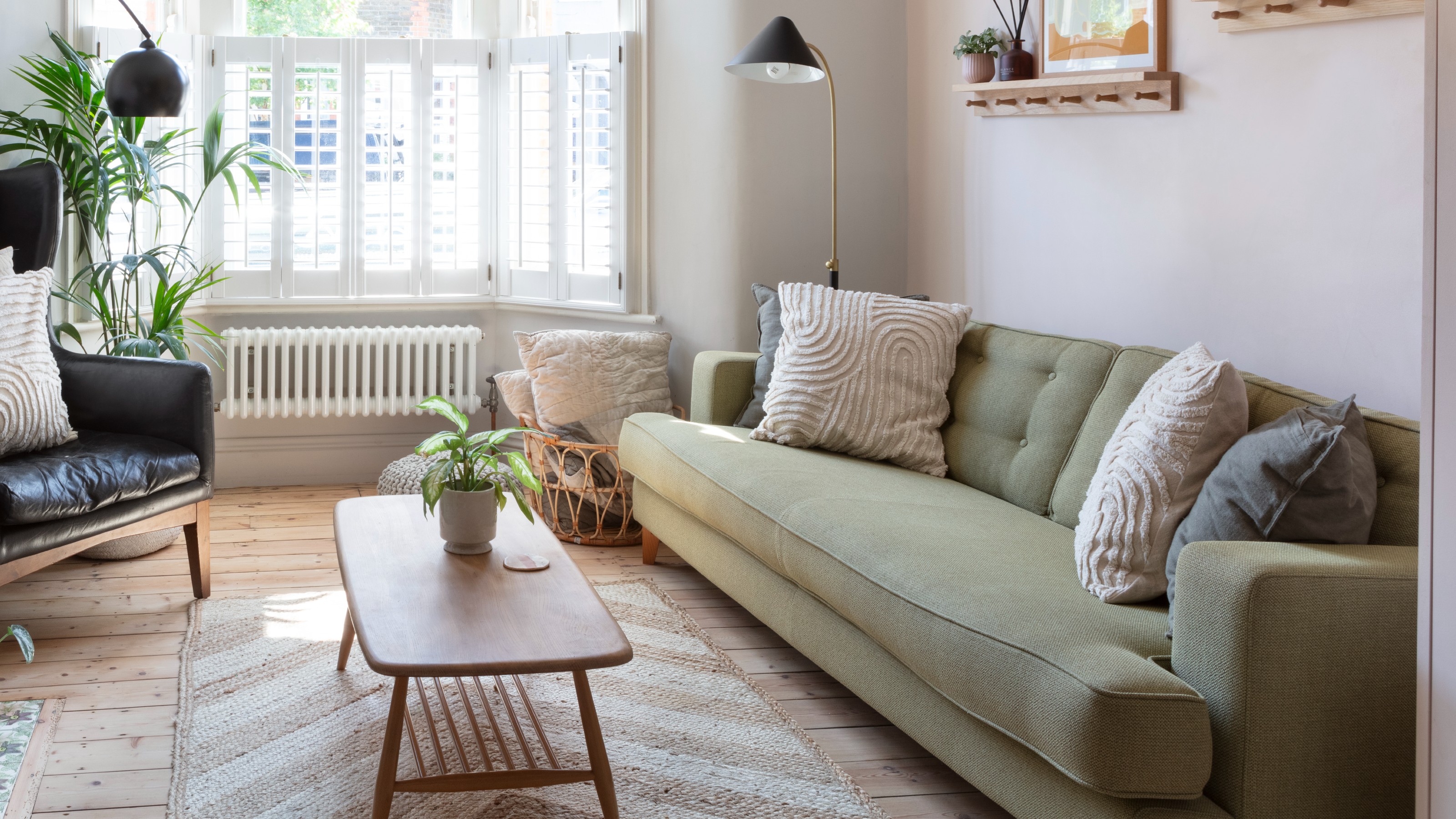
The article provides examples of designer-approved colors and their applications. For instance, Wasabi Green is showcased in a Toronto home, bringing an invigorating outdoor freshness without the associated natural elements like pollen. Oyster White, featured in a Key West, Florida, home, functions as an ideal complementary color, particularly when natural light is abundant, effectively capturing and amplifying the golden hour glow. Harbor Haze Blue is employed in a prewar duplex in Harlem, offering a balance of uplifting brightness and soothing relaxation. Jack Pine Teal, used in a Los Angeles home, demonstrates how a cleverly painted light blue ceiling can create an illusion of increased height and openness. Classic Gold, also from a Los Angeles home, is depicted as a way to achieve a similar ethereal effect with a light blue hue on the ceiling.
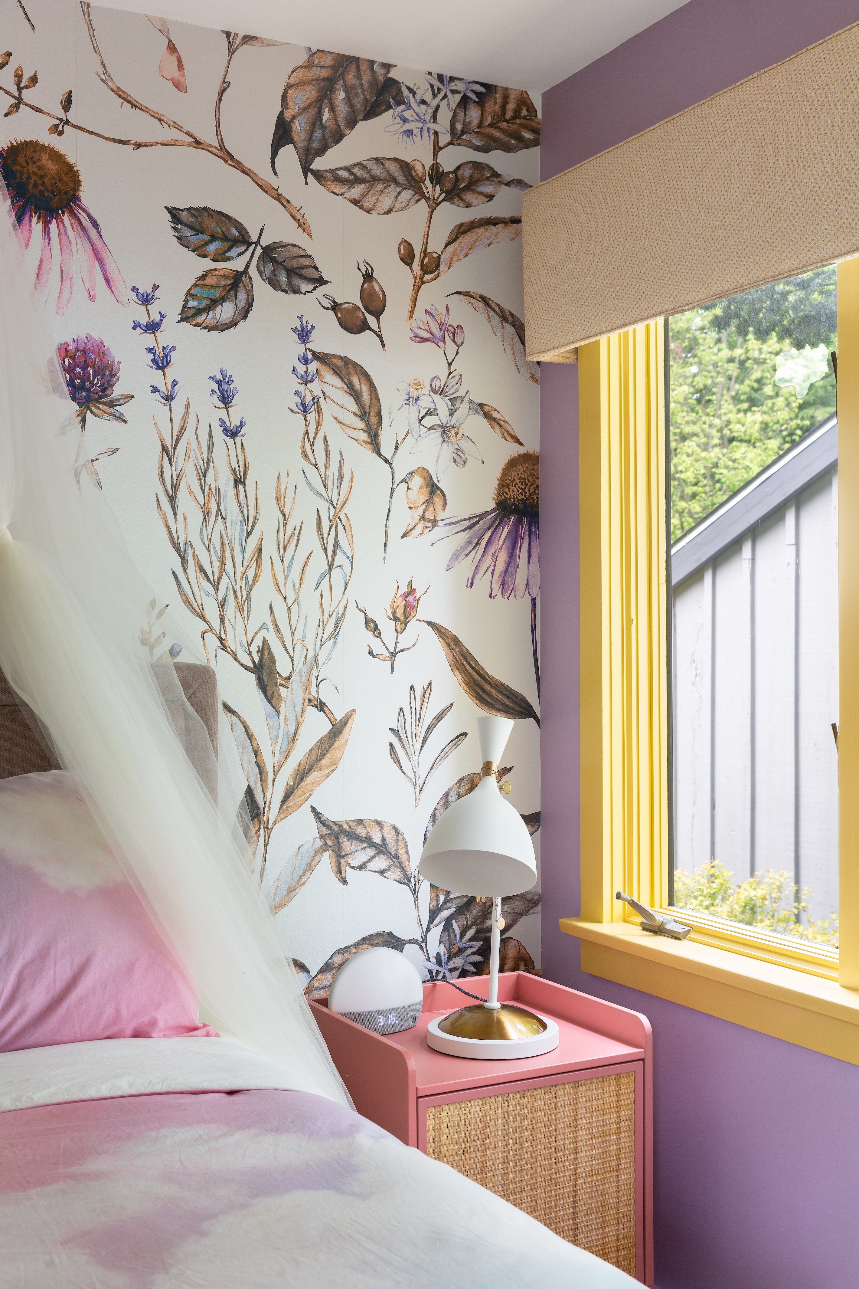
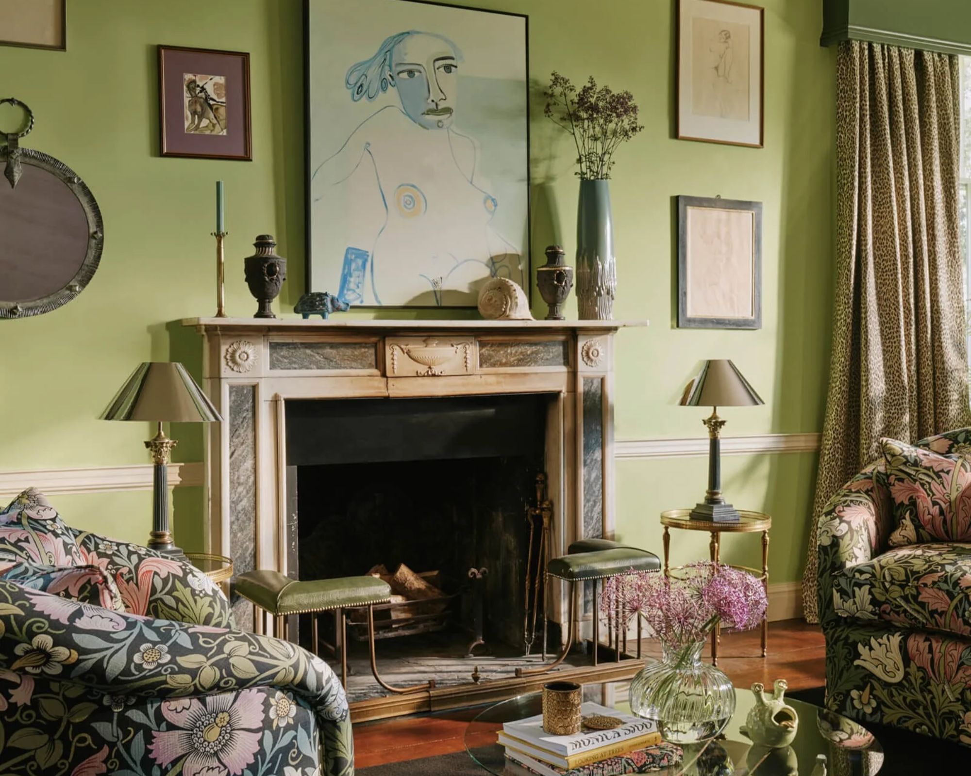
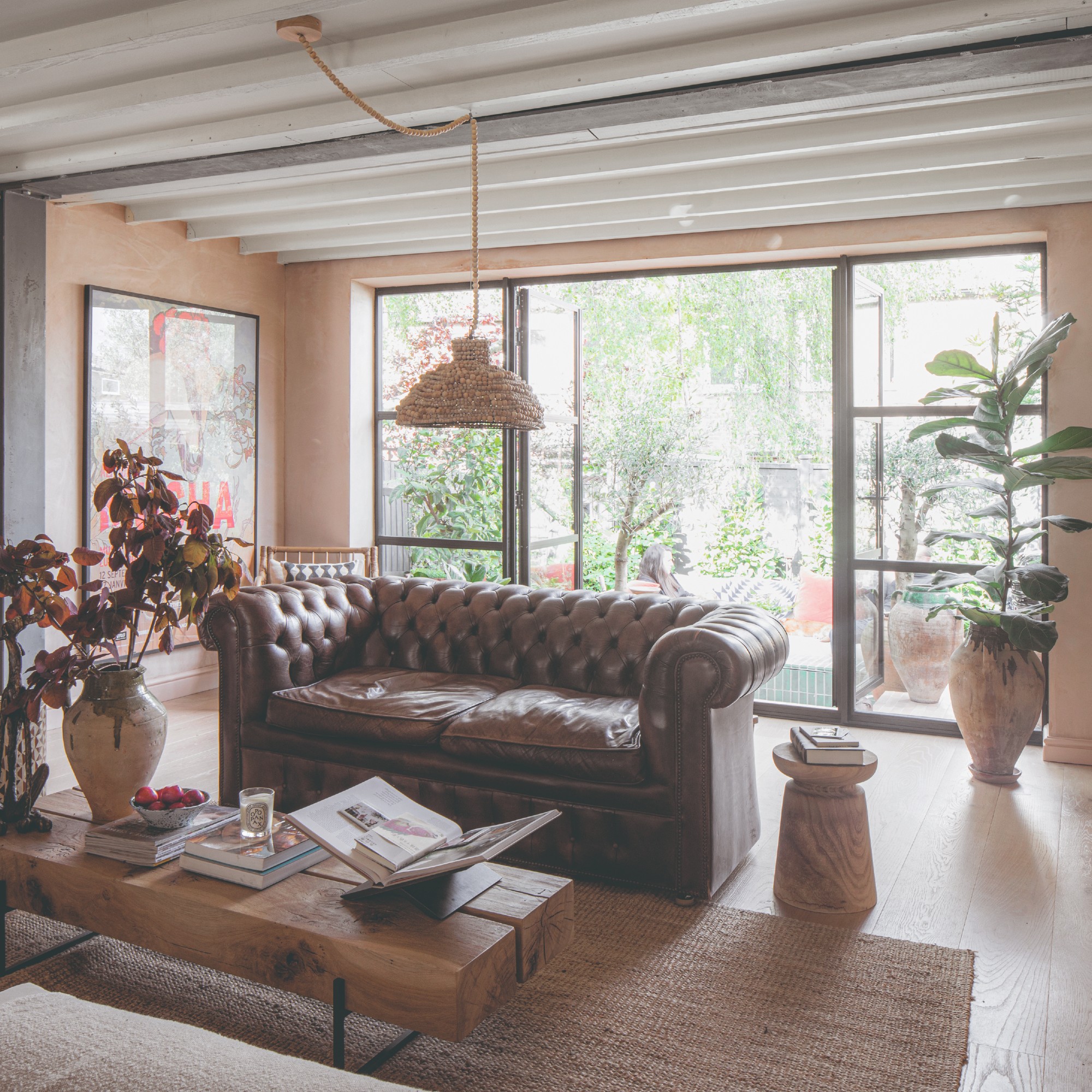
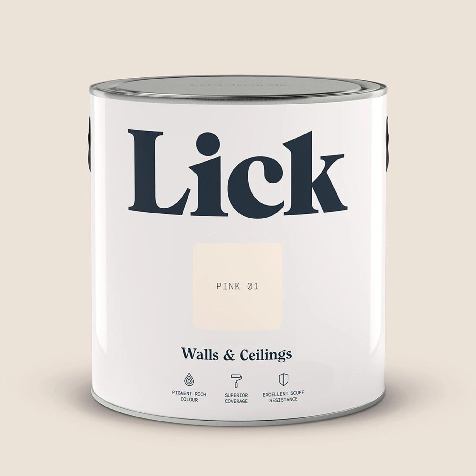
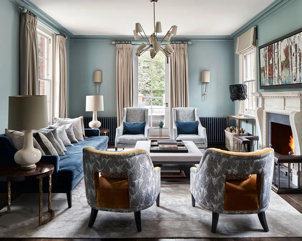
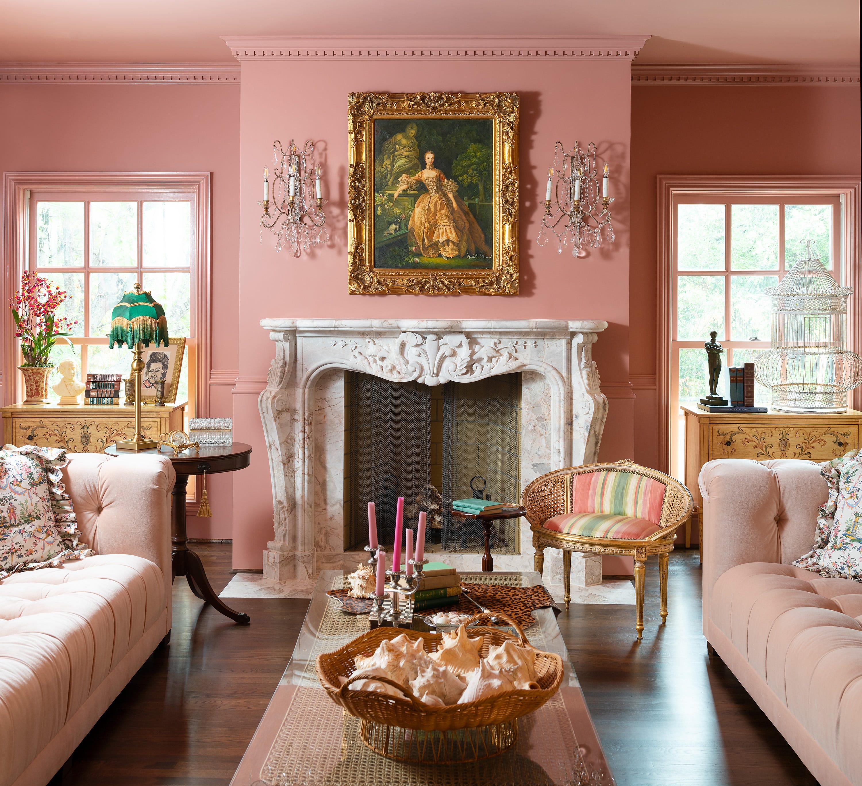
Further color inspirations include Blue Muscari, which transforms an Upper East Side space into a timeless yet contemporary setting. Walnut Brown challenges the notion of brown being dull, adding sophisticated depth to a New Jersey home. Sunny Yellow brings a perpetual sense of cheerfulness to a 1790s upstate New York farmhouse. Peach Blossom Pink offers subtle glamour in a Washington, D.C., family home. Paradise Green encourages boldness, infusing a Hamptons living room with a lively, lime-like vibrancy. Bluebelle, seen in a Yucca Valley weekend retreat, provides a delicate sky-blue that serves as a vibrant focal point.
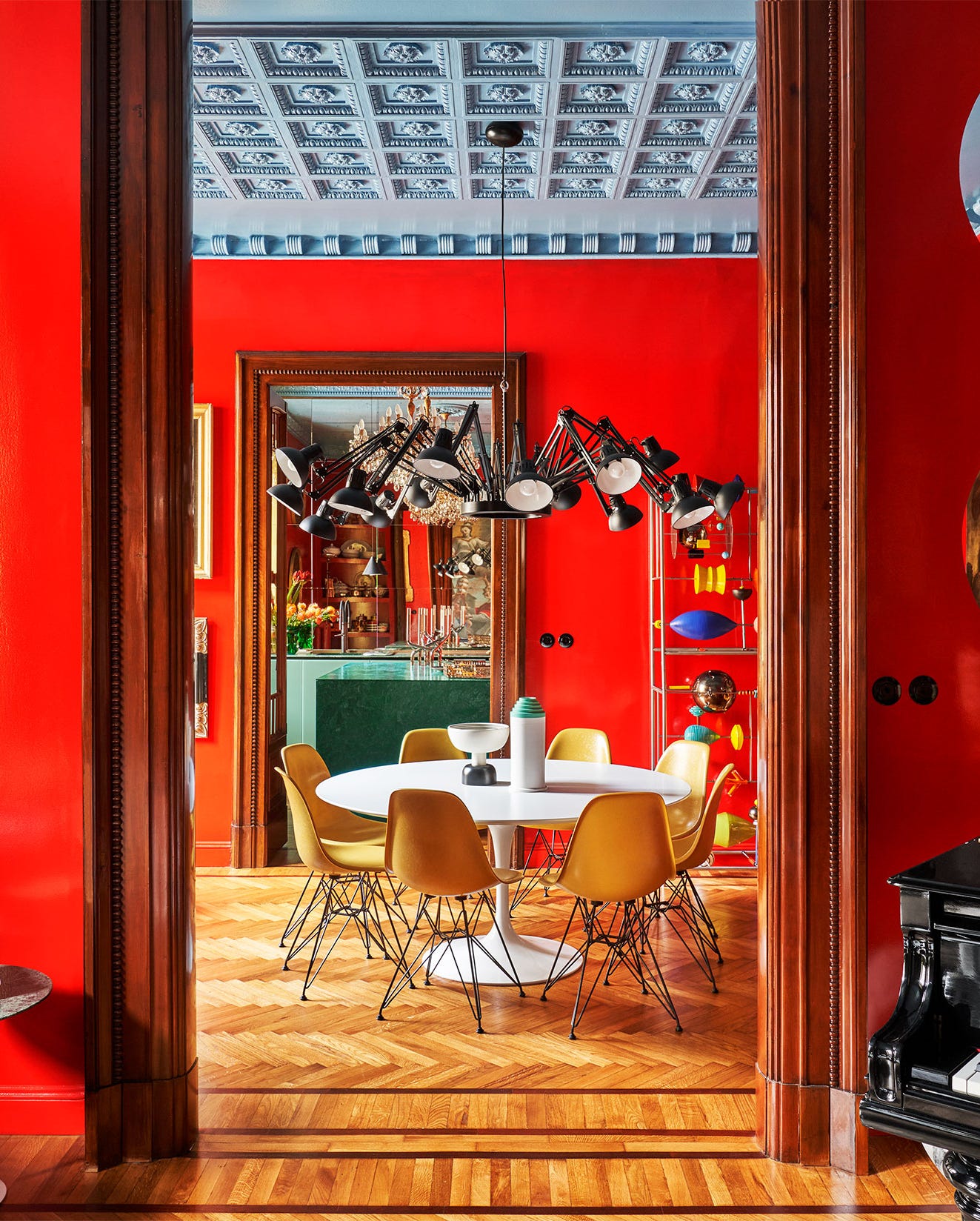
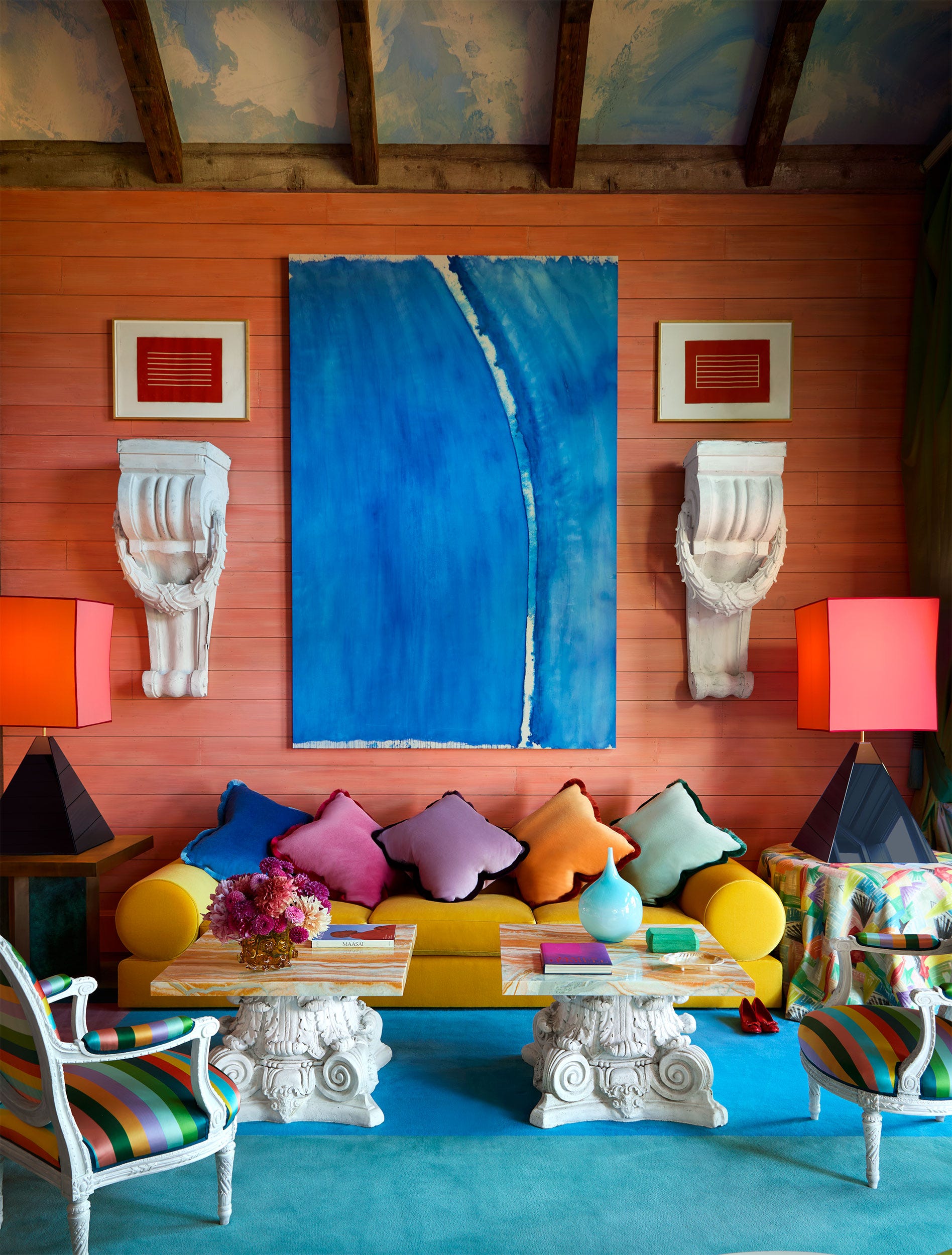
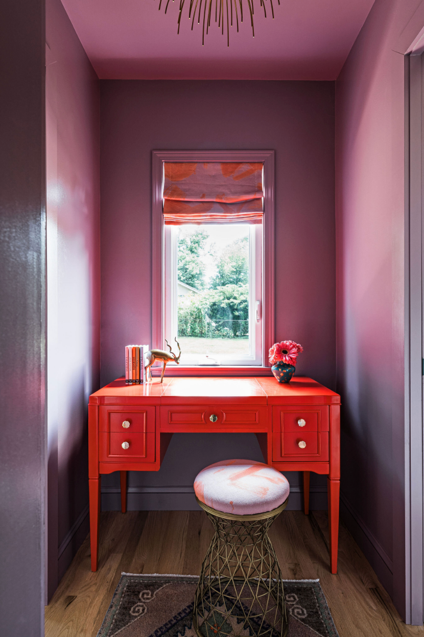
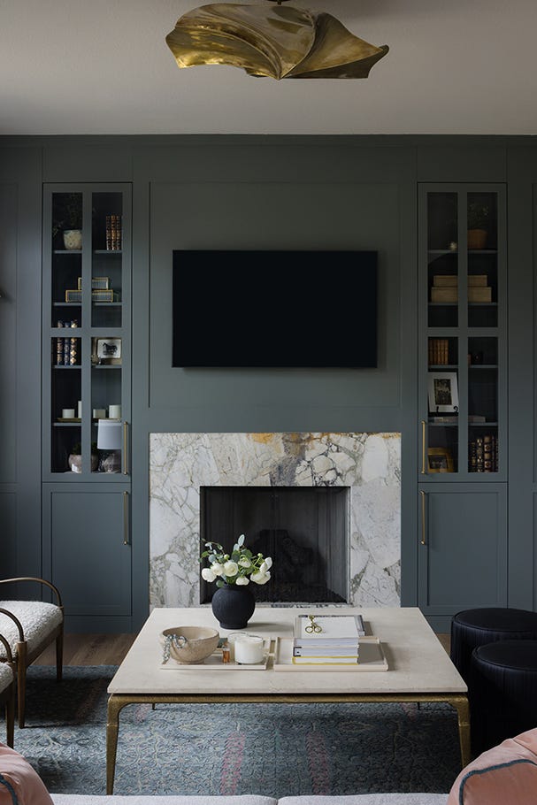
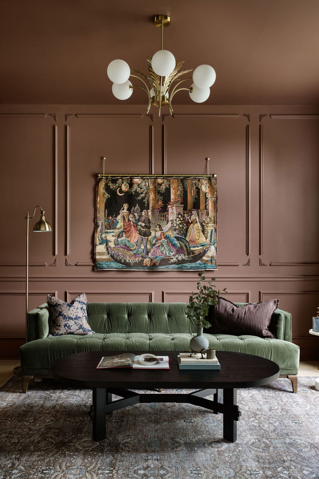
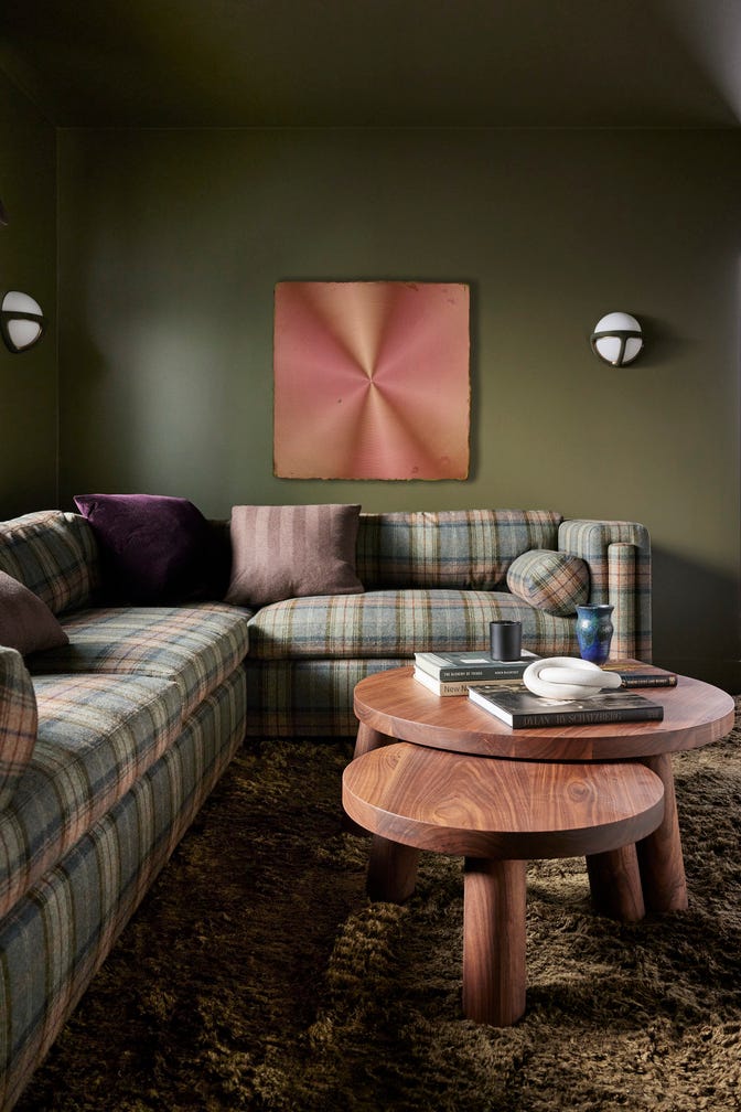
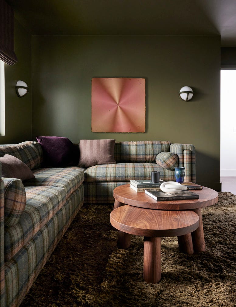
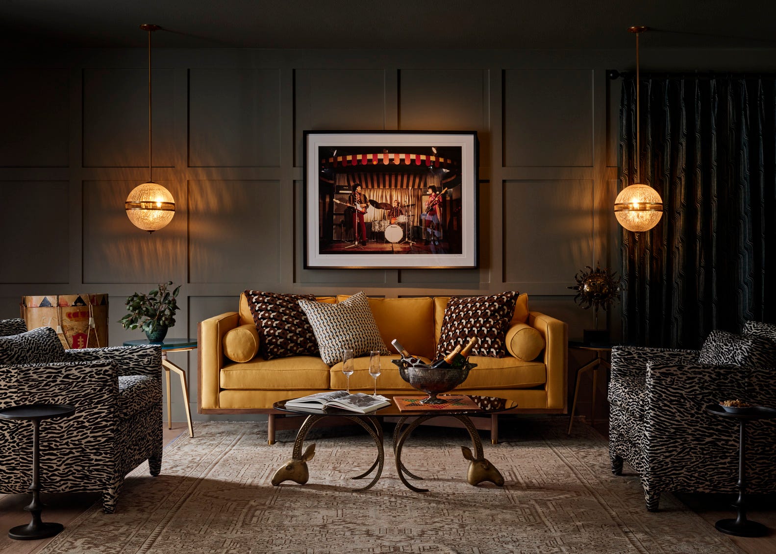
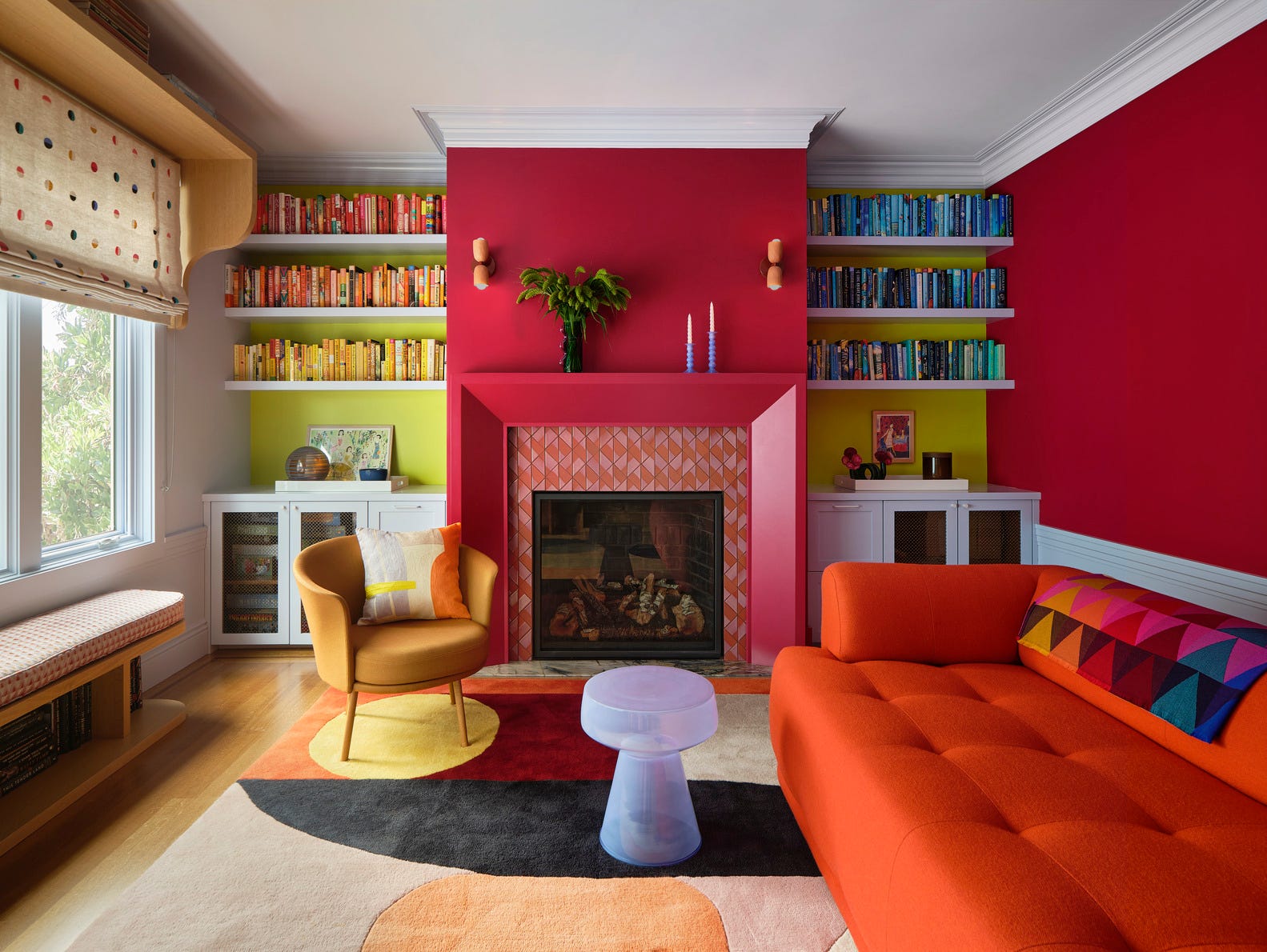
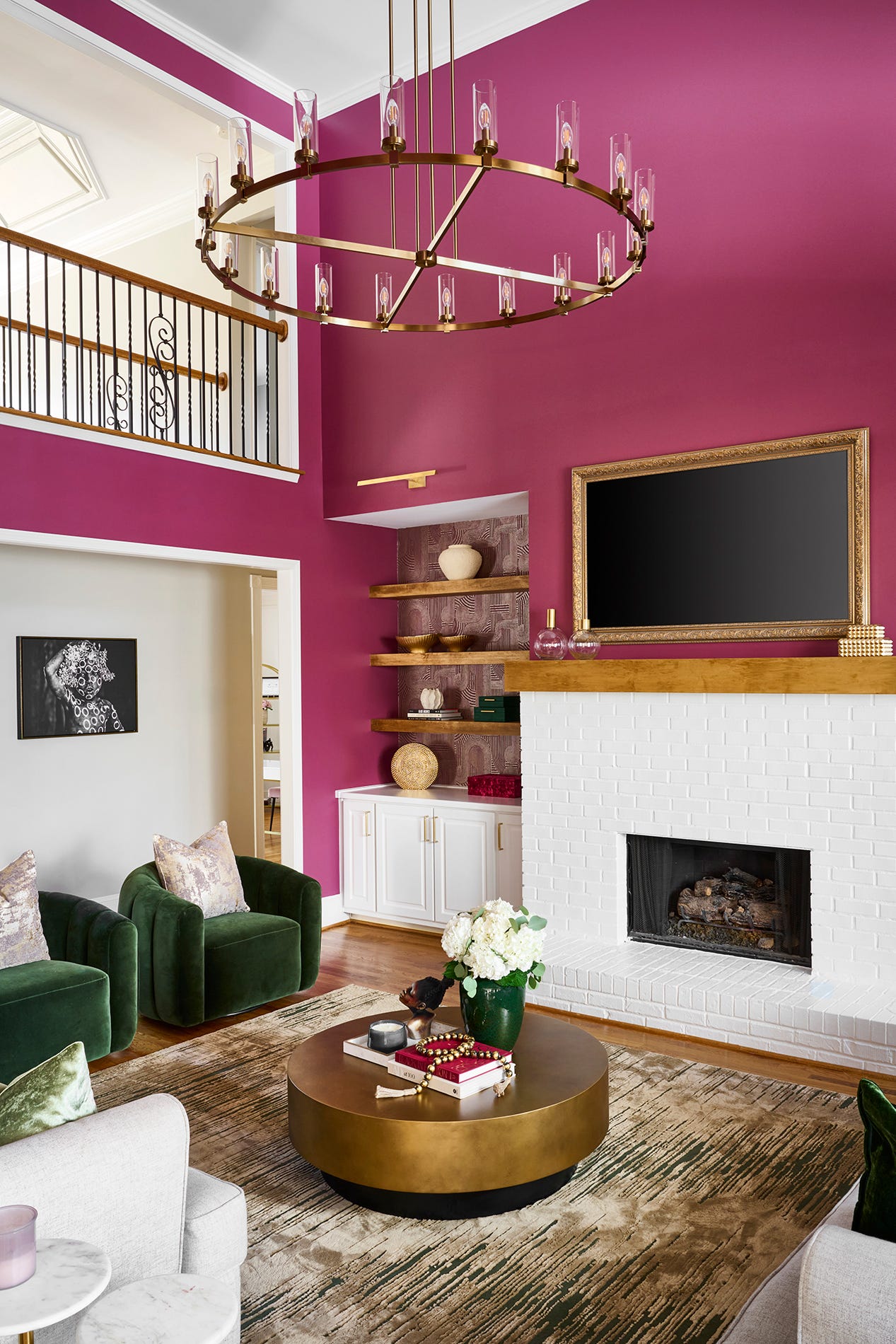
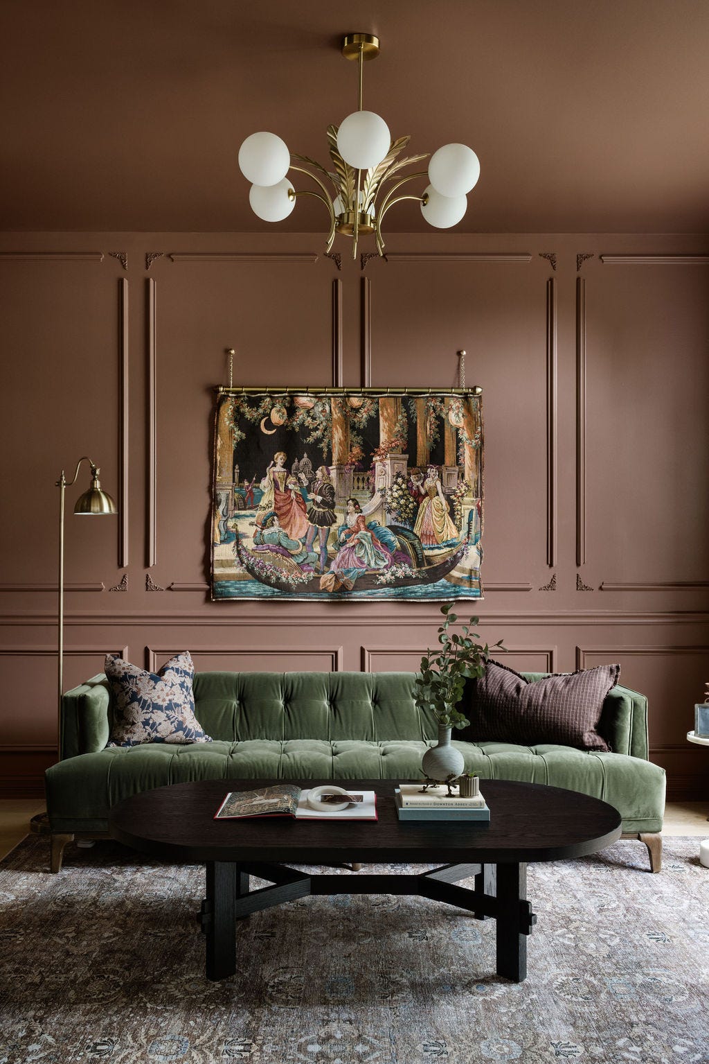
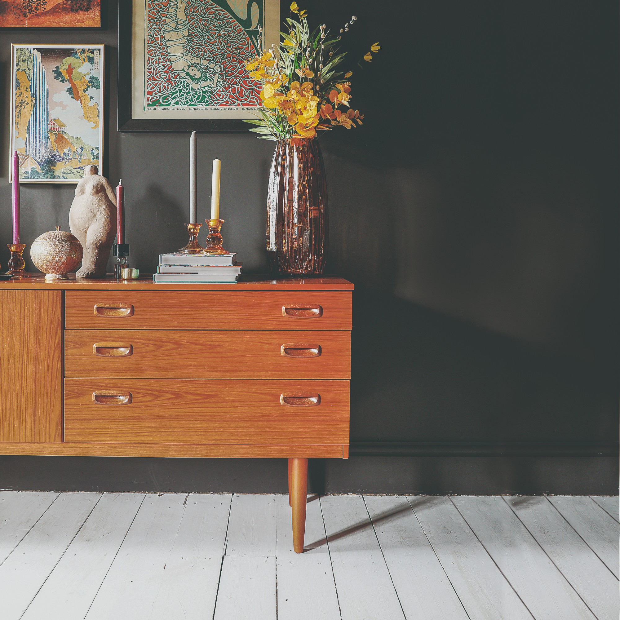
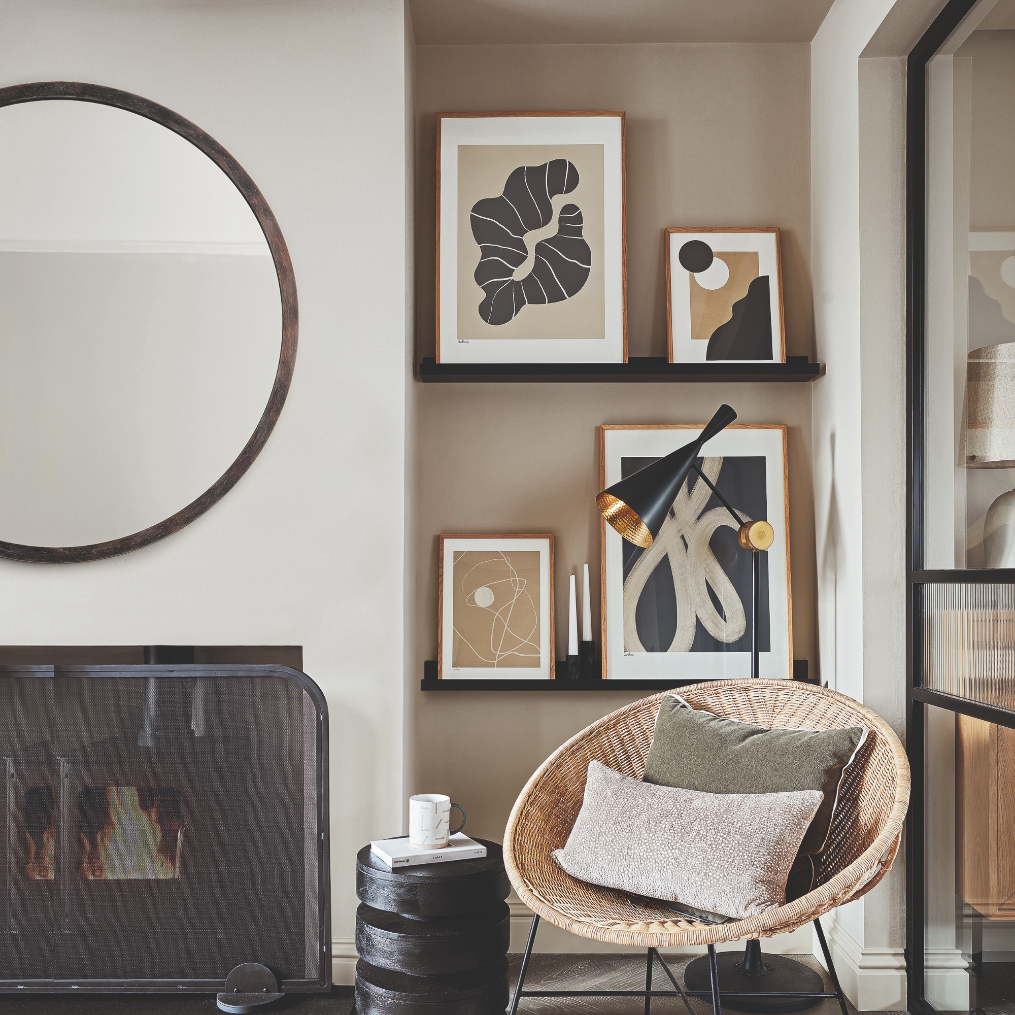
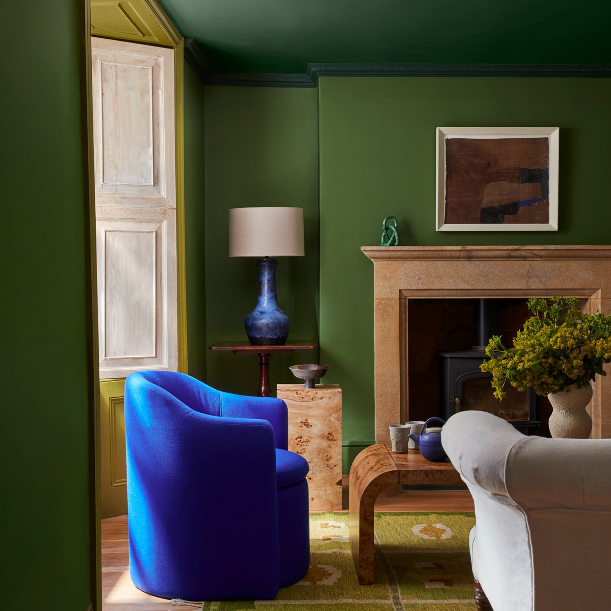
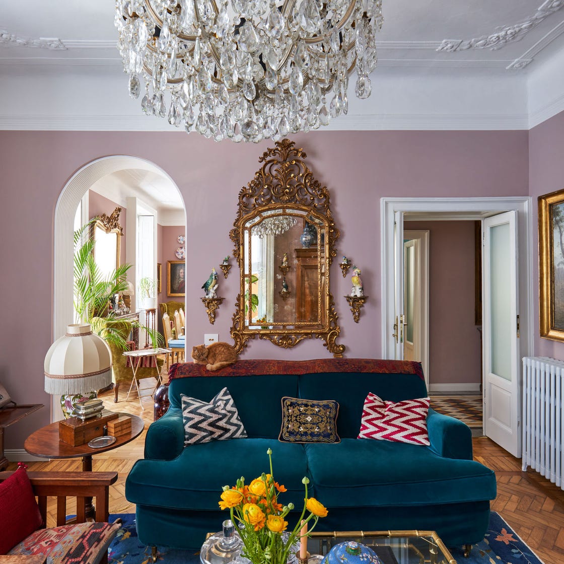
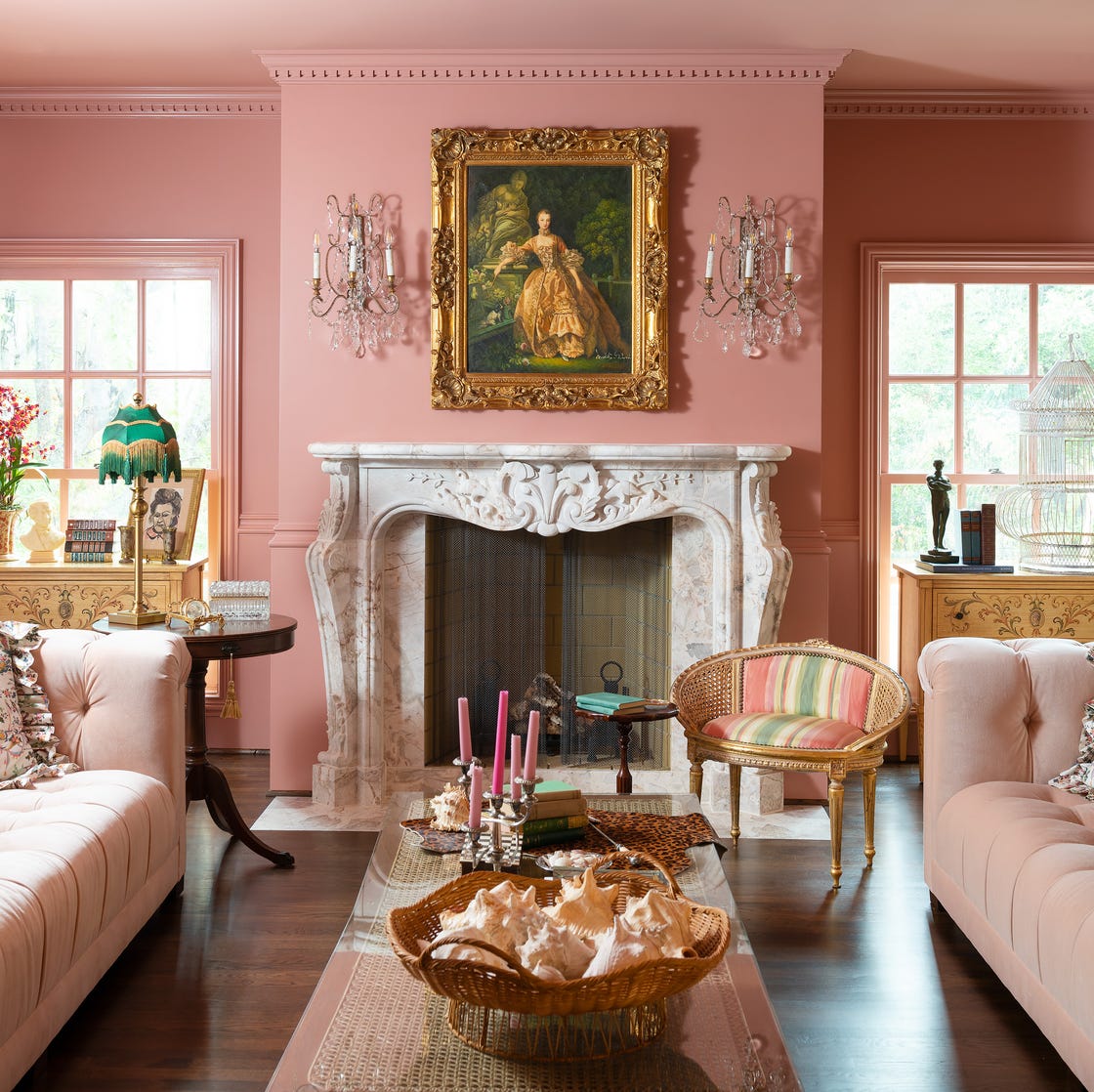
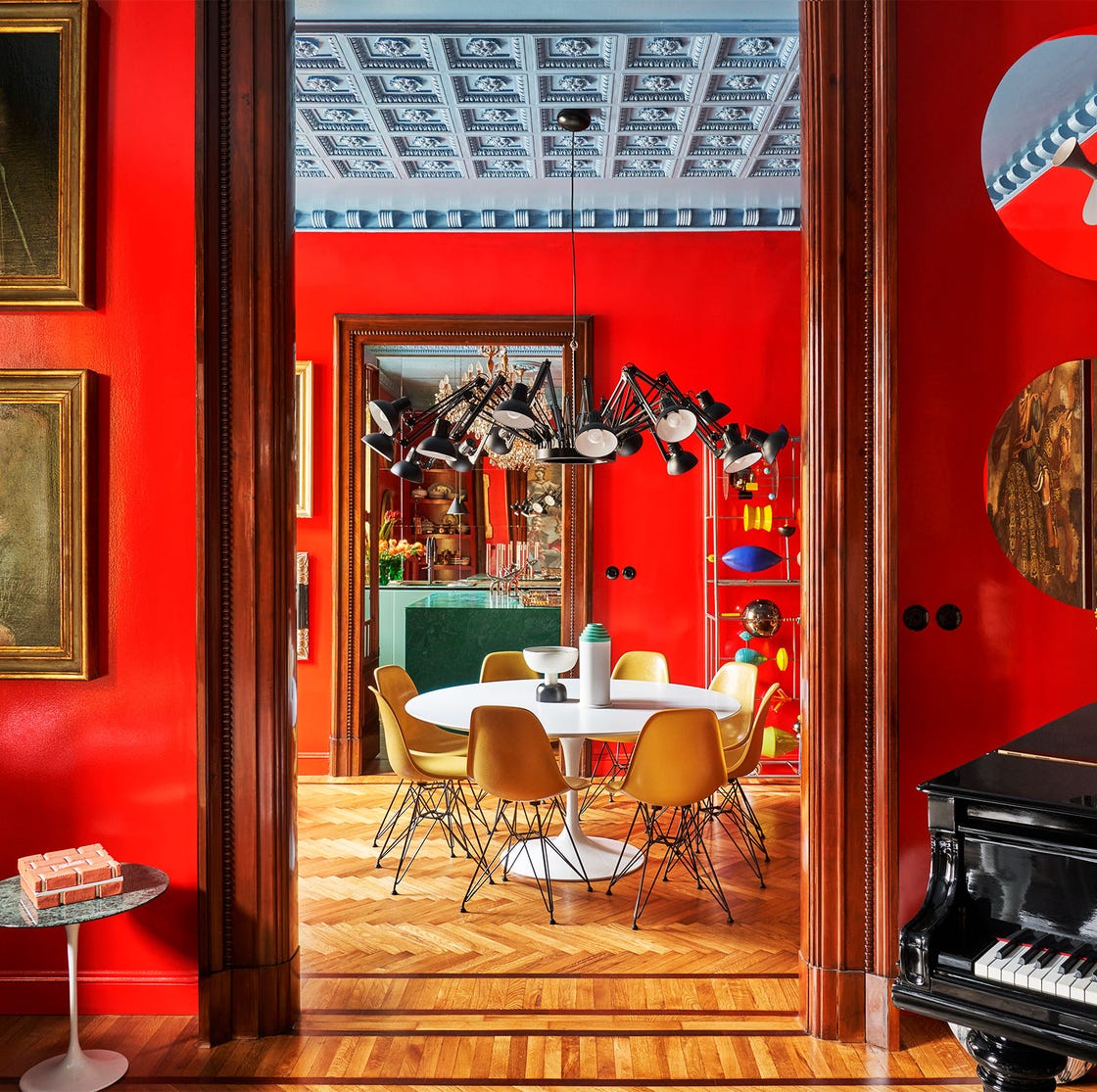
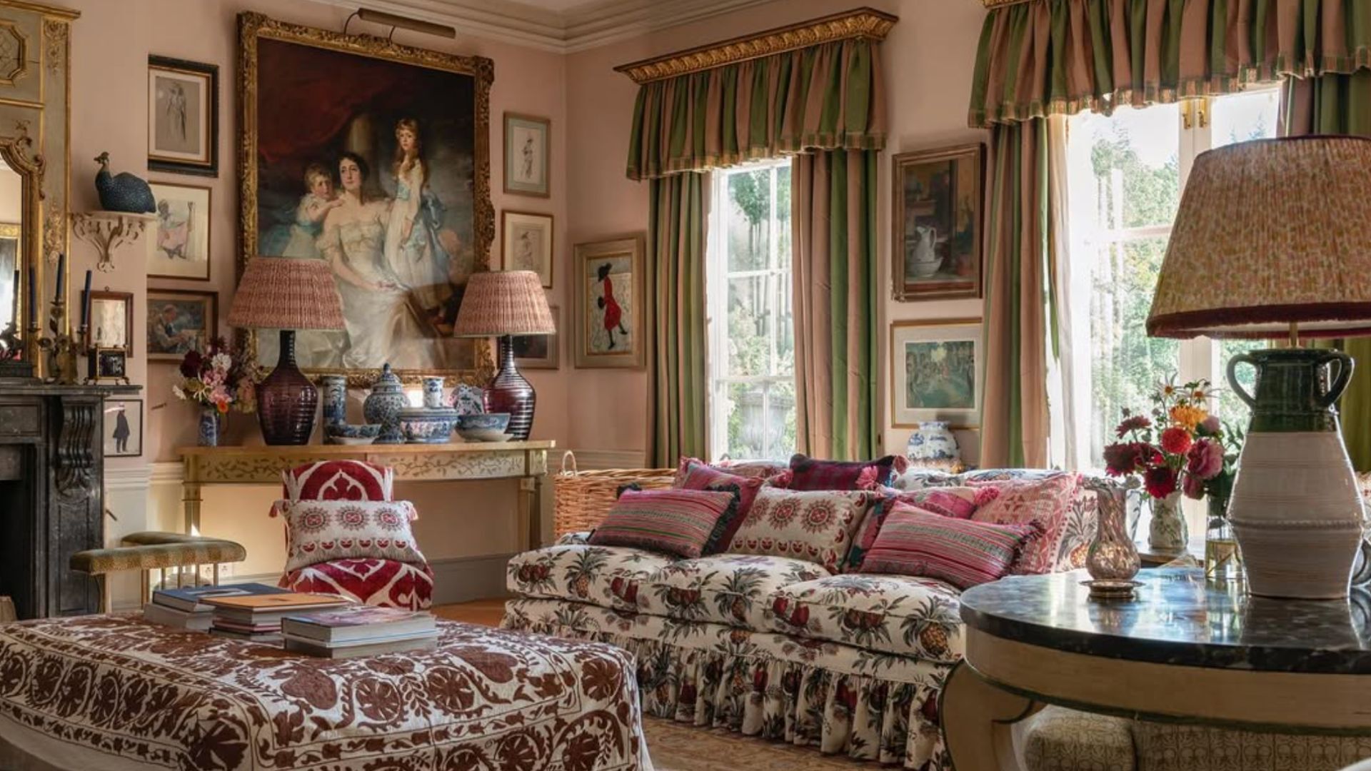
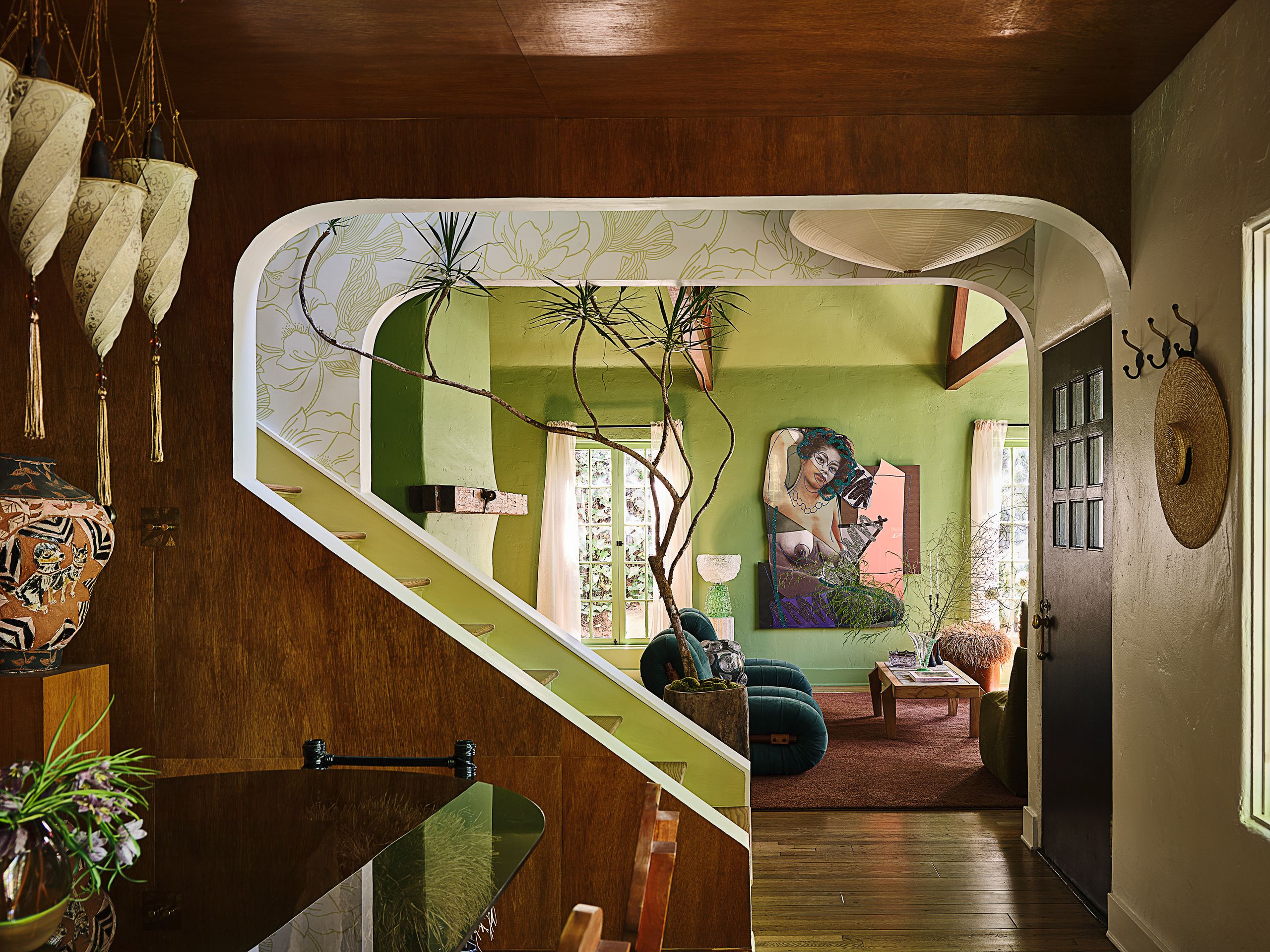
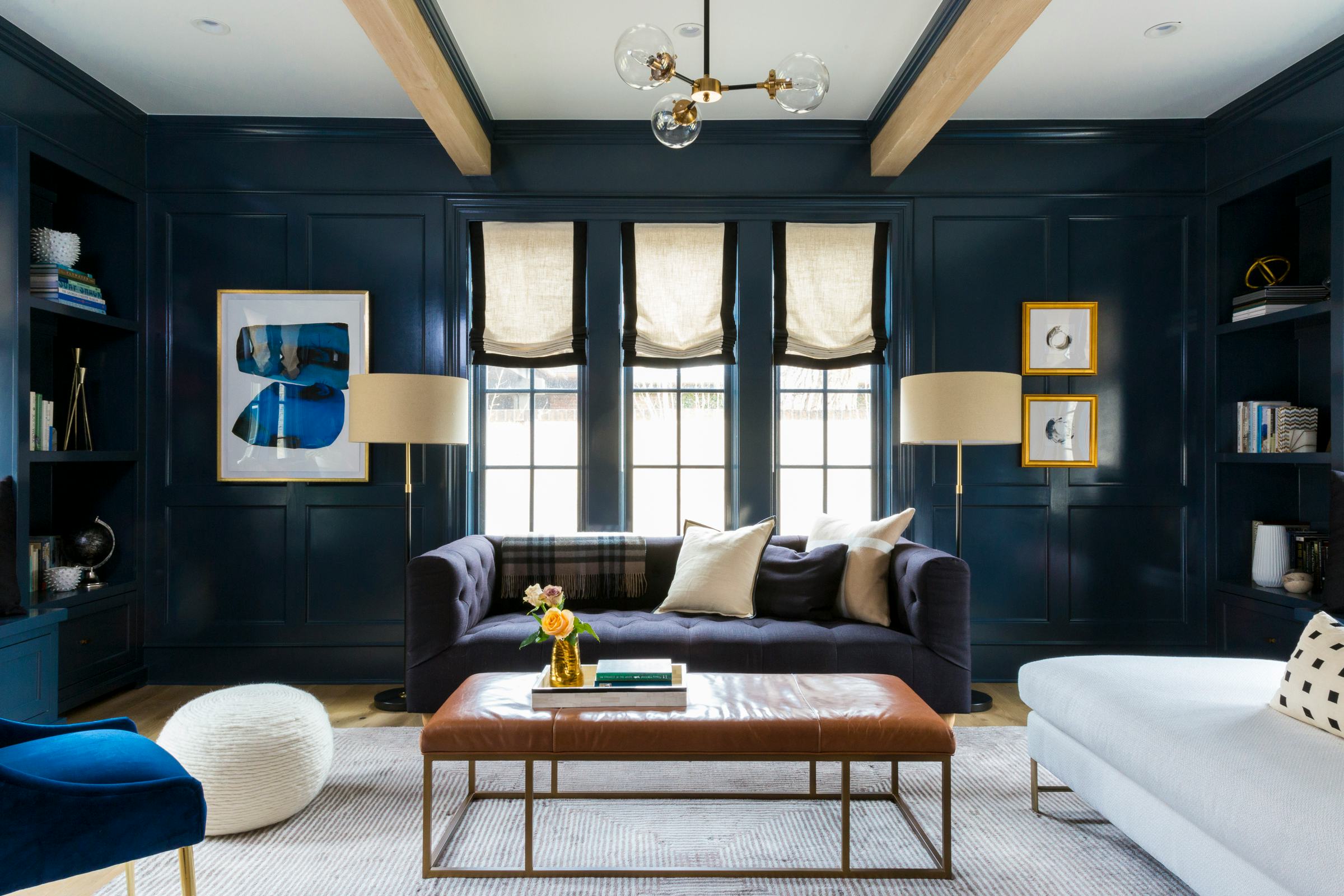
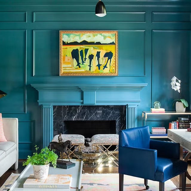
Portofino Pink, used in a Los Angeles home’s “Rosé room,” merges romance, sophistication, and tranquility. A Chartreuse Ceiling in a Parisian den demonstrates an innovative approach to color application, defying conventional wisdom. Dual Toned Neutrals in a Connecticut farmhouse highlight the importance of correcting and selecting appropriate paint colors for an overall aesthetic improvement. Azure Tide Ombré in a Paris apartment creates a stunning, jewel-box effect with its gradient blue. Purplicious, in a Mumbai apartment, showcases how a rich purple can transform a century-old space into a luxurious and captivating environment. Rectory Red, used for color-drenching in a maximalist New York City home, proves the enchanting power of a daring red. Waynesboro Taupe in a tiny studio apartment illustrates how a practical neutral can introduce character and make walls appear to recede. Lime-Washed walls in a Park Avenue apartment offer a cohesive yet unexpectedly delightful treatment. Lastly, Moody Plum, specifically Farrow & Ball’s Tanner’s Brown, adds dramatic depth to a Connecticut farmhouse, achieving a desired moodiness.
#LivingRoomDesign #PaintColors #InteriorDecorating #ColorTrends2026 #DesignerApproved #HomeDecor #AccentWalls #ShadesOfColor #InteriorDesignInspiration #LivingRoomDesign #PaintColors #InteriorDecorating #ColorTrends2026 #DesignerApproved #HomeDecor #AccentWalls #ShadesOfColor #InteriorDesignInspiration
0 comment in total
You may also like
Experts reveal the best living room paint colours to transform every space

Designer-Approved Living Room Colors That'll Make You Feel Happier

7 colour tricks to transform your mood and living room design

Living room paint ideas – stylish ways with paint
55 Living Room Color Ideas That Will Take Your Space from Drab to Fab

5 living room paint colors going out of style in 2025
28 Living Room Paint Color Ideas That Make Beige Feel Basic (In the Best Way)

These Colors Will Be Everywhere in Interiors in 2025

Designers Say These Unusual Paint Color Combos Will Transform Your Home

4 Living Room Paint Colors That Are So Outdated, According to Designers


The Year's Best Living Rooms
Living room paint ideas – 27 easy ways to bring your lounge to life with stylish and creative colours and techniques
This Color Will Transform Your Living Room Instantly
Jewel Tones Are Trending for Living Room Paint Colors, According to Designers
Design Pros Have Spoken: Here Are the Only Paint Color Trends That Matter in 2022
‘When your sofa and wall colours are in sync, the space feels intentional’ – experts reveal the 4 best paint and sofa colour combinations
Listen Up: These Are the Best Paint Colors for Your Living Room

The 60 Most Popular Living Room Paint Colors Right Now
7 Popular Paint Colors for the Living Room
We Asked Designers Which Living Room Paint Colors People Always Regret—These 6 Came Up the Most