This Color Will Transform Your Living Room Instantly
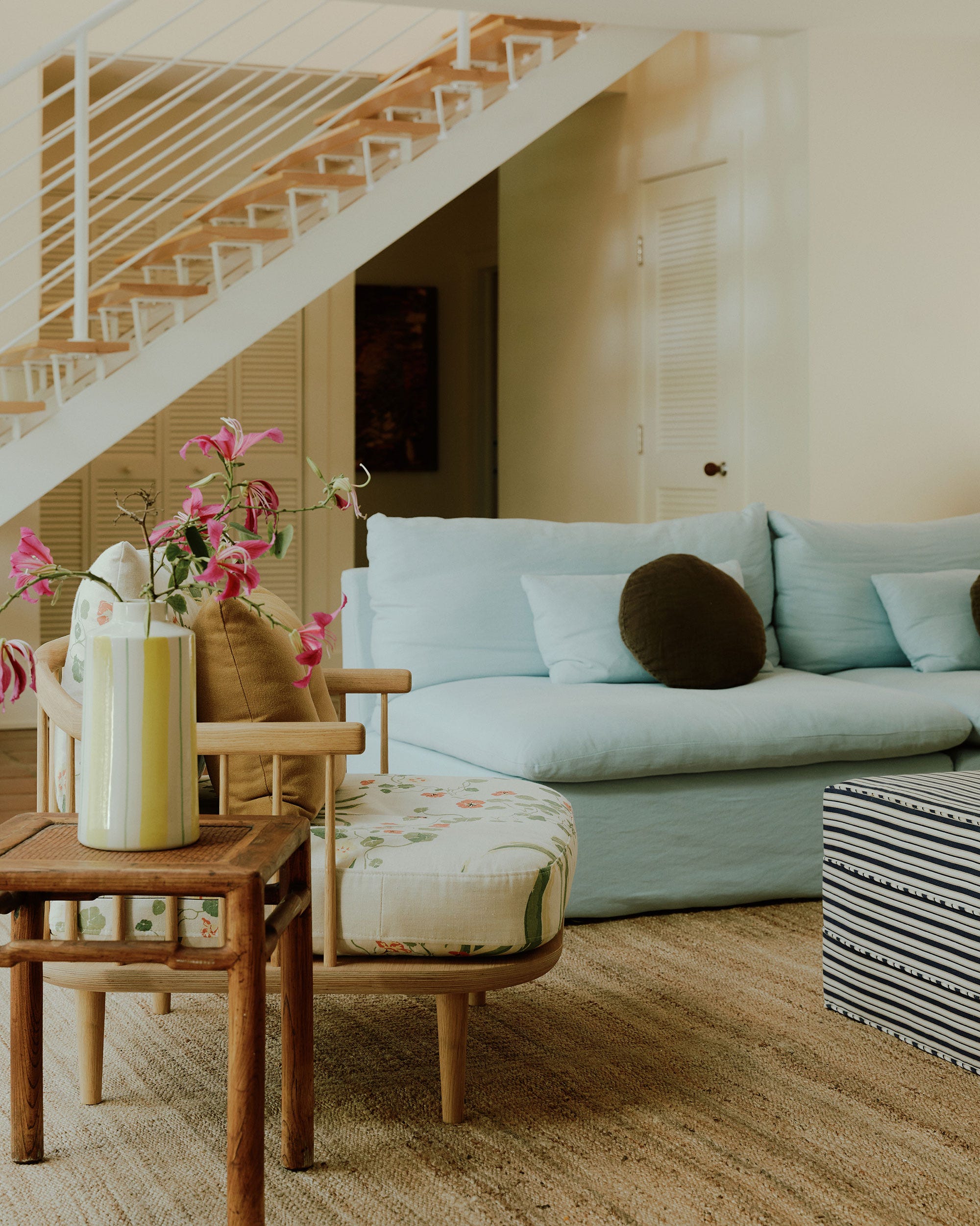
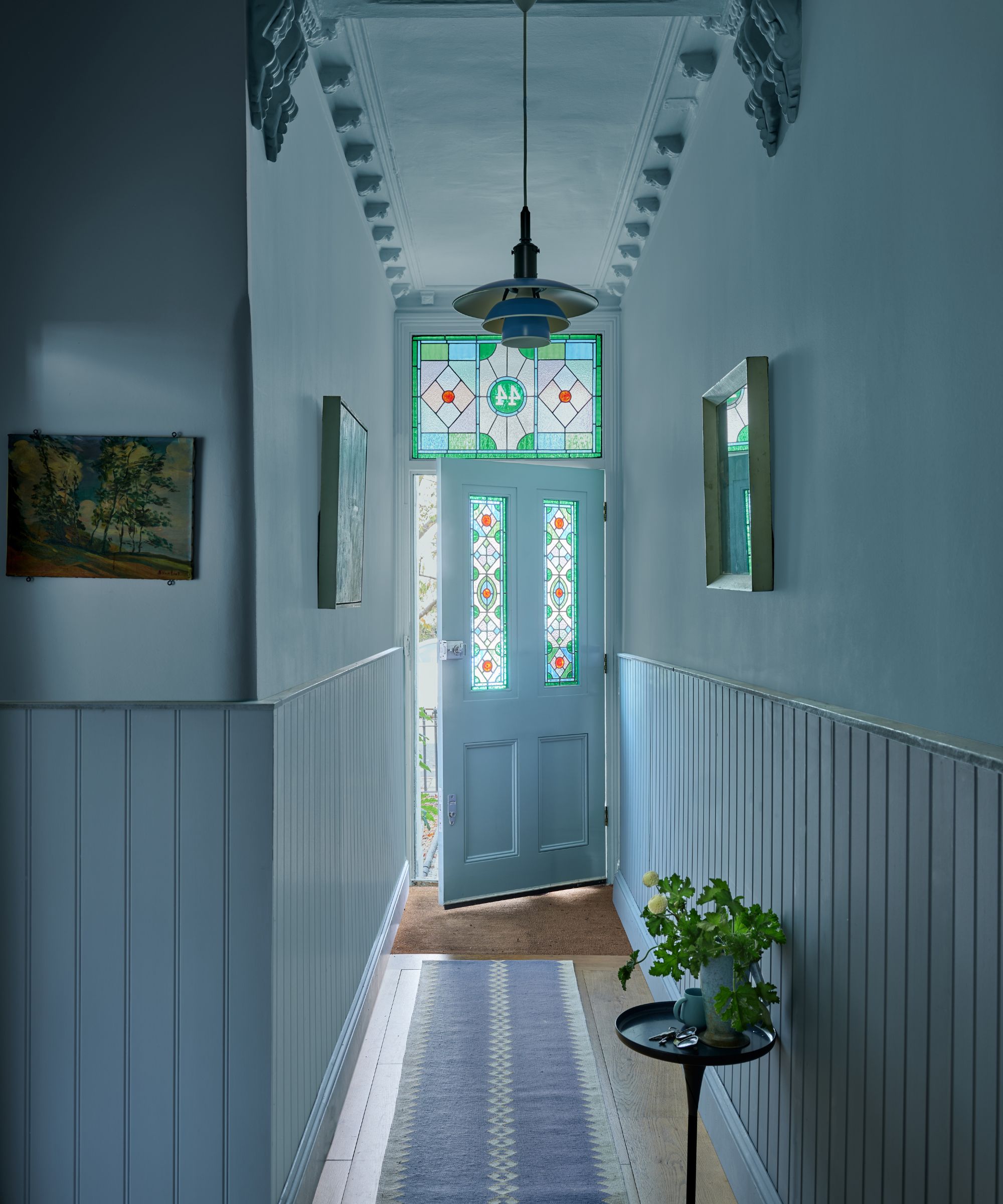
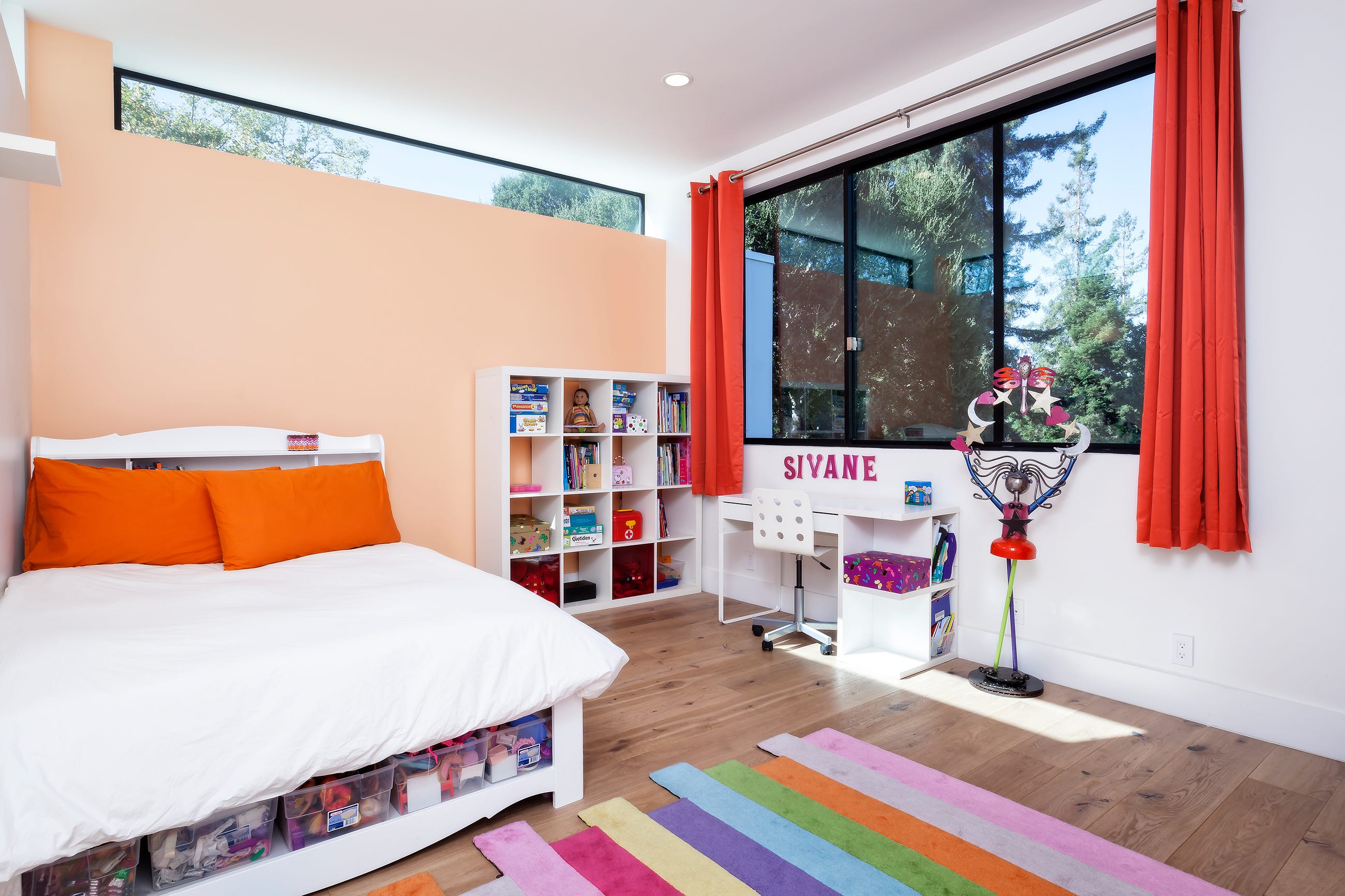
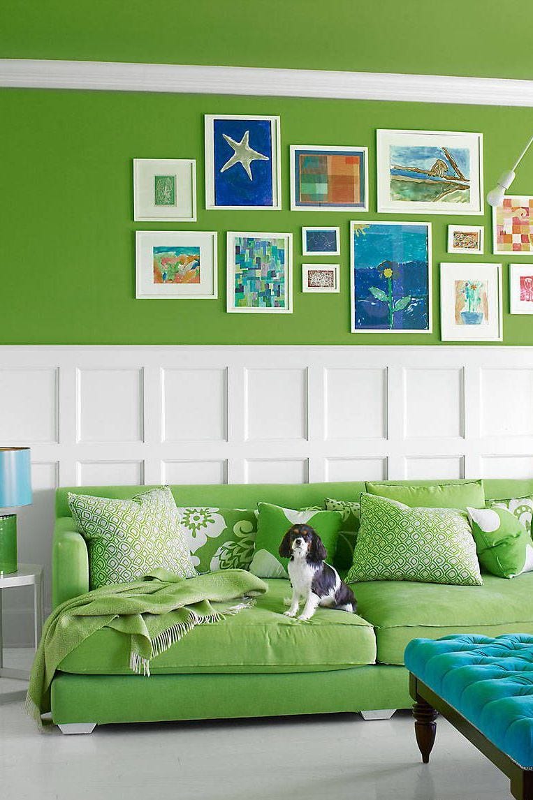
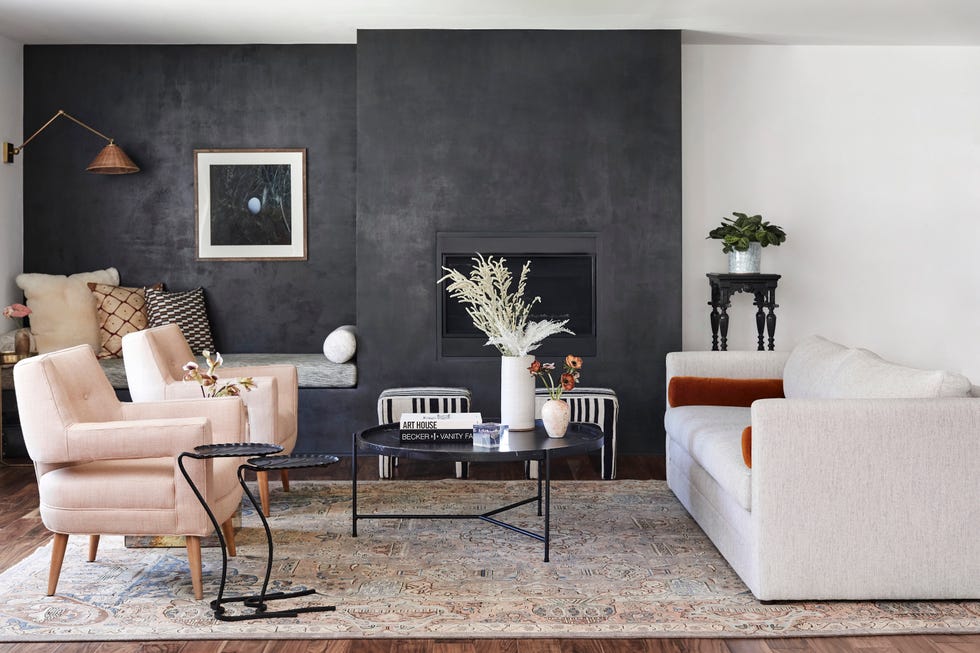
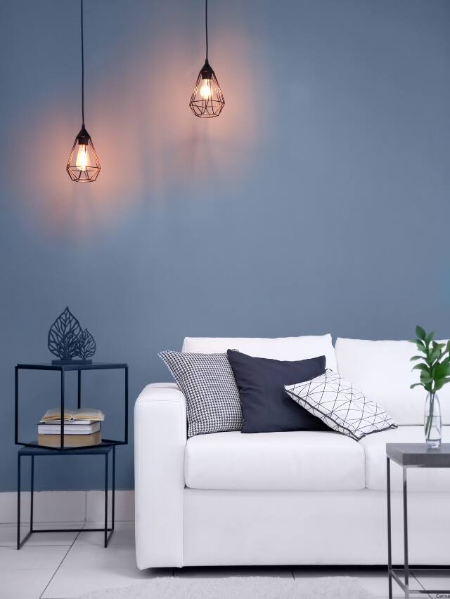
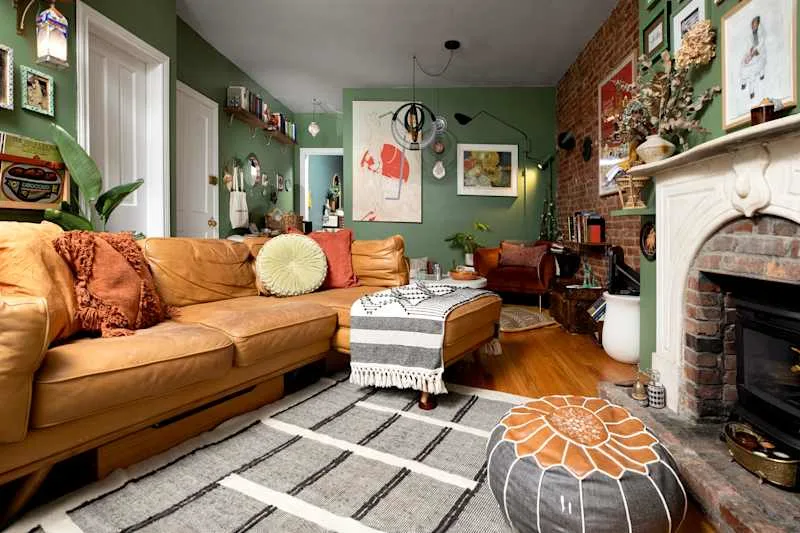
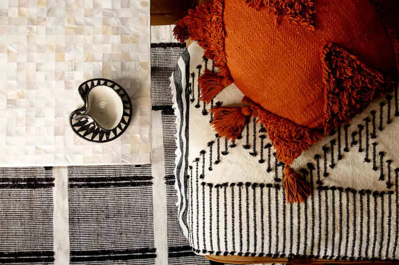
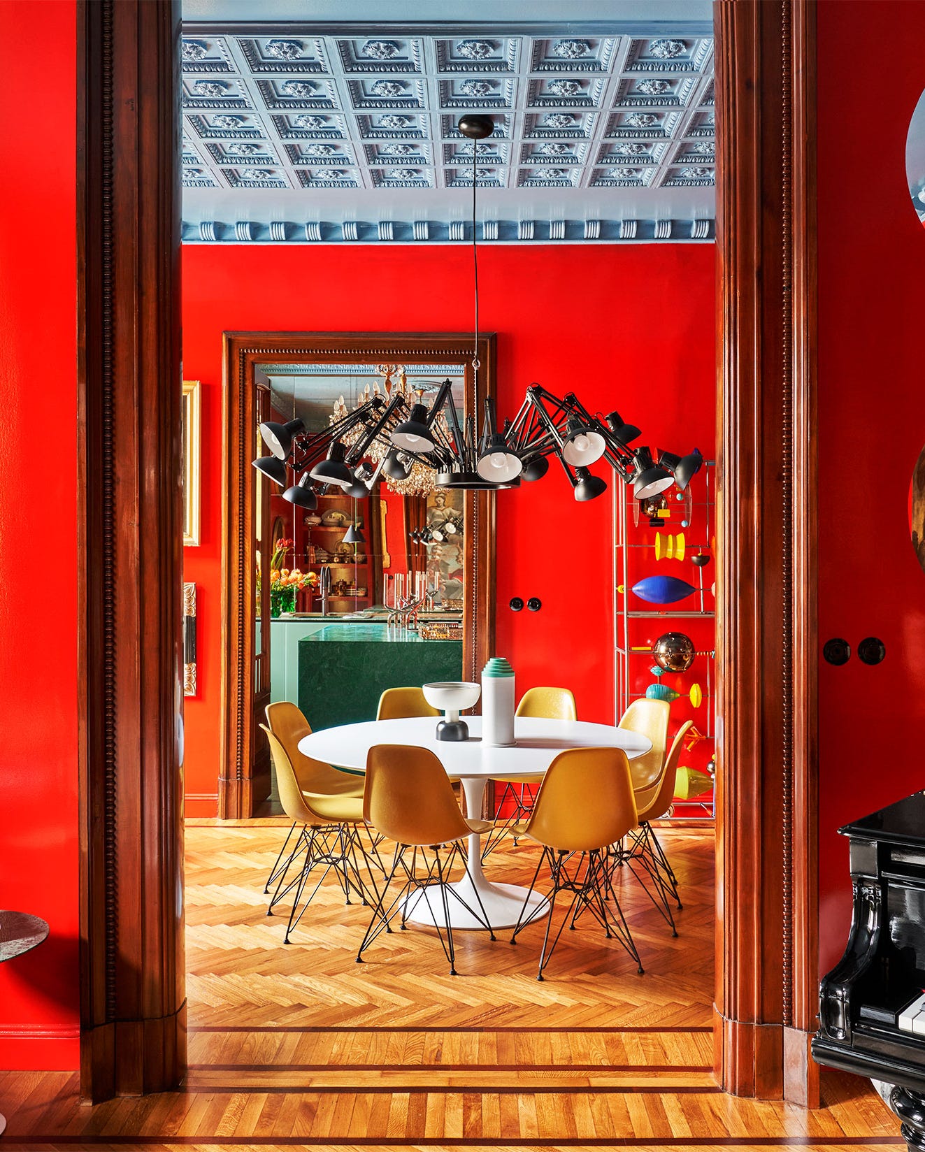
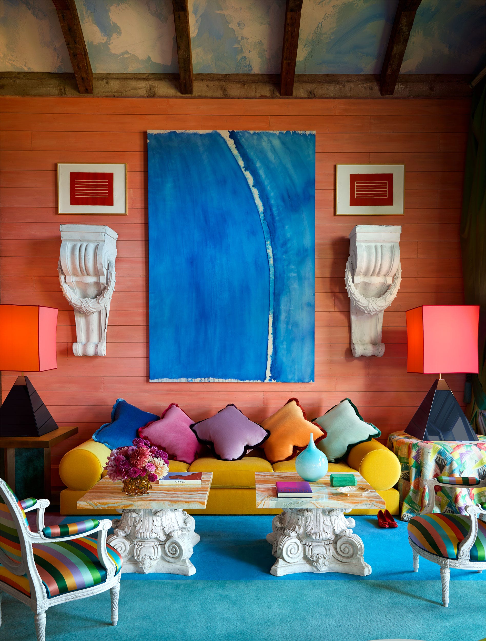
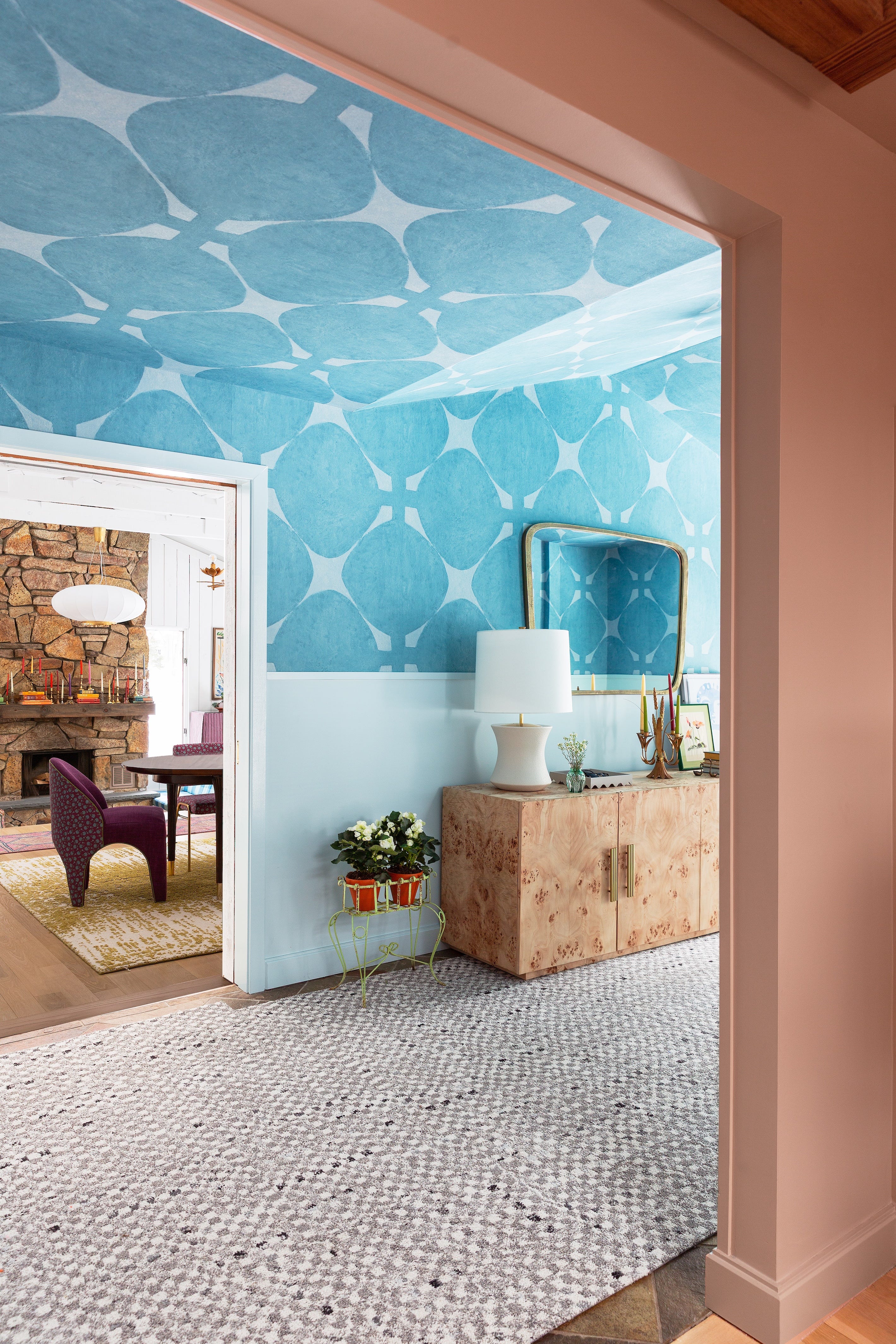
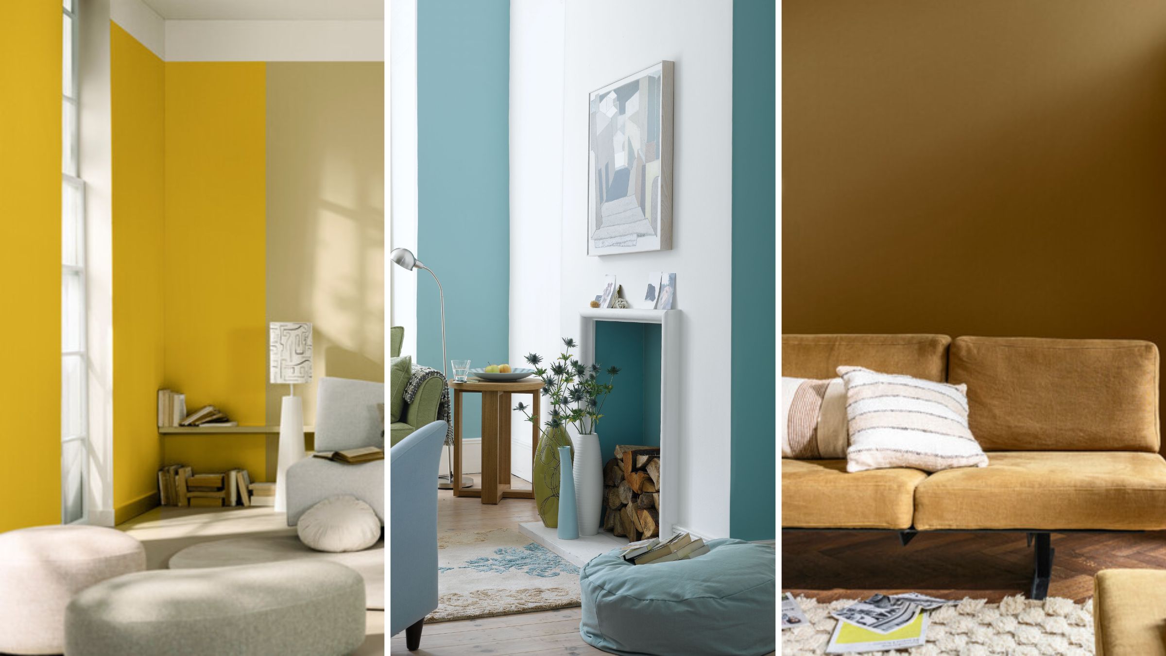
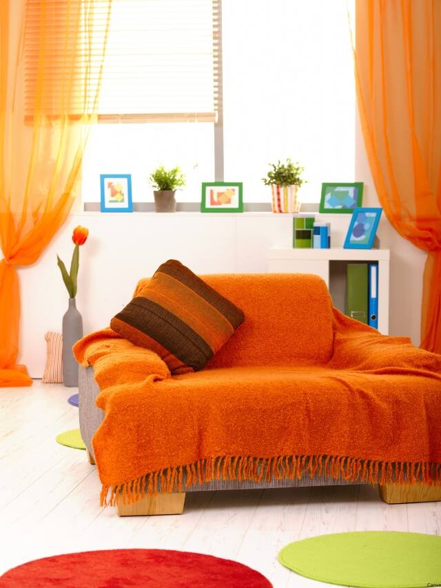
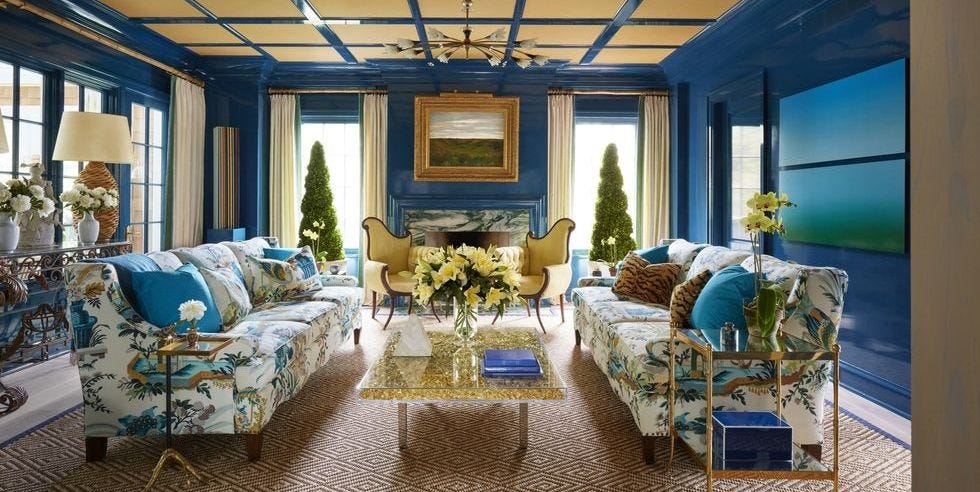
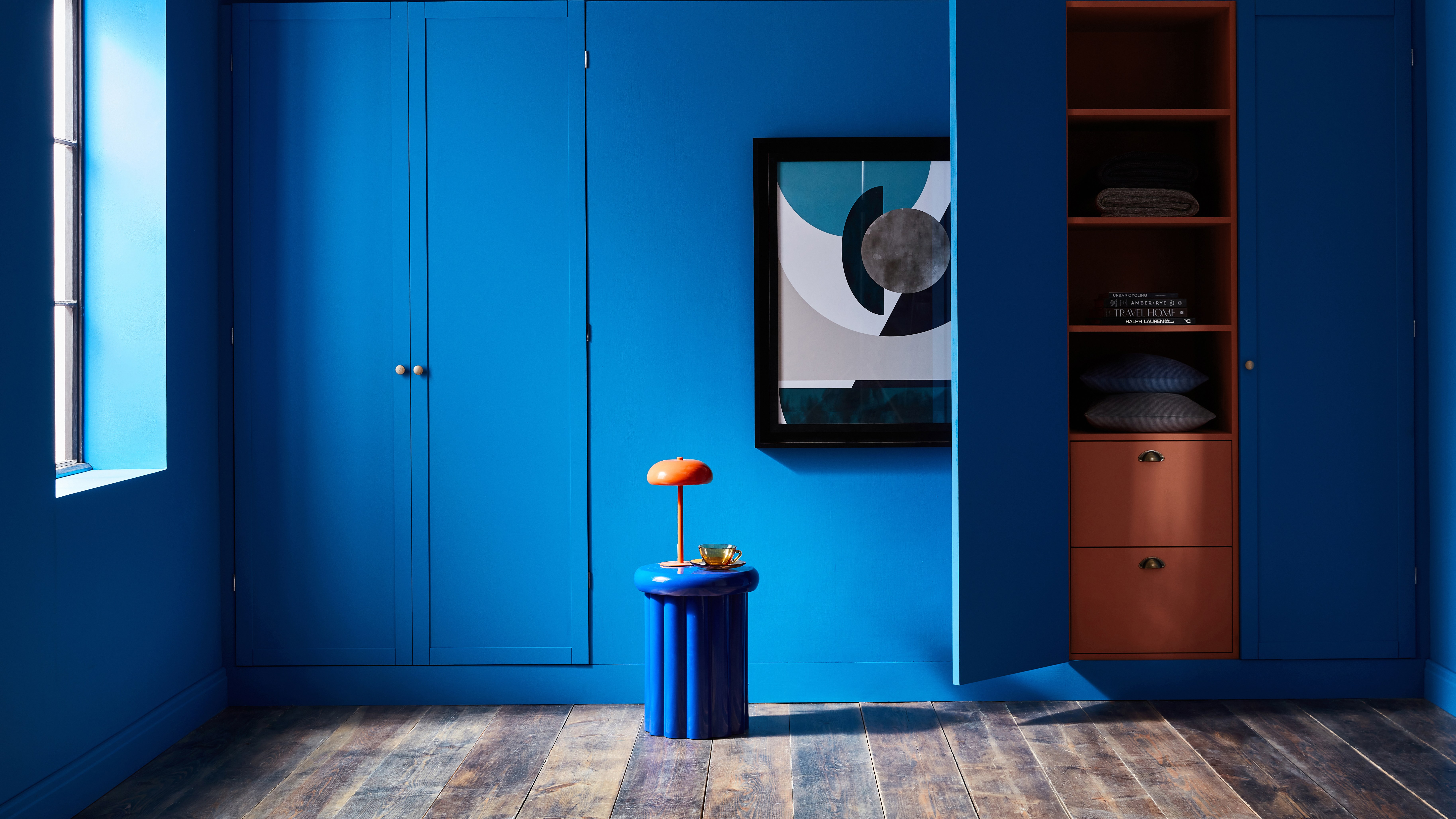
Adding an accent wall is a transformative way to inject personality and vibrance into a living room without overwhelming the space. This approach allows for a significant aesthetic change that can be integrated with existing decor more easily than repainting an entire room. The beauty of this design technique lies in its versatility, offering the option to choose from bold hues like fuchsia, emerald, or cerulean, or more subtle shades such as lavender, baby blue, or mint. Regardless of the chosen intensity, an accent wall makes a clear design statement.
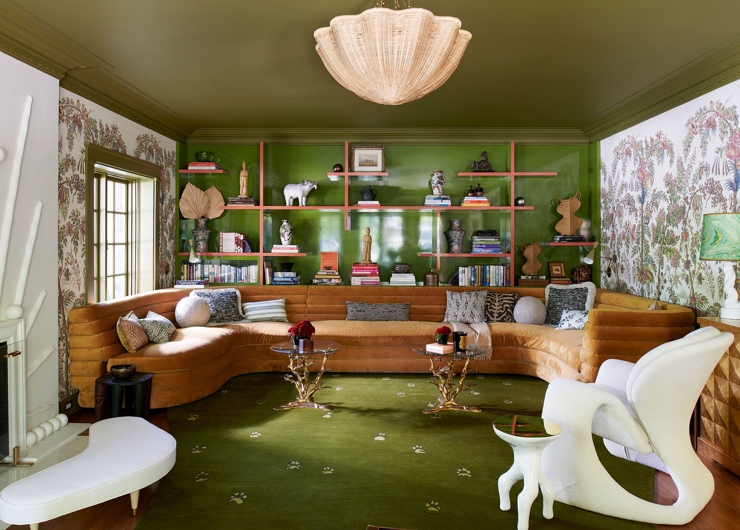
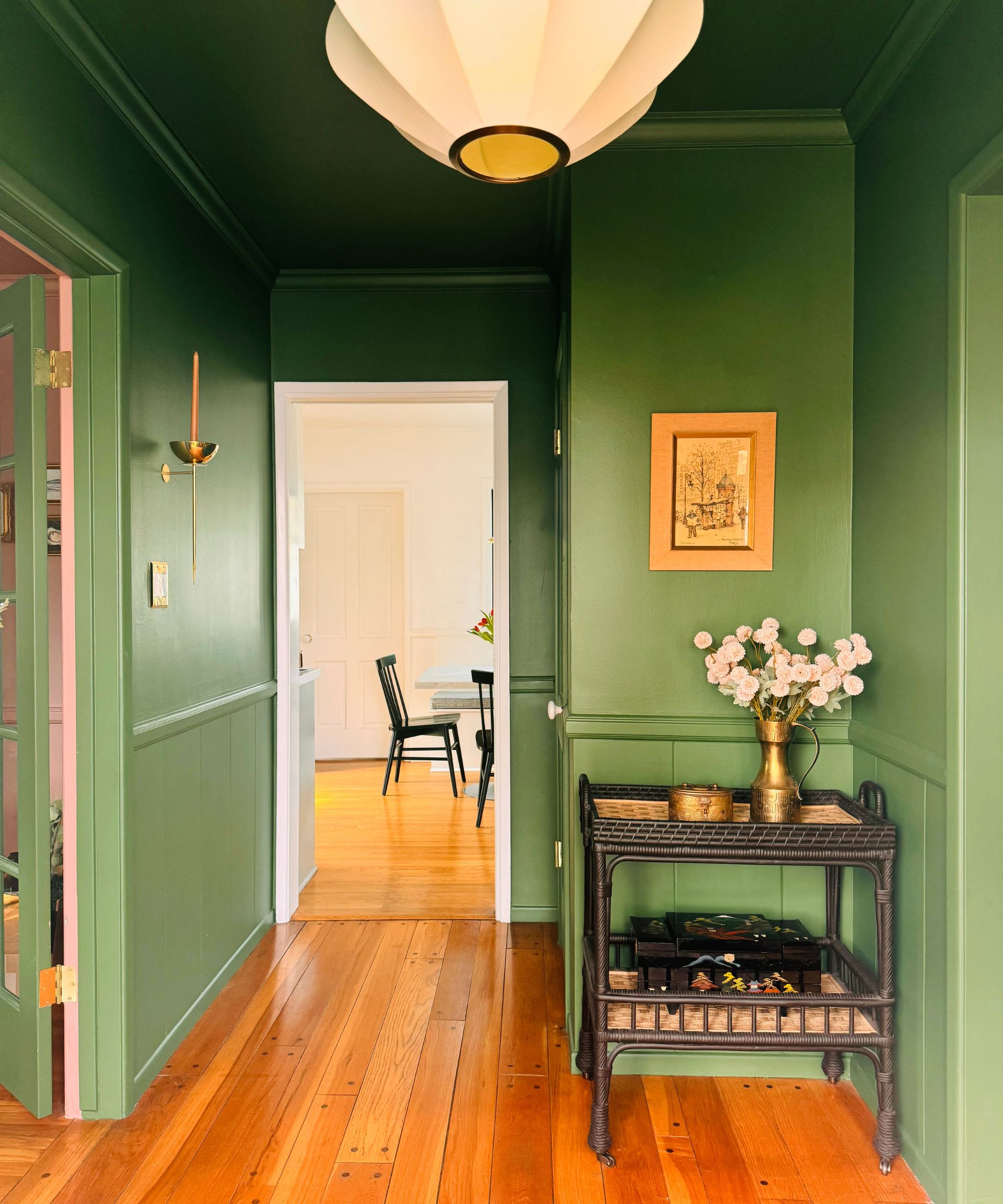
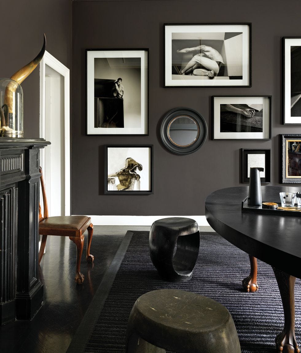
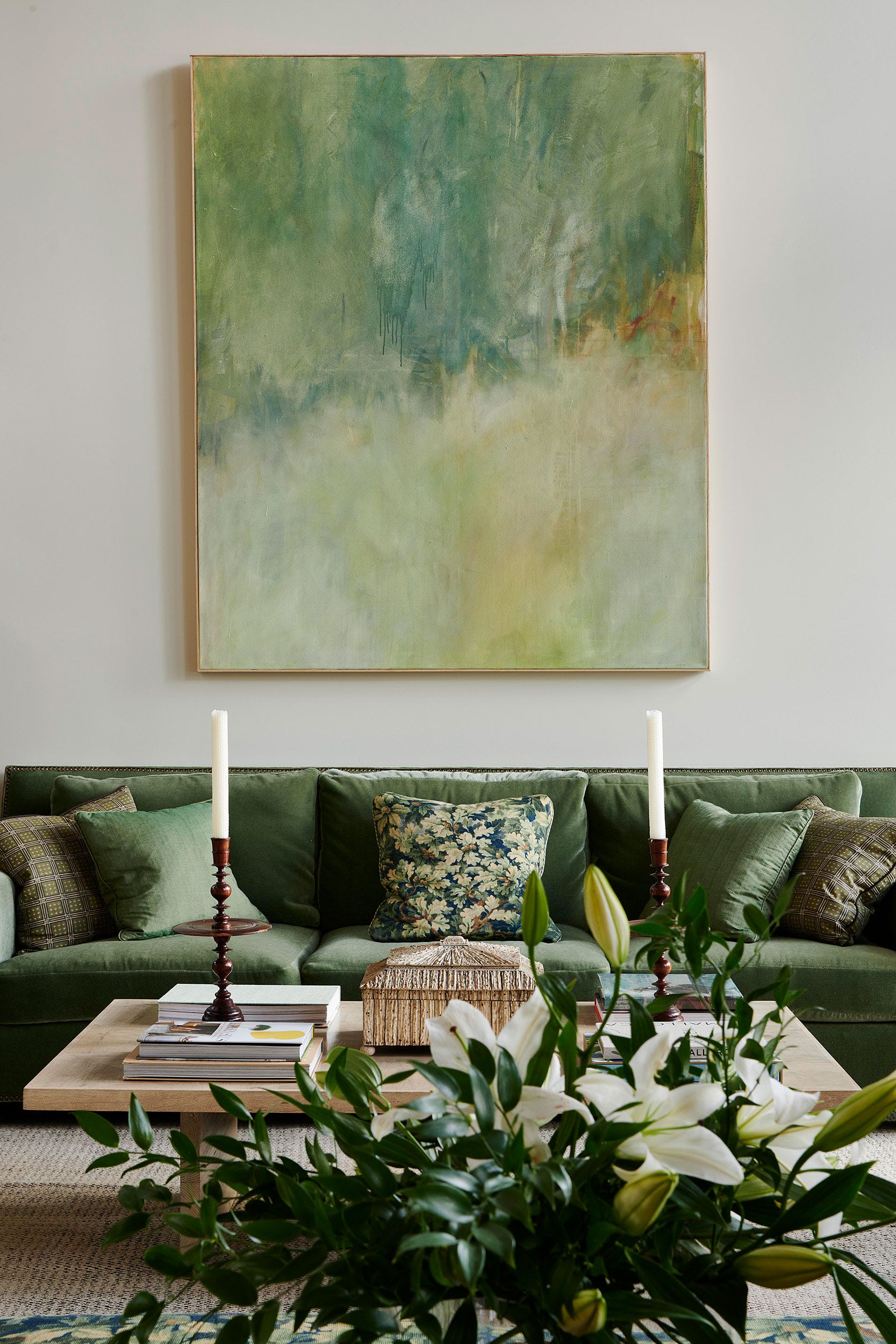
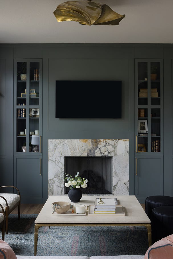
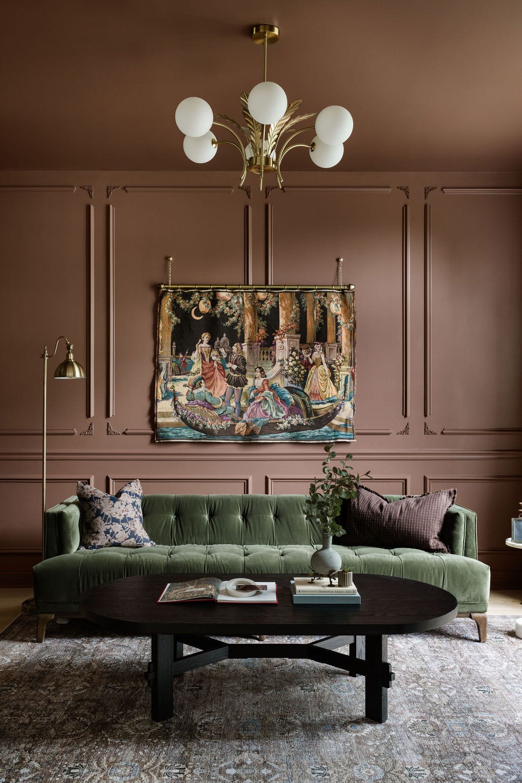
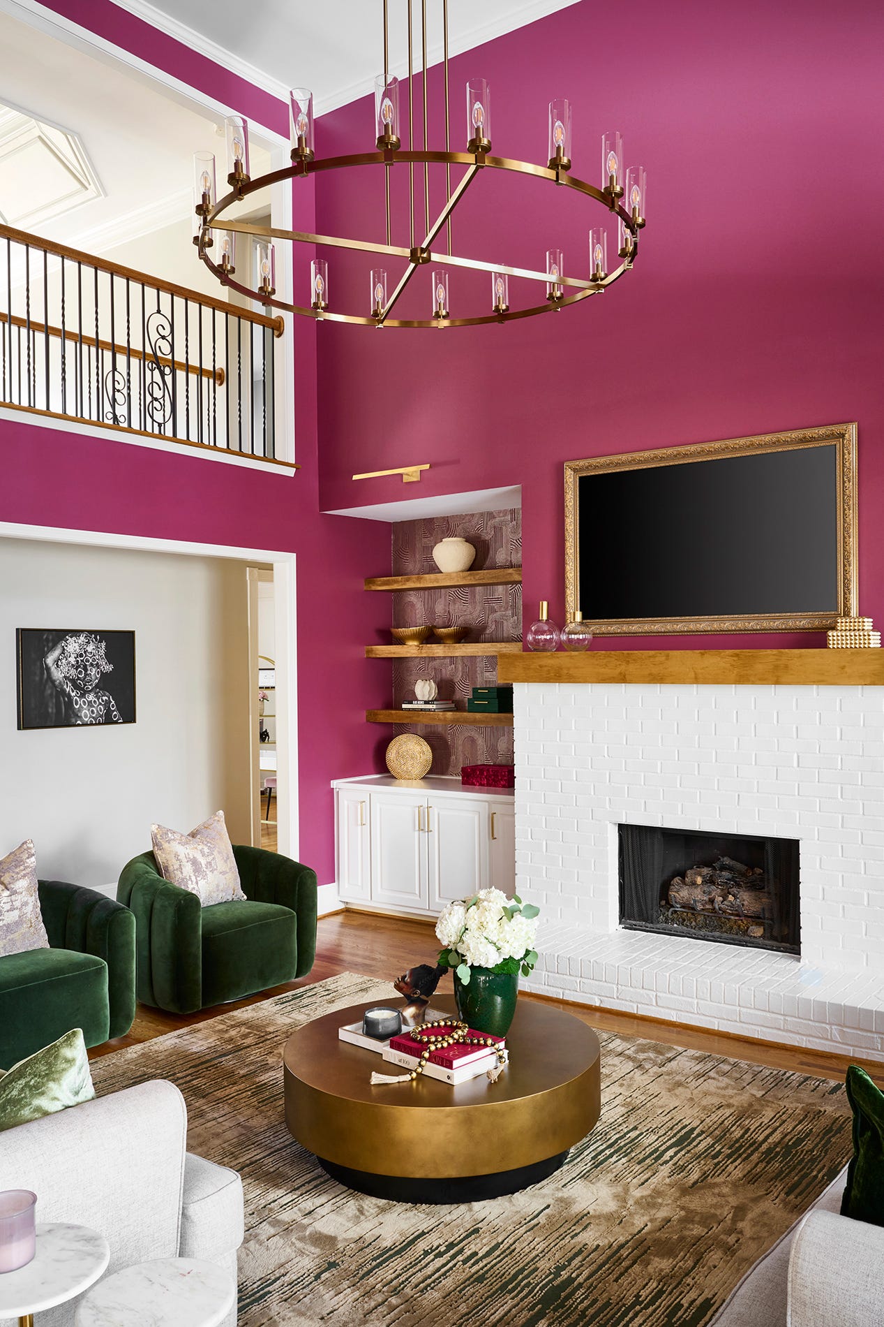
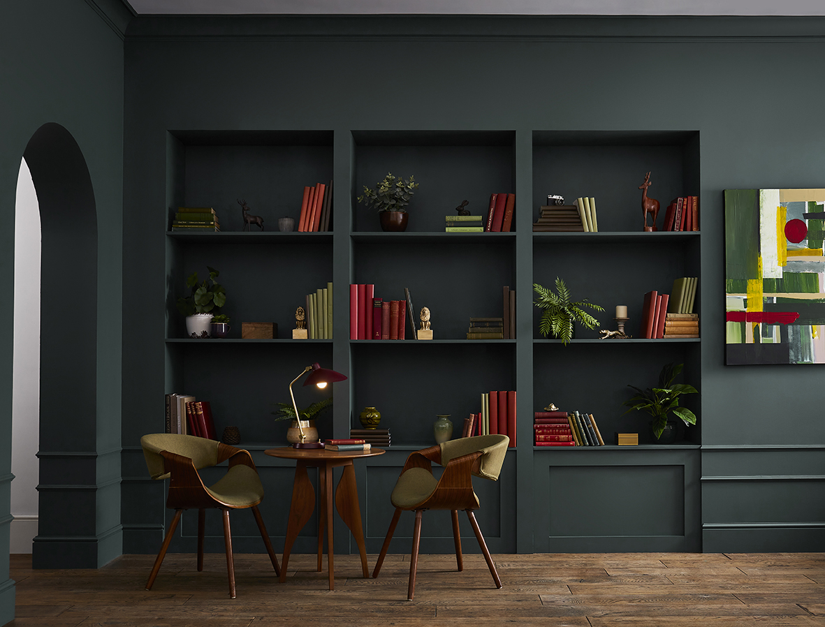
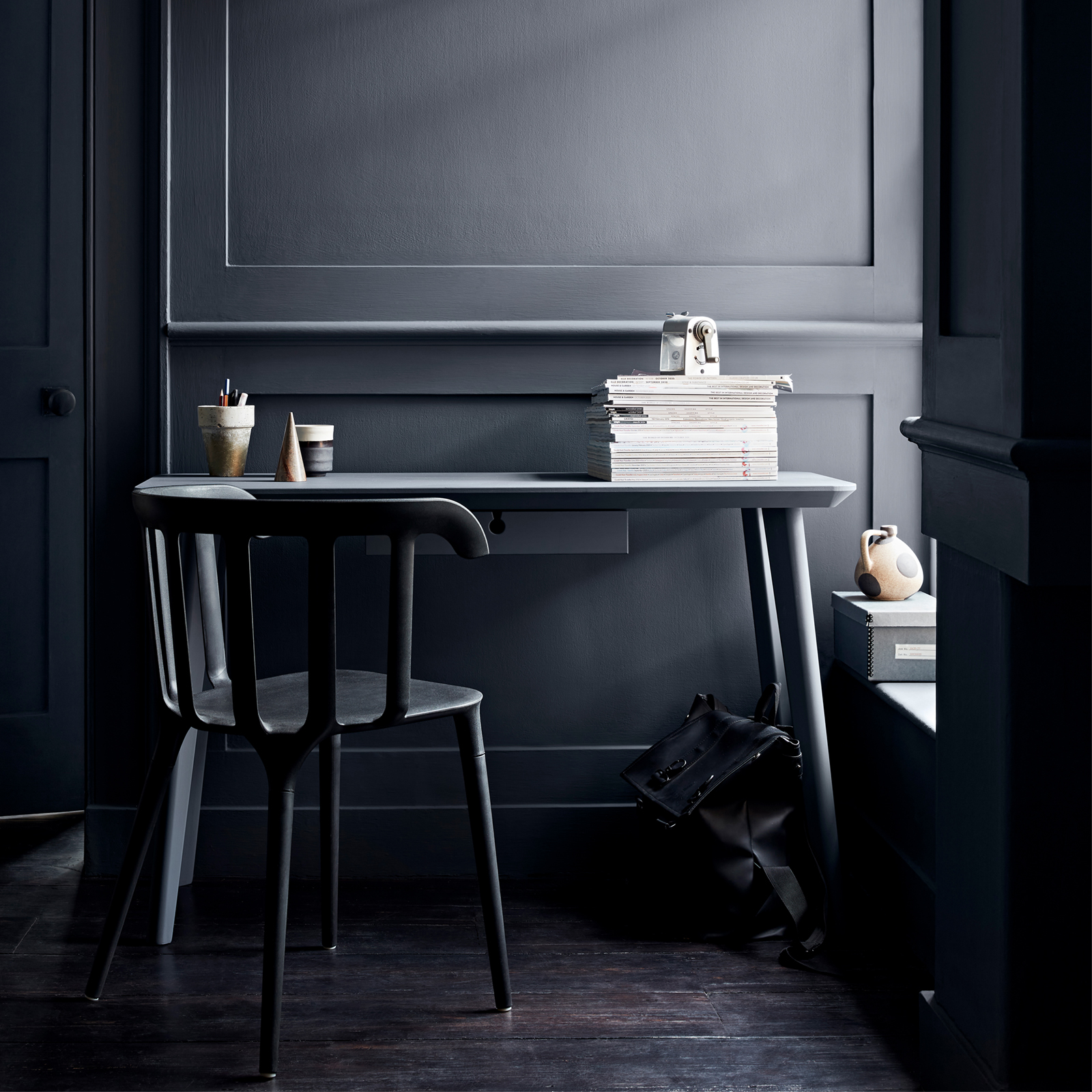
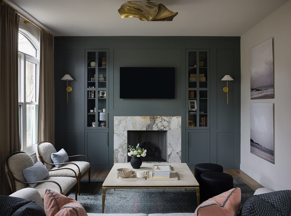
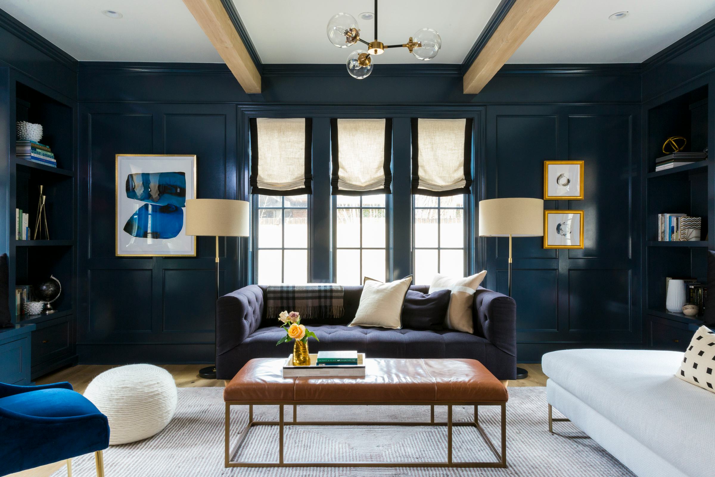
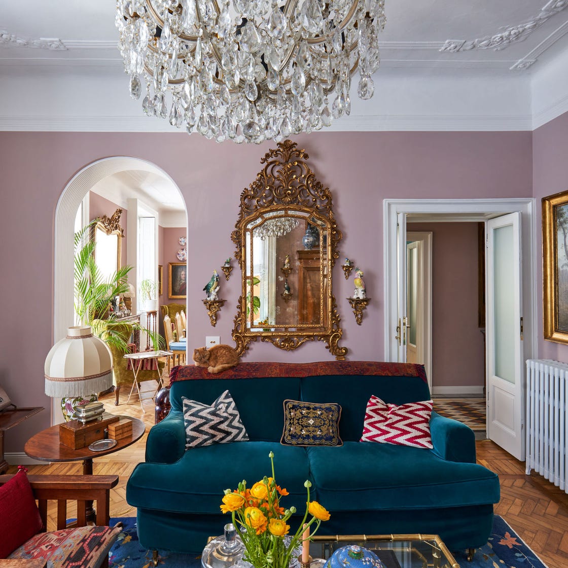
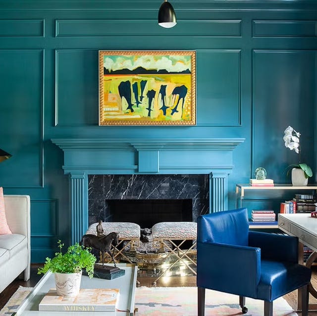
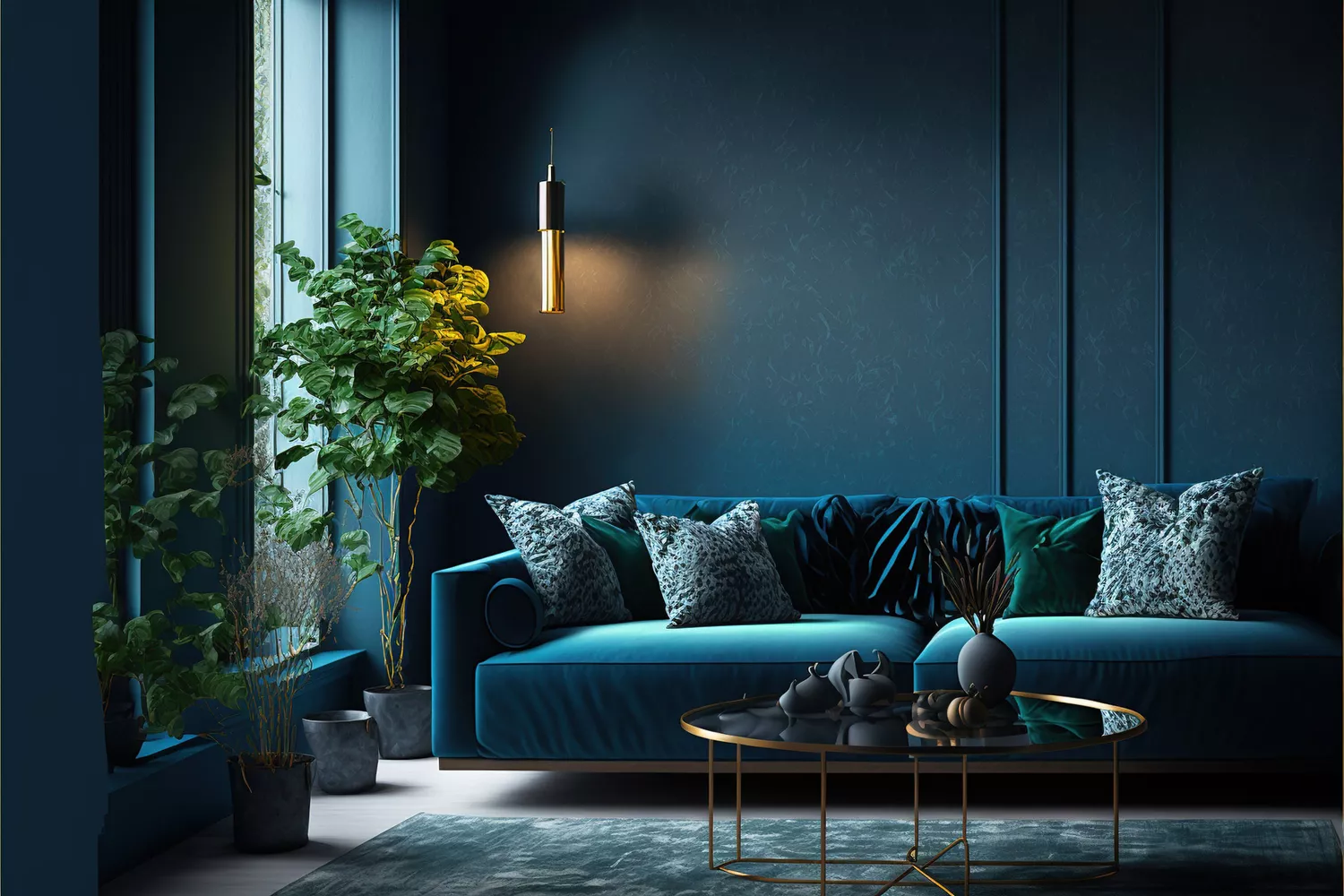
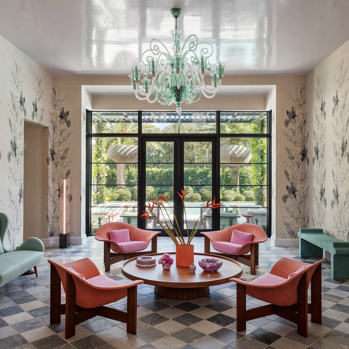
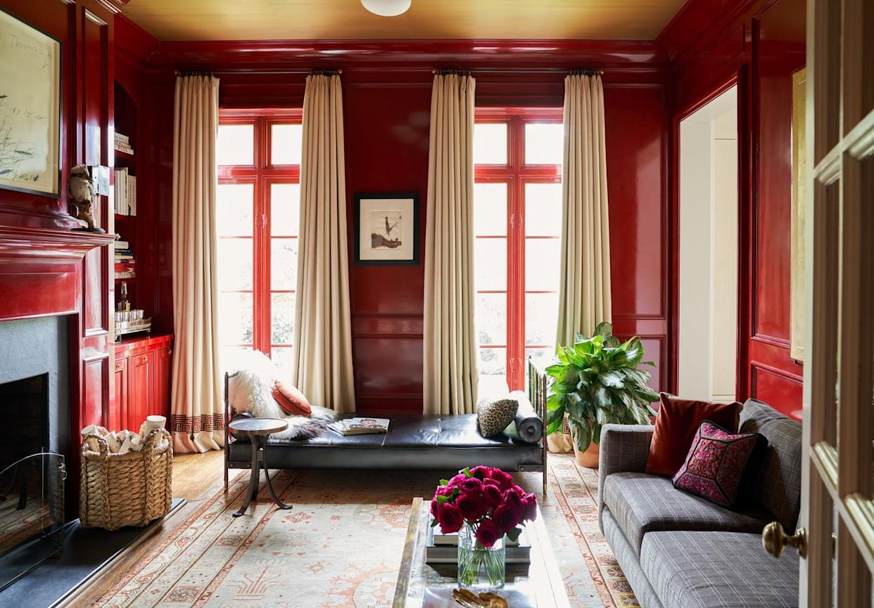
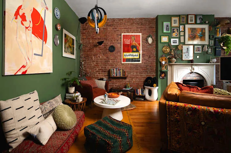
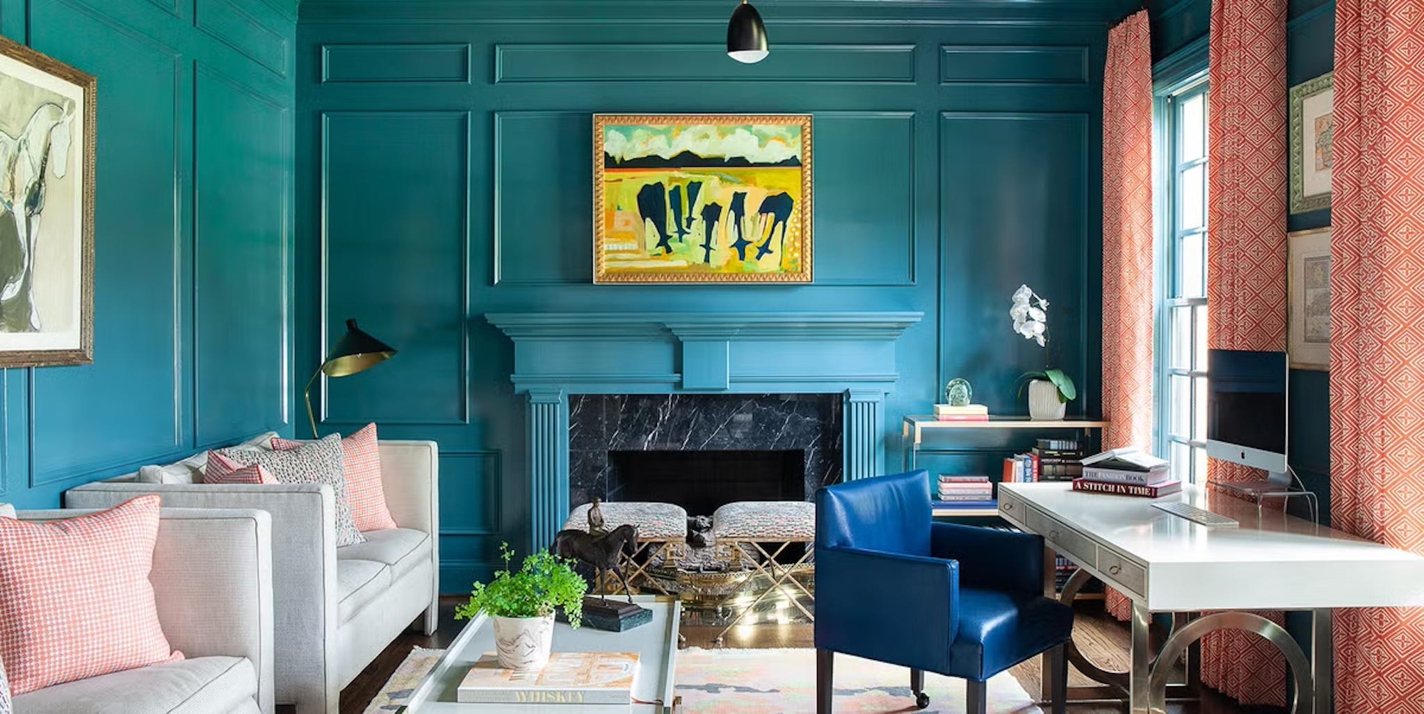
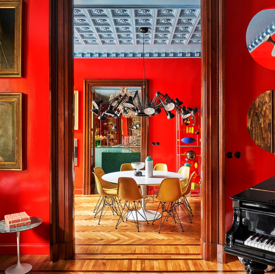
Expert advice from interior designers emphasizes key considerations when embarking on an accent wall project. Nicole Gibbons, founder of Clare, suggests embracing bold colors to create a striking impact, recommending shades like Clare's Current Mood (a mysterious, moody green), Goodnight Moon (midnight blue), and Deep Dive (dark teal). Shelby Girard, head of design at Havenly, concurs, advocating for rich hues such as deep green, muted pink, and black. These tones introduce contrast, serving as an excellent backdrop for artwork, light-colored furniture, sconces, or mirrors, and can even stand alone as a form of art.
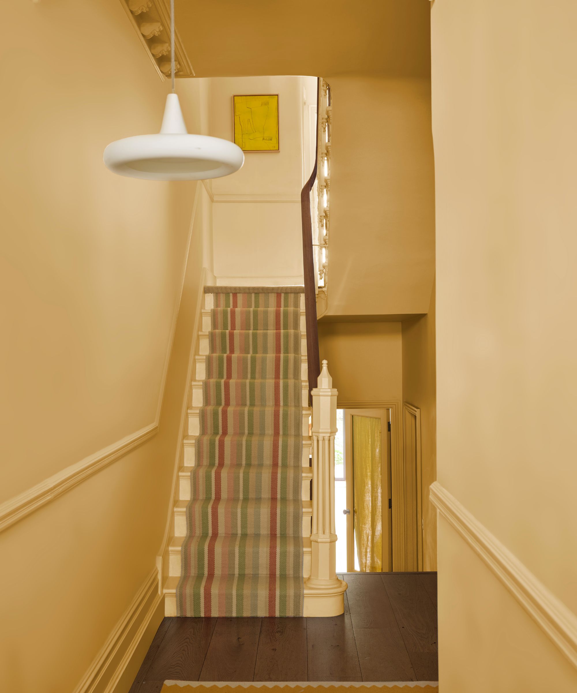
For those who find selecting an accent color challenging, an alternative strategy involves first choosing the color for the other three walls. This could involve warm creams or cool grays with subtle blue or green undertones. Once these foundational colors are established, an accent color can be chosen to complement them. Gibbons notes that employing contrasting shades of the same hue, such as pairing a dark teal like Deep Dive with a pale, airy blue like Headspace, can create a sophisticated, monochrome look.
Beyond a single accent color, other techniques can add depth, especially in smaller spaces. Girard suggests considering two-toned walls, such as painting the bottom two-thirds of a wall black while leaving the top section white, or painting over a wall with molding in a uniform color. However, moderation is key; it is generally recommended to accent only one wall per room to maintain balance and avoid overwhelming the space.
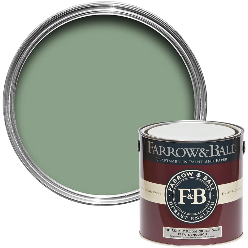
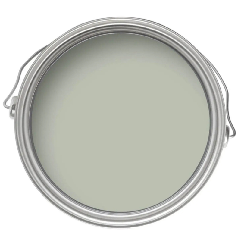
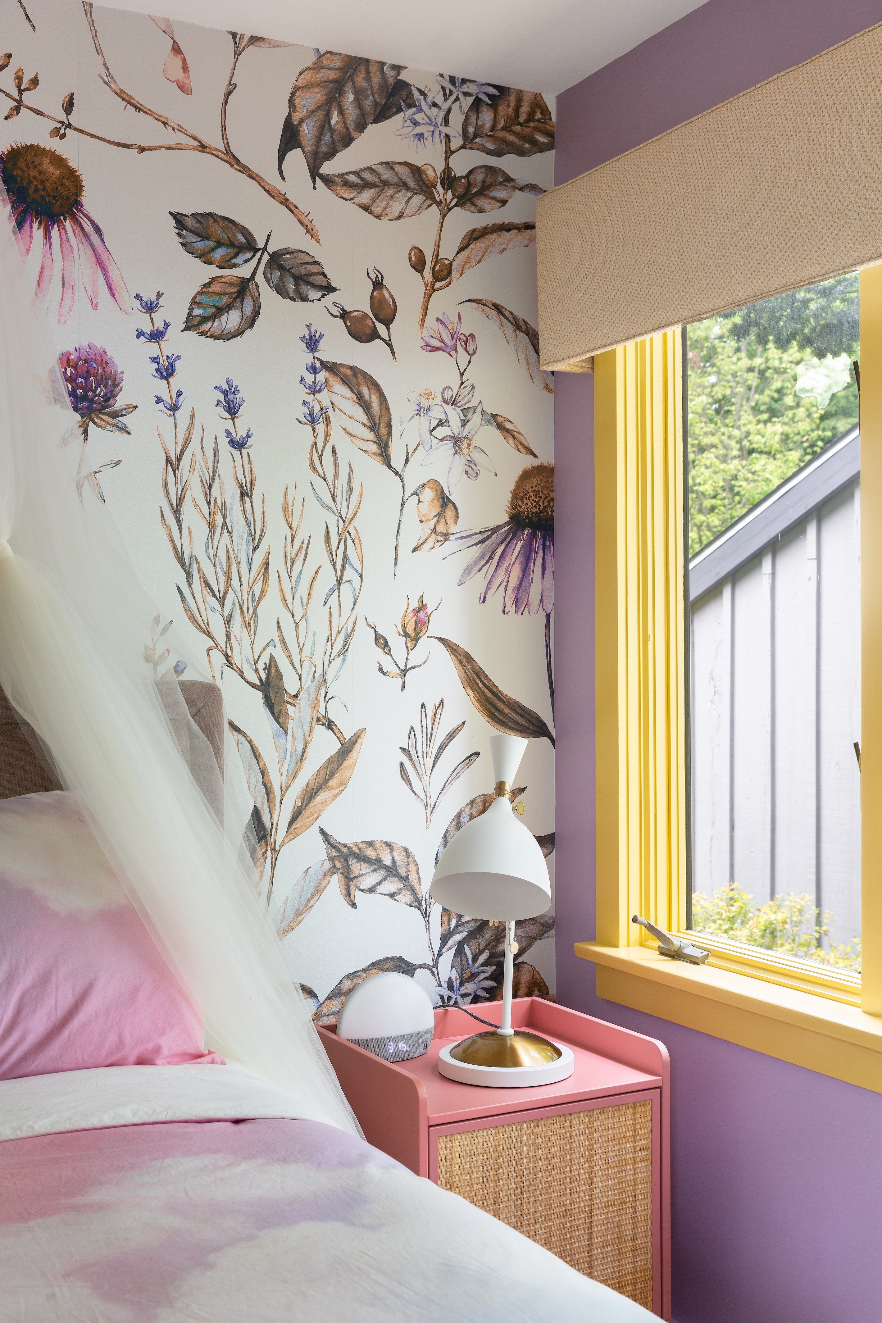
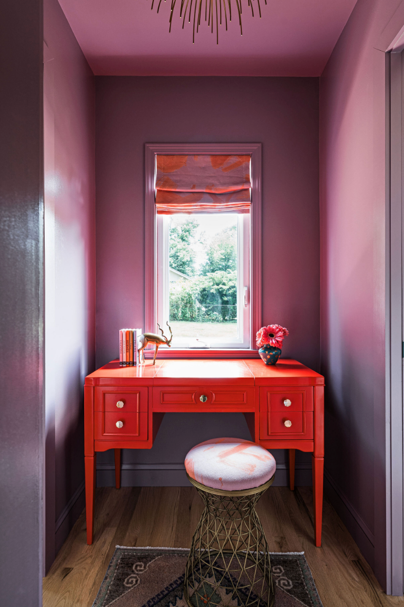
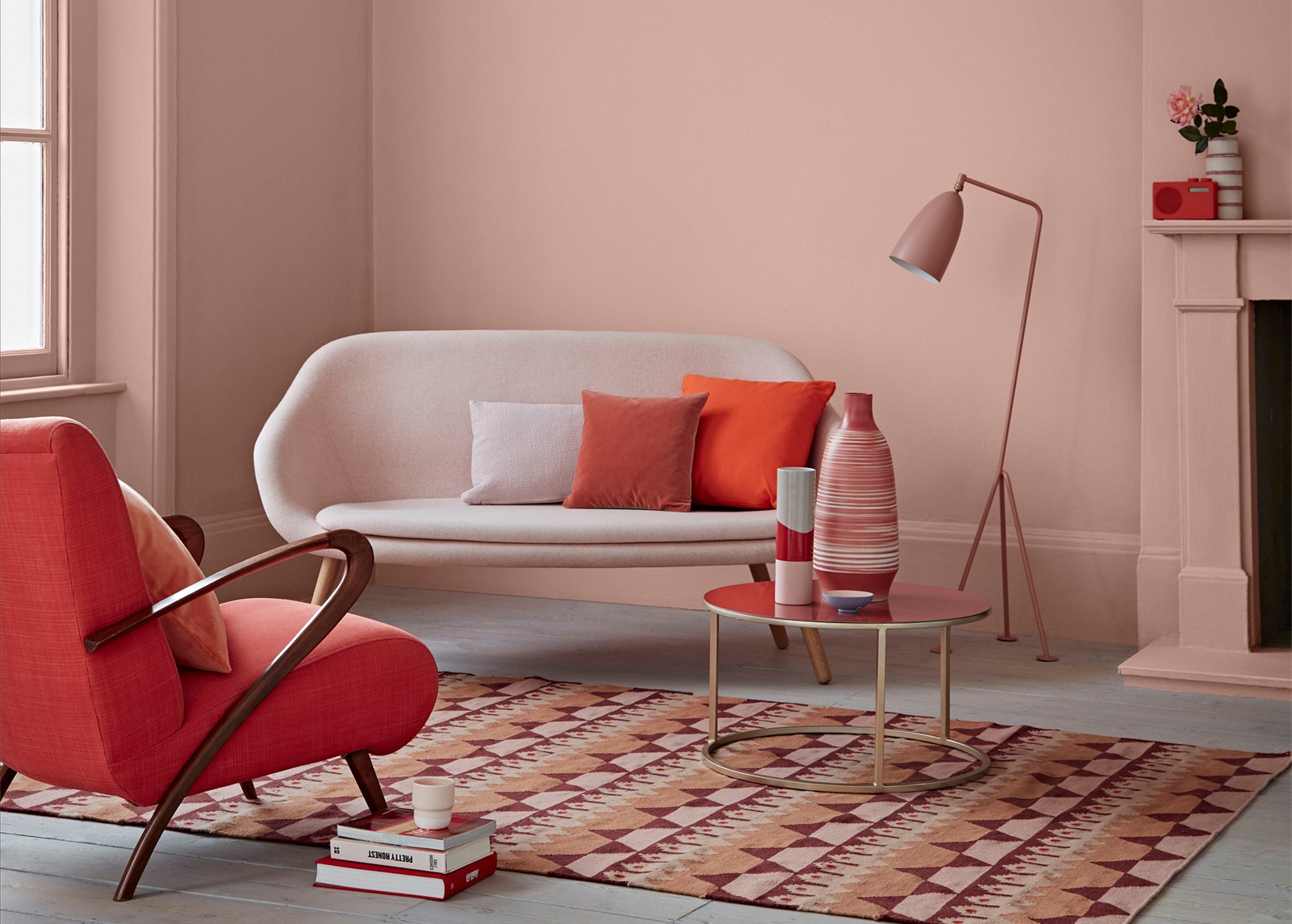
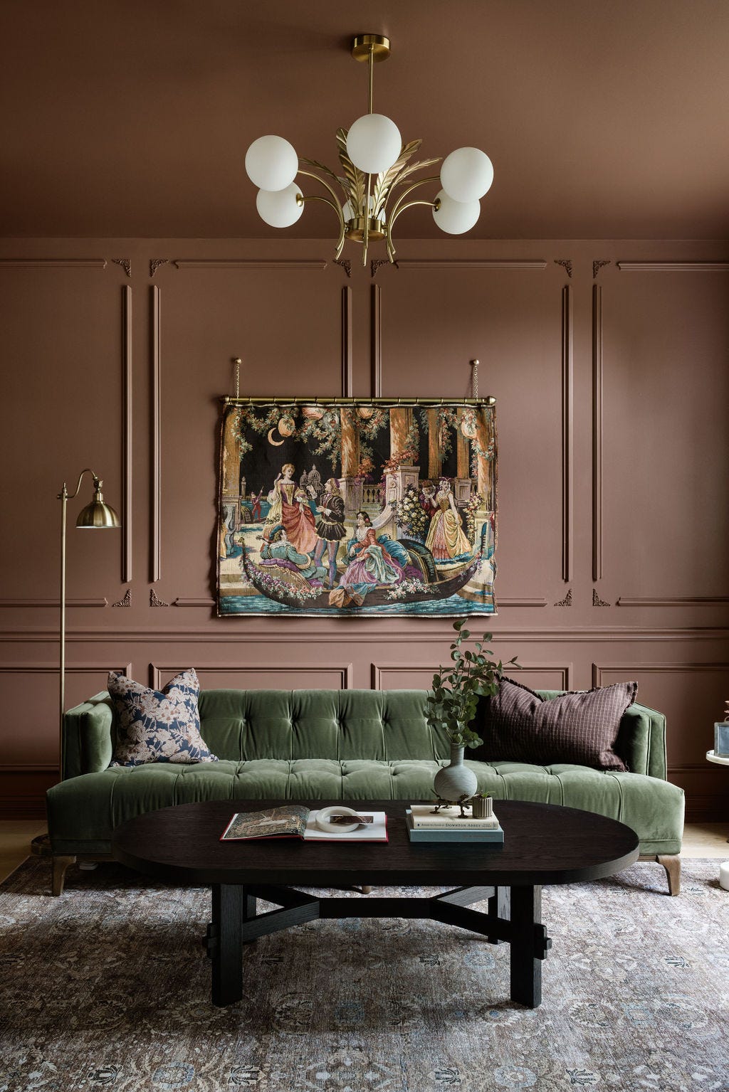
Specific color recommendations from Girard include bold or muted navy, ideal for making a statement and highlighting indoor plants; black, which creates a stark contrast with white walls and makes artwork pop; deep green, capable of conveying either a serious, old-world aesthetic or a trendy, fashionable one, particularly when paired with jewel tones and luxurious fabrics; pale pink, like Farrow & Ball's Calamine, which acts as a cheerful neutral in classic or bohemian settings; and dusty purple, such as Clare Paint's Cosmic Vibes, offering a unique, tranquil, and cozy option for living rooms or nurseries.
Ultimately, the choice of color should reflect personal taste and complement existing furnishings. Trends should be secondary to creating a home environment that genuinely represents the inhabitants. This personalized approach ensures that the chosen colors enhance the living space in a meaningful and enduring way.
#InteriorDesign #AccentWall #LivingRoomDecor #ColorSchemes #HomeStyling #PaintColors #DesignTips #HomeRenovation #InteriorDesign #AccentWall #LivingRoomDecor #ColorSchemes #HomeStyling #PaintColors #DesignTips #HomeRenovation
0 comment in total
You may also like
These Living Room Paint Colors Are a Total Mindset Shift
This Paint Brand Will Transform Your Room In A Day

Listen Up: These Are the Best Paint Colors for Your Living Room

This Color Trend Is Taking Over Homes—And It Makes Any Space Look Bigger
Experts reveal the best living room paint colours to transform every space

7 colour tricks to transform your mood and living room design

Simple Swaps for an Instant Living Room Refresh

Creative, Captivating Use of Color Helps This Home Redesign Shine


If you color drench any room make it this one

Why This Hue Is Suddenly Dominating Every Designer's Wishlist—Plus, How to Style It


Designers Say These Unusual Paint Color Combos Will Transform Your Home
Interior Designers Say the Key to Creating a Joyful Space Is to Add in This One Color


This One Color Instantly Boosts Joy in Any Room, According to Interior Designers
This Living Room Makeover Has the Dreamiest Green Paint Color


The 60 Most Popular Living Room Paint Colors Right Now
Design Pros Have Spoken: Here Are the Only Paint Color Trends That Matter in 2022
These Accent Color Ideas Will Transform Any Room
55 Living Room Color Ideas That Will Take Your Space from Drab to Fab
How to transform your rooms with colour drenching

This Is the Color Trend You'll Soon See Everywhere—And It'll Make Your Space Look Much Bigger