1/10
Designers Say These Unusual Paint Color Combos Will Transform Your Home
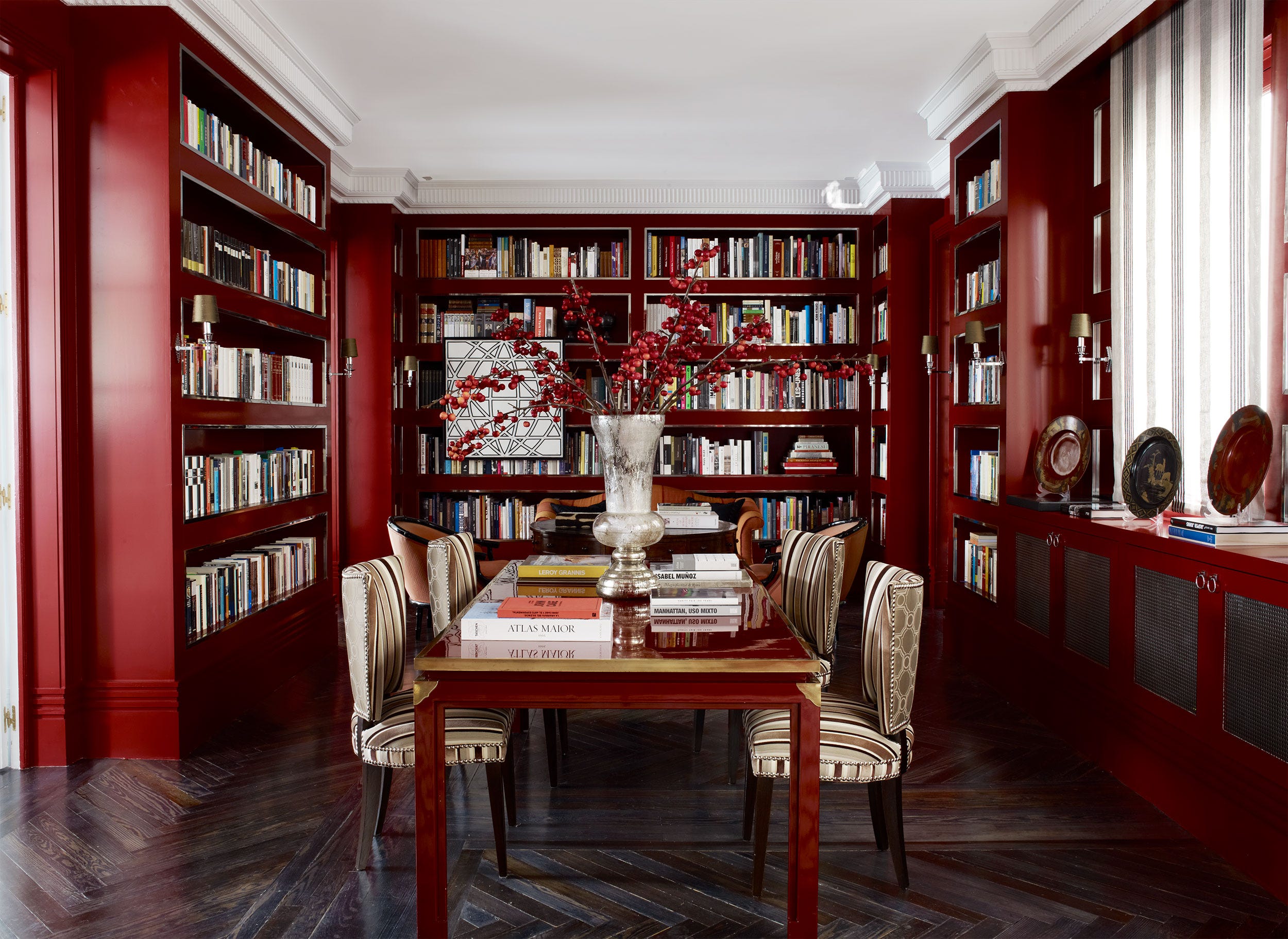
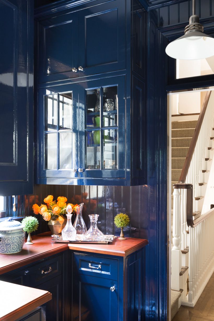
Achieving a distinctive aesthetic in interior design often goes beyond traditional color choices. While neutral palettes offer a sense of safety, embracing unusual paint color combinations can truly elevate a space. Interior designers Ashley DeLapp and Diane Rath advocate for bolder choices, suggesting that unexpected pairings create compelling visual interest. Their philosophy emphasizes how contrasts—warm clashing with cool, bold meeting muted—can surprisingly coalesce into harmonious designs, making a room feel both unique and balanced. These innovative color strategies are particularly effective for transforming a space without undertaking a full home renovation, as they can be applied to walls, ceilings, moldings, or even cabinets to refresh a room's atmosphere.
One such compelling pairing is Lavender and Yellow. Rath notes that these colors, being opposites on the color wheel, inherently generate an energetic feel. Lavender provides a calming influence, while yellow infuses joy, resulting in spaces that are both playful and serene. This combination is ideal for bedrooms or creative spaces where a balance of tranquility and vibrant energy is desired. Another bold recommendation is Lilac and Vermillion. DeLapp describes this as the 'ultimate in visual tension,' where the delicate nature of lilac meets the daring intensity of vermillion. This contrast enhances softness with boldness, creating a palette that commands attention and is suitable for areas like an office where a strong visual statement is sought.
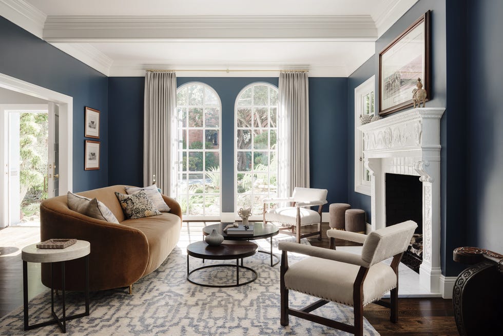
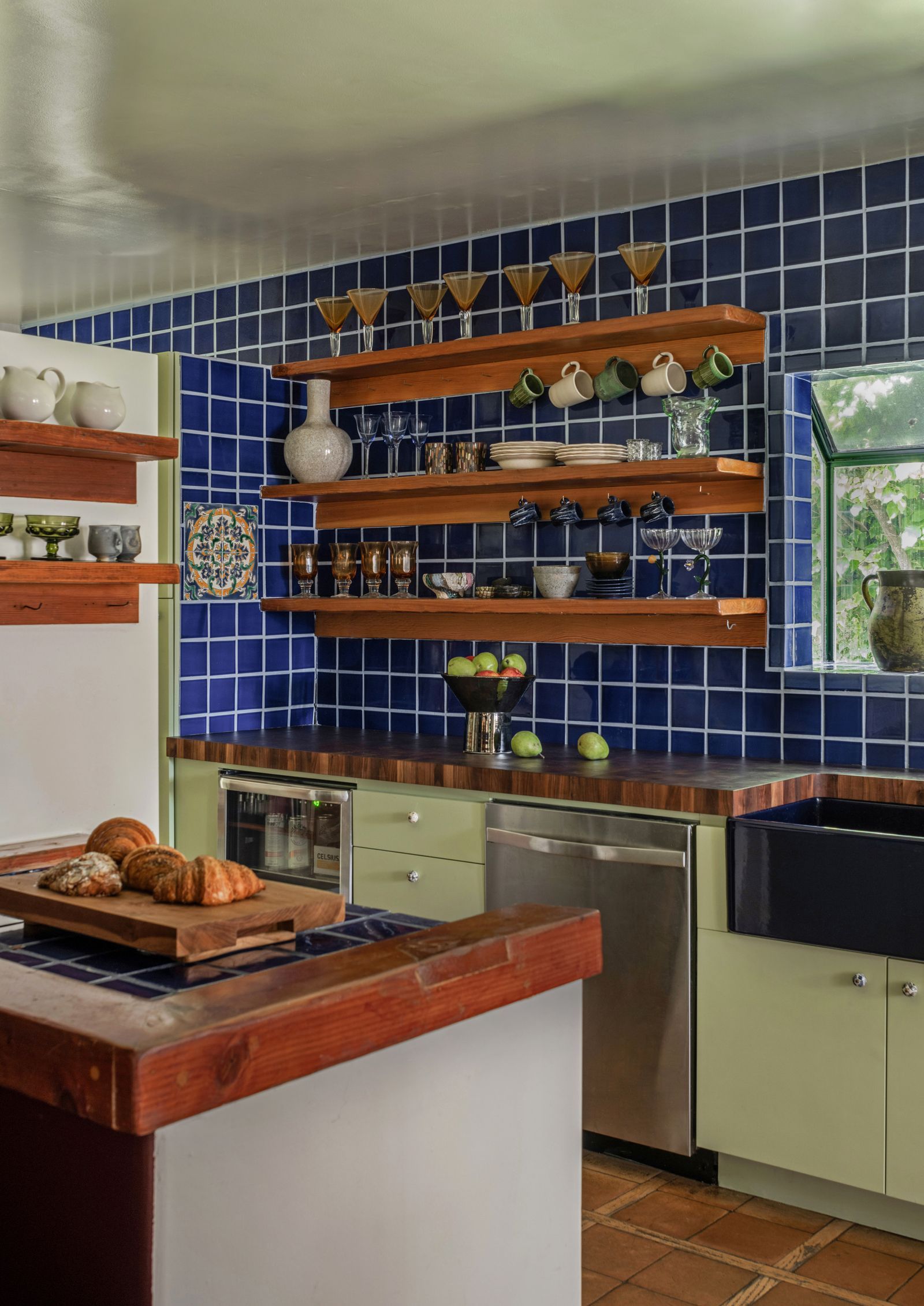
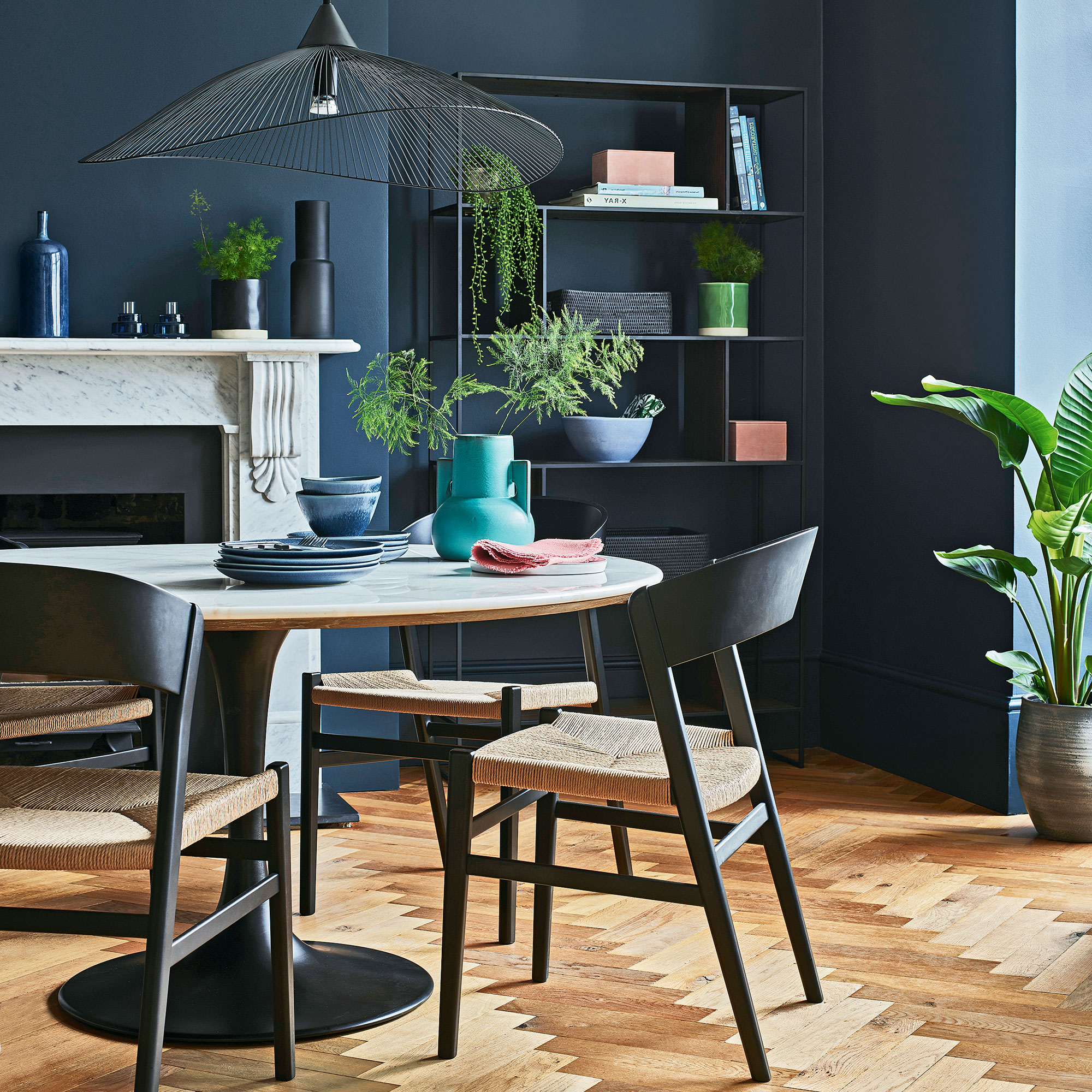
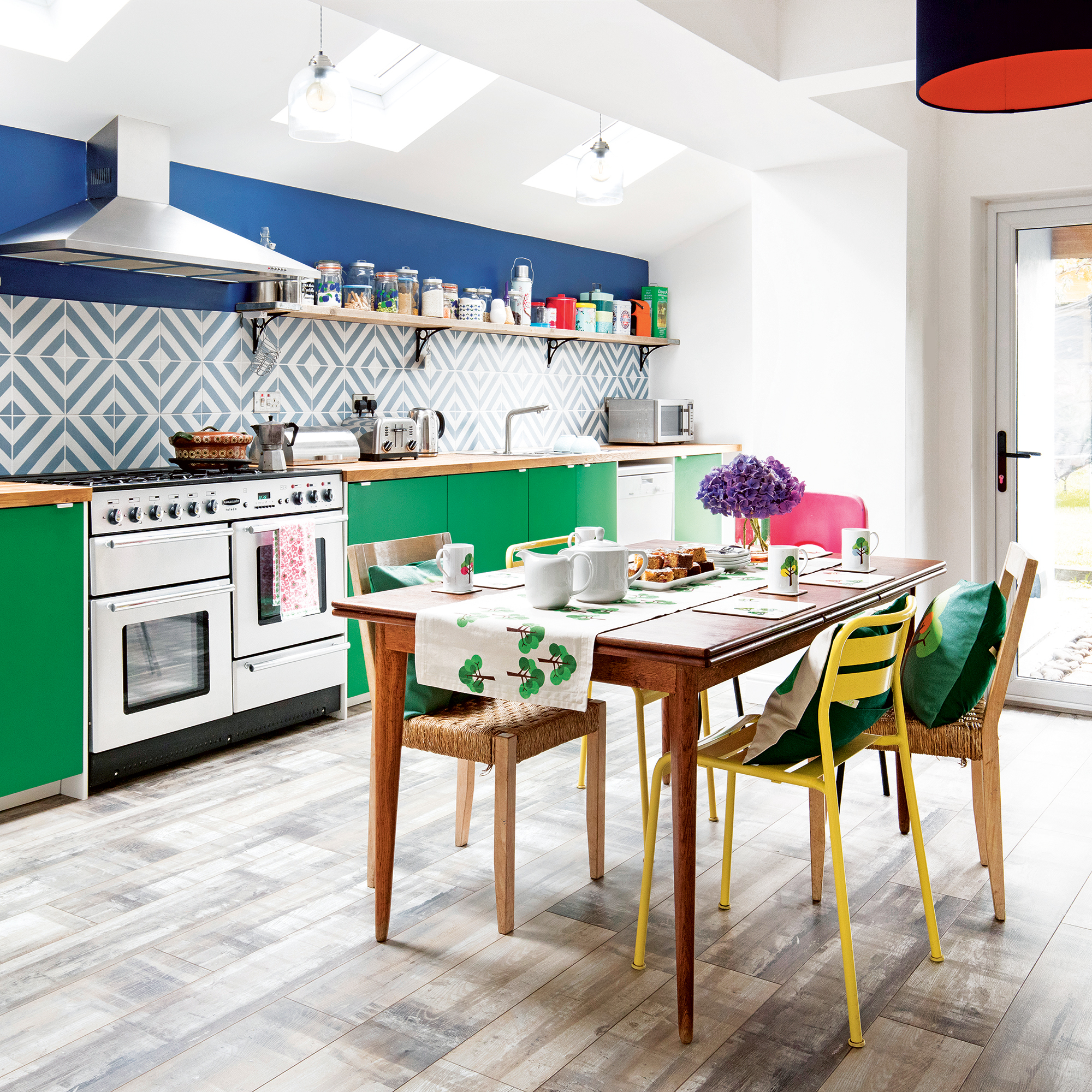
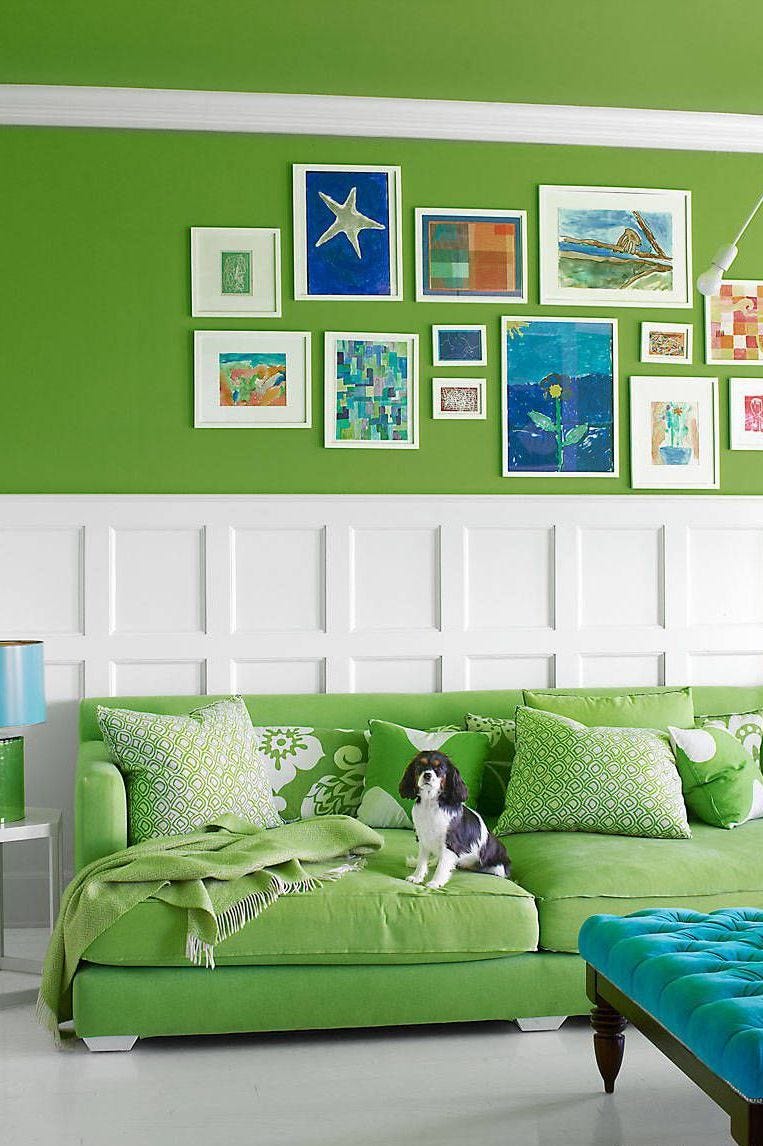
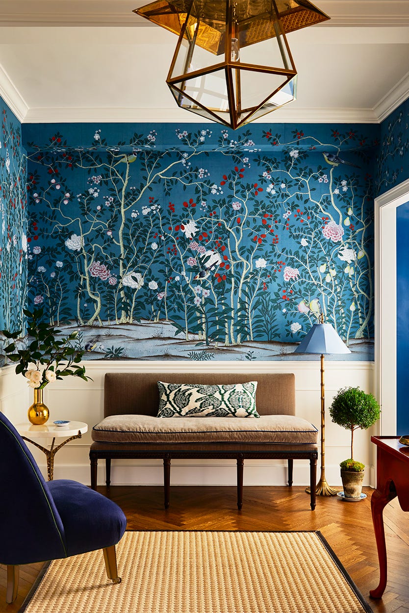
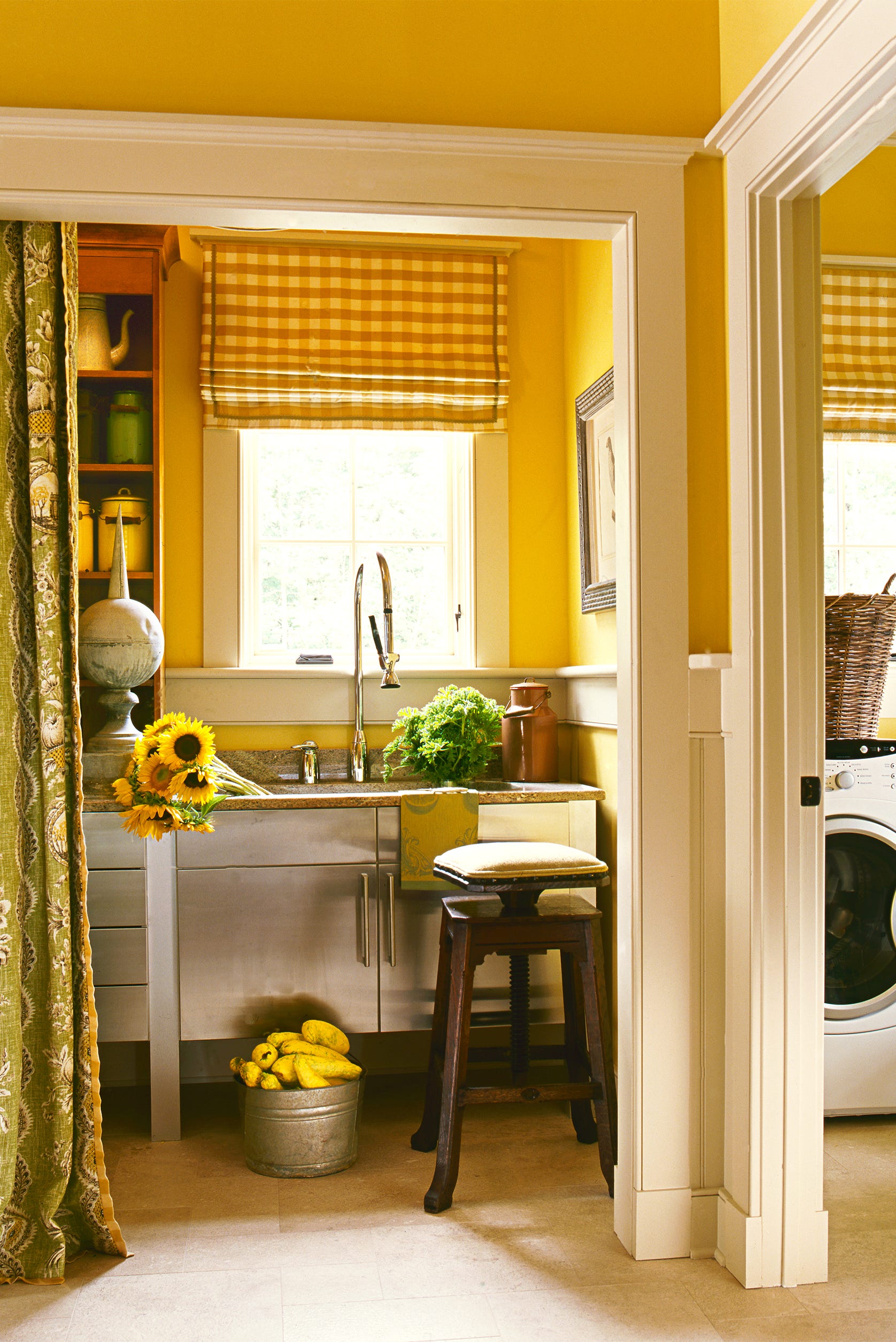
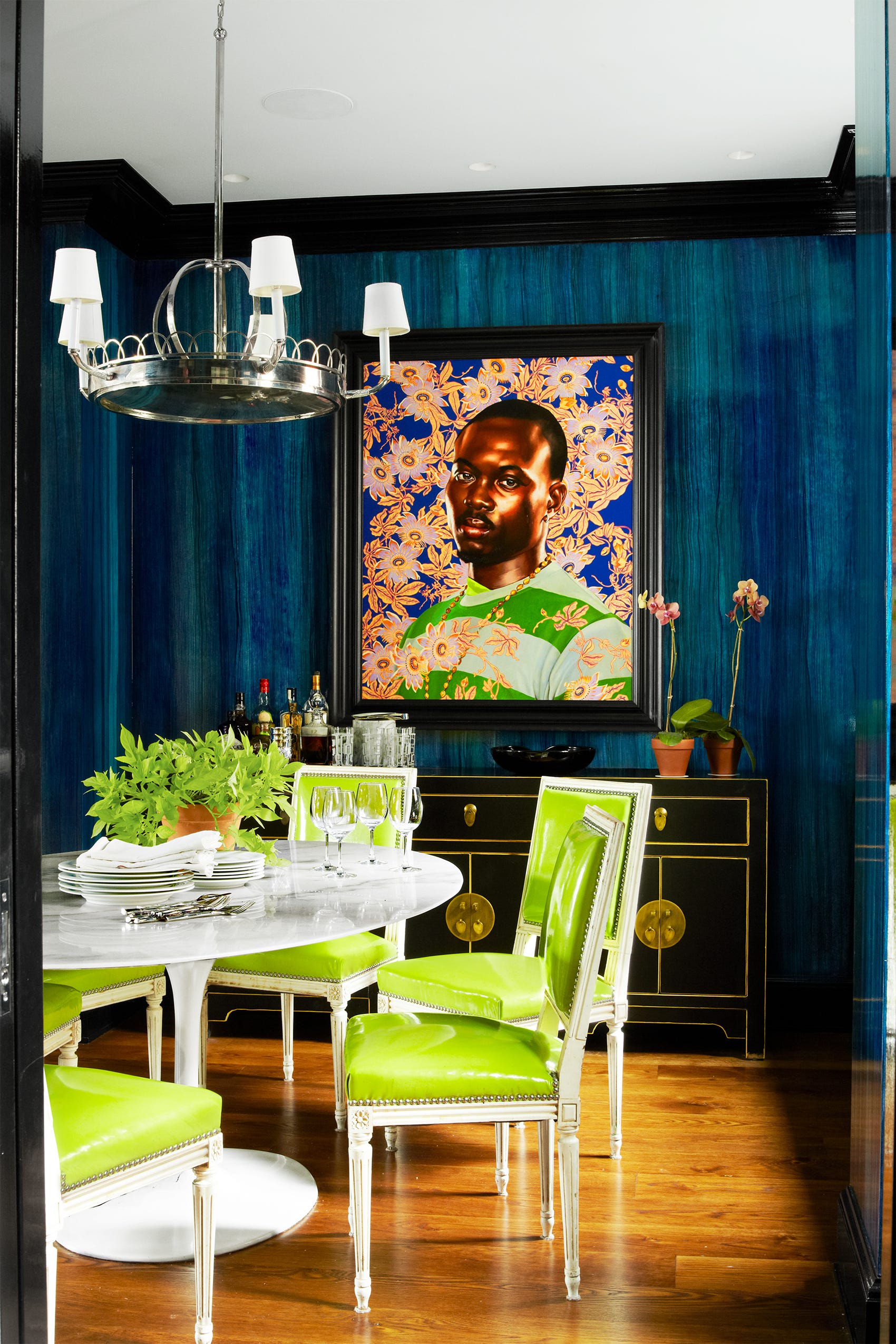
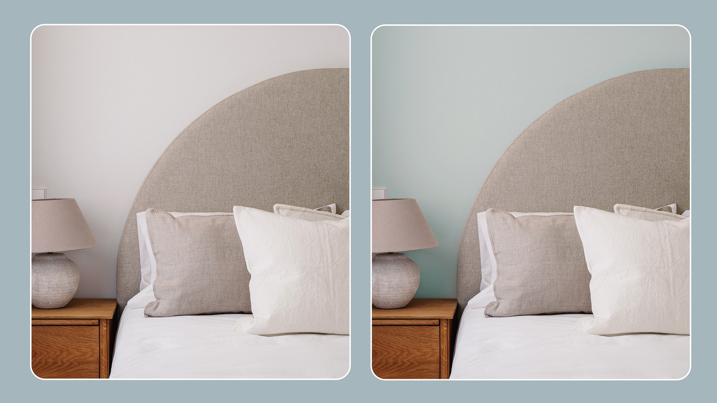
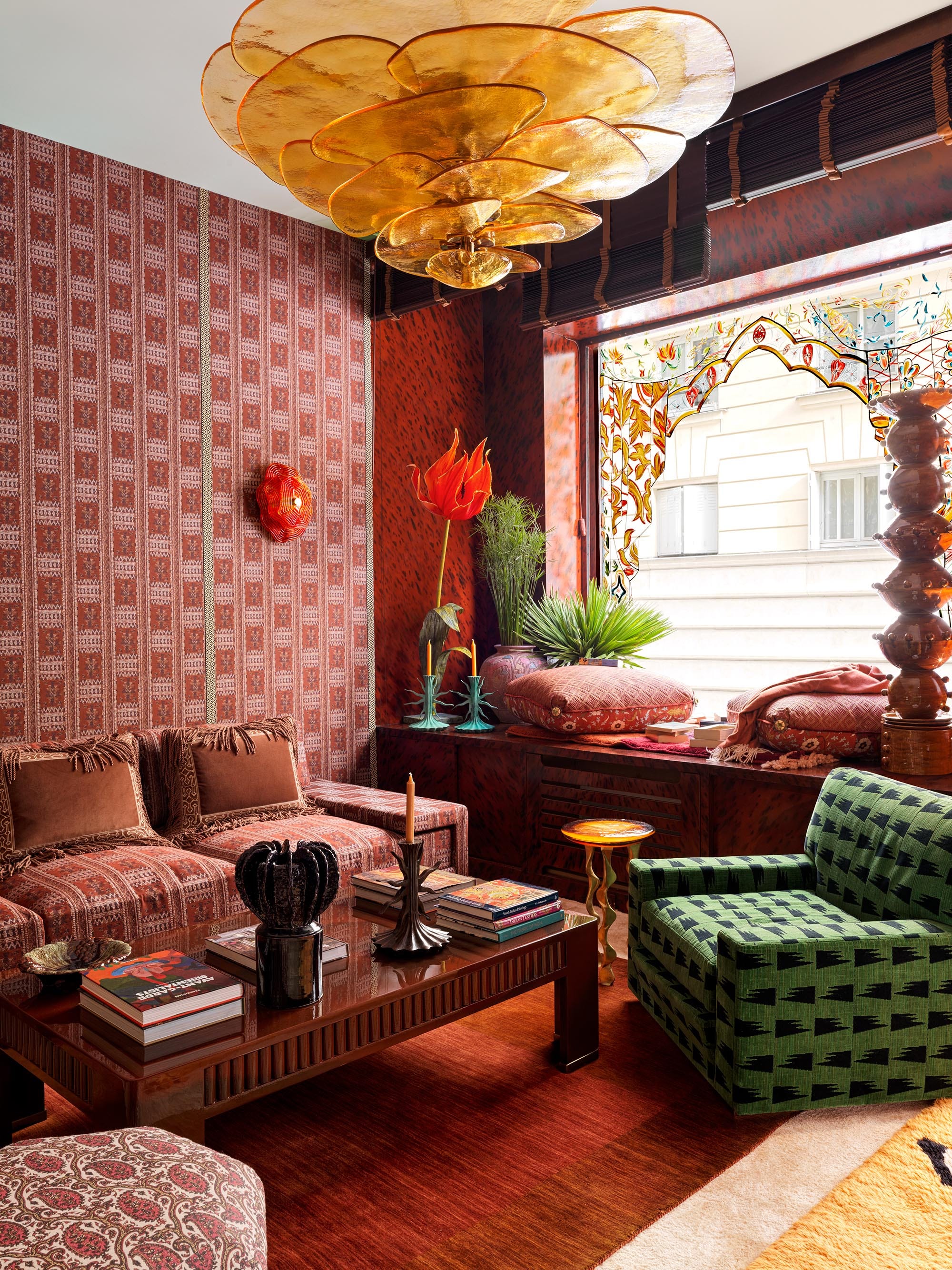
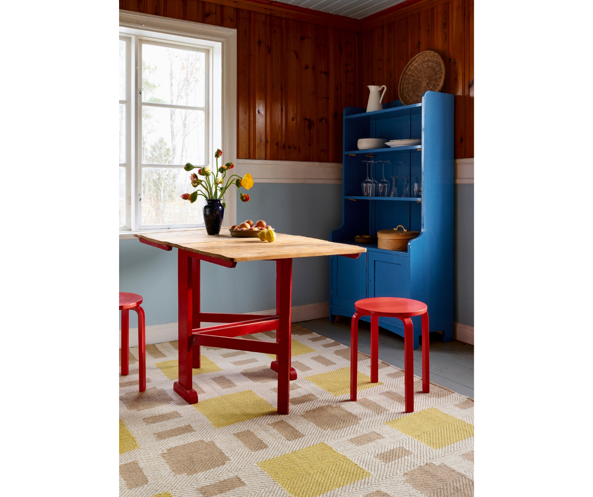
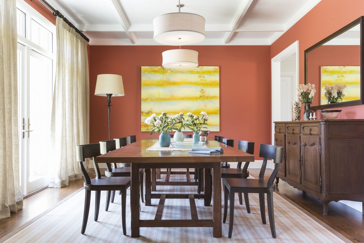
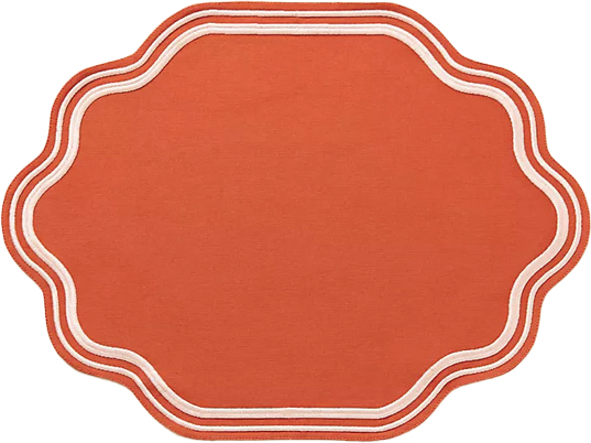
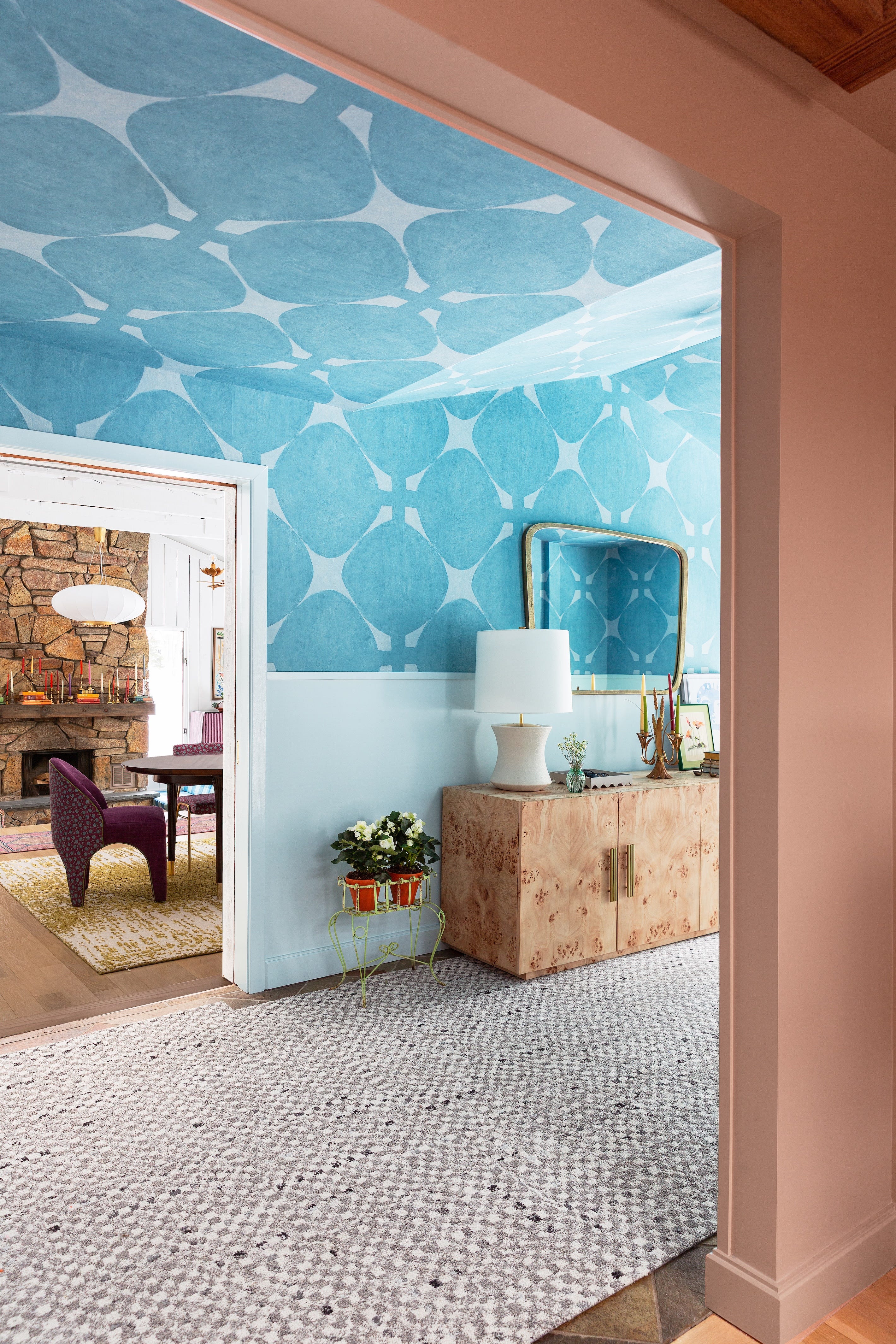
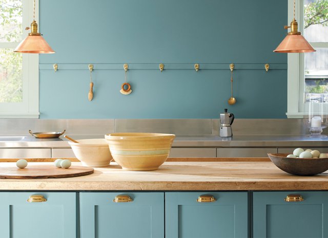
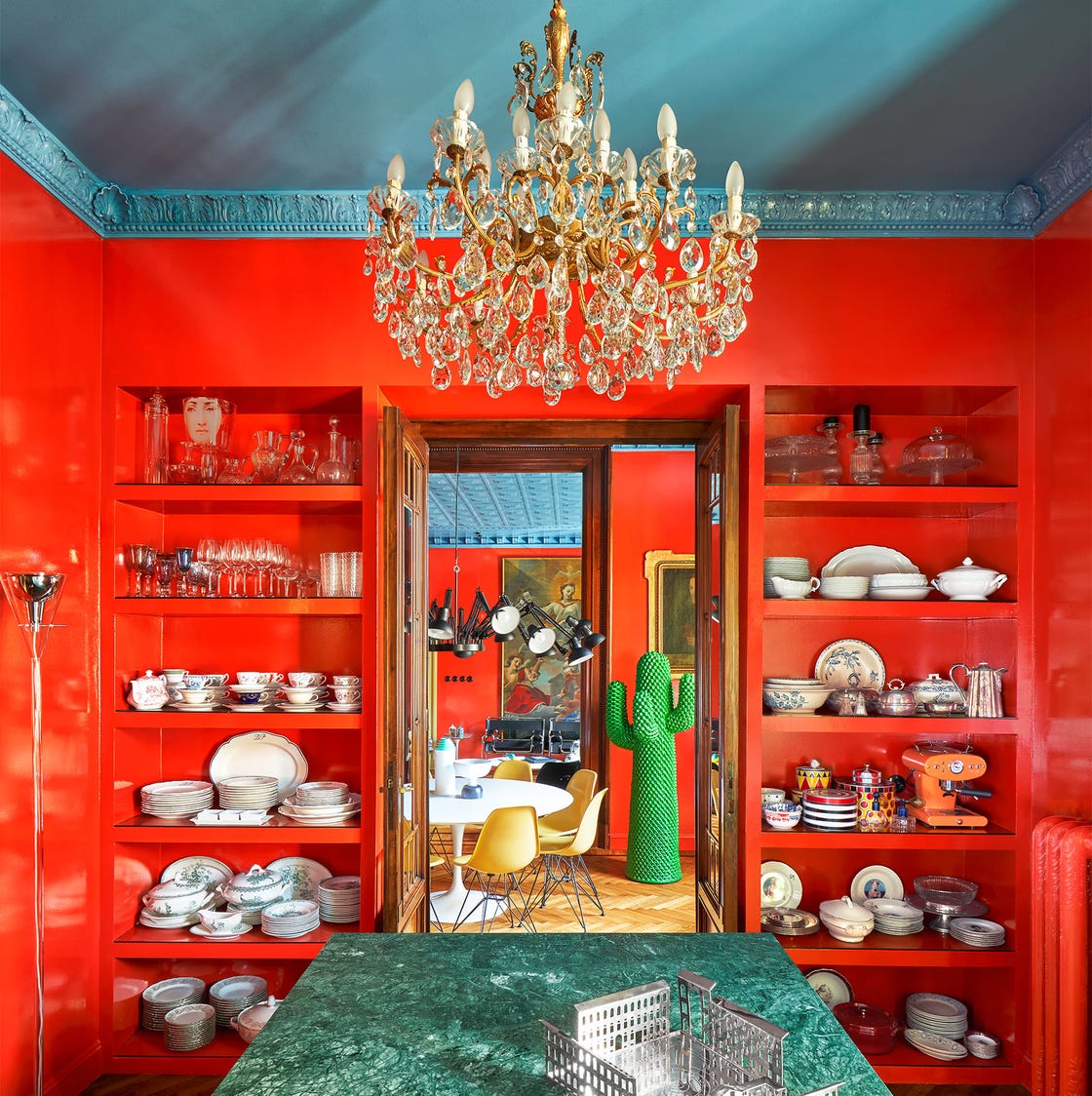
The article further explores the combination of Terracotta and Robin’s Egg Blue. Rath highlights that terracotta, with its earthy roots, and robin’s egg blue, with its crisp and refreshing quality, strike an inviting balance. Their interplay adds charm and visual intrigue, demonstrating how thoughtful opposites can lead to an approachable yet captivating design. For a refined vibrancy, Citron and Mint Green are suggested. DeLapp describes this duo as zesty, fresh, and slightly offbeat, together creating an invigorating and elegantly unexpected palette perfect for dining rooms or other social areas. Blue and Tomato Red might appear to be an unlikely match, but Rath explains that their contrast provides a room with 'pulse' by combining cool and collected tones with fiery and bold ones, enhancing visual interest through color theory.
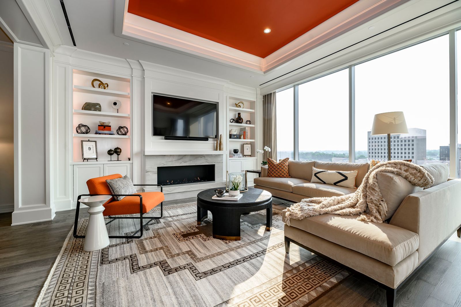
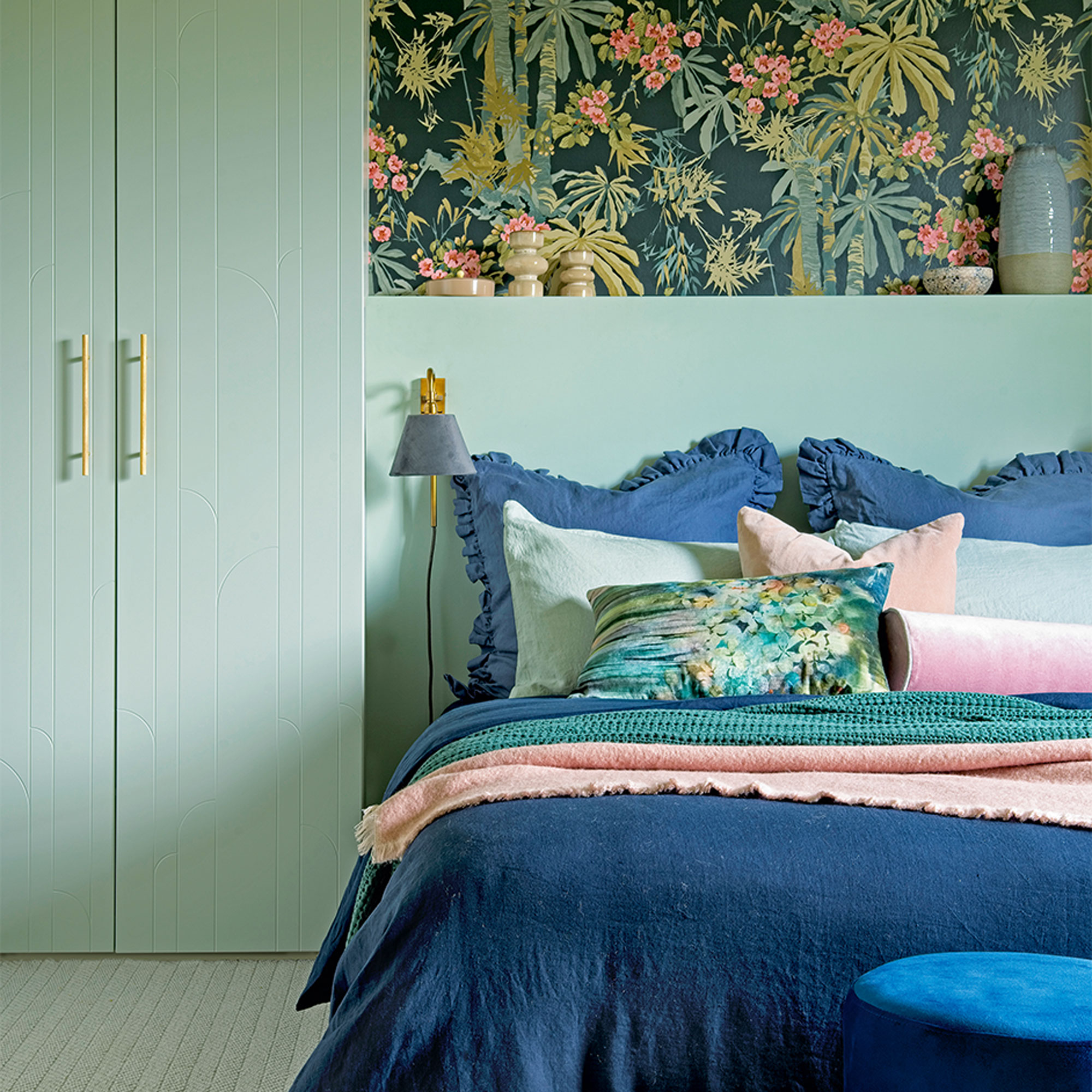
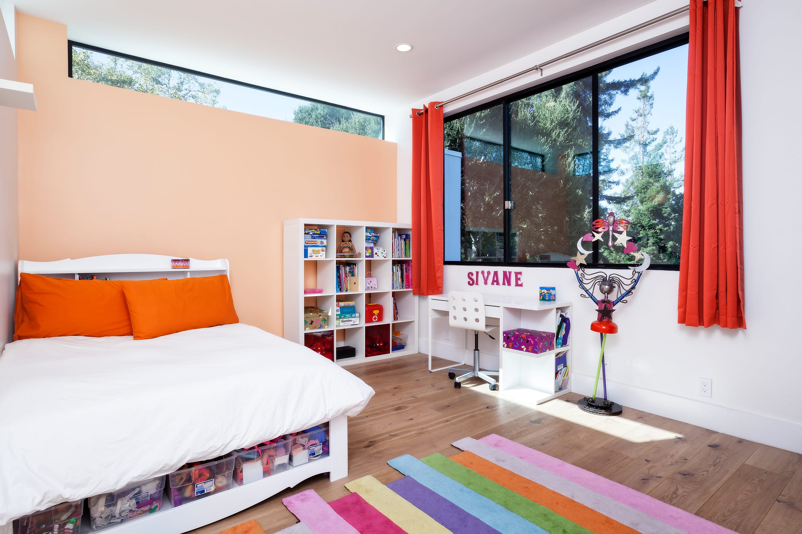
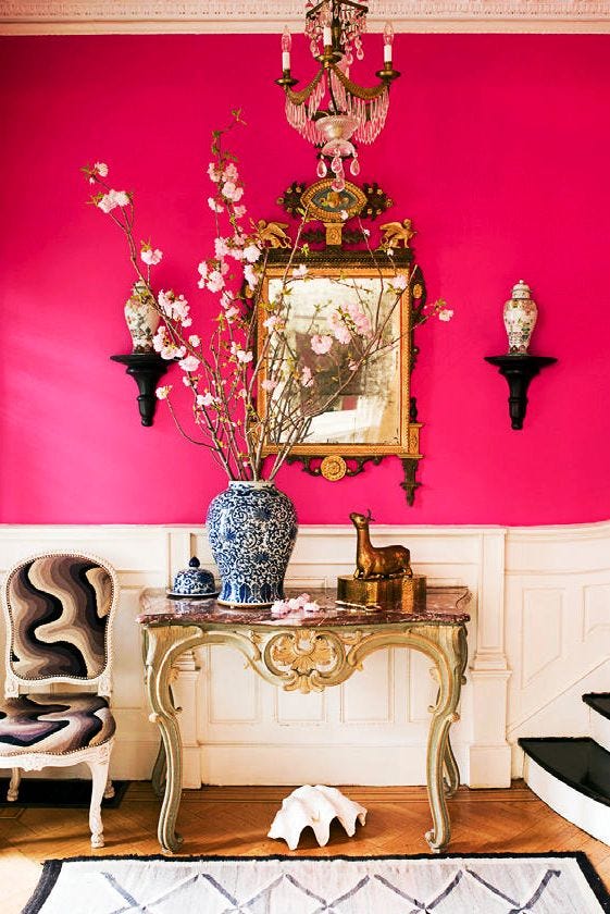
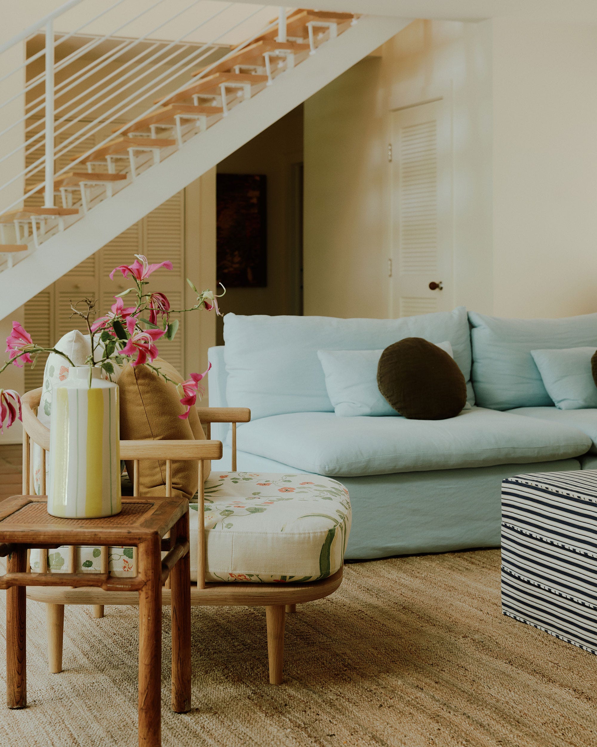
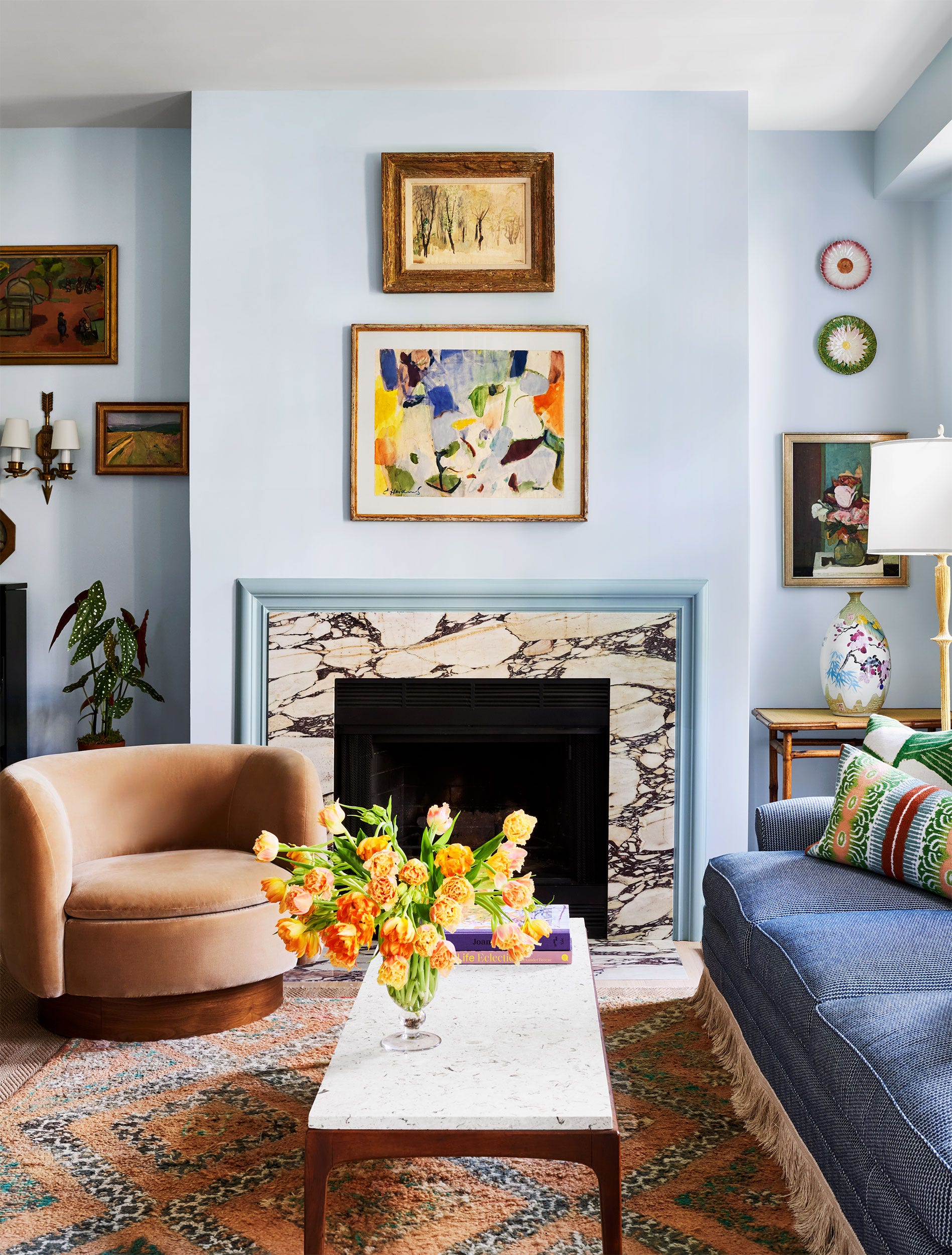
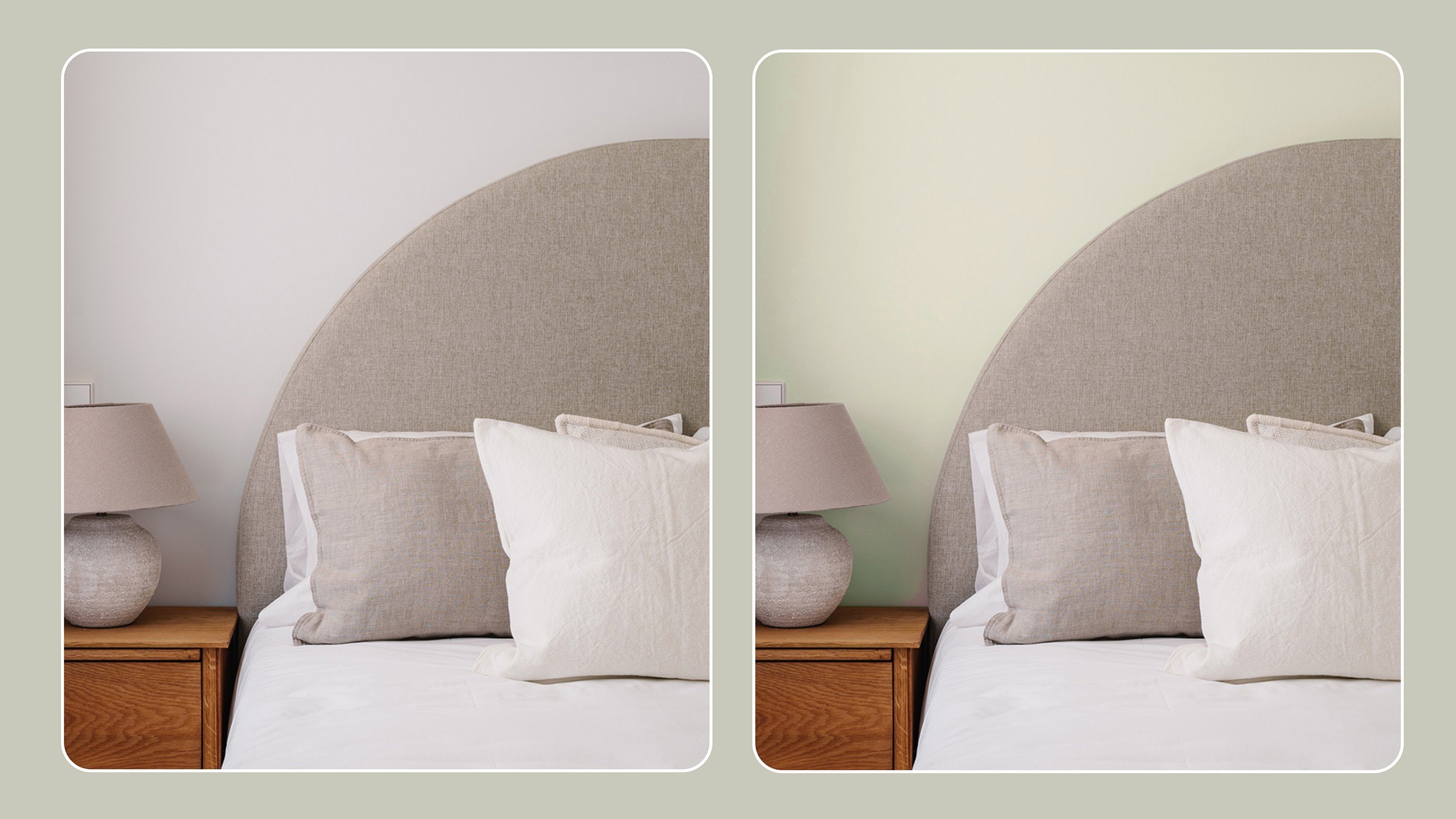
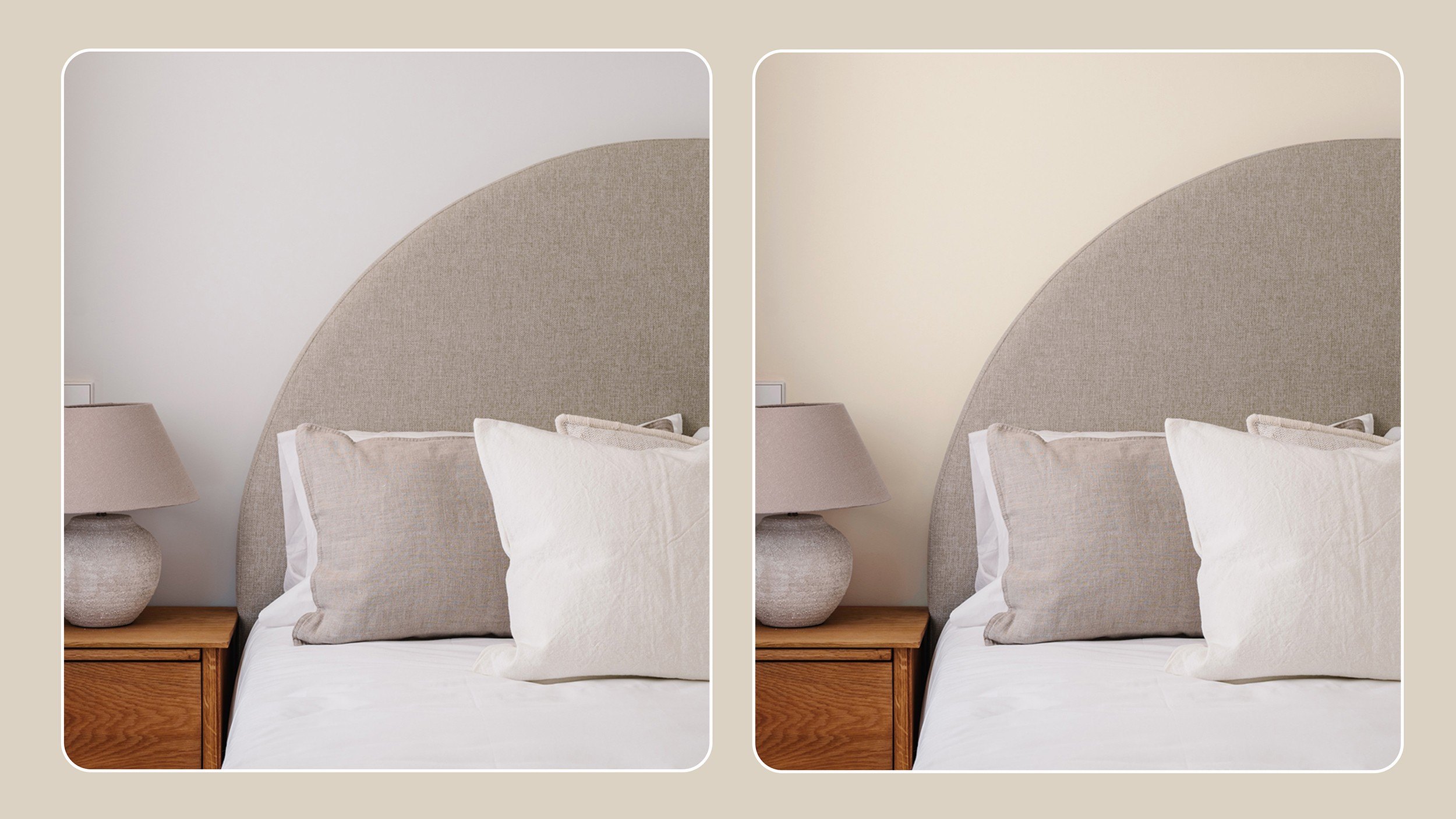
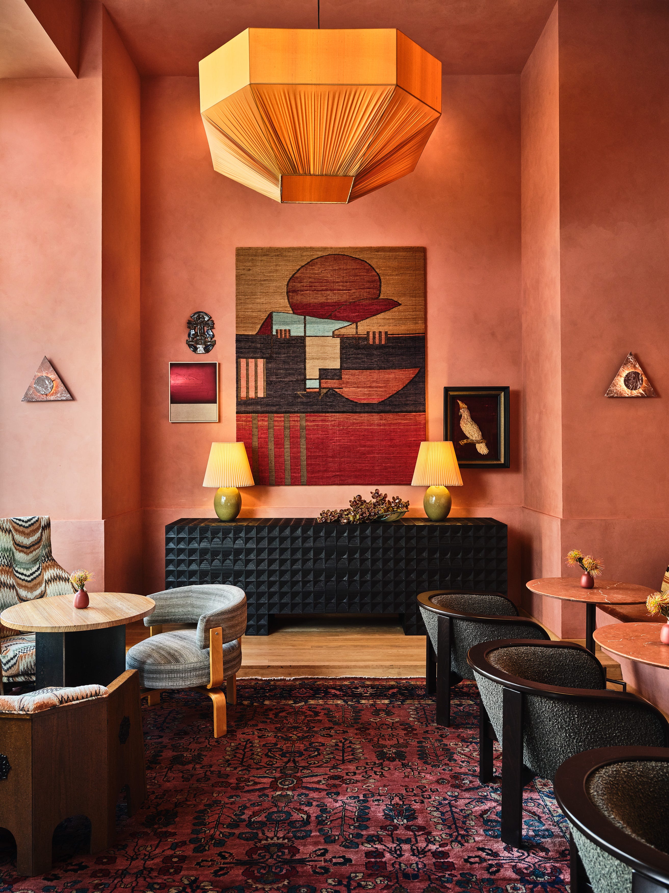
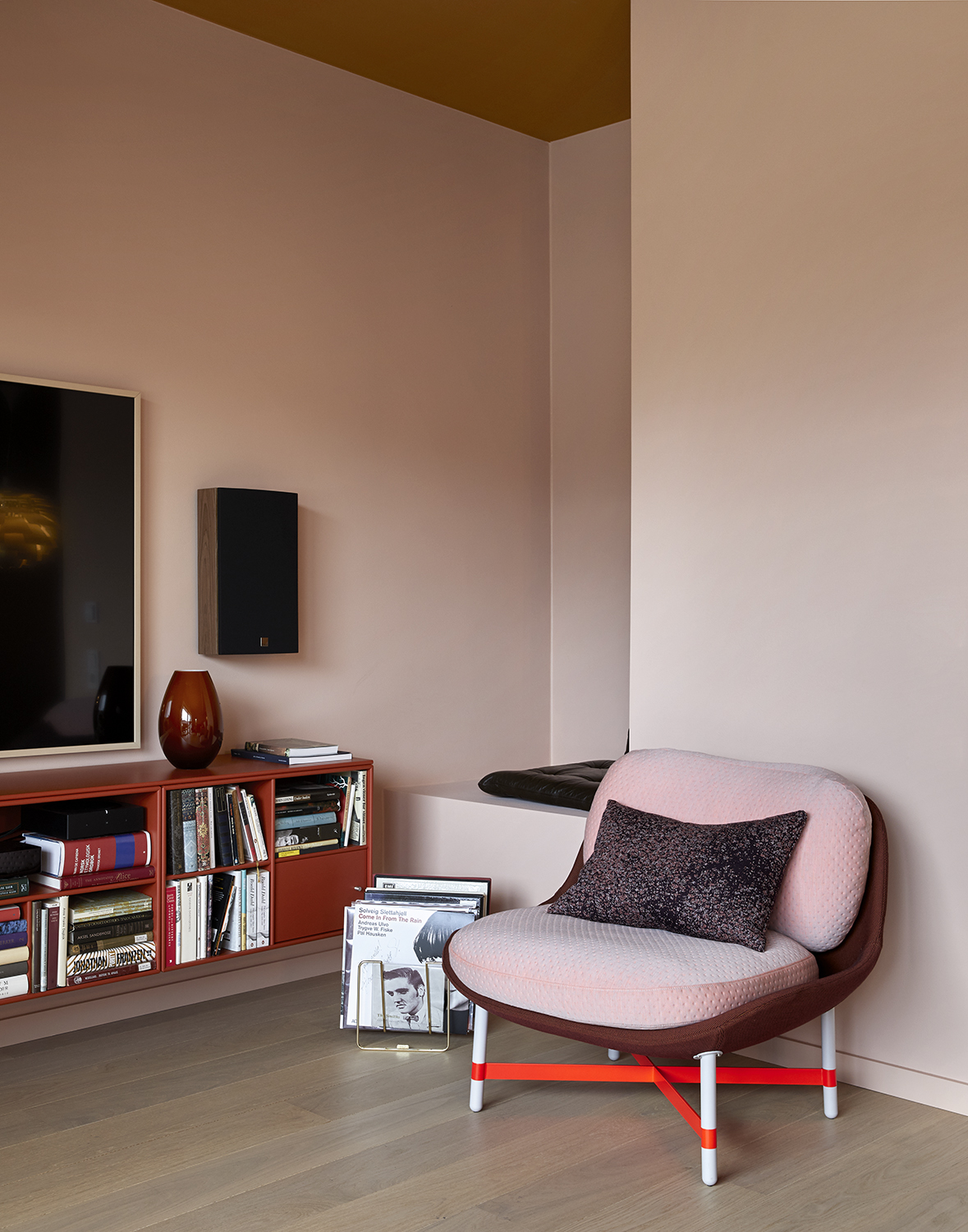
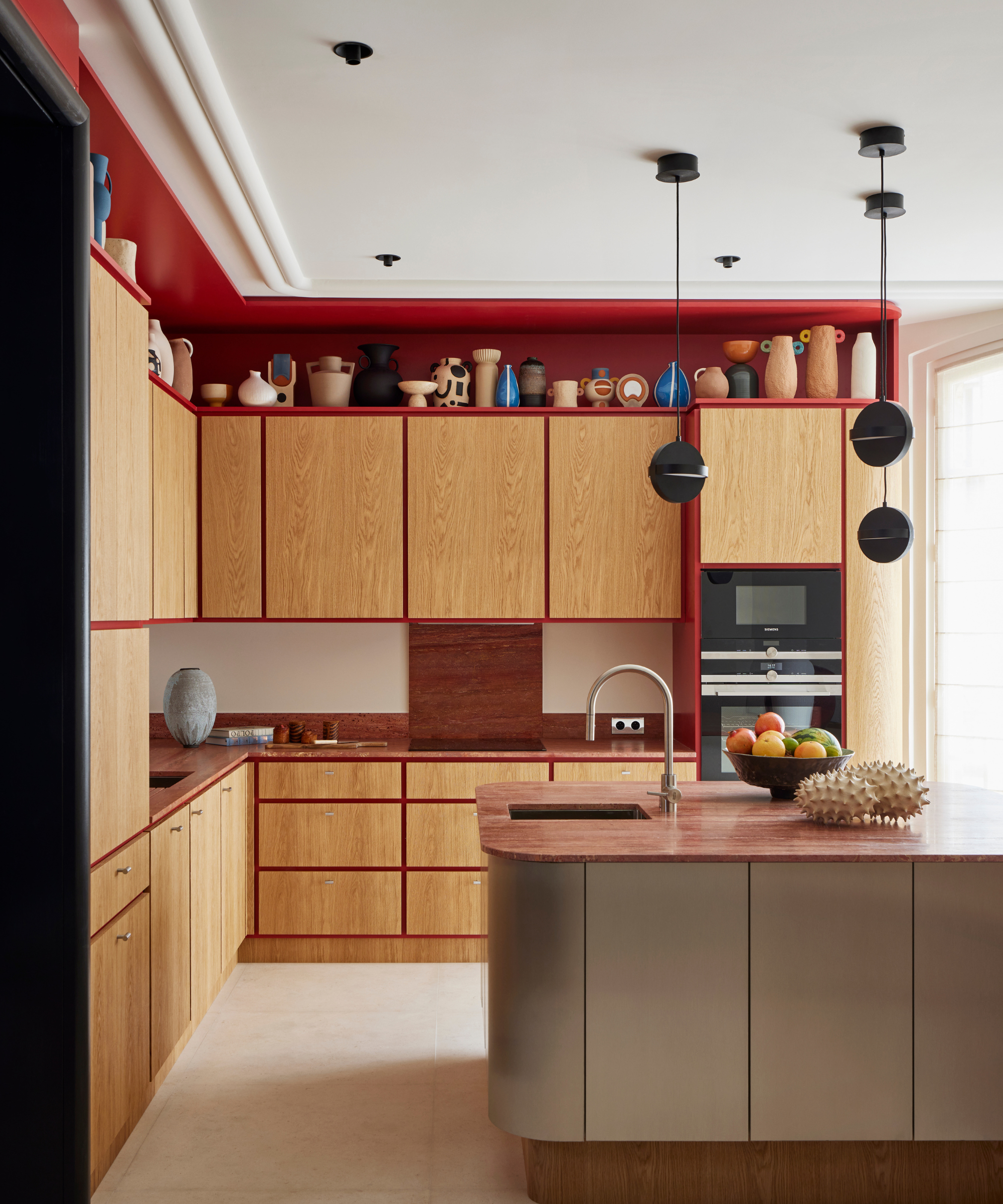
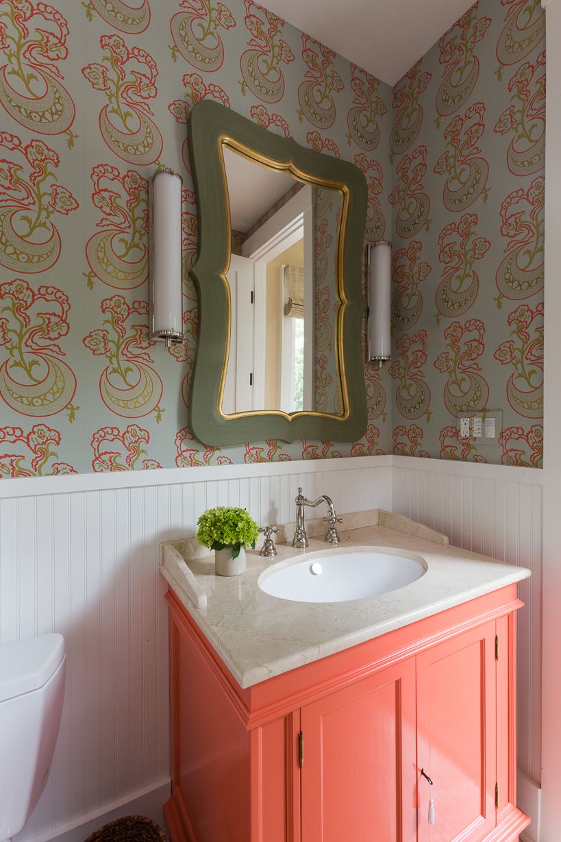
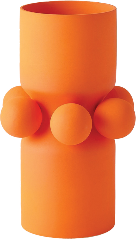
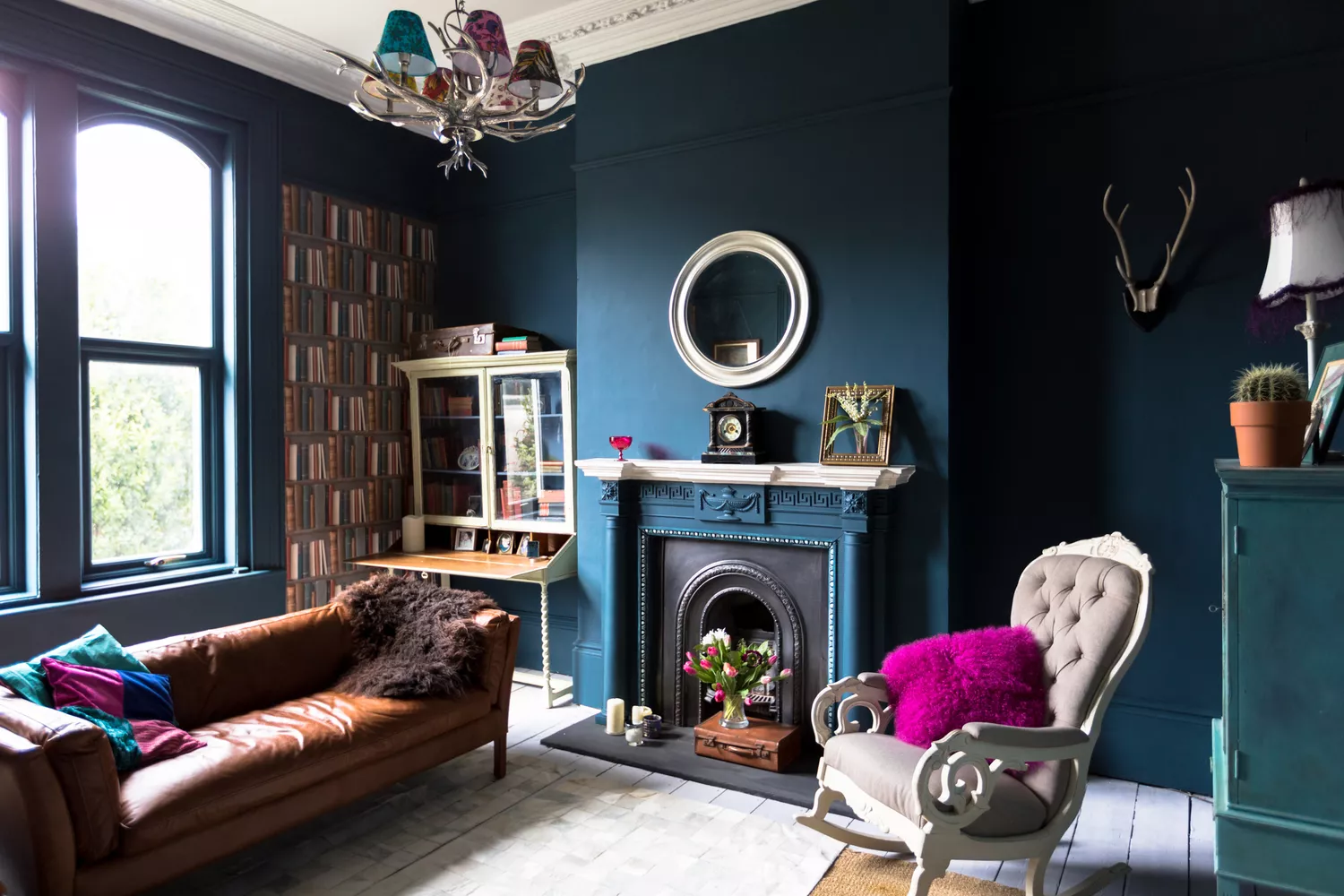
Baby Blue and Magenta offer a captivating contrast between cool composure and unapologetic intensity. DeLapp notes that this pairing evokes both nostalgia and contemporary flair, resulting in a color story that is modern yet effortlessly charming, suitable for living rooms. A monochromatic, yet dynamic, approach is seen in the pairing of Deep Sage and Soft Sage. Rath points out that two shades of green, even when distinct, can work harmoniously due to shared undertones. This layered approach creates depth and cohesion, making a room feel grounded and nuanced while highlighting architectural details through subtle contrast. Peach and Red, another suggestion, combine softness with vibrant energy. DeLapp describes this as a quirky duo that delivers an unexpected visual punch, proving that daring combinations can achieve unforgettable harmony. Finally, Tangerine and Cream establish a balance between vibrancy and warmth. Rath explains that this allows a bold color like tangerine to coexist with a softer, neutral foundation, bringing energy without overwhelming the space—a design-forward approach that highlights contrast while maintaining cohesion.
#InteriorDesign #PaintColorCombos #HomeDecor #ColorTheory #RoomTransformation #DecoratingIdeas #BoldColors #UnexpectedPalettes #InteriorDesign #PaintColorCombos #HomeDecor #ColorTheory #RoomTransformation #DecoratingIdeas #BoldColors #UnexpectedPalettes
0 comment in total
 No comments yet
You may also like
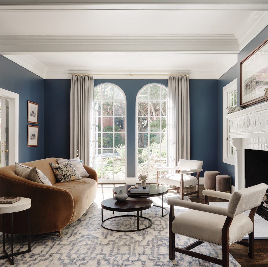
Lick Paint Will Transform the Mood in Your Home Through Color Psychology

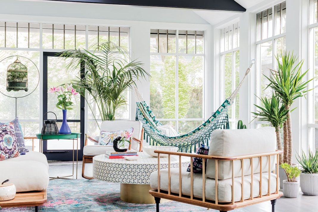
Creative, Captivating Use of Color Helps This Home Redesign Shine

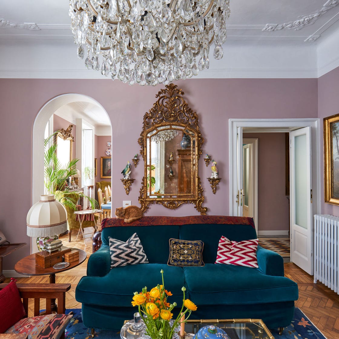
These Living Room Paint Colors Are a Total Mindset Shift
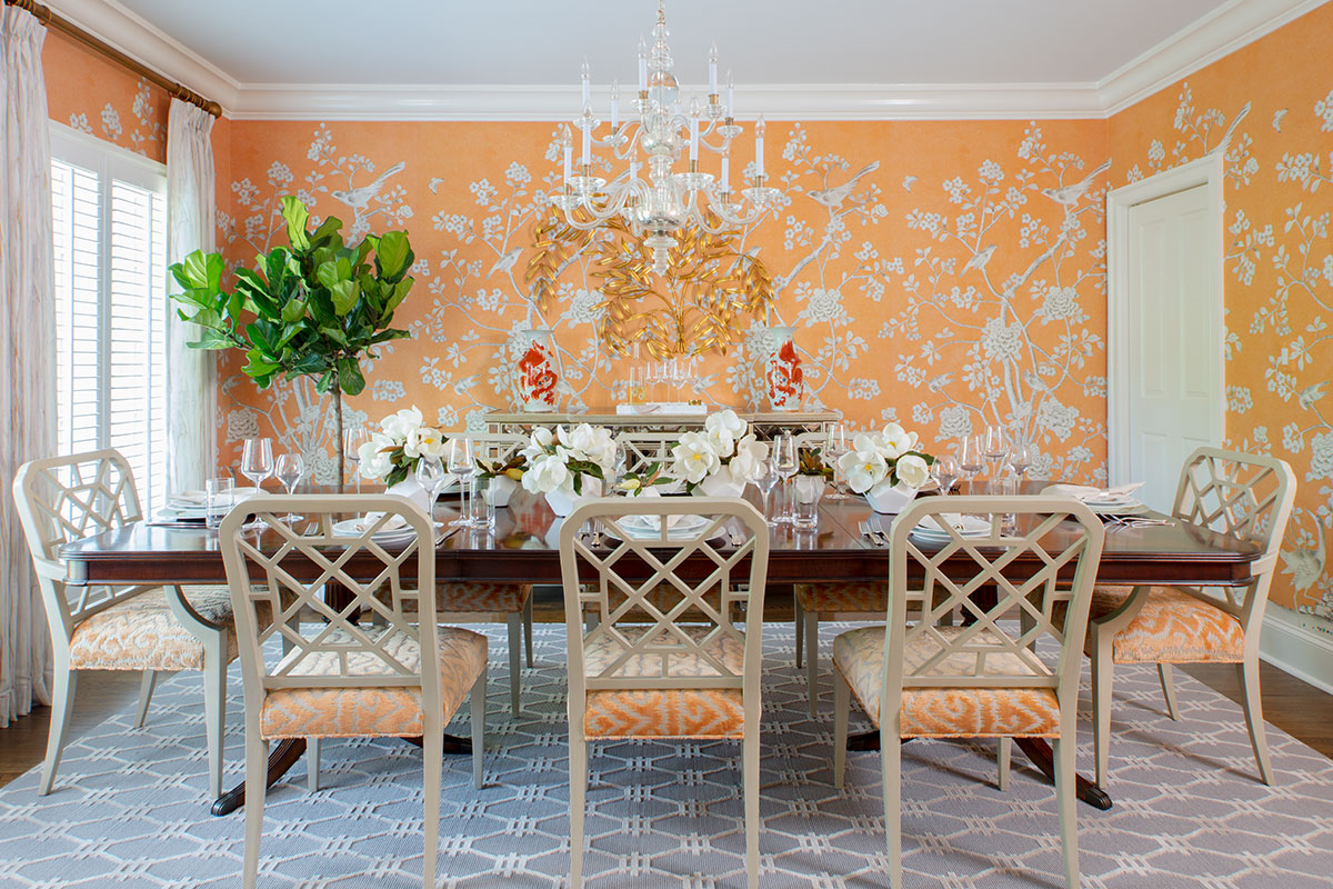
3 local designers on how to use vibrant color to transform your home
9 'good weird' paint colours approved by designers

35 Paint Colors to Consider for Every Room in Your House
Why This Hue Is Suddenly Dominating Every Designer's Wishlist—Plus, How to Style It

What Colors Go With Red? 10 Colors That Hold Their Own Alongside This Fiery Hue

6 rooms that demonstrate why blue and green are this year's coolest colour pairing
The 5 Most Overused Paint Colors and What to Try Instead, According to Designers

35 Unexpected Color Combos We Can't Get Enough Of
15 high-risk high-reward paint hues
Color Drenching Might Be Everywhere, But My Mom’s Been Doing It Since the ’90s

6 key colors to decorate with in May 2025, according to interior design and color experts in the know

Millennial Gray Is So Over—Here Are 5 Paint Colors to Try Right Now
Incorporate Color Drenching Into Your Home Design
These Accent Color Ideas Will Transform Any Room

2021’s Palette of Possibilities
These 20 Rooms Use a Red Color Palette in All the Right Ways
7 Paint Colors Designers Wish They Never Used (and What You Should Use Instead)