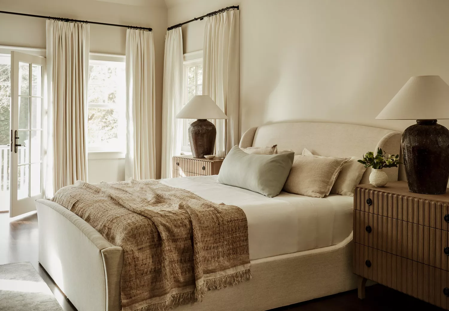
1/7
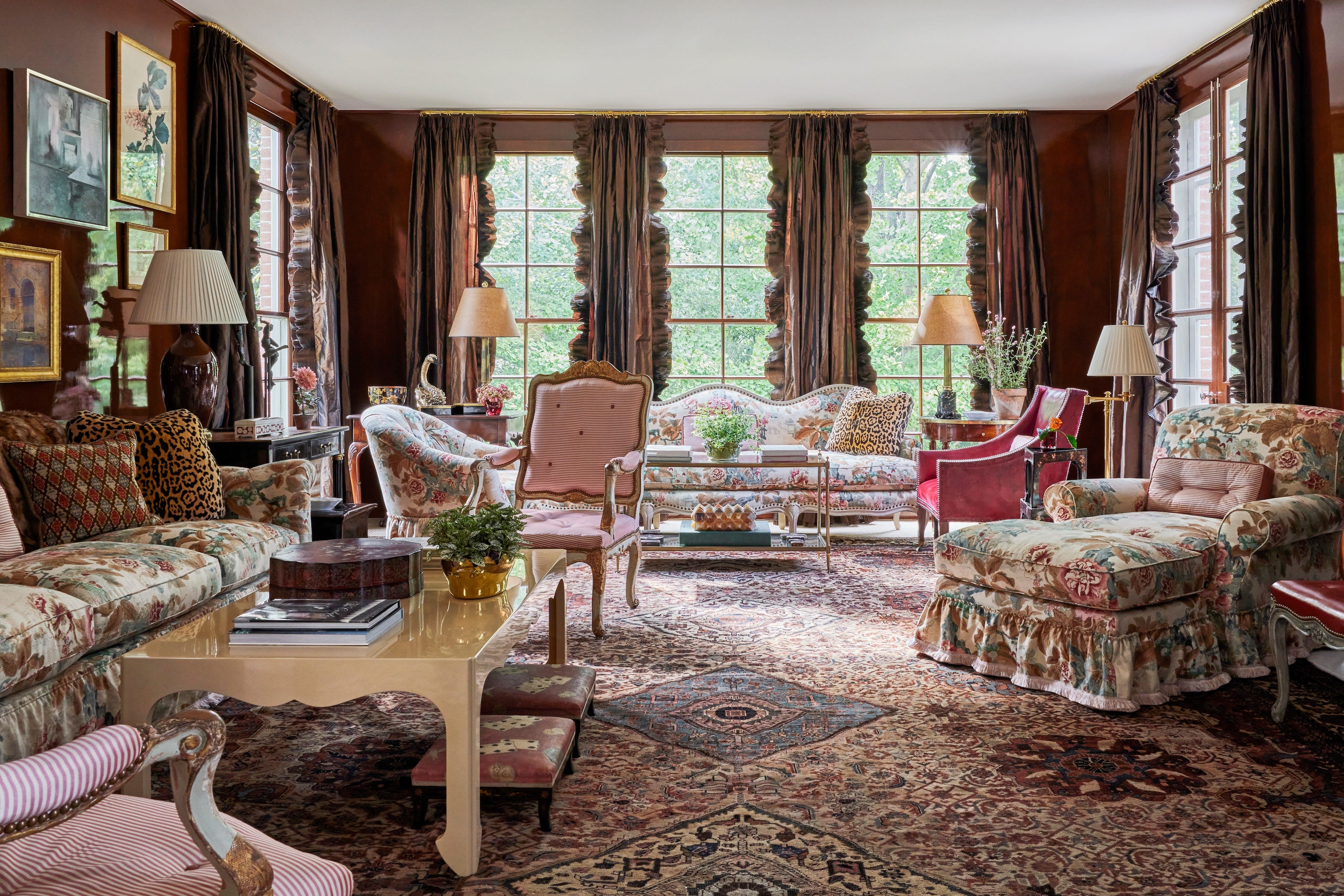
6 key colors to decorate with in May 2025, according to interior design and color experts in the know
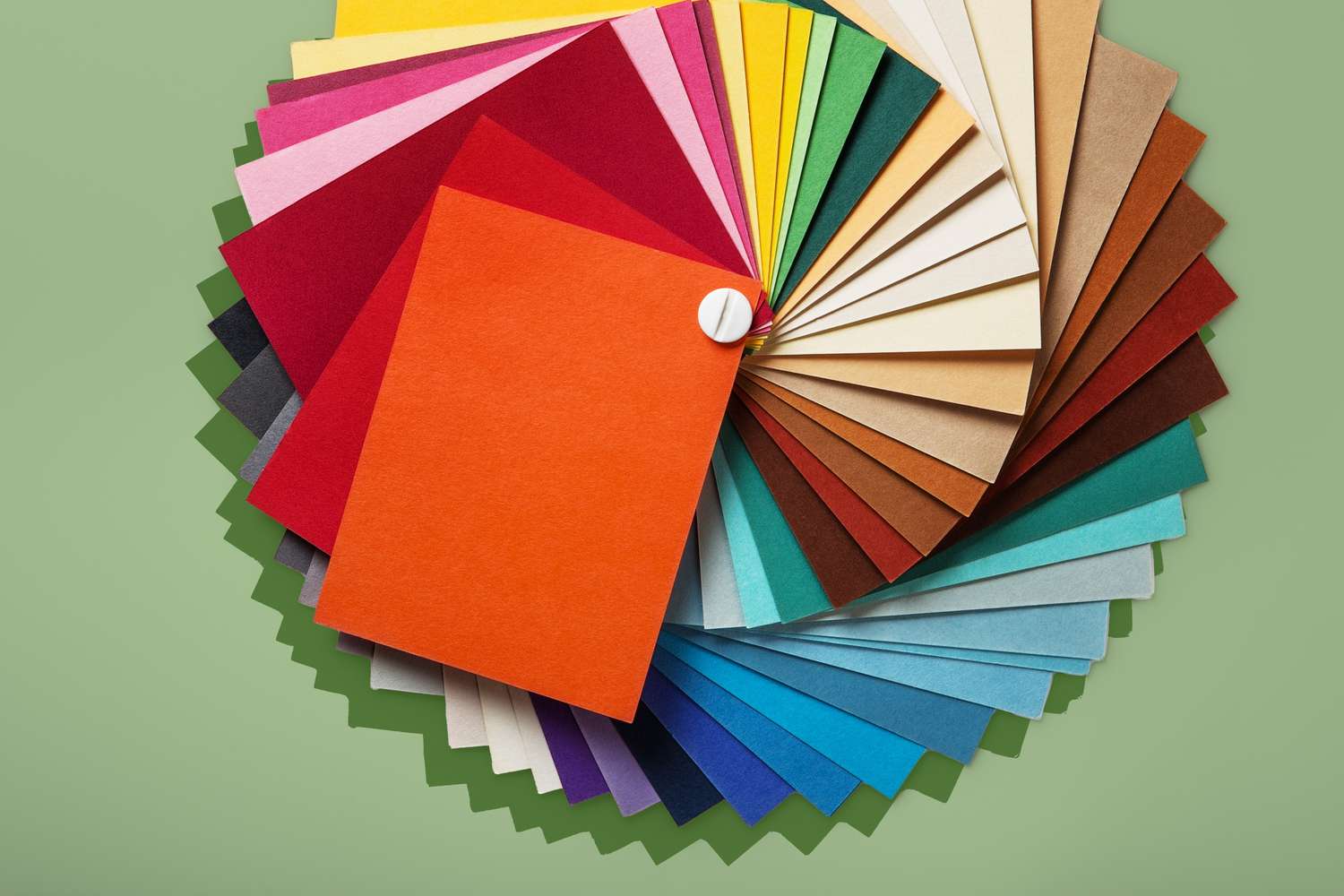
The article explores six key colors recommended by interior design and color experts for home decoration in May 2025, aligning with the optimistic and renewing spirit of the month. It emphasizes embracing joy-sparking shades for a seasonal refresh or a complete color scheme overhaul.
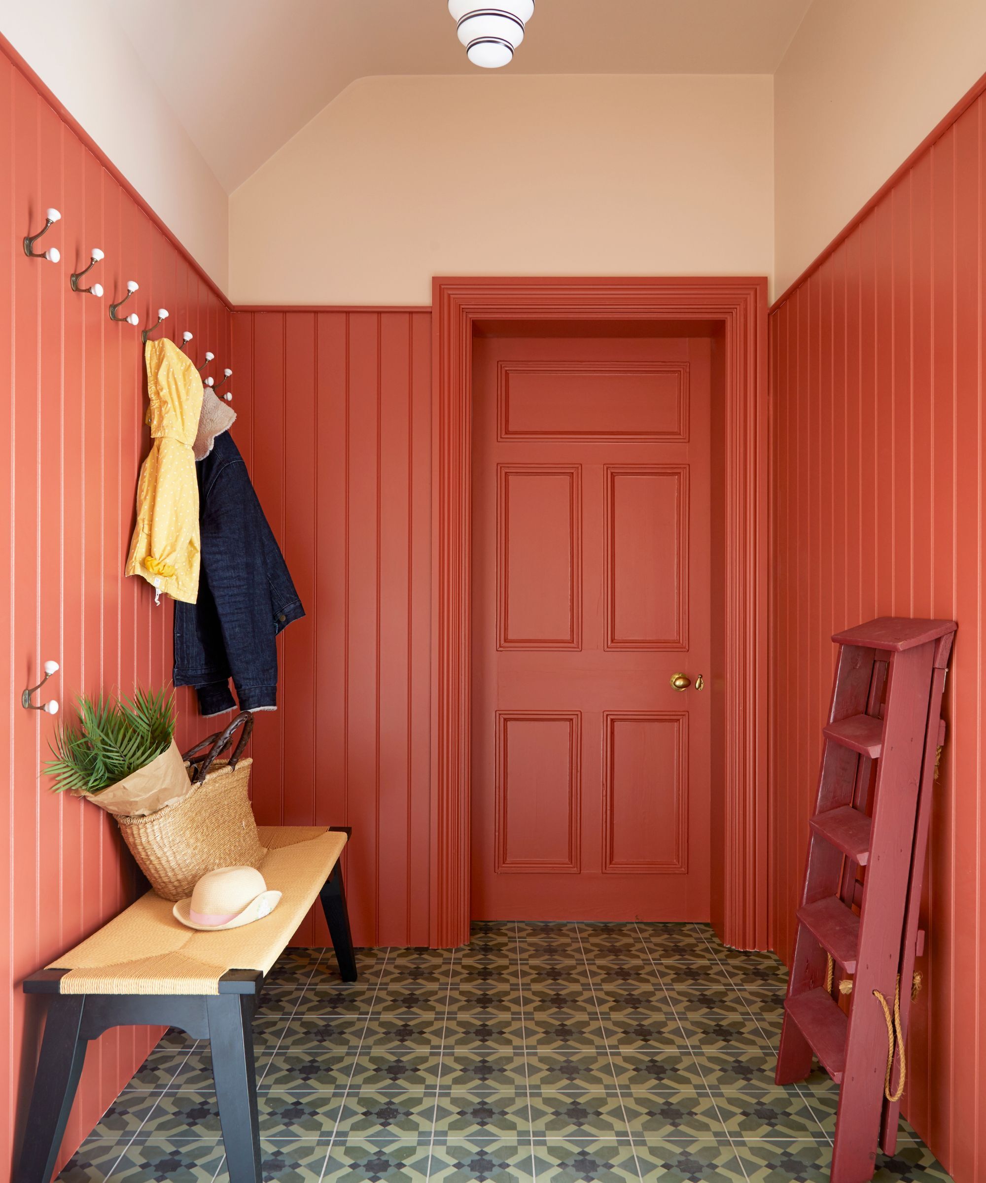
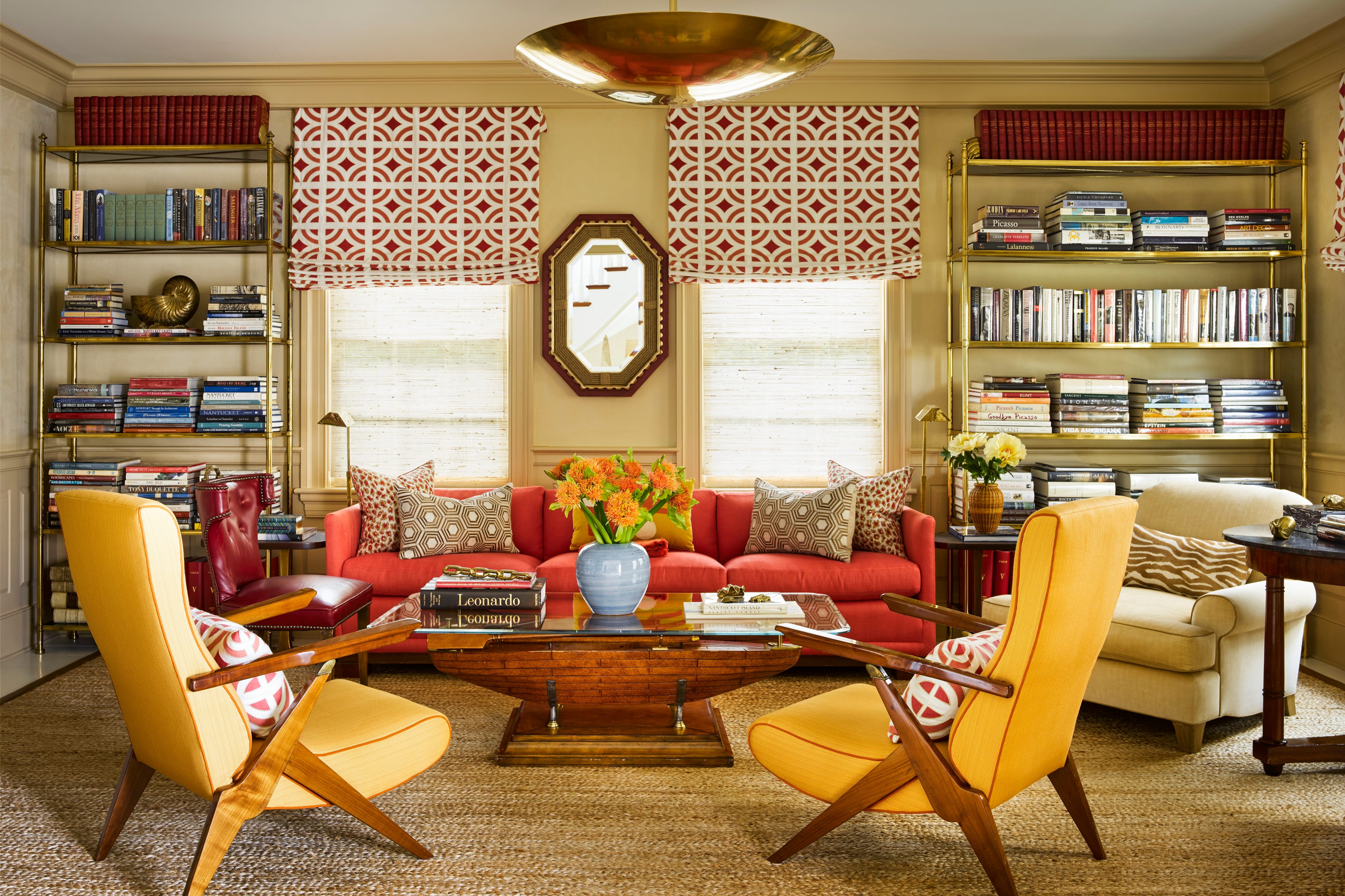
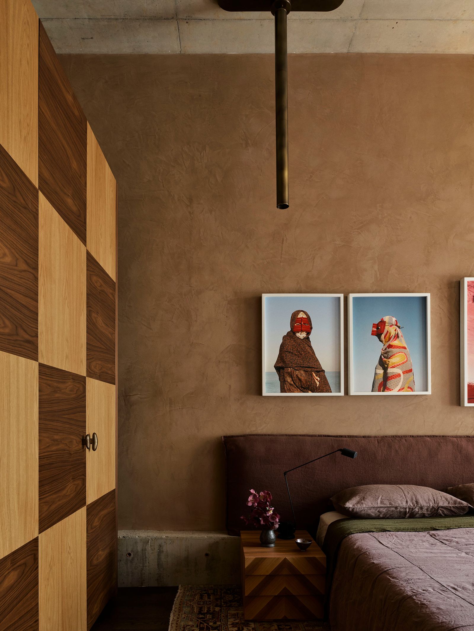
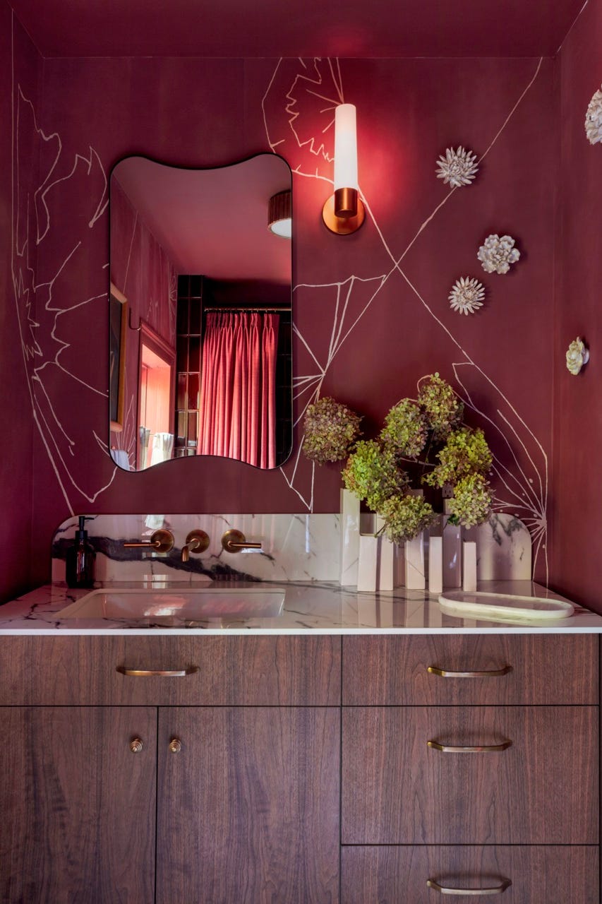
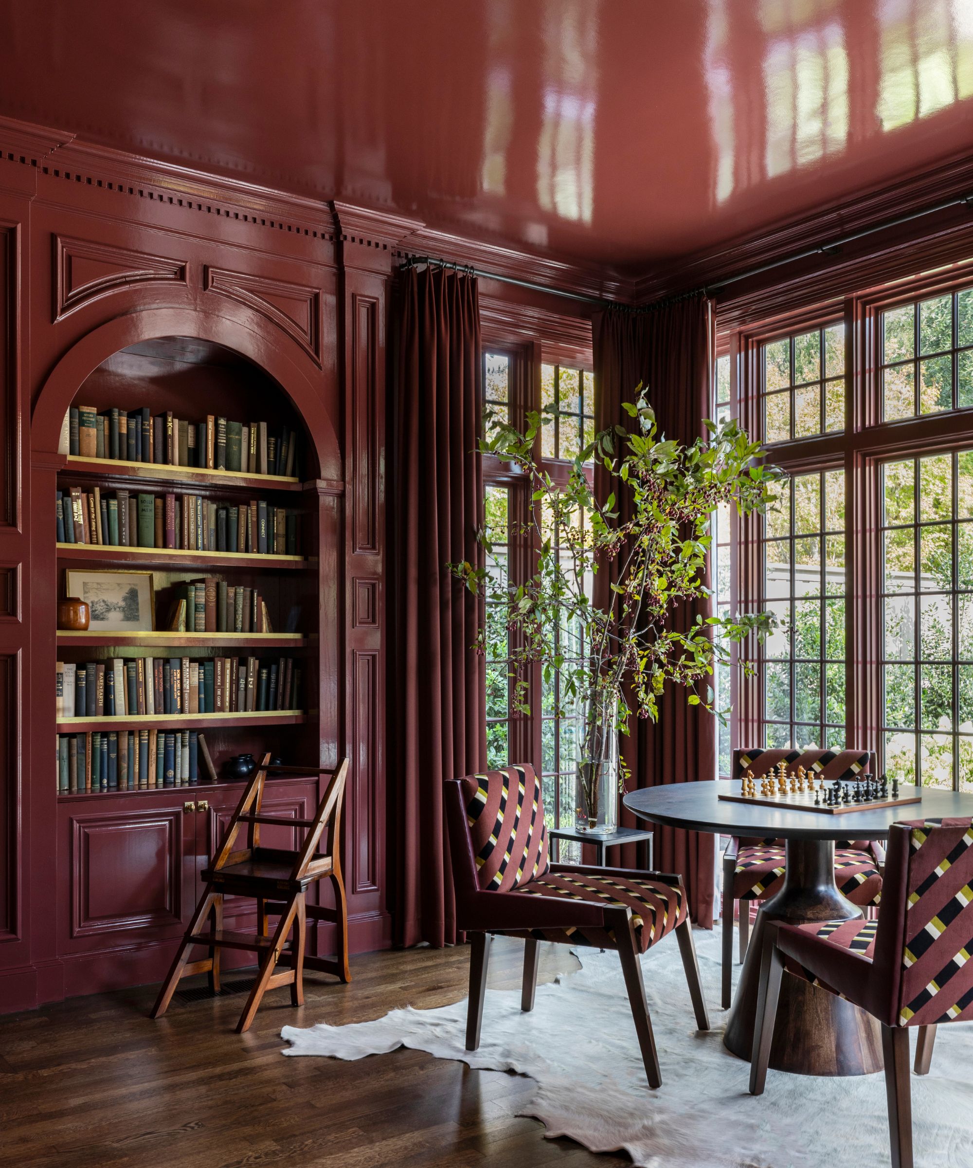
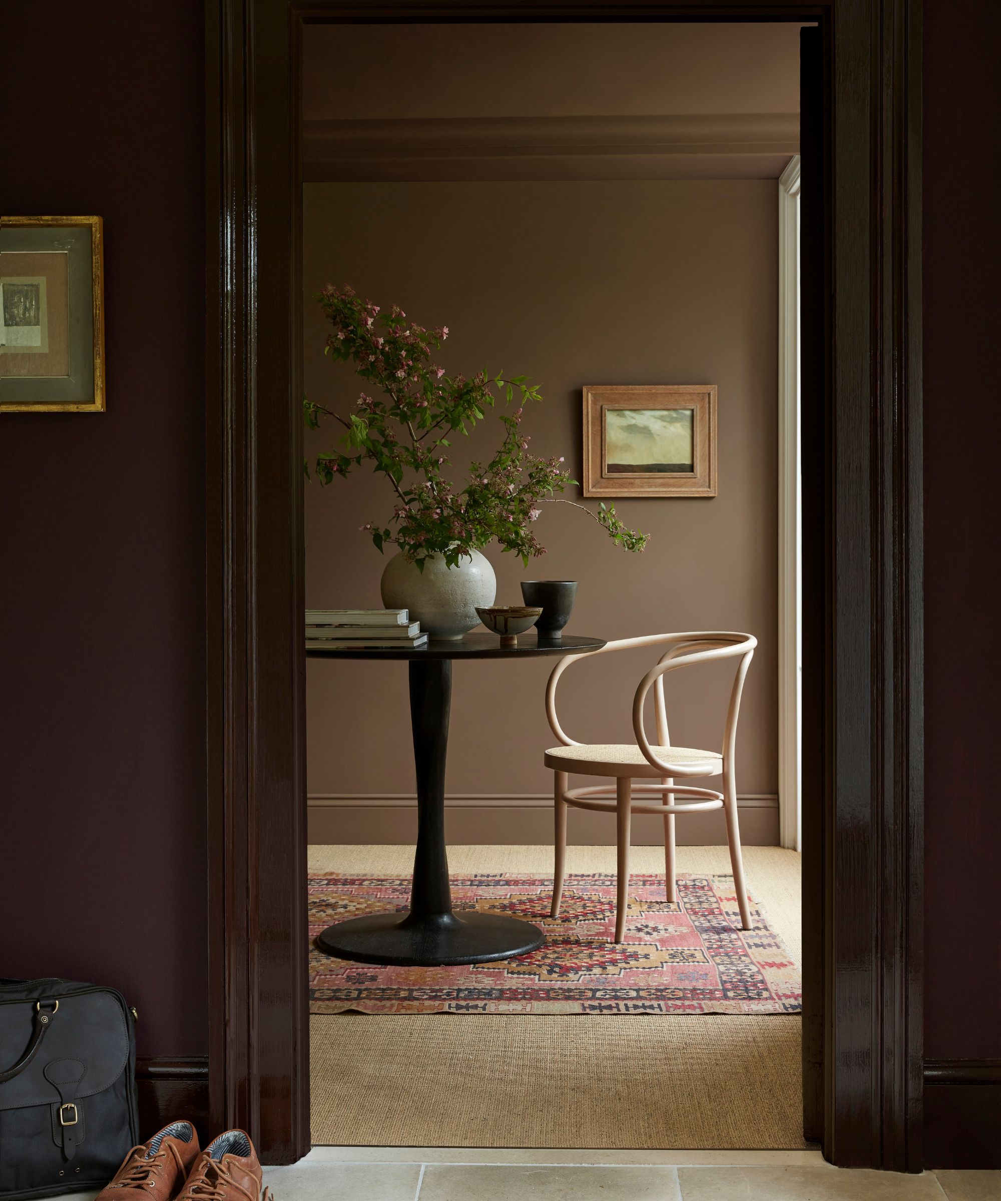
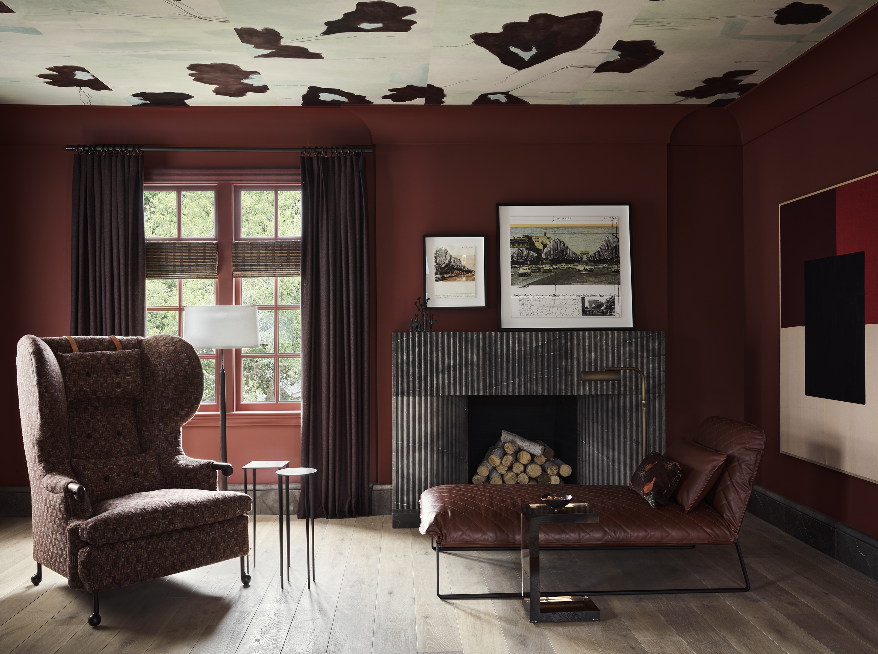
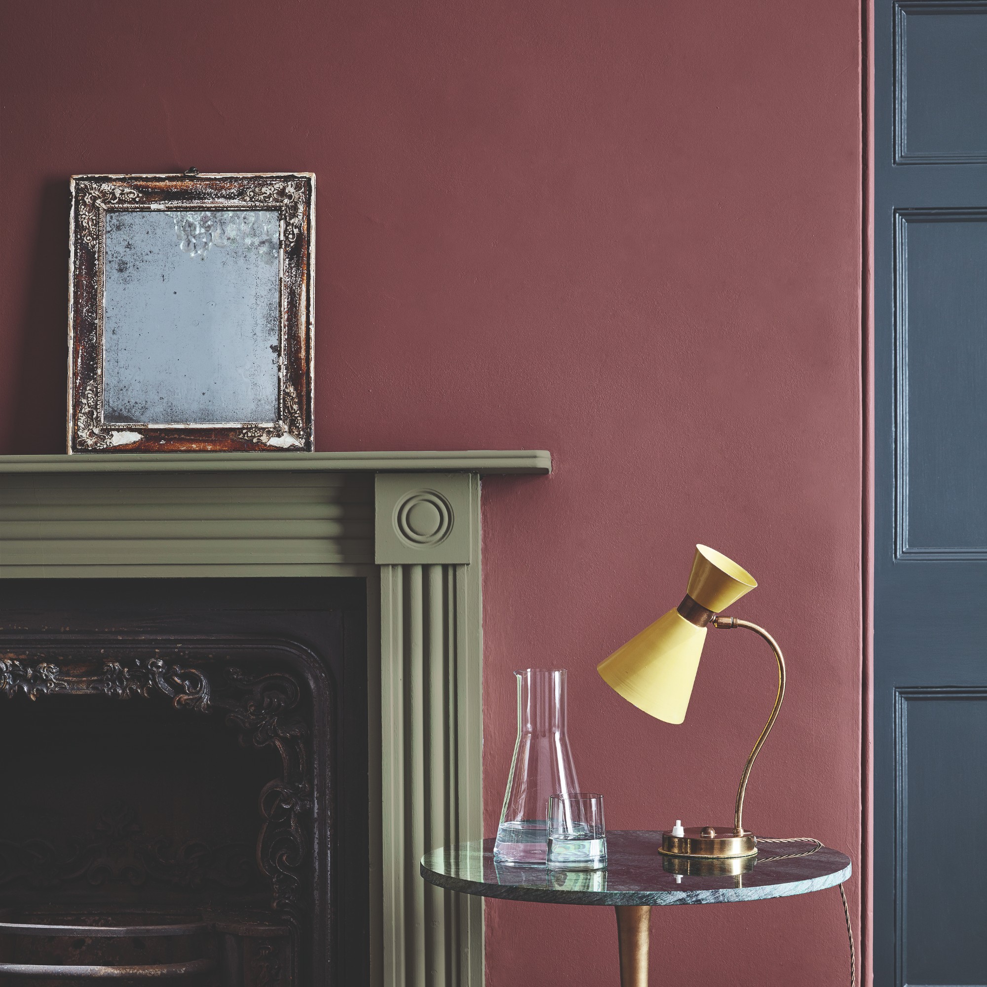
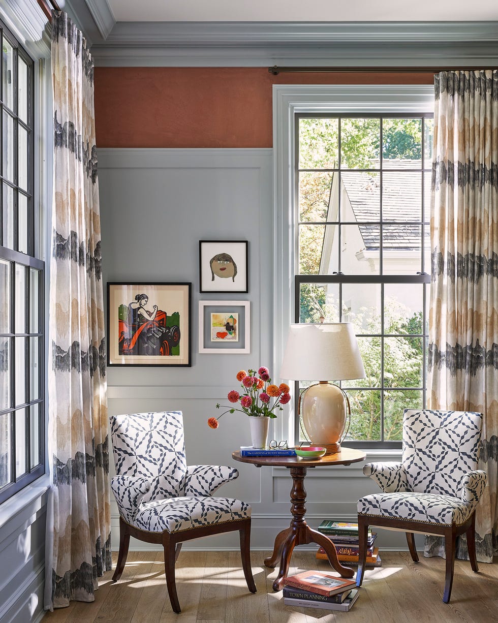
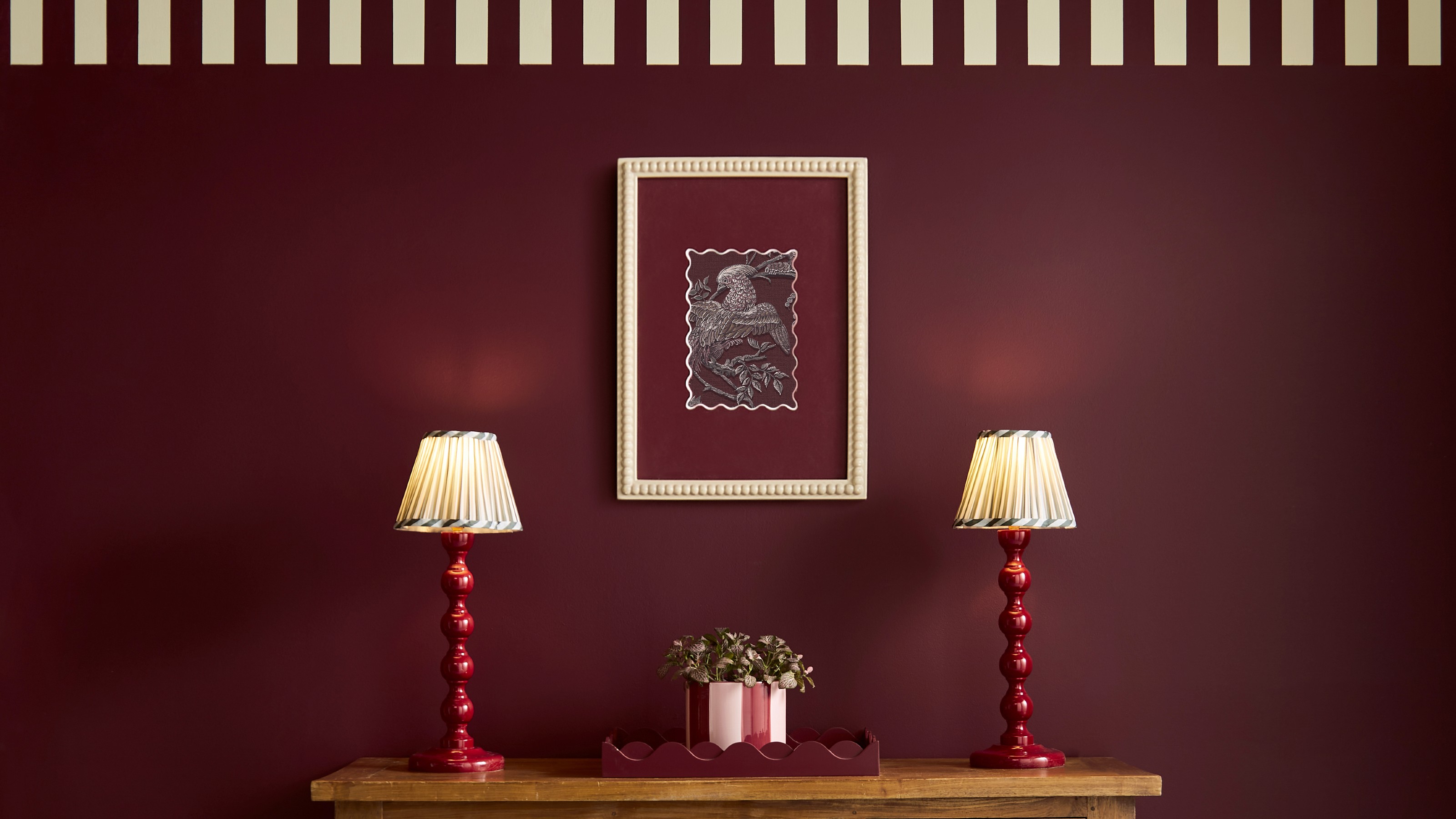
First, Tomato Red is presented as an energetic and optimistic choice, building on the 'unexpected red theory.' Designers suggest incorporating red elements, whether bold accent walls or subtle furniture pieces, to add vibrancy. Dominic Myland from Mylands highlights softer, rusty reds like 'Crayfish Party BH. 19' for warmth and character, easily integrated into existing palettes or used outdoors. Stronger variations like 'FTT-009 Bright Red' or 'Red Post Hill No. 68' are also noted for a more striking impact.
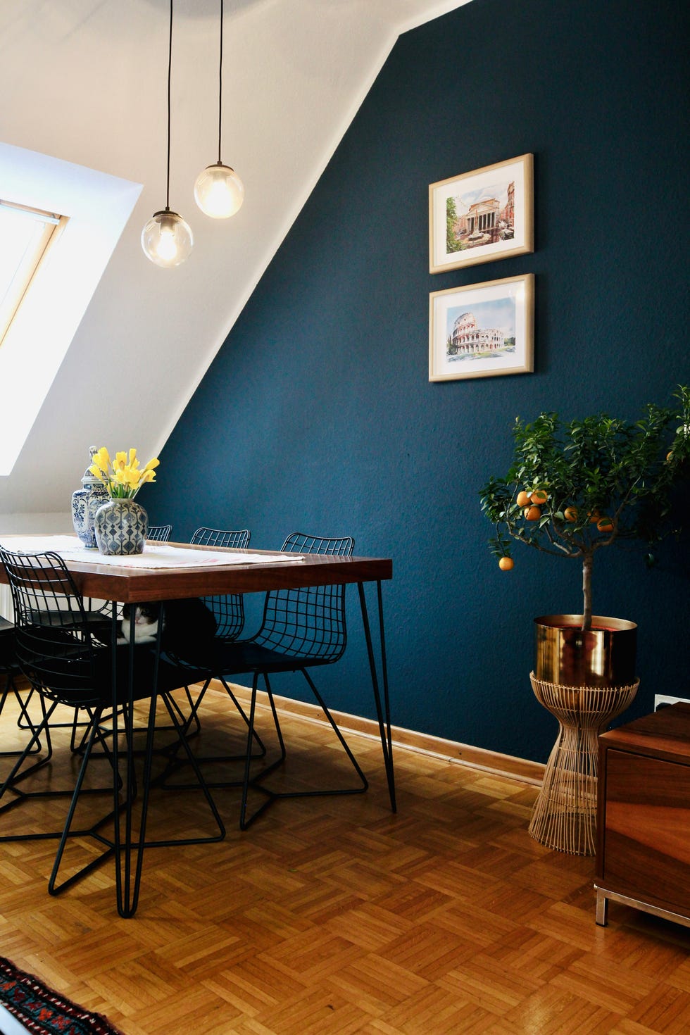
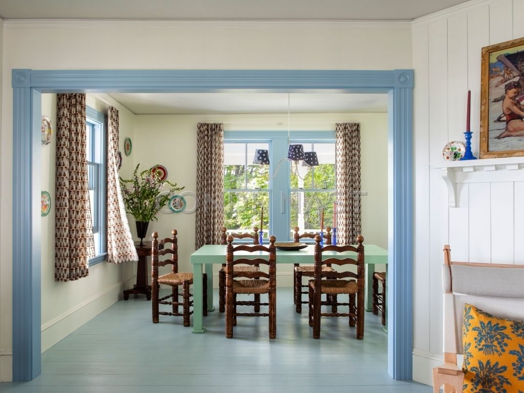
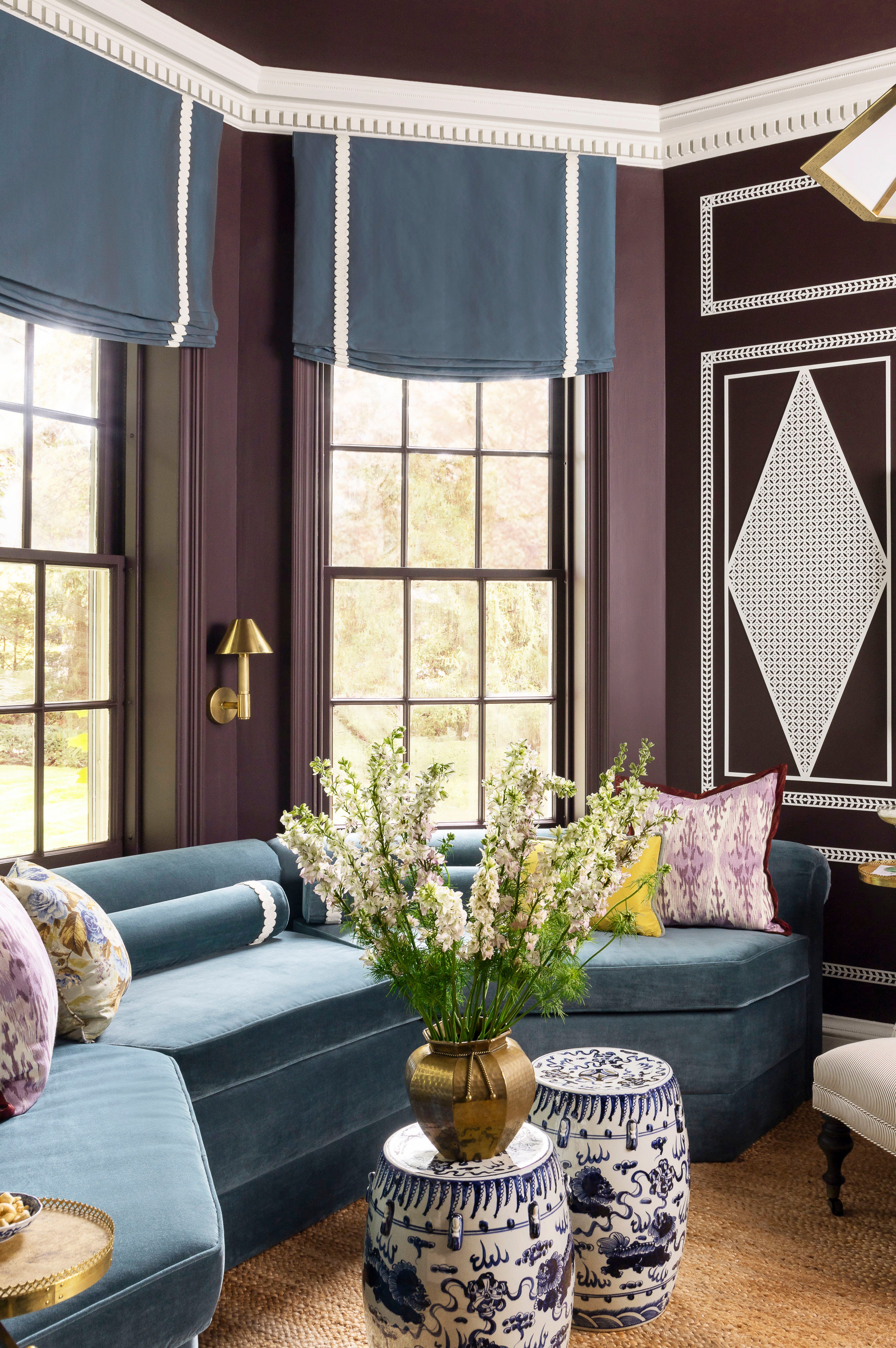
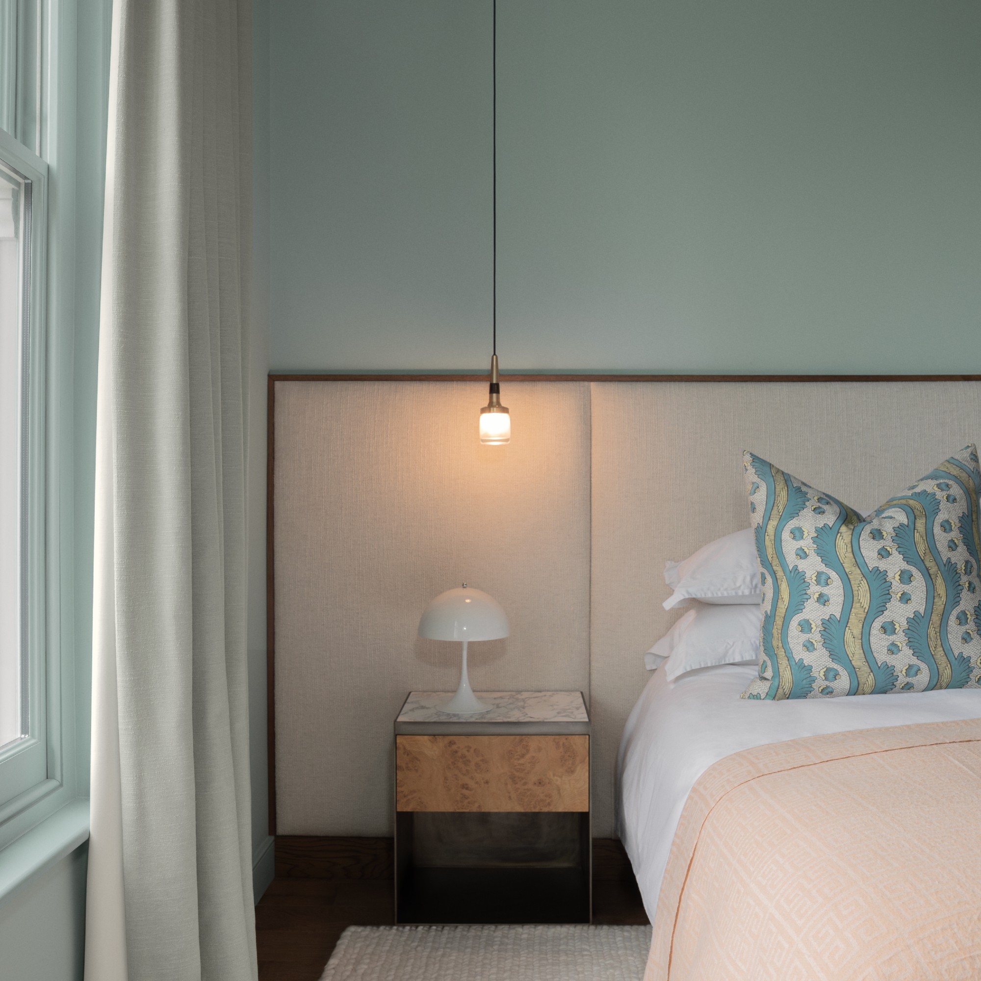
Next, Duck Egg Blue is celebrated for its timeless freshness and versatility. Positioned between green and blue, its tonal variations range from delicate to vibrant turquoise. The article mentions 'Dix Blue by Farrow & Ball' as a reliable option and 'Celestial Blue by Little Greene' for a fresher feel, while 'Daisy Field by Graham & Brown' is recommended for those favoring a Regency aesthetic. The chameleon-like nature of this color, shifting with natural and artificial light, is also discussed.
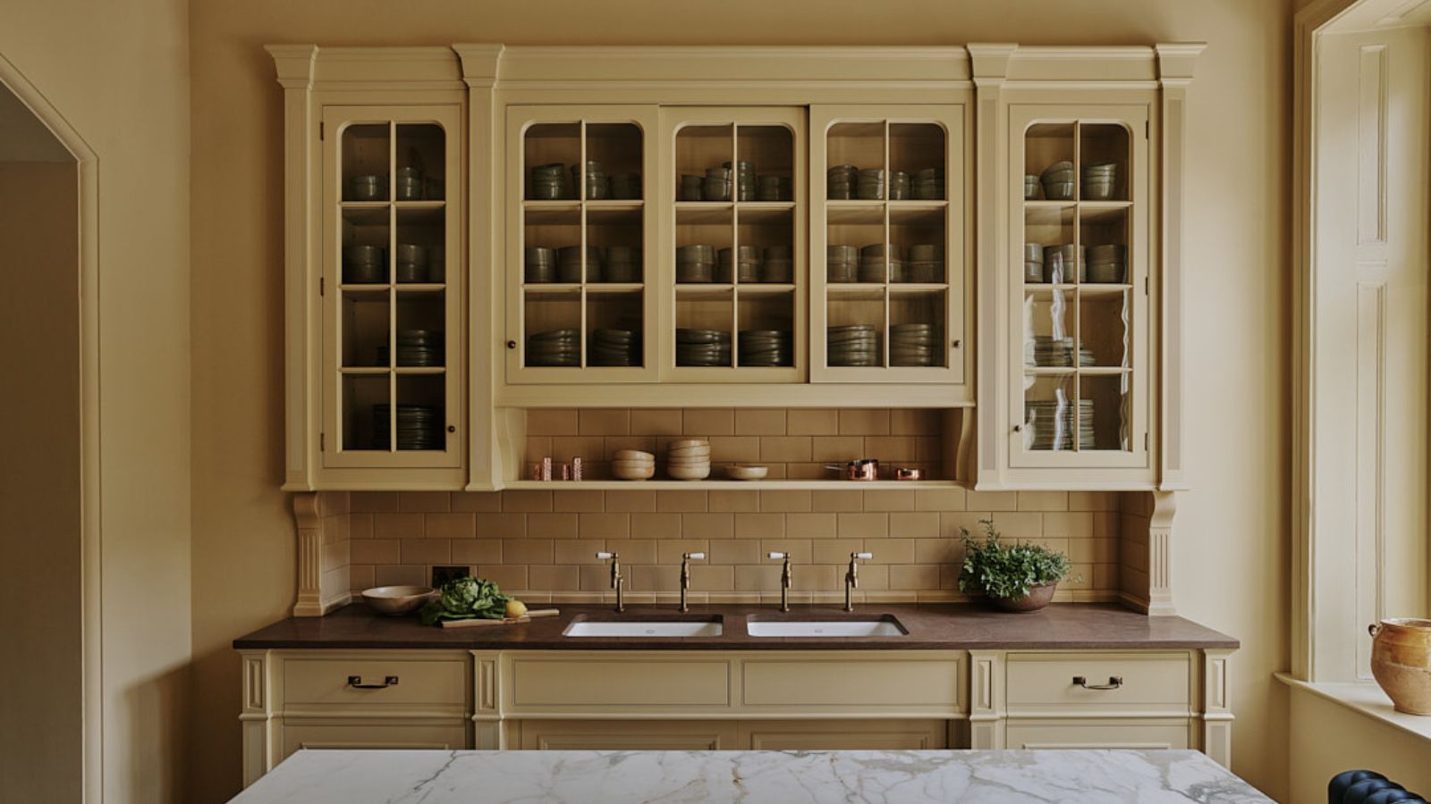
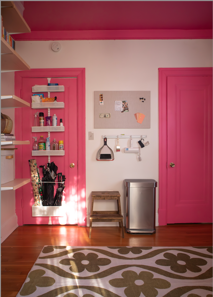
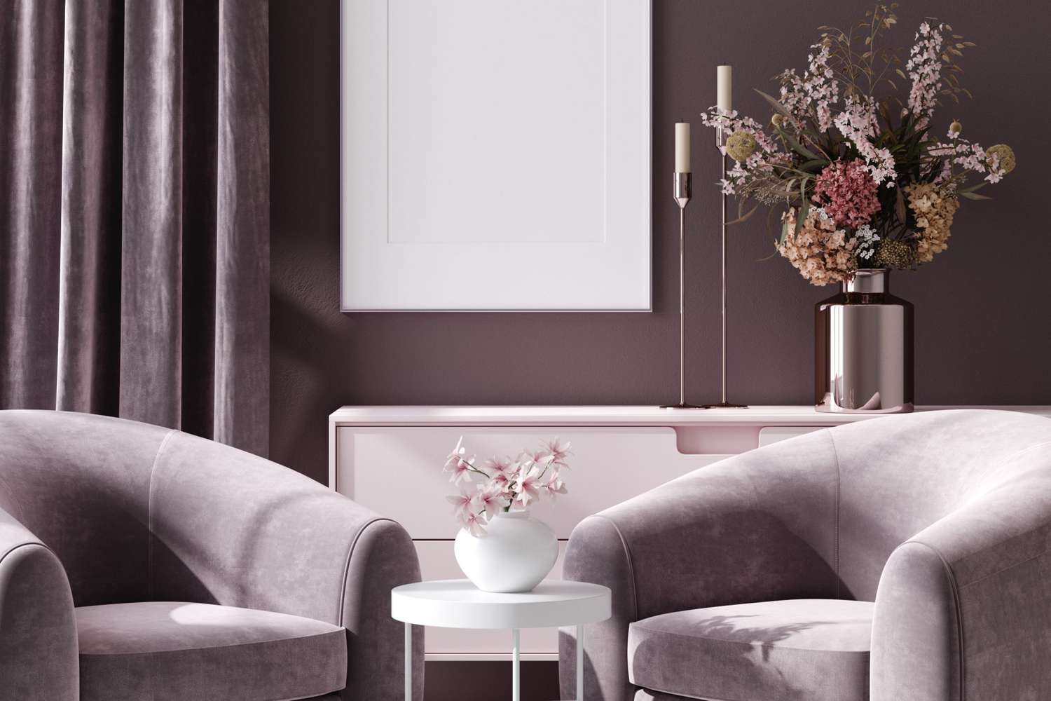
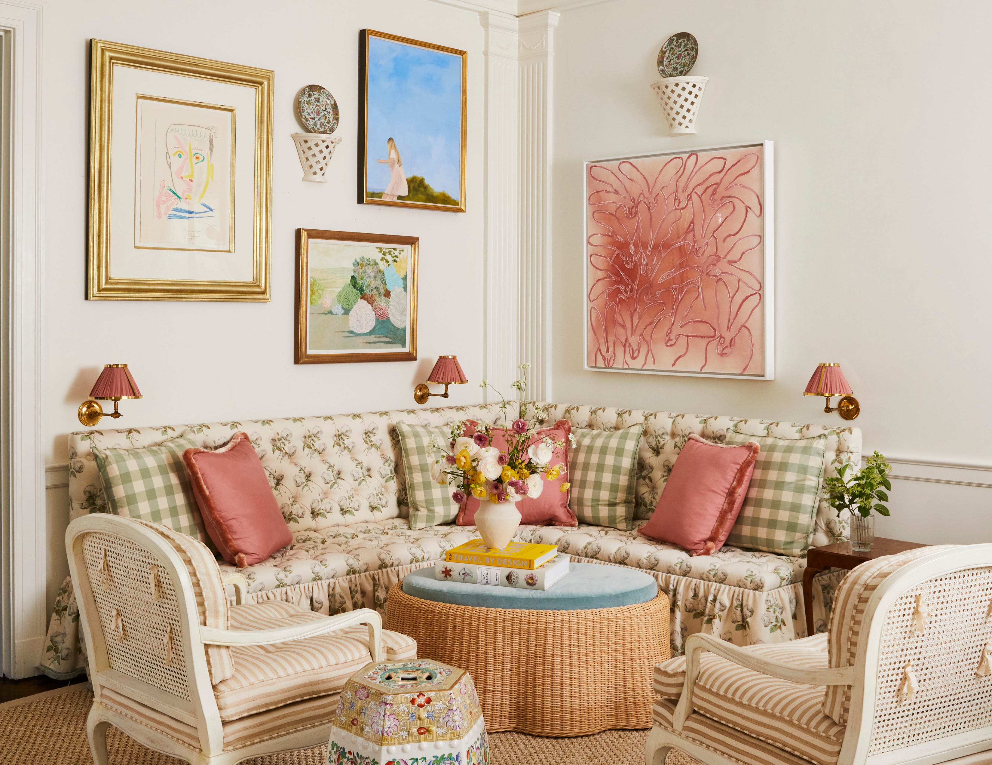
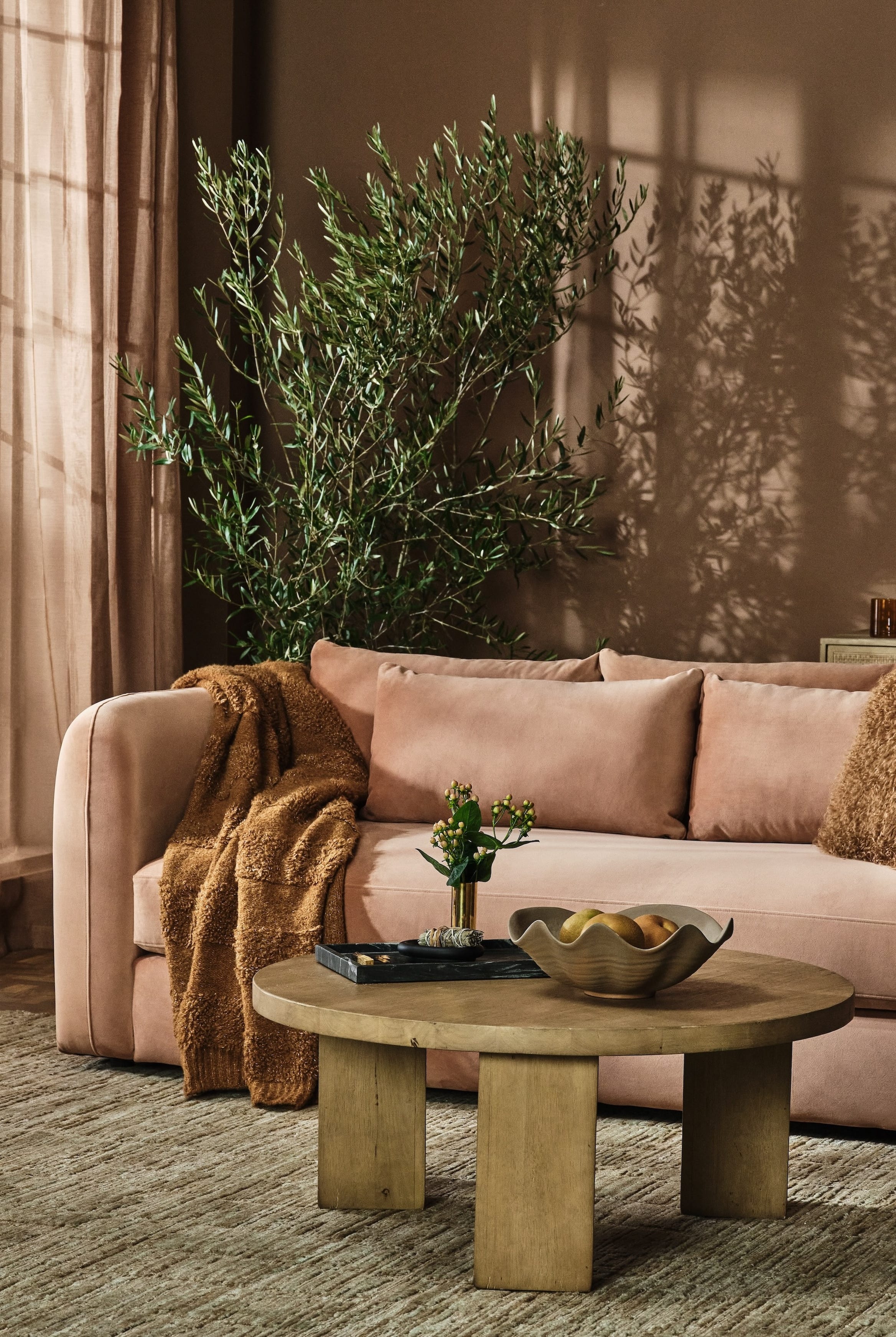
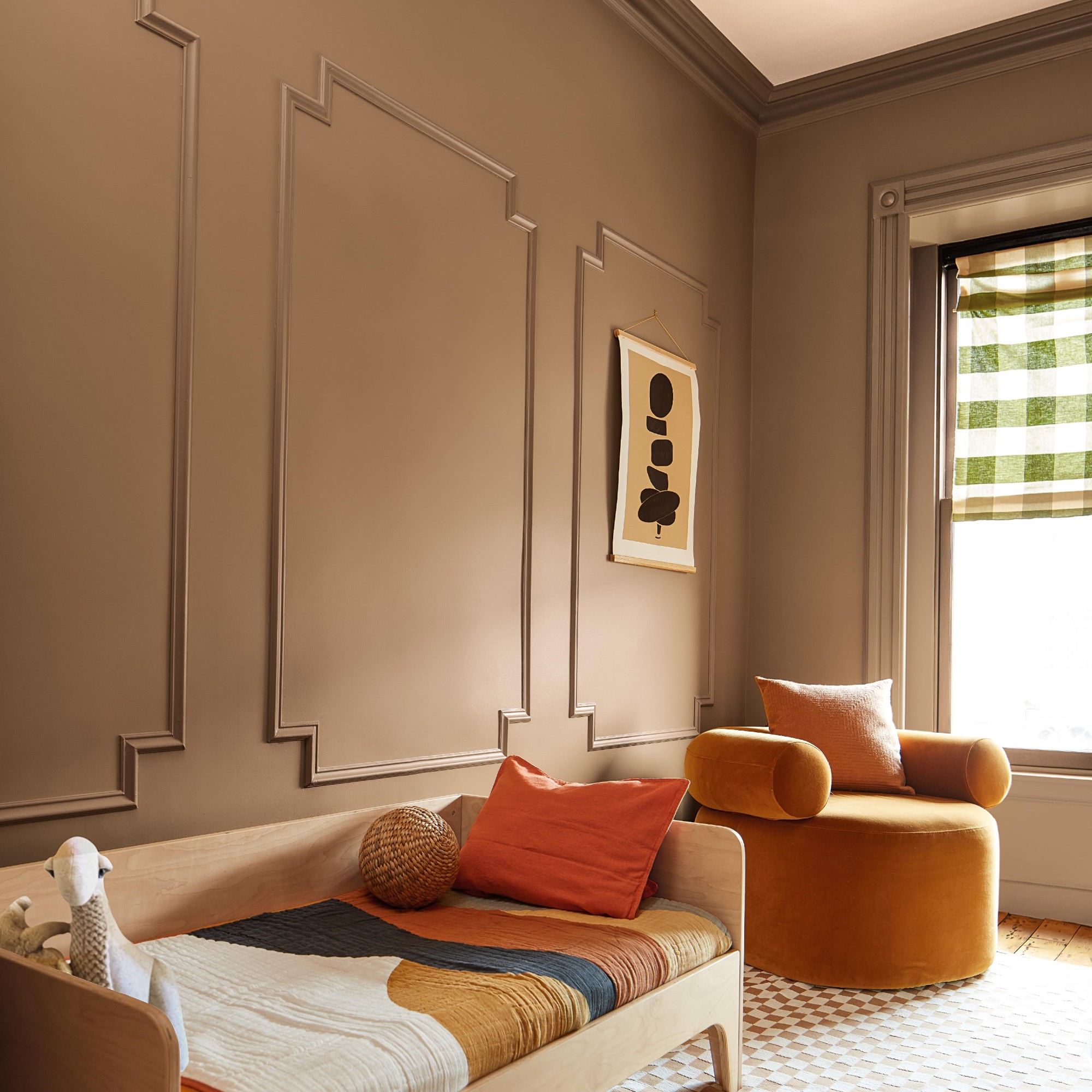
Salmon Pink is introduced as a warm and welcoming alternative to classic blush, with its orange undertone making it toastier. Sean Symington, an interior designer, praises its soft yet sophisticated presence in a kitchen. This shade is ideal for those seeking the femininity of pink without overly sugary tones, suggesting a peachy, coral-hinted salmon.
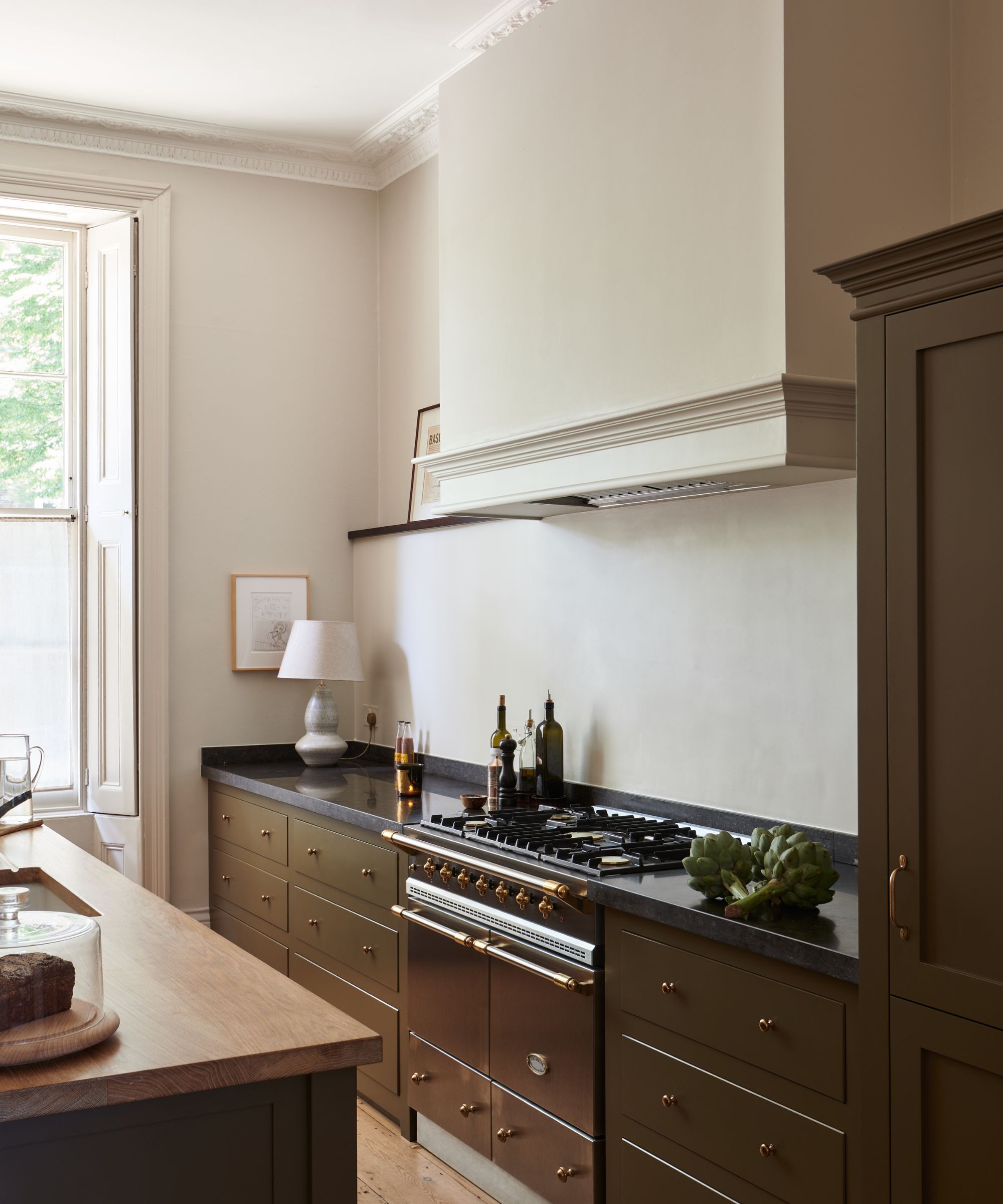
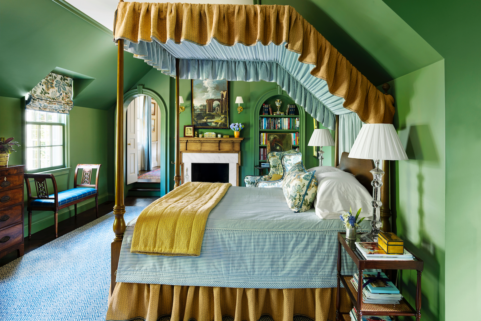
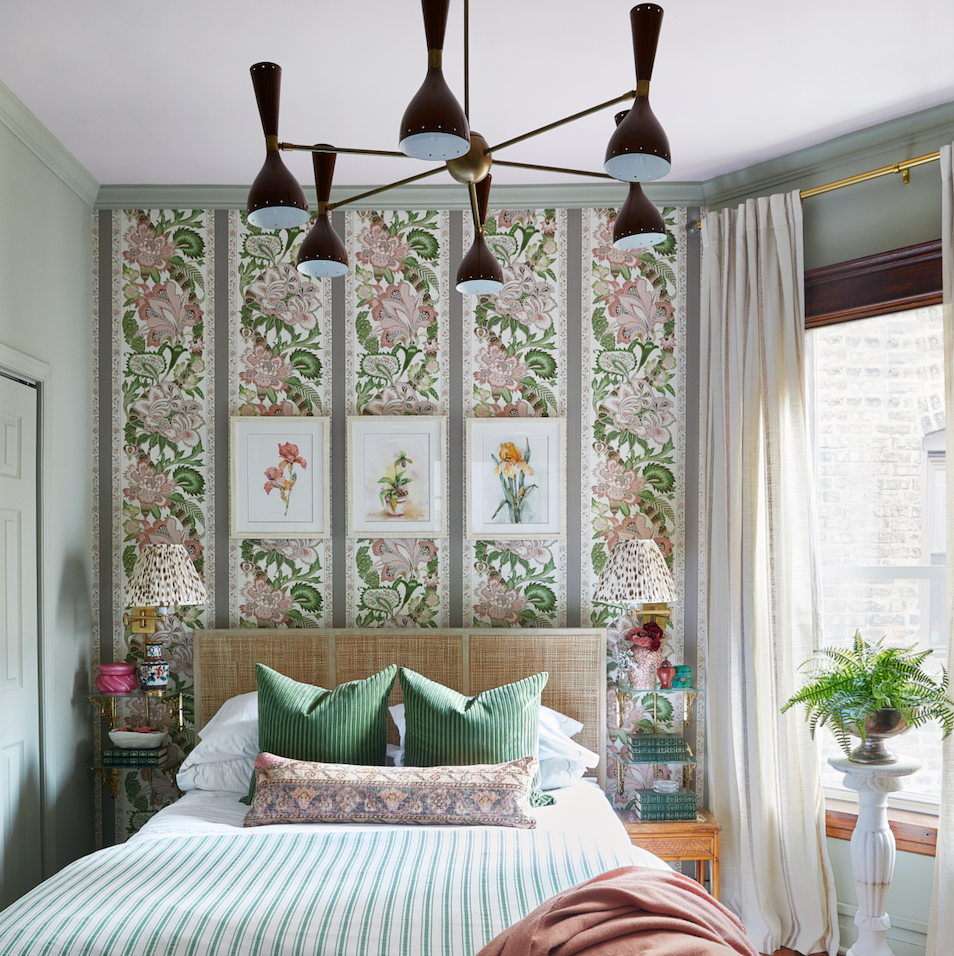
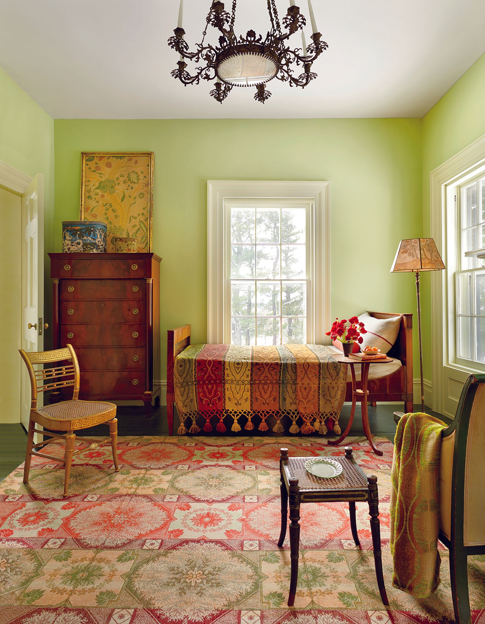
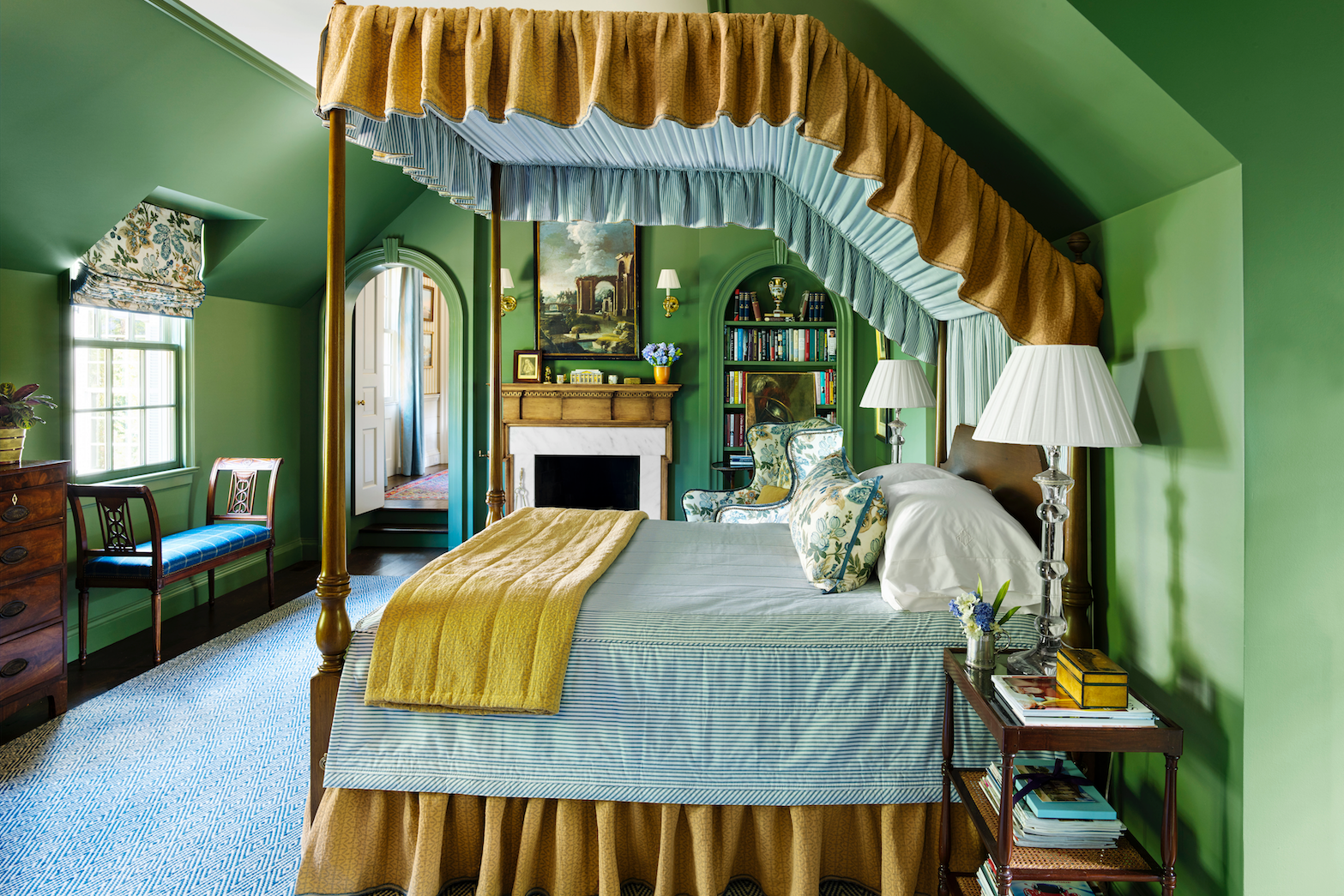
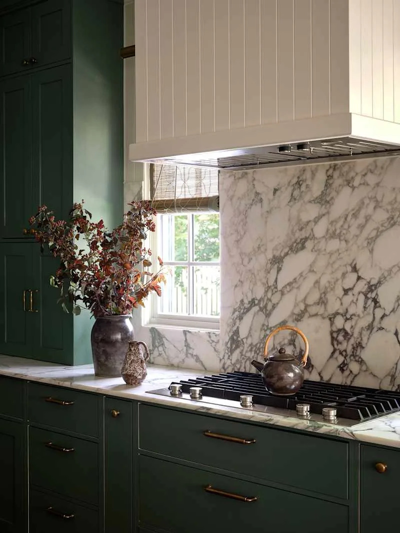
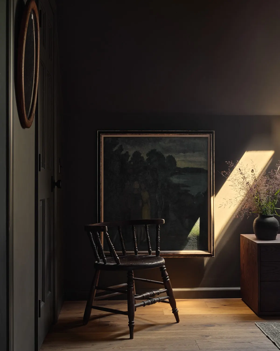
Moss Green, though seemingly unusual for May, is highlighted for its deep, inky, and verdant qualities, reflecting a trend towards bolder, saturated hues in spring. Abigail Ahern, a British interior designer, advocates for colors that reflect the landscape, like 'Seagrass Meadow,' for their atmospheric, timeless, and sophisticated appeal. The concept of 'color drenching' with this shade is encouraged for a soothing and grounding effect. Shauna Dennison-Taylor suggests pairing earthy greens with straw yellow for a blend of traditional and contemporary elements.
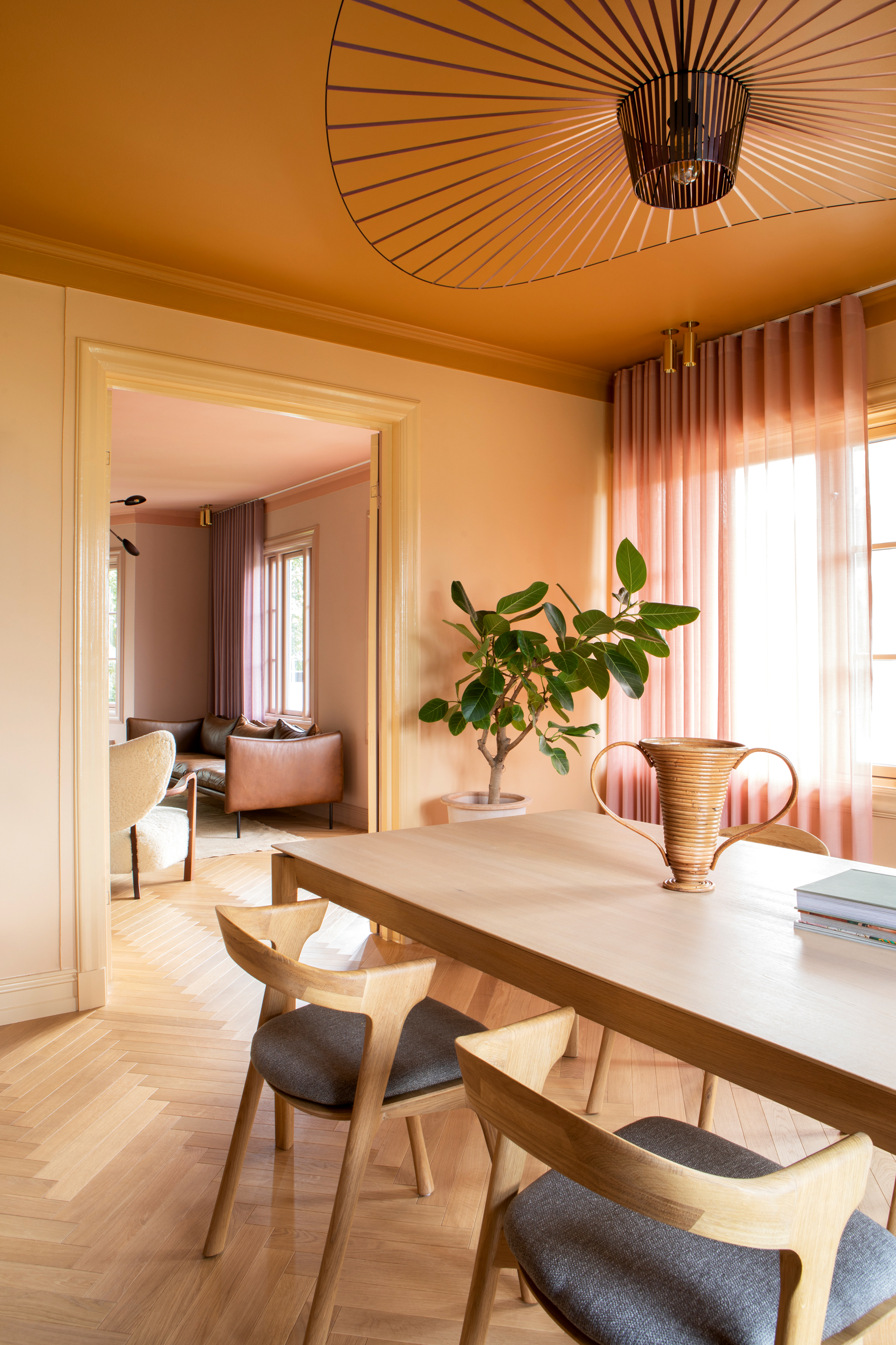
Tangerine Orange is then explored, challenging its reputation as a difficult color. The article describes it as brimming with optimism and zest, capable of feeling distinctly unstressful and frolicsome. It notes its historical use in orangeries for warmth, suggesting that flattering shades often have muddy, slightly brown undertones to avoid overwhelming potency. Fiona Duke recommends using bright citrus tones, including orange, in smaller spaces or as accents to inject cheer without being overpowering.
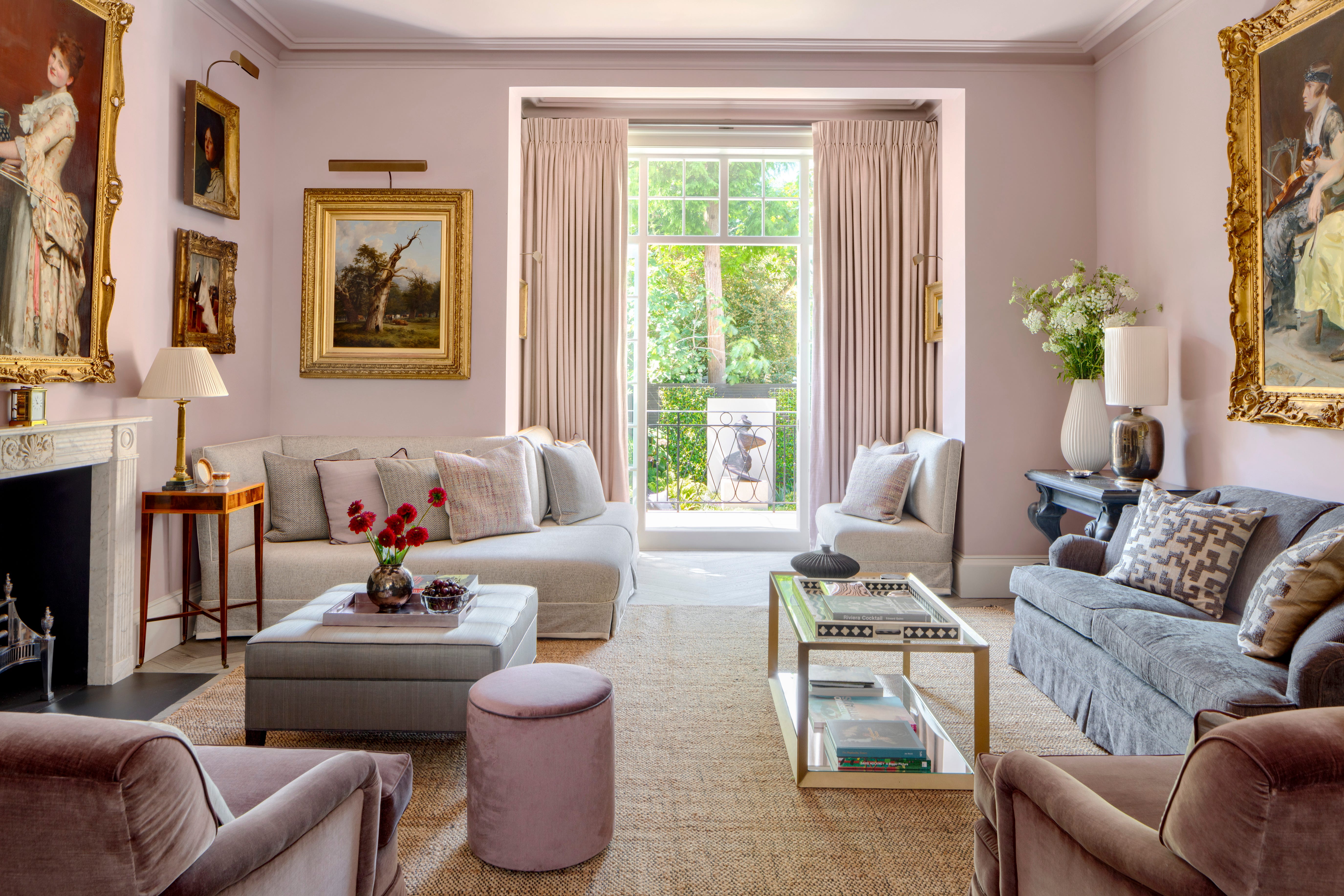
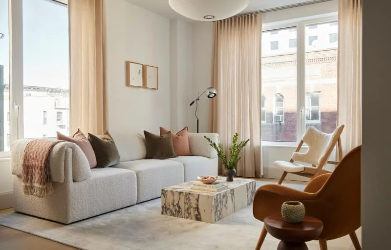
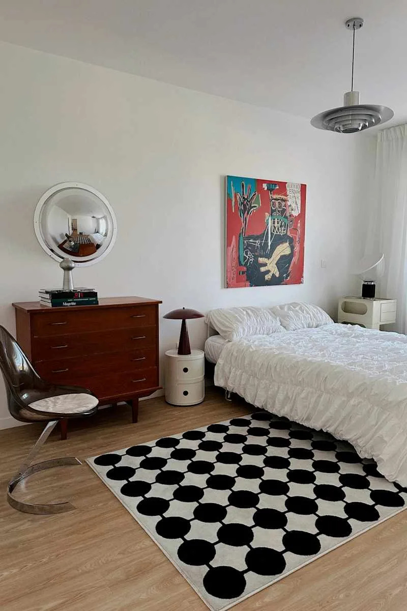
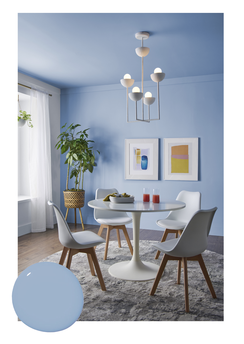
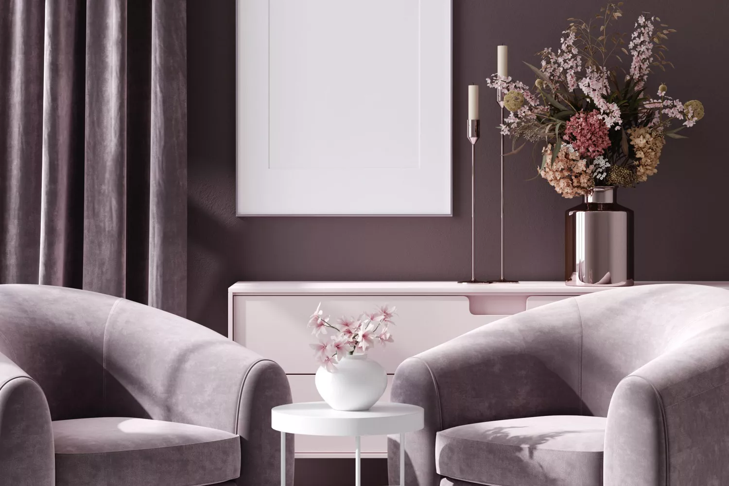
Finally, Barely There Baby Blue is presented as a persistent trend, offering a soft, calming, and unsaturated whisper of blue. Alexandra Keith from Otta Design emphasizes its suitability beyond nurseries, fitting well in serene bedrooms or sophisticated drawing rooms. It serves as an excellent alternative to gray, providing coolness and restraint without the drabness, maintaining a fresh and appealing aesthetic.
#ColorTrends #InteriorDesign #HomeDecor #PaintColors #MayDecor #DesignInspiration #ColorPalette #ColorTrends #InteriorDesign #HomeDecor #PaintColors #MayDecor #DesignInspiration #ColorPalette
0 comment in total
 No comments yet
You may also like
These are the 6 must-have colors to decorate with in April 2025

Experts Say These 5 Paint Colours Will Be Everywhere In 2026
Designers Predict You'll Use AT LEAST One of These Colors in Your Home in 2025

Move Over, Color Drenching— Color Capping Will Dominate 2026 Interiors


These 6 Colors Will Rule Interiors in 2026, According to Experts

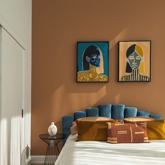
These 5 Paint Color Trends Will Be Everywhere in 2024, According to Interior Designers
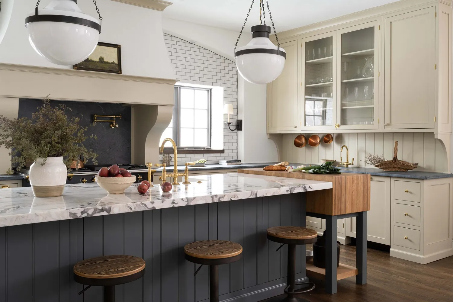
7 Trendy Paint Colors for Every Room in 2026, According to Designers

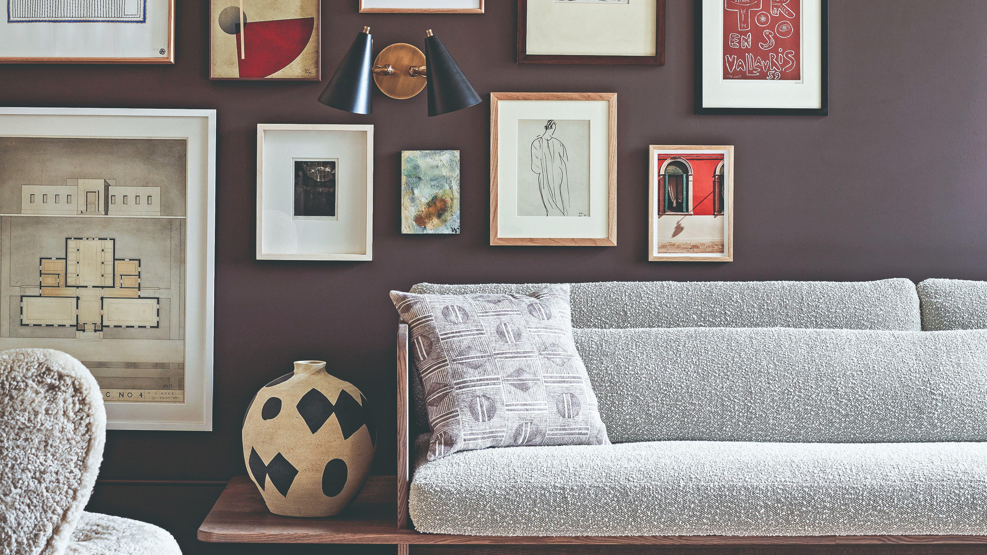
The colour palette for 2025 – these are the shades paint experts say we’ll see everywhere next year
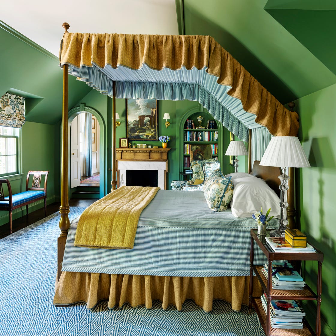
These 7 Colors Will Rule Interiors in 2026, According to Experts

5 Paint Colors That Are Out for 2025, According to Interior Designers

5 Styles That Will Dominate Home Decor in 2026, According to Experts
The colour trends 2026 that will define our homes next year

5 Paint Colors That Will Take Over in 2025, According to Interior Designers

These Colors Will Be Everywhere in Interior Design in 2026
The biggest color trends of 2025 – 10 colors designers say will lead the way next year
What Paint Colors Will Rule 2026? Designers Make Their Predictions


These Colors Will Be Everywhere in Interiors in 2025
These 8 Colors Will Rule Interiors in 2026, According to Experts

5 Living Room Color Trends for 2025 — New and Exciting Shades Designers Are Choosing for Walls

5 Bedroom Paint Color Trends You'll See Everywhere in 2025, According to Designers