1/33
Lick Paint Will Transform the Mood in Your Home Through Color Psychology
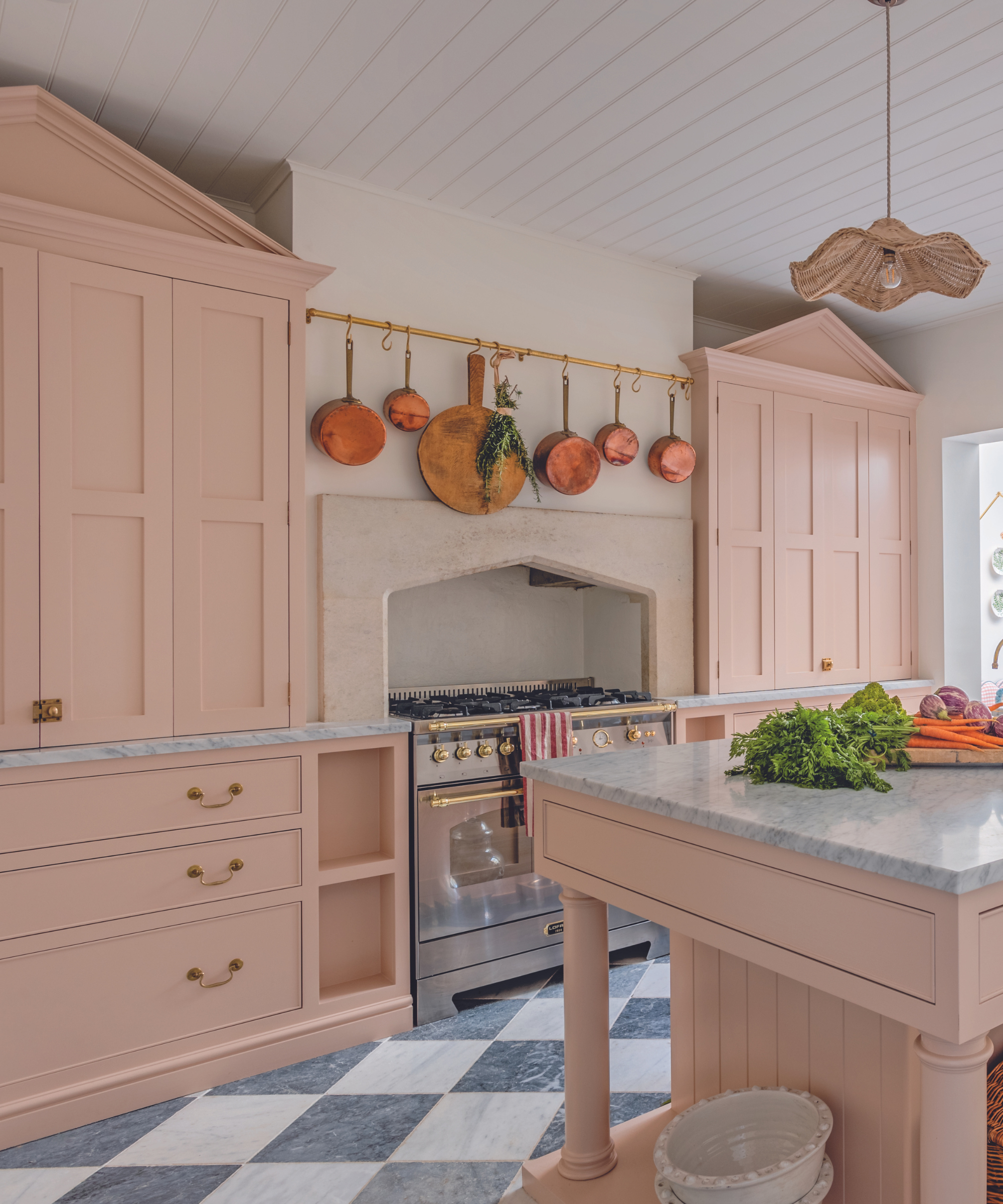
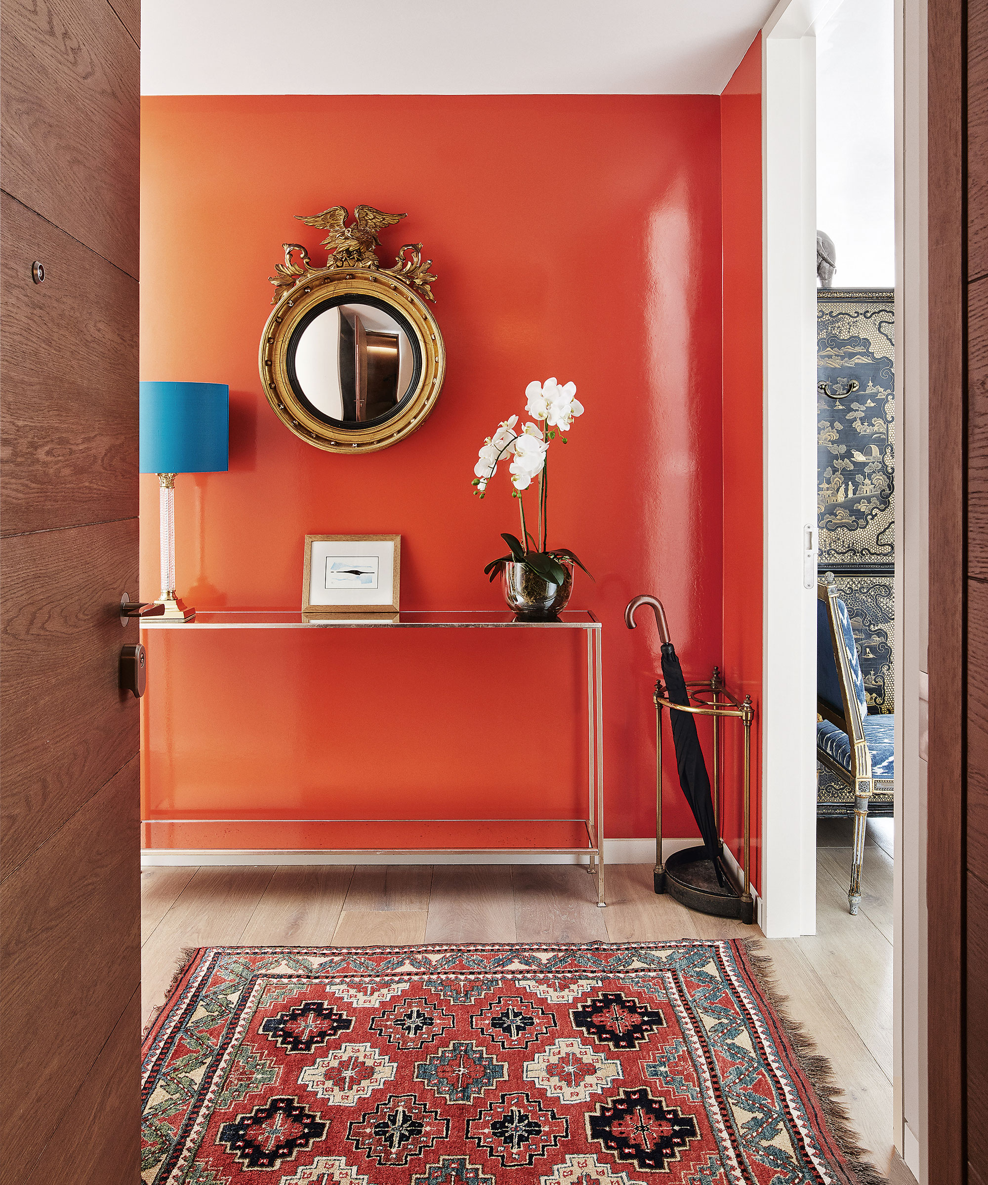
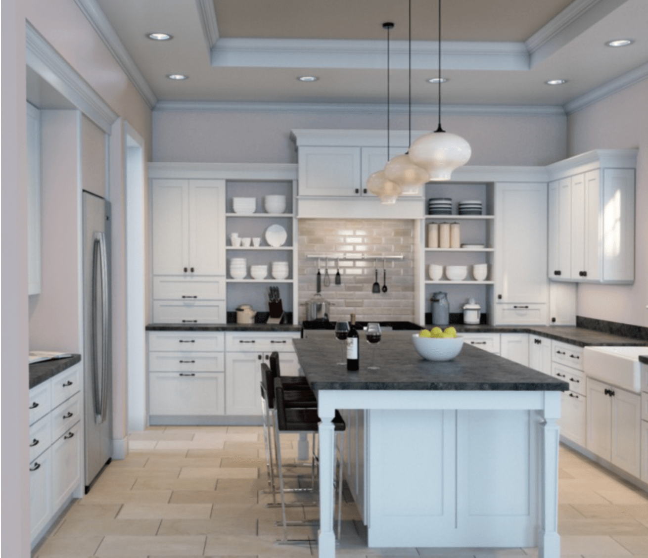
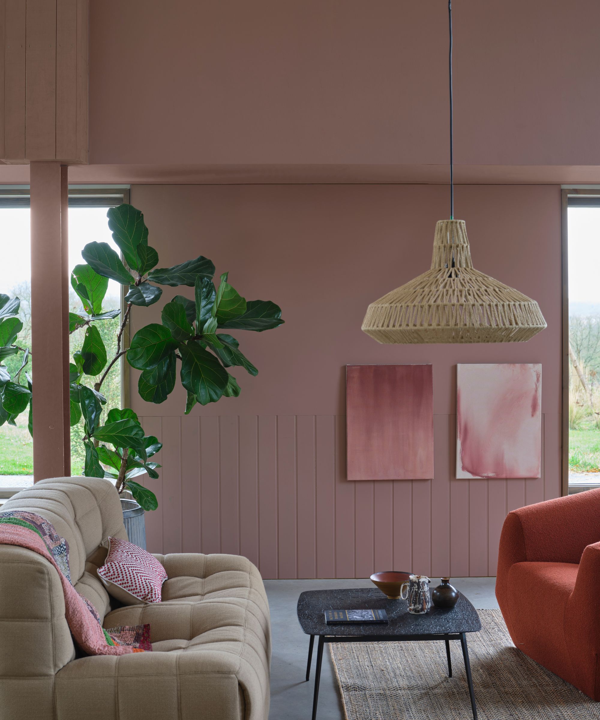
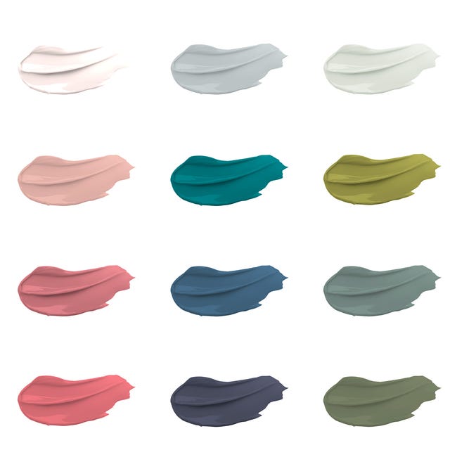
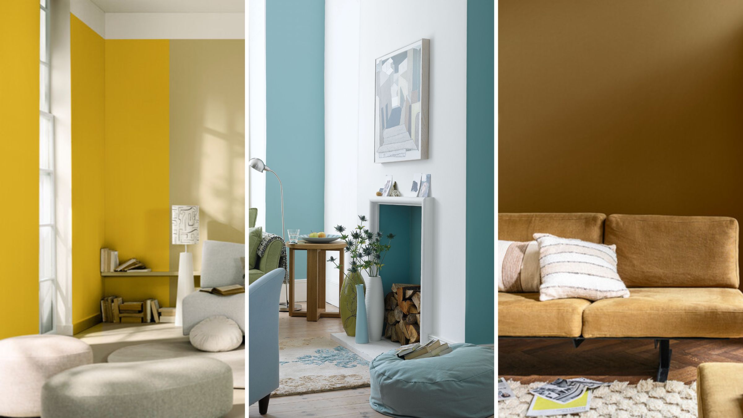
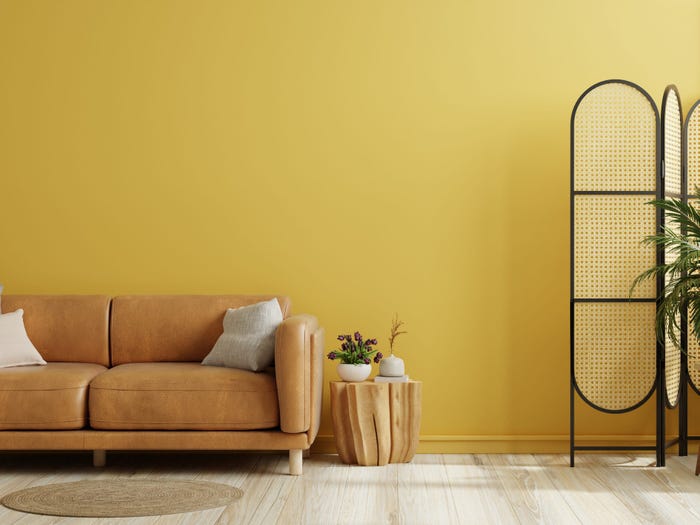
The choice of colors profoundly influences a home's atmosphere, and interior designers employ specific palettes to achieve an upscale and luxurious feel. Certain tones consistently rank high on clients' wish lists for their ability to convey elegance. These preferred hues, such as deep oxblood, classic navy, and inviting warm whites, effortlessly elevate any space. These colors can be integrated through prominent furniture pieces or by embracing the 'color-drenched' trend, where walls, ceilings, and trim are painted in a single, cohesive tone. This approach offers endless stylish possibilities, with designers often showcasing these rich colors in their own projects to demonstrate their impact.
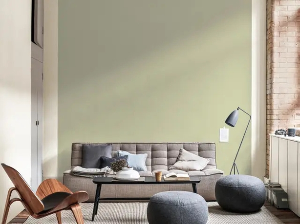
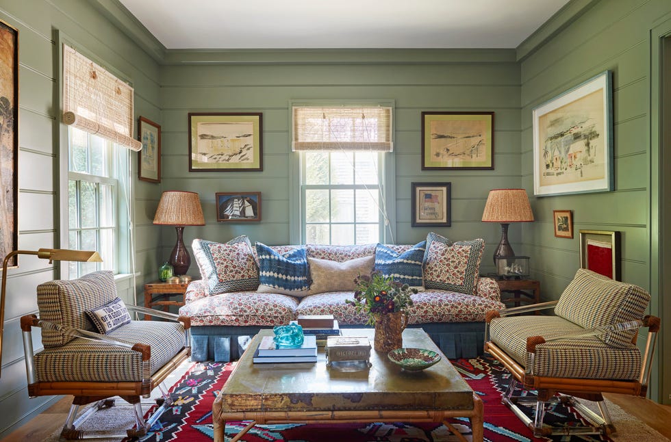
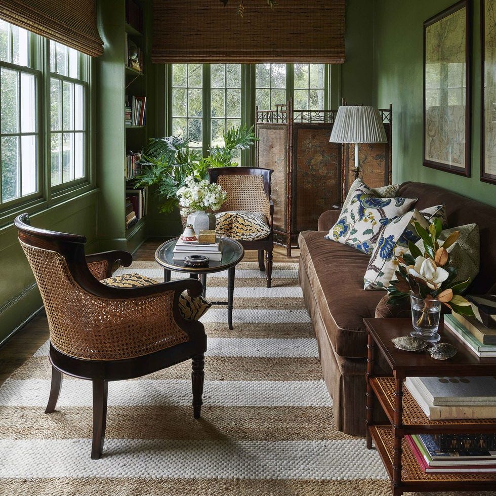
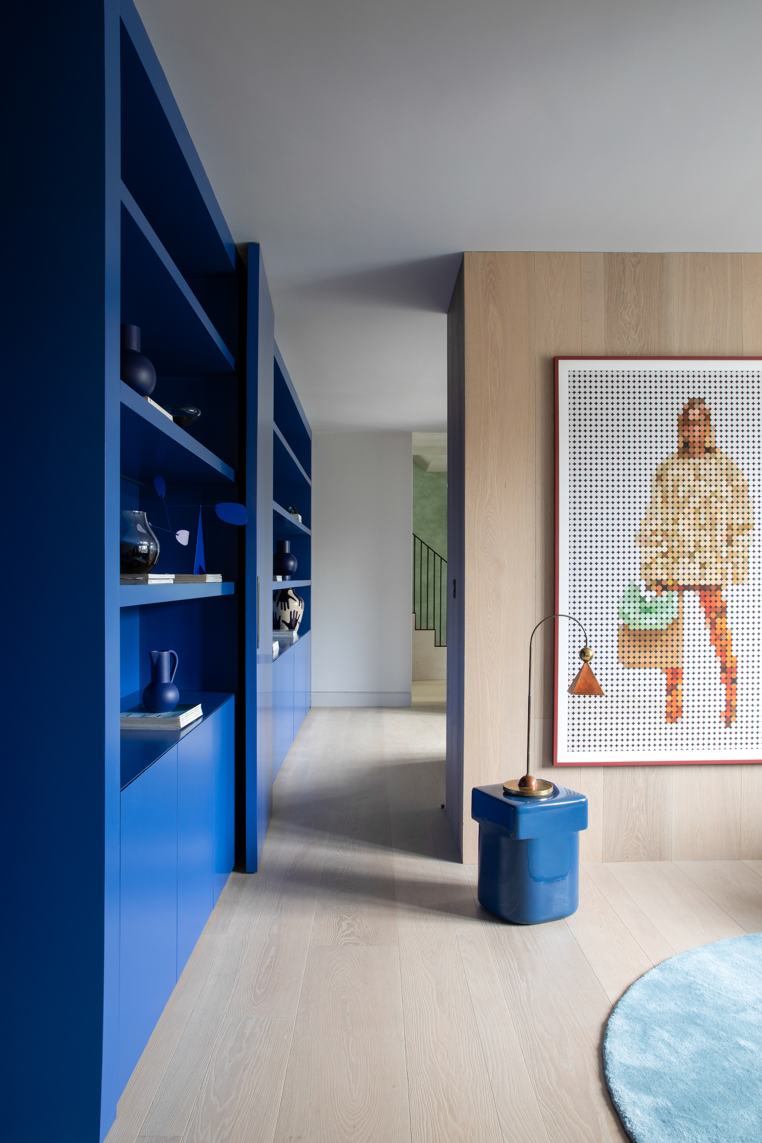
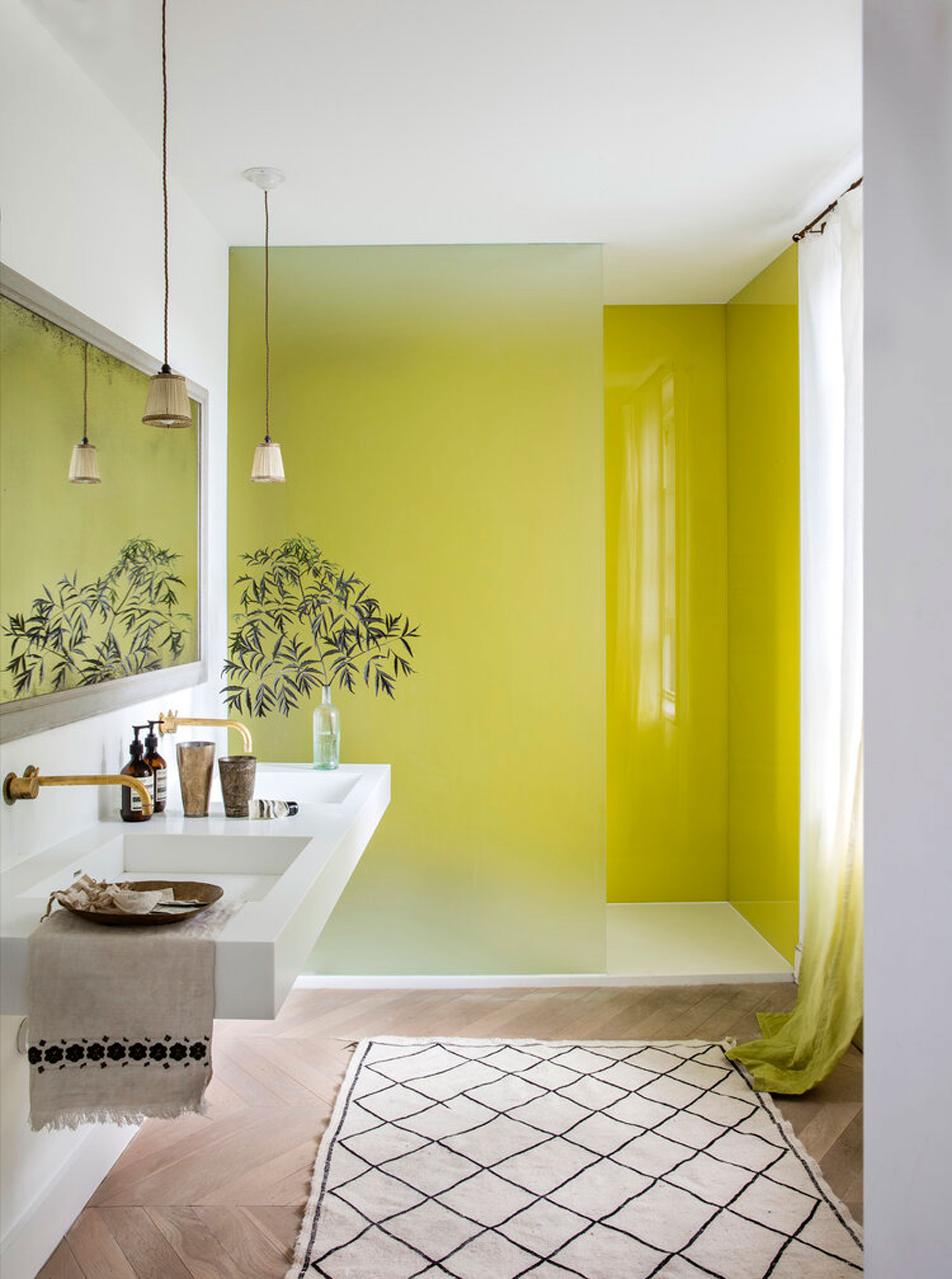
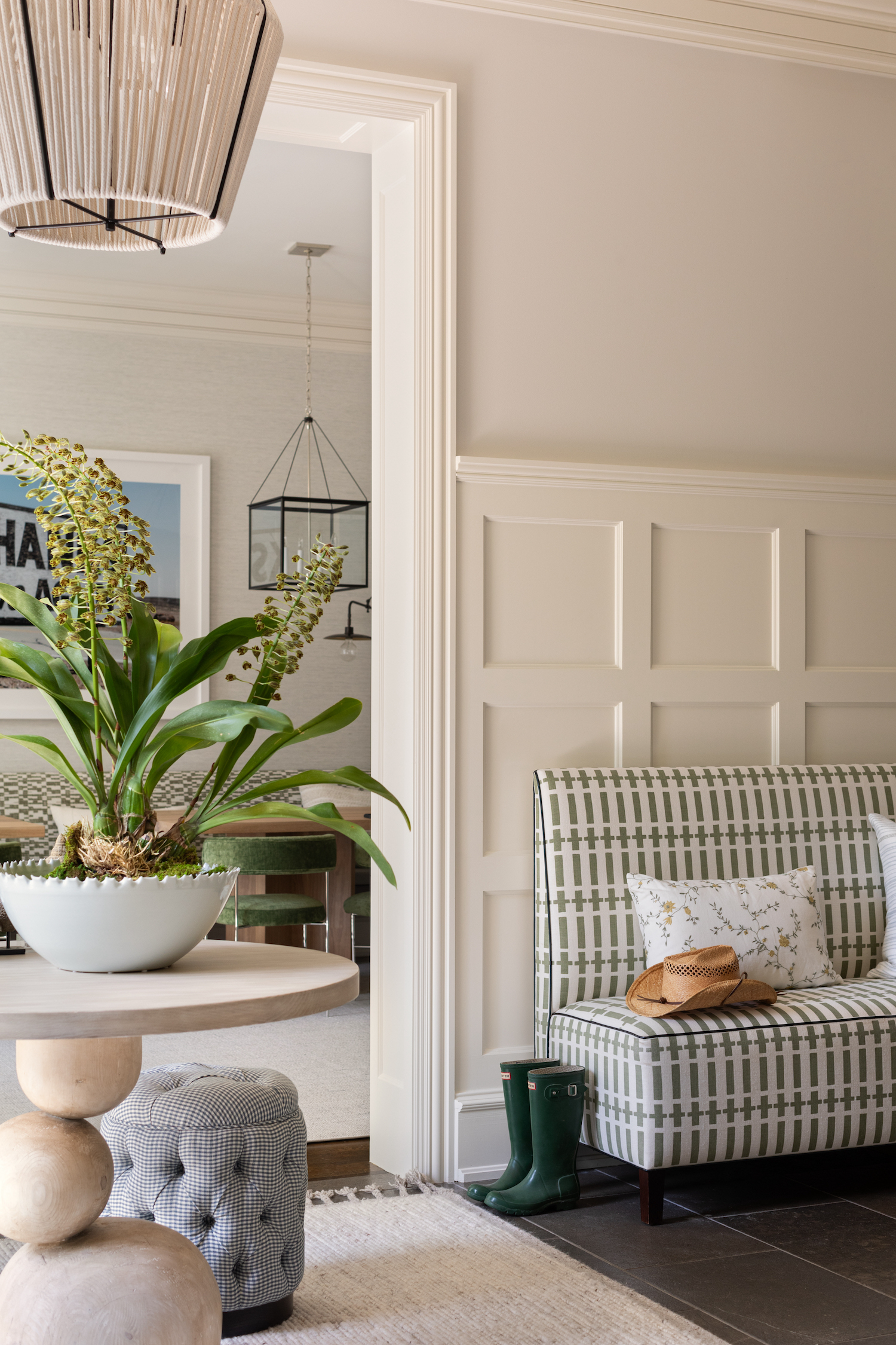
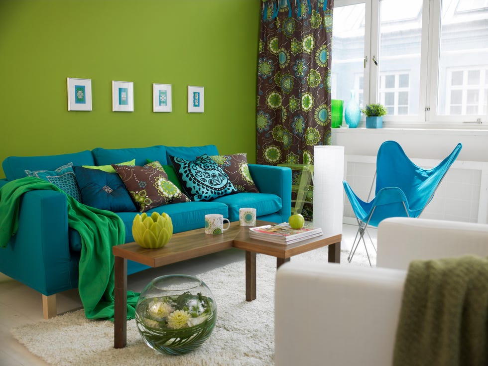
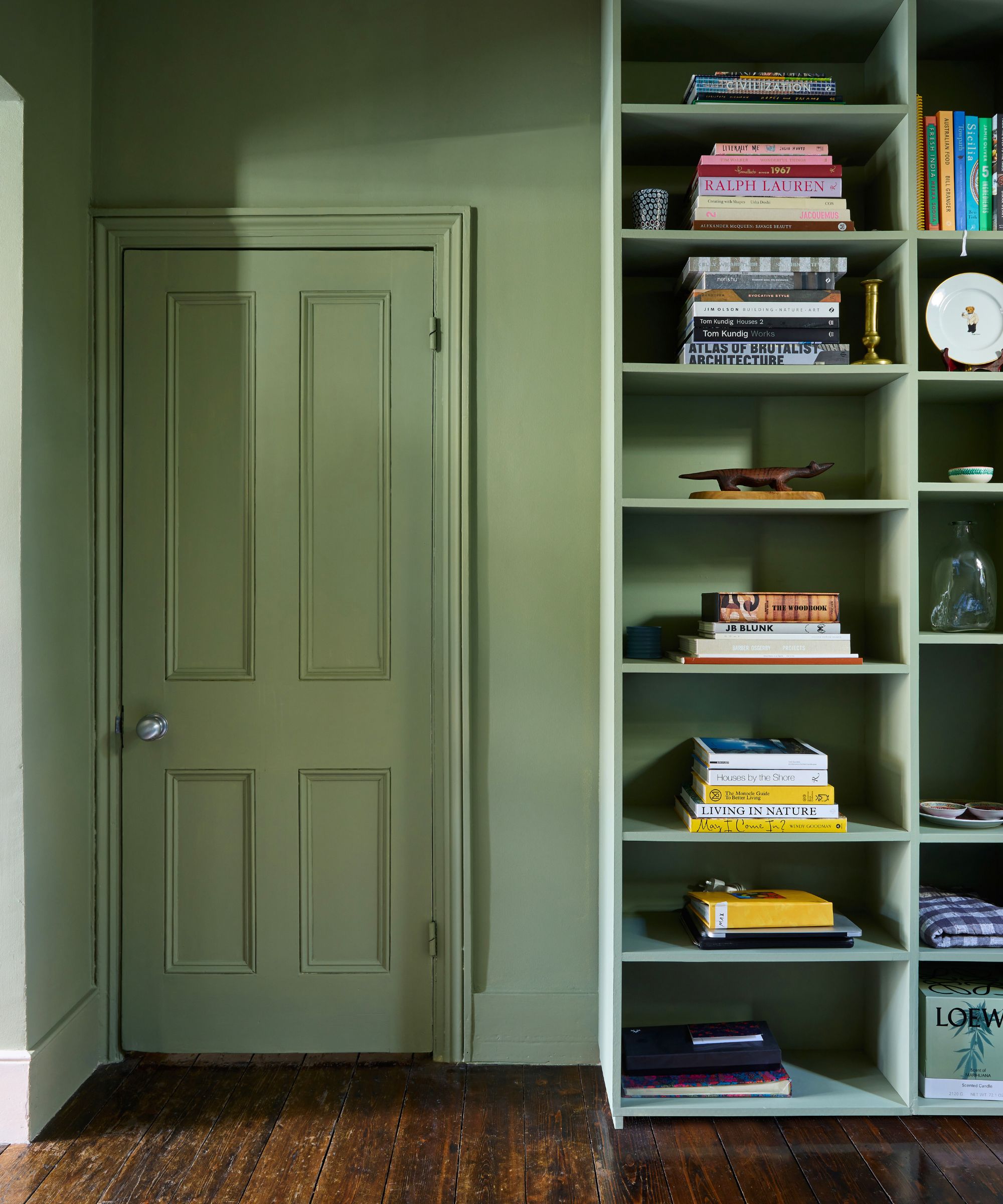
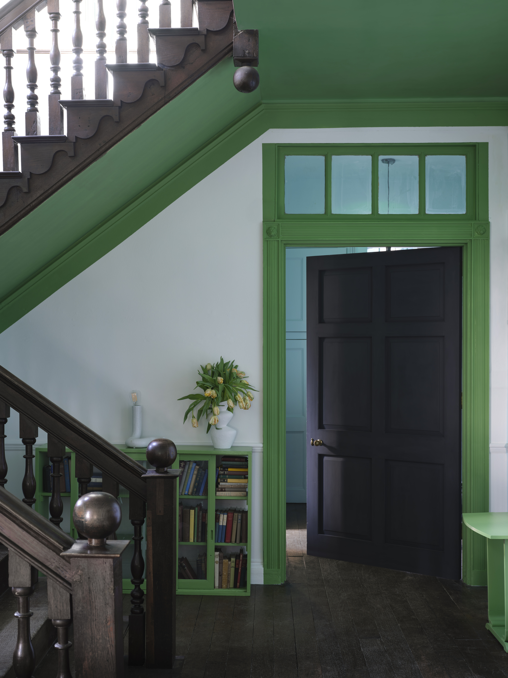
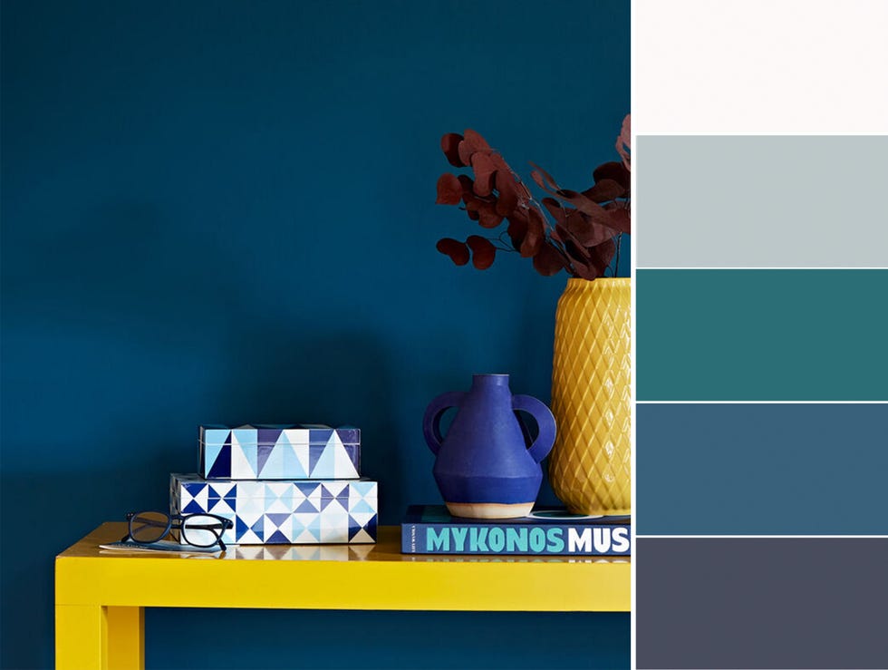
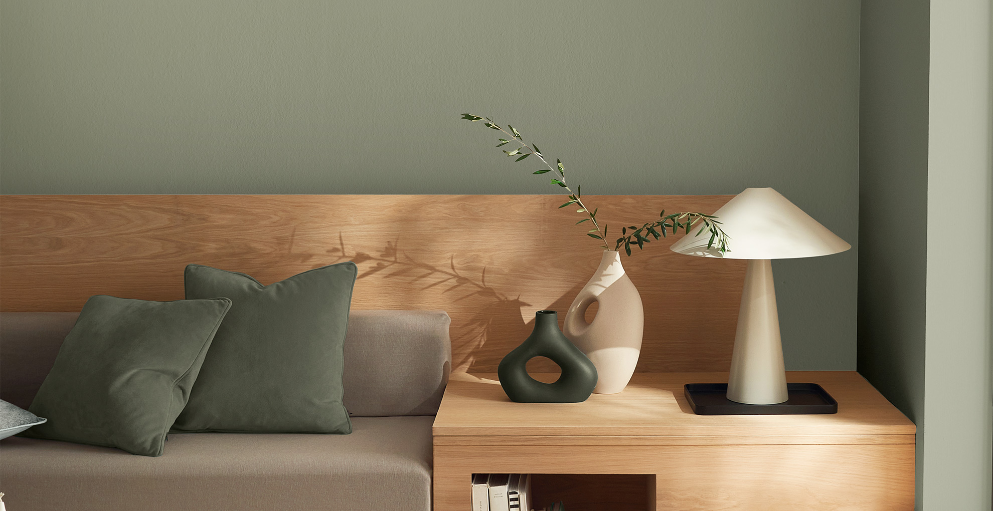
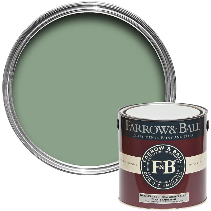
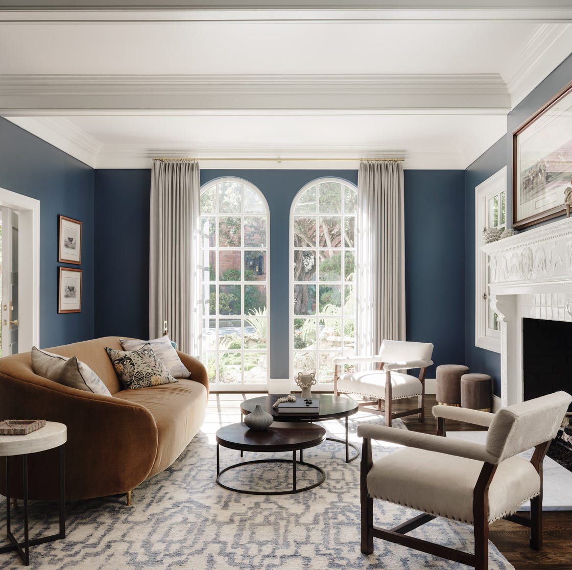
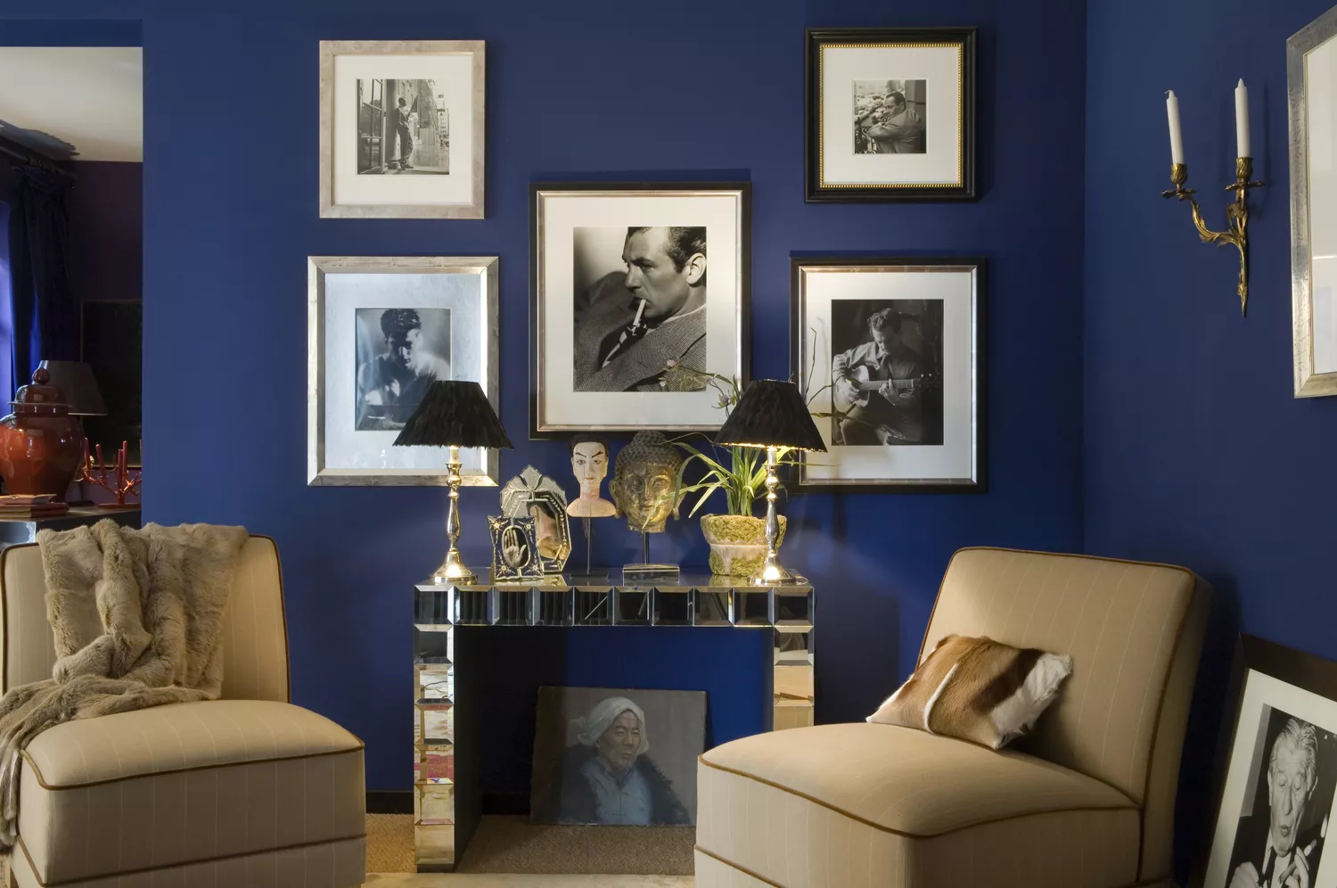
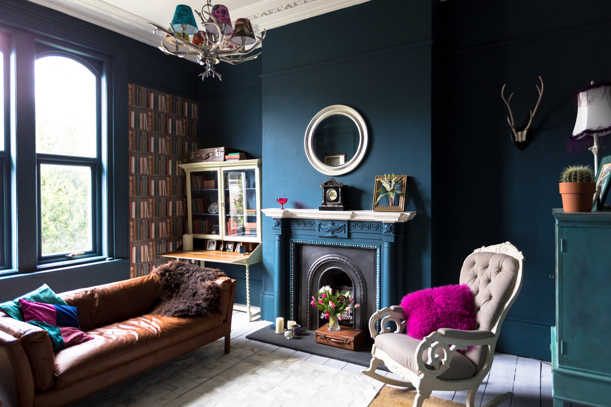
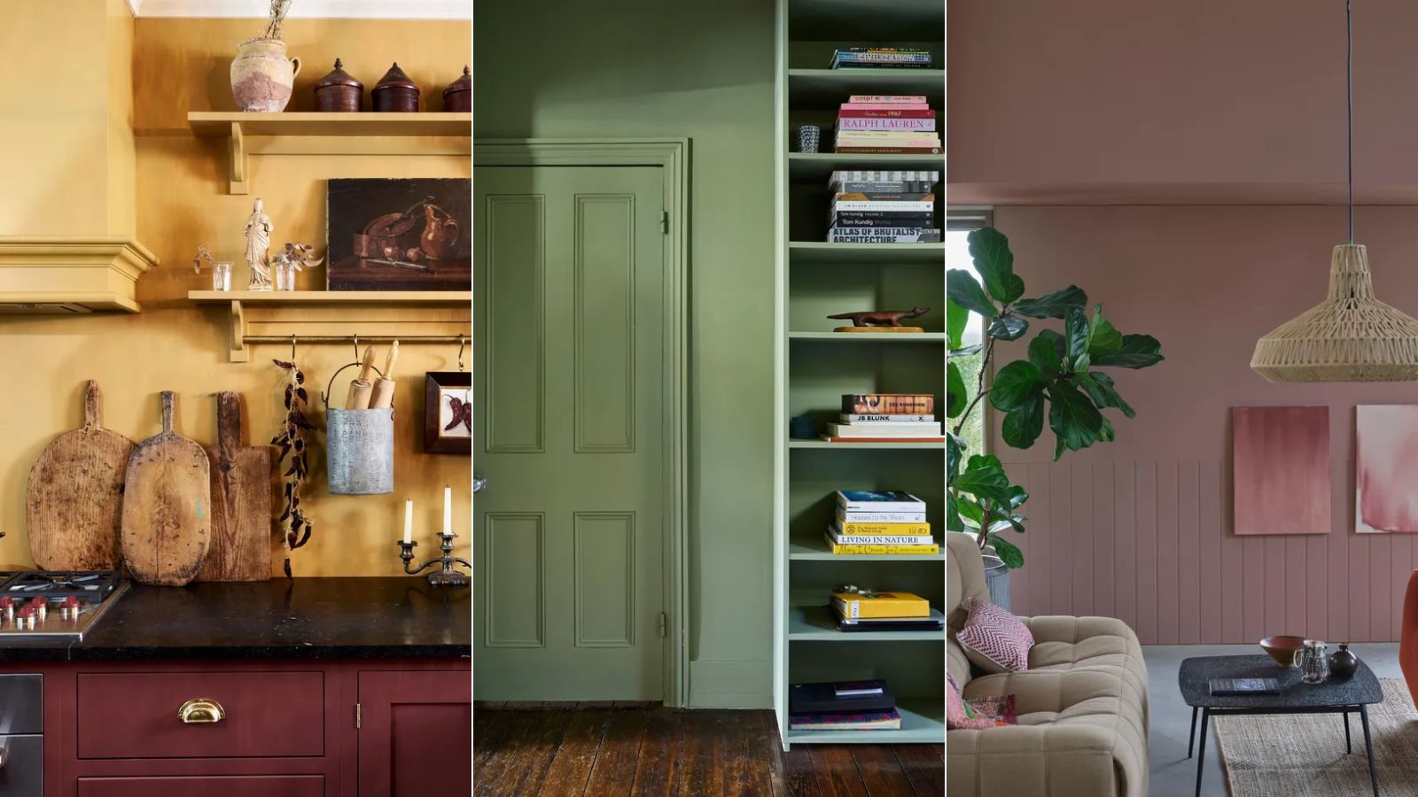
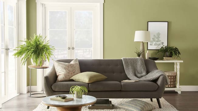
Navy blue is frequently highlighted by designers as a timeless and elevated color. It evokes a calming effect, reminiscent of the ocean and night sky, while remaining highly versatile for spaces like living rooms and kitchens. Designers recommend pairing navy with jewel tones such as deep purples, magentas, golds, and emeralds for a dramatic and rich effect. Alternatively, ivory offers a classic match, and warm gold tones enhance the blue's impact. Olive green is another popular choice, praised for its ability to transform any room into a tranquil oasis. This adaptable shade works well on entire walls or as an accent on trim and doors. Painting ceilings in a smooth semigloss olive green can add coziness and sophistication, suiting both contemporary and traditional settings. It pairs effectively with brass, bright whites, light oak, and camel, offering a colorful alternative to black.
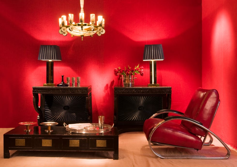
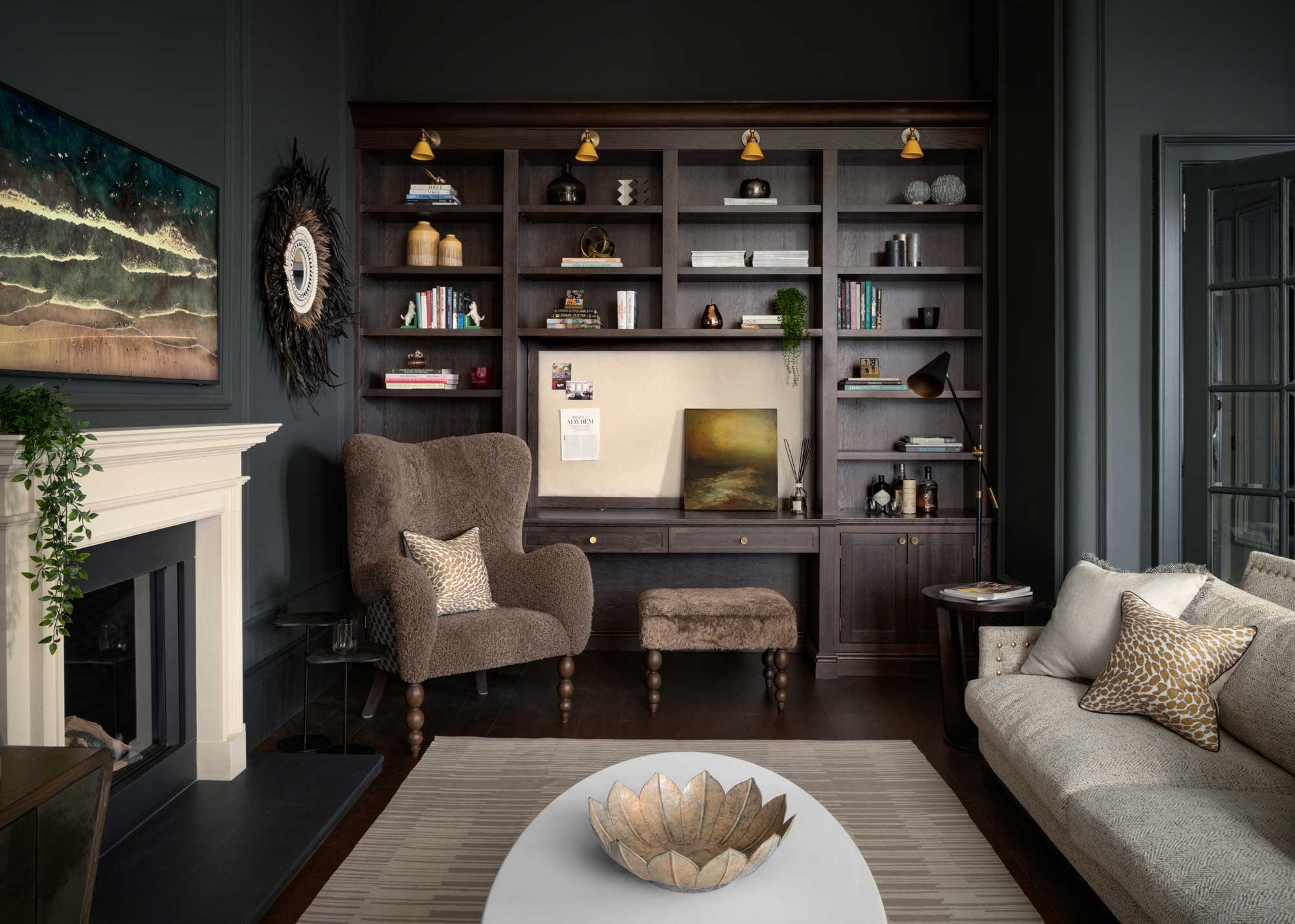
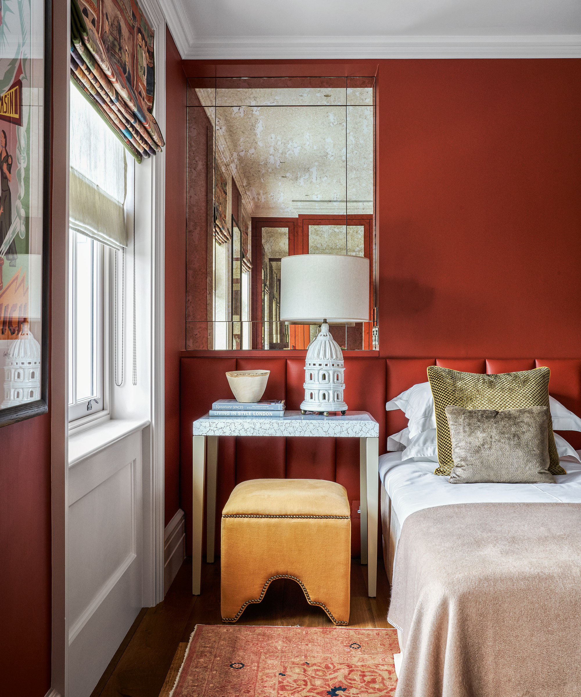
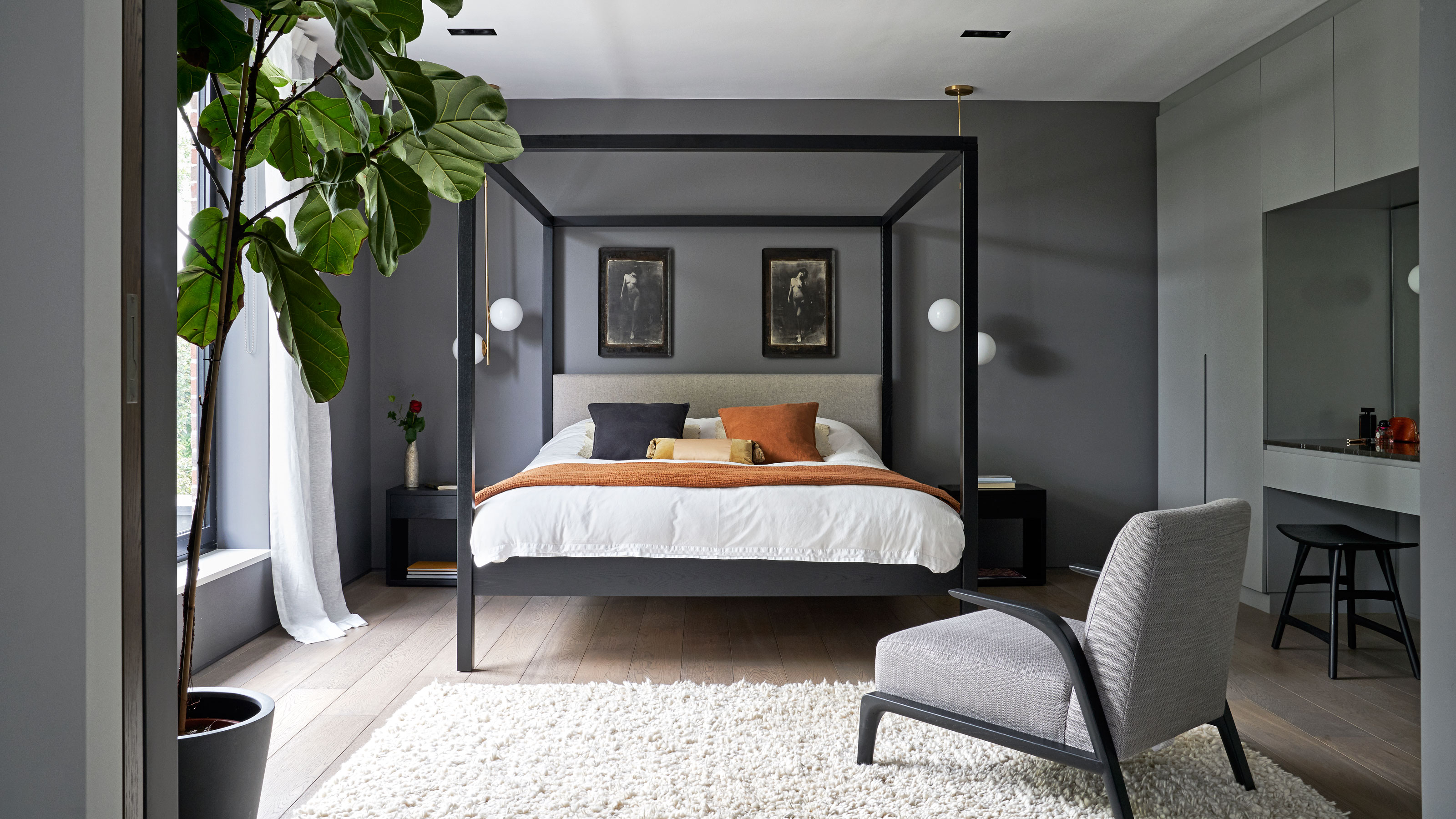
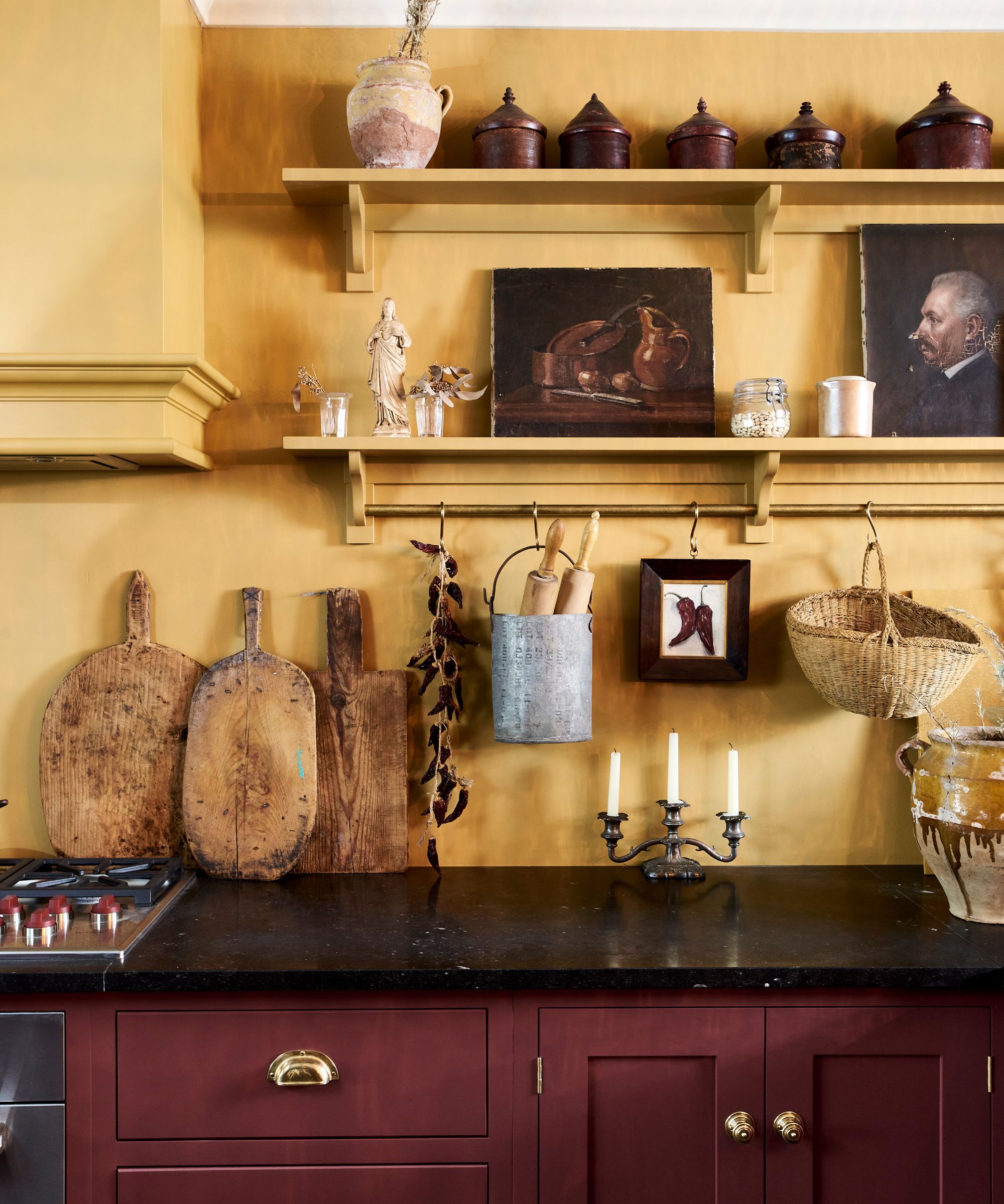
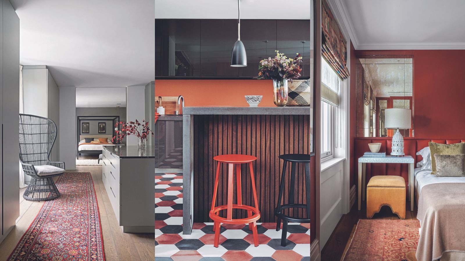
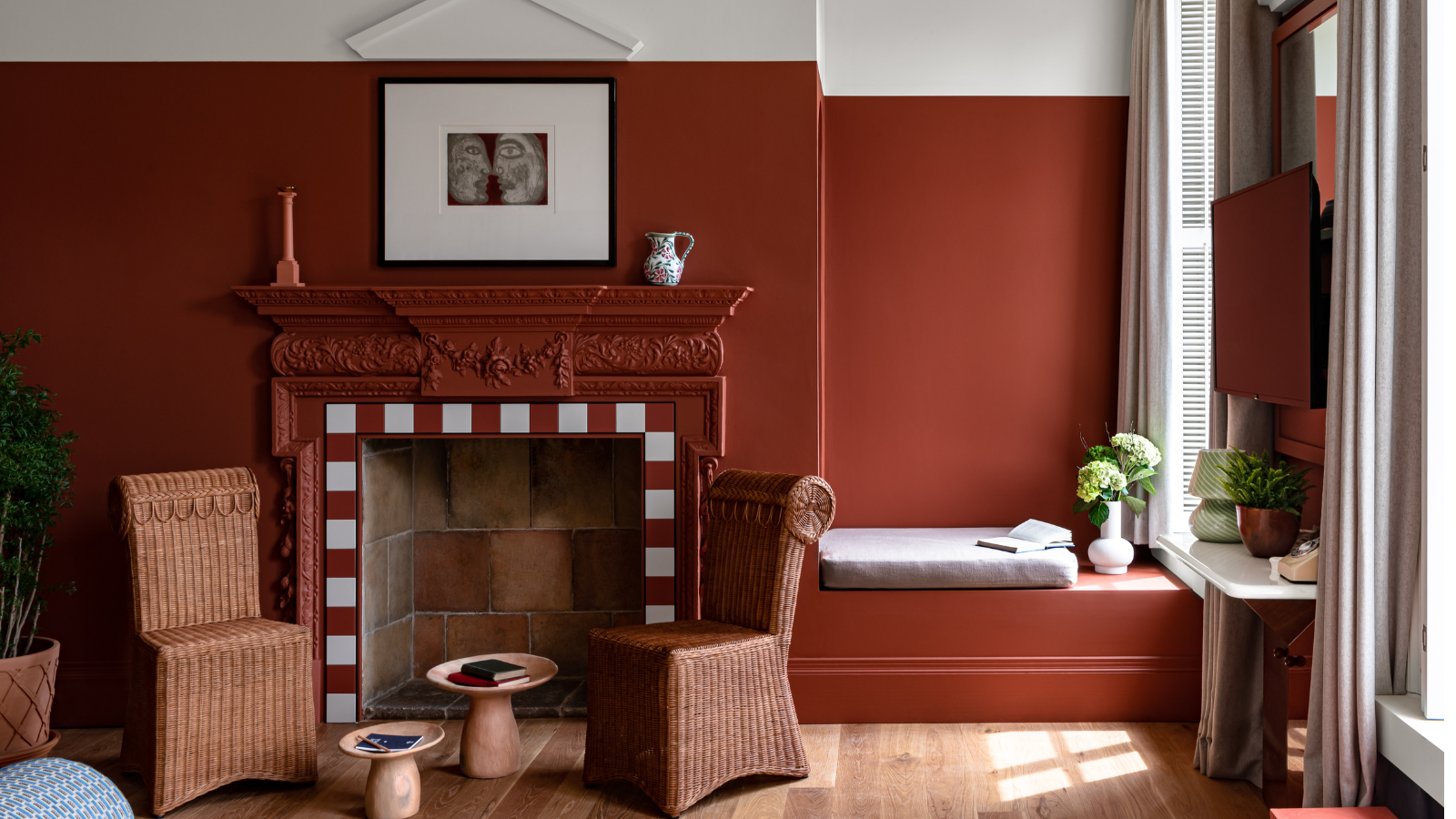
Oxblood, a deep and moody wine red, is gaining popularity among designers and enthusiasts. It channels the luxurious essence of aged wine, embodying refinement and timeless allure. This hue creates depth and a luxurious, enveloping atmosphere, making it ideal for spaces like libraries, media rooms, or dining rooms. For optimal effect, especially for color drenching, large rooms with high ceilings are recommended. Oxblood pairs well with soft neutrals for balance or with black and dark gray for an edgy, dramatic look. Dark teal offers a bolder alternative to navy, chosen by designers for its richness and refinement. Its depth interacts with light and shadow, creating a layered and intentional aesthetic. Brass accents add warmth and luxury, while neutral elements like soft beige and light wood balance the intensity.
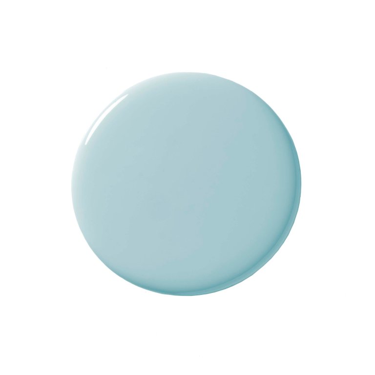
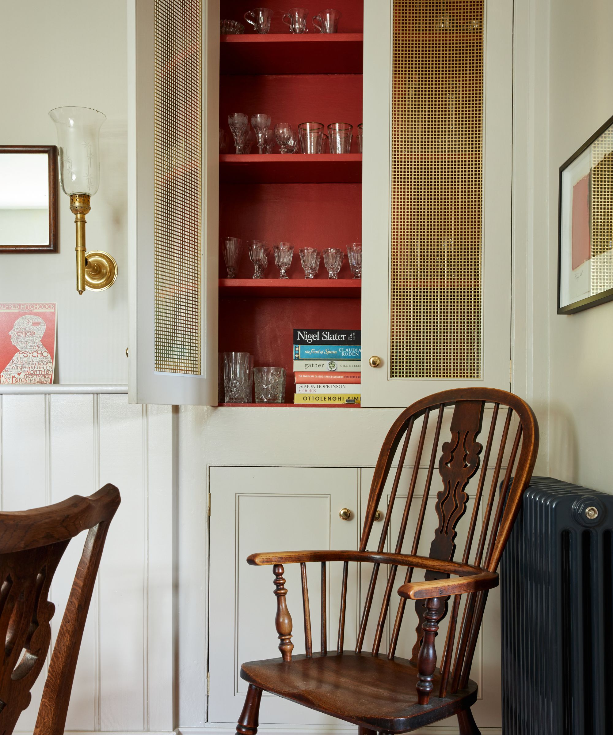
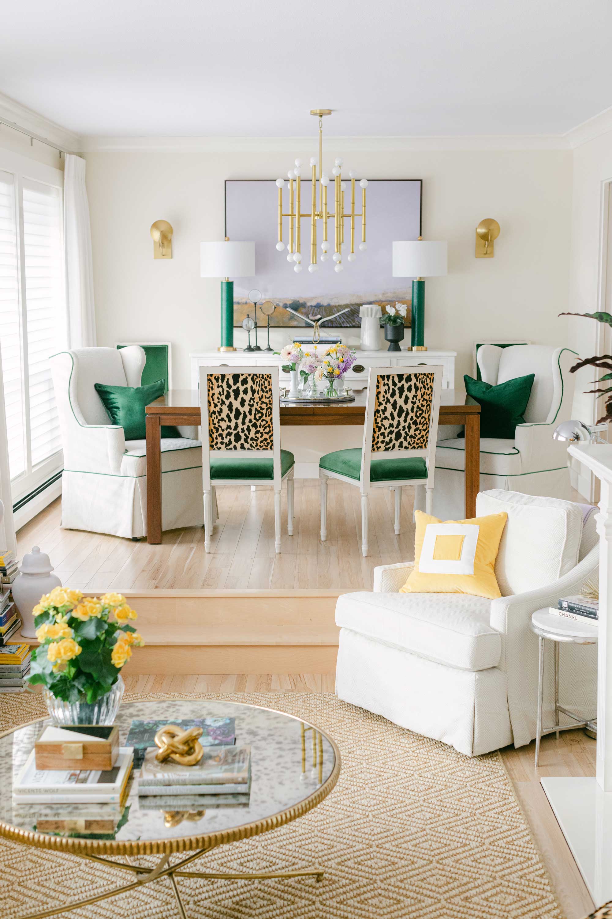
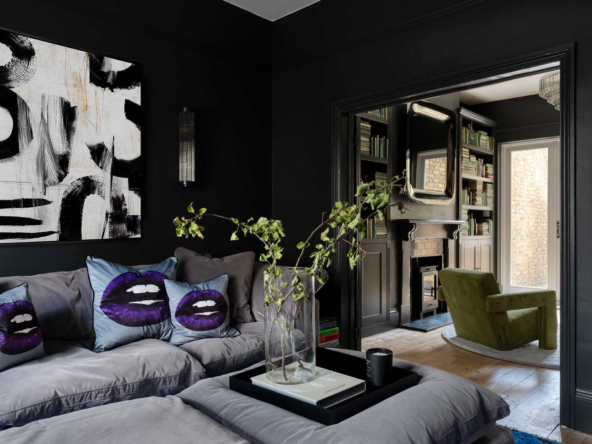
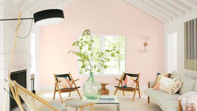
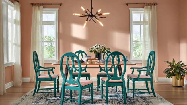
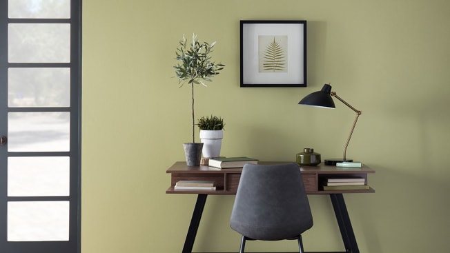
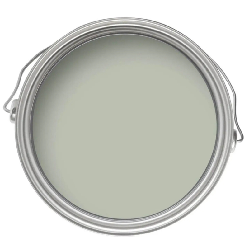
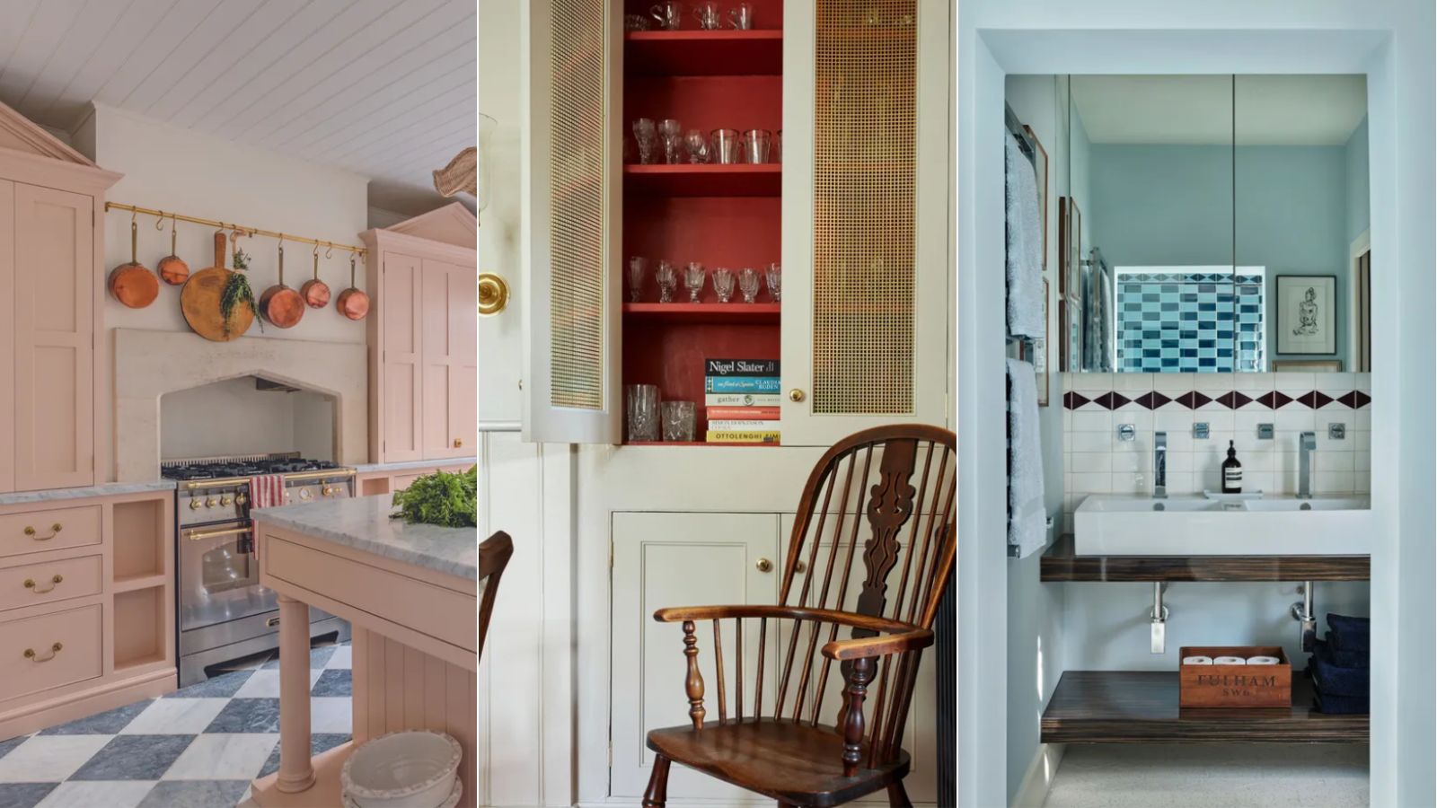
Plum purple, historically associated with royalty, naturally imparts a rich and luxurious feel. Highly saturated shades like plum, eggplant, and amethyst create depth and elegance. Designers suggest brightening these tones with gold for contrast and note their versatility in complementing other jewel tones or even vibrant tangerine orange. For those preferring lighter walls, off-white or soft white is recommended. This shade provides a clean, serene, and timeless backdrop, exuding sophistication and luxury, especially in open-plan layouts. Off-white is versatile, highlighting bolder design elements or serving as a minimalist backdrop. To achieve a truly luxurious effect, off-white should be paired with rich textures like velvet, gold accents, and deeper colors such as dark green, navy, and chocolate brown, along with wood tones for warmth. Smoky taupe, described as feeling like suede, adds depth without being overwhelming and pairs elegantly with robin’s egg blue, deep green, or crisp white. Charcoal, particularly in a limewash paint, offers understated opulence, with its subtle texture and uneven finish providing a timeless yet modern and organic quality. Paired with polished brass, marble, rich wood tones, and plush textiles under diffused lighting, charcoal creates a harmonious and sophisticated interior. Dusty blue, a blend of blue and gray, offers tailored elegance and a modern yet nostalgic feel, suitable for cabinetry, millwork, or walls, and pairs well with crisp whites, warm metallics, and light wood. Finally, incorporating texture through plaster or limewash, regardless of color, adds inherent elegance, with white plaster walls complementing jewel tones for a traditional look. Celery green, a lighter option, brings light and happiness to a room, especially with a high-gloss sheen, and pairs well with off-whites and dark accents.
#InteriorDesign #PaintColors #HomeDecor #LuxuryDesign #ColorPalette #DesignTrends #HomeStyling #InteriorDesigners #HomeRenovation #InteriorDesign #PaintColors #HomeDecor #LuxuryDesign #ColorPalette #DesignTrends #HomeStyling #InteriorDesigners #HomeRenovation
0 comment in total
You may also like
How paint colour in your home can affect your mood
7 'Unhappy' Colors That Color Psychology Experts Would Never Paint Their Walls

What are the worst colors to paint a room? The shades experts say you should never use

6 Paint Colors That Make Your Living Room Look Smaller, According to Interior Designers
How Your Home's Paint Colors Can Make You Happier, According to Experts

These Paint Colors Bring Hostility to Your Home, According to Experts

What paint colors to use to create a relaxed vibe at home

30 on-trend paint colours for every room in your home
A Color Psychologist Says This Is the Most Relaxing Paint Color

The colours you paint your walls can impact your mood, and here’s the science to prove it

The 13 Best Paint Colors for Low-Light Rooms

6 'Energetic Colors' for Vitality and "Sophisticated Interiors", According To Psychologists And Design Experts
8 Paint Colors That Promote Wellness at Home

How to use paint to change the size and shape of your room
My rented apartment follows the key rules of color psychology – here's why I'd never go back to an all-white home
Experts reveal the best living room paint colours to transform every space

A color psychologist says these color schemes are the most likely to boost your mood
Hottest Interior Paint Colors of 2020
'It's the best way to make a home joyful' - this paint trend is the perfect idea to introduce color thoughtfully
An expert in color psychology shares the 5 shades you should have in your living room