1/6
Hottest Interior Paint Colors of 2020
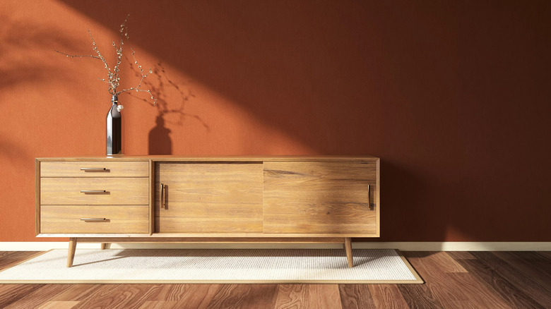
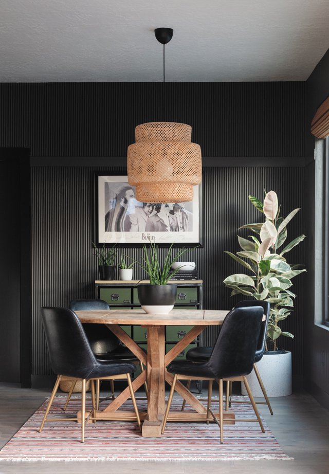
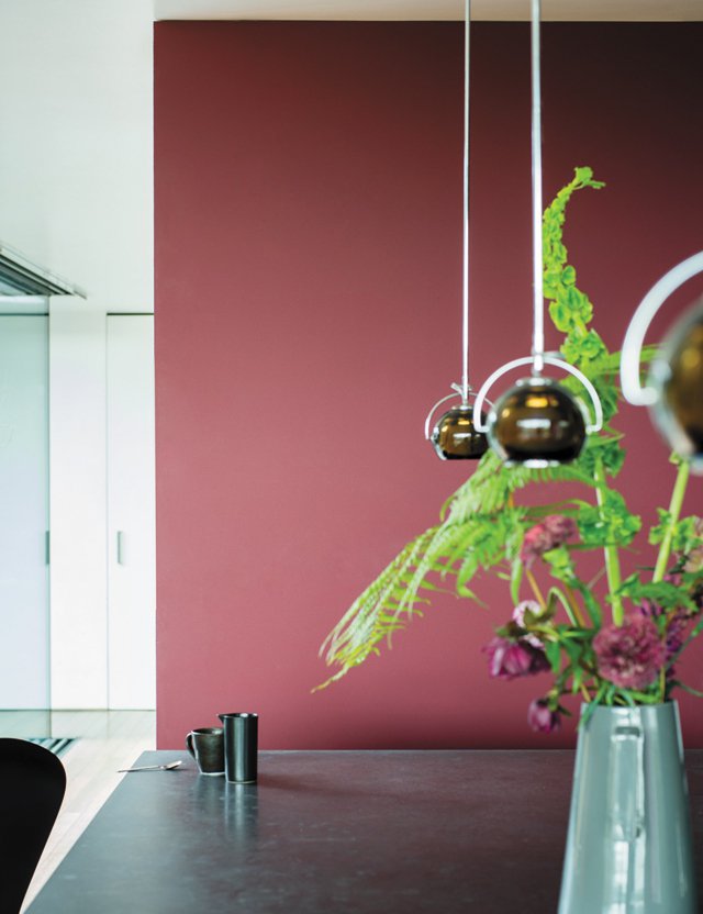
The selection of interior paint colors for 2020 reflects a prevailing desire for warmth, tranquility, and a connection to nature, themes that have been amplified by recent global circumstances. Color experts from leading paint manufacturers like Benjamin Moore, Behr, PPG, Sherwin-Williams, and Valspar identified five trending hues that offer comfort and a fresh aesthetic for homes. These selections were made prior to the coronavirus pandemic but are still considered highly relevant and popular due to their grounding and calming qualities.
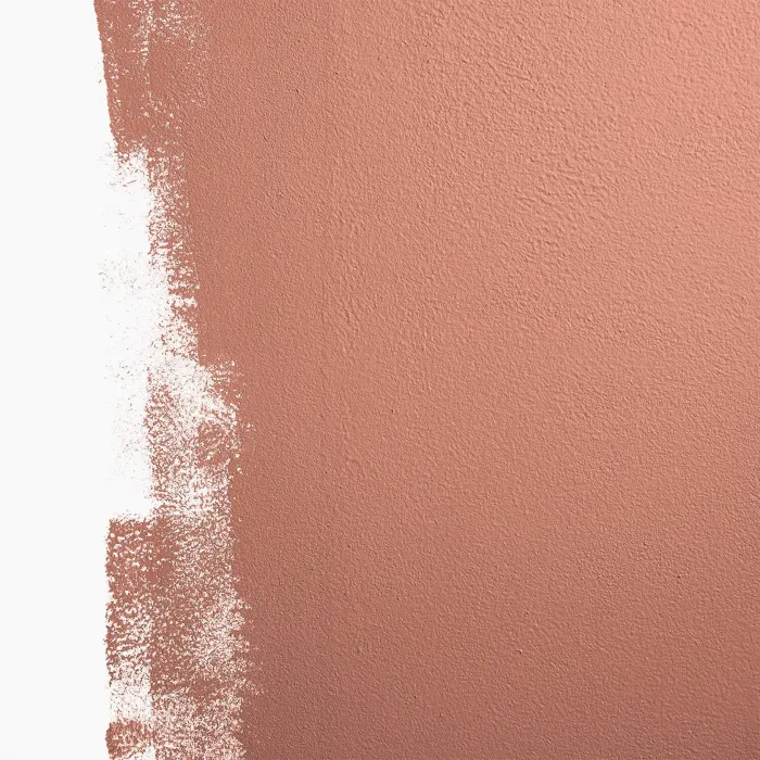
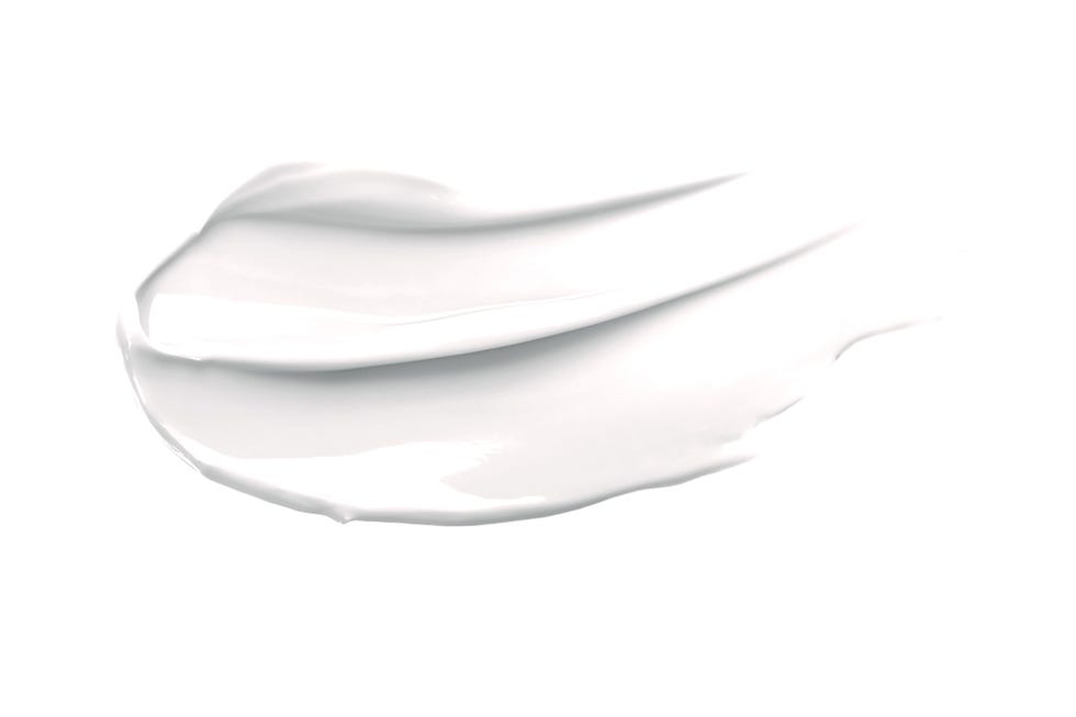
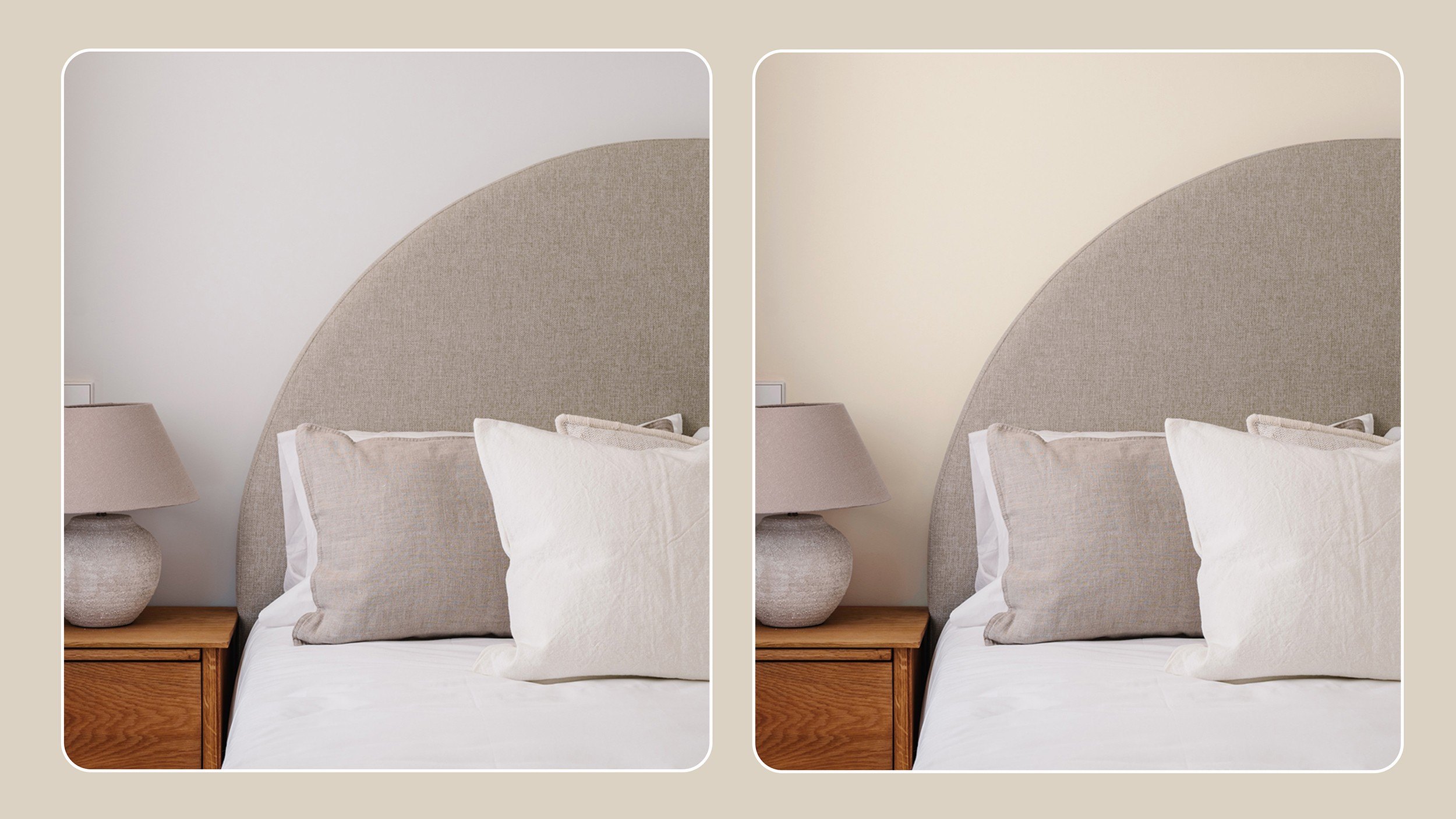
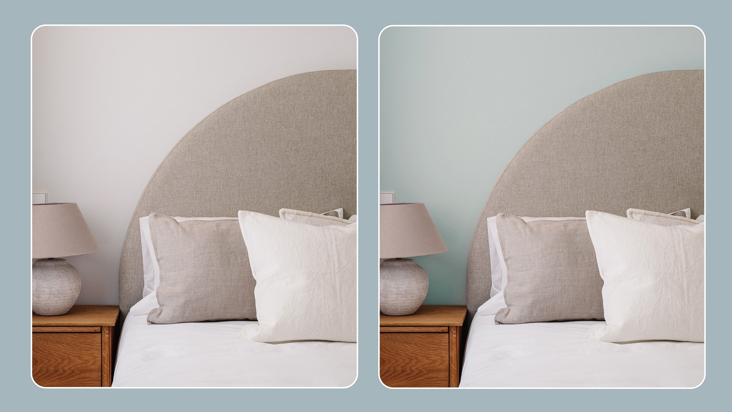
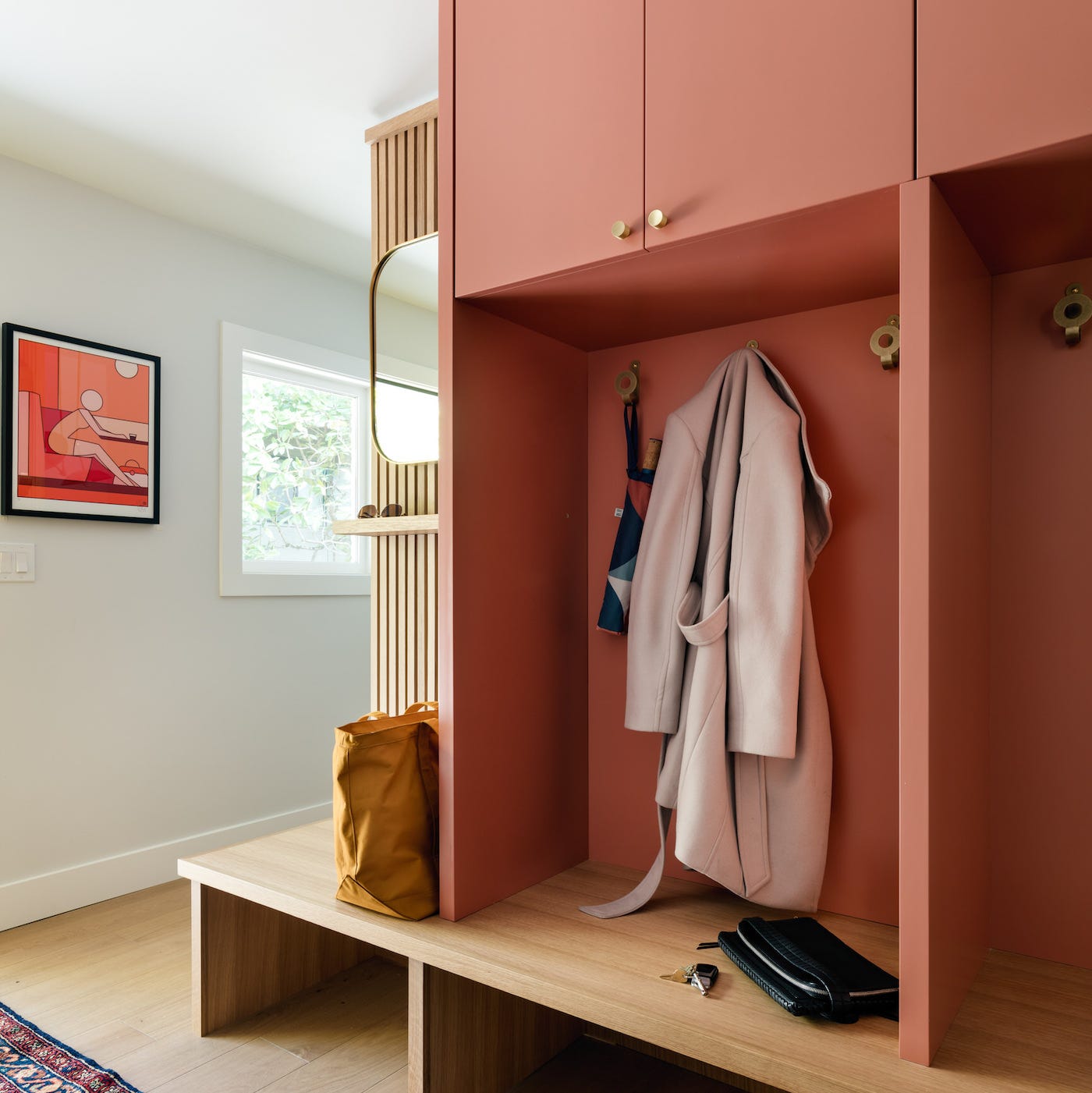
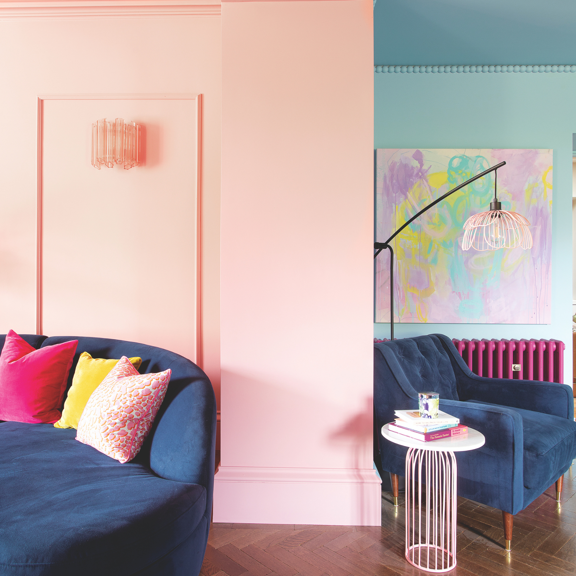
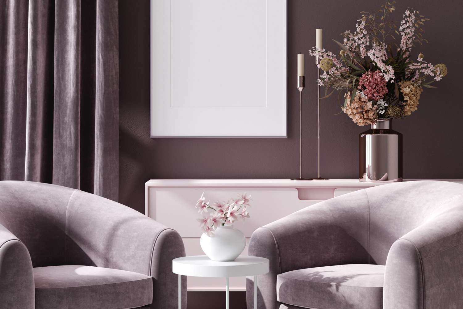
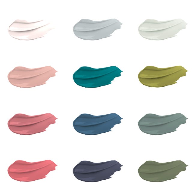
One prominent choice is Benjamin Moore's First Light 2102-70, described as a soft and sophisticated blush hue. This color imparts a rosy warmth, ideal for creating an inviting atmosphere in living or dining rooms. For optimal effect, a matte or eggshell finish is recommended for walls, complemented by a satin finish for trim, which offers a subtle sheen that enhances the soft aesthetic of the color.
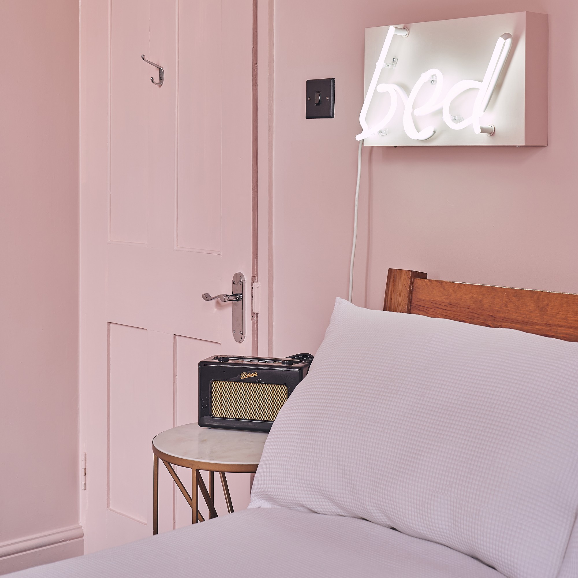
Another trending color is HGTV Home by Sherwin-Williams' Romance HGSW2067. This blush pink, with apricot undertones, redefines the concept of neutral colors. It moves beyond traditional grays and beiges to embrace soft, welcoming shades that are both calming and sophisticated. Romance is versatile enough for a dining room or a bathroom, and it pairs well with deep teal jewel tones, such as Island Time, or monochrome shades like Coral Reef for diverse design schemes.
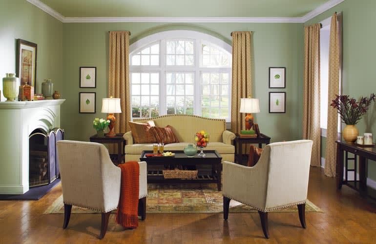
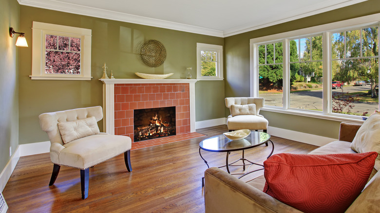
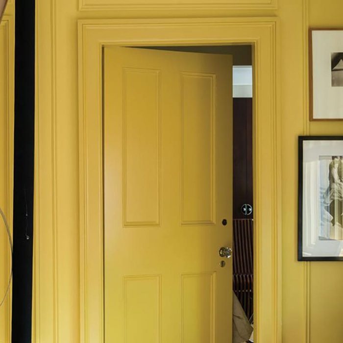
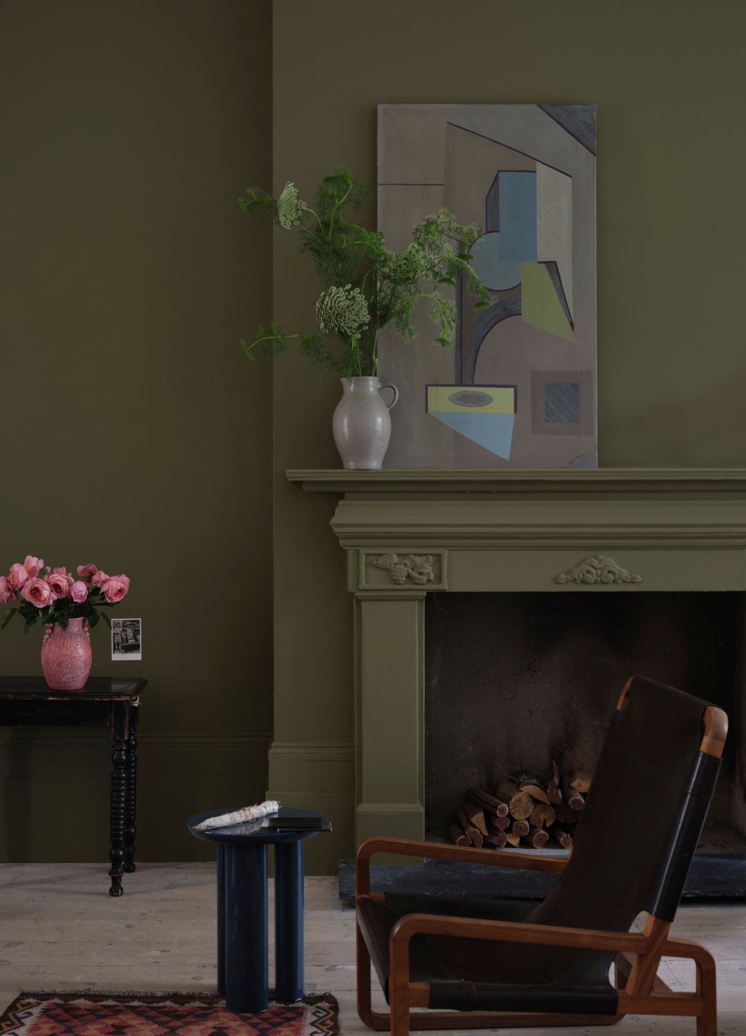
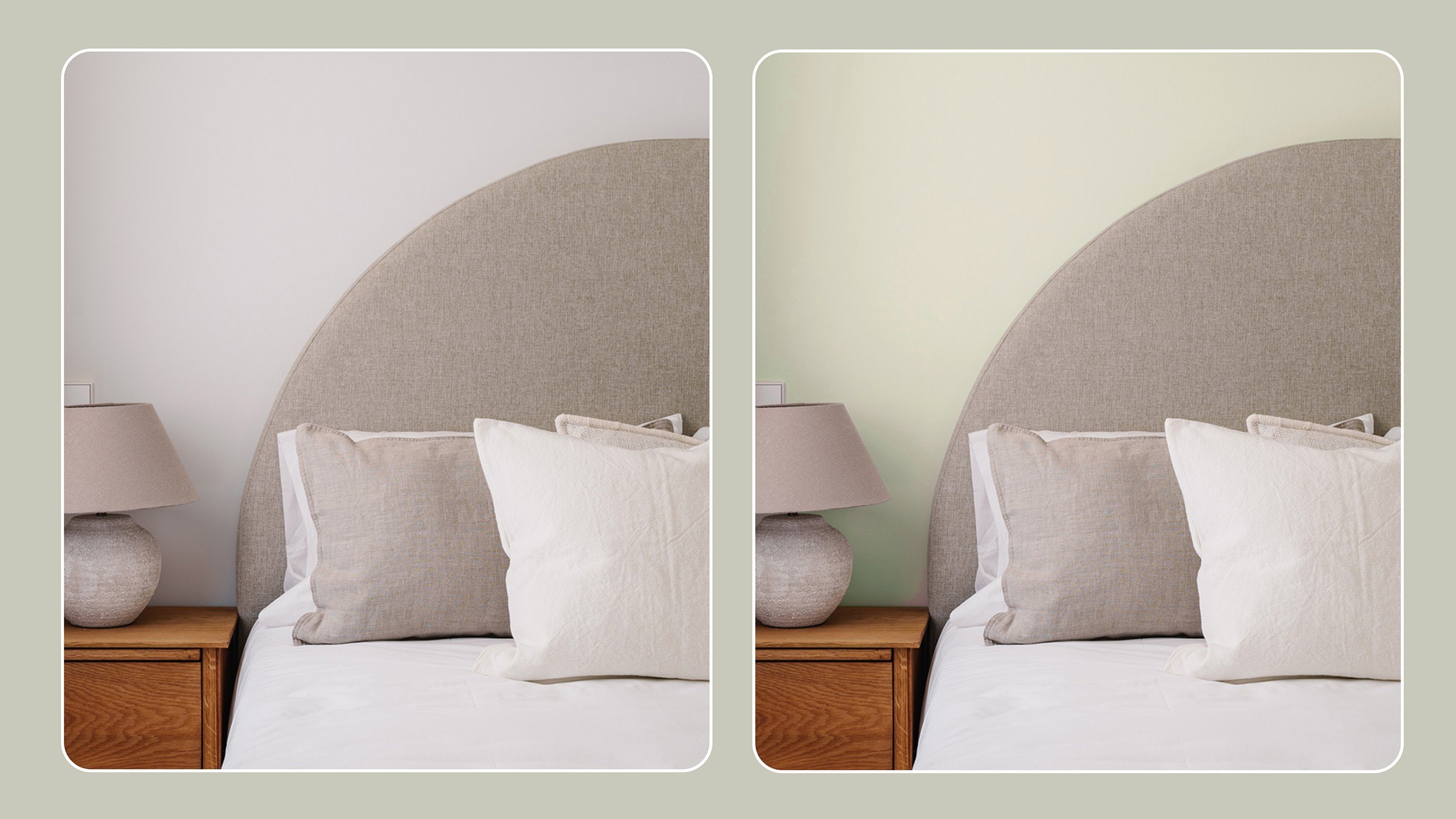
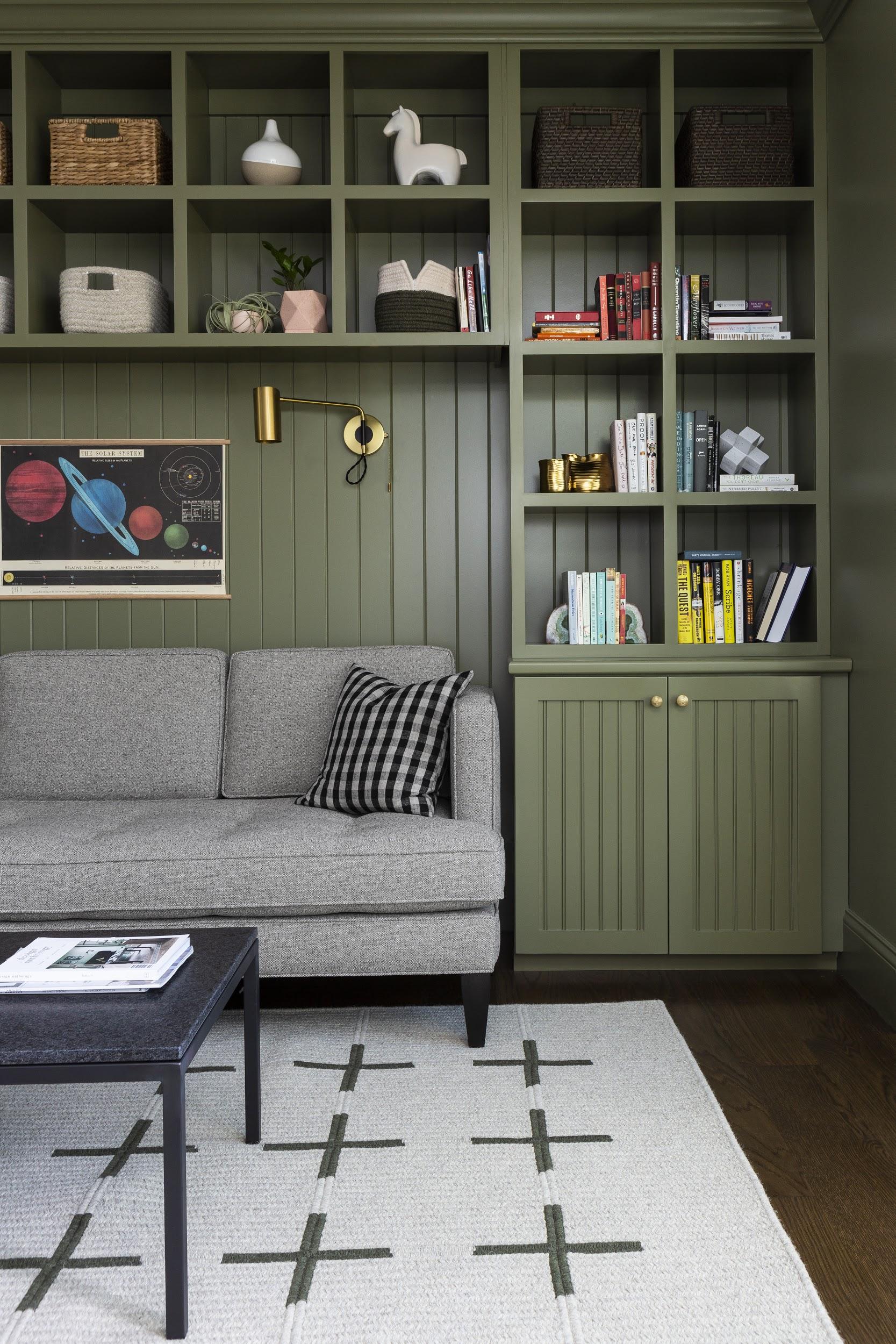
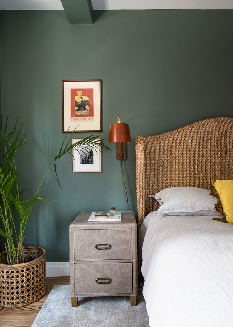
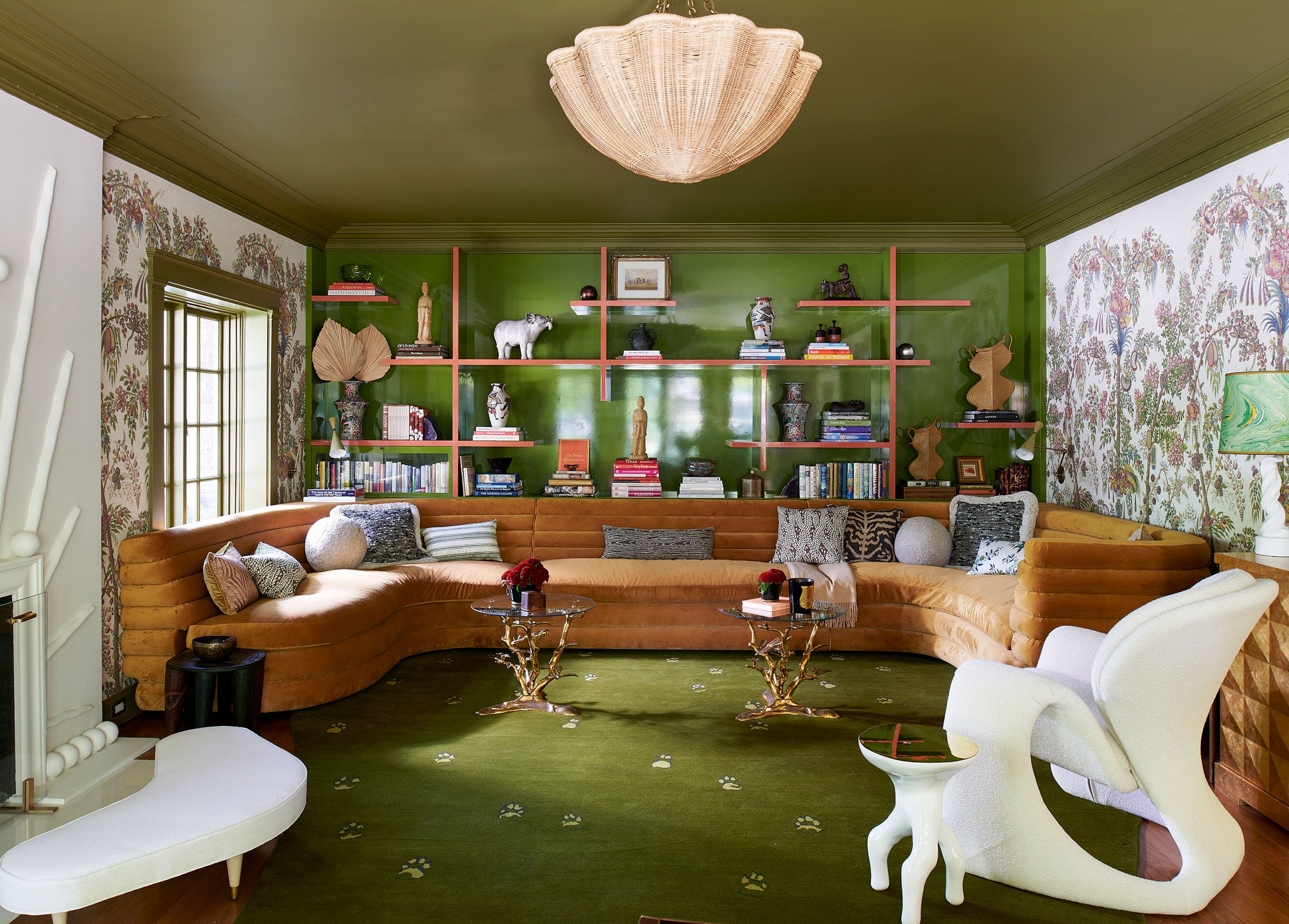
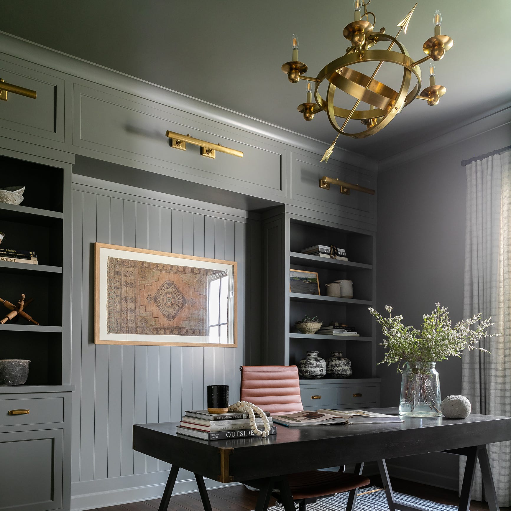
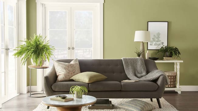
Behr’s Back to Nature S340-4 is a soothing green that aims to bridge the gap between indoor and outdoor spaces, fostering a sense of natural tranquility within the home. This color is also considered a "new neutral" and contributes to a calm environment. When selecting trim colors, contrast is key, with bright and vivid options adding energy, while classic whites like Ultra Pure White and Bit of Sugar provide a clean, complementary look.
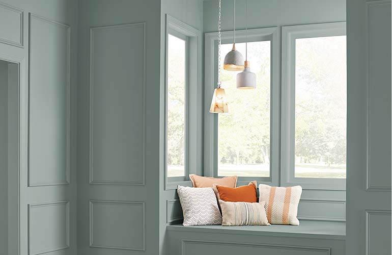
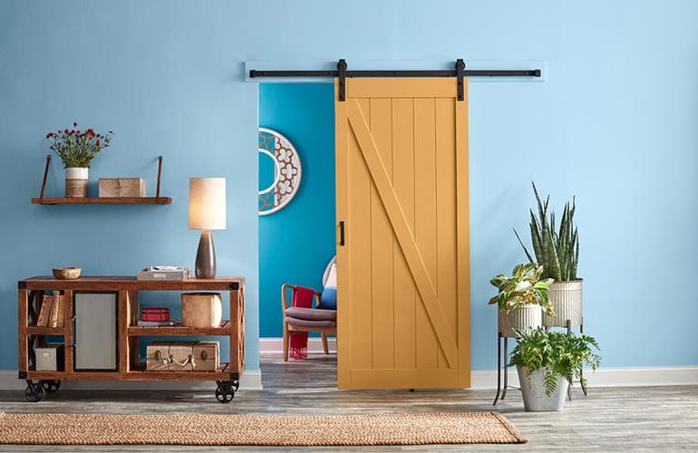
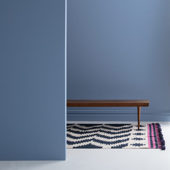
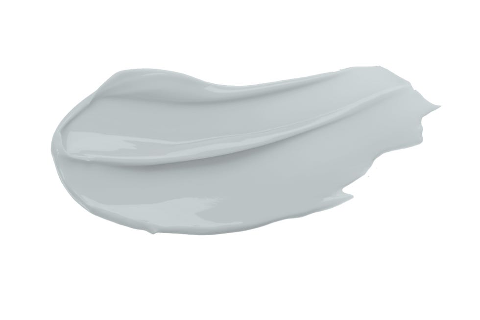
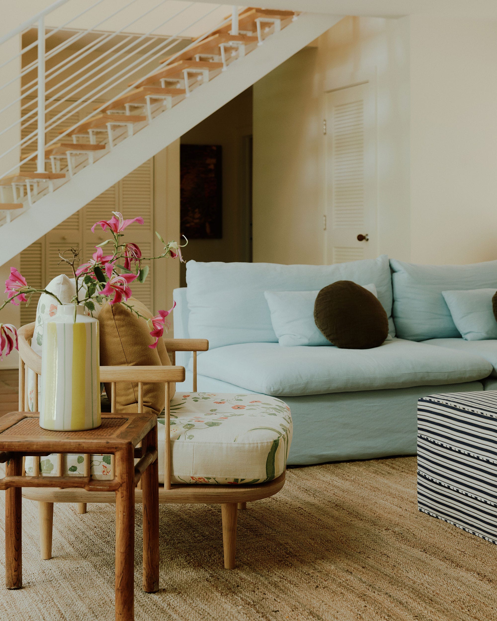
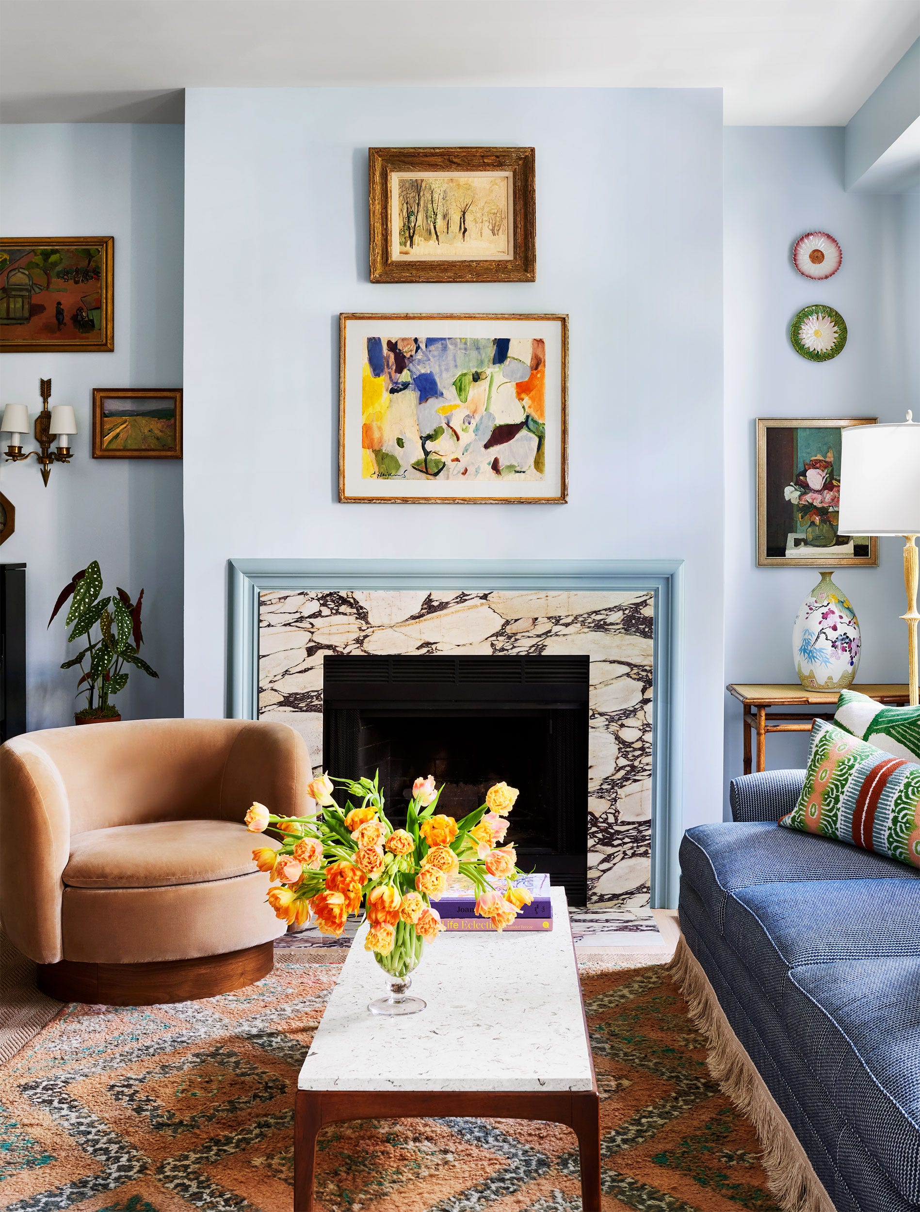
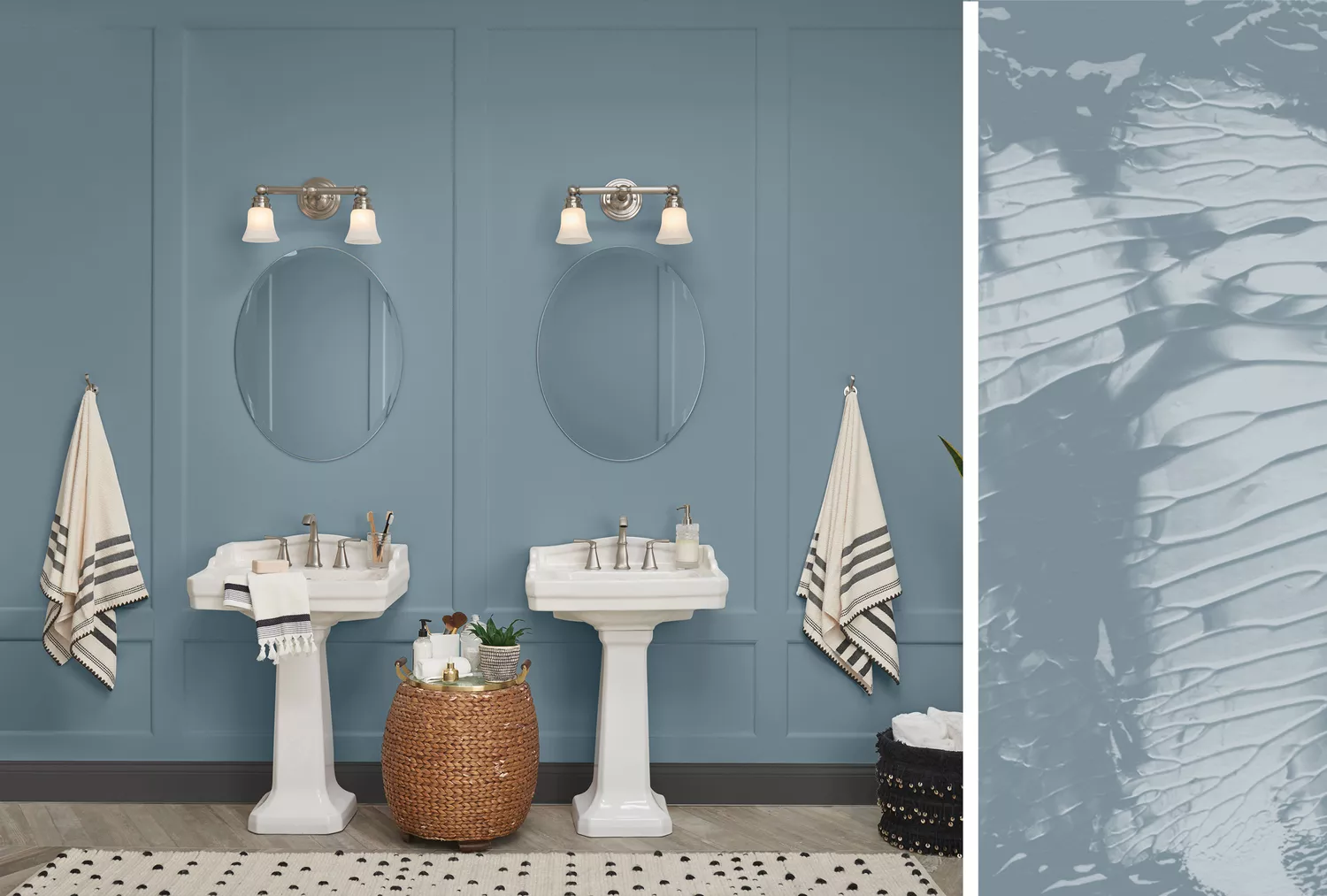
Valspar's Grey Brook 5001-1B is a pale blue reminiscent of stonewashed denim, offering a welcoming and versatile option, particularly for open-plan spaces. This adaptable hue can be combined with various shades of gray and blue. Pairing it with Valspar’s Swiss Coffee, a warm white, for trim completes a harmonious and inviting design.
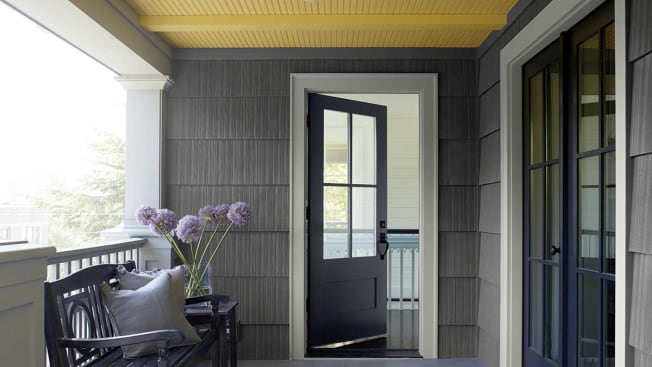
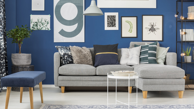
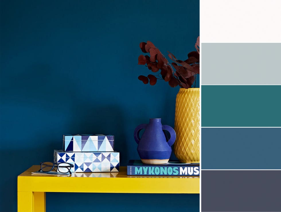
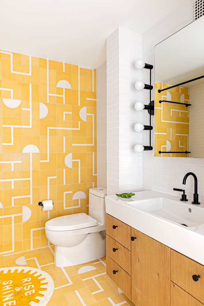
Finally, PPG’s Chinese Porcelain PPG1160-6 combines cobalt and navy, symbolizing calmness and hope, similar to the serene expanse of the ocean and sky. The cobalt element introduces a vibrant energy to the tranquil blue. This deep blue is particularly suitable for bedrooms, either as an accent or across all walls, especially in rooms with ample natural light. It also works effectively in sunny family rooms or bathrooms, with crisp white trim providing a sharp contrast. Each of these featured paints has performed well in consumer tests, with several achieving recommendations in interior paint ratings.
#InteriorPaintColors #HomeDecoration #PaintTrends #ColorPsychology #HomeImprovement #DIYHome #InteriorPaintColors #HomeDecoration #PaintTrends #ColorPsychology #HomeImprovement #DIYHome
0 comment in total
 No comments yet
You may also like
Hottest Exterior Paint Colors of 2020
2021’s Palette of Possibilities
Interior paint colour trends 2025: 10 hues you'll be seeing everywhere this year

The 5 Most Overused Paint Colors and What to Try Instead, According to Designers

Hottest Interior Paint Colors of 2018

4 Interior Designers Share the Biggest Paint Color Trends Right Now (and What’s Out!)


Designers Agree: These 7 Underrated Paint Colors Will Be Huge in 2026
These Living Room Paint Colors Are a Total Mindset Shift
Interior Paint Color Trends You Should Know About In 2021

Trending Interior Paint Colors for Homes in 2025

Millennial Gray Is So Over—Here Are 5 Paint Colors to Try Right Now
Design Pros Have Spoken: Here Are the Only Paint Color Trends That Matter in 2023

20 Interior Paint Colors Decorating Experts Love
9 Best Interior Paint Colors

These 13 Paint Color Trends for 2021 Will Give Your Home a Fresh Look
Is colour drenching still on trend for 2025? Experts reveal how the popular paint trend is evolving in the new year

6 key colors to decorate with in May 2025, according to interior design and color experts in the know

30 on-trend paint colours for every room in your home


These 6 Colors Will Rule Interiors in 2026, According to Experts

5 Paint Colors That Are Out for 2025, According to Interior Designers