1/9
Hottest Interior Paint Colors of 2018
The article explores the anticipated trending interior paint colors for 2018, drawing insights from color experts and major paint manufacturers. It highlights a diverse palette of eight distinct colors, including a dreamy blue, a seafoam green, a golden yellow, an adventurous blue, an intense green, a vivid red, and two shades of black. These predictions are informed by global trends in arts, fashion, pop culture, and even the automotive industry, as color experts travel extensively to identify emerging preferences.
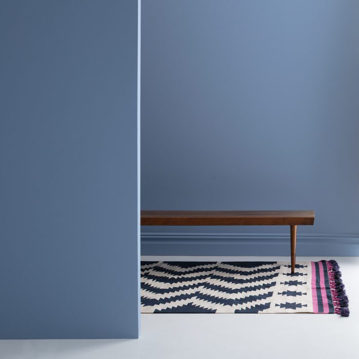
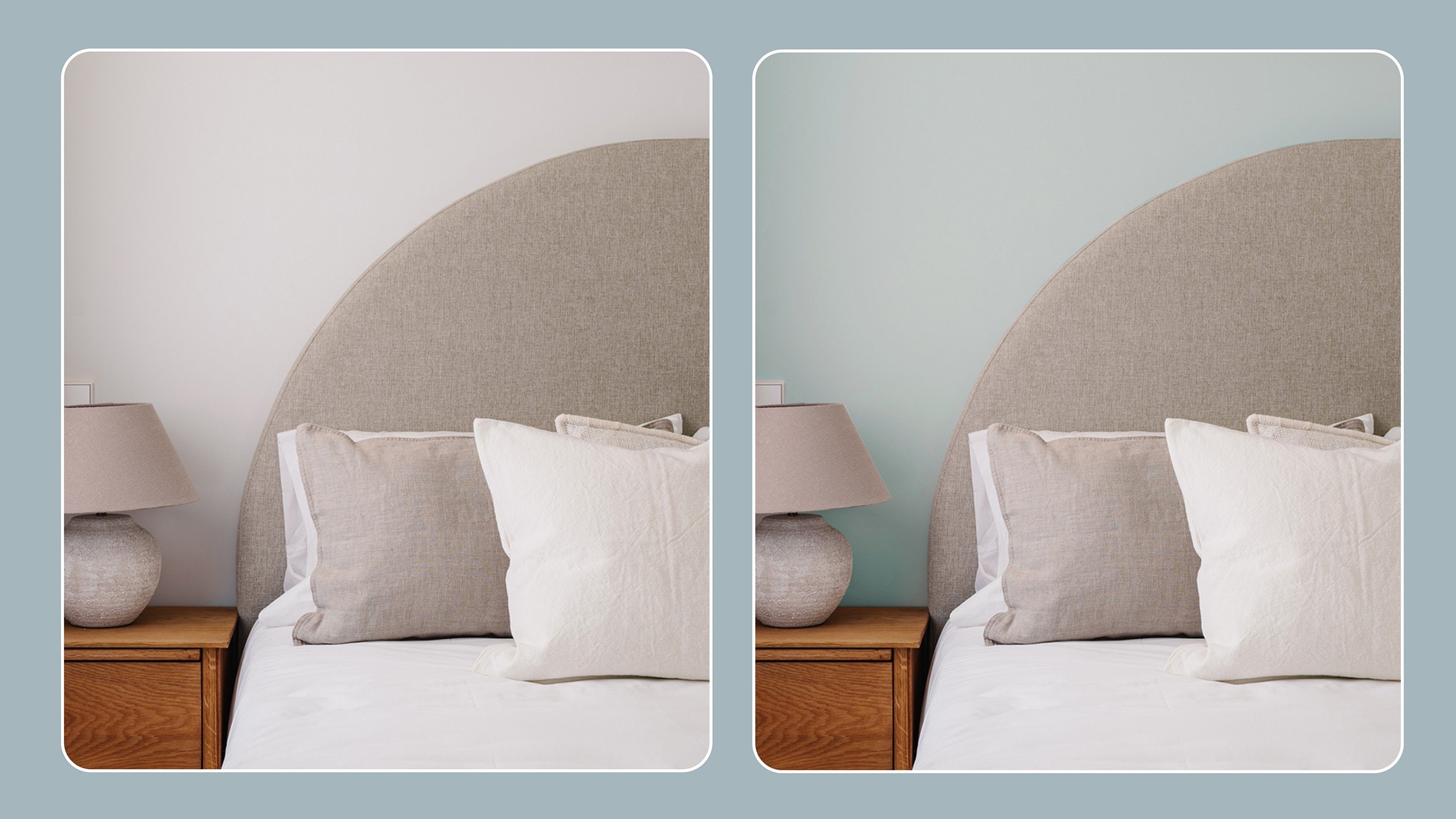
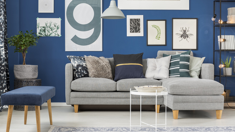
The article delves into each of the eight selected colors, providing a detailed description from the respective paint brand's color marketing team. For instance, Behr's "In the Moment T18-15" is described as a balanced blue-green that fosters a peaceful and restorative atmosphere, ideal for creating a sanctuary within the home. Suggested applications include kitchens with white cabinets or dining rooms, often paired with taupes, grays, and browns, and can be energized with pops of contrasting colors like orange. The recommended sheen varies, with matte suitable for bedrooms and eggshell for bathrooms, noting that higher sheens offer easier cleaning and stain resistance. A glossy sheen on a single accent wall can provide a striking effect.
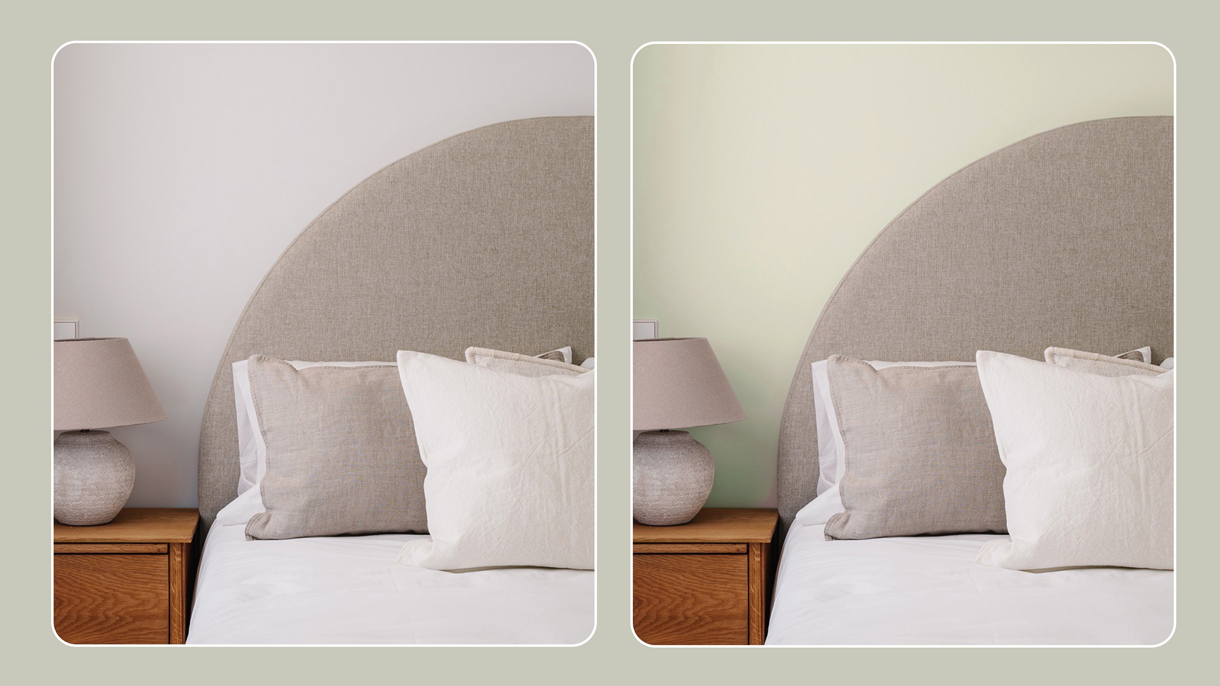
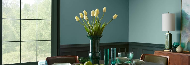
Clark+Kensington's "River Rapids 29B-3" is presented as a soothing seafoam green with gray undertones, reflecting a societal yearning for simplicity and texture amidst prevalent digital interaction. This color is suggested for relaxing spaces like family rooms or bedrooms and can be harmonized with classic shades, blue-blacks, and natural tones. The article advises satin or semi-gloss finishes for high-traffic areas due to their durability and ease of cleaning, while softer sheens like flat enamel or eggshell are suitable elsewhere.
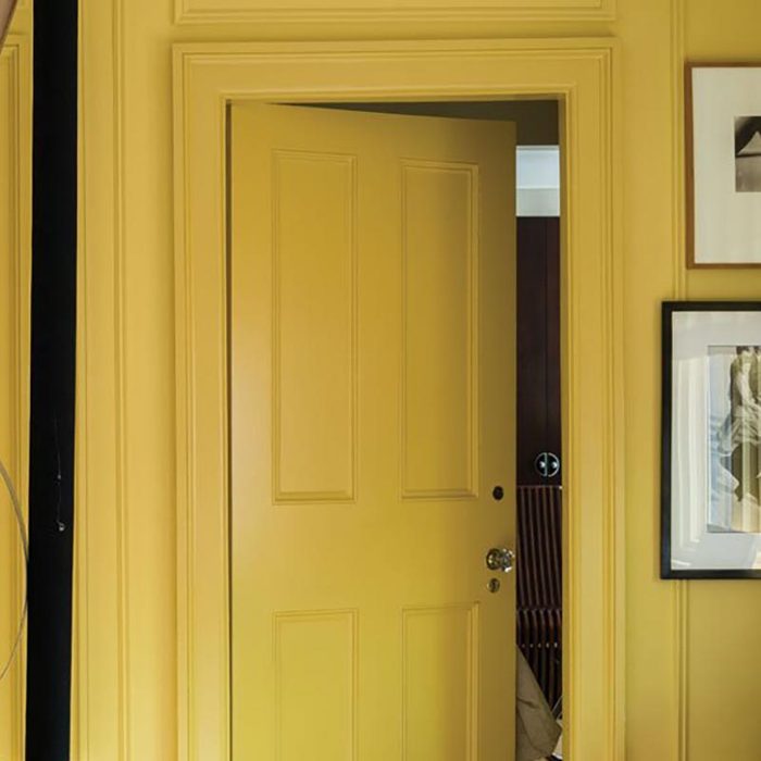
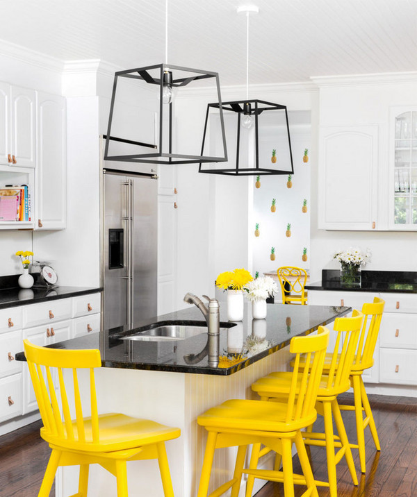
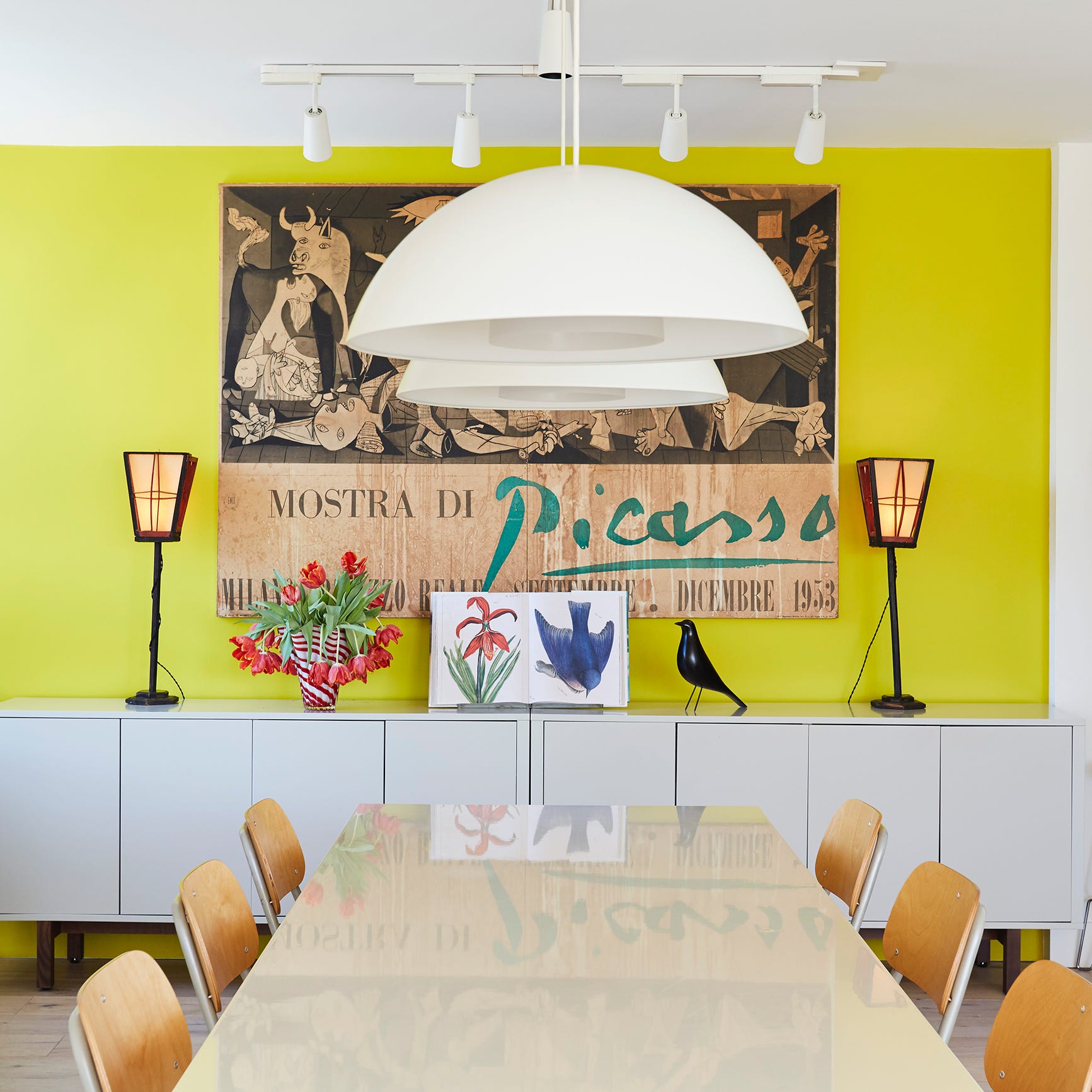
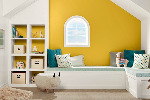
HGTV Home by Sherwin-Williams introduces "Honeycomb HGSW2133," a golden yellow inspired by tropical vibrancy, conveying optimism and energy. This versatile color can be used for accenting doors, bookshelves, or accent walls in living and dining areas, providing a vibrant backdrop for art and plants. Eggshell or satin finishes are recommended for walls in busy areas, while flat is suggested for concealing wall imperfections, and high-gloss or semi-gloss for furniture and doors.
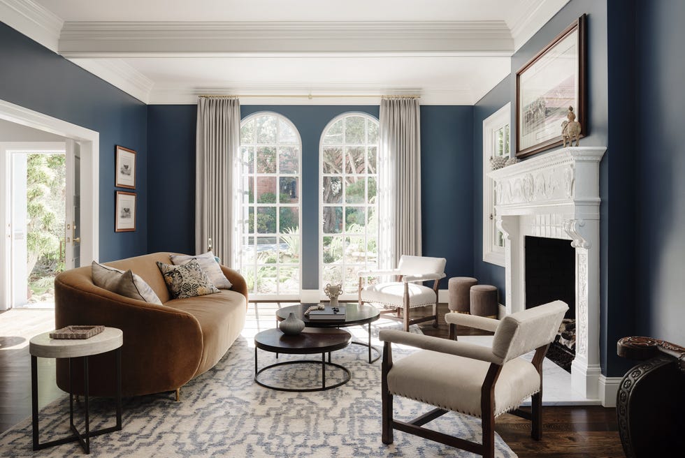
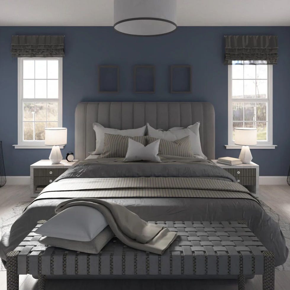
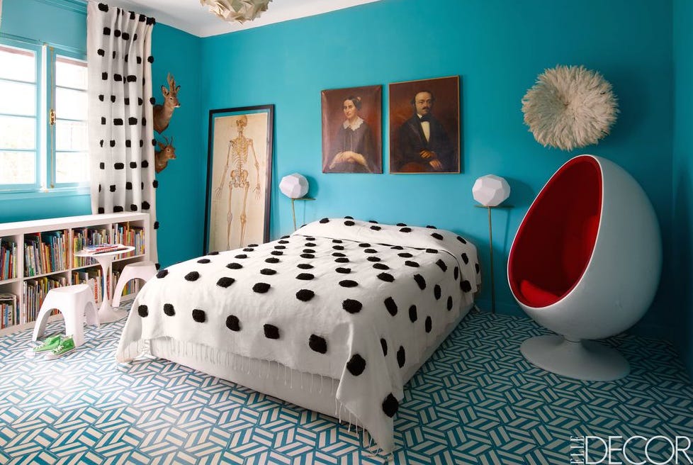
Sherwin-Williams' "Oceanside SW6496" is characterized as an opulent and mysterious green-blue, symbolizing wanderlust and global interconnectedness. It is deemed suitable for various applications when combined with whites, creams, deep rich tones, and warm metallics. For a subtle introduction, painting a front door, side table, or an accent wall in a neutral room is suggested. A flat finish for walls and semi-gloss for trim are recommended.
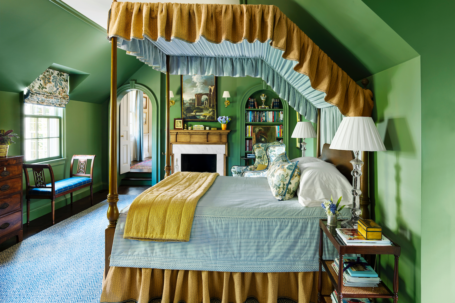
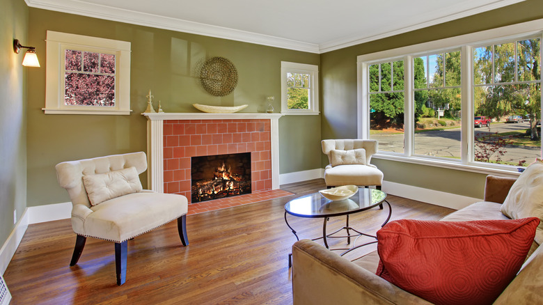
Valspar's "Favorite Green 5011-4," an intense green with a touch of blue, is highlighted for its invigorating and refreshing qualities, linking to natural healing and fostering meaningful home experiences. This color is particularly recommended for entryways to create a calming first impression. The article suggests a low sheen for rich and bright colors to minimize reflection and enhance livability.
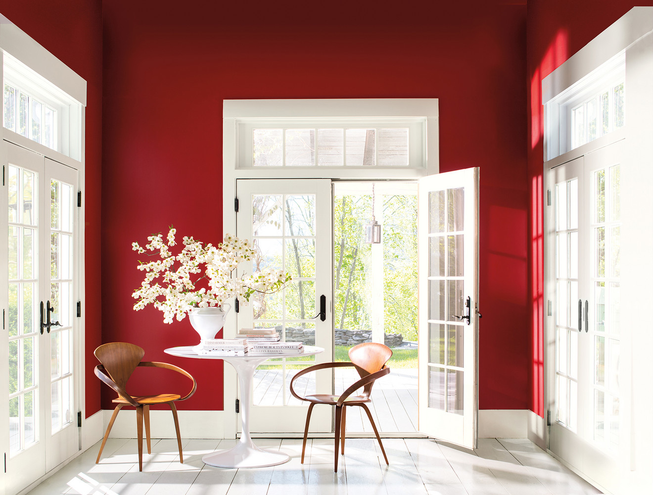
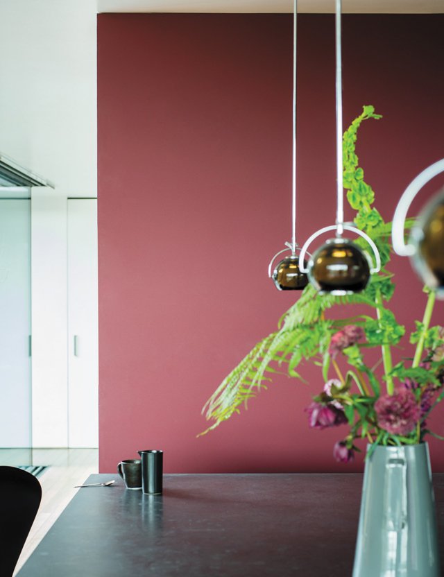
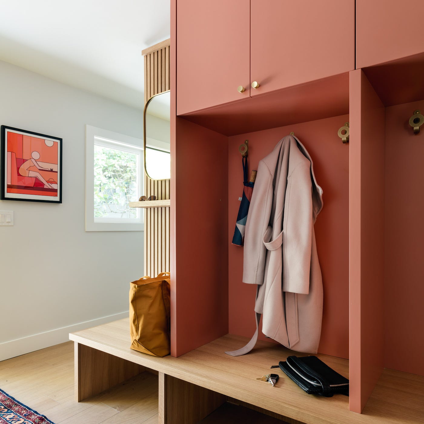
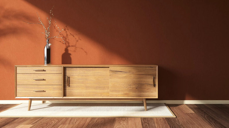
Benjamin Moore's "Caliente AF-290" is described as a vivid, charismatic, yet livable red, signifying a shift away from pastels towards bolder statements. This reflects cultural movements embodying change, strength, confidence, and vitality. Its application depends on personal comfort with red, from painting a door to using it in a dining room alongside natural light, stone, and wood elements. A matte finish is noted for its rich appearance.
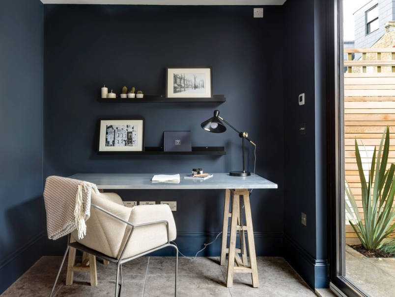
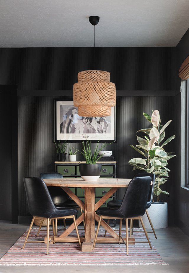
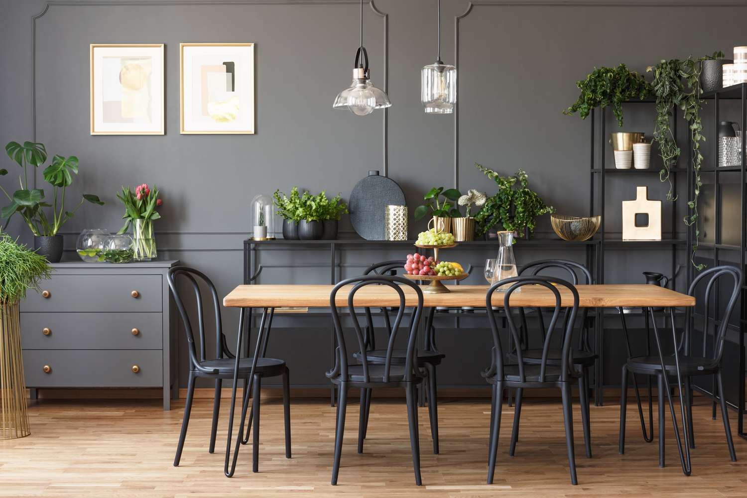
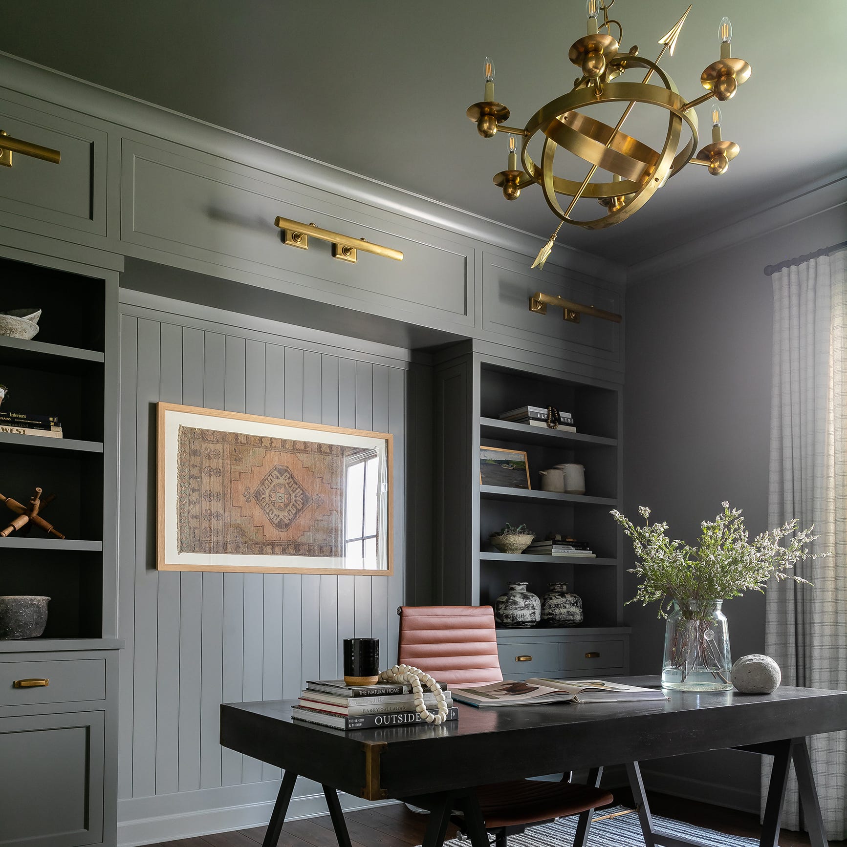
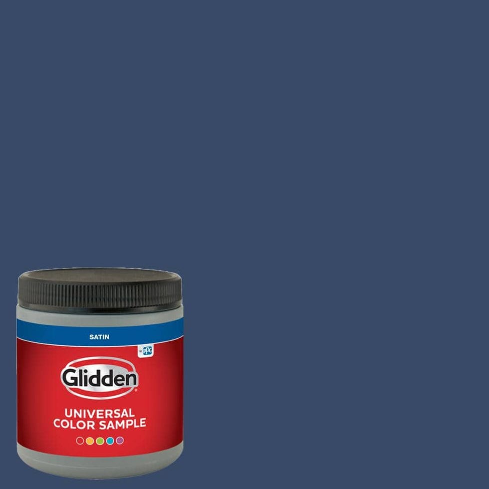
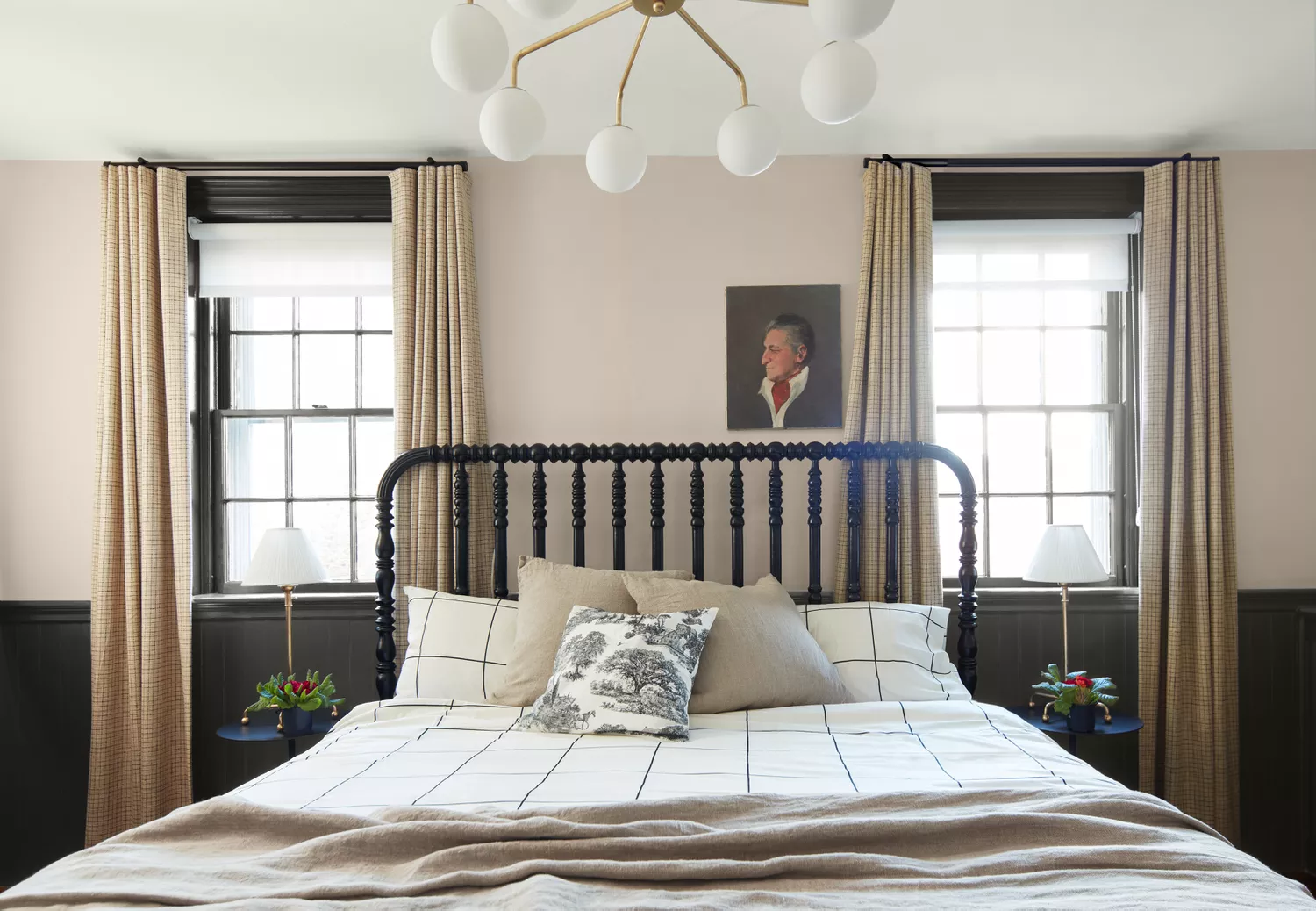
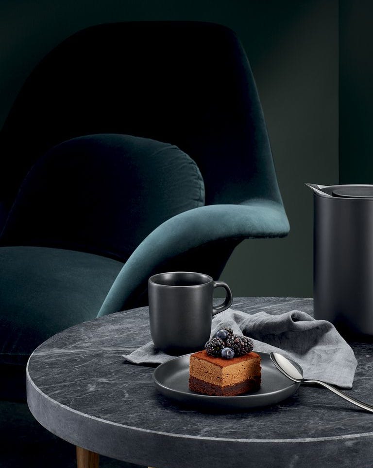
Finally, two shades of black, Olympic's "Black Magic OL116" and Glidden's "Deep Onyx 00NN 07/000," are presented as bold choices. "Black Magic" is a true black, representing a rebellious spirit and a desire for privacy, and can create a meditative atmosphere. It is suggested for bookcase panels, interior doors, or behind flat-screen TVs to make screens disappear when off. Matte is ideal, but higher sheens are advised for high-contact surfaces. "Deep Onyx" is also a true black, reflecting societal trends of protest and a need for protection. It works well as an accent wall or in bathrooms, often paired with contrasting whites and colorful accents. Matte black is praised for its stunning impression, while high gloss is suggested for front doors. The article concludes by emphasizing the importance of paint durability, stain resistance, scrubbability, sheen retention, coverage, fade resistance, and mildew resistance, based on Consumer Reports' testing methodologies.
#InteriorDesign #PaintColors #HomeImprovement #ColorTrends #HomeDecor #Behr #SherwinWilliams #BenjaminMoore #Valspar #InteriorDesign #PaintColors #HomeImprovement #ColorTrends #HomeDecor #Behr #SherwinWilliams #BenjaminMoore #Valspar
0 comment in total
 No comments yet
You may also like
Hottest Interior Paint Colors of 2020
Millennial Gray Is So Over—Here Are 5 Paint Colors to Try Right Now

4 Interior Designers Share the Biggest Paint Color Trends Right Now (and What’s Out!)

The 5 Most Overused Paint Colors and What to Try Instead, According to Designers

9 Best Interior Paint Colors

2021’s Palette of Possibilities
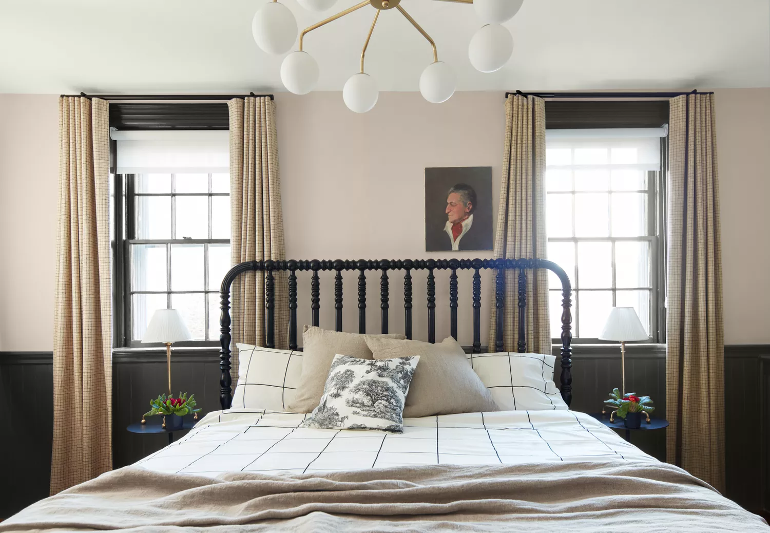
18 Warm Paint Colors for a Cozy and Inviting Space
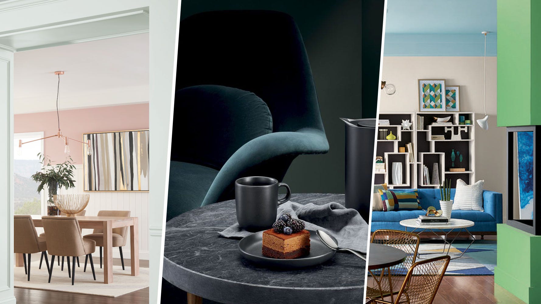
These Are The Colors Everyone Is Talking About In 2018

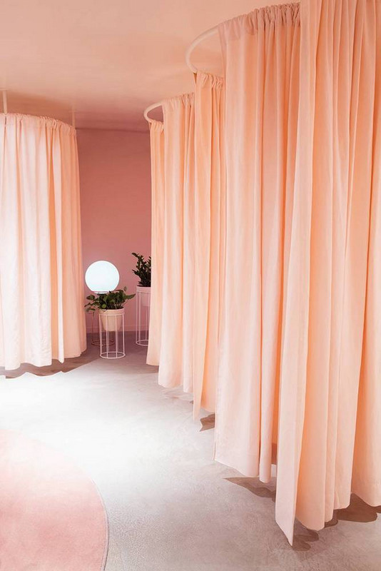
These Are the Colors You’ll Be Painting Your Home in 2018


Designers Agree: These 7 Underrated Paint Colors Will Be Huge in 2026
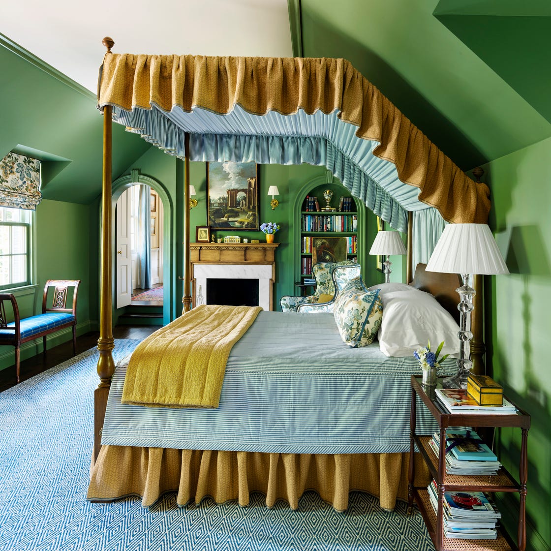
These 7 Colors Will Rule Interiors in 2026, According to Experts

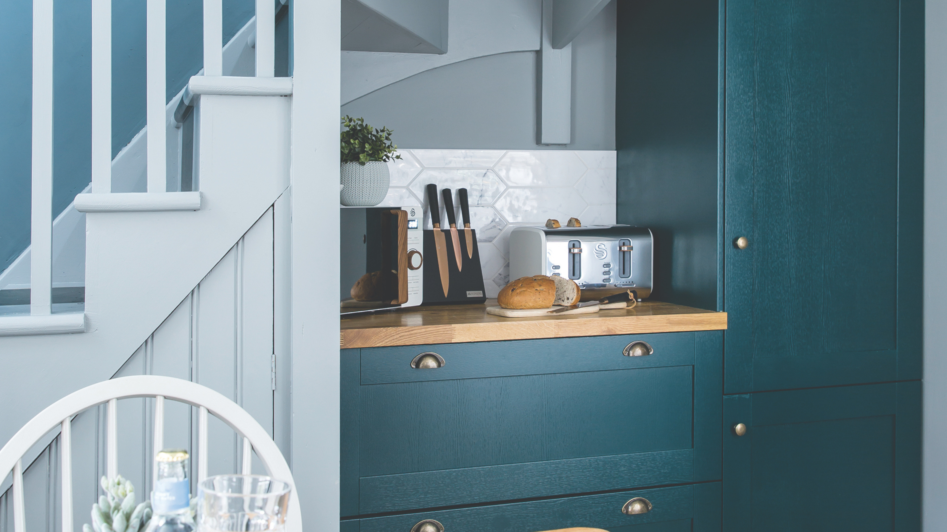
Is colour drenching still on trend for 2025? Experts reveal how the popular paint trend is evolving in the new year
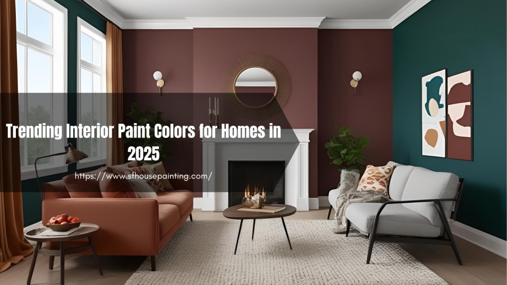
Trending Interior Paint Colors for Homes in 2025

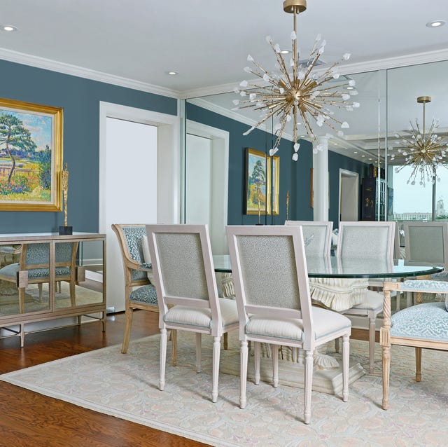
Design Pros Have Spoken: Here Are the Only Paint Color Trends That Matter in 2023


These 6 Colors Will Rule Interiors in 2026, According to Experts


The #1 Paint Color Trend of 2025, According to Designers

6 key colors to decorate with in May 2025, according to interior design and color experts in the know

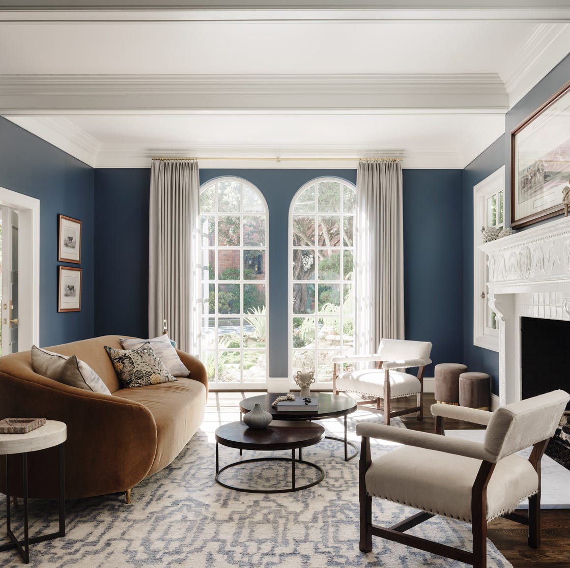
Lick Paint Will Transform the Mood in Your Home Through Color Psychology

Interior Paint Color Trends You Should Know About In 2021

12 Paint Colors That Interior Designers Are Buzzing About—See the Gorgeous Hues Here