1/9
9 Best Interior Paint Colors
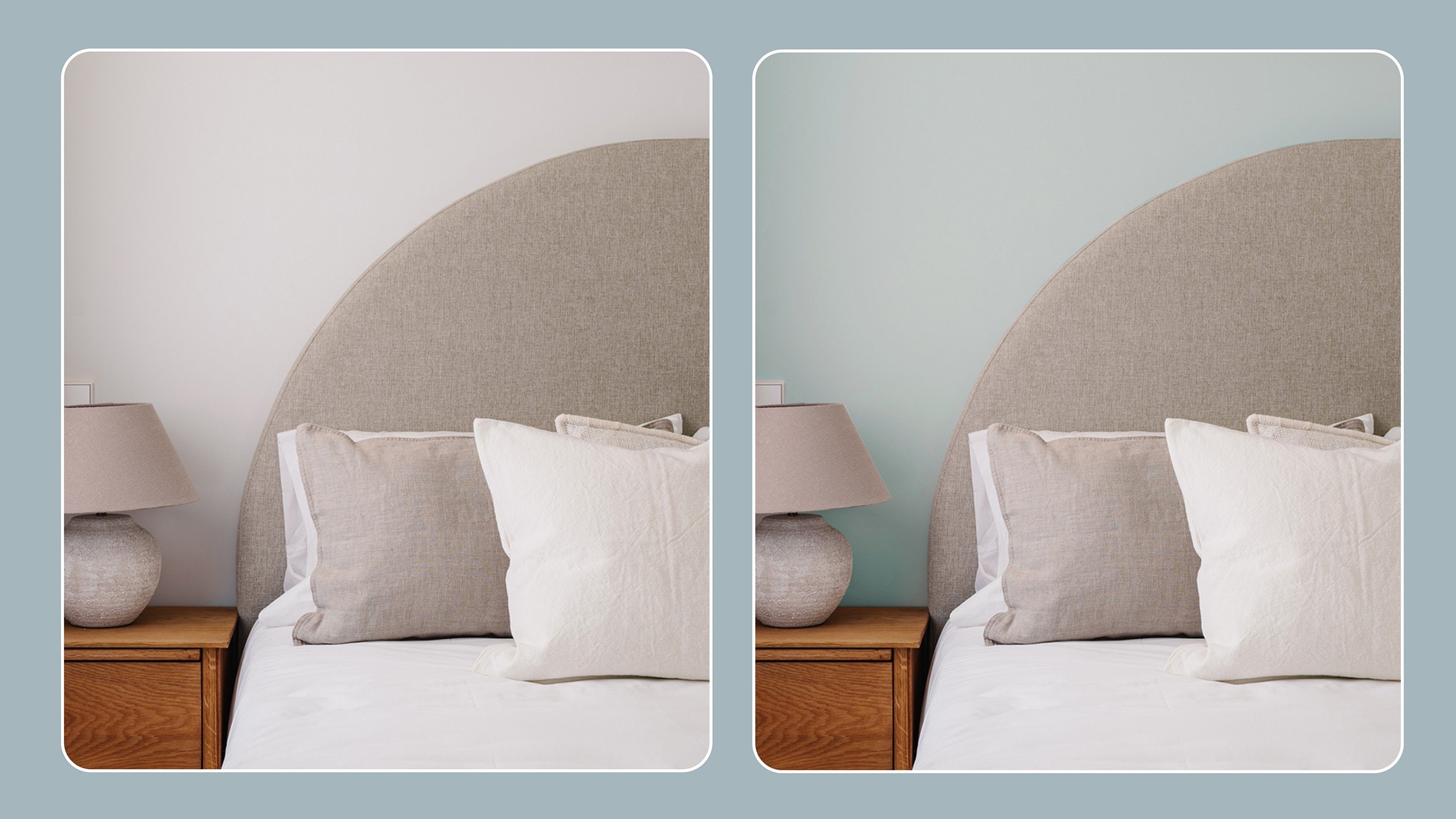
This article discusses the top nine interior paint colors, emphasizing a shift towards natural and warmer tones as influenced by interior designers and color experts. The COVID-19 pandemic has notably shaped preferences, with a growing desire for comforting, softened palettes over stark whites.
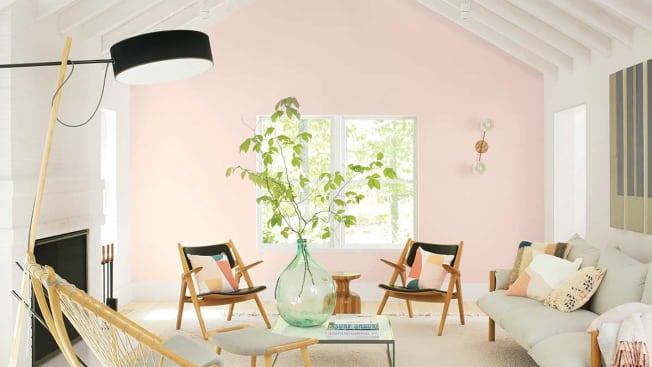
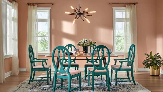
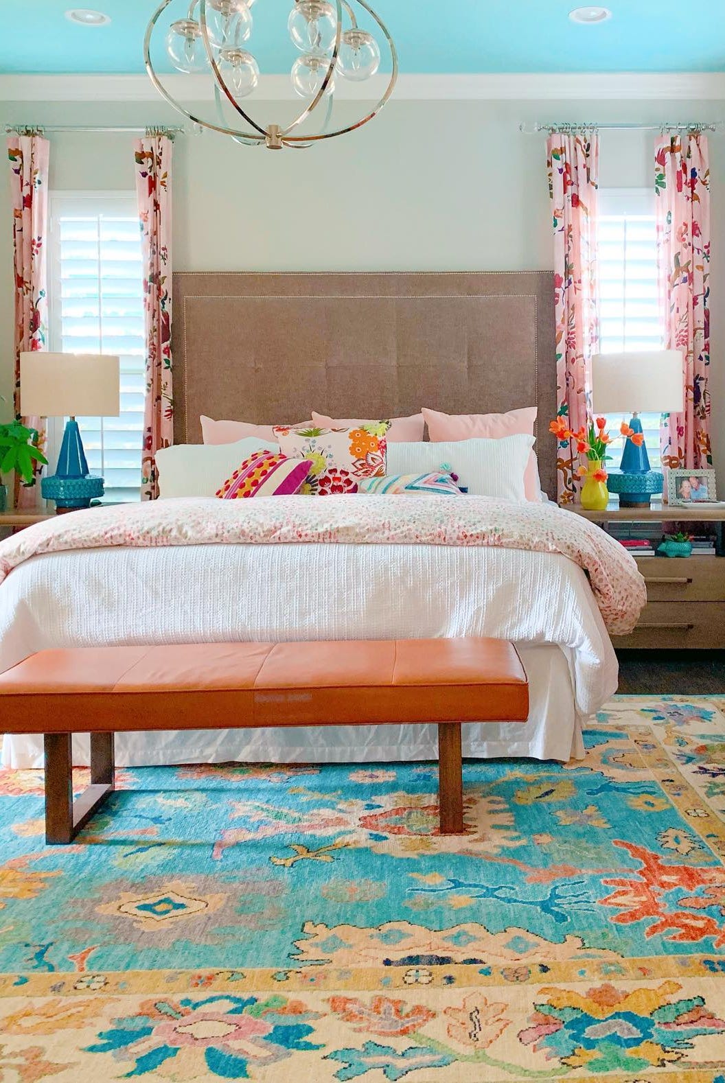
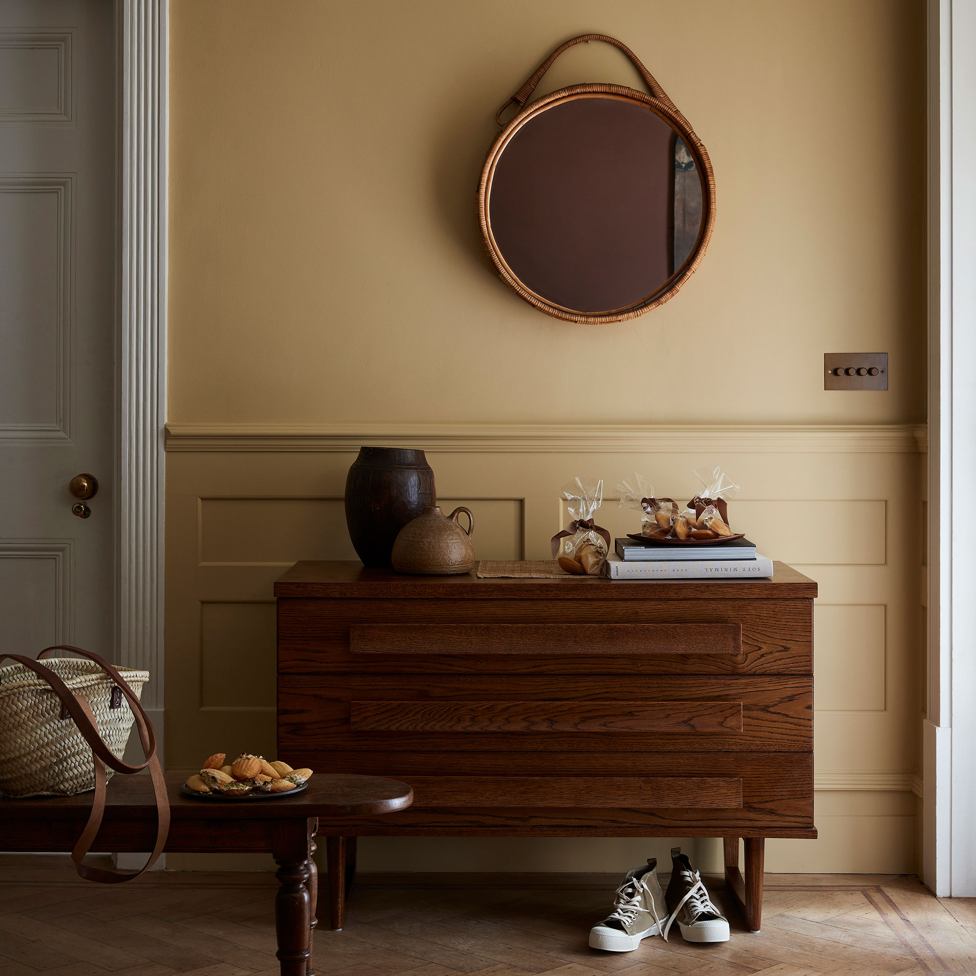
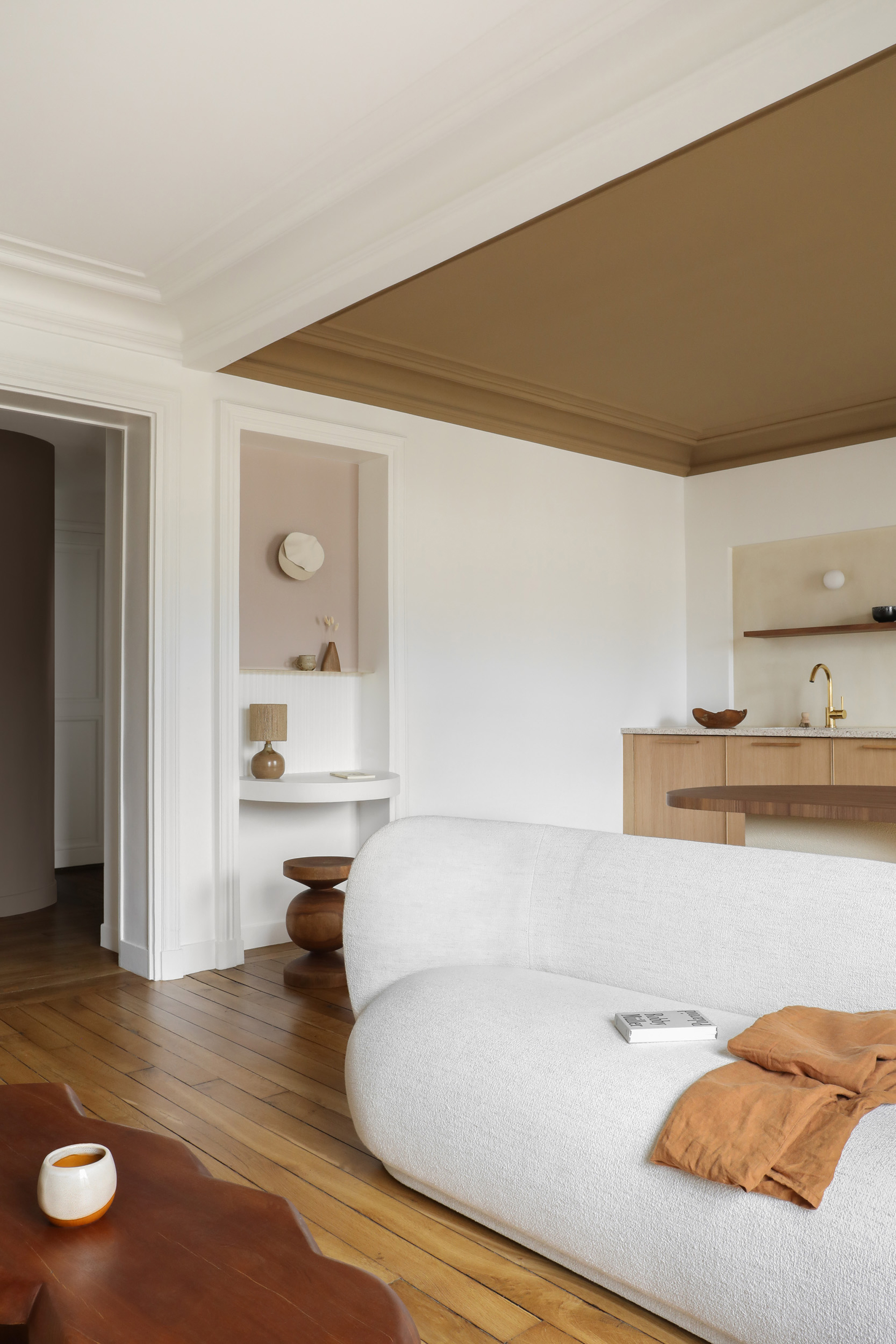
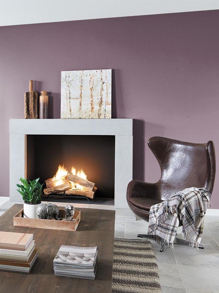
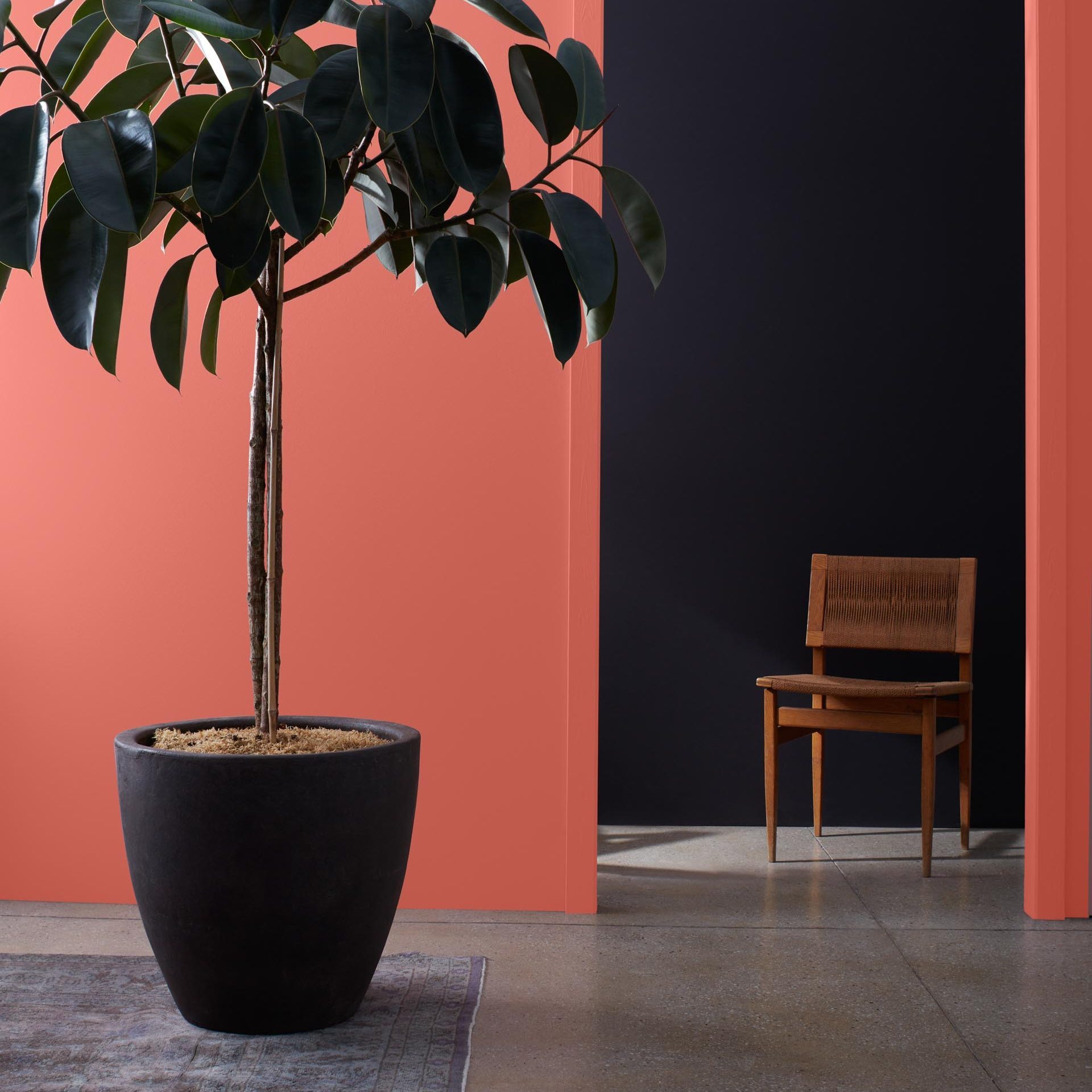
Earthy Terra-Cotta is highlighted as a returning trend, bringing deep browns and soft earthy tones back into popularity. Jen Guerin, a color and interior designer, notes that this palette offers a "huge hug" to interiors, moving away from all-white schemes. Dunn Edwards' "Arts and Crafts" is cited as an example, described as a rich terra color that blends a '70s throwback with modern softness. For a blush-infused glow, Backdrop's "36 Hours in Marrakesh" is recommended.
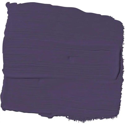
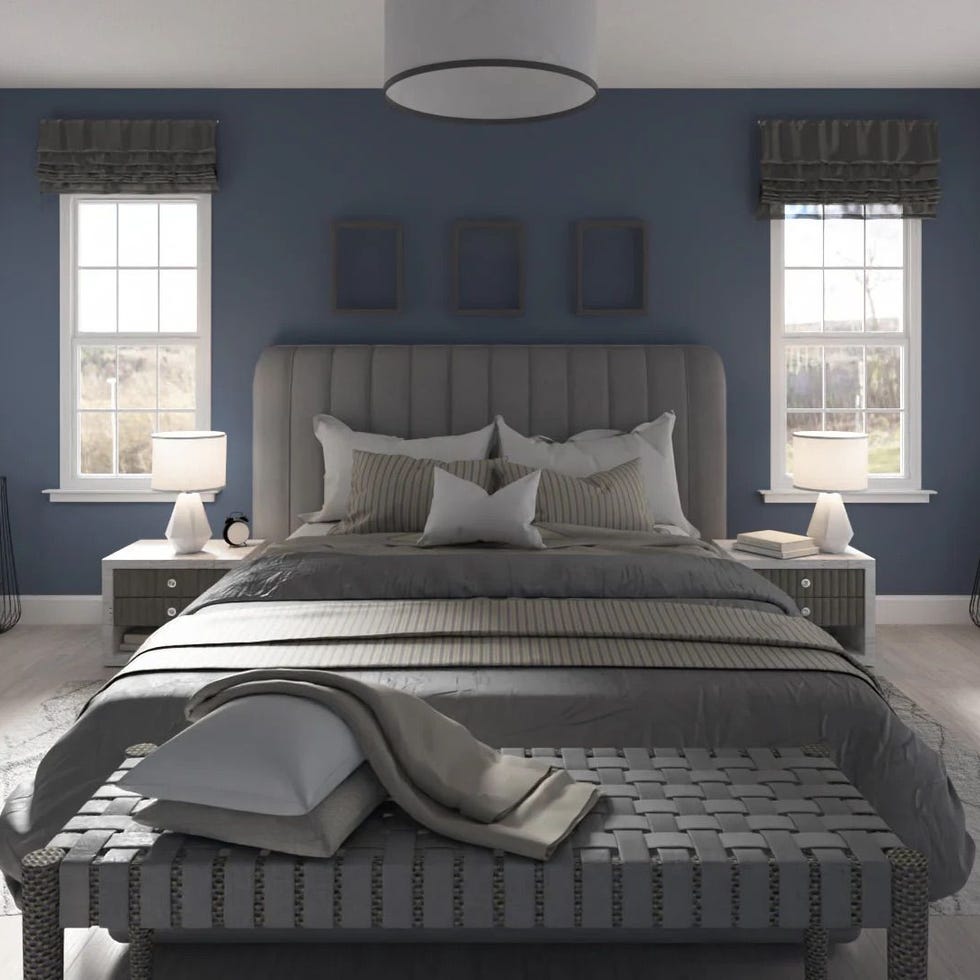
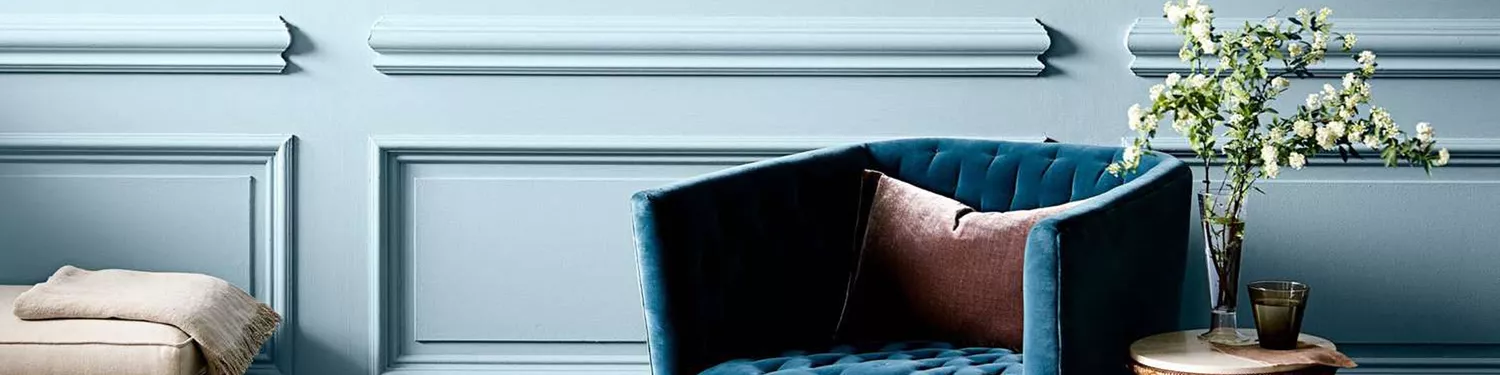
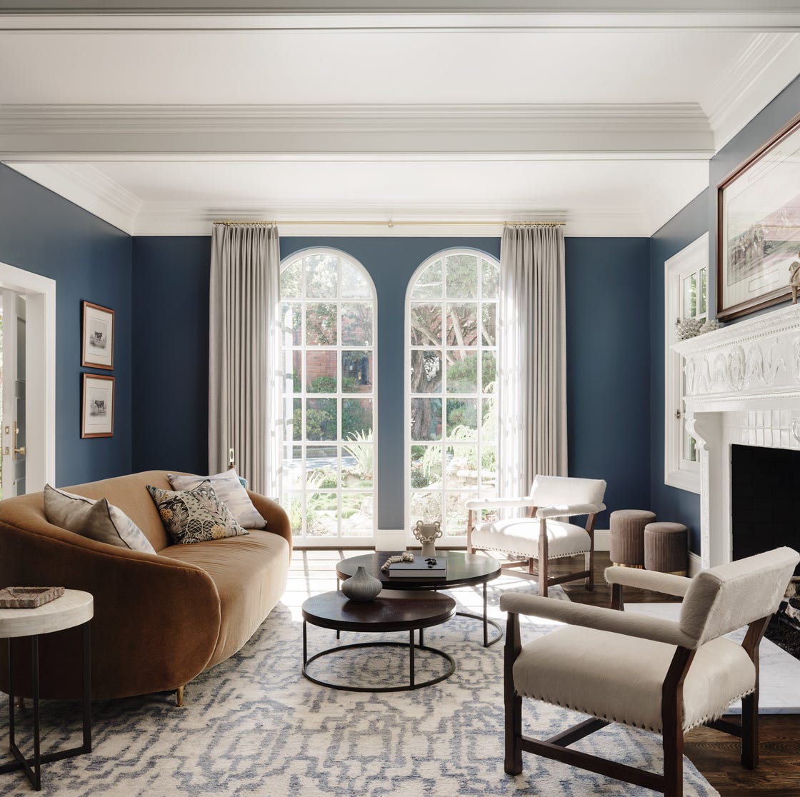
Despite the trend towards warmer colors, cool tones like Periwinkle continue to emerge, particularly following Pantone's "Veri Peri" color of the year. Guerin points out that periwinkle and similar '70s-inspired hues complement modern earth tones. Benjamin Moore's "Stratford Blue" and "Fair Isle Blue" are suggested as suitable periwinkle options.
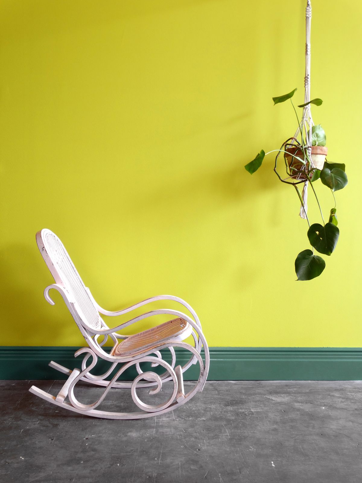
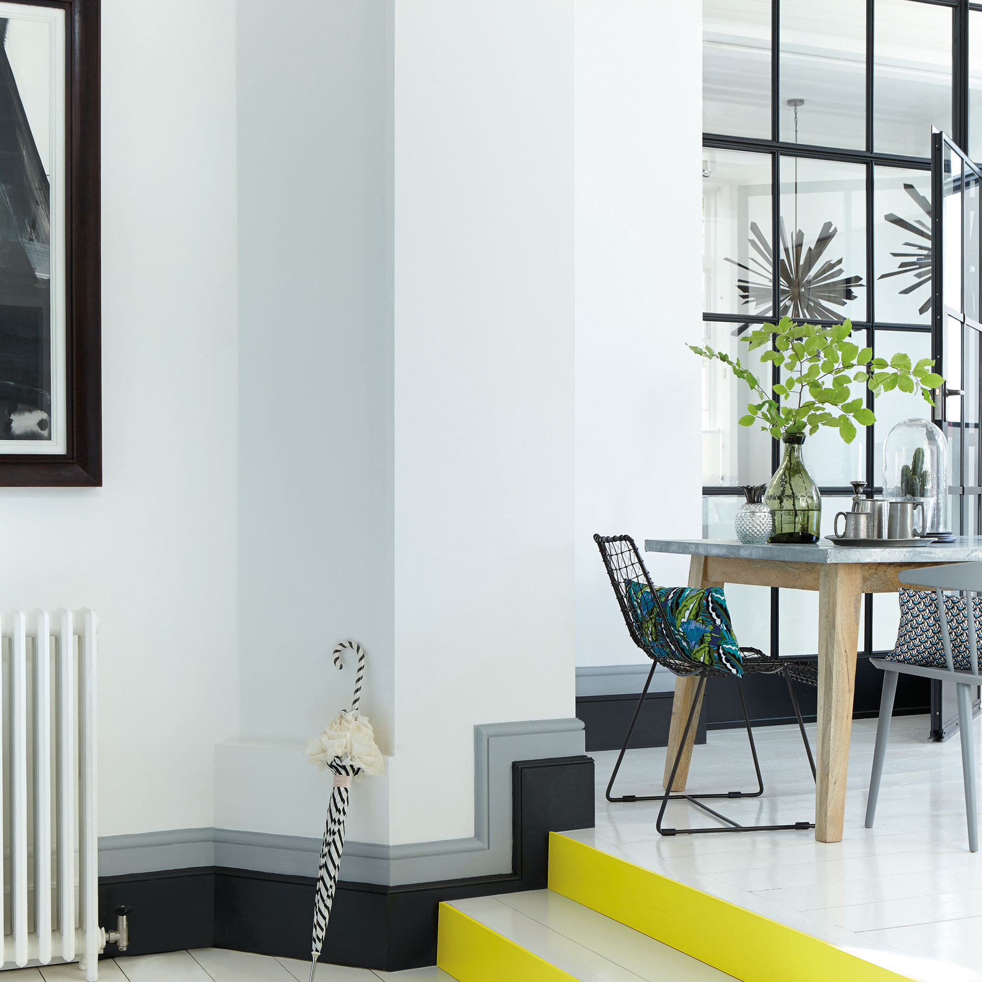
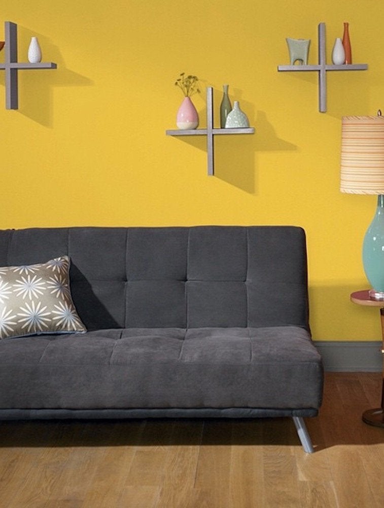
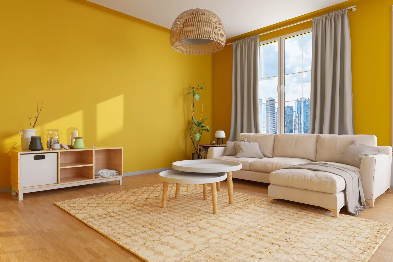
Lemon Yellow is also making a comeback. Guerin advises using yellow in less permanent areas like front doors, bath vanities, or furniture for color-shy individuals. For those feeling bolder, guest rooms, mudrooms, or entryways are suggested as spaces to experiment with vibrant colors, with Farrow & Ball's "Citron" being a favored choice.
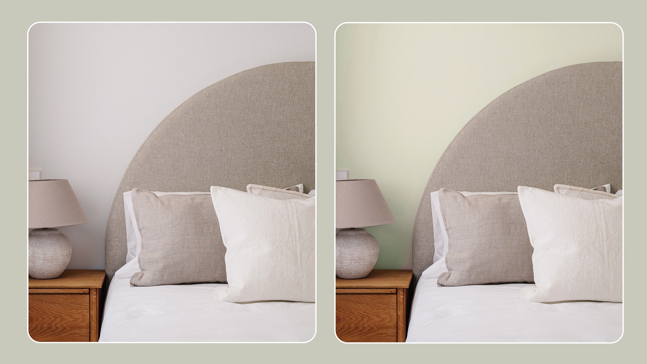
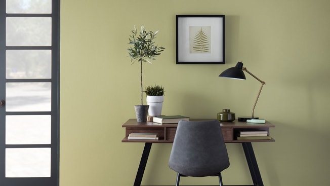
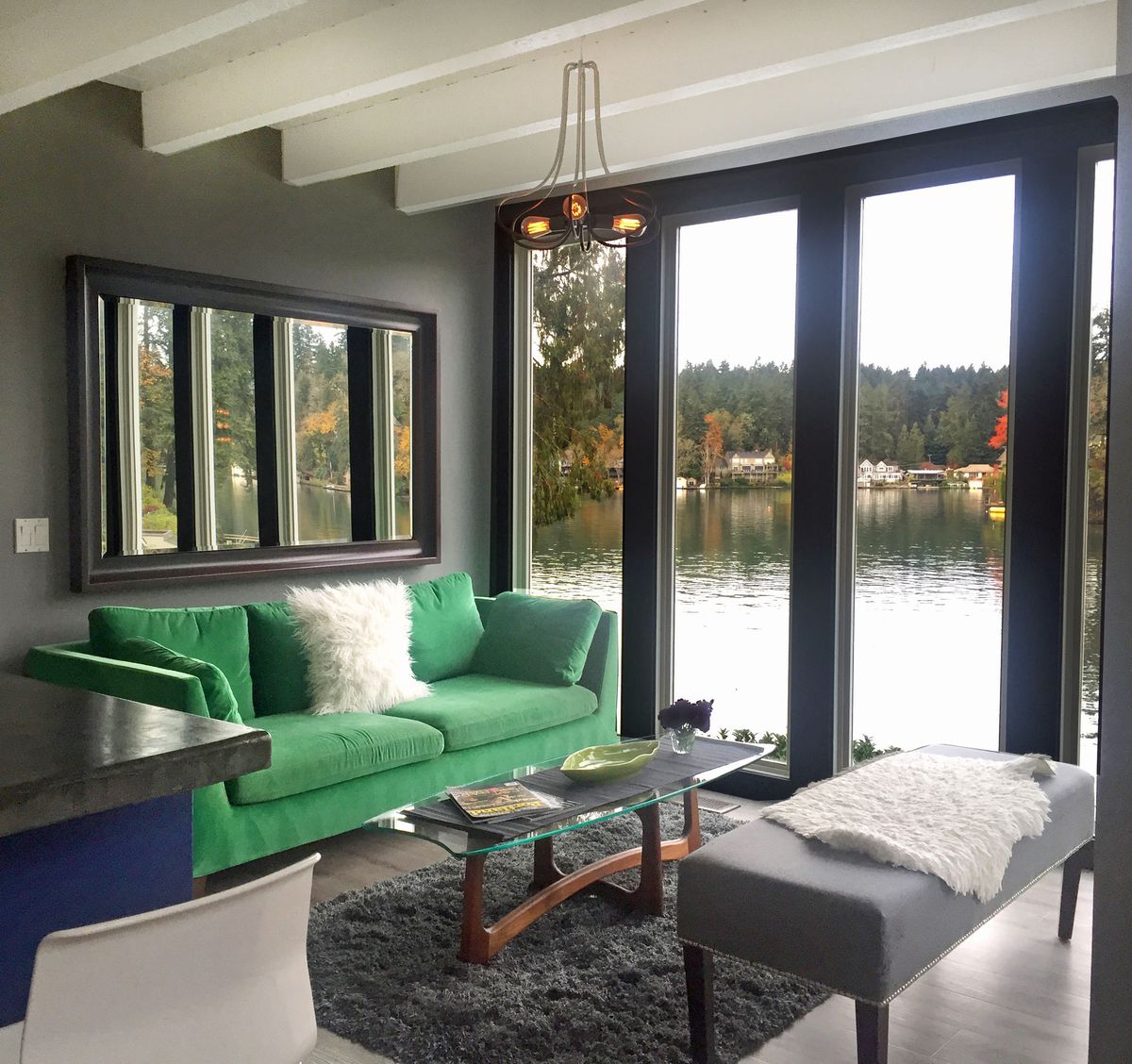
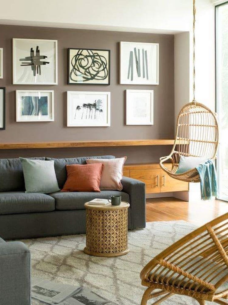
Mellow olive greens are presented as a popular alternative to the traditional "greige." Geoff Sharp, president of Sharper Impressions Painting, recommends PPG Paints' "Olive Sprig" for its modern appeal in home offices or living rooms, offering more depth than previous neutral trends. Benjamin Moore's "Aegean Olive" is mentioned for a deeper green option.
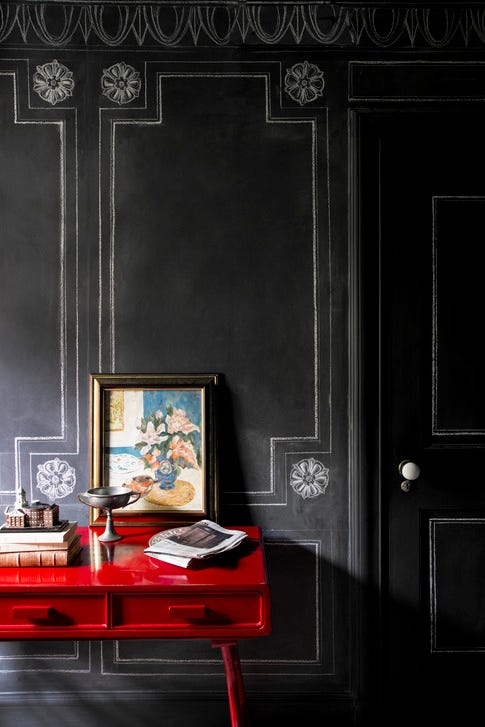
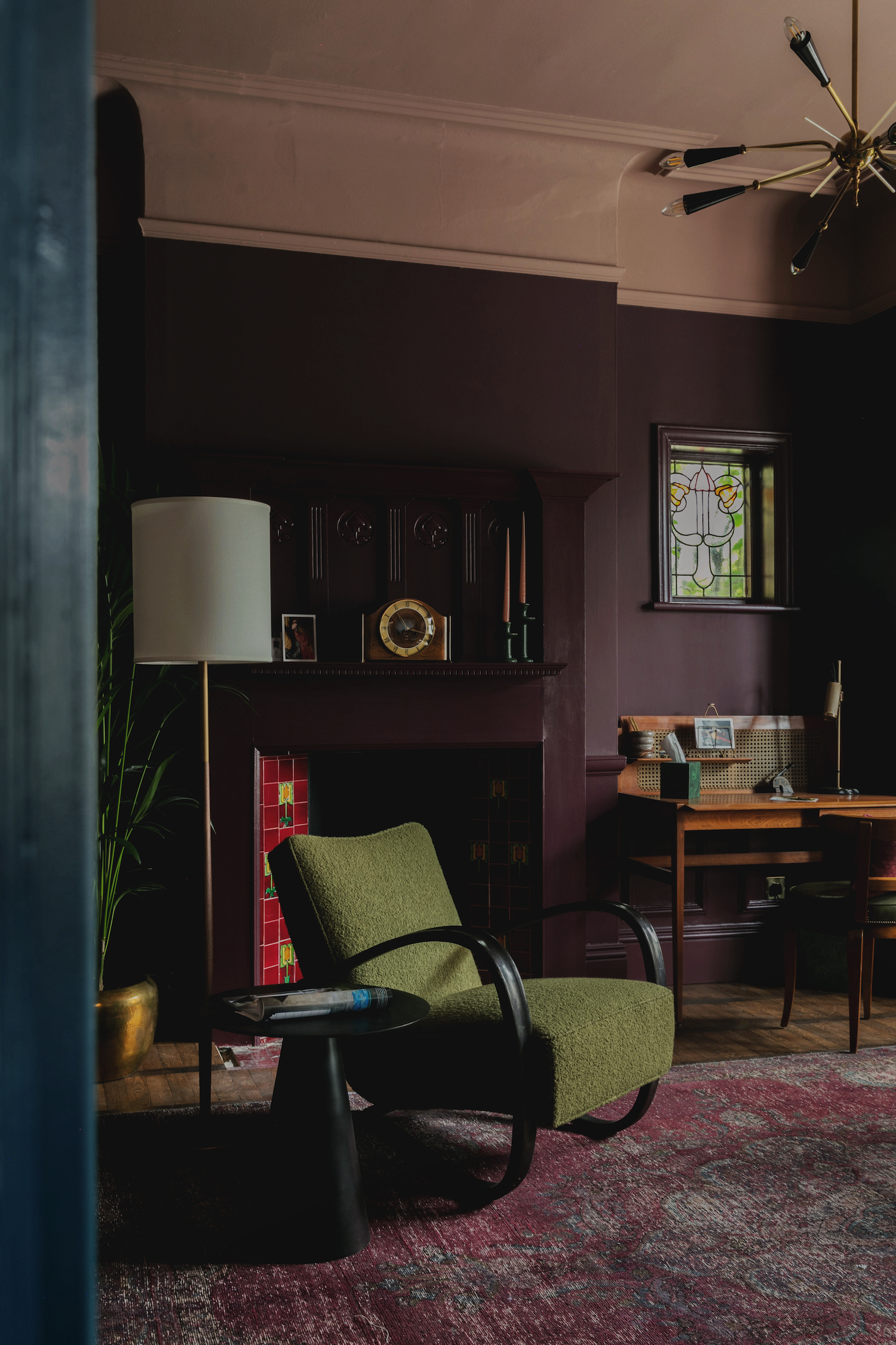
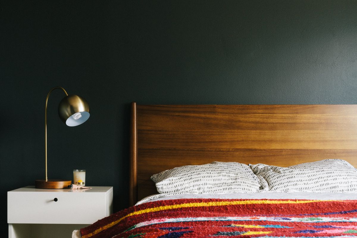
Black is identified as a power color for 2022, capable of making furniture, cabinetry, ceilings, or accent walls stand out. Sharp suggests PPG Paints' "Onyx" for its stone-colored undertone, noting its popularity for kitchen cabinetry. Anna Franklin, an interior designer, prefers Benjamin Moore's "Black Panther" for its bold yet soft quality, often paired with white or cream walls and gold hardware.
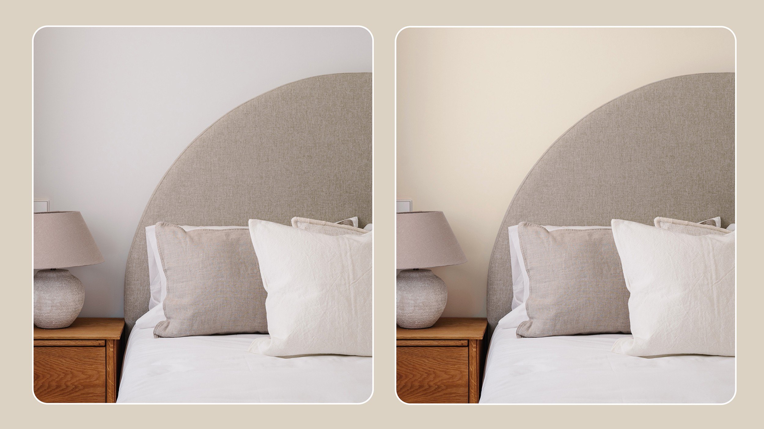
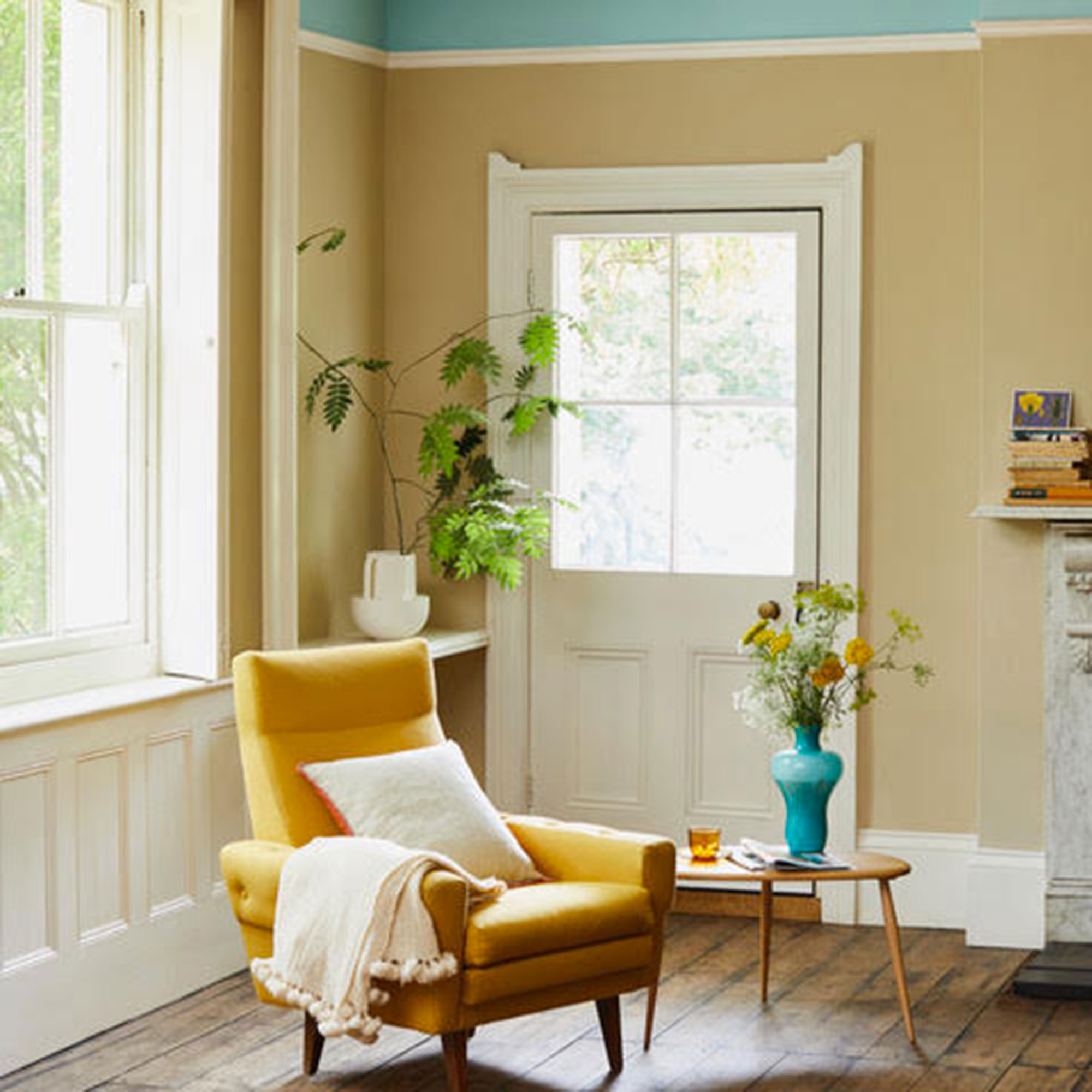
The article notes a decline in super-stark whites in favor of Cream, particularly whites with warmer undertones. Interior designer Jil Sonia recommends Sherwin-Williams' "Alabaster" for its versatility with various flooring and its comforting feel. Benjamin Moore's "White Dove" is also suggested for those seeking a warmer alternative to "Simply White," aligning with the growing "quiet luxury" trend.
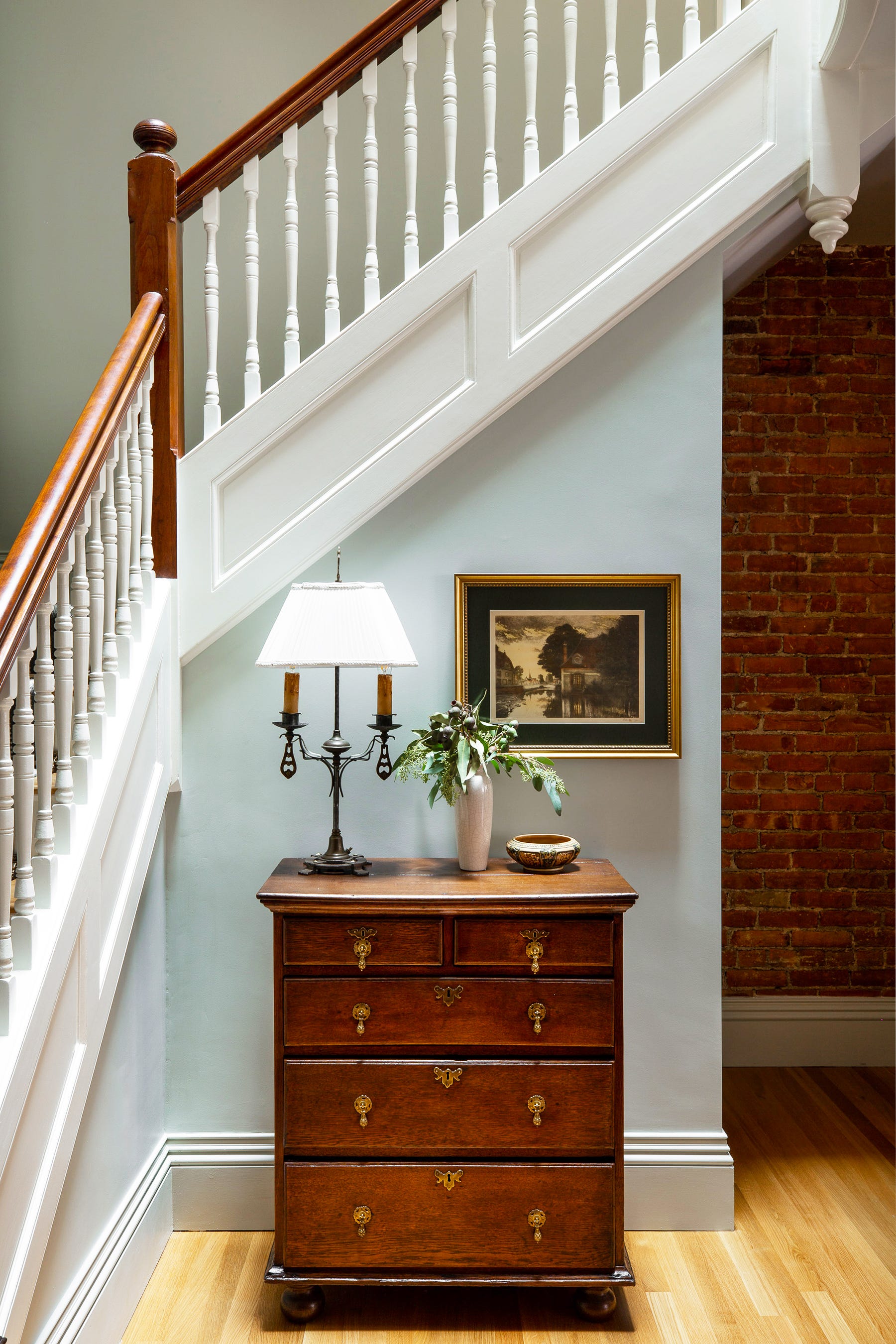
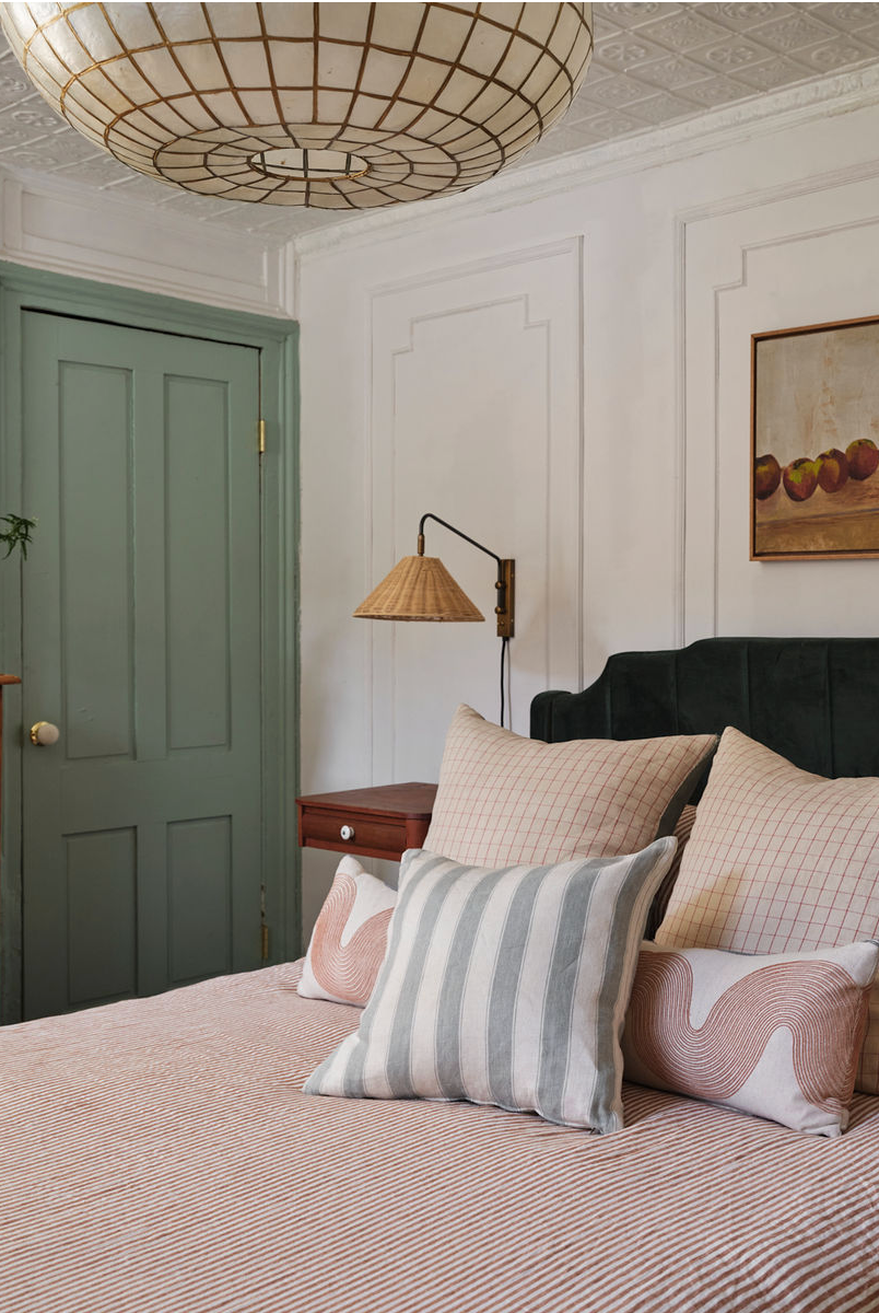
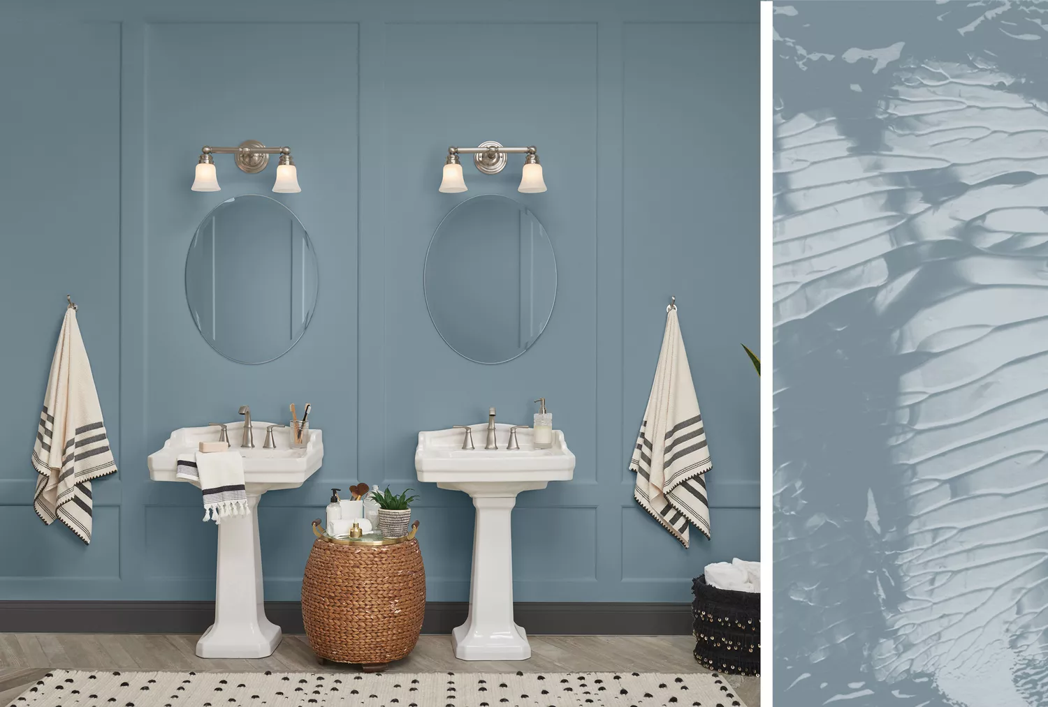
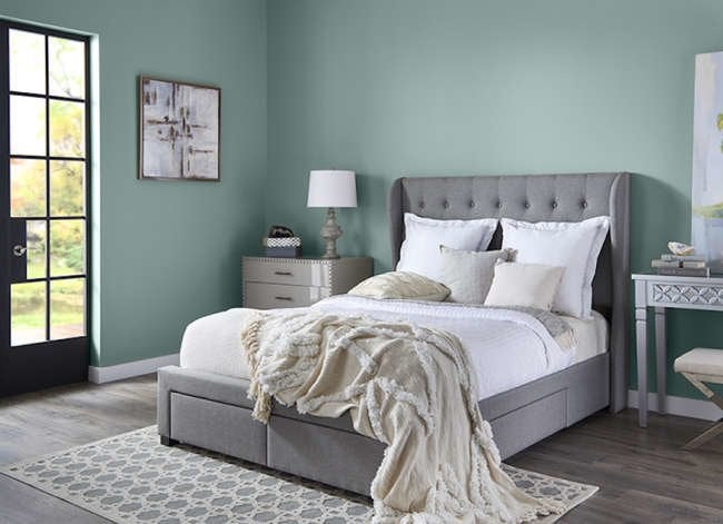
Bolder and darker greens remain fashionable, but a transition towards more natural and earthy blues and greens is observed. Sue Wadden, director of color marketing for Sherwin-Williams, highlights "Evergreen Fog" and "Rainwashed" as examples of these evolving green hues, which are increasingly being treated as neutrals. The article cautions against using too many shallow neutrals, which can be a common paint color mistake.
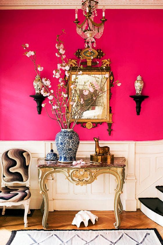
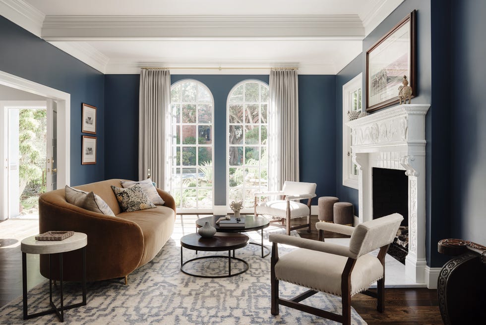
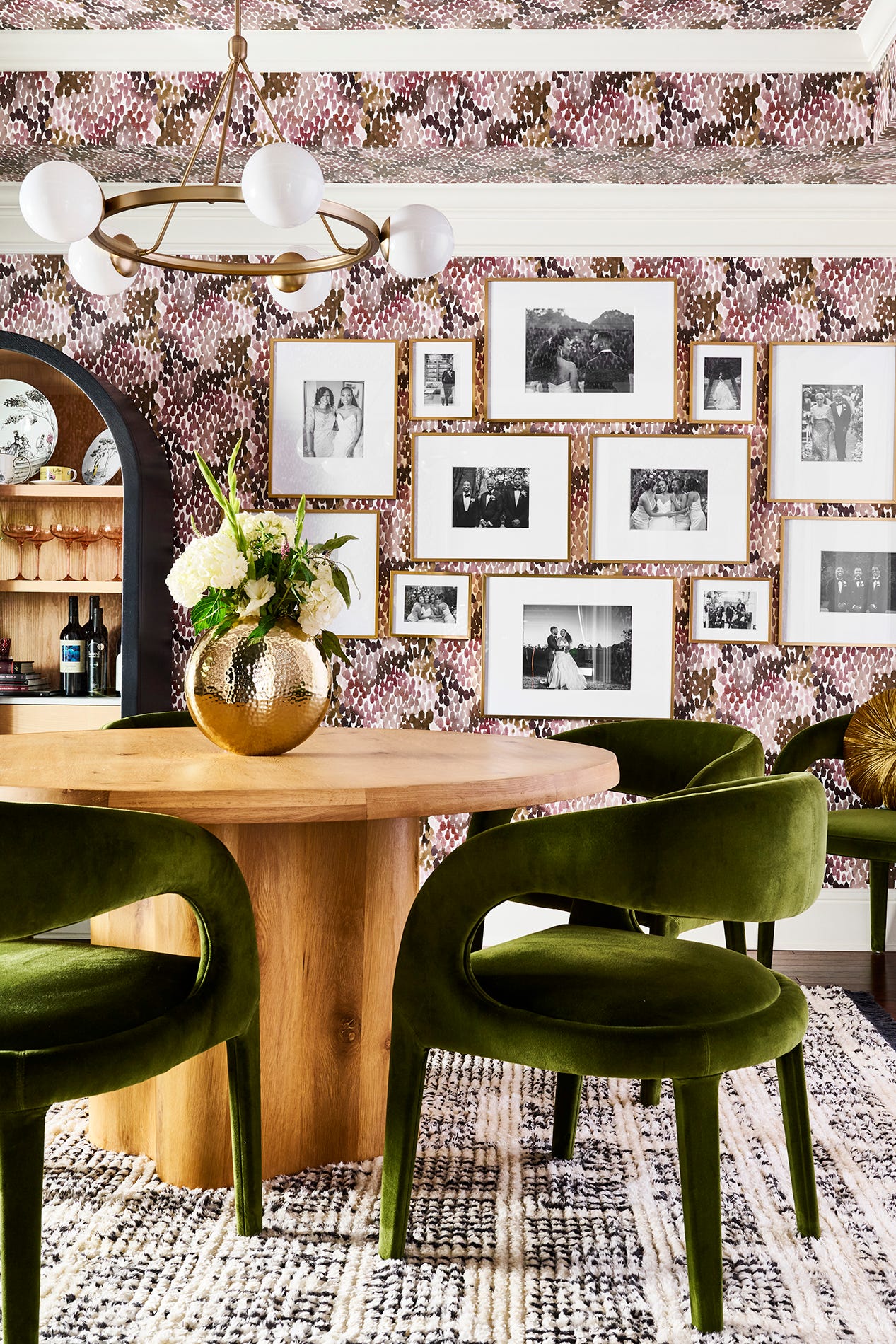
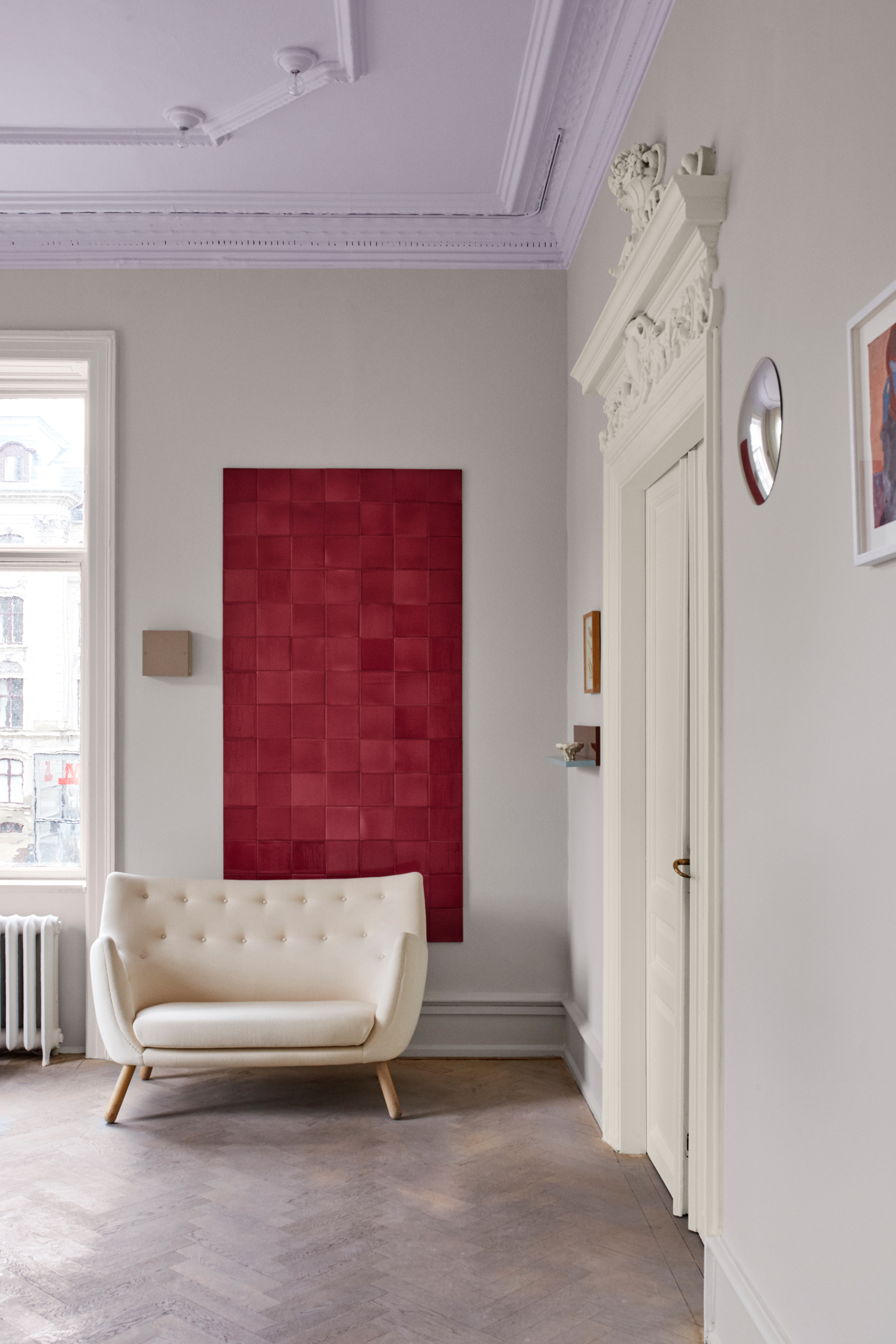
Finally, Bold Red, specifically Benjamin Moore's "Wild Flower," is offered as a vibrant contrast to the mellow earth tones. Inspired by gardens, this red features pink and orange undertones and pairs well with subdued creams, gray-blues, or navy colors, providing a dynamic yet complementary element to interior schemes.
The article emphasizes that homeowners are moving away from cool-toned grays and whites, embracing more vibrant and comforting hues that reflect a desire for nature-inspired and personalized living spaces.
#InteriorDesign #PaintColors #HomeDecor #EarthyTones #ColorTrends #InteriorStyling #HomeImprovement #DecoratingTips #PaintSelection #InteriorDesign #PaintColors #HomeDecor #EarthyTones #ColorTrends #InteriorStyling #HomeImprovement #DecoratingTips #PaintSelection
0 comment in total
 No comments yet
You may also like
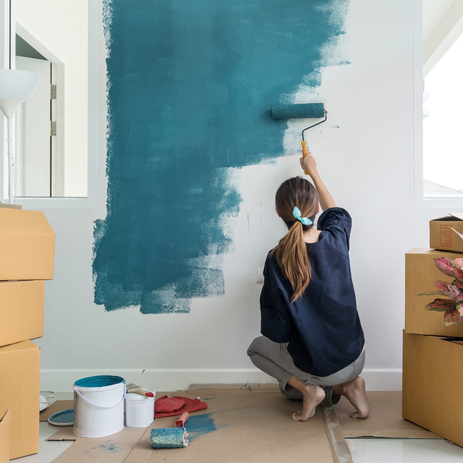
9 Best Paints for Interior Walls
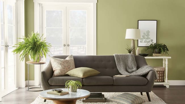
Hottest Interior Paint Colors of 2020
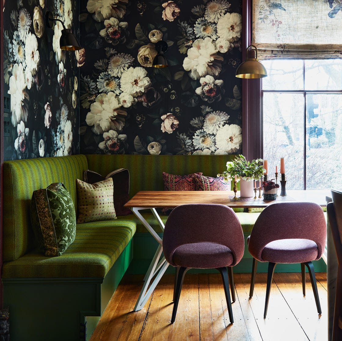
12 Color Schemes That Are Popping Off Right Now, According to Designers

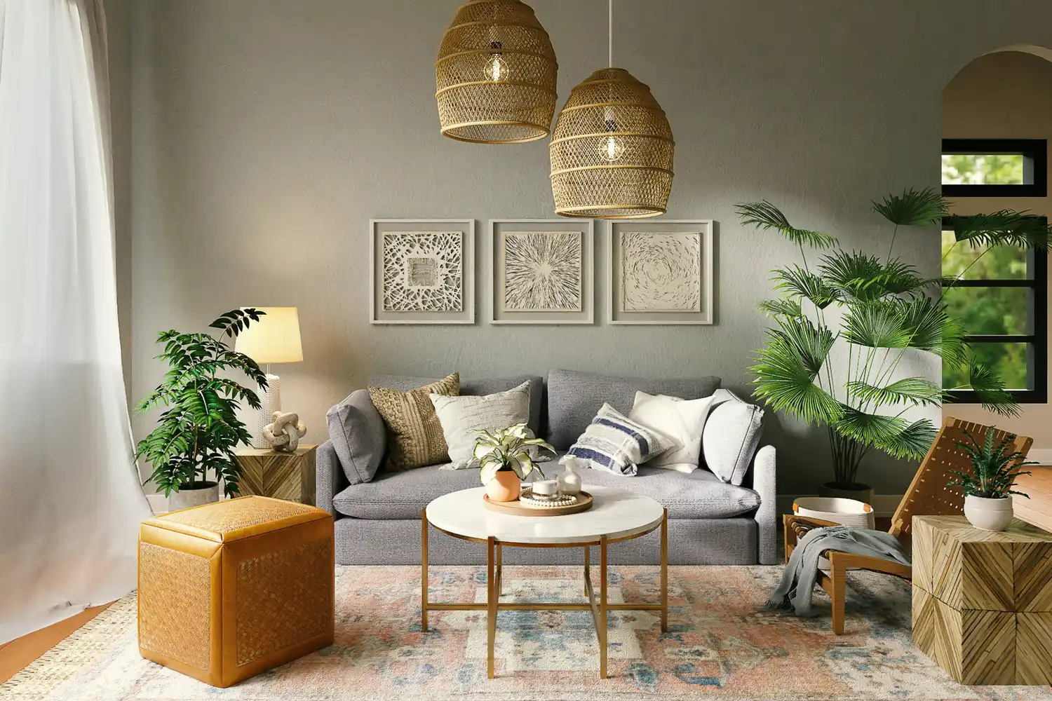
The 5 Most Overused Paint Colors and What to Try Instead, According to Designers

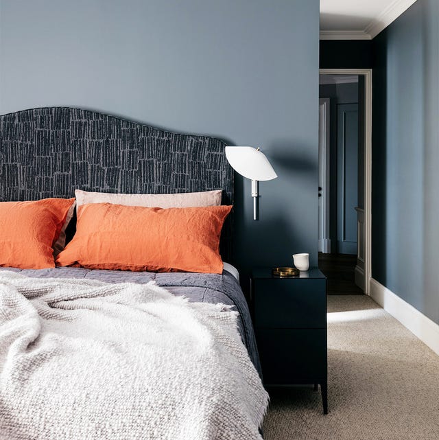
35 Paint Colors to Consider for Every Room in Your House

11 Paint Colors That INSTANTLY Make Your Home Look "Expensive," According to Designers
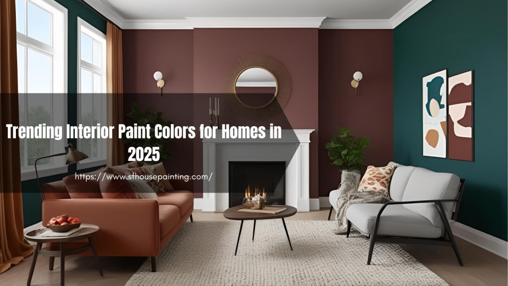
Trending Interior Paint Colors for Homes in 2025

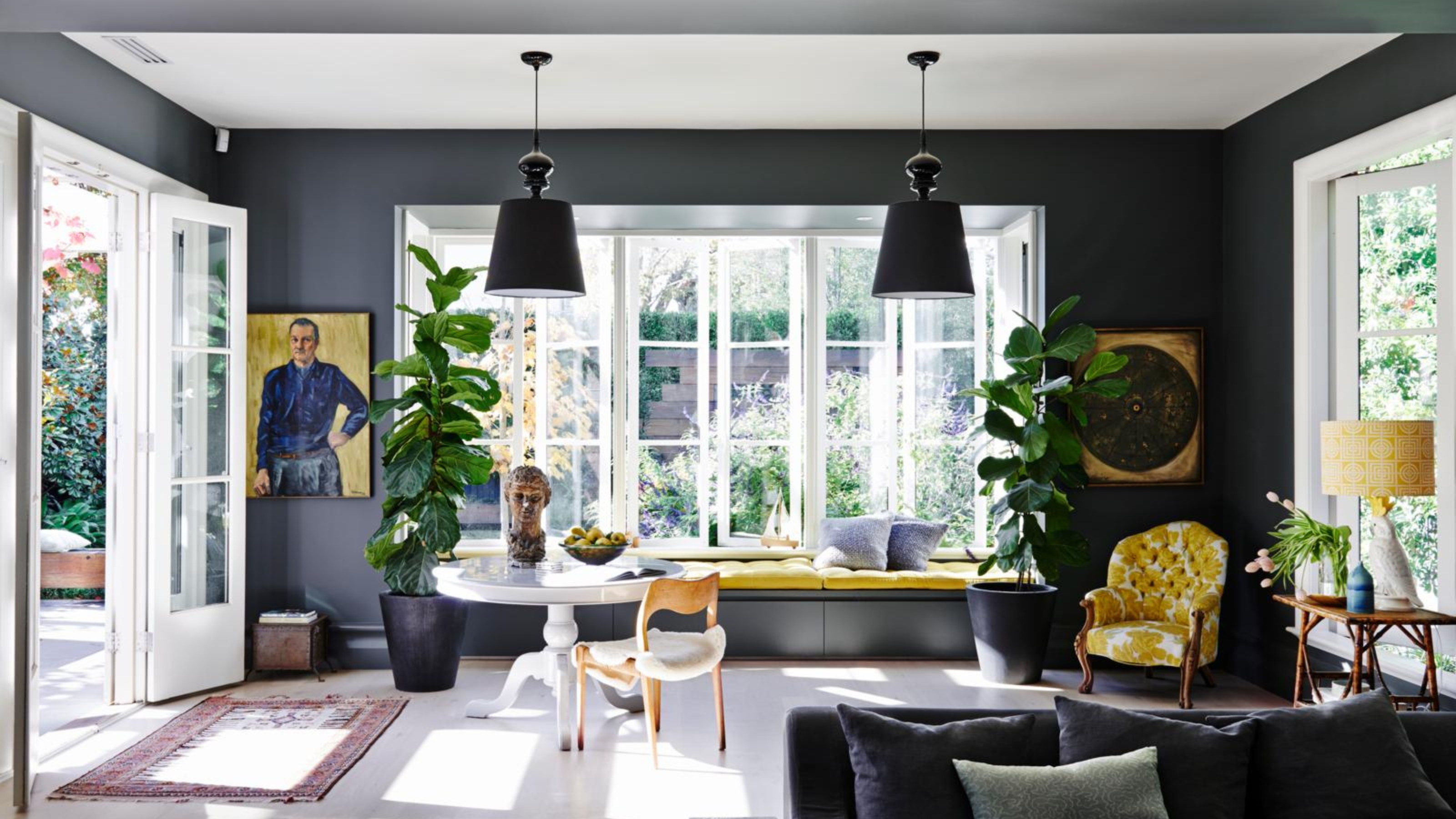
4 Times Designers Say You Definitely Shouldn't Paint Your Walls and Ceiling in the Same Color

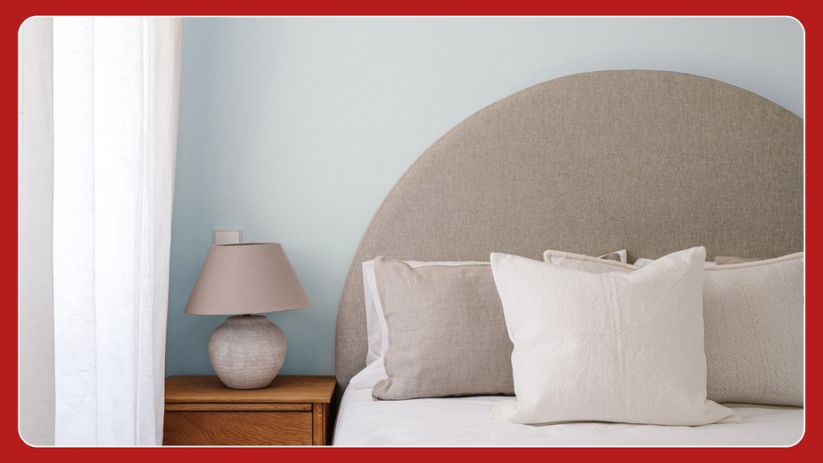
Millennial Gray Is So Over—Here Are 5 Paint Colors to Try Right Now
20 Interior Paint Colors Decorating Experts Love

6 key colors to decorate with in May 2025, according to interior design and color experts in the know

14 Paint Colors That Can Make a Room Feel Instantly Cozy

Interior Paint Colors & Palettes

The Best Interior Paint | Reviews by Wirecutter
How to choose the best paint color for any room in your house

What are the worst colors to paint a room? The shades experts say you should never use
The Best Interior Paints for Every Room of the House, Tested and Approved
Lick Paint Will Transform the Mood in Your Home Through Color Psychology
Should woodwork be lighter or darker than walls? The rules colour experts use to choose the perfect colour
5 Paint Colors to Never Use in Your Living Room, According to Interior Designers