12 Paint Colors That Interior Designers Are Buzzing About—See the Gorgeous Hues Here
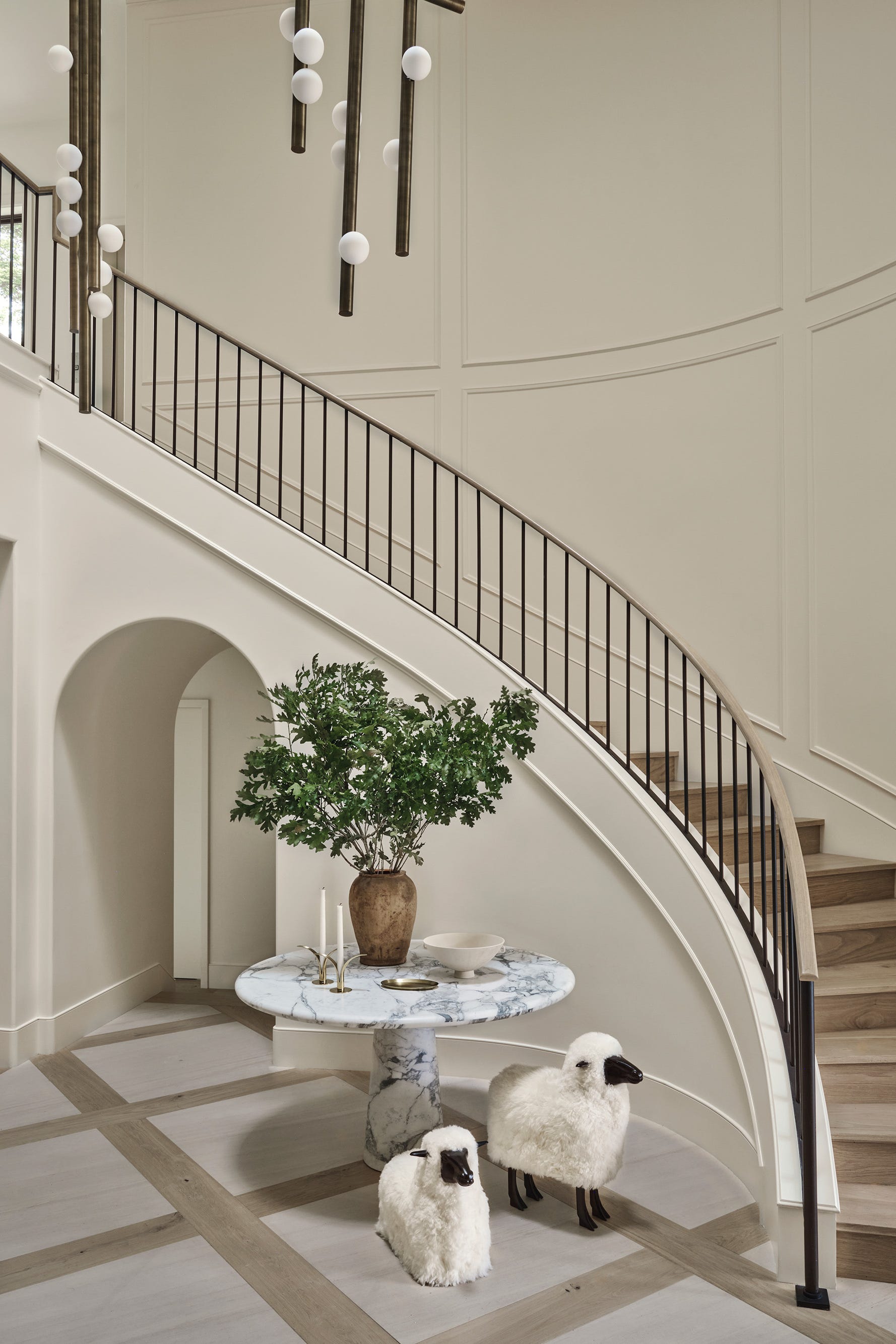
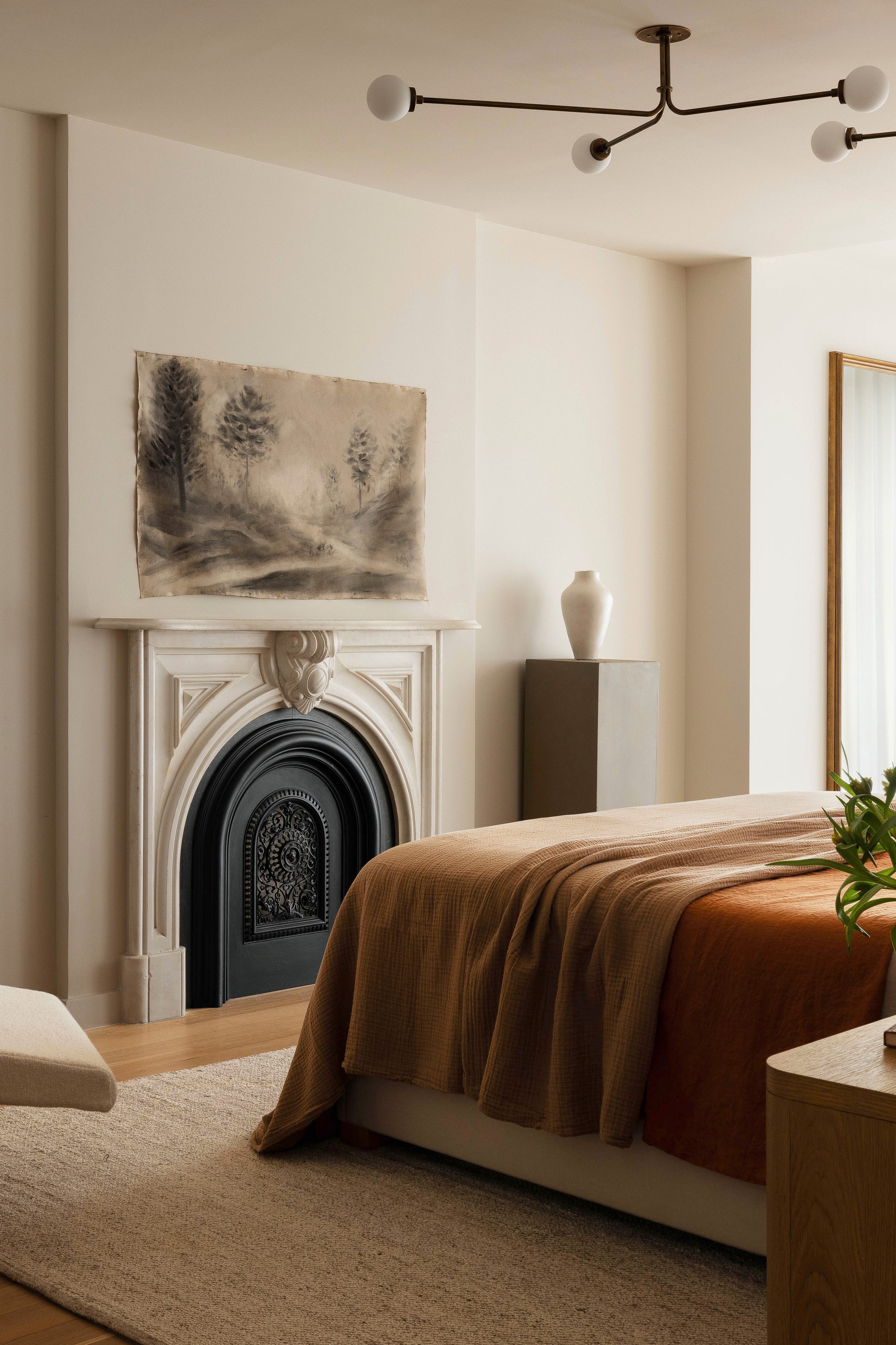
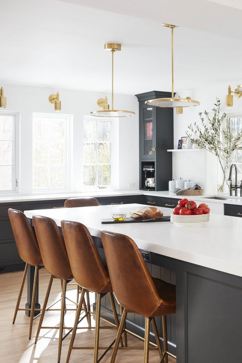
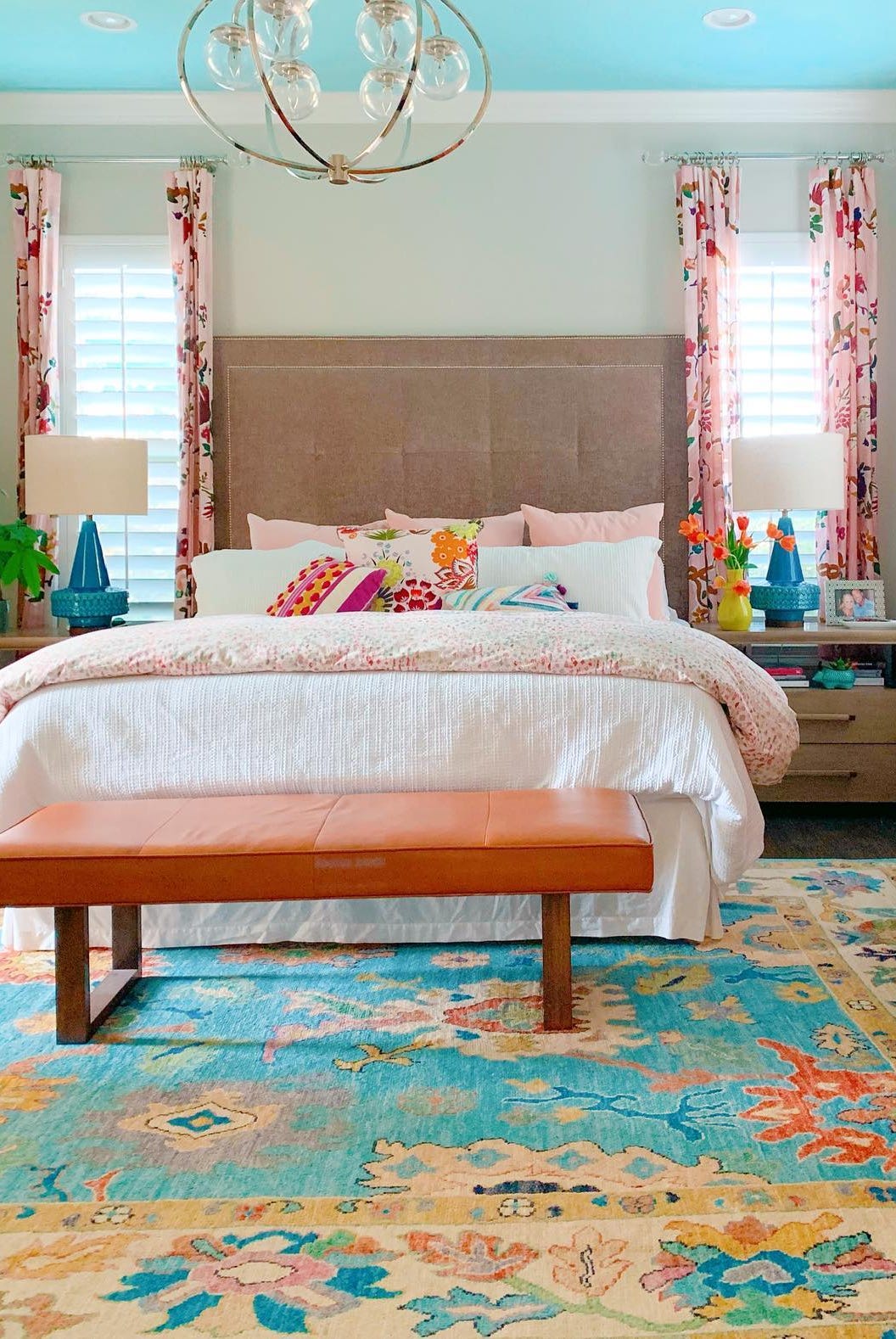
The choice of paint color is fundamental to home aesthetics, whether following annual trends or seeking a refresh. This article explores 12 paint colors favored by interior designers for 2025, offering insights into their application and impact, moving beyond conventional palettes. The selections range from deep, saturated hues to versatile neutrals and earthy tones.
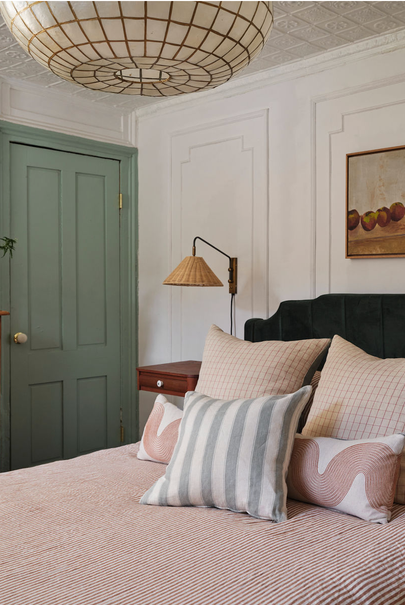
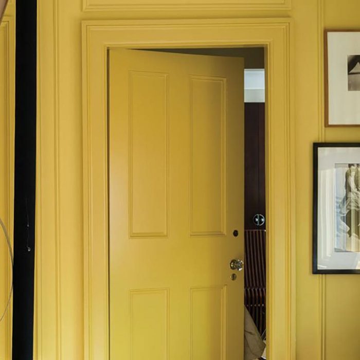
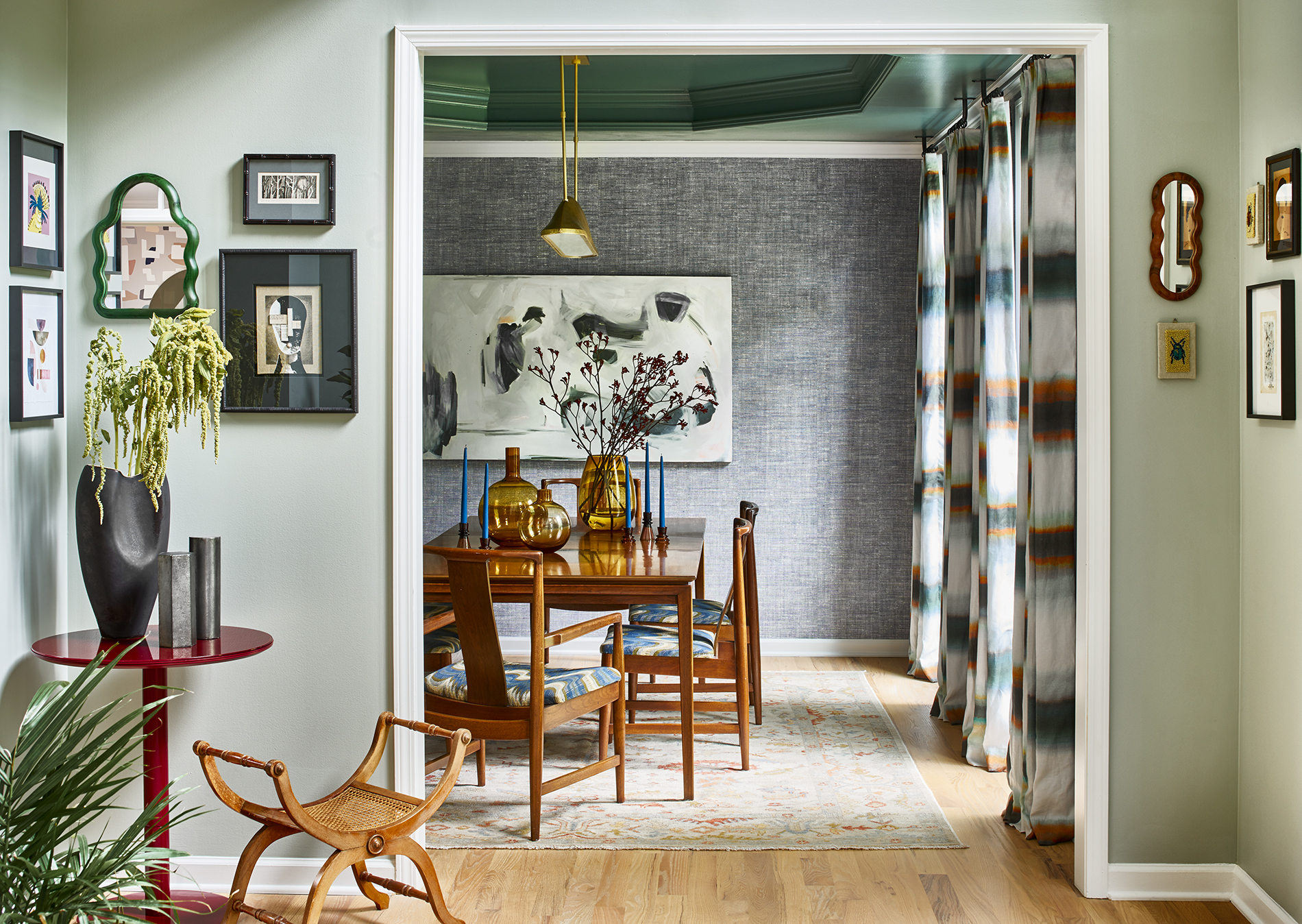
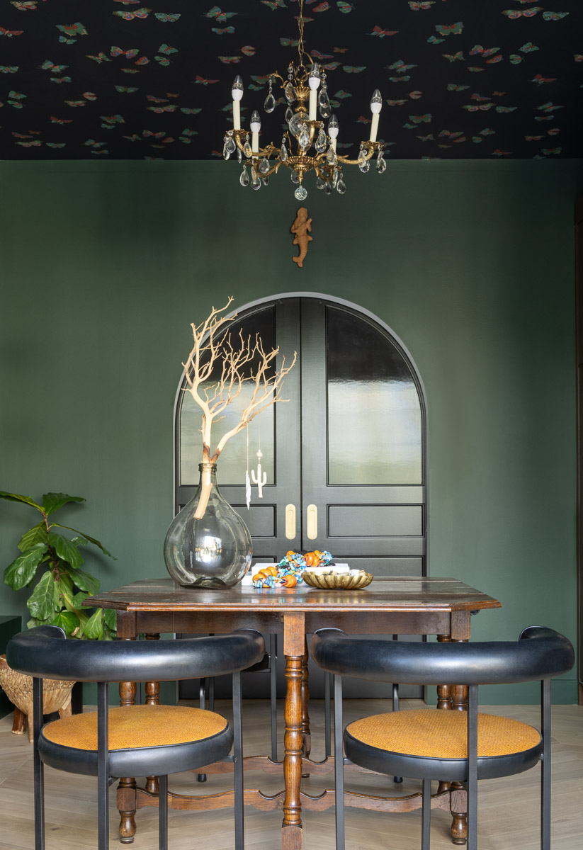
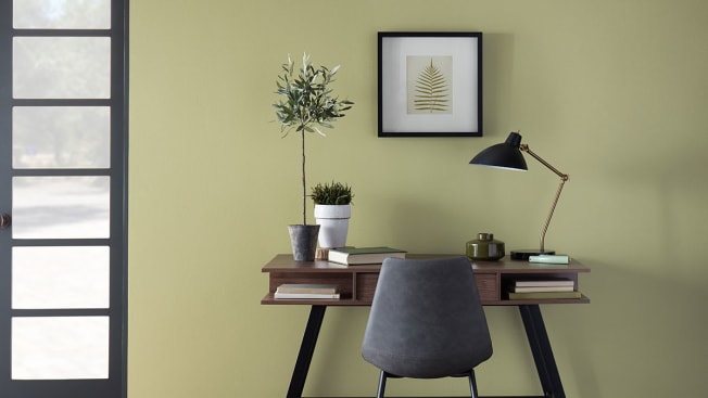
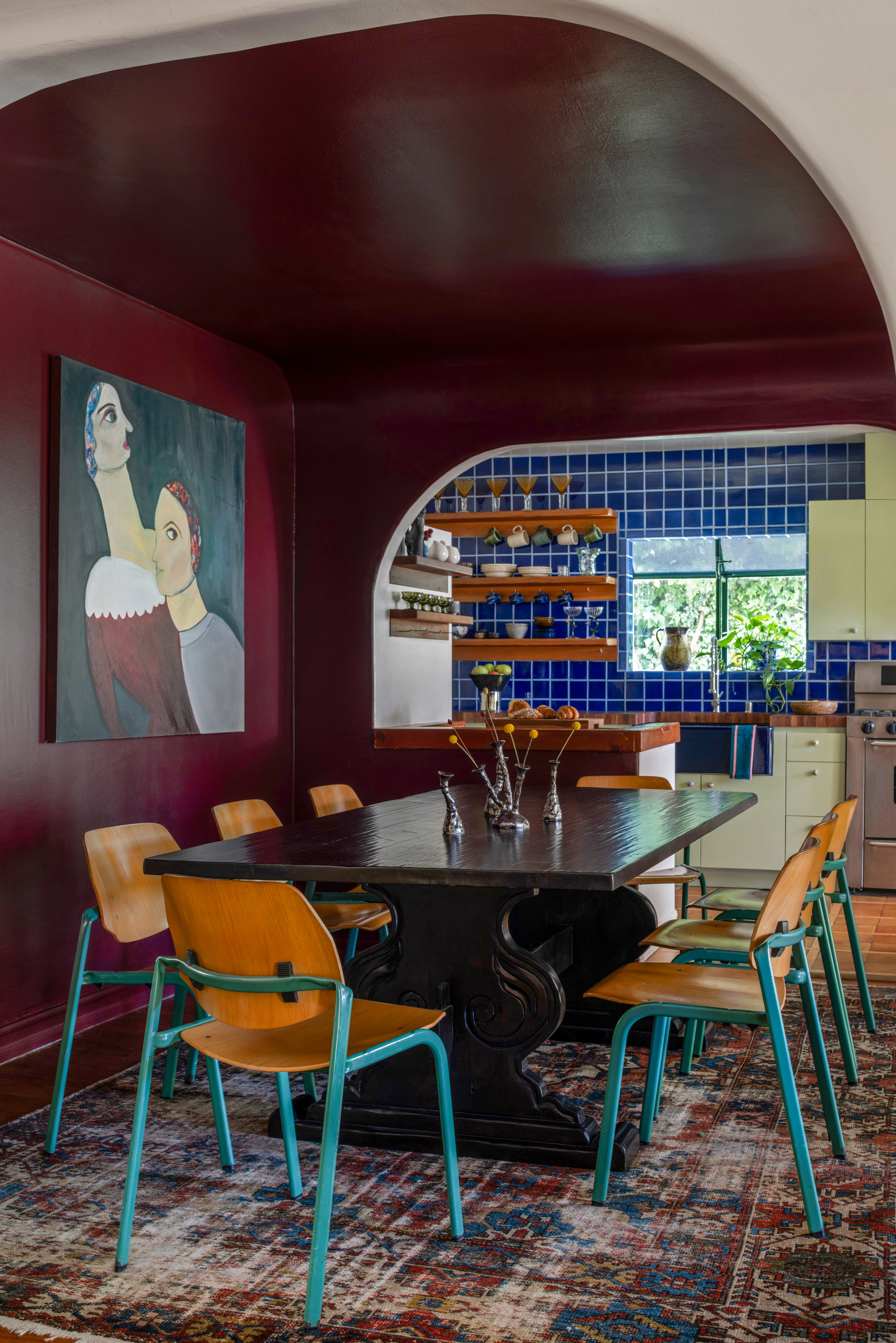
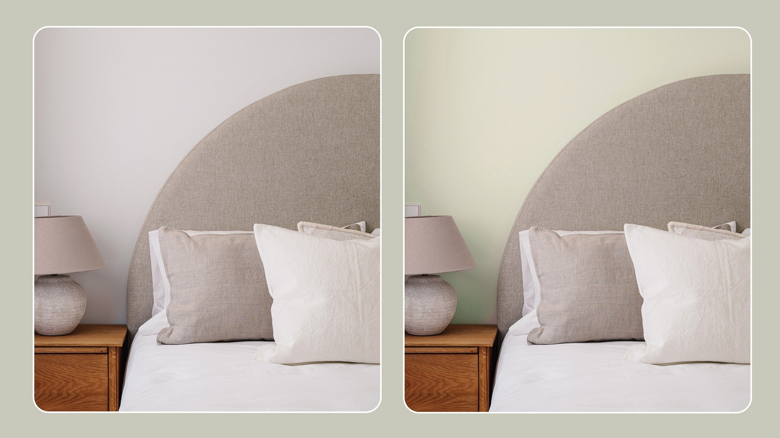
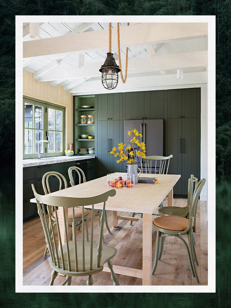
Vintage Vogue by Benjamin Moore is highlighted for its ability to bring millwork to life, especially in kitchens or libraries with floor-to-ceiling shelving. Its green tone retains depth in varying light conditions without appearing black or slate. For smaller spaces like powder baths and breakfast nooks, Gloucester Sage by Benjamin Moore provides a bold yet demure mossy green that avoids pulling gray, offering a vintage and traditional feel. India Yellow by Farrow & Ball is suggested for those desiring a bolder hue with earthy undertones, capable of being sophisticated or adding a vibrant pop, as demonstrated in a laundry room cabinet with a wallcovering.
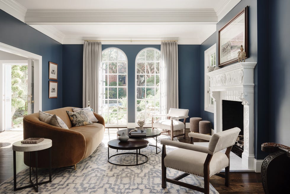
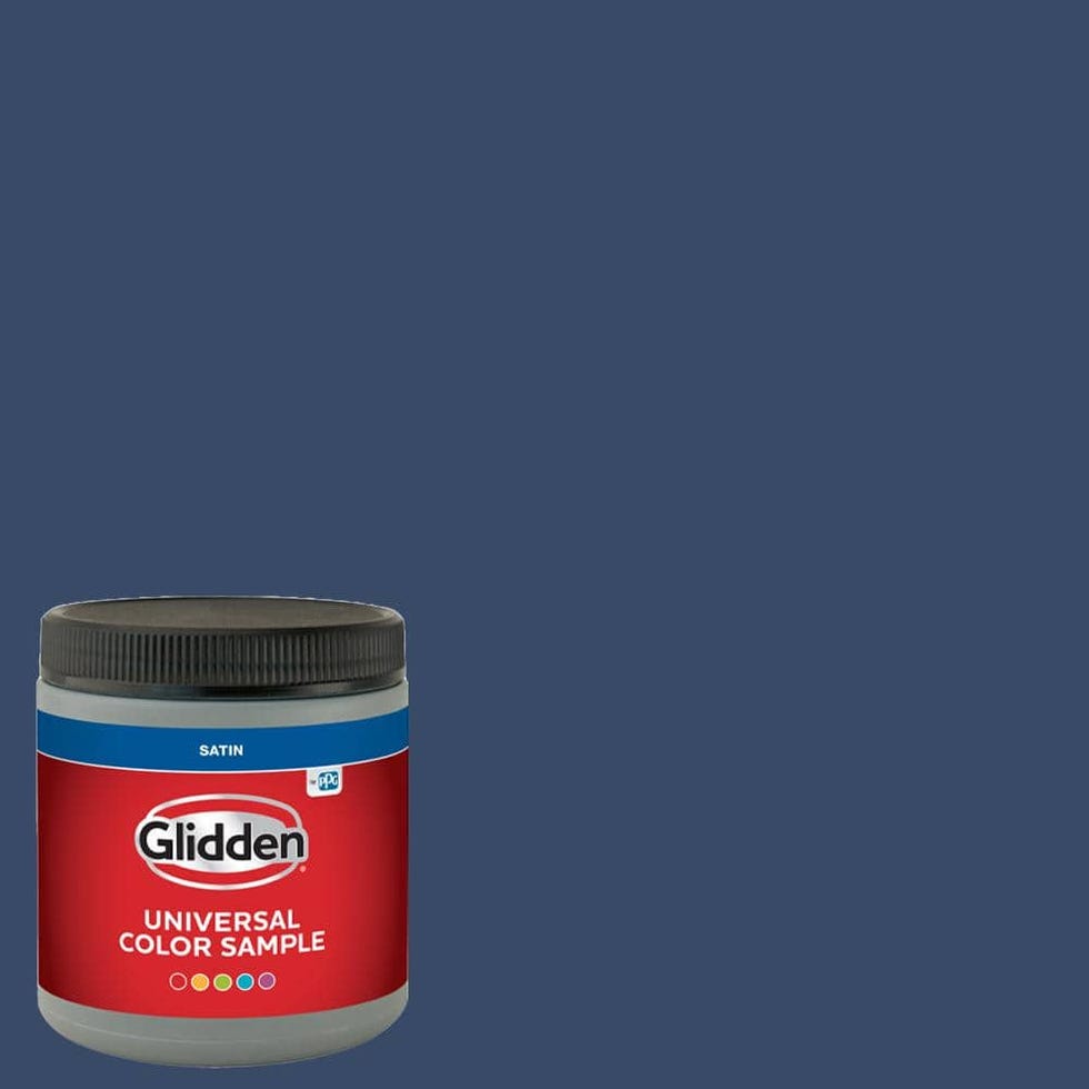
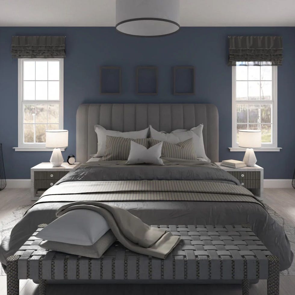
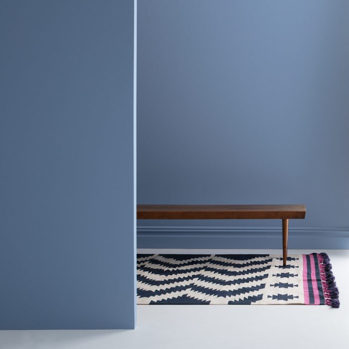
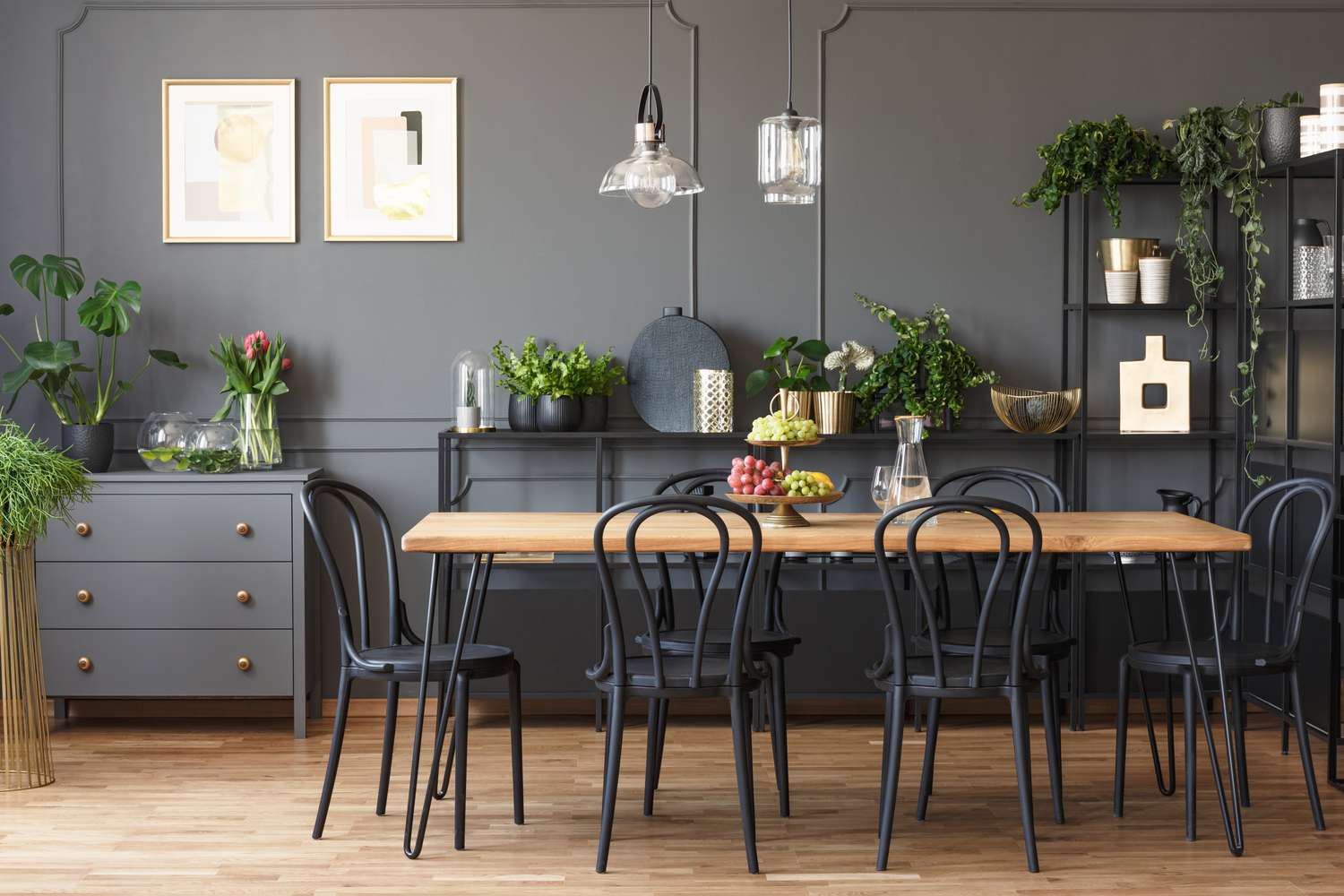
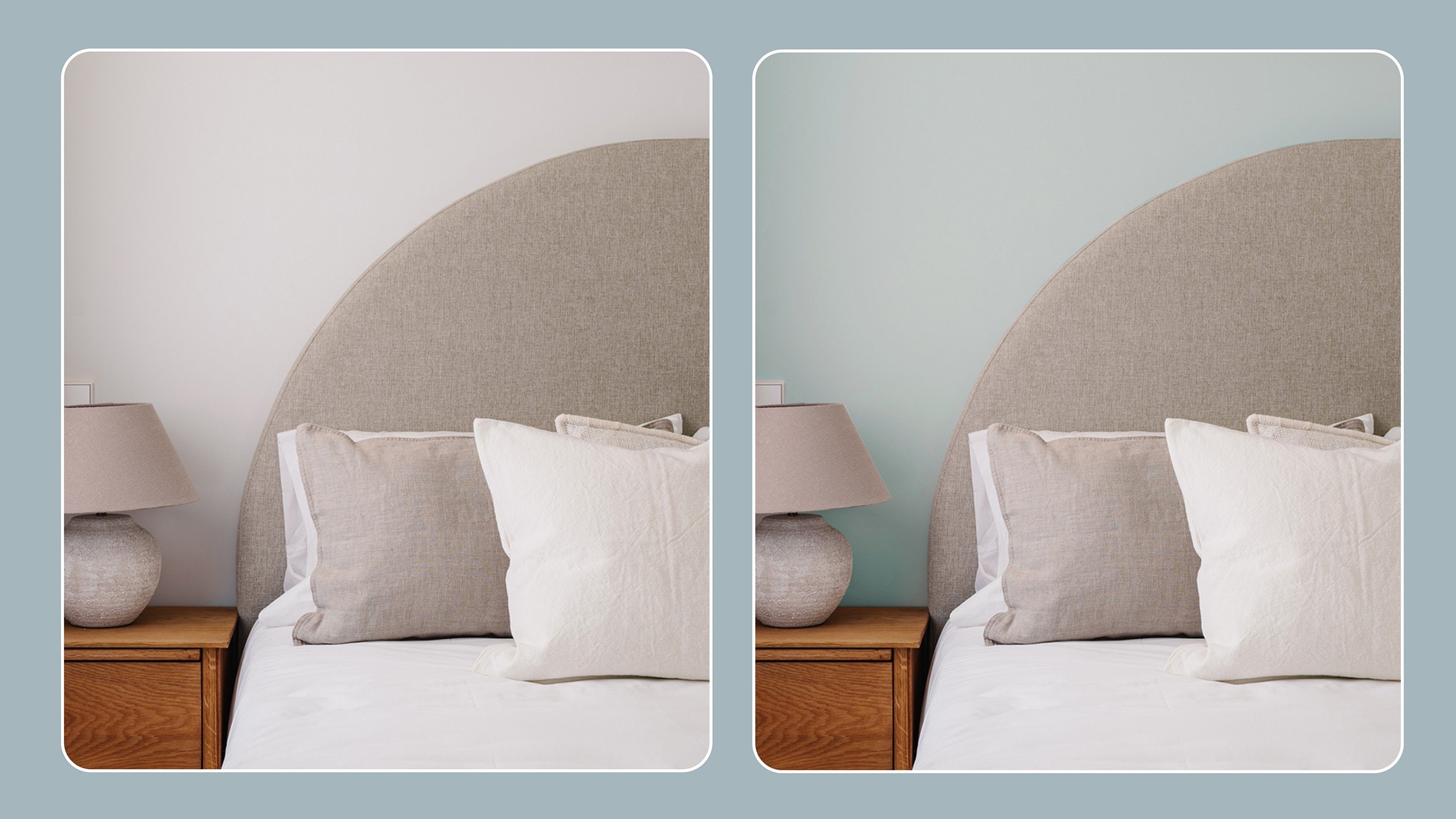
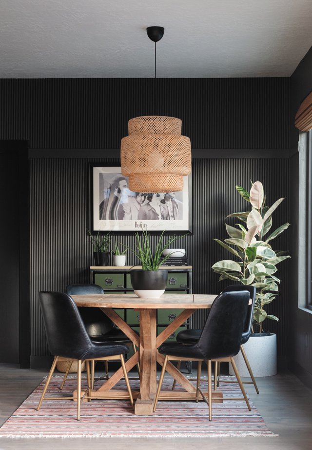
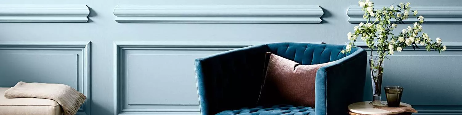
Wellfleet by Portola Paints is identified as ideal for the 2025 trend of color drenching, striking a balance between depth and warmth in its blue shade. It complements warm, earthy tones like Mocha Mousse. Barnwood by Benjamin Moore, a deep gray with brown hints, is recommended for its versatility and moody quality, suitable for bars and dining rooms. Pure White by Sherwin-Williams stands out as a reliable white, valued by designers for not pulling yellow, pink, blue, or gray in diverse lighting, maintaining its importance amidst trends favoring vibrant colors and jewel tones.
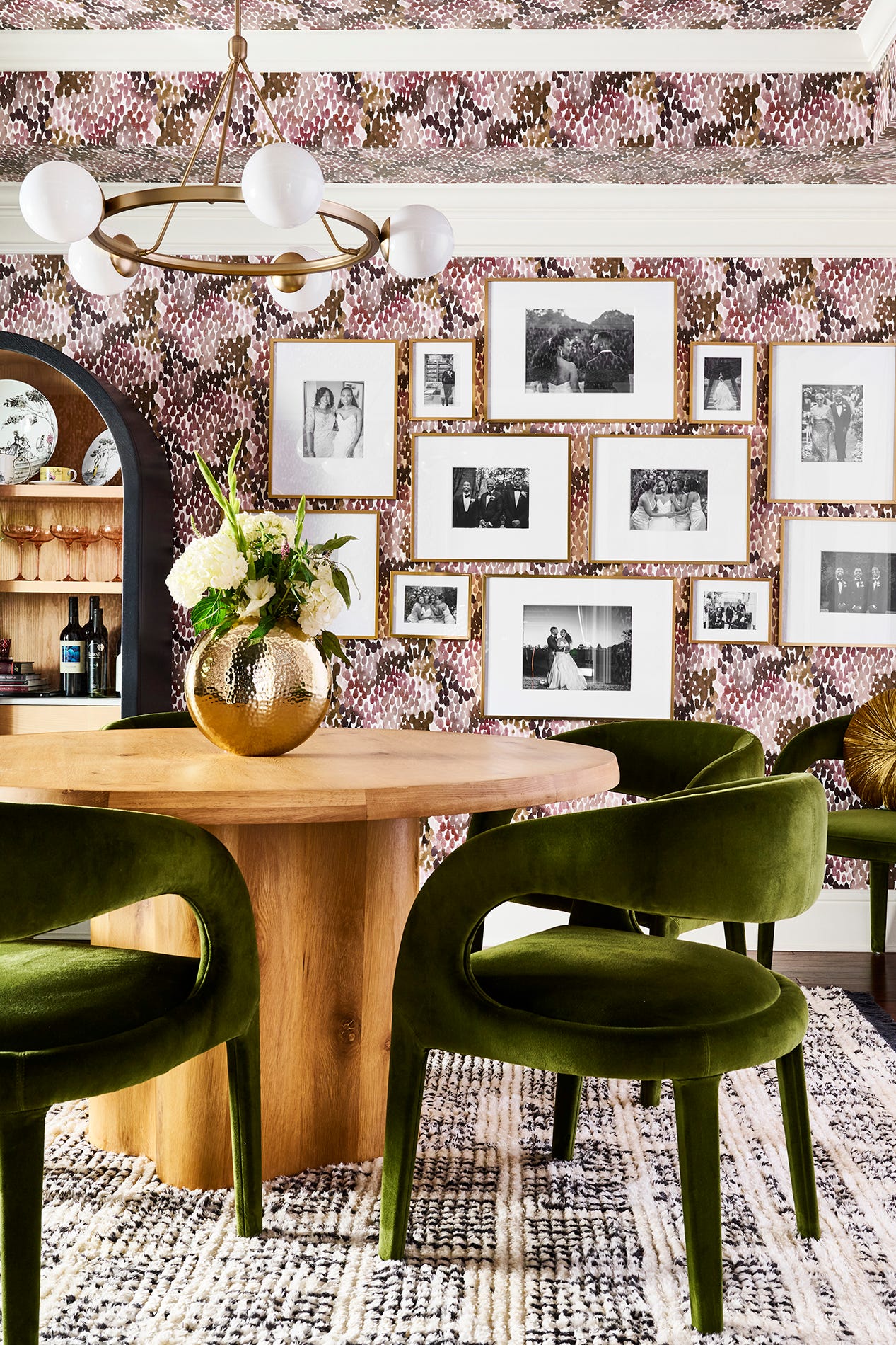
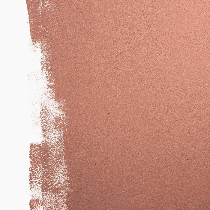
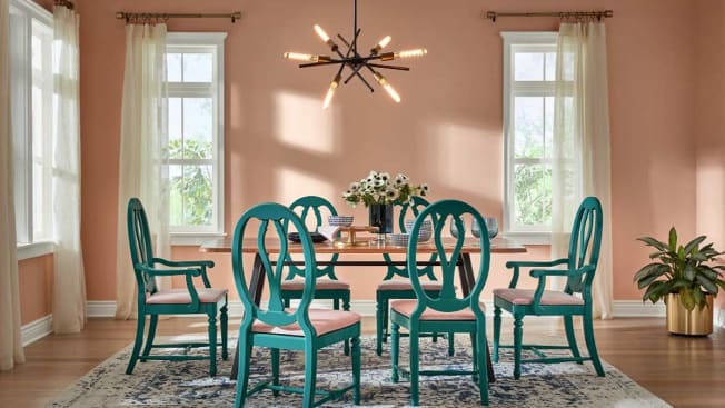
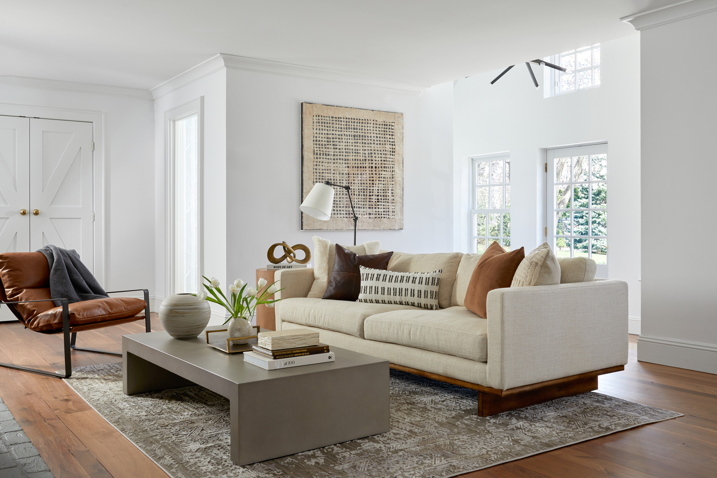
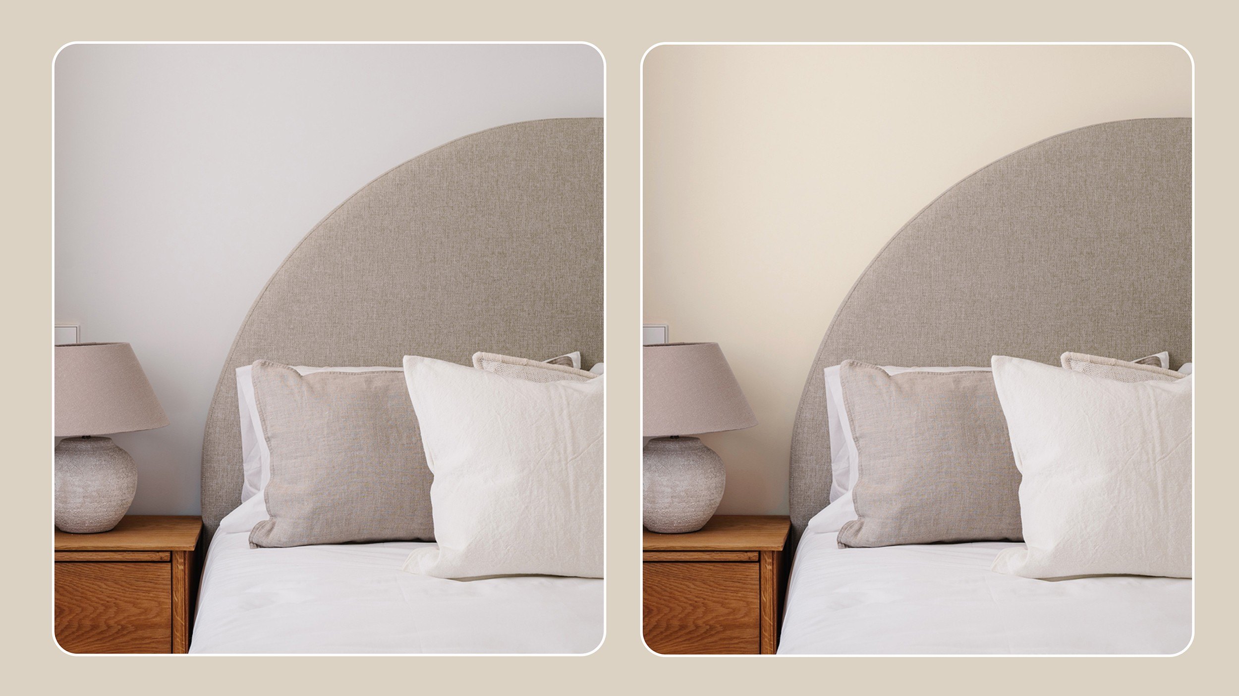
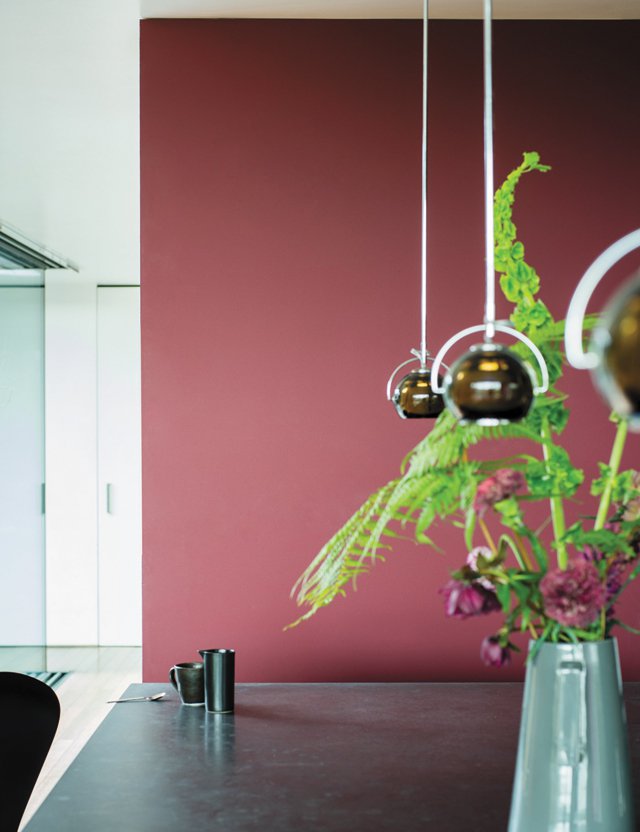
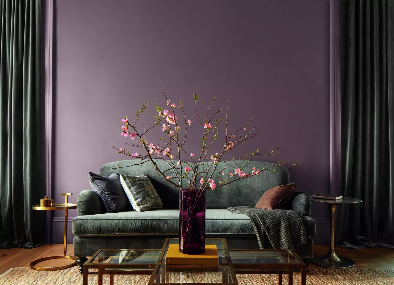
Havana Affair by Alkemis, a bright, rusty orange-red, is praised for its ability to infuse joy and warmth, with its rich, matte velvet finish likened to a jewelry box interior. Benjamin Moore's 2025 Color of the Year, Cinnamon Slate, is described as a sophisticated blend of deep plum and earth brown, offering warmth, depth, and character without feeling heavy. Alabaster by Benjamin Moore is a soft, sophisticated white that instantly elevates spaces and is expected to remain a popular choice. Revere Pewter by Benjamin Moore, a light gray with green-gray undertones, is favored for its warmth and versatility, suitable for layering with trendy colors and used across various rooms.
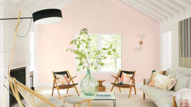
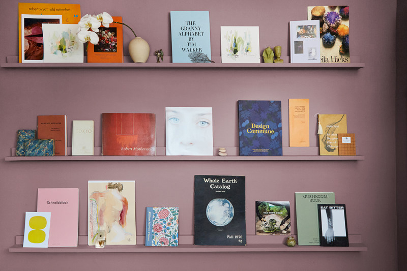
Antique Pearl by Benjamin Moore is presented as a soothing, muted silver-lilac that transitions from lilac undertones in daylight to a warm gray at night, adaptable to both cool and warm color schemes. Finally, Heron Plume by Sherwin-Williams is a soft, warm cream ideal for kitchens, providing a welcoming and versatile foundation for modern designs with its nuanced warm cream and gray tonal values. These selections collectively offer a guide to creating inviting, stylish, and character-filled interiors in the coming year.
#PaintColors #InteriorDesignTrends #HomeDecor #ColorPalette #BenjaminMoore #FarrowAndBall #PortolaPaints #SherwinWilliams #Alkemis #PaintColors #InteriorDesignTrends #HomeDecor #ColorPalette #BenjaminMoore #FarrowAndBall #PortolaPaints #SherwinWilliams #Alkemis
0 comment in total
 No comments yet
You may also like

4 Interior Designers Share the Biggest Paint Color Trends Right Now (and What’s Out!)

Lick Paint Will Transform the Mood in Your Home Through Color Psychology

12 Colors That Go With Green I'm Seeing Interior Designers Use All the Time Right Now


Designers Agree: These 7 Underrated Paint Colors Will Be Huge in 2026


8 Favorite Paint Colors of Local Interior Designers

9 Best Interior Paint Colors

The 5 Most Overused Paint Colors and What to Try Instead, According to Designers
The Color Trend Designers Are Painting Dining Rooms Right Now
The 13 Best White Paint Colors That Interior Designers Swear By
20 Interior Paint Colors Decorating Experts Love

11 Paint Colors That INSTANTLY Make Your Home Look "Expensive," According to Designers
Millennial Gray Is So Over—Here Are 5 Paint Colors to Try Right Now
7 Bold Paint Colors Interior Designers Are Longing to Use on Their Next Projects


6 key colors to decorate with in May 2025, according to interior design and color experts in the know

Hottest Interior Paint Colors of 2020
2021’s Palette of Possibilities
12 Color Schemes That Are Popping Off Right Now, According to Designers

These 6 Colors Will Rule Interiors in 2026, According to Experts

Designers Share Their Tried-and-True Shades From the Best Interior Paint Brands
Interior Paint Colors & Palettes