1/13
The Color Trend Designers Are Painting Dining Rooms Right Now
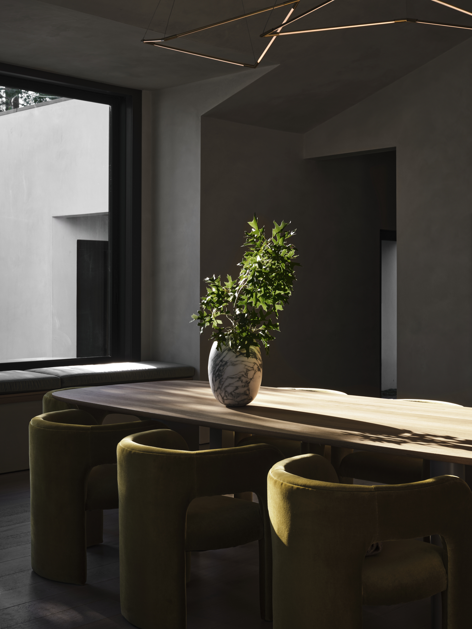
The article explores a prevailing trend in interior design for 2026, highlighting a consensus among designers regarding the ideal color for dining rooms. The author notes a shift in perception for the color purple, which has historically been considered outdated or juvenile. Now, designers are embracing deeper, reddish-brown tones of purple, particularly for dining spaces.
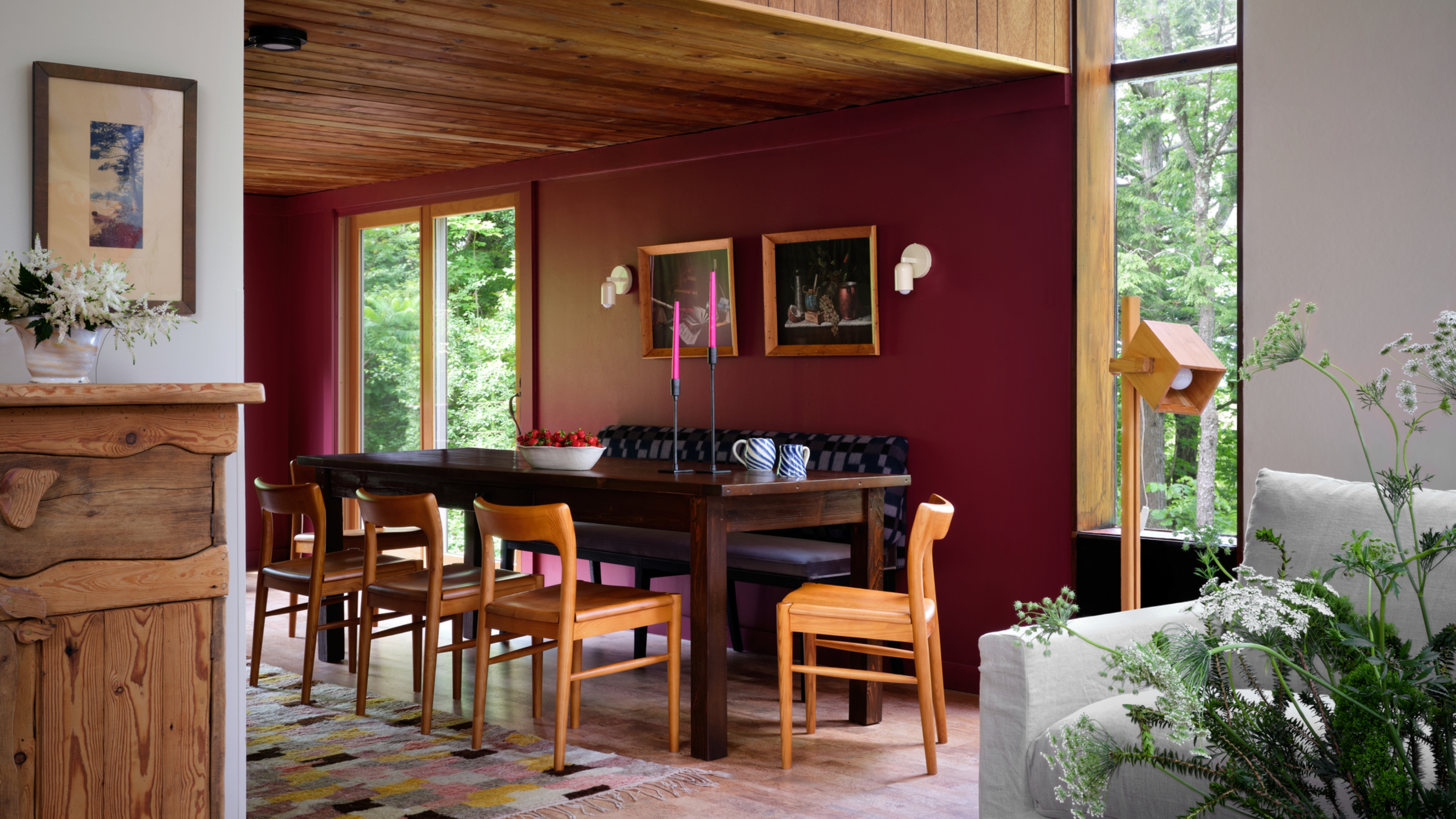
San Francisco-based interior designer Lorri Hicks Cazenave describes this preferred shade as a "smoky, near-black eggplant tone that is red in some lights and purple in others, and feels like candlelight turned into paint." This signifies a departure from neutral palettes, moving towards "juicy jewel tones" that redefine gathering spaces. The article suggests that decorating with these aubergine shades offers a timeless aesthetic, contrary to common misconceptions about purple's chicness.
The popularity of deep purple hues stems from a desire for spaces with soul, characterized by depth, mystery, and mood. According to Hicks Cazenave, aubergine achieves this without becoming overly theatrical, offering a refined and unexpected alternative to conventional neutrals. She emphasizes that these deep purples create a sense of slowness, making dinners feel longer, conversations deeper, and enhancing the appearance of individuals in the room, likening its effect to a dim, glowing light.
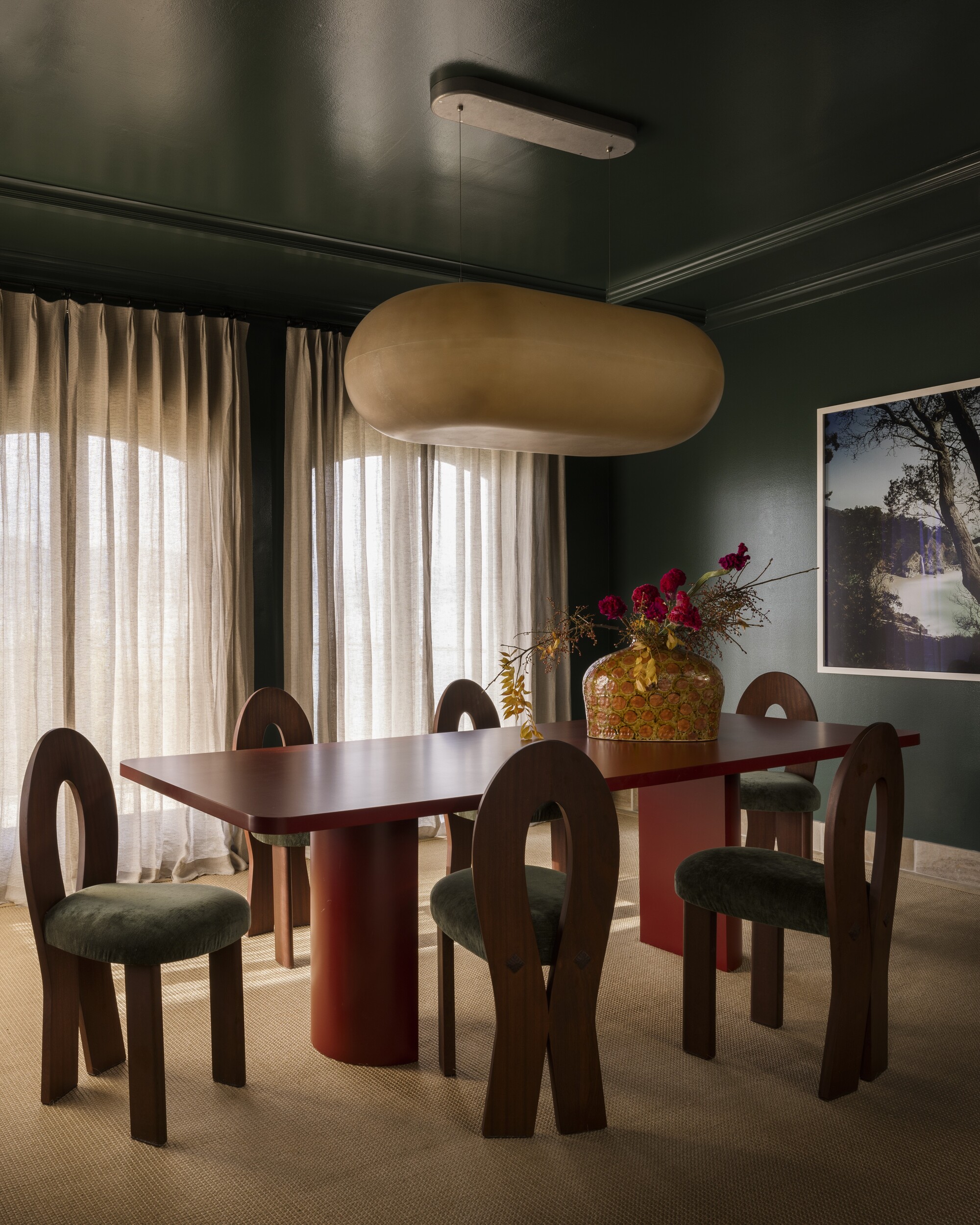
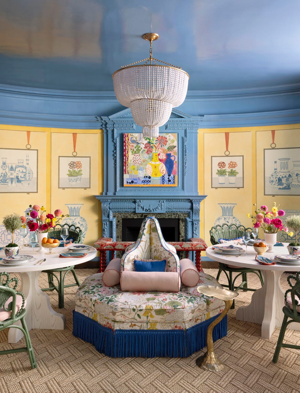
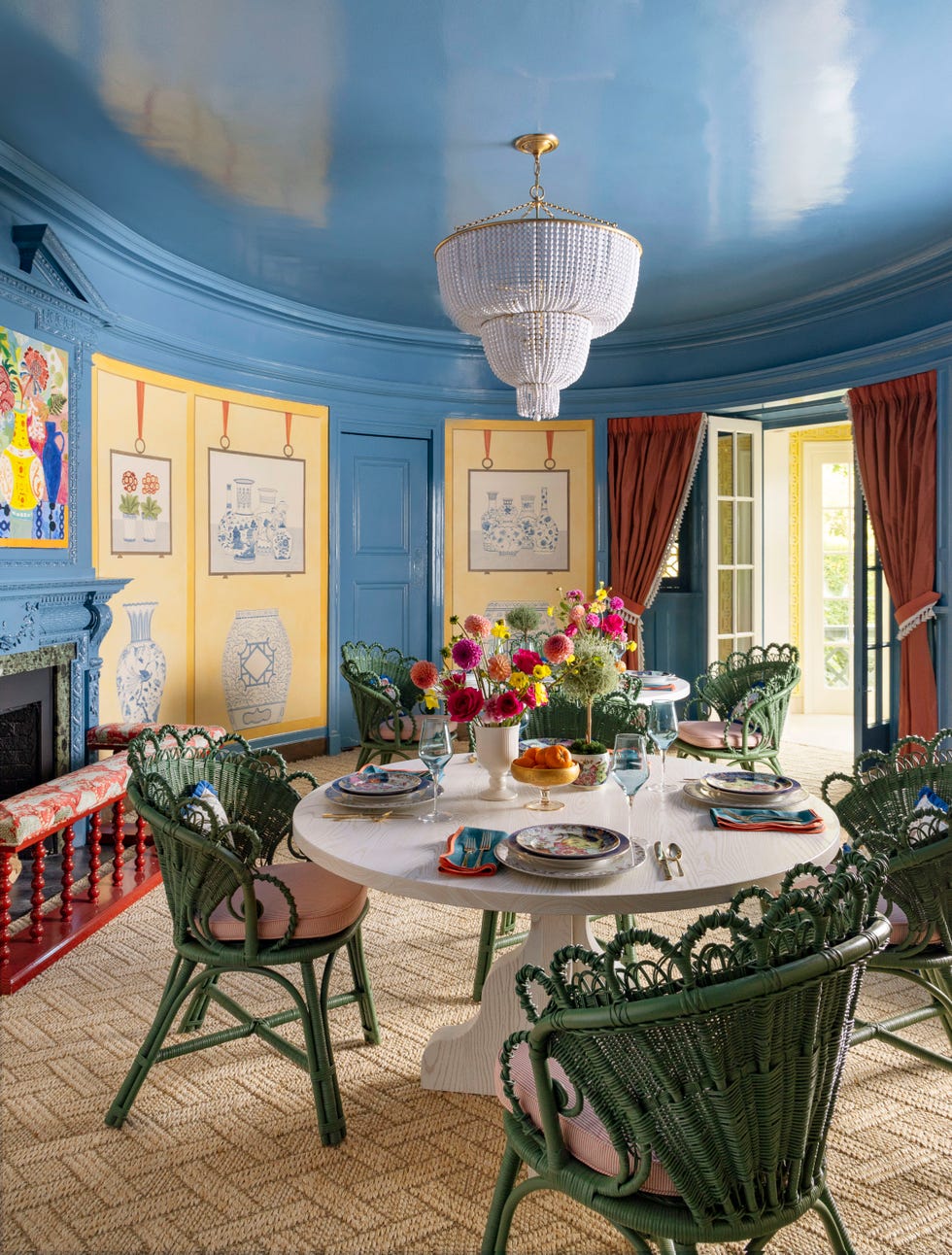
To effectively incorporate dark purple or aubergine in a dining room, designers recommend a full commitment to the color. This involves treating it as a moody neutral and applying it extensively across architectural elements such as walls, trim, and even the ceiling, to achieve a "cocoon effect." Color drenching in this shade is suggested to produce captivating and atmospheric results. Interior designer Kelly Neely advises extending the aubergine purple onto the ceiling to create a "remarkable jewel in the crown" effect, particularly if the room has sufficient height.
For paint finishes, Lorri Hicks Cazenave suggests opting for a matte finish rather than one with excessive sheen. This choice helps maintain a soft, luxurious, and atmospheric ambiance. An ultra-matte finish or limewash can also introduce texture to the walls, allowing the purple to serve as a prominent statement without overpowering the room. Designers like Kelly Neely consider purples, plums, aubergines, and burgundies as the "new neutrals," emphasizing their versatility in coordinating with various other colors.
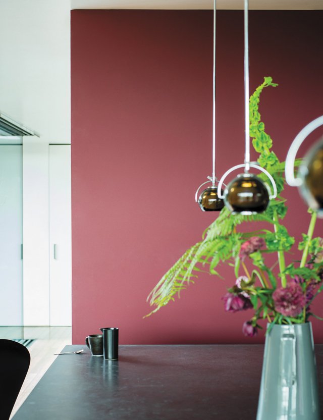
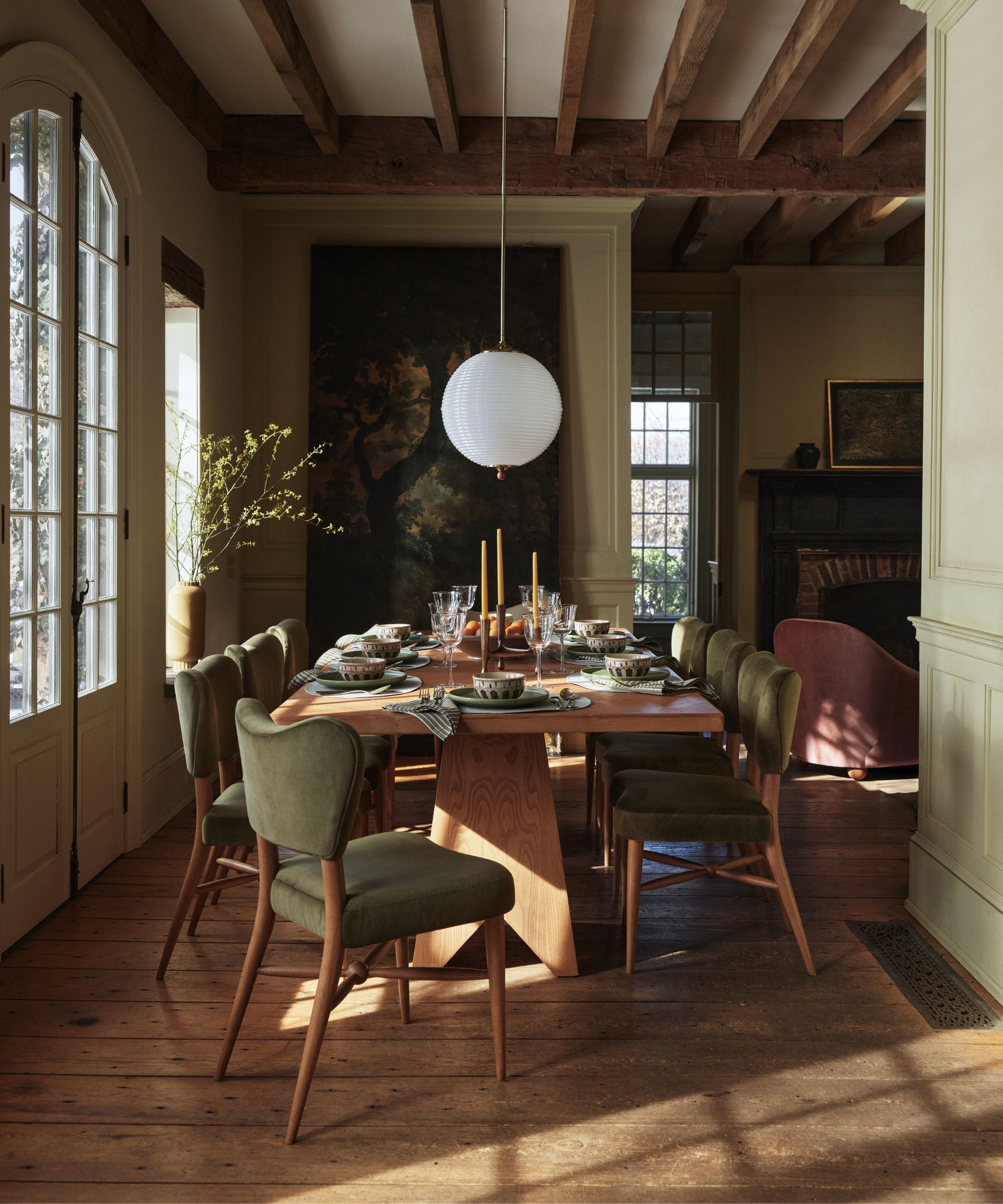
Purple's position between red and blue on the color wheel means it can harmonize with both cool and warm palettes. The article lists dusty ochre, moss green, bone white, bold magentas, chocolate browns, and smoky blue as colors that complement purple effectively. Kelly Neely points out that this versatility allows for the creation of either moody and dramatic or modern and playful spaces. When planning a purple dining room, particular attention should be given to finishes. Kelly recommends materials such as aged brass, dark timber, and natural linen to add texture and ensure the palette remains grounded and timeless. These materials, combined with purple decor, contribute to a dining room that is ready for entertaining. The article concludes by suggesting that 2026 will see a significant rise in purple interior design, particularly in dining rooms, hinting at a potential expansion of this trend to other areas like purple sofas.
#DiningRoomDesign #ColorTrends #PurpleInteriors #InteriorDesign #PaintColors #HomeDecor #AubergineShades #DesignersChoice #AtmosphericInteriors #DiningRoomDesign #ColorTrends #PurpleInteriors #InteriorDesign #PaintColors #HomeDecor #AubergineShades #DesignersChoice #AtmosphericInteriors
0 comment in total
 No comments yet
You may also like

4 Interior Designers Share the Biggest Paint Color Trends Right Now (and What’s Out!)

Lick Paint Will Transform the Mood in Your Home Through Color Psychology


6 key colors to decorate with in May 2025, according to interior design and color experts in the know

These Are The Dining Room Trends Designers Are Excited For In 2025
The 5 Dining Room Trends for 2026 You Need to Know
2021’s Palette of Possibilities
5 Dining Room Styles That Are Definitely Out of Style, Designers Say

6 Kitchen Paint Color Trends That Are Already Taking Over Walls in 2026
These 3 kitchen colours are officially out of style in 2025 - here are the shades replacing them
5 Dining Room Trends That Are Definitely on Their Way Out in 2026, Designers Warn
26 Most Popular Kitchen Paint Colors Throughout the Decades

Timeless Paint Colors HGTV Stars Love Using In Kitchens
Don't Use These 7 Dining Room Paint Colors — Designers Say You Should Avoid Them at All Costs
Five Mistakes People Make When Selecting Kitchen Cabinets—and How to Avoid Them
7 Popular Paint Colors for the Living Room
This Art-Filled Dining Room Is a Conversation Starter
The Decorating Trends Designers Are Leaving Behind in 2026

Interior Designers Have Spoken: These are the Dining Room Trends to Know About for 2026
20 Kitchen Paint Colors to Try in 2024

Designers say the key to kitchen paint colors in 2024 is to go bold