1/7
A color psychologist says these color schemes are the most likely to boost your mood
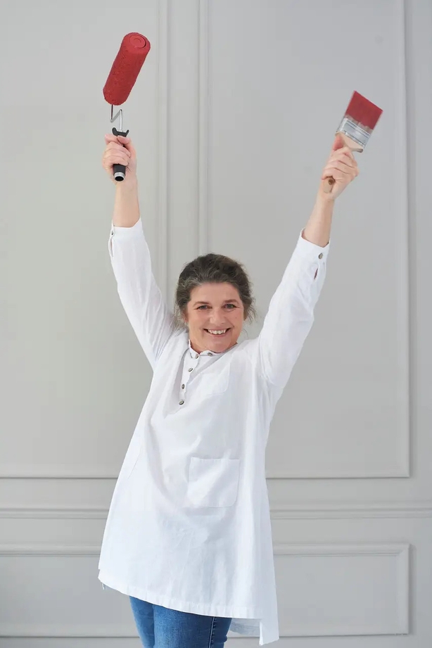
Creating a mood-boosting home environment is a common desire, and while various decor elements contribute, color is arguably the most impactful. The psychological effects of color, ranging from calming to uplifting or energizing, are widely recognized, though individual responses to specific colors can vary significantly. This article, featuring insights from Tash Bradley, Lick's color psychologist and director of interior design, offers guidance on selecting mood-boosting yet livable color schemes, even for those accustomed to neutral palettes.
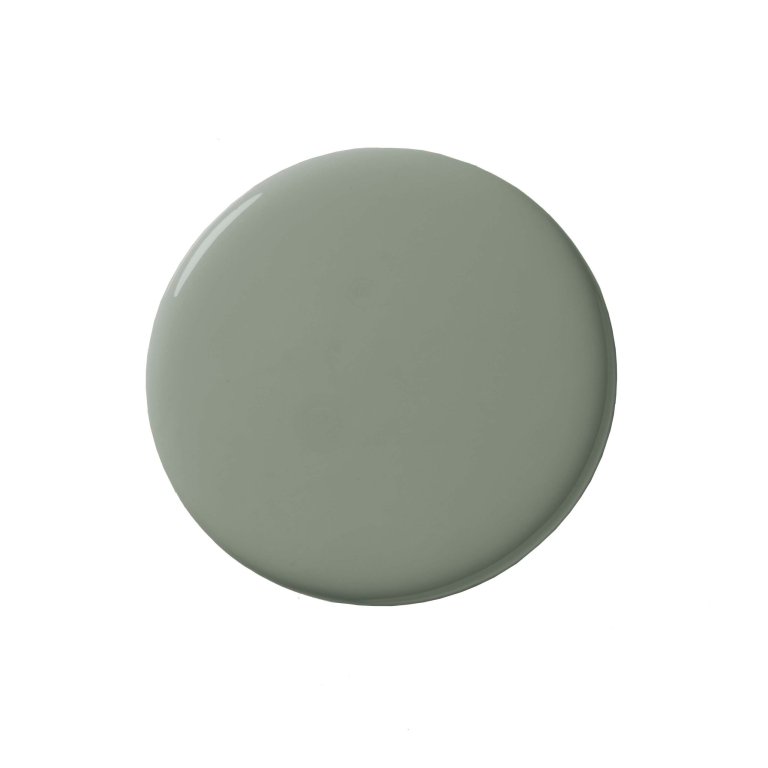
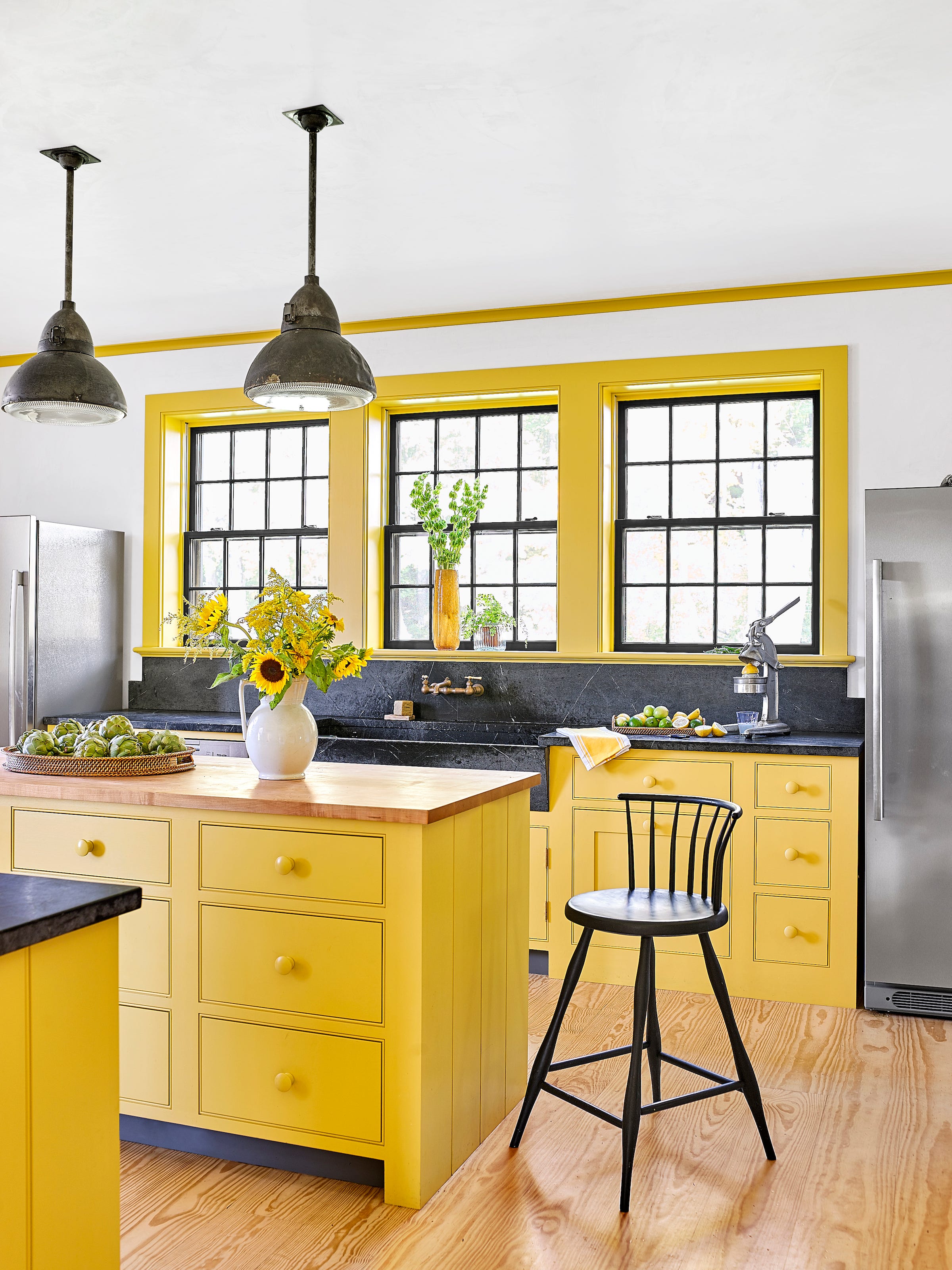
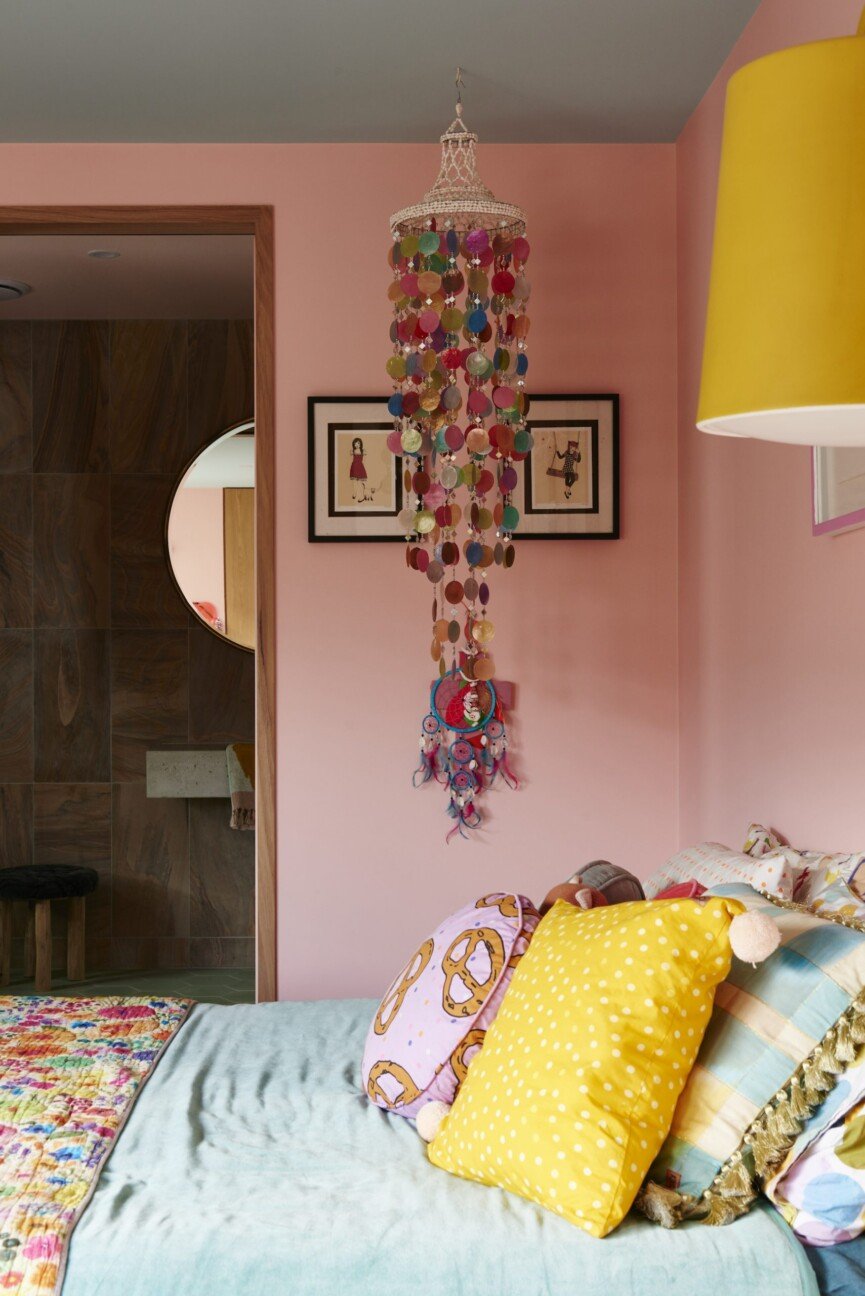
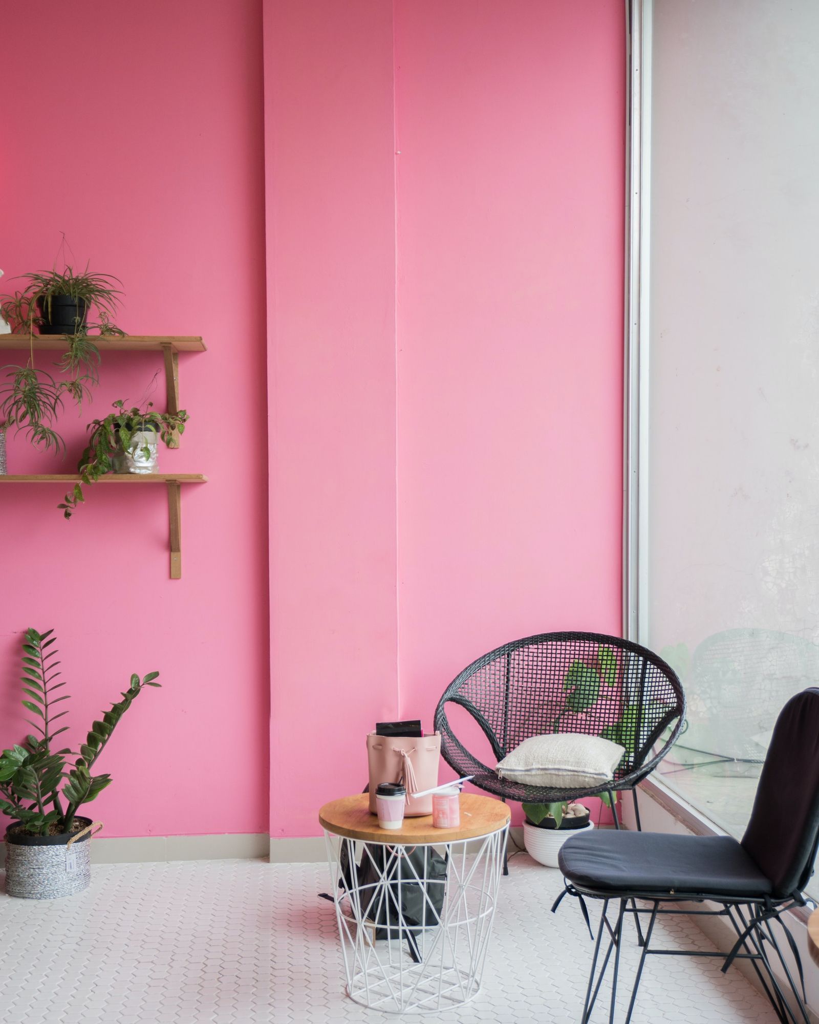
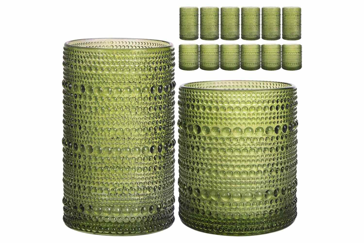
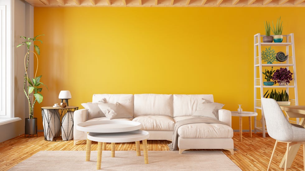
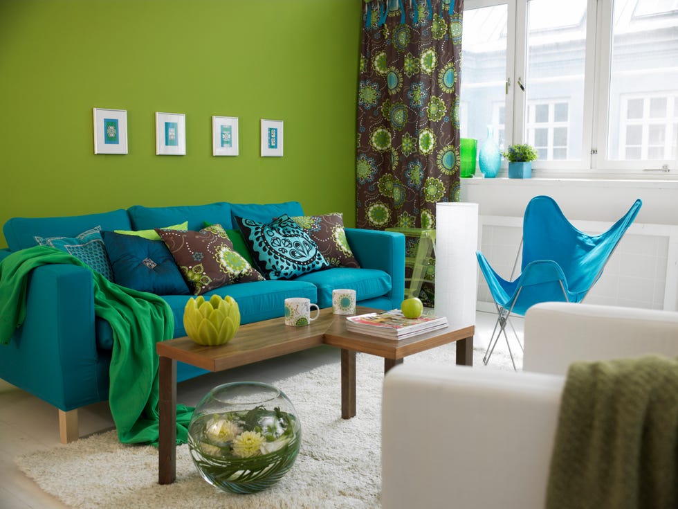
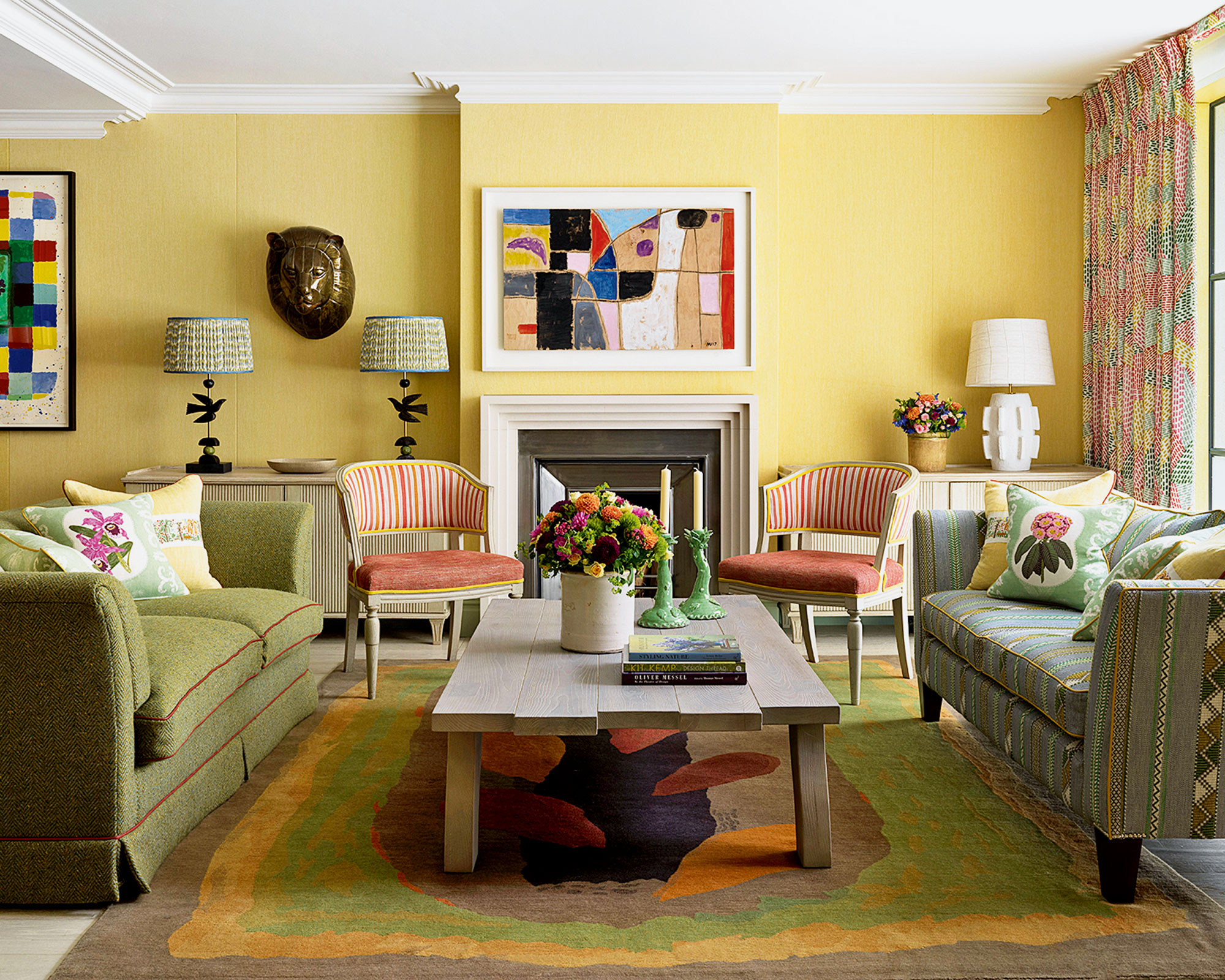
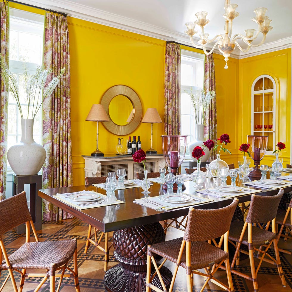
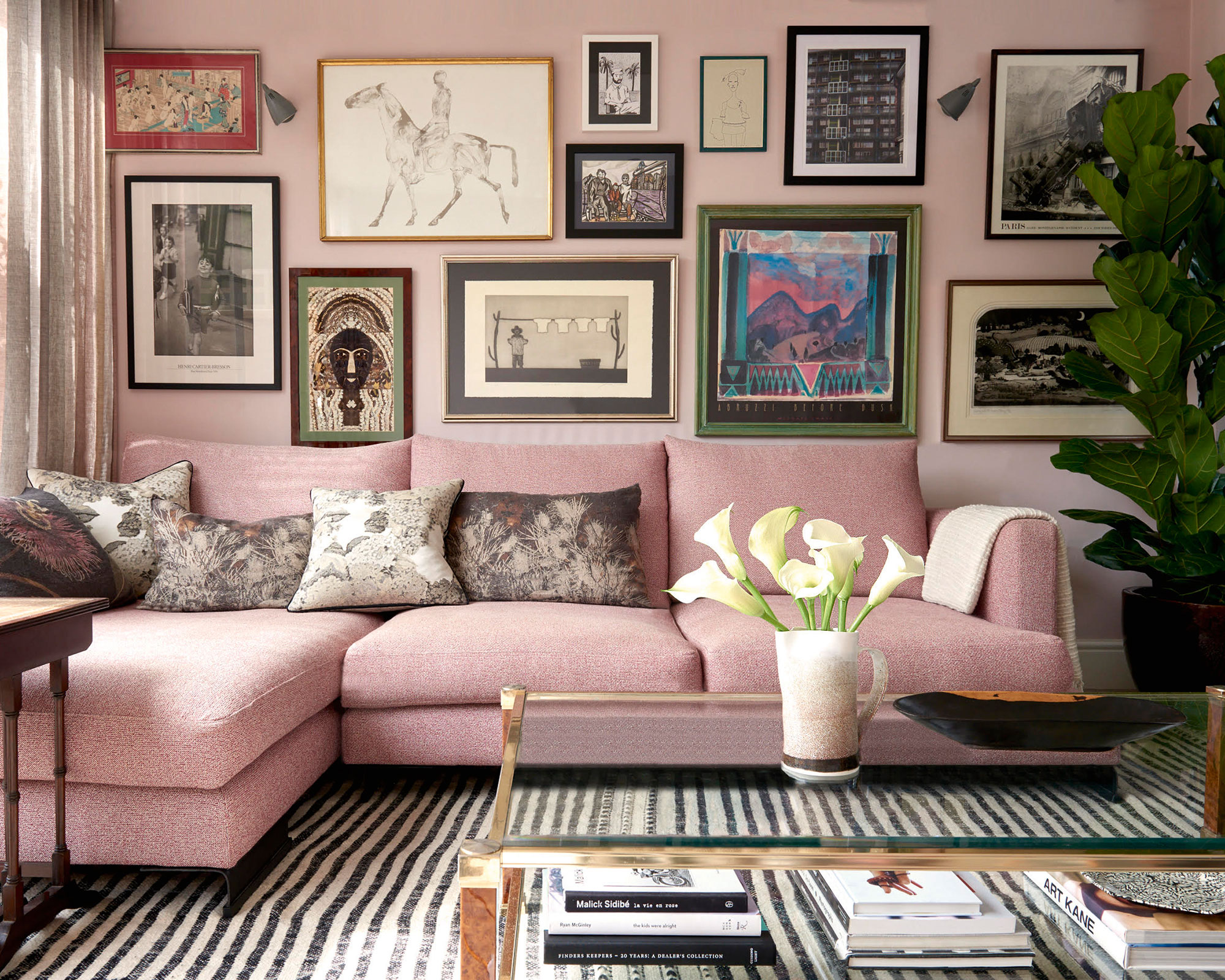
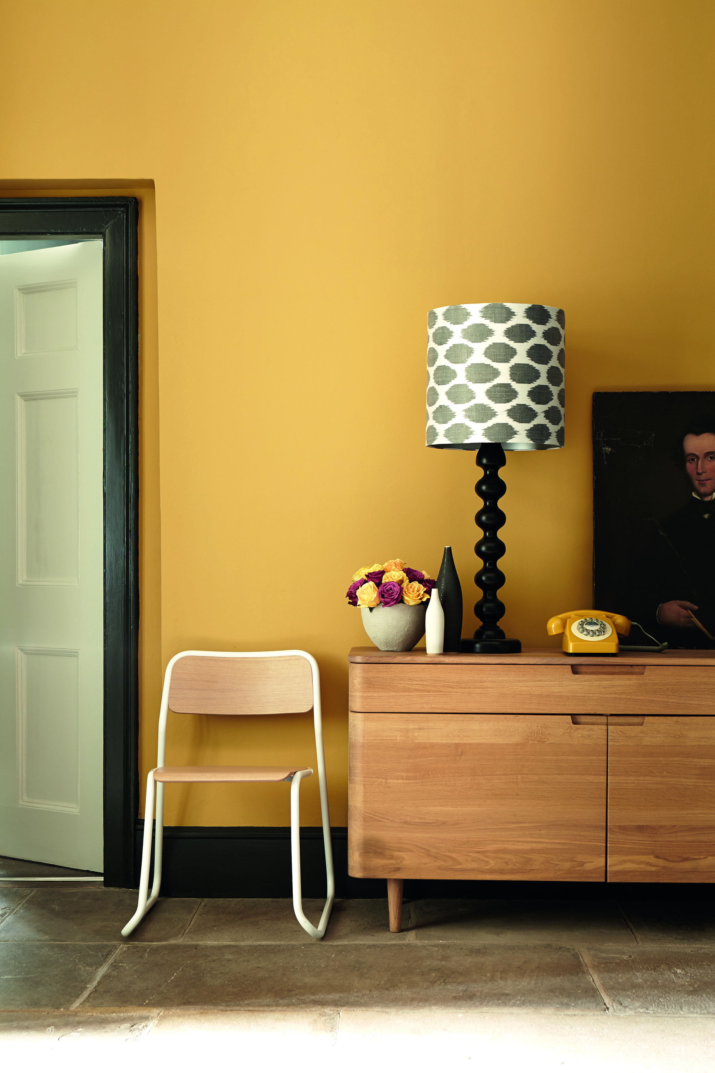
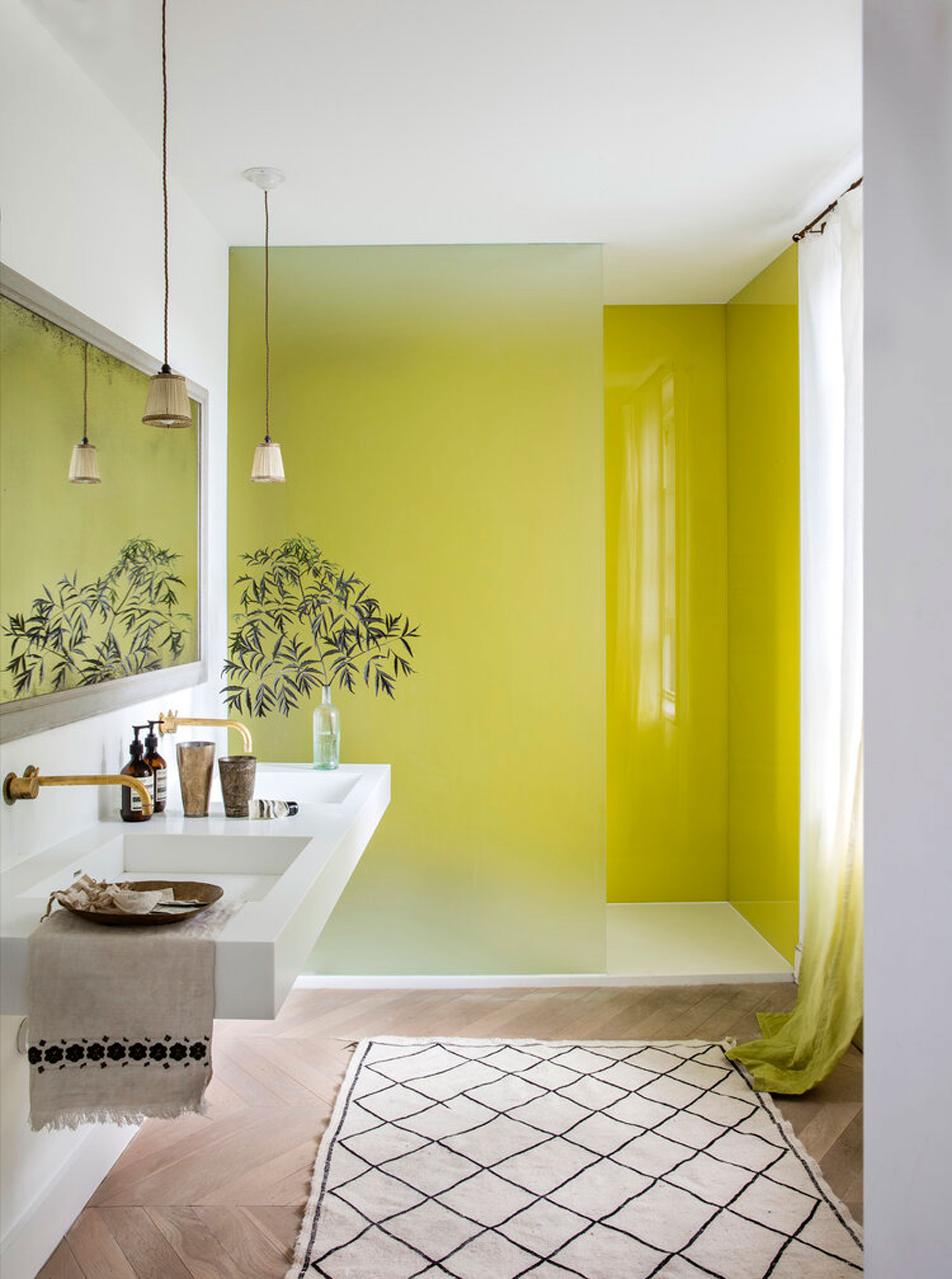
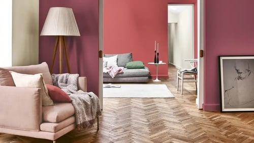
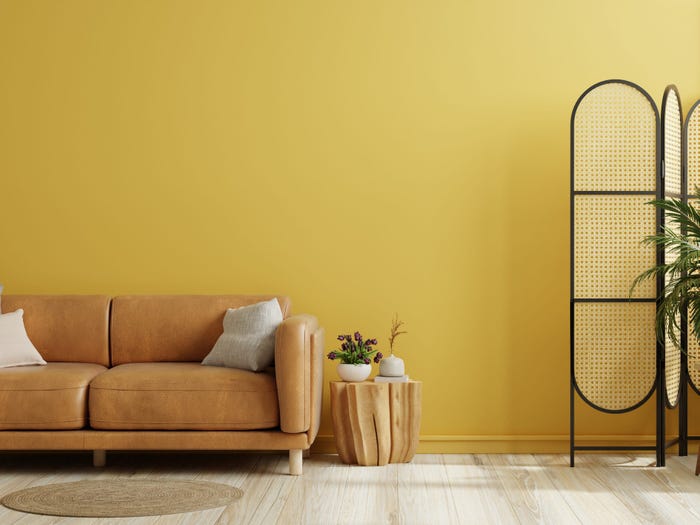
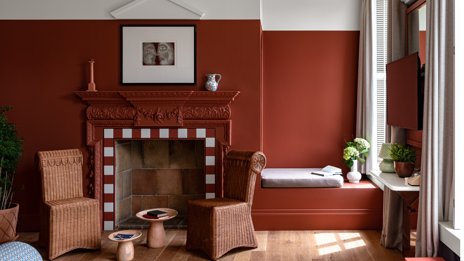
Bradley emphasizes that 'happy colors' are highly subjective, defined by personal connection and positive emotional and physical responses. However, drawing from color psychology principles, bright and warm colors with pink or yellow undertones are generally associated with happiness. Pink is linked to soothing effects, while yellow brings positivity and energy. Examples include cozy baby pinks, warming yellows, and calming greens, all of which can foster feelings of optimism and happiness. These can be incorporated through specific paint shades like Lick's Pink 04, Yellow 05, and Green 09.
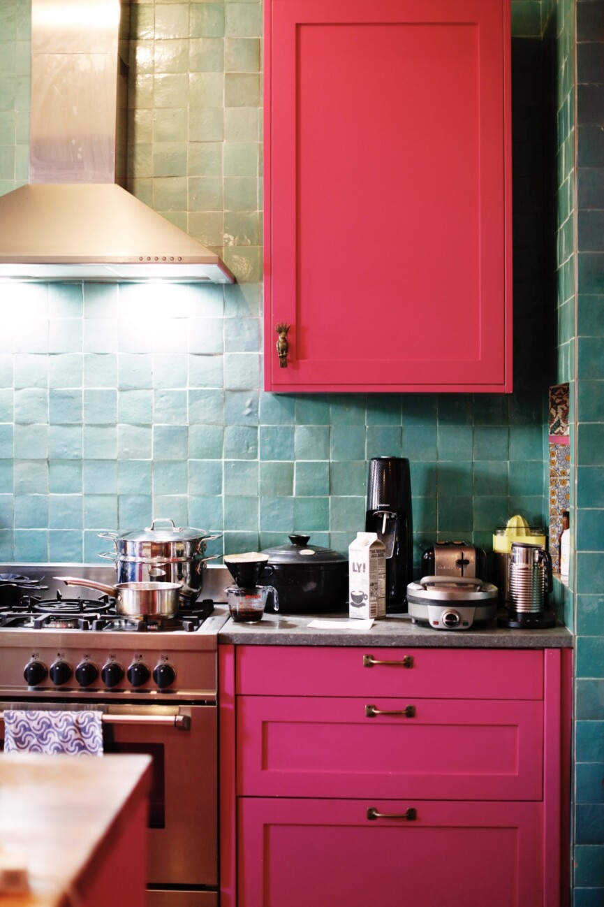
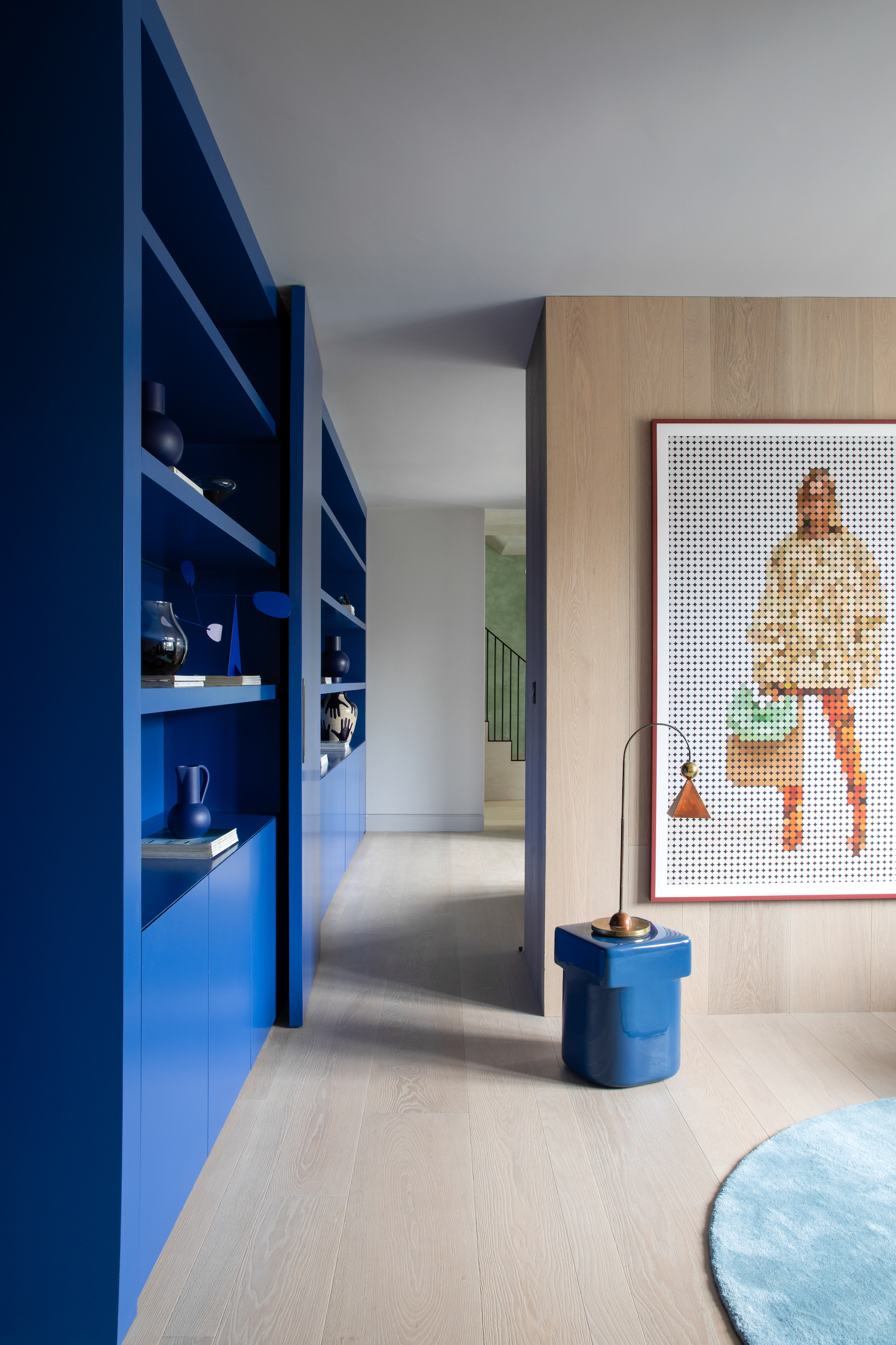
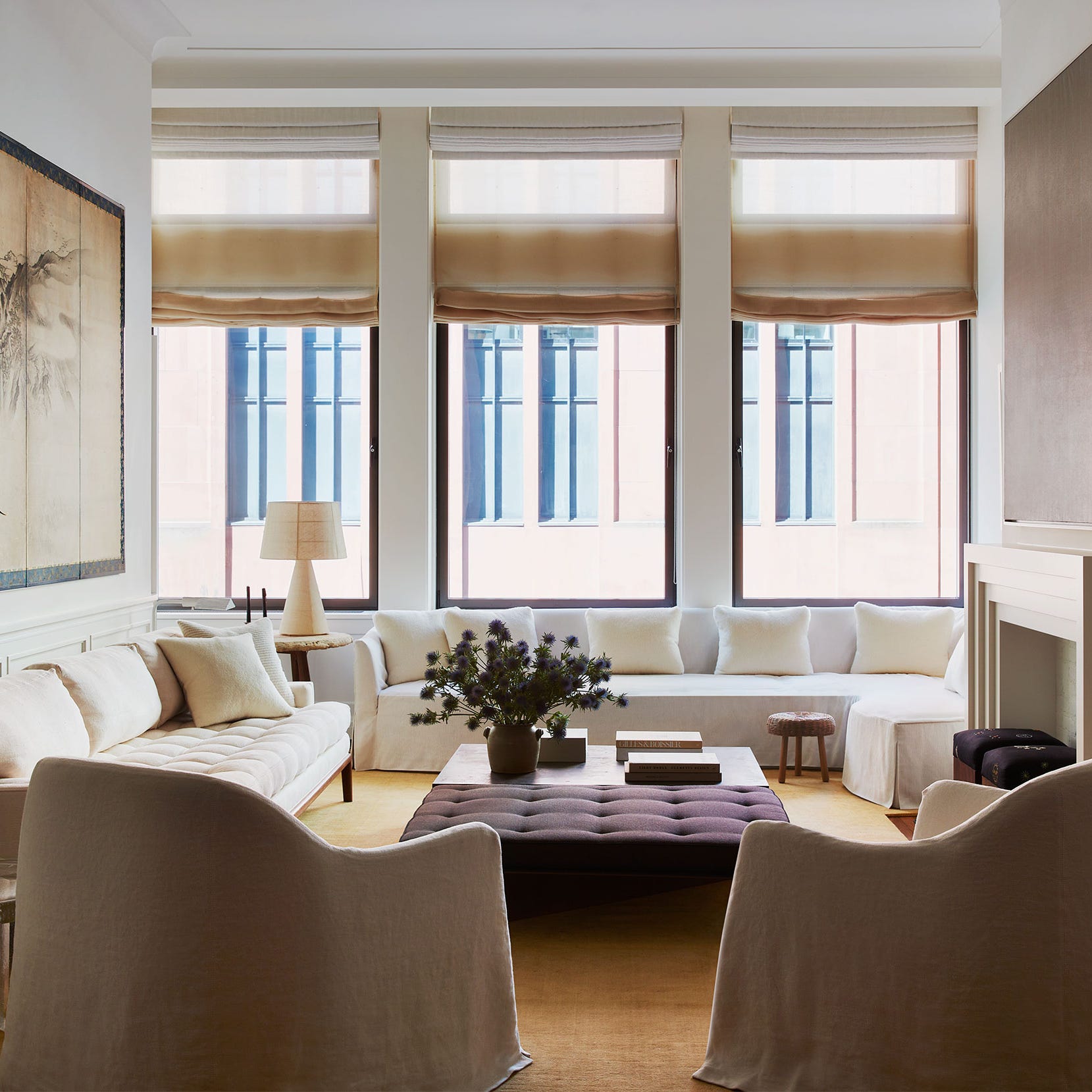
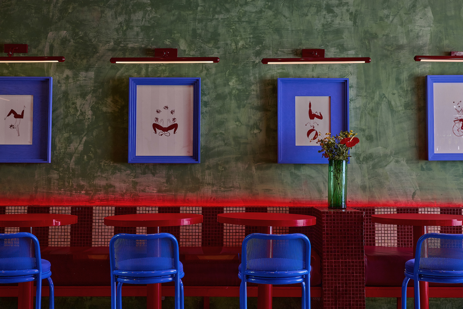
Incorporating mood-boosting colors doesn't necessarily require extensive color drenching. Even small accents can make a significant impact, demonstrating that quality often surpasses quantity in color application. For individuals who prefer neutral aesthetics, introducing brighter colors as accents—such as painting a console table, door frame, or the interior of a cabinet—can provide delightful surprises without overwhelming the space. When working with traditional neutrals, warm white paints like White 03, which has yellow undertones, can effectively reflect light and enhance the uplifting qualities of accent colors, potentially making rooms appear larger.
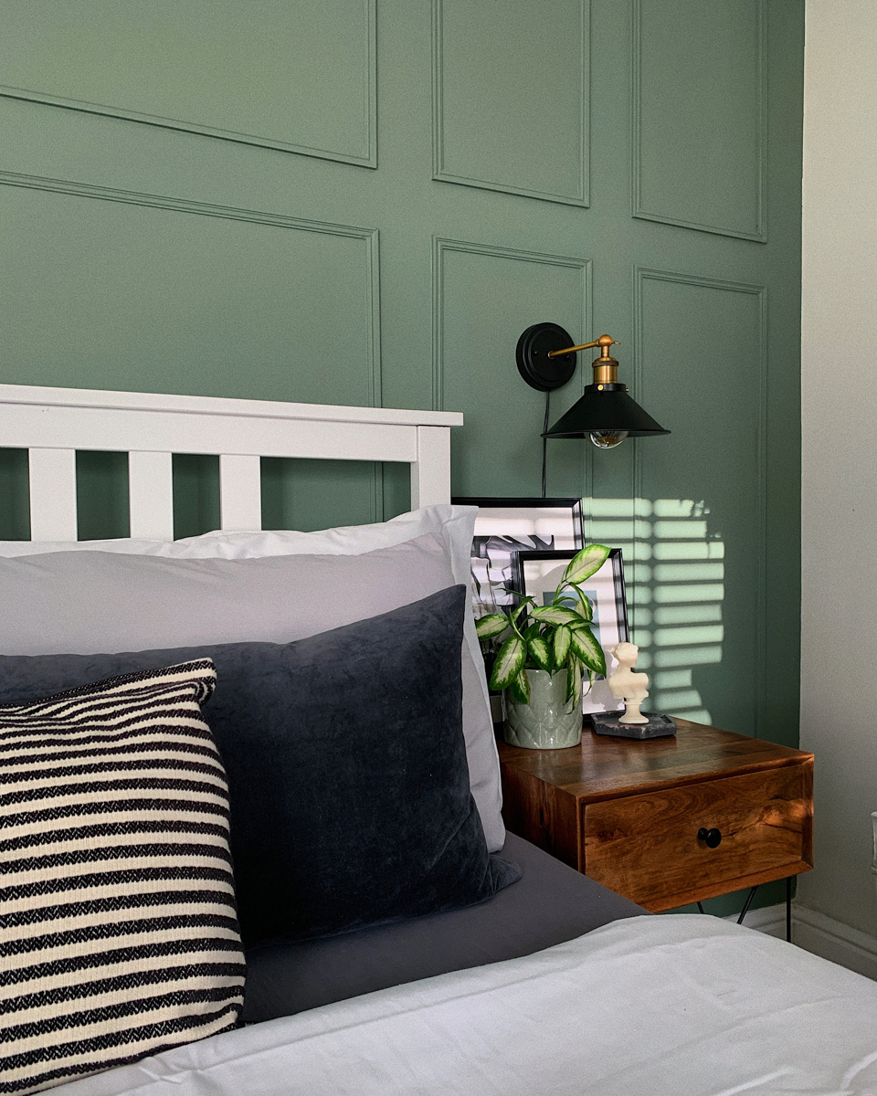
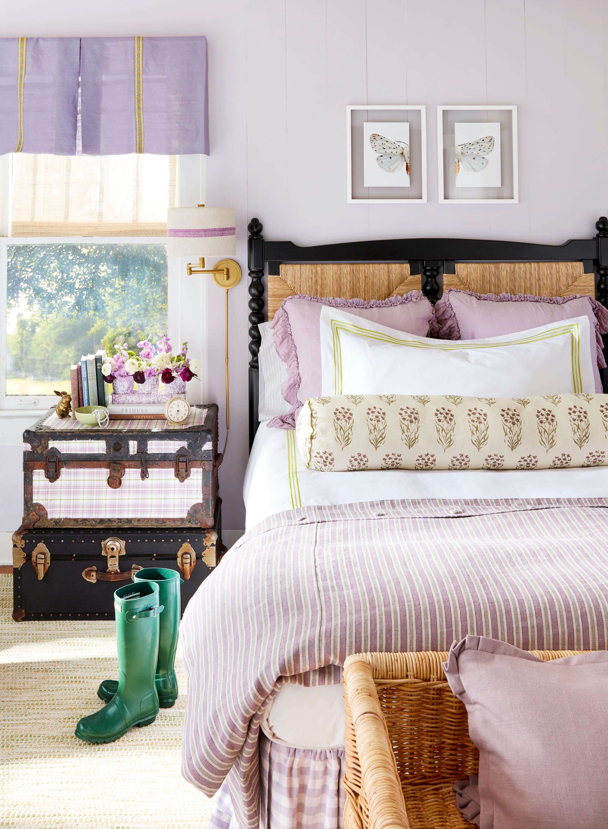
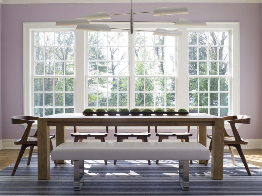
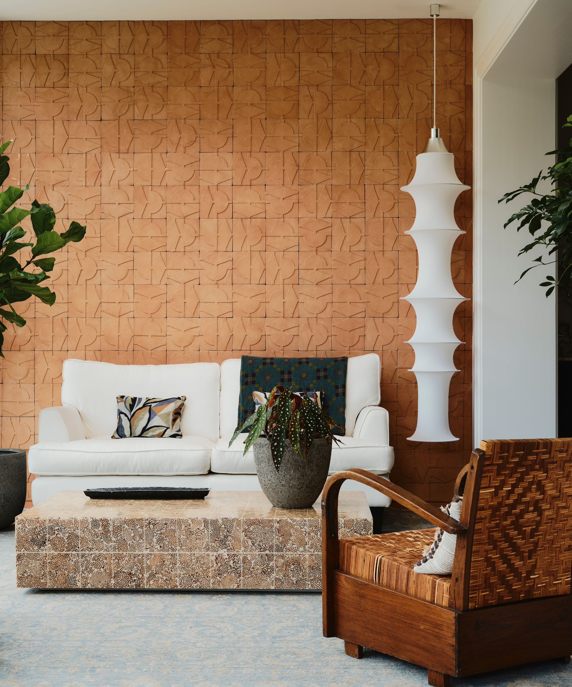
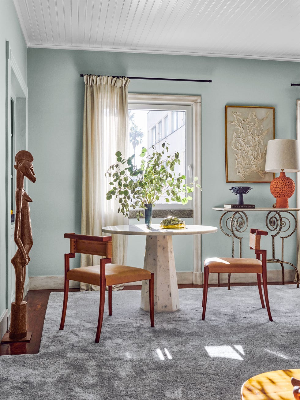
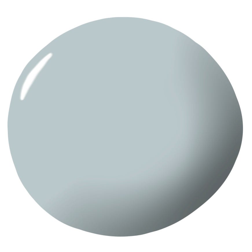
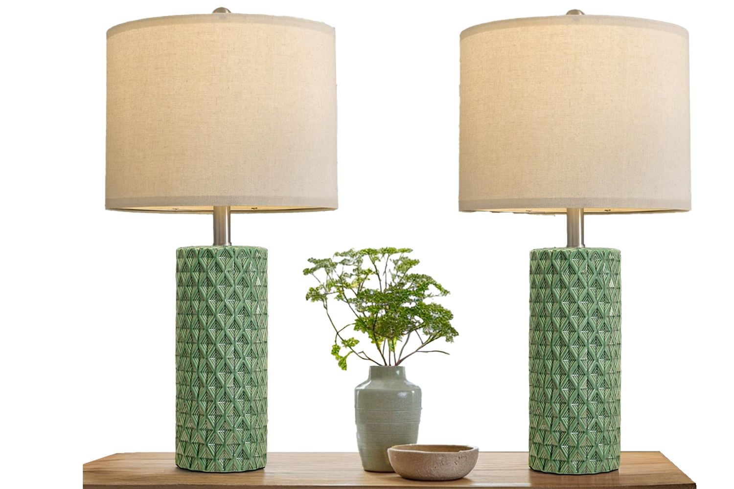
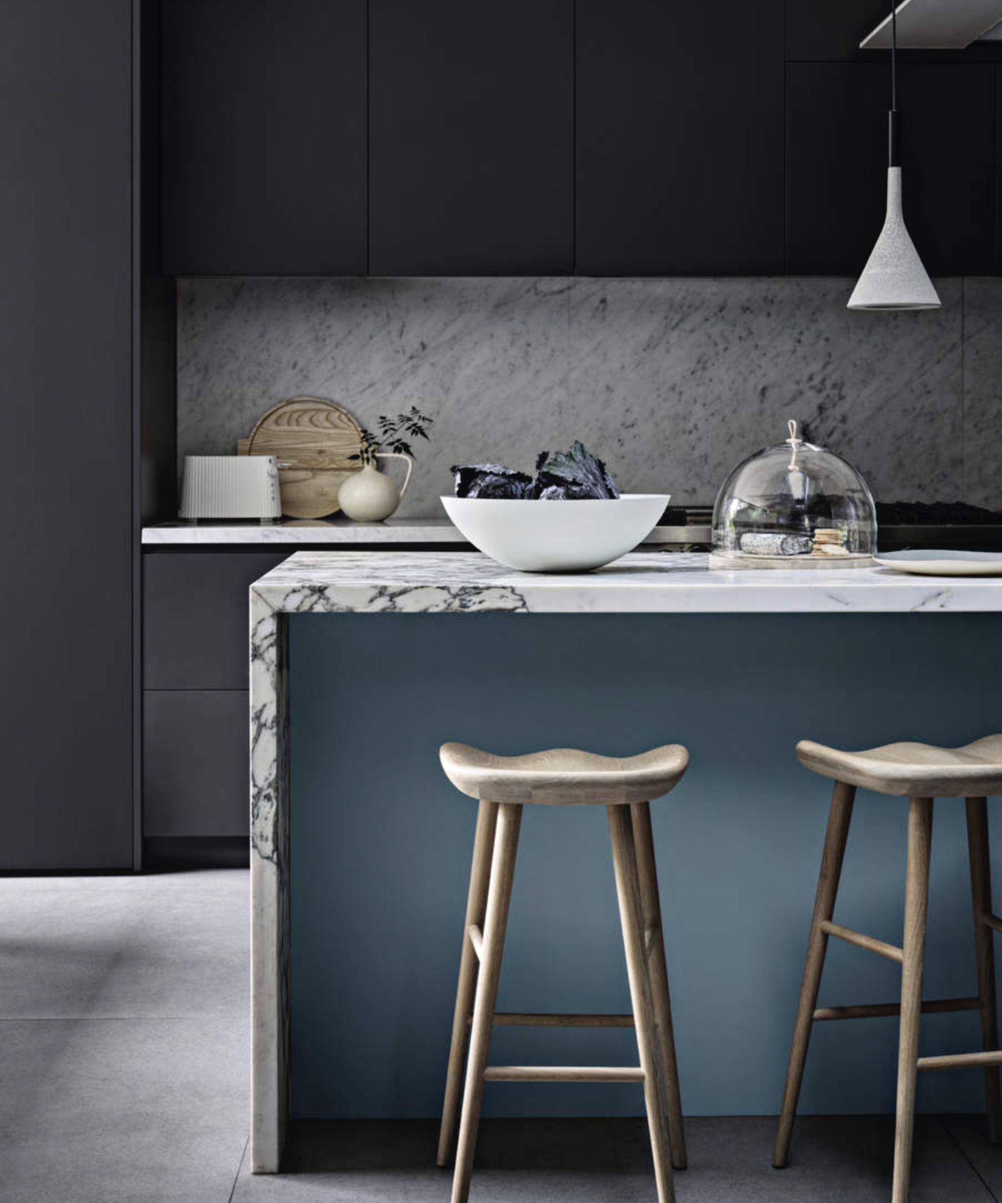
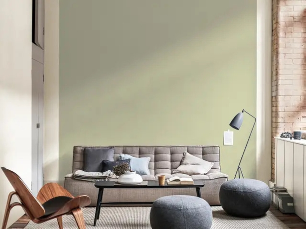
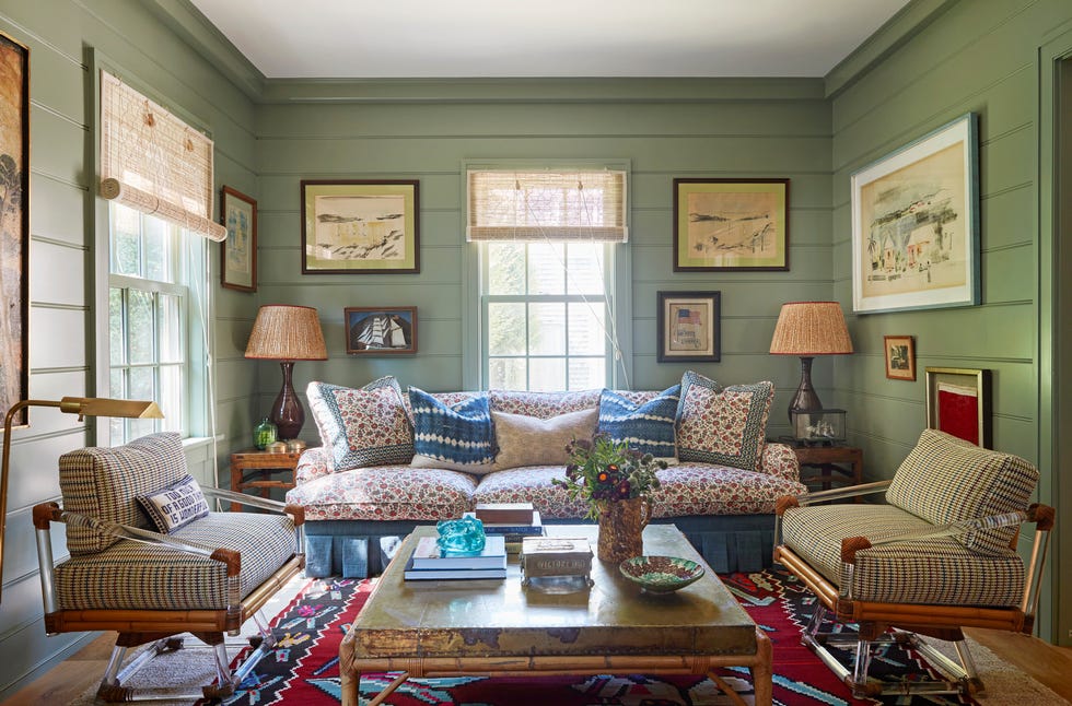
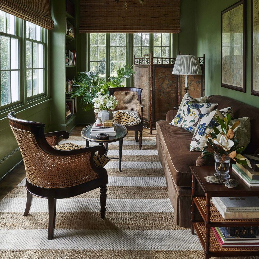
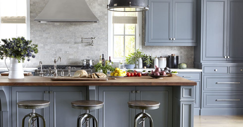
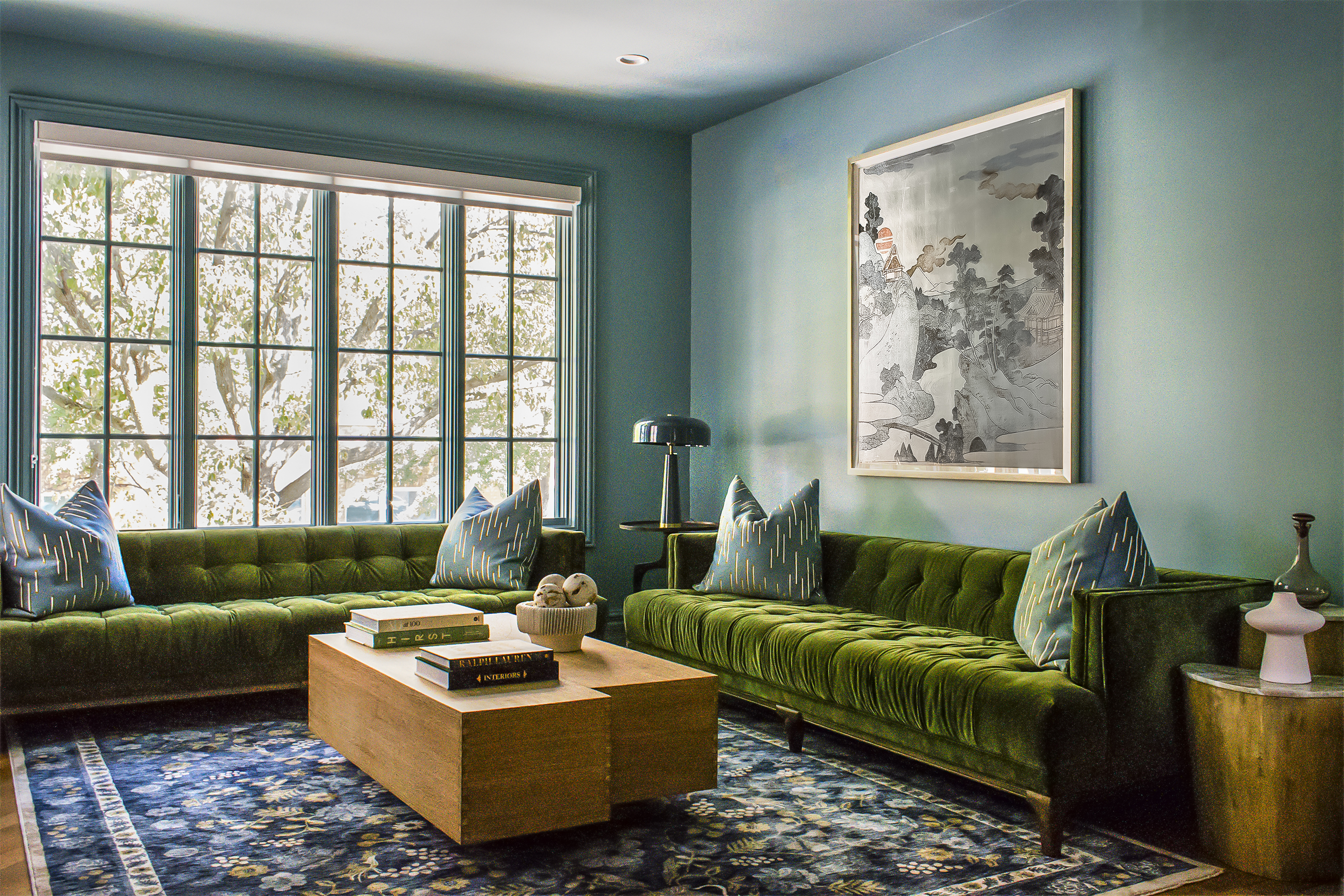
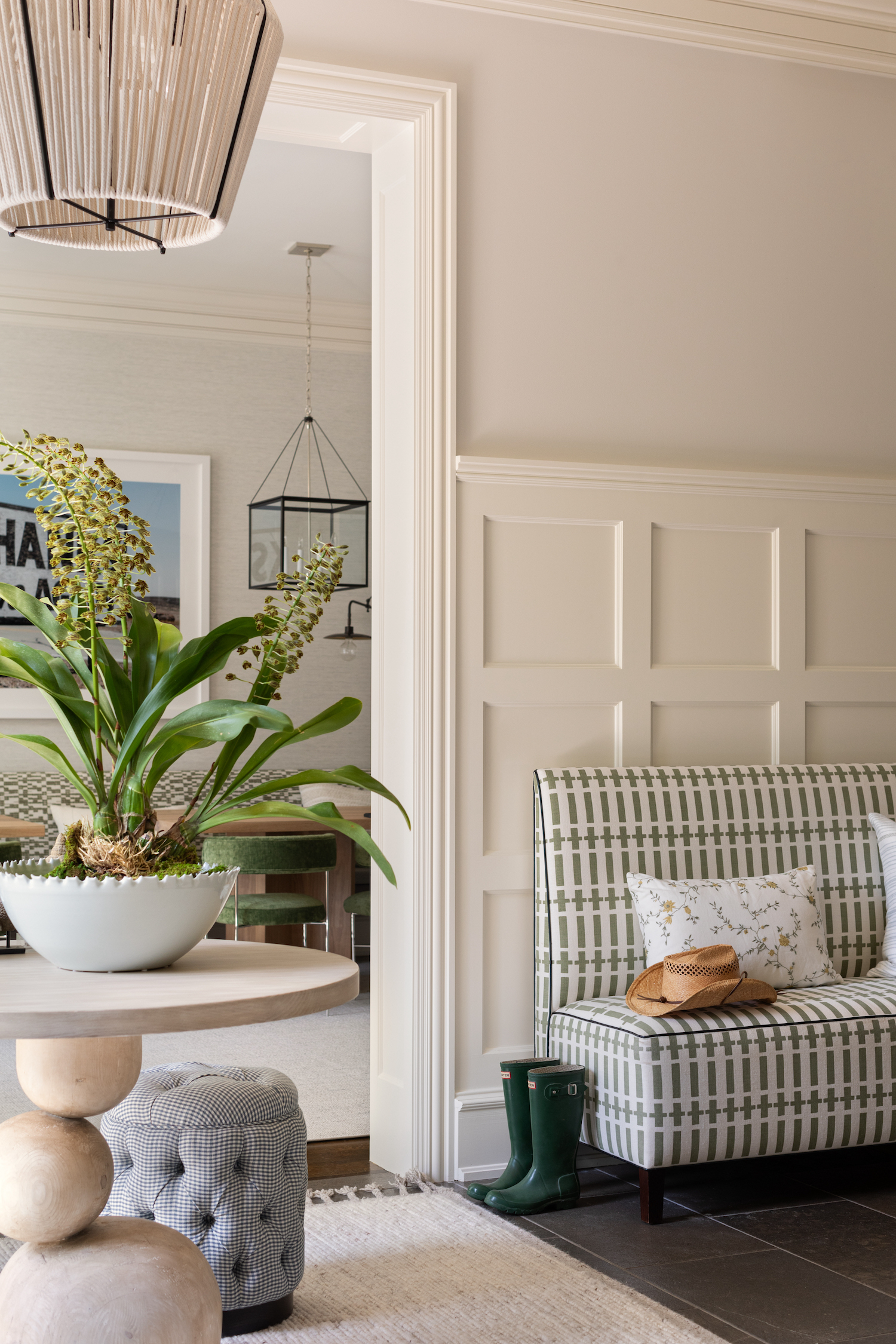
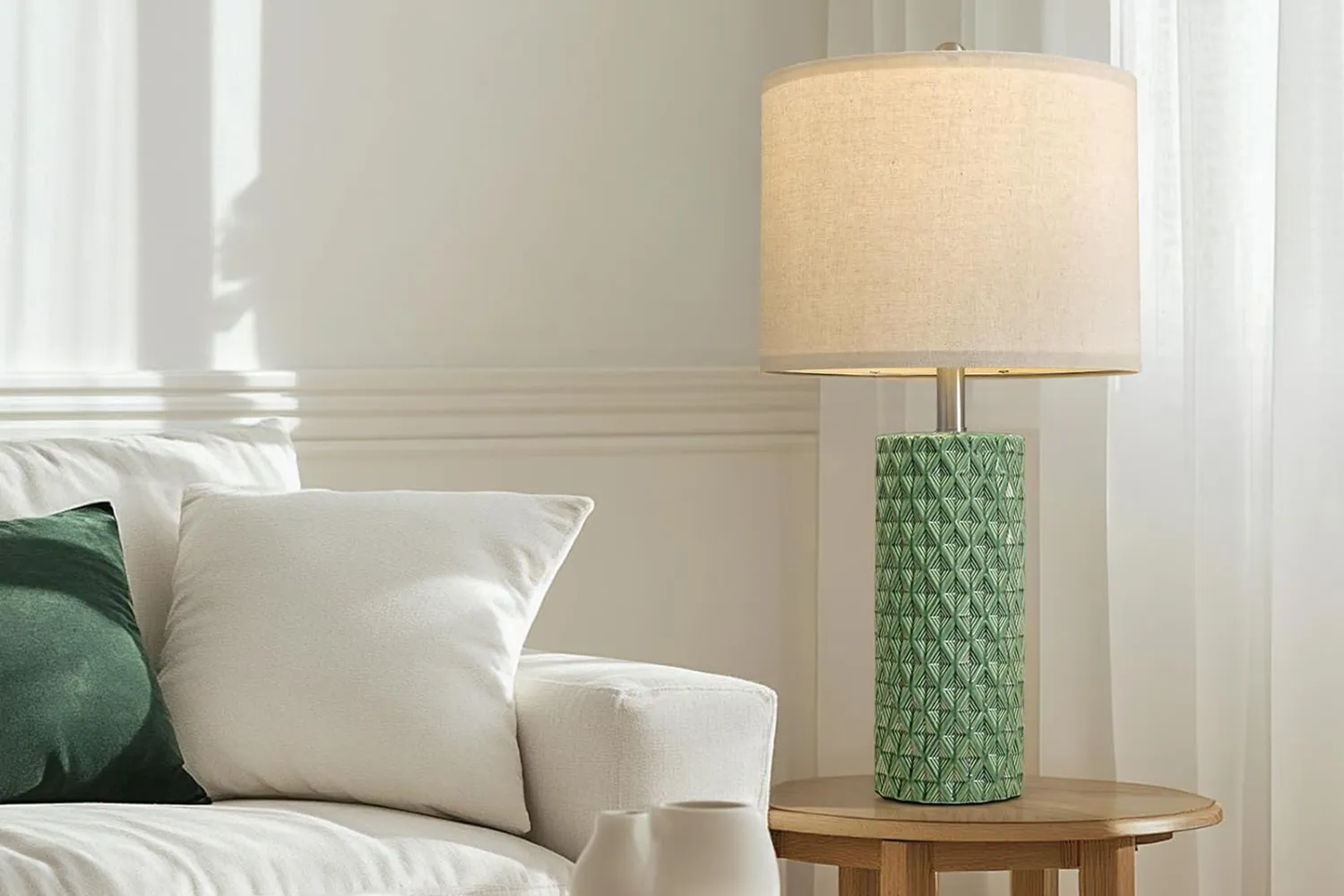
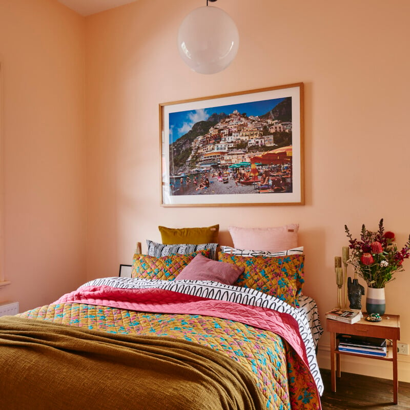
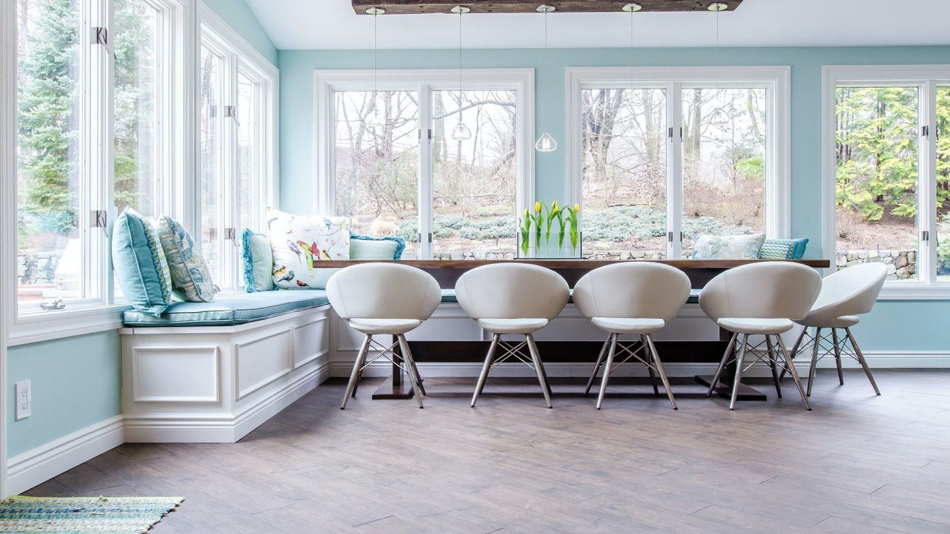
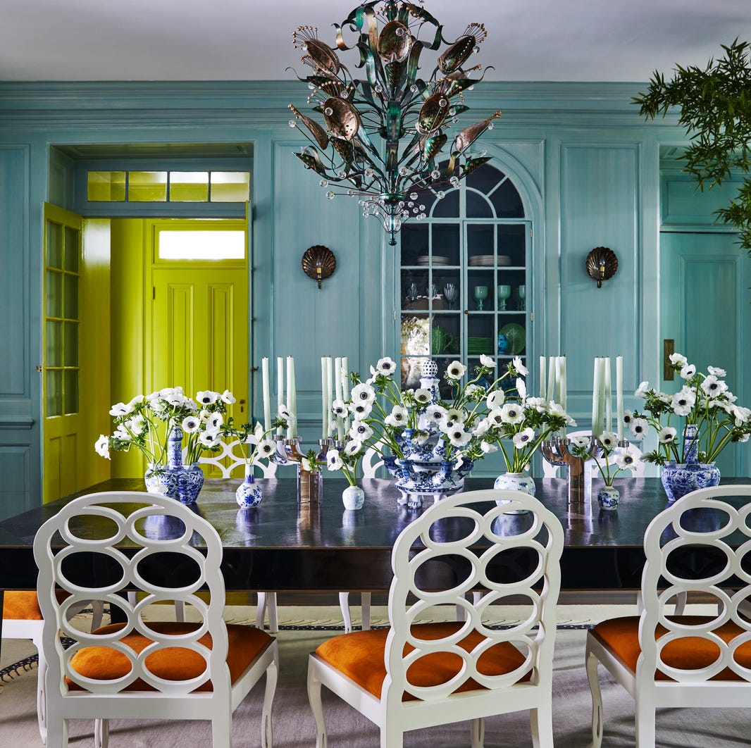
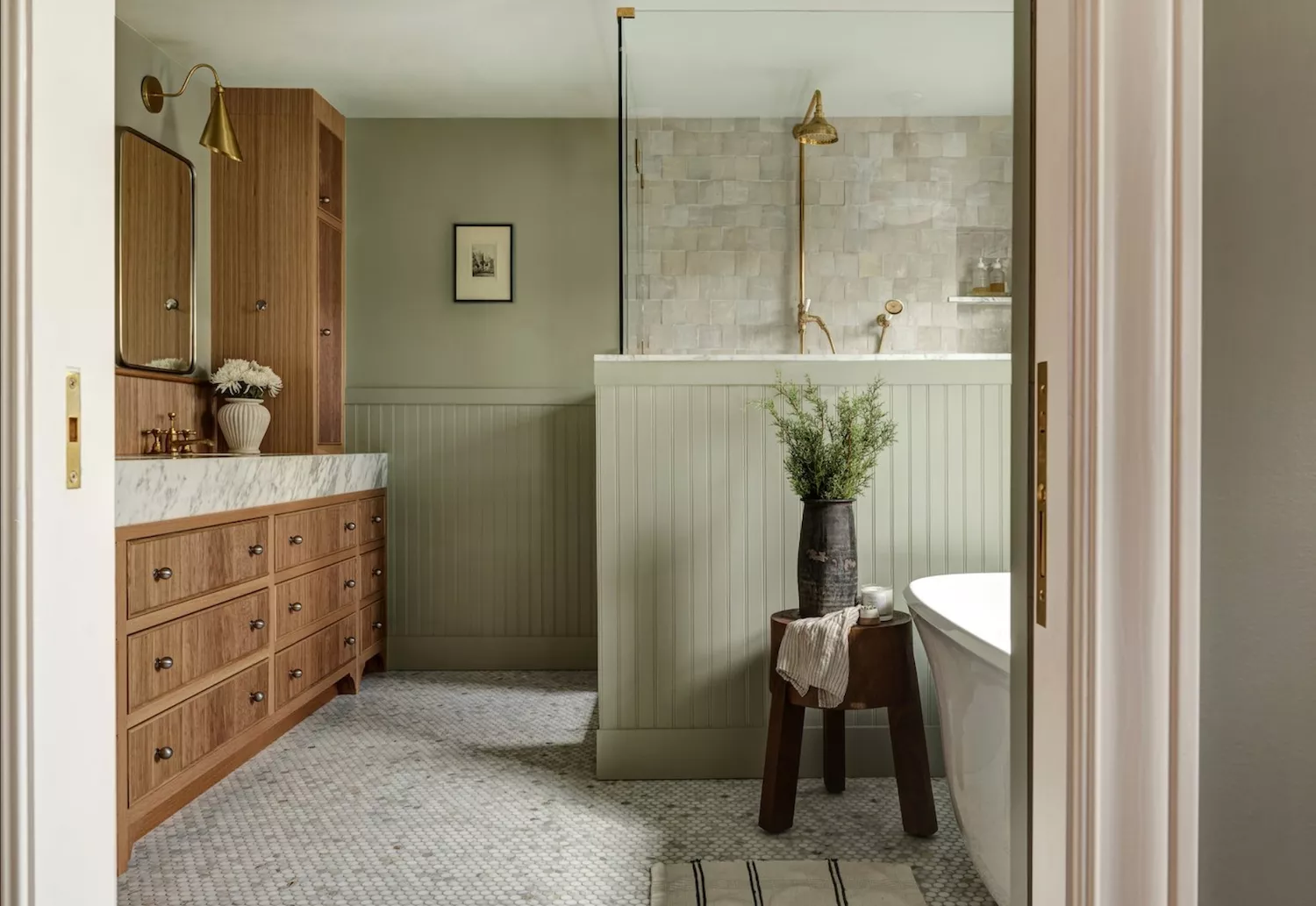
For more understated schemes, a palette of nature-inspired neutrals can offer a subtle form of happy colors. Bradley notes that neutrals extend beyond whites, suggesting greens as 'nature’s neutral.' Greens connect inhabitants with the natural world, promoting relaxation and well-being. Shades like Green 09, with its yellow undertones, evoke hope and new beginnings, suitable for rustic kitchen cupboards or serene bedrooms and living rooms. Similarly, soft pinks like Pink 01 can serve as a warm, modern alternative to traditional neutrals, creating a cozy and inviting atmosphere in various rooms, including nurseries.
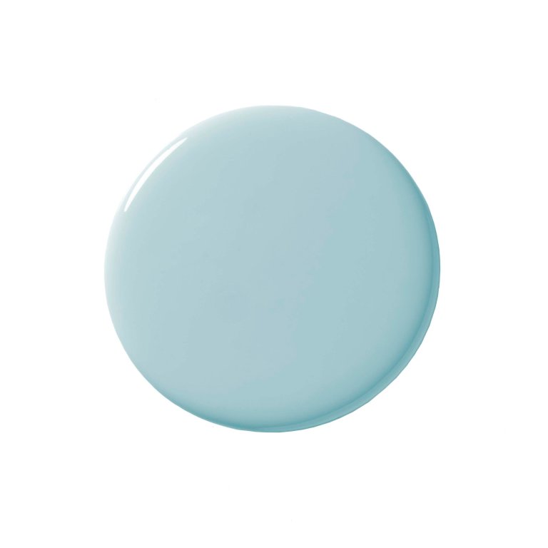
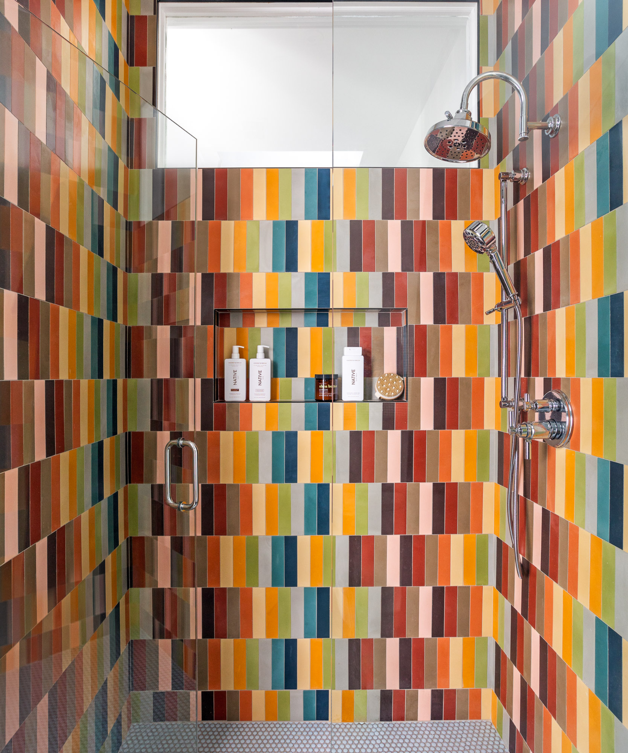
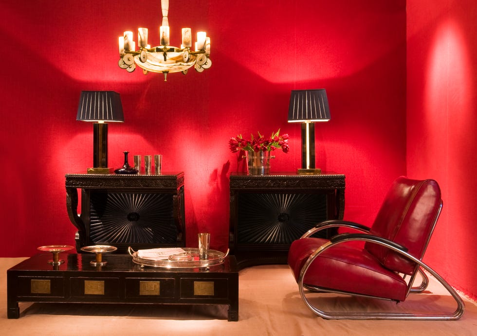
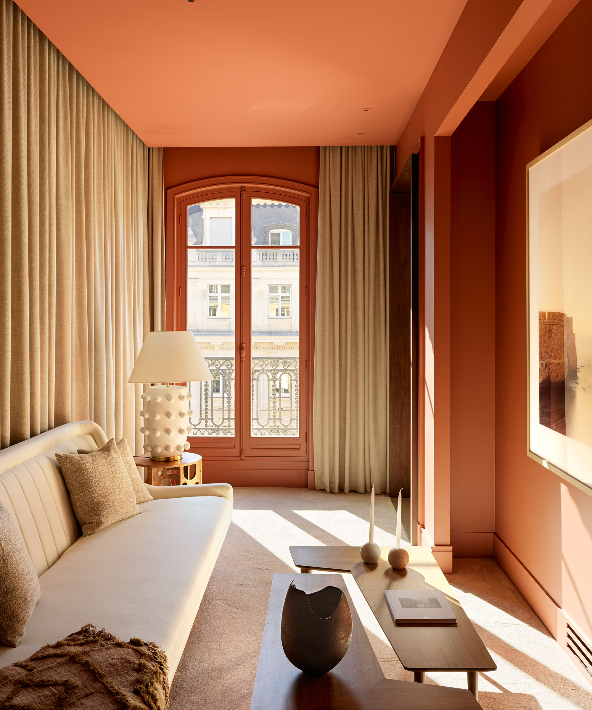
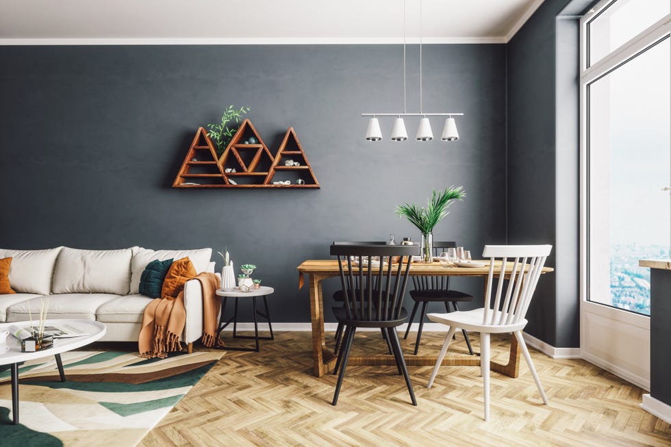
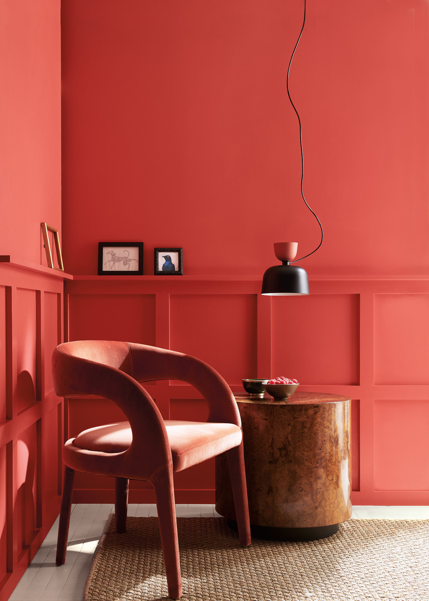
Selecting colors appropriate for each room's function is also crucial. The desired mood dictates color choice; for instance, a bedroom might benefit from warm greens to foster calm and rest, while a bathroom could feature sky blues like Blue 08 to stimulate and refresh the mind. It is important to consider how colors interact within a space, offsetting brighter hues with softer tones or natural woods for balance, or embracing color drenching for a bold, immersive experience. Bradley advises against overly saturated primary colors in large quantities due to their potential to be stimulating and stress-inducing. While vibrant, these colors can lead to feelings of anxiety if not balanced. Therefore, they are best used in small doses to provide bursts of joy without overwhelming the environment. Ultimately, personal preference for colors that evoke joy should guide decorating decisions, complementing the principles of color psychology for a truly mood-boosting home.
#ColorPsychology #InteriorDesign #MoodBoostingColors #HappyHome #DecoratingTips #PaintColors #HomeDecor #AccentColors #NatureInspiredHues #ColorPsychology #InteriorDesign #MoodBoostingColors #HappyHome #DecoratingTips #PaintColors #HomeDecor #AccentColors #NatureInspiredHues
0 comment in total
You may also like
A Color Psychologist Says This Is the Most Relaxing Paint Color

20 Calming Paint Colors That Will Change the Way You Live

How paint colour in your home can affect your mood
An expert in color psychology shares the 5 shades you should have in your living room
Add These Happy Colors to Your Home and Boost Your Mood
Interior Designers Say the Key to Creating a Joyful Space Is to Add in This One Color


Psychology Shows Which Three Colors People With Low Self-Esteem Unknowingly Choose Every Day

6 Paint Colors That Will Make Your House Sell for More Money

The Brighter, the Better—These Vibrant Paints Will Infuse Your Home With Positivity


This One Color Instantly Boosts Joy in Any Room, According to Interior Designers

5 colors that will make your living room feel happier, according to interior designers
3 paint colors that Feng Shui experts say will make your home happier – 'they ignite joy!'

Expert Speak: What are the most soothing colours for the home?

These Paint Colors Bring Hostility to Your Home, According to Experts
How Your Home's Paint Colors Can Make You Happier, According to Experts

7 'Unhappy' Colors That Color Psychology Experts Would Never Paint Their Walls
6 'Energetic Colors' for Vitality and "Sophisticated Interiors", According To Psychologists And Design Experts
Outdated color trends – 5 overdone colors that designers no longer love, and what to use instead
5 best happy living room colors for an uplifting space
Designers Agree: These Are the Most Relaxing Paint Colors for Any Room