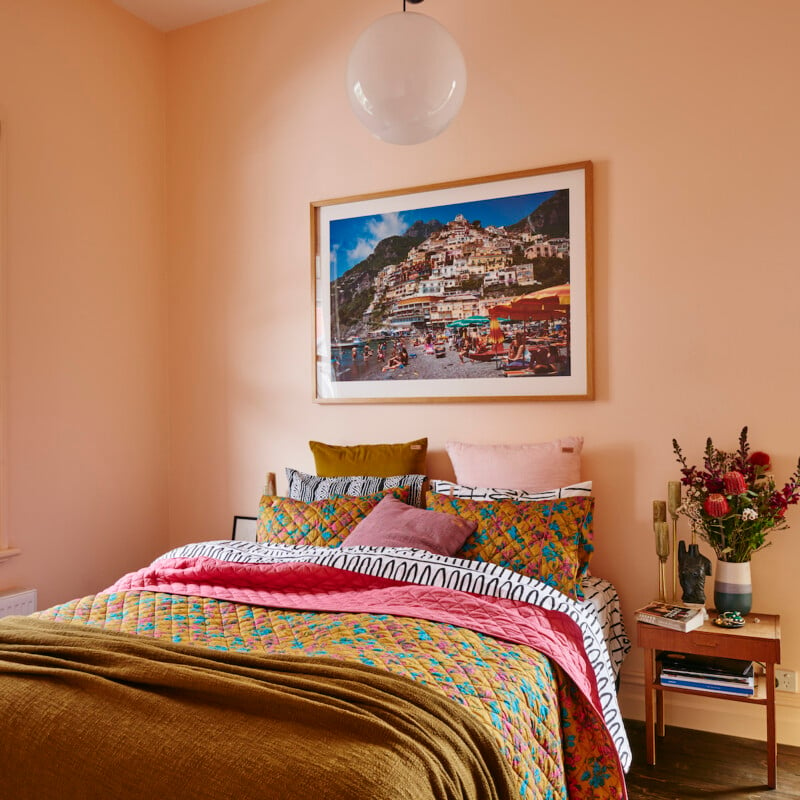
1/15
The Brighter, the Better—These Vibrant Paints Will Infuse Your Home With Positivity
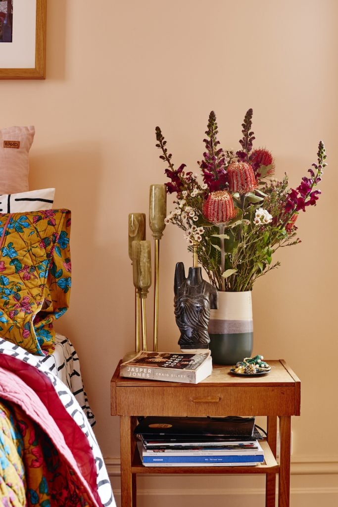
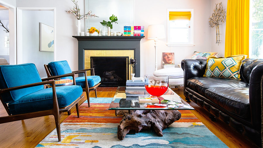
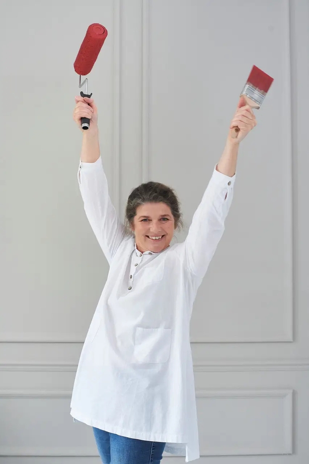
Color consultant Amy Wax emphasizes that color is the backbone of design, profoundly influencing emotions and daily life. She believes that infusing surroundings with color can bring a sense of 'joie de vivre.' The article explores how to select and incorporate vibrant paint colors into homes, drawing insights from both Amy Wax and interior designer Tiffany Hanken, who liken bright colors to a vitamin for home décor. It highlights 11 designer-picked vibrant paint colors that are currently trending.
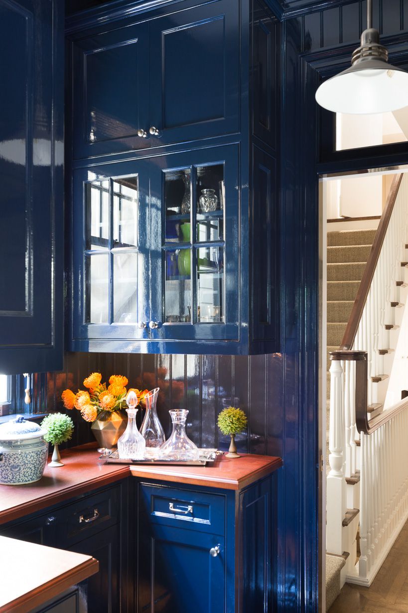
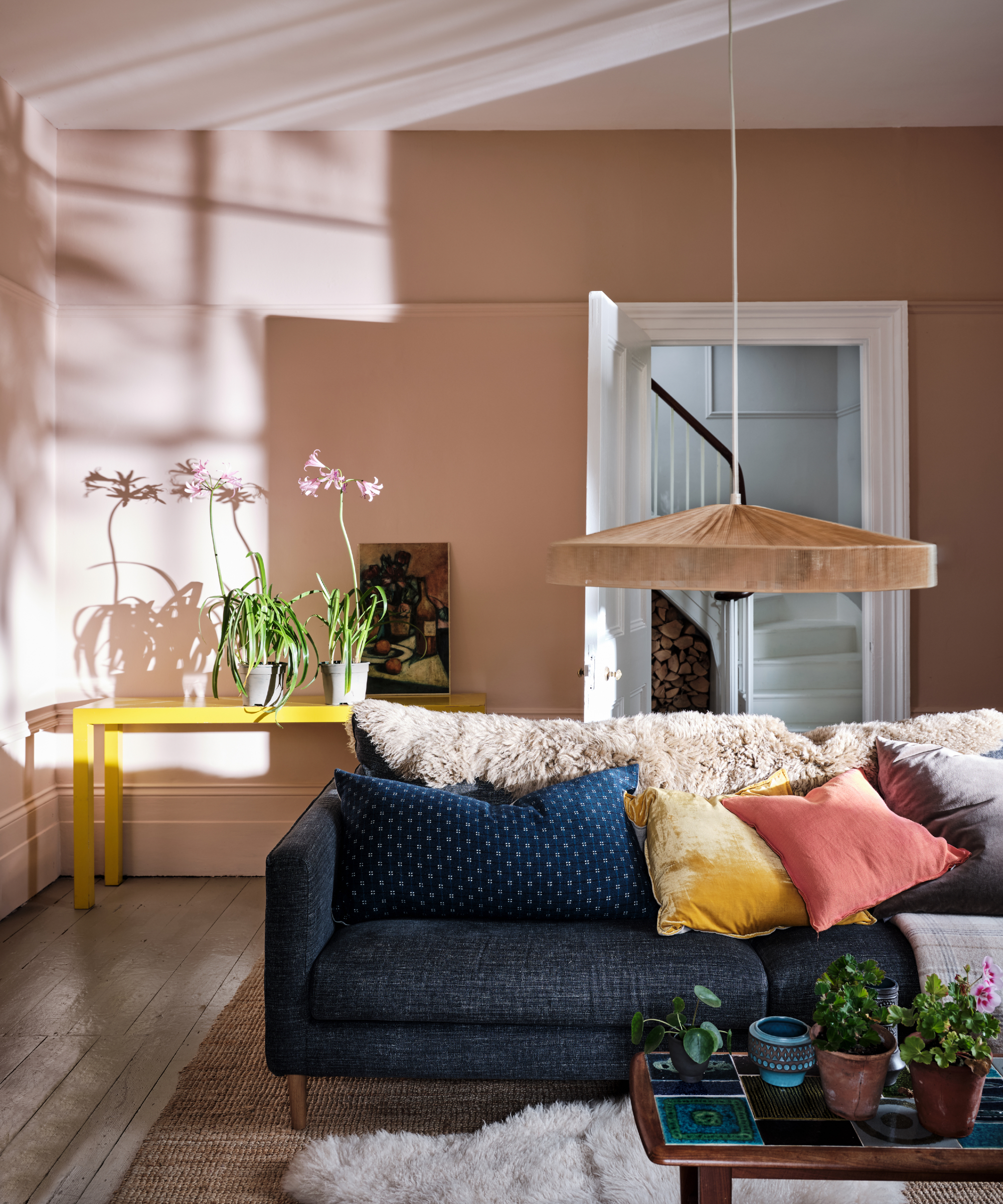
Choosing a vibrant paint color can be daunting due to the vast array of options. Wax advises beginning by considering the desired atmosphere for the room—happiness, good energy, or upliftment—to guide the color selection. She developed the app Color 911 to help individuals explore colors, visualize their impact, and find inspiration. Hanken suggests that if uncertain, one should look at existing colors in the room and consider their color wheel opposites to create contrasting, bright accents. For instance, shades of blue pair well with orange or coral.
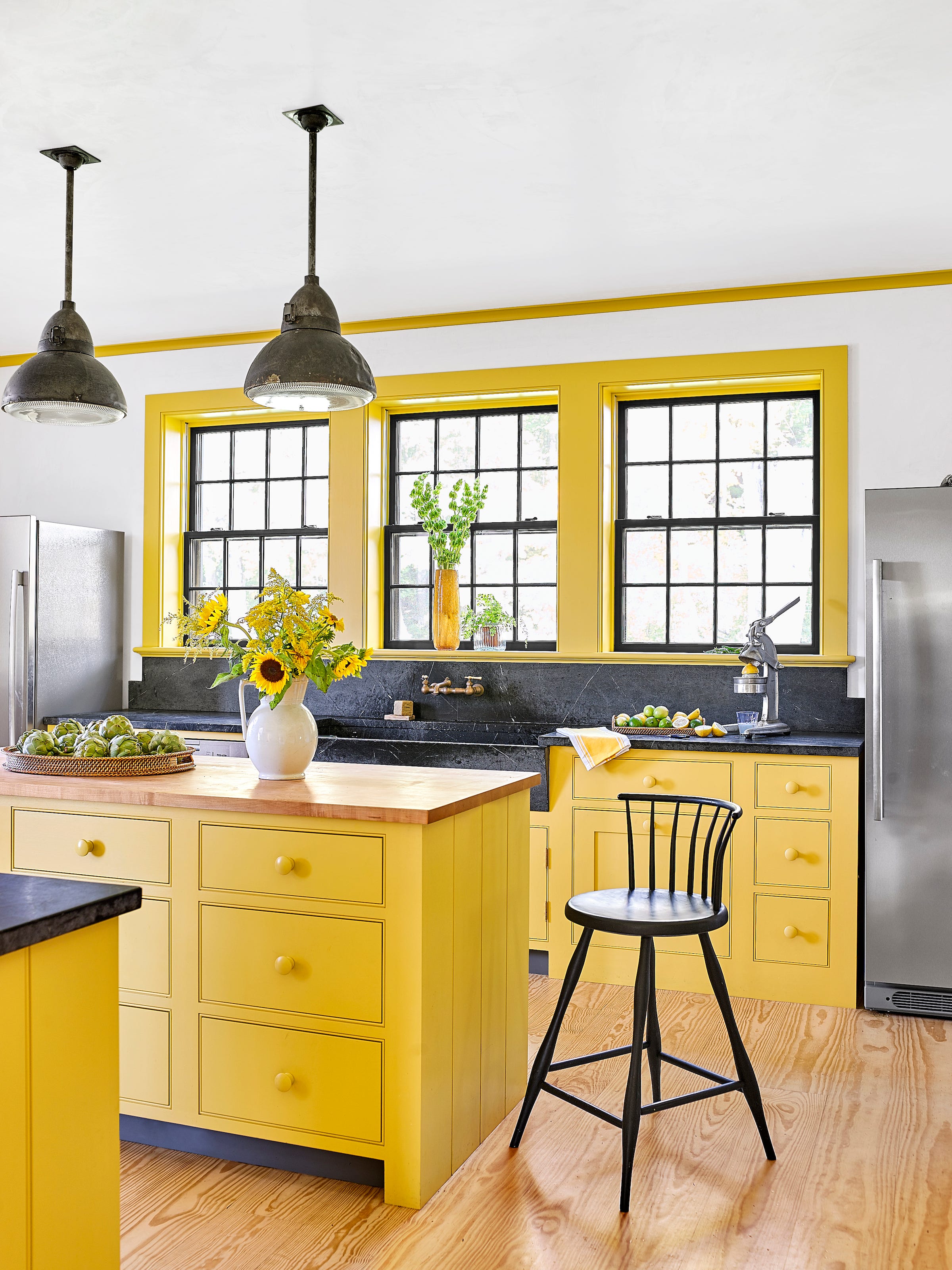
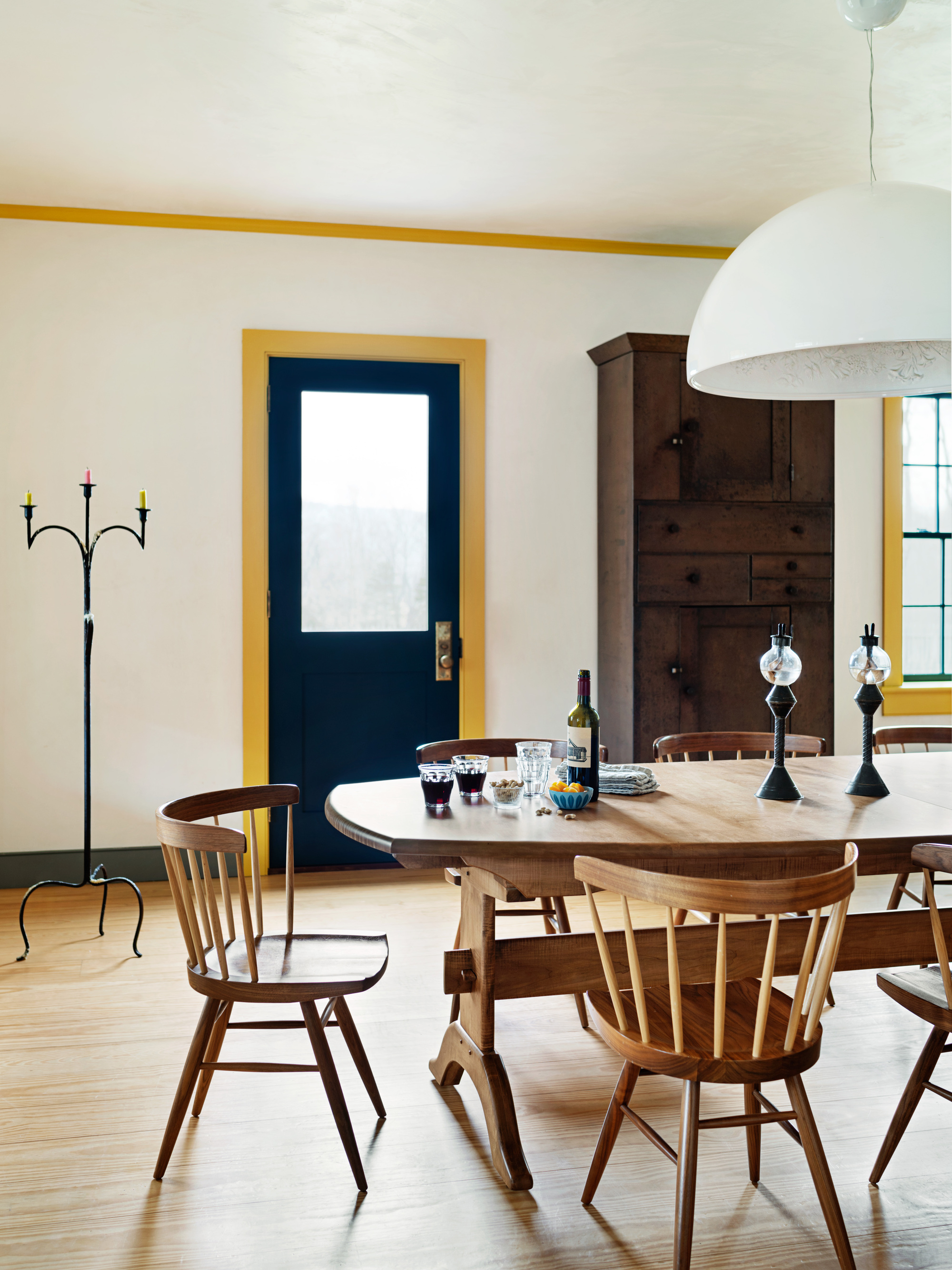
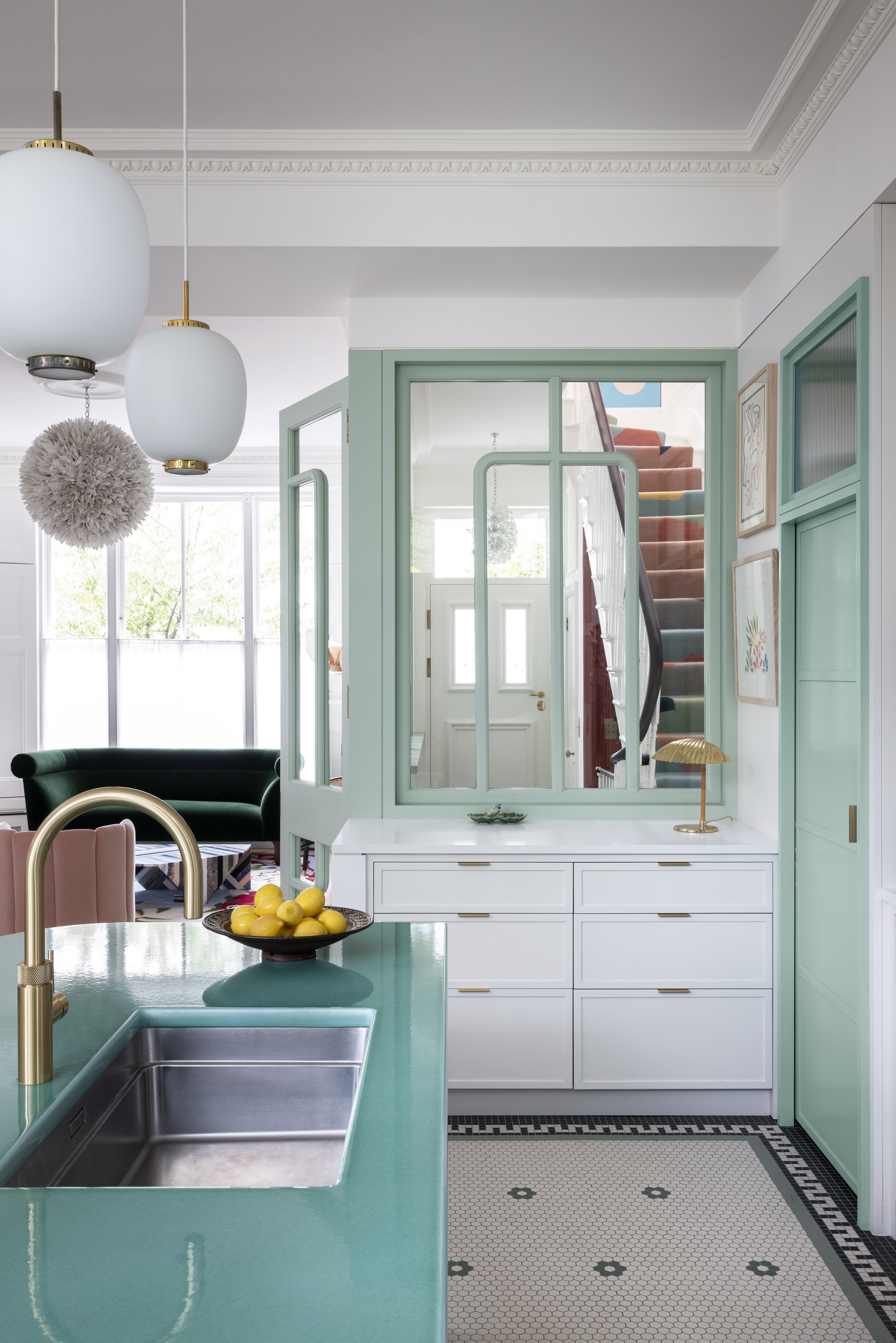
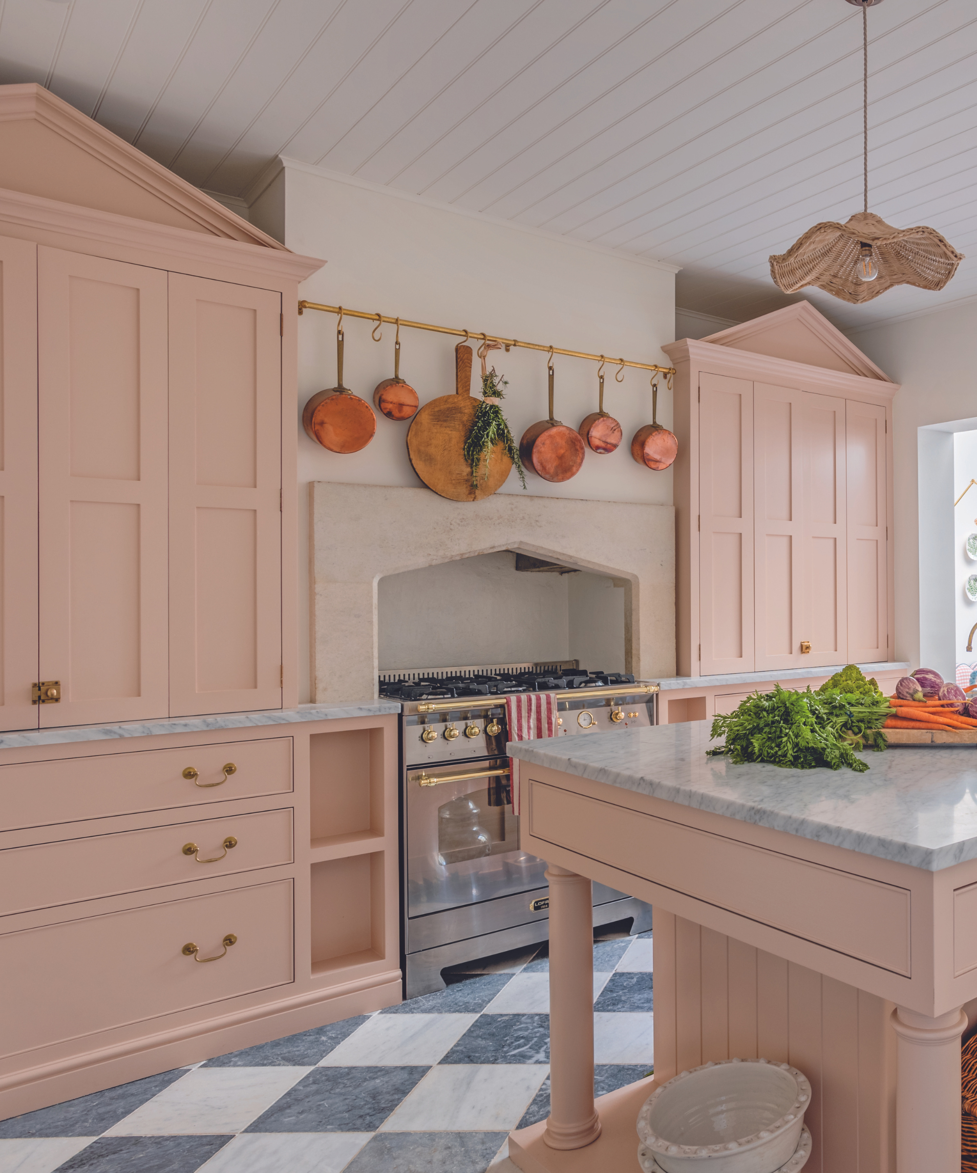
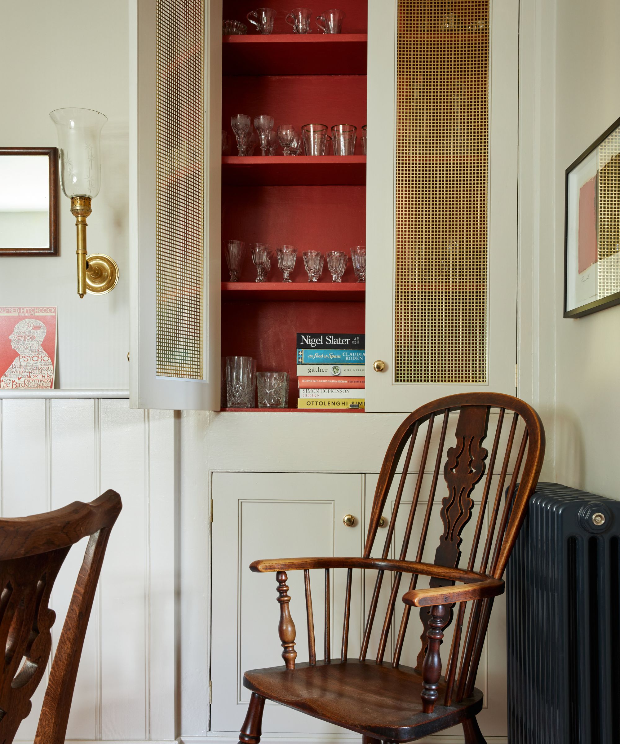
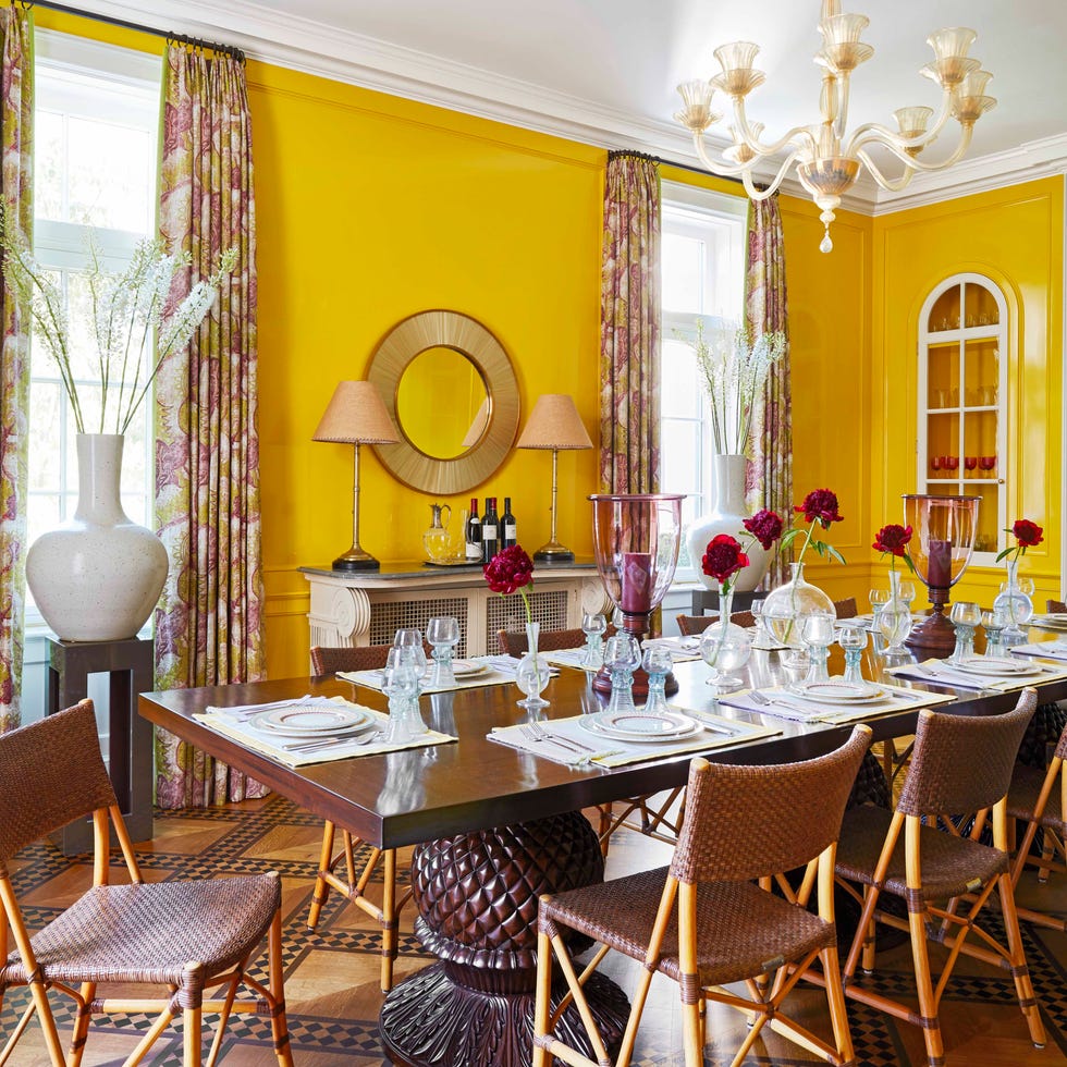
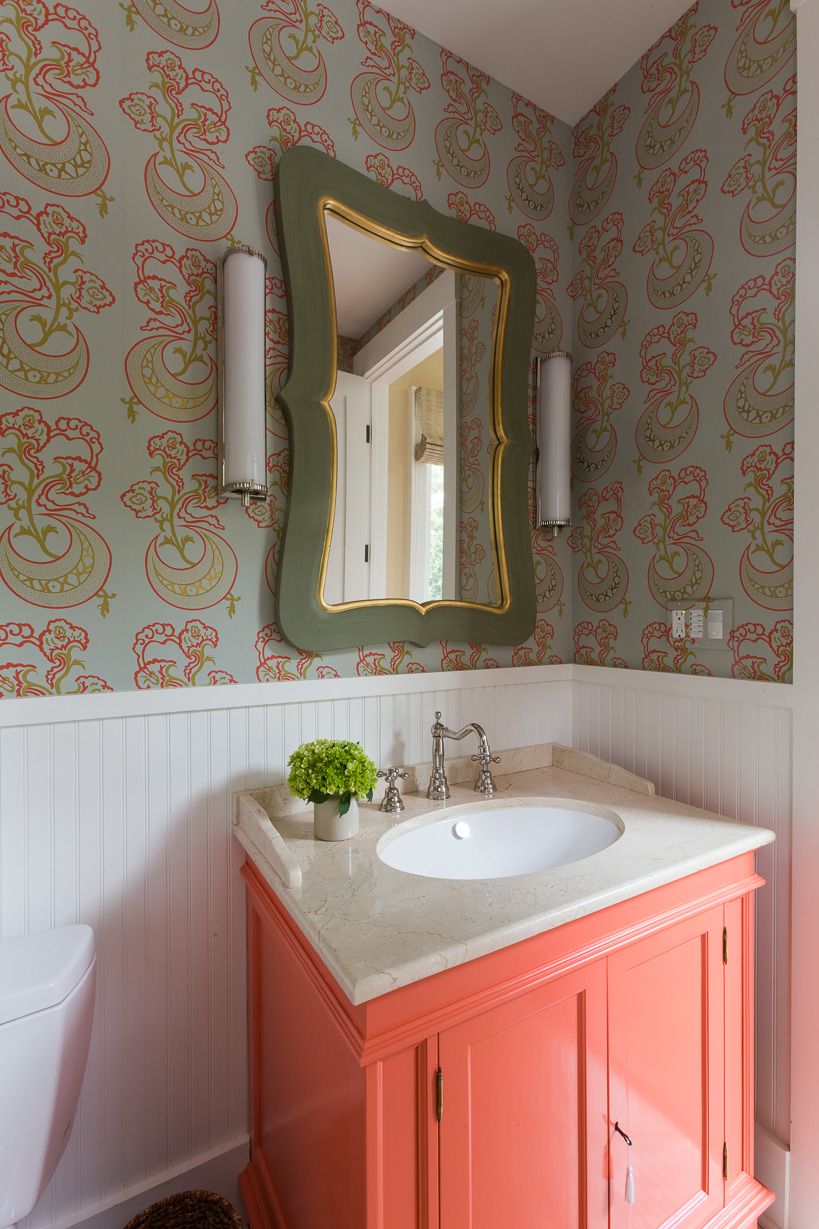
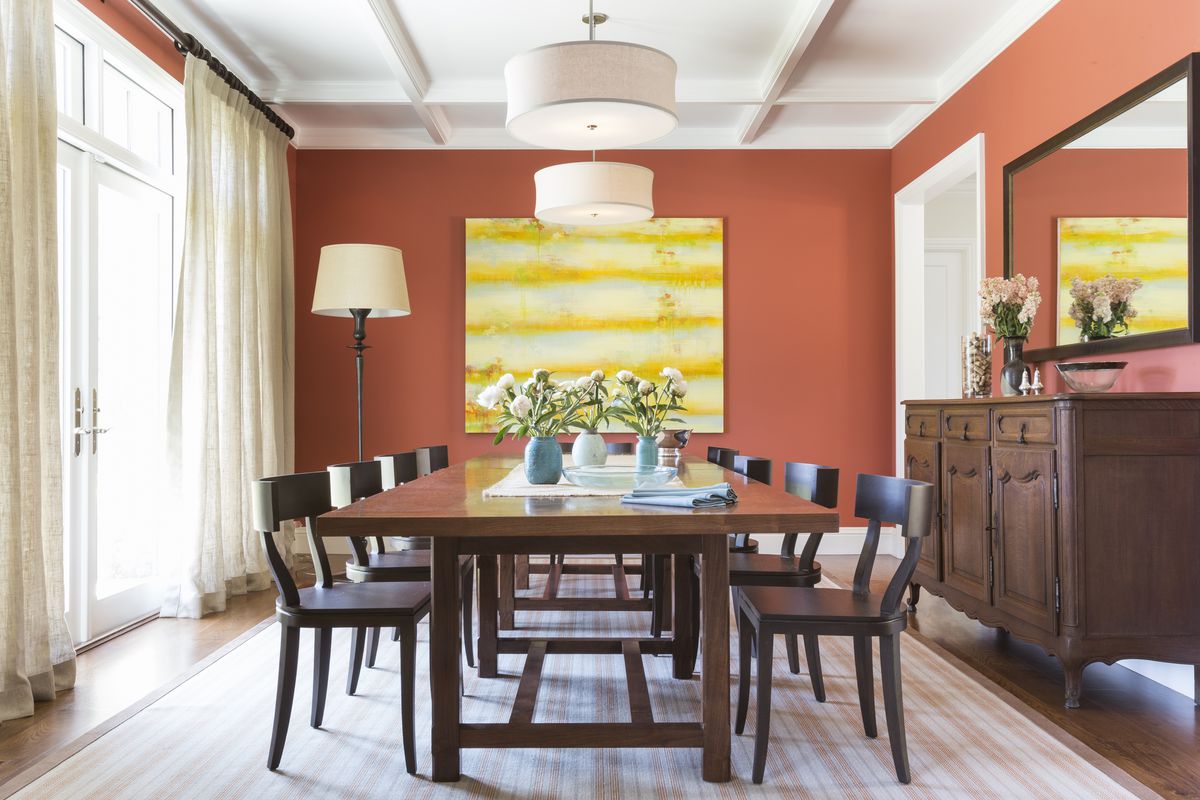
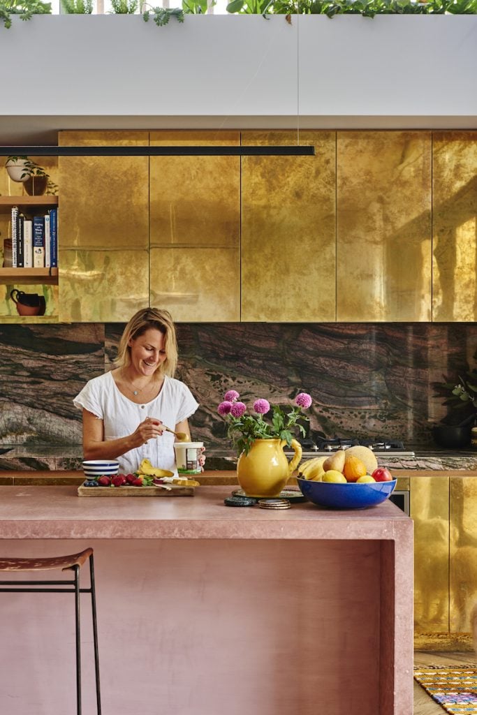
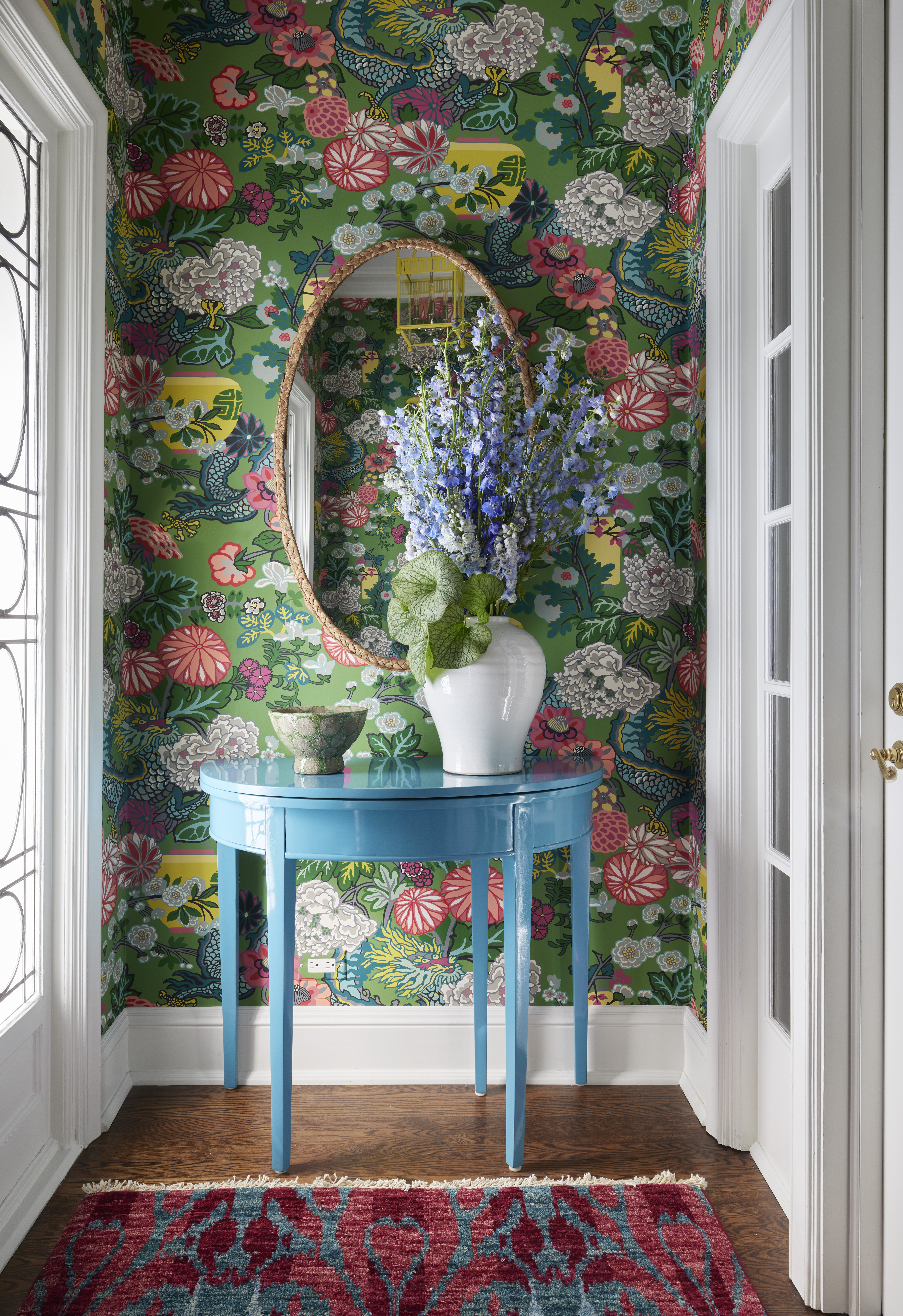
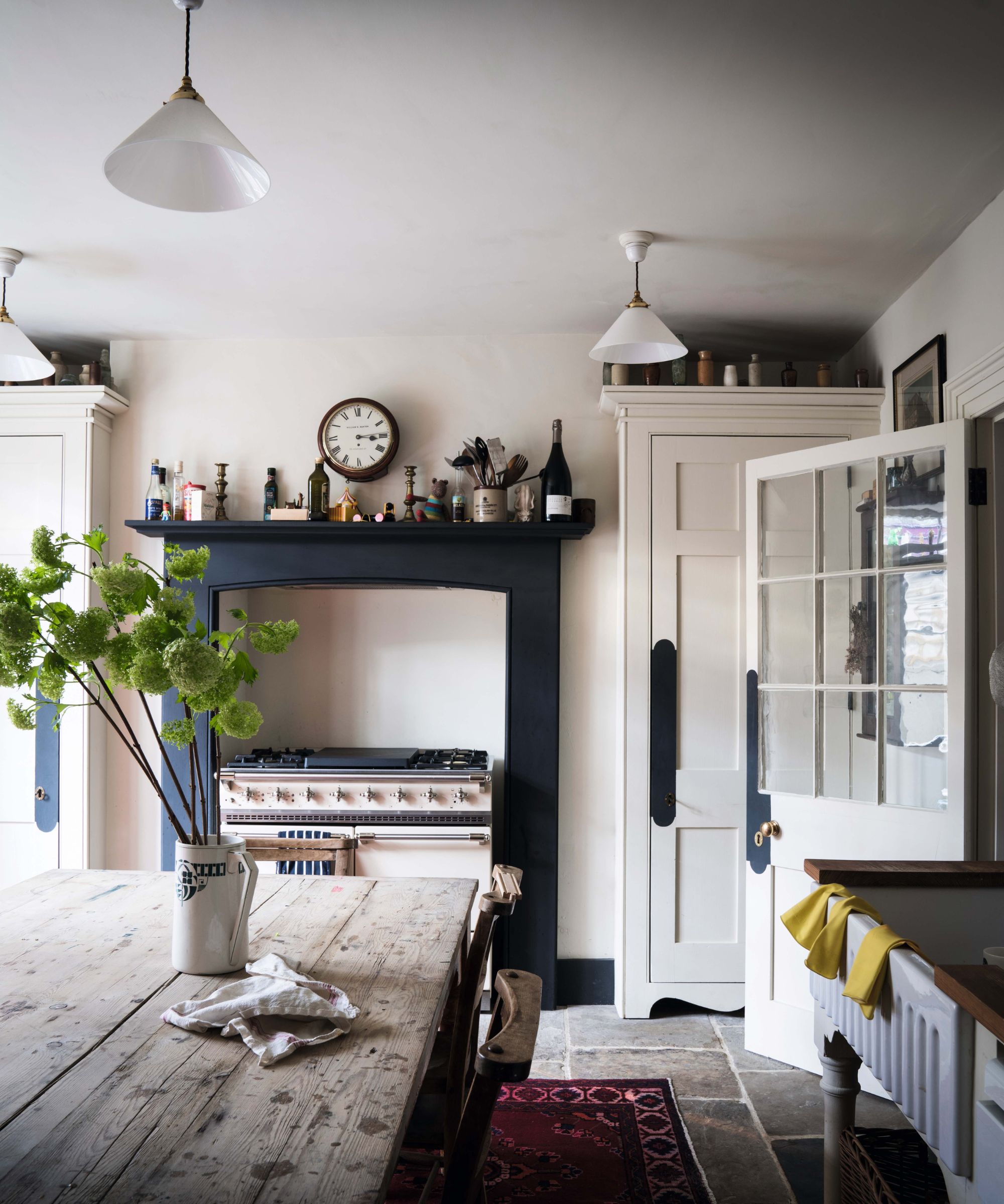
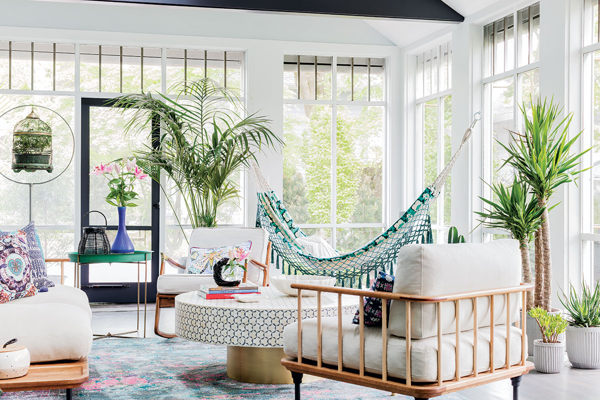
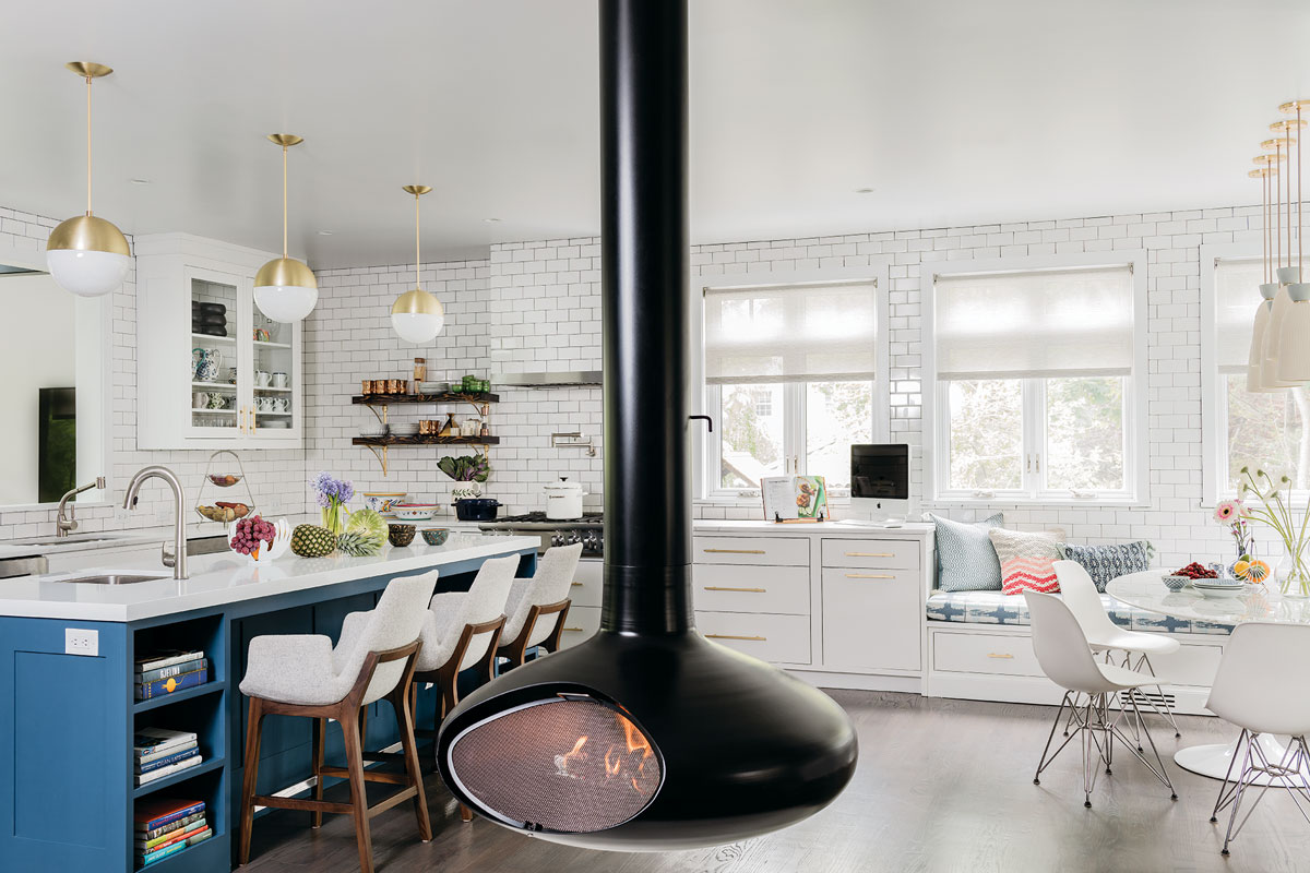
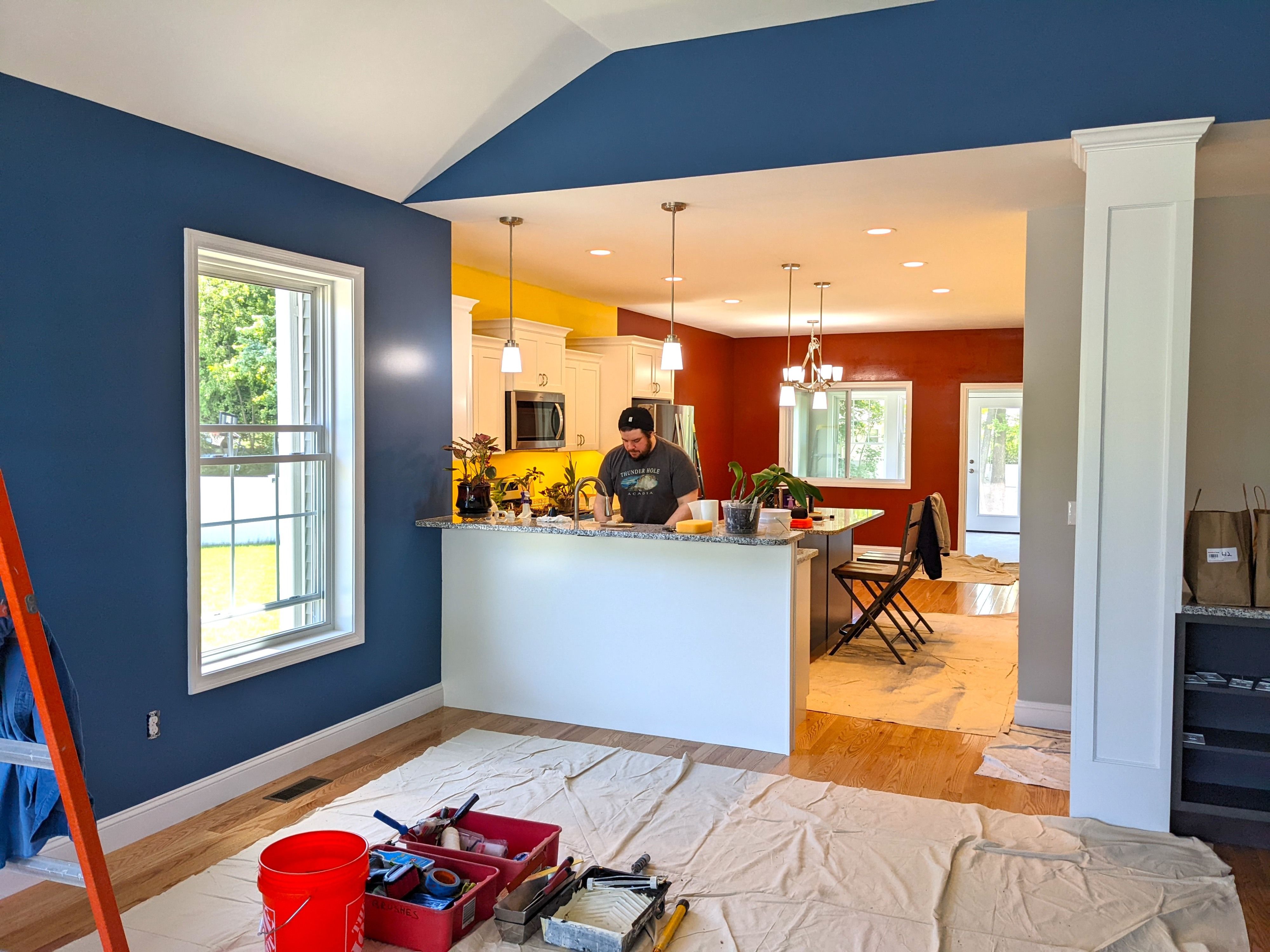
Regarding appropriate rooms for vibrant colors, Wax recommends spaces designed for entertaining, togetherness, and conviviality, such as dining rooms, kitchens, great rooms, and living rooms. She notes a current trend of incorporating bright colors in kitchens, often through accent walls or vibrant cabinets. Hanken adds that a bright dining room introduces novelty and fun, and she particularly advocates for boldly painted powder rooms, considering them spaces where any design choice is acceptable.
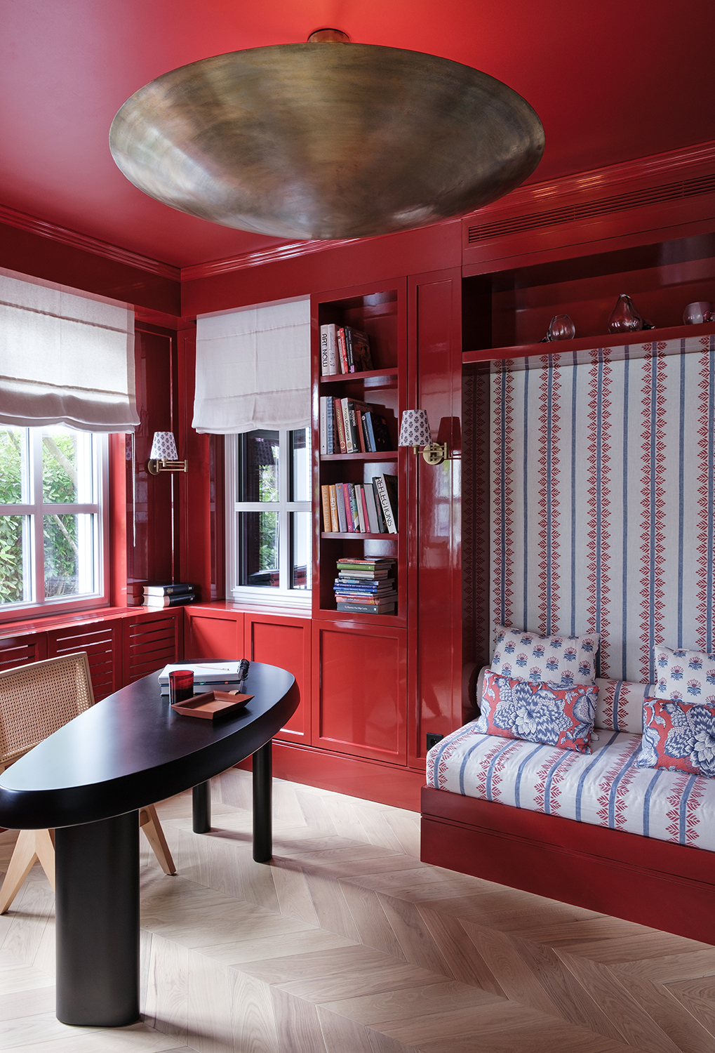
The article reassures readers about using vibrant colors, as paint is a low-commitment design element that can be easily changed. Accent walls or ceilings are suggested as playful ways to introduce bright hues. The key is to have fun with color without taking it too seriously. Trending colors for 2022 lean towards nature-inspired blues, greens, and other vibrant shades.
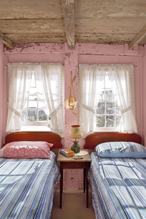
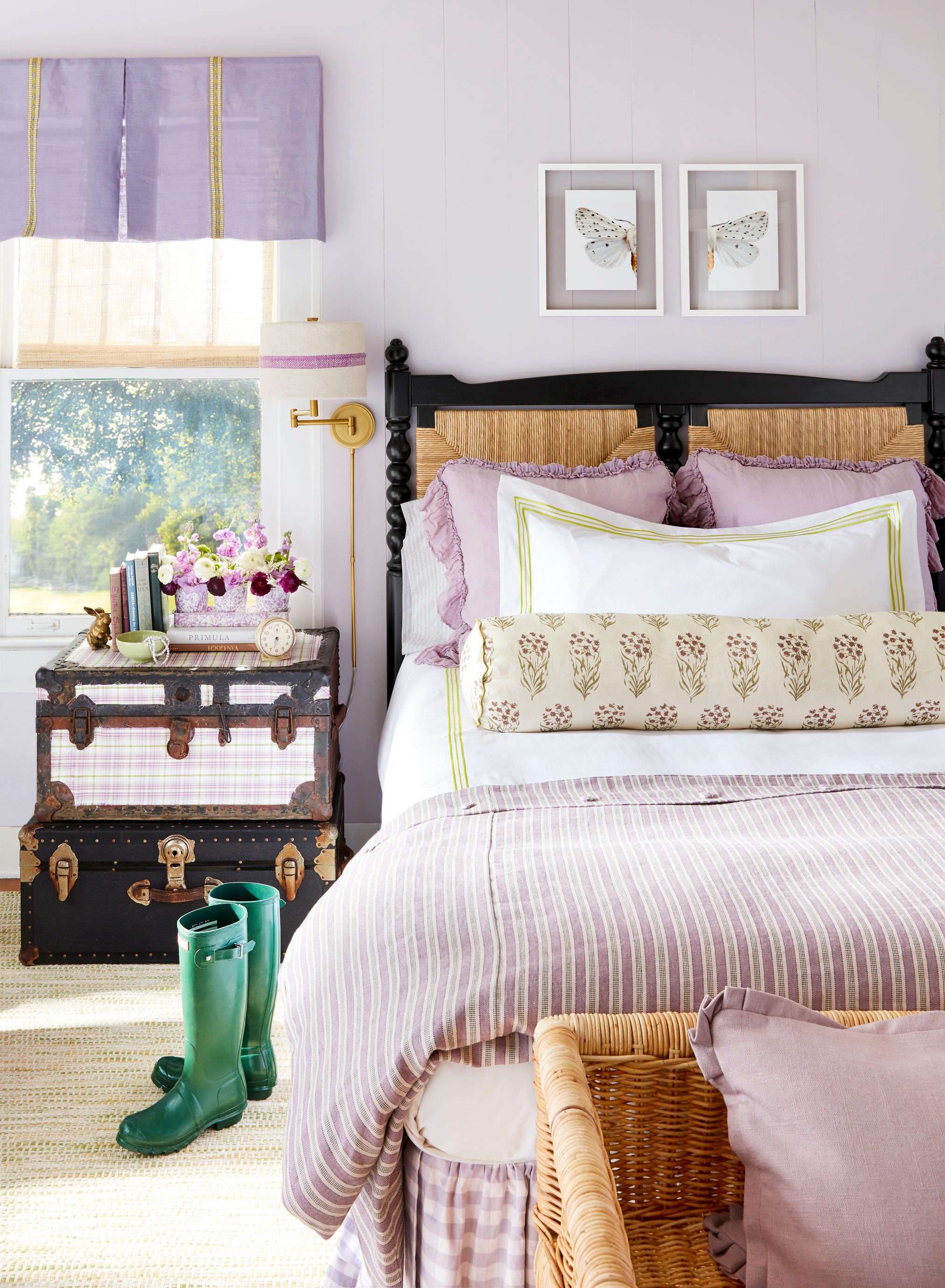
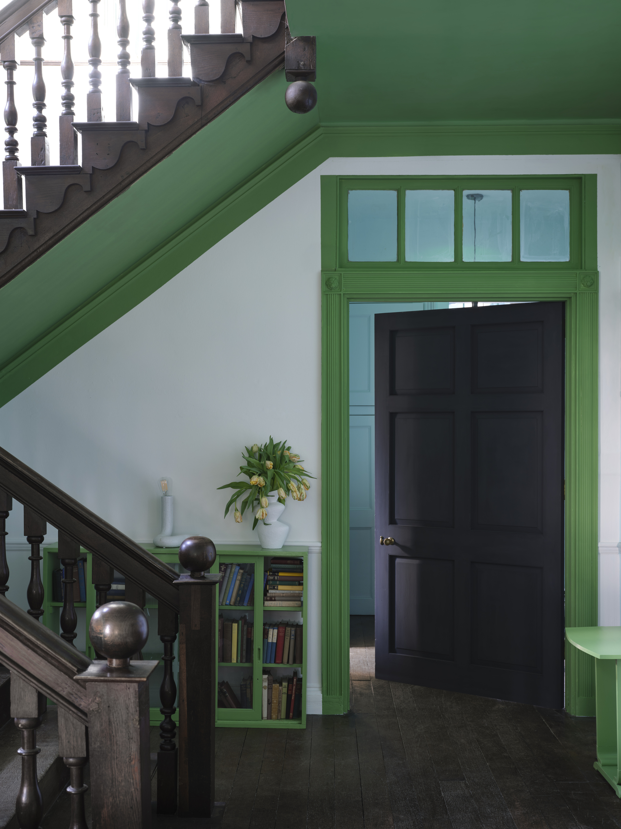
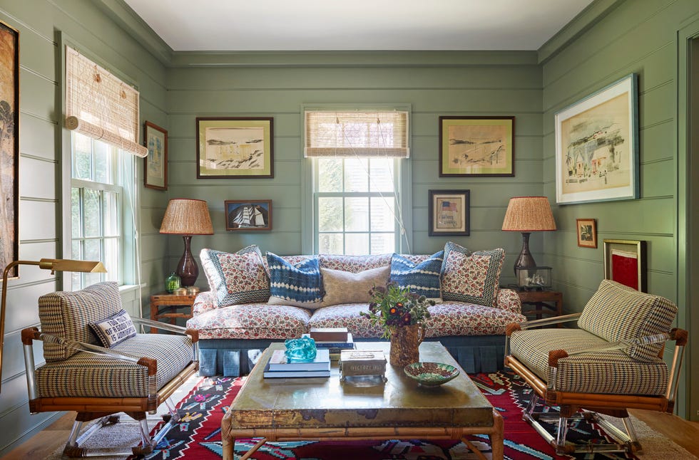
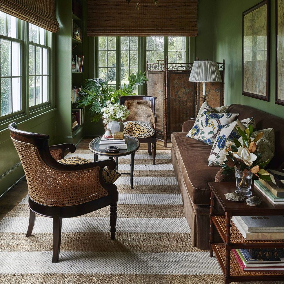
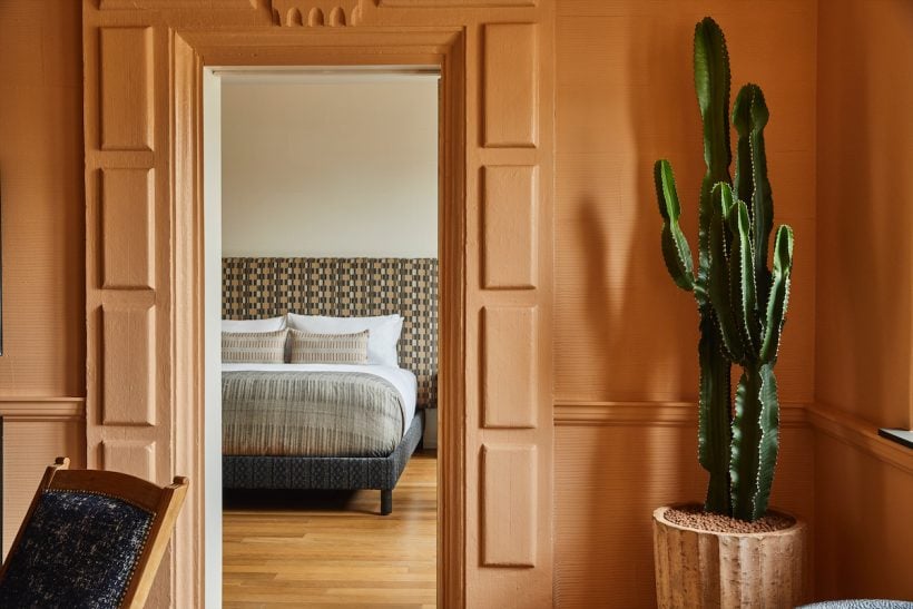
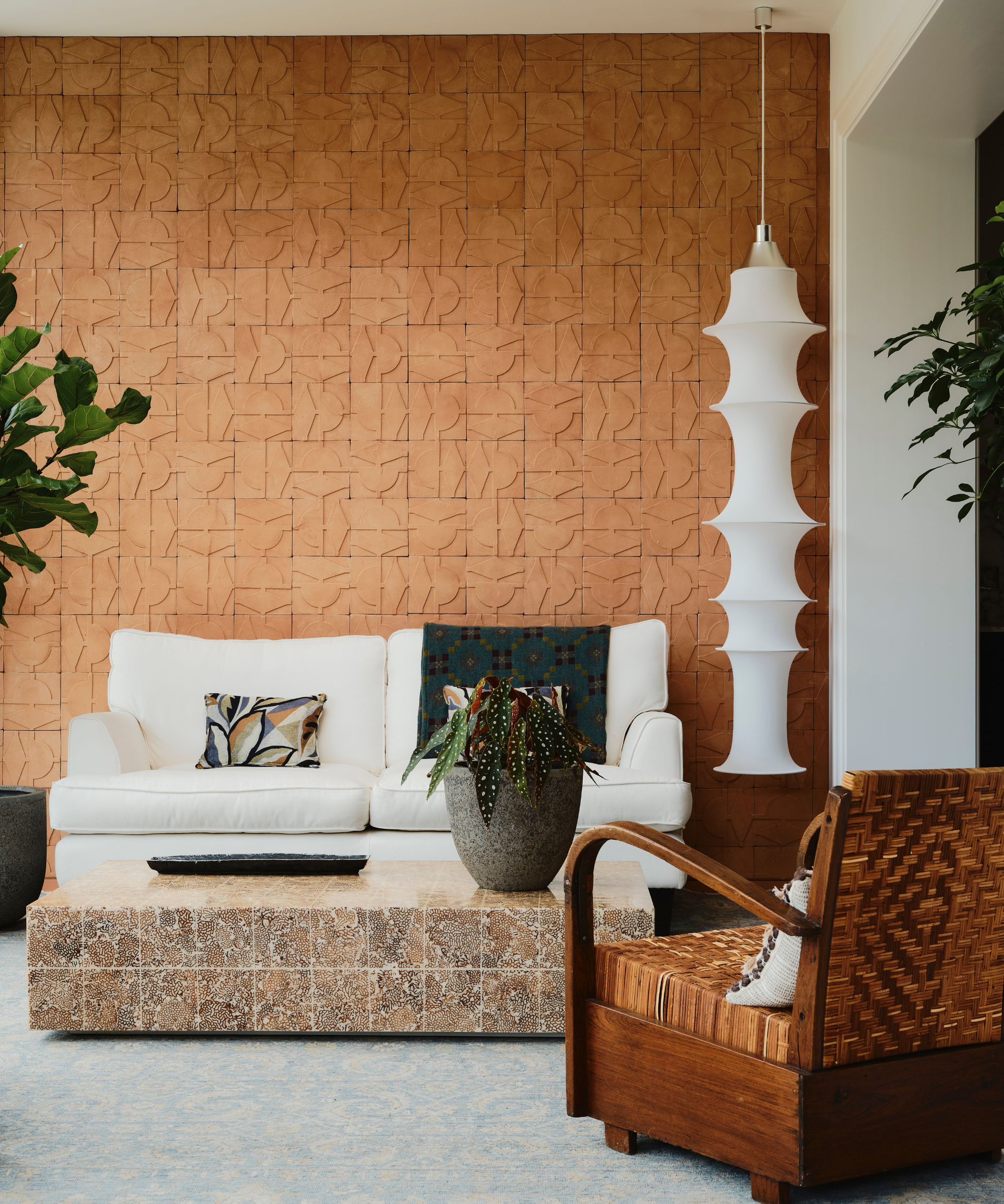
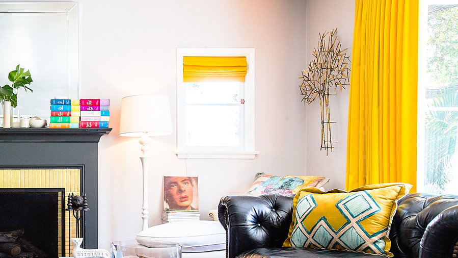
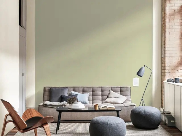
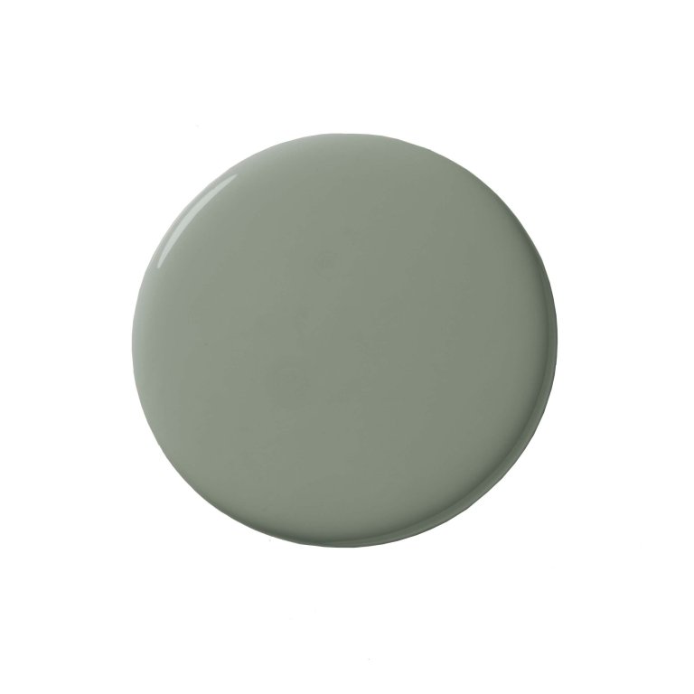
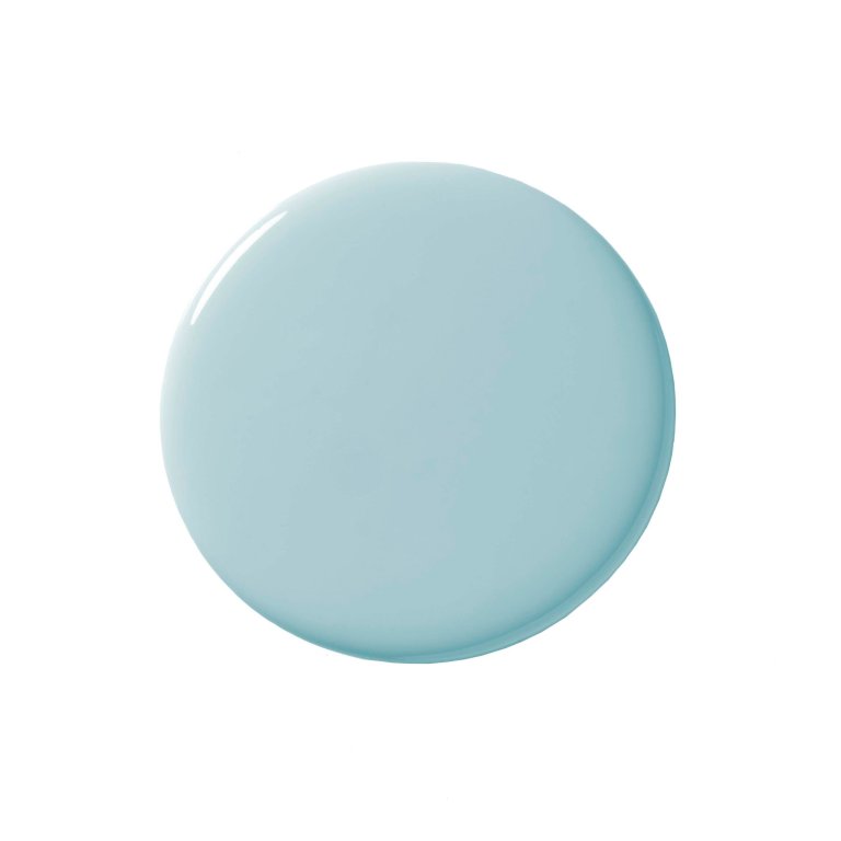
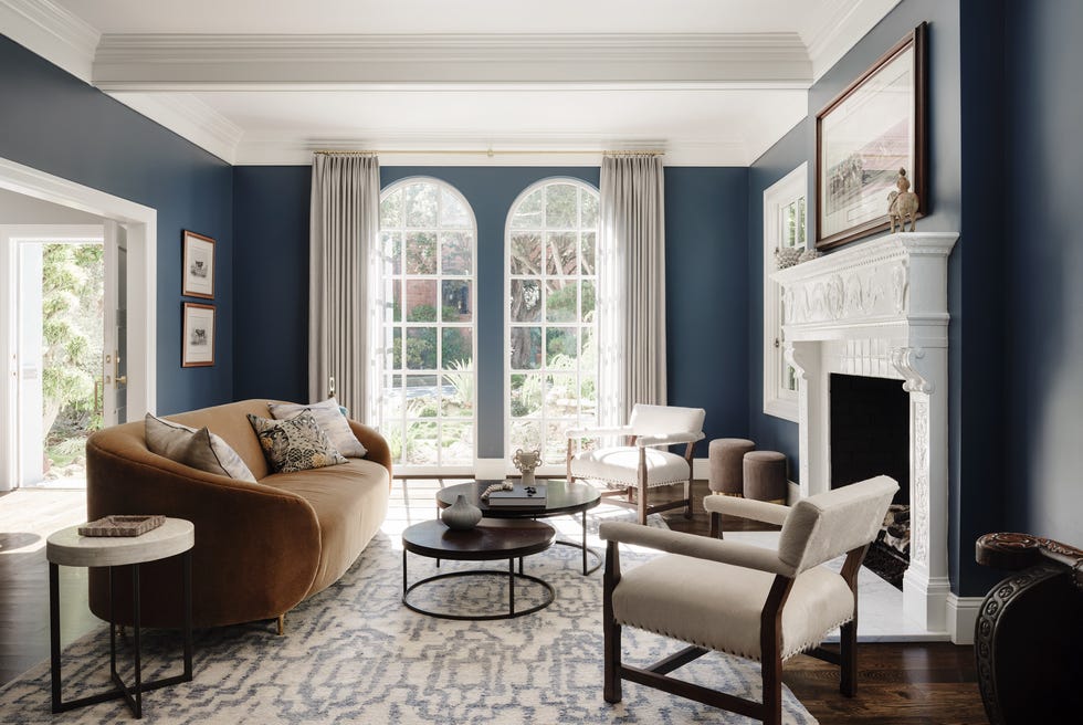
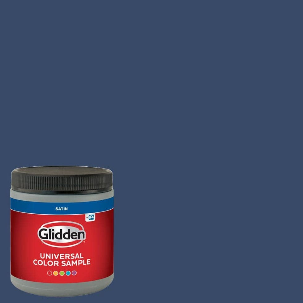
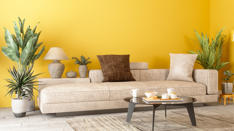
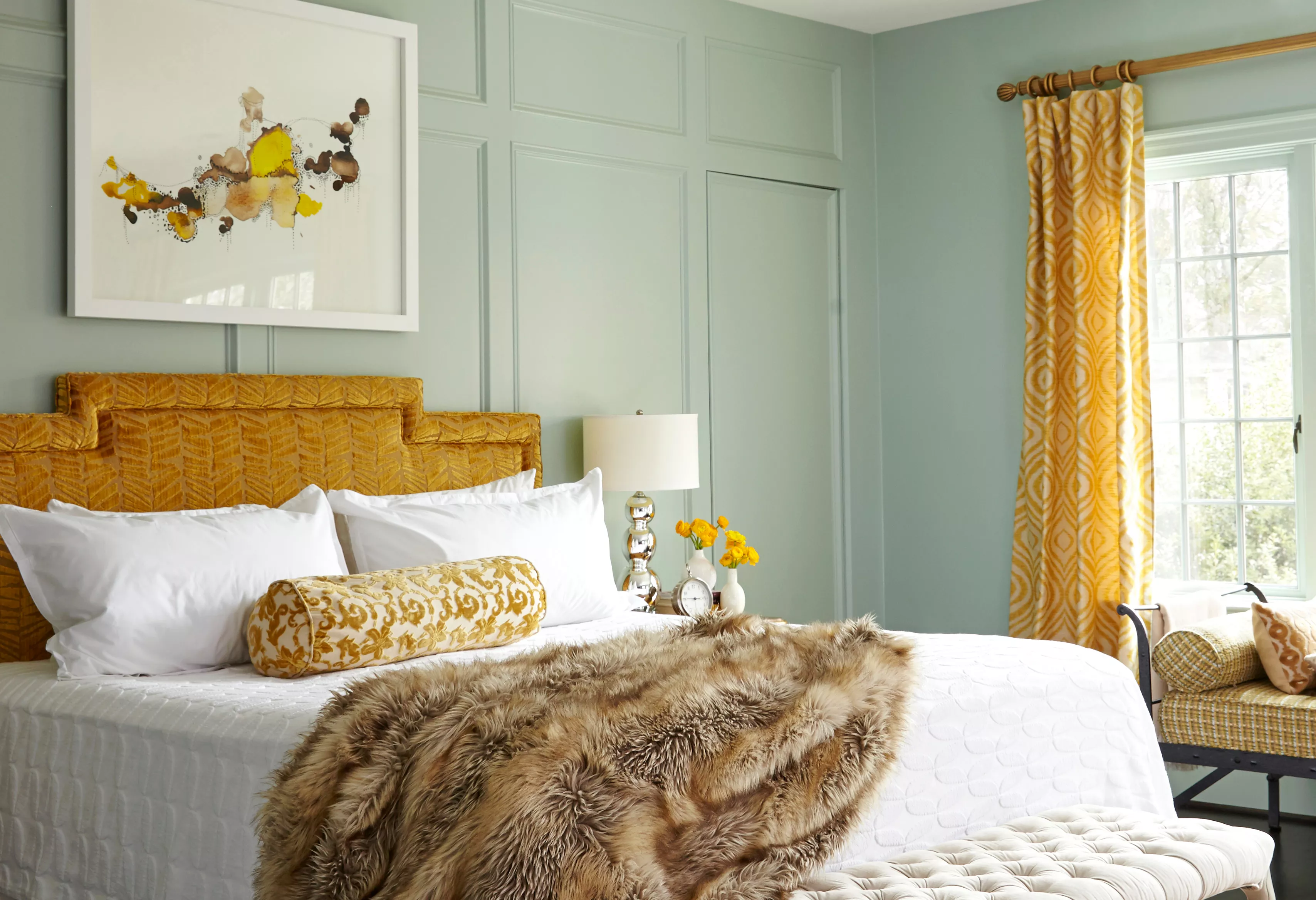
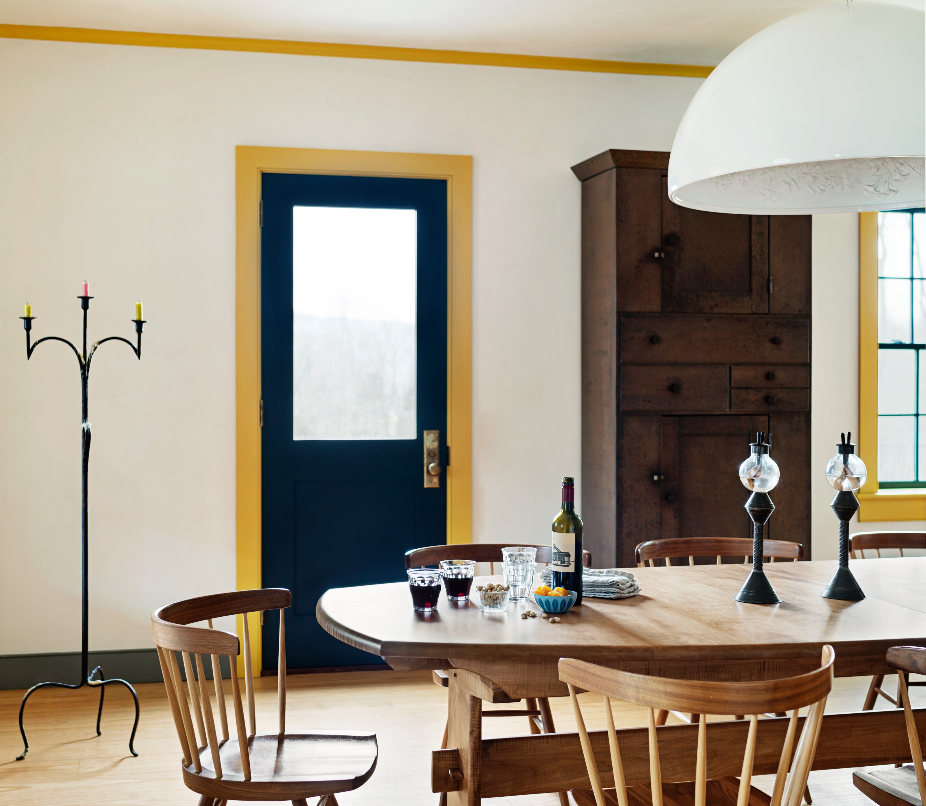
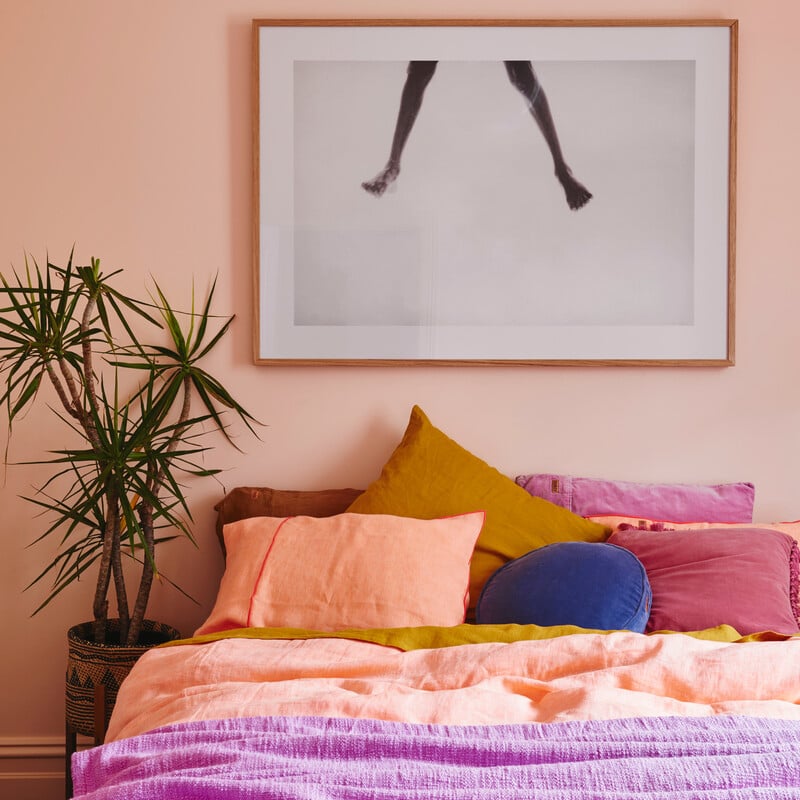
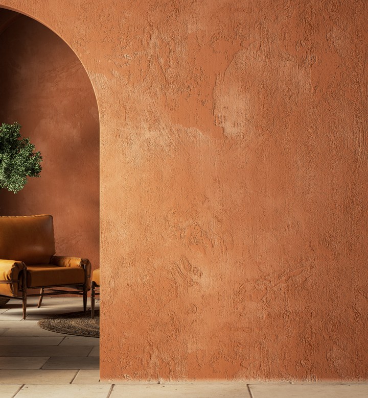
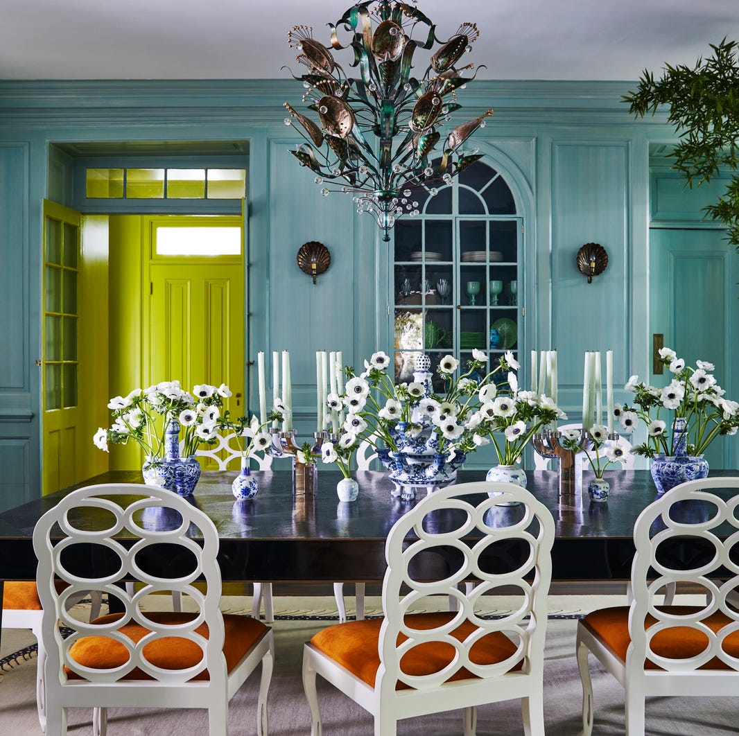
Eleven specific vibrant paint colors are recommended by Wax and Hanken. Benjamin Moore's 'In the Tropics' is a rich teal suitable for bold rooms or accents. Sherwin Williams' 'Alchemy' is a cheerful marigold yellow, ideal for kitchens or living room accent walls. Farrow & Ball's 'Rangwali' is a transcendent pink named after the Holi festival powder. Portola Paints' 'Coral Reef' offers a beachy coral hue. Benjamin Moore's 'Peony' is described as a fresh pink that brings a smile to interior décor. Benjamin Moore's 'Chicago Blues' is a favored blue by Wax, used often. Benjamin Moore's 'Violet Petal' is a flowery lilac, forecasted by designer Susan Bednar Long as a top interior color for 2022. Sherwin Williams' 'Roycroft Adobe' is a sunny terracotta, lending historic vibes. Benjamin Moore's 'Green Thumb' is a bold yet neutral and complementary lime green. C2 Paint's 'Shine' is an illuminating yellow, perfect for kitchens. Finally, Sherwin Williams' 'Turkish Tile' is a sea-reminiscent bright blue, falling between teal and cerulean. These selections offer diverse options for adding positivity and character to any home.
#VibrantPaintColors #HomeDesign #InteriorDecor #ColorPsychology #PaintColorTrends #DesignTips #AccentWalls #DIYHomeDecor #VibrantPaintColors #HomeDesign #InteriorDecor #ColorPsychology #PaintColorTrends #DesignTips #AccentWalls #DIYHomeDecor
0 comment in total
 No comments yet
You may also like
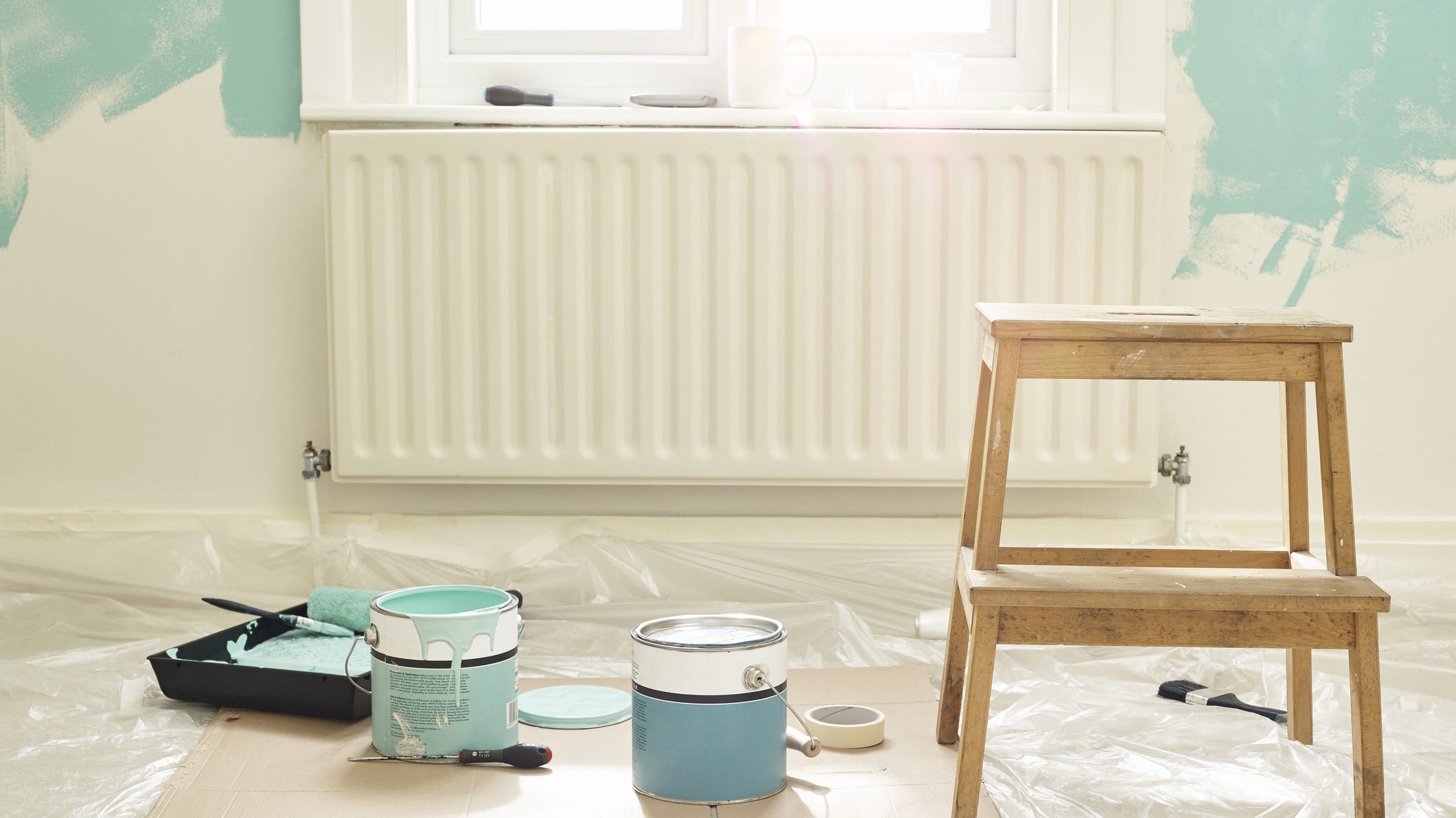
Add These Happy Colors to Your Home and Boost Your Mood
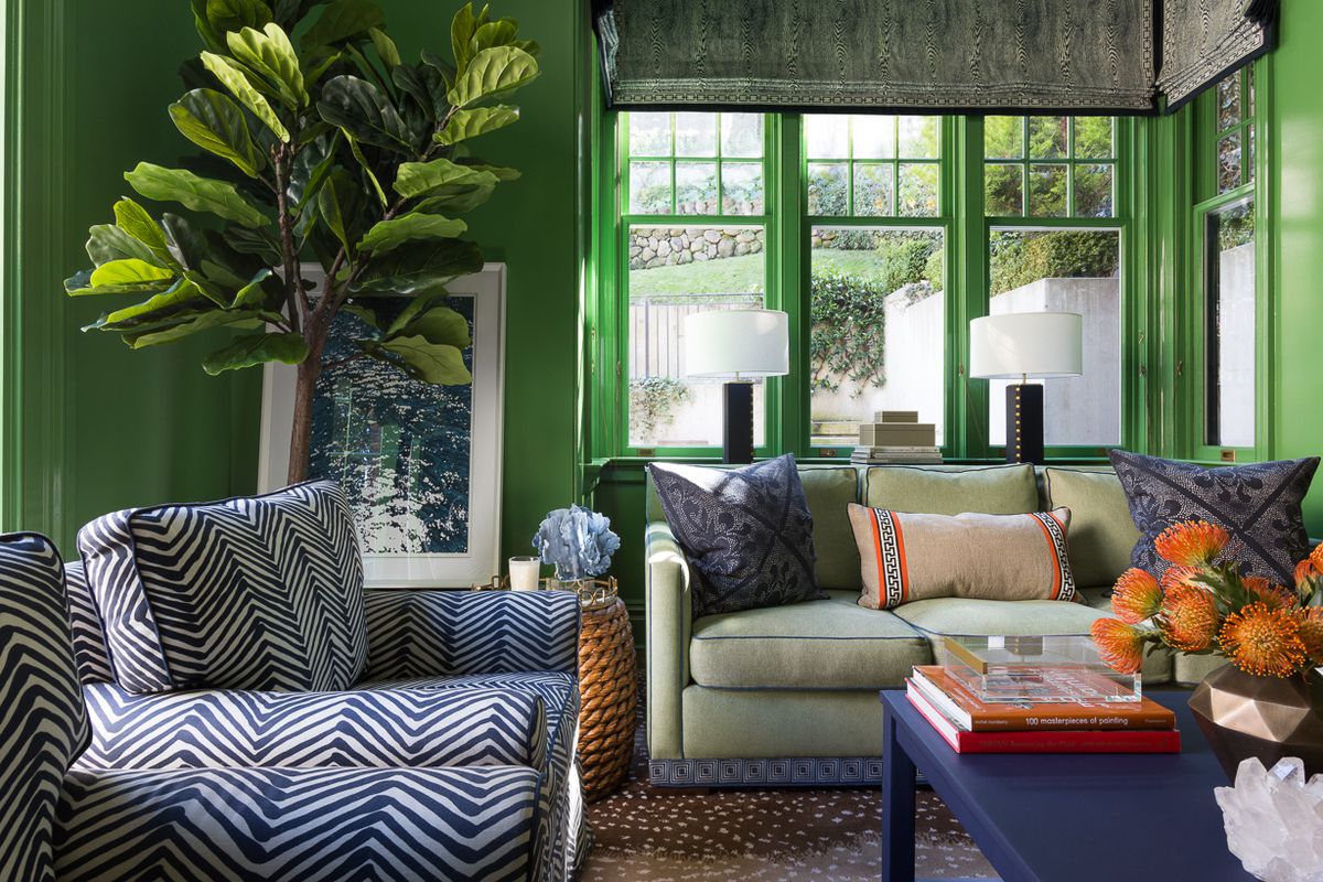
15 high-risk high-reward paint hues
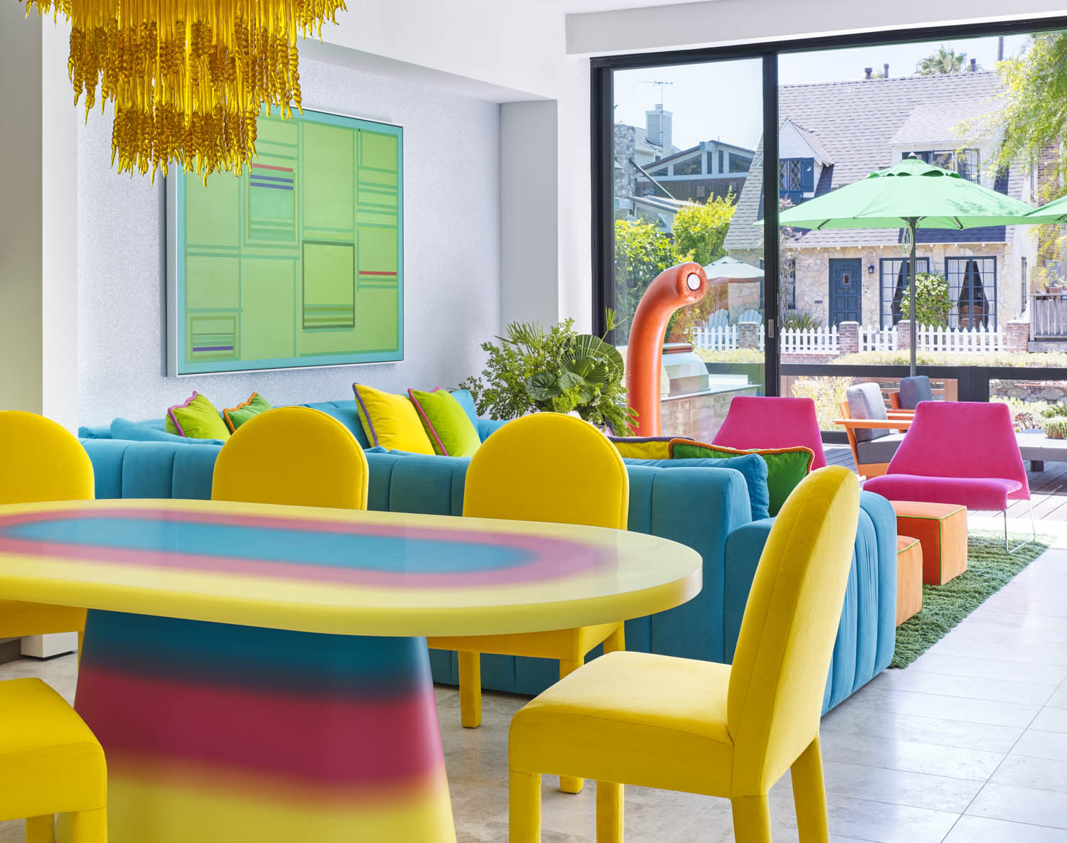
5 Vibrant Color Palettes Designers Are Using to Add Energy and Excitement to Decor

6 Paint Colors That Add Positive Feng Shui to Every Room in Your Home

'It's the best way to make a home joyful' - this paint trend is the perfect idea to introduce color thoughtfully
This Paint Color Will Infuse Your Space With Warmth and Positivity–Can You Guess What It Is?
Color Drenching Might Be Everywhere, But My Mom’s Been Doing It Since the ’90s
Lick Paint Will Transform the Mood in Your Home Through Color Psychology

A color psychologist says these color schemes are the most likely to boost your mood

The bold and the beautiful — how brave paint choices can bring your home to life

How paint colour in your home can affect your mood
Creative, Captivating Use of Color Helps This Home Redesign Shine

We Asked Designers Which Paint Colors Are Best for Brightening a Dark Room—6 Top Picks

6 'Energetic Colors' for Vitality and "Sophisticated Interiors", According To Psychologists And Design Experts
What makes a paint color flattering? Experts share their go-to shades for a universally complementary scheme

Timeless Paint Colors The Stars Of Fixer To Fabulous Love Seeing In Homes
How Your Home's Paint Colors Can Make You Happier, According to Experts

15 Ways to Add Bold Color to Your Home
A Color Psychologist Says This Is the Most Relaxing Paint Color

What paint colors to use to create a relaxed vibe at home