1/16
15 Ways to Add Bold Color to Your Home
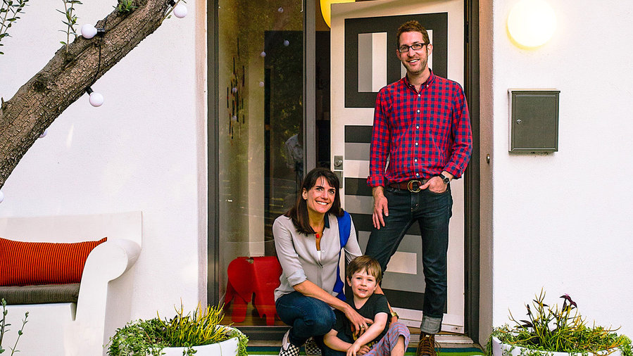
This article explores how a Pasadena couple, Jon Leaver and Tyke O’Brien, successfully incorporated bold and daring color palettes into their 1940s bungalow. As teachers and interior designers, they believe that taking risks with color is more rewarding than choosing safe, uninspired options. Their approach is exemplified by their kitchen, which features electric blue and gray hexagonal tiles, charcoal gray cabinets, and matching walls. To balance these vibrant elements, they intentionally kept most walls in other areas of the house, such as the living room, a pale gray or white, recognizing that a neutral backdrop allows colors to pop effectively. They also acknowledge that experimentation might lead to errors, advocating for the flexibility to repaint and correct design choices.
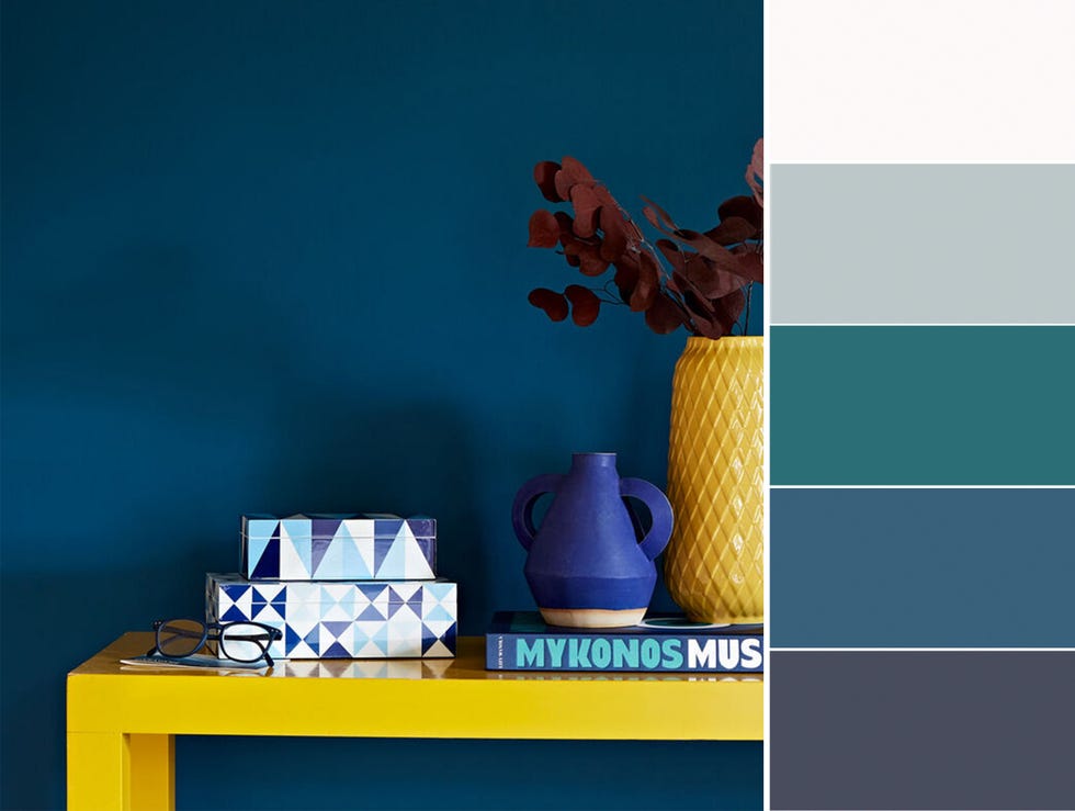
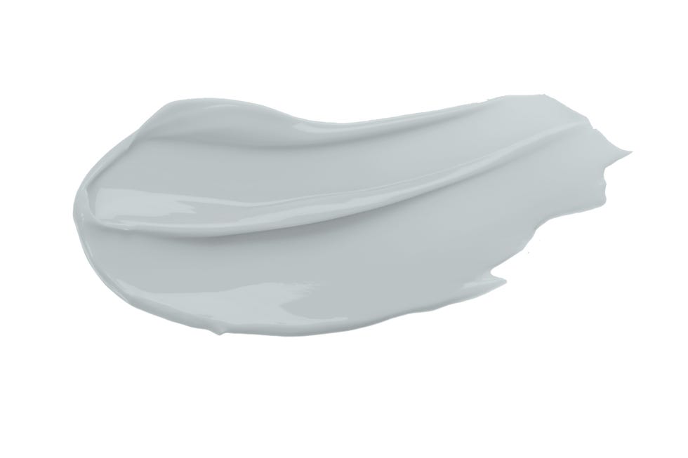
The living room showcases a dominant teal hue, with charcoal adding depth to the fireplace. Hot yellow curtains complement the rug, which features similar yellow patches, and enhance the gold leafing around the fireplace. The article highlights that hot yellow and dark teal are complementary colors, creating a harmonious yet vibrant effect. A cool gray paint with a touch of blue is used as a neutral backdrop in the living room, providing a crisp base for the bolder yellow accents. Chairs are affordably updated with bright Ikea curtain fabric. A multi-color rug serves as a mixer, tying together various elements and introducing new shades to the space. Gold leaf on the fireplace brick adds glitz, making the color scheme more dynamic.
In the kitchen, the couple transformed unremarkable wood cabinets by painting them charcoal and adding black hardware. By extending the charcoal color to the wall and window trim, they drew attention to the statement floor tile. Charcoal is presented as a versatile neutral that pairs well with both warm and cool tones. The flooring features hexagonal tiles in two shades of gray, which relate to the wall color, and electric blues that provide a striking contrast. Butcher block countertops introduce natural warmth, softening the modern tile and dark cabinetry. Unexpected art placement, such as on the kitchen island, adds playful color dashes.
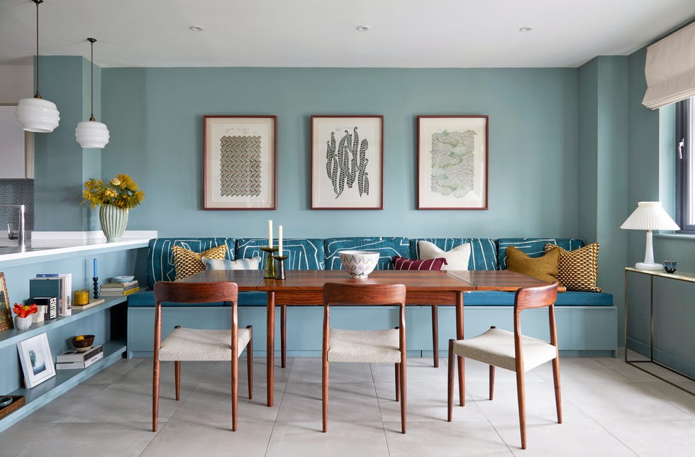
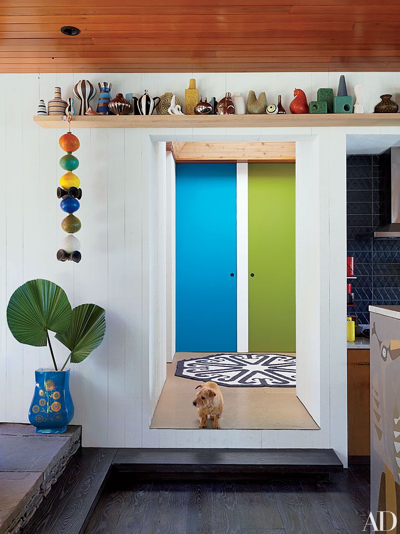
Small doses of orange in serving ware and lush greenery from houseplants are used to break up the blue/gray palette in the dining area. The dining room itself adopts a largely white palette to balance the intensity of the adjacent kitchen. Wood grain from a teak table and butcher block countertops unifies the two spaces. In this predominantly white dining room, cherry-red trim on dishes and coordinated linens provide small, cheerful pops of color. For the master bedroom, a Vivienne Westwood tartan wallpaper from Cole & Son is used on an accent wall behind the bed, eliminating the need for a headboard. The rest of the room is kept white and gray, with neutral bedding to prevent visual clutter. Finally, the front door features graphic shapes, a result of a student’s artistic interpretation, which nods to the home's midcentury architectural style. Family snapshots are creatively displayed using neon rice paper tape, adding more colorful and personal touches throughout the home.
#BoldColor #HomeDecor #InteriorDesign #PasadenaBungalow #ColorPalette #AccentWalls #DIYDecor #KitchenDesign #LivingRoomDesign #BoldColor #HomeDecor #InteriorDesign #PasadenaBungalow #ColorPalette #AccentWalls #DIYDecor #KitchenDesign #LivingRoomDesign
0 comment in total
 No comments yet
You may also like
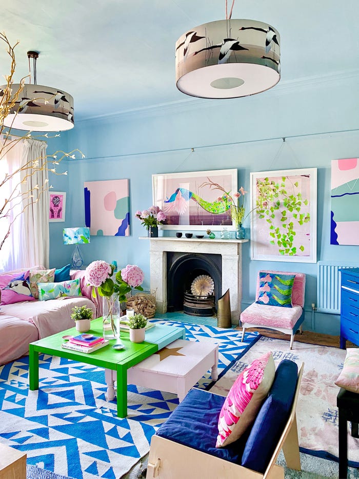
15 ways to add color to your home, according to interior designers
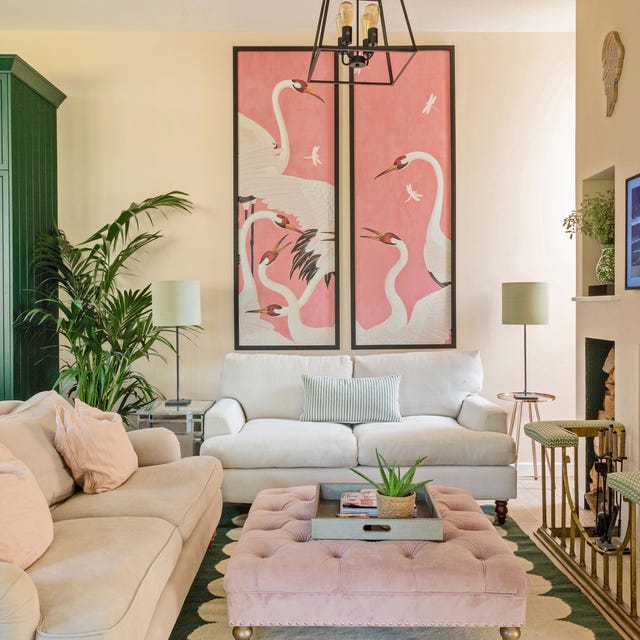
How to make your home look instantly more stylish with clever use of colour

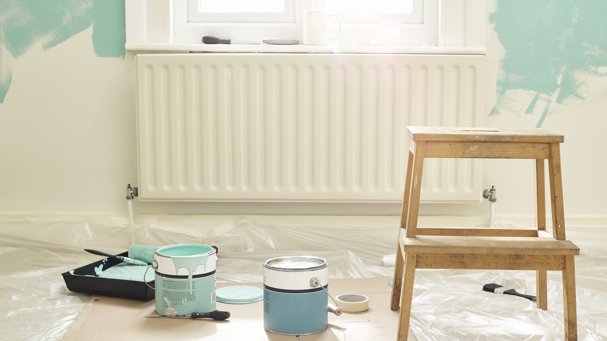
Add These Happy Colors to Your Home and Boost Your Mood
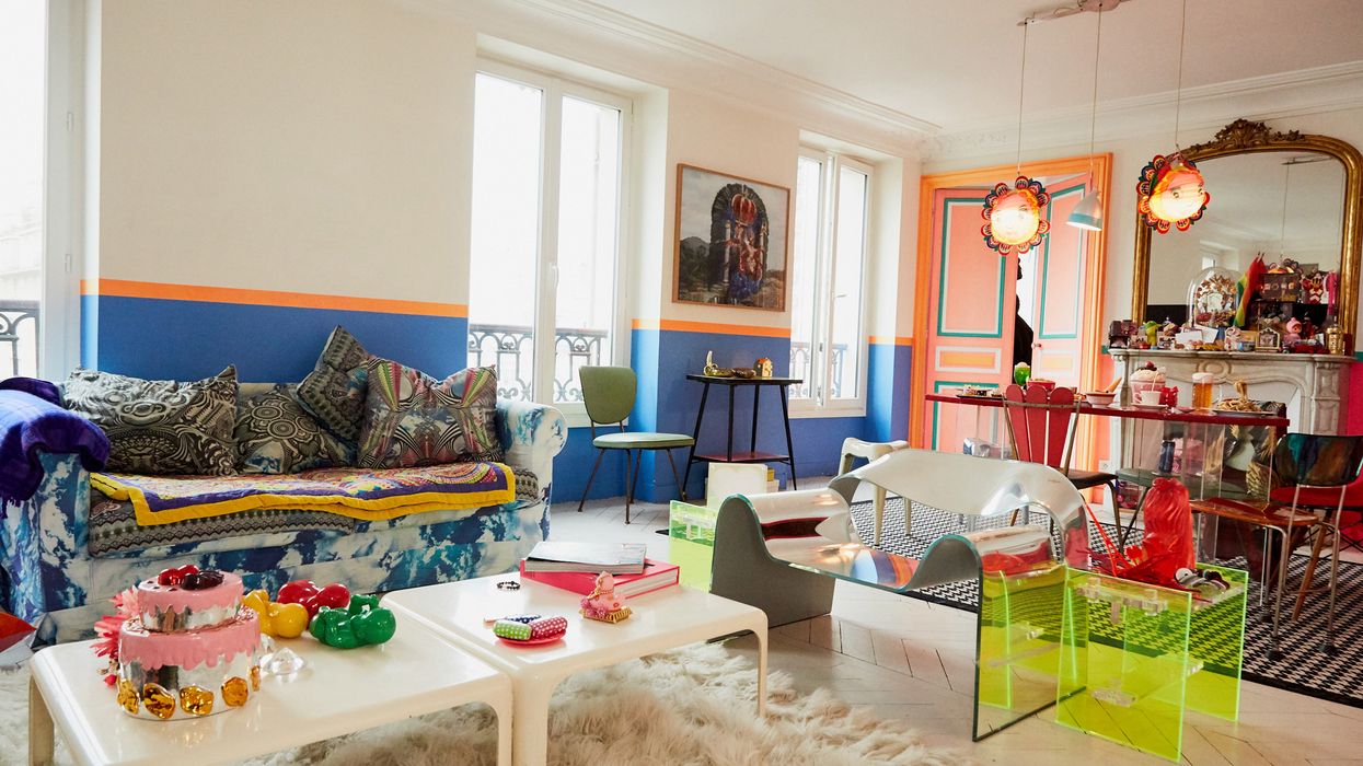
Tips for Bringing More Color Into Your Home, Straight from Interior Designers

15 high-risk high-reward paint hues
Incorporate Color Drenching Into Your Home Design

Take a Leap into Bold Color with These Decorating Ideas

10 Ways To Decorate With The World’s Favorite Color
How To Incorporate The Latest Color Trends in Your Home

15 Paint Colors That Will Make Your Home Feel Warm and Cozy

3 Things To Consider When Painting With Bold Colors
Tips for adding the hottest paint colors to your decor

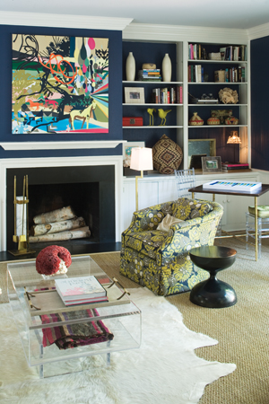
COLOR! How to Add to Your Home
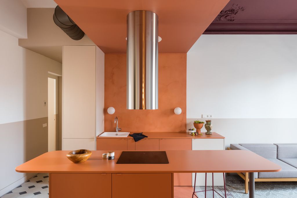
9 Color Blocking Ideas for a Bright, Cheery Home

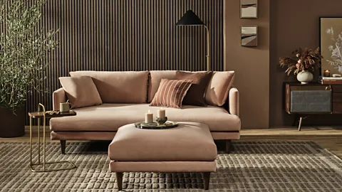
'Mocha mousse' to plum: The nine paint colours that can transform your home
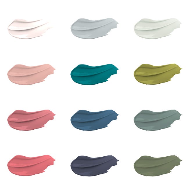
30 on-trend paint colours for every room in your home

The Brighter, the Better—These Vibrant Paints Will Infuse Your Home With Positivity

Beige, Begone: Bring Your Walls to Life With These 14 Beautifully Bold Colors

What is the Best Color for Your Home?

The bold and the beautiful — how brave paint choices can bring your home to life