1/9
Tips for adding the hottest paint colors to your decor
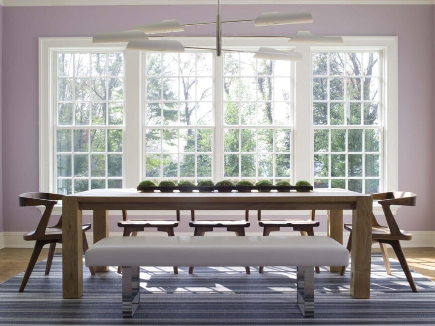
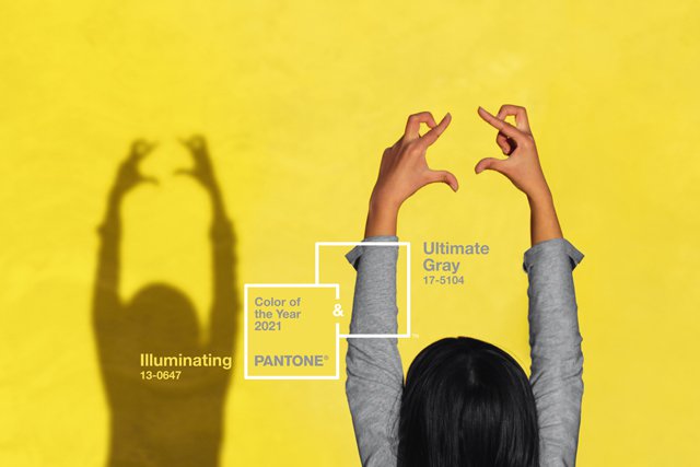
The article explores the trending paint colors for home decor, drawing insights from various paint companies and design experts. It highlights how these color predictions, especially the Pantone Color of the Year, influence style and trends within the design industry. While Pantone's 2018 pick, "Ultra Violet," a bold purple shade, garnered significant attention for its rebellious and spiritual connotations, other paint brands introduced a diverse palette.
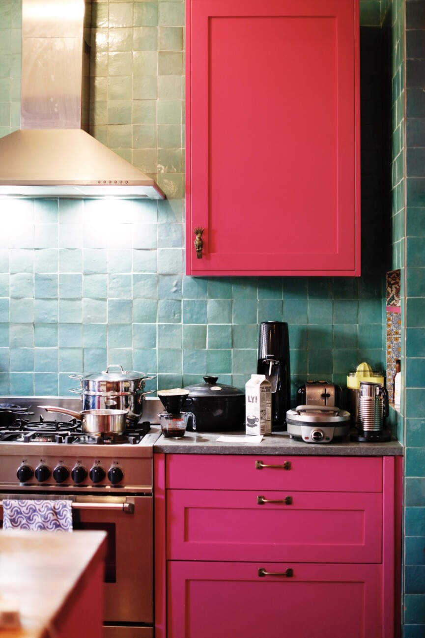
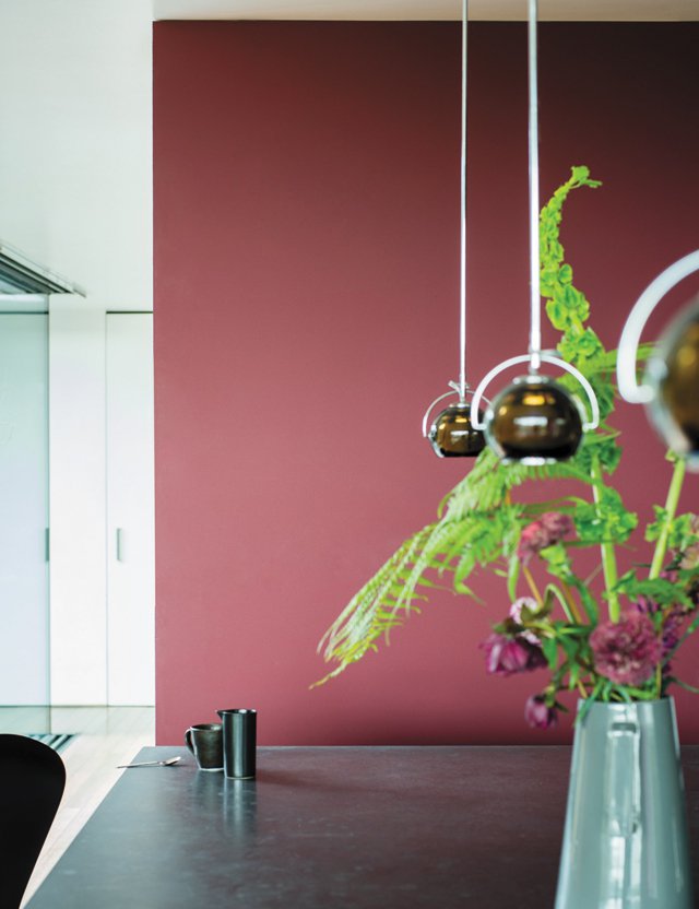
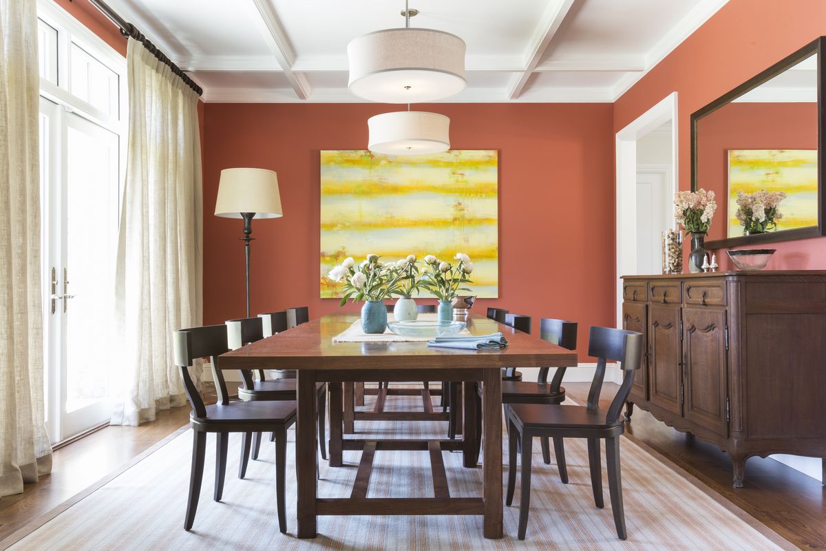
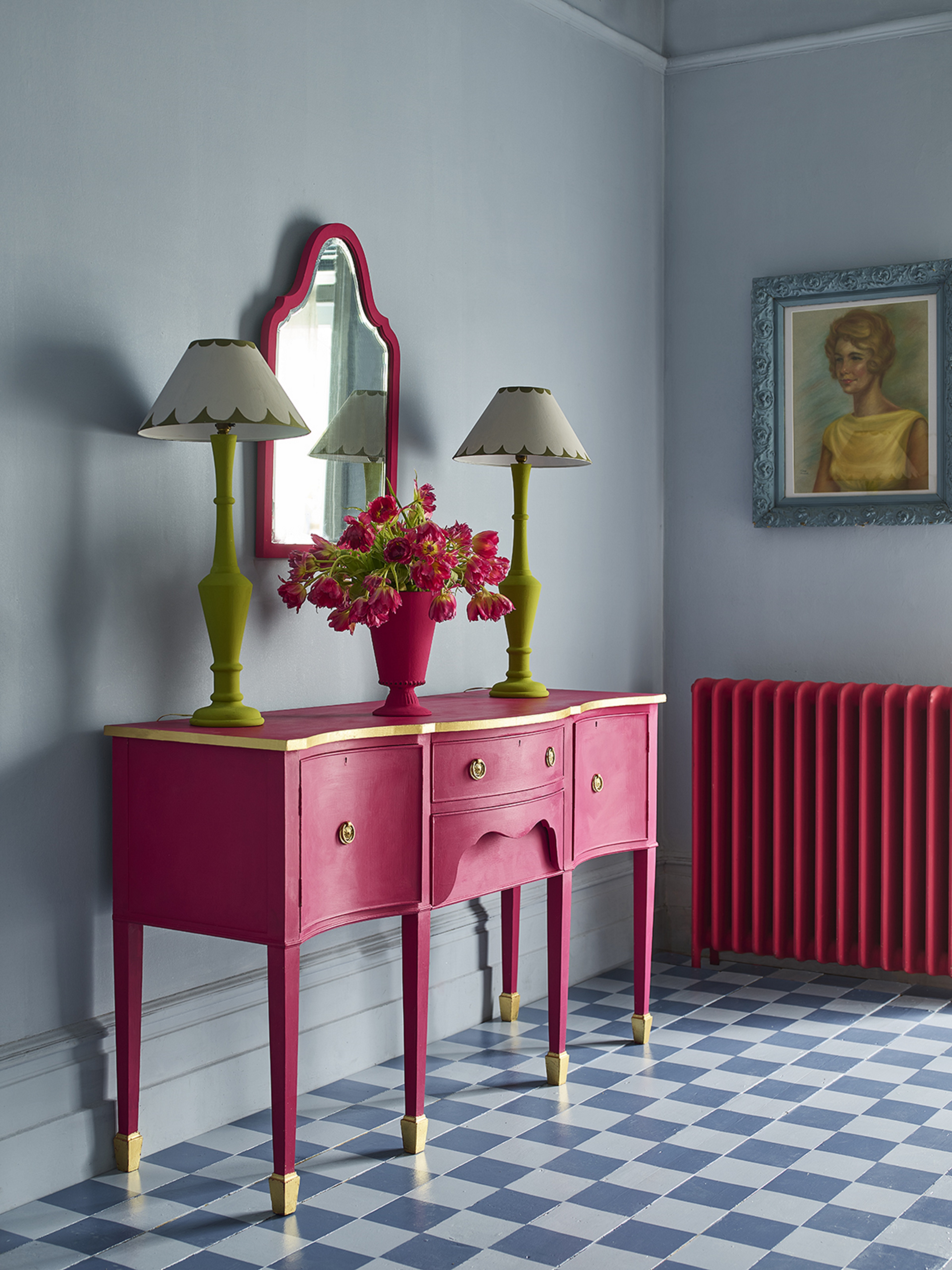
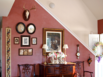
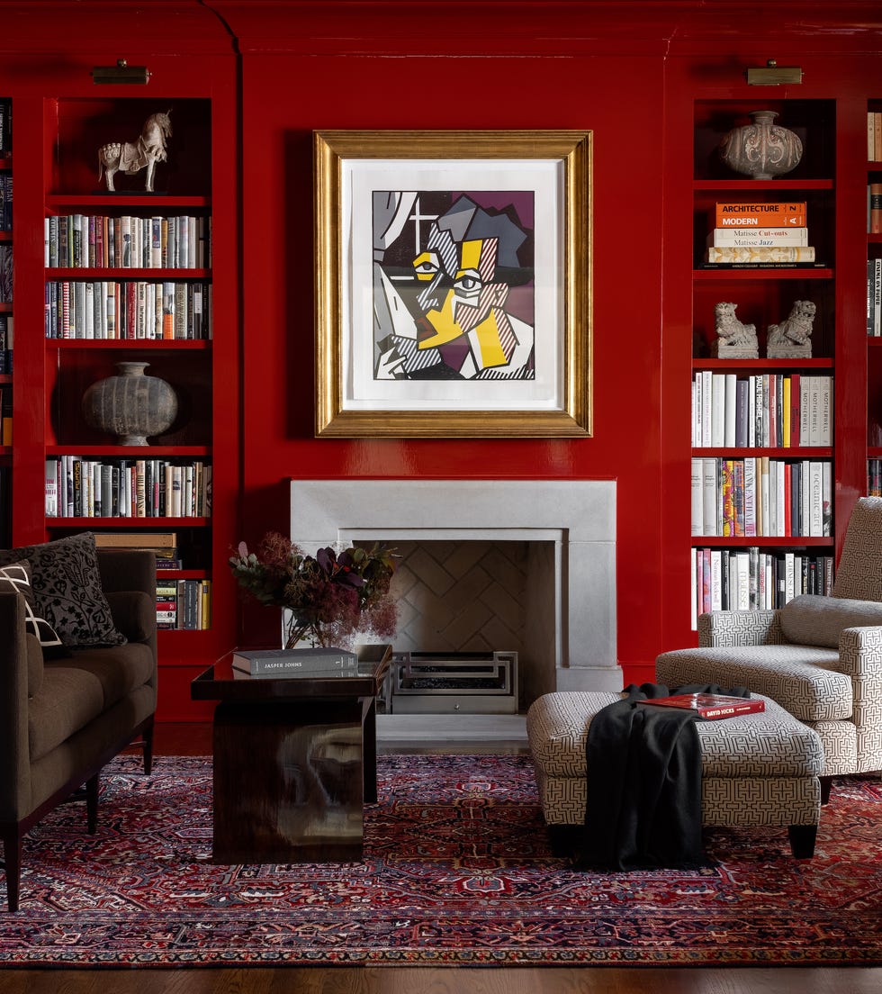
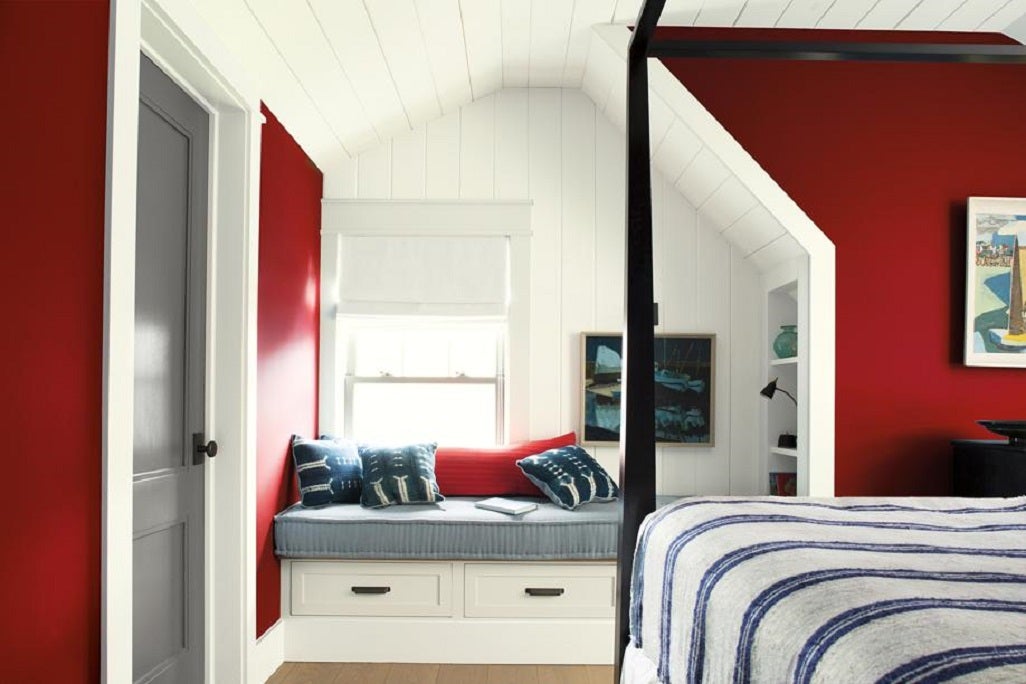
Benjamin Moore's selection, "Caliente," is presented as a strong, charismatic red with warm, brown undertones, ideal for interiors like a study. The decision to highlight red was influenced by political, artistic, and fashion trends, signaling change, strength, and confidence. Despite its boldness, the company reported a notable increase in color chip requests, indicating consumer interest in embracing this energetic hue. For those hesitant to commit to a full red room, a small accent like a red door is suggested as a starting point.
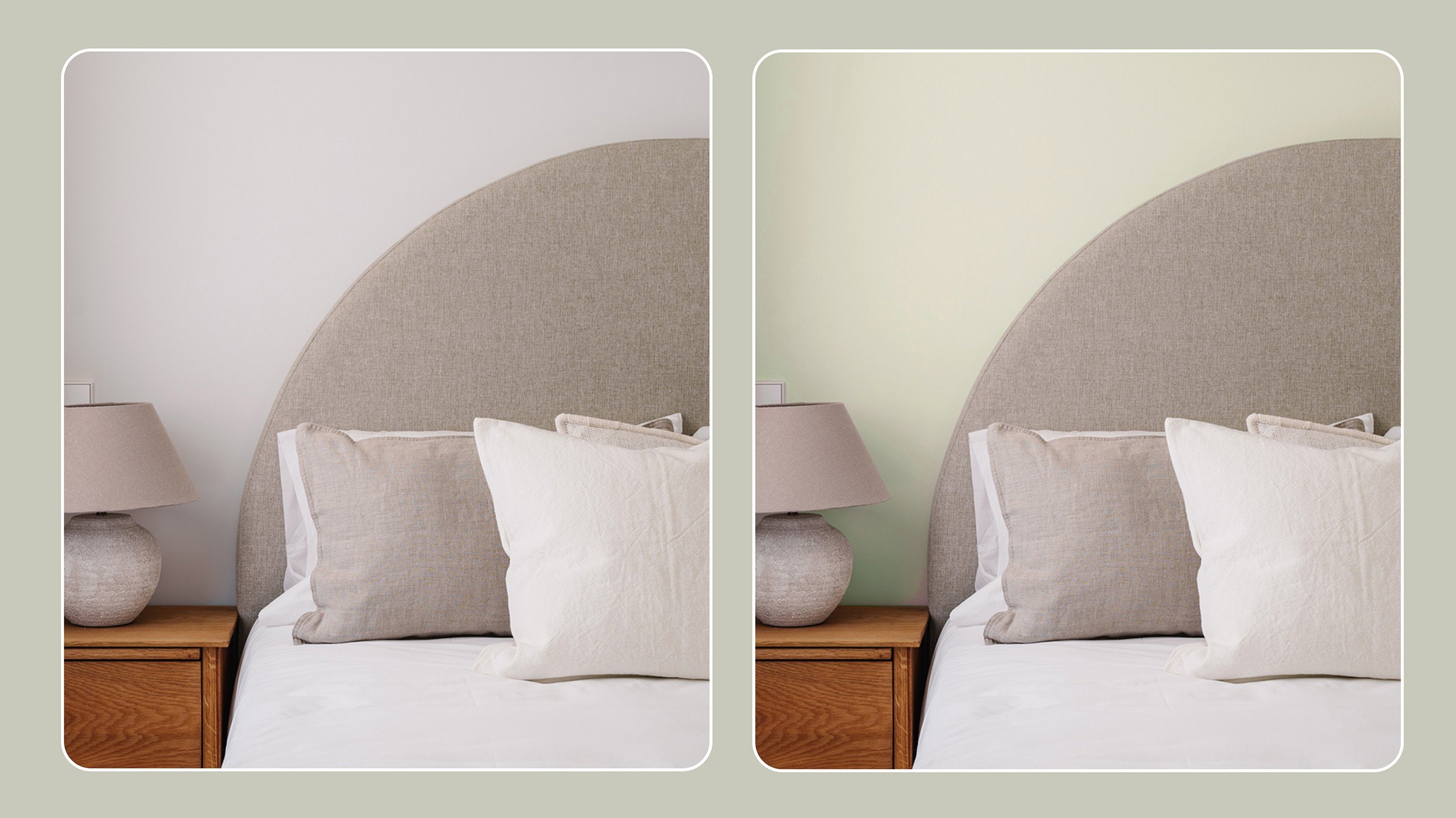
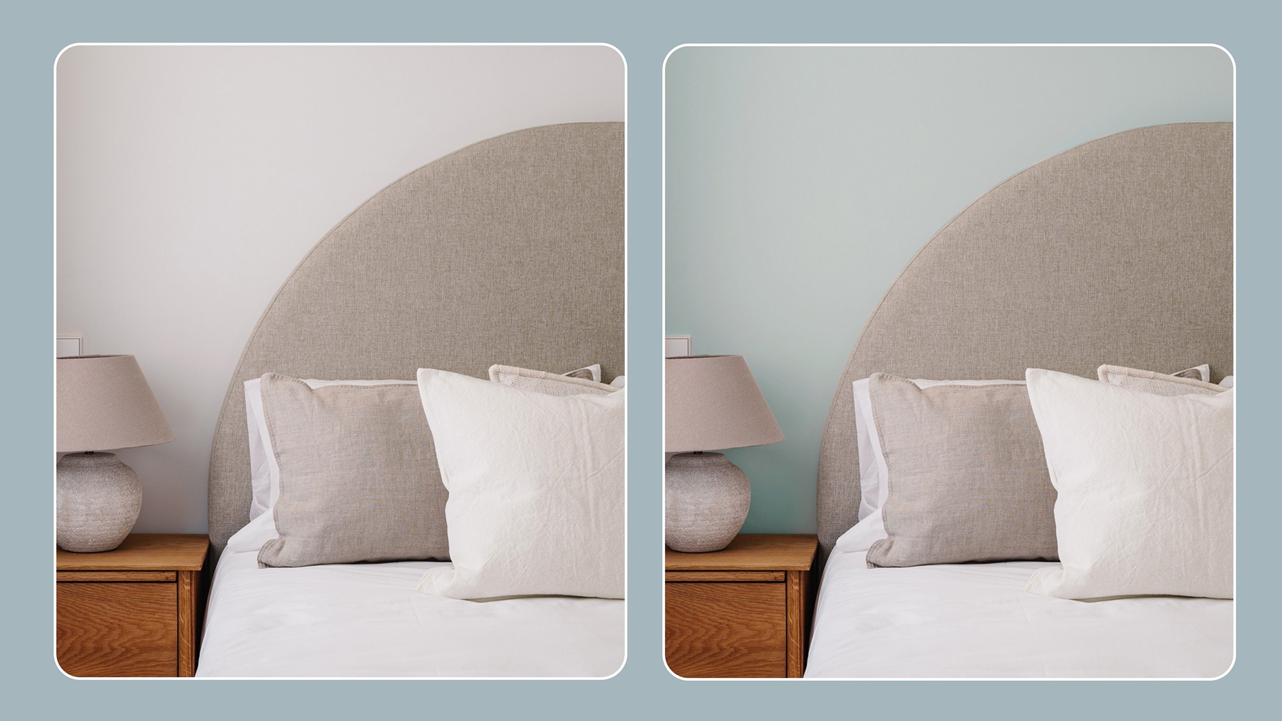
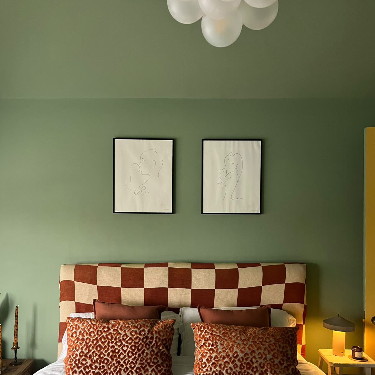
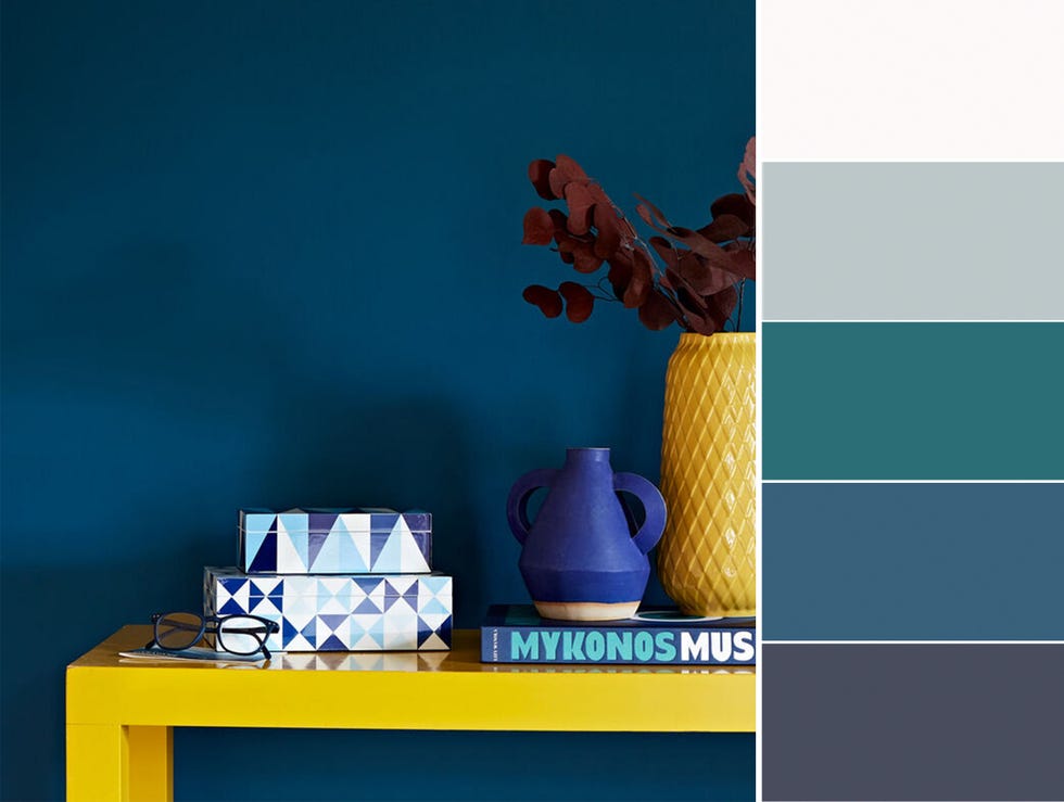
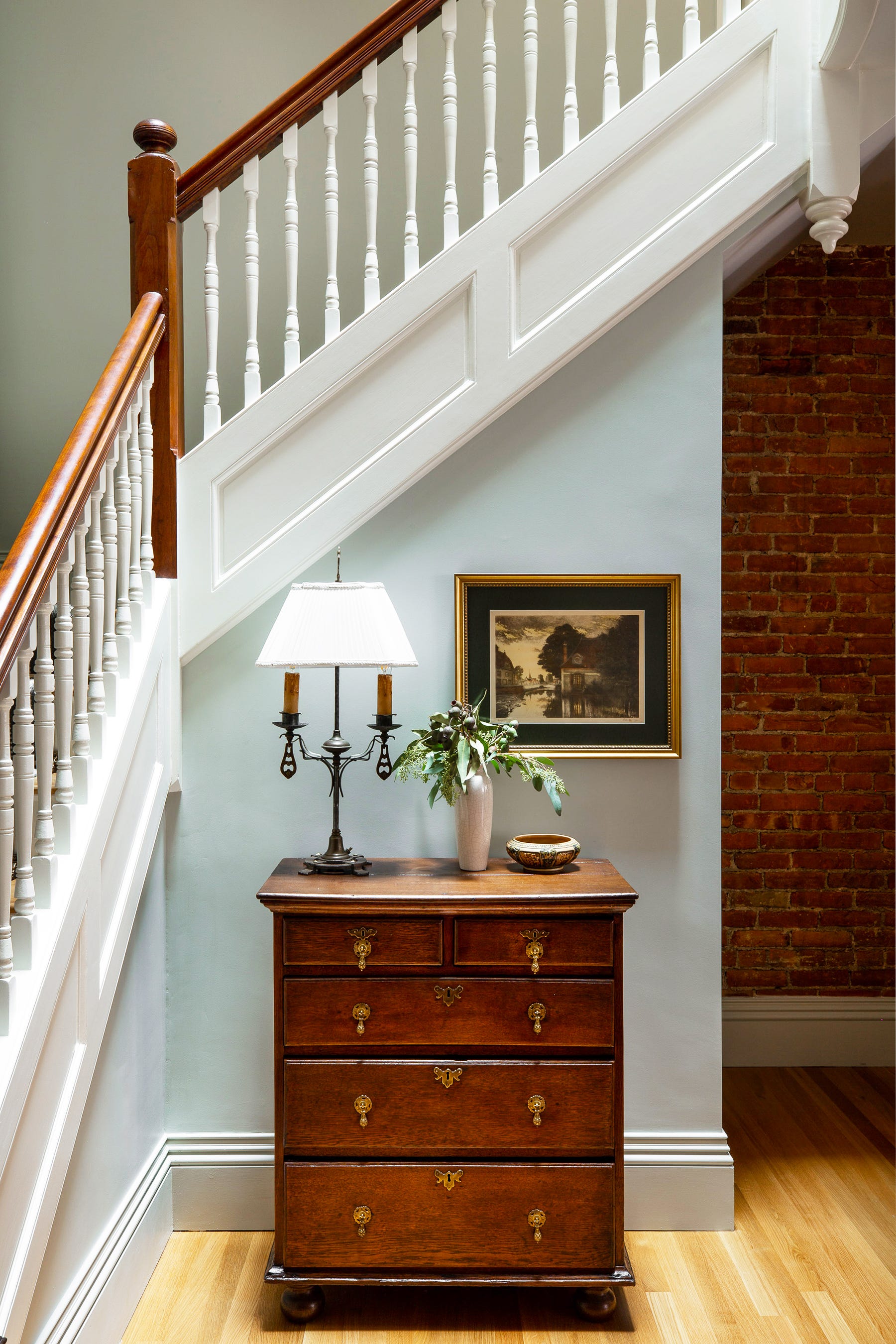
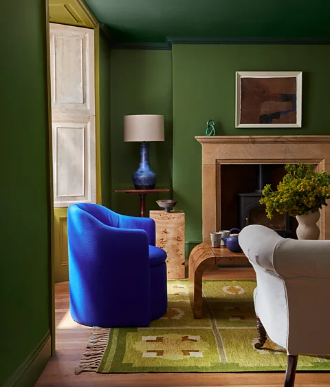
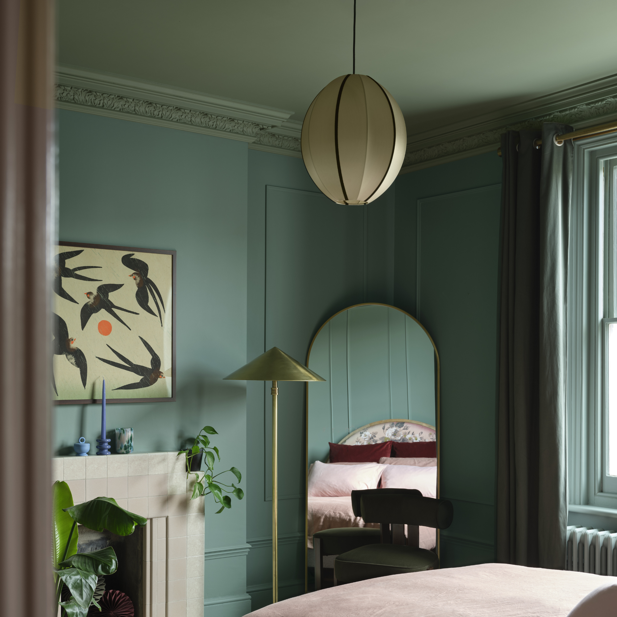
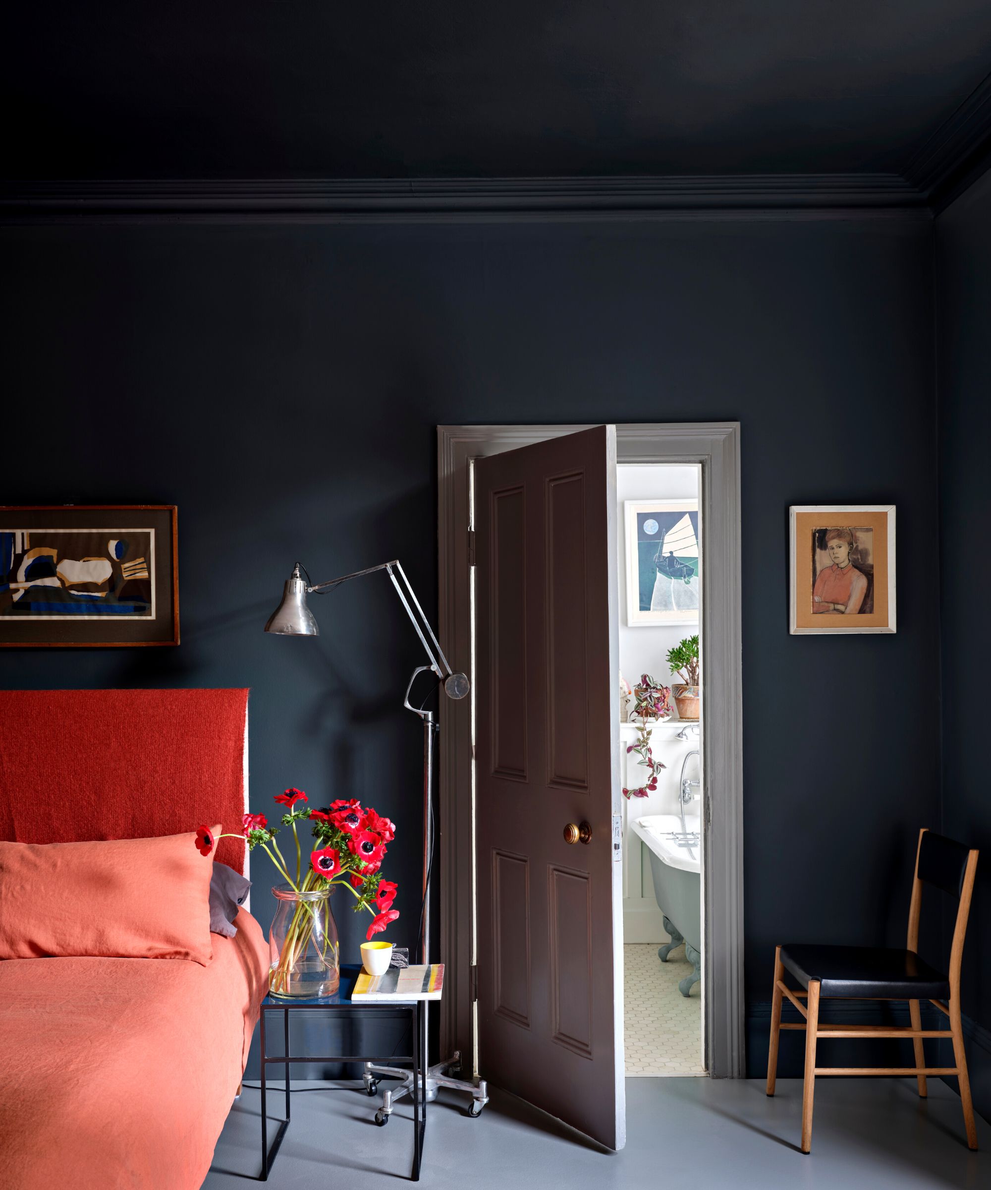
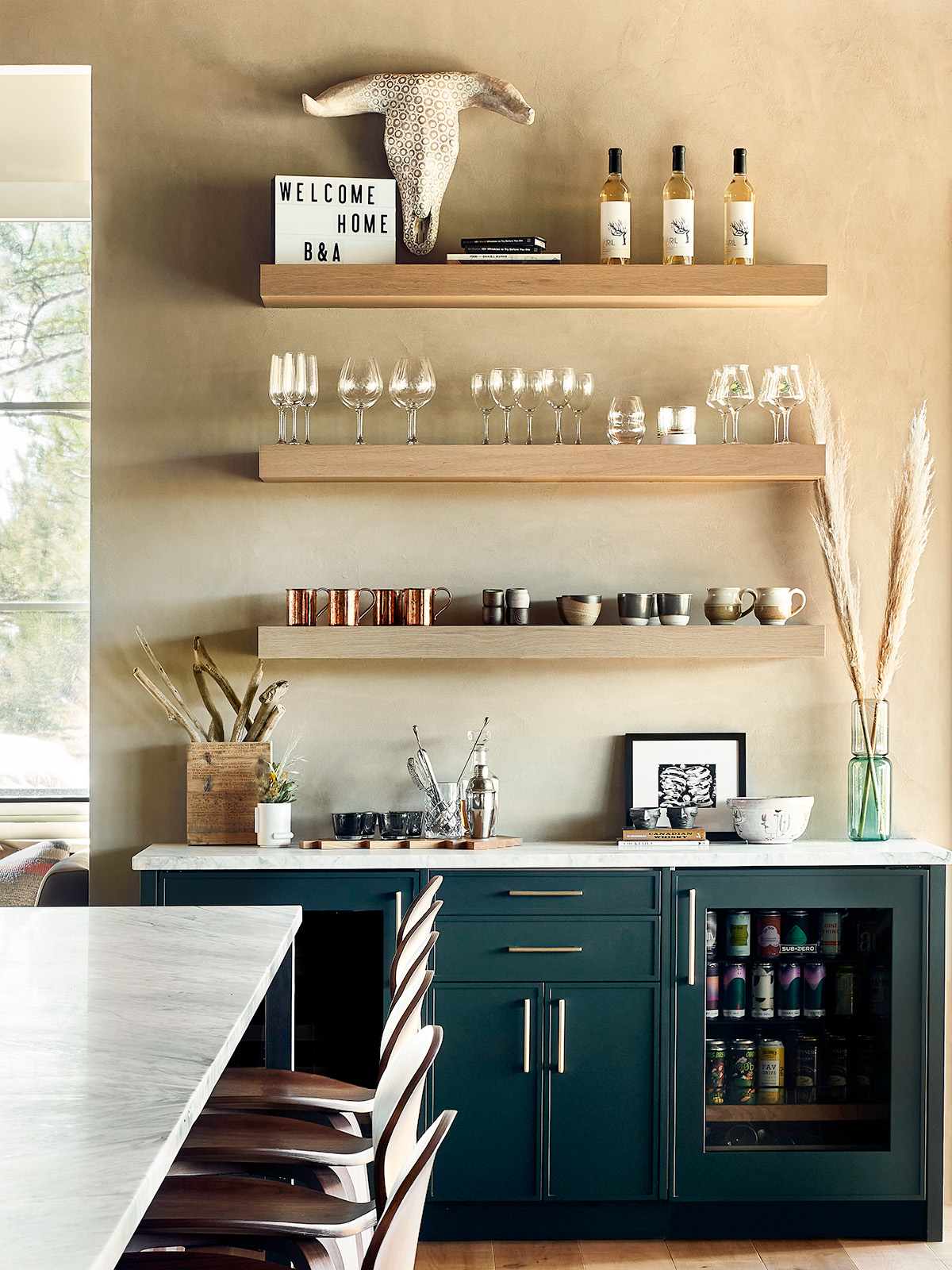
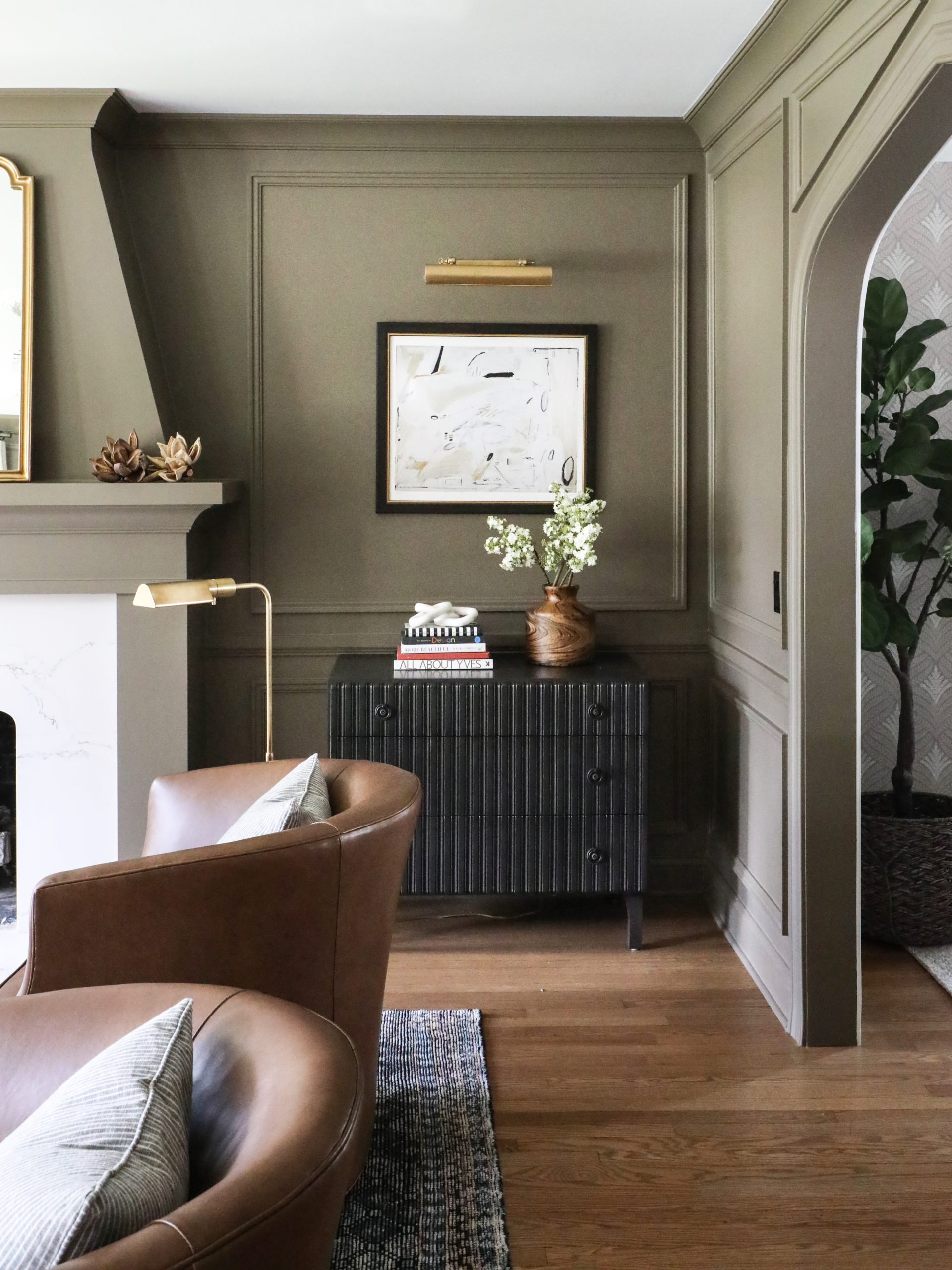
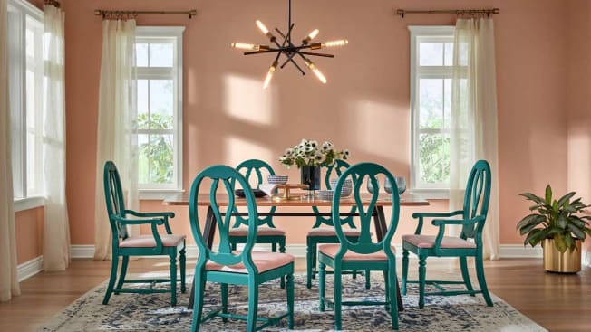
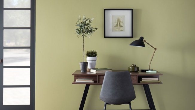
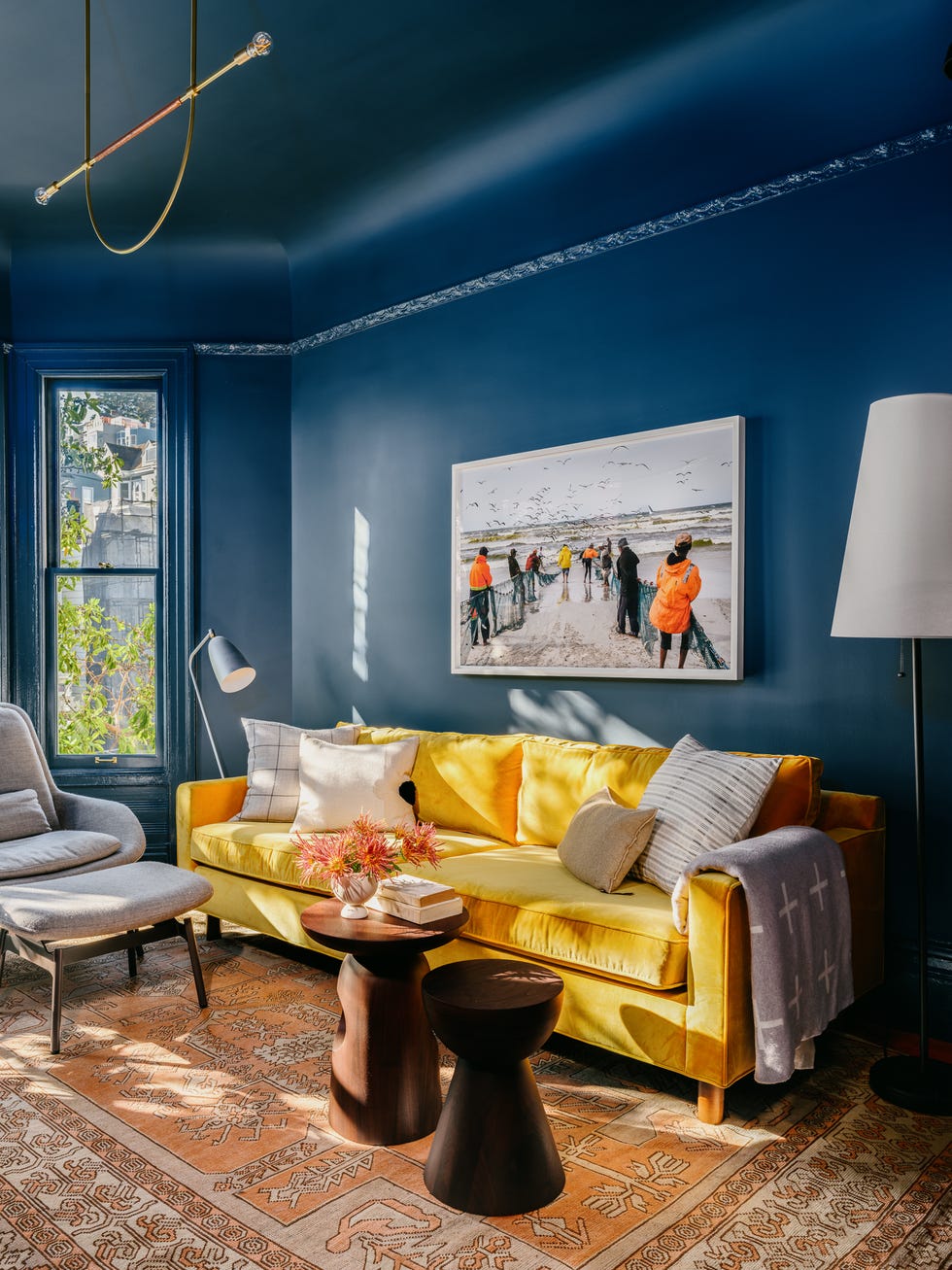
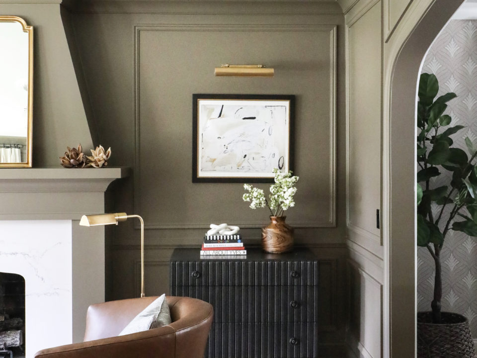
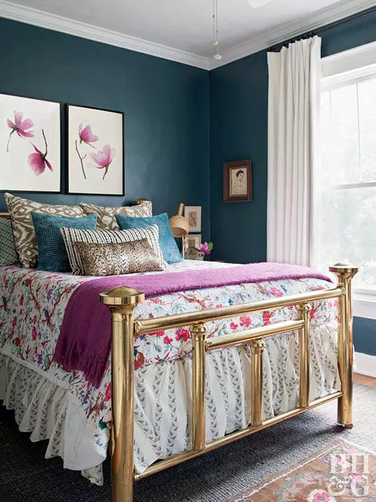
Green and blue shades are also prominent, with Sherwin-Williams's "Oceanside" being a lush teal inspired by themes of wanderlust and daring destinations. This complex color, versatile for furniture or walls, is described as having both female and male qualities, and can be used as a 'peekaboo color' visible from adjacent rooms. Dunn-Edwards Paints introduced a similar hue, "The Green Hour," a dark gray-blue-green inspired by Parisian bars. This shade is characterized by its moody yet tranquil dual personality, making it suitable as a grounding neutral. It pairs well with other deep colors or can be applied to front doors and window trims for an accent. High-end brand Farrow & Ball's "Green Smoke," a rich green-blue, is also noted for its weathered, soft appeal and versatility across modern and traditional settings. For a lighter touch, Behr's "In the Moment," a blue-green hue, offers restorative and soothing qualities, aiming to create a sense of sanctuary in living spaces.
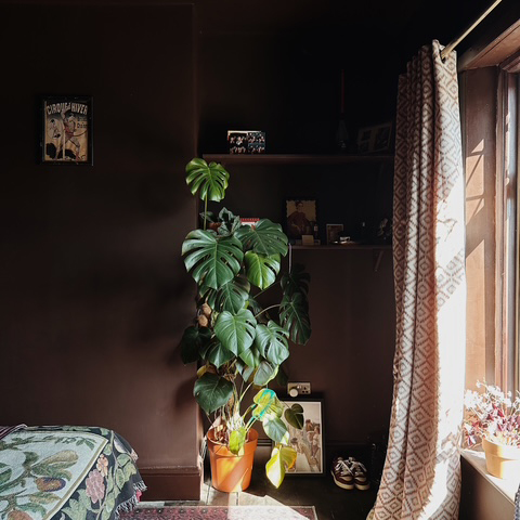
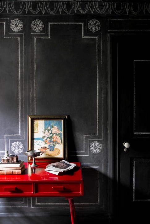
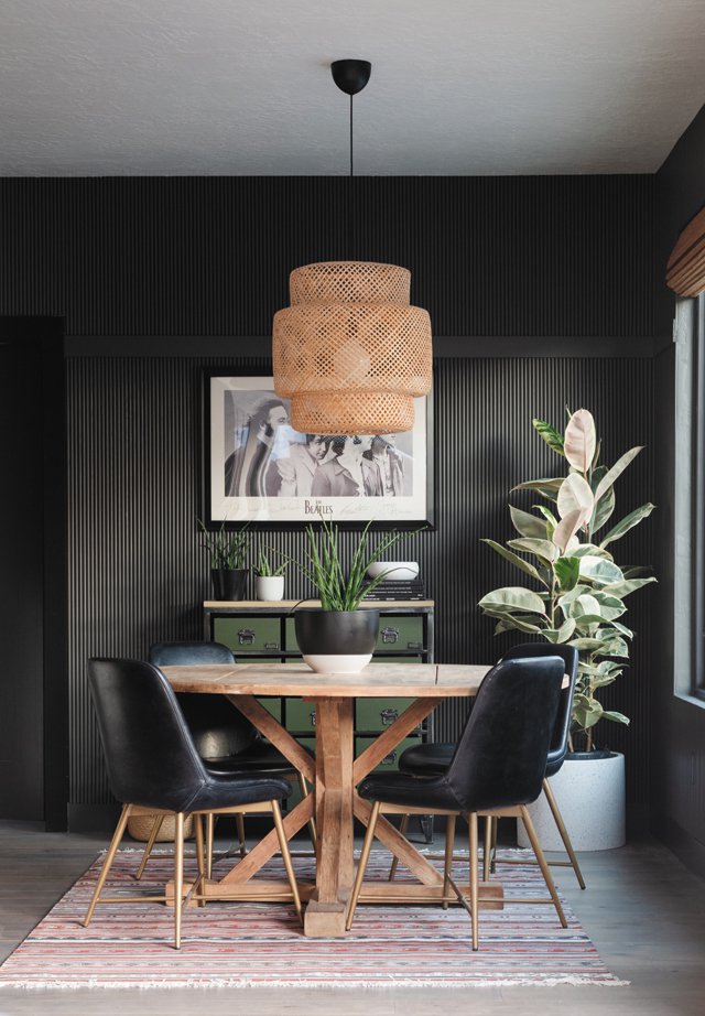
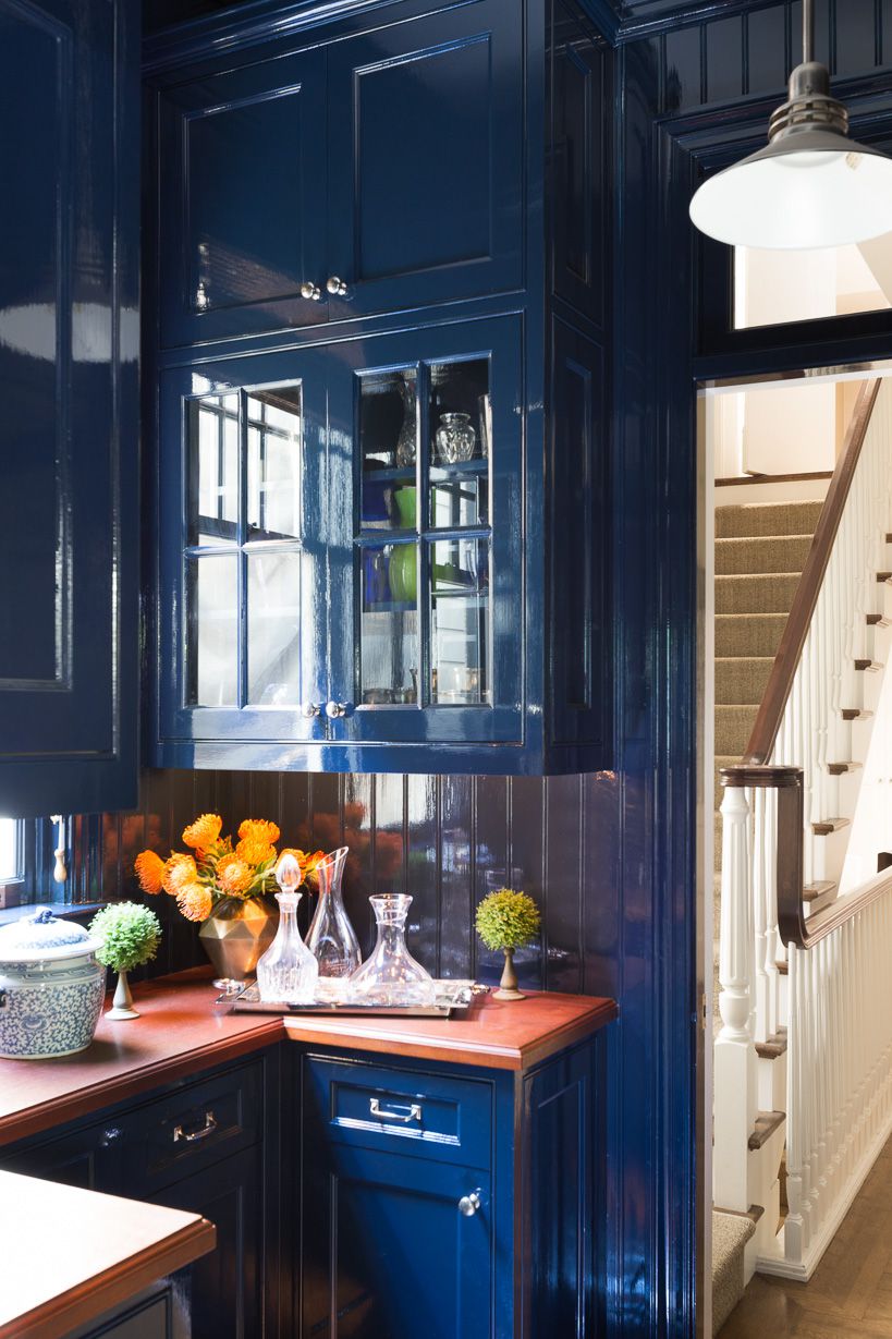
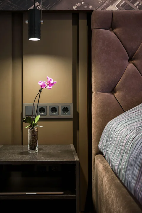
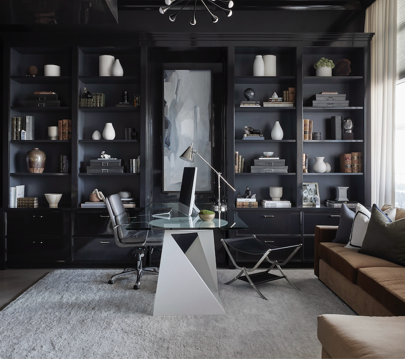
The article also discusses the rising popularity of black, with color expert Maria Killam declaring "Black is the new gray." PPG's trio of brands—Glidden, Olympic, and PPG—each spotlighted variations of black, such as "Black Flame," "Deep Onyx," and "Black Magic," as their Colors of the Year. Designers suggest using black for dramatic effect in interiors, especially in high gloss on walls, as trim, or for kitchen cabinets when contrasted with white. This trend indicates a shift towards powerful and glamorous design choices.
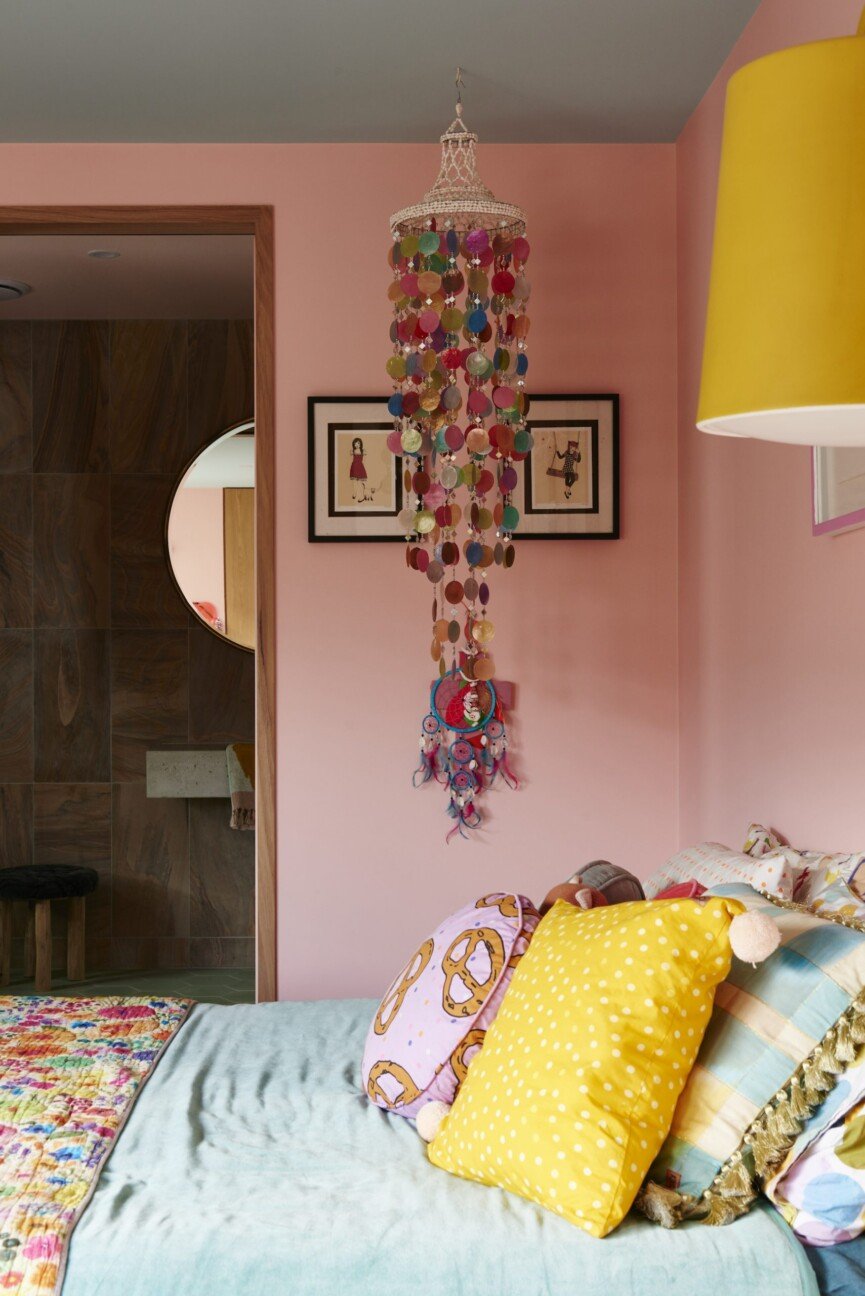
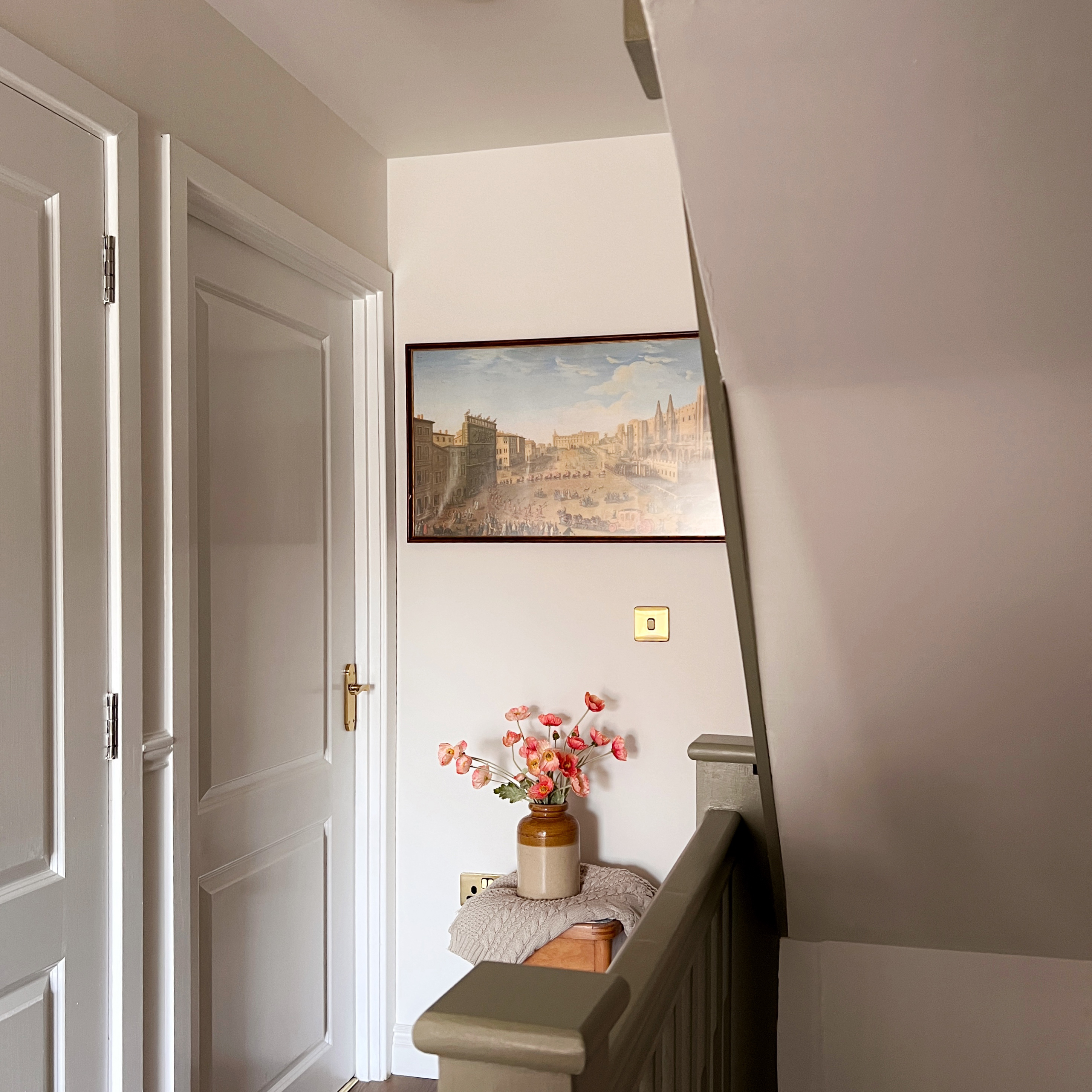
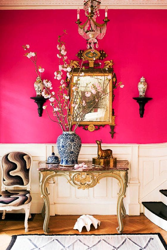
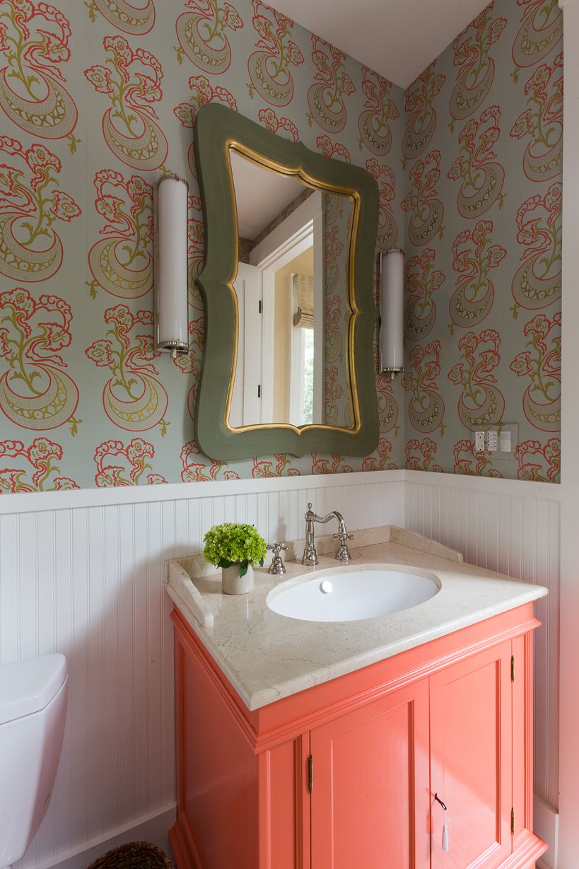
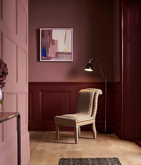
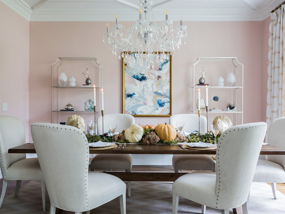
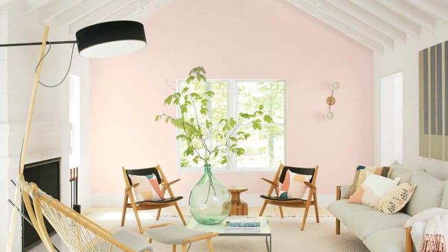
Finally, "Millennial pink" is recognized as an "unsung hero" color trend, not officially endorsed by any single brand but widely observed. This soft, cotton candy-like pink, often leaning towards peach or beige, has gained popularity across decor, fashion, and even hair colors. Its widespread acceptance across genders and its versatility as a contemporary neutral contribute to its solid staying power. Designers note its ability to blend with many other colors and its flattering effect in various applications, including wall paint and even ceilings, where it can create a warm and unexpected atmosphere. The article concludes by emphasizing the dynamic nature of color trends, suggesting that preferences can shift rapidly.
#PaintColors #HomeDecorTrends #ColorOfTheYear #InteriorDesign #Pantone #BenjaminMoore #SherwinWilliams #DunnEdwardsPaints #Behr #PaintColors #HomeDecorTrends #ColorOfTheYear #InteriorDesign #Pantone #BenjaminMoore #SherwinWilliams #DunnEdwardsPaints #Behr
0 comment in total
 No comments yet
You may also like
Millennial Gray Is So Over—Here Are 5 Paint Colors to Try Right Now
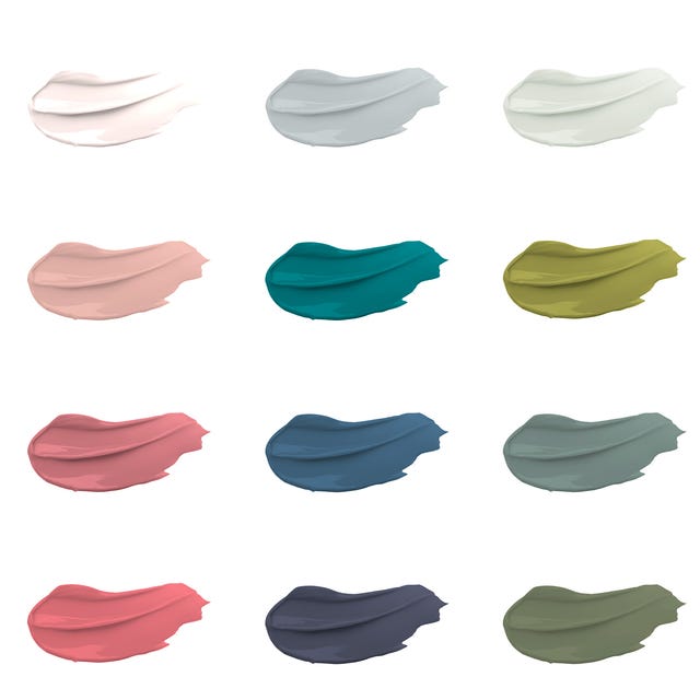
30 on-trend paint colours for every room in your home

'Mocha mousse' to plum: The nine paint colours that can transform your home
The 5 Most Overused Paint Colors and What to Try Instead, According to Designers

The Brighter, the Better—These Vibrant Paints Will Infuse Your Home With Positivity

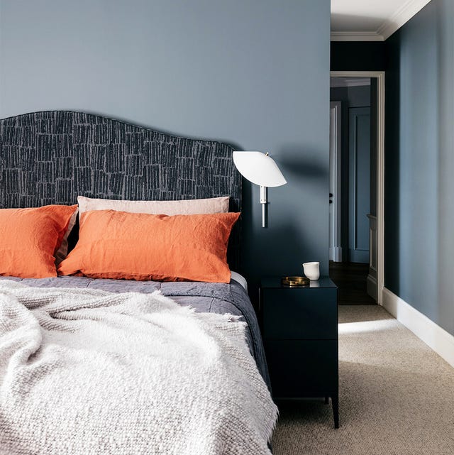
35 Paint Colors to Consider for Every Room in Your House
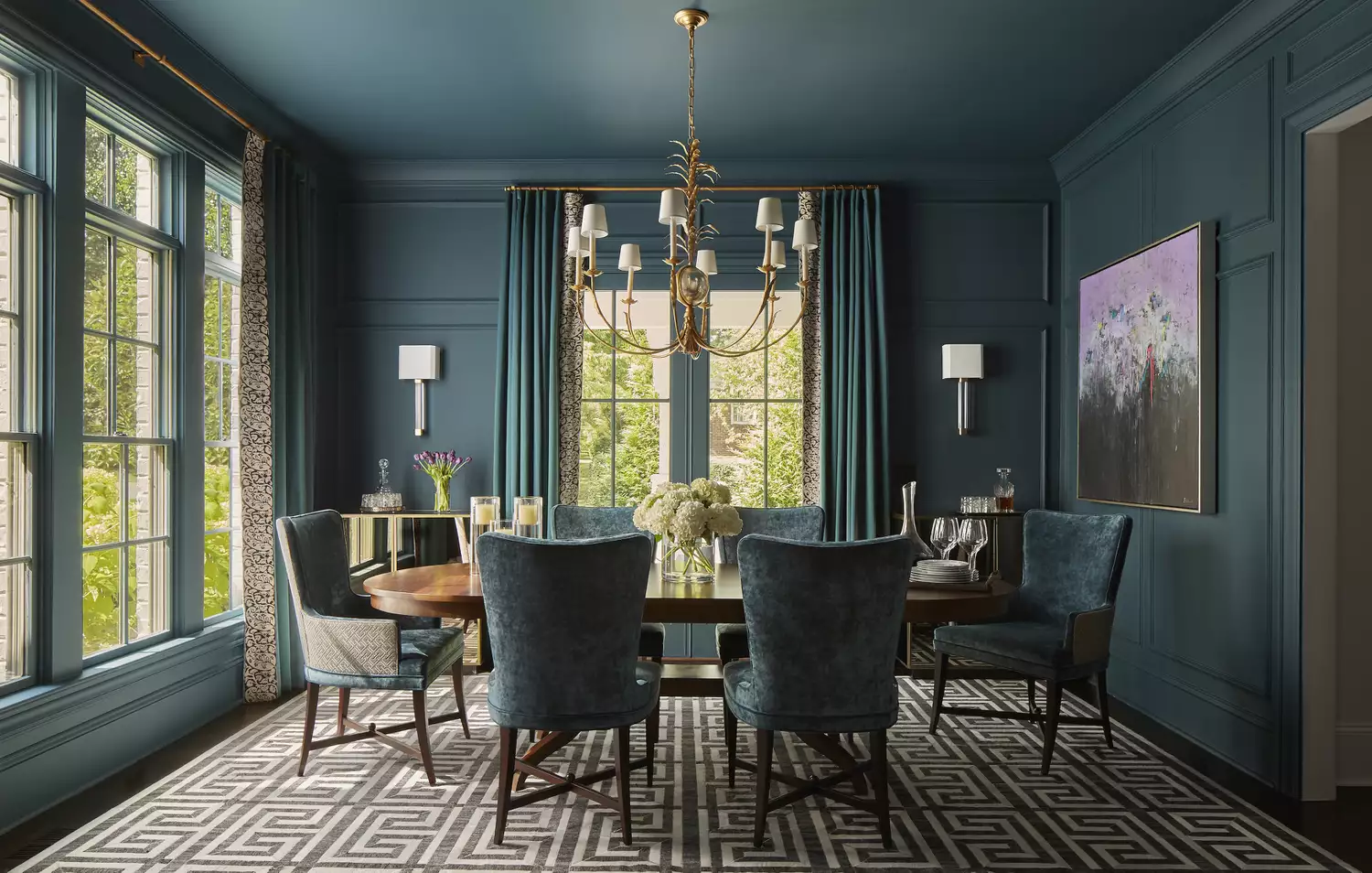
10 Color Drenching Ideas That Highlight the Beauty of This Paint Trend
Update your home with these paint tips!


6 key colors to decorate with in May 2025, according to interior design and color experts in the know

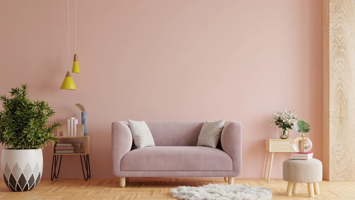
8 Timeless Paint Colors That Always Look Fresh, No Matter the Season

'Colour capping' is the new paint trick design experts are using to make a room feel bigger – how to make it work in your home
Hottest Interior Paint Colors of 2020
Real Simple Home Designers Share Their Secrets for Picking the Perfect Wall Color
2021’s Palette of Possibilities
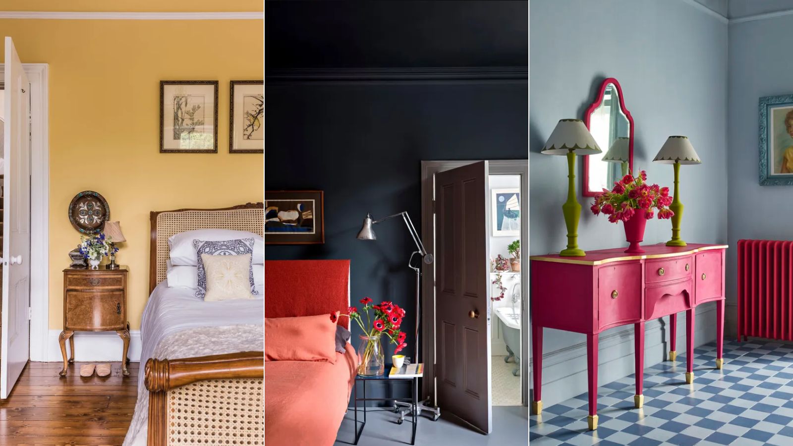
3 'small but impactful' paint updates to try in 2024, according to a color expert
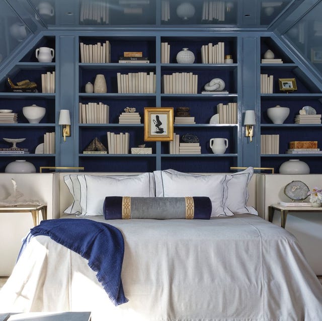
The Color Drenching Paint Trend Isn't Going Anywhere
Is colour drenching really a radical new way to decorate, or is it just lazy decorating?
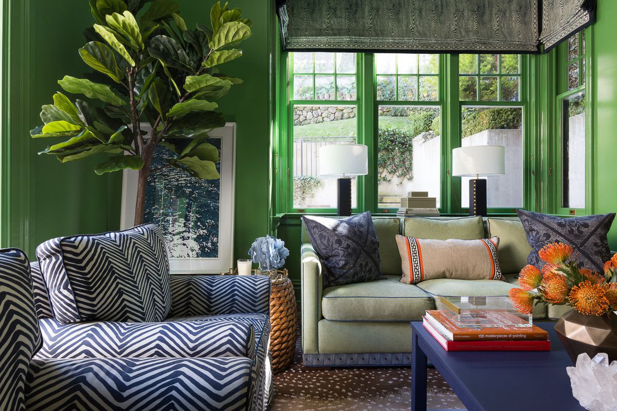
15 high-risk high-reward paint hues
How to Pick the Best Paint Colors for Every Space in Your Home
Take a Leap into Bold Color with These Decorating Ideas