1/11
How to Pick the Best Paint Colors for Every Space in Your Home
The article provides guidance on selecting appropriate paint colors for various rooms in a home, drawing on insights from designers Devon Tobin and Beth Armijo, and color consultant Michelle Marceny. The central theme revolves around overcoming the fear of using color in home interiors and leveraging it to create desired moods and aesthetics. Designers emphasize that humans naturally appreciate color, and any apprehension often stems from a fear of incorrect implementation. The article highlights that an effective color palette can evoke positive emotional and physical responses.
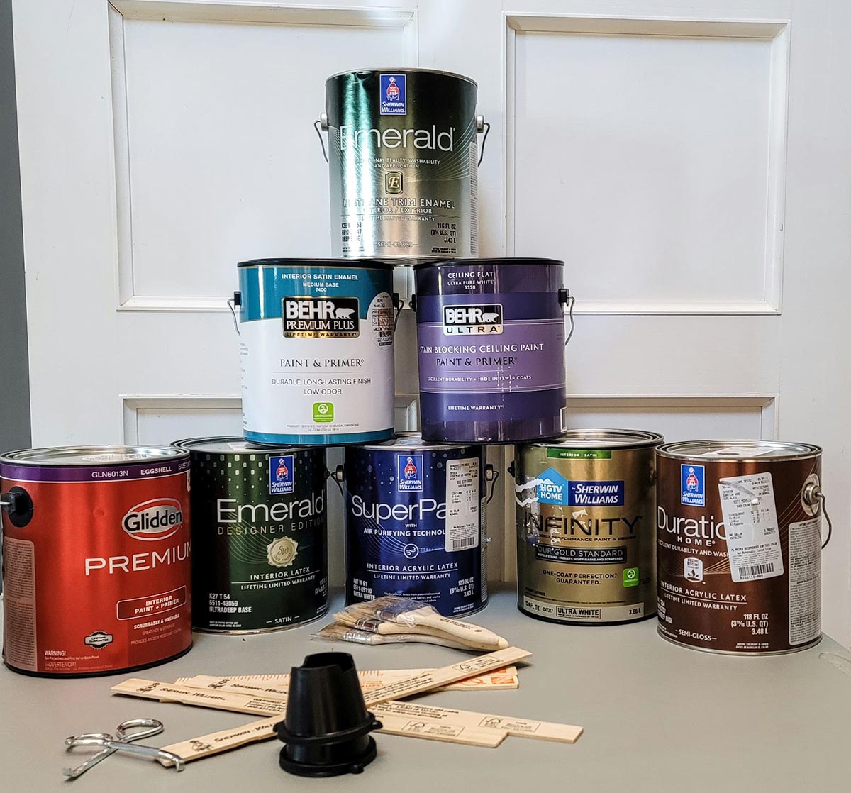
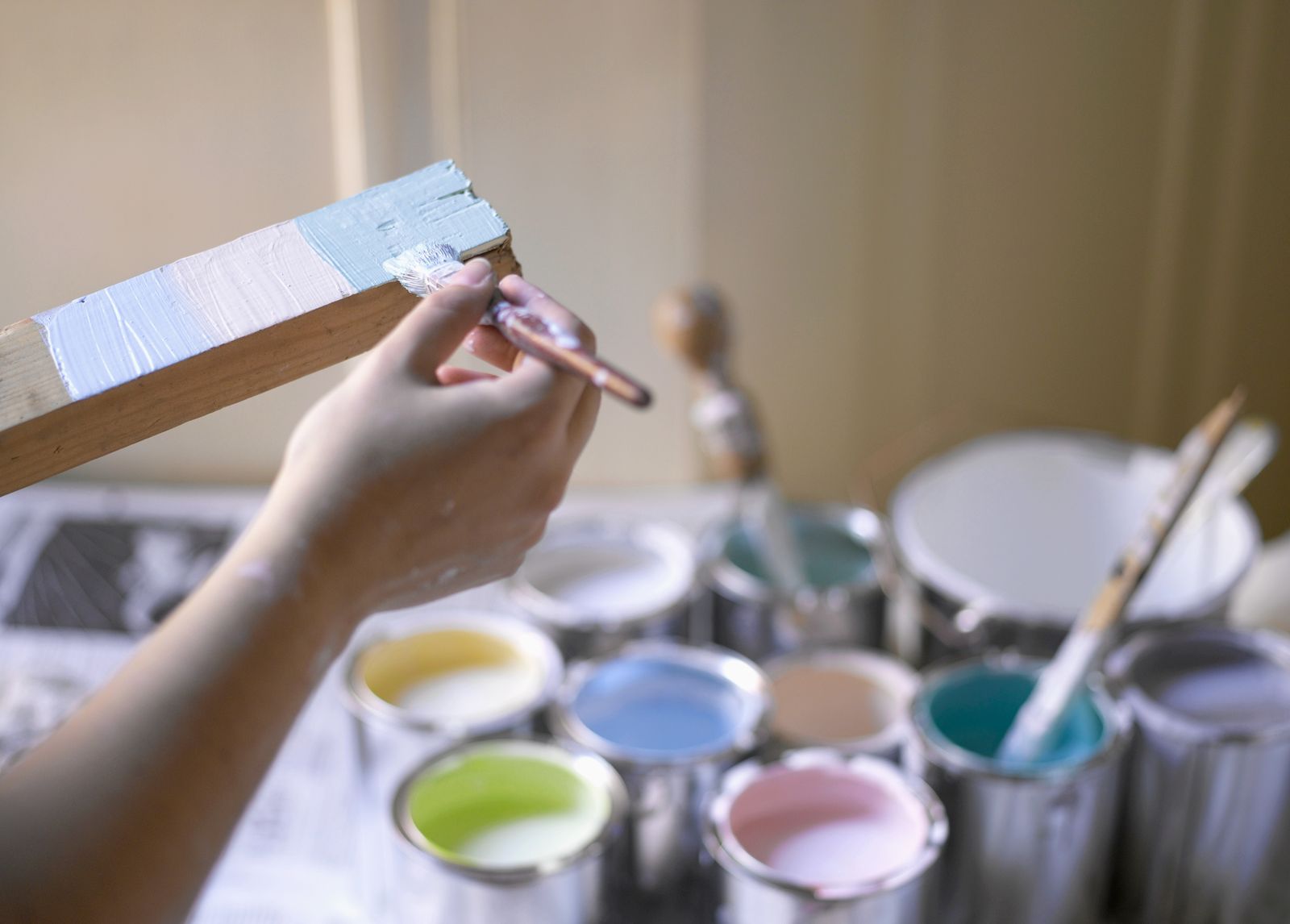
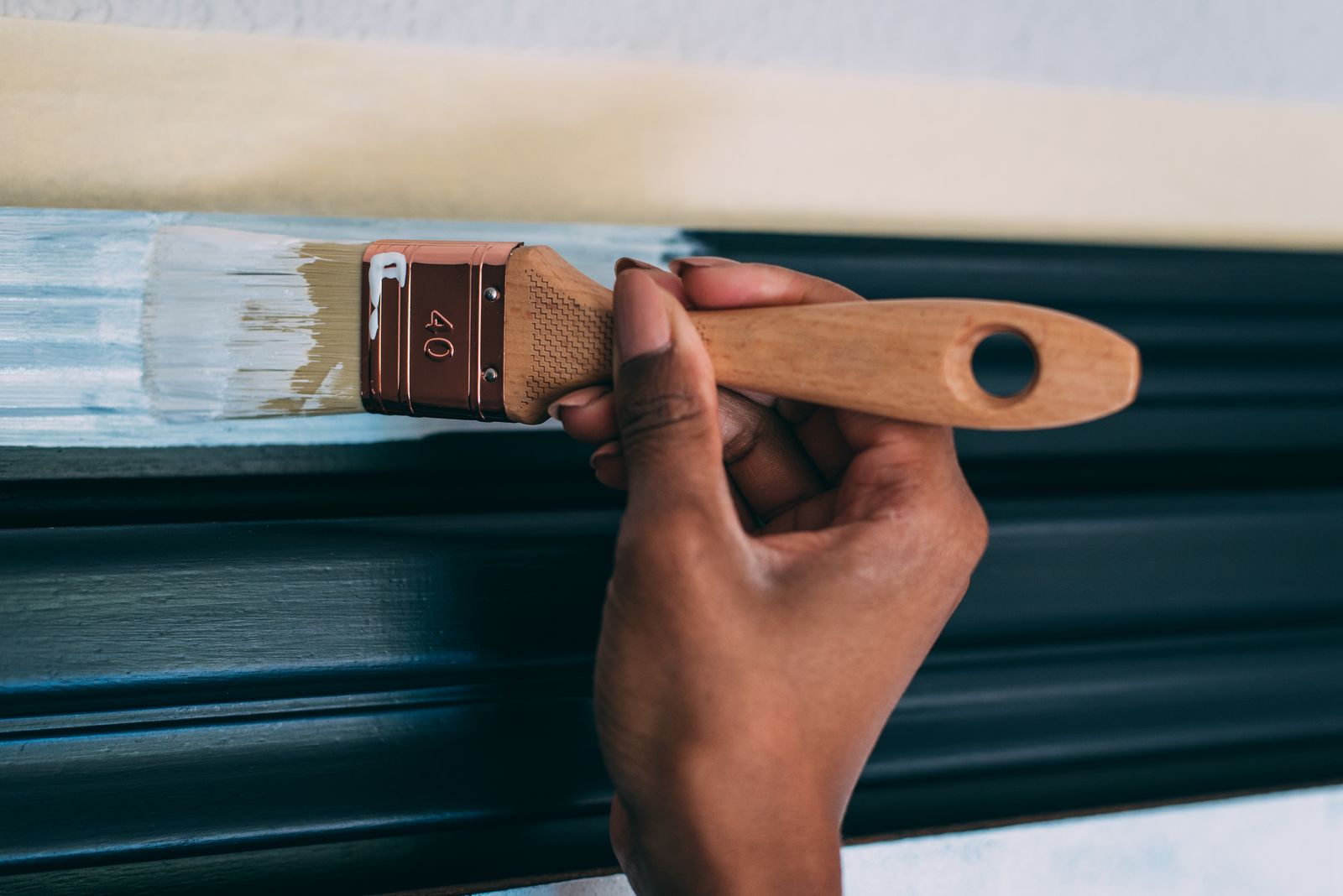
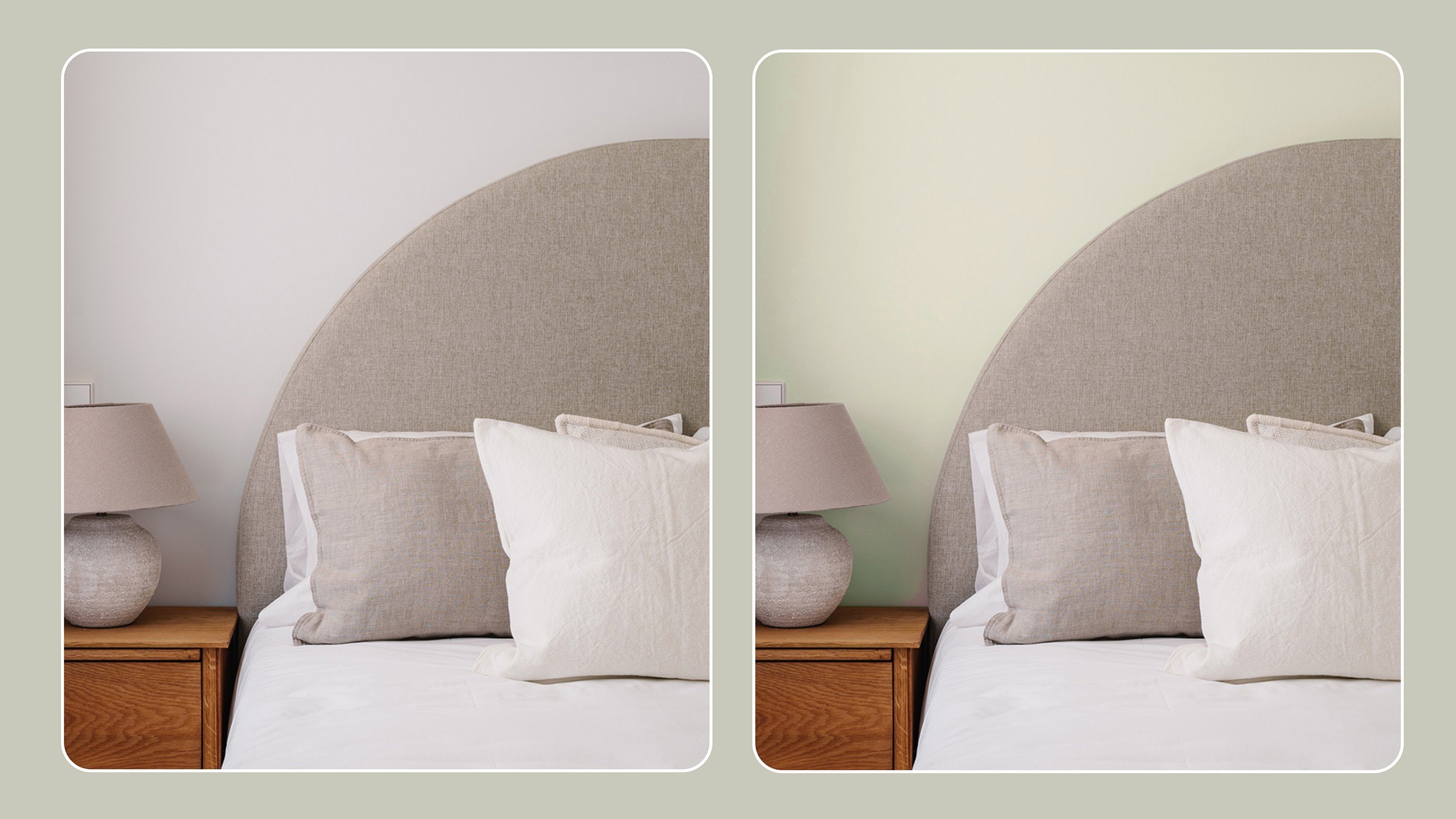
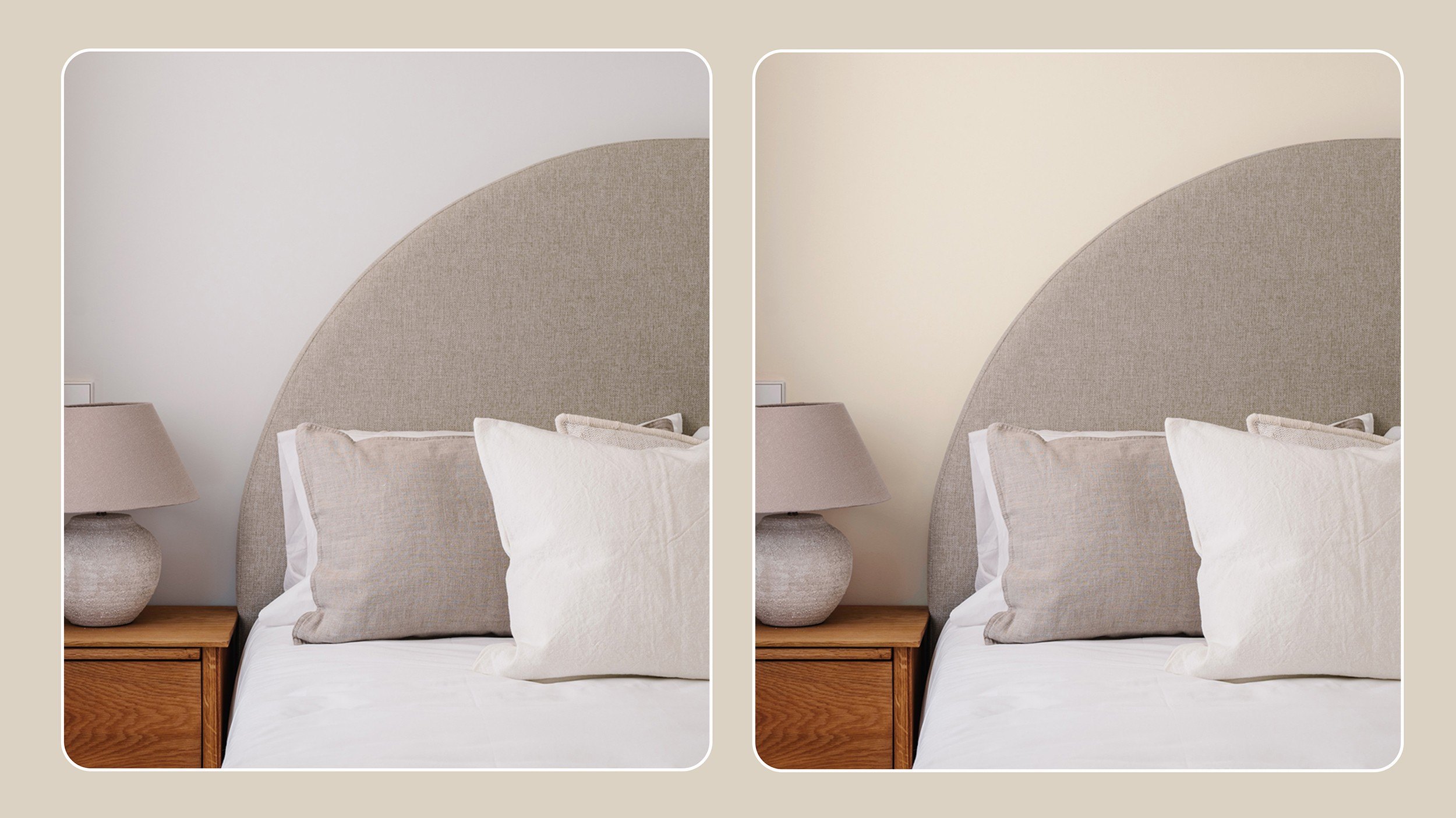
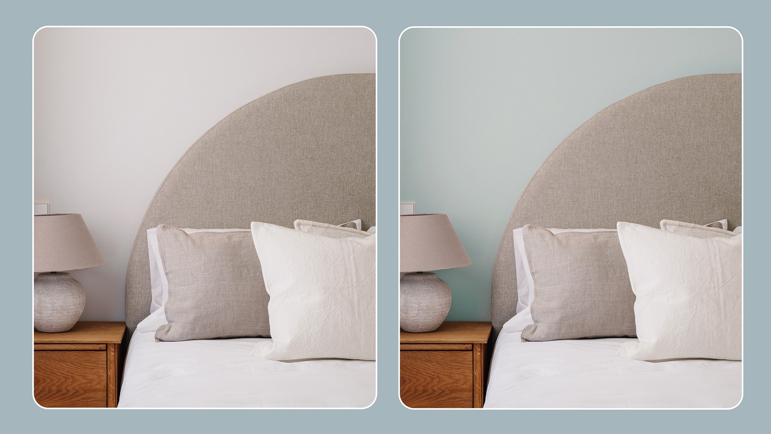
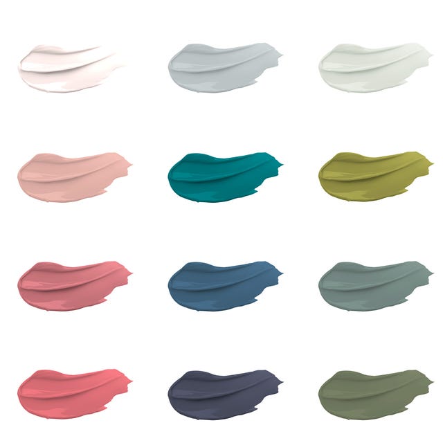
To navigate the vast selection of paint colors, the experts offer practical advice. They suggest starting by narrowing down choices, possibly by exploring manufacturers' historical collections, which offer curated and generally reliable color options. A critical step involves considering paint undertones, as colors can appear differently than initially perceived from swatches. Tobin advises obtaining samples that are both one shade lighter and one shade darker than the initial choice, as one of these alternatives often aligns better with the desired outcome. Extensive testing is recommended: painting large samples (at least 11x17 inches) on white poster boards and observing them in the actual room. This approach allows for an accurate assessment of how colors interact with the room's unique lighting conditions, which can vary significantly depending on window orientation (e.g., north-facing windows casting a blue tint).
The article also stresses the importance of living with samples for an extended period, observing how colors transform throughout the day as natural light changes and after dark. When determining personal color preferences, the experts suggest looking at one's wardrobe, as the colors people tend to wear often reflect colors they would be comfortable incorporating into their homes. The piece also acknowledges that color preferences evolve, noting that home palettes typically need updating every decade. This perspective encourages a more liberating approach to color, viewing it as a relatively small investment for significant satisfaction, even if preferences change over time.
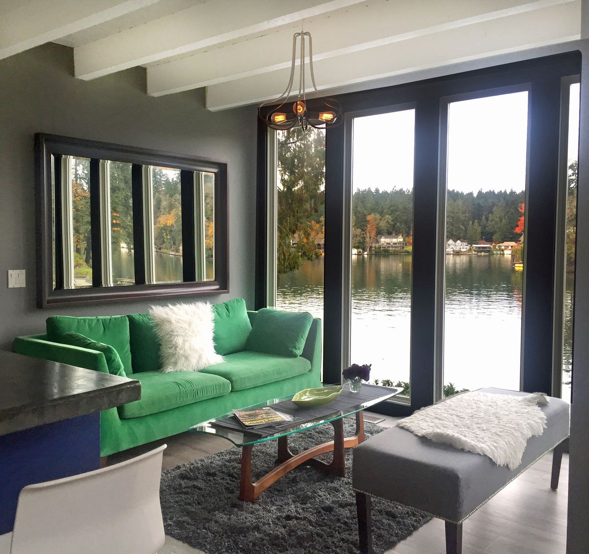
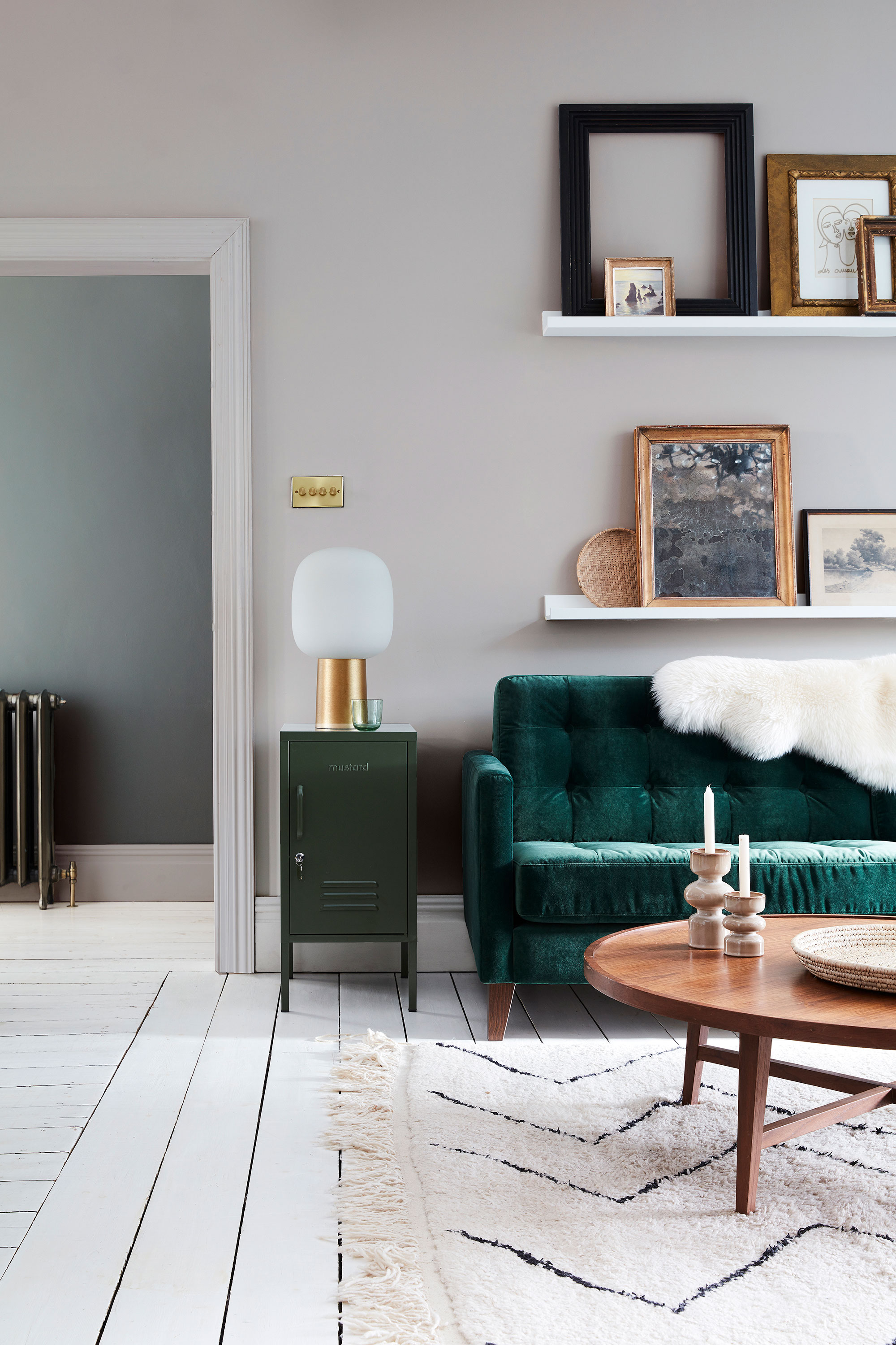
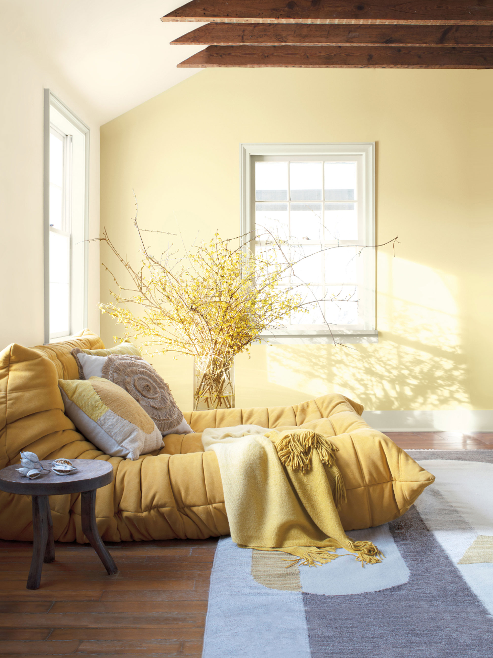
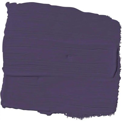
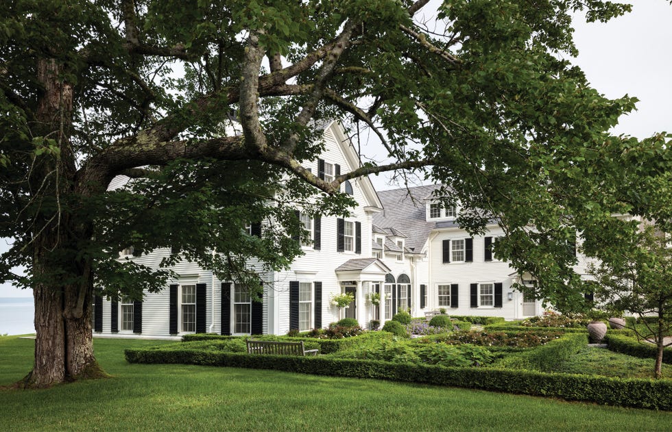
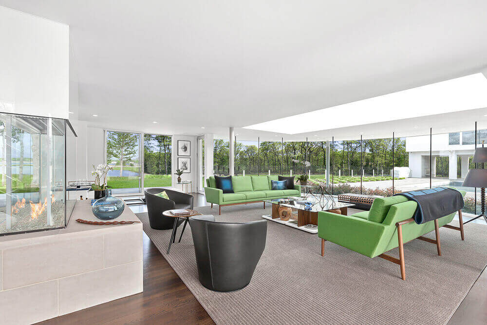
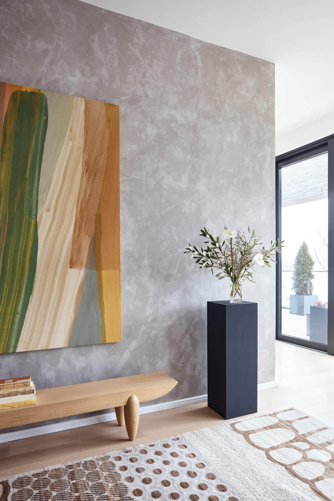
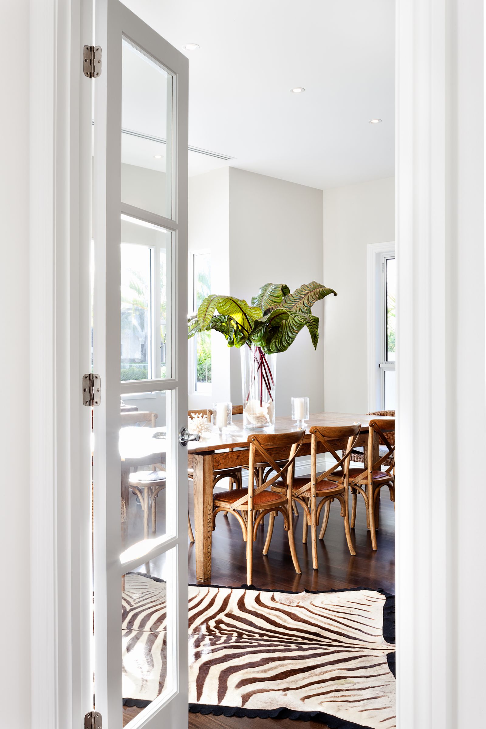
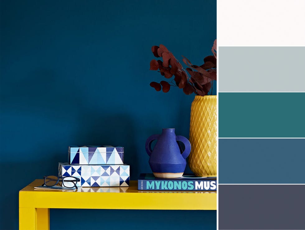
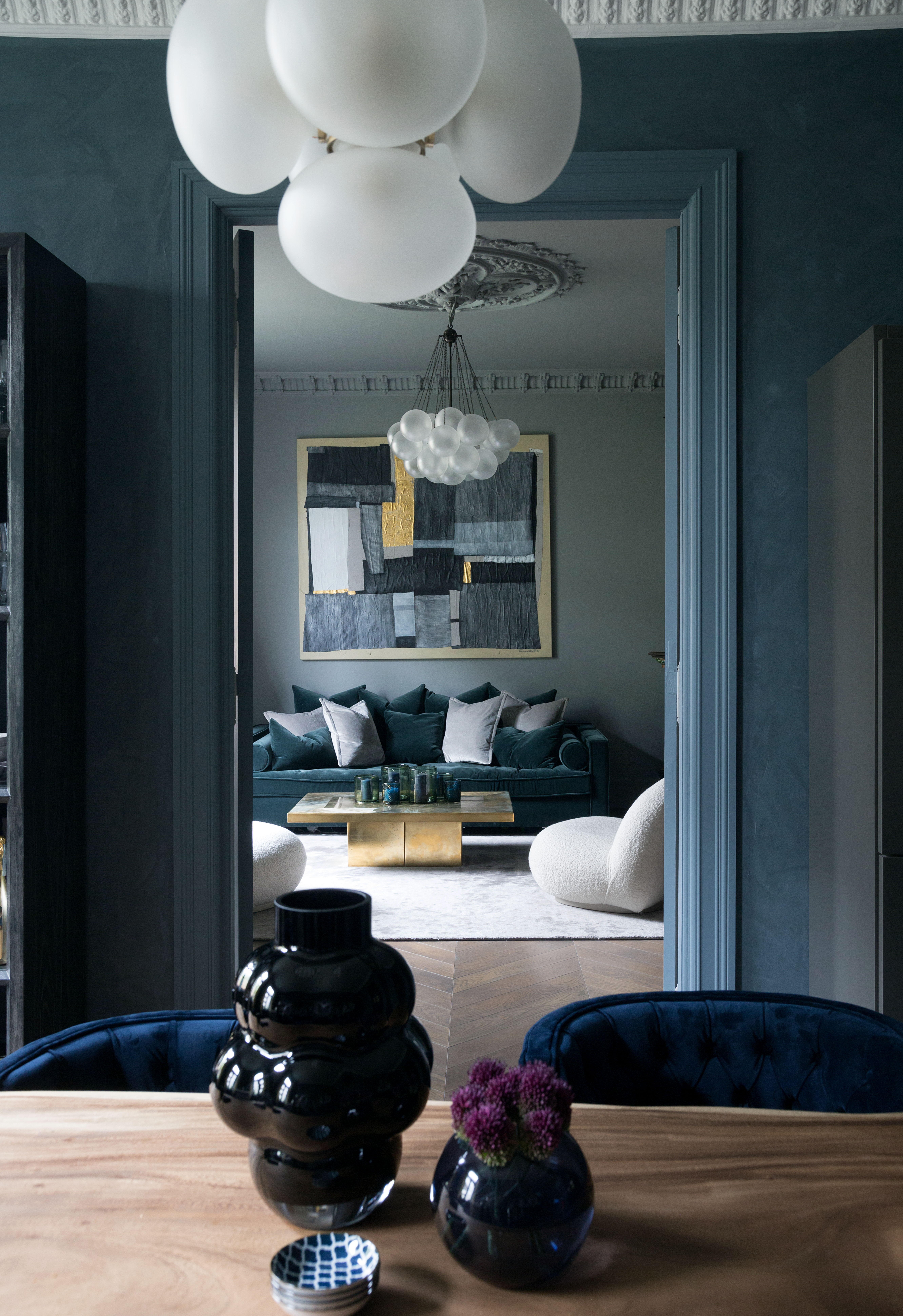
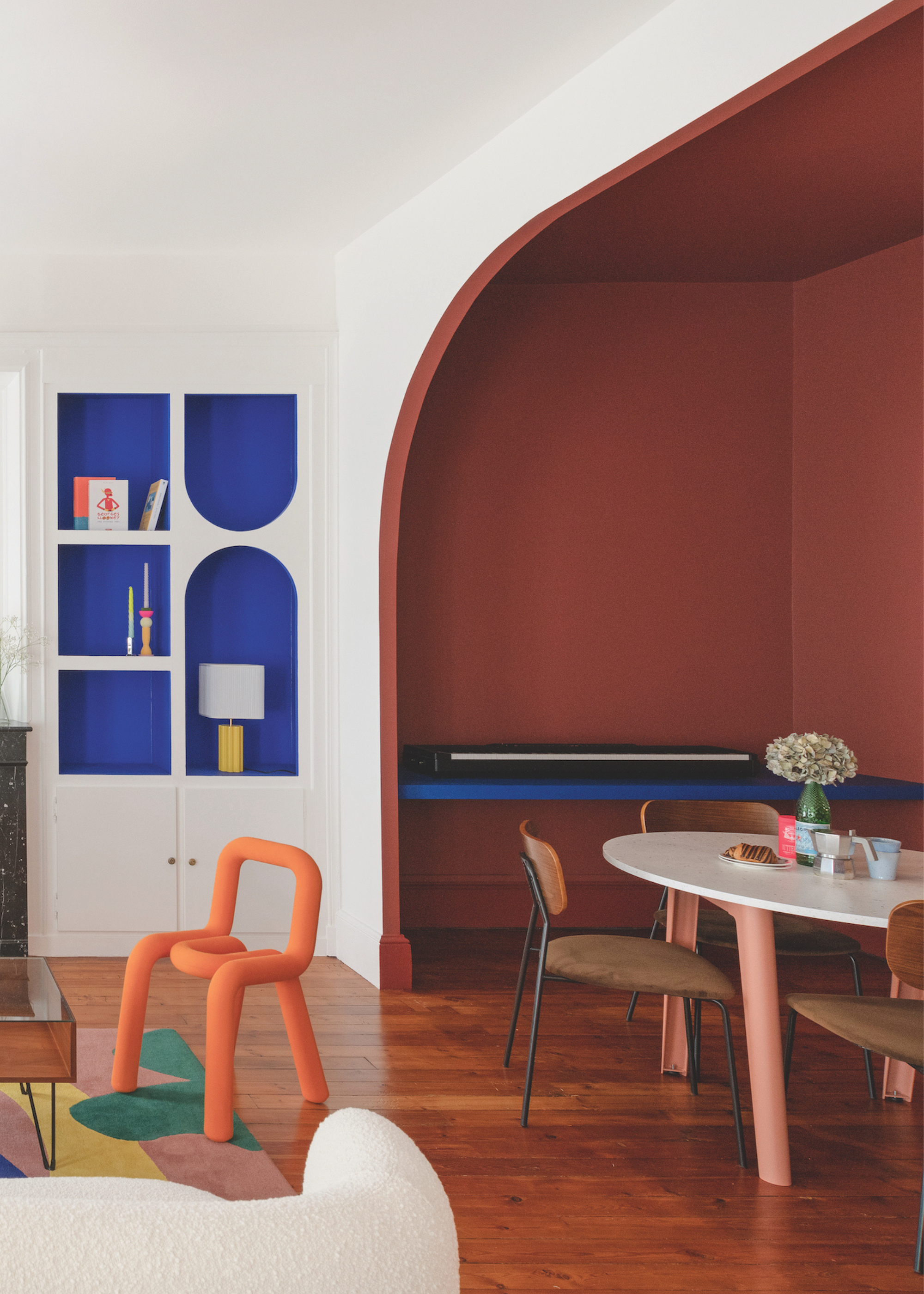
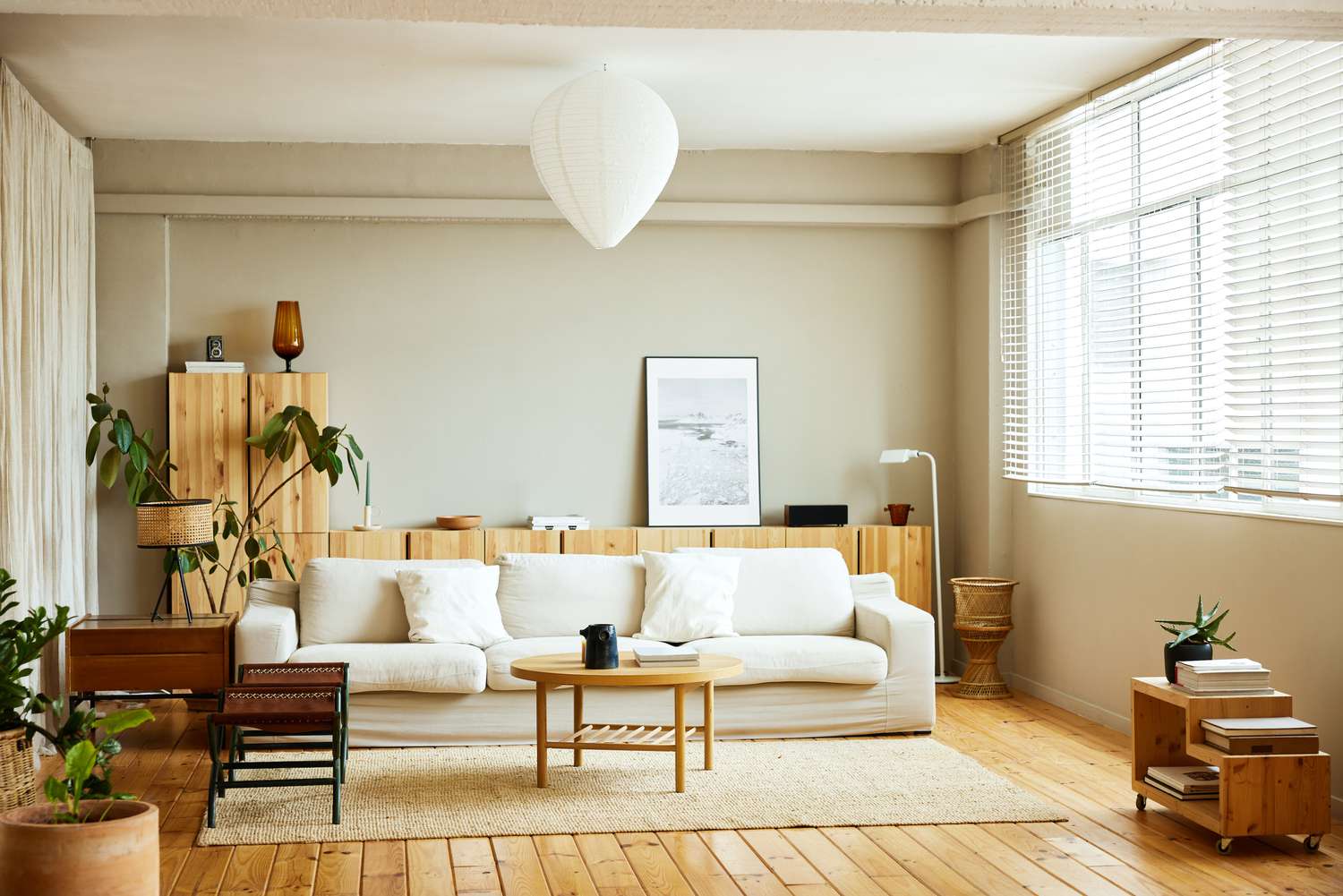
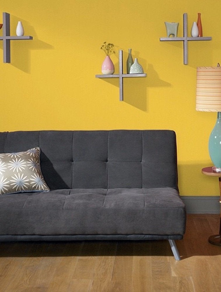
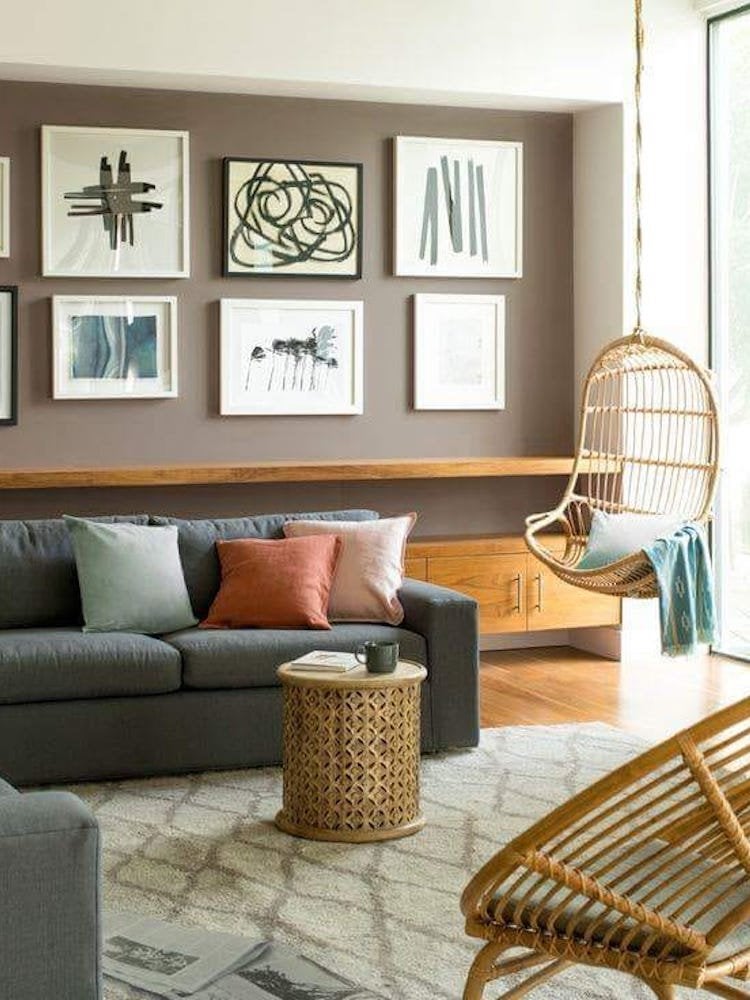
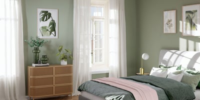
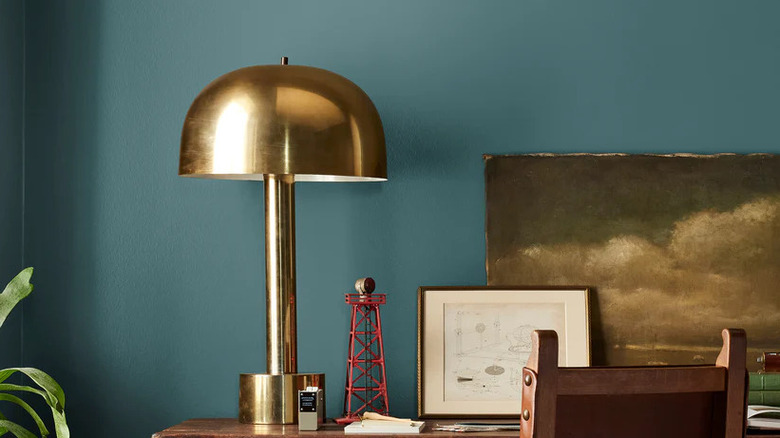
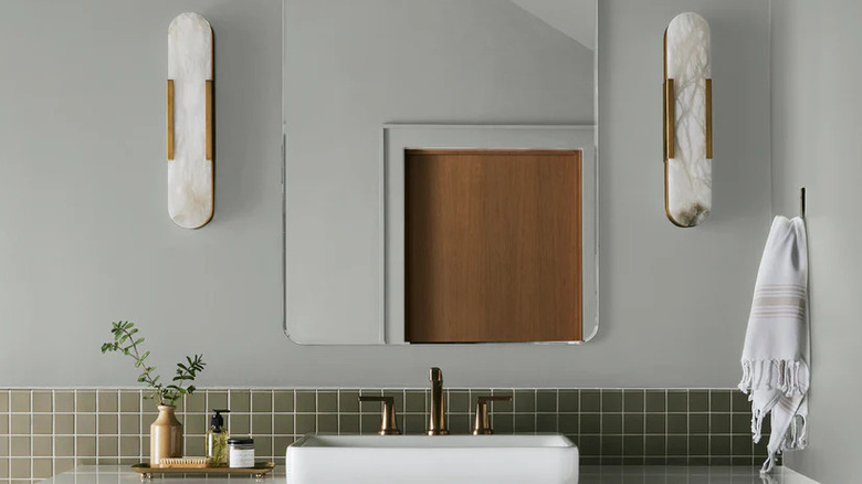
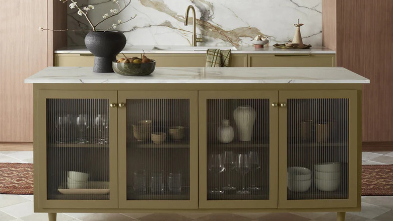
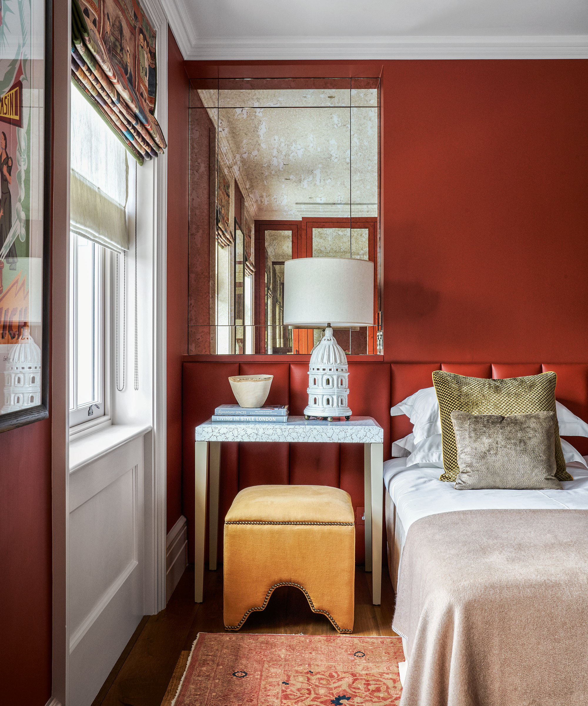
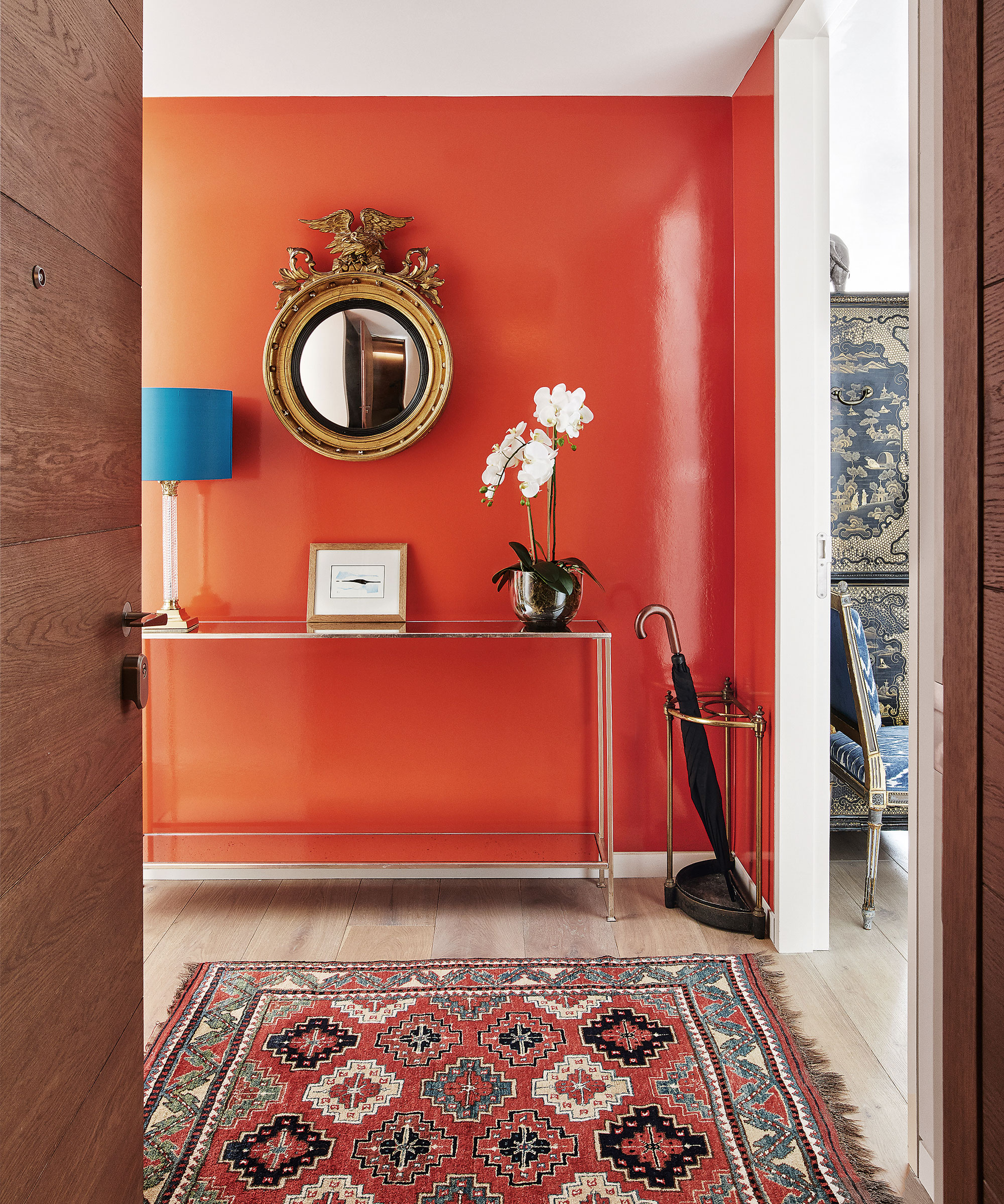
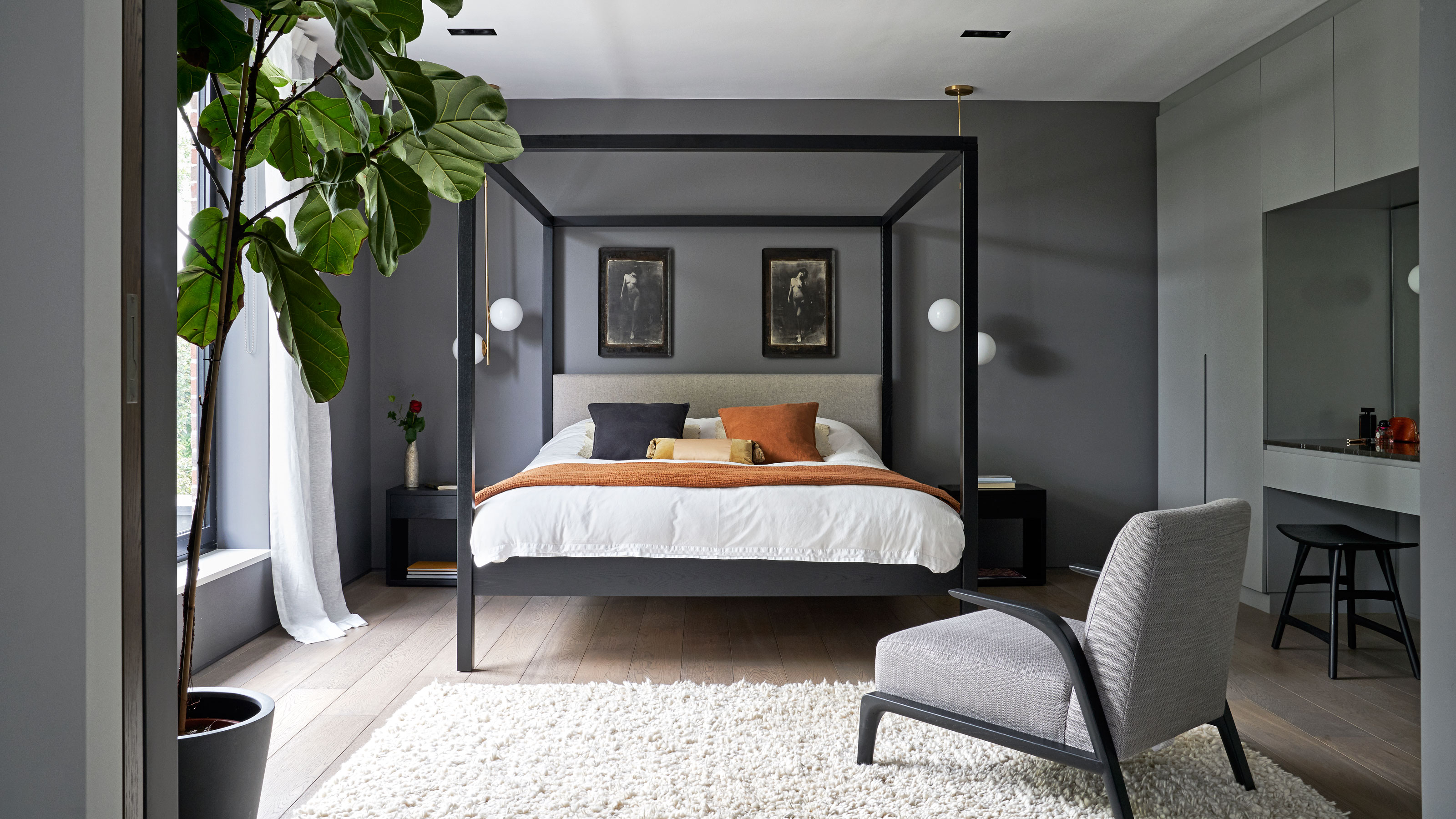
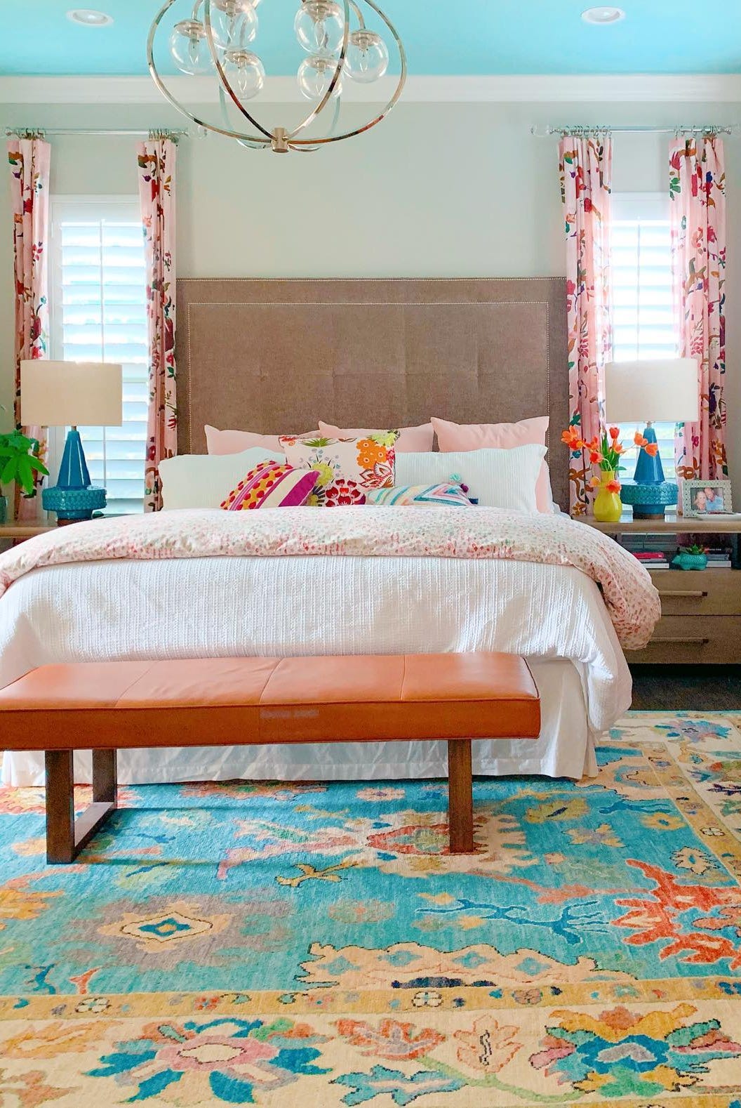
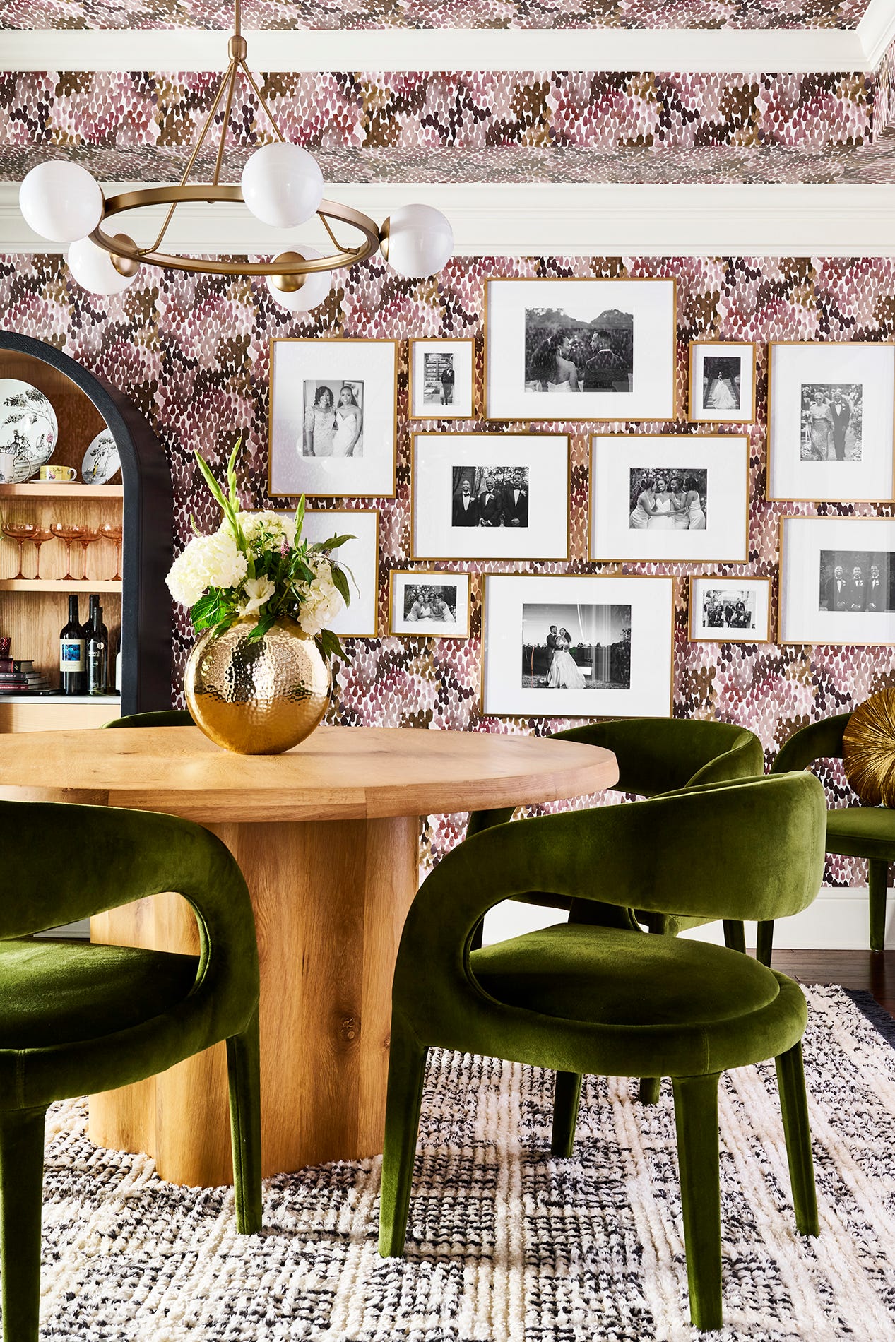
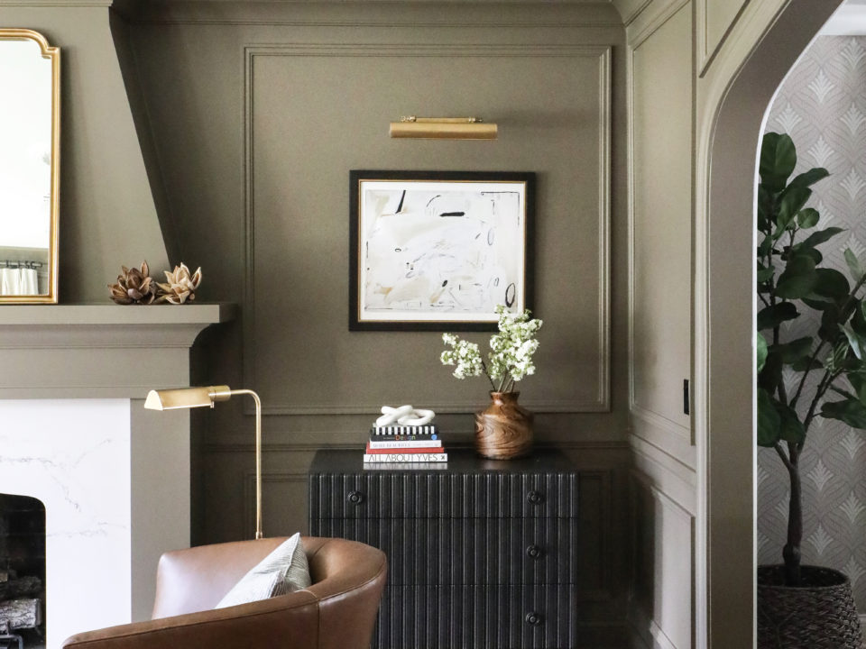
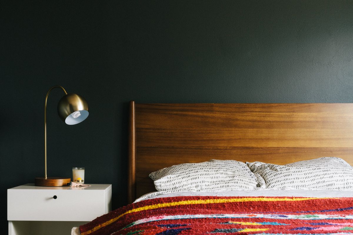
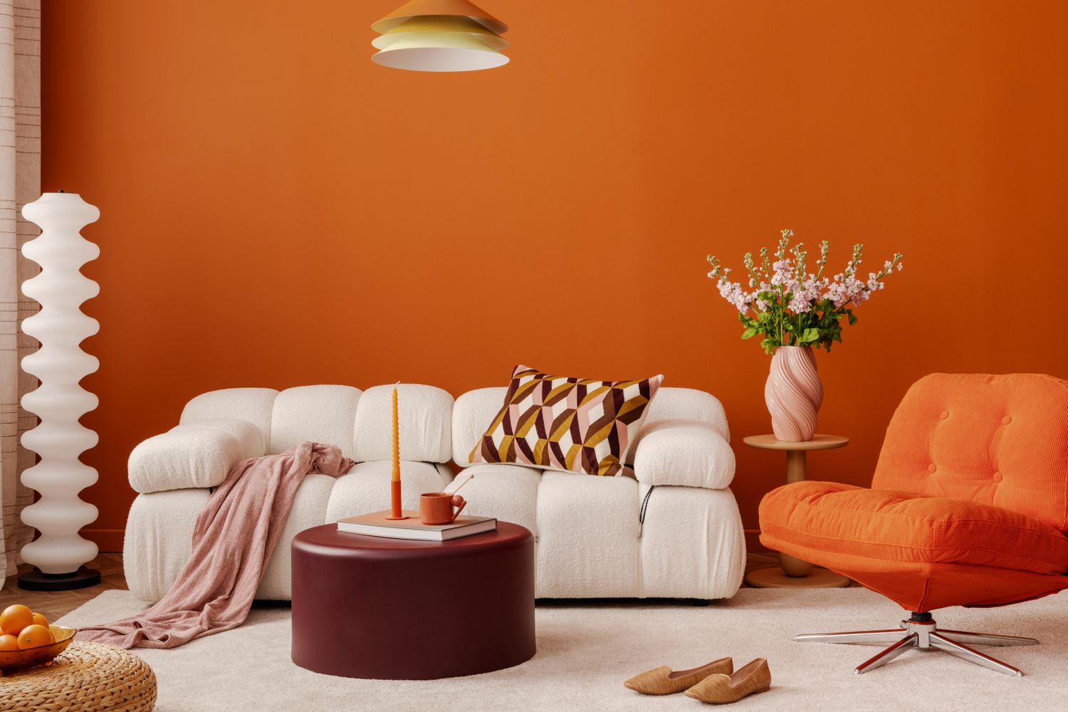
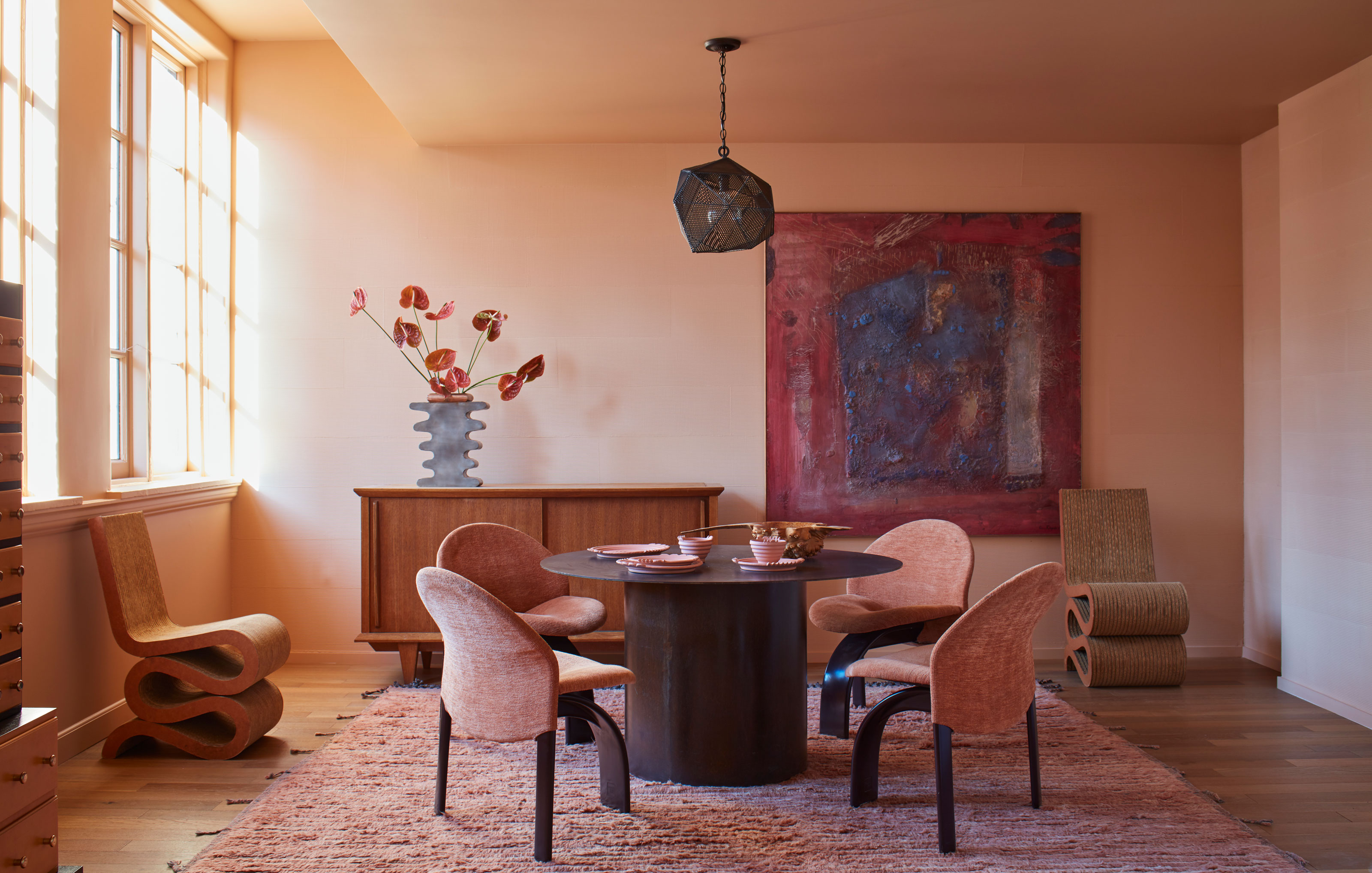
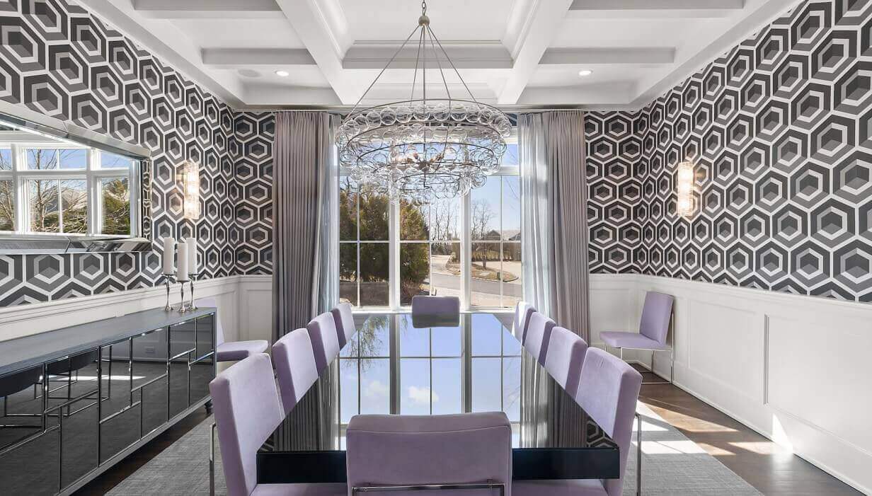
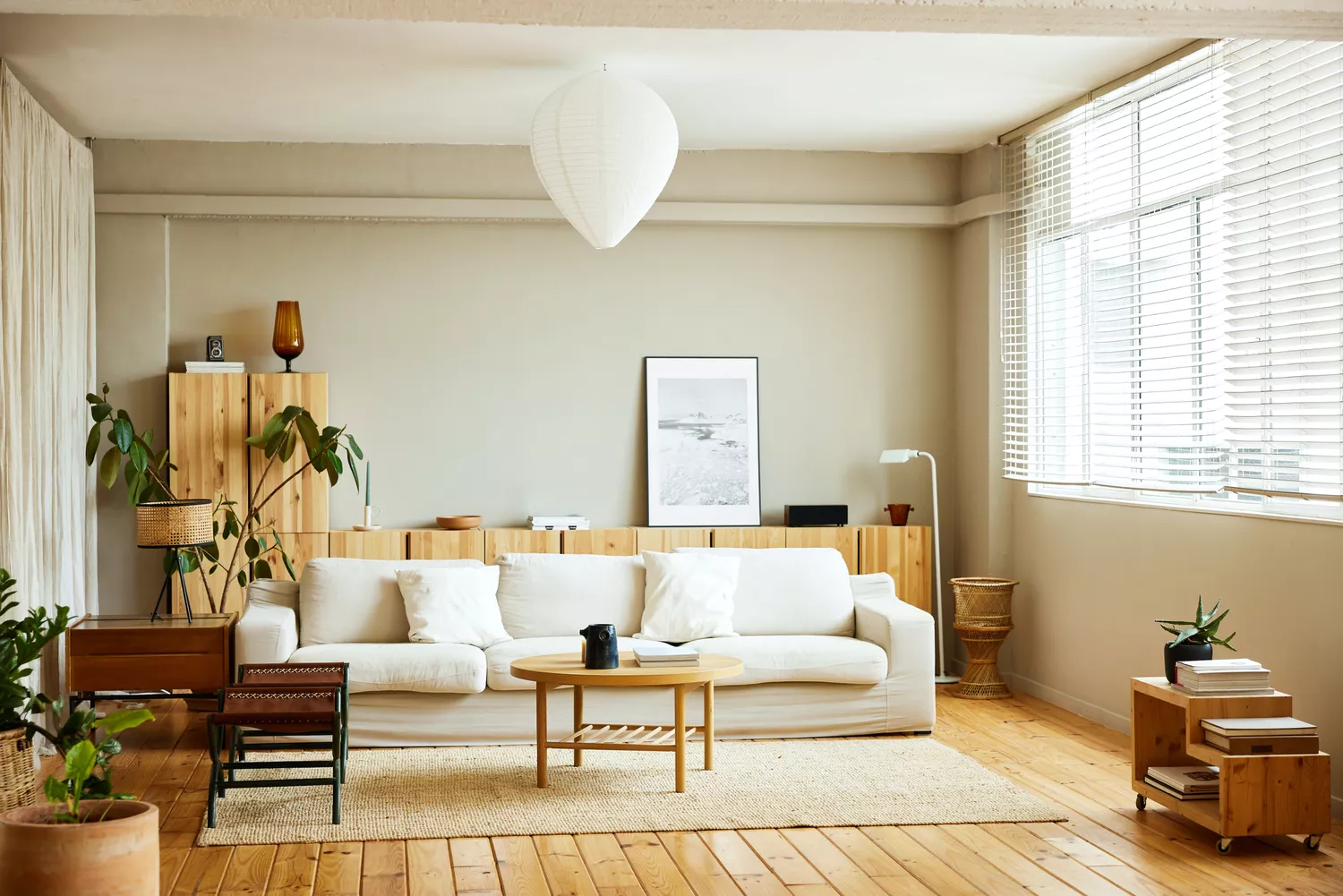
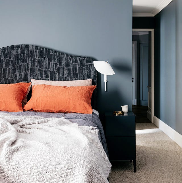
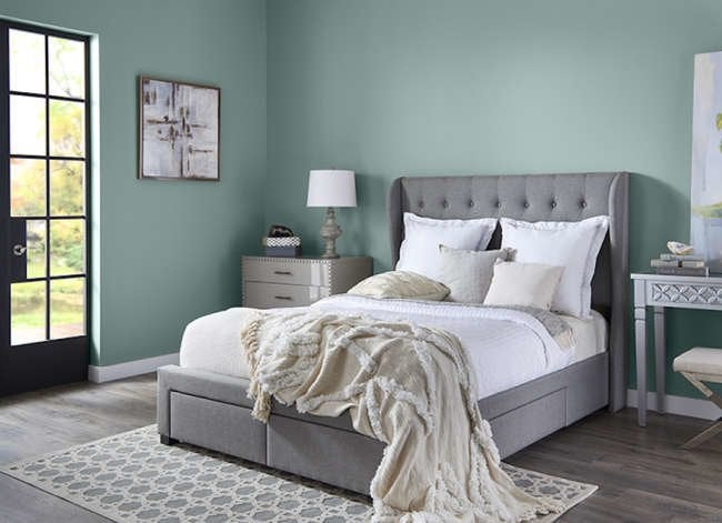
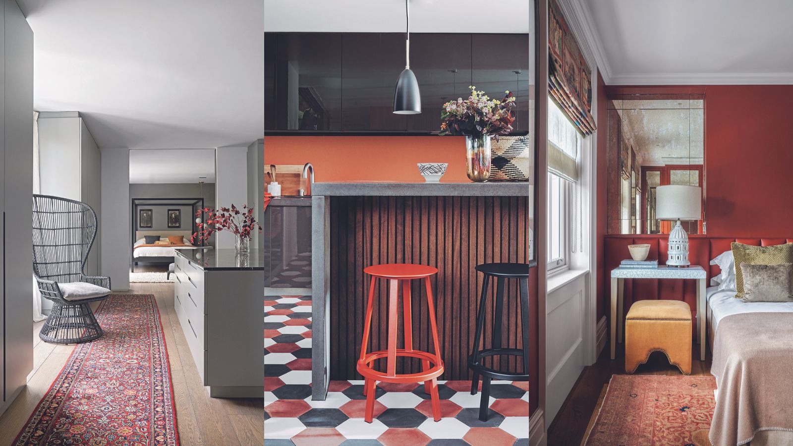
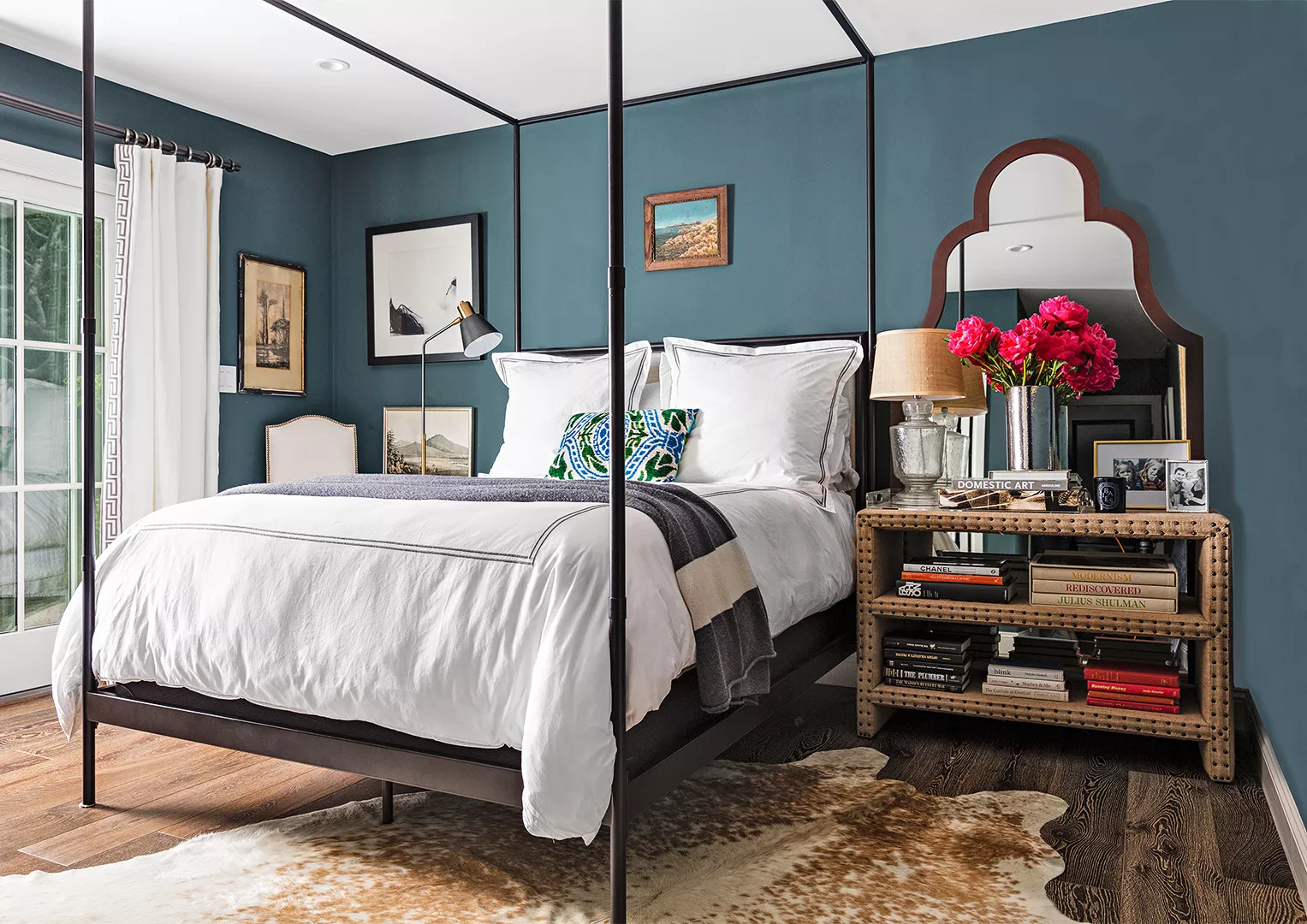
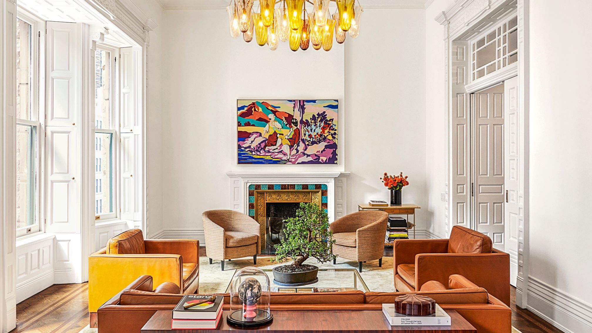
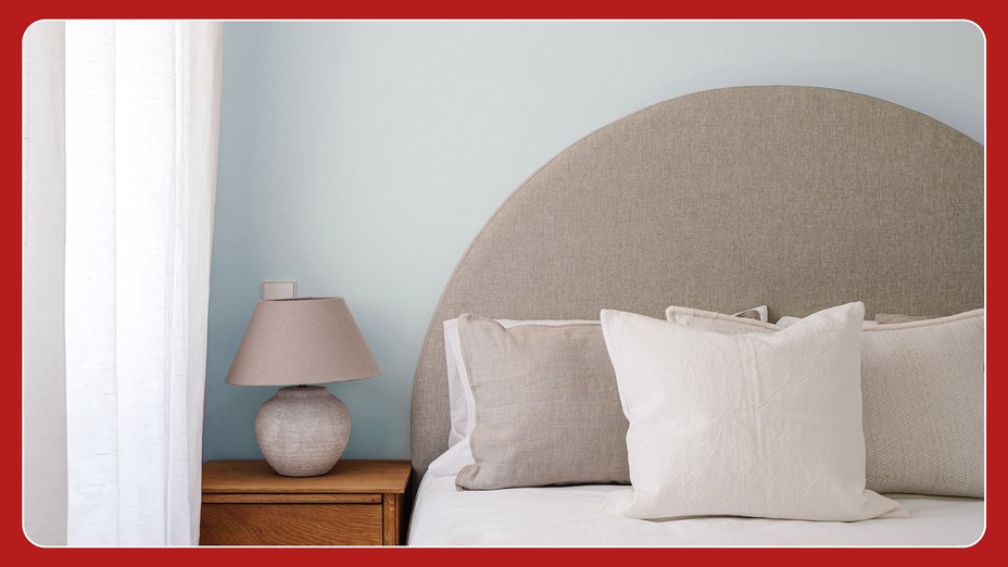
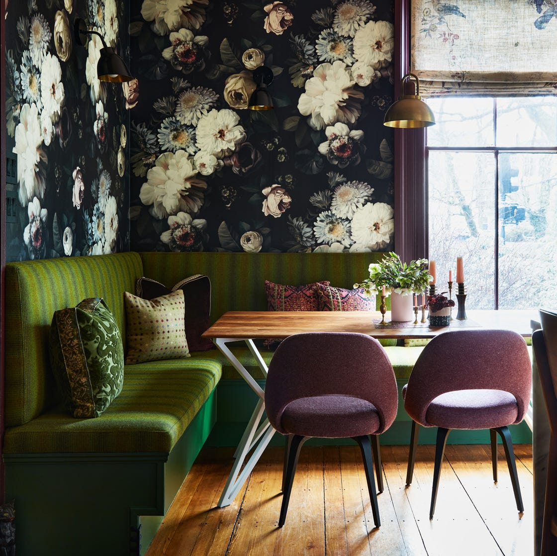
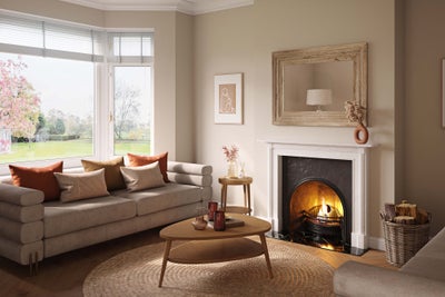
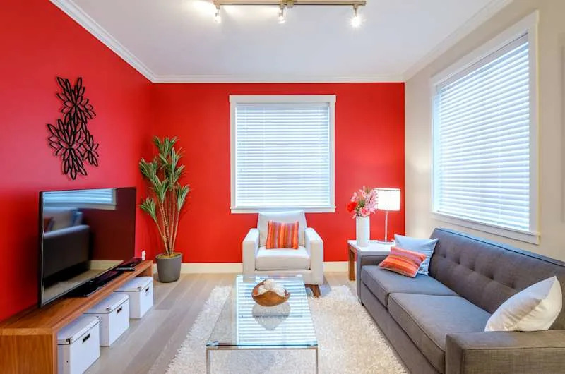
Specific recommendations are provided for different types of spaces. For gathering areas like living rooms, neutral tones are suggested, but with an expanded definition that includes natural, earthy hues such as muted greens and blues, which mimic outdoor landscapes. For dining rooms, light-reflecting colors like soft pinks and subtle golds are favored to enhance complexions, although dark, saturated colors (e.g., navy, dark green, rust) can work in rooms with ample natural light to avoid a cave-like feel. In productive spaces like offices, the choice depends on the work type; mid-tone blues like Sherwin-Williams' Granite Peak or Benjamin Moore's Britannia Blue are recommended for video calls, while dark, subdued colors can aid concentration for screen-intensive work. Kitchens, as hardworking spaces, benefit from fresh, layered neutrals to maintain clarity, with the option of using a single color in varying shades for depth without overwhelming the space. Finally, for cozy areas like dens and libraries, deep, saturated greens and blues are encouraged to create a sense of calm and distinctiveness, provided sufficient lighting is available. For bedrooms, the emphasis is on serenity, with whites, creams, and light greiges like Benjamin Moore’s Classic Gray or Sherwin-Williams’ Gossamer Veil being ideal for a tranquil backdrop, allowing accent colors to be introduced through decor or a feature wall/ceiling.
#PaintColors #HomeDesign #InteriorDesign #ColorConsultation #DesignTips #RoomMood #NeutralColors #AccentColors #HomeDecor #PaintColors #HomeDesign #InteriorDesign #ColorConsultation #DesignTips #RoomMood #NeutralColors #AccentColors #HomeDecor
0 comment in total
You may also like
How to choose the best paint color for any room in your house

Here's What Colorists Want You to Know About Picking House Paint

Here's How to Coordinate Paint Colors Throughout Your Home, so That It Looks Cohesive, Curated, but Still Creative

Never Regret a Paint Color Again—Avoid These 6 Common Mistakes

Paint color ideas for every room – experts explain the best choices for different spaces
What is the Best Color for Your Home?

How to Choose the Best Paint Finish for Every Area of Your Home, From Kitchen Cabinets to Bathroom Walls

Fixer Upper's Joanna Gaines Shares The Perfect Paint Colors For Every Area Of Your House
35 Paint Colors to Consider for Every Room in Your House


How To Choose The Right Paint Color For Your Home, According To An Interior Design Expert

14 Paint Colors That Can Make a Room Feel Instantly Cozy

What are the worst colors to paint a room? The shades experts say you should never use

23 Expert Tips for Choosing the Right Paint Colors for Your Home

Interior Paint: A Guide to Buying the Best Paints for Your Home

Millennial Gray Is So Over—Here Are 5 Paint Colors to Try Right Now
12 Color Schemes That Are Popping Off Right Now, According to Designers
The Best Interior Paints for Every Room of the House, Tested and Approved
30 on-trend paint colours for every room in your home
Decorating with paint

The 3 All-Time Worst Living-Room Paint Colors, According to Designers