1/36
30 on-trend paint colours for every room in your home
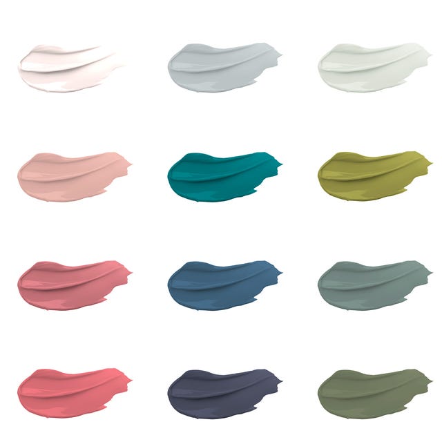
The article introduces the new House Beautiful paint collection, exclusively available at Homebase, highlighting the significance of color in home design. This collection, designed in-house by House Beautiful's team of editors and stylists, offers 30 modern paint colors across six distinct color families, providing an affordable and versatile palette for various interior applications. Each 2.5-liter can is priced at £35.00, and the paint features stain-repellent technology for easy maintenance, making it suitable for interior walls, ceilings, and wood surfaces. All paints are manufactured in the UK.
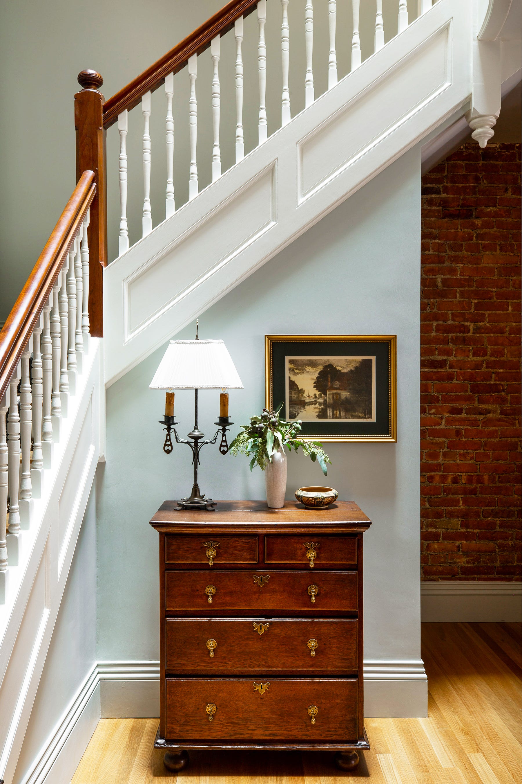
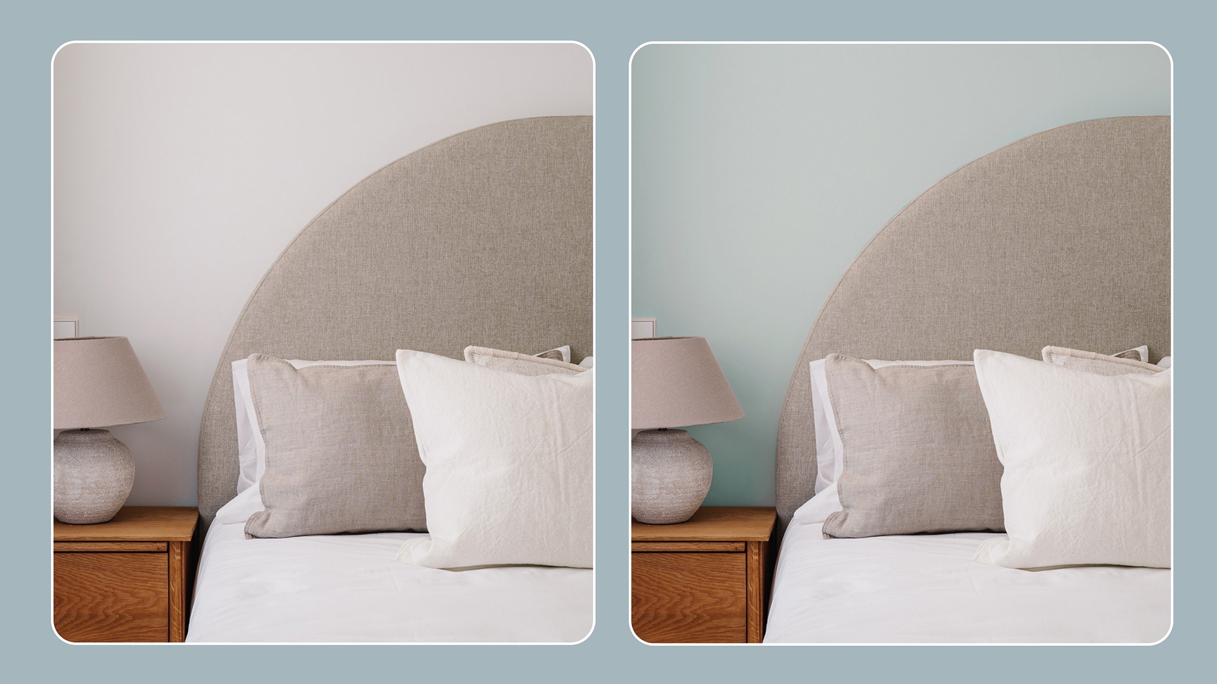
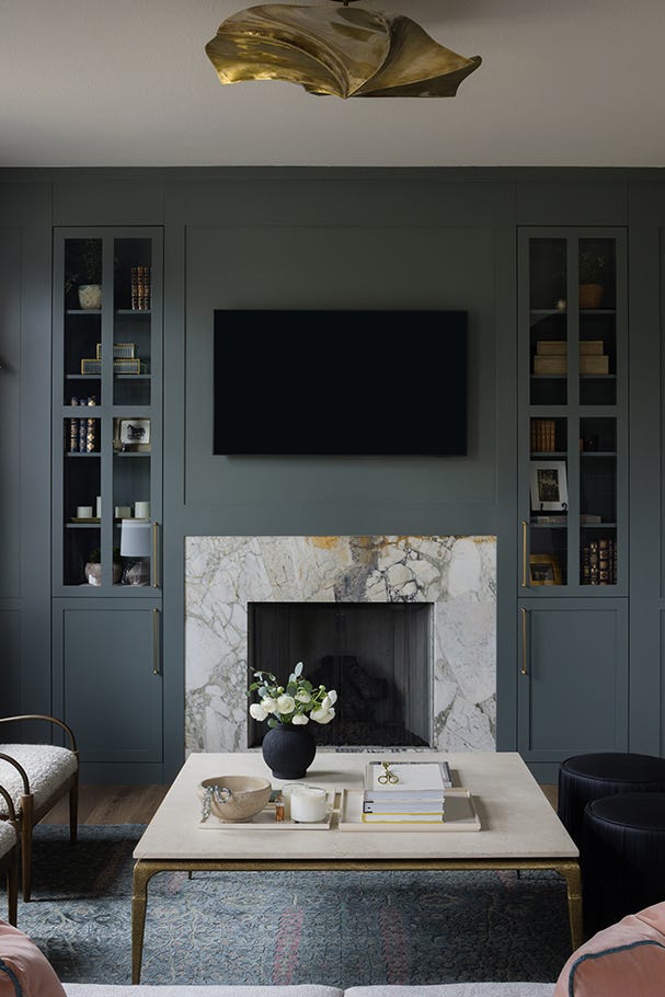
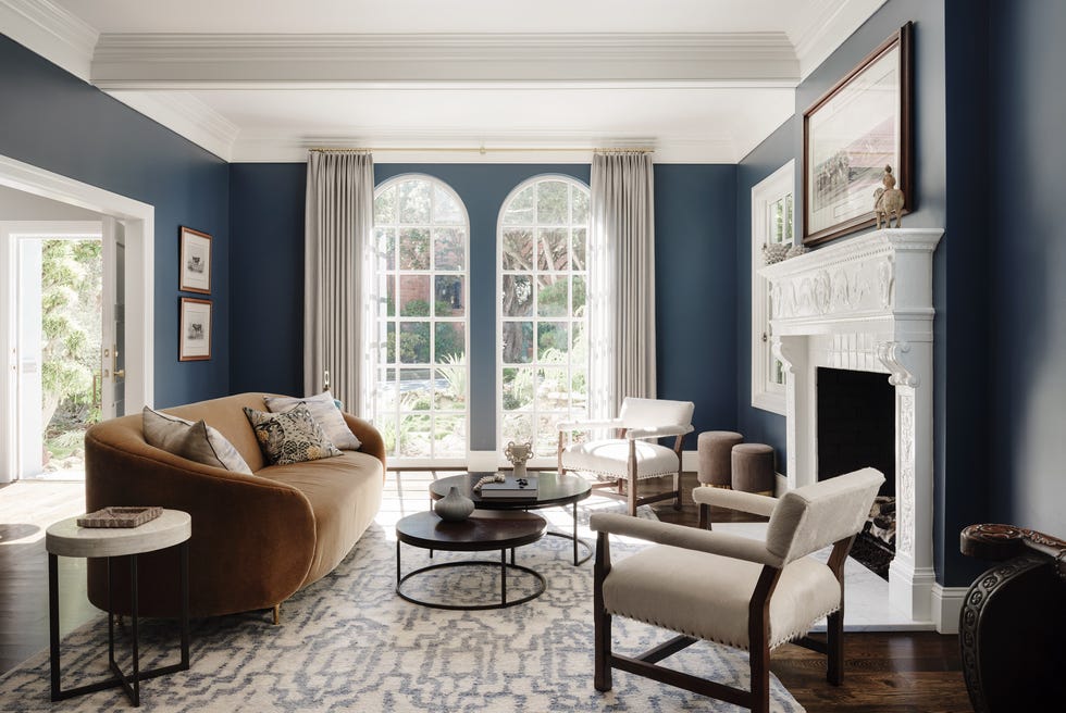
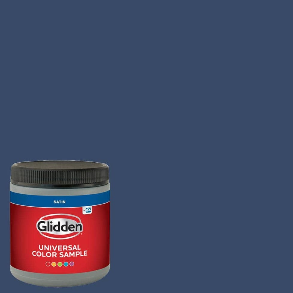
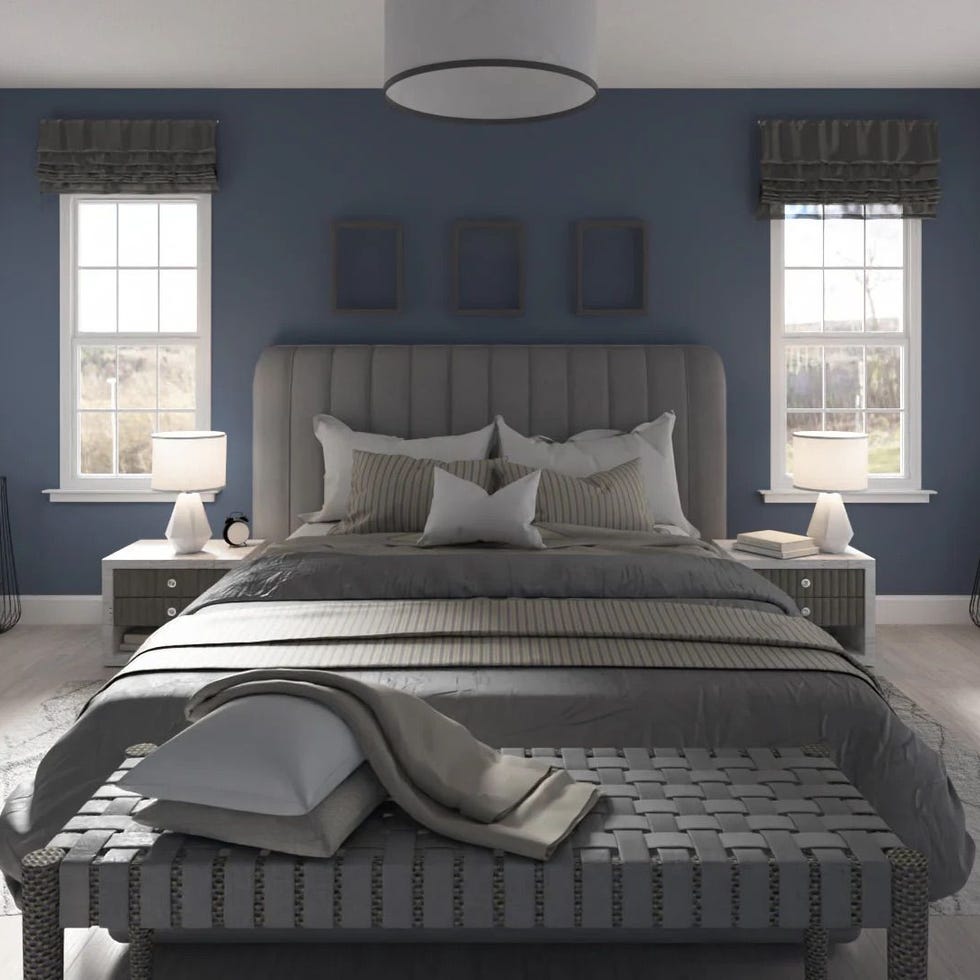
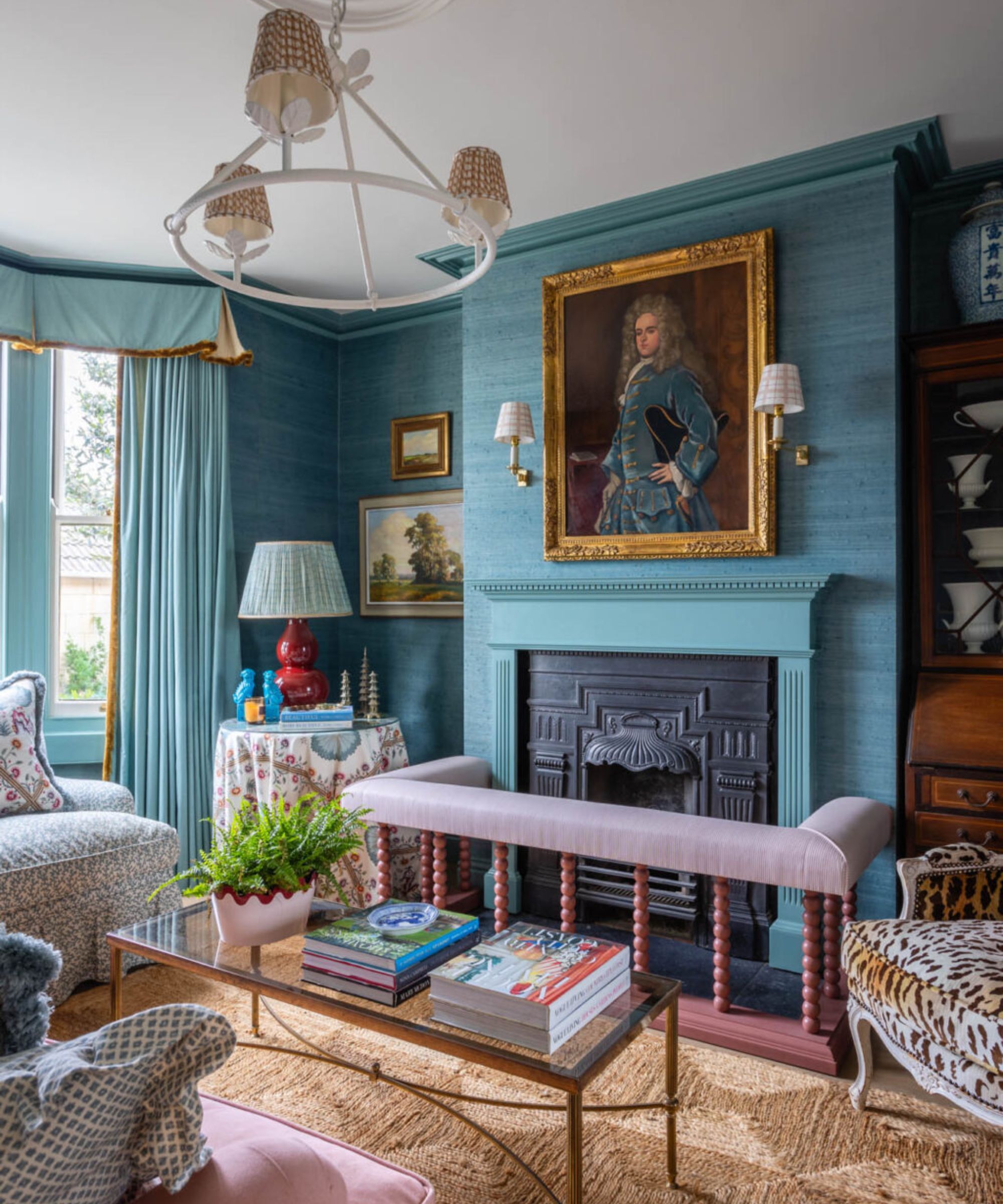
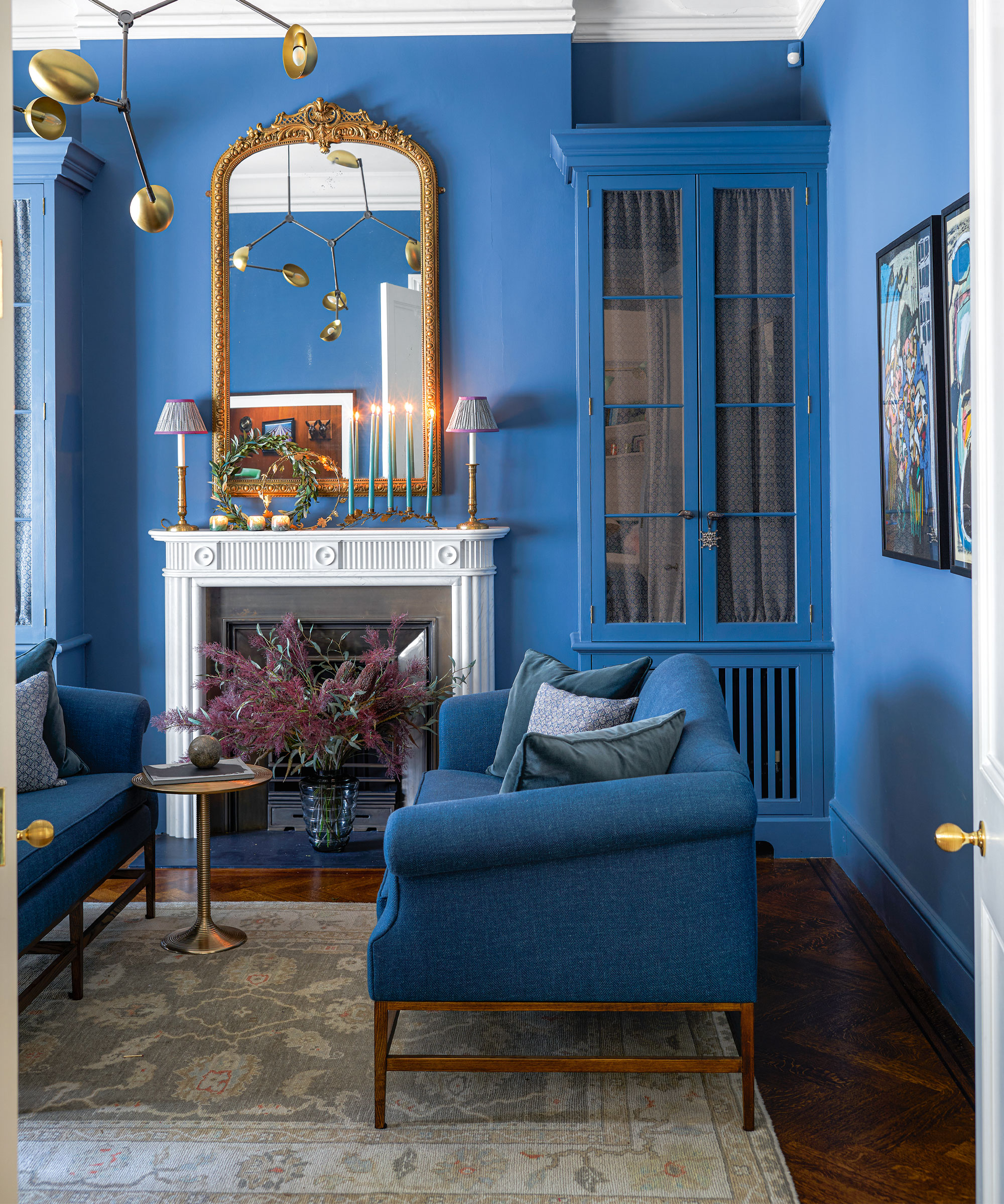
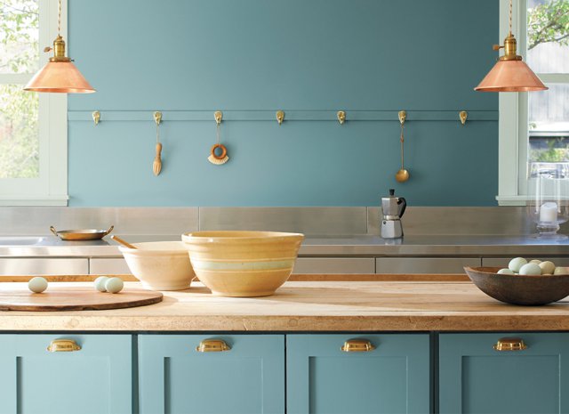
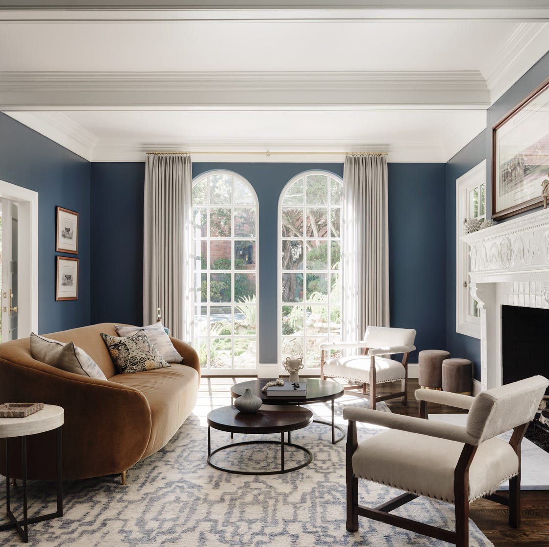
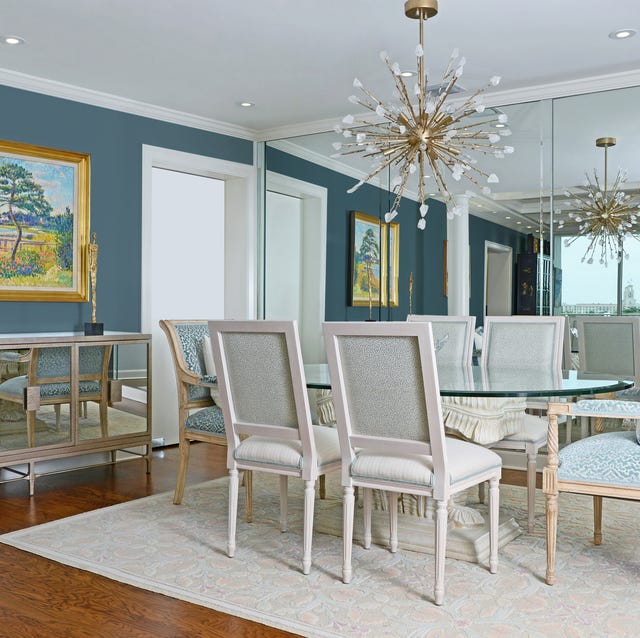
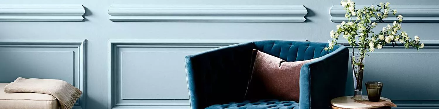
The collection is divided into six color stories. 'Boutique Blues' includes cool modern tones ranging from pale sky blues to deep inky grey-blues. Blue is associated with stability, harmony, and peace, and can create diverse moods from youthful to dramatic and cocooning, particularly in communal areas like living rooms and kitchens. Complementary colors for Boutique Blues include sunny yellows (EN.04 and EN.06) and warm orange-reds (EN.08).
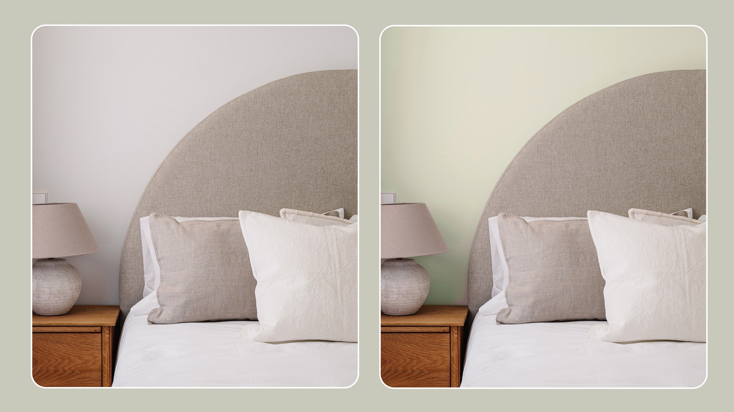
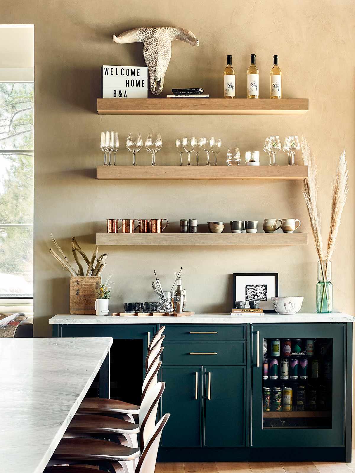
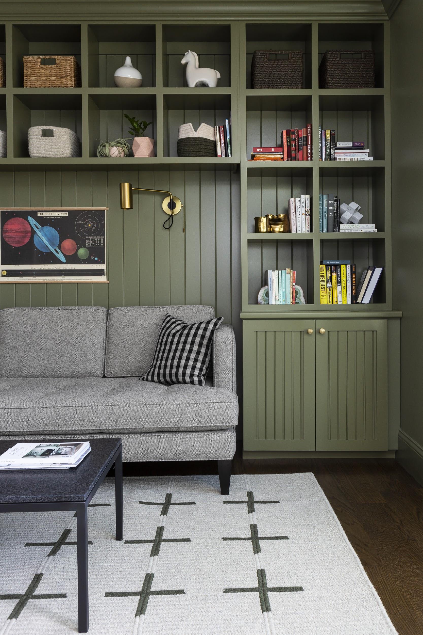
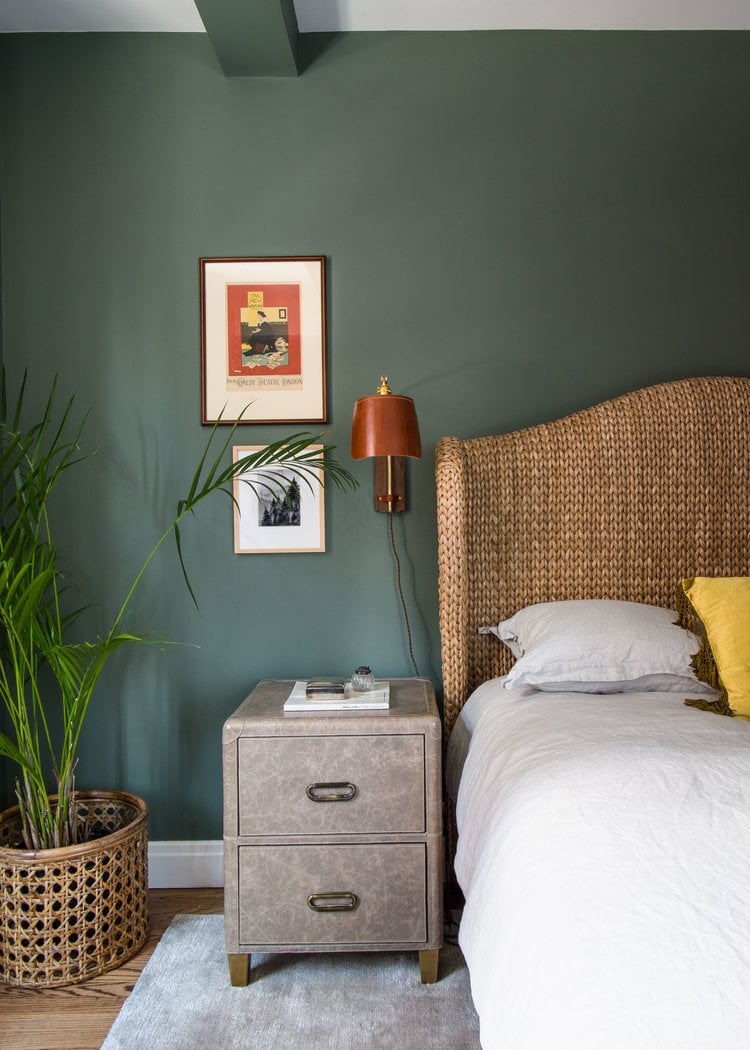
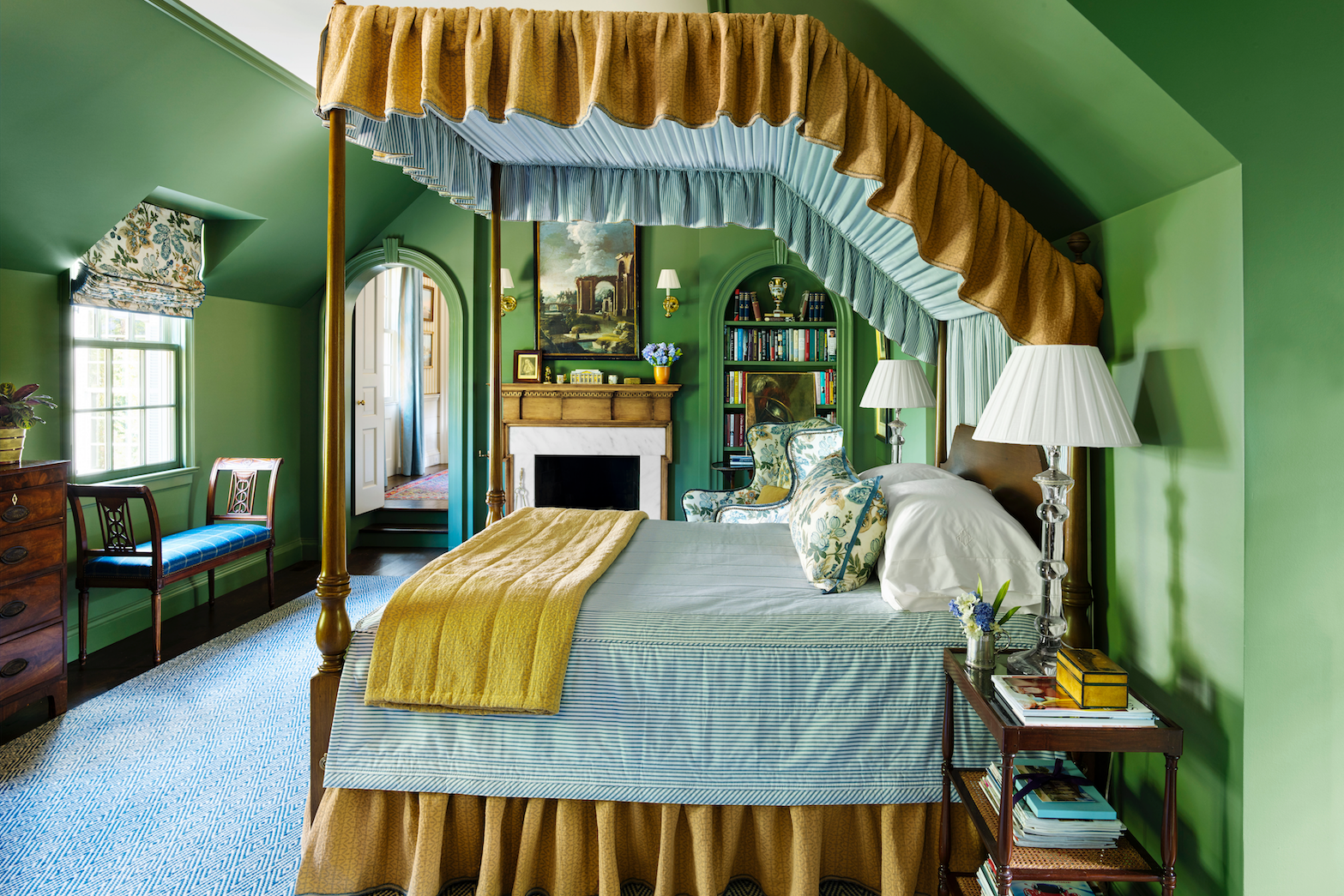
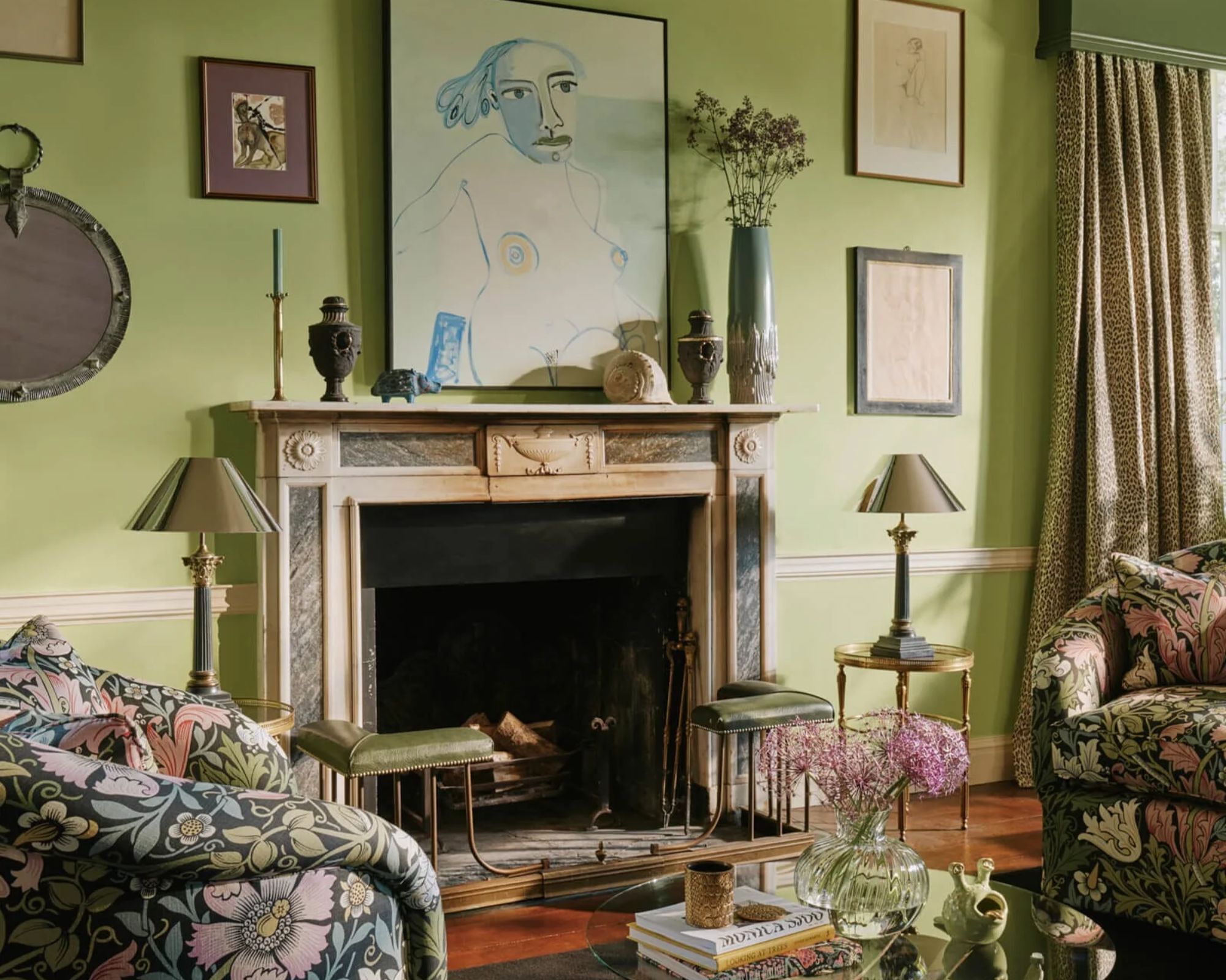
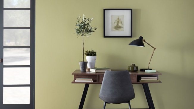
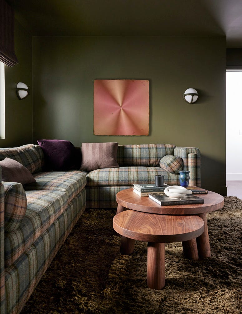
'Back to Nature' offers earthy greens, encompassing pale sage, yellow-toned new shoots, and sophisticated forest green. These shades connect interiors with the outdoors, fostering balance and serenity. Sarah Keady, House Beautiful's Style and Interiors Director, notes the strong desire to incorporate natural elements into homes, suggesting pairing these greens with plants and natural wood. Complementary colors for Back to Nature include pinks and mauves (MH.17 and TP.24).
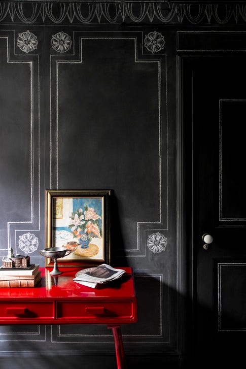
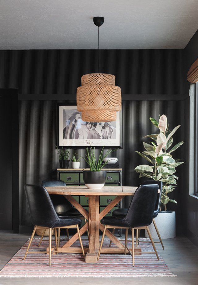
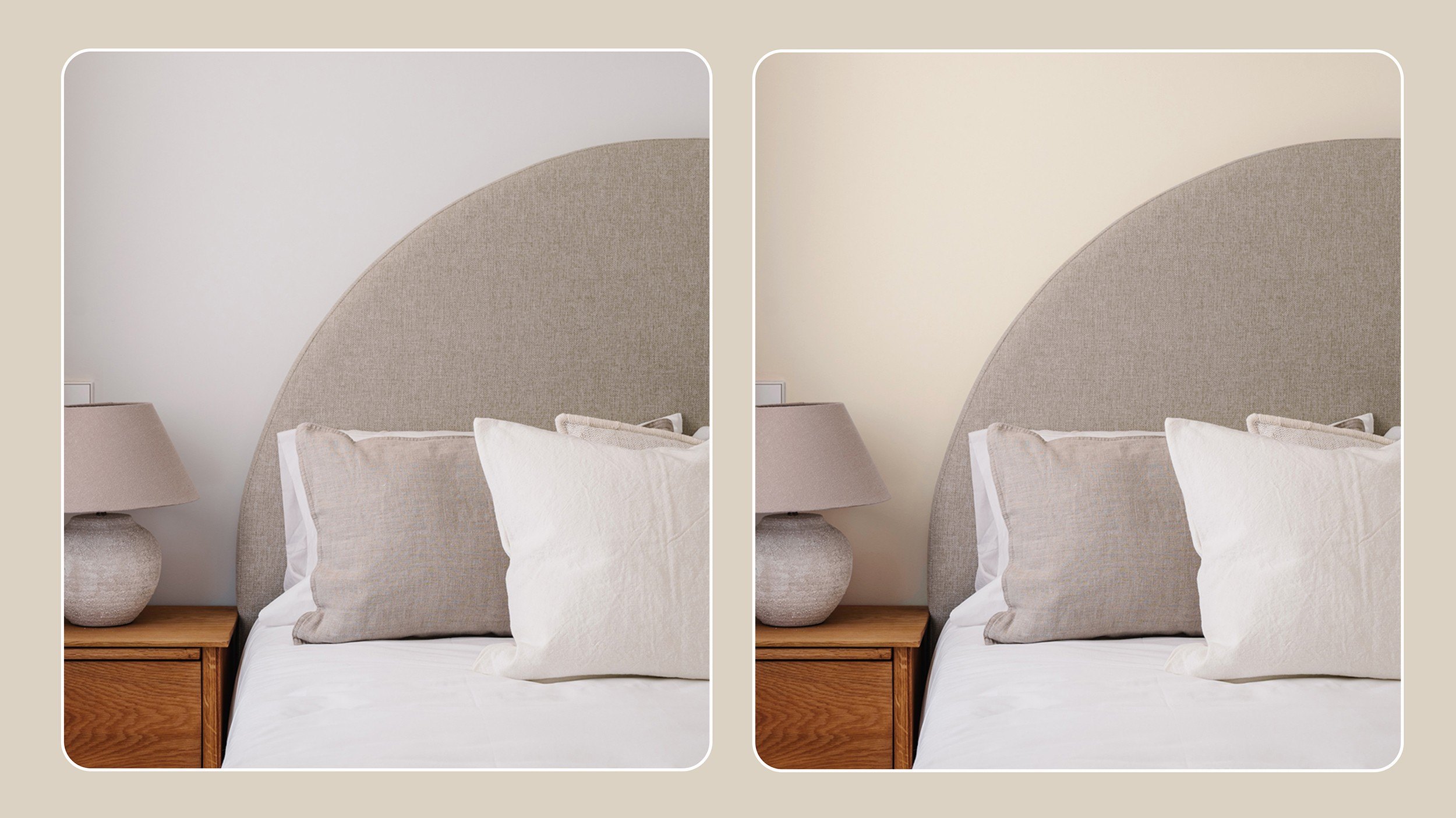
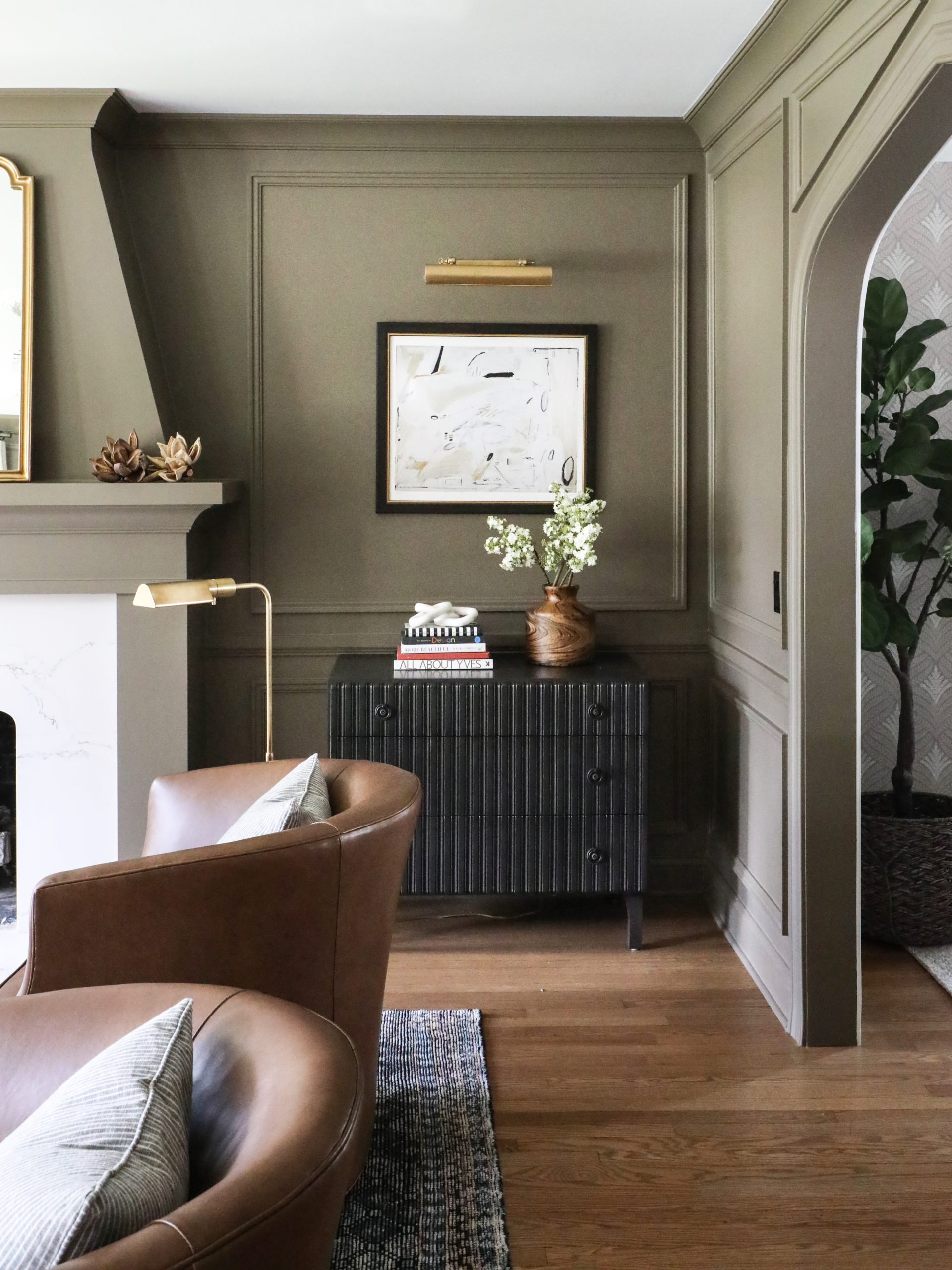
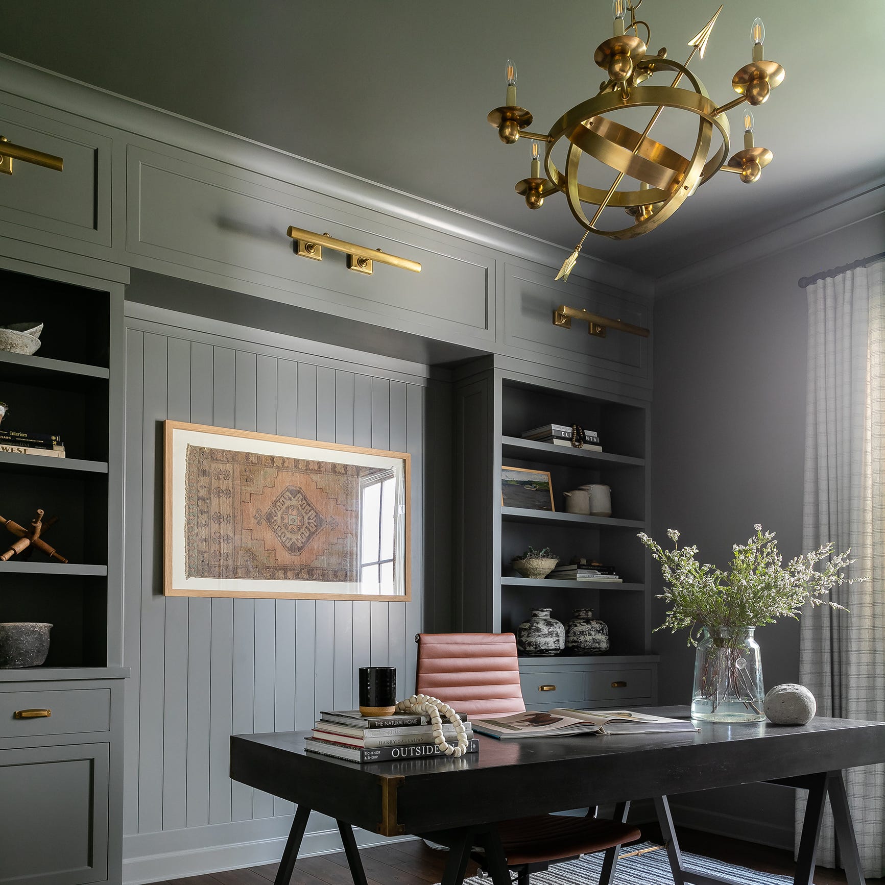
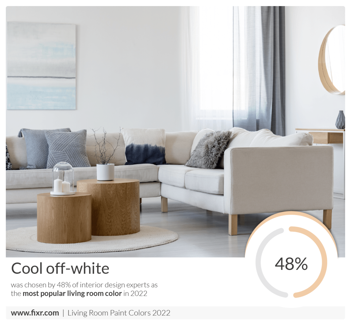
'Mono Tones' features a range of on-trend grey shades, from warm greiges to purple-toned mid-greys and deep graphites. Grey represents neutrality and balance, providing a versatile foundation for any color palette. Sarah emphasizes that grey remains a popular choice, especially for the simple Scandi look, and these hues work well both individually and combined with stronger shades. Mono Tones are highly adaptable and complement any color on the wheel.
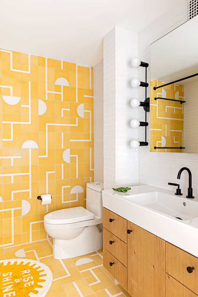
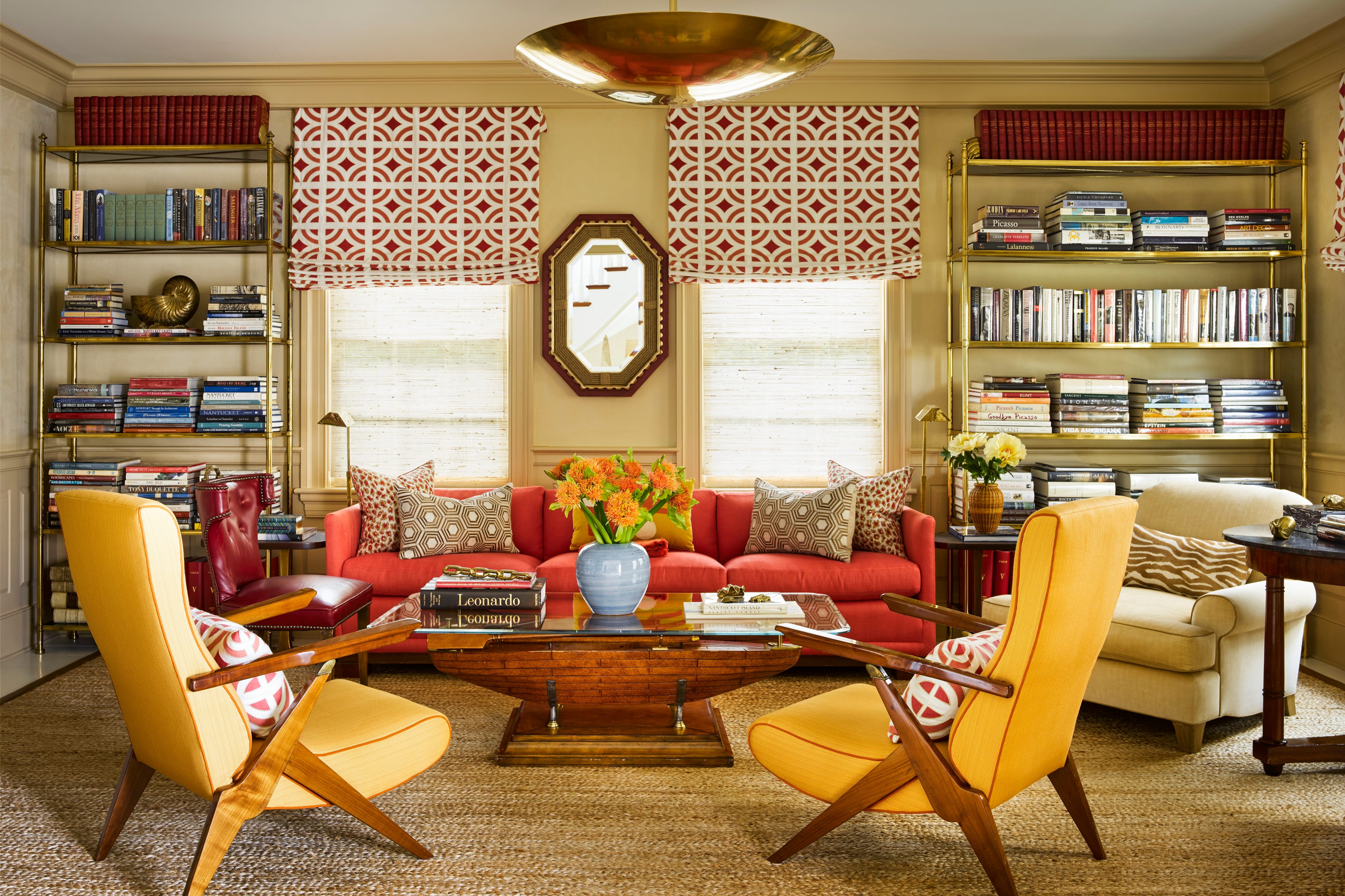
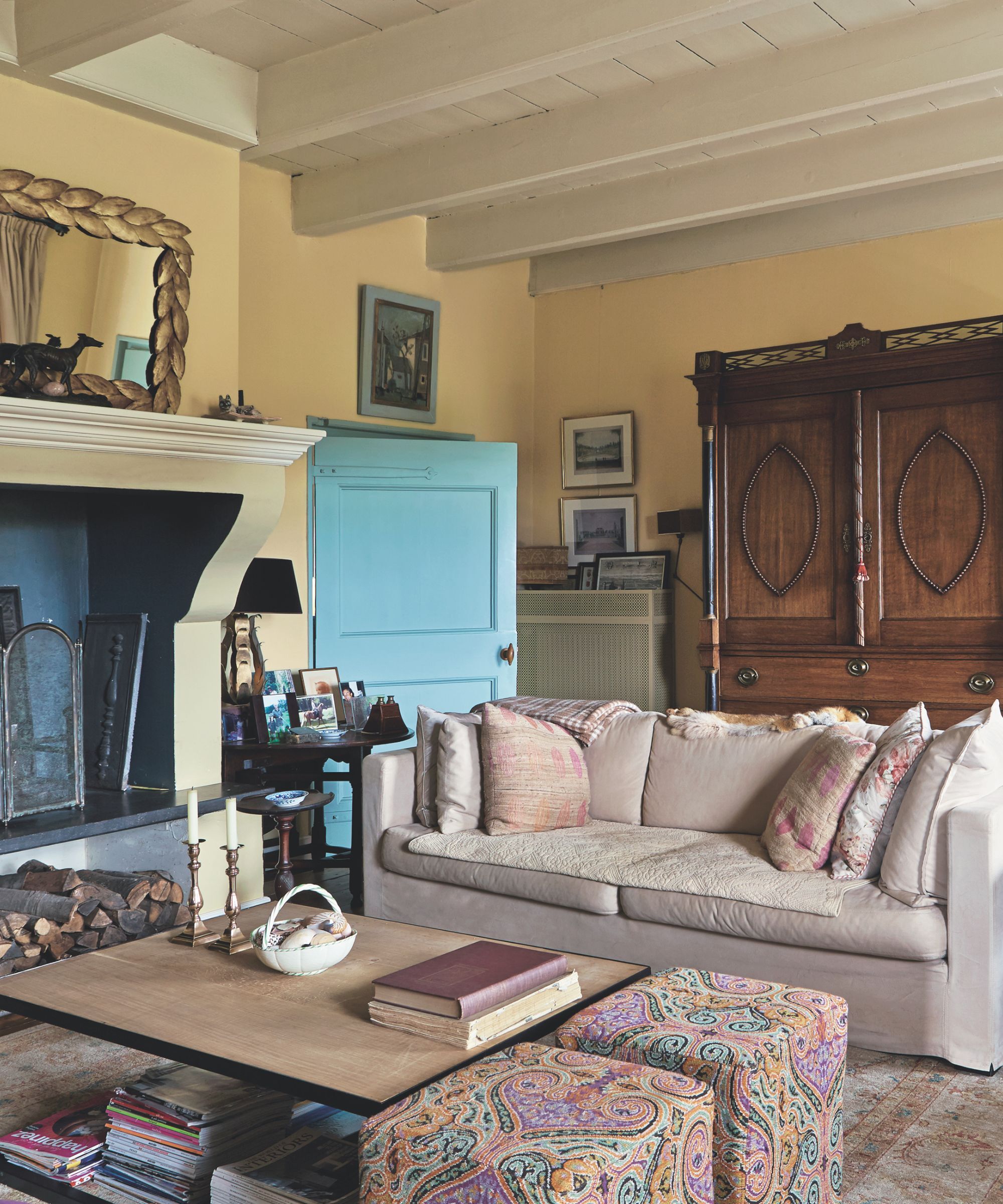
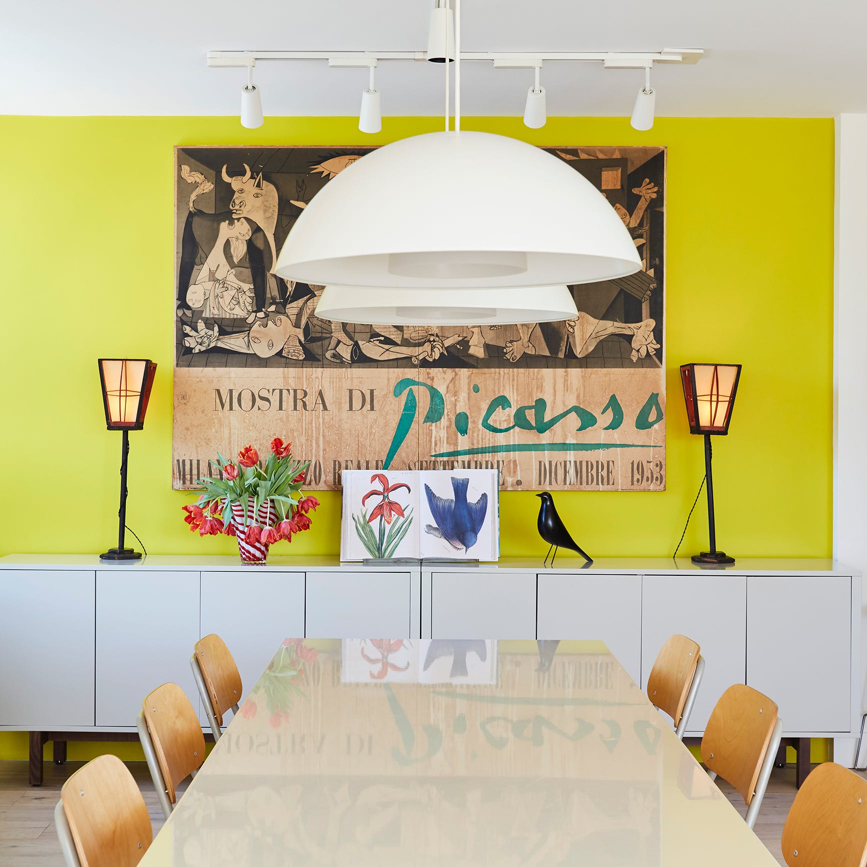
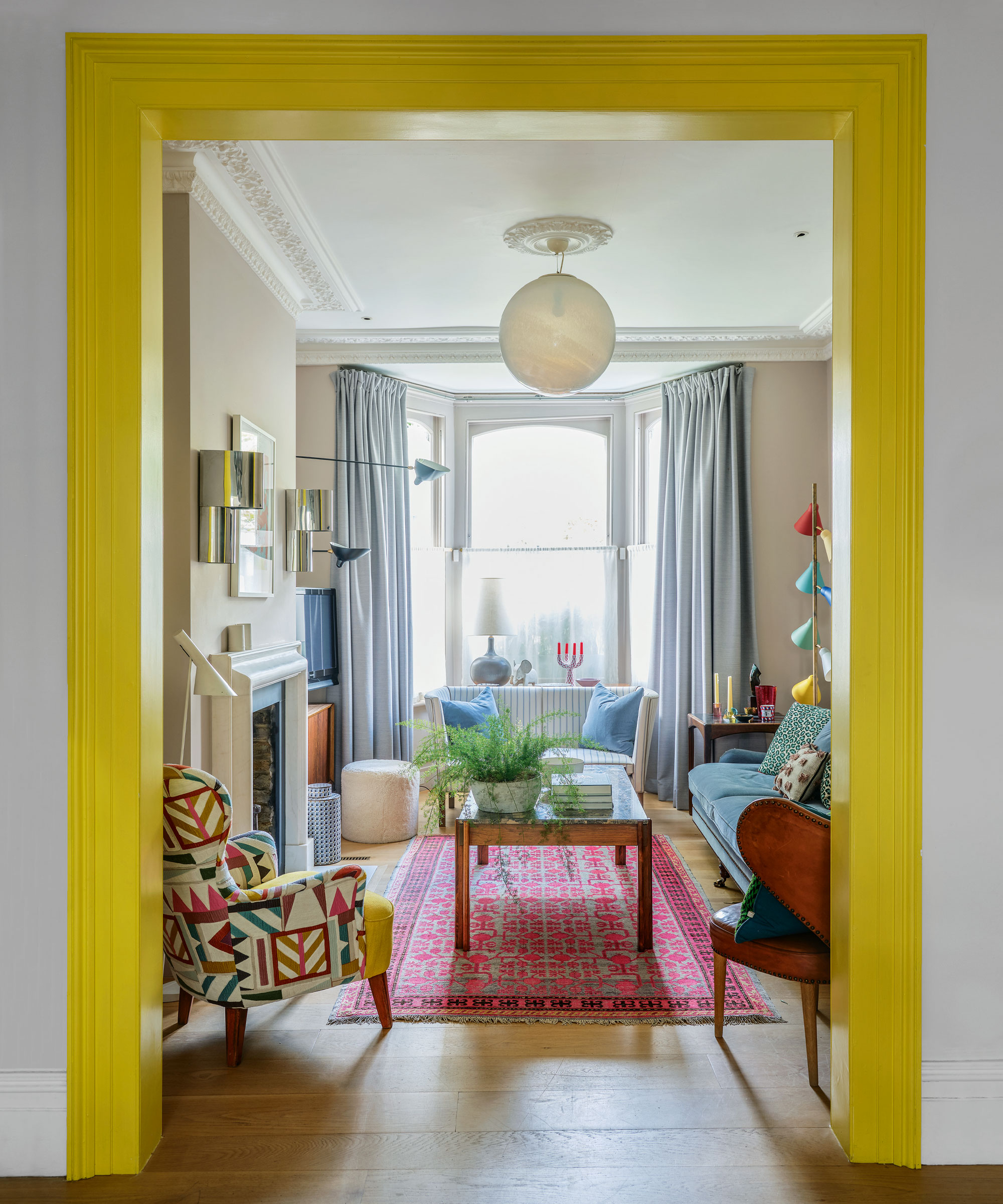
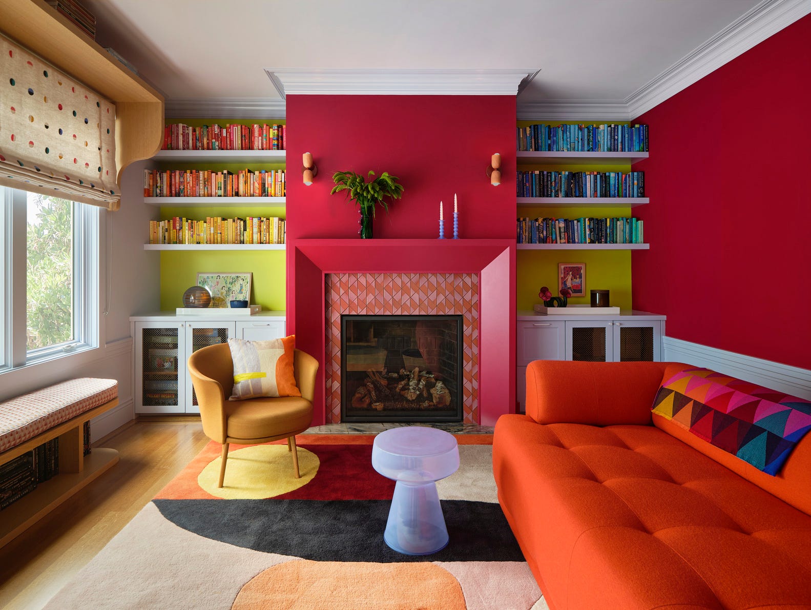
'Earth Notes' presents rich sunshine yellows and spicy orange/pinks, varying from subtle buttercup to fiery coral. These warm colors evoke a Mediterranean ambiance and bring energy and joy to a room. Sarah describes these as energetic, high-intensity shades, including saffron, turmeric, and paprika, which are currently prevalent in both fashion and interiors. Complementary colors for Earth Notes are blues and blue-violets (BB.33 and MH.19).
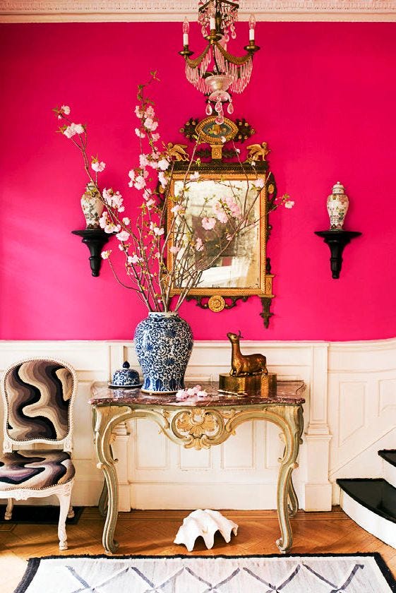
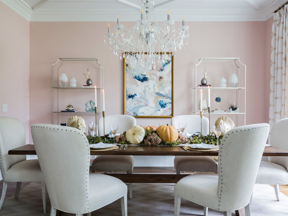
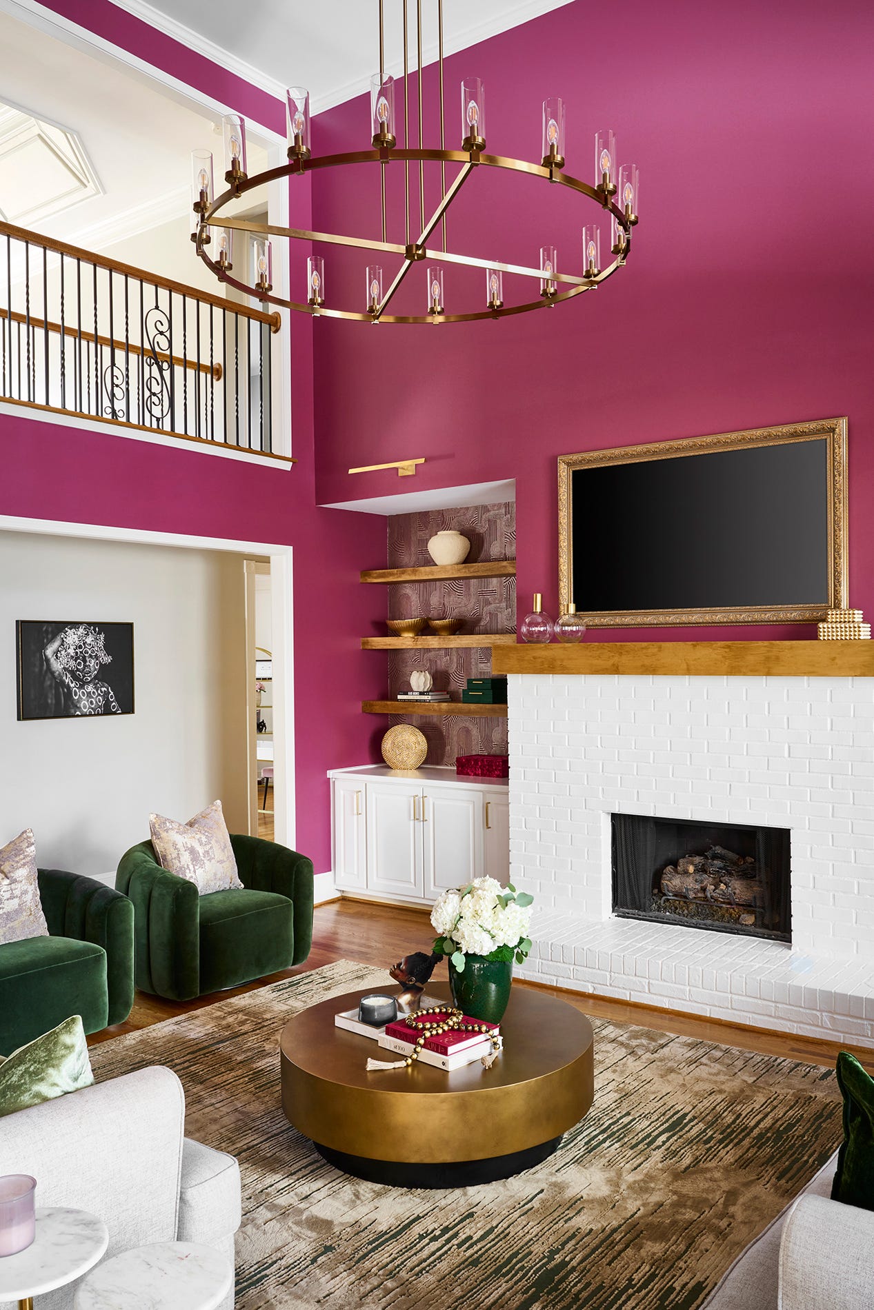
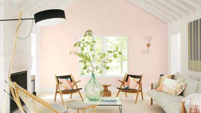
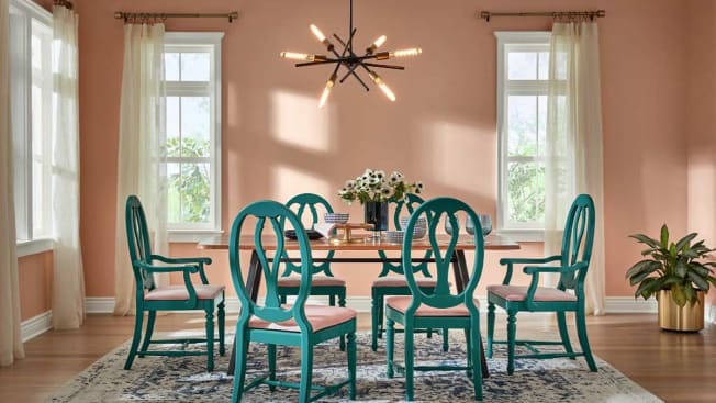
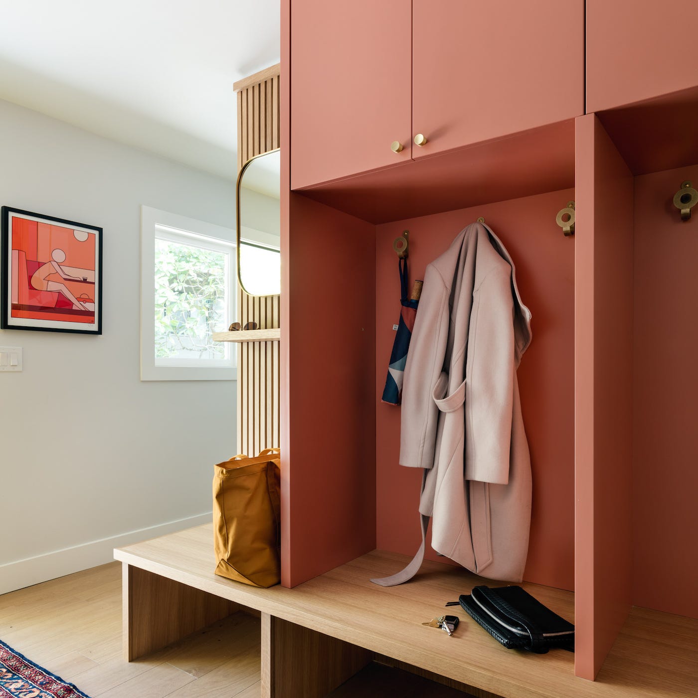
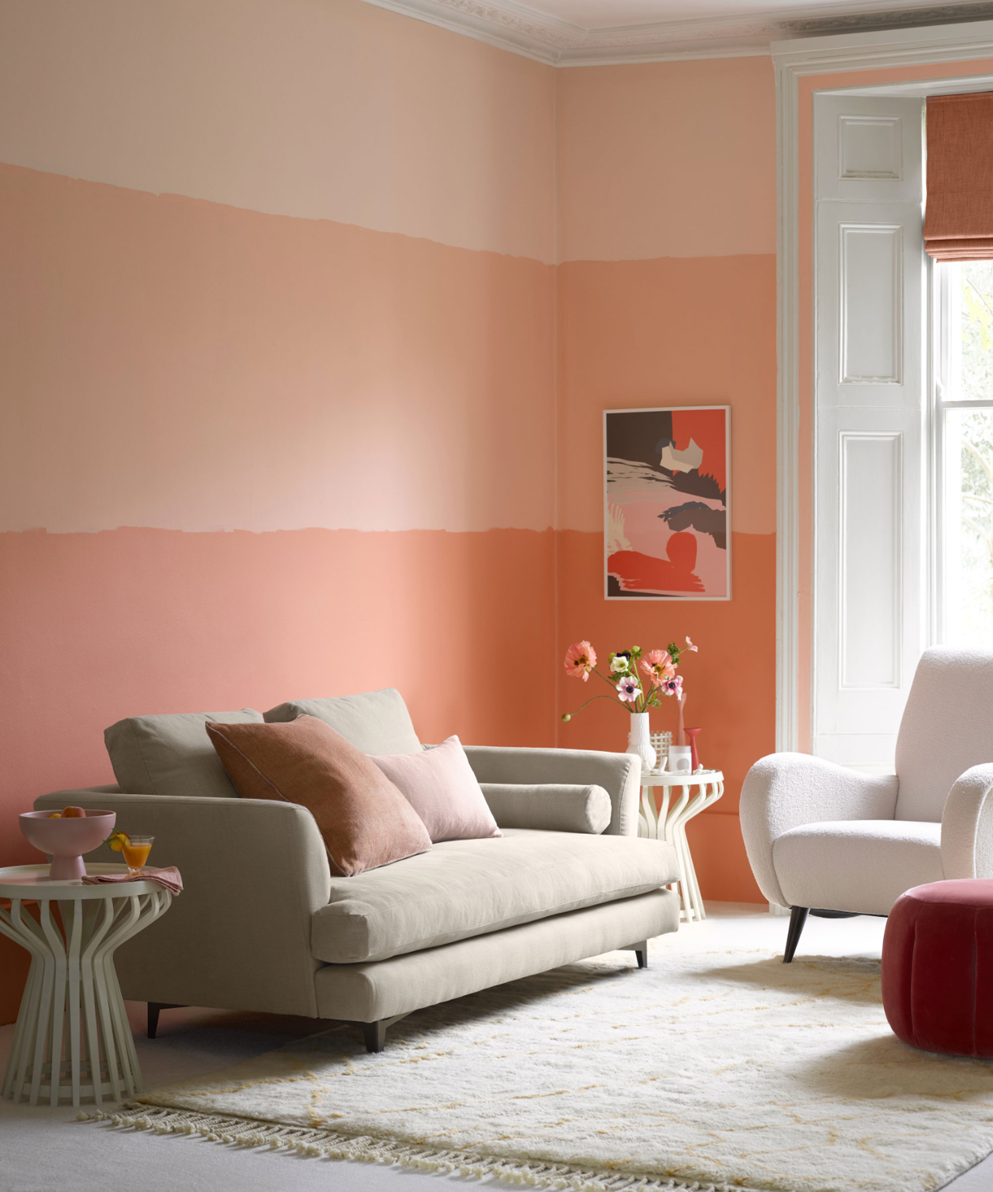
'Think Pink' is an edit of modern pink tones, including delicate peachy pinks, sophisticated millennial pink, and vibrant fuchsia. Sarah highlights pinks as the 'new neutral,' offering versatility similar to grey, and recommends pairing them with monochrome elements. Complementary colors for Think Pink include blues and turquoise shades (BB.35 and BB.37).
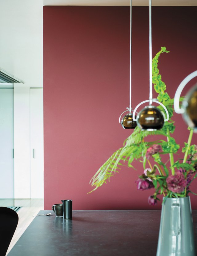
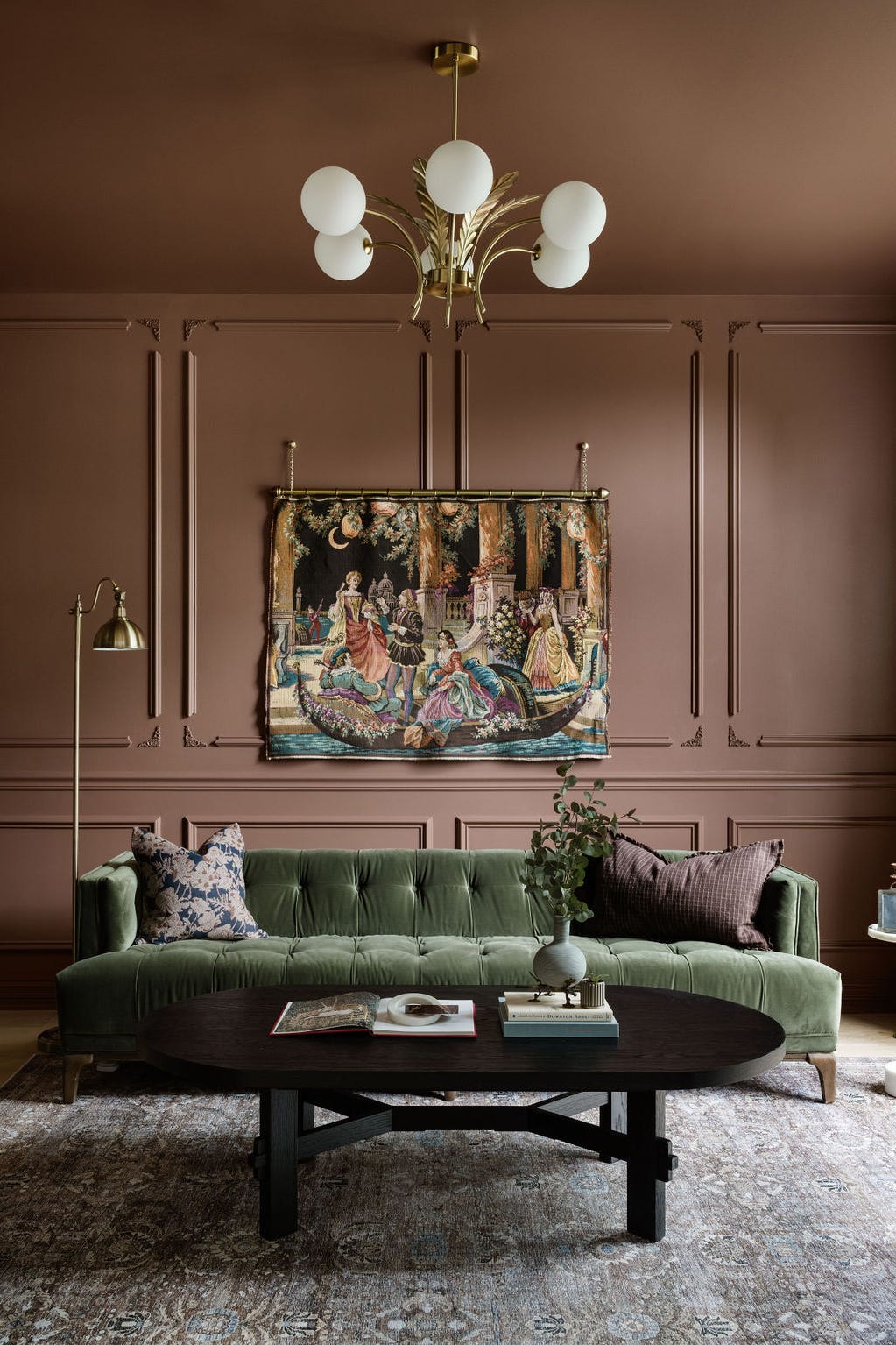
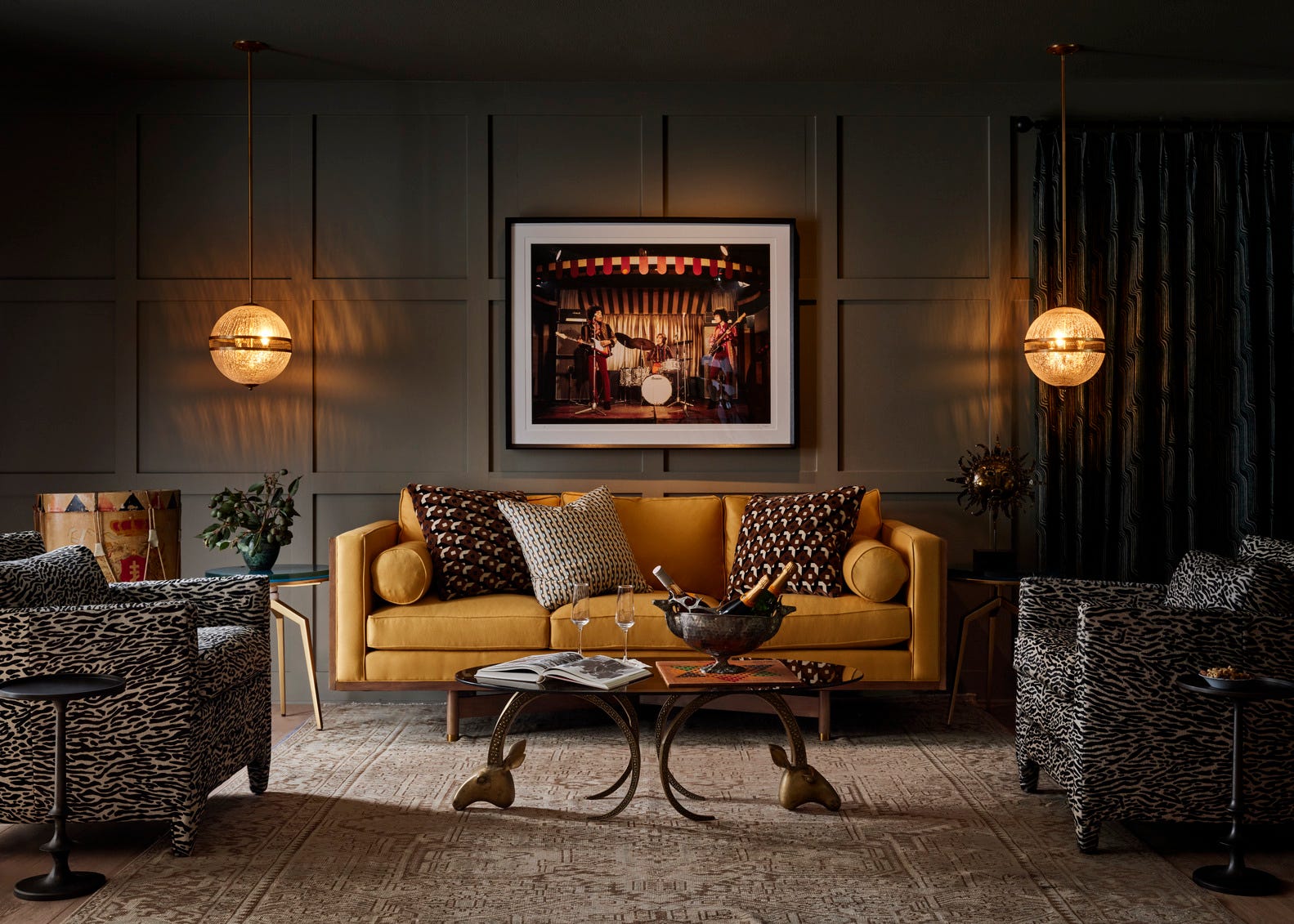
Finally, 'Moody Hues' consists of dramatic purples, from a warm creamy peach to deep mulberry. This family offers depth and mystery, providing a sophisticated and stylish option for those seeking unique colors. Sarah specifically mentions dusky mauves as standout favorites for their ability to blend modern and traditional aesthetics. Complementary colors for Moody Hues include citrusy yellows and greens (EN.04 and BN.38).
#PaintColors #HomeDecor #InteriorDesign #ColorPsychology #Homebase #HouseBeautiful #DecorateYourHome #PaintCollection #DIYHome #PaintColors #HomeDecor #InteriorDesign #ColorPsychology #Homebase #HouseBeautiful #DecorateYourHome #PaintCollection #DIYHome
0 comment in total
 No comments yet
You may also like
35 Paint Colors to Consider for Every Room in Your House
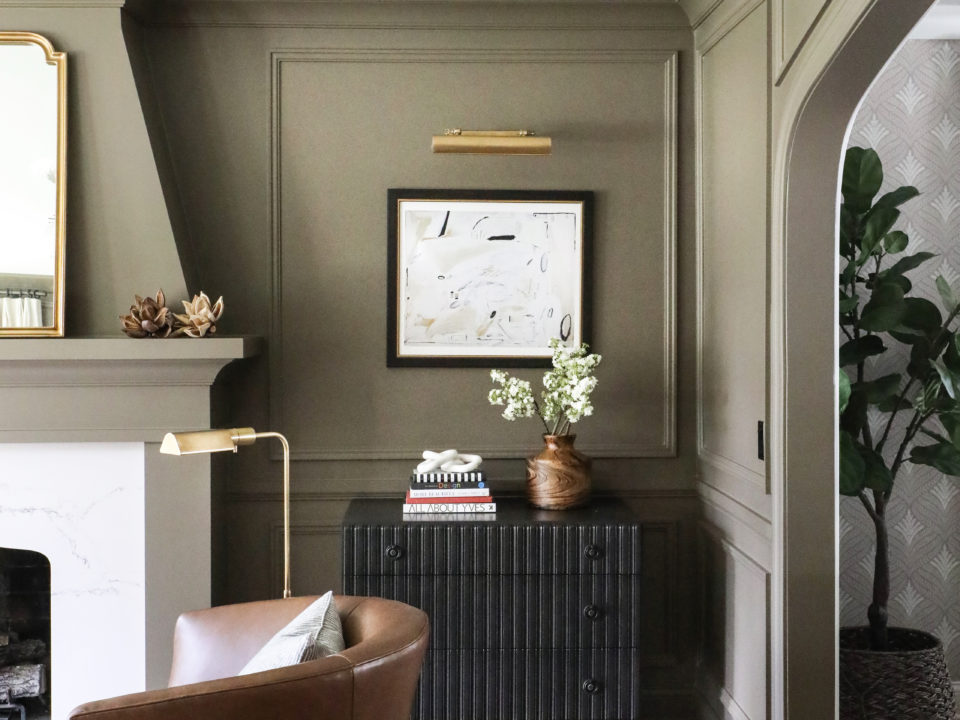
How to Pick the Best Paint Colors for Every Space in Your Home
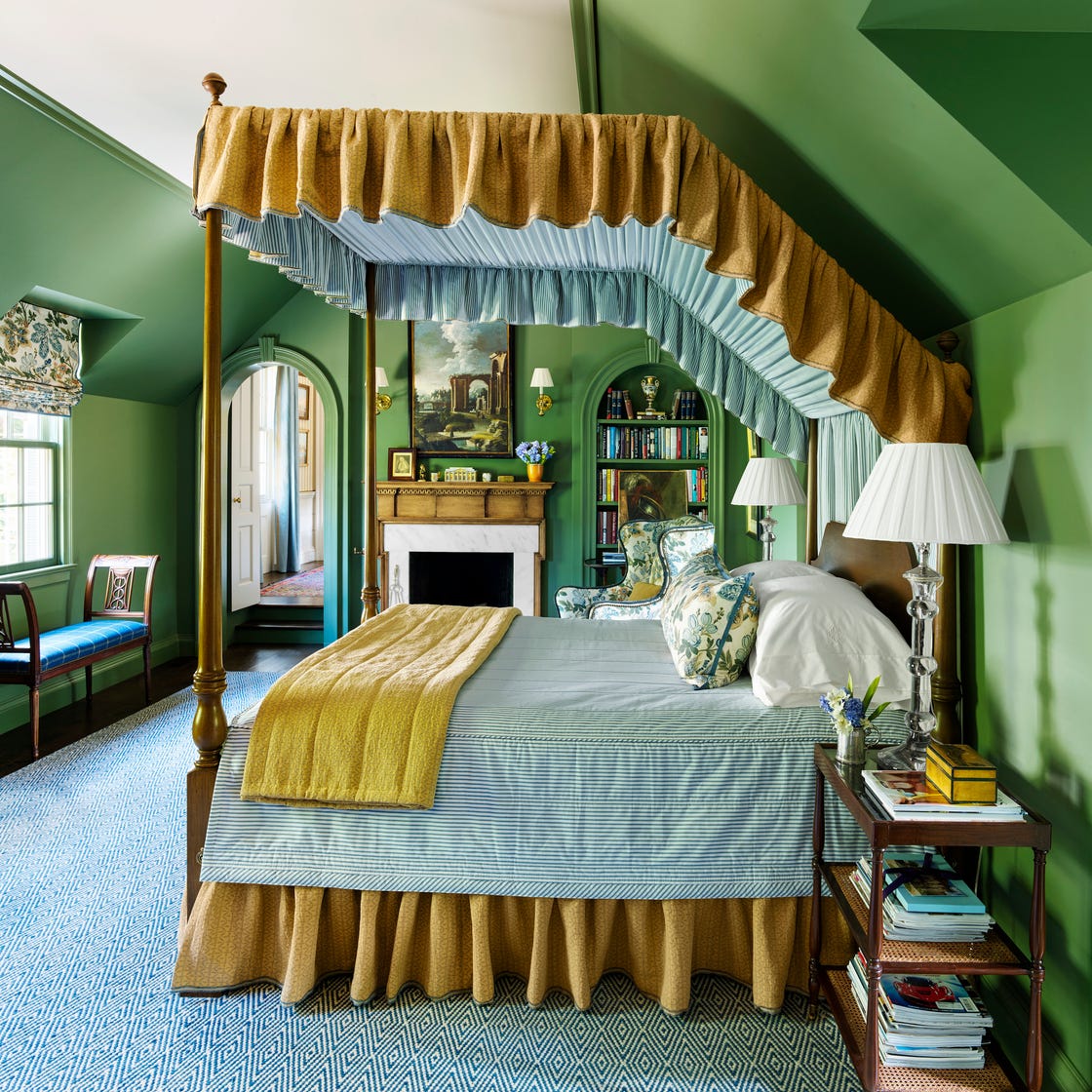
These 7 Colors Will Rule Interiors in 2026, According to Experts

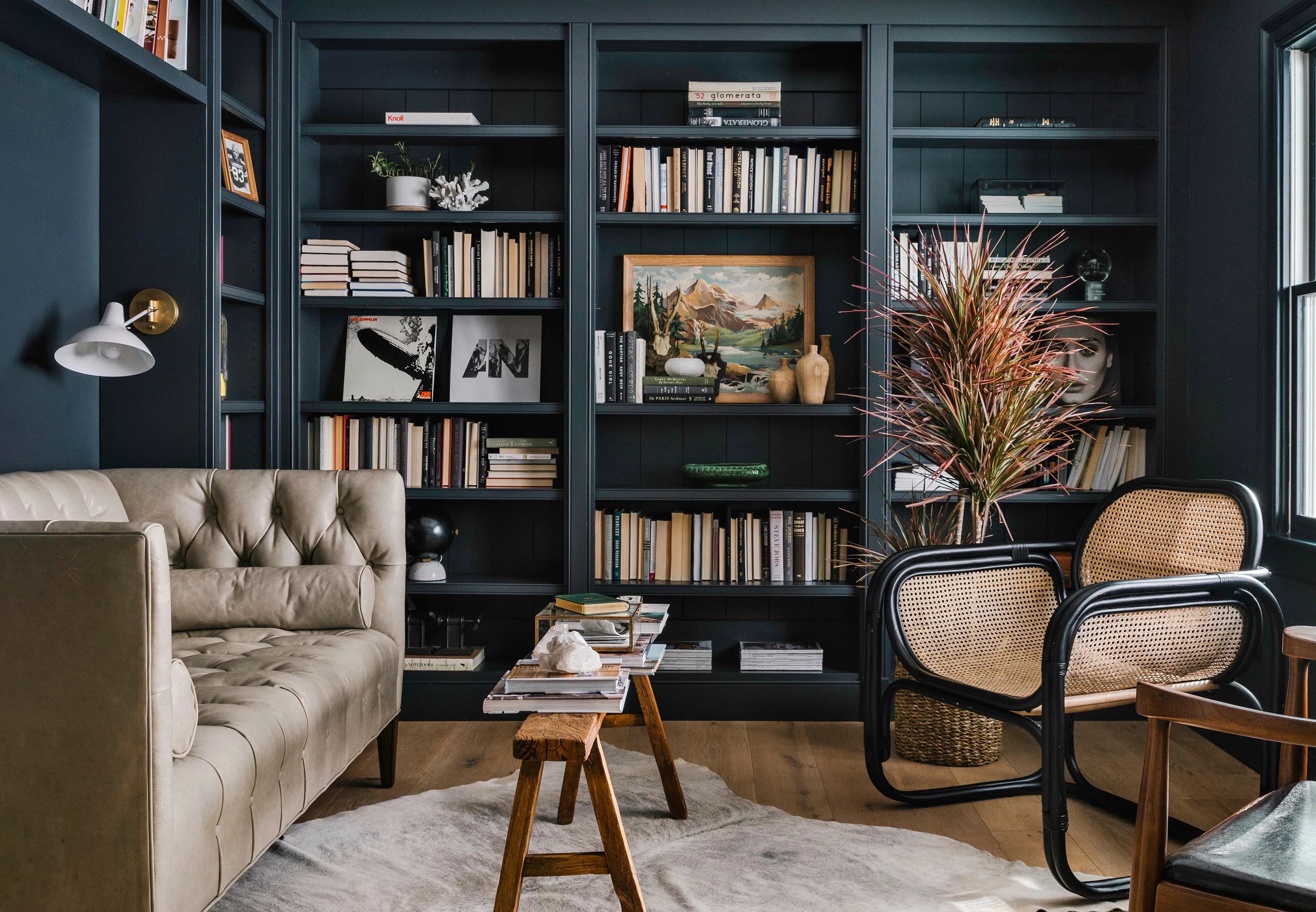
We Asked 5 Designers If Moody Paint Colors Are Still Trendy, and They All Said the Same Thing

2021’s Palette of Possibilities
These 13 Paint Color Trends for 2021 Will Give Your Home a Fresh Look

The 5 Most Overused Paint Colors and What to Try Instead, According to Designers

Living room paint ideas – 30 stylish ways with paint, and expert color tips


6 key colors to decorate with in May 2025, according to interior design and color experts in the know
8 Timeless Paint Colors That Always Look Fresh, No Matter the Season

5 living room paint colors going out of style in 2025
Jewel Tones Are Trending for Living Room Paint Colors, According to Designers
Trending Interior Paint Colors for Homes in 2025

The 60 Most Popular Living Room Paint Colors Right Now

Hottest Interior Paint Colors of 2020
7 Popular Paint Colors for the Living Room
Millennial Gray Is So Over—Here Are 5 Paint Colors to Try Right Now
Lick Paint Will Transform the Mood in Your Home Through Color Psychology
Design Pros Have Spoken: Here Are the Only Paint Color Trends That Matter in 2023
Interior Paint Colors & Palettes