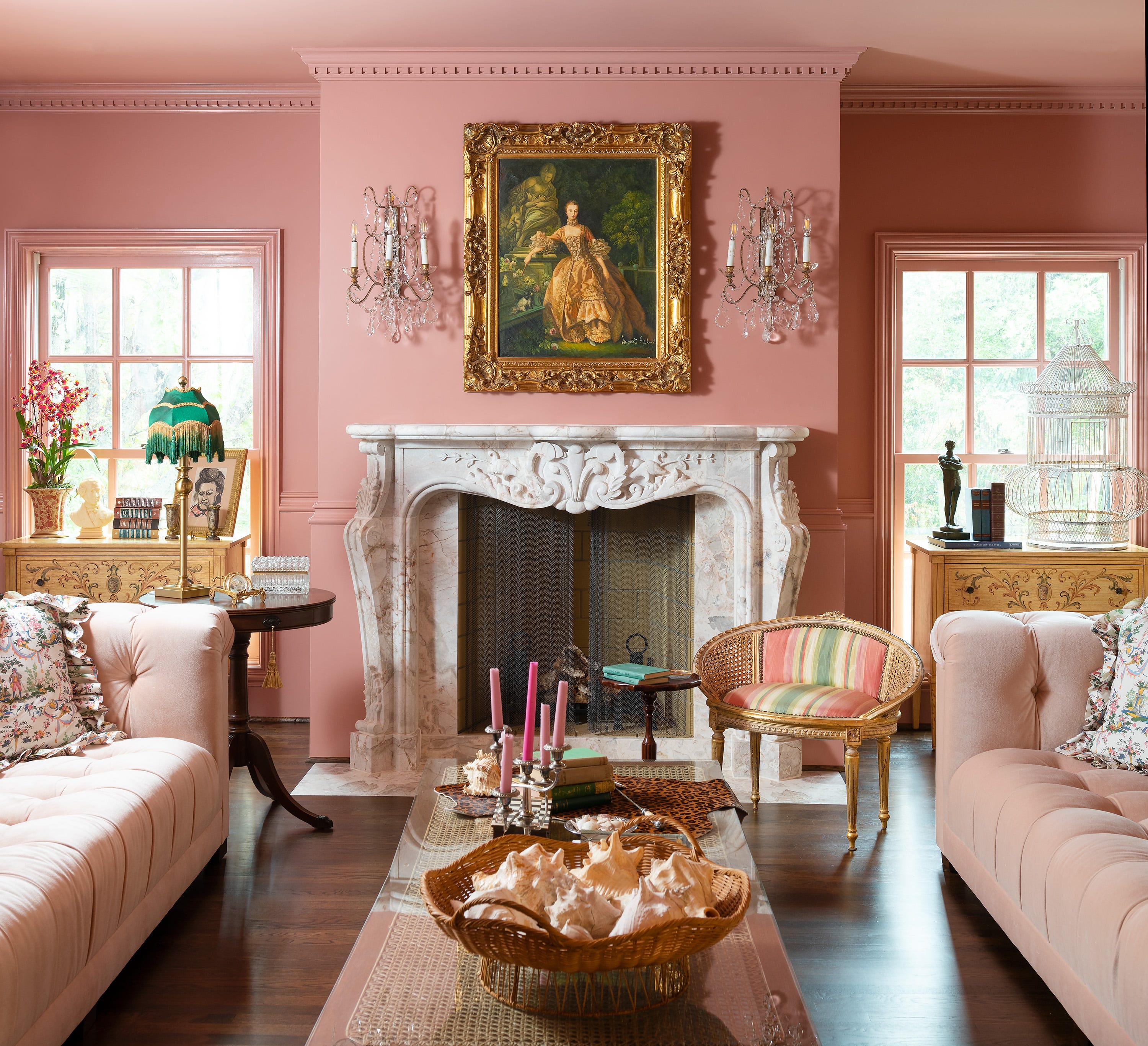
1/21
Jewel Tones Are Trending for Living Room Paint Colors, According to Designers
This article explores a curated selection of 78 living room paint color ideas, gathered from leading designers, aiming to inspire homeowners looking to refresh their living spaces. The author highlights the transformative power of a fresh coat of paint, emphasizing that it can dramatically alter a room's ambiance without requiring new furniture. The piece addresses the common challenge of selecting the perfect paint color, balancing between current trends and timeless aesthetics, and suggests considering the home's architectural style and the homeowner's personal preferences.
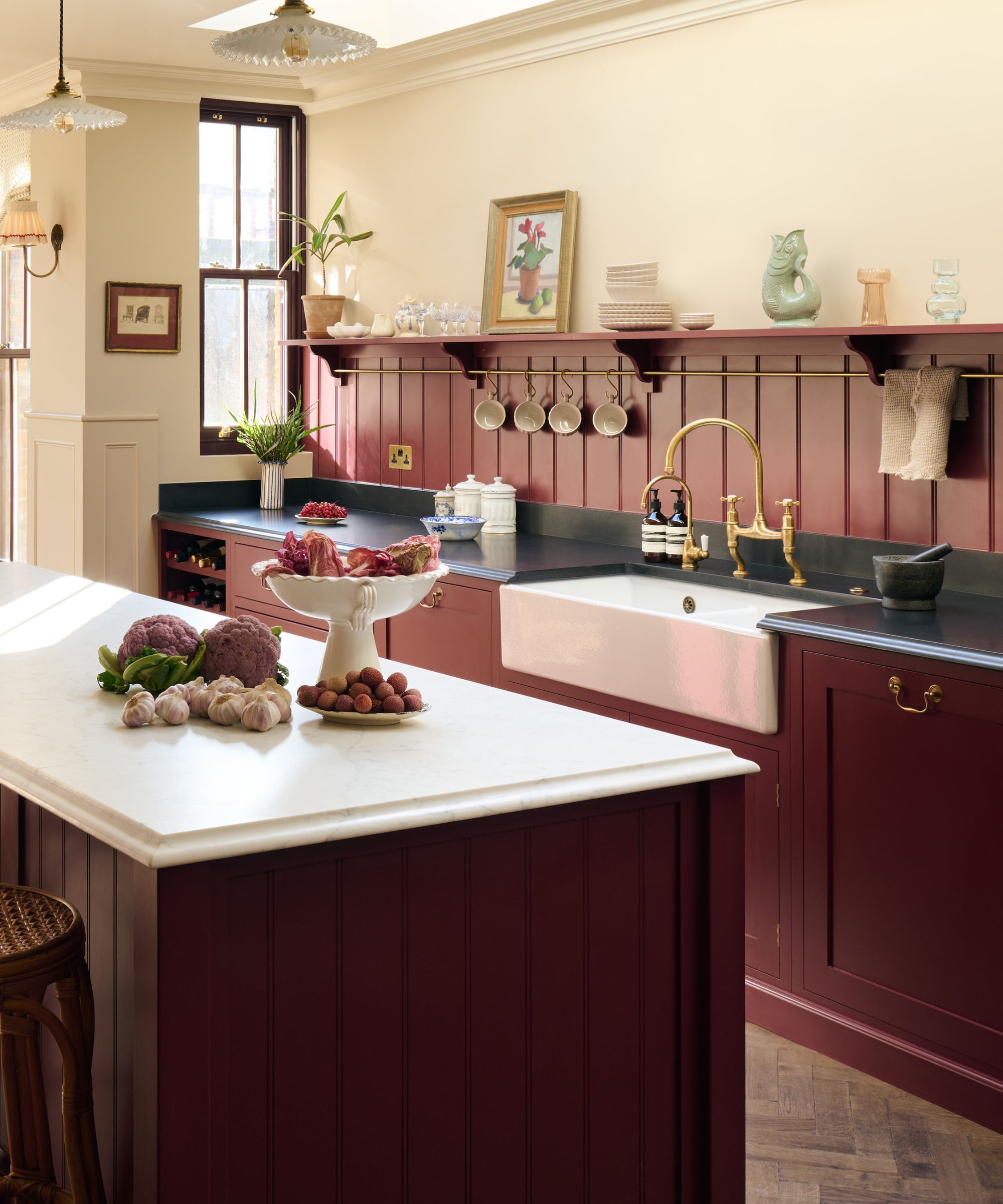
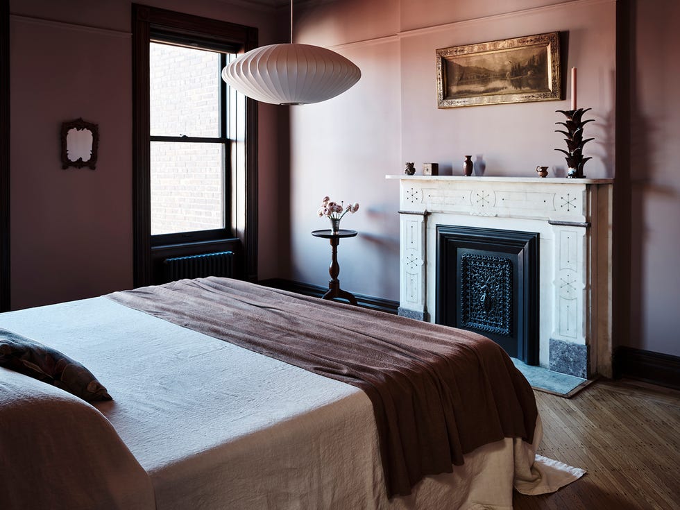
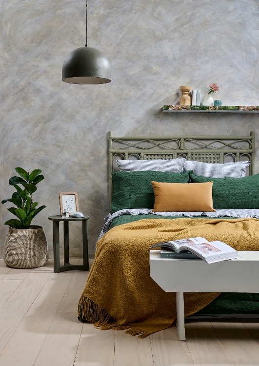
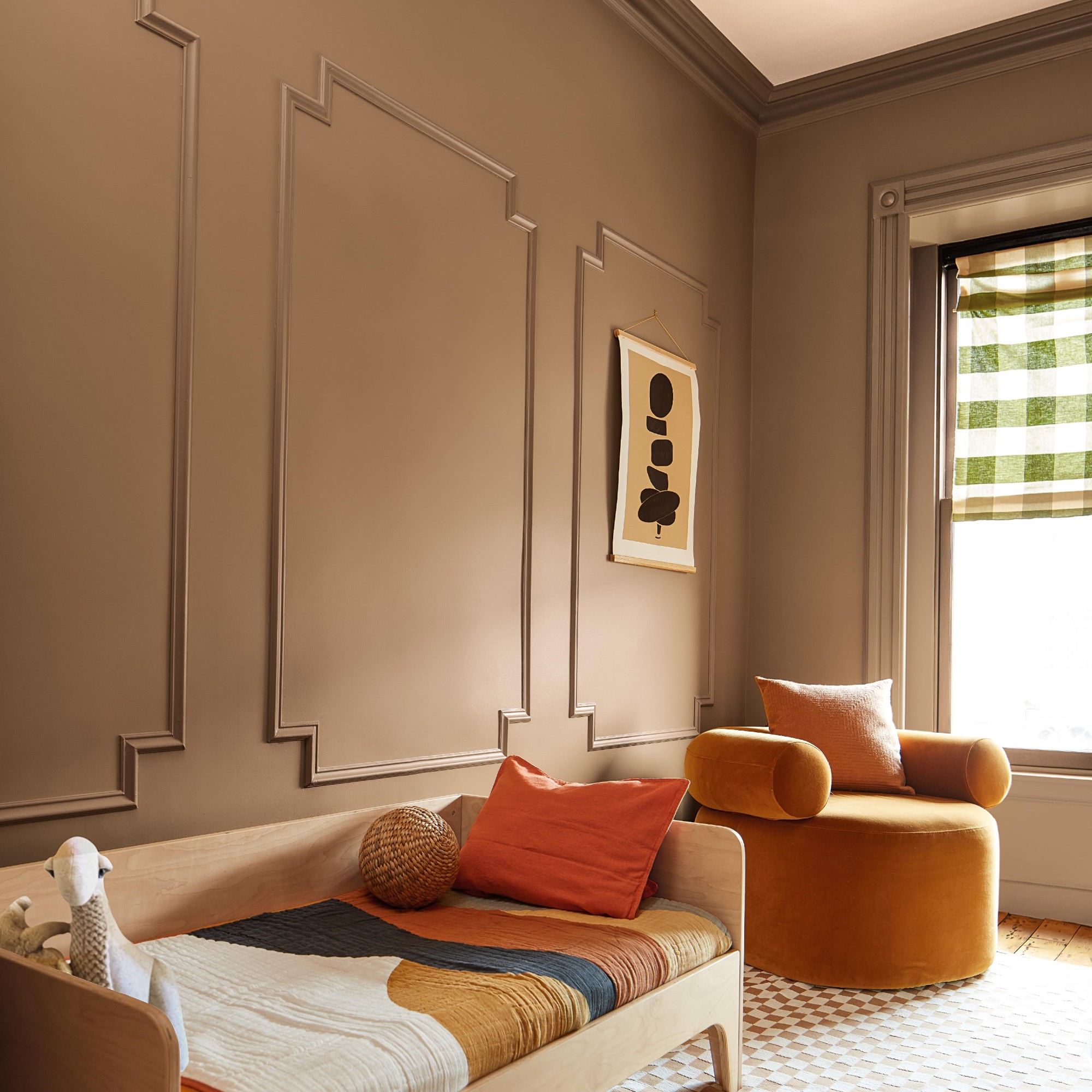
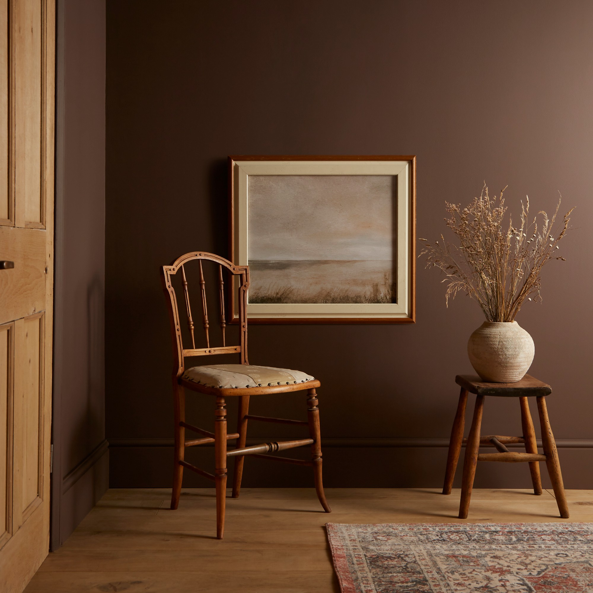
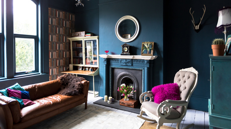
The discussion then delves into the evolving trends in paint colors, noting that while classic neutrals like white, off-white, and greige remain popular, there's a growing inclination towards richer tones such as brown and burgundy, which have been trending in the current year. The article advises readers to consider the desired mood for their living room when choosing a color, offering examples like jewel tones for a dramatic, cocooning feel; pastels and soft shades to enhance natural light and make small spaces appear larger; and moody colors like navy or forest green for a cozy, intimate atmosphere.
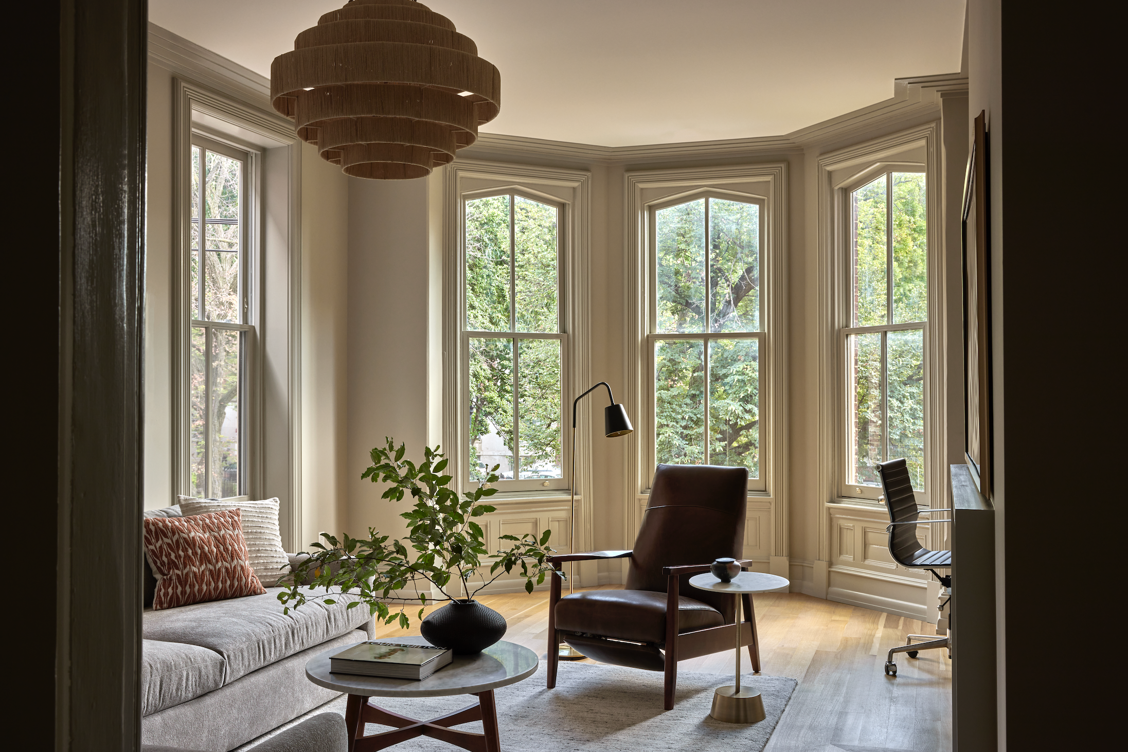
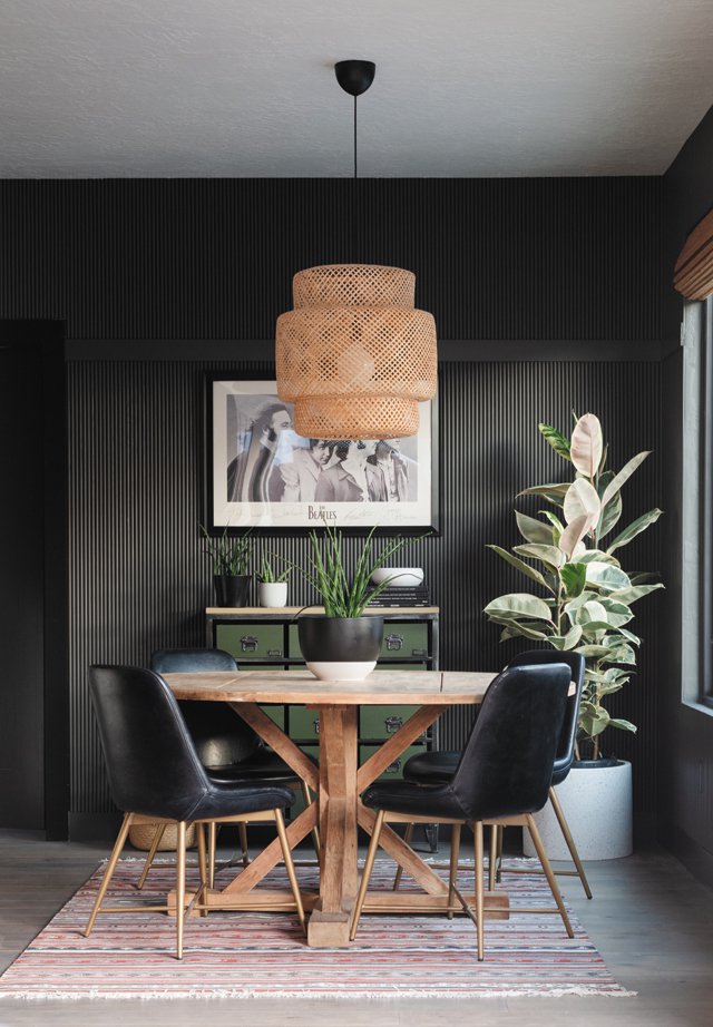
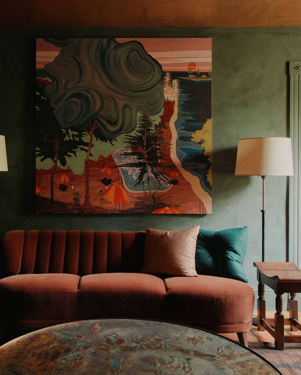
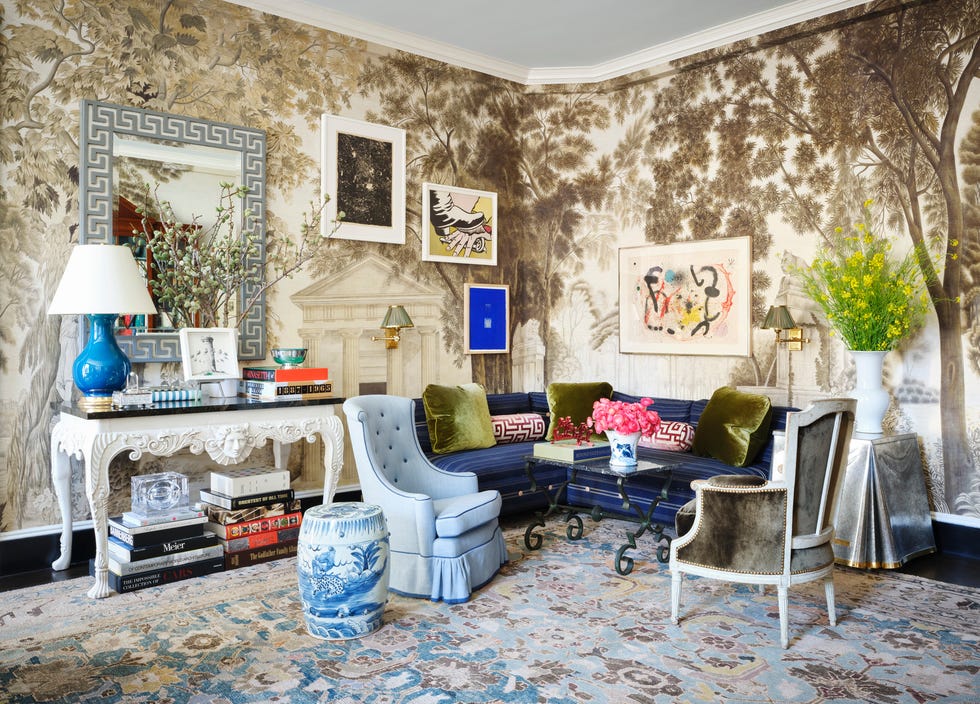
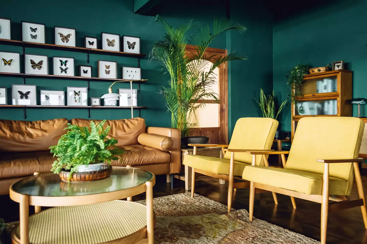
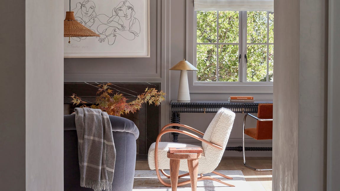
Several specific examples of living room paint colors and their applications are provided. Dark Olive, like Benjamin Moore's Trailing Vines, is presented as a choice for a moodier space, featuring a charcoal gray cast. Gray-Brown, exemplified in a speakeasy-inspired living room by designer Sarah Stacey, is noted for creating a cozy and intimate setting. The article also touches upon bold combinations, such as lime green and magenta walls by Sawyers Design, which contribute to a vibrant yet polished aesthetic.
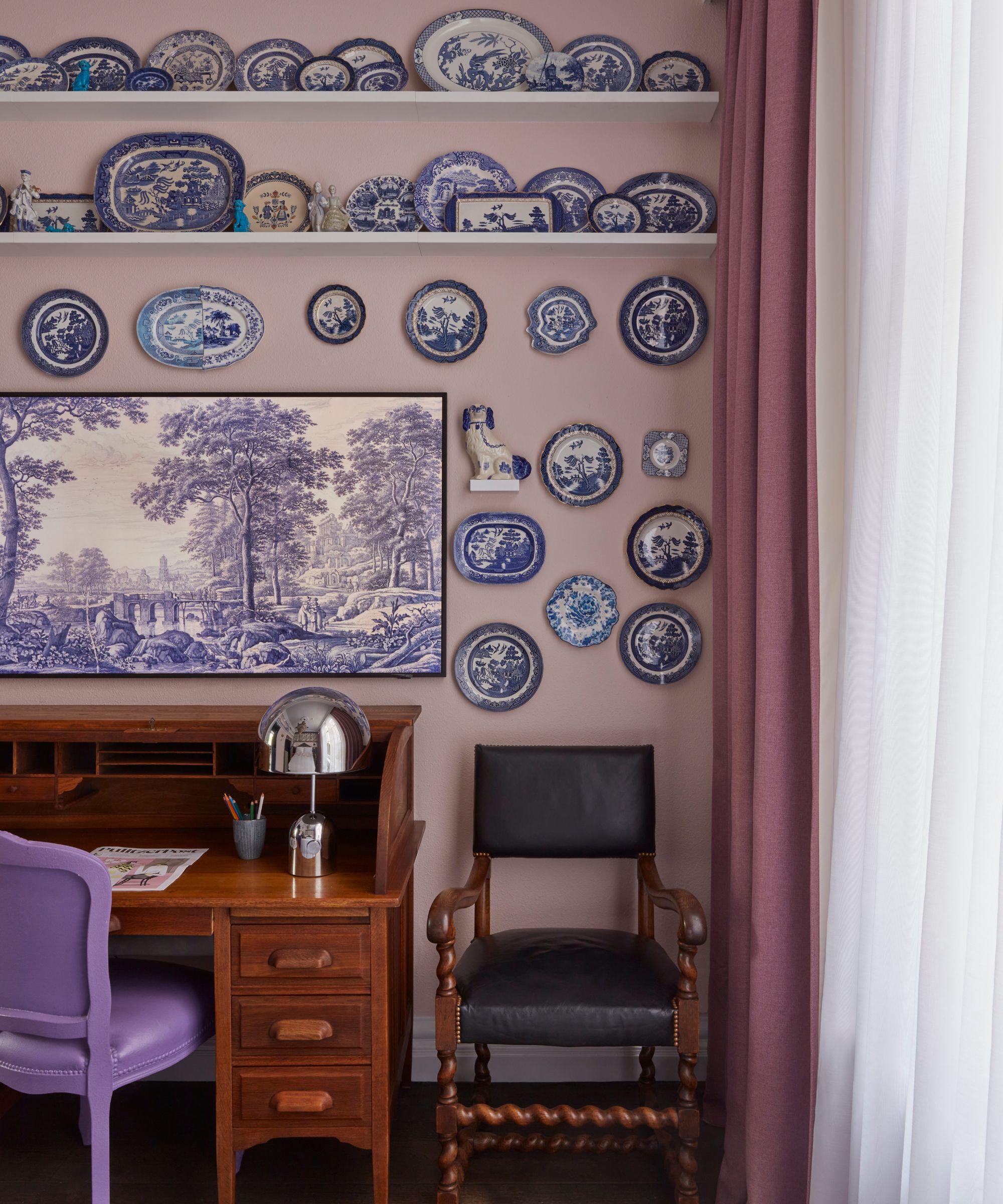
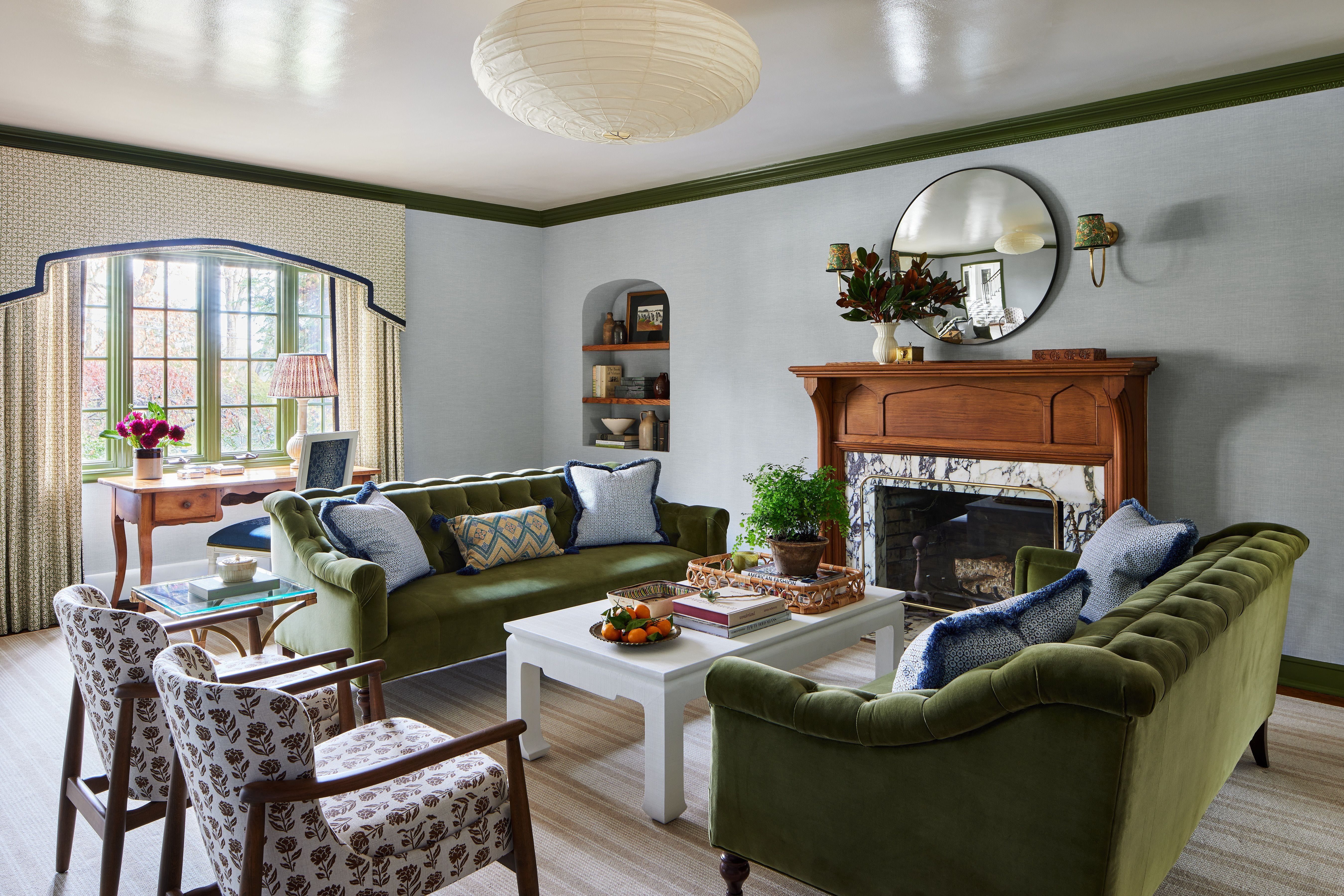
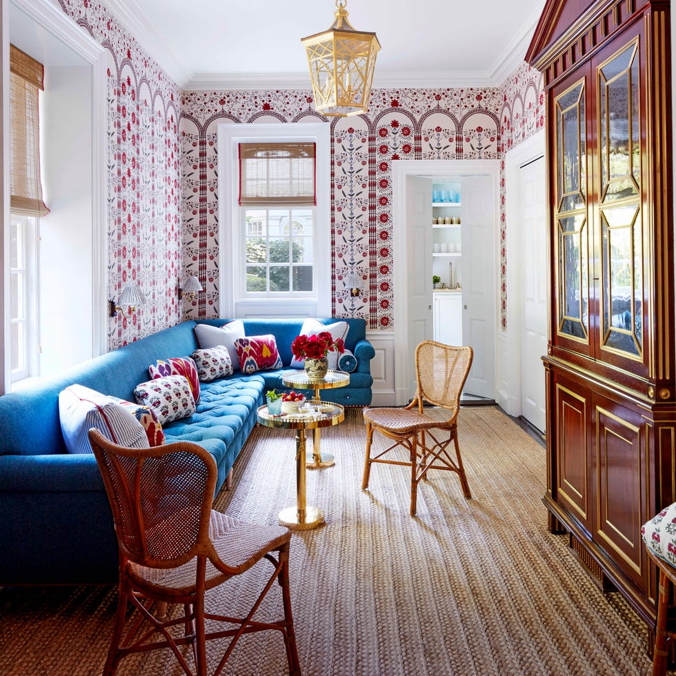
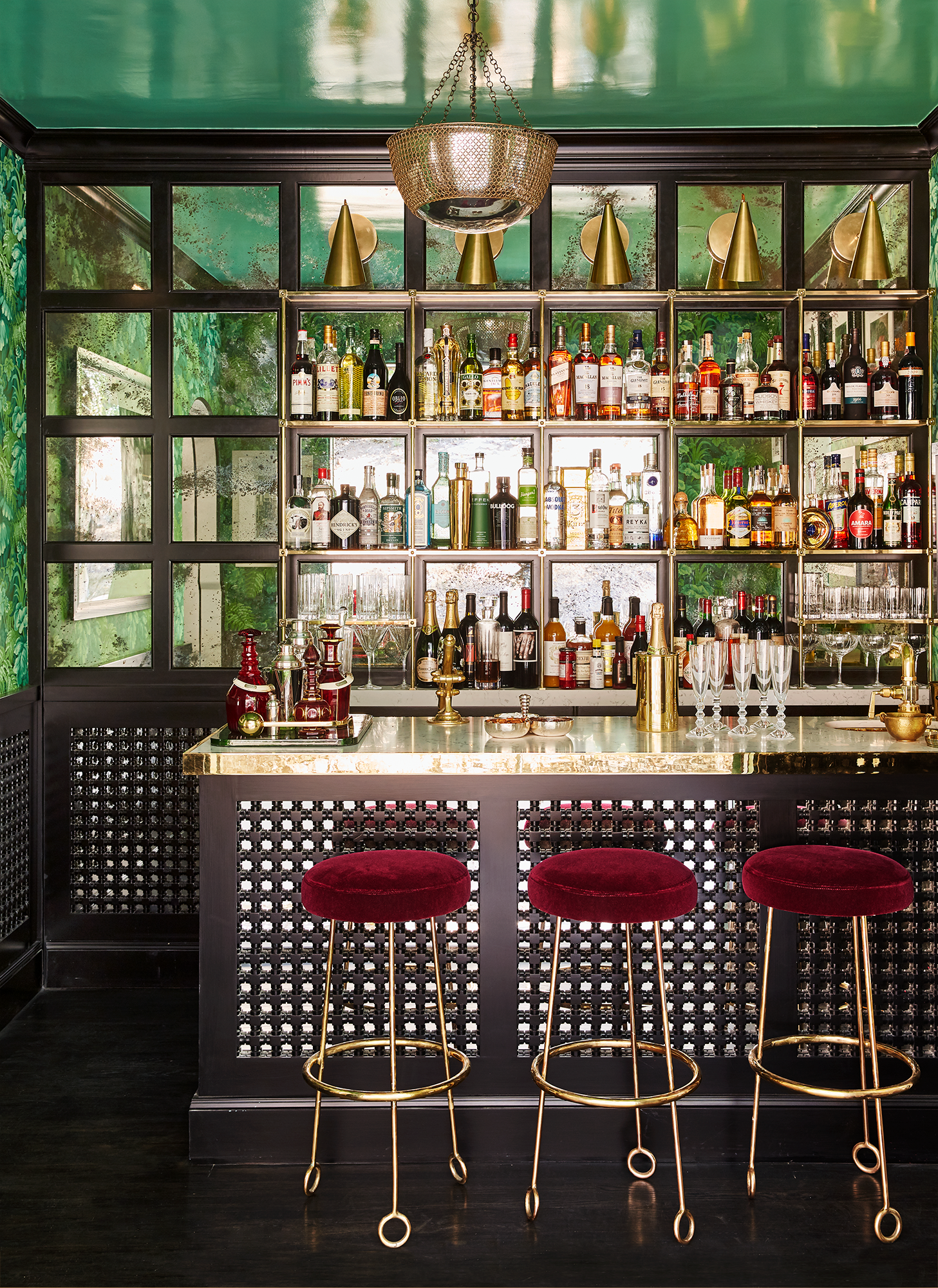
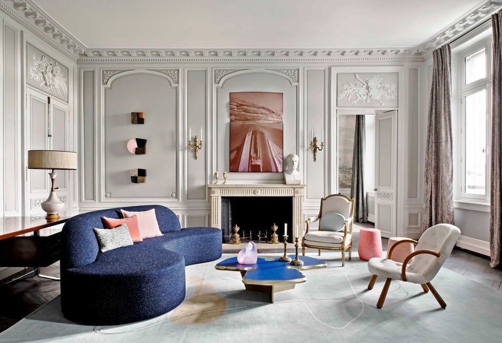
Saturated Mauve, specifically Sherwin-Williams' Patchwork Plum, is discussed for its ability to lend an intimate element, especially when tied into other room elements. Inky Blue, like Benjamin Moore's Admiral Blue, is highlighted for anchoring heavily patterned spaces with its electric appearance. Kelly Green is suggested as a versatile option that can function almost as a neutral in colorful rooms, helping to prevent the space from feeling too busy. Slate Blue, particularly Benjamin Moore's Providence Blue, is introduced with the idea of painting ceilings to differentiate spaces and add sophistication, as demonstrated by Suzanne Kasler.
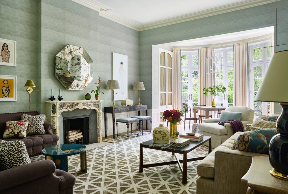
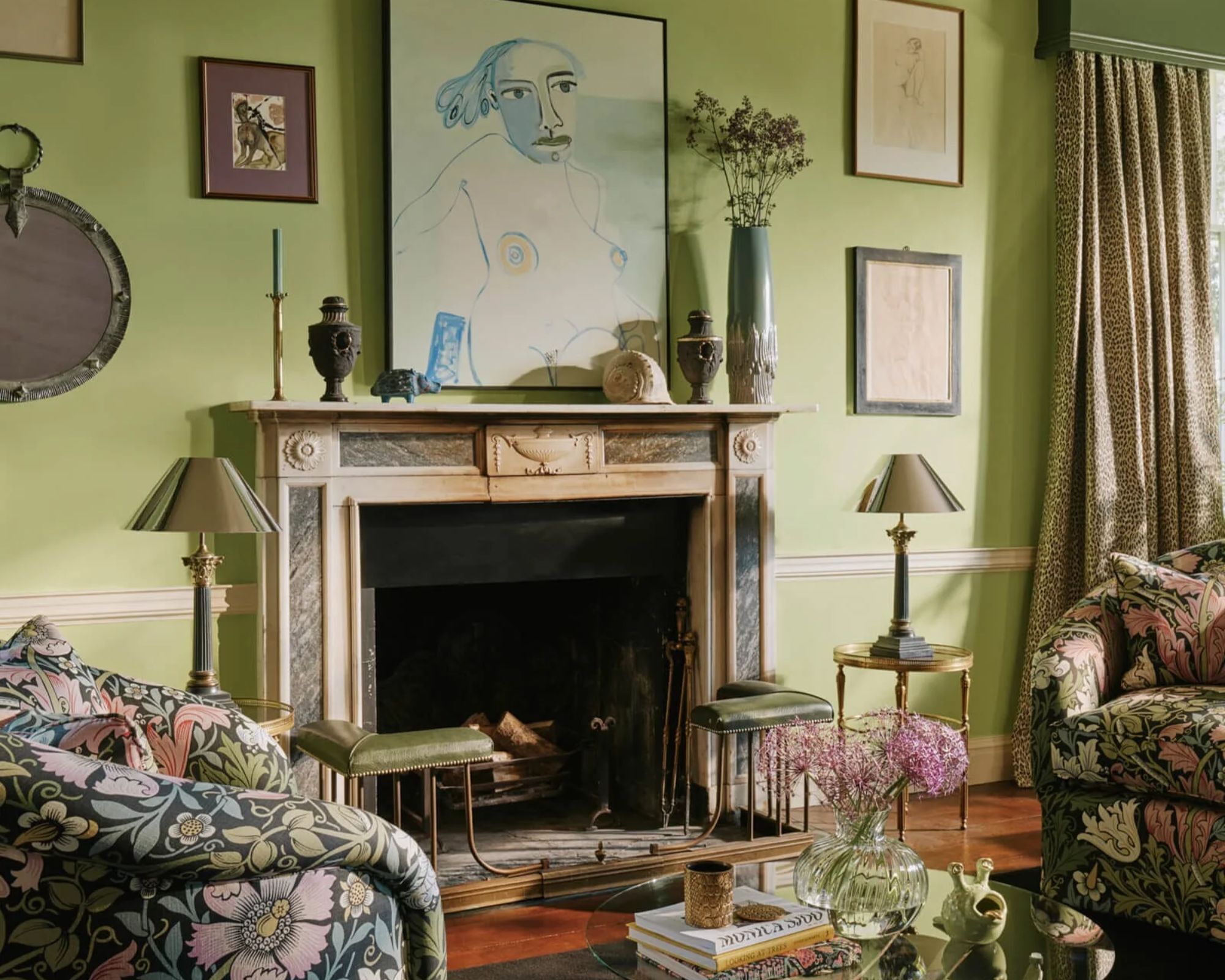
Steely Green, such as Benjamin Moore's Raindance, is described as a chameleon-like gray-green that adapts to the surrounding decor. Mossy Green tones, like Dunn-Edwards' Elemental Green, encourage risk-taking, as designers often find unexpected beauty in colors that might initially seem unappealing on a swatch. Cloudy Blue, a custom Pittsburgh Paints shade, is featured for creating a calming and elevated feel in narrow rooms. Delicate Pink, like Farrow & Ball's Tailor Tack, offers a soft and uplifting ambiance, inspired by natural elements like cherry blossoms.
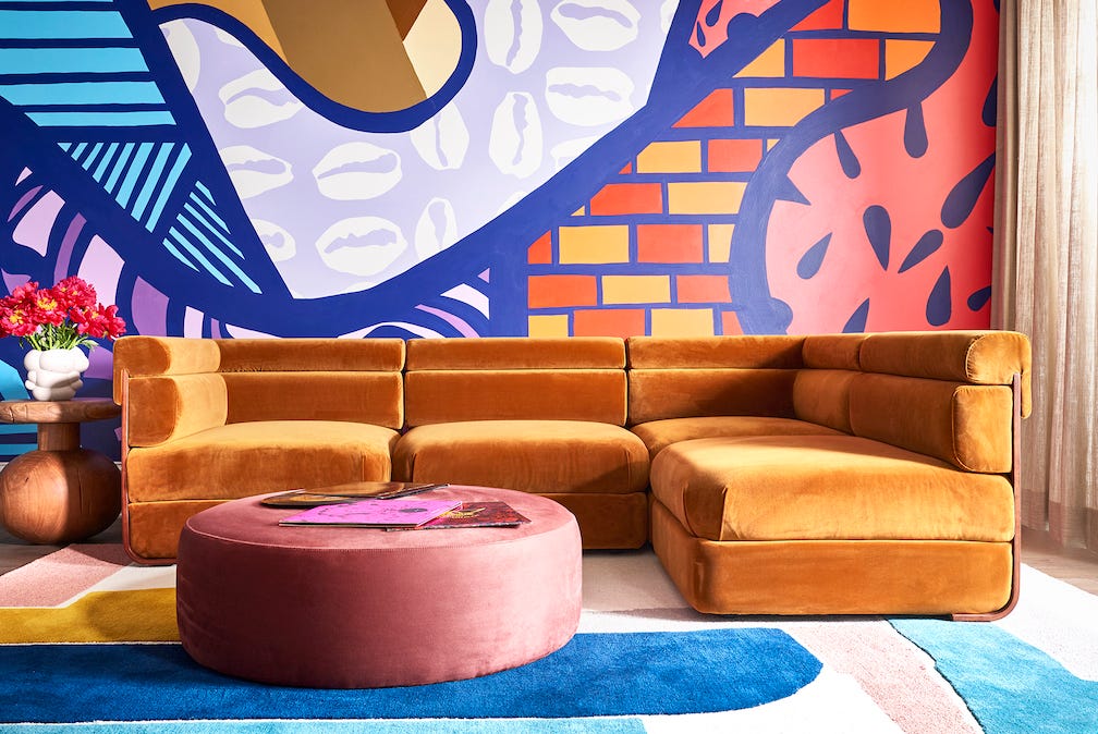
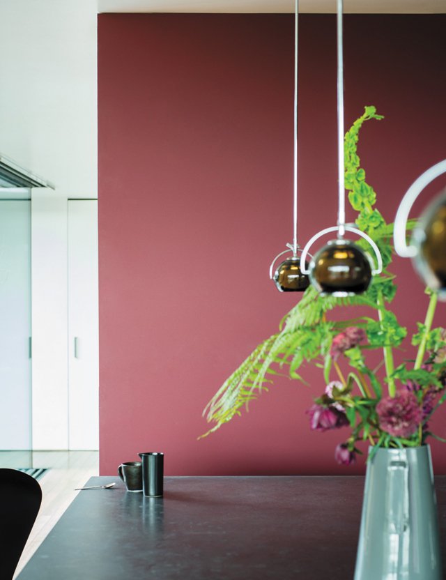
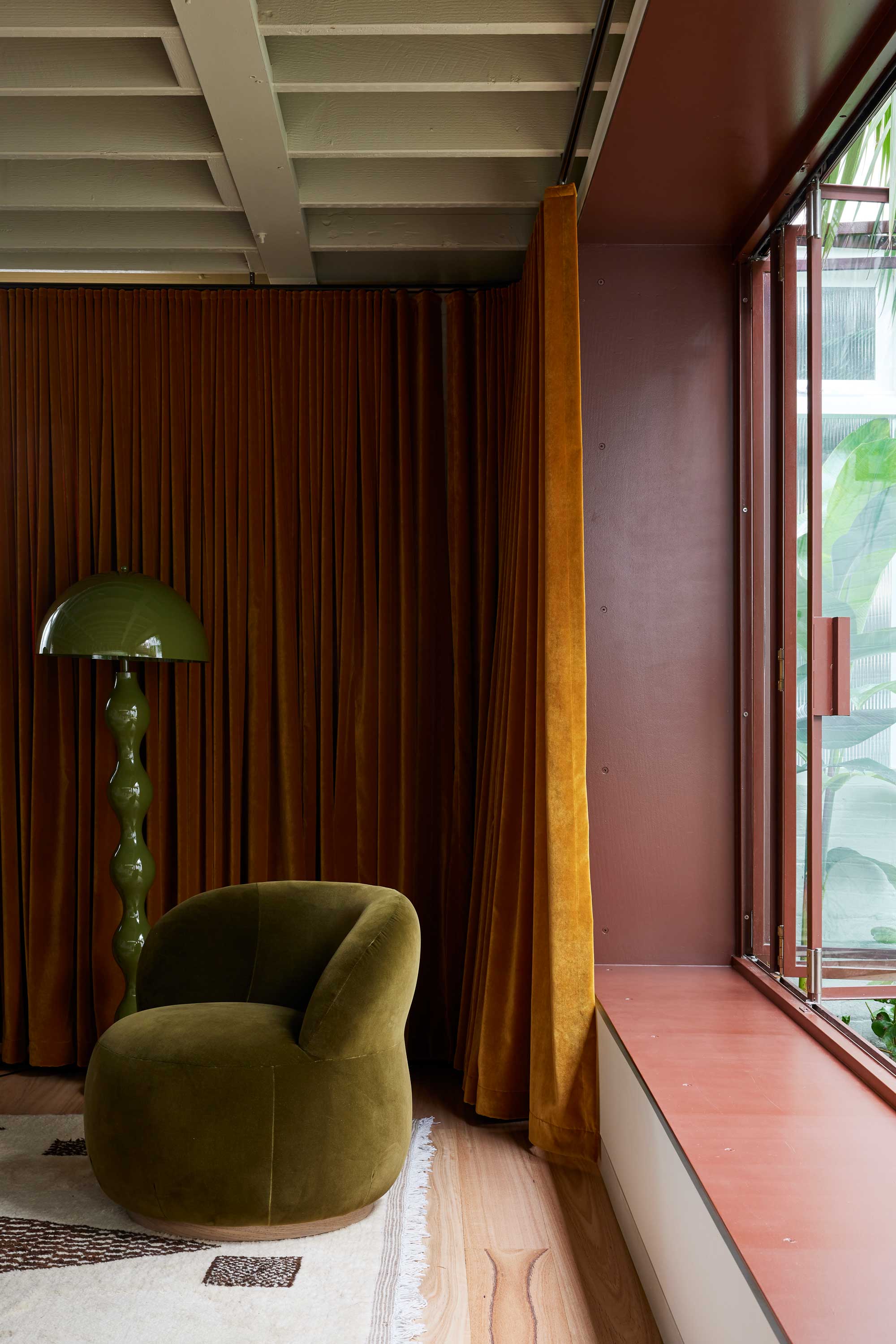
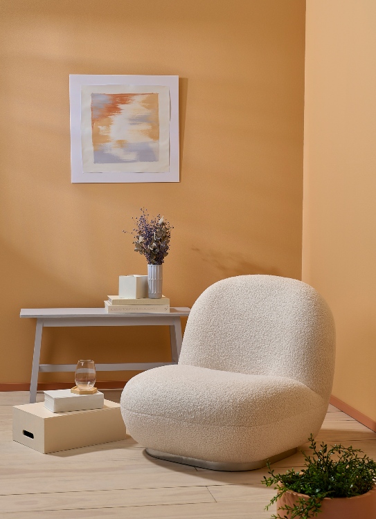
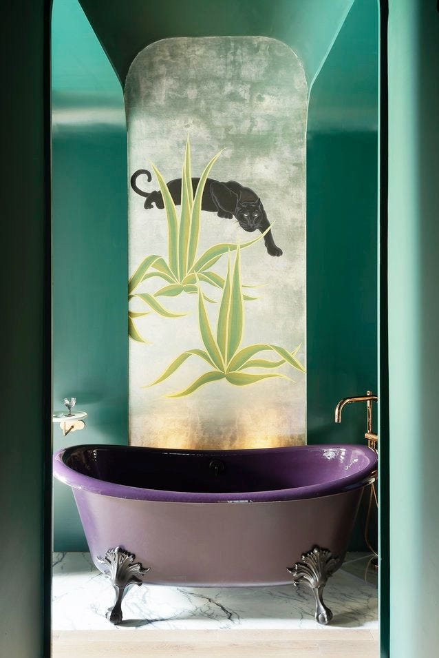
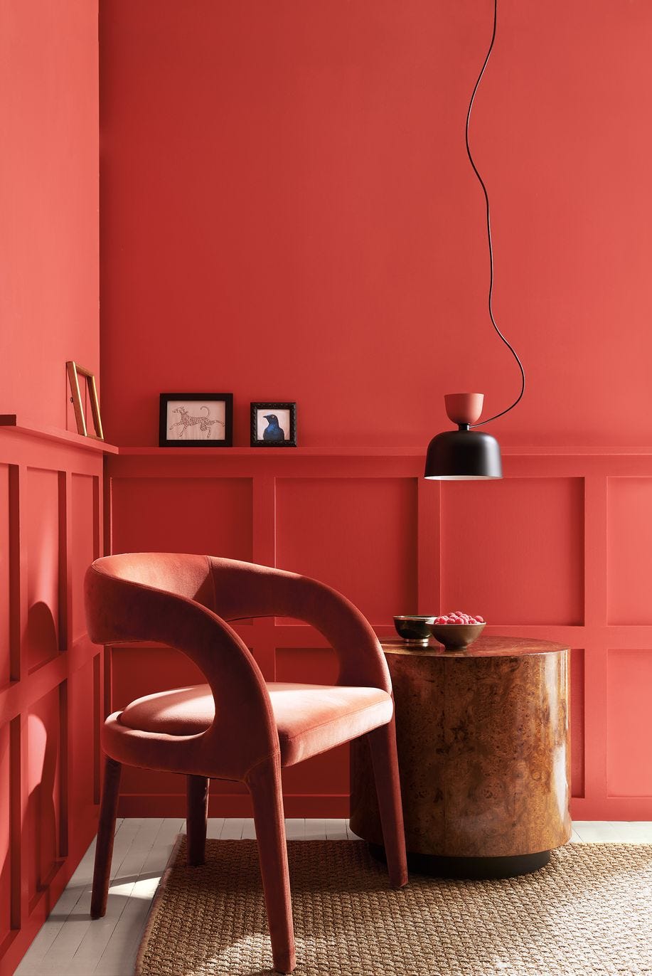
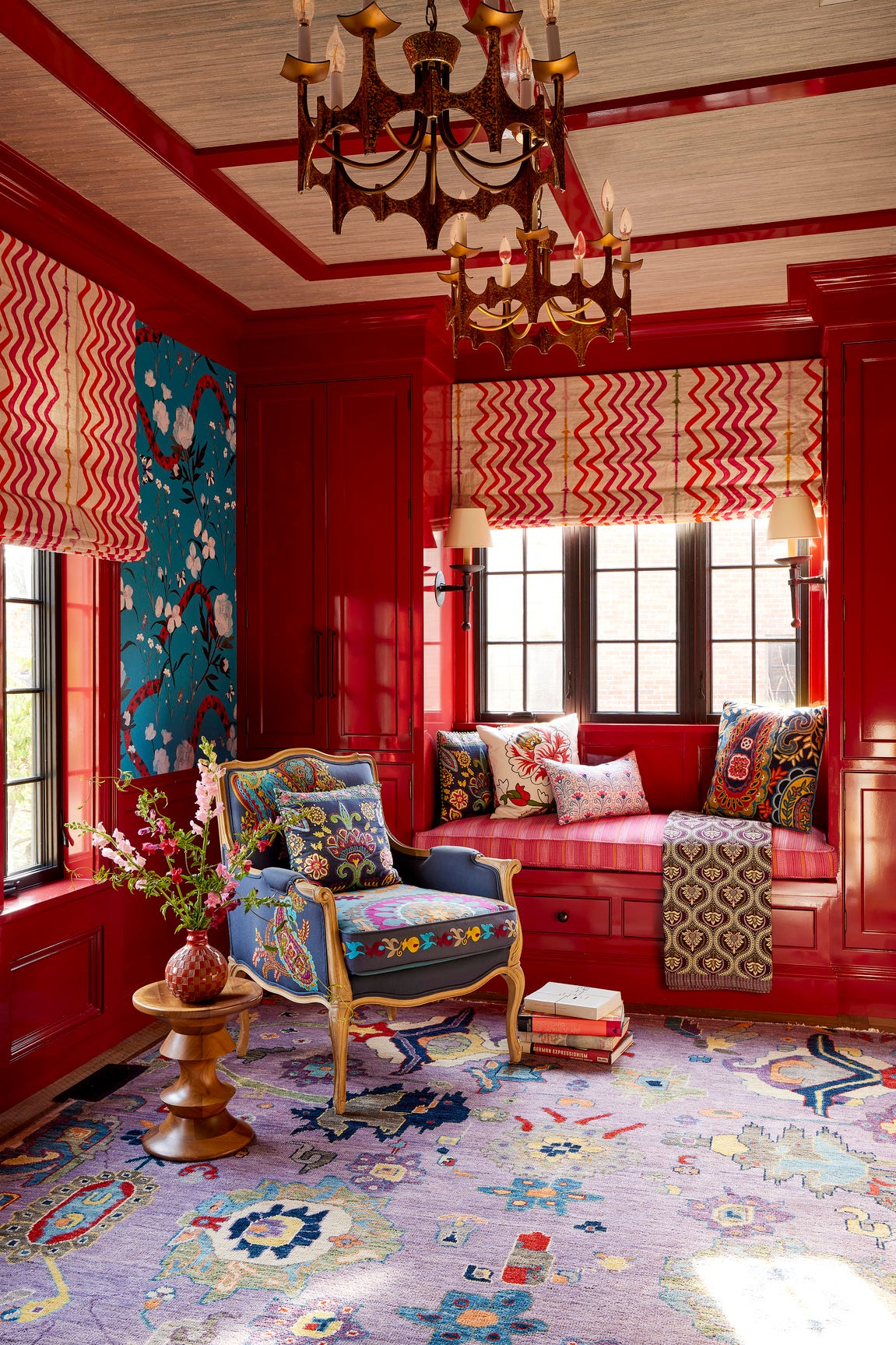
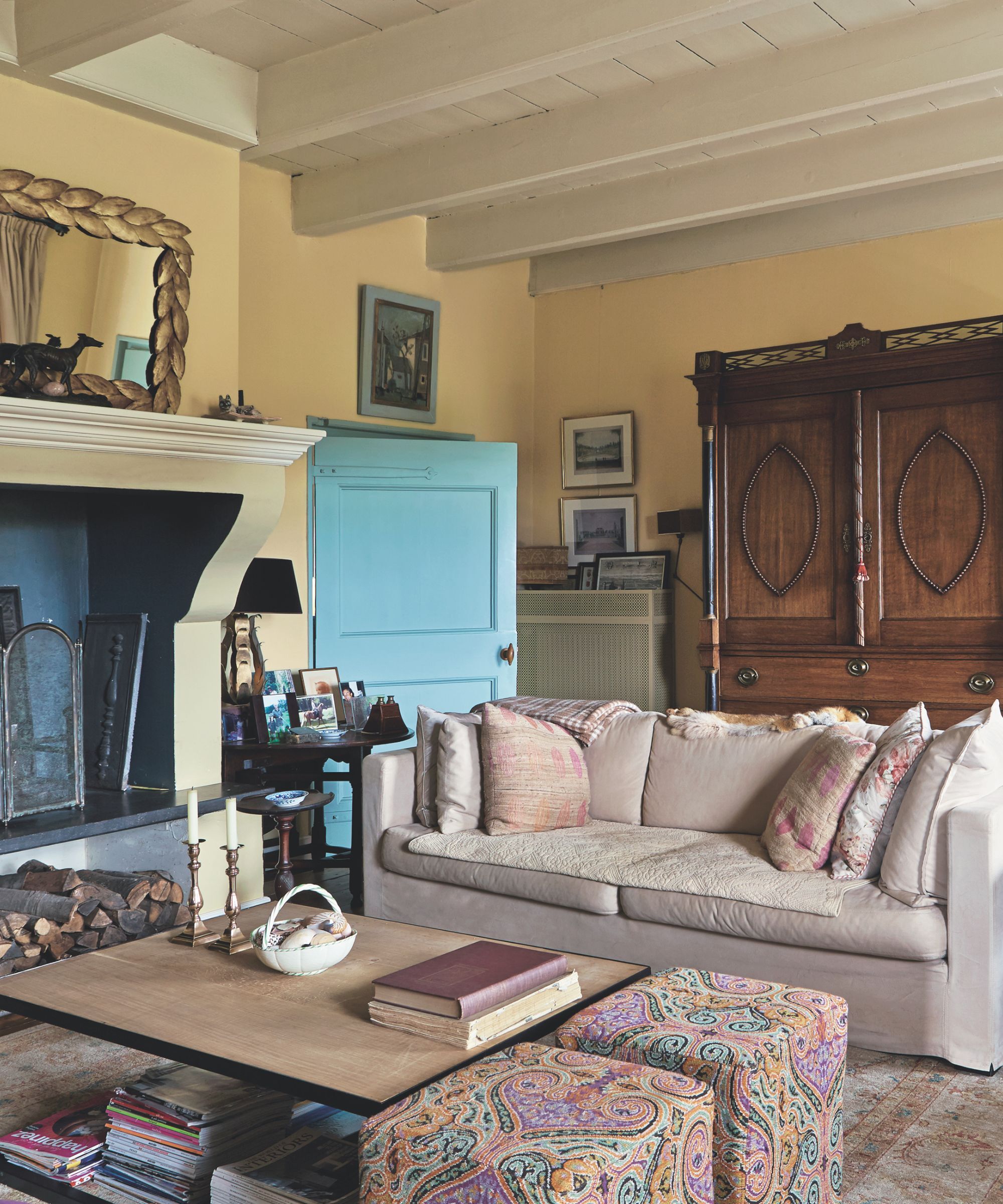
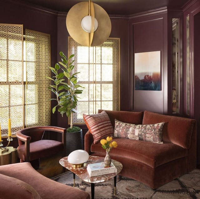
Ochre is recommended as a rich yellow-brown hue that is both enveloping and inviting, especially when paired with tonal furnishings. Burgundy, a red-toned deep purple that can appear mahogany, is described as suitable for creating dynamic and cozy escapes. Warm Orange tones are noted for their inviting quality, particularly when complemented by blue accents. Sage Green is highlighted for its soothing and welcoming effect, drawing inspiration from natural landscapes and luxurious spa environments. Lilac Purple, such as Benjamin Moore's Evening Skyline, is presented as a sophisticated yet playful choice that can complement tropical motifs. Sunshine Yellow, like an egg-yolk yellow, is shown to provide a sunny ambiance and a striking contrast to traditional settings. Bright Pink, exemplified by a bubblegum pink, is discussed for its ability to honor and highlight architectural features. Deep Teal, specifically Farrow & Ball's Hague Blue, is suggested for creating lush yet livable spaces, giving the illusion of higher ceilings when combined with white.
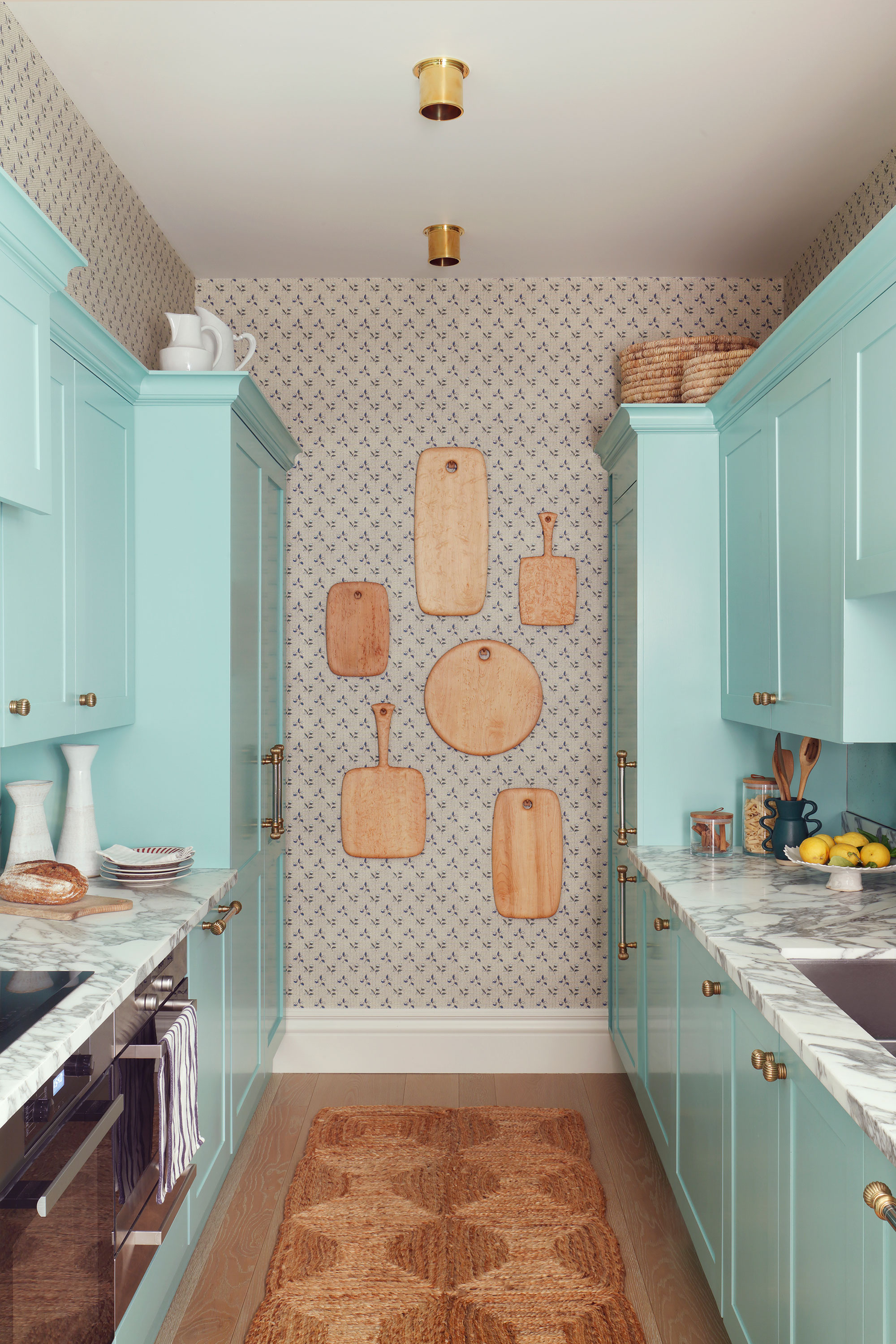
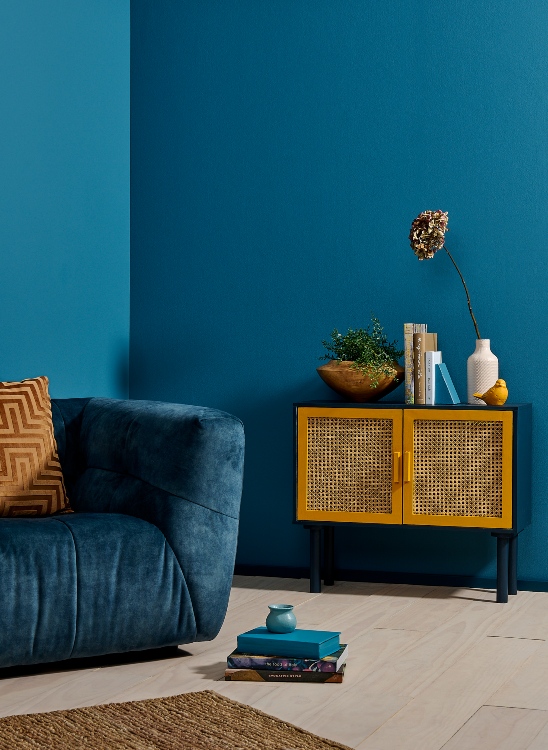
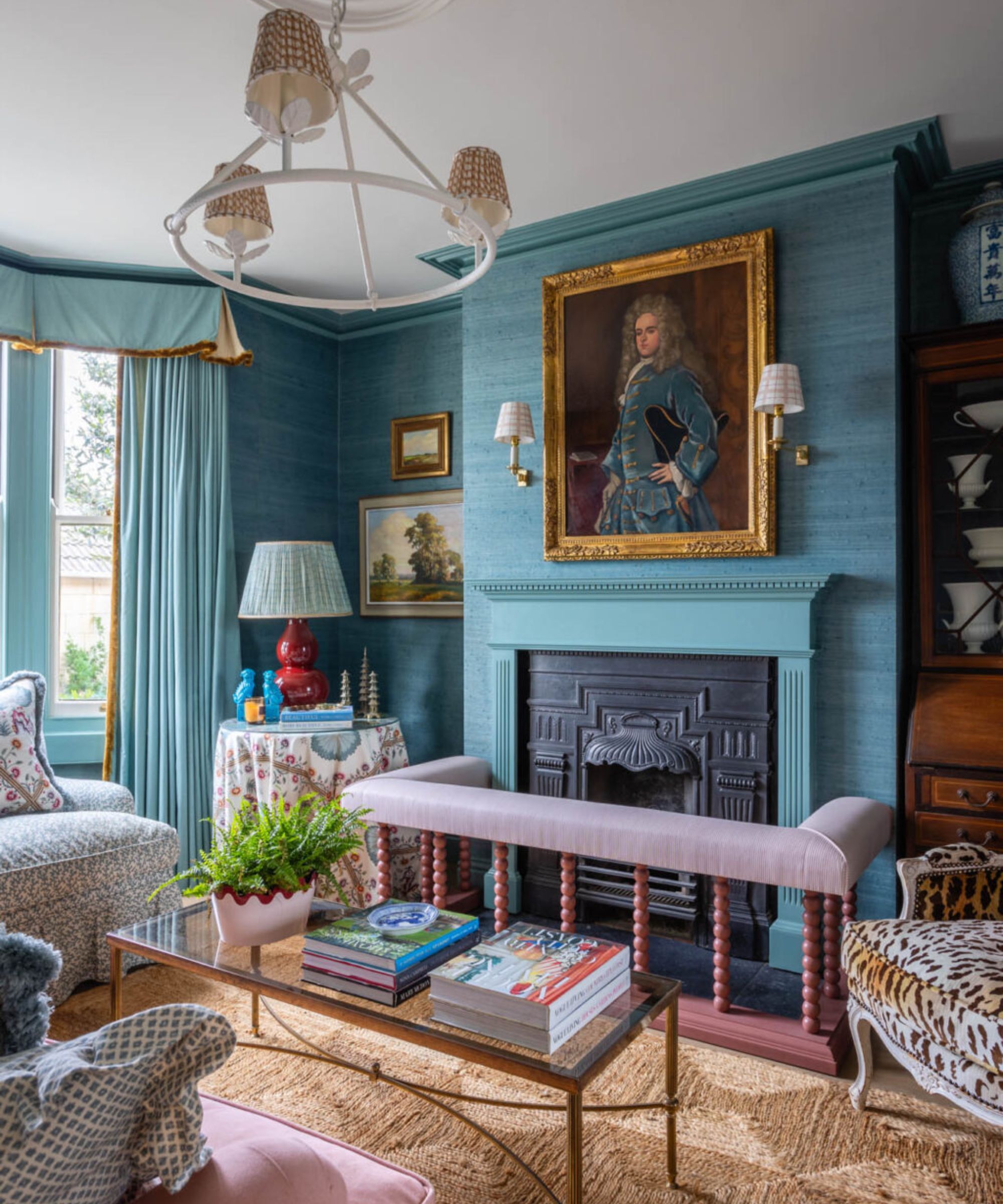
Finally, Soft Turquoise, like Benjamin Moore's Del Mar Blue, is presented as an option for elevating coastal designs without being kitschy, livening up spaces and pairing well with patterned wallcoverings. These examples illustrate the diverse range of effects different paint colors can achieve, offering practical guidance for homeowners seeking to personalize and enhance their living environments. #LivingRoomDesign #PaintColors #InteriorDesign #HomeDecor #ColorTrends #DesignInspiration #ResidentialInteriors
0 comment in total
 No comments yet
You may also like
Your Birth Month Color Could Be the Key to a Truly Unique Home – Discover Every Shade From January to December and the Meaning Behind Each One

2021’s Palette of Possibilities

6 key colors to decorate with in May 2025, according to interior design and color experts in the know
6 Outdated Interior Design Trends—And 6 That Are Making A Comeback
Designers Say This Fabric Will Dominate Living Rooms in 2024

Deeper, moody colours and precious jewel tones are in style this year
12 Jewel-Tone Paint Colors Designers Say Are Always On-Trend
5 living room paint colors going out of style in 2025

These Colors Will Be Everywhere in Interiors in 2025
Interior Designers Share the 3 Biggest Color Trends for 2026

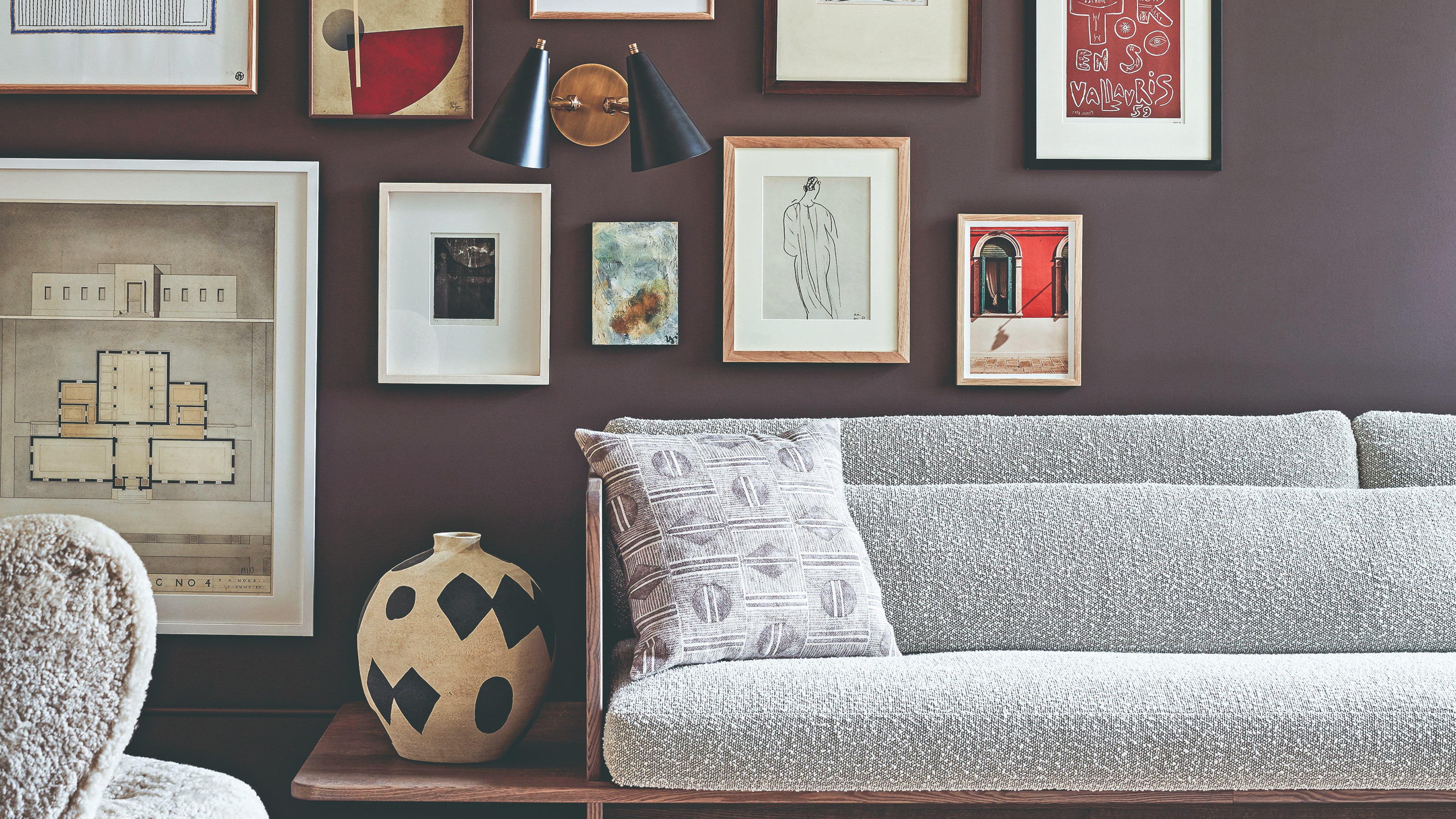
The colour palette for 2025 – these are the shades paint experts say we’ll see everywhere next year
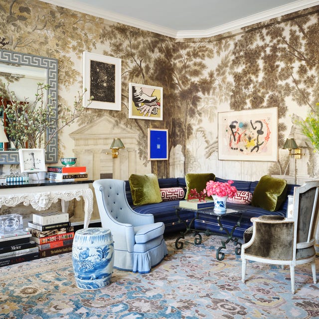
Designers Predict These 6 Living Room Trends Will Be Everywhere in 2026

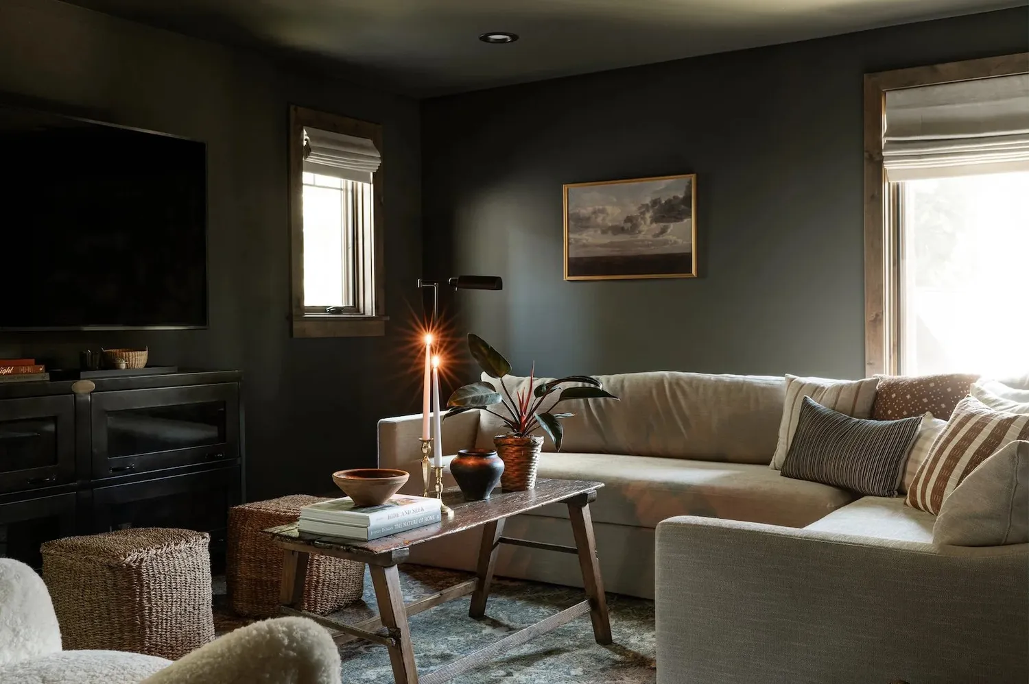
6 Living Room Paint Color Trends That Are Going to Take Over Walls in 2026

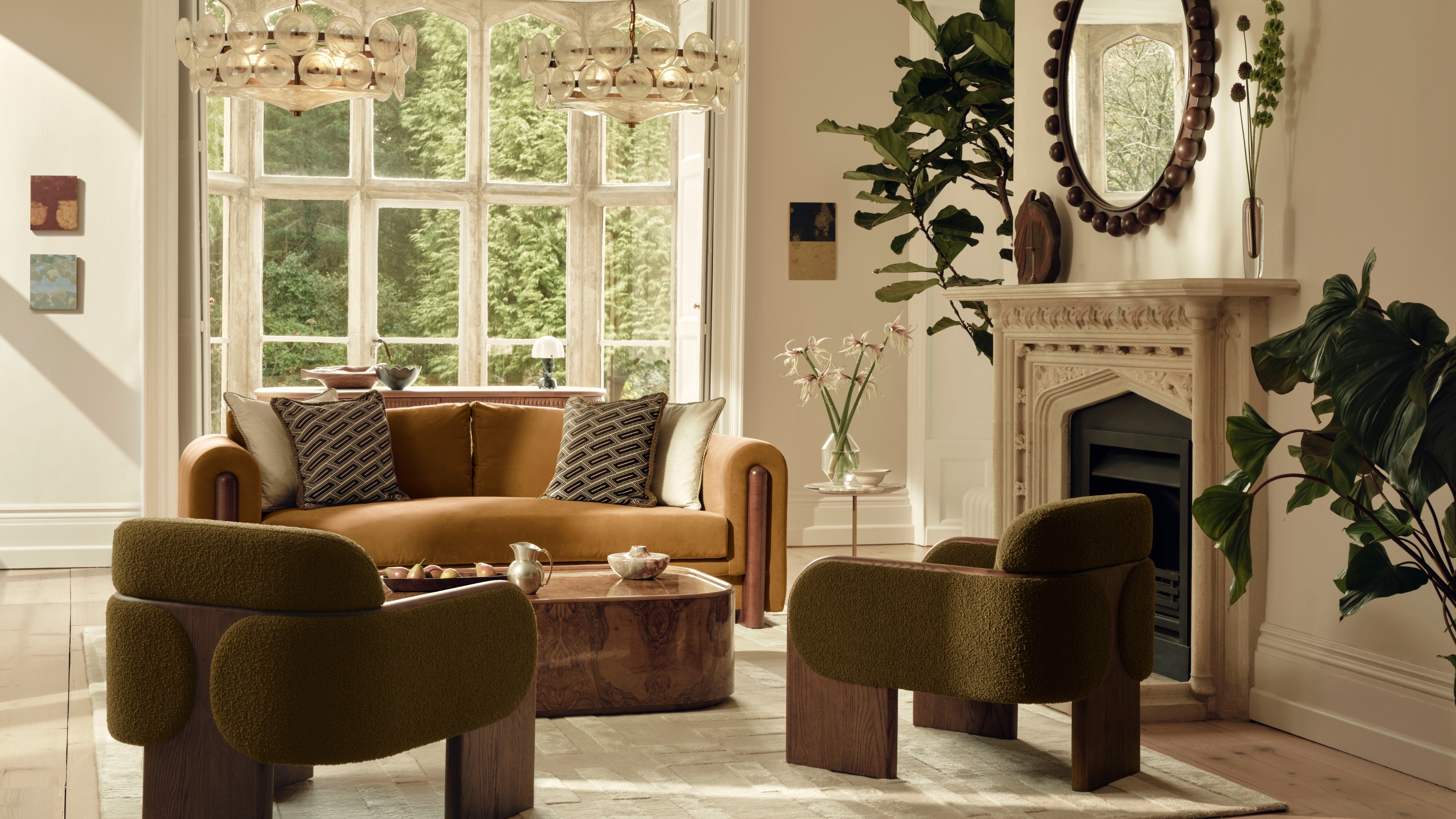
These Are the 3 Living Room Colors That Are Out of Style in 2025 — And the Shades to Use Instead

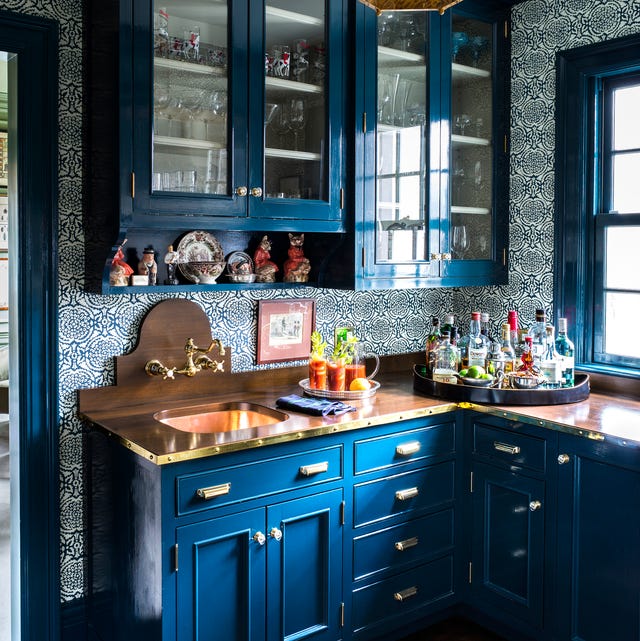
Cobalt Is the New Navy
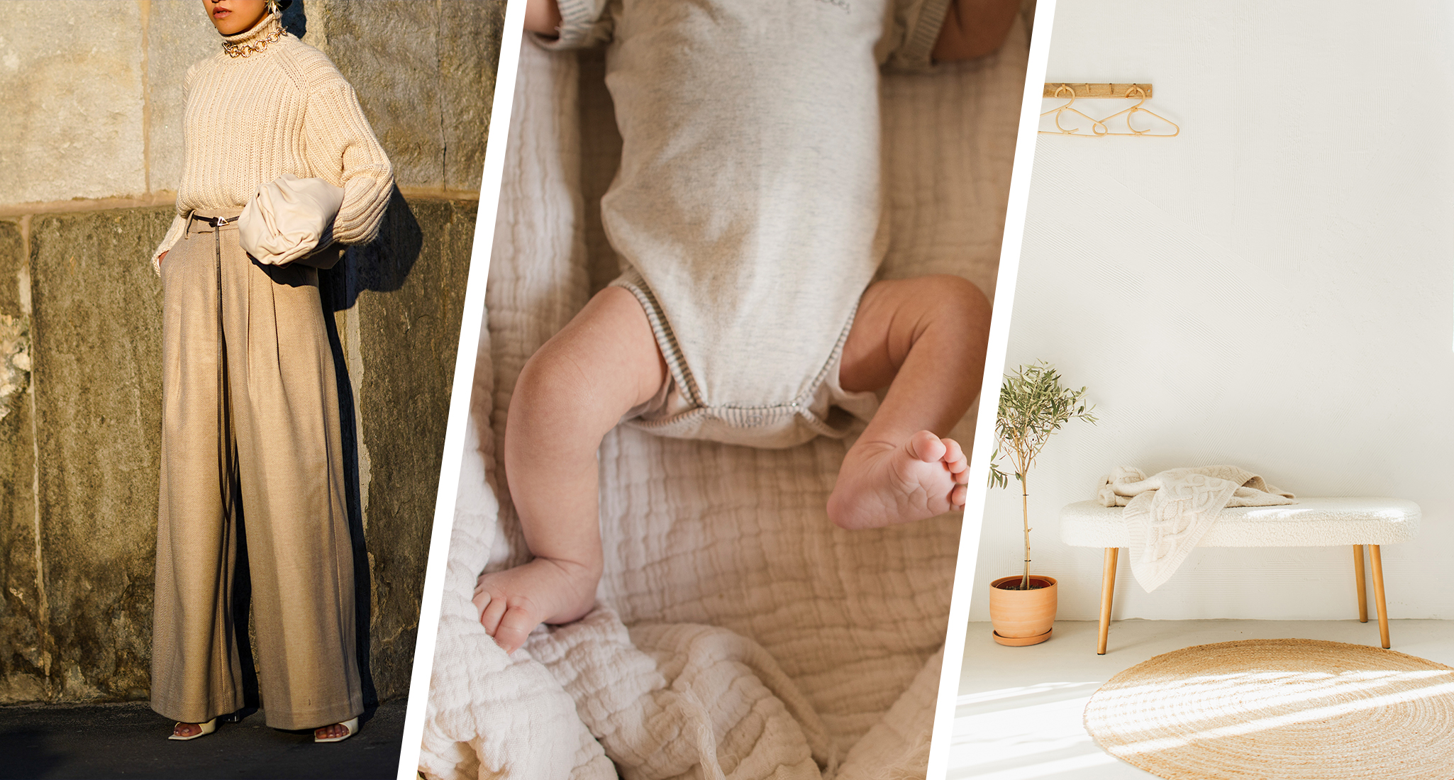
From Quiet Luxury to the Sad Beige Baby, When Will ‘Beigification’ End?

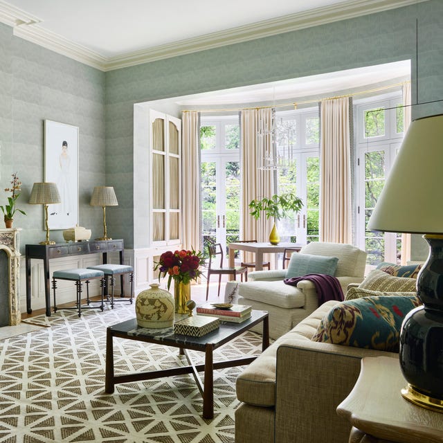
Experts Predict These 6 Living Room Trends Will Be Huge in 2025
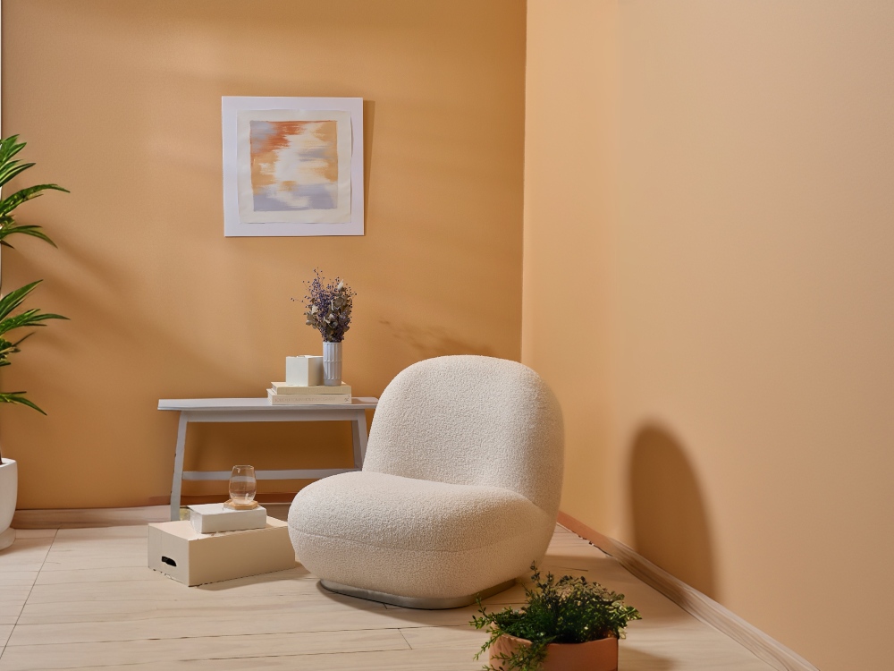
Interior Design Trendwatch: Colour is coming home
9 Color Trends That Will Take Over in 2023
The Best Colors To Incorporate Into Your Living Room In 2025