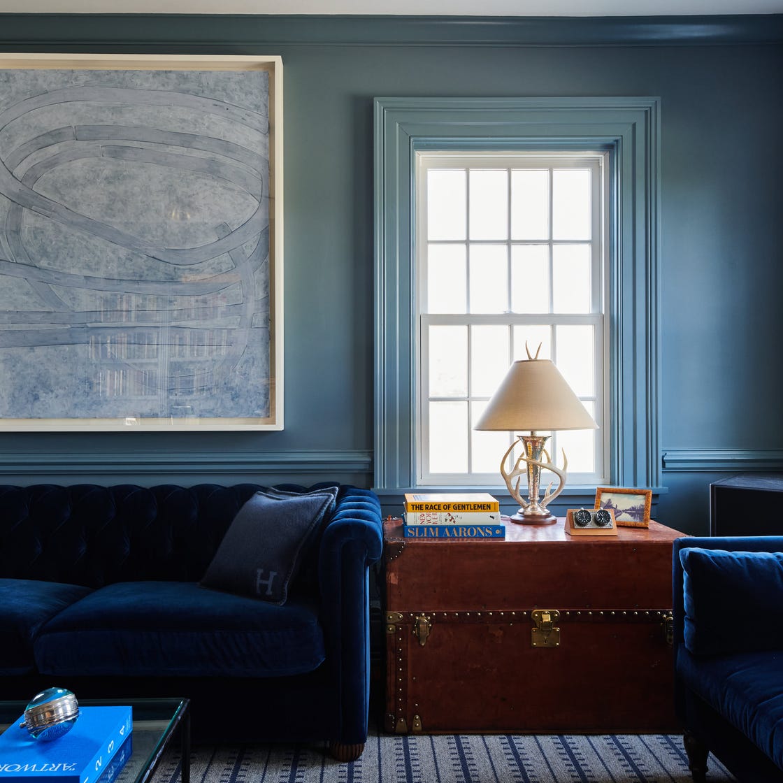
1/2
Interior Designers Share the 3 Biggest Color Trends for 2026
The article explores the anticipated color trends for 2026, as identified by interior designers. While paint brands like Behr, Valspar, and Benjamin Moore have announced their colors of the year, designers report that client requests and ongoing projects indicate a broader shift towards warmer, richer, and more adventurous color palettes. This trend moves away from minimalist and austere aesthetics, favoring colors that evoke warmth, depth, and a sense of history or nature.
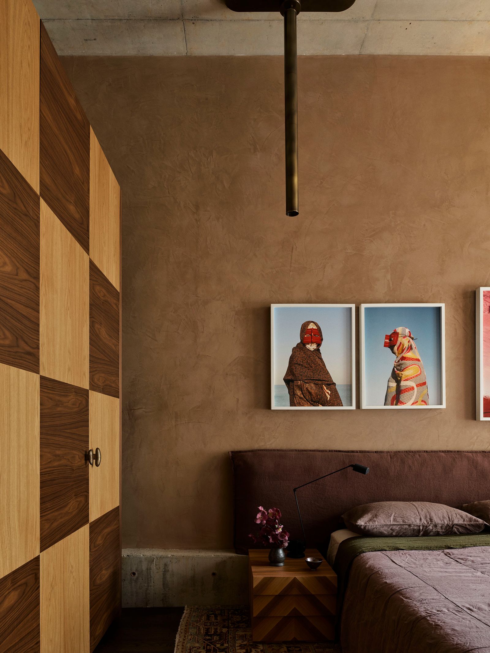
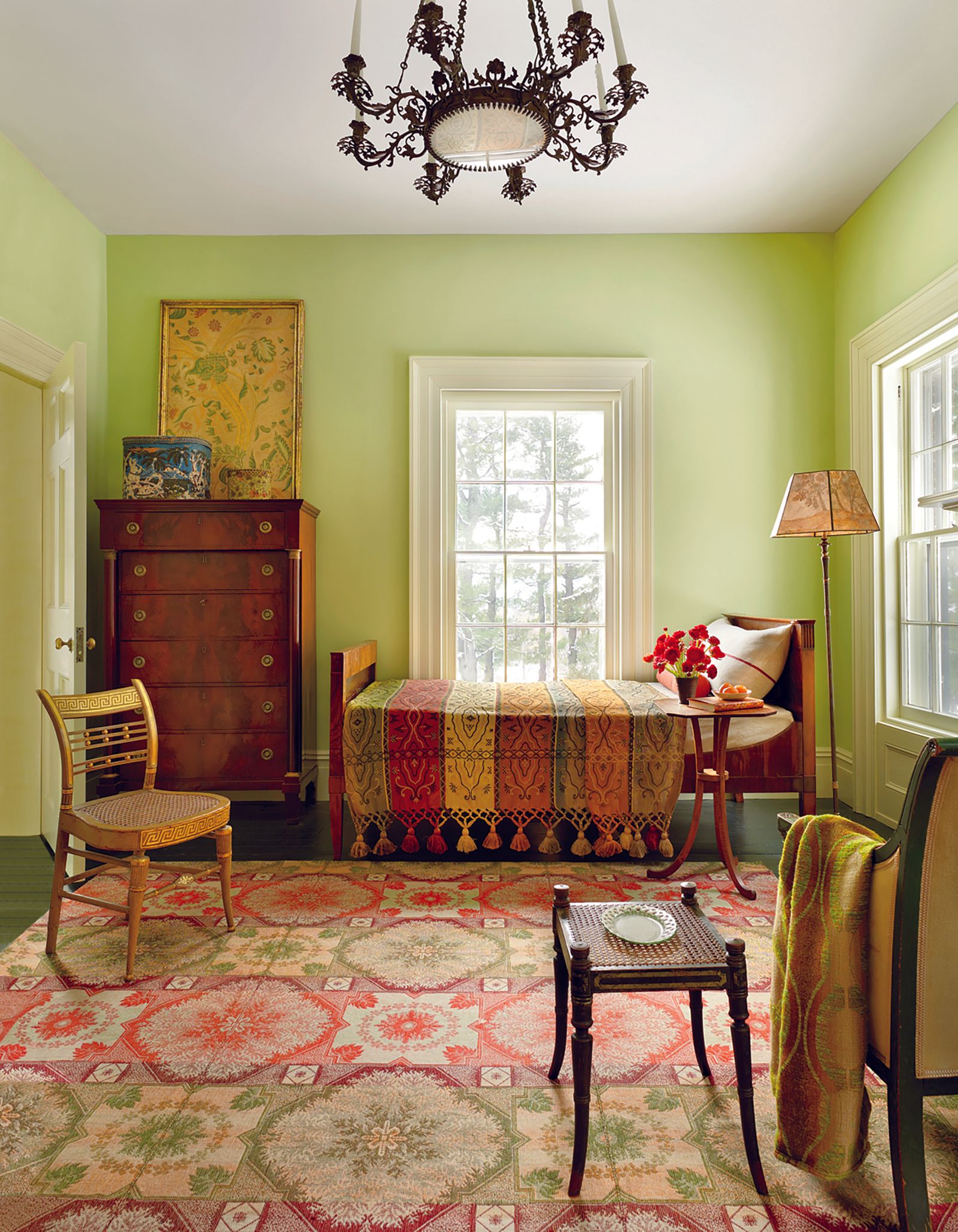
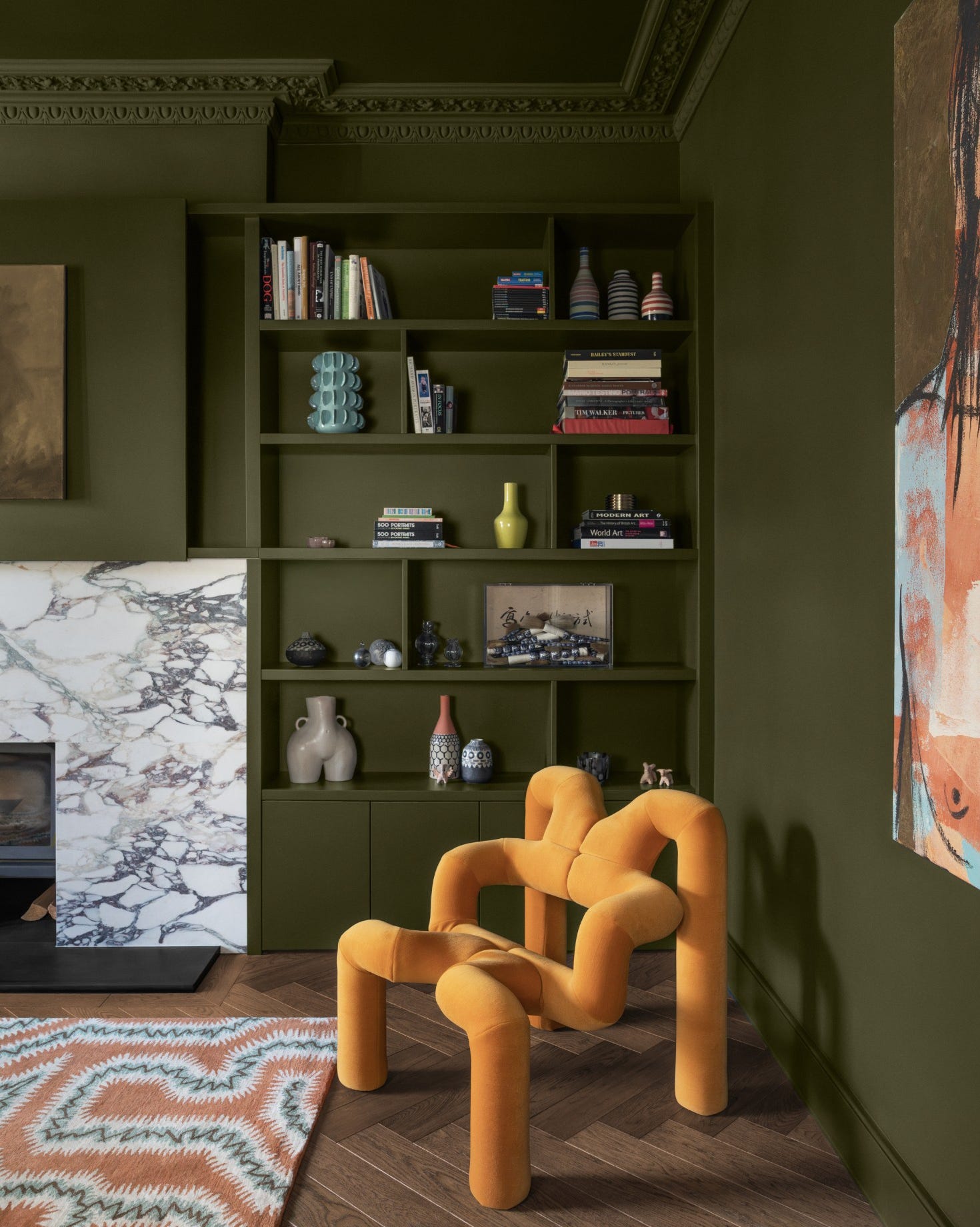
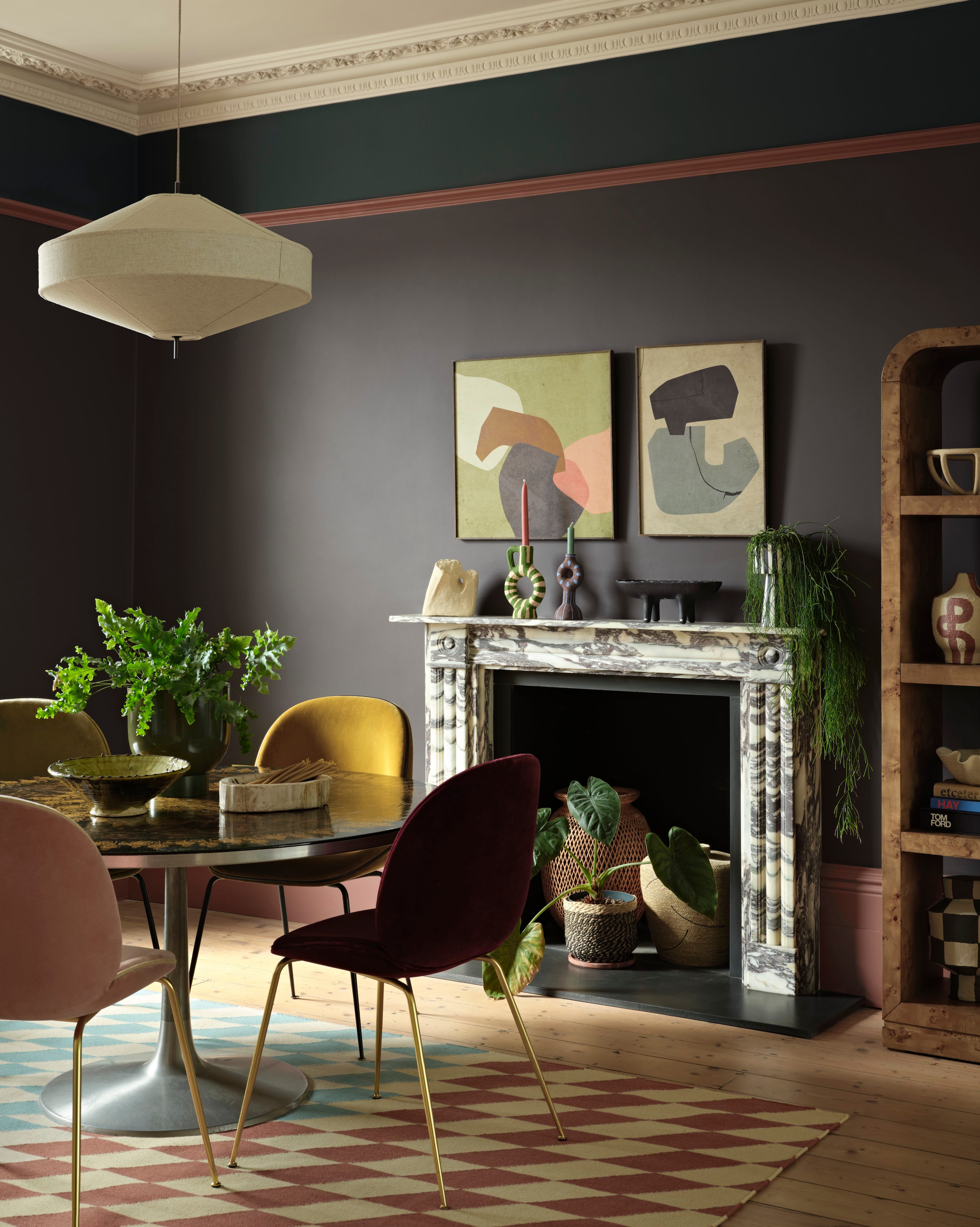
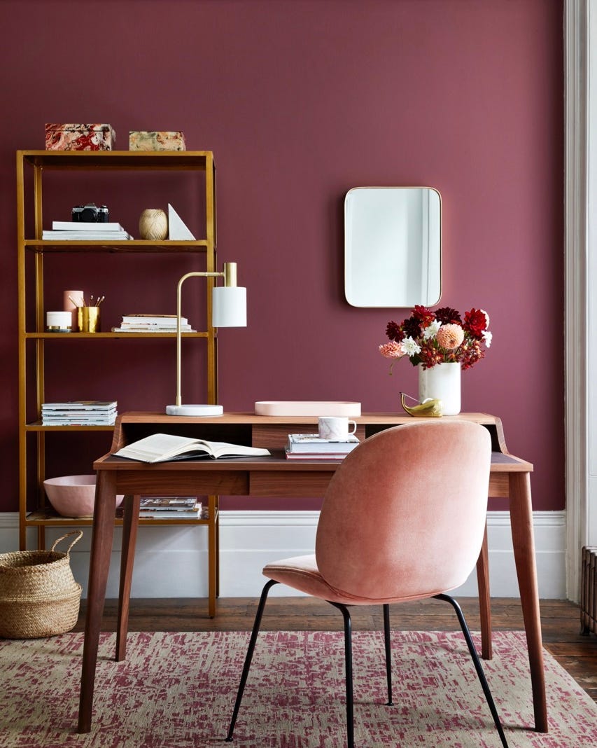
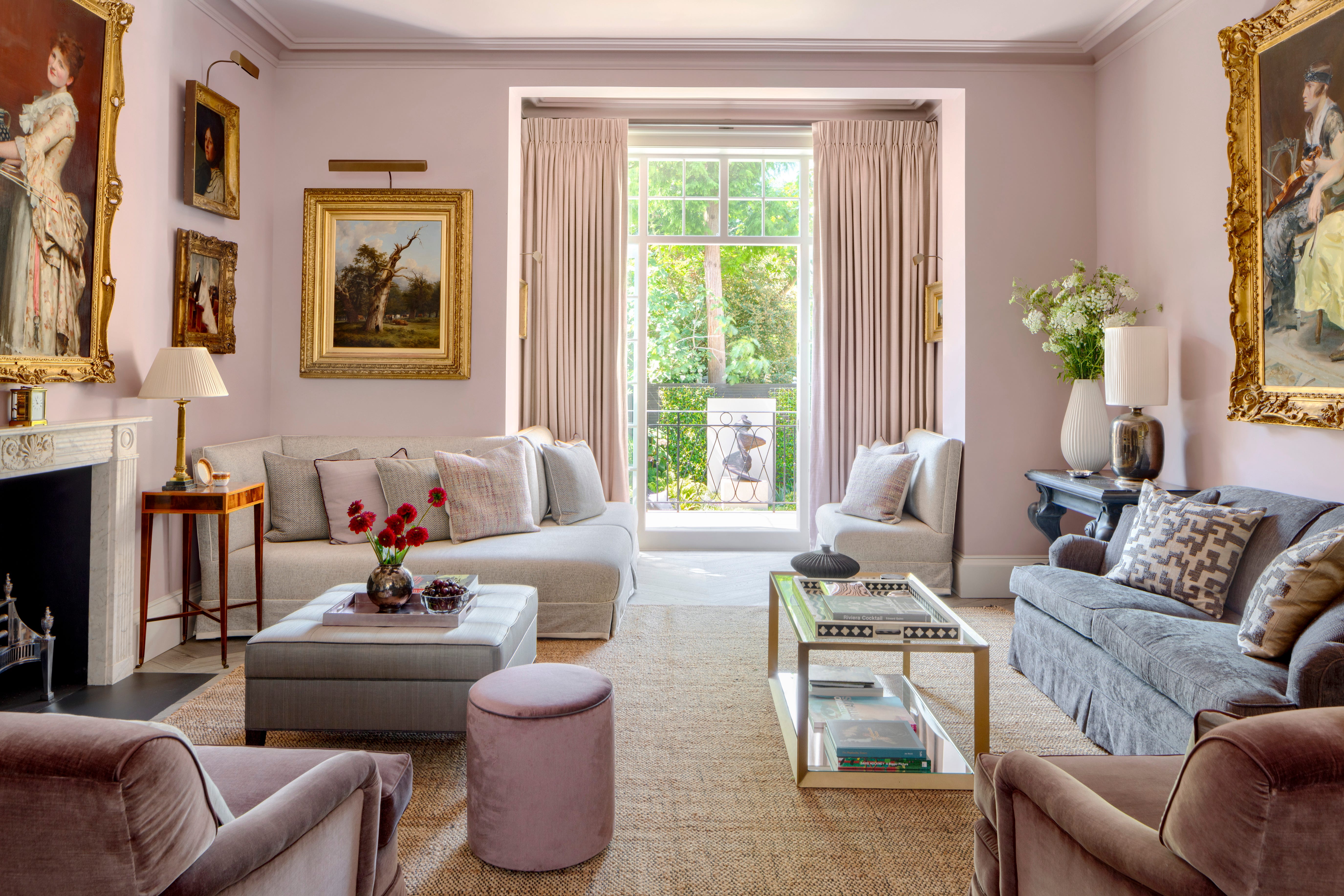
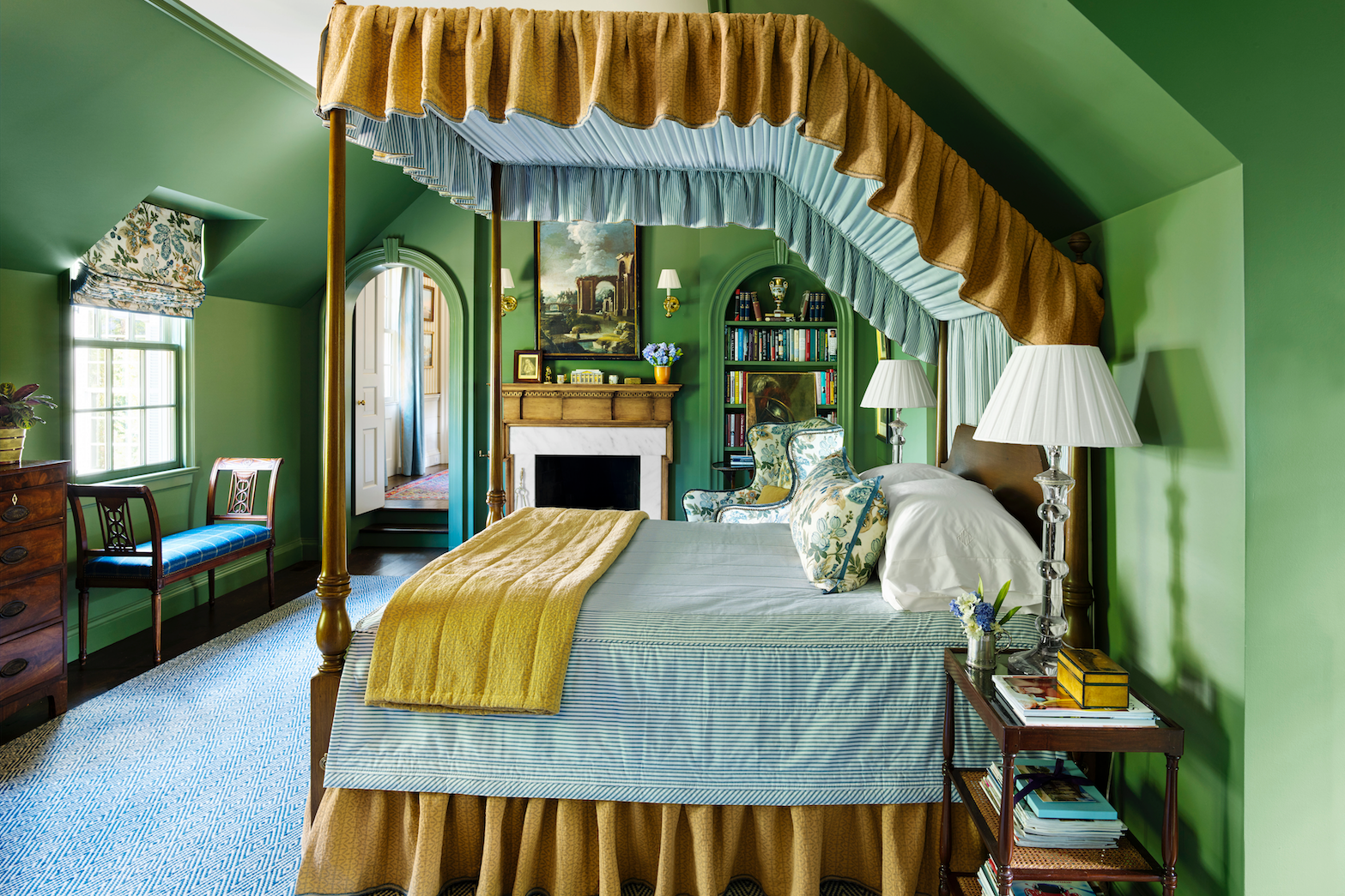
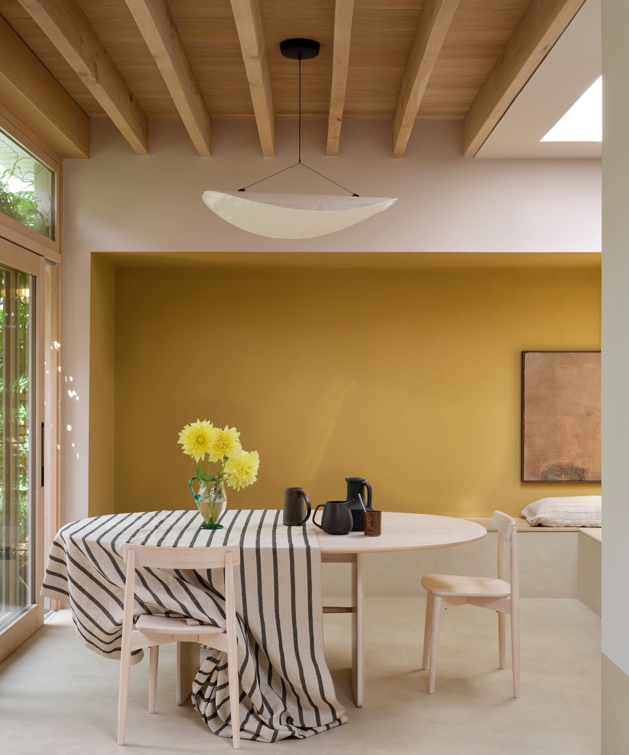
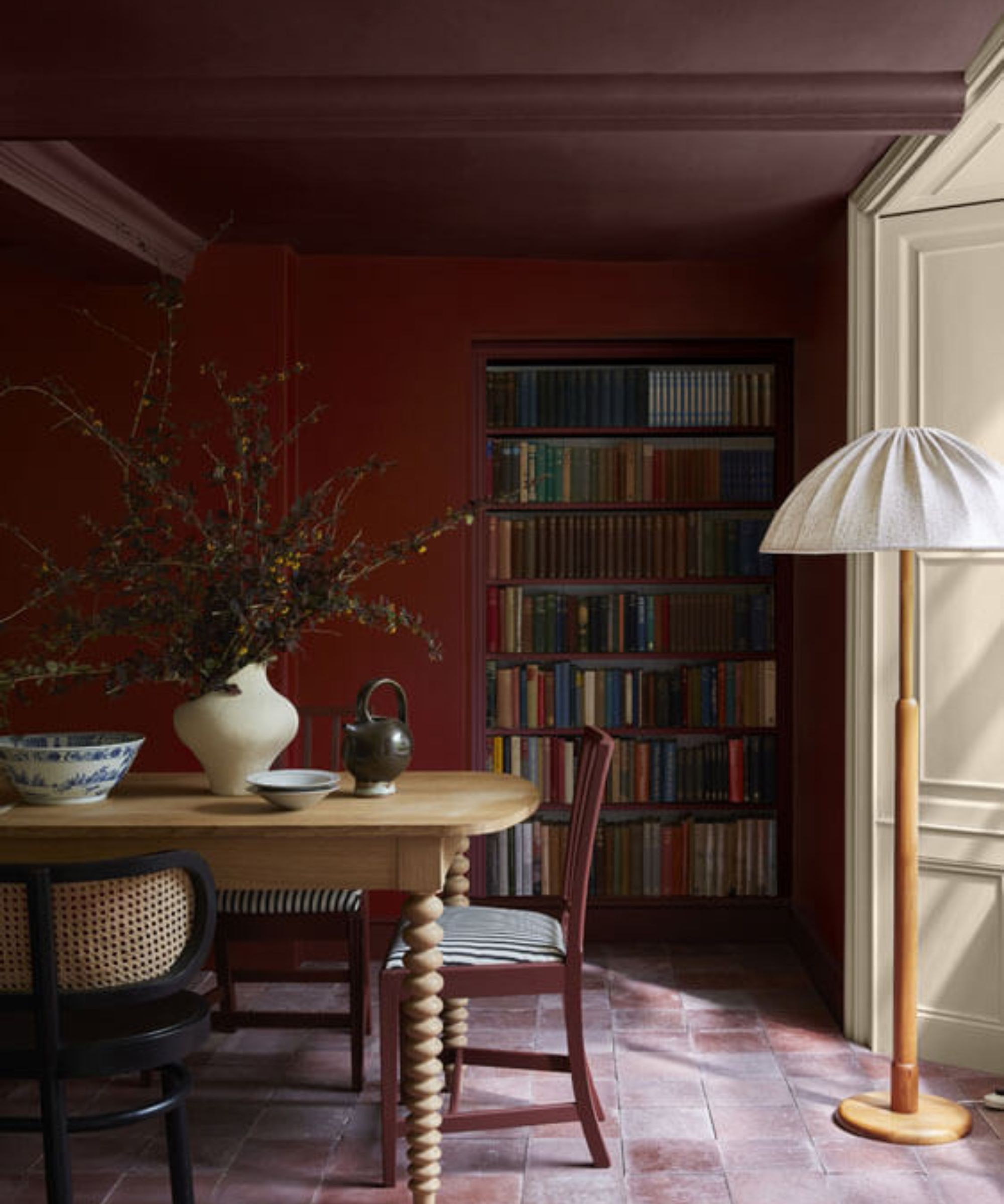
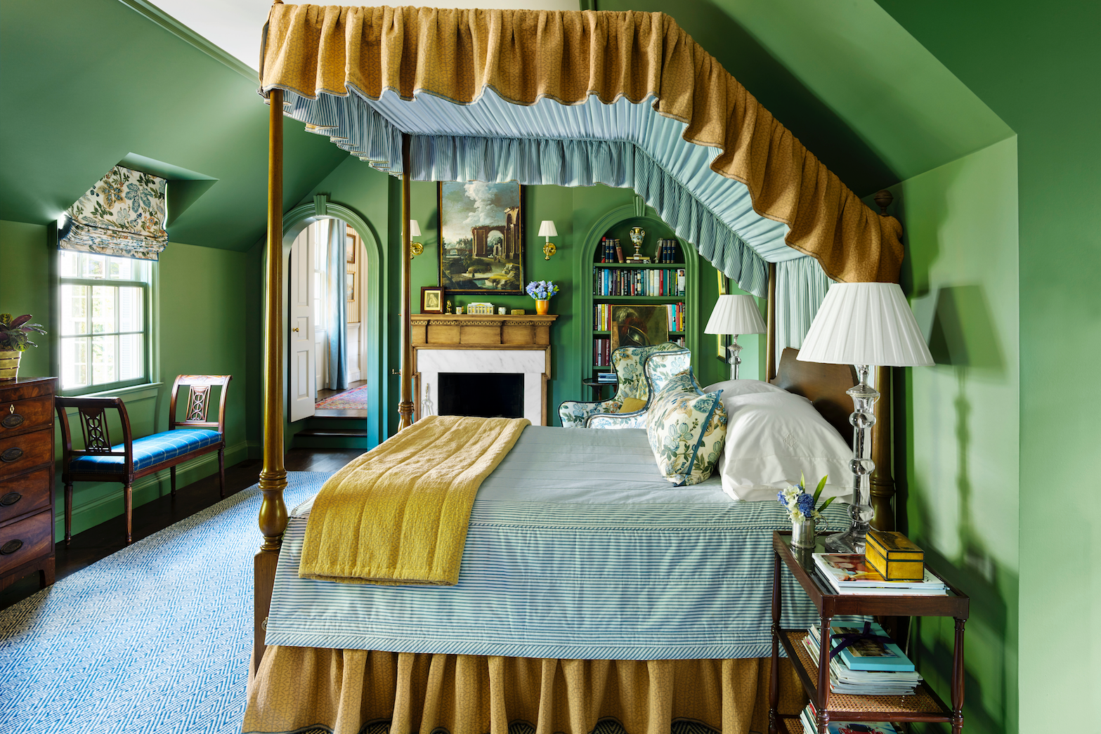
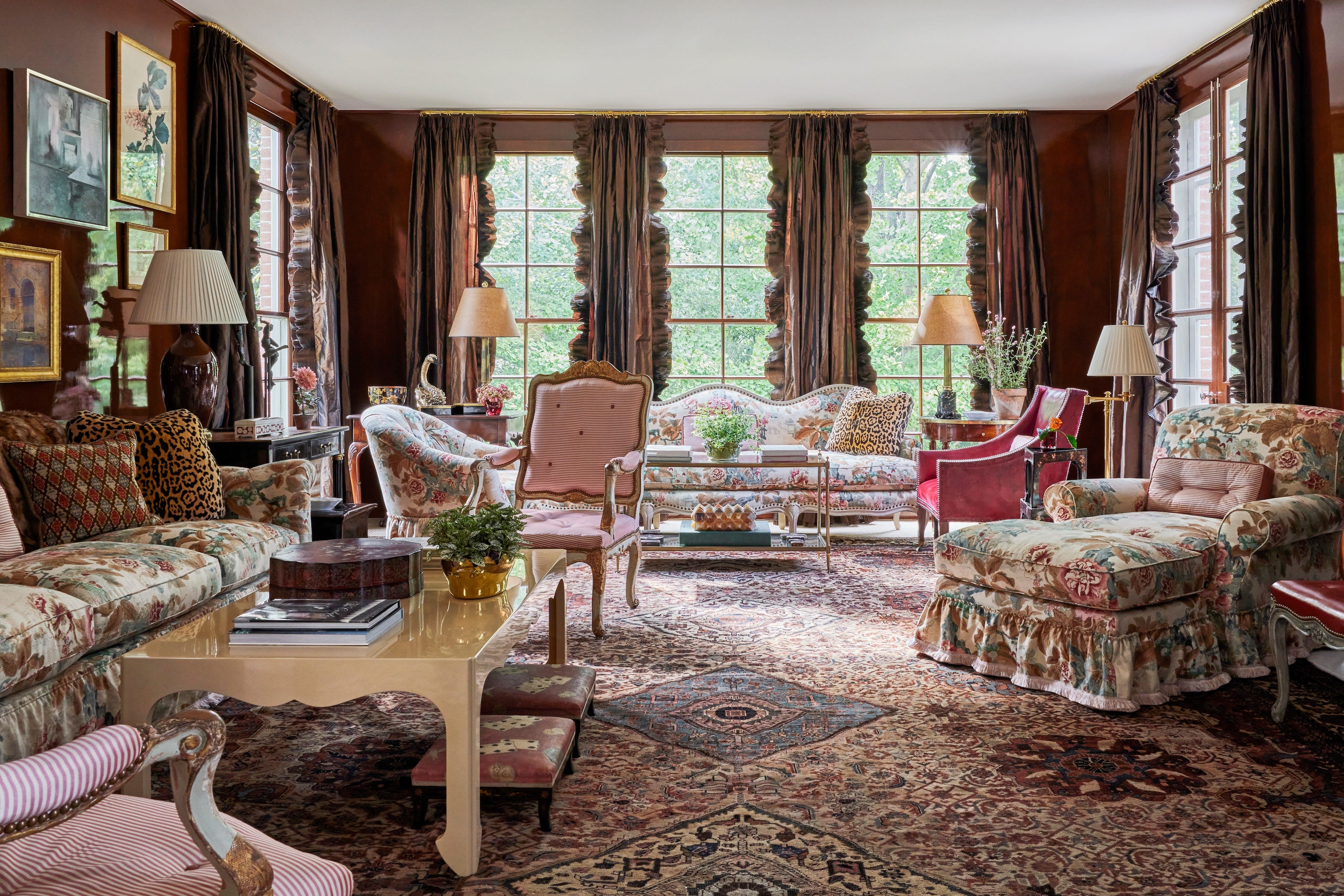
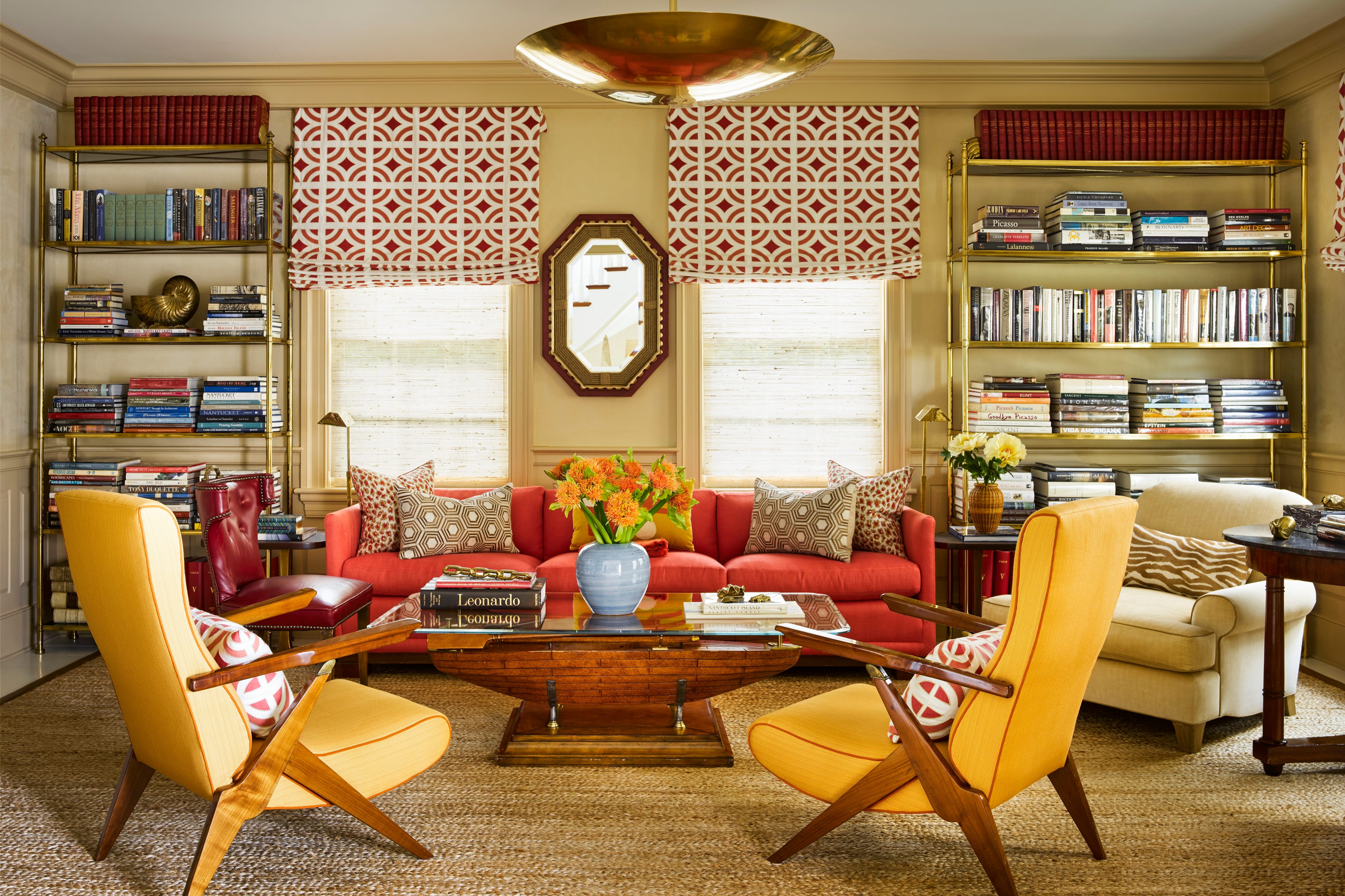
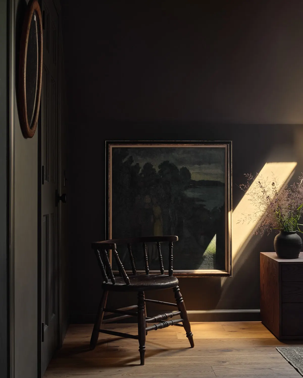
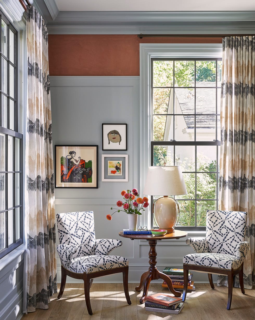
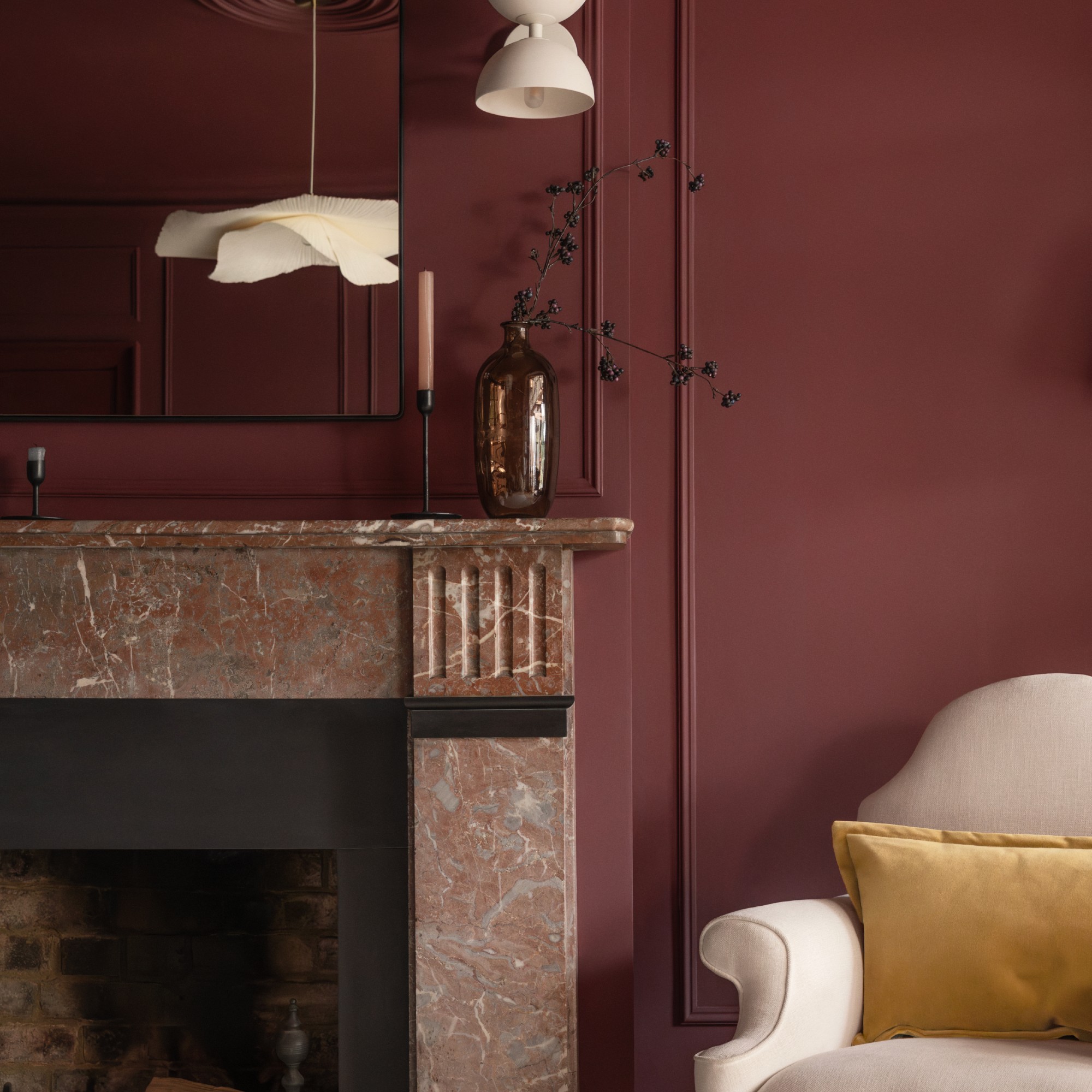
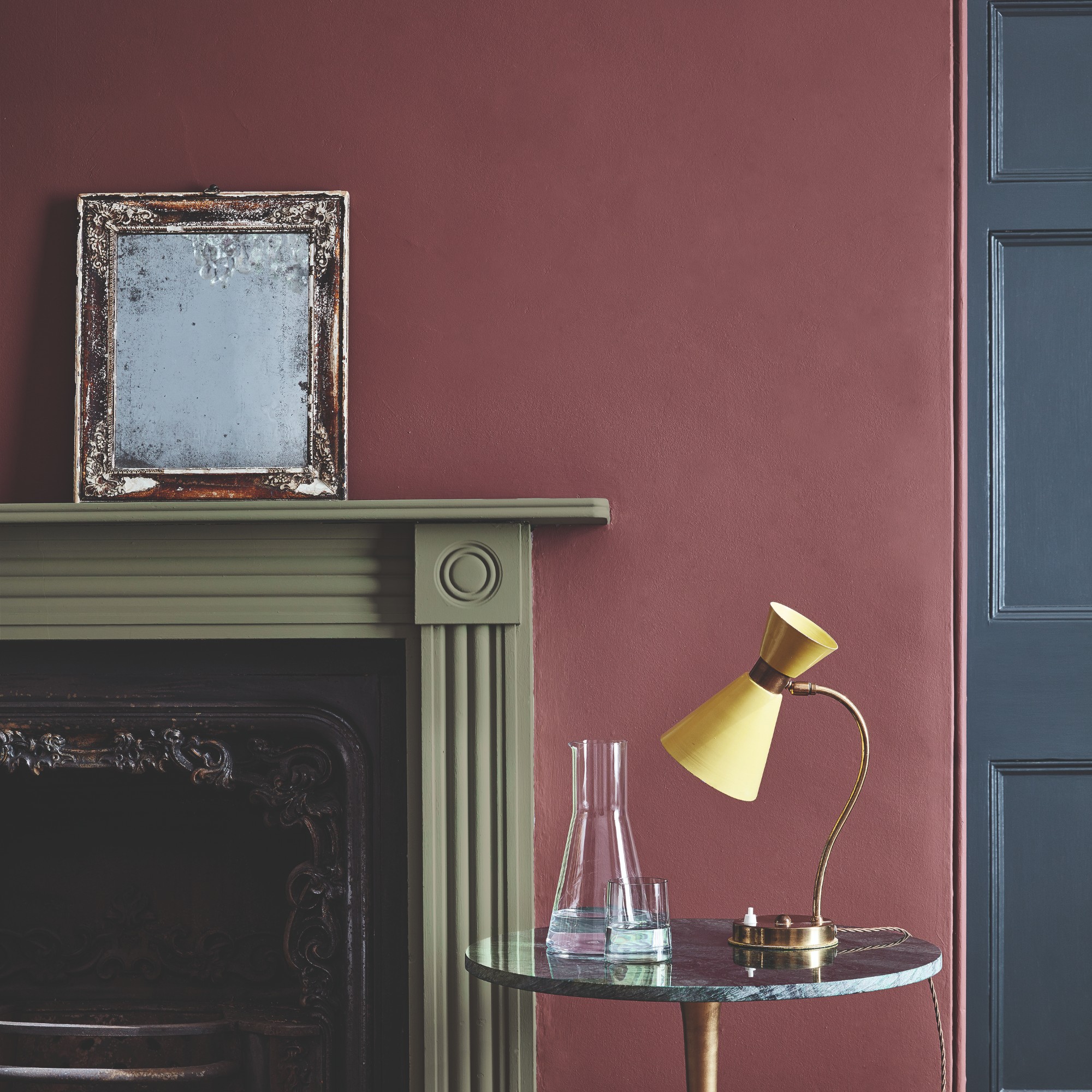
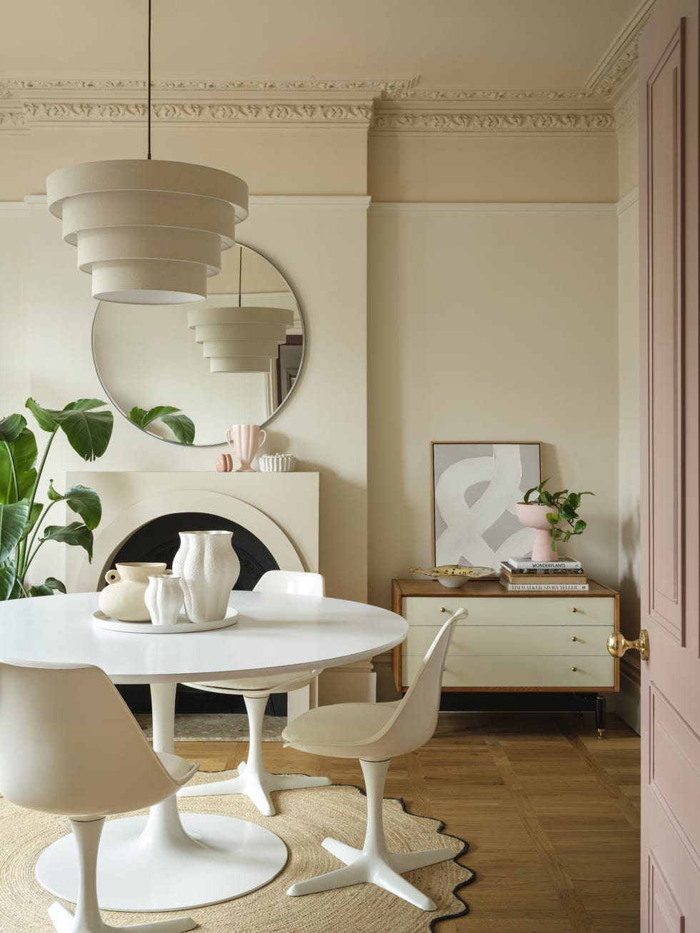
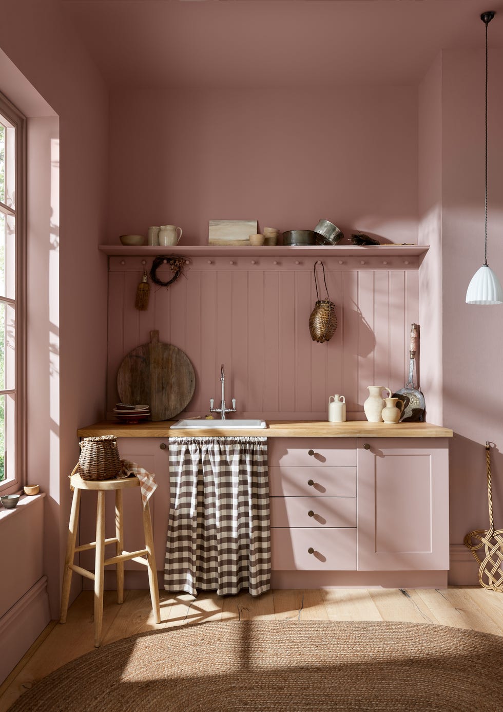
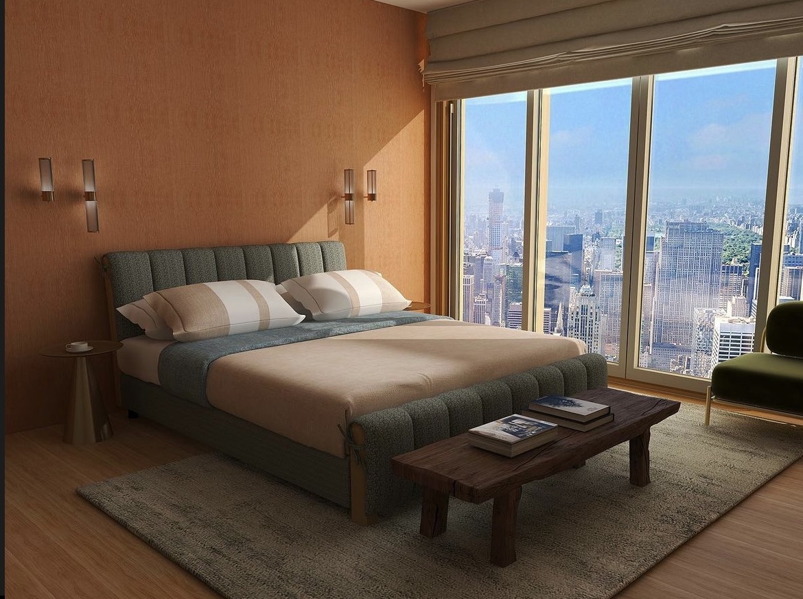
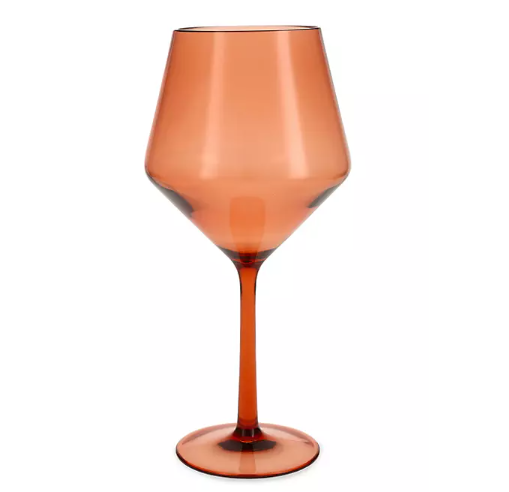
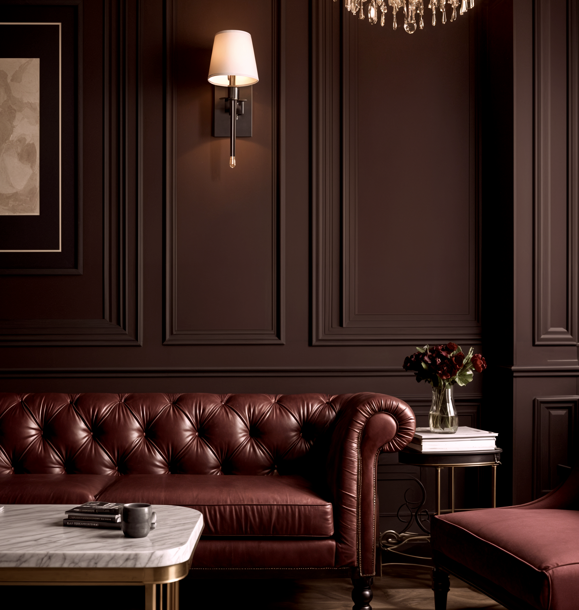
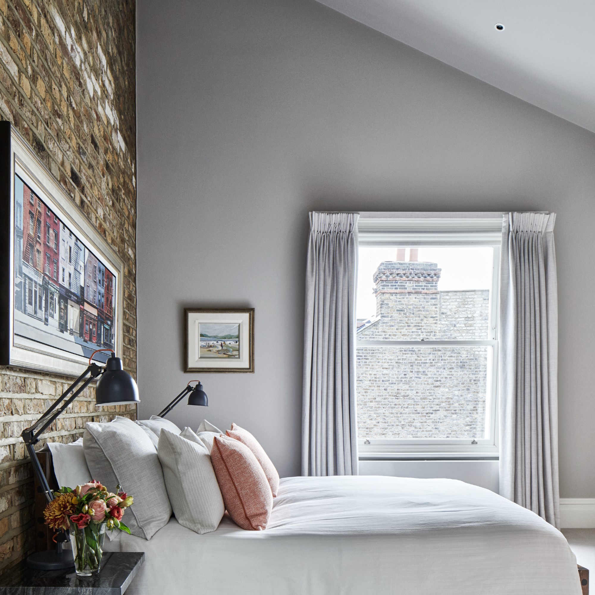
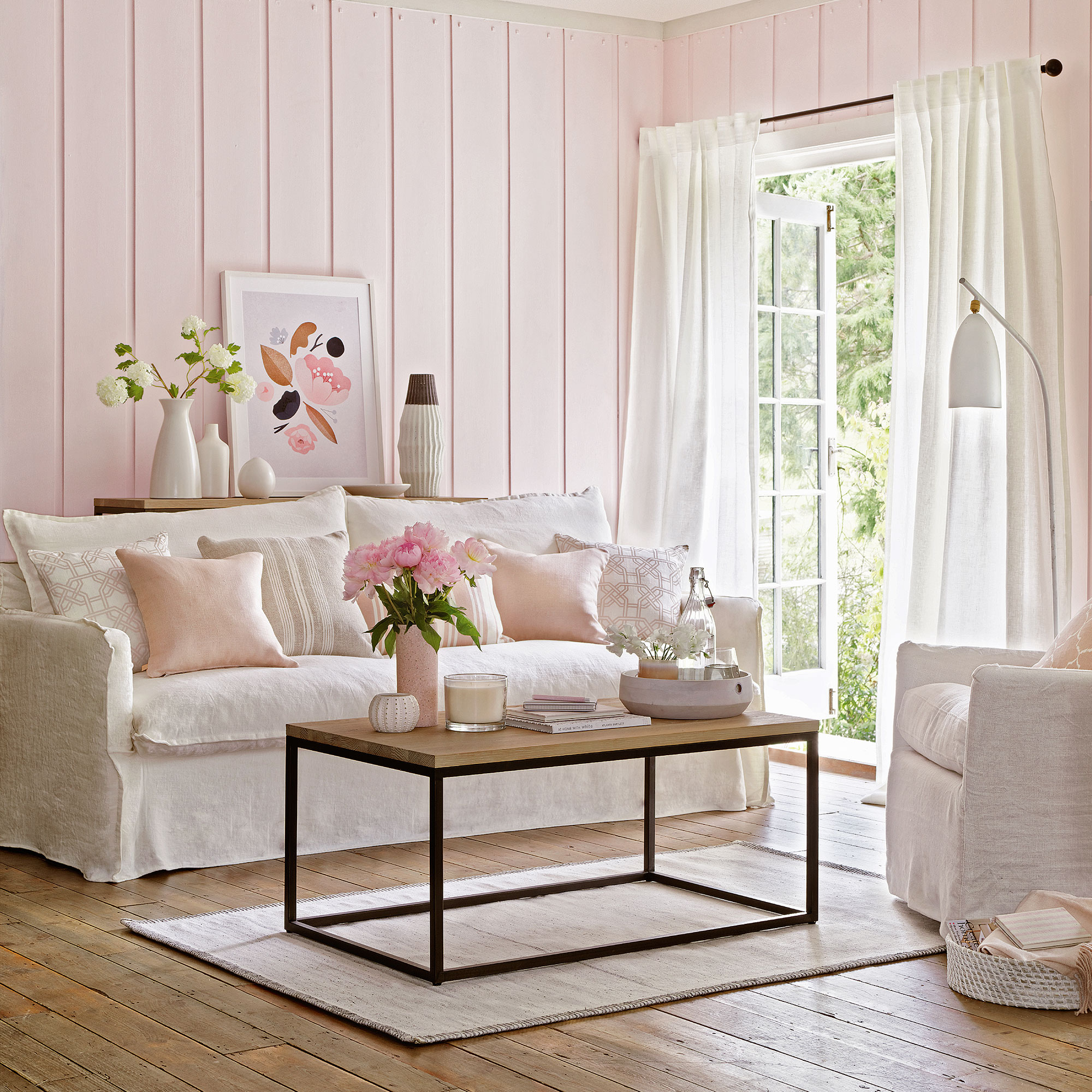
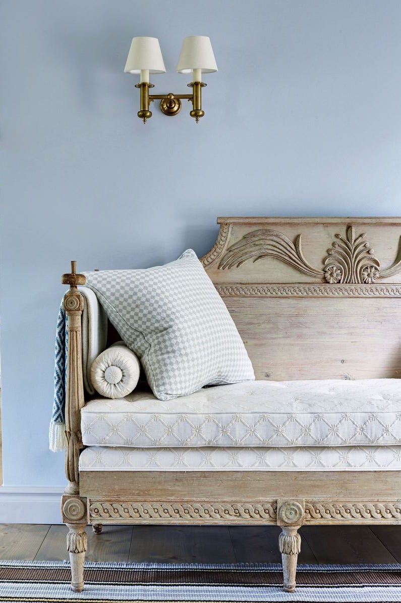
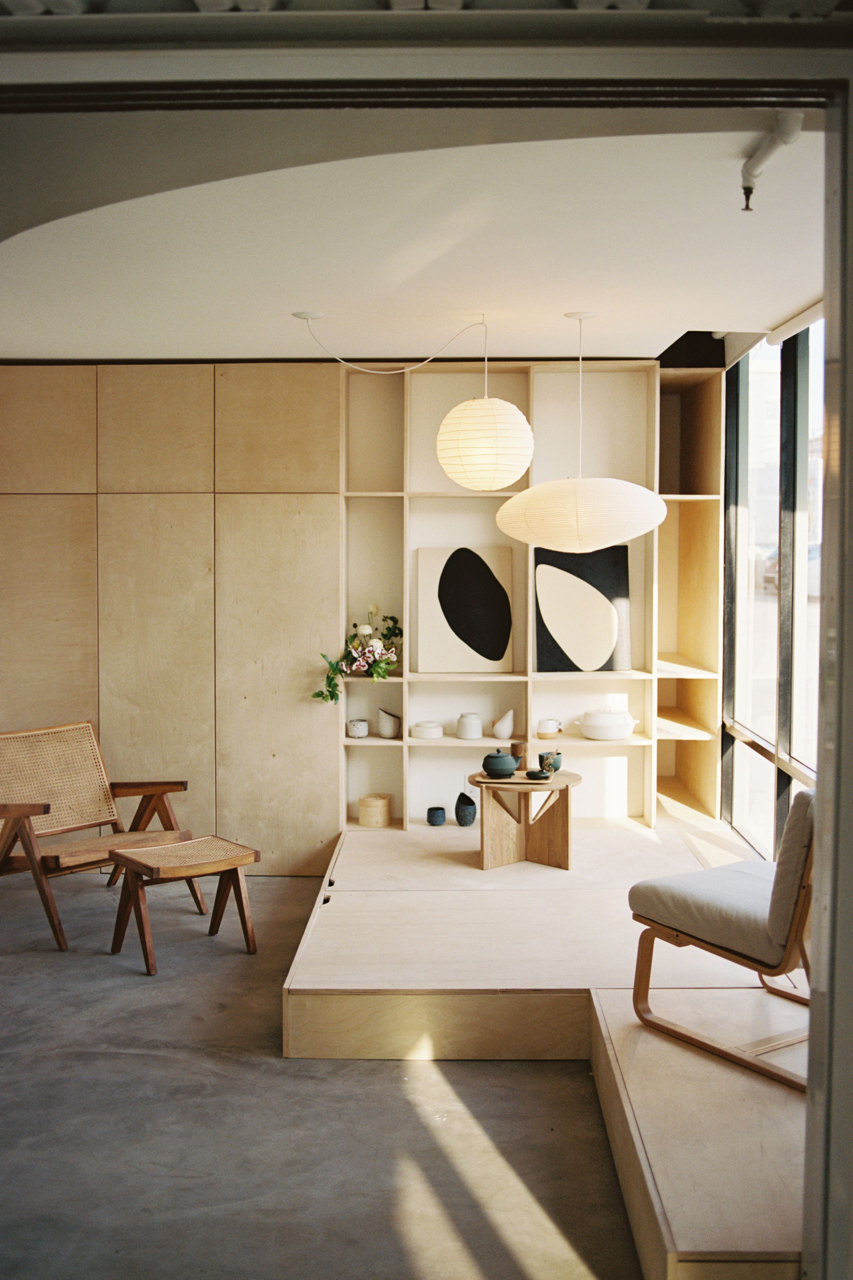
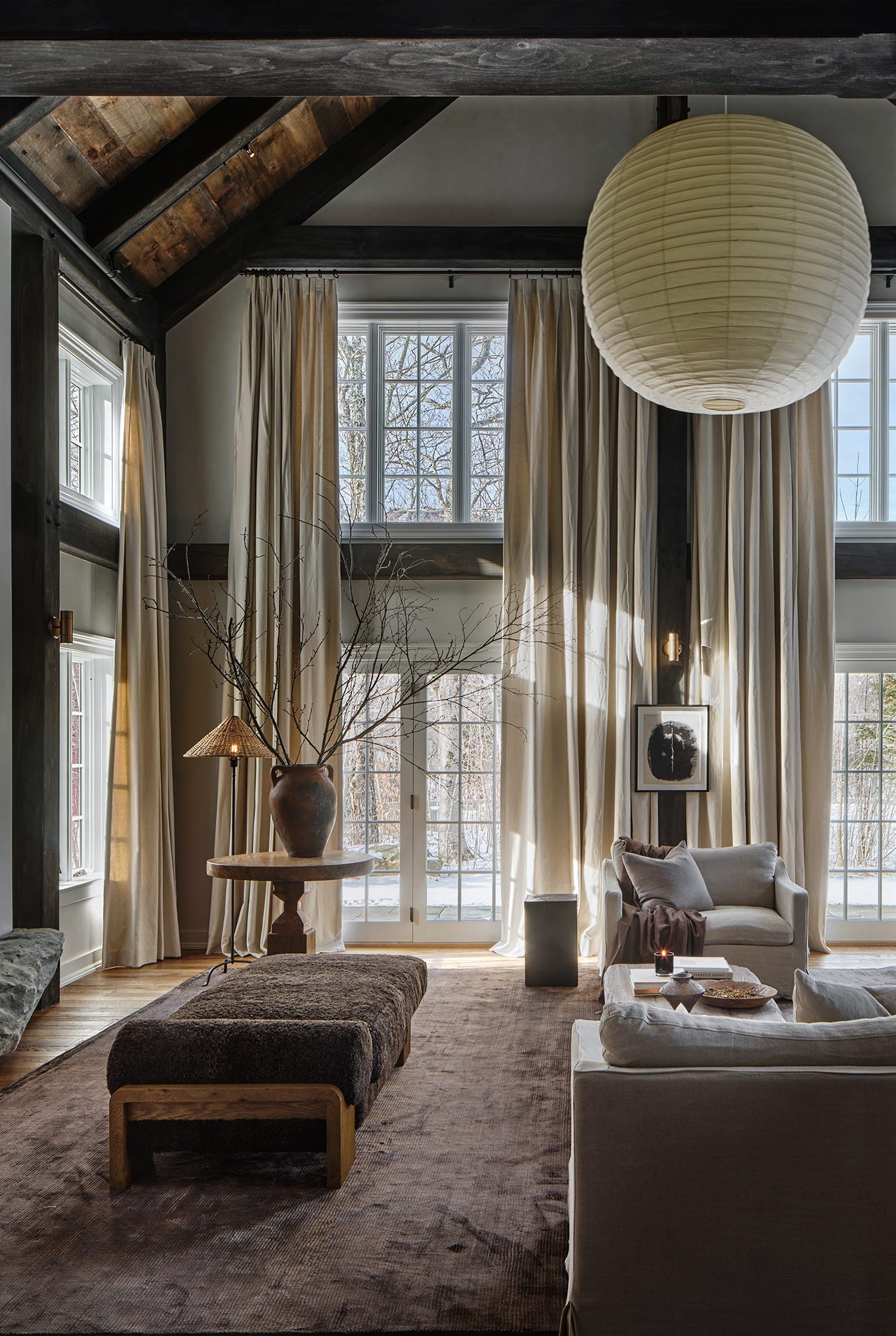
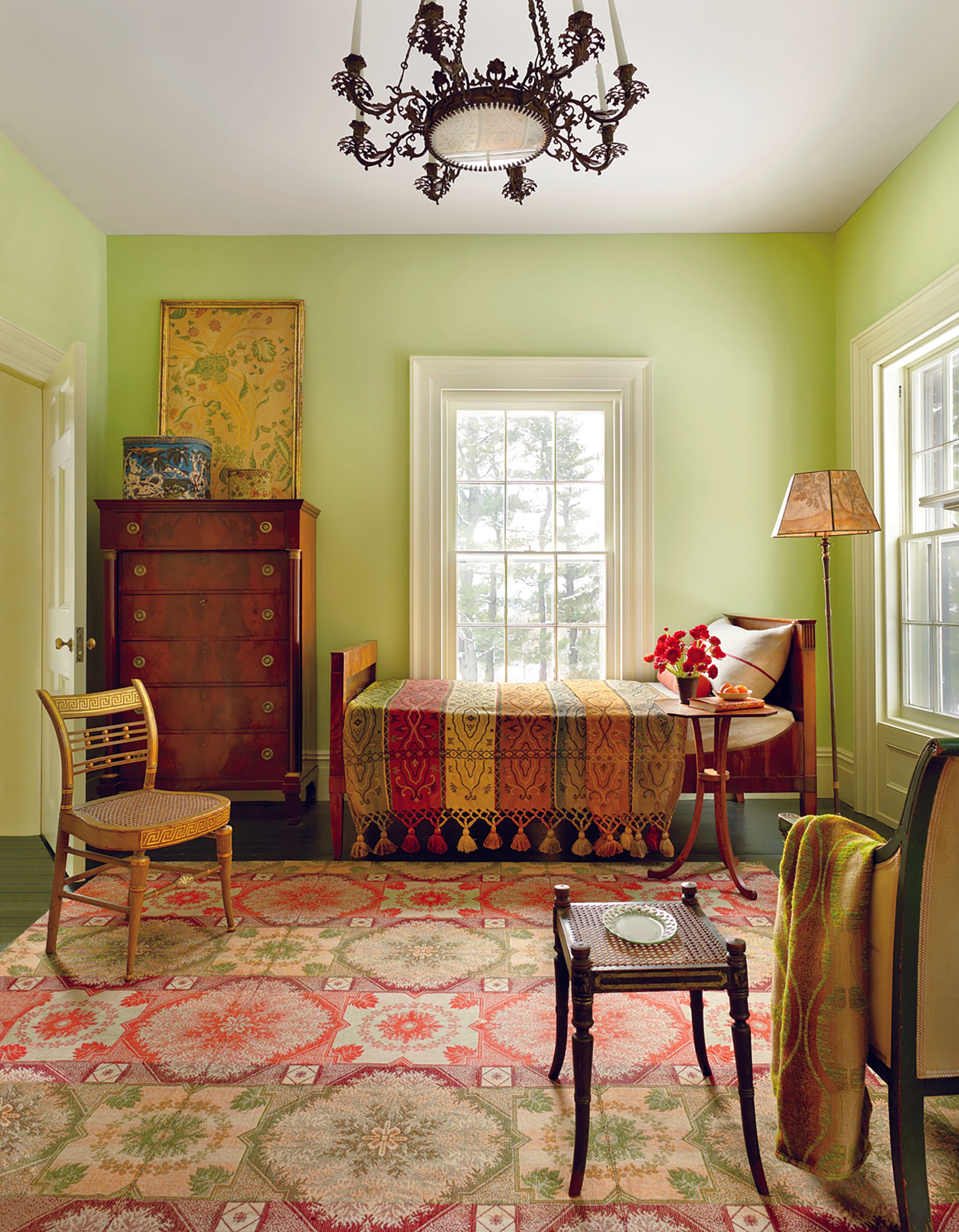
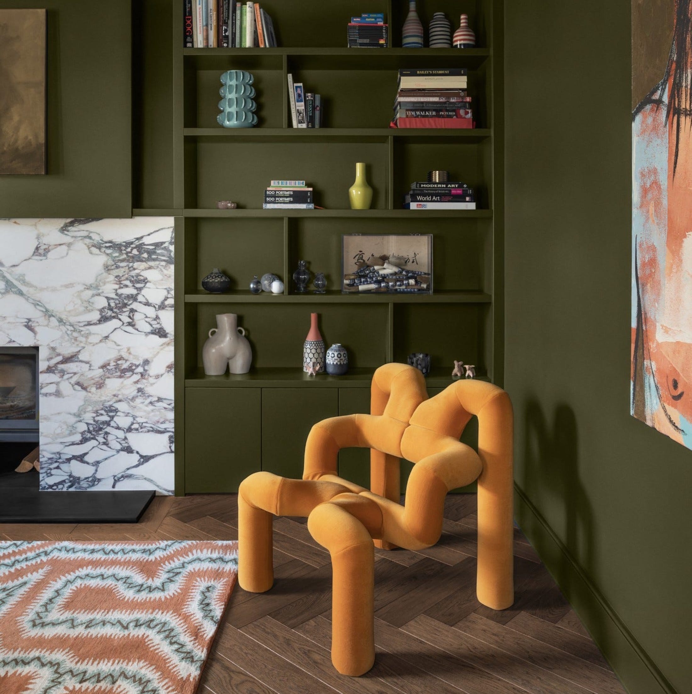
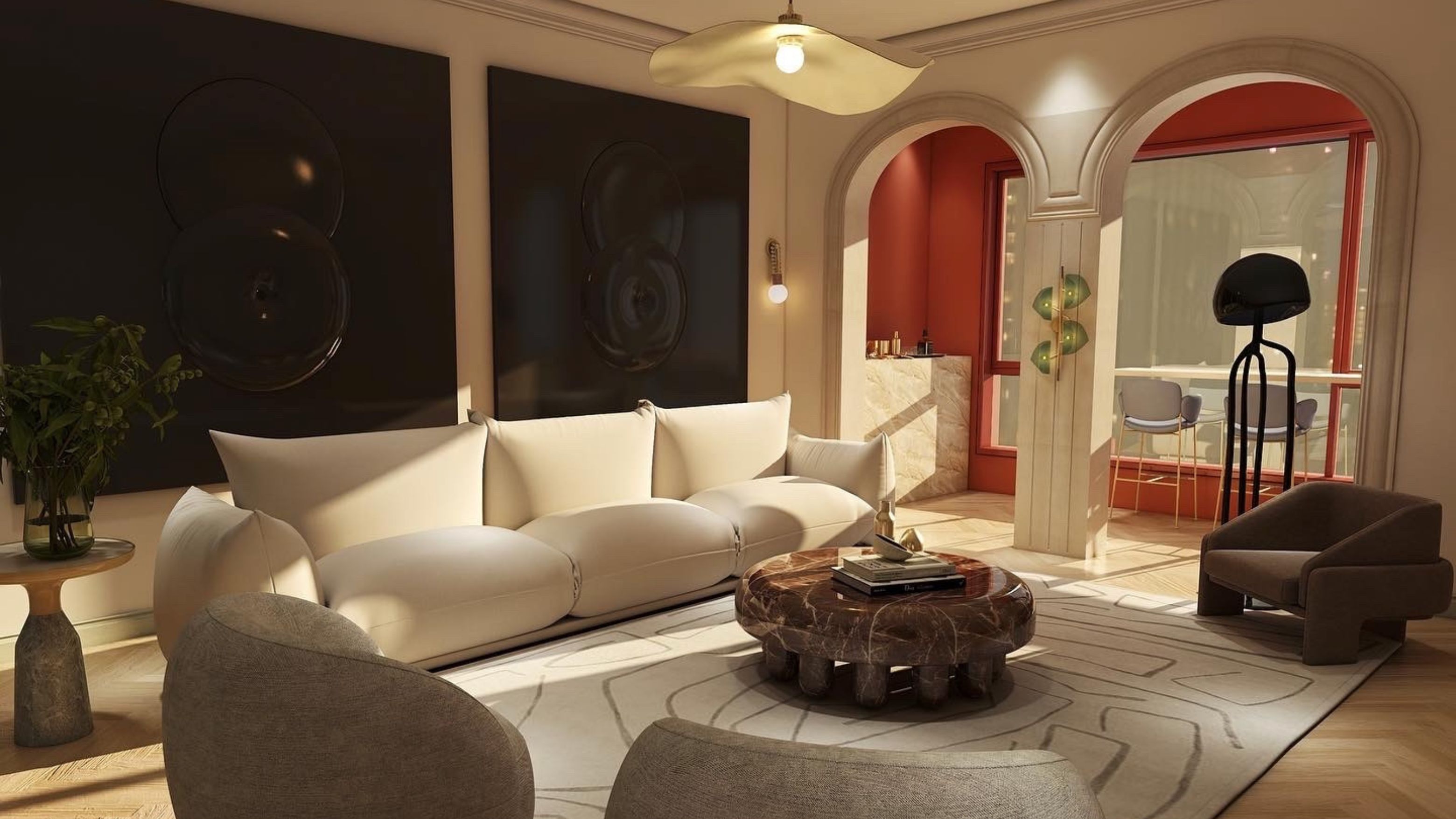
A significant trend highlighted is the resurgence of warmer, richer neutrals. Designers are observing a preference for darker wood stains over white oak and a move towards colors like merlot instead of cooler greige tones. Stephanie Hunt, founder of The Flairhunter, notes that clients are gravitating towards finishes that feel "warmer, friendlier," and less minimal. Emily Lindemann of Ruggles Lindemann Bell also confirms a strong interest in browns, rusts, and greens. Jen Baxter of Baxter Hill Interiors predicts palettes featuring "more depth and a continuing shift toward earthy, organic mid-tones," such as chalky rose, smoky blue, tobacco brown, dusty olive, sunbaked terracotta, and soft charcoal, emphasizing colors that appear timeworn and naturally integrated into a home's aesthetic. Matthias Silverton of The Snug Co. further supports this by mentioning rich combinations of olive green, mustard yellow, and burnt orange, suggesting that colors inspired by nature and those that look sun-soaked are becoming prominent.
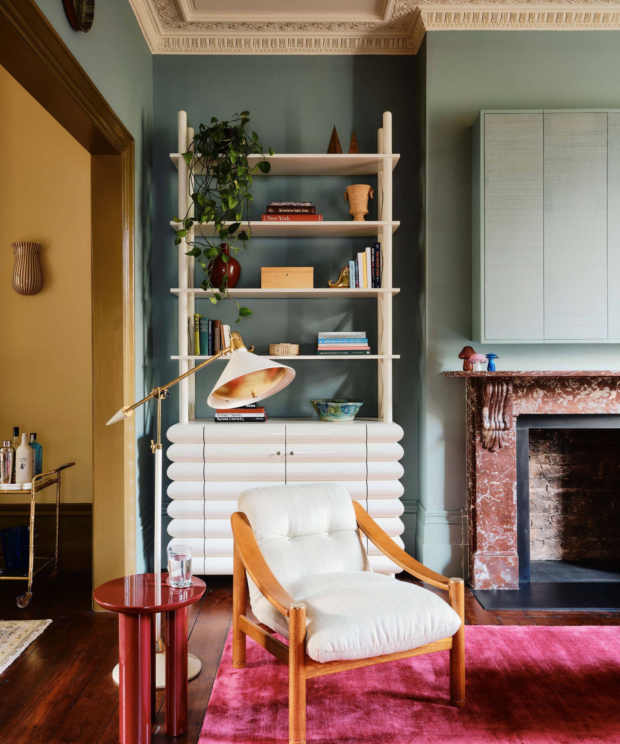
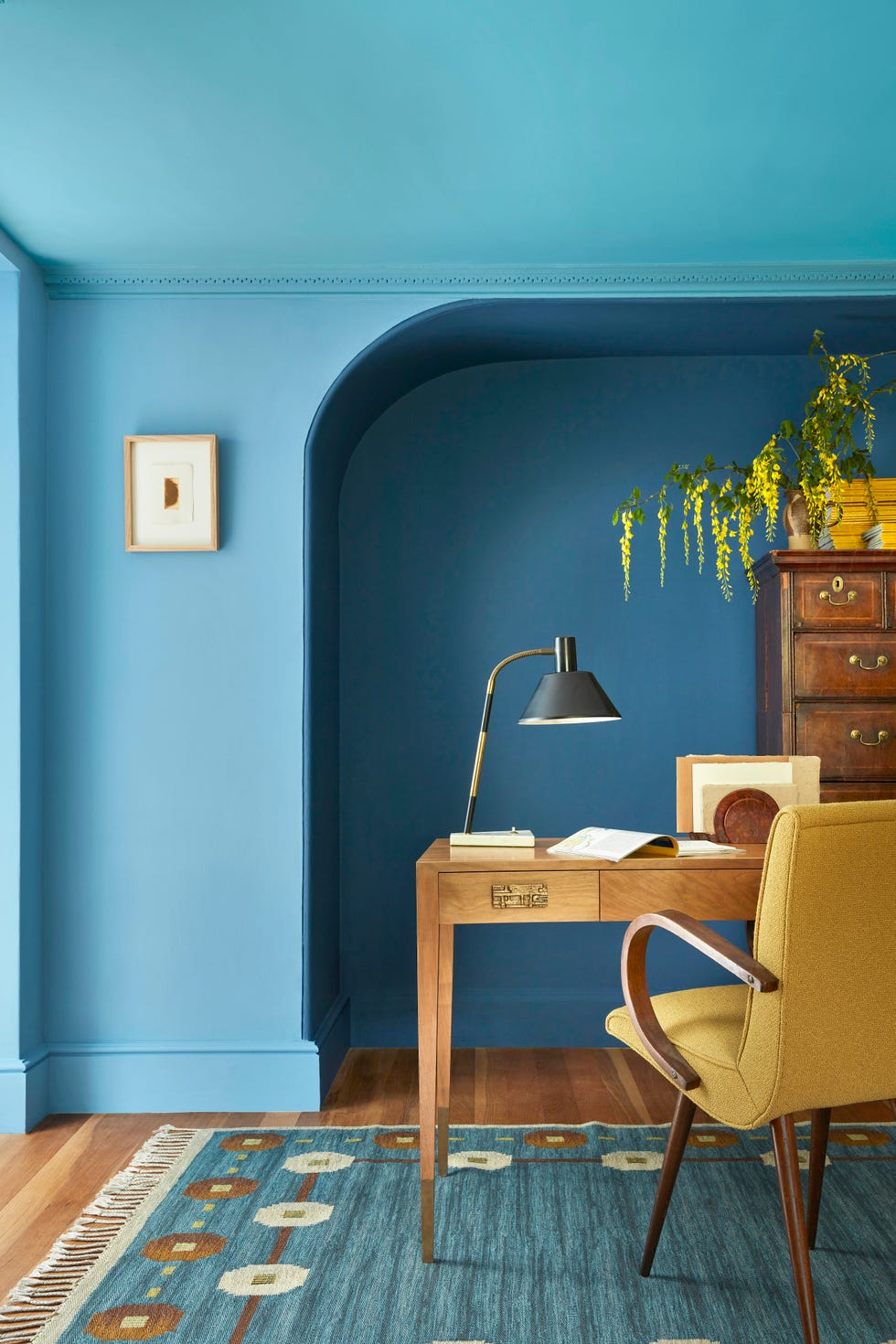
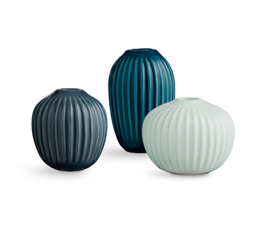
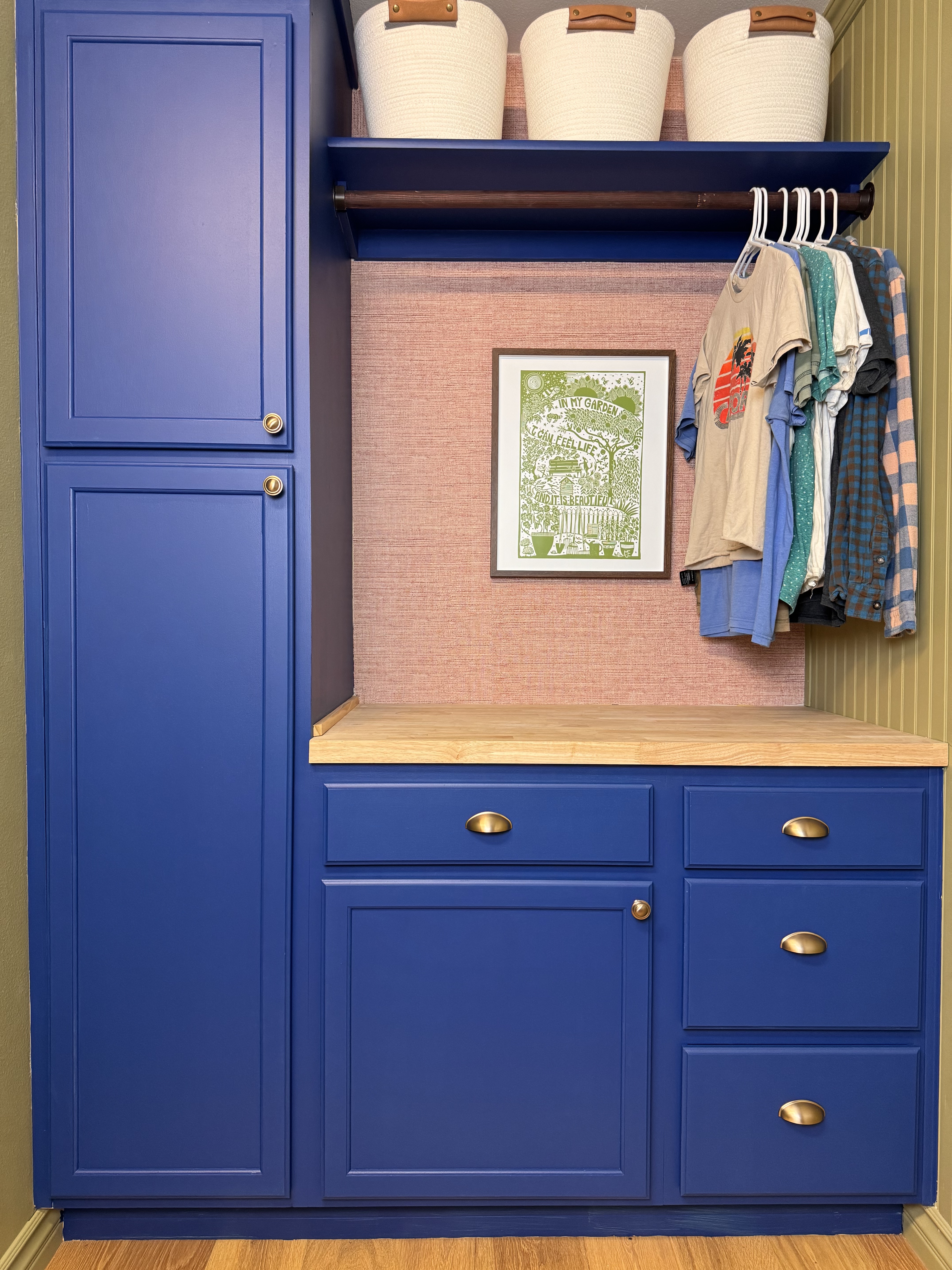
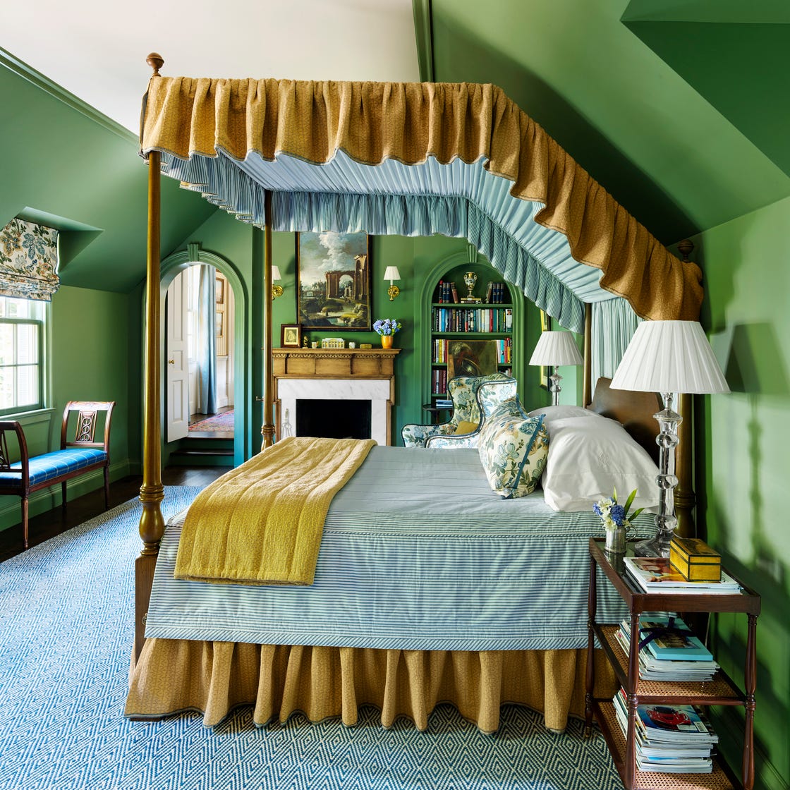
Another key trend for 2026 is the adoption of dusty jewel tones. Stephanie Hunt describes these as having a "dustier finish," reminiscent of antique jewelry. Emily LaMarque, principal of Emily LaMarque Design Studio, observes clients' inclination towards saturated, rich hues like deep sapphire and Prussian blues, muted emeralds, earthy greens, and subdued cranberry reds. Manuella Moreira, founder of Manuella Moreira Interiors, concurs, stating that jewel-tone palettes are increasingly popular for adding depth and dimension to interiors. She highlights how deep blues and greens can create a calming foundation, while layers of amethyst tones infuse personality and sophistication into a space.
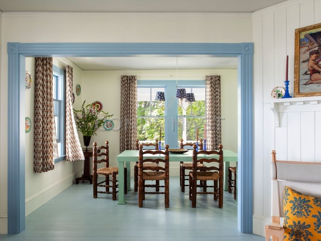
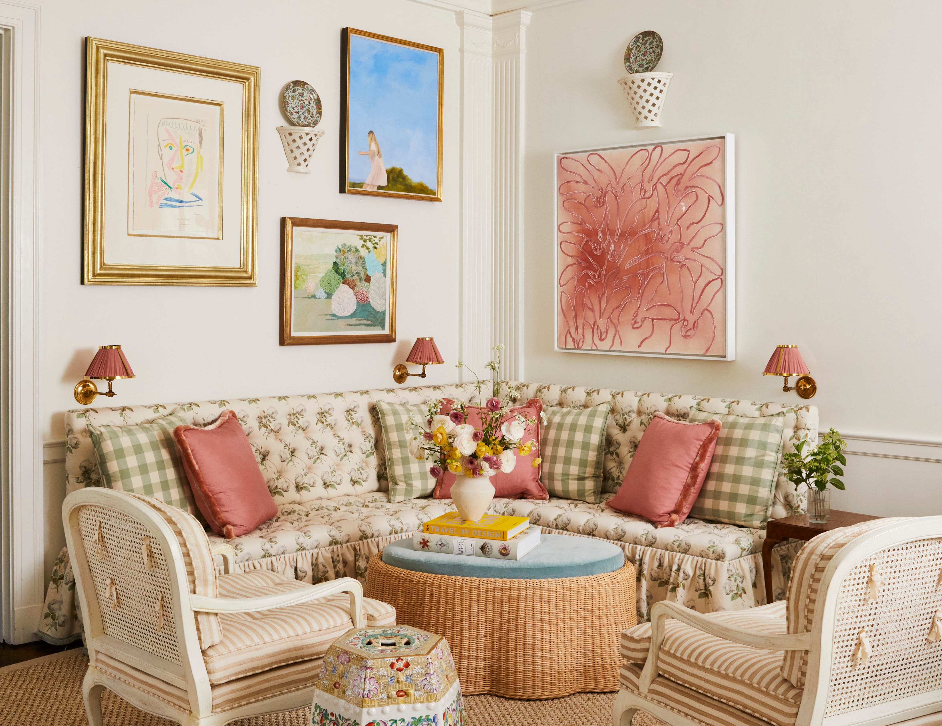
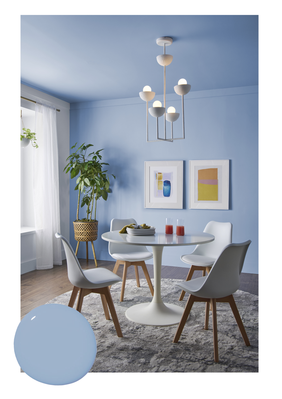
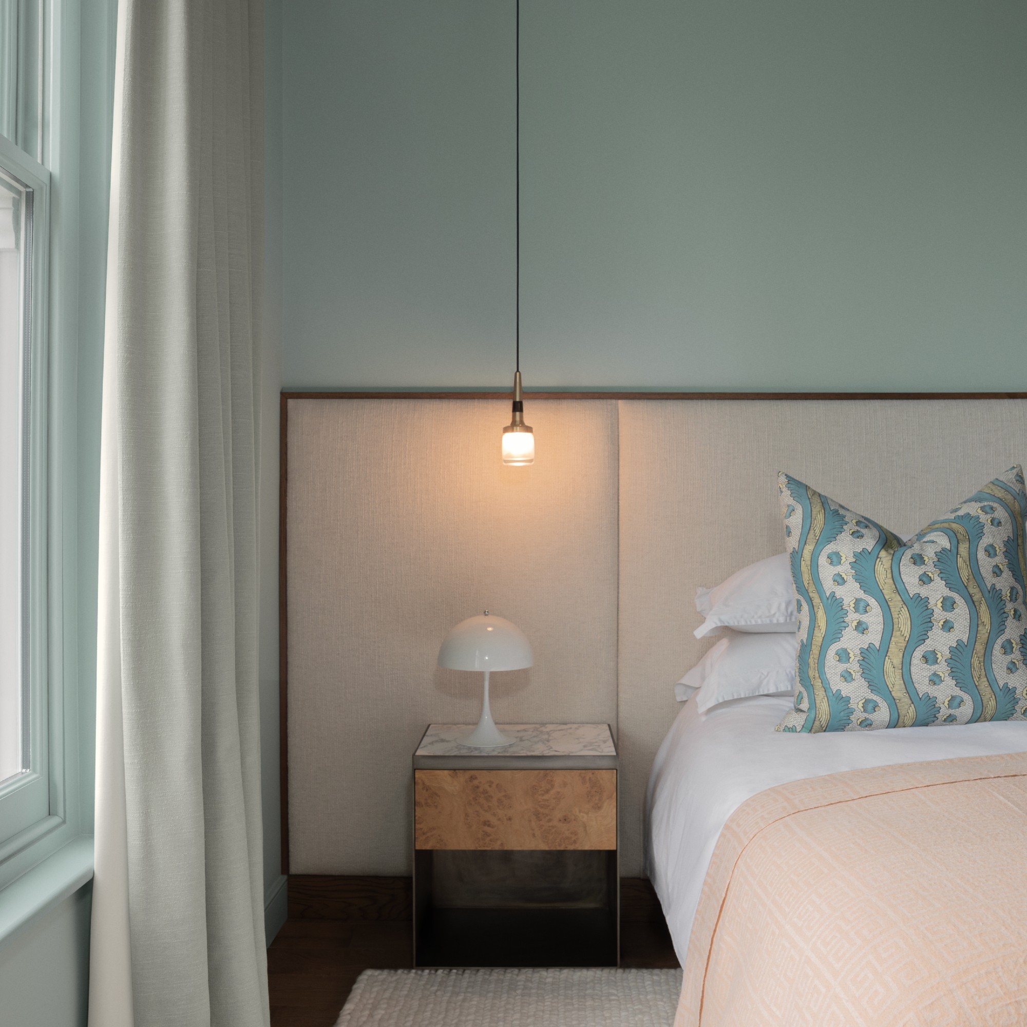
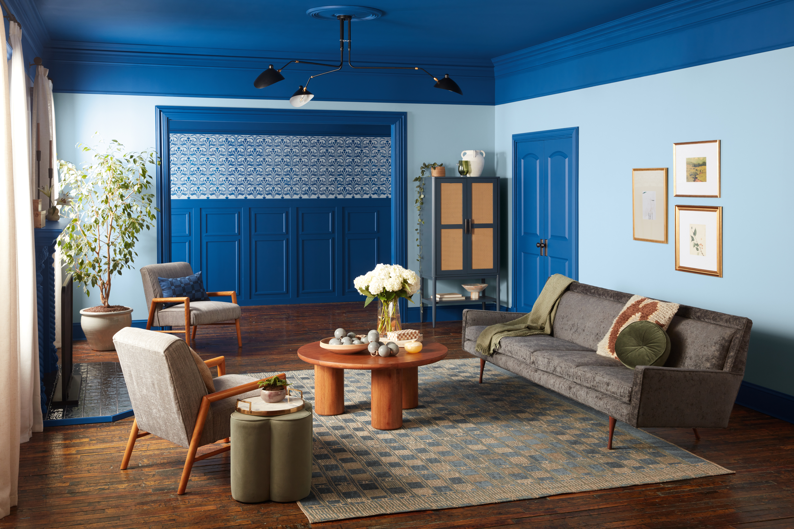
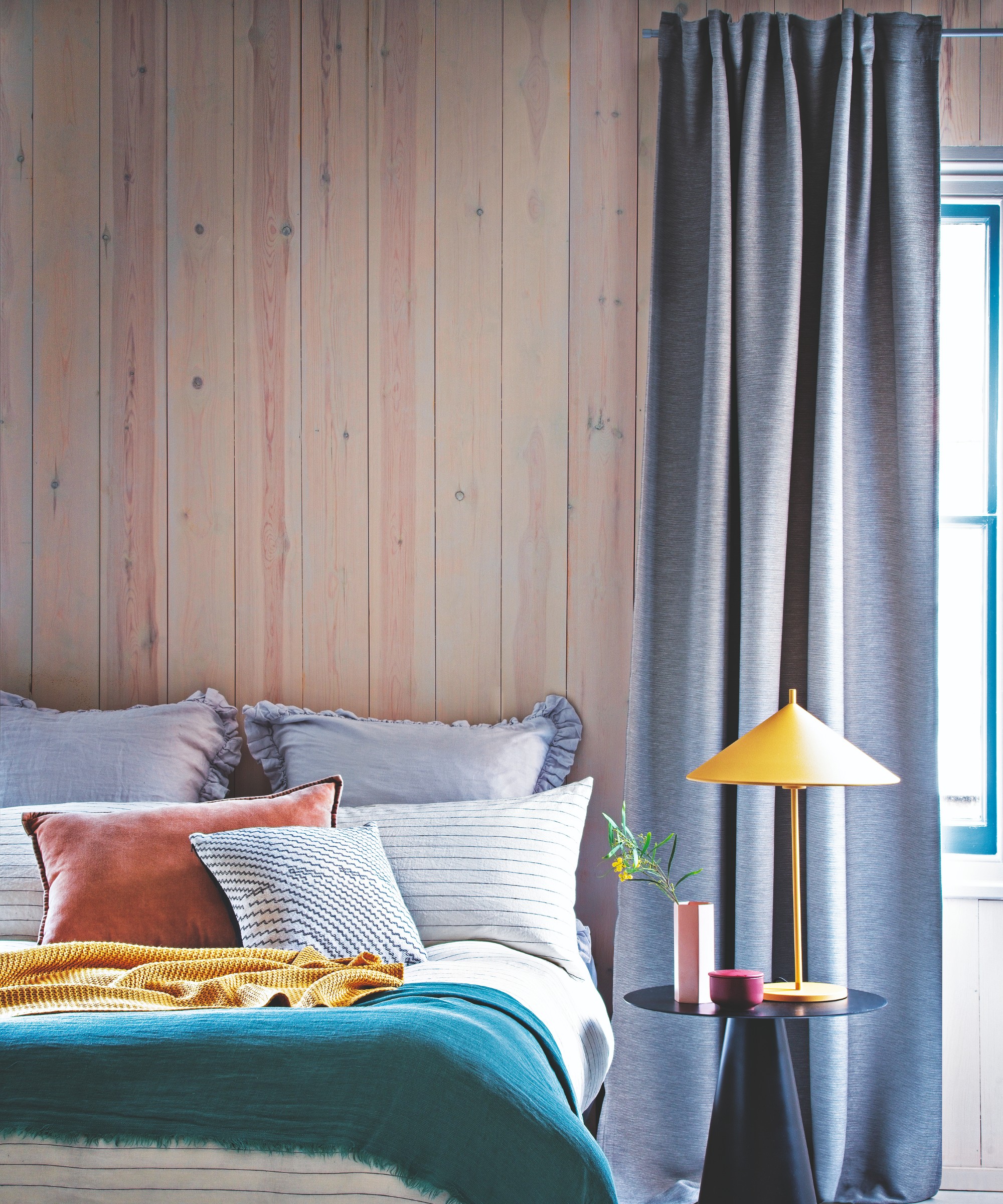
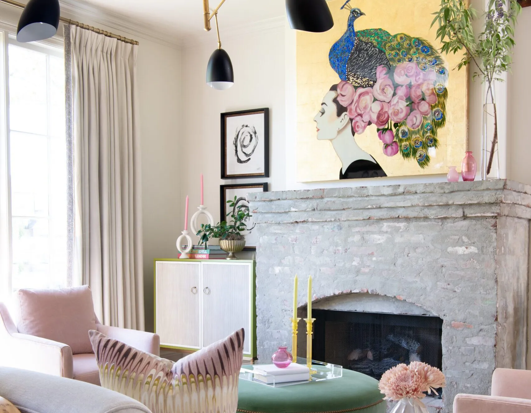
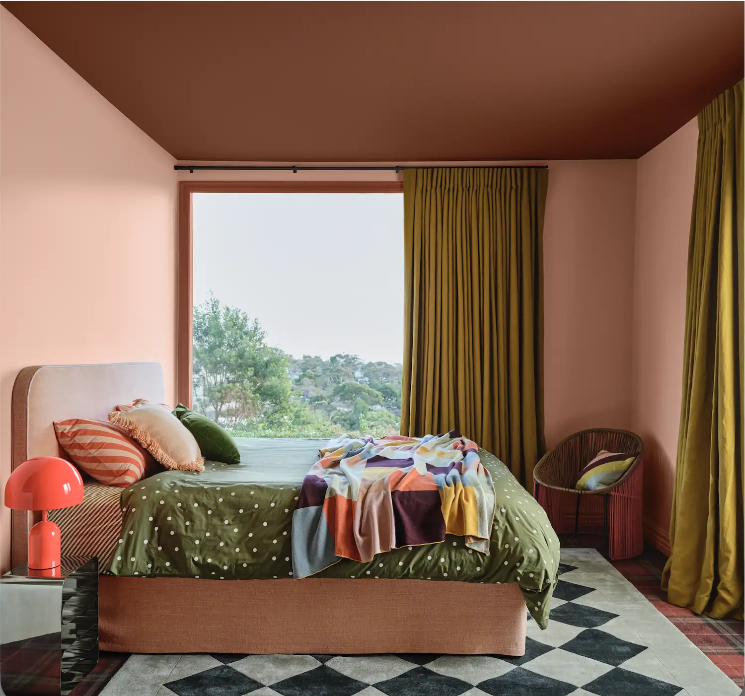

Finally, designers are embracing unexpected, high-contrast color pairings. Sarah and Rebecca Goesling of Goesling Group anticipate that 2026 will prioritize colors that feel timeless rather than merely looking timeless. They observe a move towards "adrenaline-fueled hues" like teal, cobalt, periwinkle, and chartreuse, which are then balanced with more grounded, pragmatic colors. Examples of their preferred combinations include "satin periwinkle and velvet chocolate, high gloss chartreuse and matte baby blue, and matte tangerine and metallic moss." Stephanie Hunt introduces a technique called "color capping," which involves using various shades of a single color throughout a room to create a cohesive yet dynamic effect, where elements like ceilings, upholstered headboards, and other furnishings utilize lighter or darker variations of the same base color.
#ColorTrends #InteriorDesign #HomeDecor #DesignersInsights #WarmNeutrals #JewelTones #ColorPalettes #InteriorColors #DesignTrends2026 #ColorTrends #InteriorDesign #HomeDecor #DesignersInsights #WarmNeutrals #JewelTones #ColorPalettes #InteriorColors #DesignTrends2026
0 comment in total
 No comments yet
You may also like

These 6 Colors Will Rule Interiors in 2026, According to Experts

According to Designers, These Are The Outdated Color Trends for 2026

Interiors experts predict this will be the biggest paint trend of 2026

Say Goodbye to Neutrals: Color-Drenching Will Define 2026 Interiors

These Colors Will Be Everywhere in Interior Design in 2026
These 7 Colors Will Rule Interiors in 2026, According to Experts

An interior designer shares insight on the 2026 Color of the Year and what it means for the trend cycle
These are the 3 curtain colours going out of style in 2026
What Paint Colours will Rule 2026? The Experts Make Their Predictions
Move Over, Color Drenching— Color Capping Will Dominate 2026 Interiors

3 New Color Pairings Designers Are Using for Elevated Rooms in 2024 - and How to Get the Look Now

These Are the Most Popular Interior Styles of 2026, According to Designers
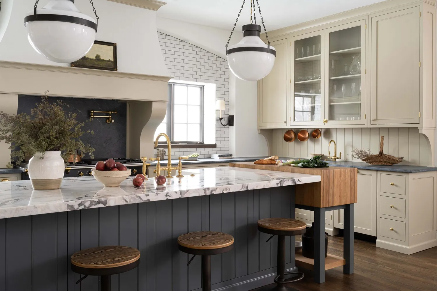
7 Trendy Paint Colors for Every Room in 2026, According to Designers

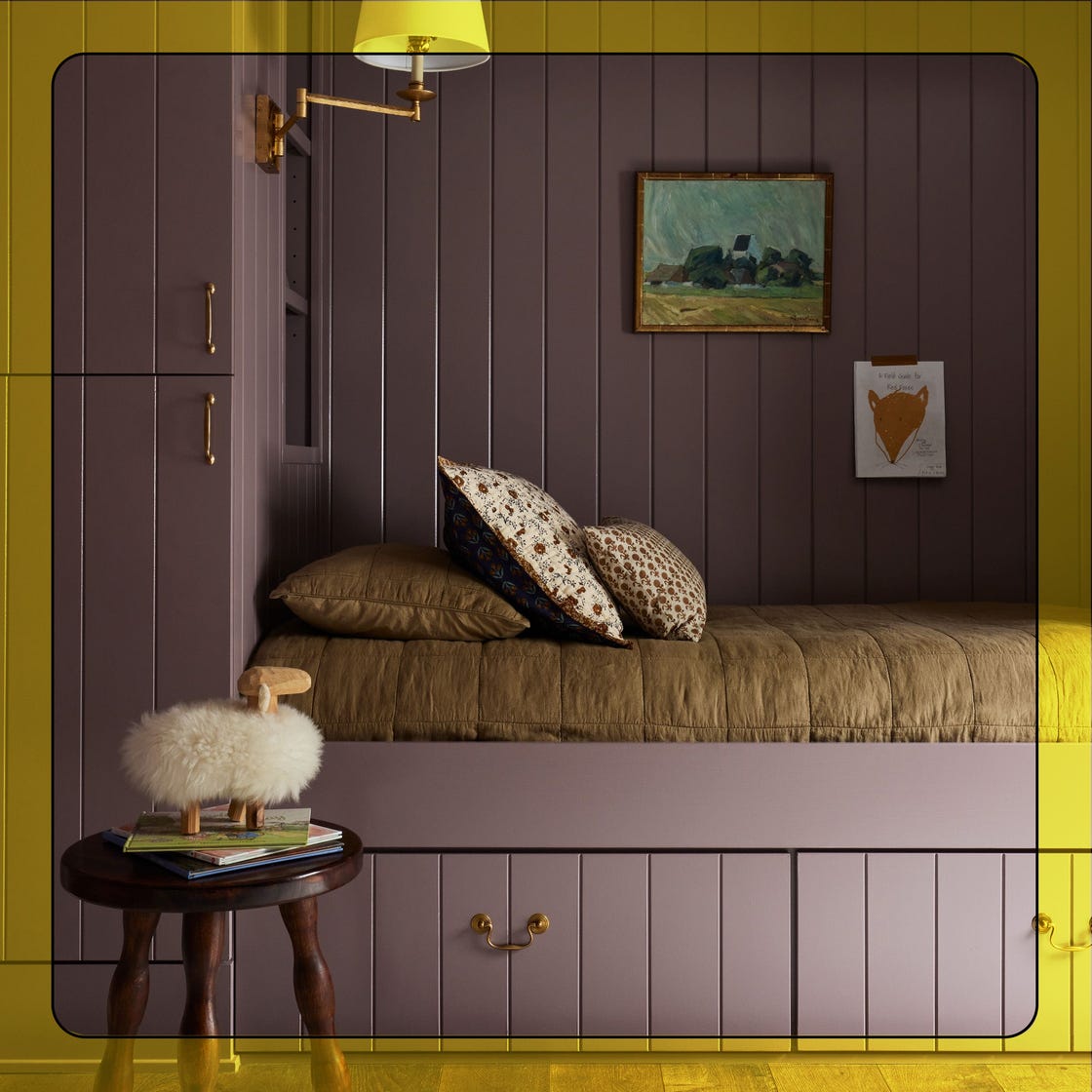
What Paint Colors Will Rule 2026? Designers Make Their Predictions


8 Paint Color Trends You'll ACTUALLY Want to Live With in 2026, According to Designers

6 key colors to decorate with in May 2025, according to interior design and color experts in the know
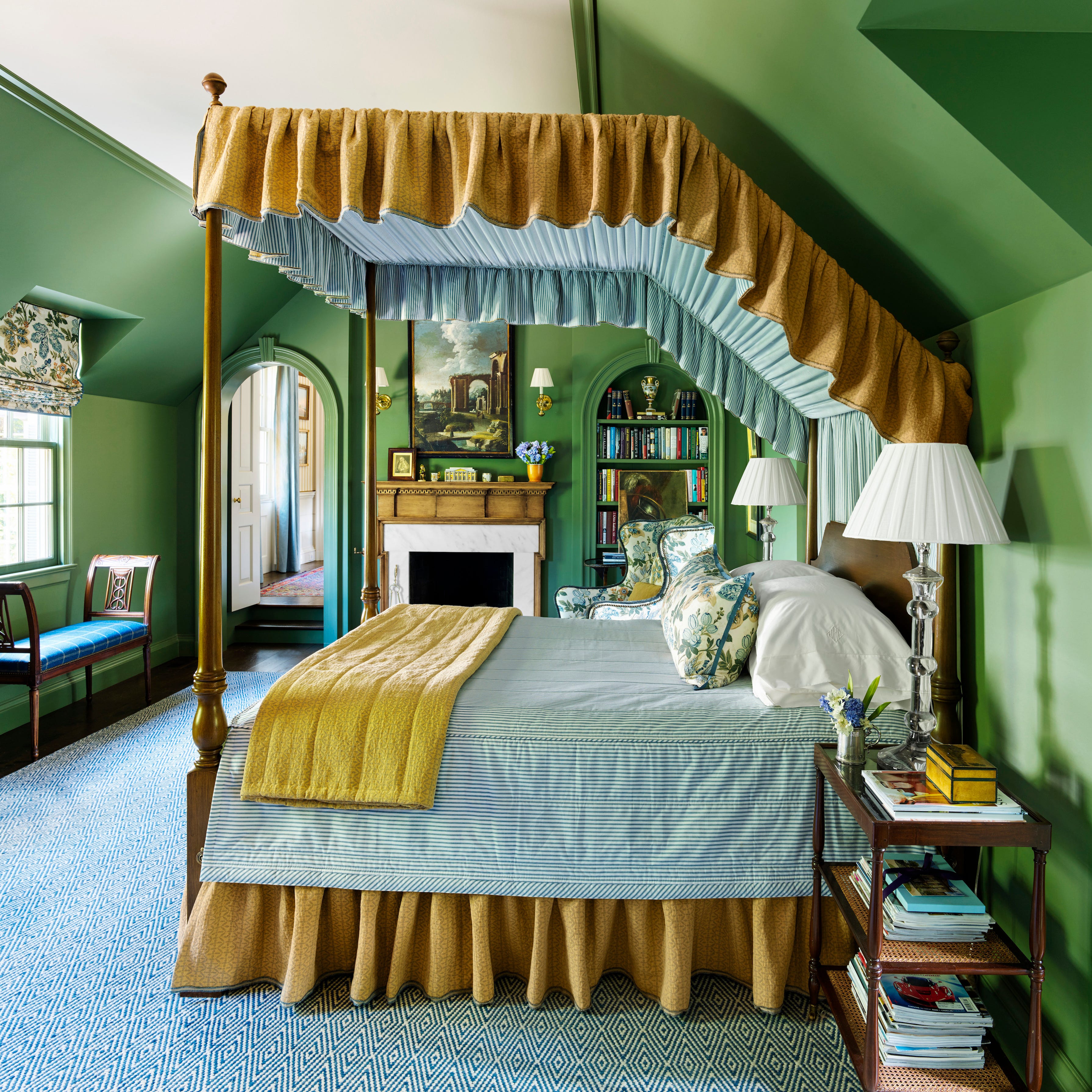
These 8 Colors Will Rule Interiors in 2026, According to Experts

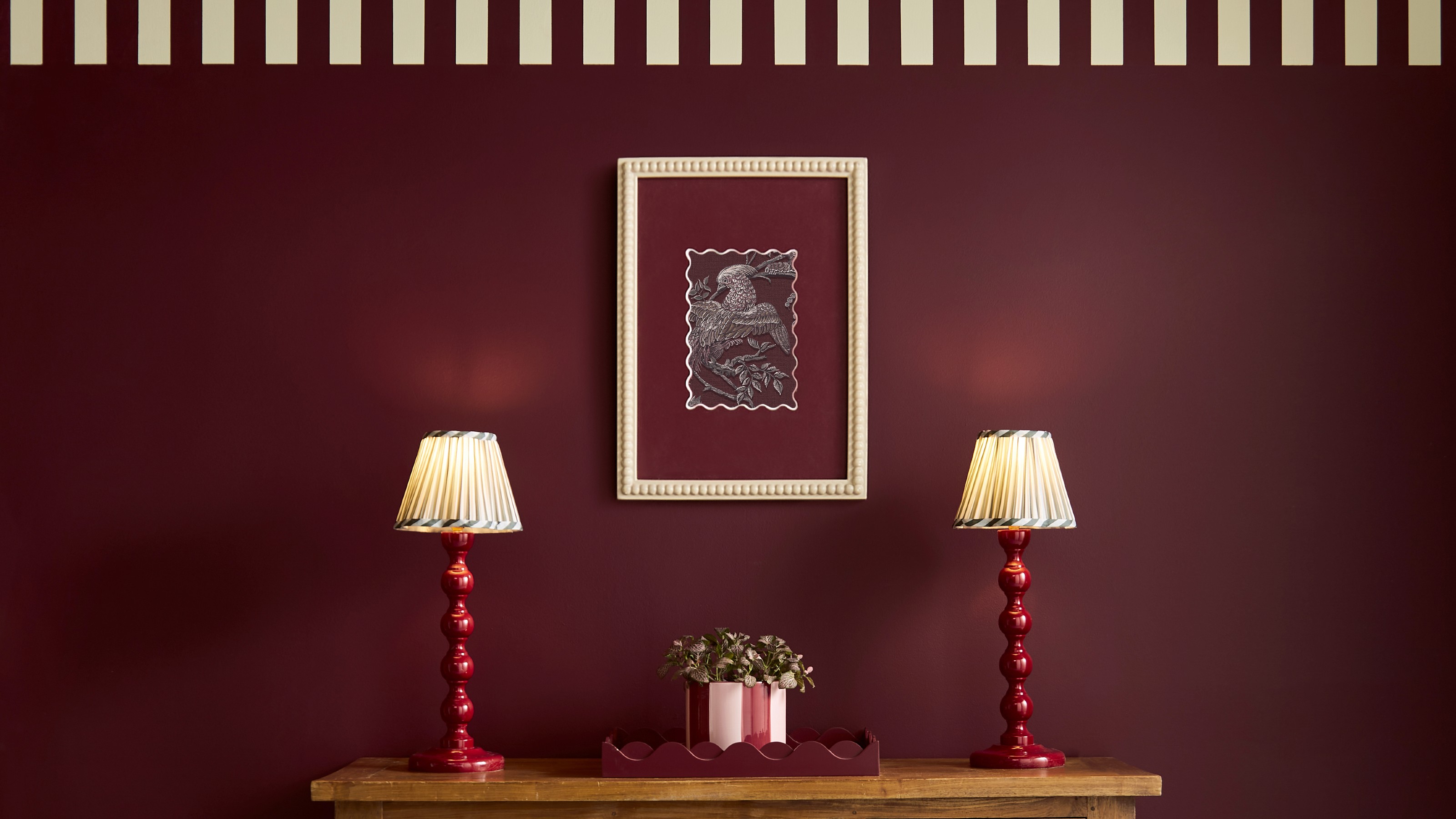
The colour trends 2026 that will define our homes next year

What is Color Forecasting? Experts Explain How to Map Trends |
The Top Interior Design Trends Experts Predict for 2026