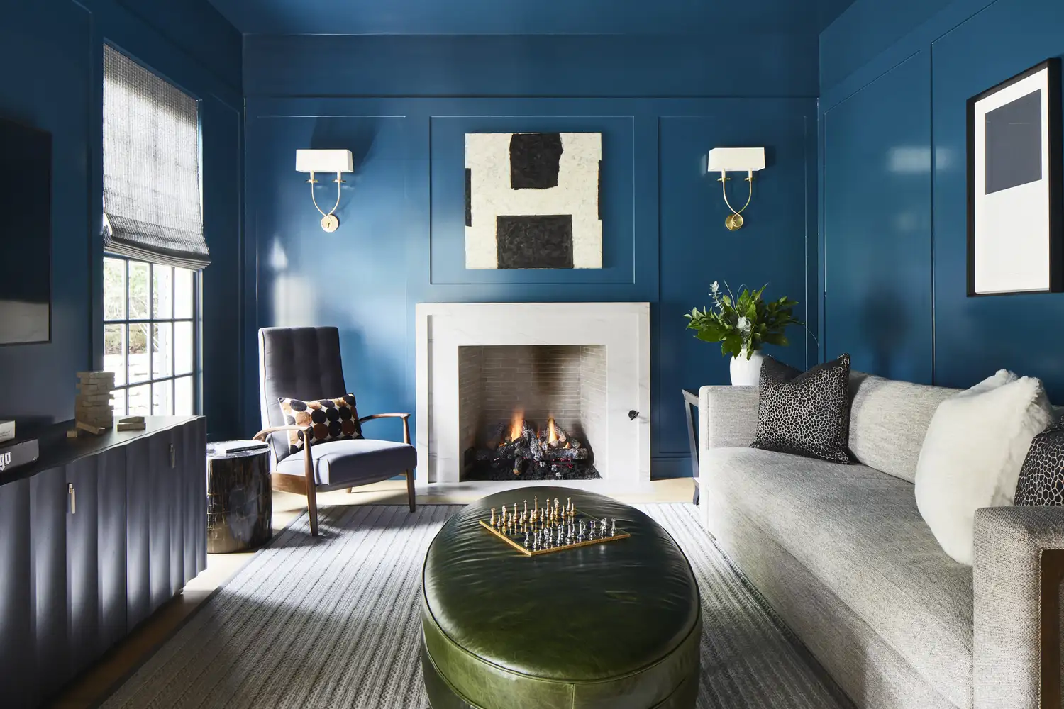
Say Goodbye to Neutrals: Color-Drenching Will Define 2026 Interiors
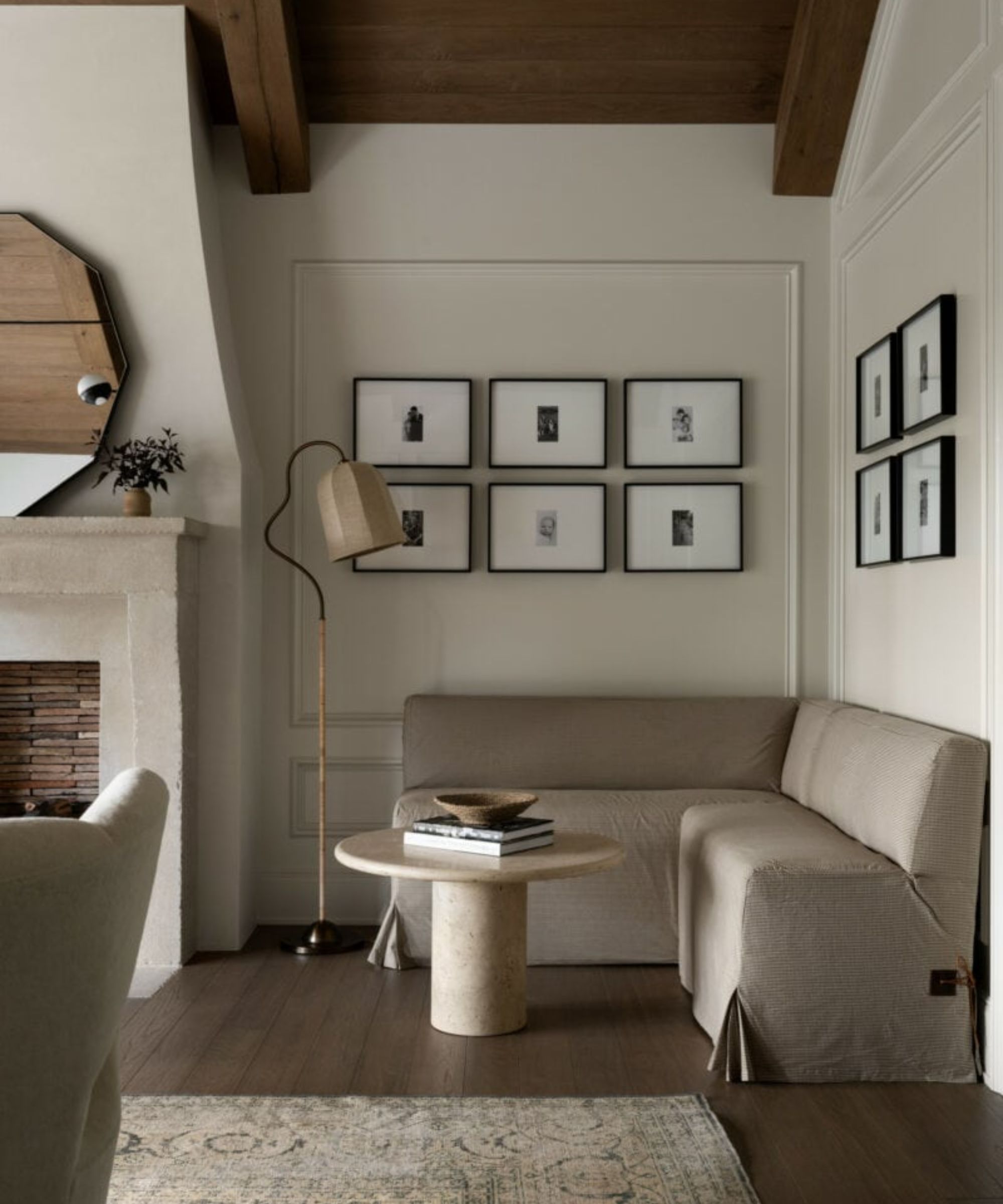
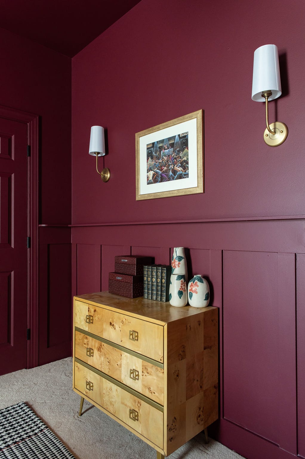
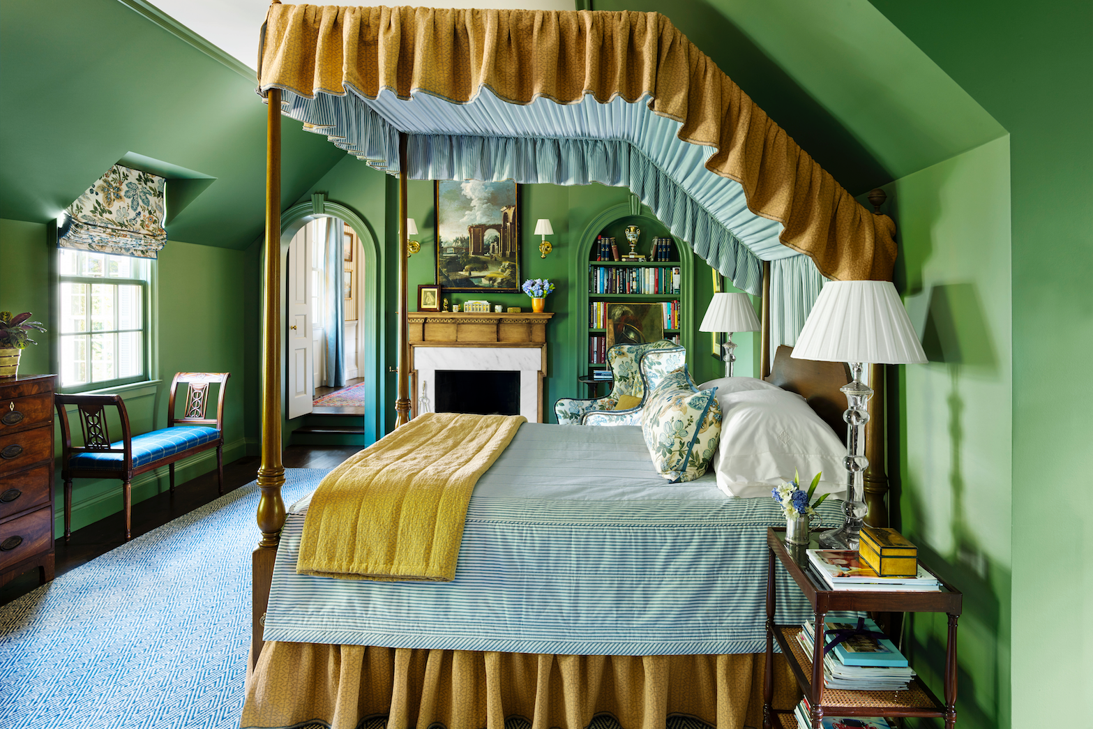
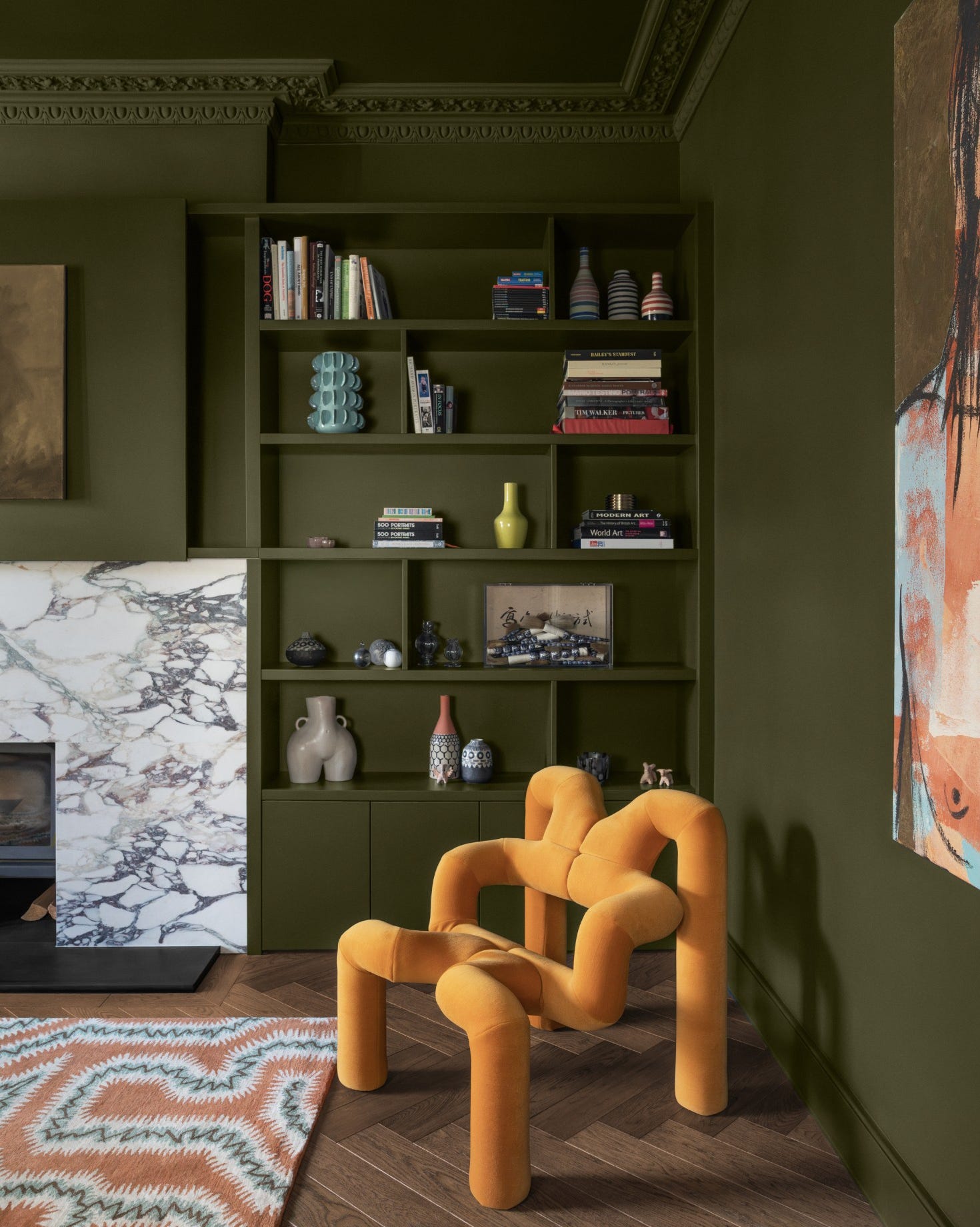
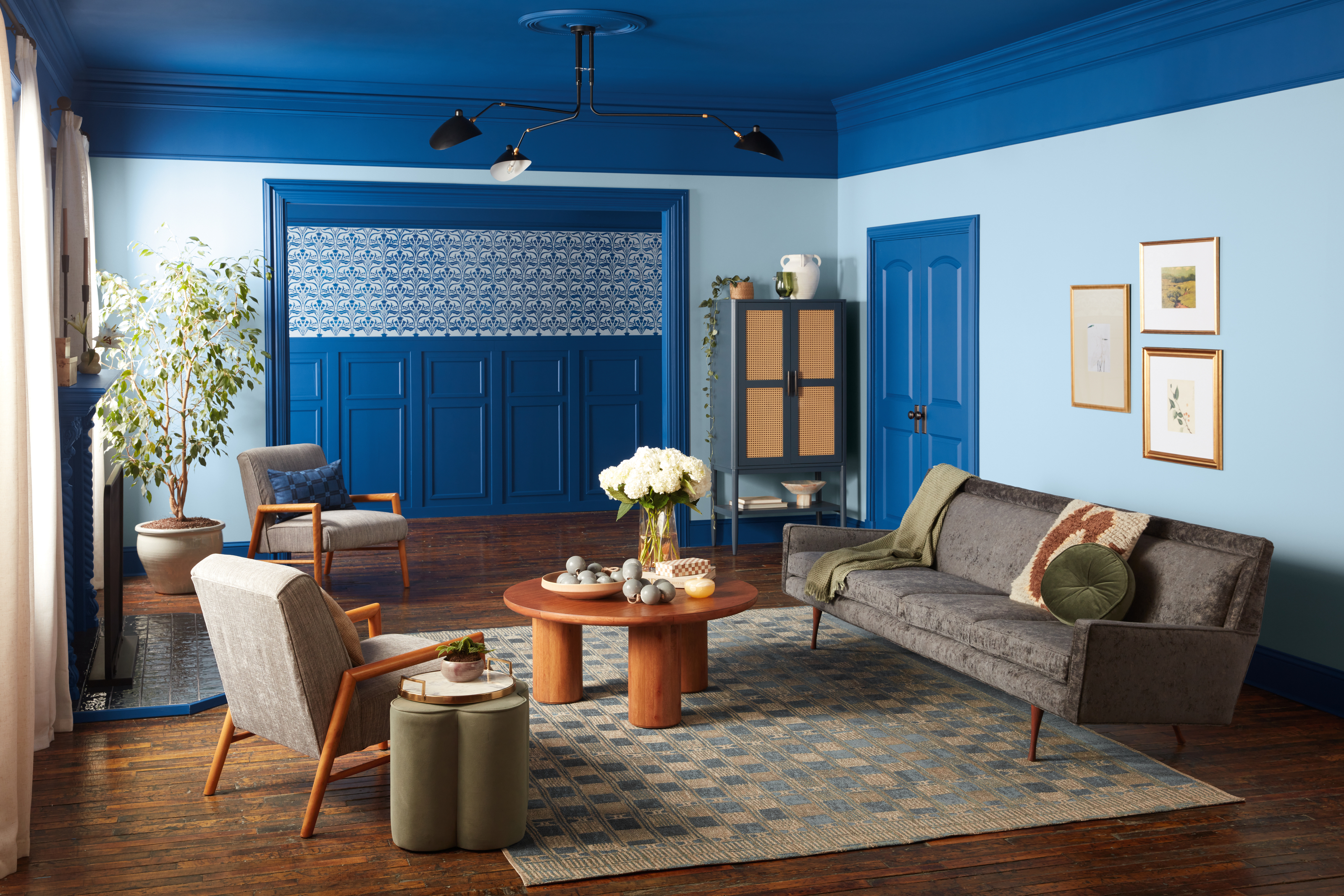
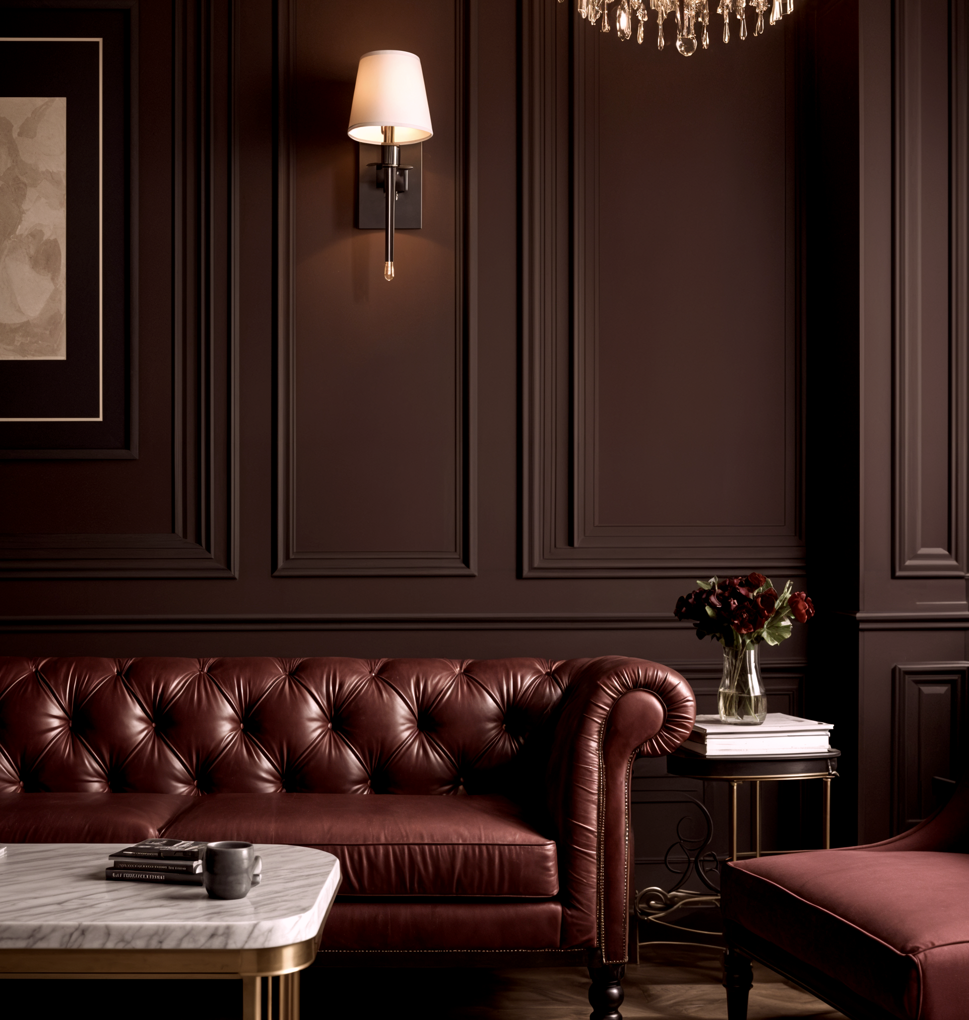
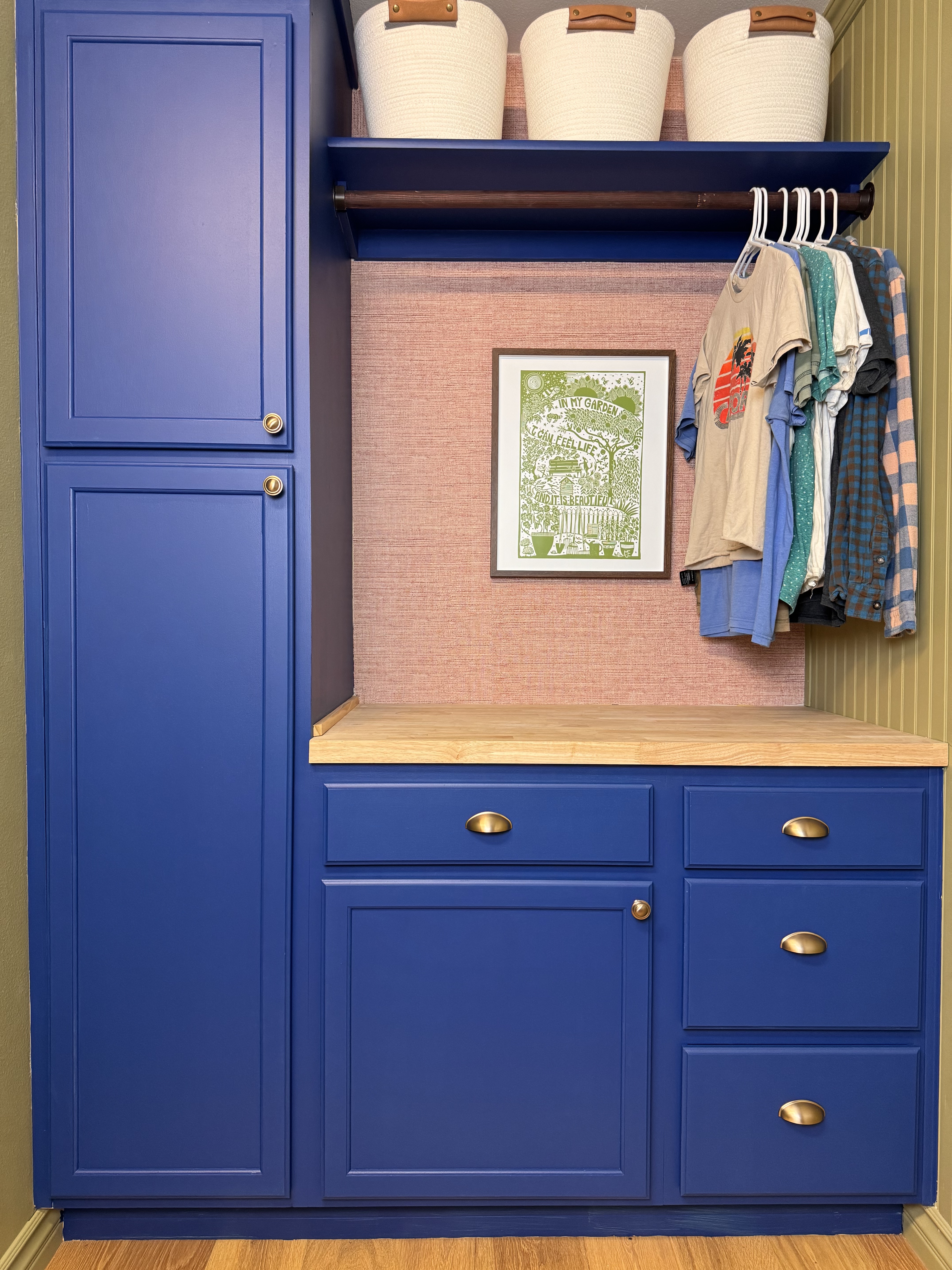
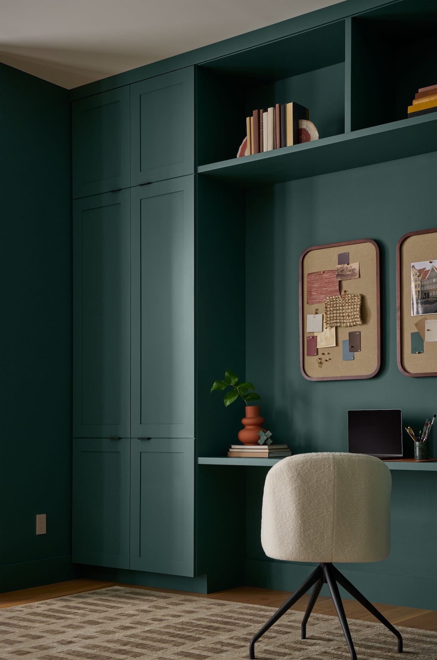
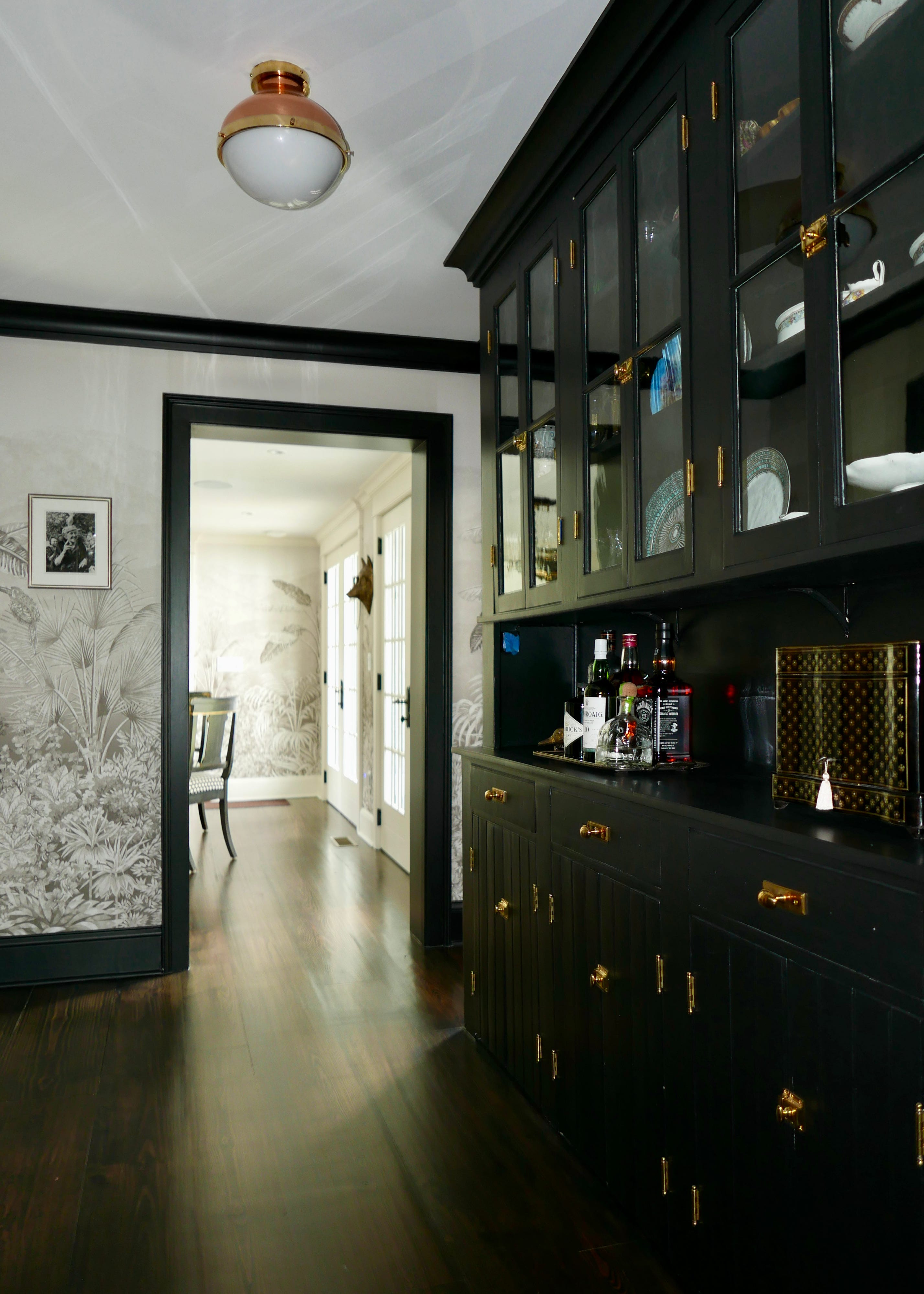
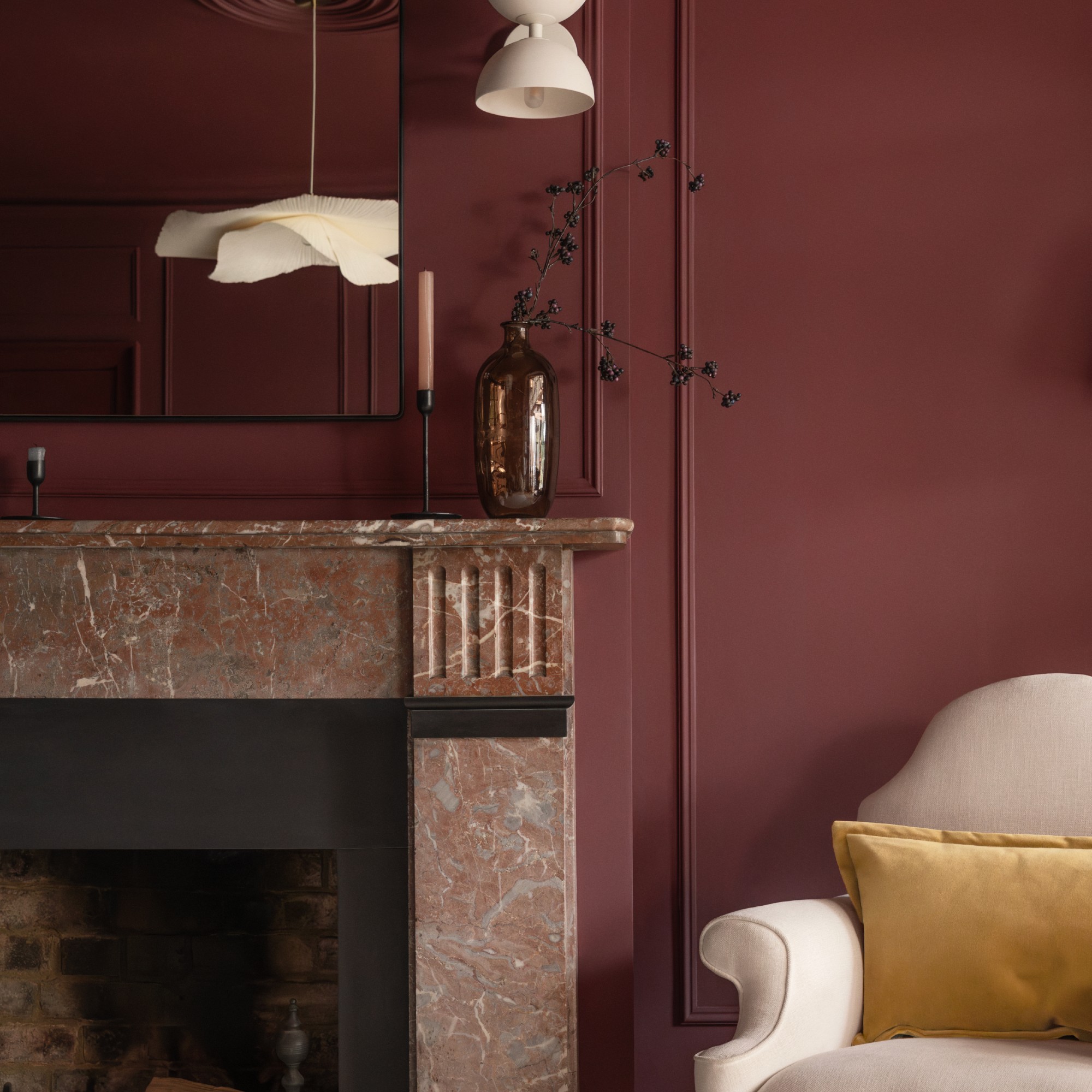
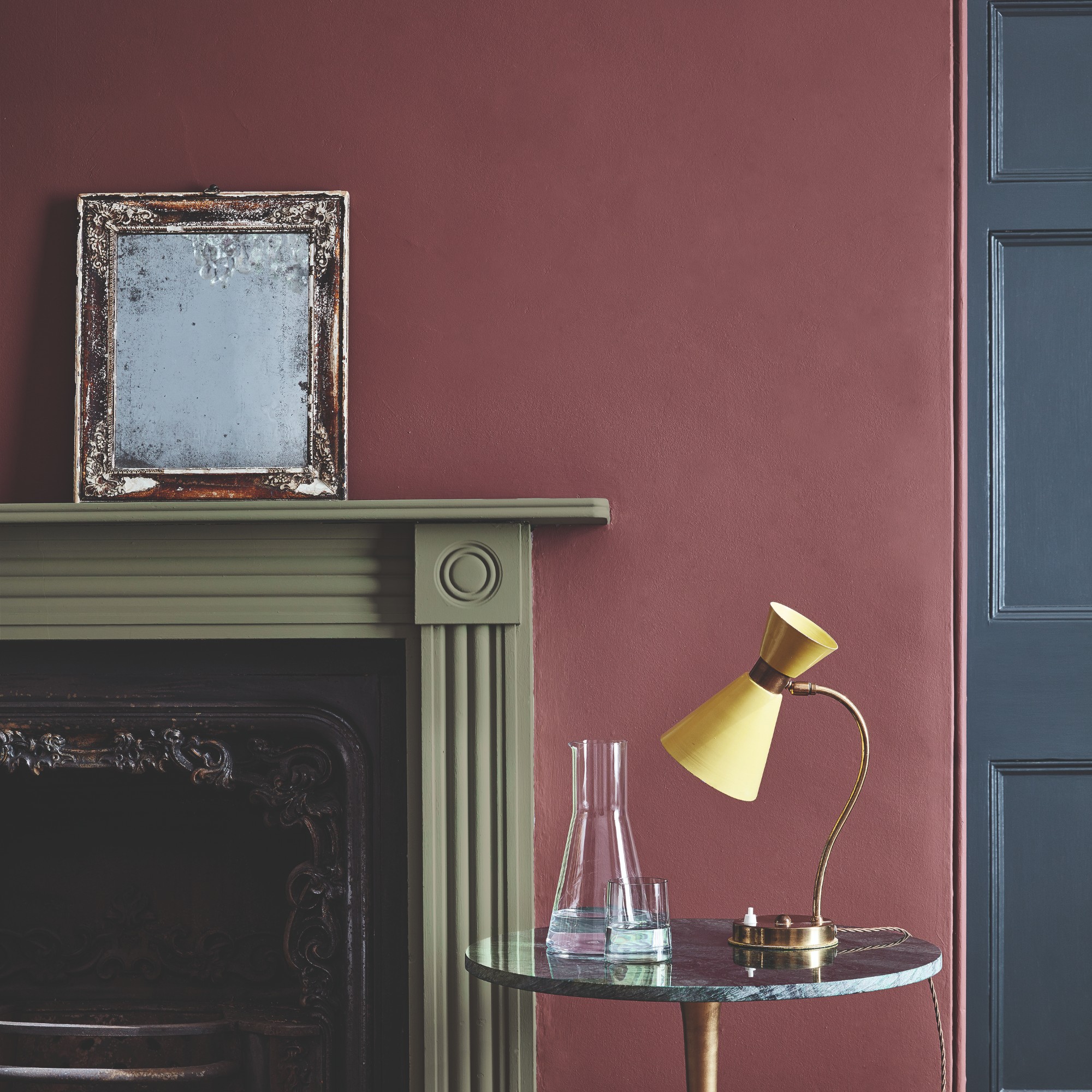

The article discusses the emerging interior design trend of "color drenching," which is predicted to define home interiors in 2026, marking a shift away from the minimalist and neutral palettes that dominated the 2010s. This trend involves using a single, cohesive color across an entire room, including walls, trim, ceilings, baseboards, and even some furniture, to create a sense of warmth, depth, and personality. The 2026 Zillow Home Trend Report indicates a 149% year-over-year increase in mentions of color drenching, reflecting a growing homeowner desire for unique, expressive spaces.
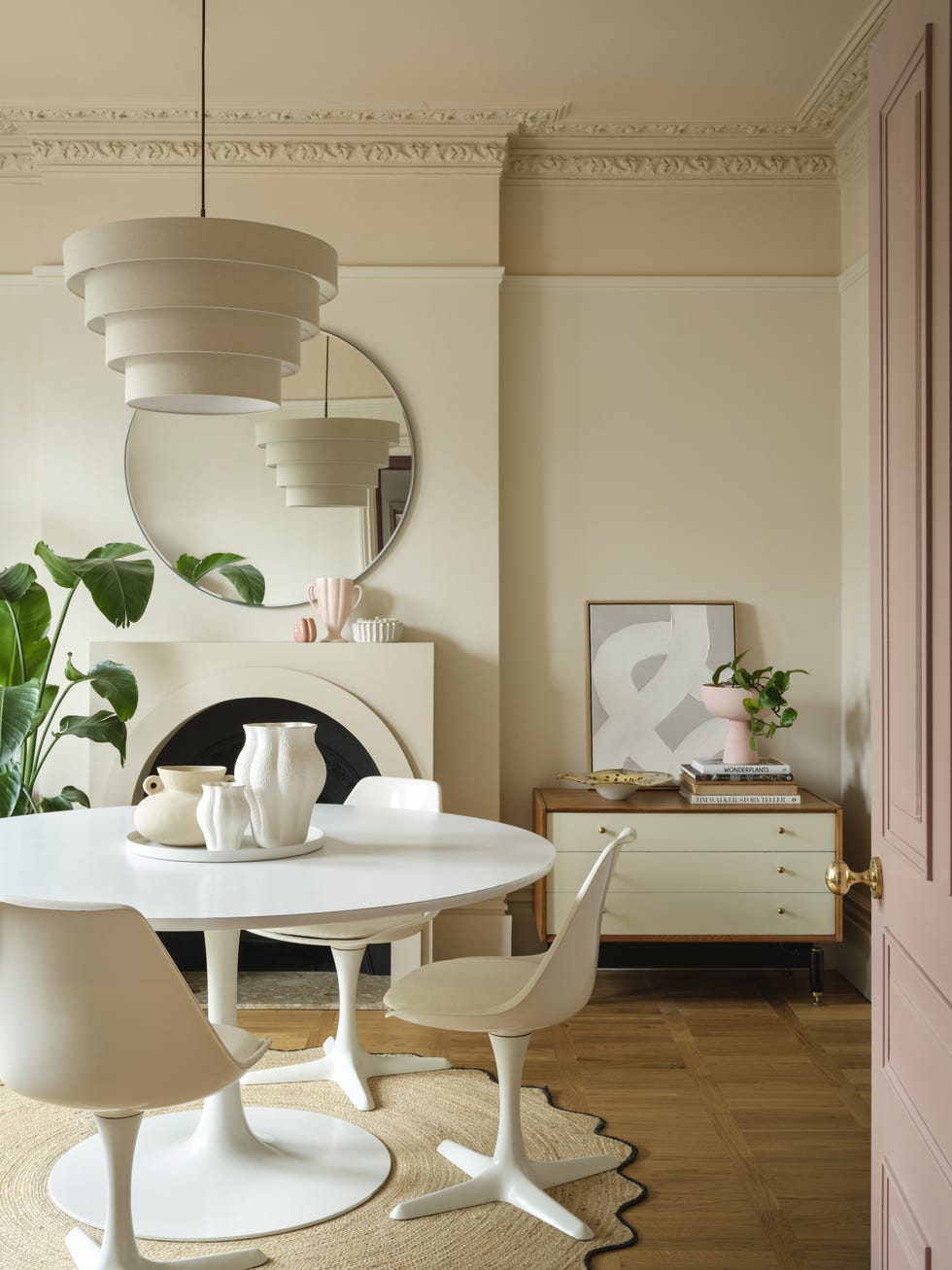
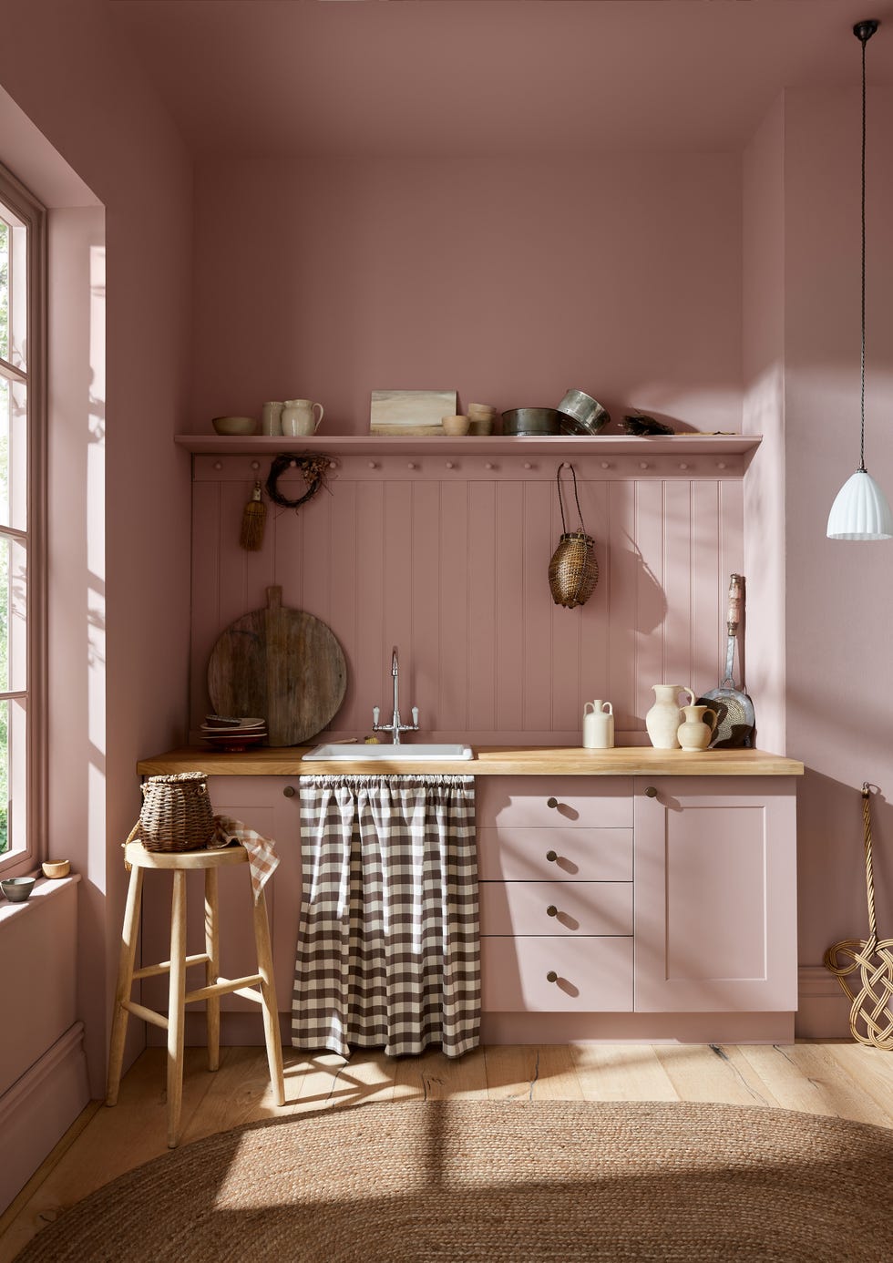
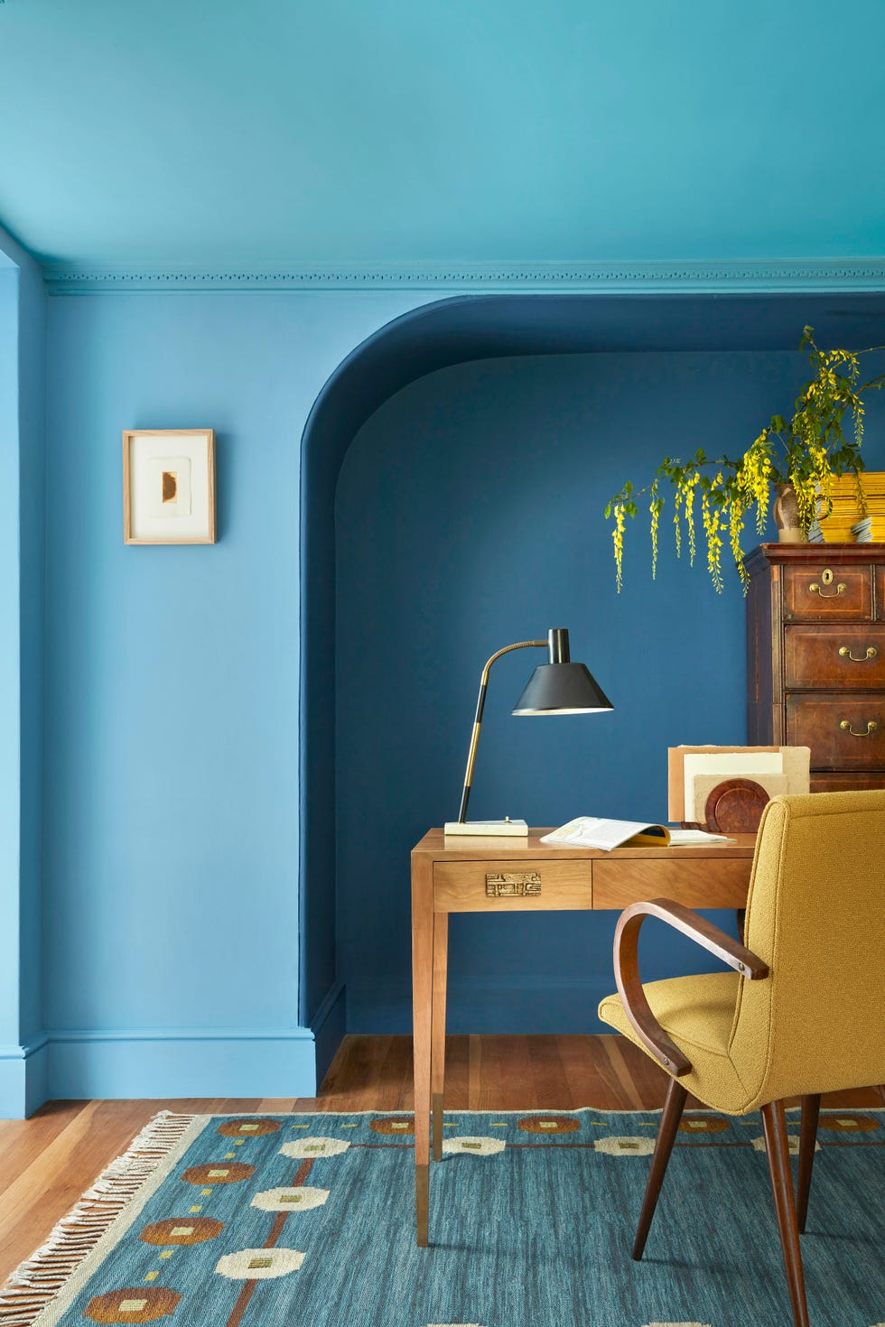
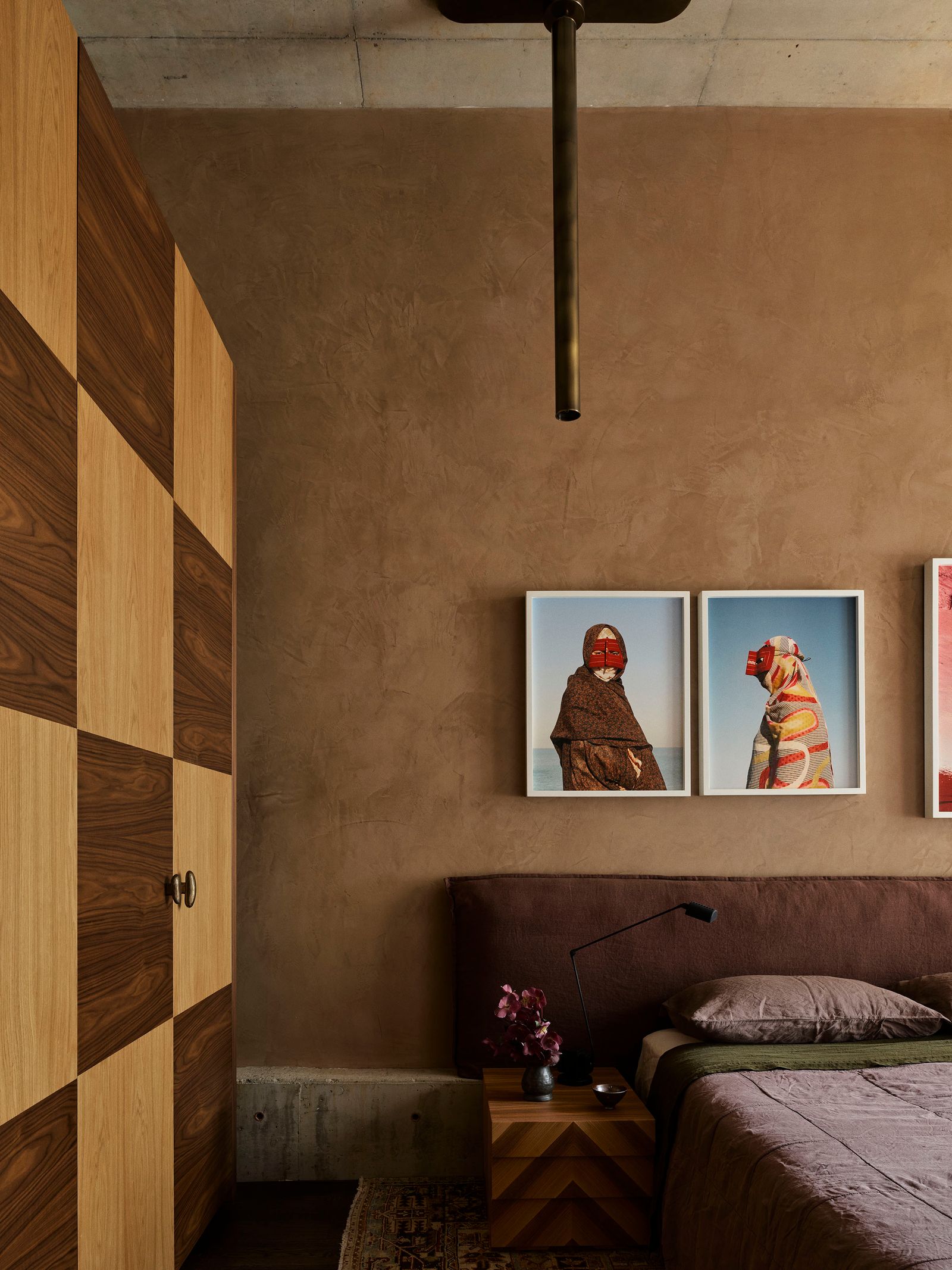
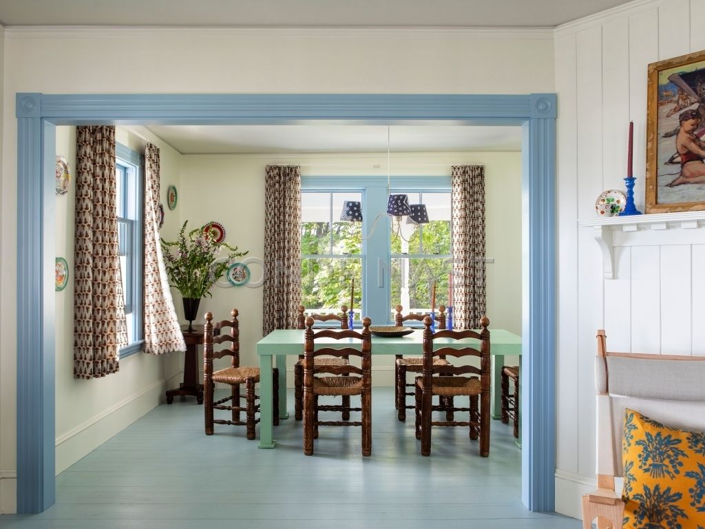
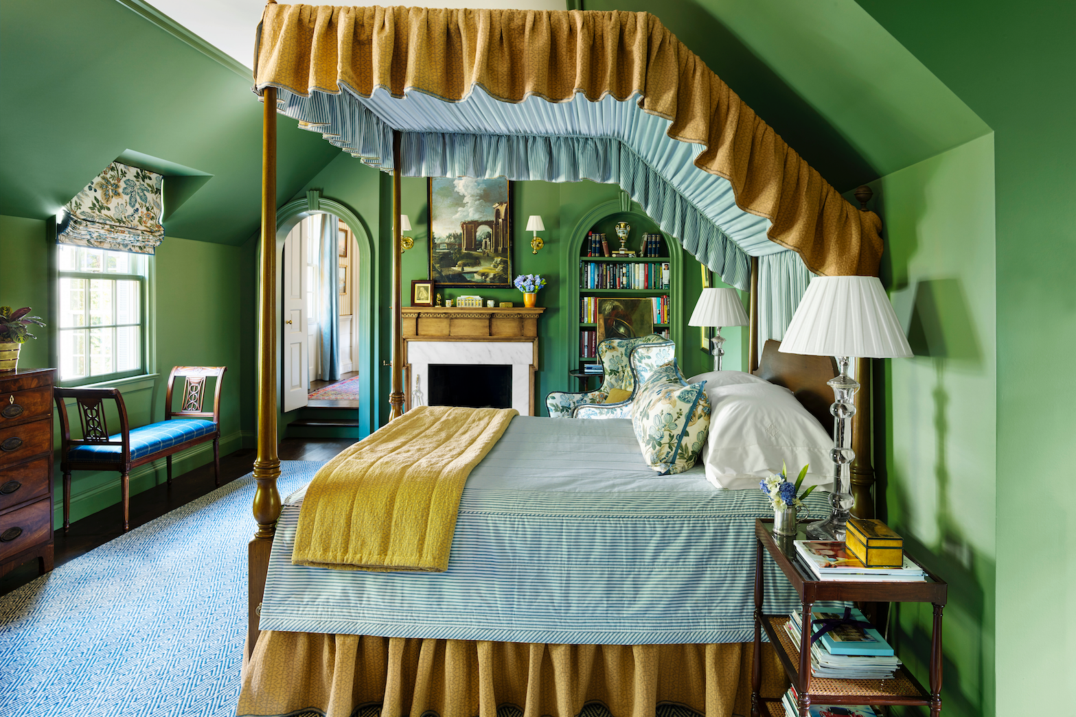
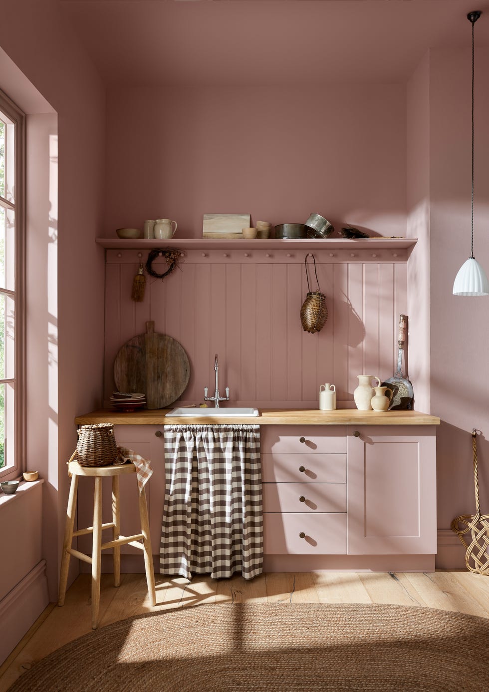
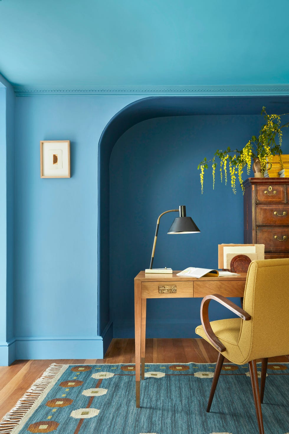
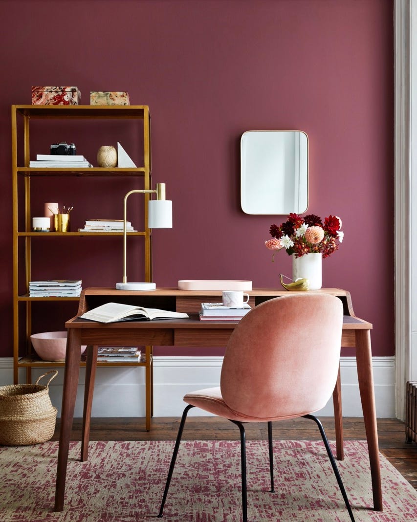
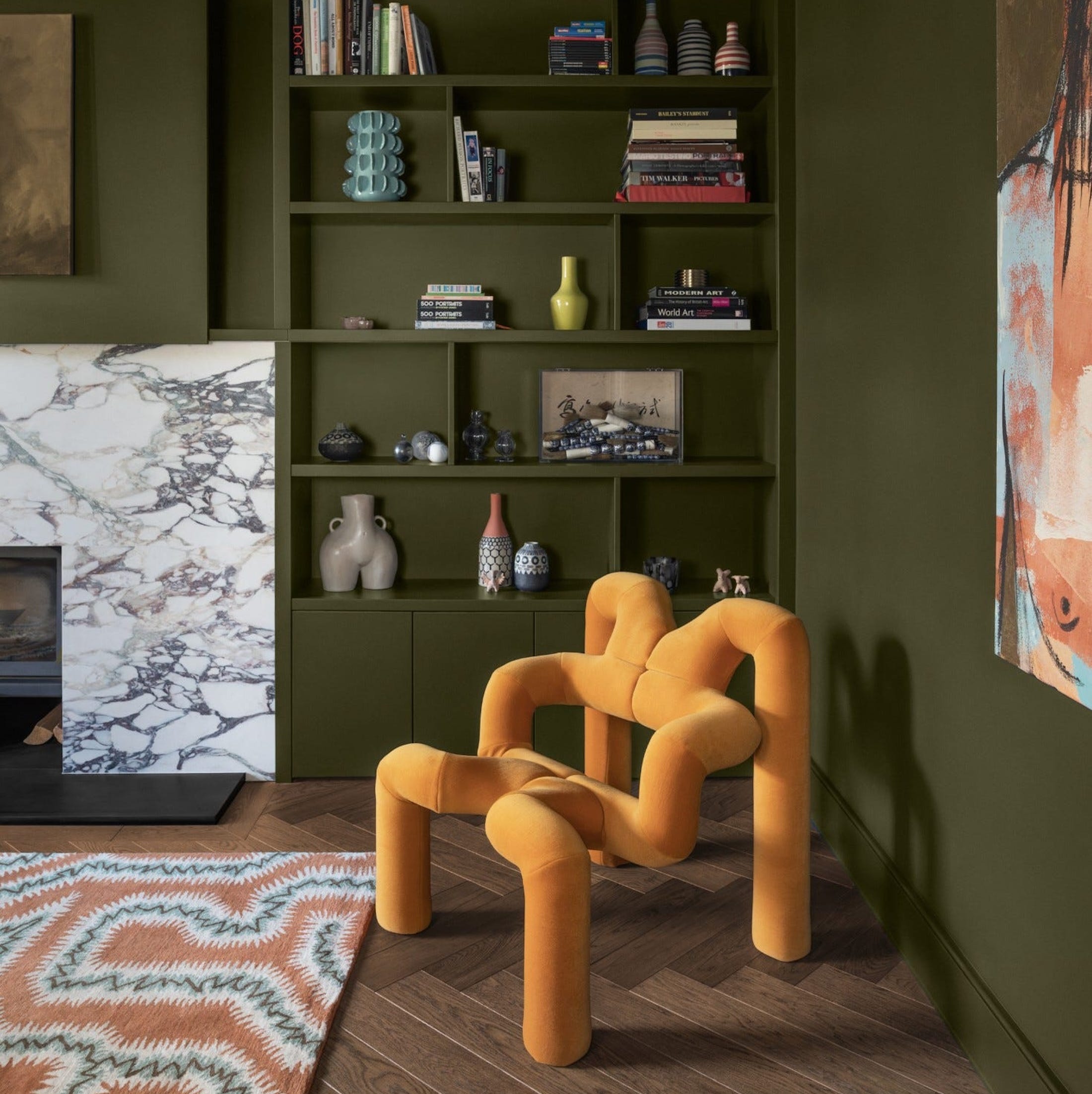
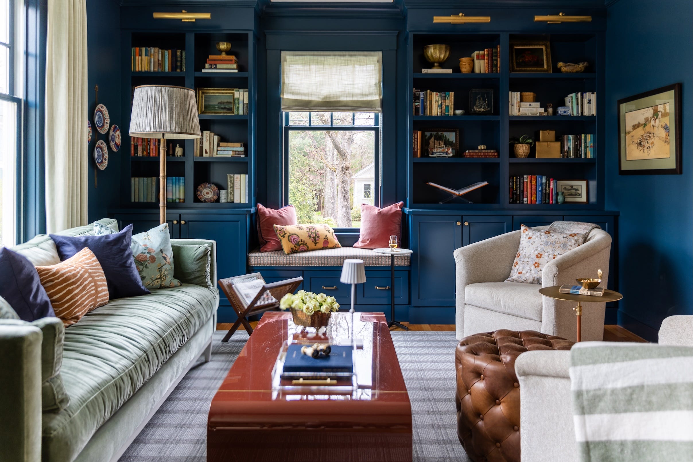
Interior designers Courtnay Tartt Elias of Creative Tonic Design and Lesley Myrick of Lesley Myrick Interior Design explain that color drenching elevates color from a supporting role to the main star of a room, allowing homeowners to express their personal style rather than adhering to generic catalog aesthetics. They differentiate color drenching from accent walls, noting that while an accent wall aims to stand out, color drenching creates a seamless, enveloping mood. This approach, though bold, is considered unfussy because the consistent application of color makes it feel more like an overall atmosphere than a singular focal point.
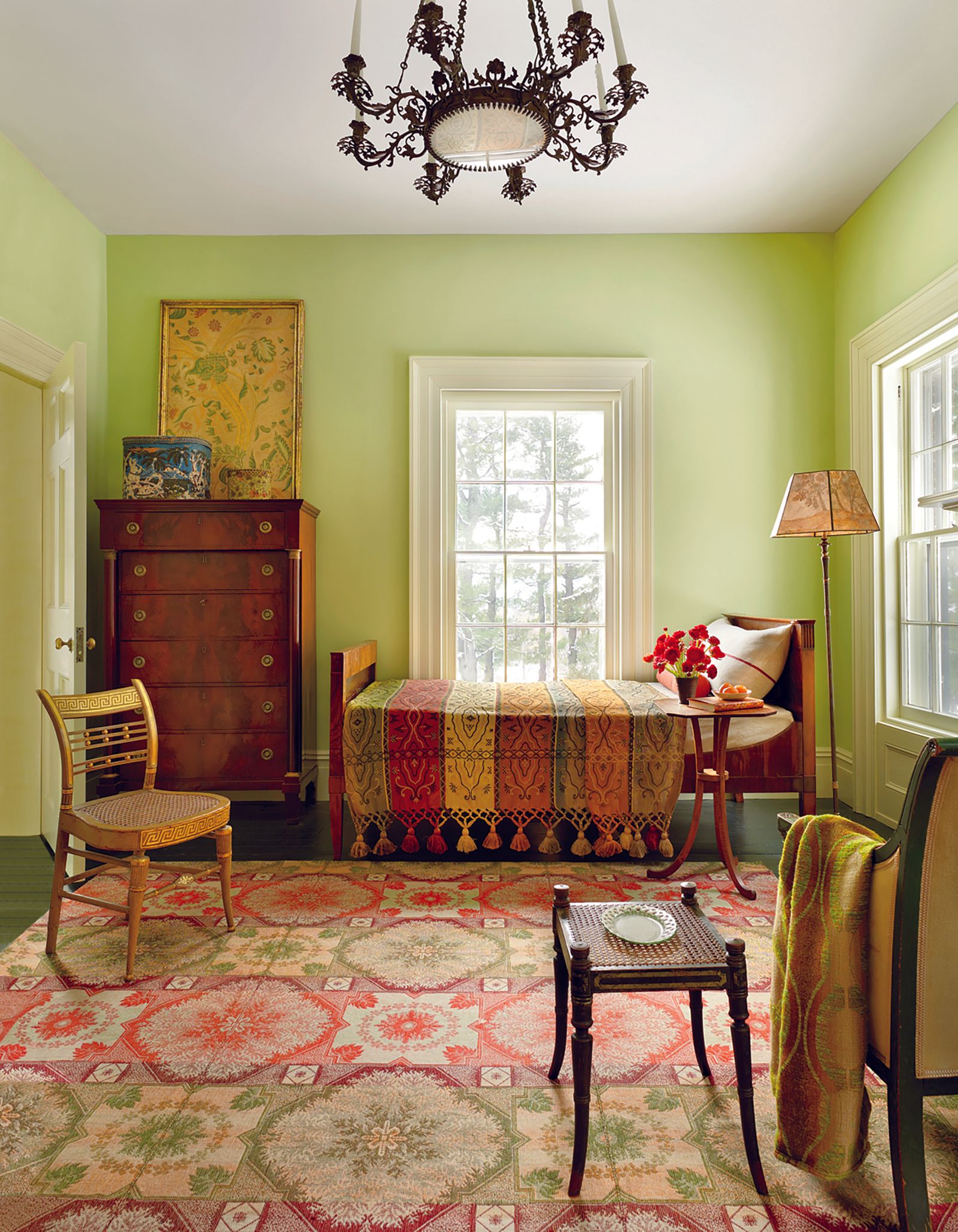
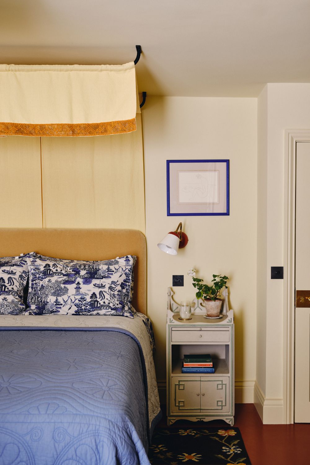
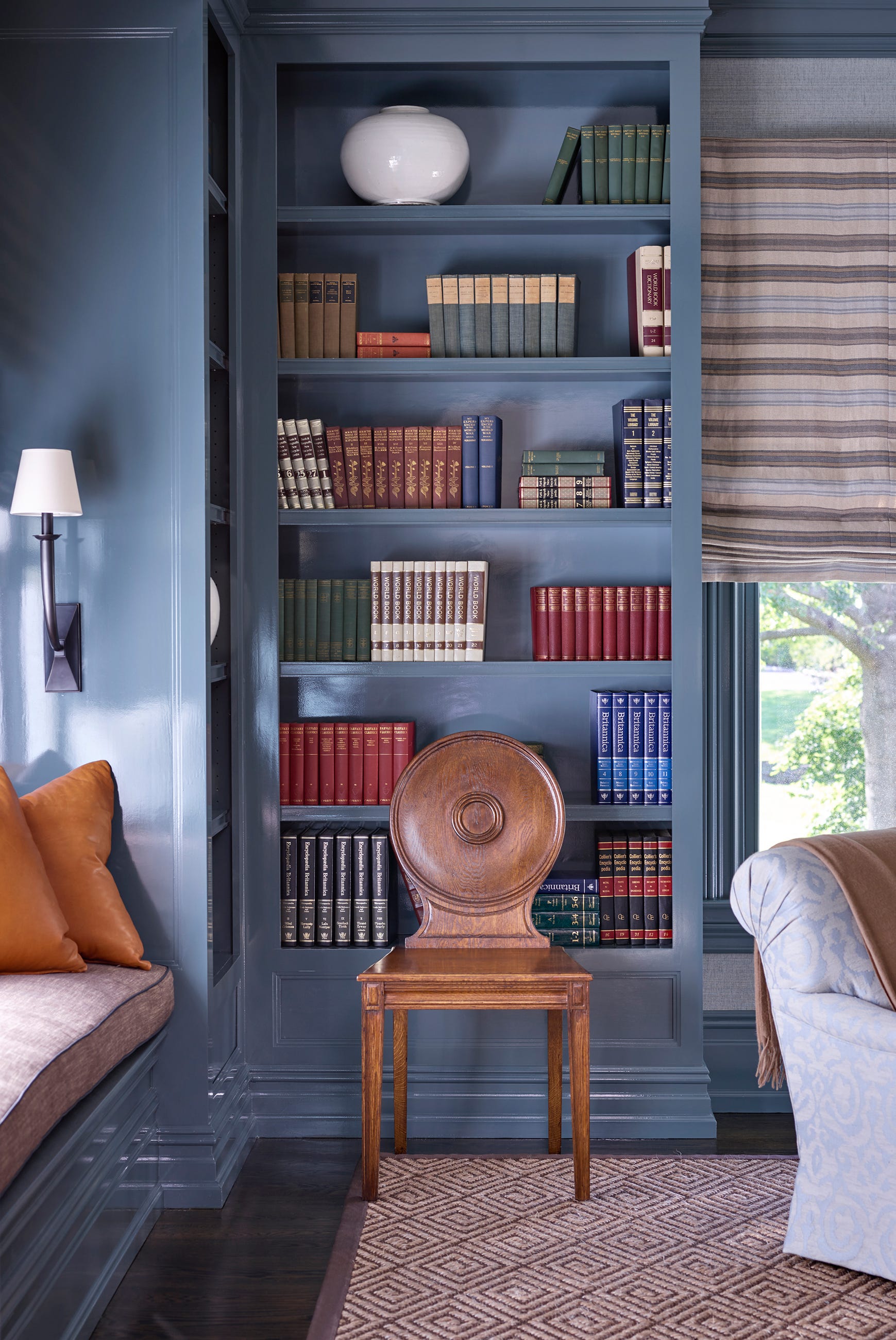
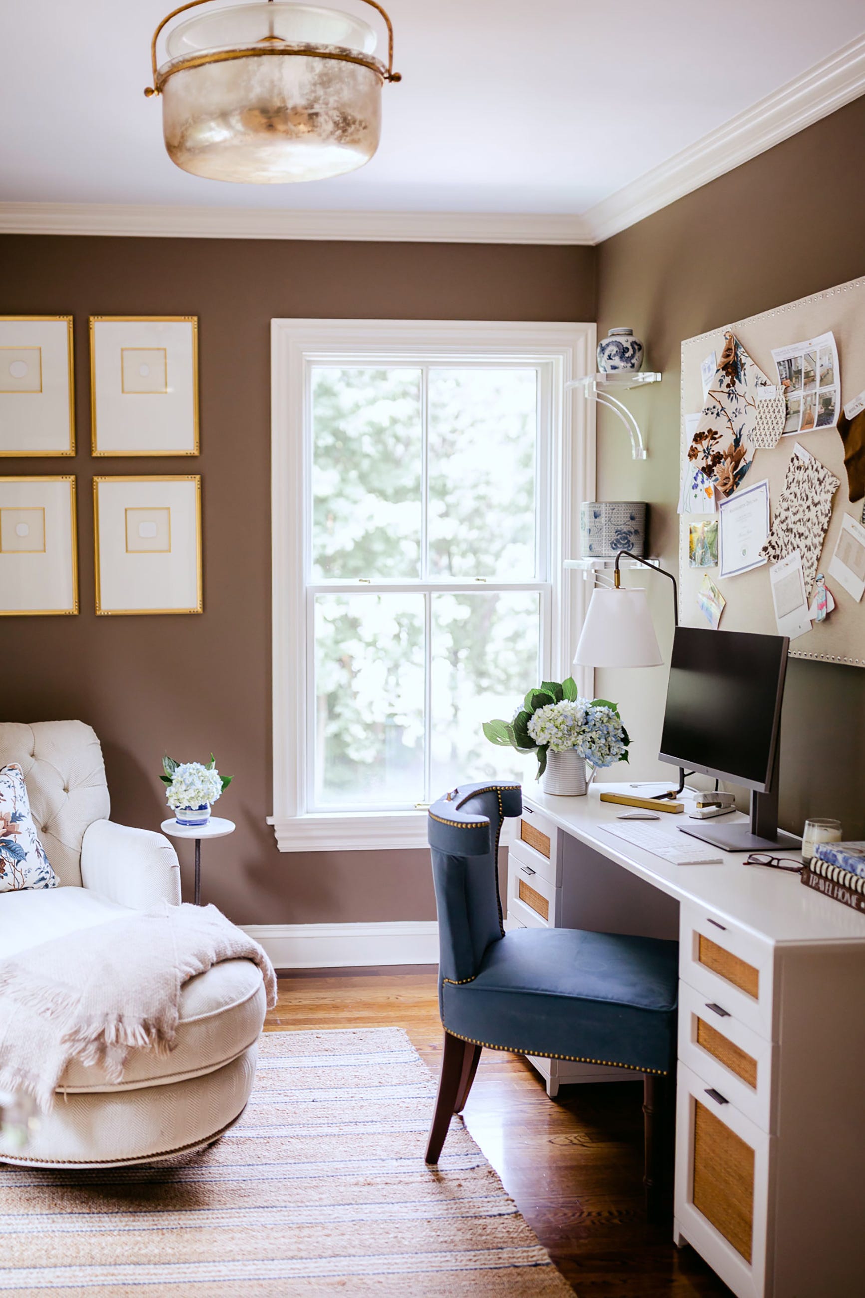
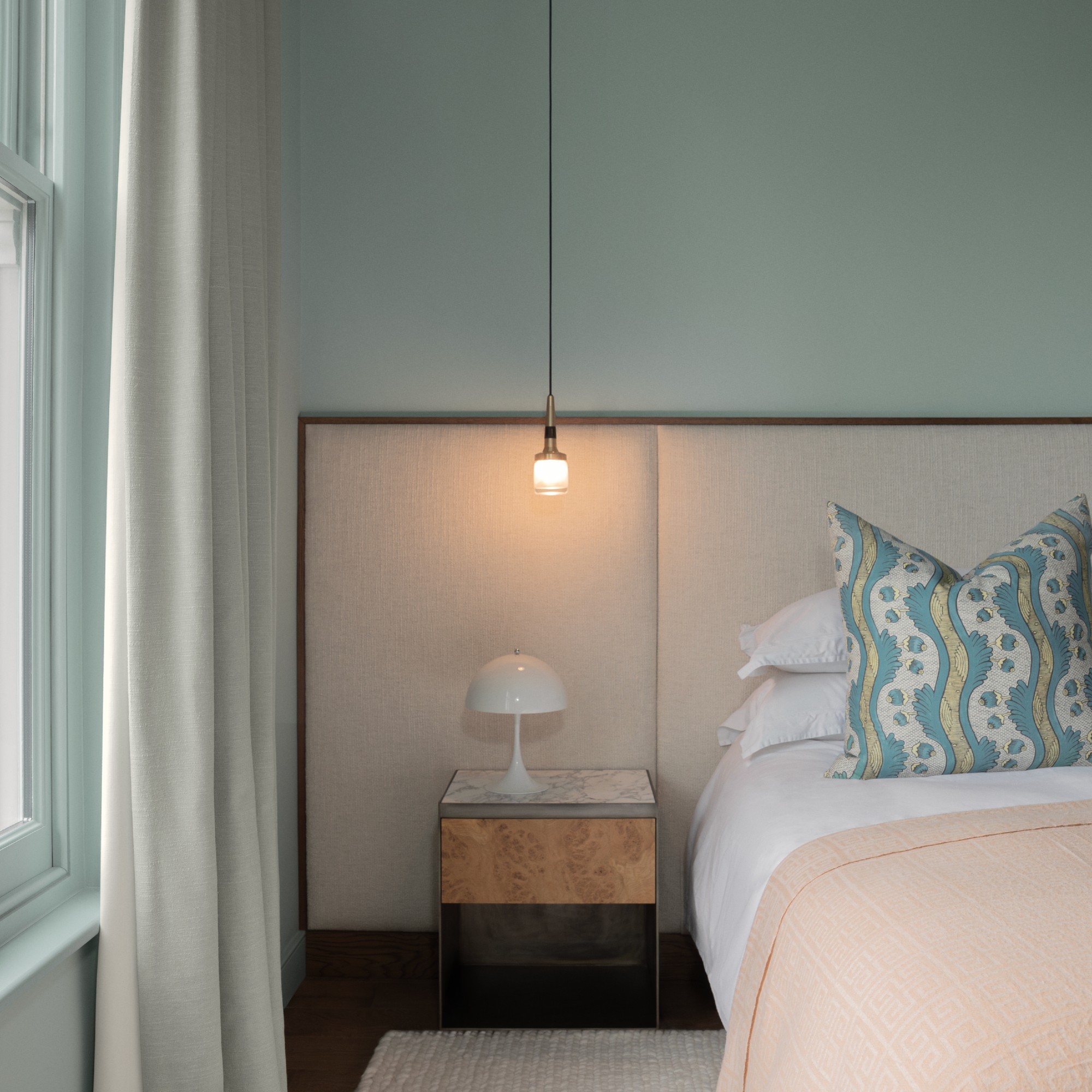
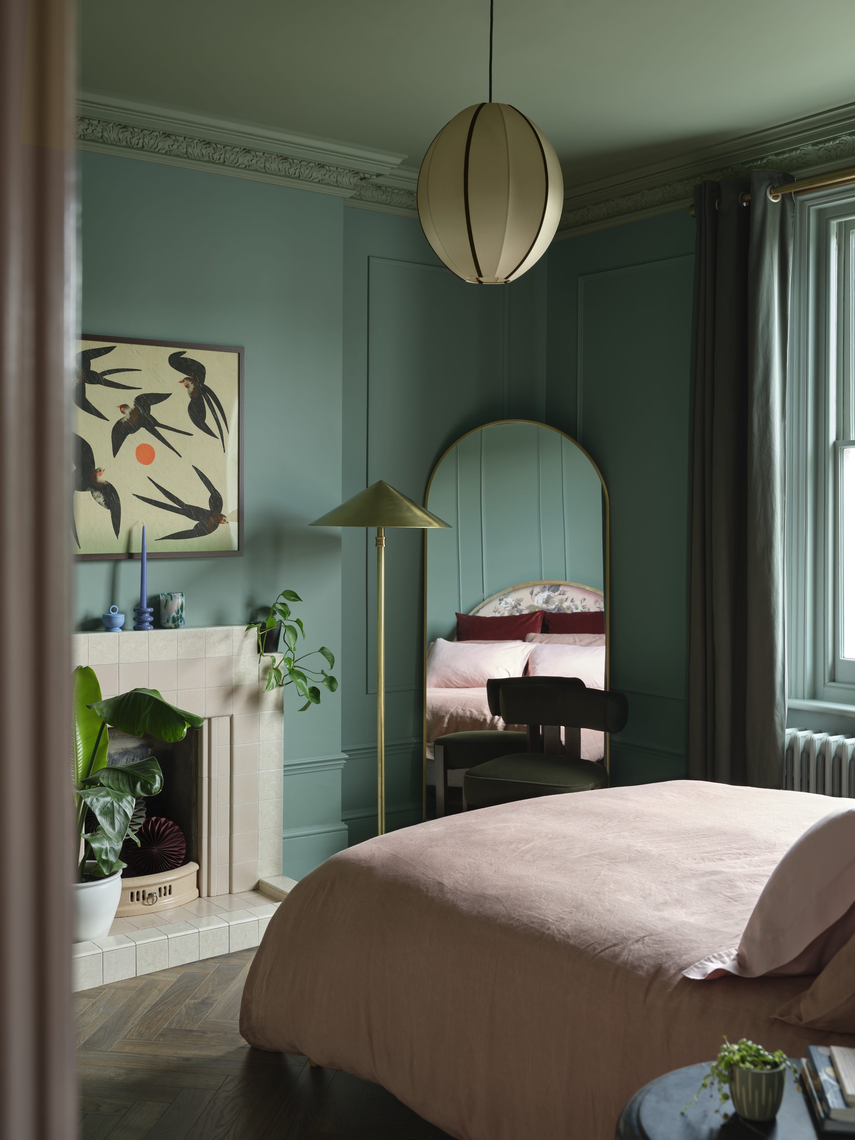
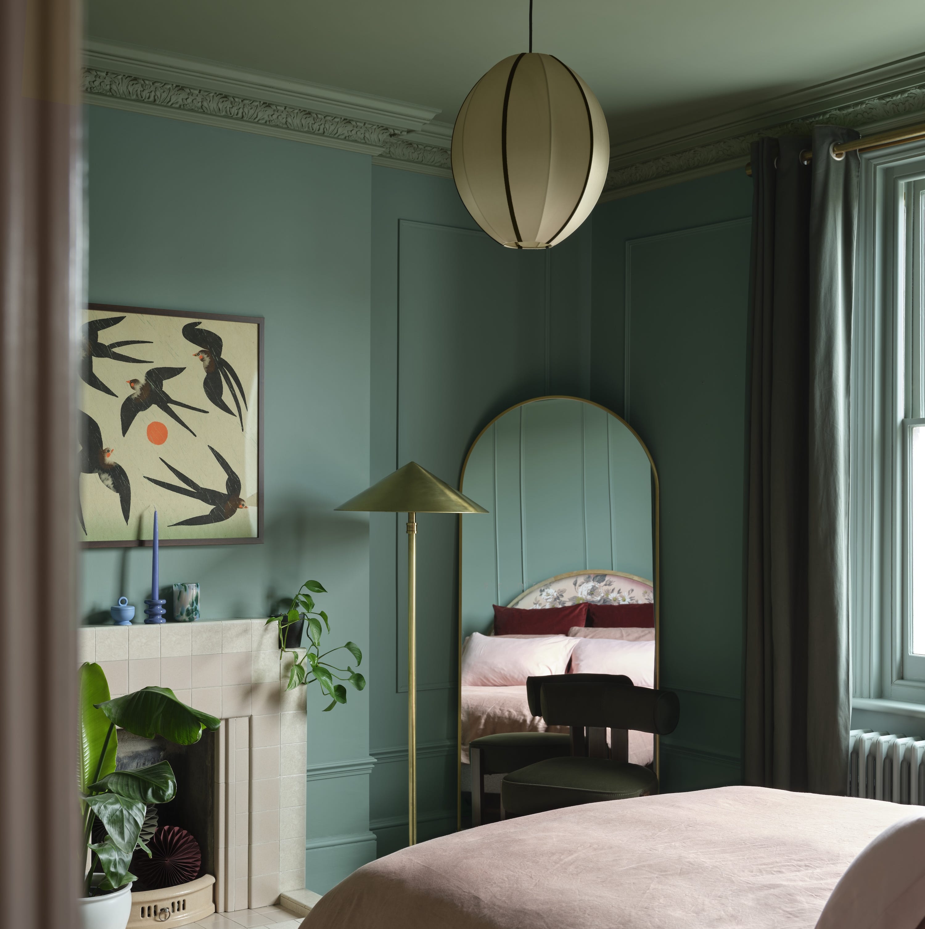
For those interested in adopting this trend, designers recommend starting with smaller, contained spaces such as guest bathrooms, reading nooks, offices, bedrooms, or powder rooms. These areas provide an ideal opportunity to experiment with color drenching without committing to larger, more visible rooms. Myrick shares an example of transforming a study with a soft green-gray, making the space feel richer and more layered by enhancing existing wood tones, art, and lighting. Color drenching in smaller rooms is also presented as an effective way to achieve a curated look without adding visual clutter.
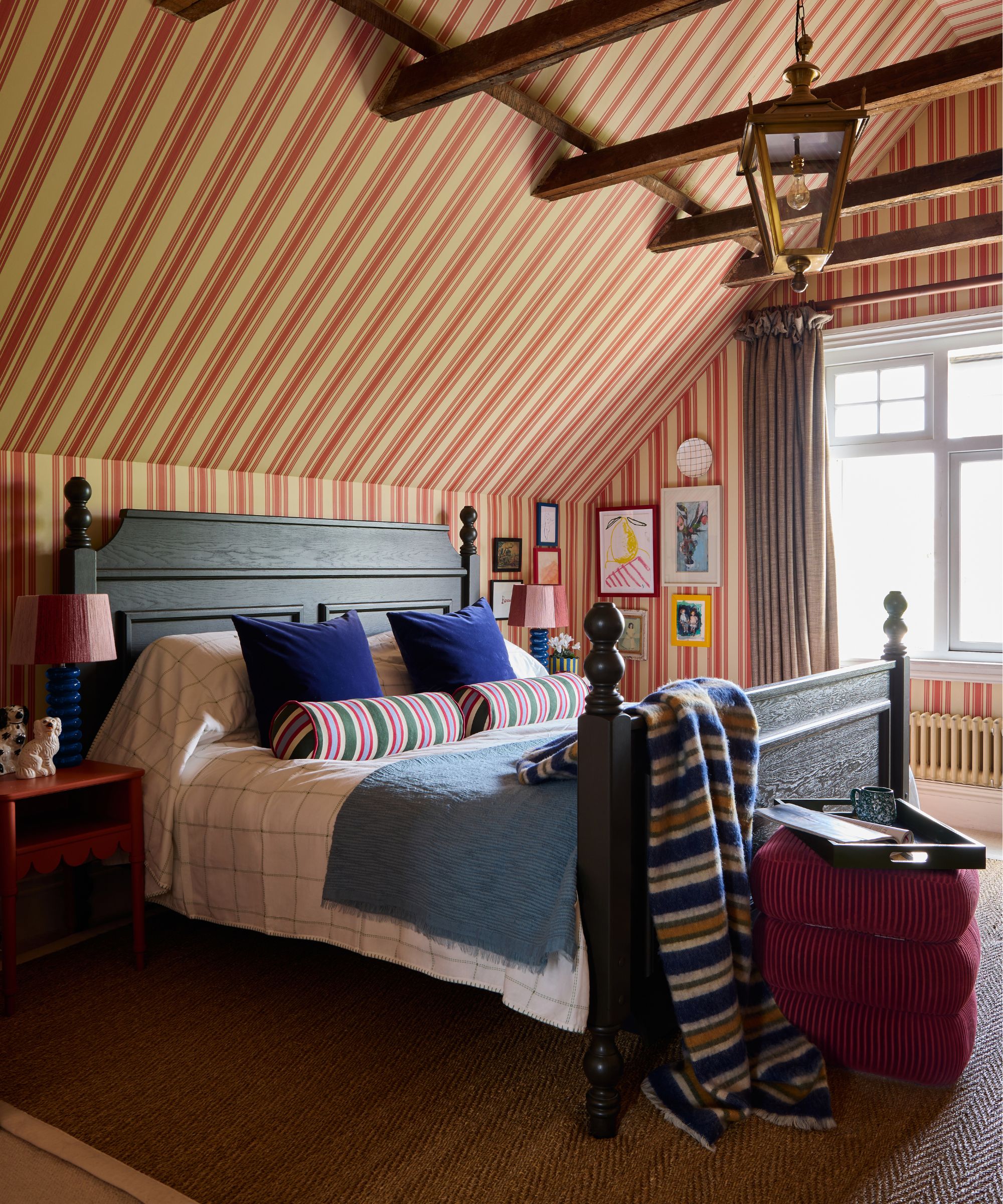
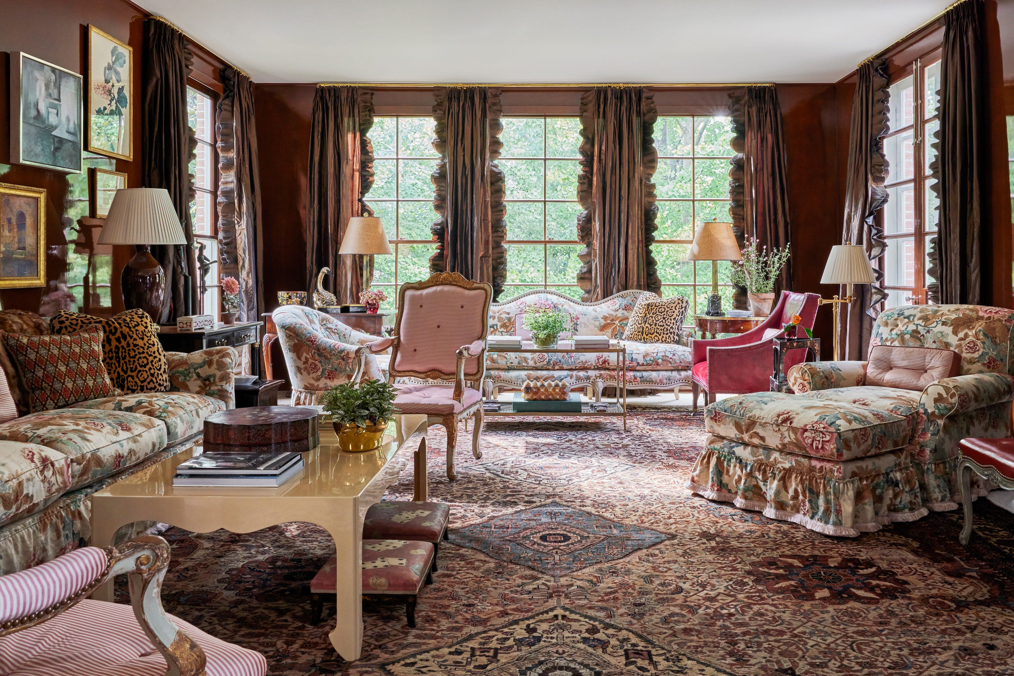
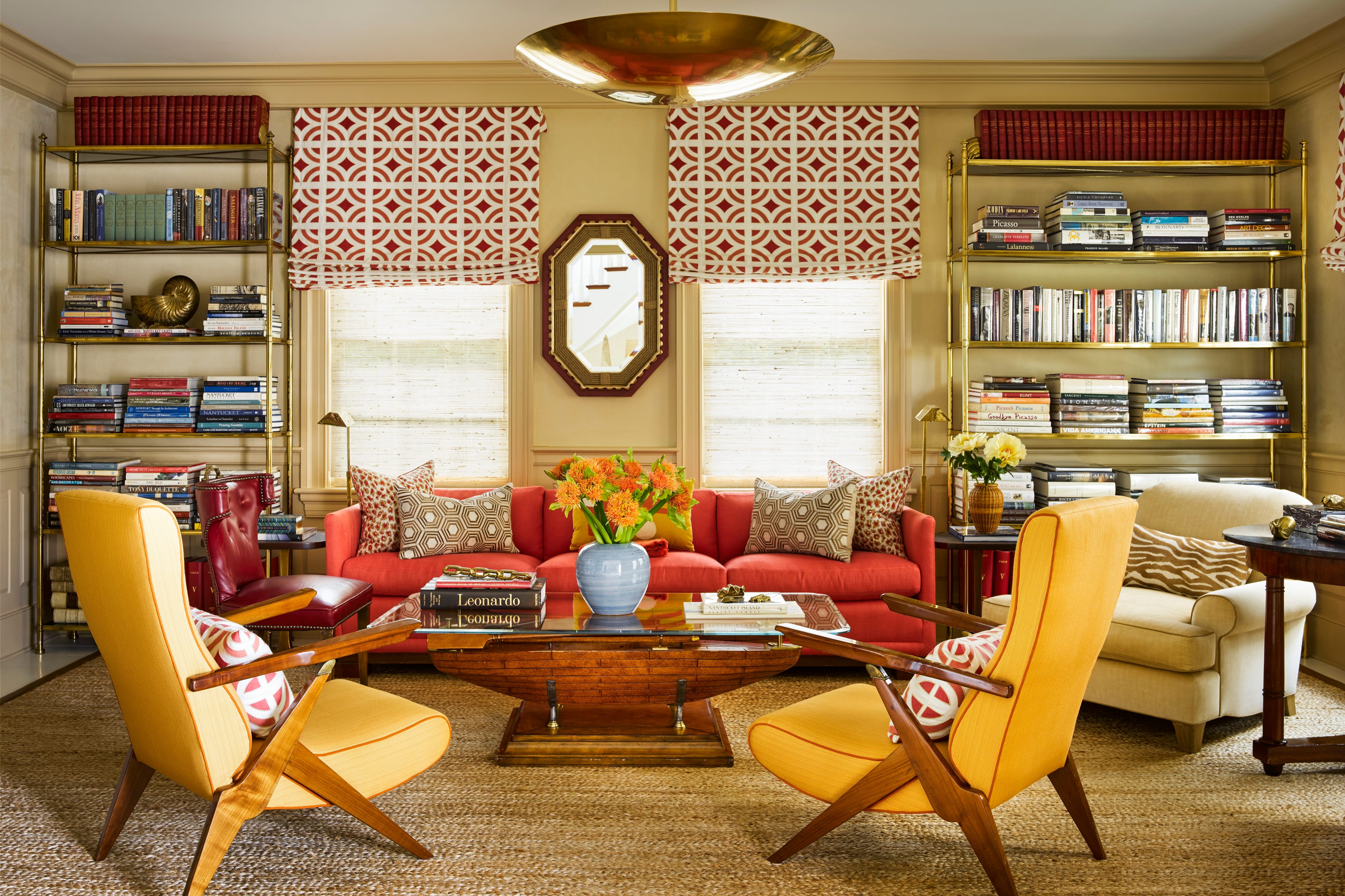
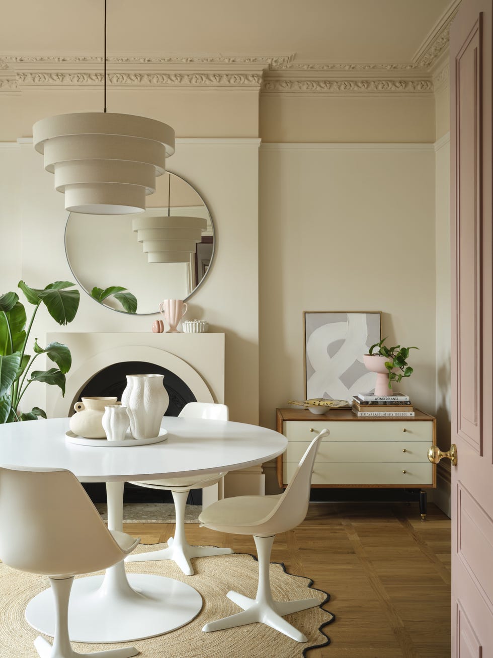
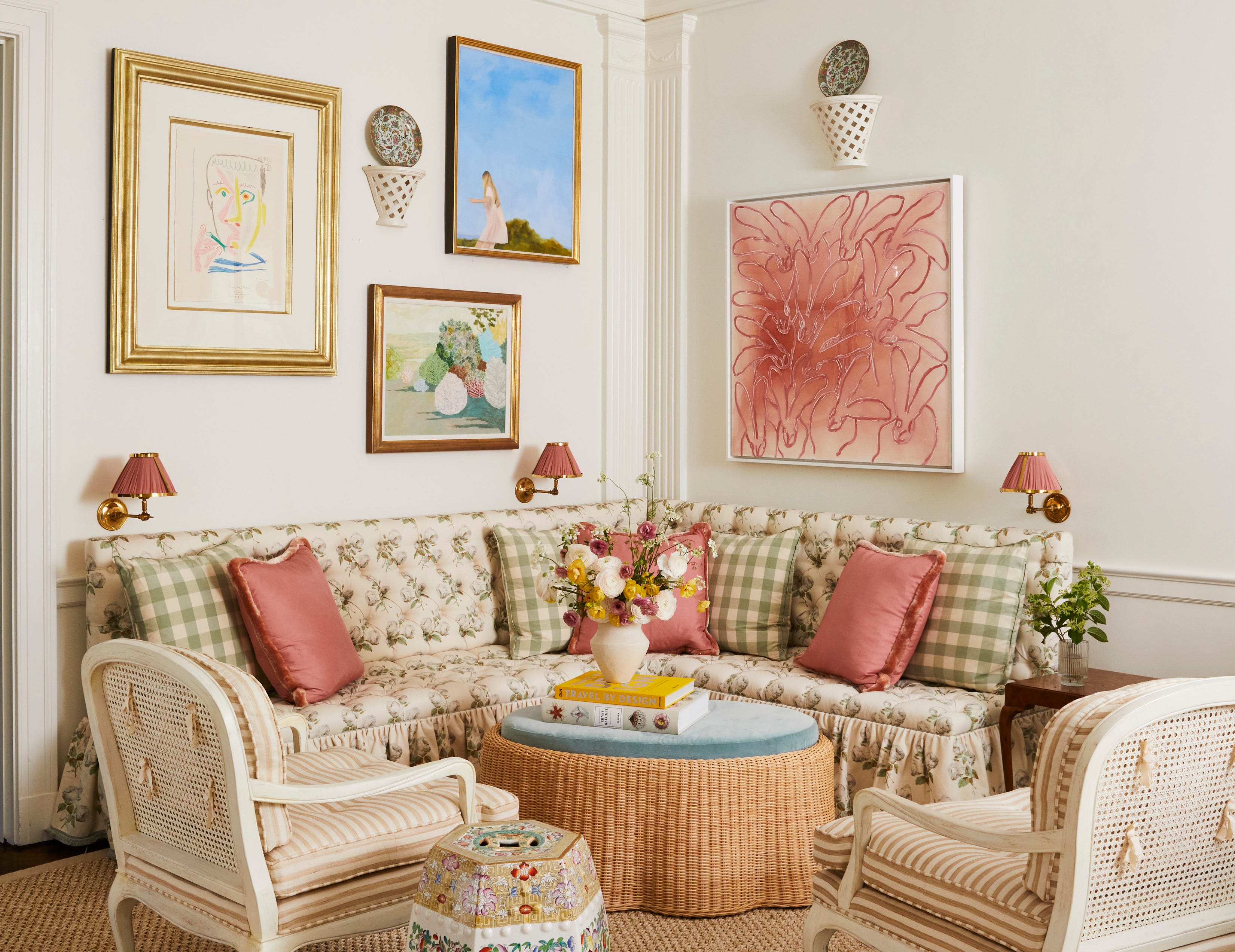
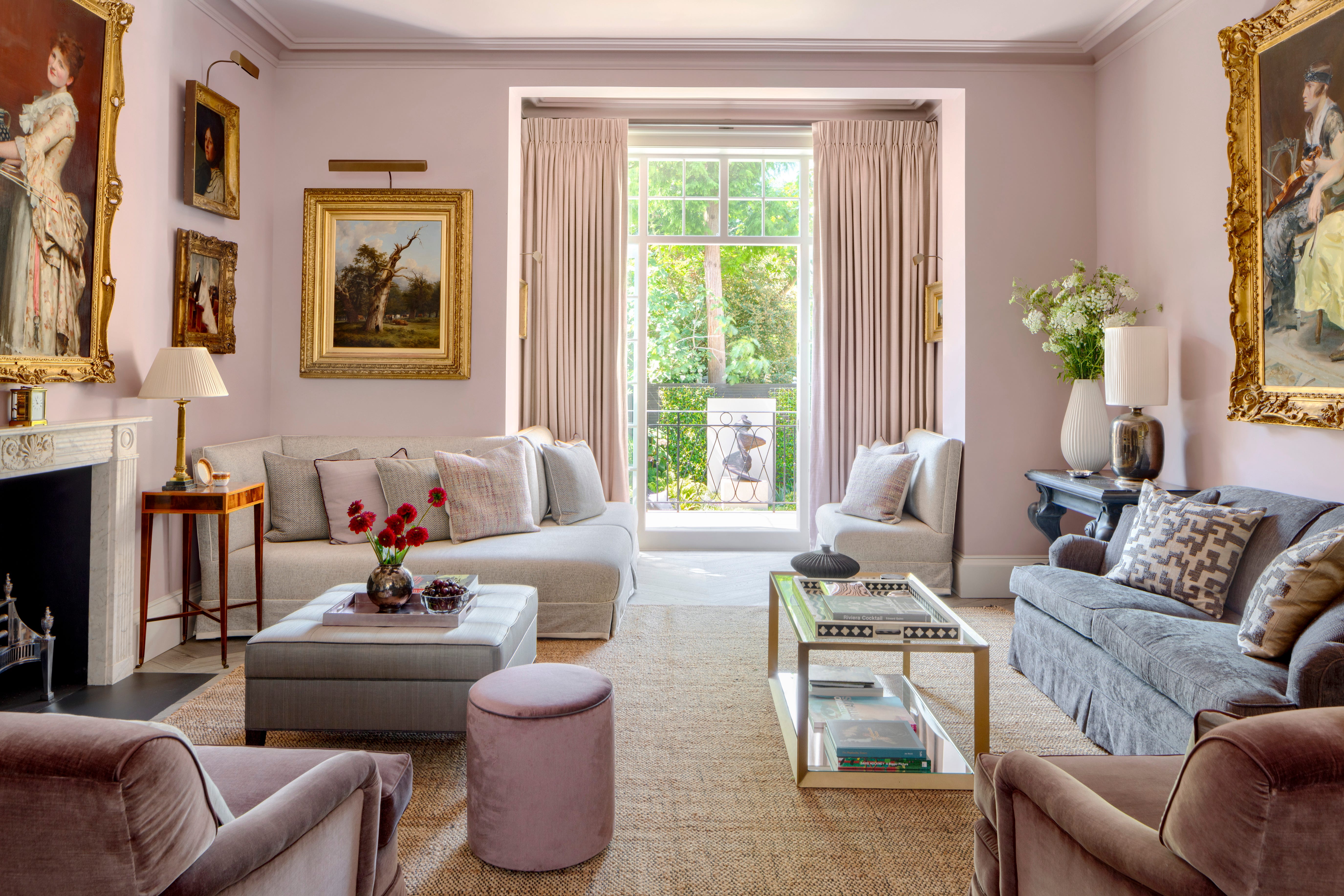
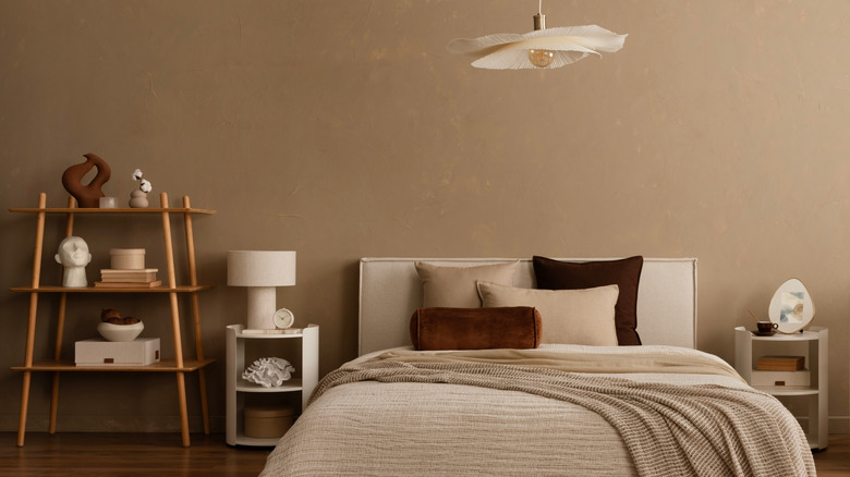
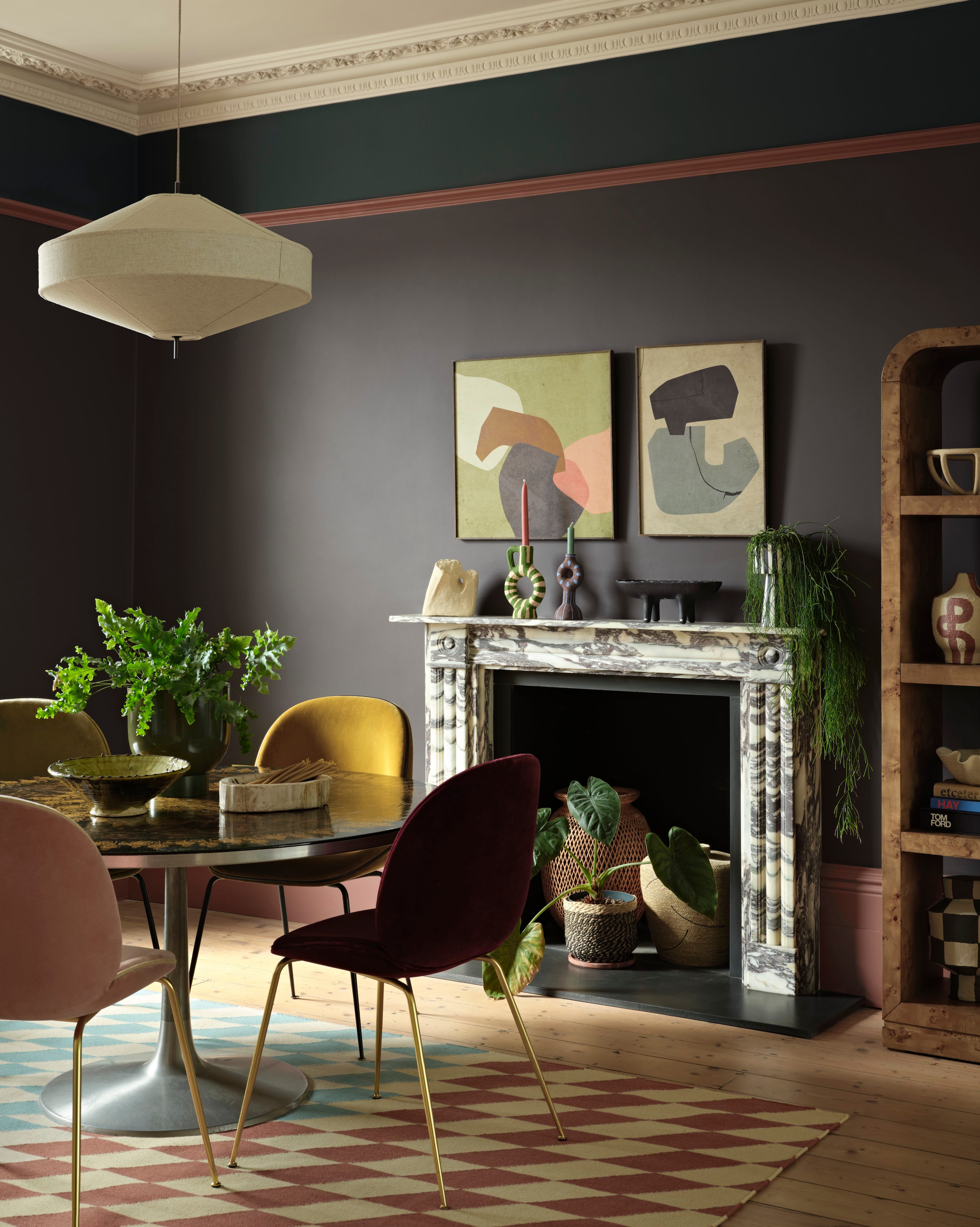
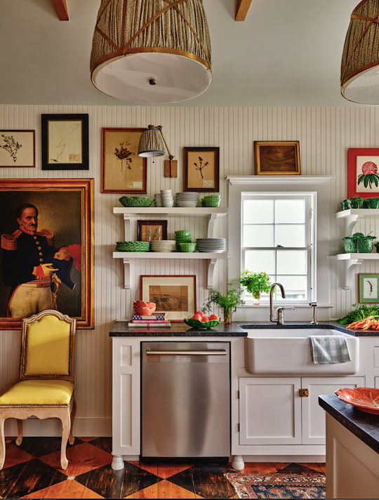
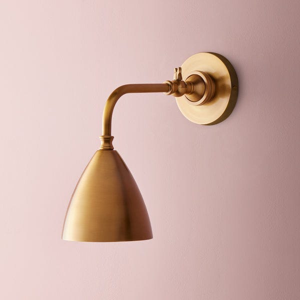
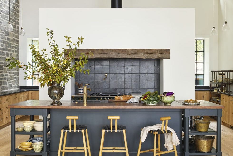
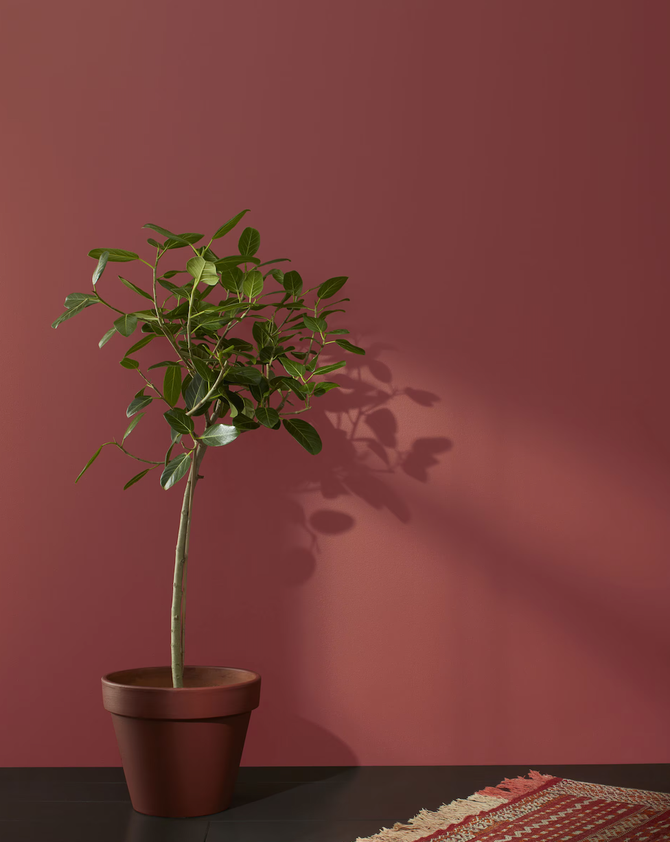
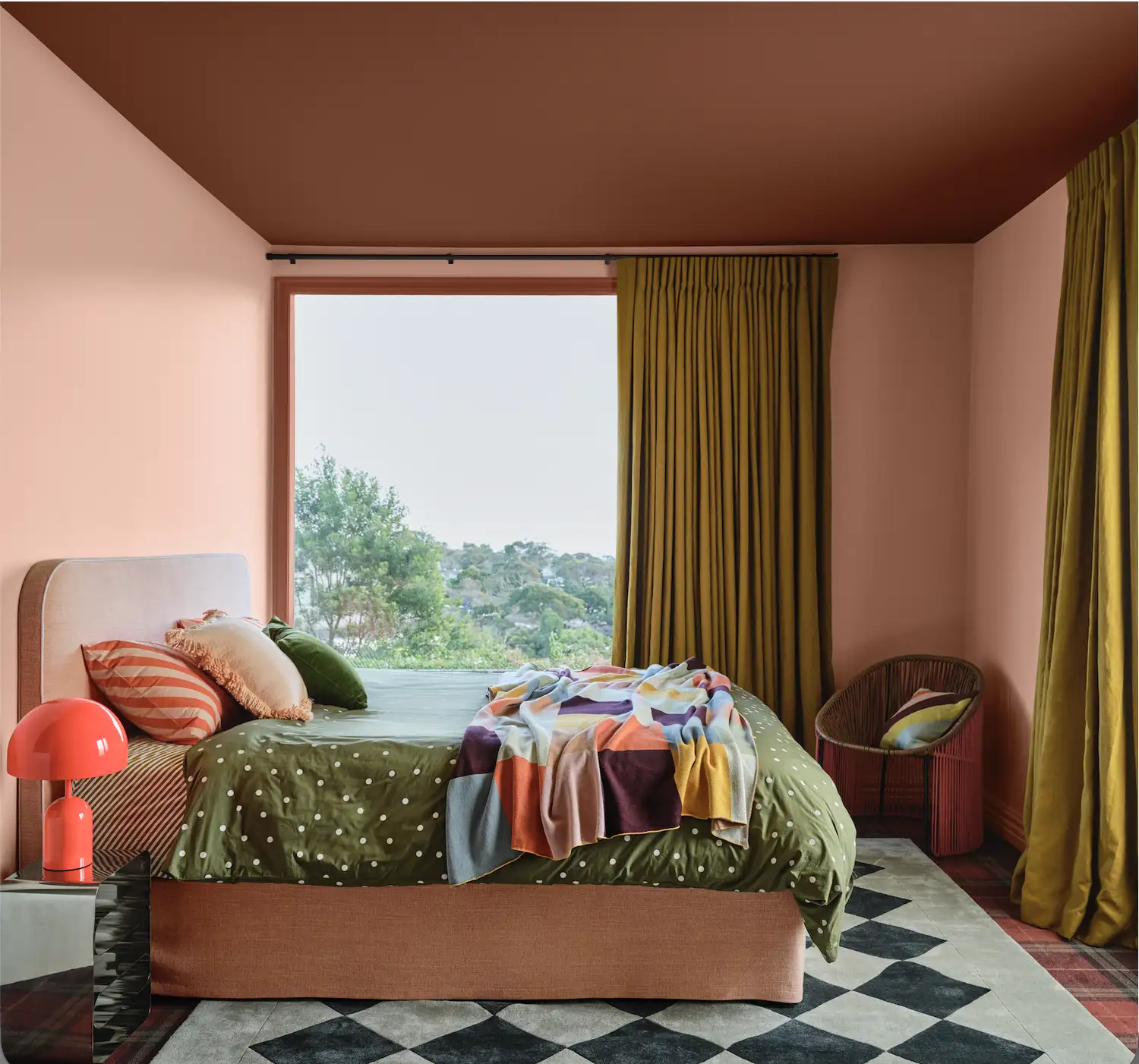
Before implementing color drenching, several steps are advised. First, homeowners should choose a color they genuinely love and that evokes positive feelings, whether it's a calming olive green or a warm terracotta. For color selection, deep, moody tones like olive, navy, and aubergine are suggested for impact, while dusty greens, warm taupes, or blush pinks can create a serene environment. Cathy Hobbs of Cathy Hobbs Design Recipes recommends using "fire colors" like mustard or orange to brighten rooms with limited natural light. Second, testing the chosen color is crucial. Lisbeth Parada, color marketing manager for Sherwin-Williams, advises painting a test section or even an accent wall and observing how the color appears under different natural and artificial lighting conditions throughout the day, as lighting can significantly alter a color's perception. Third, to prevent a monochromatic room from appearing flat, combining different finishes within the same color is recommended. This could involve using a matte finish for walls and a subtle sheen (like eggshell or satin) for trim, which adds depth and dimension without breaking the monochromatic scheme. Finally, adding texture through decor and materials, such as upholstered furniture with patterns, metallic accents, rugs, or woven lighting fixtures, can further enrich the space and make it feel cozier and more inviting.
#ColorDrenching #InteriorDesignTrends #HomeDecor #PaintTrends #MonochromaticSpaces #PersonalizedInteriors #ColorPsychology #HomeStyling #DesignTips #ColorDrenching #InteriorDesignTrends #HomeDecor #PaintTrends #MonochromaticSpaces #PersonalizedInteriors #ColorPsychology #HomeStyling #DesignTips
0 comment in total
 No comments yet
You may also like
Interiors experts predict this will be the biggest paint trend of 2026

These 7 Colors Will Rule Interiors in 2026, According to Experts

These 8 Colors Will Rule Interiors in 2026, According to Experts

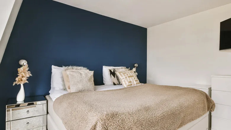
The Bold Color Trend That's Replacing Accent Walls In 2026

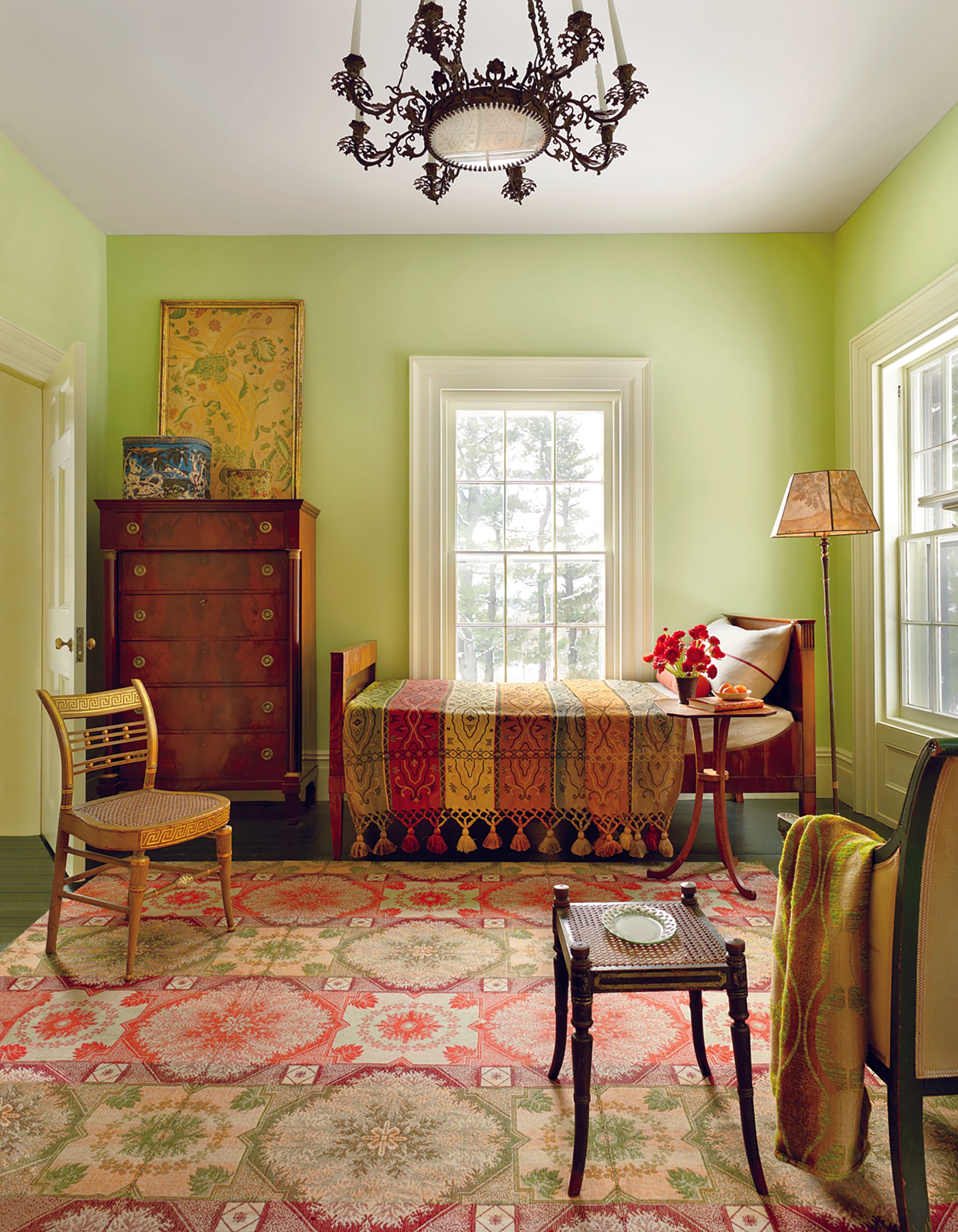
These Colors Will Be Everywhere in Interior Design in 2026

These 6 Colors Will Rule Interiors in 2026, According to Experts

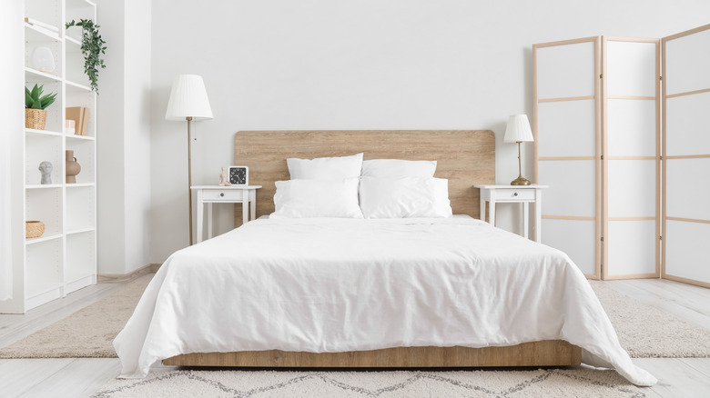
Say Goodbye To White Bedrooms — These Neutrals Will Dominate 2026 Design Trends

2026 Color of the Year Announcements Have This In Common

These Colors Will Be Everywhere in Interiors in 2025
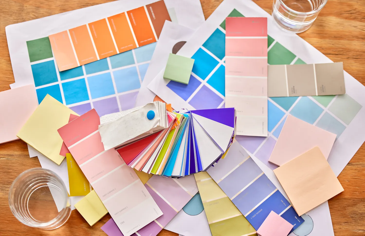
Goodbye Gray—This Soothing Paint Color Will Dominate Interiors in 2026, Designers Say
What Paint Colours will Rule 2026? The Experts Make Their Predictions

Designers Say These 12 Paint Colors Will Be Everywhere in 2026

Move Over, Color Drenching— Color Capping Will Dominate 2026 Interiors

Designers Predict This Will Be The Biggest Paint Trend Of 2026

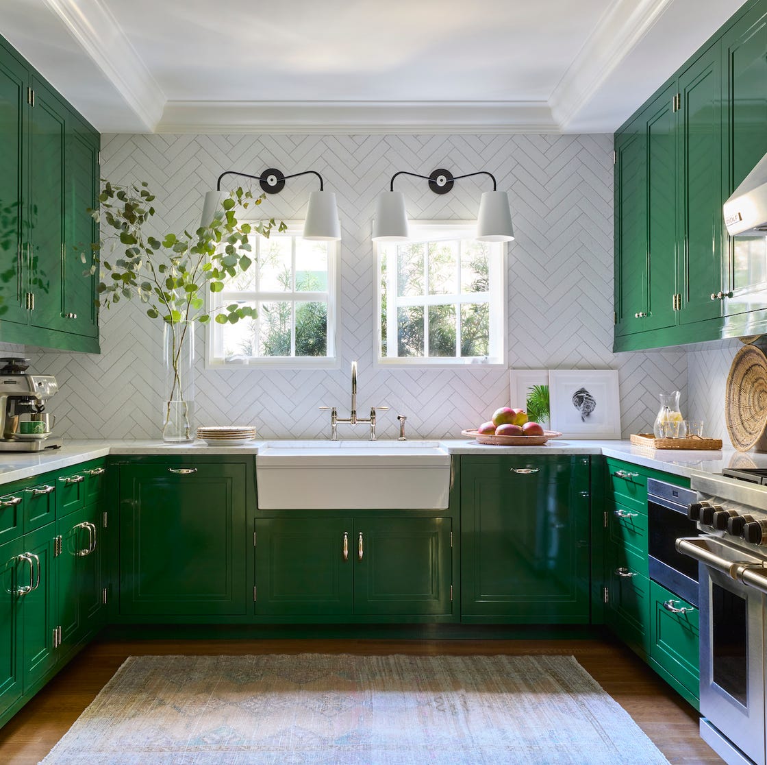
8 Kitchen Trends Designers Predict Will Be Everywhere in 2025
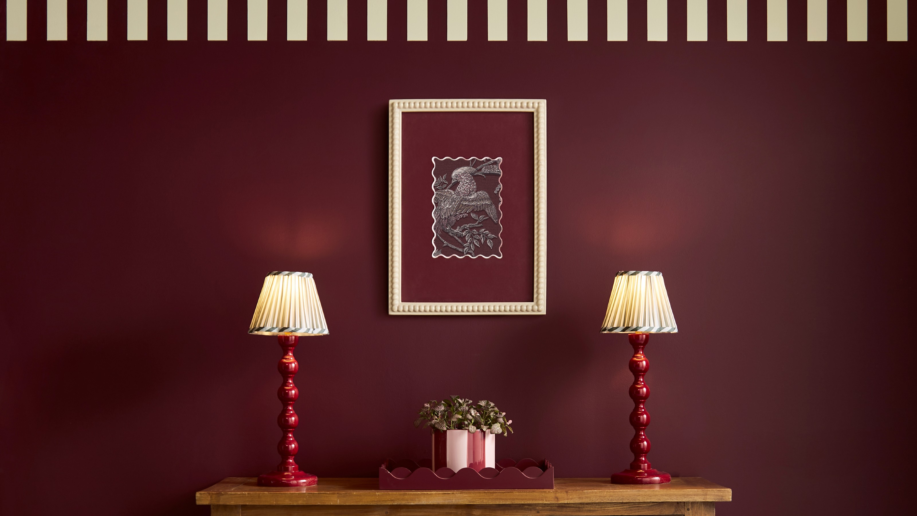
The colour trends 2026 that will define our homes next year

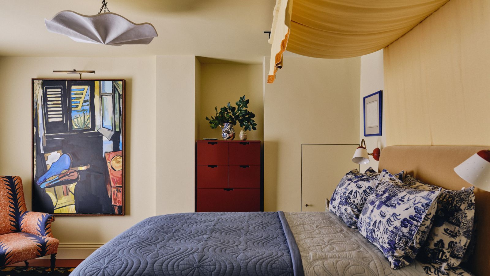
Bye Bye Bland Bedrooms, Designers Are Predicting 2026 Trends Are All About Color, Cozy, and Character

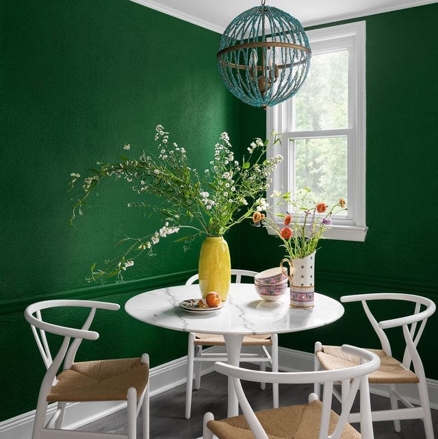
The Interior Paint Colors You'll Be Seeing Everywhere in 2024
What is Color Forecasting? Experts Explain How to Map Trends |

The Bold Color Trend That's Replacing Accent Walls In 2026