1/15
2026 Color of the Year Announcements Have This In Common
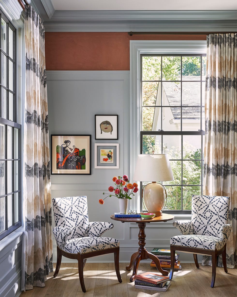
The annual announcements of the 'Color of the Year' (COTY) by various paint and stain brands serve as a significant indicator of upcoming trends in home design. These selections are not merely marketing tactics but rather reflect the collective mood and prevailing aesthetic sensibilities of the time. The 2026 COTY picks predominantly feature warm, comforting, and subdued earthy tones, signaling a desire for serenity and classic elegance in living spaces.
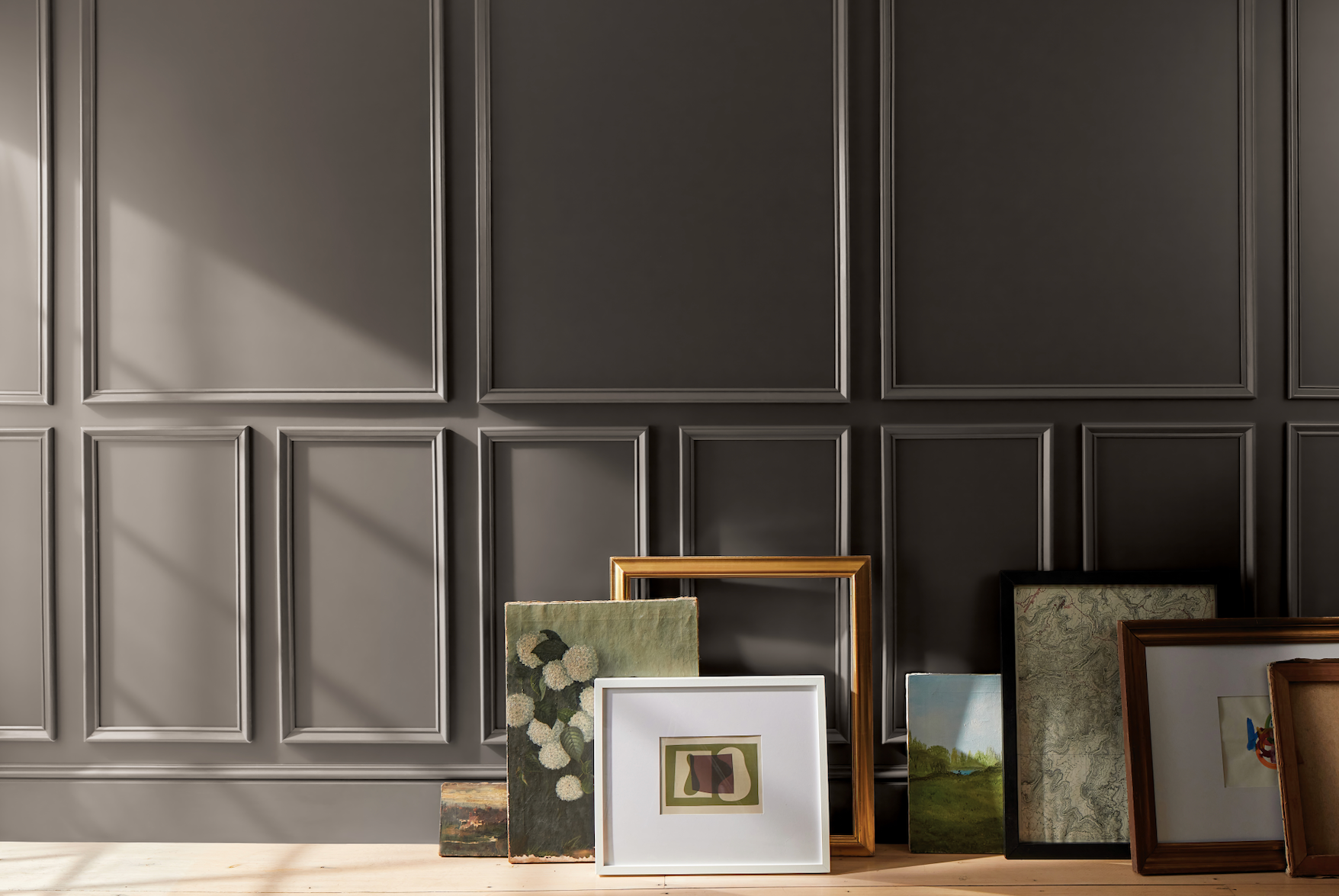
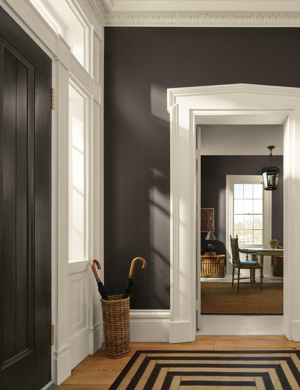
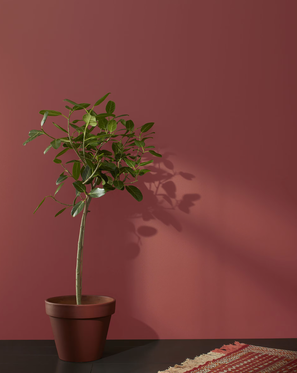
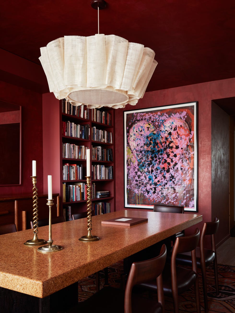
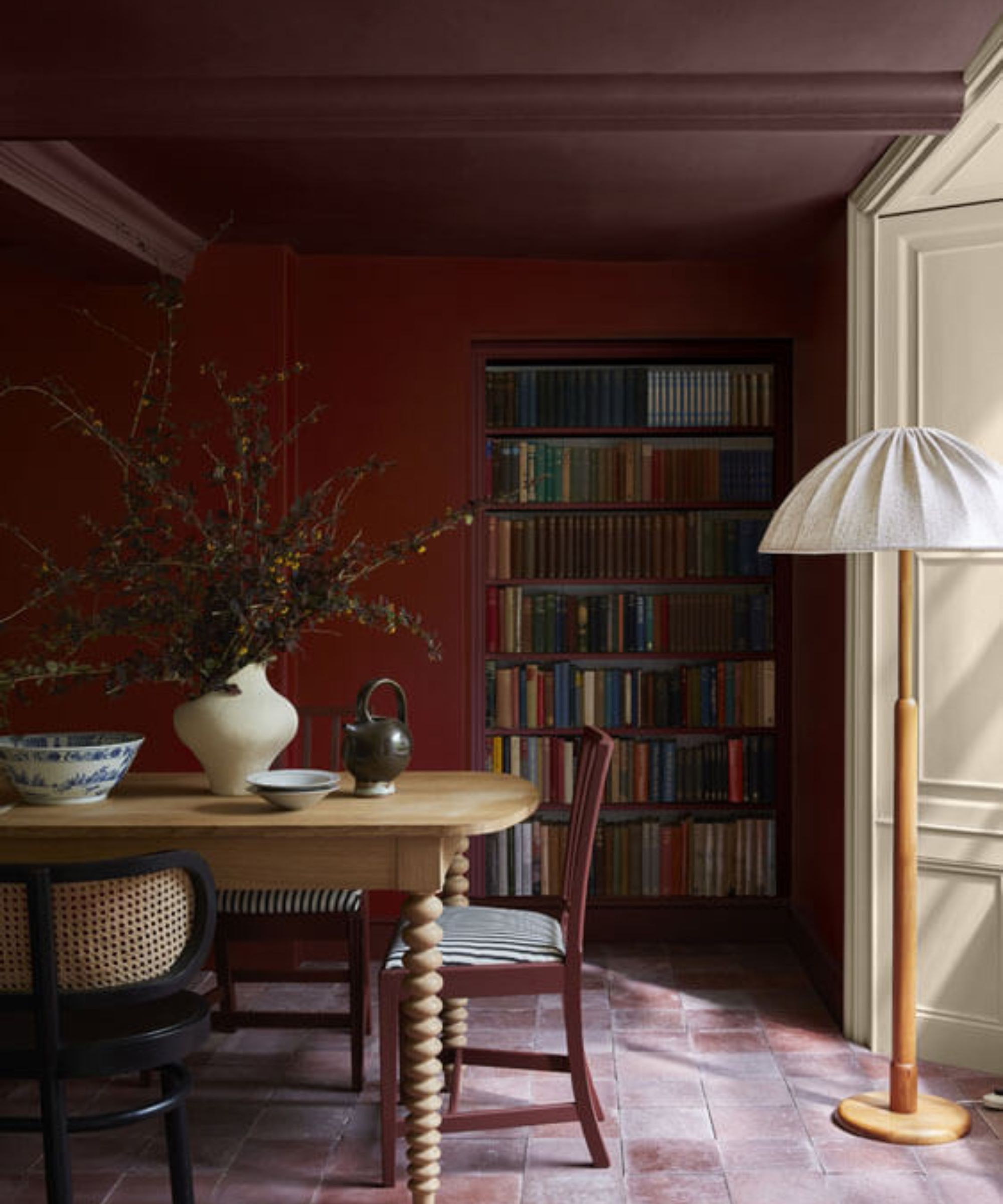
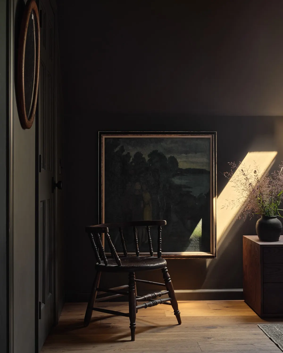
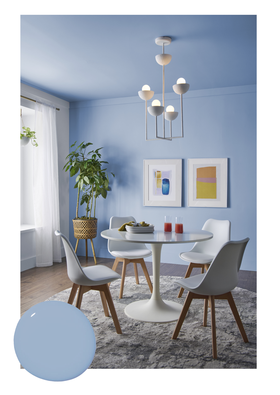
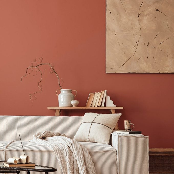
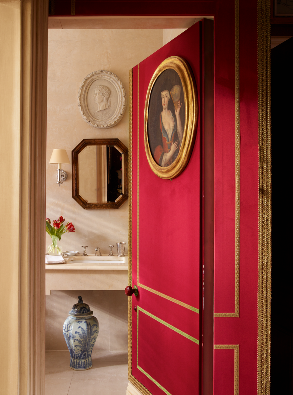
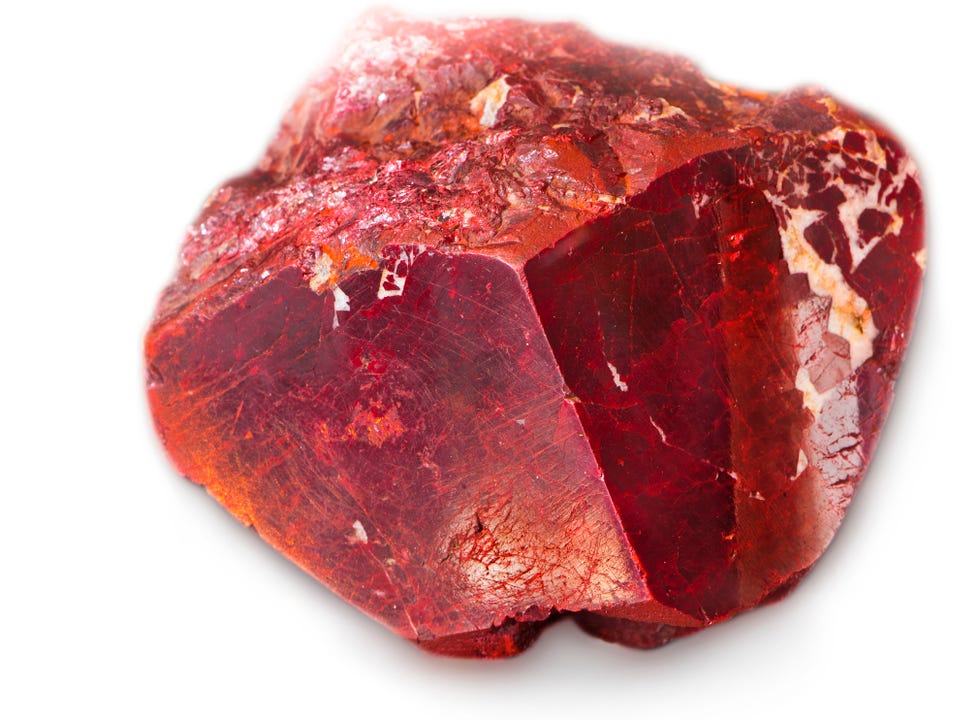
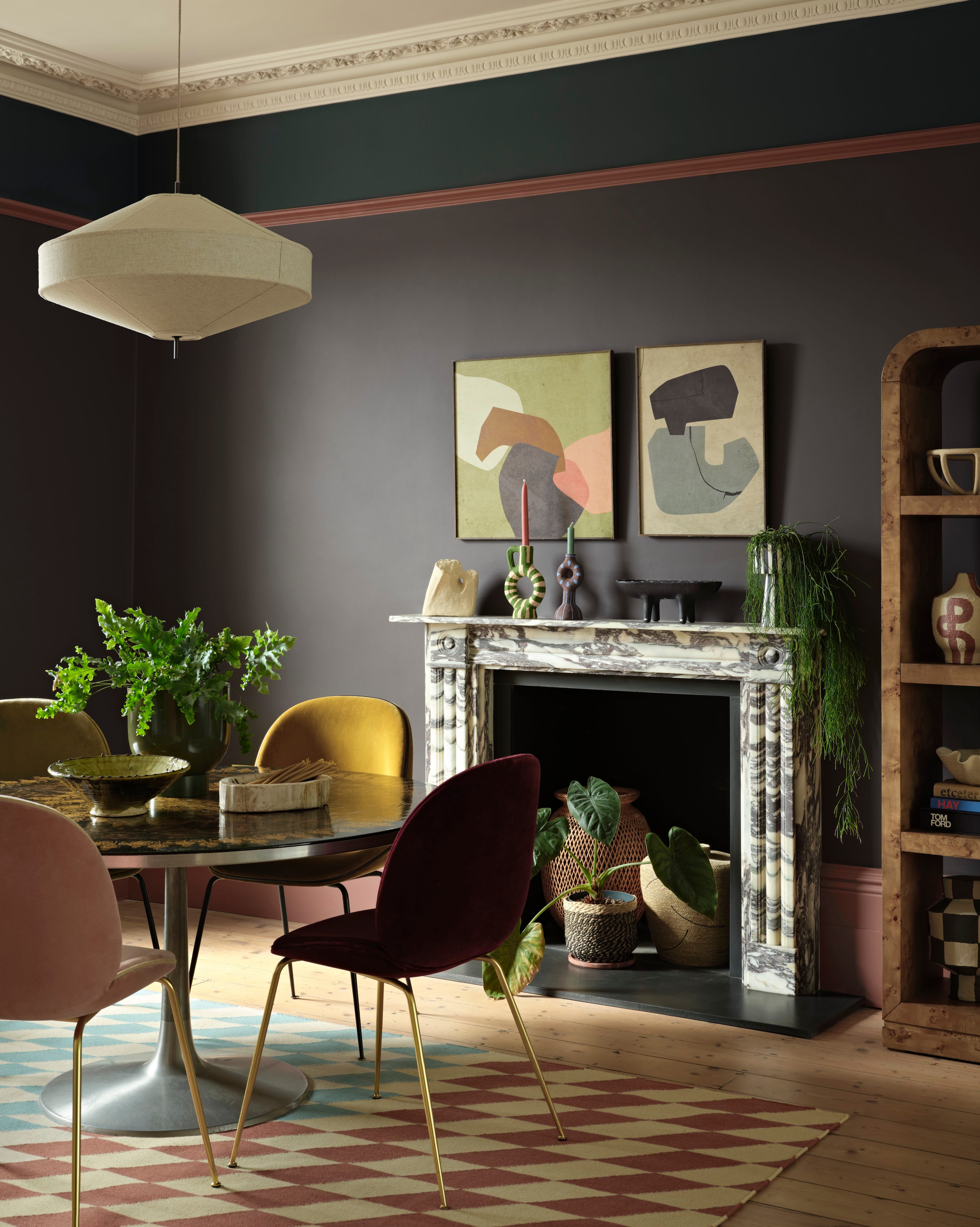
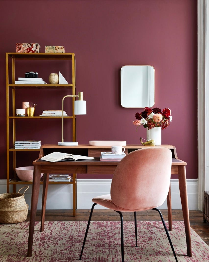
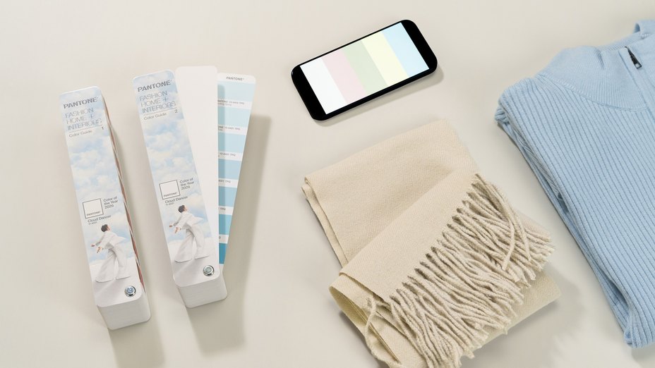
Pantone's 'Cloud Dancer' is an airy white chosen to evoke serenity and spaciousness, promoting well-being and lightness. Pittsburgh Paints Company selected 'Warm Mahogany,' a rich red neutral designed to foster deep conversation, making it suitable for dining rooms and cafes. Krylon's 'Matte Coffee Bean,' a dark brown, signifies a rise in dark neutrals, offering a timeless yet sophisticated warmth without overpowering a space. C2 Paint's 'Epernay,' named after a French village known for its limestone architecture, reflects a return to classic, enduring colors that blend old-world elegance with modern aesthetics.
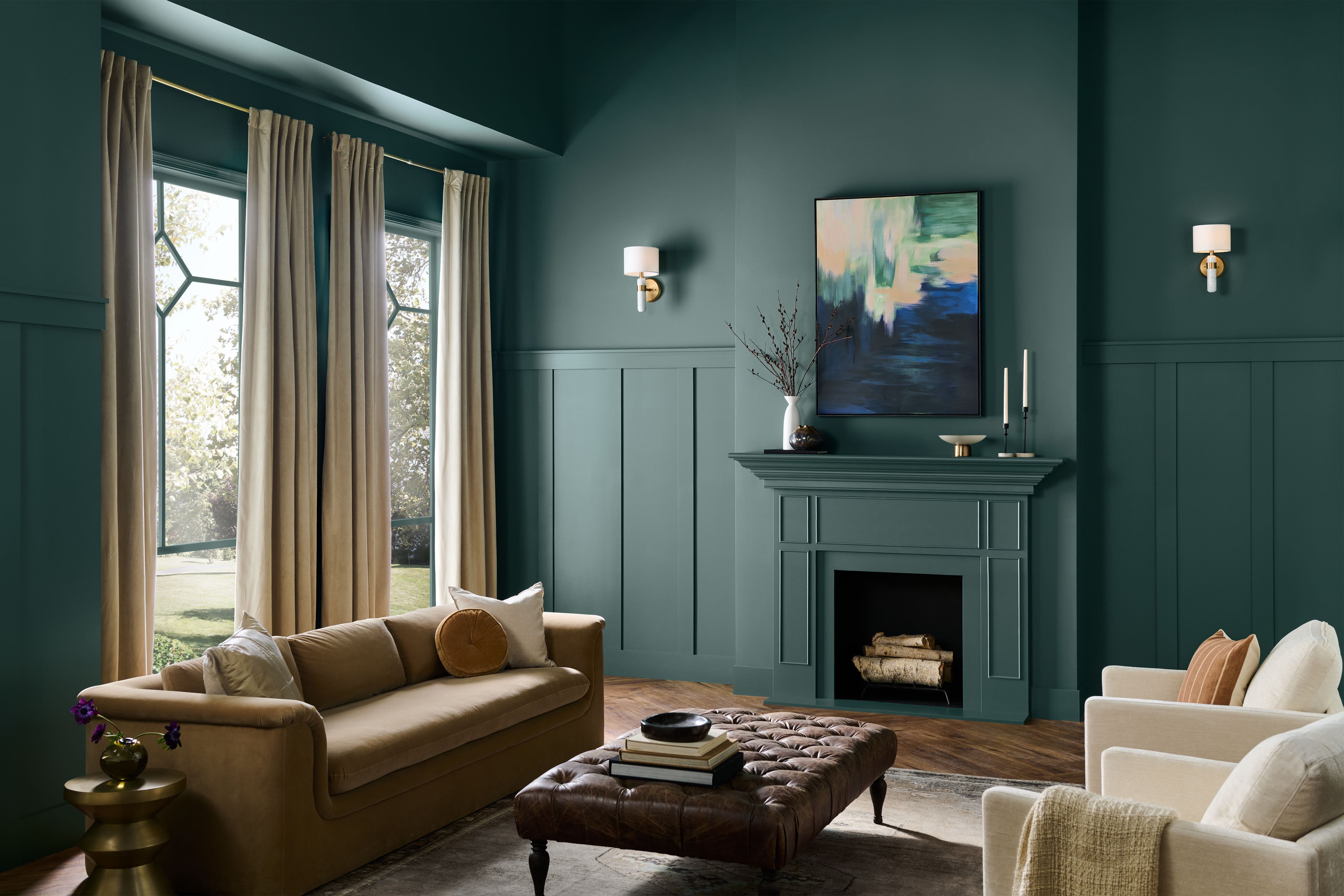
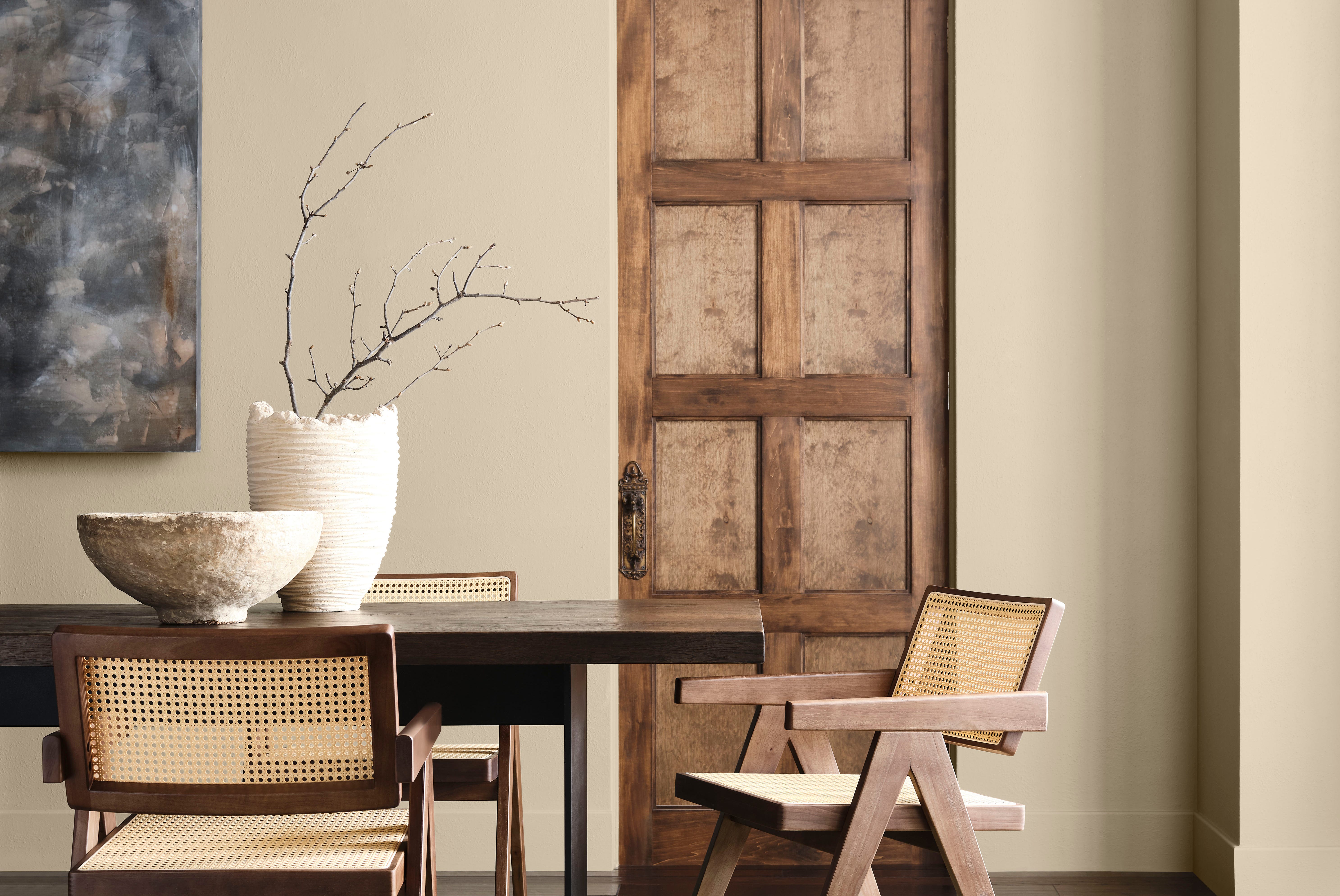
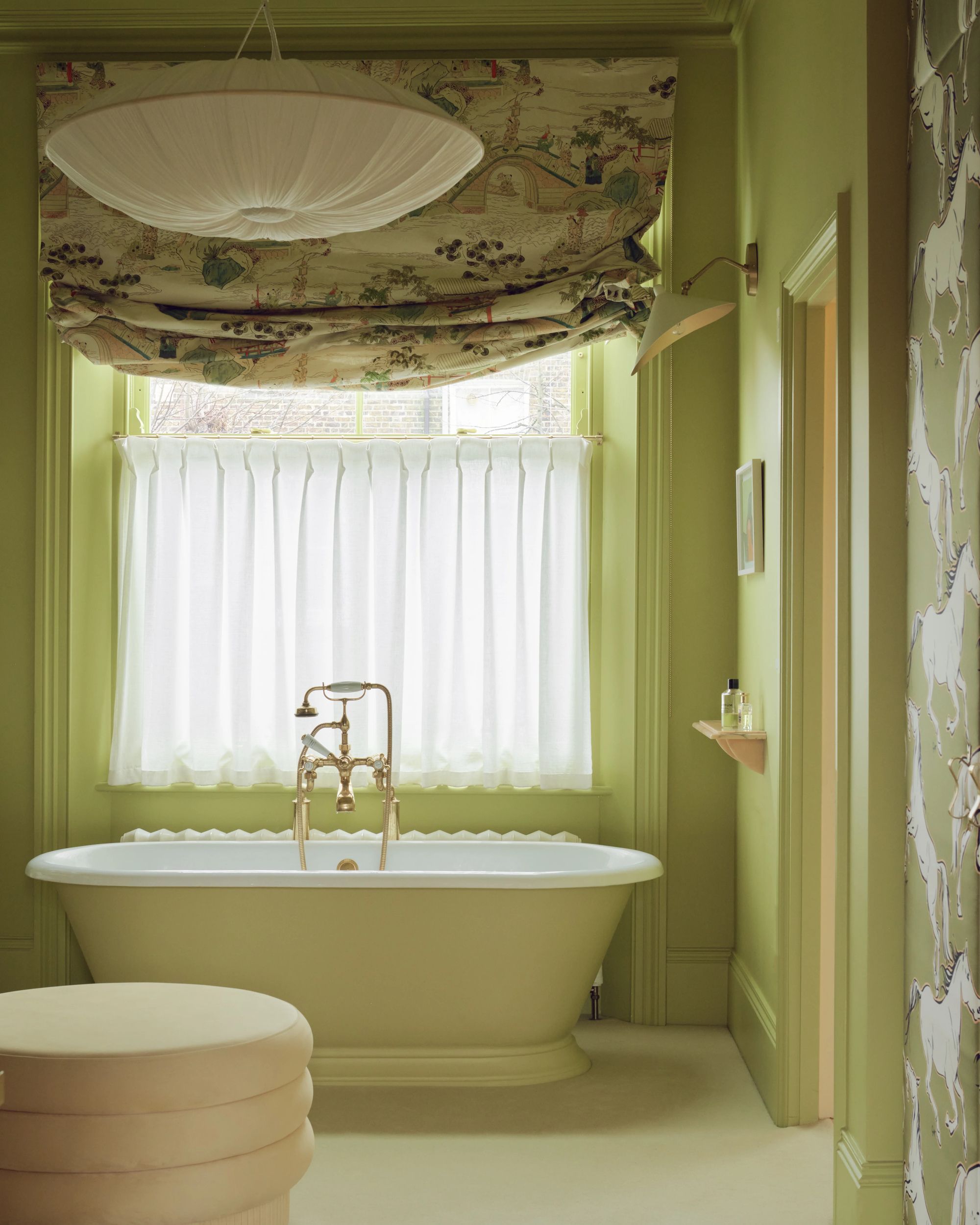
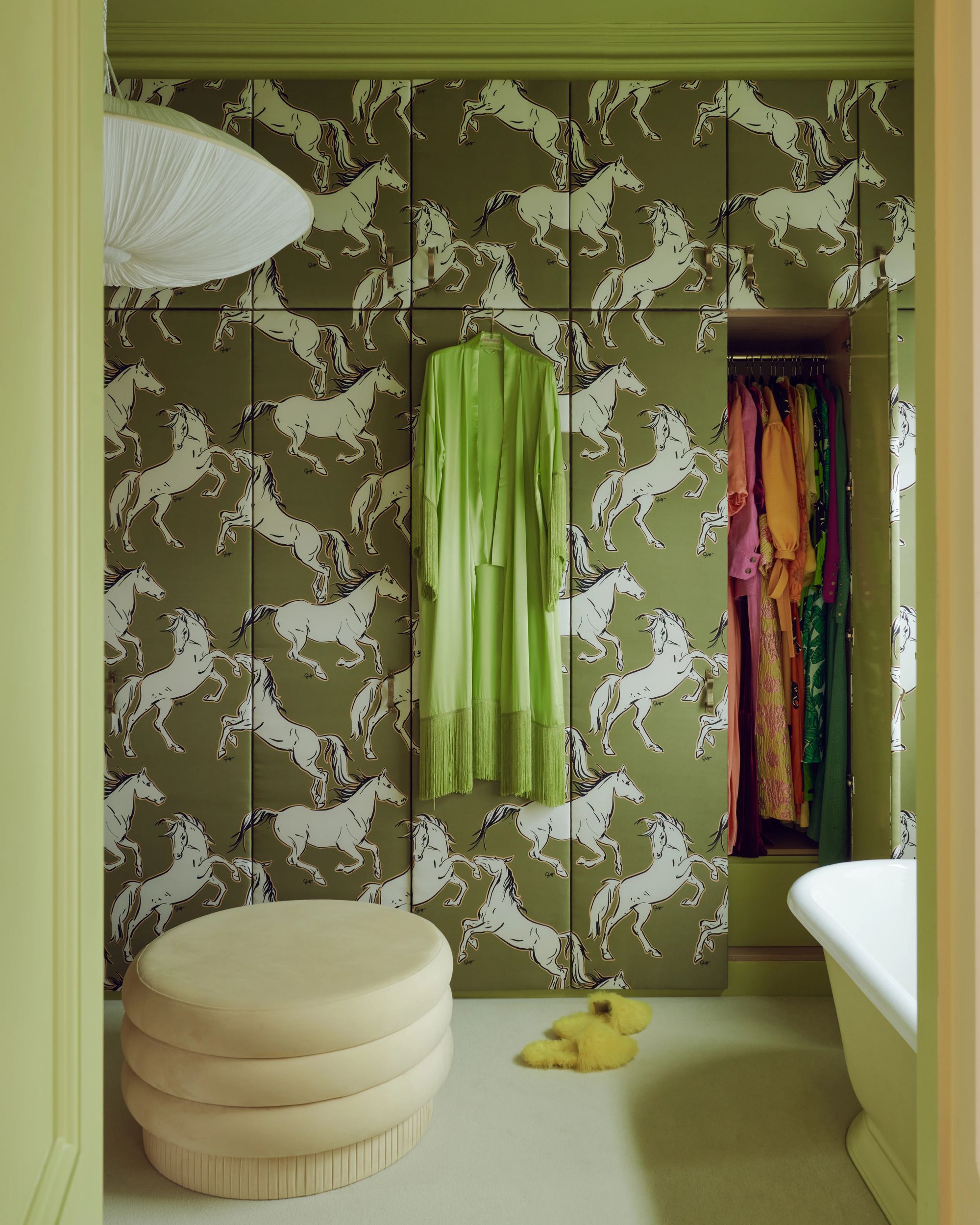
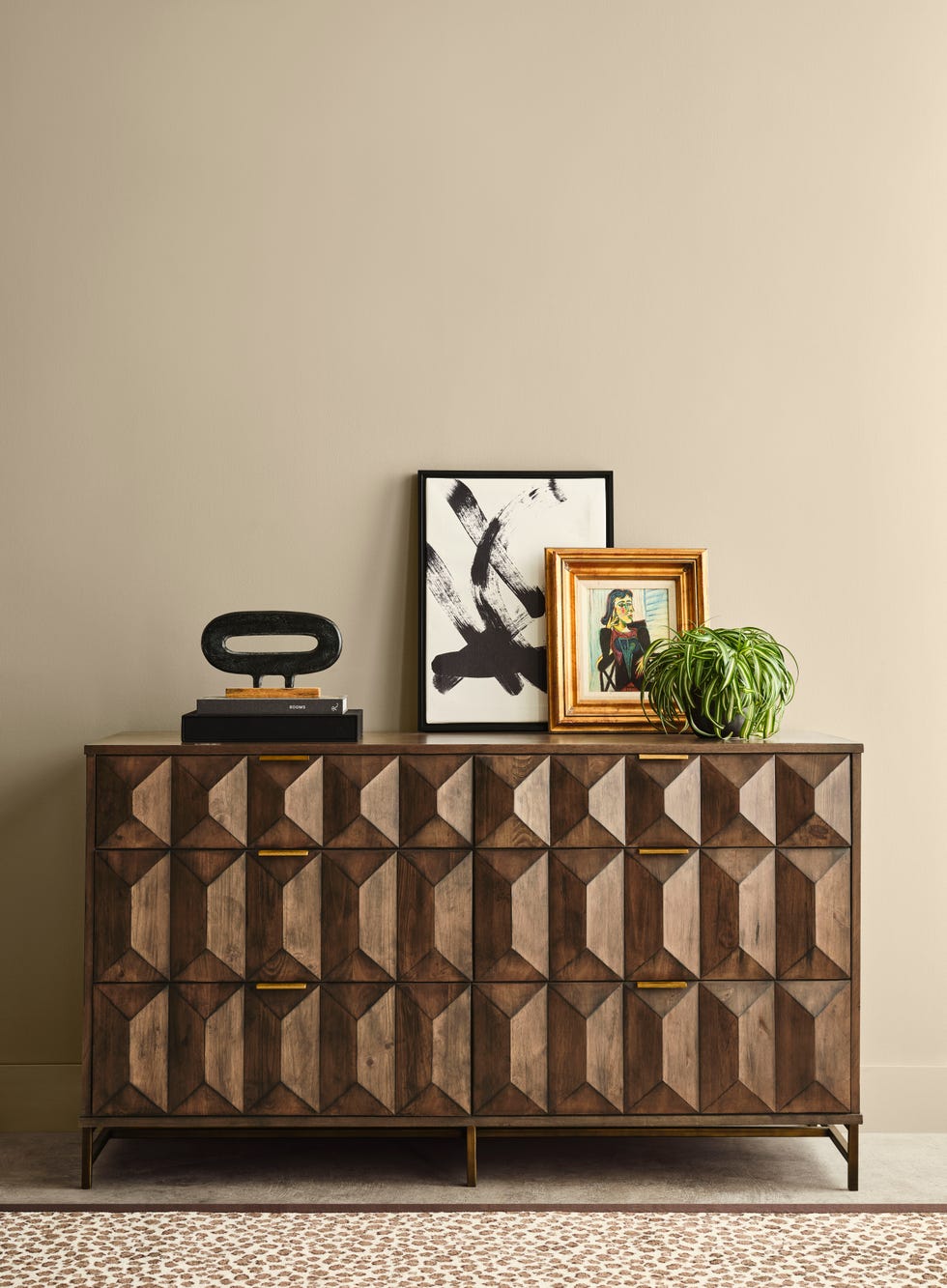
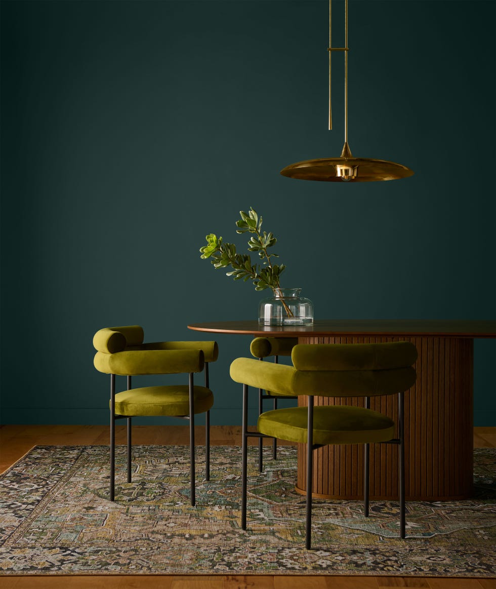
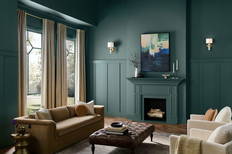
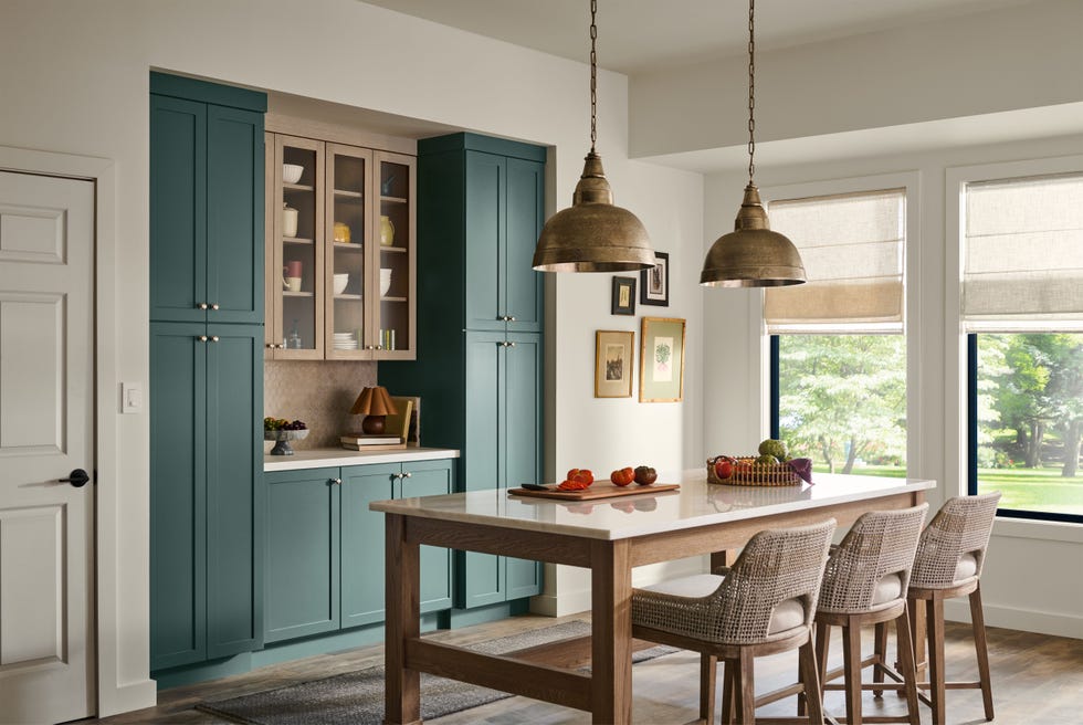
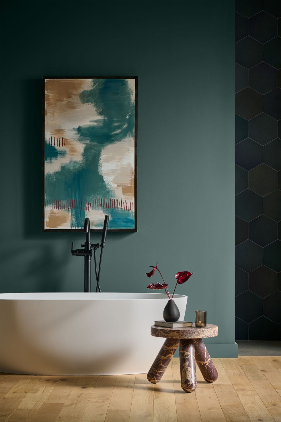
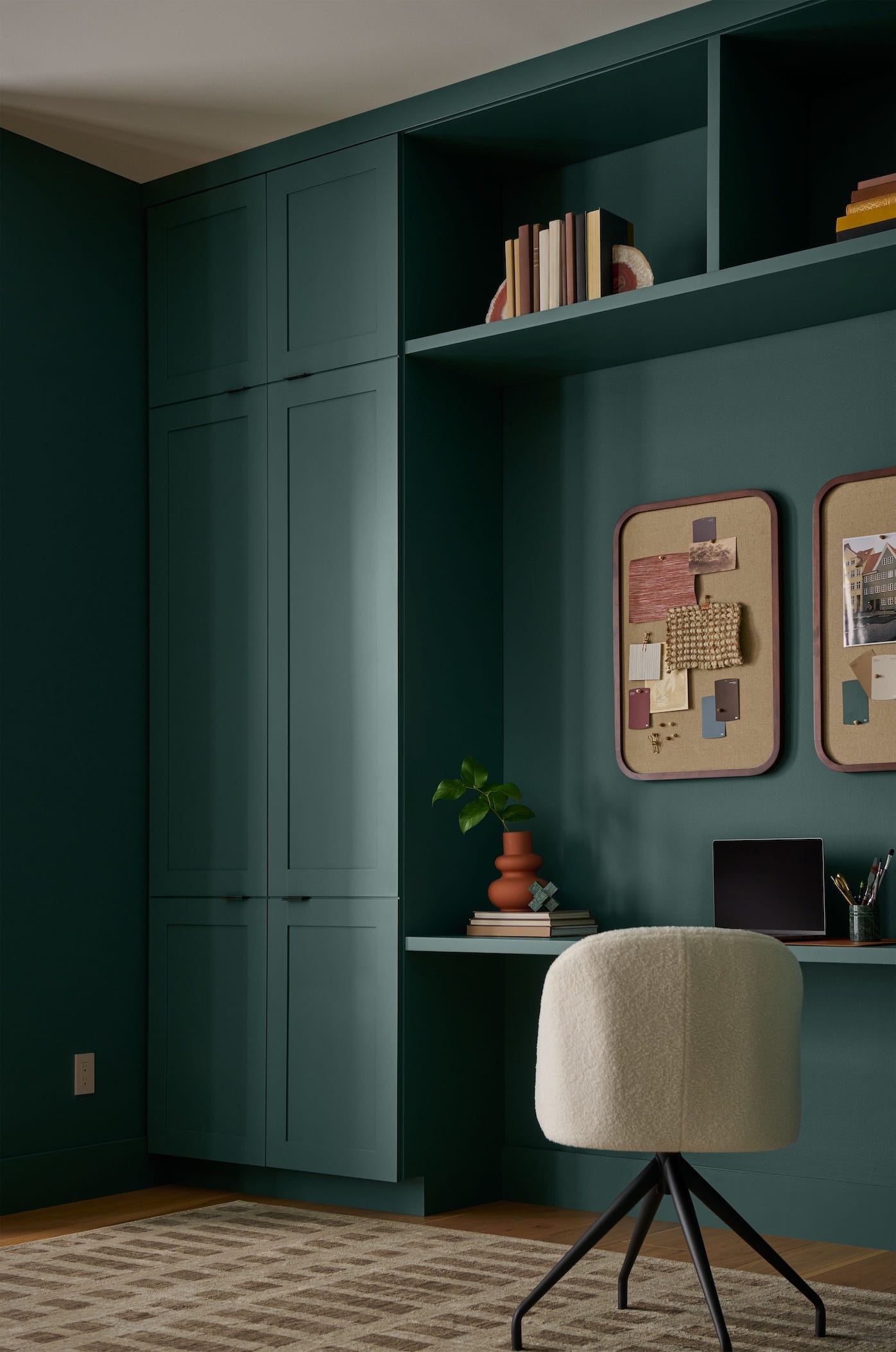
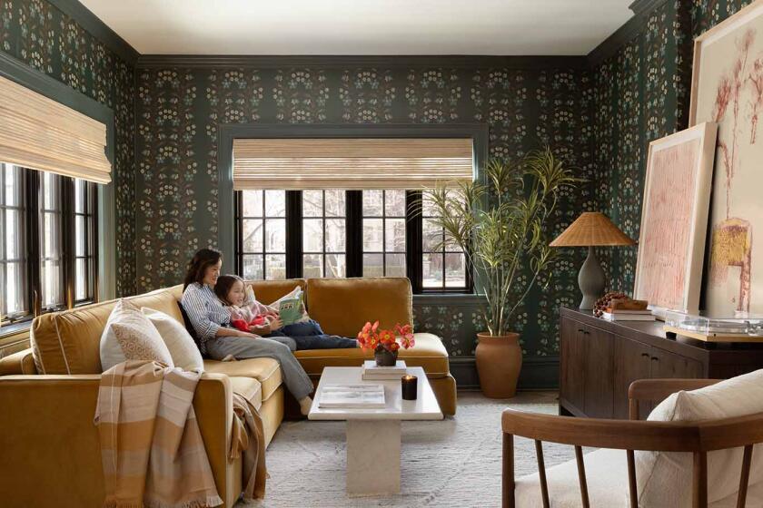
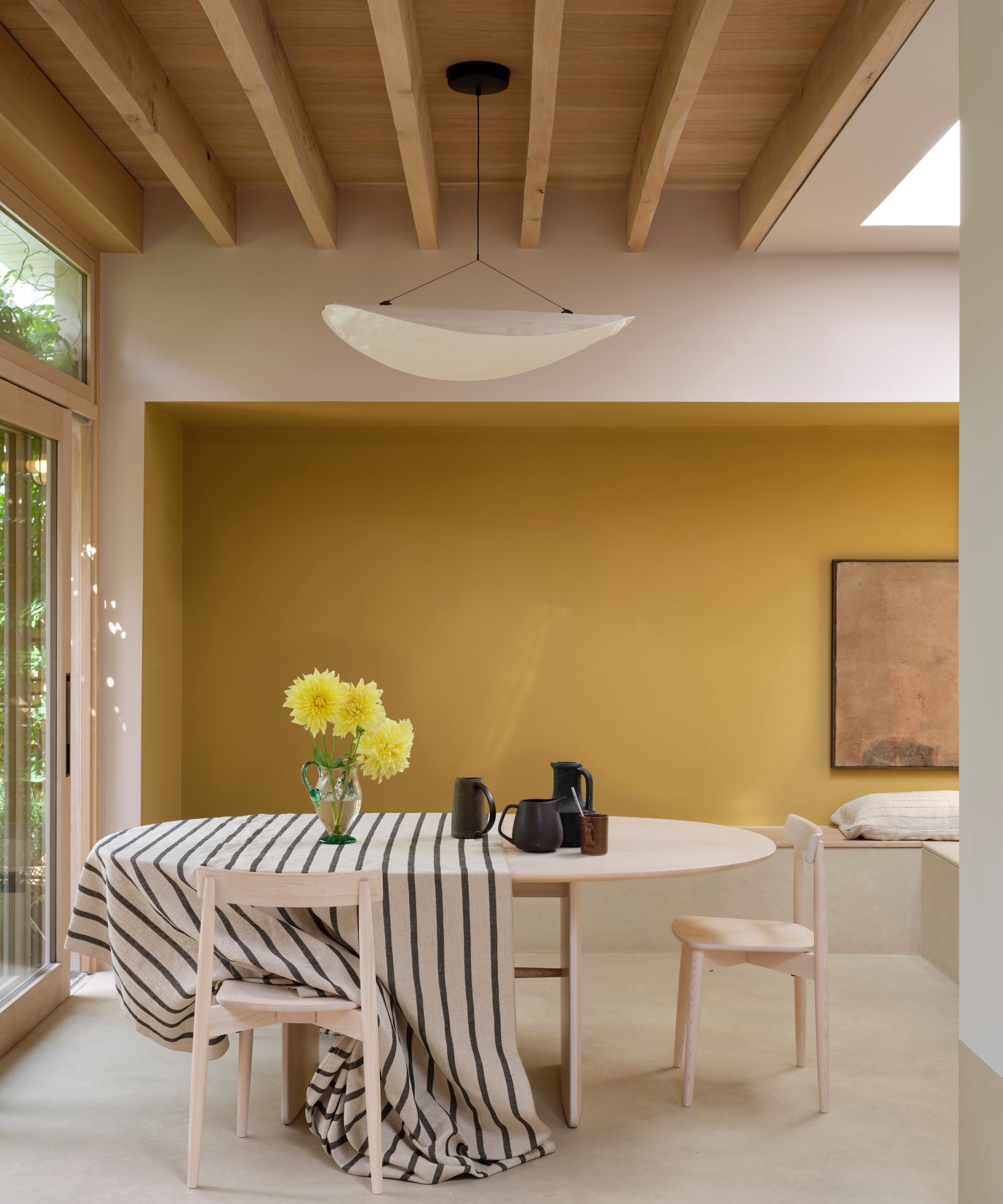
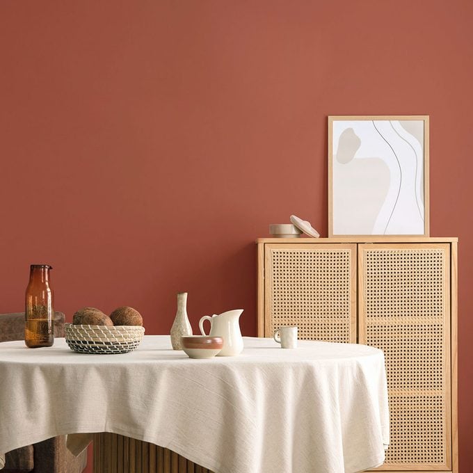
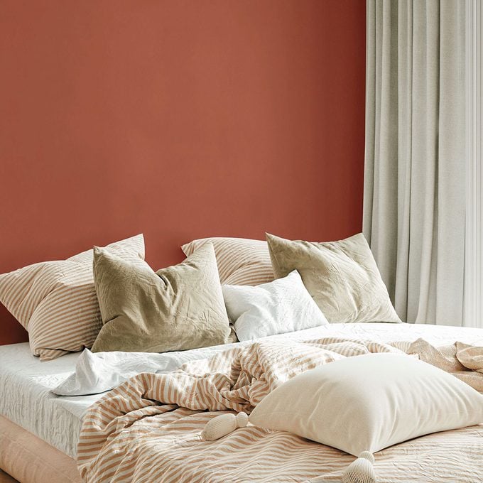
Sherwin-Williams introduced 'Universal Khaki,' a subtle, earthy tan that serves as a versatile background for stronger neutrals and vibrant colors. Valspar's 'Warm Eucalyptus,' a restorative green, emphasizes mindful living and the appreciation of small moments through serene design. Behr's 'Hidden Gem,' a soothing jade, provides a sense of balance and depth, being both timeless and fresh. Dutch Boy's 'Melodious Ivory' is a creamy warm neutral that evokes nostalgia and brings harmony to any living space, reminiscent of indulgent treats. Minwax chose 'Special Walnut,' inspired by the honest beauty of wood and the renewed desire for real, enduring materials like reclaimed beams and heirloom furniture, highlighting the aged patina of well-loved spaces. Lastly, Clark+Kensington's 'Hazelnut Crunch,' a rusty red, draws inspiration from biophilic design, cozy minimalism, and nature-rooted tones, balancing familiarity with boldness.
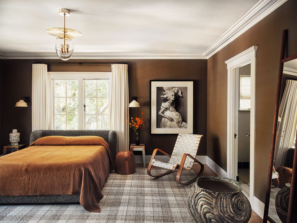
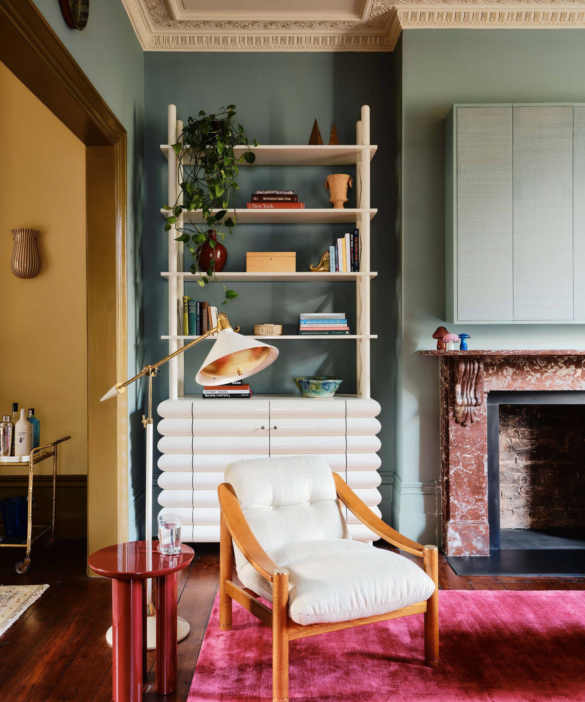
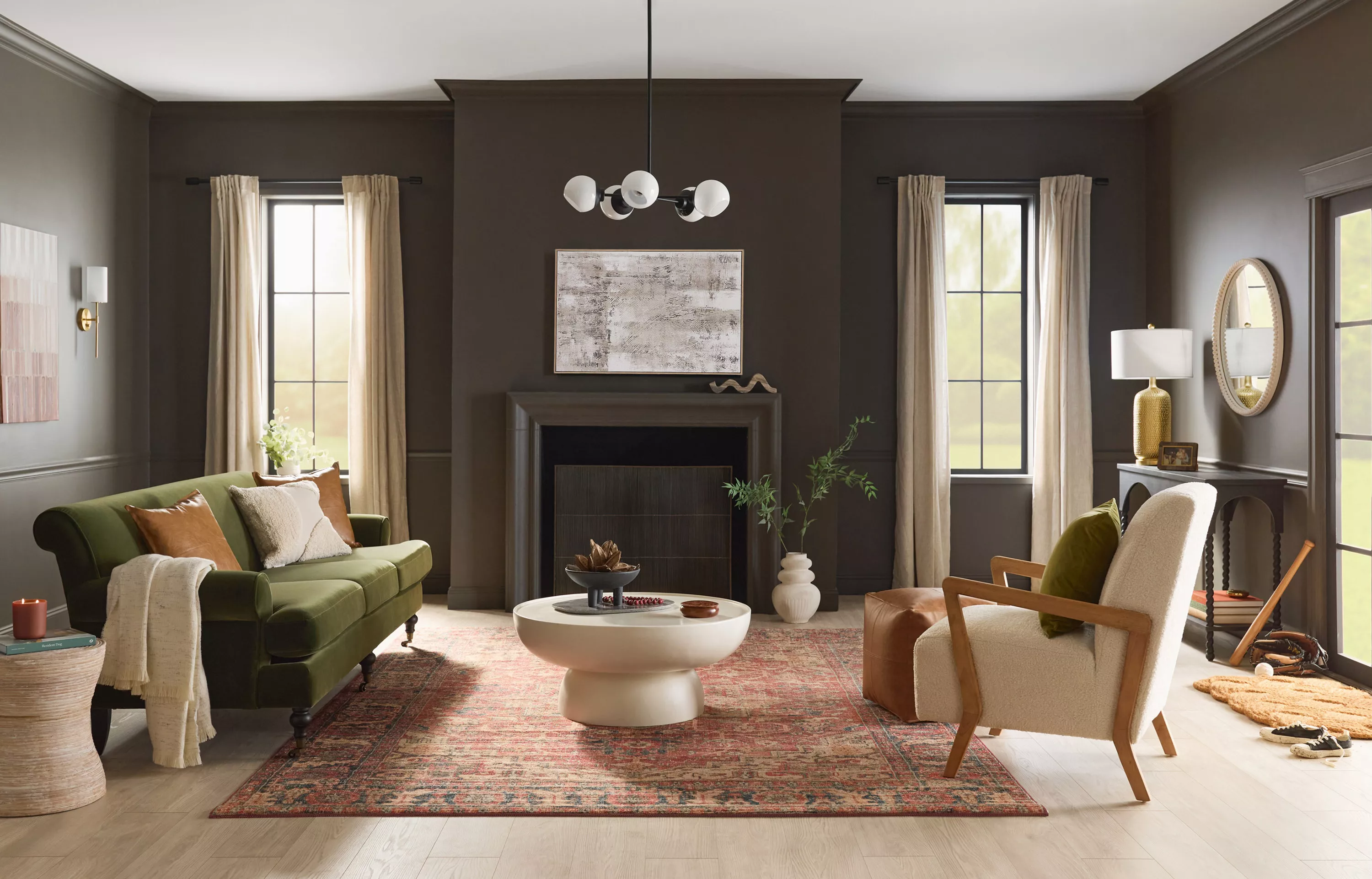
Several overarching trends emerge from these 2026 COTY selections. Firstly, earthiness is a dominant theme, with all colors being naturally occurring and often rooted in shades of brown. This reflects a desire for grounding and inspiration from organic elements, manifested in soothing and understated hues. Secondly, the selections are notably classic, comparable to smart wardrobe investments that remain stylish over time. These colors offer longevity and versatility, minimizing the need for frequent repainting or restaining as trends evolve. Thirdly, there is a distinct retro influence, specifically a nod to the warm and natural palettes popular in the 1970s. While modernized and more subdued, the essence of that era's color schemes is clearly present. Finally, a strong emphasis on neutrality is evident, as all chosen colors are designed to serve as supportive elements, complementing vibrant companions while maintaining a serene and gentle presence. This collective shift towards earthy, classic, retro, and neutral palettes indicates a broader cultural longing for comfort, stability, and timeless beauty in home environments.
#ColorOfTheYear2026 #PaintTrends #HomeDecor #InteriorDesign #EarthyTones #ClassicColors #NeutralPalettes #RetroRevival #MindfulLiving #ColorOfTheYear2026 #PaintTrends #HomeDecor #InteriorDesign #EarthyTones #ClassicColors #NeutralPalettes #RetroRevival #MindfulLiving
0 comment in total
 No comments yet
You may also like
Every 2026 Color of the Year That Has Been Announced So Far

Designers Say These 12 Paint Colors Will Be Everywhere in 2026

What Paint Colors Will Rule 2026? Designers Make Their Predictions
UPDATE: Here Are All the 2026 Colors of the Year—Including Pantone’s Shocking Pick
What This Sour Yellow-Green Says About Color for 2026

Looks Like Bold Stripes Will Have Their Moment in 2026

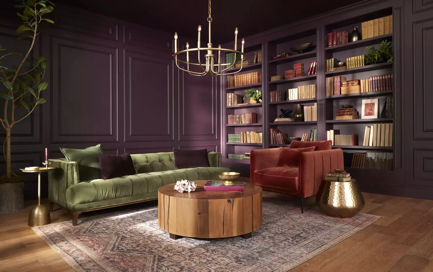
The 2025 Colors of the Year Are Here—and They All Have One Thing in Common

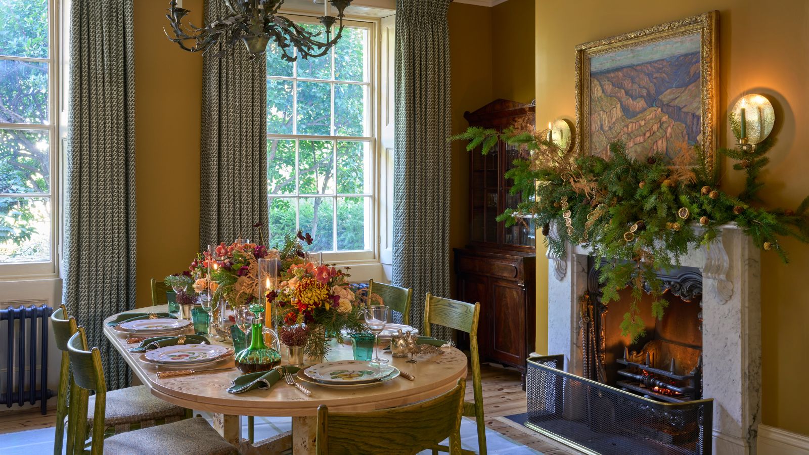
Unexpected Christmas Color Schemes for 2026

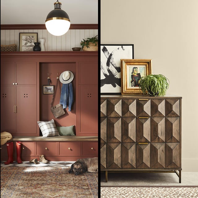
What 2026's Colors of the Year Say About You—And All Of Us

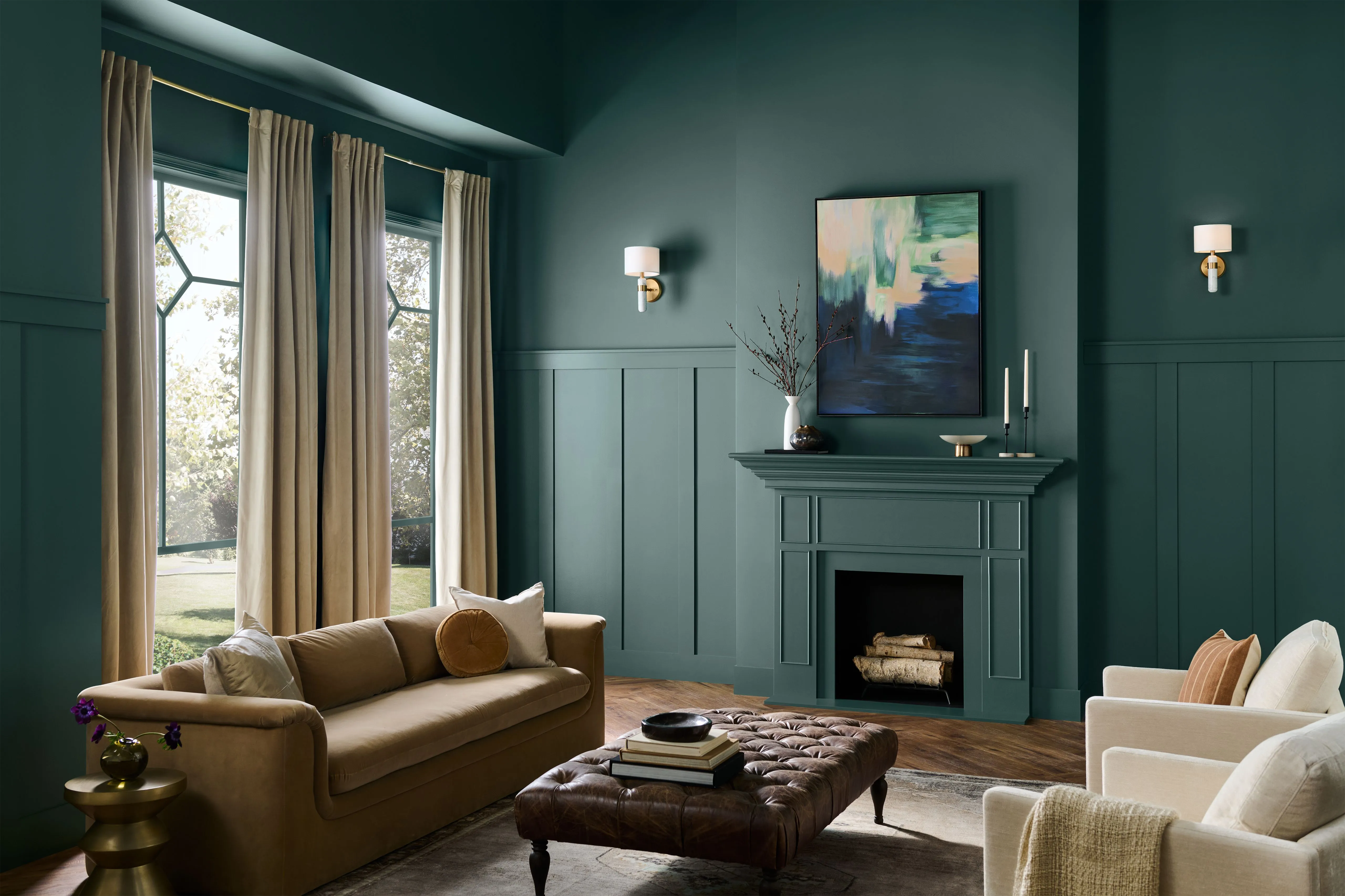
Every 2026 Color of the Year Revealed So Far—and What They Say About the Year Ahead

Clark + Kensington’s 2026 Color of the Year Is Deliciously Neutral


Experts Say These 5 Paint Colours Will Be Everywhere In 2026
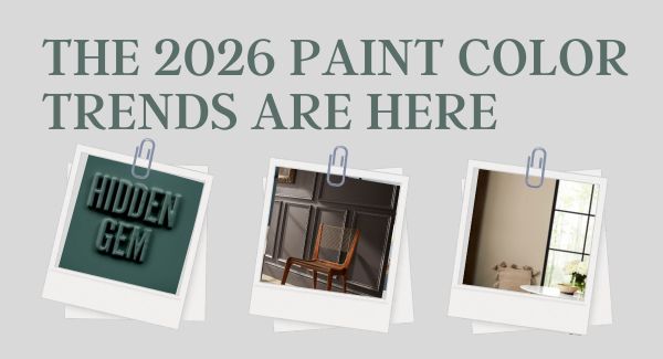
The 2026 paint Colors of the Year Have Been Announced

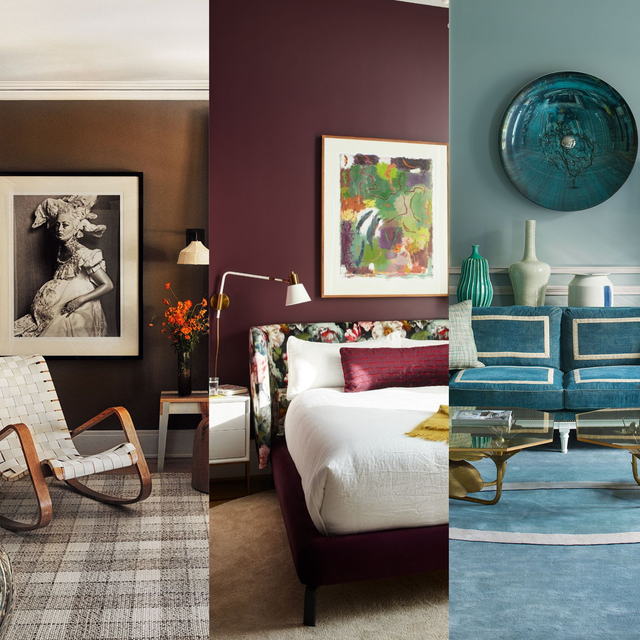
We’re Calling It: These Are the Official Color Trends of 2025
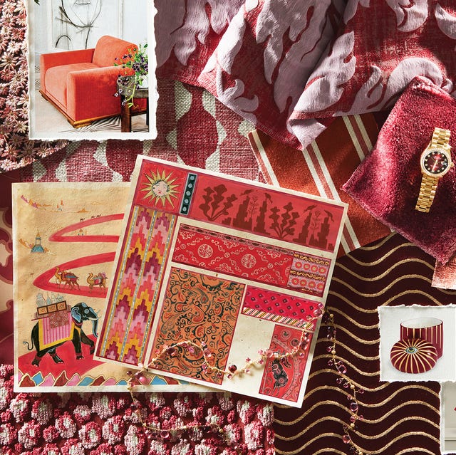
Our 2026 Color of the Year Started With a Scandal-Plagued Royal—No, Not That One

What Paint Colours will Rule 2026? The Experts Make Their Predictions
Behr's 2026 Color of the Year Is Here—And It’s Moody
According to Designers, These Are The Outdated Color Trends for 2026
Etsy’s 2026 Color of the Year Is a Soft, Vintage Blue
Every 2025 Color of the Year We Know So Far