1/21
The Interior Paint Colors You'll Be Seeing Everywhere in 2024
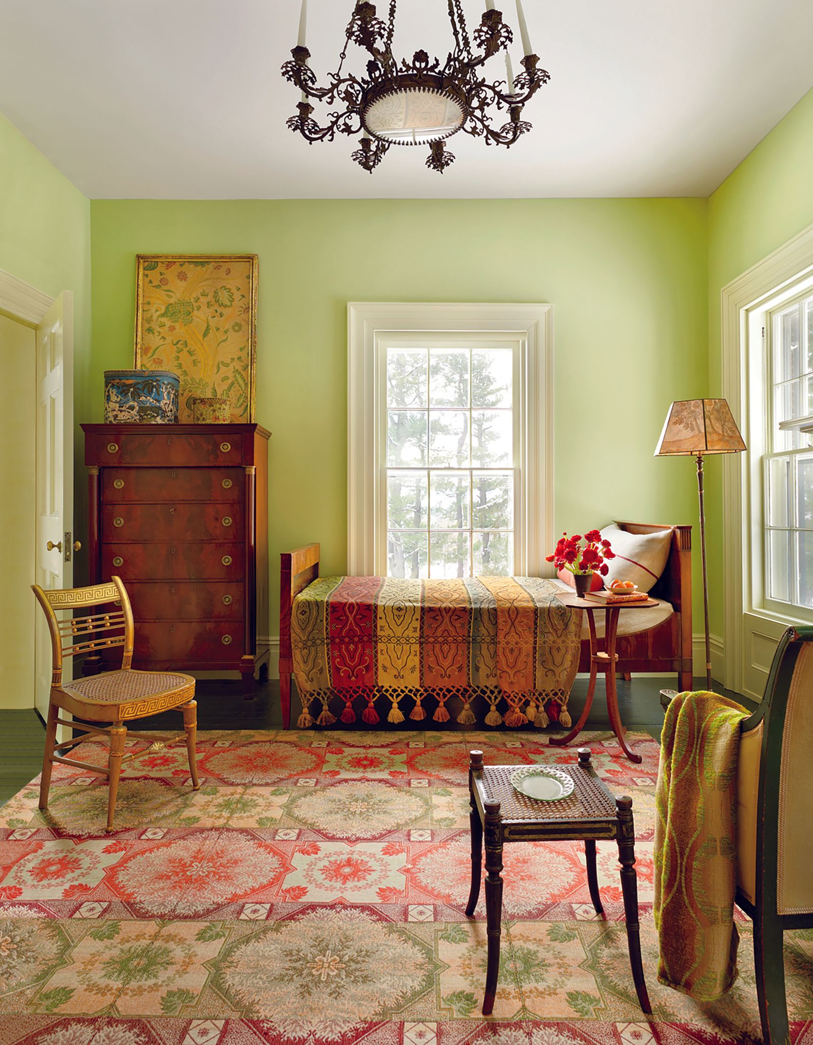
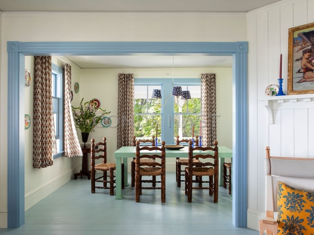
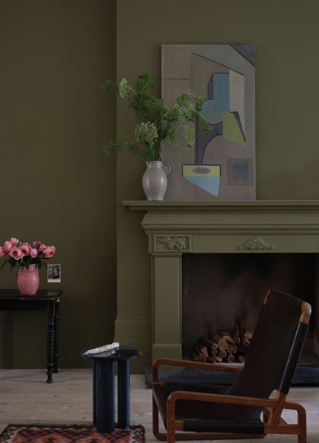
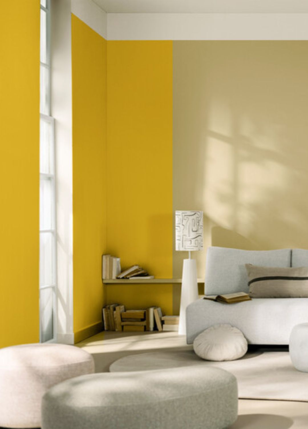
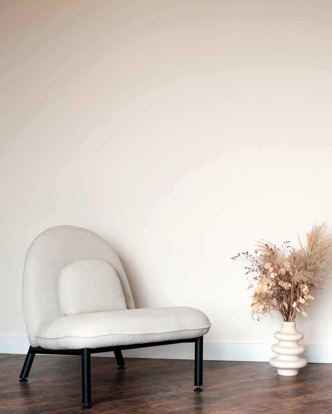
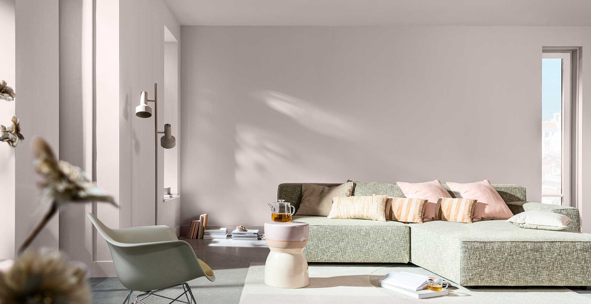
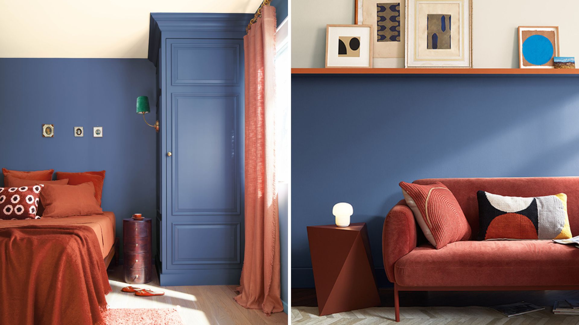
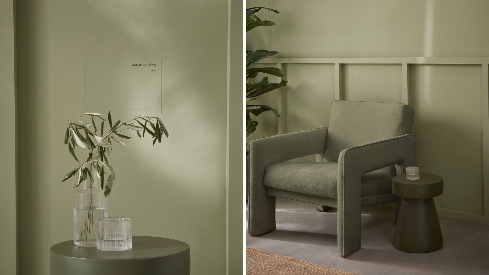
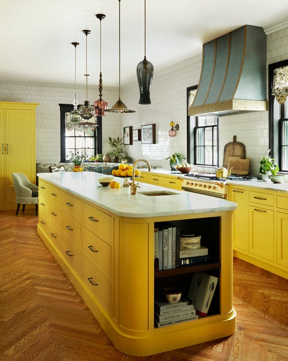
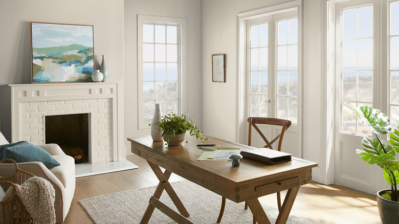
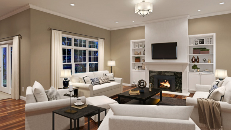
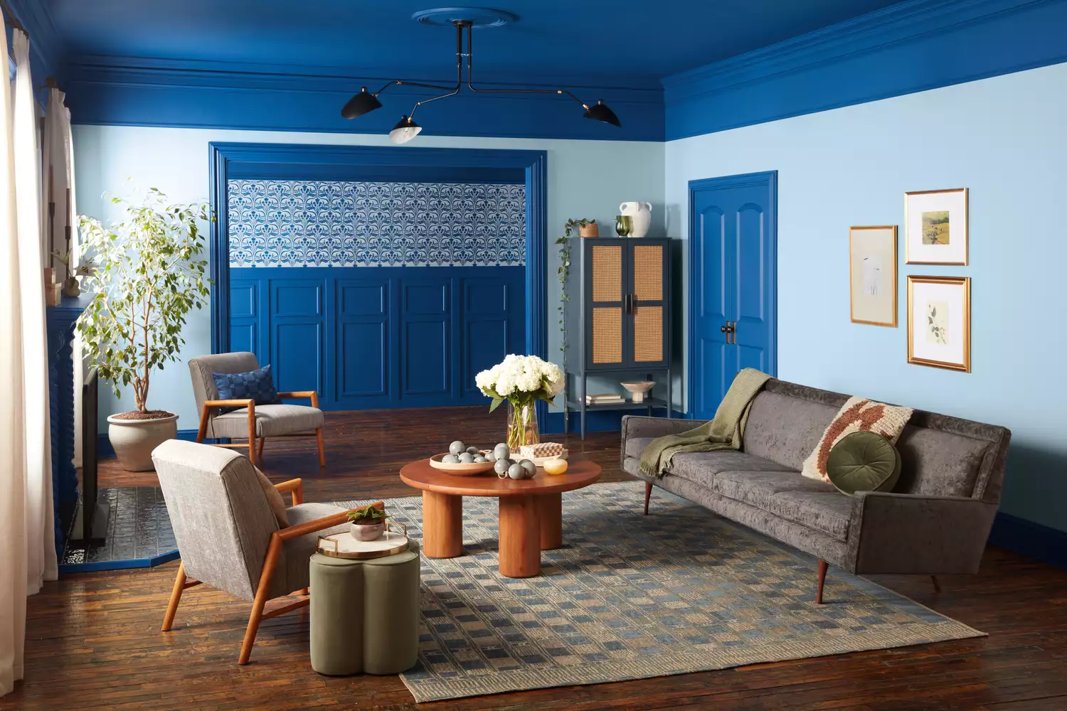
The article presents a curated list of interior paint colors recommended by professional designers, aimed at helping homeowners refresh their living spaces. It emphasizes that a simple paint job can significantly transform a room, making it Instagram-worthy without requiring a full renovation. The featured paint colors are sourced from popular brands such as Benjamin Moore, Sherwin-Williams, Farrow & Ball, Clark+Kensington, and Dunn-Edwards.
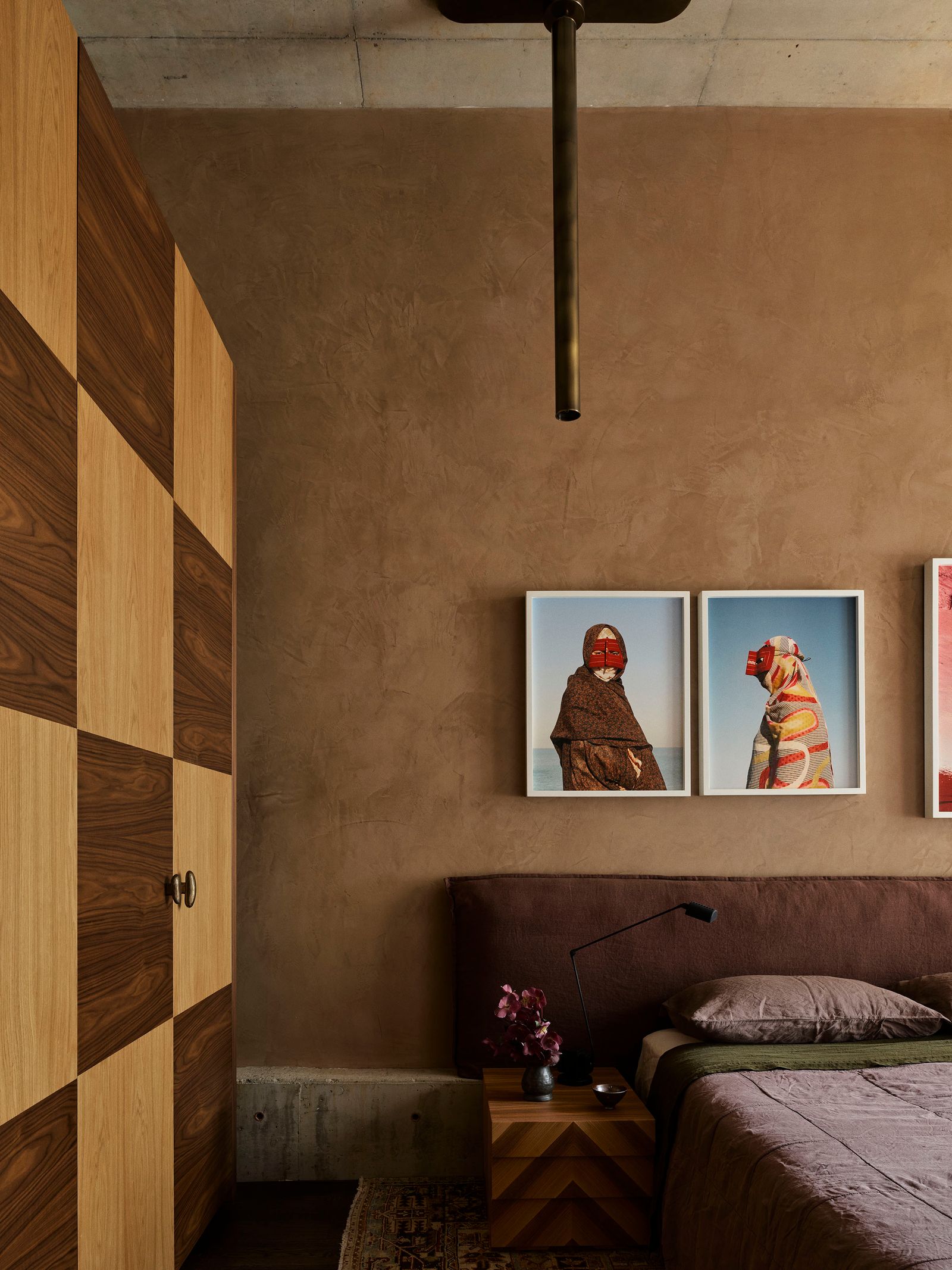
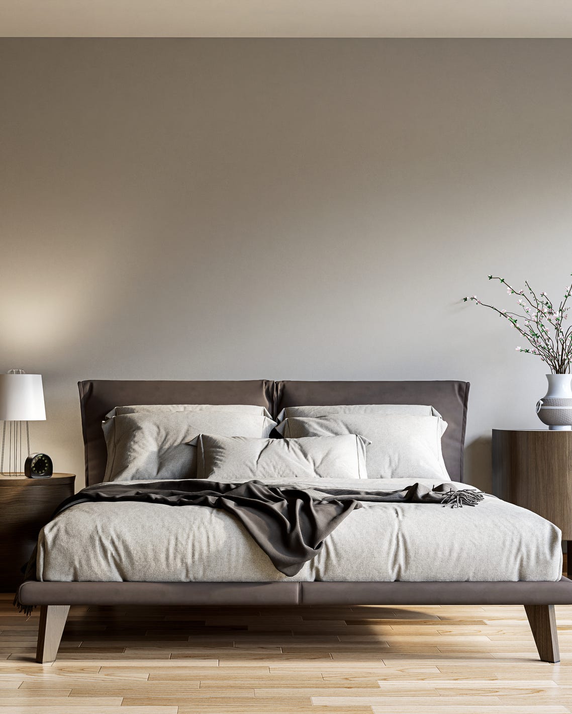
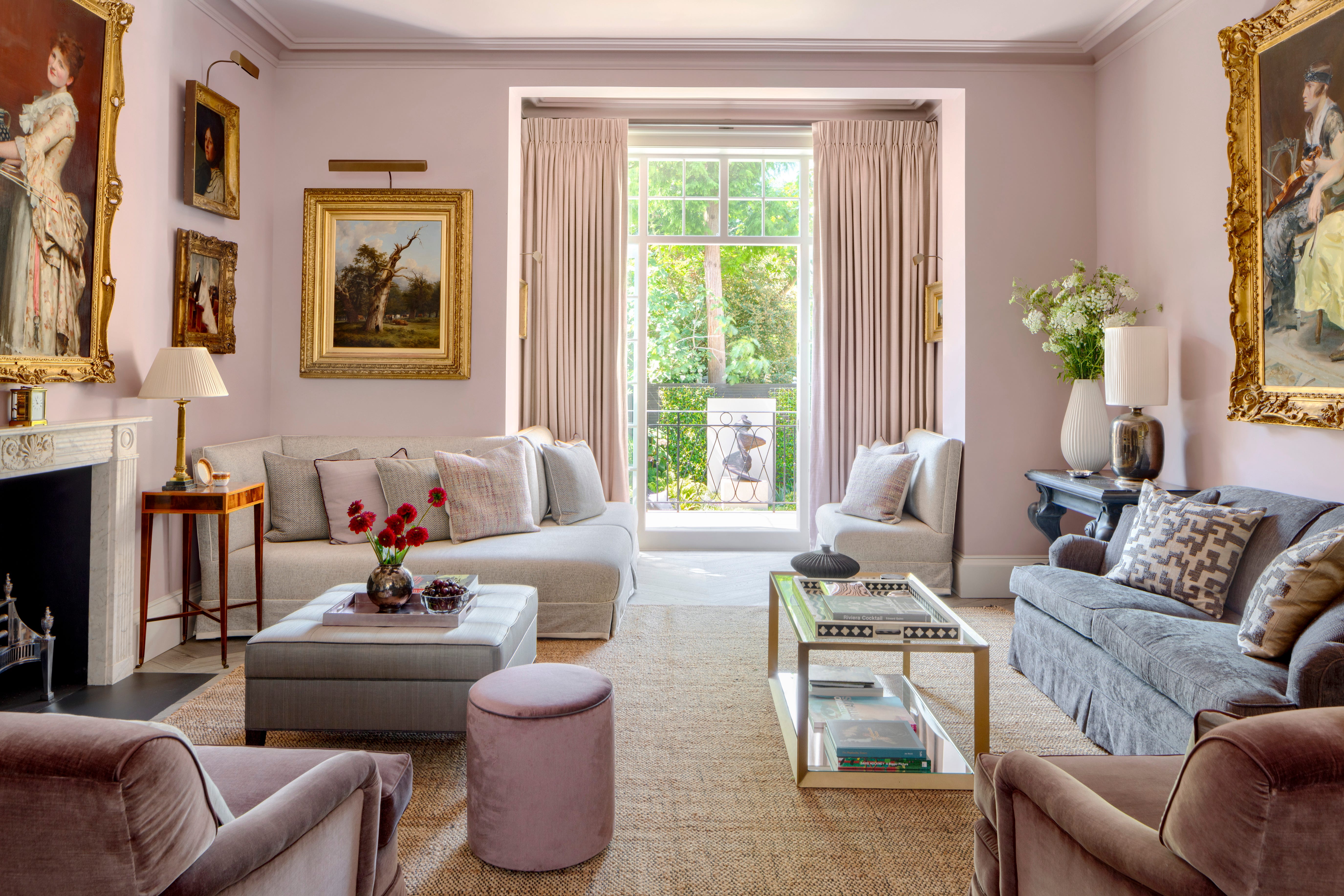
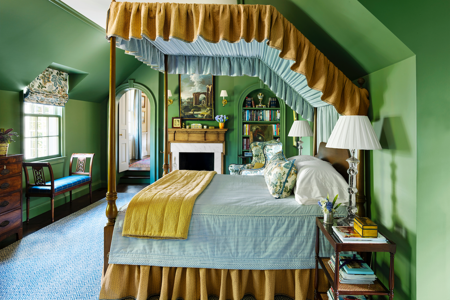
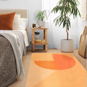
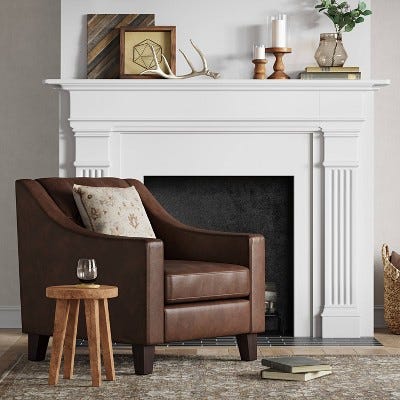
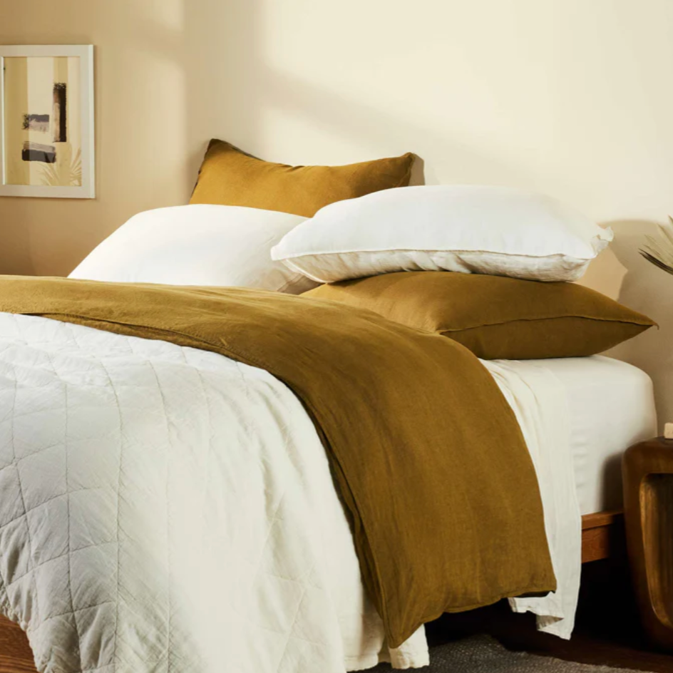
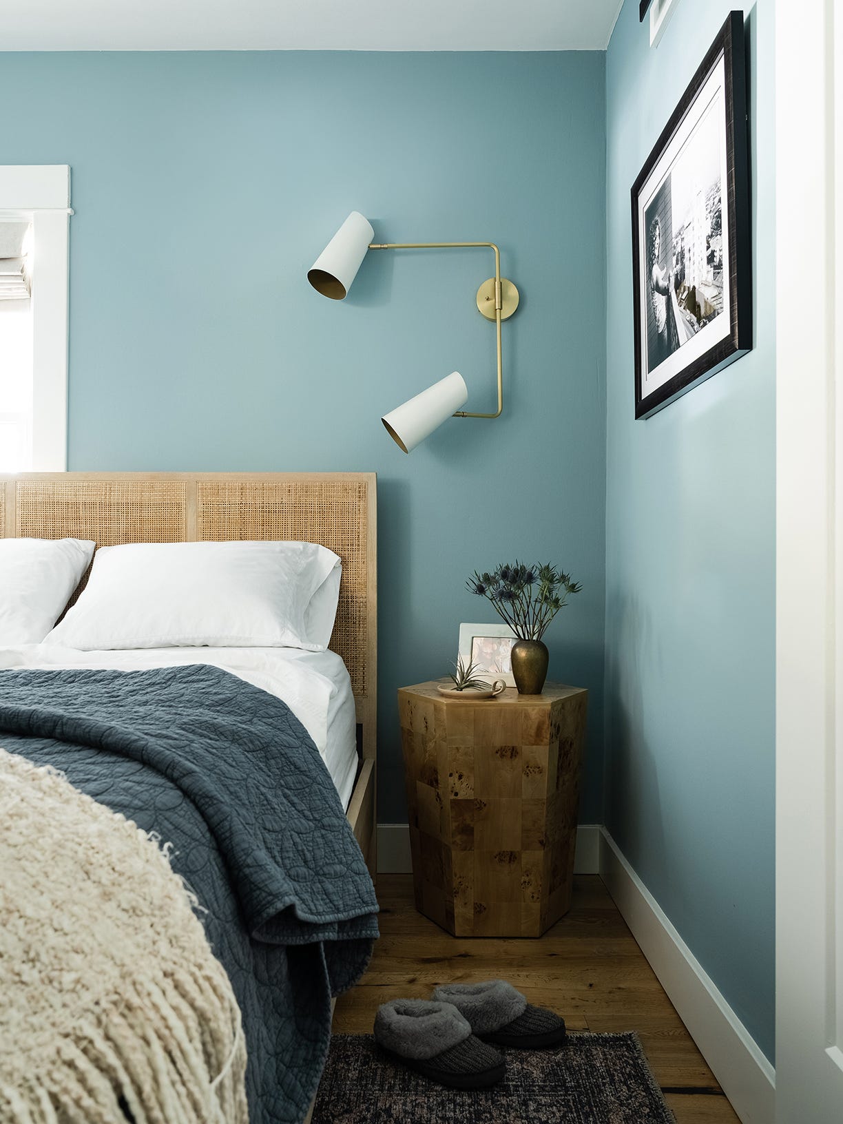
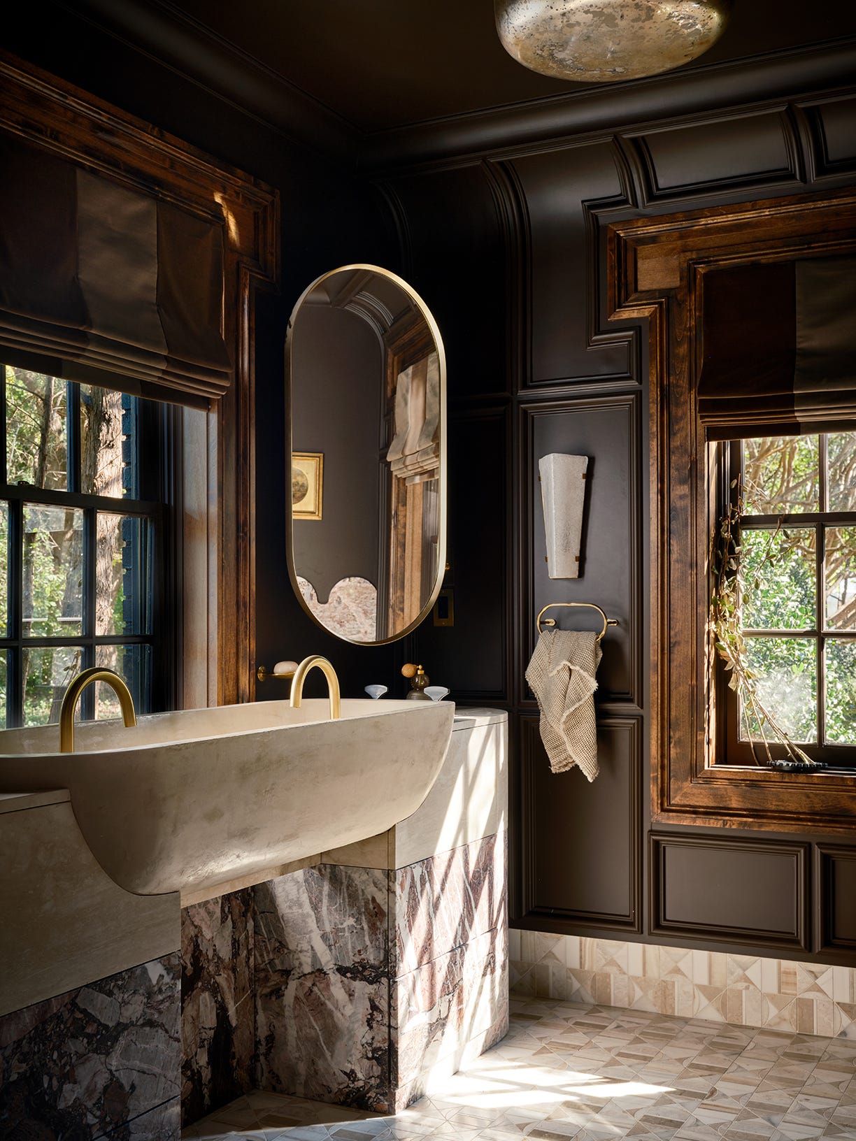
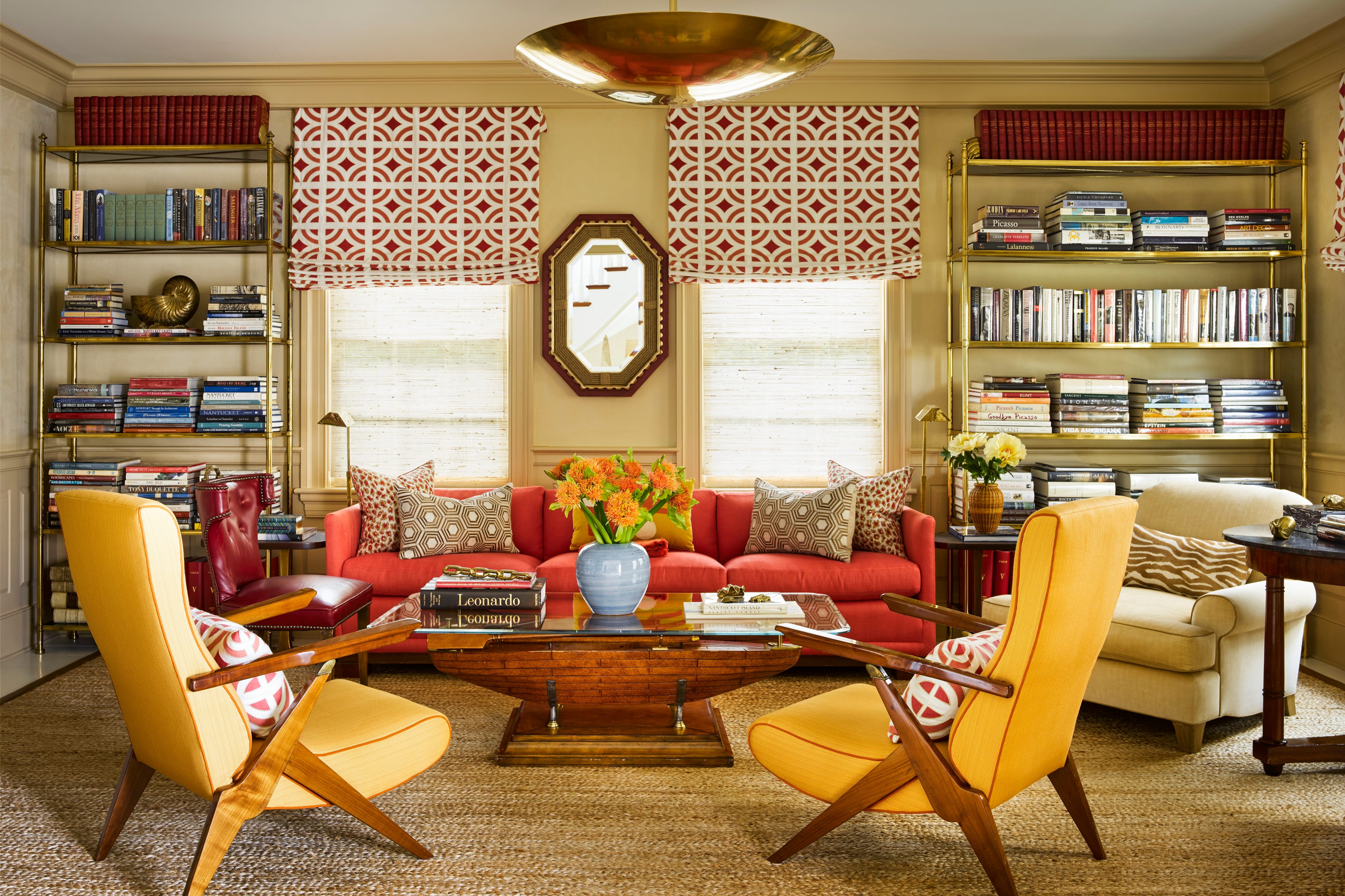
For various rooms, specific color recommendations are provided to evoke different moods and complement existing decor. For instance, warm neutrals or soft blue shades are suggested for bathrooms to create a calming atmosphere. Energizing orange is recommended for modern office spaces to promote motivation and inspiration. Dark and moody tones like gray, brown, or black are highlighted as a popular trend for foyers and cozy bedrooms, offering depth and bold interest. Additionally, designer-approved white colors are included for kitchens and living rooms.
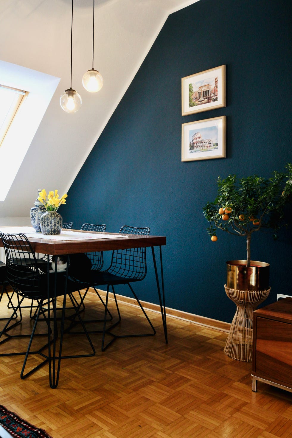
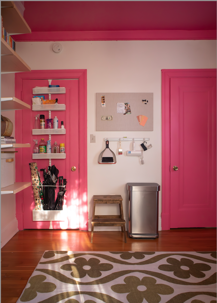
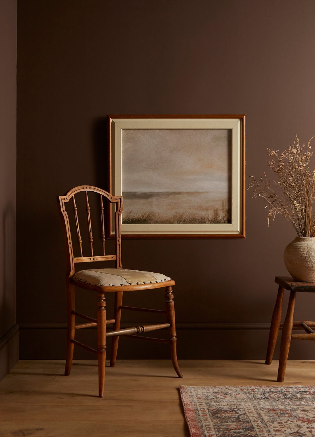
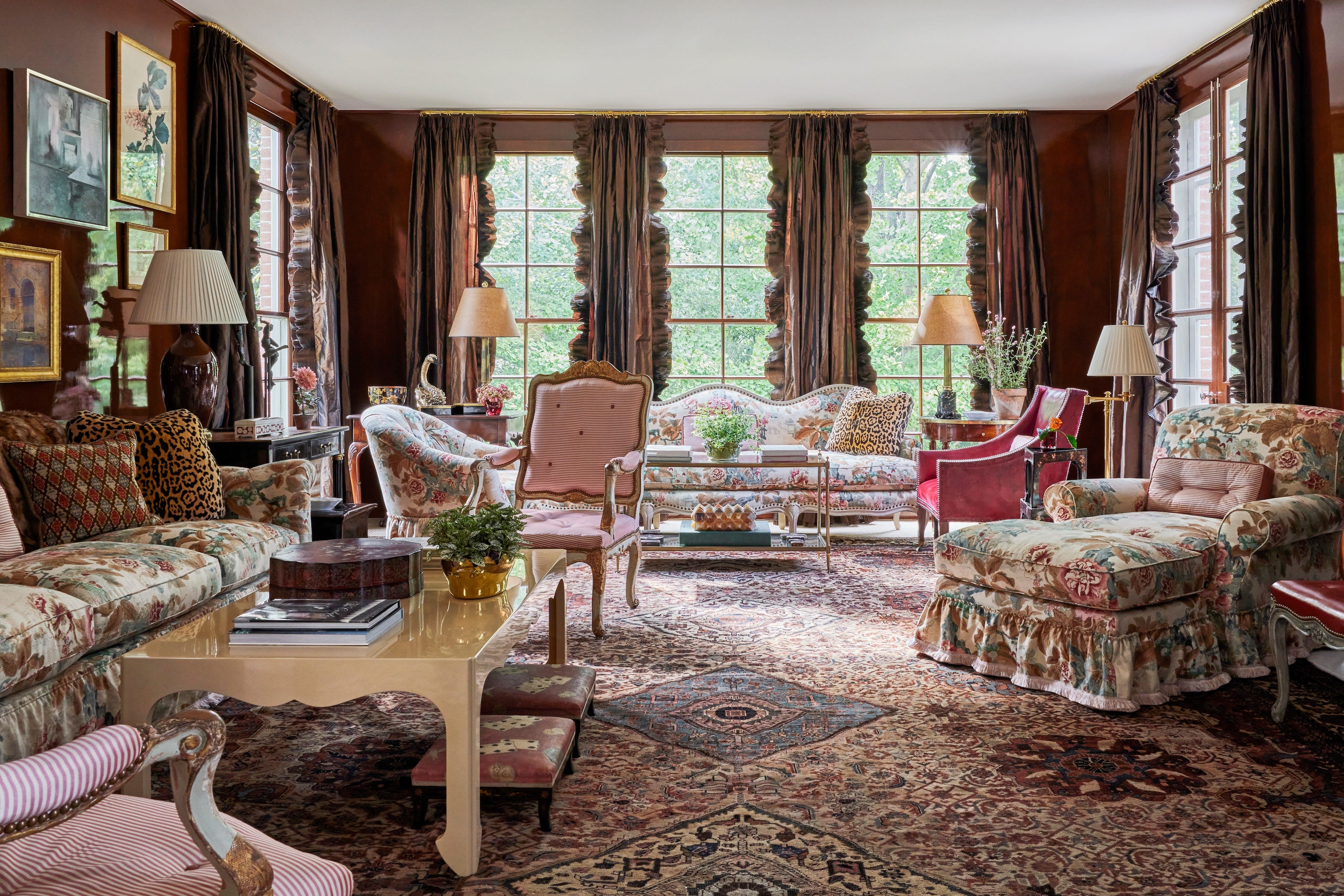
Several designers share their top picks and reasons for their choices. Dan Mazzarini of BHDM Design praises Benjamin Moore's Templeton Gray for its chameleon-like quality, adapting to other decor with its blue, gray, and green undertones. He recommends it for millwork, kitchen islands, and libraries. Marie Cloud of Indigo Pruitt suggests Sherwin-Williams' Burgundy for its deep, warm, and inviting feel, ideal for guest rooms, bedrooms, or dining areas. Erin Gates favors Benjamin Moore's Fairview Taupe, a cozy brown with a chalky gray hint, which pairs well with blues or faded russet tones. Adam Hunter recommends Sherwin-Williams' Hearty Orange for workspaces due to its energetic, creative, and positive radiation, complementing neutrals and wood tones.
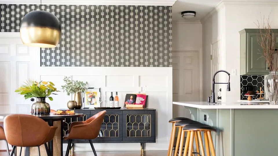
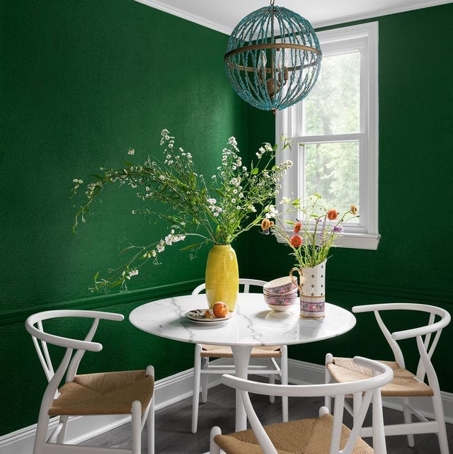
Sarah Storms discusses Benjamin Moore's Buffett Green, an unexpected hue for dining areas that harmonizes with kitchen elements and brings life and light to the space. Jennifer Verruto of Blythe Interiors highlights Sherwin-Williams' Steely Gray, noting its rich yet subtle blue undertone that creates a calming foundation for living spaces. Gideon Mendelson mentions Benjamin Moore's Moonshine, an off-white with a muted blue-gray undertone, adding depth and interest to foyers. Verruto also recommends Sherwin-Williams' Oyster Bay for its versatility, offering a balance of warm and cool tones with coastal influences.
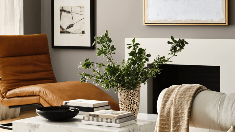
Lauren Lerner of Living with Lolo prefers Sherwin-Williams' Forged Steel, a warm gray with brown tones that changes with lighting, suitable as a dramatic backdrop. Caren Rideau of Kitchen Design Group's top gray pick is Benjamin Moore's Classic Gray, valued for its soft warmth that doesn't distract from artwork. Gail Davis uses Benjamin Moore's Century Darjeeling for its impactful dark hue in guest bedrooms. Mindy O'Connor suggests Farrow & Ball's Dimpse, a cool pale gray that acts as a neutral for modern spaces. Brianne Bishop recommends Benjamin Moore's Gray for its deep, moody quality that balances warm and cool elements.
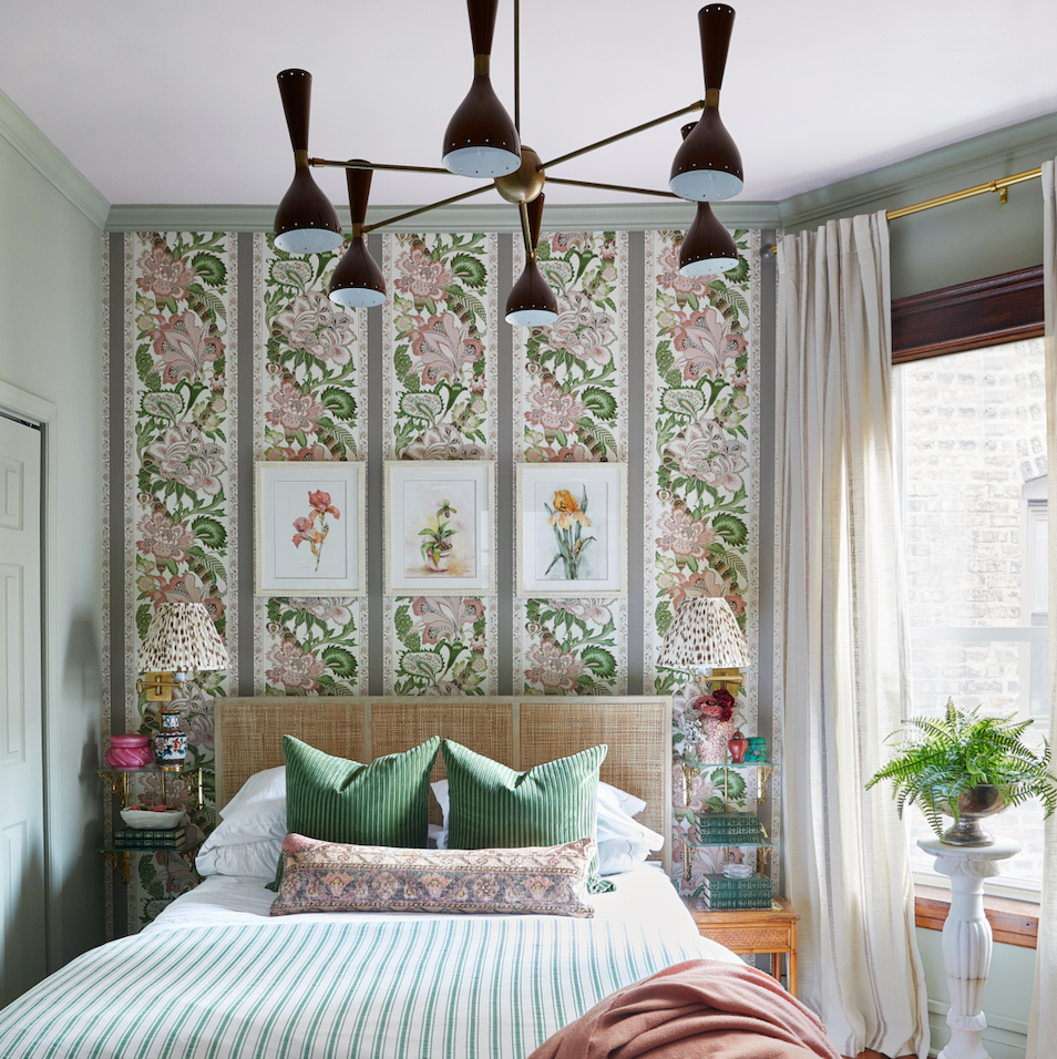
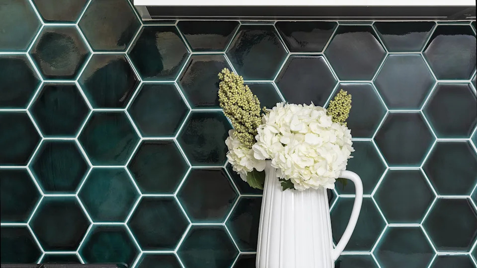
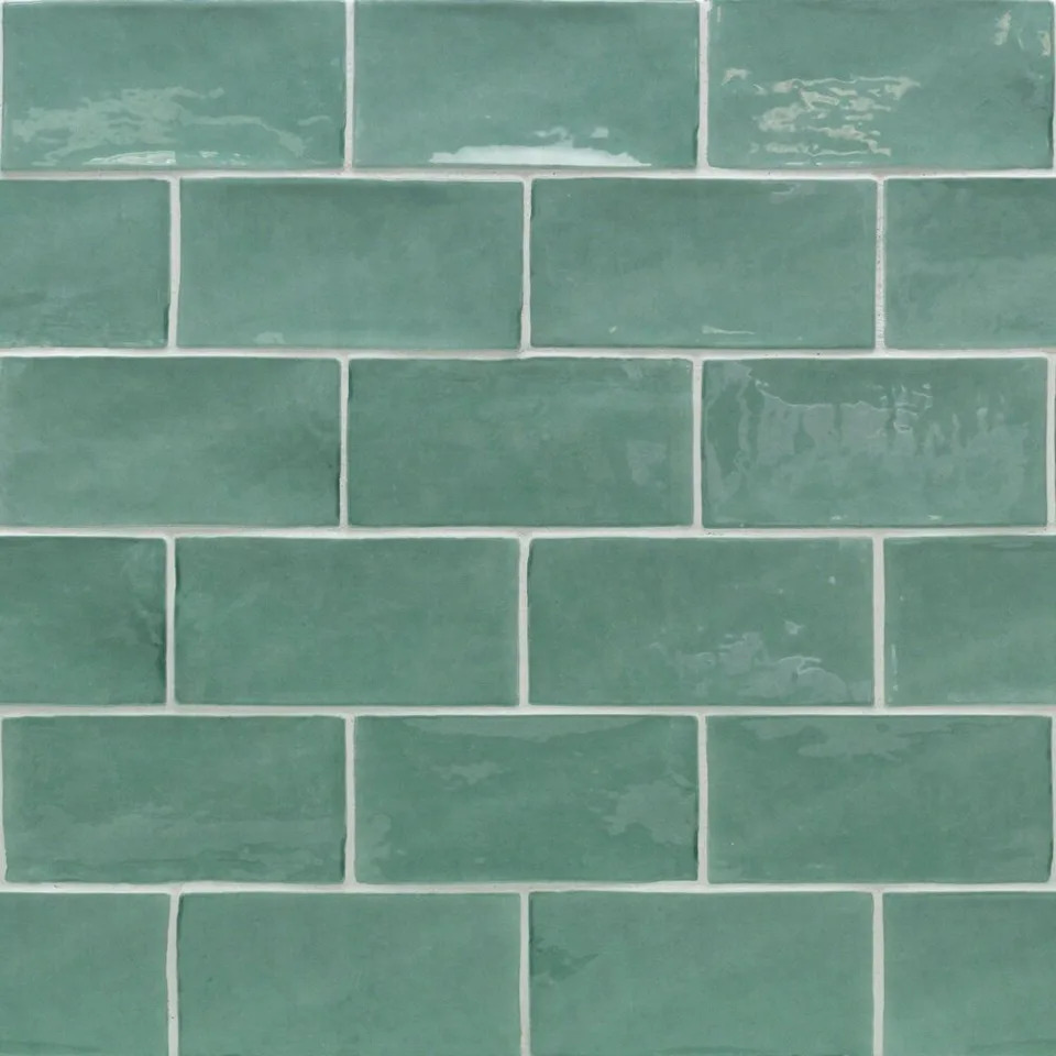
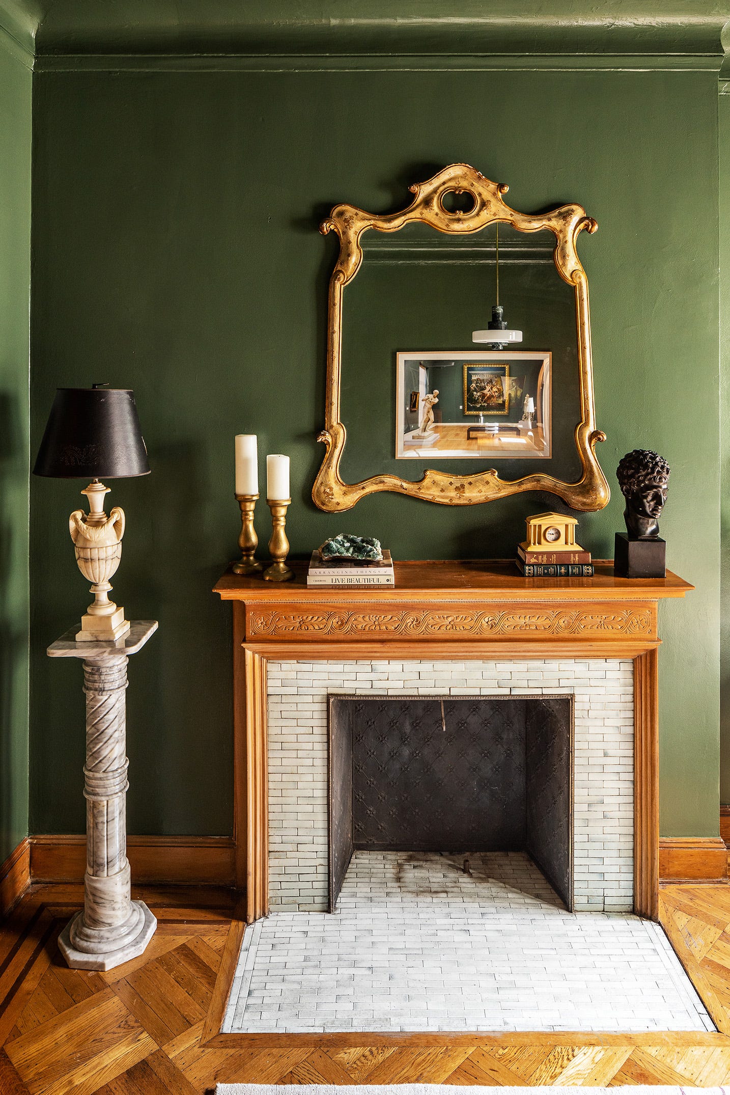
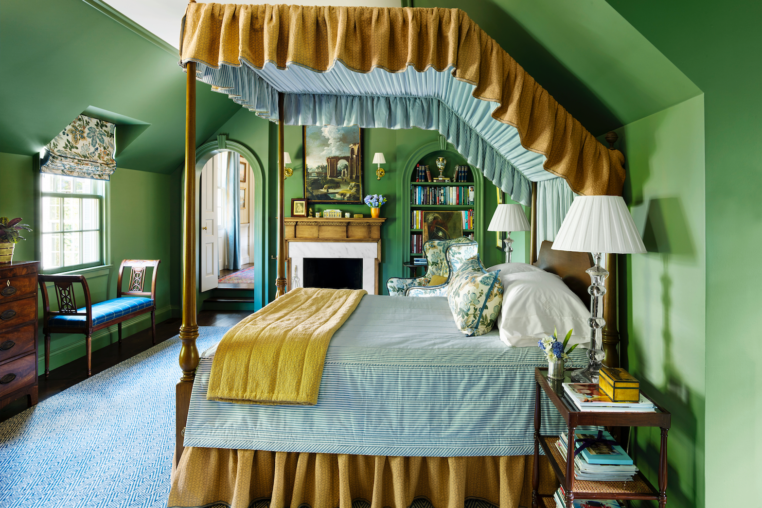
Kirsten Krason of House of Jade Interiors uses Sherwin-Williams' Snowbound for a consistent white across walls, trim, cabinets, and ceilings. Ariel Okin prefers Benjamin Moore's Chantilly Lace for its cool, crisp white that makes rooms airy and clean. Breegan Jane recommends Benjamin Moore's Aegean Teal for its serene, shimmering quality in bedrooms, libraries, offices, or cabinetry. Erin Gates likes Farrow & Ball's Green Smoke for powder rooms and millwork, offering a subdued yet dramatic deep green. Kate Lester suggests Dunn-Edwards' Cavernous for those who appreciate dark colors, praising its contrast with white and compatibility with warmer neutrals. Lauri Ward highlights Benjamin Moore's Palladian Blue, a versatile blue-gray-green for sunny rooms or tranquil bedrooms. Katie Reynolds recommends Clark+Kensington's Garden Stone for its warm gray tones that resist blue undertones. Jill Hosking-Cartland prefers Sherwin-Williams' Compatible Cream for a warm, inviting yellow that coordinates well with adjoining rooms. Irene Lovett of designstiles recommends Benjamin Moore's Intense White, a grayish tone that offers subtle contrast with white trim. Abbe Fenimore of Studio Ten 25 suggests Benjamin Moore's Revere Pewter as a versatile neutral for open floor plans. Brittany Zachos of Zachos Design Group uses Benjamin Moore's Decorator's White for a crisp, clean feel in bright ceilings, trim, and bathrooms. Arianne Bellizaire recommends Sherwin-Williams' Wool Skein as a neutral that avoids pink undertones. Finally, Elissa Morgante of Morgante-Wilson Architects favors Benjamin Moore's Manchester Tan, a warm neutral that changes with the light, offering richness or freshness depending on the source.
#InteriorDesign #PaintColors #HomeDecor #DesignerTips #HomeRenovation #DIYDecor #ColorTrends #BenjaminMoore #SherwinWilliams #InteriorDesign #PaintColors #HomeDecor #DesignerTips #HomeRenovation #DIYDecor #ColorTrends #BenjaminMoore #SherwinWilliams
0 comment in total
 No comments yet
You may also like
These 5 Paint Color Trends Will Be Everywhere in 2024, According to Interior Designers
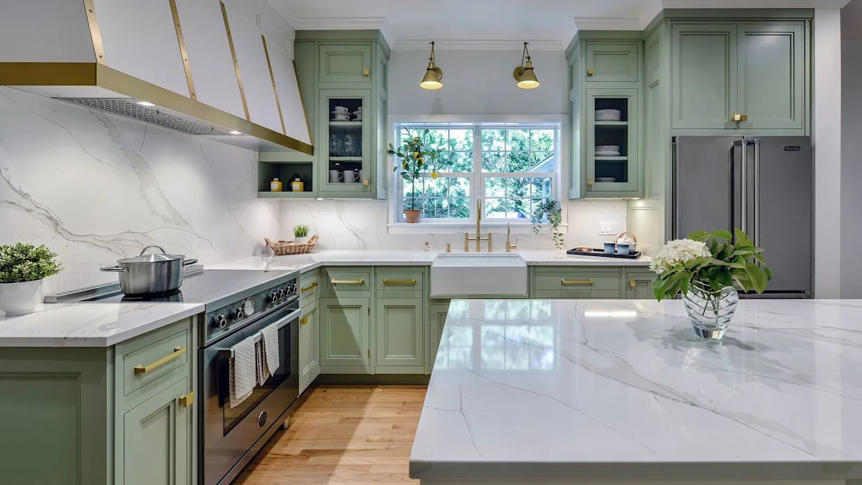
The Kitchen Color You're Going to Be Seeing Everywhere in 2024
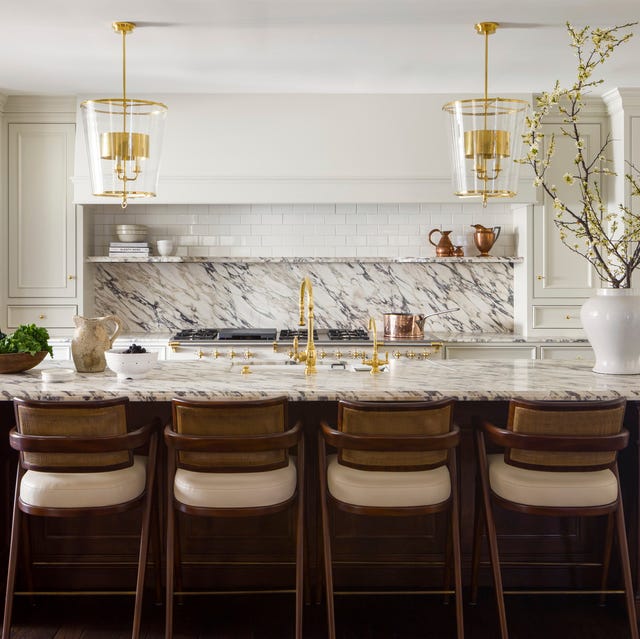
These Kitchen Paint Colors Will Be Everywhere in 2025

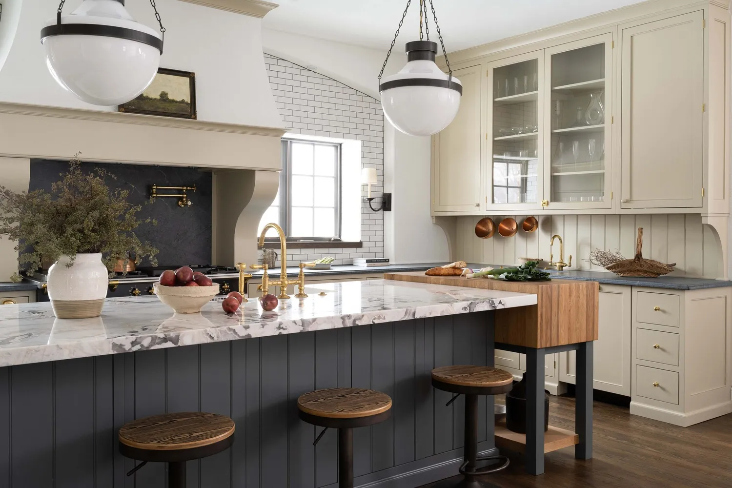
7 Trendy Paint Colors for Every Room in 2026, According to Designers


These Colors Will Be Everywhere in Interiors in 2025
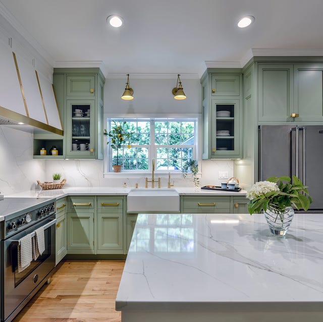
The Kitchen Color You're Going to Be Seeing Everywhere in 2024
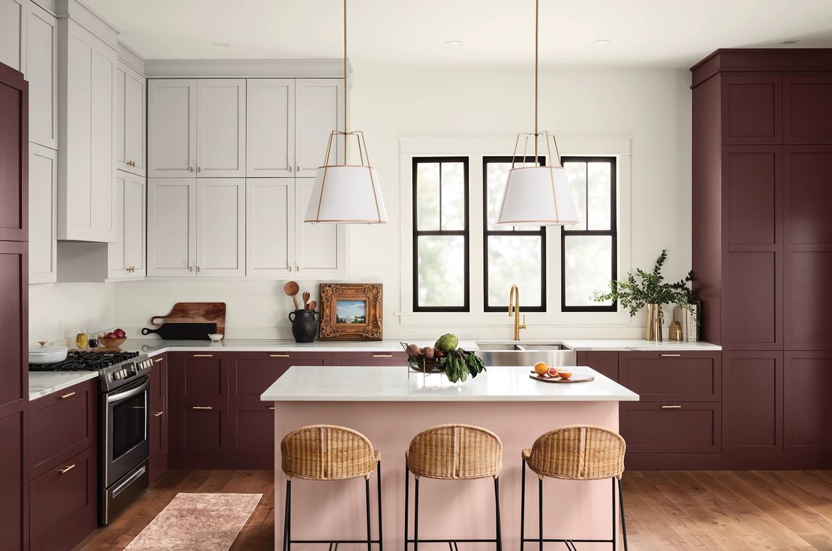
These Are The Top Kitchen Paint Colors For 2024

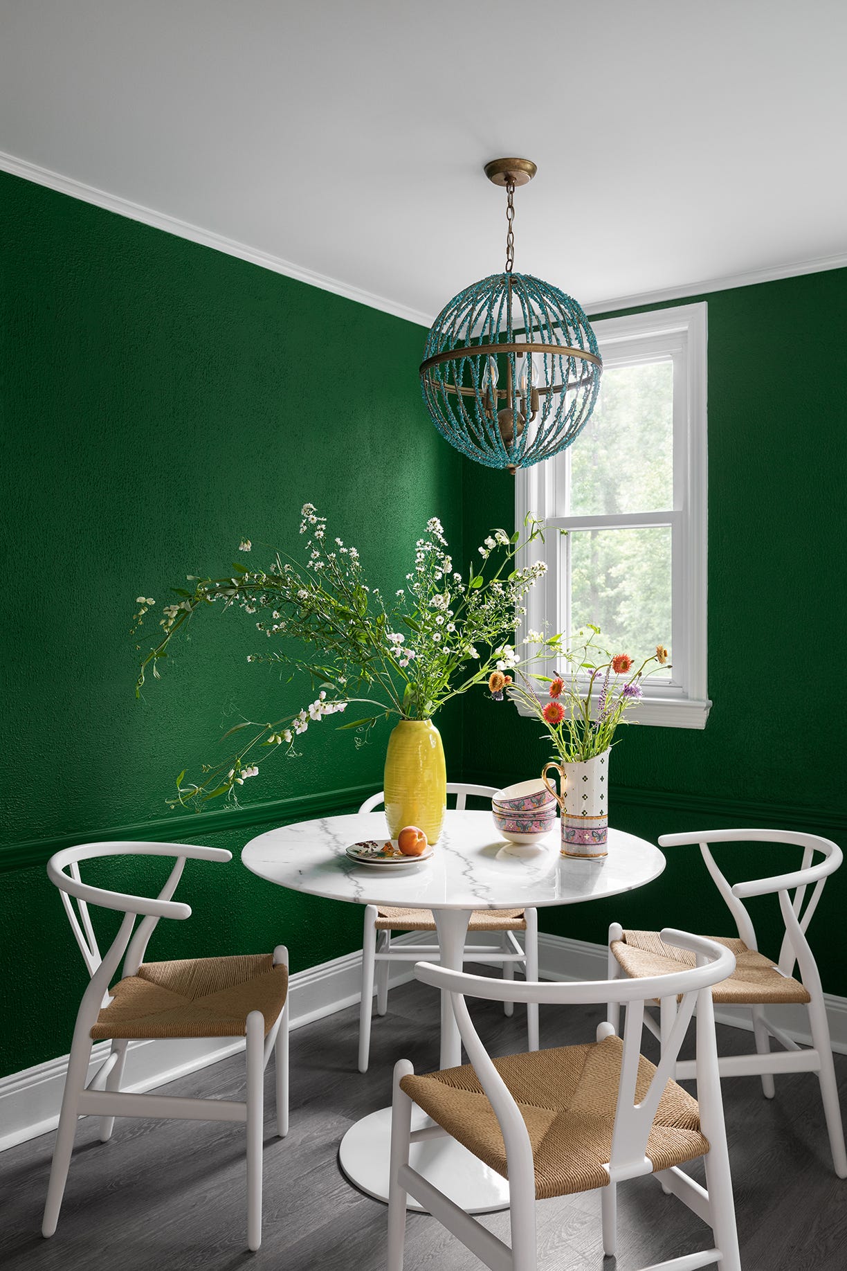
12 Trending Paint Colors for 2024, According to Design Experts
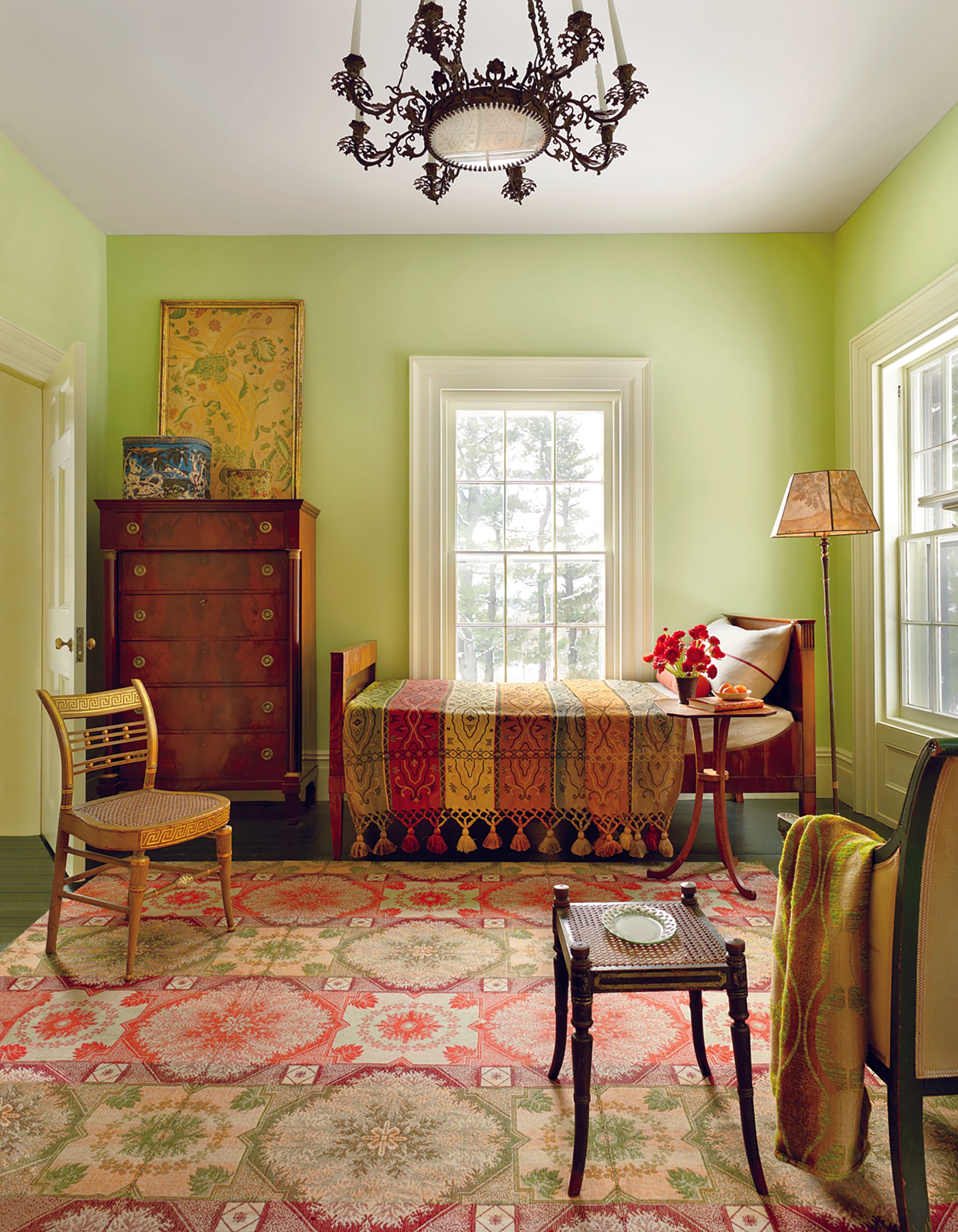
These Colors Will Be Everywhere in Interior Design in 2026

Trending Interior Paint Colors for Homes in 2025

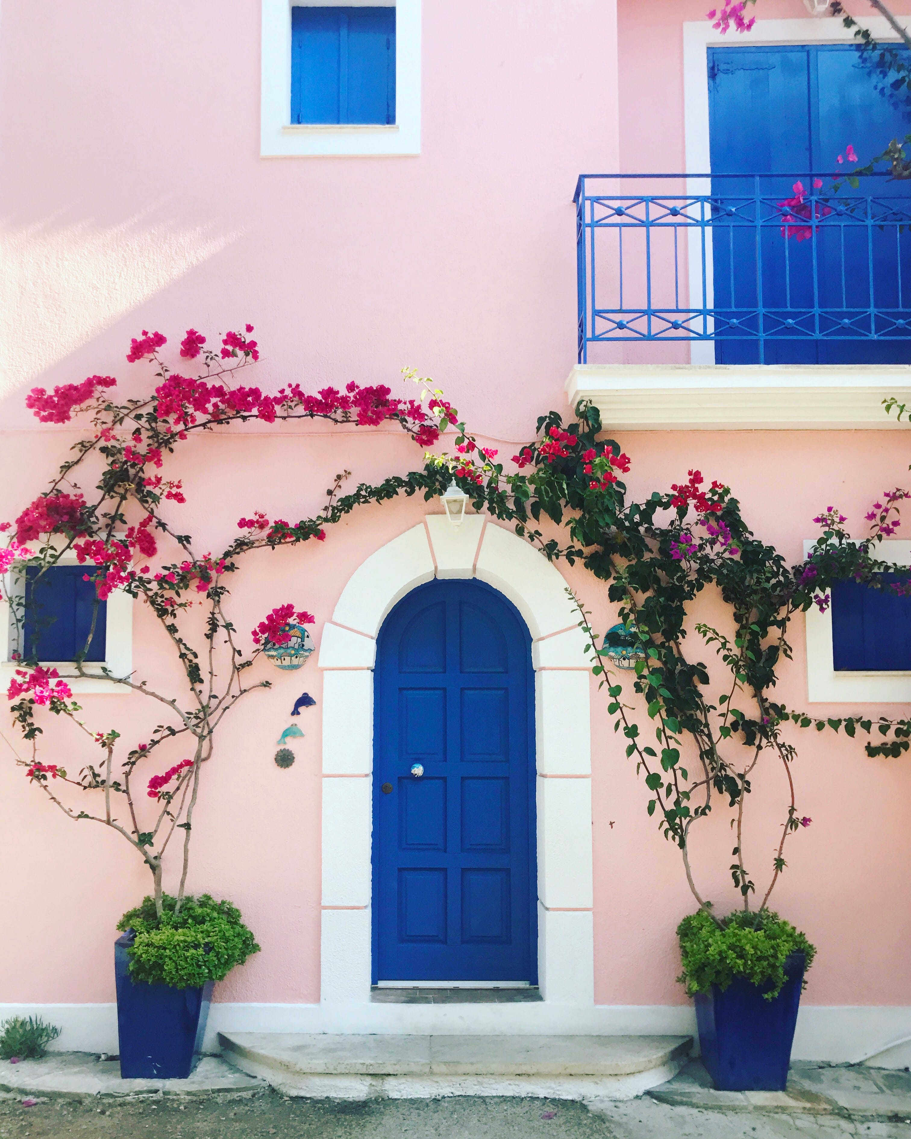
These 50 House Colors Are All the Rage in 2024

These 7 Colors Will Rule Interiors in 2026, According to Experts

7 Interior Paint Color Trends You'll See Everywhere In 2025
Here Are the Most Popular Bedroom Paint Colors for 2024

These 8 Colors Will Rule Interiors in 2026, According to Experts

These 20 Trendy Paint Colors Will Be Taking Over Walls In 2026
Interior paint colour trends 2025: 10 hues you'll be seeing everywhere this year

Interior Paint Colour Trends 2024: 14 influential shades to inspire our homes

Interior Designers Say These Decor Trends Will Be Everywhere in 2024
Every 2025 Color of the Year We Know So Far—and Inspiration for How to Use Each in Your Home