1/6
Designers Predict This Will Be The Biggest Paint Trend Of 2026
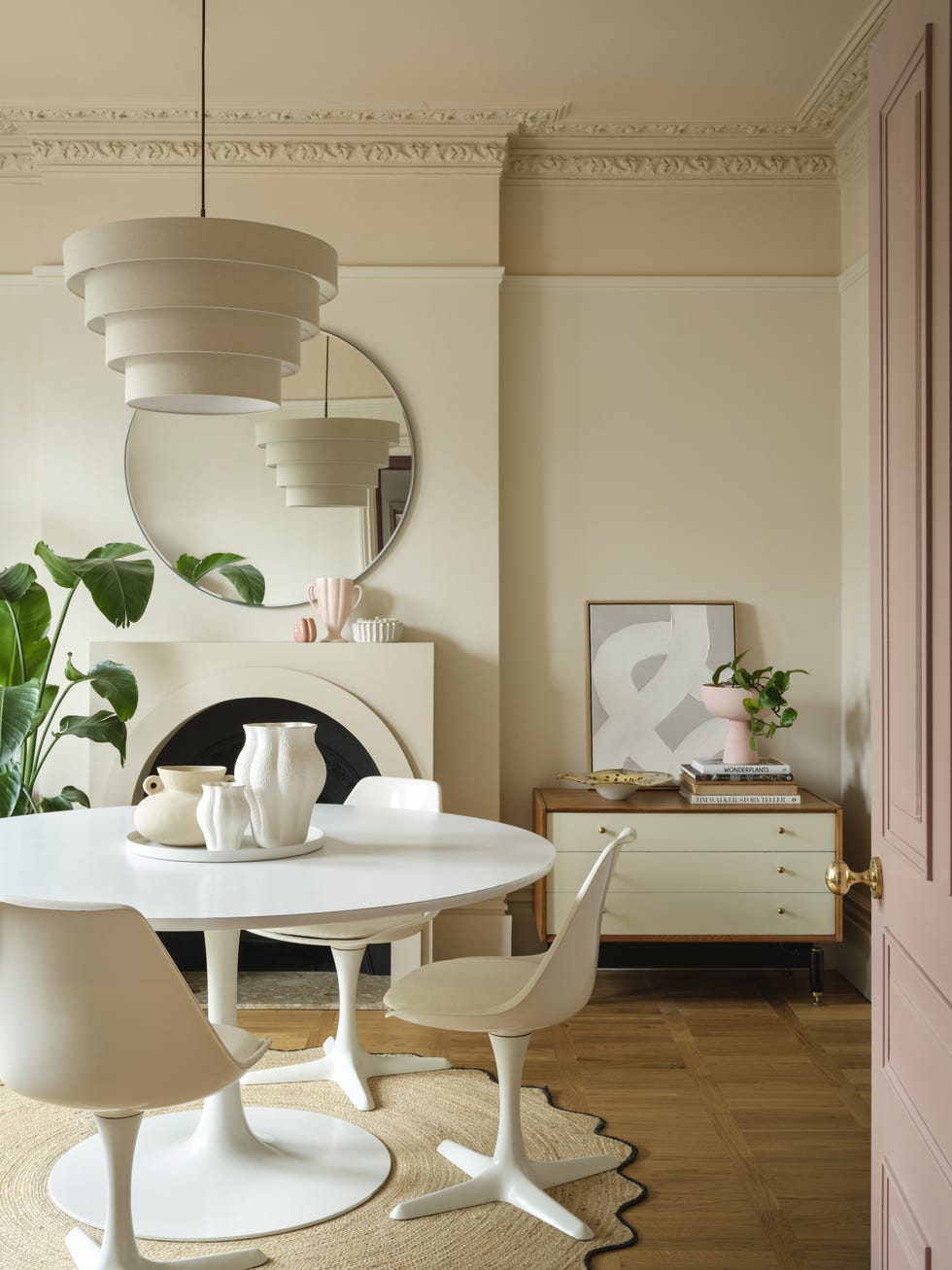
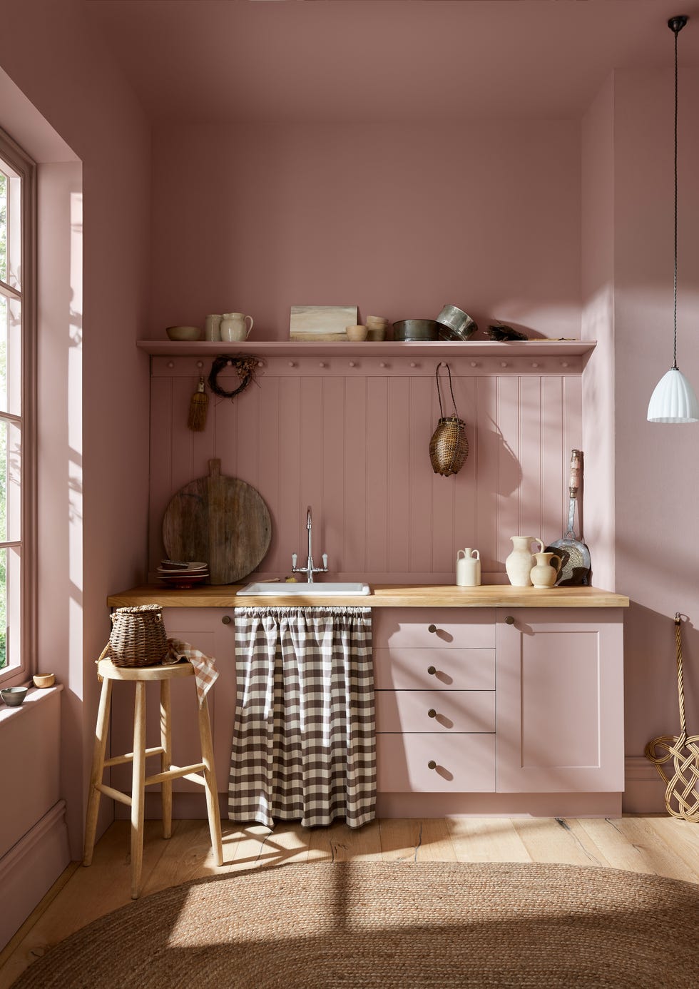
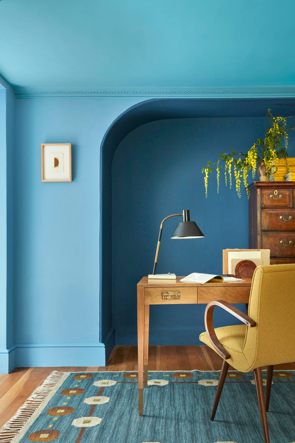
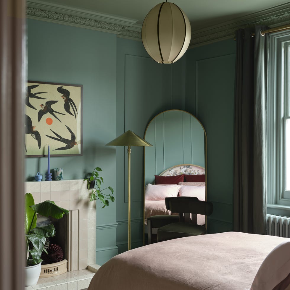
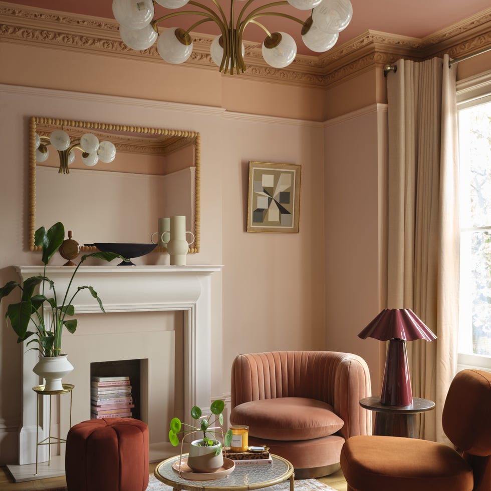
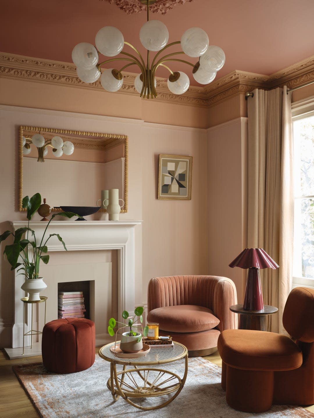
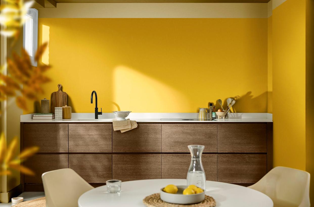
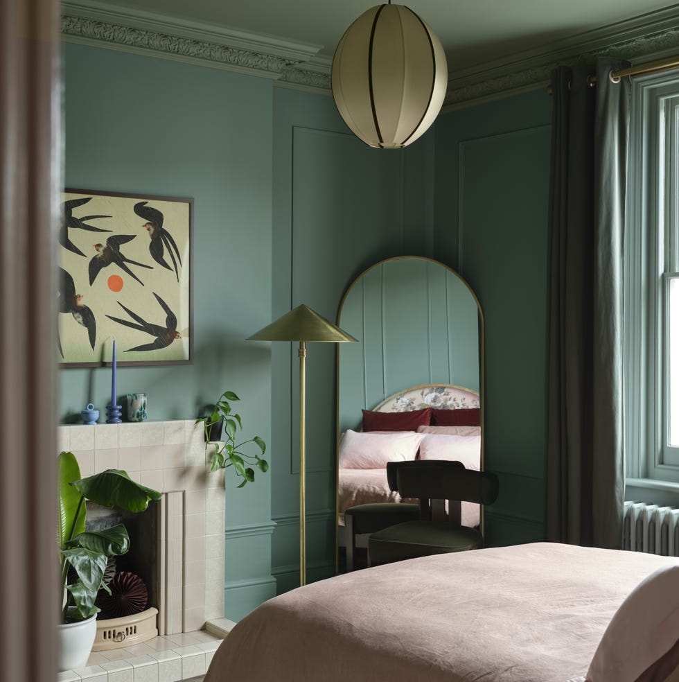
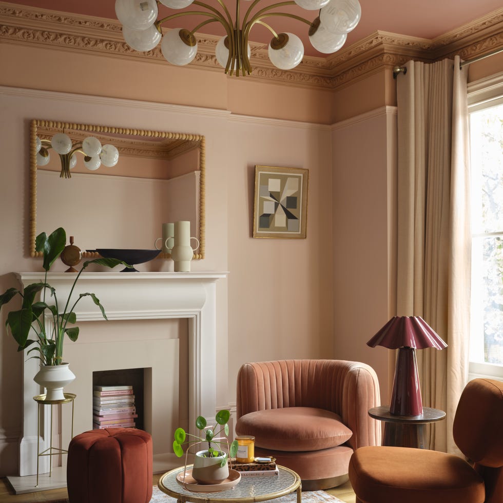
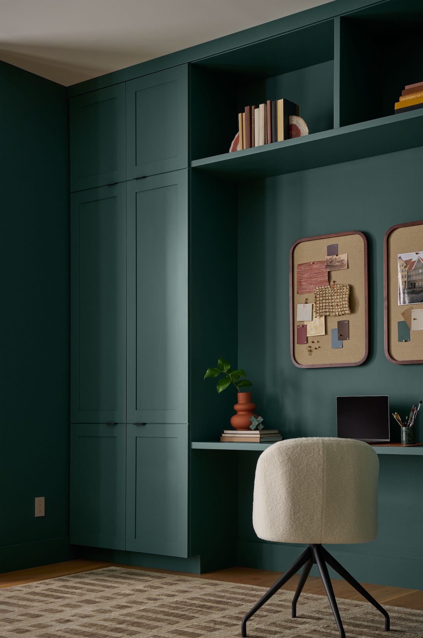
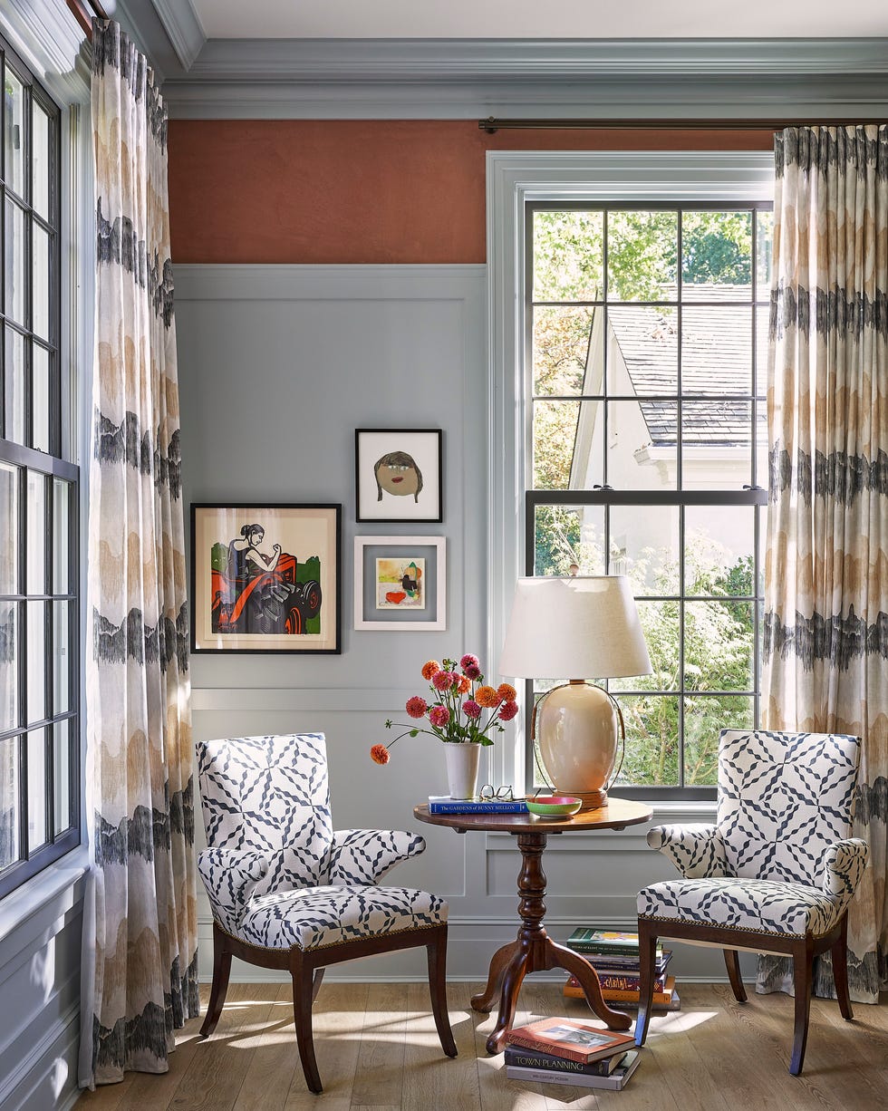
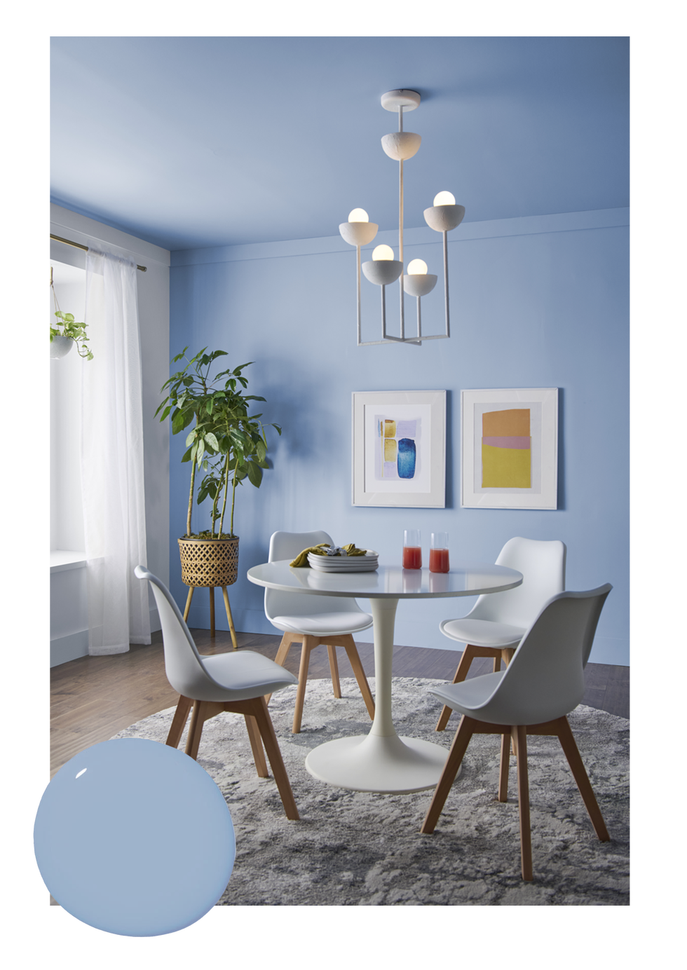
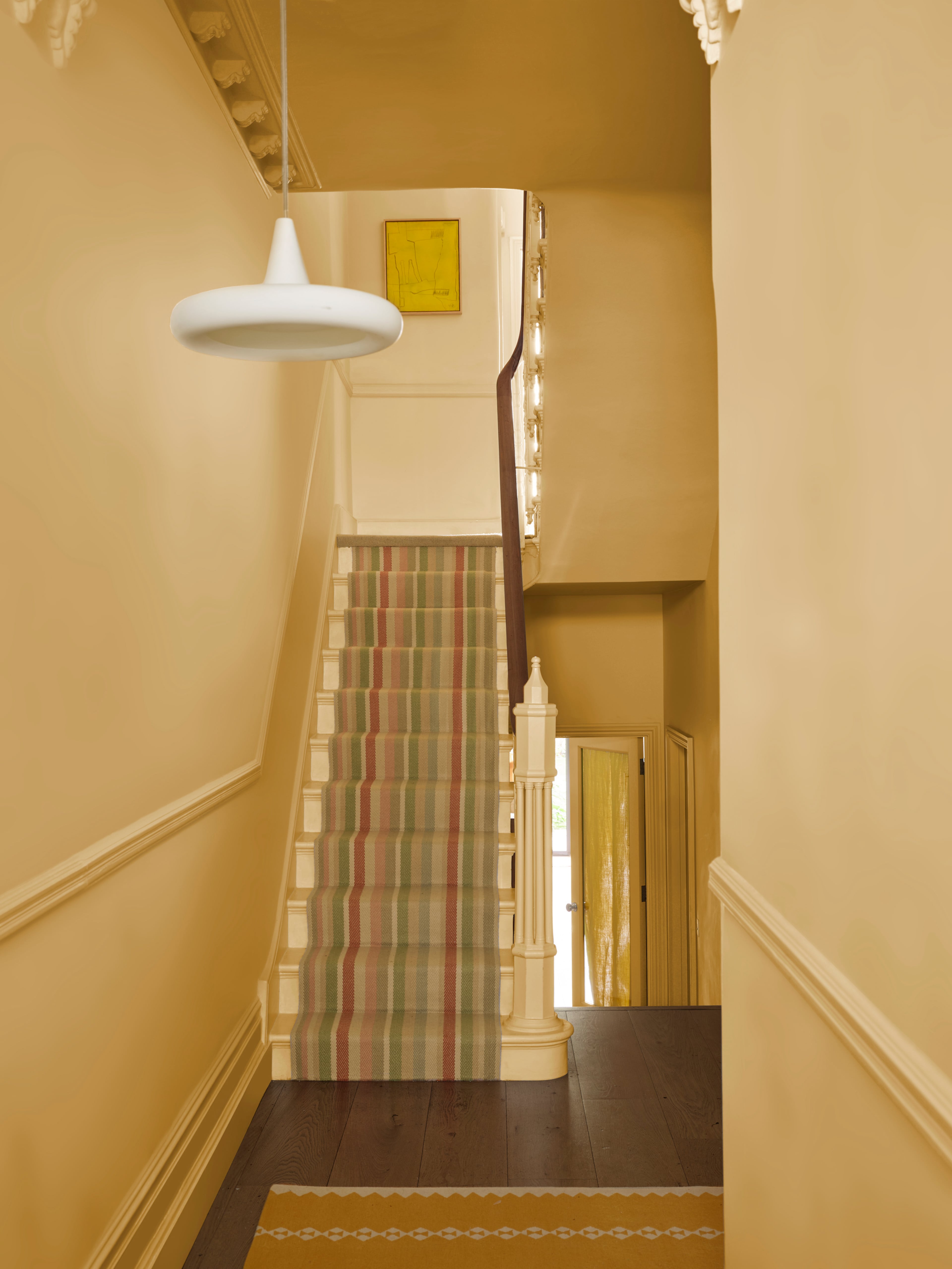
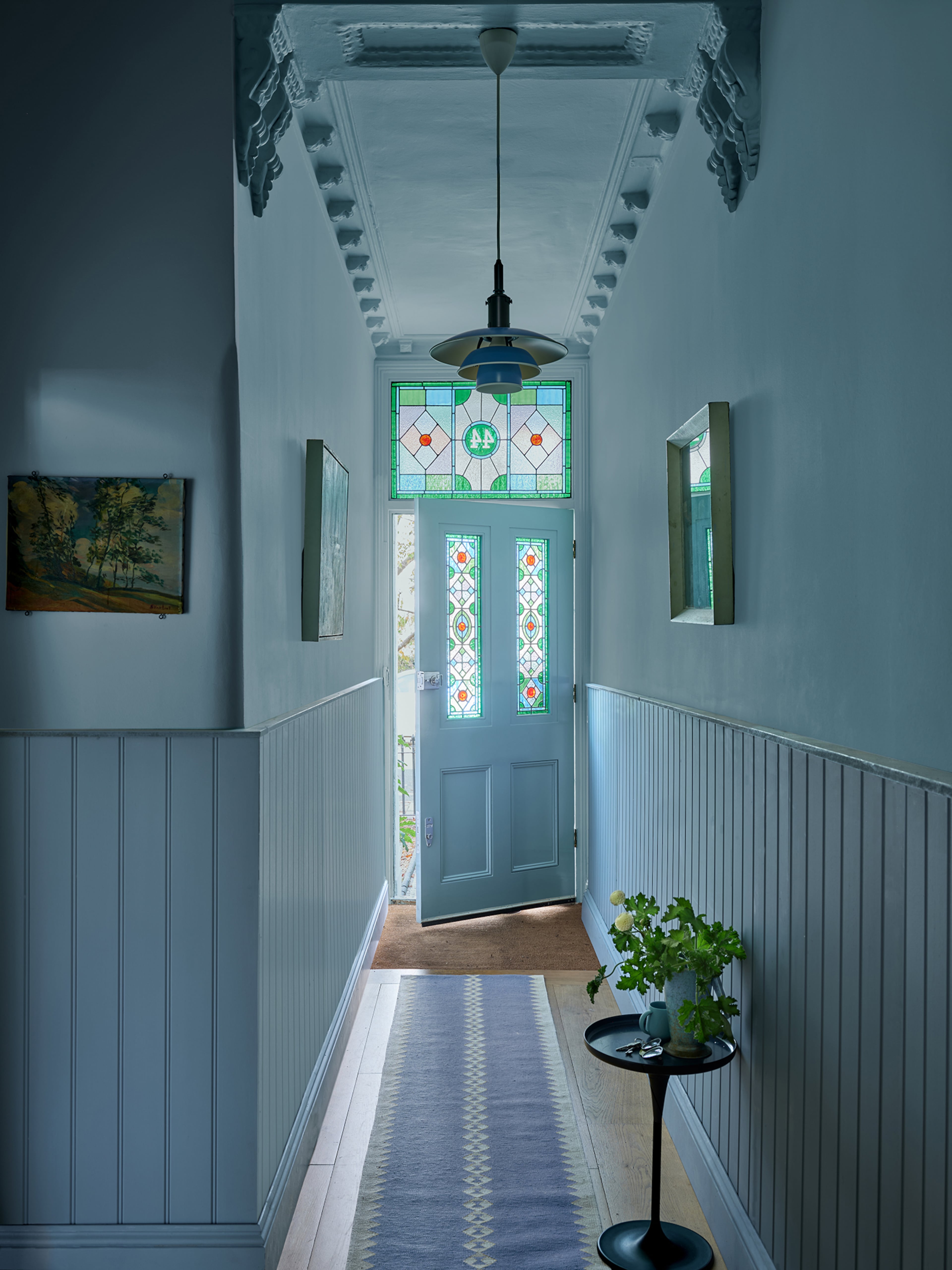
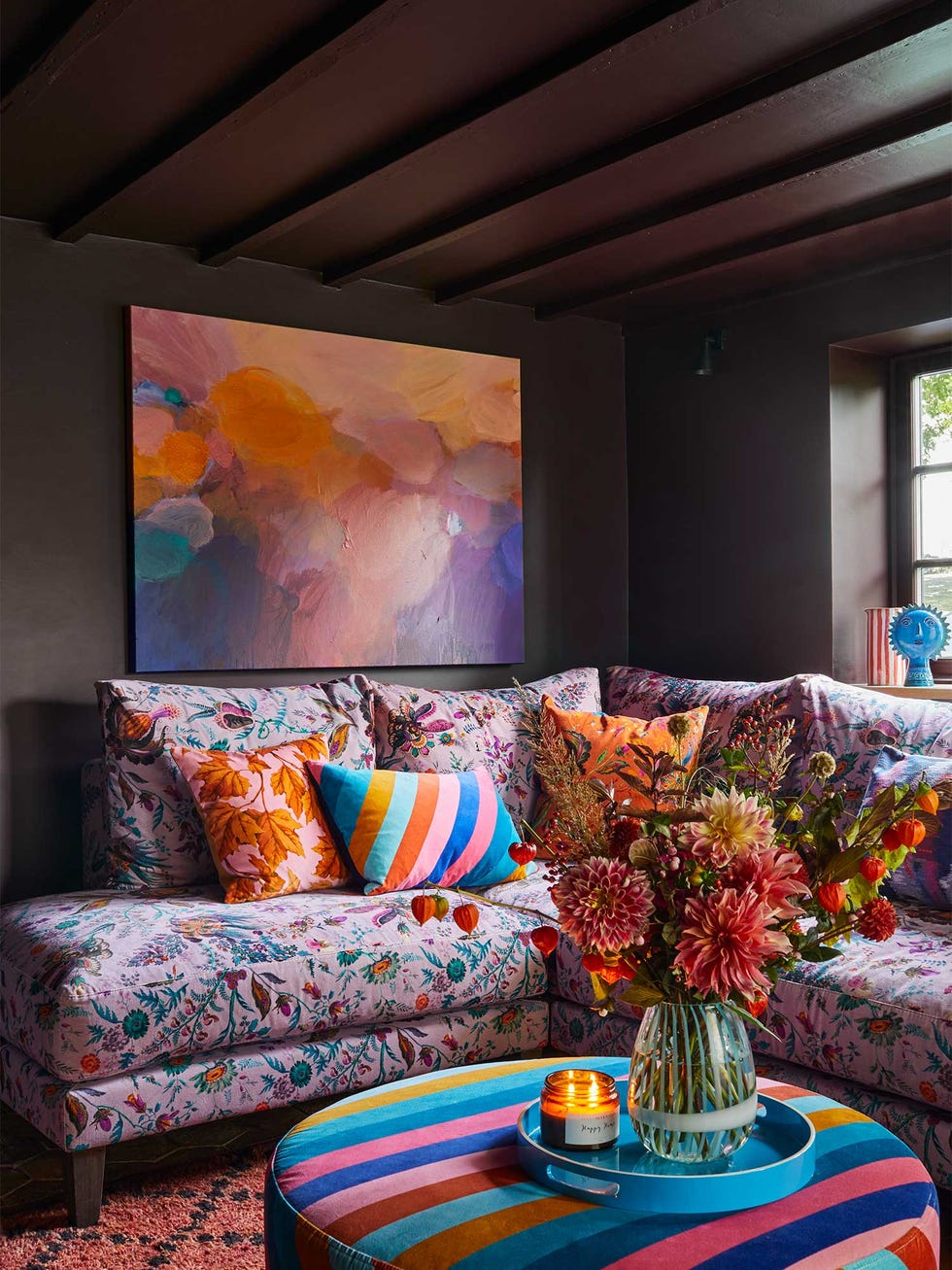
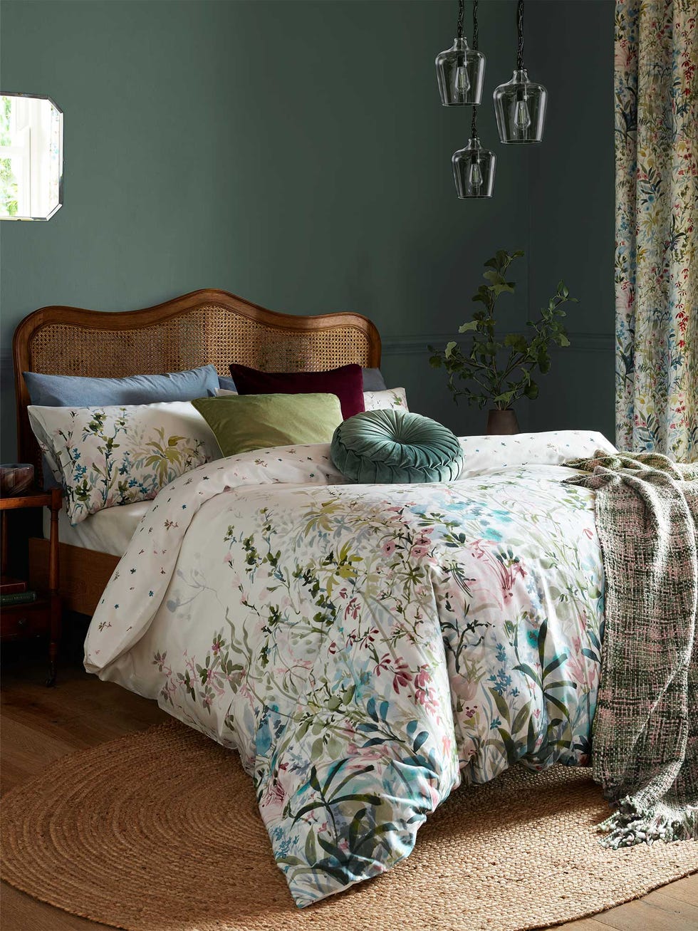
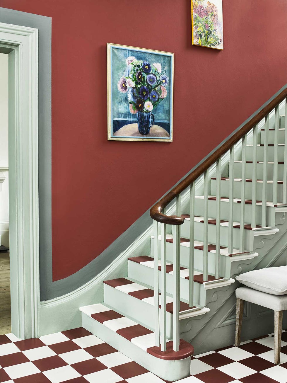
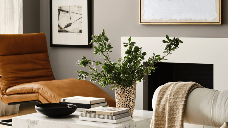
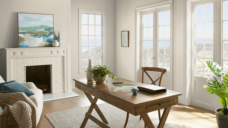
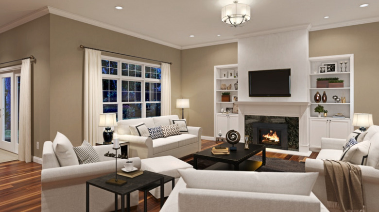
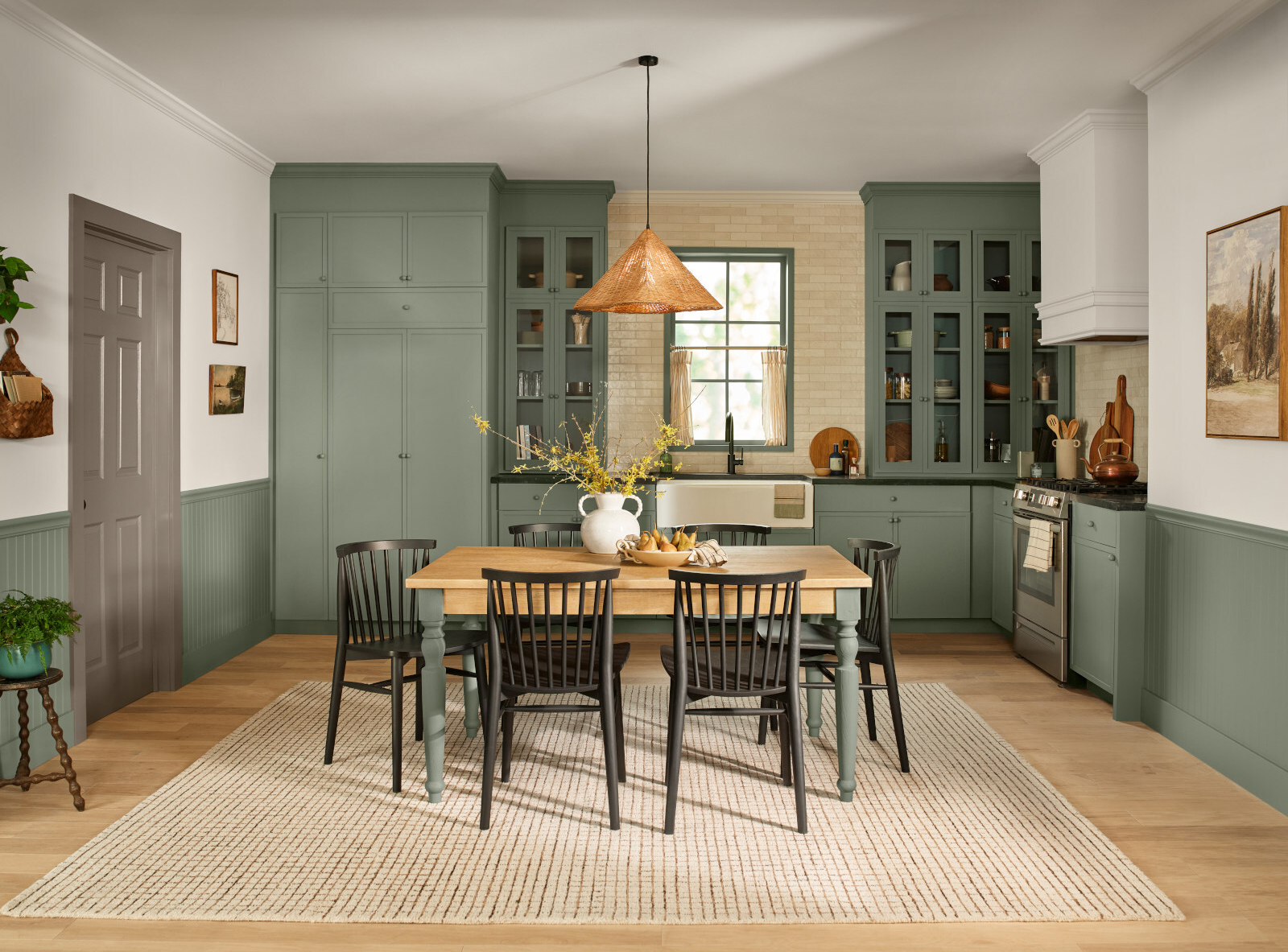
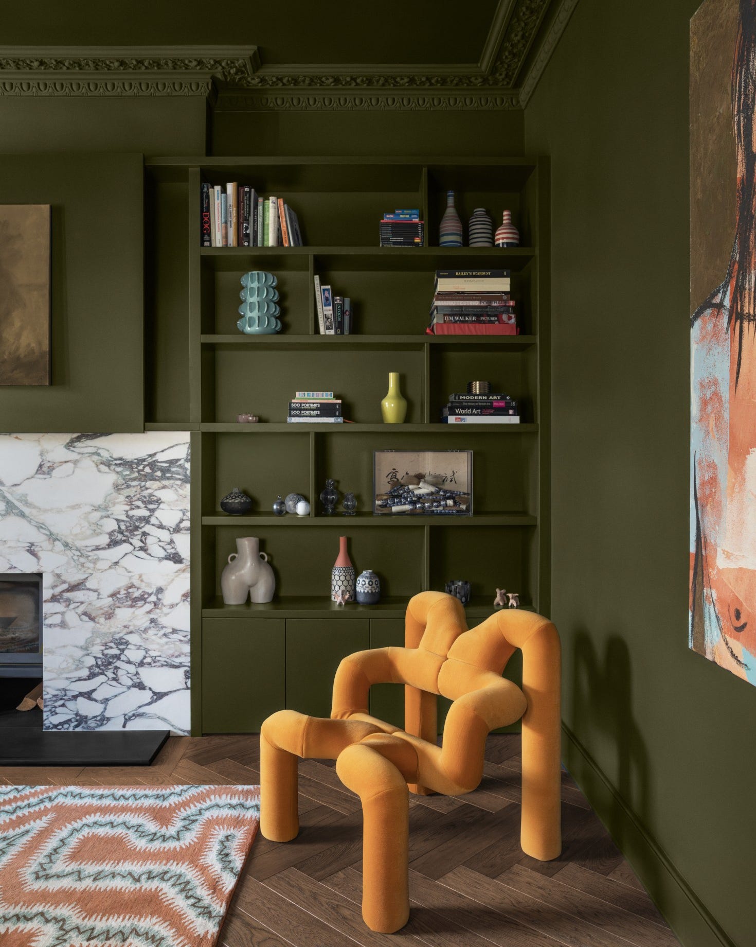
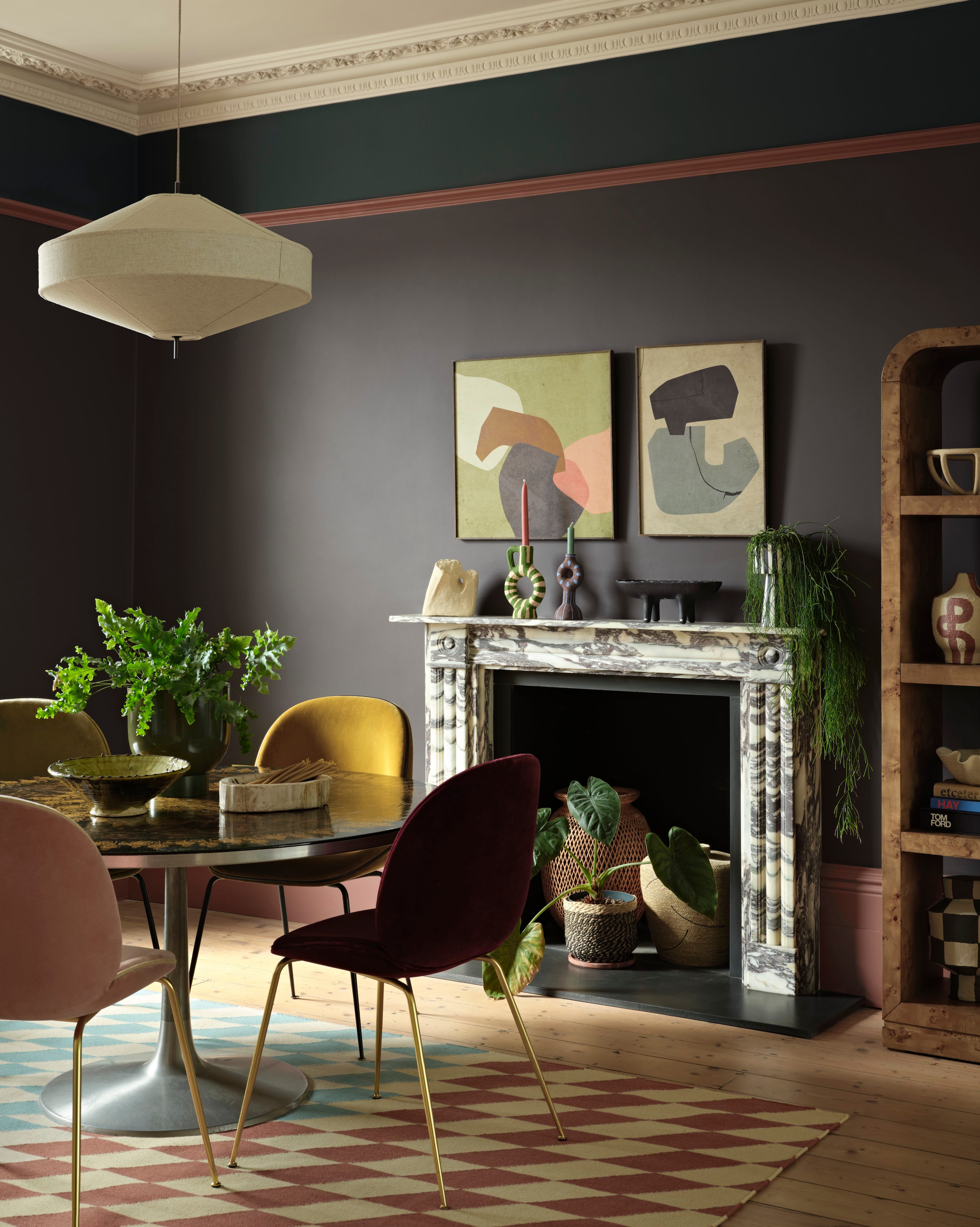
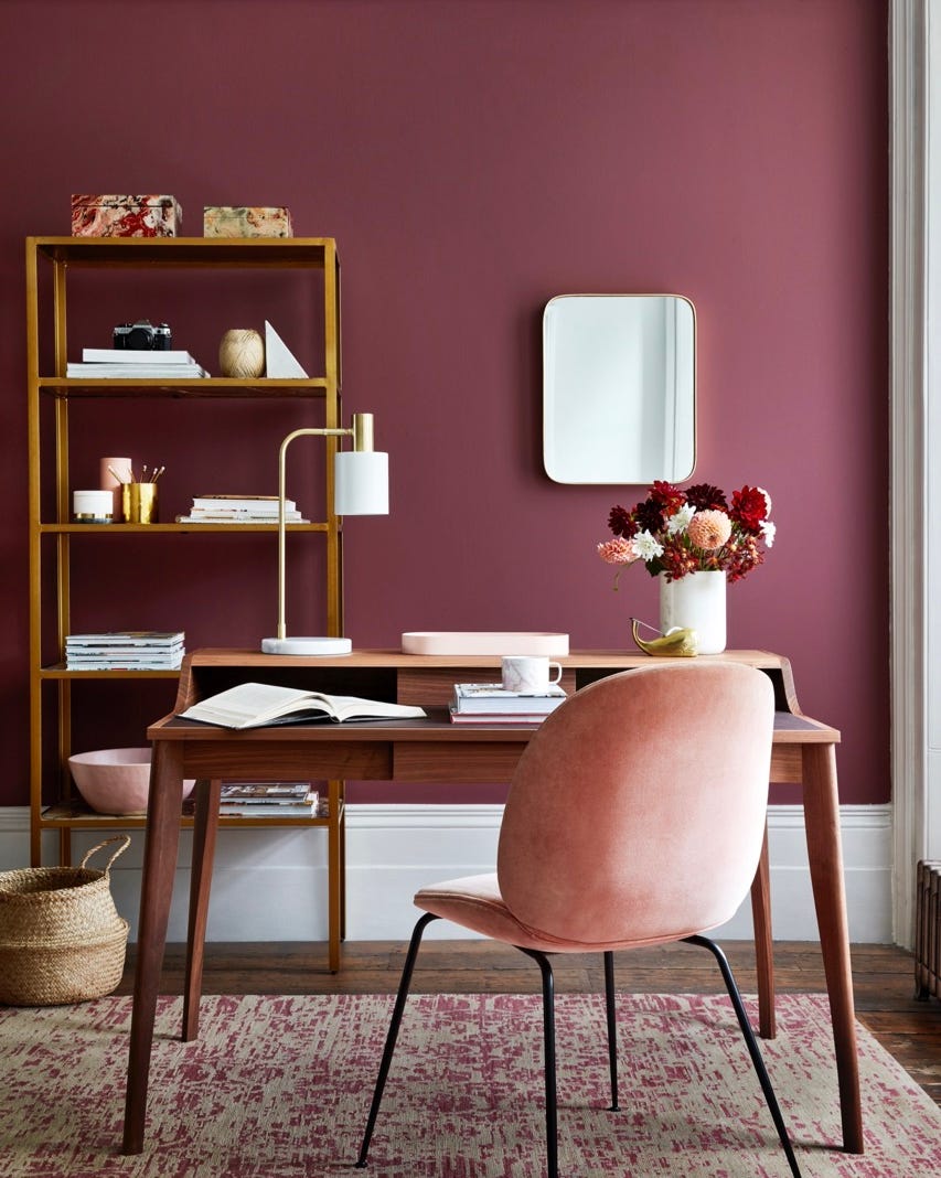
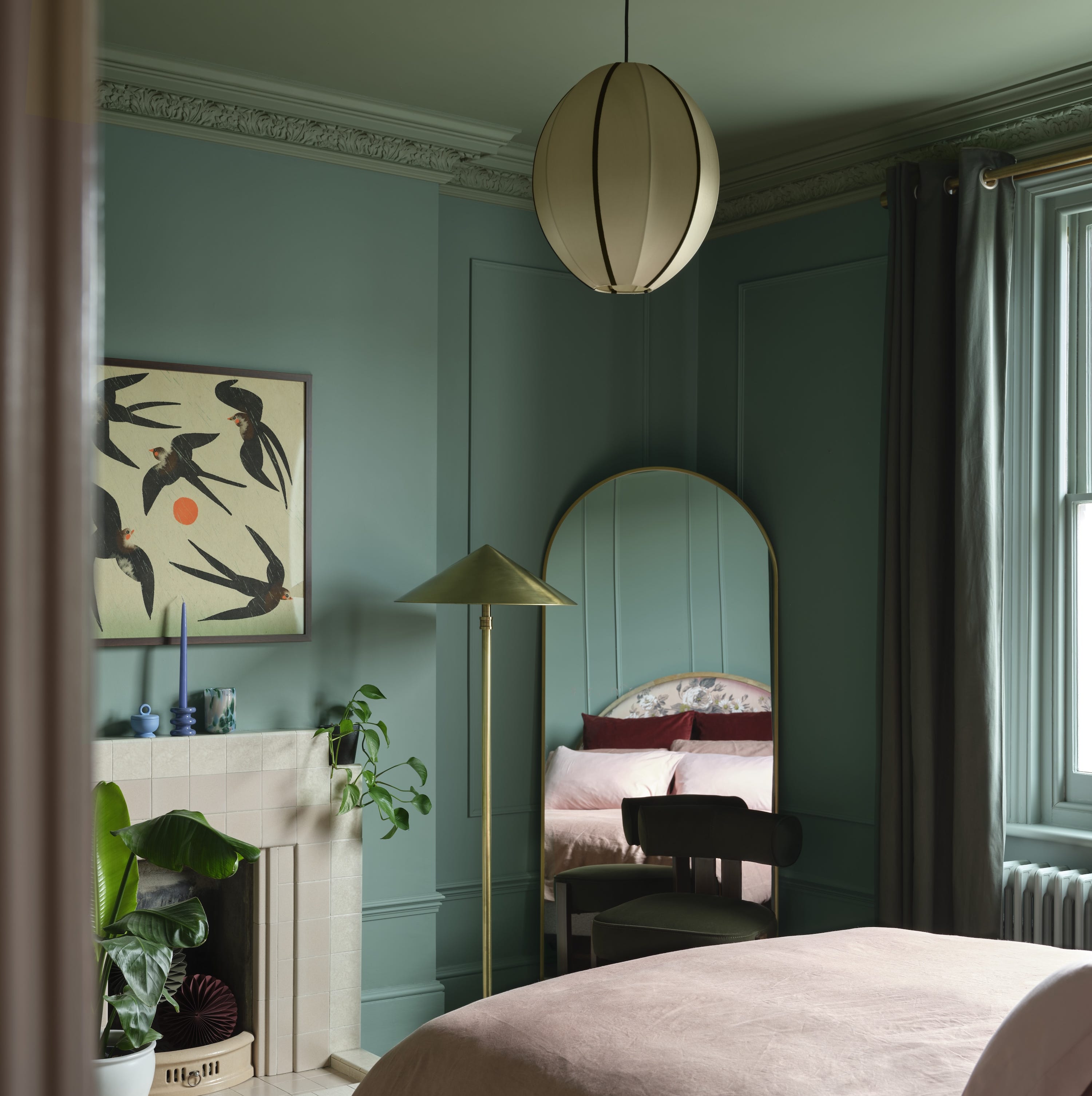
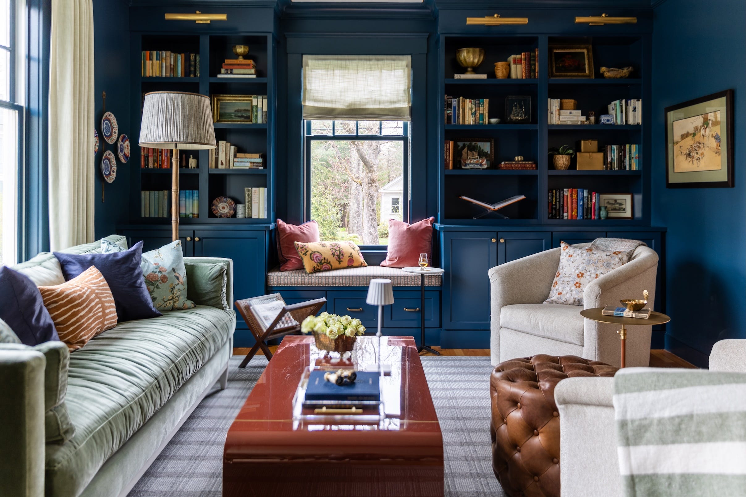
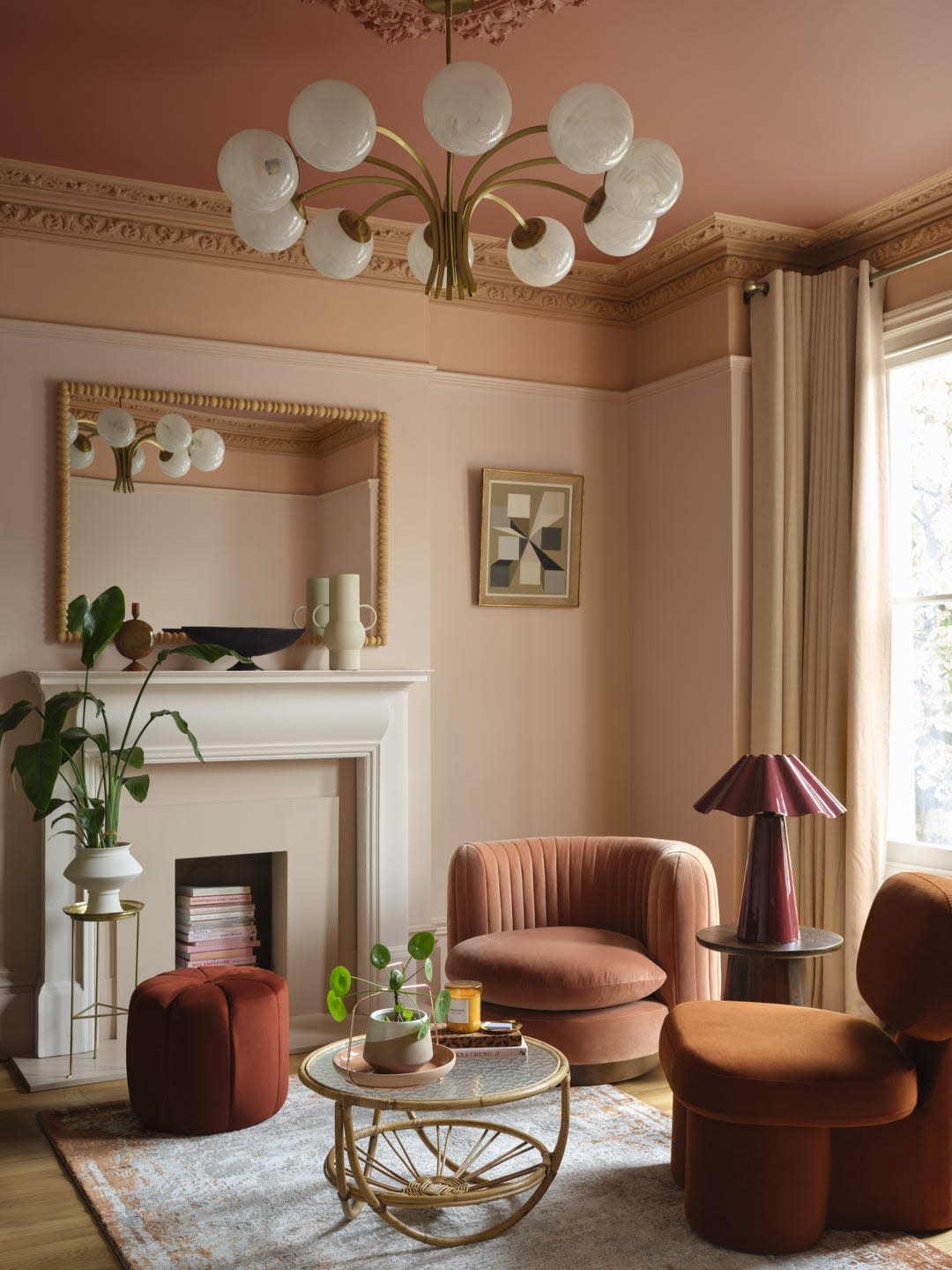
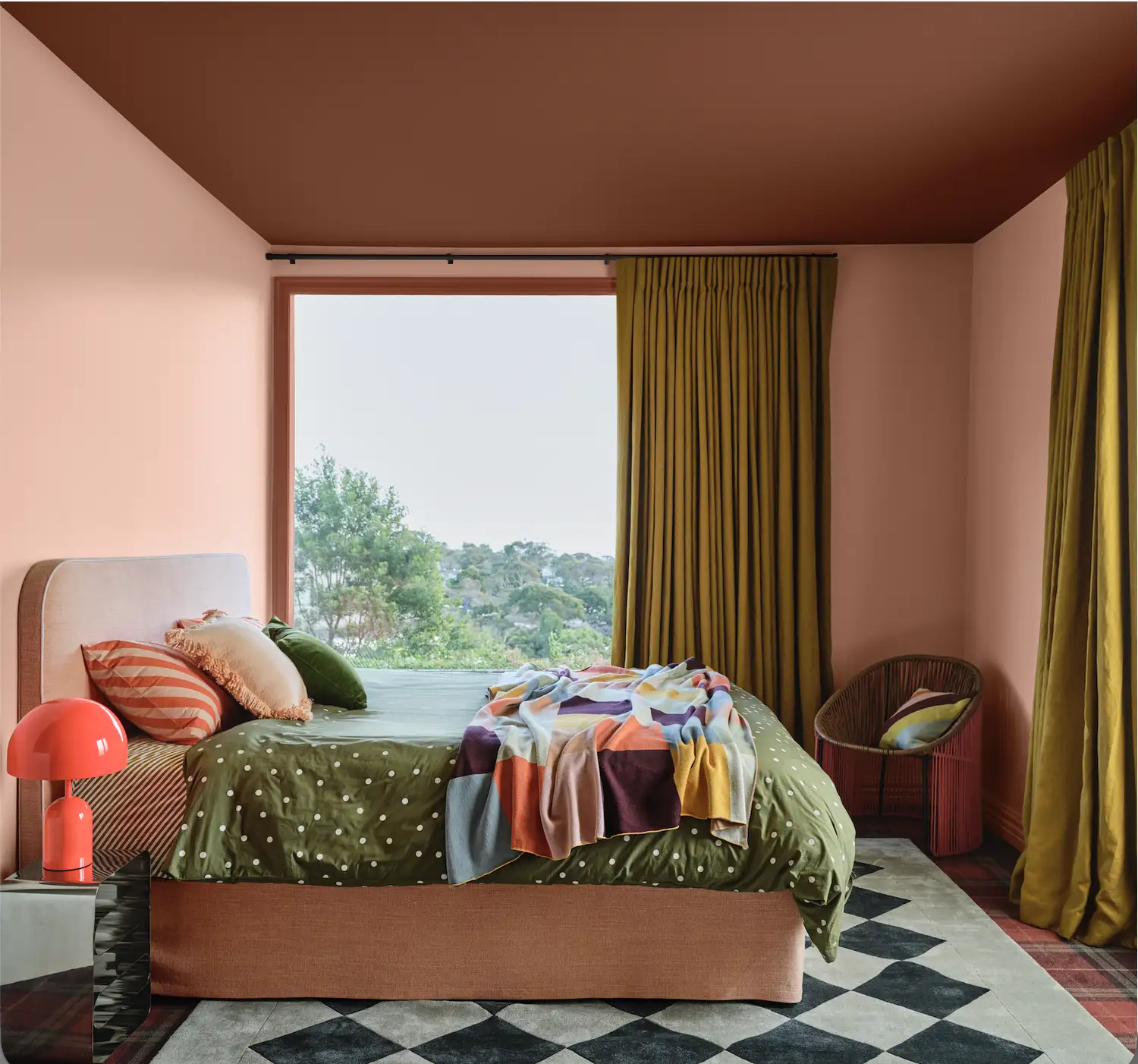
The article introduces 'colour capping' as the prominent paint trend for 2026, a technique that employs tonal washes to create a calm and cohesive atmosphere in homes. Colour capping involves using varying shades from the same color family across different surfaces of a room, including walls and ceilings, to achieve a soft gradient effect that intensifies towards the ceiling. Helen Shaw, director of marketing at Benjamin Moore, describes it as a clever way to refresh a home and achieve a designer look by transforming the room's atmosphere and proportions. Charlotte Broadribb, a colour consultant at Yinteriors, highlights that this technique helps balance and proportion colours while creating the perception of increased room height.
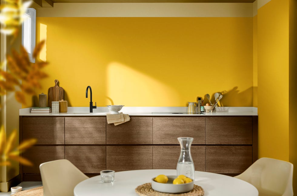
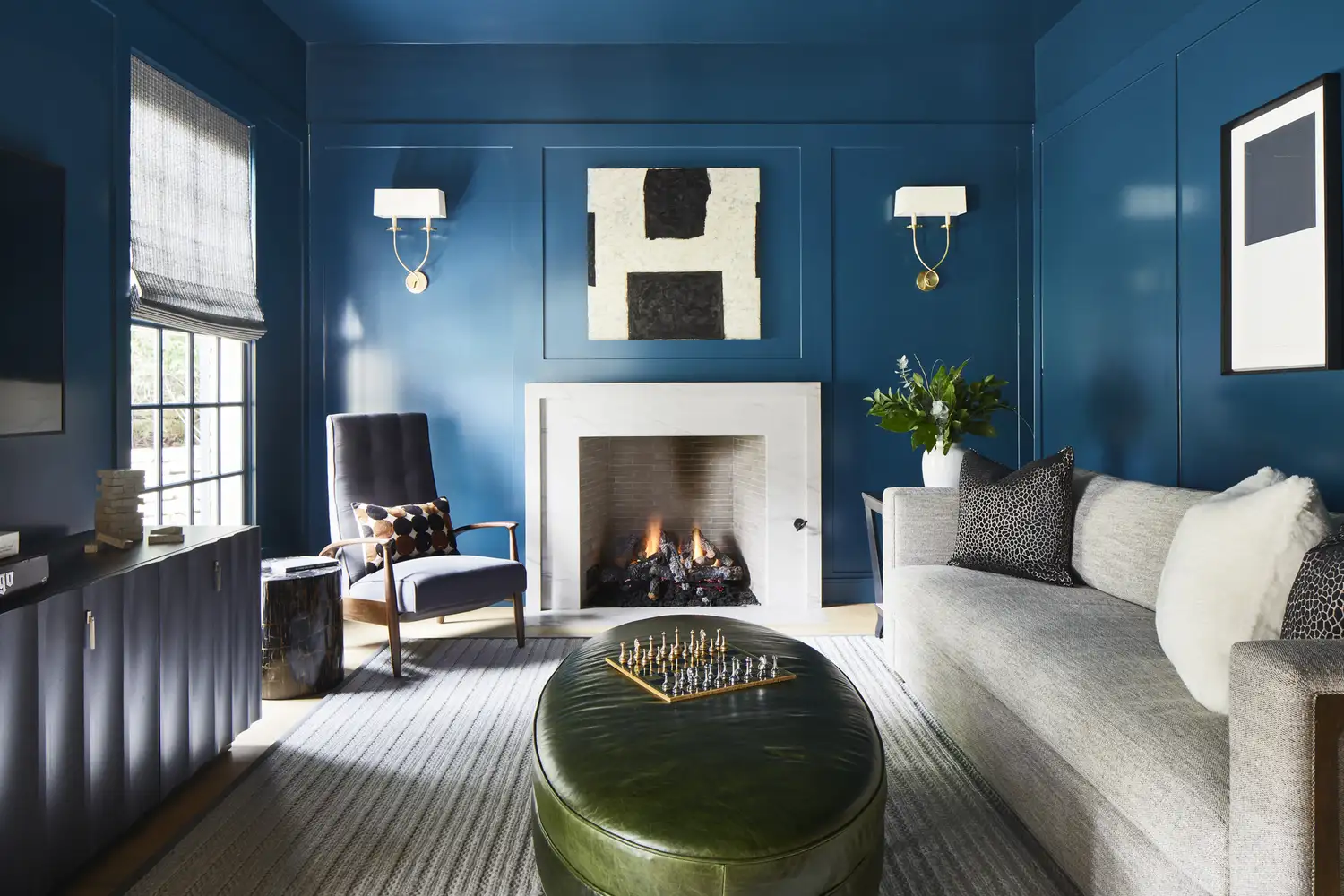
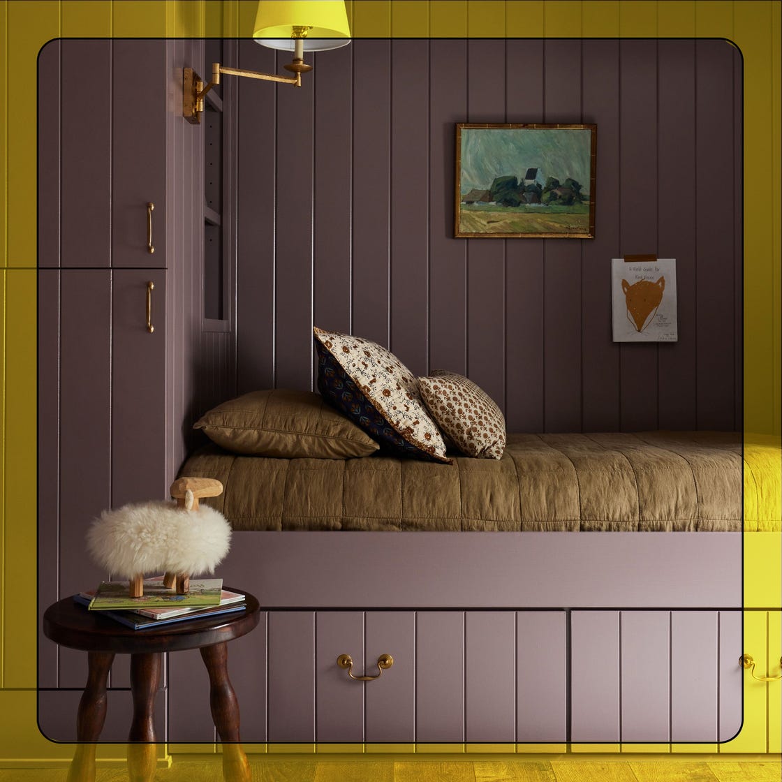
Colour capping is differentiated from other popular painting techniques like 'colour drenching' and 'double drenching.' Unlike colour drenching, which involves covering every surface in a single shade, colour capping layers tones from the same color family for a soft, intensifying gradient. Double drenching, conversely, uses two or more colors from the same palette on all available surfaces, focusing on contrast and saturation, whereas colour capping emphasizes tonal harmony and balance with a softer and more refined aesthetic.
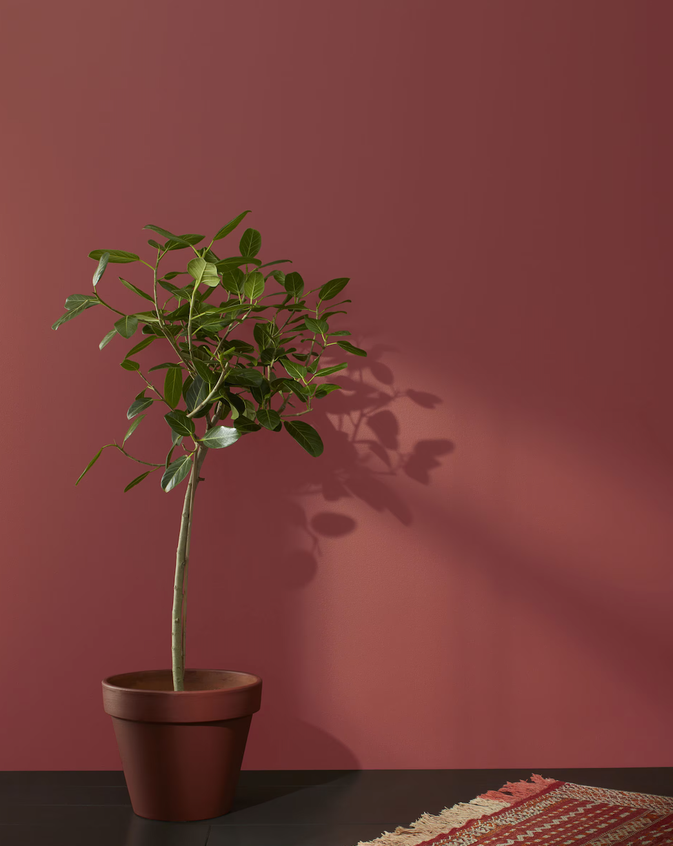
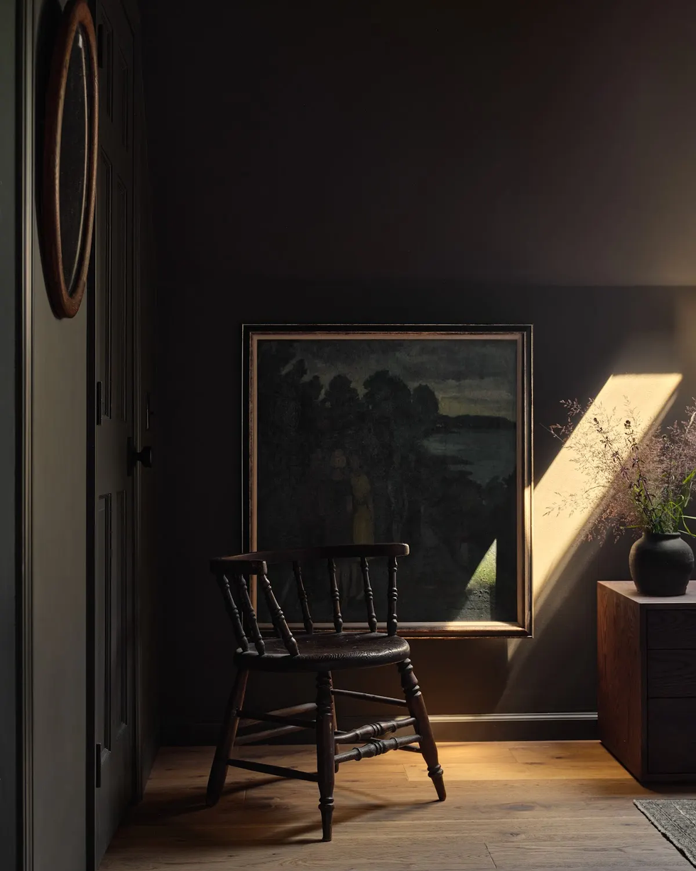
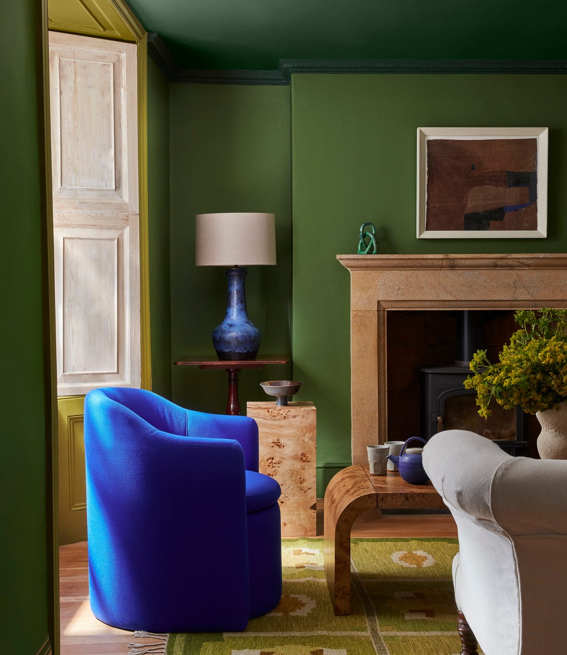
To enhance the visual appeal of colour capping, varying paint finishes between walls and ceilings is recommended. Helen Shaw suggests using a higher sheen level on the ceiling to reflect light, adding drama and incorporating the 'fifth wall' into the overall design. This approach results in a dynamic and sophisticated finish, characterized by a gentle interplay of light, depth, and tone. The technique can be subtly applied with neutrals, such as an off-white wall capped with a slightly more saturated hue, or used with bolder jewel tones and warming autumnals for a cocooning effect.
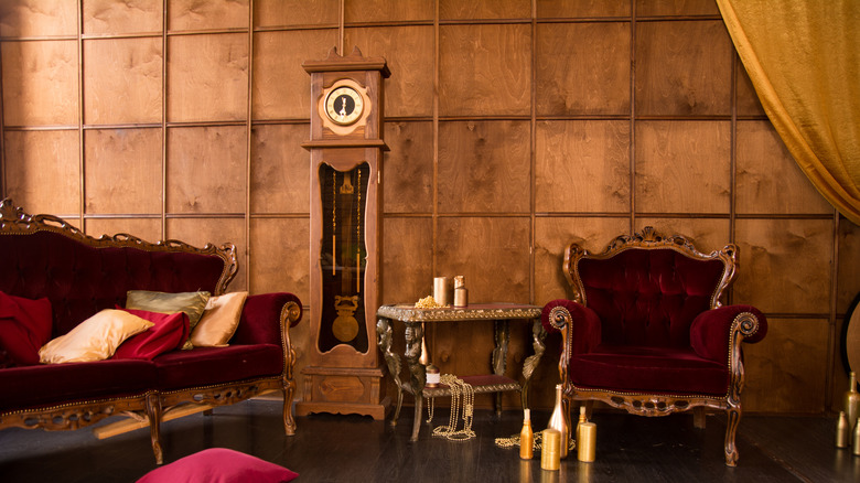
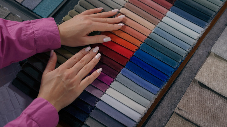
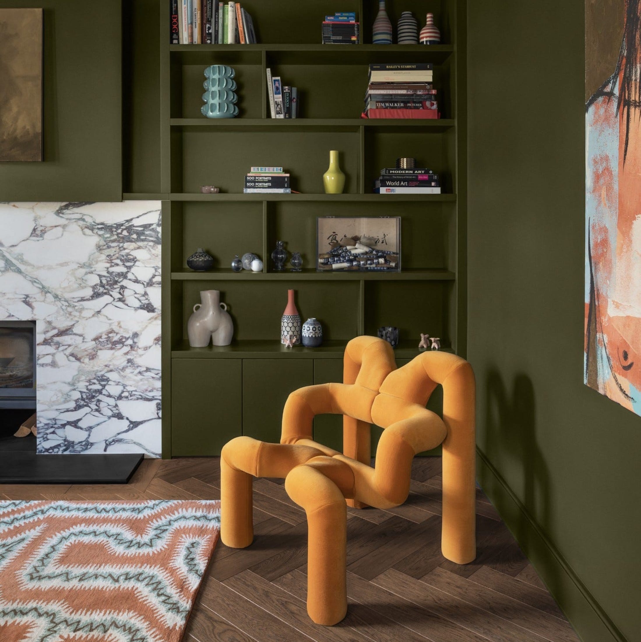
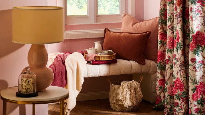
When decorating with colour capping, the chosen paint tones for walls and ceilings should be extended to upholstery and soft furnishings to create a layered and harmonious look. Magdalena Gierasinska of Barker and Stonehouse advises mirroring the ceiling's deeper tone in furniture pieces like velvet sofas or armchairs, with lighter shades for rugs and curtains to maintain balance. Shelley Cochrane of Furniture Village adds that decorative accents, such as lighting or cushions, should complement the color scheme, ensuring a considered and cohesive space where metallic fixtures and wooden furniture provide texture without overwhelming the design.
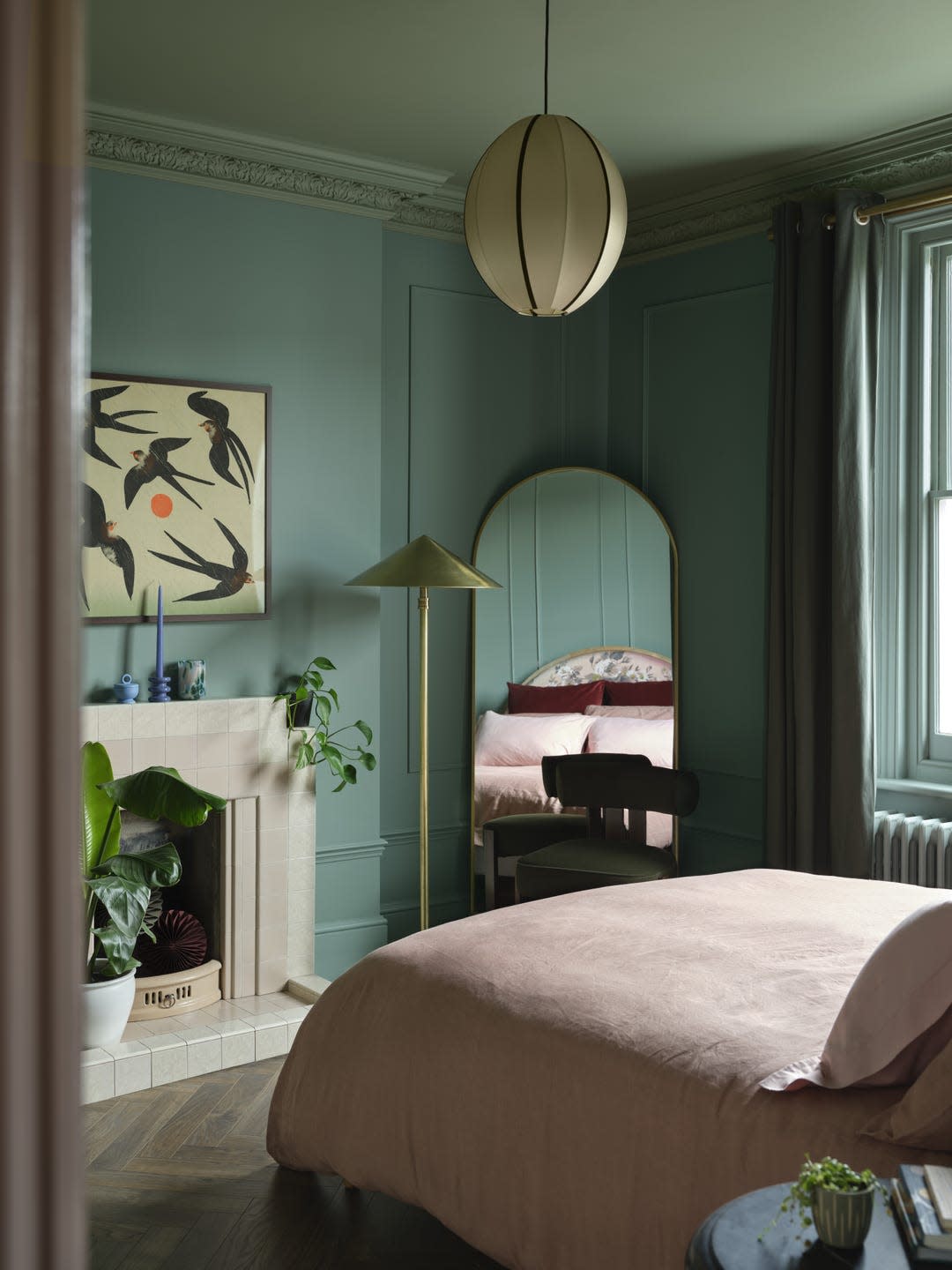
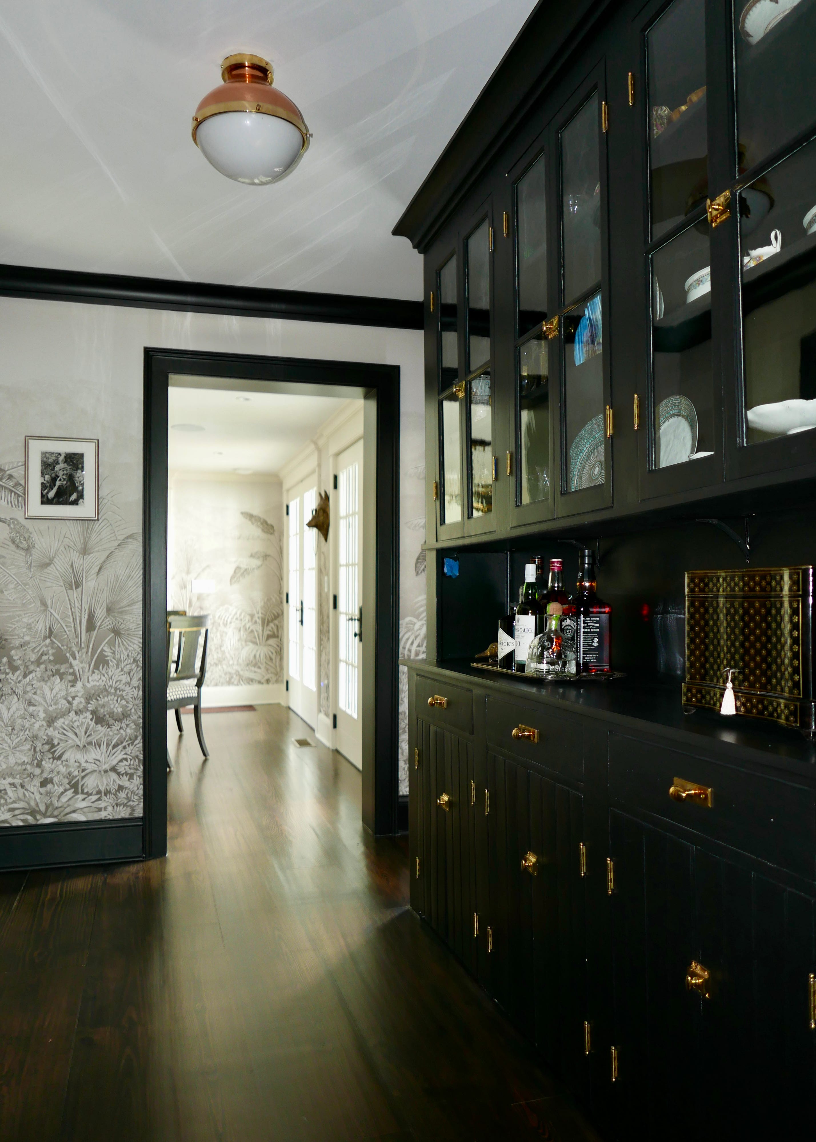
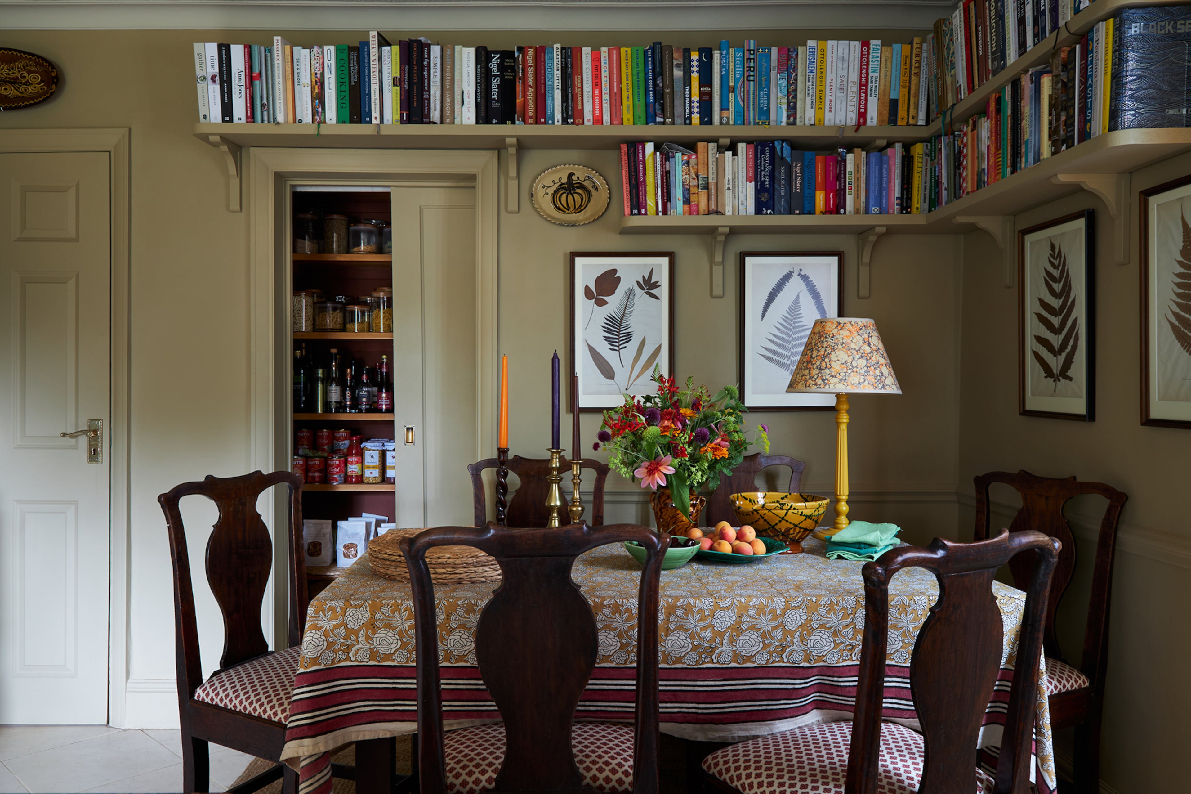
Colour capping's versatility makes it suitable for both period homes and modern interiors. In older properties, it can accentuate architectural details like cornices and picture rails, while in contemporary spaces, it adds depth and warmth. The technique is particularly effective in larger rooms like living rooms and bedrooms, especially when aiming for a peaceful ambiance. Natural greens, blues, and creams are noted as colors that particularly enhance this sense of calm. However, Charlotte Broadribb cautions against using colour capping in already dark rooms, those with low ceilings, small windows, or limited space, as it can make these areas feel even smaller. In such cases, incorporating accessories in coordinating shades is suggested as a softer alternative to achieve a similar cohesive feel without reducing visual space.
#InteriorDesign #PaintTrends #ColorCapping #HomeDecor #PaintTechniques #TonalDecor #ArchitecturalFeatures #BenjaminMoore #Yinteriors #InteriorDesign #PaintTrends #ColorCapping #HomeDecor #PaintTechniques #TonalDecor #ArchitecturalFeatures #BenjaminMoore #Yinteriors
0 comment in total
 No comments yet
You may also like
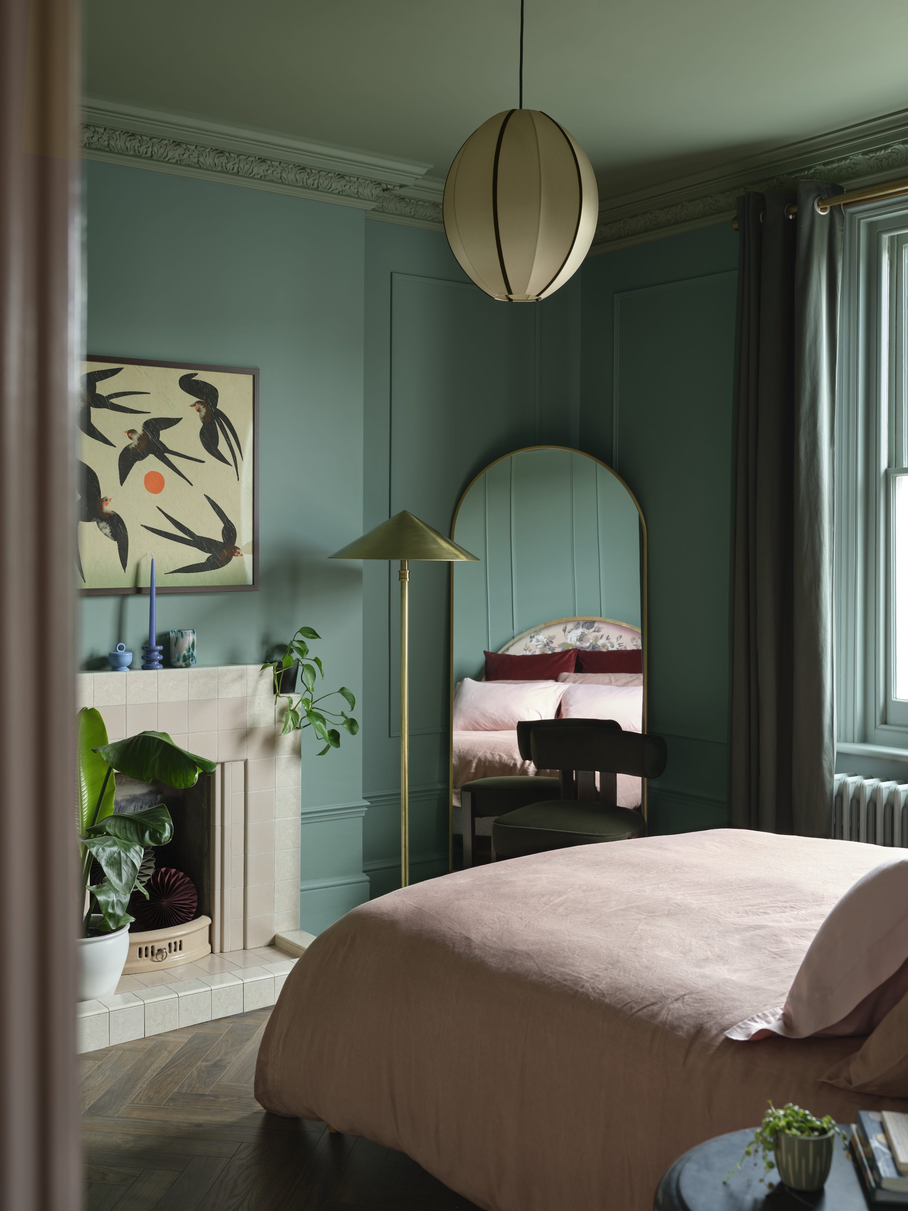
Interiors experts predict this will be the biggest paint trend of 2026


The #1 Paint Color Trend of 2025, According to Designers

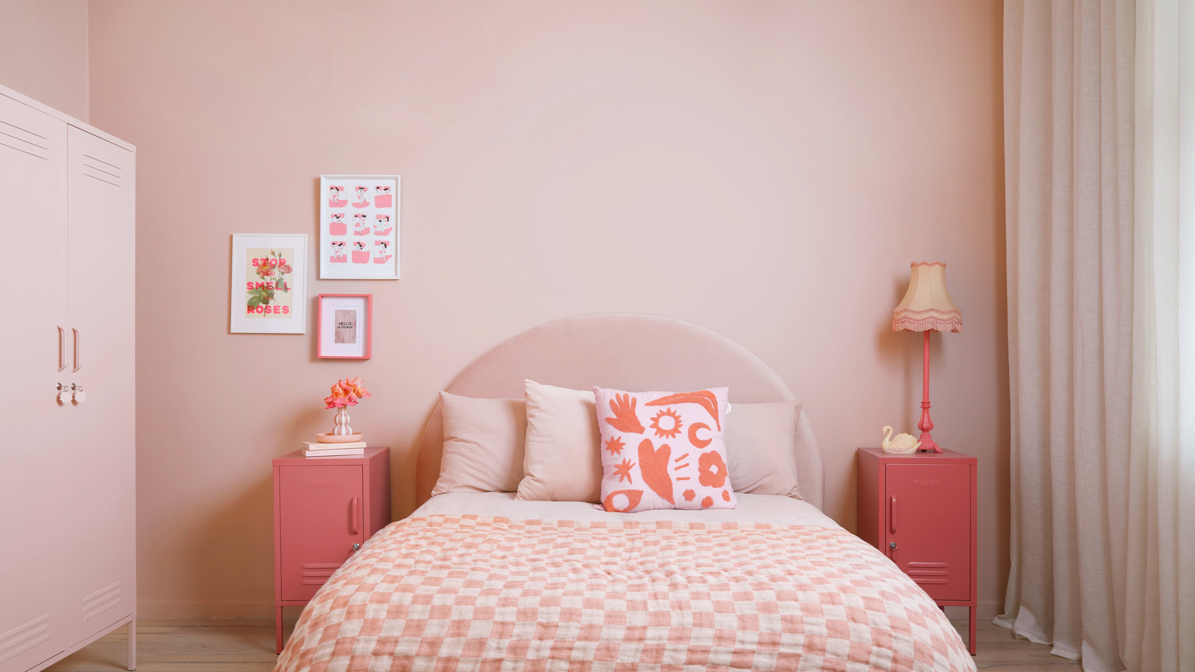
Bold, edgy color drenching is going to be big in 2024
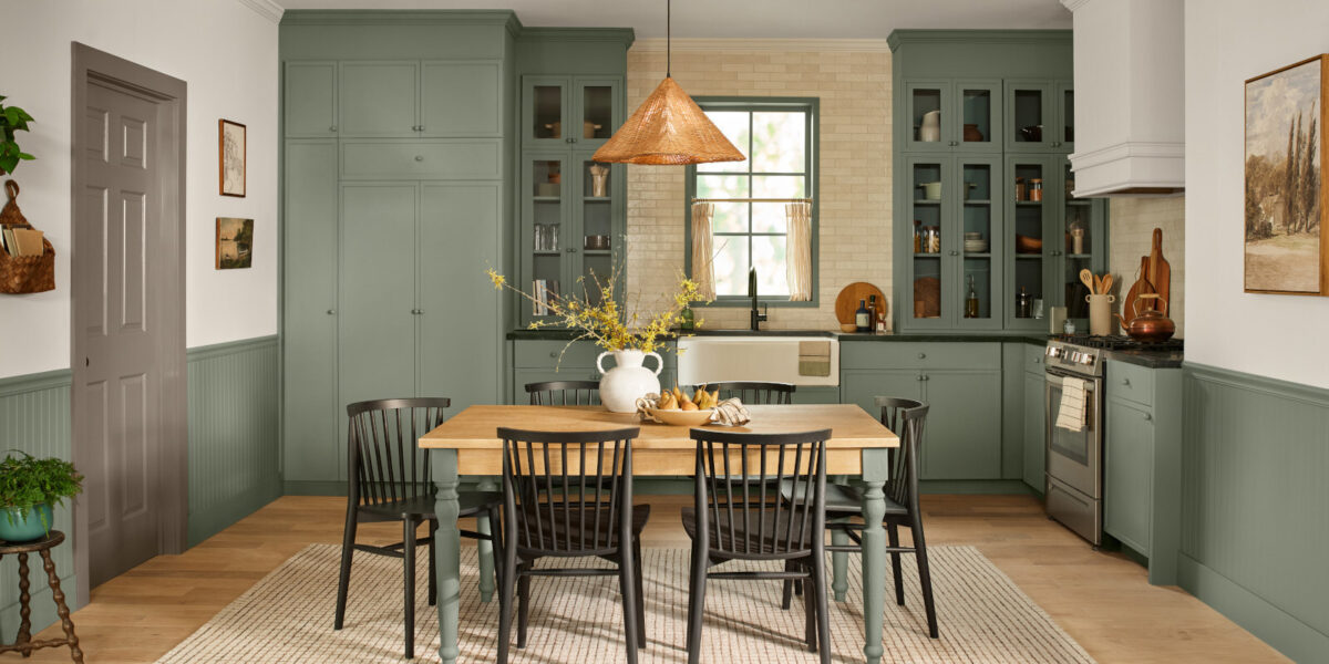
These Will Be the Most Popular Paint Colors in 2026

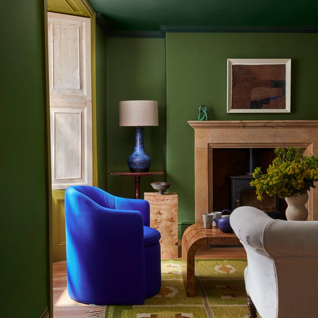
Meet 'colour capping', the paint trend set to take over 2026
Designers Say These 12 Paint Colors Will Be Everywhere in 2026
Pinterest Says This High-Class Aesthetic Is Sure To Trend In 2026


8 Paint Color Trends You'll ACTUALLY Want to Live With in 2026, According to Designers

This British Paint Trend Is Set to Take Over 2026

Say Goodbye to Neutrals: Color-Drenching Will Define 2026 Interiors


2026 Color of the Year Announcements Have This In Common
What Paint Colours will Rule 2026? The Experts Make Their Predictions
Move Over, Color Drenching— Color Capping Will Dominate 2026 Interiors

What Paint Colors Will Rule 2026? Designers Make Their Predictions
Colour experts share their top paint trends for 2024

The decorating trends everyone will be talking about in 2026
This British Paint Trend Is Set to Take Over 2026

Experts Say These 5 Paint Colours Will Be Everywhere In 2026
These 20 Trendy Paint Colors Will Be Taking Over Walls In 2026
The Outdated Paint Color That's Coming Back In A Major Way In 2026