8 Timeless Paint Colors That Always Look Fresh, No Matter the Season
The article explores the concept of 'seasonless' paint colors for home interiors, offering guidance on selecting hues that remain appealing and appropriate throughout the year. It addresses the common challenge of choosing paint colors that can transition seamlessly between the different moods and lighting conditions of spring, summer, autumn, and winter, eliminating the need for frequent repainting.
Expert advice from Lisa Hudson, brand president of Fresh Coat Painters, Amy Wax, color expert and author of 'Can't Fail Color Schemes,' and Amy Krane, architectural color consultant at Amy Krane Color and host of the design podcast 'Let’s Talk Paint Color,' forms the core of the article. They emphasize several key considerations for homeowners.
Firstly, the experts recommend seeking out mid-tone hues. These colors strike a balance, providing depth and warmth in colder months without feeling overwhelming when natural light increases in spring and summer. They are described as the 'Goldilocks, just-right shade' that can adapt to changing environments.
Secondly, understanding undertones is crucial. Undertones are the subtle base colors that influence how a paint color appears under different lighting. The experts advise looking for colors with a 'quiet warmth' or a 'complex undertone,' such as a greige with a hint of brown or a dusty blue with a touch of green. These complex undertones enable colors to adapt and avoid appearing bleak in any season.
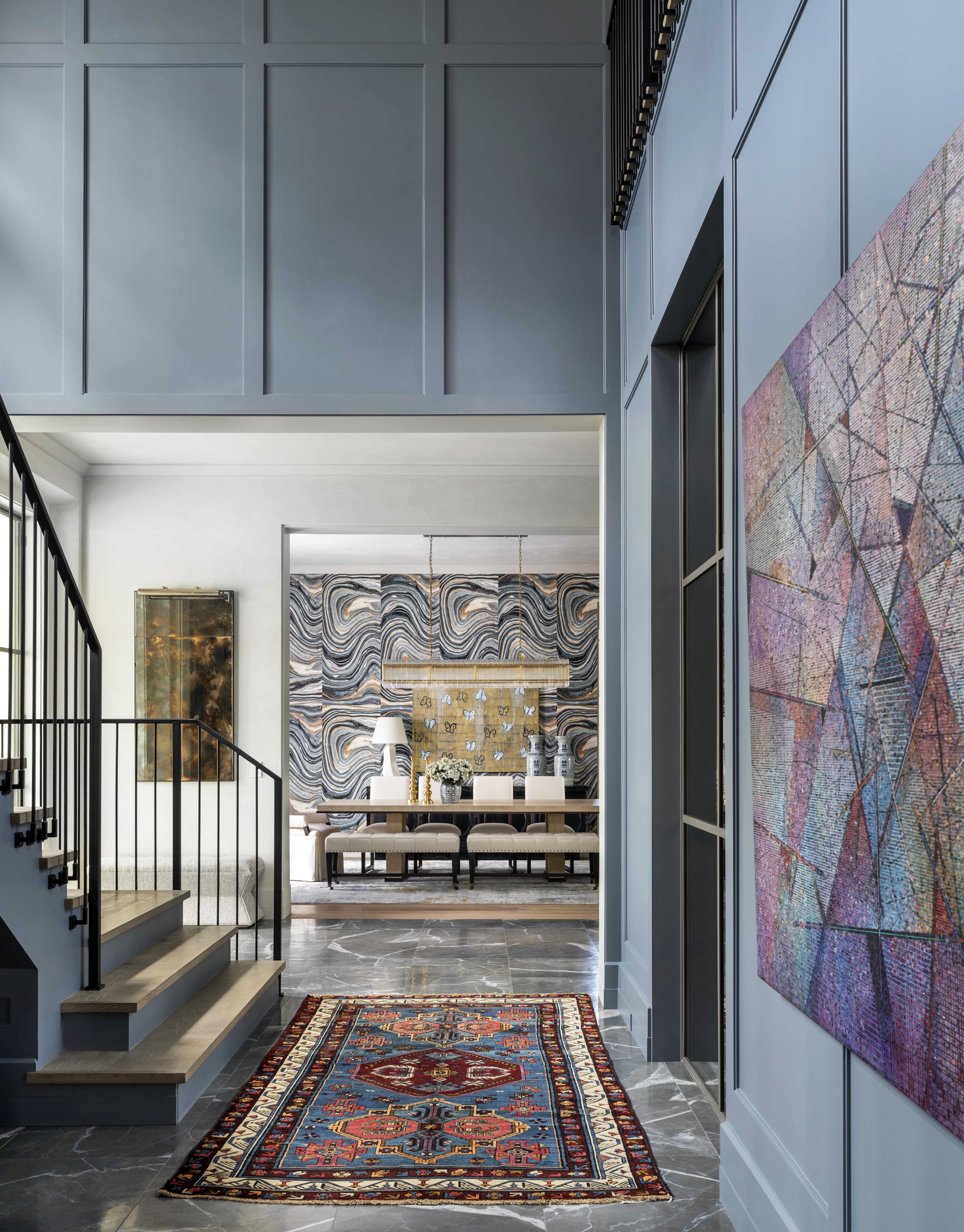
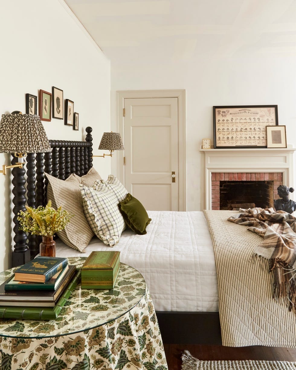
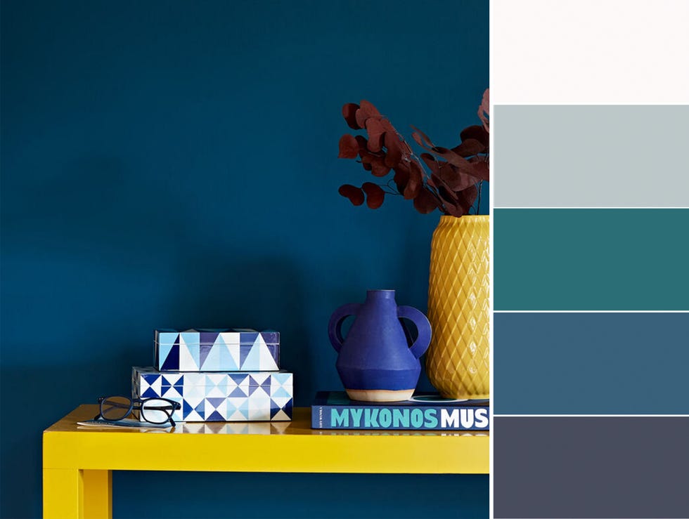
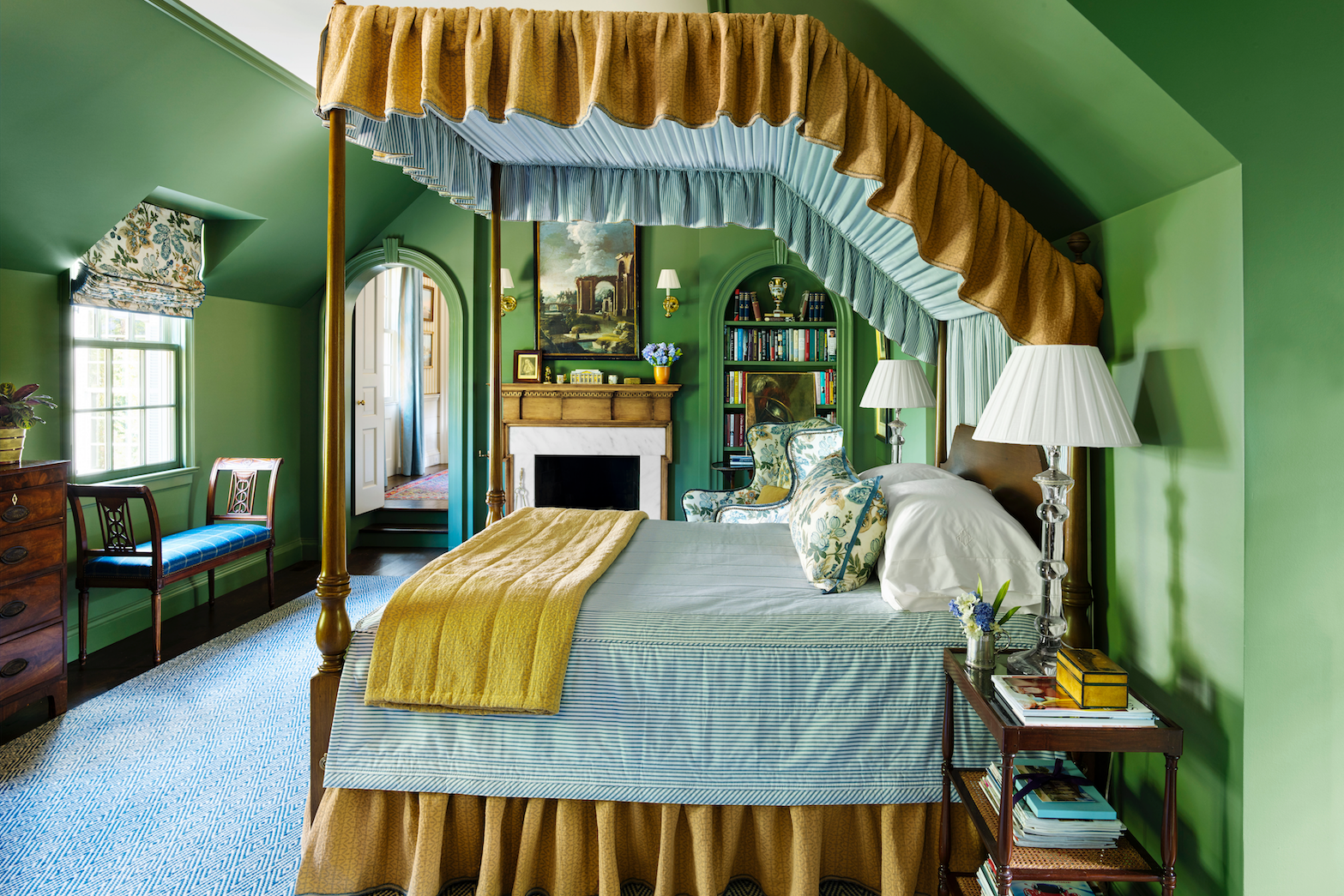
A third recommendation involves using accessories to manage color intensity seasonally. Rather than repainting, homeowners can change throw blankets, comforters, bed coverlets, and throw pillows to introduce seasonal touches. For example, if a room is painted with blue tones, light baby blues can be used in warmer months, transitioning to classic navy blues in cooler periods. Similarly, whites can evolve from clean and bright to charcoal grays, greens from minty to hunter, and browns from soft beige to chocolatey.
Fourthly, testing paint samples before making a final decision is highlighted as critical to avoid regret. It is suggested to observe the sample in the room at different times of day to understand how light conditions affect its appearance. Using large foam core pieces painted with the sample color allows for greater flexibility in moving them around the room to assess how the color interacts with various light sources and corners.
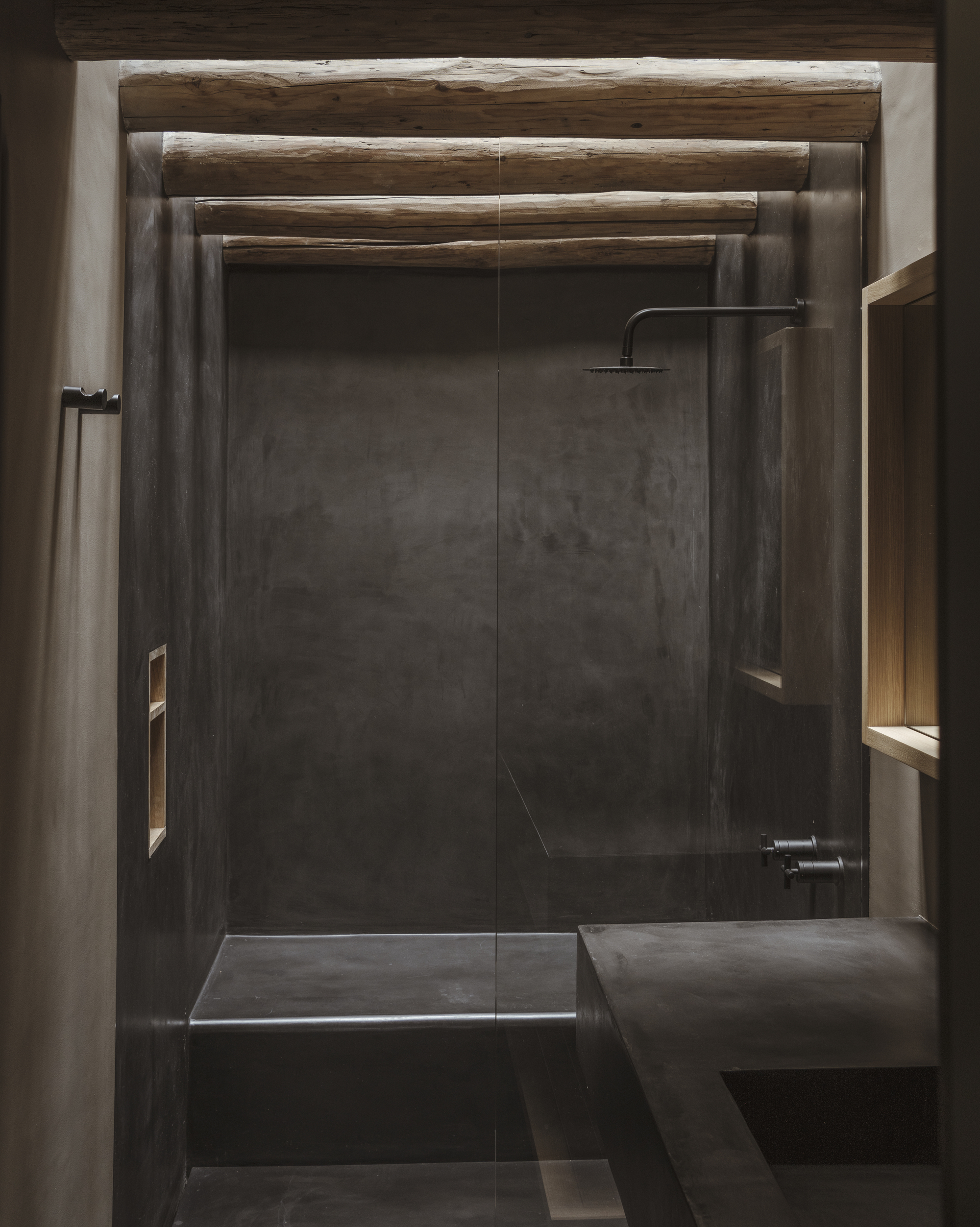
Fifthly, considering the local climate and geographic region is important. Color palettes suitable for a warm, sunny region like the south may differ significantly from those in New England. Brighter, more saturated, or tropical colors might be more fitting for consistently warm climates, while dark, moody colors might feel out of place.
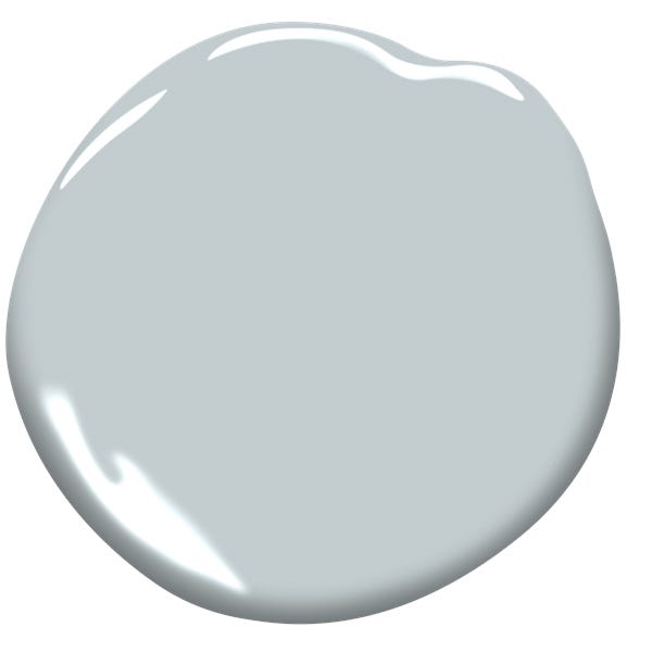
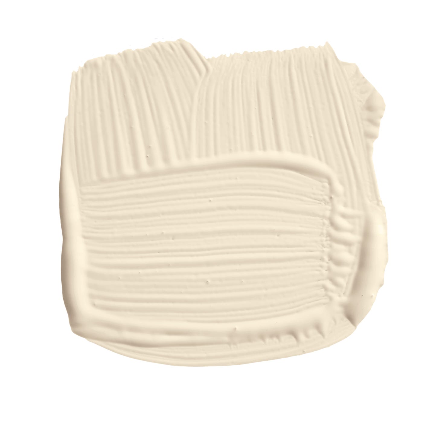
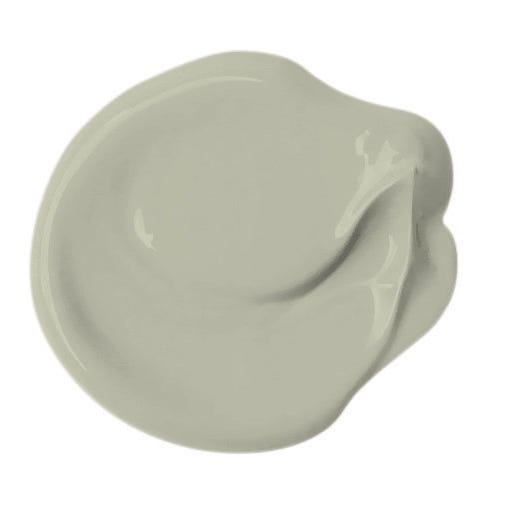
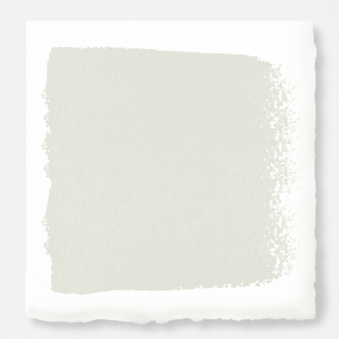
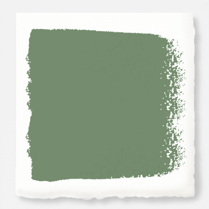
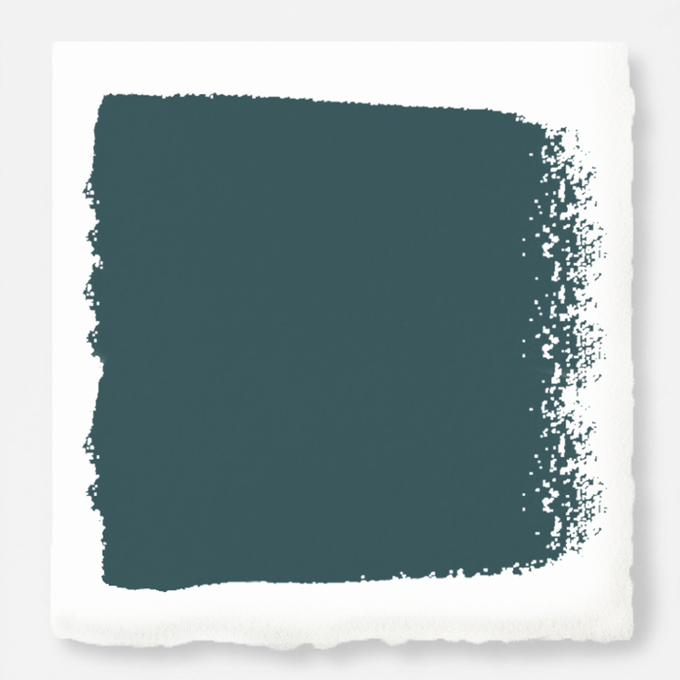

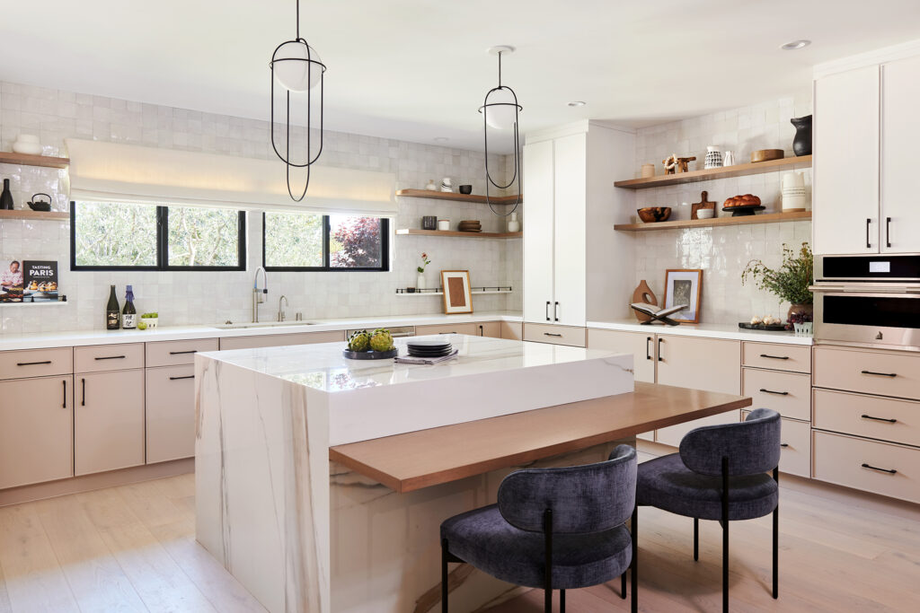
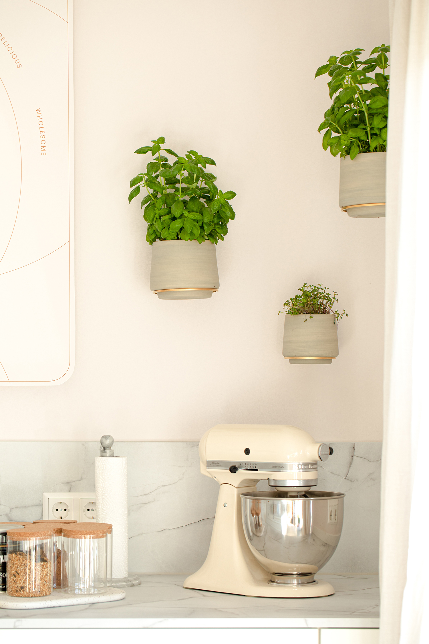
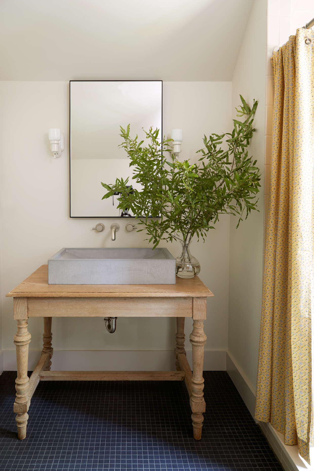
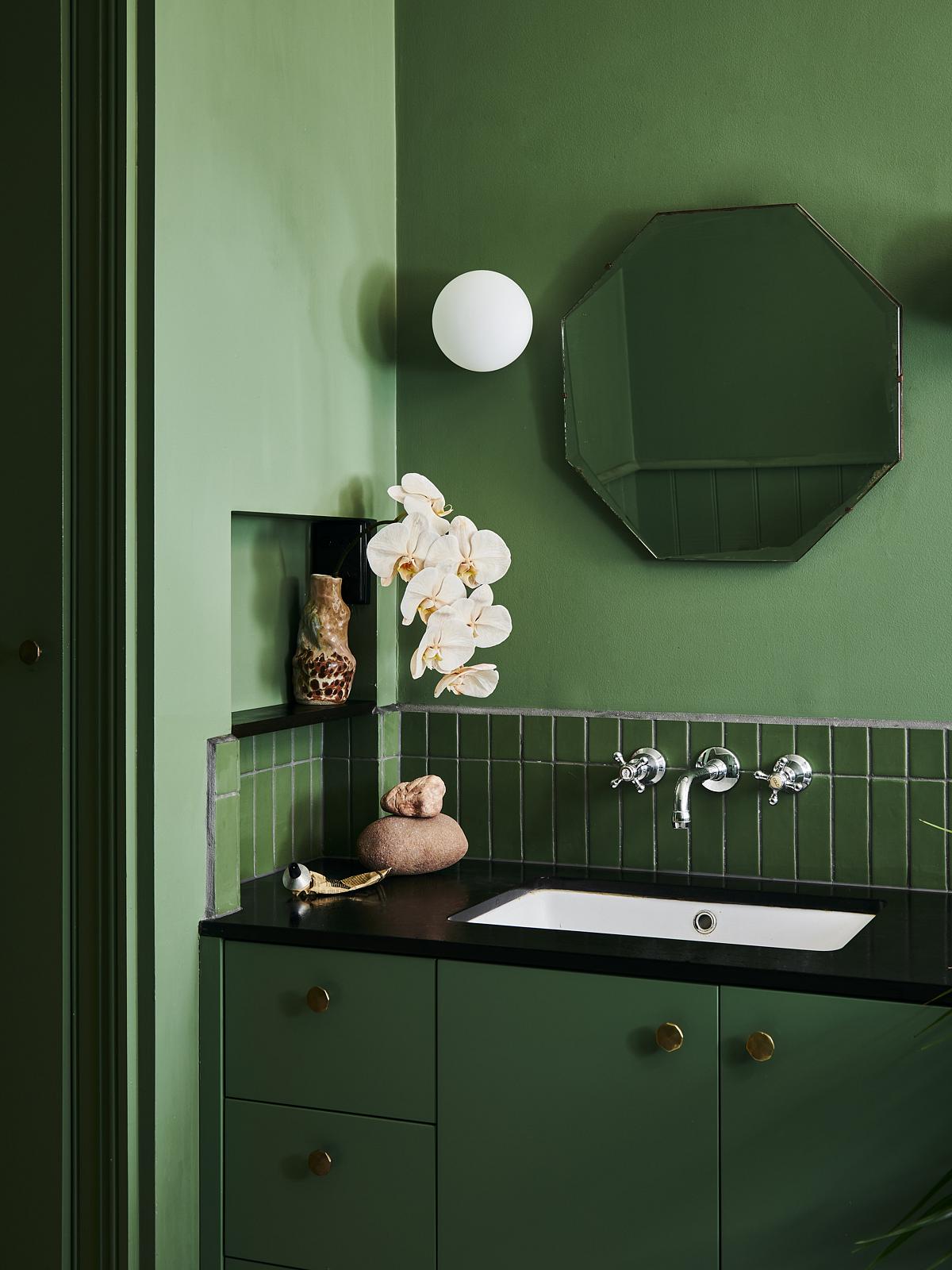
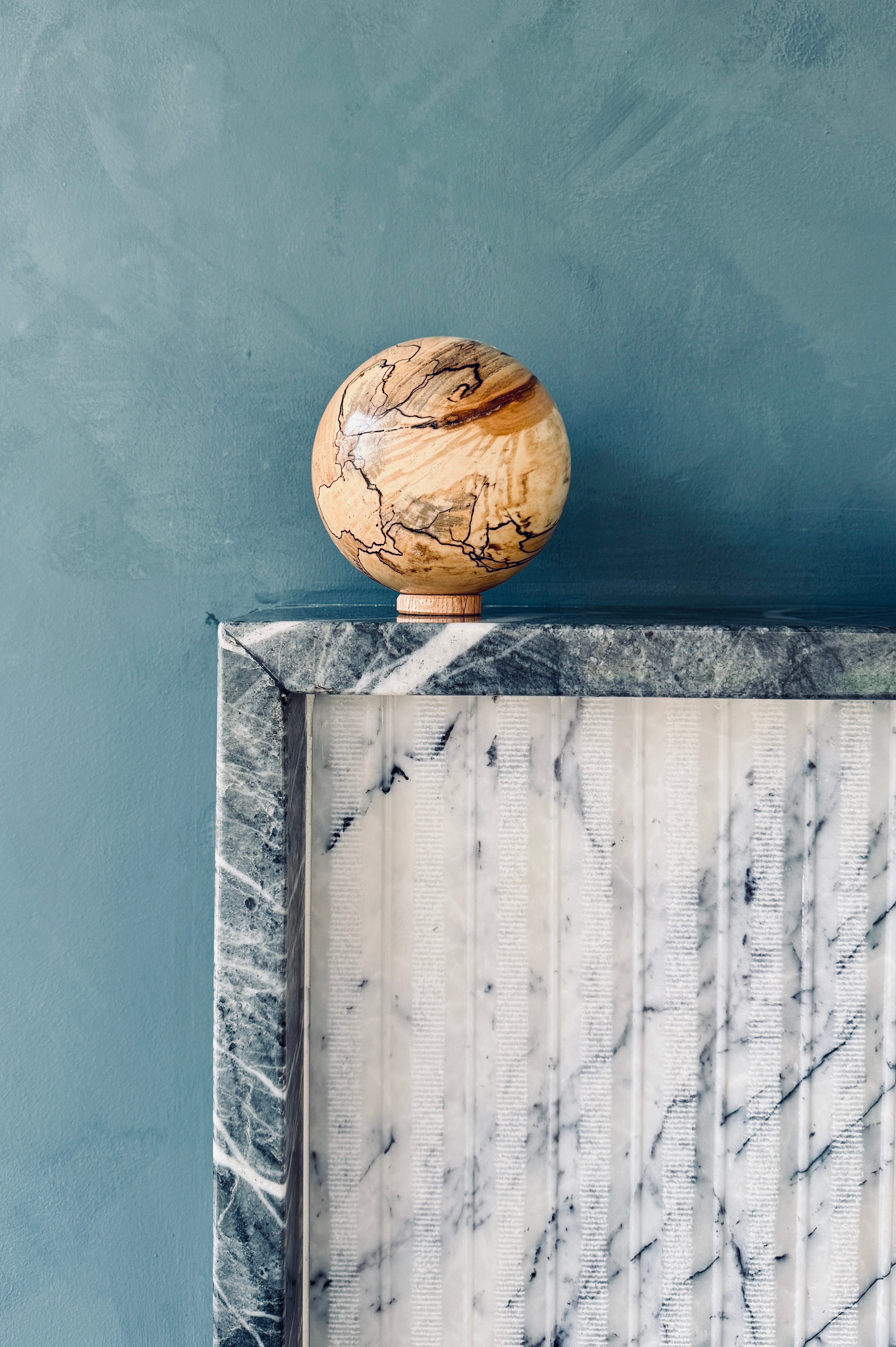
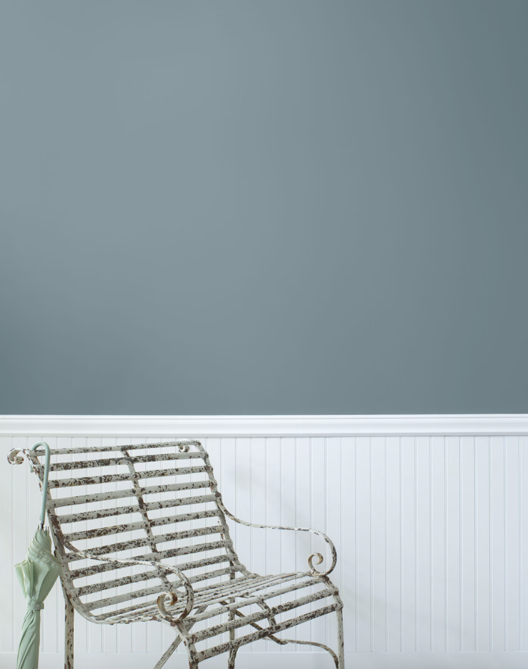
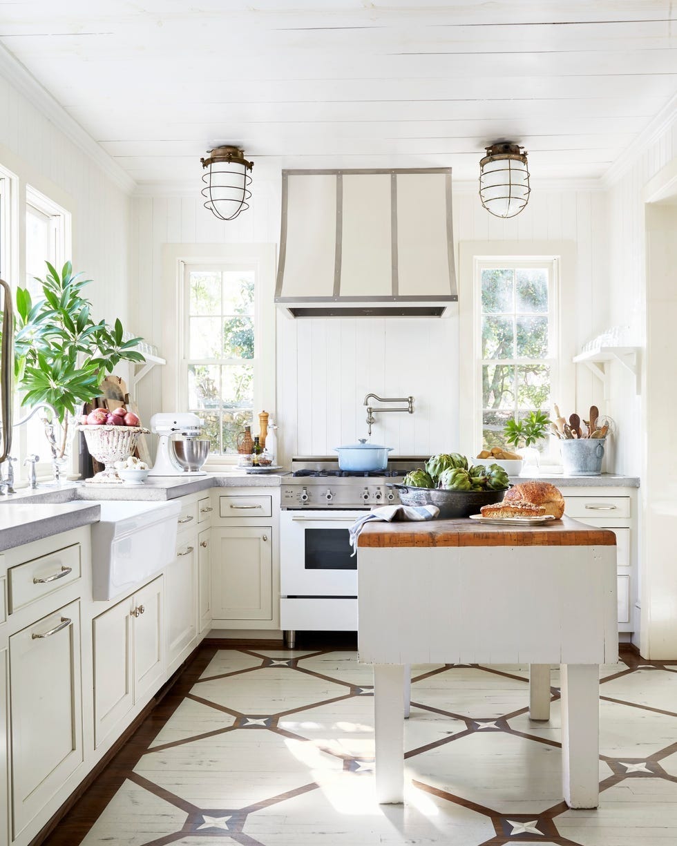
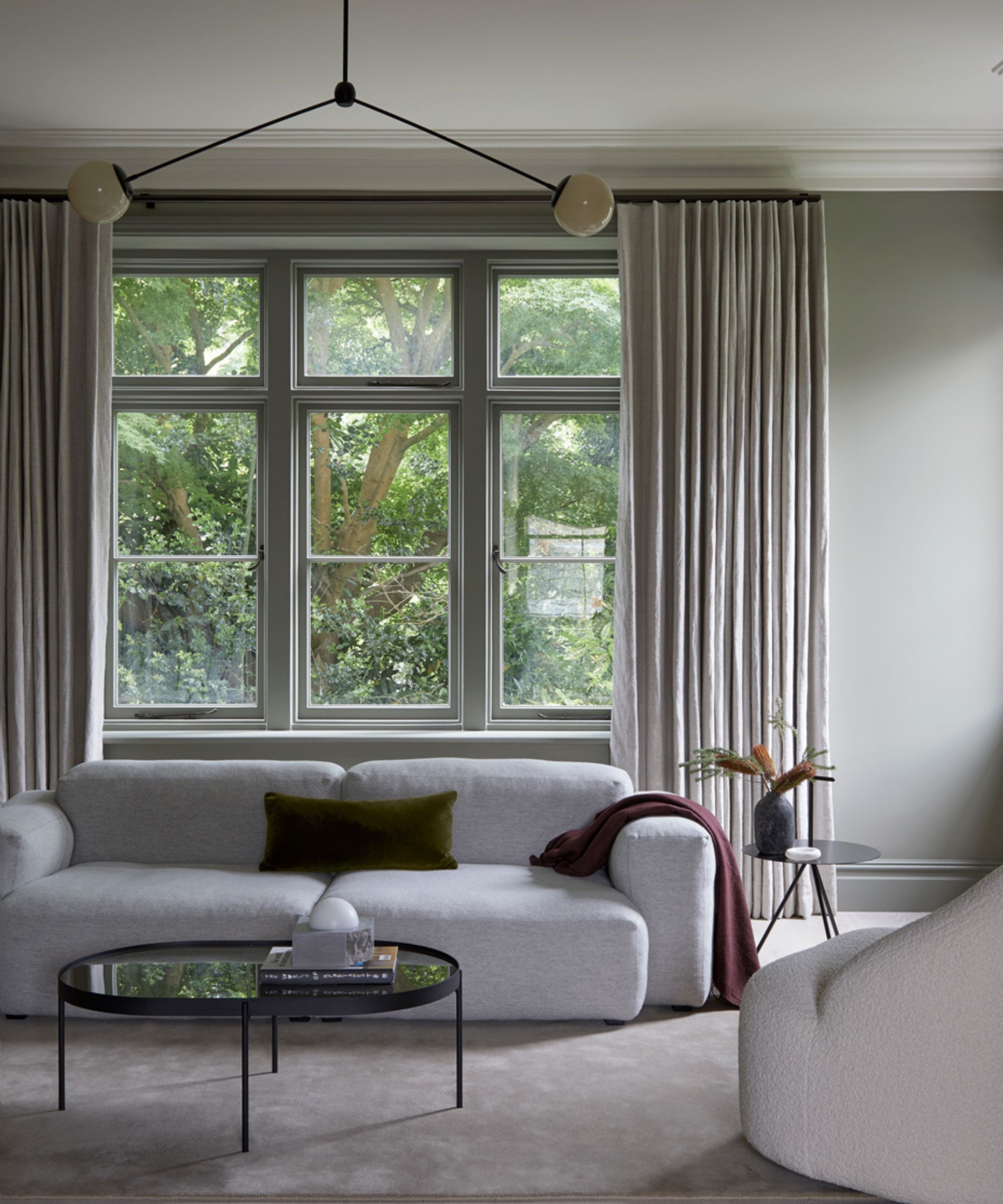
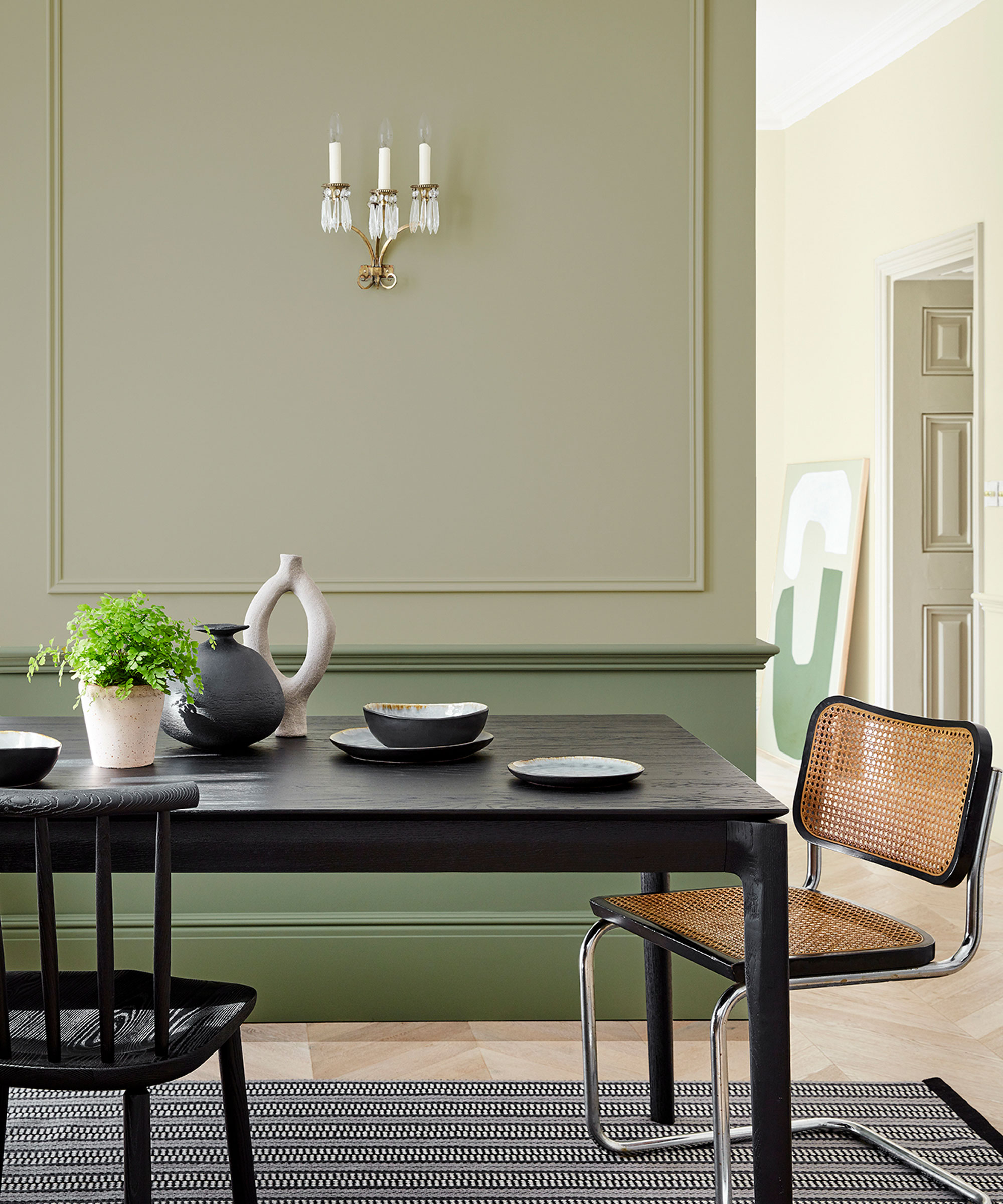
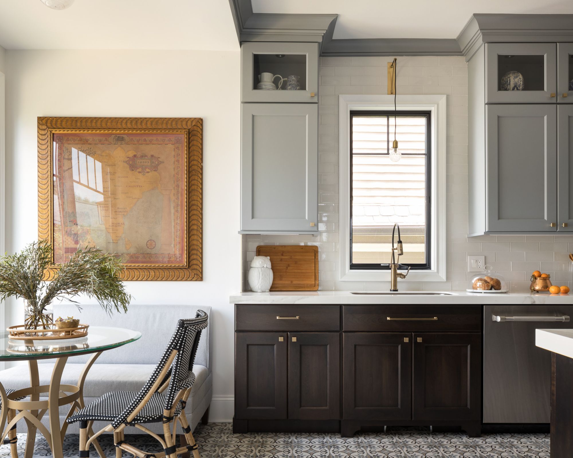
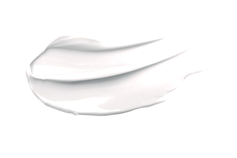
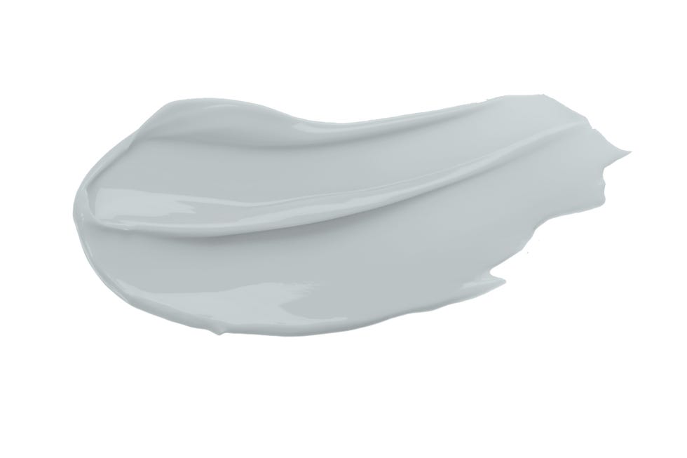
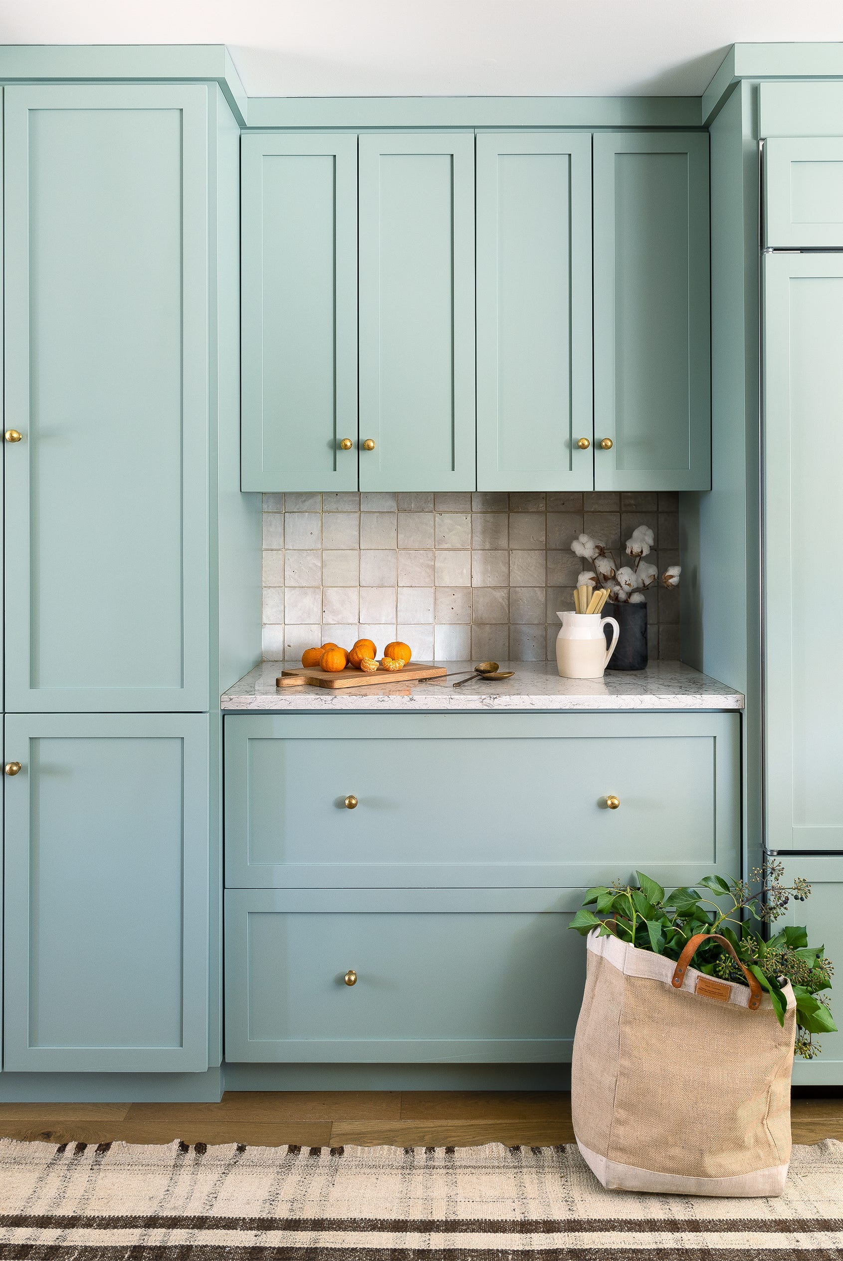
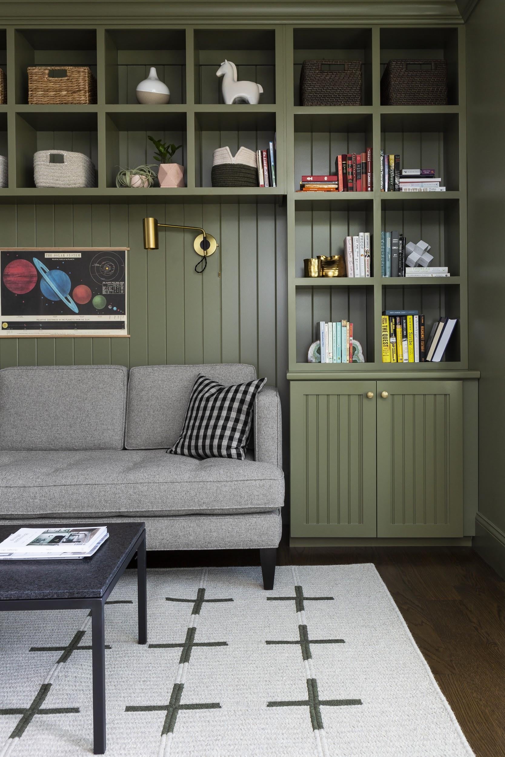
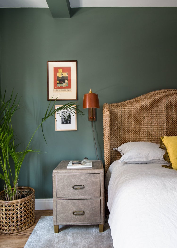
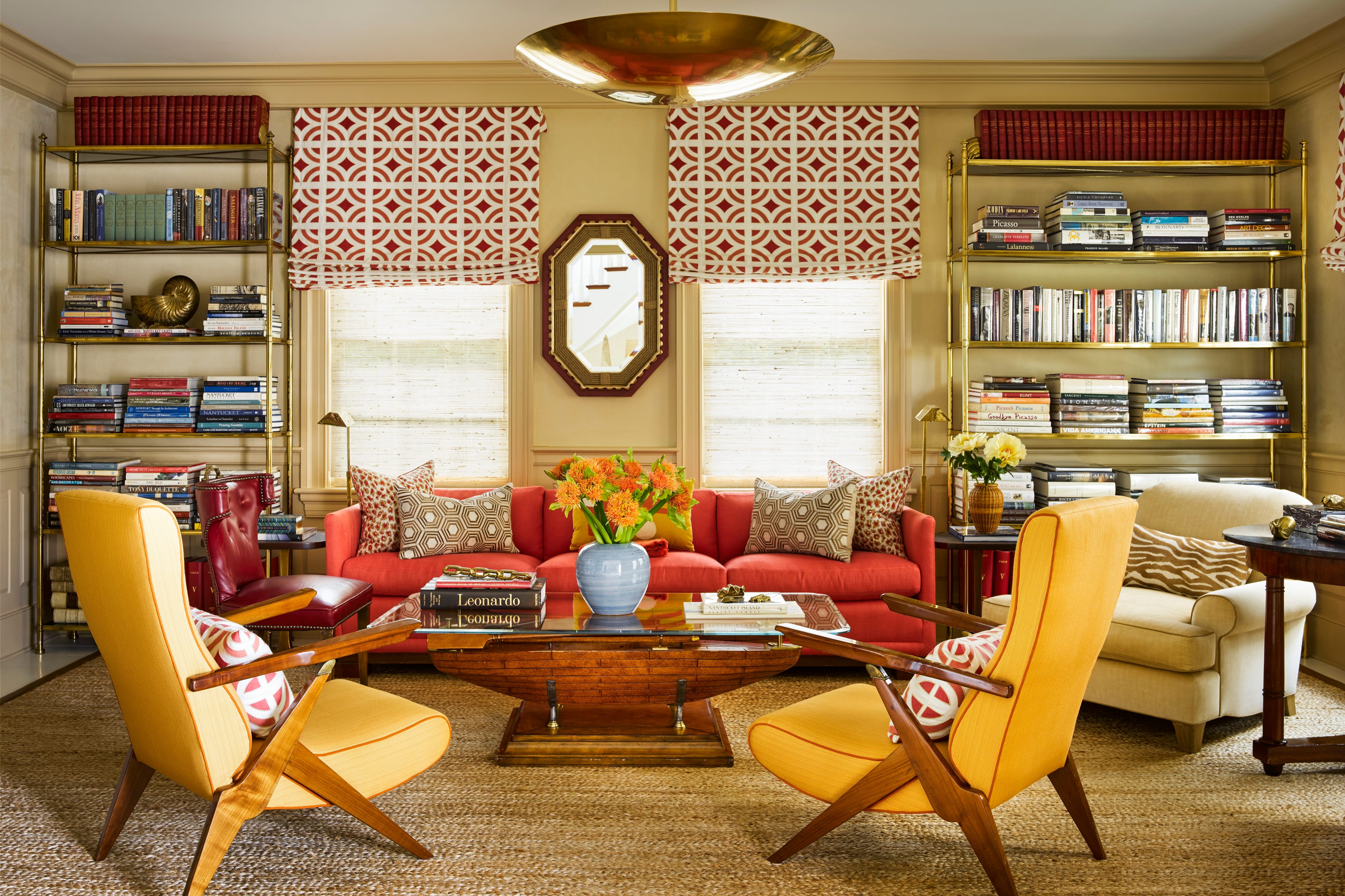
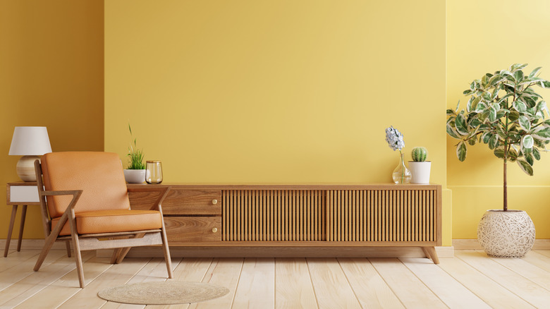
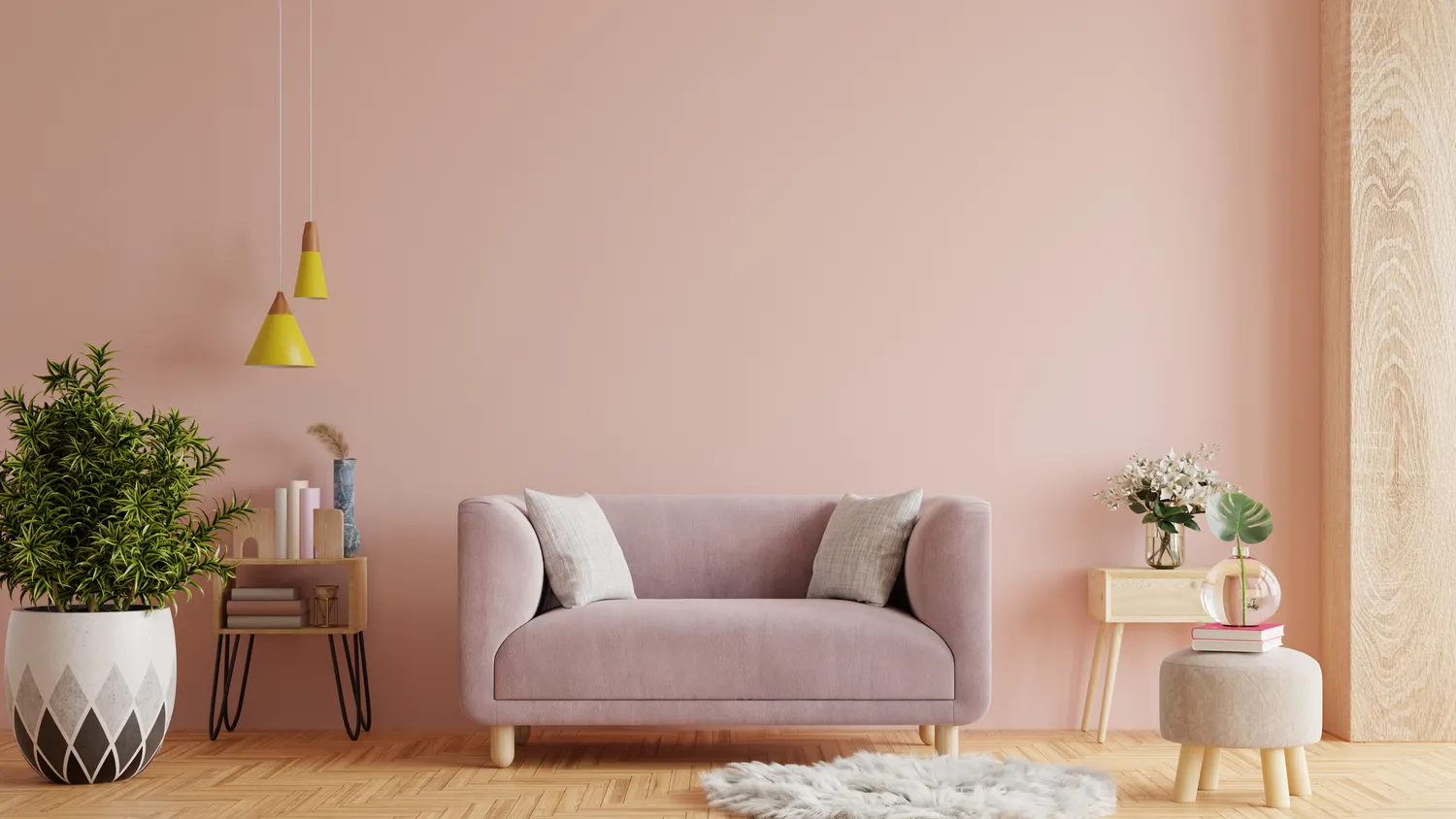
Finally, the purpose and natural light of a room should influence color choice. A dark, dramatic color might be perfect for a cozy reading nook but unsuitable for a brightly lit kitchen. The article then presents eight specific paint color recommendations that exemplify these principles. These include Pigeon by Farrow & Ball (a mid-tone green-gray), Monticello Rose by Benjamin Moore (a rosy hue), Agreeable Gray by Sherwin-Williams (a warm gray with beige undertones), Soft Chinchilla by Benjamin Moore (a sky blue with a hint of gray), Mizzle by Farrow & Ball (a silvery rain shade), Chestertown Buff by Benjamin Moore (a buttery gold), Spring Has Sprung by Benjamin Moore (a soft sage green), and Accessible Beige by Sherwin-Williams (a warm, earthy neutral). Each of these colors is chosen for its versatility and ability to adapt to varying seasonal conditions and interior styles.
#PaintColors #HomeDecor #InteriorDesign #ColorTrends #SeasonlessDesign #HomeImprovement #DecoratingTips #PaintSelection #PaintColors #HomeDecor #InteriorDesign #ColorTrends #SeasonlessDesign #HomeImprovement #DecoratingTips #PaintSelection
0 comment in total
 No comments yet
You may also like

5 Timeless Paint Colors That Will NEVER Go Out of Style, According to Designers

The 6 Paint Colors for Your Kitchen That Will Never Go out of Style
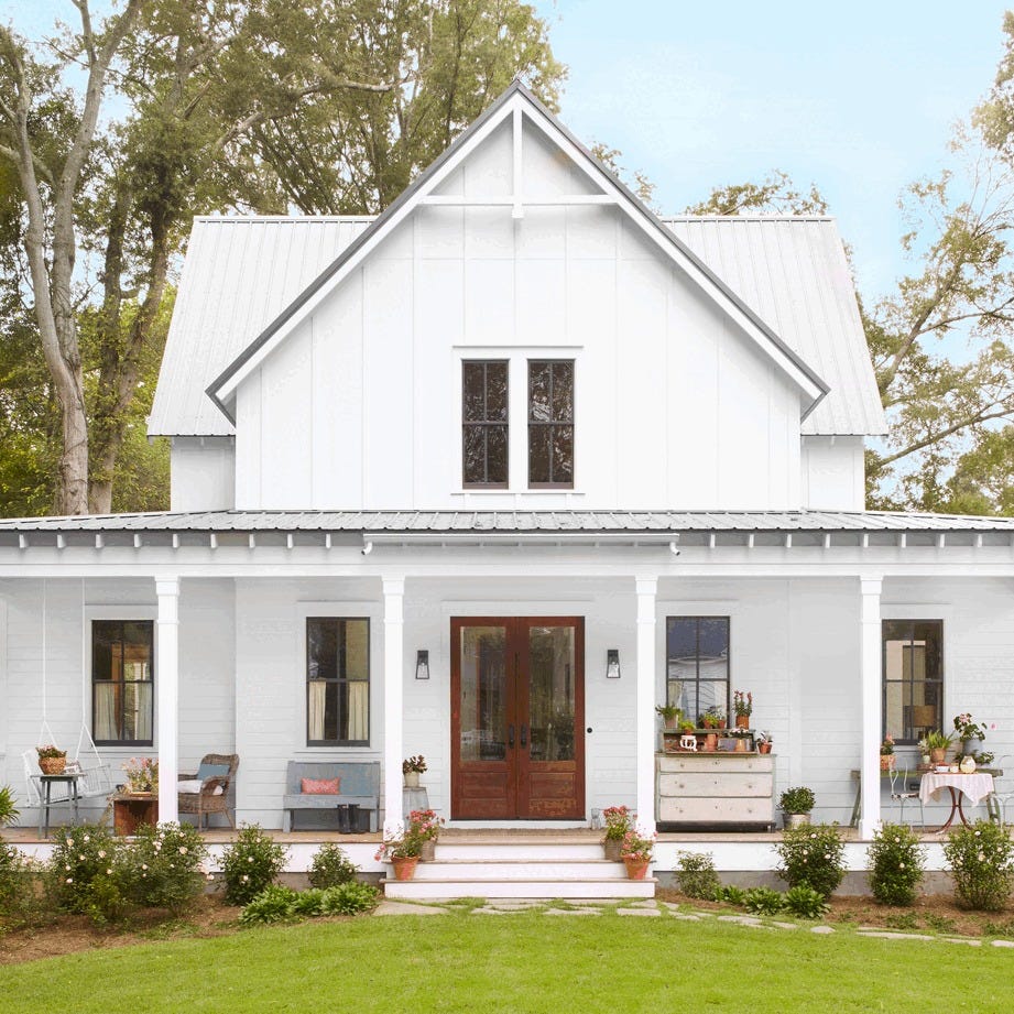
The 25 Best Farmhouse Paint Colors for Timeless Style
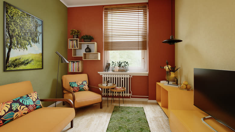
The Vintage Paint Color That Will Never Go Out Of Style
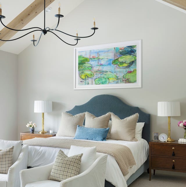
These 20 Paint Colors Will Never Go Out of Style, According to Designers

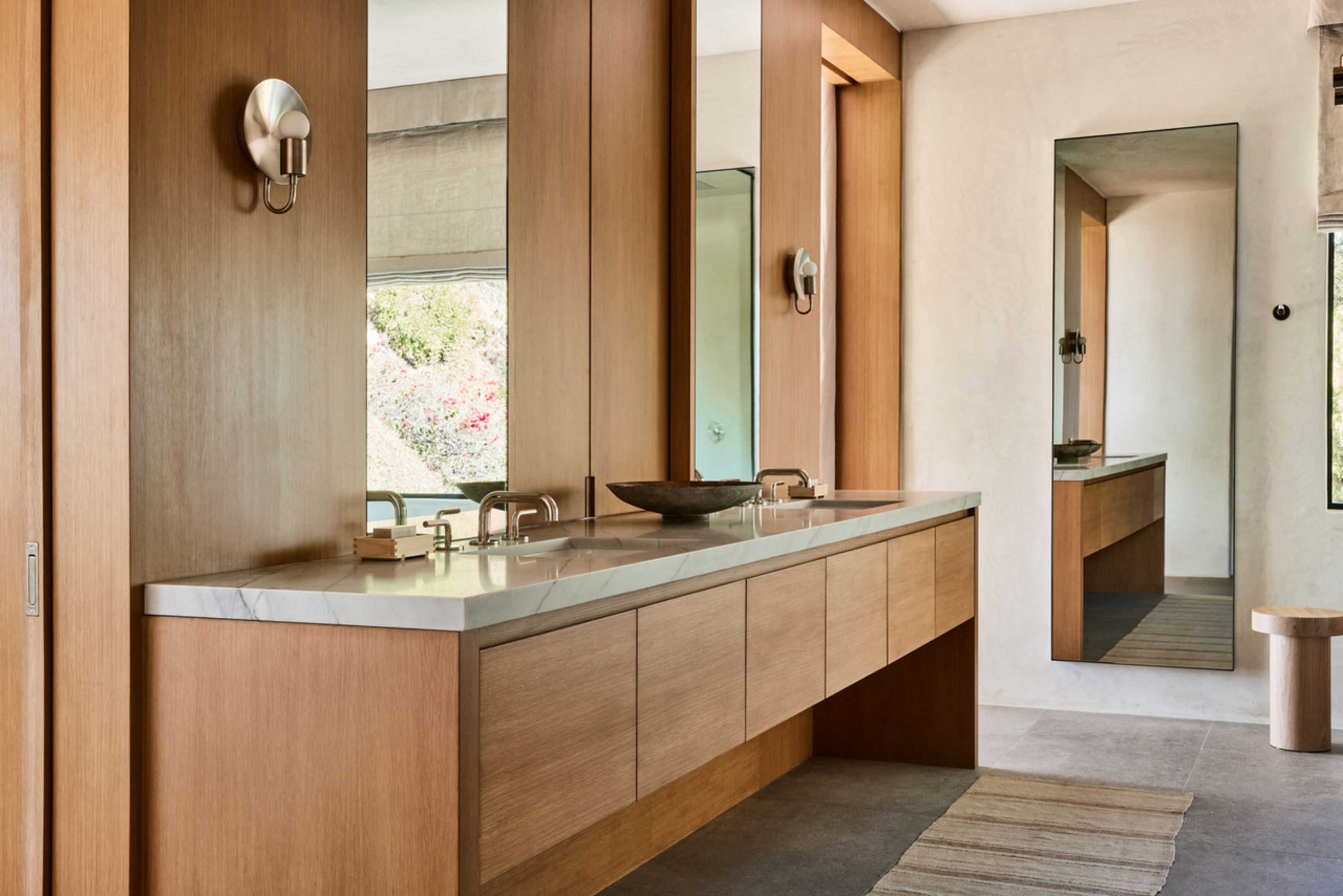
5 Timeless Colors to Choose for a Bathroom That Will Never go Out of Style

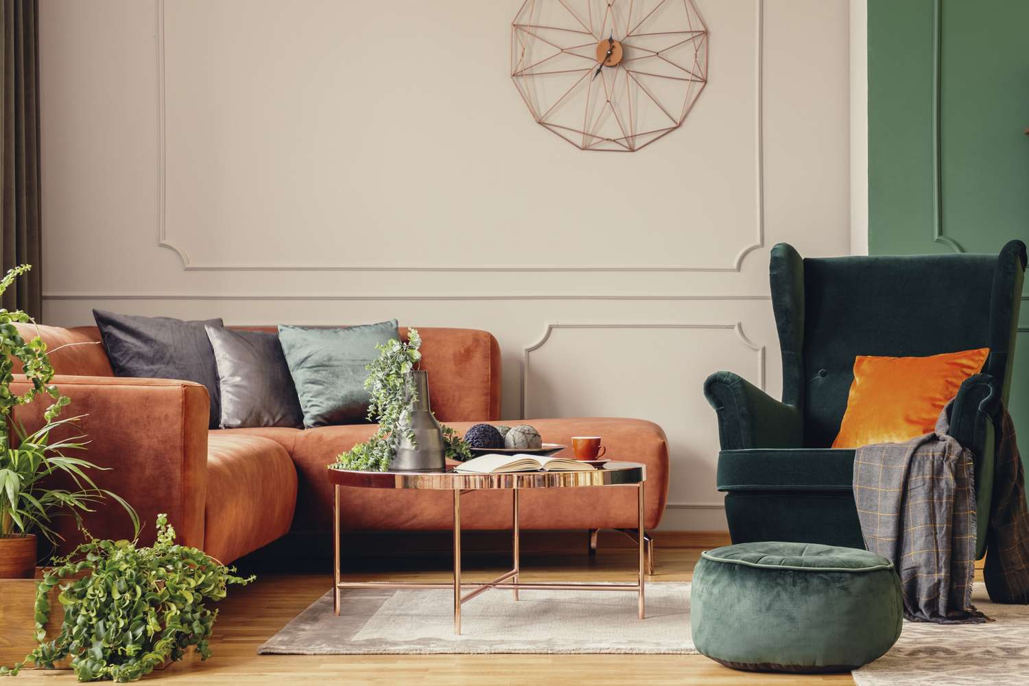
5 Timeless Paint Colors That Go With Absolutely Everything, According to Color Experts
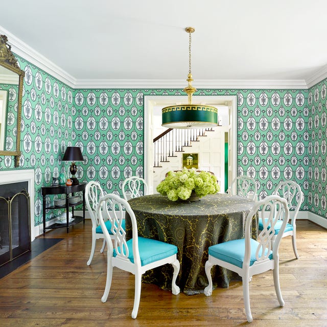
The Versatile Color That'll Cheer You and Your Home Up All Year Long

The most timeless paint colors according to designers

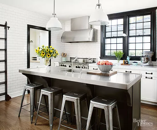
Classic Color Schemes That Never Go Out of Style

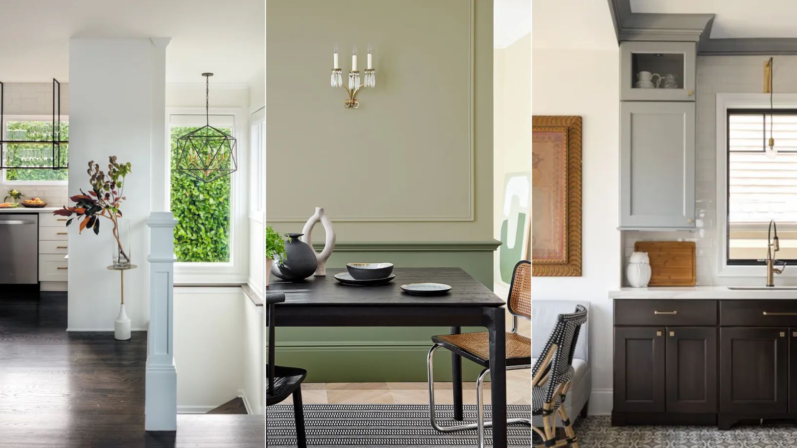
5 enduring colors designers always return to when they have trend fatigue
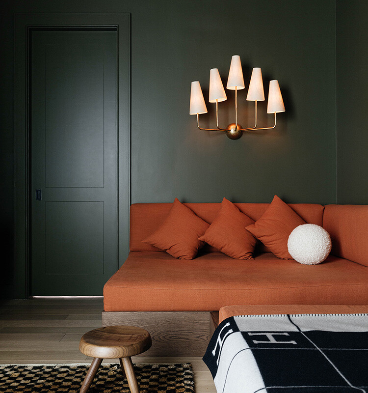
We Can’t Get Enough of These 13 Paint Color Trends for 2021
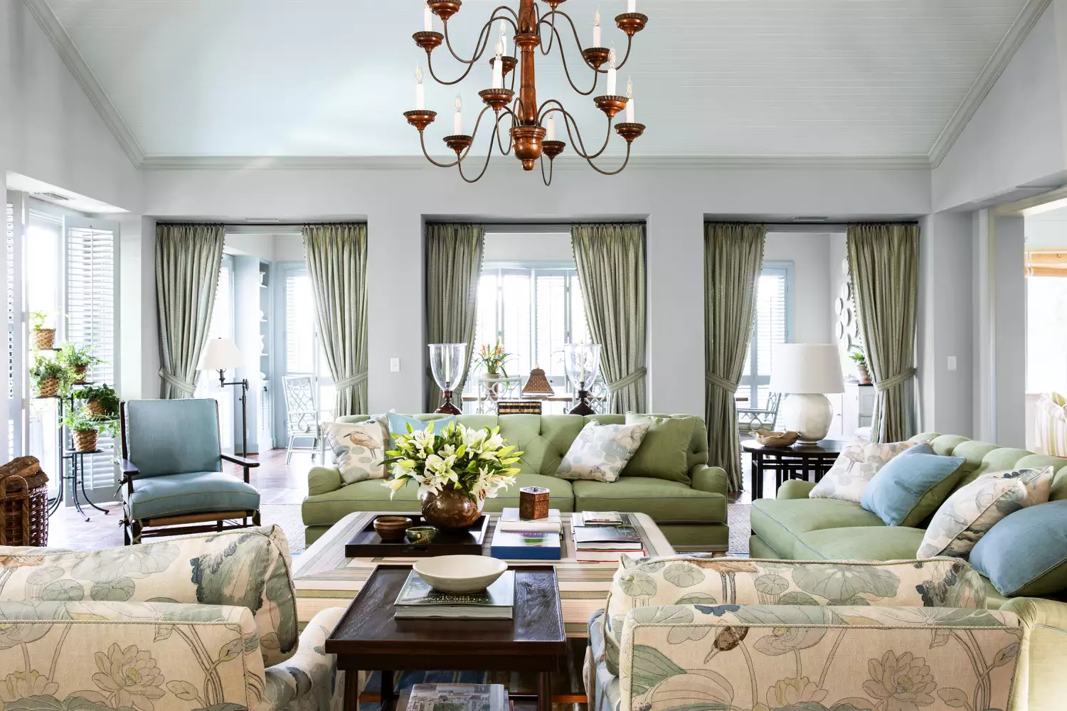
15 Timeless Paint Colors You’ll Never Tire Of, According To Designers
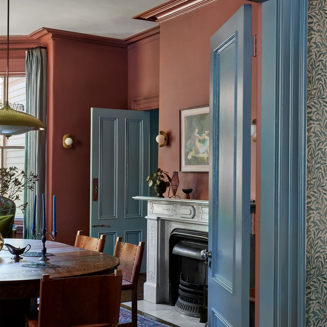
15 Designer-Approved Blue-Gray Paint Colors That Will Never Go Out of Style
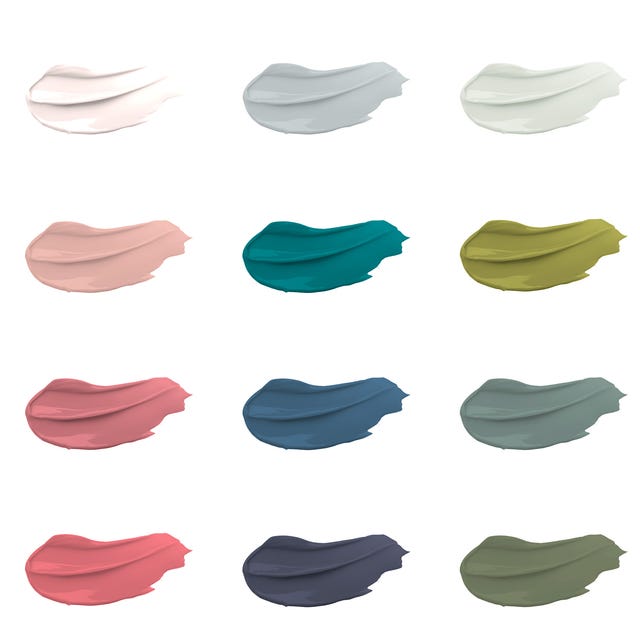
30 on-trend paint colours for every room in your home
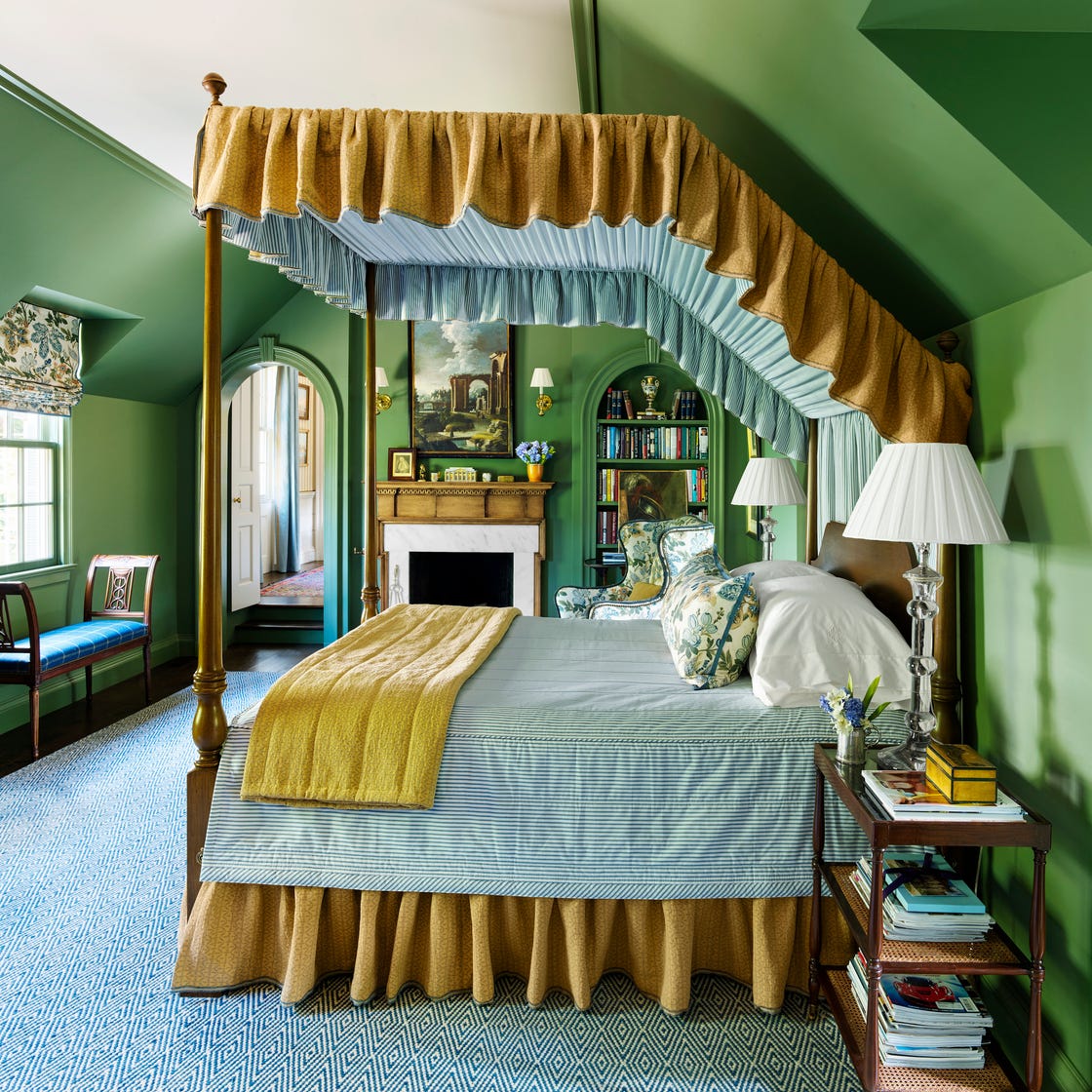
These 7 Colors Will Rule Interiors in 2026, According to Experts

3 Paint Colors That Will Never Go Out of Style, According to Joanna Gaines


Designers LOVE Pairing These Unexpected Colors With This One Timeless Hue

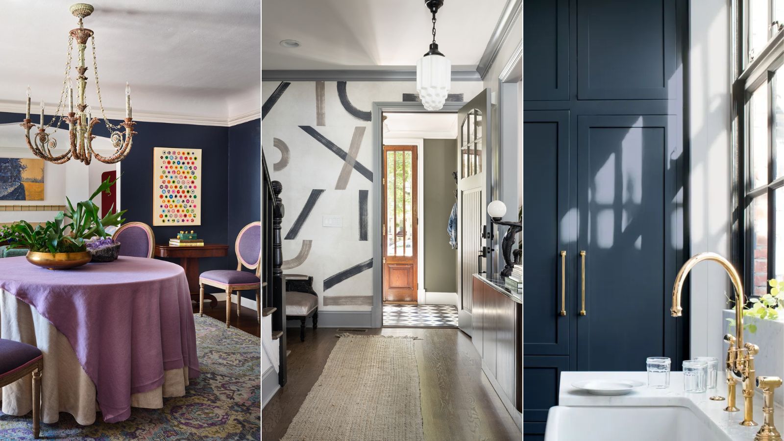
Designers who never follow trends swear by this color family to make their homes look timeless
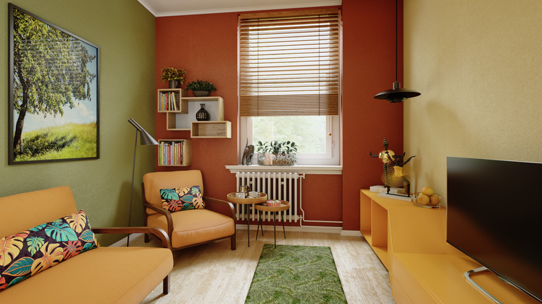
The Vintage Paint Color That Will Never Go Out Of Style