1/2
The Vintage Paint Color That Will Never Go Out Of Style
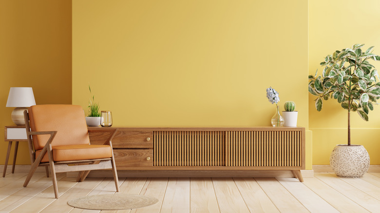
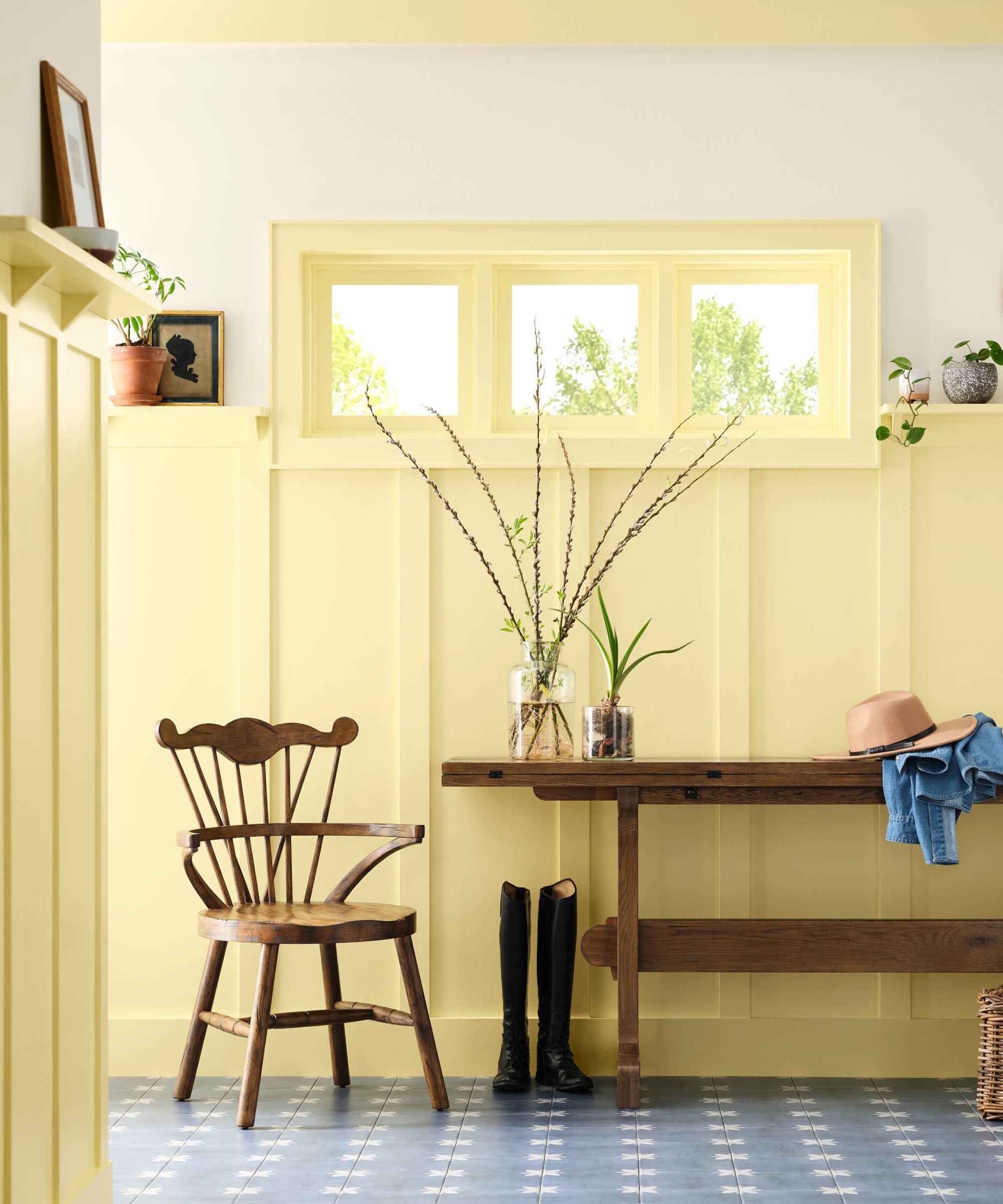
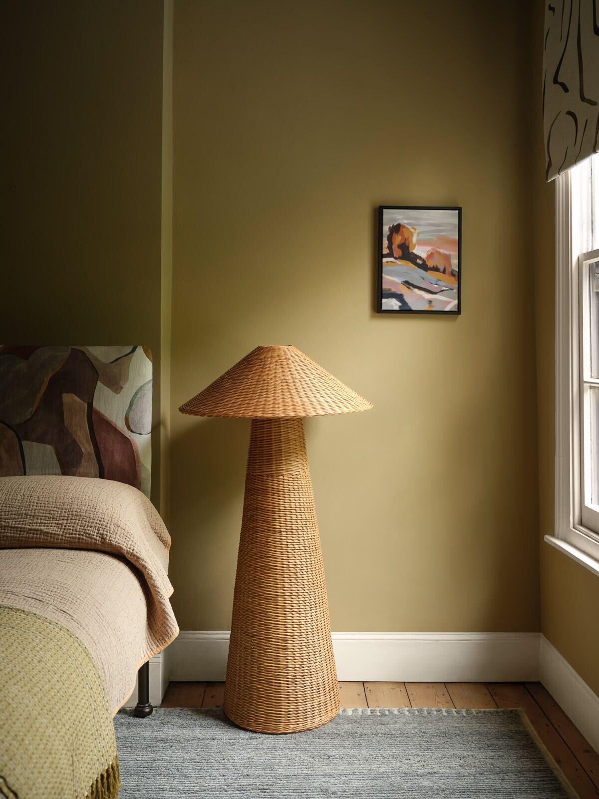
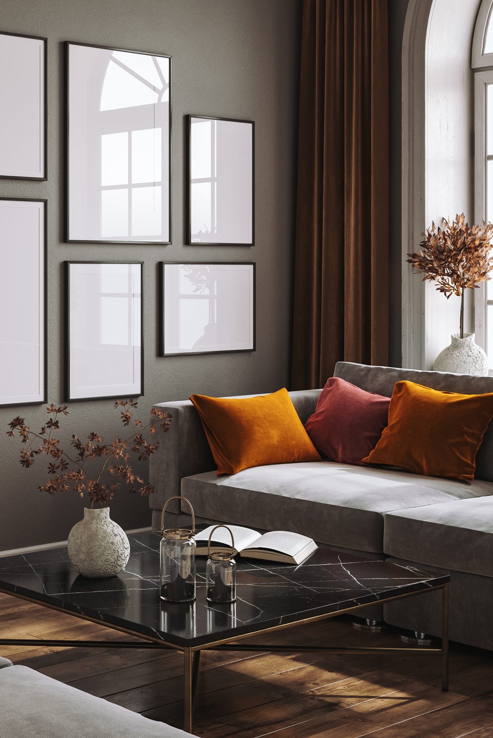
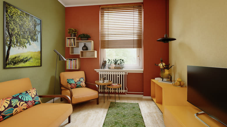
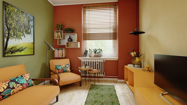
The dynamic nature of trends dictates a constant flux, particularly evident in the realm of paint colors. However, certain shades possess an enduring quality, often those imbued with a sense of nostalgia. Among these, sandy and gold ochre has consistently maintained its appeal and has recently experienced a resurgence in popularity. This hue, once a hallmark of mid-century modern aesthetics and 1970s retro interiors, is now being embraced by contemporary designers. Its application injects playful bursts of color and a cozy, distinctive character into spaces.
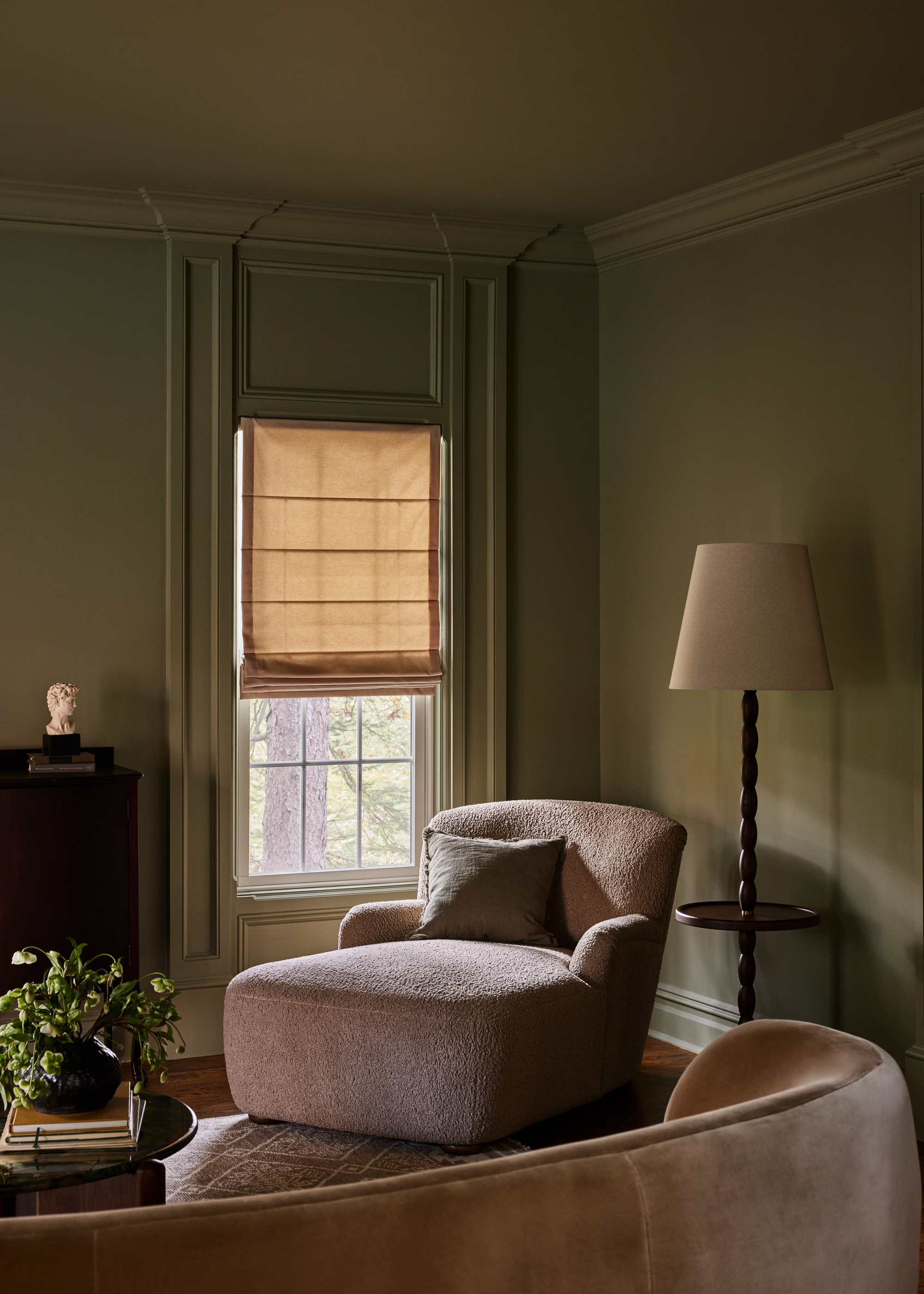
Incorporating a sandy or golden ochre shade into a room's palette can immediately transform its ambiance. The inherent earthy undertones of these colors create a warm, inviting atmosphere that evokes a bygone era. Furthermore, the exceptional versatility of gold ochre shades across diverse design styles is a significant factor contributing to its recent revival. This color spectrum seamlessly integrates into various settings, from living and dining rooms where it cultivates an intimate environment, to bedrooms where it introduces a sense of tranquility. For those disinclined to paint an entire room, golden ochre can be strategically employed to accentuate specific features, such as a bookshelf wall, a current living room design trend that is gradually replacing traditional accent walls.
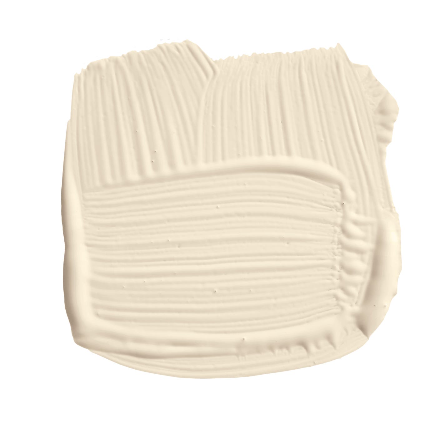
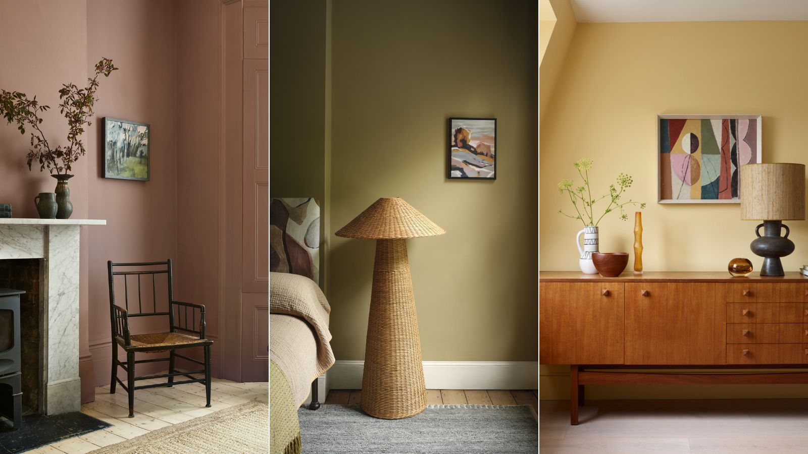
To achieve a cohesive aesthetic, golden ochre walls can be effectively paired with natural materials and finishes. A notable example of this year's favored shades is Benjamin Moore's Summerdale Gold. This particular hue, part of the brand's Historical Colors collection, is characterized as a honey gold with subtle green undertones. Its inherent earthiness positions it as an ideal choice for the autumn season, while its calming, neutral essence makes it a suitable option year-round. Similarly, Sherwin Williams' Earthy Ochre offers another avenue for introducing warmth and a nostalgic feel into a space. The muted yellow and brown tones of this color evoke a natural sensibility, complementing rustic, boho, or mid-century modern designs, all of which prioritize the integration of natural elements into interior spaces.
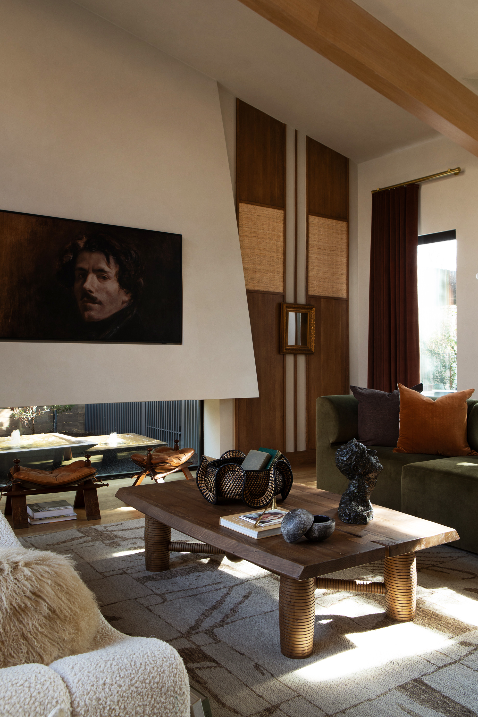
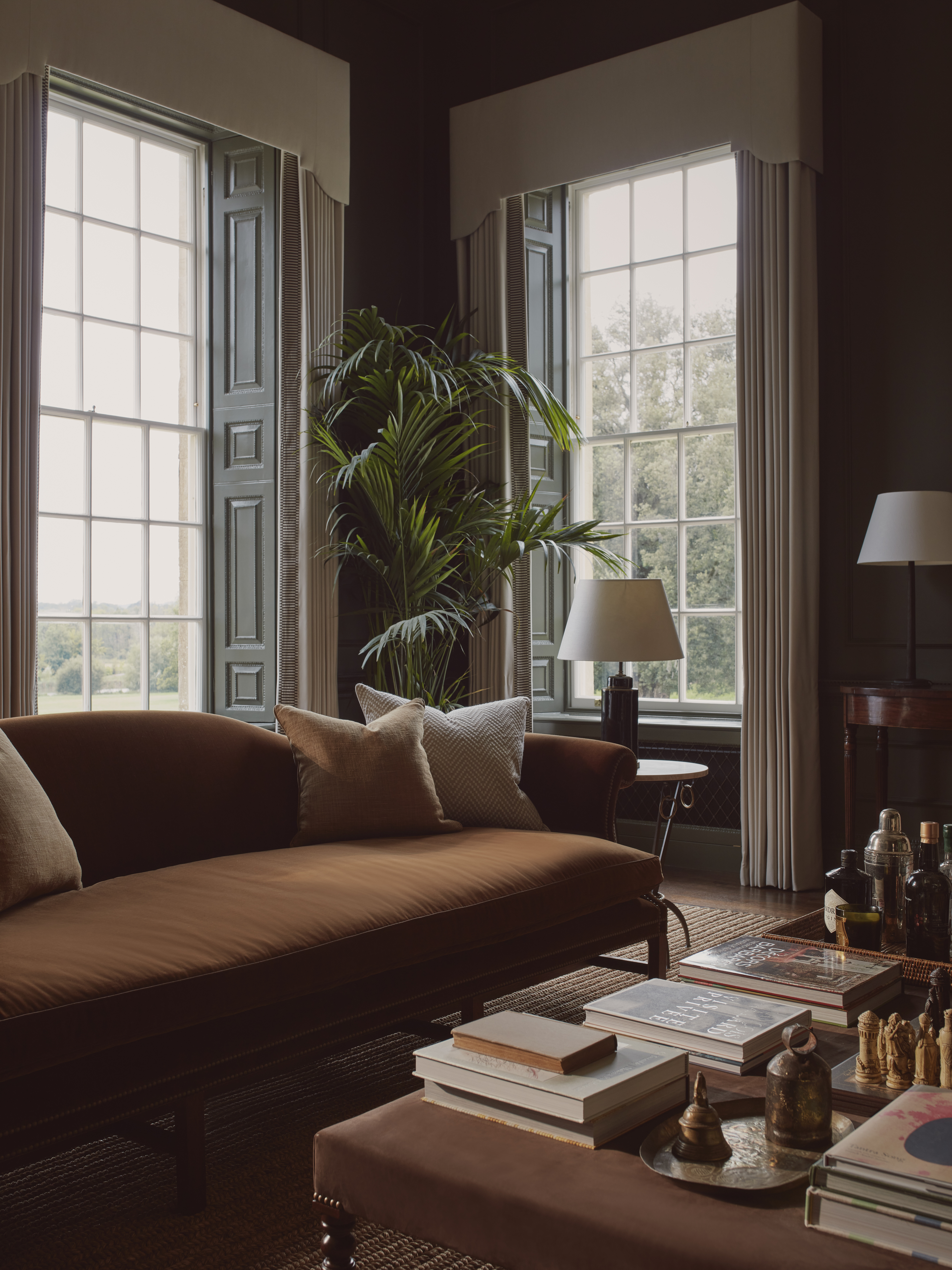
The organic quality of golden ochre hues facilitates their harmonious pairing with natural materials and finishes. Textured elements such as wicker, rattan, burlap, or linen exhibit a particularly strong synergy with these shades. The color can also be strategically integrated through fabric choices for cushions, curtains, or upholstered furniture, adding subtle pops of color. For hard surfaces, natural stones like travertine or marble enhance the earthy essence of golden ochre, while its warm undertones create an excellent complement to rich wood tones found in flooring and furniture. When decorating a room painted in this shade, incorporating warm-toned metals such as copper or brass, through lighting fixtures or other accents, is advisable. To further amplify the vintage aesthetic, the practice of mixing metals within home decor is a recommended approach.
#VintagePaintColor #GoldOchre #InteriorDesignTrends #MidCenturyModern #HomeDecor #BenjaminMoore #SherwinWilliams #NaturalMaterials #WarmTones #VintagePaintColor #GoldOchre #InteriorDesignTrends #MidCenturyModern #HomeDecor #BenjaminMoore #SherwinWilliams #NaturalMaterials #WarmTones
0 comment in total
 No comments yet
You may also like

5 Timeless Paint Colors That Will NEVER Go Out of Style, According to Designers

Vintage paint colors making a comeback this year – experts reveal their top shades for adding a touch of nostalgia

5 Timeless Colors to Choose for a Bathroom That Will Never go Out of Style

8 Timeless Paint Colors That Always Look Fresh, No Matter the Season

These 20 Paint Colors Will Never Go Out of Style, According to Designers

The 6 Paint Colors for Your Kitchen That Will Never Go out of Style
Designers Agree: This Classic Living Room Paint Color Never Goes Out of Style
15 Designer-Approved Blue-Gray Paint Colors That Will Never Go Out of Style
3 Paint Colors That Will Never Go Out of Style, According to Joanna Gaines

Classic Color Schemes That Never Go Out of Style

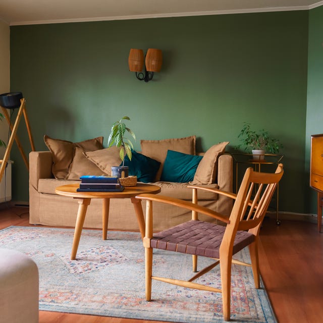
Designers Say These Vintage Paint Colors Are Back
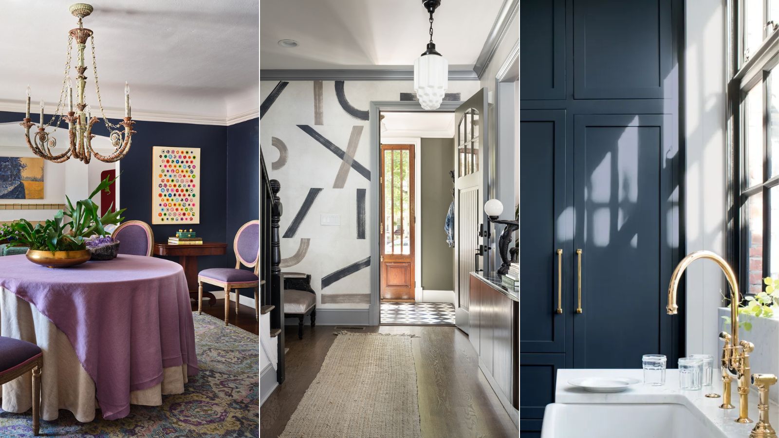
Designers who never follow trends swear by this color family to make their homes look timeless
The Vintage Paint Color That Will Never Go Out Of Style

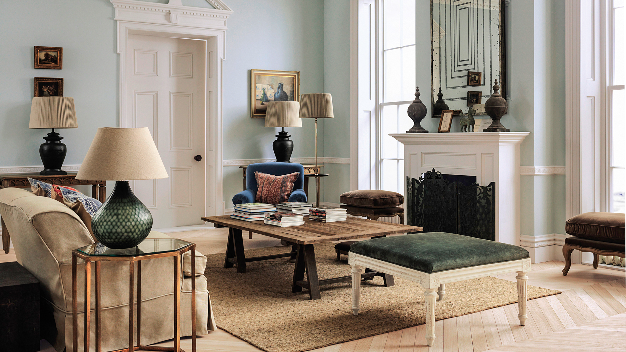
The Best Vintage-Inspired Paint Colors — 6 Expert-Approved Shades for a Touch of Chic Nostalgia

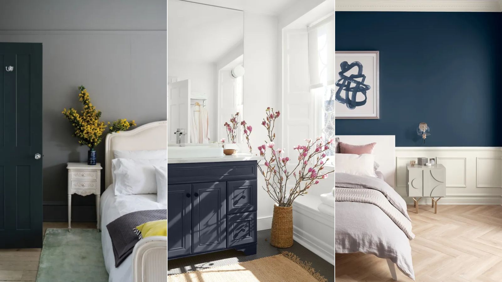
Paint colors going out of style in 2025
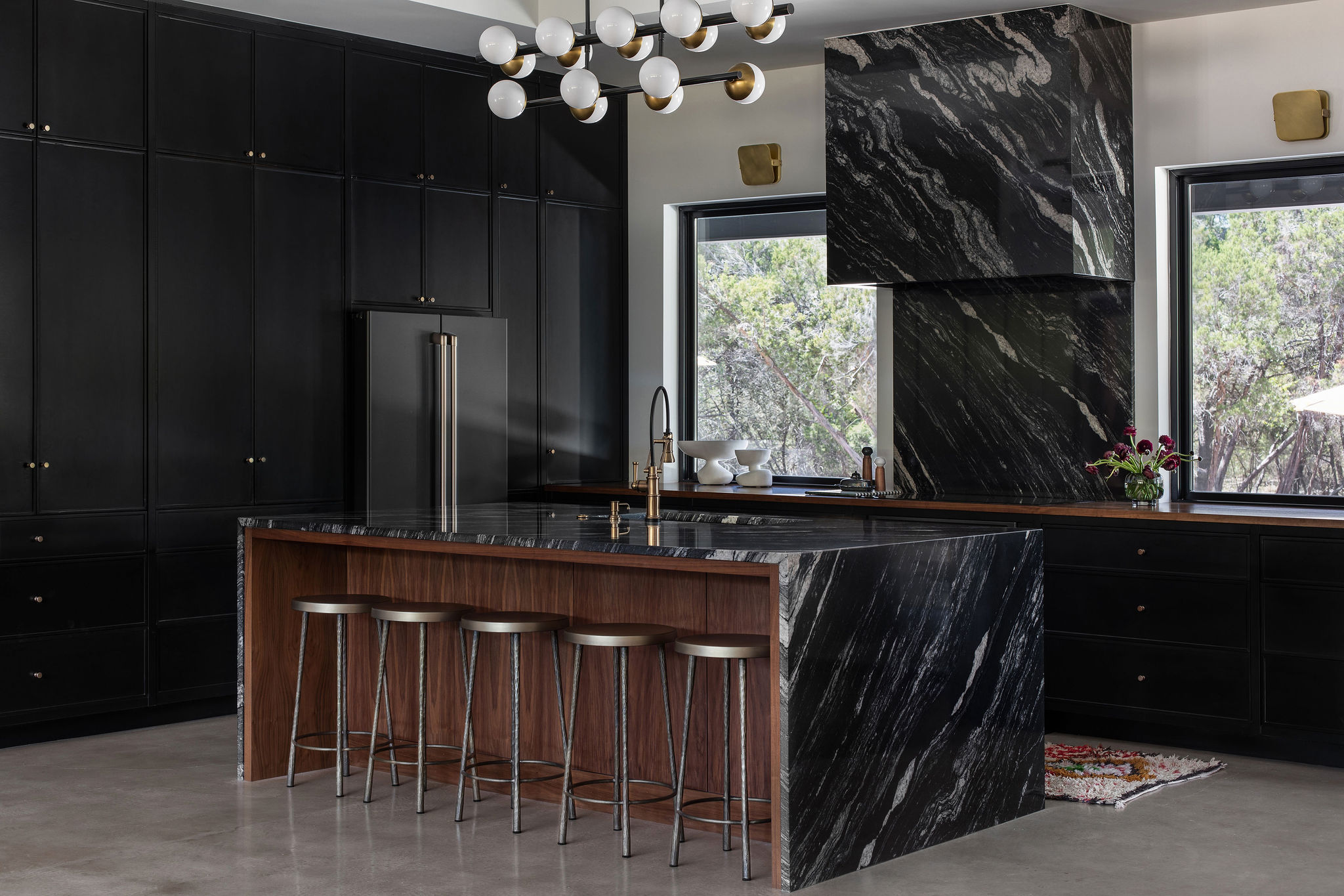
Kitchen Cabinet Colors That Will Never Go Out of Style — 10 Tones That Are a Timeless Choice

The most timeless paint colors according to designers
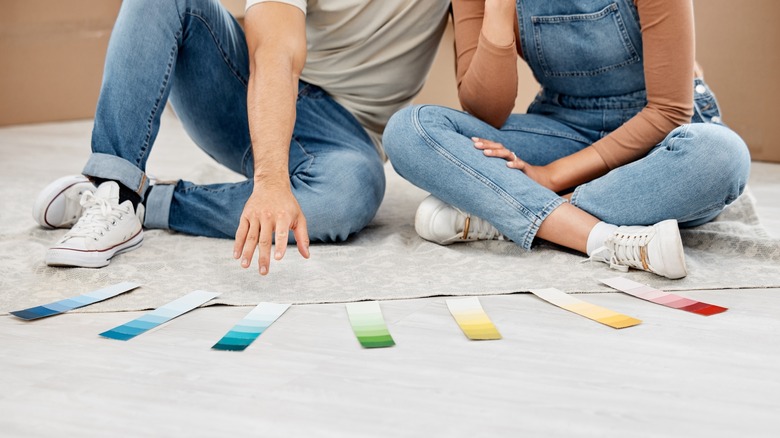
Once-Trendy Paint Colors That Will Make Your Home Look Dated In 2025
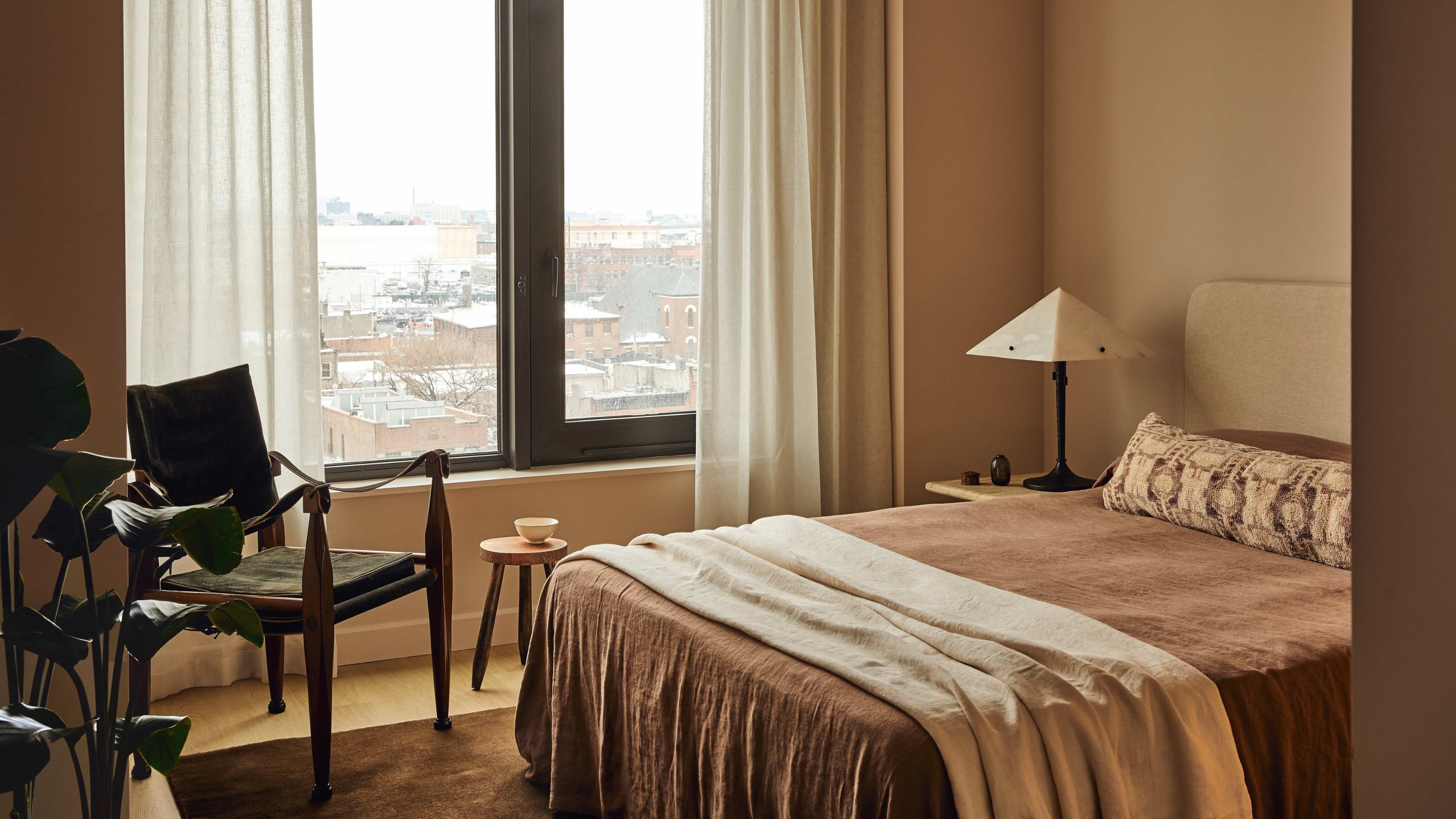
3 Classic Color Palettes That I'm Betting Will Feel Just as Current in 100 Years' Time
15 Timeless Paint Colors You’ll Never Tire Of, According To Designers