1/5
3 Classic Color Palettes That I'm Betting Will Feel Just as Current in 100 Years' Time
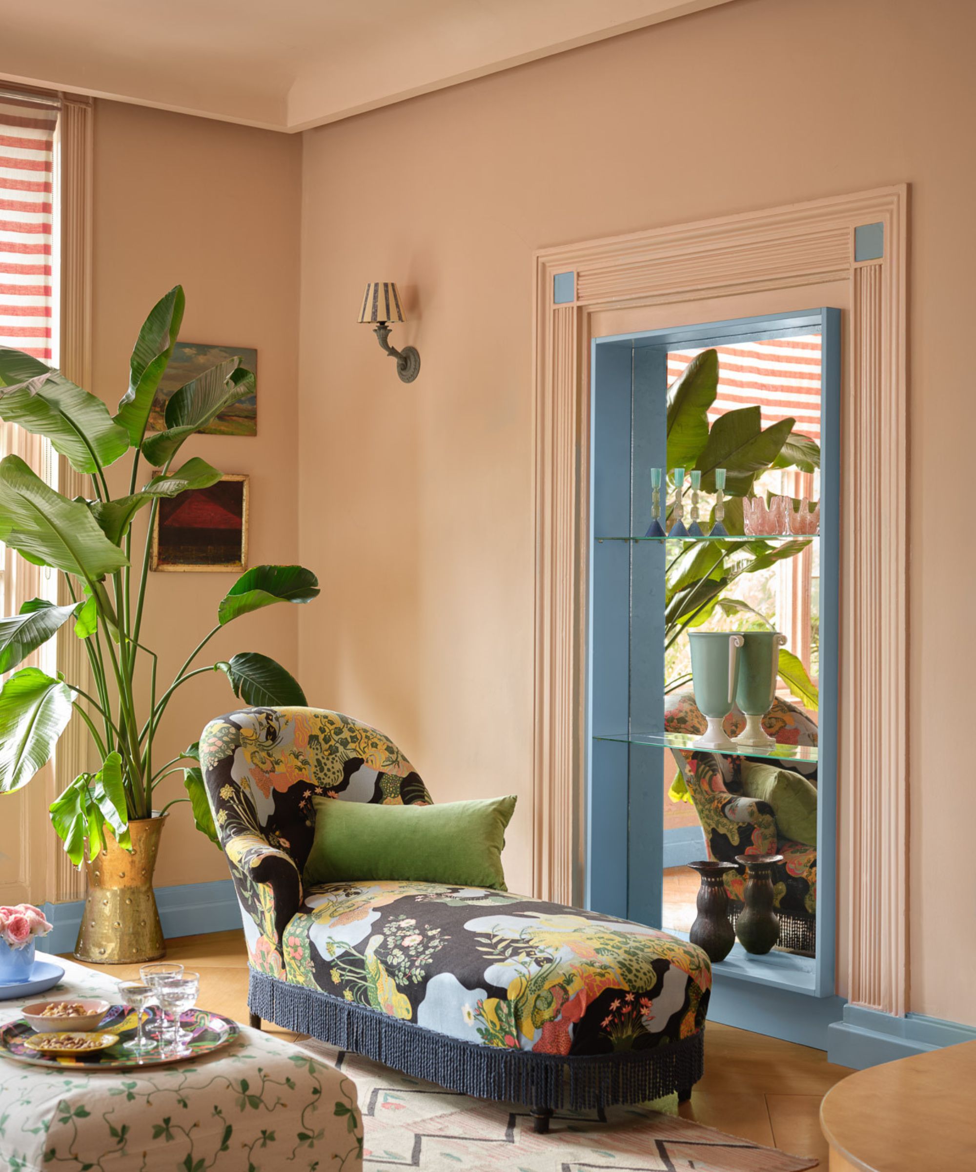
Classic color palettes, characterized by their familiarity, permanence, and quiet elegance, possess a versatility that allows them to adapt to evolving design trends while maintaining a foundational aesthetic. Unlike fleeting color trends that often feature bold, playful shades reflecting current popular styles, classic palettes offer an enduring sense of timelessness, making them suitable for curating a sophisticated and lasting home environment. These palettes are rooted in nature and evoke a sense of grounded reliability without appearing static.
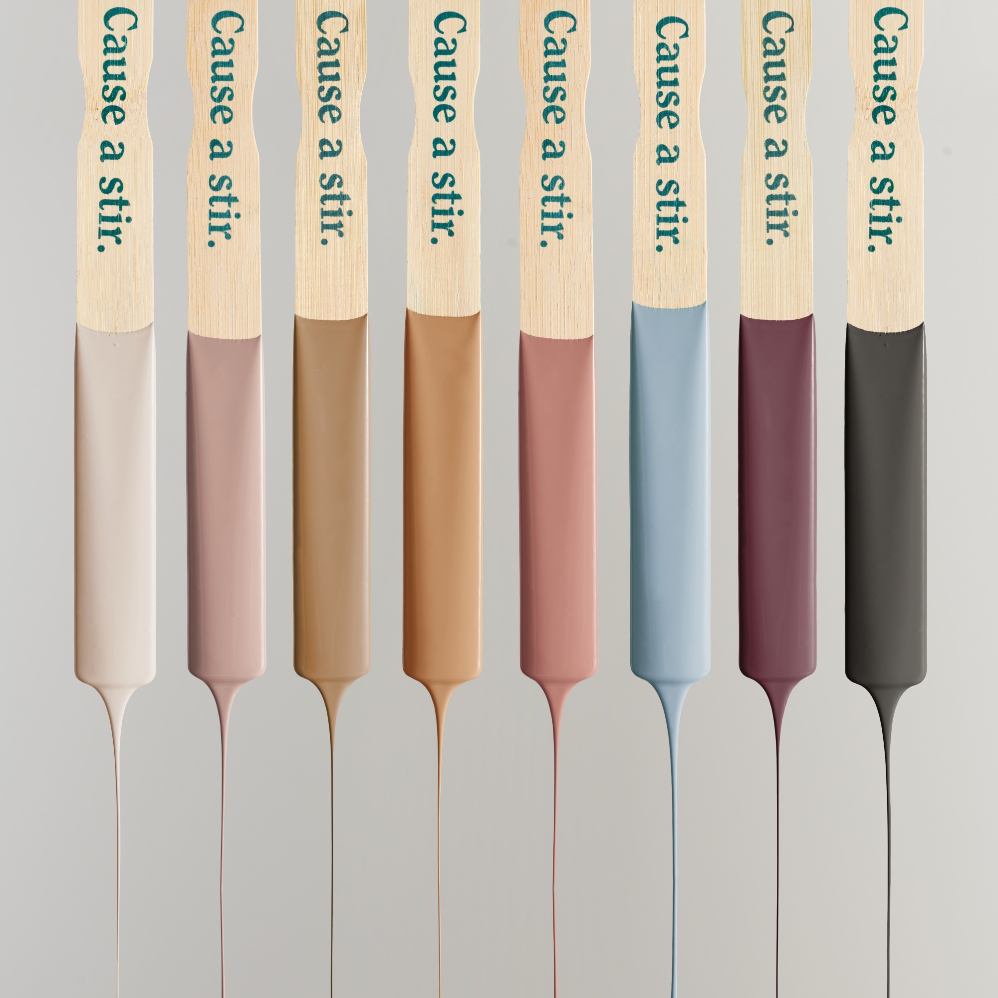
Interior designers emphasize that classic colors "whisper with confidence" and are deeply connected to nature and a refined taste. These colors are typically grounded neutrals with significant depth, such as bone white, camel, navy, and charcoal. Their inherent effortlessness allows them to harmonize with a diverse range of materials and interior styles. While classic colors retain their core presence, minor shifts in temperature—for example, a move from cooler grays and crisp whites to warmer taupe sands and browns—can update their application without diminishing their timeless appeal. This dynamic allows classic palettes to evolve subtly, ensuring their continued relevance across generations.
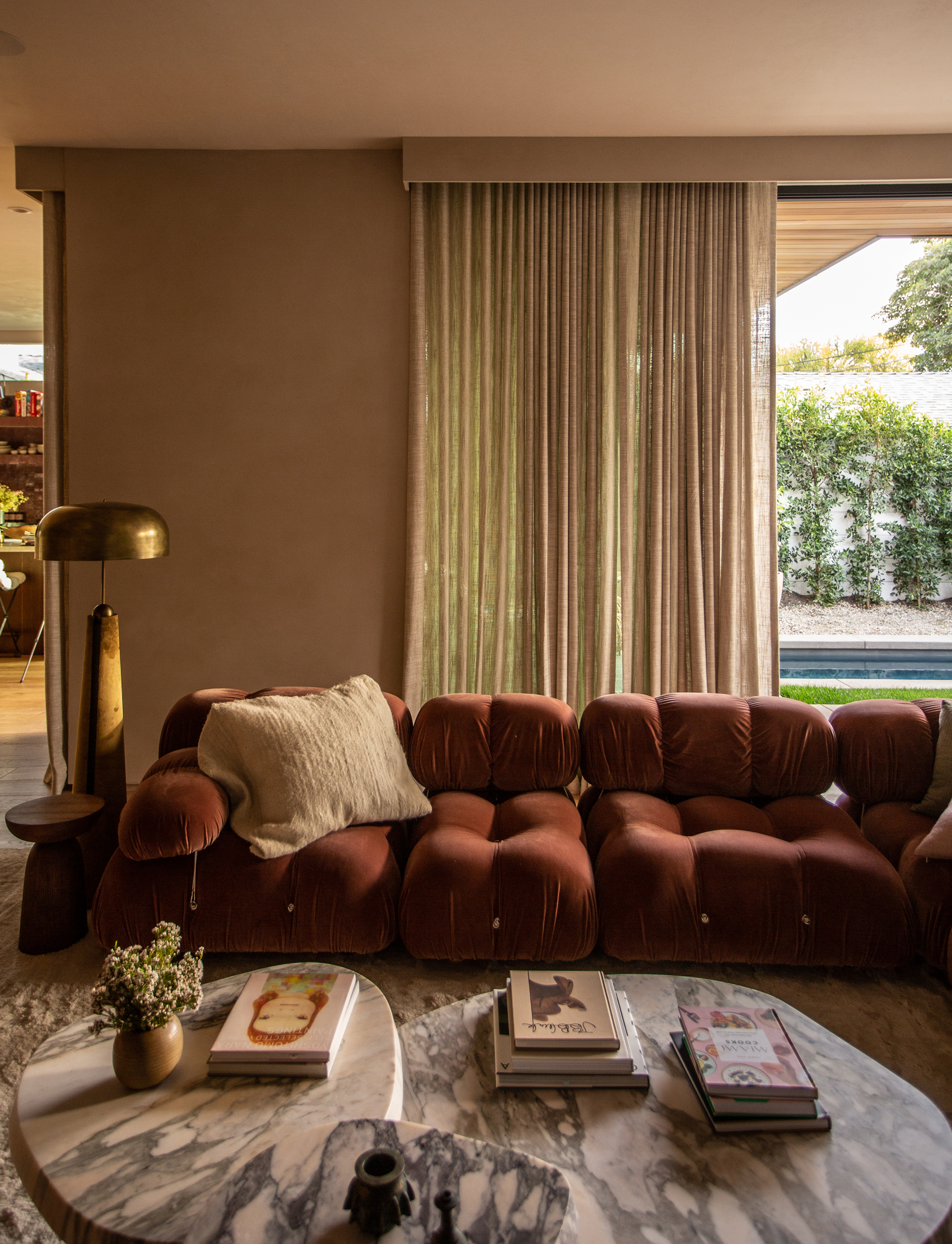
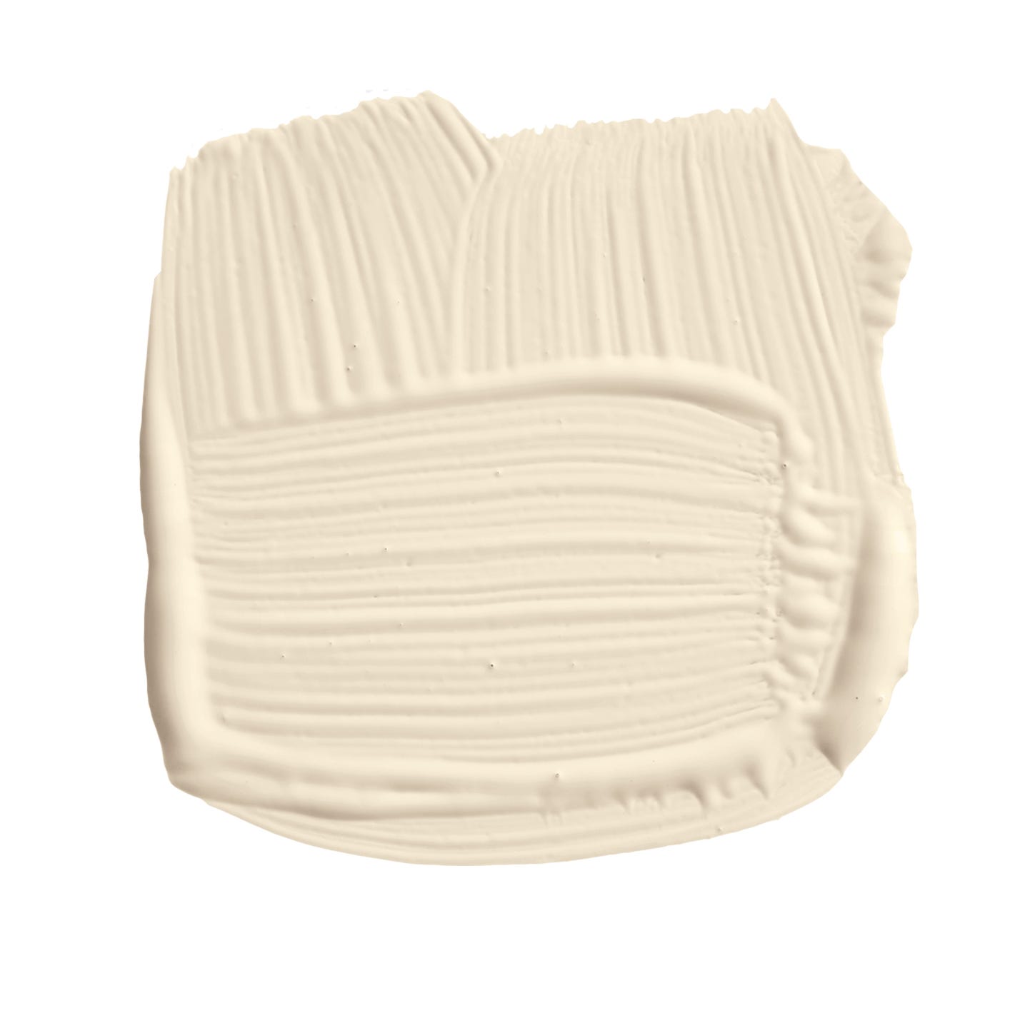
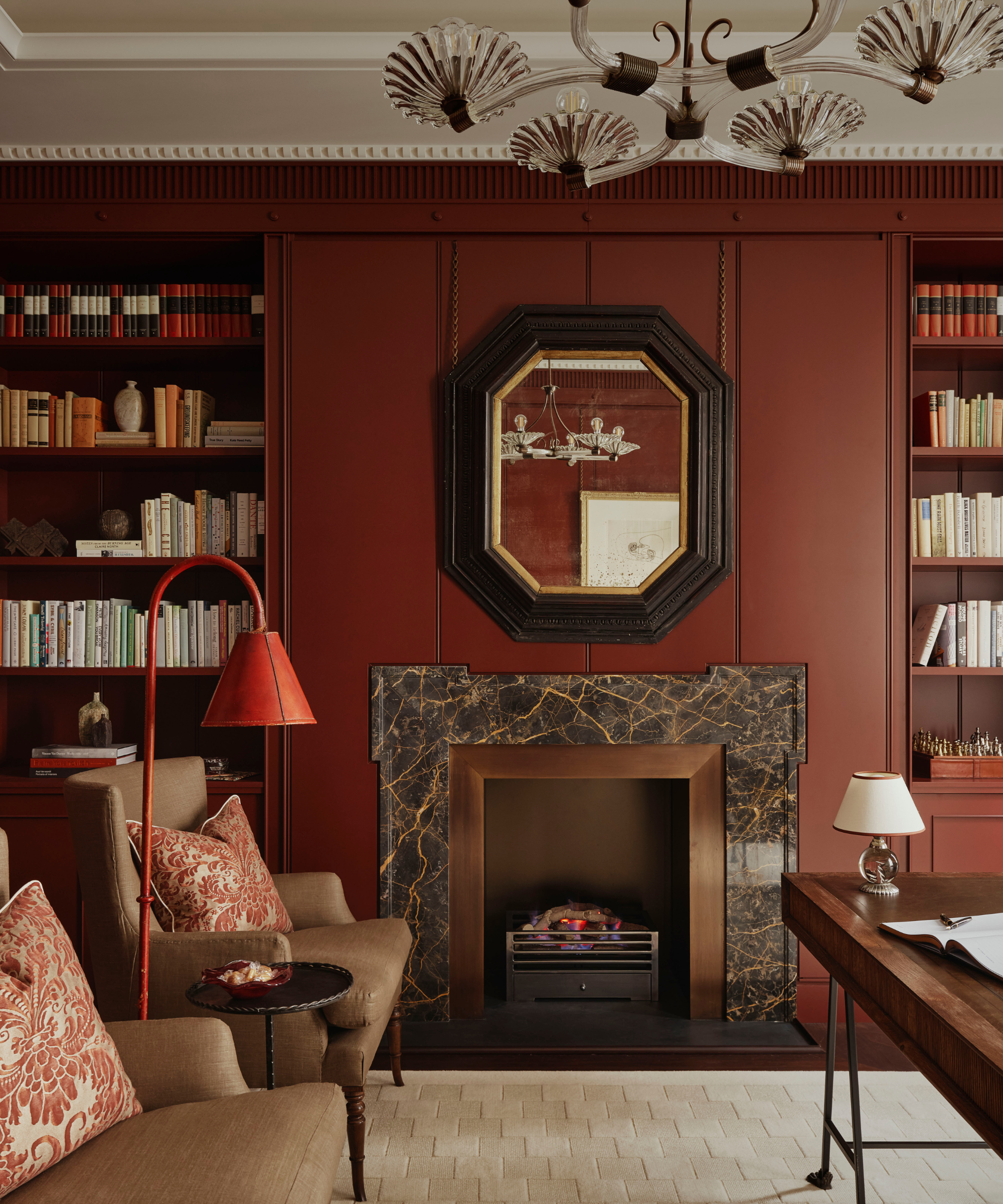
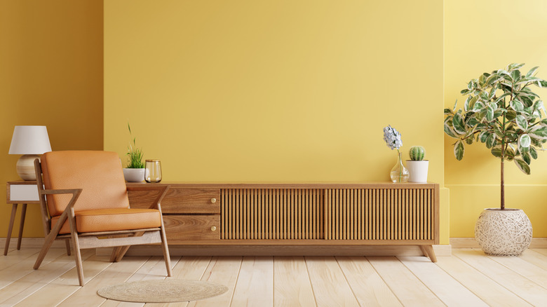
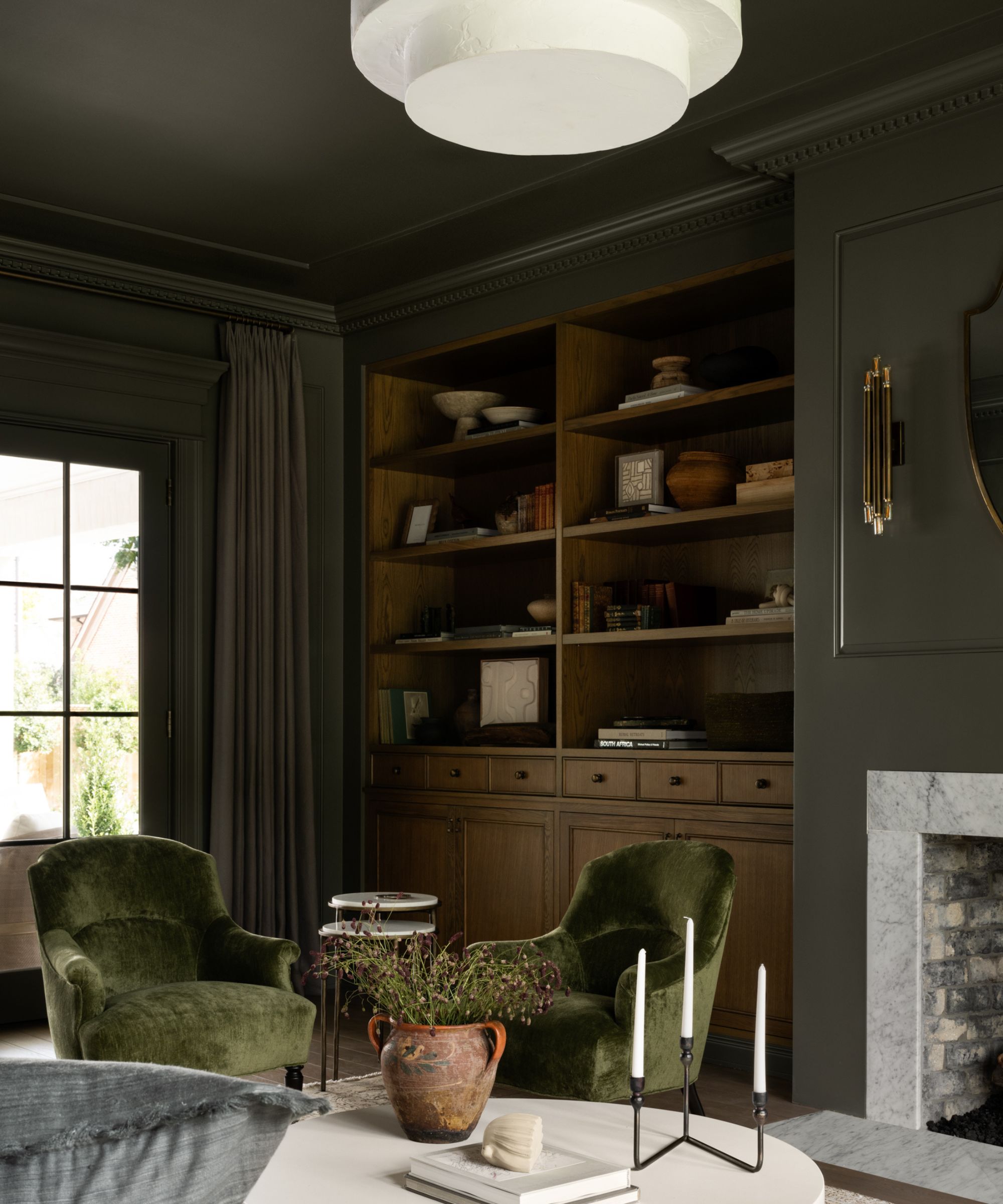
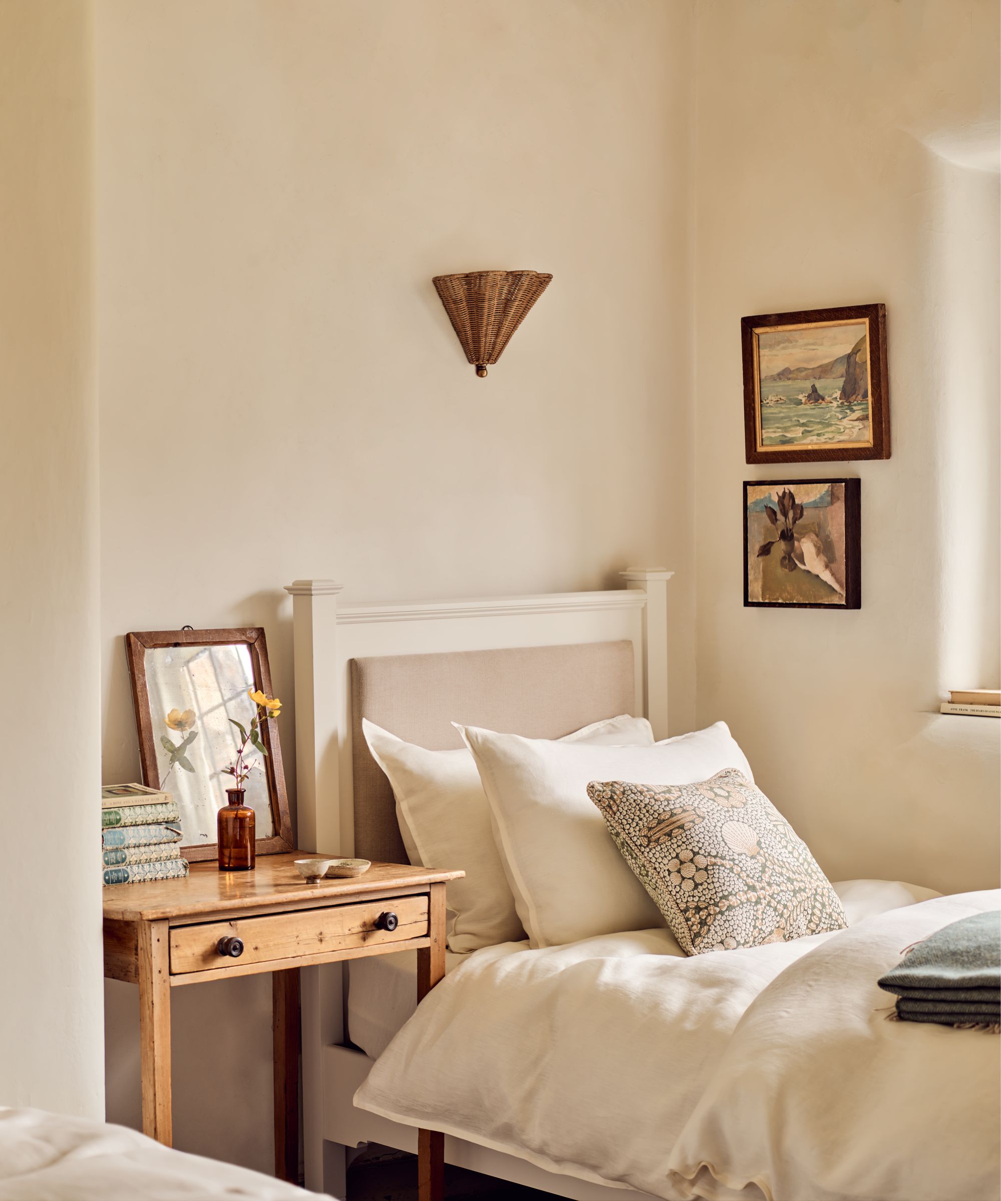
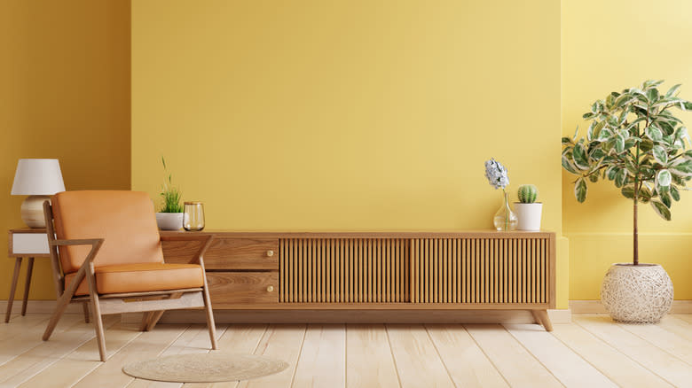
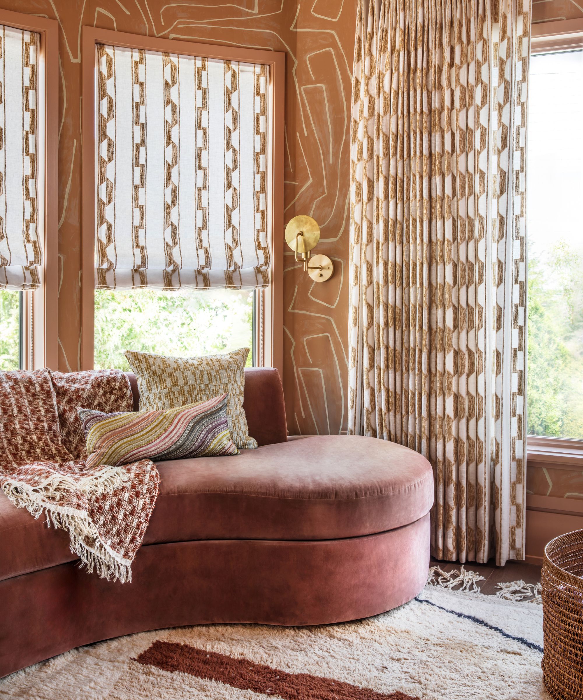

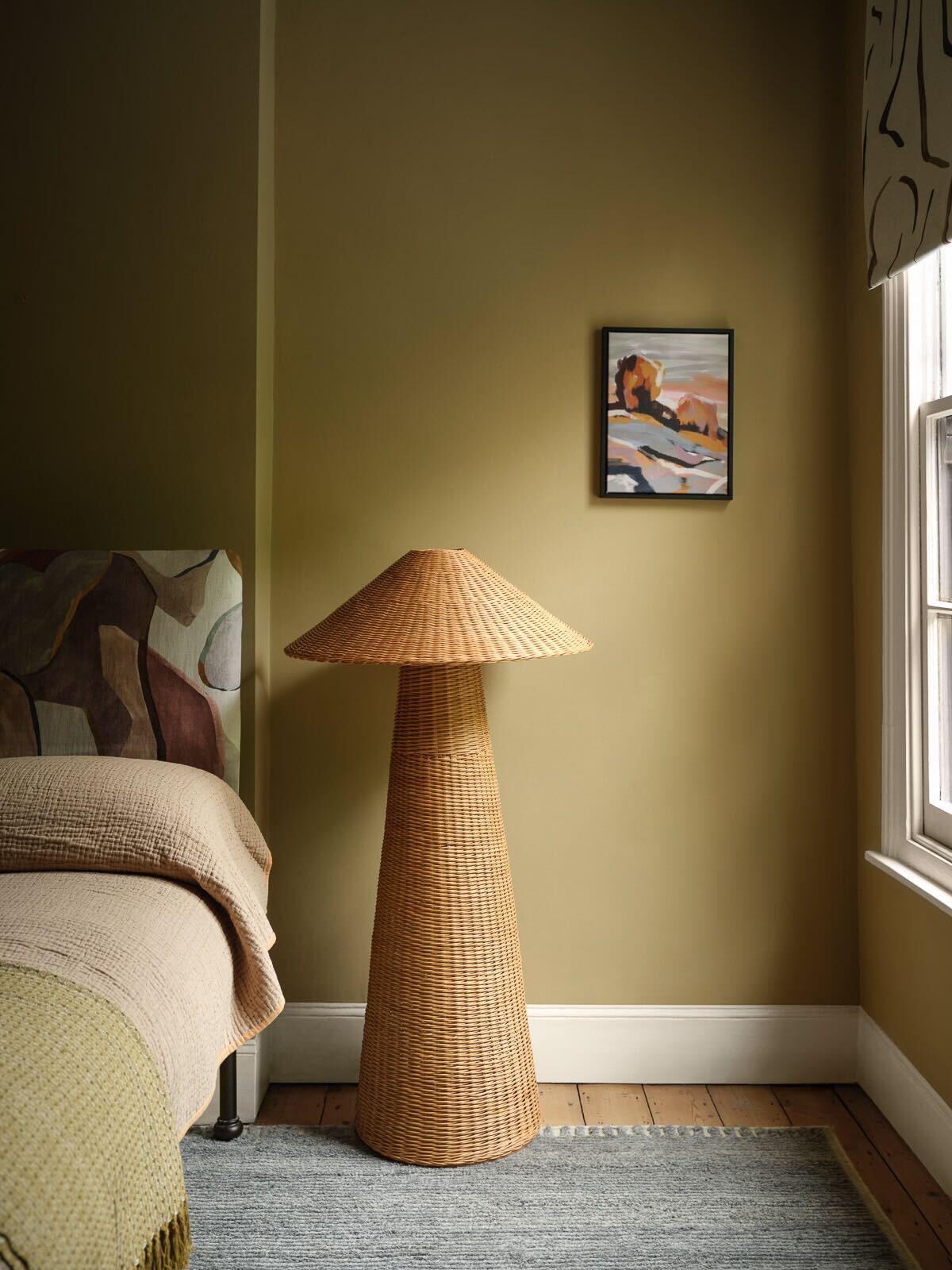
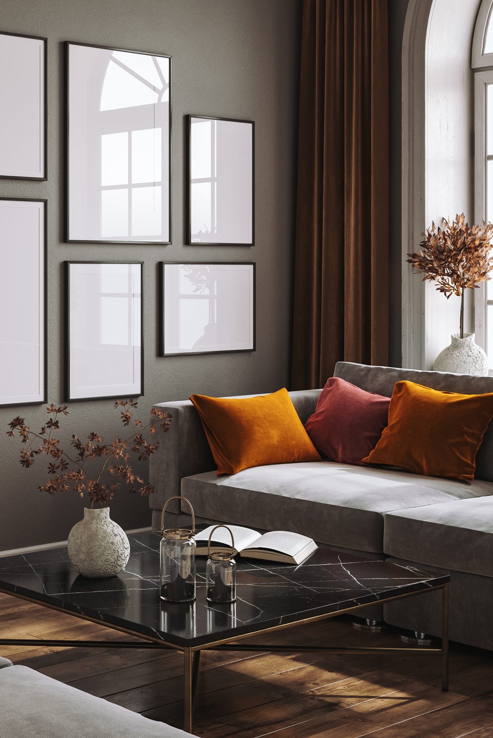
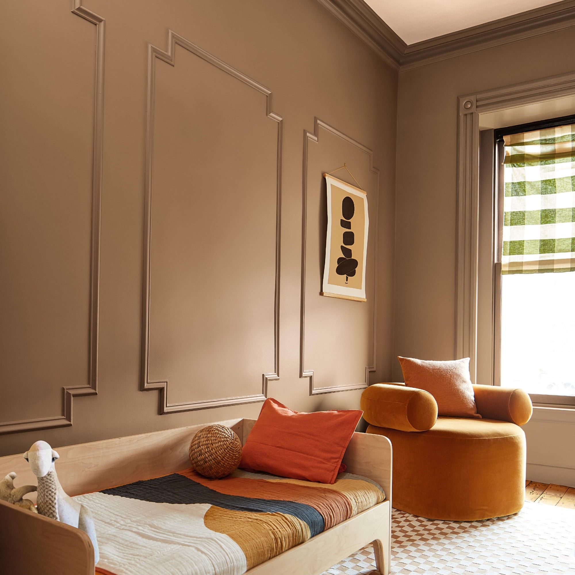
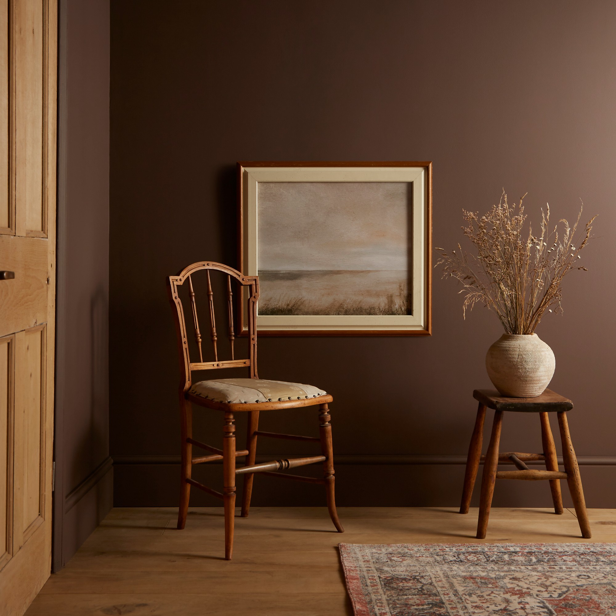
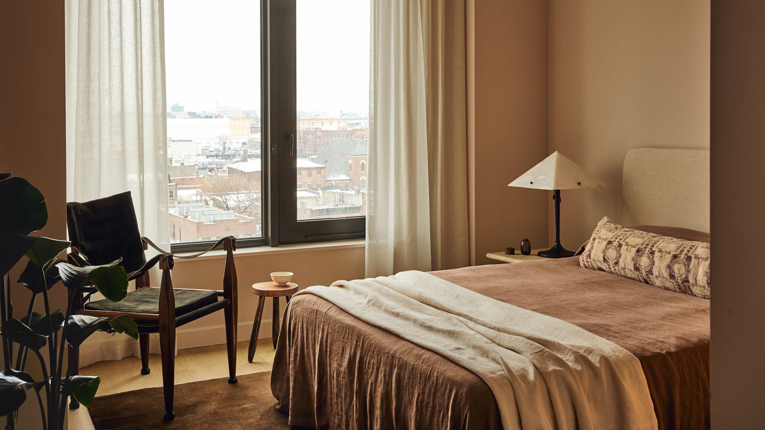
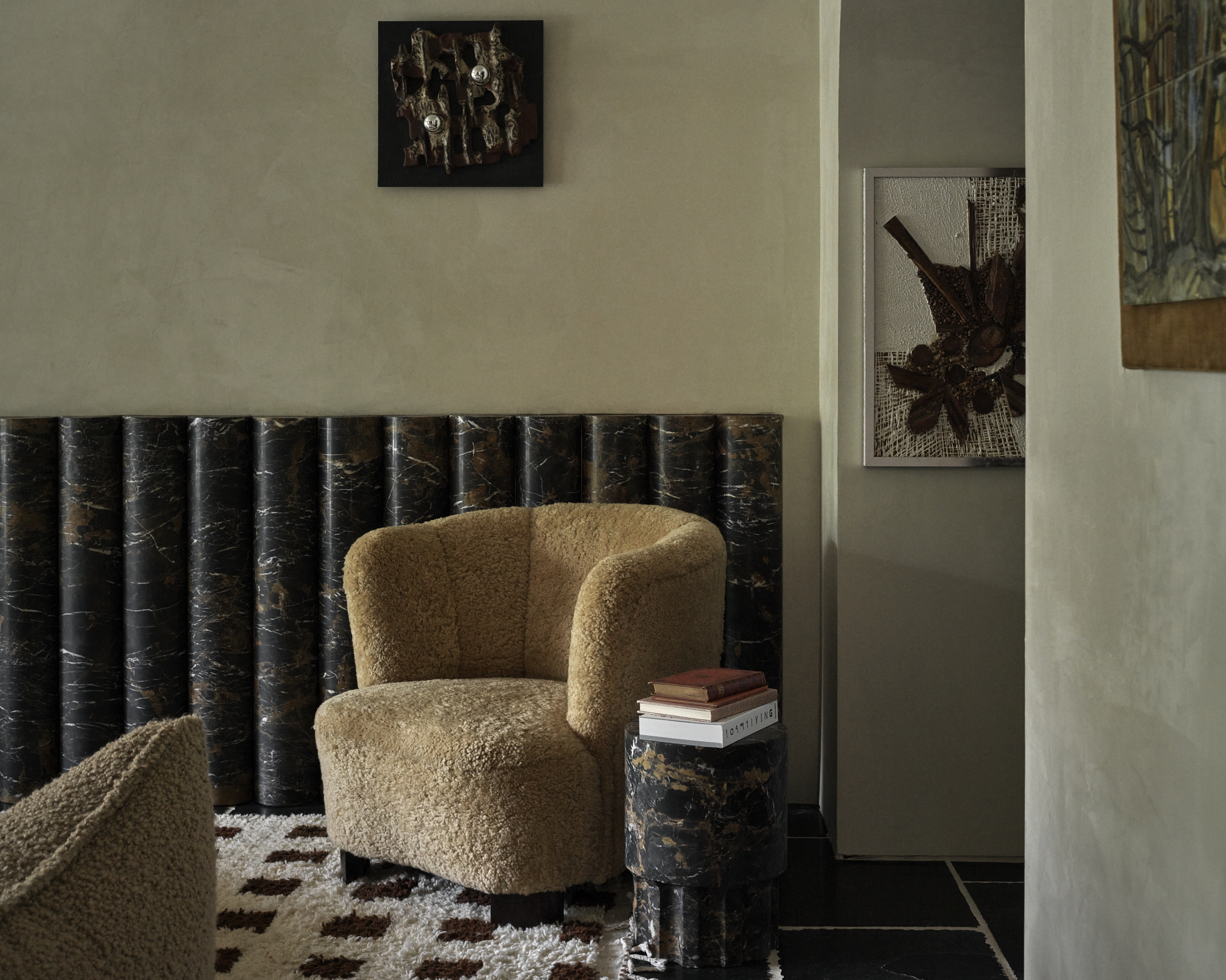
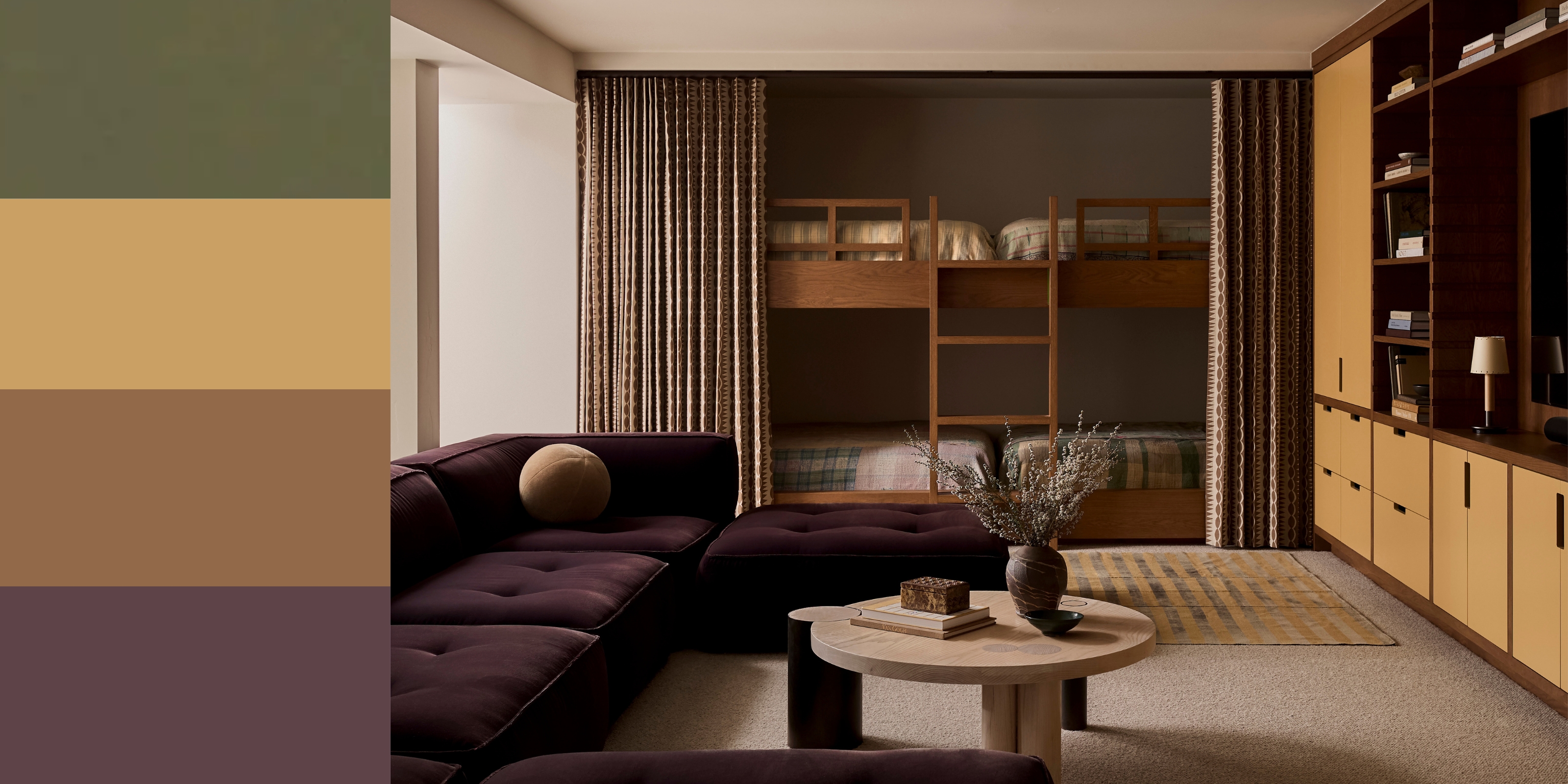
One prominent classic color palette combines bone, camel, and espresso. This trio creates a warm, inviting, and grounded atmosphere without becoming overly heavy. Designers describe these as "neutrals with depth," including ivory, chocolate browns, and caramel, noting their layered tones and subtle presence. To elevate this palette, integrating texture through materials such as linen, leather, wool, and wood is crucial. Experimenting with finishes like limewash paint, high-gloss millwork, or velvety matte walls can further enhance the classic aesthetic, ensuring the space feels lived-in and rich with character rather than merely observed.
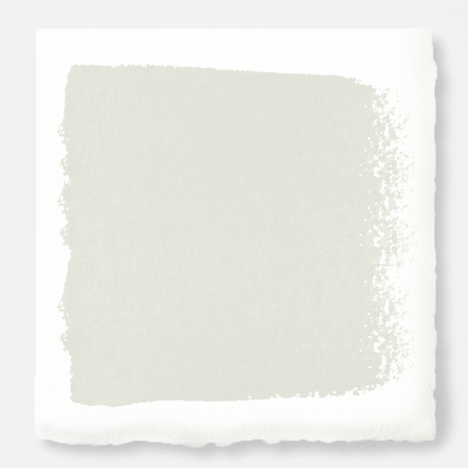
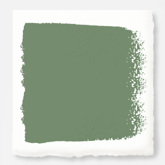
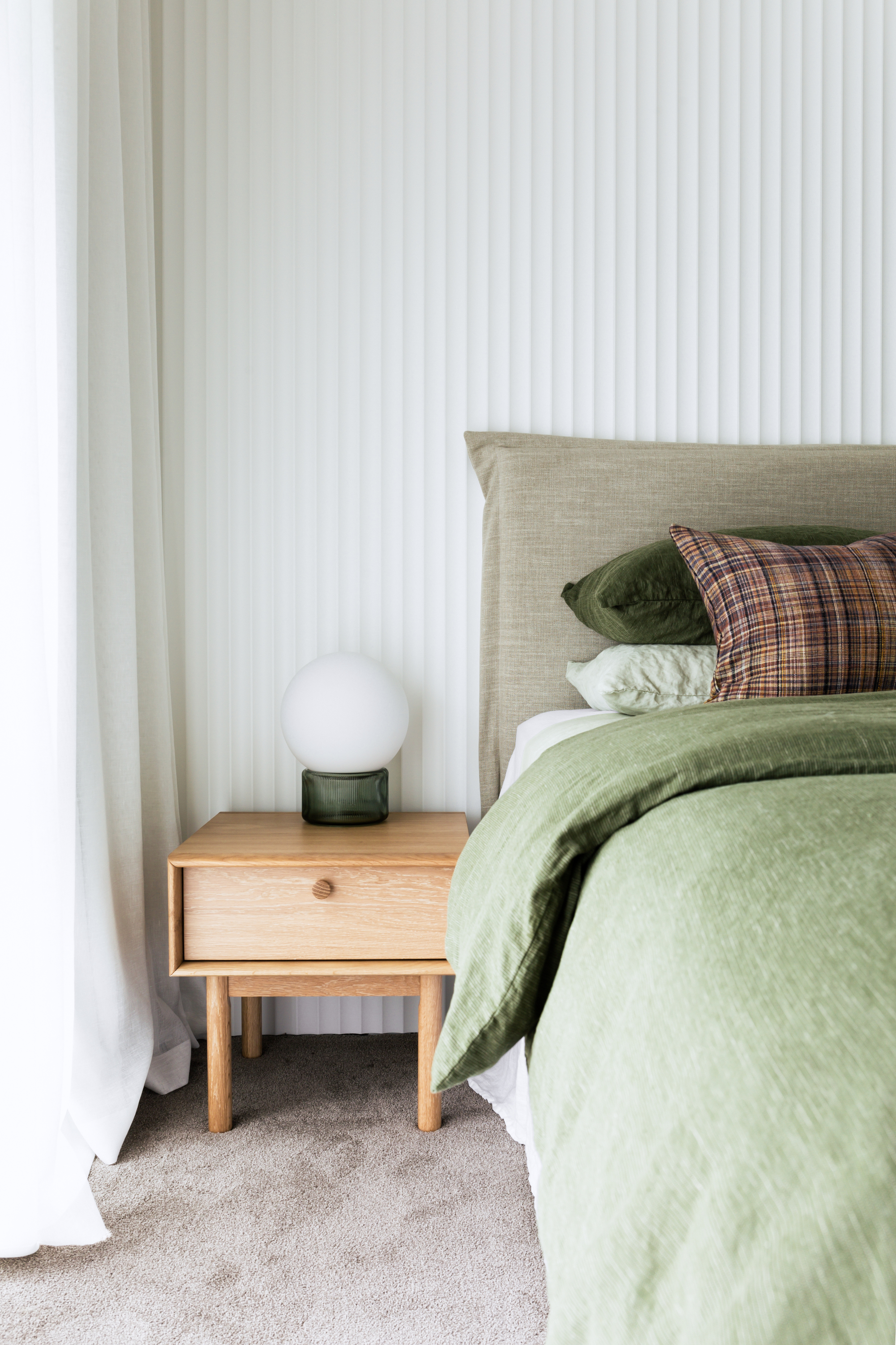
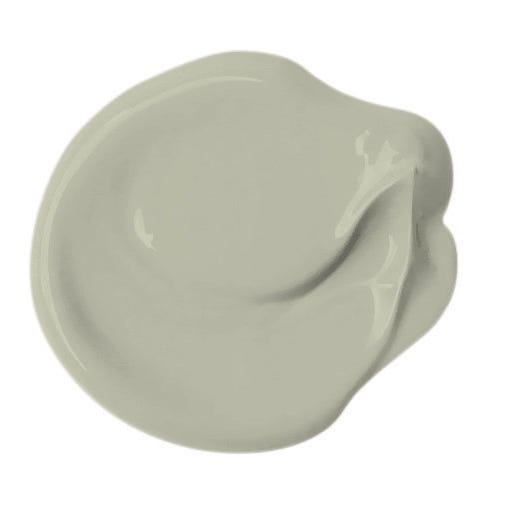
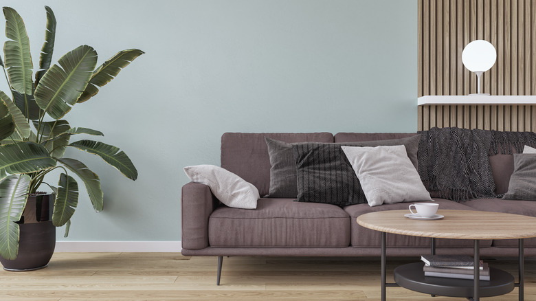
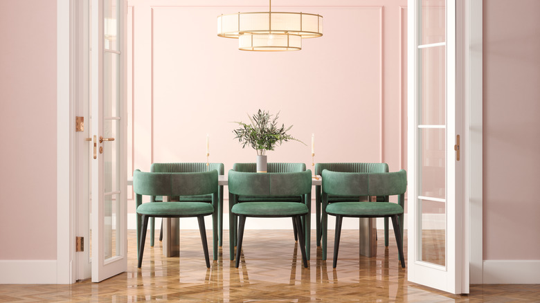
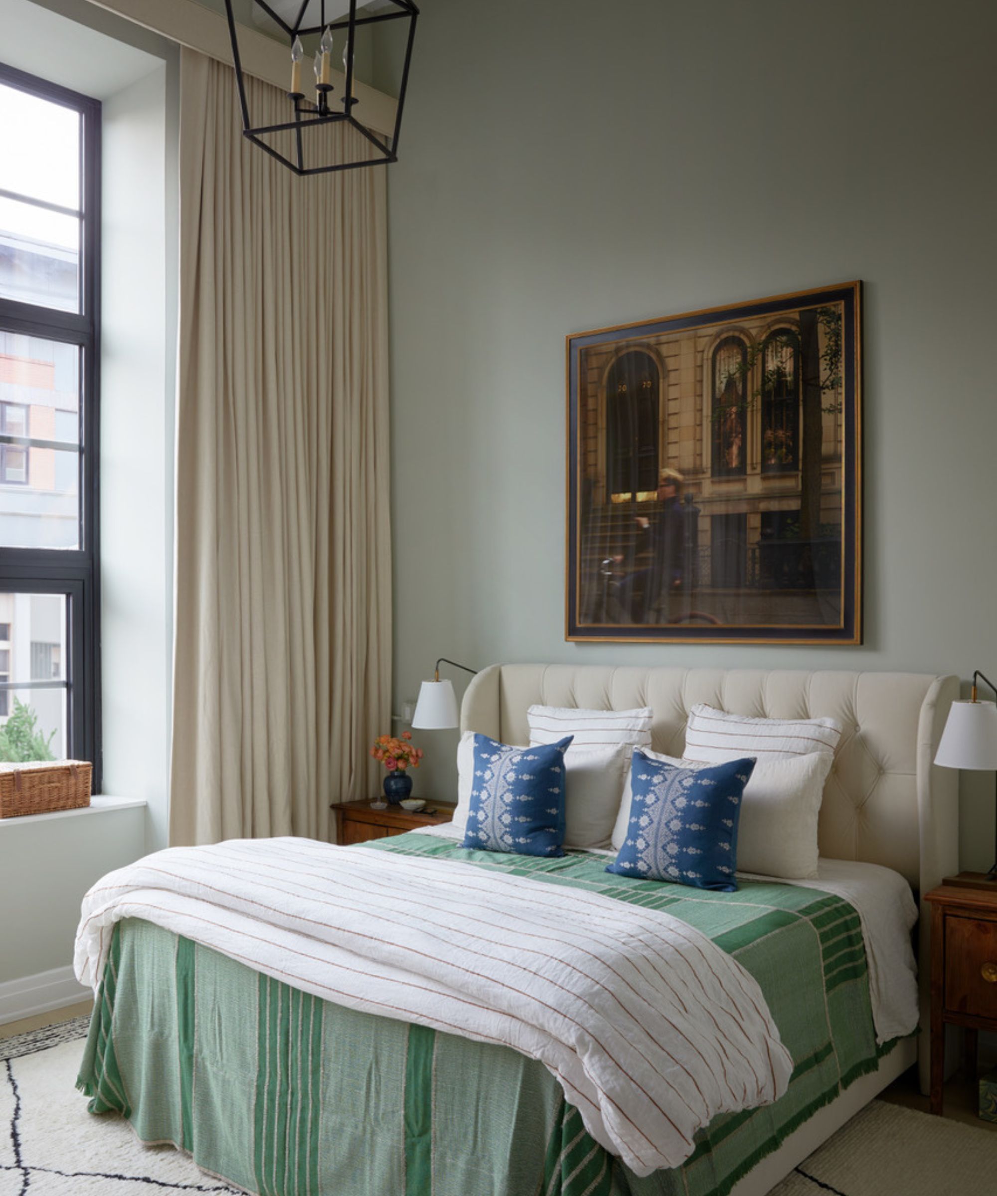
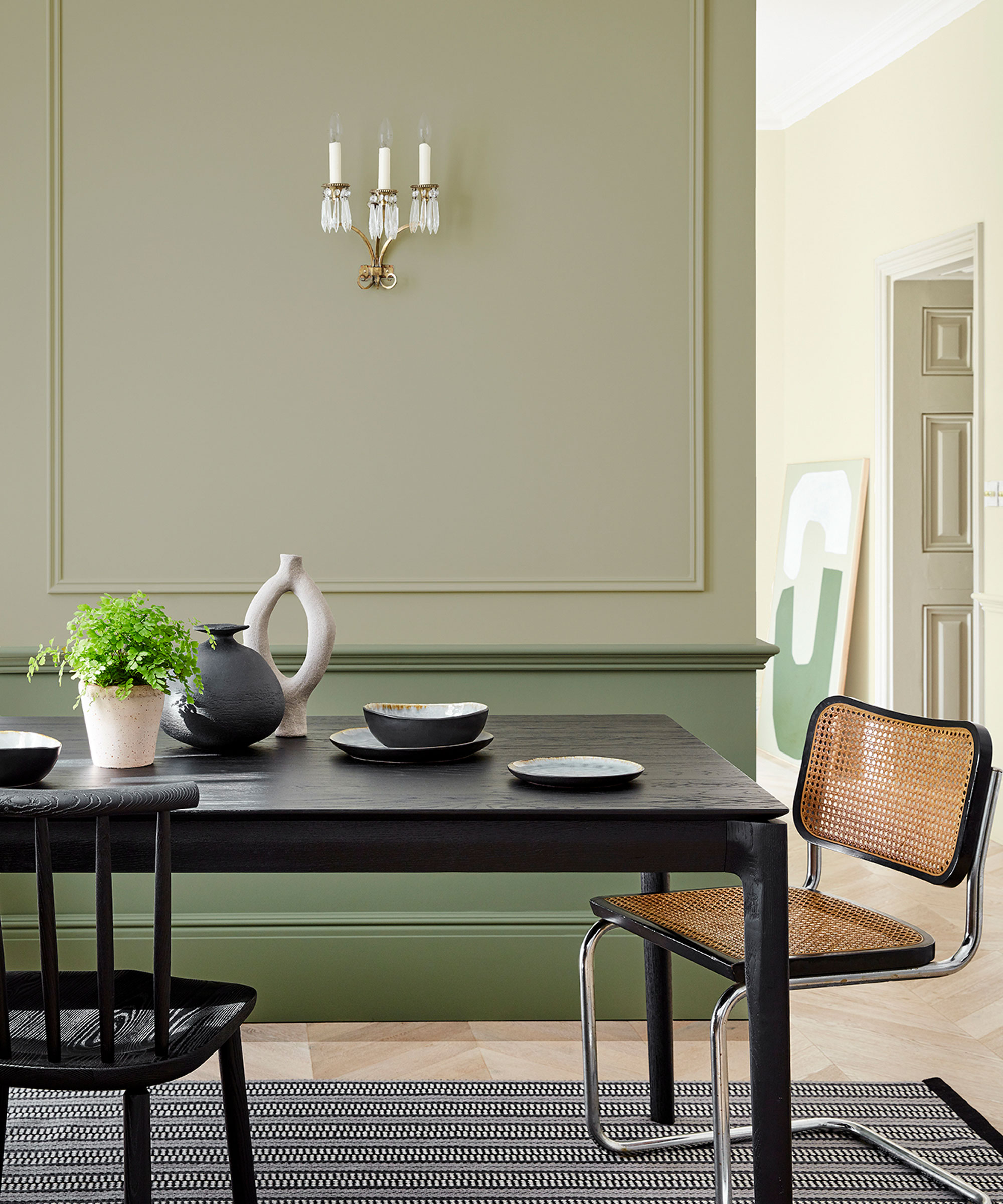
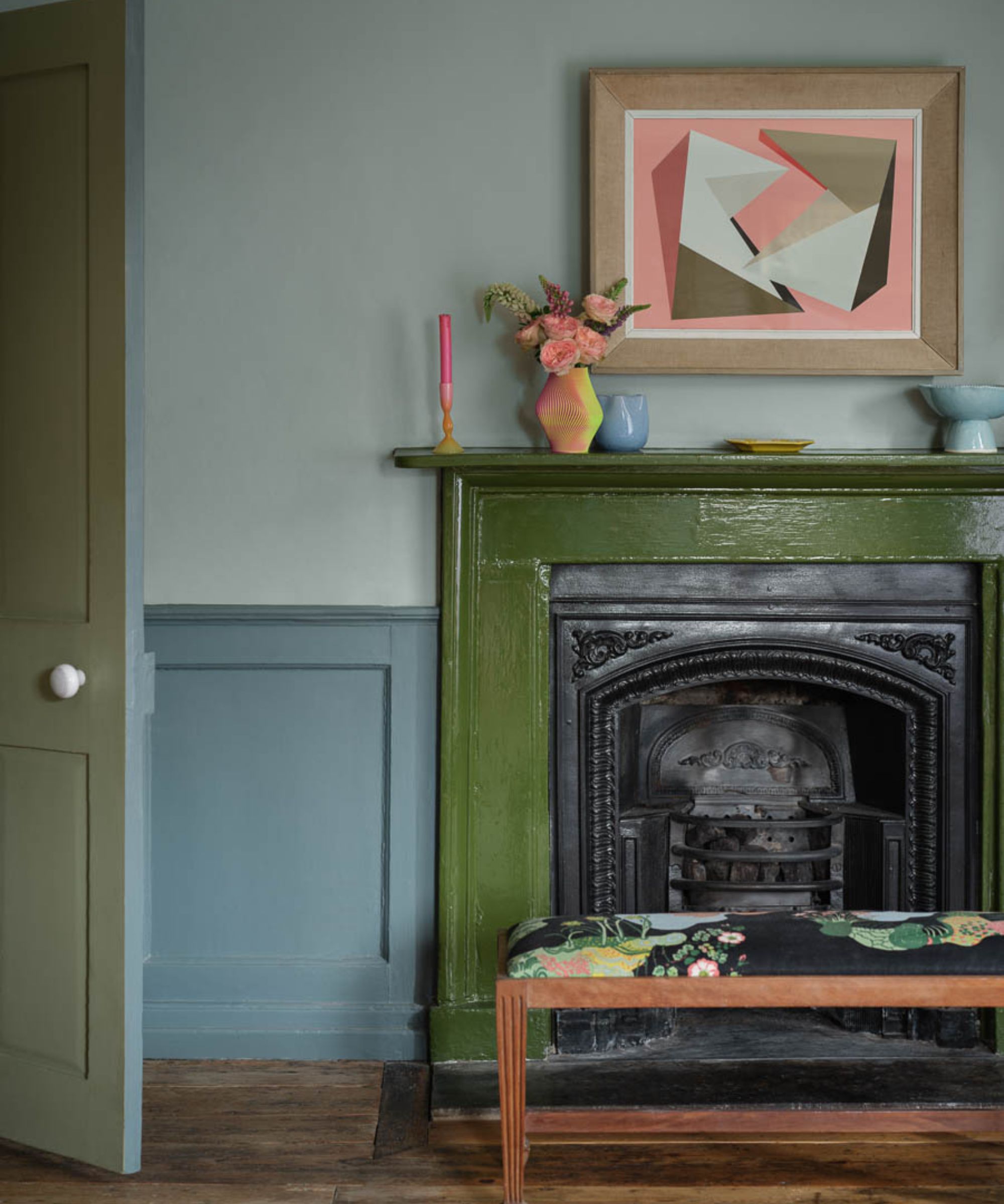
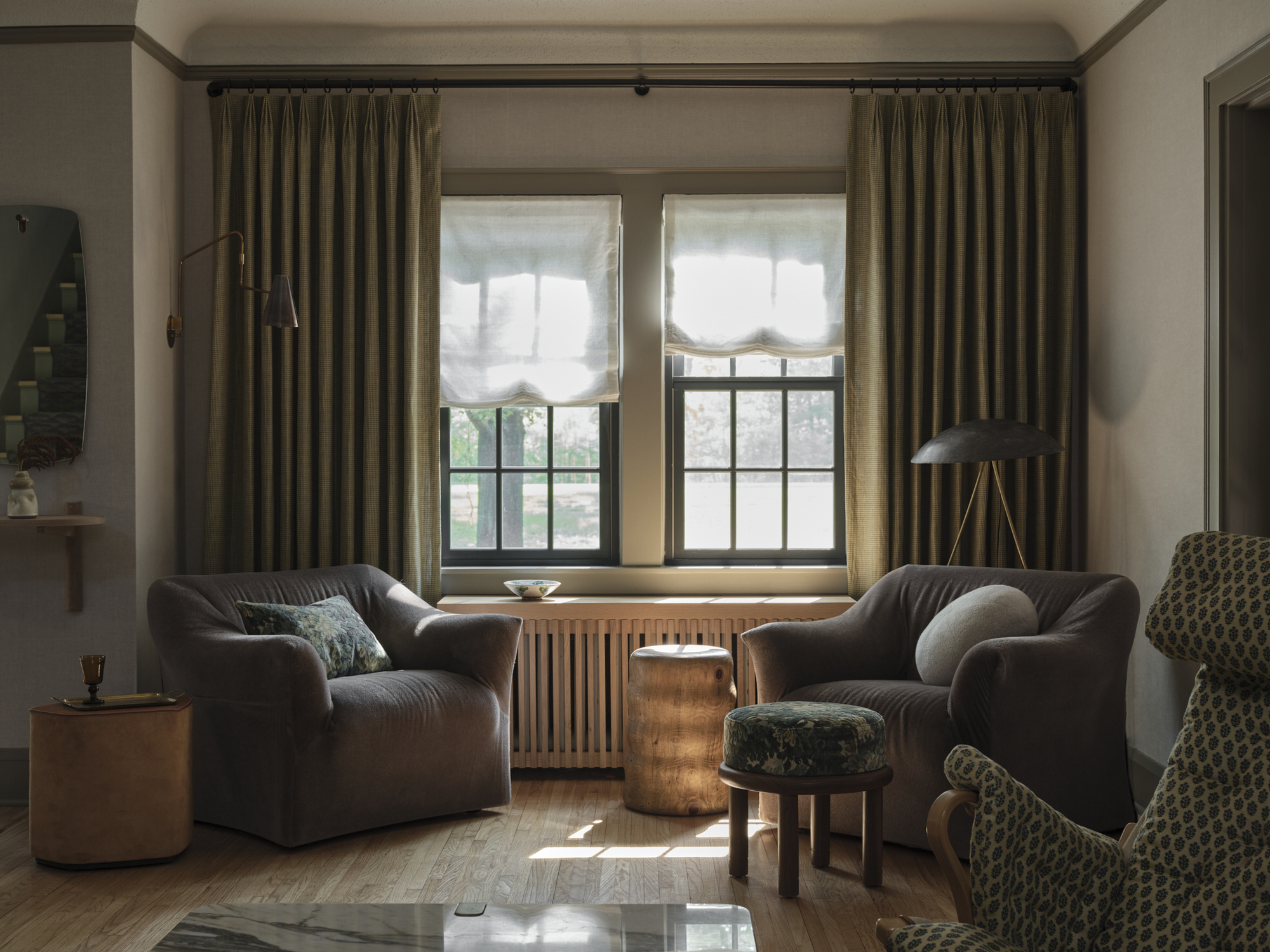
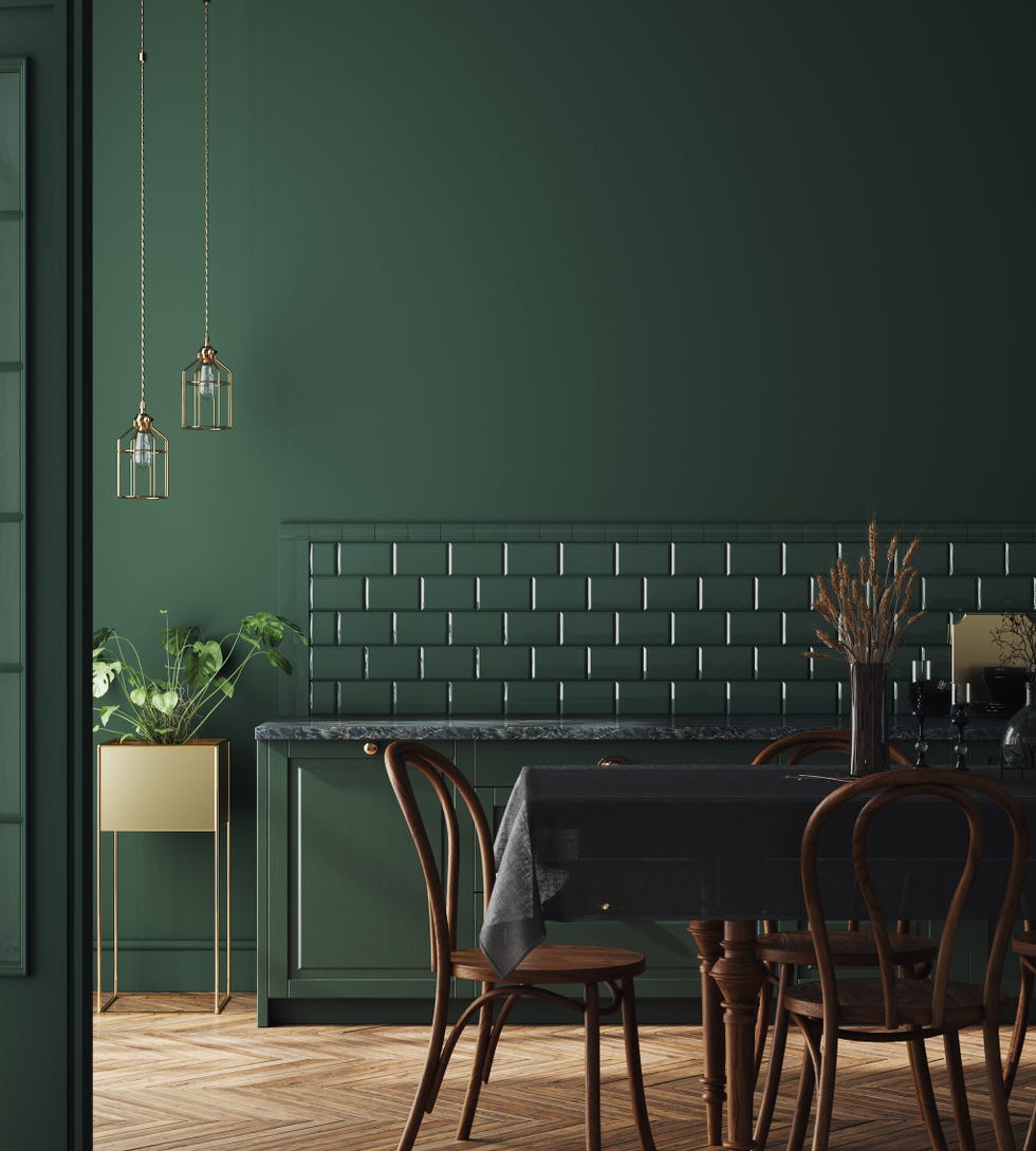
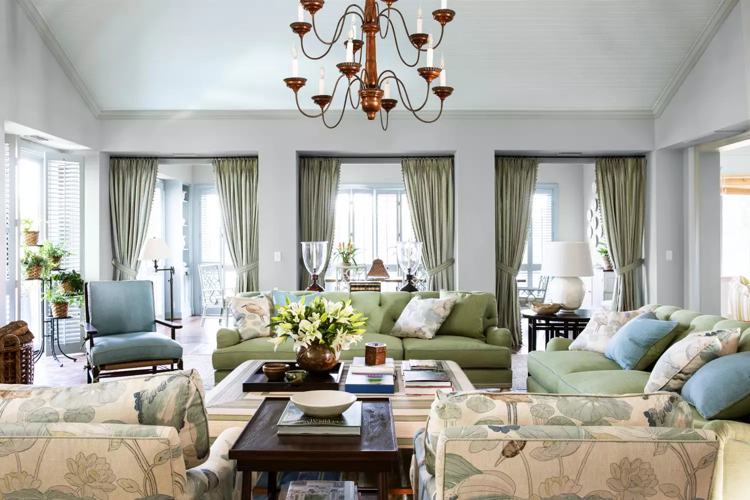
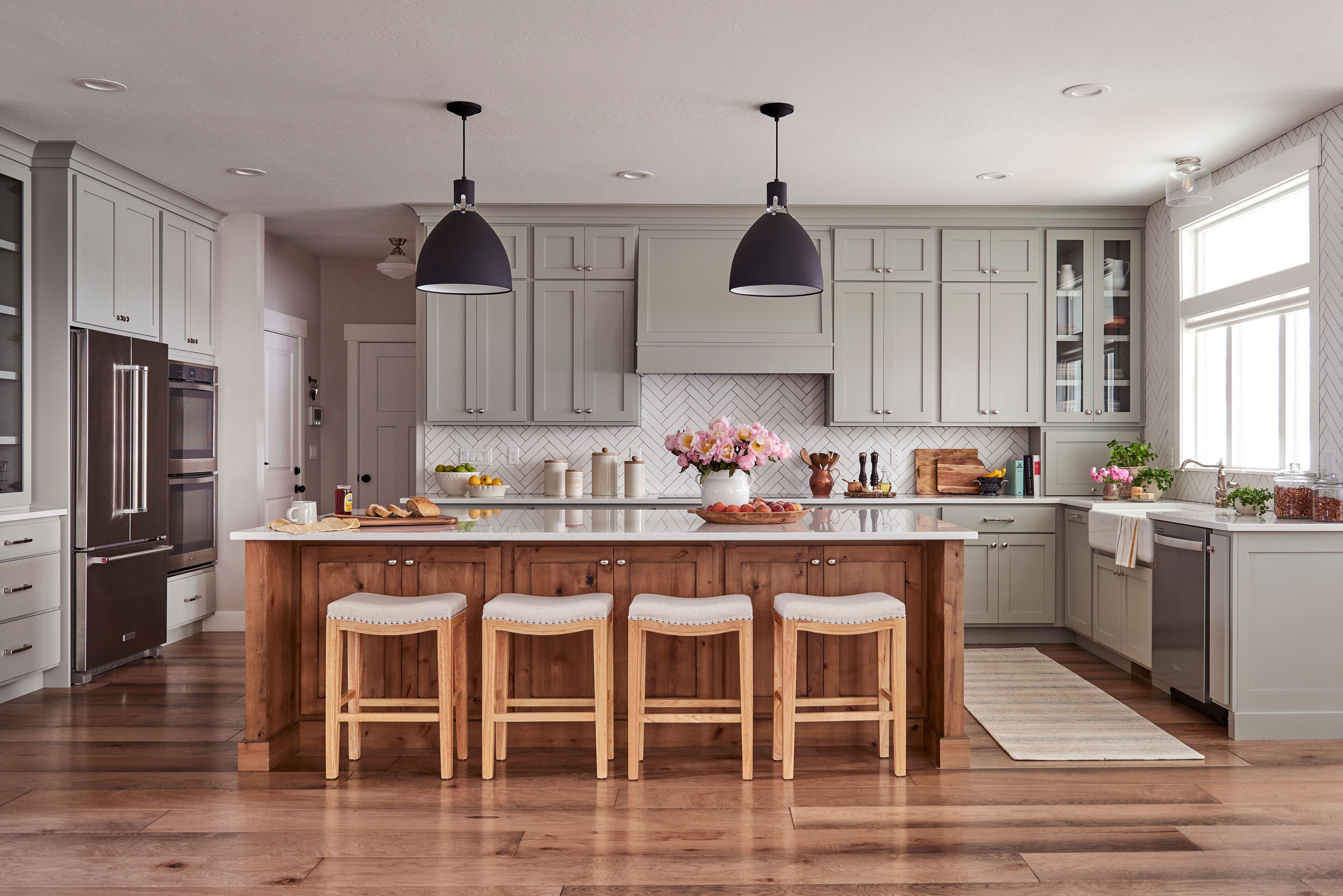
A second classic palette features ivory, sage, and blackened bronze. This combination offers subtle yet engaging contrast, resulting in a refined aesthetic. Soft ivory provides a warm and textured neutral base, while charcoal and warm blacks introduce a quiet dramatic and architectural element. Sage green acts as a sophisticated, craftily colorful canvas, allowing for the incorporation of meaningful objects, handcrafted textures, and personal color accents, such as vintage textiles, inherited art, or metallic finishes. Other green shades like olive green and moss can also be used to bring natural elements indoors, ensuring graceful aging.
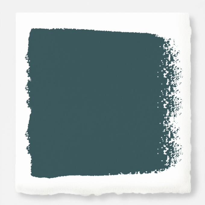
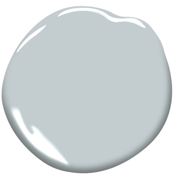
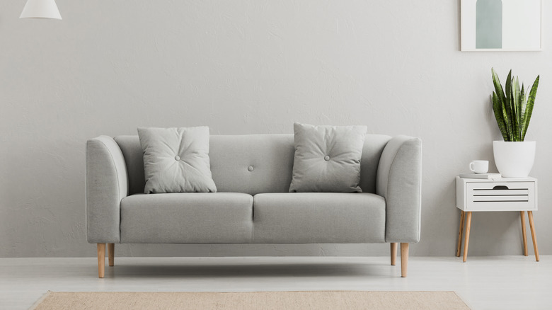
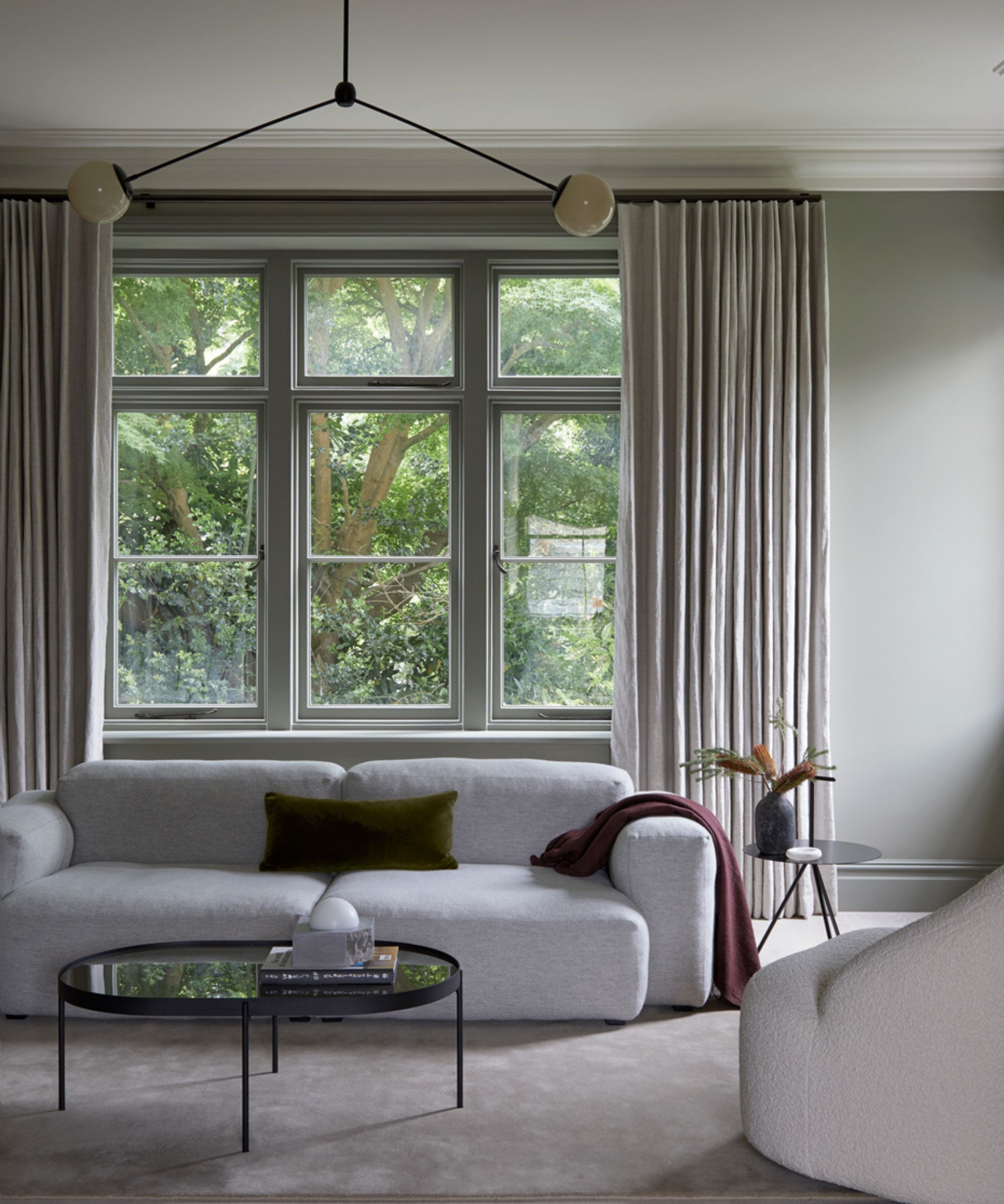
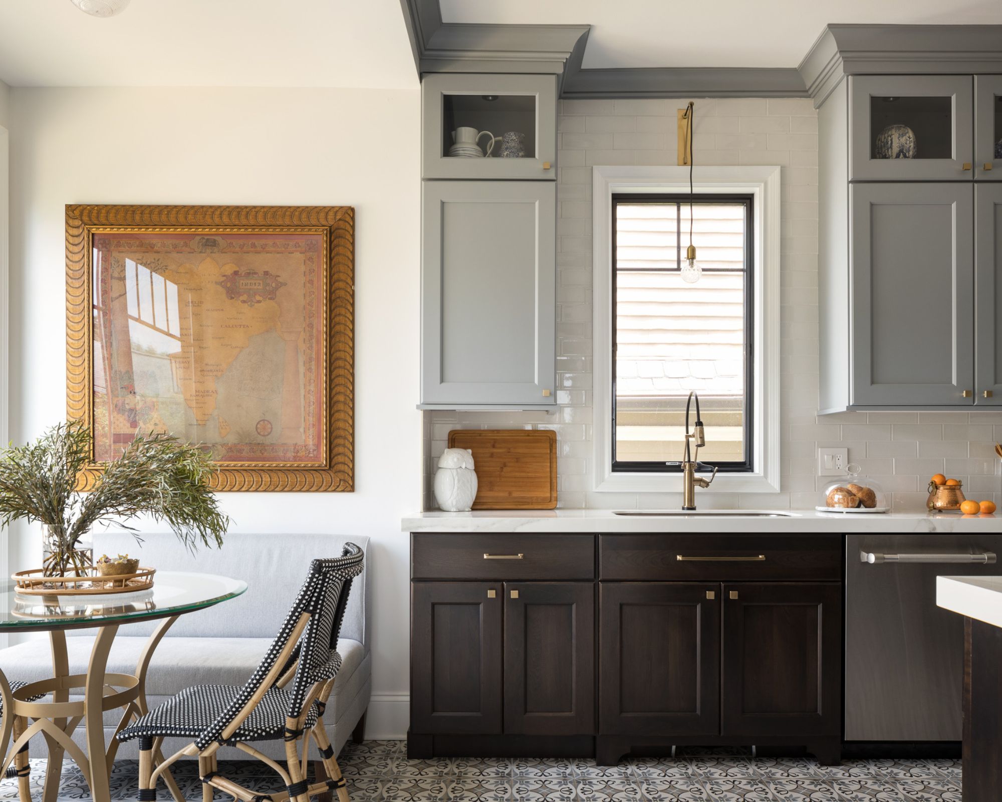
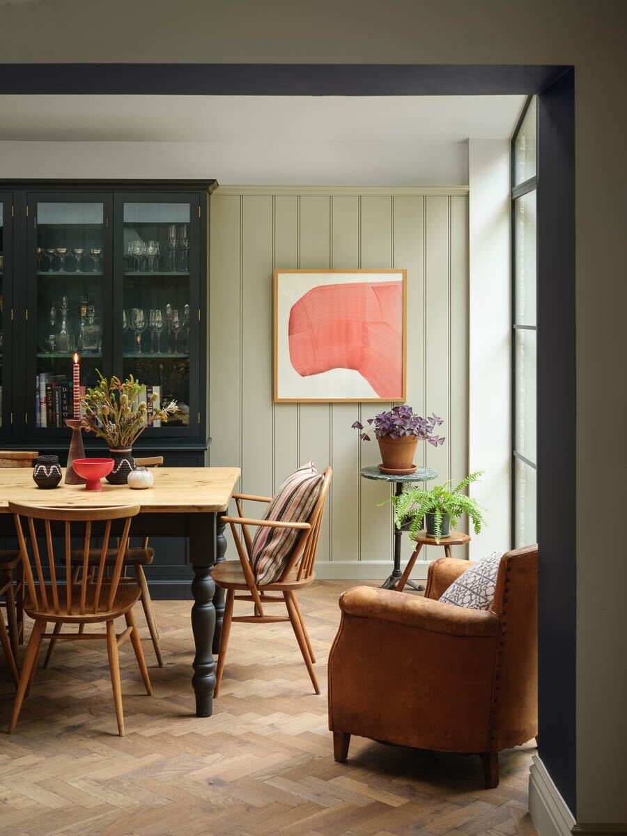
The third classic palette consists of stone gray, charcoal, and white oak. This blend of grays and whites creates a tailored, clean, balanced, and effortlessly refined look. While gray might be perceived as a fading trend in some contexts, when integrated thoughtfully, these tones become an integral part of the home's architecture rather than mere decor, evolving with the inhabitants. With a neutral and cool-leaning palette, achieving interior design balance is paramount. This involves carefully considering aspects like warm and cool tones, matte and gloss finishes, light and shadow, and varied textures to ensure the gray feels current and dimensional, rather than flat.
When implementing classic color palettes, it is essential to commit to a concise selection and repeat these shades intentionally throughout the space. This means applying the chosen two or three colors consistently across paint, materials, and finishes. For instance, the tone of oak floors can be echoed in wood furniture or open shelving, and bronze accents can reappear in hardware and lighting. This restrained approach fosters a cohesive, considered, and ultimately classic environment, providing a perfect strategy for coordinating paint colors across an entire home.
#ClassicColorPalettes #InteriorDesignTrends #HomeColorSchemes #TimelessDesign #NeutralColors #HomeDecor #DesignLongevity #MaterialityInDesign #ArchitecturalColors #ClassicColorPalettes #InteriorDesignTrends #HomeColorSchemes #TimelessDesign #NeutralColors #HomeDecor #DesignLongevity #MaterialityInDesign #ArchitecturalColors
0 comment in total
 No comments yet
You may also like
3 Paint Colors That Will Never Go Out of Style, According to Joanna Gaines

These 20 Paint Colors Will Never Go Out of Style, According to Designers

5 enduring colors designers always return to when they have trend fatigue

15 Timeless Paint Colors You’ll Never Tire Of, According To Designers

The most timeless paint colors according to designers
Vintage paint colors making a comeback this year – experts reveal their top shades for adding a touch of nostalgia
The Vintage Paint Color That Will Never Go Out Of Style

Designers LOVE Pairing These Unexpected Colors With This One Timeless Hue

5 "trend-proof" colors for your home designers think will be just as popular in 10 years' time
The Vintage Paint Color That Will Never Go Out Of Style

Designers say these '80s-inspired colors are making a comeback in 2025 – 5 retro shades for a colorful home
Designers Say These Vintage Paint Colors Are Back
Classic Color Schemes That Never Go Out of Style

Once-Trendy Paint Colors That Will Make Your Home Look Dated In 2025
The Best Vintage-Inspired Paint Colors — 6 Expert-Approved Shades for a Touch of Chic Nostalgia
The colour palette for 2025 – these are the shades paint experts say we’ll see everywhere next year

5 Timeless Paint Colors That Will NEVER Go Out of Style, According to Designers

As a color editor, I've seen hundreds of color trends come and go this year – these are the ones I think will stick for 2025
70s Color Palettes — 4 Formulas That Work for Homes Today
3 Kitchen Paint Colors Experts Promise Will Never Go Out of Style