1/17
70s Color Palettes — 4 Formulas That Work for Homes Today
Nostalgia plays a significant role in interior design, extending beyond personal memories to past aesthetics. The 1970s color palette, characterized by golden yellows, olive greens, deep purples, rusty oranges, and chocolate browns, is experiencing a resurgence in contemporary home decor. This trend allows for a blend of retro charm with modern sensibilities, creating cozy and personalized spaces.
According to color expert Amy Moorea Wong, typical 70s visuals include olive-y, avocado greens, rusty oranges, gold-ish yellows, and chocolate browns, often complemented by splashes of magenta, deep purple, and occasional electric blue or acid lime for a psychedelic touch. While vibrant, these palettes maintain distinct and defined characteristics. Interior designers and color experts identify four main approaches to integrating 70s color schemes into modern homes.
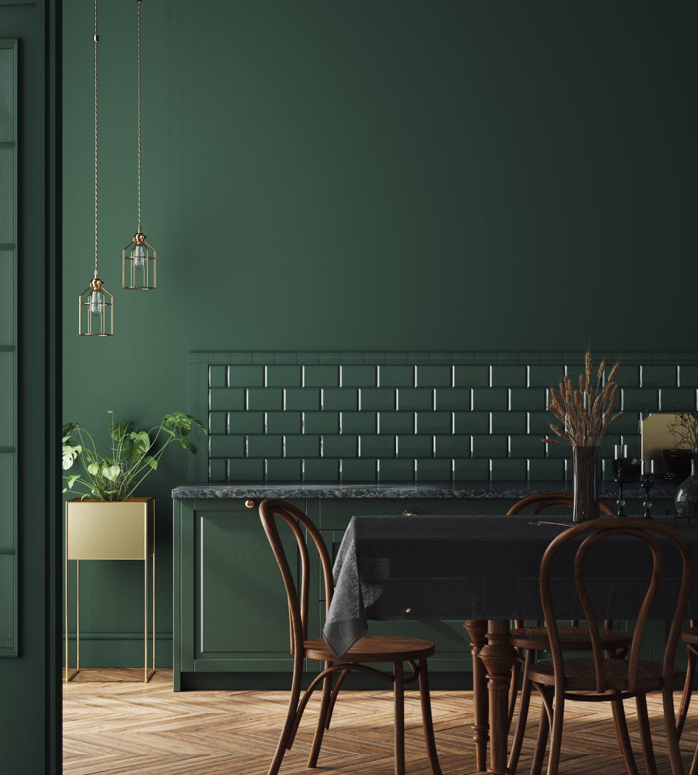
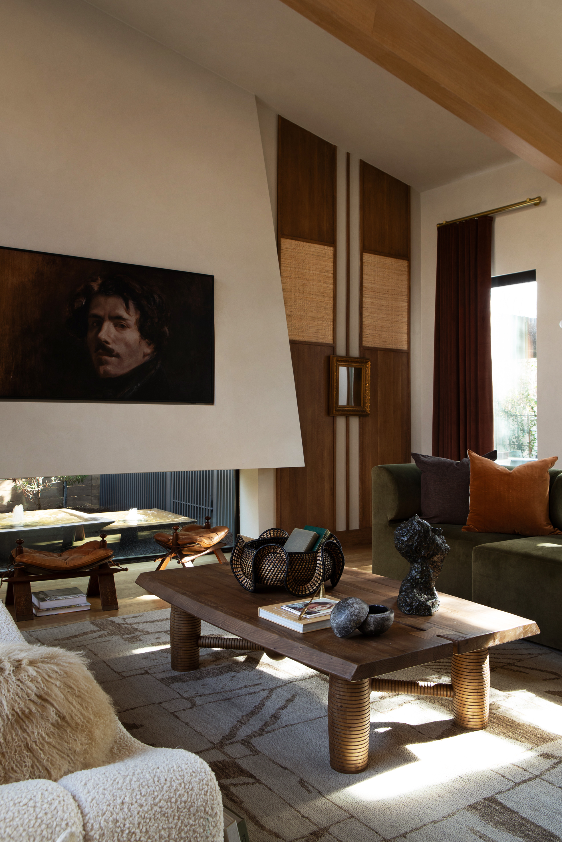
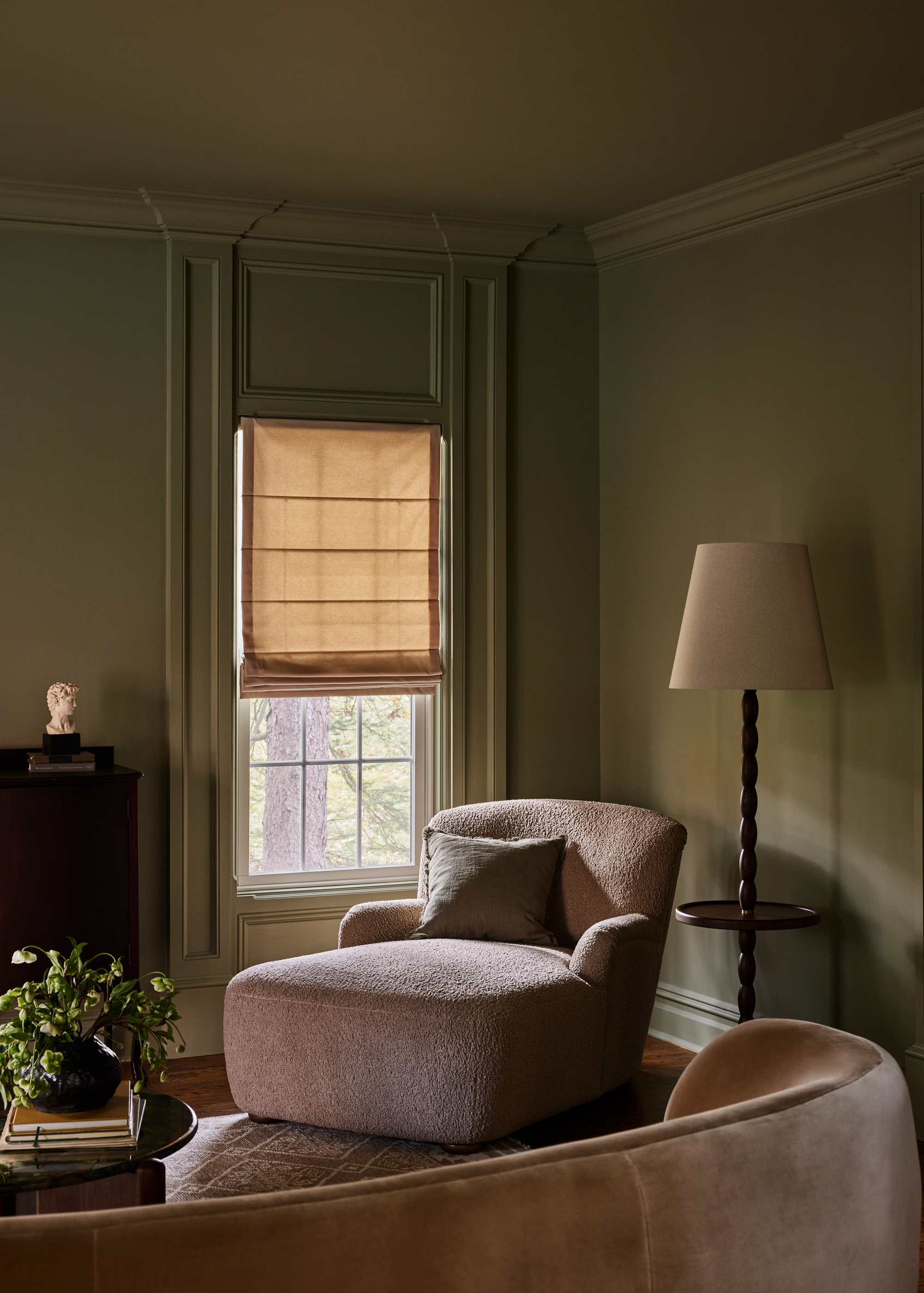
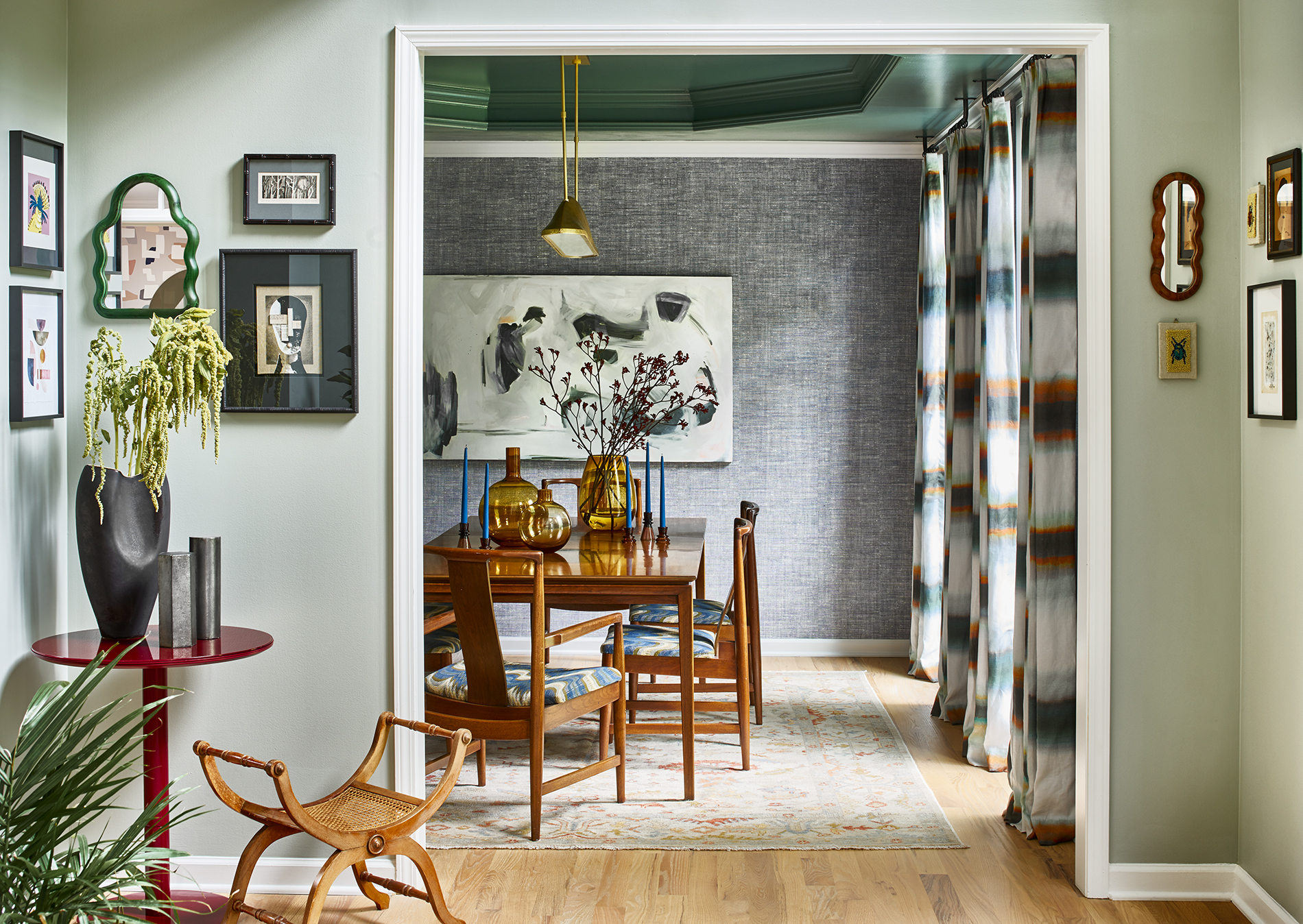
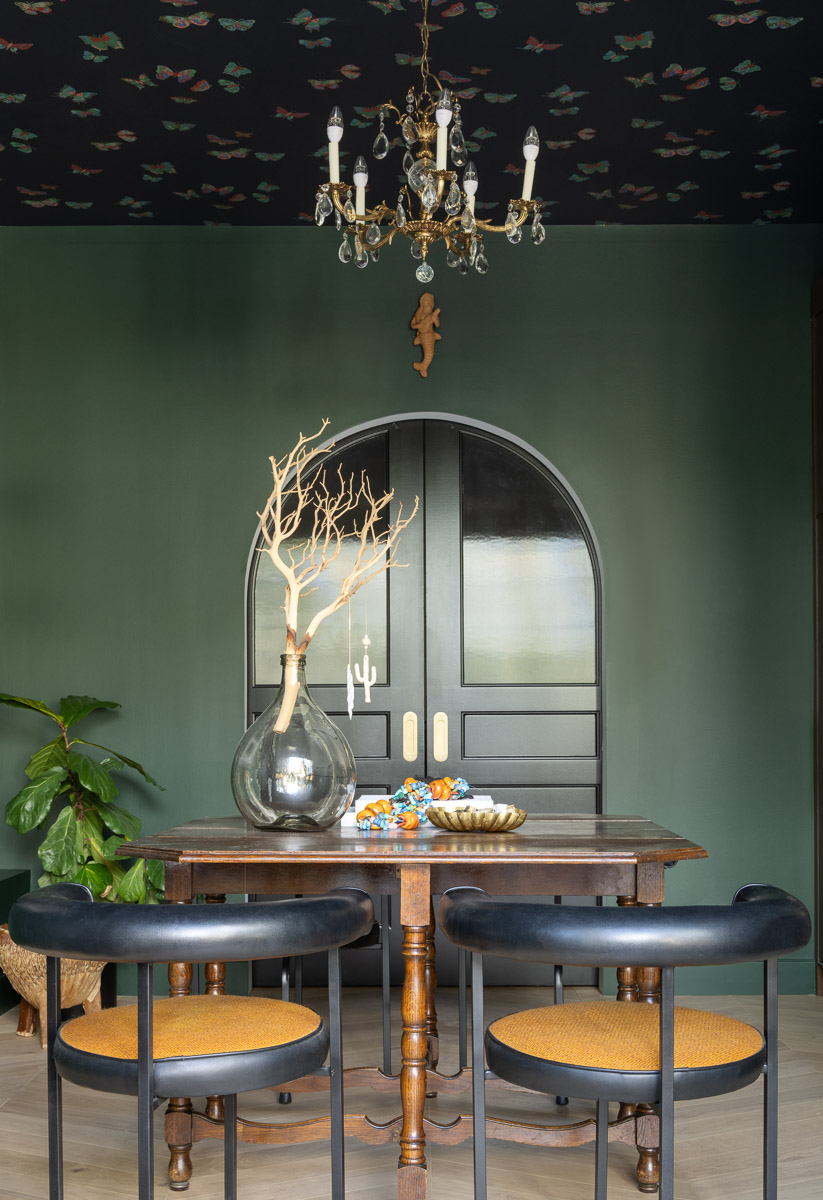
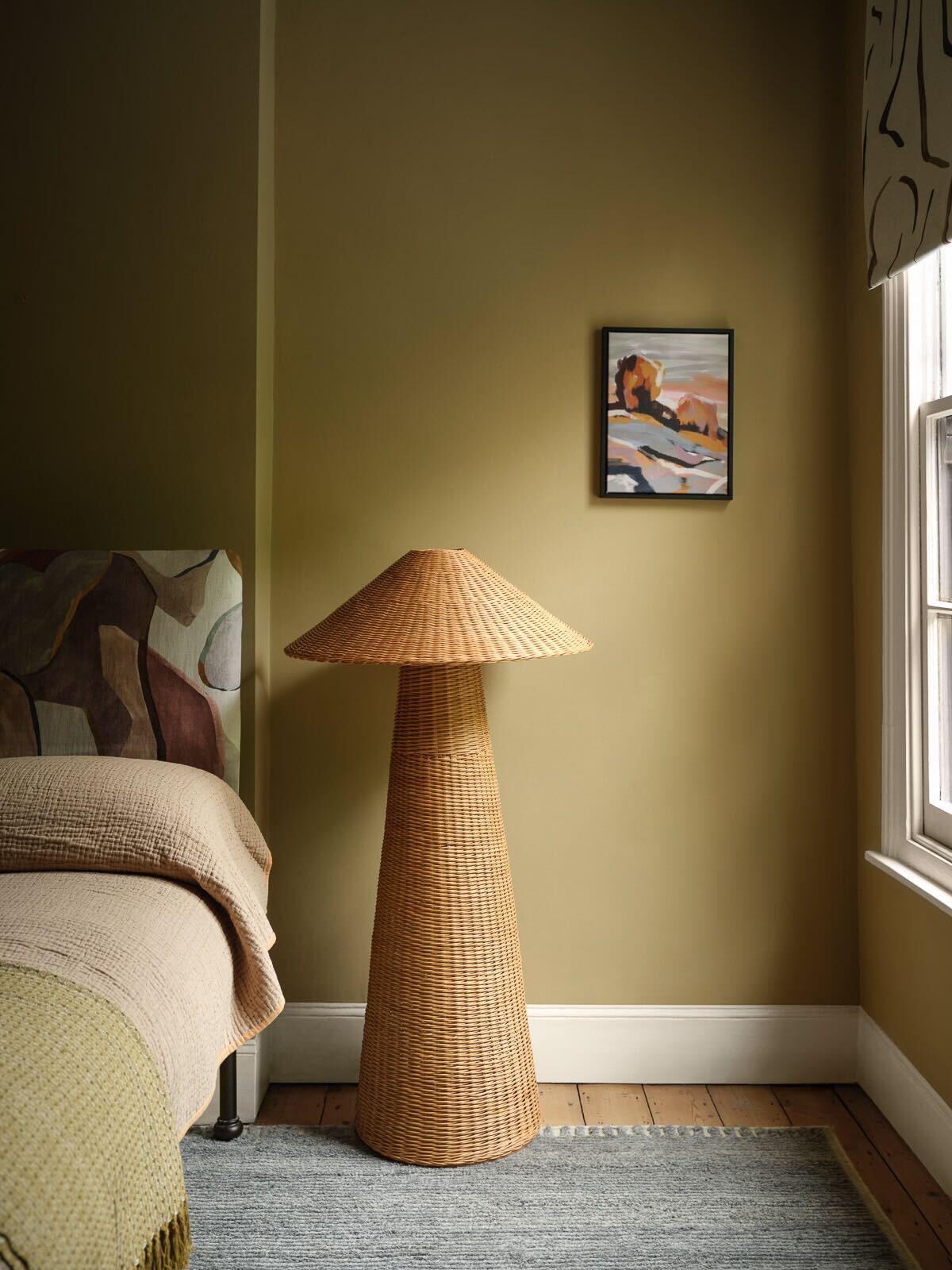
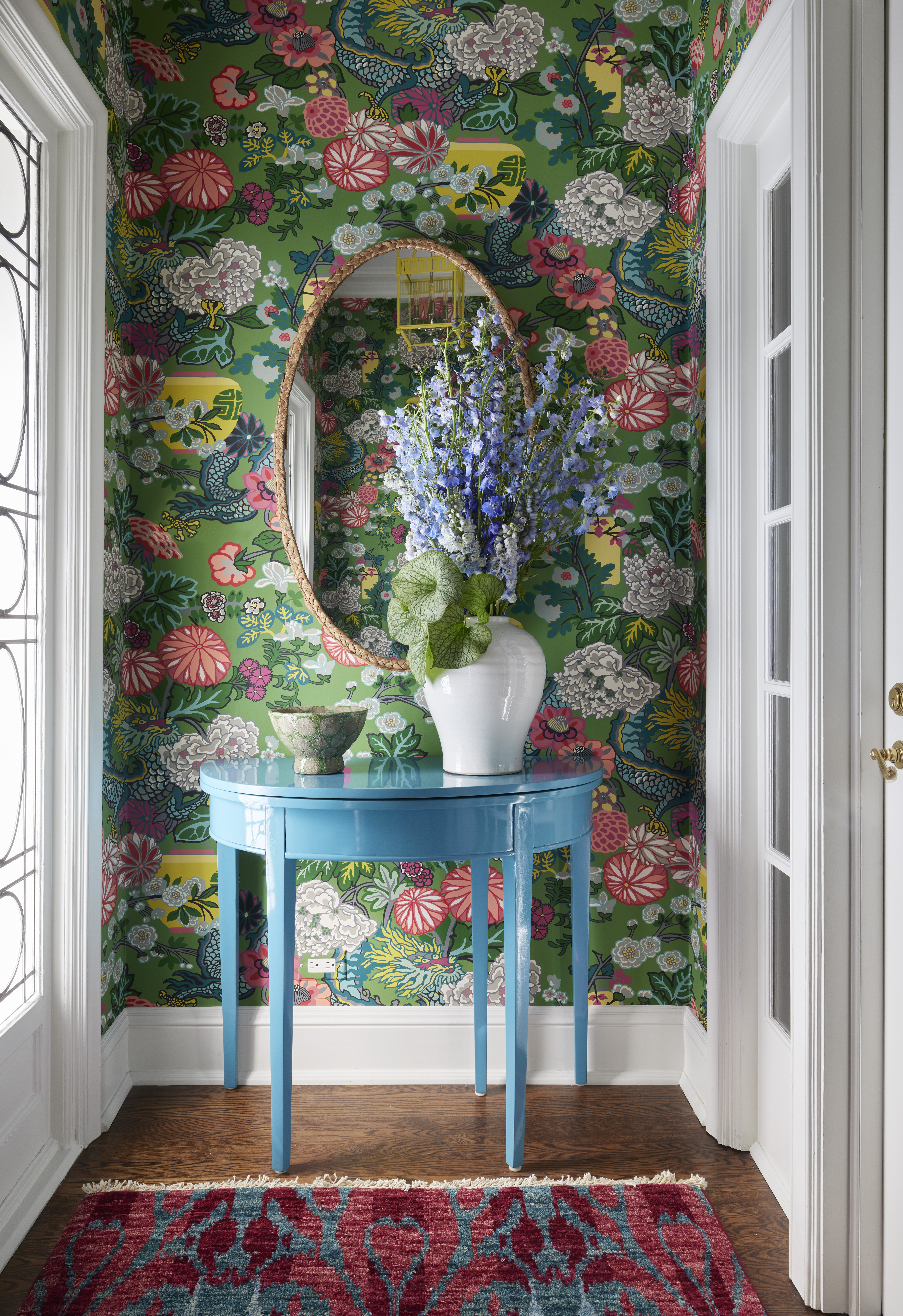
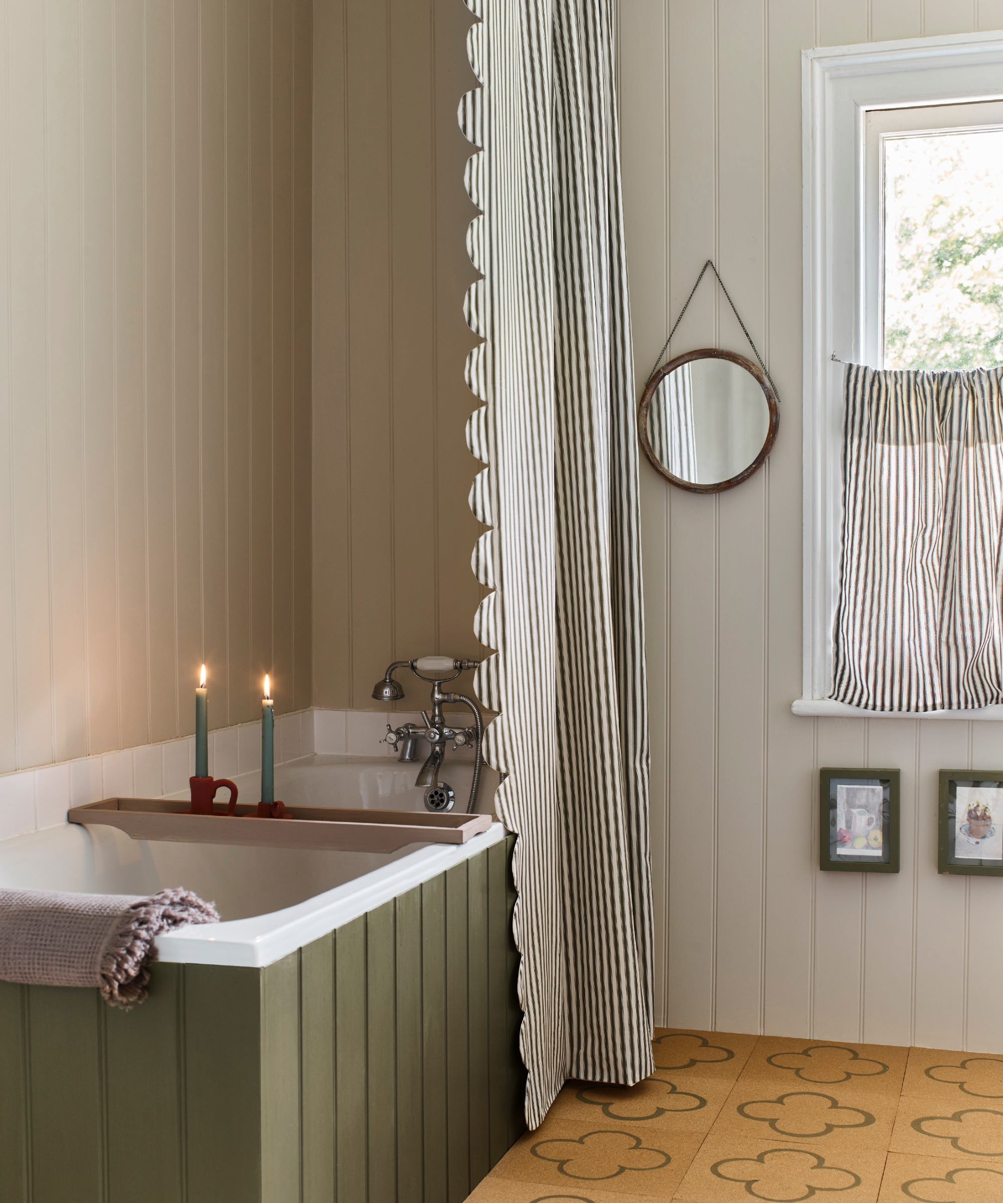
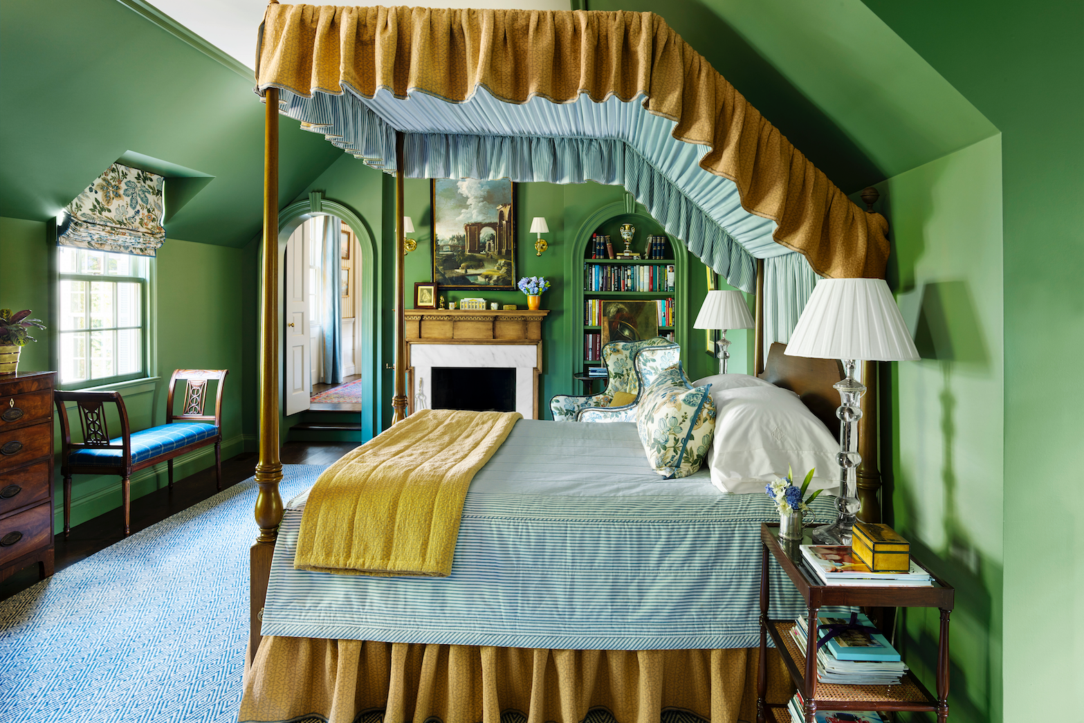
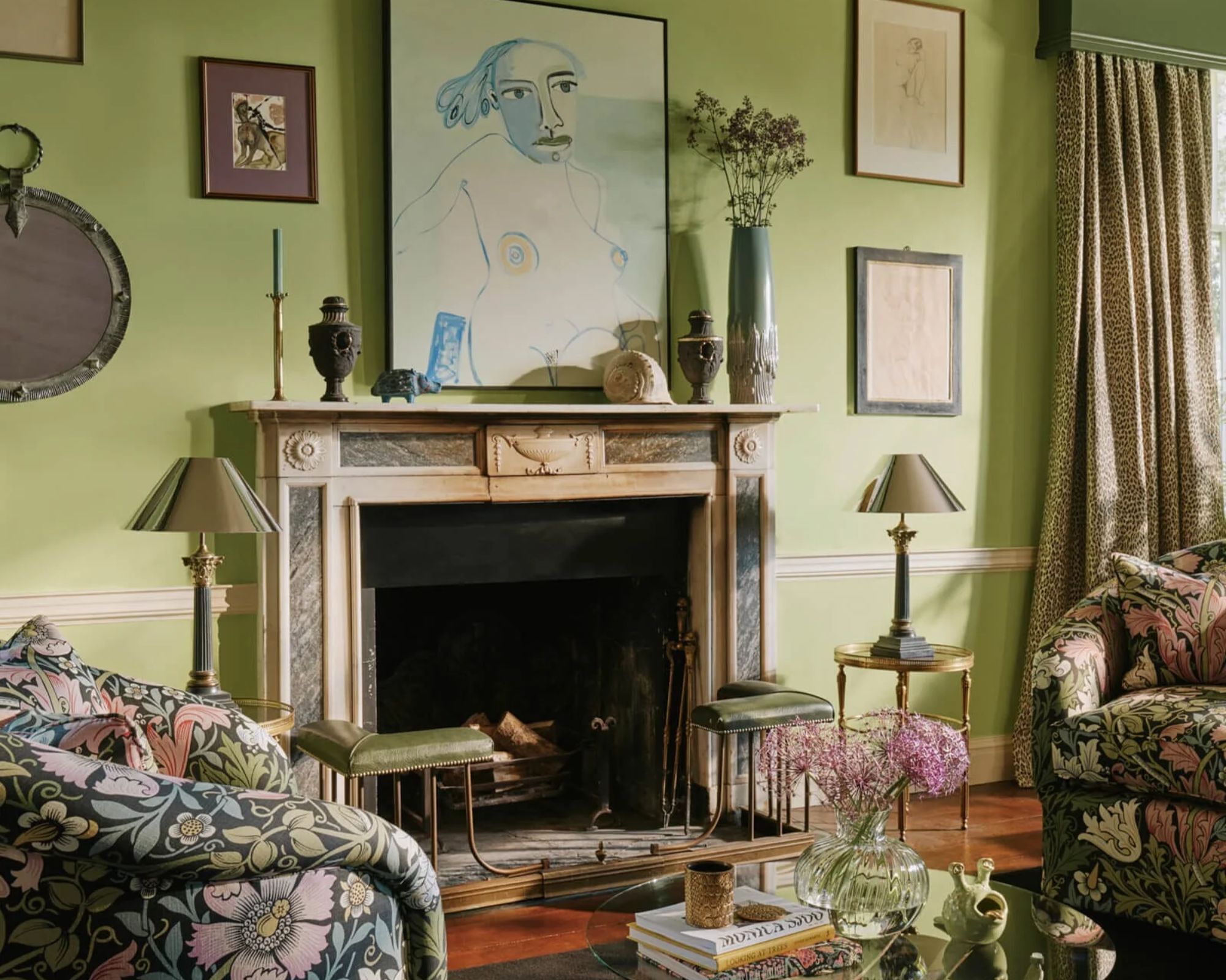
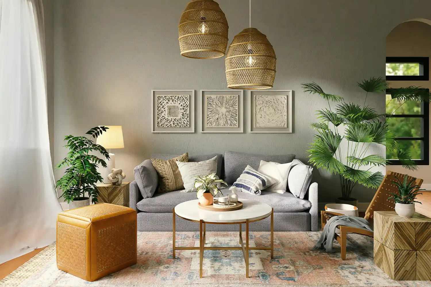
The first approach focuses on grounding green earth tones. These include soothing shades like avocado and moss greens, often paired with subtle oranges from wood accents. This palette represents a connection to nature and a departure from the brighter 1960s Space Age interiors, offering a warm, inviting, and playfully retro feel. Designers recommend using olive and avocado greens as a base wall color or in textile accents such as curtains and rugs, complemented by wooden furniture to introduce brown and orange tones. These greens are versatile and can often function as neutral colors.
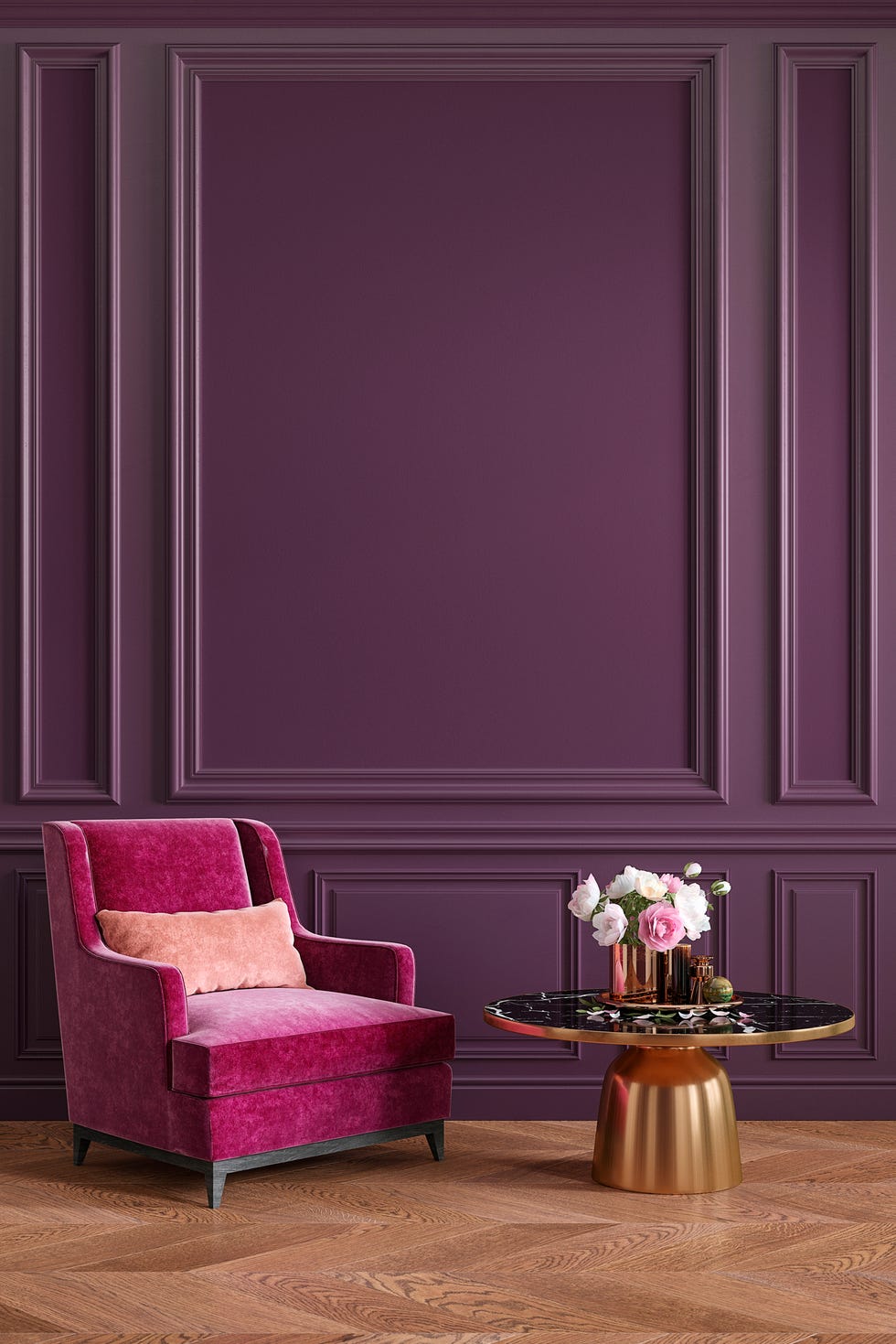
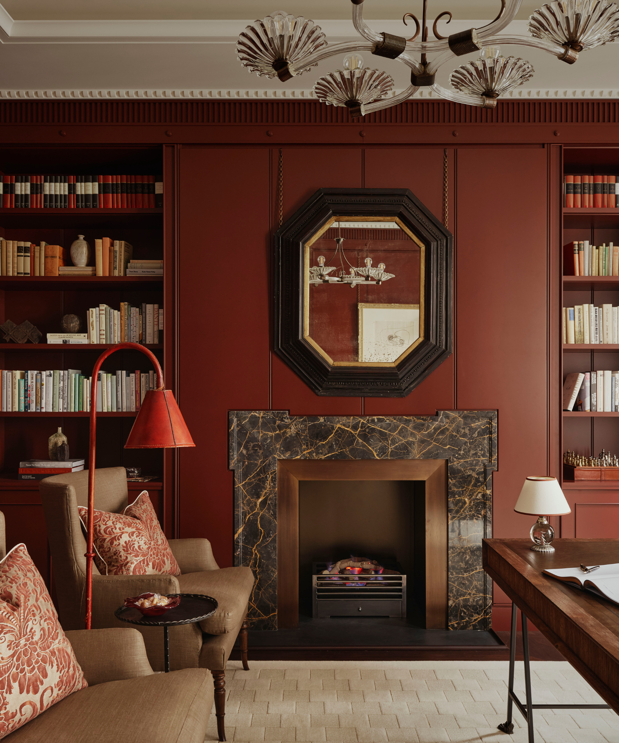
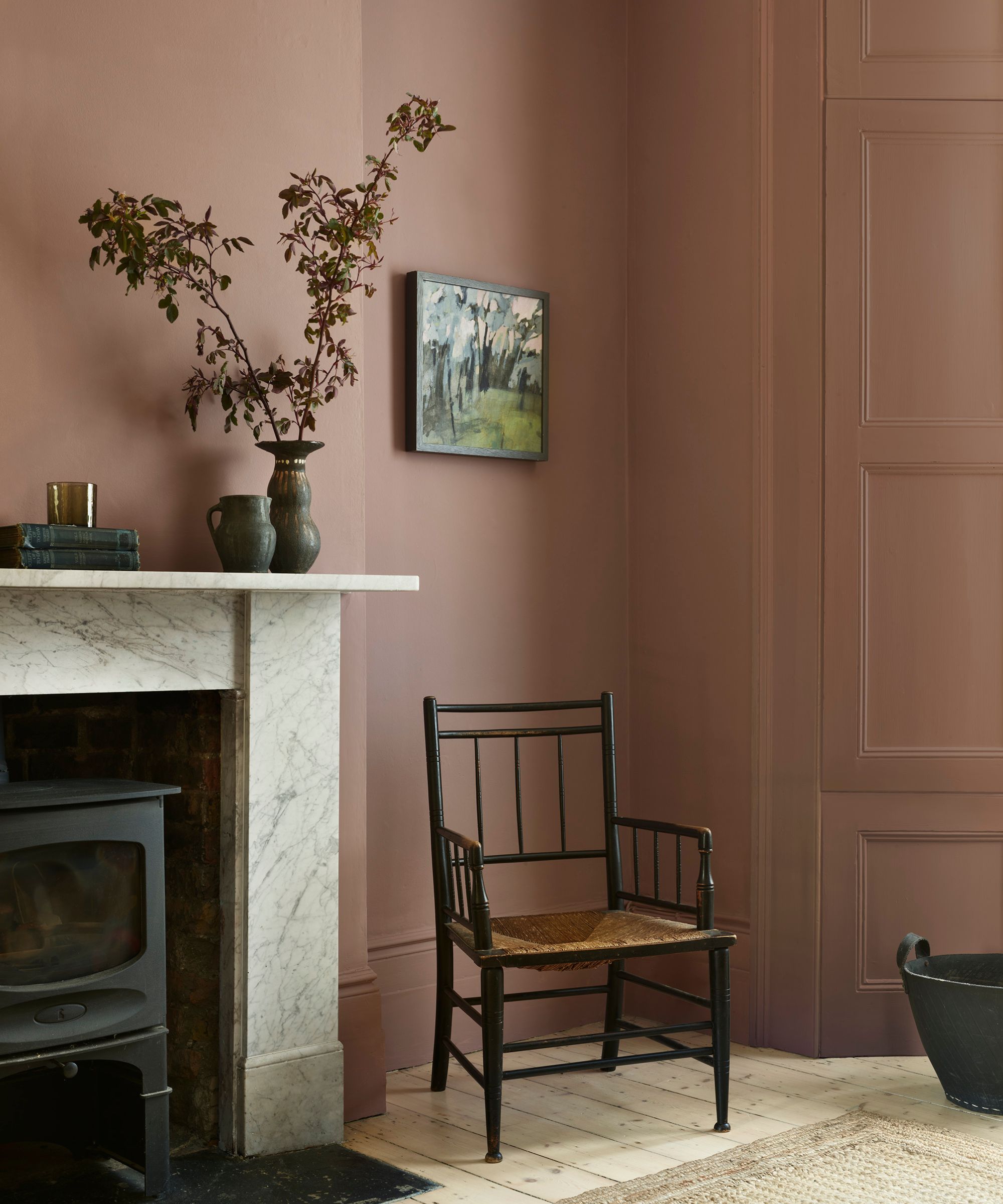
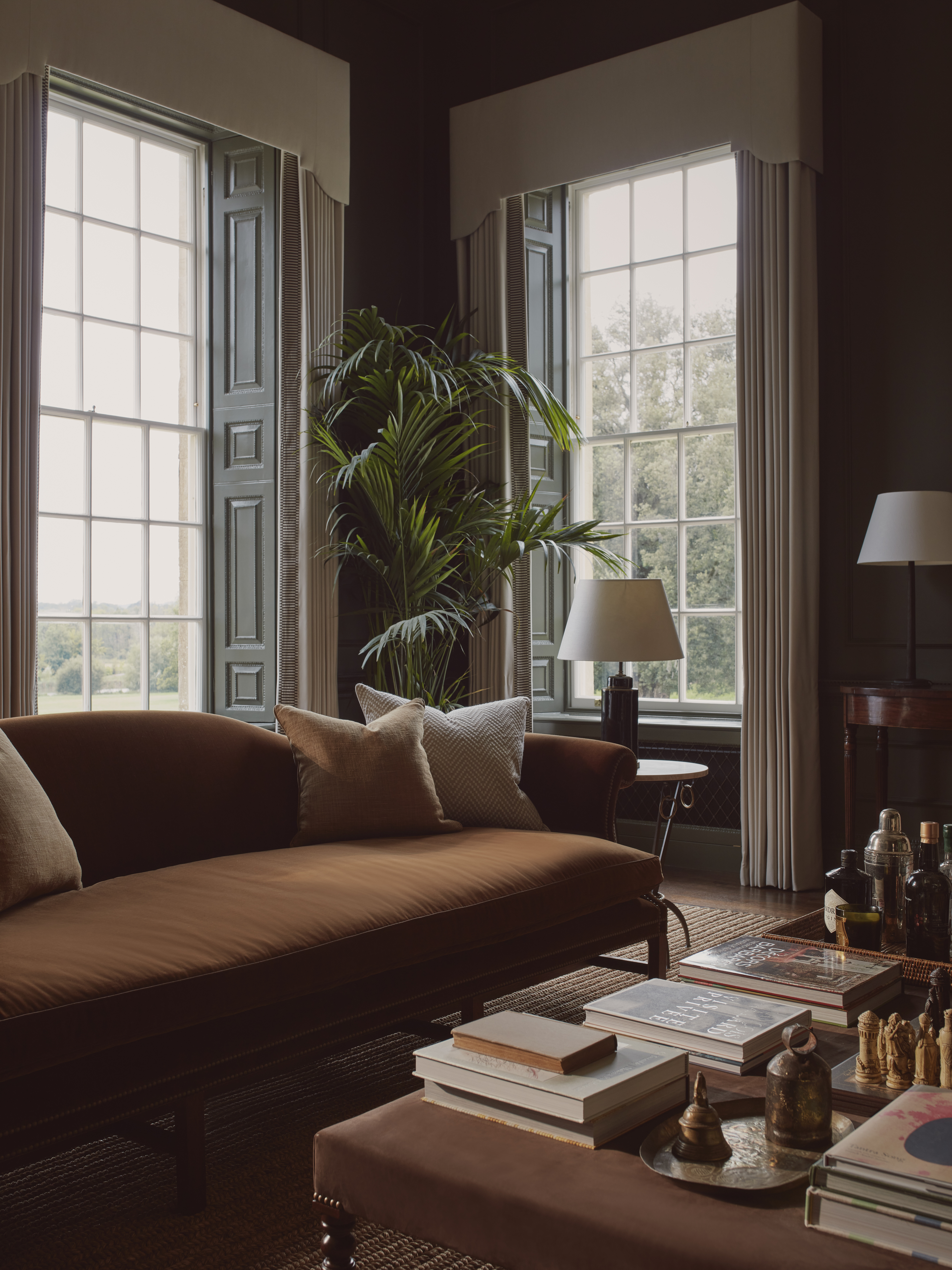
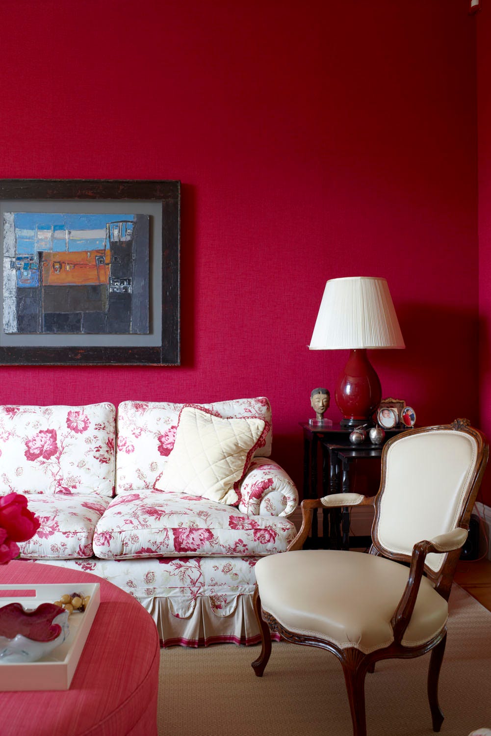
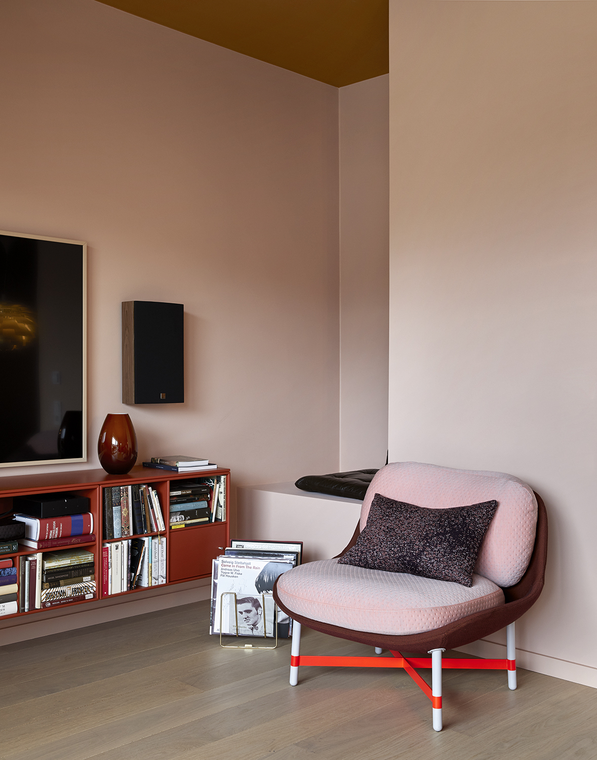
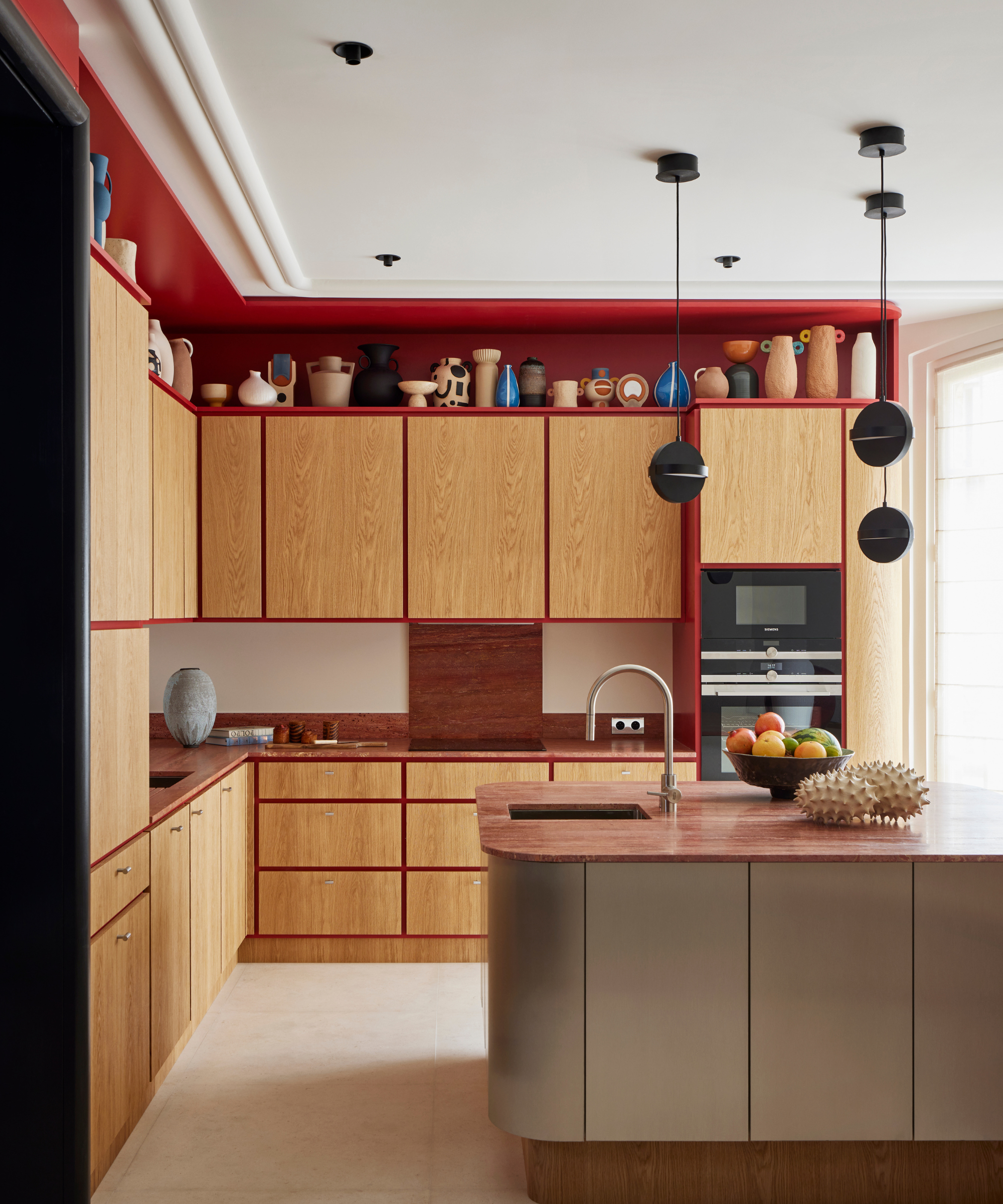

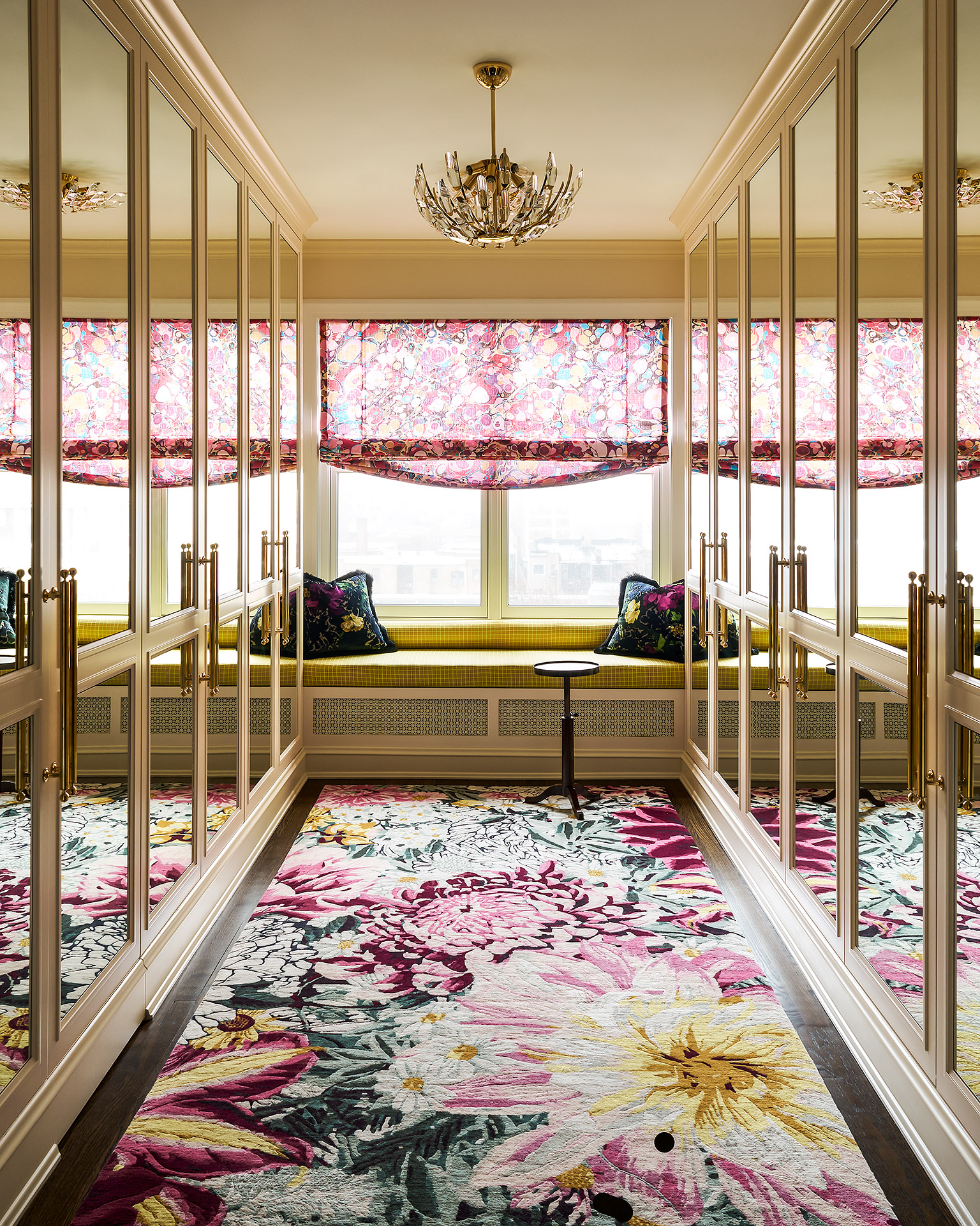
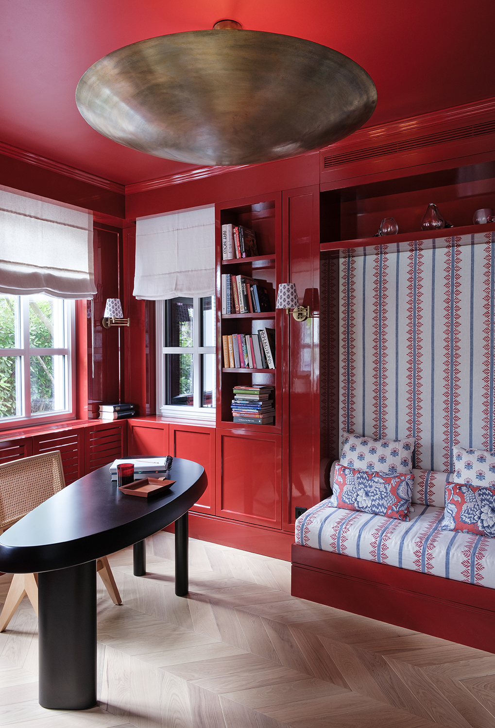
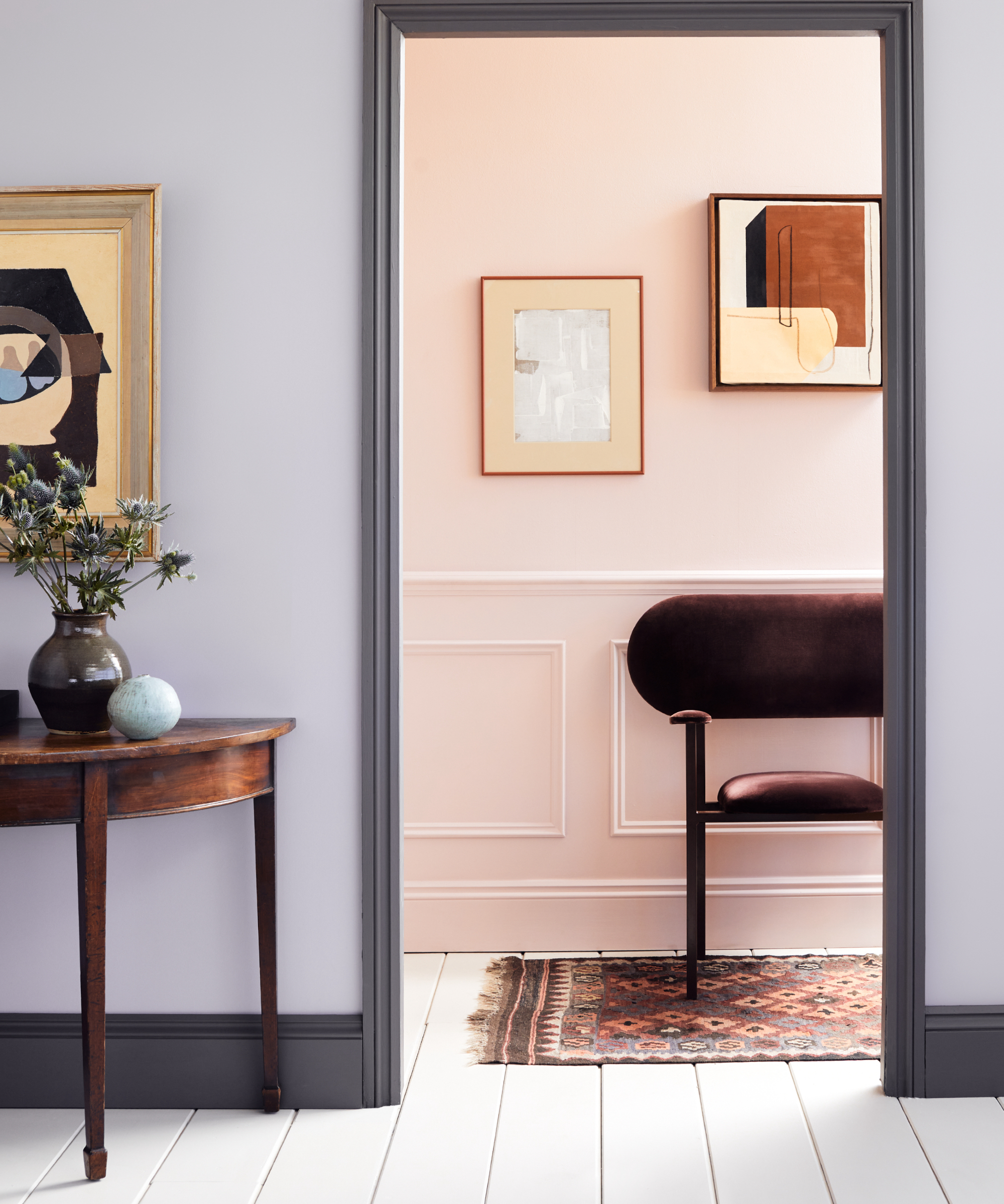
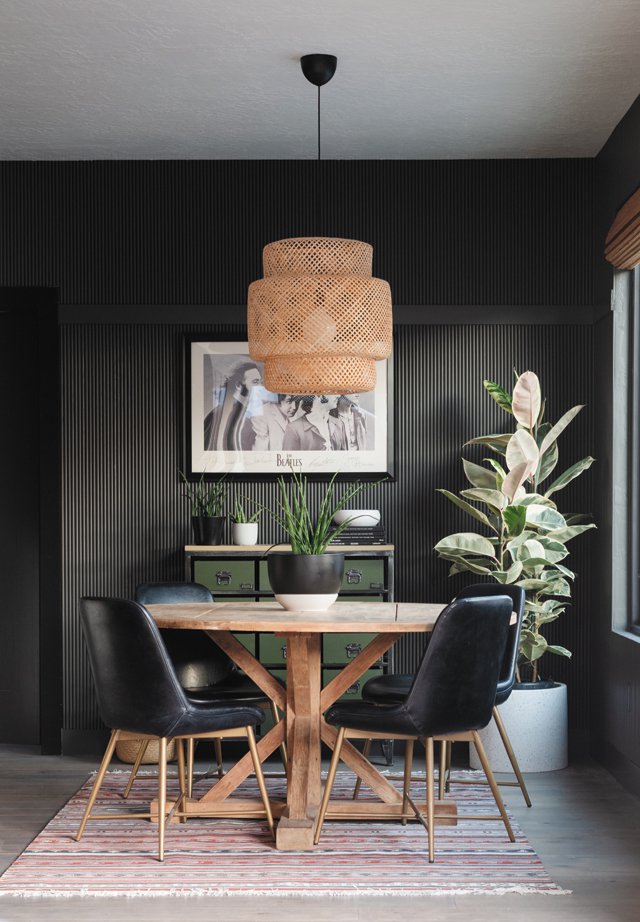
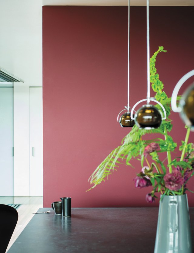
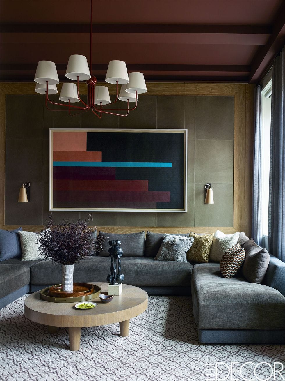
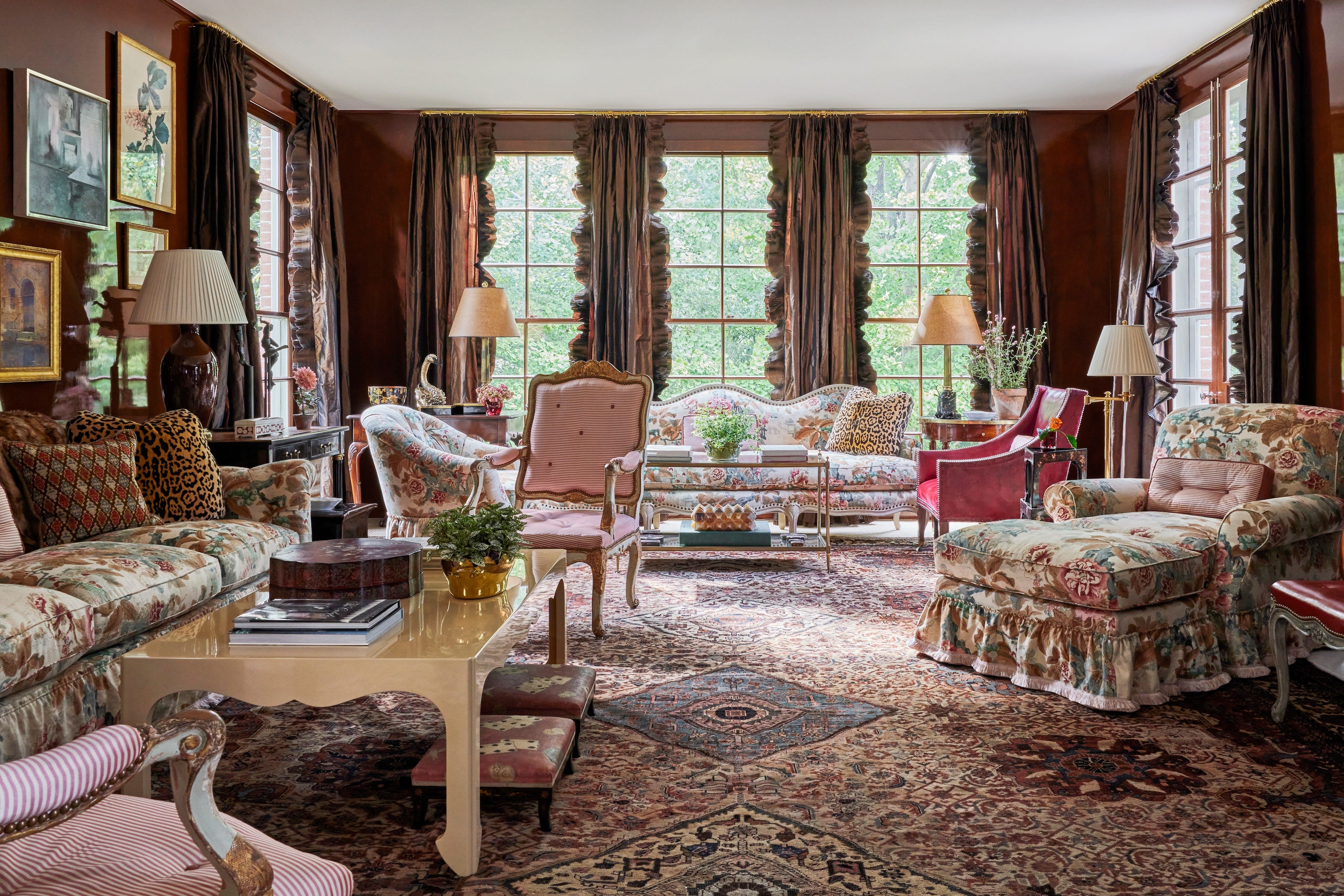
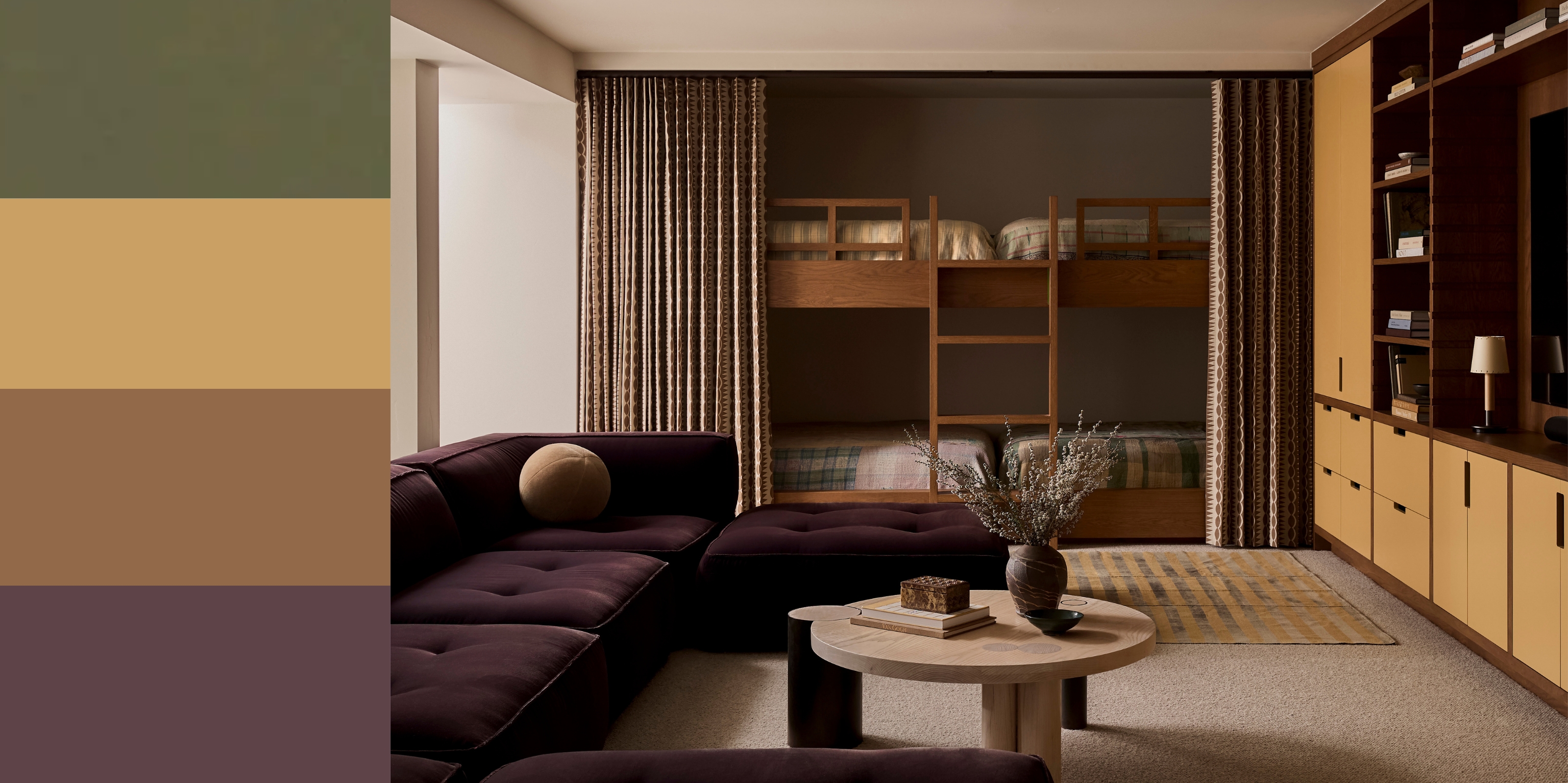
The second approach involves deeply saturated, warm shades. This style incorporates dramatic dark color schemes, including plum purples, brick reds, and orangey-browns, to create a distinct 70s vibe. For a contemporary application, designers suggest keeping walls and floors neutral while introducing large furniture pieces in purple, rich magenta, or even navy. Brighter shades of hot pinks and purples can be added through cushions and accessories. Subtle flashes of vivid blue, green, or yellow, along with sleek silver lighting and metal accents, can enhance the disco aesthetic. Integrating mid-toned wood is crucial to unify the look, as its warmth complements soft, comforting spaces like living rooms, bedrooms, and kitchens, especially through colorful cabinetry, shelving, countertops, or tables.
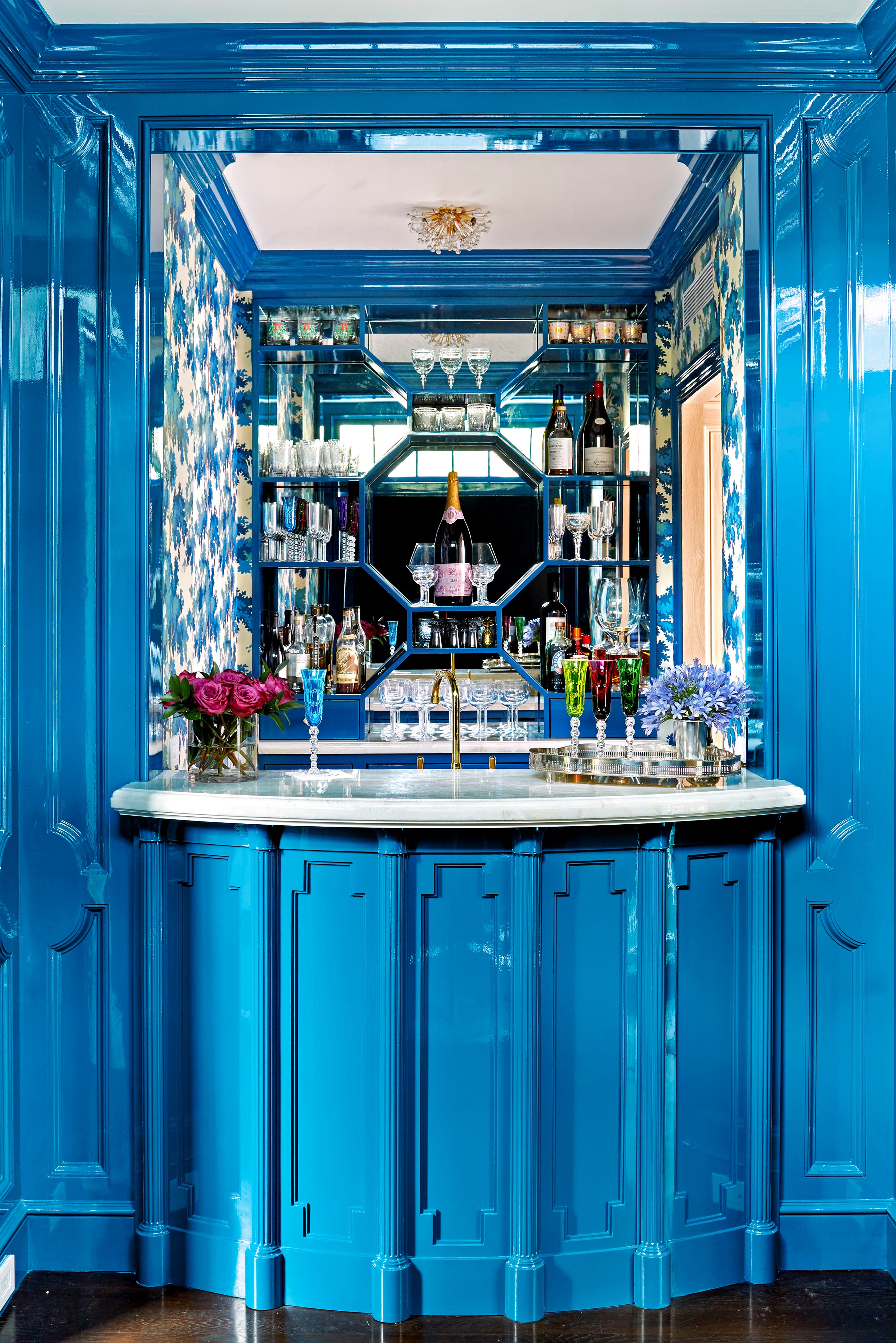
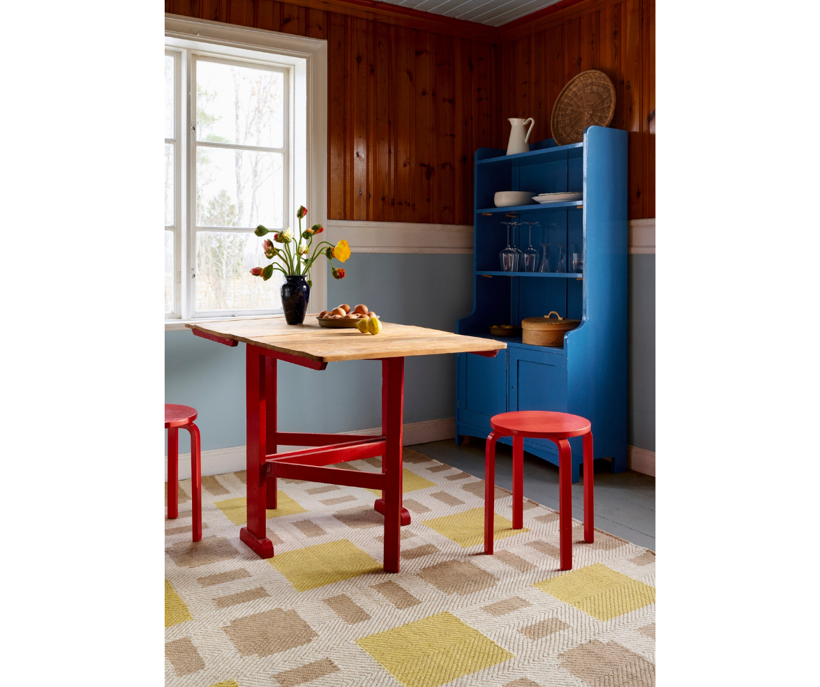
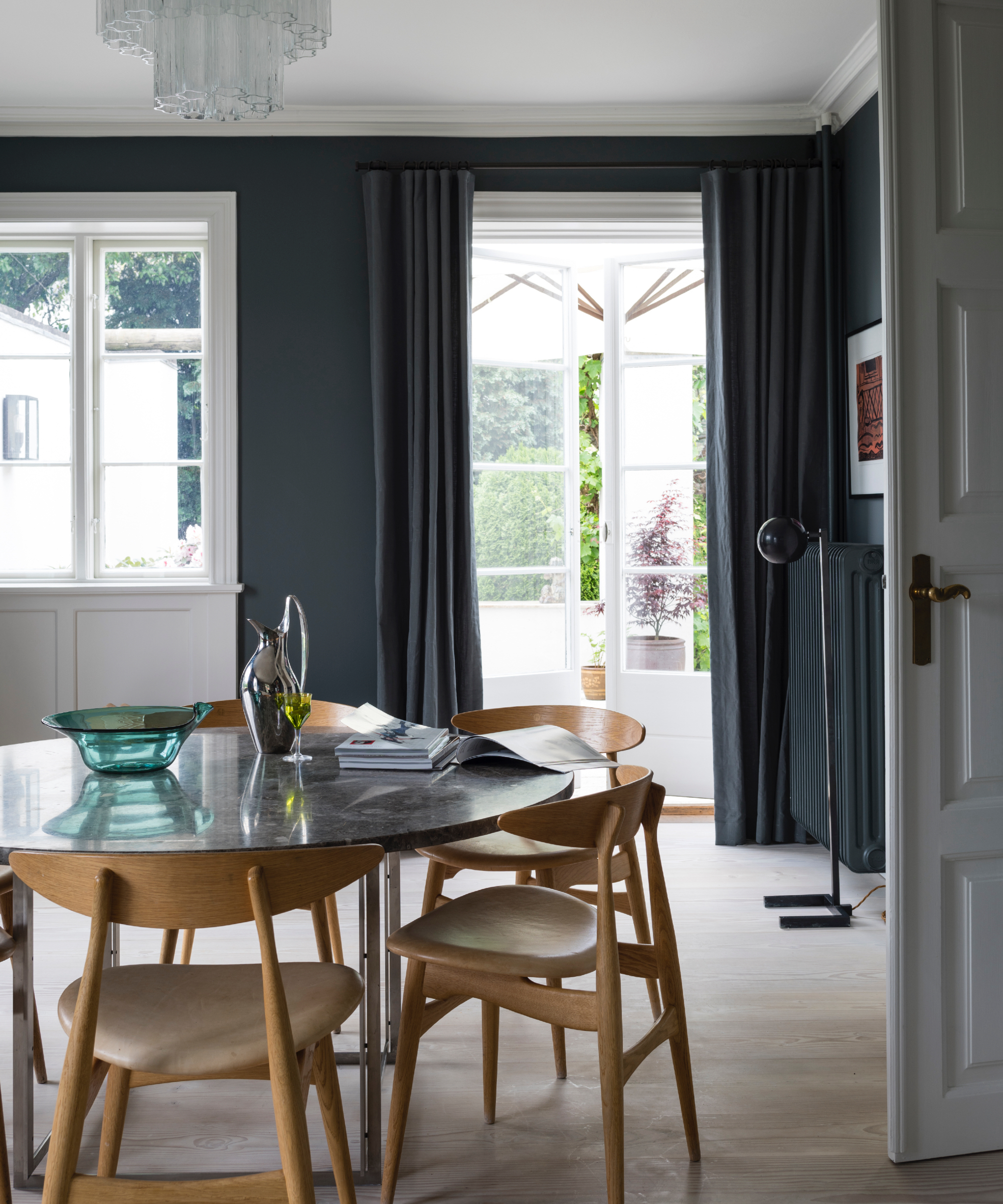
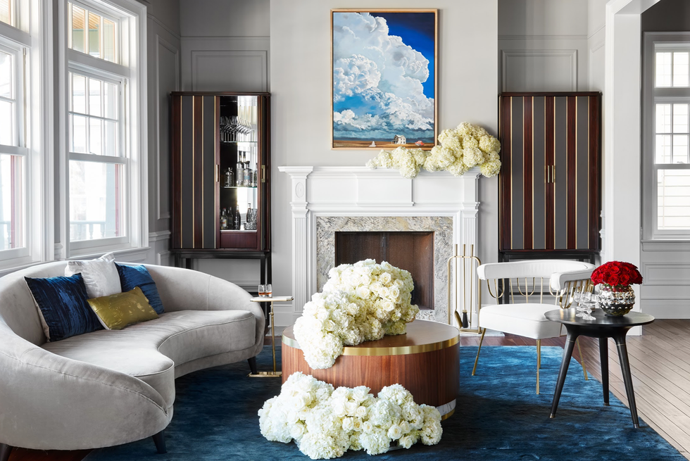
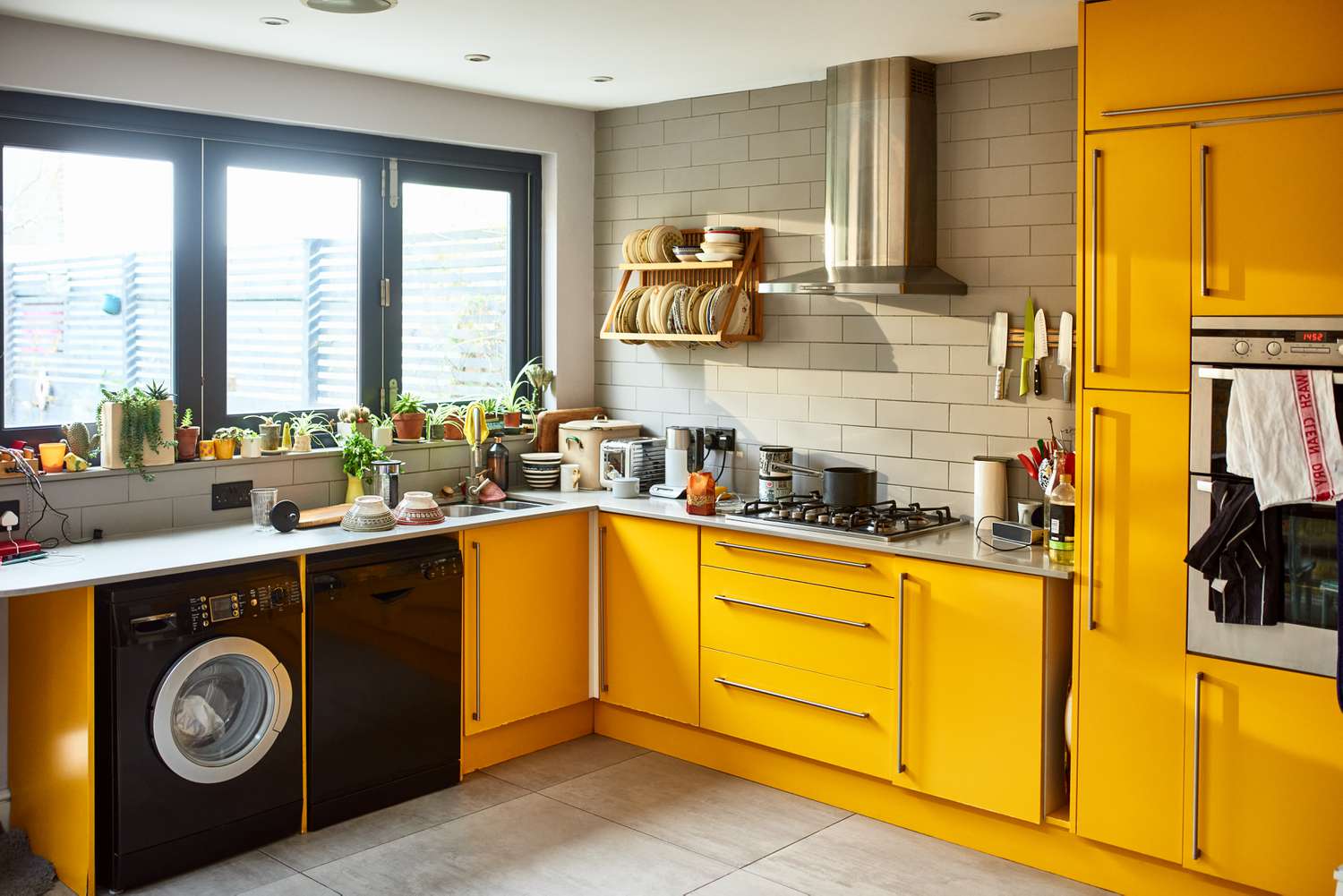
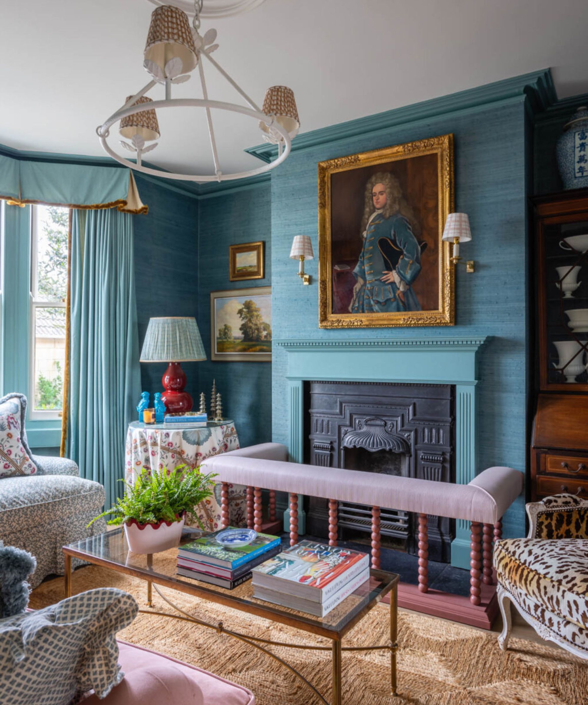
Third, bright blues paired with cozy oranges offer a youthful and electric 70s feel. This palette combines bright blues and dark teals with bold oranges and sunshine yellows. The inherent complementarity of these colors, especially burnt orange and teal, makes them easy to mix and match. While warm yellows and oranges can serve as solid base colors in their more neutral forms, dark teals and soft blues create harmonious pairings. For a more vibrant and glam aesthetic, designers suggest hot pinks, vivid blues, playful prints, or flashes of silver, evoking a disco atmosphere.
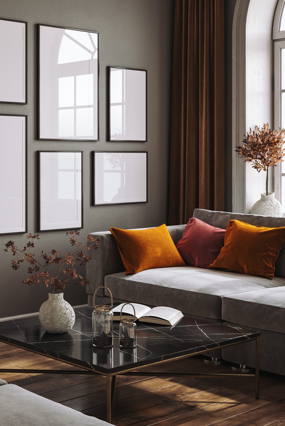
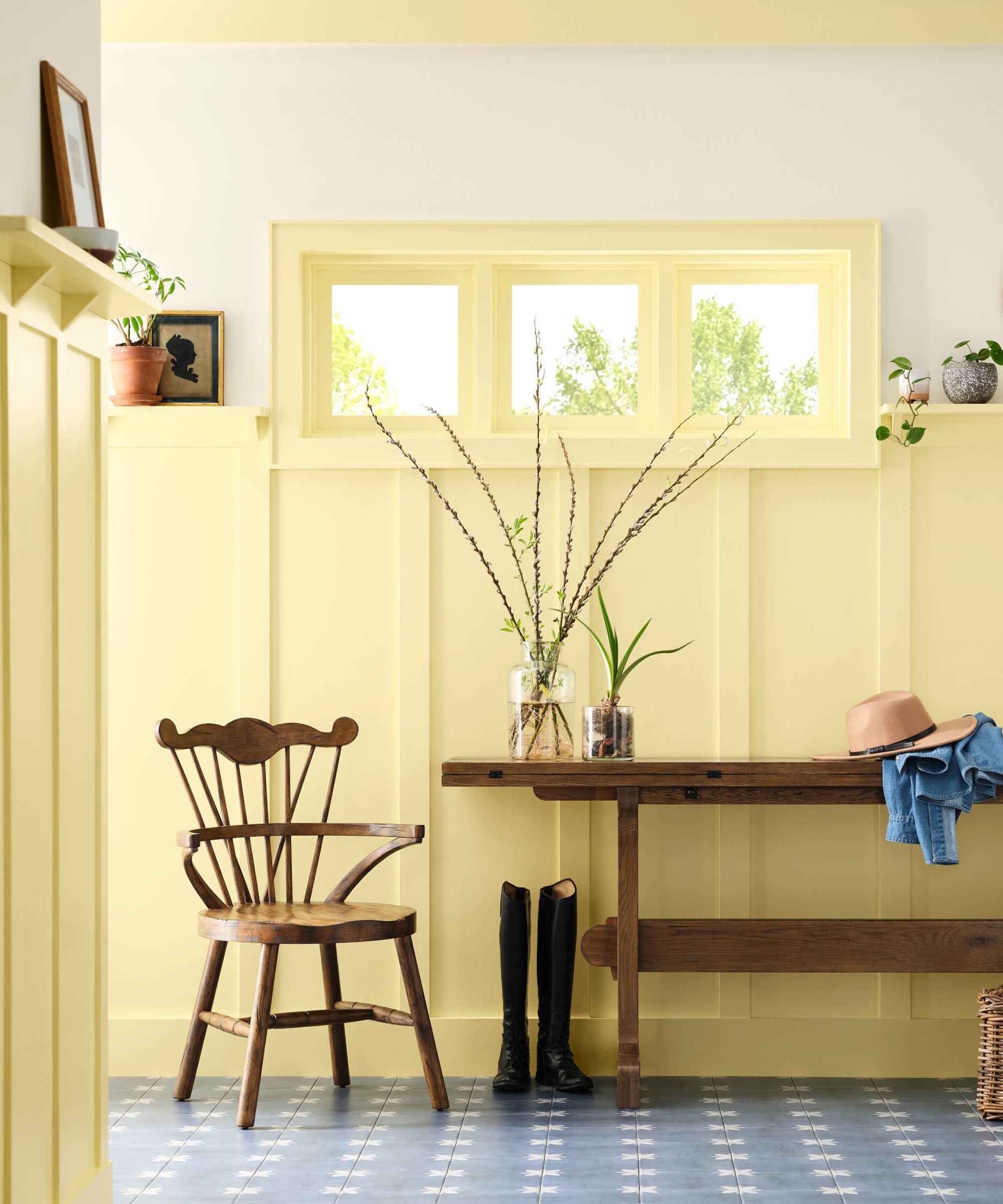
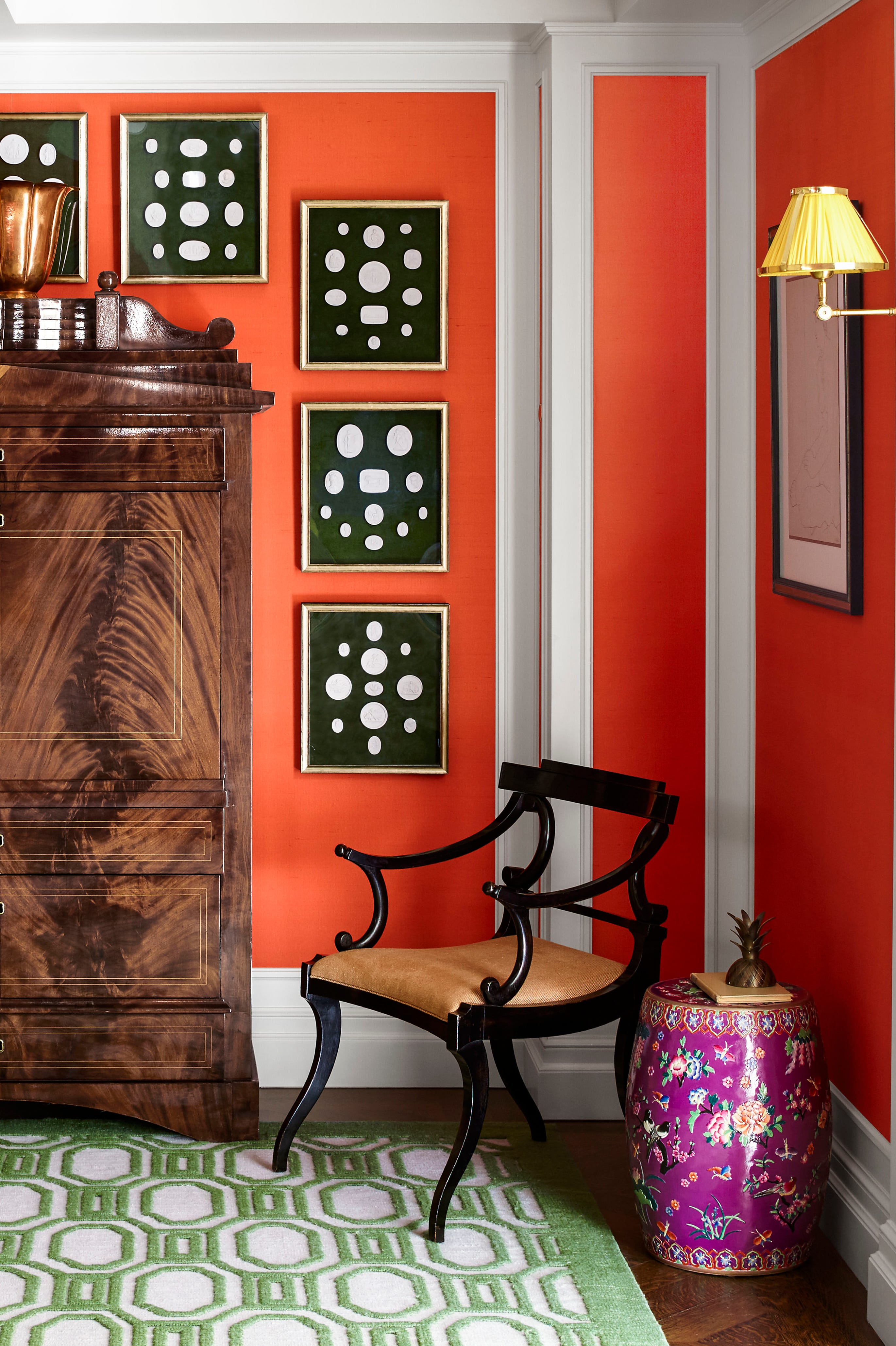
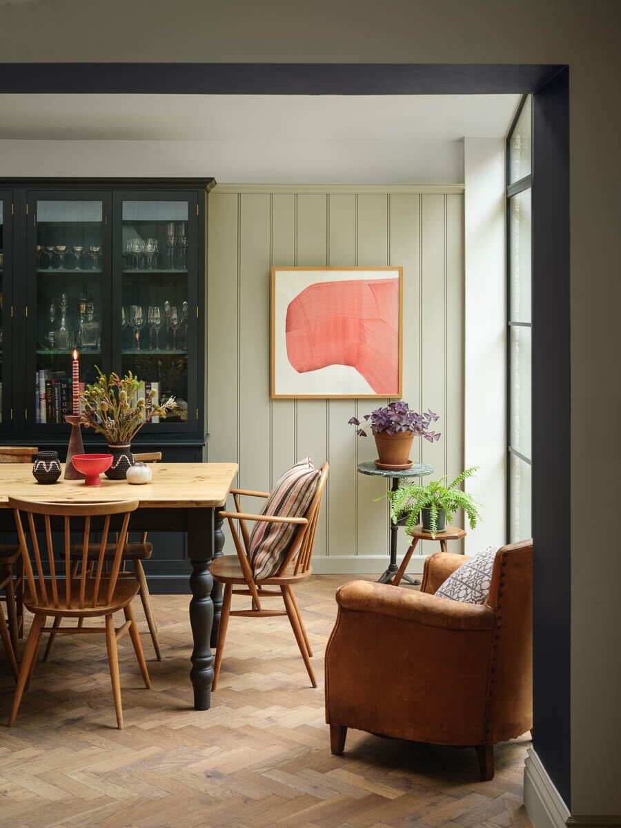
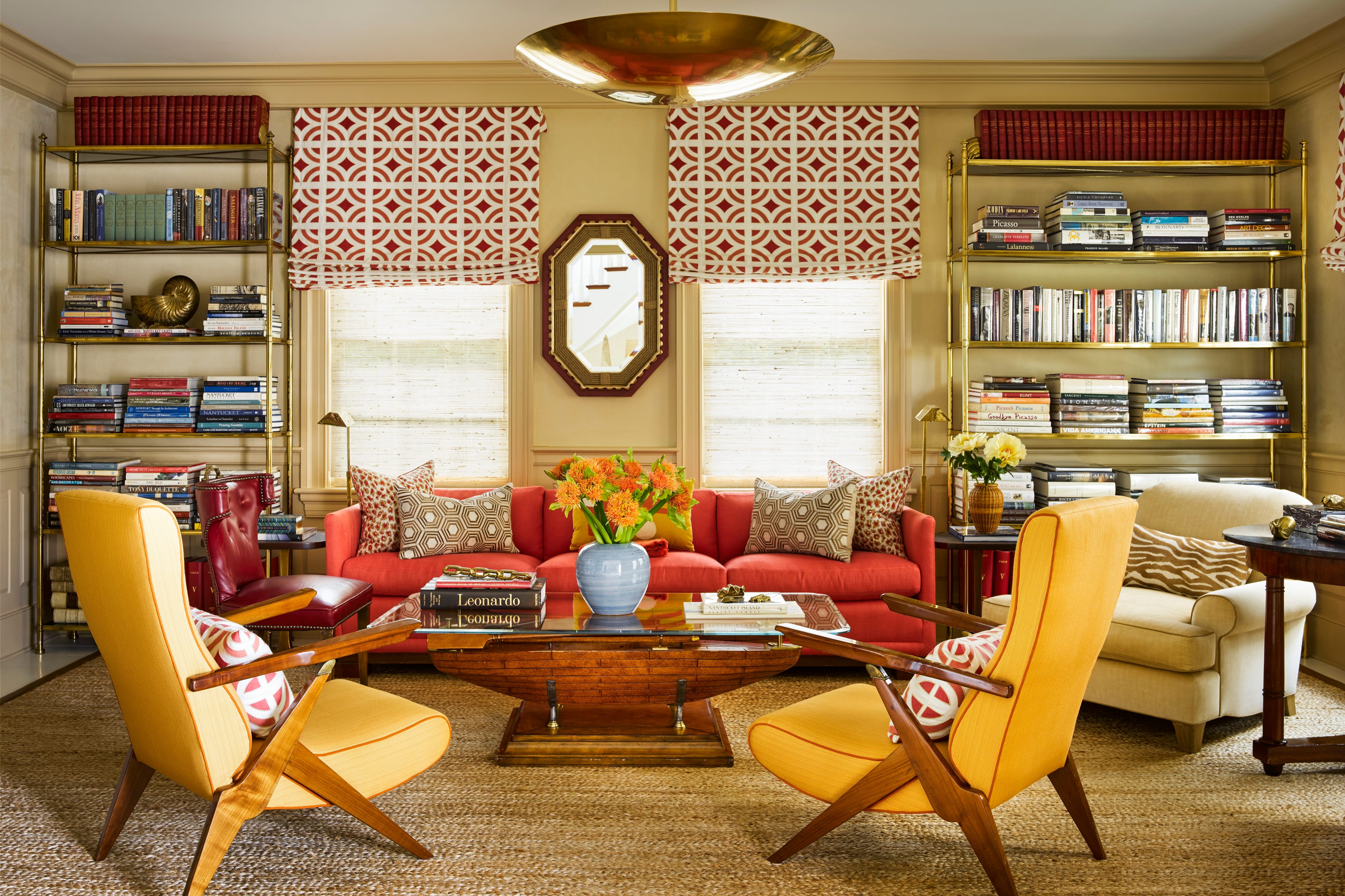
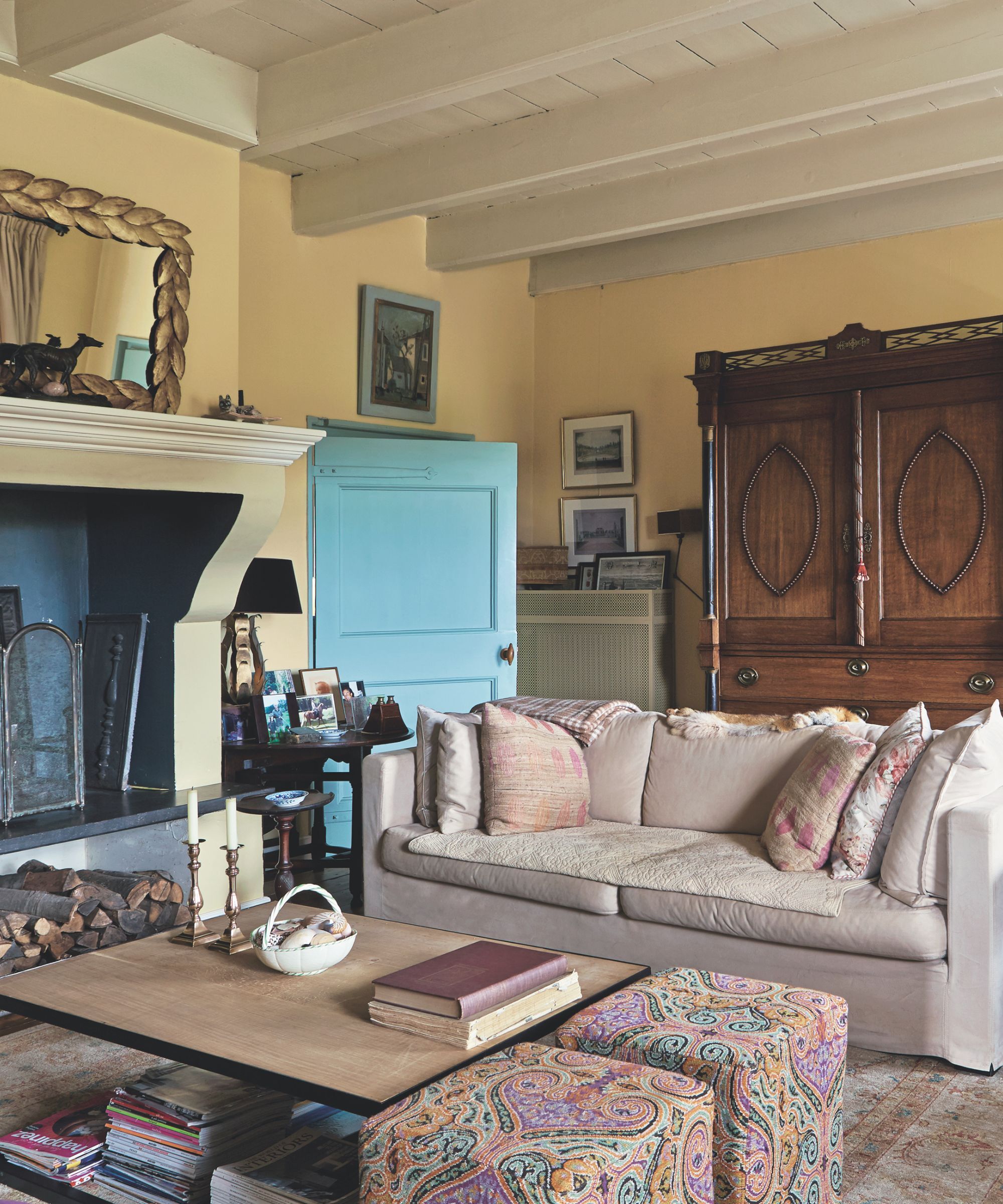
Finally, the classic combination of avocado green and harvest gold remains a quintessential 70s palette, often paired with chocolate brown and burnt orange. To adopt this look, one can start with natural wood furniture. Green wall colors provide a timeless base, or earth tones can be incorporated through large furniture pieces or rugs. Mustard and dappled muted orange can be introduced as secondary colors in upholstery or curtains. More vivid colors like purple, pink, and brighter greens/yellows can serve as supporting roles in smaller furniture, artwork, or decorative objects. These versatile 70s color palettes are suitable for various rooms throughout the home, inviting a nostalgic yet sophisticated ambiance.
#SeventiesDesign #ColorPalettes #InteriorDesignTrends #HomeDecor #RetroRevival #EarthTones #WarmColorSchemes #NostalgicInteriors #SeventiesDesign #ColorPalettes #InteriorDesignTrends #HomeDecor #RetroRevival #EarthTones #WarmColorSchemes #NostalgicInteriors
0 comment in total
 No comments yet
You may also like
Designers Say These Vintage Paint Colors Are Back

12 Colors That Go With Green I'm Seeing Interior Designers Use All the Time Right Now

7 of the most versatile and easy to use paint colors according to designers

5 Outdated Kitchen Paint Colors That Interior Designers Are Tired of Seeing
Vintage paint colors making a comeback this year – experts reveal their top shades for adding a touch of nostalgia
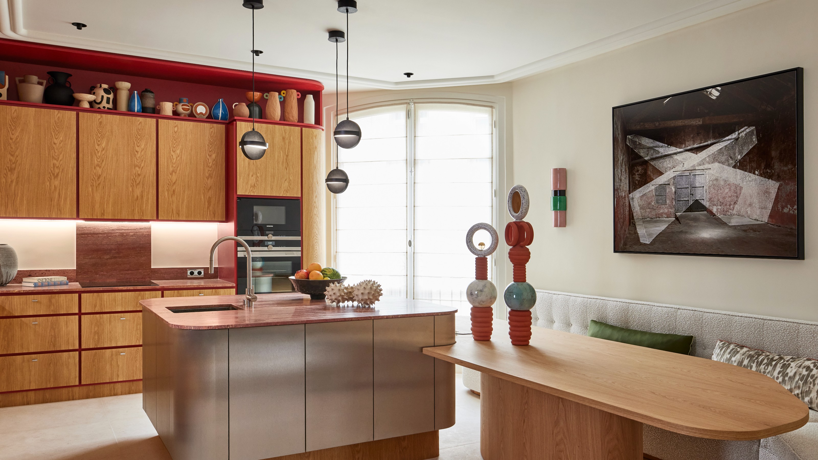
What Colors Go With Red? 10 Colors That Hold Their Own Alongside This Fiery Hue
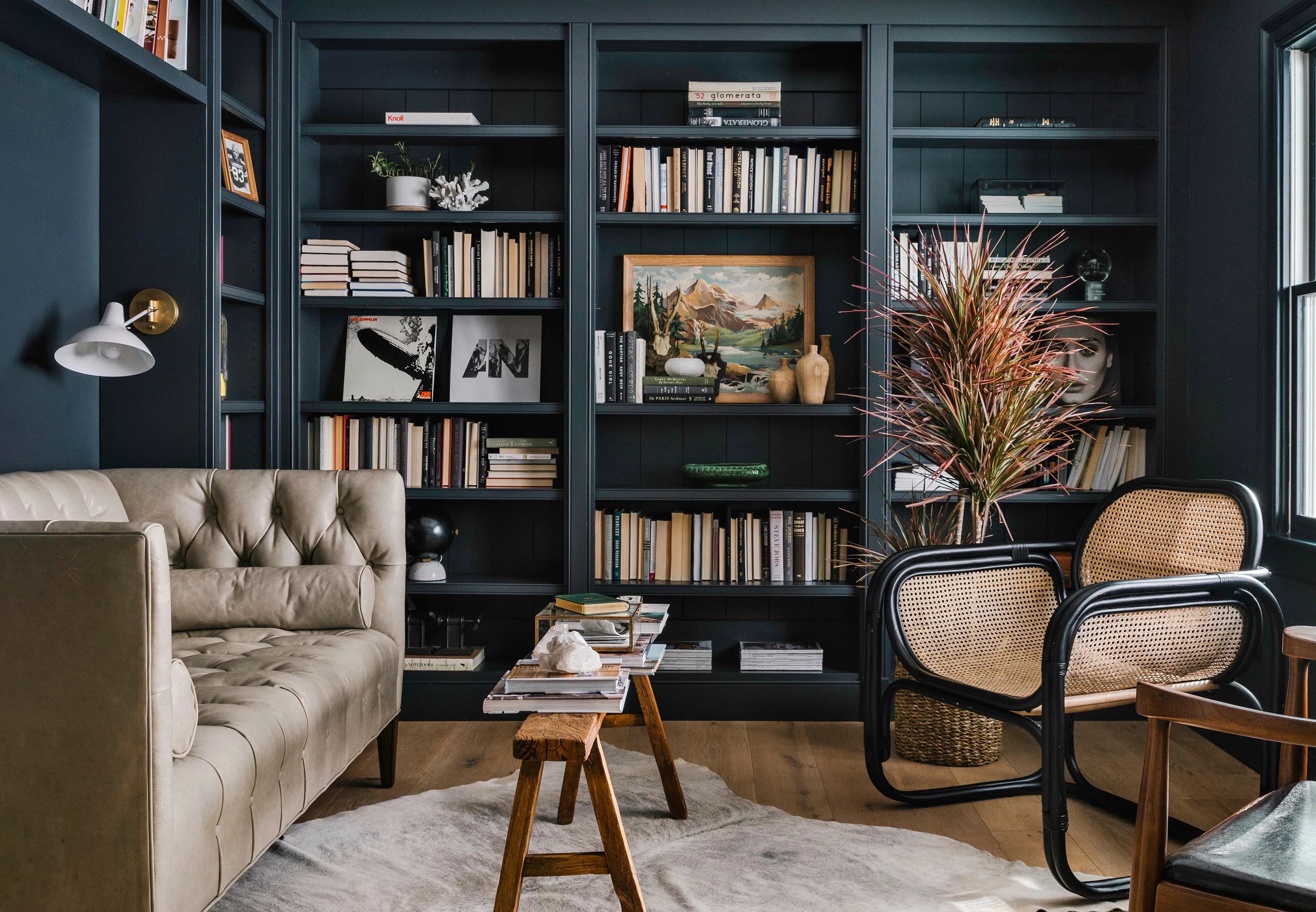
We Asked 5 Designers If Moody Paint Colors Are Still Trendy, and They All Said the Same Thing


11 Paint Colors That INSTANTLY Make Your Home Look "Expensive," According to Designers

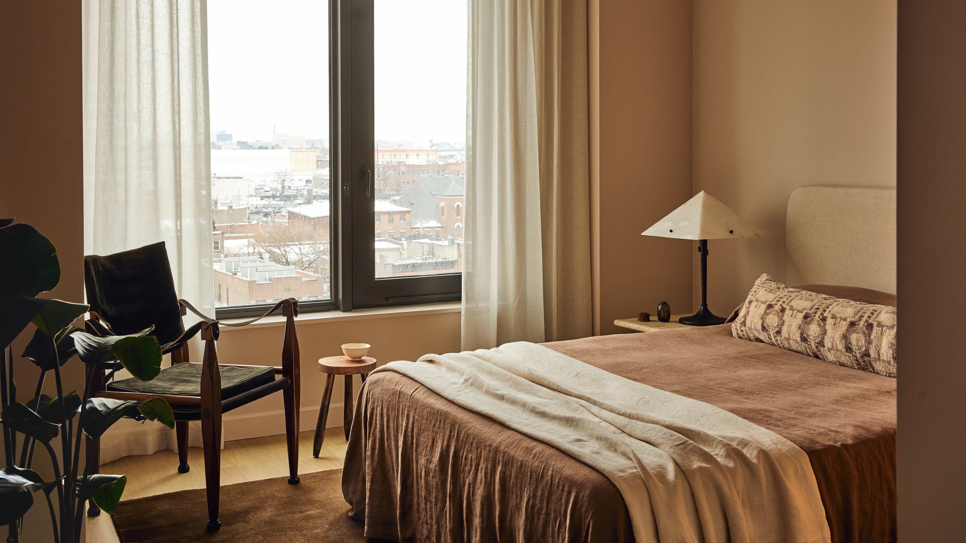
3 Classic Color Palettes That I'm Betting Will Feel Just as Current in 100 Years' Time
Interior Paint Colors & Palettes

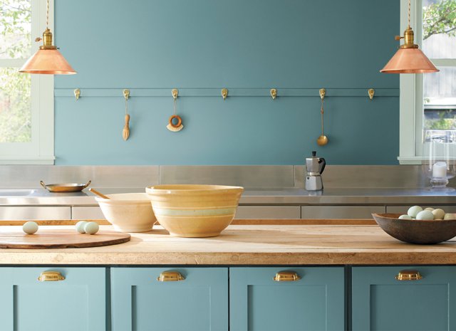
2021’s Palette of Possibilities
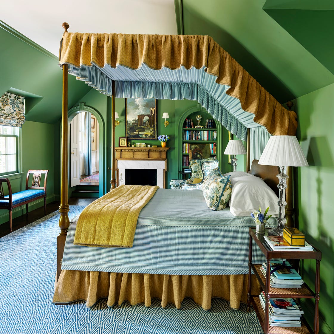
These 7 Colors Will Rule Interiors in 2026, According to Experts

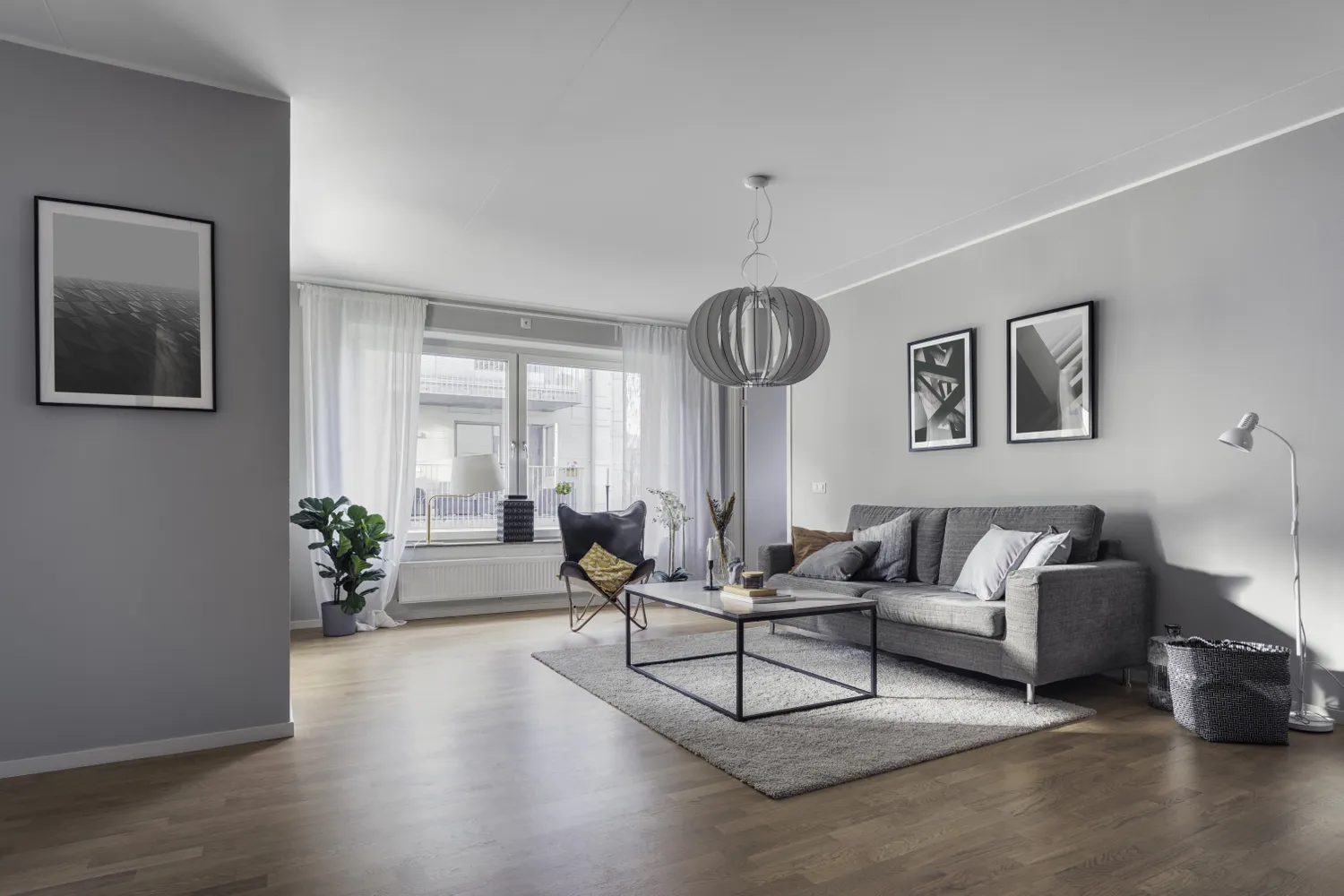
Still Have One of These Outdated Paint Colors and Styles in Your Home? Designers Say It’s Time to Repaint

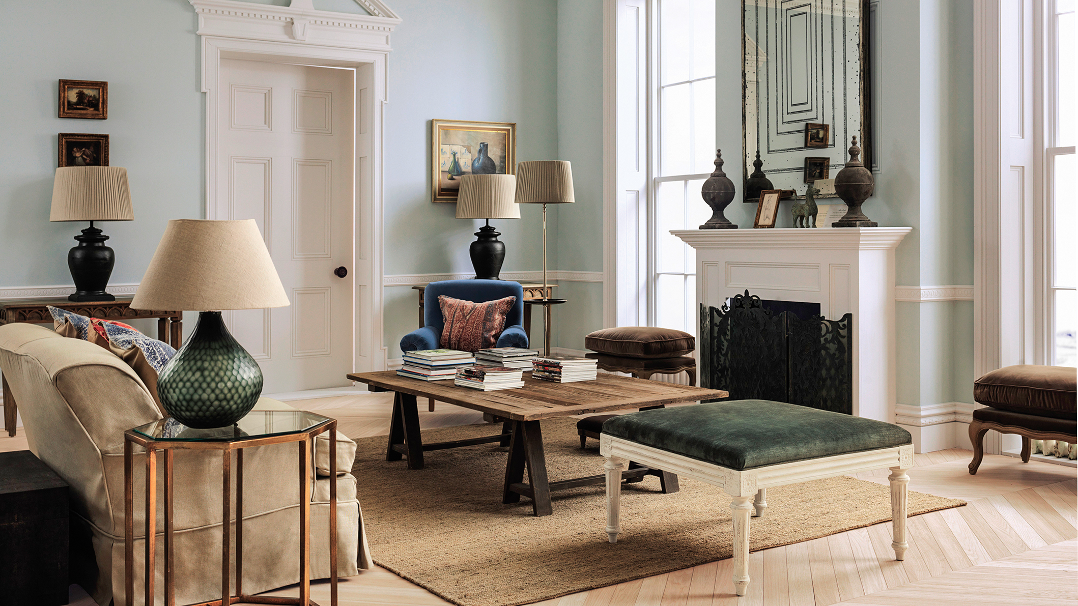
The Best Vintage-Inspired Paint Colors — 6 Expert-Approved Shades for a Touch of Chic Nostalgia
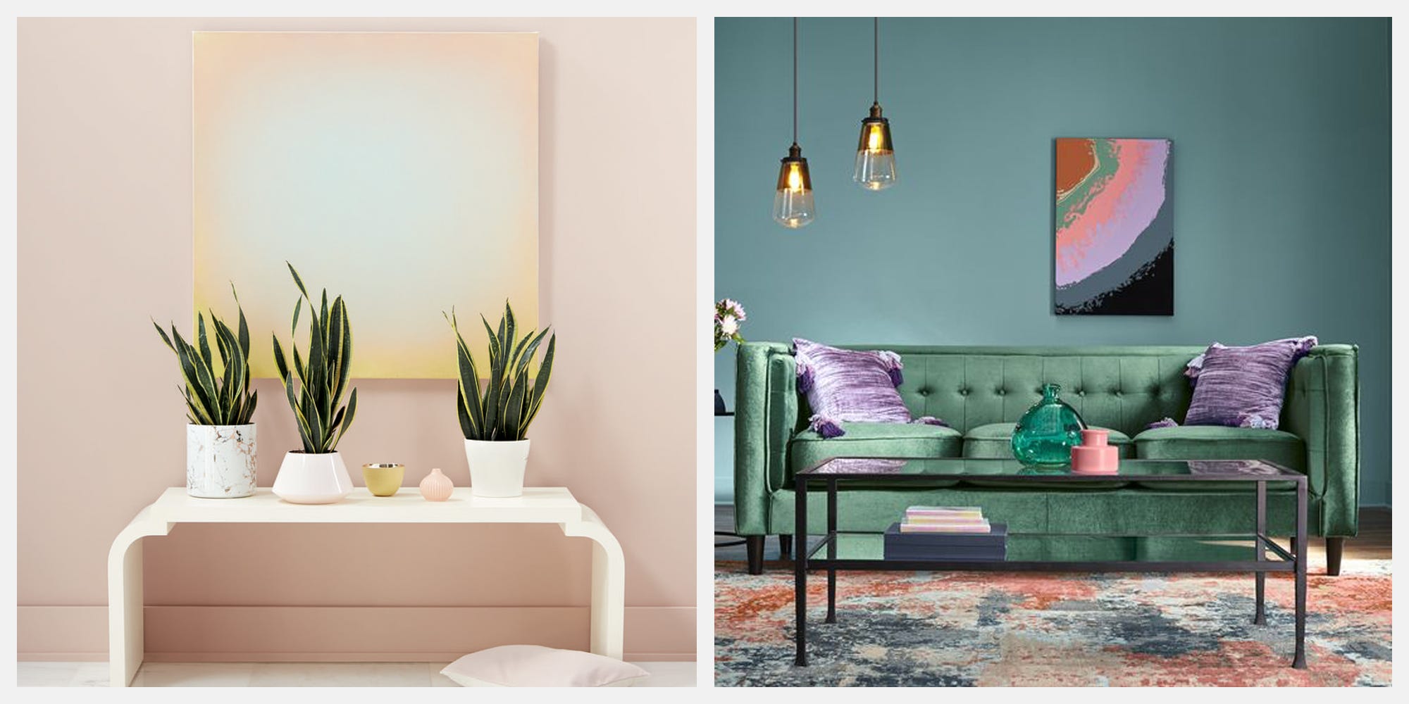
Give Your Home A Modern Refresh With 2019's Top Color Trends

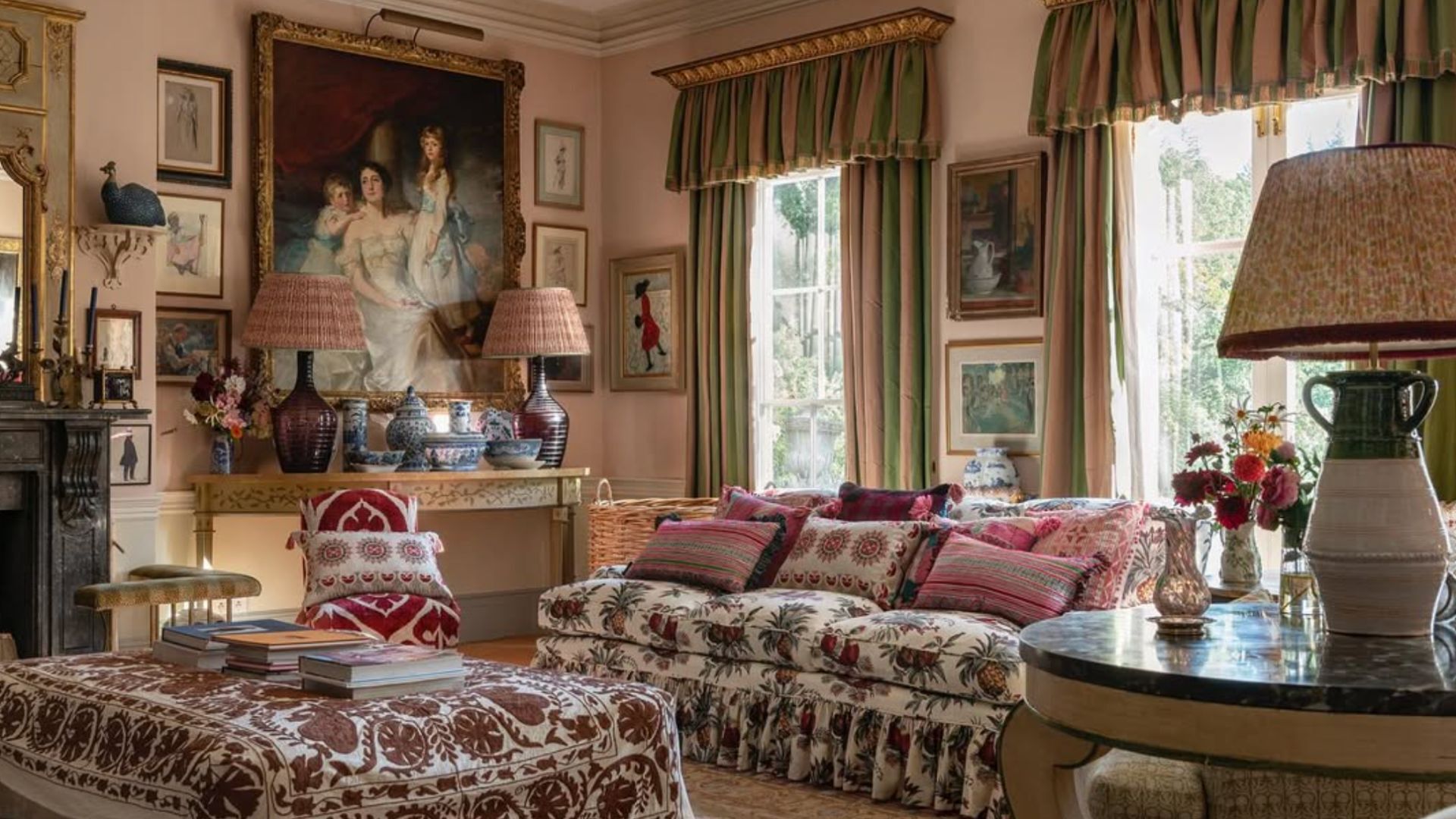
5 living room paint colors going out of style in 2025
Can You Guess The Most Popular Paint Color The Year You Were Born?
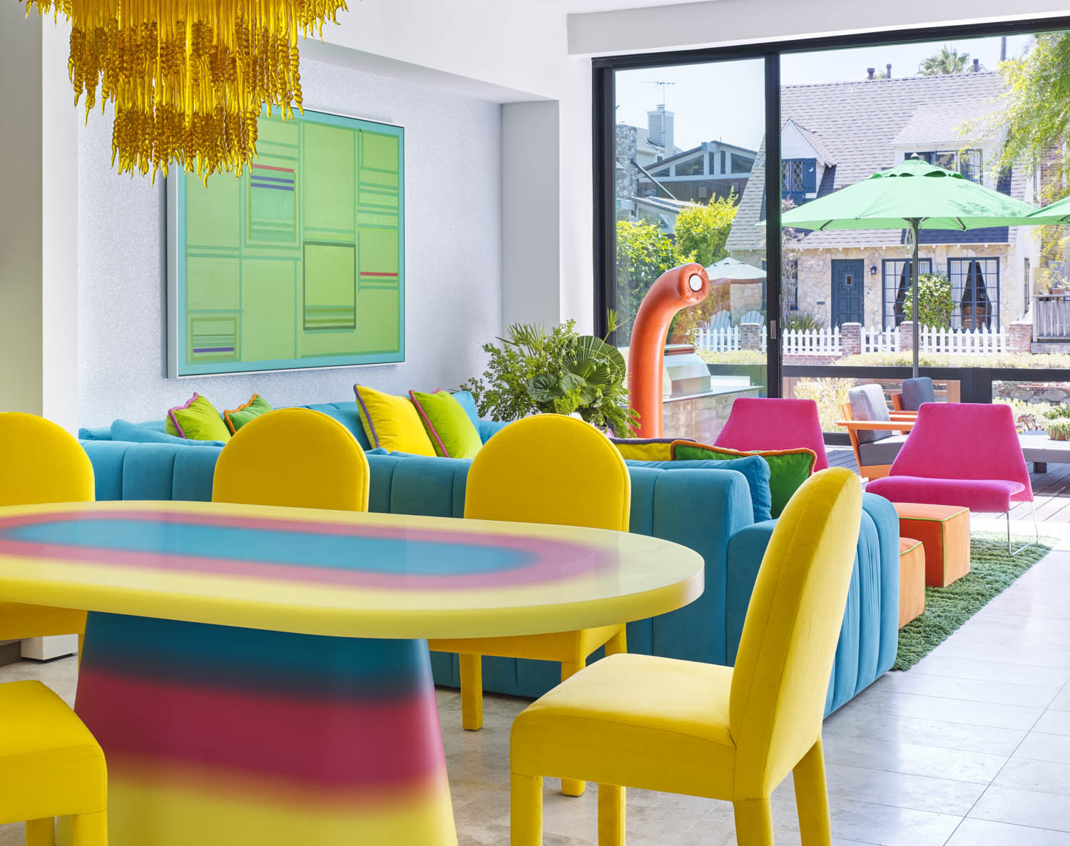
5 Vibrant Color Palettes Designers Are Using to Add Energy and Excitement to Decor

6 key colors to decorate with in May 2025, according to interior design and color experts in the know
The 5 Most Overused Paint Colors and What to Try Instead, According to Designers