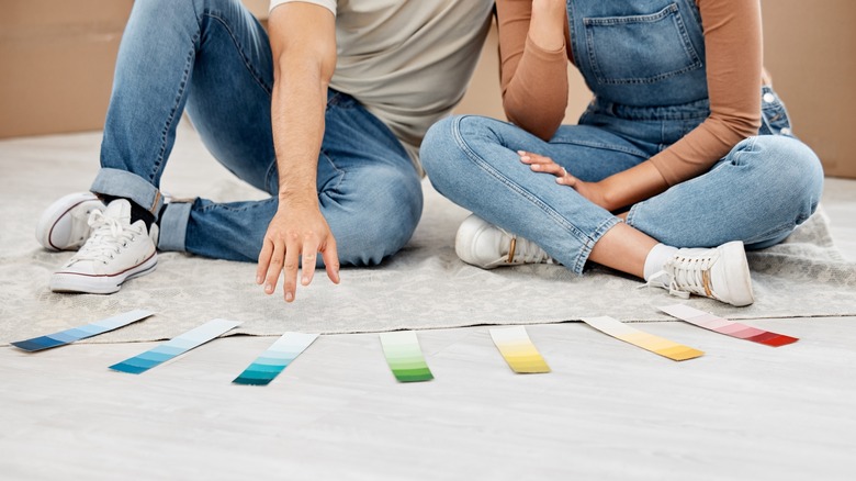
1/6
Once-Trendy Paint Colors That Will Make Your Home Look Dated In 2025
Interior design trends, especially paint colors, evolve over time, leading some once-popular choices to appear dated. This discussion highlights several paint color trends that are predicted to make homes look less current in 2025, advocating for a shift towards warmer, more natural palettes.
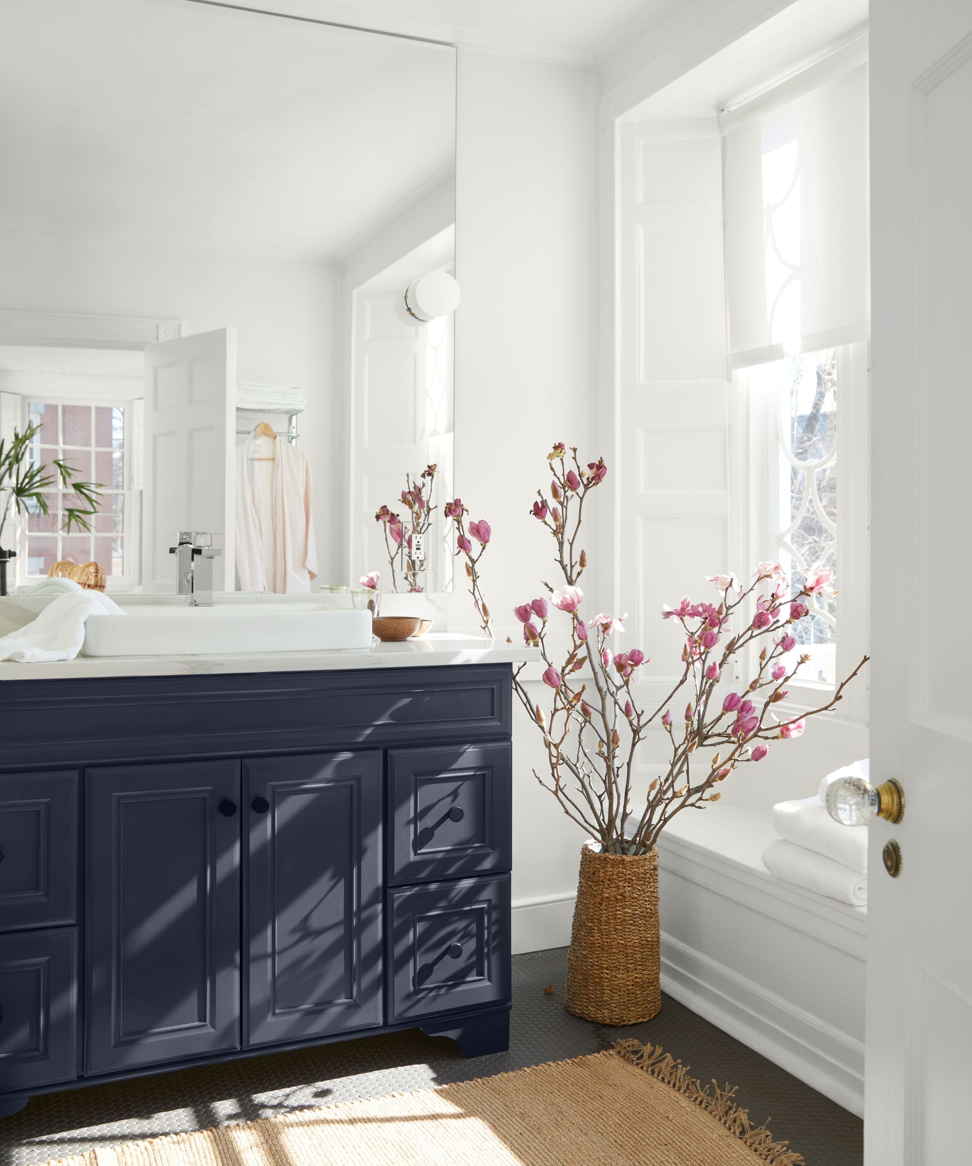
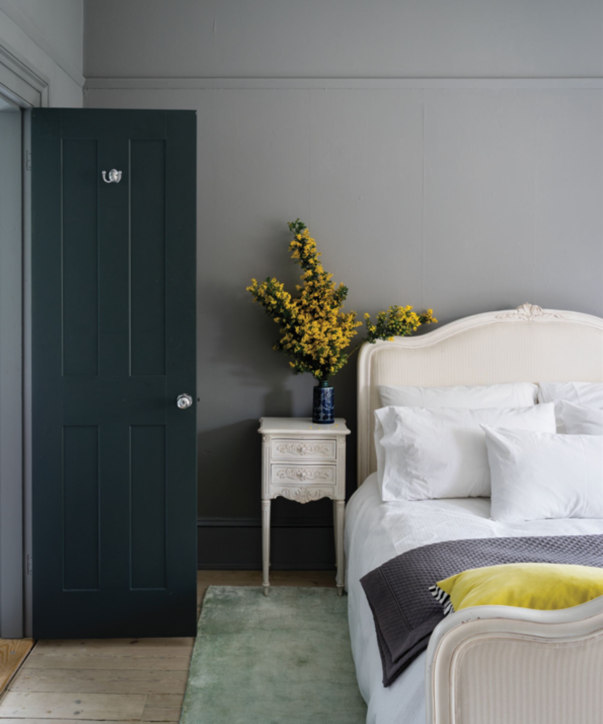
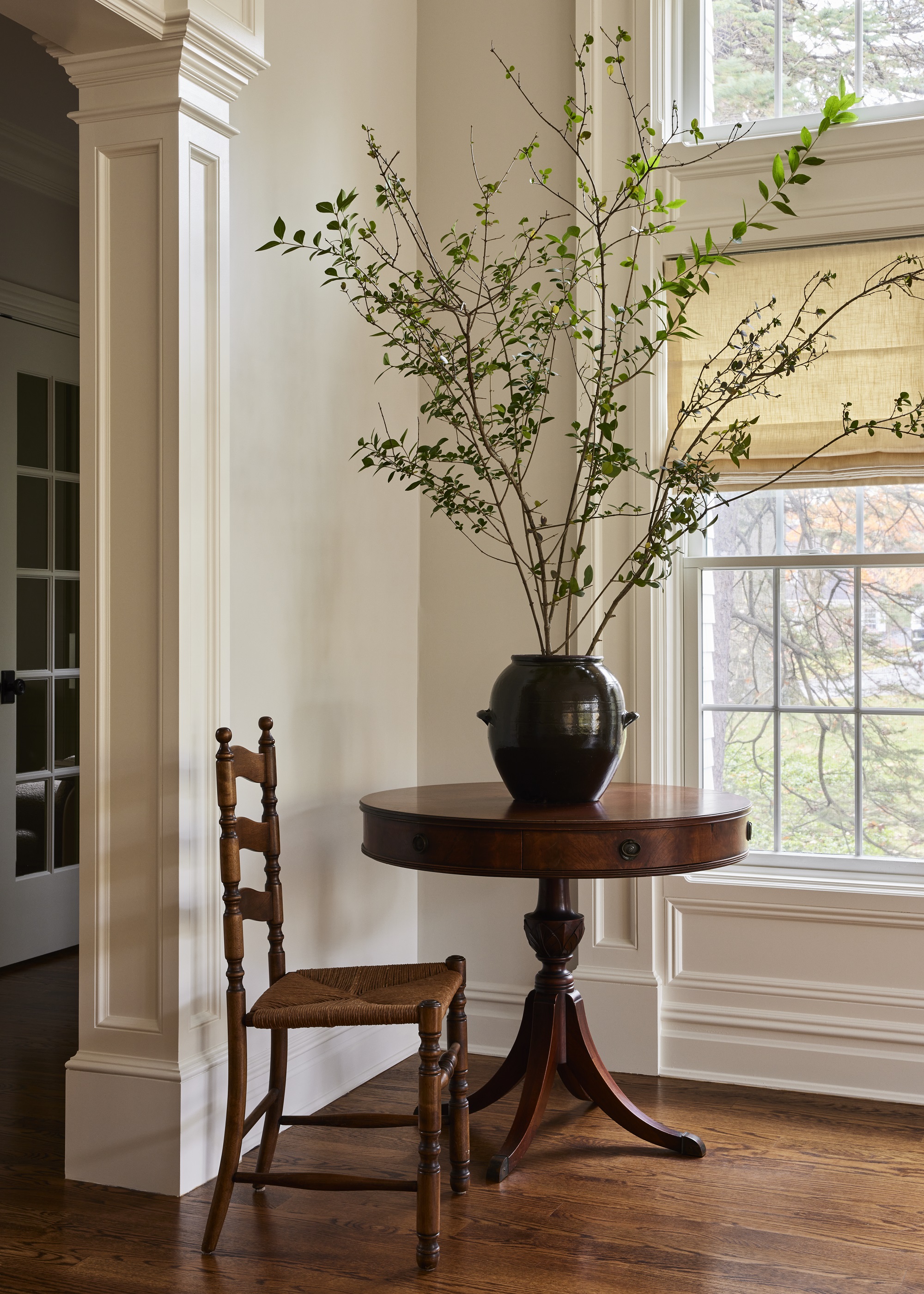
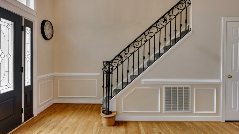
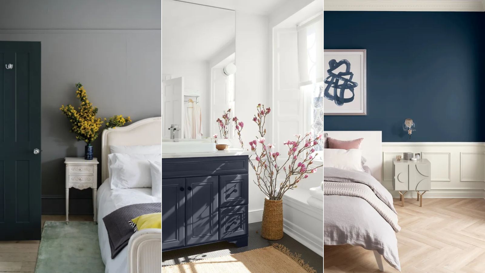
One significant trend to move away from is the use of cold neutrals, particularly cool gray. While once perceived as clean and orderly, cool gray is now considered overdone and can create a clinical, uninviting atmosphere. If a complete repaint isn't feasible, incorporating natural tones like deep browns and greens, along with florals, can help offset the coolness. Similarly, all-white spaces, especially those with blue or gray undertones, are losing favor. The current preference leans towards whites with warmer undertones, such as yellow or pink, as the broader trend shifts towards natural, warm colors across all shades.
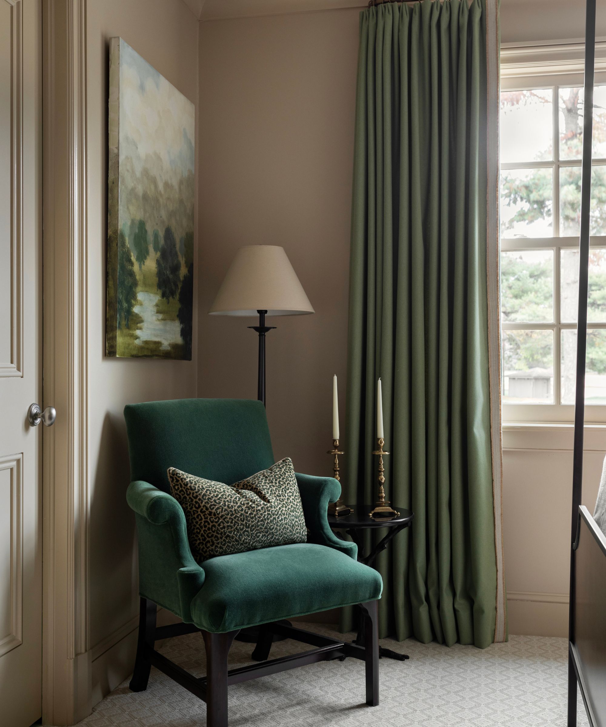
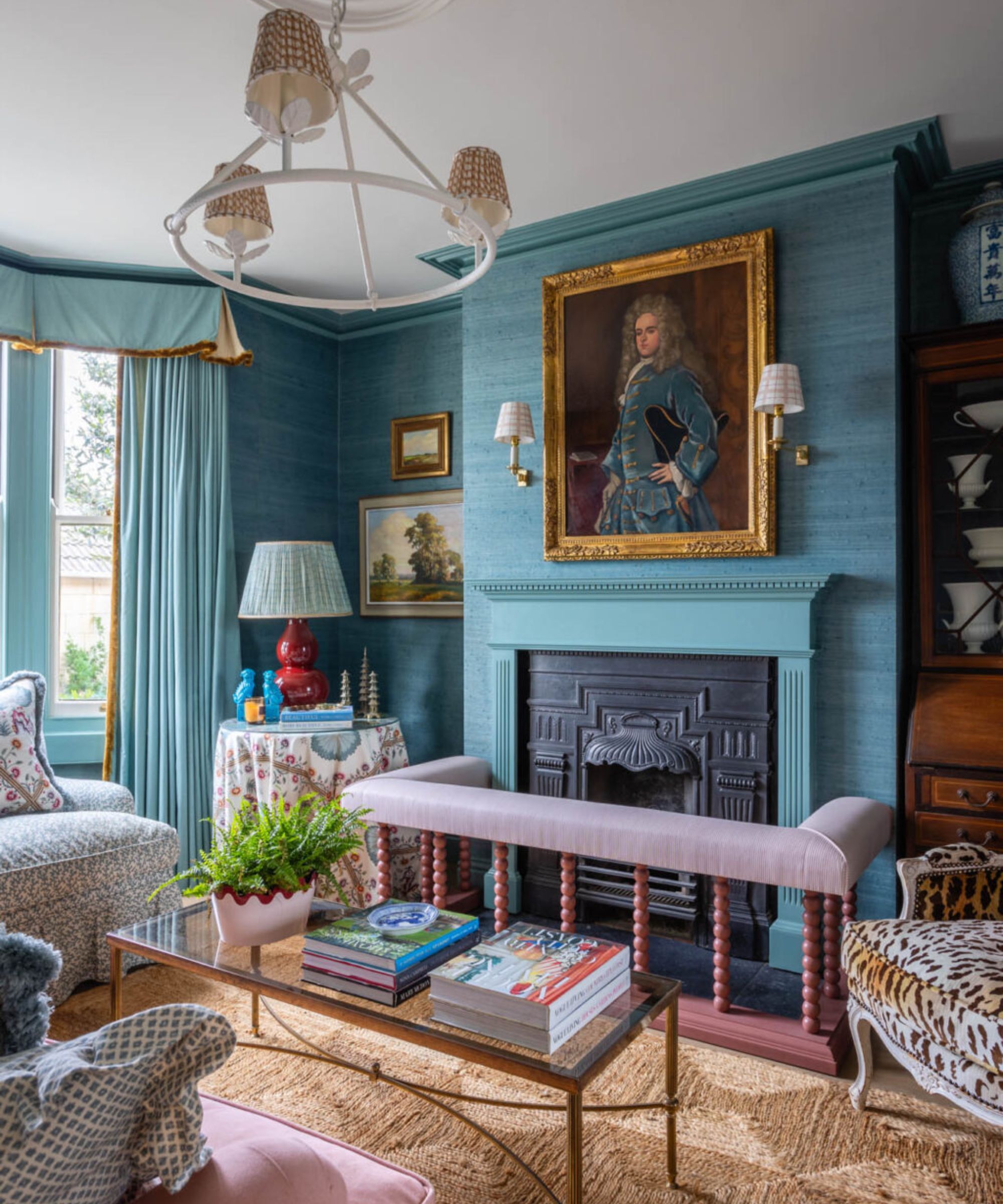
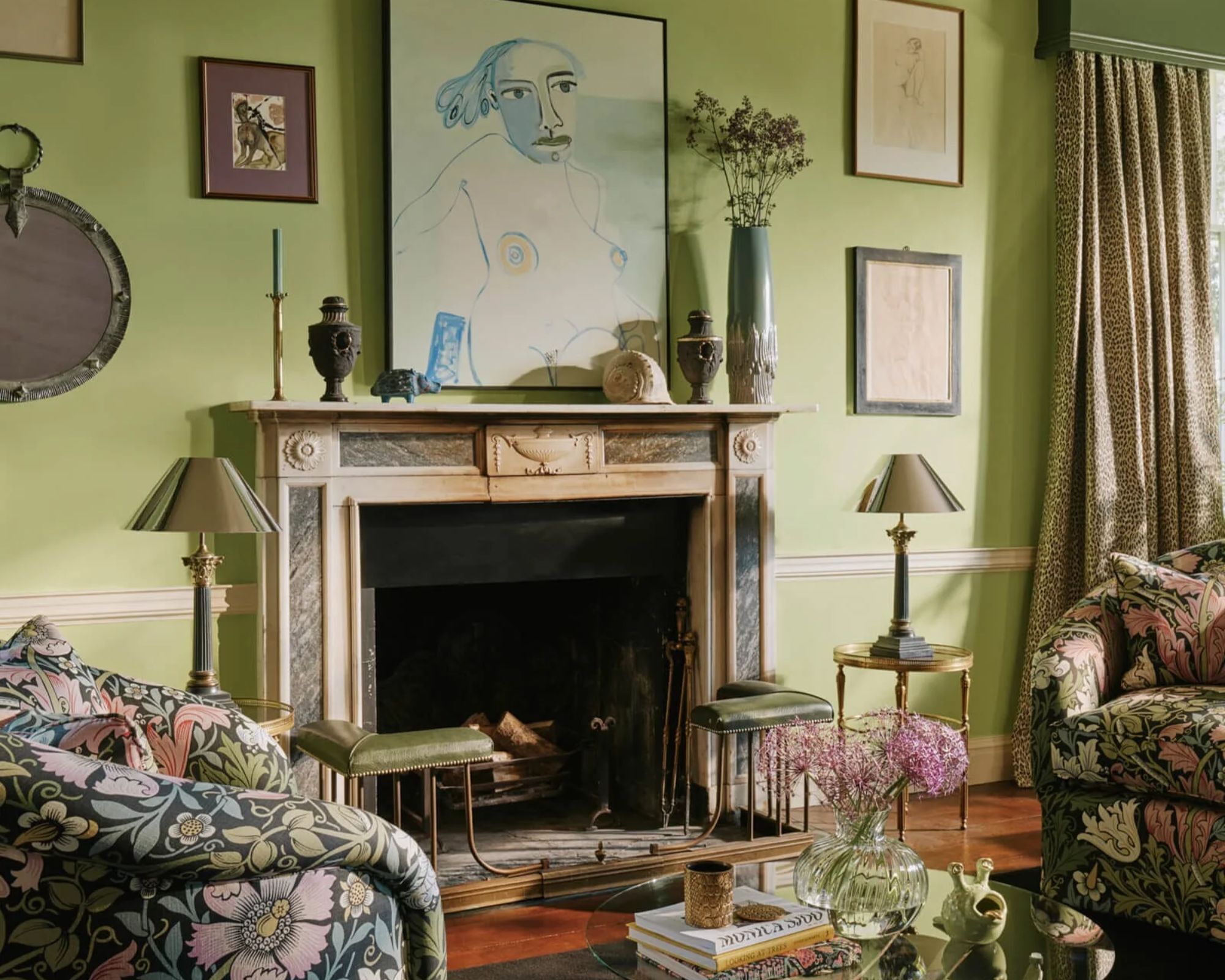
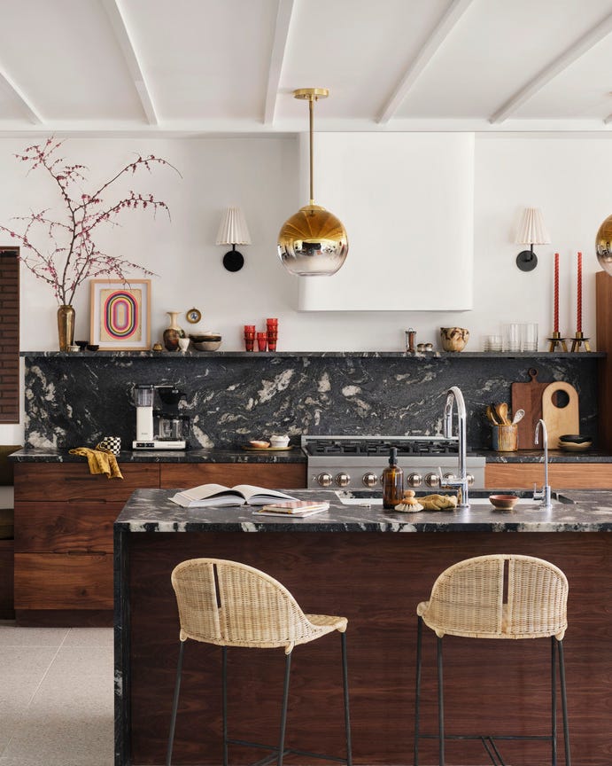
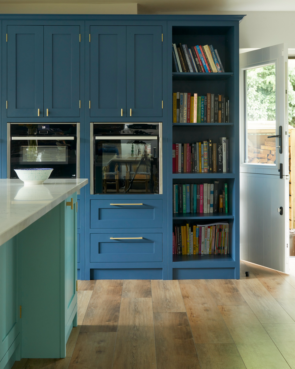
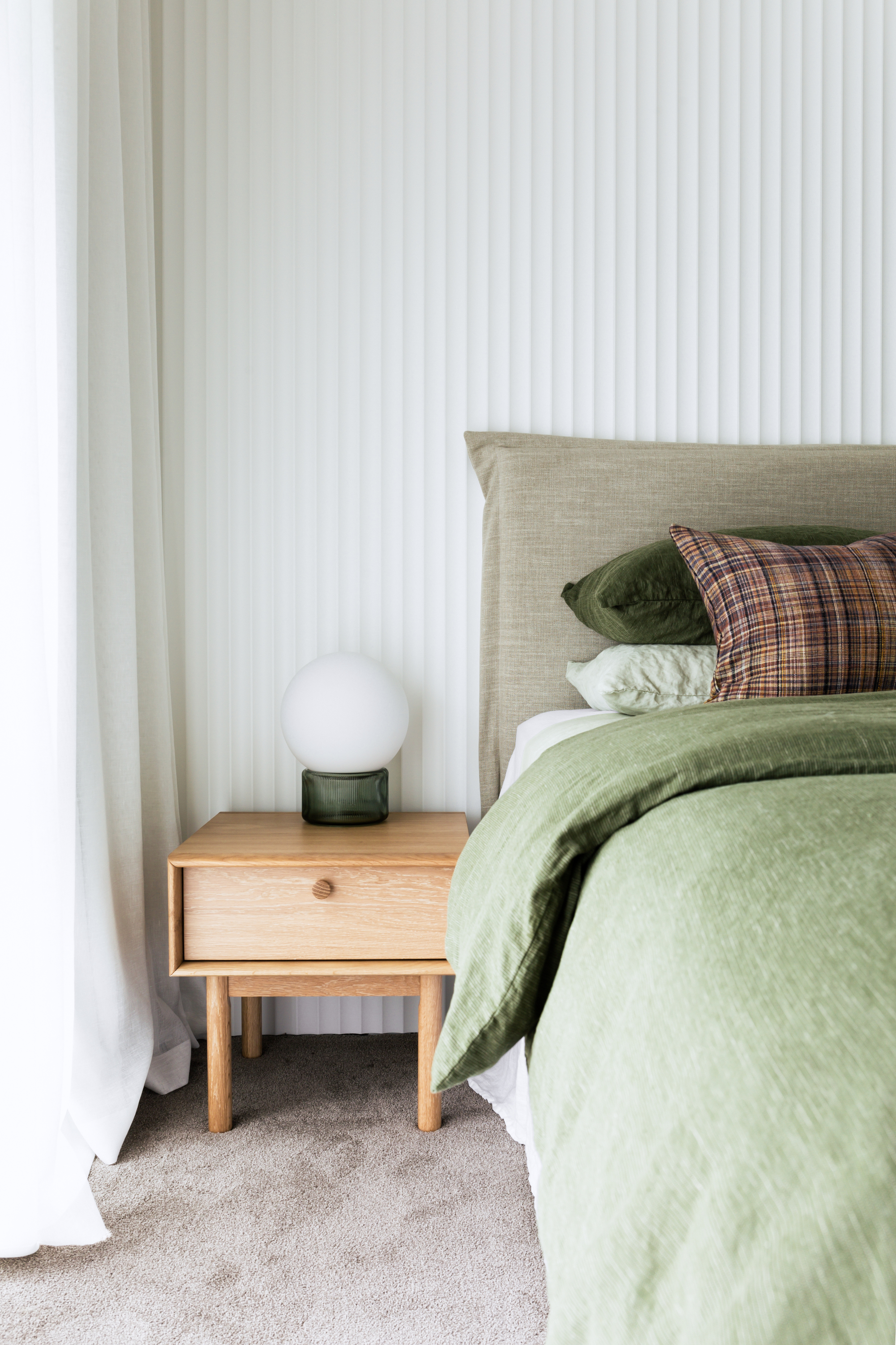
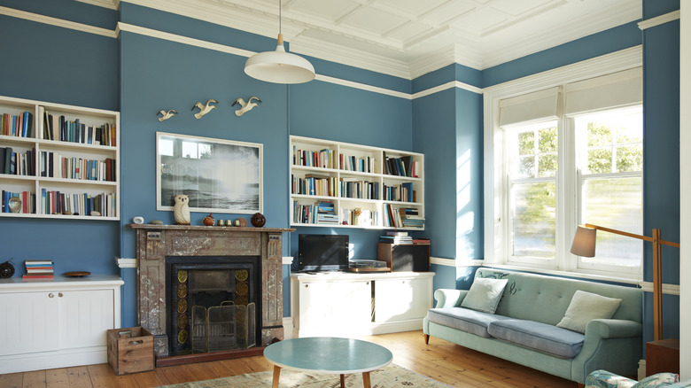
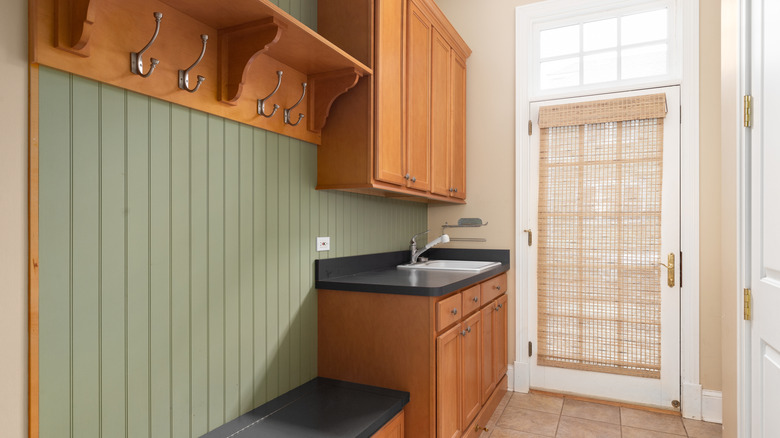
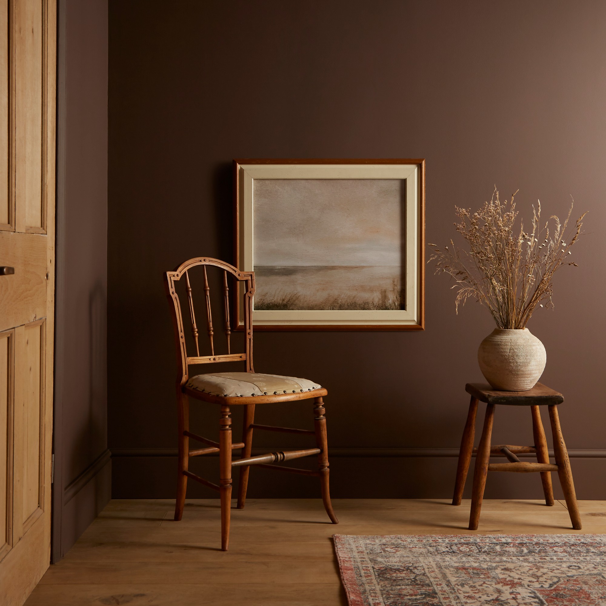
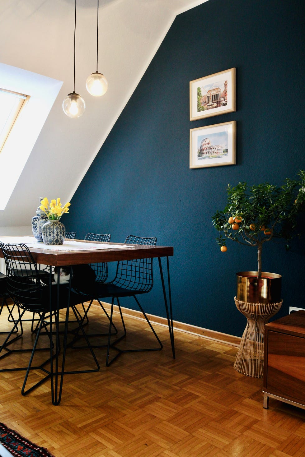
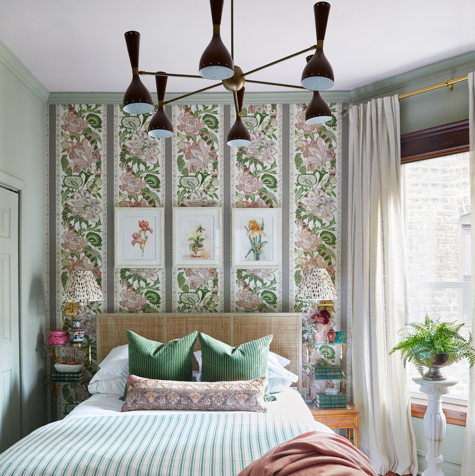
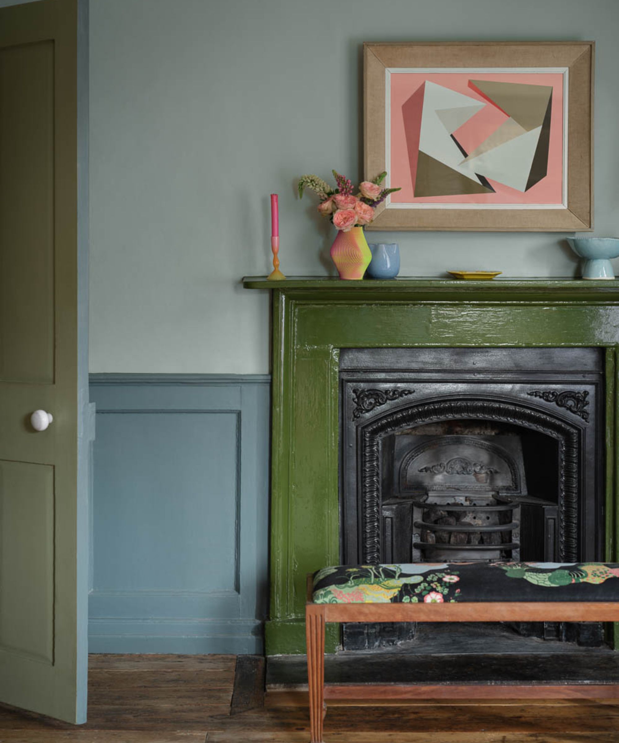
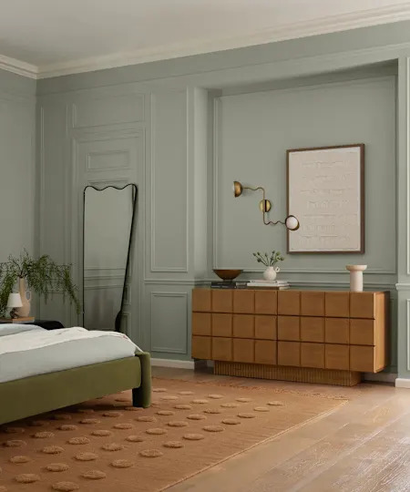
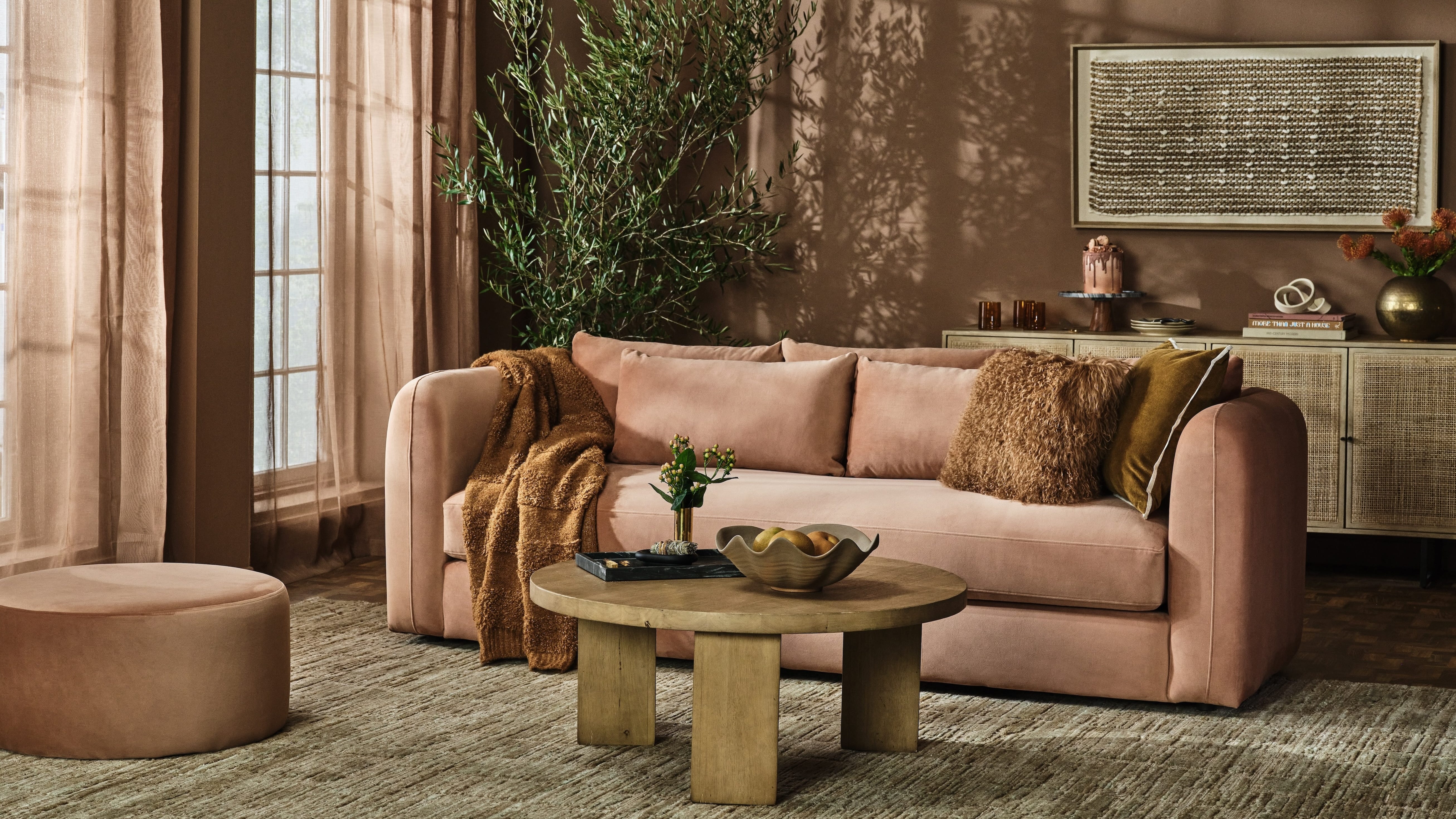
Another dated approach is the use of greens and blues with low vibrancy, such as mint or institutional green-gray. The contemporary design philosophy, often termed biophilic design, emphasizes reconnecting with nature by bringing natural elements indoors. This translates to using greens that are either bold, like forest green, uniquely shaded, such as moss green, or greens with blue undertones. When drawing inspiration from nature, browns are favored as primary neutrals over grays. Biophilic design extends beyond color to include elements like natural light, curved organic shapes, and materials like wood, stone, cotton, and rattan, all contributing to a comfortable and enduring aesthetic.
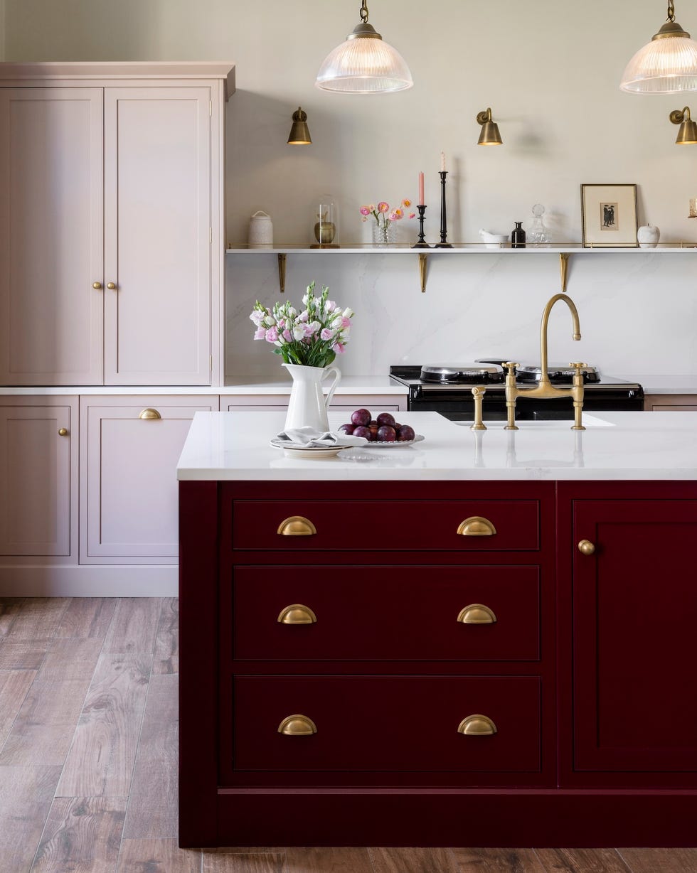
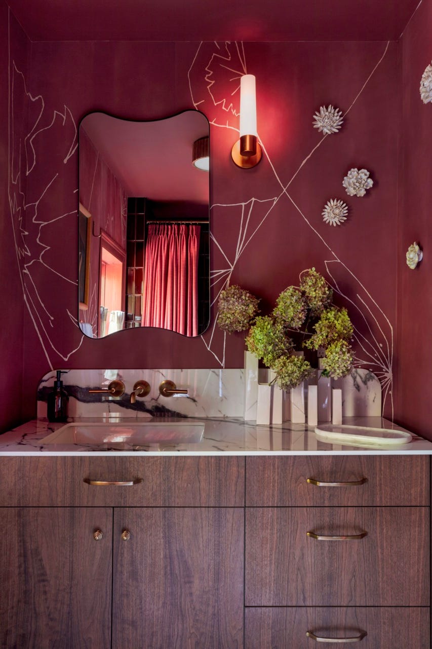
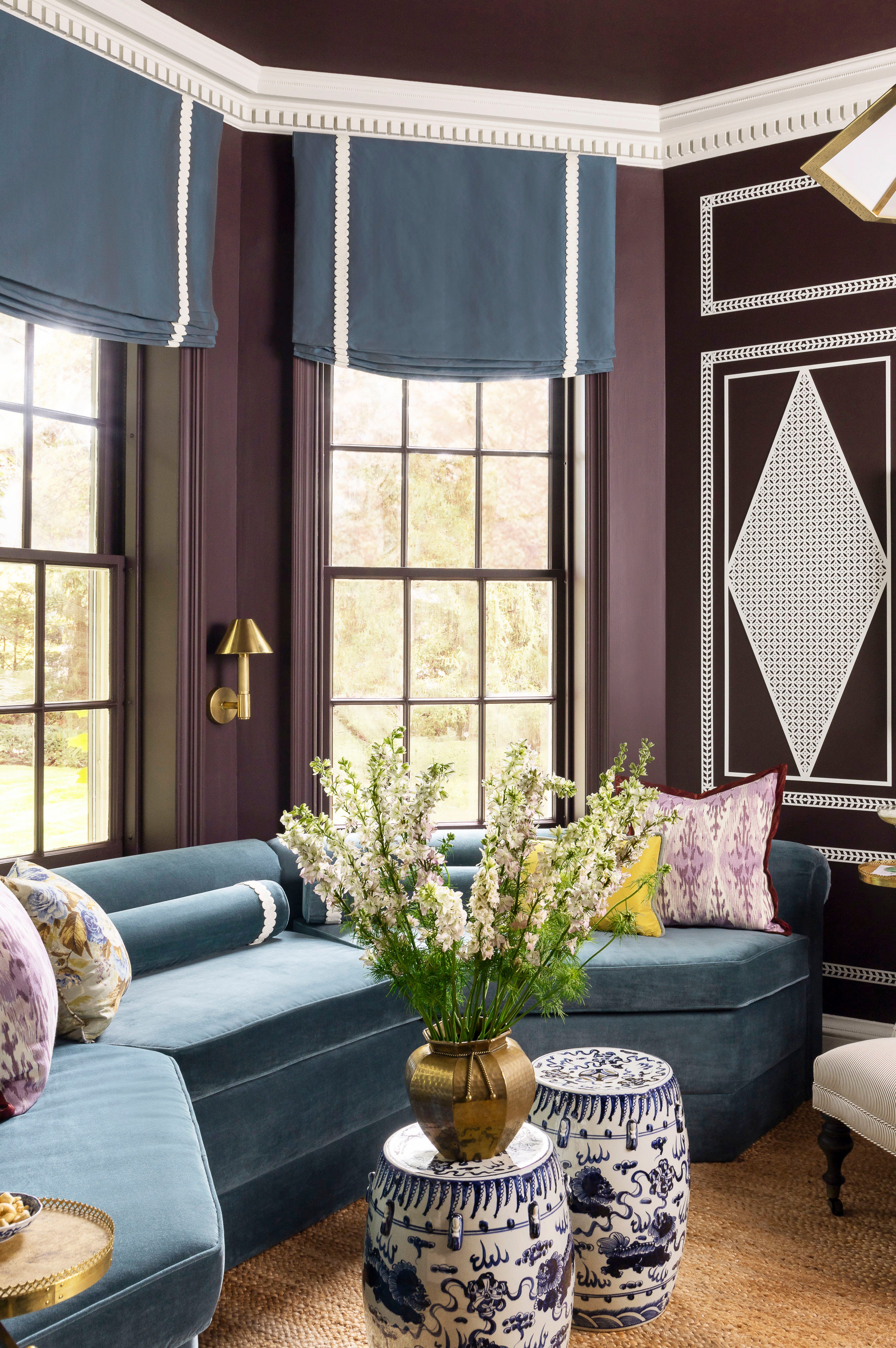
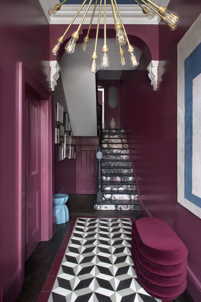
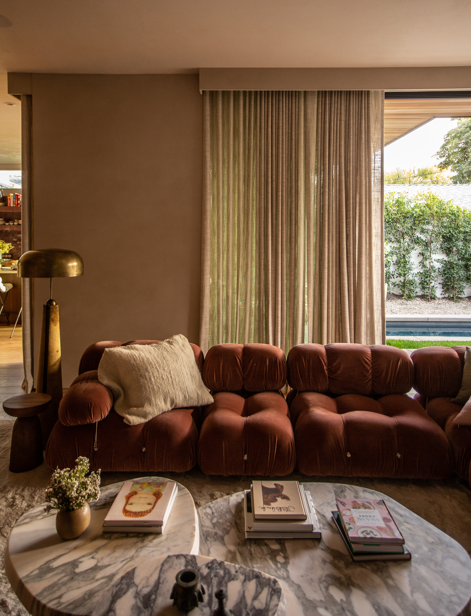
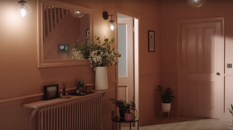
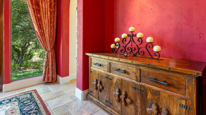
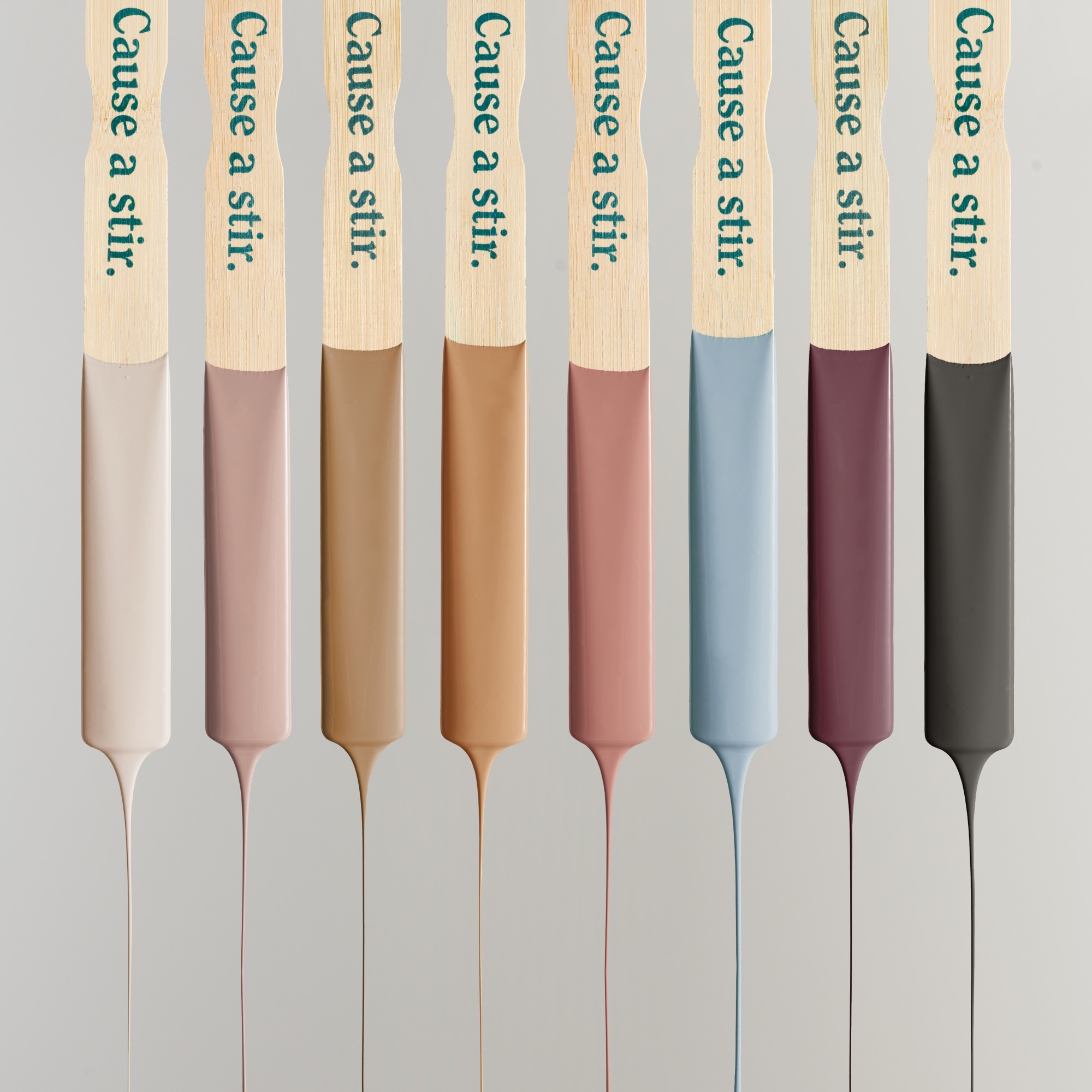
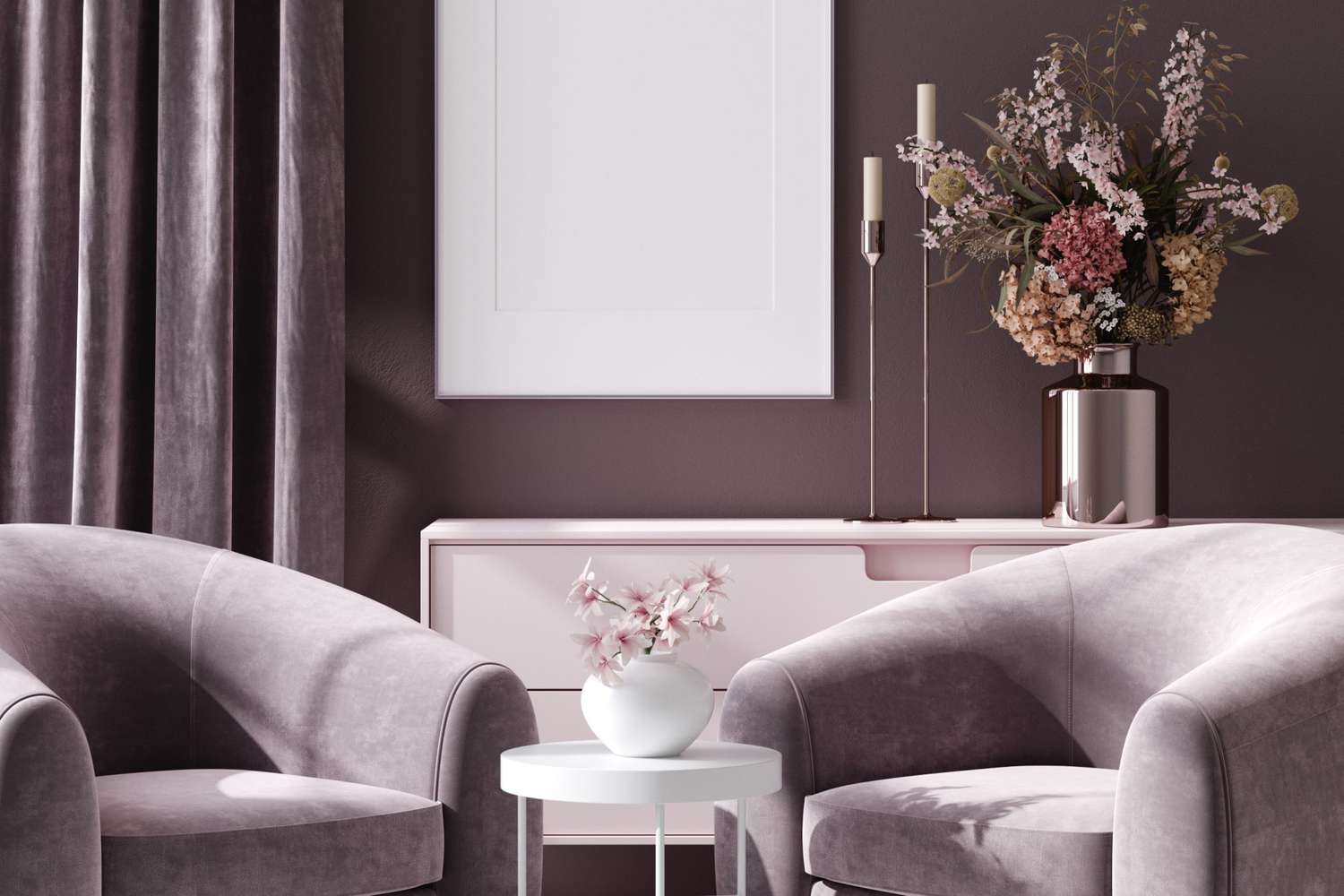
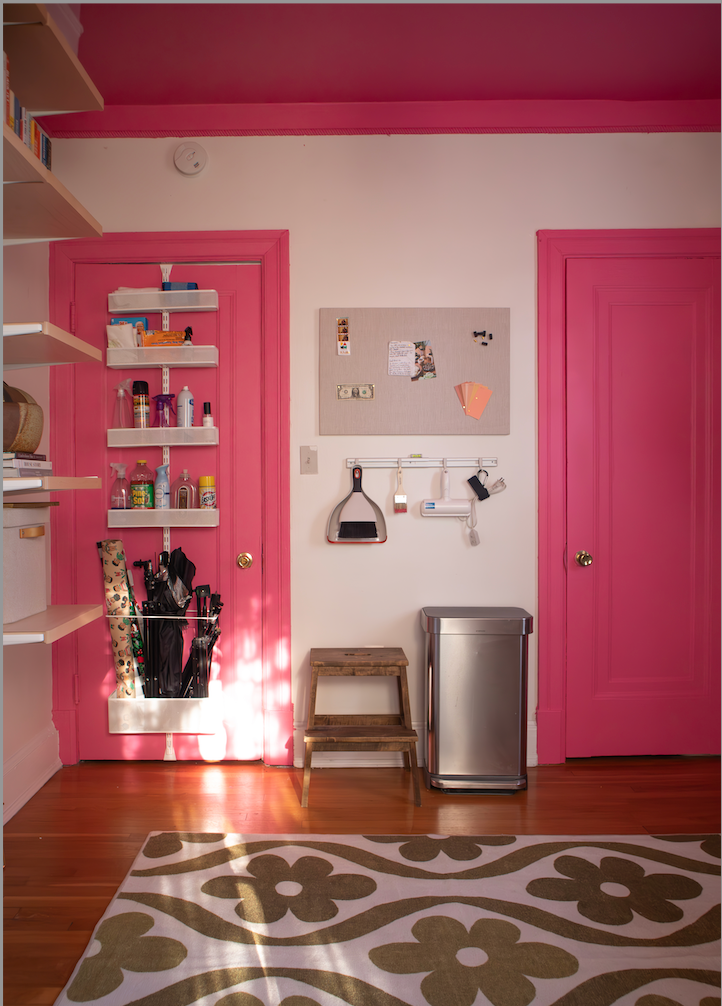
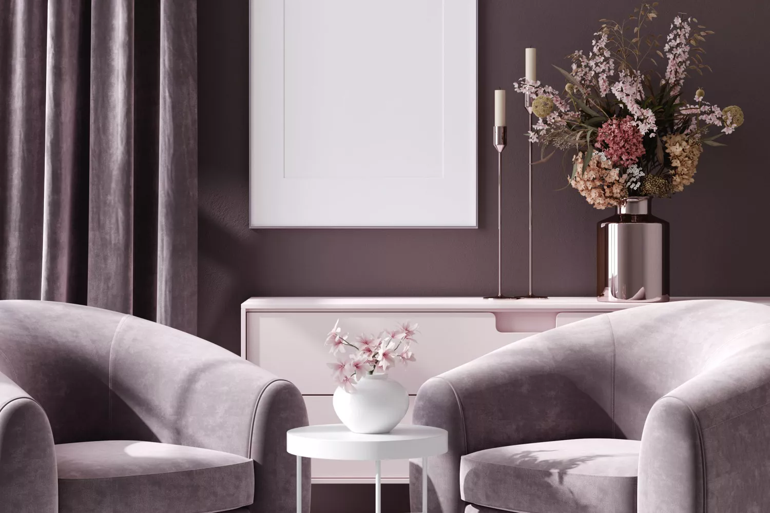
The pastel trend, particularly pink, has also seen its peak. While nude pink tones and corals can work as accents, extensive use of pink on walls or furniture clashes with the emerging earth-tone aesthetic. Bright, startling colors like crimson and magenta are also out. Instead, warmer, muted tones such as deep cinnamon, cider, brown-red claret, deep orange, or even deep purple (like eggplant) are recommended. These colors evoke a sense of banked warmth rather than a vibrant flame. Eggplant, with its mix of deep purple and red/brown undertones, is presented as a versatile choice that harmonizes well with greens, blues, blacks, and beiges.
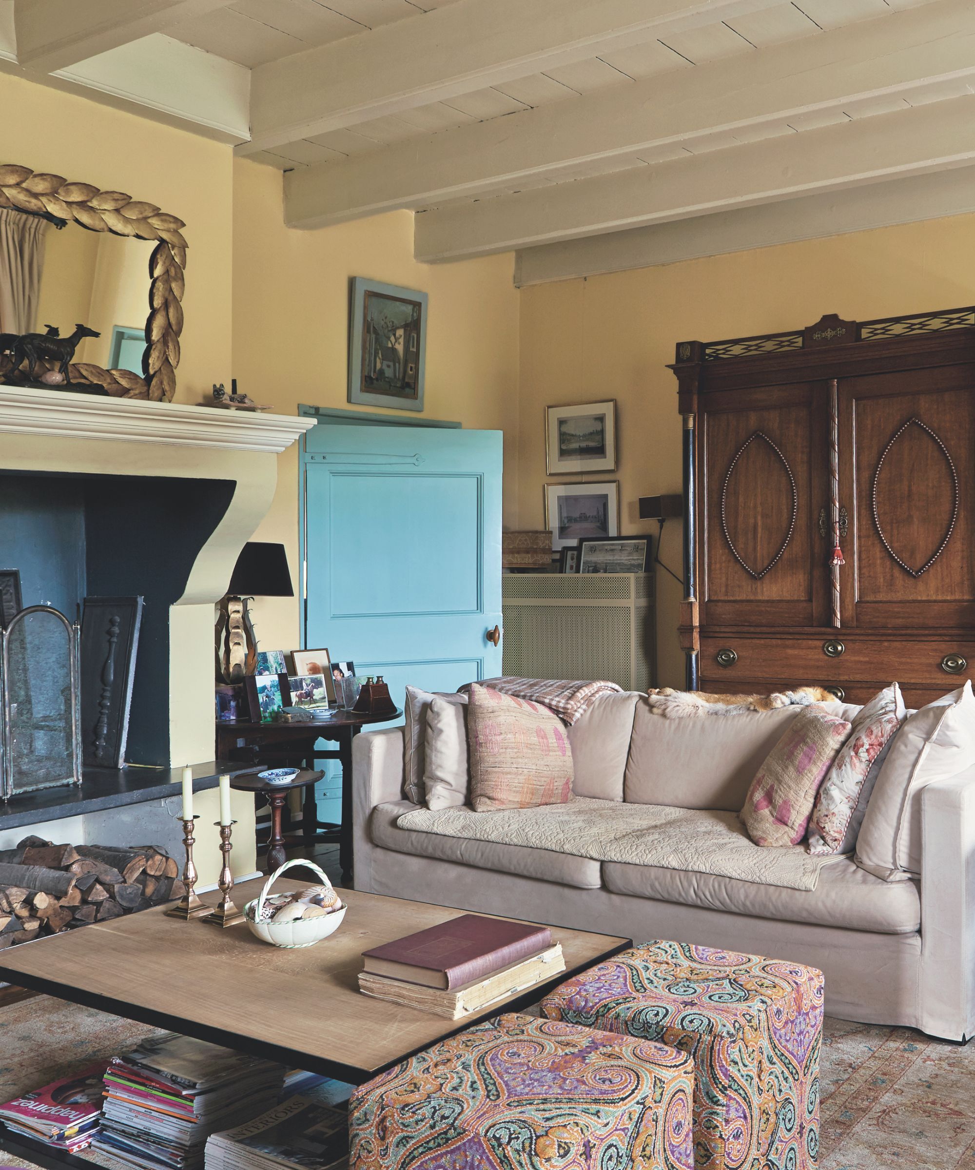
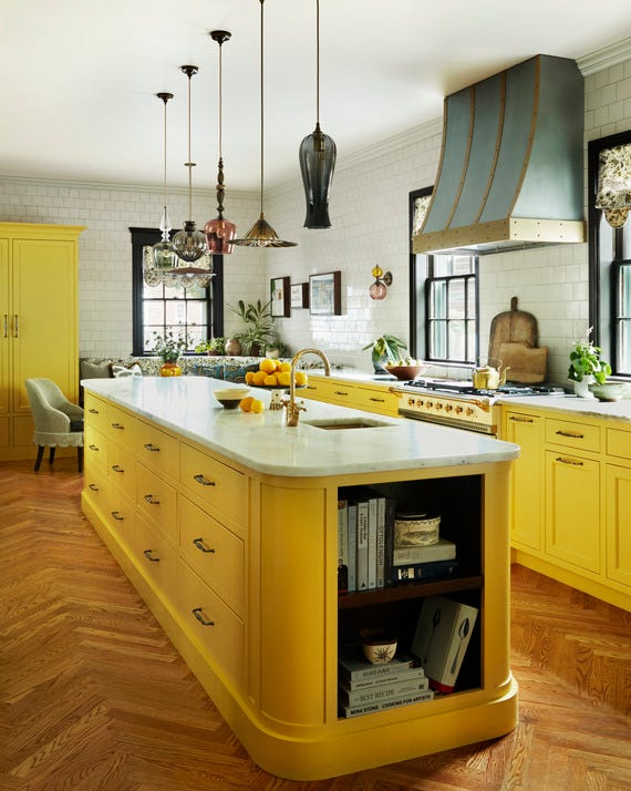
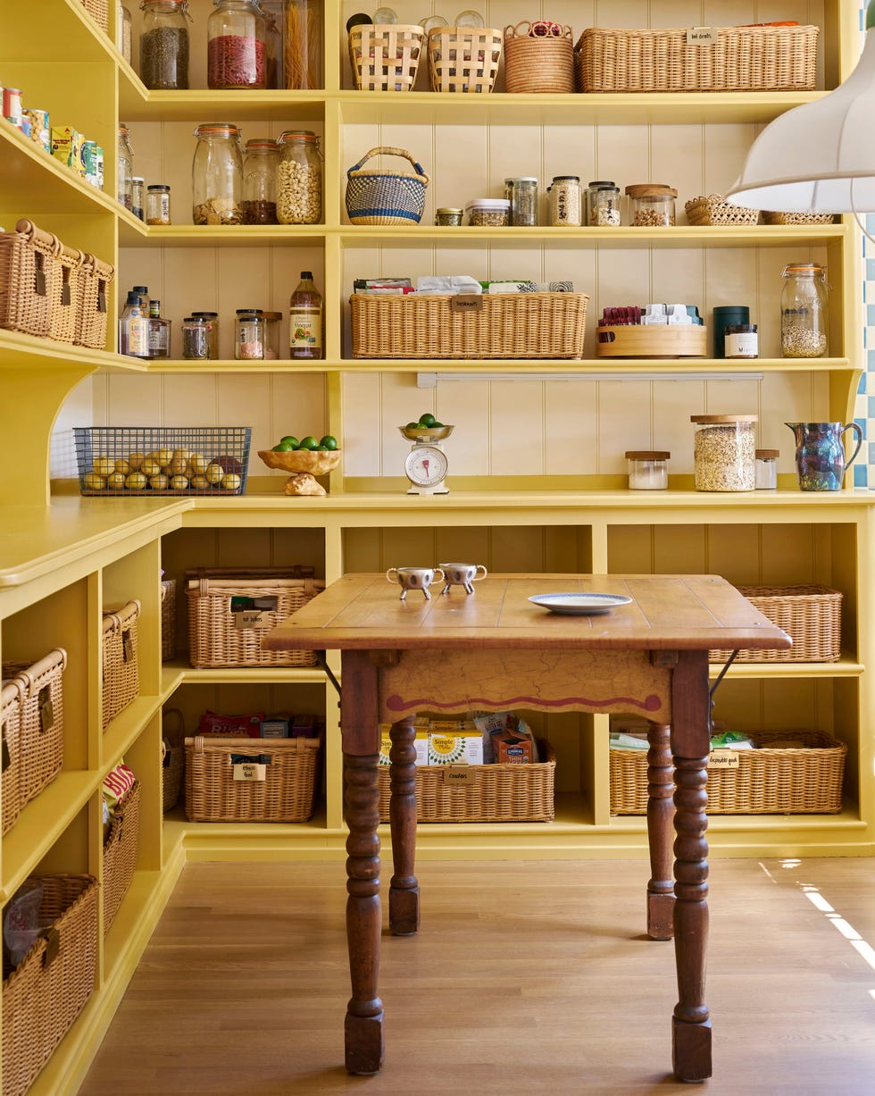
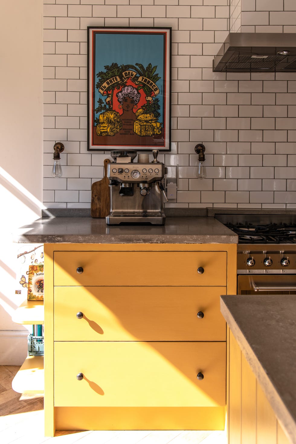
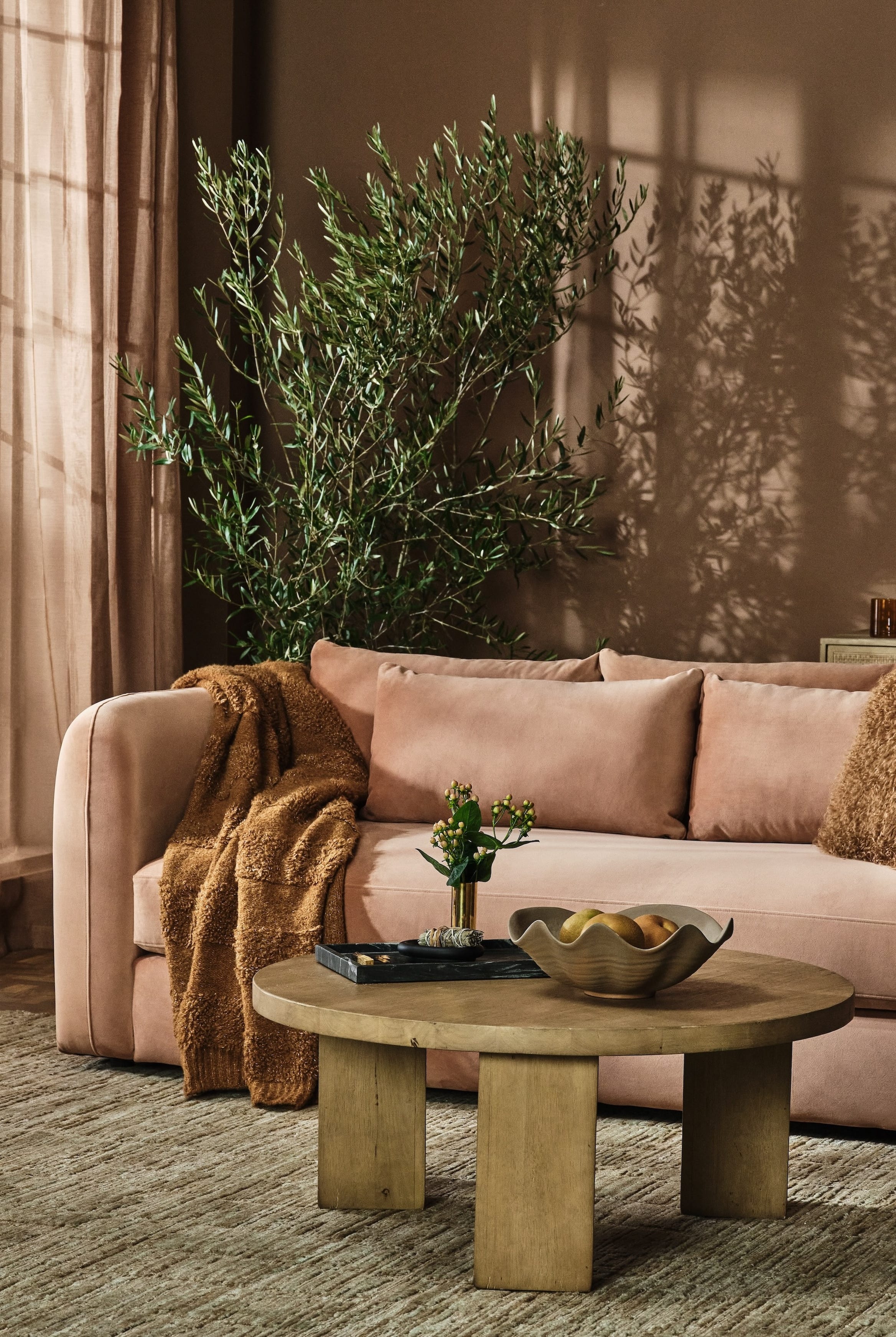
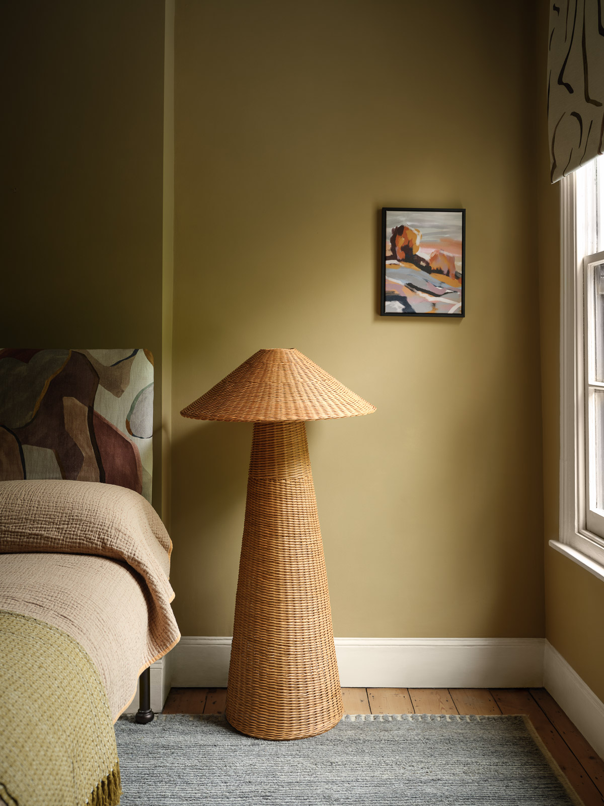
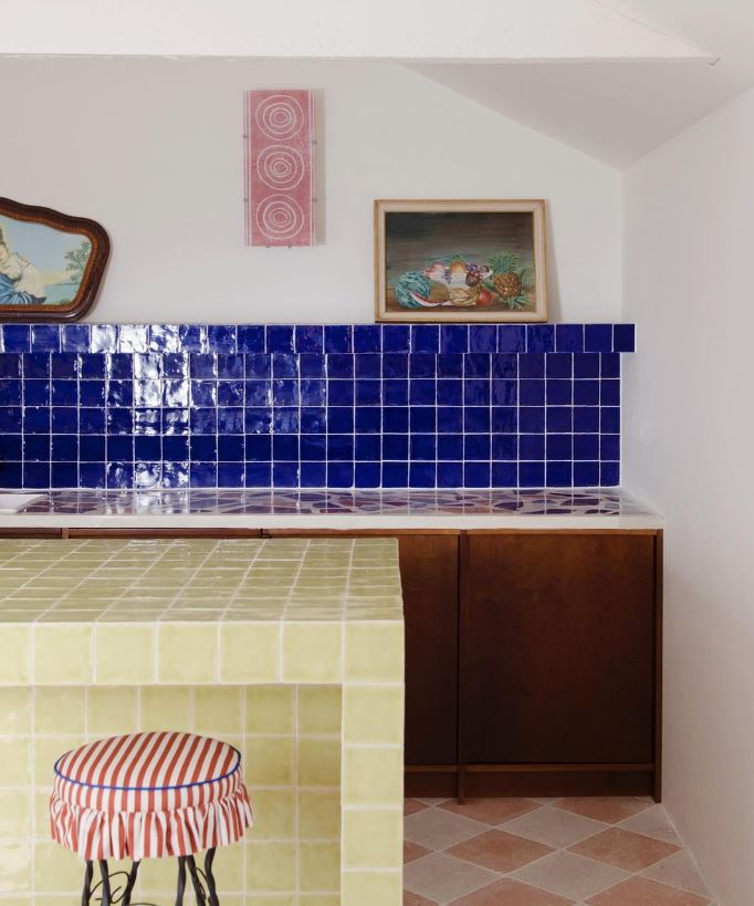
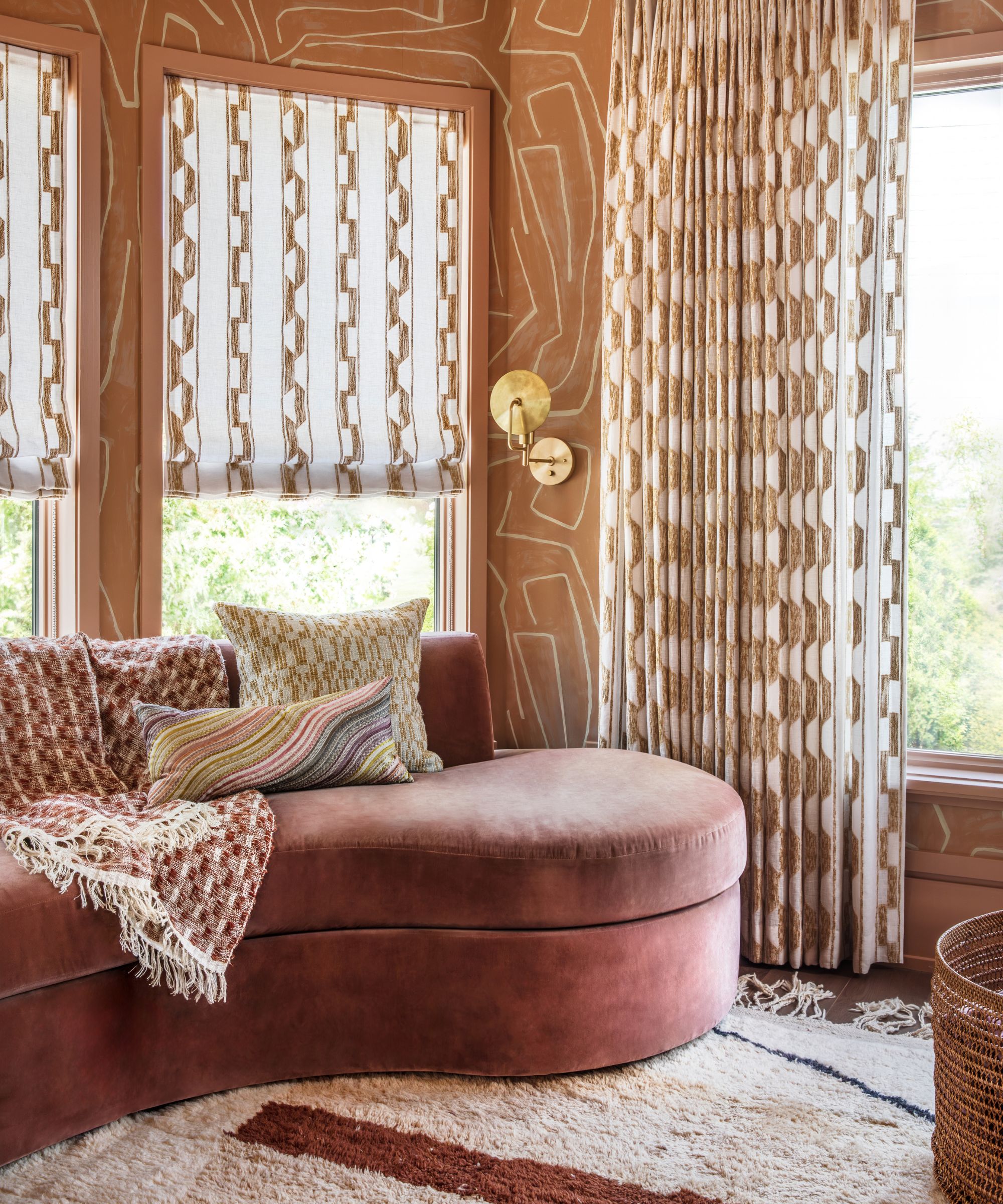
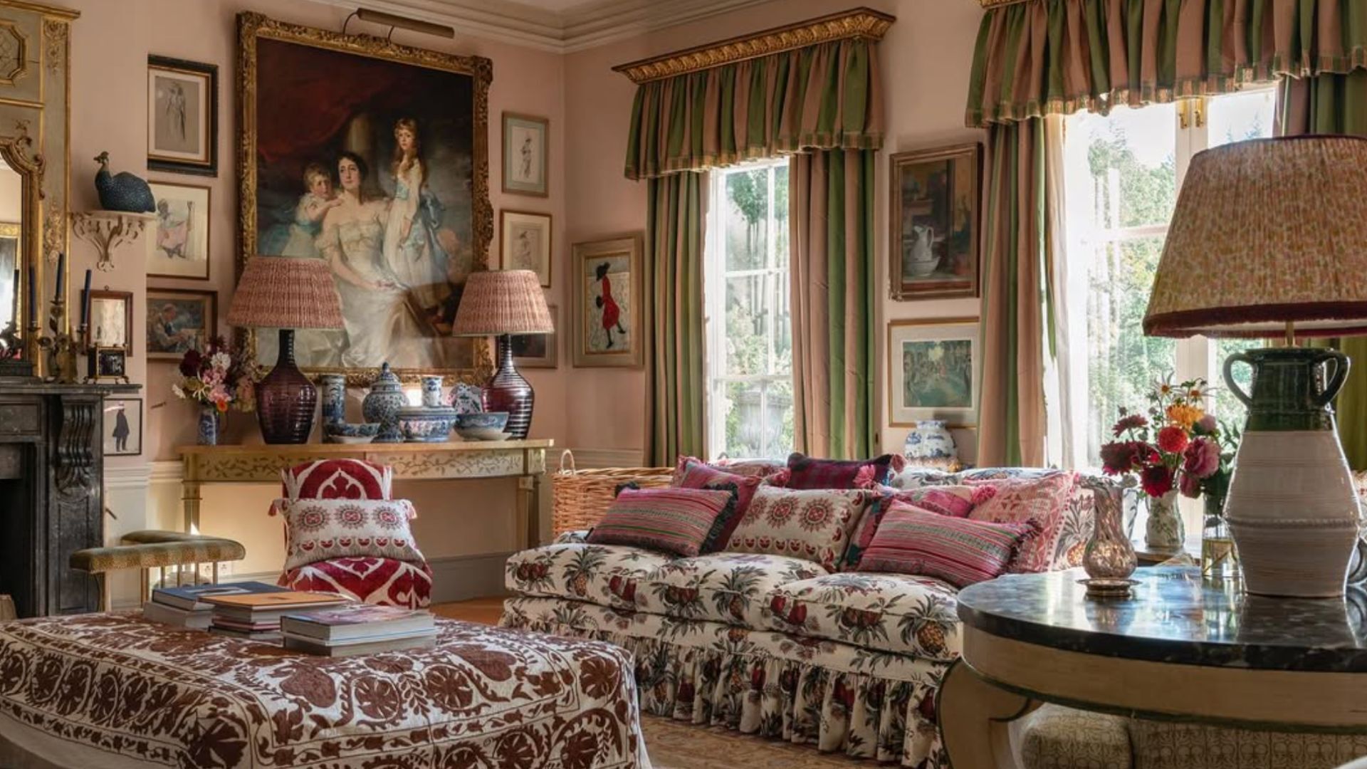
The article also warns against misinterpreting the return to earth tones as a revival of the lurid, psychedelic-era colors of the mid-1970s, such as mustard yellow, burnt orange, and avocado green. The focus is on softer, more natural earth tones that blend and complement each other, moving away from garish, separated tones. The goal is to create inviting spaces with muted, layered colors, enhanced by cozy textures and nubby fabrics, rather than recreating past décor mistakes.
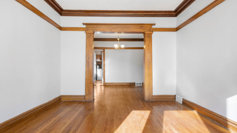
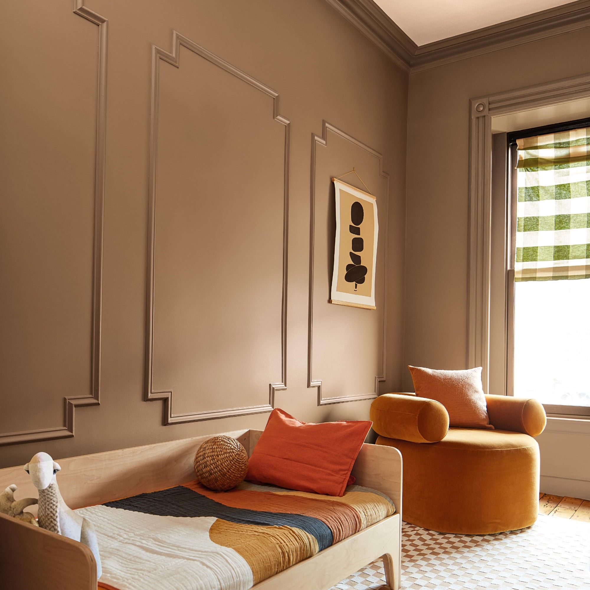
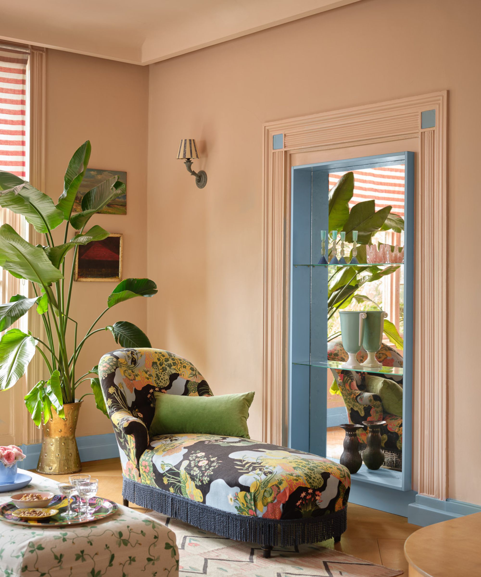
Finally, saturating a room solely in beige is another outdated trend. Referred to as "millennial beige," this approach often lacks commitment and inspiration. Instead, existing beige walls can be enhanced by introducing complementary colors through curtains, carpets, throw rugs, upholstery, and art. Medium to dark browns, terra cotta, smoky blues, and sage greens can warm up the space. Beige walls can also be contrasted with black furniture for drama or paired with white trim and layered with crisp and nubby textures for a soothing effect, ultimately moving away from an uninspired, monotone beige environment.
#PaintColors #InteriorDesignTrends #HomeDecor #DatedColors #BiophilicDesign #WarmNeutrals #EarthTones #ColorPalettes #PaintColors #InteriorDesignTrends #HomeDecor #DatedColors #BiophilicDesign #WarmNeutrals #EarthTones #ColorPalettes
0 comment in total
 No comments yet
You may also like
Paint colors going out of style in 2025

These kitchen paint colours will be everywhere in 2025 – and there's even one for neutral lovers

8 Stunning Paint Trends To Keep Your Home's Interior Fresh In 2025
5 Paint Colors That Are Out for 2025, According to Interior Designers

5 living room paint colors going out of style in 2025
Designers Predict You'll Use AT LEAST One of These Colors in Your Home in 2025

5 Paint Colors That Will Take Over in 2025, According to Interior Designers

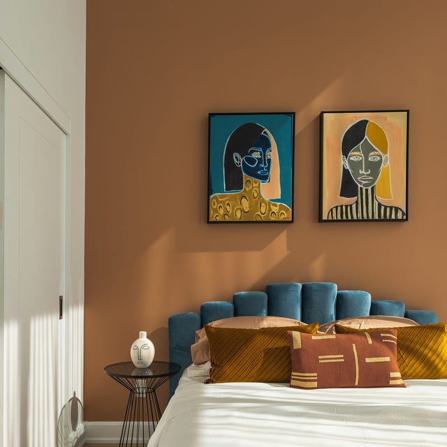
These 5 Paint Color Trends Will Be Everywhere in 2024, According to Interior Designers

These Colors Will Be Everywhere in Interiors in 2025
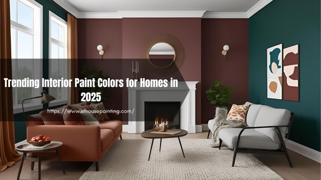
Trending Interior Paint Colors for Homes in 2025

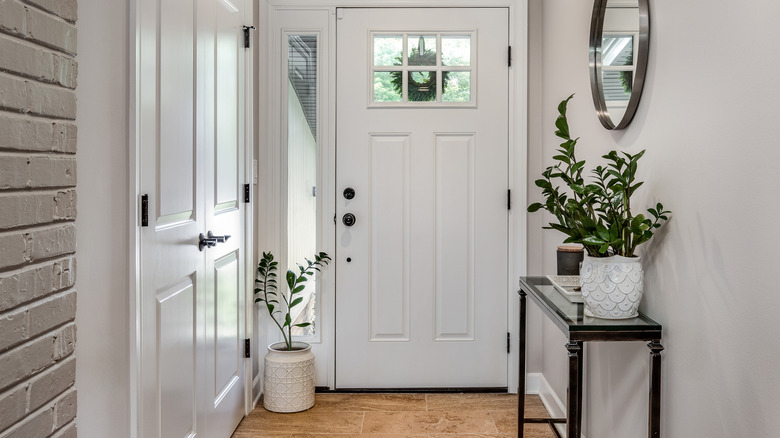
Outdated Entryway Paint Colors To Avoid In 2025 (And What To Try Instead)
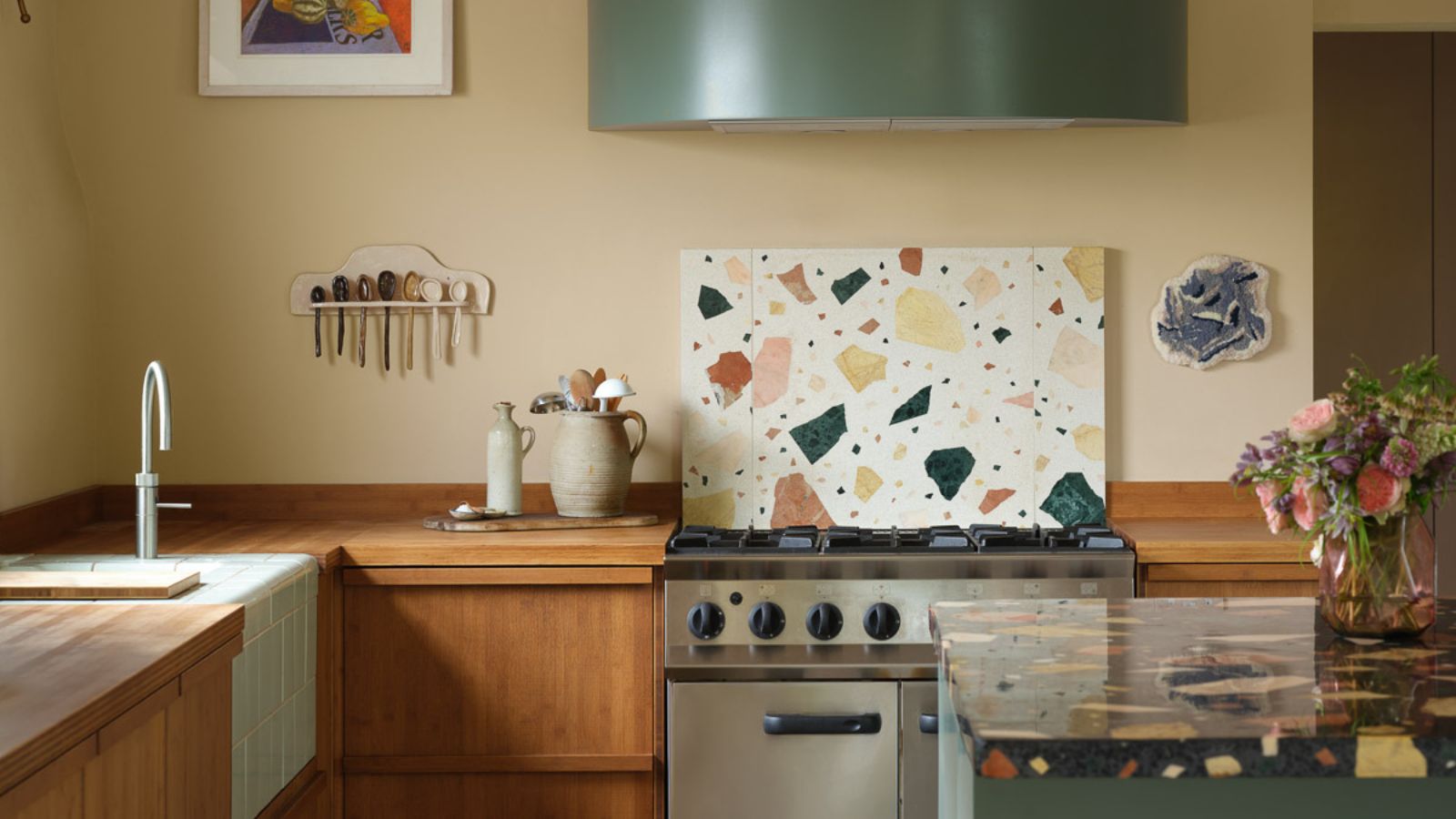
Designers say these '80s-inspired colors are making a comeback in 2025 – 5 retro shades for a colorful home
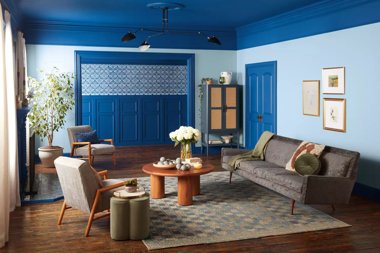
Every 2025 Color of the Year We Know So Far—and Inspiration for How to Use Each in Your Home

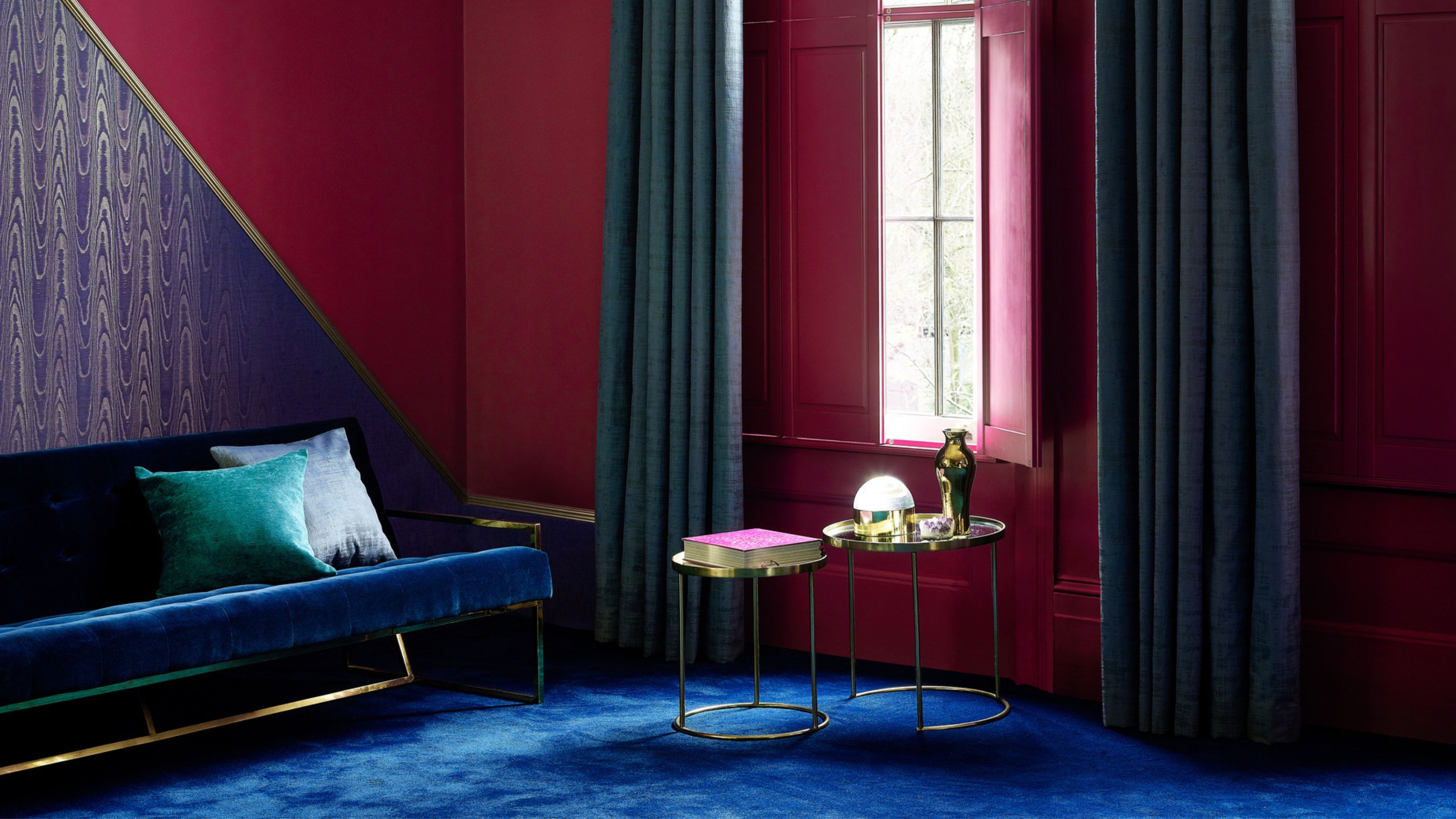
5 Paint Colors Going Out of Style in 2025 — And What You Should Replace Them With Before Then


The #1 Paint Color Trend of 2025, According to Designers

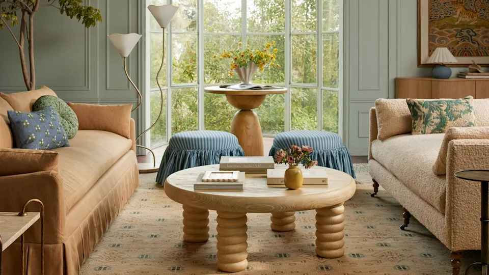
These 5 rug colors are going out of style for 2025, according to interior designers

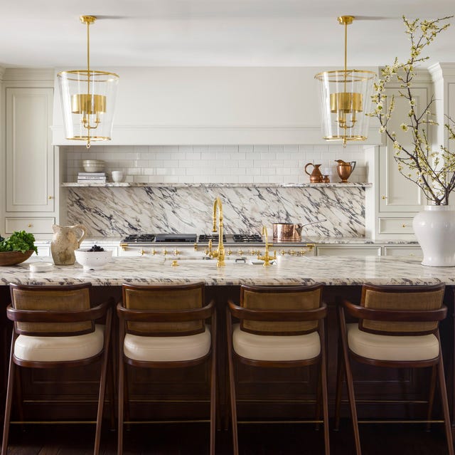
These Kitchen Paint Colors Will Be Everywhere in 2025
5 "trend-proof" colors for your home designers think will be just as popular in 10 years' time
The colour palette for 2025 – these are the shades paint experts say we’ll see everywhere next year
8 Paint Colors Going Out of Style In 2025, According to Designers