1/11
The most timeless paint colors according to designers
The article explores the concept of timeless paint colors, highlighting how they serve as foundational elements in interior design, providing elegance without demanding excessive attention. Interior designers frequently recommend classic choices that transcend fleeting trends. These colors are chosen for their versatility and ability to complement various design elements across different architectural styles, from Georgian townhouses to modern penthouses.
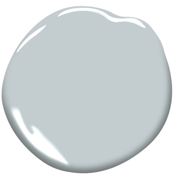
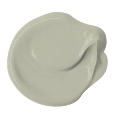
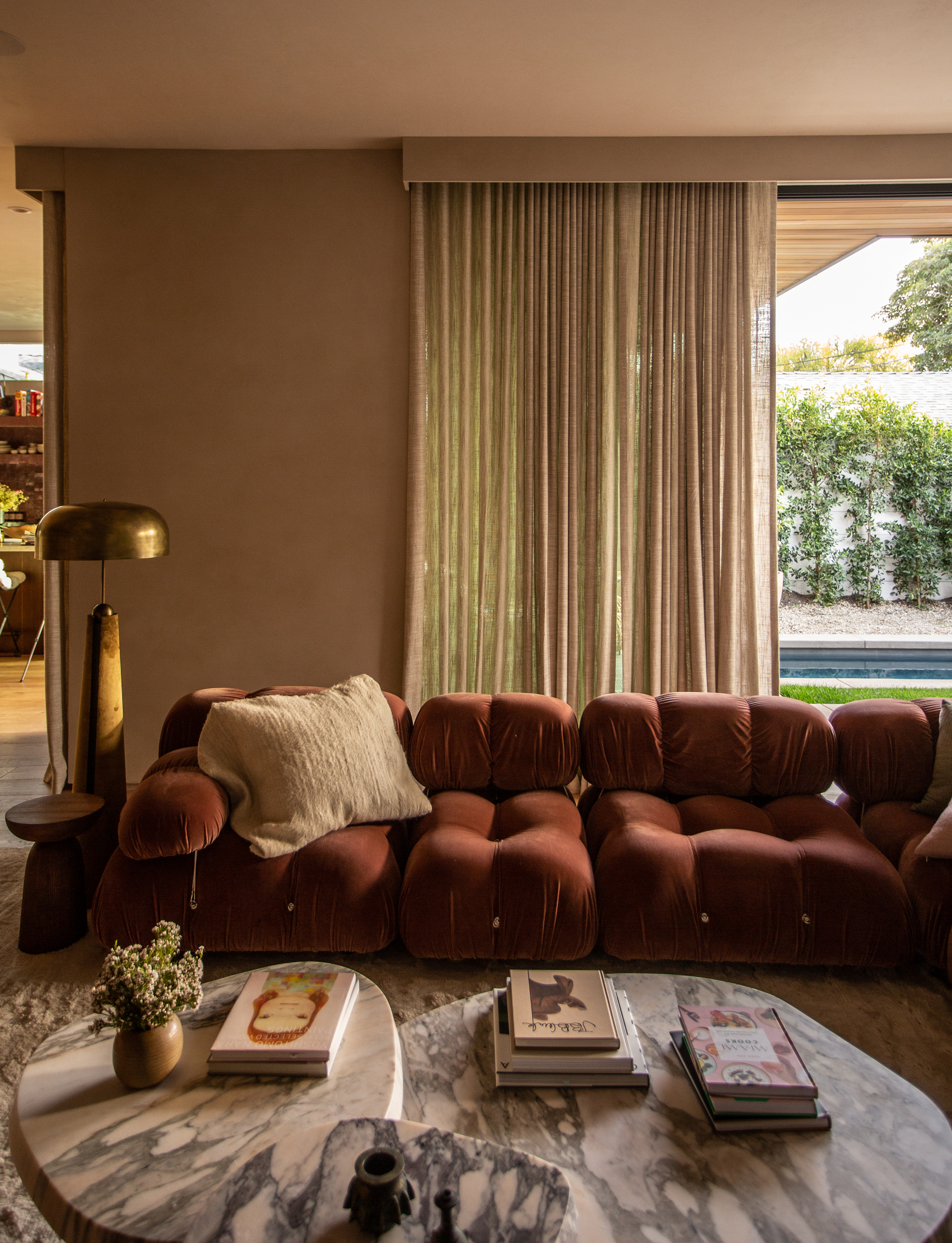
Melissa Read, creative director at Studio Burntwood, emphasizes that timeless colors create a stable backdrop, allowing other design features to shine. She specifically points to Farrow & Ball’s Elephant’s Breath as a prime example. This soft greige tone is noted for its adaptability, subtly changing with light conditions, and is often paired with accents like antique brass or dark marble to enhance its natural warmth and refinement.
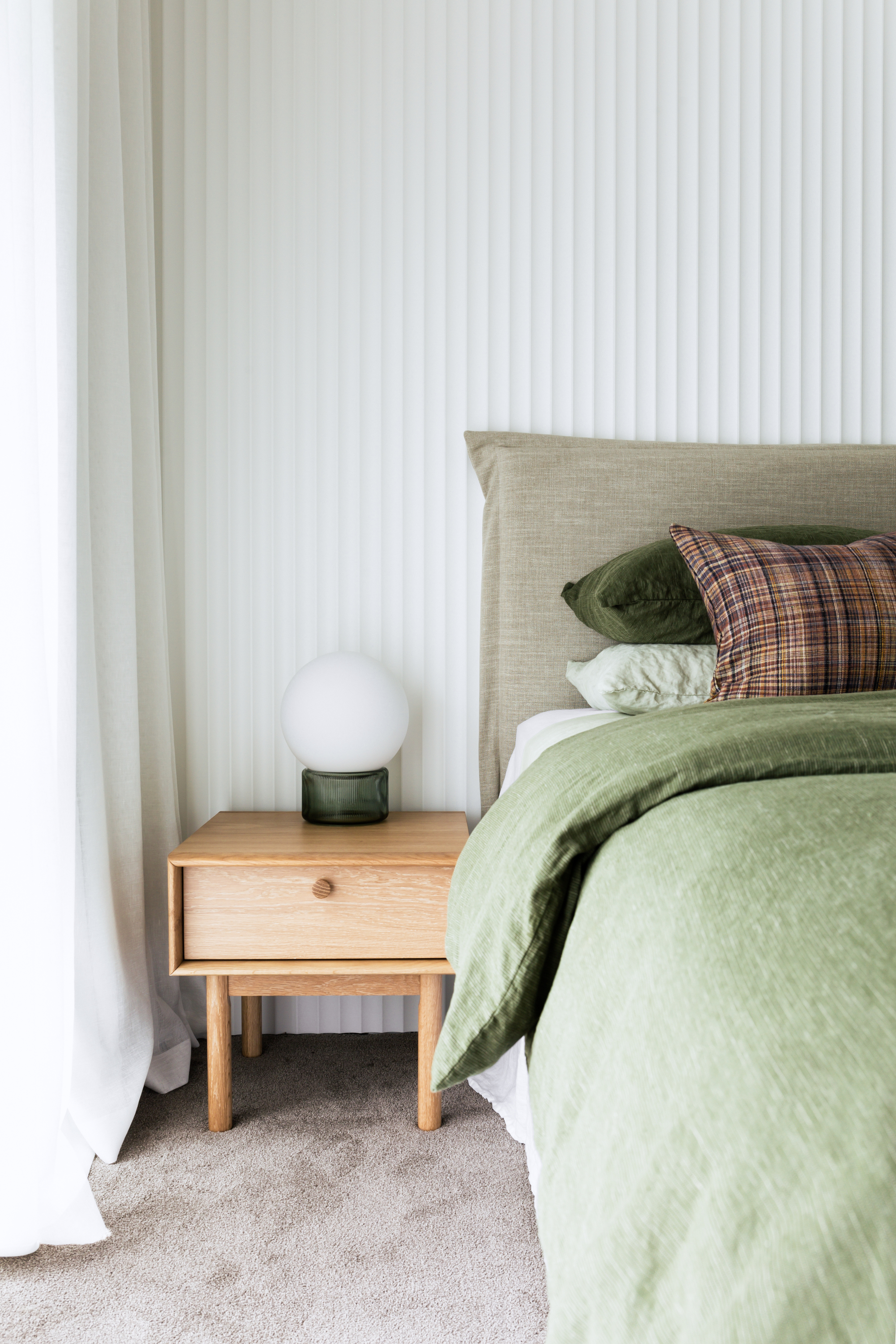
Benjamin Moore's Seapearl is another favored timeless paint, described by Illinois-based interior designer Andrea Goldman as a white with modern gray undertones. Its soothing and quiet quality makes it suitable for both walls and trim, ensuring it maintains its appeal over time. Similarly, Benjamin Moore’s Alabaster is highly regarded by interior designer Glenna Stone for its fresh, neutral white appearance with a subtle pink undertone. This color introduces light and airiness into any room and is celebrated for its ability to blend seamlessly with various palettes, from bold to muted, making it ideal for diverse spaces like kitchens, bathrooms, and living rooms.
Miranda Cullen of Inside Stories also advocates for classic neutrals, citing Sherwin-Williams' Greek Villa as a bright, warm white and Accessible Beige for a richer taupe. Both are recognized for their versatility, suiting any design style while retaining a timeless quality. While neutrals dominate the discussion of timeless paints, the article also notes that bolder hues can be equally enduring. Emily Tucker, an interior designer, suggests Benjamin Moore’s Million Dollar Red, comparing it to a classic red lipstick for its chic and energetic presence when used thoughtfully.
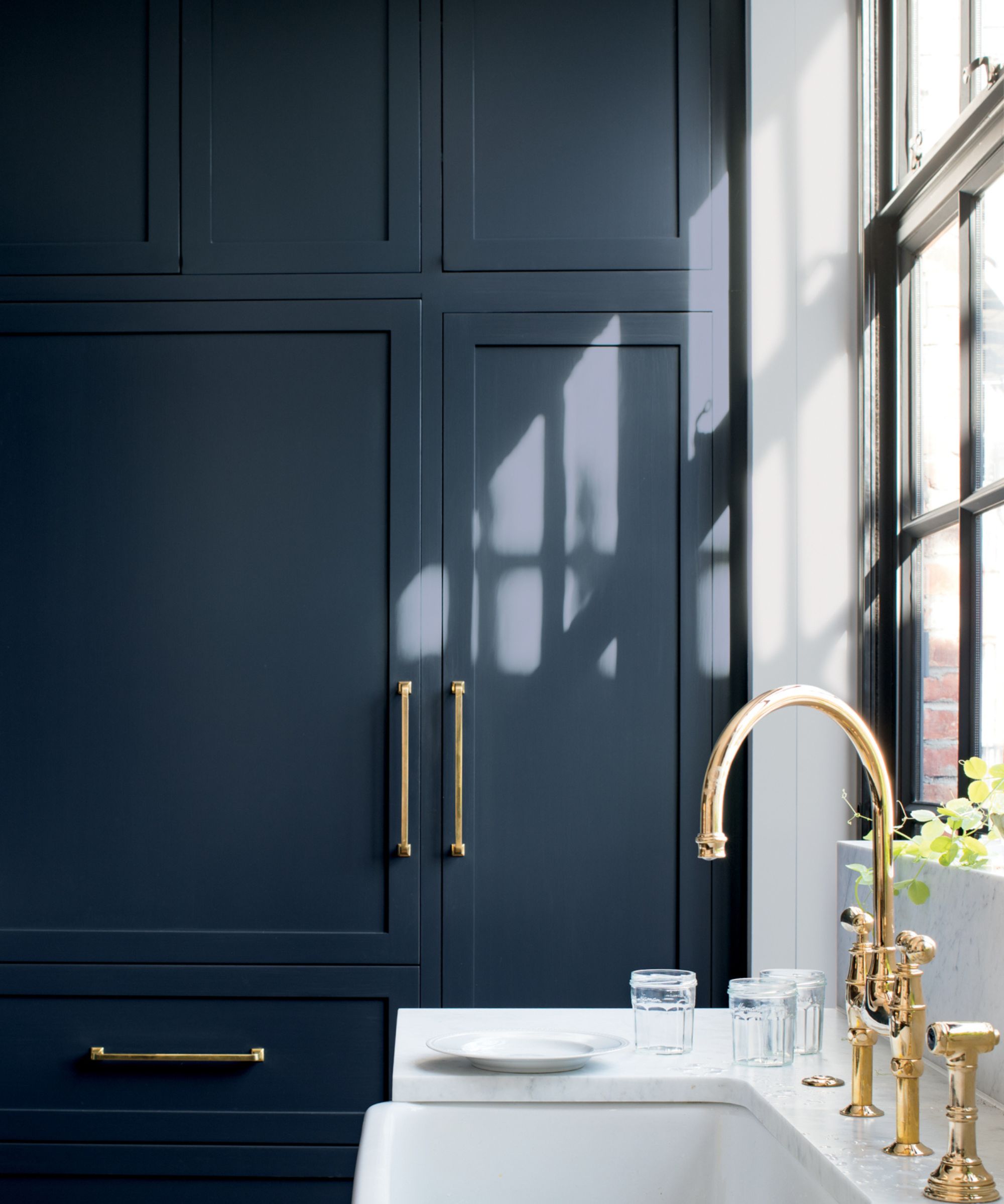
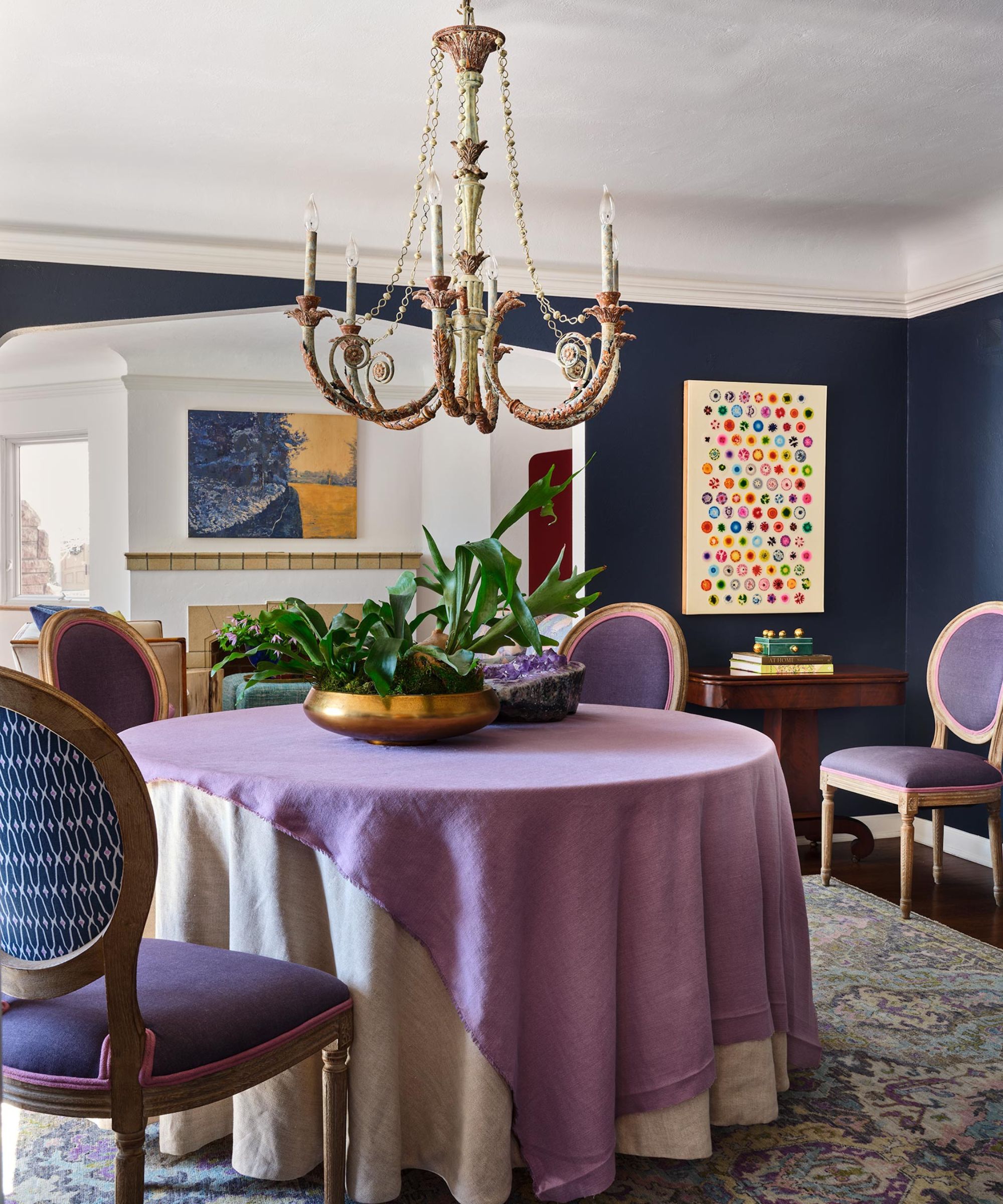
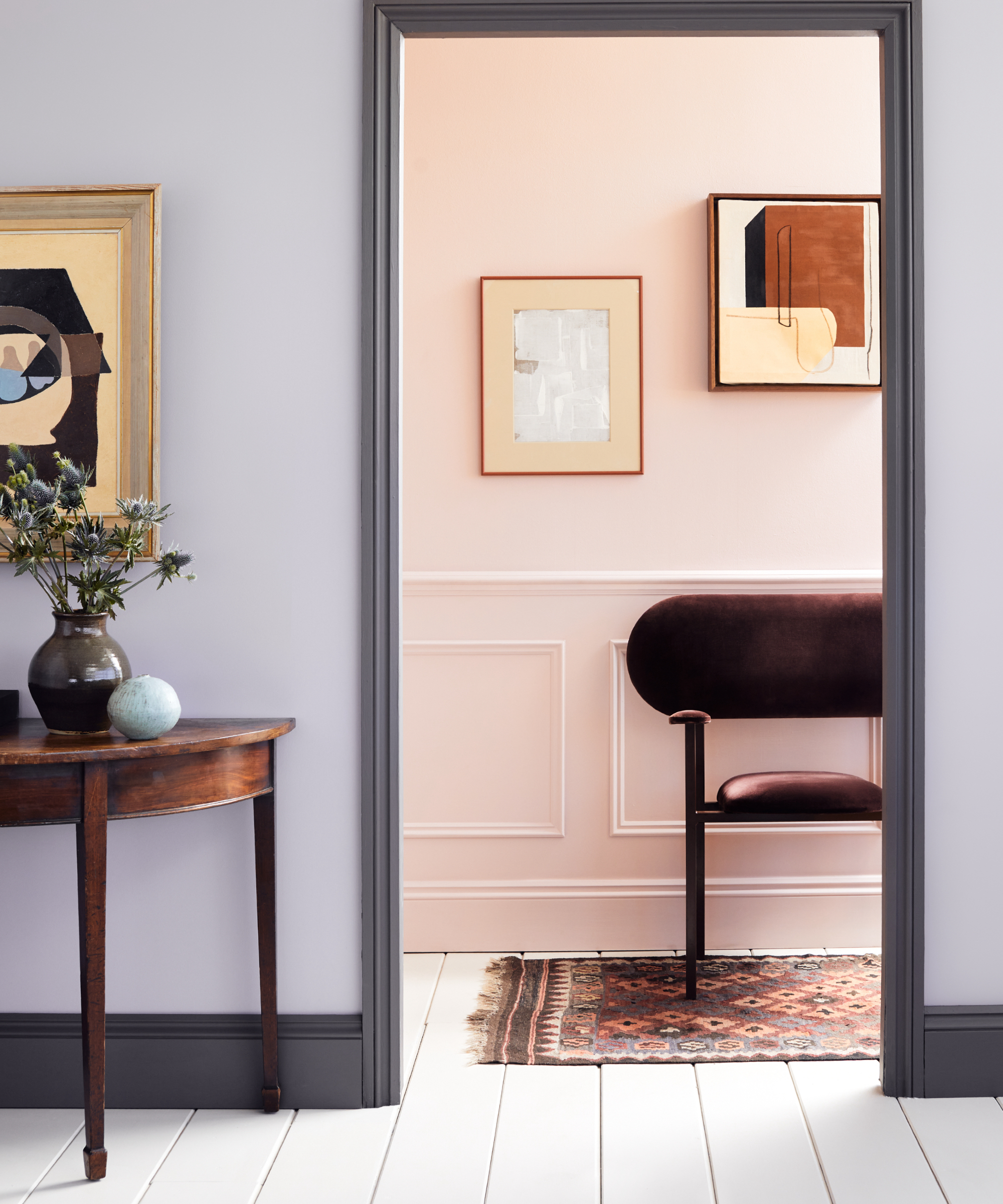
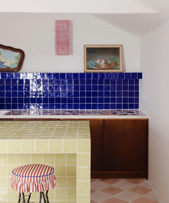
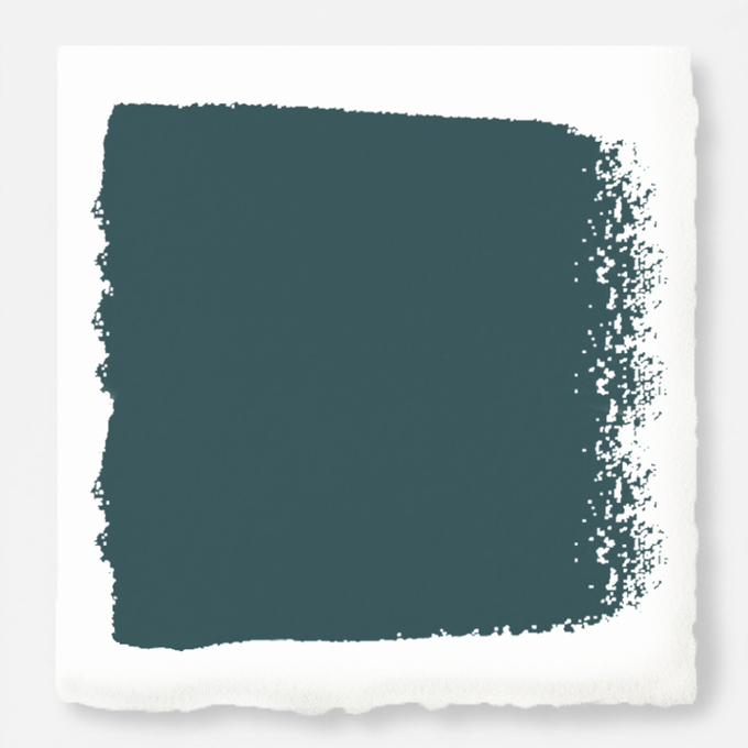
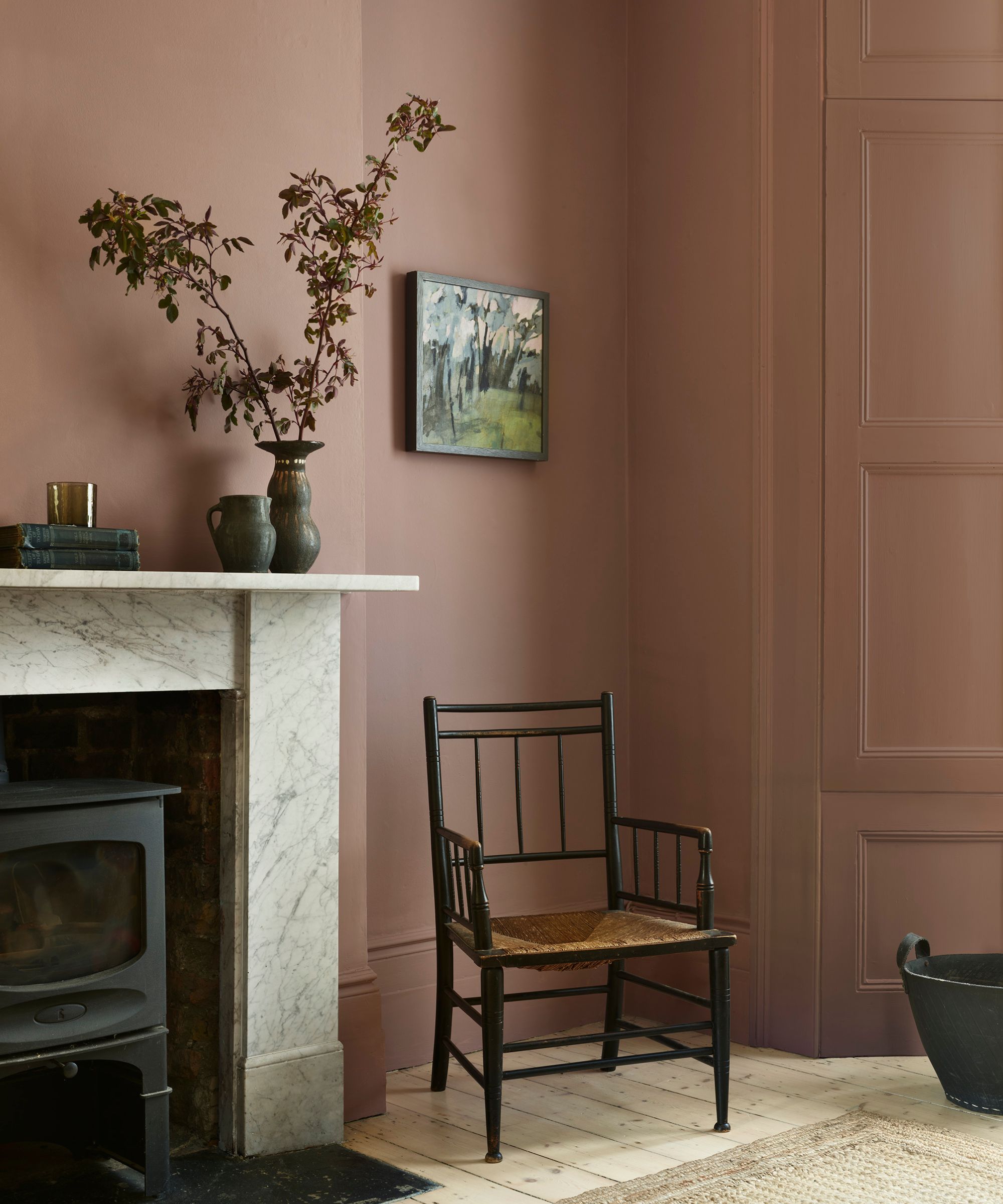
For those seeking a timeless blue, Denver-based interior designer Nadia Watts recommends Benjamin Moore's Hale Navy. She praises its ability to complement various colors, including hot pink, purple, red, and yellow, making it a versatile backdrop for both modern and colorful art. Farrow & Ball’s Dead Salmon is highlighted as a sophisticated, moody plaster pink that brings a calming and serene feeling to a room, offering a more interesting alternative to lighter neutrals while still maintaining refinement. Another Farrow & Ball shade, Dimity, a light taupe, is favored by Cindy McKay for its warm and cozy feel, especially in spaces with red tones.
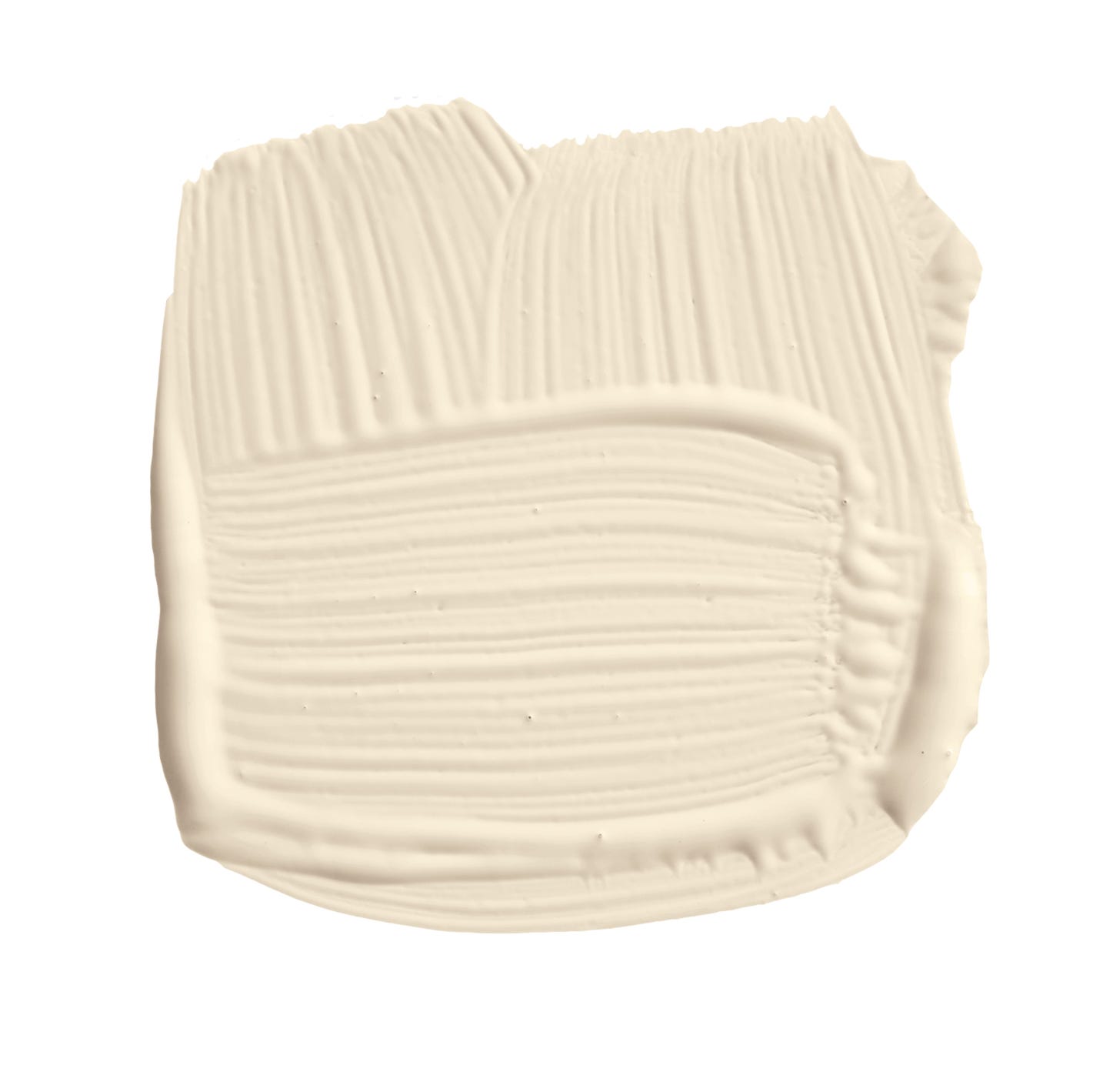
Benjamin Moore's Linen White is chosen by Suzanne Tucker for its perfect balance between classic elegance and understated chic, being neither too cool nor too warm. Its subtle cream undertone ensures richness and adaptability to contemporary or traditional settings. Lastly, Benjamin Moore's White Dove is a popular choice among designers like Beth Webb for its universal compatibility with millwork, cabinetry, and walls, seamlessly integrating with almost any color scheme.
The article concludes by advising readers to sample these timeless paint colors to observe how they appear under different lighting conditions throughout the day before making a final decision. This practical recommendation ensures that the chosen color will meet expectations and maintain its desired aesthetic appeal in the home.
#InteriorDesign #PaintColors #TimelessDesign #HomeDecor #NeutralPalette #FarrowAndBall #BenjaminMoore #SherwinWilliams #ColorTrends #InteriorDesign #PaintColors #TimelessDesign #HomeDecor #NeutralPalette #FarrowAndBall #BenjaminMoore #SherwinWilliams #ColorTrends
0 comment in total
 No comments yet
You may also like

5 Timeless Paint Colors That Will NEVER Go Out of Style, According to Designers


7 of the most versatile and easy to use paint colors according to designers

Designers LOVE Pairing These Unexpected Colors With This One Timeless Hue

12 Jewel-Tone Paint Colors Designers Say Are Always On-Trend
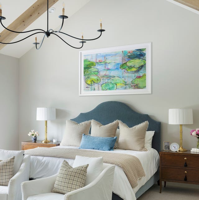
These 20 Paint Colors Will Never Go Out of Style, According to Designers

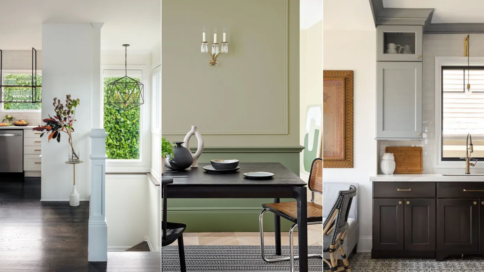
5 enduring colors designers always return to when they have trend fatigue
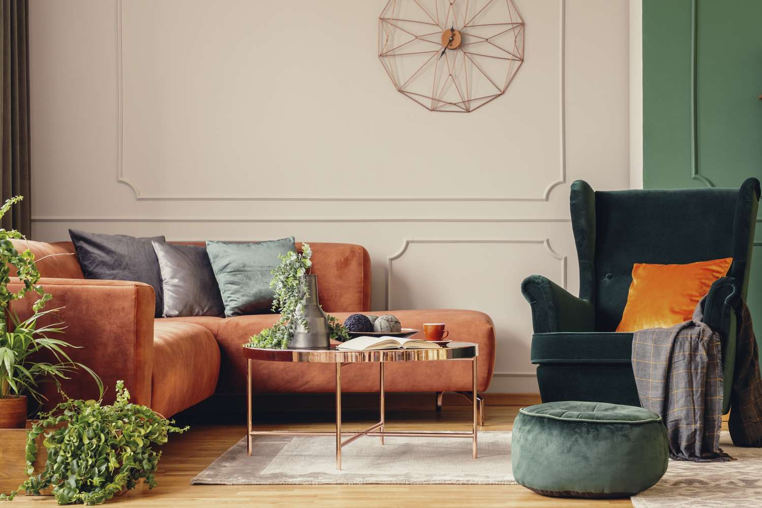
5 Timeless Paint Colors That Go With Absolutely Everything, According to Color Experts

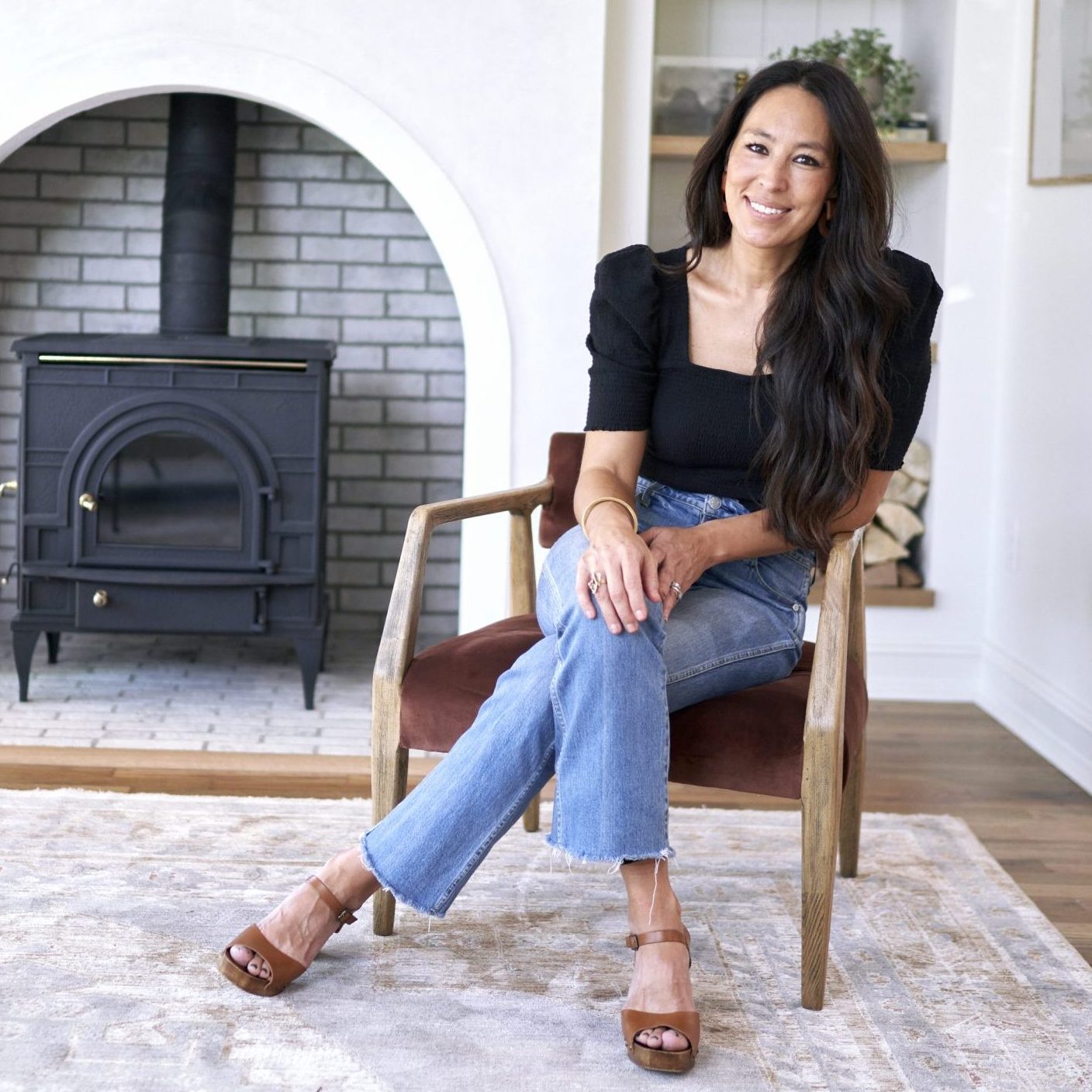
3 Paint Colors That Will Never Go Out of Style, According to Joanna Gaines


10 Timeless Living Room Paint Colors Designers Swear By
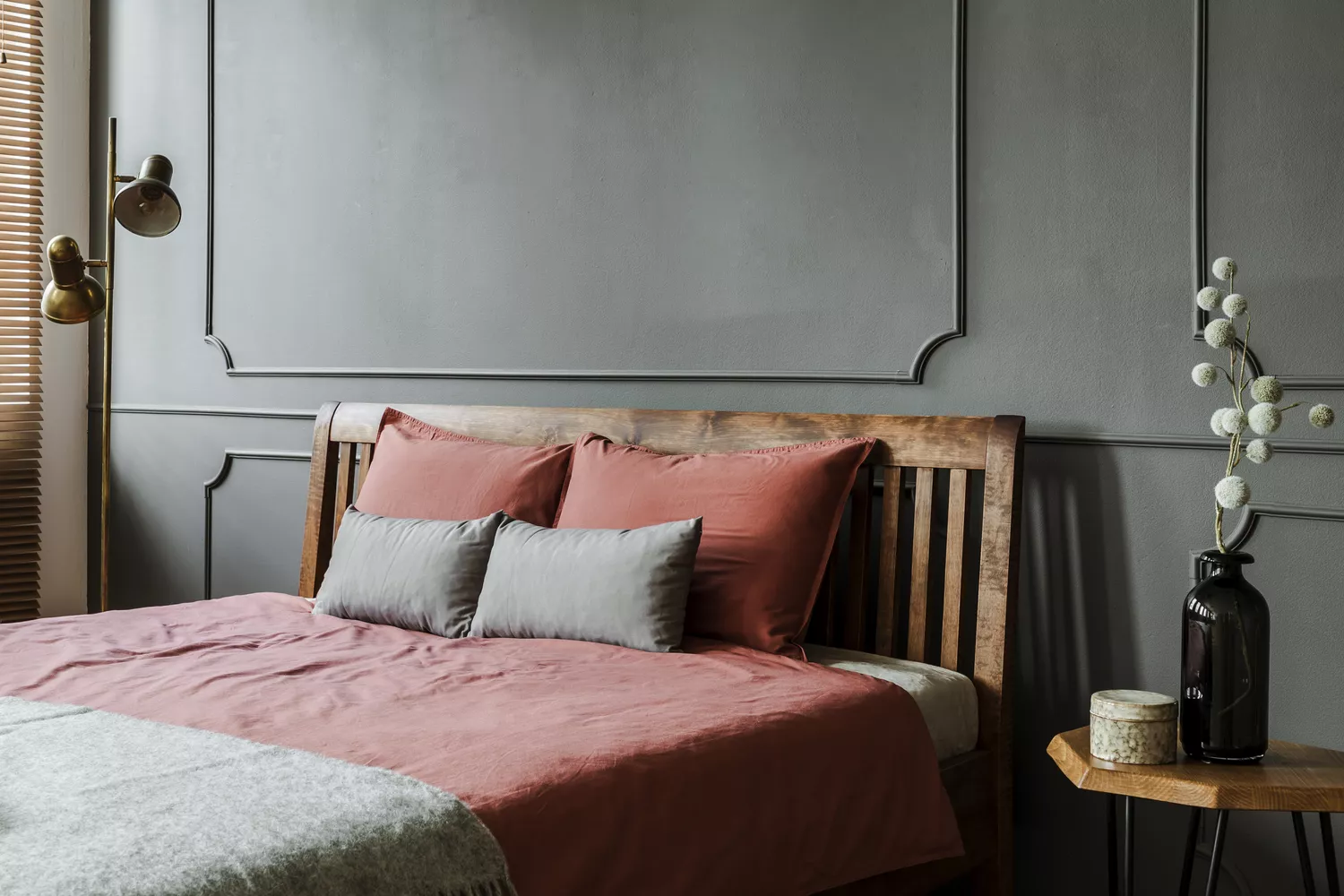
We Asked Designers to Pick the Most Timeless Bedroom Paint Colors—Here's What They Said
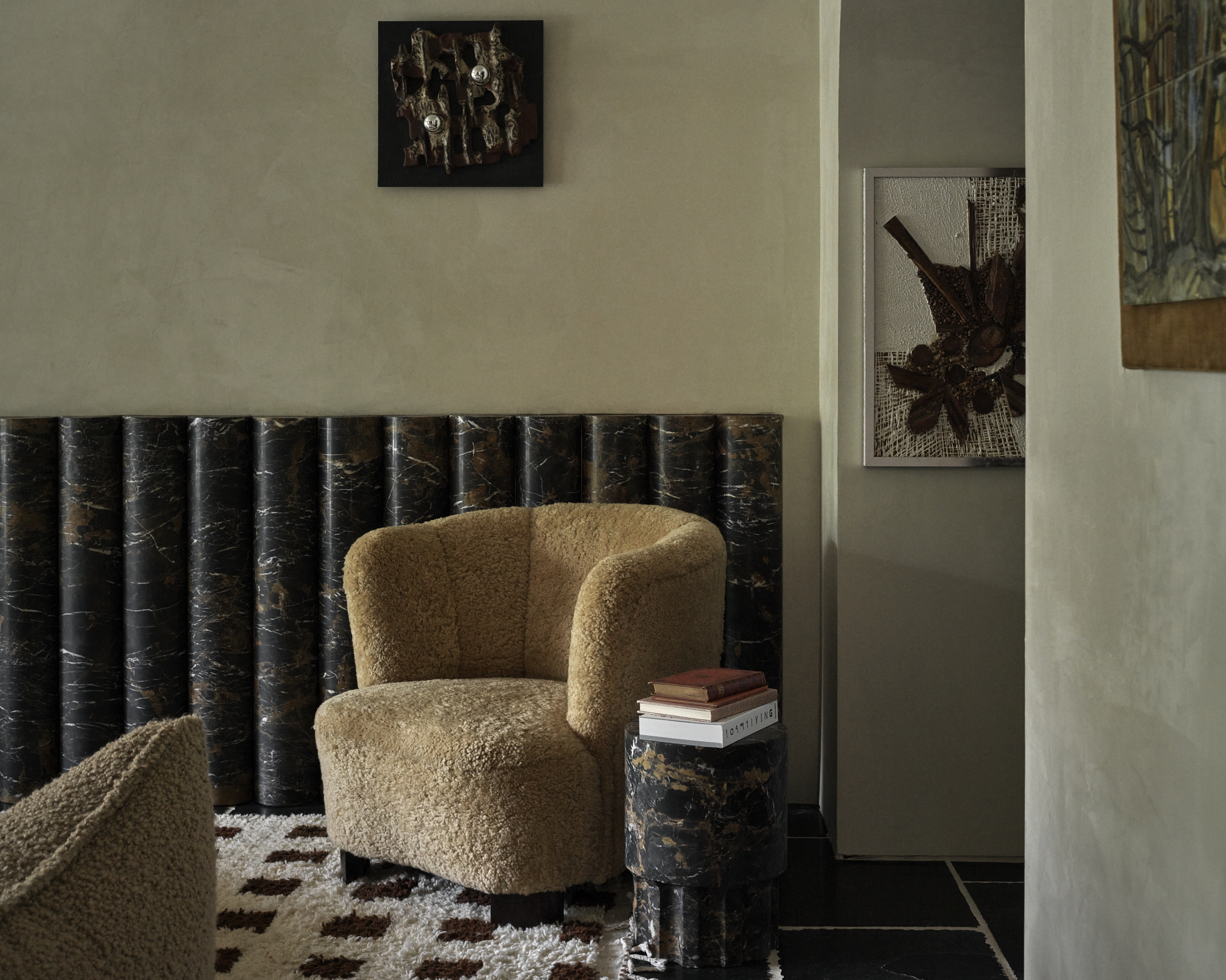
5 "trend-proof" colors for your home designers think will be just as popular in 10 years' time

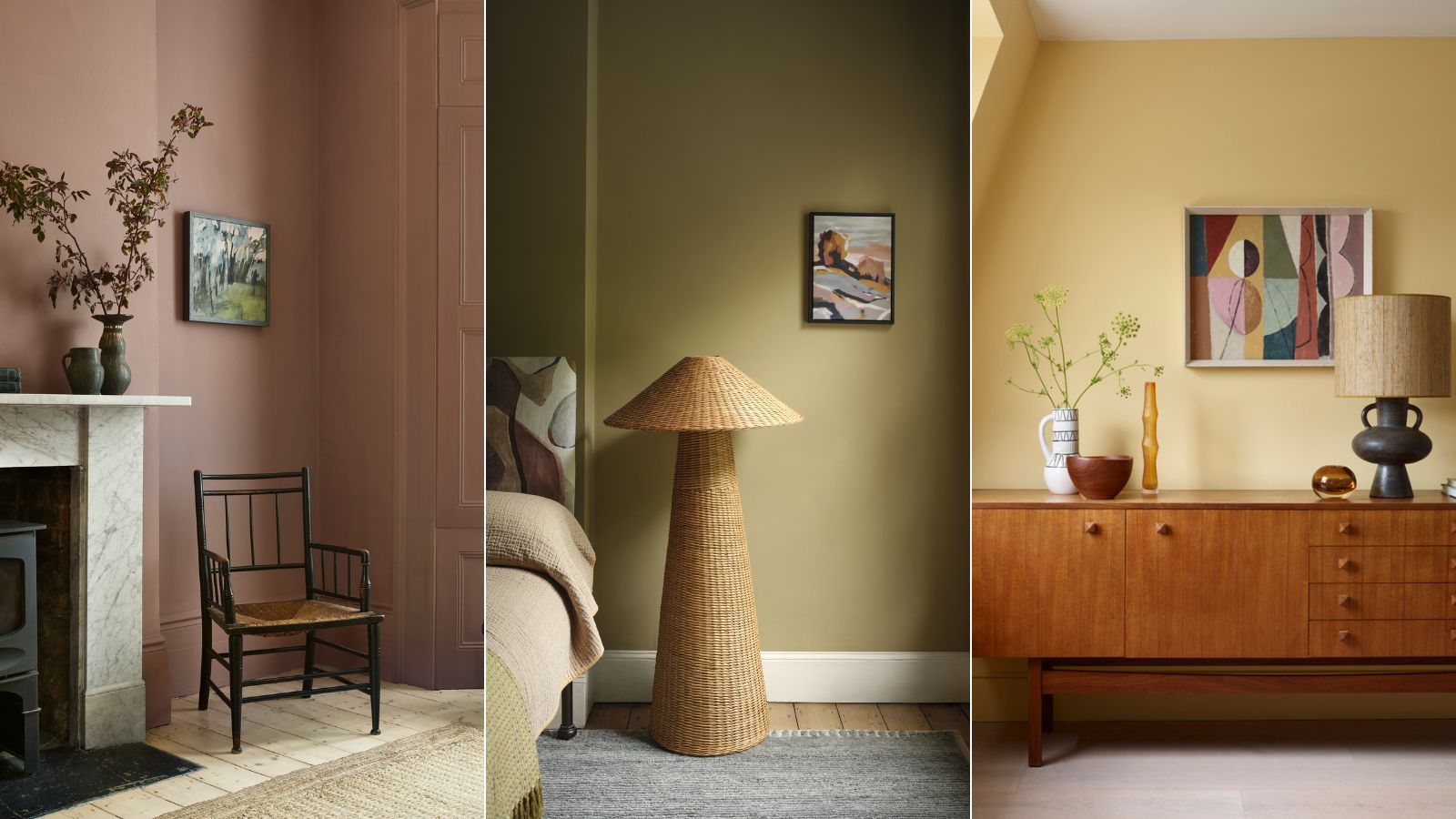
Vintage paint colors making a comeback this year – experts reveal their top shades for adding a touch of nostalgia
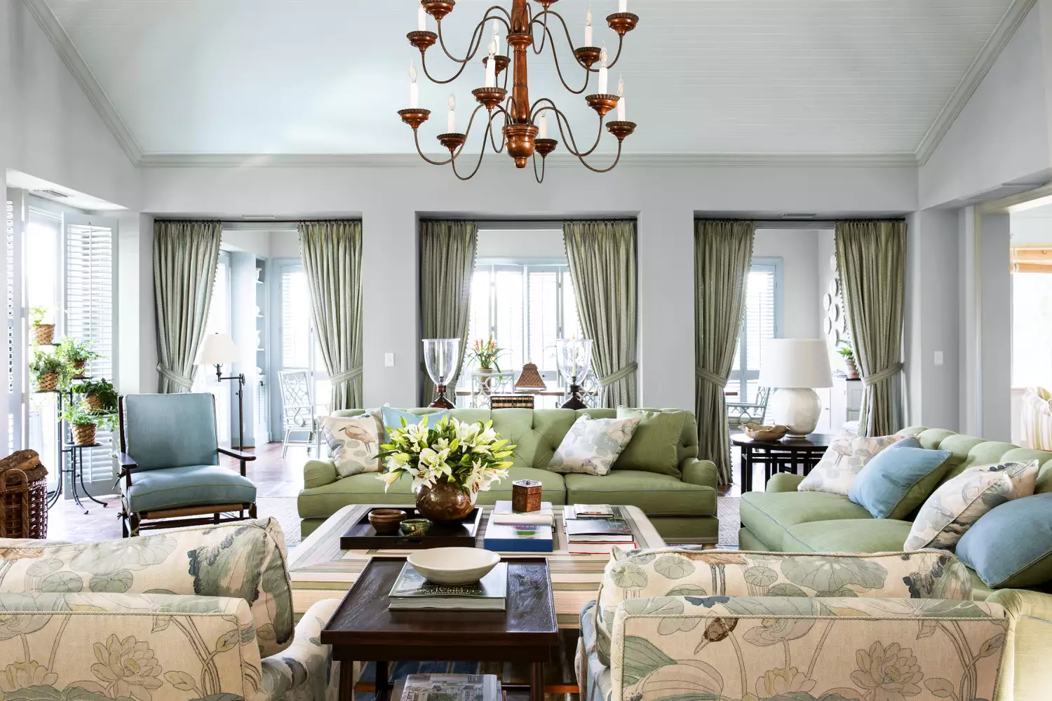
15 Timeless Paint Colors You’ll Never Tire Of, According To Designers

4 Interior Designers Share the Biggest Paint Color Trends Right Now (and What’s Out!)


An A-List Designer’s Secrets To Picking Perfect Paint Colors
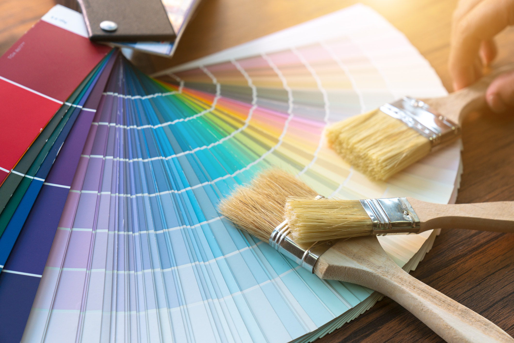
Britain's best interior designers on the paint colours you just can't go wrong with
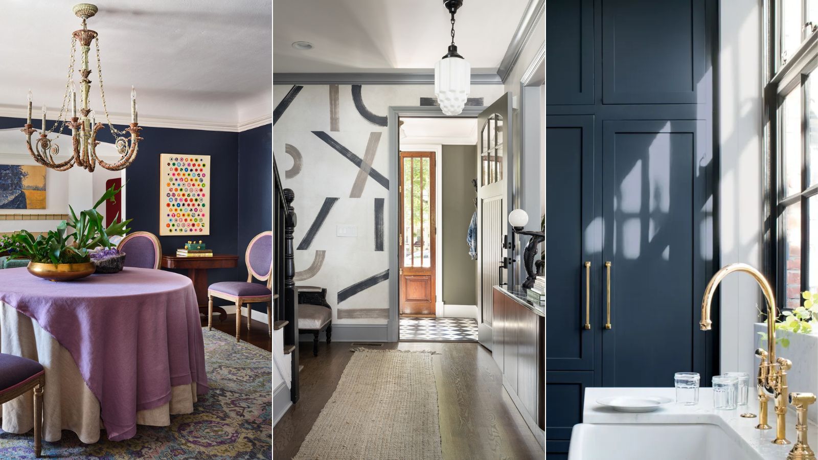
Designers who never follow trends swear by this color family to make their homes look timeless

11 Paint Colors That INSTANTLY Make Your Home Look "Expensive," According to Designers
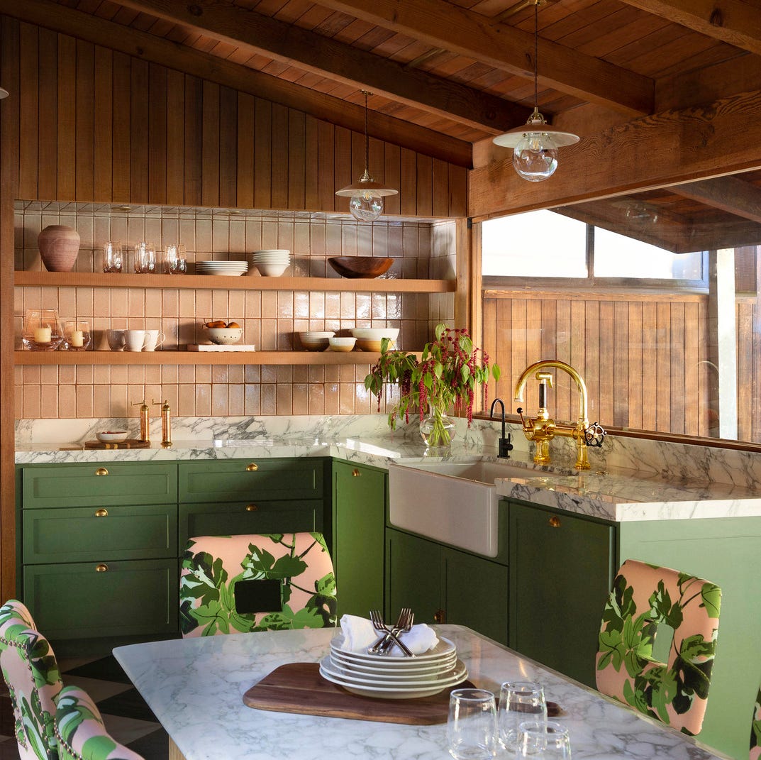
The Kitchen Colors Designers Call “Forever Favorites”
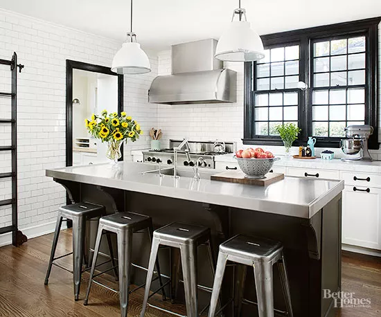
Classic Color Schemes That Never Go Out of Style