1/9
Britain's best interior designers on the paint colours you just can't go wrong with
The article presents a curated list of reliable paint colour recommendations from eight leading British interior designers: Emily Todhunter, Emma Sims Hilditch, Henriette von Stockhausen, Katrin Cargill, Lucy Elworthy, Luke Edward Hall, Susie Atkinson, and Sophie Elborne. This compilation serves as a guide for individuals looking to decorate their homes with enduring and aesthetically pleasing paint choices.
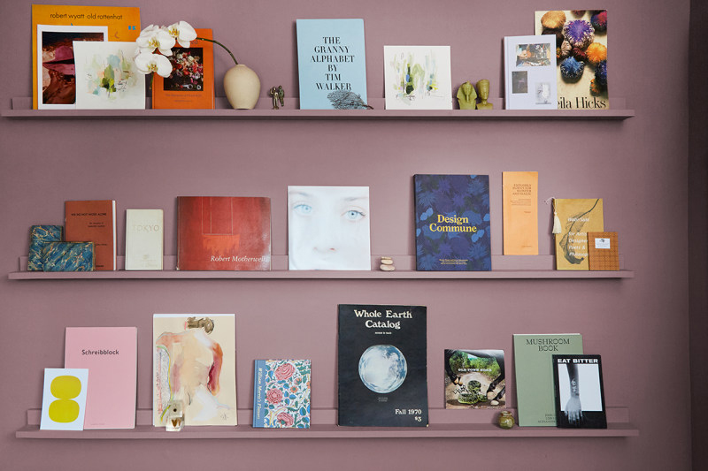
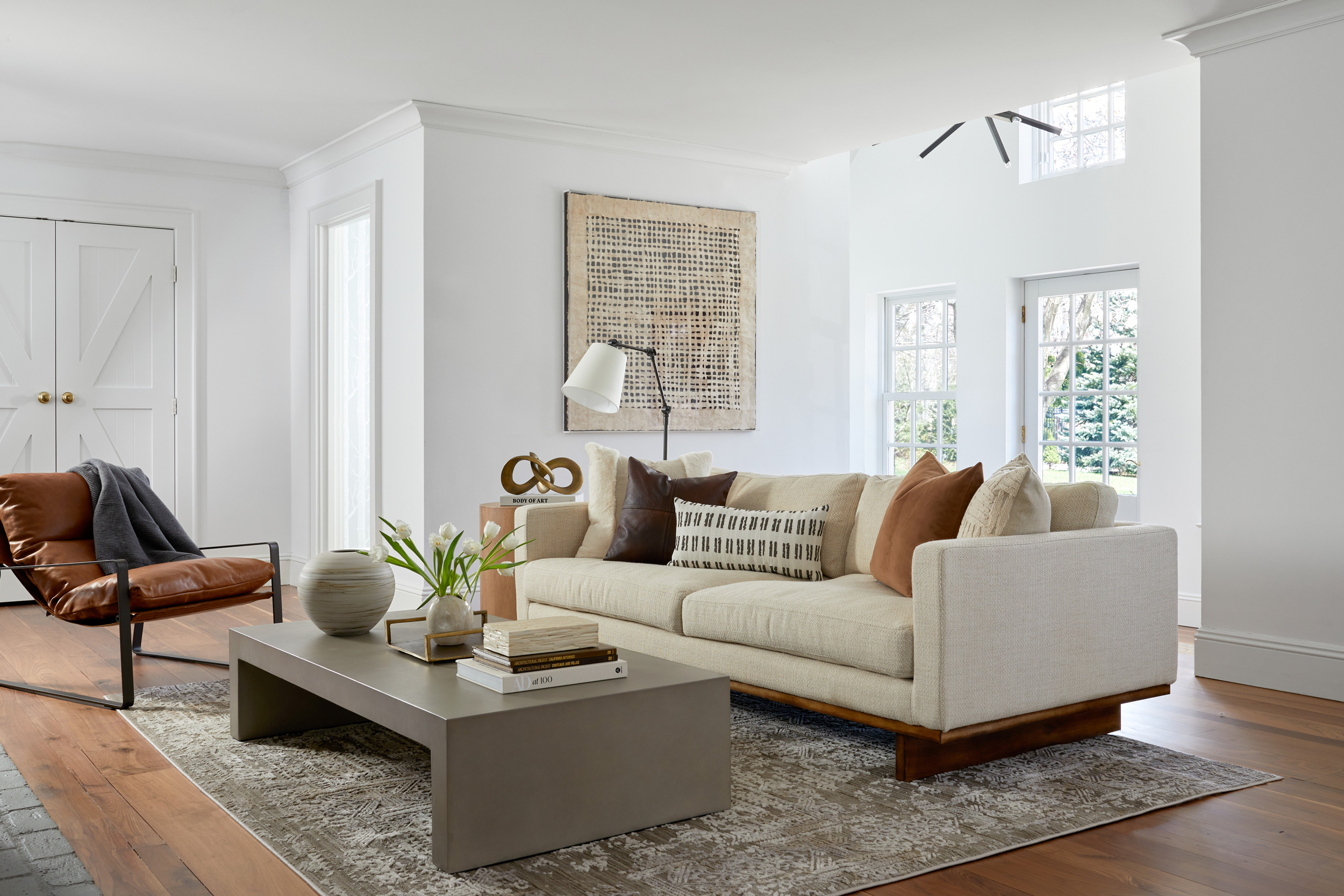
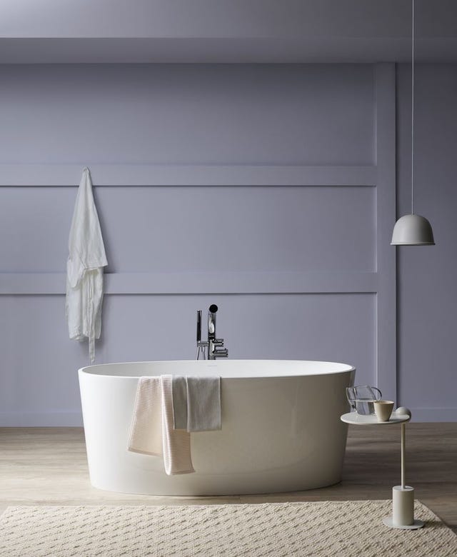
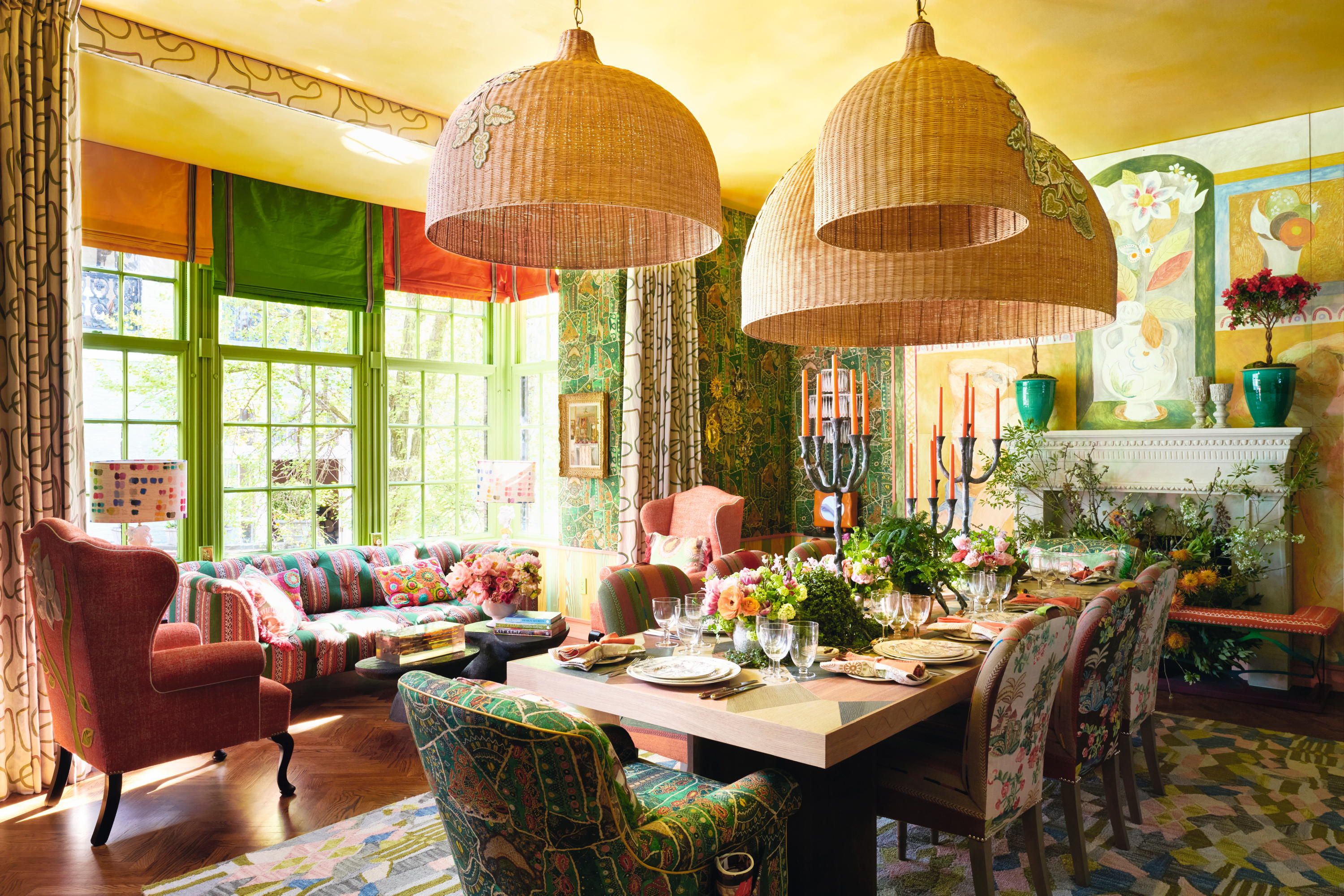
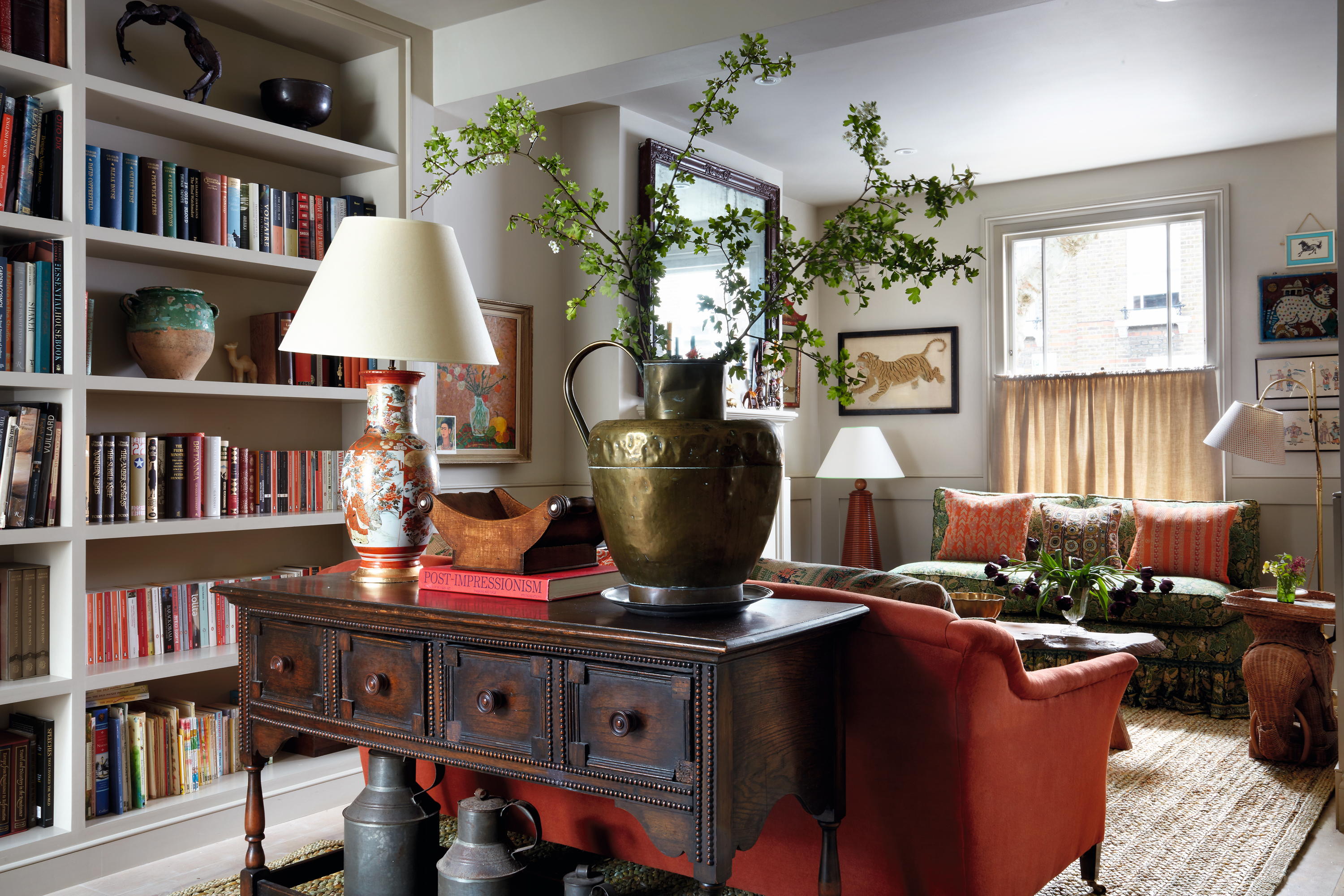
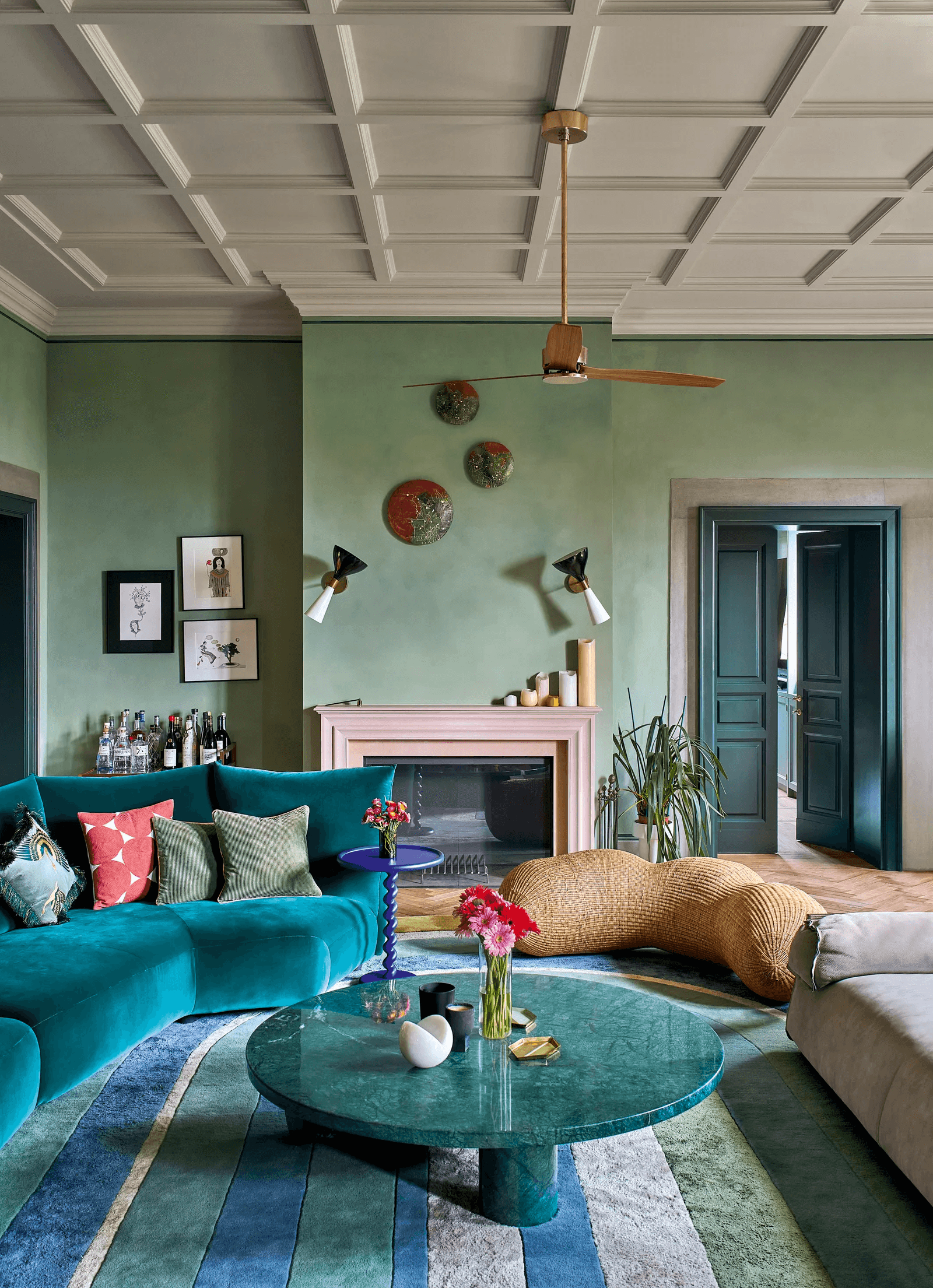
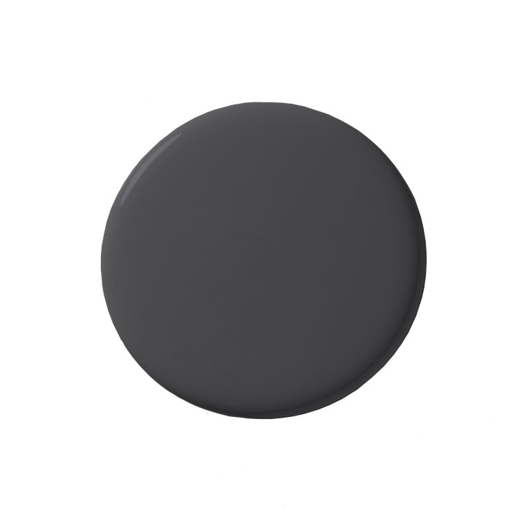
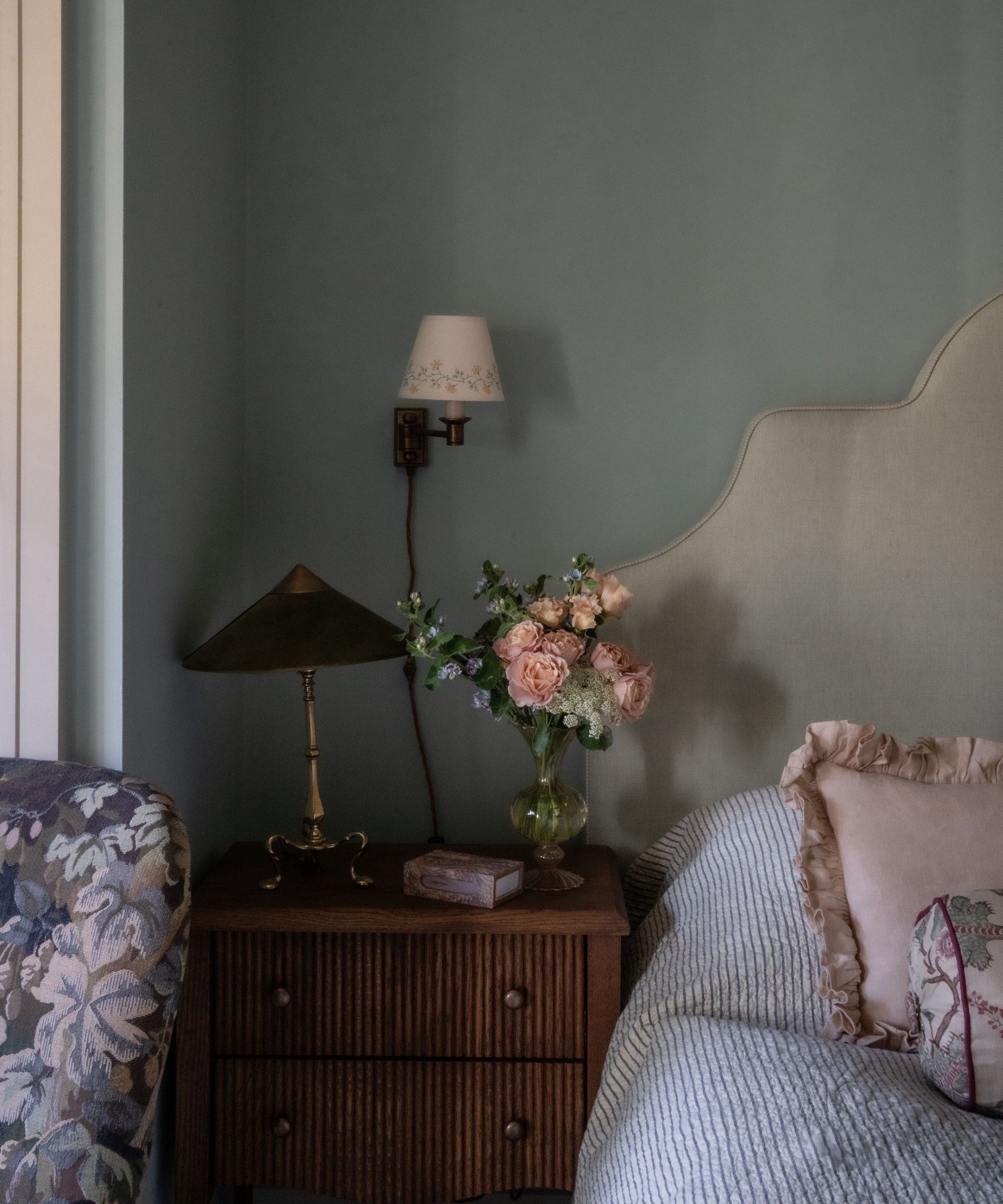
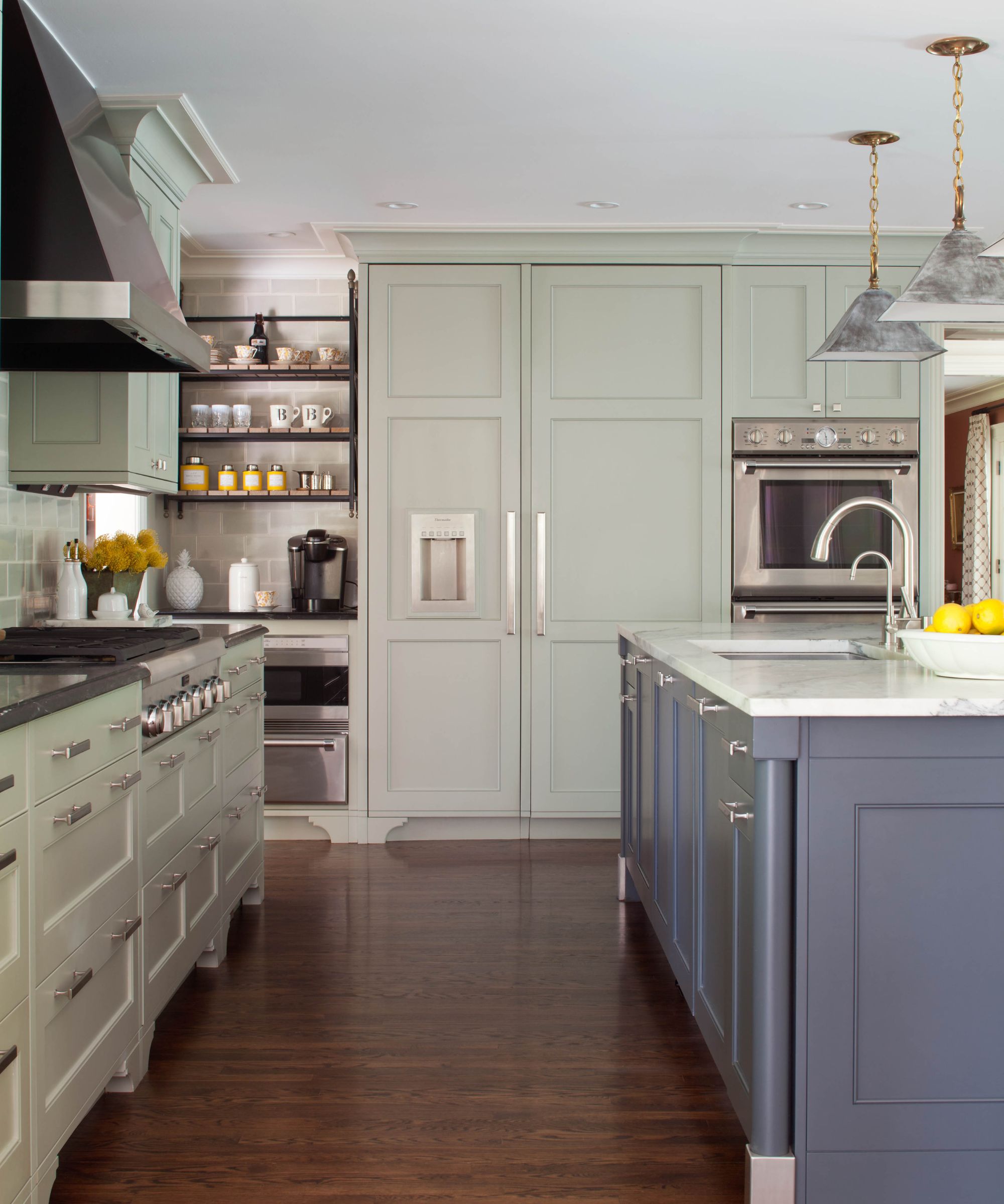
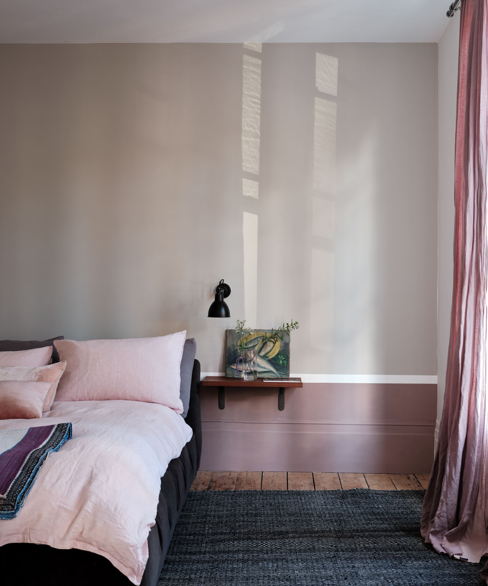
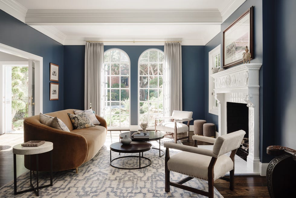
Each designer offers their top selections across four categories: neutral, dark, soft, and bright, providing specific paint names and brands. Emily Todhunter suggests Dulux's Subtle Ivory 3 as a go-to off-white for ceilings and woodwork, Farrow & Ball's Down Pipe for its versatility, Edward Bulmer's Eau de Nile for a gentle green, and Paint & Paper Library's Deep Water Green for an uplifting turquoise. Emma Sims Hilditch recommends Neptune's Shell for cabinetry and walls, Farrow & Ball's Picture Gallery Red for grandeur, Farrow & Ball's Blue Gray for a serene atmosphere, and Farrow & Ball's Cook’s Blue for kitchens and exterior dining areas.
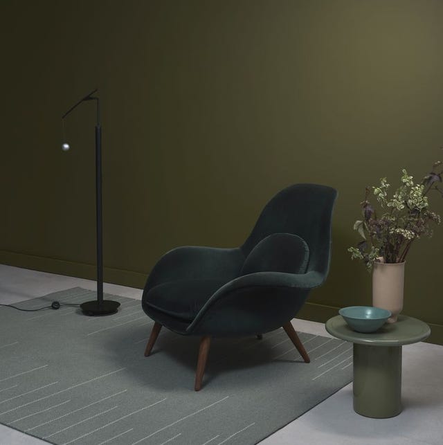
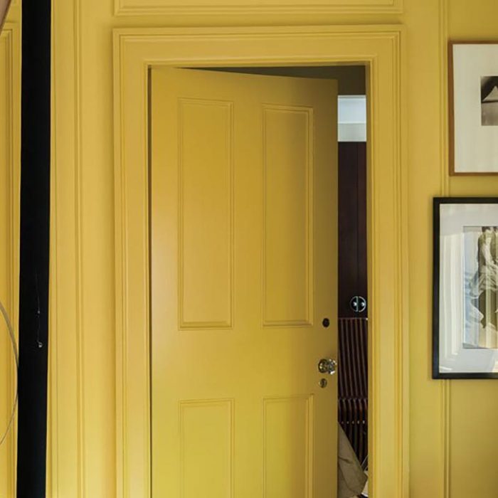
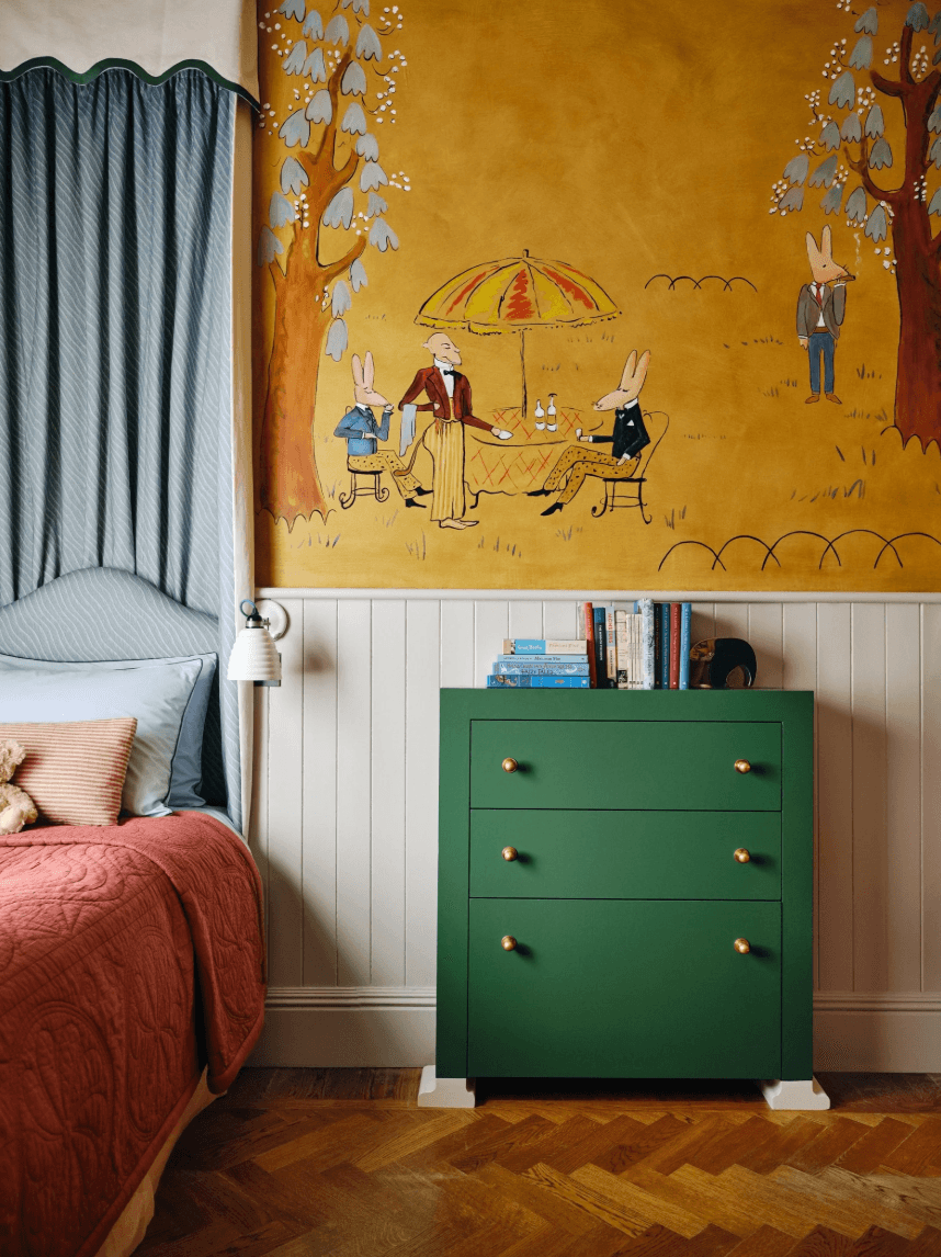
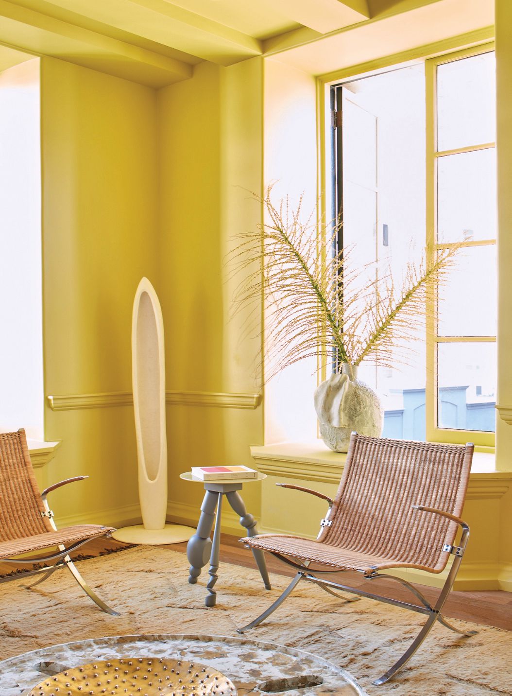
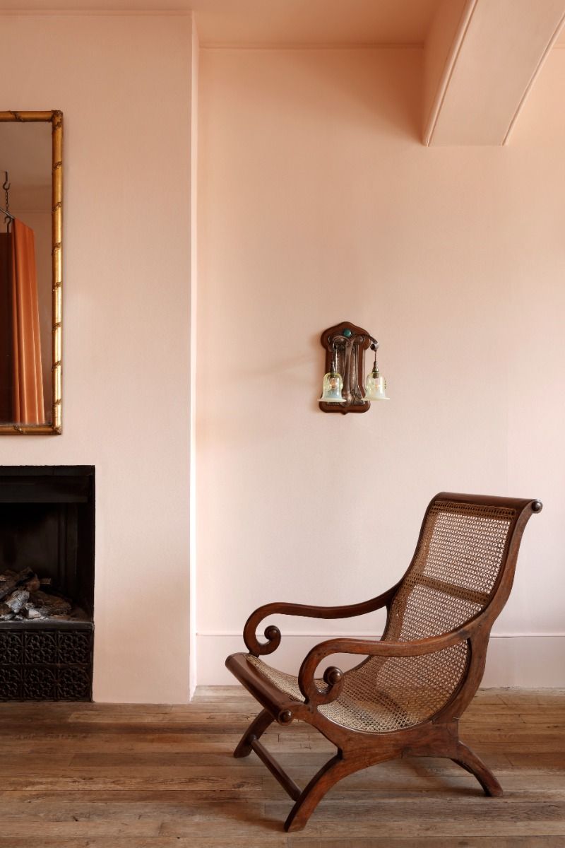
Henriette von Stockhausen's choices include Farrow & Ball's Wimborne White as a soft all-rounder, Farrow & Ball's Studio Green for its depth, Edward Bulmer's Jonquil for a warm, old-fashioned feel, and Rose of Jericho's Dark Yellow for a brightening effect. Katrin Cargill favors Dulux's Jabot as a pure white neutral, Papers and Paints' Camo 2 for dining rooms, Little Greene's Angie for a soft pink, and Mylands' Circle Line for a strong yellow that pairs well with various fabrics. Lucy Elworthy's selections include Farrow & Ball's Slipper Satin for its compatibility with natural materials, Zoffany's Half La Seine for its fresh and serene qualities, Farrow & Ball's Inchyra Blue for bookcases and TV walls, and Farrow & Ball's Yellow Ground for its warmth and pairing with reds and purples.
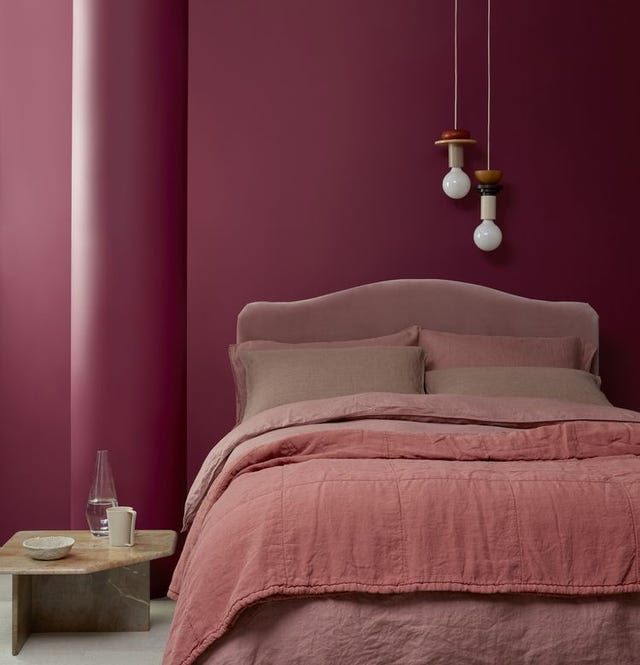
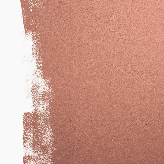
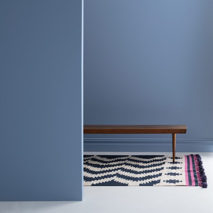
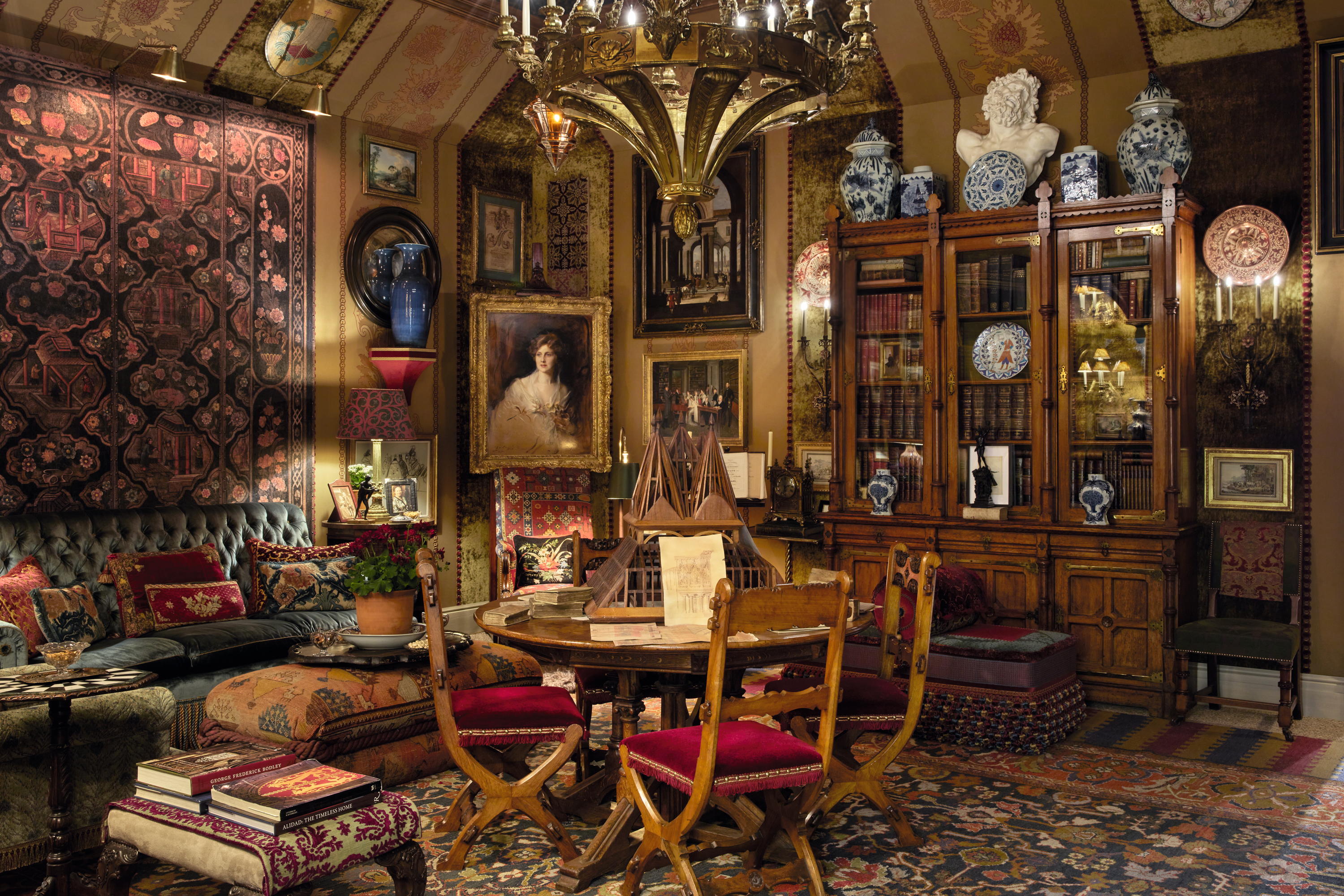
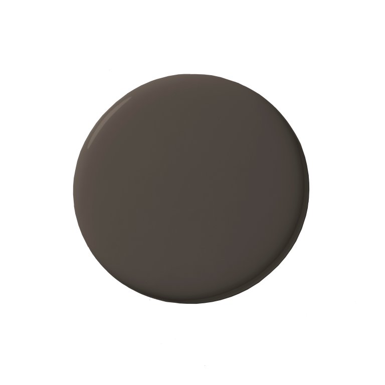
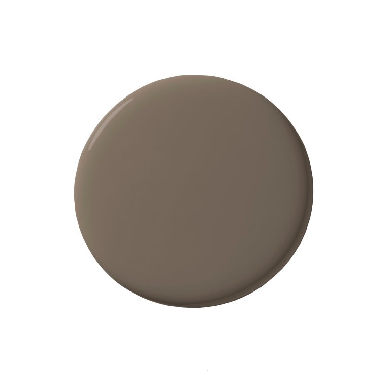
Luke Edward Hall suggests Farrow & Ball's Setting Plaster for a soft, delicate neutral, Papers and Paints' 4-050 for a 1970s chocolate brown, Papers and Paints' Pistachio for a calming green, and Papers and Paints' Manhattan for a vibrant coral. Susie Atkinson recommends Paint & Paper Library's Slate II as a warm pebble and sandy grey neutral, Abigail Ahern's Mulberry Red for a moody hallway, Cassandra Ellis's Faded Blossom for a luminous pink, and Farrow & Ball's Pale Powder for a subtle yet enlivening aquamarine. Lastly, Sophie Elborne highlights Zoffany's Norsk Blue for hallways and cosy rooms, Paint & Paper Library's Georgetown for a cosy brown that complements oranges and reds, SC292 Papers and Paints for a balanced white, and Edward Bulmer's Invisible Green for skirting and doors.
The article emphasizes the importance of using tester pots to evaluate how colours appear in specific lighting conditions and with existing furnishings, as digital representations may not perfectly reflect the actual outcome. This advice underscores the practical approach to selecting paint colours for interior spaces, ensuring satisfaction with the final result.
#InteriorDesign #PaintColors #HomeDecoration #DesignerRecommendations #NeutralColors #DarkColors #SoftColors #BrightColors #CountryLife #InteriorDesign #PaintColors #HomeDecoration #DesignerRecommendations #NeutralColors #DarkColors #SoftColors #BrightColors #CountryLife
0 comment in total
 No comments yet
You may also like

8 Favorite Paint Colors of Local Interior Designers

9 Best Interior Paint Colors

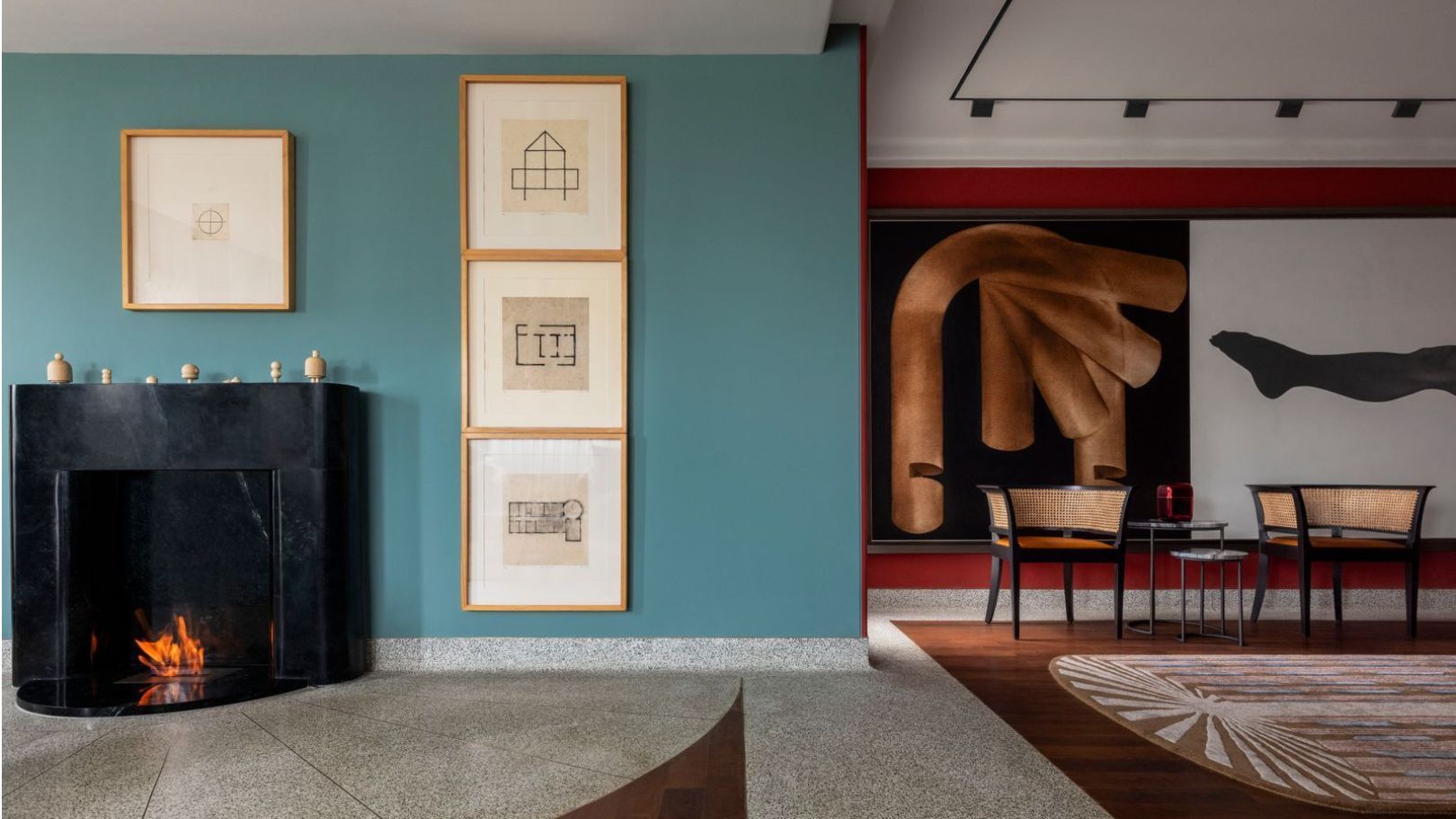
7 colour combination ideas that AD100 designers swear by for home interiors

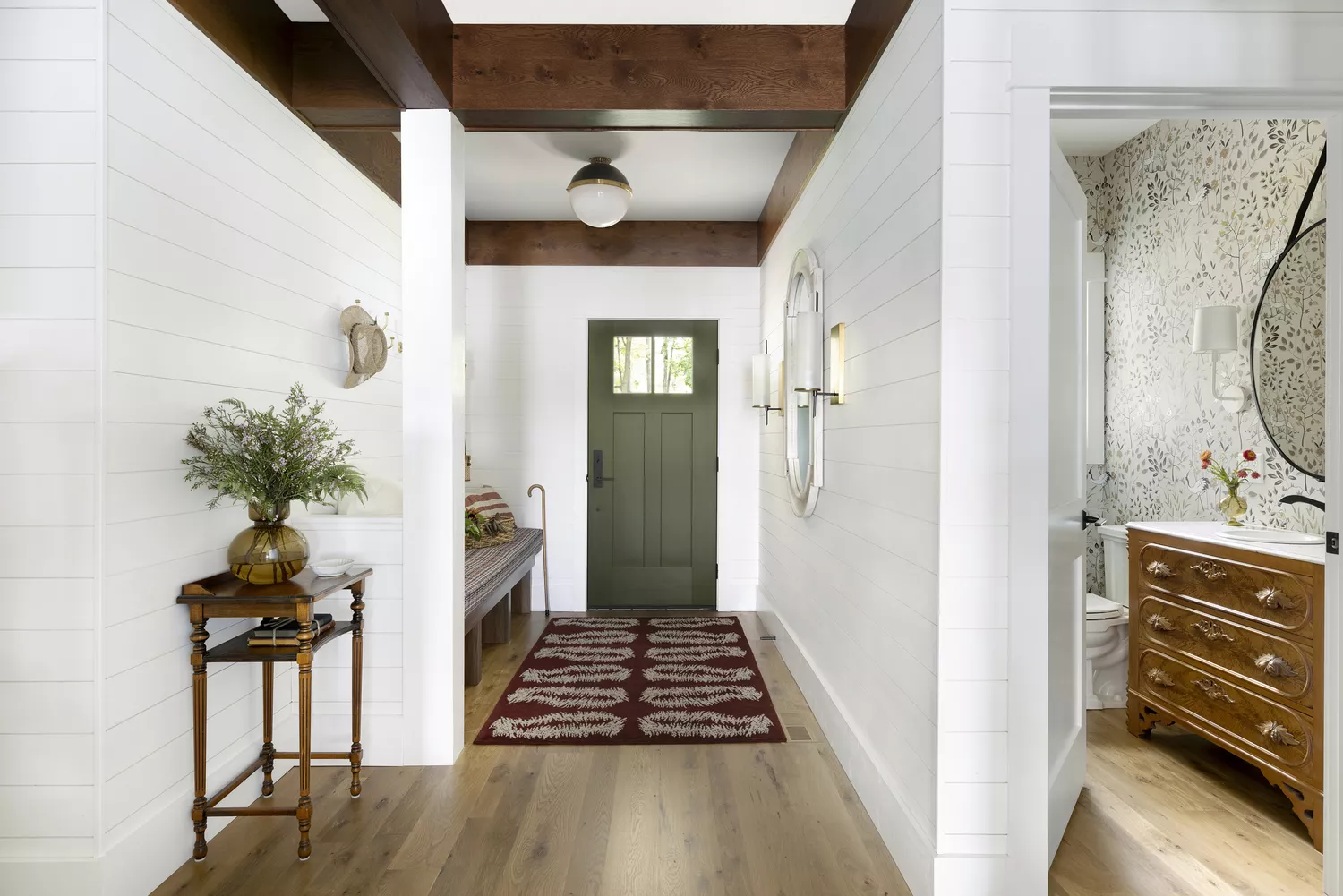
9 Classic Paint Colors For Interior Doors That Designers Can't Get Enough Of
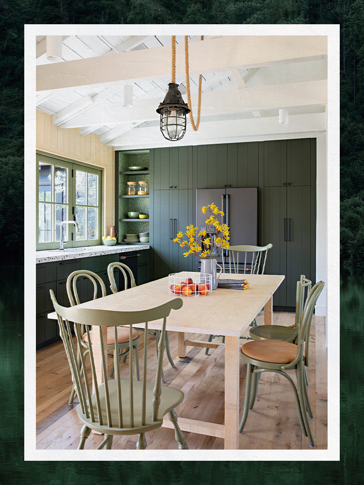
Designers Share Their Tried-and-True Shades From the Best Interior Paint Brands
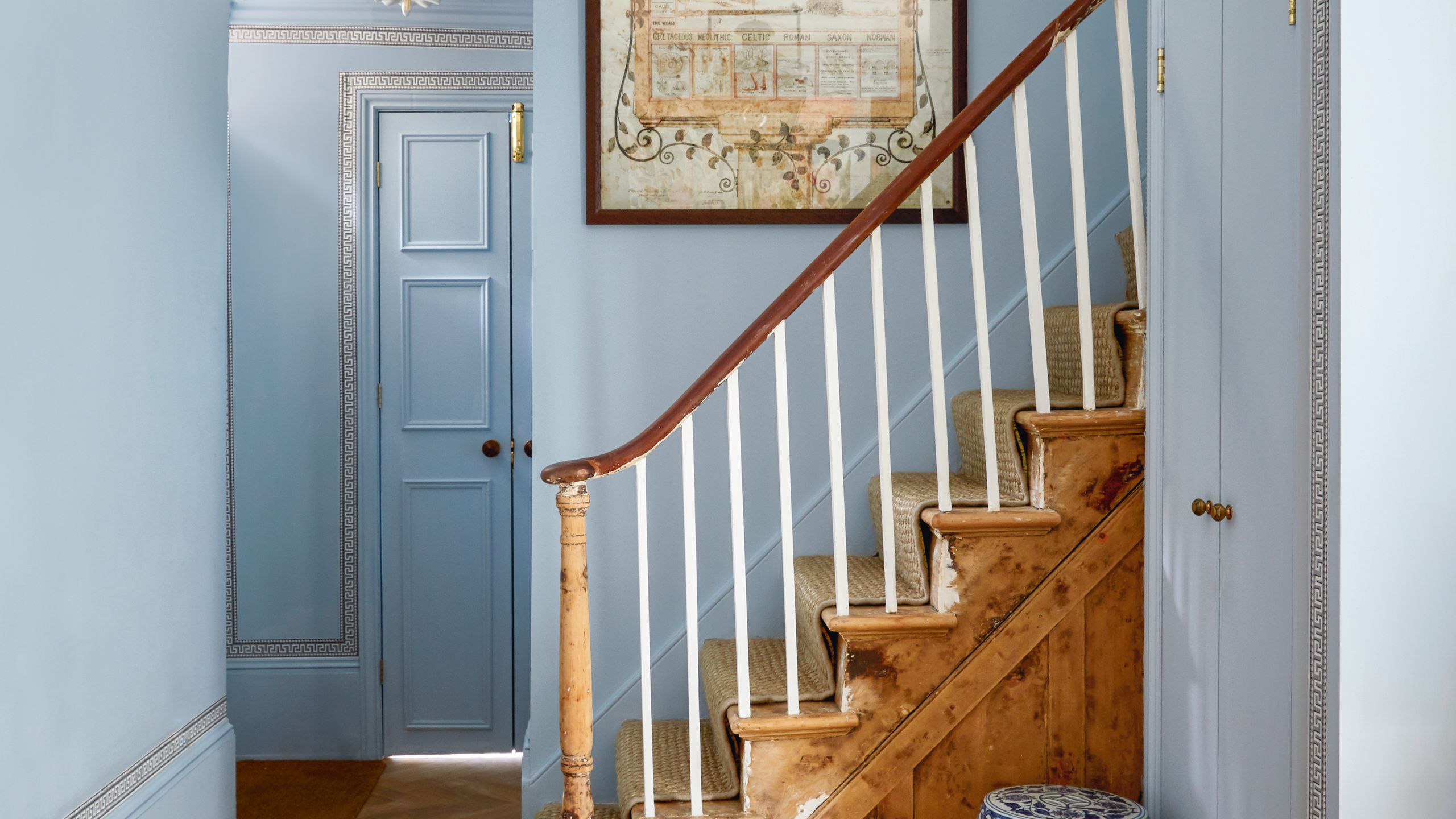
All the interior designers with paint collaborations (and our favourite shades)
33 Absolutely Perfect Paint Colors Designers Love


An A-List Designer’s Secrets To Picking Perfect Paint Colors


11 Paint Colors That INSTANTLY Make Your Home Look "Expensive," According to Designers

20 Interior Paint Colors Decorating Experts Love


4 Interior Designers Share the Biggest Paint Color Trends Right Now (and What’s Out!)

Interior designers' favorite Farrow & Ball paint colors

12 Paint Colors That Interior Designers Are Buzzing About—See the Gorgeous Hues Here

10 Timeless Living Room Paint Colors Designers Swear By

The most timeless paint colors according to designers
Lick Paint Will Transform the Mood in Your Home Through Color Psychology
Discover the beautiful new collection of shades created by ELLE Decoration with Crown Paints

The best interior designers in Britain
The Best Exterior Paint Colors Designers Have Ever Used

The Best Living Room Paint Colors, According To Designers